SIMS REED
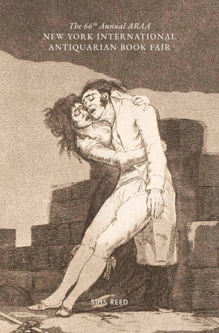
cover image: From cat. no. 7, Goya’s ‘Los Caprichos’
Stand E13
Park Avenue Armory, New York
30 April–3 May 2026
nb. Book descriptions have been abbreviated for this fair list. Please contact us for full descriptions or further images.
info@simsreed.com | +44 (0) 20 7930 5566 44 st james’s place, london, sw1a 1ns
[01].
Albrecht Dürer
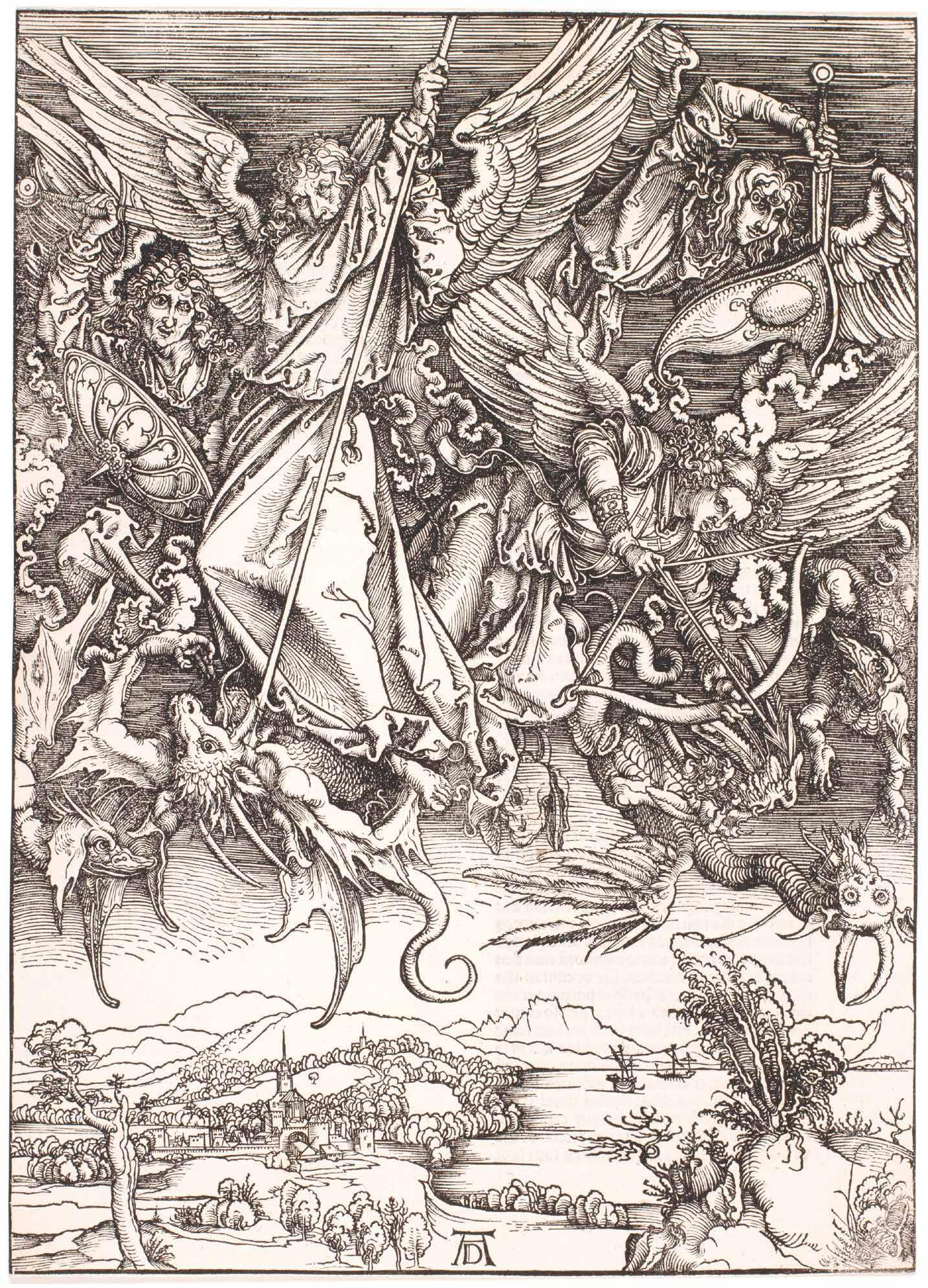
Die heimliche Offenbaru[n]g Ioh[an]nis). (The Secret Revelation of St. John). / Apocalipsis cum Figuris. (The Apocalypse with Pict ures) Nuremberg. (By the artist). 1498/1511
¶ Dürer’s ‘The Apocalypse’, the first book to be conceived, designed, printed and sold by a single artist.
Conceived as a project by Dürer in the mid-1490s and the approach of the millennium, his ‘Apocalypse’ cycle is a work of paramount importance in the development of his own oeuvre, of the woodcut and of the illustrated printed book. The priority Dürer created of the illustration over the text was a reversal of the traditional modus and a precedent that has endured. The text, as indicated by the title of the German edition, is St. John’s ‘Book of Revelation’, the apocalyptic visionary text of the end of this world and the coming of the next, a thesis that was of immediate appeal to a Europe in the grip of millenarian chaos and on the verge of a Turkish invasion.
Dürer’s first edition of 1498 featured a printed title and fifteen original woodcuts
with text to the verso of each print in Latin or German; for the second edition of 1511 Dürer added a vignette to the title of the Virgin with infant Christ appearing to St. John. The presence here of a proof without text is significant (these are highly desirable and of considerable rarity) and demonstrates Dürer’s innovative distributive techniques: the book could be bought as a whole, or in single sheets, as desired; for the later 1511 edition, the Apocalypse could be purchased with two other of his illustrated books, ‘The Life of the Virgin’ and ‘The Large Passion’ as ‘Drey Bücher’.
Folio. (c.380 × 280 mm). Original woodcut title with the Virgin with child appearing to St. John, printed text in Latin or German where applicable and 15 original woodcuts by Albrecht Dürer, various sheet sizes.
$520,000
[02].
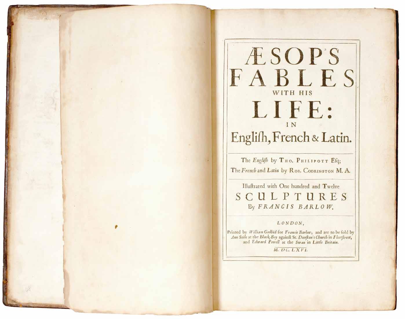
Francis Barlow. Thomas Phillpot & Robert Codrington Aesop’s Fables With His Life: in English, French & Latin London. Printed by William Godbid for Francis Barlow, and are to be sold by Ann Seile at the Black-Boy against St. Dunstan’s Church in Fleetstreet, and Edward Powell at the Swan in Little Britain. 1666
¶ A very rare large paper copy of the scarce first edition of Francis Barlow’s undoubted masterpiece of English book illustration.
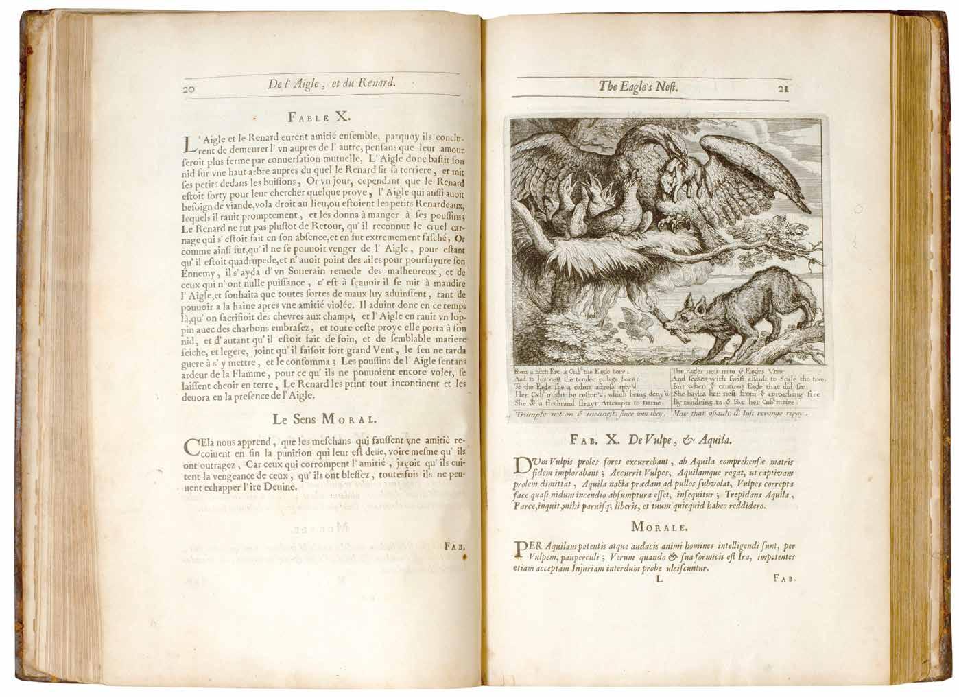
By the time of the Restoration Francis Barlow had achieved a measure of success with his suites of prints of animals – engraved by the best such as Hollar, Griffier and Place – and his decoration of houses and by the mid-1660s had contributed to the Aesop of Ogilby and Hollar. It is not entirely clear why he would wish to issue another edition of the Fables (Hofer suggests a competitive nature and a different projected audience) but by 1665 he had engraved a superb title (it bears that date) and by the time of publication in 1666 (the date to the letterpress title) had engraved a frontispiece of Aesop surrounded by animals and 110 halfpage vignettes after his own drawings to illustrate the Fables. Each of the Fable engravings is accompanied by lines of verse by Thomas Philipott; the translations of Aesop’s life into French and Latin was by Robert Codrington. Whatever Barlow’s motivation, the result is one of the most extensive and beautiful English illustrated books of the seventeenth century, and one of the scarcest, the scarcity often attributed to the loss of the sheets in the Great Fire of London.
Large paper copies of this first edition are identifiable (see ESTC) through vari-
ous issue points, all present here, but also as per Philip Hofer the transposition of some of Barlow’s engravings. In the present copy the engraving for ‘Fab. XLVIII’ (‘The Ant and Fly’) is in fact that for ‘Fab. XLXIX’ (‘The Ant and Grasshopper’). Hofer indicates too that the engravings for ‘Fab. LXX’ (‘The Tortoise and Hare’) and ‘Fab. LXXI’ (The Young Man and His Cat’) are also transposed, however, in the present copy they are not (the margins, headlines etc. conform to the remaining large paper leaves) although ‘The Young Man and His Cat’ features the erroneous title ‘The Nurse and Her Child’ (‘Fab. LXIX’) albeit with the correct page number. Large paper copies also feature ‘FINIS’ beneath the signature Ppp at the foot of the leaf with the final engraving (for ‘FAB. CX’, ‘The Tortoise & Eagle’); in addition the spacing of the text in the large paper copy also suggests that the text on this leaf was reset.
Folio. (356 × 242 mm). [161 leaves including additional engraved title; pp. (i), (i), (iii), (i), 40, 31, 17, 2–221, (ii)]. Full contemporary calf, boards ruled in blind, later spine with red morocco label with gilt title and blind rules in seven compartments, marbled edges.
— $52,800
[03].
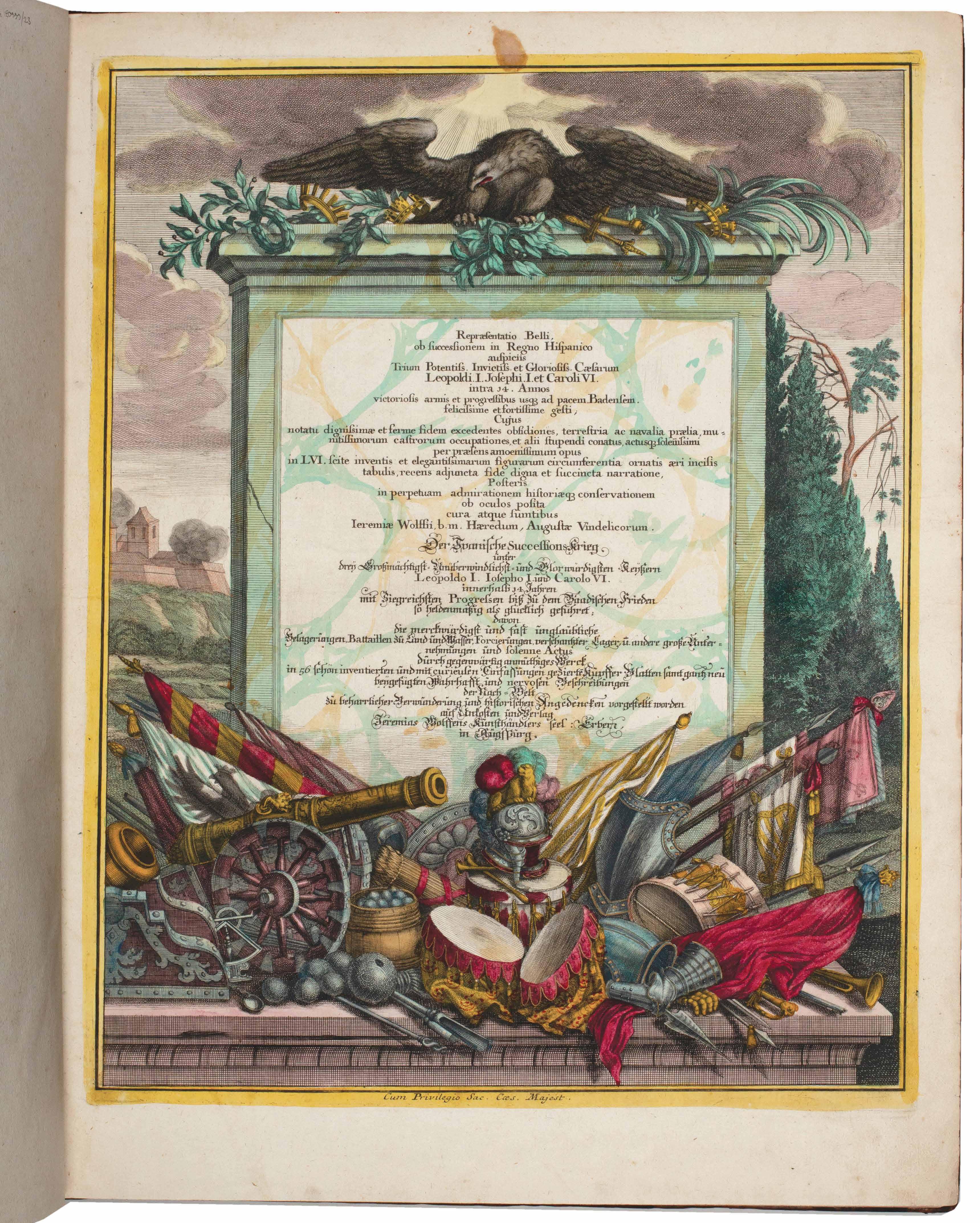
Paul Decker the Elder, Paul Decker the Younger, Abraham Drentwett the Elder et al. Repraesentatio Belli, ab successionem in Regno Hispanico ... / Der Spanische Successions-Krieg ... &c Augsburg. Jeremias Wolff. c.1715
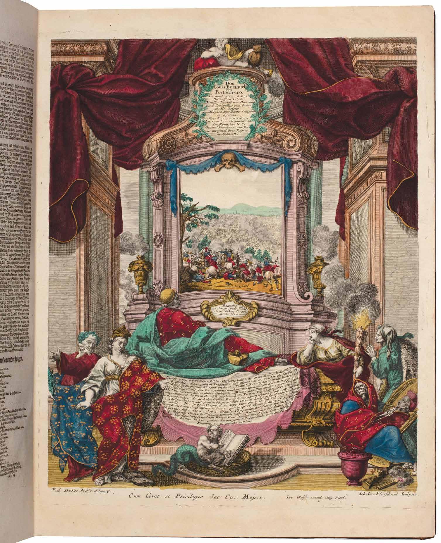
¶ An exceptional copy of Decker’s very rare suite of engravings – here inplano and with exceptional additional colouring and highlighting in gilt by hand – illustrating the battles of the War of the Spanish Succession.
Decker’s suite depicts the battles of the complex series of engagements that became known as the War of the Spanish Succession (1701–1714). Prompted by the death of the last of the Spanish Habsburg Kings, the childless Charles II, and with a shifting group of alliances and a field of warfare that included not only Continental Europe and the Mediterranean, but also the Caribbean and North America, the War of the Spanish Succession has a case to be a true world war. In part an attempt to check French hegemony, the war featured a number of outstanding victories for the Duke of Marlborough and Prince Eugene of Savoy, including Blenheim, although the war was ultimately, at best, indecisive.
Each of Decker’s magnificent plates features a single engagement, depicted
in the central portion of the plate, the whole image surrounded with a decorative border composed of architectural, allegorical and armorial symbols and motifs in the Baroque manner and a descriptive text concerning the battle. Many of the plates feature an additional small vignette of the battlefield keyed to the descriptive text and illustrating the placement of the armies and the most significant figures involved.
The colouring and highlighting by hand of the present copy is remarkable.
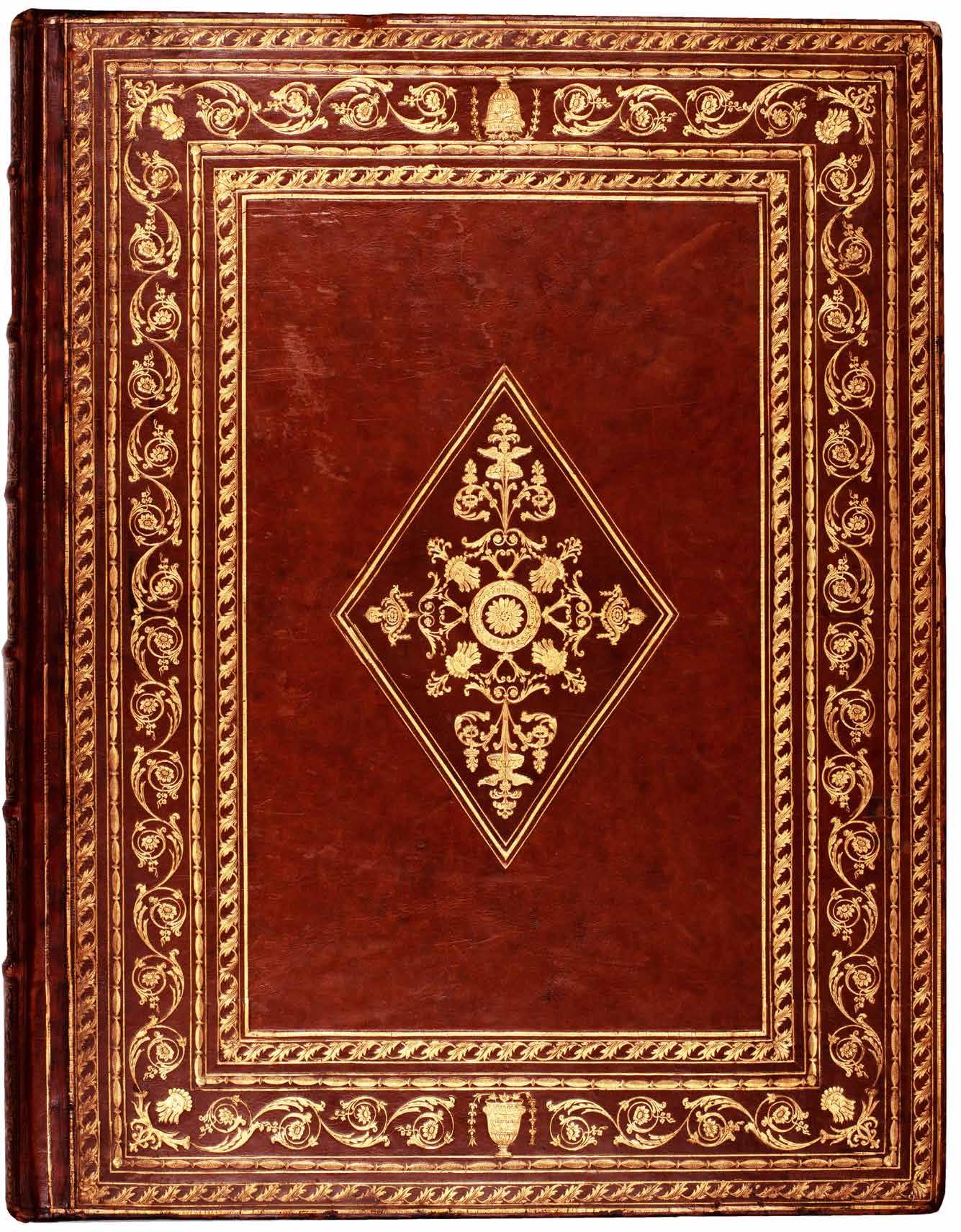
Folio. (554 × 423 mm). [58 unnumbered leaves]. Full contemporary blond calf, boards with elaborate neo-classical decorative borders composed of rules, foliate, floral and rope-work tools, vase tools at head and foot and mask corner tools all to surround a central lozenge with a decorative composition of floral, foliate and mask tools, later banded spine with elaborate decorative tooling in gilt in seven compartments, turnins tooled in gilt, red speckled edges.
—$85,800
[04].
Henry Fielding
The History of Tom Jones, a Foundling London. Printed for A. Miller. 1749
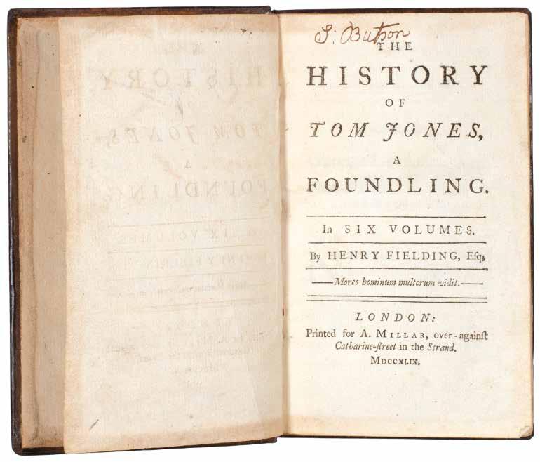
¶ A very good copy of the first edition, first issue of Henry Fielding’s famous, enormously popular and influential comic novel.
From the first edition limited to 2,000 copies. Although Fielding’s early novel ‘The History of Tom Jones, A Foundling’ was not the first, or even his first, it is certainly his masterpiece and one of the finest, if not the finest novel in the English language. All copies of this first edition were subscribed for by booksellers – and were sold so quickly that there were not enough binders to be found – and a second exact reprint was ordered almost immediately. At the end of the year of publication four editions had been issued and 10,000 copies sold.
This is a fine example of the first edition with errata leaf and all cancels called for by Rothschild (and with the overlooked cancel in Vol. II, N12). Some occasional toning, one or two small tears with no loss, occasional pencil markings and discrete repairs to the spine do not detract from what is a very fine example of Fielding’s work.
6 vols. 12mo. (169 × 109 mm). pp. lxii, (i, errata), 214; (i), 324; (i), 370; (i), 312; (i), 294; (i), 304. Full contemporary calf, boards with double gilt rules, banded spines with red morocco labels with gilt title, gilt rules and gilt volume numbers direct in six compartments, edges sprinkled red.
— $7,260
[05].
Thomas Paine
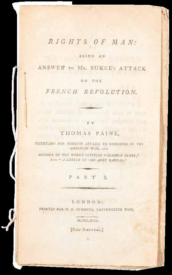
Rights of Man: Being An Answer to Mr. Burke’s Attack on the French Revolution. [and:] Rights of Man. Part the Second. Combining Principle and Practice
London. Printed for H. D. Symonds, Paternoster Row. 1792
¶ Superb, unsophisticated examples, uncut entirely and stitched as issued in pamphlet form, of the first two parts of Thomas Paine’s ‘Rights of Man’.
Composed in reaction to Edmund Burke’s 1790 ‘Reflections on the Revolution in France’ (and so advertised in Paine’s title as ‘An Answer to Mr. Burke’s Attack ... ‘), the first part of Paine’s response was first published in February 1791 by Joseph Johnson before its withdrawal – Johnson feared prosecution or worse – and its issue with a new imprint by J. S. Jordan in March of the same year. Despite efforts by the government of the day to censor the work – although
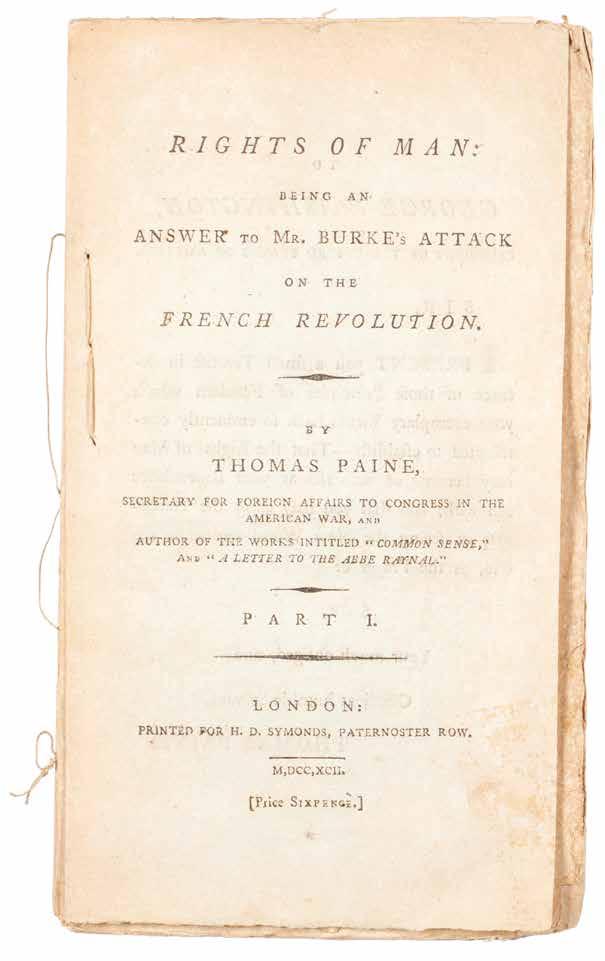
Pitt feared the effect on the populace he himself (see PMM) thought Paine correct – the analysis of basic democratic rights was so crucial that it proved very popular and was reprinted numerous times. The two parts presented here, each with an individual price, unbound and stab stitched as issued, demonstrate that the ‘Rights of Man’ was made available as a pamphlet for ease of distribution and concurrent popular influence.
2 vols. 8vo. (208 × 126 mm). pp. iv, 78, (i); vii, (i), 9–90, (iv), (i). Unbound gatherings stab stitched in pamphlet form as issued.
— $9,900
[06].
James Gillray
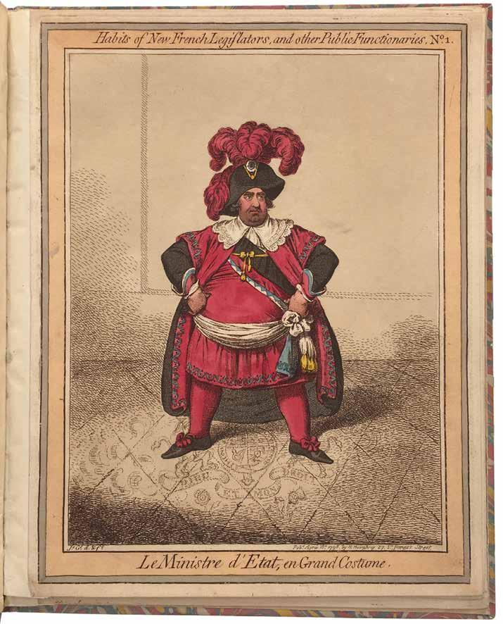
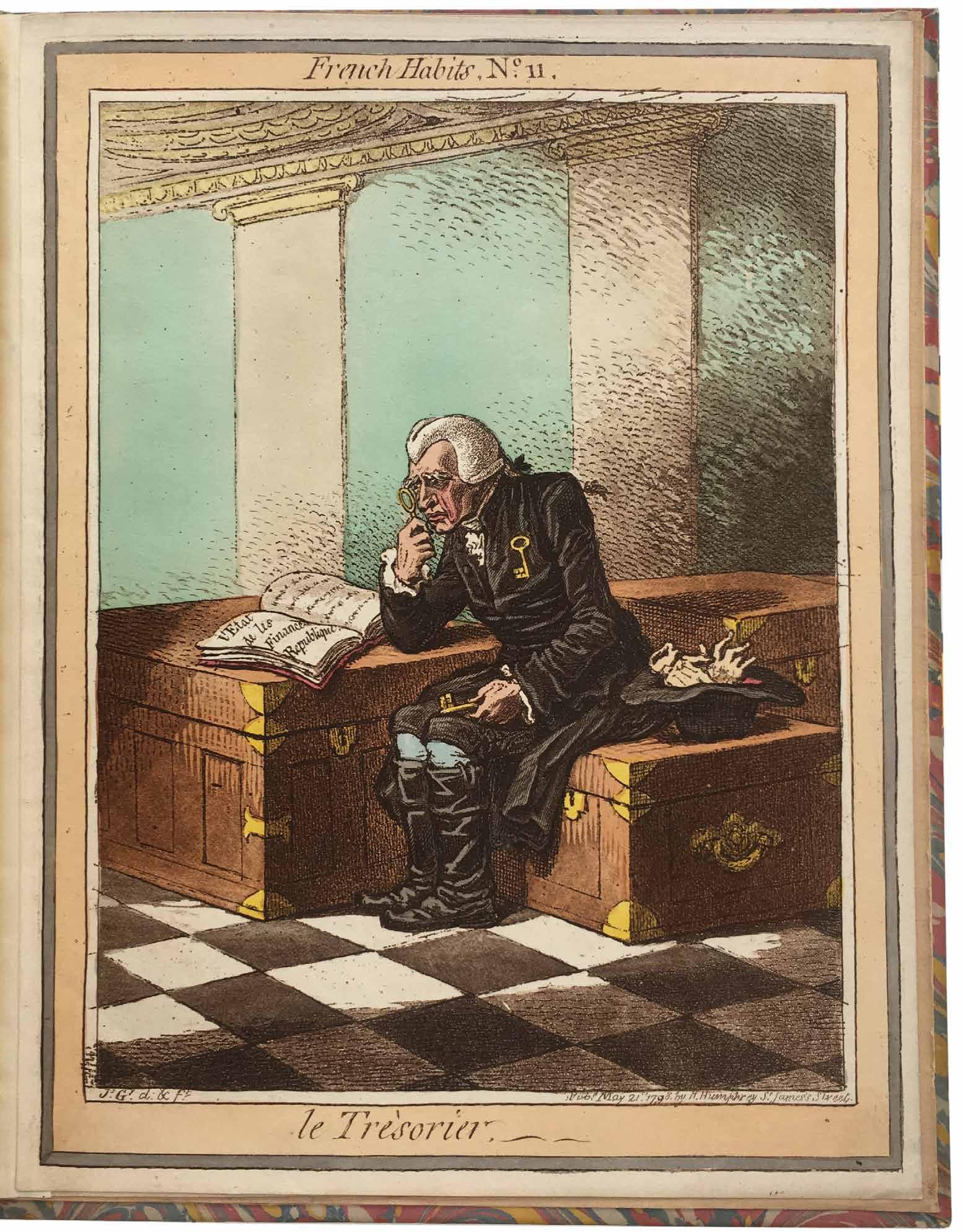
Habits of the New French Legislators, and other Public Functionaries. No. 1–No. 12 London. H. Humphrey. 1798
¶ A very fine complete set of Gillray’s hand-coloured satirical etchings of the Whig opposition depicted in the costumes designed by Jacques-Louis David for the legislators of the French republic.
Published by Hannah Humphrey from her shop in St. James’s between 18th April and 21st May, 1798, Gillray’s caricatures depict, despite the title indicating they are French, English legislators.More particularly they satirise the Whig opposition of the day, viewed through the prism of the revolution in France. The first plate for example, ‘Le Ministre d’Etat, en Grand Costume’, shows Charles James Fox outfitted as a revolutionary but standing on a rug embroidered with the Royal arms and motto ‘Dieu et Mon Droit’.
Fox was, at that moment, in the political wilderness and he and his allies found themselves in a precarious position in the face of a popular war and its Tory advocates led by Pitt. Gillray, always conservative, was merciless in his ridicule of France, the French, the revolution and those he took to support them. Later the same year, Lord Bateman wrote to Gillray: ‘The Opposition are as low as we can wish them. You have been of infinite service in lowering them, and making them ridiculous.’
Small folio. (278 × 222 mm). [12 leaves]. Later marbled paper-covered boards, black morocco label with gilt title to spine.
— $12,500
[07].
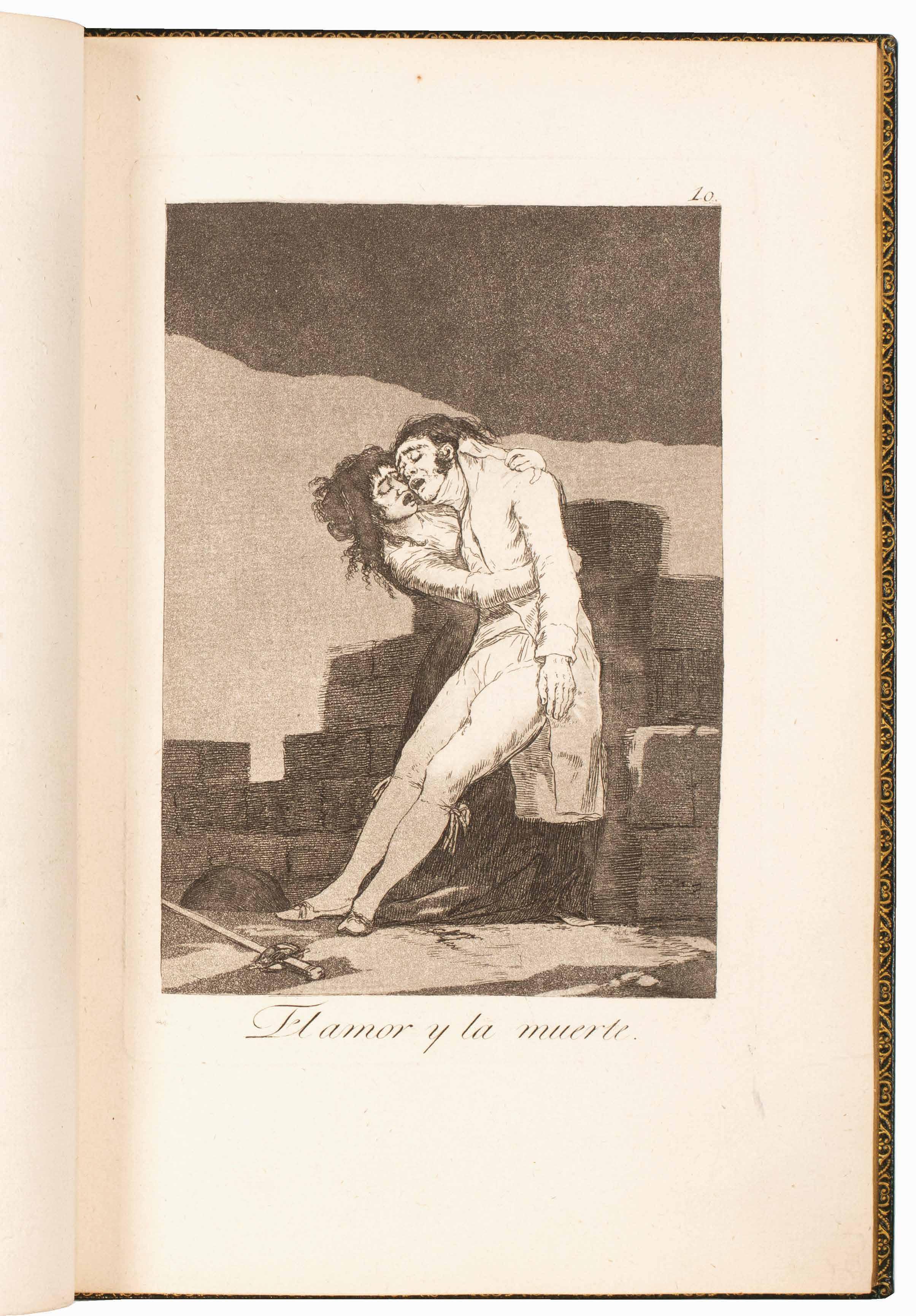
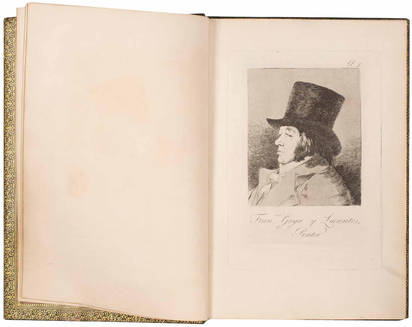
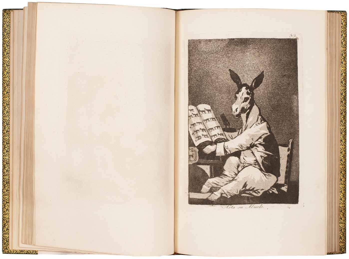
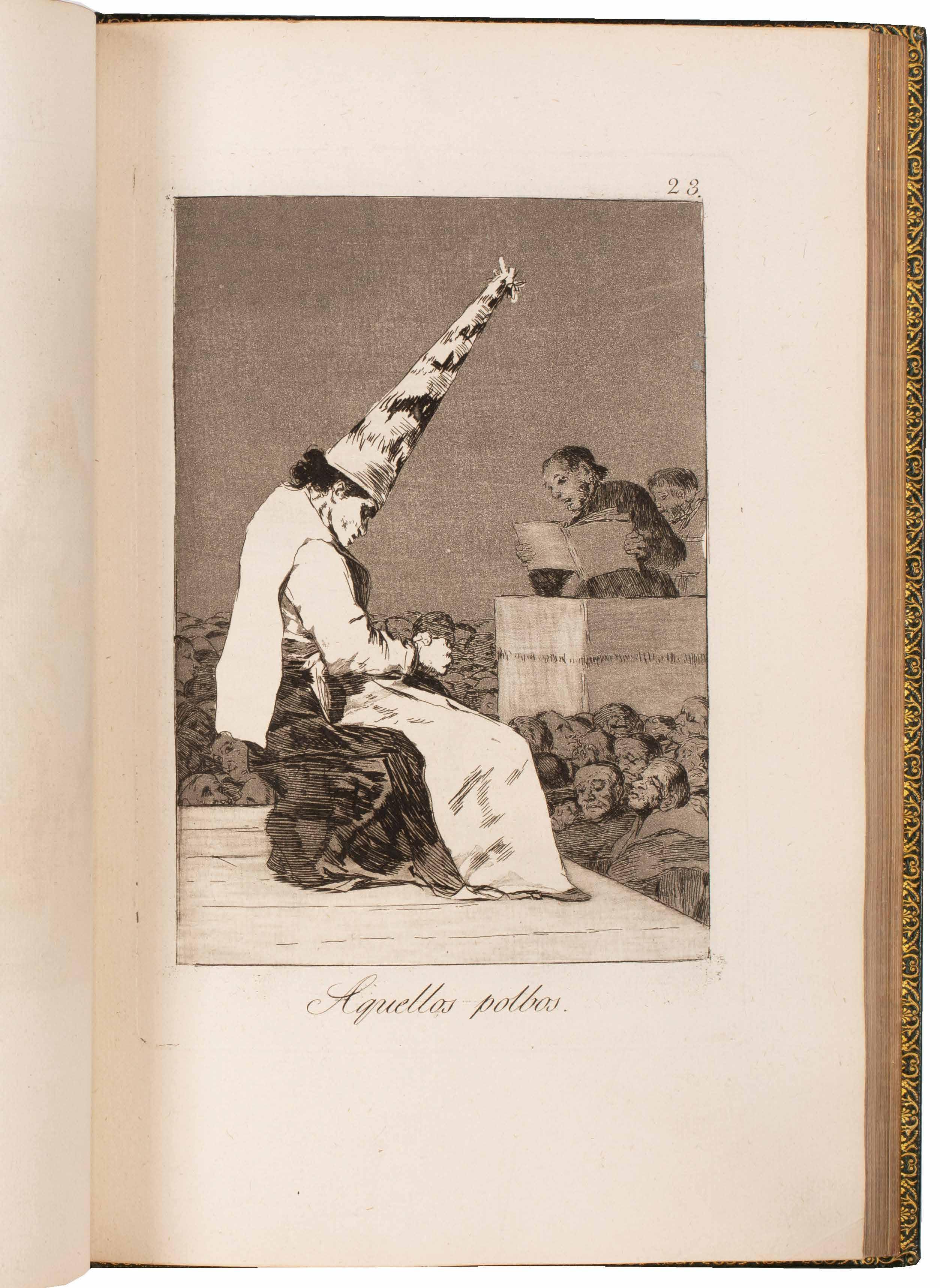
Goya (Francisco José de Goya y Lucientes) Los Caprichos
Madrid. (Published by the artist). (1799)
¶ A fine set of the first edition of Goya’s greatest set of prints, printed in warm sepia ink on thick laid paper.
From the first edition limited to approximately 300 copies (see Harris); this copy is printed after the scratch on plate 45 (‘Mucho hay que chupar?’) which occurred early in the printing but this is nevertheless a beautiful set with very crisp impressions of the plates, the paper retaining its original tone and the aquatint remaining strong.
‘This edition is easily identified by the brilliance of the impressions and by the paper and ink used.’ —Harris
Published by Goya himself in 1799 and produced after Goya’s return from his lover the Duchess of Alba’s estate at Sanlúcar in 1798, Los Caprichos have long exerted a fascination greater than that of his other printed work. Of an evident satirical intent, the meaning and intended targets of Los Caprichos have long been discussed, though with no reliable conclusions having been made. The Church, particularly the Inquisition
whom Goya later claimed had investigated Los Caprichos, the Government, the Queen Maria Luisa, her advisors and even the Duchess of Alba have been identified as the objects of Goya’s satire and, indeed, as characters in the plates themselves. It is known, however, that Goya omitted two plates from the eventual 80 that alluded more directly to contemporary figures (in this case the Queen and the Duchess of Alba) and it seems certain that he wished an intriguing element of uncertainty to surround his work.
4to. (308 × 215 mm). Eighty etched plates with aquatint by Francisco Goya (sheet size: 300 x 200 mm) numbered 1–80 on laid paper. Full green crushed morocco by Marius Michel with his signature gilt, boards ruled in gilt, banded spine with title gilt and foliate and floral decorative tooling in six compartments, turn-ins with elaborate gilt floral motif, marbled endpapers, a.e.g., later green morocco-backed wool-lined solander box.
—$363,000
[08].
William Blake
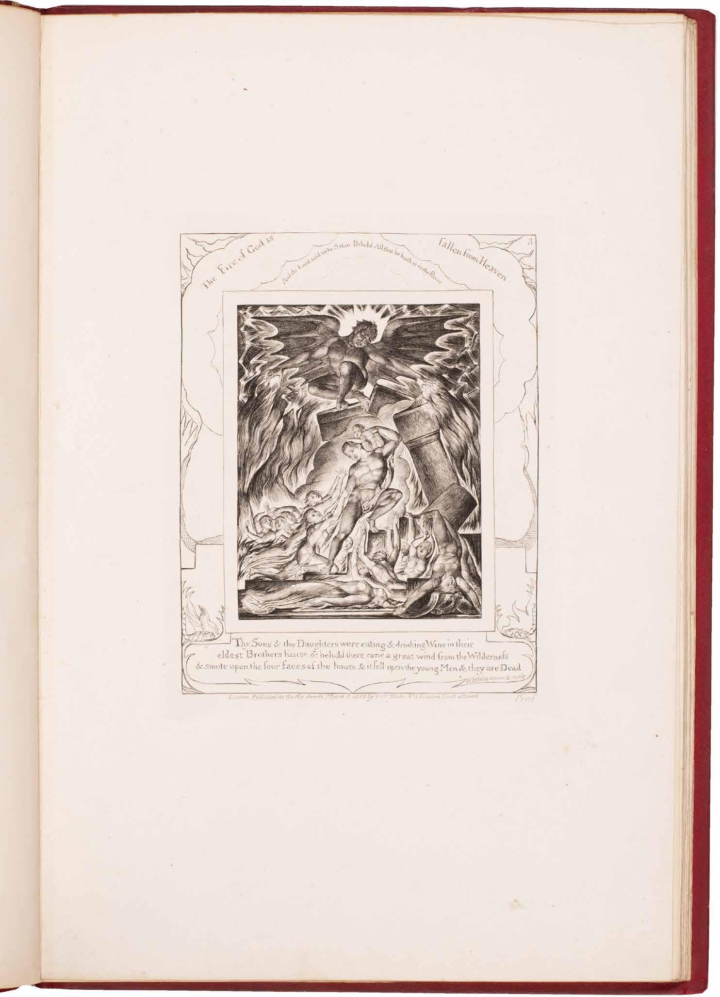
Illustrations of the Book of Job, in Twenty-One Plates, Invented and Engraved by William Blake London. Published by the Author & Mr. J. Linnell. 1825. (March 1826)
¶ William Blake’s illustrations for the ‘Book of Job’, the scarcest issue on French paper, bound in red morocco.
The first edition was issued in 3 versions: 65 copies on French paper – as for the present example – 150 copies on laid India, and 100 copies on Whatman paper; the copies on French paper and laid India paper were issued with the word ‘proof’ at lower right within the plate. The engravings for the Book of Job were commissioned formally by John Linnell in an agreement of March 25, 1823. Despite a publication date of March 8, 1825 (the plates bear this date), they probably did not appear until early 1826 (the title label states ‘March, 1826’) and were sold sporadically by Linnell and his heirs (he died in 1882) over the course of
the next century. Indeed, the family sold 68 sets of India proof copies at Christie’s in 1918. Always fascinated by the Book of Job, Blake’s engravings were based on a series of watercolours executed between 1805 and 1806 for his patron Thomas Butts concerning a debate between Satan and God concerning Job’s piety. The plates are noteworthy as being the last complete series of engravings completed before Blake’s death in 1827.
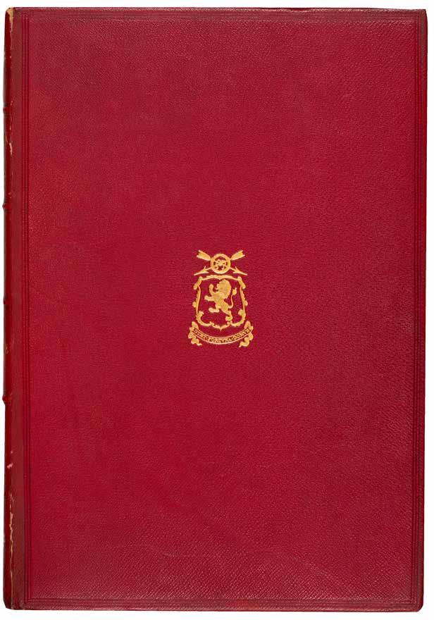
Folio. (428 × 298 mm). [22 leaves]. Full scarlet pebble grain morocco, boards with triple rules in blind to surround central armorial vignette to front cover, banded spine with gilt title and tooling in six compartments, marbled endpapers.
—$79,200
[09].
Alessandro Manzoni
The Betrothed Lovers; A Milanese Tale of the xvii th century: Translated from the Italian of Alessandro Manzoni Pisa. Nicolas Capurro, Lung’Arno. 1828
¶ The very rare first edition in English of Alessandro Manzoni’s masterpiece of Italian literature ‘I Promessi Sposi’.
‘Il più celebre romanzo della letteratura Italiano.’ —Fabrizio Govi
Alessandro Manzoni’s masterpiece, considered by many to be the finest work of Italian literature after Dante, was composed in the early 1820s, completed in 1823 and published volume by volume between 1825 and 1827. The book made Manzoni famous immediately and was admired widely. This English translation, published anonymously, but the work of Charles Swan, was printed in Pisa and issued in England in June, 1828.
Very scarce on the market, we can trace only three copies at auction in the last century. This translation is also scarce in
institutions and we can trace only those copies at the British Library (two copies), the Bibliothèque Publique of Yverdonles-bains in Switzerland and eight copies in the US (at Illinois, the Ransom Center, the Huntington, the Morgan, Indiana, Virginia, Chicago and Princeton);
COPAC adds a further copy at Oxford. The two copies held by the British Library appear to be different issues: that with Capurro listed as the publisher (as for the present copy) and that with the Rivingtons.
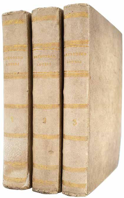
3 vols. 12mo. (198 × 122 mm). pp. (i), (i), xvii, (i), 390, (ii); 397; 347, (i). Full contemporary vellum, gilt decoration and titles to spines.
—$12,600
[10].
William Henry Fox Talbot
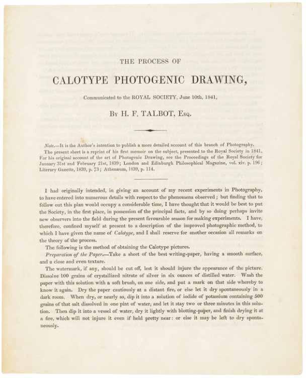
The Process of Calotype Photogenic Drawing, Communicated to the Royal Society, June 10th, 1841 London. Printed by J. L. Cox and Sons. 1841
¶ The rare first edition of the first announcement of Fox Talbot’s calotype method – the negative/positive photographic process – the most important innovation in the history of photography.
Although Talbot had announced his researches and progress in the field of what was to become photography in his 1839 lecture to the Royal Society (‘Some Account of the Art of Photogenic Drawing ... &c.’), that lecture, although ground-breaking, dealt largely with the achievement of an image on treated paper and only alluded briefly to the possibility of a more versatile development. It was not until his 1841 lecture to the same body (the title as per the present publication is ‘The Process of Calotype Photogenic Drawing ... &c.’) that the details of his refinements, and most particularly his successes with the negative / positive process, were delineated. Those successes and Talbot’s development of the resultant negative / positive process for photographic reproduction and duplication remained the predominant methodology in the field for more than 150 years; all subsequent refinements, whether in the chemicals used, differing methods for image capture, printing and so on, were merely variations on Talbot’s original scheme. Talbot had patented his method in secret (he was awarded ‘Her
Majesty’s Royal Letters Patent No. 8842’) in February 1841, prior to his lecture to the Royal Society, concerned by Arago’s announcement of Daguerre’s discoveries, the efforts of Hippolyte Bayard and the priority of his own work.
The document was reprinted with an altered title (‘The Process of Talbotype (formerly called Calotype) Photogenic Drawing ... &c.) in 1846.
‘Privately printed for the author for distribution to friends and editors.’
— Gernsheim
4to. (229 × 182 mm). [Single bifolium: pp. (4)]. Loose as issued, later moroccobacked portfolio.
—$36,000
[11]. Société des Eclectiques
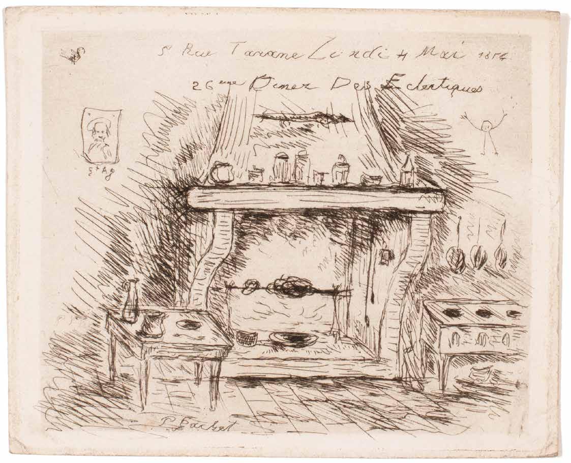
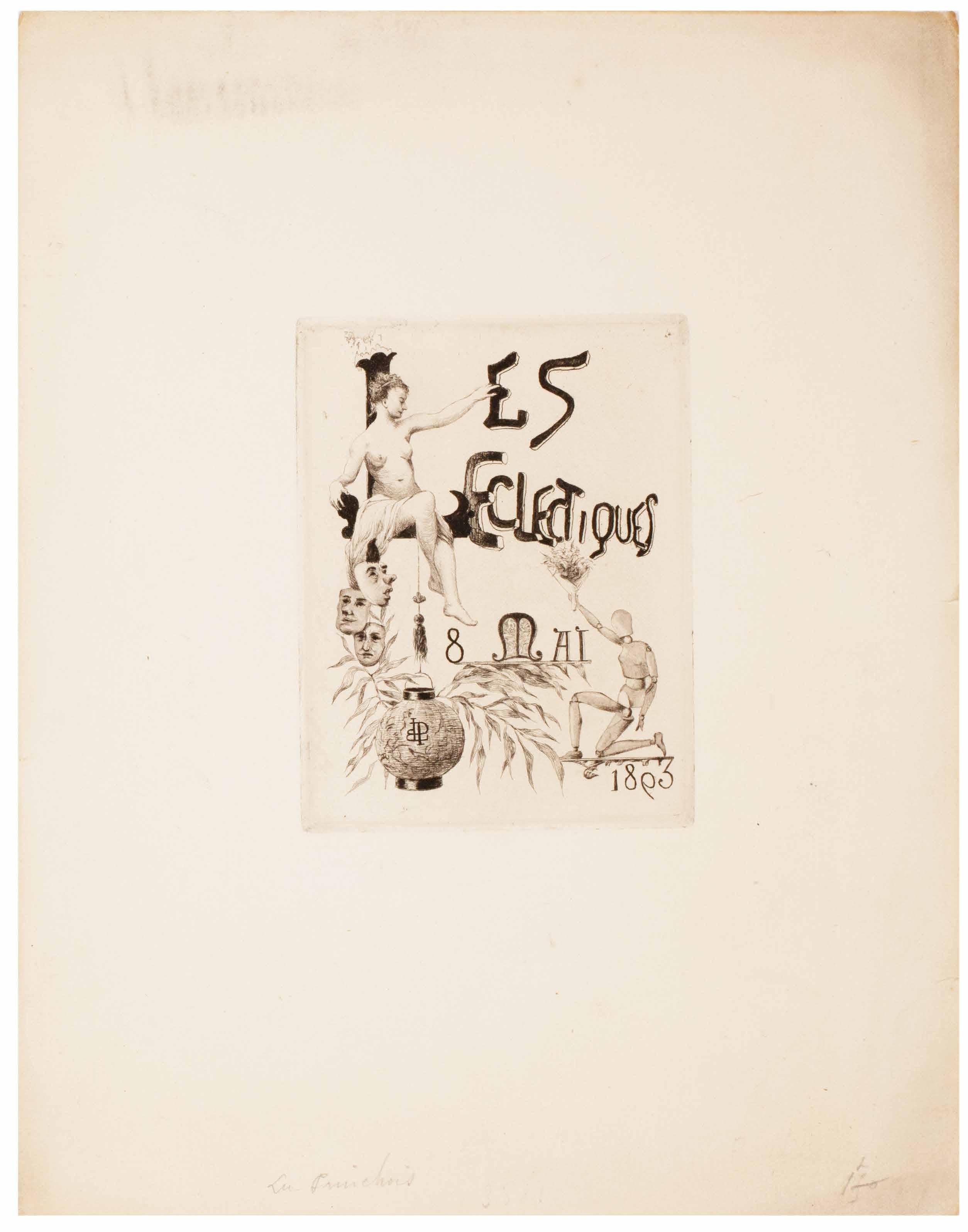
22 Engravings by Various Artists for the Illustrated Invitation s of the Société des Eclectiques Issued Between 1883 and 1900 Paris. 1872–1903
¶ A remarkable series of engraved invitations on uncut sheets by various artists for the dinners of the Société des Eclectiques.
Founded in 1872 by artists, engravers and poets, the Société des Eclectiques was a dining society that met one Monday per month for over thirty years. For each occasion an invitation was engraved by one of the members. The twenty-two examples presented here, all (save one) on large paper and likely in early states, represent a remarkable survival and a scarce resource.
Artists represented include Van Gogh’s patron Dr. Gachet (1874?), Aglaus Bouvenne, Frederic Regamey, Letouneau, G. Sauvage, Charles Ficht, etc.
‘Ces rencontres amicales ressemblaient, d’après les comptes rendus de séances, plus
à des assemblées de potaches anticléricaux et irrévérencieux qu’autre chose, malgré la présence d’Émile Bin qui devint maire de Montmartre après Clemenceau, puis fut destitué pour avoir peint un portrait du général Boulanger ... Dans cette joyeuse compagnie, il y avait le sculpteur Guillemin, le libraire Voisin, le journaliste écrivain Ernest d’Hervilly, Charles Asselineau que l’on ne présente pas, le plus grand illustrateur de son temps Félix Régamey …’.—Bernard Vassor
4to. (c.220 × 280 mm. [22 leaves of various paper stocks]. Etchings and engravings for the most part on laid paper recto only in early states and on untrimmed sheets, the majority retaining their deckle edges.
—$7,260
[12]. Edouard Manet & Edgar Allan Poe Le Corbeau. The Raven. Poème par Edgar Poe. Traduction français e de Stéphane Mallarmé. Avec Illustrations par Edouard Manet Paris. Richard Lesclide. 1875
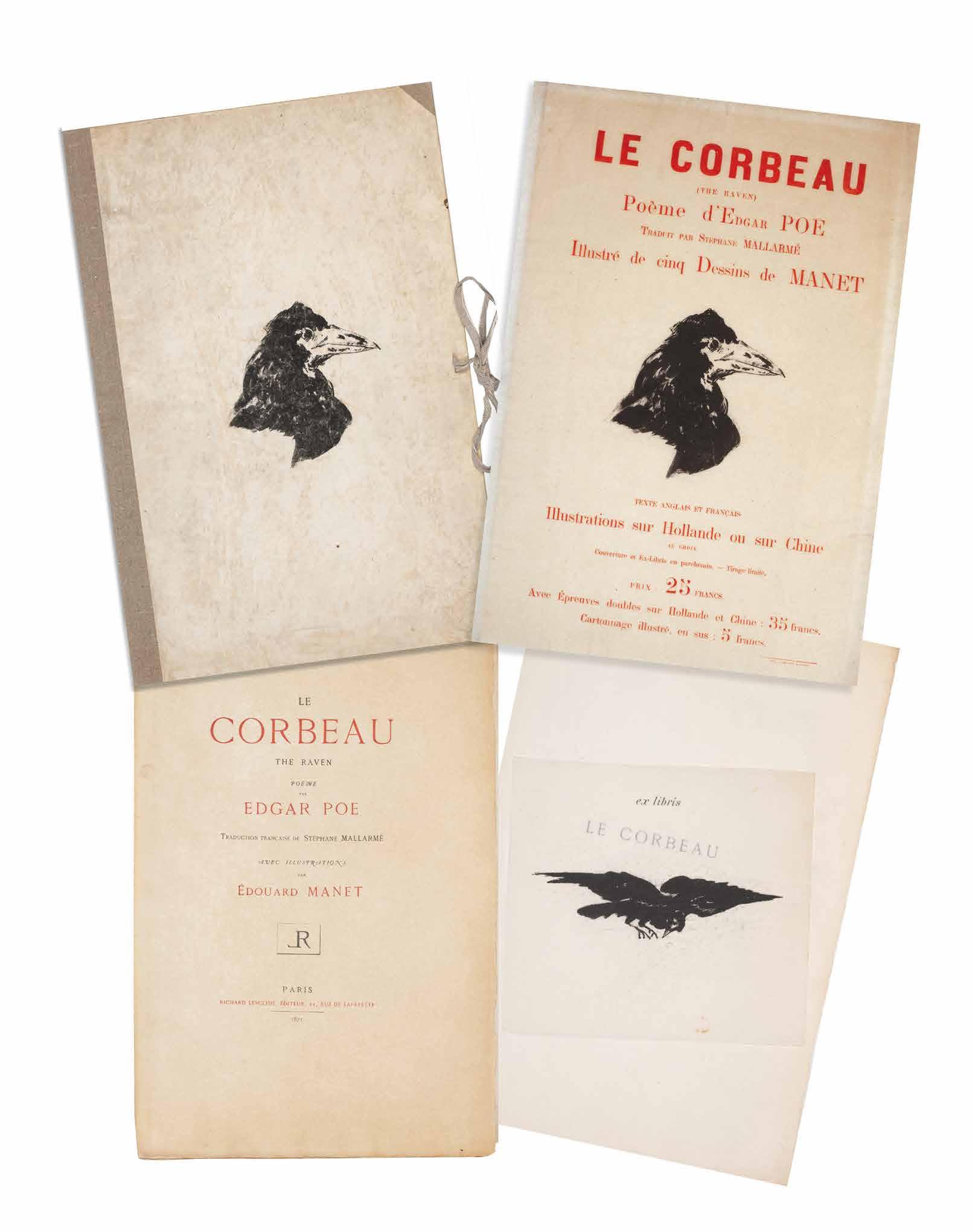
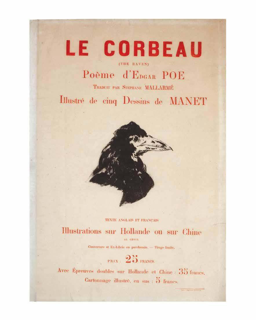
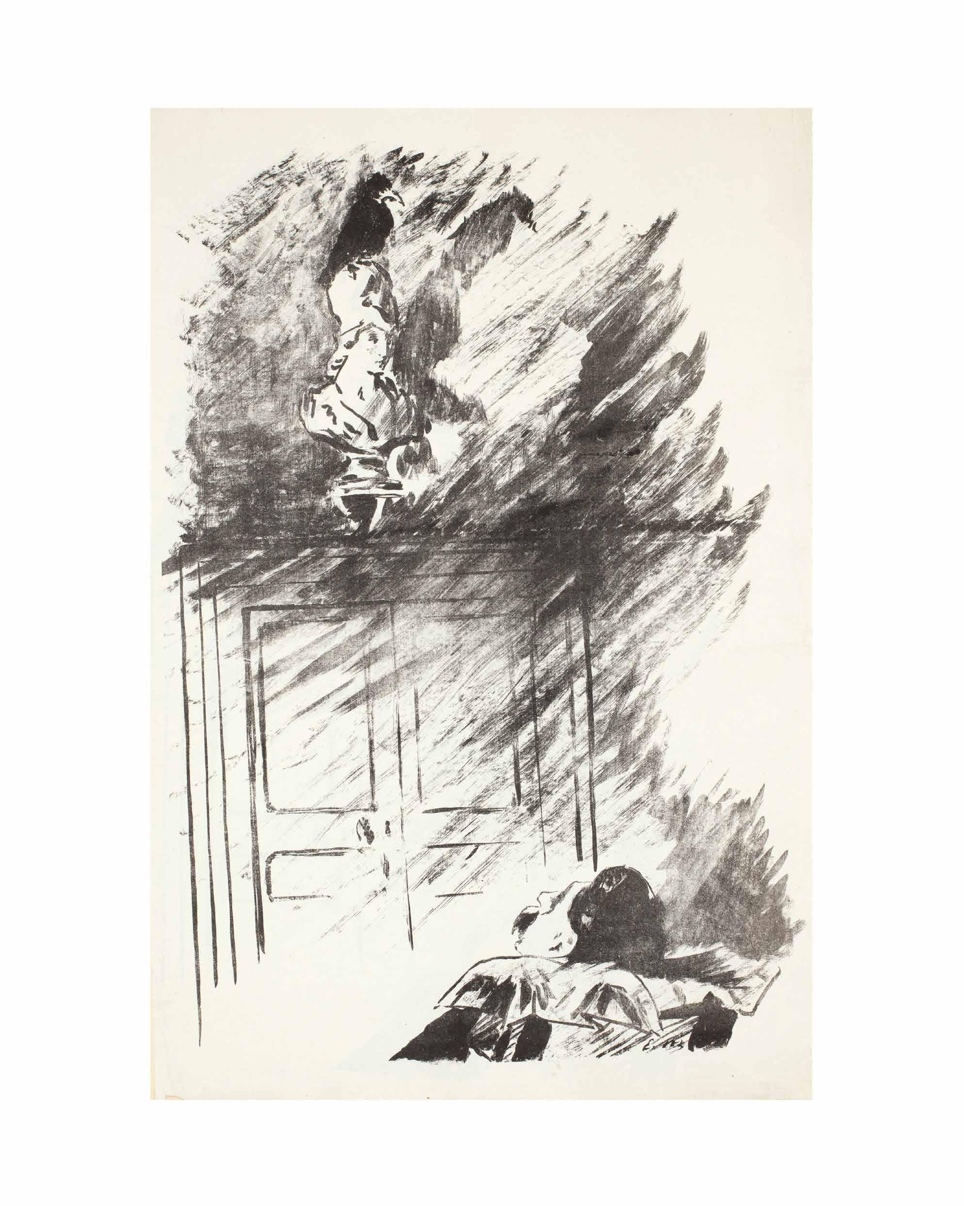
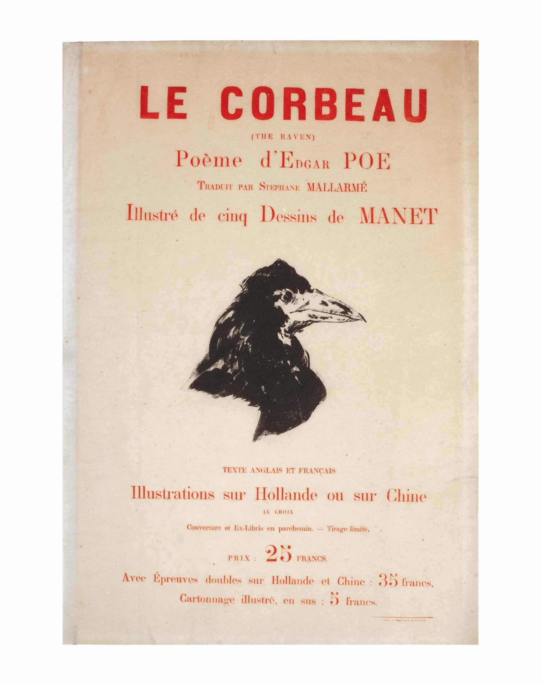
¶ Manet’s illustrations for Mallarmé’s translation of Edgar Allen Poe’s ‘The Raven’ — a stunning copy of ‘Le Corbeau’ in the original portfolio, with a suite of Manet’s illustrations on Chine and with the very rare ‘affiche de librairie’.
From the edition limited to 240 copies (although only 150 were printed), with this copy signed by Manet and Mallarmé in ink to the justification, with the additional suite of lithographs on Chine, the original poster on papier parcheminé and in the original portfolio with Manet’s raven’s head to front cover and the list of publications to the rear.
The copy presented here, with the very rare suite, the rarer original portfolio and the even rarer poster is a remarkable survival and represents one of the finest copies of the work to remain extant. Juliet Wilson-Bareau in her census records only six copies with the plates on both papers
as here; she notes that, of these, four are in institutional collections.
The large and striking ‘Le Corbeau’ is always cited as one of the high points of French book illustration. Considered ‘an astonishingly modern illustrated book for 1875’ (The Artist and the Book), ‘Le Corbeau’ represents a turning-point in the history of the illustrated book. Book illustration was subsequently ‘liberated’ from literal interpretation.
Folio. (548 × 372 mm). [10 leaves of Hollande + four leaves of Chine + parchment ex-libris + poster]. Loose in the original publisher’s portfolio, the ‘cartonnage illustré’ of parchment with Manet’s raven’s head to front cover in black and the advertisements of Librairie de l’Eau-Forte to the rear, the portfolio with later cloth backing and new ties.
—$184,800
[13].
KELMSCOTT PRESS
Jacobus de Voragine
The Golden Legend of Master William Caxton Hammersmith. Kelmscott Press. 1892
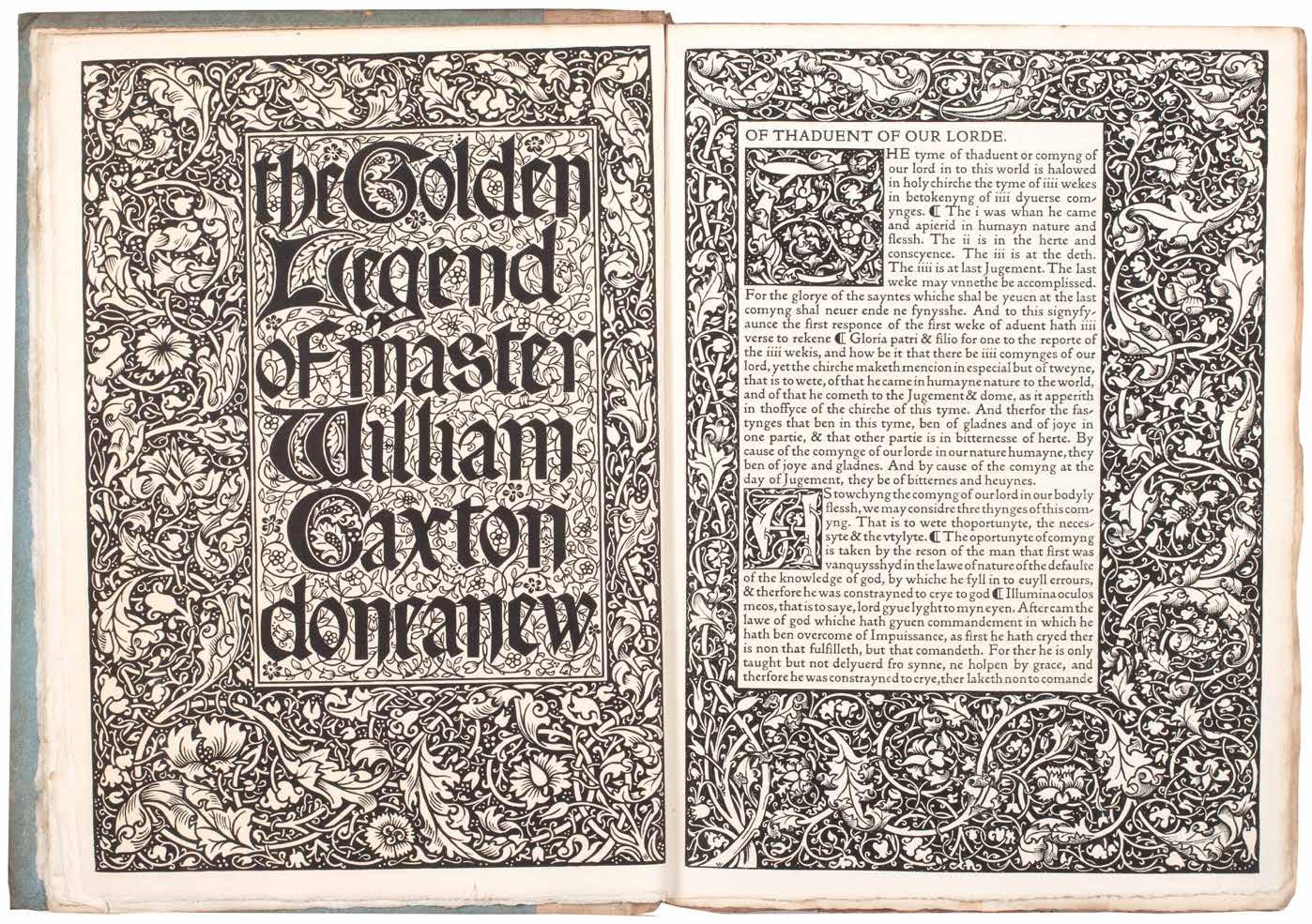
¶ A very good copy of the first Kelmscott Press edition of William Caxton’s ‘The Golden Legend’.
From the edition limited to 500 copies on Flower paper (no copies printed on vellum), volumes two and three unopened.
Morris’ first proposed publication by the Kelmscott Press, ‘The Golden Legend of Master William Caxton’ was announced in the ‘Literary Gossip’ column of the Athenaeum as early as September 13th 1890 (this is probably the earliest mention of the press in print). The ‘Legenda Aurea’, Jacobus de Voragine’s 13th-century compilation of Saints’ lives, an essential prism for the understanding of the medieval mind in Morris’ view, was enormously popular in manuscript and print: ‘ ... no other book was more usually reprinted in various languages between the years 1470 and 1520 ...’ (Ellis).
A copy of Caxton’s first edition (printed c.1483 / 1484) was borrowed from Cambridge University and transcribed by Ellis’ daughter; corrections
to the text were made by Ellis (in consultation with Morris) while Morris designed the mise en page and occupied himself with the printing. Ellis’ proposed glossary and bibliography of English editions of the ‘Legenda Aurea’, which he intended for an introduction, found no favour with Morris, and in the published book the glossary is printed at the end of the third volume in truncated form. In addition Morris did allow Ellis to print a bibliographical notice, the ‘Memoranda, Bibliographical & Explanatory, Concerning the Legenda Aurea of Jacobus de Voragine & Some of the Translation of It’, also at the end of the third volume.
3 vols. 4to. (304 × 216 mm). pp. xii, 464; 465–864; 865–1286. Original publisher’s canvas-backed blue paper boards, printed paper title labels to spines, spines a little darkened, labels and free endpapers with some toning as usual.
—$12,500
[14].
KELMSCOTT PRESS
Raoul Lefèvre
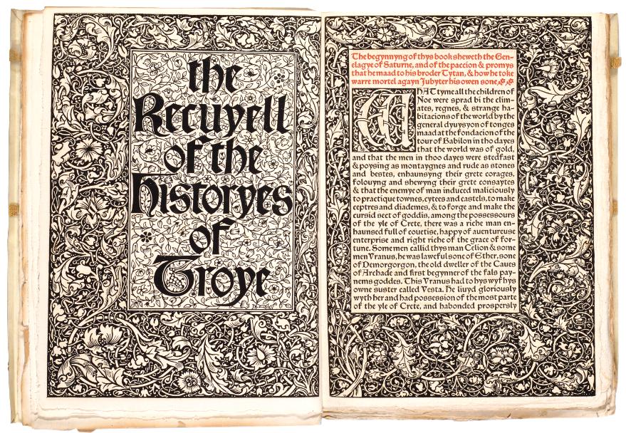
The Recuyell of the Historyes of Troye Hammersmith. Bernard Quaritch for Kelmscott Press. 1892
¶ The Kelmscott Press edition of Caxton’s ‘The Recuyell of the Historyes of Troye’, the first book printed in English.
From the edition limited to 305 copies, with this one of 300 on Flower paper.
Caxton’s edition of the text, using his own translation of Raoul Lefèvre’s Burgundian romance, was the first book printed in the English language in Bruges in 1473 or 1474. The book was also a favourite of William Morris. Although Caxton’s ‘Recuyell’ had been reprinted in numerous editions, this Kelmscott Press version was ‘the first to go back directly to Caxton’s text’ (Peterson). The text was edited by H. Halliday Sparling. Morris’ ornamental designs are printed here for the first time and his vine border – used twice in the second volume – also appears here for the first time.
‘As to the matter of the book, it makes a thoroughly amusing story, instinct with mediaeval thought and manners ... It is
the last issue of that story of Troy which had such a hold on men’s imaginations; the story built up from a rumour of the Cyclic Poets, of the heroic City of Troy, defended by Priam, with his gallant sons, led by Hector the ‘preux Chevalier’, beset by the violent & brutal Greeks, who were looked on as the necessary machinery for bringing about the undeniable tragedy of the fall of the city.’– Morris’ manuscript note for Quaritch’s catalogue in Cockerell’s presentation copy.
3 vols. in 2. Large 4to. (300 × 220 mm). [156 leaves, 214 leaves, with inserted blank; pp. xv, (i), 295; 297–718]. Elaborate decorative woodcut borders and initials throughout, text printed in Troy type, with table of characters and glossary in Chaucer type, printed in black and red throughout. Original publisher’s limp vellum with Yapp edges, green cloth ties, titles gilt to spines.
—$11,200
[15].
KELMSCOTT PRESS
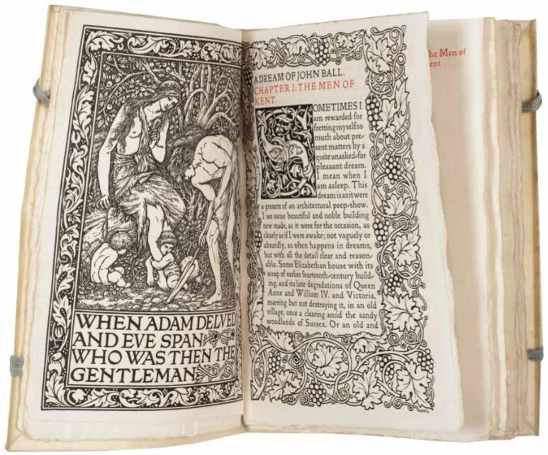
Edward Burne-Jones & William Morris A Dream of John Ball and a King’s Lesson Hammersmith. Kelmscott Press. 1892
¶ A fine example of the first illustrated book issued by the Kelmscott Press, William Morris’ ‘A Dream of John Ball’.
From the edition limited to 311 copies, with this one of 300 on paper.
‘The first five books from the Press had only simple titles set in the Golden type, but the sixth Kelmscott volume, ‘A Dream of John Ball’ (1892), included a frontispiece by Burne-Jones (the first illus-
tration in the Press’s books) across from the opening text page, with large Roman lettering underneath designed by Morris.’
William S. Peterson
8vo. (210 × 152 mm). [70 leaves including blanks; pp. (i), (i), 123]. Original publisher’s cream vellum with Yapp edges, blue silk ties, gilt title to spine.
—$9,900
[16].
KELMSCOTT PRESS
Frederick S. Ellis (Editor)
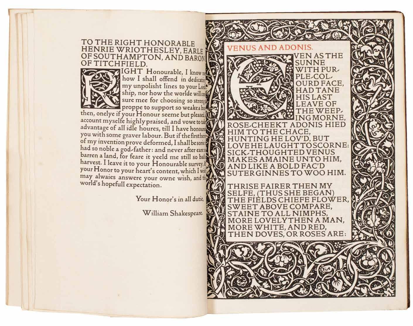
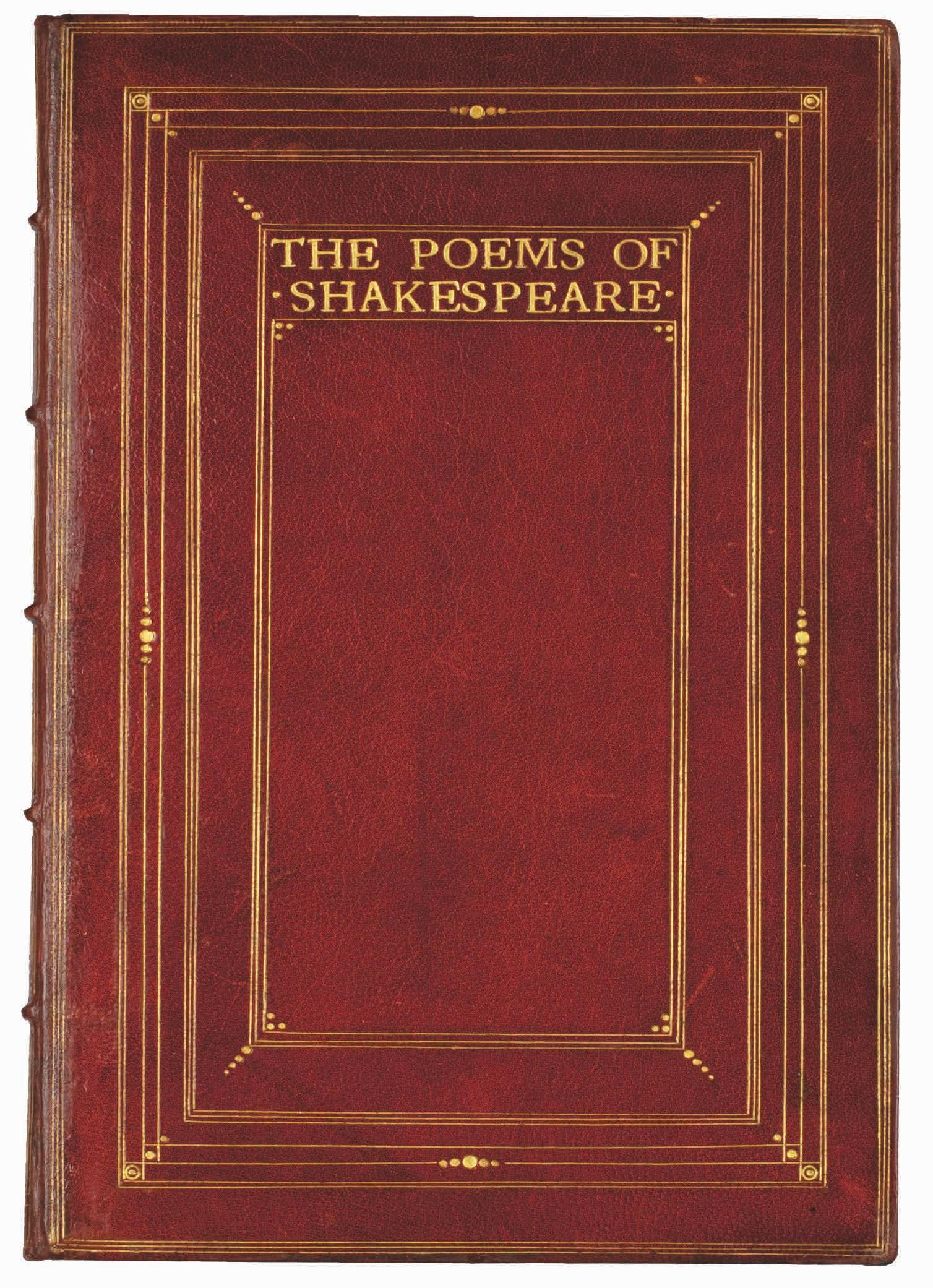
The Poems of William Shakespeare printed after the original cop ies of Venus and Adonis, 1593. The Rape of Lucrece, 1594. Sonnets, 1609. The Lovers Complaint Hammersmith. The Kelmscott Press. 1893
¶ The Kelmscott edition of the poetic work of Shakespeare in a charming binding by Hatchards of Piccadilly.
From the edition limited to 510 copies, with this one of 500 on Flower paper. ‘After a lapse of about three hundred years Shakespeare’s Poems are in this edition printed with the original spelling ... The fact of being able to study these poems in the language in which they were written, ought we think, to add materially to the pleasure of the reader.’ —From the Foreword
8vo. (208 × 146 mm). [116 leaves including blanks; pp. (vi), 216, (i)]. Full red crushed morocco by Hatchards with their signature gilt to rear pastedown, front board with concentric fillets to enclose gilt title ‘THE POEMS OF / SHAKESPEARE’, decor of pointille tools at corners, sides and head and foot, matching decor to rear board, banded spine with gilt title and gilt decoration in six compartments, turnins and board edges with gilt rules, a.e.g.
—$12,220
[17].
KELMSCOTT PRESS
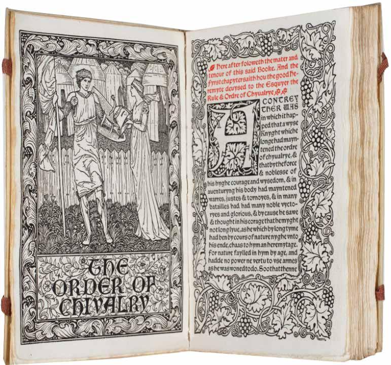
Ramon Lull, William Caxton, William Morris, F. S. Ellis (Ed.). The Order of Chivalry. Translated from the French by William Caxton. [and:] L’Ordene de Chevalerie with Translation by William Morris Hammersmith. Kelmscott Press. 1893
¶ A fine copy of the Kelmscott edition of Caxton’s translation, the first book from the press printed in Chaucer type.
From the edition limited to 235 copies, with this one of 225 on paper.
‘Saw the sheets of Caxton’s Order of Chivalry the printing of which is just complete. It is the prettiest book yet done ...’.—Sydney Cockerell writing in his diary quoted by Peterson
With the armorial bookplate of Harry Manfield to the front pastedown. Harry Manfield (1855–1923) of Moulton
Grange was the eldest son of Sir Moses Philip Manfield MP, a Northampton shoe and bootmaker. A Liberal MP himself, Manfield was a Justice of the Peace, a philanthropist, a councillor and, as demonstrated here, a bibliophile.
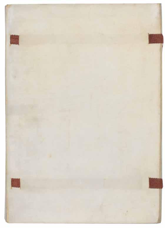
2 vols. in 1. 8vo. (204 × 140 mm). [78 leaves including blanks; pp. (iv), 151. Original publisher’s limp vellum with Yapp edges, maroon silk cloth ties, title gilt to spines.
—$5,940
[18].
KELMSCOTT PRESS
William Morris
The Wood Beyond The World Hammersmith. Kelmscott Press. 1894
¶ Robert Hall’s copy – with his bookplate depicting his library with this copy displayed to show the frontispiece and opening page of text –of William Morris’ fantasy novel.
From the edition limited to 358 copies, with this one of 350 on paper.
‘The borders in this book, as well as the ten half-borders, are here used for the first time ...’. —William S. Peterson
The bookplate of Robert Hall dated 1902, now detached and inserted loose, depicts a contemporary library with a view of a cathedral through the window. Of pertinence here, a number of volumes – all clearly Kelmscotts – are strewn on the table, while lying on the floor and in the foreground are other books and along the right wall are shelves and multiple volumes. The only readily identifiable
volume of all those books depicted is a copy of ‘The Wood Beyond the World’, recognisable by its frontispiece and facing page of text with its Morris border; closer inspection reveals further Kelmscotts: in the foreground is a volume with ‘CHAUCER’ and ‘KELMSCOTT ’ to the spine, while another, flat on the table’ is titled ‘BEOWULF ’ (i.e. ‘The Tale of Beowulf’), a third appears to be ‘The Glittering Plain’ (which version remains unclear), while a fourth may be ‘News from Nowhere’.
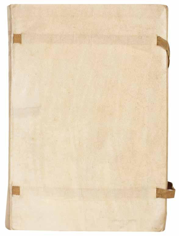
8vo. (212 × 148 mm). [134 leaves including terminal blank; pp. (iv), 261]. Original publisher’s limp vellum with Yapp edges, yellow silk cloth ties, title gilt to spines.
—$12,500
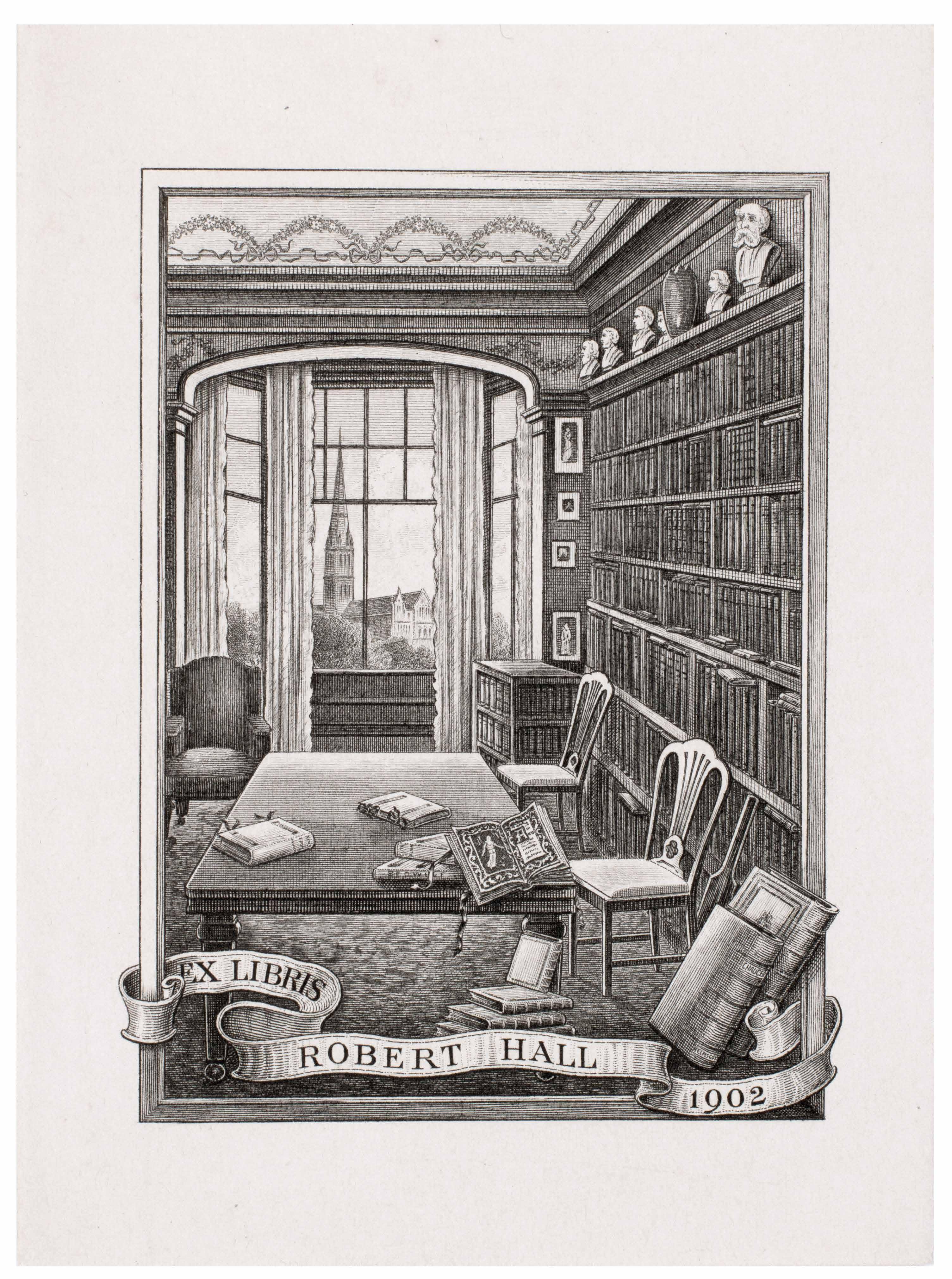
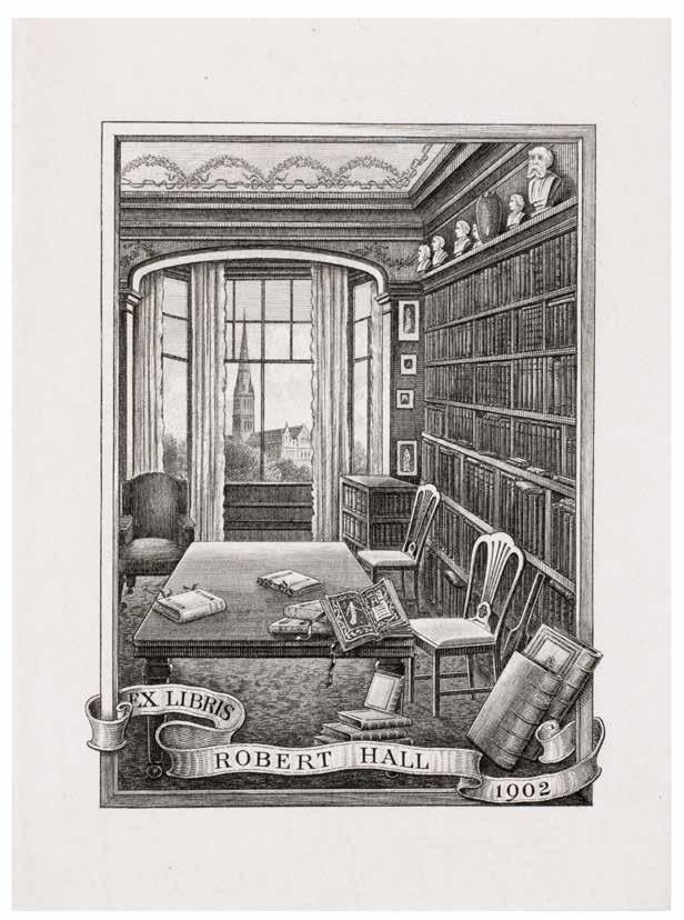
Hall’s bookplate right: A detail of the bookplate, illustrating the spread shown above
[19].
KELMSCOTT PRESS
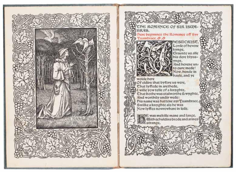
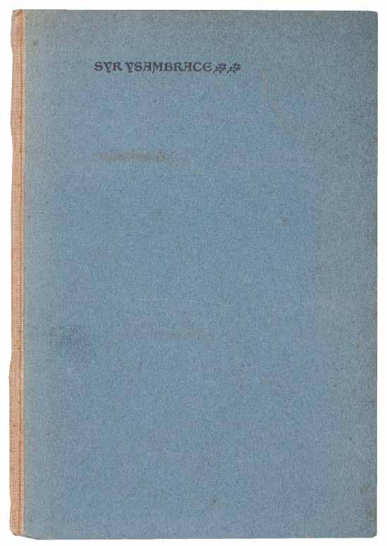
Syr Ysambrace. (The Romance of Sir Isumbras) Hammersmith. Kelmscott Press. 1897
¶ A very good copy, partially unopened.
From the edition limited to 363 copies, with this one of 350 on Flower paper. Edited by Ellis after the printed edition by J. O. Halliwell from a manuscript in Lincoln Cathedral Library.
8vo. (210 × 146 mm). [24 leaves; pp. (iv), 41]. Original publisher’s blue hollandbacked printed boards with title and ornaments to front cover in black.
—$3,960
[20].
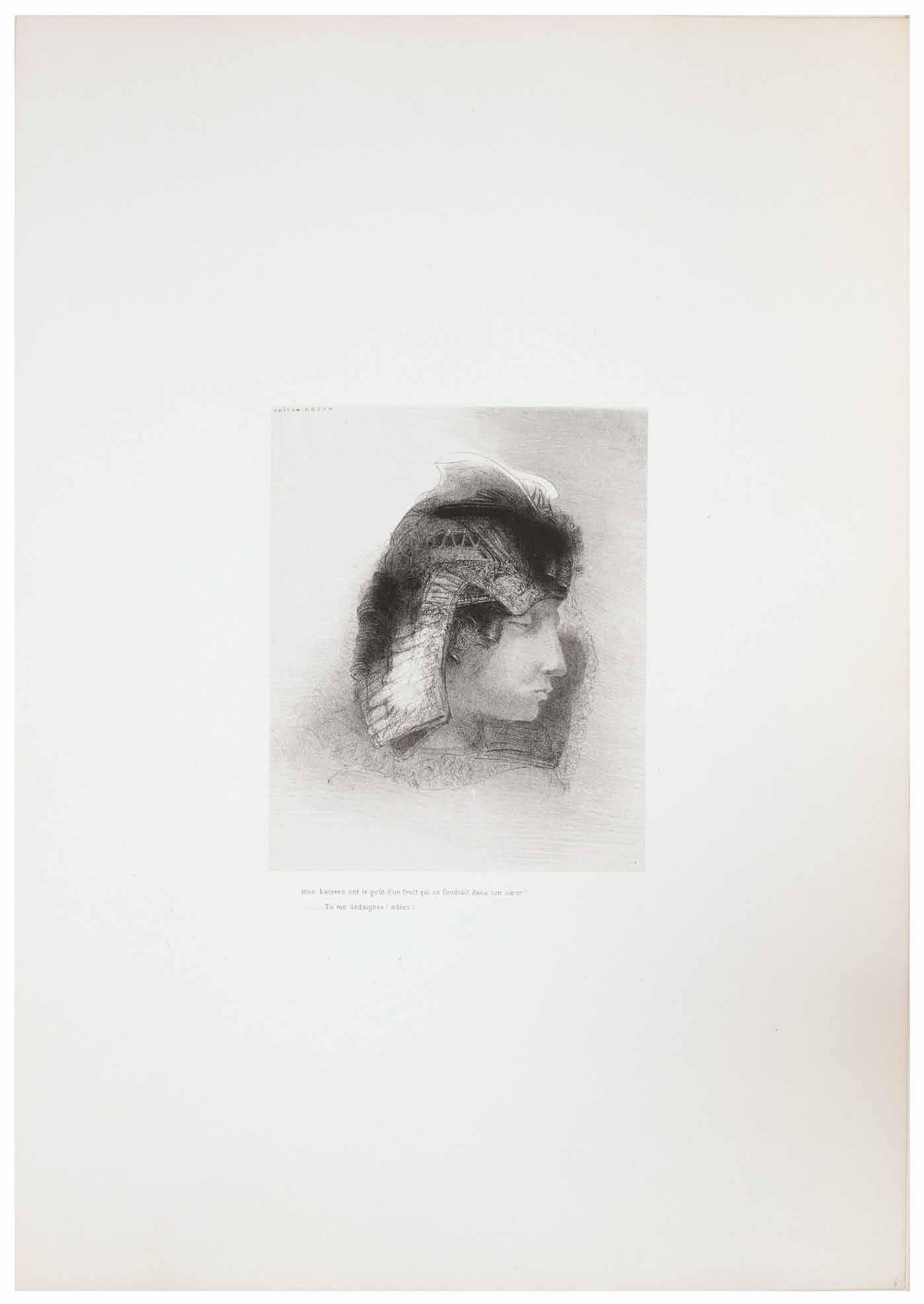
Odilon Redon
La Tentation de St. Antoine - 3me Série Paris. Published by the author. 1896
¶ André Gide’s exceptional copy of the ‘Troisième Série’ of ‘La Tentation de St. Antoine’ with all of the lithographs signed in pencil by his friend, the artist Odilon Redon.
From the edition limited to 50 copies; this copy features the title signed ‘Odilon Redon’ in crayon and all 23 of the lithographs signed in pencil by Redon in capitals as usual.
The complete album, comprising the title-page with the lithograph vignette printed in yellow on Japon, and the set of 23 lithographs to illustrate Flaubert’s text, printed on chine applique, each signed individually in pencil by Redon with his small capitals within the subject; the lithographs were printed by Clot and Blanchard, Paris.
Redon spent much of 1895 making ‘La Tentation de St. Antoine. 3me. Serie’ - his first album of lithographs in five years - his third and most ambitious effort based on Flaubert’s novel. He produced only one more album of lithographs, ‘Apocalypse de St. Jean’, in 1899.
André Gide writes to Odilon Redon in June 1896, ‘Monsieur, Votre nouvelle suite pour la Tentation de Saint Antoine est si belle, si merveilleuse que je voulais vous exprimer de vive voix toute l’admira-
tion de qui vous aime depuis longtemps déjà ...’ This series and Gide’s letter, which served to introduce Gide and Redon personally, led to Redon inviting Gide to his studio and the beginning of their friendship.
‘Flaubert’s first magnum opus, retelling the temptations that afflicted Saint Anthony, was completed over twenty-five years before its publication in 1874. The mystical trials were compelling subjects for Redon, who made three sets of illustrations in which he tried to fathom their symbolic content. The last and largest series of lithographs on the temptations [this set] was commissioned by Vollard and issued in 1896, many decades before they were incorporated into book form after the artist’s death.’ — Castleman
Folio. (586 × 410 mm). [24 leaves]. Leaf with lithograph title and vignette printed in vermillion and signed in crayon by Redon and 23 original lithographs on chine appliqué by Redon mounted to larger sheets of stiff card, each with printed title beneath and signed on the lithograph by Redon in pencil. Loose as issued in original publisher’s wrapper with lithograph vignette and text and original burgundy portfolio with gilt titles to front cover.
—$99,000
[21].
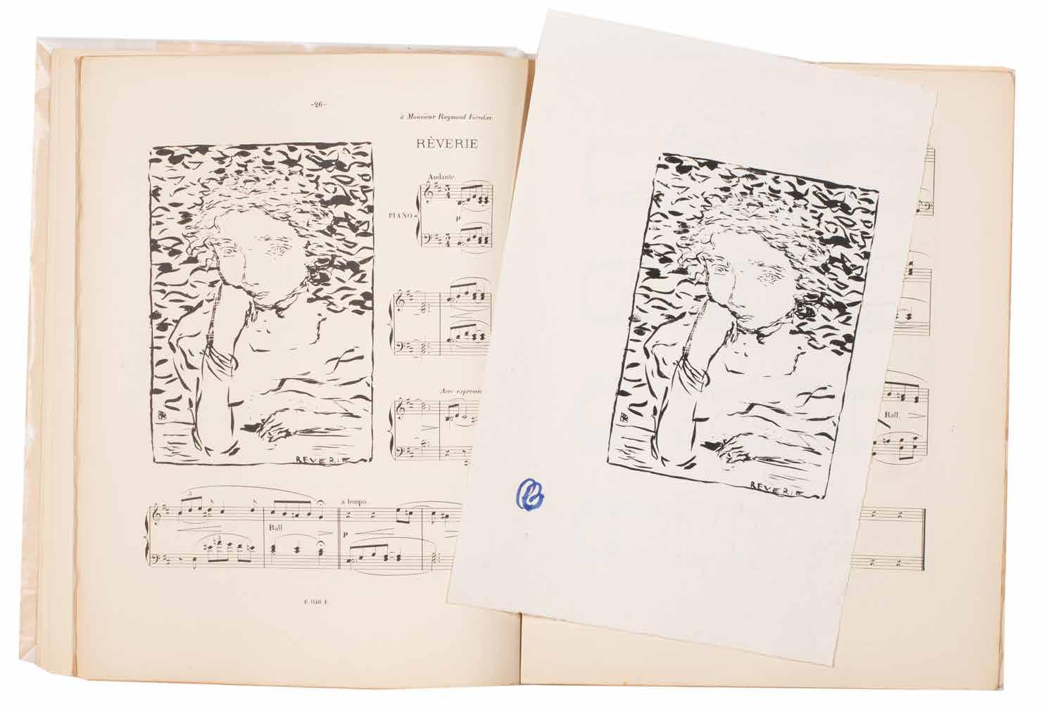
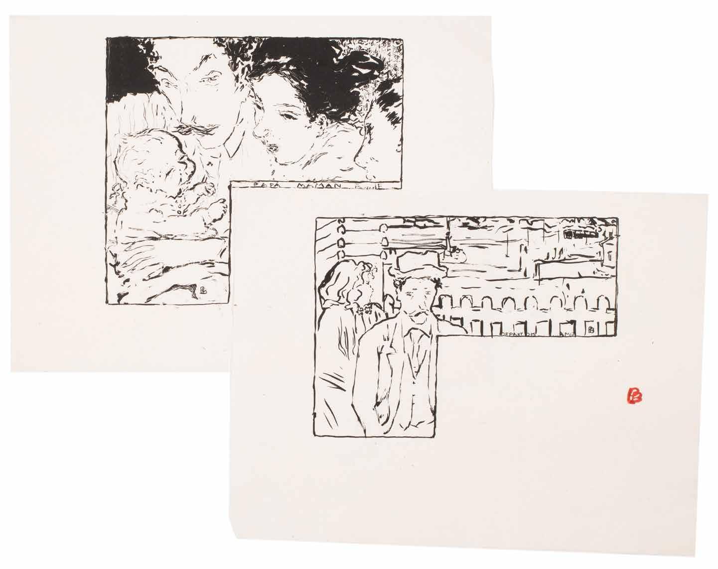
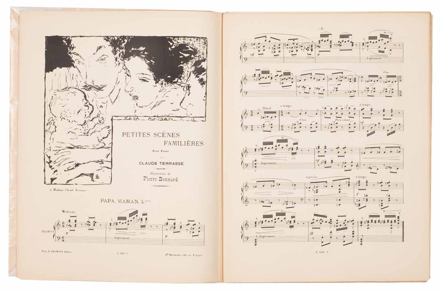
Pierre Bonnard Petites Scènes Familières. Pour Piano
Paris. E. Fromont. (1893)
¶ Charles Terrasse’s musical scores with Bonnard’s lithograph illustrations –one of his earliest works – together with the exceptionally rare signed suite on Chine.
The exceptionally rare suite of the 19 prints printed without text and with each image signed by Bonnard with his initials, in brush, either in scarlet or blue.
There were only some 20 copies printed of these proofs, all on sheets of Chine paper and without text.
Illustrated by Bonnard, Terrasse’s music for children is one of the artist’s
earliest illustrative projects. Although sometimes cited as his first, the listing of ‘Petit Solfège Illustré’ on the list of published works makes it clear that that work preceeds this.
Small folio. (352 × 274 mm). [17 bifolia + wrapper + 19 leaves of Chine; pp. 61, (i)]. Original publisher’s printed wrappers with reproduction manuscript title and small lithograph vignette to front cover.
— $33,000
[22].
Pierre Bonnard & Paul Verlaine, Claude Terasse and Franc-Nohain Répertoire des Pantins
Paris. Mercure de France. [1898]
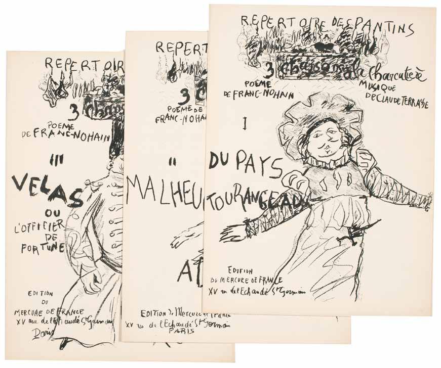
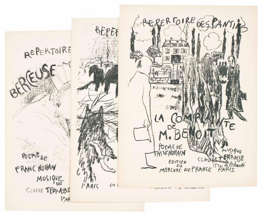
¶ A complete set of the musical scores with covers illustrated by Pierre Bonnard for the Répertoire des Pantins.
The Théâtre des Pantins was a puppet theatre founded by Alfred Jarry, Franc-Nohain and Claude Terrasse. Bonnard produced six original lithograph covers for songs by Franc-Nohain with music by Claude Terrasse (three others were issued with covers by Jarry for his own music); Bonnard also made the marionettes for the theatre.
‘The Echo de Paris of 1 April 1898 gave the following description of the theatre: ‘Rue Ballu, at the back of a courtyard, on the first floor, a mini-theatre for a tiny audience. It was here that Alfred Jarry, with the aid of some ingenious marionettes, has recently staged a revival, lasting a few evenings, of his epic Ubu.
The auditorium is cramped but is pleasantly decorated by Edouard Vuillard with pyrotechnics of dazzling colour, and by Bonnard with some quite beautifully executed silhouettes in black and grey.’
— Bouvet: Bonnard. The Complete Graphic Work
6 issues. Folio. (c.350 × 270 mm). [Bifolium + inserted leaf or two bifolia for each number]. Printed musical score for each, with ‘Poème de Franc-Nohain’ and ‘Musique de Claude Terrasse’ and each with original lithograph cover by Bonnard. Each loose as issued in original publisher’s printed wrappers, front covers with original monochrome lithograph illustration and text by Pierre Bonnard, advertisements to rear covers.
— $4,750
[23].
Pierre Bonnard & Paul Verlaine Parallèlement
Paris. Imprimerie Nationale / Ambroise Vollard Editeur. 1900
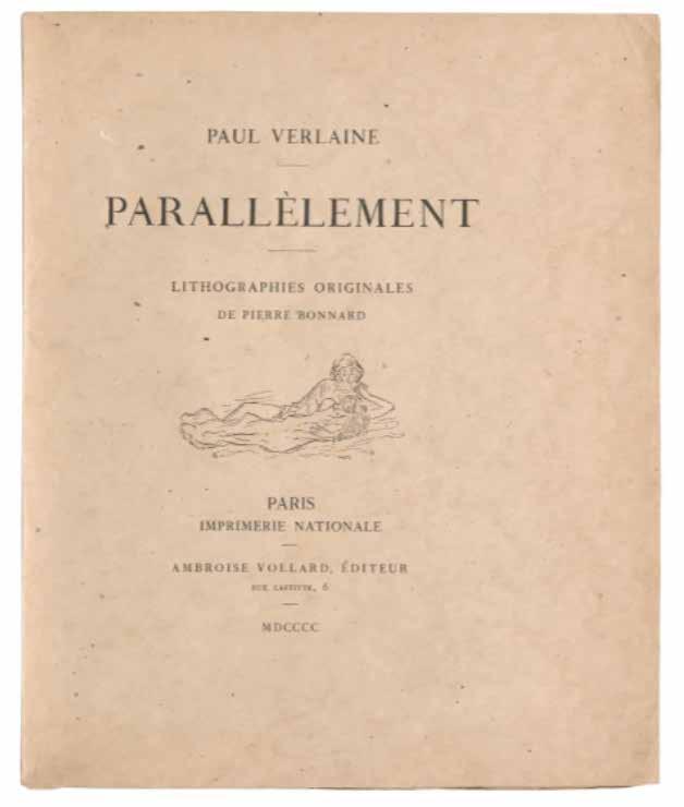
¶ The ground-breaking Parallèlement, Ambroise Vollard’s first book, comprising Verlaine’s verse illustrated with Pierre Bonnard’s delicate rose lithographs, here in the original wrappers.
From the edition limited to 200 numbered copies, with this one of 170 copies on vélin de Hollande.
This copy was issued with the second version of the wrapper and title, with the vignette of the Imprimerie Nationale replaced with a vignette by Bonnard himself for each, after the privilège was withdrawn on the discovery that ‘Parallèlement’ was libidinous and erotic verse by a decadent Symbolist and not, as had been thought, a mathematical text. The initial privilège granted to the book was printed on the verso of an initial leaf and was replaced after its
withdrawal with an original lithograph by Bonnard printed in a slightly darker colour than the lithographs that illustrate the text. This copy, stitched as issued in the original wrappers, has had some minor repairs to the spine edges and the first leaf of text (‘Dédicace’) does feature a stain (it appears to be the artefact of a thin inserted item), however, it remains a very good copy.
‘An epoch-making book ...’.
— The Artist & the Book 1860–1960
Small folio. (308 × 256 mm). [74 leaves; pp. (vi), 139, (iii)]. Original publisher’s printed wrappers with titles and vignette by Bonnard to front cover in black, title to spine, later protective black box.
— $23,000
[24].
Charles Conder & Paul Verlaine Choix de Poésies
Paris. Bibliothèque Charpentier. 1904
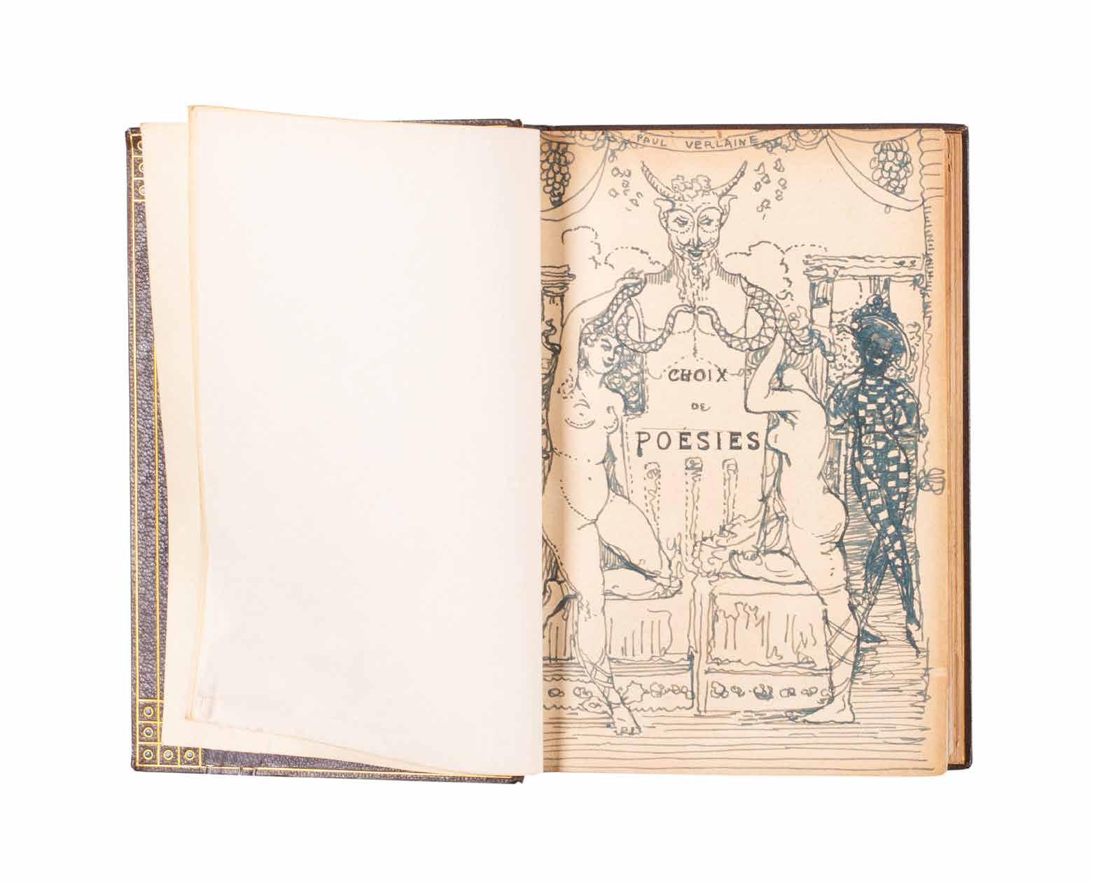
¶ A beautiful copy in purple morocco by the Guild of Women-Binders’ Woolrich sisters, presented by Charles Conder to his patron Mary Davis and with six signed original drawings in ink, crayon and watercolour.
Conder’s presentation is in black ink to the verso of the title: ‘To Mrs. Edmund Davis Souvenir of / Christmas Paris 1905 from Charles Conder’.
Conder’s gift, the present volume of Verlaine with its elaborate inserted drawings and watercolours, is clearly a profound thank you from an artist to his patron. The Davises were supporters, and generous ones, of the artists they admired and Conder’s gift seems a fitting tribute to a patron whose sympathies - artistic and poetic - lay with his own. The watercolours all take their inspiration from Verlaine and are entitrely in keeping with his wider oeuvre, decorative, colourful and tending to the rococo, and reflecting and complimenting
the decorations for the ‘Adam’ room, the paintings on silk and the fans of Conder’s that the Davis had collected. Conder’s own copy of Verlaine, now apparently in the Dixson Library in Sydney, was also illustrated in pen and wash, a clear indication of the significance of the present copy.
8vo. (182 × 126 mm). pp. iv, 300. Contemporary purple crushed morocco by Ellen & Sofita Woolrich with their signatures gilt to rear pastedown, boards with double gilt rules to enclose a decorative border of gilt-surrounded azure morocco pointilles and linear gilt tooling, banded spine with related decor and ‘PAUL VERLAINE’ in six compartments, matching morocco turnins with pointille corner décor and rules in gilt, white vellum doublurres, t.e.g., peach velvet-lined, leather-covered lime cloth protective box with leather covers reproducing the décor of the binding.
— $29,500
[25].
Oskar Kokoschka
Der Gefesselte Columbus Fortsetzung der ‘Träumenden Knaben’ (Vienna). 1907
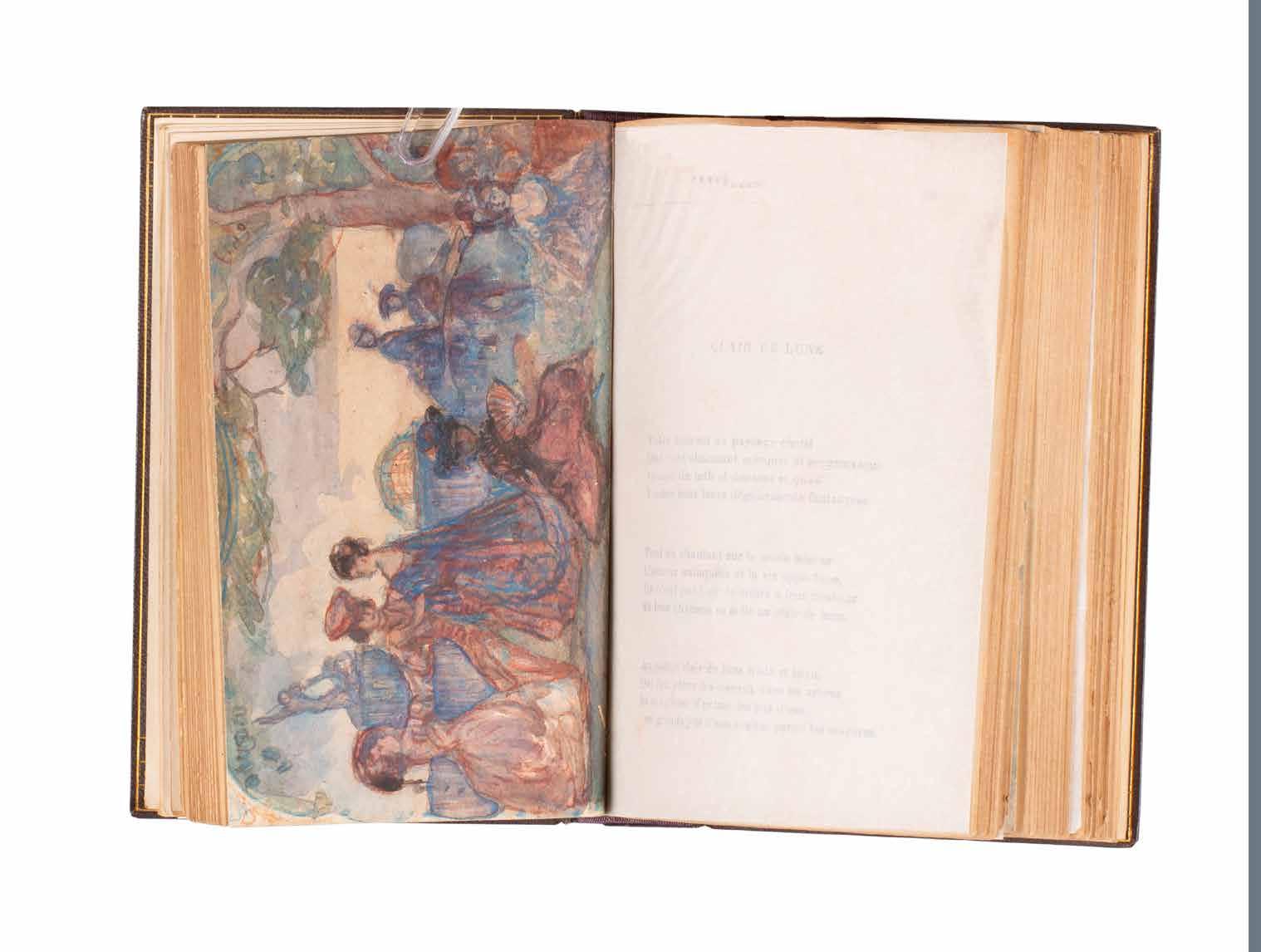
¶ Oskar Kokoschka’s original typescript for ‘Der Gefesselte Columbus’, his continuation to ‘Die Träumenden Knaben’, with his extensive corrections.
Kokoschka’s text, recto only on seven leaves of wove paper and dated 1907, is titled at the head of the first leaf ‘Fortsetzung der ‘Träumenden Knaben’ before the addition above of the manuscript title ‘Das Bewusstein der Gesichte’, itself crossed through and replaced beneath with the further and final title ‘Der Gefesselte Columbus’.
Although written by Kokoschka as a continuation of his ‘Die Träumenden Knaben’ (published in 1908), ‘Der Gefesselte Columbus’ was not published as a text until 1921. At that date it was issued as a lithograph reproduction of Kokoschka’s manuscript to accompany a
series of pictorial lithographs Kokoschka had executed after the inspiration of his love for Alma Mahler. Although the text pre-dates Kokoschka’s meeting with Alma, the lithographs their passionate three year relationship inspired - also published separately in 1916 by Gurlitt after Kokoschka composed them in 1914 – fitted the text and an edition of 120 copies uniting the illustration and text was published, again by Gurlitt, in 1921; a larger edition in small format was also issued.
4to. (220 × 290 mm). [17 leaves including blanks]. Later burgundy morocco-backed green cloth, matching morocco label with gilt titles to front cover.
— $19,800
[26].
Natalia Goncharova, Mikhail Larionov, Kasimir Malevich, Vladimir Tatlin, Kirill Zdanevich et al.
Oslinyĭ Khvost. Katalog vystavki kartin gruppy khudozhnikov Oslinyĭ Khvost. (Donkey’s Tail. Catalogue of the Exhibition of Paintings by the Donkey’s Tail Group of Artists) Moscow. Miasnitskaia, Uchilishche Zhivopisi, Vaianiia i Zodchestva. 1912.
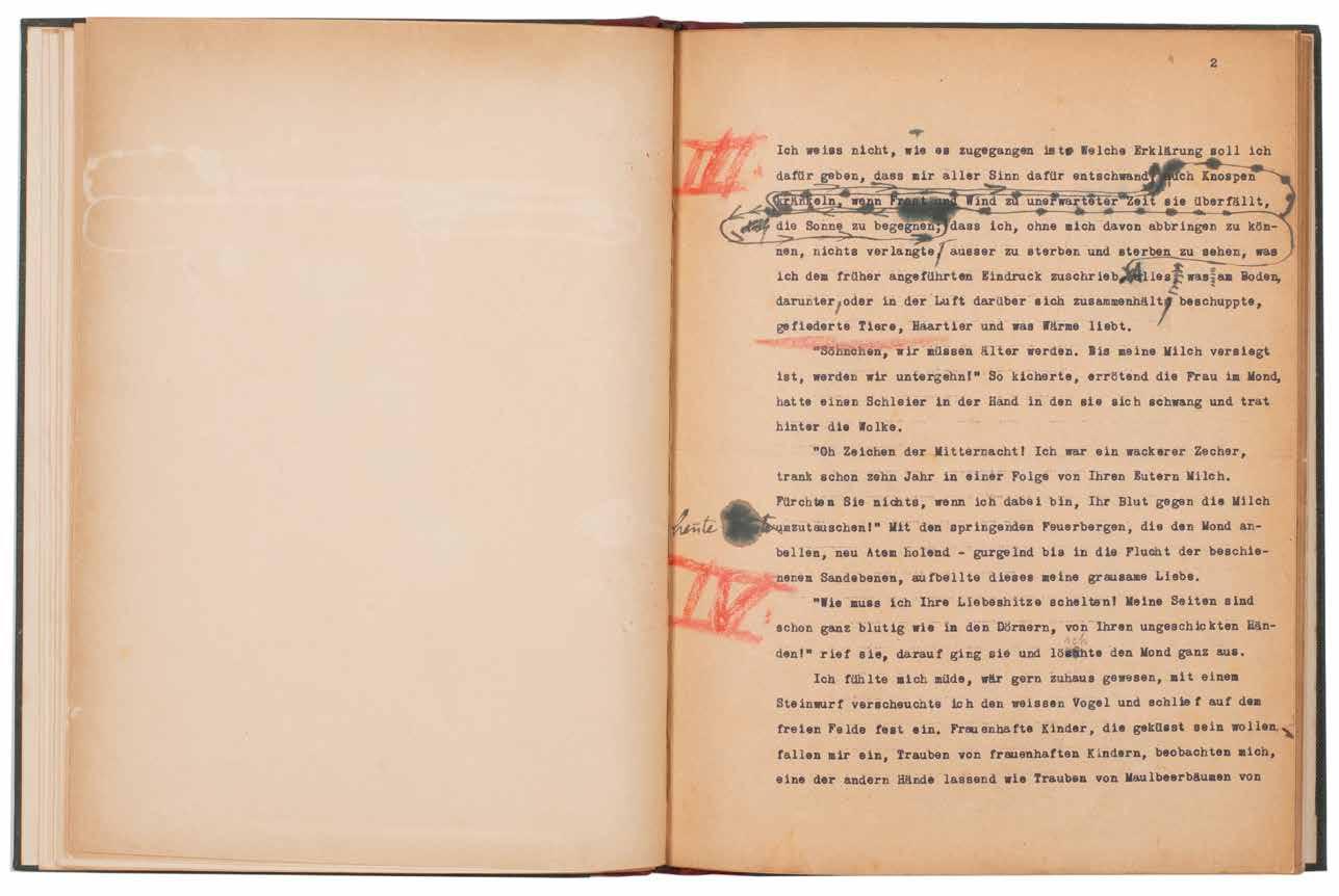
¶ The very scarce catalogue for the first exhibition of ‘The Donkey’s Tail’, the avant-garde Neo-Futurist / Primitivist group.
‘Donkey’s Tail’ was a short-lived avantgarde Russian Neo-Futurist / Primitivist group that formed around Mikhail Larionov and the most radical members of the ‘Jack of Diamonds’. The rupture with ‘Jack of Diamonds’, due to disagreements about the influence of French avant-garde ideas and tendencies, occurred in the latter part of 1911 and in December Larionov issued a proclamation ‘Ssora ‘Khostov’ s ‘Valetami’’ (The Quarrel between the ‘Tails’ and the ‘Jacks’) in the
‘Voice of Moscow’ (Golos Moskvy). The group held only one exhibition - this is the catalogue for it - opening on 11th March, 1912. The group did form a further affiliation (Larionov alludes to the ‘Target’ in his 1911 announcement) holding a second, albeit amalgamated exhibition, and publishing ‘Oslinii Khvost i Mishen’ (The Donkey’s Tail and Target) in 1913.
12mo. (167 × 124 mm). [8 leaves; pp. 16]. Original publisher’s white glossy printed wrappers stapled as issued with titles in black to front cover.
— $5,950
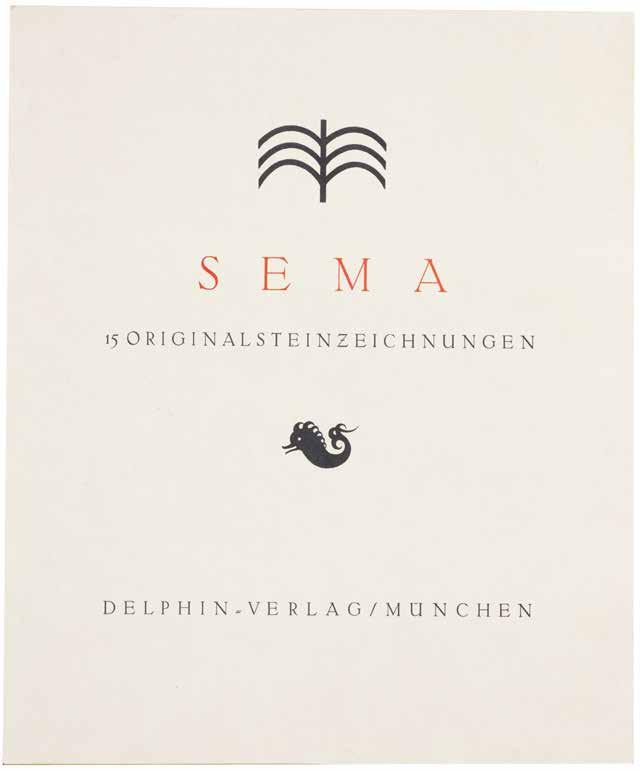
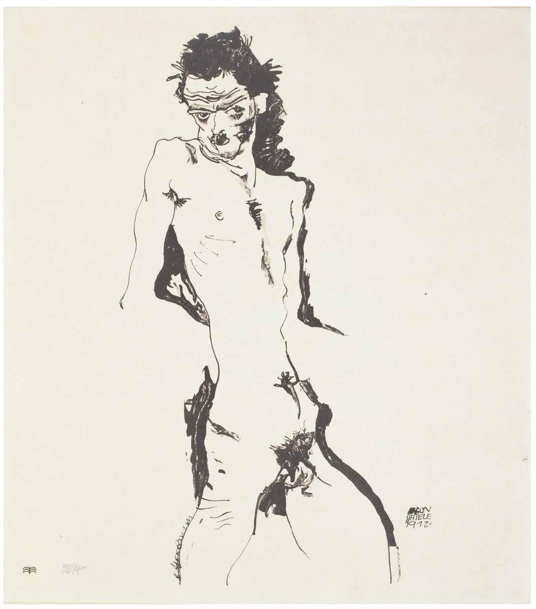
Egon Schiele, Paul Klee, Alfred Kubin et al. Sema Mappe
Munich. Delphin Verlag. 1912
¶ The scarce complete portfolio of the Sema group with signed original graphics by Klee, Kubin, Schinnerer and others and including Egon Schiele’s first original print.
This portfolio, published in 1912, is one of the first collaborative graphic projects committed to a modern conception of art and marks the beginning of the long series of portfolios, a form adopted and used by almost all art movements, of the 20th century.
‘Sema’ (from the Greek word for ‘sign’) was an international artists’ association founded in Munich in 1911. The members included Paul Klee, Alfred Kubin, Egon Schiele, Max Oppenheimer, Karl Caspar, Edwin Scharff and others. The ‘Sema’ group is most remembered for its exhibitions at the Moderne Galerie Thannhauser in Munich and for the portfolio presented here, the ‘Sema Mappe’, published by the Delphin-Verlag.
Featuring 15 lithographs, the portfolio is most significant for the first work in lithography by Paul Klee (he had made a number of etchings prior to this) and the first print in any medium by Egon Schiele. The group was short-lived and even by the end of 1911, Klee had met Kandinsky and joined the editorial team of ‘Der Blaue Reiter’; the group was dissolved when Klee left ‘Sema’ for ‘Der Blaue Reiter’.
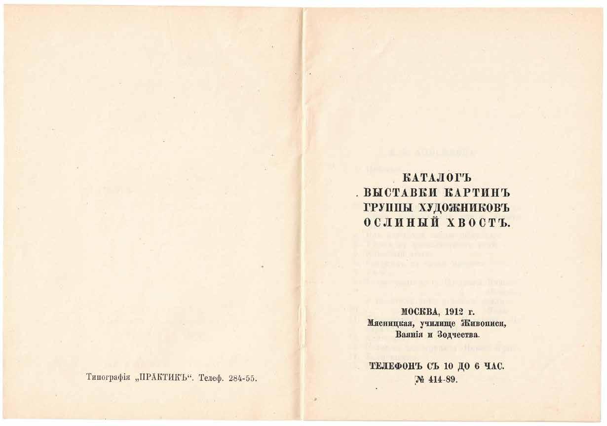
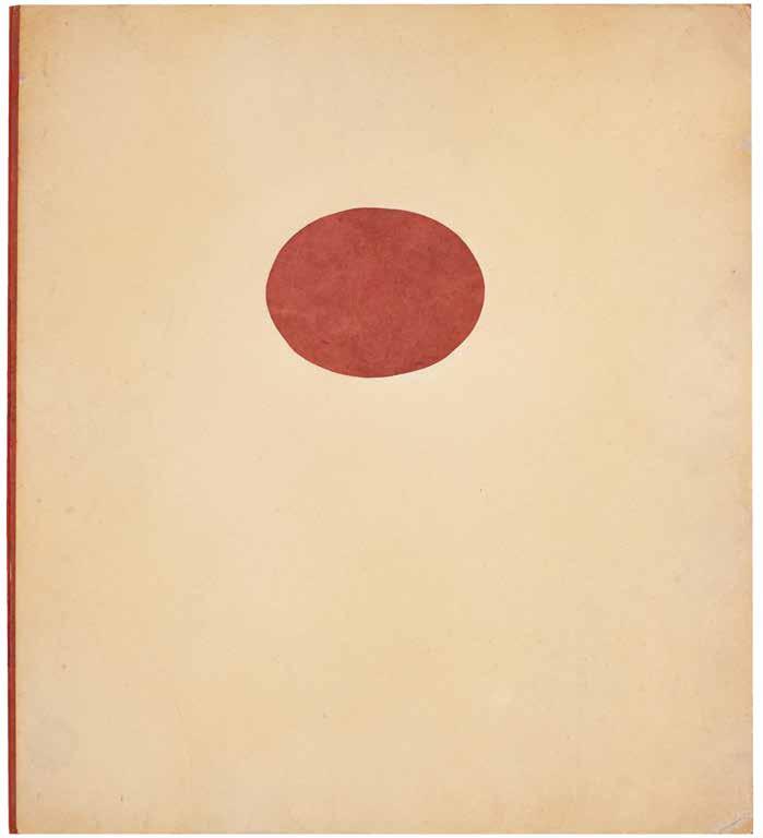
Folio. (460 × 410 mm). [18 unnumbered leaves]. Leaf with title in red and black with publisher’s vignette and justification verso, leaf with list of artists and their contributions, leaf with introductory text and 15 original lithographs by various artists each signed at lower right or left in pencil; sheet size: 450 x 400 mm or the reverse. Original publisher’s red card-backed cream card board portfolio with flaps, circular red label to front cover.
— $52,800
[28].
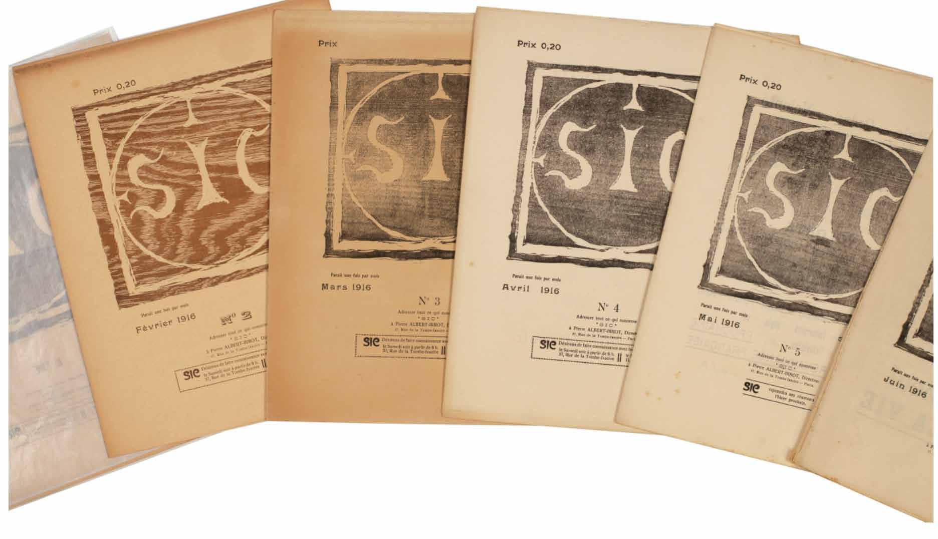
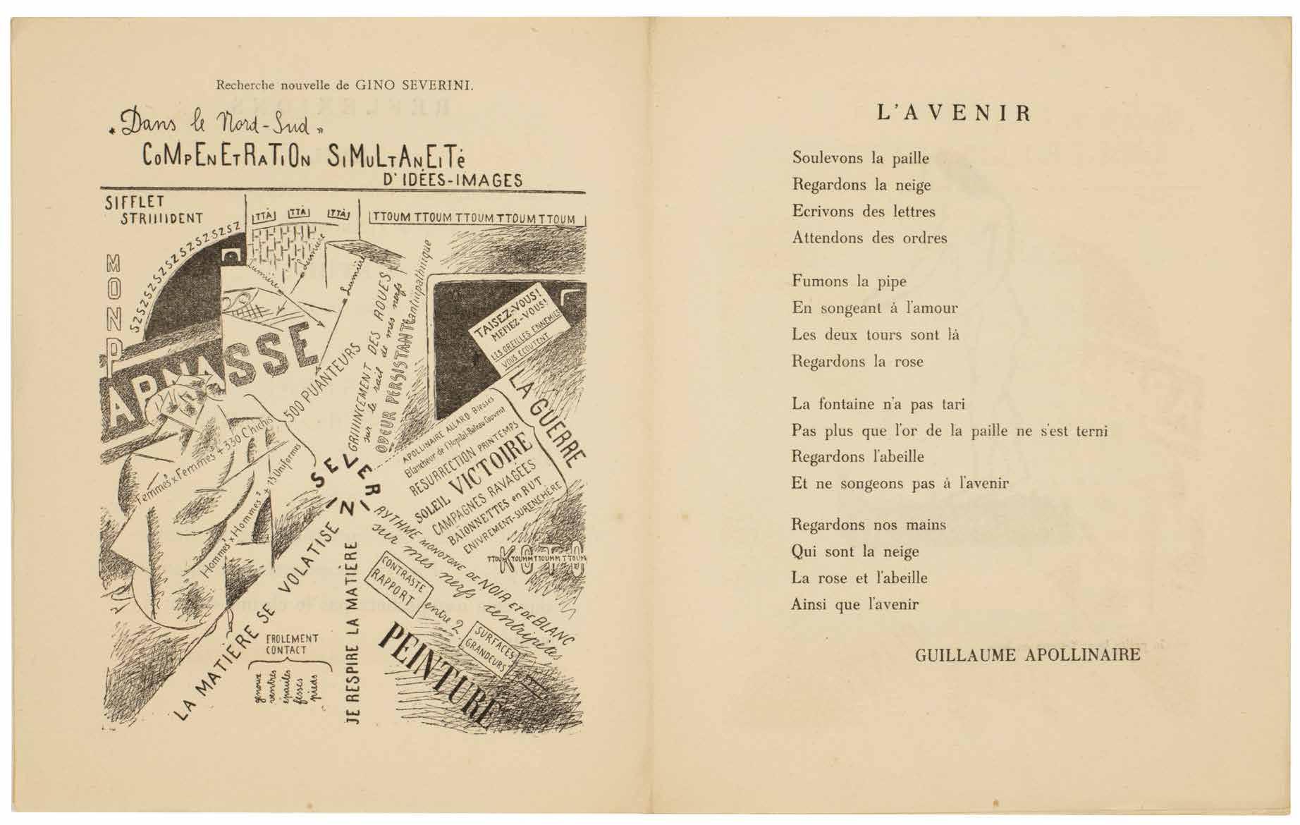
Pierre-Albert Birot (Directeur) SIC. Sons. Idées. Couleurs. Formes No. 1. (Janvier 1916). – No. 53 / 54. (Décembre 1919). (All Published) Paris. SIC, 37 rue de la Tombe-Issoire. Janvier 1916–Décembre 1919
¶ The scarce complete series of the influential avant garde review SIC.
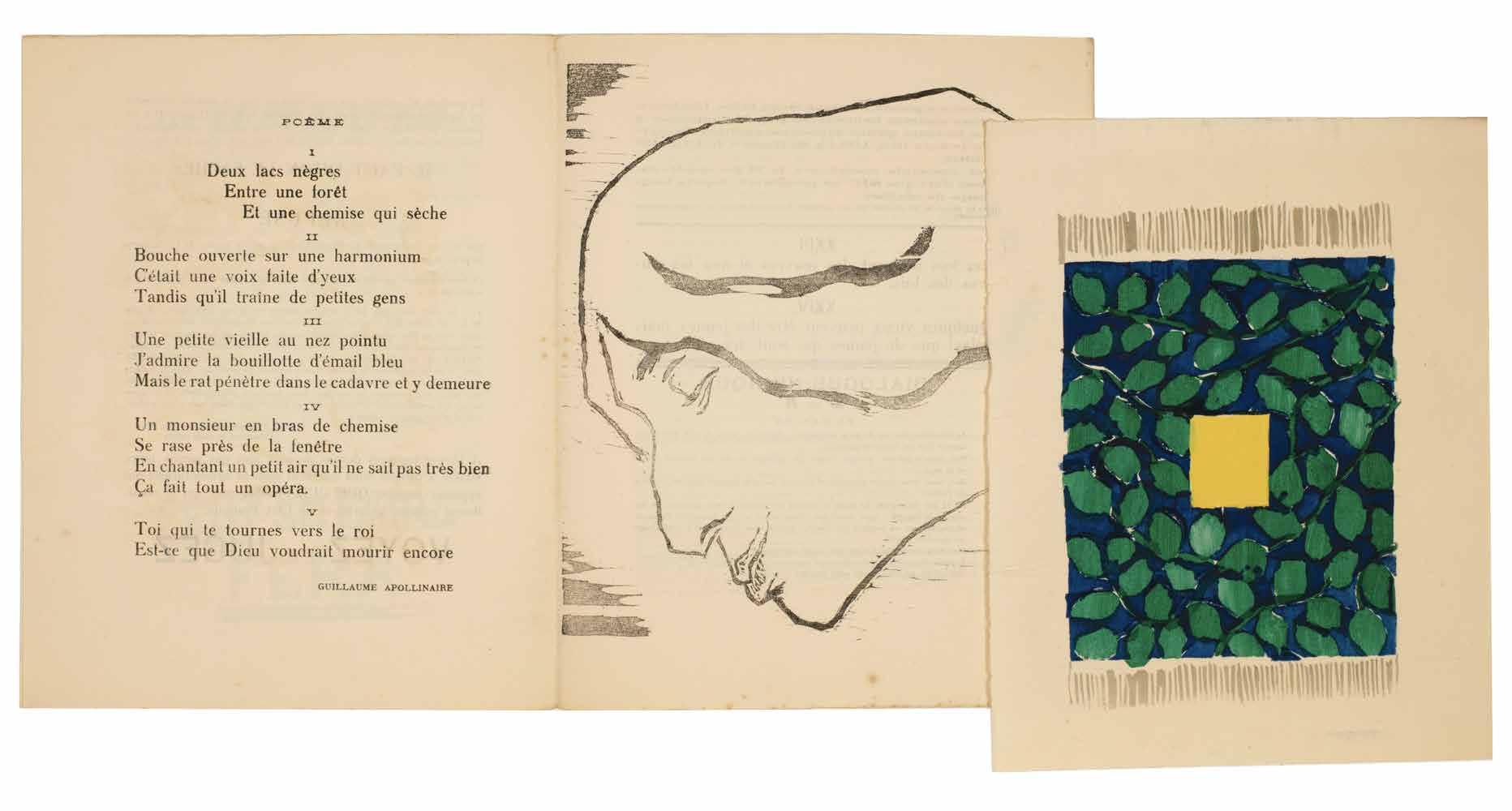
Founded by the poet, painter, sculptor, publisher and typographer Pierre Albert-Birot (1876–1967) in 1916, SIC, with its focus on the avant garde was one of the most influential literary, musical and artistic periodicals of the period. From issue number two, Albert-Birot was aided by Gino Severini and in issue number 4, Apollinaire makes his first – but by no means his last – appearance with the poem ‘L’avenir’; Apollinaire continued to contribute until his death in 1918 and the triple issue 37 / 38 / 39 was ‘composé en mémoire de Guillaume Apollinaire’. Of particular note is the fact that SIC sought to represent the whole of the avant garde and promoted Cubism, Futurism, dada,
with Tzara contributing regularly, as well as contributions from Breton, Aragon and others who would develop Surrealism.
54 issues in 40 vols. 4to. (282 × 225 mm). Original publisher’s printed wrappers, stapled or loose as issued, with Albert-Birot’s device ‘SIC’ to covers where applicable in black or bistre, issues 26–34 with ‘SIC’ replaced with a reproduction of a work of art, the issues inserted loose into two pockets of a later hand-decorated patterned paper-covered and lined board protective folding box with title labels to front board and spine, additional notes loose in additional marbled paper envelope, grey silk-covered slipcase.
— $12,500
[29].
Gino Severini
Futurisme
– Cubisme (Paris?). (c.1918)
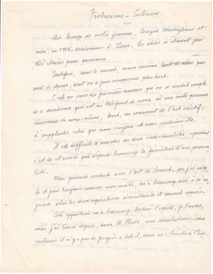
¶ Autograph manuscript by Gino Severini contrasting and comparing Futurism and Cubism and making reference to Seurat, Blake, Baudelaire, Apollinaire and Matisse.
One of the leaders of Italian Futurism and an important theoretician of the technicalities of painting in his own right, Gino Severini, writes here of Futurism and Cubism, its interpenetrating relationship, its derivations and inspirations and its place in a wider artistic context. The MSS starts with Severini’s arrival in Paris together with Modigliani in 1906: ‘Au temps de notre jeunesse, lorsque Modigliani et moi ... arrivâmes à Paris, les idées n’etaient pas très claires pour personne ...’. He discusses the differences between the two movements, their similarities and Blake’s ‘The Marriage of Heaven and Hell’: ‘Cette opposition m’a beaucoup torturé l’esprit, je l’avoue, mais j’ai trouvé depuis, dans W. Blake, une consolation: ‘Sans contraires il n’y a pas de progrès’, dit-il, dans ses: ‘Proverbes de l’Enfer’’.
After a discussion of the beginnings of both movements, their reception and importance (he compares this to the discovery of perspective), he concludes with the lines: ‘En conclusion, et selon moi, on ne peut opposer ces deux mouvements, même si leur points de départ s’opposent; je soutiens cette idée (qu’Apollinaire et ensuite Matisse ont approuvée) ... la poésie [underlined] était le contenu et la raison d’étre de l’art.’
4to. (270 × 210 mm). [2 leaves]. Manuscript text in French in blue ink, concluding in black, recto and verso with occasional excision and correction in pencil on cream wove paper with the watermark ‘EXTRASTRONG’, text with title to initial leaf, numbered at upper right and signed at conclusion.
— $5,600
– 58 –
[30].
Paul Eluard (Ed.)
Proverbe. Feuille Mensuelle. Nos. 1 (1er Février 1920) – 5 (1er Mai 1920), plus No. 6. (Also L’Invention 1, 1er Juillet 1921). (All Published) Paris. 1920–1921
¶ A rare complete and unsophisticated set of this Paris dada periodical.
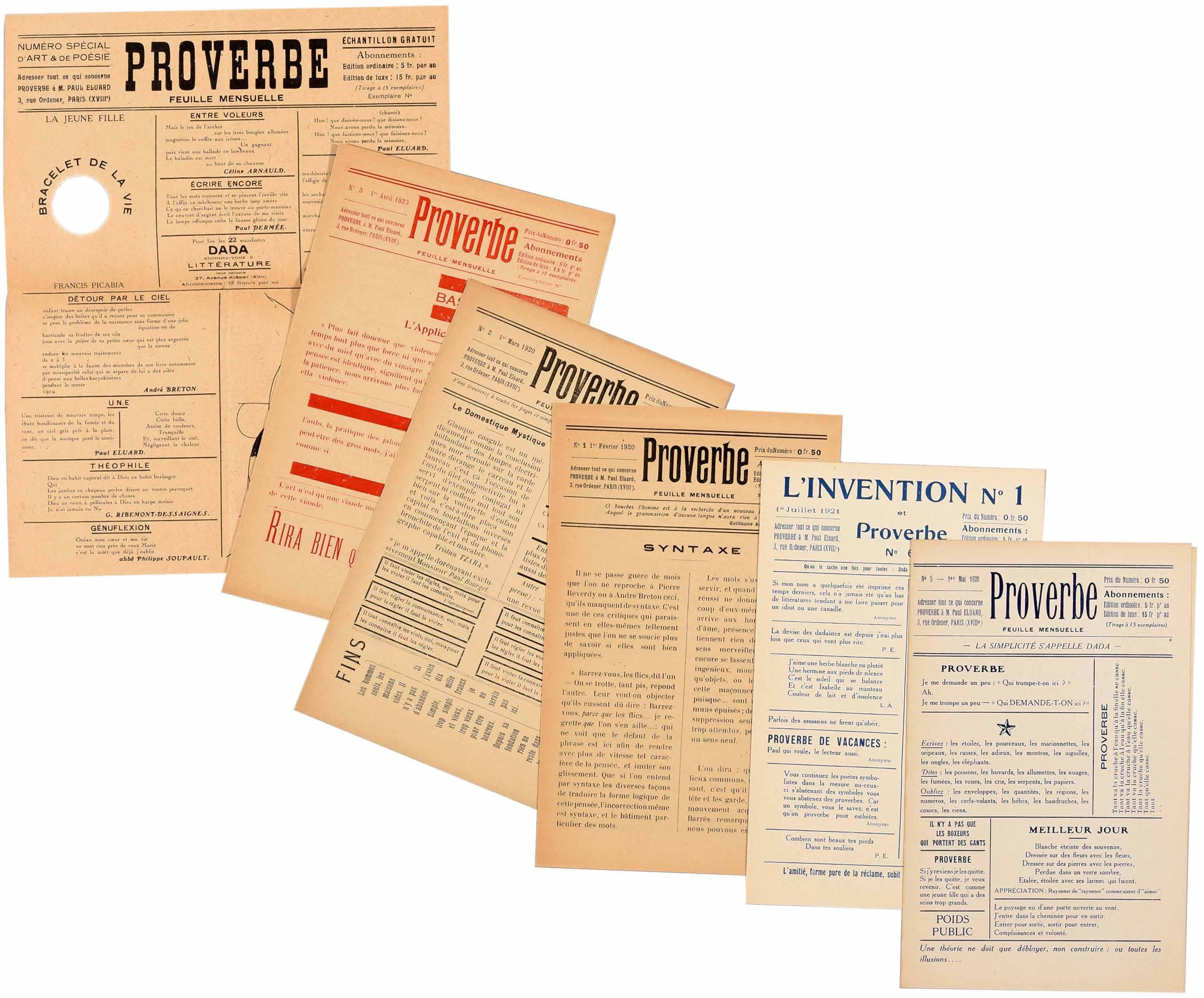
Edited by poet Paul Eluard, the focus of ‘Proverbe’ is far more seriously linguistic, although it retains the playfulness to be expected from dada, than many other periodicals of the period. Although the typical elements of dada typography are present – the variable font, different register, differing colours, the ruling and the use of different angles of printing to the plane of the page – here it is the word that reigns. In fact, only one of the issues is in any sense illustrated: issue 4 contains a reproduction of a drawing by Picabia, the ‘Machine de bon mots’, but even here Picabia’s concern is at least as semantic as visual.
The first article of the first issue makes the aim of ‘Proverbe’ clear: ‘Syntaxe’ by Jean Paulhan with its urge to reinvigorate language is followed by pieces by Phillipe
Soupault, Tristan Tzara, an aperçu by the Marquis de Sade and an editorial page of aphorisms, mottoes, advertisements and instructions. Perhaps the most memorable of these latter is the reassuring announcement concerning Picabia’s ‘391’: ‘391 ne contient pas d’arsenic. On peut le prendre en toute sécurité et en secret sans rien changer à ses habitudes.’
6 issues. (221 × 139 mm). [Single folded sheets of newspaper stock; issue 3 printed in red, issue 4 printed vertically with no outer text]. Issue no. 4 with a printed illustration ‘Machine de bon mots’ after a drawing by Francis Picabia and the printed stamp in red on outer unprinted wrapper: ‘PROVERBE / n’existe que pour / justifier les mots.’ Single printed folded sheets as issued.
— $11,250
[31].
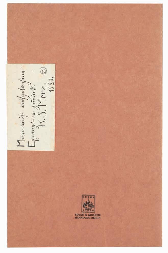
Kurt Schwitters
Die Silbergäule Merz - Die Kathedrale Hanover. Paul Steegemann Verlag. 1920
¶ An excellent example of one of Schwitters’ finest productions, ‘Die Kathedrale’, including the additional paper label to the front and rear covers.
‘The booklet ‘Die Kathedrale’ with 8 lithographs by Schwitters was published by Paul Steegemann’s Silbergaule series in 1920. The prints differ greatly from one another. Some are drawn in free rhythms on a light ground and present once more the motif of pseudo-functional machinery or show Dadaistically [sic] combined elements familiar from the drawings (windmill, coffee mill, house, stroller, handwriting, numbers). Others are compact and flat-looking ‘abstract’ forms - rectangular or oval. Here too Schwitters
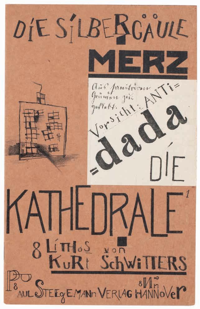
made use of ‘foreign matter’ such as pieces of shoe leather and patterned material (presumably confectioners’ paper such as he often used in his early collages, but pasted on the process block). The Kathedrale graphics are doubtless the finest, most original works produced by Schwitters at this time, and they deserve a place of honour in the history of modern graphics.’ — Schmalenbach
8vo. (224 × 144 mm). [8 unnumbered leaves]. Original publisher’s brown printed wrappers including the white paper lithograph label to front and rear covers cut as usual, stapled as issued.
— $16,500
[32].
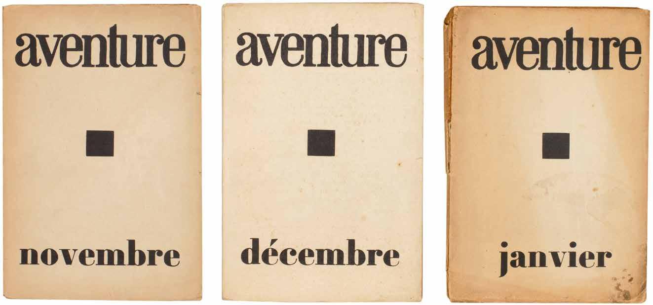
René Crevel, Roger Vitrac, Jacques Baron et al. aventure. novembre. décembre. janvier. (All Published)
Paris. 1921–1922
¶ A complete set of this scarce periodical bridging dada and Surrealism and featuring Dubuffet’s first work.
Following in the footsteps of Jarry and Apollinaire, this scarce dada periodical with a strong flavour of Surrealism, was produced under the direction of René Crevel (by number 3 he is ‘gérant’) with assistance and contributions from Marcel Arland, Roger Vitrac, Jacques Baron and Henri Cliquennois. Literary contributors included both Tristan Tzara (for issues 1 and 3) and André Breton (issue 3) despite the pair having fallen out over the direction (or not) of dada. Numerous others, also later to become Surrealists contributed, including Louis Aragon, Georges Limbour, Max Morise, and Paul Morand. Although Breton too was a contributor to ‘aventure’, the contributors split between those who followed his leadership of Surrealism as a movement and those who favoured that of Yvan Goll.
A major theme, and one later addressed at length by the Surrealists, is the rôle of humour, its characteristics and its importance to, and the importance of, the works of Rimbaud, de Lautréamont and Jarry. The issue ‘novembre’ carries a questionnaire on the subject, ‘Faillité de l’Humour?’, with questions sent to various writers including Paul Valéry, Tristan Tzara, Jean Paulhan, Paul Dermée, Blaise Cendrars (he answers ‘Merde’ to all questions), Max Jacob and René Crevel.
3 vols. 8vo. (230 × 146 mm). pp. 32; (iv), 32; (iv), 48. Stitched as issued in original publisher’s cream printed wrappers with Yapp edges, printed titles and black square vignette in black to front covers, price to rear covers, publication and contents details to inner front wrappers, later hand-decorated patterned paper-lined cream board protective box with title in blind to front board and label with title in black to spine.
— $5,900
Tristan Tzara, Edgar Varèse, Philippe Soupault, Georges Ribemont-Dessaignes, Man Ray, Max Ernst et al.
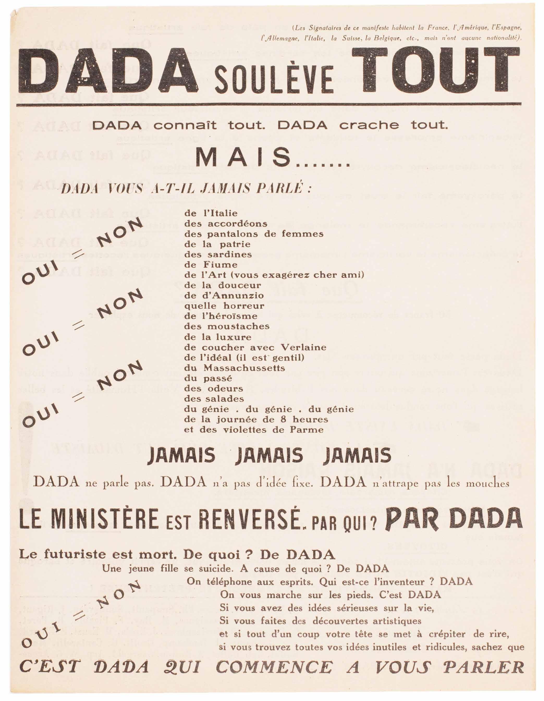
DADA
SOULÈVE TOUT. DADA connaît tout. DADA crache tout. MAIS ... Paris. Au Sans Pareil. 1921, 12 Janvier
¶ A very fine example, never folded, of this scarce, iconoclastic and blasphemous dada manifesto, an excellent specimen of dada typography.
Tzara’s 1921 restatement of dada had a very serious purpose: to reinvigorate and revitalise dada. Tzara was to some extent successful and dada continued albeit with the same troubles that prompted the issue of this manifesto. The document is an outstanding example of the typographical caprice and linguistic inventiveness that made dada so intriguing and appealing. The use of various other schools of art (Cubism, Expressionism, Simultaneism, Futurism, Unanism, Neo-Claissicism, Ultraism, Creationism, Vorticism and Imagism) to underline dada’s point, or rather its lack thereof, is classic. Tzara’s most iconoclastic and blasphemous slogans, were taken up by Van Doesburg for his own later dada poster produced in conjunction with Schwitters, ‘kleine dada soirée’: ‘DADA EXISTE DEPUIS TOUJOURS / LA SAINTE VUERGE DÉJÀ FUT DADAÎSTE !’
This manifesto was truly international, as noted at the head of the sheet: ‘(Les
– 64 –[33].
Signataires de ce manifeste habitent la France, l’Amérique, l’Espagne, l’Allemagne, l’Italie, la Suisse, la Belgique, etc., mais n’ont aucune nationalité).’
‘In 1921, Tristan Tzara found himself battling to sustain Dada’s declining popularity. Aesthetic, political, and social differences among the movement’s most prominenet members shook Dada at the foundation. In line with Dada’s emphasis on easy distribution, Tzara created this one-page flyer presenting a condensed, more direct iteration of the Dada Manifesto ... The text’s inconsistent typefaces, orientation, and size embody the disorientation and randomness at the heart of the Dadaist philosophy.’ — From the catalogue of The Art Institute of Chicago
Folio. (277 × 212 mm). [Single sheet of cream paper]. Drop-head title and printed text recto and verso in French with typical dada typography, manicules and type variation, imprint and list of signatories at foot of verso.
— $6,600
Hans Arp, Georges Ribemont-Dessaignes, Max Ernst & Marcel Duchamp. Tristan Tzara, Philippe Soupault, Benjamin Péret, Louis Aragon, et al.
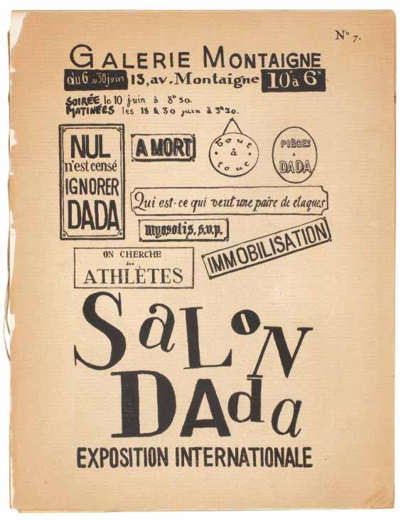
SaLoN DAda. Exposition Internationale Paris. (Imprimerie Crémieu). (1921)
¶ A presentation copy of the very scarce ‘SaLoN DAda’ with the rare invitation to the highly controversial ‘Soirée dada’.
From the edition limited to 600 numbered copies, each stamp-numbered to the justification to front wrapper verso.
Tristan Tzara’s presentation is in black ink to the left-hand margin of the centre spread: ‘à Hannie et Aldo / van Eyck / Pour le 30ème Anniversaire / de Dada / avec le souvenir amical / de / Tristan
TZARA / Sur les lieux du crime / Zürich 23 févr. 46’ and with a typical Tzara sketch of a flower. The spread also includes the legend ‘Conformément aux règlements en vigueur l’amour est interdit aux végétaux des squares’, (at left) Tzara’s ‘L’art et la chasse’ and (at right) the tipped-in illustration of Duchamp’s ‘Mariée’.
Opening with Philippe Soupault’s ‘Le Profil de dada’, the catalogue ‘SaLoN DAda’ represents both the highwater mark and the beginning of the end of dada in Paris. ‘SaLoN DAda’ was convened in June 1921, after Picabia had left the movement (although he was to return) despite all he had done to initiate ‘SaLoN DAda’, Breton did not participate and Duchamp had departed
both physically for New York and metaphorically: although his contribution to the catalogue (the reproduction of his painting ‘Mariée’) remains, his contributions to the exhibition (nos. ‘28’ to ‘31’ under his name are blank) were removed. ‘SaLoN DAda’ as an exhibition held at the Galerie Montaigne (within the Théâtre des Champs-Elysées) was largely successful albeit not without controversy, featuring international contributions from Arp, Baargeld, Man Ray, Charchoune, Walther Mehring, J. Evola, Aldo Fiozzi and Joseph Stella, as well as Jacques Rigaut, Jacques Vaché, Gala and Paul Eluard and Théodore Fraenckel among others.
Also included, inserted loose, is the announcement for ‘Soirée dada’, a single sheet of cream glossy paper printed in black recto only (270 x 206 mm).
Small 4to. (270 × 210 mm). [7 bifolia including wrappers]. Original publisher’s printed wrappers with typographic title to front cover in black, justification verso, catalogue to rear wrapper and interior, staple preserved, later stitching.
— $16,500
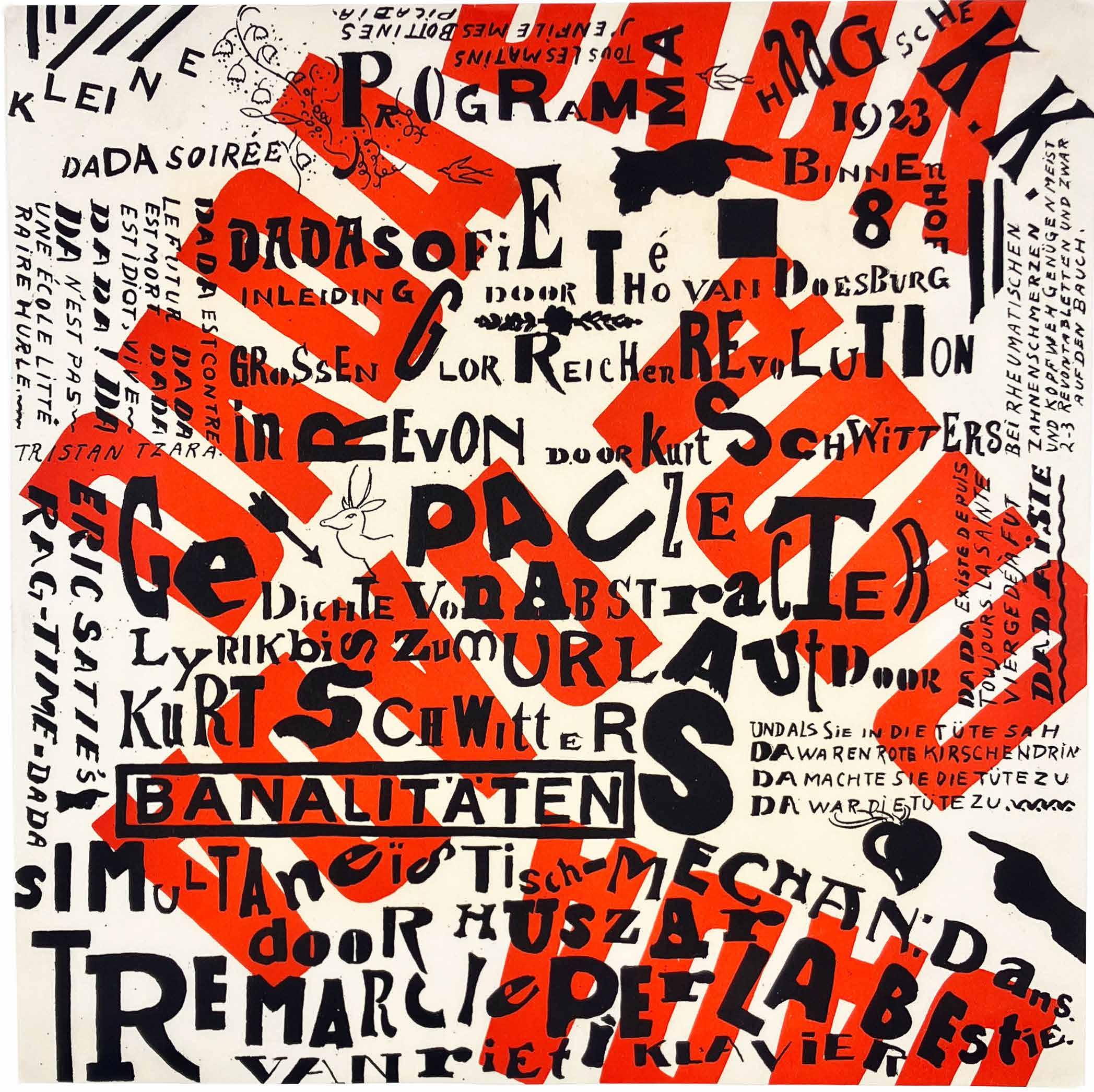
Théo van Doesburg & Kurt Schwitters kleine dada soirée (The Hague). (1922/1923)
¶ An excellent example, never folded, of the first issue of the iconic ‘kleine dada soirée’ poster.
This programme / poster by Théo van Doesburg and Kurt Schwitters details the events for the travelling show they had devised towards the end of 1922. Their proposed tour of Holland was to start in The Hague in December 1922 but had to be postponed due to problems with Schwitters’ passport. On January 10th, 1923, Schwitters and van Doesburg appeared at the Haagsche Kunstkring (the details are at the upper right of the poster together with the address ‘Binnenhof 8’) and the performance featured van Doesburg’s ‘dadasofie’, ‘ragtime-dada’ by Erik Satie and Schwitters’ sound poetry. The chaotic typography of the poster, in typical dada style, features random capitalisations, variations in typography,
the text at variable and peculiar angles, manicules, small vignettes, a quotation from Tristan Tzara etc., all against a background with ‘dada’ printed in red. The basic form for each event included van Doesburg reading from his booklet ‘Wat ist Dada?’, Schwitters making animal noises (barking like a dog or cooing like a dove) from the audience before reading his own works, van Doesburg’s wife Nelly – she appeared under the stage name ‘Pétro’ – would play musical selections and the fourth collaborator, Vilmos Huszár, projected on a screen the moving figure of a mechanical dancer.
(300 × 300 mm). Lithograph in red with additional printing in black recto only on thin newsprint paper, the full sheet, never folded.
— $33,000
[36].
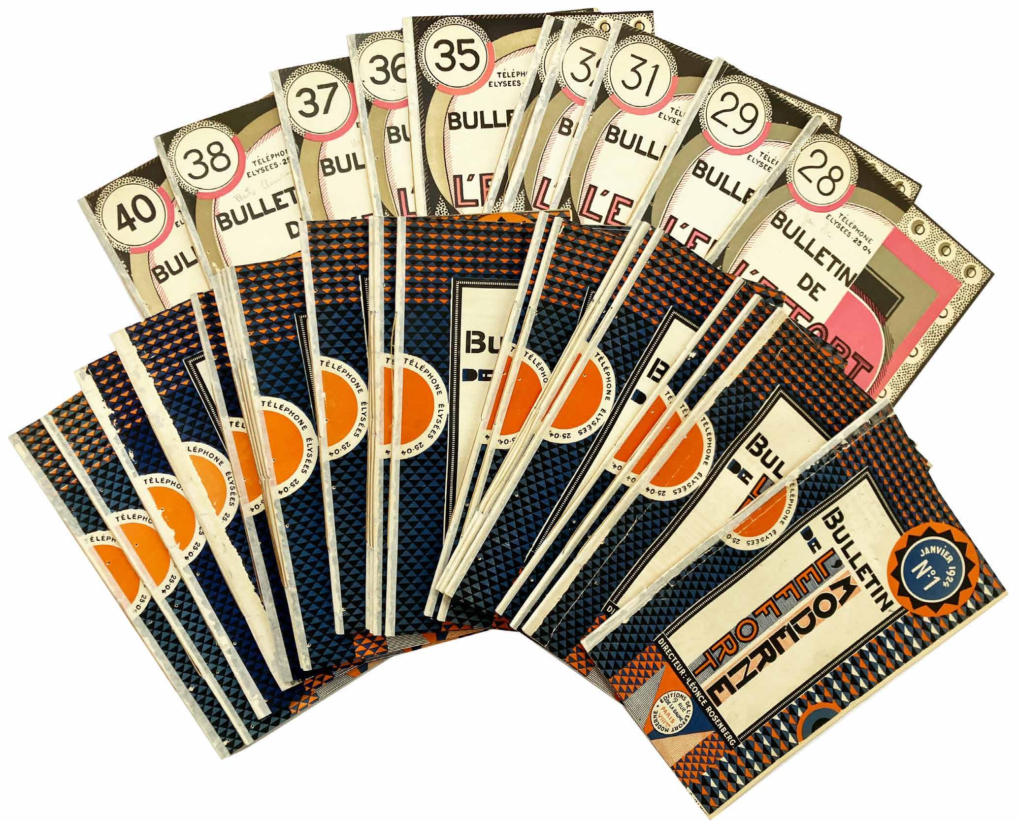
Léonce Rosenberg Bulletin de ‘l’Effort Moderne’.
No. 1. (Janvier 1924). – No. 40. (Décembre 1927). (All Published) Paris. Imprimerie Union / Imprimeris Moderne des Beaux Arts / Imprimerie des Lettres et des Arts / Les Presses Modernes [for] Editions de l’Effort Moderne. 1924–1927
¶ A scarce complete set of Léonce Rosenberg’s ‘Bulletin de ‘L’Effort Moderne’ with all the wrappers by Georges Valmier.
The ‘Bulletin’ with its striking covers by Georges Valmier provided a literary and intellectual forum both for Cubism and the wider world of art and provided perhaps most importantly a very extensive corpus of illustration not only of painting but of all of the arts. Each issue features 8 leaves of monochrome images (for nos. 21–30 four leaves only were included) of work by all of the most important artists – a full list would include almost everyone of note and in every field – of the day. Significant literary contributions were by Maurice Raynal, Henri van de Velde, Gino Severini, Albert Gleizes, Jean Metzinger, Pierre Reverdy, J.-J.-P. Oud on architecture, Fernand Léger, Léonce Rosenberg himself, Florent Fels, Piet Mondrian and many others. The ‘Bulletin’ ran to 40 numbers, recovering
midway from a reduction in text and image content (nos. 21–30), surviving several changes of printer (the final issues were printed by companies overseen by Rosenberg’s daughter Lucienne), a lessening of advertising revenue but never by a decline in quality of text or illustration. A cynic might point to the fact that much of the text consisted of the serialisation of books published by Rosenberg’s Editions de l’Effort Moderne but that would be to misconstrue and underestimate the scope of Rosenberg’s vision.
40 vols. 8vo. (c.238 × 156 mm). Original publisher’s printed colour wrappers with titles and elaborate decorative design by Georges Valmier to front covers (nos. 1–27 with design in red, blue, black and white; nos. 28 - 40 with a different design in black, cream, pink and grey), advertisements to rear covers and wrapper interiors.
— $23,000
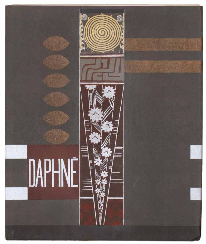
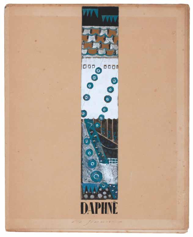
François-Louis Schmied & Alfred de Vigny Daphné
Paris.
Chez F. L. Schmied.
1924
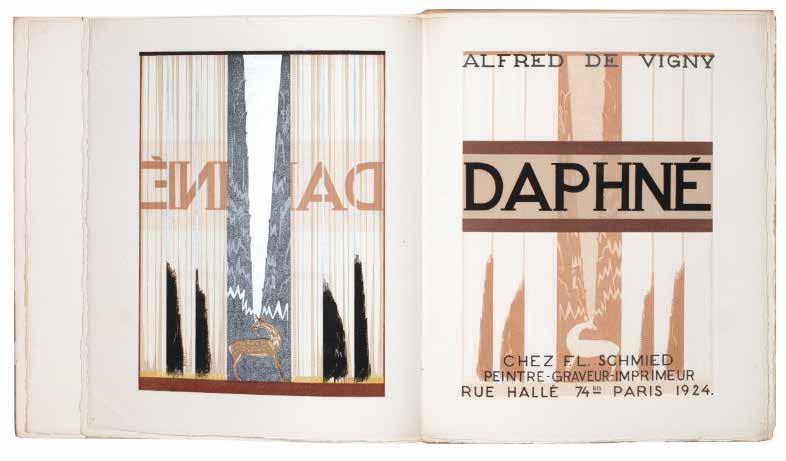
¶ Schmied’s first major book: de Vigny’s ‘Daphné’ with three signed leaves of original painted work by Schmied for the book.
From the edition limited to 140 copies, each with printed number and signed by Schmied in pencil. Also included, inserted loose, with the present copy is the following original material:
— a blank bifolium matching the paper used for the printed book with Schmied’s original painting for the pictorial title: executed in colour gouache and silver paint to a sheet of card, the work is signed by Schmied in ink beneath and mounted over the title ‘DAPHNÉ’ executed in black ink direct to the sheet; the final verso of the sheet features a proof of printed text for the book pasted to the sheet with Schmied’s hand-painted bandeaux above and beneath in umber
— a blank bifolium matching the paper used for the printed book with Schmied’s original painting for the vignette at the foot of a leaf of text: executed in colour gouache and signed at lower right in blue ink, the painting is pasted to the sheet beneath as a proof of printed text for the book (the text matches that of the bifolium detailed above) pasted to the
sheet beneath Schmied’s painting for the bandeau at the head of the same executed in umber and ochre
— a single leaf matching the paper used for the printed book with Schmied’s original painting for a large initial ‘T’ used in the book: executed in gouache direct to the sheet, the painting is signed beneath in blue ink by Schmied at lower right
As per the justification: ‘Cette édition des quatre lettres de Daphné, due à l’initiative du Docteur Amédée Baumgartner, a été établie par F.-L. Schmied qui en a conçu l’ordonnance et l’ornementation, gravé les planches sur bois et exécuté le tirage sur ses presses à bras à 140 exemplaires numérotés et signés. Pressier: Pierre Bouchet.’
Small folio. (310 × 258 mm). [48 bifolia: 96 unnumbered leaves]. Loose as issued in original publisher’s thick paper printed wrappers with wood-engraved decoration and argent title with two thick argent bands flowing over the spine to the rear wrapper by Schmied, original marbled paper-covered chemise with paper label with argent title pasted to spine and matching slipcase.
— $8,500
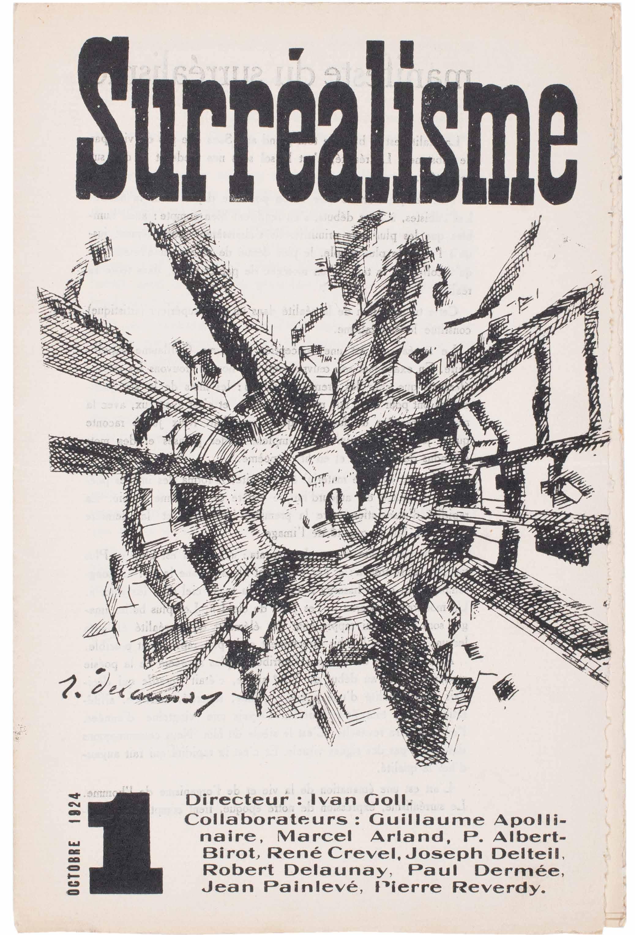
Robert Delaunay, Ivan Goll, Pierre Albert-Birot, Paul Dermée, René Crevel et al. Surréalisme. No. 1. Octobre 1924. (All Published) Paris. (Imprimerie Deshayes). 1924
¶ An excellent copy of the first Manifesto of Surrealism issued by the Apollinairean Surrealists in 1924 and preceding Breton’s ‘Manifeste de Surréalisme’ by two weeks.
Guillaume Apollinaire had first made use of the neologism ‘sur-réalisme’ in the program notes to Erik Satie’s 1916 ballet ‘Parade’ before he subtitled his own drama ‘Les Mamelles de Tirésias’, ‘drame Surréaliste’, in 1917. Despite Apollinaire’s coinage, the word ‘Surréaliste’ did not enter common usage until the 20s and the issue of the two Surrealist manifestoes in October, 1924. The first to appear, the present, was issued on October 1st in the sole issue of the review ‘Surréalisme’.
Directed by Ivan Goll and supported by Marcel Arland, Pierre Albert-Birot, René Crevel, Joseph Delteil, Robert Delaunay, Paul Dermée, Jean Painlevé and Pierre Reverdy, the Apollinairian Surrealists (Apollinaire too is listed, post mortem, as a ‘collaborateur’) took the view that Surrealism had existed since Apollinaire’s coinage. Breton’s manifesto, also titled the ‘Manifeste du Surréalisme’ was published on October 15th. Needless to relate, an
– 74 –[38].
antagonistic, clamorous, and, at times, furious, intellectual storm raged. Debate and Breton’s prevarications aside, the neologism is Apollinaire’s and Surrealism would not have existed in any of the forms it took ultimately without him and without ‘Les Mamelles de Tirésias’. The contents of the issue are as follows: ‘manifeste du surréalisme’; ‘exemple du surréalisme: le cinéma’; Pierre AlbertBirot’s ‘mon bouquet au surréalisme’; Paul Dermée’s ‘surréalisme couleur du temps’; a transcription of Apollinaire’s important 1917 letter to Paul Dermée concerning the coinage of the neologism ‘Surréaliste’; Pierre Reverdy’s ‘bel occident’; Joseph Delteil’s ‘Esthètes et Anges’; Marcel Arland’s ‘la route obscure’; René Crevel’s ‘je ne vendrai pas la commode de mon grand-père’; Jean Painlevé’s ‘drame néo-zoologique’; Gollivan’s (Ivan Goll’s) ‘le peintre robert delaunay parle’...
4to. (252 × 166 mm). [4 bifolia: 8 unnumbered leaves including wrappers]. Original printed paper wrappers stapled as issued.
— $3,950
[39].
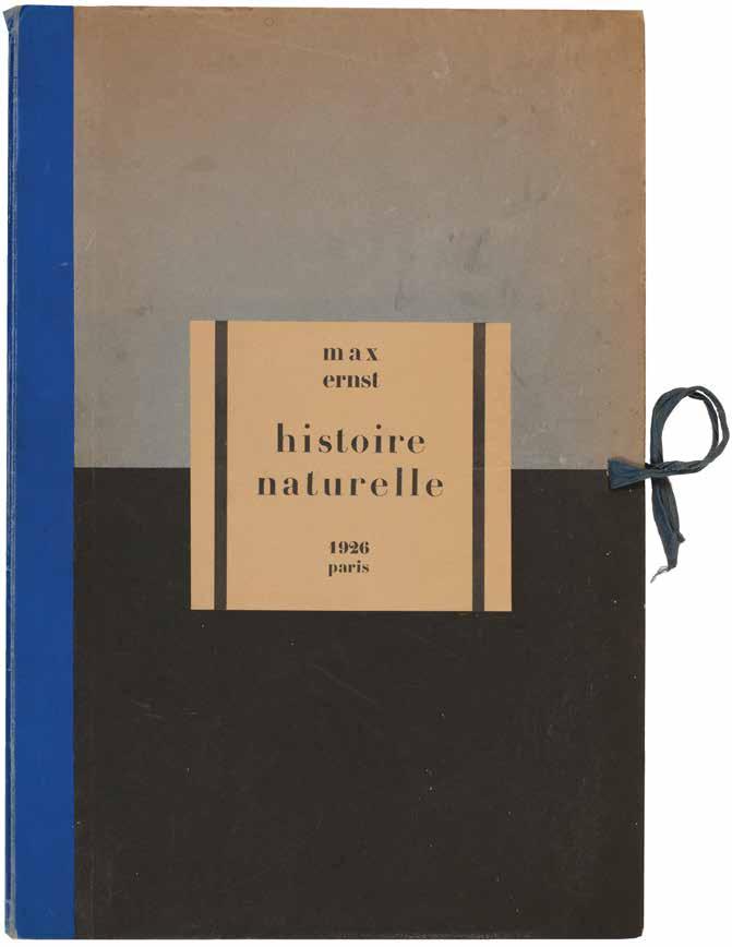
Max Ernst & Hans Arp (Intro.) Histoire Naturelle Paris. (Editions Jeanne Bucher). 1926
¶ A superlative unsophisticated édition de tête example of exceptional rarity of Max Ernst’s early frottage experiments.
From the edition limited to 300 numbered copies (6 lettered hors commerce copies were also issued), with this one of the first 20 édition de tête copies on Japon Impérial signed and numbered ‘11’ in ink by Max Ernst.
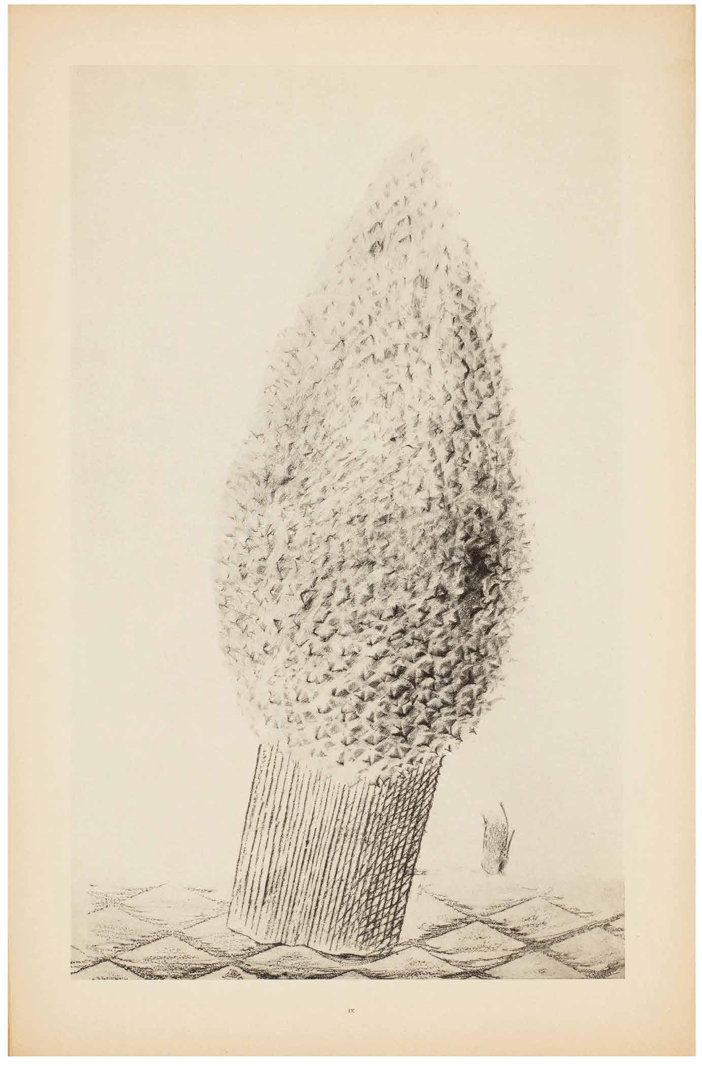
One of Ernst’s earliest childhood recollections was of an imitation mahogany panel opposite his bed which he was prone to peruse while falling asleep. Such an image helped spark his invention of frottage (rubbings of diverse materials such as planks, bricks, watch parts, cheese graters, buttons, etc.).
Made during the latter half of 1925, this album represents only a small portion of the hundreds of frottages Ernst produced during that period. Bearing both poetic and descriptive titles (The Fascinating Cypress, The Vaccinated Bread), the plates are introduced by Ernst’s dada compatriot Hans Arp by means of a long automatic prose poem. The text is printed without capitals throughout; the final plate (‘éve la seule qui nous reste’) is misnumbered ‘43’ in the list of plates.
Folio. (516 × 350 mm). [2 bifolia (text on smaller sheets) + 34 leaves of plates]. Leaf with title, leaf with list of plates recto and verso, leaf with Arp’s introductory text recto and verso, blank leaf with justification verso (all on smaller sheets) and 34 lithograph plates by Max Ernst each printed recto only and numbered I–XXXIV (sheet size: c.498 × 324 mm or the reverse). Loose as issued in original publisher’s cloth-backed blue, turquoise and black portfolio, printed title label to upper board, blue cloth ties.
— $40,000
[40].
Nancy Cunard
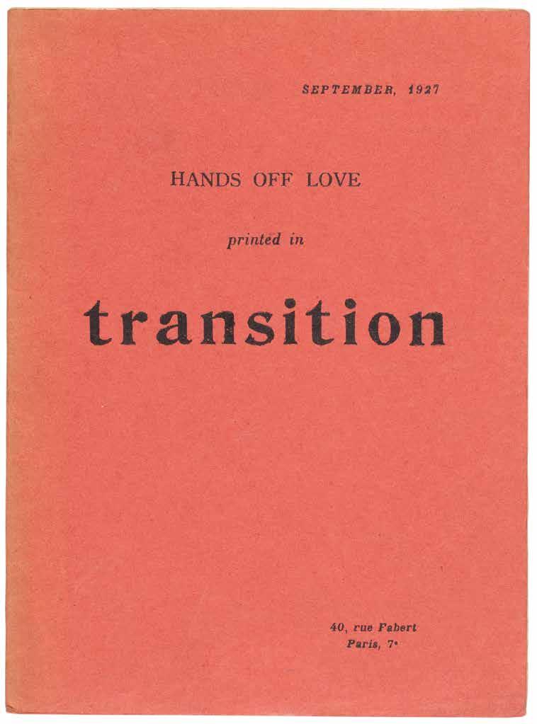
Maxime Alexandre, Louis Aragon, Jacques Baron, et al. Hands Off Love. (Printed in Transition) (Paris). 1927
¶ The very scarce offprint, issued in defence of Surrealism’s hero Charlie Chaplin after his divorce and the publication of Lita Grey Chaplin’s scandalising ‘The Complaint of Lita’.
Charlie Chaplin’s divorce from Lita Grey Chaplin was concluded in August 1927 but her divorce complaint (i.e. ‘The Complaint of Lita’ listed above) had been made public – likely by Lita’s lawyers at her behest – and a grand, scandalous furore resulted. ‘Hands Off Love’, largely an expression of distaste at the
hypocrisy of the scandal and in defence of Chaplin, was printed first in the literary review ‘Transition’ in September 1927 before its appearance as this offprint. It appeared again, later and in French, in ‘La Révolution Surréaliste’ in October 1927.
12mo. (194 × 144 mm). [3 bifolia: 6 unnumbered leaves]. Original publisher’s pinkish-red printed wrappers, stapled as issued, titles to front cover in black.
— $3,000
[41].
Giorgio de Chirico & Jean Cocteau
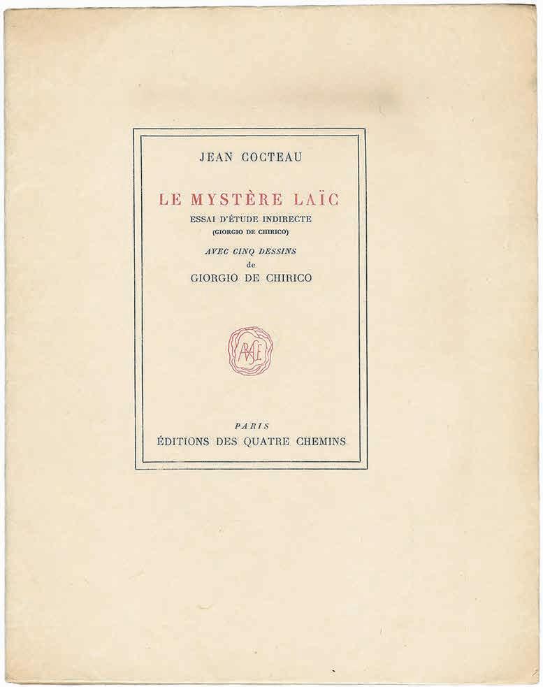
Le Mystère Laïc. Essai d’Etude Indirecte (Giorgio de Chirico)
Paris. Editions des Quatre Chemins. 1928
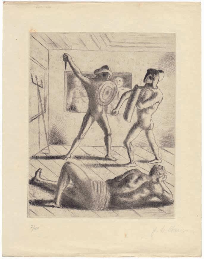
¶ A very fine example of the édition de tête with de Chirico’s original etchings and corrected proofs by Jean Cocteau.
From the edition limited to 3,330 copies, with this one of 10 from the édition de tête on Japon Impérial with de Chirico’s etchings inserted loose, each signed and numbered from the edition of 100 in pencil; the book is also signed by Cocteau on the half-title and includes two leaves of printed text with manuscript corrections in ink by Cocteau.
The two leaves with manuscript corrections feature text printed on pages 30, 31, 32 and 33. Cocteau has made manuscript excisions, ellisions and
additions which amount to substantial changes. In several instances the corrections differ even from the final published text which was completed in December 1927; the achevé d’imprimer gives a publication date of ‘le Trente Mai Mil Neuf Cent Vingt-Huit’...
Small 4to. (246 × 194 mm). pp. (blank leaf), 80, (v), (2 blank leaves). Original publisher’s cream printed wrappers with red printed title and black printed text to upper cover and spine, cloth-backed board chemise and matching box.
— $19,500
[42].
Jindrich Styrsky & Vitezslav Nezval
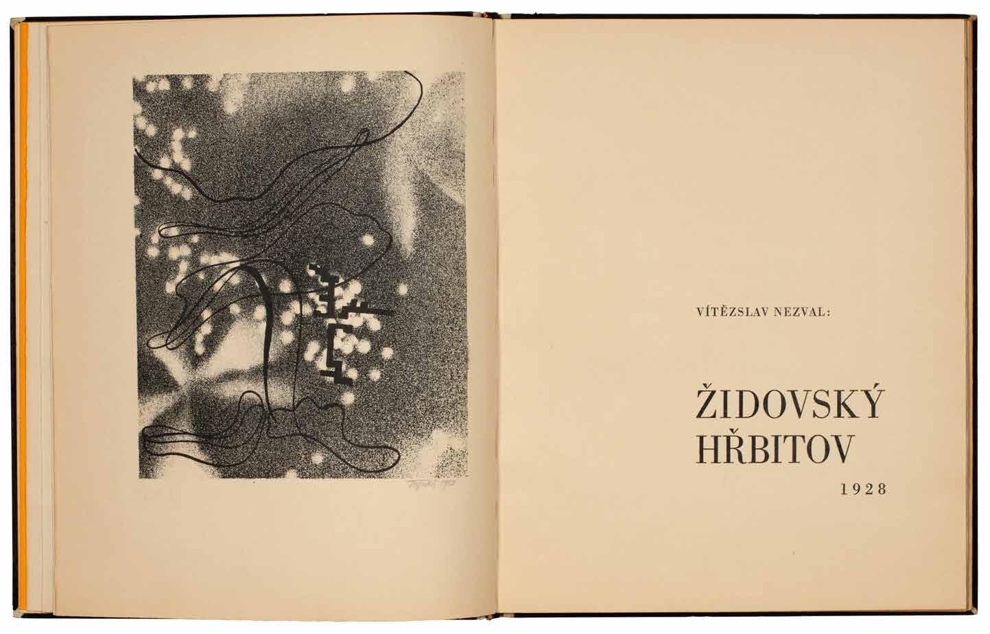
Židovský Hřbitov. (The Jewish Cemetery) Prague. Odeon / Jan Fromek. 1928
¶ Toyen’s copy of her friend Vitezlav Nezval’s verse illustrated by her creative partner Jindrich Styrsky and designed by Karel Teige.
This extraordinary copy of ‘Židovský Hřbitov’ unites the leading lights of the Czech artistic avant-garde: the poet Nezval with his signed presentation, the artist Styrsky who has signed all of the original lithographs and inscribed the book with a long quote from de Quincey, the designer and theorist Teige who was responsible for the typography and mise en page and, of course, Toyen herself, to whom the work is presented. All were members of the group ‘Devětsil’ and Toyen and Styrsky had developed the credo of ‘Artificialism’ in Paris in 1927, their response to Surrealism; the illustrations by Styrsky for ‘Židovský Hřbitov’ belong to his pre-Surrealist Artificialist oeuvre.
From the edition limited to 220 numbered copies on Hollande Van Gelder; this copy signed by Nezval to initial blank and numbered to the justification in ink; also with Nezval’s presentation to the initial blank beneath
his signature, Styrsky’s extensive and allusive manuscript quotation from de Quincey to the half-title and with all the original lithographs signed and dated ‘1928’ in pencil by Styrsky.
Nezval’s presentation is in black ink to the initial blank beneath his signature: ‘Drahé Mance tuto knížku, kterou jsme dělali s Jindrou / vzpomínajíce na ni a smutni, protože se nevrátila / Její Sláva / V Praze 4. XII. 1928’.
Styrsky’s extensive quotation in Czech – taken from Thomas de Quincey’s ‘Levana and Our Ladies of Sorrow’ in ‘Suspiria De Profundis: Being a Sequel to the ‘Confessions of an Engllsh OpiumEater’’ – is in black ink to the half-title. A transcription of the manuscript is available on request.
Small folio. (303 × 244 mm). [24 leaves; pp. 31]. Contemporary Czech vellumbacked stiff black card boards, gilt tile to spine, t.e.g., original publisher’s orange printed paper wrappers with titles to front cover and spine in grey / green by Karel Teige preserved.
— $52,800
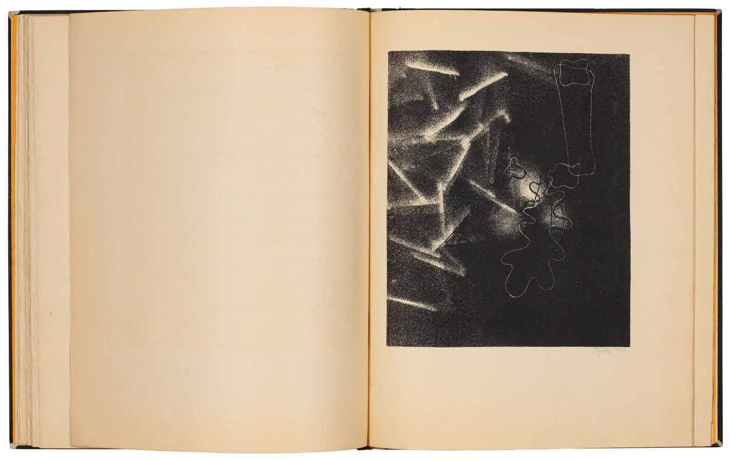
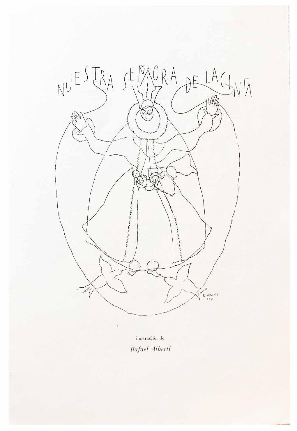
Rafael Alberti & Carlos Rodriguez-Pintos Dos Oraciones a la Virgen Paris. Carlos Rodríguez-Pintos. 1931
¶ A charming double collaboration between artist and poet, printed on the poet’s own press, with each providing a poem and an illustration.
From the edition limited to 325 copies, with this unnumbered copy seemingly on Japon; copies were issued on ‘papel Holland Pannekoek’ and on ‘papel
Ronsard’ and this copy appears to be neither.
4to. (210 × 290 mm). [3 bifolia: 6 unnumbered leaves]. Loose as issued in original publisher’s thick Japon printed wrappers with flaps and titles in black to upper cover.
— $1,250
[44].
Man Ray & Pierre Bost
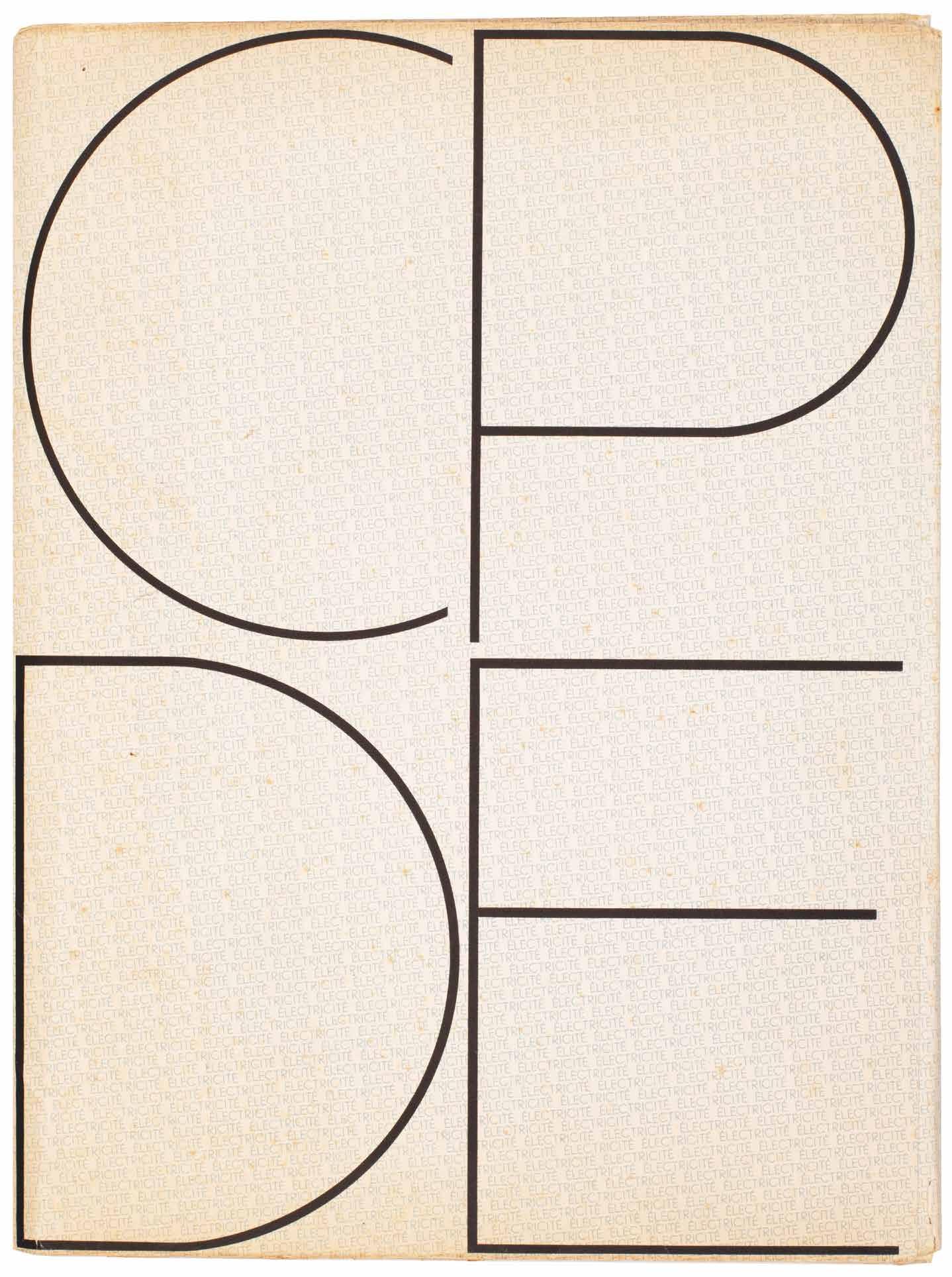
Électricité. Dix Rayogrammes de Man Ray et un Texte de Pierre Bost
Paris. CPDE (Compagnie Parisienne de Distribution d’Electricité). 1931
¶ Man Ray’s ‘Electricité’, an excellent, unsophisticated copy, with the original compliment slip.
From the edition limited to 500 copies each stamp-numbered to the justification (the justification and achevé d’imprimer are printed to the interior of the card portfolio).
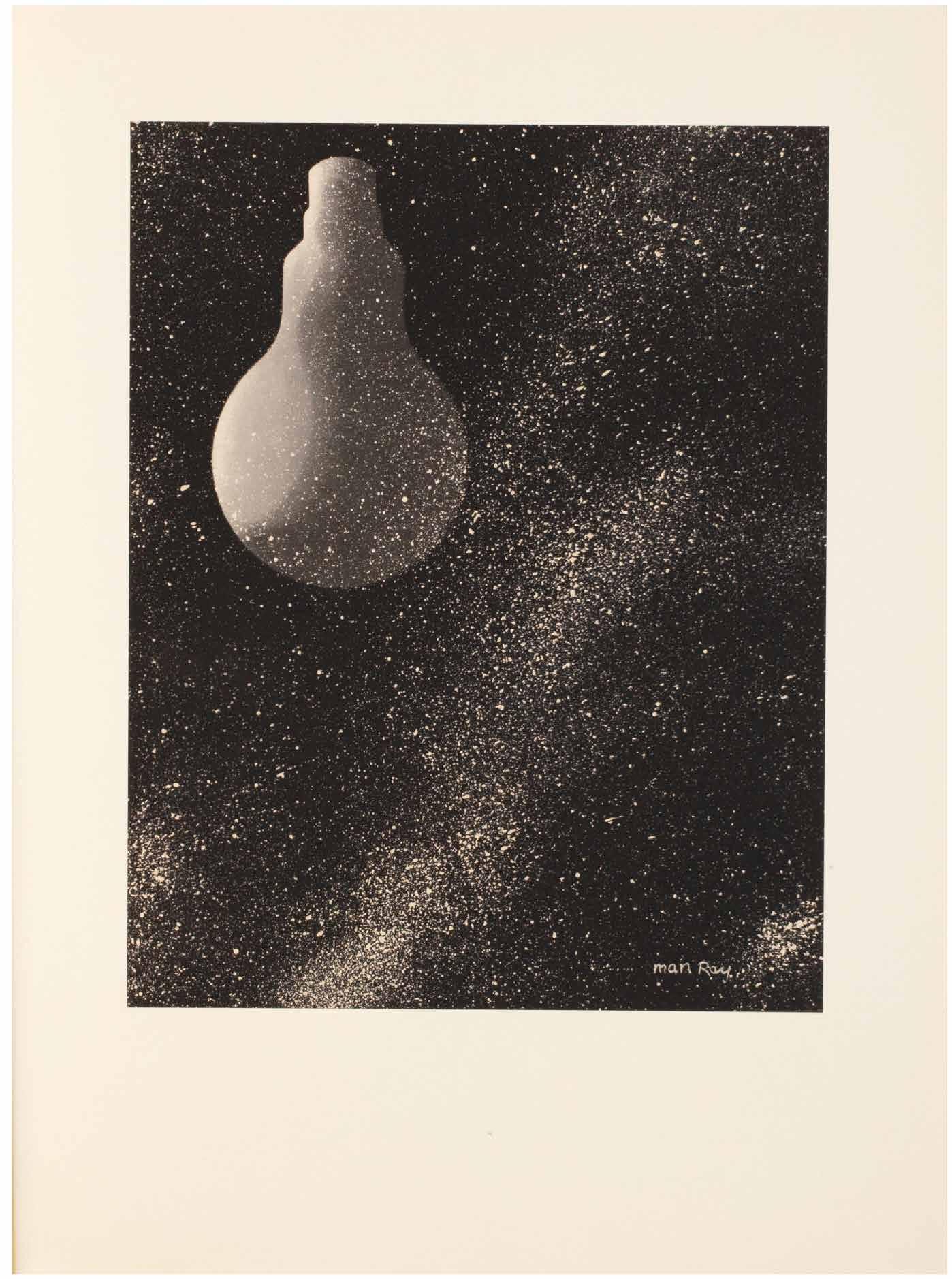
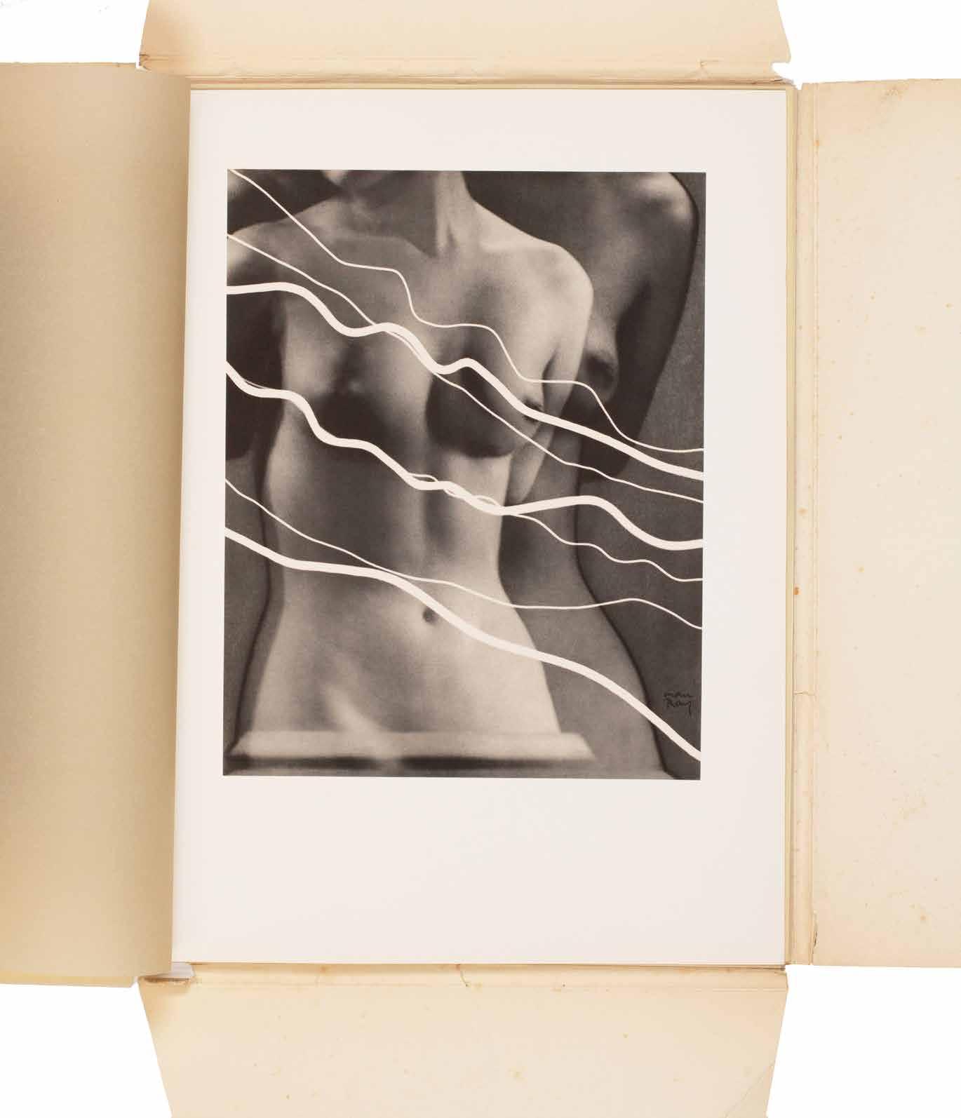
This work was commissioned by a French electric company (La Compagnie Parisienne de Distribution d’Électricité) to promote and publicise the use of electricity. The portfolio consists of 10 photogravures made from Man Ray’s original rayograms; each rayogram makes use of some electrical device in the home. The conception is brilliant and the images among the most direct and uncontrived in Man Ray’s oeuvre. ‘Electricité’ is also notable as Man Ray’s last intensive investigation of the rayogram process.
‘Man Ray’s Electricité (Electricity) is not only one of the most ravishing and sought-after of company photobooks, but
it contains a cogent suite of photographs that the leading American Dadaist and commercial photographer himself never bettered. The ideas are generally simple, but formally adroit, even witty – full of visual poetry and delight ... Electricity is, of course, invisible, and in much of the portfolio Man Ray seeks to make the invisible visible, creating visual equivalents for electrical power ... Solarized images look as if they are pulsating with hidden energy ... They [CPDE] ended up with one of the most successful unions between commerce and the artistic avant garde, a monument of modernist bookmaking and a thoroughly contemporary, unexpected, beautiful and frequently playful vision of the brave new world of electrical energy.’ — Parr / Badger
Folio. (384 × 284 mm). [2 bifolia (text) + 10 leaves of plates]. Original publisher’s printed card portfolio with typographic design in blue and black.
— $60,000
[45].
Max Ernst & Tristan Tzara Où Boivent les Loups Paris. Editions des Cahiers Libres. 1932
¶ Breton’s copy of the rare édition de tête on Japon Nacré with a long presentation from Tzara and Ernst’s frontispiece etching in three states.
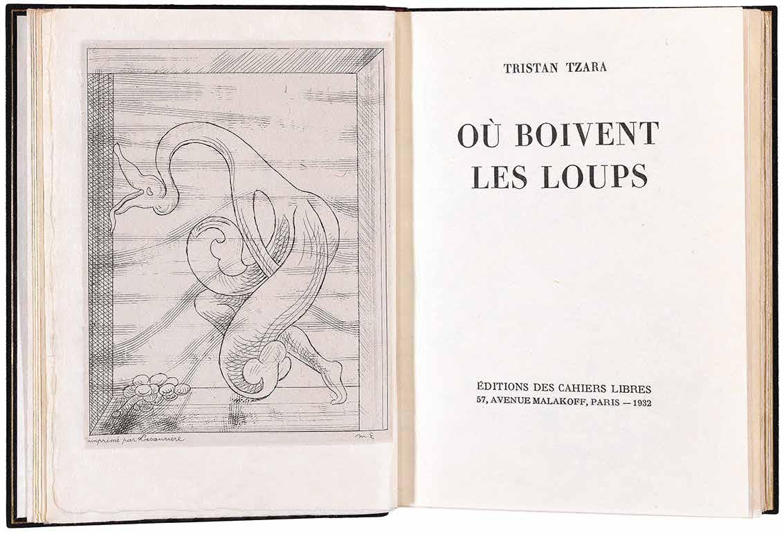
From the edition limited to 1,010 numbered copies, with this one of 10 from the édition de tête on Japon Nacré, signed by Tzara in blue ink and with Max Ernst’s original etching as frontispiece; Ernst’s etching, here in three states, was issued only with the édition de tête and the three nominatif copies for the author, artist and publisher.
Tzara’s long, affectionate and evocative presentation is in black and blue inks to the half-title: ‘à André Breton [in black ink, the remainder in blue] / tout au long d’une vie et d’une mort corrigées / sans égards pour les écuries des sommeils / dans la solitude dans l’instable souffle des insectes / dans la raréfaction des contrastes / en signe de complicité linéaire / et d’amitié / Tristan Tzara / [with a drawing of a flower] / Oct. ‘34’.
The etching, printed by Roger Lacourière, is present in the final published version (Spies E) on Chine appliqué, without letters on Chine appliqué (Spies D) and with the plate cancelled on Chine (not listed by Spies).
The etching is itself of considerable rarity in any state with Spies recording only 16 copies in total, no mention of pulls of the barred plate and with the ‘D’ state known in only a single pull.
Also included, bound in after the title, is Tzara’s original manuscript for ‘et du jour au lendemain’, recto only in blue ink, the eighth poem in four stanzas of ‘La Fonte des Ans’; all of Tzara’s text is printed in lowercase throughout.
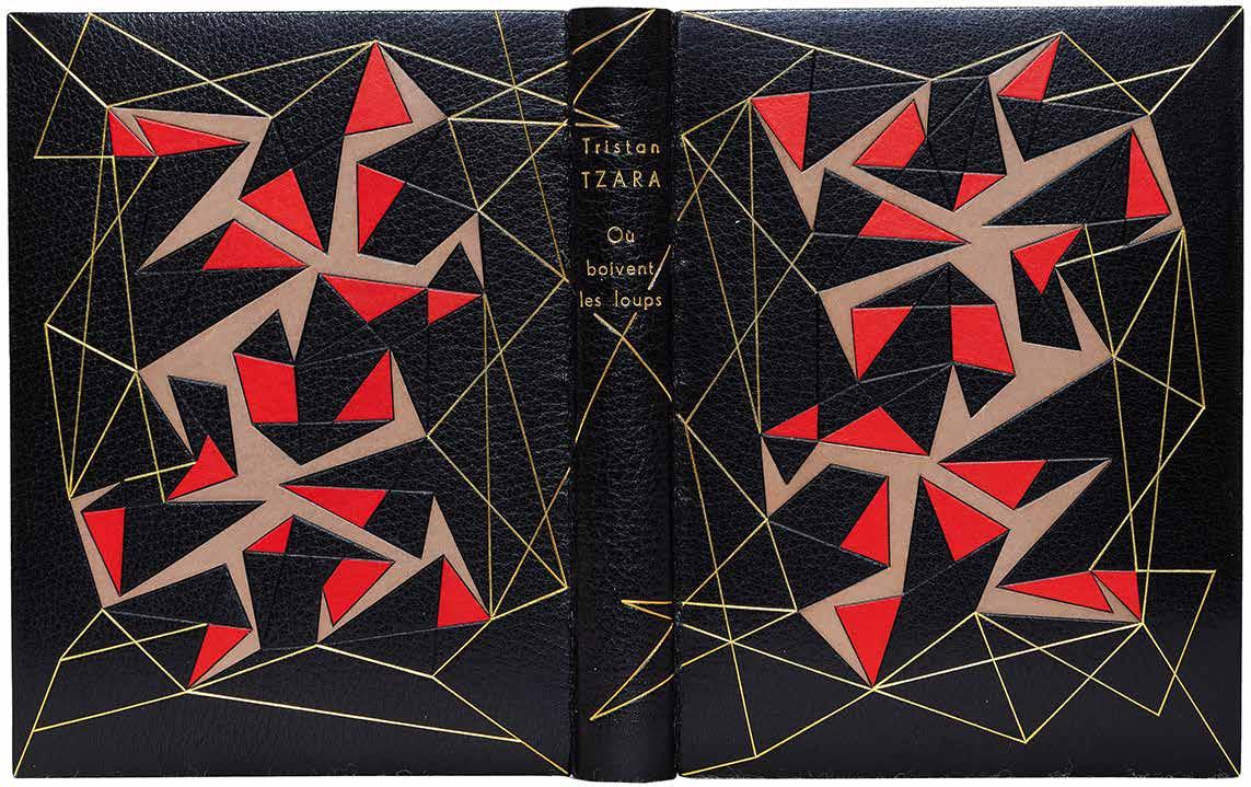
12mo. (194 × 148 mm). [94 leaves ; pp. 173, (i)]. Full black crushed morocco by Pierre-Lucien Martin with his signature gilt and dated ‘1955’, front and rear boards and spine with elaborate rules in gilt and blind to form an elaborate parallelogrammatic motif, boards with additional onlays of scarlet and beige calf, title gilt to spine, turn-ins ruled in gilt, japon nacré doublures and endpapers, original printed wrappers with titles in black to front cover and spine and publisher’s vignette to rear cover preserved, original black calf-backed red paper board chemise and matching slipcase.
— $72,600
[46].
(Paul Bonet) & René Gaffé
Connaissance de Paul Bonet ... à l’Occasion d’une Présentation de Ses Reliures à la Galerie Giroux ... &c Brussels. Des Presses de A. Lesigne [for] Galerie Giroux. 1933
¶ An excellent copy of the scarce catalogue of the exhibition of bindings by Paul Bonet together with the original invitation to the exhibition.
From the edition limited to 300 copies. The exhibition, held at the Galerie Georges Giroux in Brussels, was from 4th to 14th March, 1933. The introductory text, laudatory in the extreme, is by René Gaffé, one of Bonet’s principal customers during his early years of innovation. The Giroux exhibition incorporated some of Bonet’s most innovative – at least up until that time – bindings, several of them from Gaffé’s own collection. The composition of the bindings, novel in
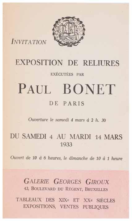
their own right, liberate the binding from tradition and utilise it as a further plane of expression. Those bindings displayed promote in particular Bonet’s masterful use of different metals as both a material to incorporate and for the whole binding itself and demonstrate his mastery of pictorial typography as decoration.
Small 4to. (241 × 180 mm). [10 unnumbered leaves]. Original publisher’s grey paper printed wrappers stapled as issued, titles in black to front cover, justification verso, printer’s credit to foot of rear wrapper.
— $1,250
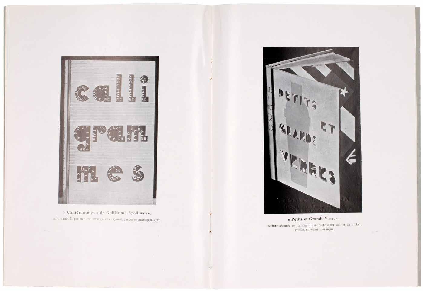
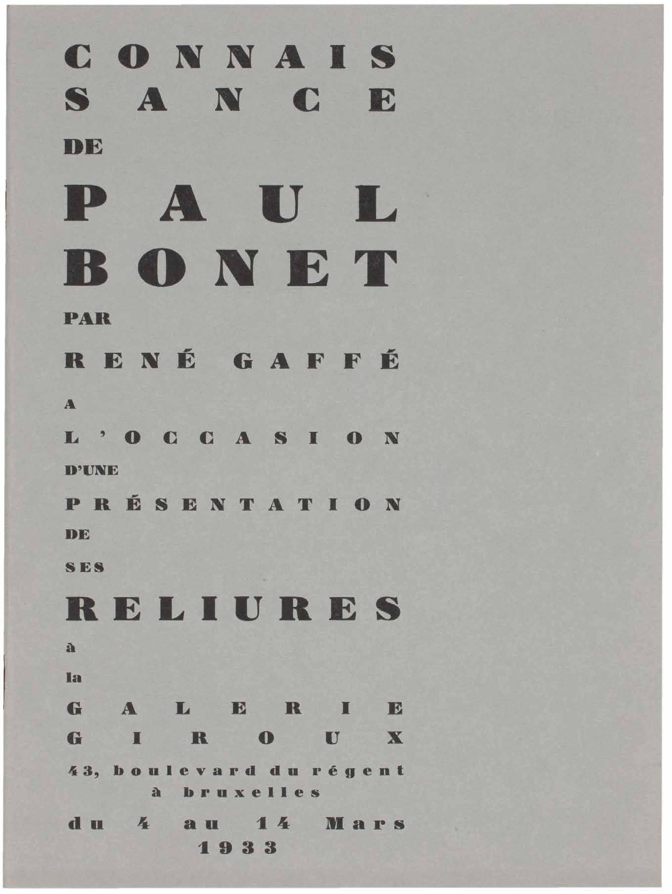
Wassily Kandinsky & René Char Le Marteau sans Maître Paris. Editions Surréalistes. 1934
¶ The édition de tête of the first edition of René Char’s collection with Wassily Kandinsky’s original frontispiece etching and bound by Georges Leroux.
From the édition de tête limited to 20 numbered copies on papier de Hollande van Gelder with Kandinsky’s original dry point engraving as frontispiece; only copies from the édition de tête were issued with the original engraving.
Also included, inserted loose, is the scarce subscription announcement printed on yellow paper with a quotation from the Comte de Lautréamont.
Kandinsky’s untitled etching, issued in only 20 impressions, was followed by only two further etchings, those for ‘La Main Passe’ (1934) and ‘Fraternity’ (1939), before Kandinsky’s death in 1944.
Pablo Picasso was a profound admirer of Char and of the work, which collected all of Char’s poems published after 1927, and submitted an etching for the second edition – printed in a very similar format to this edition – published again
by José Corti’s Editions Surréalistes, in 1945. A third illustrated edition was also published, illustrated by Joan Miró, in 1976. This first edition and in this issue of 20 copies with Kandinsky’s etching is the rarest of the editions; Picasso’s etching for the édition de tête was issued in 25 copies while the version with Miró’s etchings was an edition of 215 copies, 50 with an additional suite.
8vo. (192 × 146 mm). pp. 142, (i). Full black crushed morocco by Georges Leroux with his signature gilt, boards with abstract geometric rules in gilt and green and outlined parallelograms, several with inlaid café crème calf, smooth spine with gilt titles, café crème calf doublures, bright green brushed suede free endpapers, original publisher’s printed wrappers in black and red and backstrip with titles in black preserved, a.e.g., black morocco-edged green paper-covered board slipcase with additional signature at foot.
— $36,000
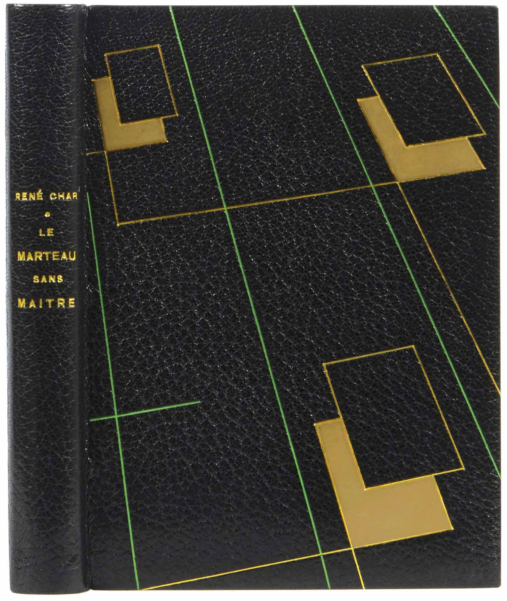
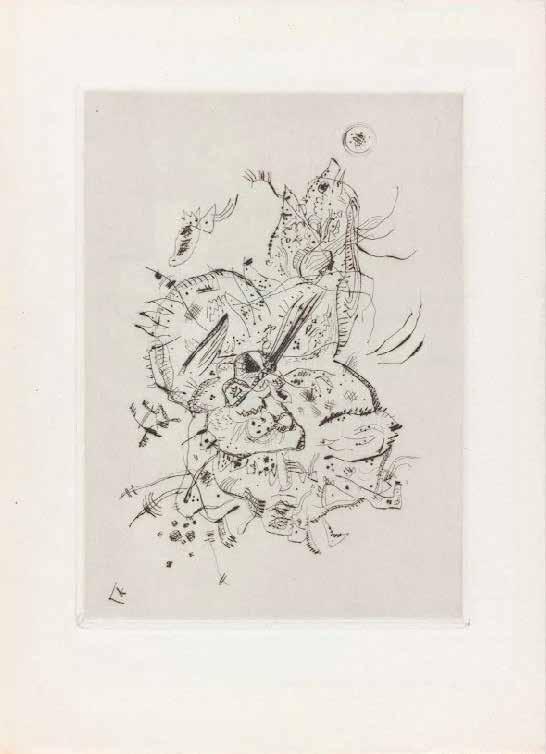
James Joyce Ulysses
London. John Lane / The Bodley Head. 1936
¶ The deluxe issue of the first edition of Joyce’s magnum opus to be printed in Great Britain.
From the edition limited to 1,000 copies, with this one of 100 on mould-made paper in the deluxe vellum binding designed by Eric Gill and signed and numbered by Joyce; the original slipcase features matching numbering to the book.
This authoritative edition of ‘Ulysses’, the first to be published in Great Britain, features Joyce’s corrected text, details of the seven previous editions and their fates where applicable (for example for the Egoist Press edition ‘499 copies were seized by the Customs Authorities, Folkestone’) and detailed appendices concerning the protests, injunctions and trials relating to the publication of the book and a bibliography of works by Joyce.
Written over a seven year period during Joyce’s peripatetic tour of Trieste, Zurich and Paris (where it was eventually first published), ‘Ulysses’ chronicles a day in the life of Leopold Bloom: June 16th 1904. The book was banned in Britain, Ireland and America until the 1930s due to its apparent obscenity, hence the need originally for French publication. Considered by many to be the greatest work of literature in the English language,
‘Ulysses’ is certainly a supreme monument of literary Modernism and conceivably the greatest work of literature of the 20th century; Nabokov considered it one of the ‘greatest masterpieces of twentieth century prose’. However, the greatness of ‘Ulysses’ has often been overshadowed by the novel’s difficulty, its ambiguities and its intense literary nature, all factors that led the publisher Sylvia Beach to announce the first edition of the work with the apology: ‘the publisher asks the reader’s indulgence for typographical errors unavoidable in the exceptional circumstances’; the errors are corrected in the present edition.
Although the slipcase for the present copy is rubbed and worn, it remains intact and the vellum of the binding of the book is fresh with only slight toning to the spine and some small marks to the boards; overall a very good copy of this important text.
Large 8vo. (264 × 204 mm). pp. xiii, 765, (i). Original publisher’s full vellum designed by Eric Gill with gilt bow vignette to front and rear boards, cream endpapers, title gilt to spine, a.e.g., original patterned paper-covered board slipcase with white paper label with printed titles and matching copy number in ink.
— $36,500
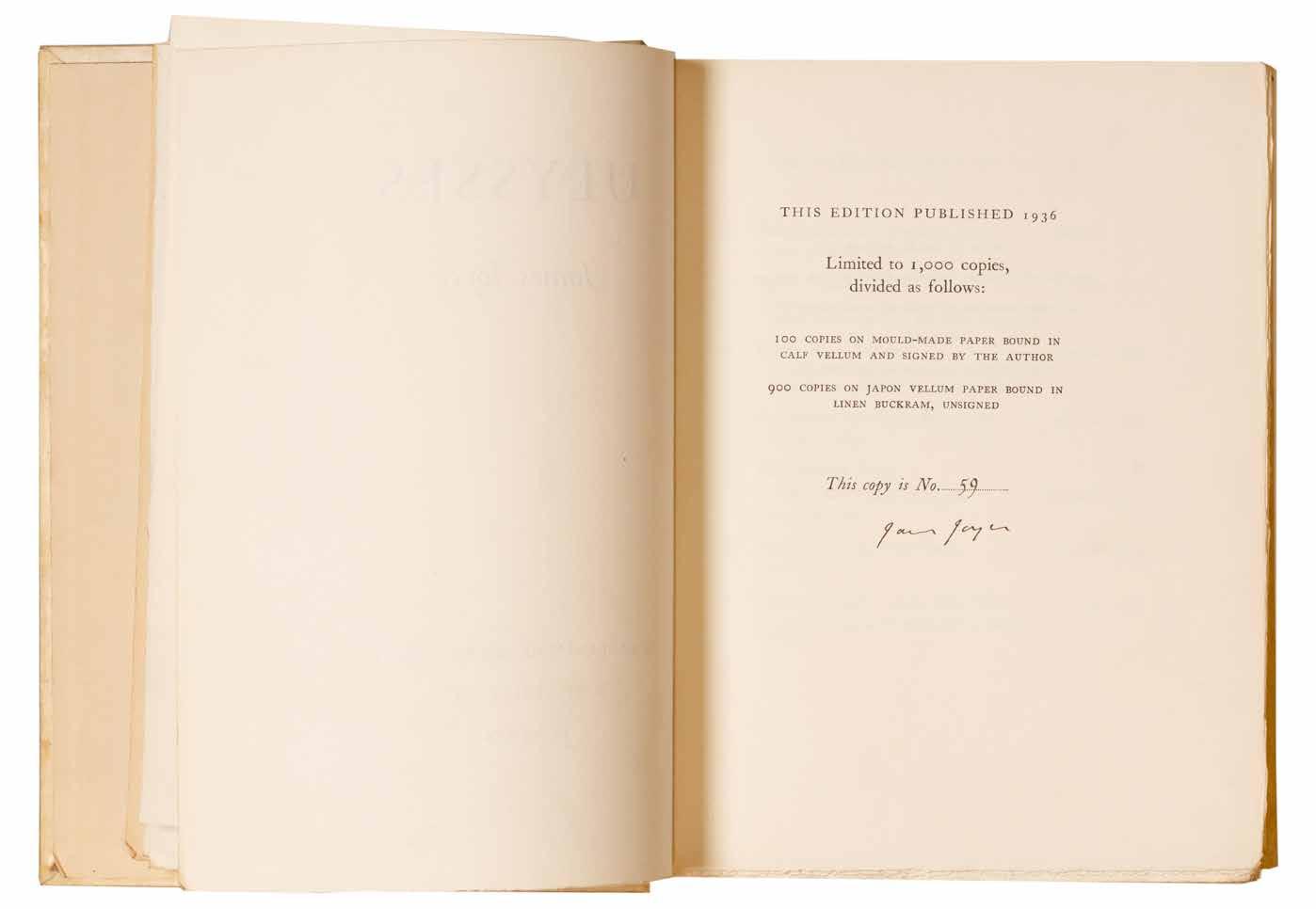
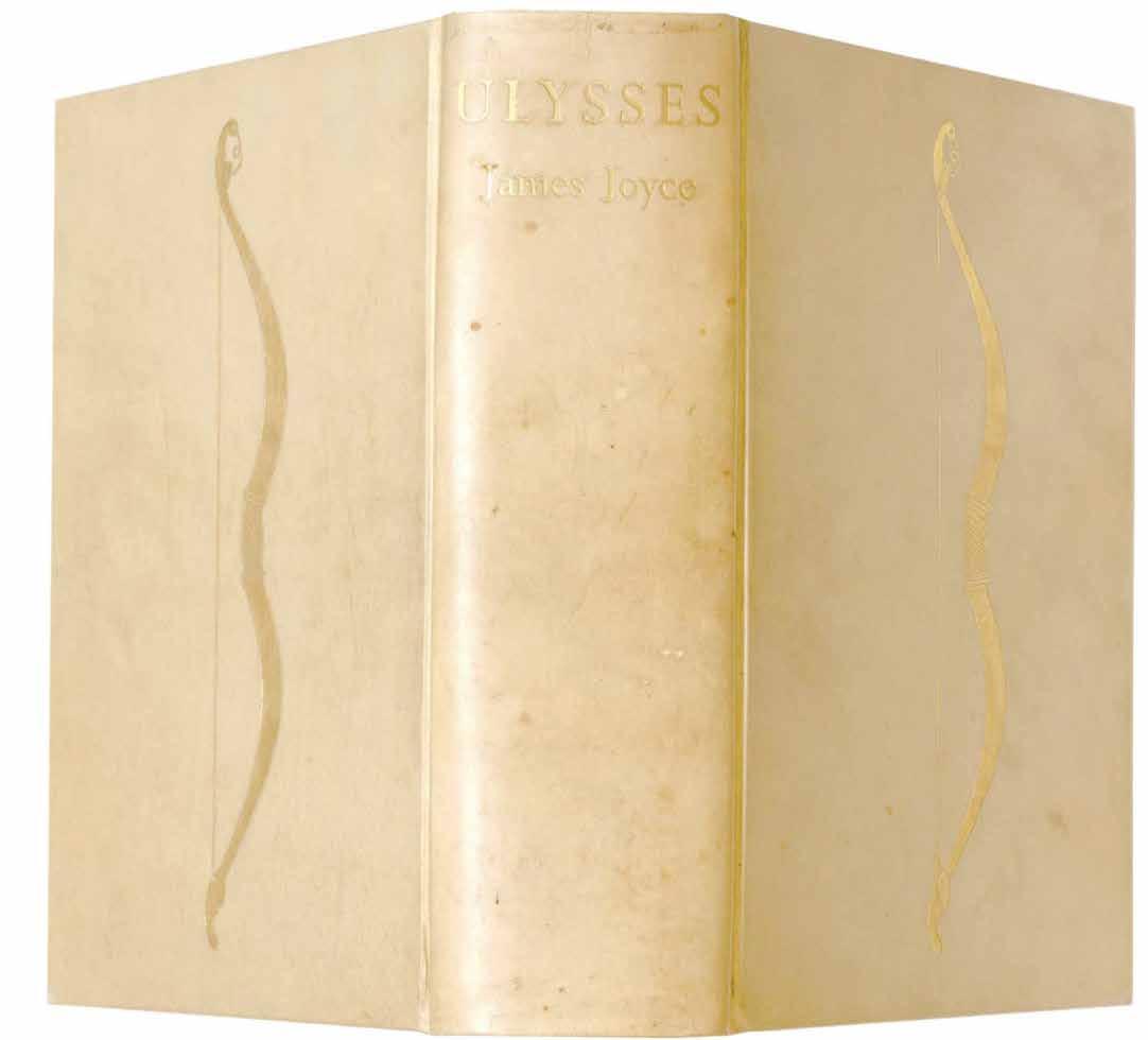
[49].
André Breton (Preface) and Herbert Read (Intro.)
The International Surrealist Exhibition. Thursday, June 11th to Saturday, July 4th, 1936 London. New Burlington Galleries. 1936
¶ Gaston Ferdiére’s presentation copy of the scarce catalogue for the ambitious and highly influential International Surrealist Exhibition held in London in 1936 signed by a number of the participants.
Presented by Mesens in red ink: ‘Exemplaire de Gaston Ferdière’ and, beneath, the signatures of André Breton (in green), Hans Arp (in pencil), Roland Penrose (in blue ink), Claude Cahun (in blue grey), Sheila Legge, Rupert Lee and David Gascoyne (all in sepia), Paul Eluard (in black ink) and Man Ray (in pencil); the following leaf with advertisements (and adjacent to the details of the committee, list of contributors etc.) features an inscription in black ink by Conroy Maddox: ‘Refused to participate / Conroy Maddox’.
Gaston Ferdière was a controversial figure, a Surrealist-affiliated poet who published verse in the mid-1930s, a doctor who administered to the Spanish Republicans in the Spanish Civil War and a psychiatrist, lauded and criticised for the electroshock therapy he administered to Antonin Artaud in the 1940s before Artaud’s suicide in March, 1948. Ferdière was a friend of Breton, Crevel, Desnos and Péret, later Hans Bellmer and Unica Zûrn (who he also treated) and was anathemised by Isou (another patient)
and the Lettrists along with psychiatrists and psychiatry in totality. At the titme of the London Surrealist Exhibition, Ferdière had published a small handful of verse collections: ‘L’Herbier’ (1926), ‘La Chanson Fruste’ (1927), ‘Ma Sébile’ (1931) and ‘Paix sur la Terre - Poèmes pour les Théâtres Prolétariens d’Action Contre la Guerre’ (1936).
8vo. (155 × 240 mm). pp. 32. Original publisher’s pink stapled wrappers with printed collage by Max Ernst to front cover, later protective crystal wrappers.
— $3,960
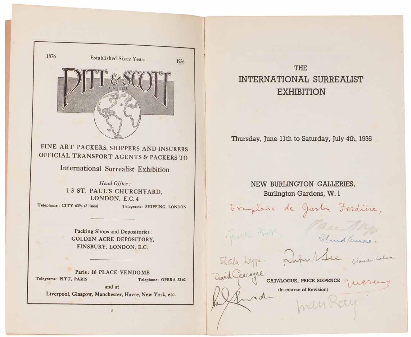
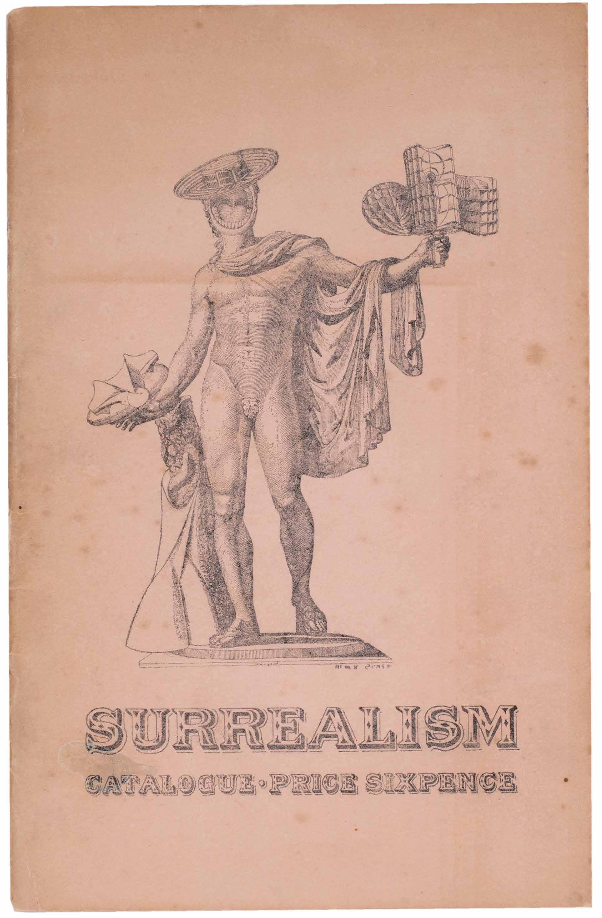
[50].
Joan Miro & Alice Paalen Sablier Couché (Paris). Editions Sagesse. 1938
¶ Sonja Sekula’s copy of ‘Sablier Couché’ presented by Paalen, with a manuscript poem, Miró’s superb signed frontispiece and bound by Pierre-Lucien Martin.
From the edition limited to 75 numbered copies on Arches paper signed and numbered in ink by Alice Paalen on the justification and signed and numbered by Miró on the etched frontispiece.
Paalen’s presentation is in black ink to the initial blank (please ask for a transcription).
The following page features Paalen’s poem ‘Mercure éteint’ in blue ink.
8vo. (210 × 174 mm). [8 unnumbered leaves; 4 bifolia]. Full tan polished calf by Pierre-Lucien Martin with his signature gilt to front turn-in and dated 1970, front and rear board with large abstract geometric onlays of crème caramel polished calf, turquoise suede doublures and free endpapers, smooth spine with title gilt, t.e.g., original grey handmade paper wrappers with titles in black to front cover preserved, matching wool-lined calf-backed paper board chemise with gilt title to spine and calf-edged slipcase.
— $22,500
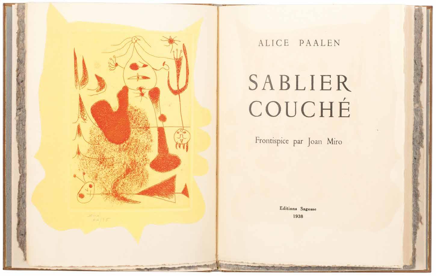
[51].
Pablo Picasso & Ilia Zdanevich (Iliazd) Afat. Soixante-Seize Sonnets
Paris. Le Degré Quarante et Un. 1940
¶ The first of Iliazd’s beautiful and typographically inventive illustrated books and the first he produced with Picasso.
From the edition limited to 64 copies on ‘Montval à la cuve’, signed by Picasso and Iliazd in pencil.
‘Afat was the first of nine books Iliazd and Picasso collaborated on. All of them were published under the imprint of ‘Degré Quarante et Un’, a name Iliazd chose in memory of a school of futurist poetry called the ‘University of the 41º’, which he had founded in Tiflis in 1917 ... Afat is a collection of 76 sonnets in Russian by Iliazd, the majority of which were written between January and June,
1938. In his poems, Iliazd writes of love, of feminine beauty, of the poet’s difficult métier and the hidden meaning of words. Three sonnets are about the poet’s relationship to ‘Pablo’ (Picasso).’
Patrick Cramer
Oblong 4to. (215 × 320 mm). [50 unnumbered leaves including blanks]. Loose as issued in original publisher’s printed parchment wrappers over card boards with title in black to upper cover, original tan patterned paper board chemise and matching slipcase with label with ‘ILIAZD / PICASSO’ in blue ink to edge.
— $42,900
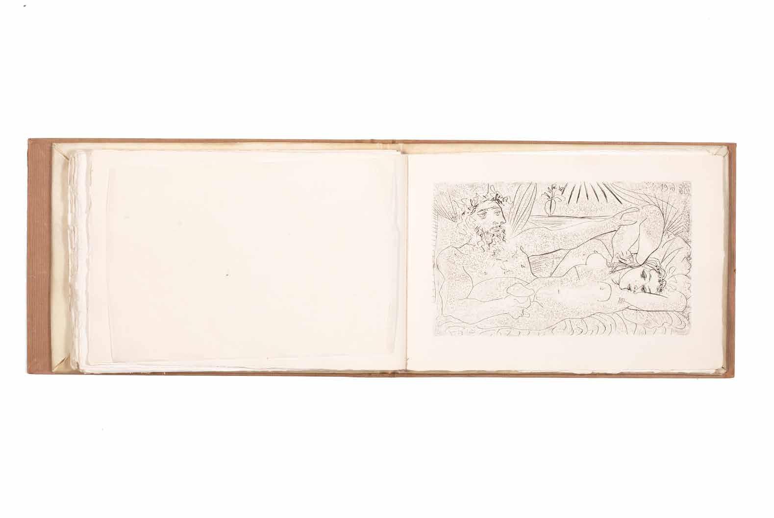
[52].
Pablo Picasso & André Breton Anthologie de l’Humour Noir Paris. Editions du Sagittaire. (1940)
¶ An excellent, unsophisticated copy of André Breton’s important ‘Anthologie de l’Humour Noir’ with the frontispiece etching by Picasso and Oscar Dominguez’s unique cover.
From the edition limited to 57 numbered copies with Oscar Dominguez’s unique cover, with this one of 17 issued with the original etching by Picasso and one of 10 on Hollande van Gelder; an ordinary edition was also issued with a different cover.
Although the justification states that the cover is by Marcel Duchamp, it is actually an original work by Oscar Dominguez and a card is inserted with acknowledgement of the error. In addition the justification states that the original etching by Picasso issued in 17
copies is signed, however, no examples of the etching are signed.
Picasso’s engraving, an etching with aquatint, grattoir and burin, is a portrait of Dora Maar and is titled ‘Buste de la Femme à la Chaise’; the etching was printed in Paris by Roger Lacourière.
Large 8vo. (233 × 164 mm). [132 leaves + 20 leaves of glossy paper (portraits); pp. 262, (i)]. Original publisher’s printed wrappers with overall original monochrome décalcomanie by Oscar Dominguez, the front and rear covers with illumination in green ink by Dominguez, the front cover with black paper label with titles in blue and signed by Dominguez in the same ink at lower right.
— $46,000
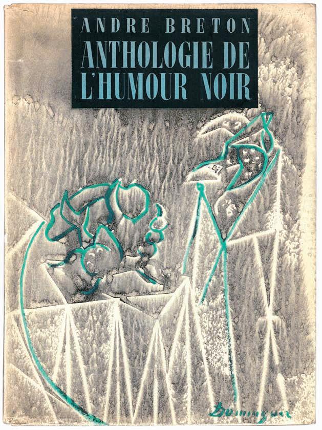
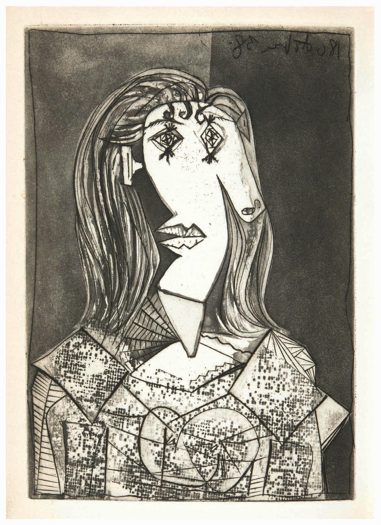
Marc Chagall, Max Ernst, Yves Tanguy, André Breton, Piet Mondrian, et al. Soby, Alfred Thrall & Nicolas Calas Artists in Exile
New York. Pierre Matisse. 1942
¶ Margaret and Alfred Barr’s presentation copy of the catalogue for the exhibition they had done so much to enable, signed by all of the participating artists and by the gallerist Pierre Matisse.
Pierre Matisse’s presentation is in black ink to the foot of the blank ‘Notes’ leaf bearing the signatures of the participating artists: ‘THIS IS A SPECIALLY SIGNED COPY FOR MARGARET AND ALFRED BARR / Pierre Matisse / NEW YORK MARCH 3d 1942’.
The copy is signed in various colour inks by all of the participants: Marc Chagall (blue ink), Pavel Tchelitchew (turquoise), Ossip Zadkine (red), Eugene Berman (purple), Yves Tanguy (umber), Fernand Léger (red), Max Ernst (blue), André Masson (red), André Breton (turquoise), Amedée Ozenfant (blue), Kurt Seligmann (umber), Piet Mondrian (blue / black), Roberto Matta Echaurren (sepia) and Jacques Lipchitz (green).
It is significant that Margaret Scholari Barr, known as Marga, is listed first in the
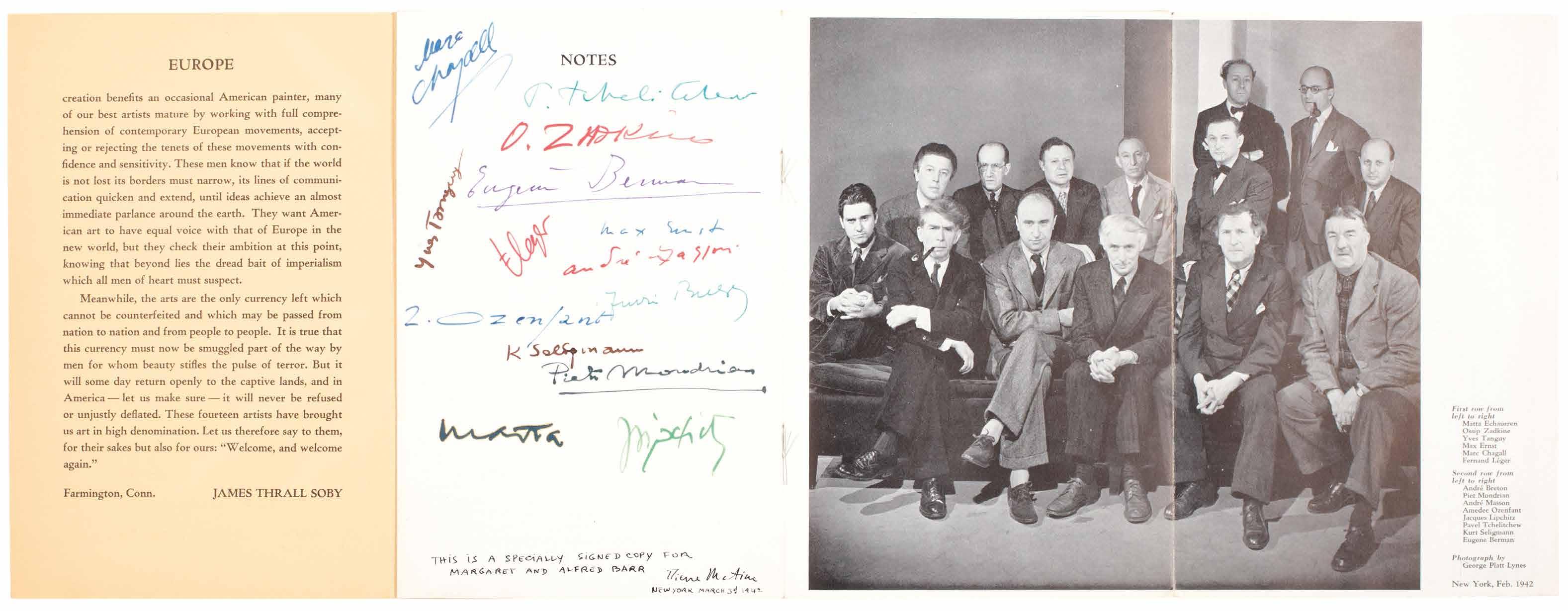
presentation by Pierre Matisse, as from 1940 she had taken charge of the ongoing operations to help artists and writers fleeing Europe. Each individual required ‘a visa from the State Department, an affidavit of financial support, an affidavit of moral sponsorship vouching that he or she was in imminent danger and would not be inimical to U.S. interests, biographical sketches and letters of reference proving identities and the above, and at least $400 for ocean passage’. Barr worked in conjunction with Curt Valentin (himself a beneficiary of the Barrs’ help), Kay Sage (she married Yves Tanguy, another beneficiary in 1940), Kay Boyle and the Emergency Rescue Committee. Although no exact list of all
of those who benefited from the help of the Barrs and the ERC remains extant, the majority of those who exhibited in ‘Artists in Exile’ did and the present catalogue represents a remarkable testament to their work, their efforts and humanity and that of their saviours.
8vo. (230 × 154 mm). [3 unnumbered leaves, one large and fold-out]. Original publisher’s pale yellow printed wrappers with folding flap, titles to front cover in green, later green board slipcase.
— $22,500
André Derain & Alcofrybas Nasier (Pseud. of François Rabelais) Pantagruel. Les Horribles et Espouvantables Faictz et Prouesses du Très Renommé Pantagruel, Roy des Dipsodes, Fils du Grand Géant Gargantua Paris. Albert Skira. 1943
¶ André Derain’s superb woodcuts –the only colour illustrations he made for a book.
From the edition limited to 275 numbered copies, with this one of 200 ordinary examples on vélin d’Arches signed by Derain.
André Derain’s only book illustrations printed in colour and an outstanding example of the unusual process of polychrome printing from single blocks. Roger Lacourière, usually an intaglio printer, was so intrigued by the proposed process for Derain’s illustrations that he collaborated with Derain in their production. The printing took two years in the special studio that Lacourière had established.
‘Commissioned by the publisher Albert Skira in 1941, Derain worked for 3 years to produce the illustrations, cooperating with Lacourière and developing a novel printing process whereby the wooden blocks were inked in several colours simultaneously rather than the usual method of a separate block for each colour.’ —From Manet to Hockney
Folio. (348 × 284 mm). [50 bifolia: 100 leaves including blanks; pp. 187, (ii), (i), (i)]. Loose as issued in original publisher’s wrappers with label to front cover, original parchment-backed chemise with label to spine and slipcase.
— $8,000
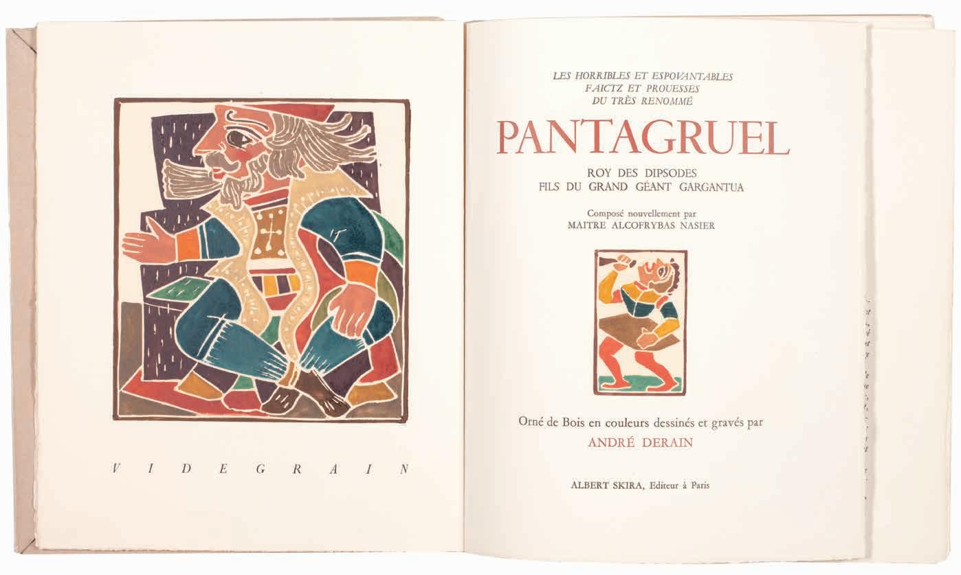
[55].
Jean Dubuffet & André Frénaud
Vache bleue dans une ville. Texte d’André Frénaud
Paris. Mourlot, imprimeur, pour le compte de Pierre Seghers, éditeur. 1944
¶ A beautiful copy with a long manuscript poem by Frénaud and a superb association, uniting the poet, Frénaud, the artist, Dubuffet, Dubuffet’s wife, Lili, and Frénaud’s wife, the binder Monique Mathieu.
Frénaud’s extensive manuscript, the prose poem ‘Ma petite vache’, is in red ink to an inserted leaf recto and verso (please contact us for a full transcription).
‘Vache Bleue dans une Ville’ features a 1944 prose poem by André Frénaud dedicated to Jean Dubuffet (dated ‘20 juillet’) paired with Dubuffet’s lithograph ‘Vache no. 4’ with its dedication ‘à André / Frénaud / amitié / J. Dubuffet’ dated ‘9 Nov 44’ as frontispiece. The book itself features the date ‘le 25 décembre 1944’ to the achevé d’imprimer while Frénaud’s manuscript, another prose poem, is dated ‘31-1-45’. The book and its presentation unite Dubuffet and Frénaud, Dubuffet’s wife Lili - also mentioned in Frénaud’s presentation - as well as Frénaud’s wife Monique Mathieu who bound the book, her abstract geometric motif recalling Dubuffet’s frontispiece the ‘Vache no. 4’. Frénaud’s long manuscript – the
Surrealist prose poem ‘Ma petite vache’ – reflects the language and content of the printed Surrealist prose poem ‘Vache bleue dans une ville’ (and the two were composed within six months of each other). The two works by Frénaud and the lithograph by Dubuffet reflect back and forth and are reinforced too by Monique Mathieu’s abstraction to the front cover of the binding.
Square 8vo. (202 × 176 mm). [5 unnumbered leaves including inserted leaf with Frénaud\’s presentation]. Full blue limp crushed morocco by Monique Mathieu with her signature gilt and dated 1976, front cover with elaborate asymmetric excisions, inserted sections of asymmetric tan suede and blue toned calf to form an abstract geometric motif recalling a cow, morocco doublures and endleaves, original printed printed Auvergne wrappers with title to front cover and justification and achevé d’imprimer to rear wrapper preserved, chocolate reverse calf-lined blue cloth chemise with gilt title to spine and blue cloth slipcase.
— $12,500
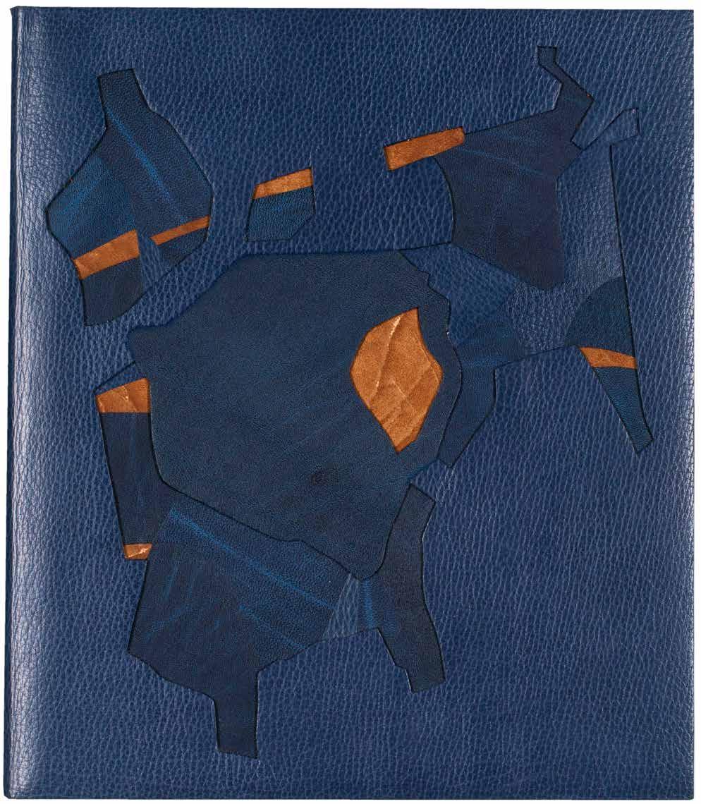
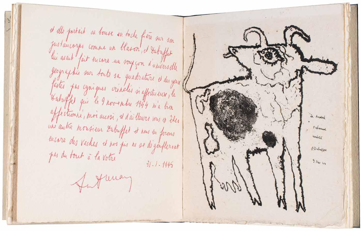
[56].
Alice Paleen & César Moro Lettre d’Amour (Mexico City). Editions DYN. 1944
¶ A very rare example of Alice Paalen’s collaboration with César Moro with its beautiful cover and title, format and frontispiece.
From the edition limited to 50 numbered copies on papier Hammermill Laurel, with this one of 50 signed by the author to the justification and with Paalen’s signed etching as frontispiece; a single hors commerce copy was also issued that included Moro’s original manuscript and ‘la première épreuve’ of Paalen’s etching. The cover and the title reproduce a superb collage by Moro with the title in large scarlet letters and a number of translations of the title in other languages: Arabic, Latin, Greek, German, Spanish, Italian, Farsi, Hungarian and others, some unidentified. Moro’s name and the apostrophe in ‘Lettre d’Amour’ are for the present copy printed in ochre; Paalen’s own copy featured the same in lilac. Although the title matches the cover for the most part, there are slight differences: for the title Moro’s name is printed in black and outlined in scarlet, in addition, the apostrophe of ‘Lettre d’Amour’ is printed in black and highlighted, again in scarlet.
‘Plaquette peu commune, deuxième livre publié par le poète et peintre surréaliste péruvien César Moro alors en exil au Mexique ... Durant son exil, il organisa en 1940 avec le peintre Wolfgang Paalen l’Exposition internationale du Surréalisme (il écrivit la préface du catalogue) avec l’aide de Breton alors
refugié à New York. Puis il collabora à El Hijo Pródigo et au Dyn, fondé par Paalen en 1942. Rentré au Perou en 1948, il y meurt huit ans plus tard.’ (see ‘Mille Nuits de Rêve’).
‘Lettre d’Amour’ is very scarce, institutionally and in commerce, and we locate only two copies: at the Pontificia Universidad Catolica del Peru in Lima and at the Kunsthaus Zurich in Switzerland; at auction we trace only the copy presented by Moro to Alice Paalen and her husband Wolfgang, later in the collections of Arman and Geneviève and Jean-Paul Kahn, sold at Bergé in 2019. Although the justification indicates that an additional hors commerce copy was issued with Moro’s original manuscript and the ‘première épreuve’ of Paalen’s etching, the Moro archive at the Getty includes Moro’s manuscript and lists too an etching by Paalen together with the original collage for the wrapper and title; further research is needed but this suggests that the hors commerce example was retained by Moro himself.
Small 4to. (238 × 179 mm). [4 bifolia = 8 unnumbered leaves + inserted leaf with original etching]. Stitched as issued with red thread in original publisher’s printed wrappers, the front cover with the title in large letters in scarlet, the author’s name in ochre and the title translated into numerous languages in black.
— $9,900
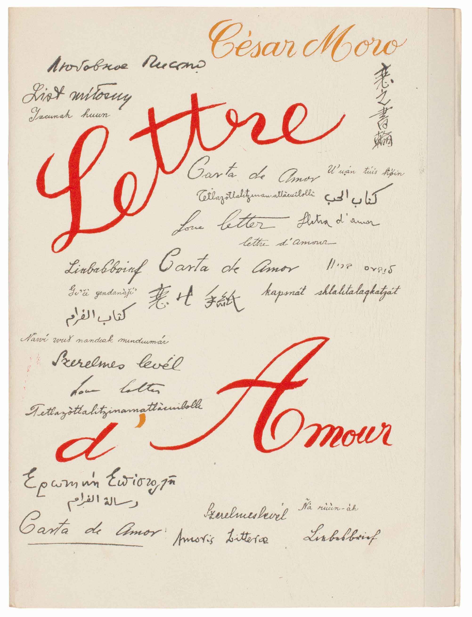
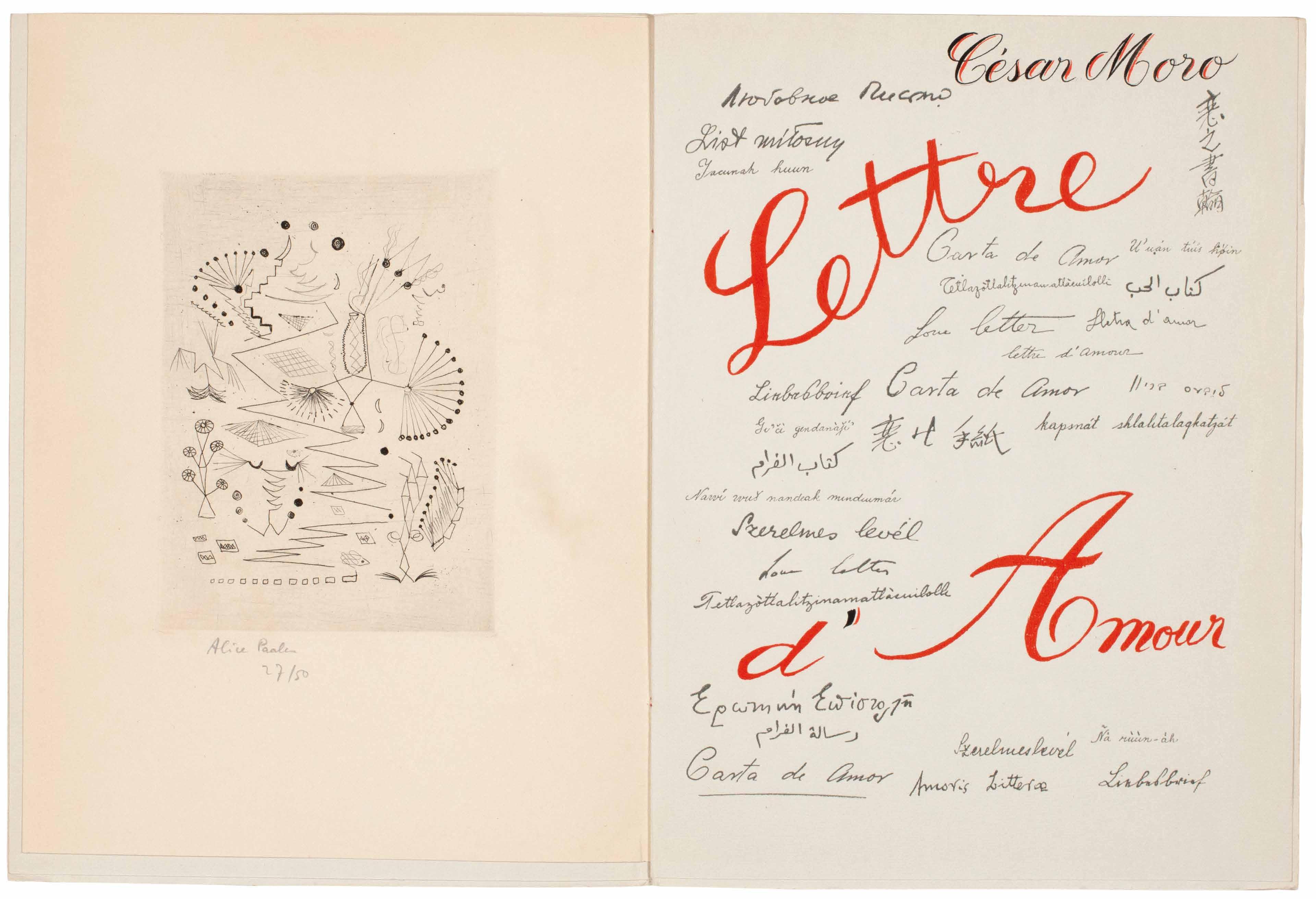
Lucian Freud & William Sansom The Equilibriad
London. The Hogarth Press. 1948
¶ Lucian Freud’s illustrations for William Sansom’s Kafka-esque novella.
From the edition limited to 750 copies, signed and numbered by Sansom in turquoise ink.
Lucian Freud (1922–2011) provided illustrations for Nicholas Moore’s ‘The Glass Tower’ (1944) before illustrating the present work. The illustrations after
Freud’s original drawings are instantly recognisable as his work. Freud provided no further illustration for any subsequent books.
8vo. Original publisher’s black buckrambacked marbled paper-covered boards, title gilt to spine .
— $1,250
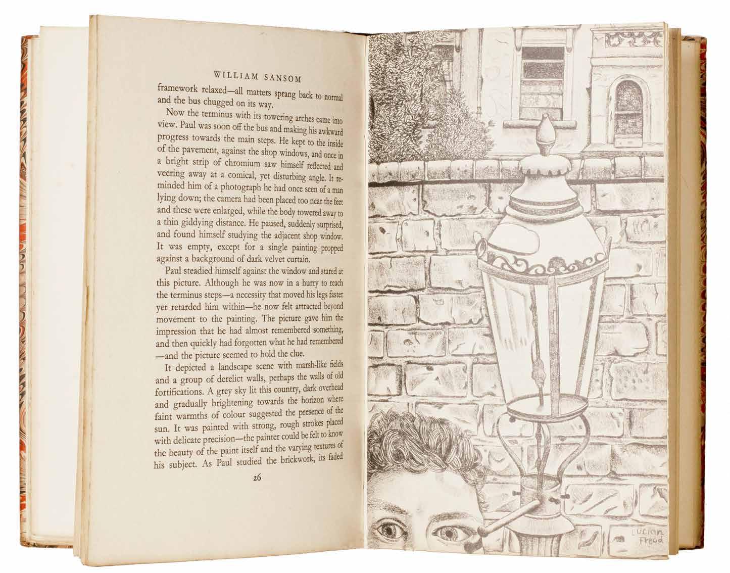
[58].
Ilia Zdanevich (Iliazd)
Pis’mo (The letter) (Paris). Sorok Pervyĭ Gradus (41º / Le Degré Quarante et Un / Forty-One Degrees). (1948)
¶ The first edition of Iliazd’s poem ‘Pis’mo’ (The Letter) inspired by the poet’s meeting with fellow emigré Princess Olga Djordjadze in Cannes in 1946.
From the edition limited to 60 copies each signed and numbered by Iliazd in pencil, with this one of 30 on vélin pur fil du Marais; Iliazd has dated the justification ‘9449’ in pencil in his characteristic format.
The poem ‘Pis’mo’, one of very few written in France that were published, was inspired by Iliazd’s meeting of Olga Djordjadze in 1946 and composed at the end of the same year . Djordjadze had accused Iliazd of undertaking ‘shameful’ work (he was engaged in writing a doctoral thesis in Russian for another). Iliazd’s response to Djordjadze was: ‘For whom, then, do you want me to write in Russian?’ to which she responded: ‘I would wish that it be only for me’. The result was a poem filled with romantic love, nostalgia and the impossibility of fulfilment.
The printed poem – first published in 1948 in characteristic Iliazd format with clear and exact typography and meticulous printing by Dmitri Snegarov and Volf Chalit at l’Imprimerie Union in limited numbers on special paper
and enclosed in sheets of different blank wrappers – marks the beginning of Iliazd’s major period of book production and led to one of Iliazd’s most important collaborations with Picasso. The second collaboration with Picasso (the first was ‘Afat’ of 1940) ‘Pis’mo: Escrito por Iliazd. Grabado por Picasso’, also published in 1948 takes the text of the poem ‘Pis’mo’ but features two title pages, one in Russian (for Djordjadze) and one in Spanish (for Picasso) and is illustrated with 6 of Picasso’s engravings.
12mo. (186 × 136 mm). [6 folded sheets: 24 leaves including initial and terminal blanks]. Loose as issued in original thick wove jacket with printed title to front cover in black.
— $9,900
Ilia Zdanevich (Iliazd) Poésie de Mots Inconnus
Paris. Le Degré Quarante et Un. 1949
¶ A very fine copy of Iliazd’s typographic masterpiece of visual, phonetic and sound poetry, preserved and unbound, as intended.
From the edition limited to 158 copies on papier Isle de France à la cuve, with this one of 115 numbered in Arabic numerals in red to the justification (i.e. leaf ‘3’ with Dominguez’ engraving) and signed and dated ‘271249’ in black crayon by Iliazd; a further 41 ‘exemplaires de compagnon’ numbered in Roman numerals and two ‘dépot’ copies all on the same paper and 13 proofs on vellum or chine were also issued.
This anthology of ‘forgotten phonetic poetry’ by Georgian-born poet-publisher Iliazd was published as his response to an intellectual argument against the Lettrists and Isidore Isou. Iliazd had assembled examples of visual and sound poetry (dada, Futurism, zaum, calligrammatic and so on) to demonstrate a historical context denied by the provocative Isidore Isou and a younger generation of iconoclastic Lettrists. A battle of letters had developed over the previous couple of years and ‘Poésie de Mots Inconnus’
was to be Iliazd’s published riposte after the chaotic mélée that concluded his 1947 lecture ‘Après Nous le Lettrisme’. Iliazd’s response to the Lettrists was a remarkable interplay of typographic innovation and illustration, a demonstration of the novelties of the pioneers of visual poetry combined with the illustrative printing techniques of the visual avant garde.
As per Johanna Drucker: ‘He [Iliazd] was not so much working at a mimetic redundancy of verbal and graphic qualities as he was demonstrating the theatrical potential of the page.’
Small 8vo. (175 × 138 mm). [29 leaves including terminal blank each folded in 4]. Loose as issued in original publisher’s printed paper wrappers with contributors to each volume in black to front wrapper, two thick paper jackets, original parchment wrapper with the winged harp vignette by Ribemont-Dessaignes and ‘NE COUPEZ
PAS MES PAGES’ in black to front cover and title stamped in blind to spine, original pleated parchment envelope with title stamped in blind to spine.
— $46,000
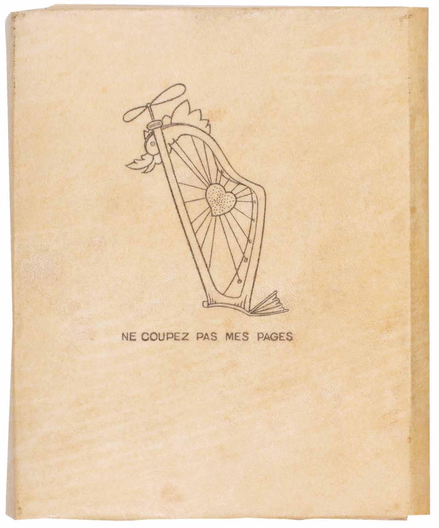
[60].
Francis Picabia & Murilo Mendes Janela do Caos. (Window of Chaos) Paris. Imprimerie Union. 1949
¶ A very good unsophisticated copy of the very scarce illustrated book ‘Janela do Caos’: Francis Picabia illustrating Murilo Mendes.
From the edition limited to 220 numbered copies on Auvergne, with this one of 23 hors commerce examples marked ‘EXEMPLAIRE / H. C.’ with the additional suite of lithographs in red. This remarkable and scarce book, truly international in formation, combines the illustration of Francis Picabia with the verse of the Brazilian Modernist Murilo Mendes and typography by Michel Tapié; the text was printed by Imprimerie Union (Russian emigrés), the lithographs by
the Parisian printer Desjobert, directed by the diplomat Roberto Asumpção de Araujo in collaboration with J. Guimarães Rosa and Francette Rio-Branco. Mendes’ verse is taken from his collections ‘Poesia Liberdade’ and ‘Mundo Enigma’.
Small folio. (326 × 260 mm). [24 leaves + 6 leaves (suite); pp. 41, (i)]. Loose as issued in original publisher’s printed wrappers with title to front cover in black, the suite loose in a separate wrapper with title in black and flap, orange paper-covered board chemise with title to spine in black and grey paper-covered board slipcase.
— $16,500
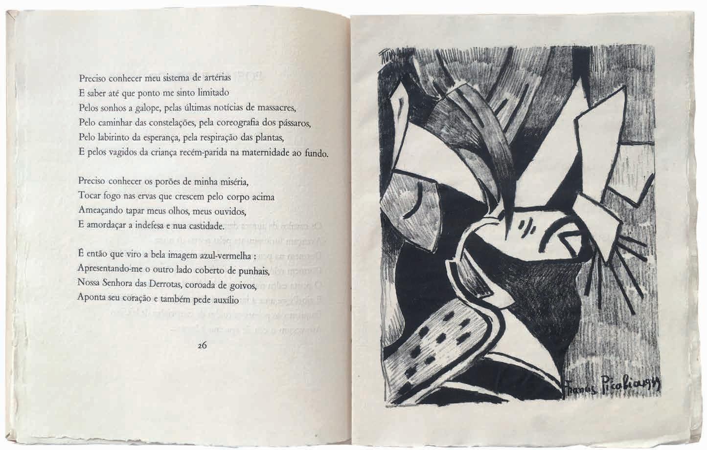
[61].
Karel Appel & Hugo Claus De Blijde En Onvoorziene Week. De Hand-Reeks Nummer 1. (The Happy and Unforeseen Week). (All Published) Paris. By the artists / COBRA-bibliotheek. December 1950
¶ A very rare presentation copy of Karel Appel and Hugo Claus’ photocopy artist book with additional handcoloured illustration by Appel.
From the edition limited to 200 numbered copies signed by Appel and Claus in blue ink to the title; Appel’s presentation is in blue ink to the same leaf: ‘VOOR / ALDO. / 25-12-’50’.
The first and only number of this very rare early CoBrA publication produced while the Belgian poet (Claus) and the Dutch painter (Appel) lived in Paris. Claus and Appel attempted to solicit subscriptions for what was to be a series of publications (each issue would be
available for three guilders) however only three copies were, in fact, subscribed for and the project was abandoned after this sole number. Produced in its entirety using a prototype photocopy method (‘een Foto-copy systeem’), the illustrations were coloured individually by Appel by hand using vibrant primary colours.
4to. (276 × 228 mm). [4 bifolia: 8 unnumbered leaves]. Original publisher’s tan photocopy card portfolio with flap, title after Claus’ manuscript to front cover with illustration by Appel across covers and spine coloured by the artist by hand.
— $9,900
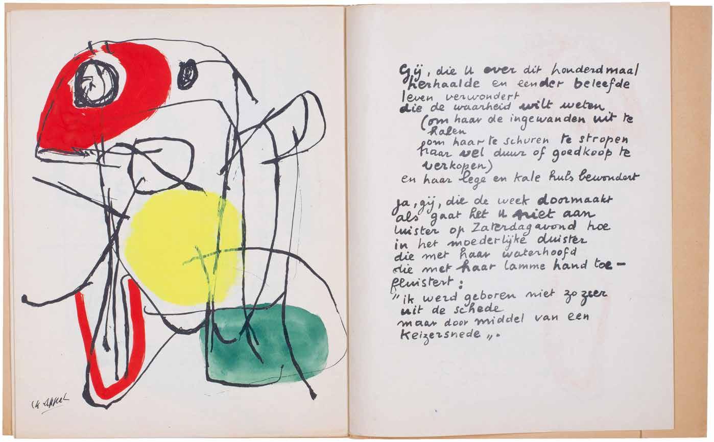
[62].
Jean Dubuffet Honneur aux Valeurs Sauvages (Lille). (1951)
¶ A very fine copy of the printed version of Dubuffet’s speech , a powerful articulation of Art Brut, written for the exhibition ‘Cinq Petits Inventeurs de la Peinture’ in 1951.
The exhibition ‘Cinq Petits Inventeurs de la Peinture’ opened in Lille, at the Librairie Marcel Evrard, on January 10th, 1951 and ran until January 25th. Organised by Dubuffet and Dr. Paul Bernard, the exhibition consisted of the work of five patients in the SaintJean-de-Dieu Hospital (also the Hôpital Lommelet) at Saint-André-lez-Lille (now the Établissement Public de Santé Mentale for Lille). The five patients
were chosen for their painted work as untaught outsider artists. At the time of the exhibition, Dubuffet gave a talk at Lille University’s Faculty of Letters, the content of which is reproduced in the present opuscule.
4to. (278 × 219 mm). [13 leaves; pp. (i), 23]. Original publisher’s thin tan card wrappers, stapled as issued, printed title to front cover in black, crushed morocco-backed patterned paper-covered board chemise with title argent to spine, matching slipcase.
— $2,300
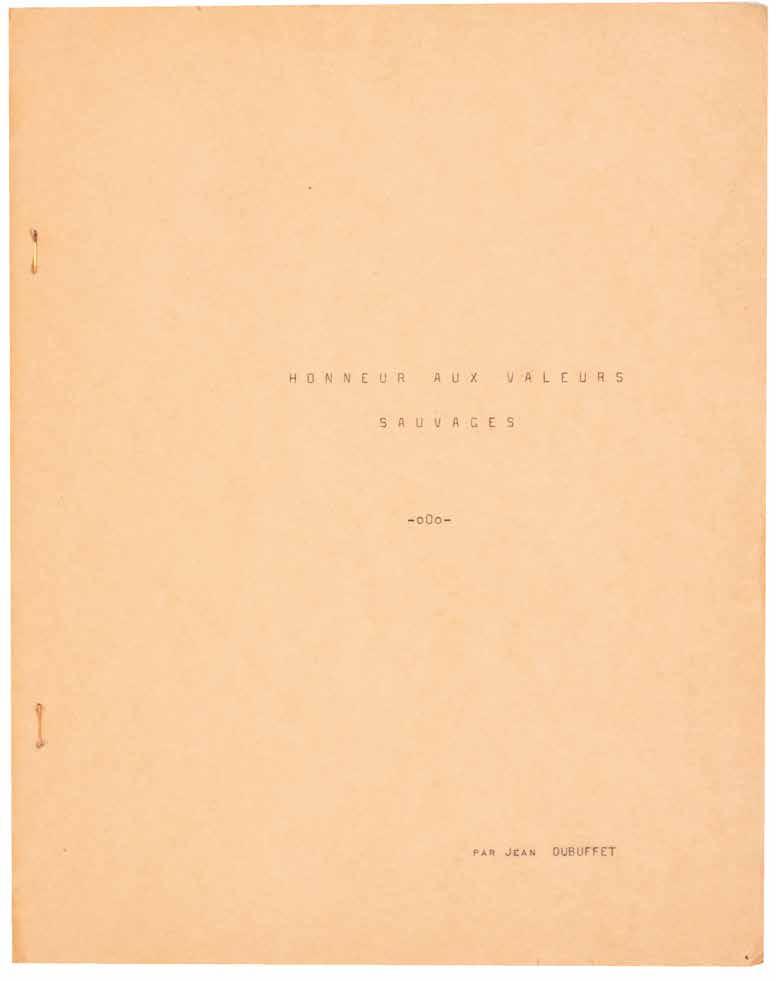
Jean Dubuffet
Tableaux d’Assemblages: The Original Maquette for the Catalogue for the Exhibition with an Extensive Dossier Concerning the Same: Notes, Letters, Typescripts &c.
Paris. Galerie Rive Droit. 1957
¶ An extraordinary ensemble of original material, including an extensive series of letters and other manuscripts from Jean Dubuffet, his maquette for the catalogue, the catalogue itself and other material concerning Dubuffet’s 1957 exhibition ‘Tableaux d’Assemblages’ at Galerie Rive Droite.
Dubuffet began a series of extraordinary collage works – he termed them ‘Assemblages d’Empreintes’ – making use of traditinal materials, his own fabricated elements as well as the wings of butterflies after travelling to Savoie with Pierre Bettencourt in 1953. Assemblage, Dubuffet’s own neologism, became central to his practice and over the next few years he created an extraordinary body of work, the ‘Tableaux d’Assemblages’, culminating in his eponymous exhibition in 1957. The ‘Tableaux d’Assemblages’ that grew out of the earlier ‘Assemblages d’Empreintes’, featured a dense array of shapes, marks, textures, colours and forms, excised and rearranged, reassembled on the canvas, or creating new shapes and forms on other canvases. The exhibition that resulted, delineated in the material presented here, was held at Jean Larcade’s Galerie Rive Droite; Dubuffet exhibited 30 ’Tableaux d’Assemblages’ and 15 ‘Assemblages d’Empreintes’.
‘I envisaged making all sorts of experiments with various textures, patches, marks, etc. on the canvases, then cutting out the parts I liked and assembling them at will. The main
attraction of this technique was that it allowed me to make my first marks with great freedom and spontaneity, without worrying about spoiling other parts of the picture.’ —Jean Dubuffet
2 vols. Small folio. (274 × 228 mm + 276 × 238 mm). Typed original letters, manuscrit material in pencil and ink, an original maquette and other printed material tipped-in to bound leaves, mounted or bound in throughout. Vol. 1: full vari-coloured lizardskin by C. and J.-P. Miguet with their signature in blind, excised rectangular section to front board with onlaid section of morocco with title
‘JEAN DUBUFFET’ in blind, matching turn-ins, steel grey brushed suede doublures and endpapers, top edge argent, grey wool-lined black calf-backed marbled paper-covered board chemise with argent title
‘Correspondence Autour d’une Exposition ... &c.’ to spine, matching slipcase; vol. 2: full vari-coloured lizardskin by C. and J.-P. Miguet with their signature in blind, excised rectangular section to front board with onlaid section of morocco with title ‘JEAN DUBUFFET ’ in blind, matching turn-ins, steel grey brushed suede doublures and endpapers, top edge argent, grey wool-lined black calf-backed marbled paper-covered board chemise with argent title ‘Correspondence Autour d’une Exposition ... &c.’ to spine, matching slipcase.
— $29,500
images on next spread
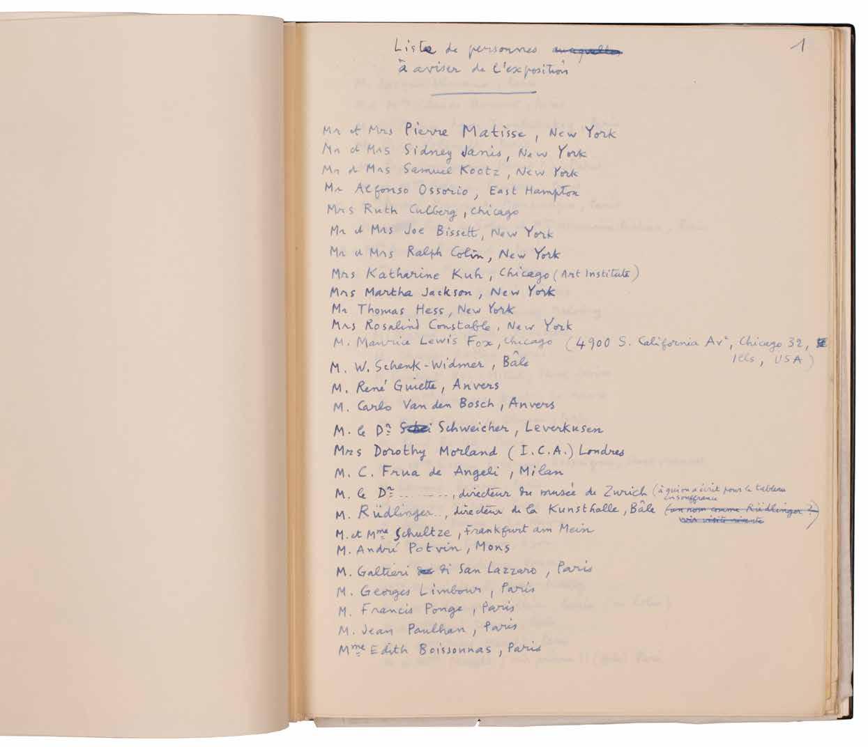
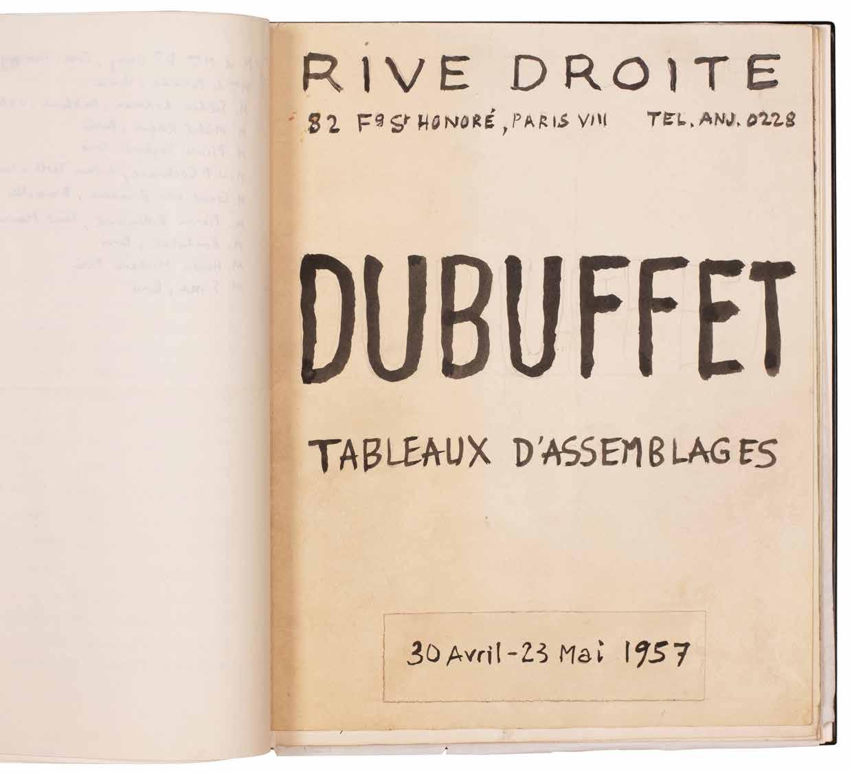
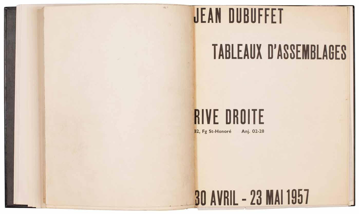
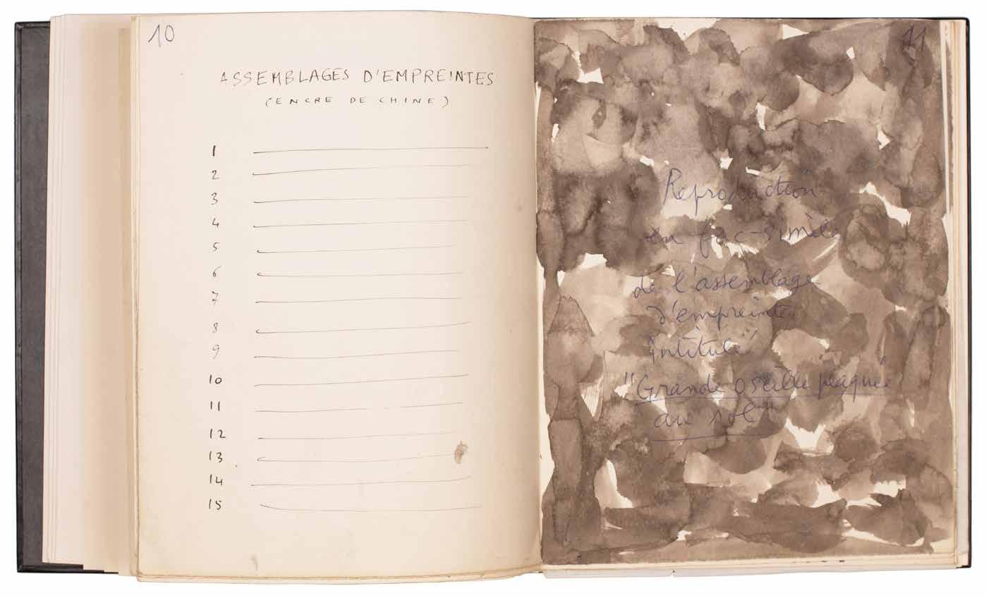
[64].
Jean Dubuffet Expériences Musicales
Venice. Galleria del Cavallino. 1961
¶ The complete series of vinyl records of Jean Dubuffet’s musical experiments, ‘Expériences Musicales’, each in the lithograph sleeve he designed.
Each of the records in the present set is inscribed ‘H. C.’ and signed by Dubuffet to the central pink label; copies with the pink label were destined for the publisher, Galleria del Cavallino for distribution (as here) although some of the records were issued also with red, yellow or white labels for alternative distributors, among them Dubuffet himself.
‘Tout ceci [Dubuffet’s text] dit les disques ici réunis ne sont pas présentés dans l’esprit d’oeuvres prétendant à s’imposer mais comme premières expérimentations
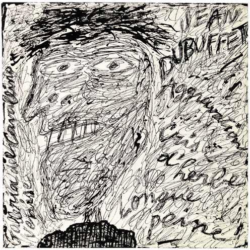
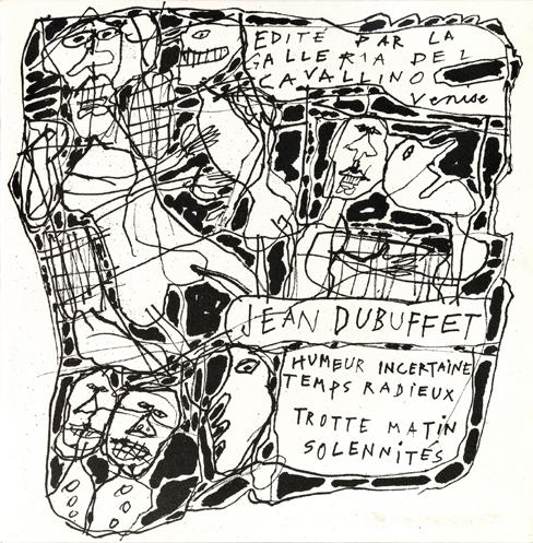
d’un qui s’aventure en un domaine fort mal connu de lui et c’est dans cet esprit que je prie les musiciens de les accueillir.’
Jean Dubuffet, Avril 1961
Square 4to. (295 × 285 mm). 6 vinyl records with music and poetry by Dubuffet, each with a monochrome lithograph sleeve cover by Dubuffet, with printed booklet ‘Expériences Musicales’, a single folded bifolium with printed text recto and verso by Dubuffet and 19 monochrome reproduction photographs. Each disc inserted into printed paper sleeve with Dubuffet’s lithograph to front cover and with original glassine inner sleeve, loose in original publisher’s cloth box with printed title.
— $16,500
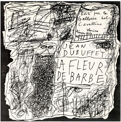
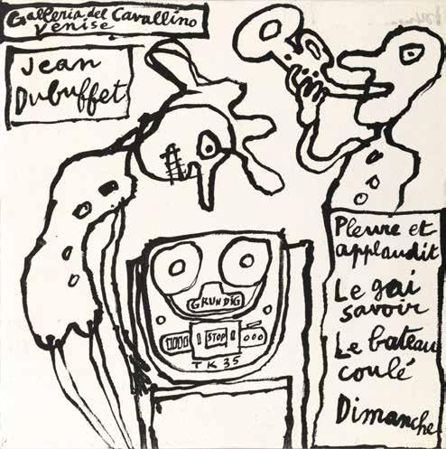
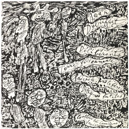
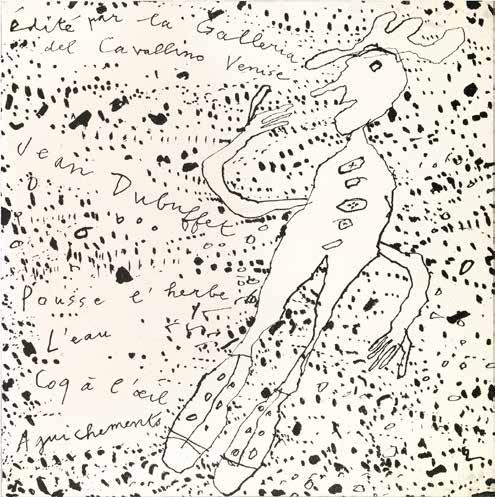
[65].
Jean Dubuffet
COUINQUE . Texte de Jean Dubuffet
Alès. PAB. (P[ierre]. A[ndré]. B[enoit].). 1963, 21 mars
¶ An excellent example of Dubuffet’s ‘COUINQUE’, his own text and dry point illustration printed and published by PAB.
From the edition limited to 46 copies on vélin d’Arches including ‘quelques-uns hors commerce’ (Webel cites 10), with this copy signed by Dubuffet and PAB in pencil and inscribed ‘H. C.’.
‘COUINQUE’ features one of Jean Dubuffet’s outsider phonetic nonsense texts and his celluloid engravings as
illustration, and is composed entirely of triple and double folded sheets.
8vo. (222 × 163 mm). [4 trifolia, 1 bifolium]. Title, eight leaves of text and 7 celluloid engravings by Jean Dubuffet (including that for the wrapper), final leaf with achevé d’imprimer and justification. Original publisher’s printed wrappers with Dubuffet’s engraving and title to front cover.
— $12,500
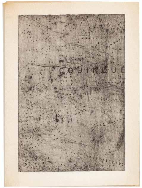
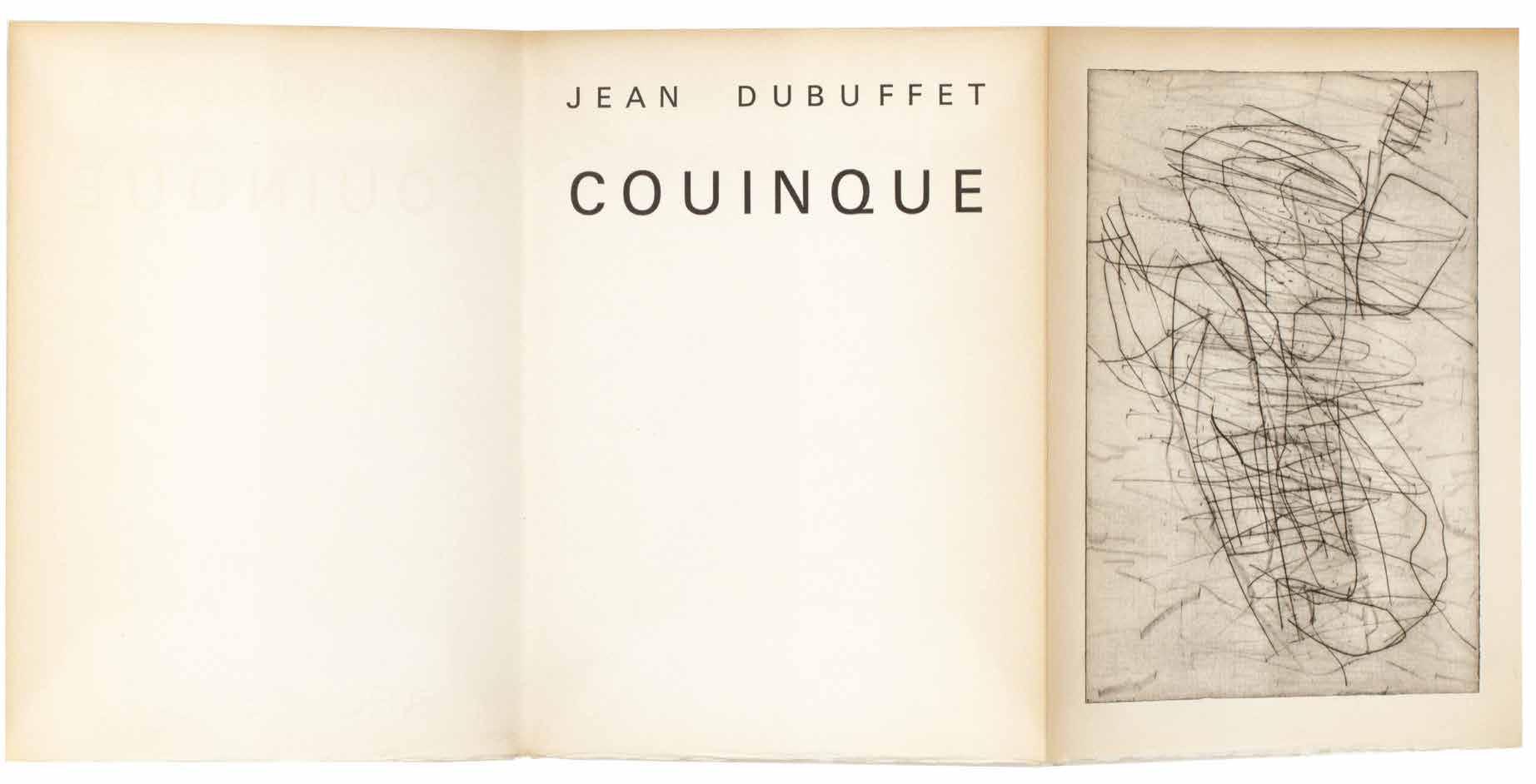
[66].
Max Weber Woodcuts and Linoleum Blocks
New York / Great Neck, Long Island. E. Weyhe. 1956
¶ An excellent example of the édition de tête with the additional signed suite.
From the edition limited to 225 copies each signed and numbered by Weber in ink, with this one of the first 25 from the édition de tête specially bound and with the additional portfolio of signed woodcuts; the remaining copies were issued in cloth and without the signed suite.
Max Weber (1881–1961) was a pioneering American painter and printmaker who studied in Paris in the early years of the twentieth century where he was exposed to the work of Cézanne, Picasso and Matisse, met Guillaume Apollinaire, attended Gertrude Stein’s
salon and made friends with Douanier Rousseau (Weber helped organise his first US exhibition). On his return to the US in 1909, Weber is credited with introducing Cubism to the New World.
2 vols. 8vo. (258 × 174 mm). + Folio. (336 × 244 mm). [4 leaves of cream wove paper + 31 leaves of doubled Japon Shiduzoka].
Original publisher’s oatmeal cloth-backed printed paper-covered card boards, title gilt to spine, matching paper-covered board slipcase, additional prints loose in original grey card portfolio, white paper label with printed titles to upper cover.
— $4,750
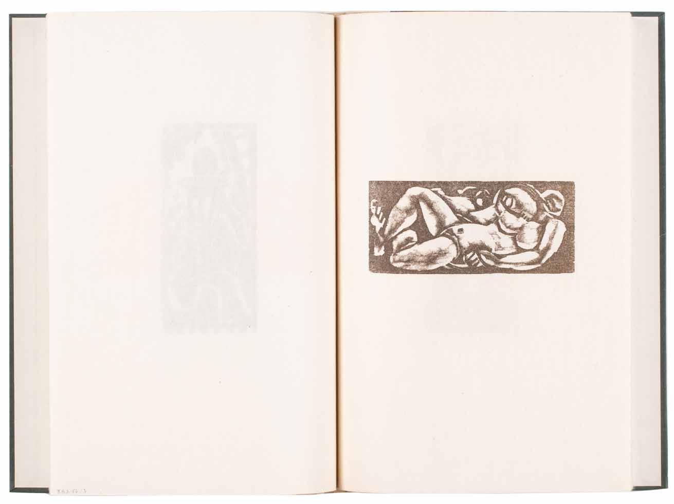
[67].
Toyen (Marie Cerminova) & Elie-Charles Flamand A Un Oiseau de Houille Perché sur la Plus Haute
Branche de Feu. Dessins de Toyen Lyon. Les Ecrivains Réunis / Armand Henneuse. 1957
¶ Mesens’ copy of Flamand’s verse illustrated by Toyen with a presentation from the poet.
From the edition limited to 120 numbered copies, with this one of 100 on lama bleu.
Flamand’s long presentation to E. L. T. Mesens is in white ink to the front wrapper verso: ‘A E. L. T. Mesens / Pour l’intarissable source de clartés qu’ont / fait jaillir, au plus profond de mon / coeur, son amitié comme sa poésie / En souvenir de nos tardives promenades / dans les environs de la rue Daunou / au cours desquelles il délie pour moi / les noeuds de la nuit. / Avec ma fidèle affection / ElieCharles Flamand’.
Also included, inserted loose, is the folded prospectus, a sheet of blue printed card (folded: 140 x 105 mm; unfolded: 140 x 210 mm) with title, an illustration by Toyen and details of the edition with the additional note by Flamand in black ink: ‘Les exemplaires de tête comporteront une pointe-sèche de TOYEN’.
Small folio. (315 × 235 mm). [4 bifolia: 8 unnumbered leaves]. Original publisher’s matt black wrappers stitched as issued, titles in relief to front cover.
— $1,650
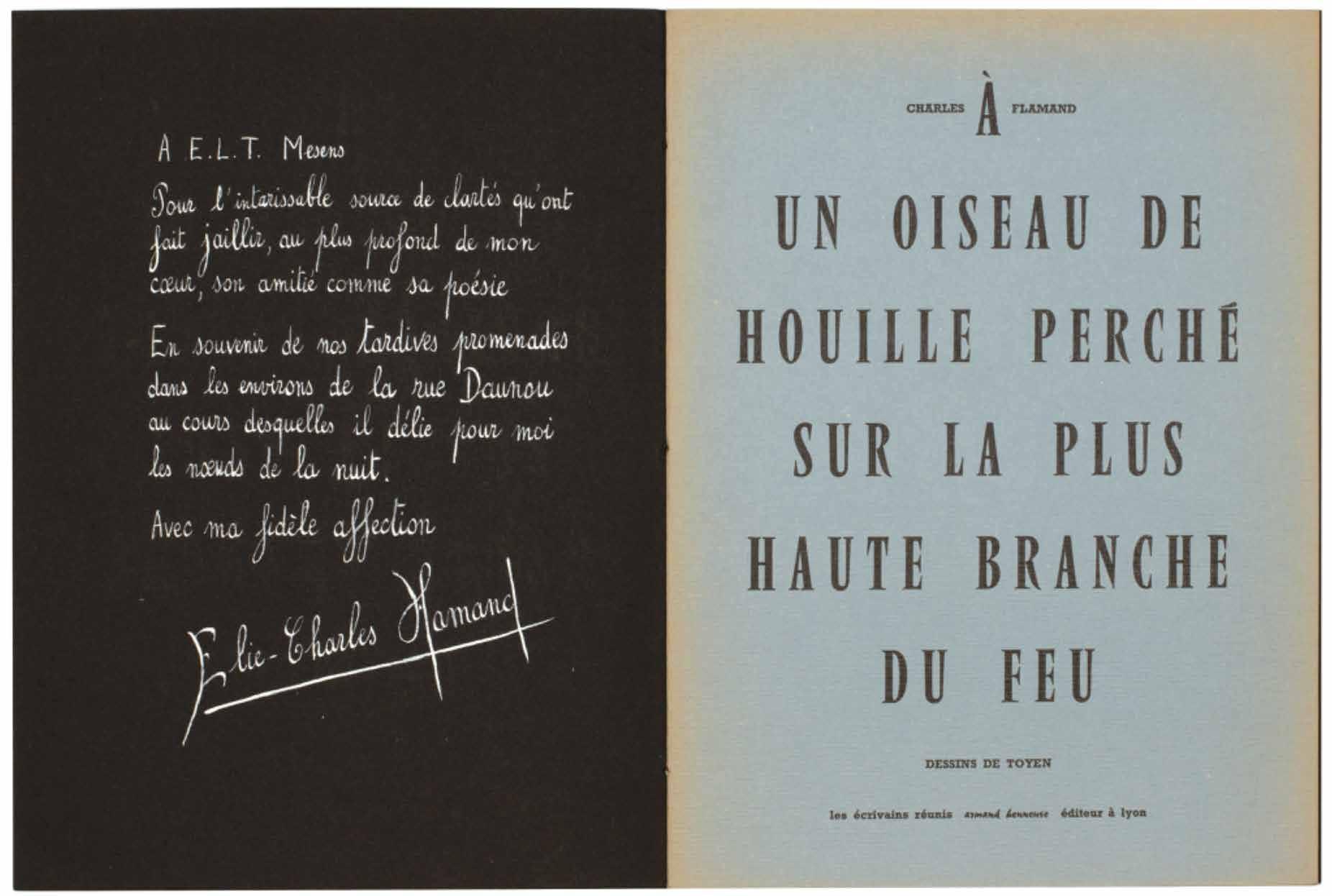
[68].
Andy Warhol A Gold Book (New York). (By the artist). (1957)
¶ A unique example of the most beautiful of Warhol’s pre-Pop books with a variant cover.
From the edition limited to 100 copies, signed by Andy Warhol in ink on the half-leaf justification and with the text: ‘Dedicated to / Boys / Filles / friuts [sic] / And / flowers / Shoes and t[ed] c[arey] and e[d]. W[allowitch]. / Book designed by / Miss Georgie Duffee’.
The cover for this copy features Warhol’s line drawing of a hand clasping a flower (see F & S IV.115), the whole image cut out and pasted to the gold papercovered front board. Printed in black
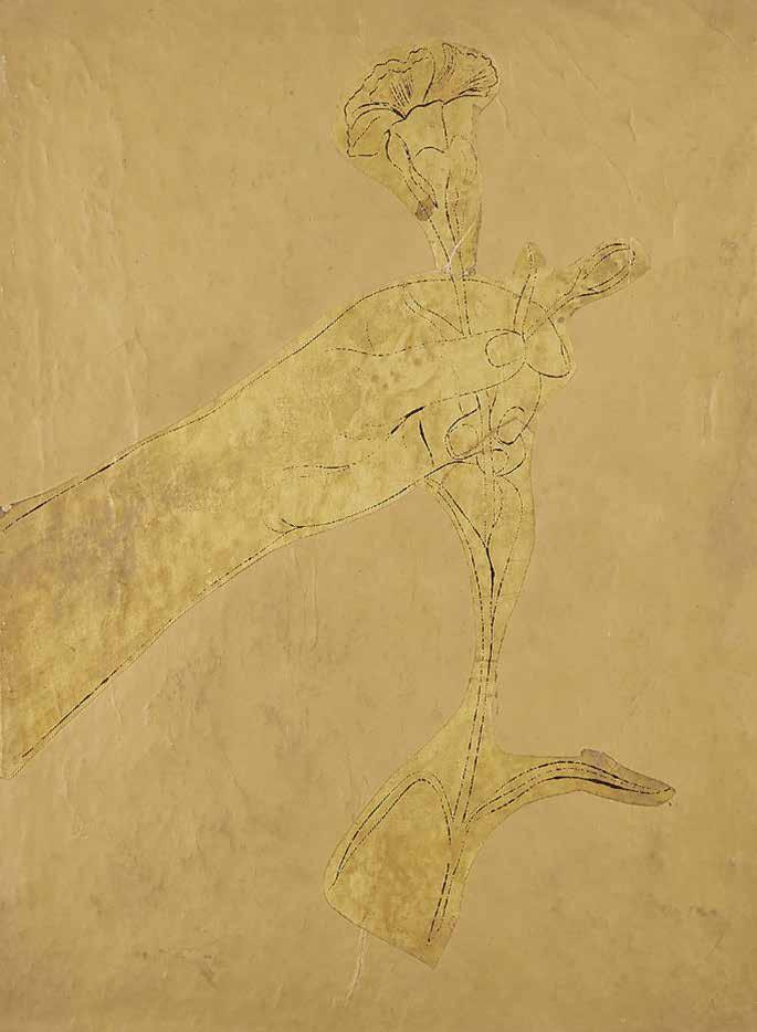
on gold paper, this example represents a unique variant, not described in Feldman & Schellman’s catalogue raisonné of Warhol’s prints, which gives details of the version printed on white paper only.
Small folio. (370 × 282 mm). [20 unnumbered lesaves: 14 leaves of gold paper (including half-leaf for title + 6 leaves of cream laid paper]. Original publisher’s gold paper-covered boards, front cover with collage decoupé lithograph of a hand clasping a flower in black on gold paper.
— $42,500
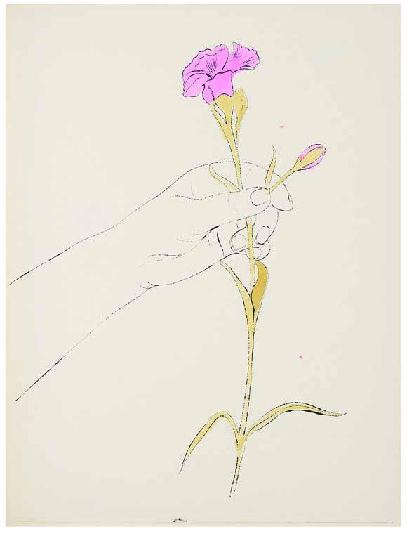
[69].
Marcel Duchamp (& Mimi Parent)
Couple de Tabliers. (Couple of Laundress’s [sic] Aprons).
Imitated Rectified Readymade (Paris). (Mimi Parent for Daniel Cordier). 1959
¶ Marcel Duchamp’s rare anthropomorphic imitated rectified readymade ‘Couple de Tabliers’.
From the edition limited to 20 copies, each signed and dated ‘Marcel Duchamp 59’ in ink to cream silk ribbon pasted to the upper right verso of each.
To create these readymades (Schwarz describes them as ‘imitated rectified readymades’), Duchamp bought a pair of plaid potholders in a New York bazaar before adding various elements to ‘rectify’ them and to sexualise them with male and female characteristics.
Conceived and executed by Marcel Duchamp in New York in 1959, this pair of ‘imitated rectified readymades’ are from the original edition of 20 assembled by Mimi Parent for the édition de tête edition of ‘Boîte alerte!’, itself the deluxe version of the catalogue for ‘EROS’, the Exposition inteRnatiOnale du Surréalisme, organised that year by André Breton at the Galerie Daniel
Cordier, Paris. It had been intended that Duchamp would collaborate with Breton and he remained credited although his participation was minimal. The exhibition focussed on erotic love and the sexualised female, with the intention to shock, provoke and liberate the imagination of its audience.
Two oven gloves / potholders in red, blue and yellow tartan with additional applied white cloth tape and silk labels with hanging strap at head, each rectified at lower end to create two legs, the ‘male’ with excised section to create a ‘fly’ with concealable pink-headed phallus of stuffed white cloth, the ‘female’ with flap and applied section of animal fur to create pubic hair, the labels verso signed and dated in laundress ink ‘Marcel Duchamp 59’; male: 203 × 177 mm; female: 205 × 198 mm.
— $125,400
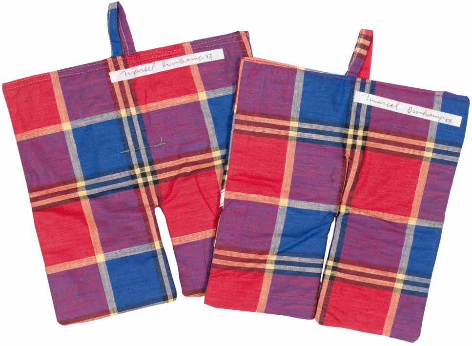
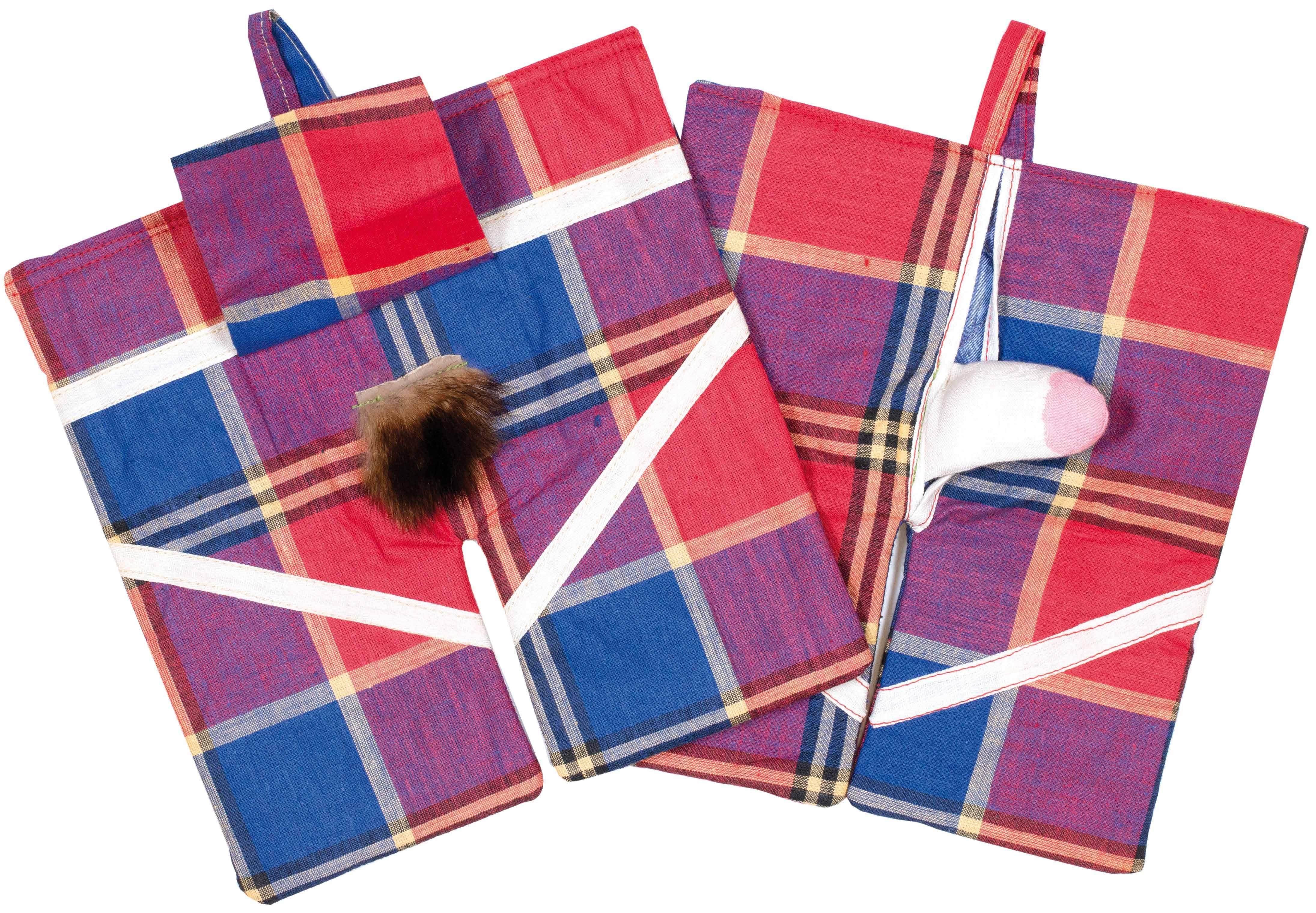
[70].
Karel Appel & Bert Schierbeek
A Beast-Drawn Man
Amsterdam. De Bezige Bij. 1961
¶ An excellent copy of Schierbeek and Appel’s large format collaboration with the fragile vinyl chemise in very good condition.
From the edition limited to 75 copies, each signed and numbered by the artist and author, with this copy one of ‘a few’ hors commerce copies; the lithographs in the present copy are all signed by Appel and numbered ‘H. C. VI’ in pencil.
This edition of Bert Schierbeek’s ‘A Beast-Drawn Man’ with illustrations by Karel Appel consists of ‘seven fragments of the experimental novel of the same
name’; the work was published in Dutch with the title ‘Het dier heeft een mens getekend’. The cover photograph is by Ed van der Elsken and the endpapers reproduce a letter from Appel to Schierbeek.
Folio. (520 × 428 mm). [26 leaves including lithographs]. Original publisher’s black printed cloth with titles in white to front cover and spine, colour photograph mounted to upper cover, printed endpapers, clear vinyl chemise with printed title at foot.
— $12,500
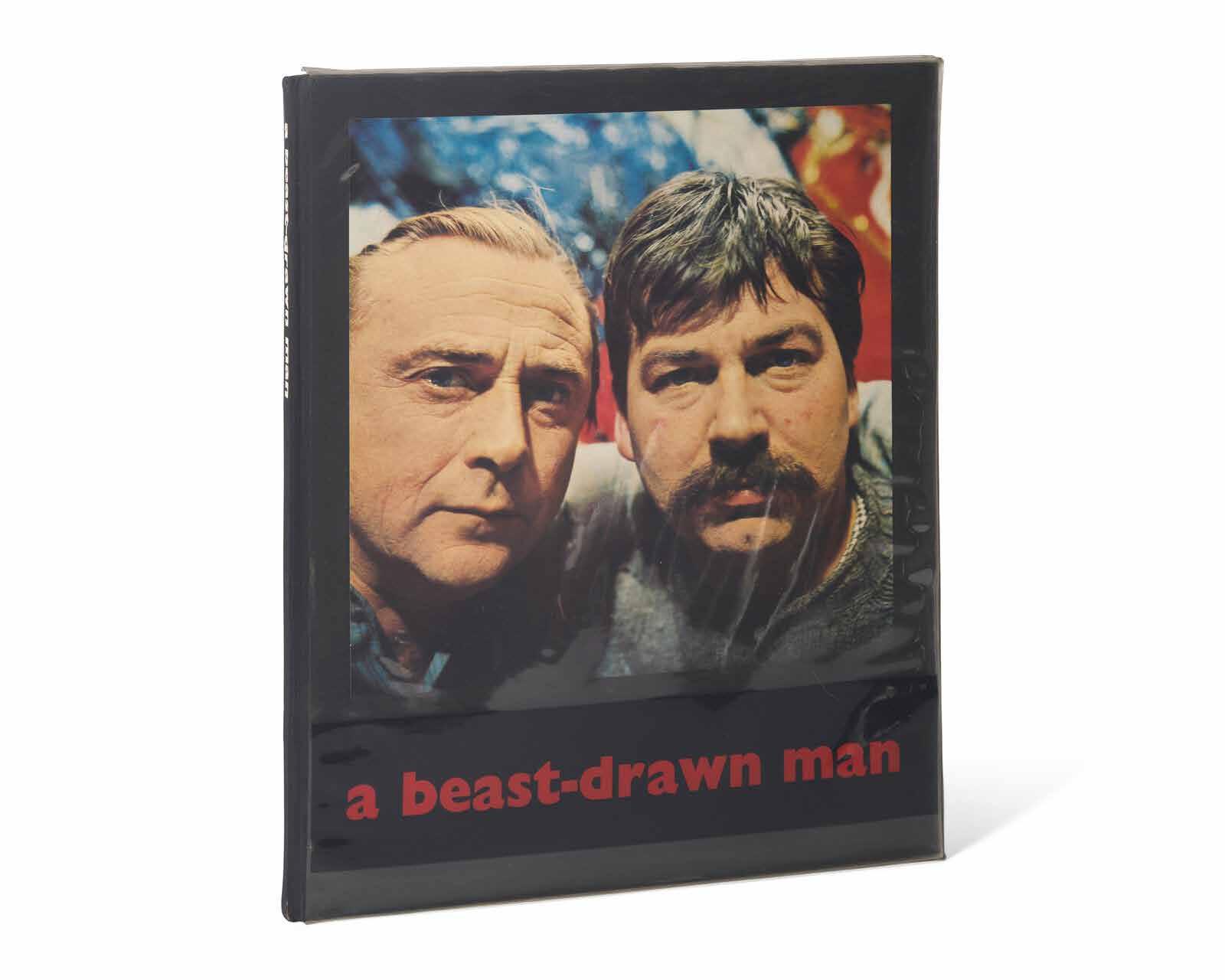
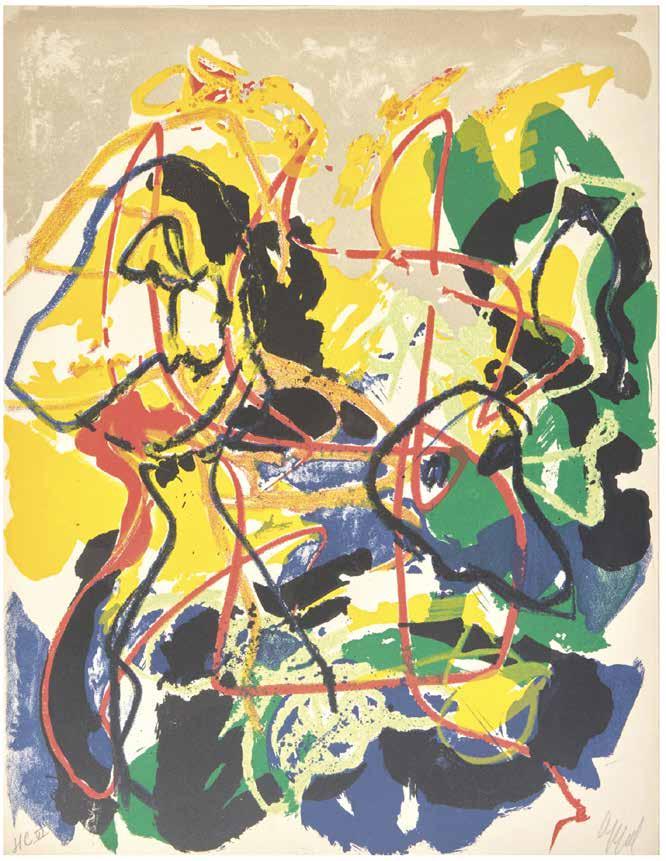
Yves Klein
Monochrome und Feuer Krefeld. Museum Haus Lange. 1961, (January–February)
¶ A very fine example of Yves Klein’s catalogue multiple ‘Monochrome und Feuer’ purchased at the Kaiser Wilhelm Museum in Krefeld at the time of the exhibition.
The Krefeld exhibition ‘Monochrome und Feuer’ (Monochrome and Fire) included a wide range of Klein’s work including his monochromes, sponge reliefs, sponge sculptures, anthropometries and cosmogonies. It also included a small void room and his drawings of his water and fire wall and fountain designs. Perhaps the most spectacular of all was the installation of his Fire Sculpture and Wall of Fire on the museum’s lawn.
The accompanying folder published for the exhibition is one of the most
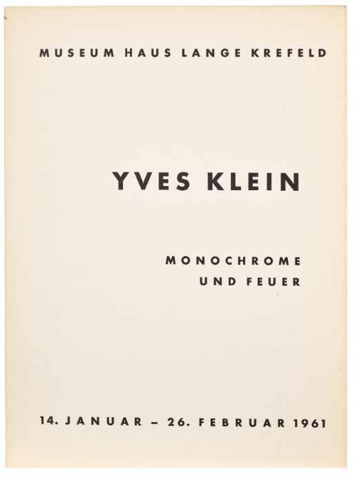
renowned of exhibition catalogues, including as part of its contents, the three original chromatic sheets by Klein, one in International Klein Blue (IKB), one in lucid pink, and the other gold. On the gold sheet, Klein has applied, by hand, three small sections of gold leaf. The resultant triptych is one of the most striking of Klein’s printed works.
4to. (320 × 235 mm). 9 pages of text and 24 illustrations and with the 3 chromatic sheets in blue, pink and gold, the latter decorated with three sections of applied gold leaf. Loose as issued in card folder, with accompanying text leaves.
— $26,500
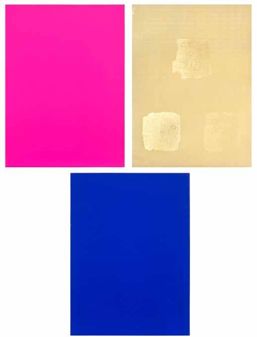
[72].
Alberto Giacometti & Marcel Duchamp with Robert Lebel La Double Vue / L’Inventeur du Temps Gratuit Paris. Le Soleil Noir. 1964
¶ Robert Lebel’s dual novel and autobiography with Marcel Duchamp’s signed multiple, Giacometti’s signed diptych and the additional signed suite of his etchings.
From the edition limited to 126 numbered copies on vélin cuve BFK Rives with an original double page etching by Giacometti (signed on the cover as usual) and Marcel Duchamp’s original signed multiple, with this hors commerce copy with the additional suite of 6 smaller etchings, all signed by Giacometti; a further 150 ‘Club’ copies were issued with an etching by Ferró as well as 1,200 copies with reproductions.
This is one of the 15 ‘hors commerce’ examples with 6 additional prints signed by Giacometti (as with copy no. 1); the remaining examples of the édition de tête, i.e. nos. 2 - 11, included only an additional 3 signed etchings by Giacometti. The justification, Giacometti’s ‘diptyque’,
the additional suite (and its wrapper) together with Duchamp’s multiple are all designated ‘H[ors]. C[ommerce]. C’ in pencil.
‘In addition, there are 15 copies hors commerce designated HC / A to HC / O, with the suite of 6 smaller etchings, all signed.’ — Herbert Lust
Square 4to. (288 × 234 mm). [20 bifolia: 40 leaves + ‘diptyque’ + multiple + suite; pp. 79, (i)]. Loose as issued in original publisher’s black paper wrappers with gold triangular cut-out vignette with title in black to front wrapper and silver circular cut-out vignette with second title to rear wrapper, Giacometti’s signed diptych within blue printed boards and suite in white printed wrapper, original publisher’s blue paper board chemise with black label to spine with title in blue and matching slipcase
— $66,000
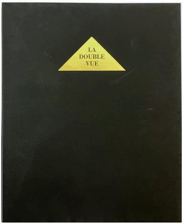
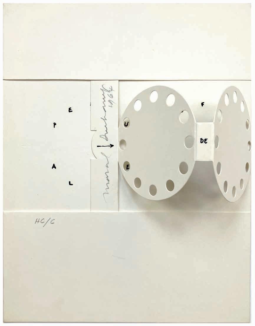
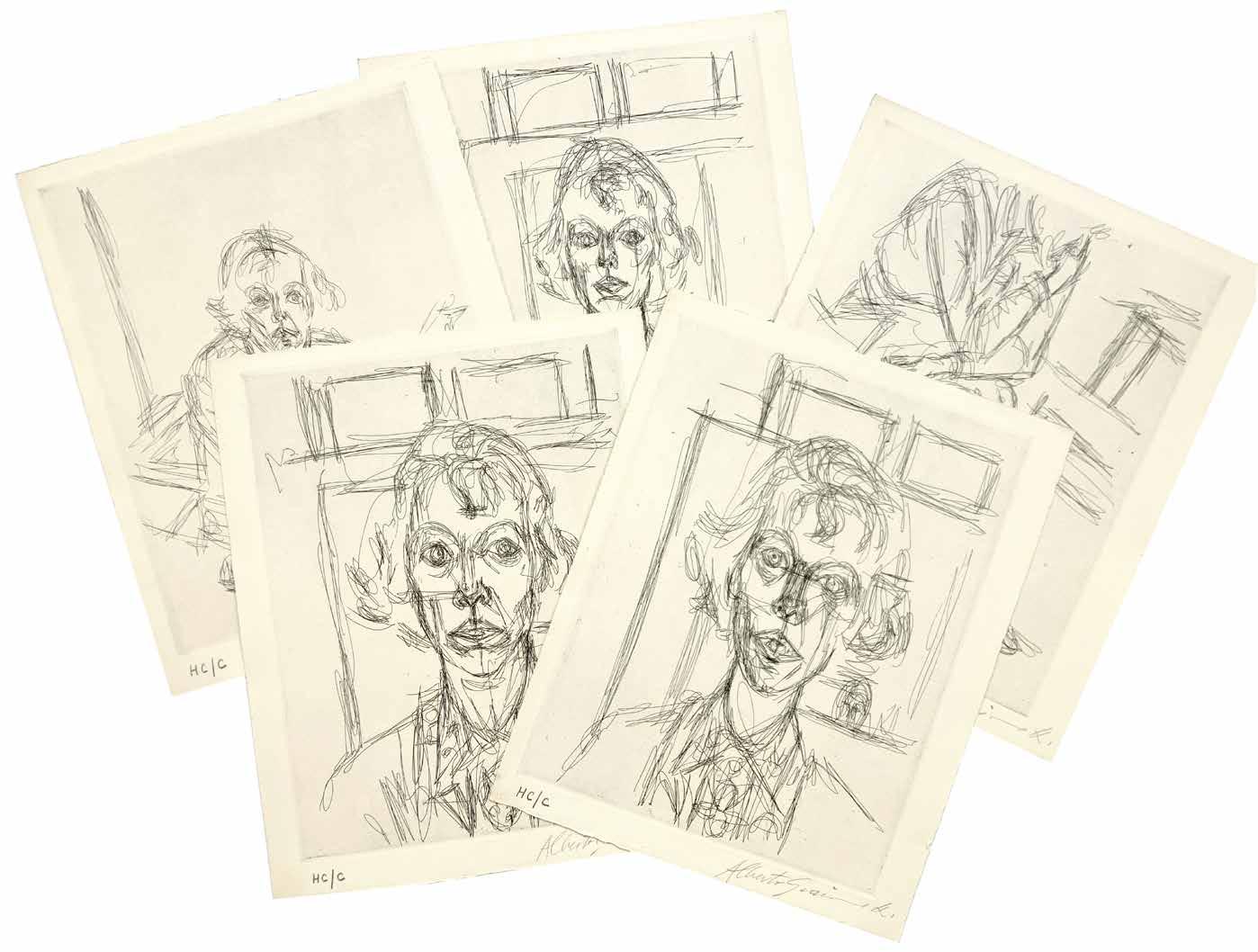
[73].
Iliazd & Max Ernst Hommage à Tempel. (Affiche / Poster for the Exhibition of ‘(65 )
Maximiliana ou l’Exercise Illégal de l’Astronomie’)
Paris. Imprimerie Union / Le Degré 41 / Le Point Cardinal. (1964)
¶ The original poster / announcement for the exhibition of Iliazd and Max Ernst’s important collaboration.
Held at ‘Le Point Cardinal’ in rue Jacob, Paris, from 29th April to May 30th, 1964, the exhibition of the ‘bonnes feuilles’ of Maximiliana was heralded with this poster. Although the poster omits the name of Iliazd and Max Ernst’s collaboration, i.e. ‘(65) Maximiliana ou l’Exercise Illégal de l’Astronomie’, the poster does make clear their enormous admiration for and indebtedness to Tempel.
The poster was printed by Imprimerie Union, Iliazd’s preferred printer and the one he (as well as many of his fellows)
used repeatedly. It is very likely given Iliazd’s own history as a typographer, typesetter, designer and publisher that he designed the poster - the poster announcing Iliazd’s 1949 ‘Poésie de mots Inconnus’ made use of the same duotone lettering as featured here - and produced the mise en page himself.
Folio. (616 × 412 mm). Printed duotone text in red and black to surround central lozenge with reproduction photographic portrait in sepia of Tempel on cream poster stock; the poster in remarkable condition with no creases or folds.
— $1,250
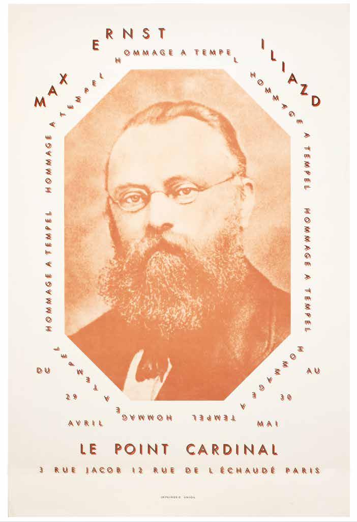
Andy Warhol, Tom Wesselmann, Allen Jones, et al. Creeley, Robert, Robert Indiana, Gerard Malanga et al. Katz, William (Ed.) Stamped Indelibly. A Collection of Rubberstamp Prints New York. William Katz / Indianakatz ... at the Bowery. 1967
¶ An excellent presentation copy of William Katz’s assemblage of rubberstamps by various poets and Pop artists.
From the edition limited to 225 numbered copies with each print signed by the artist (the Warhol and Red Grooms prints with stamp signatures as issued); only the first 110 copies were for sale, available through Multiples, Inc.
The presentation reads: ‘for Robert and Jen / With our love, / Bob [Creeley] / and In Friendship / Bill (Katz) / 3 Jan ‘72’.
‘William Katz, who began publishing books in 1964 as a college student, wanted to create a book using as modest and simple a technique as possible. He asked his Pop artist and writer friends to design
commercially made rubber stamps, which he then handprinted to create this book. (‘Stamped Indelibly’ contains Warhol’s first cow print and Oldenburg’s first drum pedal print.) Robert Indiana, an instructor whom Katz met at college, offered him space in which to work, thus Indianakatz became the imprint of this book. Katz later founded Bouwerie Editions to publish books of poetry with prints ...’.
— Elizabeth Phillips & Tony Zwicker.
4to. (292 × 225 mm). [14 unnumbered leaves with 19 mounted leaves recto and / or verso]. Original publisher’s coarse-weave oatmeal cloth as issued.
— $13,200
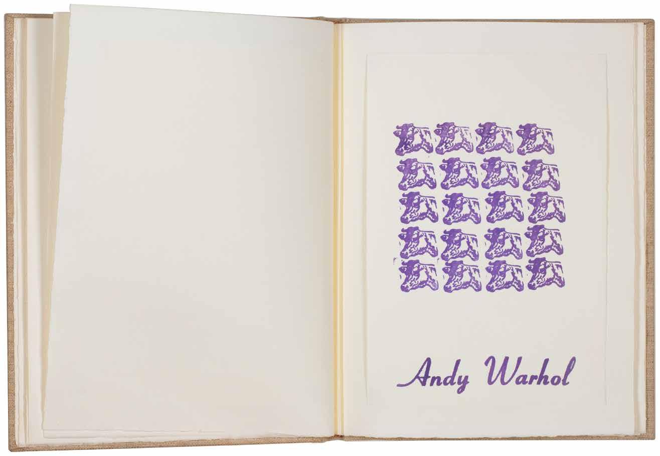
[75].
John Baldessari
Throwing Three Balls in the Air to get a Straight Line (Best of Thirty-Six Attempts)
Milan. Giampaolo Prearo Editore S.r.L. / Galleria Toselli. 1973
¶ Baldessari’s beautiful photographic serial multiple.
From the edition limited to 2,000 copies. As early as 1972 / 1973, Baldessari had set himself the impossible task of balancing order and chaos with Throwing Four Balls in the Air to Get a Straight Line (Best of 36 Tries) and Throwing Three Balls in the Air to Get an Equilateral Triangle (Best of 36 Tries), continuing in 1974 with Throwing Four Balls in the Air to Get a Square (Best of 36 Tries).
Oblong folio. (248 × 328 mm). [14 unnumbered leaves]. Leaf with titles and small colour vignette, 12 leaves each with colour offset illustration and final leaf with colophon, all recto only on glossy stock with rounded corners. (Sheet size: 244 x 324 mm). Original publisher’s blue card envelope with flap, gilt titles to upper cover with the small excised rectangle to show the title vignette
— $8,580
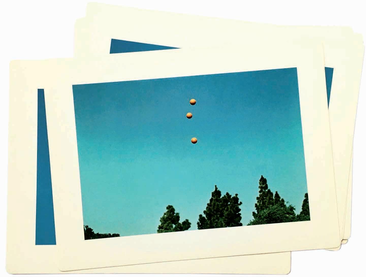
[76]. Christo Wrapped Book. (Modern Art) New York. Abrams Original Editions. 1978
¶ A scarce presentation copy of Christo’s book object multiple.
From the edition limited to 140 copies, with this one of 20 artist’s proof copies signed and numbered in Roman numerals by Christo in black ink to the rear wrapping and with a presentation: ‘for Ken’.
4to. (349 × 254 mm). The book Modern Art, by Sam Hunter and John Jacobus, wrapped in transparent plastic with twine and cord, signed and numbered by Christo on the rear wrapping. Wrapped as issued.
— $19,800