books from the isles
henry wooton ❧ francis barlow ❧ inigo jones isaac ware ❧ thomas paine ❧ james christie thomas rowlandson ❧ george cruikshank
henry alken ❧ william blake ❧ charles conder
john thomson ❧ kelmscott press ❧ c.r.w. nevinson ashendene press ❧ herbert read ❧ kenneth macleay eric gill ❧ james joyce ❧ roland penrose richard long ❧ susan allix
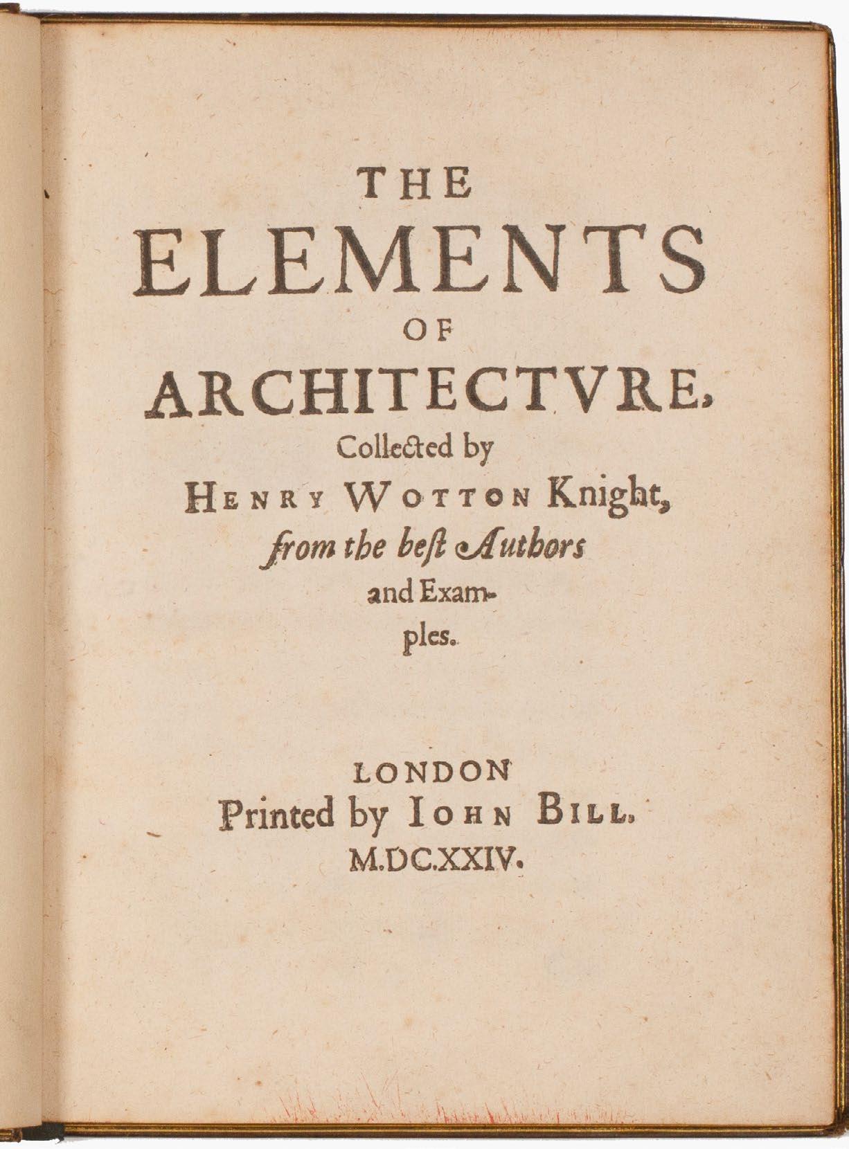
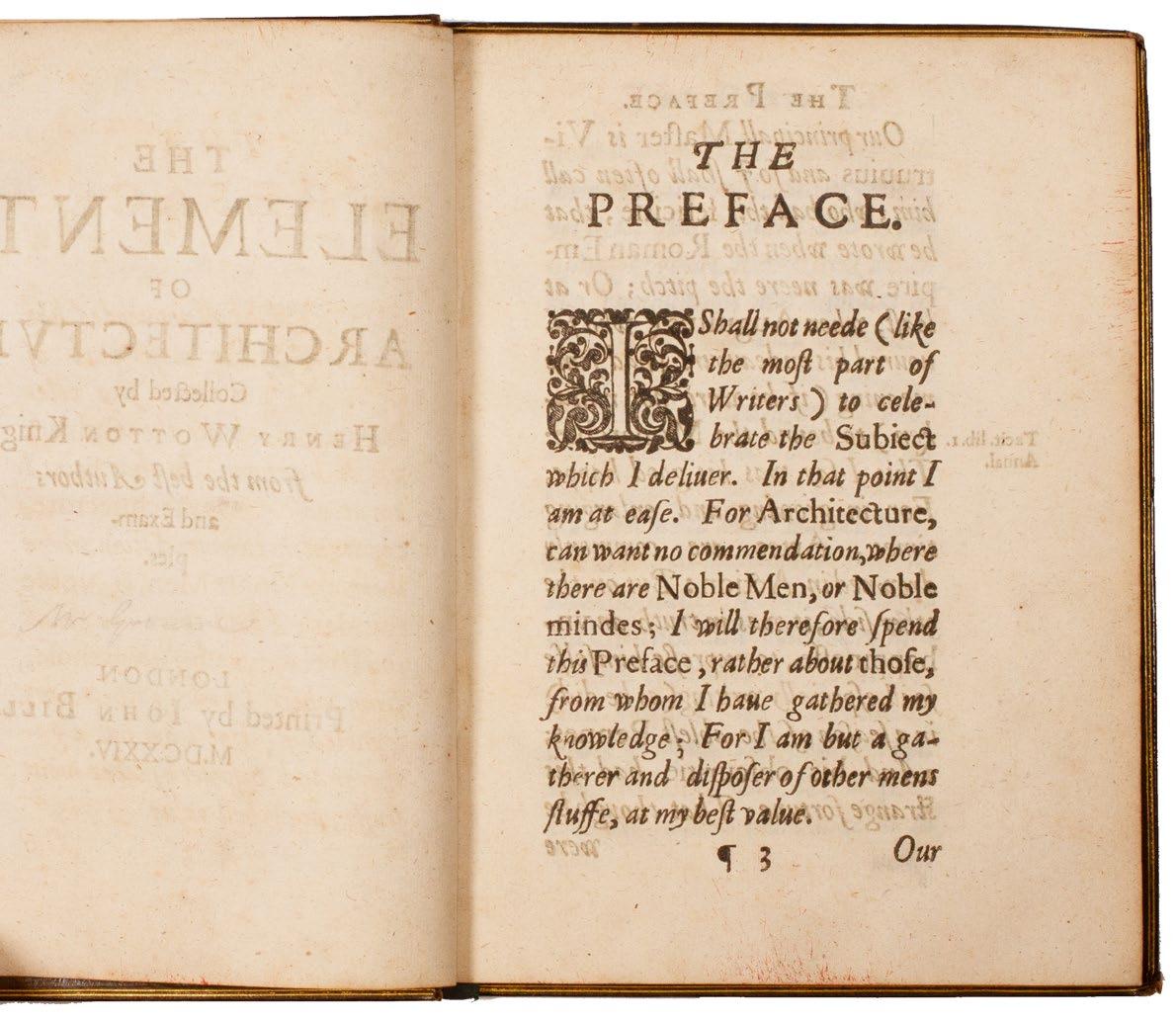
1WOTTON, Sir Henry
The Elements of Architecture ... from the Best Authors and Examples London. Printed by John Bill. 1624.
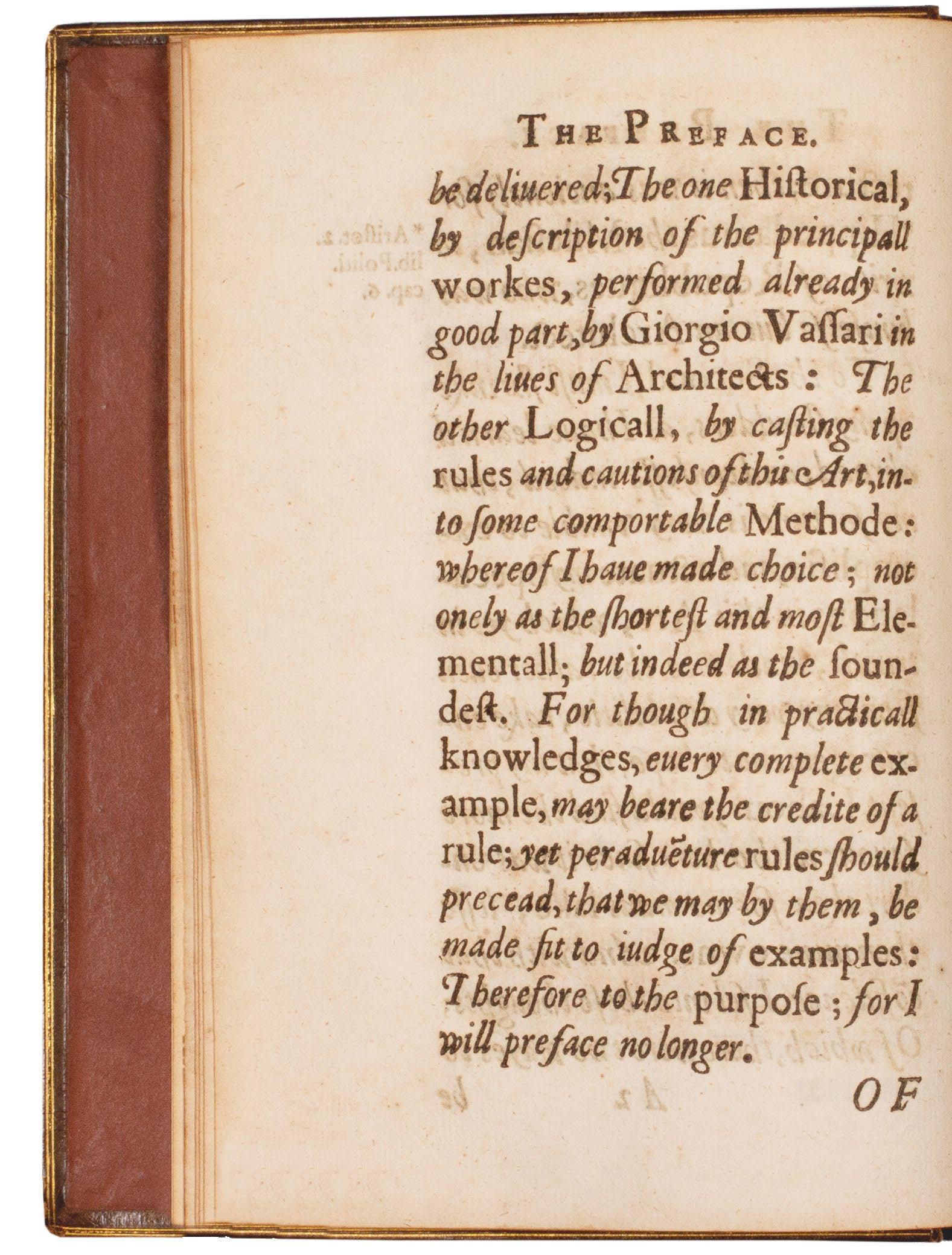
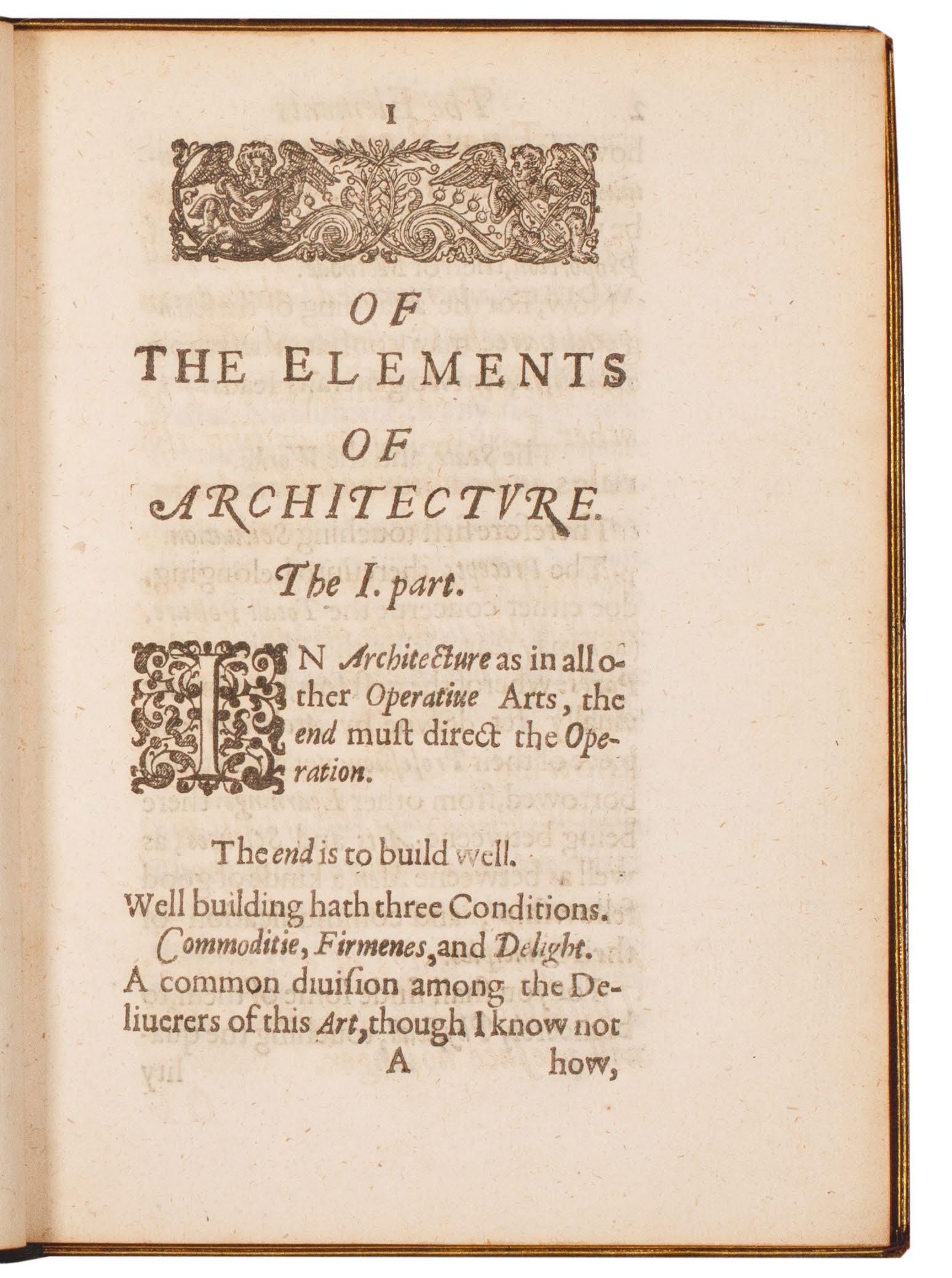
Small 4to. (188 × 144 mm). [67 leaves, without initial blank ¶1; pp. (i), (viii), 123]. Leaf with title, four leaves with Wotton’s preface and Wotton’s text ‘Of the Elements of Architecture’ in two parts, final leaf with errata, decorative woodcut head-piece to opening of Wotton’s text, woodcut decorative initials throughout, printed text in Roman type throughout with preface, headlines, marginal notes and emphases in italic. Full nineteenth-century olive crushed morocco, boards with triple gilt rules to enclose a decorative roll tool border in blind, banded spine with elaborate decorative gilt tooling and gilt titles in six compartments, turn-ins with gilt double rules, brown glazed endpapers, green silk placemarker, a.e.g.
� A very fine copy of Sir Henry Wotton’s scarce treatise, the earliest English theoretical work on architecture.
Although there are earlier printed books on architecture in English, they are either unobtainable (John Shute’s 1563 ‘The First and Chief Groundes of Architecture .... &c.’ is almost mythical in terms of its scarcity), a translation (the 1598 Lomazzo translated into English by Richard Haydocke) or practical (the 1611 English edition of Serlio appealed to contemporary builders and architects as a manual), and so Sir Henry Wotton’s contribution, ‘The Elements of Architecture’, based as it is on his own appreciation, experience and comprehension of architecture, is of considerable importance. Wotton’s motivation has often been subsumed to his ambition to become Provost of Eton after his return from diplomatic service in Europe; in the face of competitors equally or more fully qualified, Wotton sought to impress the Duke of Buckingham in whose gift the Provost-ship lay (Wotton was successful ultimately and served as Provost until his death in 1639). Wotton described his treatise as a ‘pamphlet’ (it is certainly more than that) and described it as being ‘printed sheet by sheet, as fast as it was born, and it was born as soon as it was conceived; so it must needs have the imperfections and deformities of an immature birth, besides the weakness of the parent ...’.
The importance of Wotton and of his ‘Elements’ lie in his introduction to England of an intellectual framework for the analysis, appreciation and understanding of architecture derived from his own experience of architectural practice in England, Italy, Germany and France and of specific buildings and gardens. Wotton’s sources – as per Millard – are as follows: ‘Besides Vitruvius, he had consulted one of other edition of the major Vitruvian commentaries by Guillaume Philandrier, Walther Ryff, and Daniel Barbaro; Alberti’s
‘De re aedificatoria’; Philibert de l’Orme’s ‘Premier tome de l’architecture’; Vasari’s ‘Vite’; Vignola’s ‘Regole delle cinque ordini’’ and Palladio’s ‘Quattro libri’. He also refers to Dürer on arch construction and Bernardino Baldi, besides nonarchitectural writers such as Johan ven Herne, Nicholas of Cusa, and Tycho Brahe. Classical quotations are drawn from Aristotle, Homer, Pliny the Younger, and Quintilian.’
The effects of ‘The Elements of Architecture’ were far reaching: a Latin version was included in Johannes de Laet’s 1649 Amsterdam edition of Vitruvius and it seems that it was this translation that then formed the basis for the Spanish edition ‘Elementos de architectura, recogidos de los authores, y exemplares mas aprobados’ printed in Madrid in 1698. The English text was included in various editions of ‘Reliquiae Wottonianae’ from 1651 and was included in the third edition of John Evelyn’s translation of Fréart, ‘A Parallel of the Antient Architecture with the Modern ...’. As per BAL RIBA ‘it probably achieved its widest circulation in the form of substantial extracts edited by William Fisher and inserted into his edition of Scamozzi’s sixth book, ‘The mirror of architecture’, from 1671’. Facsimile editions were issued in 1903 (S. T. Prideaux), 1963 (Folger) and 1969 (RIBA). This first edition of Wotton’s text is scarce on the market with only a handful of copies sold at auction in the last 50 years.
‘The text is erudite and pithy, and was intended to impress both by its learning and its literary quality. Wotton makes repeated references to other writers, but judges them critically and is not a mere synthesizer of other people’s ideas.’ — BAL RIBA
‘This little book, the product of Wotton’s familiarity with and understanding and critical evaluation of, the best known writers on architecture (Vitruvius, Palladio, Alberti, Barbaro, de l’Orme, etc.), brought to England the Renaissance concepts of architecture, adjusted to English requirements. It was intended for the pleasure and edification of the virtuoso, not for the architect. Wotton’s famous definition ‘Well building hath three conditions: Commodity, Firmness and Delight’ was taken up later ... Wotton also presents what is probably the earliest critical method of looking at and evaluating architecture.’ — Weinreb
[ESTC S120324; Weinreb 1:193; Fowler 445; Park 119; Millard 95; BAL RIBA 3716].
£22,500
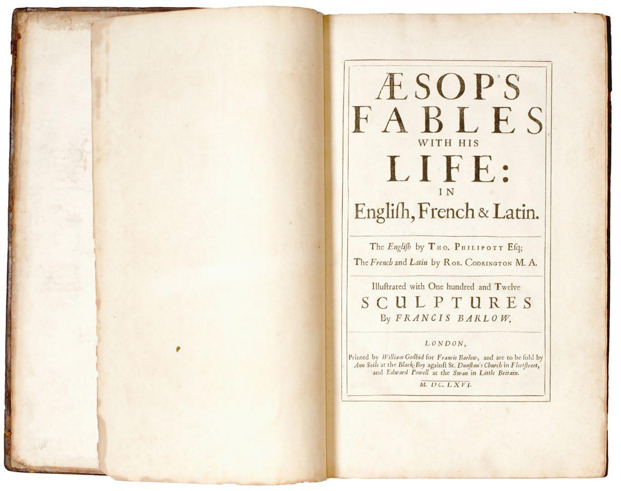
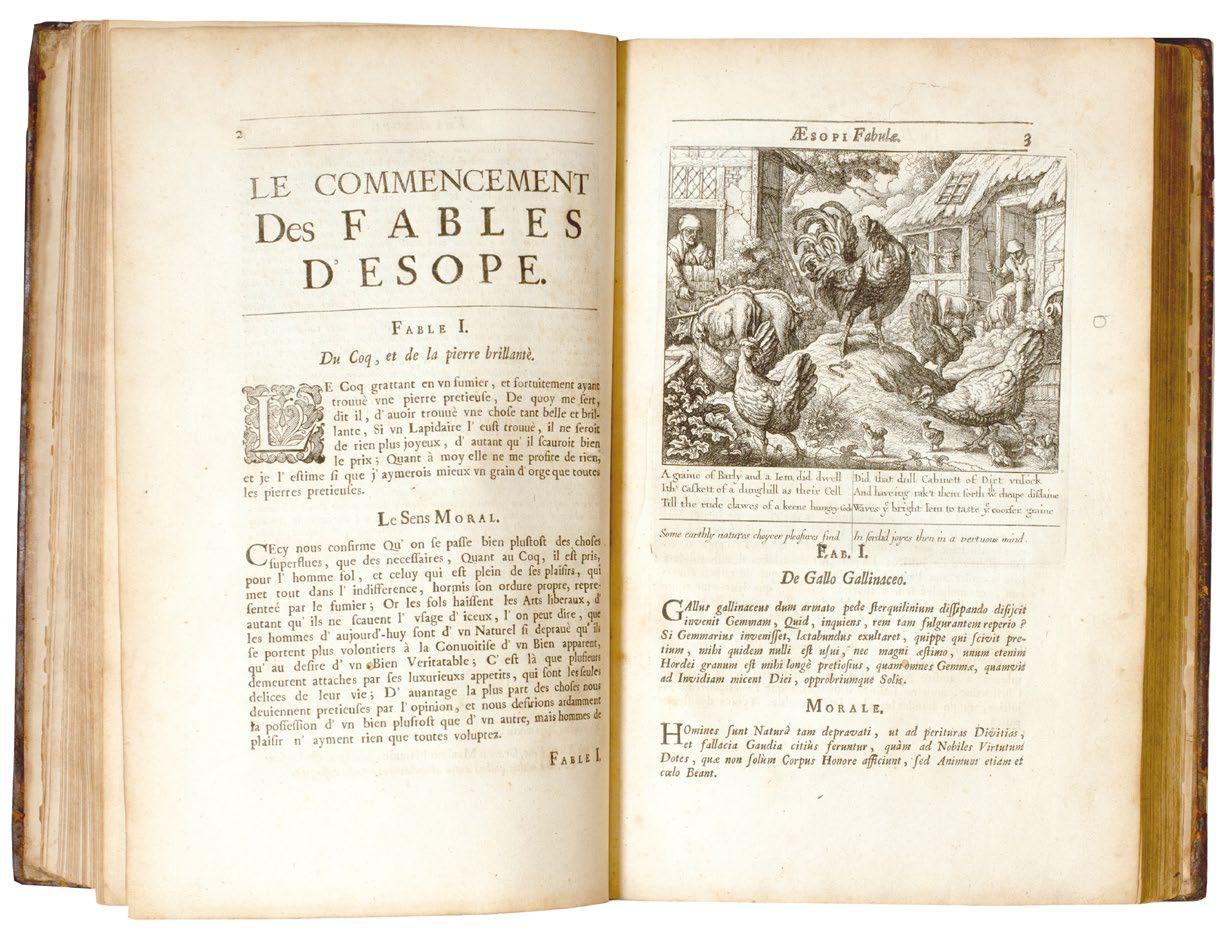
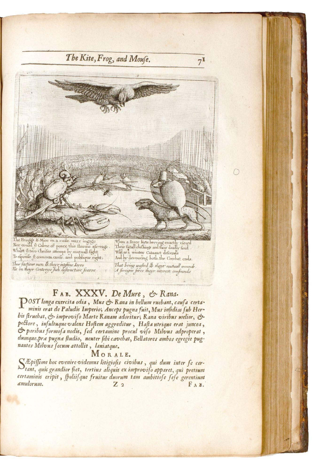
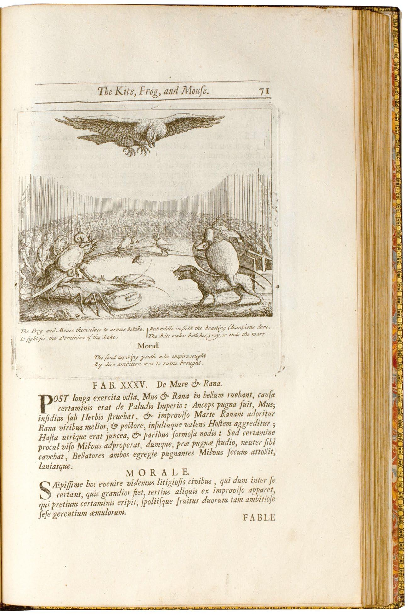
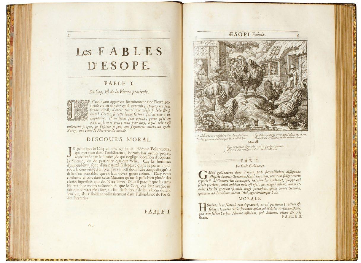
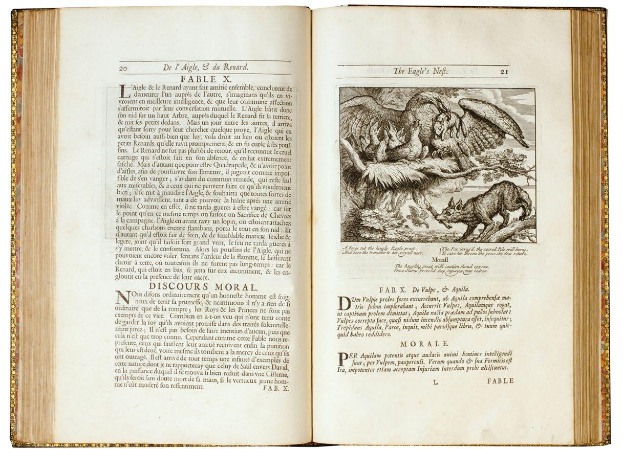
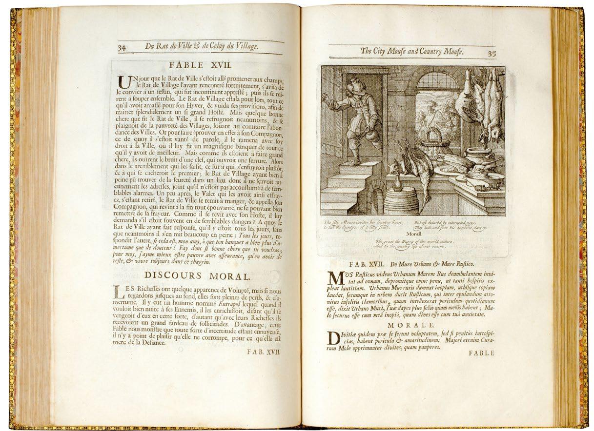
Aesop’s Fables With His Life: in English, French & Latin. London. Printed by William Godbid for Francis Barlow, and are to be sold by Ann Seile at the Black-Boy against St. Dunstan’s Church in Fleetstreet, and Edward Powell at the Swan in Little Britain 1666
Folio. (356 × 242 mm). [161 leaves including additional engraved title; pp. (i), (i), (iii), (i), 40, 31, 17, 2–221, (ii)]. Printed title within double rules, engraved title by Barlow with central title within elaborate cartouche and surrounded by an eagle, leopard, boar, fox, wolf and lion, leaf with large decorative woodcut inhabited ten-line initial and Barlow's dedication to Sir Francis Pruijan (or Prujean), leaf with Barlow's 'To the Reader', leaf with engraved frontispiece of Aesop with animals and additional engraving with text beneath, 20 leaves with 'A Brief Prospect of the Life of Aesop', 16 leaves with 'La Vie d'Esope', 9 leaves with 'Aesopi Philosophice Fabulantis, Vita' and Aesop's 110 fables illustrated with 110 engravings, final leaves with 'La Table' and 'The Table', decorative woodcut initials and tail-pieces throughout; sheet size: 350 × 228 mm. Full contemporary calf, boards ruled in blind, later spine with red morocco label with gilt title and blind rules in seven compartments, marbled edges.
� A very rare large paper copy of the scarce first edition of Francis Barlowʼs undoubted masterpiece of English book illustration.
By the time of the Restoration Francis Barlow had achieved a measure of success with his suites of prints of animals – engraved by the best such as Hollar, Griffier and Place – and his decoration of houses and by the mid-1660s had contributed to the Aesop of Ogilby and Hollar. It is not entirely clear why he would wish to issue another edition of the Fables (Hofer suggests a competitive nature and a different projected audience) but by 1665 he had engraved a superb title (it bears that date) and by the time of publication in 1666 (the date to the letterpress title) had engraved a frontispiece of Aesop surrounded by animals and 110 half-page vignettes after his own drawings to illustrate the Fables. Each of the Fable engravings is accompanied by lines of verse by Thomas Philipott; the translations of Aesop’s life into French and Latin was by Robert Codrington. Whatever Barlow’s motivation, the result is one of the most extensive and beautiful English illustrated books of the seventeenth century, and one of the scarcest, the scarcity often attributed to the loss of the sheets in the Great Fire of London.
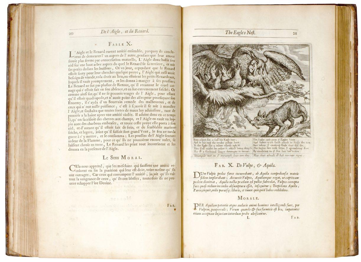
Large paper copies of this first edition are identifiable (see ESTC) through various issue points, all present here, but also as per Philip Hofer the transposition of some of Barlow’s engravings. In the present copy the
engraving for ‘Fab. XLVIII’ (The Ant and Fly) is in fact that for ‘Fab. XLXIX’ (The Ant and Grasshopper). Hofer indicates too that the engravings for ‘Fab. LXX’ (The Tortoise and Hare) and ‘Fab. LXXI’ (The Young Man and His Cat) are also transposed, however, in the present copy they are not (the margins, headlines etc. conform to the remaining large paper leaves) although The Young Man and His Cat features the erroneous title The Nurse and Her Child ( ‘Fab. LXIX’) albeit with the correct page number. A second edition was published in 1687 with additional plates to illustrate the life of Aesop and with Philipott’s verse replaced with new verse by Aphra Behn. A third edition was issued in 1703 and a posthumous French edition appeared in 1714, published in Amsterdam; Philip Hofer suggests that the third edition was really made up of unused sheets from the two earlier editions but with a new title and that the edition in French – it makes use of some of Barlow’s plates – is not a Barlow edition.
‘This seventeenth-century polyglot (English-French-Latin) Aesop is handsomely illustrated with engravings after designs by Francis Barlow (?1626–1702), an English painter renowned for his pictures of country life and field sports. (He was perhaps the finest English draughtsman of animal scenes in the seventeenth century.) Barlow, who published the book at his own expense, explains in his preface that he intends the work to contribute to the education of young people. This is the first edition; the relatively few copies known are all survivors of the Great Fire of London, which swept over the printer’s premises in 1666.’ — Early Children’s Books and Their Illustration
‘No artist has responded with more sensitivity and less sentimentality to the gentle grace of deer ... The least of creatures, the frog, the hare, the snake, and the swallow, and the least favoured of them, the ass, the boar and the wolf -- he draws them all with an intimacy, charm, and inviolable integrity never surpassed in an English book ... ’. — Edward Hodnett
This large paper issue of the 1666 Aesop is very scarce: while ESTC lists 17 copies for the small paper issue (see ESTC R21542) it notes only two of the large: the copy at the Huntington and that at the Morgan Library and Museum, New York; Harvard too holds a copy.
[ESTC R477463; see 'Francis Barlow' by Edward Hodnett, 1978; see #9 in the Morgan Library and Museum's 'Early Children's Books and Their Illustration', 1975; see Philip Hofer's 'Francis Barlow's Aesop' printetd in the Harvard Library Bulletin, Autumn 1948].
£40,000
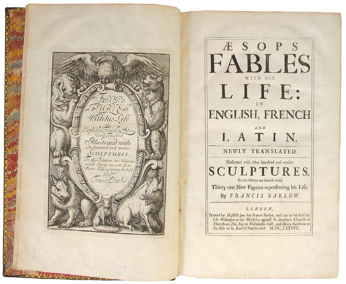
BARLOW, Francis. (Aesop). Behn, Aphra Aesop’s Fables with his Life: in English, French and Latin. Newly translated. Illustrated with one hundred and twelve sculptures. To this edition are likewise added, thirty one new figures representing his life by Francis Barlow London. H. Hills jun. for Francis Barlow. 1687
Folio. (372 × 248 mm). [196 leaves; pp. (x), 40, (62), 40, 17, 2 - 221, (3)]. Collation: a2, B2-I2, K2-L2, B2-I2, K2-L2, B2-I2, K2-T2, V2, X2-Z2, Aa2-Ii2, Kk2-Tt2, Vv2, Xx2-Zz2, Aaa2-Iii2, Kkk2-Ppp2. Contents: Leaf with engraved title verso; title recto, verso blank; leaf with engraved arms of 'William, Earl of Devonshire' verso; a1 dedication leaf 'to the Right Honorable William, Earl of Devonshire'; a2 'to the Reader' recto, engraved frontispiece verso; page 1 (B1) - page 40 (L2) 'A Brief Prospect of the Life of Aesop'; 31 engraved plates by Francis Barlow printed recto only, including the "scandalous" plate; page 1 (B1) - page 40 (L2) 'la Vie d'Esope, Phrygien'; page 1 (B1) - page 17 (F1 recto) 'Aesopi, Philosophice Fabulantis, Vita'; page 2 (F2 verso) - page 222 (Ppp1 recto 'the Fables of Aesop', 'Fables d'Esope', 'Aesopi Fabulae' with 110 half-page vignette engravings by Francis Barlow with verses by Aphra Behn; Ppp1 verso - Ppp2 recto 'the Table'. Engraved title, printed title, engraving with the Devonshire arms, dedication leaf 'to the Right Honourable William of Devonshire', leaf 'to the Reader', engraved frontispiece and 31 engraved plates illustrating the 'Life of Aesop' and 110 half-page vignette engravings to the 'Fables'. Full contemporary black morocco by the Barlow's Aesop Binder, front and rear boards bordered with rules and roll tools in gilt to surround elaborate decorative panels composed of floral and foliate tools in the form of garlands, sprays and tendrils emanating from a Greek urn with conjoined drawer-handle tool surround, banded spine with gilt title 'BARLOWs AESOP' and elaborate decorative tooling of thistles and acorns in eight compartments, turn-ins and board edges with decorative gilt roll tool border, marbled endpapers, a.e.g.
PROVENANCE: Ownership signature of Hen[ry]. Ben[edict]. Hall in sepia ink to title]. Francis Barlow’s undoubted masterpiece of English book illustration – a superlative large paper copy in a contemporary binding by the ‘Barlow’s Aesop Binder.
� A superlative large paper copy in a contemporary English binding, by the Barlowʼs Aesop Binder, of Barlows undoubted masterpiece of English book illustration.
This copy – printed on excellent paper – is in a beautiful contemporary binding, the binding in a beautiful state of preservation, by the ‘Barlow’s Aesop Binder’. Few bindings by the ‘Barlow’s Aesop Binder’ are known and the present copy, identifiable by the lettering to the spine and comparable decorative tooling, is one of only a handful. Active in the 1680s and 1690s, the bindery worked certainly for William and Mary, although the identified copies of Barlow’s masterpiece from the bindery include too the Devonshire dedication copy from Chatsworth, the Cracherode copy (both
these now at the British Library), Pepys’ copy at Magdalene, Cambridge, the present copy and one other in a private collection in the US.
This second edition of Francis Barlowʼs masterpiece adds 31 plates (32 including the frontispiece) to illustrate the life of Aesop, including the often mutilated ‘obscene’ plate (here untouched), and includes verse by Aphra Behn (1640–1689) commissioned especially for each of the ‘Fables’. The unsigned plates are engraved by Barlow and the remainder by Thomas Dudley, a student of Wenceslaus Hollar. Barlow himself drew and engraved all of the illustrations for the ‘Fables’ themselves.
‘Francis Barlow was the first native English book illustrator - indeed, the leading interpretative illustrator in England before 1800 ... Otto Benesch of the Albertina Museum, Vienna has called him ‘one of the greatest illustrators of all timeʼ.ʼ — Edward Hodnett
Complete copies of Barlowʼs work in good condition are scarce, the present copy, however, a large paper example in its original binding by theh Barlow’s Aesop Binder, printed on a different, thick, paper stock and entirely unsophisticated, is of the utmost rarity. This is borne out, if it is necessary to provide evidence, by the fact that this copy featured in two sophisticated collections of illustrated books of the last 50 years: firstly that of Arthur and Charlotte Vershbow, secondly that of Robert S. Pirie; the latter collector rarely, if ever, settled for second best and would certainly have bought another copy if he had found one, that he had to wait for the present copy is telling.
[Wing 703; see ‘English Restoration Bindings’ by Howard Nixon, pg. 40, nos. 98 / 99; see 'Francis Barlow' by Edward Hodnett, 1978]. Edward Hodnett. Francis Barlow, 1978. See Chapters XIII & IX].
£35,000
4ALBERTI, Leon Battisa
The Architecture of Leon Battista Alberti in Ten Books, Of Painting in Three Books and Of Statuary in One Book. Translated into Italian by Cosimo Bartoli. And Now First Into English, And Divided into Three Volumes by James Leoni, Venetian Architect; To Which Are Added Several Designs of His Own, For Buildings Both Public And Private London. Thomas Edlin. 1726
4 works in 3 vols. Folio. pp. (16), 103; (2), 44, 46–47, 49–66, 68–68, 69–130; (2), 34; (8), 6. Engraved allegorical frontispiece, printed title in Italian, printed title in English, leaf with Leoni's dedication in Italian to ‘Giorgio, Prencipe di Vallia’, two leaves with list of subscribers, four leaves with the life of Alberti and list of his works, four leaves with preface by Leoni, parallel text in English and Italian of books I–V (103 numbered leaves) and 9 engraved hors texte plates; printed title in English for vol. II, printed title in Italian and parallel text of books VI–X (130 numbered leaves) and 58 engraved hors texte plates, 3 double-page and one folding on two sheets; leaf with privilege, printed title to vol. III in English, printed title in Italian, leaf with dedication to Thomas Scawen in Latin, parallel text in English and Italian of Books I–III of ‘On Painting’ and book I of ‘On Statuary’ (34 numbered leaves) and 8 engraved hors texte plates; printed title in English for Leoni’sWorks, printed title in Italian, five leaves with ‘To the Reader’, six leaves with Leoni’s text and additional subscribers list and 27 engraved plates, 11 double-page and 9 folding plates on two sheets. All of the plates are by Leoni apart from 3 by Bernard Picart, the engraver – often unnamed – is given variously as Picart, John Harris or J. Cole. Printed titles with woodcut vignettes, woodcut head- and tail-pieces and decorative initials throughout. (Sheet size: 426 × 275 mm). Full modern speckled calf.
PROVENANCE: Ownership signature to head of titles of [illegible] Mulholland and dated ‘Sept[embe]r. 8th, 1843.’
� First edition in English of Albertiʼs De Re Ædificatoria, together with his other works De Pictura and Della Statua.
John Evelyn had appended an English translation of Della Statua to his own work on Fréart, but it was not until Leoni (who had also introduced Palladio to an English audience) that any of Alberti’s other works appeared in English. The engravings and text used by Leoni for Alberti’s architectural text were based on the translation and first illustrated edition published by Bartoli in 1550, while he used du Fresne’s 1651 edition for the painting and sculpture sections and the brief life of Alberti. Leoni added a further section at the end of Alberti’s works to publicise his own endeavours.
As part of the court of Cosimo de Medici the Elder, friend to Lorenzo, Brunelleschi and the Humanist circle, as well as secretary to six Popes, Leon Battista Alberti was much more than an architect or theoretician. Born
into an important but exiled Florentine family in Genoa in 1404, Alberti, with his knowledge of Latin and Greek, flourished when the family were permitted to return in 1429. His works covered painting (De Pictura), sculpture (Della Statua), cryptography, the family and mathematics (Ludi Rerum Mathematicarum), the source for which was Euclid’s Optics and it is the combination of his talents that led to the publication of perhaps his most famous and influential work, the De Re Ædificatoria of 1485.
Printed in the year of the Battle of Bosworth Field and the ascendancy of the Tudors, Britain had to wait until 1726 for the first English edition, the publication of which is strongly indicative of the work’s lasting importance.
Building on the ideas of Vitruvius, Alberti also divides his work into ten books and stresses, in particular, the harmonious whole of a building, but has time to reflect on matters relating to gardens where he follwed the Roman landscapists rather than prevalent medieval ideas of walled gardens. Considered by later architects to be more of a theoretician than a practical architect, Alberti is most remembered for his facade of Santa Maria Novella in Florence, an exercise in the tiling of the plane, a breaking down of total surface area into harmonious compartments. In doing this, he provides the spectator with a group of additive units, by which he may visually take the measure of the building, (K. Williams). In this Alberti made use of his own researches, which involved precise measurement and survey of among other things the human body and Rome in its entirety, which he undertook in 1444, as well as the work of Masaccio and Brunelleschi and their rediscovery of geometrical perspective. Active until the end of his life, the De Re Ædificatoria, begun in 1450 was not published until after Alberti’s death in Rome in 1472.
Subscriber’s to this edition included a large number of masons, plasterers, builders and carpenters as well as Nicholas Hawkesmore [sic], Sir John Vanbrugh, Sir Christopher Wren (although deceased when the work was finally issued), Leoni’s patron Thomas Scawen and Lord Burlington who both ordered two copies including one, each, on large paper.
[Millard 4; Berlin 2554; Fowler 11; Weinreb 16, 9].
£15,000
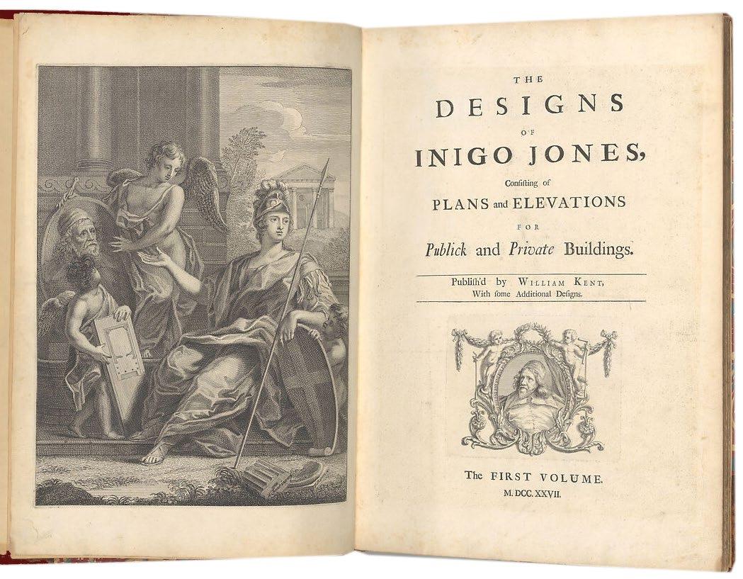
5(JONES, Inigo). Kent, William. The Designs of Inigo Jones, Consisting of Plans and Elevations for Public and Private Buildings. With Some Additional Designs
London. Thomas Edlin. 1726
2 vols. in 1. Folio. (505 × 390 mm). Frontispiece, title with engraved vignette, dedication with engraved head- and tail-pieces to King George (George I who died in 1727), advertisement leaf, list of plates, list of subscriberʼs (pp. x) and 52 engraved plates numbered 1–73, of which five are large fold-outs and take four numbers each, and 7 double-page taking 2 numbers each; Vol. II - title with engraved vignette, list of plates (pp. vi) and 45 engraved plates numbered 1–63, of which 18 are double-page and take 2 numbers each; two small tape repairs to frontispiece recto, some leaves slightly toned as often. Contemporary French red morocco, boards with triple gilt rules, banded spine with gilt decoration and tooling with green morocco label with gilt title in eight compartments, turn-ins with roll tool border, board edges ruled in gilt, marbled endpapers, a.e.g.
PROVENANCE: Discrete bookplate of Baron Alexis de Redé to front pastedown.
� An outstanding example of the first edition of the published works of Inigo Jones in contemporary French red morocco.
Essentially based on the Jones-Webb collection of architectural drawings purchased by Lord Burlington in the early 1720s, this book provides extensive coverage of Jones’s designs for the Banqueting House in Whitehall and various smaller projects. The work gives much space to the designs by Jones and Webb for Whitehall Palace as a whole (without acknowledging that they are in fact mainly by Webb) and adds to the drawings from this source four plates based on Palladio’s drawings for S. Giorgio in Venice (which Burlington had also acquired). There are, in addition, a large number of plates illustrating buildings designed by Lord Burlington himself, notably Chiswick House and the Westminster School dormitory. The whole forms a splendid record of Jones’s work and of Burlington's reinterpretation of Palladio and Jones for his own time.
‘‘The Designs of Inigo Jones’ was a significant feature in Burlington’s campaign to establish a new standard of taste in England: the first ... in a series of visual exemplars ... It was published again as late as 1770, with an additional perspective view of the Whitehall Palace.’ — Millard
The allegorical frontispiece by William Kent, though frequently lacking, is present here.
The subscribers’ leaf lists more than 350 (several ordering multiple copies), and includes 18 Dukes and 22 Earls, one of whom was Lord Burlington, the commissioner of the work who ordered 12 sets. Other notable subscribers were Christopher Wren, Nicholas Hawksmoor, Colen Campbell, Isaac Ware, Paul Fourdrinier (listed as Fourdriener), Sir Robert Walpole and Hans Sloane; there is no clear French candidate as a subscriber for the present copy.
The bookplate to the front pastedown is that of Baron Alexis de Redé (1922 – 2004). Born Oskar Dieter Alex von Rosenberg in Zurich (he inherited his title on the death of his brother in 1942), de Redé was an Austro-Hungarian banker, aesthete, collector and socialite known for exquisite taste, opulent hospitality and legendary balls. Dubbed ‘La Pompadour de nos jours’ by Nancy Mitford, de Redé lived for over 50 years in an apartment at the Hôtel Lambert on the Isle de Saint-Louis in Paris, and after they bought it in the late 1970s he shared the house with Marie-Hélène – with whom he threw balls at the Château de Ferrières – and Guy de Rothschild. De Redé’s copy of ‘The Designs of Inigo Jones’ passed to the Rothschilds on his death in 2004.
[Millard 34; Fowler 162].
£18,500
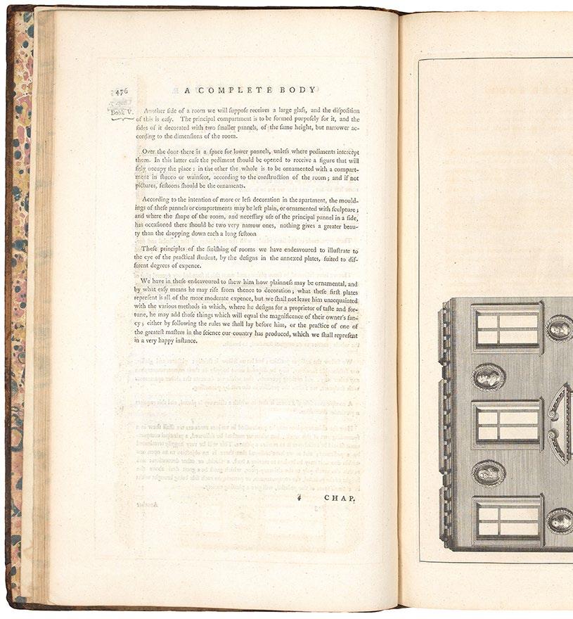
WARE, Isaac
A Complete Body of Architecture. Adorned with Plans and Elevations, from Original Designs
London. Printed for T. Osborne and J. Shipton ... &c. 1756
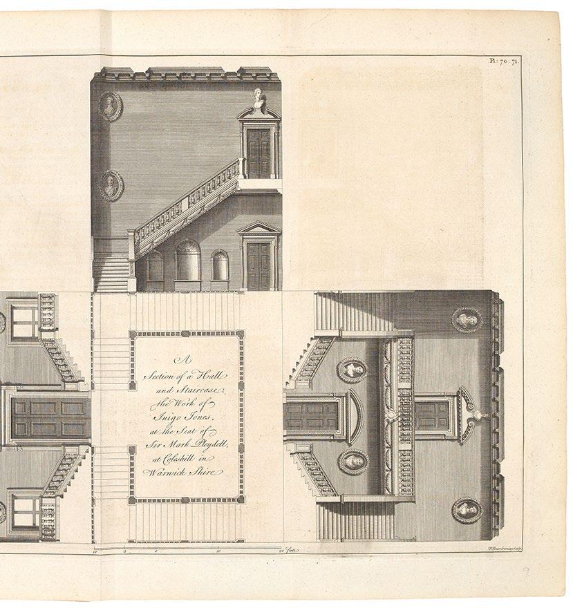
2 vols. Folio. (412 × 258 mm). pp. (xviii), 748 (758 with the unnumbered text leaves), (iv). Engraved frontispiece, printed title in red and black with engraved vignette, preface, list of plates, contents and Ware’s text in ten books illustrated with 114 engraved plates (14 folding) with irregular numbering in first state (with the numbers within the platemark and plate 70 / 71 titled ‘Warwick Shire’), final eaves with index. Contemporary mottled calf.
PROVENANCE: Ownership signature of John Ingilby to title, likely Sir John Ingilby (1705–1772) or his illegitimate son, also Sir John Ingilby (1758–1815); ownership signature of W. B. Colthunt and date ‘27 Oct. 1919’ to front free endpaper.
� The first edition of Isaac Wareʼs practical and comprehensive manual of architecture.
Isaac Ware (1704–1766), the associate of Lord Burlington, member of the St. Martin’s Lane Academy and member of the ‘Board of Works’ was already associated with a number of important architecture books (‘The Designs of Inigo Jones ... &c.ʼ of 1731, the ‘Plans ... of Houghton’ of 1735, ‘The Four Books of Architecture of Andrea Palladio’ of 1738 and the translation of Sirigatti of 1756) before he issued this, his massive magnum opus. A follower, but not a slavish one, of Palladio and Vitruvius, Ware offers the two as the pinnacles and authorities for all of architecture but cautions against blind acceptance. Of major importance to English Palladianism, Ware’s Georgian legacy is also relevant and his ‘Complete Body’ was of such interest to his contemporaries that a second edition was published a short time after his death in 1766.
‘Like Vitruvius and Alberti before him, Ware arranged his treatise in ten books. Having defined the most commonly used architectural terms, he devotes the rest of book one to a discussion of materials. Book two is divided into five sections: the first on location; the second on the functional parts of a building and the third, fourth, and fifth, on the orders. Book three begins the practical advice on house construction. Books four, five, and six deal with doors, windows, and interior ornament, book seven with exterior ornament and garden buildings, book eight with bridges. Book nine consists of an interesting return to what Ware calls ‘the construction of elevations upon the true principles of architecture’ ... It is in the nature

of an appendix to the whole, and allows Ware to write cuttingly of modern practices. Book ten is a brief introduction to mathematics and mensuration ...’ . — Millard
‘There was a copy of either the 1756 or 1767 edition in Jefferson’s private library at the time of his death ... The copy Jefferson ordered for the University in the section on ‘Architecture’ of the want list can be identified as either of these two editions from the title, but there is no record of the library’s ever having received it.ʼ (Jefferson’s Fine Arts Library, pg. 374).
[Park 84; Fowler 436; Millard 87; Jefferson's Fine Arts Library 126a].
£7,500
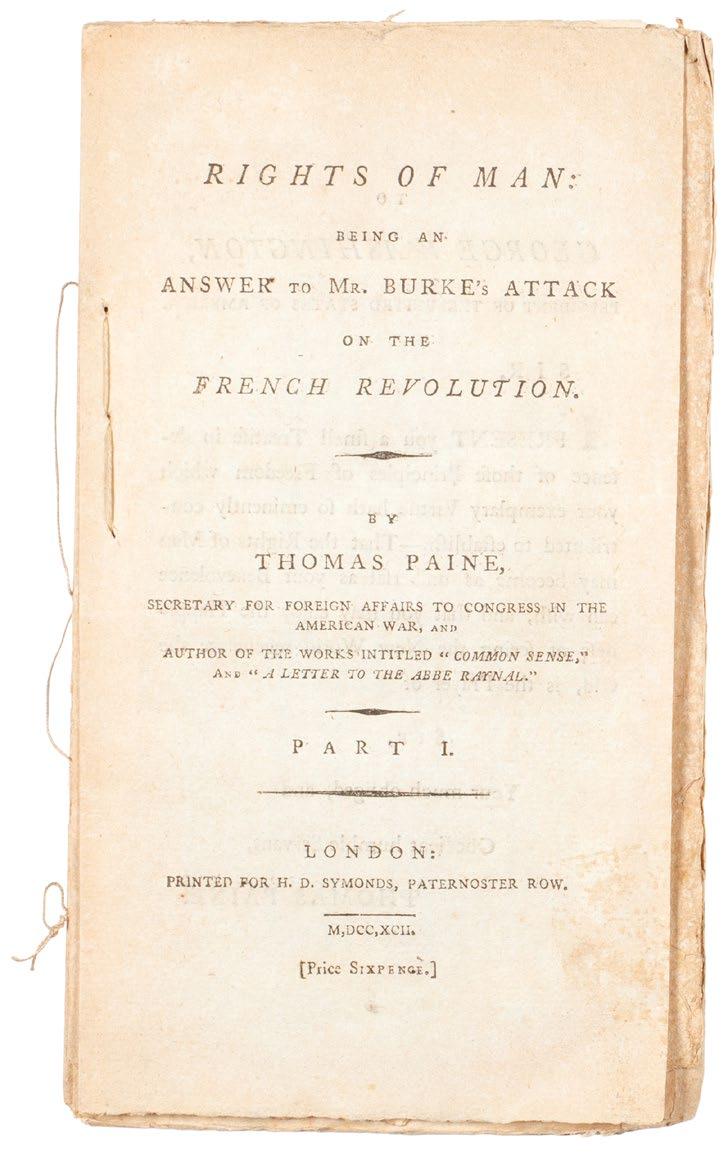
PAINE, Thomas
Rights of Man: Being An Answer to Mr. Burkeʼs Attack on the French Revolution. [AND:] Rights of Man. Part the Second. Combining Principle and Practice
London. Printed for H. D. Symonds, Paternoster Row. 1792
2 vols. 8vo. (208 × 126 mm). pp. iv, 78, (i); vii, (i), 9–90, (iv), (i). Printed title to part one with Paine's dedication 'To George Washington, President of the United States of America', leaf with 'Preface to the English Edition' and Paine's text including the 'Declaration of the Rights of Man and of Citizens by the National Assembly of France', the 'Observations' on the same, Paine's 'Miscellaneous Chapter' and 'Conclusion', final leaf with advertisement recto for 'Rights of Man Part II'; printed title to part two, leaf with Paine's dedication to 'M. de la Fayette' recto, verso and following leaves with 'Preface' and contents, Paine's text with 'Introduction' and five chapters and 'Appendix', final leaf verso with advertisement for 'Part I' and 'Common Sense'. Unbound gatherings stab stitched in pamphlet form as issued.
� Superb, unsophisticated examples, uncut entirely and stitched as issued in pamphlet form, of the first two parts of Thomas Paineʼ s Rights of Man.
Composed in reaction to Edmund Burke’s 1790 ‘Reflections on the Revolution in France’ (and so advertised in Paine’s title as ‘An Answer to Mr. Burke’s Attack ...’), the first part of Paine's response was first published in February 1791 by Joseph Johnson before its withdrawal – Johnson feared prosecution or worse – and its issue with a new imprint by J. S. Jordan in March of the same year. Despite efforts by the government of the day to censor the work – although Pitt feared the effect on the populace he himself (see PMM) thought Paine correct – the analysis of basic democratic rights was so crucial that it proved very popular and was reprinted numerous times. The two parts presented here, each with an individual price, unbound and stab stitched as issued, demonstrate that the ‘Rights of Man’ was made available as a pamphlet for ease of distribution and concurrent popular influence.
‘With a force and clarity unequalled even by Burke, Paine laid down those principles of fundamental human rights which must stand, no matter what excesses are committed to obtain them ... Rights of Man was an immediate success ... The government tried to suppress it, but it circulated the more briskly ... Considered apart from the turmoil which attended its first publication, however, Rights of Man can be seen for what it is: the textbook of radical thought and the clearest of all expositions of the basic principles of democracy.’ — Printing and the Mind of Man
[ESTC: T5878 & T5879; see PMM 241].
£7,500

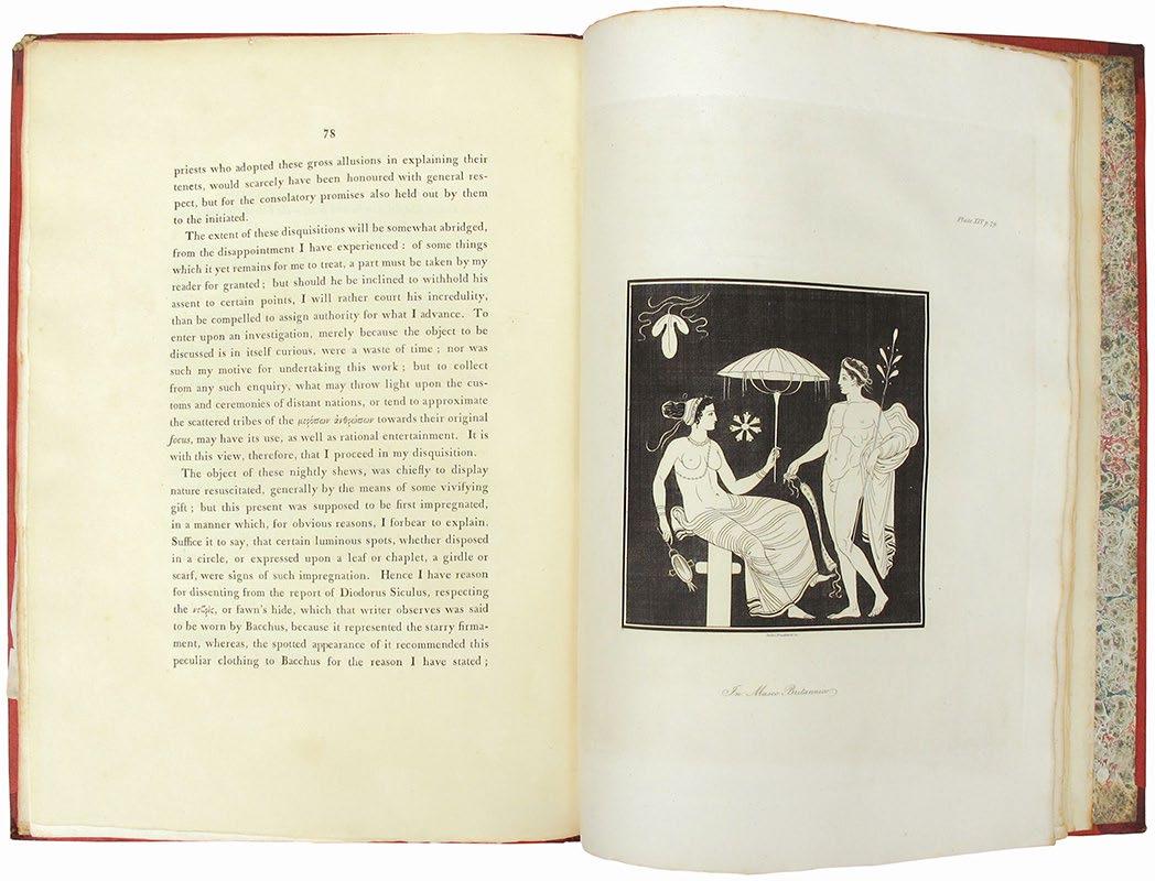
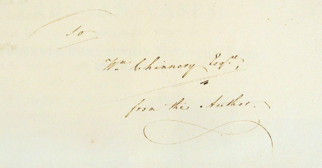
Disquisitions upon the Painted Greek Vases, and their probable connection with the shows of the Eleusian and other mysteries
London. William Bulmer and Co, T. Becket. 1806
Folio. (390 × 278 mm). pp. vii, 99. Illustrated with 16 engraved plates, and decorative headpieces. Contemporary red straight-grained morocco-backed red paper boards, gilt title and elaborate decorative tooling to spine, marbled endpapers.
� Privately printed first edition which James Christie had circulated to ‘a learned few’; this copy inscribed by Christie on initial blank in sepia ink: ‘To / W[ilia]m. Chinnery Esq. / from the Author’...
This privately printed edition pre-dates the published edition by 19 years (1806 as opposed to 1825).
James Christie, auctioneer and member of the Society of Dilettanti, believed that the images on Greek vases derived from ‘the mystic theology of the ancients’. For his examples he drew on the collections of the British Museum and Thomas Hope.
£8,500
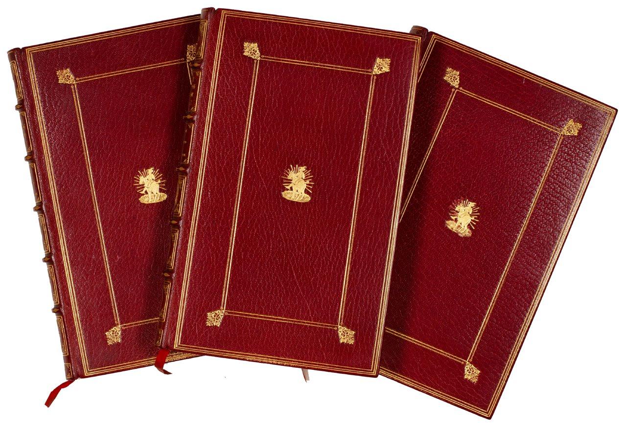
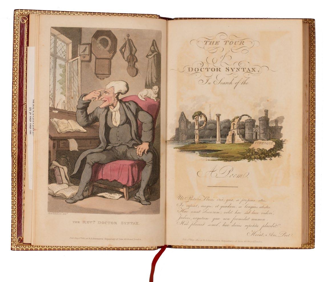
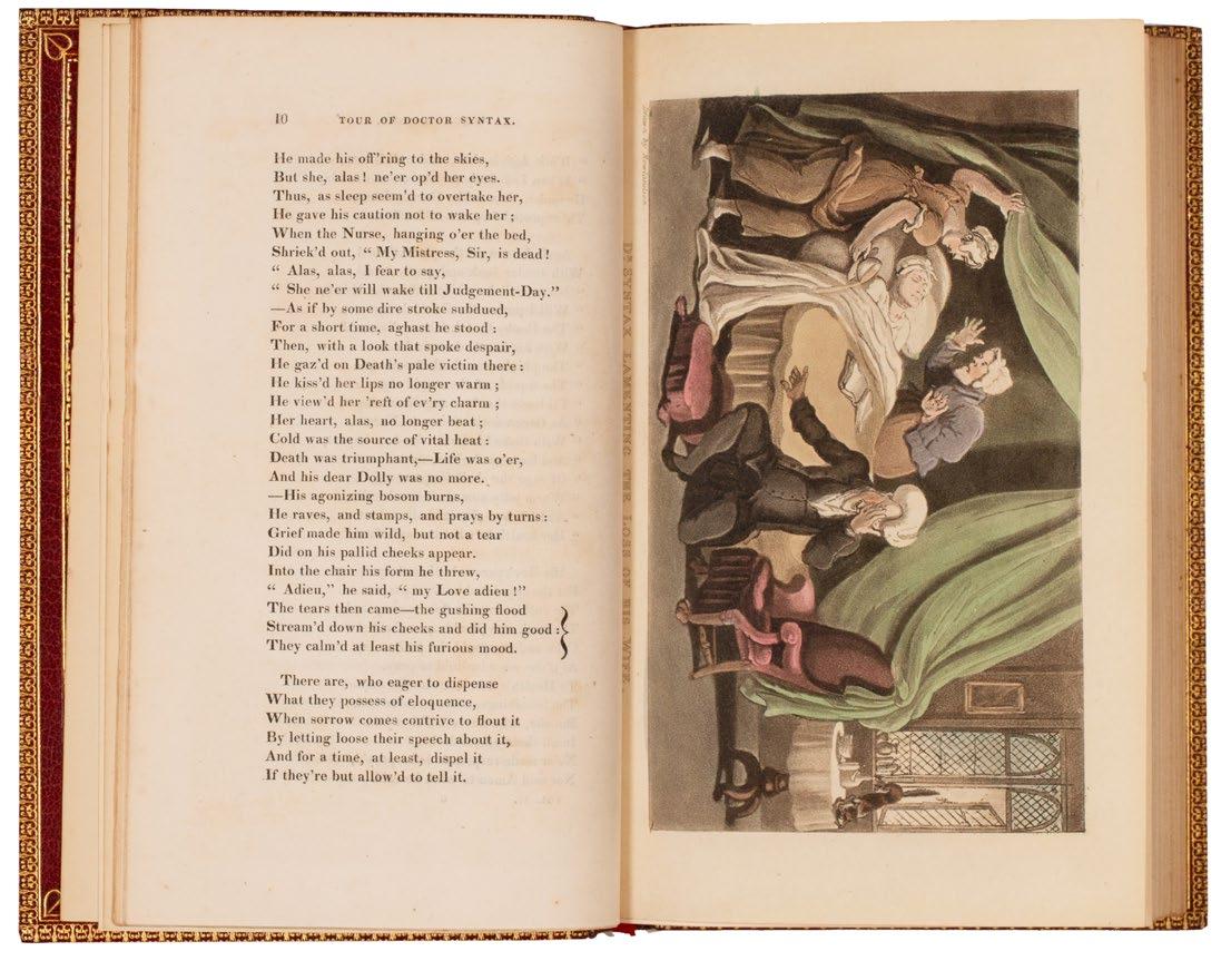
ROWLANDSON, Thomas. Combe, William
Three Tours of Doctor Syntax
London. Ackermann. (1812; 1820; 1821)
3 vols. 8vo. (230 × 152 mm). pp. 276; 277; 279. Vol. I: engraved title with aquatint vignette, and 30 aquatint plates including frontispiece, title and plates ; vol. II: engraved title with aquatint vignette with 24 aquatint plates including frontispiece; vol. III: engraved title with aquatint vignette and 24 aquatint plates, vignette and plates. Plates coloured throughout by a contemporary hand. Later red morocco by Root, boards ruled in gilt and with central gilt vignette tool of a man riding an ass, banded spines with gilt titles and tooling in six compartments, turn-ins tool;ed in gilt, red silk doublures and endpapers, t.e.g.
� The first edition of each of Dr. Syntaxʼs tours in later red morocco.
The three volumes comprise:
The Tour of Doctor Syntax, in Search of the Picturesque; a poem.
The Second Tour of Doctor Syntax, in Search of Consolation; a poem.
The Third Tour of Doctor Syntax, in Search of a Wife; a poem.
This copy with a signed receipt from Combe to front free endpaper of vol. 1; bookplate of Eric S. Quayle to front free endpaper verso of each vol.
£1,800
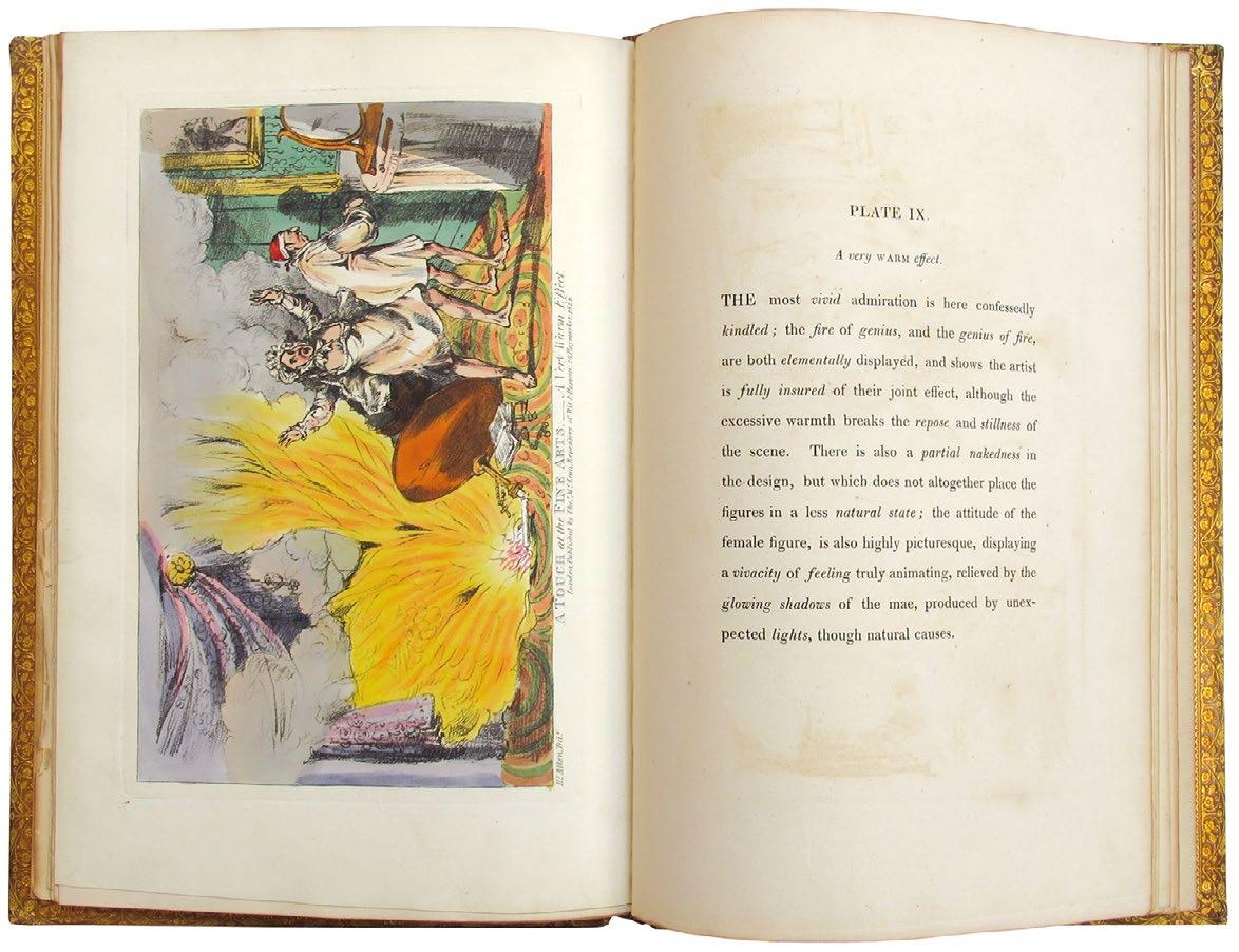
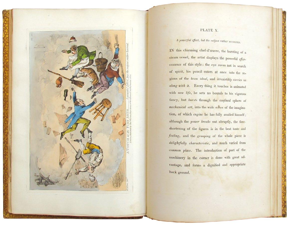
4to. (284 × 194 mm). Engraved frontispiece with additional colouring by hand, title, preface leaf and 11 engraved plates each with additional colouring by hand and plates each with leaf of descriptive text (the frontispiece counted as plate five with text leaf). Later full polished calf by Rivière with their stamp to front free endpaper verso, boards ruled in gilt with floriate border and the initials W. B. B. to upper board, banded spine with elaborate gilt decoration and red morocco title label in six compartments, dentelles with elaborate gilt decoration, marbled endpapers, t.e.g.
� Alkenʼs satirical collection of plates illuminating the terminology of artistic criticism.
For this series, Alken has titled each plate with an appropriate critical term, An Imposing Effect, A Striking Effect, A Very Warm Effect and so on, while the plate itself provides caricaturial counterpoint to the pretentiousness of the term itself.
‘An attempt to elucidate, by graphic delineations, a variety of terms generally and perhaps exclusively made use of by artists, amateurs, connoisseurs, virtuosos, and the like, is the laudable object of this Work. Long, indeed, has a generous public been, doubtless, puzzled in the endeavour to discover some ray of meaning to those glowing, brilliant, and forcible phrases which the critical catalogues, ‘Catalogues Raisonnées,’ &c. of the day are woefully burthened with.’ — From the Preface
[Tooley 58].
£800
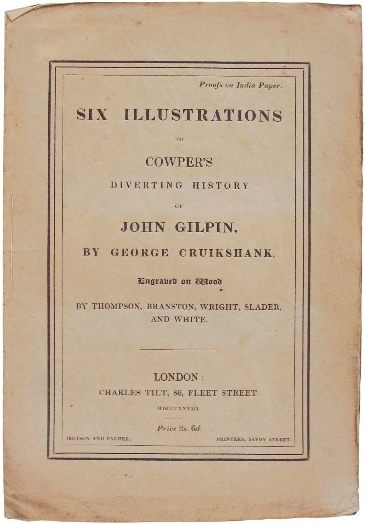
Six Illustrations to Cowperʼs Diverting History of John Gilpin
London. Charles Tilt. 1828
8vo. (236 × 164 mm). Six monochrome wood engravings by George Cruikshank, each printed recto only on India paper. (Sheet size: 212 × 158 mm). Original publisher's printed stitched paper wrappers, loose in later paper-lined brown cloth portfolio with gilt title to spine.
� The rare issue of Cruikshankʼs plates, proofs on India paper, in the original wrappers.
‘The illustrations (India proofs) were also issued unmounted separately without text, in brown paper printed wrappers, in royal octavo.’ — Cohn [Cohn 169].
£450
William
The Marriage of Heaven and Hell (London). (John Camden Hotten). (1868)
4to. (251 × 200 mm). [27 leaves]. Leaf with pictorial lithograph title and 26 leaves of thick wove paper with lithograph text and illustration, all after William Blake by Henry Bellars and all with additional colouring and heightening in watercolour by hand. Original publisher's vellumbacked blue paper-covered boards.
� The first published facsimile of any of William Blakeʼs illuminated books, John Camden Hottenʼs The Marriage of Heaven and Hell.
From the edition limited to 150 (possibly 153) copies.
This facsimile, made c.1868 and the first of any of William Blake’s illuminated books, features lithograph text and illustration with the colour provided in watercolour by hand. Blake’s original work, printed using copper engraving for the text and outlines and then finished by hand, was produced c.1790–1793 and is extant in only nine complete copies, each unique, and some fragments. This facsimile was produced by using copy ‘F’, dated by scholars to c.1795, now held by New York’s The Morgan Library & Museum. At the time the facsimile was produced the original was in the collection of Richard Monckton Milnes, Baron Houghton (1809–1885) and as per ‘Blake Books’, Houghton lent it to the publisher John Camden Hotten for reproduction. A note in the supplement volume to ‘Blake Books’, taken from Sir Geoffrey Keynes’ copy of his ‘Bibliography’ (1921) - now in Cambridge University Library - suggests otherwise: ‘Edward Gordon Duff told John Sampson that Lord Houghton lent his copy of the original to Swinburne, and that Camden Hotten made his facsimile [1868] without permission, whereat Lord Houghton was much incensed.’
The publisher John Camden Hotten was the first to publish a critical study of Blake (Swinburne’s ‘William Blake: A Critical Essay’, 1868) that included too the first colour reproductions of works by Blake. For ‘The Marriage of Heaven and Hell’ facsimile, planned as the first of many, he made use of the skill of the artist Henry Bellars, described by H. Spencer Ashbee as ‘perhaps the best facsimilist that ever lived’ who likely made use of a photographic process to transfer the text and image to the stone (see Morton Paley’s extensive exegesis for fuller details). Hotten’s project to issue further facsimiles was curtailed by Bellars’ death in the year this was issued.
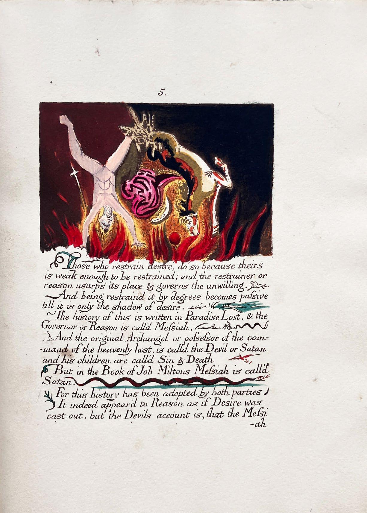
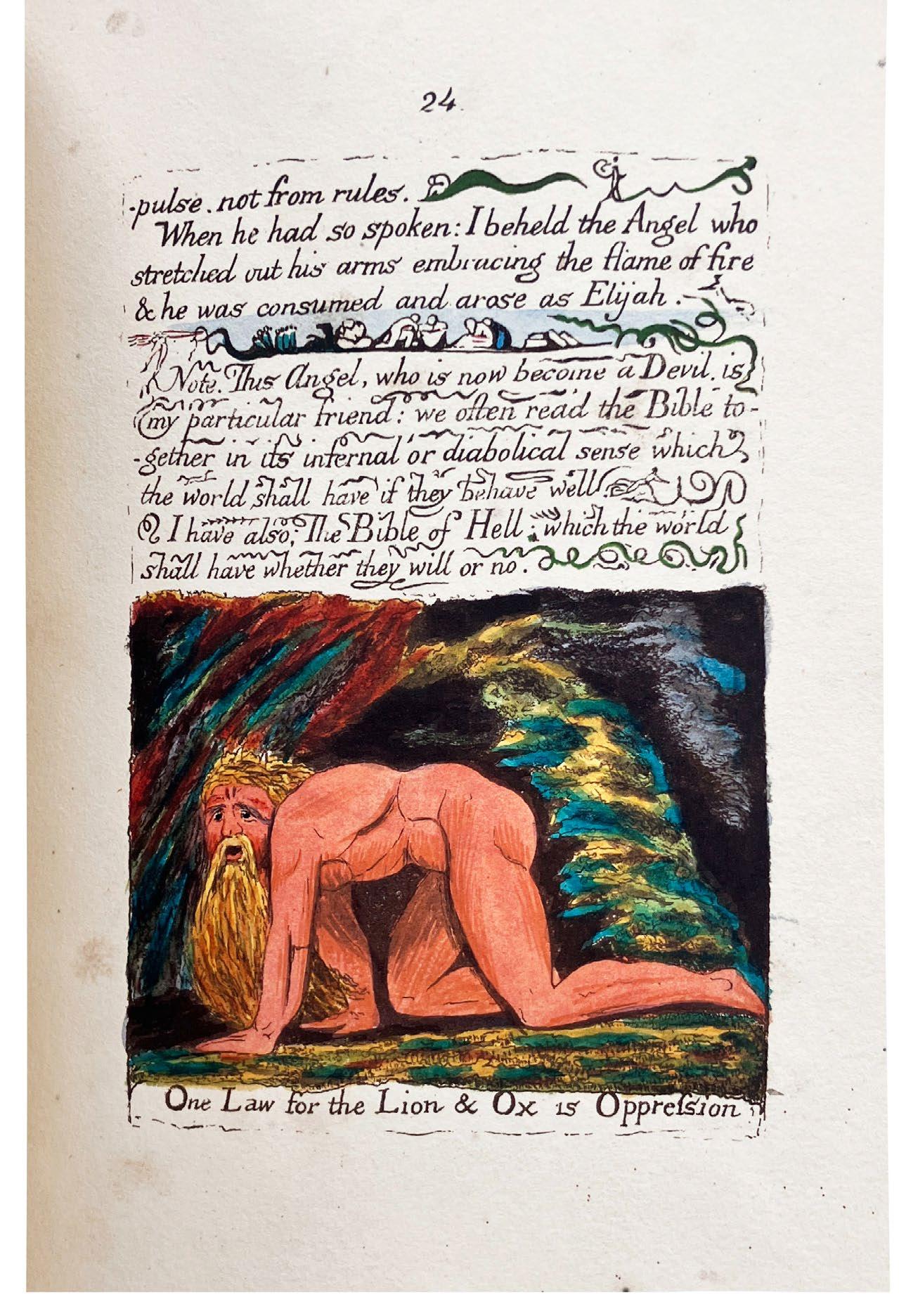
All copies of this 1868 facsimile, printed on a thick wove stock chosen for its similarity to Blake’s original paper, feature spotting, foxing and staining – a result of the reaction between the printing ink, the hand-applied watercolour and the paper – as well as some oxidisation of the inks used; the present example features foxing and staining as usual, although largely marginal, but the colour remains bright and fresh and comparable to that of the original book.
‘For every thing that lives is Holy’. —William Blake
‘Some time during the first months of 1790 a devil spoke to William Blake, an alter ego who revealed a truth and with whom a marriage was conceived, leaving neither the devil nor Blake the same again. The child of this union was The Marriage of Heaven and Hell ... It is a work that deliberately unsettles and questions, prods and cajoles, challenging the way we think. It tells us that evil is good and good evil, and promises us a Bible of Hell. The Proverbs of Hell have become a lexicon of protest and liberation, upsetting convention and subverting authority, made all the more memorable by the spirit of exuberant delight that characterizes their collective wisdom.’
— Michael Phillips
[Blake Books I, 99, see also 98, pp. 285–304 & Supplement 98, pp. 97–101; Keynes 210; Bentley & Nurmi 85; see Morton D. Paley's 'John Camden Hotten, A. C. Swinburne, and the Blake Facsimiles of 1868', Bulletin of the New York Public Library, Vol. 79, 1975–1976; see also Bodleian facsimile, 2011].
£1,750
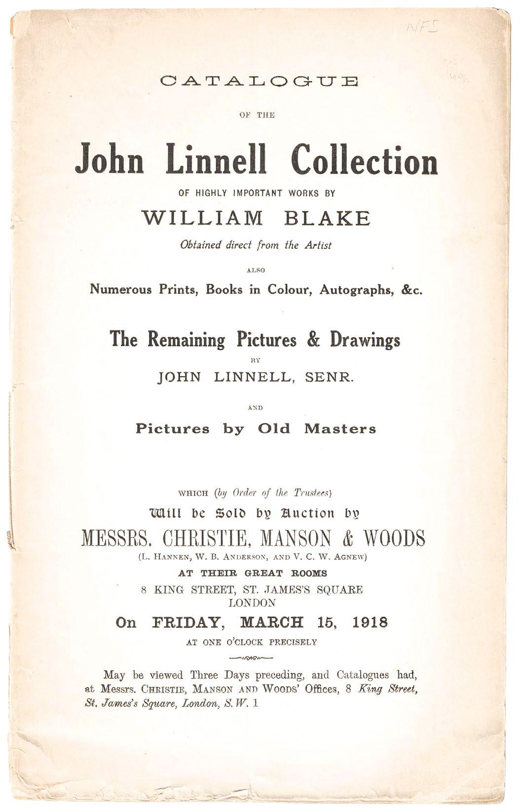
BLAKE, William
Catalogue of the John Linnell Collection of Highly Important Works by William Blake Obtained Direct from the Artist ... &c London. Christie, Manson & Woods. 1918
8vo. (246 × 155 mm). [16 leaves; pp. 30]. Title to front wrapper, conditions of sale verso and the details of 215 lots. Original publisher's printed paper wrappers, stitched as issued, titles to front cover in black.
� A fine unsophisticated copy of the important catalogue of the sale of this highly significant collection of William Blake material.
The sale was held on Friday, March 16th, 1918 at Christie’s ‘Great Rooms’ in King Street, St. James’s.
In 1818 John Linnell (1792–1882) met William Blake (1757–1827), with whom he remained friendly until Blake’s death in 1827. Linnell became an important patron to Blake in the final years of his life, commissioning, among other works, a set of engravings illustrating the Book of Job, and buying the watercolours that Blake had made for John Milton’s ‘Paradise Regained’.
The first portion of the sale was made up of works by Linnell himself as well as works and prints by other artists. Lots 148 to 215 all relate to Blake and include among sketches, watercolours and letters, the 98 drawings for Dante, the drawings for the ‘Illustrations of the Book of Job’, the drawings for Milton’s ‘Paradise Regained’, the illuminated books ‘America, A Prophecy’, ‘The Marriage of Heaven and Hell’, ‘Songs of Innocence and Experience’ (two copies), ‘There Is No Natural Religion‘, ‘Vala’ and more; notable are also the eleven sets of Blake’s engravings for Dante and the 68 copies of the ‘Illustrations of the Book of Job’. Four of the lots are priced in sepia ink in the catalogue: a note records that ‘148 Dante’s ‘Divina Comediaʼ’ sold for 7,300 Guineas; ‘149 The Book of Job’ (i.e. the original drawings) sold for 3,000; ‘151 Paradise Regained’ fetched 2,100; and ‘215 ... ‘Songs of Innocence and Experience’’ achieved 700 Guineas.
The catalogue, a remarkable survival, shows some toning to the wrappers and has been folded at some point, a few chips to the rear wrapper and some dog ears do not detract from a well-preserved and unsophisticated example. Although well represented and widely held in institutions, the catalogue is very scarce in commerce.
£1,750
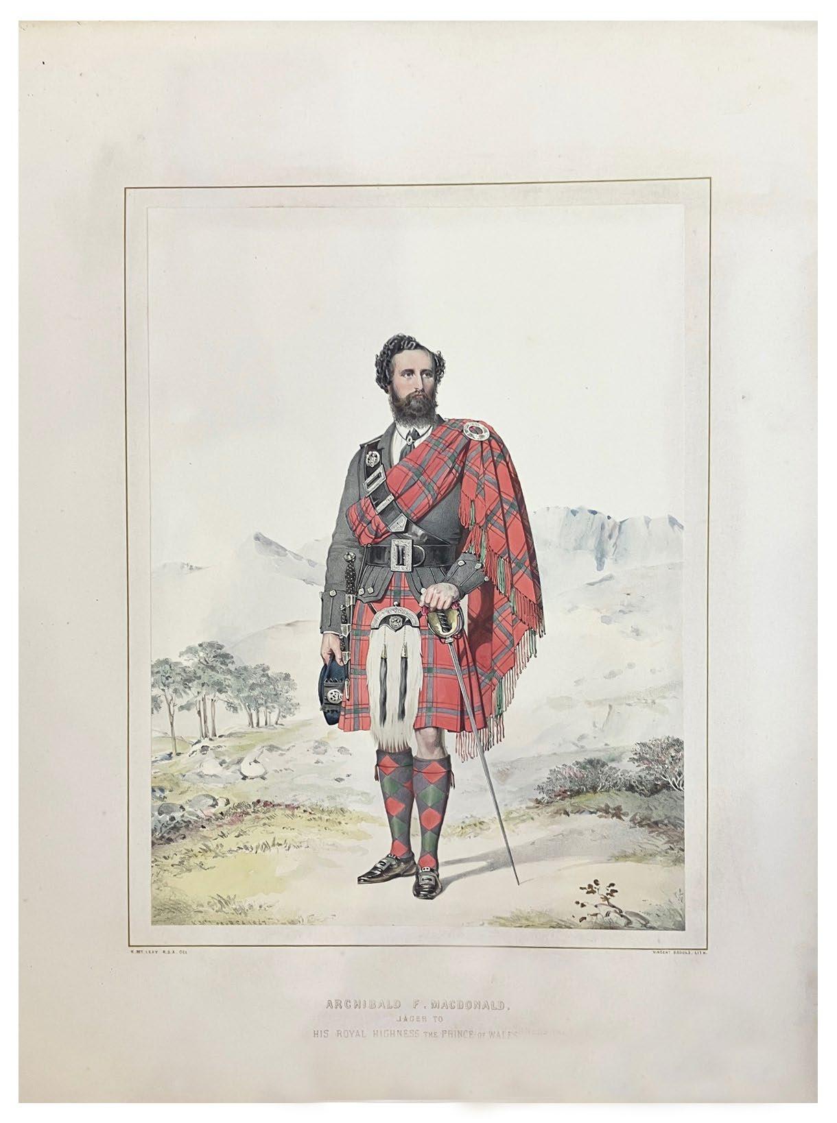
MACLEAY, Kenneth & Vincent Brooks
Highlanders of Scotland. Portraits Illustrative of the Principal Clans and Followings, and the Retainers of the Royal Household at Balmoral ... &c London / Edinburgh. Mr. Mitchell, Publisher ... Blackwood & Sons. 1870
2 vols. Elephant folio. (568 × 466 mm). Title to each vol., leaf with 'Preface' to vol. I, contents leaves to each vol. and 31 lithograph plates (15 in vol. I and 16 in vol. II) each with additional colour by hand and mounted to large leaves of thick blue / grey card within gilt rules and with titles in gilt, each with leaf (or leaves) of descriptive text on thinner paper, text and plates mounted to tabs throughout; sheet size: 556 × 434 mm. Original publisher's burgundy cloth, titles gilt within gilt ruled borders to front covers and gilt to spine, boards with bevelled edges, a.e.g., later glazed yellow paper-lined maroon cloth boxes, burgundy morocco labels with gilt titles to front covers and spines.
� Alexander Macpherson Campbellʼs presentation copy of this scarce large format study of Scottish costume and characters.
The title of the first volume features an elaborate calligraphic presentation in sepia ink verso: ‘London 1st. Jan[uar]y. 1870 / Presented to / Alexander Macpherson Campbell / by ...’; the following names, there are 9, are signatures and mostly illegible but appear to include John Charldon., Harry Dumas, Bernard Fowler, G. B. Foster, Clayton Litchfield and John Tiscombe.
Detailing the principal clans of the highlands and the Balmoral retainers of Queen Victoria, Macleay’s work – issued with the Royal arms and imprimatur and ‘Published by Command’ – provides a large and detailed pictorial record of Victorian Scotland. Each of Vincent Brooks’ lithographs – all are finished with remarkable quality with colour by hand – after Macleay’s originals is accompanied by Macleay’s detailed exegetic text.
The clans depicted are as follows: Campbell, Cameron, Chisholm, Murray, Drummond, Gordon, Grant, Fraser, Macdonald, Macgregor, Macintosh, Menzies, Robertson et al.; also shown are Queen Victoria’s ‘Personal Servant’ John Brown, her piper, William Ross, ‘Head Keeper’ John Grant and others.
£3,000
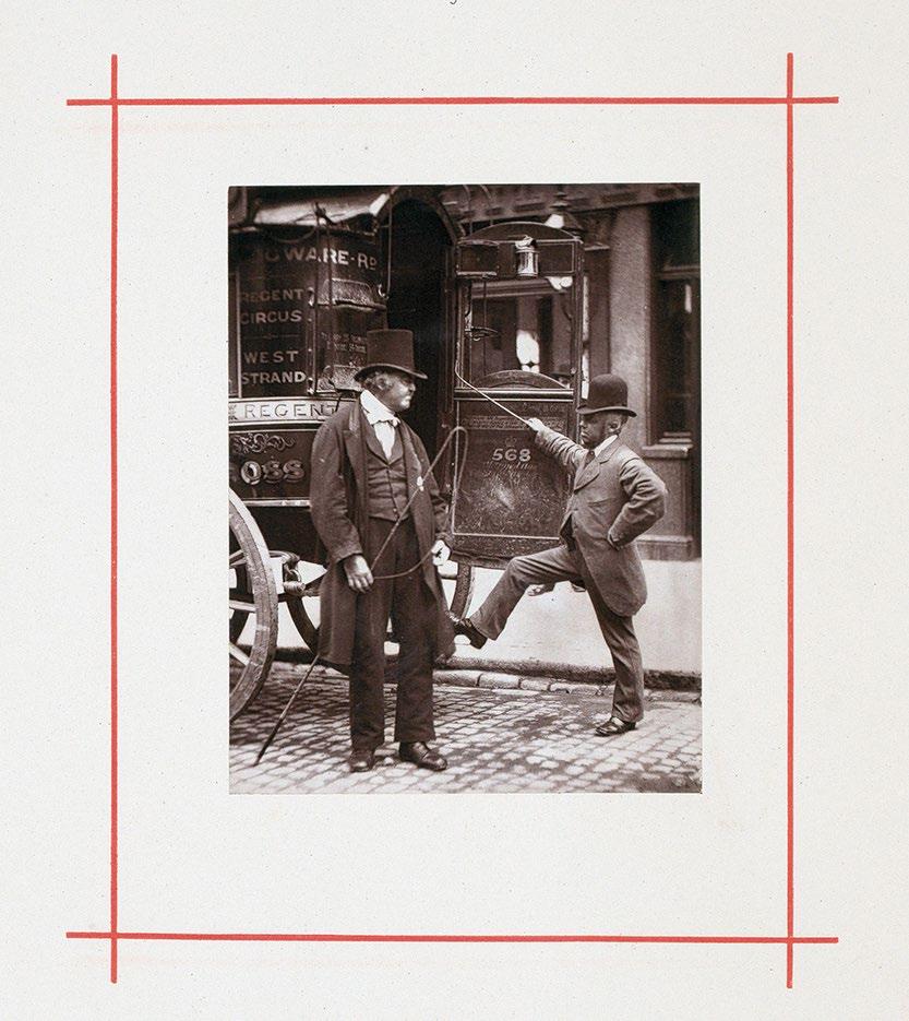
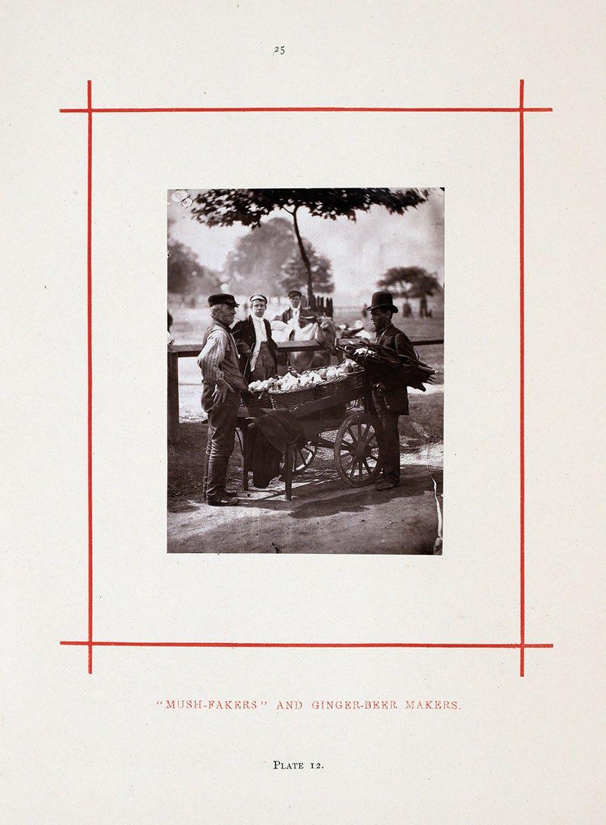
(THOMSON, John). (Thomson, J. & Adolphe Smith) Street Incidents. A Series of Twenty-One Permanent Photographs, with Descriptive Letter-Press London. Sampson Low, Marston, Searle, & Rivington. 1881
4to. (284 × 222 mm). pp. (i), 100 (including 21 leaves with plates). Title, list of plates and twentyone monochrome Woodburytype photographs, each mounted on card within a red border with title in red. Original publisher's green cloth, with gilt title and elaborate decoration in blind and gilt figures from 'Covent Garden Flower Women' and 'the London Boardmen', printed floral endpapers, later cloth box with label with pictorial title to front board and label with title to spine (both taken from the binding itself).
� John Thomsonʼs photographic depictions of Londonʼs street life.
Published as a shortened version of Thomson’s earlier Street Life in London, Street Incidents contains 16 fewer plates, though apart from the altered title the binding is the same. It is unknown whether the plates were reprinted due to the popularity of the work or whether the present volume was reissued with fewer plates to ensure sale of the publisher’s stock.
Thomson’s photographs in ‘Street Life in London’ and the commentary upon the images by Thomson and Adolphe Smith, depict a London in which life is a harsh and continuous struggle. The characters on view here are familiar to us more from Dickens’ novels or from an idea of the Whitechapel of Jack the Ripper than from any nostalgic image of a straitlaced or patrician Victorianism. Each image is accompanied by descriptive text. Thomson and Smith are sympathetic to the objects of their study and seem intent on cataloguing the variety of types to be found rather than attempting any Barnum-like freakshow.
As Thomson himself writes: ‘The precision and accuracy of photography enables us to present true types of the London poor and shield us from the accusation of either underrating or exaggerating individual peculiarities of appearance’.
‘Street Life in London ... constitutes the first photographic social documentation of any kind.’ — Gernsheim, The History of Photography pg. 447
[Parr / Badger I, 48; see Gernsheim pg. 447].
£7,500
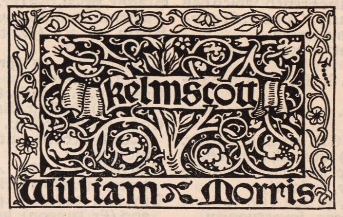
KELMSCOTT PRESS. Voragine, Jacobus de The Golden Legend of Master William Caxton Hammersmith. Kelmscott Press. 1892
3 vols. 4to. (304 × 216 mm). pp. xii, 464; 465–864; 865–1286. Woodcut title by William Morris and two full-page woodcut plates by Sir Edward Burne-Jones (all in vol. 1), each, together with facing leaves of text with elaborate woodcut borders, several additional woodcut decorative flourishes, numerous ten-line and six-line decorative woodcut initials throughout, colophon with woodcut Kelmscott Press vignette. Printed text in Morris' Golden Type. Original publisher's canvas-backed blue paper boards, printed paper title labels to spines, spines a little darkened, labels and free endpapers with some toning as usual.
� A very good copy of the first edition of The Golden Legend.
From the edition limited to 500 copies on Flower paper (no copies printed on vellum), volumes two and three unopened.
Morris’ first proposed publication by the Kelmscott Press, ‘The Golden Legend of Master William Caxton’ was announced in the ‘Literary Gossip’ column of the Athenaeum as early as September 13th 1890 (this is probably the earliest mention of the press in print). The ‘Legenda Aurea’, Jacobus de Voragine’s 13th-century compilation of Saints’ lives, an essential prism for the understanding of the medieval mind in Morris’ view, was enormously popular in manuscript and print: ‘ ... no other book was more usually reprinted in various languages between the years 1470 and 1520 ... ’ (Ellis). A copy of Caxton’s first edition (printed c.1483 / 1484) was borrowed from Cambridge University and transcribed by Ellis’ daughter; corrections to the text were made by Ellis (in consultation with Morris) while Morris designed the mise en page and occupied himself with the printing. Ellis’ proposed glossary and bibliography of English editions of the ‘Legenda Aurea’, which he intended for an introduction, found no favour with Morris, and in the published book the glossary is printed at the end of the third volume in truncated form. In addition Morris did allow Ellis to print a bibliographical notice, the ‘Memoranda, Bibliographical & Explanatory, Concerning the Legenda Aurea of Jacobus de Voragine & Some of the Translation of It’, also at the end of the third volume.
Also included, loosely inserted, is the slip of paper (70 x 202 mm) with Morris’ note to the binder: ‘IF this book be bound the edges of the leaves should only be TRIMMED [their capitals], not cut. In no case should the book be pressed, as that would destroy the ‘impression’ of the type and thus injure the appearance of the printing. Wm. Morris.’
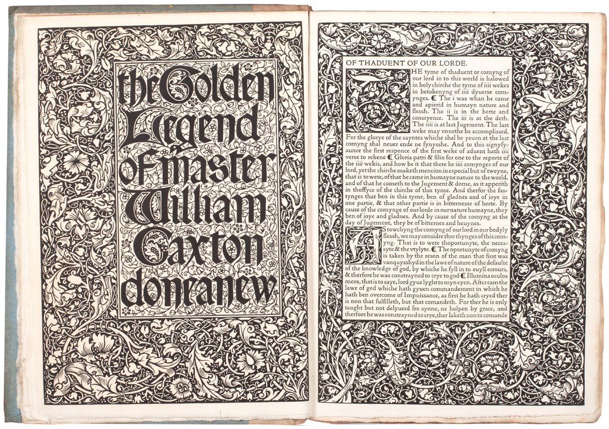
‘The Press was created, in part, as an outlet for Morris’s antiquarian enthusiasm for England’s first printer ... The Golden Legend was the first book planned, and it was only its length and minor technical problems that prevented it from being the first book printed at the Kelmscott Press.’
— Peterson, pg. 178
‘ ... the most superbly beautiful book that ever, I should think, came from any press.’ — Algernon Charles Swinburne in a letter to the editor Ellis
[Peterson A7].
£9,500
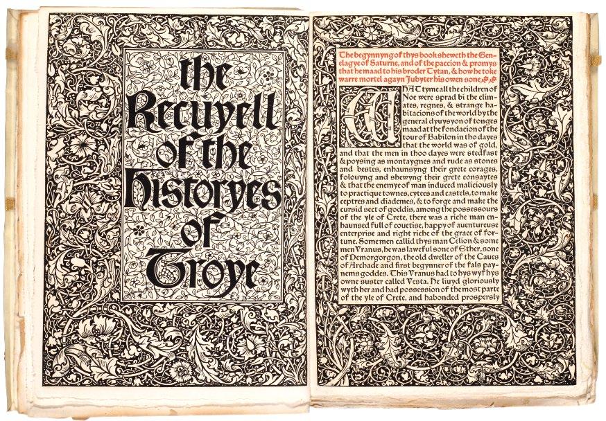
KELMSCOTT PRESS. Lefèvre, Raoul The Recuyell of the Historyes of Troye Hammersmith. Bernard Quaritch for Kelmscott Press. 1892
3 vols. in 2. Large 4to. (300 × 220 mm). [156 leaves, 214 leaves, with inserted blank; pp. xv, (i), 295; 297 - 718]. Elaborate decorative woodcut borders and initials throughout, text printed in Troy type, with table of characters and glossary in Chaucer type, printed in black and red throughout. Original publisher's limp vellum with Yapp edges, green cloth ties, titles gilt to spines.
� The Kelmscott Press edition of Caxtonʼs The Recuyell of the Historyes of Troye, the first book printed in English.
From the edition limited to 305 copies, with this one of 300 on Flower paper.
Caxtonʼs edition of the text, using his own translation of Raoul Lefèvres Burgundian romance, was the first book printed in the English language in Bruges in 1473 or 1474. The book was also a favourite of William Morris. Although Caxton’s ‘Recuyellʼ had been reprinted in numerous editions, this Kelmscott Press version was ‘the first to go back directly to Caxton’s text’ (Peterson). The text was edited by H. Halliday Sparling. Morris’ ornamental designs are printed here for the first time and his vine border – used twice in the second volume – also appears here for the first time.
‘As to the matter of the book, it makes a thoroughly amusing story, instinct with mediaeval thought and manners ... It is the last issue of that story of Troy which had such a hold on men’s imaginations; the story built up from a rumour of the Cyclic Poets, of the heroic City of Troy, defended by Priam, with his gallant sons, led by Hector the ‘preux Chevalier’, beset by the violent & brutal Greeks, who were looked on as the necessary machinery for bringing about the undeniable tragedy of the fall of the city.’
— William Morris’ manuscript note for Quaritch’s catalogue in Cockerell’ s presentation copy
[Peterson A8].
£8,500
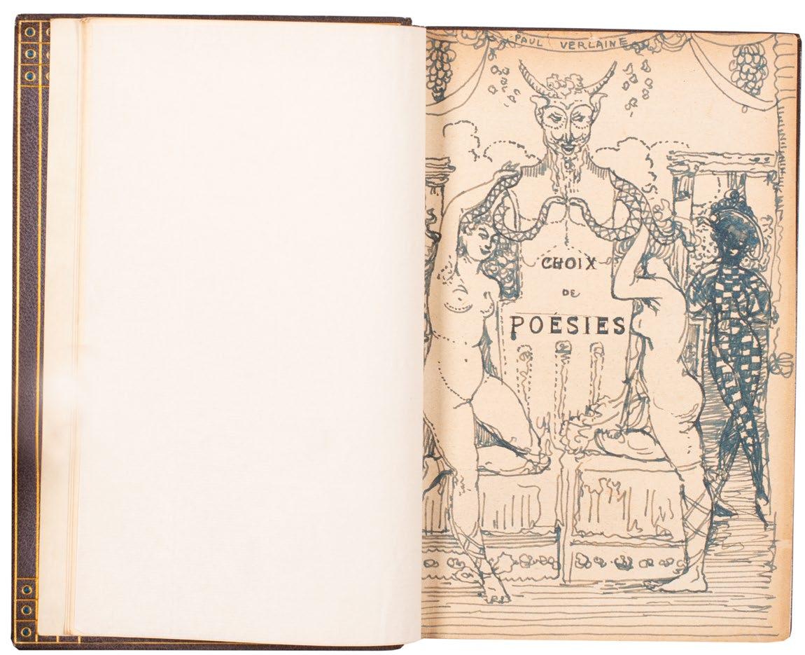
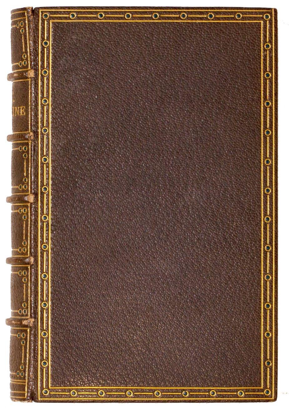
8vo. (182 × 126 mm). pp. iv, 300. Inserted leaf with manuscript and drawn pictorial half-title by Conder in ink backed to the frontispiece portrait of Verlaine (a reproduction of Eugène Carrière's painting), printed title with Conder's presentation verso (see below), inserted leaf with Conder's first original watercolour signed in pencil, two leaves with François Coppée's 'Préface' and selections from Verlaine's verse, each section with introductory title ('Poèmes Saturniens', 'Fêtes Galantes', 'La Bonne Chanson', 'Romances sans Paroles', 'Sagesse', 'Les Uns et les Autres', 'Comédie', 'Jadis et Naguère', 'Amour', 'Parallèlement' and 'Bonheur' illustrated with five inserted leaves each with an original watercolour or crayon drawing by Conder (see also below), final leaves with 'Table des Matières'. Contemporary purple crushed morocco by Ellen & Sofita Woolrich with their signatures gilt to rear pastedown, boards with double gilt rules to enclose a decorative border of gilt-surrounded azure morocco pointilles and linear gilt tooling, banded spine with related decor and 'PAUL VERLAINE' in six compartments, matching morocco turn-ins with pointille corner décor and rules in gilt, white vellum doublurres, t.e.g., peach velvet-lined, leather-covered lime cloth protective box with leather covers reproducing the décor of the binding.
� A beautiful copy in purple morocco by the Guild of WomenBindersʼ Woolrich sisters, presented by Charles Conder to his patron Mary Davis and with six signed original drawings in ink, crayon and watercolour.
Conder’s presentation is in black ink to the verso of the title: ‘To Mrs. Edmund Davis Souvenir of / Christmas Paris 1905 from Charles Conder’.
Mary Davis (1866–1941) née Halford, was the wife of Edmund ‘Napoleon of the Cape’ Davis (1861–1939), later Sir Edmund, the Australian-born British mining financier of Lansdowne Road and Chilham Castle, who had given up an artistic career for gold-mining, accruing a serious fortune. Mary Davis was an accomplished artist (like Conder she painted many fans and some of their fans were exhibited together in New York in 1914), and together the Davises were magnaminous patrons who amassed a large collection of paintings by Old Masters and by their own contemporaries, among them several important paintings by Whistler. Conder had first encountered Mary Davis in Paris in the 1890s and later the collector patrons gave Conder his first important commission – for Conder it was highly significant and led to others .– the decoration of the ‘Adam’ room in their Holland Park house.
Conder’s gift, the present volume of Verlaine with its elaborate inserted drawings and watercolours, is clearly a profound thank you from an artist
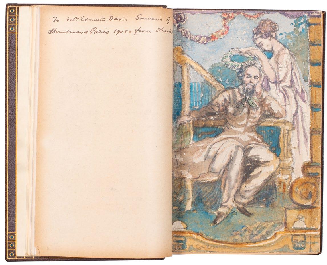
to his patron. The Davises were supporters, and generous ones, of the artists they admired and Conder's gift seems a fitting tribute to a patron whose sympathies – artistic and poetic – lay with his own. The watercolours all take their inspiration from Verlaine and are entitrely in keeping with his wider oeuvre, decorative, colourful and tending to the rococo, and reflecting and complimenting the decorations for the 'Adam' room, the paintings on silk and the fans of Conder’s that the Davis had collected. Conder’s own copy of Verlaine, now apparently in the Dixson Library in Sydney, was also illustrated in pen and wash, a clear indication of the significance of the present copy.
‘If the imagery of Conder’s watercolours on silk derived formally from Watteau, he added another layer. It derived from nineteenth-century literary reinterpretations of the artist, particularly by Paul Verlaine, whose poems after Watteau’s ‘Fêtes galantes’ were published in 1869. Conder’s copy of Verlaine’s ‘Choix des poesies’ [sic], which he illustrated in pen and wash, is now in the Dixson Library in Sydney.’ — Ann Galbally
‘Edmund and Mary Davis had a strange house in Lansdowne Road, Notting Hill, for a room of which Charles Shannon and Charles Ricketts suggested to their patrons that Conder should do decorative paintings. Originally the house had been quite ordinary and commonplace, but it was very dear to Edmund and his wife, because it brought their modest beginnings back into their recollections. Year after year the semi-detached villa grew, their collection of treasures increased till the walls would hold them no longer. At each of my visits to London I found another floor and a new wing which extended out over the garden. Then they spread across the road, and wonderfully appointed stables, a swimming-bath, and a tennis-court covered the ground floor of a building of studios for artists (of whose company were Shannon and Ricketts). In this Mother Hubbard house Edmund and Mary were always on the look-out for a chance to give young artists commissions to do new decorations. Conder’s hour had struck.’ — Jacques-Emile Blanche
‘Conder ... was an artist possessed of vast and astonishing powers of invention, and a brilliant colourist. He showed his genius in the decorative panels he designed ... for Mr. Bing, Mr. Edmund Davis, and others. These were achievements which would have gained him in other ages constant employment in adorning public buildings or palaces ... Indeed as a decorative artist and painter-poet who created and lived in a fairyland of his own, Conder certainly deserves some record.’ — Frank Gibson
‘Ellen (Nelly) G. Woolrich probably learned to bind from Cockerell or from Sangorski and Sutcliffe. She was working at 5 Bloomsbury Square when she exhibited in the A & CES exhibition in 1903 and in Antwerp in 1904. She and her sister Sofita were Americans... ’. — Marianne Tidcombe
Please contact us for a list of Conder’s original drawings and watercolours.
[see Ann Galbally's 'Charles Conder: The Last Bohemian', Melbourne, 2002, pp. 256– 261; see Frank Gibson's 'Charles Conder: His Life and Work ... &c.', London, 1914; see Jacques-Emile Blanche's 'Portraits of a Lifetime &c.', London, 1937; see Marianne Tidcombe's 'Women Bookbinders 1880– 1920', London, 1996, pg. 173].
£22,500
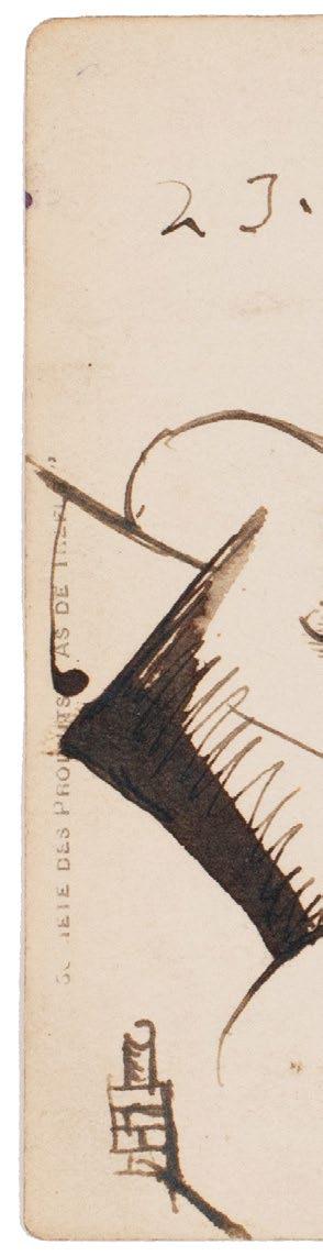
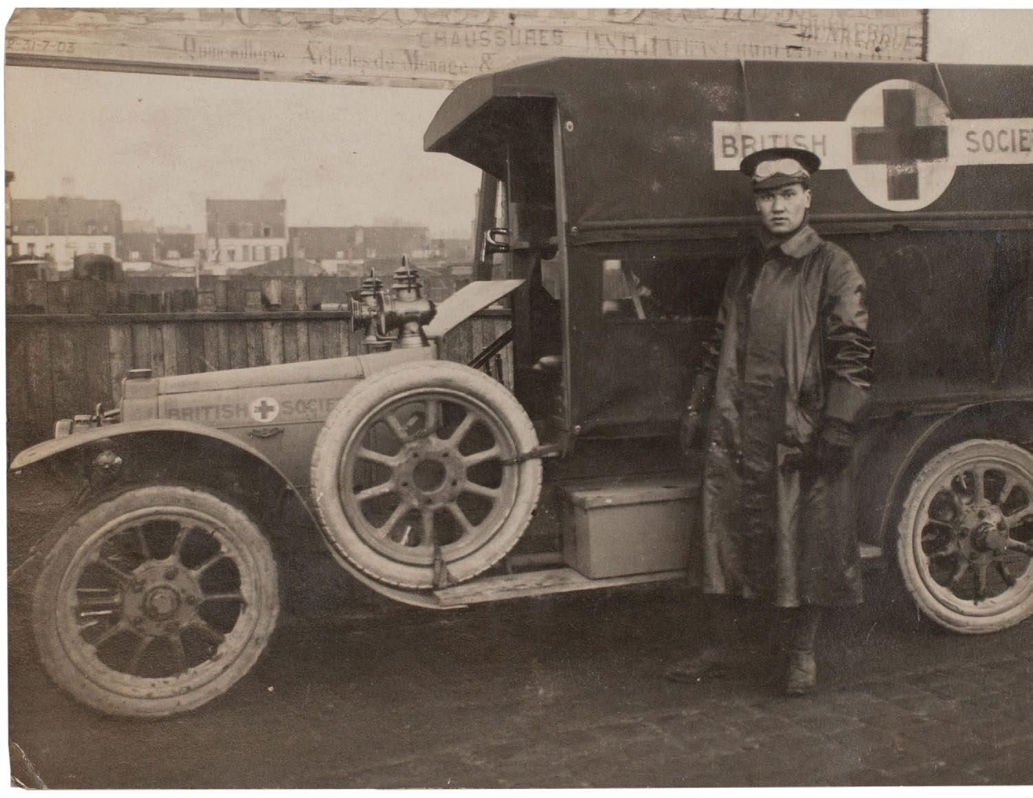
NEVINSON, Christopher Richard Wynne Original Futurist Drawing Executed on the Verso of a Photograph of Nevinson With His Ambulance in WWI (Malo-les-Bains). 1915
(90 × 140 mm). Gelatine silver print on photograph postcard stock, printed postcard layout and detail in French verso, verso with original drawing and presentation in sepia ink by Nevinson.
� An extraordinary Futurist drawing by Nevinson from the First World War executed on the verso of the rare photograph of Nevinson standing beside his Friendsʼ Ambulance Unit Mors Motor ‘busʼ .
Nevinson’s original Futurist drawing depicts a fighter aircraft, a biplane, above a townscape of roofs and chimneys with what appears to be billowing smoke and clouds; his presentation –like his drawing – is in sepia ink: ‘23.1.15. / a [sic] mon petite amie Simone / de / C. R. W. Nevinson.’
Christopher Richard Wynne Nevinson (1889–1946) volunteered for service with the Red Cross as an ambulance driver at the declaration of war in 1914 (Nevinson was born with a limp and would not have passed the physical examination for the army), ‘pursued by the urge to do something’. He was attached to a unit of the Friends' Ambulance Service and on arrival at Dunkirk was immersed immediately in the horrors of ‘The Shambles’, the nickname for the shed ‘full of dead, wounded, and dying’ that was the result of the near complete collapse of French medical service. After the institution of the Lady Florence Fiennes Hospital at Malo-les-Bains, Nevinson ferried the wounded from ‘The Shambles’, and from the front at Woosten and Ypres, to the hospital for treatment. After Nevinson’s leg began to make driving too difficult he was retained at Maloles-Bains as nurse where he remained until his return to England at the end of January 2015.
The recipient of the present drawing and photograph was Sister Simone Lengrand, a nurse at the Lady Florence Fiennes Hospital (the dearth of adequate medical facilities in the early part of the war saw the establishment of private hospitals funded by philanthropic individuals or societies), who must have known Nevinson through their work at the hospital. Nevinson
commissioned this photograph, of the artist beside his ‘bus’, a Mors Motor ambulance, and sent another example to Marinetti, now held at the Palazzo Grassi. Although the reasons for Nevinson’s departure from France are unknown – Nevinson suggests he was invalided home – he was certainly back in London very shortly after this drawing was executed and presented. Nevinson exhibited compositions inspired directly by his experiences in March 1915 before he volunteered for service with the Royal Army Medical Corps in London; he was commissioned as an official war artist in 1917.
Nevinson often created small drawings that he used later as the basis for larger and more elaborate paintings and several examples of such war drawings are known. Although no painting is known after the present drawing, its presentation mitigates against this in any case, it does include
important elements of Nevinson’s wider war oeuvre. The presence of a biplane – as per ‘Paint and Prejudice’, ‘Dunkirk was one of the first towns to suffer aerial bombardment’ – is remarkable and an image and motif that Nevinson returned to often in paintings (see ‘Spiral Descent’ of 1916 and ‘Aerial View’ from 1919 / 1920) and prints (see ‘Swooping Down on a Taube’, ‘Banking at 4000 Feet’ and ‘In the Air’, all 1917). The townscape too is itself noteable and is highly reminiscent of that of the 1915 painting ‘Ypres After the First Bombardment’ with its empty facades, absent rooves and billowing smoke. This drawing represents an important and hitherto unknown stage in Nevinson’s artistic development from the period prior to the war to his later work as a war artist and is a crucial indicator that Nevinson continued to work as an artist while at the front.
The drawing and photograph remained in the collection of Simone Lengrand, she retained it together with all her memorabilia of the war in a memorial album of cuttings and photographs, until her death. The photo-
graph was inserted loosely into a support sheet (it is retained here) with her note ‘Mardi 23 Janvier 1915’ (above) and ‘Mr C. R. W. Nevinson le Peintre futuriste de / retour du front’ (beneath). The verso of the photograph, and therefore the drawing itself, remained hidden until the sale of the album; the album has been dispersed and is not present here.
‘By the time I had been at The Shambles a week my former life seemed to be years away. When a month had passed I felt I had been born in the nightmare. I had seen sights so revolting that man seldom conceives them in his mind and there was no shrinking even among the more sensitive of us. We could only help, and ignore shrieks, puss, gangrene and the disembowelled.’
— C.R.W. Nevinson writing in Paint and Prejudice
‘The problem for Richard [Nevinson] was how to depict the war, how to identify a suitable compromise in subject matter and technique and how to isolate himself from the negativity surrounding extreme Futurist rhetoric, while retaining his avant-garde, and possibly, rebel, status. Beyond acceptability, Richard also had to wrestle with the concept of presenting this new, and very modern, though often visually mundane, war ... The colourful uniforms had been replaced with khaki, the heroic charges and defences with long-range shelling, the sweeping military manoeuvres with trench warfare. The era of the machine gun, the U-Boat, the aeroplane and poison gas was going to guarantee that this war would not be picturesque in the way that the conflicts had been depicted in the past. A new language would almost certainly be required to depict this most modern of wars; the first total war.’ — Michael Walsh
[see Nevinson's 'Paint and Prejudice', London, Methuen, 1937; see Michael Walsh's 'C. R. W. Nevinson: This Cult of Violence', New Haven and London, 2002].
£30,000
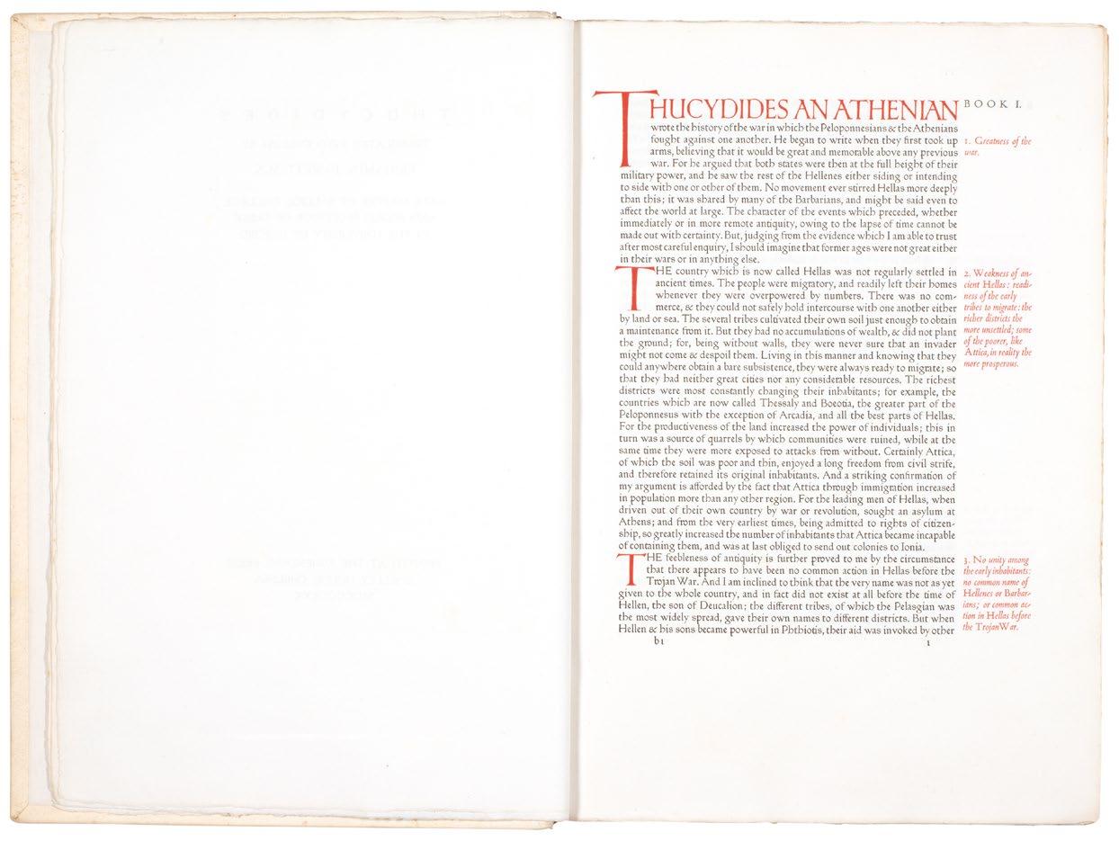
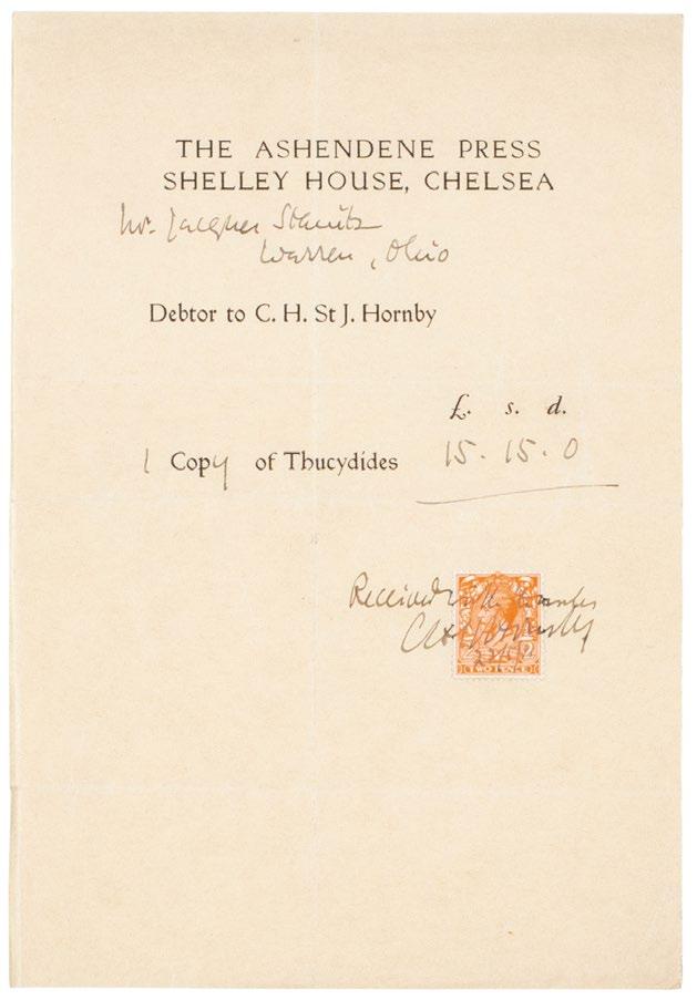
ASHENDENE PRESS.
Thucydides. (The History of the Peloponnesian War)
Chelsea. The Ashendene Press. 1930
Folio. (408 × 282 mm). [188 leaves; pp. 363, (i)]. Printed title and 'Book I' to 'Book X' of Thucydides' text in English in red and black in Ptolemy type, chapter summaries in Blado marginal, chapter summaries and opening lines by Graily Hewitt in red, the red initials from the alphabet designed by Eric Gill for the Ashendene Utopia, final leaf with colophon and woodcut Ashendene device verso. Original publisher's full white pigskin by W. H. Smith & Son, Ltd. with their signature gilt to rear turn-in, banded spine with gilt title in six compartments.
� The Ashendene Thucydides, the final folio from the press.
From the edition limited to 280 copies, with this one of 260 on Batchelor ‘knight in armour’ Ashendene paper; 20 copies on vellum were also issued.
The Greek text was translated by Benjamin Jowett, Regius Professor of Greek at Oxford. The book is printed in Ptolemy with Blado marginal chapter summaries – the first time St John Hornby had used a different type for side-notes.
This copy includes the original purchaser’s invoice, a single leaf (216 x 150 mm) headed ‘THE ASHENDENE PRESS / SHELLEY HOUSE, CHELSEA’ and made out to Mr. Jacques Steinitz / Warren, Ohio’. Signed by St. John Hornby, with two pence stamp and dated May 27th, 1931, the cost is detailed as 15 Guineas.
[Ashendene XXXVII].
£7,500
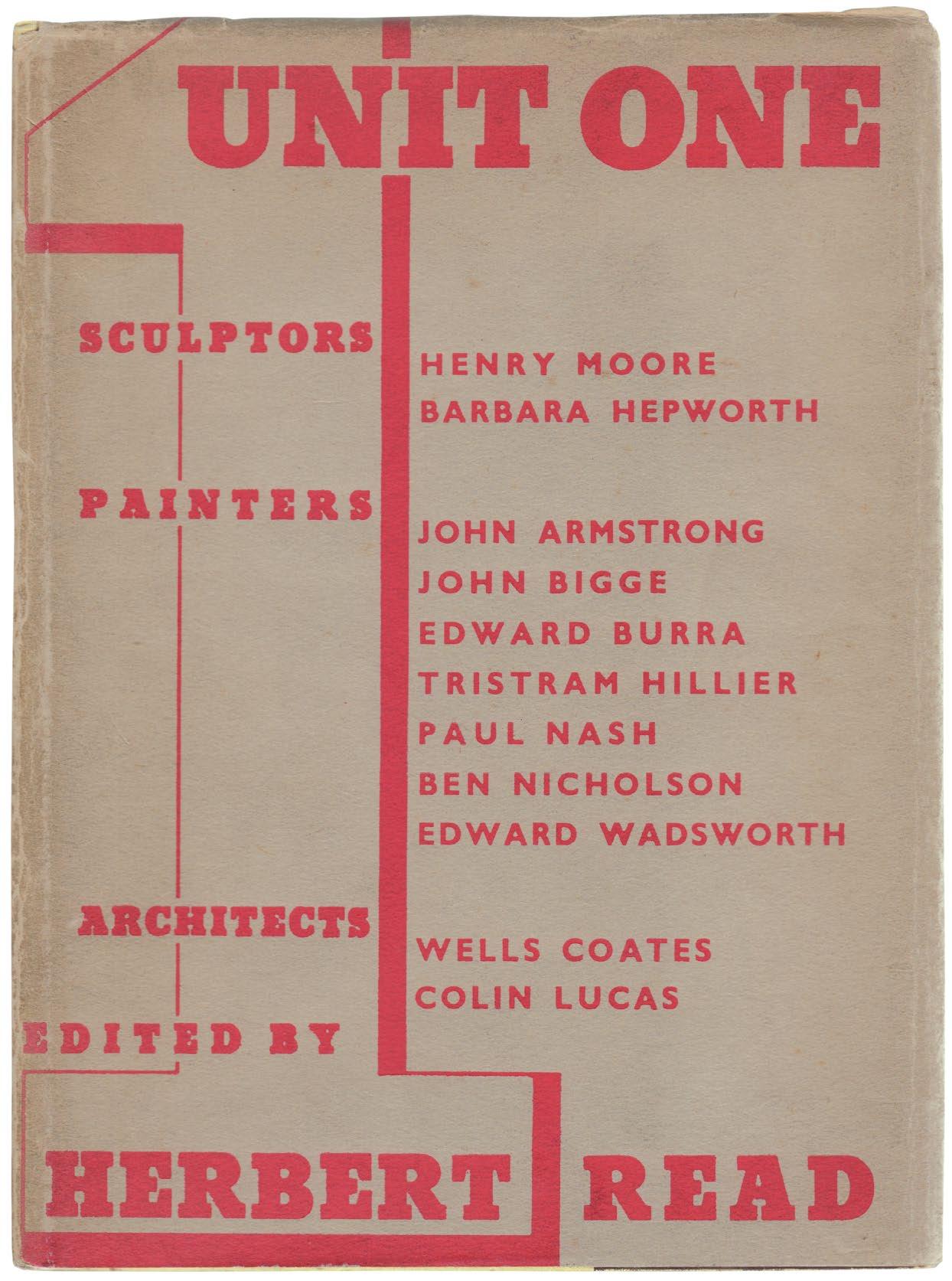
READ, Herbert (Ed.)
UNIT ONE. The modern movement in English architecture painting and sculpture London. Cassell and Company Ltd. 1934
4to. (254 × 190 mm). pp. 124. Illustrated with 67 monochrome plates. Original publisher's yellow cloth with title to upper cover, original grey dust-jacket with titles to front panel in red.
� The sole publication of the English artists and architects who formed Unit One.
Unit One consisted of the sculptors Henry Moore and Barbara Hepworth, the painters John Armstrong, John Bigge, Edward Burra, Tristram Hillier, Paul Nash, Ben Nicholson and Edward Wadsworth and the architects Wells Coates and Colin Lucas. Unit One opposed the English romantic tradition of working ‘by the light of nature’ and advocated a strong ‘structural purpose’ in both painting and architecture.
‘Unit One is the name of a new group of English artists – painters, sculptors and architects – which was formed early in the year 1933. It is not a group of new artists: most of the eleven constituent members already have established reputations. Nor does it stand for any new principle in art. It arose almost spontaneously among a few artists well-known to each other, out of a consciousness of their mutual sympathies and common necessities.ʼ
— Herbert Read, writing in the Introduction
Members represented in this book are Moore, Hepworth, Paul Nash, John Armstrong, John Bigge, Burra, Tristram Hillier, Ben Nicholson, Wadsworth, and the architects Wells Coates and Colin Lucas.
£850
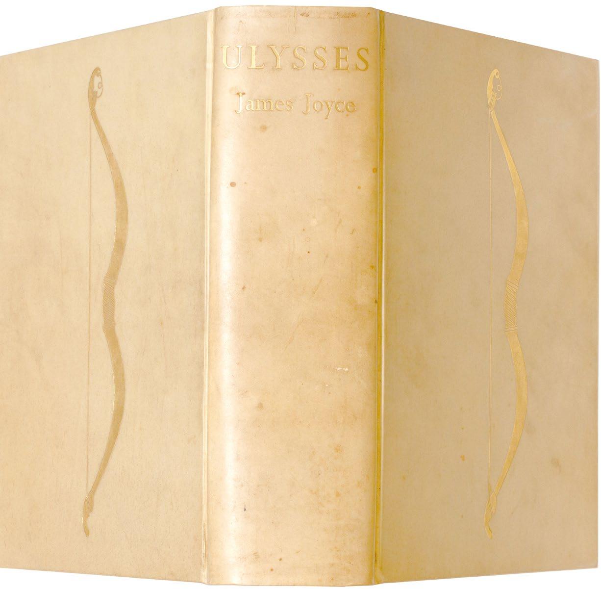
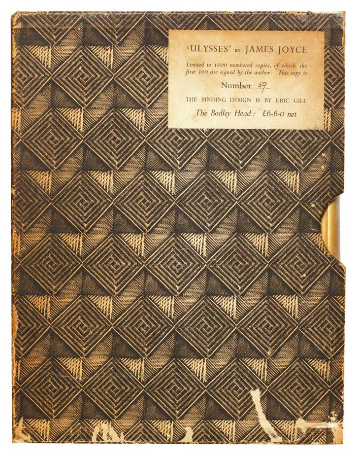
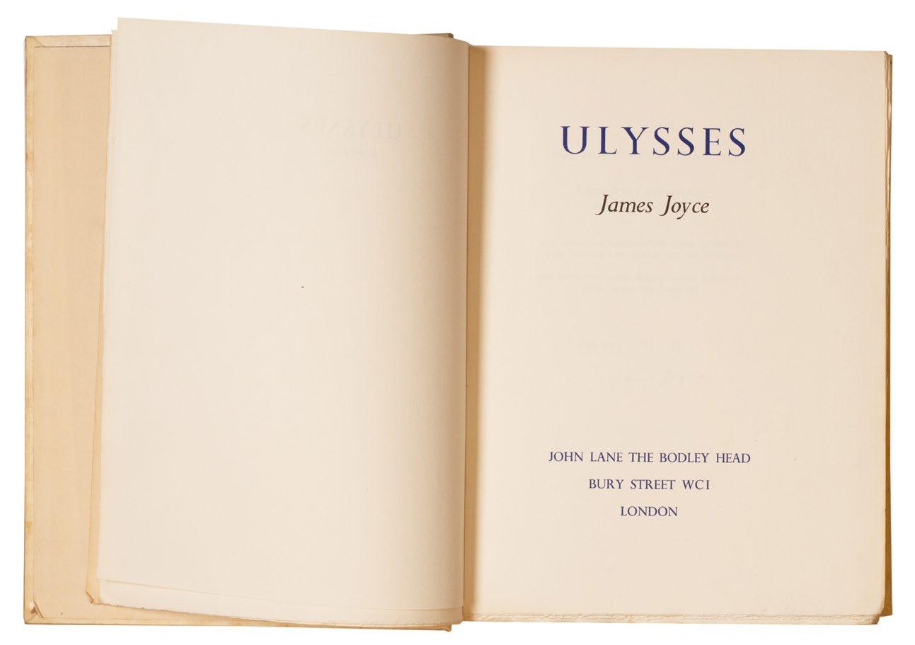
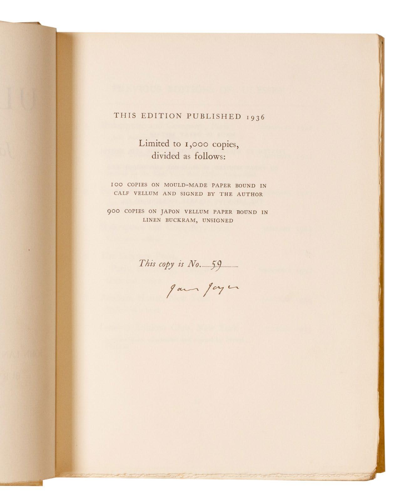
JOYCE, James Ulysses
Large 8vo. (264 × 204 mm). pp. xiii, 765, (i). Half-title, printed title in blue and black, leaf with justification and production credits verso, leaf with list of 'Previous Editions of 'Ulysses'', leaf with details of the appendices and Joyce's text concluding 'Trieste-Zürich-Paris, 1914–1921' and appendices Original publisher's full vellum designed by Eric Gill with gilt bow vignette to front and rear boards, cream endpapers, title gilt to spine, a.e.g., original patterned paper-covered board slipcase with white paper label with printed titles and matching copy number in ink.
� The deluxe issue of the first edition of Joyceʼs magnum opus to be printed in Great Britain.
From the edition limited to 1,000 copies, with this one of 100 on mouldmade paper in the deluxe vellum binding designed by Eric Gill and signed and numbered by Joyce; the original slipcase features matching numbering to the book.
This authoritative edition of ‘Ulysses’, the first to be published in Great Britain, features Joyce’s corrected text (see below), details of the seven previous editions and their fates where applicable (for example for the Egoist Press edition ‘499 copies were seized by the Customs Authorities, Folkestone)’ and detailed appendices concerning the protests, injunctions and trials relating to the publication of the book and a bibliography of works by Joyce.
Written over a seven year period during Joyce’s peripatetic tour of Trieste, Zurich and Paris (where it was eventually first published), ‘Ulysses’ chronicles a day in the life of Leopold Bloom: June 16th 1904. The book was banned in Britain, Ireland and America until the 1930s due to its apparent obscenity, hence the need originally for French publication. Considered by many to be the greatest work of literature in the English language, ‘Ulysses’ is certainly a supreme monument of literary Modernism and conceivably the greatest work of literature of the 20th century; Nabokov considered it one of the ‘greatest masterpieces of twentieth century prose’. However, the greatness of Ulysses has often been overshadowed by the novel’s difficulty, its ambiguities and its intense literary nature, all factors that led the publisher Sylvia Beach to announce the first edition of the work with the apology: ‘the publisher asks the reader’s indulgence for typographical errors unavoidable in the exceptional circumstances’; the errors are corrected in the present edition.
Although the slipcase for the present copy is rubbed and worn, it remains intact and the vellum of the binding of the book is fresh with only slight toning to the spine and some small marks to the boards; overall a very good copy of this important text.
[Slocum & Cahoon A23].
£27,500
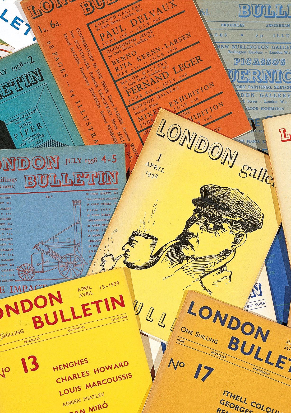
London Bulletin. Vols. 1–20. (All Published) London. London Gallery. 1938, April–1940, June
20 vols. in 15. 4to. (250 × 190 mm). Profusely illustrated throughout in colour and monochrome with text and illustration on a variety of paper stock of differing colour; the final triple number (18–20) also includes two hors-texte full-page woodcuts in two colours by Stanley William Hayter and John Banting and John Buckland Wright's original monochrome woodcut. Original publisher's wrappers, each of a different colour and with titles to front covers in various colours, later blue cloth chemise with leather title label to spine and matching slipcase.
� A complete set of the most influential English Surrealist periodical.
Edited by E. L. T. Mesens, this was the most influential English language Surrealist magazine and the only one to be published in England. Although it described itself as an avant-garde review, Surrealist contributions were numerous; the periodical also featured Constructivism and more abstract art, not Surrealist in tone, but Surrealism was the dominant mode throughout.
Contributors included Paul Eluard, Herbert Read, Mesens, André Breton, Nash, Tanguy, Beckett, Péret, Picabia, George Reavey, Humphrey Jennings, Roland Penrose, Eileen Agar, John Banting, Conroy Maddox and others.
The series includes three double numbers and the final triple number: 4/5: The Impact of Machines; 8/9: Living Art in England; 15/16: Picasso in English Collections; 18–20: Surrealism. In this set, issue 1 includes the original printed order slip on thin blue paper, loosely inserted.
‘ ... it was not until 1938, when E. L. T. Mesens published the Bulletin of the London Gallery, of which he had become director in 1937, that the Surrealist group in England found a voice, although theirs was not the only voice in it.’
— Dawn Ades
‘London Bulletin has assumed the position of the only avant garde publication in this country concerned with contemporary poetry and art. Although its first number was practically a monograph, by various hands, concentrated on the work of the surrealist René Magritte, it has rapidly expanded its range, reflecting besides exhibitions of painting, other activities of living interest in its pages. The July double number, devoted to The Impact of Machines, further increased the value of its position by arousing the attention of numerous readers abroad ... ’. — Introduction to Issue no.7
[Ades 14.53, see pp. 349 - 357; Fonds Destribats 403]. £5,500
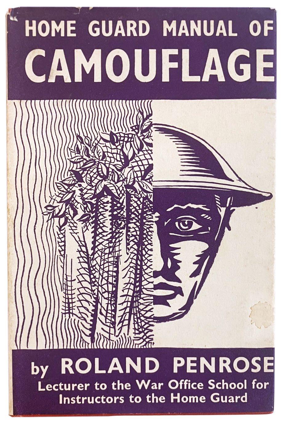
Home Guard Manual of Camouflage London. G. Routledge & Sons, Ltd. 1941
8vo. (125 × 190 mm). pp. 102. Richly illustrated with monochrome drawings and 4 photographs. Original publisher's red cloth, title in black to spine, with the original jacket with illustration and titles in purple and cream to front cover and spine, advertisement to rear and explanatory text to flap.
� A very good copy of Penrose’s rare manual with the scarce dust jacket.
Roland Penrose was a Quaker and therefore a known pacifist, but after the outbreak of World War II he volunteered as an air raid warden and then taught military camouflage at the Home Guard training centre at Osterley Park: ‘This led to Penrose’s commission as a captain in the Royal Engineers. He worked as Senior Lecturer at the Eastern Command Camouflage School in Norwich, and at the Camouflage Development and Training Centre at Farnham Castle, Surrey. During his lectures, he used to startle his audiences by inserting a colour photograph of his partner Lee Miller, lying on a lawn naked but for a camouflage net; when challenged, he argued ‘if camouflage can hide Lee’s charms, it can hide anything’. Forbes suggests this was a surrealist technique being put into service. His lectures were respected by both trainees and colleagues. In 1941 Penrose wrote the Home Guard Manual of Camouflage, which provided accurate guidance on the use of texture, not only colour, especially for protection from aerial photography (monochrome at that time).’ — Wikipedia / Tate Online
A very good copy, there are some slight stains to the jacket, toning to the spine and rubbing at head and foot; the cloth and pages remain in excellent condition.
£550
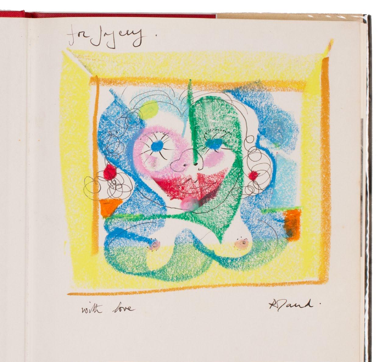
(REEVES, Joyce). Penrose, Roland Portrait of Picasso (with Additional Correspondence and Original Material to Joyce Reeves) London. Lund Humphries. 1971
4to. (255 × 192 mm). Half-title with monochrome reproduction photograph of Picasso's eyes, colour frontispiece (a reproduction of a 1904 self-portrait) verso, title with copyright verso, leaf with contents and Alfred Barr's 'Preface' verso and on following leaf, foreward and introduction by Penrose and Penrose's text profusely illustrated throughout with numerous monochrome reproduction photographs, portraits, paintings, drawings etc. several reproductions in colour, final leaves with index. Original publisher's scarlet cloth, title to spine in black, original pictorial dust-jacket with titles to spine in blue and black, colour photographic portrait of Picasso to front cover, monochrome portrait of his hands to rear, book details to front and advertismement to rear flaps, additional material inserted loose.
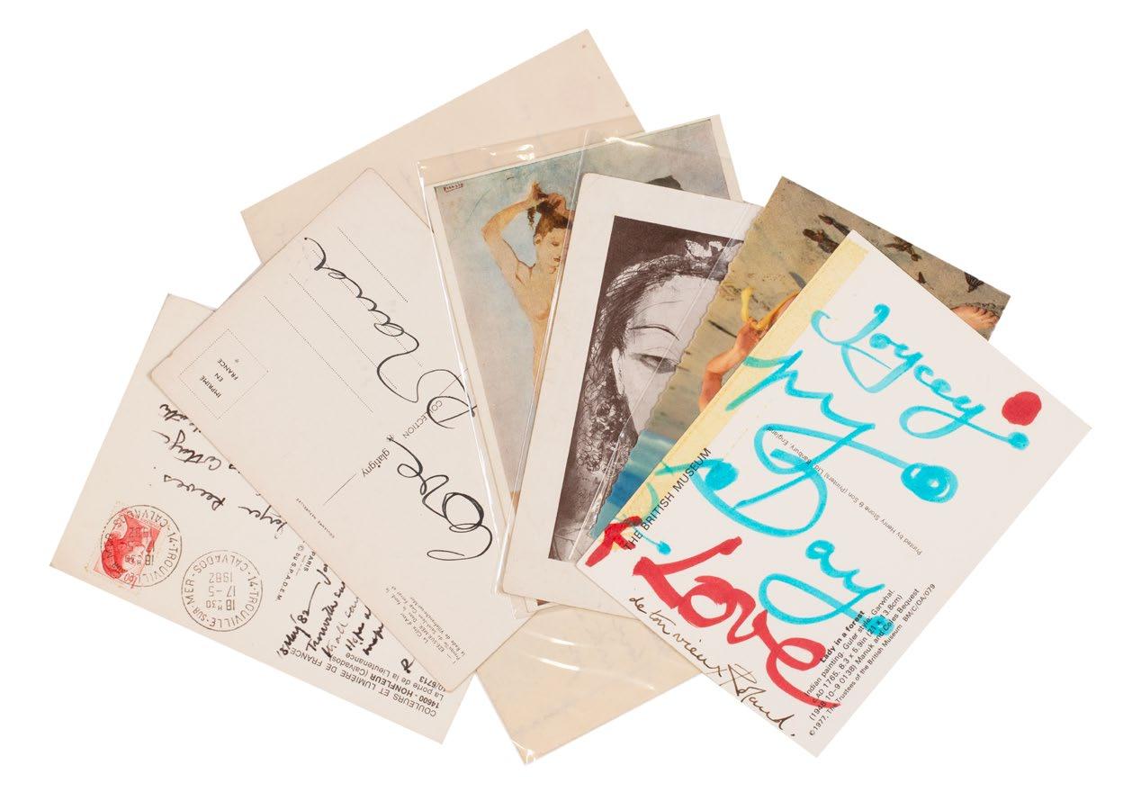
� Joyce Reevesʼ presentation copy of Roland Penroseʼs Portrait of Picasso with an original crayon drawing and remarkable additional original material and correspondence.
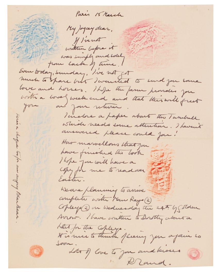
Penrose’s presentation is in black ink and above and below the elaborate crayon drawing: ‘for Joycey / with love Roland’; the drawing itself, executed in various colours of pastel over black ink, appears to be a portrait of Reeves.
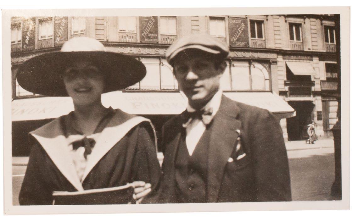
Joyce Reeves (1911–1993), aka Joyce Gard, was a translator (she worked for the review XXème Siècle from the later 1920s until the 1970s), writer of childrens’ fiction, civil servant (during the war in the Ministry of Economic Warfare and in the late 1940s in Germany), ceramicist, academic and from the early 1950s until the early 1970s Roland Penrose’s private secretary and research assistant. In this latter rôle, Reeves was of crucial importance in the completion of Penrose’s ‘Picasso: His Life and Work’ (1958) and the ground-breaking 1960 exhibition at the Tate organised by the Arts Council of Great Britain. Although the exhibition was held at the Tate and Penrose was the director of the ICA at the time, his close relationship – as friend and biographer – with Picasso meant that he, and by proxy Reeves, had enormous responsibility for the organisation of the exhibition and the production of its catalogue.
The correspondence presented here, spanning 1948 to 1982, presents a remarkable picture of Penrose as a correspondent. As with many of his presentations in books, his letters are effusive, often illuminated and feature drawings, highlighting and frottage. It seems clear from the present collection - and the extensive correspondence of Penrose and Reeves held
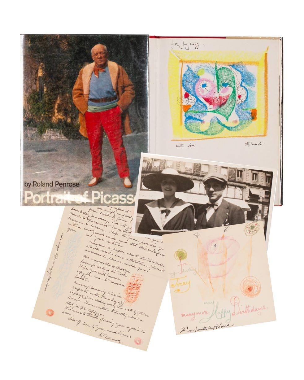
in the Penrose archive at National Galleries Scotland underlines this - that Penrose valued Reeves very highly. For example, the extensive letter (see below) decorated with colour frottage discusses, among other things, a book recently completed by Reeves and the arrival in London of Penrose, Lee Miller, the Man Rays and William Copley (aka CPLY) and his wife Norma, presumably for Copley’s exhibition at the ICA (May 25th – July 1st 1961); Reeves translated Patrick Waldberg’s essay for the catalogue and Man Ray opened the exhibition.
Please contact us for a full list of the additional material.
[see 'Roland Penrose Scrap Book 1900–1981', New York, 1981; see the entry for Joyce Gard in 'The Writers Directory 1980–1982'; see 'RPA613 - Reeves, Joyce' in the Penrose Archive at National Galleries Scotland].
£2,750
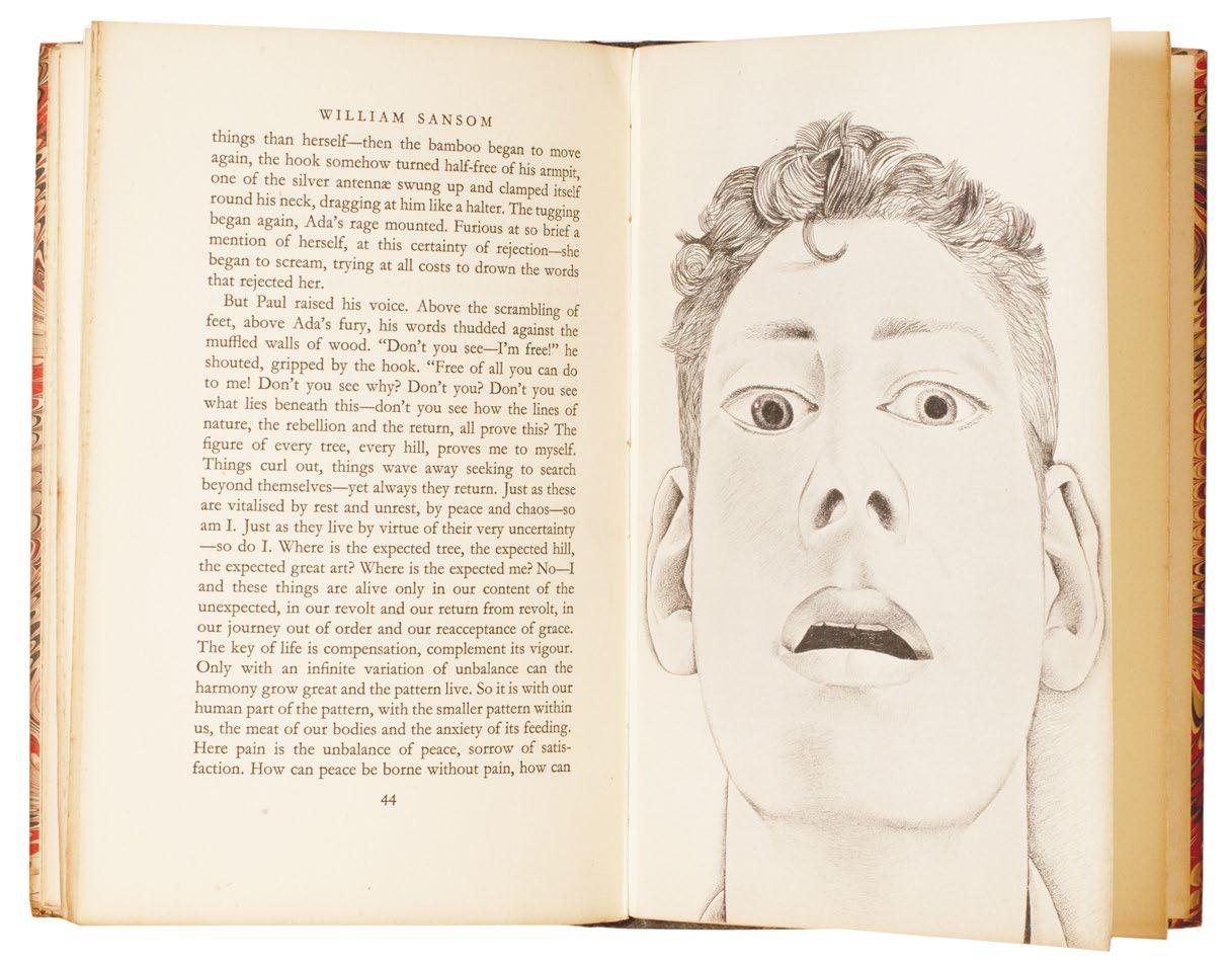
FREUD, Lucian. Sansom, William
8vo. (224 × 148 mm). [24 leaves + 5 inserted leaves of plates on different paper; pp. 45, (i)].
Half-title, leaf with justification, printed title in red and black, copyright verso, leaf with Sansom's dedication to Osbert Sitwell and Sansom's text with three-line opening initial in red and illustrated with 5 full page monochrome illustrations, all recto only after Freud's original drawings, final leaf with printer's credit verso. Original publisher's black buckram-backed marbled paper-covered boards, title gilt to spine.
� Lucian Freudʼs illustrations for Sansomʼs Kafka-esque novella.
From the edition limited to 750 copies, signed and numbered by William Sansom in turquoise ink.
Lucian Freud (1922–2011) provided illustrations for Nicholas Moore’s ‘The Glass Tower’ (1944) before illustrating the present work. The illustrations after Freud’s original drawings are instantly recognisable as his work. Freud provided no further illustration for any subsequent books.
£950

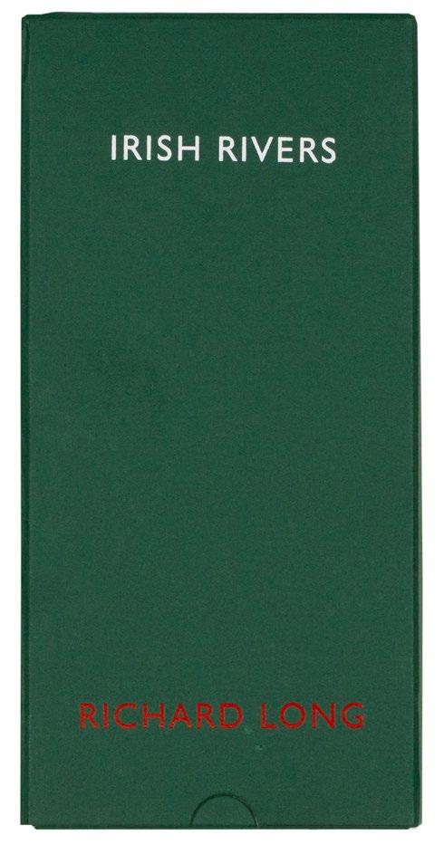
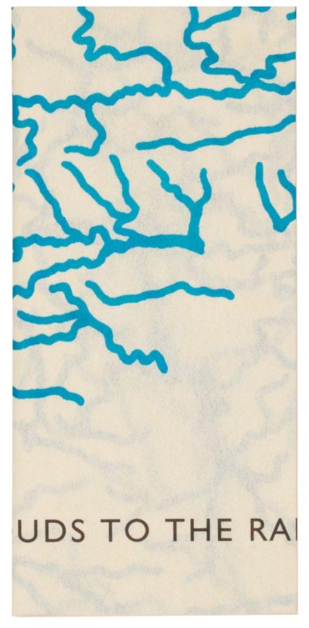
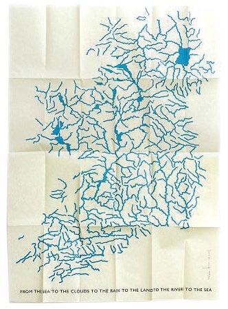
LONG, Richard Irish Rivers
Turin. Marco Noire Editore. 1998
Tall 8vo. (256 × 128 mm). [Single folded leaf]. A single sheet of vellum with original silkscreen in blue and legend in black beneath by Richard Long recto, signed and numbered by Long in pencil at lower right; sheet size: 250 × 118 mm (folded), 1,000 × 695 mm (unfolded). Original publisher's green cloth slipcase with title 'IRISH RIVERS' in white and credit 'RICHARD LONG' in red to front cover, matching chemise with flap.
� An excellent example of Richard Longʼs large format silkscreen map multiple on vellum.
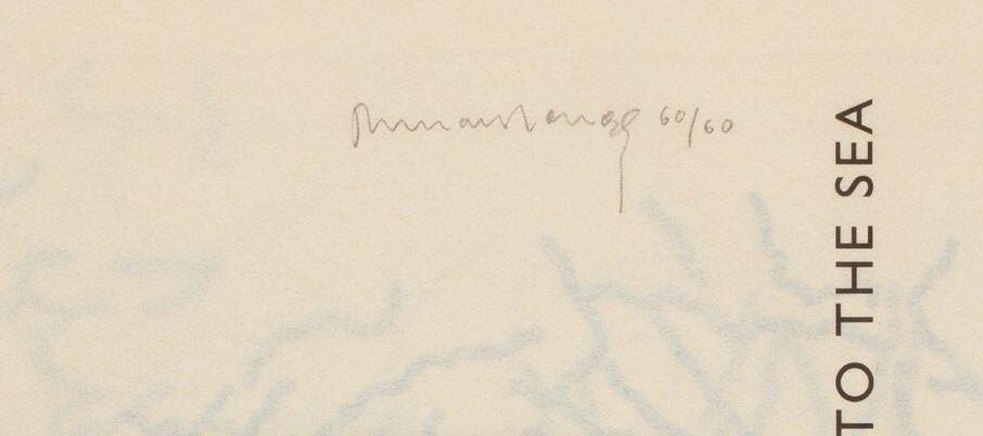
From the edition limited to 60 copies, each signed and numbered by Richard Long in pencil.
Richard Long’s ‘Irish Rivers’ is just that: a silkscreen map of Ireland, deconstructed entirely, with all terrain, geography and topography excised and retaining only the rivers and loughs. Printed entirely in blue, the rivers and loughs give an alternate sense of Ireland, usually imagined as the emerald isle, as an island of blue. Beneath Long’s image is the printed legend iterating the endless cycle of water: ‘FROM THE SEA TO THE CLOUDS TO THE RAIN TO THE LAND TO THE RIVERS TO THE SEA’ .
The multiple ‘Irish Rivers’ also relates to a group of works created by Richard Long in the 1990s. Among them are an original drawing in blue pencil of all of the rivers of Ireland, and another drawing, of the rivers of England, Scotland and Wales. Executed too in 1998, both of Long’s drawings of rivers feature the same legend as this multiple version as the title beneath, in red for the Irish drawing and in blue for the UK drawings.
£2,750
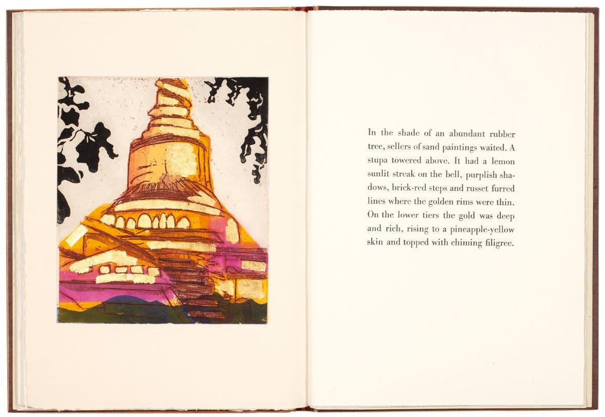
London. The Willow Press. 1977
Folio. (340 × 255 mm). [28 unnumbered leaves: 3 blank leaves, 20 leaves with text and illustration composed of uncut double leaves, leaf with justification, 4 blank leaves]. Half-title, frontispiece, printed title with publisher's vignette, colophon verso, text with 20 illustrations (14 full-page), all original colour etchings with aquatint by Susan Allix, final leaf with justification recto; loosely inserted is the original printed slip with advice regarding the interleaving of the plates. Full light blue crushed morocco by Susan Allix with her blindstamped initials to rear pastedown, front board with gilt tooling to form an abstract female figure, tooling in blind flowing over both boards with additional inlaid sections of colour morocco to form a decorative floral design, turnins with additional inlaid sections of morocco and tooling in blind to match, blue handmade paper endpapers, loose in original wool-lined blue cloth box with gilt title to spine.
� An excellent copy of one of Susan Allix’s earliest artist books.
From the edition limited to 50 numbered copies, signed and numbered in ink by Allix on the justification.
The book is created in its entirety by Allix, who made the prints, developed the typography and mise-en-page and bound the book
£4,000
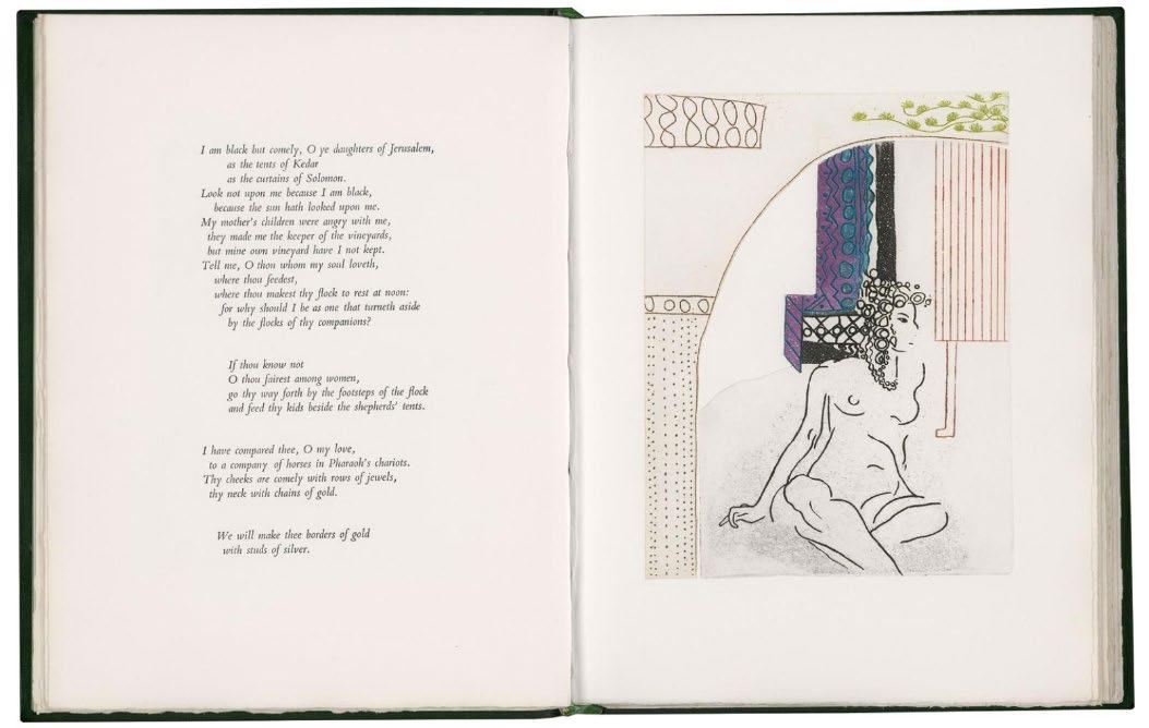
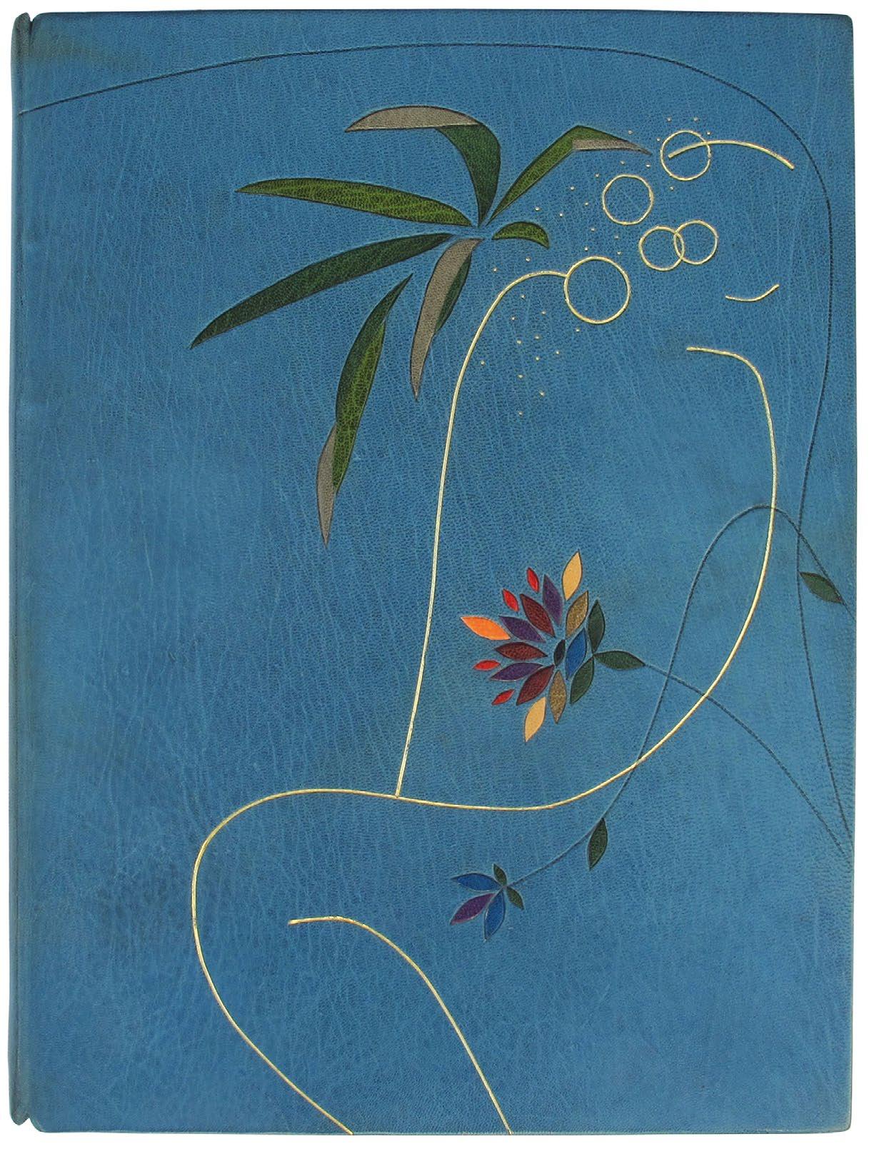
Anon, old or unknown. Nonsense & Nonsense. A collection of verses and extracts by Mr. M. Prior, Dr. S. Johnson, Mr. E. Lear, Mr. L. Carroll, the Sphinx, Mr. or Mrs. Anon. etc. with logical or nosensical Typographic arrangements and visual promptings London. (Susan Allix). 2008
Folio. (290 × 230 mm). [50 unnumbered leaves including blanks]. Printed text in various types and illustration in various media all on various paper stock in various formats, final leaf with justification and colophon. Full burgundy crushed morocco, excised sections with curvilinear edges reveal a checkerboard pattern of gilt, pink and café crème paper, front board with three applied sections of white paper with monochrome drawings and four colour paintings (see below) mounted to squares or rectangles of burgundy crushed morocco with magnetic fastenings, single painting mounted to rectangle of burgundy morocco affixed to centre of rear board, smooth spine with tooled title in black, cream handmade patterned paper doublures, bronze free endpapers, burgundy velvet-lined oatmeal drop-back box with morocco label to spine with title in black.
� The édition de tête in the deluxe magnetic binding of one of Allix’ s most extraordinary, inventive, capricious and whimsical artist books.
From the edition limited to 24 numbered copies signed and numbered by Allix in pencil, with this one of 8 from the édition de tête in the deluxe binding.
Allix’s detail regarding the book taken from the colophon is instructive: ‘Authors: old or unknown. / Typefaces: various (but including Grotesque, Gill, Granby and Gallia, with Caslon, Engravers Roman & altered and unaltered wood letter). / Papers: various (including Arches, Somerset, Zerkall). / Printing: by hand, by letterpress; with new intaglio plates and lino-cuts and old printer’s blocks.’
Also included, inserted loose, is the prospectus for the book, a sheet folded in three (210 x 98 mm folded) with printed text recto only together with the price list which also gives detail of the price for Pagoda Memories.
‘On a nonsensical scale this book is not deeply nonsensical. It looks like a book; it has pages that turn conventionally and its contents are not gibberish. Most of the words have been around for many years, some so long their authors have been forgotten. But they are set in a variety of arrangements, using more typefaces than are usually expected in one book.
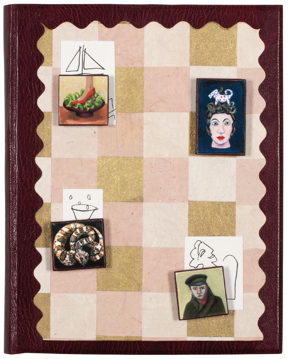
There is a new piece of punctuation I invented, some woodletter I altered and some old printers’ blocks reprinted ... The initial idea ... was for the reader to be able to do more than turn the pages; to be able to move or change images. Small pictures on the binding would be turned or re-located over others by the use of magnets. As the results of this were not intended to be serious, they would be accompanied by some nonsensical words ... The different sizes, shapes and tones of the various papers used sustain a vitality in the flow of pages, while the limited colour scheme of terracotta, red and cream unifies the collection of odd, puzzling or humorous verses and extracts.’ — From Susan Allix’s text from the book’s prospectus
£4,000
Pagoda Memories. Golden Pagodas of Myanmar with Burmese Notes
London. (Susan Allix). 2009
Folio. (340 × 248 mm). [33 unnumbered leaves]. Engraved frontispiece with additional applied goldleaf (see below), printed title in burgundy and Allix's text (some also in burgundy) with section titles, some printed on Pindaya handmade mulberry paper, illustrated with 7 engravings, final leaf with justification and colophon. Full terracotta crushed morocco, front and rear boards with large onlaid sections of burgundy to claret varicoloured morocco, front board with additional gilt decoration with onlaid sections of tan morocco with curvilinear decorative tooling in gilt, red and black to form a stylised pagoda motif, handmade textured chocolate paper doublures, burgundy gilt-patterned Kinwashi paper free endleaves, custard wool-lined burgundy cloth drop-back box with leather label to spine with title in black.
� A superb example of a Susan Allix illustrated book – created in its entirety by the artist – inspired by her travels in Myanmar.
From the edition limited to 10 copies on Magnani Biblos and Burmese mulberry papers, signed and numbered by Allix in pencil.
Also included, inserted loose, is the prospectus for the book, a sheet folded in three (210 x 98 mm folded) with printed text recto only and housed in a folder, a further, larger sheet folded in three (297 x 210 mm folded) with title and pictorial vignette to front cover, advertisement for Allix’s ‘Nonsense & Nonsense’ with pictorial vignette to interior flap and with a central pocket of Kinwashi matching the endleaves of this book.
The book was conceived and created in its entirety by Allix, who made the prints (intaglio prints with ‘line-drawing, aquatint, open-bite, softground, carborundum’ and colour), developed the typography and mise-en-page and bound the book. Four of Allix’s engravings also include applied gold leaf.
‘This is a straightforward book about pagodas (or payas), the fantastical pieces of architecture that exist in their thousands in Myanmar ... As memories, the prints and their accompanying words are not concerned with historical facts and locations, or with interpretations of use or construction. They are in the nature of descriptive records of passing moments, remembered for some special quality.’ — From Susan Allix’s text from the book’s prospectus
£4,000