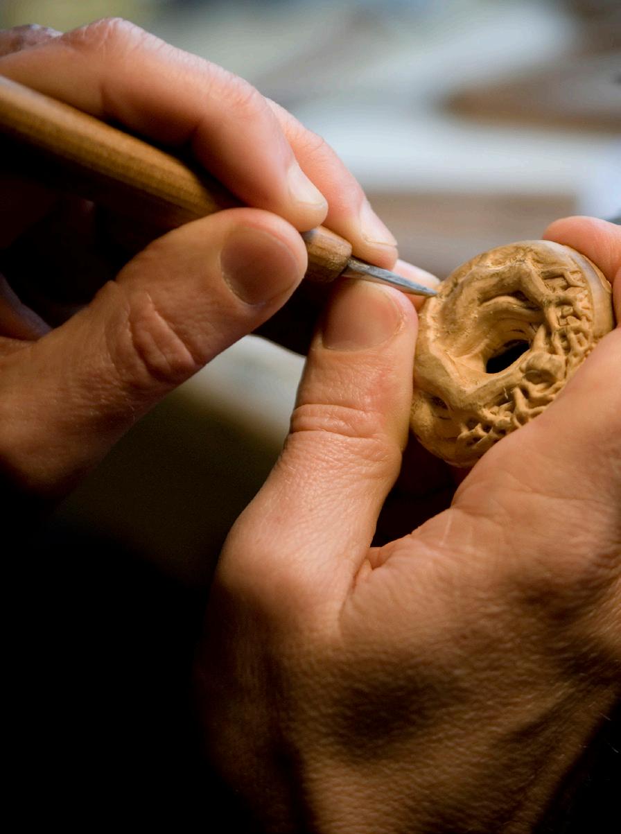
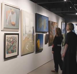
In this issue, we are thrilled to share Dr Rosalind Hollinrake's first-hand account of her discovery of the works of Clarice Beckett, now regarded as one of Australia's most important painters, but at one time almost entirely forgotten. We also discover funerary masks from Ancient Egypt, take a look inside Jacqueline Kennedy Onassis' jewellery box, learn about the intricate art of netsuke carving with Leigh Sloggett, and examine three intriguing chair designs created with the intention of being, at least in part, deliberately uncomfortable.
We also take a closer look at mesmerising emeralds, fan-shaped paintings, and the porcelain paintings of Harry Davis for Royal Worcester.
So, take a (comfortable!) seat, and enjoy these stories and many more from our specialists and guest contributors.
June – July 2026
features
Fully Informed or Misinformed?
Faces for the Afterlife: Funerary Masks from Ancient Egypt
Into the Light: The Extraordinary Rediscovery of Clarice Beckett
Porcelain Landscapes: The Artistry of Harry Davis
Fanfare: The Fan Design in Australian Art
Sitting with Discomfort
The Rise, Fall, and Reinvention of Accessible Luxury Jardin of Envy
Graphic Confidence: Alun Leach-Jones in Print
The Remarkable Reverso, a Watch You'll Flip Over
Jewels of a First Lady: The Style Legacy of Jacqueline Kennedy Onassis
in focus
From the Workshop: The Art of Netsuke Carving with Leigh Sloggett
Five Minutes with Daisy Giuffrida
22nd Report: How Koala Detection Dog Bear Found his Purpose
A Last Look
cover:
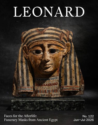
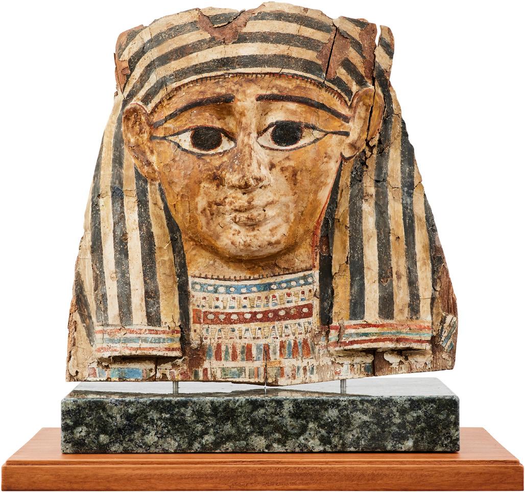
An Egyptian Sarcophagus Mask
Third Intermediate Period (1075-663 BCE).
Height 50cm
$10,000-15,000
The Collector's Auction Tuesday 2 June, Sydney
below:
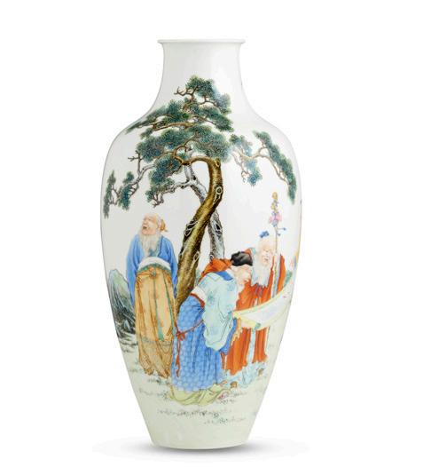
A very fine and rare Chinese famille-rose "Scholars" vase, Huairentingzhi fourcharacter iron-red seal mark, Hongxian period (1915 - 1916)
$20,000-30,000
Important Chinese & Asian Art
Auction Sunday 14 June, Melbourne
join us Connect Value, Sell & Buy
AUCTION CALENDAR
JUNE –
JULY 2026
July
The Auction Salon
Modern Design
Mon 1 Jun, 10am
Melbourne
The Collector's Auction
Tue 2 Jun, 2pm
Sydney
Specialist Rugs Thu 11 Jun, 10am
Melbourne
Important Chinese & Asian Art
Sun 14 Jun, 11am
Melbourne
Asian Art Winter Edit
Tue 16 Jun, 10am
Melbourne
Fine Jewels
Mon 29 Jun, 6pm
Melbourne
Fine Art
Tue 30 Jun, 6pm
Melbourne
The Collection of John and Wendy Alsop
Tue 7 Jul, 10am
Sydney
Decorative Arts
Mon 13 Jul, 6pm
Melbourne
Optics of Time: A Private Collection of Antique Eyewear
Wed 22 Jul, 10am
Sydney
The Sydney Jewellery Edit Wed 29 Jul, 10am
Sydney
Furniture & Interiors
Objects & Collectables
Jewellery
Art
Every Thu from 10am
Melbourne
Fully Informed or Misinformed?
by john albrecht, managing director & head of important collections
a chance encounter with my school music teacher gave me my first real insight into how industry specific language, particularly the language of cataloguing, can work perfectly well inside a professional bubble while being deeply unhelpful, and even misleading, to the public.
She was reminiscing about an estate auction she had attended many years ago in Melbourne and laughing about a section of porcelain items catalogued with the initials “AF”, which happened, coincidentally, to be her own initials.
She assumed the pieces were initialled “AF” and had once belonged to someone with those letters or perhaps were marked by an artist or owner. In fact, “AF” was an old cataloguing abbreviation meaning “as found”, later more bluntly expressed as “all faults”: a warning to prospective buyers that the item may be damaged or imperfect in some way.
Only after purchasing several pieces did the auction house clarify for her that each item was indeed damaged, to one degree or another. My teacher, a person of great humour and spirit, found the situation hilarious. She had learned a lesson and laughed it off. But not all cataloguing language is so harmless.
One commonly accepted, and far more problematic term is “bearing a signature.” Auction houses use this phrase when an item carries a signature that is not regarded as authentic, or when authenticity cannot be verified at the time of cataloguing. It may mean the signature was added later, is by another hand entirely, or is considered too weak or uncertain to stand behind. In other cases, it simply allows the auctioneer to acknowledge the presence of a signature without taking responsibility for its legitimacy, while leaving open the possibility of “future research.”
The difficulty is that we now operate in a 21st century marketplace where most buyers are private clients - not seasoned antique dealers - and professional advisers are far fewer than they were even fifty years ago. As a result, this sort of language has become increasingly obscure, ambiguous, and misunderstood.
My concern is that an unsuspecting buyer may easily read “bearing a signature” as an implicit assertion of authenticity. To understand what the phrase truly means, one often has to dig into a catalogue glossary or fine print, something few buyers would think to do, or even realise they must do. In my view, that is a fundamental failure of communication that needs to be rectified.
In truth, “bearing a signature” is a loose, brittle, and hollow addition to the cataloguing process. More often than not, it obscures rather than clarifies, and it carries a very real risk of misleading the buyer, even when no deliberate deception is intended.
My advice is simple: when you see the expression “bearing a signature”, assume that the signature is more likely inauthentic than genuine. The auctioneer is effectively distancing themselves from the claim, relying on an antiquated expression that no longer serves a useful purpose for today’s buyer, except, perhaps, to pass unnoticed.
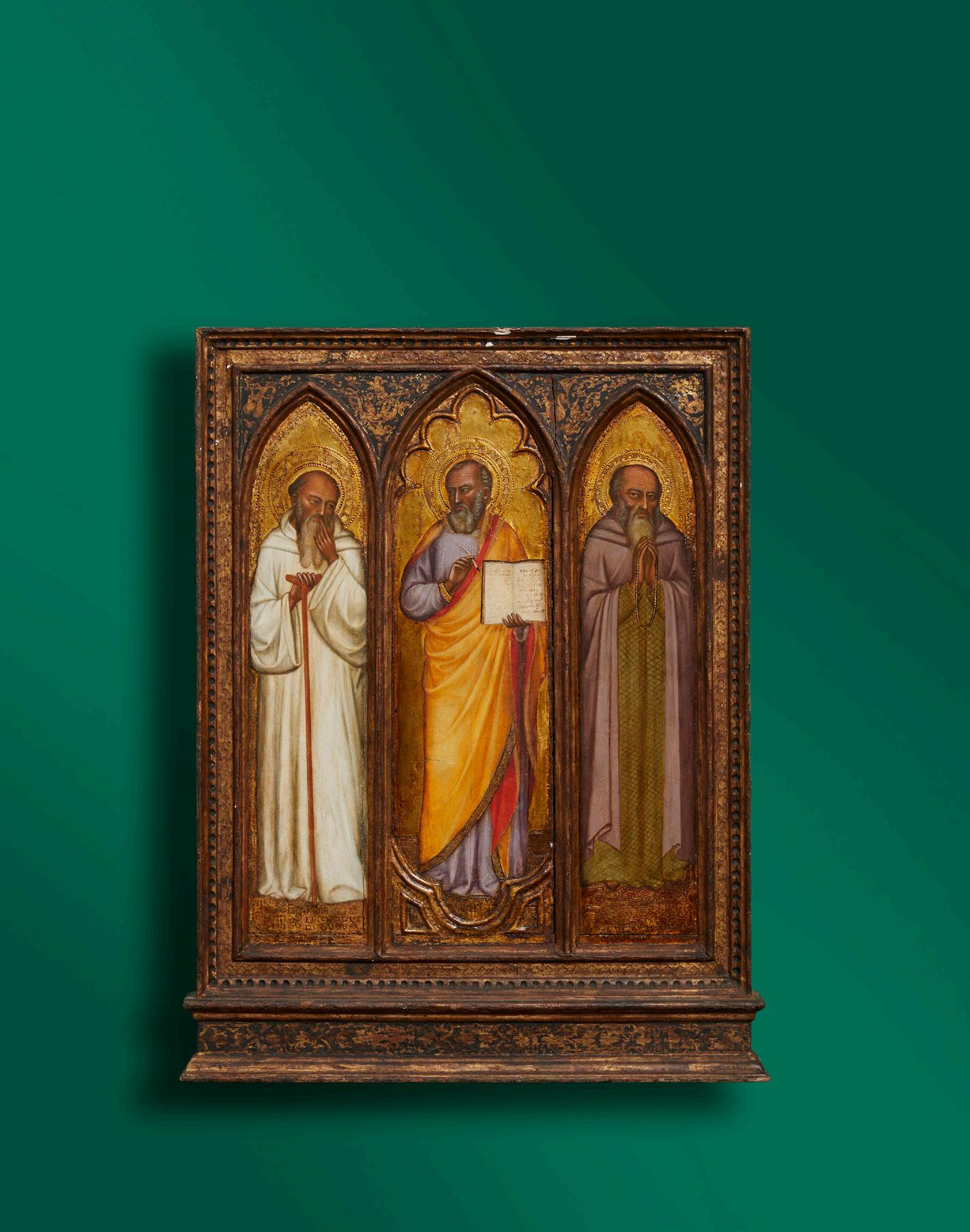
opposite:
Attributed to JACOPO DI CIONE (Florence, active c.1362-1398/1400)
St Romauld (or Beata Jacopo Geri?), St Mark, and St Paul the Hermit Sold for $550,000
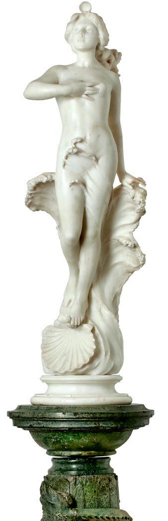
right:
An Italian white marble figure of the birth of Venus attributed to Ferdinando Andreini (1843-1922) Sold for $35,000
“Bearing a signature” is a descriptive devoid of value other than that the work has a signature on it.
The term “Attributed to”, by contrast, indicates a level of confidence that it is by the attributed party.
Faces for the Afterlife: Funerary Masks from Ancient Egypt
by madeleine mackenzie, head of decorative arts & art, sydney
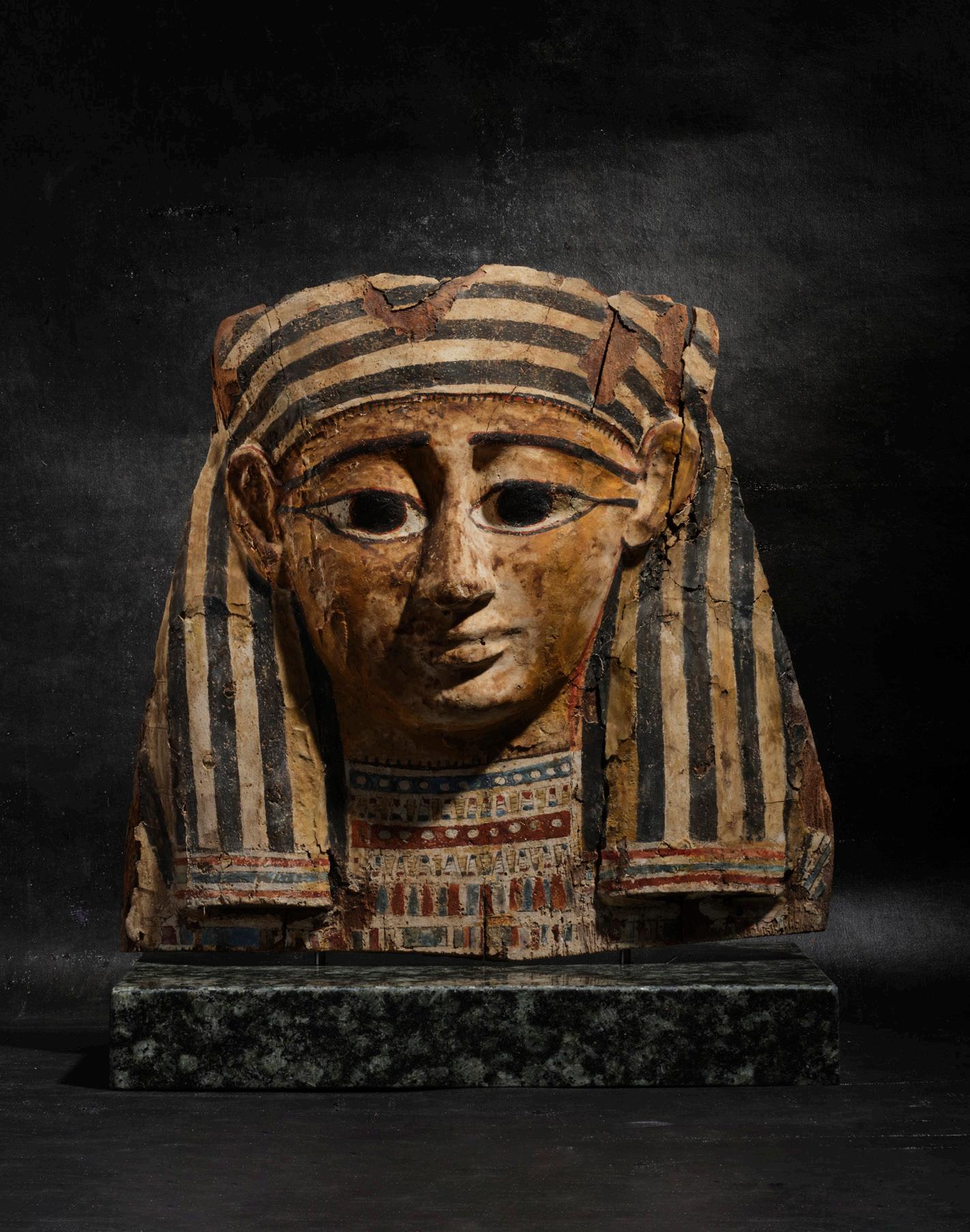
left: An Egyptian Sarcophagus Mask Third Intermediate Period (1075-663 BCE), plaster on wood and polychrome, the striped khat headdress framing the face with geometric patterned necklace, on later marble plinth encased in perspex box. Height 50cm $10,000-15,000
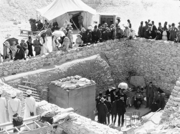
opposite left: Tourists crowd around the retaining wall surrounding the pit containing the entrance to Tutankhamun's tomb (KV62) in the Valley of the Kings, 1923
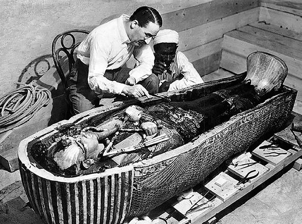
opposite right: Howard Carter opens the innermost shrine of King Tutankhamun's tomb near Luxor, Egypt, 1925
across human history, funerary masks have appeared in societies where death rituals and beliefs about the afterlife were central to cultural identity. Anthropomorphic masks were commonly used to honour the dead, establish links with the spirit world, and preserve the likeness or essence of the deceased.1 Archaeological evidence shows their use in cultures as far reaching as Mycenaean Greece, ancient Rome, the Andes, Mesoamerica, Southeast Asia, and Egypt, where the tradition reached its most elaborate and enduring expression. While materials and meanings varied, funerary masks consistently acted as mediators between the living and the dead, ensuring recognition, protection, and continuity beyond death.2
Few cultures placed as much emphasis on the face of the deceased as ancient Egypt. Egyptian funerary masks formed part of a complex religious system in which death was seen not as an end to life but rather an interruption, and eternal life depended upon the preservation and recognition of the body.3 Masks protected the head both physically and magically and ensured that the ba (spirit) could identify and reunite with its body in the afterlife.4
The earliest ‘mummy mask’ to be documented dates from the Old Kingdom (2686–2181 BCE), when wrapped mummy heads were shaped with plaster and painted to suggest facial features, as seen in the Medum Mummy of Ranofer, discovered in 1891.5 True sculptural masks developed later, becoming increasingly common during the First Intermediate Period (2181-2040 BCE) and Middle Kingdom (2040-1786 BCE), when separately formed masks were placed over the mummy’s head.6
Masks were not intended as true portraits. Instead, they presented idealised, youthful faces that associated the deceased with divine perfection and triumph over death.7 The materials used to create these masks varied widely including carved wood, gold, and silver, and some masks were decorated with gemstones, gold leaf and/or paint. However, the majority of masks were made from cartonnage, a composite of layered linen or papyrus stiffened with plaster and then painted, used from the First Intermediate Period through to Roman rule (30 BCE-337 CE).8 These masks, often manufactured by artisans in workshops, would not have been cheap to produce, the materials and labour would have been costly. However, the number of masks that have survived suggests that whilst they were initially presumed to have been only crafted for royalty or nobility they were likely produced for a larger percentage of the population. Dr Foy Salf, an Egyptologist at the University of Chicago, said “I don’t think it would be surprising if up to 35% of the population had the means to acquire them.”9
The most famous example of an Egyptian funerary mask is the gold mask of Pharaoh Tutankhamun (c.1350 BCE) discovered by British archaeologist Howard Carter in 1925. The mask is crafted from over 10 kilograms of solid gold, inlaid with lapis lazuli, carnelian, and other semi-precious stones. This exquisite craftsmanship represents the pinnacle of Egyptian funerary art.
Similar concerns with remembrance and spiritual transition appear in other parts of the world as well. Mycenaean Greece produced beaten gold burial masks, while Inca rulers and Southeast Asian kings were buried with golden face coverings. In ancient Rome, wax death masks preserved ancestors’ features for ceremonial display, a tradition revived in medieval and early modern Europe with royal effigy masks. From the 17th to 20th centuries, plaster and wax death masks of notable figures remained popular in Europe, reflecting the enduring fascination with preserving the human face at death.10
Together, these traditions highlight a universal human impulse: to give the dead a face that bridges mortality and eternity.
1. Britannica, Encyclopaedia. “Mask: Funerary and Commemorative Uses.” Accessed April 20, 2026. https://www.britannica.com/art/mask-face-covering/Funerary-and-commemorative-uses.
2. ibid
3. American Art Museum, Smithsonian Institution. “Mummy Mask.” Accessed April 20, 2026. https://americanart.si.edu/artwork/mask-31153
4. Art Institute of Chicago. “Funerary Mask.” Accessed April 20, 2026. https://www.artic.edu/ artworks/64312/funerary-mask.
5. Kelsey Museum of Archaeology. Faces of Immortality: Mummy Masks of Roman Egypt. University of Michigan. Accessed April 20, 2026. https://lsa.umich.edu/content/dam/kelsey-as sets/kelsey-publications/pdfs/Faces_of_Immortality.pdf.
6. Egypt at Manchester. “The Function of a Mummy Mask.” September 5, 2012. https://egyptman chester.wordpress.com/2012/09/05/the-function-of-a-mummy-mask/.
7. American Art Museum, Smithsonian Institution. “Mummy Mask.” Accessed April 20, 2026. https://americanart.si.edu/artwork/mask-31153.
8. (Australian Museum; Britannica)
9. New York Times. “Archaeology Reveals New Insights into Egyptian Death Masks.” February 12, 2024. https://www.nytimes.com/2024/02/12/science/archaeology-egyptian-death-mask.html.
10. Britannica, Encyclopaedia. “Mask: Funerary and Commemorative Uses.” Accessed April 20, 2026. https://www.britannica.com/art/mask-face-covering/Funerary-and-commemorative-uses.
The Collector's Auction will take place on Tuesday 2 June in Sydney. For viewing times and to see the full catalogue please visit our website.
Clarice Beckett is today regarded as one of the most important Australian painters of the interwar period, however she was very nearly forgotten entirely after her death. Beckett's current recognition is largely due to the tireless efforts of Dr Rosalind Hollinrake, following a chance encounter with the artist's sister. Here, our Head of Fine Art, Dr Wiebke Brix, chats with Rosalind about her dedication to ensuring Clarice Beckett received the acclaim she always deserved.
by wiebke brix, head of fine art
Into the Light: The Extraordinary Rediscovery of Clarice Beckett
Rosalind, you are widely recognised for your pivotal role in the rediscovery and reassessment of Clarice Beckett, now regarded as one of Australia’s most important modernist painters. Through decades of research, advocacy, and careful stewardship, you transformed Beckett’s posthumous reputation, bringing her work into the centre of Australian art history. Your commitment extends far beyond scholarship, encompassing the curation of exhibitions and an unwavering dedication to ensuring Beckett’s legacy is accurately understood and documented.
Could you take us back to the moment you first encountered Clarice Beckett’s works, what did you see, how did the discovery unfold?
In 1965, my first encounter with two small landscape paintings by an unknown artist, ‘C. Beckett’, was an evocative and uncanny experience, one that would ultimately alter the course of my life. They hung in the august company of Russell Drysdale, Arthur Boyd, and Arthur Streeton, yet it was Beckett alone who drew me in. Through them, I saw and felt the Australian landscape in a powerful, contemporary new way. They were unique.
In 1971, I opened a small gallery in Melbourne to promote women and forgotten artists. A mention in The Sun newspaper brought Hilda Mangan to my door, carrying six small, exquisite unsigned paintings. Having faced rejection with them before, she offered no information, only asking if I knew the artist. I did, ‘C. Beckett’. Her shock was palpable. C. was Clarice, her sister, who had died in 1935. Thousands more paintings, she told me, remained at her daughter’s farm.
An open-sided shed revealed a devastating sight: rows of rotting paintings, ravaged by weather, rodents, and possums, a violation of a lifetime’s work. Yet on the concrete floor lay a few hundred pieces in fine condition, and in the daylight their atmospheric beauty was spellbinding.
After careful cleaning and modest pricing, I mounted an exhibition. Selling women’s art and an unknown Beckett was a considerable financial risk. Yet every painting sold and art critic Patrick McCaughey felt her work deeply and recognised its Modernism in his writing.
Your relationship with Beckett’s work has spanned decades. What has driven your continued dedication to researching, preserving, and advocating for her practice, what compelled you to recognise her significance when others had overlooked them?
The sublime capture of a transient moment in the natural world stirred in me a deep, intense emotional response and forged a quiet but enduring connection to the artist. Like all great art, these works left footprints on my mind. I felt deeply compelled by this artist.
When I first met you, I sensed an extraordinary commitment to Clarice Beckett’s art, one that reflects the devotion and clarity of a true art purist. On a personal level, what does it mean to you to ensure that Clarice Beckett is represented with care, accuracy, and integrity, particularly as her work continues to gain wider attention in both institutional and market contexts?
My dedication had been sealed from that first moment of encounter. Had the works later proved to be by a male artist, my resolve would have remained unchanged: to secure recognition for this singular Australian voice.
I was not alone in perceiving her significance. During her lifetime, a few recognised in her work something new, yet as beautiful as a Manet or a Rembrandt. But in a misogynistic environment, such recognition held little weight, and her early death consigned her to obscurity. My task, then, was to begin again.
As an early reflective feminist, I sought to challenge the status quo for women artists, leading to the first monograph on an Australian woman artist, Clarice Beckett and her Circle (Macmillan, 1979). Beckett became my spearhead.
I place her, without hesitation, alongside the Heidelberg artists’ impressionist 9x5 paintings and Fred Williams’ celebrated new vision of the landscape. Williams himself acknowledged that Beckett had arrived there before him, in her own modernist language.
Today, Beckett’s recognition is secure. Alistair Hunter (AO) generously gifted 22 of her paintings to AGSA, and their inclusion in the 138 paintings hung in the exhibition, The Present Moment (2021), brilliantly curated by Tracey Lock, elevated Beckett’s profile even further and drew international admiration. All state and most regional galleries now own and treasure Clarice Beckett’s paintings.
With thanks to Dr Rosalind Hollinrake
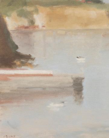
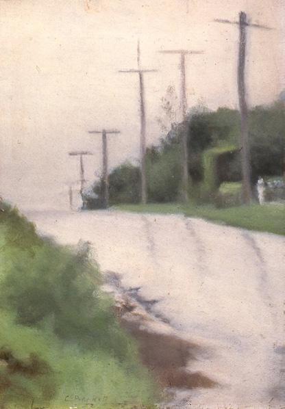
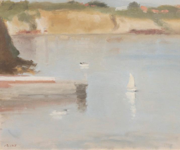
left: Clarice Beckett (1887-1935) Beach Road After the Rain
right:
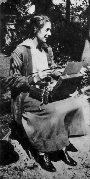
Clarice Beckett painting in her yard at her Beaumaris home
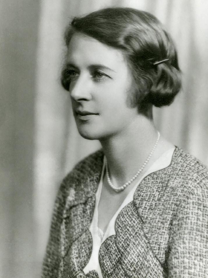
top: Unknown photographer, Portrait of Clarice Beckett, c 1931
(detail):
Clarice Beckett (1887-1935)
(Mentone Cliffs) c.1932
oil on board
44.5 x 54cm
$80,000-100,000
Porcelain Landscapes: The Artistry of Harry Davis
by anthony hurl, south australia representative specialist
left: A Royal Worcester two handled pedestal vase, depicting a shepherd with horse and cart feeding sheep in a snowy landscape, signed “H. (Harry) Davis”, shape number 1969, dated 1910, 40.6cm high. $10,000-15,000
one of the finest artists ever to work at the renowned English porcelain company, Royal Worcester, was Harry Davis (1885-1970). Davis was known for his versatility, painting fish, various other animals, and superb landscapes, both rural and urban.
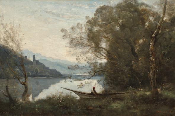
Born in Worcester in 1885, Davis was the third generation to work for the Worcester works; his father was a figure modeller and his grandfather, Josiah Davis, was a talented gilder. Harry joined Royal Worcester at just 13 years old, subsequently being apprenticed to Ted Salter in 1899. Davis’ initial training commenced under his grandfather who taught him how to draw. Salter then taught him the more complex skills required to master the Highland landscapes which he reproduced so skilfully, emulating the work of Jean Baptiste Camille Corot.
Due to his immense artistic ability, during the 1920s, when Worcester received important special commissions, often it was Davis who was asked to complete them. For example, in 1923 Royal Worcester received a prestigious £7,000 order for a service from His Highness Shri Ranjitsinhji Vibhaji, Maharaja Jam Saheb of Nawanagar. It was completed by Davis and included 24 beautiful scenes of India and England.
Perhaps more known to Worcester collectors is the collaboration between Davis and Harry Stinton in 1928 to complete a service of 25 dinner plates, 25 dessert plates, and 25 cups and saucers for Mr Kellogg of cereal fame. Davis painted the dessert plates and cups and saucers with delicate Corot style misty landscapes. These scenes were based on a book in the Worcester factory library, ‘Les Paysages de Corot’ Editions du ‘Studio’, published in Paris in 1913.
Also in 1928, Davis succeeded William Hawkins as the foreman painter, taking on teaching duties as well as his prodigious output. He also designed quite a number of patterns and painted trial models of three-dimensional figures being produced by the factory. Royal Worcester also produced presentation pieces for famous identities of the day such as Sir Winston Churchill and Sir Donald Bradman which were completed by Davis. Harry Davis worked for Royal Worcester for a total of 71 years, and stated that during his time at the factory he had been extremely happy. Despite his surprise that anyone should want to collect his pieces, it is a testament to his artistic virtuosity that aside from the technical masterpieces of George Owen, the most expensive Royal Worcester sold at auction in recent times in Australia have been pieces painted by Harry Davis.
Showing the great skills of Harry Davis to full advantage, we will be offering a fine large vase in our upcoming July Decorative Arts Auction, depicting a shepherd with horse and cart feeding sheep in a snowy landscape.
The Decorative Arts Auction will take place on Monday 13 July in Melbourne. For viewing times and to see the full catalogue please visit our website.
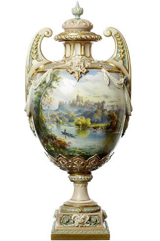
left: An important Royal Worcester 'Windsor Castle' porcelain vase and cover by Harry Davis, dated 1904 Sold for $21,080 Showing Davis’ precocious early talent is a magnificent Windsor Castle vase, sold by Leonard Joel in 2015. Given the vase is dated 1904, he would have been just 18 years old.
right: Jean Baptiste Camille Corot The Moored Boatman: Souvenir of an Italian Lake, 1861
In the late 19th to early 20th centuries, Australian art underwent a significant transformation. Moving beyond the Nationalism of the Heidelberg School, artists began to embrace cosmopolitan influences, decorative arts, and more intimate, stylised forms. Among the most intriguing expressions of this shift are fan shaped artworks.
by amanda hayward (née north), senior fine art specialist
Fanfare: The Fan Design in Australian Art
the artist charles conder has become synonymous with his watercolour on silk fan shaped paintings. Conder began making these works relatively late in his career in the 1890s, a period that marked the transition from Historicism to Art Nouveau in the arts.1 Fan shaped artworks exemplify this artistic shift through their combination of historical Rococo motifs and Art Nouveau elements within the same composition.
The fan shaped composition in art was inspired by the physical form of handheld fans that became fashionable again during the late Victorian and Edwardian periods. The fan, which was previously associated with cultural status as personal adornment and a feminine icon, became prominent in fine art following the rise of Japonisme, which led it towards becoming a symbol of early 20th century modern art and avant-gardism.2
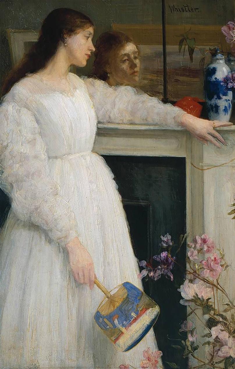
First appearing in 12th century Japan, it was not until the 1580s that fans arrived in Europe.3 With the emergence of Japonisme in Europe in the late 19th century, the fan became a device of experimentation. Following Paris trends, artists such as James McNeill Whistler often inserted an ornate fan in the hands of his sitters, seen in his artwork Symphony in White, No. 2: The Little White Girl 1864 for example. Fan shaped paintings were therefore an extension of this growing interest in the fan generally, moving beyond merely a decorative novelty, and offering artists a chance to experiment with unconventional formats.
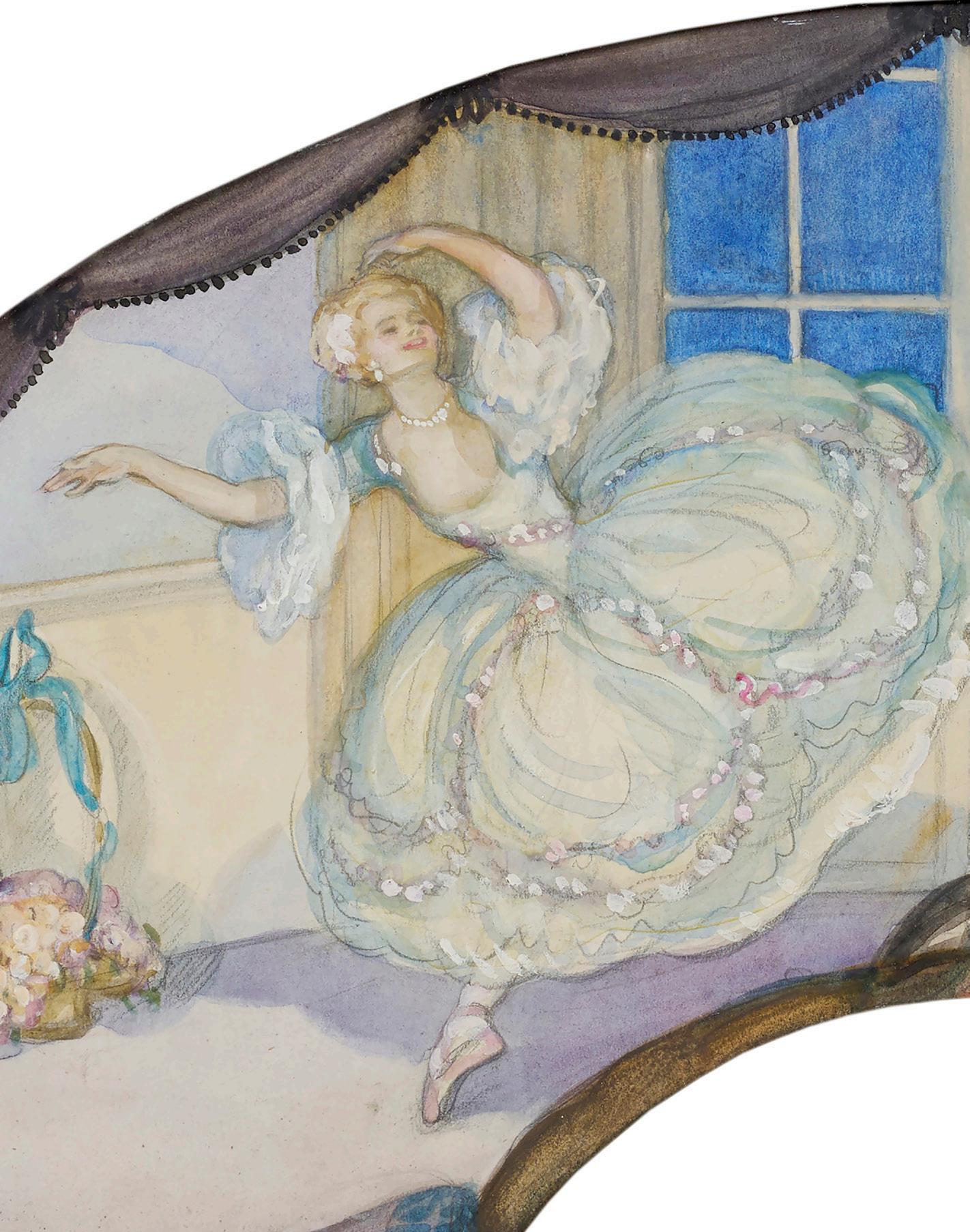
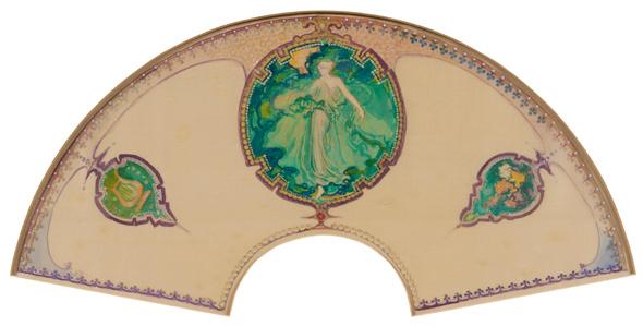
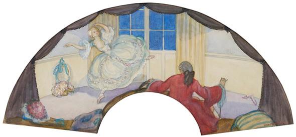
Two compelling examples of fan paintings are Thea Proctor’s The Dancer c.1910 and Arthur Streeton’s work Decoration: Emerald Fan. Though different in mood and execution, both works reflect a moment when Australian artists looked towards European and Japanese aesthetics, while redefining their own visual language. Proctor was particularly attuned to such developments. Having spent time in London between 1903 and 1921 and moving within avant-garde circles, she absorbed the influence of James McNeill Whistler, Charles Conder, and George Lambert. Proctor successfully exhibited some of her fan paintings in London at the Royal Academy, while also sending works to Australia to be included in the Australian Exhibition of Women’s Work in 1907 in Melbourne.4 Proctor’s fan shaped works adeptly capture a romantic, idealised world, conveying her interest
in historical costume and the influence of Japonisme.5 The Dancer exemplifies her refined sensibility. The composition presents a graceful ballerina caught mid-motion, her voluminous dress swirling outward as if animated by music. The setting, a softly rendered interior with drapery and a window, simultaneously suggests a stage and a private salon, collapsing the boundary between performance and everyday life.
Arthur Streeton was another Australian artist who spent time overseas, equally seeking out the opportunities London offered to aspiring artists. Best known for his Australian landscapes, Streeton approached the fan format from a different perspective to Thea Proctor. Rather than depicting a narrative scene, his work Decoration: Emerald Fan, embraces abstraction and ornamentation. The central figure is a stylised female form enveloped in flowing green drapery and surrounded by intricate patterns and jewel-like motifs, creating a richly decorative surface. Streeton’s engagement with this format may seem surprising given his association with en plein air and the Australian bush, however, it reflects the broader versatility of artists at the time and their European influences.
In reviving and reimagining the painted format in the early 20th century, artists explored the potential of art as a domain no longer confined to traditional canvases, but rather something that could take on new shapes, literally and conceptually.
1. The Metropolitan Museum of Art, Painted fan with a design of feathers and three medallions, accessed on 16 April 2026: http://www.metmuseum.org/art/collection/search/847020.
2. Nunn, Pamela Gerrish., Fine Art and the Fan 1860-1930, Journal of Design History, vol. 17, no. 3, 2004, pp. 251–66. Accessed 16 April 2026: JSTOR, http://www.jstor.org/stable/3527116.
3. Nunn, Pamela Gerrish., Fine Art and the Fan 1860-1930, Journal of Design History, vol. 17, no. 3, 2004, pp. 251–66. Accessed 16 April 2026: JSTOR, http://www.jstor.org/stable/3527116.
4. Nicholls, Lara., Thea Proctor in N Bullock, K Cole, D Hart & E Pitt (eds), Know My Name, National Gallery of Australia, Canberra, 2020, pp. 302–303.
5. Art Gallery of New South Wales, Fan Design, Thea Proctor, accessed on 19 April 2026: https://www.artgallery.nsw.gov.au/collection/works/WA6.1959/#about.
The Fine Art auction will take place on Tuesday 30 June in Melbourne. For viewing times and to see the full catalogue please visit our website.
left top:
Arthur Streeton (1867-1943)
Decoration: Emerald Fan
watercolour on silk
25.5 x 51.5cm (fan shaped)
$8,000-12,000
left bottom & previous page (detail):
Thea Proctor (1879-1966)
The Dancer c.1910
watercolour on paper
22.5 x 50.5cm (fan shaped)
$6,000-8,000
opposite: James McNeill Whistler
Symphony in White, No. 2: The Little White Girl 1864 oil on canvas
76.5 x 51cm
In the collection of the Tate Britain, London
SITTING WITH DISCOMFORT
by rebecca stormont, senior modern design specialist
Uncomfortable by Design
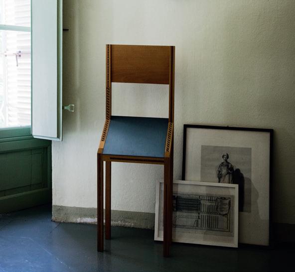
in 1944, bruno munari published an essay in Domus that would become an enduring critique; ‘Seeking Comfort in an Uncomfortable Chair’. The opening line sets the scene and the mood, “One comes home tired after having worked all day and finds an uncomfortable chair.” Munari’s argument was that designers, obsessed with novelty and status, had abandoned the one thing a chair was actually for. In chasing originality, they had made comfort the collateral damage of taste. In the 80 years since its publication, it appears maybe nothing has changed, but thankfully so in my opinion as it would otherwise be difficult to curate a Modern Design auction. Some designers took the essay as a starting point and made discomfort itself the idea. Here are three - all functional - all uncomfortable.
A year after his Domus essay, Munari designed a chair that appeared to confirm every fear it had articulated and then revealed itself as something stranger. The Singer Chair, produced by Zanotta in 1945, is set at a 45-degree angle. There is no comfortable position. Your body cannot settle nor perhaps can your mind. But this was not a failure of design. It was the design. His essay lamented that design had forgotten the body. His chair remembered it by putting the body under mild, constant duress. Munari conceived the Singer Chair for a very specific scenario: the visit of an unwanted guest. Sit here, it says, and you will not linger. The chair weaponises discomfort as a social instrument and is ironically functional.
Between 1983 and 1993, Rei Kawakubo designed a furniture collection that most people had no idea existed. Made in small quantities, the pieces were conceived not as domestic objects but as environmental extensions of the Comme des Garçons stores. Raw unfinished metal, chain backs, and a minimal and harsh aesthetic; Kawakubo described the pieces as “a kind of secondary furniture; furniture used in places of transit, which generate an image, an ambiance.” They were not designed to be sat in so much as to be felt. The effect is spatial and psychological. After a 2017 Paris exhibition brought the collection wider attention, individual pieces began
selling for upwards of $10,000 at auction. Kawakubo herself was characteristically oblique: “It is an undeniable fact that design is reflective of the designer’s personality. Though I do not view myself as harsh and stark. If I must characterise the essence of my furniture design, it is: simplicity.”
In 1987, another chair high on my wish list was conceived; Cini Boeri and Tomu Katayanagi’s Ghost Chair for FIAM. Where the Singer Chair makes discomfort explicit and the Kawakubo chairs make it atmospheric, the Ghost makes it perceptual. Debuted at the 1987 Salone del Mobile in Milan, the Ghost is cut from a single monolithic sheet of 12mm curved glass. The materiality of cold transparent glass creates a psychological experience of mild, persistent unease. You become acutely aware. The chair appears to float - but what if were to break? Boeri herself initially resisted the idea: “Glass is cold and gives a feeling of fragility. It does not guarantee comfort, and an armchair, on the other hand, must offer warmth, comfort, and security.” But what did Munari think? “The petrification of a water ribbon, almost like the abstract solidification of an idea where technology can rhyme with poetry.” There is a poetic duality and perhaps of the three examples the Ghost is the most structurally sound and comfortable? I will have to sit and think about it.
image: Singer chair by Bruno Munari, 1945 Zanotta Edizioni collection / Image courtesy Zanotta
BEYOND THE BOUTIQUE
by john d'agata, senior luxury consultant
The Rise, Fall, and Reinvention
of Accessible Luxury
About five years ago, post-pandemic, I wrote an article for Leonard Magazine on the changing face of luxury stores. At this time, the demand for luxury goods was at an all-time high. Lockdowns and the scarcity of designer pieces did not dampen the market’s insatiable appetite for luxury and the instant prestige that it offered the purchaser. In fact, during this period, most, if not all luxury goods retailers posted record profits. In the lead up to this zenith was a master stroke by all the leading houses - to offer entry point items within their ranges to lure new and younger clients to their brands.
Pierre Cardin in the late 1960s was the trailblazer in the concept of offering designer luxury to the masses. True couture was fading, and younger eyes were focused on contemporary trends, in a similar way to the post WWI youth who ushered in the Jazz Age and its modernity. Cardin began offering ready to wear garments and accessories in the latest fashion trends, available freely to all in chain stores at affordable prices. He was also the first to franchise his brand. For this, he was initially criticised by the fashion world, only to have other houses such as Dior, YSL, and Lanvin, to name a few, quickly follow suit. This trend of licencing out lasted for a couple of decades, making large profits for the brands. The consequence however was that luxury houses lost control of their designs and the quality of the merchandise. The integrity of the brands needed to be taken back.
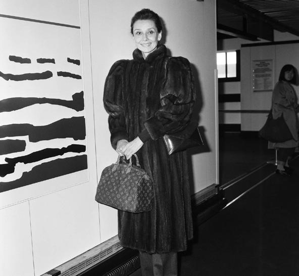
Let’s jump forward a couple of decades to the 1980s, when luxury houses started taking back control of their brands. The 70s and early 80s were difficult periods and many traditional houses were in decline. A new way of gaining fresh clients started to evolve. It was in the late 80s and early 90s that we started to see merchandise produced in-house and not by franchises, paving the way for a fresh outlook on luxury goods. In this period, we start to see a surge in designer accessories and affordable streetwear such as t-shirts, sneakers, belts, and caps with branded logos for instant recognition, literally allowing the wearer to ‘buy into the brand’. At the higher end of the luxury market, many iconic bags are introduced. The 1955 Chanel classic double flap was remastered in 1983 featuring a modern ‘CC’ lock, a restructure, and a leather-interwoven chain shoulder strap. Hermès created the Birkin bag for Jane Birkin in 1984 and at this time, Louis Vuitton made sure that the Speedy was the most sought-after bag in its range. Originally created in 1930 and endorsed by Audrey Hepburn in the late 50s, it’s still considered one of the most enduring handbags ever made.
Finally, luxury houses were back in control of their own products, bringing them to a new generation on their own terms. It was a stroke of genius which led the way for a designer revolution unparalleled in history. This in turn led the way to a rebirth of the independent designer store and mass products to be enjoyed by all. By the late 1990s and early 2000s, the taste for luxury goods was stronger than ever and their new clientele was being offered a wider array of merchandise than ever before. There seemed to be no end to the madness, however a change was in sight.
So, back to where we began. Whether by default or desire, after the pandemic, luxury brands changed their tack; there seems to now be an interest in alienating the mass market from the bricks and mortar stores. Brands are pushing shoppers onto online platforms or making them wait in queues for a chance to browse the old-fashioned way. Wealthier clients are identified and encouraged to skip the line and make an appointment with their sales associate, which really takes the spontaneity out of luxury shopping. I do get the about face. These are big enterprises with high overheads including retail staff, designers, craftsmen and women, huge inventories, logistics, marketing, and celebrity endorsements… the list goes on.
Perhaps the good old days of luxury for everyone have gone, despite the availability of product being at an all-time high? The secondary market offers a compelling alternative, often at lower prices than the actual stores and literally decades of quality branded designer pieces to choose from. You just have to know where to look.
image: Audrey Hepburn at an airport carrying the Speedy handbag by Louis Vuitton / Alamy
One of the most famous engagement rings in history began as a single large rough Colombian emerald, before being cut into two stones. One of these was then cut and faceted, resulting in an alluring 19.77 carat emerald. The deep green stone, possibly from the famed Muzo mines, was purchased by Cartier and transformed into a masterpiece. by annie soust, head of fine jewels & timepieces, melbourne
Jardin of Envy
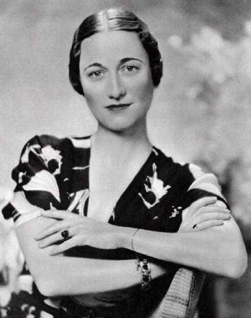
set in platinum and yellow gold, surrounded by a diamond halo, and with a now famous inscription inside the band, “We are ours now 27x36”, the ring is a love token, a unique and bold statement, and more importantly, a piece of history from the time of the abdication of the British throne, presented by Kind Edward VIII to Wallis Simpson in 1936.
What makes Wallis Simpson’s emerald compelling is not just its size, but its character. Colombian emeralds, particularly those from the Muzo mines, are known for their blueish-green colour, deep saturation, and soft, velvety depth. For inside a beautiful emerald is a “jardin”, or garden, of inclusions - minerals, liquids, or gases trapped inside a stone during its formation. Light softly diffuses around these natural inclusions that when viewed through magnification show another glowing and captivating world.
In 1953, across the Atlantic, John F. Kennedy presented Jacqueline Kennedy with an engagement ring comprising a “toi-et-moi” of a diamond paired with a 2.84 carat emerald, set side by side and framed by baguette cut diamonds, made by French jeweller Van Cleef & Arpels. Another symbolic ring, the diamond represented clarity and the enduring tradition of the Kennedy family, while the emerald quietly suggested sophistication and individuality echoing Jackie’s sensibility and cosmopolitan appeal. This less than conventional engagement ring was a statement in design, not as bold in size as Simpson’s, but a contrasting statement of modernism and controlled, inimitable style.
Again, the emerald is believed to have been mined in Colombia, presenting the alluring jardin, with sought-after hues of blue-green with moss like inclusions, likened to an underwater garden.
Colombian emeralds were historically traded in India and carved with floral motifs representing paradise, such as the 1695 Mogul Mughal Emerald, associated with the reign of Shah Jahan, who commissioned the Taj Mahal. It is a monumental 217.80 carat emerald, unlike anything previously seen in Europe. Mughal emeralds are defined entirely differently as stones are often carved, not faceted, size and presence outweighs clarity, jardins are admired and desirable as they enhance the artistry of carvings of floral and foliate motifs, and symbolism is central.
However the world’s largest emerald is a Zambian stone known as ‘The Lion’, weighing an incredible 5,655 carats and originating from the Kagem Emerald Mine. Zambian emeralds are relatively new, but cannot be overlooked, with their heritage just starting. They are vivid and often bright in colour, cooler in tone but with strong saturation, with less to little jardin, resulting in crisp, bold, and powerful gems.
Emeralds form when elements are brought into contact under just the right conditions, at just the right time in the Earth’s history; their beauty begins with improbability. A collision of elements within two entirely different geological conditions - one metamorphic, one igneous - they form and grow in fractured, mineral rich environments from Brazil and Colombia to Australia, Afghanistan, and Zambia. Fluids move through the crystallising gem as it forms, with ongoing interruptions to growth and formation creating the jardin within.
Emeralds endure not because they are clean, bright, and perfect, but because they are profoundly vivid and imperfect. From the velvety moss green depths of Colombian emeralds to the carved magnificence of Mughal treasures or the bold clarity of recent Zambian discoveries, each holds the imprint of its origin within. Look into an emerald to find a quiet story formed within the earth, an enduring reminder that true beauty lies not in perfection or flawlessness, but in depth, character, boldness, symbolism, and history.
The Fine Jewels Auction will take place on Monday 29 June in Melbourne. For viewing times and to see the full catalogue please visit our website.
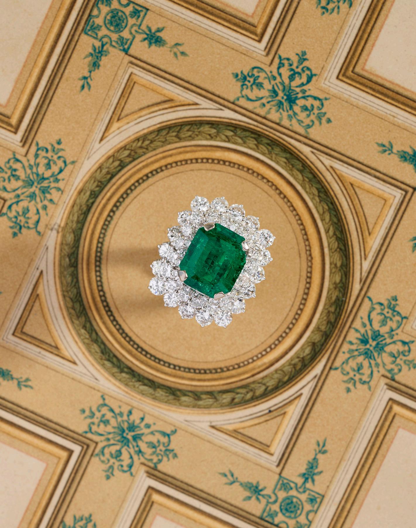
previous page: Platinum, emerald and diamond ring
$32,000-42,000
opposite:
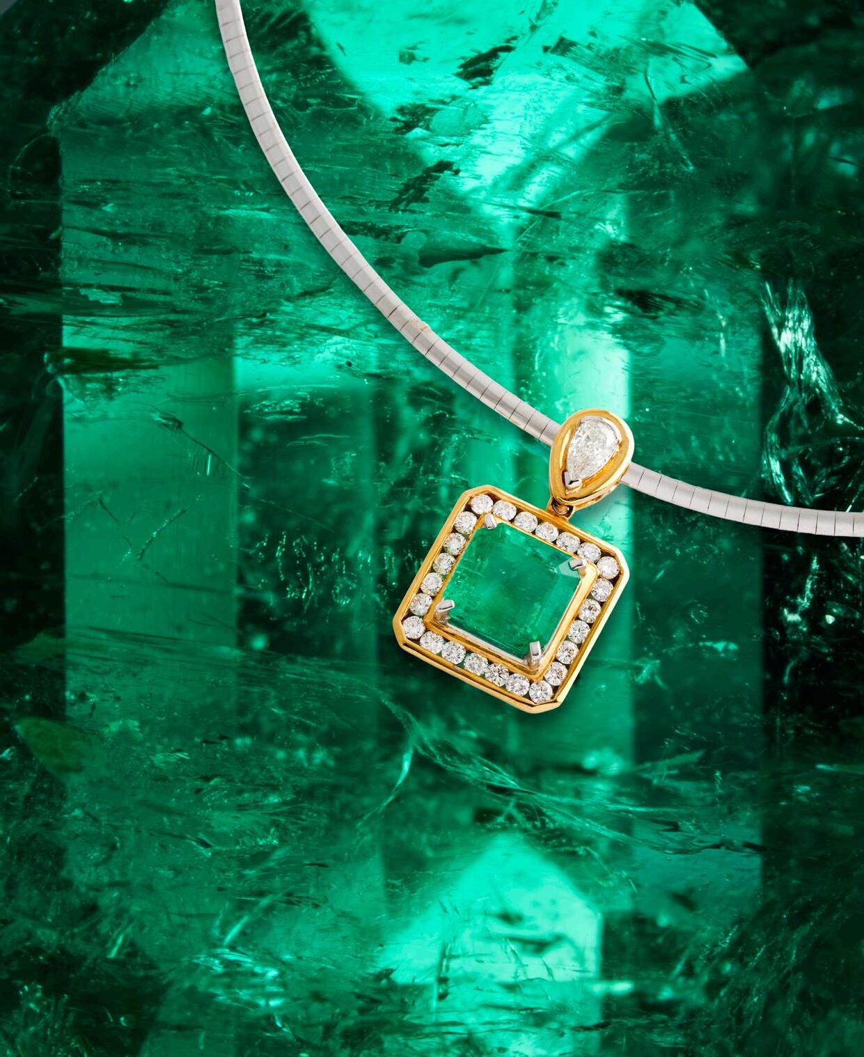
18ct gold, emerald and diamond pendant and two-tone gold Omega necklace
$4,000-6,000
left: The Duchess of Windsor wearing her Cartier emerald engagement ring, 1936 / Alamy
Graphic Confidence: Alun Leach-Jones in Print
by hannah ryan, senior art specialist, manager of speciality auctions
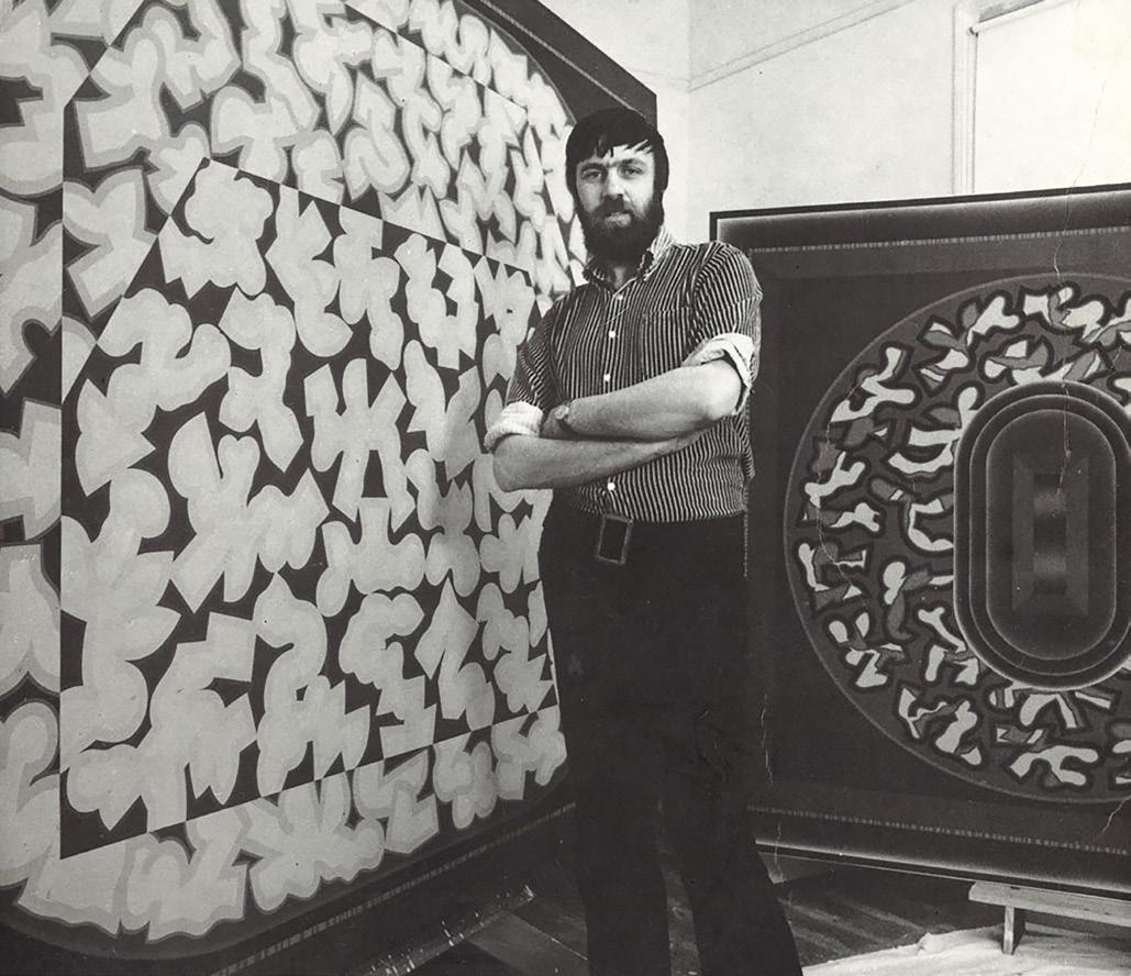
left: Alun Leach-Jones, 1970, by an unknown photographer.
Source: Watters Archive, Art Gallery of New South Wales Archive
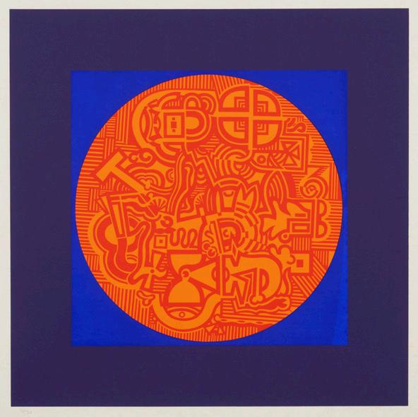
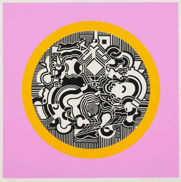
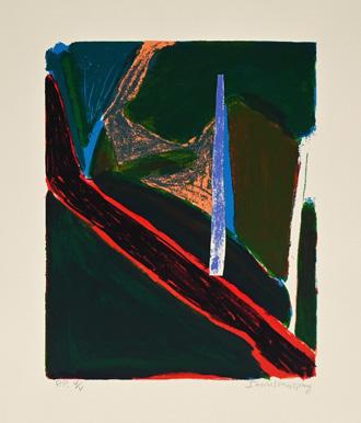
alun leach-jones’ prints are easy to respond to. Bold, graphic, and confident, they hold attention without pushing too hard. In our recent Prints & Multiples auction, that clarity translated into strong results, with collectors drawn to works that feel resolved and visually immediate. They don’t require much explanation, which is part of their appeal.
Born in Lancashire in England in 1937, Leach-Jones arrived in Australia in 1960 and quickly immersed himself in what was, at the time, one of the most active printmaking environments in the country; the South Australian School of Art. He studied under Udo Sellbach, developing a grounding in lithography and an early appreciation for the technical discipline of printmaking.
It was during a return to London in 1964 that his understanding of the medium shifted more decisively. There, he encountered a different model of printmaking. Artists such as Patrick Caulfield and Eduardo Paolozzi were producing bold, graphic screenprints through collaborative studio processes, often working with master print technicians rather than executing every stage themselves. The scale, clarity, and visual confidence of these works had a clear impact, opening up a new way of thinking about print production that aligned with his increasingly conceptual approach.
Back in Melbourne, that shift found its perfect counterpart in his meeting with print technician Larry Rawling in 1966. Rawling, then at the beginning of what would become a highly influential career, provided the technical expertise to translate Leach-Jones’ ideas into print with precision. Their collaboration would span decades and, in many ways, set a benchmark for artist-printer relationships in Australia. Rawling’s technical precision allowed Leach-Jones to fully explore screenprinting, particularly in relation to colour and clarity. Together they produced flat planes of colour and sharply defined edges, often built through complex layering. These prints incorporated multiple individual colours, yet the result always feels controlled and resolved.
Leach-Jones described printmaking as a space where his “focus is narrowed to the technical possibilities and how they can be broadened”1, noting that this engagement with process could take the pressure off the conceptual demands of painting. You can see that thinking play out clearly in the prints. There is a sense of resolution, even when the compositions themselves are complex. Areas of colour sit alongside sharp, controlled lines, giving the works structure without making them feel rigid.
While he is often described as a painter and sculptor, printmaking sits firmly at the centre of his practice. It is not secondary, nor simply a means of reproduction. The relationship between mediums moves both ways, with ideas shifting between prints and paintings rather than remaining fixed. At times, prints anticipate later works in paint. At other times, they revisit and refine existing compositions. Either way, they stand on their own.
His significance as a printmaker was recognised early. In 1967, he was named a Print Patron of the Print Council of Australia, and later, in 1990, he was made an Honorary Life Fellow of the Royal Society of Painter-Printmakers in the UK. These acknowledgements speak not only to the scale of his output, but to his influence in shaping how printmaking has been understood in Australia.
What keeps drawing people back to his work is its immediacy. The colour, the rhythm, and the sense that each element has been tested and resolved through process. They are works that are simply enjoyable to live with.
That was certainly evident in the recent auction. Collectors responded instinctively, drawn to pieces that feel as fresh now as they did decades ago. There is a timelessness to Leach-Jones’ prints. Not in a static sense, but in the way they continue to feel active, alive, and relevant.
1. Burke, J., ‘Alun Leach-Jones’, Imprint, Print Council of Australia, Melbourne, 1976, p. 2
THE REMARKABLE REVERSO
by patricia kontos, senior timepieces & jewels specialist
A Watch You'll Flip Over
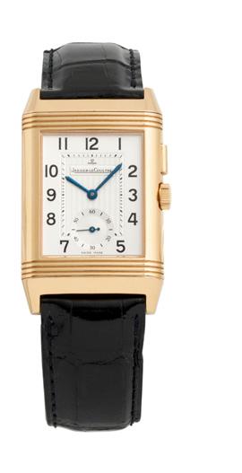
it may surprise you, as it did me, to learn that the 1930s Jaeger-LeCoultre Reverso may not have been the first reversible watch, but such is its iconic status that it owns the reversible watch case space. Not only did the Reverso upset the status quo for being a rectangular watch powered by a rectangular movement at a time when round watches dominated, it went much further in that it was able to completely flip in its housing, and that is how Reverso, from the Latin for ‘I turn around’, emerged from its shell.
The origins of the reversible watch are not so clear-cut. Some accounts suggest that four years before the Reverso’s debut, another Swiss manufacturer had already ventured into this alterable territory. The watchmaker associated today for later icons such as its Compax chronographs and Polerouters, Universal Geneve, possibly introduced their version of a convertible wristwatch in 1927 and patented it in 1933. An Art Deco exemplar of clean geometry and strong lines in a refined rectangular case, the watch was released as the Ideo and later the Cabriolet. But unlike the Reverso’s fluid swivelling mechanism, this precursor was more mechanical, though no less inventive. The watch case sat within a frame secured by a small screw at six o’clock, and once released, the inner container could be lifted, rotated, and snapped playfully back into place.
The creator of Universal Geneve’s Cabriolet case design has slipped into obscurity over time. By contrast, the origins of the Jaeger-LeCoultre Reverso are well documented and owe much to the efforts of César de Trey. An entrepreneurial businessman and associate of Jacques-David LeCoultre, the then owner of the LeCoultre manufacture, de Trey travelled to Colonial India in 1930 where he witnessed the shine with which British army officers had taken to the game of polo.
What today is known as the ‘Sport of Kings’ was originally a rigorous Persian cavalry training exercise, evolving into an aristocratic pastime before being codified by British officers in India during the mid-19th century. It was during the intensity of one such match, that de Trey witnessed the players’ frustration at the shattering sound of watch crystals and damaged dials during play. The story goes that an officer, his watch in pieces, challenged de Trey to come up with a timepiece robust enough to withstand polo’s punishing demands.
Up for the challenge, de Trey conceived the idea of a dial that could be protected by being turned upside down. He then approached LeCoultre with the ingenious concept and from there a French industrial designer, René-Alfred Chavot, was tasked with bringing it to life with a slide and flip mechanism. On March 4, 1931, the Paris patent office received an application to file for “a watch capable of sliding into its housing and turning over completely”.
A man of vision, de Trey promptly acquired the rights from Chavot and registered the name Reverso. Eager to capitalise on its commercial potential, de Trey and LeCoultre signed a partnership and started production immediately.
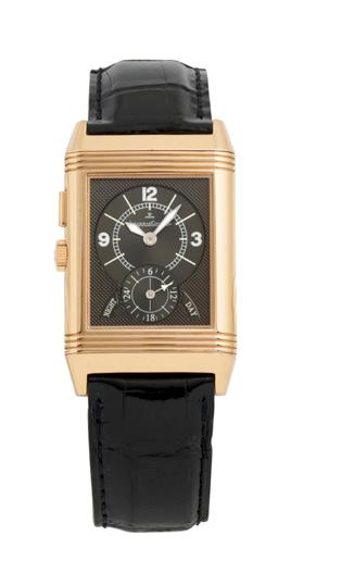
The Reverso was seen as embodying the Art Deco spirit. Its sleek linearity and innovative industrial design found form in gold and Staybrite steel cases prized for being scratchproof and corrosion resistant. Notably the plain case back - unlike the dual-dial Duoface configuration of todayoffered a generous surface for embellishment and personalised engravings, adding another aspect to its sporty-chic duality.
But just as we have seen previously, the course of horology rarely runs smoothly, and this early momentum was abruptly curtailed by the upheaval of the Second World War. Production slowed and shifting tastes back to round and military-specification watches rendered the rectangular, polo-oriented Reverso as increasingly unfashionable. The post-war decades did little to revive its fortunes with the disruptive rise of quartz technology.
Fortunately, a lifeline would be thrown when in 1975 an Italian distributor, Giorgio Corvo, who believed in the design’s financial potential, famously acquired the last remaining new old stock of unused and incomplete Reverso cases which lay dormant at the Jaeger-LeCoultre factory and had them fitted with small oval mechanical movements. The gamble paid off, and the Corvo Reverso sold out within months. By 1982, Jaeger-LeCoultre had officially reintroduced the Reverso in a line of watches that were equipped with mostly quartz movements, ironically the technology that once threatened its very existence.
Staying true to its essence as the first true sporty dress watch, established nearly a century ago on a polo field in India, the Reverso continues to celebrate duality, with day/night dials and dual time zone displays, never losing sight of its past as it continues forward as one of horology’s enduring marvels.
Our Timepieces auction will take place on Monday 17 August in Sydney. For viewing times and to see the full catalogue please visit our website.
JEWELS OF A FIRST LADY
by lauren boustridge, head of fine jewels & timepieces, sydney
The Style Legacy of Jacqueline Kennedy Onassis
few women have shaped the visual language of American elegance quite like Jacqueline Kennedy Onassis. Effortlessly poised and quietly composed, her style reached far beyond fashion into jewellery, where every piece seemed to carry meaning, part memory, part statement, part story. From the White House years through to her later life in New York, Jackie’s jewels reflected moments of love, transition, and reinvention. More recently, renewed interest in the Kennedy dynasty fuelled in part by FX’s Love Story: John F. Kennedy Jr. & Carolyn Bessette, which revisits the lives of John F. Kennedy Jr. and Carolyn Bessette-Kennedy, has brought fresh attention to the legacy of the family and the enduring symbolism of its most recognisable heirlooms.
Jackie’s two engagement rings perfectly illustrate the arc of her life, moving from restrained elegance to bold opulence. The first, gifted by John F. Kennedy, was designed by Van Cleef & Arpels and featured a 2.88-carat diamond paired with a 2.84-carat emerald in a romantic toi et moi setting. Originally framed by baguette diamonds, Jackie later had the ring redesigned with marquise and round stones, subtly evolving it as her role as First Lady grew more defined. Her second engagement ring, from Aristotle Onassis, was a striking contrast, an extraordinary 40-carat marquise-cut diamond known as Lesotho III, created by Harry Winston. Rarely worn in public, it nonetheless marked a very different chapter of her life, one shaped by independence, wealth, and global attention.
One of Jackie’s most distinctive jewels was her diamond sunburst brooch, a 19th century piece set in silver and gold that she discovered in London in the early 1960s. Captivated by its radiant design, she went so far as to part with other gifted brooches to acquire it. Once in her possession, it quickly became a signature piece during her White House years. She wore it pinned to coats and evening gowns, but most memorably placed in her hair, echoing the form of a tiara at state dinners and official events. This inventive styling transformed the brooch into something entirely personal, a perfect example of her instinct for reinterpreting tradition with ease and imagination.
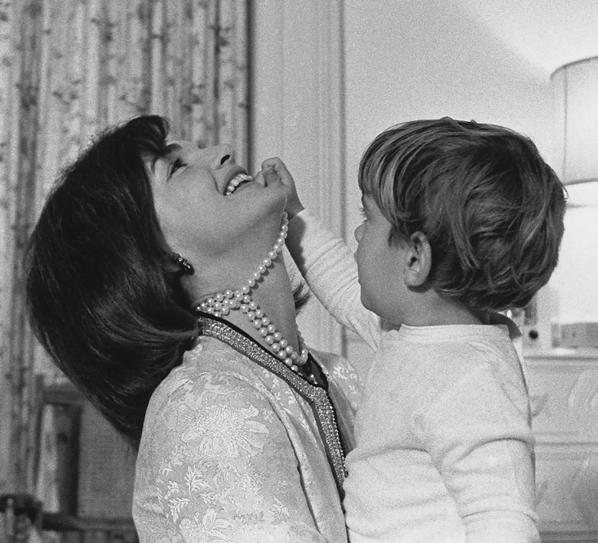
Equally defining were the enamel bangles by Jean Schlumberger for Tiffany & Co., later known simply as “Jackie bangles.” Designed in the 1960s, they combined gold with richly coloured enamel in bold, graphic patterns, sometimes accented with gemstones. Jackie wore them stacked in multiples, often mixing designs and colours to create a relaxed yet striking effect. The look felt modern and unforced, especially in contrast to more formal jewellery conventions of the time. In her post White House years in New York, the bangles became a defining part of her everyday style, reinforcing her reputation for effortless sophistication and securing their place as enduring symbols of her influence on modern jewellery design. Jacqueline Kennedy Onassis’ faux triple strand pearl necklace remains one of the most recognisable elements of her public image. Designed by Kenneth Jay Lane, the 19-inch, three-strand necklace was intentionally made in imitation pearls yet worn with such confidence that it became synonymous with her White House elegance. It appeared in countless photographs, perhaps most memorably in a candid image of a young John F. Kennedy Jr. playfully tugging at his laughing mother’s neck, capturing both intimacy and glamour in a single frame. Despite its modest origins, costing likely less than $300 at the time, the necklace’s legacy far outgrew its materials. When it was later sold at Sotheby’s in 1996 as part of Jackie’s estate, it achieved extraordinary results, becoming the highest-selling item in the auction at $211,500 USD. In doing so, it cemented its status not only as a signature piece of her personal style, but as a powerful symbol of how Jackie could transform even the simplest jewels into enduring icons of American elegance.
image: First Lady Jacqueline Kennedy laughs as her son, John F. Kennedy, Jr., plays with her simulated-pearl necklace in John’s nursery / Alamy
From the Workshop
The Art of Netsuke Carving with Leigh Sloggett
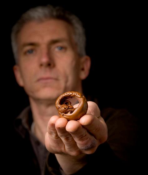
For more than three decades, Leigh Sloggett has been carefully shaping intricate animals in miniature, carrying forward the centuries-old Japanese tradition of netsuke carving. Since beginning his practice in 1992, Leigh has honed his craft under esteemed masters and currently works and exhibits in Japan. Here, Leigh shares some insights into this specialised craft, from its historical origins to its modern-day significance in Japanese culture.
Could you share a brief history of netsuke for our readers who may not be familiar with them?
Netsuke is a kimono accessory which originated in Japan in the Edo period as toggles to suspend items such as pouches or medicine cases from the sash (obi). Initially simple found objects that functioned for the purpose, they developed into highly detailed carvings in the 18th -19th centuries. With the introduction of Western clothing during the Meiji period, netsuke lost their practical role but are still carved today as collectible art objects.
What first drew you to the art of netsuke carving, how did you first learn the skill, and how did it lead you to move to Japan?
I have had an interest in netsuke since I found a small book in the school library when I was a high-school student. After finishing my studies in art and design at university and inspired by a trip to Japan I decided to go and study netsuke carving under Japanese contemporary carvers.
How do you approach a new netsuke, where do your inspirations for the designs come from?
Inspiration can come from many places, but I’m most inspired by nature - its elemental motion and animal behaviour. My designs are all original and I start by doing some very simple sketches, followed by making a rough model to outline the design in three dimensions.
Could you share the process of creating a piece?
After the design work is done, I rough out the shape using saws, rasps and a dental rotary grinder. Then the details are slowly refined using a range of different shaped long handled scrapers. The next stage is polishing and often redefining the detail before staining and the final polish.
How do you decide which material to use for each netsuke?
The choice of material depends on what best suits the design, but it must always be appropriate for netsuke - dense enough to allow fine carving, take stain and polish well, and remain durable so the detail does not wear away easily.
What details set a masterful netsuke aside from an ordinary one, and what should collectors be looking for?
Several factors define a high-quality netsuke. One which the novice collector might overlook is the himotoshi (the hole made for the chord to pass through). On a good netsuke the artist has considered its placement both aesthetically and functionally and they have given as much attention to it as to the rest of the carving. It is integral to the design not an afterthought. Another thing to look for is the rendering of details like hands. In a masterful netsuke, the artist will have carved these well. Originality, expressive quality, and a well-considered design are also indications of a high-quality work.
Is there a particular piece of yours that you consider your personal favourite?
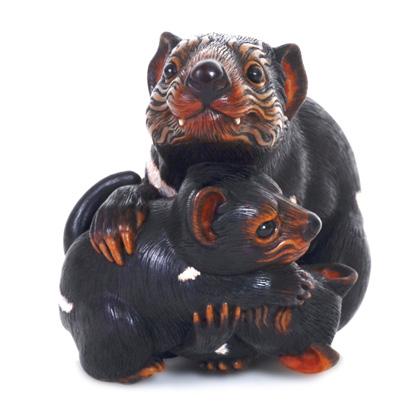
One piece that I’m quite proud of, titled ‘Rough & Tumble’, is this family of Tasmanian devils where the mother looks out while her two joeys play fight around her feet. This is probably the most complex piece I have carved.
What do you wish more people knew about netsuke?
Netsuke is a unique art form, possessing an inherent beauty rarely found elsewhere, one that arises from its functional purpose, resulting in objects that are both elegantly compact and intimately scaled.
With thanks to Leigh for his time. See more at leighsloggett.com
right:
Leigh Sloggett Rough and Tumble
far right:
Leigh Sloggett, portrait by Yusuke Sato
FIVE MINUTES WITH DAISY GIUFFRIDA
This issue, we spend five minutes with Daisy, our Fine Art administrator & registrar.
favourite artist
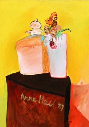
I really like the work of Anne Hall and David Band, particularly for their vibrant use of colour.
leonard joel staff all seem to have a side project or talent—what’s yours?
favourite cocktail
An Aperol Spritz is always my go-to.
favourite auction purchase
I’m still very happy with my recent purchase from the Art Salon; a screenprint by Idris Murphy. I love abstract art, and it sits very well in my living room after I got it framed.
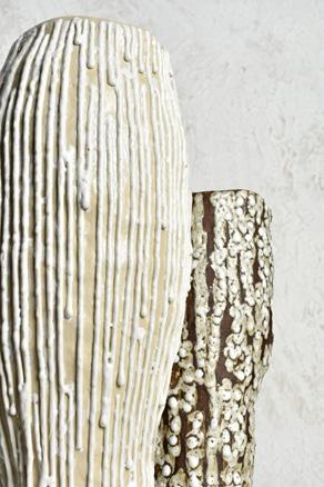
I work with ceramics outside of Leonard Joel. I studied it at university and now spend a lot of my spare time experimenting with glazes on abstract forms.
favourite tv series
My favourite series is One Day on Netflix, I love how it’s set in Edinburgh at the start. I used it as my travel inspiration and went to the same places that featured in the series and ended up loving all of it.
by ifaw oceania head of programs josey sharrad
How Koala Detection Dog Bear Found his Purpose
Ten years ago, I met a young dog called Bear.
He was anxious, skittish, and hyper-focused, with zero interest in humans or other dogs. A tightly wound ball of energy, just waiting to be unleashed. Life as a pet in the confines of a Gold Coast apartment simply wasn’t for him - he ended up literally eating the walls!
His owners were at the end of their tether.
Then they saw the International Fund for Animal Welfare’s (IFAW) callout for a koala detection dog, one that could sniff out live koalas. What if all those traits that made Bear a challenging pet - his boundless energy and obsessive love of balls - could be put to good use? What was there to lose?
Training a dog to detect live koalas was a dream of our good friend Romane Cristescu from Detection Dogs for Conservation at the University of the Sunshine Coast. It was novel. It was bold. And no one knew if it could be done.
Most koala detection dogs are trained to sniff out koala scats, which is relatively straightforward. Koala poo is found on the ground at the base of trees, and there’s often plenty of it - koalas can produce up to 300 pellets a day!
Sniffing out live koalas is a whole different ball game. They live high up in the trees, highly camouflaged little grey balls of fur the size of a football and incredibly tricky to spot with the human eye. They also move around more than people realise.
Could a dog be trained on the scent of koala fur rather than poo, to sniff out what we couldn’t see? It would be a game-changer, especially in emergencies when rescuers need to locate orphaned or injured koalas quickly. It could help save lives.
So IFAW made a bold move and partnered with Romane to find out. And it turned out there was nothing to lose - and everything to gain.
When Bear walked through the door and stared at us with those now-famous intense blue eyes, we knew we had found the one. He passed his initial tests with flying colours and was soon out in the field sniffing out live koalas. He had zero interest in the koalas themselves - he only had eyes for his reward, a ball, and what he had to do to get it.
From that moment, he was unstoppable. He had found his true purpose.
Then came the Black Summer of 2019-20 - the fires that tore through the country and devastated koala populations.
We had a thought. It was crazy, but maybe just crazy enough that if it worked, it would be remarkable. Could Bear help search for koala survivors? Would he be able to detect koalas through the overwhelming scent of ash and fire? It had never been done before.
When the fire-grounds were declared safe, Bear joined us on search and rescue missions, wearing protective booties to shield his paws from the hot ground.
I don’t know why we ever doubted him. He became our secret weapon during those dark days, locating more than 100 koalas—animals we simply would not have found without him. He was a much-needed glimmer of hope amid the tragedy, not only saving koalas but helping people heal too.
Images of Bear working on the firegrounds in his now-iconic red booties quickly went viral - capturing hearts all the way to Hollywood and catching the attention of Tom Hanks and Leonardo DiCaprio.
He went on to star in his very own ‘dogumentary’, Bear Koala Hero, gather thousands of followers on Instagram, and inspire a new book by Romane about his incredible story
But Bear is completely oblivious to his fame. For him, work was play and he was living his best life when traipsing through the Aussie bush in search of koalas.
Finding his true purpose transformed him. He is a completely different dog from the one I met ten years ago. He has become self-assured, sociable, and deeply affectionate. He has mellowed with age and has even become a super-snuggler.
Now the time has come for him to hang up his booties and enjoy a well-earned retirement. It’s a bittersweet moment.
He will spend his days running on the beach, relaxing on the couch, and playing with his best friend Luna. But I suspect he may still dream of searching for koalas.
His contributions to koala conservation are extraordinary, and they will never be forgotten.
Thank you, Bear, for everything.
On 22 March 2017, the first industry briefing between IFAW (International Fund for Animal Welfare) and auctioneers and antique dealers from Australia took place, with the view to ending the auction and antiques trade in rhinoceros horn and ivory. That same year, Leonard Joel introduced a voluntary cessation policy and we are proud to no longer sell these materials. In the 22nd Report, IFAW share the latest news about their conservation projects.
image: Bear, Koala Detection Dog, IFAW
THE ANTWERP 6, BILLY
JASON
LESLEY
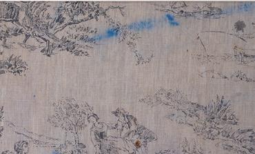
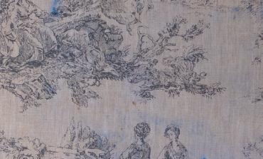
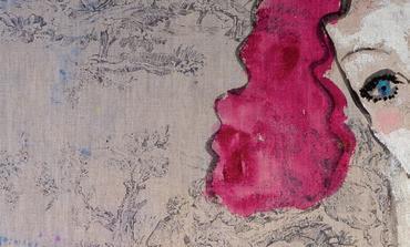
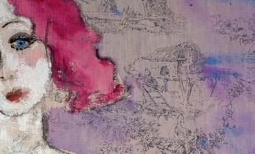
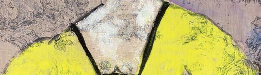
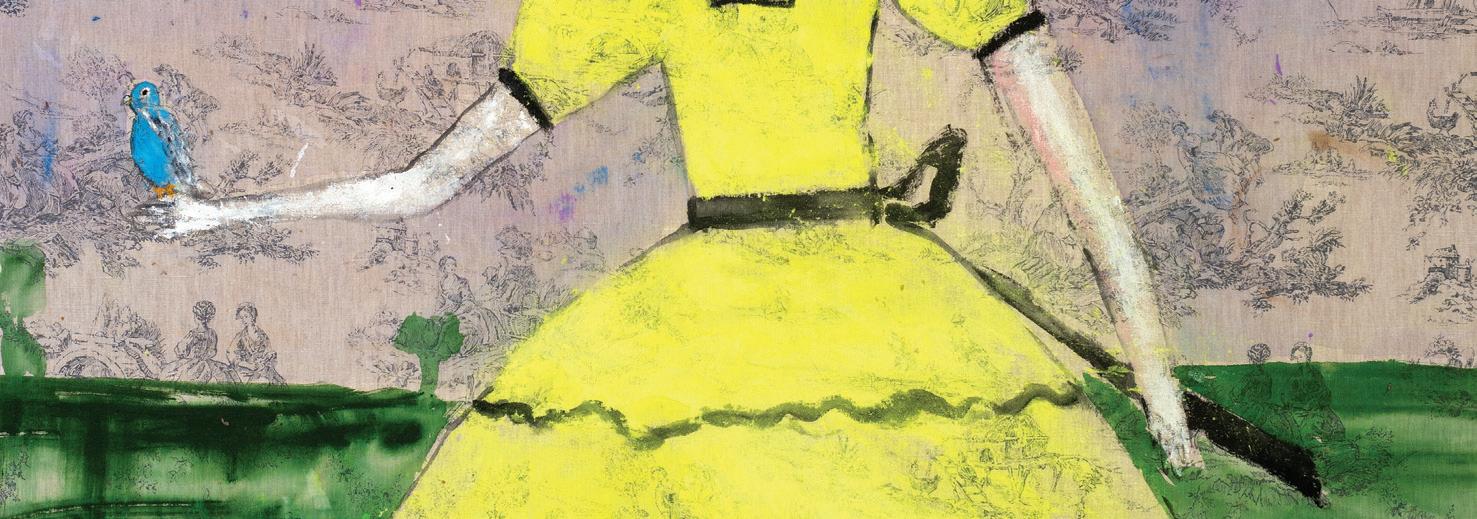
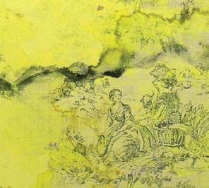
JENNY WATSON Scarlett O’Hara with a budgerigar (detail), 2014 Acrylic and Japanese pigment on rabbit skin glue primed English printed linen, 182 × 128 cm
Courtesy of the artist and Roslyn Oxley9 Gallery, Gadigal Country/Sydney
BAIN,
DUMBRELL, LIAM FLEMING,
GREIG, NADIA HERNÁNDEZ, DOUGLAS KIRKLAND, MIKE PARR, LIAM ROSS BAKER, KATHLEEN RYAN, MINDY SEU, RHODA TING & MIKKEL BOJESEN, JENNY WATSON & MORE
In this feature, we revisit a handful of beautiful and extraordinary pieces that have passed through our doors since the last issue.
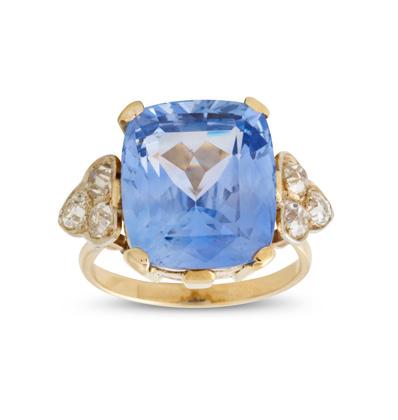
This extraordinary ring centres on a 23.34 carat, certified unheated sapphire of captivating, natural light blue, sourced in Queensland and recently sold in our Sydney Fine Jewels Auction.
Sapphire and diamond ring
Sold for $35,000
Fine Jewels Sydney, April 2026
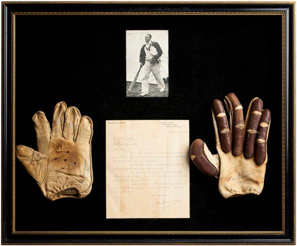
An extremely rare and important pair of Donald Bradman's 1948 Ashes Test Match batting gloves
Sold for $57,500 Decorative Arts, March 2026
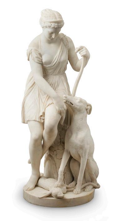
Sold for $50,000 Decorative Arts, March 2026
Alexander MacDonald (1847–?)
A Classical female figure, probably Diana, accompanied by a hound with a hare beneath its paw
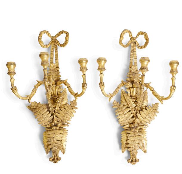
A pair of Victorian three-light gilt composition appliques
Sold for $5,000
The Terence Lane Collection, Part I, May 2026
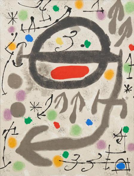
Joan Miro (Spanish, 1893-1983)
Les Perseides (The Perseides): Plate 3 1970
Sold for $12,500 Prints & Multiples, April 2026
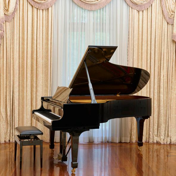
A grand piano by Steinway & Sons
Sold for $112,500 'Coonac', Toorak – Selected Fine Art, Furniture, & Objects, Melbourne, April 2026
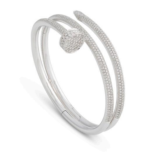
Cartier 18ct white gold 'Juste Un Clou' diamond bangle
Sold for $111,250 Fine Jewels, Sydney, April 2026
With regular auctions in Fine Art, Jewels & Watches, Decorative Arts, Modern Design, Luxury and more, there’s something to suit every taste at Leonard Joel.
browse
Browse our online auction catalogues or view in person at one of our salerooms.
bid
Create an account online and use it whenever you bid. You can also receive Lot alerts tailored to your interests.
Bidding is simple and you can do so in person, online, by phone or by leaving an absentee bid. Our team is always on hand to guide you.
now delivering
Get your auction purchases delivered straight to your door with Leonard Home Delivery (Melbourne only), our convenient, fast, reliable delivery service managed by our in-house team. Please visit our website for more information or contact delivery@leonardjoel.com.au
connect
Subscribe to our email newsletter through our website to stay up to date with news on upcoming auctions, special events, and industry insights. website leonardjoel.com.au instagram @leonardjoelauctions facebook facebook.com/leonardjoelauctions youtube youtube.com/user/leonardjoel1919
VALUE, SELL & BUY
Contact a Leonard Joel Specialist
managing director & head of important collections
John Albrecht 03 8825 5619 john.albrecht@leonardjoel.com.au
Auction Specialists
fine jewels & timepieces
Annie Soust
Head of Department, Melbourne 03 8825 5645 annie.soust@leonardjoel.com.au
Lauren Boustridge
Head of Department, Sydney 02 9362 9045 lauren.boustridge@leonardjoel.com.au
fine art
Wiebke Brix Head of Department 03 8825 5624 wiebke.brix@leonardjoel.com.au
Amanda Hayward (née North)
Senior Fine Art Specialist 03 8825 5644 amanda.north@leonardjoel.com.au
decorative arts
Chiara Curcio
Head of Department 03 8825 5635 chiara.curcio@leonardjoel.com.au
asian art
Luke Guan Head of Department 0455 891 888 luke.guan@leonardjoel.com.au
modern design
Rebecca Stormont
Senior Modern Design Specialist 03 8825 5637 rebecca.stormont@leonardjoel.com.au
luxury
John D'Agata, Senior Jewellery Consultant 03 8825 5605 luxury@leonardjoel.com.au
prints & multiples
Hannah Ryan Senior Art Specialist, Manager of Specialty Auctions 03 8825 5666 hannah.ryan@leonardjoel.com.au