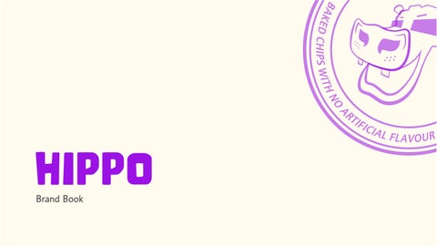
The Hippo Brand Manual serves as a comprehensive guide to maintain consistency, clarity, and cohesion across all brand touchpoints. It outlines the brand's core identity, including its values, mission, vision, tone, and visual elements, ensuring that every aspect of communication aligns with the rebranded personality of Hippo.
Introduction
01 01 Introduciton
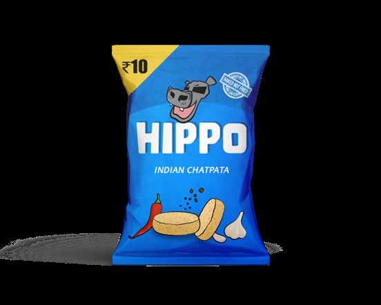
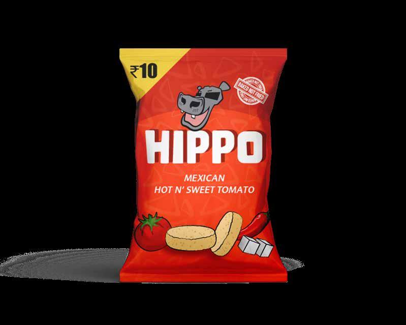
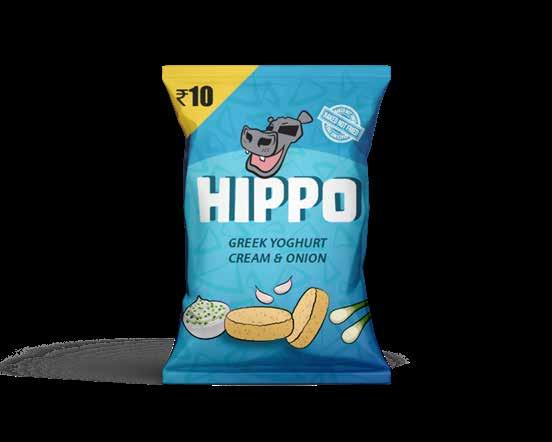
Hippo is a rejuvenated healthy snack brand that champions the idea of guilt-free indulgence with a twist of adventure. Known for its signature baked-not-fried chips, Hippo combines globally-inspired flavors with a commitment to health and sustainability. The brand has evolved into a symbol of vibrant, flavorful snacking, offering consumers a passport to taste the world without compromising on health.
BRAND VALUES
MISSION
VISION
To deliver guilt-free, globally-inspired snacking experiences that prioritize health, flavor, and adventure, all while promoting mindful and sustainable choices for a better future.
To become the leading choice for health-conscious snackers around the world by setting a benchmark for taste, quality, and innovation, while inspiring a lifestyle of mindful eating and global exploration.
BRAND ATTRIBUTES
• Healthy – Baked, not fried; light yet flavorful.
• Adventurous – Inspired by global flavors, offering a taste journey.
• Vibrant – Bold, fun, and engaging in design and messaging.
• Trustworthy – Committed to health, sustainability, and quality.
• Inclusive – Welcoming diverse tastes and dietary needs.
Brand Mascot Colour Palette
Typography
Aa
SYSTEM ELEMENTS
Pattern
Logo System
02 02
Brand Mascot and Logo
MASCOT INTRODUCTION
Meet HIPPO!. The mascot for Hippo Chips.
The hippo mascot has a funky and bold vibe, which is great for a snack brand targeting younger audiences or families.
He exudes confidence and fun—this is a positive association, indicating that the product is something to feel good about.
Personality :
- Energetic & Optimistic
- Funky & Fun
- Health Advocate
- Confident but Humble
- Friendly & Relatable
MONOCHROME LOGO
ISOLATION AREA
MINIMUM SIZE
8.5 mm 16 mm 8 mm
03 03 Colour
Primary Colour Palette
#0CBE36 #3BBAE1
#006BCB #9B13E4
#FFFCEF #F9E400
#FFAE2E #EE4923
Extended Colour Palette
#0CBE36 #3BBAE1 #006BCB
#016D18 #0583A0 #003E6D
#9B13E4 #FFFCEF #F9E400 #FFAE2E #EE4923
BRAND
BACKGROUNDS
The full colour logo should only be used on white backgrounds. Dont pair the black mascot outline with a coloured logo. Dont add a shadow which will make it diificult to reach. When there is a coloured backround, a shadow can be added to elevate the white logo. Dont use a colour logo on a similar background. Dont use a black logo on a colour background. In the case of a texture or a photo the coloured logo can be used as long asit is perfectly legible.
GUIDANCE
Do not alter the logo in any way. Just use the logo as it is. Follow the colour palette and dont use any other colour outside of that. Dont use a gradient for the logo. Dont obstruct the logo with any illustration or photograph.
Illustrations
Dont use illustrations of people with exxagerated features. Dont use illustrations with geometrical features. Dont use complex illustration with too many lines. Keep it simple andminimalistic.
Brand Voice and Messaging
TONE OF VOICE
• Upbeat and Fun: Playful and approachable, reflecting the brand's vibrant personality.
• Confident and Clear: Emphasizing the baked-not-fried health benefit and global flavor uniqueness.
• Inclusive and Relatable: Connecting with audiences of all ages and lifestyles.
• Use action-oriented words like "Savor," "Discover," and "Enjoy" to create an engaging narrative.
• Overly technical jargon about health or baking processes.
• Slang that might alienate a broader audience or sound insincere.
• Negative comparisons to fried snacks; focus on baked benefits instead.
Tagline :
This tagline highlights Hippo’s promise of guilt-free snacking with a playful twist. It emphasizes the healthy, baked crunch of the chips while celebrating their globally-inspired flavors. The tagline invites consumers to embark on a flavorful journey around the world, offering a satisfying and wholesome snack that’s both exciting and light. It’s the perfect blend of health and adventure in every bite!
Lorem ipsum dolor sit amet, consectetuer adipiscing elit, sed diam nonummy nibh euismod tincidunt ut laoreet dolore magna aliquam erat volutpat. Ut wisi enim ad minim veniam, quis nostrud exerci tation ullamcorper suscipit lobortis nisl ut aliquip.
Informa Pro Bold
Informa Pro Medium
Informa Pro Regular
06 06 Logo Systems
Tier 1 Lockups
Tier 1 Lockups
Tier 2 Lockups
Tier 3 Lockups
Tier 1 Lockups
HIPP
07 07 Graphic Elements
Brand Assets
Pattern
Mascot Emoji Stickers
Guidance and Misuse
Dont use the pattern if they overpower the creative. Dont stretch or distort the assets.
Dont recolour the emojis and retain the given colours.
Lorem ipsum dolor sit amet, consectetuer adipiscing elit, sed diam nonummy nibh euismod tincidunt ut laoreet dolore magna aliquam erat volutpat. Ut wisi enim ad minim veniam, quis nostrud exerci tation ullamcorp
HIPPO
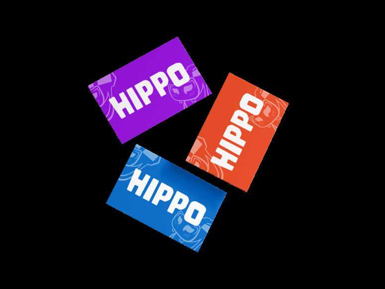
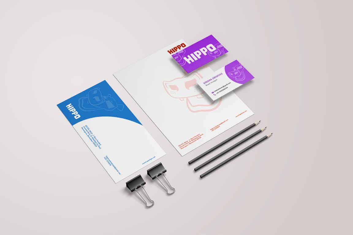
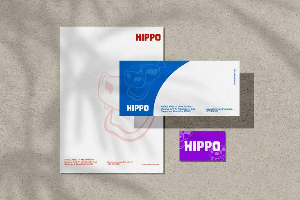
Stationary and Assets
09 09
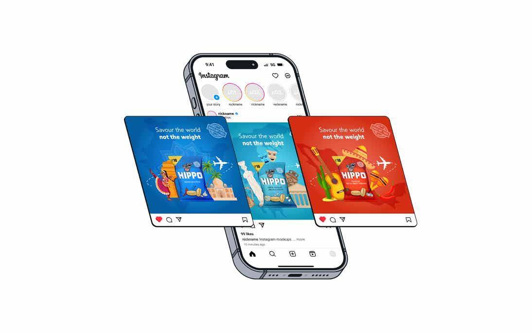
Digital Presence
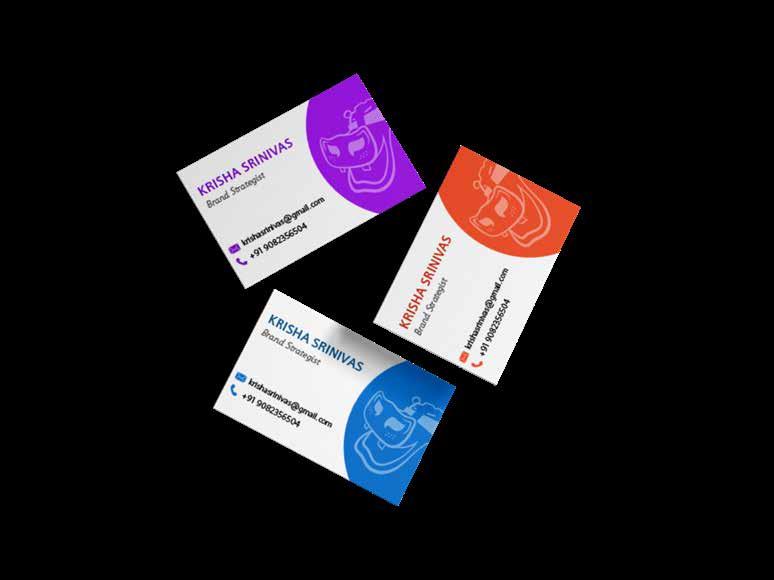
CONTACT INFORMATION
Krisha Srinivas
Brand Strategist
Contact Number : 908xxxxxxx
For further information please contact the Brand Management Team for assiwtance. We also recommend you to use the Hippo website to download the brand assets, guidelined and learn more about the Hippo brand.