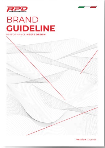

BRAND GUIDELINE
PERFORMANCE MEETS DESIGN

Introducion
These guidelines have been created to define the new look and feel of RPD Moto. They serve as a practical tool for communicating the brand’s personality while bringing together all the fundamental elements that form its new visual identity. Various versions have been designed for different applications, incorporating the institutional typeface.
Proper adherence to these guidelines is essential for strengthening the brand’s presence and maintaining high visibility. We recommend reading these guidelines thoroughly before applying the new visual elements to ensure the correct and consistent use of brand assets.
Why Should We Follow These Guidelines?
Following these guidelines is crucial because RPD Moto has always maintained a strong, consistent identity, earning global recognition. These guidelines provide you with the necessary tools to effectively implement RPD Moto’s visual identity, ensuring brand consistency and impact.
A Change of Paradigms
Brand Value
Where performance meets design, and innovation drives with elegance. We are rpdmoto, a motorsports brand born from a passion to merge strength and beauty in every product we create.
To create components that not only enhance performance but also elevate aesthetics. We're not just launching a brand we're igniting a revolution in motorsport. Get ready to experience the thrill of speed the pinnacle of style, and the cutting edge of innovation.
History Brand
A Legacy of Performance & Design
Born from the relentless pursuit of power, precision, and aesthetics, RPD Moto was founded with a vision to redefine the motorsports industry. What started as a passion for high-performance engineering soon evolved into a brand that seamlessly merges strength and beauty in every product we create.
From the very beginning, we set out to craft components that not only enhance performance but also elevate aesthetics—because true innovation is about more than just speed; it’s about making a statement. With cutting-edge technology, premium materials, and a deep understanding of motorsports culture, RPD Moto has quickly become a name synonymous with precision, durability, and style.
As we continue to push boundaries, we’re not just building parts—we’re shaping the future of motorsports. Join us in this revolution and experience the thrill of speed, the pinnacle of style, and the cutting edge of innovation.


BRANDMARKS

Primary Logo
The RPD Primary Logo represents the attributes and values of the RPD brand. It is a unique mark that sets us apart from our competitors and should be central to all communications. It should be used as the first choice wherever possible (size and area permitting). Only when legibility is compromised should the RPD Secondary Logo be used.
01 | THE RPD PRIMARY LOGO
The RPD Primary Logo must be displayed in red or white reversed (out of black). When using the RPD Primary Logo in red, the ‘Performance Racing Development’ text must remain in white and not be transparent. When using the RPD Primary Logo in the white reversed variant, the letters ‘Performance Racing Development’ must remain in black. This is particularly important when reproducing the logo on a colored background or photograph.
02 | THE EXCLUSION ZONE
Any RPDLogo needs a clear area around it to ensure maximum stand-out. This area is the exclusion zone and must be kept free of other logos, graphics, text, or the edge of the printed piece. The exclusion zone for any RPD Logo should be equal to the height of the ‘C’ on each side, top, and bottom.
03 | MINIMUM LOGO SIZE
Minimum sizes of the logo have been developed to ensure legibility when used on small applications. The minimum size of the RPD Primary Logo for digital/screen and print-based design work is 27mm or 77px wide.
Main Logo
Minimum use 40 mm / 80 px
minimum size for digital/screen based and print based design work
Simplify
If the logo is too small and makes the product tagline unreadable, the logo can be made in a solid color, opposite to the background.
Icon
The icon logo can be used for product marking placement or as a visual asset when the size does not allow for the main logo, using a solid color type.

Logo Misuse

Blood Sweat & Gears
CHAMPIONSHIP
CHAMPION
THE LOGO IS A REGISTERED TRADEMARK LOGO OFFICIAL PARTHNER
Official Partner
The RPD Partner Logos visually illustrate the relationship between the RPD and an official RPD Partner brand.
01 | RPD ALIGNED LOGO
The Aligned Logo is a fusion of two logos arranged to promote a strong brand presence when describing the relationship between the two properties. The Aligned Logo incorporates the RPD Primary Logo. The Aligned Logo is for exclusive use by official RPD Partners in any communications

Grey dotted line indicates the exclusion zone that must be respected
02 | RPD PARTNER PANEL
The RPD Partner Panel should be used wherever the RPD Championship Partners are displayed collectively. It is implemented in all cases where the commercial messages from all RPD Partners are to be integrated alongside each other.





Grey dotted line indicates the exclusion zone that must be respected

BRAND APPLICATION

Logo Application
01 | RPD LOGOS AND BACKGROUNDS
Primarily, the RPD Logo should be red on a white background or white reversed out of red. As a secondary usage, a logo reversed out of a colored background may be used,. When using the red logo, the “Performance Racing Development” text must remain in white and not be transparent. When using the white logo, the “Performance Racing Development” text must remain in black.
02 | RPD LOGOS ON PHOTOGRAPHIC BACKGROUNDS
The logo can be placed on an image, provided the area in the exclusion zone is free of clutter. The examples alongside illustrate the correct and incorrect use of the logo and an image. The RPD trademark must be the hero brand, leading the creative and serving as an anchor within the artwork. It can be placed anywhere, although the top or bottom right is the preferred position.
FALLBACK LOGO
To be used in exceptional cases against red.
The legibility of the RPD logo must always be ensured. In other words, the contrast between logo and background must be as high as possible. The background and its structure must be selected to be as smooth as possible.




PRIMARY LOGO | To be used against white, picture, or color.

LOGO AGAINST GRADIENT






INCORRECT | Contrast between the logo and the background too low
The white logo can be placed on any part of a sufficiently dark gradient background The gradient logo MUST NOT be used on campaign advertising assets.
APPLICATION LOGO FOR MARKING
The legibility of the “Racing Performance Development” logo must always be ensured. In other words, the contrast between logo and background must be as high as possible.
However, if the type of material produced is small in size, the RPD logo can be used without the tagline and only with a straight line

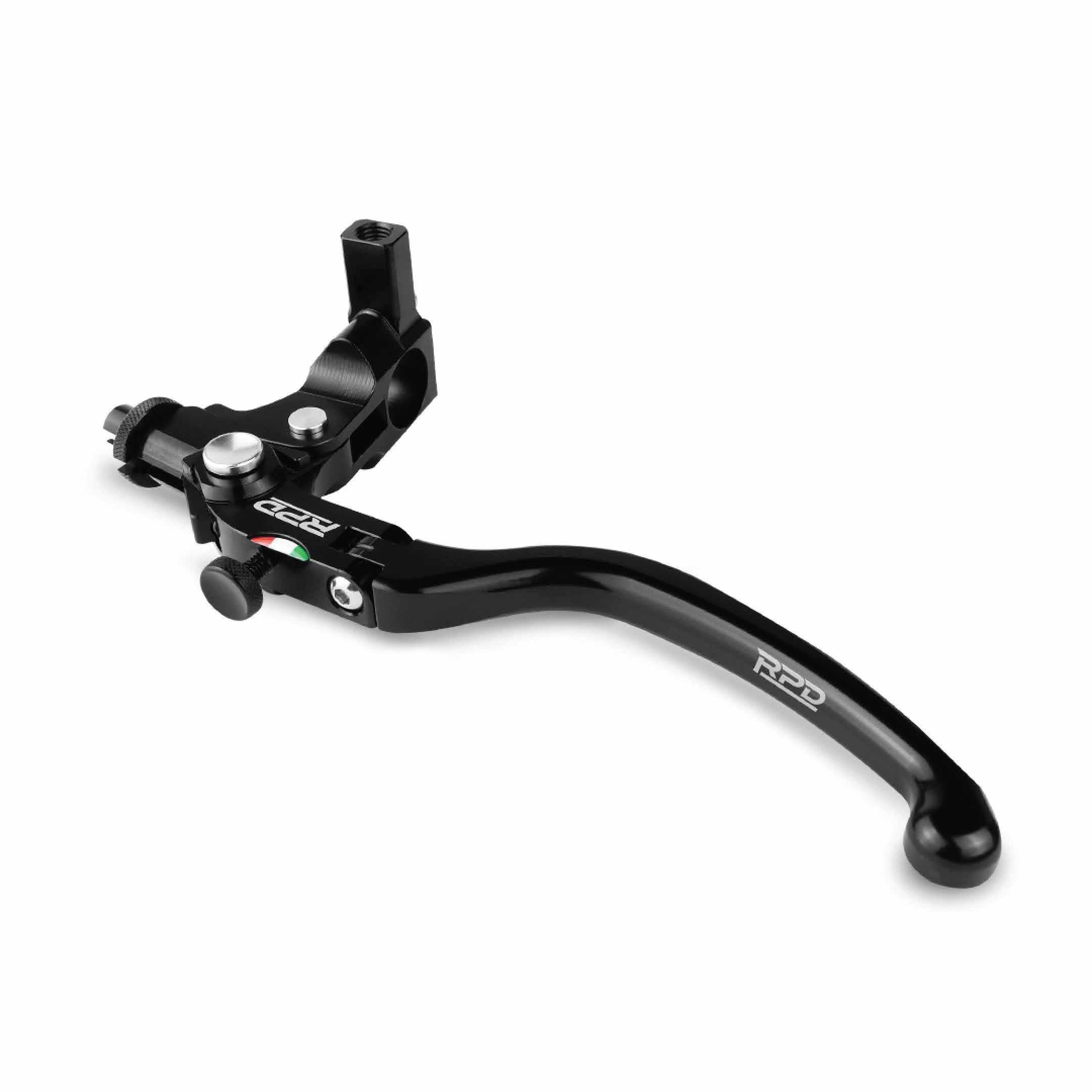
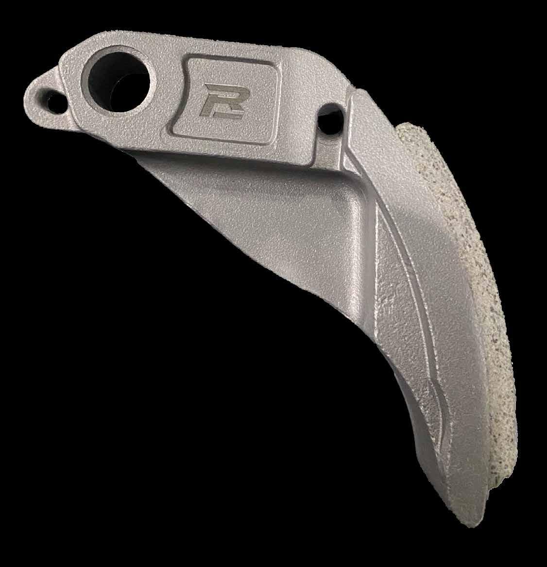

Minimal
Minimal size logo withou text
Minimal size logo icon
Minimal size logo with text
Minimal size logo icon


COLOURS & ELEMENTS

RPD LOGO COLOURS
Colours
The RPD Logos must be reproduced in either red or white reversed
01 | PRIMARY COLOURS
These colours have been chosen to ensure maximum and consistent stand-out in a world of varying colours and locations. The colours should be used in a balanced manner and equally represented across an entire creative wherever possible. Emphasis may be given to one colour over another to ensure legibility in accordance with the media used (e.g., online bias to white vbackground for on-screen clarity).
Primary Colour RED
RGB : R237 / G27 / B47
CMYK : C0 / M100 / Y90 / K0
Pantone Coated : 185 C
02 | HIGHLIGHT COLOUR
Primary Colour WHITE
RGB : R255 / G255 / B55
CMYK : C0 / M0 / Y0 / K0
Pantone Coated : 000 C
The highlight colour should never represent more than 15% of the overall colour palette. This colour symbolizes growth and positivity and is used to create dynamism and stand-out against the red, white, and grey.
Primary Colour BLACK
RGB : R0 / G0 / B0
CMYK : C90 / M90 / Y90 / K90
Pantone Coated : 6 C
Primary Colour GREY
RGB : R105 / G105 / B100
CMYK : C60 / M50 / Y50 / K20
Pantone Coated : 416 C
RPD GUIDELINES / CTA BUTTONS
Primary CTA
DARK BACKGROUND
White RPD Type Next Bold on red button.
For CTA copy, the first letter of each word should be capitalized. e.g., View Offer, Learn More, Explore Now
Primary CTA
DARK BACKGROUND
White RPD Type Next Bold on red button.
For CTA copy, the first letter of each word should be capitalized. e.g., View Offer, Learn More, Explore Now
RPD DIGITAL COLOURS
Element
Italian Flag
Following every design and visual asset as an additional ornament and decorative element in each design. There are no strict rules for placement or positioning within an artwork. However, the scale used should not be too prominent.
Here are the elements :
Price List Symbol
Can be used for flyers and promotional media that require price information. The use of ‘Type Name and Motorcycle Application’ is stated in the example below, along with detailed pricing and numerical representation in Rupiah.
The background must be included when displaying price information to ensure clarity across all types of design media.
Information Detail
Used as a CTA (Call To Action) symbol in design descriptions or promotional media. It can be improvised while maintaining a design style that remains consistent.
QUANTUM D2 40mm

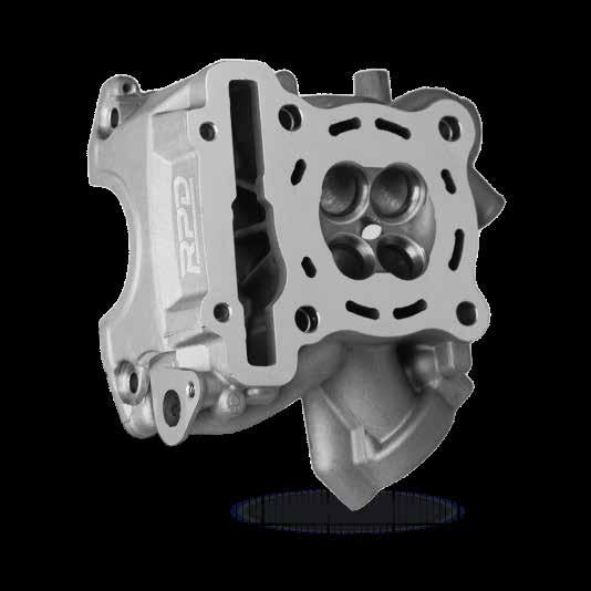
Information Icon
The prepared information icons can be used to highlight the features available for each part. However, improvisation is still possible by adjusting to additional features. Additionally, the pre-designed arrow indicators are also available for use.

TYPHOGRAPHY

RPD Fonts
In principle, the typeface Handle Gothic Wd is used.
HEADLINES AND SUBHEADLINES ARE SET IN UPPER CASE, while body copy is set in upper case and lower case.
The other typefaces can be used to ensure optimal legibility and text structure, for examplev in body copy, intermediate headlines or price labelling. In digital media, clickable elements are always set in Bold. Offer copy is written in “Montserat” case.
TYPOGRAPHIC APPROACH
RPD Font may be used as a design feature to deliver the RPD message. Colour, font and size may be applied and mixed freely to communicate the emotion and competitiveness.
PRIMARY WEIGHT
Handle Gothic Wd
Aa Bb Cc Dd Ee Ff Gg Hh Ii Jj
Kk Ll Mm Nn Oo Pp Qq Rr Ss
Tt Uu Vv Ww Xx Yy Zz
0123456789$%&?!:#+/
SECHONDARY WEIGHT
Aa Bb Cc Dd Ee Ff Gg Hh Ii Jj Kk Ll
Mm Nn Oo Pp Qq Rr Ss Tt Uu Vv Ww Xx Yy Zz
0123456789$%&?!:#+/
Montserrat


ATL & BTL
Above The Line & Below The Line communication
Precise rules for ATL communication enable the Brand’s value to be respected unambiguously.
Which mark to use?
In ATL communication there is a clear distinction to be made between the two media, video and print. For video communica- tion the correct version of the trademark is the Digital Communications one, while in the case of printed communication the version to use is that for Printed Communications. The fol- lowing pages illustrate both versions in combinations with the payoff. Great care must be taken to use the right combination for the medium. This page shows the two versions of the tra- demark.
Here you will find the practical application of the guideli- nes described in this document. The example used is the RED campaign, in the following formats: single page, half page, double page, poster and TVC. For each one, there is a specific application of all the elements. To adapt earlier or future campaigns, please follow the instructions relating to the format intended for use.
RELATIONSHIP BETWEEN FOOTER AND PAGE FORMAT
When the RPD trademark appears in advertising, it must be on a white blank space. There are rules for the footer's dimensions and positioning: it must occupy the bottom tenth of the printed sheet. Additionally, it must extend all the way to the three edges of the sheet, with no distractions around it. The trademark’s position on the footer follows the rules explained in earlier illustrations. In a single-page advertisement, the model name may be placed above the white blank space. On double-page spreads, the footer is extended across the left-hand page, but the rules for the trademark’s positioning are the same as for the single page.
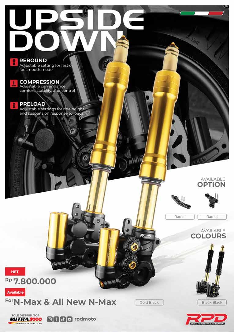
SINGLE PAGE 210 x 297 mm
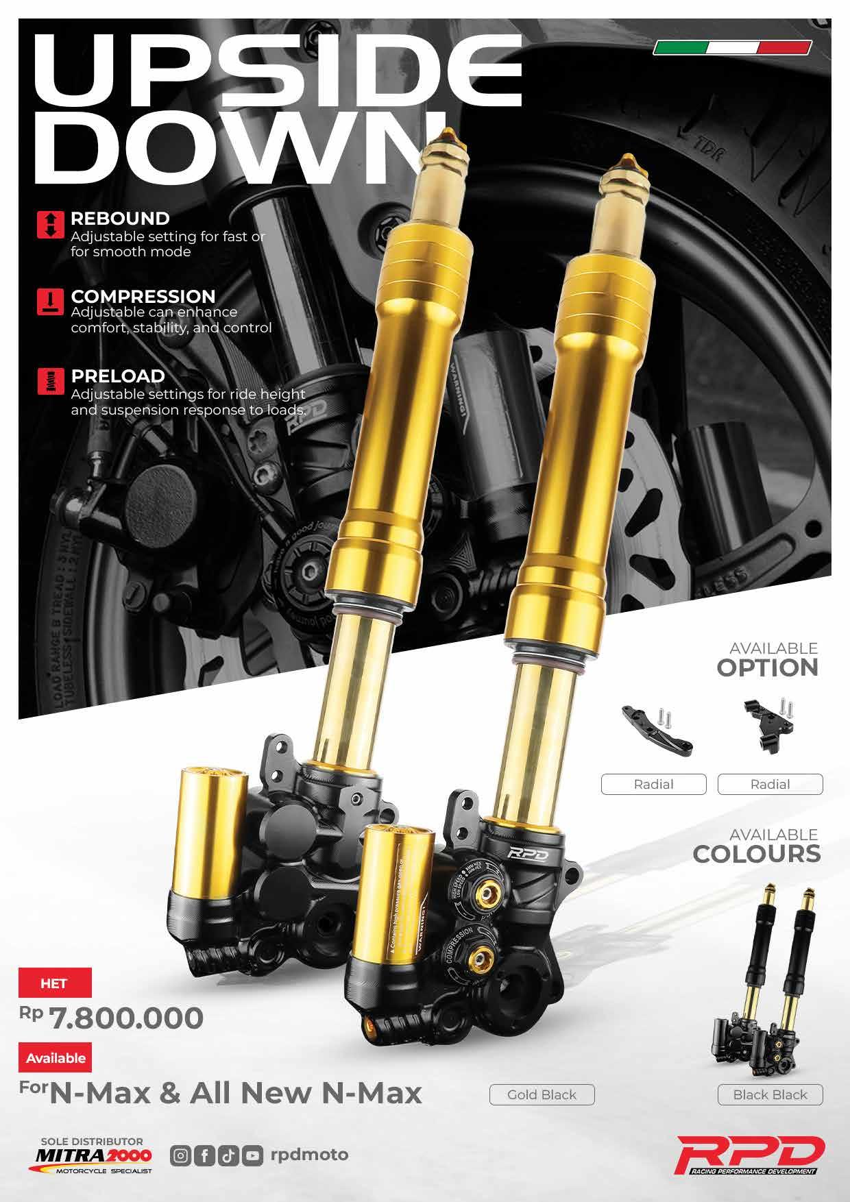
The figure shows an example of a single-page ad. In addition to the rules for correct composition of the strip at the botvtom of the page, this example highlights all the key elements featured in RPD
communication: 1) Headline 2) Subhead 3) Main Object 4) Detail Information 5) Footer. These elements must adhere to the composition rules shown in the figure: the correct typeface at the correct size, and the correct technical characteristics and color.
1. HEADLINE
5. FOOTER
3. MAIN OBJECT / TOPICK
2. SUB HEADLINE / DESCRIPTION
3. MAIN OBJECT / MAIN TOPICK
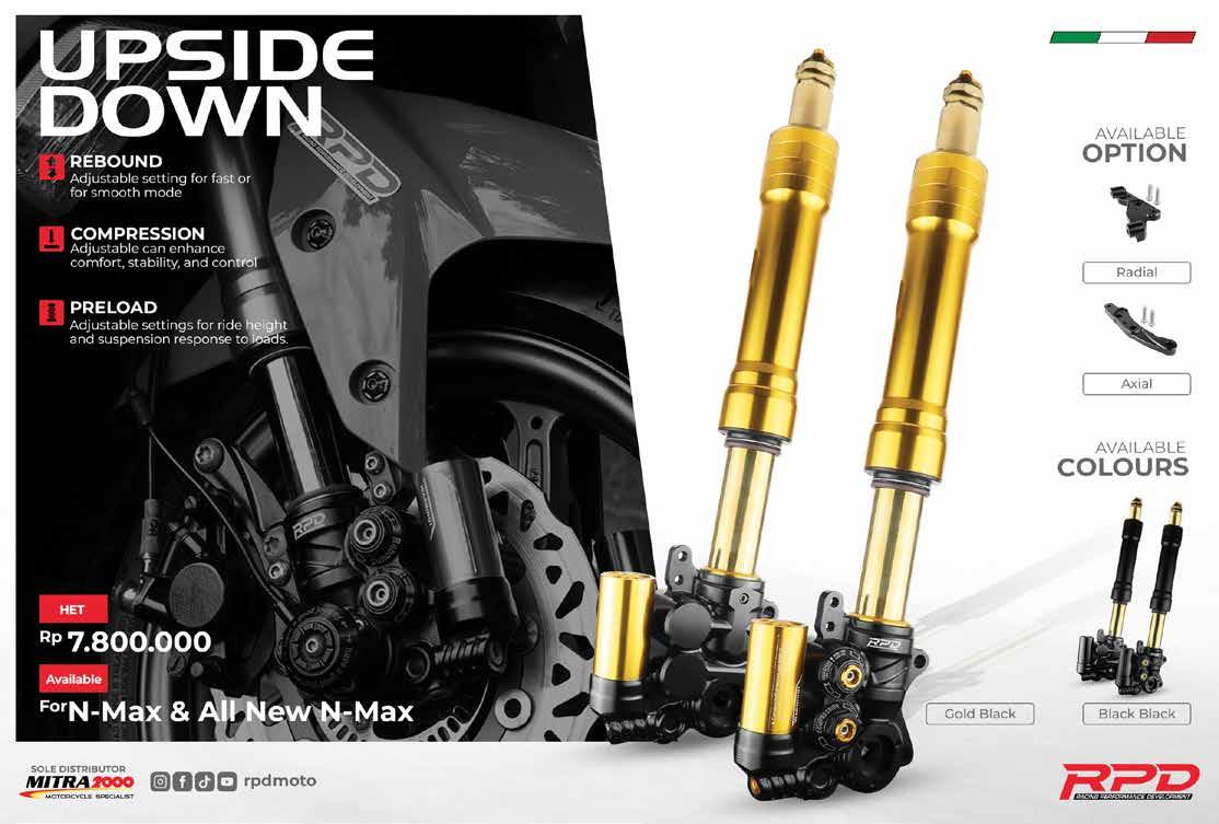
HALF PAGE 330 x 240 mm
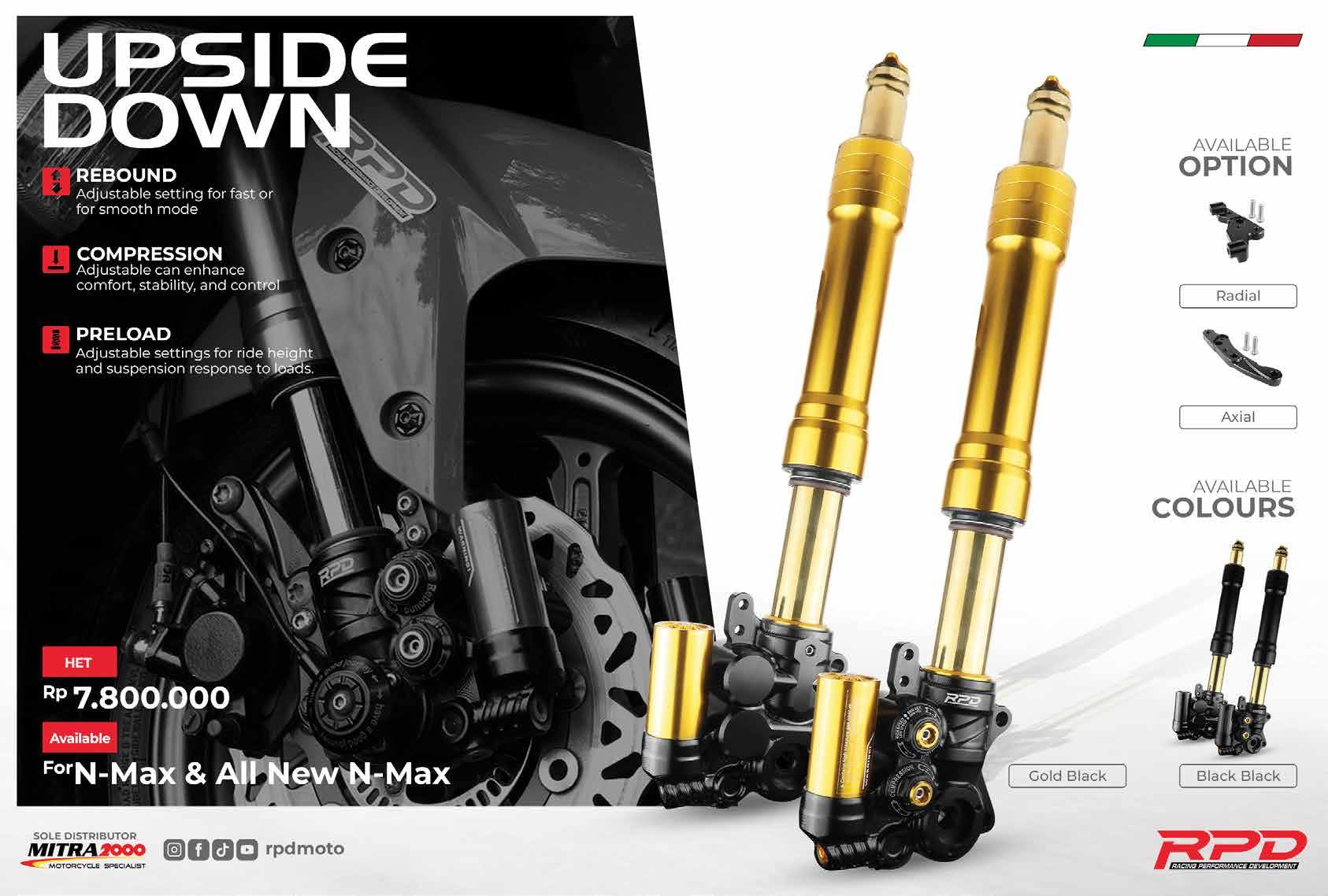
The figure shows an example of a half / double -page ad. In addition to the rules for correct composition of the strip at the bottom of the page, this example highlights all the key elements featured in RPD
communication: 1) Headline 2) Subhead 3) Main Object 4) Detail Information 5) Footer. These elements must adhere to the composition rules shown in the figure: the correct typeface at the correct size, and the correct technical characteristics and color.
1. HEADLINE
HEADLINE
SUB HEADLINE / DESCRIPTION
4. DETAIL INFORMATION
5. FOOTER
3. MAIN OBJECT / TOPICK
2. SUB HEADLINE / DESCRIPTION
4. DETAIL INFORMATION
5. FOOTER
3. MAIN OBJECT / MAIN TOPICK
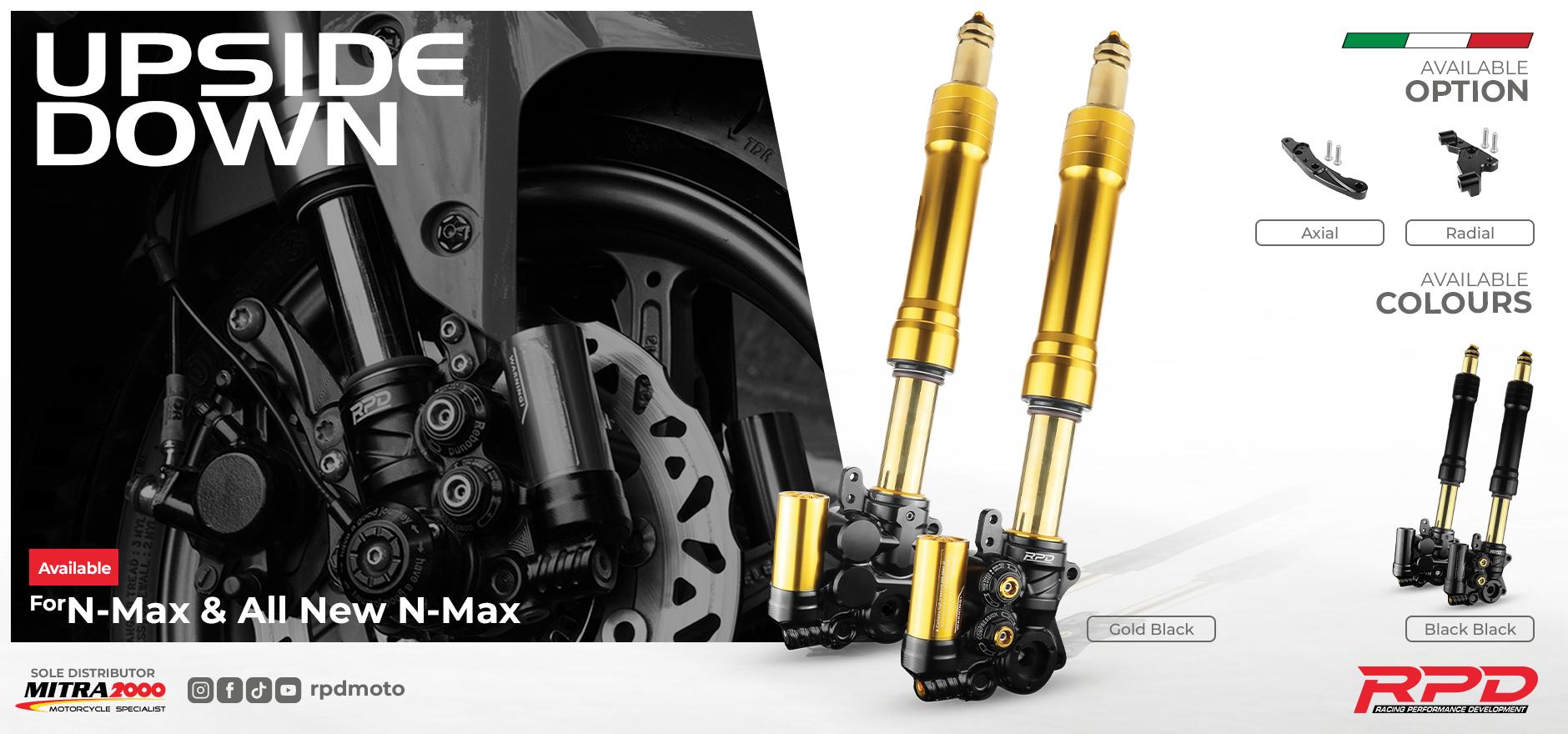
ADVERTISING 6 x 3 m
The figure shows an example of a large-format poster. In addition to the rules for correct composition of the strip at the bottom of the page, this example highlights all the key elements featured in RPD
communication: 1) Headline 3) Main Object 4) Detail Information 5) Footer. These elements must adhere to the composition rules shown in the figure: the correct typeface at the correct size, and the correct technical characteristics and color.
1. HEADLINE
DETAIL INFORMATION Font : Montserat
FOOTER
2. MAIN OBJECT / TOPICK
mm
4. FOOTER
3. DETAIL INFORMATION
2. MAIN OBJECT / MAIN TOPICK
1. HEADLINE
3. DETAIL INFORMATION
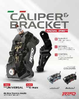
SOCIAL MEDIA 1080 x 1350 px
The figure shows an example of social media. As well as the rules for correct composition of the fother at the bottom of the page, this example shows all the ke elements featured in RPD
communication: 1) Headline & Sub Headline; 2) Main Object & Topick; 3) Detail Information; 4) Footer; Those elements must respect the rules of composition shown in the figure: the right type- face at the right size; the right technical characteristics and colour.
1. HEADLINE / SUB HEADLINE
3. MAIN OBJECT / MAIN TOPICK
3. DETAIL INFORMATION
1. HEADLINE
Handle Gothic Wd
: 55 - 75 pt
white 100%
2. MAIN OBJECT / TOPICK
DETAIL INFORMATION
4. FOOTER
4. FOOTER
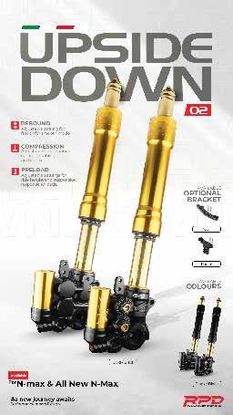
SOCIAL MEDIA 1080 x 1920 px
The figure shows an example of social media. As well as the rules for correct composition of the fother at the bottom of the page, this example shows all the ke elements featured in RPD
communication: 1) Headline & Sub Headline; 2) Main Object & Topick; 3) Detail Information; 4) Footer; Those elements must respect the rules of composition shown in the figure: the right type- face at the right size; the right technical characteristics and colour.
1. HEADLINE / SUB HEADLINE
2. DESCRIPTION
3. MAIN OBJECT
FOOTER 4. DETAIL INFORMATION
1. HEADLINE / SUB HEADLINE Font: Handle Gothic Wd Size : 55 - 75 pt
2. DECRIPTION
3. MAIN OBJECT
4. DETAIL INFORMATION
5. FOOTER
BTL COMMUNICATION
The next section shows some examples of correct use of the trademark on Below The Line material.
BUSINESS MATERIALS
BUSINESS CARDS
On the front of the business card, there should be space to place the company logo, which must always be surrounded by white space.
The name and address on the back of the business card should follow the RPD corporate business card format.
FIRTS NAME
Position / Title name your addres and number location Jakarta, Indonesia
+62 8888 8888 8888 Yourmail@rpd.com homepage
PRODUCTION SPECIFICATION
Papaer : Fancy 300g
Color density : #000000 white
Cours : #e82230 Red & #686966 Grey
BUSINESS MATERIALS
A4 STATIONARY
On the top left side of the stationery, enough space is provided for the Group Head logo. The authorized address, phone number, and email should be placed at the bottom.
Data
Lorem ipsum
dolor sit amet, consectetuer adipiscing elit, sed diam nonummy nibh euismod tincidunt ut laoreet dolore magna aliquam erat volutpat.
Ut wisi enim ad minim veniam, quis nostrud exerci tation ullamcorper suscipit lobortis nisl ut aliquip ex ea commodo consequat. Duis autem vel eum iriure dolor in hendrerit in vulputate velit esse molestie consequat. vel illum dolore eu feugiat nulla facilisis at vero eros et accumsan et iusto odio dignissim qui.
blandit praesent luptatum zzril delenit augue duis dolore te feugait nulla
Ut wisi enim ad minim veniam, quis nostrud exerci tation ullamcorper suscipit lobortis nisl ut aliquip ex ea commodo consequat. Duis autem vel eum iriure dolor in hendrerit in vulputate velit esse molestie consequat.Ut wisi enim ad minim veniam, quis nostrud exerci tation ullamcorper suscipit lobortis nisl ut aliquip ex ea commodo consequat.
Ut wisi enim a wisi enim ad minim veniam, quis nostrud exerci tation ullamcorper suscipit lobortis nisl ut aliquip ex ea commodo conseq.
Salam Sejahtera
Nama Lengkap
PERFORMANCE MEETS DESIGN
Kepada Yth, Bpk xxxxxx Salam Sejahtera
BUSINESS MATERIALS
ENVELOPE DL
On the bottom right side of the stationery, enough space is provided for the Group Head logo. The tagline "Performance Meets Design" should be placed at the top left.
PERFORMANCE MEETS DESIGN
SPATIAL COMMUNICATION
OUTDOOR MATERIALS
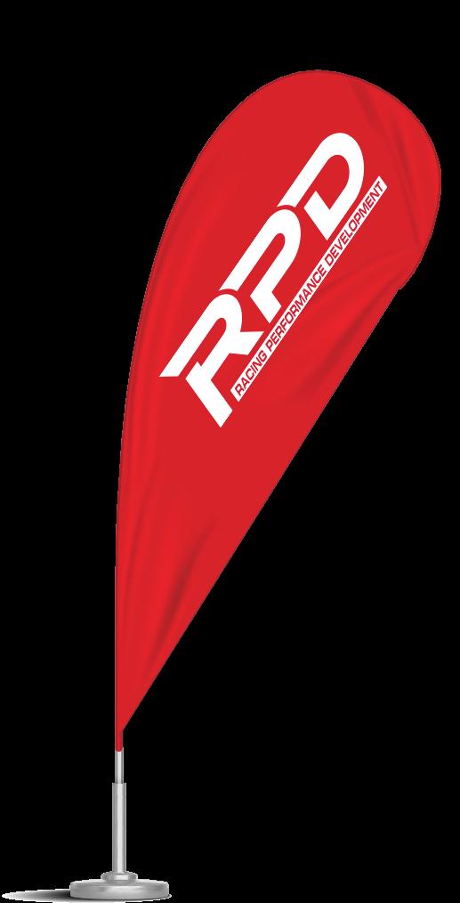
The dominant colour here is RPD red, when positioning the logo, sufficient distance must be maintained in relation to other elements.
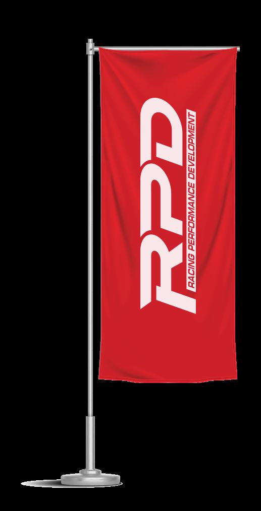
FLAG
BEACH FLAG
SPATIAL COMMUNICATION
OUTDOOR MATERIALS
The dominant colour here is RPD red, when positioning the logo, sufficient distance must be maintained in relation to other elements.
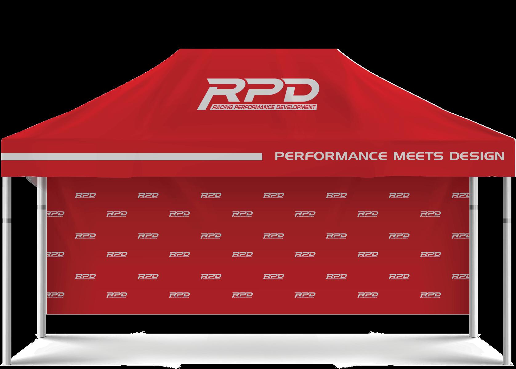
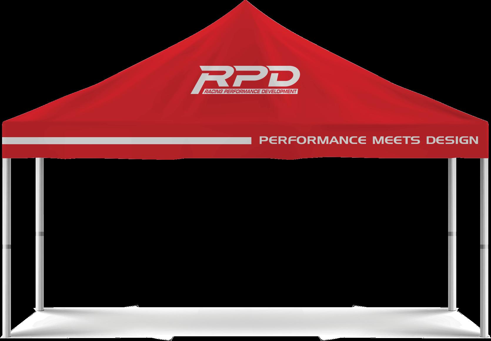
OUTDOOR MATERIALS
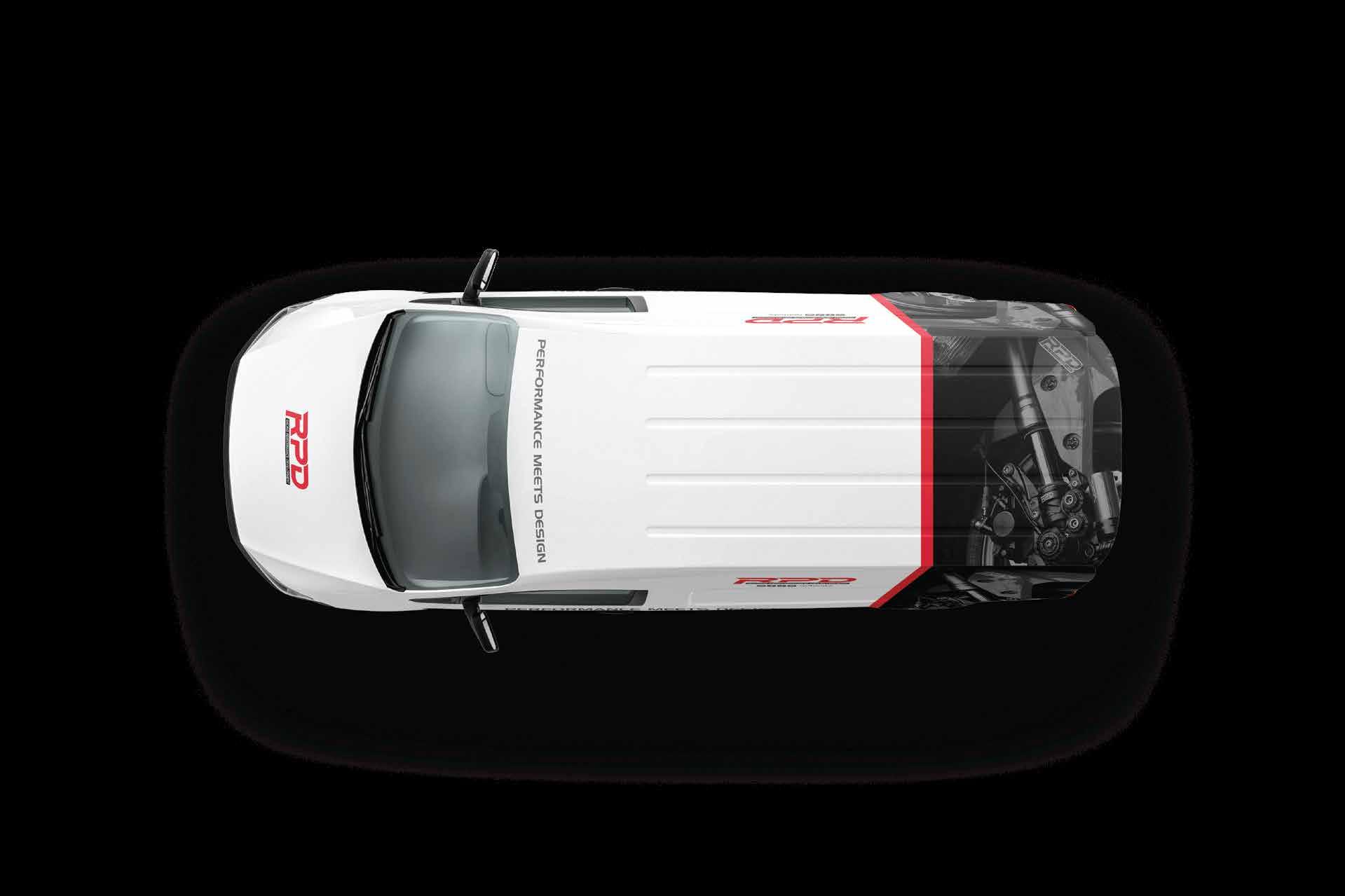
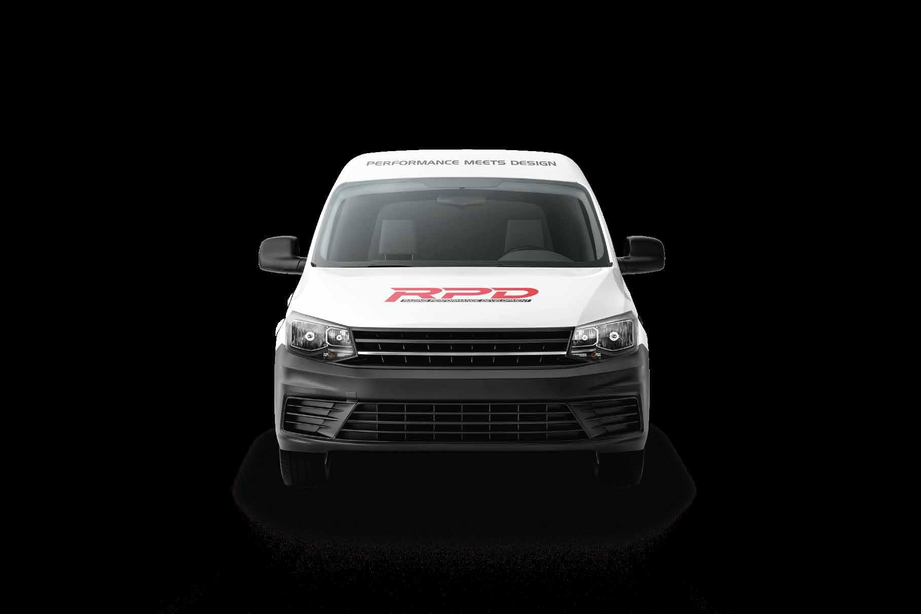
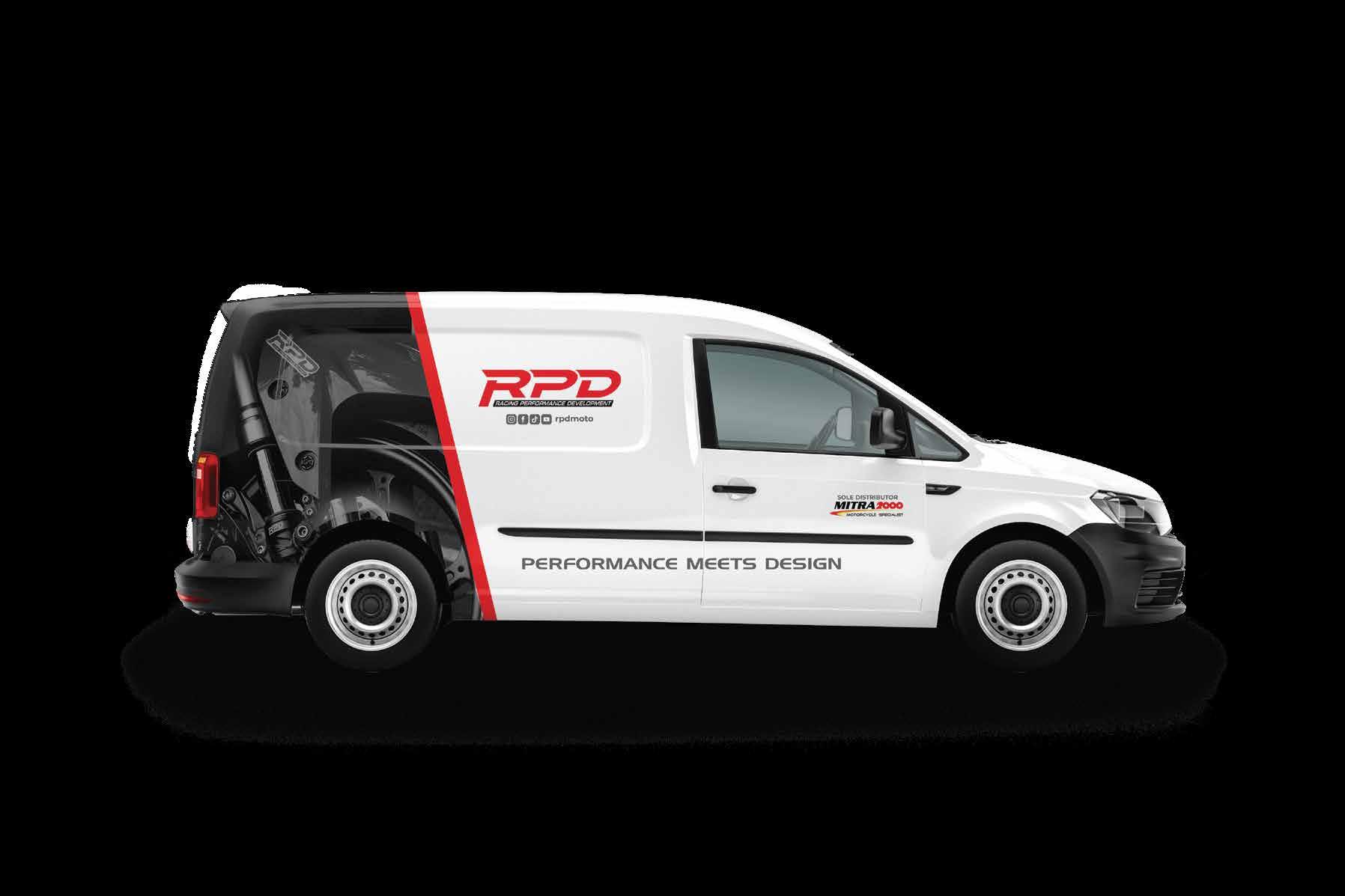
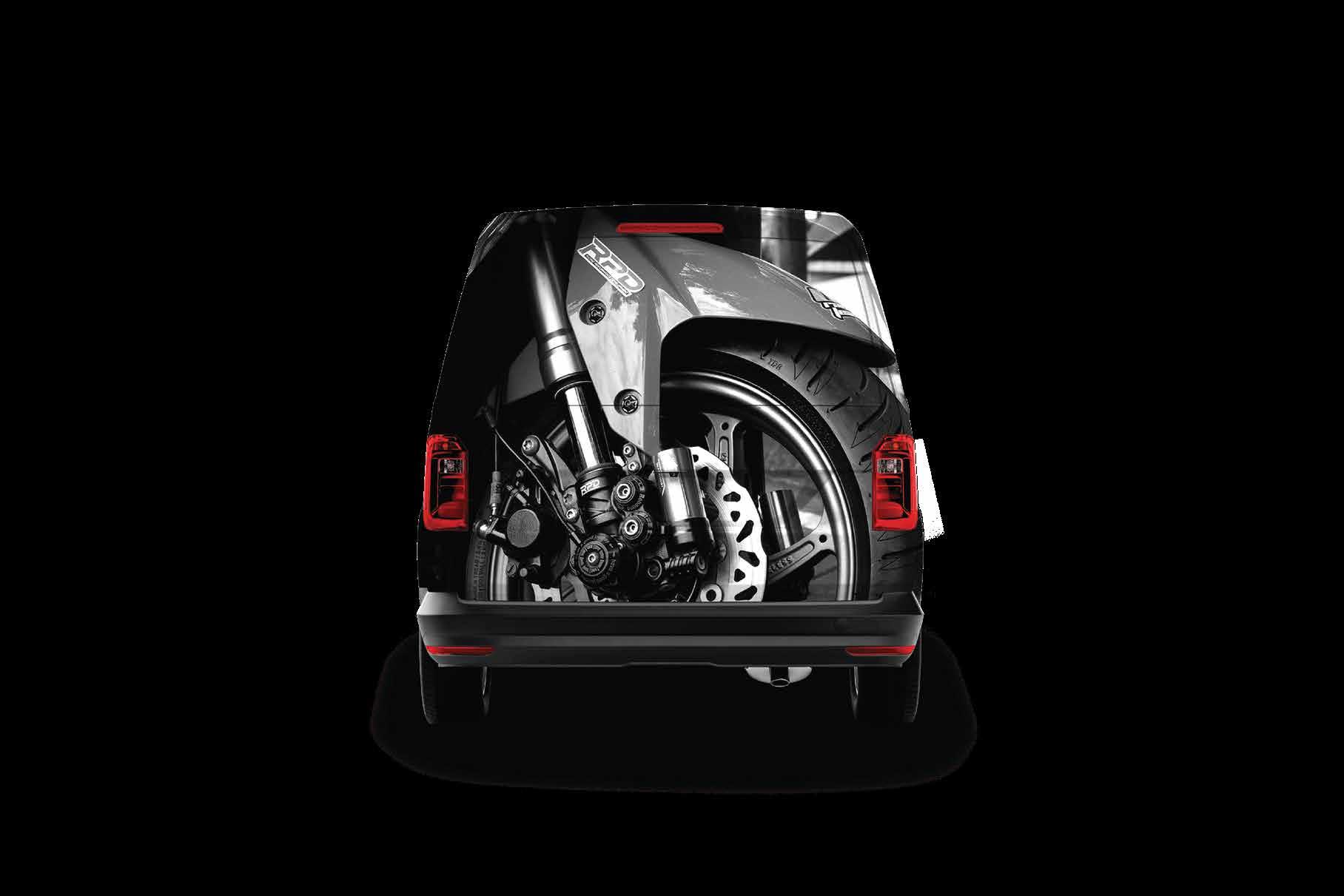
The dominant colour here is RPD red,

Release | Feb 2025
