Keyano has always been a cornerstone of education, industriousness, and community in Alberta. As we advance, we always remain true to the spirit of “Keyano” – the Cree word for sharing. And to the values that have shaped generations of learners, community members, and industries.
This Brand Style Guide is your roadmap to communicating the Keyano College story with clarity, consistency, and pride. Every element has been carefully considered and designed to reflect our institution’s character: resilient, close-knit, and ambitious.
Find all of the elements you need to tell the story of an institution that welcomes all, adapts to change, and celebrates the transformational power of learning. Whether you are creating a brochure, a campus sign, or a digital campaign, this guide will help you capture the essence of Keyano College.
Together, we can share more of Keyano with the world.
Brand Story
Brand Story
Like the surging Athabasca River, our shared history shifts course, yet our institution adapts, embracing the new while honouring the past. Keyano means sharing in Cree. It signifies our collective journey – yours, mine, and ours.
We offer a place for students to explore possibilities, discover their strengths, and create meaningful futures. Keyano is the common ground between higher learning, greater perspectives, and the industrious spirit that builds our region and shapes what comes next. Much like the Northern Lights illuminating our skies, you’re never quite the same once you’ve experienced the transformation for yourself.
Welcome to the next chapter of Keyano College, a reflection of the ambition, resilience, and connection that define our community.
125 words
Like the surging Athabasca River, our shared history shifts course, yet our institution adapts, embracing the new while honouring the past. Keyano means sharing in Cree. It reflects our collective journey – yours, mine and ours.
We offer a place where students can explore possibilities, discover their strengths, and build meaningful futures. Keyano is the common ground between higher learning, greater perspectives, and the industrious spirit that drives our region forward, and shapes what comes next. Rooted in community and connected to opportunity, we prepare students for careers, leadership and lifelong growth.
Much like the Northern Lights illuminating our skies, transformation leaves a lasting impression. Welcome to the next chapter of Keyano College, shaped by ambition, resilience, connection, and a shared belief in what’s possible together.
100 words
Like the surging Athabasca River, our shared history shifts course, yet our institution adapts, embracing the new while honouring the past. Keyano means sharing in Cree, and it reflects our collective journey – yours, mine, and ours.
We offer a place for students to explore possibilities, discover their strengths, and build meaningful futures. Keyano co nnects higher learning, broader perspectives, and the industrious spirit that shapes our region.
Much like the Northern Lights illuminating our skies, transformation leaves a lasting impression. Welcome to the next chapter of Keyano College, shaped by ambition, resilience, connection, and a shared commitment to what comes next.
75 words
Like the surging Athabasca River, Keyano College continues to adapt while honouring the past. Keyano means sharing in Cree, reflecting our collective journey – yours, mine, and ours.
We are a place where students explore possibilities, discover strengths, and build meaningful futures. Connecting higher learning with the spirit of our region, Keyano helps shape what comes next.
Welcome to the next chapter of Keyano College, shaped by ambition, resilience, connection, and belief in what’s possible together.
50 words
Like the surging Athabasca River, Keyano College adapts while honouring the past. Keyano means sharing in Cree, reflecting our collective journey.
We help students explore possibilities, discover strengths, and build meaningful futures.
Like the Northern Lights illuminating our skies, the transformation experienced at Keyano leaves a lasting impression for generations.
Brand Messaging
Brand Messaging
Our brand messaging will always seek to inspire and invite our audience to learn more. Whether you’re writing a headline for an ad, web page content for our site, or a radio ad for an open house, take it as an opportunity to showcase our commitment to community and the success of our students.
Our words should reflect the pride we take in our legacy, the excitement we have for the future, and the inclusive spirit that defines our institution.
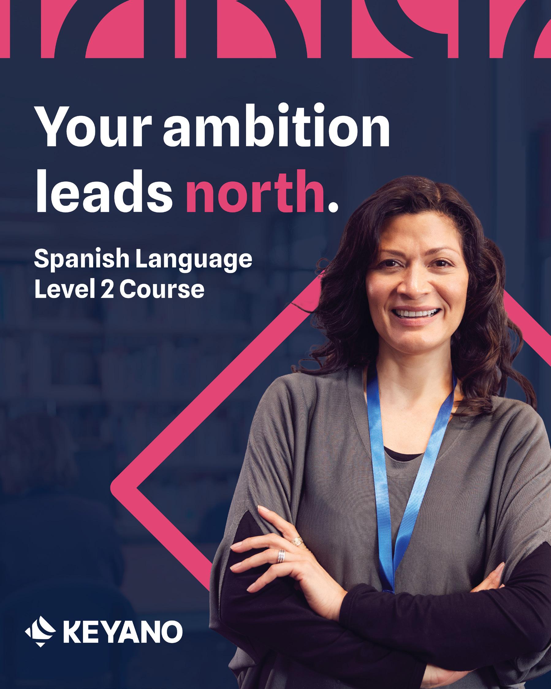
YOUR AMBITION LEADS NORTH
Keyano Name
Keyano College is evolving its brand identity and shortening its primary operational name to simply, Keyano.
The transition honours the institution’s longstanding connection with the Regional Municipality of Wood Buffalo (RMWB), connecting its official identity with the familiar way the institution is commonly recognized.
This is an intentional shift, introducing modern standards and an updated corporate colour palette inspired directly by the RMWB’s northern landscape.
Taglines
Your Ambition Leads North.
To be used outside of the Wood Buffalo region.
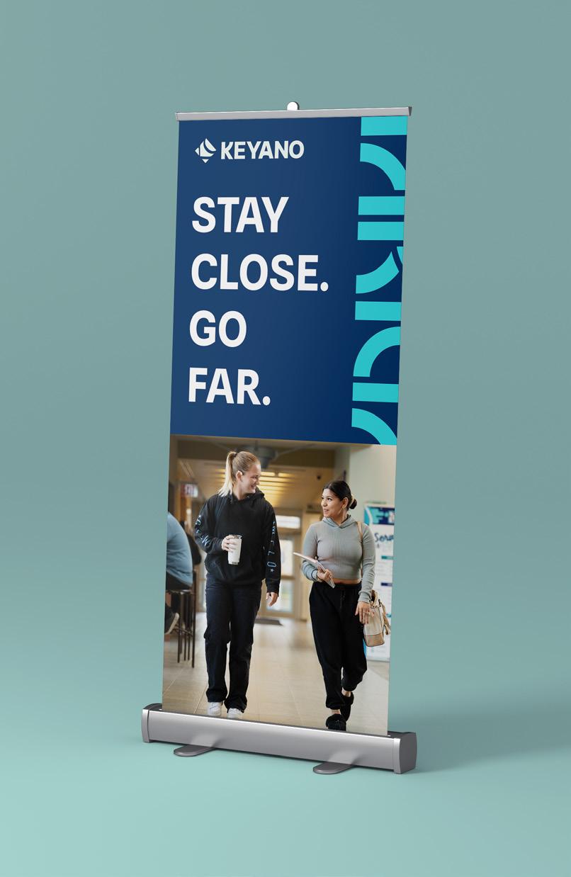
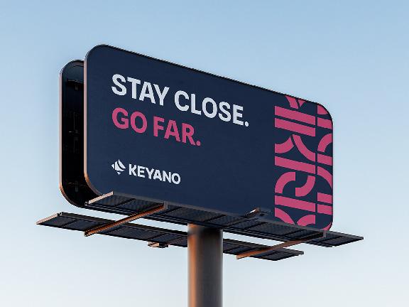
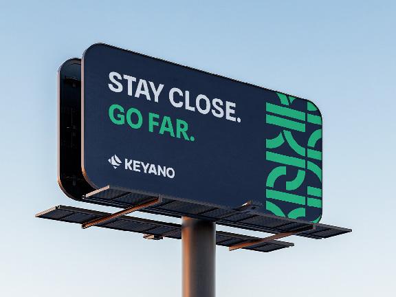
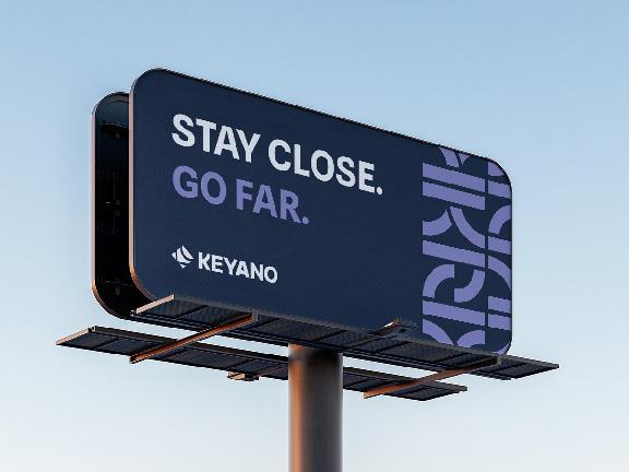
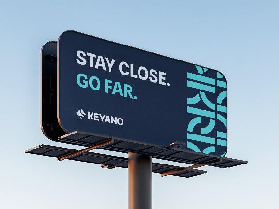
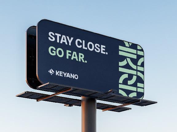
Stay Close. Go Far.
To be used in the local region.
Rooted in Wood Buffalo. Built for what’s next.
To be used in the local region.
Local learning, real results.
To be used in local region, to promote Continuing Education.
Tone of Voice
Tone of Voice
The Keyano College brand voice is designed to invite all members of the public to get to know our institution. There are no barriers between Keyano and our community – every curious mind is welcome on campus. We can embrace different groups in different ways. But our expertise, passion and collegial attitude are always on display.
We have a proud legacy and we’re excited to share it. You can feel our enthusiasm for our home imbued in everything we do. We’re here to let the region know all the ways we’re helping Alberta grow.
As we move into the future, and Keyano reinvents how we transform students’ lives, the two most important things to communicate are the impact for our continued excellence, and the ever-growing scope of our institutional impact.
Brand Pillars
Brand Pillars
Family
We are small, close-knit, and personal. You can find your way; you can find your people.
Community
The collective is at our heart, and the industry is at our core. Combining our strengths to make a real difference in the Wood Buffalo region.
Grit
We punch above our weight. We are resilient and adaptable. We work with what we have, and what we achieve is amazing.
For everyone
We have options and choices. We are your ability to carve your own path. Your journey is yours to shape.
Excellence By way of the caliber of our faculty. By way of the passion of our staff. By way of the achievement of our athletes. We are excellence.
Primary Brand
Logo
Keyano Logo
Our logo speaks to Keyano’s established legacy with the authority of a traditional mark, while its unique, non-traditional design embodies our forward-thinking energy.
Logo Orientations
The icon verison should be used only when space is tight and you need a clean look.
Its compact design is ideal for applications where the full logo is not legible, including social media profile images, mobileresponsive layouts, favicons, and small promotional items. The icon should never be used as the sole identifier of the College. It may only appear on its own when the Keyano name is clearly displayed elsewhere on the item or page. Otherwise, the full logo must be used.
HORIZONTAL (PRIMARY)
The horizontal version is our primary logo and should be used whenever possible.
Its horizontal arrangement makes it ideal for most materials, including print collateral, digital platforms, and signage, where a compact and impactful brand presence is required.
STACKED
The stacked version provides flexibility in layouts where horizontal space is limited or a more vertical presentation is desirable.
This orientation is particularly effective for swag where space is more rectangular, ensuring the logo remains legible and visually balanced even in constrained spaces. Only use this with Marketings approval.
Clearspace is presented here as the absolute minimum buffer around the logo. The logo, and layout, will benefit from even more breathing room if available.
Clearspace & Minimum Size
Minimum sizes for print applications indicated here are the absolute minimum, however certain backgrounds, printing processes, target screen resolutions, and UI considerations might require larger logos to be legible and accessible. Always verify that the Keyano logo is easily legible on the target medium at 100%.
Minimum Size for digital applications, may vary depending on the format and final display size. Please send any digital use of the Keyano logo to the Marketing team for review and approval before publishing to ensure the logo is sized correctly.
Clear space for the Keyano College logo is defined by the height of the letter K. When positioning other graphic elements in relation to the logo, clear space should be applied on all sides in order to protect the integrity of the logo.
Clear space for the Keyano Diamond, when used on its own, is defined by half the width of the diamond. When positioning other graphic elements in relation to the diamond, clear space should be applied on all sides in order to protect the integrity of the diamond.
Clearspace
Minimum sizes for print applications
Department Logo
While departments are not permitted their own logo, the department name can be added below the Keyano logo to be used when appropriate to promote or identify key aspects of Keyano College.
Department logos should be used sparingly as required.
Please contact Marketing & Communications Department to receive appropriate logo treatment for a particular department.
See the full colour palette in the next section for more details.
Logo Colours
The logo may be used in Keyano Navy on light backgrounds and white on dark backgrounds.
Maximum contrast and clarity should be considered when using the logo on any background, especially when applied on top of an image. When using a photo background, select an image that is not overly busy to ensure legibility and clarity. The appropriate colour is dependant on the composition and colours of the chosen photo, as well as the intended layout of the design.
Improper Usuage
These are examples of improper use of our logo. Please abide by these restrictions to ensure the logo is never misrepresented.
If there are any further questions regarding logo usuage and format, please contact the Marketing & Communications Department.
Do not warp or distort the logo or icon.
Do not tilt the logo or icon.
Do not change the colour of the logo or icon.
Do not add decorative elements to the logo or icon.
Do not place logo or icon on busy background.
Colour
Colour Palette
The Keyano colour palette is flexible and focussed.
Use any of the colours for Keyano College (but not all together at once) and refer to the sub-brand sections for specific sub-brand colours. Careful with that Dancing Pink, it’s meant as an accent colour!
These colours are expressed as PANTONE (spot colour printing), CMYK (4-colour printing) and RGB/HEX (screen viewing).
Choose the appropriate colour based on the application — print or screen — ensuring the colours stay true to their specific colour code.
Colour Accessibility
FOREGROUND COLOUR
Accessibility is an increasingly important aspect of a visual identity system that needs to be considered, especially when pertaining to digital applications. The goal of accessibility is to provide adequate contrast between text and its background so that it can be easily read by all audiences, especially those with moderate to low vision.
The following text and colour combinations can be used in accordance to WCAG AA accessibility standards. WCAG 2.0 Level AA requires a contrast ratio of at least 4.5:1 for normal text and 3:1 for large text. Check using: https://www.audioeye.com/color-contrast-checker/
Typography
Typography
HEADLINES & COPY
Typography is a strong element of Keyano’s brand personality and plays an important role in creating a consistent look across all communications and promotional materials.
Our main brand typeface, Spline Sans, should be used primarily for headlines, subheads and body copy.
The font Inter Tight is used for the logo and sub-brands.
Both fonts are Google Fonts
Spline Sans INTER TIGHT
SPLINE SANS BOLD
ABCDEFGHIJKLMNO P QRSTUVWXYZ abcdefghijklmnopqrstuvwxyz 1234567890
The Primary Brand pattern has been created by combining elements of the Keyano Logo in a repeating motif. Refer to the art in this guide for examples and inspiration for applying the pattern.
Pattern
The diamond is our legacy pattern. Keeping follow through from our current brand.
Photography
Photography
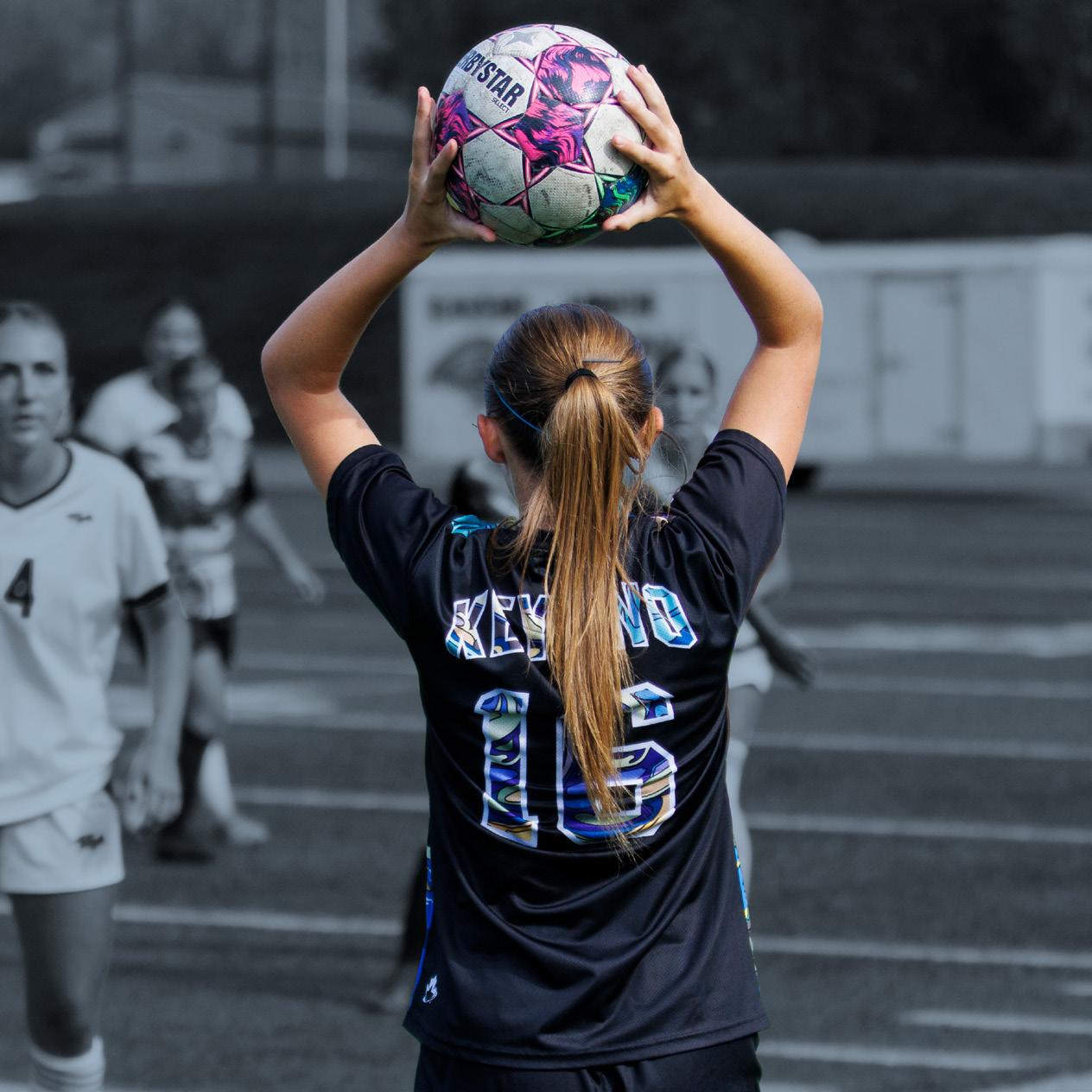
Photos should showcase our students, faculty, staff, and the broader community in genuine, candid settings. We can make studying, collaborating, working, and celebrating together feel aspirational.
When selecting or creating imagery for Keyano communications:
Prioritize authenticity: Use natural light and real environments whenever possible. Subjects should appear engaged, confident, and approachable.
Highlight diversity: Represent a broad range of ages, backgrounds, and cultures, demonstrating Keyano’s commitment to welcoming all.
Showcase campus and community: Feature recognizable locations, events, and landscapes that are unique to Keyano and our region.
Support our brand pillars: Images can evoke themes of family, community, grit, and excellence.
Whether it’s a student mastering a skill, a team celebrating success, or faculty mentoring the next generation, our visual storytelling emphasizes the dynamic, optimistic and future-looking character of Keyano and our members.
Application Examples
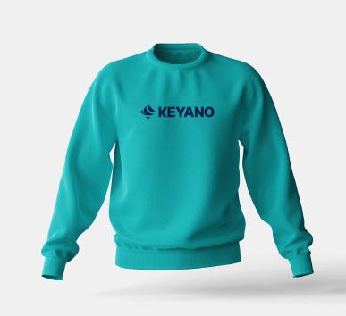
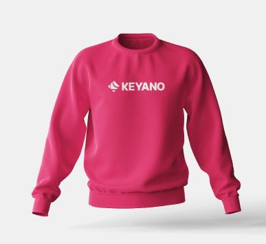
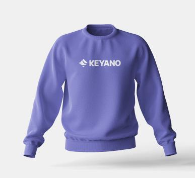
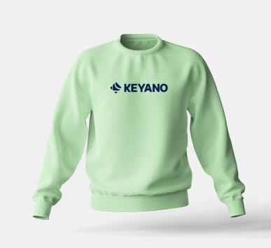
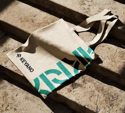
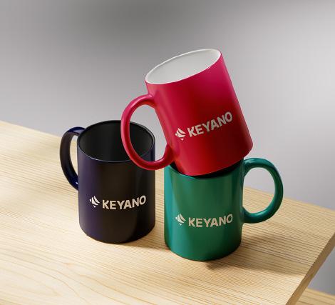
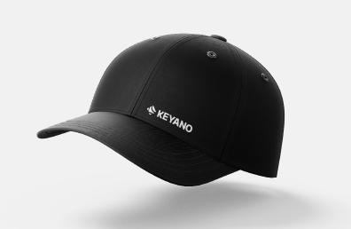
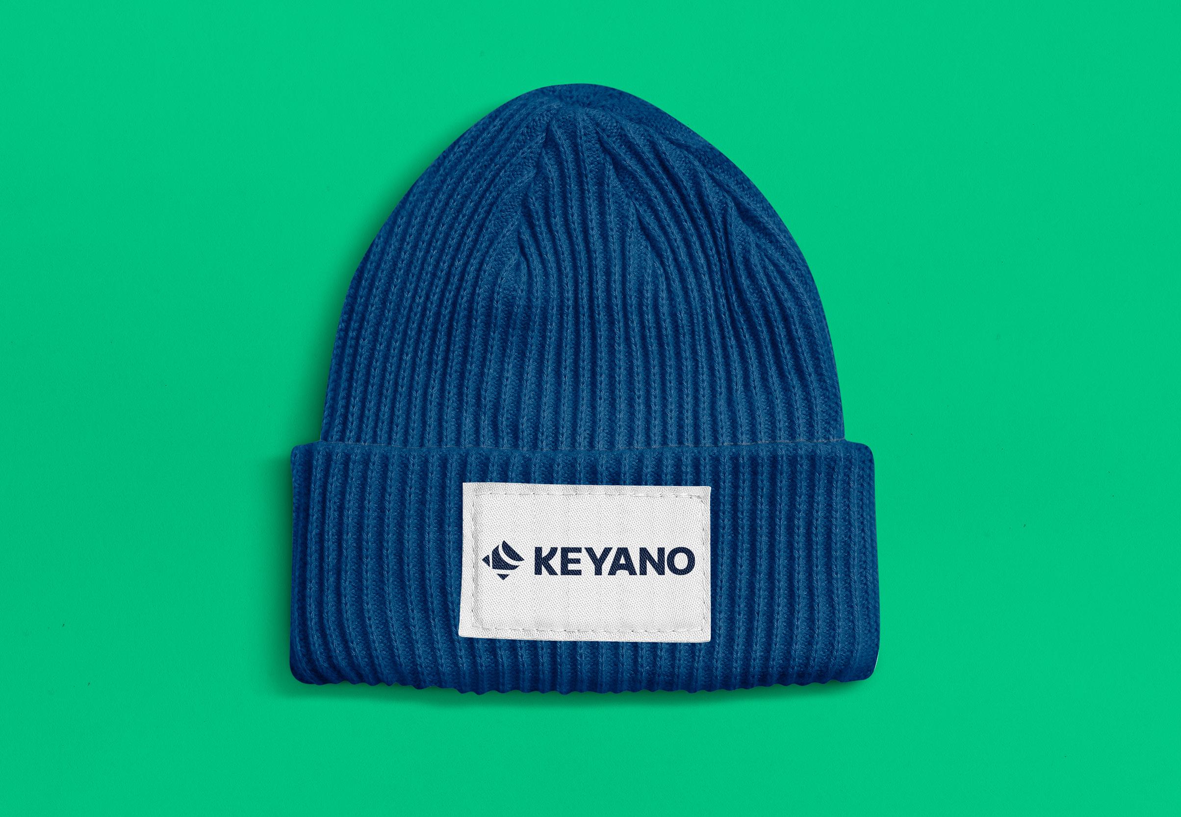
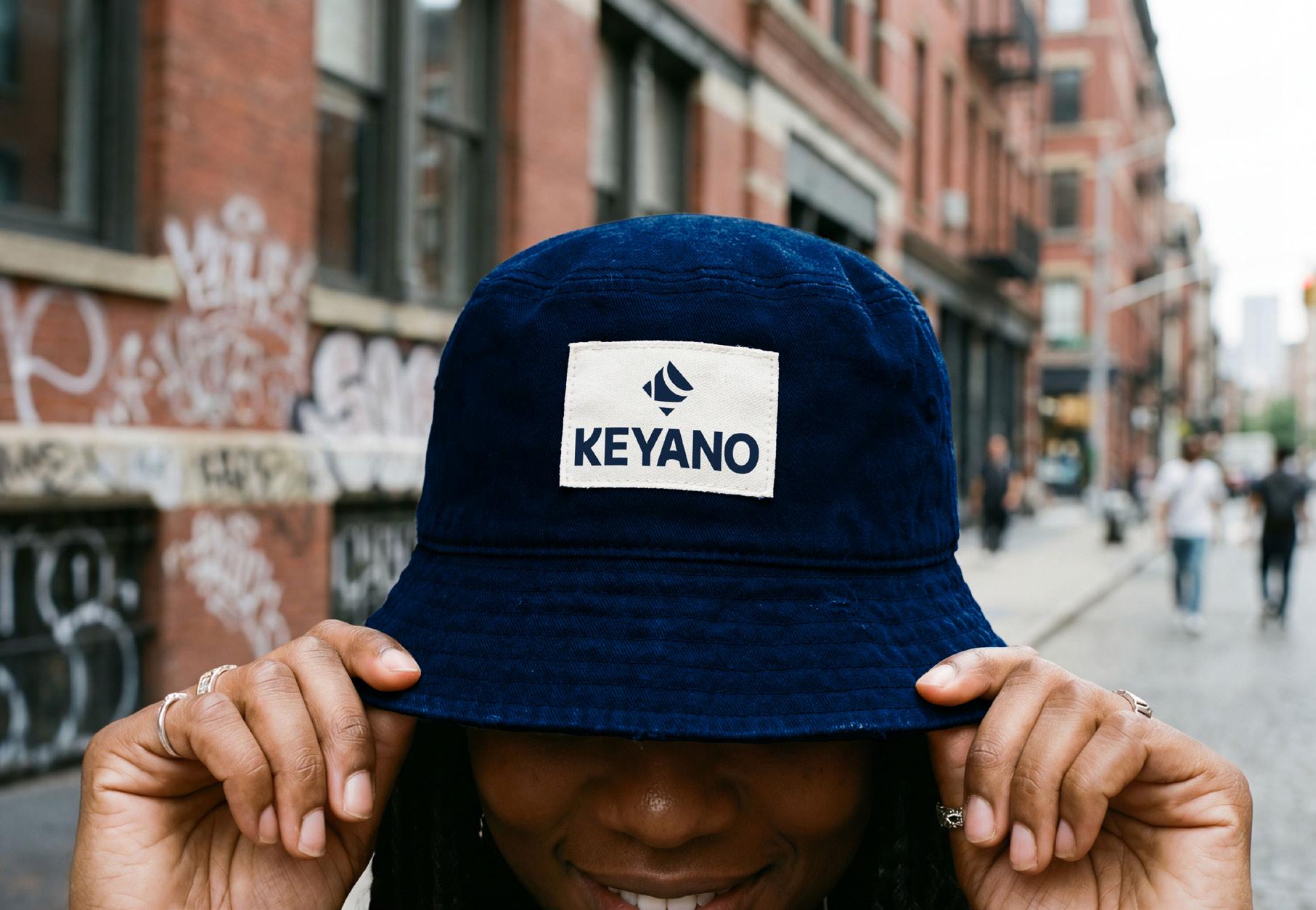
Application Examples Swag
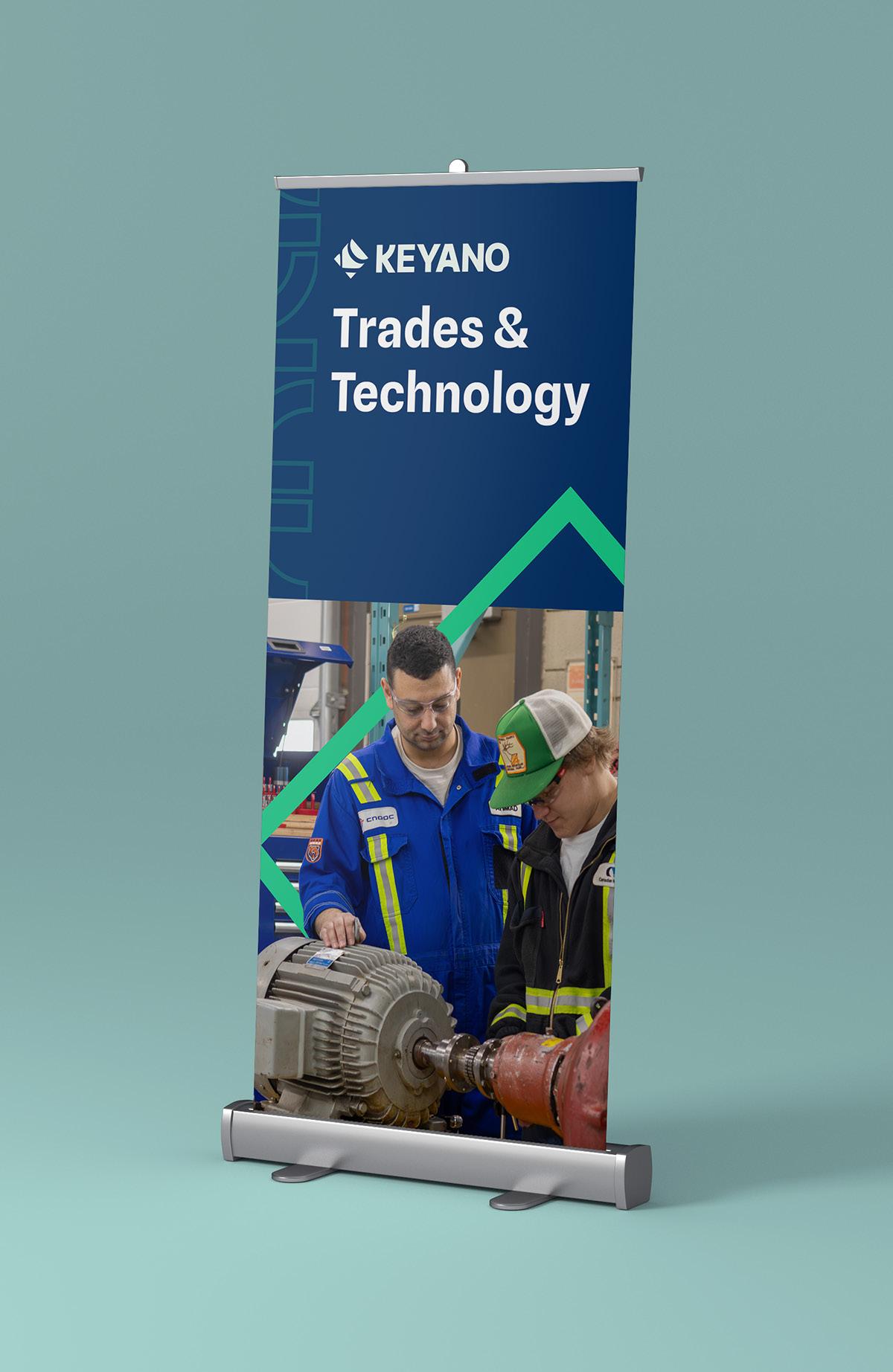
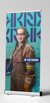
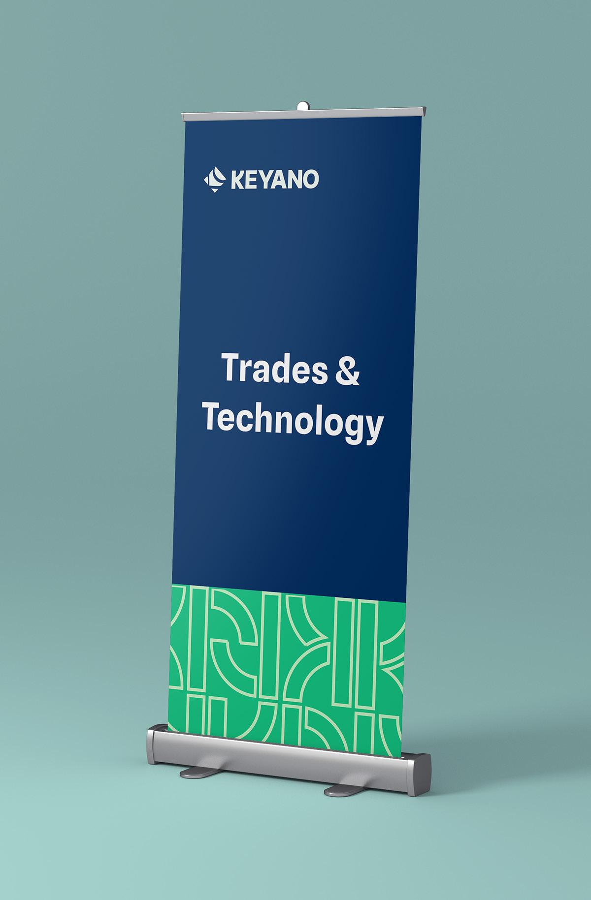
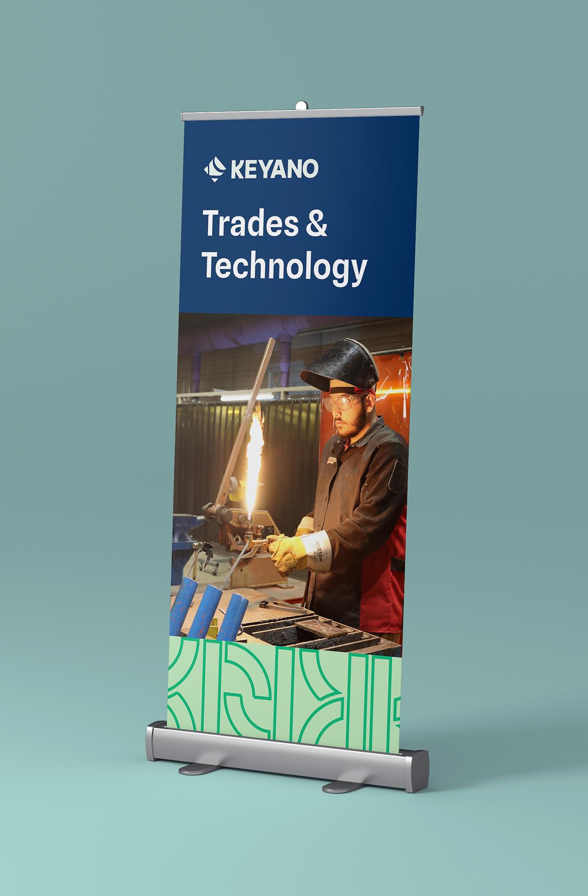
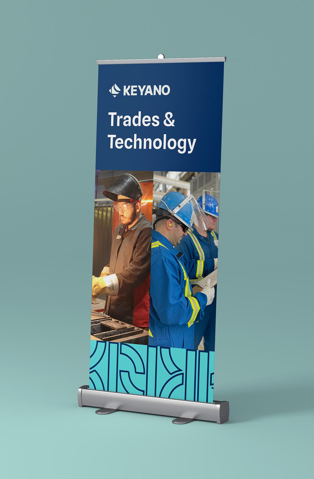
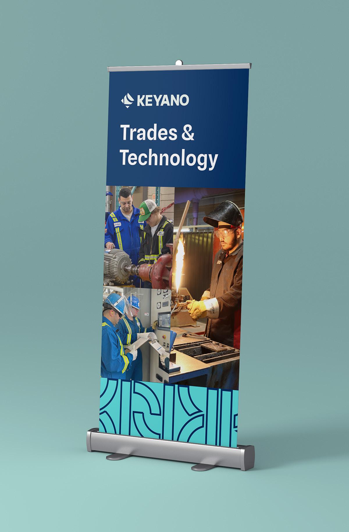
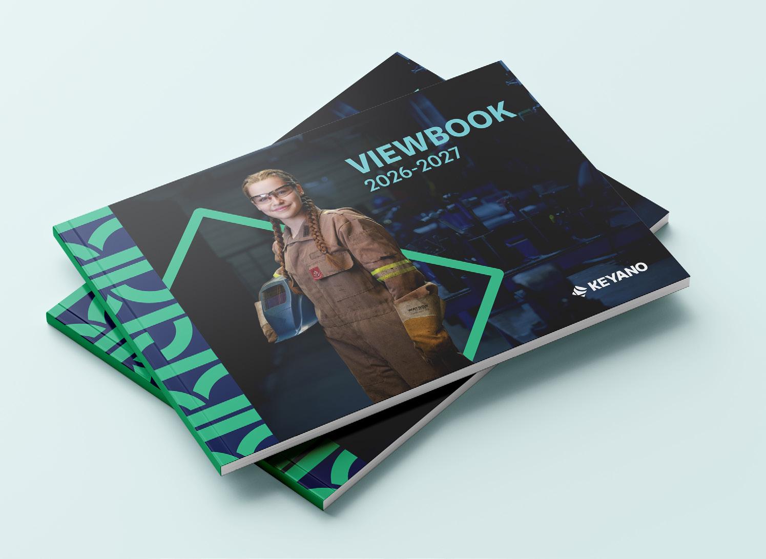
Below are examples of the Keyano Primary Brand identity system applied to a range of materials. The identity system outlined in the brand guidelines should be used as a foundation to create a variety of marketing and brand materials.
Ideas and templates.
Application Examples
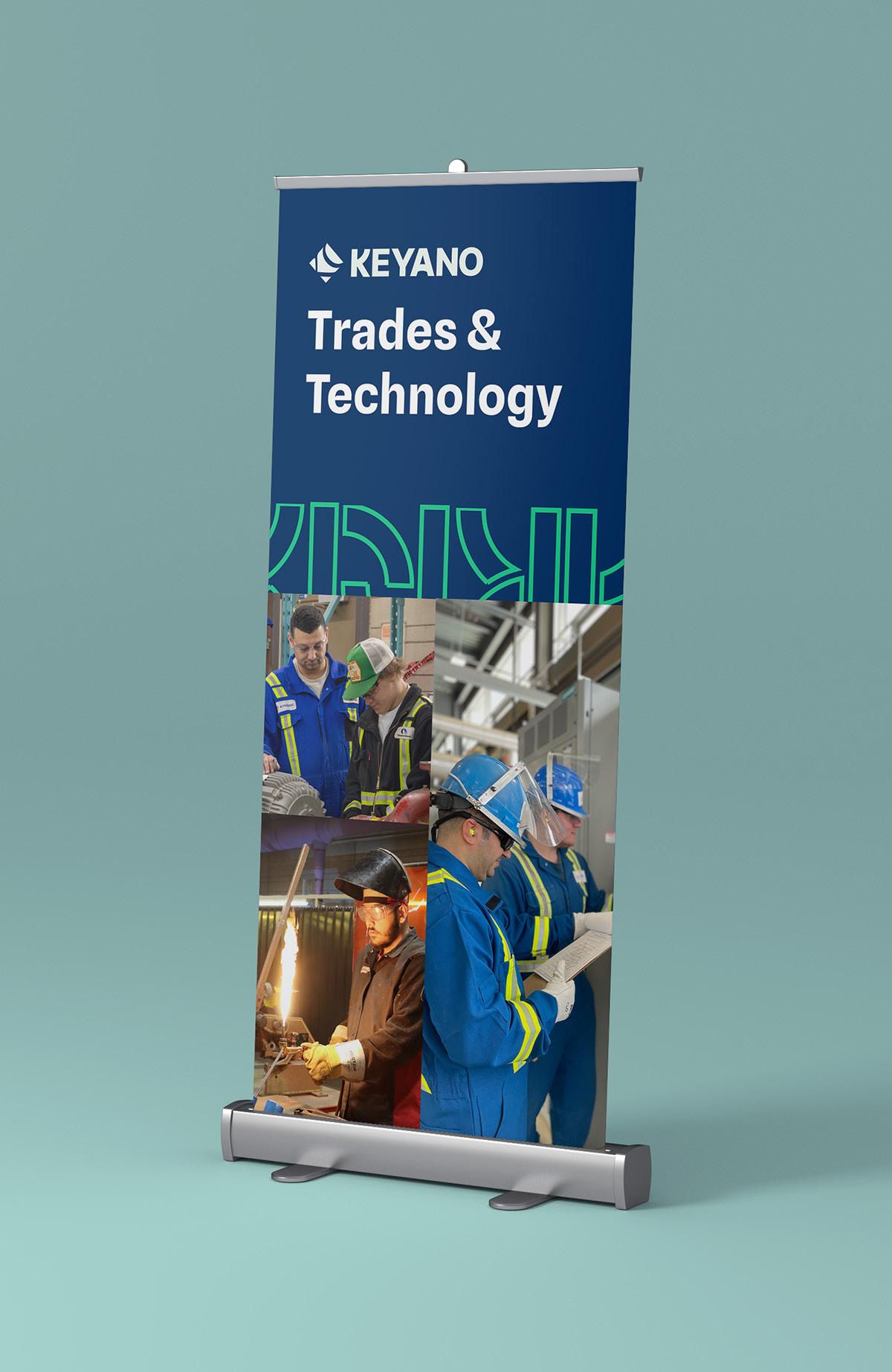
Collateral
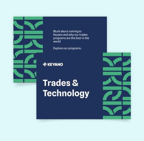
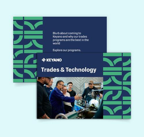
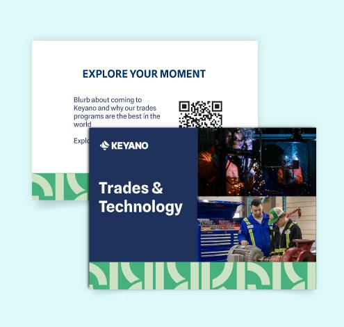
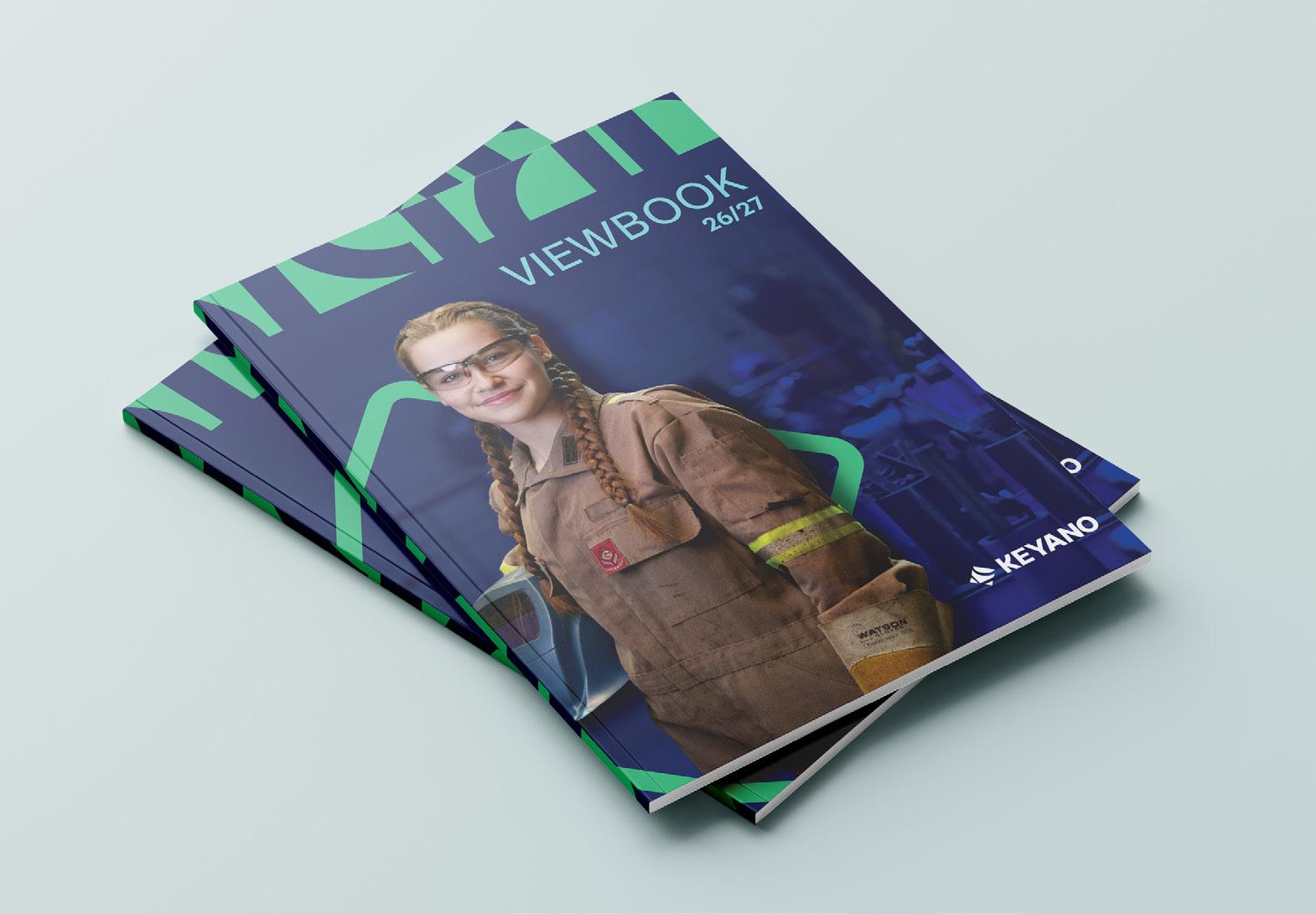
Below are examples of the Keyano Primary Brand identity system applied to a range of materials with multiple options. The identity system outlined in the brand guidelines should be used as a foundation to create a variety of marketing and brand materials.
What a full set could look like.
Application Examples
Collateral
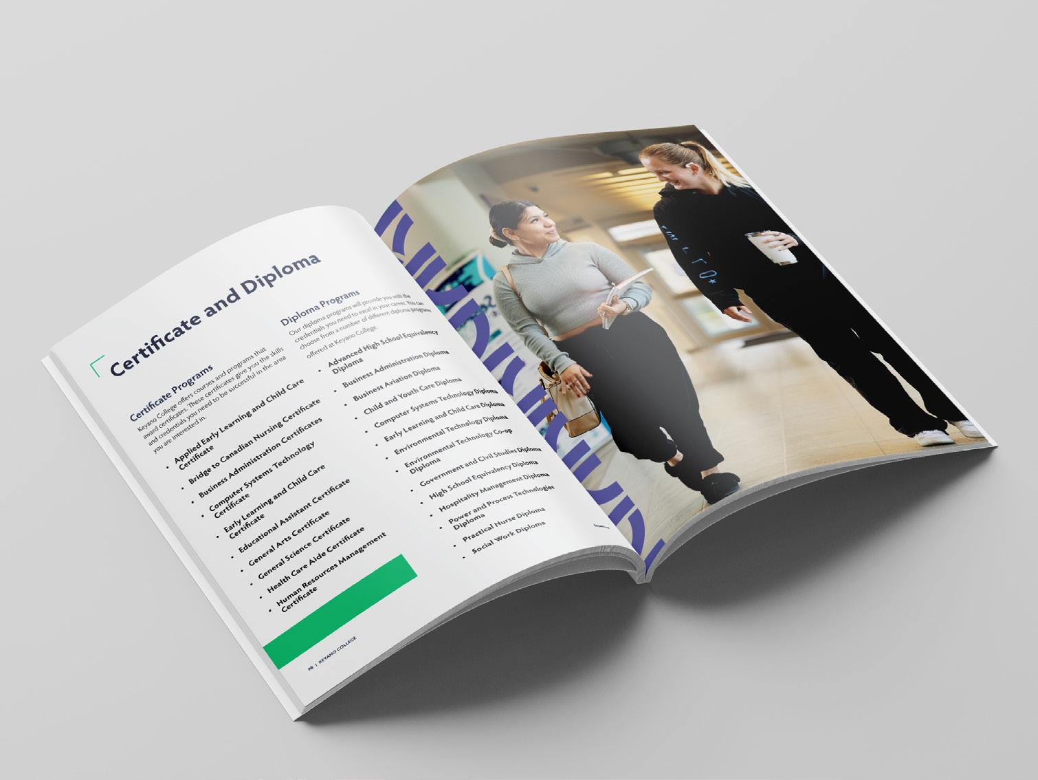
Below are examples of the Keyano Primary Brand identity system applied to a range of materials with multiple options. The identity system outlined in the brand guidelines should be used as a foundation to create a variety of marketing and brand materials.
Application Examples
Collateral
Below are examples of the Keyano Primary Brand identity system applied to a range of materials with multiple options. The identity system outlined in the brand guidelines should be used as a foundation to create a variety of marketing and brand materials.
Application Examples Email Signature
FIRST/LAST NAME, credentials Position Title Department Name
Note: The example email signature layout can be applied to any of the Keyano brands, with the choice of logo selected based on individual needs.
8115 Franklin Avenue, Fort McMurray, AB, T9H 2H7 Tel: 780-791-4800 keyano.ca
We respectfully acknowledge that we are on Treaty No. 8 Territory, the ancestal and traditional terrotory of the Cree, Dene, and Metis people.
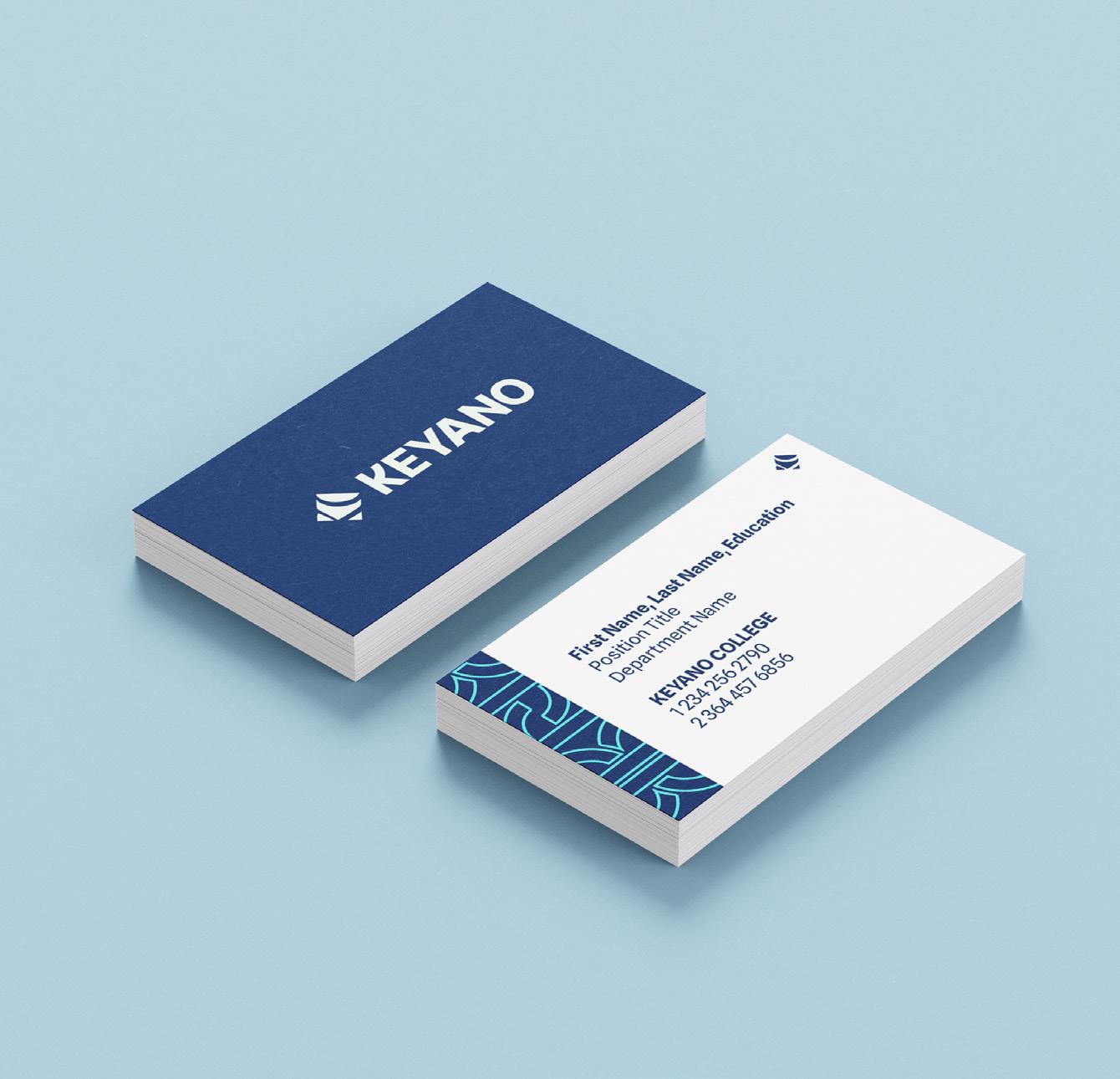
Application Examples Business Cards
Note: We will only have 1 standard design for everyone SIGNATURE LAYOUT Example Layouts
Application Examples Social Media
We prioritize authentic, natural photography that reflects real people, real learning, and real outcomes. Graphics support the message but never replace the story.
Below are graphic elements of the Theatre sub-brand identity system that can be applied to a range of materials. The identity system outlined in the brand guidelines should be used as a foundation to create a variety of marketing and brand materials.
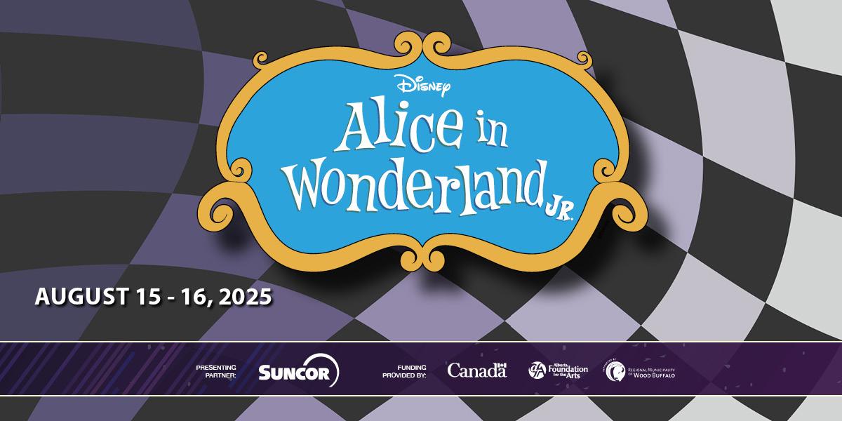
Purple bar on shows
Application Examples
Below are examples of the Theatre sub-brand identity system applied to a range of materials. The identity system outlined in the brand guidelines should be used as a foundation to create a variety of marketing and brand materials.
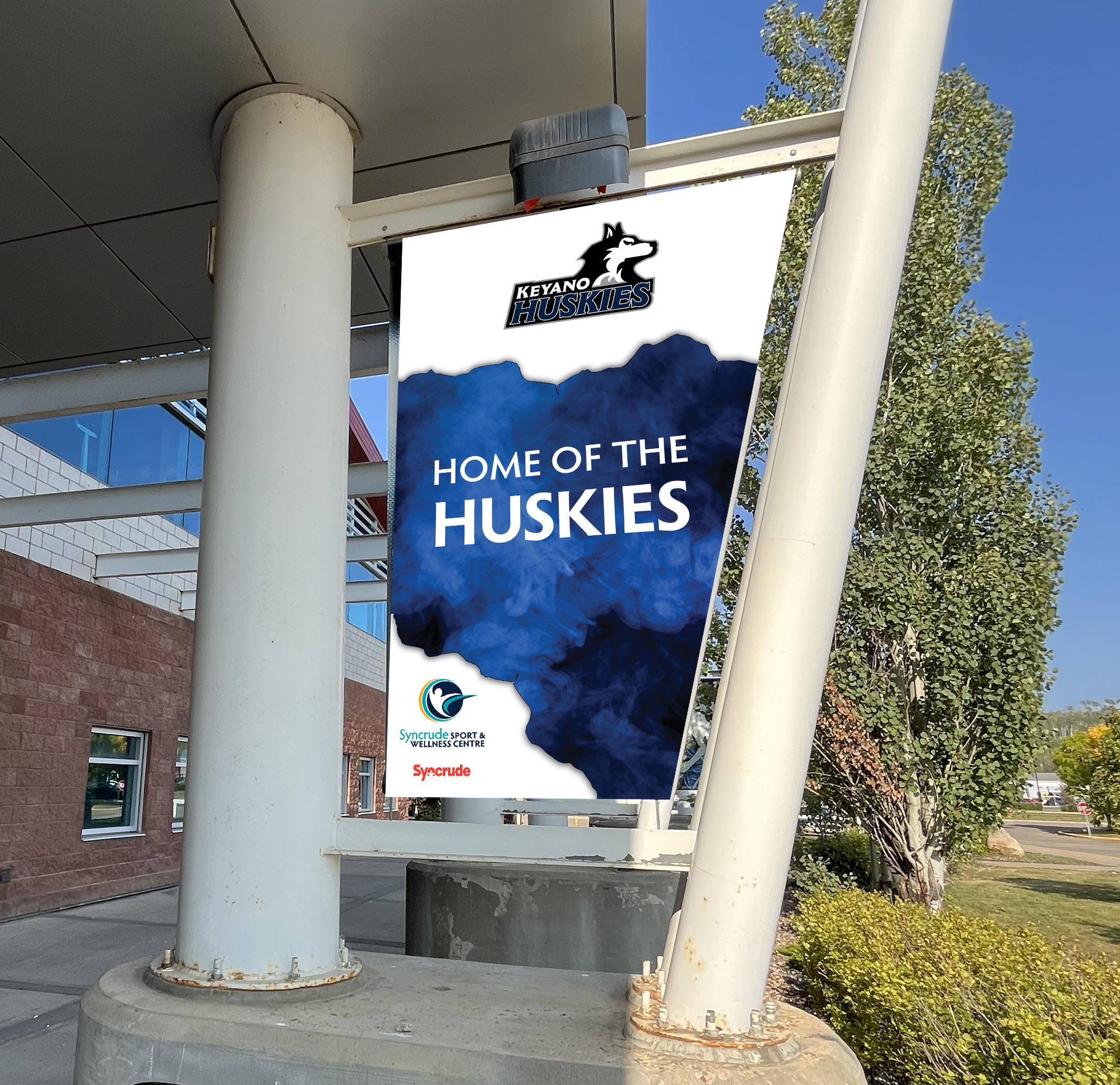
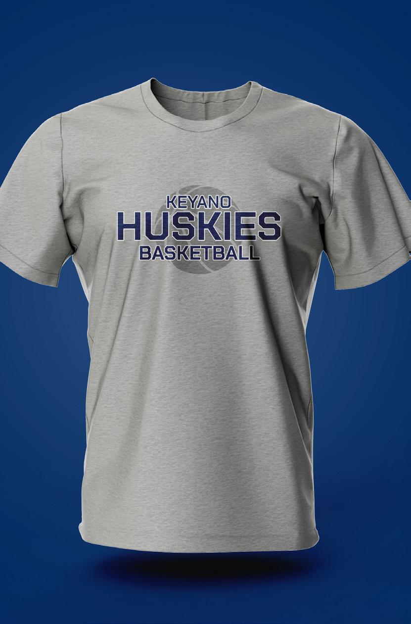
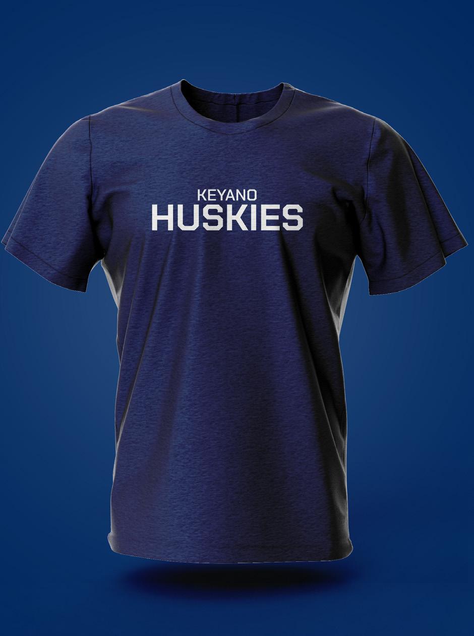
Huskies
The Huskies Logo
The Huskies Wordmark
KEYANO
HUSKIES
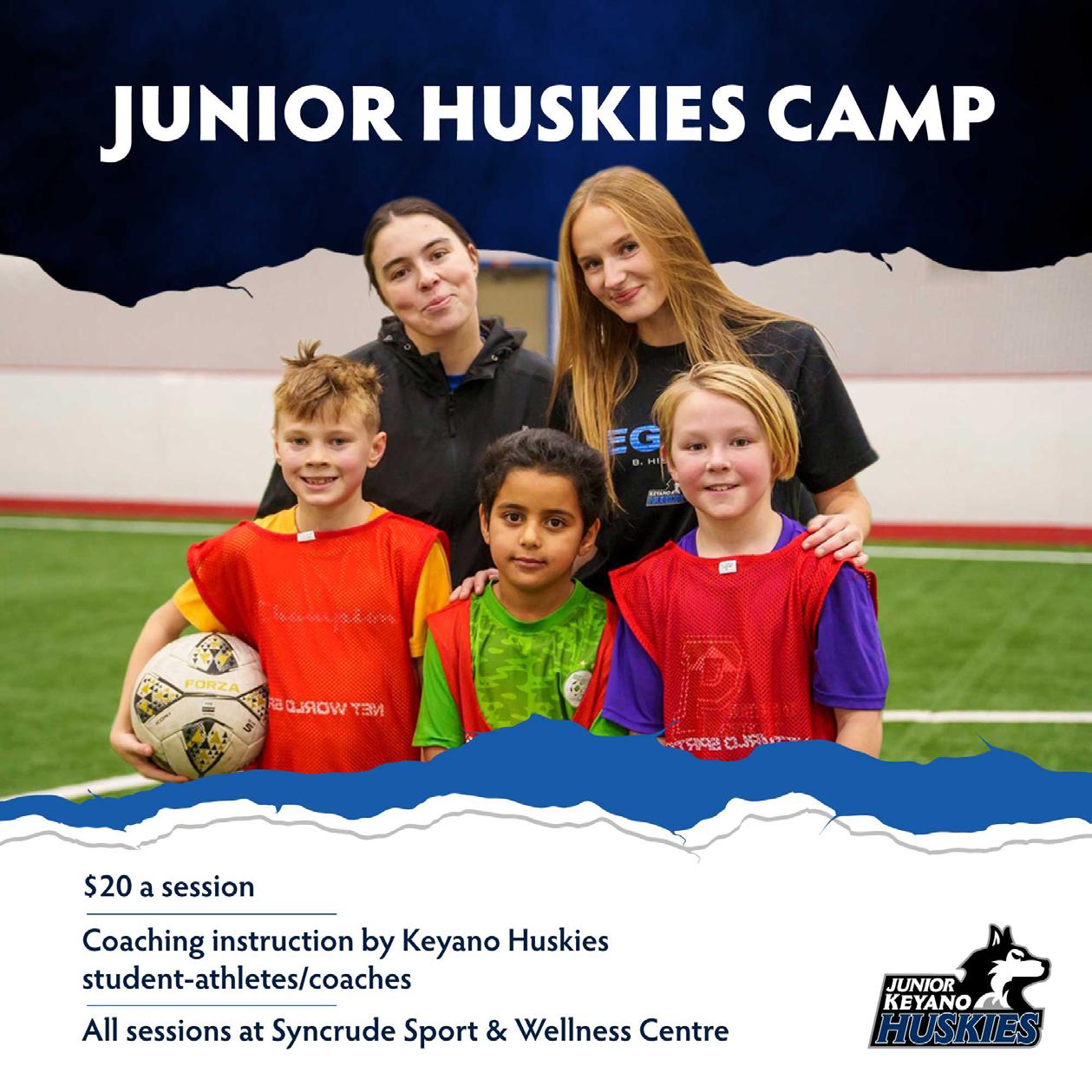
Junior Huskies
The wordmark is to be used where vertical space is limited and the primary logo becomes to small to read.
The Junior Huskies logo is to be used on all Junior Huskies marterials.
The primary Keyano Huskies logo.
The Keyano Huskies colour palette consists of Keyano Navy, and Cool Grey.
Choose the appropriate colour based on the application — print or screen — ensuring the colours stay true to their specific colour code.
Typography
HUSKIES FONT
Typography is a strong element of the Keyano Huskies brand personality and plays an important role in creating a consistent look across all communications and promotional materials.
Our main brand typeface, Chakra Petch, should be used primarily for headlines, subheads. Inter Tight should be primarily used for body copy.
The Syncrude Sport & Wellness Centre logo should be treated the same as the primary Keyano Sport & Wellness Centre logo.
Typography
Typography is a strong element of the Syncrude Sport & Wellness brand personality and plays an important role in creating a consistent look across all communications and promotional materials.
Our main brand typeface, Big Noodle Titling, should be used primarily for headlines, subheads. Inter Tight should be primarily used for body copy.