

D.J. Sustaita
Stigler High School
Stigler, OK
Mitchell Bird, adviser
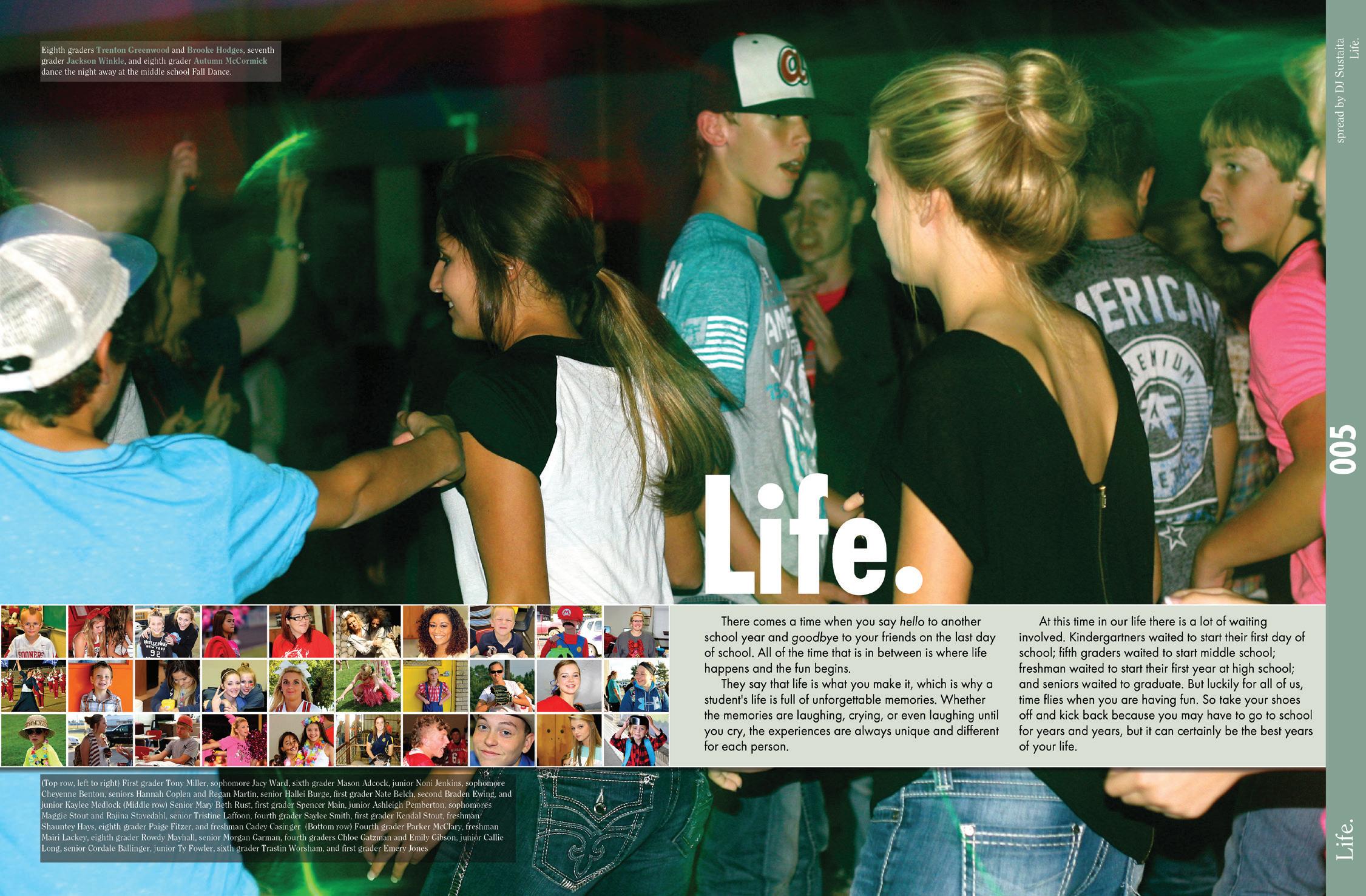
Contrast is the driving design principle behind this powerful divider spread design. A super-sized, full-bleed background photograph is a stark contrast to the 30 smaller photos on the spread. This contrast creates visual energy. Care is taken to crop the small photos tightly so the faces are easy to see. A bar not only provides a placeholder for the small photographs and copy, it provides horizontal unity. Identifications are provided for the 30 small photographs without adding clutter.
Lake Washington High School
Kirkland, WA
Dawn Wyatt, adviser
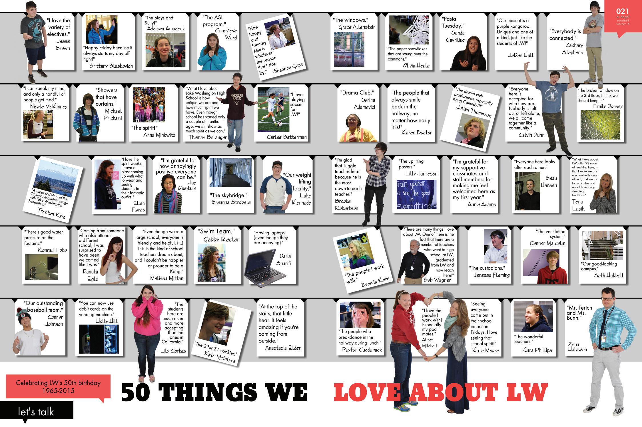
Arranging 50 content elements on a design takes special planning and skill. To mark the school’s fiftieth anniversary, this spread features “50 Things We Love about LW.” To organize the content, each item receives a box featuring quotes and illustrative photographs. While the consistent boxes add unity to the presentation, contrast is created by tilting some of the boxes and using a select number of cut-out background photos, which avoids a checkerboard look. A light gray tint in the background makes the white boxes pop.
Clayton High School
Clayton, MO
Marci Pieper, adviser
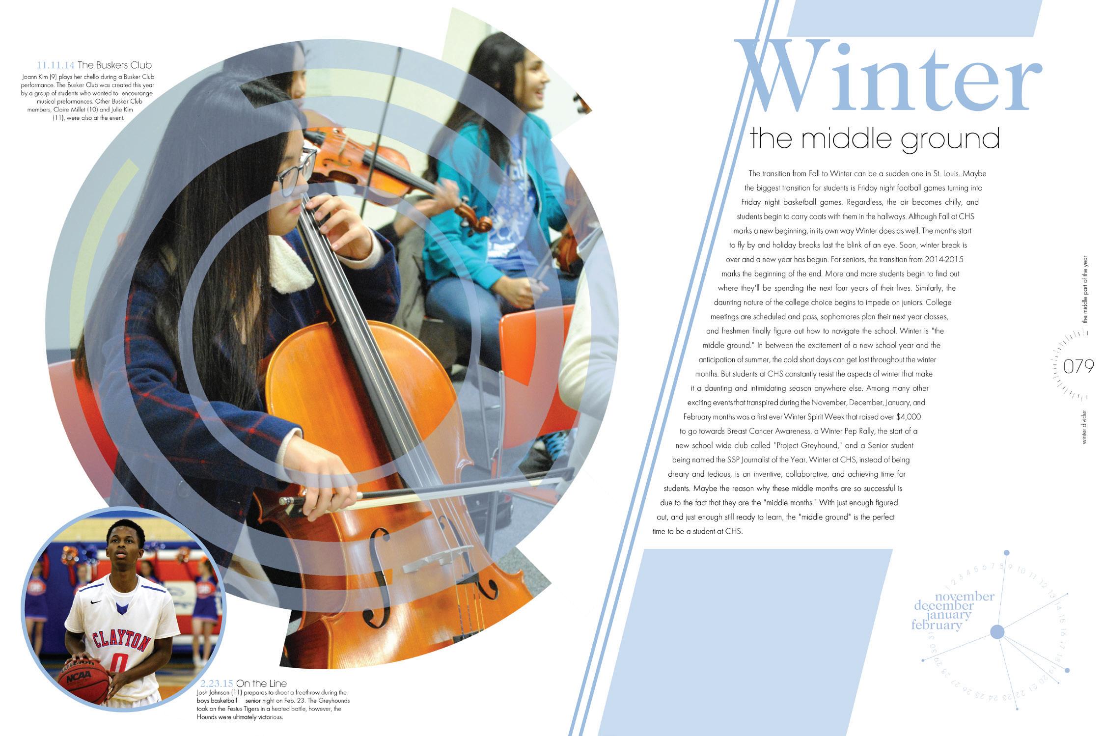
Circular graphics, coordinating with the yearbook’s theme presentation, accent the photo presentation on this divider spread. The content of the dominant photo on the left intentionally directs the reader into the copy presentation on the right. The circular graphic concept is also incorporated into the folio presentation and the abstract clock-style icon on the right. The angled alignment of the text block provides a stark contrast to the circular elements. Color accents the design and provides unity as it echoes across the spread.
H | M HONORABLE MENTION
Leah Davis
Dr. Phillips High School
Orlando, FL
Deborah Grund, adviser
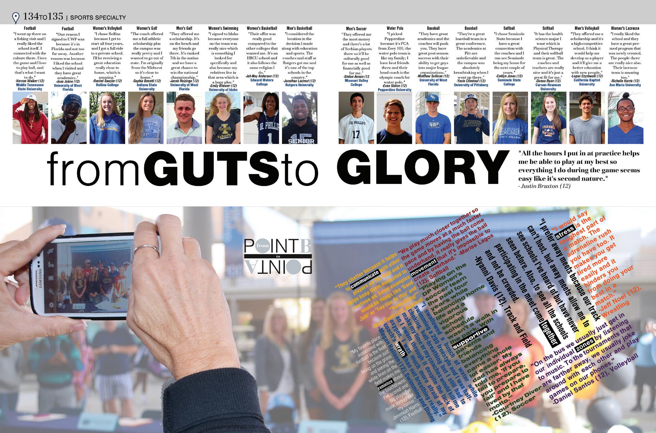
This creative sports specialty spread profiles athletes who were recruited to play collegiate athletics. In an unusual placement, storytelling quotes and photos of the featured athletes are displayed at the top of the page above the headline. Key words in the headline are typographically emphasized by using bold and all-caps. An interesting photo treatment, from signing day, provides a dominant focal point.