





Typology: Residential
Date: December, 2022
Location:
162 Augusta Ave., Toronto, Canada
Instructor: Petros Babasikas
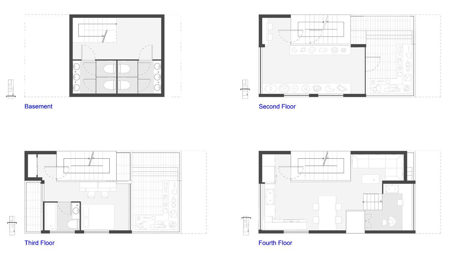
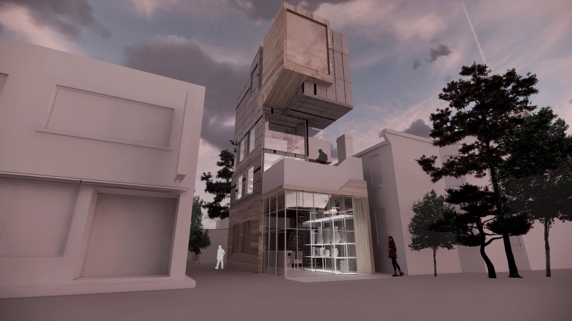
Nestled in the vibrant heart of downtown Toronto, the Kensington Market stands as a testament to the evolving landscape of mixed-use commercial-residential buildings. Among them, the NightCraft Residency emerges as an architectural gem, employing a strategic approach to seamlessly harmonize the interplay between public and private spaces, both within its walls and beyond.
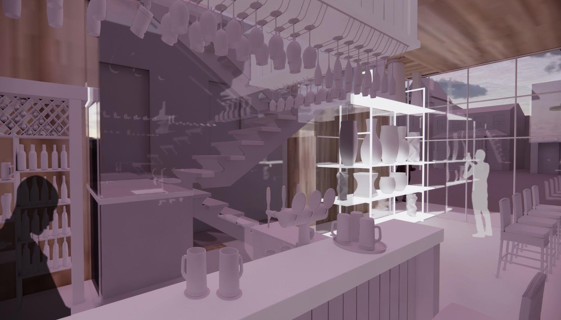
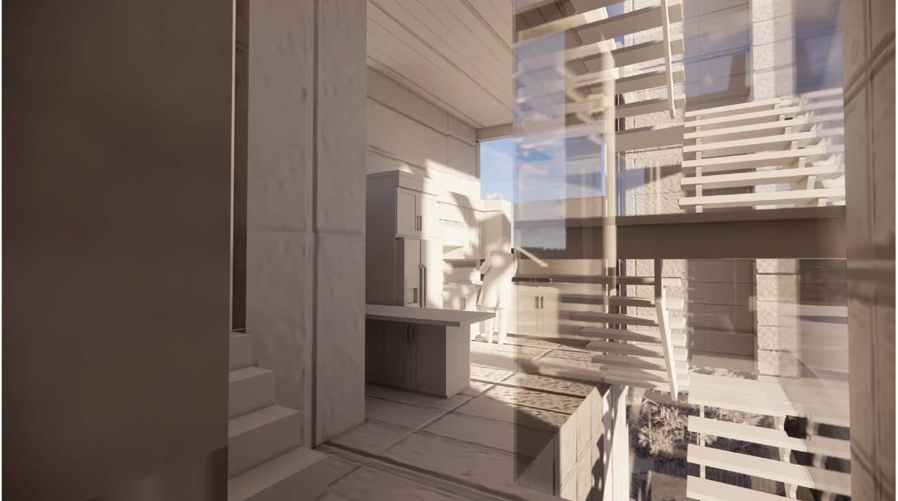
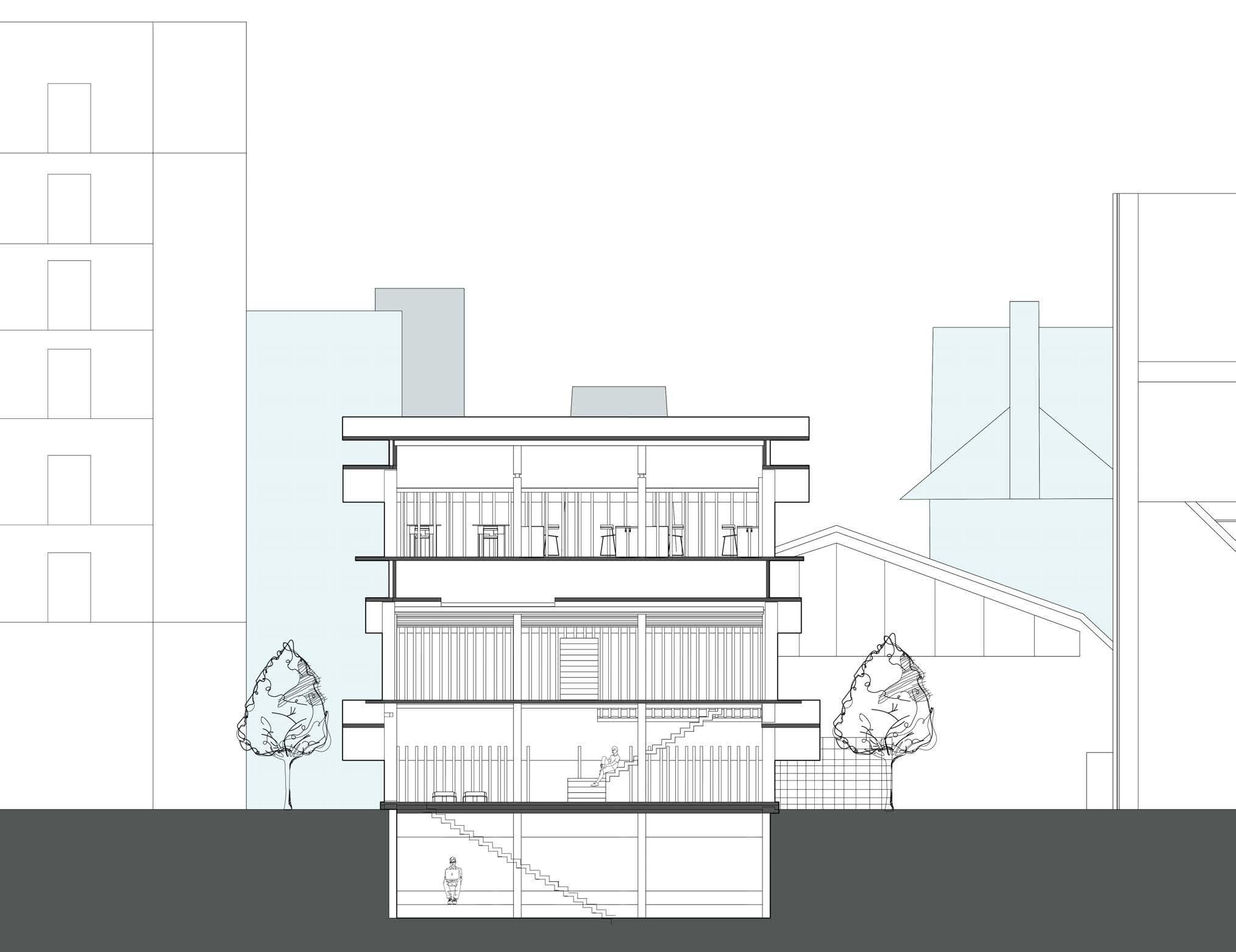
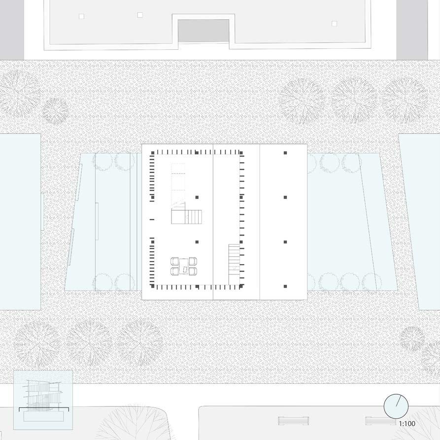
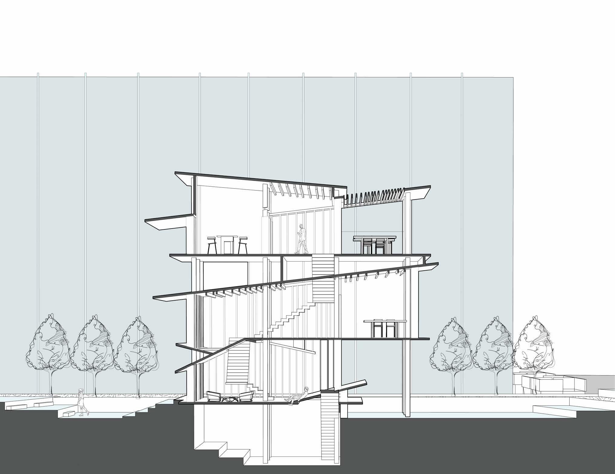
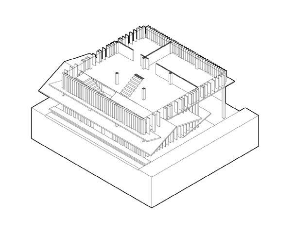
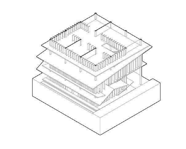
Designed for a bartender and ceramic designer couple, this residence harmonizes public and private spaces by stacking individual boxes, inspired by Frank Gehry’s Norton House. Informed by Gehry’s exploration of spatial hierarchy, the NightCraft Residency seamlessly blends private sanctuaries with shared social spaces. The residence caters to the couple’s nocturnal professions, merging a designer’s studio with a thriving bar.
The core objective of the project is to craft a dwelling that seamlessly integrates commercial space for two small business owners. Both professions demand a nocturnal rhythm, as the designer strives to meet deadlines while the bar thrives in the evenings. By merging these two businesses, the project aims to create a symbiotic relationship where the success of one enhances the other.
Departing from conventional compact house designs, the NightCraft ingeniously segregates private programs into individual boxes, stacked to form a distinctive vertical architecture. At the heart of this design is the omnipresent ceramics, serving as both a unifying theme and a practical bridge between the private and public realms. The ceramics gallery not only creates a destination for locals but also fosters a sense of community, inviting visitors to enjoy the designers’ works while savoring a drink from the bar.
NightCraft Residency transcends the boundaries of conventional living, offering a space where professional and personal spheres coexist harmoniously. It’s a testament to design, where form and function converge to create a home that not only caters to the needs of its inhabitants but also enriches the cultural fabric of the Kensington Market.
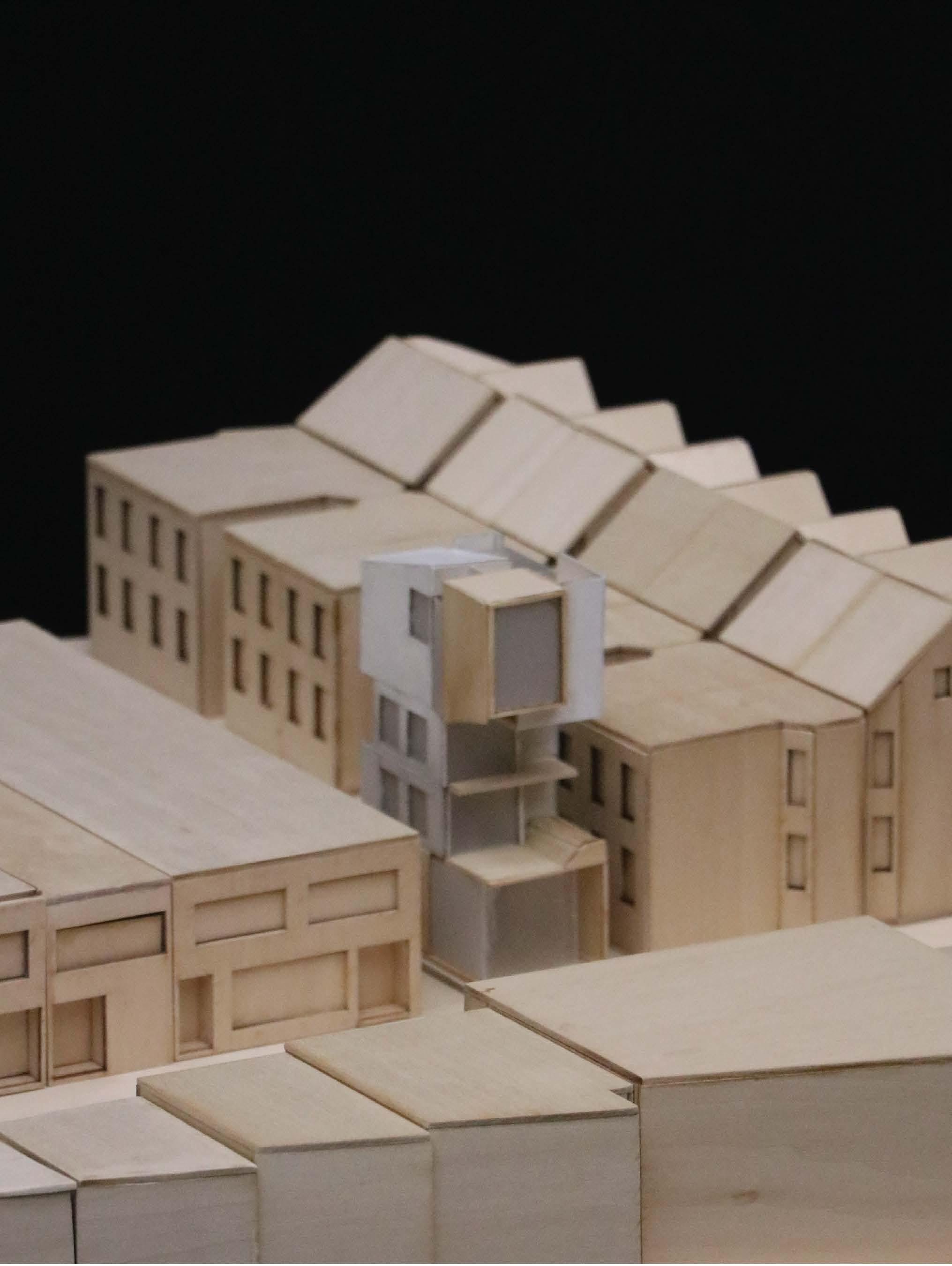
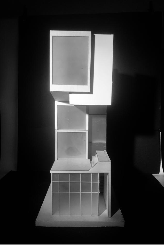
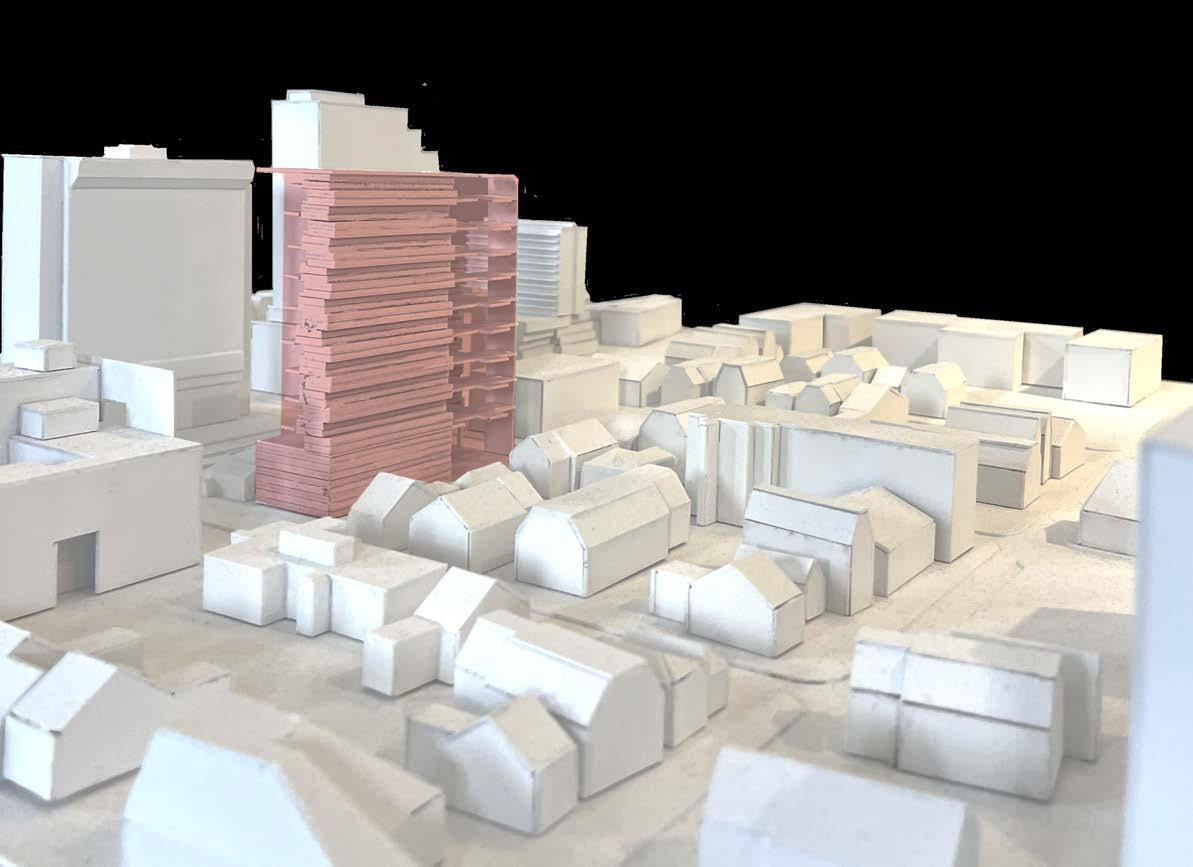
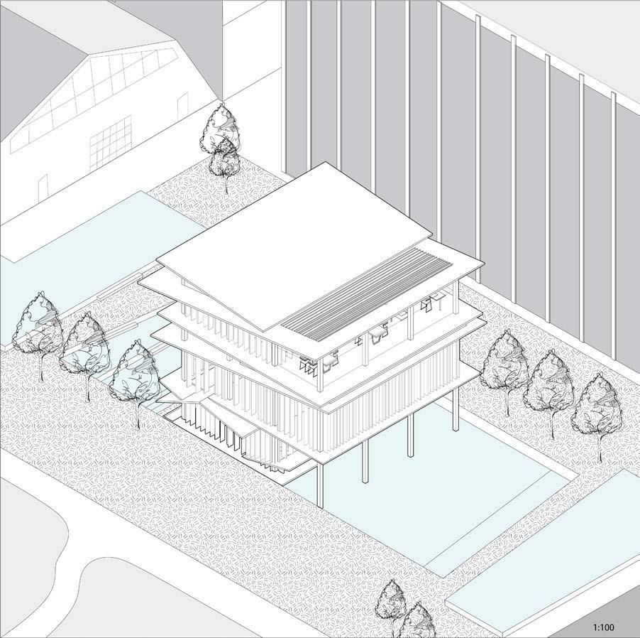
: NightCraft Residency on site model (1:100)
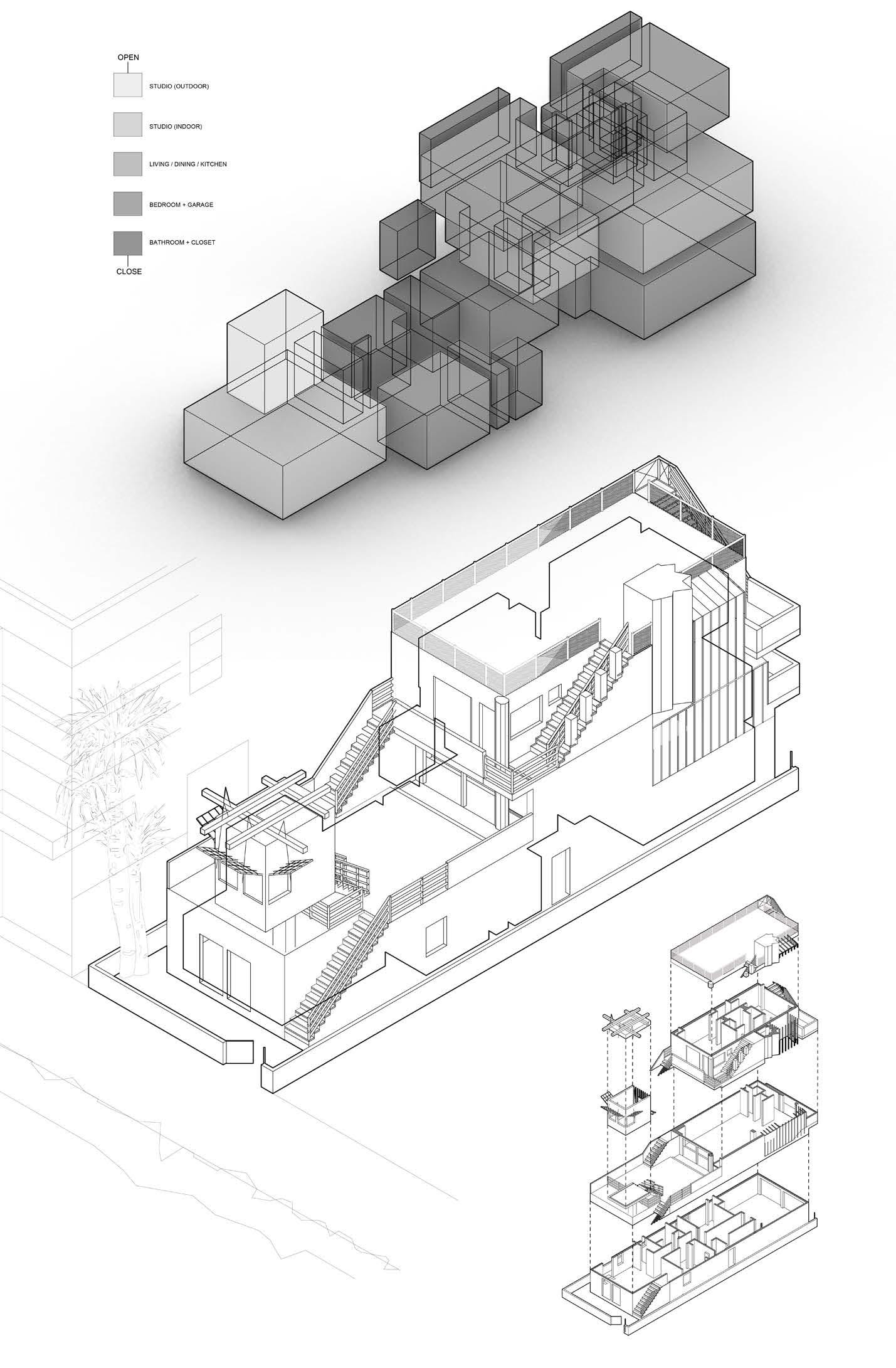
Frank Gehry’s Norton House was conceived with the intention of establishing a private yet public space within the Norton residence. The design features rooms stacked like boxes, interconnected by stairs and terraces in a three-story structure. These rooms span from open spaces to closed ones, with the studio utilizing large beach-facing windows to preserve openness while providing isolation.
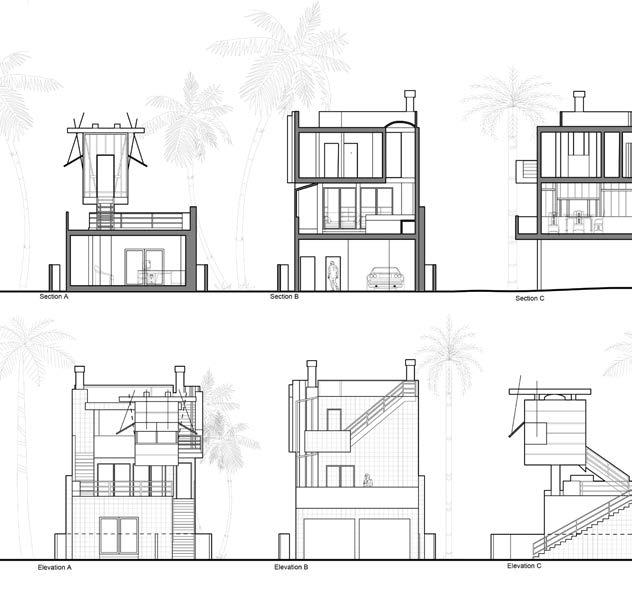
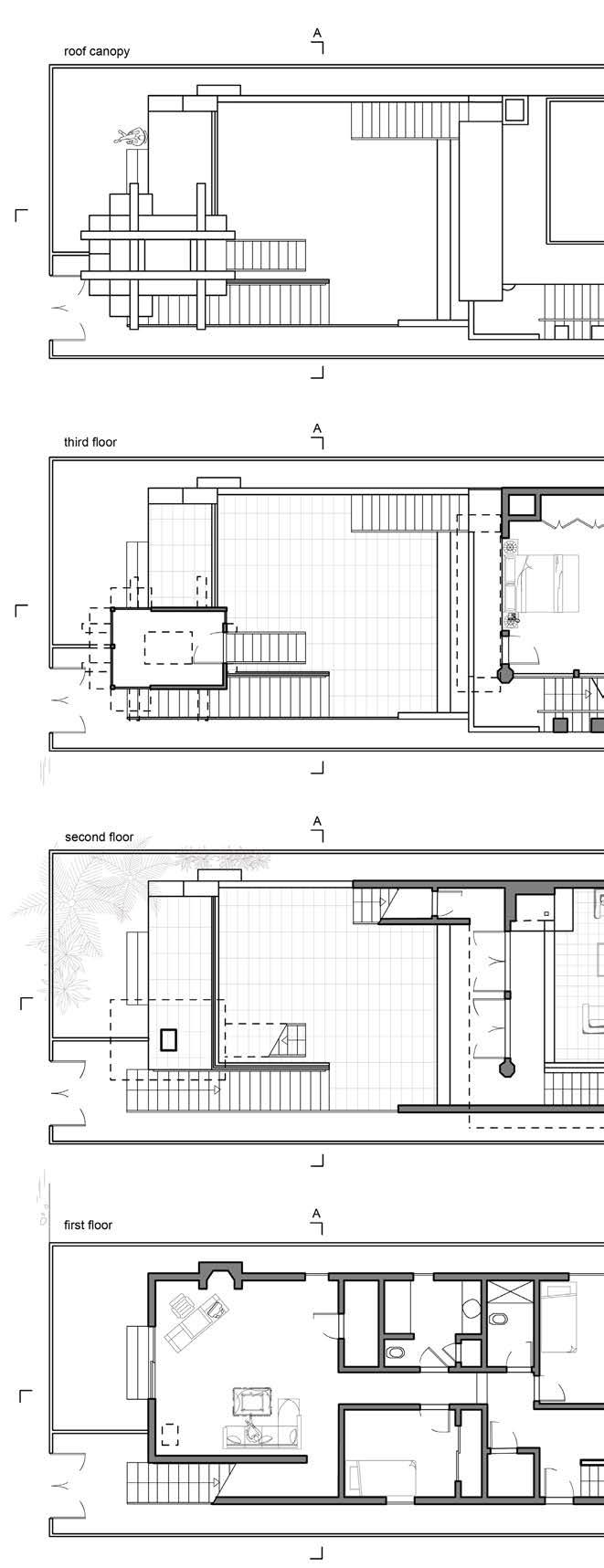
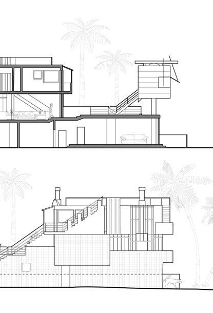

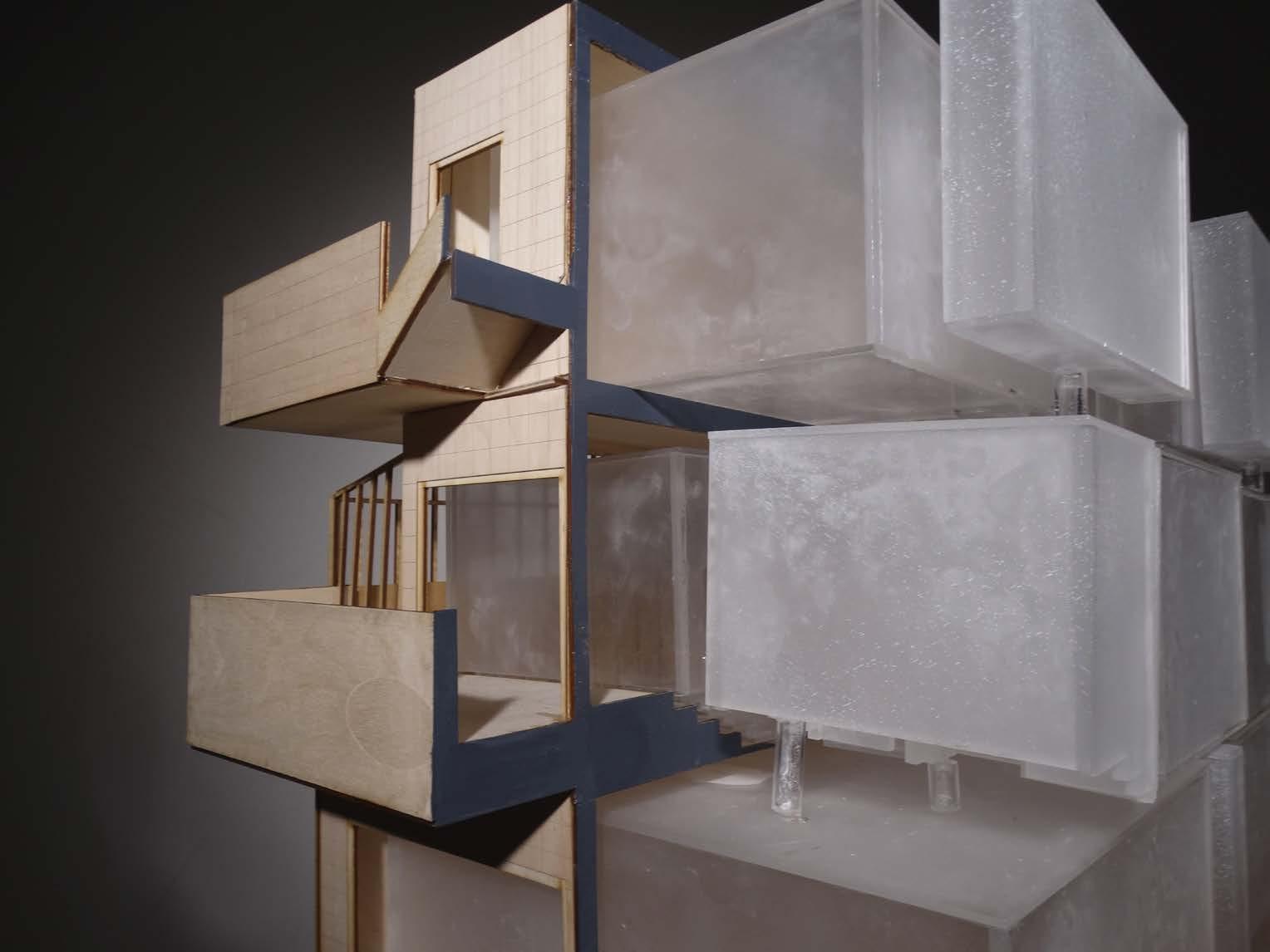
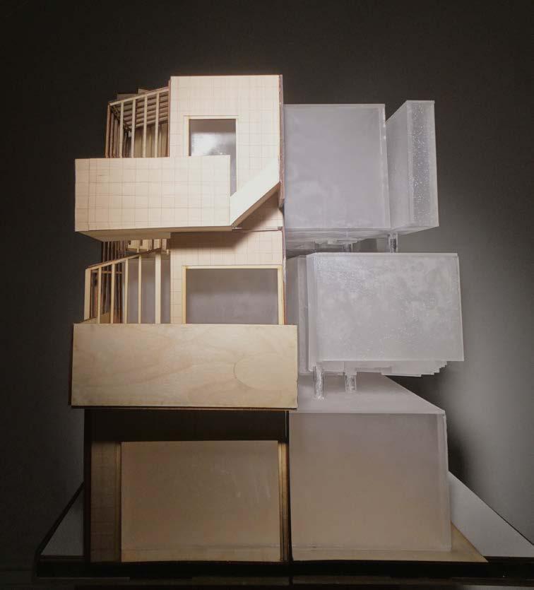
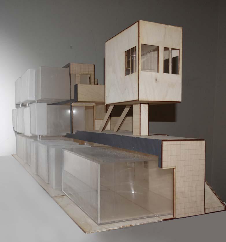
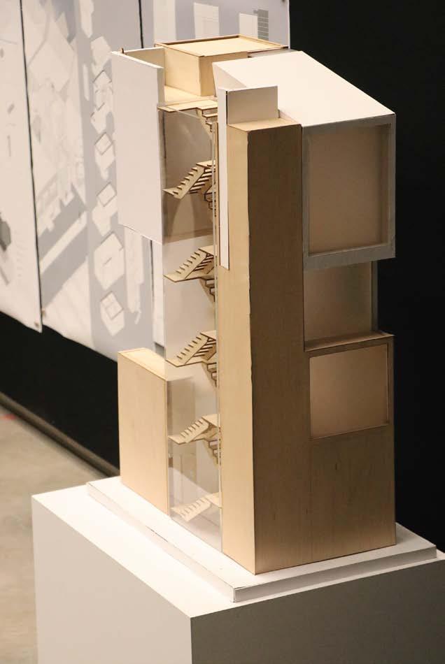
The model visually represents this concept by depicting rooms as boxes. The varying opacity levels of these boxes signify the degree of privacy within the residence. Opaque boxes indi- cate private spaces, while transparent ones denote more pub- lic areas, allowing passersby to observe activities within.
Inspired by the Norton House’s adept creation of a private yet public environment, NightCraft Residency echoes this ethos. Tailored to the needs of its inhabitants—a bartender and a ceramic designer—the design seamlessly integrates private and public spaces, creating a dynamic living environment.
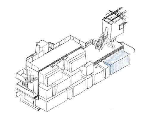

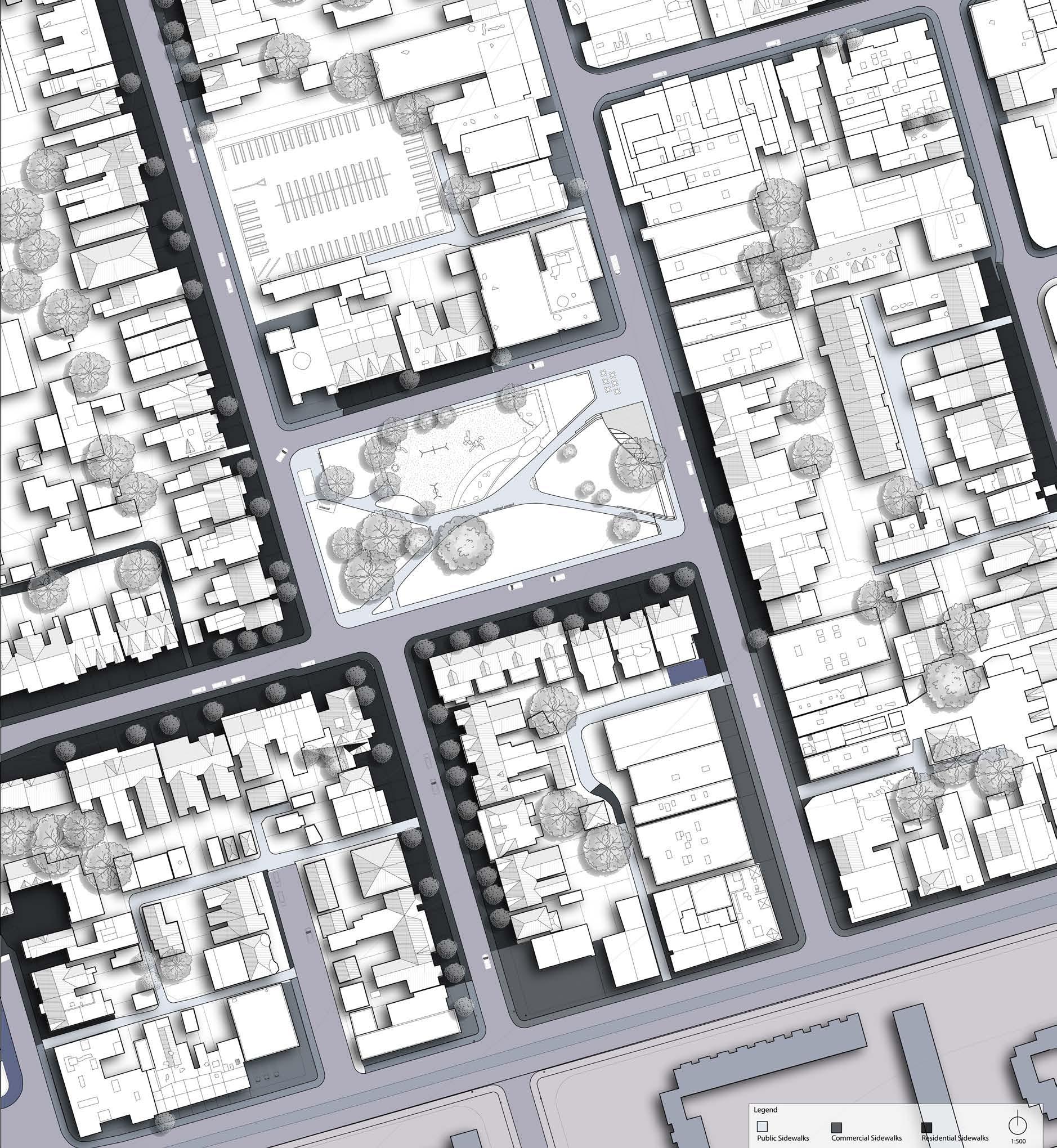

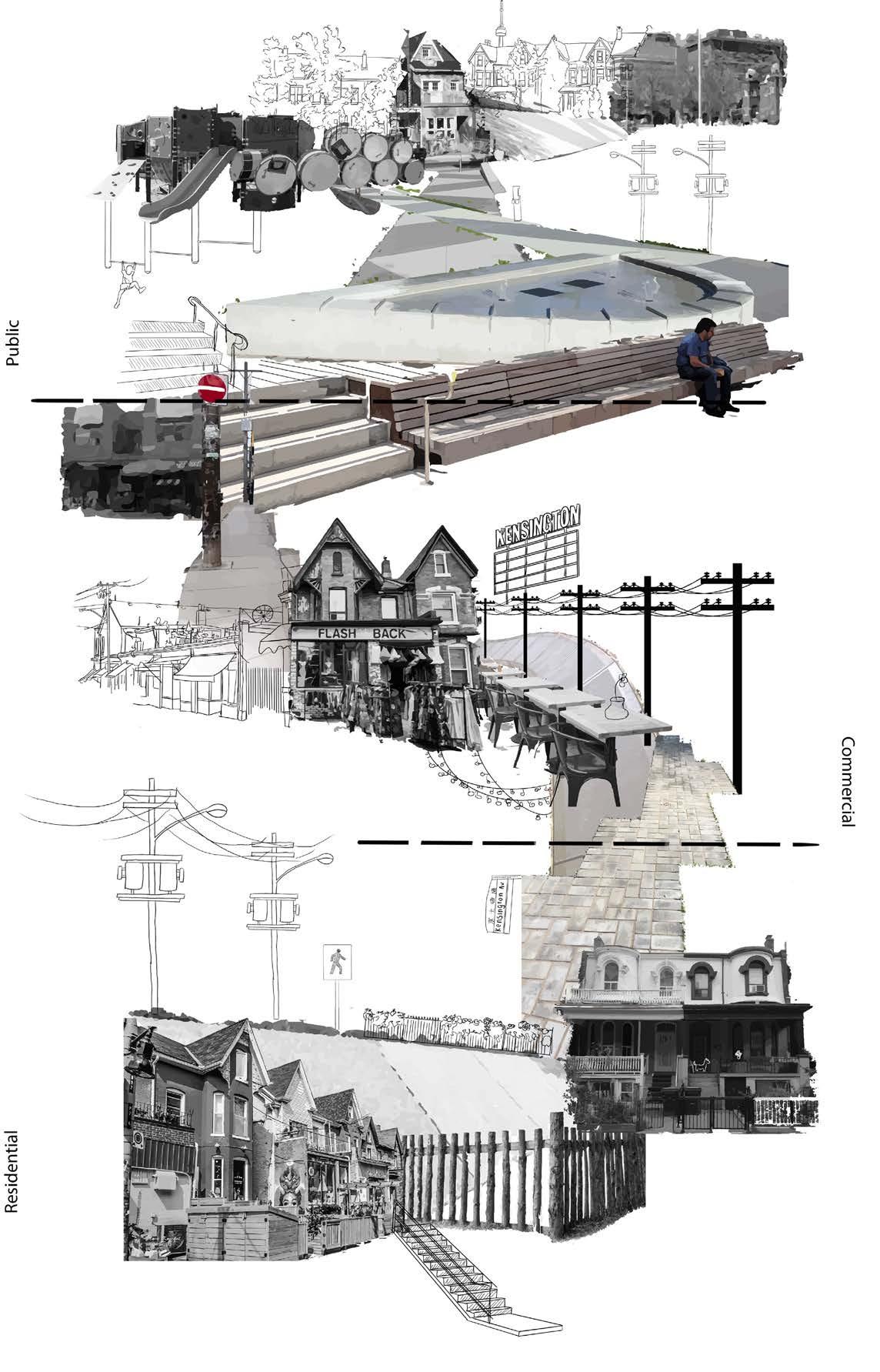
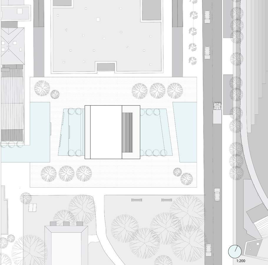
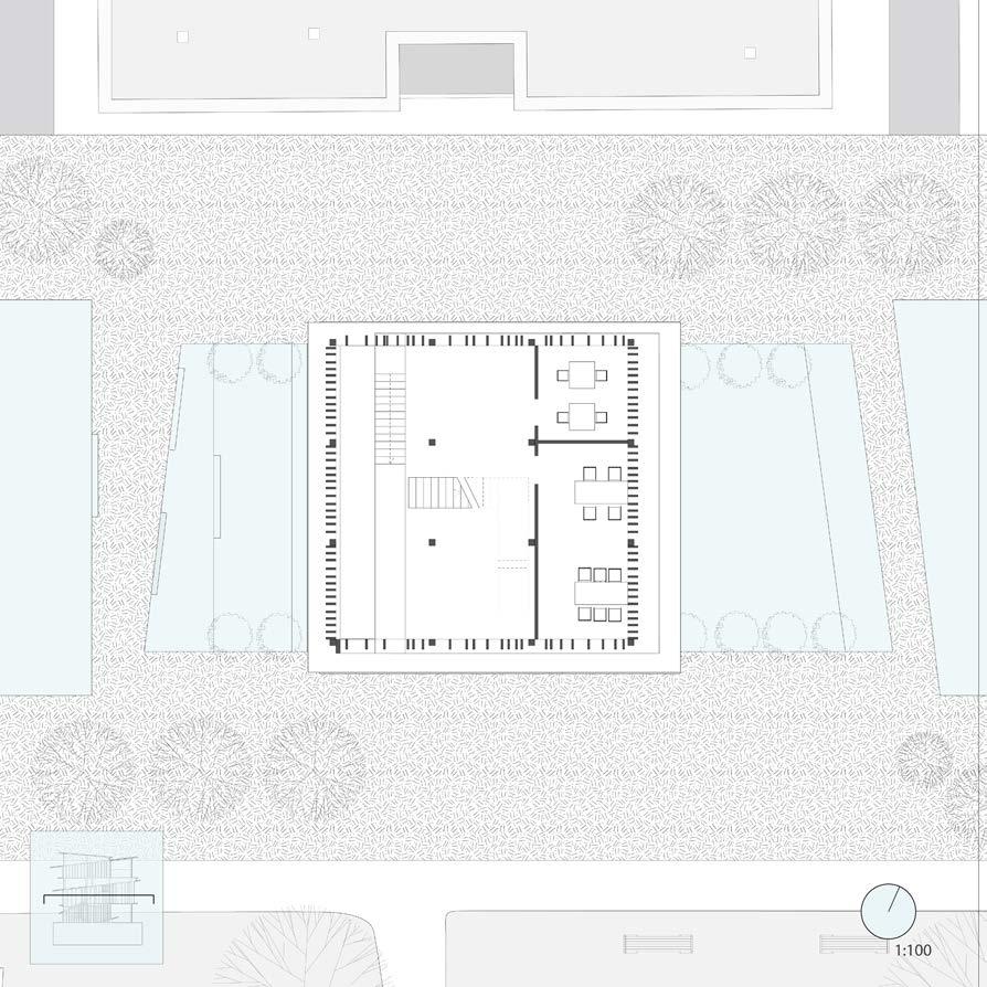
The site located in Kensington Market boasts proximity to public transportation and pedestrian routes, facilitating accessibility. To the north of the site lies Bellevue Square Park, a public space that adds to the overall character and surroundings of the proposed project.

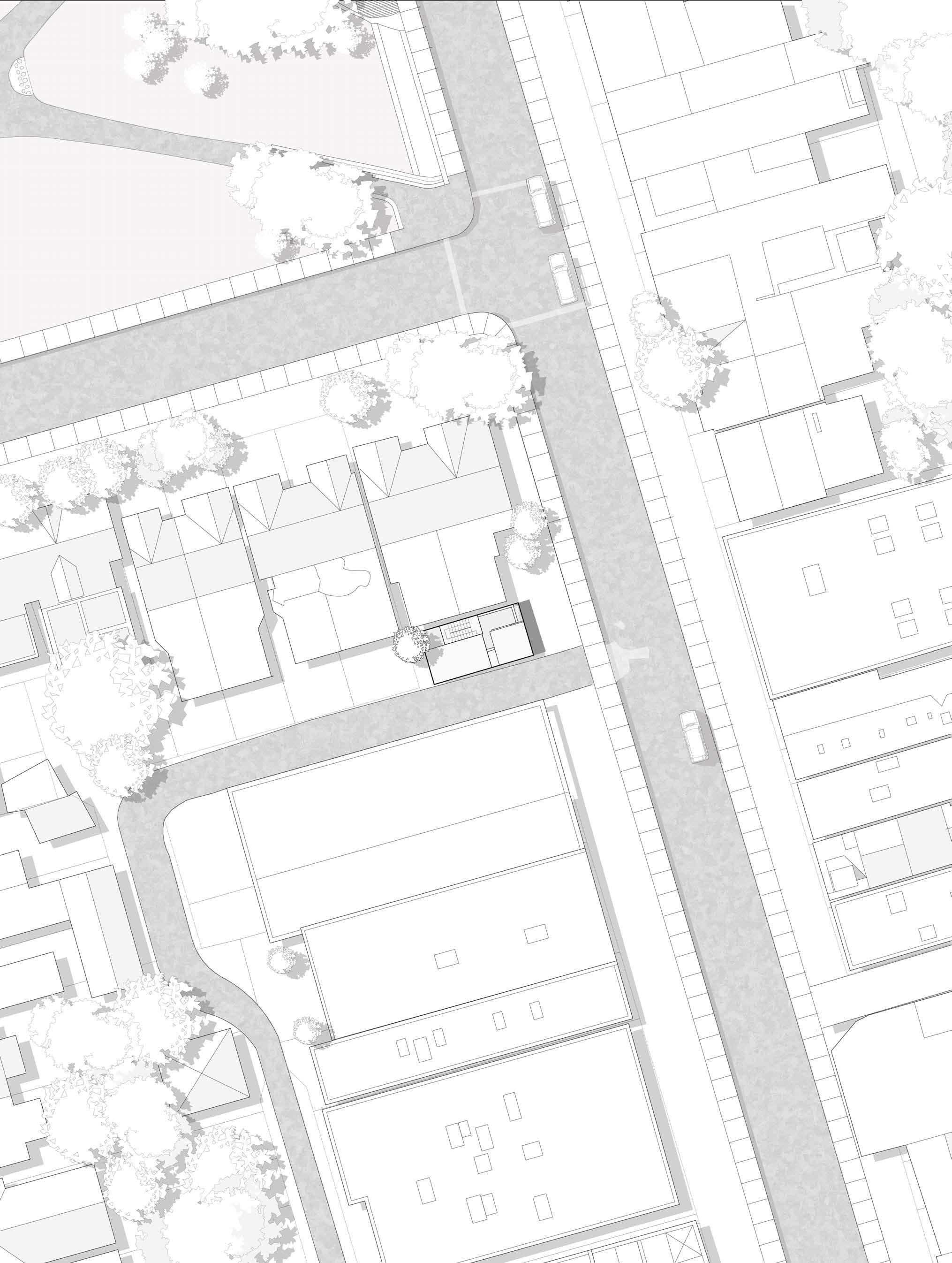
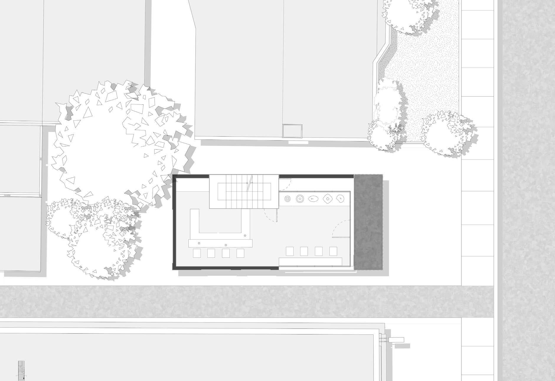
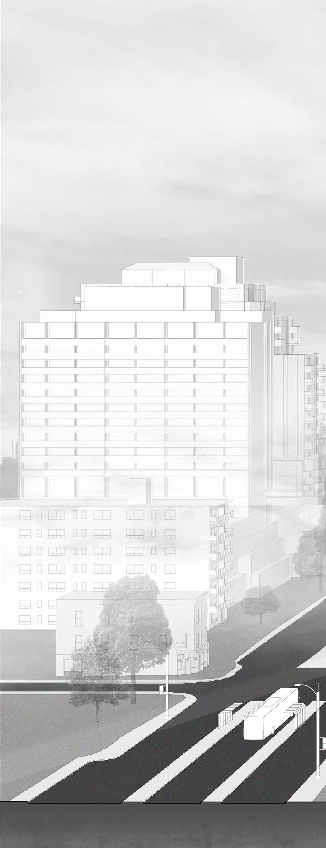
The chosen site for the design is situated at 162 Augusta Avenue, Toronto, Canada. The master plan encompasses the top view of the proposed build and its immediate context. Augusta Ave. on the right side is lined with mixed-use and commercial buildings, while residential structures flank both sides of the laneways, strategically set back from the main road to ensure enhanced privacy.


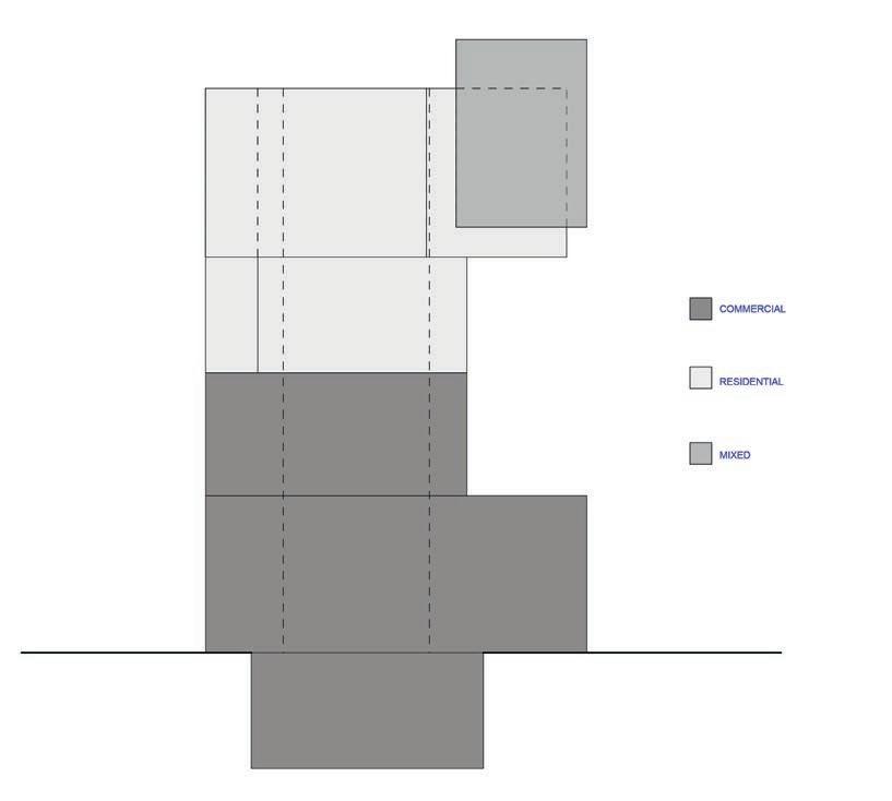
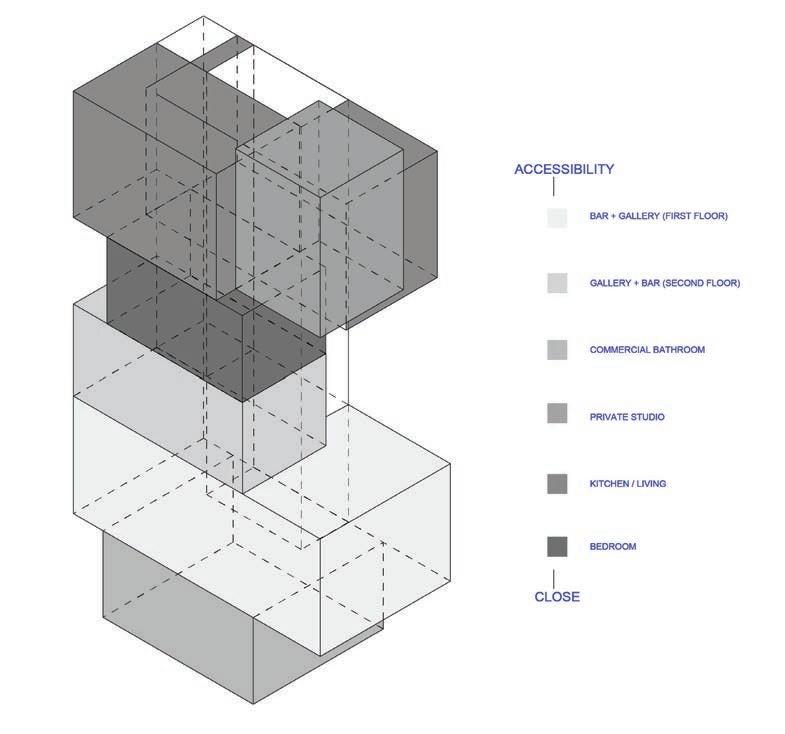


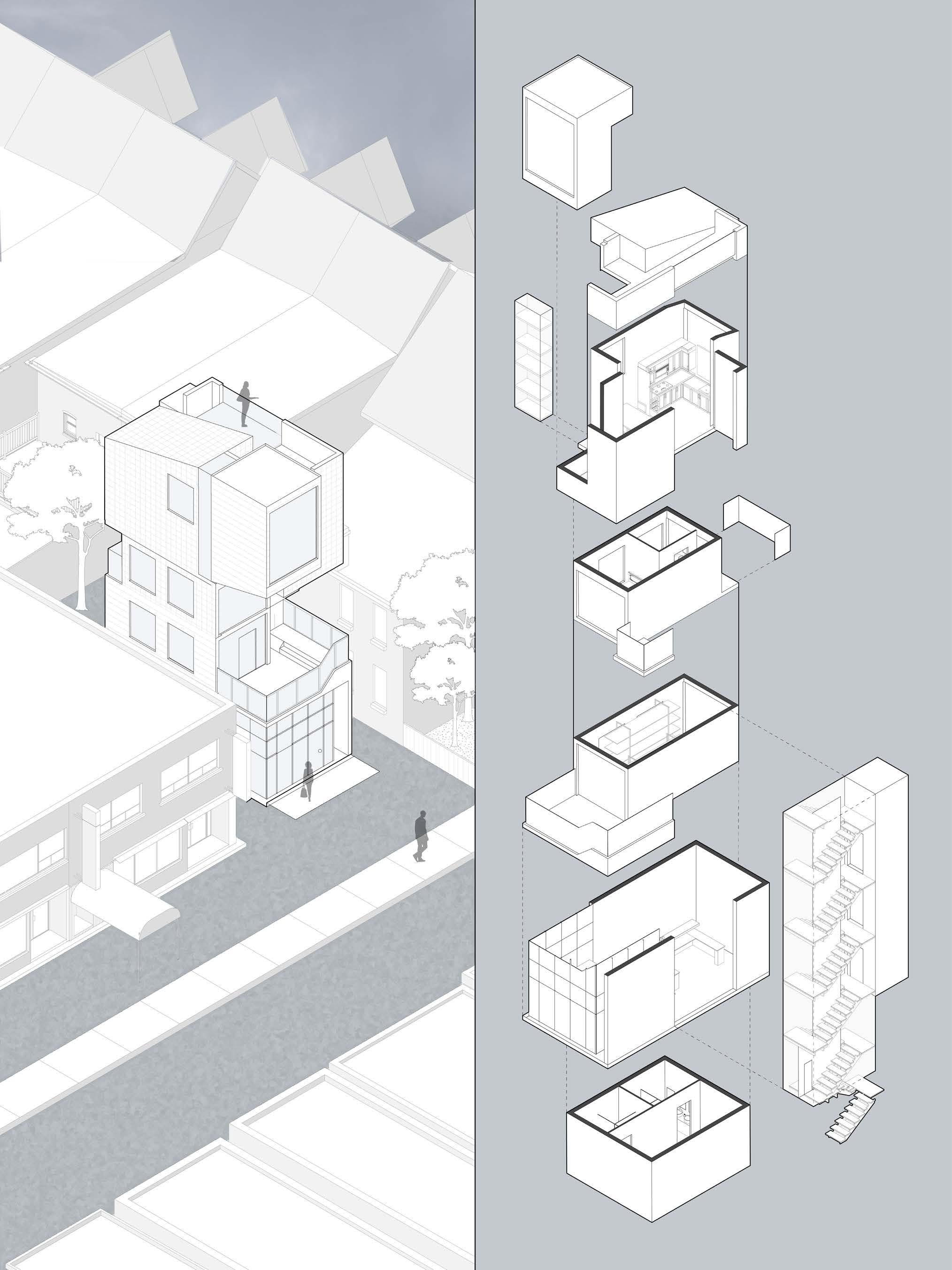
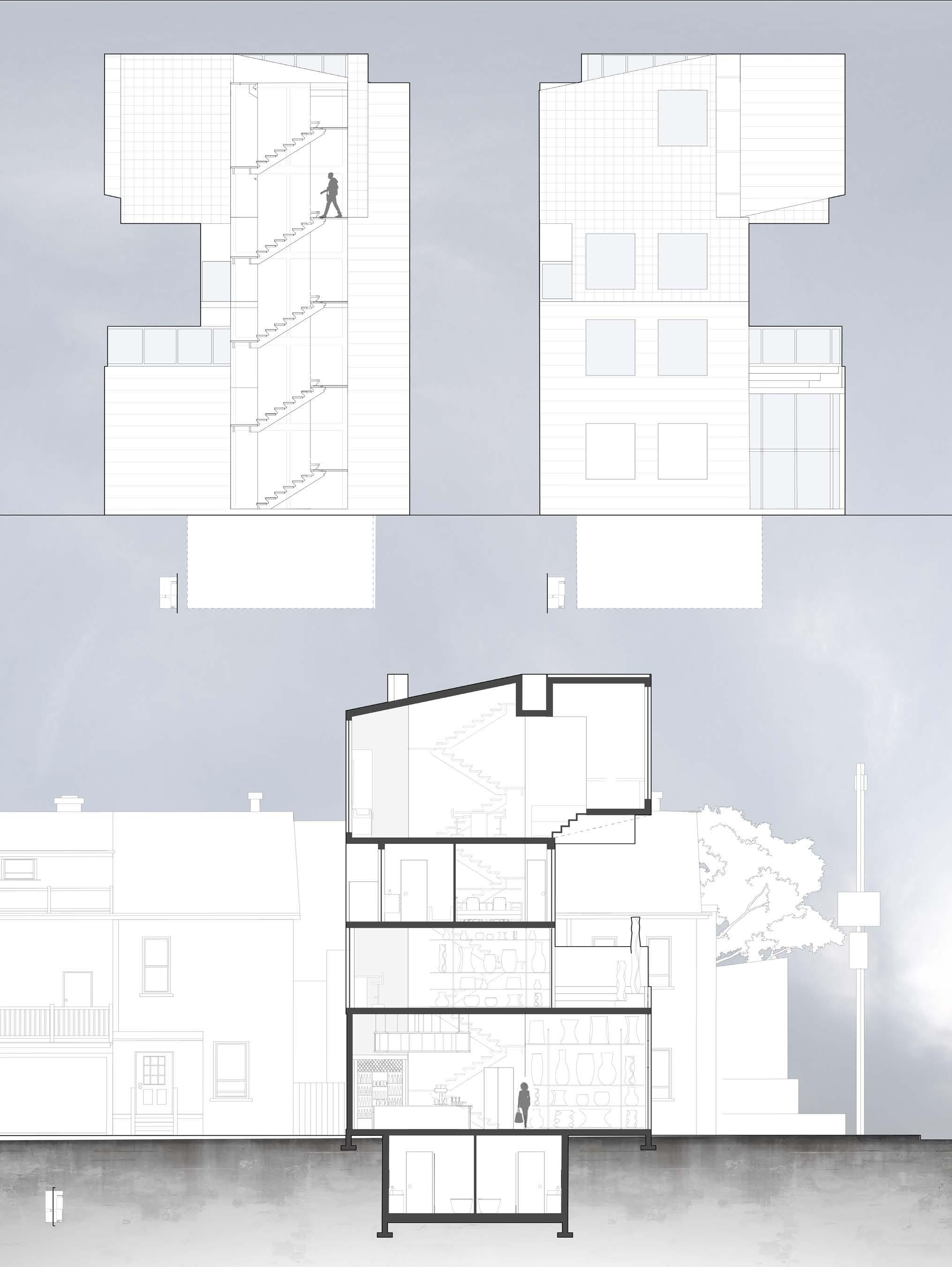
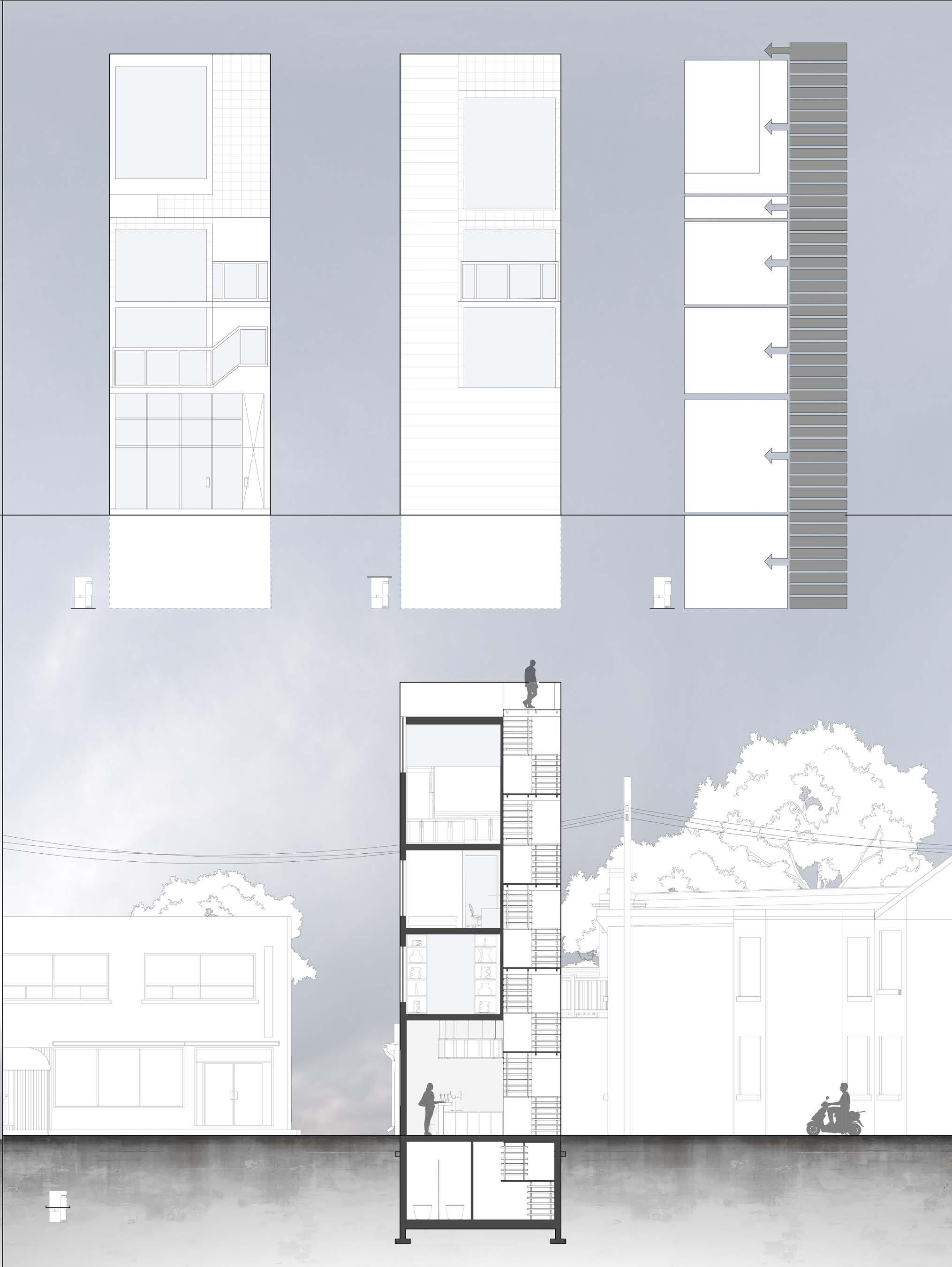
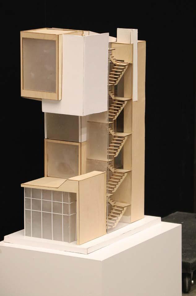
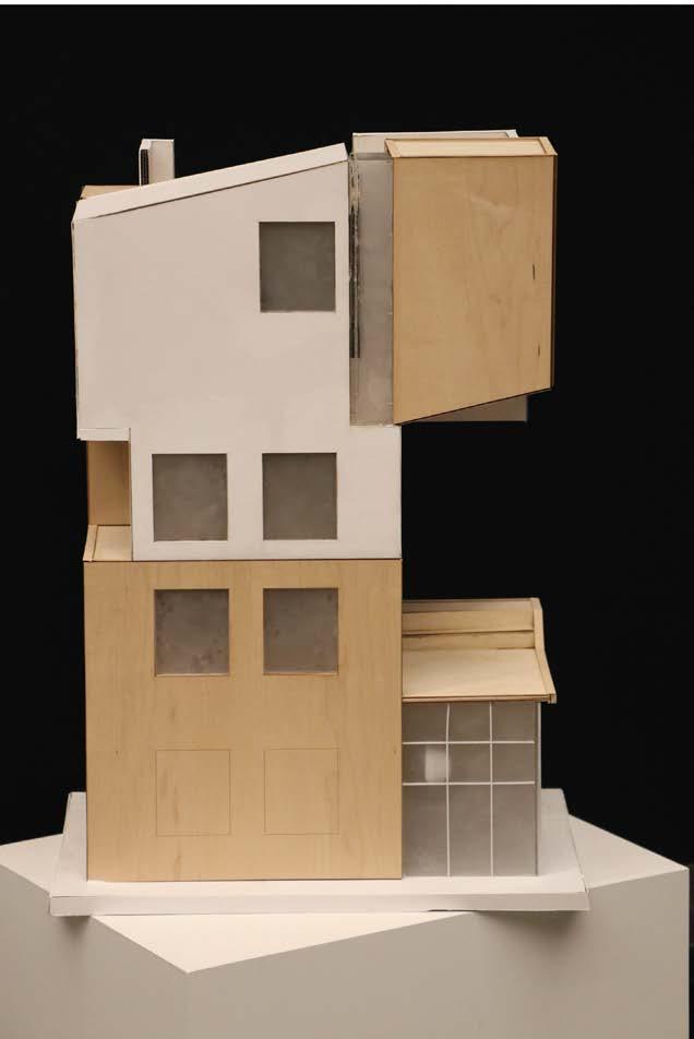
The physical model employs a distinctive dual-material approach to convey its nuanced design narrative. The wooden facade, serving as a visual marker, distinctly delineates the commercial spaces within the structure. In contrast, the white material signifies the private residential areas, creating a harmonious dialogue between the two. Central to the model’s representation is the depiction of rooms as boxes, stacked upon each other to sculpt the architectural form. This strategic arrangement not only symbolizes the layered complexity of the internal spaces but also communicates the varying levels of privacy inherent in each. This layering not only defines the spatial hierarchy but also reflects the project’s commitment to seamlessly integrating private and public realms.

Studio - Merging intersections into spatial design
Typology: Mixed-Use
Date: December 2024
Location: Imgained Cayon Site
Instructor: Benjamin Freyinger
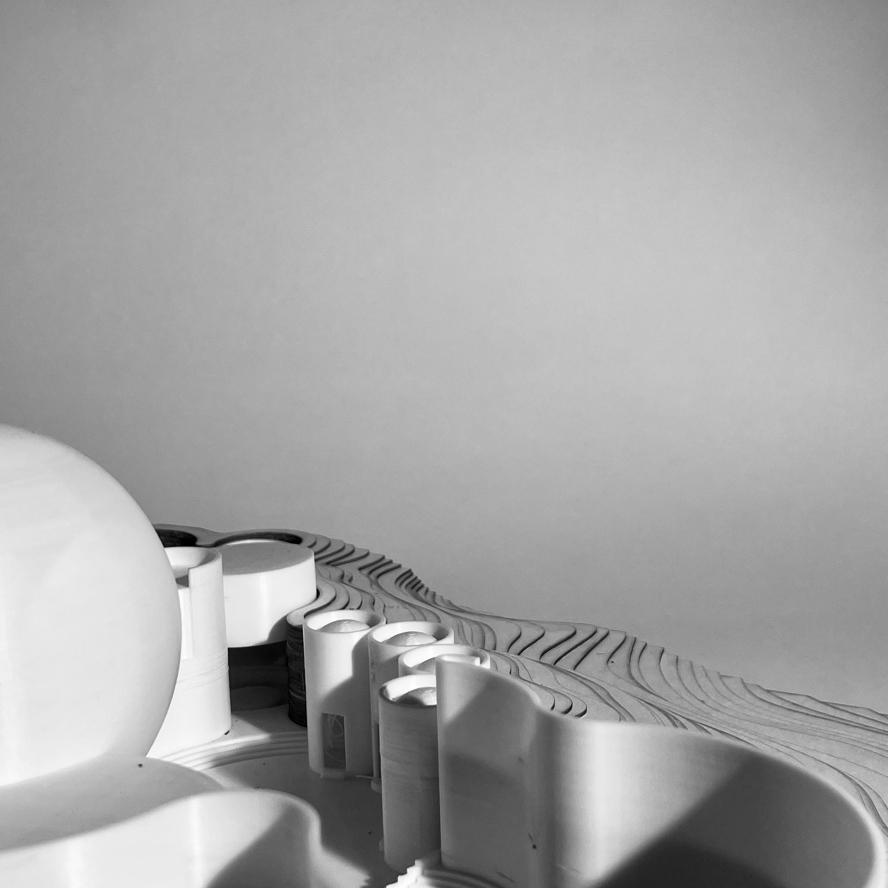
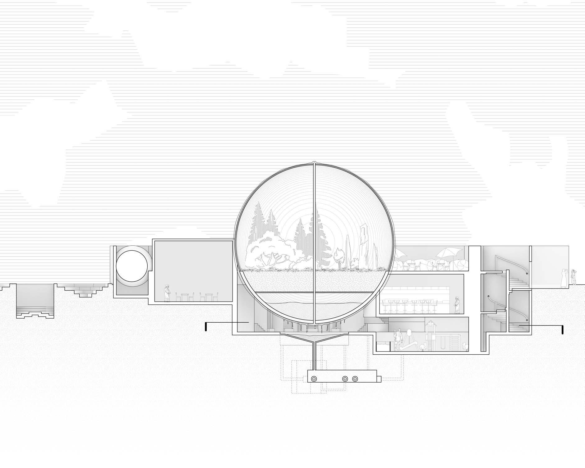
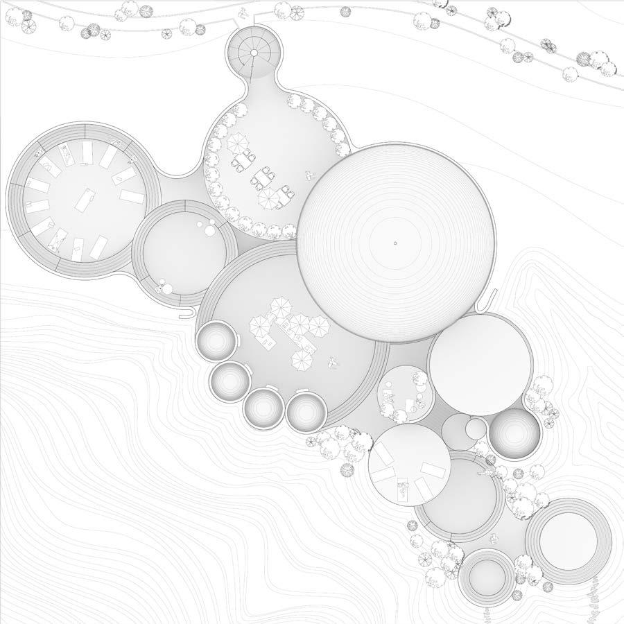
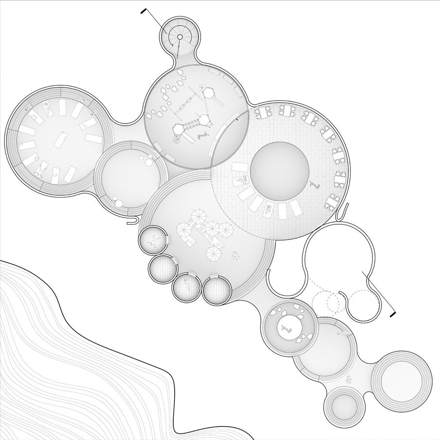
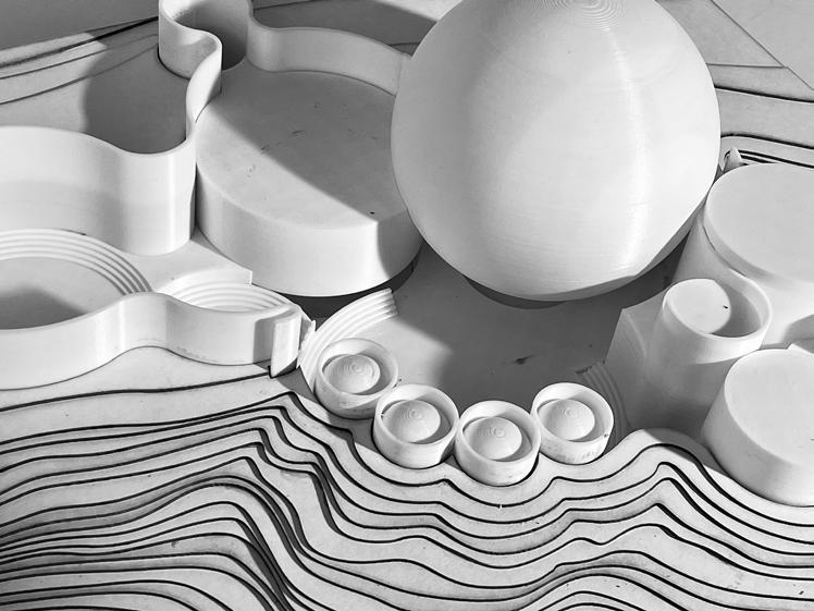
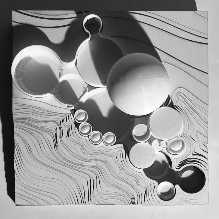
This project reimagines Vasily Kandinsky’s Softened Construction (1927) within the environmental context of a 150-by-150-foot canyon site. Inspired by the artwork’s intersecting shapes, circular forms inform the building’s layout and flow, creating a series of terraced, interconnected spaces for rest, activity, and reflection.
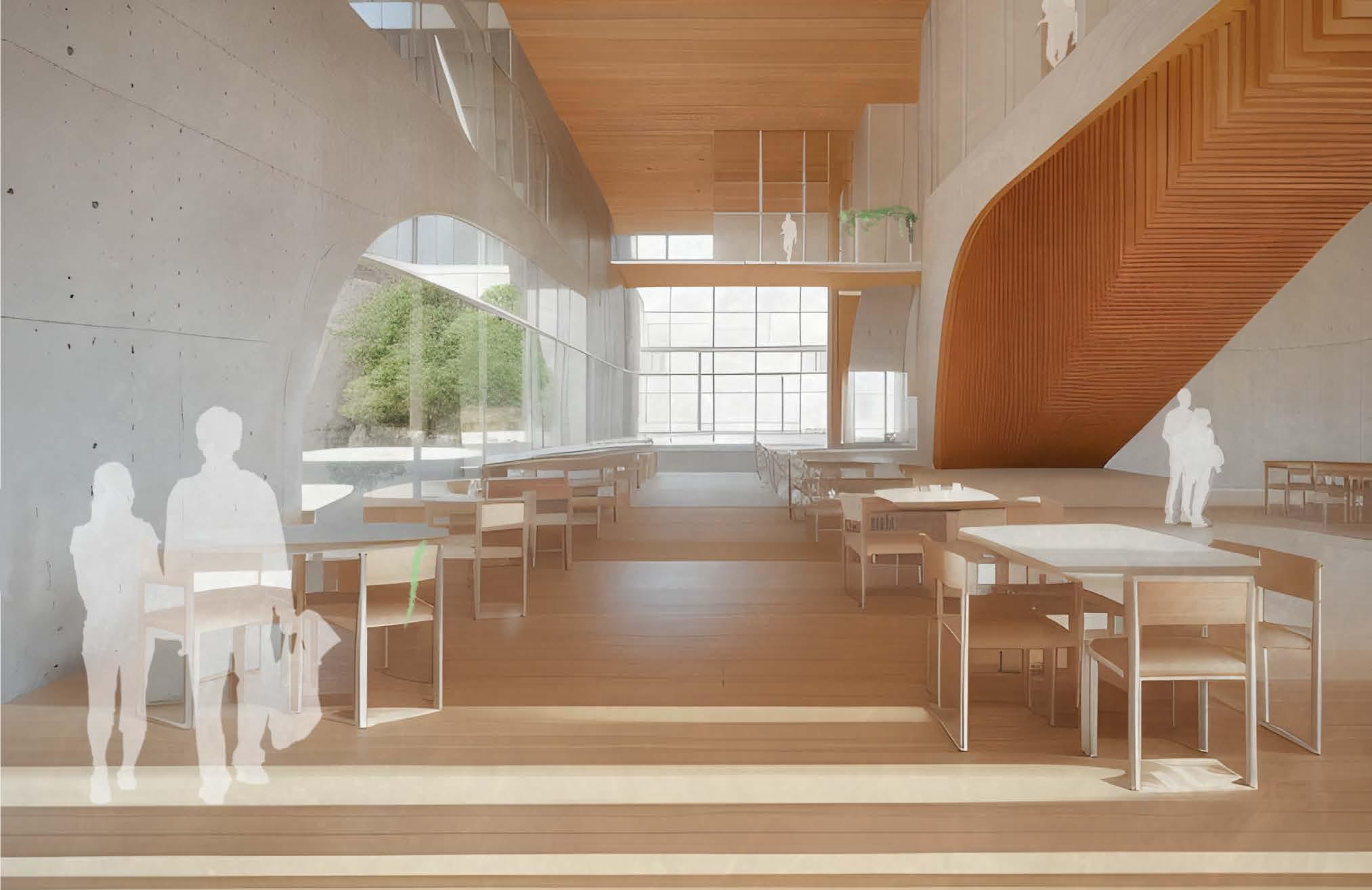
The journey begins with a water-featured entry and transitions through spaces designed for relaxation, interaction, and functionality. Key elements include private domes for repose, a vendor area, dining spaces, a yoga and meditation zone, and a rooftop garden. A central spiral staircase connects these spaces vertically, leading to distinct areas such as a secluded child’s play zone, an adult bar, and the rooftop.
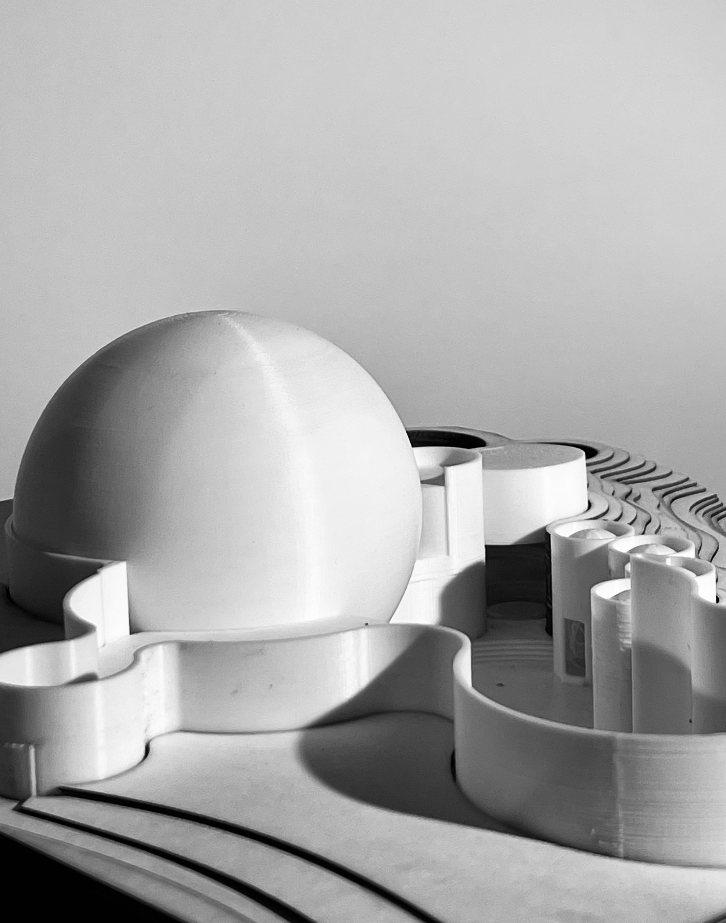
At the heart of the design is a sustainable water-collection dome, which not only cools and sustains the building but also symbolizes the integration of environmental responsibility. This project merges artistic analysis, spatial design, and sustainability, showcasing how abstract principles can inspire architecture that balances form, movement, and ecological awareness.
Right: 3/32 physical model


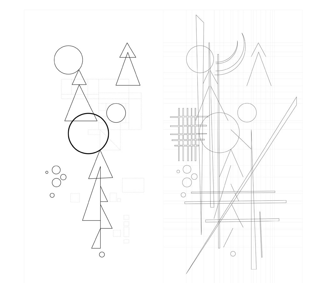
The artwork’s strength lies in its balance between order and dynamism. There is a clear structure—anchored by grids and alignments—but there are also areas of fluidity and misalignment that create visual interest. In your plan, you can use these principles to create spaces that feel both organized and lively, structured yet open to interpretation.
The key takeaway is that relationships between elements are crucial: how figures relate to the ground, how parts contribute to the whole, how the center connects to the periphery, and how alignment and misalignment introduce hierarchy and tension.
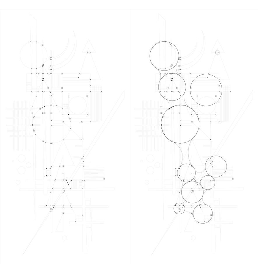
Center/Periphery Aligned/Misaligned Part/Whole Part/Whole (annotated)
The exploration of these ideas directly reflects the formal qualities of the Softened Frame concept. By interpreting the artwork’s visual logic through spatial design, the plan transforms abstract forms into architectural elements—balancing clarity with complexity, order with spontaneity.



Design Build - How can we use computational tools to challenge conventional methods of wood construction through design to digital fabrication facilitated through robotic systems?
Typology: Mass Timber Pavillion
Date: June, 2024
Location: 1Spadina Cr., Toronto, Canada
Instructor: AnnaLisa Meyboom, Aryan Rezai Rad, Nicholas Hoban
Role: Design, Construction, Drawing, and Photograpghy
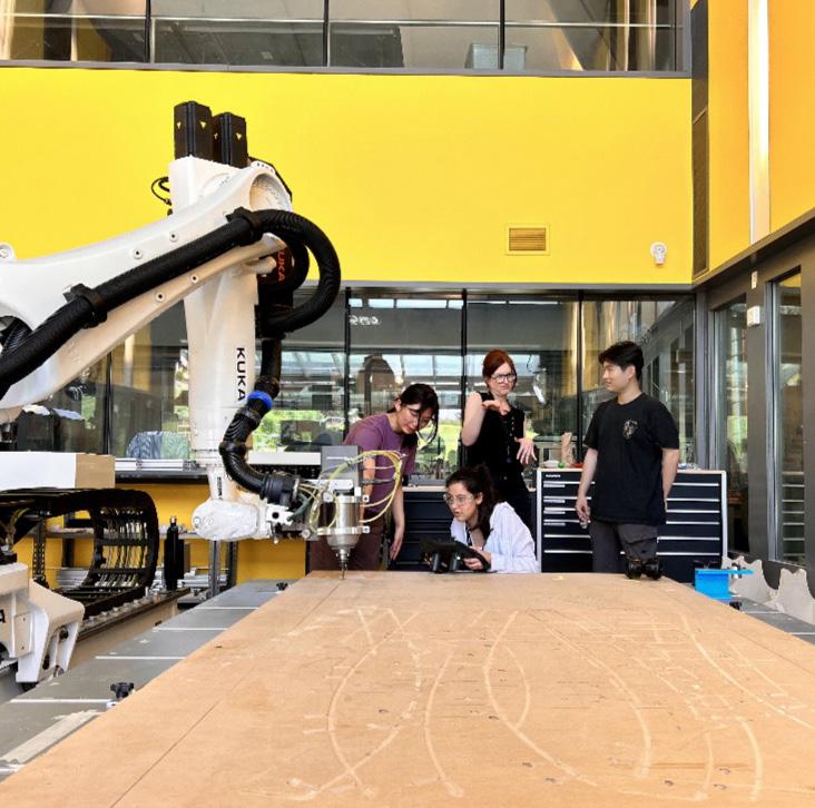
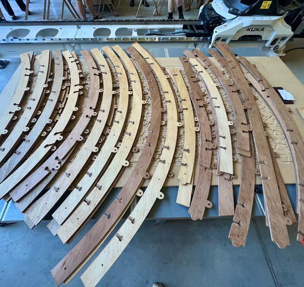
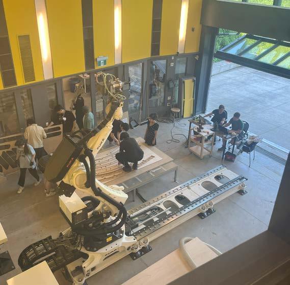
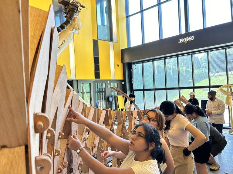
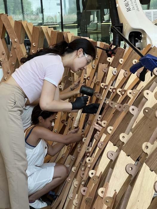
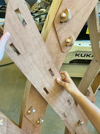
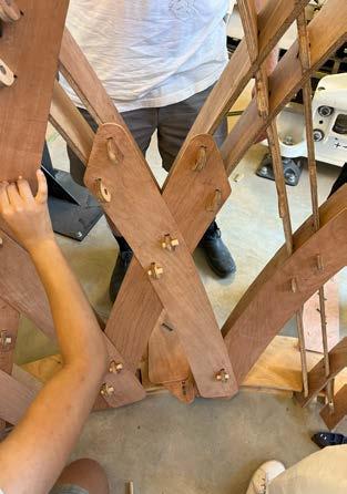
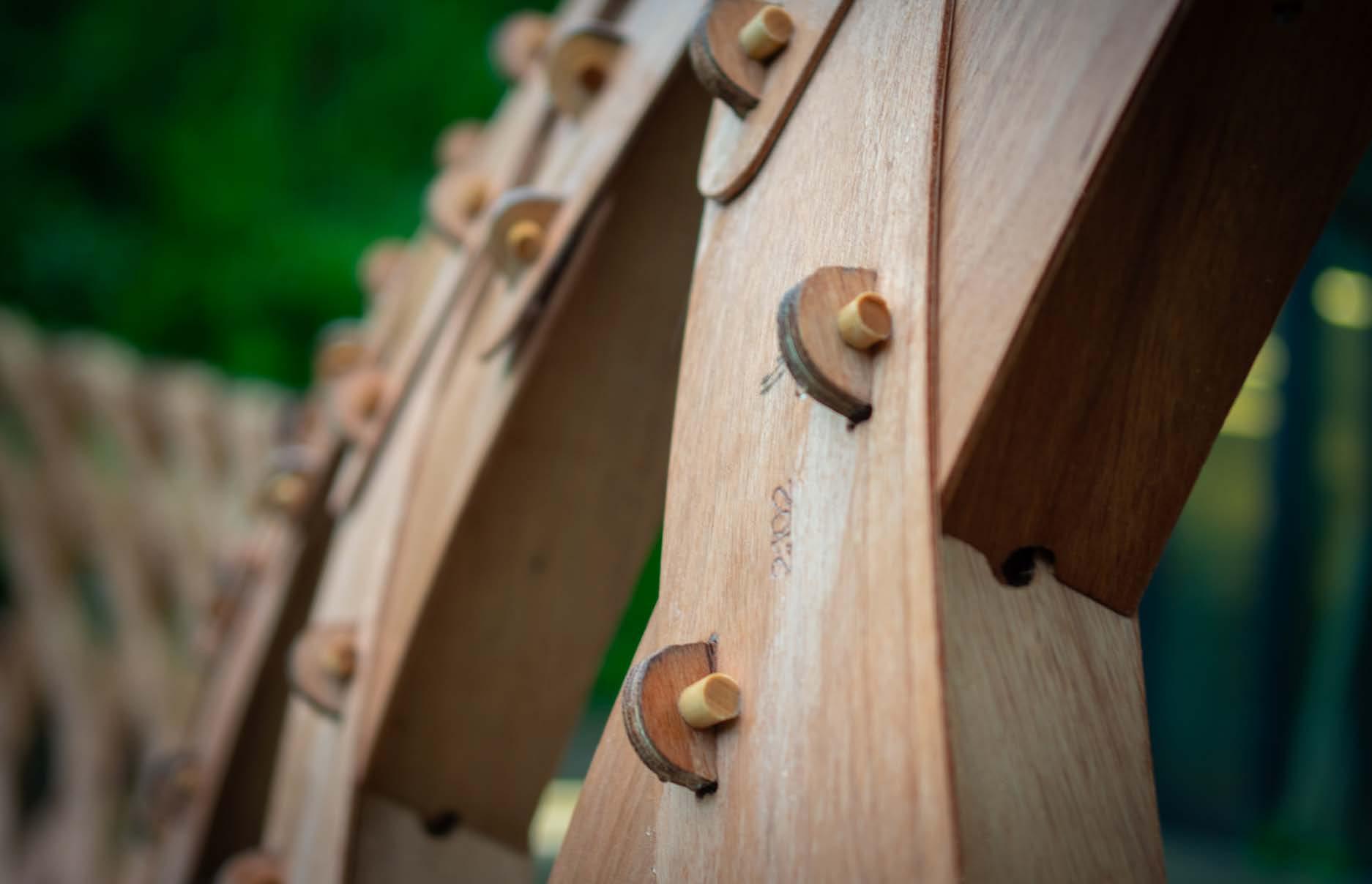
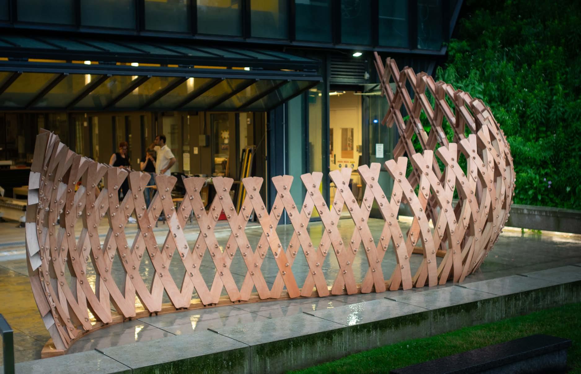
Robot Made is a hands-on two-week intensive design-build project that integrates computational design with robotic fabrication to explore innovative techniques for constructing geometrically complex wooden structures. Utilizing a KUKA robotic arm, the project reimagines conventional wood construction processes, emphasizing wood’s sustainable properties, such as its ability to store embodied carbon and reduce greenhouse gas emissions.
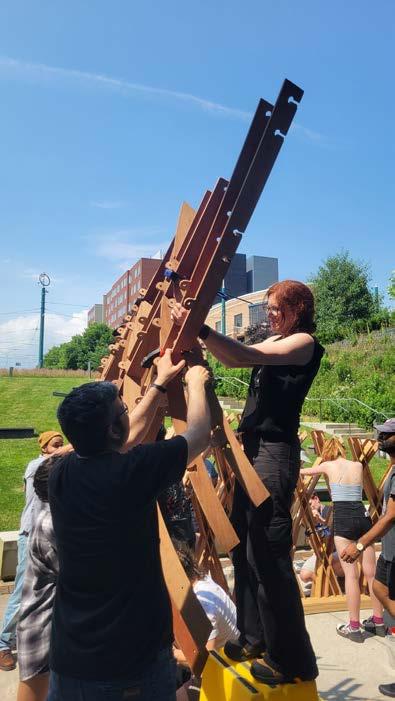
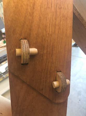
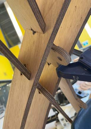
As one of 19 University of Toronto Daniels students selected to participate in this design-build, I collaborated on developing computational models that incorporated structural analysis, simulation, and robotic manufacturing workflows. Through the Design for Manufacturing and Assembly (DFMA) process, we embedded construction and assembly logic into both digital and physical models, enabling precise robotic fabrication and efficient on-site assembly. Robot Made provided a unique opportunity to push the boundaries of traditional fabrication methods while exploring the future of sustainable construction.
Robot Made focused on the design to direct fabrication.
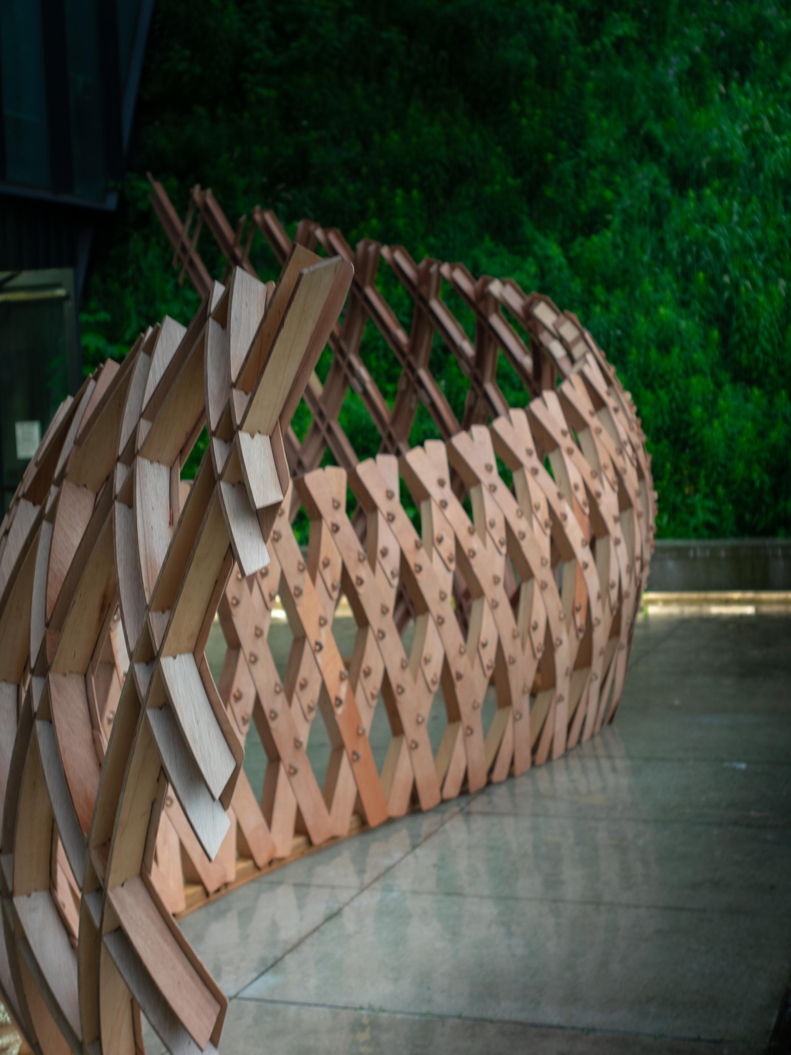
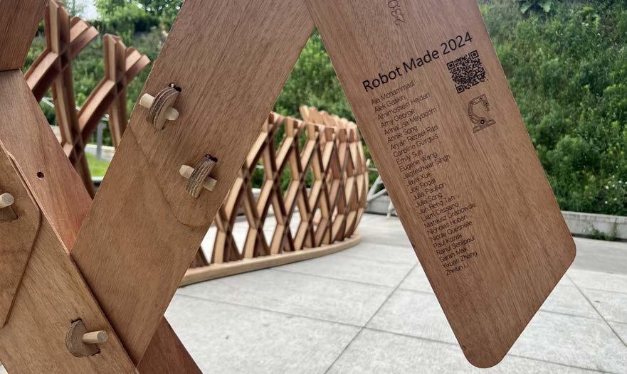
The completed pavillion is displayed on the south side of the Daniels Building at 1 Spadina Crescent, serving as a lasting testament to the innovative work and collaboration of the Robot Made 2024 team.
Right: Completed mass timber structure


inputting geometries to be cut


setting a base by marking points on a build table
setting a base by marking points on build table
setting a base by marking points on build table

positioning and securing of materials onto table
positioning and securing of materials onto table
positioning and securing of materials onto table

positioning and securing of materials onto table


inputting geometries to be cut

milling begins, KUKA is monitored throughout
milling begins, KUKA is monitored throughout
positioning and securing of materials onto table
Web Fabrication Process
Web Fabrication Process
inputting geometries to be cut
inputting geometries to be cut

removal of materials, and clean up
removal of materials, and clean up
removal of materials, and clean up
removal of materials, and clean up
removal of materials, and clean up
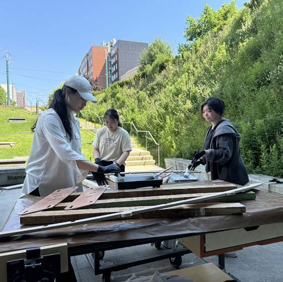
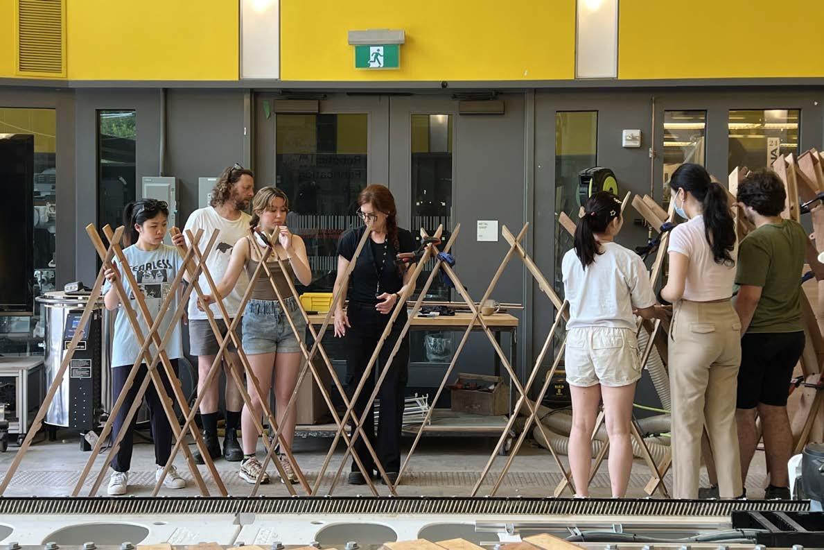
Right: The pavilion was constructed over a 10-day process. During days 1–3, the team focused on design development, learning necessary software, and training for fabrication. From days 4–8, the webs, flanges, and base were produced simultaneously. The final two days, 9–10, were dedicated to assembling the pavilion.
1: training
2: KUKA arm milling webs
3: arial view of our workshop
4: positioning materials onto table
5: vacuuming debris from mills
6: numbering webs
7: CNC flanges
8: sanding webs and flanges
9: varnishing webs and flanges
10: drying webs and flanges
11: organizing flanges for assembly
12: pavillion base assembly
milling begins, KUKA is monitored throughout
milling begins, KUKA is monitored throughout






Typology: Student Residence
Date: April 2023
Location: Sussex Ave. and Spadina Ave. (University of Toronto), Toronto, Canada
Instructor: Jon Cummings
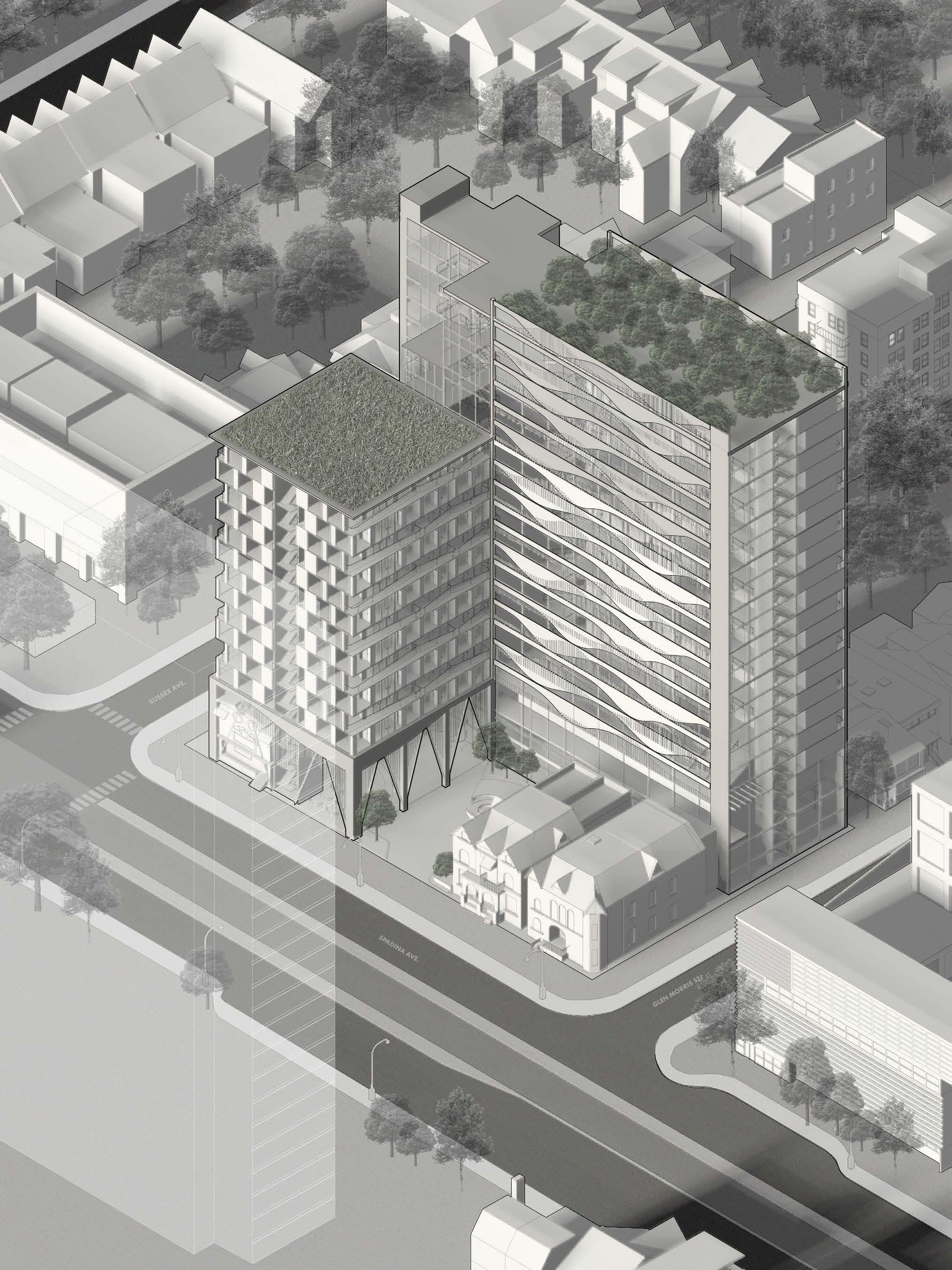
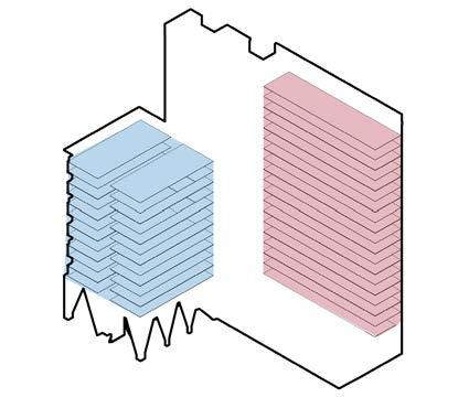
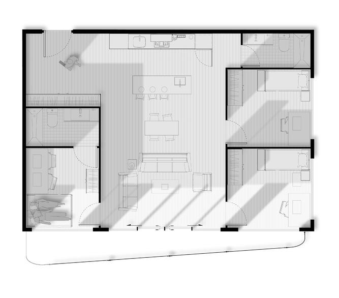
Rooted in the legacy of the historic Peabody Terrace complex, envisioned by José Luis Sert in 1964 for married students with kids at Harvard University, this architectural undertaking confronts challenges unveiled in Peabody Terrace. The evolving dynamics of the Peabody community, particularly the erosion of a tightly-knit atmosphere following the recent integration of undergraduate students has illuminated the need for distinct ‘massings,’ birthing the concept of two separate structures in Harmony in Heights. One mirrors the conventional student residence, featuring shared communal spaces like bathrooms and kitchens for undergraduate students. The other embodies the character of a graduate house or single-family unit, offering self-contained kitchens and bathrooms within each unit.
This intentional duality extends beyond mere physical separation. Each ‘massing’ is envisioned as an autonomous community, fostering a sense of belonging among its residents. The shared open spaces act as neutral ground, facilitating interaction between the two distinct communities. It is within these communal areas that the larger community, comprised of both graduate and undergraduate residents, is forged. Drawing from Peabody Terrance’s wisdom, the skip-stop circulation emerges as a subtle yet effective means for these two communities to intersect. This circulation method provides a unique spatial choreography, allowing residents to cross paths without intruding directly into each other’s spaces. It becomes a metaphorical bridge, enabling organic connections between the two communities while preserving the sanctity of their individual identities.
Right: south-west isometric
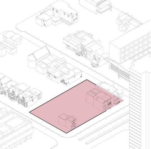
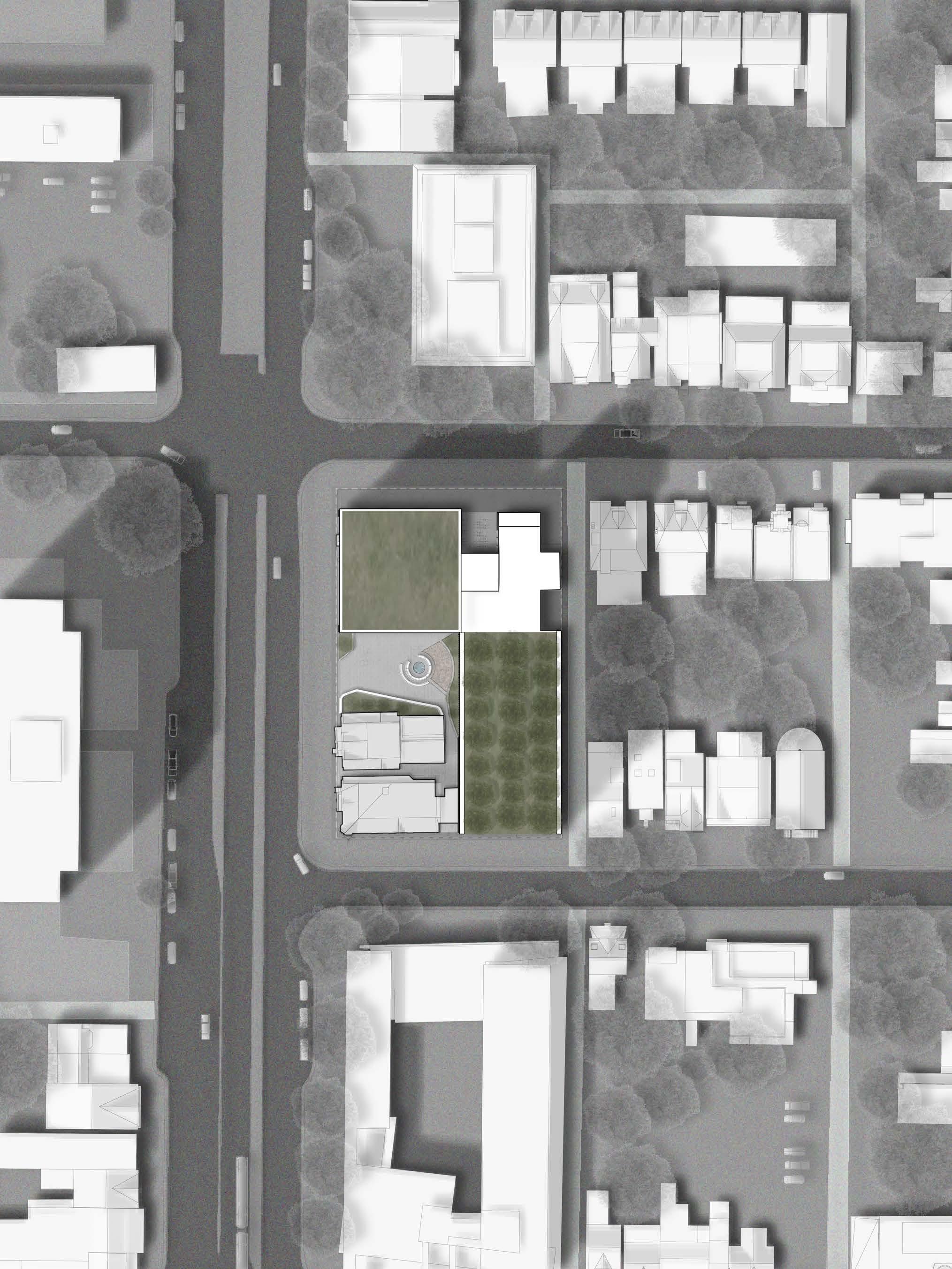
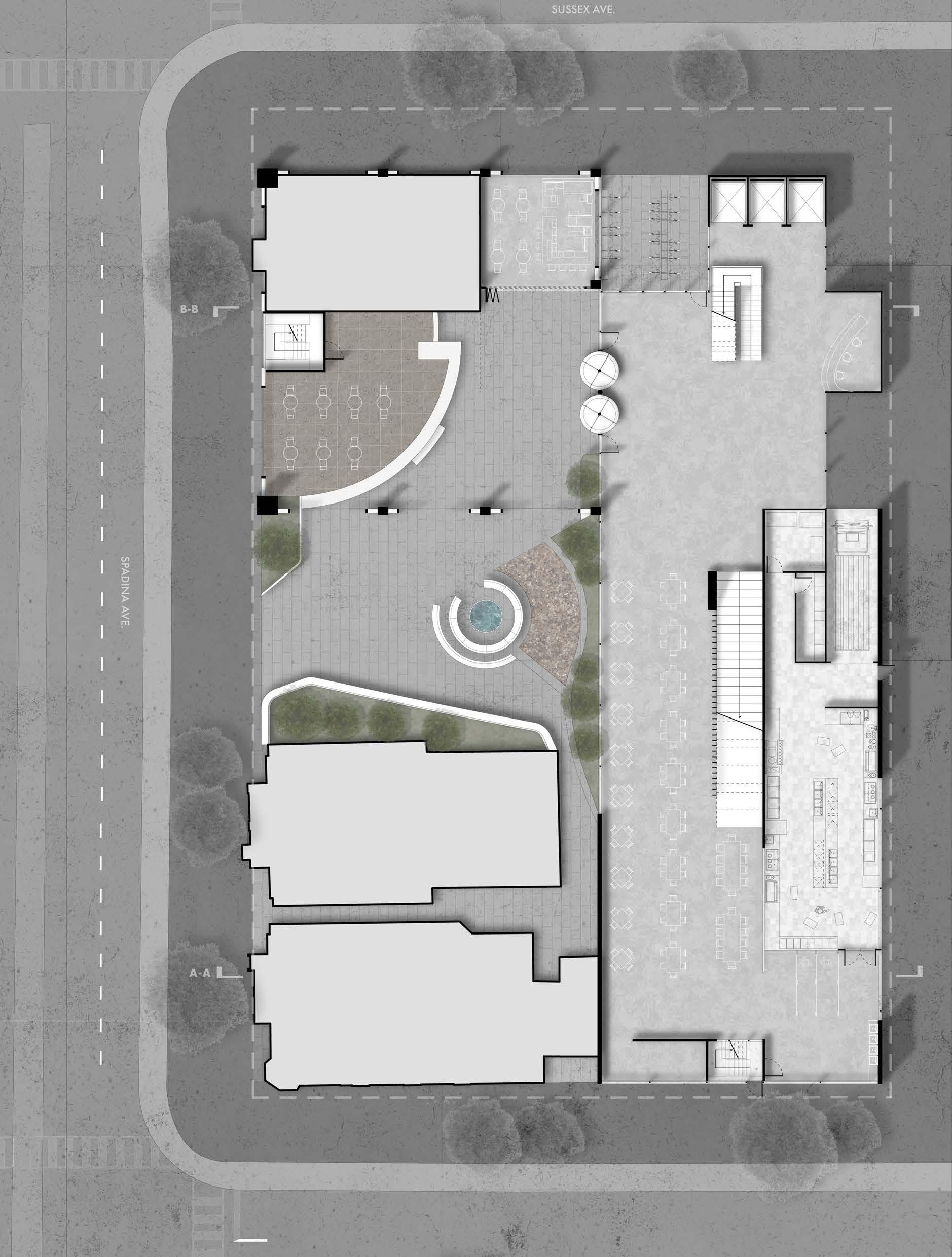
The building is situated at the intetsection of Spadina Ave. and Sussex Ave.
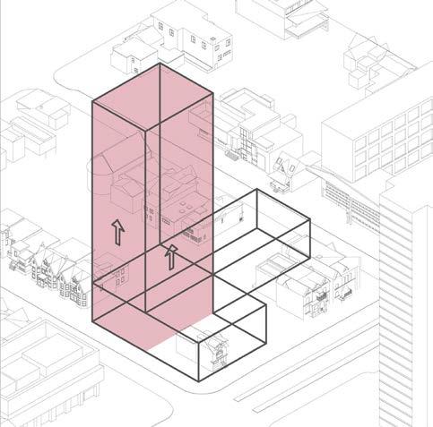
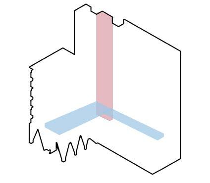
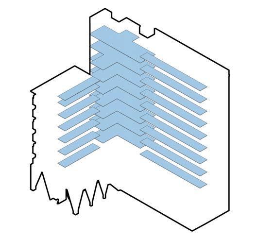
The North East section of the building is extruded as a circulation core following a skip-stop circulation pattern.

The building is pushed to behind the two larger heritage buildings which allows for urban construction and an welcoming enterance for people.
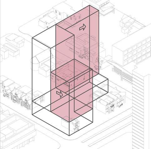
Two residential towers are extruded. One hosts the grad students and the other one hosts the undergrad students. The grad tower is lowered to reduce northern shadow foorprint.
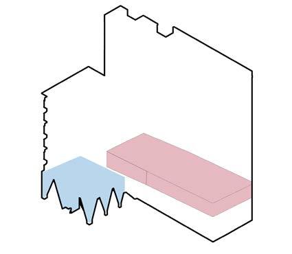
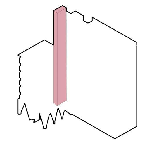
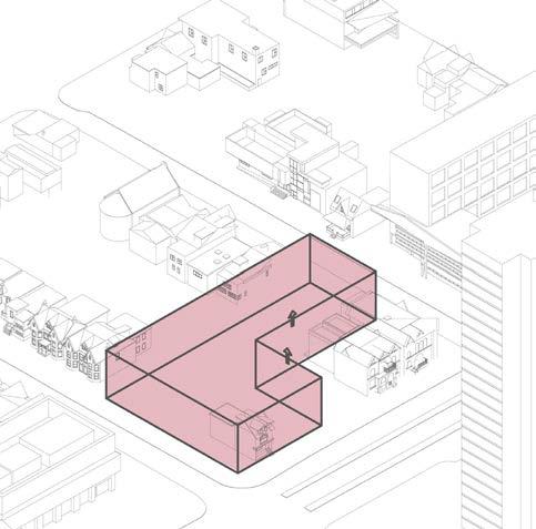
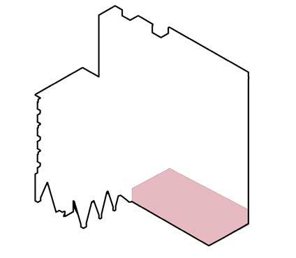
The ground level space and mezzanine is extruded to the height of the heritage buildings.

The building is eneloped by a glass facade inspired by the Melcrete Building in Punjab, India.
B-B mezzanine plan
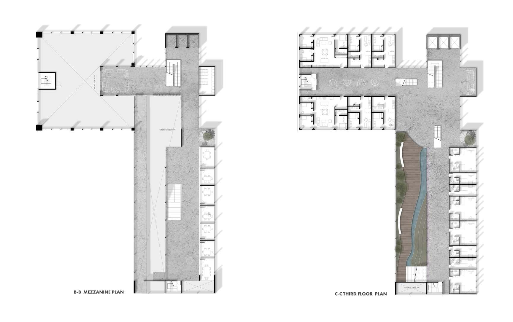
C-C third floor plan

lower principal plan
E-E upper principal plan
Steel
Steels used fo he siuciral elements of he builing, Its used in the facade panel Hames and in the colums.
Concrete
Concrete is used os flooring in all the common areas like first floor, second floor, and all the circulation. The walls of the podium floor is also concrete.
Birch

Birch is used on oll he residential areas. Thot includes the grad ond undergrad




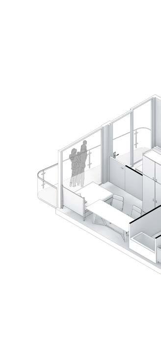


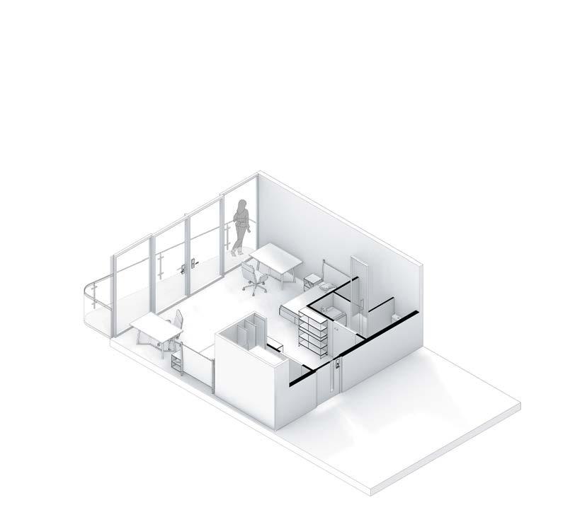
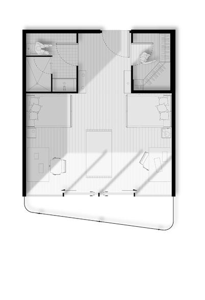
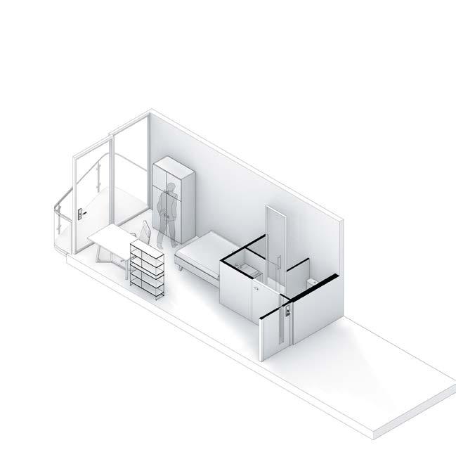
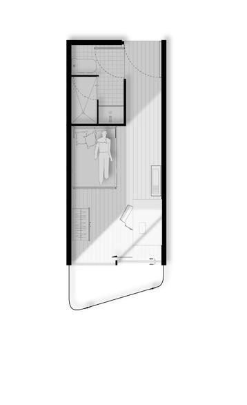
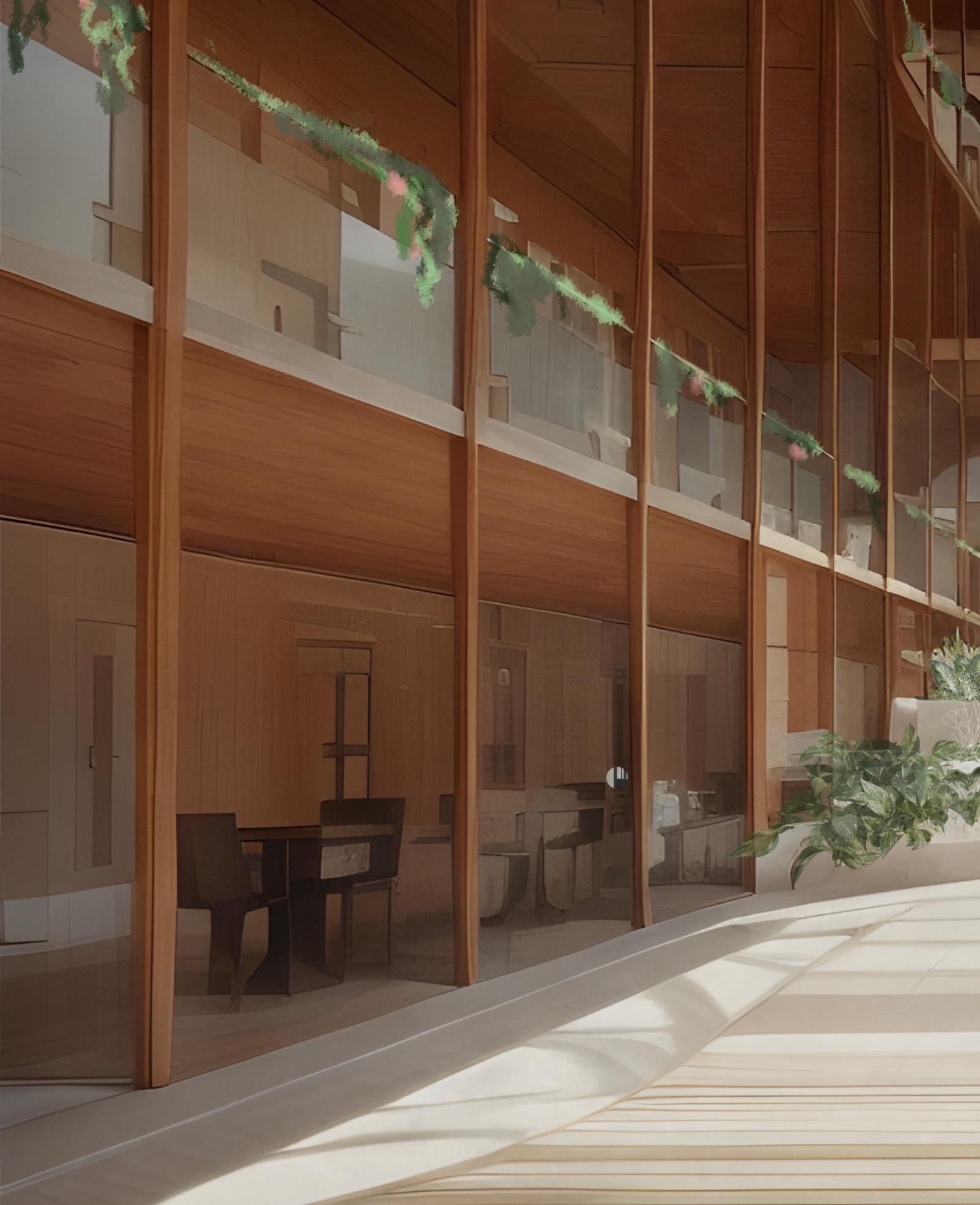


Typology: Mixed-use Site Analysis
Date: December, 2023
Location:
55 Mill St., Toronto, Canada
Instructor: Anne-Marie Armstrong
Collaborators: Zaina Abou-Seif, Pavani Mande, Qiqi Liu
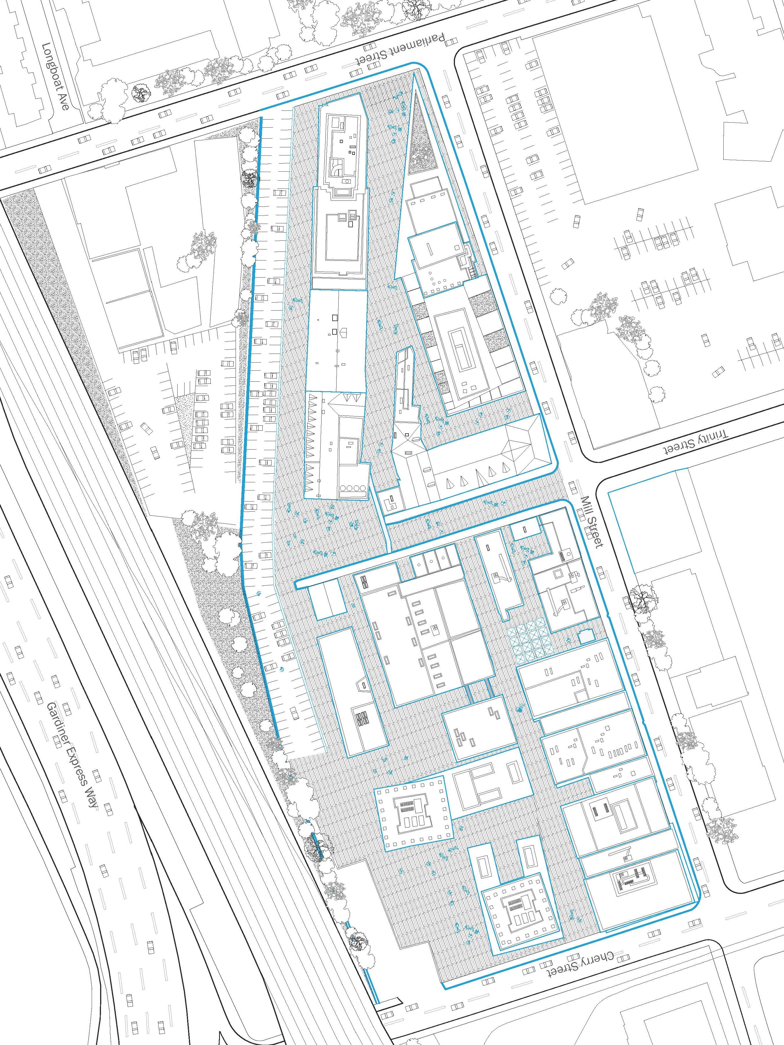
We examine the Distillery District’s role as a privately-owned historic town-within-a-town in the heart of downtown Toronto. Having undergone centuries of typological evolution and transfers of economic ownership, the area’s multilayered character is reflected both in its physical materiality and its role as a site of social experience where the visitor is expected to become a consumer. Its unique visual identity amalgamates three distinct ages of architecture into one space, allowing the visitor to experience both the old and new as they walk through the pedestrian-only streets. Traces of the past further reveals the site’s gradual transformation from an industrial alcohol distillery into a buzzing semi-residential hub for the arts and local businesses.
Consequently, through physical and cultural means that publicize the once entirely private site, the resulting thematic unit becomes its own entity within the modern city. With buildings that line the lot’s perimeter and enclose the space, the Distillery District’s clearly defined edge conditions formally isolate it from the remainder of the city to produce a sense of privacy and exclusivity. On the other hand, its historical marketability and reliance on consumerism attracts locals and tourists alike during temporal events and food marketplaces that establish implicit borders through the informal occupation of space, such as line-ups, loitering, or crowds. Such methods of territory-claiming contest communal space.
Implementing historic street signs and newly-built apartments within the space is representative of the sense of community established within this nationally preserved site, emerging the Distillery District as a public-private site where the past meets the present.
*All drawings are done in collaboration and divided evenly among the four of us
Right:Distillery District site map

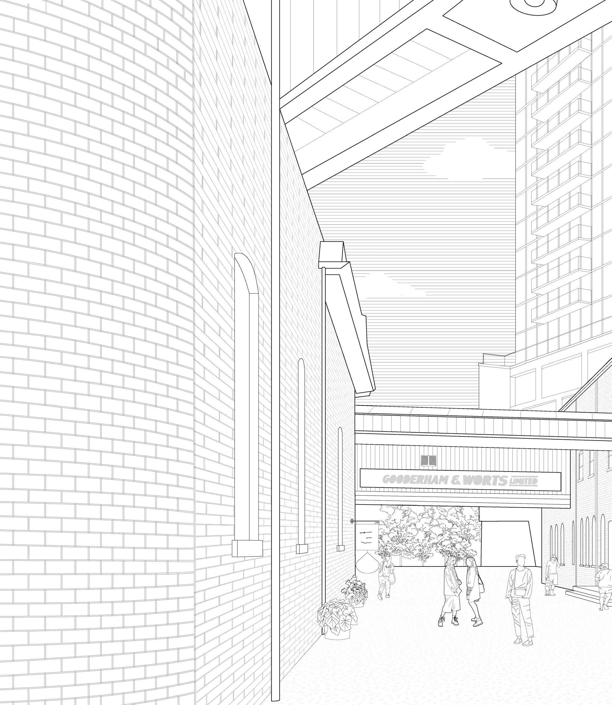
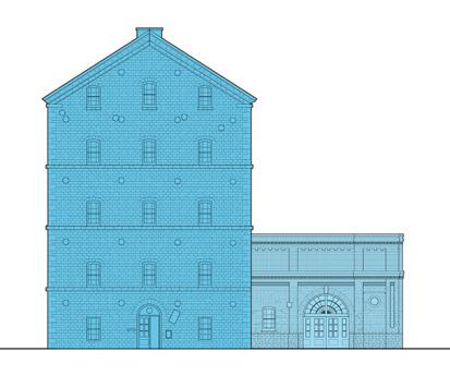
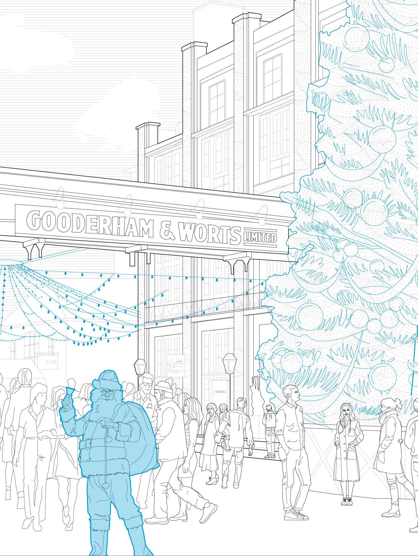
The perspective seeks to display the various socio-architectural typologies that join together within the District - a school, urban residences, preserved sites, and commercial stores and restaurants. The drawing illustrates the various dichotomies of past vs present, culture vs consumption, residential vs commercial, local vs franchises. These juxtapositions are produced as a result of the architecture, site function and occupation by visitors, vendors etc.
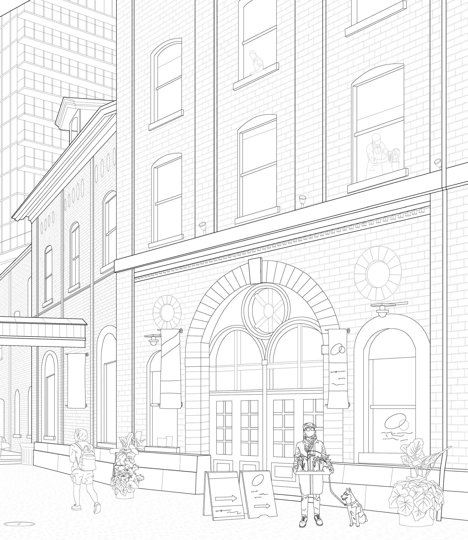
The “Gooderham and Worts” sign is indicative of the historically privatized space that has undergone transfers of ownership, transforming the largely private industry to a privatized public space of culture and consumption. The presence of “VIS Arts School” reinforces the identity of the historic district as a space for cultural, art and communal engagement. These different conditions contribute to the creation of a multilayered set of boundaries and edge conditions.
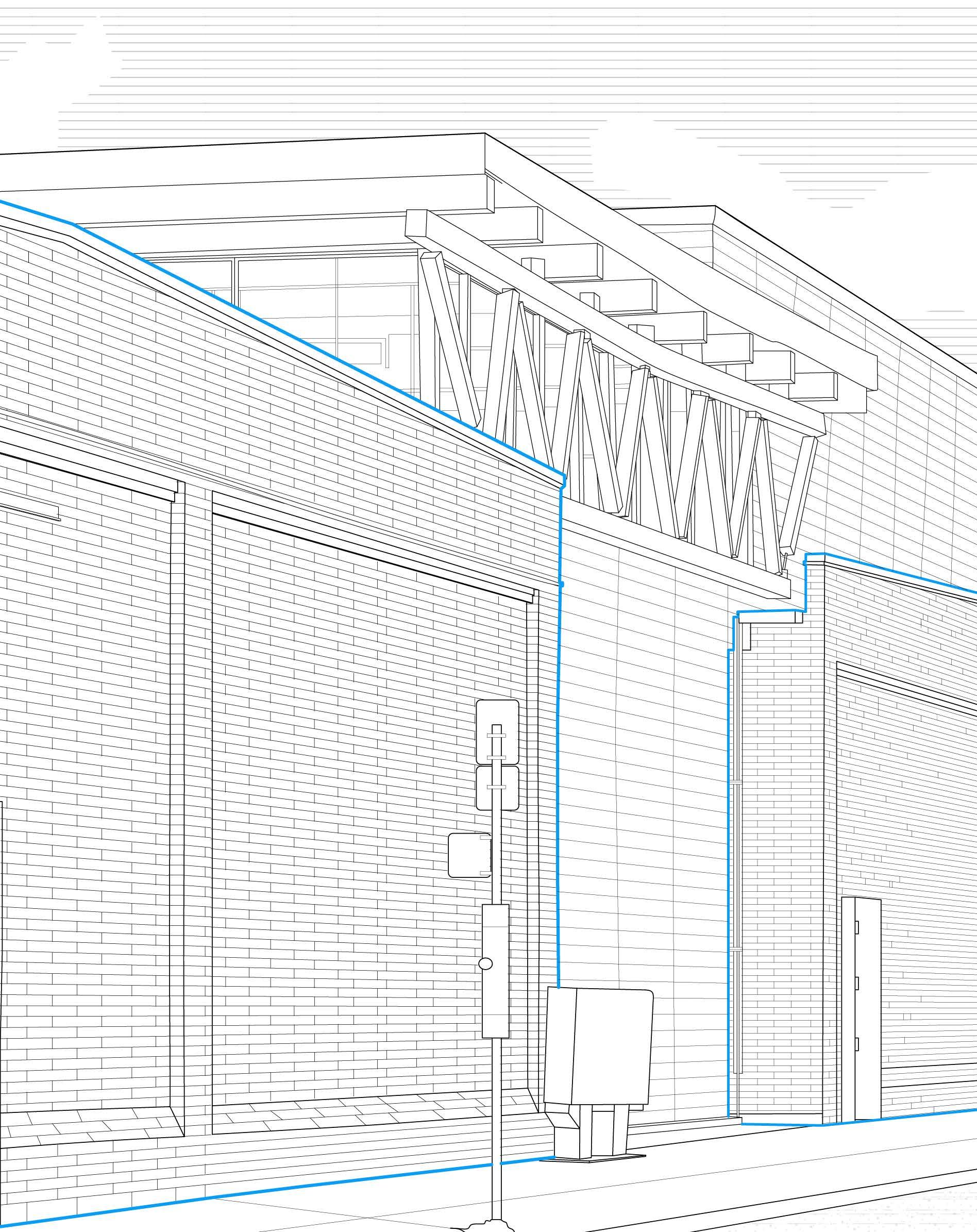
Envisioned as both physical and metaphorical delineations, the building’s strategic placement along the lot’s contours not only defines spatial boundaries but also orchestrates a narrative of transition and encapsulation. Within these walls, visitors encounter a transformative journey–from a bustling cityscape to a curated realm steeped in historical significance. The buildings, with their inward-facing windows, create an intimate enclosure, evoking a sense of both captivation and immersion.
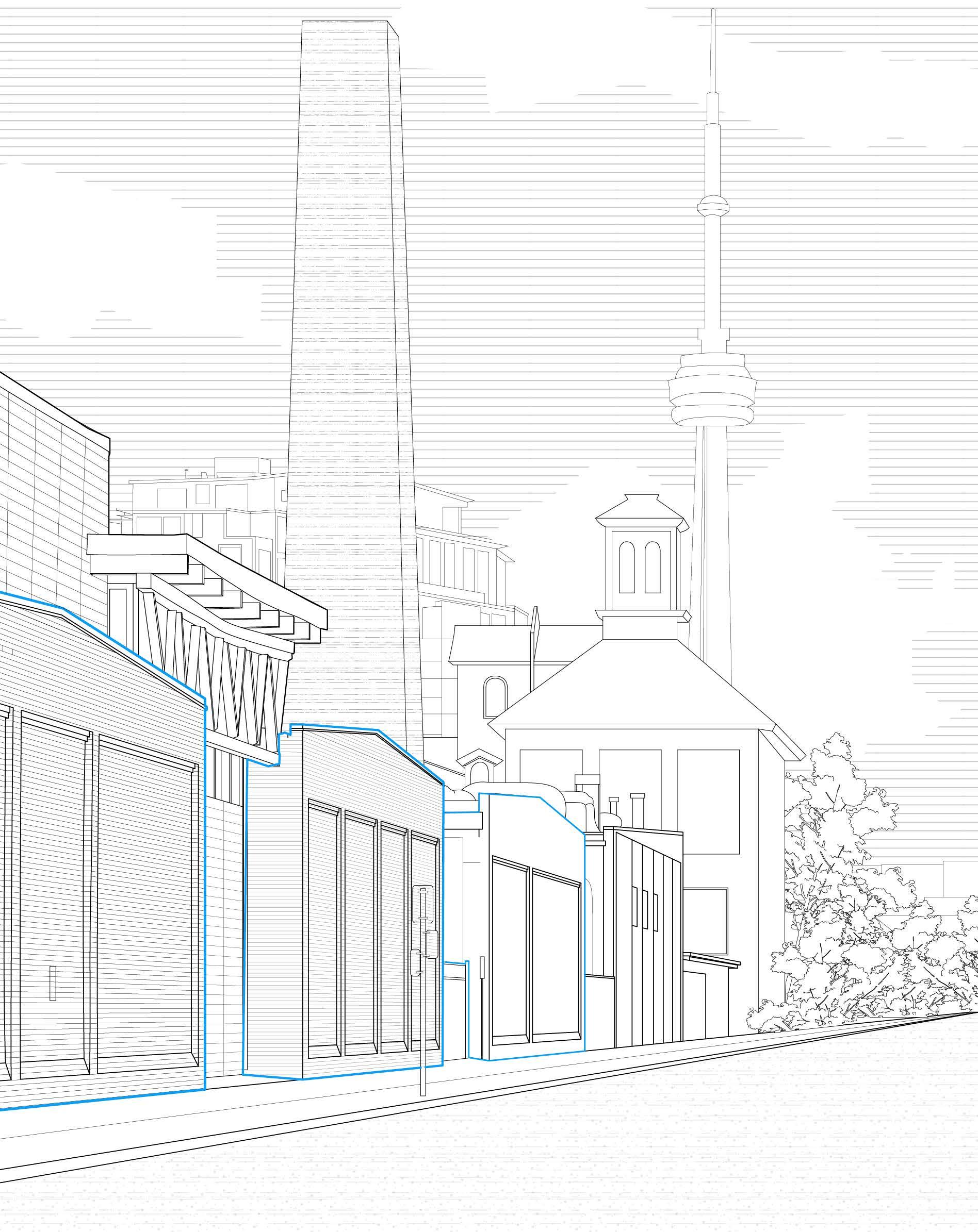
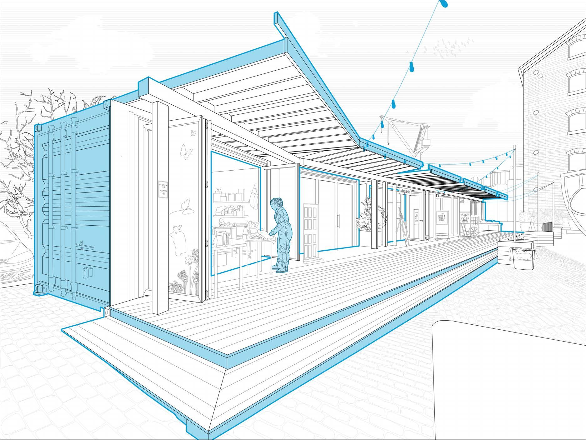
While highlighting the commercial aspect of the district, the storage boxes on the perimeter of the site are physical boundaries that are utilized during specific seasons and events for local vendors. Their arrangement indicates the border of the district in a spot that is usually permeable by pedestrians, denoting a temporary edge condition that constrains the flow of visitor traffic.
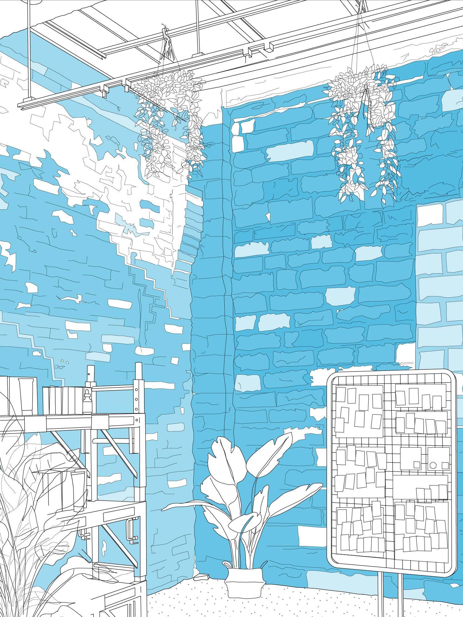
The drawing illustrates the moment new and old meet within a renovated space in the historic site: the store of a modern skincare brand residing within a building that was once used as a fermenting cellar. The diagrammatic facade represents two buildings whose age and materiality differ, yet their identities are seamlessly integrated through one wall. While the historic quality is preserved, the furniture and products included in the perspective represent contemporary commercial values and design. Using adaptive reuse strategies, the Distillery District remains an operational and lively space while maintaining its charming industrial character.
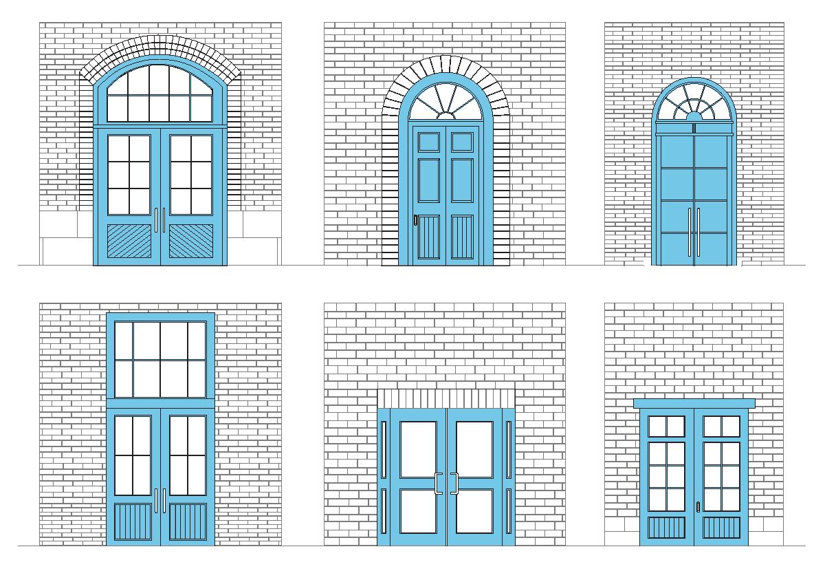
“Green”
The doors and windows of historical buildings in the district are painted green, contrasting with the rest of the modern buildings. Cataloguing these doors reveals that the difference in colour is an important feature that identifies the thematic unit with its own historic identity, which can be traced to doors even outside.
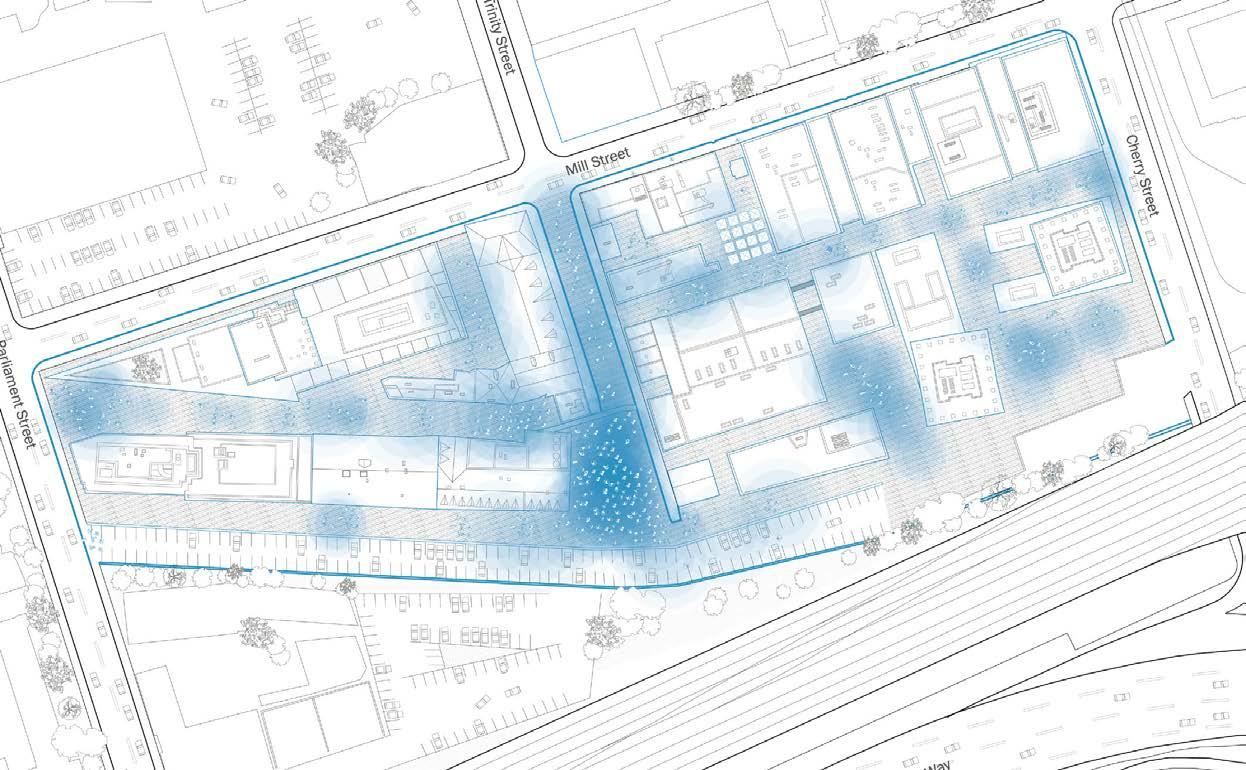
diagrammatic plan

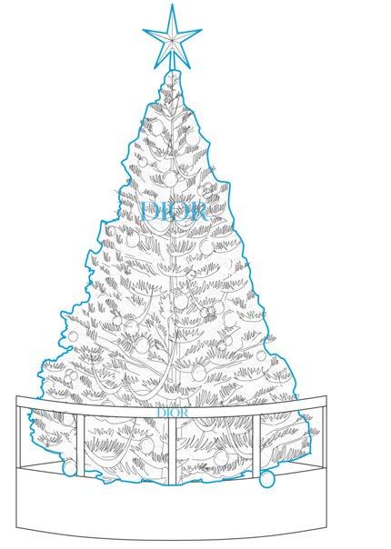
workers setting up Christmas Village
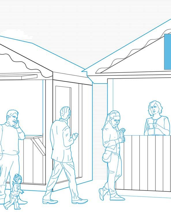
customers lining up in front of kiosks
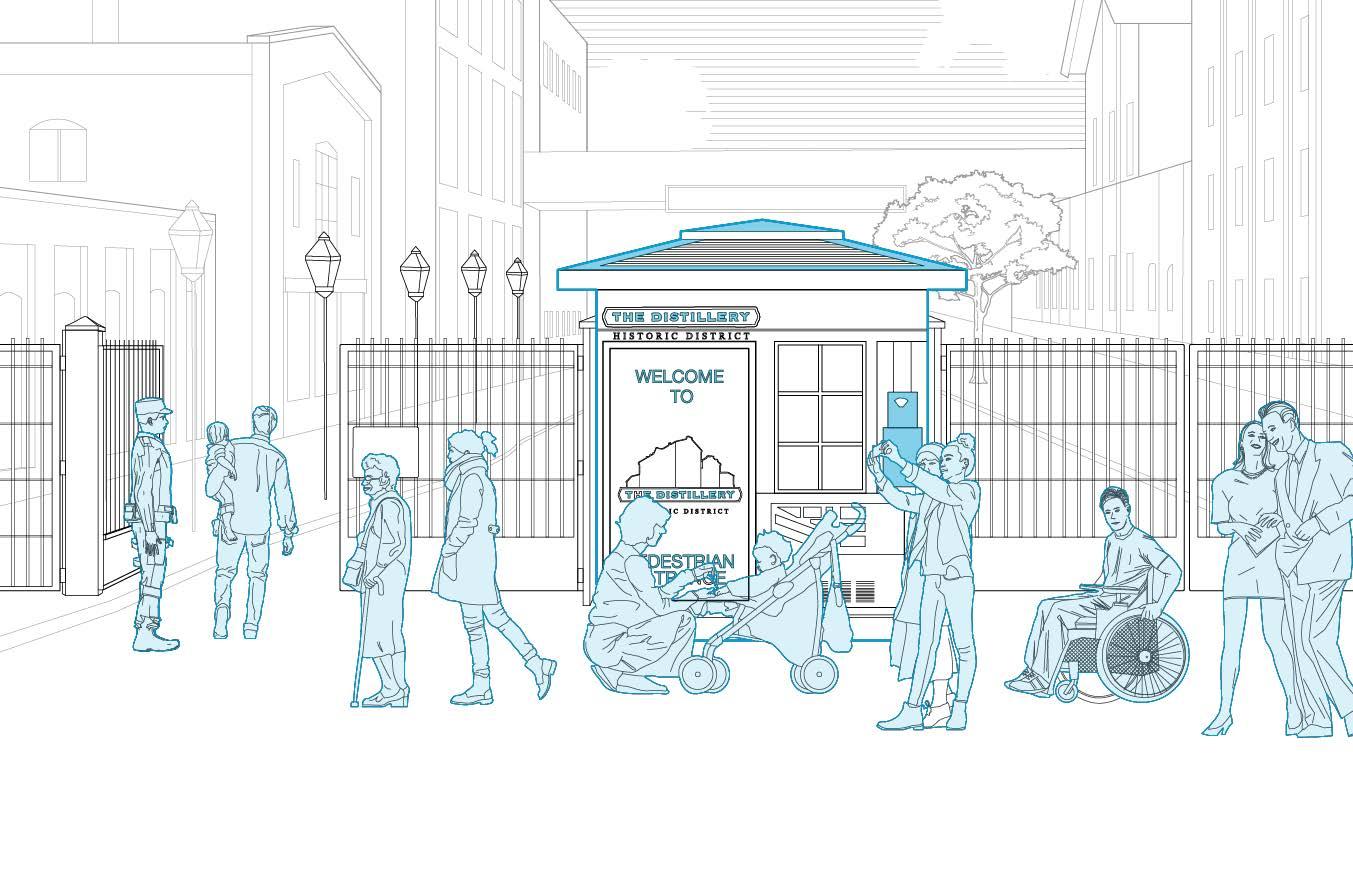
customers qued outside waiting to go in the district
Christmas is perhaps the busiest time of year at the District, as it provides a variety of winter activities that draw in tourists and locals alike. With local vendors selling their handmade products at markets and food at themed kiosks, the site encourages visitors to consume and shop. As illustrated in the diagrammatic map, the district garners an increased amount of pedestrian traffic, particularly within the center of the site where the Christmas tree stands and where the visitors line up outside of the main entrance. Clusters of shoppers can be seen in front of stores and walking between pathways, embodying the patterns of movement and physical occupation of space.
Typology: Student Study Lounge
Date: December, 2021
Location: 90 Devonshire Pl. (University of Toronto), Toronto, Canada
Instructor: Luke Duross
Project Word: Barricade
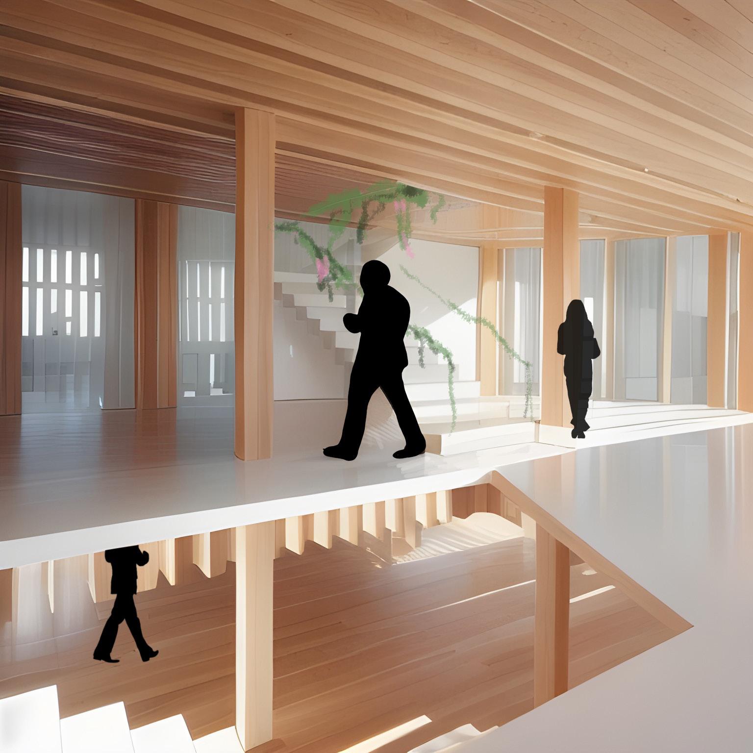
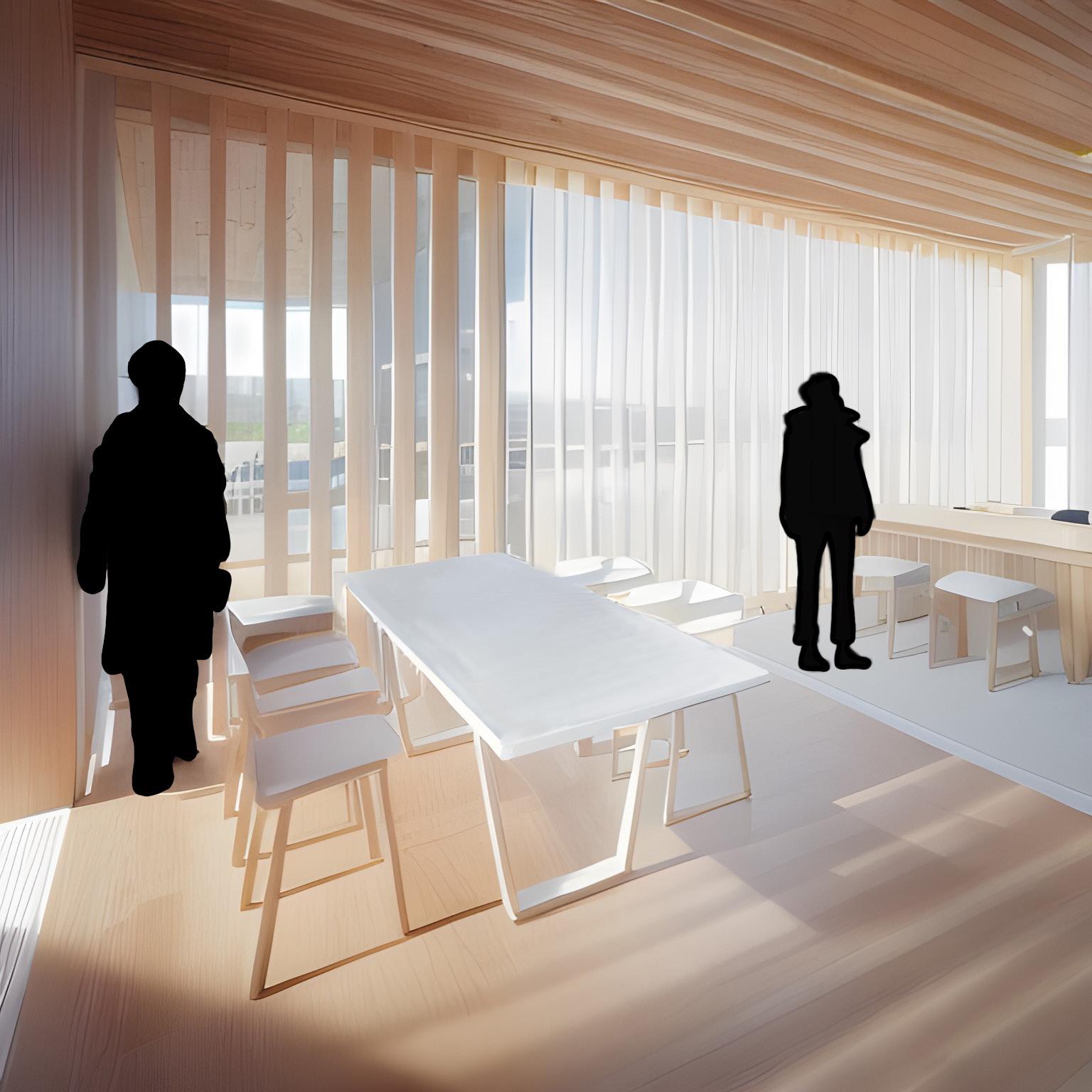
An exploration in architectural design, where the boundaries between light, space, and the student experience are reconsidered. This student center transcends traditional paradigms, delving into an experimental interplay of facade dynamics to curate an environment that adapts to both light and people.
This student center is a living canvas of design experimentation, merging facade dynamics, natural light orchestration, and student-centric adaptability. In crafting this project, a deliberate succession of panels becomes the protagonist, strategically placed to weave a play of shadows and light. These panels, arranged with precision in angles and spacings, expertly manage views and sunlight direction, resulting in a luminous yet focused study space on campus.
At its core, this project challenges the conventional role of a study center’s facade by strategically placing panels at varying distances throughout the building. This deliberate placement serves as a mechanism to artfully manipulate the influx of natural light into interior spaces, affording students the unique opportunity to curate their study environment throughout the day. The thoughtful incorporation of these panels isn’t confined to the exterior; it continues into the interior of the building. This intentional continuity extends beyond functional utility, creating a dynamic and playful atmosphere that resonates with students, offering solace during stressful times.
This project becomes a facilitator of individualized experiences, empowering students with the flexibility to choose between brighter or dimmer spaces based on personal preference. This is not just a student center; it’s an architectural canvas where light, space, and student well-being converge in a harmonious dance.
Right: Radiant Barricades main enterance exterior collage

first floor plan second floor plan
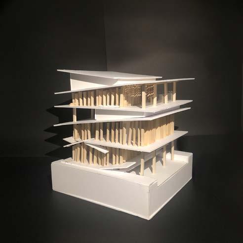
Utilizing a sequence of panels, a deliberate design choice was made to obscure views and regulate the entry of light in this facade study. The strategic arrangement of these panels at various angles and spacings facilitates the management of the viewer’s sight and controls the direction of sunlight entering the building, resulting in a luminous yet concentrated ambiance study place on campus.
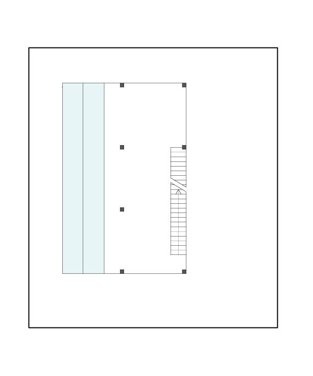
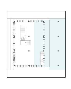

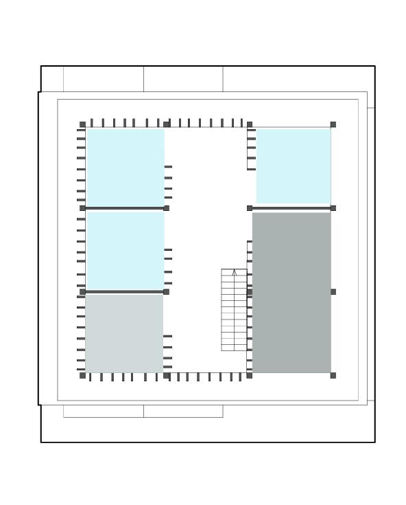

The program delineates four distinct spaces within the student center. The basement and ground floor are thoughtfully designated as havens for repose and contemplation, offering a tranquil environment conducive to reflection. As you ascend to the upper floors, a dynamic shift occurs, revealing spaces tailored for solo, duo, and group study sessions. This deliberate arrangement ensures a versatile and harmonious utilization of the facility, catering to the diverse needs of students at various levels of focus and collaboration.

Firm: ZAS Architects + Interiors
Typology: Commercial Office
Date: Summer, 2023
Location: 5 Shoreham Dr., Toronto, Canada
Supervisor: Andrzej Gortat
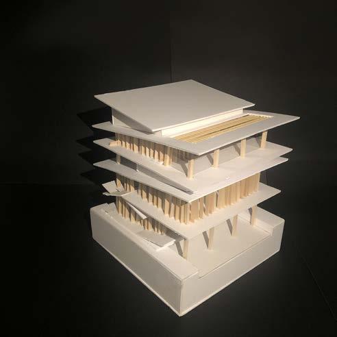
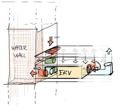
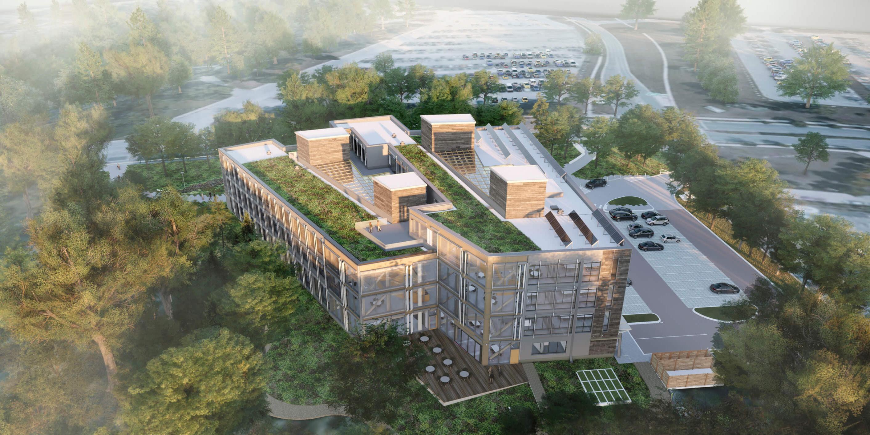
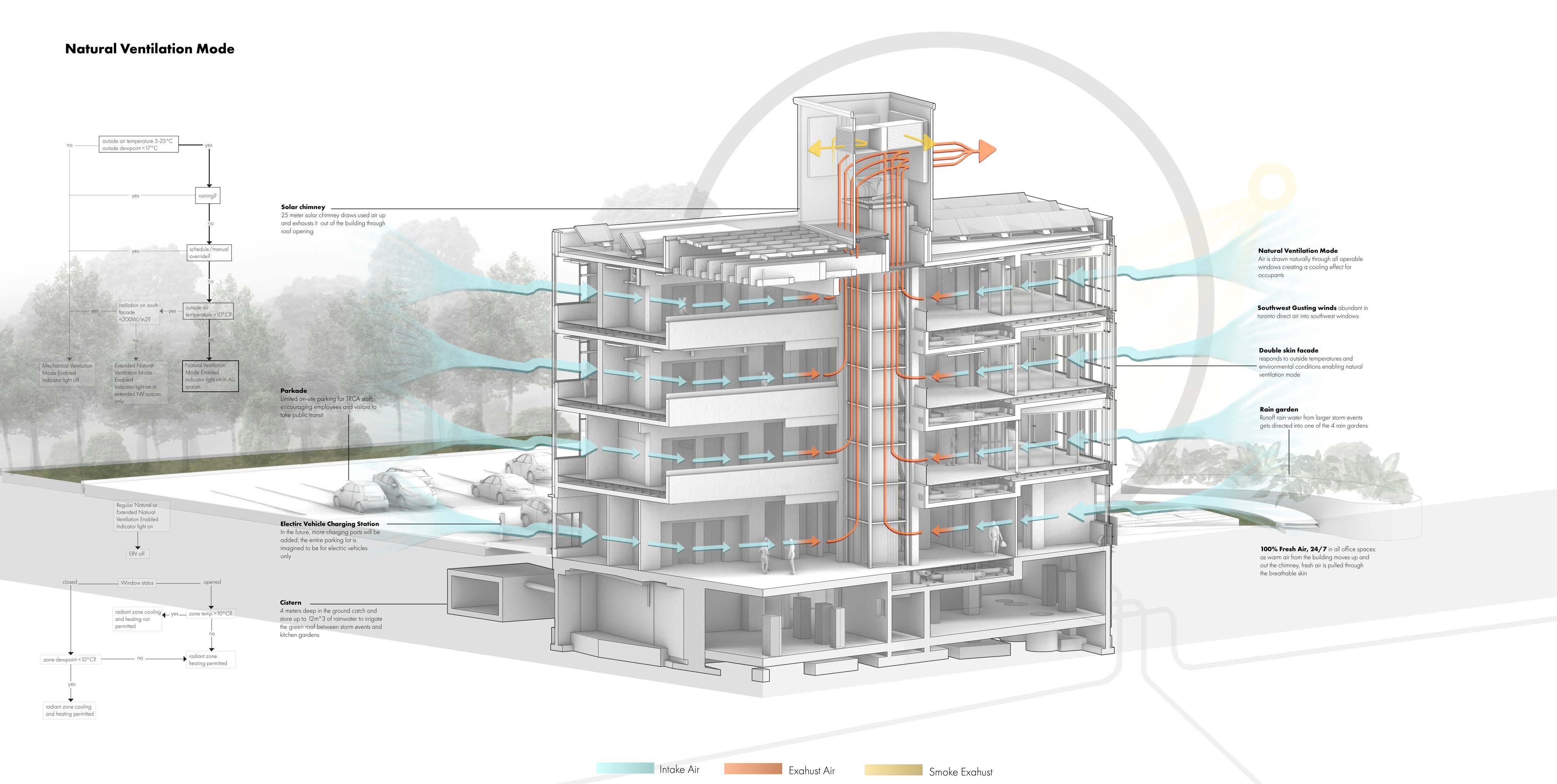
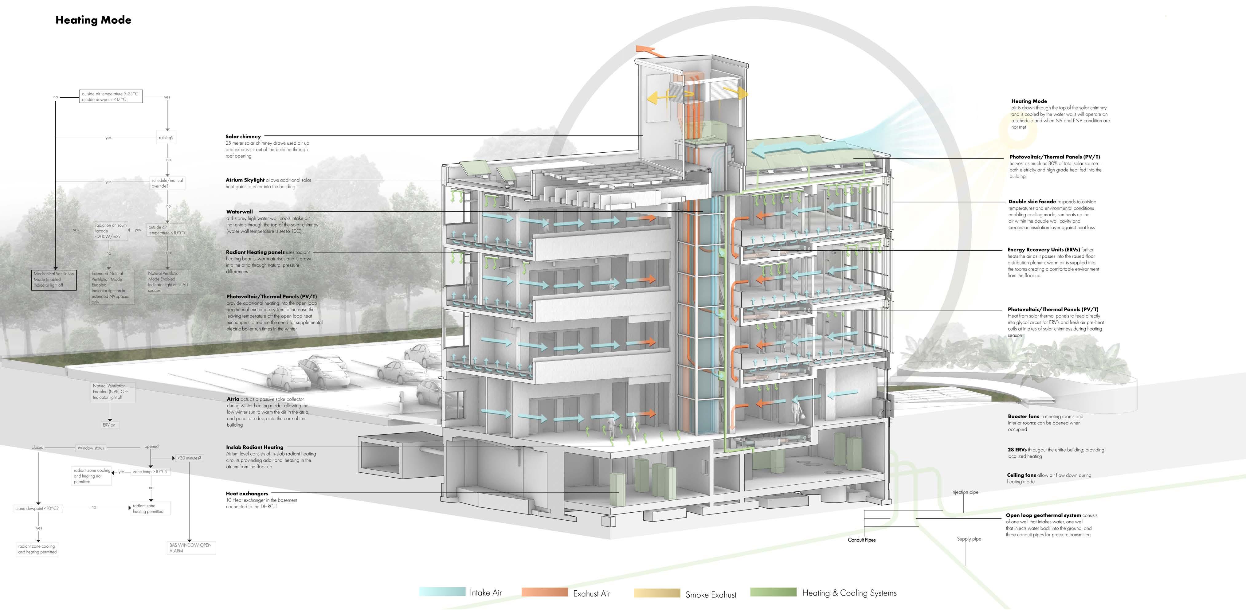
Working at ZAS Architects, the project involves designing the Toronto and Region Conservation Authority’s (TRCA) new carbon-neutral headquarters. Aligned with the “CaGBC’s Zero Carbon Building Standard,” this transformative initiative turns the building into a sustainable learning center. Tasked with translating the project proposal into diagrams that document passive house design incorporated into the TRCA’s new headquarters, the focus is on showcasing various elements such as natural ventilation, daylight optimization, shading systems, and thermal insulation.
What truly sets the building’s design apart is its exceptional natural ventilation system, featuring four solar chimneys positioned at the corners of the atrium. Each chimney integrates four water walls, forming a distinctive system. While I’m illustrating the building’s sustainable design strategies, my focus is primarily on its natural ventilation system, detailing its four modes of ventilation and the interconnected systems, including the preheat facade and radiant cooling/heating system. Notably, this is the first Canadian building to seamlessly integrate both solar chimneys and water walls, historically distinct systems
The project echoes their philosophy of creating user-friendly spaces prioritizing well-being and energy efficiency. The collaboration aims to foster a balance between environmental sustainability and occupant-centric principles, creating a built environment that considers environmental impacts, optimizes thermal comfort, and embraces cutting-edge technology.






“Patterns Burnt Wood Left on Different Surfaces
Personal
Adobe Illustrator
Aggregation
Model
Academic
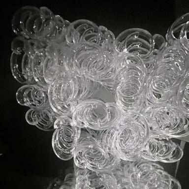
Curtain Rings
January 2023
Cherry
Personal
Procreate for iPad
March 2023

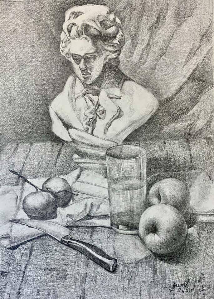
Still Life Sketch
Personal Graphite
November 2019
Jungkook (Fanart of Jungkook)
Personal
Procreate for iPad
June 2020
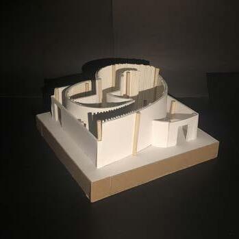
“Walls” Model
Academic 1:50
September 2021
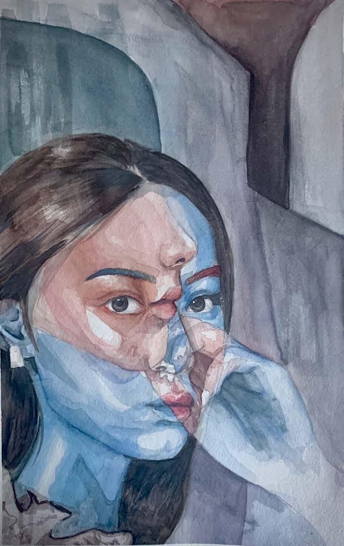
Kate Academic Watercolour October 2020
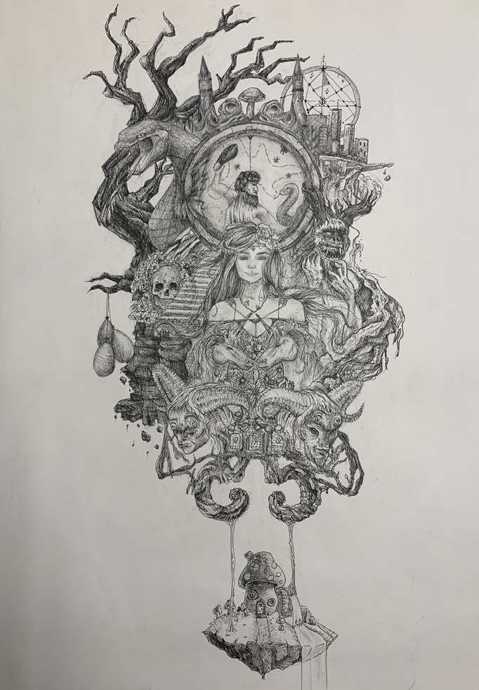
Nightmares
Personal Fineliner
January 2019
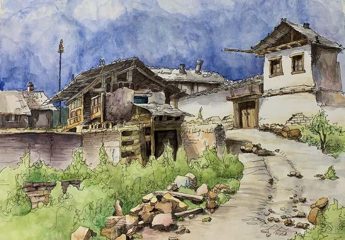
Guanxi, China
Personal Watercolour August 2020
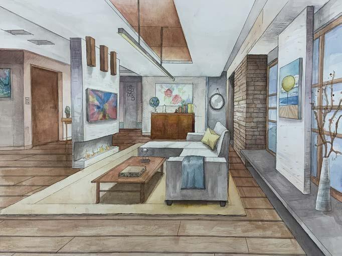
Interior Design
Personal
Watercolour June 2020
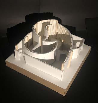
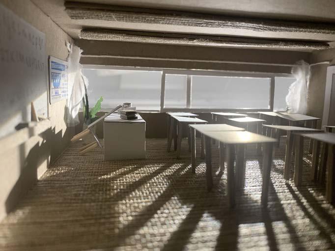
“School of Paspels “
Model
Academic 1:100 October 2020
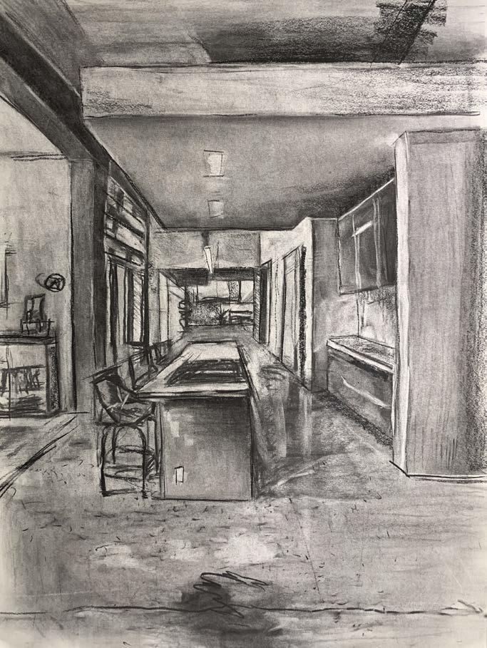
Young Guns Studio
Personal Charcoal on paper July 2021


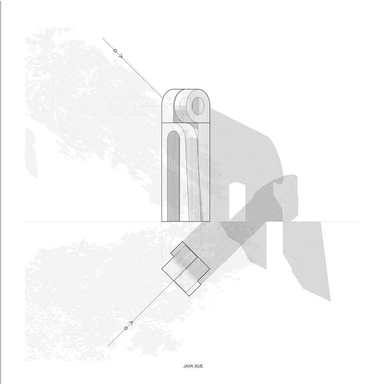

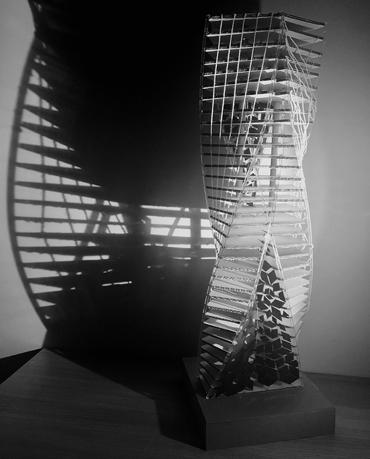
Grasshopper Tower #2
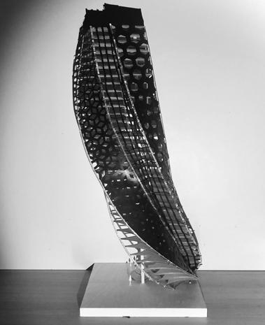
Academic Wood
April 2022
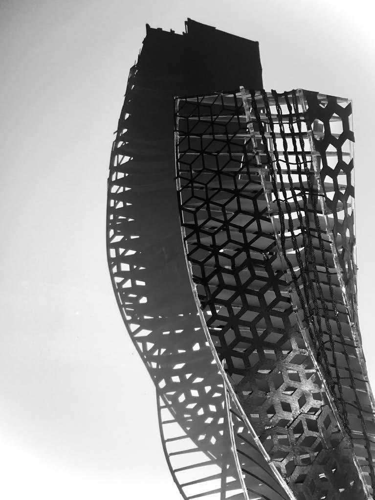
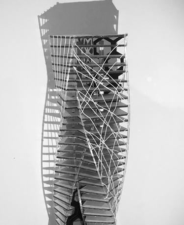
Grasshopper Tower #1
Academic
Cardboard
March 2022
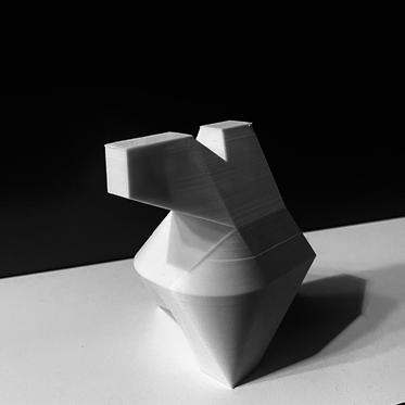
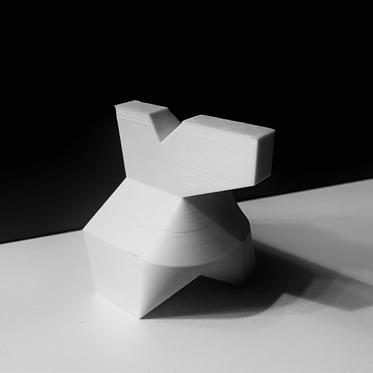
Casting
Academic
3d Print + Plaster
December 2024

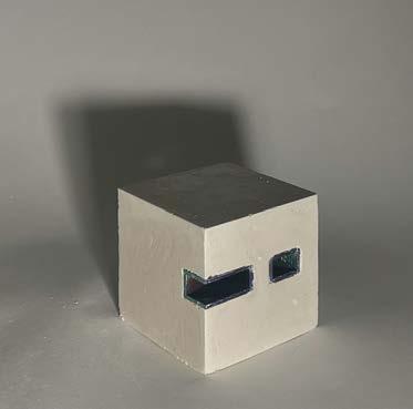

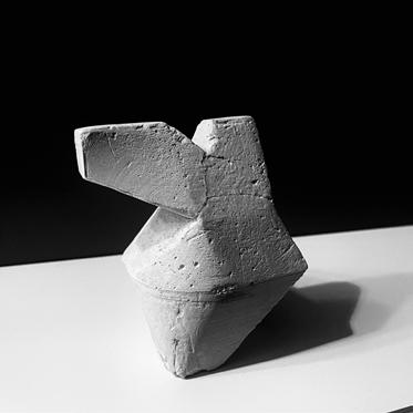
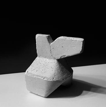
Casting Academic
3d Print + Plaster
December 2024
