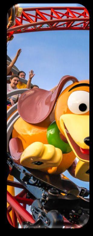
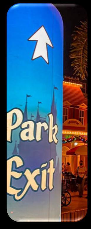
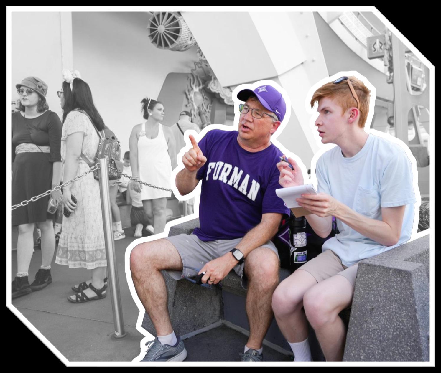
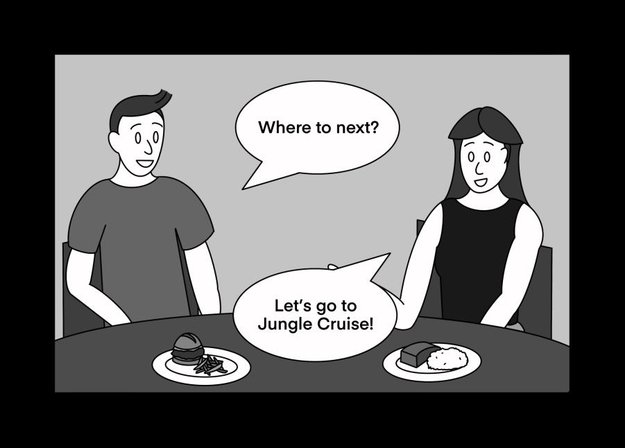
The proposal of an update for the Walt Disney World app that improves elements for navigation and dining.
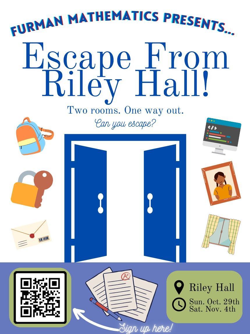
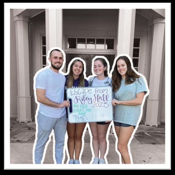
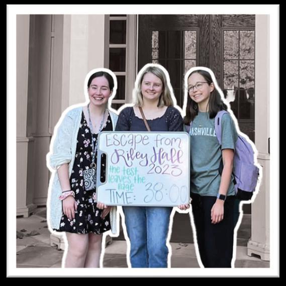
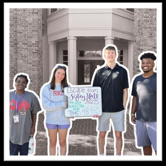
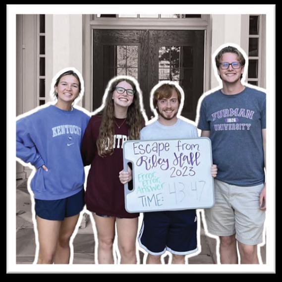
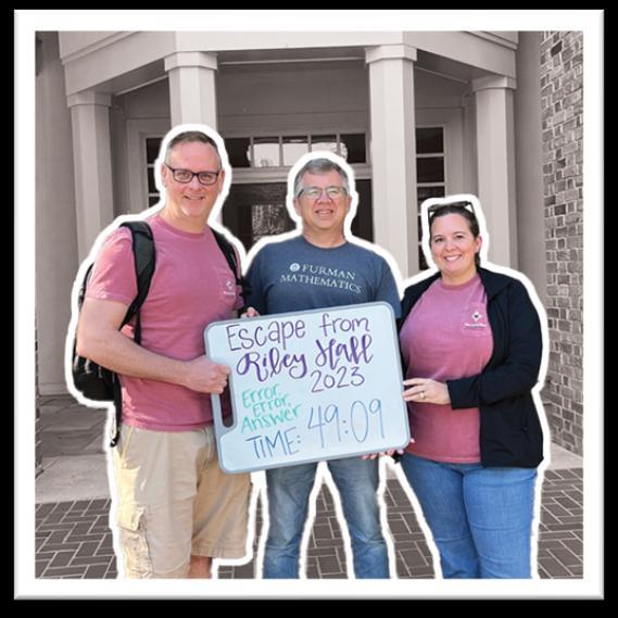
Escape From Riley Hall
The blueprints for an “escape the room” event at Furman University, filled with puzzles and a motive to escape.
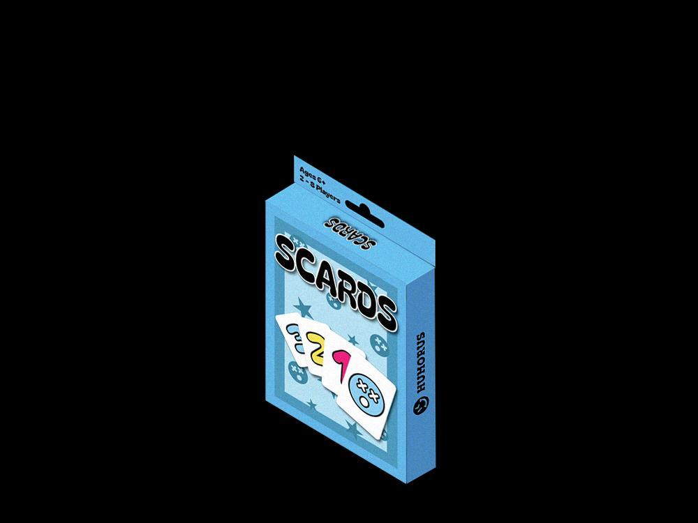
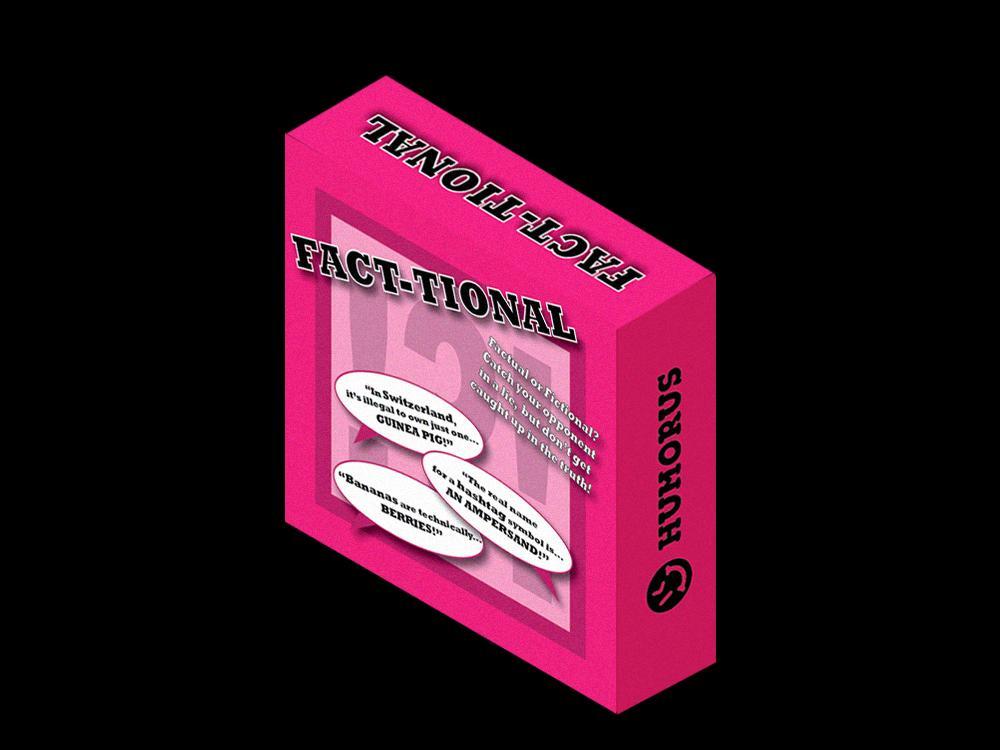
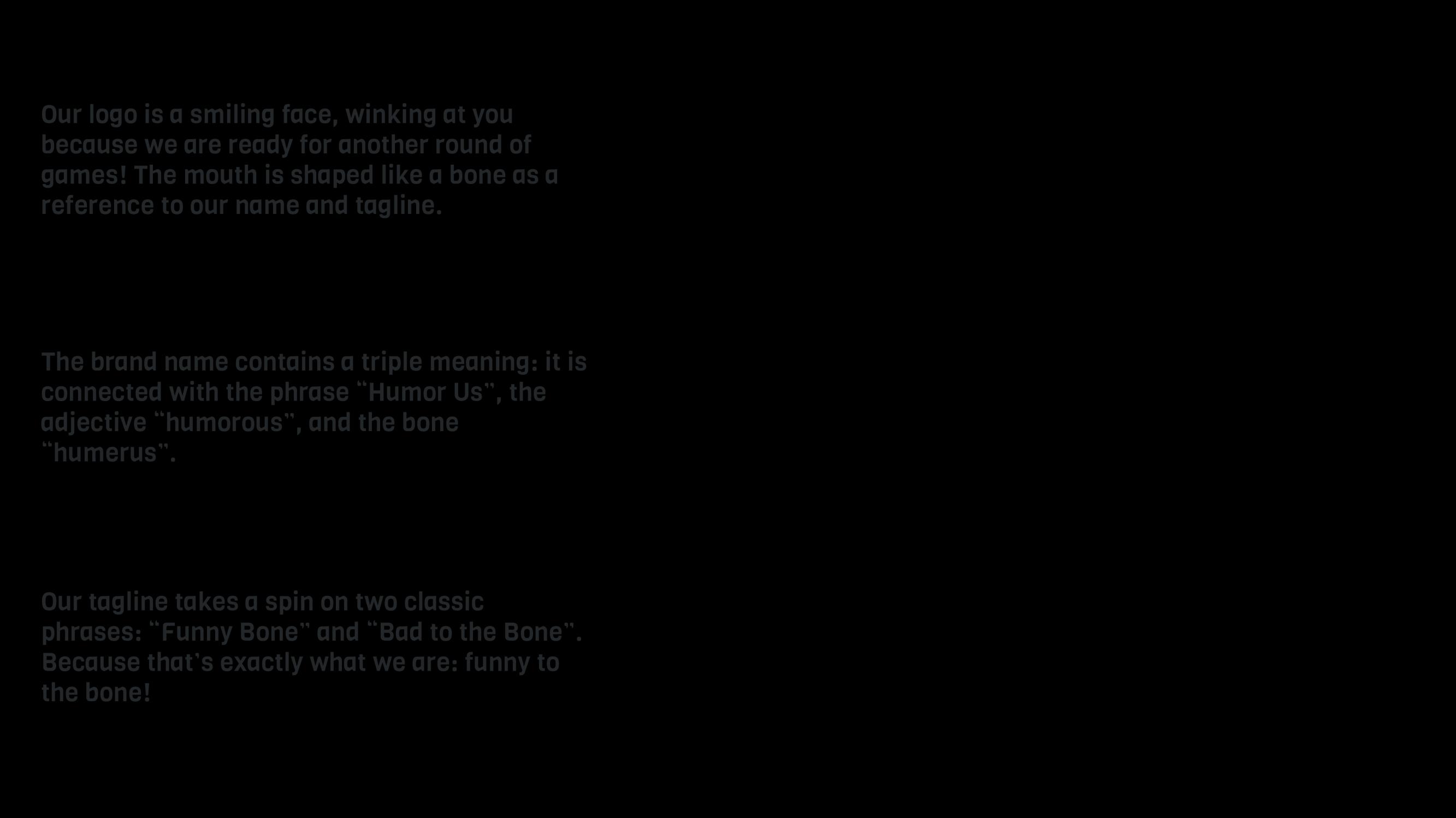
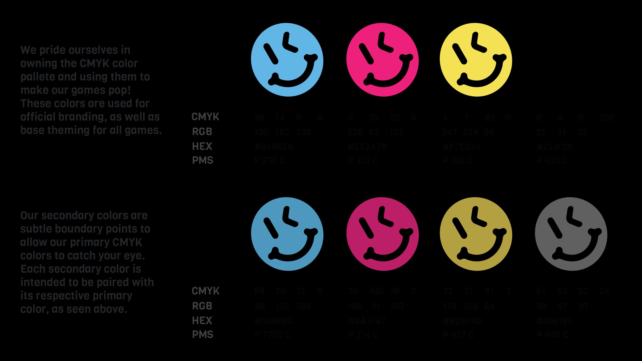
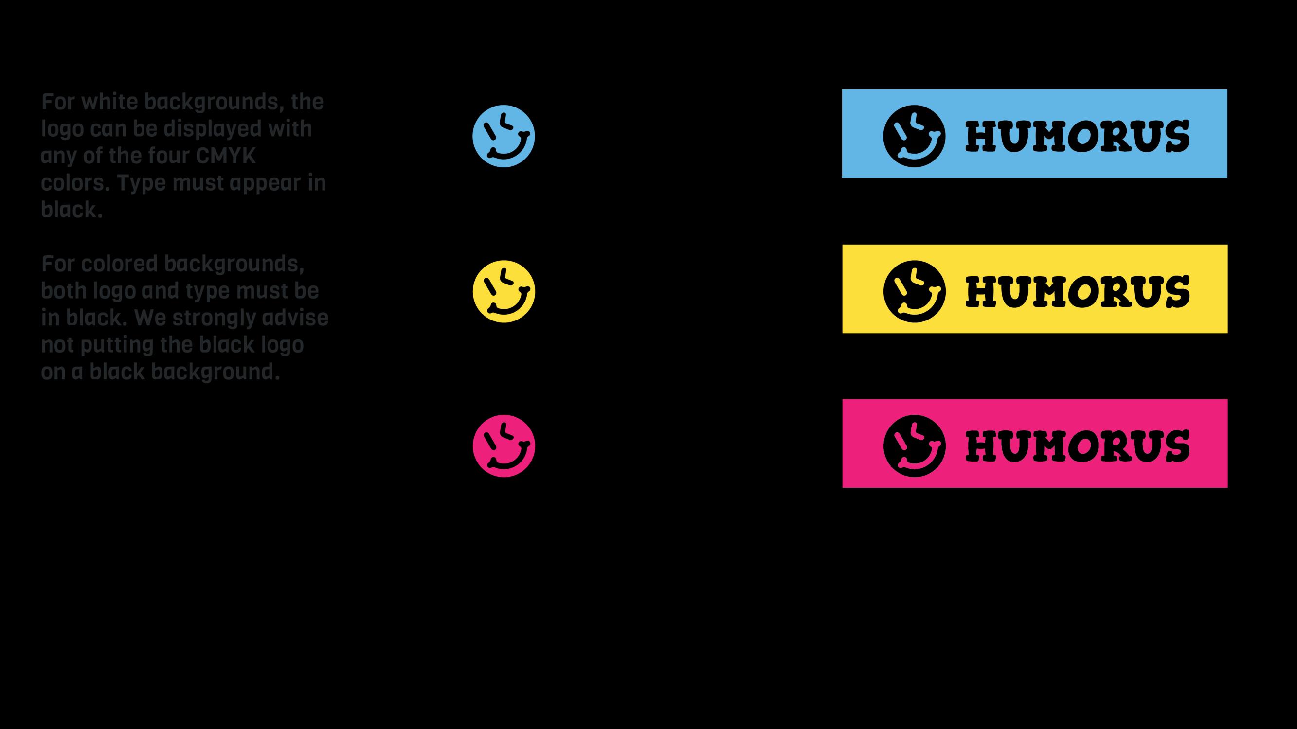
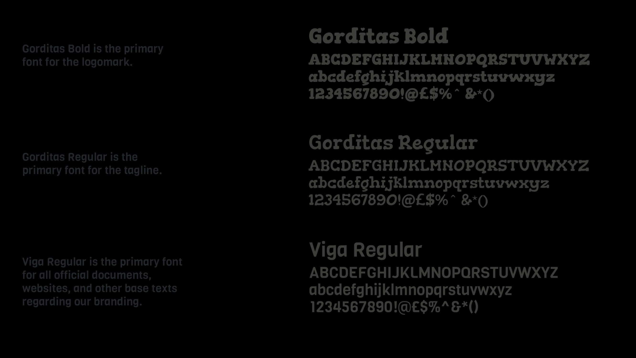
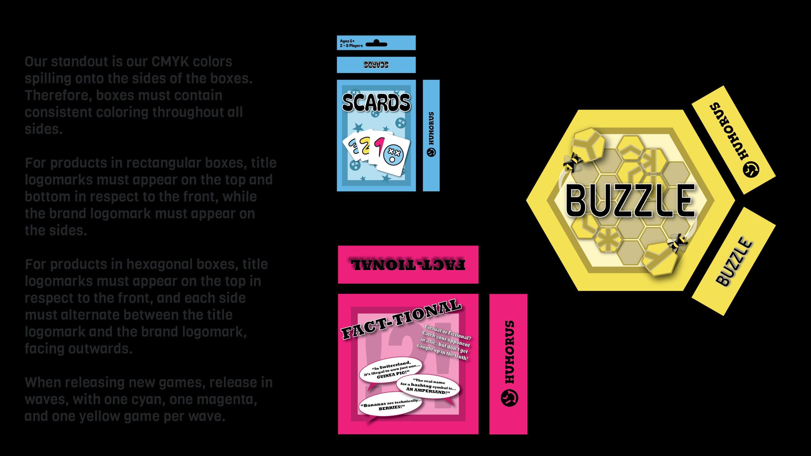
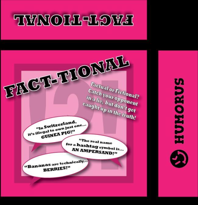
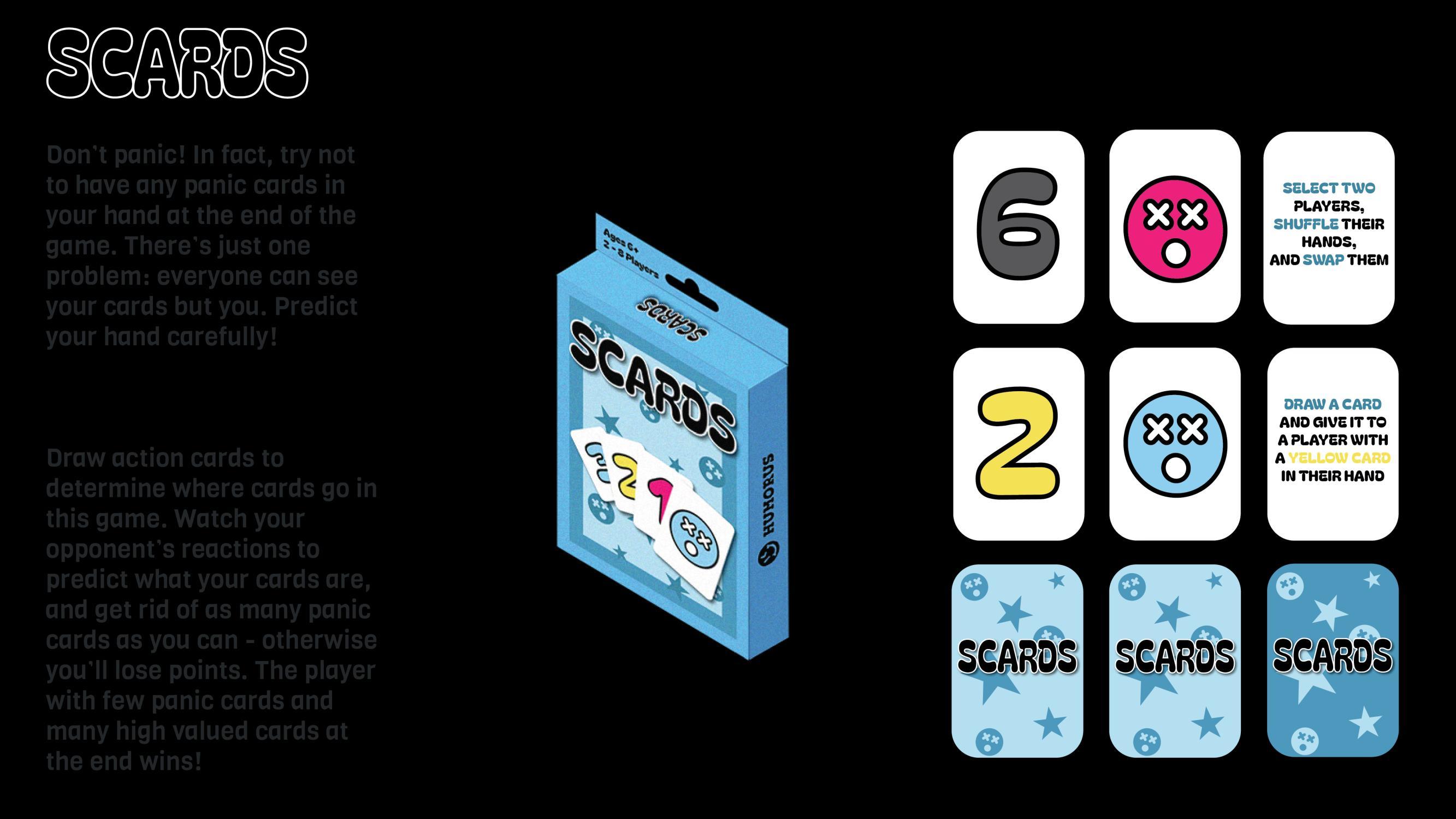
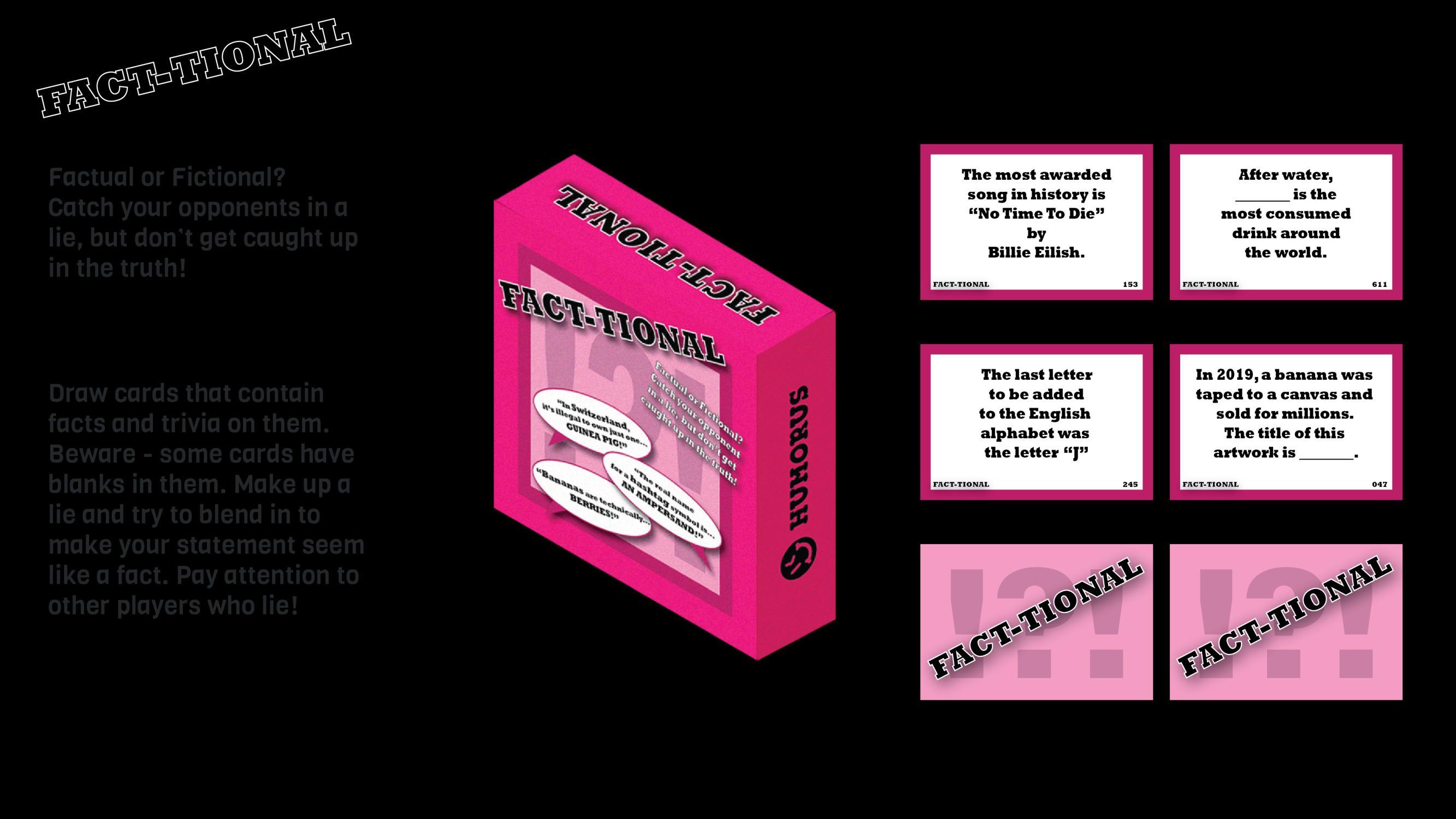
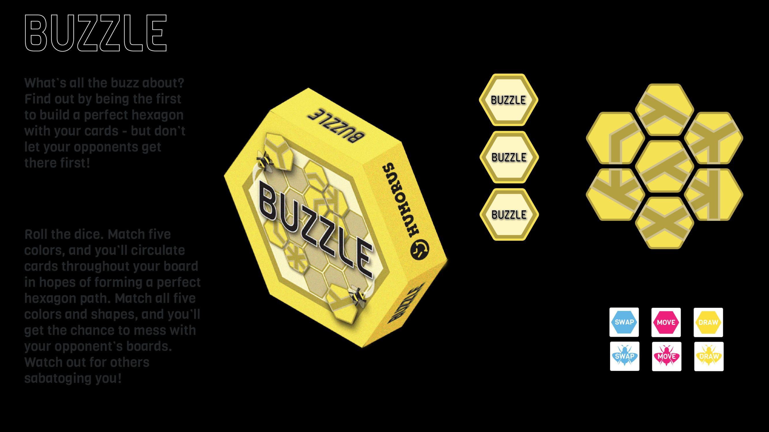
HUMORUS
The brand design guidelines of a board game company, along with three concepts of polished board games
Rolling Pin For Arthritis
The re-design of a rolling pin that redirects pressure in the hands to better accommodate weak joints caused by arthritis.
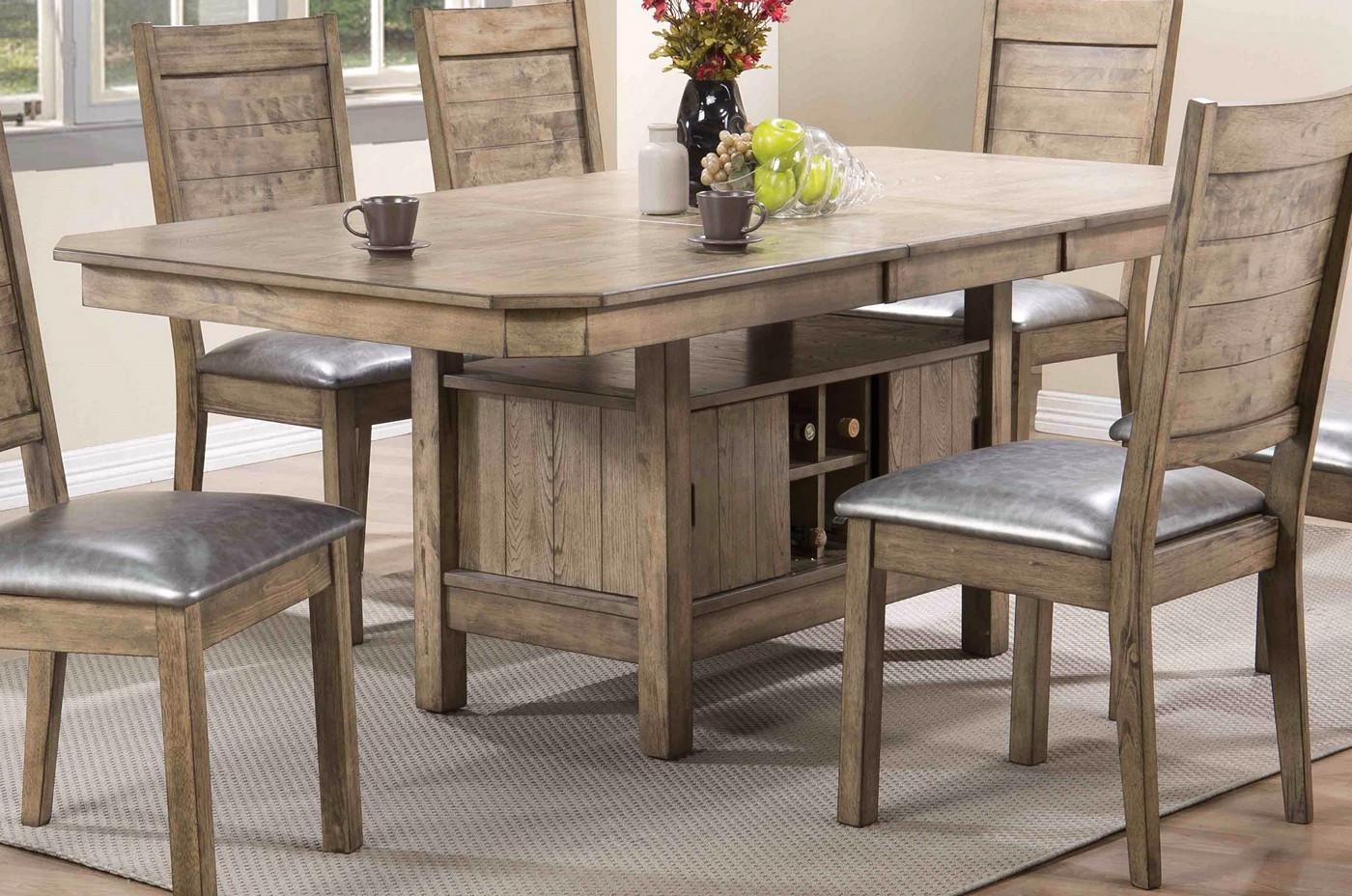
Dining Table + Storage
The design of a multipurpose dining table that rotates downwards to reveal additional storage space underneath.
ThePaladin Illustrations
The sketches and thumbnails produced for articles featured in ThePaladin , the student newspaper at Furman University.
Renders & Sketches
The collection of renderings and sketches in marker and ink, completed as practice for developing skills in rapid design visualizing.
ExperientialDesign
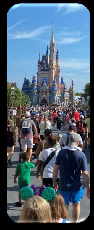
World
User Interface Update Proposal
1. Identifying Pain Points
2. Current User Interface
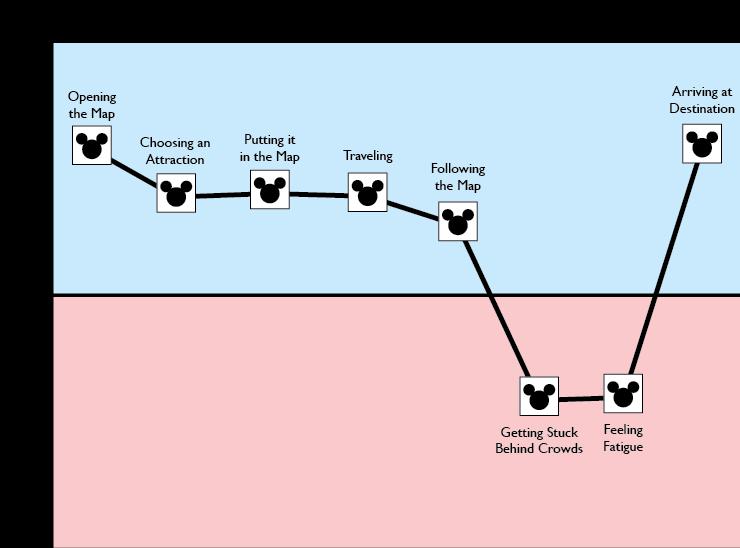
3. Journey Maps
4. Current State Storyboard
5. Proposed User Interface
6. Future State Storyboard
7. Solution Feasibility
8. Future Research
User Journey Touchpoints
Data Collection
Method: Survey Participants: 7
Requirements: Participants must have been to any of the Walt Disney World parks within the past 5 years to ensure recent feedback.
Format: Participants were asked to give a star rating for each touchpoint, as well as describe pain points and highlights.
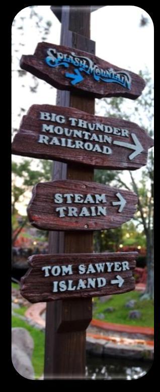
Touchpoints of Interest
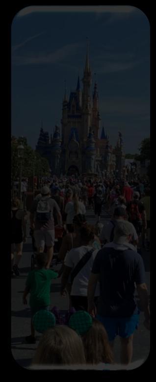
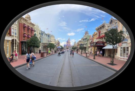
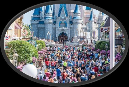
Pain Points Relating to Navigation
“Haunted Mansion caused problems. Backed up lines caused traffic when going from Fantasyland to Frontierland.”*
“Congestion in certain areas occurred due to small exchange points like Fantasyland into Frontierland.”*
“Having to plan my park route around wait times means walking a lot more. Transcending the park several times.”
“Crowds were high, wait times were high.”
*indicates minor change for
“Dietary restrictions / healthier options could be improved. ”
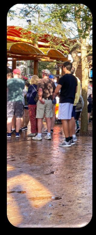
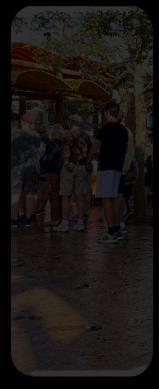
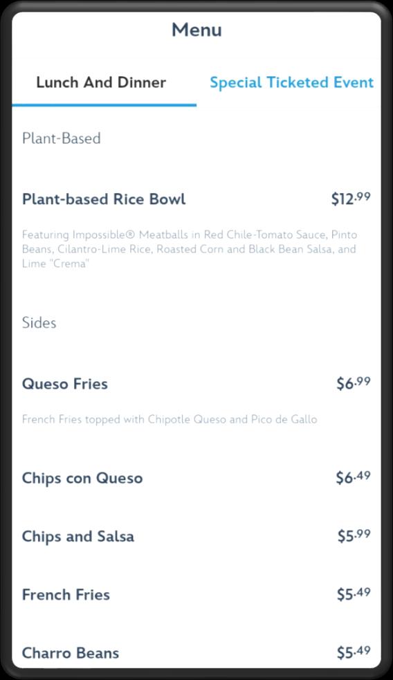
Pain Points Relating to Dining
“Expensive food! And they would typically have the same things at multiple locations.”
“Depending on how you try and optimize your day you don’t have room to go to a restaurant for an entire meal. I spent many times getting a Mickey pretzel or some popcorn and eating it going from one ride to the next so you could do the most. However, these quick snacks aren’t good options for those with gluten or dairy sensitivities. ”*
*indicates minor change for
Positives: Map is intuitive and easy to follow. Resources are easy to find through search features.
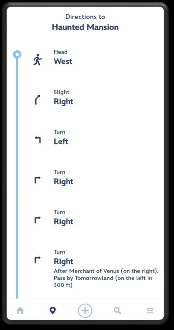
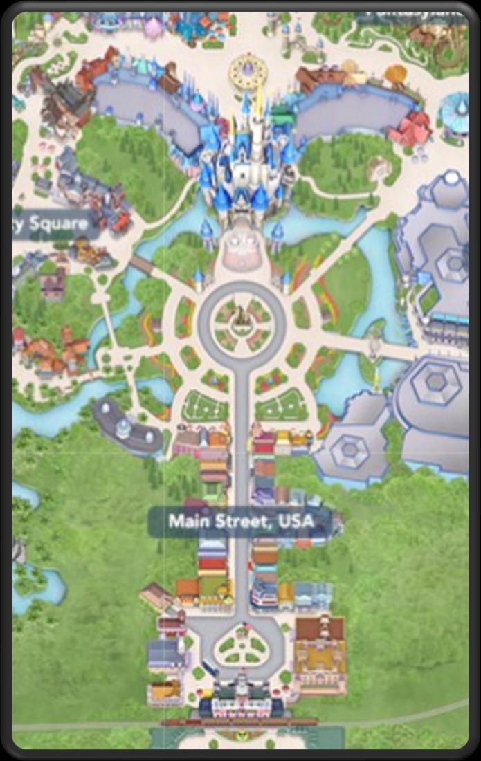
Current Navigation UI
Negatives: Only one route provided for the destination. No indication for foot traffic or congestion.
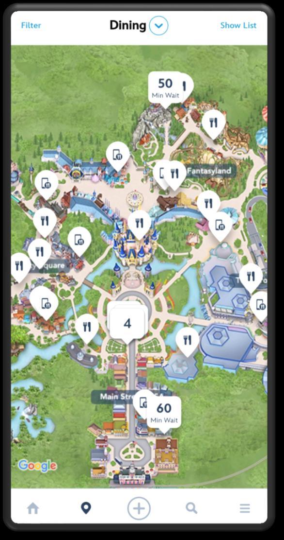
Positives: Available filters for type of cuisine, pricing, dining experience and more.
Mobile order option to speed up waiting.
Current Dining UI
Negatives: No option to filter based on dietary preferences, causing a need to check restaurants individually.
Many restaurants serve similar foods, making it harder to individually filter.
Journey Map for Navigation
Journey Map for Dining
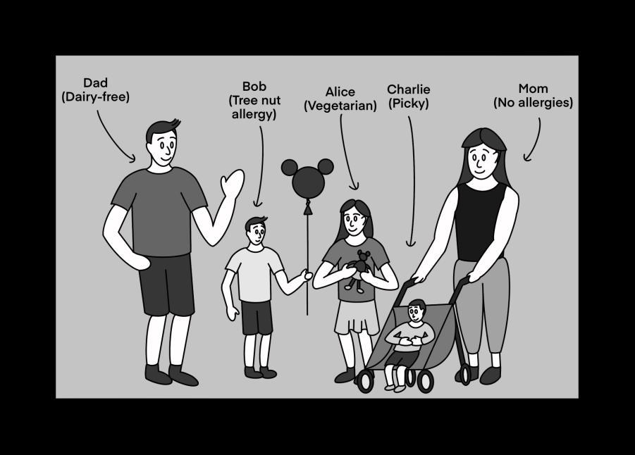
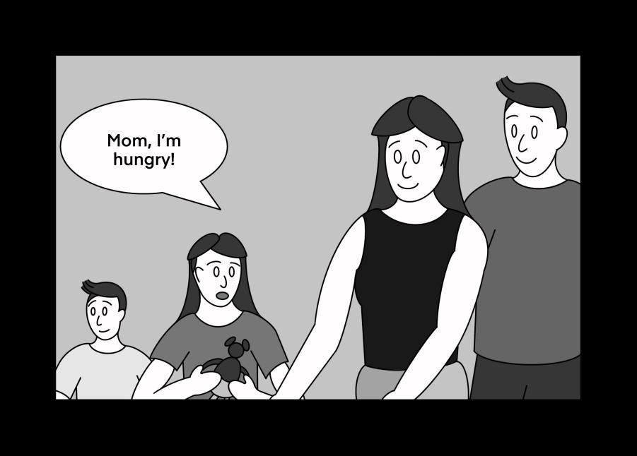
Current State Storyboard
Introducing the Bernoulli family, along with their dietary preferences.
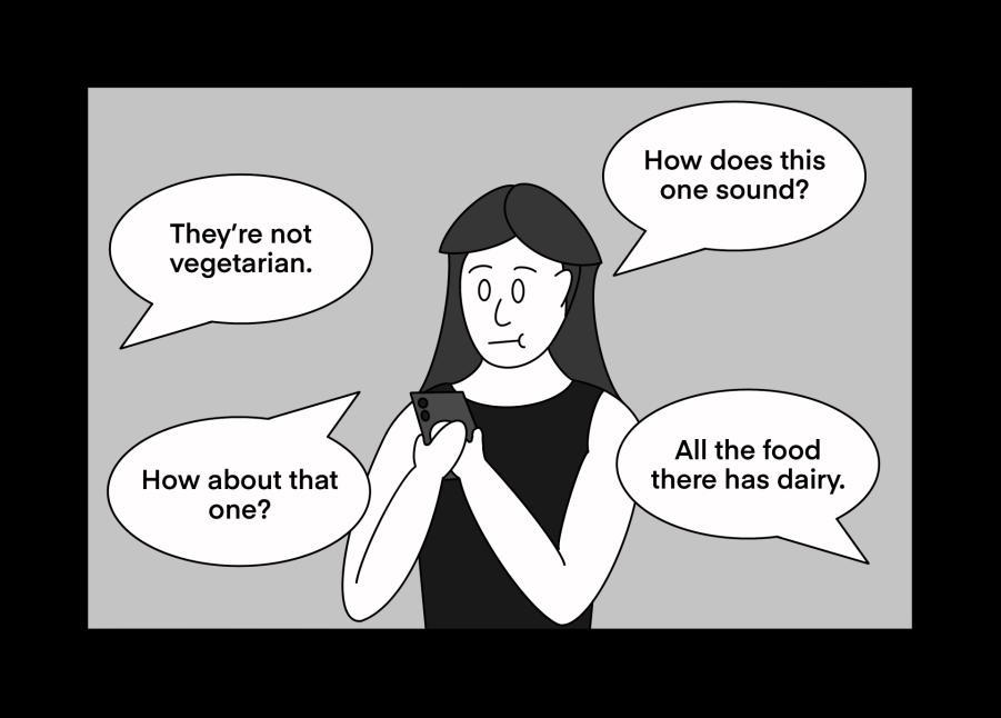
Time to search through each restaurant. The first few suggestions don’t fit with everyone.
The group gets hungry! Looks like its time to grab a bite to eat.
Why can’t Mom filter out all the restaurants that fail to fit the dietary preferences?
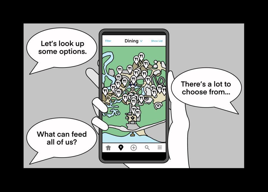
Mom pulls up her phone to look at dining options for the group.
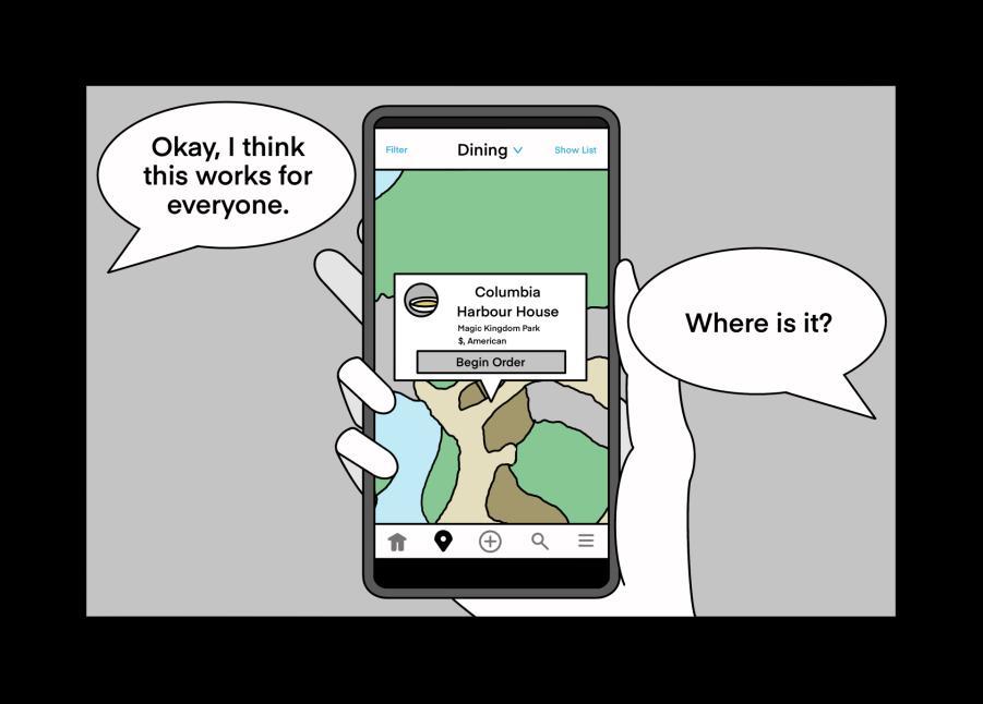
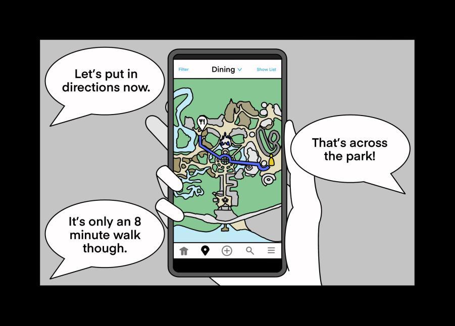
Finally! After heavy research, a restaurant is chosen. But where exactly is it?
Looks like it’s across the park. Time to plug in directions to get there.
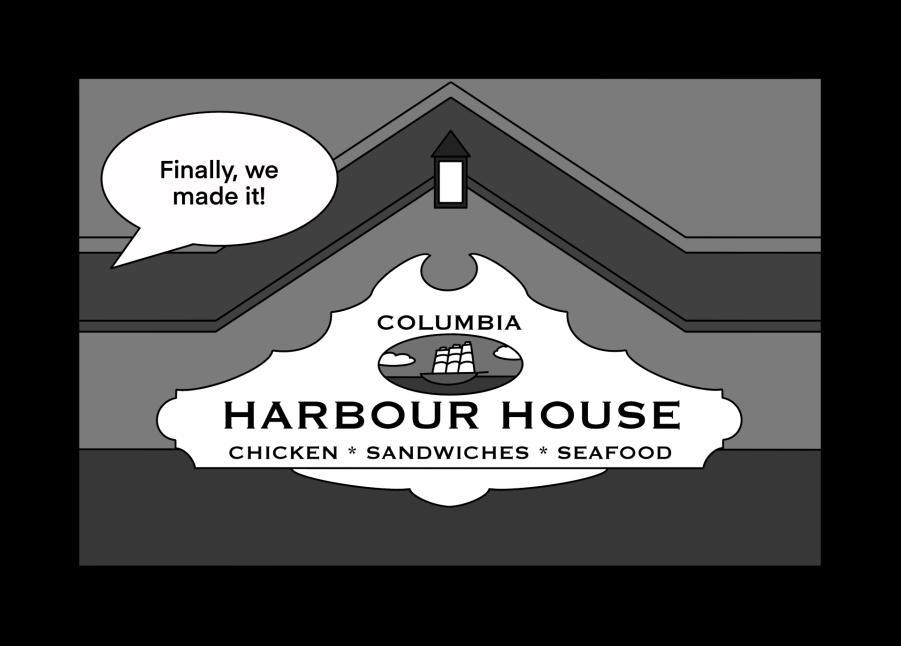
Finally! They made it to the restaurant.
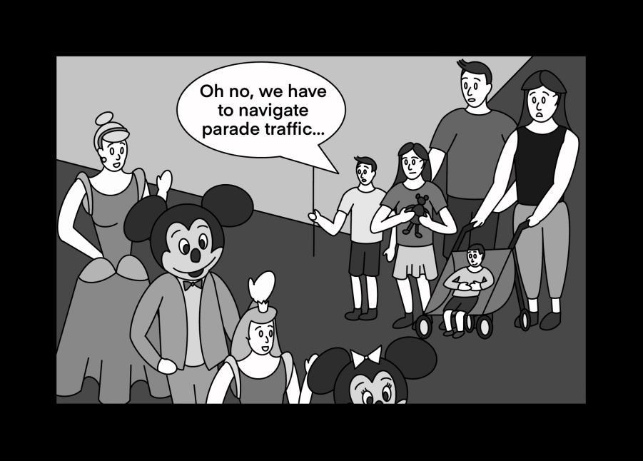
Oops – the route took them straight through the parade. How will they get around?
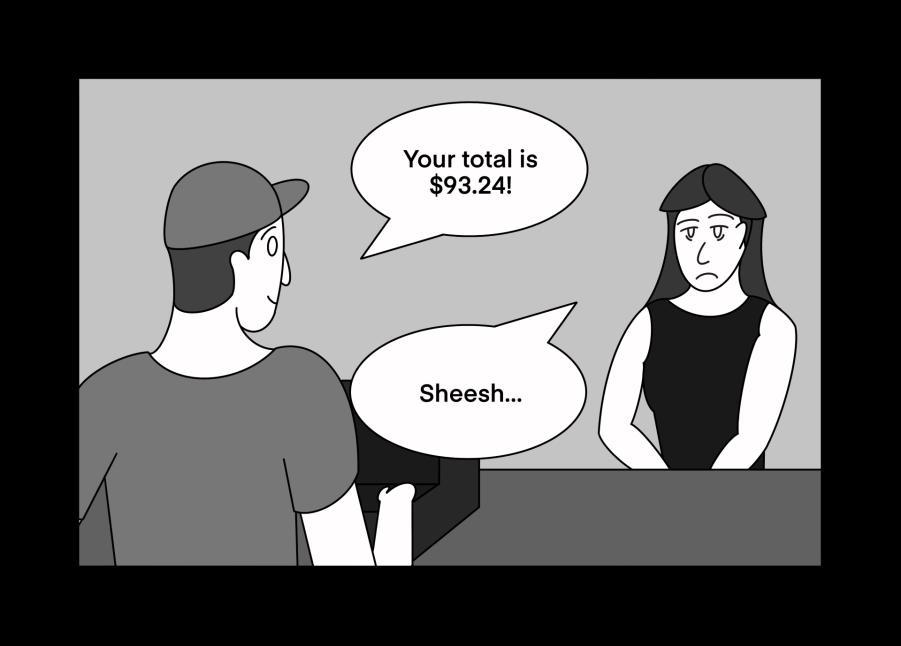
That’s pricey! Looks like Mom isn’t too happy, especially after the hassle to get there.
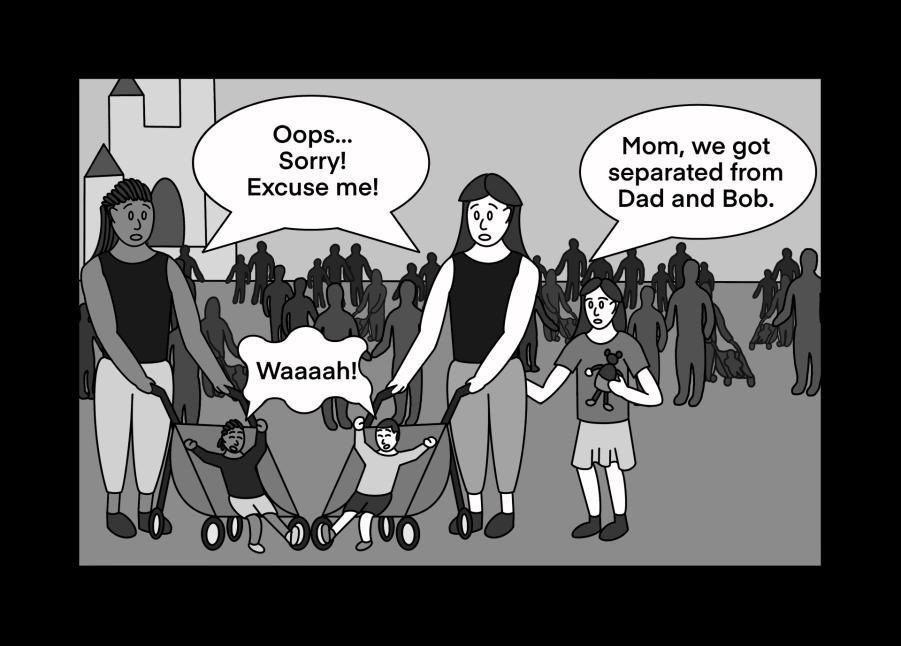
Turns out navigating your stroller through a crowd isn’t a very fun activity…
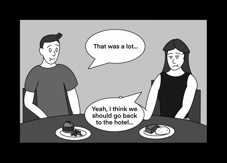
Seems like that was a lot for everyone, especially Mom. Is it time to leave?
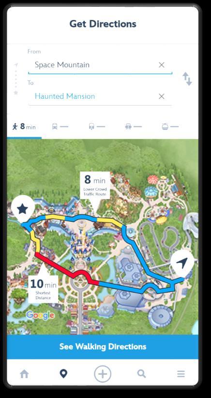
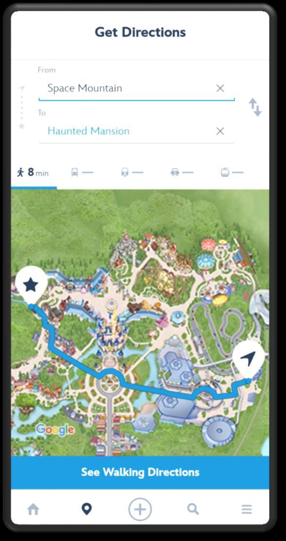
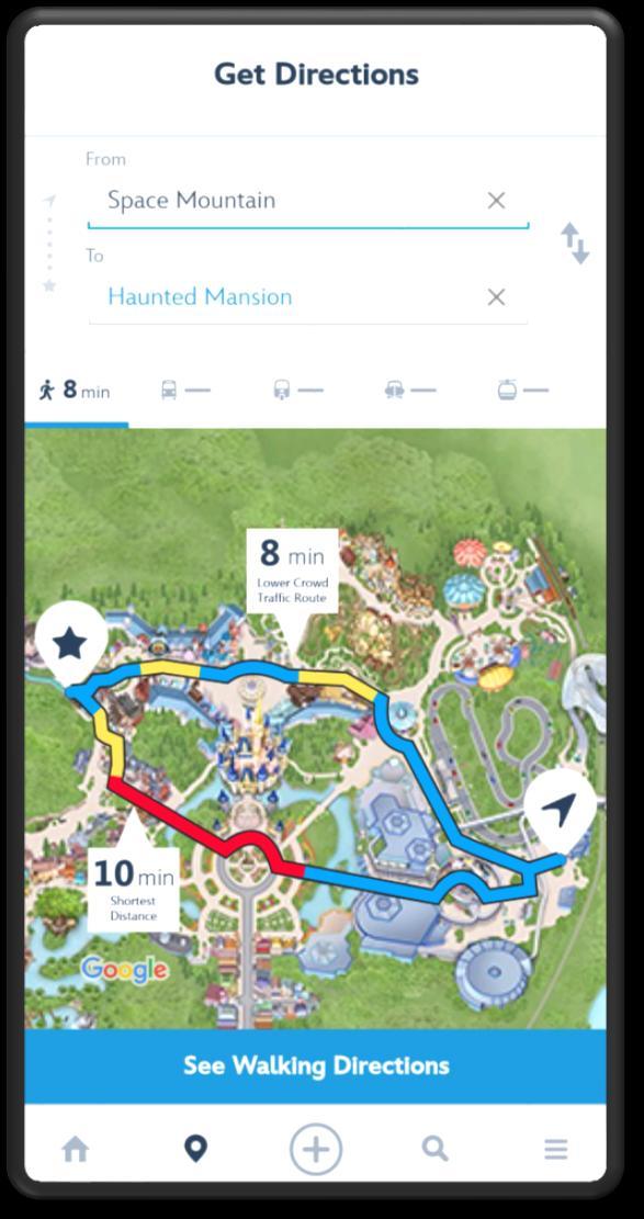
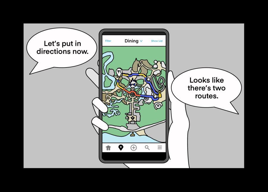
New Navigation UI
New pathfinding system allows for multiple routes to be offered, which can be categorized depending on…
❖ Route Distance
❖ Traversal Time
❖ Crowd Congestion
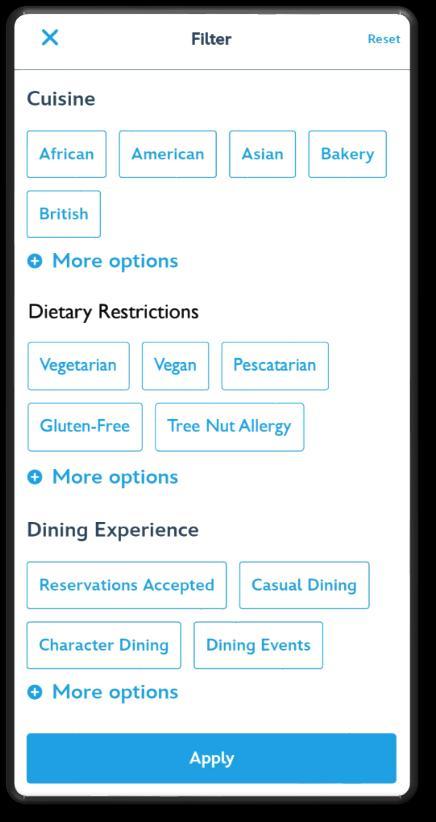
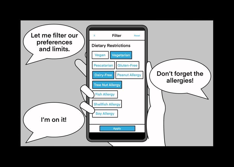
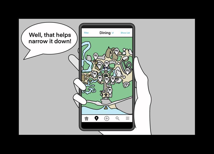
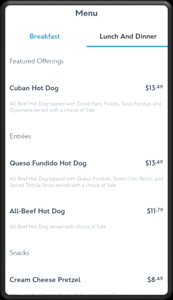
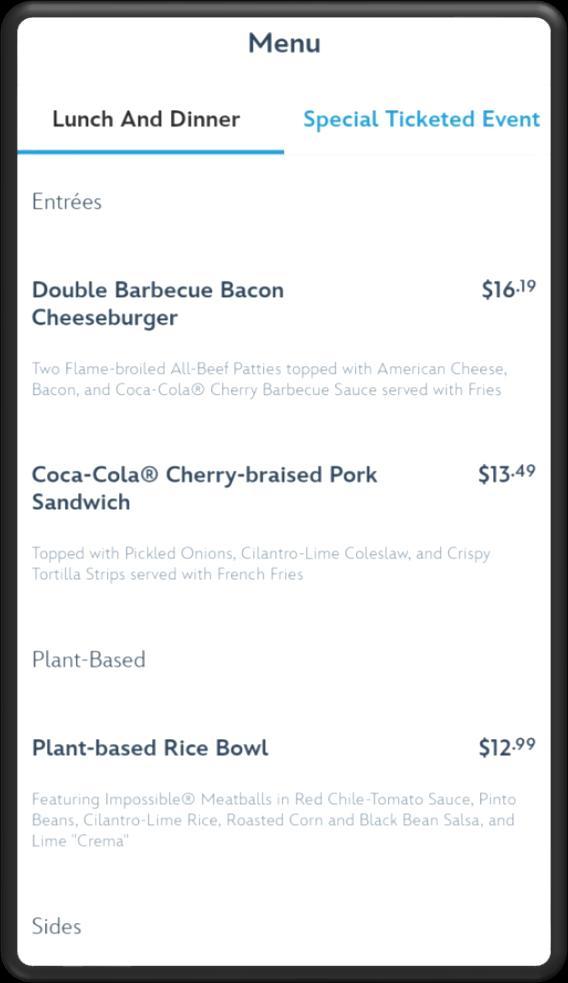
New Dining UI
New dining filters allow users to better fit their dietary needs, which include restrictions such as…
❖ Allergies ❖ Diets ❖ Intolerances
Future State Storyboard
Here again is the Bernoulli family, along with their dietary preferences.
This time, she filters through the restaurants that fit all preferences with a quick action.
The group gets hungry! Looks like its time to grab a bite to eat.
Now, only restaurants that fit everyone’s needs will appear on the map.
Mom pulls up her phone to look at dining options for the group.
A restaurant is agreed upon – that was easy! But where exactly is it?
Looks like it’s across the park. There are two recommended routes to get there.
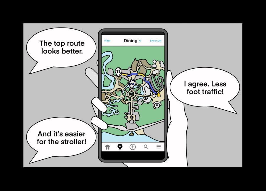
The top route seems to be less congested –seems like an easier route for Charlie!
They made it to the restaurant!
The food is pricey, but worse things could have happened today.
Good choice! They managed to avoid the parade traffic and have a leisurely walk.
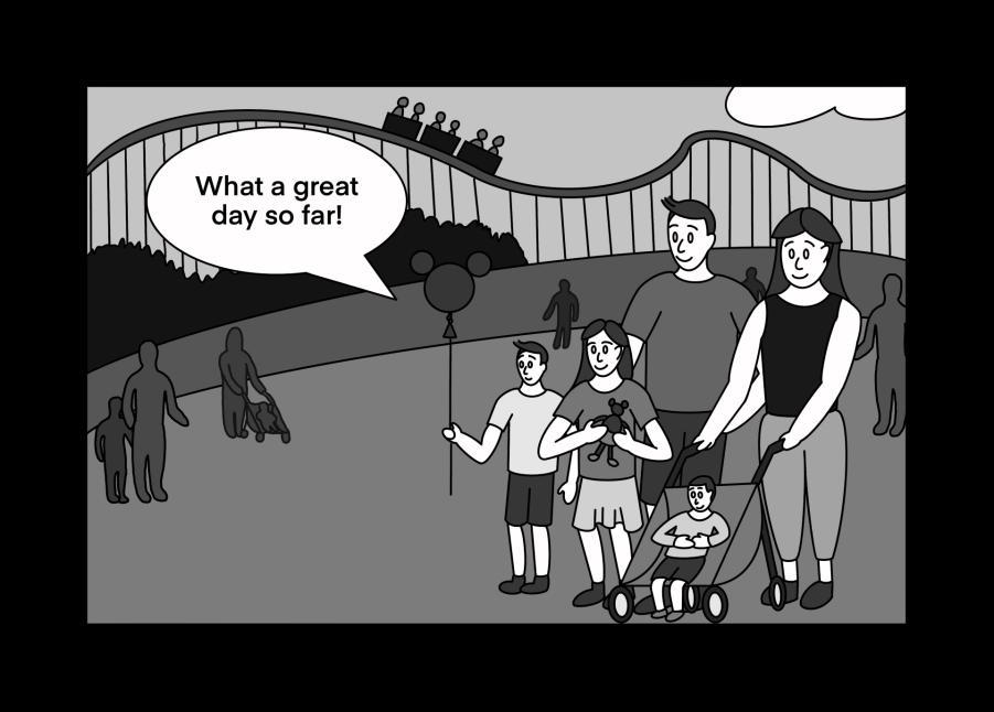
Everyone is nourished and ready to continue their trip at the happiest place on Earth!
Solution #1 Navigation
Idea: App density tracking.
Implementation:
Using your location, the app tracks where you are and sends it to a global map that tracks all users of the app. Then, it provides an estimate of which parts are densely populated.
Like how most GPS apps work on the road, but does not account for guests without the app, such as children.
Solution #2 Navigation
Idea: Camera + AI population density tracking.
Implementation:
Using cameras and technology, density could be approximated, which provides the app a reasonable estimate on how busy an area of the park is. Very accurate, but it may cause distrust in guests for making them feel like they are being watched.
Low Density
High Density
Solution #1 Dining
Idea: Loose filtering.
Implementation:
Filters out any restaurant that does not contain at least one hearty item that fits the dietary need.
Great for determining restaurant preference in a group setting.
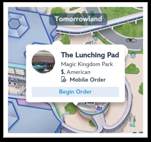
The Lunching Pad
Gluten-free
Solution #2 Dining
Idea: Strict filtering.
Implementation:
Filters out any item that does not fit the criteria of the intended restriction. Works better for individual needs when finding a restaurant.
Can work in tandem with solution #1 for dietary filtering!
Pecos Bill Tall Tale Inn and Cafe
Future Research
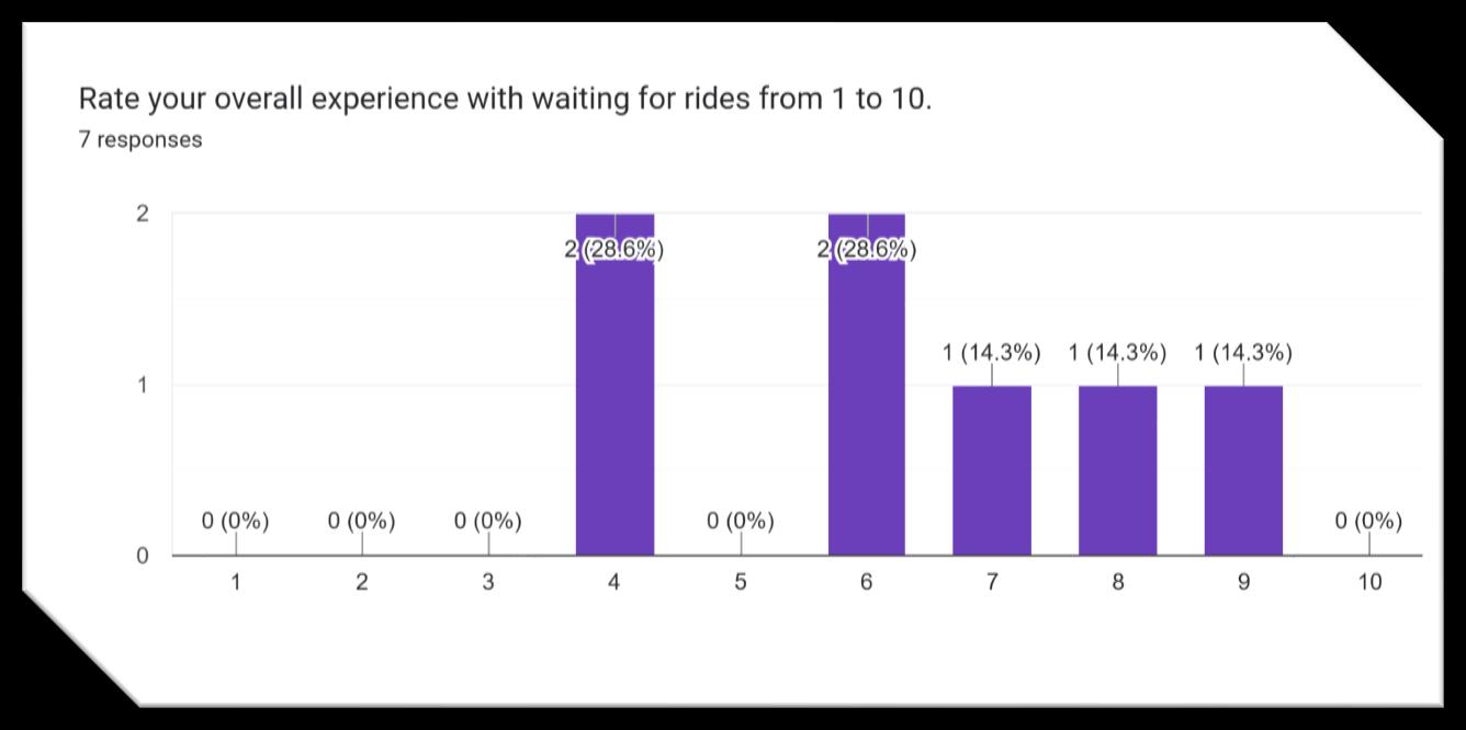
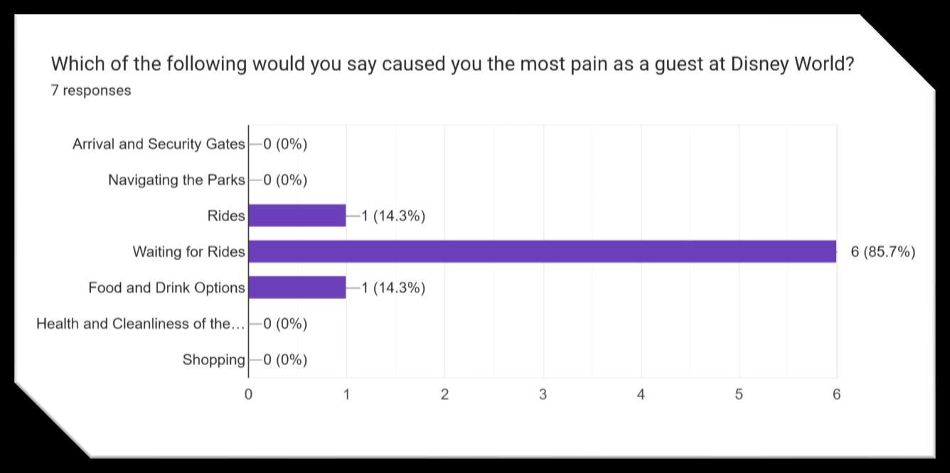
Topic: Waiting for Rides
Reasoning:
Most participants found “waiting” to be the greatest source of pain during their trips to Walt Disney World.
For longer scale design projects, this pain point is an excellent direction to pursue when improving user experience.
ExperientialDesign
ESCAPEFROM RILEYHALL
TWO ROOMS. ONE WAY OUT.
CANYOUESCAPE?
ESCAPE FROM RILEY HALL
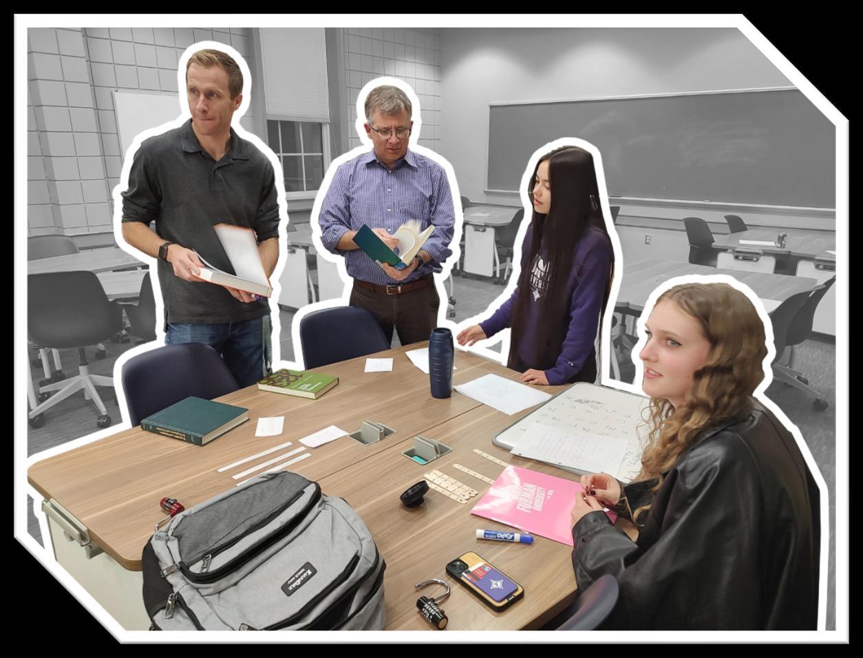
• The Mathematics Student Advisory Board event that introduced art-based elements into the world of mathematics through puzzle design, compelling narratives, and a motive to escape the room.
• Intended to build recognition for the mathematics department and allow the community to experience problem solving from an artistic standpoint.
NARRATIVE
• You are given an exam by your professor to complete, and it is due in an hour. You are assigned to a room to complete it. You need a good grade, so you sit down and start working on the exam. As you open it up, you panic, as there is one simple goal – toescape .
Something is up… Good luck!
PLANNING PHASES
Before Puzzle Design
• Determine the type of people in the audience
• Decide how many difficulty levels we are designing
• Determine how many people are in each puzzle group
• Establish an estimated run time for puzzles
• Determine which rooms we use for each difficulty
• Assign roles for who will cover each step in the design process
• Develop the narrative
• Propose a budget
During Puzzle Design
• Design the puzzles
• Determine that the difficulty is appropriate
• Figure out methods of testing puzzles
• Spot loopholes
• Find methods of preventing players from sharing answers
• Determine puzzle set up time
• Determine puzzle reset time
• Consider appropriate hints for players who are stuck
After Puzzle Design
• Design appealing advertisements
• Create a way for people to sign up
• Set up a messaging system informing participants about details
• Organize a timetable for the puzzles
• Determine the total cap on how many people participant overall
• Compose the photo-op afterwards
• Assign staffing roles
• Provide reset instructions for gamemasters
• Test reset and setup times
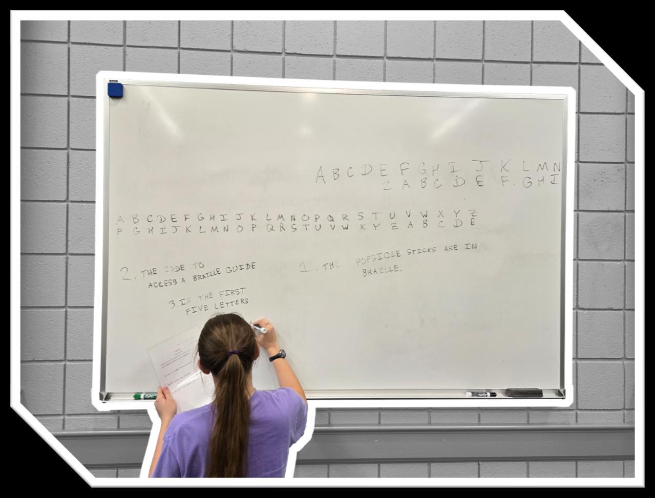
BLUEPRINT & CLUE SAMPLES
You search the room and discover that you are given…
- The quiz
o It has a front sheet that tells the participant about the “quiz”, but once the page is opened, it only has one sentence: “Find the key and escape. Have fun :)”
- Two bookbags (sections of the bookbag contains the following items)
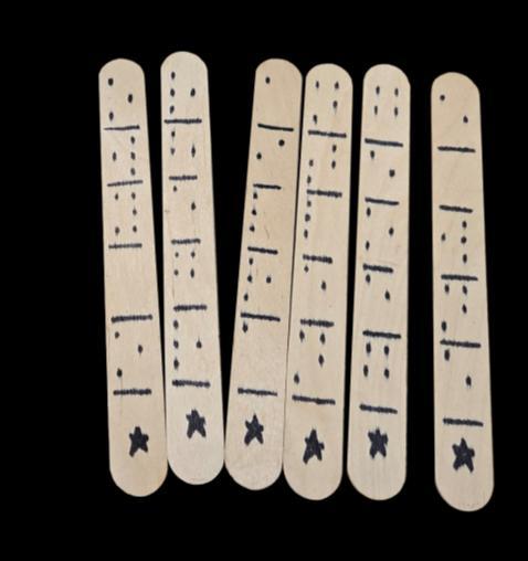
o Popsicle sticks (stored in a water bottle)
▪ The popsicle sticks have strange dots on them. What could they mean?
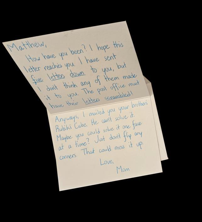
o A handwritten letter
▪ It looks like it was written to the owner of the backpack from their mom.
o Two math textbooks
▪ There are annotations on many of the pages.
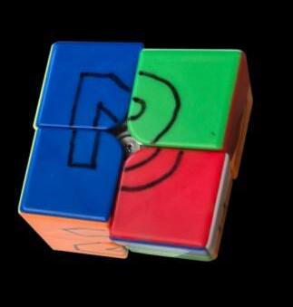
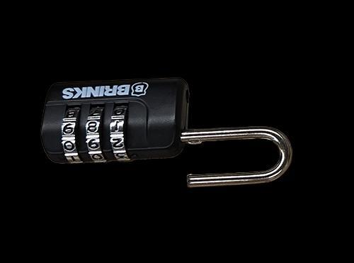
o A 2x2 Rubik’s Cube
▪ There are strange markings on all sides of it.
o A simple question
▪ “When you add two numbers, you get a s _ _.”
o A cryptology homework assignment
▪ It contains a jumbled message:
• “OCZ KJKNDXGZ NODXFN VMZ DI WMVDGGZ. OCZ XJYZ OJ VXXZNN V WMVDGGZ BPDYZ DN OCZ ADMNO ADQZ GZOOZMN JA OCZ IVHZ JI OCZ GZOOZM.”
o A notecard with many math terms on it
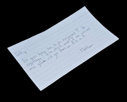
o A note that reads:
▪ “Patty –
Do you know how to do Assignment 5 for cryptology? I’m stuck and I am worried my grade will go from an A to an F.
ExperientialDesign
ProductDesign
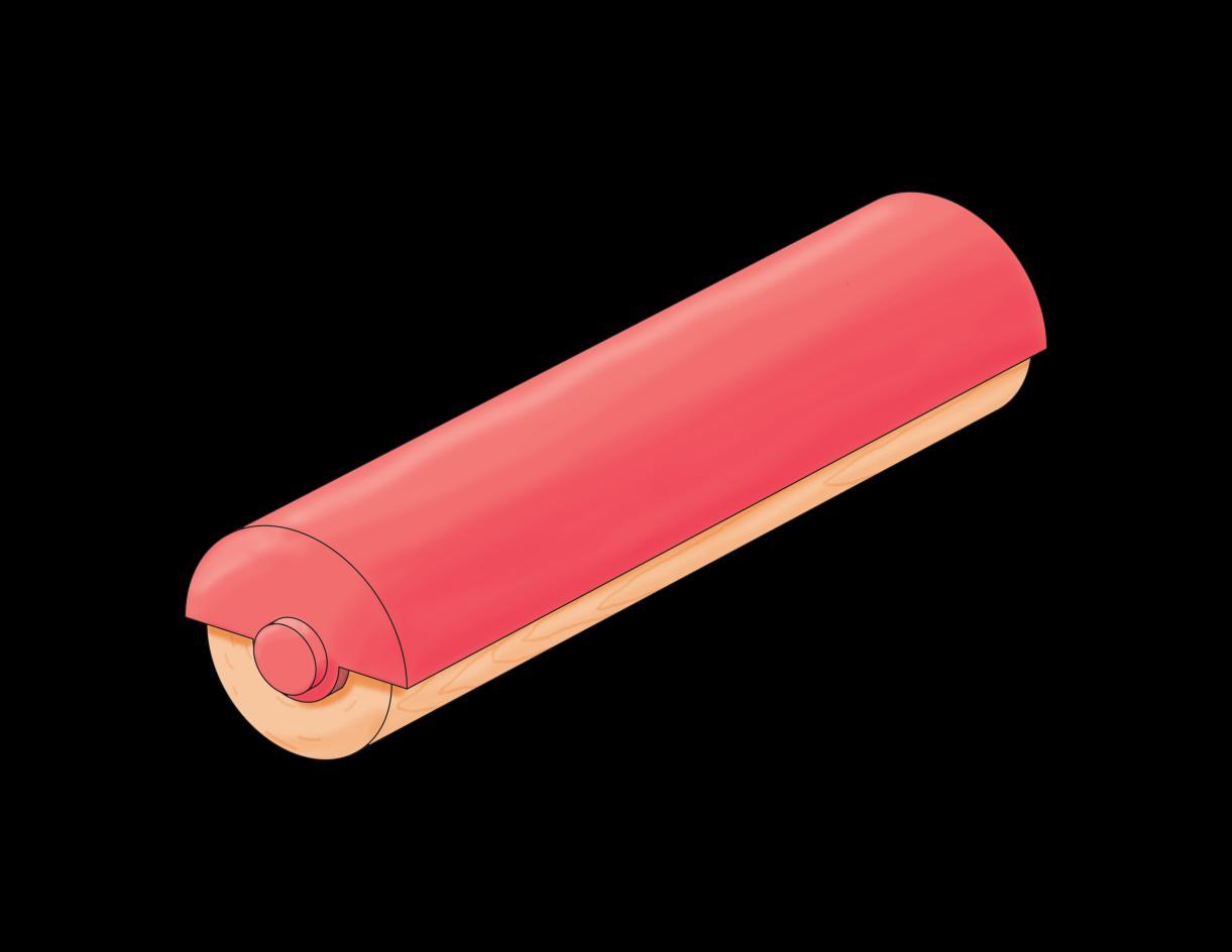
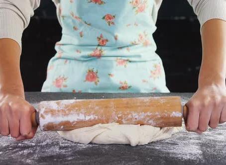
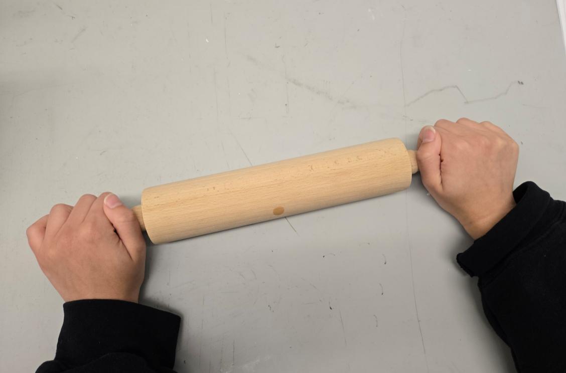
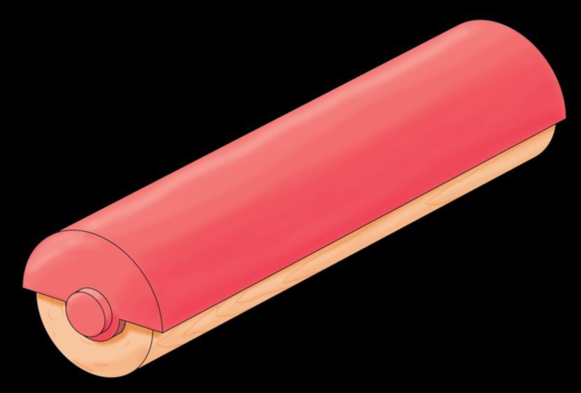
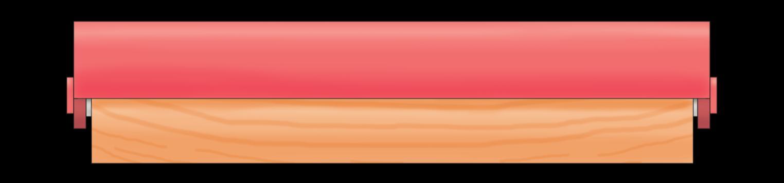
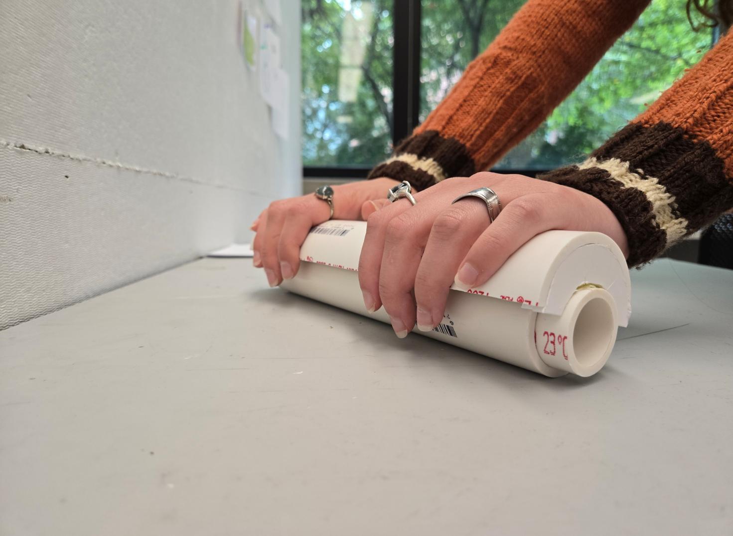
ROLLING PIN FOR ARTHRITIS
Prompt
• Create a product for users afflicted with arthritis and grip issues to assist them in daily activities.
Current Problems & Ideas
• Baking is an engaging activity with physical and mental benefits.
• The rolling pin, a common tool in baking, requires two hands and firm grip.
• Very few rolling pins on the market focus on redistributing hand placement and continue to have handles on the side that require tight grip.
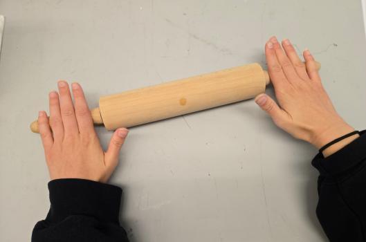
Pain Points
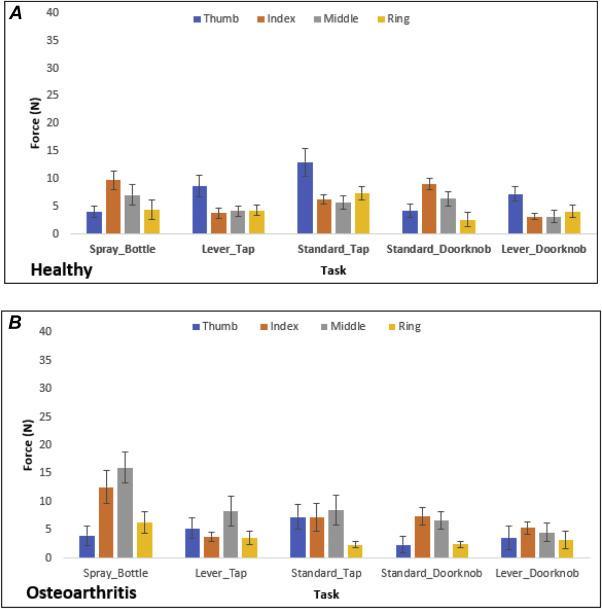
• Healthy people primarily rely on thumb/index fingers.
• Osteoarthritis afflicted people rely more on middle/ring fingers for grip stability and control.
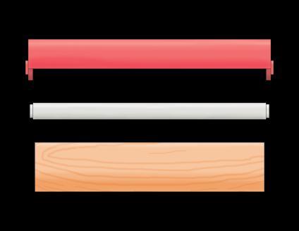
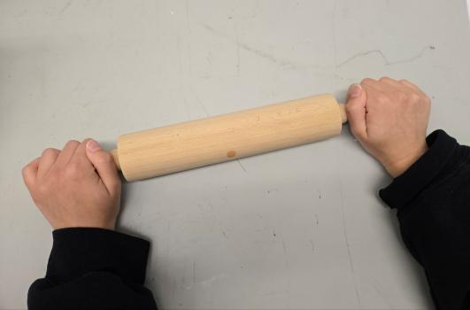
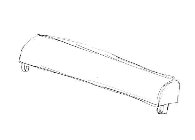
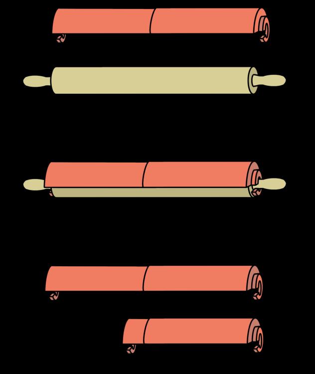
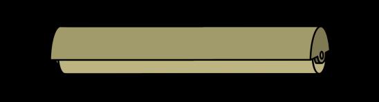
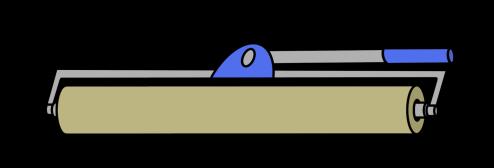
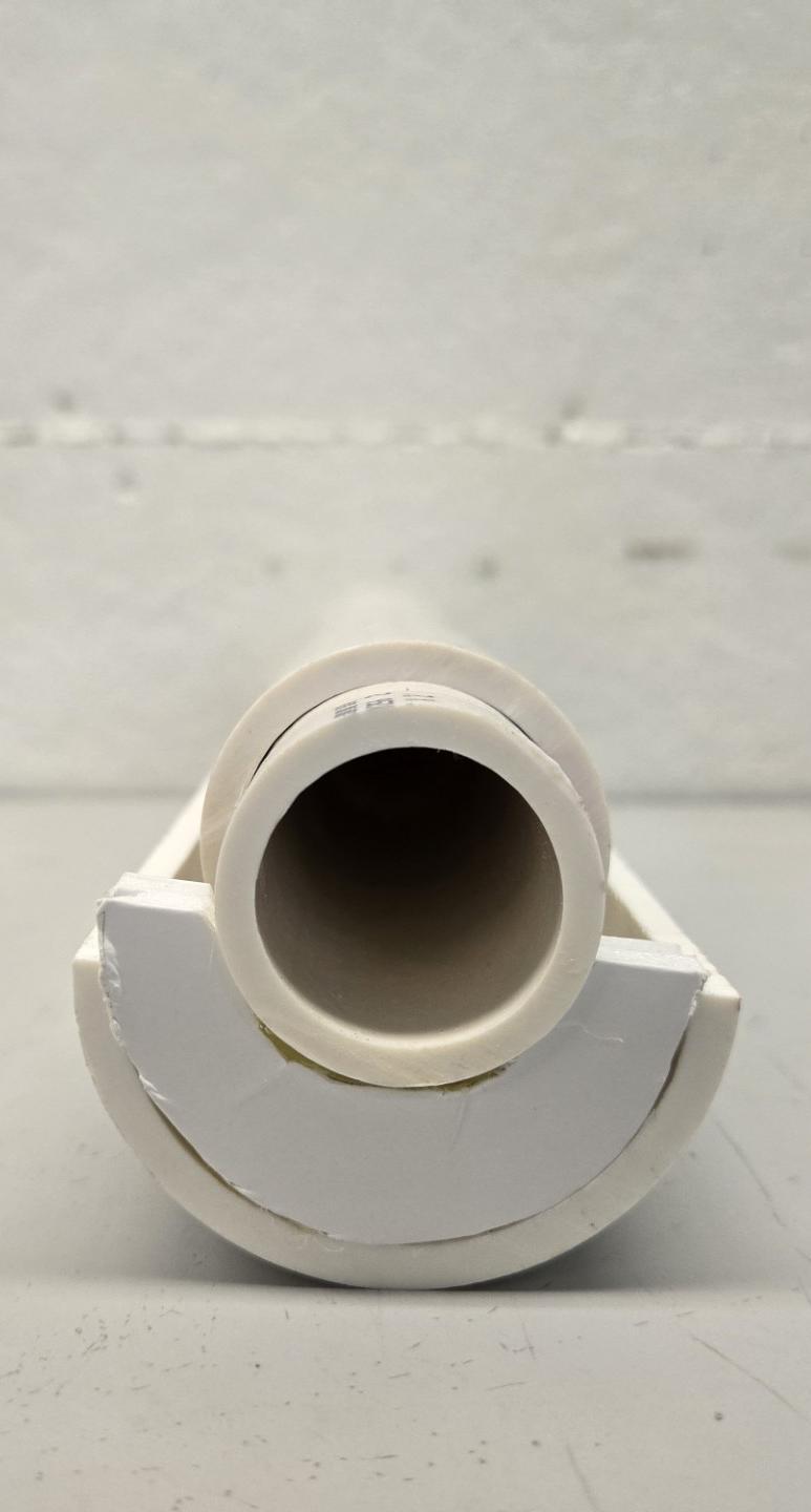
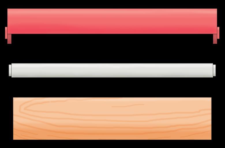
Rolling Pin Structure
• Two parts to a rolling pin: Wheel and Dowel
• Design goals:
• Relocate the handles without changing up the structure.
• Utilize an arthritic friendly motion.
Wheel
Dowel
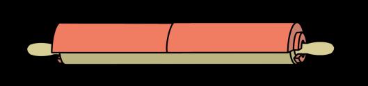
Brainstorming
Top Three Ideas
Top shell handle and detachable design for easy cleaning.
Collapsable shell that attaches to any rolling pin.
Foldable “paint roller” design to allow for one handed motion.
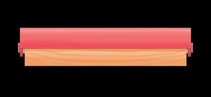
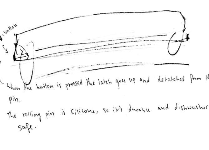
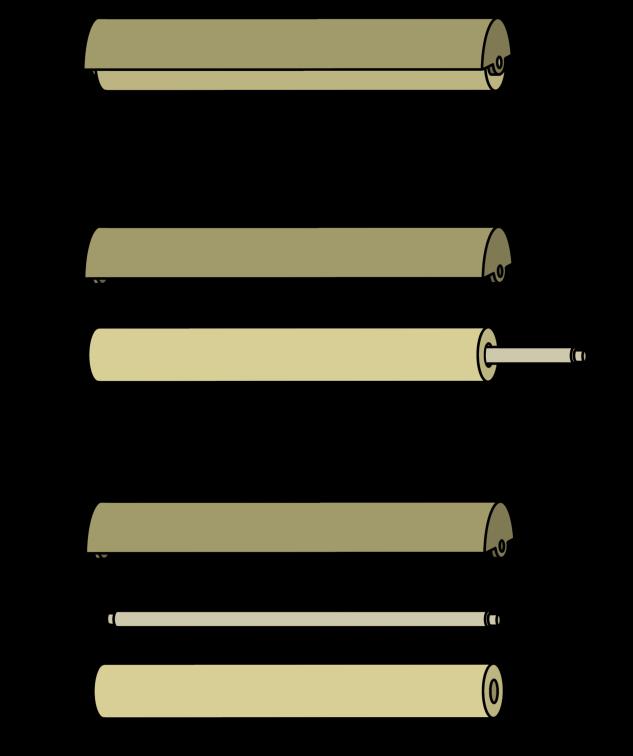
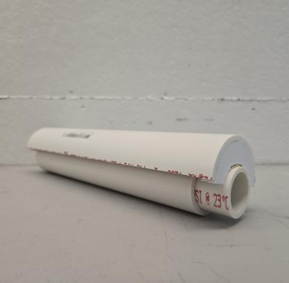
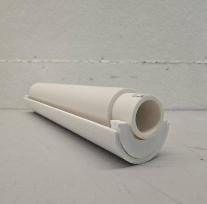
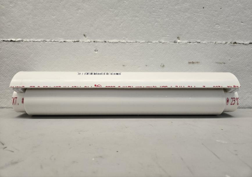
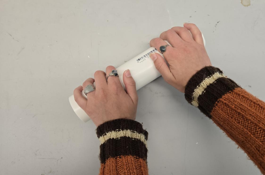
Physical Prototype
• Three parts:
• Dowel
• Runs through the middle.
• Wheel
• Rolls on the dowel and flattens content.
• Shell
• New hand placement location.
Solving The Problem
Redistributes effort required to the palms, as opposed to the thumb and index fingers.
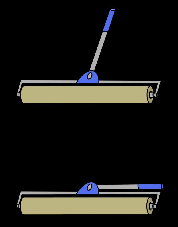
Final Render
2.3125
Shell
Dowel Wheel
Release Button
Future Additions
• Determine material.
• Non-stick material for the wheel.
• Easy to wash or dishwasher safe material.
• Create simple lock and unlock mechanisms to allow for easy cleaning.
• Test shell designs for optimal grip ability.
ProductDesign
Prompt
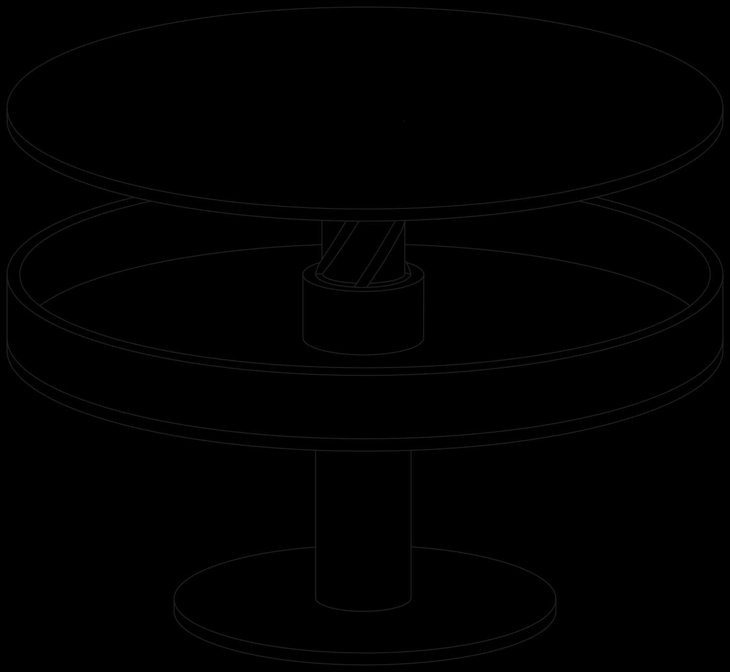
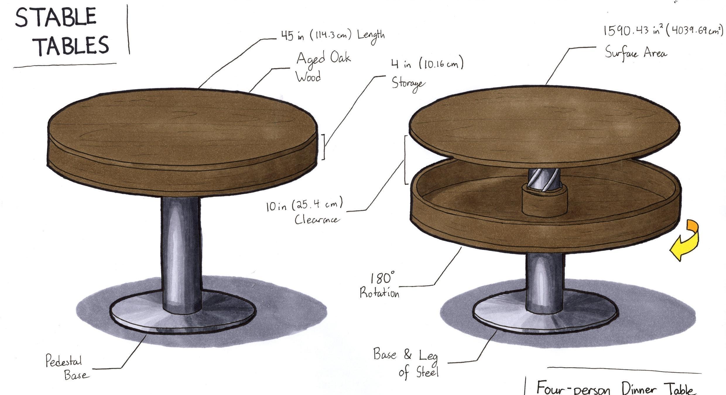
• Design a furniture piece that serves more than one purpose and balances both style and substance to create an elegant and functional piece.
Current Problems & Ideas
• Storage is always an issue in households, especially for smaller living such as apartments.
• Most dining tables serve a sole purpose of being a dining table.
• Of the dining tables that exist with storage, many tend to have storage that is small, hard to reach or exposed.
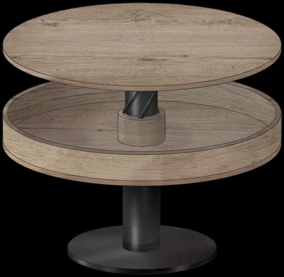
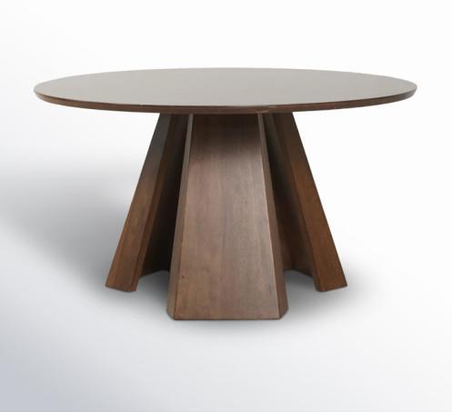
Main Idea
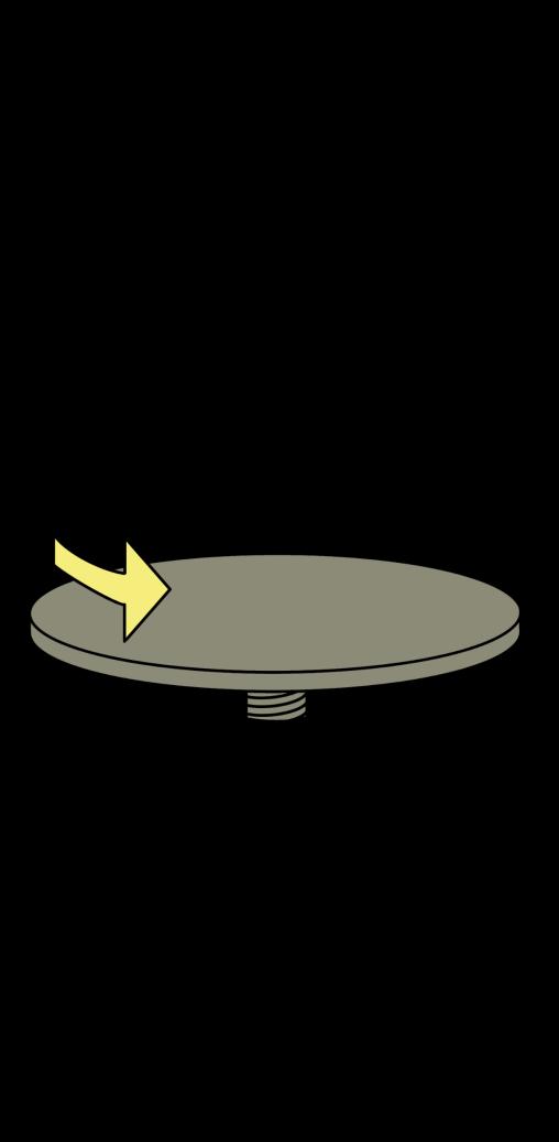
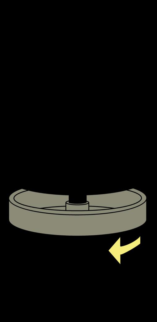
• Create a storage container that revolves around the table to expose contents within.
• Two major components: the lid and the bin. The bin holds the items while the lid acts as the table’s top.
Up Screw
• Lighter weight
• No interference with people sitting
• May require removing things from top to open
Two Design Choices
Down Screw
• Keeps the lid stable
• Easier to design handles
• Things can shift around inside while opening
• The selected design
Human Measurements & Scale
View
Measurements
Top View (Inscribed Square)
Final Render
4 in (10.16 cm) storage
10 in (25.4 cm) clearance
180° rotation down screw
Steel leg & base
Pedestal base
Aged oak wood
Future Considerations
• Design bin handles to allow for easy opening and closing.
• Create locking mechanisms to keep the bin stable when closed.
• Refine interior to prevent sliding objects when opening.
• Test height options and design chairs that come in a set.
Drawings&Renders
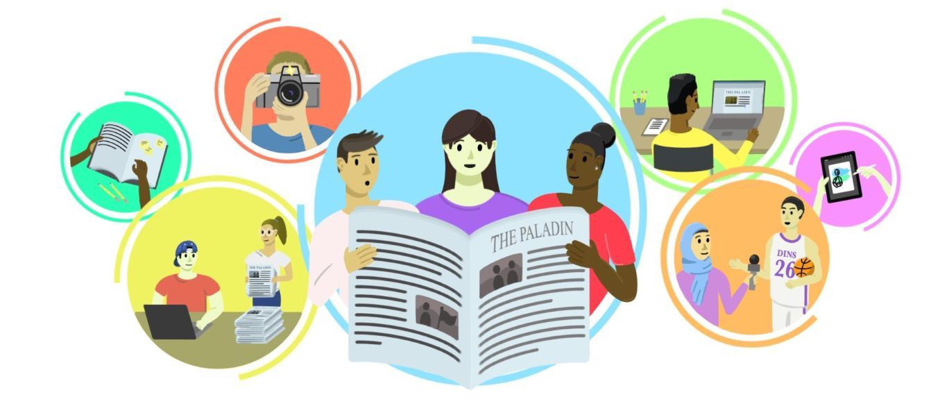
The Paladin Illustration Portfolio
Opinions | News |Arts, Campus, & Culture | Other
PORTFOLIO
Opinions | News |Arts, Campus, & Culture | Other
My Illustration Journey
By Jacob E. Robertson
In January 2024, I began an illustrating position for The Paladin, the student-led newspaper at Furman University. My role was to design article thumbnails that would highlight the contents of the articles and draw in a diverse audience. I primarily worked in Opinions, though occasionally I would illustrate for other sections.
In addition to illustrating, I was given the opportunity to design the recruiting advertisements (as seen on the right), the branding for the “Ask Bea” section, and spirit wear.
This portfolio contains my best pieces I illustrated during my time with The Paladin. Moreover, I have been selected to continue illustrating for “Ask Bea” to keep the art style and branding consistent. Below is the link for the website!
Jan. 2024 – May 2025
PORTFOLIO
Opinions | News |Arts, Campus, & Culture | Other
My Illustration Journey
Illustration by Jacob E. Robertson
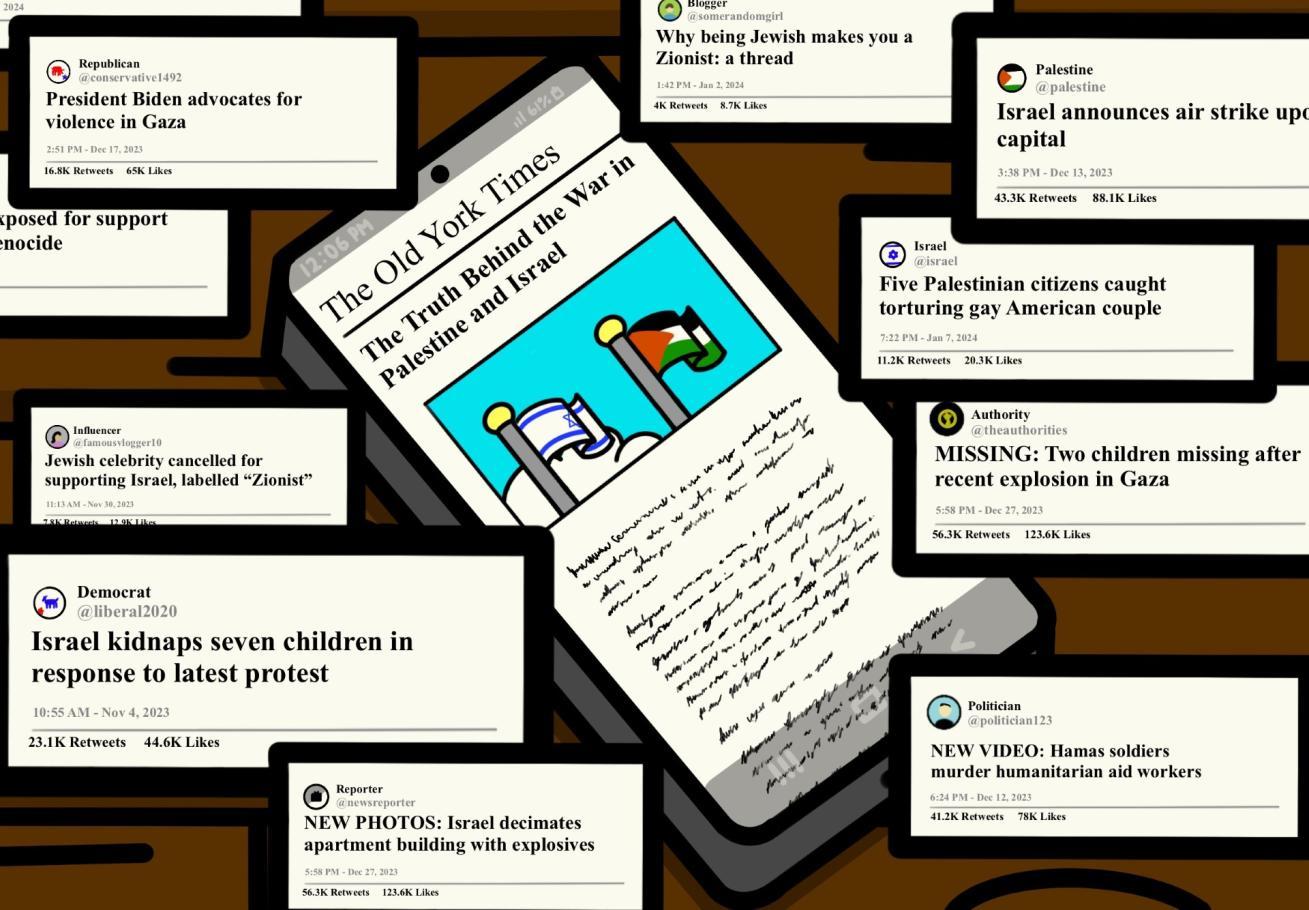
Title: Social Media is Distorting Our Perception of the War in Gaza
Tagline: The spread of misinformation, hate speech and polarizing content makes social media an unreliable and dangerous source of information on this crisis.
Graphic Contents: A phone, containing facts about the conflict between Isreal and Palestine, is surrounded by media that displays exaggerated headlines and rage-inducing stories.
Feb. 16, 2024
Website link: Social Media is Distorting Our Perception of the War in Gaza
PORTFOLIO
Opinions | News |Arts, Campus, & Culture | Other
My Illustration Journey
Illustration by Jacob E. Robertson
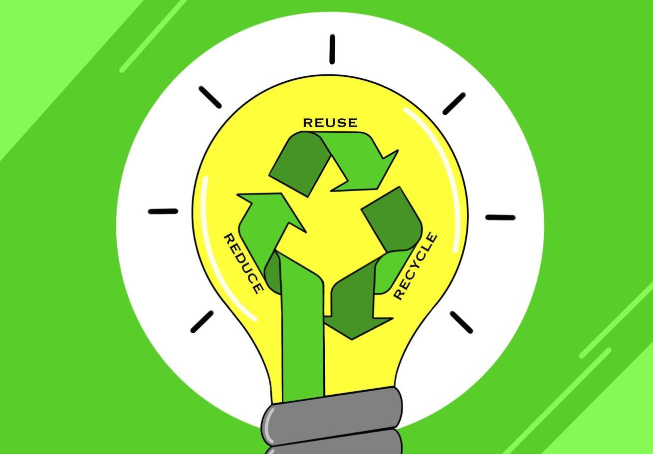
Title: Plastic Consumption at Furman: Is Recycling Really Sustainable?
Tagline: The Furman community must stop thinking of plastic recycling as a solution and instead focus on reducing consumption to solve the plastic crisis.
Graphic Contents: A lightbulb along with the recycling logo depicts the order that we should engage in to be sustainable: reduce, then reuse, then recycle.
Apr. 5, 2024
Website link: Plastic Consumption at Furman: Is Recycling Really Sustainable? – The Paladin
PORTFOLIO
Opinions | News |Arts, Campus, & Culture | Other
My Illustration Journey
Illustration by Jacob E. Robertson
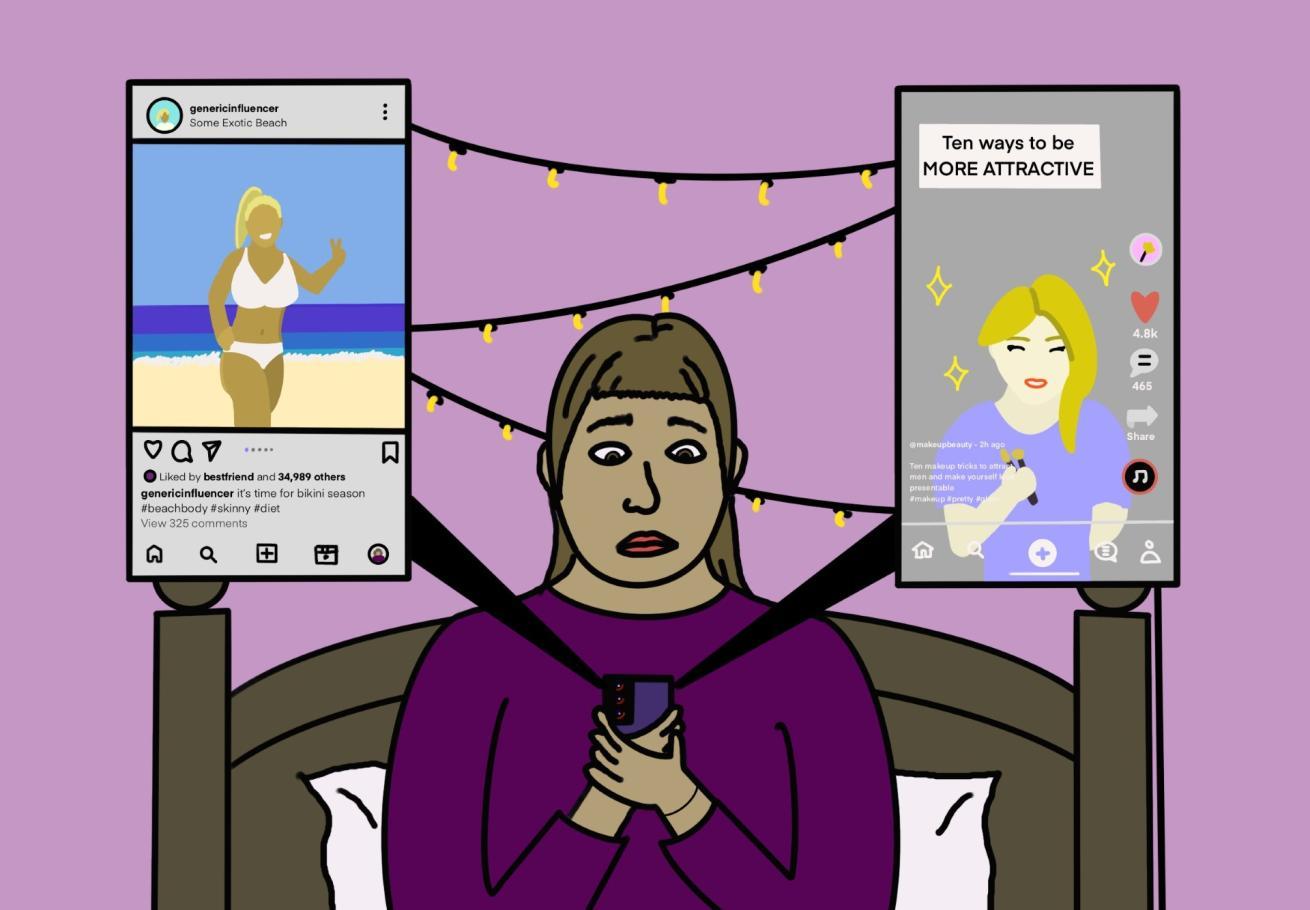
Title: Redesigning Our Feeds for a Positive Body Image
Tagline: Comparison to unrealistic body standards starts at a young age, largely due to social media. Users must assert control over their feeds to establish a healthier relationship with their body.
Graphic Contents: A girl is sitting upset about her own beauty standards as she compares herself to other posts on her feed.
Apr. 22, 2024
Website link: Redesigning Our Feeds for a Positive Body Image
PORTFOLIO
Opinions | News |Arts, Campus, & Culture | Other
My Illustration Journey
Illustration by Jacob E. Robertson
Title: StraightTalk Series Missed an Opportunity for Civil Debate
Tagline: By asking panelists to comment on the importance of non-partisanship without challenging them to put it into practice, the Riley Institute neglected the perfect opportunity to foster civilized debate on Furman’s campus.
Graphic Contents: The Riley Institute, the group that organizes StraightTalk, has created an unstable foundation for students to debate and discuss politics, causing distress and unease.
Oct. 28, 2024
Website link: StraightTalk Series Missed an Opportunity for Civil Debate - The Paladin
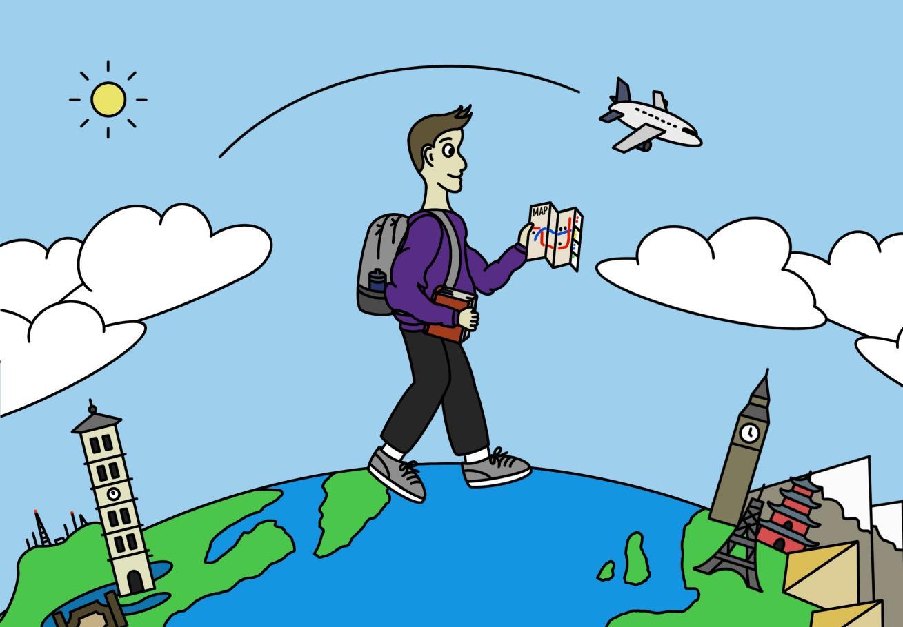
Tagline: Every student should consider stepping out of their comfort zone through study abroad.
Graphic Contents: A student is depicted stepping out of Furman University’s bubble to explore international areas in pursuit of new experiences and cultural activity.
Website link: Lessons Beyond the Books – The Paladin
PORTFOLIO
Opinions | News |Arts, Campus, & Culture | Other
My Illustration Journey
Illustration by Jacob E. Robertson
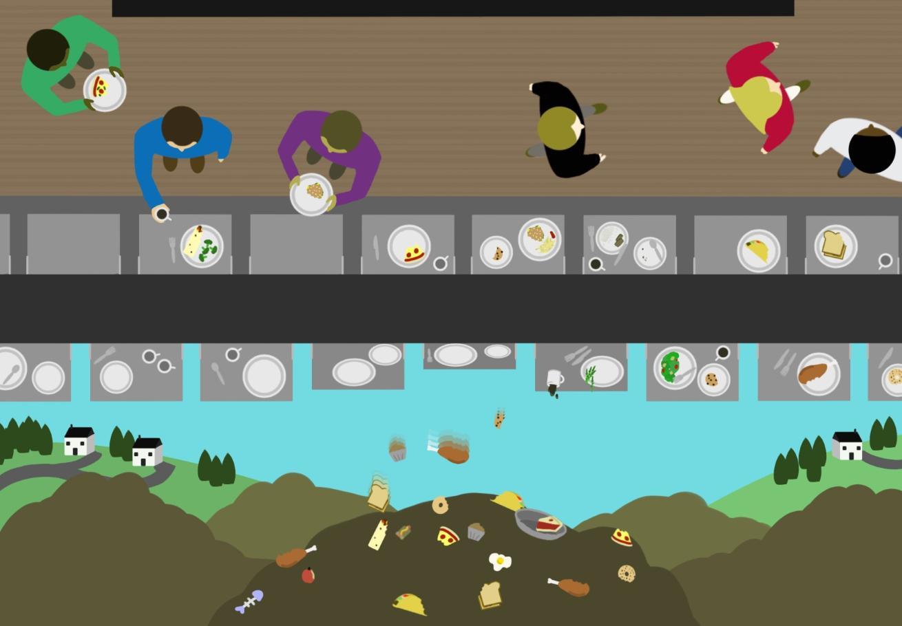
Title: Buffet Blunders: Reducing Food Waste in the Dining Hall
Tagline: Excessive food waste in the campus dining hall is a significant environmental and economic issue that requires immediate attention through improved inventory management, portion control, and student education initiatives.
Graphic Contents: In the top of the frame, students are seen from a bird’s-eye view depositing dishes with leftovers to be sent to the back. In the bottom, the frame reveals the leftover food being discarded in landfills near populated areas.
Jan. 16, 2025
Website link: Buffet Blunders: Reducing Food Waste in the Dining Hall – The Paladin
PORTFOLIO
Opinions | News |Arts, Campus, & Culture | Other
My Illustration Journey
Illustration by Jacob E. Robertson
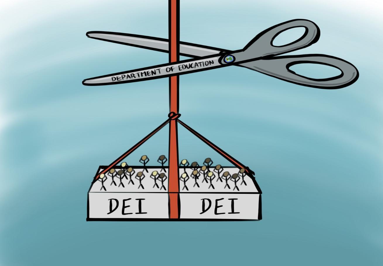
Title: Rolling Back DEI is anAttack on Higher Education
Tagline: Diversity, Equity and Inclusion are a vital part of the liberal arts education and should not be removed from the Furman experience.
Graphic Contents: The Department of Education is depicted as scissors, ready to cut out DEI programs. There are people panicking over the impending news of being cut.
Mar. 26, 2025
Website link: Rolling Back DEI is an Attack on Higher Education –
PORTFOLIO
Opinions | News |Arts, Campus, & Culture | Other
My Illustration Journey
Illustration by Jacob E. Robertson
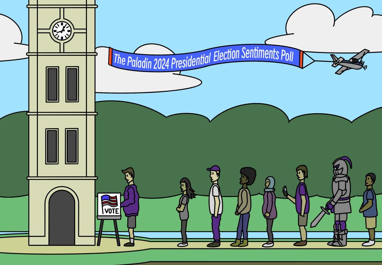
Title: Paladin Survey Reveals How Students Voted in the Presidential Election
Tagline: The Paladin’s Presidential Election Sentiments Poll gauged students’ voting intentions and sentiments about the 2024 presidential election.
Graphic Contents: Students across campus, along with the campus mascot, are lined up to cast their vote for the 2024 presidential election at the Furman University Bell Tower.
Nov. 10, 2024
Website link: Paladin Survey Reveals How Students Voted in the Presidential Election – The Paladin
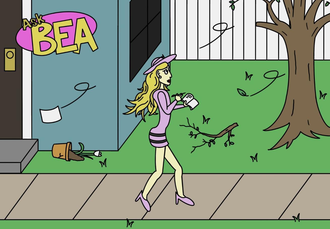
Tagline: Ask Bea: Your go-to guide for Furman’s ups, downs and everything in between.
Graphic Contents: Bea is walking through the wake of hurricane Helene, taking notes of the surrounding conditions.
Website link: Introducing “Ask Bea” – The Paladin
PORTFOLIO
Opinions | News |Arts, Campus, & Culture | Other
My Illustration Journey
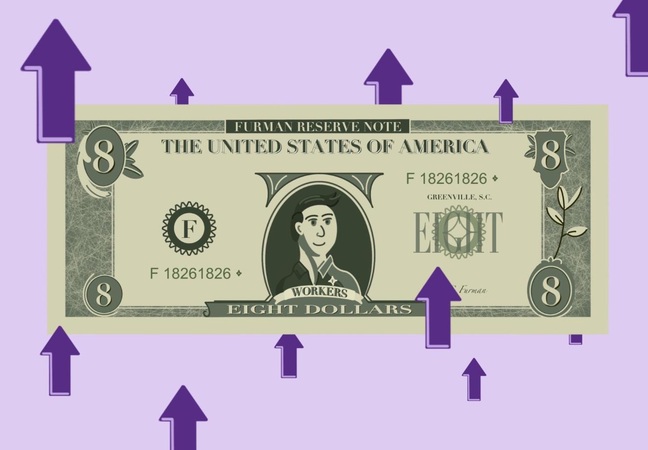
Illustration by Jacob
E. Robertson
Status: Created, but not published
Graphic Contents: An eight-dollar bill is depicted with a campus worker on it. Arrows indicate the desire that student organizations on campus have for raising the minimum wage for these workers.
PORTFOLIO
Opinions | News |Arts, Campus, & Culture | Other
My Illustration Journey
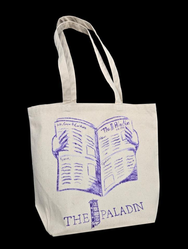
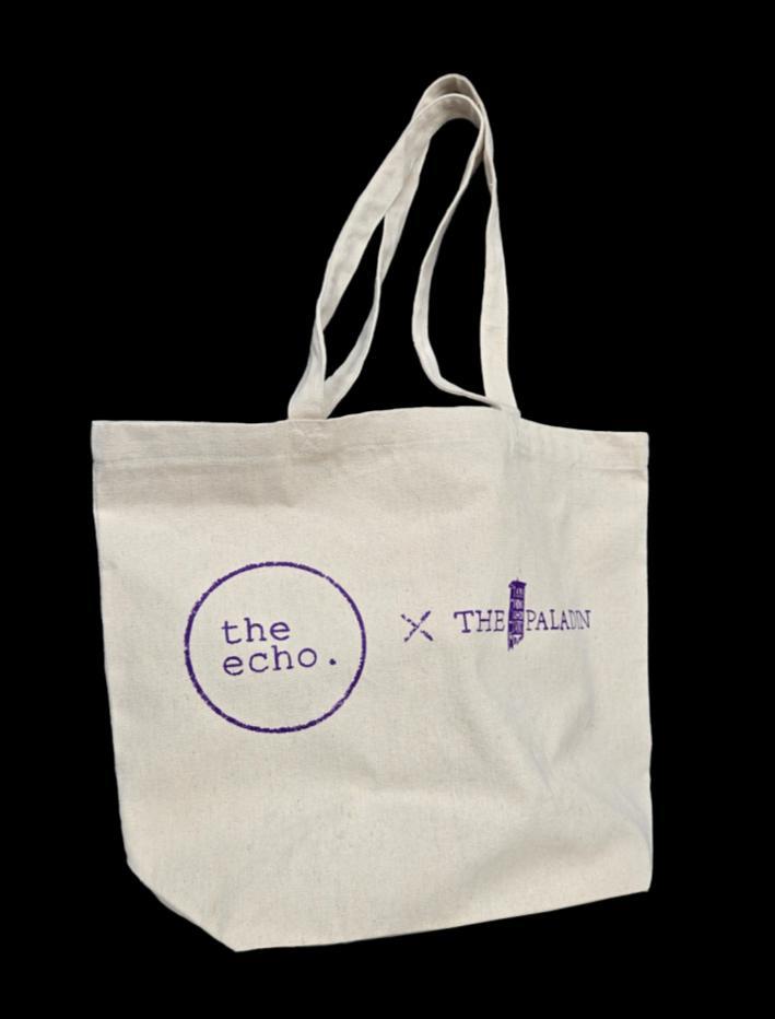
Illustration by Jacob E. Robertson
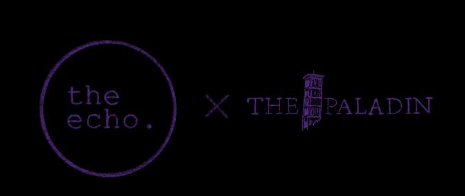
Apparel: The Paladin Tote Bags
Graphic Contents: Tote bags designed as apparel for The Paladin. The design shown on the left is an original design for the newspaper, while the design on the left is to promote a collaboration between The Paladin and the echo., the literary magazine on campus.
Drawings&Renders
Renders & Sketches
Marker & Ink
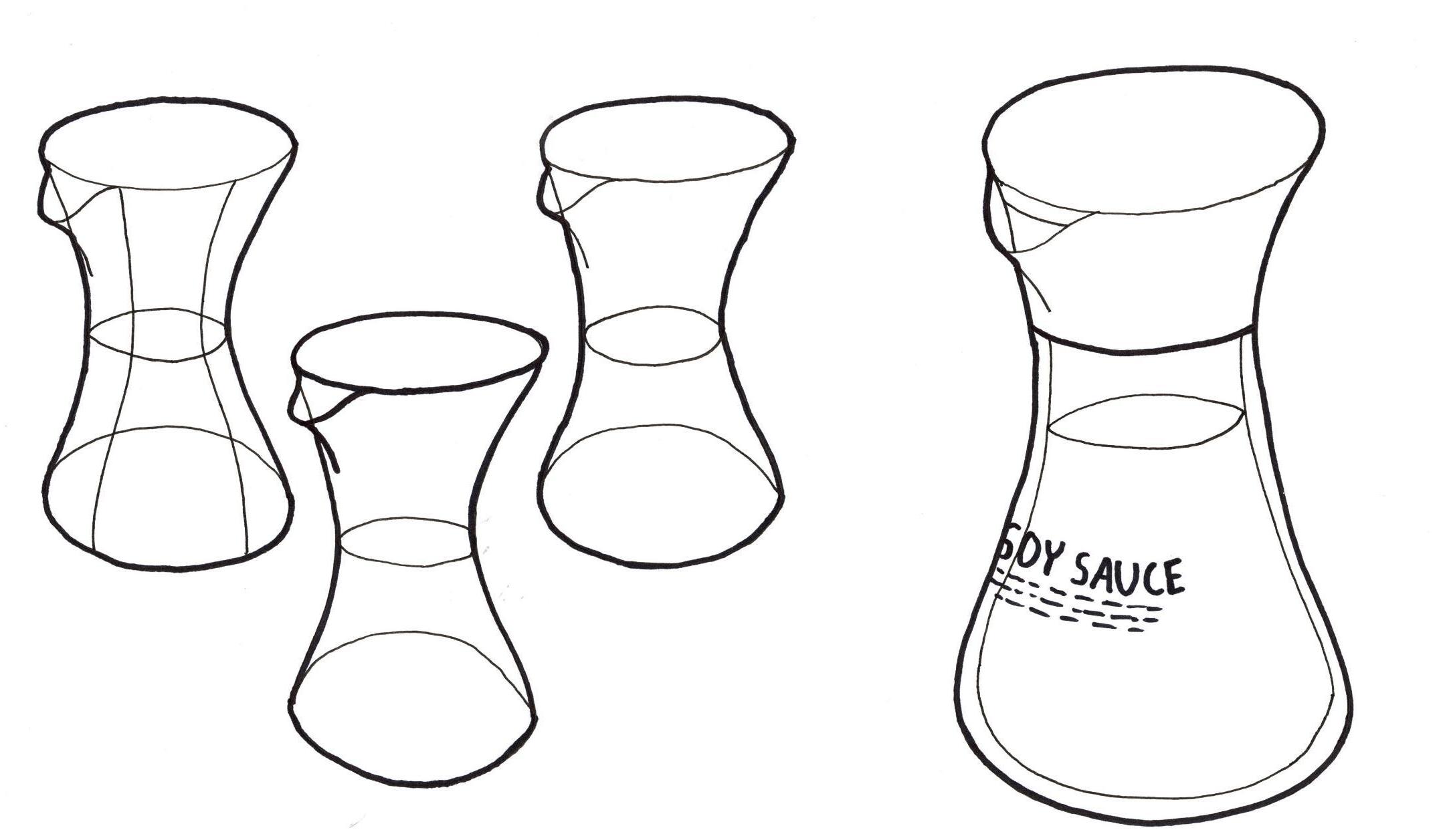
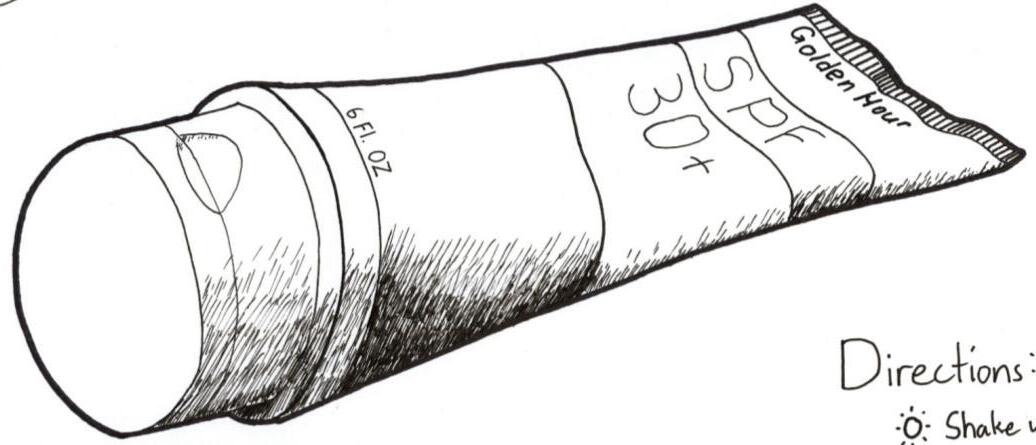
sauce bottle product sketches.
Soy
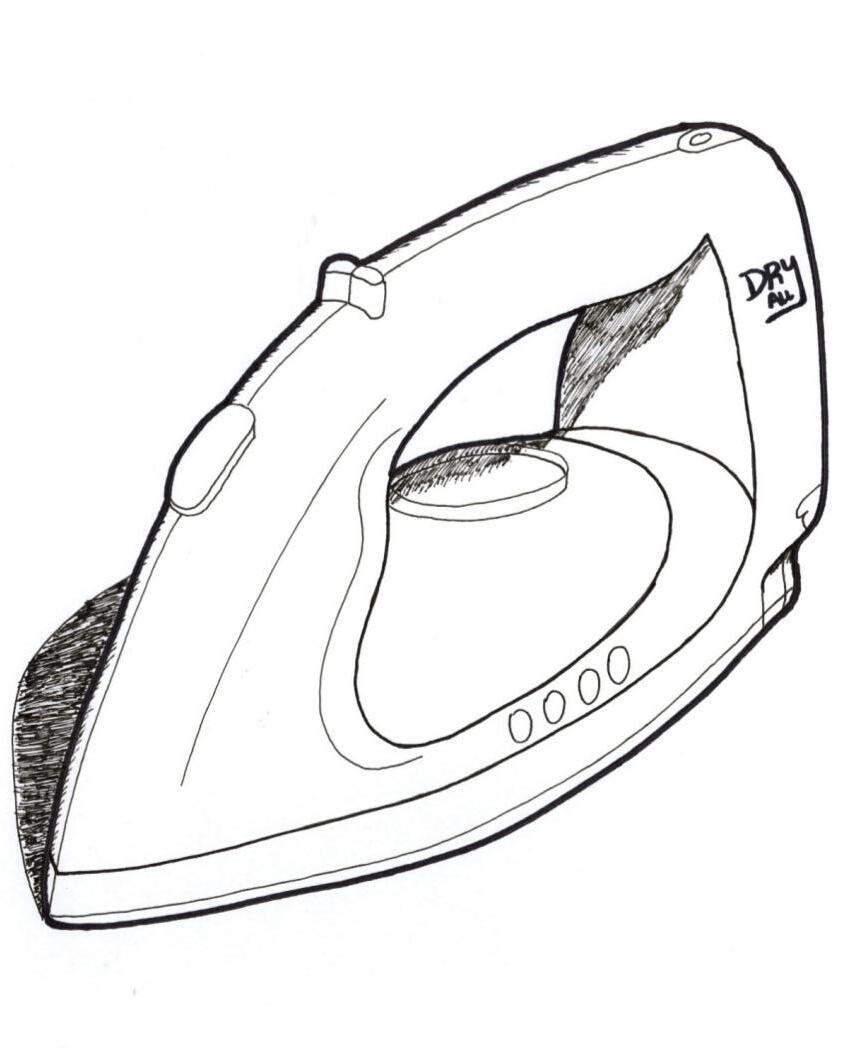
Simple product sketches & shading.
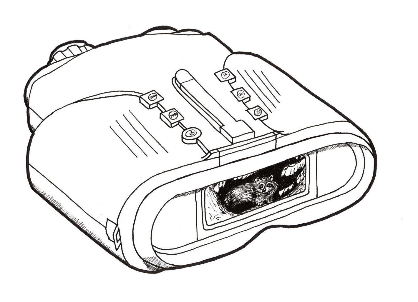
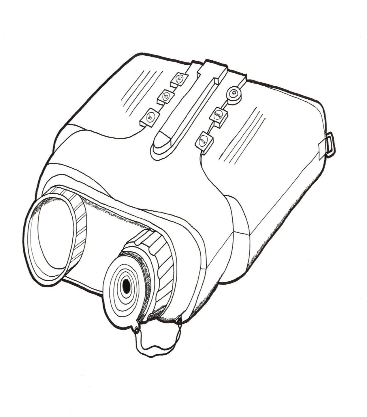
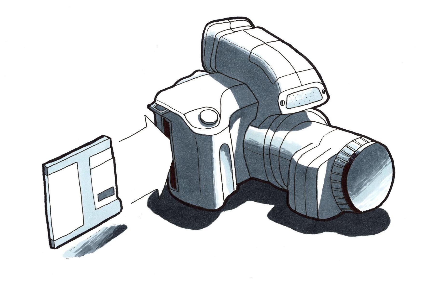
Night vision camera from multiple perspectives.
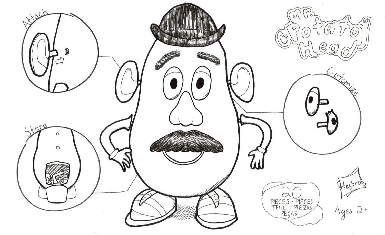
Character toy product sketches.
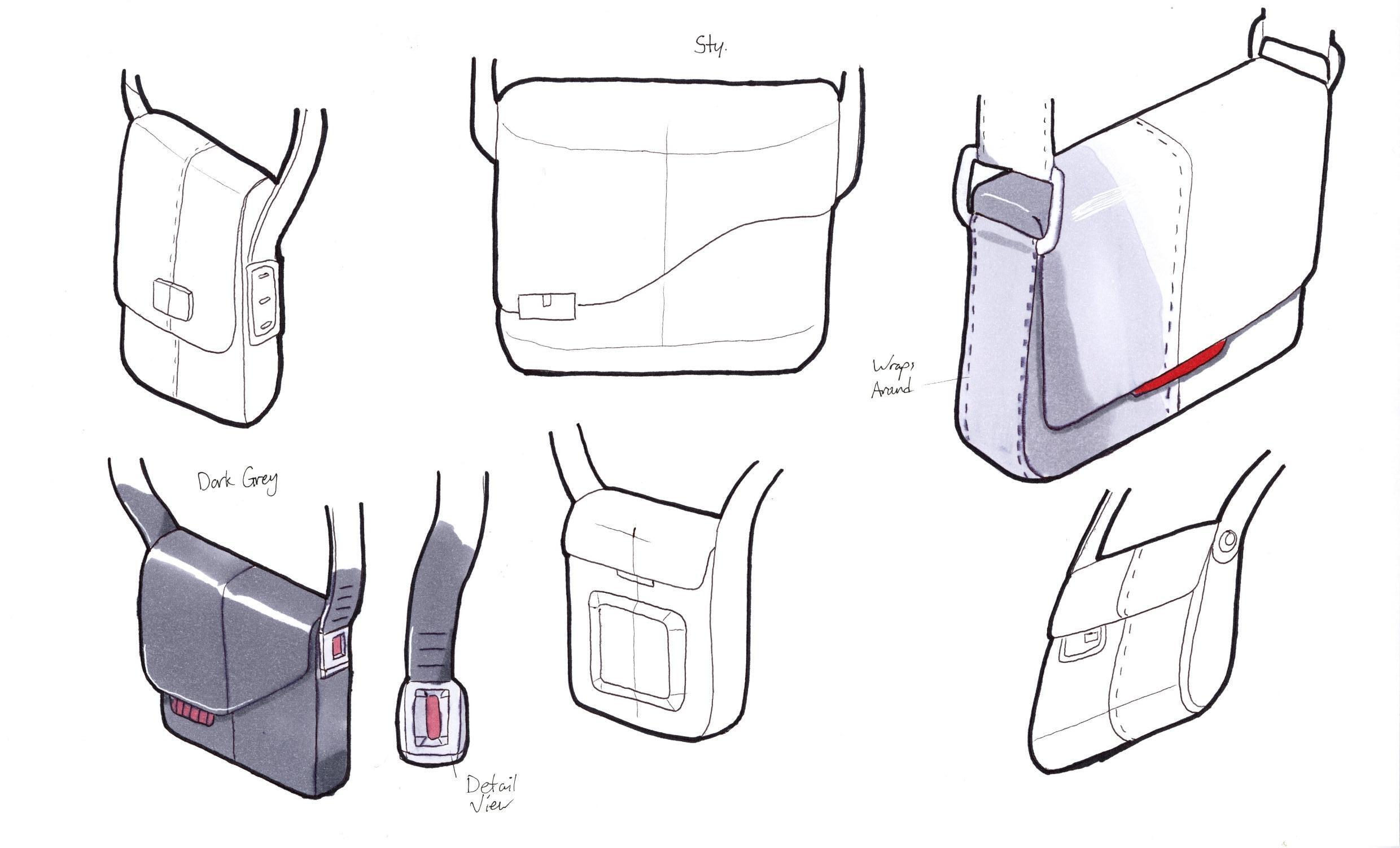
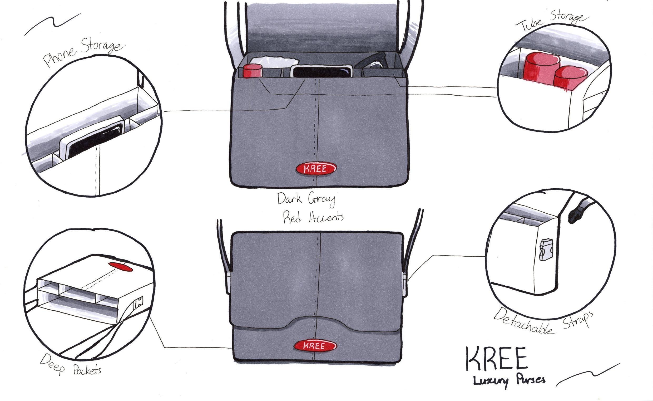
Purse conceptual ideas.
Purse final idea & sketch.
Sketches in monochrome & greyscale.
Sketches with glossy surfaces & color.
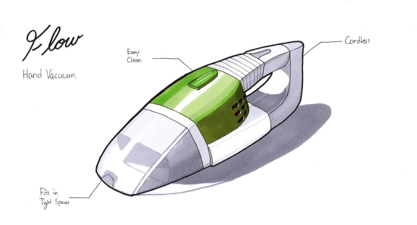
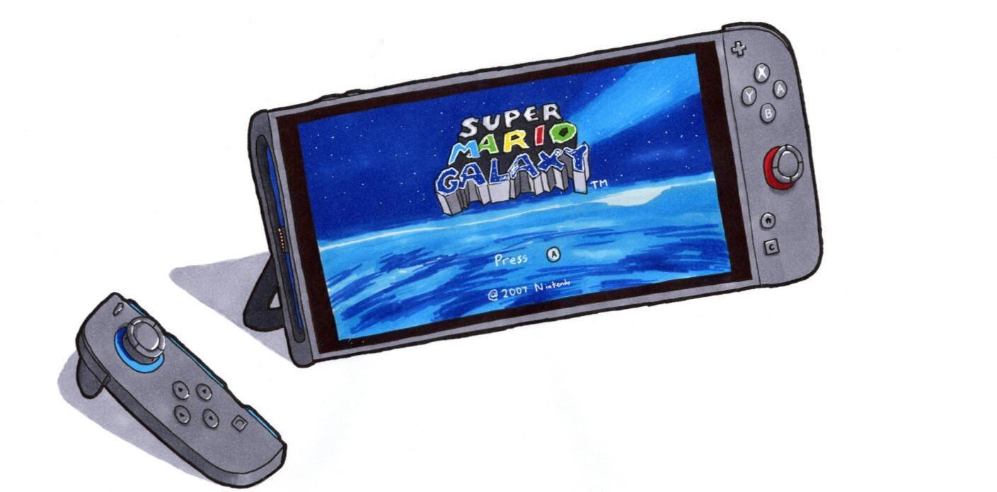
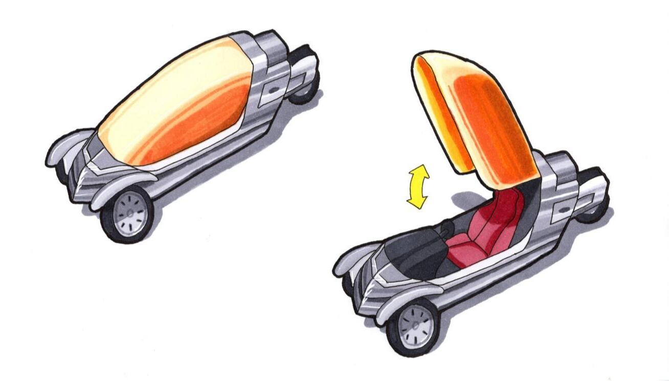
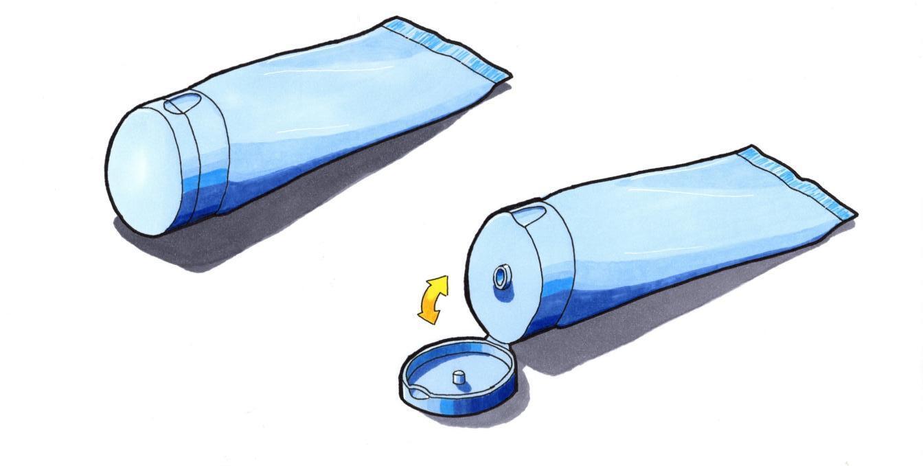
Sketches of products in motion.
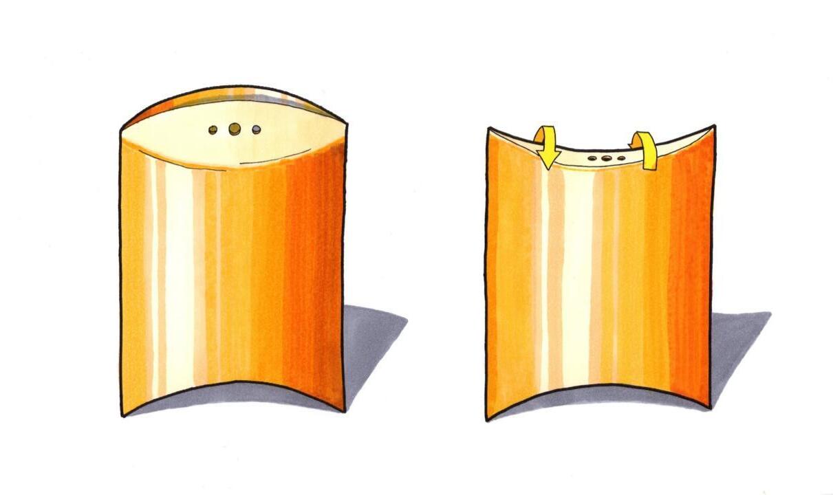
Cross sections & exploded views.
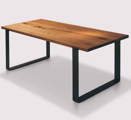
Dining table with additional storage render.
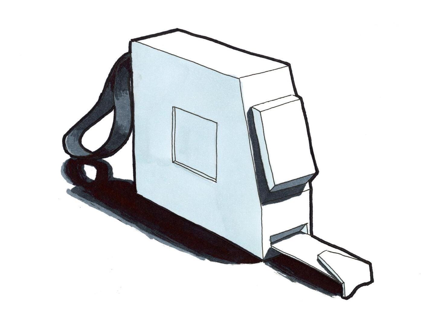
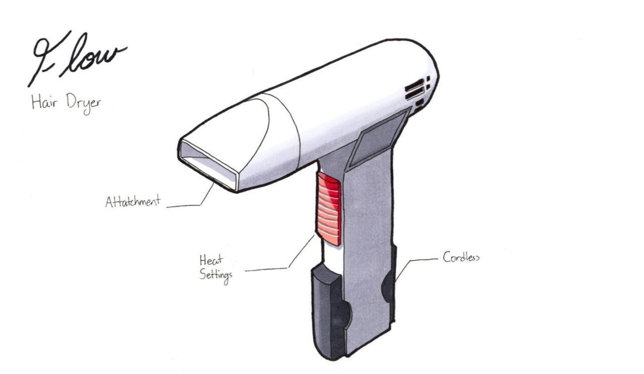
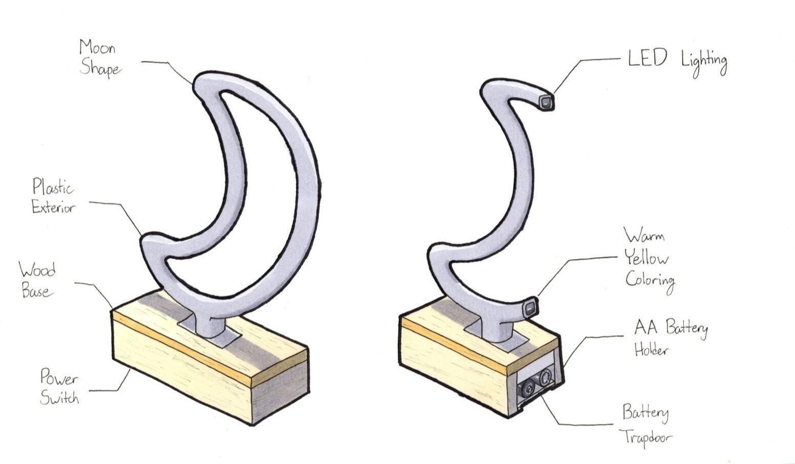
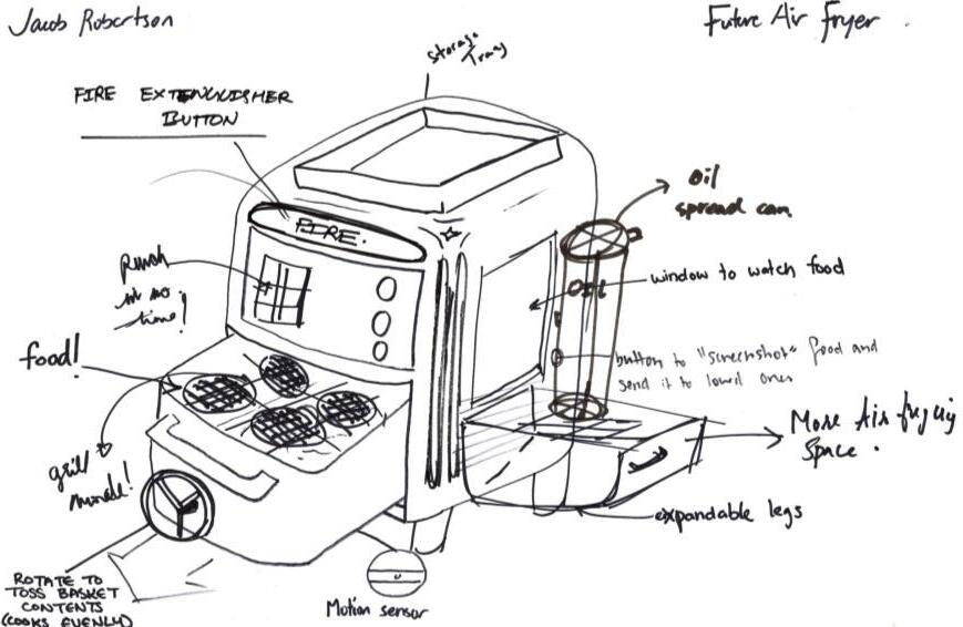
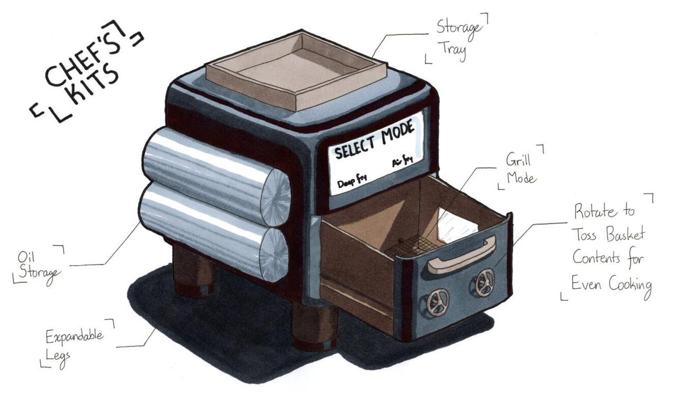
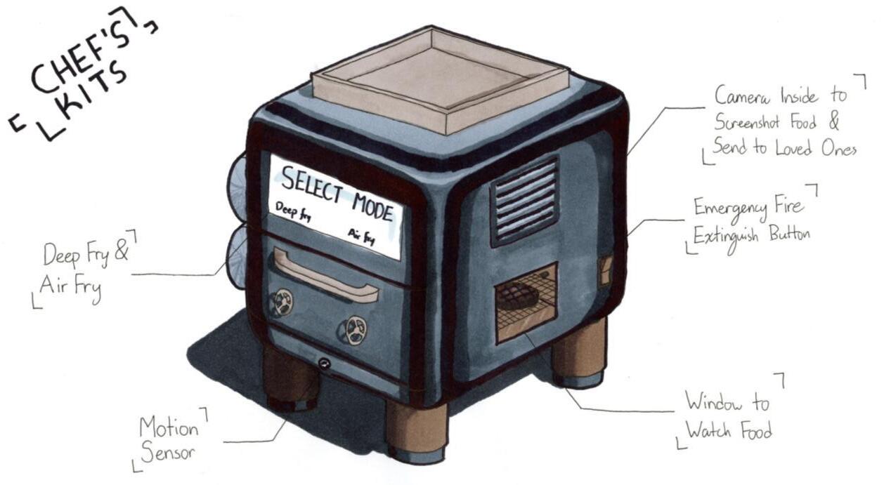
Sketch of future appliance & renders from two separate angles.