September October 2026 / CDN $1 2 .95
CANADIAN
INTERIORS
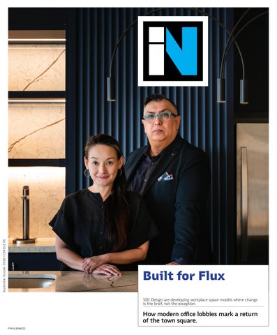
Built for Flux SDI Design are developing workplace space models where change is the brief, not the exception.
How modern office lobbies mark a return of the town square. PM#43096012
CI S-O 26.indd 1
2026-08-24 10:25 AM
MH003 Cella Coppertone
Create elevated interior spaces effortlessly with Homapal® Metal Laminates. Formica.com/HomapalMetals
CI S-O 26.indd 2
2026-08-24 10:25 AM
// 3 16
THE ELASTIC OFFICE A new workplace design method rejects permanence in favour of possibility. By Shannon Moore
COVER – SDI Design principals Joanne Chan and Mardi Najafi in Crowe Soberman. Photo by Atik Bheda
CANADIAN
INTERIORS
09/10 2026
24
8 ARIDO JOURNAL 10 CAUGHT OUR EYE
PUBLIC ACCESS From Montréal to Calgary, once overlooked and outdated corporate lobbies are being radically reimagined as dynamic places for civic life. By Evan Pavka
12 SEEN Salone del Mobile may be
a poor place to predict the future, but it remains an excellent place to spot its early signals.
14 SEEN Canadian designers and manufacturers made a conspicuous showing at NeoCon. Call it reverse colonization, if you like. The more interesting story is how confidently Canadian contract design is defining its own territory.
28 THE HEALING SCHOOL Across three recent projects, medical education is moving out of the institutional box. Flexible classrooms, landscape-driven interiors, daylight, and social atriums are reshaping how students, patients, families, and clinicians experience the places where medicine is taught and practiced. By Rhys Phillips
16
34 GOOD READS Wes Anderson: The Archives exhibition at The Design Museum in London; Phaidon’s new global survey of high-design residential escapes. 40 OVER & OUT Community activism preserves a sacred site, now revitalized as a contemporary art destination.
24
28
September | October 2026 / V63 #5
Editor in Chief
Peter Sobchak Art Director
Roy Gaiot ularArts, Inc.
Shannon Moore, Evan Pavka, Rhys Phillips, Jeremy Vandermeij Online Editor
Lucy Mazzucco
Breeze™ Acoustic Wall Panels ©mod
ts, Inc. Flo™ Acoustic Wall Panels ©modularAr Kruk Photography Eric Ab Design Elements, Scottsdale |
Contributors
Publisher
Faria Ahmed 416-441-2085 x. 5 fahmed@canadianinteriors.com Vice President / Sales
Steve Wilson swilson@canadianinteriors.com Circulation Manager
circulation@canadianinteriors.com President & Executive Publisher
Alex Papanou
Partners
Flo™ Acoustic Wall Panels ©modularAr ts, Inc. Ab Design Elements, Scottsdale | Eric Kruk Photography
Canadian Interiors magazine is published by iQ Business Media Inc. 126 Old Sheppard Ave, Toronto, ON M2J 3L9 Telephone 416-441-2085 e-mail: info@canadianinteriors.com website: www.canadianinteriors.com Canadian Interiors publishes six issues, per year. Printed in Canada. The content of this publication is the property of Canadian Interiors and cannot be reproduced without permission from the publisher. Subscription rates > Canada $38.95 per year (plus taxes) U.S.A. $71.95 USD per year, Overseas $98.95 USD per year. Back issues > Back copies are available for $15 for delivery in Canada, $20 USD for delivery in U.S.A. and $30 USD overseas. Please send payment to: Canadian Interiors, 126 Old Sheppard Ave, Toronto, ON M2J 3L9 or order online www.canadianinteriors.com For subscription and back issues inquiries please call 416-441-2085 x2 e-mail: circulation@canadianinteriors.com, or go to our website at: www.canadianinteriors.com
shatter expectations
Member of the Alliance for Audited Media s, Inc.
Flo™ Acoustic Wall Panels ©modularArt
ISSN 1923-3329 (Online), ISSN 0008-3887 (Print) H.S.T. # 80456 2965 RT0001
AuralScapes
®
acoustic wall panels
32” self-aligning panels for any sized application modulararts.com 206.788.2410
CI S-O 26.indd 4
iQ Business Media Inc. Canada Post Sales Product Agreement No. 43096012
2026-08-24 10:25 AM
By Peter Sobchak psobchak@canadianinteriors.com
INSIDE
// // 5 5
The Machine Wants an Office
If there is a bigger topic than the future impact of artificial intelligence (AI) on all our personal and professional lives, I’m not sure what it is. Listening in on keynotes and panel discussions at events like NeoCon, it is sounding like the predominant attitudes within the industry are fairly consistent: that AI’s greatest value in architecture and interior design lies less in generating finished concepts than in strengthening the stages that precede them. Designers remain responsible, goes the dominant line of reasoning, for framing the right questions, interpreting context and exercising judgment, while AI accelerates analysis, organizes research and surfaces possibilities that might otherwise remain hidden. That distinction is important, say the advocates, because it treats artificial intelligence as a capable research assistant rather than a surrogate designer. The implication is quietly practical: efficiency may increase, but the defining characteristics of professional practice still depend on experience, observation and an ability to understand people beyond the data they generate. The A+D industry’s official stance, at least if the associations that represent it are any indication, is not dissimilar to the unofficial one: that AI is poised to reshape design practice, but the profession’s responsibility remains unchanged. The Royal Architectural Institute of Canada’s new position statement, for example, argues that AI should augment design thinking rather than replace professional judgment, insisting that architects retain full accountability for every decision affecting public safety, ethics and the built environment. It also calls for greater transparency around AI use, stronger protection of intellectual property and client data, and equitable access to emerging tools so technological advantage does not deepen industry disparities. Innovation, the statement suggests, is most valuable when it strengthens human expertise, preserves trust and reinforces architecture’s public purpose. When talking openly and honestly (and off the record) with designers about the topic, they admit that AI becomes more useful as projects become more complex. It can quickly synthesize workshop notes, identify recurring themes, analyze precedent images and propose alternative design directions, allowing teams to spend less time sorting information and more time evaluating it. Even so, the designers I’ve spoken with repeatedly acknowledge the limits of these outputs. AI cannot explain why clients respond emotionally to a space, because it lacks lived experience and contextual awareness. It can reveal patterns, but it cannot determine their significance without human interpretation, making critical judgment the profession’s most durable skill.
CI S-O 26.indd 5
Resisting both utopian and catastrophic narratives, it is clear that AI will gradually reshape practice in much the same way earlier digital tools did. As a simple “writing on the wall” strategy (pun intended), designers should cultivate prompt writing as a professional competency, not because prompts replace design thinking but because they direct it. But also, a note of caution: AI introduces familiar concerns around bias, misinformation, environmental cost and overreliance, making thoughtful skepticism as valuable as technical fluency. The profession’s advantage may ultimately rest not in producing more images or documents, but in knowing when the machine’s answer deserves to be challenged. Yet in a more immediate and tangible way, artificial intelligence’s first impact on the office may not be algorithmic at all, but architectural. As venture capital pours into AI firms, those companies are converting investment into leased square footage, creating a direct pipeline from financing to workplace demand. In Canada, technology companies accounted for 32.2 per cent of all office leasing in the first quarter of 2026, more than double the previous year’s share and the highest level recorded in a decade. Rather than displacing the office, AI is accelerating its return as a physical destination for talent, collaboration and growth. For architects and interior designers, this marks the earliest measurable design consequence of the AI economy. Long before artificial intelligence reshapes how buildings are conceived or documented, it is already generating commissions by expanding the footprint of companies racing to recruit specialized talent. Toronto, Vancouver and Montréal all recorded stronger technology leasing activity, with Toronto posting a 2.4-fold increase between 2023 and 2025 while also reducing office vacancy, placing it among the healthiest technology markets as tracked by CBRE. The broader lesson is that office recovery is becoming increasingly selective. Venture capital is concentrating in innovation ecosystems with established research institutions, technical expertise and mature urban infrastructure, making design quality a competitive advantage rather than an amenity. AI companies are seeking workplaces that support rapid expansion, reinforce culture and attract scarce talent, placing renewed emphasis on adaptable interiors capable of evolving alongside fast-moving businesses. For Canada’s design profession, AI’s most immediate legacy is not digital automation, but a fresh cycle of workplace projects driven by unprecedented investment in technology.
2026-08-24 10:25 AM
6 //
CANADIAN INTERIORS Sep/Oct 2026
CanadianInteriors.com
Why We’re Craving 100-Year-Old Hues
Restful Recharge: Fix Coffee + Bikes PHAEDRUS Studio transforms a constrained footprint into a highly coordinated hybrid environment where structural, mechanical, and spatial systems work together.
Ryan Smith from 3form explores how, as the influence of the digital age softens, designers are turning to more saturated hues to create interiors that feel warmer and more personal.
The future of commercial kitchens is electric, but it will not be simple
Electric kitchens promise gains in efficiency and emissions, but as Jason Gilron of Foundry Kitchens explains, the transition brings challenges.
Maitake Table: Q&A with John Patkau
Originally designed in solid wood, the Maitake Table by Patkau Studio has been reimagined in Cosentino’s Ēclos mineral surface.
Now Boarding: Something to Do lounge A former transborder duty-free space at Billy Bishop Toronto City Airport has been redesigned with black metallic detailing, silver chrome and warm wood touches.
Exclusive to our
DIGITAL EDITION
Good Reads
Exploring Wes Anderson’s influence on interiors.
Advanced Concepts 2.0: Q&A with Heather Dubbeldam
Three installations explore how contemporary workplace design can better support agency, comfort, and multi-generational use. Visit the expanded digital edition at www.canadianinteriors.com
CI S-O 26.indd 6
2026-08-24 10:26 AM
DRS120 DropSpot Bottle Filler with Bi-level Cooler
DRS120Steel DropSpot in Stainless finish. Bottle Filler with Bi-level Cooler in Stainless Steel finish.
DropSpot™
™ Bottle Fillers & Coolers DropSpot Bottle Fillers & Coolers Ounce for ounce, a better option for hydration. With our new Bottle Fillers and Coolers you
Ounce for ounce, betterand option for hydration. can refill on style,asafety, sustainability, delivering fresh drinking water every sip. With our new Bottle Fillers and with Coolers you can refill on style, safety, and sustainability, delivering fresh drinking water with every sip. To learn more visit sloan.com/dropspot Distributed in Canada by Dobbin Sales dobbinsales.com
To learn more visit sloan.com/dropspot Distributed in Canada by Dobbin Sales dobbinsales.com CI S-O 26.indd 7
DRS100 DropSpot Bottle Filler in
DRS110 DropSpot Bottle Filler with Single-
Stainless Steel finish.
level Cooler in Stainless Steel finish.
DRS100 DropSpot Bottle Filler in
DRS110 DropSpot Bottle Filler with Single-
Stainless Steel finish.
level Cooler in Stainless Steel finish.
2026-08-24 10:26 AM
8 //
ARIDO
Journal
By Jeremy Vandermeij
A Profession That Builds Itself Ask one hundred Ontario interior designers what ARIDO is, and most will give a version of the same answer: it is the body that grants and protects our title. They are right. Chartered under the ARIDO Act and strengthened by Bill Pr6 in 1999, which gave Registered members the exclusive legal right to use the title Interior Designer in Ontario, ARIDO has enforced the profession’s protected title for more than a generation. A serious mandate, set out in legislation, that we carry as the largest interior design association in Canada. But that is only half of what ARIDO is. The picture most interior designers hold — a regulator you belong to, a set of dues you pay — misses something more important. The association is not something you belong to. It is something you build. What the work actually runs on The proportions tell the story. In one recent year, ARIDO’s work was carried out by 79 committee volunteers, with another 41 members standing up for our Communities across four regions, all of it held together by a staff of eight. That is roughly 15 volunteers for every employee. If that sounds stretched, it is the rule rather than the exception. Independent
CI S-O 26.indd 8
benchmarking of professional bodies finds that volunteers outnumber paid staff by about 12 to one, and that the smaller the organization, the higher the ratio climbs. But that ratio carries an obligation. When people give their evenings to this profession, they deserve an experience
Why membership is a form of making I came to this way of seeing associations through my graduate work. Studying strategic foresight and innovation — and, fittingly, doing most of it in teams, because systems work is almost always shared work — I spent two years with colleagues examining how organizations change. One idea stayed with me: organizations are among the most powerful entities on the planet, and the people inside them, under the right conditions, can change the world. Looking closely at member-driven organizations, I kept finding the same quiet pattern. The people being served were also the people doing the serving: governing; funding; supplying and benefiting all at once. The economist Elinor Ostrom won a Nobel Prize for naming it: our most valuable goods are co-produced, made by the very people who benefit from them. A profession works the same way. The standards that give your title meaning, the assessment that qualifies the next generation, the public confidence that lets a client trust you, none of it arrives finished. It is built,
The association is not something you belong to. It is something you build. worthy of the gift: staff who can prepare them, clear their path, and make their time count, with enough operational capacity behind them to turn good committee work into finished results. Much of my current work with the Board is exactly this: bringing new resources into ARIDO, while keeping the budget in balance, so that the people who show up are set up to do their best work. The volunteers are not a convenience. They are the organization, and our job is to be worthy of them.
year after year, by designers giving time to work that will benefit colleagues they may never meet: Registered members, interns, students, educators, and retired members at the same table. That is not overhead on the way to the real work. It is the work. What the Board actually carries Above that effort sits a responsibility most members never see. ARIDO’s Board does not simply steer the organi-
2026-08-24 10:26 AM
// 9
zation; it carries the profession in law. Directors hold the legal and fiduciary duty for a body accountable to its members, to the public, and to government: a responsibility that will only deepen as ARIDO advances toward direct regulation. To serve on the Board is to volunteer at the highest level of accountability the profession has: unpaid, often unseen, carrying real weight. Stewarding a legislated mandate on behalf of an entire profession is not administrative work. It is a considerable thing to give, and it deserves to be named as such. The asset that never appears on an invoice There is one more thing we make together that no balance sheet records. The political scientist Robert Putnam called it social capital, which is the trust and reciprocity that let people cooperate for shared benefit. It is why you can call a peer you have never met and get a straight answer, and why government extends confidence to our title. Trust like that cannot be bought; it accumulates slowly, one kept commitment at a time, and because it is shared, every member draws on it whether they notice or not. Worldwide, some 2.1 billion people — more than a third of the working-age population — volunteer every month. And in a field worth close to $200 billion globally, the standards that let a client trust any one designer are written and enforced by designers themselves.
In that same graduate work, my team studied how movements begin: not with the leader, but with the first person willing to stand up beside them, and then the next, until standing up is simply what everyone does. Associations grow the same way. Every committee, every community, every hard problem solved began with one member deciding to be that first follower. So take this as an open invitation: put your name forward for a committee or community in the next cycle, or simply write to me at jvandermeij@arido. ca. The profession is already yours. It grows stronger each time one more of us decides to help build it.
Jeremy Vandermeij is Executive Director of ARIDO, a design-trained strategist, educator, and community-builder focused on professional value, public confidence, and renewal.
Since 1934, ARIDO has been the self-regulatory body for interior design in Ontario, focused on protecting the public and furthering the profession.
The invitation This year, the Board’s Foundation Committee will take on the task of mapping ARIDO’s full value proposition: that is, the value we create for members, for the industry, and for the public. Value-proposition mapping is one of the systems tools I first learned in that graduate research. I suspect the finished map will state plainly something designers already feel but rarely see named: the return on membership is not a list of perks. It is a share in a profession that other members are actively making more valuable.
CI S-O 26.indd 9
2026-08-24 10:26 AM
10 //
The NNS
Montréal Design Week
CAUGHT OUR EYE
CANADIAN INTERIORS Sep/Oct 2026
CI S-O 26.indd 10
2026-08-24 10:26 AM
// 11 Pull Up a Chair The NNS is a Montréal-based agency that specializes in, among other areas, scenography. And for Design Week they certainly put on a show with Drama Table, an installation that turns dining into a carefully staged performance where discomfort becomes part of the experience. The installation pairs deliberately awkward seating and cutlery with concealed objects revealed beneath cloches, or serving bells, encouraging hesitation and curiosity. By disrupting familiar rituals, the project asks designers to reconsider how furniture and objects can shape behaviour and unsettle the simple act of sharing a meal. Soft Power Soft Goods examined the expressive potential of pliable materials through furniture, lighting, and objects shaped from fabric, foam, paper, silicone, and other flexible mediums. Organized by Double Entendre, the exhibition revealed how material behaviour can guide form rather than merely serve it. Each piece embraced softness as a design methodology, challenging assumptions about permanence and structure while demonstrating how tactile experimentation can generate compelling contemporary objects.
Jean-François Brière
Audrey Demers
Birthday Suit This is quite a year to be turning 50! The CN Tower, Toronto Blue Jays, and Montréal’s Olympic Stadium all look to 1976 as birth years. One unique acknowledgement of the latter was O-cycle, a project with Concordia University’s design program led by designer and instructor Jeremy Petrus, where students transformed reclaimed technical fabric from the Stadium roof into speculative projects that challenge conventional ideas of material value. Rather than treating the iconic membrane as waste, they explored its structural, tactile, and cultural potential through inventive sustainable design strategies. The resulting work demonstrates how emerging designers can unlock new purpose from existing materials, reframing adaptive reuse as both a creative discipline and a catalyst for future practice.
CI S-O 26.indd 11
2026-08-24 10:26 AM
12 //
CANADIAN INTERIORS Sep/Oct 2026
By Peter Sobchak with files from Lucy Mazzucco
SEEN 1
2
3
4
5
Furniture Menagerie Salone del Mobile is a zoo. All the animals are here, in their pens, preening and strutting for the passersby. Is a zoo the place to accurately identify and predict the evolutionary trends of animals, or in Salone’s case, high-end furniture? Probably not. Just as it would be inaccurate to call a portrait painter an ethnographer. But just as those strokes of the painter tell a compelling story, so too do the broad strokes of noticeable storylines seen in the furniture industry.
CI S-O 26.indd 12
1 Urchina | Moooi Inspired by the radial geometry of sea urchins, Urchina Light transforms slender carbon rods into a luminous sculptural form that shifts with changing light. Glowing tips define its silhouette while concealed uplight and downlight layers balance ambience with function. Modular, replaceable components and four size options ensure the fixture is designed for longevity as well as visual impact.
Bitmap | NII The Japanese furniture brand’s first presentation outside of Japan included this collection. Composed of two intersecting rectangular volumes, Bitmap reimagines workplace seating through an asymmetrical form that encourages fluid interaction. One seemingly floating block functions as a side table, armrest, or perch, while the modular design allows multiple pieces to connect in varied configurations, giving designers an adaptable landscape for collaboration within evolving offices.
2
2.0 | Kartell & Laufen by Ferruccio Laviani Thirteen years after the launch of the first joint collection, 2.0 pairs sculptural form with renewed material and technological research. Under Ferruccio Laviani’s creative direction, the collection extends the collaboration’s distinctive design language into an environment shaped around well-being and daily rituals. Its cohesive aesthetic positions bathroom fixtures and furnishings as integral architectural elements rather than purely functional objects. 3
2026-08-24 10:26 AM
// 13
6
7
8
9
4 YaYaHo | Ingo Maurer Suspended current-carrying wires transform YaYaHo into an architectural framework where light, structure, and space remain in constant dialogue. A celebration of 40 years on the market included new geometric modules, including cubes, shades, and Japanese paper panels, that expand its compositional range, while direct current technology enables greater precision. The system stretches, angles, or divides interiors with a flexibility that remains strikingly contemporary.
Knitted Light | Foscarini Exploring the intersection of light and 3D knitting, these experimental fixtures treat textile as both structure and diffuser. Advanced knitting techniques generate sculptural volumes, while fashion-inspired cutting transforms flat fabric into dimensional forms that filter illumination with remarkable subtlety. The result expands the expressive vocabulary of lighting through material innovation and textile craft.
5
MC72 | Studio Paolo Ferrari Inspired by the aerodynamics of a Macchi M.C.72 racing seaplane, this sofa collection pairs tailored upholstery with softened, low-slung volumes that appear to glide above the floor. A white limestone coffee table reinforces the collection’s restrained balance of precision, comfort, and sculptural lightness. 6
CI S-O 26.indd 13
Geometriæ | Moroso Designers Anna Lindgren and Sofia Lagerkvist of Stockholm-based studio Front transformed simple geometric volumes into upholstered forms that oscillate between illusion and object. Jacquard-woven textiles integrate hand-drawn shadows directly into the fabric, creating a shifting perception of depth that blurs two- and three-dimensional space. The result is a collection where geometry becomes an active material, shaping how furniture is experienced within an interior. 7
8 Flair | Scavolini Curved profiles and rounded end units give Flair a softer architectural language, creating fluid transitions across kitchen, living, and bathroom settings. Convex cabinetry pairs with concave open shelving to introduce depth and visual rhythm, while lacquered and natural wood finishes reinforce its tactile character. The result is a cohesive system tailored to increasingly fluid, open-plan interiors. 9 Core | Visionnaire A luminous core running through sculpted glass transforms light from illumination into structure, giving the fixture its rhythm and architectural clarity. Conceived as a suspended micro-architecture, the collection reveals its internal framework through layers of transparency and geometry, creating a refined interplay between material, form, and the surrounding space.
2026-08-24 10:26 AM
14 // SEEN
1
CANADIAN INTERIORS Sep/Oct 2026
By Peter Sobchak with files from Lucy Mazzucco
2
4 3
Red and White in Chi-Town 2
For some Canadians these days, crossing the border of our southern neighbour feels a little like entering Mordor. Which made it somewhat surprizing then, upon arriving at The Mart for NeoCon, the number of Canadian design professionals attending and Canadian contract furniture companies presenting new product in grandiose showroom spaces. Some form of reverse colonization, perhaps? What follows are noteworthy launches that fulfill a “Buy Canadian” mandate.
CI S-O 26.indd 14
2026-08-24 10:26 AM
// 15
5
7 6 1 Continuum | Envirotech Built around a structural core engineered from reclaimed laminate work surfaces, Continuum transforms one of the office industry’s most overlooked waste streams into contract-grade furniture. Upholstered in recycled Kvadrat TelaMia with tabletops made from upcycled textile waste, the modular lounge system is designed to evolve through reconfiguration, repair, and renewal while maintaining a refined architectural presence.
Sutton Alcoves | Three H This northern Ontario furniture company brings architectural nuance to the open office, using softly defined volumes to carve out spaces for focus and conversation without sacrificing visual permeability. Freestanding or stackable, the system layers integrated seating with optional pergola or flat tops to create subtle thresholds, offering designers a refined framework for more fluid and adaptable workplaces. 2
Pohm Lounge | Division Twelve A tubular frame cradles a generous upholstered shell, giving Pohm a sculptural presence that balances industrial precision with tactile comfort. Inspired by the French word for apple (pomme), the lounge chair is distinguished by a rounded wooden armrest detail that invites touch, creating a quiet moment of connection while reinforcing the dialogue between warm natural materials and expressive steel. 3
4 Studio | Lacasse One of four new product launches, the Studio collection rethinks workplace flexibility through adaptable seating that responds to how people gather, focus, and collaborate. Inspired by the rhythm of neighbourhoods, its softly upholstered forms shift from laptop perch to conversation nook, workspace, or lounge. Affordable and highly configurable, Studio gives designers a versatile toolkit for creating more responsive, people-first interiors.
CI S-O 26.indd 15
Blink | Teknion Formway helps bring the precision engineering that shapes Blink into a task chair that conceals its technical sophistication beneath a remarkably restrained form. A shell punctuated by more than 1,000 perforations flexes with the body, while a patented Keel Mechanism responds intuitively to shifts in posture, creating fluid, self-adjusting support that encourages movement without interrupting the rhythm of work.
5
6 Form 58 | Stackabl Not a launch in the strictest sense, but a debut of an expansion to their Form 58 collection, this modular downlight integrates a proprietary underside-mounted light disc that delivers focused illumination without compromising acoustic performance. Formed from upcycled PET, post-consumer aluminum, and remnant Merino wool felt, it pairs circular material thinking with a restrained architectural expression, offering customizable light output and colour temperatures for tailored interior applications.
Craft Work | Luum Textiles The newest collection by creative director Dorothy Cosonas comprises six new products: one woven wallcovering; one drapery; one multipurpose; and three upholsteries. Among the latter is Dori: richly embroidered on a recycled polyester and linen ground, Dori explores colour as material through densely layered stitching that creates visual and tactile depth across seven palettes. Influenced by Josef Albers’ colour work, Loewe’s ready-to-wear pieces derived from Anni Albers’ weavings, and the mixed-media art of Joana Choumali, the upholstery balances handcrafted character with contract-grade durability. 7
2026-08-24 10:26 AM
16 //
CANADIAN INTERIORS Sep/Oct 2026
By Shannon Moore
The Elastic Office
A new workplace design method rejects permanence in favour of possibility.
Two years ago, Toronto-based SDI Design principals Mardi Najafi and Joanne Chan asked each other a transformative question: How can we future-proof workplaces? With more than 50 years of blended experience in the industry, the pair had witnessed and studied various victories and failures in office design throughout the decades, from the rise of executive hierarchies in the 1950s and ‘60s; to the disruption of technology in the 1990s; and the fallout from the pandemic-driven 2020s. Reflecting on what comes next, Najafi and Chan shared a self-professed “eureka moment.” Instead of delivering static workplaces that would fulfill clients’ needs today, they would begin experimenting with a flexible design approach that would anticipate and support those same clients’ needs into the future. Before long, their Adaptive Planning method was born.
CI S-O 26.indd 16
“When we joined forces two years ago, we started layering our fields into the projects that came to us,” says Najafi, whose background in retail, hospitality and branding has proven the perfect complement to Chan’s own expertise in workplace design. “In our opinion, the true measure of design isn’t how well it serves today’s needs. It’s how effortlessly it adapts to tomorrow’s possibilities.” In Adaptive Planning, Najafi and Chan reimagine today’s workplace as a nimble site that can readily evolve to satisfy a business’s longterm needs. Every design decision — from interior architecture to furniture, lighting systems, plumbing and mechanical — is made with flexibility and efficiency in mind. “There are no fixed regimented elements within the space,” says Najafi. The method outlines eight design principles that emerged from their historical research and from new data collected from 2016 to 2021.
2026-08-24 10:26 AM
Arash Moallemi
// 17
This spread Rift-cut oak, bronze, felt, and local limestone carry the narrative at Northleaf Capital Partners, replacing overt national cues with texture, weight, and craft. Reeded glass and vertical fins give the plan a measured cadence, while layered lighting edits transparency into something more nuanced. The sculptural wood stairs are the project’s anchor, pulling café, lounge and gallery-like paths into one fluid experience.
CI S-O 26.indd 17
2026-08-24 10:26 AM
18 //
CANADIAN INTERIORS Sep/Oct 2026
Designing for change, not completion To start, Najafi and Chan studied past clients in the 10,000 to 50,000 square foot range. They discovered that regardless of industry, there exists a scope of square foot metrics that can help inform a company’s space requirements based on current and forecasted headcounts. “It’s very scientific,” says Chan. “The idea is to use data for design, rather than emotion or aesthetics only.” These metrics do not dictate how much desk space each person requires. Instead, they can help a design team determine how best to utilize an entire office space to support current needs and future growth. By maximizing utility per square foot, every inch of the workplace becomes scalable, allowing an office space to contract and evolve over time at minimal reinvestment cost. Once square footage requirements are determined, the Adaptive Planning method considers how best to organize that available space. Instead of assigning cubicles or individual offices to different departments, staff are encouraged to congregate based on projects and are provided equal access to shared spaces like reservable neighbourhoods, desk-sharing hubs, and multi-purpose rooms. Under this approach, a company can more easily accommodate growth, hybrid attendance, and shifting corporate priorities within its existing footprint, thereby reducing (and often eliminat-
CI S-O 26.indd 18
ing) the need for future renovation. “If a team has grown double, for example, we can move that team to another neighbourhood, rather than trying to change the space,” says Chan. Those same shared spaces are designed to support different types of activities — focus, social, collaboration and support — giving employees the freedom to choose workstations that best support their daily moods and needs. They are also fitted with freestanding furniture systems and movable partitions that establish the parameters of a room without the need for permanence. “Furniture is no longer just a desk, a chair, a table,” says Chan. “It’s a power system that creates a definition of space. It can be easily changed within 24 or 48 hours.” Mechanical, electrical, plumbing, and power systems are also designed to support future layout shifts. Designers can utilize ceiling grids, raised floors, and other creative means to ensure infrastructure components remain accessible and adaptable over time.
From allocating space to creating opportunities These first principles of Adaptive Planning are distinctly visible in SDI Design’s recent project for accounting firm Crowe Soberman. Completed in early 2026, the 28,000-sq.ft. Toronto office spans two
2026-08-24 10:26 AM
Atik Bheda
// 19
This spread At Crowe Soberman, a legacy accounting office was turned into a workplace with the agility of a start-up and the polish of a boutique hotel. Biophilic cues, warm woods, residential furnishings, interior glazing, and acoustic layering replace corporate rigidity with tactile ease and professional confidence. Its strongest move is future-readiness: modular offices, reconfigurable furniture, and multi-use social and meeting spaces allow teams, technology, and client expectations to shift without costly reinvention, giving the 28,000-sq.-ft. workplace a clear identity built to evolve.
CI S-O 26.indd 19
2026-08-24 10:26 AM
20 //
CANADIAN INTERIORS Sep/Oct 2026
floors, combining open neighbourhoods and collaborative hubs with private offices, quiet focus rooms, phone booths, and meeting suites. A hospitality-inspired café dubbed the Crowe’s Nest sits at its centre, serving as a lunchroom that doubles as a gathering space for informal meetings, celebrations, and town halls. Each space is equipped with adaptable furniture and power systems, ensuring that future growth can be accommodated through reconfiguration instead of costly renovation. By embracing the Adaptive Planning method, Crowe Soberman has extended the lifespan of its workplace while maximizing its long-term value. The same can be said for Northleaf Capital Partners, whose 40,000-sq.-ft. Toronto-based financial office was also recently reimagined by SDI Design. Here, the Adaptive Planning method best presents itself through a modular design. The floorplan is highly symmetrical, with uniform workstations and standardized meeting room blocks that are equipped with repeated parts and inventory. The way Najafi and Chan see it, by reducing variation in core components, designers can create a kit-of-parts system that facilities teams can manipulate over time. Around these repeated blocks is ample circulation space, guiding users towards communal break-out spaces like a library and lounge. A large central staircase connects
CI S-O 26.indd 20
2026-08-24 10:26 AM
// 21
colleagues on various floors and ensures full utilization of the office space, while modular wall systems help with acoustic control. Above, a wood-clad ceiling grid not only establishes visual warmth but achieves the infrastructure flexibility required for a successful Adaptive Planning method.
Atik Bheda
Another consideration of the method is layered flexibility, a process by which an office’s various spaces are broken down into a hierarchy of adaptability. While furniture, artwork and signage are considered “highly-flexible” and easy to change, things like partitions, doors, lighting systems, flooring and finishes are “semi-flexible,” requiring more effort to adapt. A building’s core structure and services like washrooms, reception areas, and entry points are “fixed,” sitting lowest on the ease of adaptability scale. By identifying a hierarchy of adaptability, companies can more easily determine where best to invest their money now and in the future. “It’s to think about design as a business tool,” says Chan. This principle was successfully applied in a 2025 renovation for Mattel Headquarters Canada in Mississauga. Working with a preset budget, SDI Design was initially contracted to perform cosmetic upgrades on the 26,000-sq.ft. space, including new flooring,
CI S-O 26.indd 21
This spread At Mattel Canada’s Mississauga headquarters, SDI Design turned fiscal constraint into creative currency, recasting a once-modest refresh as a workplace animated by play, brand memory, and everyday utility. Graphic storytelling, branded neighbourhoods, and a rotating reception showcase create a lively spatial narrative, while retained infrastructure, refreshed flooring, paint, and LED lighting do the heavy lifting with economy. A reduced renovation footprint frees resources for high-impact moments that can evolve with campaigns, product launches, and the company’s culture of reinvention.
2026-08-24 10:26 AM
CANADIAN INTERIORS Sep/Oct 2026
paint and lighting. Using the Adaptive Planning method, SDI Design was able to establish a more strategic approach that would retain and repurpose 75 per cent of the building’s existing elements, maximizing value and allowing funds to be redirected to higher-impact upgrades within a 14,000-sq.ft. radius. In addition to repurposing existing furniture and reconfiguring spaces to incorporate the method’s signature collaboration areas and flexible work zones, the design team paid considerable attention to brand integration not only through graphics, but through a dedicated brand activation space in the office’s lobby that is intended to showcase products and support launches, campaigns, employee initiatives, visitor experiences and activations. Core to the Adaptive Planning method, brand integration ensures that spaces always feel intentional and personalized, despite their ability to shift and change over time. “We know that for many workplaces, bringing the brand and corporate culture into a space is really important,” says Najafi. “Most importantly, the branding culture has to remain visible even as the layout shifts.” In addition to integrating the brand into Mattel’s highly visible reception space, graphics were introduced into the office’s wayfinding and shared spaces. The result is a renovation that thoughtfully reconsiders the client’s perceived needs and delivers solutions that will serve the workplace over a more significant period.
CI S-O 26.indd 22
Future proof Reflecting on the development and application of their Adaptive Planning method, Najafi makes references to Henry Ford’s famous (but apocryphal) statement that if he had asked people how to improve transportation, they would have merely envisioned faster horses, not the game-changing Ford Model T. “We don’t start with the programming that the client gives us in the kickoff meeting,” says Najafi. “We listen to the programming in our research and design-thinking phase, but we bring best practices and out-of-the-box thinking to the table. That’s what Adaptive Planning is. It future proofs the design.” Indeed, Adaptive Planning is not a checklist, but a mindset; a stimulus that inspires designers to embrace a role in business strategy and provide creative solutions for managing opportunities and uncertainty. Somewhat metaphorically, the method also challenges designers to be nimble and adaptable themselves, as the industries they serve continue to evolve and change. “We don’t have a crystal ball as designers, nor do our clients,” concludes Najafi. “But successful designers aren’t the ones who know the most. They’re the ones who never stop learning.” Above Workplace functionality was improved by reimagining underutilized areas as collaborative destinations, social hubs, and flexible meeting environments that support a variety of work styles and encourage spontaneous interaction.
Atik Bheda
22 //
2026-08-24 10:26 AM
Name: ASI Maximum Privacy ad Publication: Canadian Architect
PHENOLIC MAXIMUM PRIVACY ® PARTITIONS
WE'VE TAKEN
PRIVACY
Client: ASI Group
Job#: 00000
TO THE MAX
Phenolic Maximum Privacy® shown in Graphite Grafix 3020. Floor to ceiling configuration.
Introducing Phenolic Maximum Privacy ® Partitions ASI Group's NEW Maximum in Privacy and Comfort.
ASI Group now offers Phenolic Partitions up to 120" high. Floor mounted overhead braced partitions are offered up to 96" high as a standard. Both configurations are mounted 1" above finished floor for the Maximum in Privacy. Available in all ASI phenolic colors. Visit asi-globalpartitions.com/products/maximum-privacy-phenolic
PARTITIONS
CI S-O 26.indd 23
ACCESSORIES
LOCKERS
MARKERBOARDS
2026-08-24 10:26 AM
24 //
CANADIAN INTERIORS Sep/Oct 2026
By Evan Pavka
Public Access
From Montréal to Calgary, once overlooked and outdated corporate lobbies are being radically reimagined as dynamic places for civic life.
I
n 1980, American sociologist William H. Whyte released the film and book The Social Life of Small Urban Spaces. In it, he shared observations on a range of public plazas, squares, corridors and pathways, emphasizing their role in shaping the everyday quality of cities. These were urban spaces that facilitated intentional and chance encounters while offering room to both rest and meaningfully participate in public life. Almost five decades later, Whyte’s analysis of what makes or breaks such metropolitan places continues to resound. This is especially true as designers are increasingly asked to reimagine underused amenities like lobbies into bold civic nodes, perhaps even new town squares where people can meet, connect and contribute to the culture of their respective cities. In downtown Montréal, Redbourne looked to do just that with one significant building in its portfolio. Bordered by McGill College Avenue and De Maisonneuve Boulevard, the 30-storey 1801 McGill
CI S-O 26.indd 24
College occupies a coveted position in the city’s core. The 30-yearold tower boasts direct access to the metro system and newly completed REM station while offering connections to the Place Montréal Trust mall and nearby Oscar Peterson Park. “It’s really a transitional space between the outside and the underground,” explains Susie Silveri, principal of local practice Inside Studio. Yet, its outdated lobby left much to be desired. To reframe the 2,250-sq.-ft. lobby and atrium as a draw for both potential tenants and the public alike, the property management group tapped Silveri and her team to refresh the dark and dated interiors. To begin with, the designers stripped back additions that had obscured the character of the modernist building. During this process, the original reception was relocated from the front to allow for more streamlined circulation and fluid progression from Montréal’s bustling core into the below-grade entrance. The new
2026-08-24 10:26 AM
// 25 elongated wood-clad security desk now sits beneath a sloped ceiling formed by the angled truck ramp above, creating a clearer axis between the street entrance and the retail concourse beyond. “We wanted to encourage visibility and added movement in the space,” explains Tina Rahaniotis, senior designer and project lead at Inside Studio. As such, the designers lined the entire interior— including the soaring 20-ft. atrium—in slate-hued porcelain tile. The now bright and airy atmosphere is in stark contrast to the previously dim entrance, with its once orange- and taupe-toned marble. Integrated linear LEDs further improved visual connection from the street by accenting the angular passageway leading to the vaulted elevator bay. In one last gesture to improve the social dimension of the space, Inside Studio placed the DNA bench by Italian brand True Design where the original reception once sat, offering another place for chance encounters between tenants and passersby. Completed in 2025, the renovation has already reactivated the once outmoded lobby. “It is being used as a throughway,” Silverie adds, with its refreshed image actively attracting new tenants.
Civic choreography On a similarly challenging corner site some 3,500 kilometres away in Calgary’s west end, Zeidler Architects were tasked with renewing the ground-floor lobby and atrium of the once vacant Nexen Building. Thought it had long maintained a significant presence in the city since its construction in 1982, the connection to the streetscape, however, was largely underdeveloped. “People knew about the building and they walked past it,” Zeidler’s creative director of interior design, Ian Franceschi, explains, “but nobody really engaged.”
Stéphane Brügger
As a former single-tenant building with security on both ends, “how you interacted with the ground floor was fundamentally different,” Zeidler partner Sean Crawford adds. With a new owner and vision for multiple occupancies, Crawford and Franceschi set to work studying the site and the potential of the some 16,000-sq.-ft. space. The city’s CTrain system to the north, a bike lane to the south, connections to the elevated Plus 15 networks—16 kilometres of sheltered walkways through downtown Calgary—and pedestrian paths in the adjacent Century Gardens park were all opportunities to knit the interior more closely with the public realm of the developing neighbourhood. As Franceschi asserts: “We wanted the public to be able to come into the space.”
This spread At 1801 McGill College, a long-overdue lobby renewal recasts a below-grade commuter conduit as Montreal’s indoor town square. The design turns inherited friction into form: a sloped truck-ramp ceiling now frames reception, while the former fountain becomes a monolithic porcelain plinth animated by elongated moss planters. Soft grey, slate-like tile brightens the volume and sharpening wayfinding. Natural white oak and True Design’s DNA bench inject warmth and wit, giving fast-moving tenants, shoppers, and transit riders a clearer, more social civic pause.
CI S-O 26.indd 25
To achieve this, a large-scale media installation was introduced at the north entrance to catch passersby as they depart the light rail train. The artwork’s pixelated screens frame a series of desire paths that cut through the wood-clad elevator bays, directing traffic into the southern lobby and allowing one to easily “walk right through the building,” says Franceschi. Alongside, a new spiral stair wrapped in the same wood connects this entrance to the elevated pedestrian network above as well as the radically reimagined atrium across. Capitalizing on natural light from the two glazed façades, or “jewel-box” condition as Crawford describes, the designers carried the sinuous forms of the nearby park into the undulating curves of
2026-08-24 10:26 AM
26 //
CANADIAN INTERIORS Sep/Oct 2026
This spread At 801 Seventh, a dormant Calgary tower is remodelled as an urban interior with the voltage of a civic platform. A sculptural social stair and ribbon-like spiral stair choreograph movement as invitation, while wood warmth, planting, generous seating, and calibrated light soften the late-Modernist shell. Digital media sharpens the north lobby into a street-facing beacon without overpowering the tactile craft. More than circulation, the atrium and Plus-15 links become a contemporary town square: flexible, porous, and tuned for exchange, learning, display, and daily downtown life.
CI S-O 26.indd 26
2026-08-24 10:26 AM
// 27
Adrien Williams
a grand sculptural—and inhabitable—stairway. Planes ebb and flow around the existing structure, creating multi-functional platforms accented by integrated lighting that gently direct visitors. With subtle details such as the rolled edges of the polished concrete surfaces and white oak veneer, these tiered elements become stages for a greater civic choreography, able to quickly transform to host larger meetings, open forums and even smaller intimate gatherings ranging from casual lunch breaks to a quick coffee. Above, a balcony grafted onto the thoroughfare of the Plus 15 network not only provides additional space for engagement but now enables users with mobility devices to meaningfully engage with the gatherings below. This addition also strategically shelters integrated meeting rooms below, thoughtfully connected to the social stairs and nearby enclosed seating area to operate as a collection of what the designers describe as “shared civic rooms.” Such adaptability was put to the test soon after completion, when the municipal government transformed the renovated interior
CI S-O 26.indd 27
into a large urban planning forum. And although the University of Calgary’s School of Architecture and Planning has just moved into the building’s top floors, there are already plans to use the revitalized atrium as a dynamic site for lectures, exhibitions, and other meaningful exchanges, turning the ribbon-like steps into the exact scaffolds for evolving social interaction that the designers intended. Together, these once-ignored sites have been reconnected both physically and conceptually to the life unfolding beyond their walls. In Montréal, this meant reshaping the potential of circulation throughout the city, turning an overlooked entrance into an active passage. In Calgary, an under-utilized landmark gave way to a renewed space for engagement tied directly into the revitalization of its surroundings. As both places to move through and bustling destinations, these urban interiors, as Whyte might describe them, reveal that perhaps the most consequential new civic spaces are not just plazas or squares, but lobbies too.
2026-08-24 10:26 AM
CANADIAN INTERIORS Sep/Oct 2026
By Rhys Phillips
Cooper & O’Hara
28 //
CI S-O 26.indd 28
2026-08-25 10:29 AM
// 29
The Healing School
Across three recent Canadian projects, medical education is moving out of the institutional box. Flexible classrooms, landscapedriven interiors, daylight, and social atriums are reshaping how students, patients, families, and clinicians experience the places where medicine is taught and practiced. Since Dr. David L. Sackett and his colleagues at McMaster University introduced evidence-based medicine four decades ago, hospital design has been revolutionized. Three recent Canadian projects demonstrate how these principles now reach deep into all medical facility design.
A hospital can be a scary place The Fourth-Floor Atrium at the University of Alberta Hospital (UAH), an existing but underused glazed courtyard, has been redesigned by Reimagine Architects to support patients’ families while acknowledging cultural context and bringing a sense of calm into a frequently high-stress environment. The University Hospital Foundation mandated a setting to help families navigate long surgical waits while offering places for quiet conversation and consultation. Toni Chui, senior interior designer, describes the intent as an “almost Zen-like space that is an escape from the rest of the hospital setting.”
Opposite UAH’s Atrium translates Edmonton’s River Valley into a restorative interior language: daylight, planting, sculptural trees and sheltered gazebos temper clinical intensity with biophilic calm. Designed for patients, families, staff and students, the refuge pairs operational clarity with emotionally intelligent placemaking, turning waiting into a softer, more humane spatial experience, itself a teachable moment.
CI S-O 26.indd 29
In response to the Foundation’s explicit instructions, Reimagine grounded the project in biophilic design by interpreting Edmonton’s landscape. The resulting “river valley theme [emerged] from Edmonton’s really beautiful, active, and protected river valley,” Chui says. Sculptural metal tree forms rise within the atrium, referencing poplars and lodgepole pines. Shaped by stories shared through the hospital’s Indigenous Wisdom Council, they reflect poplar trees’ resilience and the lodgepole pine’s tenacity after wildfires. The circulation path follows gentle curves paved with water-colour ed tiles creating a riverbed-like rhythm. Multiple integrated alcoves offer private refuge. These intimate seating areas are arranged like small clearings, says Chui, giving families options for privacy or proximity. They also serve as spaces for doctors to have sometimes difficult conversations with relatives. Along with live plants, seven large “boulders,” sculpted by Jason Carter, a Cree visual artist, continue the river aesthetic while representing the seven principals of indigenous Grandfathers’ Teachings. Patients in rooms overlooking the Atrium lacking a visual connection to nature, benefit from clear sightlines into the “valley pathway” encouraging early patient mobility. Families can follow a patient’s progress through two integrated digital patient-tracking boards. The lighting system is layered and adjustable, responding to seasonal changes. LED colour-changing strip lighting supports special events including citywide celebrations, says Chui. The lighting strategy also considers how different users experience the space. “What does it feel like for a child to walk through the space versus someone in a wheelchair or for an adult who might be taller or shorter?” A non-denominational reflection space “nestled among [the] tree sculptures gives everybody an opportunity to use the space how they want to,” says Chui. Cultural sensitivity was ensured through extensive engagement with the Wisdom Council of Elders, furthering truth and reconciliation. Some Zoom meetings including other cultural groups involved over 40 participants, says Chui. Evidence-based research, as explicitly mandated by The Foundation, has resulted in a redesigned atrium that supports stress reduction, communication, mobility, and staff wellbeing. Crucially, it acknowledges and mediates the emotional weight of waiting and the importance of connection during medical care.
A civic school of medicine Toronto Metropolitan University’s (TMU) new School of Medicine in Brampton also involved the adaptive reuse of an existing building, the former Bramalea Civic Centre. It now functions as a community health clinic with a strong teaching role. Working with Two Row Architect, Diamond Schmitt Architects reworked the building so that teaching spaces and a public clinic are in the three-storey south wing, while the north wing contains faculty and administrative offices as well as post-graduate space and a library.
2026-08-24 10:26 AM
CANADIAN INTERIORS Sep/Oct 2026
Like Edmonton’s Atrium, project architect Dennis Giobbe notes, “[TMU] wanted to embed the principles of equity, diversity, inclusion and reconciliation throughout the student experience, but especially in the design of the building.” The project is the first university building to apply TMU’s Indigenous Design Guidelines, developed with Two Row Architect. The existing building brought constraints. “Spaces [were] designed for a different purpose,” says interior designer Haley Zhou. “It had become almost maze-like in terms of its organization and had lost the clarity it once had.” The team re-established clear circulation routes and re-opened a former tiered community room as a student lounge. Flexible, operable partitions now allow classrooms to expand or contract, while translucent glass walls bring borrowed daylight into interior casebased learning rooms.
CI S-O 26.indd 30
The architects express the interior around three ecological palettes — wetlands, meadows, and woodlands — to give each program area a distinct identity. They asked, says Zhou, how could they “re-establish a connection with the land, inspired by the trail network across the street.” Meadows define most of the south wing; woodlands the atrium and communal spaces; and wetlands the quieter areas like offices and the library. Defined palettes guide colour, material, and environmental character of these areas. The school wanted one’s first entry to be welcoming, says Giobbe. The original four-storey atrium, therefore, underwent a significant transformation. Original quarry tile and split-face block remain, but now combined with wood veneer, Corten steel, acoustic slats and planting. Chingokusi was the original Ojibwe name for area, meaning “land of the tall pines,” hence the abundant use of wood.
Tom Arban Photography
30 //
2026-08-25 10:29 AM
// 31
Brutalist columns reclad in wood and a dark navy ceiling establish a “midnight forest,” while “star map” lighting embeds Indigenous cosmology into the building’s central gathering space. In a written note, Two Row Architect states “the idea of an Ojibwe star map [is] a way to tell the story.” Shifting from night to day, Zhou adds, “You can see how much daylight is part of this space.” This concern for light is evident throughout with views to the outside in flexible classrooms and the use of translucent walls and doors, particularly in the high-fidelity exam rooms used for “simulating” evidence-based doctor/patient interaction. The clinic, accessible directly from the parking lot and the onelevel higher atrium, features wood, decorative film, and children’s features to replace institutional vibes with a more approachable atmosphere. Translucent glazing in exam room doors softens the
CI S-O 26.indd 31
This spread TMU’s School of Medicine reimagines a former civic building through an ecosystem-inspired interior language rooted in wetlands, meadows, and woodlands. The renewed four-storey atrium layers preserved quarry tile and split-face block with wood veneer, Corten steel, acoustic slats, vertical planting, and Ojibwe star map lighting, establishing a warm civic identity. Throughout, felt panels, resilient flooring, porcelain tile, upholstered millwork, and smart glass balance durability with a residential sensibility, softening the institutional expectations of academic healthcare design.
2026-08-24 10:26 AM
32 //
CANADIAN INTERIORS Sep/Oct 2026
Inside, the program integrates a patient-partner clinic and specialized laboratories, ensuring theory and practice intersect within a highly legible plan. “The clinic occupies a distinct portion of the building, giving it autonomy and privacy without disconnecting it from the educational environment,” says Pronovost. The waiting area, however, is deliberately screened from the atrium to maintain dignity and calm for the volunteer patients.
Maximizing natural light, acoustic controls, flexible learning environments and culturally safe spaces all support wellbeing. Giobbe summarizes the approach as, “If we create a great space that people like to be in, then the education and clinical experience is enhanced.” TMU’s School of Medicine embodies the use of ecological palettes and the reflection of Indigenous design principles to shape both an educational and clinical environment reflecting the people who use it.
Between heritage and modernity
The four-storey atrium is the pavilion’s social and spatial anchor. Bright, legible and again visually connected to the outdoors, it supports intuitive wayfinding and spontaneous interaction. Pronovost describes it as “a gathering space, a spatial landmark, and a structuring element of the pavilion’s everyday experience.” A central wood staircase acts as a warm visual marker, while acoustic treatments, including slatted wood panels and acoustic ceiling tiles, reduce noise and cognitive load.
The Teaching Pavilion at Hôtel-Dieu de Lévis is a new wing combining contemporary pedagogy with regional healthcare priorities. Designed by Anne Carrier Architectes (ACA) together with Coarchitecture, the pavilion uses a modern architectural language to complement rather than compete with its attached historic Augustine ensemble. As Patricia Pronovost, associate architect and firm CEO explains, “The building acknowledges the memory of the site while clearly asserting its role as a contemporary medical learning pavilion.”
Interior spaces are designed for flexibility and wellbeing. Teaching rooms include entry vestibules with dedicated storage, operable partitions, and consistent daylight access. Pronovost explains that “the building’s narrow wings distribute classrooms along the façades, ensuring consistent natural light.” Collaborative nodes along circulation routes encourage informal exchange, supporting research-linked social interaction to reduce isolation and cognitive fatigue.
The project brief required the pavilion to accommodate nearly 90 medical students in an environment that supports active hands-on learning with collaboration between students, patients and faculty. Pronovost describes the mandate as “an attractive and distinctive learning and knowledge-development environment rooted in the 21st century.” These pedagogical and cultural directives shaped the need for flexible teaching spaces, optimized circulation, and a spatial hierarchy that encourages spontaneous interaction but, unlike the other two projects, with a conscious modern clinical vibe. The pavilion’s four-storey volume had to respond to a sloping topology while aligning with striking views and maintaining the legibility of the historic ensemble. A restrained material palette of the animated exterior volumes, that importantly extends fully into the interior, never overpowers the heritage structures. A 13-m. high, fully glazed bridge provides a fluid, transparent transition that Pronovost notes “acts as a threshold between two worlds: medical education and patient care.”
CI S-O 26.indd 32
The pavilion’s contribution extends beyond its strict academic function. Pronovost notes that “the project creates numerous opportunities throughout the building for rest, informal interaction and individual study.” This, she maintains, supports long-term professional satisfaction and physician retention. Hospital staff have also adopted some of the lounges, “demonstrating the quality and versatility of these spaces beyond their initial academic purpose.” Through its integration of landscape, history, and human-centred design, the Teaching Pavilion establishes a contextually grounded interior environment that advances medical education and patient wellbeing.
This spread Designed for nearly 90 students in Université Laval’s regional medical program, the new teaching pavilion at Hôtel-Dieu de Lévis prioritizes contemporary medical education over conventional academic space. Flexible active-learning classrooms, specialized laboratories, a patient-partner clinic, and a variety of collaborative study areas are organized around a four-storey daylit atrium that encourages interaction among students, faculty, and clinicians while supporting intuitive circulation.
Adrien Williams
clinical environment. A smudging room provides controlled conditions for ceremony, while consultation with Brampton’s diverse community led to various multi-faith rooms.
Daylight and landscape views are central to the pavilion’s interior performance. Generous northwest openings capture views of the St. Lawrence River and Québec City, while southeast glazing opens onto the protected Augustines’ Garden. Pronovost emphasizes that “every room maintains a relationship with the outdoors [while] angled façades allow more natural light to enter the heart of the building.” This planning process, she continues, “recognizes the importance of avoiding enclosed, inward-looking spaces that can negatively affect wellbeing.” These moves reflect biophilic strategies derived from evidence-informed design principles.
2026-08-25 10:30 AM
// 33
CI S-O 26.indd 33
2026-08-24 10:26 AM
34 //
CANADIAN INTERIORS Sep/Oct 2026
By Peter Sobchak
GOOD READS
Wes Anderson’s influence on interiors extends far beyond perfectly symmetrical compositions. A landmark exhibition at London’s Design Museum revealed how his commitment to storytelling, craftsmanship and worldbuilding offers lessons for designers shaping spaces with emotional resonance.
M
Which is why I was equal parts excited and trepidatious at visiting the Wes Anderson: The Archives exhibition at The Design Museum in London (extended run until August 16 and certainly destined for other venues). This massive retrospective of his work can be enjoyed from several angles, but what I walked away felling positive about is how it reveals that Anderson’s greatest contribution to interior design is not a visual style but a way of thinking about environments as complete narrative systems. That distinction matters because professional interiors have increasingly shifted away from creating memorable experiences in favour of optimizing measurable performance. Anderson’s films
Luke Hayes
The Wes Effect
ore and more these days, designers pitch new projects to me that somewhere in the write-up make a reference to Wes Anderson. I can’t say I’m surprised: for the young generation of designers, Wes Anderson has become shorthand for symmetry, pastel palettes and meticulously staged interiors. What worries me is when I see those who sell design using Andersonian shorthand to peddle a style, be it referencing Fantastic Mr. Fox when showing a cottagecore kitchen citing Asteroid City when injecting a dining room with some Americana. As a cinephile and fan of Anderson’s oeuvre, I feel reducing his influence to an instantly recognizable aesthetic misses deeper lessons to be mined.
// 35
suggest another possibility. Every room, hotel lobby, train compartment and private residence exists because it tells the audience something about the people who inhabit it. The architecture is never merely a backdrop. It is an active participant in the story. Designers who borrow only his colour palettes or geometric compositions often miss the real achievement, which lies in the emotional intelligence embedded within every carefully constructed space. The exhibition reinforced this point by deliberately moving beyond finished film stills, with more than 700 objects presented not as movie memorabilia but as evidence of an extraordinary design process. Storyboards, notebooks, scale models, props, sketches and handmade prototypes exposed the amount of thinking required before a fictional environment ever reaches the screen. For interior designers accustomed to explaining the value of process over appearance, the exhibition is remarkably familiar territory. Encouragingly in this presentation was the particular emphasis it placed on Anderson’s world building and the network of collabora-
tors responsible for realizing it. That may be the exhibition’s most valuable message for the design profession. Although Anderson’s films are routinely described as the product of singular authorship, the archives demonstrate that his worlds emerge through sustained collaboration among production designers, costume designers, illustrators, artists, model makers and craftspeople. Interior design operates in precisely the same way. Strong projects rarely emerge from isolated genius. They result from carefully directed teams united by a shared vision. Perhaps the exhibition’s most revealing insight was Anderson’s insistence that every object should exist as though it belongs to a functioning world. The curators noted that even items appearing on screen for only moments are conceived and fabricated as authentic objects rather than disposable props. That philosophy resonates with designers increasingly questioning superficial applications of materiality. Authenticity is not achieved through expensive finishes or nostalgic references. It comes from treating every detail as worthy of consideration because users will inevitably sense whether an environment possesses internal coherence.
Opposite Asteroid City vending machines built by German model maker Simon Weisse blend 1950s product design, pastel colours and hand-lettered details. Above Isle of Dogs Megasaki noodle bar set was handmade, camera-tested and intricately detailed by 3 Mills Studios in east London.
36 //
CANADIAN INTERIORS Sep/Oct 2026
Few contemporary filmmakers have elevated models and miniatures with such conviction, and the exhibition celebrate them accordingly. The monumental model of the Grand Budapest Hotel sits alongside meticulously crafted stop motion sets from Fantastic Mr. Fox and Isle of Dogs, demonstrating that physical making remains central to Anderson’s creative process even within an overwhelmingly digital era. For interior designers navigating AI visualization and increasingly sophisticated rendering software, this serves as a timely reminder that tactile experimentation continues to generate ideas computers cannot.
Please Arrive Promptly at the House of Anderson by Bulent Akman
Jessie Atkinson wrote Live Like Wes in Manchester to answer the question (as stated on page 7): “what if you want to live like Wes Anderson on purpose?” Her answer takes the form of a coffee-table book that would not be out of place in a symmetrical colour-coded hotel lobby lounge.
Equally compelling and on display was Anderson’s lifelong habit of preserving his work. The exhibition exists because he refused to allow objects from his productions to disappear after filming concluded, carefully building an archive over nearly three decades. Designers might recognize a parallel challenge within their own profession. Interiors are often photographed immediately after completion and then largely forgotten, despite embodying countless design decisions, prototypes and material investigations that could inform future practice. Anderson treats his archive as a living design resource rather than a nostalgic collection.
First, the structure of the book is worth noting. Excluding front and back matter, eight unnumbered chapters are categorically organized by the Wes Anderson film that inspired each chapter, letting fans skip to their favourites. The chapters themselves are organized to permit browsing, skimming, or reading as time and interest permit. Running heads offer point-blank advice: “Mix your mediums” (pg. 81) and “Choose pattern” (pg. 125), paired with still frames from Anderson films and curated stock photography. Examples of interiors can spark ideas without requiring further reading.
This perspective helps explain why Anderson continues to influence interiors long after countless imitators have exhausted his visual vocabulary. His films can remind designers that memorable spaces depend less on spectacle than on consistency of intent. Colour, furniture, graphics, architecture and objects all participate in a single narrative, each reinforcing the emotional logic of the whole. The Design Museum’s retrospective succeeded because it uncovers that invisible framework, revealing that behind every perfectly framed image lies an obsessive commitment to craft, collaboration and storytelling. For interior designers searching for inspiration beyond the latest trend cycle, that may be Anderson’s most enduring design lesson.
Luke Hayes
Above The Grand Budapest Hotel scale model on display spans over three metres in width and was built at a 1:18 scale by Simon Weisse Studio.
For those with a little leisure, there are art-project instructions by Alan Atkinson and Jane Atkinson, which offer stress relief for those so inclined. If there is one drawback to the book, it is the prose. “Life in 1950s America left a lot to be desired, but there’s no denying that there were a lot of good things about it too” is perfectly true, but it does not add anything to the conversation. Space forbids further examples of smooth-asglass filler that should have been cut, but perhaps coffee-table-book prose with clarity, precision, and succinctness would make for a book too thin on textual material to set against its photographs. Having said that, buy Live Like Wes for the structured inspiration, the art projects, and the break from screens that dipping into its matte, full-colour pages will be. Bulent Akman is a writer and educator based in Warsaw, Poland.
// 37
38 // GOOD READS
CANADIAN INTERIORS Sep/Oct 2026
By Peter Sobchak
And the Livin’ is Easy A global survey of homes designed for light, leisure, and warm-weather living.
A
fter what felt interminable, winter is finally over. With the return of our long-lost friend — sunshine and warmth — comes the season for lazy voyeurism and fantasizing about vacationing in spaces you will never find on AirBnB, and Summer Houses is here to help you do exactly that.
Admittedly, at first glance, Summer Houses risks feeling like another aspirational survey of high-design escapes for the globally mobile class. The format is familiar: lush photography, remote landscapes, and a roster of architects working at the intersection of luxury and restraint. Yet what distinguishes this volume is its insistence that the contemporary vacation house is less about indulgence than recalibration. Across tropical rainforests, Nordic shorelines, volcanic hillsides, and Canadian forests, the book makes a compelling argument that the best retreat architecture functions as a mechanism for slowing perception and sharpening one’s relationship to climate, light, and terrain. Perhaps too heavy for the beach or poolside, but perfect for the deck, Phaidon’s newest offering is edited with a clean visual rhythm, and the collection avoids reducing these projects to stylistic spectacle. Instead, the houses are framed as experiments in alternate living. That curatorial angle gives the book unexpected relevance for professional interior designers navigating a market increasingly concerned with wellness, sustainability, and emotional experience rather than pure status. The projects may span Costa Rica, Tasmania, Greece, Norway, Colombia, and the Bahamas, but they share a remarkably consistent design ethos. The strongest common denominator is a rejection of domination over landscape. Nearly every project privileges low-impact siting, passive cooling, natural ventilation, and local materials. In Costa Rica, Studio Saxe’s Sinfonía Verde hovers above the rainforest on stilts while
channeling monsoon rains into natural streams. In Norway, Erling Berg’s I/O Cabin lightly bridges rocky terrain with elevated timber volumes. In the Netherlands, WillemsenU literally buries much of a residence beneath a meadow to minimize visual and thermal impact. Even the more monumental houses, such as NADAAA’s Villa Varoise on the Côte d’Azur, rely on courtyards, thermal mass, and carefully calibrated apertures rather than technological excess. What emerges is a global language of restraint. Concrete, timber, stone, plaster, and glass appear again and again, not as aesthetic clichés but as climatically intelligent tools. Interior palettes lean tactile and subdued, allowing shadow, weather, and topography to become active participants in the design. The book repeatedly returns to thresholds and transitional zones. Courtyards, terraces, pergolas, covered walkways, and open-air circulation spaces dissolve the hard boundary between interior and exterior. In this sense, the most successful projects feel less like objects placed in landscapes than atmospheres shaped by them. For interior designers specifically, the book’s greatest value may lie in its detailing of spatial psychology. Many of these homes are compact, yet almost all feel expansive because of sightlines, material continuity, and carefully edited furnishings. Dubbeldam Architecture + Design’s Bunkie on the Hill in Muskoka exemplifies this approach with its warm cedar-lined interiors, multifunctional built-ins, and strategic framing of lake views. Dubbeldam is also the only Canadian project in a book that skews heavily toward European and Latin American practices. Notably absent are several Canadian firms one might expect in a survey of contemporary summer houses, particularly studios associated with cottage country and West Coast residential design. That omission reinforces one of the book’s underlying limitations: while geographically expansive, it is not especially comprehensive in representing the breadth of regional residential design cultures such as the richness of Canada’s cabin and lakeside design culture. Still, Summer Houses succeeds because it understands that vacation architecture today is no longer about escapism alone. These homes propose new ways of inhabiting the world more lightly, more slowly, and with greater attentiveness to place. For designers confronting increasingly urgent environmental and cultural questions, that shift feels less like fantasy and more like a blueprint.
Opposite: Top left Summer Houses (© Phaidon. ISBN: 9781837290932) Top right Bunkie on the Hill, 2024, Muskoka, Ontario, Canada. Dubbeldam Architecture + Design. Bottom Sinfonia Verde, 2022, Peninsula de Osa, Puntarenas Province, Costa Rica. Studio Saxe.
Alvaro Fonseca
Riley Snelling
// 39
40 //
CANADIAN INTERIORS Sep/Oct 2026
By Lucy Mazzucco
Catrine Daoust
OVER & OUT
Life After Near-Death
Community activism preserves a sacred site, now revitalized as a contemporary art destination.
A
sacred site of worship is still a living place, even after it no longer serves its initial purpose, something the residents of the Municipality of Saint-Norbert in Québec understood when reimaging the function of their former church. A last-minute benefit concert gave residents the ability to turn to artist Étienne Paquette, who created SOLEILS, a permanent sculptural and digital artwork that unfolds around, inside, and across the façade of what is now known as Espace culturel Jean-Pierre Ferland. Comprising four artistic zones, SOLEILS was designed around themes of inner life and the rituals that shape community living, and integrates elements of heritage, light, digital creation, and collective memory in an immersive experience. One of four zones and the dominant interior component, Musical Anemometers is arranged in an arc within the main hall and features six monumental musical instruments, crafted in wood and worked metal. Activated by breath or by hand, they create an interactive soundscape. Following a set program, visitors can engage with voices and sounds drawn from two musical repertoires: one, inspired by the soundscape of a garden, is generative and lets visitors create their own meditative environment; while the other reinterprets five well-known songs by Jean-Pierre Ferland.
CI S-O 26.indd 34
For Saint-Norbert, the transformation is both concrete and symbolic since the former church that was once at risk of disappearing has now become a living place open to future uses. SOLEILS invites residents and visitors to explore the site, interact with the installations, and experience the space as a place for gathering and reflection. Outdoors, the components are accessible and visible yearround to residents and passersby. On summer evenings or during the village’s community events such as farmers’ markets, concerts, and other activities, the work becomes part of the village’s public life, encouraging interaction and shared experiences. Although not part of a focused provincial initiative, this project speaks of a broader effort to preserve the identity and heritage of regional communities, a cultural issue of real significance in Québec and beyond. “SOLEILS was the result of sustained cultural and artistic development efforts, and of a collaboration that I think is fairly rare, between an artist and a municipal institution in a rural, agricultural setting,” says Paquette. “Saint-Norbert is the village where I grew up, and where I chose to come back to raise my children. Seeing my neighbours and fellow residents work to bring their heritage church back to life, I wanted to take part in that transformation in my own way.”
2026-08-24 10:26 AM
FEATURING CHICCO: COLOUR, CHARACTER, AND ITALIAN CHARM COME TOGETHER IN A PLAYFUL TRIBUTE TO TIMELESS VENETIAN TERRAZZO
OTTAWA • TORONTO • MONTREAL • KINGSTON • EUROTILESTONE.COM • @EUROTILESTONE
CI S-O 26.indd 35
2026-08-24 10:26 AM
Bring bold visions to life with innovative design solutions from award-winning Armstrong brands like Turf,® 3form,® and Arktura.® Leverage specialty expertise across a variety of materials for striking spaces that deliver acoustic excellence, sustainable performance, and unmatched aesthetics—no matter how creative the vision.
Empower your creativity at armstrong.com/bold
CI S-O 26.indd 36
2026-08-24 10:26 AM