Through disciplined detailing and tactile finishes, Simone Ferkul balances graphic clarity with a warm material sensibility.
Indigenous authorship shaping spaces through listening, iteration and material memory.
CANADIAN INTERIORS
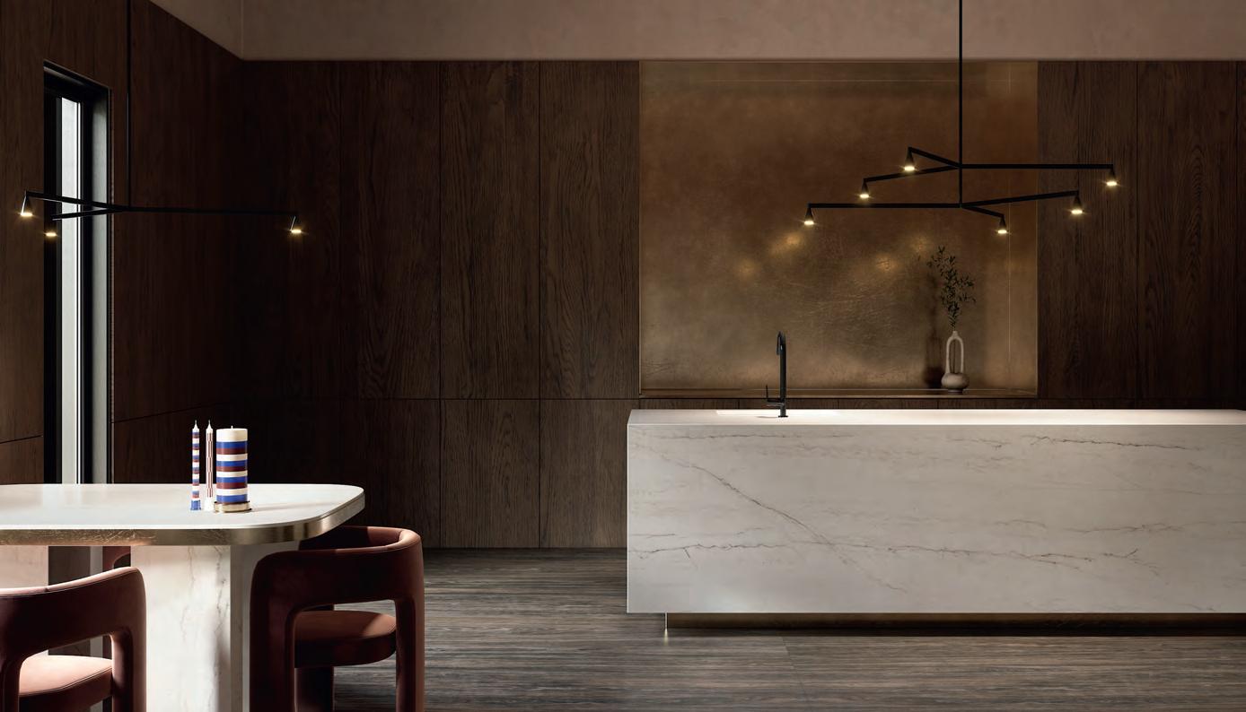
SUPERIOR HEAT RESISTANCE A RECYCLED CORE INLAYR® 3D DESIGN
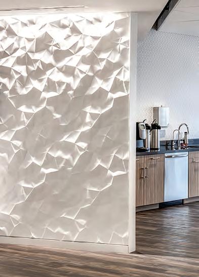
ĒCLOS is a next-generation mineral surface developed with advanced layered design technology.
ZERO SILICA
EBB & FLOW
At Simone Ferkul Projects, objects and interiors inform one another across shifting scales. By Tory Healy
FROM FIRST PRINCIPLES
How collaborations and hypercontextuality are leading to a new era in Indigenous Design. By
Matthew Hague
LINES OF SIGHT
Fifty years after piercing Toronto’s skyline for the first time, the CN Tower is once again defining what it means to experience the city from above. By Shannon Moore
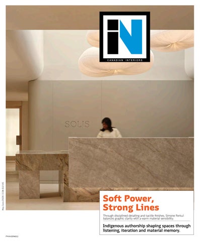
COVER – Solis Movement in Toronto’s East End by Simone Ferkul Projects.
05/06 2026
26 32 20 26 32
8 ARIDO JOURNAL
10 CAUGHT OUR EYE
12 SEEN Shows in Malaysia and China represent maturing furniture markets seeking global relevance; Light+Building reveals how illumination is evolving.
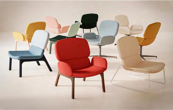
18 THE GOODS These seating collections combine comfort and sculptural design, serving as versatile options for urban living.
36 GOOD READS
38 OVER & OUT A new dementiafriendly shower renovation enhances patient comfort and care.
Photo by Riley Snelling
CANADIAN INTERIORS
May | June 2026 / V63 #3
Editor in Chief Peter Sobchak
Art Director
Roy Gaiot
Contributors
Matthew Hague, Tory Healy, Shannon Moore, Jeremy Vandermeij
Online Editor Lucy Mazzucco
Publisher Faria Ahmed 416-441-2085 x. 5 fahmed@canadianinteriors.com
Canadian Interiors magazine is published by iQ Business Media Inc.
126 Old Sheppard Ave, Toronto, ON M2J 3L9
Telephone 416-441-2085
e-mail: info@canadianinteriors.com
website: www.canadianinteriors.com
Canadian Interiors publishes six issues, per year. Printed in Canada. The content of this publication is the property of Canadian Interiors and cannot be reproduced without permission from the publisher. Subscription rates > Canada $38.95 per year (plus taxes) U.S.A. $71.95 USD per year, Overseas $98.95 USD per year.
Back issues > Back copies are available for $15 for delivery in Canada, $20 USD for delivery in U.S.A. and $30 USD overseas.
Please send payment to: Canadian Interiors, 126 Old Sheppard Ave, Toronto, ON M2J 3L9 or order online www.canadianinteriors.com
For subscription and back issues inquiries please call 416-441-2085 x2
e-mail: circulation@canadianinteriors.com, or go to our website at: www.canadianinteriors.com
Spring, it is said, is the season of rebirth, growth and activity. One way this truism is typically seen in the A&D industry is a paroxysm of trade shows and in-person events flooding our calendars in early spring months. While not a revelation — design industry trade shows tend to cluster primarily in early spring and early fall — an uncommon mushrooming of opportunities seemed to happen this past March and April. In that brief period, Canadian Interiors participated in events in Malaysia, China, Germany, Spain and Italy, and kept tabs on others elsewhere. And it wasn’t just the number of events; there felt a changed mien among attendees at these events.
During my participation in several of those events referenced above, both the amplified number and energy of the Canadian design contingent I encountered was palpable, particularly during Salone del Mobile.Milano 2026, the grande dame of the show circuit (and which ended mere days before we went to press, so my report is forthcoming). Here, Canadian visitor numbers rose significantly — 28 per cent compared to previous years and one of the largest increases by countries, according to organizers — even against a backdrop of geopolitical instability, unstable markets and growing international supply chain complexity (and let’s be honest: costs and flights).
The more I imbedded myself in their groups and spoke to members of Canada’s A&D industry at these shows, the more I noticed similarities in their attitudes. For designers now, trade shows are more than just occasional sources of inspiration or vendor-sponsored outings (although some of that still exists). They see them as multi-layered business development ecosystems where product specification intelligence, relationship-building, thought leadership, and future business development converge.
As one designer said to me during Salone, their growing interest in trade shows is not rooted in some nostalgic return to pre-pandemic habits, but in the realities of a market that now demands more active visibility and sharper positioning. Designers are operating in an environment shaped by rapid product innovation, sustainability mandates, supply chain instability, cost pressures, and heightened client expectations. In this context, she said, trade shows provide concentrated access to manufacturers, suppliers, collaborators, and emerging technologies in ways that digital channels alone cannot replicate. One of the greatest values of trade shows has always been in prod-
By Peter Sobchak
uct specification. But these days, material and product decisions are deeply tied to performance, regulatory compliance, ESG requirements, and long-term project resilience. Attending major trade events allows designers to evaluate products firsthand, compare innovations directly, and engage with manufacturers in real time. This compresses months of fragmented research into highly efficient, strategic knowledge acquisition. More importantly, it allows designers to make better-informed specification decisions that can reduce project risk and strengthen client confidence.
Yet product intelligence is only one dimension of the opportunity. As Johanna Hoffmann mapped out superbly in recent blog posts, trade shows have also become high-value networking ecosystems that extend far beyond traditional client development. Designers now use these environments to strengthen relationships with suppliers, consultants, media, and strategic collaborators. This broader networking capacity positions designers not simply as creative professionals, but as active participants in a larger ecosystem.
The surge in trade show interest also reflects broader structural changes in the market. As procurement cycles grow more competitive and buyers become more informed, visibility and trust must be reinforced continuously. Digital presence may establish awareness, but in-person engagement often accelerates credibility and relationship-building in ways that are critical for securing future opportunities.
Ultimately, trade shows have become far more than marketplaces. They are laboratories, networking hubs, content engines, and business development accelerators. But there is something else growing which can’t be denied: an energy. As one Toronto-based designer said to me at Salone, while pausing briefly to down yet another espresso to fuel her excited explorations, the energy now is contagious, emanates beyond the physical locations, and plants seeds in new places. One example immediately came to mind when she said that: the first-ever Montréal Design Week happening this spring, with a program of exhibitions, studio visits, conferences, and urban circuits across the city. In a rapidly shifting marketplace, firms that view trade shows as integrated strategic assets rather than optional events will be better equipped to make smarter product decisions and position themselves for sustained future growth.
CanadianInteriors.com
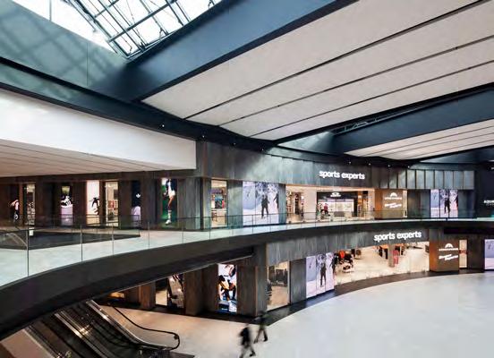
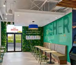
Spatial Strategy: Sports Experts Royalmount
Designed by INDESIGNinc–CONRATHarchitecte for seamless shopping with an open layout, mezzanine views, and versatile displays.
Unique Aesthetics: Otie Bakehouse
Designed by The Good Design Group and AT Art & Interiors, this cozy cafe features bold interior choices including bright blue accents.
New Beginnings: Cornerstone Architecture Office
Cornerstone’s new office occupies two floors including a storefront entrance from the shared patio for tenants.
Cultural Connection: JYN – Jewish Youth Network
The design by Dvira Interiors incorporates contemporary aesthetics alongside Jewish symbolism to foster learning, connection, and spiritual growth.
Beyond Finish Packages
how
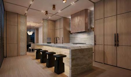
Maximizing Asset Performance Through Integrated Design
Daniel Kocur from InterRent examines why interior designers belong in real estate development, and early design integration should be a core investment strategy.
vivid compendium that celebrates chromatic optimism.
Jeffrey Kansun of Sierra Homes explores
personalization is changing luxury housing.
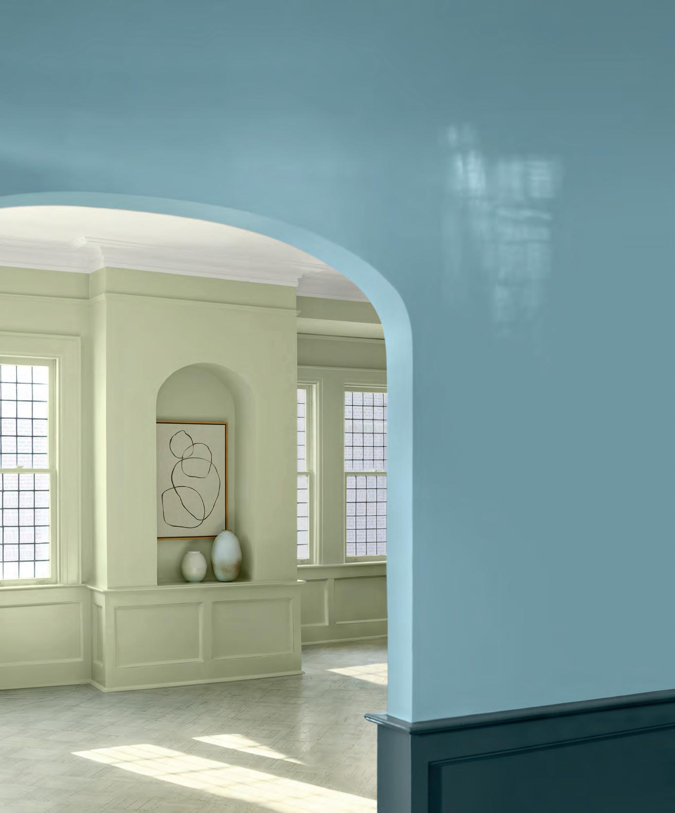
Set the tone for years to come.
Inner wall: Mesquite 501, Regal® Select, Matte
Outer wall: Franklin Lakes 1643, Regal® Select, Matte Wainscotting: Yorktowne Green HC-133, Advance®, Satin Crown Moulding: Swiss Co ee OC-45, Advance®, Semi-Gloss
Professional associations are often judged by how well they protect standards. That matters. But standards alone are not the whole test. A profession can be well-established, credible, and still arrive at a moment when several parts of its environment begin shifting at once. When that happens, the issue is not whether the foundation was sound. The issue is whether the structure now has enough flexibility to create the next layer of value.
That is how I read ARIDO’s present moment.
The clearest evidence sits in the regulatory pathway linking ARIDO, the OAA, the Office of the Attorney General, and the Architects Act. After direction from the Attorney General’s office in late 2016, ARIDO and the OAA established a Joint Task Force in early 2017. On April 9, 2018, the Attorney General indicated that Direct Regulation was the preferred model. ARIDO members and OAA Council then voted in June 2018 to move that model forward. Amendments passed in March 2024 resolved part of the legislative pathway, with consultations and further drafting expected to resume soon. That is not a static picture. It is evidence of a system in active reorganization.
Design offers the simplest way to understand it. A room changes faster than a floor. A floor changes faster than a
building. A building changes faster than the legal, institutional, and cultural systems around it. Each layer moves at its own speed, but none moves alone. A decision in one suite can influence the floor. A change to the Building Code can alter what is possible across an entire building. The profession works the same way. Members, standards, legislation, qualifications, public understanding, and organizational leadership do not all shift
and maintains expectations around ethics, insurance, and professional conduct. It also carries responsibility for fair registration practices and complaints processes, while continuing to build professional credibility and public confidence. Those functions are not side notes to the story. They are part of the story. They show that ARIDO already operates across multiple systems that affect both members and the public.
This is collective work. The next chapter will be stronger if we shape it together.
together. But when several of them begin to move at the same time, the profession reaches a leverage point.
That matters because Direct Regulation is only one expression of a broader opportunity. ARIDO is already more than a body waiting for a future statutory outcome. Under its current mandate, it qualifies members, protects title, sets standards, requires continuing education,
Why I read it this way and why this moment matters for value
My own path into this role is part of why I see the moment this way. I began in interior design practice, where I learned how ideas become technical detail and then lived experience. Later, I taught interior design, helped build DesignTO into Canada’s largest design festival, and
worked in roles where community, institution-building, public value, and longterm strategy had to reinforce one another. Graduate work in Strategic Foresight and Innovation sharpened that systems lens further. Across all of it, one lesson held: when we misread a system, we misread the moment.
What is easy to miss is that this is also a value moment.
That means more clarity, more trust, and more room for the profession to advance; value that members can actually feel in practice, not just read about in a report.
For the public, value comes through confidence: confidence that qualifications are fair, standards are meaningful, titles are protected, and the profession is being stewarded with care. For members, value is broader than regulation alone. It includes professional recognition, stronger positioning, clearer pathways, learning, visibility, connection, collective voice, and a more coherent public understanding of what interior designers contribute. In a period like this, the issue is not whether ARIDO should choose between serving members and serving the public. The issue is how to increase confidence for both, without compromising either.
Why governance matters now
The clearer separation between the Registrar and Executive Director roles strengthens the organization by distinguishing public-protection responsibilities from member-facing leadership. That is not merely an internal adjustment. It is part of how trust is built. It gives the Registrar’s office a clearer footing in registration, standards, ethics, and title enforcement, while allowing the Executive Director’s office to focus more fully on strategy, partnerships, positioning, and the broader conditions through which member value can grow.
This is why I see it as a moment to create more value with discipline, clarity, and partnership. The work is to use this
opening well: to strengthen the profession’s public value, to deepen the value members actually feel, and to build trust by making ARIDO more useful, more legible, and more connected to the realities interior designers are living now.
If you are a member or an industry partner, I want to hear from you. Email me at jvandermeij@arido.ca with ideas for creating member value, forging or reforging partnerships, or strengthening the role ARIDO can play for the profession and the public. If you want to meet, introduce yourself, or start a conversation, please reach out. This is collective work. The next chapter will be stronger if we shape it together.
Jeremy Vandermeij is Executive Director of ARIDO, a design-trained strategist, educator, and community builder focused on professional value, public confidence, and renewal.
Since 1934, ARIDO has been the self-regulatory body for interior design in Ontario, focused on protecting the public and furthering the profession.
CAUGHT OUR EYE
Eugene Krasnaok
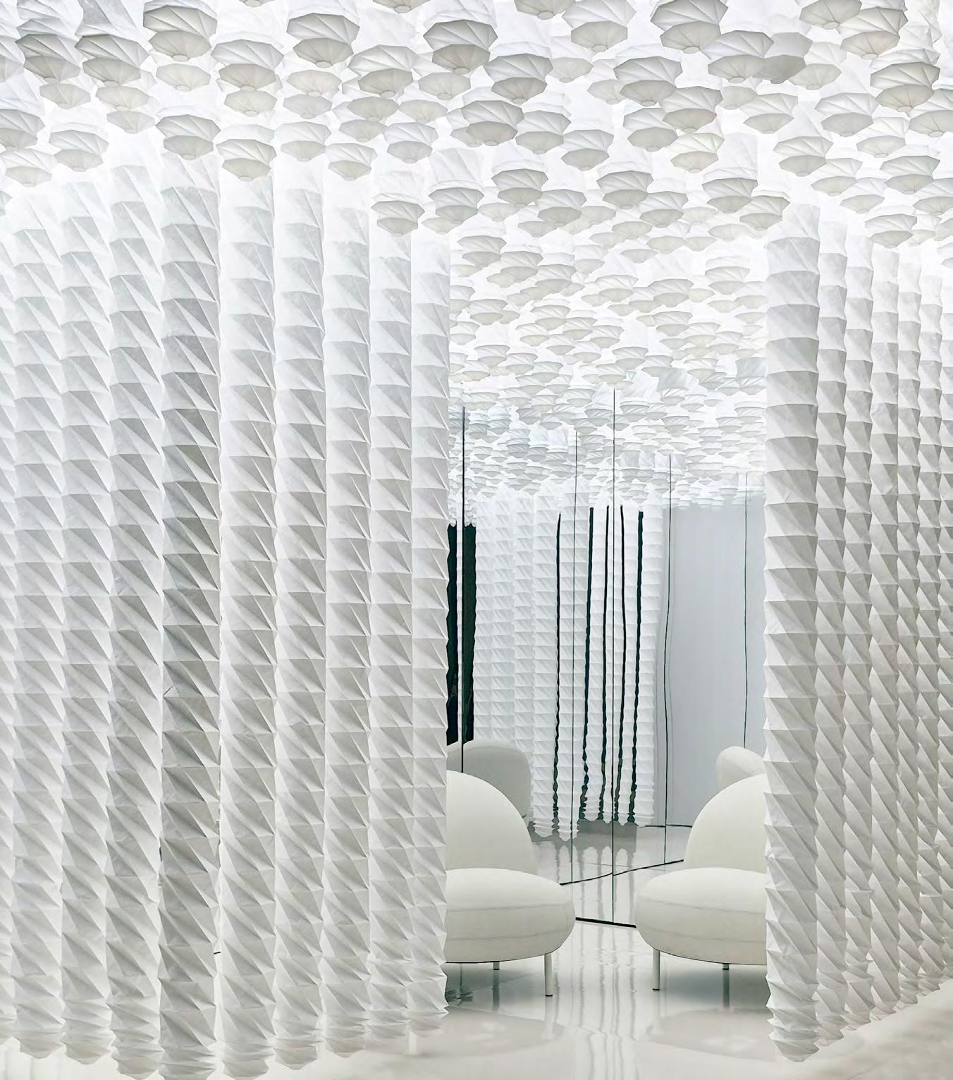
Column Width The highlight of Teknion’s new Advanced Concepts 2.0 program is the Nimbus Adaptive Architectural System, designed by Dubbeldam Architecture + Design, which reframes workplace planning from the ceiling down. In addition to obvious sci-fi coolness, the System inverts the logic of partitioning by deploying kinetic, ceiling-suspended fabric pillars to shape space with softness and precision. Constructed from highdensity polyethylene fibers, these translucent elements deliver acoustic control, integrated circadian lighting, and on-demand reconfiguration.
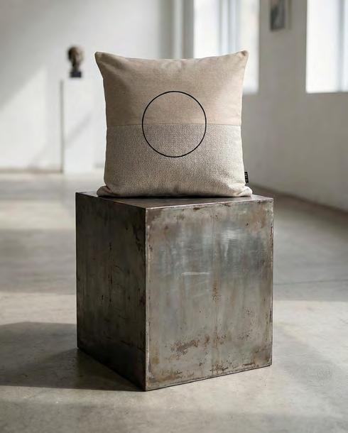
Soft Structure, Sharp Intent Toronto-based Interior 31’s limited-edition textile objects distill architectural discipline into tactile, sculptural form, where woven fabrics, leather and embroidery converge as quiet spatial anchors. Founded by Viviana Michaud, whose Mexican-French heritage and cross-disciplinary background inform a layered sensibility, the collection balances restraint and expression through material-driven compositions that elevate everyday interiors.
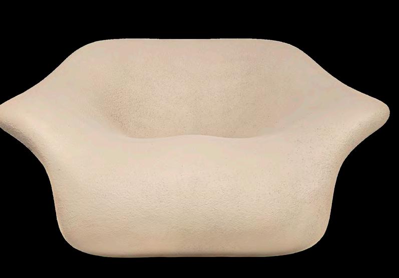
Sand and Sensibility Presented at IDS26 but somewhat lost among the cacophony of pieces within the Field of Interaction sculptural landscape, Embrace of the Dune is a hand-sculpted armchair by Toronto-based Yury Goncharov that positions seating as emotional architecture. Evoking desert topographies, the armchair merges comfortable design with inhabitable art, offering warm materiality and a deliberate resistance to tech-forward aesthetics in favour of craft-driven, sensory domesticity.
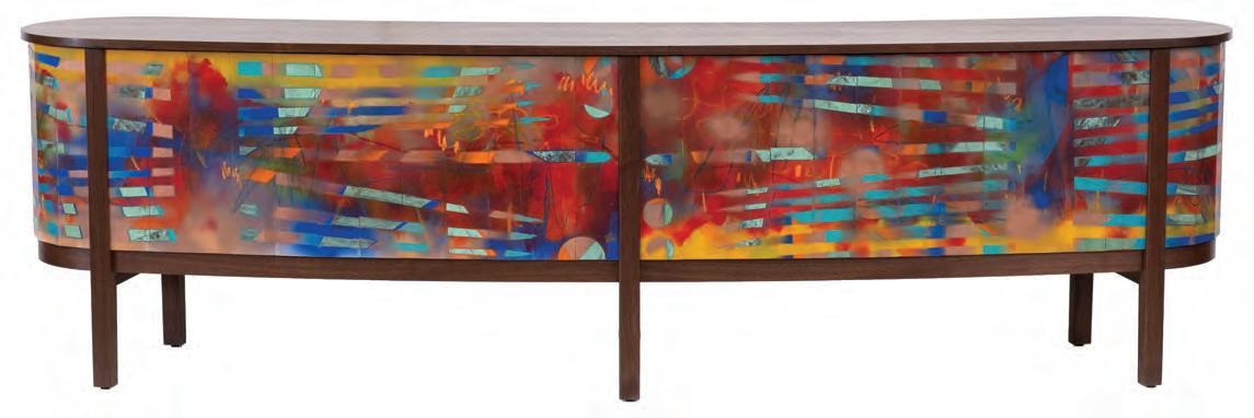
Table with Memory A custom statement table anchors a Canadian diplomatic residence in Mexico, designed with Indigenous art and reclaimed copper from Parliament Hill. Christopher Solar collaborated with Cree-Métis artist Jason Baerg on the piece commissioned by Global Affairs Canada as part of efforts to showcase Canadian culture abroad. Solar built the arc-shaped walnut table as a continuous surface for Baerg’s painted artwork, while inlaid fragments of reclaimed, patinated copper from Parliament’s roof subtly respond to the artwork.
Courtesy
Yury Goncharov
Domestic Futures, Dialed In
With a massive layout roughly four times the size of Salone del Mobile, CIFF Guangzhou read as a barometer of shifting domestic landscapes, where lifestyle specificity and market segmentation are now design drivers.
Prime Minister Mark Carney wants Canadian professions to look at doing more business with China, and for our A&D community the China International Furniture Fair (CIFF Guangzhou) might be a good place to start: significantly larger in both physical scale and brand volume than both Salone del Mobile.Milano and NeoCon combined, CIFF Guangzhou spans 850,000-sq.-m. across 90 exhibition halls, gathering more than 5,100 brands (Salone typically occupies around 230,000-sq.-m. and NeoCon a mere 93,000-sq.-m.).
Inarguably the “world’s largest” by volume, CIFF Guangzhou wants to position itself as an “integrated ecosystem” covering the entire industry chain, from raw materials and machinery to finished furniture. A massive net is cast, but as we know, quantity does not always equal quality. To see where design was driving value meant focusing primarily on the Contemporary Design Exhibition: 60 commercial design brands; 20 independent designer labels and 60 international studios covering 40,000-sq.-m. through four halls felt the most familiar to Western design affinities.
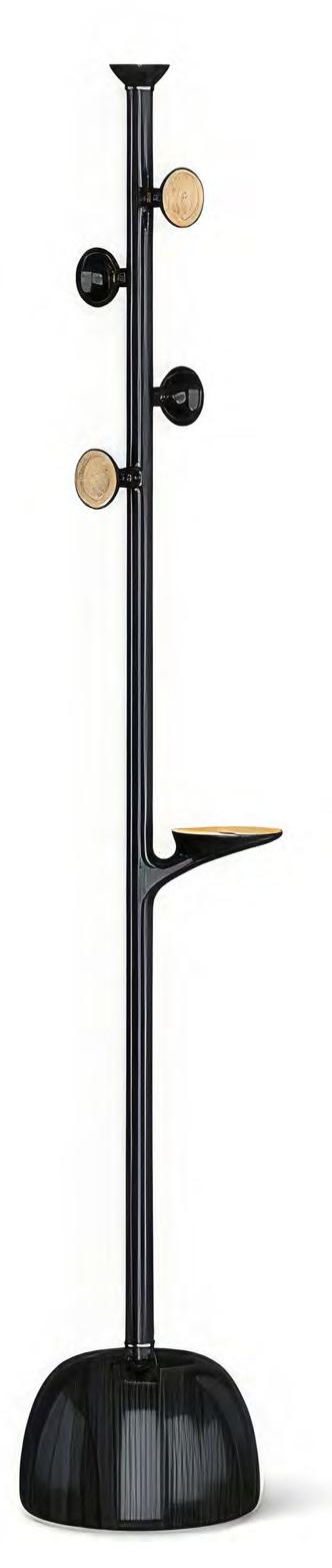
1 Subdued Fragrance | Foshan Qianjin Furniture Co. Shenzhen Top Design Co. transformed a famous poem by Chinese philosopher Zhuangzi into a sculptural rack, where plum-blossom-inspired hooks soften a disciplined silhouette. A central tray adds utility, while wood, metal, and deep-toned finishes create a tactile interplay balancing cultural resonance with contemporary restraint and a quietly expressive material palette.
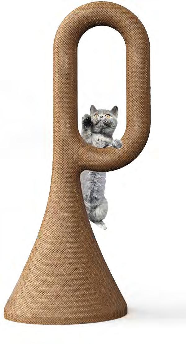
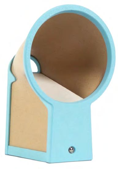
2 Cat Tree | Flytech A small but interesting segment of the show was Pet Life, where 40 companies covering 2,000-sq.-m. showcased products across the entire pet industry chain, from human-pet furniture and smart devices to accessories and related services. Flytech, a subsidiary of MT Furniture and designer, manufacturer, and exporter of outdoor and pet furniture, was one of those companies with a catalogue full of hyper-modern and clever offerings, such as the Musical Note Cat Tree series, which won Red Dot Awards when launched in 2023.
3 Pica | Mingdu Design Co. Another Red Dot winner in this section thanks to designers Liang Chen and Song Zhuoyang, Pica distills origami logic into a refined pet nest, where a single felt sheet and discreet buttons unlock multiple configurations. Semi-enclosed yet social, it balances comfort and visibility, transforming into a travel-ready carrier.
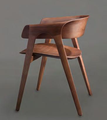
4 PaperMass | OOD Heshan Zhuyou Furniture Co. This iF Design Award 2026 winner is an impressive pairing of advanced, precision-led fabrication with time-honoured mortise-and-tenon joinery and hand-finished detailing. The result is a chair where digital efficiency meets inherited craft, delivering a quietly progressive object that balances material integrity with contemporary refinement.
5 Belvedere Collection | Livintwist Rooted in this Hong Kong company’s early adoption of recyclable materials, this outdoor collection advances circular design with recycled rubber rope and fully recyclable aluminum construction. A 1960s-inflected lightness informs its refined forms, pairing durability with quiet nostalgia to create an outdoor system that merges material innovation with restorative, nature-led living.
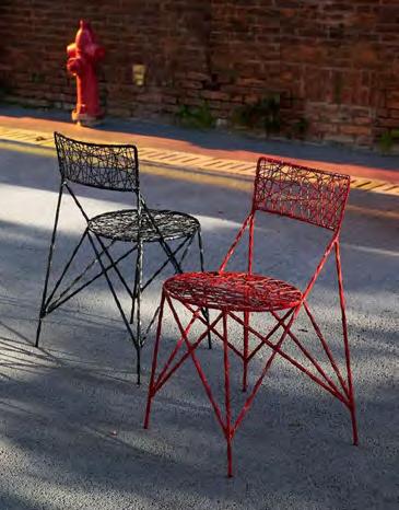
6 Cat’s Cradle Chair | Dak Haan Translating a nostalgic game into structure, with carbon-fiber filaments intricately woven through fixed joints to form a gossamer, sculptural seat, this handcrafted chair weighs just under one kilogram and pairs airy lightness with tensile strength, delivering durability, weather resistance, and expressive, one-off materiality.
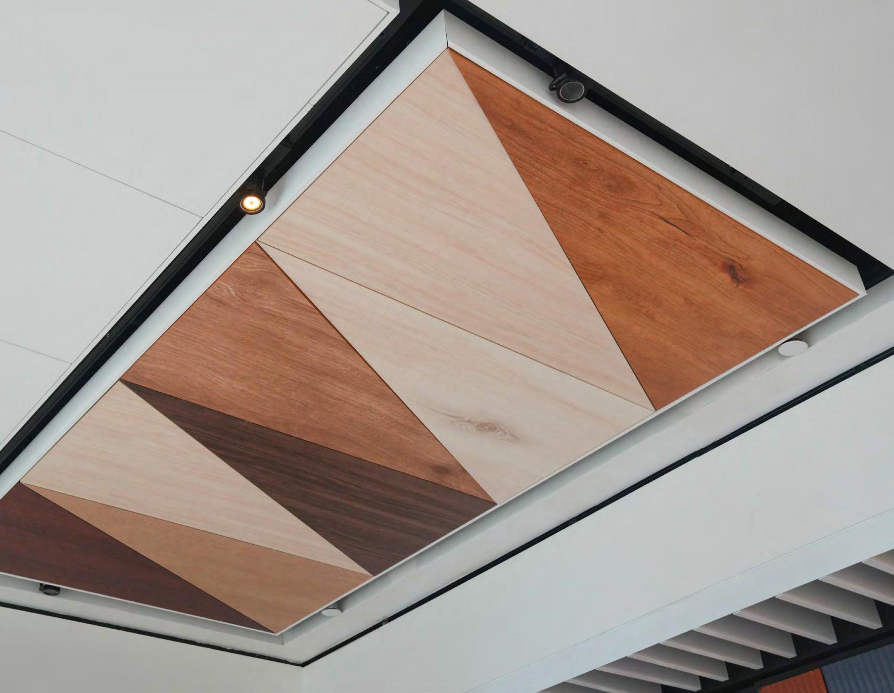
DECOUSTICS®
WOOD-LOOK CEILING
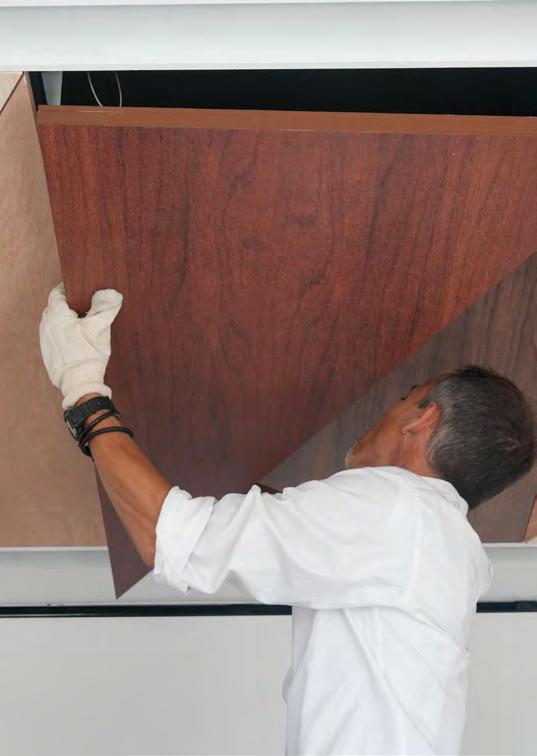
A perfect blend of innovation and design freedom, Decoustics Impressions is a ceiling and wall solution that uses fade-resistant, digital printing technology to offer 10 realistic solid wood-look finishes in non-repetitive patterns.
•Lightweight and ready-to-install
•Durable and easy to maintain
•NRC up to 0.85
•Available with low VOC Components
•Climate and fade resistant
•Custom sizes, shapes, forms, and curving capabilities
learn more at certainteed.com
Decoustic® Impressions wall and ceiling solutions enhance acoustics to reduce noise levels and improve occupant comfort.
Ceiling
Getting Off the FloorFactory
By Peter Sobchak
Disciplined manufacturing and supply chain mastery have never been Malaysian problems. Getting global recognition for design authorship is. But a maturing MIFF reflects an industry leaning into original concepts that favour clarity and utility.
At the 2026 edition of the Malaysian International Furniture Fair (MIFF), product innovation tracked closely with an industry in transition. Exhibitors presented a confident mix of modular systems, multipurpose typologies, and selectively integrated smart technologies, reflecting a maturing understanding of how flexibility now underpins both residential and contract environments. This year’s showcase also underscored a broader industrial evolution: Malaysia’s steady pivot from OEM manufacturing to design-led enterprise. Companies are investing in original concepts and brand identity, supported by a growing ecosystem of local talent. Against a backdrop of shifting global supply chains and demand for sustainable production, the fair positioned Malaysia as an increasingly sophisticated player, one aligning industrial capability with design intelligence to compete across higher-value segments.
1 Rest+ | Beori This lamp collection pairs soft, contemporary forms with circular design thinking, using recycled materials to deliver calm, directional ambient light. Adjustable colour temperatures and expressive finishes position them as wellnessdriven objects balancing sustainability, tactility, and quietly sculptural presence.
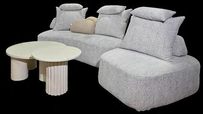
2 Akemi Kira Modular Sofa | Eastern Decorator Sdn Bhd The Platinum winner of the Furniture Excellence Award at MIFF, the Kira Modular Sofa pairs screwless, woodfree construction with adaptable configurations and plush, sculpted volumes. Built from Reloop Fibre, a proprietary upcycled textile composite, it handsomely presents modular seating with a refined silhouette shaped by flexibility, engineered support and circular design thinking.
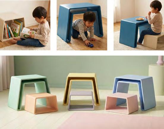
3 Stackablock | Prathiin Saravanamuthu A student at Universiti Sains Malaysia and participant in the Furniture Design Competition (which challenged designers under 40 to create bedroom furniture for children aged five to nine), Saravanamuthu may have only picked up a Special Mention certificate, but what is notable is how his product was quickly picked up for production, proving the marketability of his design.
The CeilingThinking
From sensor-rich fixtures to data-led controls,
Light + Building 2026 reveals how illumina -
tion is evolving into an active participant in atmosphere and spatial performance.
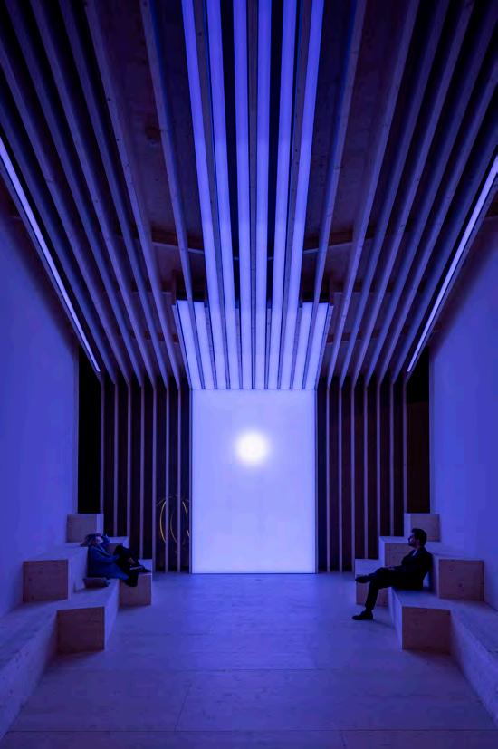
Light + Building 2026 in Frankfurt underscored a shift in lighting as both infrastructure and experience, where innovation is less about fixtures alone and more about intelligent ecosystems. Across nearly 2,000 exhibitors, the most compelling product advances fused AI-driven controls with sensor-rich luminaires, enabling lighting schemes that respond fluidly to occupancy, daylight, and use. These adaptive systems point to a future where illumination operates as a dynamic layer within broader building intelligence, closely tied to energy management, electrification, and bidirectional charging networks.
Equally notable was the refinement of lighting as a design medium: manufacturers paired high-performance technology with nuanced colour tuning, material sensitivity, and increasingly circular construction. Experimental prototypes and emerging designers pushed formal and material boundaries, hinting at a more expressive yet responsible direction. The result is a new design paradigm positioning lighting as a central tool in shaping responsive, future-ready interiors.
Elsa Lam is editor of Canadian Architect.
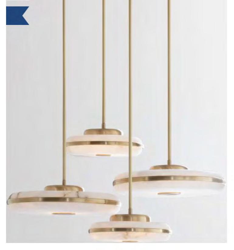
1 Beren | Bert Frank Inspired by mid-century classics, Bert Frank’s U.K.-made lights blend quality materials such as bronze, leather, and wood with sophisticated style. The Beren line of wall sconces, pendants, table lamps, and chandeliers, available through LightForm, are made from milky white Spanish alabaster, and framed with rings of antique brass.
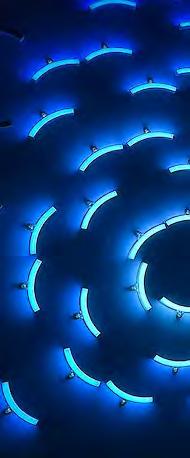
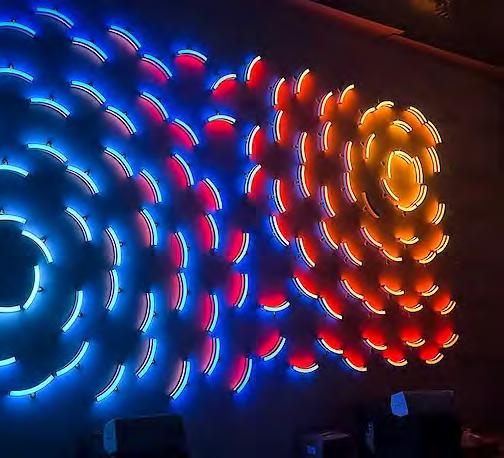
2 Liquid Line | Lightnet A stand-out at Light + Building was a kinetic installation called Liquid Tiles, created by German manufacturer Lightnet with Catalan audiovisual artist duo Playmodes. The installation featured 126 curved lights, set in a triangular matrix; in time with ambient music, the lights rotated to form dynamic patterns animated by changing colours. The base product, Lightnet’s Liquid Line, is available as a surface-mounted or suspended system, with a new option to add metal mesh curtains.
3 Cieluma | Zumtobel In 2024, Zumtobel broke the World Record for largest continuous illuminated ceiling with a 203-sq.-m. installation of their textile light system Cieluma. This year, they introduced a feature called Move, where the individual 1.5-in. pixels behind the diffusing textile can be controlled to create gauzy atmospheric patterns, such as simulating sunrise and sunset.
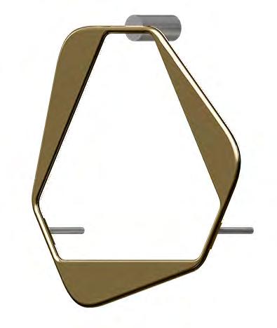
4 Gorget | Ilum Ilum’s high-design lights aren’t easily available in Canada, but there’s a workaround. The luxury lighting company will ship the luminaire without its electronic driver; a Canada-approved unit can be added upon installation. A model
that caught our eye as being worth the effort was the Karim Rashid-designed Gorget, an asymmetrical ring that recalls a medieval headscarf.
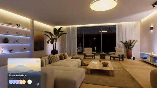
5 SpatialAware | Philips Hue Advancements in smart building trends are making their way into lighting products for all markets. The recently introduced Hue SpatialAware feature allows users to scan a room to determine the position of each Philips Hue light, then an algorithm ensures they all work in harmony to create the most natural ambience.
6 Lightware | Saas Instruments Picture going into a restaurant with small LED light points integrated into the table. A waiter comes by and clicks a straw-sized brass tube over the light point: the tube contains a fibre optic cable that redirects the light into a warm wash over the table. Saas Instruments’ elegant Lightware, distributed through Eurolite in North America, is being used in restaurants around the world, including a half dozen listed in Michelin guides.
THE GOODS
Have a Seat
These seating collections combine comfort and sculptural design, serving as versatile options for urban living, hospitality spaces, and contemporary workspace interiors.
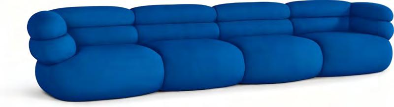
1 FreeForm | King Living The Australian furniture designer which was one of the first to explore the structural and aesthetic potential of high-performance foam is continuing that tradition with a new furniture line aimed at young professionals, renters and first-home buyers. The FreeForm collection features products with removable and machine-washable covers, bases crafted from 50 per cent post-industrial recycled high-density polyethylene, and compact delivery that reduces packaging waste.
2 Olive | Allseating Tackling the well-worn trope of work environments that feel uniform, Olive’s customizability allows companies to express their culture visually, matching seating with brand palettes or departmental themes. The chair ’s colour options also aim to support neurodiversity in the workplace, with calming hues helping to anchor focus zones, while more vibrant tones energize collaborative areas, contributing to flexible, inclusive environments.
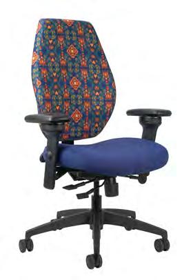
3 Waaban Chair | ergoCentric Canada’s first Indigenous-inspired, Canadian-made ergonomic office chair, created through a first-of-its-kind design collaboration between ergoCentric and eSupply Canada, a 100 per cent Indigenous-owned distributor. The chair, whose name means “the morning light” in Anishinaabemowin, features artwork by Tracey Metallic, a Mi’gmaq artist whose designs weave traditional motifs with contemporary form. Each chair sold contributes directly to the next generation of Indigenous leaders, with $20 from every chair donated to Indspire, a national Indigenous-led charity supporting post-secondary education for First Nations, Inuit, and Métis students.
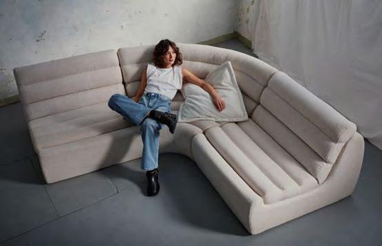
4 Biboni Sofa | Knoll This North American debut with Sharon Johnston and Mark Lee of Johnston Marklee continues Knoll’s legacy of collaboration with architects and designers. Plush scallops and soft folds are shaped into an anthropomorphic form that envelops and embraces the human body. Designed with an architectural mindset, every element was shaped to enhance its relationship to a surrounding space, and reflects a balance between formal and informal, which offers a combination of softness and support.
5 Mason Lounge Chair | KFI Studios Featuring a sculpted multi-piece shell inspired by the rounded forms of smooth pebbles, designers can upholster the lounge chair in a single textile for a monochromatic look or combine multiple fabrics to add personality. To complement its soft, upholstered form, three base options are offered: a solid ash wood frame for warmth and natural character, a steel sled base for a modern profile, and an aluminum four-star base for dynamic mobility with a 360-degree swivel.
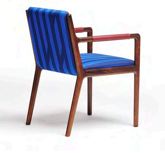
6 Hazel Guest Chair | HBF Offered in five models with single fabric, dual fabric and multi-fabric options, the chair’s proportions allow for longer sit times while the upright pitch and supportive back encourage an engaged posture. With a frame constructed from solid ash and offered in 15 finishes, Hazel is manufactured domestically to ensure quality and sustainability standards, and meets ANSI/BIFMA Level 3 Furniture Sustainability Standards, Third Party Certified – BIFMA Level 7.4.4, and is SCS Indoor Advantage Gold Certified.
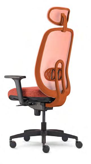
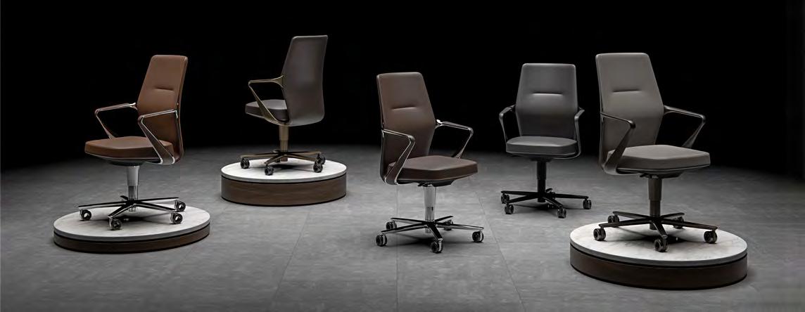
7 Ferra | Halcon Balancing Italian restraint with executive polish, the company’s first foray into the conference seating world pairs sculptural ribbon arms offered in metal or leather-wrapped finishes with a tailored mechanism that enables subtle, intuitive movement. Designer Mario Ferrarini focused on fine leathers, rich finishes, and polished metals in a poised silhouette, delivering comfort and quiet sophistication to contemporary conference settings.
By Tory Healy
Ebb & Flow
At Simone Ferkul Projects, objects and interiors inform one another across shifting scales.
It’s important to meet your subject on their turf when writing a profile. Perhaps a workspace will reveal something about personality, maybe method. Interior and object designer Simone Ferkul’s Toronto studio is sunlit and orderly, with no swatches in sight. Stone and wood samples line the windowsill in neat succession, alongside miniature studies of stools. Below a flatscreen TV sits a row of Ferkul’s self-designed Catch and Release brass incense holders, their funnel shapes marked by use. A marquetry of veneers hangs on one wall, while a grey “visitor” hard hat rests atop a filing cabinet. These seemingly incidental objects later prove telling. Together, they outline a practice that moves fluidly between object and environment, where small acts of making scale into larger spatial ideas.
Her professional path was not always obvious. Now 35, Ferkul grew up in Mississauga, Ont. Her mother was an illustrator, her father built custom homes. Her parents immigrated from Eastern Europe, and she credits part of her drive to an innate self-sufficiency. When not at Cawthra Park, a high school known for its arts program, she was on construction sites. Influenced by both micro- and mac-
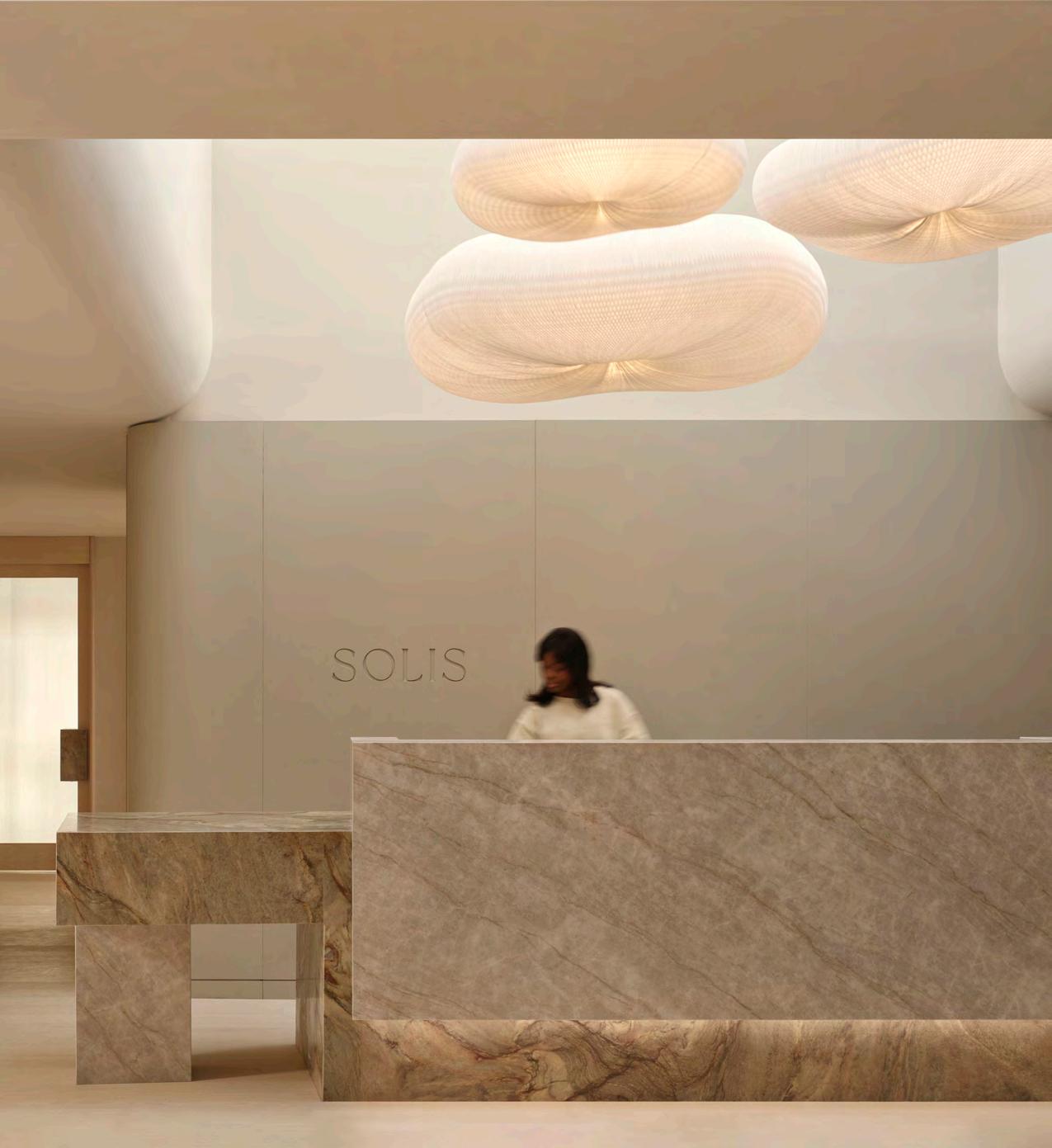
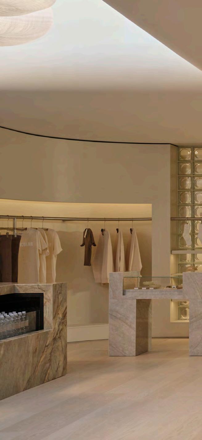
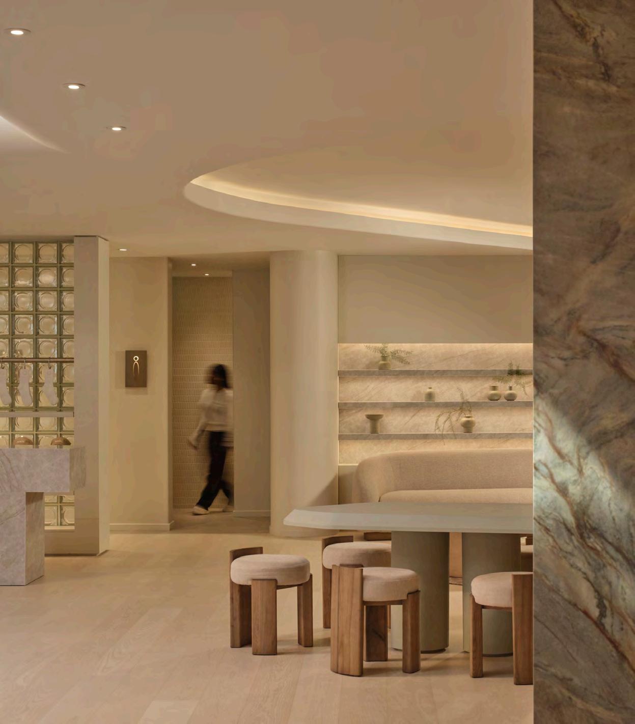
Right In Toronto’s east end, Solis Movement’s new studio by Simone Ferkul Projects trades spectacle for a controlled, sun-washed restraint where materiality and light quietly choreograph the user experience. A palette of warm neutrals rendered through printed quartz, Abet Laminati millwork, and softly reflective surfaces establishes continuity, while monolithic forms and curved ceiling planes temper the spatial rhythm.
Photography by Riley Snelling
ro-scale thinking, she considered a career in architecture. “But I didn’t want to build towering façades,” she says. “The ability to move people through space is an amazing power. If someone doesn’t walk away with a feeling, there’s a certain failure in the design.”
During her time at Toronto Metropolitan University’s School of Interior Design, she served as a teaching assistant for several shop classes. “I like to build when I can,” she says. “That’s important to me, from model making to the finished product. I’m learning to let go a little bit. The stools are made in Hamilton, Ont. by Tetome House, but I design them. I’m always experimenting. On the wall, that veneer piece, I hand-cut it to see how materials behave beside each other. I let the material guide the process, rather than a book telling me what to do.”
After graduating, Ferkul secured both funding and a position at Yabu Pushelberg, a firm celebrated for its luxury hotels and furniture, all held to a high level of design rigour. She followed with a tenure at Mason Studio, known for its intentionality and community engagement, before joining DIALOG. There, she spent five years and played a key role in the firm’s North America–wide return-to-workplace
planning following the pandemic. These experiences, spanning fine detail and large-scale problem-solving, proved formative. By the time Simone Ferkul Projects (SFP) was founded in 2022, with work arriving by word-of-mouth, her attention to quality control was white hard hat worthy, not only in execution, but in narrative.
Today, her four-person team completes roughly 10 projects annually. “We’re taking on less and less residential, maybe one a year,” she says. “Commercial is where we thrive; I live for hospitality spaces.” As both creative director and project manager, Ferkul remains closely involved at every stage. The studio operates across a full interior design scope, from concept through to implementation. Furniture and product design extend this investigation, with ideas moving between object and interior. Each project begins with a tailored line of questioning around vision, function, and parameters, establishing a clear structure for the work to develop. Decisions at the level of the object inform the spatial whole, and vice versa.
Across her work, common threads emerge in process and palette, yet no two projects resolve in the same way. “You have a responsibility as a designer to develop something that is derivative of your client,” she
says. “That starts from day one.” What results is a body of work that rewards close reading, where distinct identities emerge in subtle, unexpected ways, grounded in her ability to operate across scales.
Every Facet
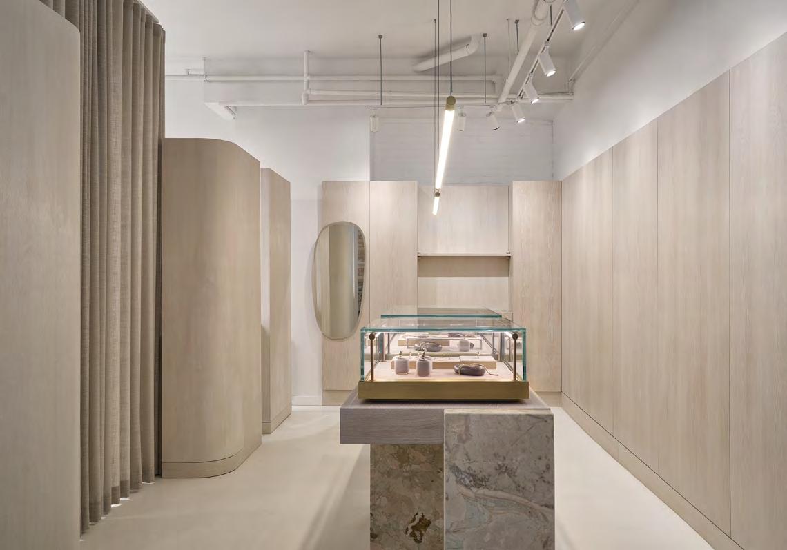
This approach becomes legible at Attic, a 600-sq.-ft. jewellery studio in Toronto’s Old Town neighbourhood, completed in 2023. Ferkul began with an object-based idea: the way a diamond is held within a ring. That tension between suspension and containment informed the project’s formal language. Working within a boxshaped plan, she reorganized the studio from the inside out, aligning process and experience. In this way, the project operates as both object and interior, where the logic of jewellery becomes a driver for space.
Given a limited budget and a desire to avoid major construction, the strategy focused on insertion rather than rebuilding the shell. Existing columns were integrated into the layout, an uneven floor resolved through a recalibrated datum, and the back-of-house reconfigured to support distinct stages of production. Openings between zones allow clients to glimpse jewellery manufacturing in real time.
At the centre, a Ceppo Antico marble jewellery bar anchors the space. The Attic Stool, developed through iterative paper models and now available in walnut, ash, and cherry, emerged as both a functional element and a new typology for SFP. Stained oak millwork and linear lighting establish a restrained backdrop, allowing each material to register clearly.
The designer’s authorship is embedded directly into each project. Ferkul carved walnut “pebbles” for the display cases, testing how chains would drape and settle. “I try to leave something I’ve physically made in every project,” she says. Subtle interventions, such as custom pulls that double as bud vases, extend the language of jewellery into millwork. It’s a tightly controlled exercise in scale, where the smallest gestures carry architectural consequence.
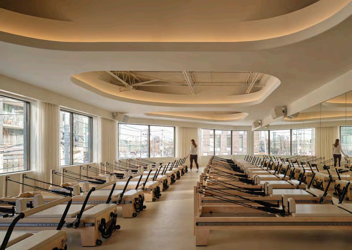
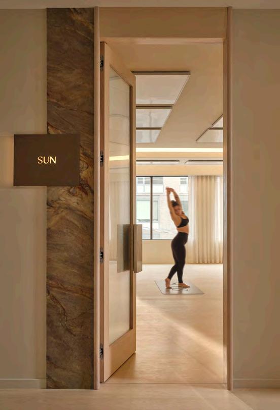
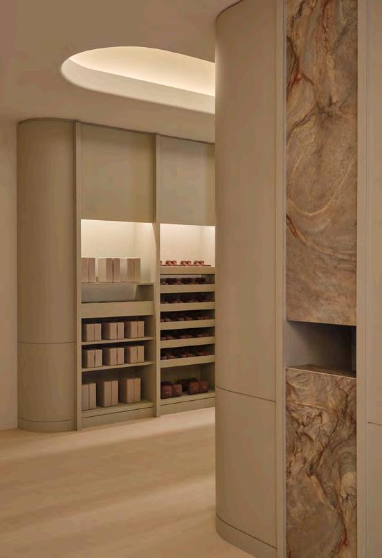
This spread The program unfolds as a calibrated gradient of intensity. The Reformer studio privileges clarity through openness and sculpted ceilings, while the infrared-heated Sun Room layers warmth and illumination into an immersive envelope. Throughout, integrated millwork, diffused lighting, and tactile finishes sustain a spa-like sensibility, positioning transition spaces as integral to the project’s holistic, performance-driven design narrative. Skylights and perimeter glazing pull daylight deep into the plan, dissolving boundaries between circulation, retail, and repose.
Sweet Indulgence
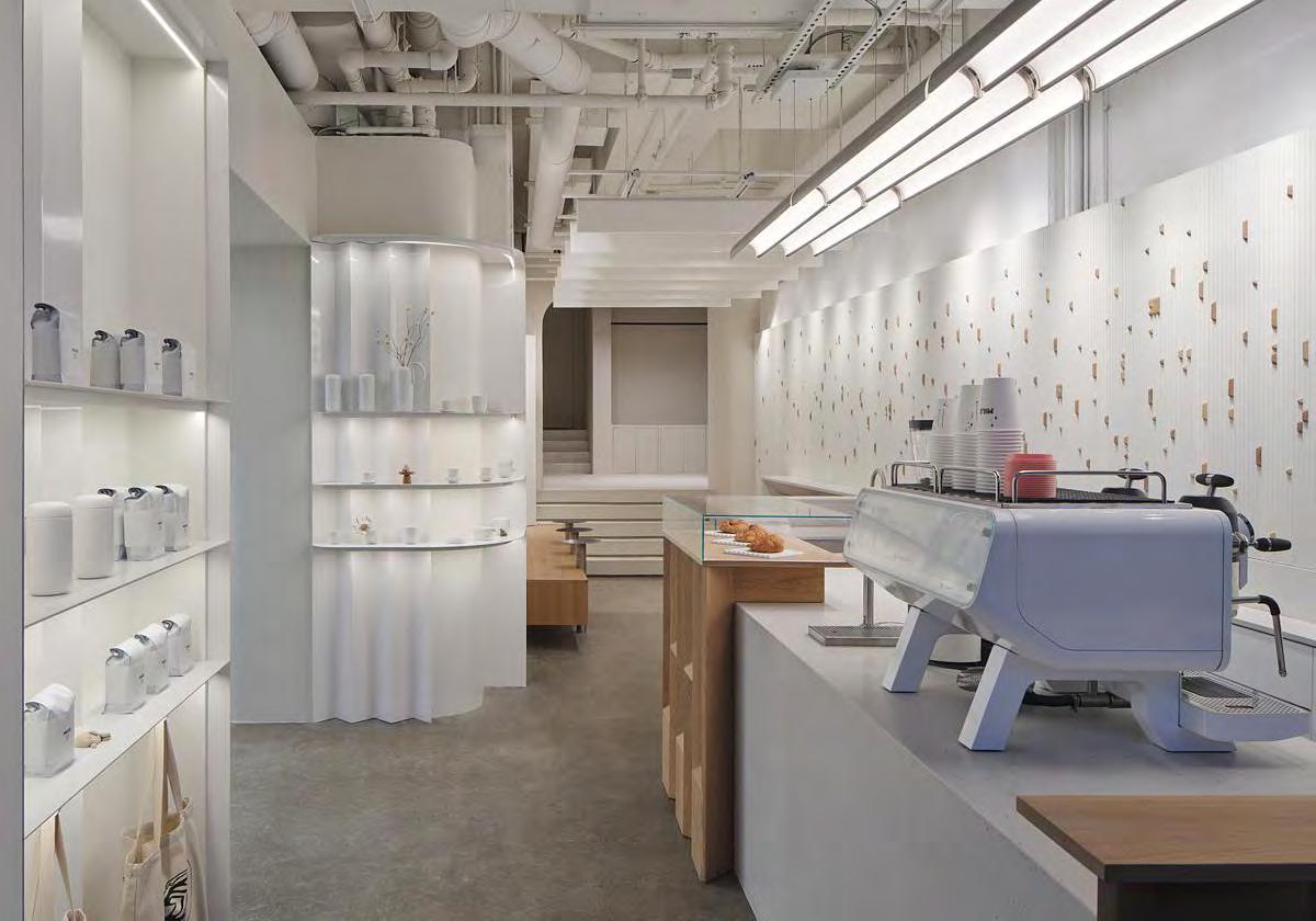
That impulse expands at Milky’s Coffee in Toronto’s west end, completed in 2024. If Attic began with a setting, Milky’s begins with a graphic. The brand’s elongated diamond motif becomes faceted surfaces that shape millwork and space.
Within a narrow footprint shared with a barbershop, the design works through constraints with careful standardization of circulation, sightlines, and material layering. An 18-foot bar anchors the space, while shifting ceiling heights create moments of compression and release. Oak, steel, and Caesarstone operate as components of a larger graphic system, where folds, edges, and shadow lines carry continuity throughout.
Here again, the work moves between scales. The Attic Stool reappears in simplified form, while more than 300 wooden elements are cut, fitted, and hand-assembled into the wall’s fluted surface. This translates the brand’s motif into a tactile, dimensional field. Pattern becomes three-dimensional form, extending the project’s logic beyond individual elements to the feel of the room itself. At Milky’s, the work shifts from object to narrative, where design is not only constructed, but conveyed.
Sun-Washed Sanctuary
At Solis Movement, that narrative expands to the scale of experience. Developed across two locations in Toronto, the project reflects an ongoing dialogue between designer and client, where brand identity is shaped through space. “You can convey a brand in a space without having it in your face,” Ferkul notes. Here, the body becomes the primary point of reference, with architecture responding to movement, rhythm, and duration.
Above A restrained intervention at Attic elevates raw structure through a material dialogue, pairing pale timber with crisp white surfaces and discreet metal accents. Angled ceilings are softened by integrated millwork and diffuse light, creating a calibrated interplay of texture and luminosity that melds materials with space. Right Milky’s Fold reframes its signature elongated diamond into a spatial motif, unfolding the geometry across wood, metal, and stone to create a tactile, three-dimensional surface language.
The first location, on King Street West, completed in 2024, established a framework that balances intensity with pause. A restrained palette allows the space to operate as both studio and platform, accommodating daily use and a growing roster of international
brand partnerships. Circulation and thresholds manage transitions between arrival, workout, and recovery, while shifts in ceiling height create moments of compression before opening into larger volumes.
By the time the studio expanded east in 2026, near St. Lawrence Market, the brief had shifted from definition to refinement. Working within an existing volume organized around a skylight, the design builds on earlier ideas while extending them spatially and formally. The plan is structured in response to this overhead aperture, using light to anchor movement and orient the interior. Finished ceiling heights vary, with cut-outs revealing structure above and enhancing the perception of openness.
Material experimentation plays a central role. Layered plasters and mineral-based finishes were developed through on-site mock-ups, testing how surfaces respond to changing daylight conditions. In parallel, key elements were refined as part of a broader spatial language. A 20-foot Abet Laminati clad reception desk anchors the entry sequence, its geometry responding directly to adjacent architectural conditions. Elsewhere, monolithic display cases remain rigid and orthogonal, while bespoke tables and seating introduce softer, more fluid forms that reflect the shifting positions of the body in
motion. A quartz water-refilling station marks the ritual of hydration, reinforcing the studio’s emphasis on restoration and repair. At Solis, the personality easter eggs seen in earlier projects scale up from custom elements into architectural gestures, including sculptural ceiling interventions and colour-shifting coves.
Throughout, Ferkul’s process remains closely tied to construction, extending beyond drawings into an ongoing dialogue with both client and builder. “Nothing can be designed to every single detail in drawings,” she says. “There are always site conditions.” Her regular presence, hard hat on, allows decisions to be adjusted and resolved in real time. Details are not simply executed but developed in the field, particularly where materials meet or conditions shift. Small adjustments reinforce continuity, establishing a flexible framework that allows the brand to evolve while maintaining coherence.
Ultimately, Ferkul’s work is defined less by style than by method. Rooted in observation, iteration, and response, her approach moves between object and interior in a continual ebb and flow of scale. In her studio, the objects that first appeared incidental read instead as evidence of a process where ideas are tested, refined, and carried through to the built work.
By Matthew Hague
From First Principles
How collaborations and hypercontextuality are leading to a new era
in Indigenous Design
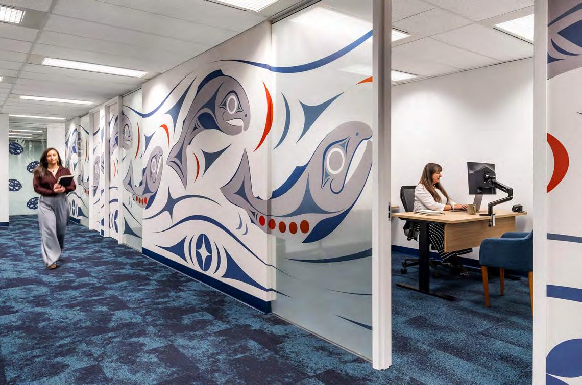
Recently, when Tiffany Shaw, principal of Edmonton-based Reimagine Gathering, an Indigenous-owned design studio, was asked to co-design five legal offices in British Columbia, she anticipated a challenge. Her client, the B.C. First Nations Justice Council (BCFNJC), wanted to create safe, welcoming spaces where diverse communities could not only access free services but also see themselves reflected in the design.
“Especially on the West Coast, the Haida formline type of graphics has come to be indicative of all B.C. Indigenous peoples,” says Shaw. “But there is a lot more variety. The way an Indigenous artist from the Okanagan region would represent themselves is extremely different from an artist from the coast. Even within a relatively small area, like the Lower Mainland, there are numerous regional differences.”
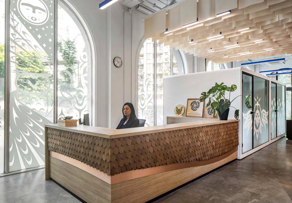
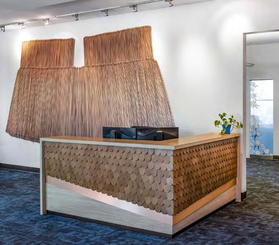
This spread In Vancouver, the retrofit strategy is deliberately restrained yet materially expressive. Custom millwork animates reception with rounded wooden shakes that echo salmon scales, while wall abstractions of natural motifs introduce texture without visual noise. Indigenous art anchors the spatial narrative, supported by a palette that foregrounds natural
and
films that diffuse light. The result is an environment that feels recalibrated rather than rebuilt, where cultural motifs are embedded with precision and the architecture
wood, soft neutrals,
glazing
recedes to let material storytelling lead.
Barrie
Underhill
Upper Left Photography
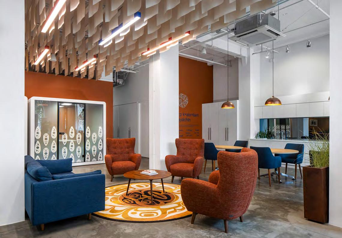
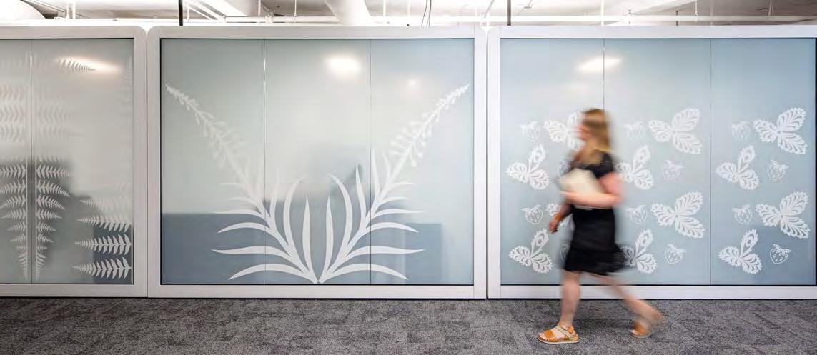
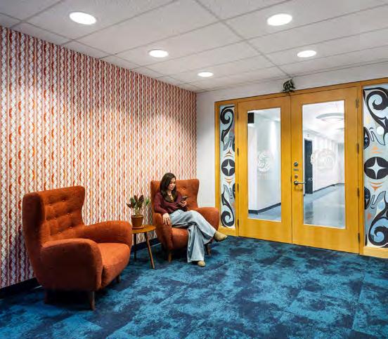
This page In Surrey and Kelowna, the language expands through integrating region-specific plant iconography and weaving references into murals, films, and bespoke finishes. Material choices such as warm woods, tactile wall treatments, and crafted millwork remain consistent but are tuned to each community through artist collaboration. The interiors operate as layered canvases where cultural authorship is materially encoded, transforming standard lease spaces into places of resonance.
Barrie Underhill / Upper Left Photography
To Shaw, a citizen of the Métis Nation of Alberta, avoiding visual clichés and culturally inappropriate references was paramount. Her results in the stunning BCFN Justice Centres reflect a broader, burgeoning shift within Canadian design. A growing cohort of Indigenous creatives is asserting distinct cultural identities and insisting on specificity over pan-Indigenous generalizations or bland, non-descript modernism. Their output is striking in part because, while contemporary, it is not generic or the kind of thing that could be found in any big city around the world. Instead, it is deeply grounded in what makes their communities distinct: their singular art, history and languages.
Many of the BCFNJC Justice Centres are in relatively close proximity, all located in the southern part of the province: two on Vancouver Island (Nanaimo and Victoria), two in the Lower Mainland (Surrey and Vancouver), and one in the Okanagan (Kelowna). Despite this geographic clustering, no two share the same aesthetic. “They are all very contextual,” says Shaw. “Everything was curated to reflect the nations in the immediate vicinity, including the language on the signage. The signage in Victoria looks wildly different than in Surrey.”
In the Kelowna office, a copper tulle mat by Syilx artist Mariel Belanger hangs behind the reception desk. Traditionally, such mats
were woven from reeds for a variety of domestic purposes, including floor coverings and tepee walls. Here, it is elevated with metal while quietly signalling to visitors that they are welcome and that this is a place where they can feel at home.
In Vancouver, where many clients are from Coast Salish nations, the decor takes a different direction. Local artists, including Mack Paul, Ocean Hyland and Austin Harry, referenced culturally significant animals such as owls, as well as Indigenous plants from the Lower Mainland, in patterns applied to front windows and glass partitions. Many of the motifs are taken from those found on traditional House Posts, hand-carved statuary used to greet new visitors and welcome old friends and family home.
Overall, 29 regional artists — many identified by Shaw’s colleague Tiffany Creyke, a design consultant and member of the Tahltan Nation — were brought on to outfit the offices. To Shaw, the artists were central to the project’s success. “They understood the context best [and] helped create unique identities,” she says. “More than a third of the budget went to supporting Indigenous artists. That’s another way this project has had a direct benefit for Indigenous communities.”
Several of the Justice Centres are housed in buildings with colonial undertones. The Nanaimo location occupies a former Canadian Bank of Commerce, a Classical Revival structure with Doric columns reminiscent of European capitals. In Victoria, the centre is set within a former Carnegie library, entered through a coffered archway. The siting, which Shaw was part of, was an intentional act of reconciliation. “But it’s not about erasing history,” says Shaw. “It’s about layers. We wanted to showcase Indigenous art and creativity on the same level as colonial spaces. You’ll notice the coffers of the ceiling in Victoria are still there, now painted with a beautiful mural.”
Achieving such thoughtful results was especially notable given the tight timeline. Originally, Reimagine Gathering, in conjunction with sister studio Reimagine Architects, was given one year to open all five offices. While permitting delays pushed some openings, the team worked quickly to bring each Justice Centre online.
“Our firm is based on a workshop approach,” says Shaw. “We always try to make the room bigger and bring as many experts to the table as possible and make decisions by consensus. It can be
messy, but it also supports faster decision-making. It allows us to move forward with diligence and strength.”
Veronica Burch, an interior designer with Reimagine Architects, worked closely with Shaw on the project. “This was my first project with Reimagine,” she says. “It was different. I’m used to more patriarchal structures where there’s a person at the top dictating what’s happening. This felt more matriarchal, a circle rather than a triangle, where everybody’s voice was heard.”
“One uses it to be in”
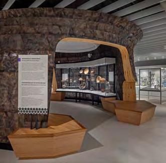
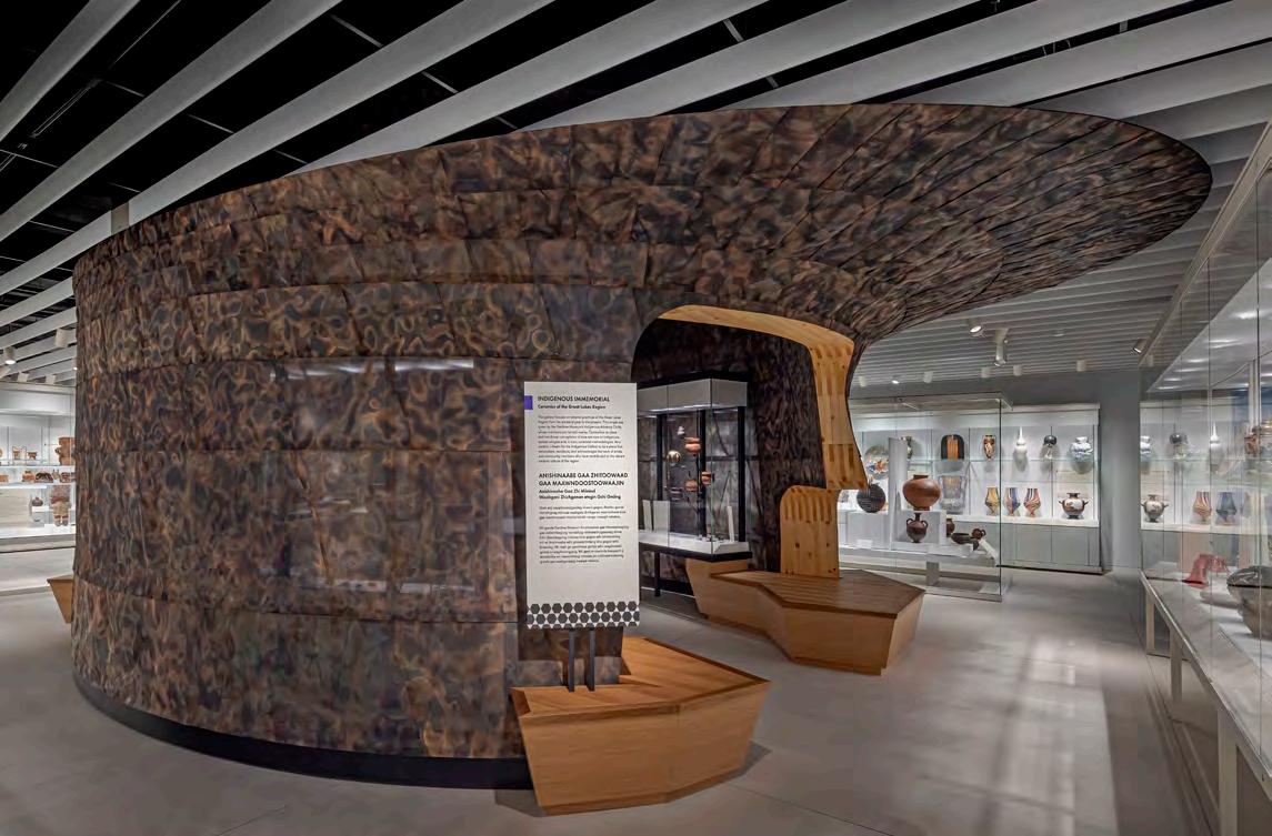
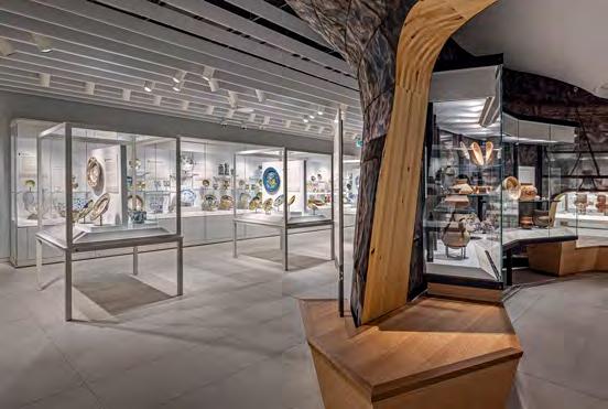
A similarly collaborative approach shaped the recent $15-million redesign of Toronto’s Gardiner Museum, an institution dedicated to ceramic arts. The new ground floor, designed by Montgomery Sisam Architects and Andrew Jones Design, is decidedly modern, with sleek, glass-walled vitrines displaying earthenware and other clay objects. Its centrepiece, however, offers a striking contrast. Juxtaposed against the clean lines — razor-straight ceiling slats and pale grey rectangular floor tiles — is the new Gallery of Indigenous Ceramics, a first for the institution.
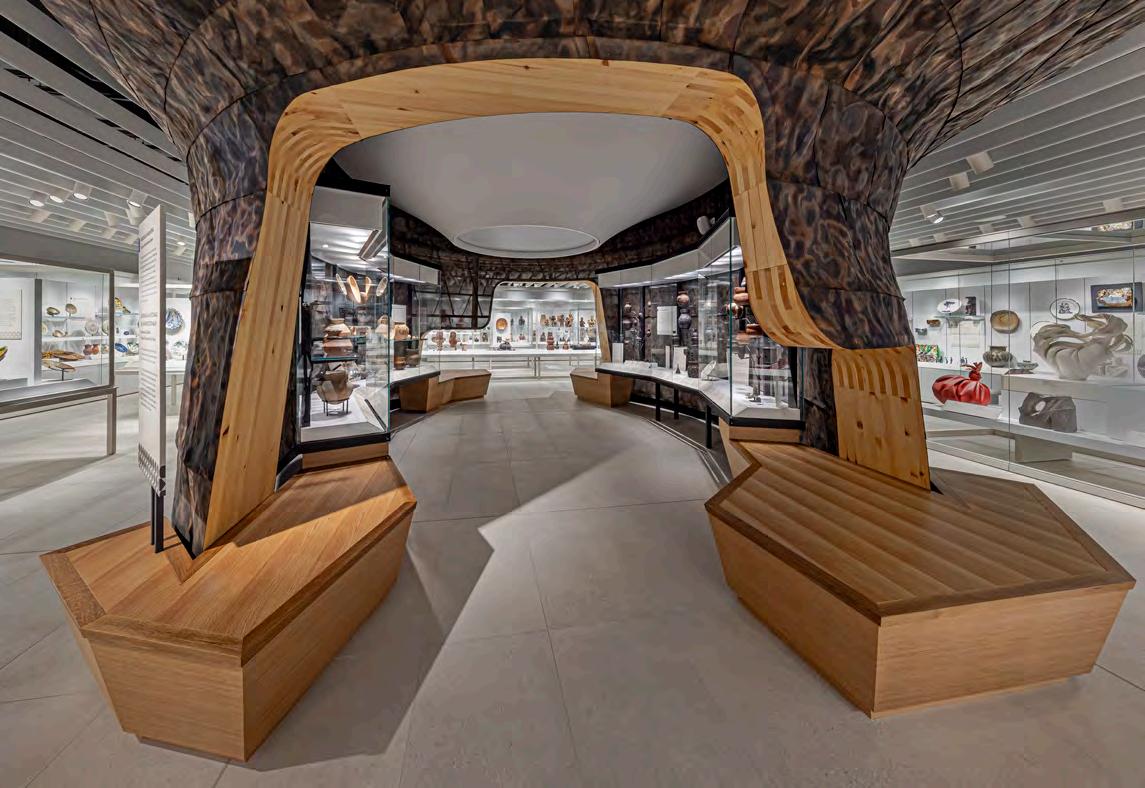
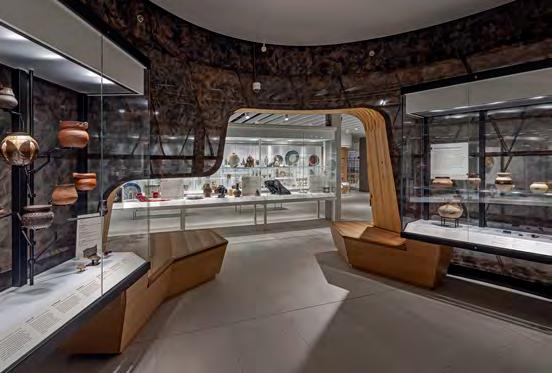
Designed by Chris Cornelius, founding principal of studio:indigenous and a professor in the department of architecture at the University of New Mexico, the gallery is curvaceous, resembling a massive vessel whose rounded walls open on two sides. At the entrances, birch benches extend outward, inviting visitors to enter and pause. “The display vitrines inside the gallery rest on the ends of the benches,” explains Cornelius. “I wanted all the elements to feel integral to one another, one thing supporting another.”
The Gallery of Indigenous Ceramics focuses on pottery from the Great Lakes region, the traditional home of the Haudenosaunee Confederacy including the Mohawk, Oneida, Onondaga, Cayuga, Seneca and Tuscarora as well as other First Nations. “I’m Oneida,” says Cornelius. “I was inspired by containers of the Haudenosaunee, ceramics as well as basket-making. I wanted to design a vessel with the idea that these crafts are not from the past. They are present, evolving and alive, part of an ongoing tradition.”
Fittingly, the gallery itself — which Cornelius calls Yelákhwa , an Oneida word for “container” but translates as “one uses it to be in” — transforms over time. Some changes are immediately recogniz-
Previous page and this spread At the core of the Gardiner Museum’s reimagined ground floor, the Gallery of Indigenous Ceramics is conceived as both anchor and aperture. Designed by Chris Cornelius, the space privileges material resonance over spectacle, with earthen tones, subdued lighting, and tactile surfaces that echo clay’s origins. Display strategies are intentionally intimate, allowing ancestral works from the Great Lakes region to sit within a spatial language of continuity. Natural finishes and restrained architectural gestures recede, positioning ceramics not as artifacts, but as living carriers of knowledge, shaped as much by hand as by place.
able. A circular oculus in the ceiling contains a digital screen that cycles through 24 hours of celestial imagery every 20 minutes, including night skies and birds in flight. “A connection to the sky is important across many Indigenous groups,” says Cornelius. “I wanted to bring that into the design, even though I could not connect directly to the sky.”
Other transformations unfold more slowly. While the structure is made of glue-laminated wood, it is clad in perforated copper mesh. “The copper will get darker,” says Franchesca Hebert-Spence, the Gardiner’s inaugural Curator of Indigenous Ceramics and a member of the Anishinaabe Sagkeeng First Nation. “Sometimes, in museums, we want things to last forever in perpetuity. That’s not practical. Our belongings have lives. They change. Sometimes they die. I think it’s beautiful that the material will continue to evolve.”
In the Great Lakes region, copper has long held cultural significance. “Where I’m from, in Wisconsin, there were very large copper deposits,” says Cornelius. “The Menominee and Potawatomi often used it in their ceremonies.” For the installation, Cornelius collaborated with Toronto fabrication studio McWood, demonstrating how to apply a proprietary mix of chemicals that produce varied hues in the metal, including browns and purples. “To me, making something that is Indigenous requires hands-on engagement,” he says. “Even at the scale of architecture, it’s invaluable to have an element of hand craftsmanship.”
Ultimately, Cornelius attributes the gallery’s realization not only to design vision but to collaboration. He worked closely with Hebert-Spence, along with an Indigenous advisory circle that included cultural leaders such as Mary Anne Barkhouse, Kent Monkman, André Morriseau, Duke Redbird and Tekaronhiáhkhwa/Santee Smith. “When I work with Indigenous communities, they’re usually not my own,” he says. “Listening has been a really important part of my work. I’ve found that projects go much more smoothly if I listen first, then try to understand what story needs to be told, and then reflect it back to the community to validate their input. When I’m finished, it’s like I want to say: ‘I heard you.’”
By Shannon Moore
Photography: by doublespace photography
Lines of Sight
Fifty years after piercing Toronto’s skyline for the first time, the CN Tower is once again defining what it means to experience the city from
above.
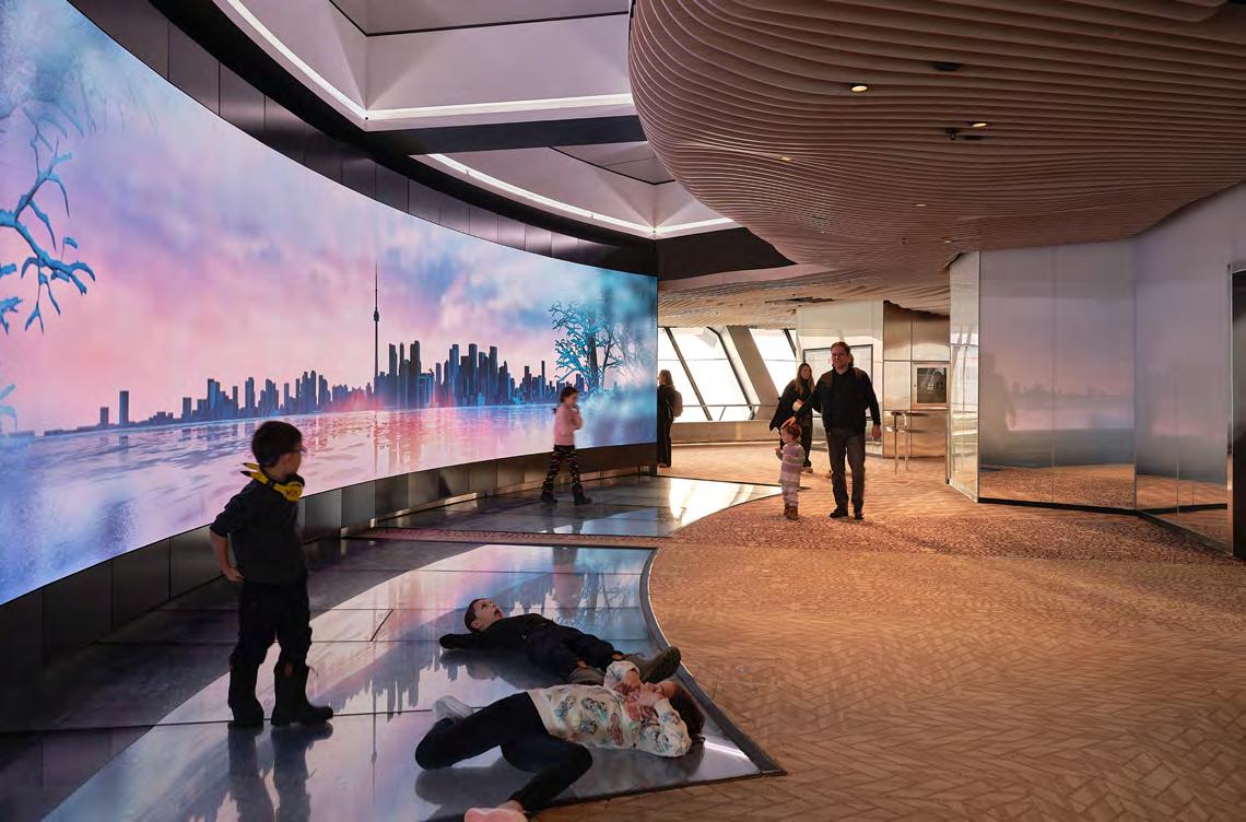
As part of its 50th anniversary celebration, the CN Tower’s Lower Observation Level recently underwent a $21-million renovation focused on improving accessibility, interactivity, and visitor engagement.
Positioned 342 metres above ground, the Lower Observation Level had not been reimagined since the building first opened in 1976. Following a competitive design-build competition in 2021, Toronto-based architects Superkül and construction crew Boszko & Verity set out to reimagine the interior offerings and exterior observation deck, achieving a more functionable space within the confines of the floor’s existing footprint.
To start, the design team reflected on the efficiency and utility of the outdoor space. “Previous to our renovation, the entire perimeter of the level was open air,” says Will Elsworthy, principal at Superkül. Temperature fluctuations, high winds, and a variety of weather patterns meant that the observation deck was inaccessible for large portions of the year. “We were tasked with reimagining that perimeter and looking at the possibility of making it more usable yearround.” The original steel caging — once a necessary but visually
intrusive safety feature — was removed, and in its place, Superkül added a custom perimeter enclosure system, pairing new panes of sloped glass with fine mesh screens above. The result not only ameliorates sightlines but maintains the open-air sensation and provides improved shelter from the elements.
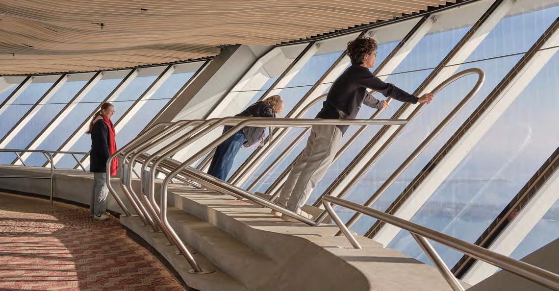
To fulfill the CN Tower’s request for more interior space, the design team took two-thirds of the old exterior and moved it inwards. The sloped windows are echoed on the interior perimeter, where new “tilt zones” called OverView allow patrons to climb up and lean out, taking full advantage of the views through the angled glass panes. Committed to maintaining the Tower’s Gold Certification from the
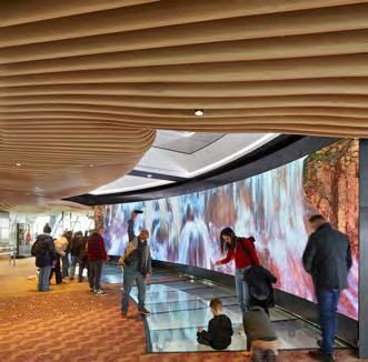
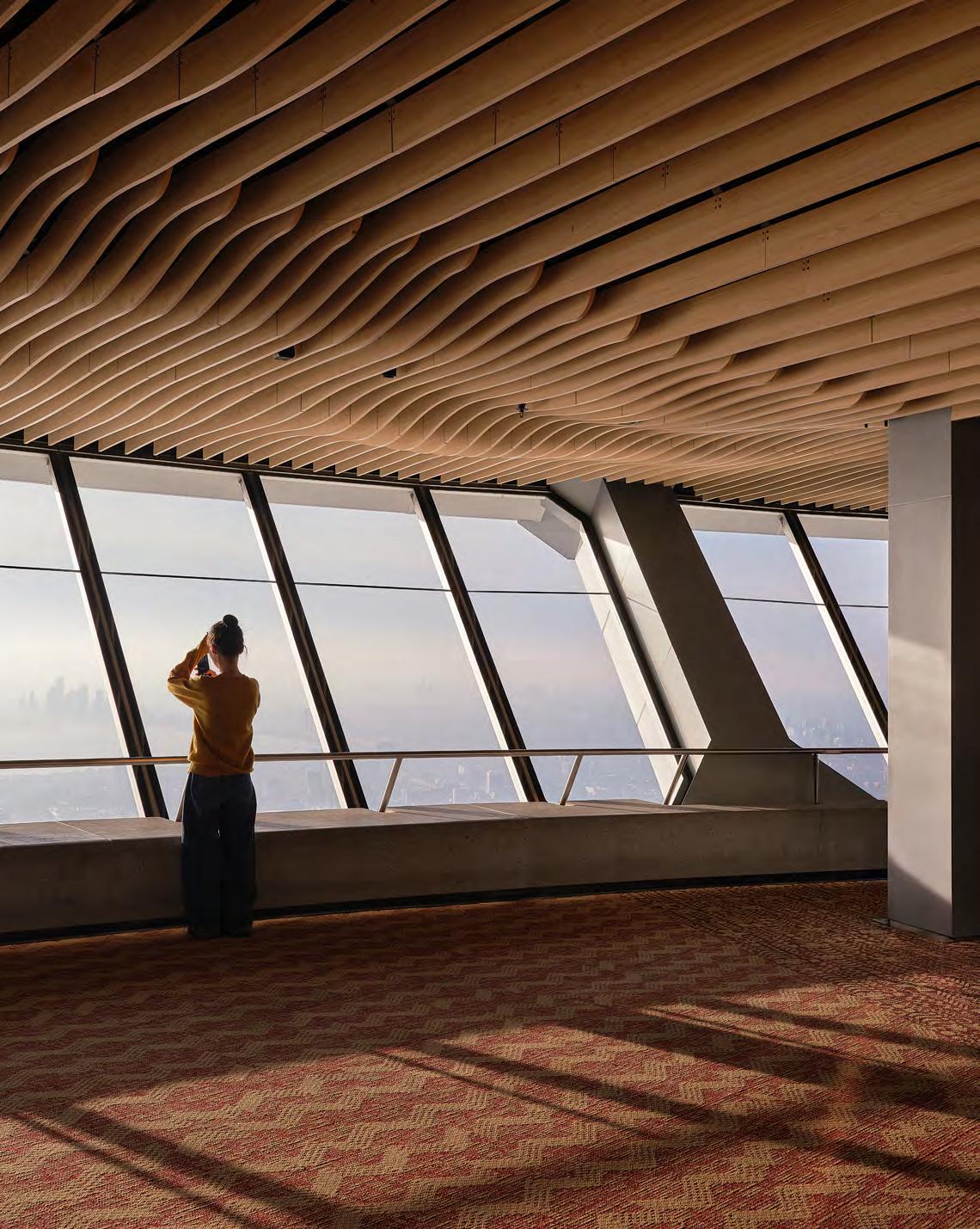
This spread The reimagined Lower Observation Level of the CN Tower trades nostalgia for a highly calibrated, nature-inflected interior renovation. The project’s real innovation lies at the perimeter, where steeply sloped structural glass replaces vertical glazing to expand both footprint and sensation. Custom mullions and movement connections accommodate the tower’s subtle sway, turning structural necessity into experiential drama. The removal of the steel security cage unlocks uninterrupted views, while “Tilt Zones” invite a controlled lean into the skyline.
Rick Hansen Foundation, the team worked with consultant Human Space to ensure that the tilt zones were accessible to everyone by installing railings that were well-above weight and bending capacity, and including a special area carved into adjacent benches for those with mobility needs.
To further that sense of connection to the city below, the team was also tasked with upgrading the ever-popular glass floor, which was originally constructed of thick glass with metal plates and dividing steel beams. “What we did as part of our renovation was cut out a bunch of that steel structure and replace all of the glass with a thinner glazing assembly,” says Elsworthy. “It’s still super strong — people jump on it, do all kinds of risky things on it all the time — but it’s stronger, and by virtue of being thinner, it’s clearer.”
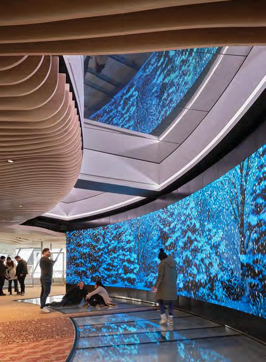
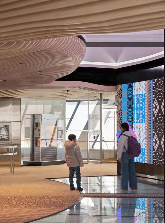
This spread A parametrically designed ceiling radiates outward in oak-laminated phenolic fins, evoking an arboreal canopy while quietly integrating mechanical and life-safety systems within its modular depth. Integrated AV elements like low-profile LED displays, directional audio, and discreet projection mapping are embedded within the architecture, layering interpretive content without competing with the view. Fiberglass-reinforced concrete benches and a palette drawn from rock, water, and wind reinforce the biophilic narrative without tipping into pastiche, grounding the experience in material performance as much as metaphor.
While the tilt zones and glass floor encourage people to look down, the team cleverly introduced a new feature that entices people to look up. The ceiling is made of oak-laminated phenolic panels and fins that serve two purposes: to provide a visually striking “biophilic” effect that evokes the feeling of being in nature, while concealing and providing quick access to the floor’s ductwork, sprinkler system, AV components, Wi-Fi antennas, and security cameras.
Boszko & Verity undertook a 3D scan of the space, which allowed Superkül to envision how the ceiling design should unfold. The resulting fins ebb and flow around the mechanical components, allowing for greater height and better sightlines overall. “It’s an effort to sculpt and shape views from the space to the outside,” says Elsworthy, who explains that each fin can be easily taken down to service the components above. “The ceiling is doing a lot of work and doing it beautifully at the same time.”
The Lower Observation Level now also features interactive displays with assistive listening, panoramic screens, and a 40-ft.-long video wall that serves as the conduit for Artmosphere, a digital exhibition showcasing original works by Canadian and Indigenous artists that “act as another window onto the world,” says Elsworthy, “a window
onto art.” Be it representations of the sun by Coast Salish artist Dylan Thomas, a psychedelic landscape painting by Toronto-based artist Enna Kim, or a celebration of fall’s many colours by Mohawk and Cree artist Katie Longboat, Artmosphere brings together diverse identities and perspectives, celebrating Canada’s cultural heritage within the iconic setting of the CN Tower itself.
Art integration continues in the flooring, which is constructed of recycled carpet and fabric fragments, among other materials, and features artwork inspired by Indigenous practices in medicine, healing, and connection to Earth.
Beyond the design upgrades, the transformation of the Lower Observation Level demanded logistical creativity. Apart from a four-storey permanent maintenance gantry that was hoisted into place on cables — marking the first operation of its kind since the CN Tower’s original construction — the entire renovation relied on carefully choreographed transport. “Everything had to come up through the elevators,” says Elsworthy. “Every single slab, all of the glazing, you name it.” This posed significant challenges. For example, a compact mobile crane used to install the glass floor could scarcely fit into the elevator, so a technician accompanied it 113 storeys up with the doors open.
Likewise, the large panels of floor-to-ceiling glazing needed to remain intact. Too tall to fit into the elevator, they were also brought up via technician, sitting on top of the elevator in a specially built cradle.
Other notable obstacles included working around visitor access to the building and remaining flexible to Toronto’s unpredictable weather. “Some work couldn’t be done if the winds were too high, for example, or the temperature was too cold,” says Elsworthy. All these constraints required precise coordination and problem-solving, underscoring how building at such heights is as much an exercise in ingenuity as it is in design.
At its core, the renovation of the Lower Observation Level marks an important chapter in the life of the CN Tower. “Buildings need a credits reel,” says Elsworthy. “It takes not only a village, but a small city to build something like this.” More than just an architectural feat, it stands as a symbol of pride and heritage, continuing to inspire and connect people across Canada and beyond.
By Peter Sobchak
GOOD READS
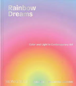
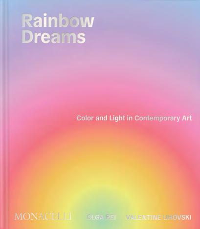
A fun, vivid compendium that celebrates chromatic optimism while quietly sidestepping colour’s sharper political edges.
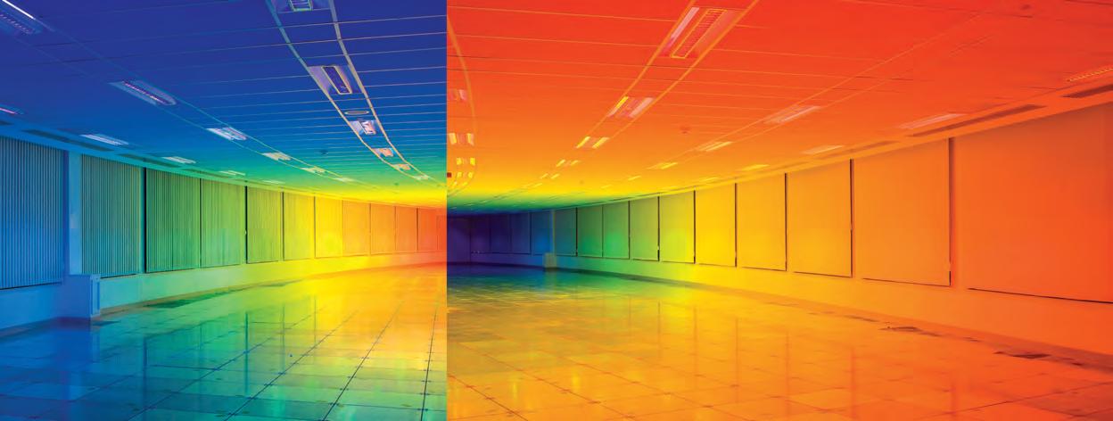
Rainbow Dreams: Color and Light in Contemporary Art (Monacelli Press) arrives less as a conventional survey and more as a saturated atmosphere, one that interior designers, attuned to the emotional charge of space, will recognize immediately. Edited by Olga Rei and Valentine Uhovski, the volume positions colour — and somewhat more specifically, the rainbow — not merely as motif, but as a spatial and psychological device: a way of organizing perception, mood, and meaning across disciplines that range from painting to immersive installation.
At its most compelling, the book understands the rainbow as a timeless ordering system and intuitive gradient that transcends language and geography. The editors lean into this universality, framing colour
as a connective tissue in an otherwise fractured cultural moment. Their introduction reads like a manifesto for chromatic optimism, casting the spectrum as a “visual antidote” to complexity and crisis. For designers, this resonates: the idea that colour can structure experience as much as form or material feels particularly current in an era of sensorial interiors and experiential branding.
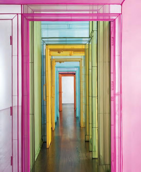
A delight to flip through, but just under the photons there vibrates a larger ambition than pure visual pleasure. Interviews with Judy Chicago and Mickalene Thomas complicate the rainbow’s apparent neutrality. Chicago’s reflections reveal a pre–Pride flag engagement with spectral colour rooted in perception and formal inquiry, while also acknowledging how meaning accrues over time, often beyond an artist’s control. Thomas, by contrast, mobilizes colour with precision and intent, using saturated palettes to assert Black identity, femininity, and power. In her hands, the rainbow is not simply atmospheric; it is declarative, even insurgent.
This tension — between the rainbow as universal symbol and as culturally specific code — is where Rainbow Dreams both succeeds and stumbles. The editorial approach favours breadth over friction. By assembling more than 100 artists (none Canadian, sadly) under the generous umbrella of “colour and light,” the book creates a seductive visual continuity, but at times smooths over the sharper edges of meaning. Works that engage deeply with identity politics or historical trauma are visually integrated into a broader narrative of optimism, occasionally diluting their urgency. The rainbow becomes a unifying brand language, when in reality it can operate as a site of contestation.
For a design audience, this raises a productive question: can a symbol so heavily coded by LGBTQ+ histories, by protest, by visibility ever return to a purely universal register? Or is its power precisely in its layered ambiguity? The book gestures toward this complexity but rarely lingers. It prefers flow to rupture, gradient over contrast.
The roster is notably international, spanning the U.S., Europe, Latin America, Asia, and the Middle East, with artists such as Nick Cave, Olafur Eliasson, Gabriel Dawe, and Mickalene Thomas representing a broadly globalized contemporary scene. While this reinforces the editors’ thesis of the rainbow as a cross-cultural, borderless symbol, it also means regional specificity, including Canadian perspectives, is largely absent.
That said, a few practices in the book (particularly those engaging landscape, light phenomena, or environmental perception) could conceptually resonate with Canadian artistic traditions, but these connections are implicit rather than articulated. The curatorial approach prioritizes universality over geographic grounding, which may be a missed opportunity for situating color within more localized cultural or environmental narratives.
Still, Rainbow Dreams excels as a visual resource and a conceptual prompt. Its pages offer a reminder that colour is never incidental. For interior designers navigating the intersection of atmosphere and meaning, the takeaway is clear: the rainbow may promise harmony, but its most interesting applications lie in how it holds contradiction in suspension.
By Peter Sobchak
Rethinking the Clinical Ritual
Evidence-based design transforms a shower into stress-reducing care space.
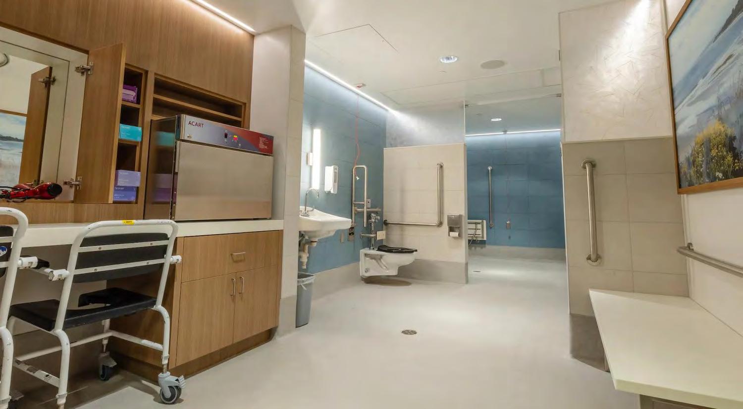
Anewly redesigned shower room at the University Health Network (UHN)’s Toronto Rehab University Centre combines innovation and collaboration to improve care for people living with dementia while showing how thoughtful, evidence-based design can support patient well-being.
The initial concept of the project was developed in collaboration with Dr. Ron Keren, a geriatric psychiatrist at Toronto Rehab. Led by associate professors Maya Mahgoub-Desai and Bruce Hinds and with research methods support from professor Dr. Kate Sellen, the studio guided students through a design process that led to concepts for the unit, including the existing shower spaces. This early work eventually laid the groundwork for UHN’s built solution, with the redesign bringing studio and research recommendations into a real clinical setting.
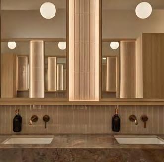
The intention of the design was to respond to a common challenge in care environments and support a calmer, more dignified bathing experience for people living with dementia. Since showering can often be disorienting or stressful in new or different environments due to noise, limited privacy, and unfamiliar surroundings, the redesigned space aims to tackle those challenges, while making the space more comfortable and accessible for patients and their caregivers.
The new space features a biophilic approach, using wood and natural colours to create a calmer atmosphere combined with a more spalike, patient-centred experience that contains soft lighting, reduced glare, clear spatial organization, a heating panel and towel warmer, a grooming area, calming artwork, and slip-resistant flooring, all of which can help patients living with dementia feel more comfortable during the bathing process.
Kasian Architecture was selected through an RFP process and served as the prime consultant. The team led a collaborative practice, working closely with UHN, family members, researchers, and donors to implement a holistic and human-centred design approach for the space. Engagement with a community group of individuals who have experience with dementia caregiving was central to the process, and their insight helped shape the direction of the design. This resulted in a space where every design decision reflects a deeper purpose and helps answer the question of why it is designed this way.
The project is as a meaningful step forward in designing for dementia and aging populations and showcases the impact of research-based design. Staff training in personalized care and communication further supports improvements as part of UHN’s broader effort to reimagine care environments for those living with dementia.
Inspired by Nature, Designed for Quiet
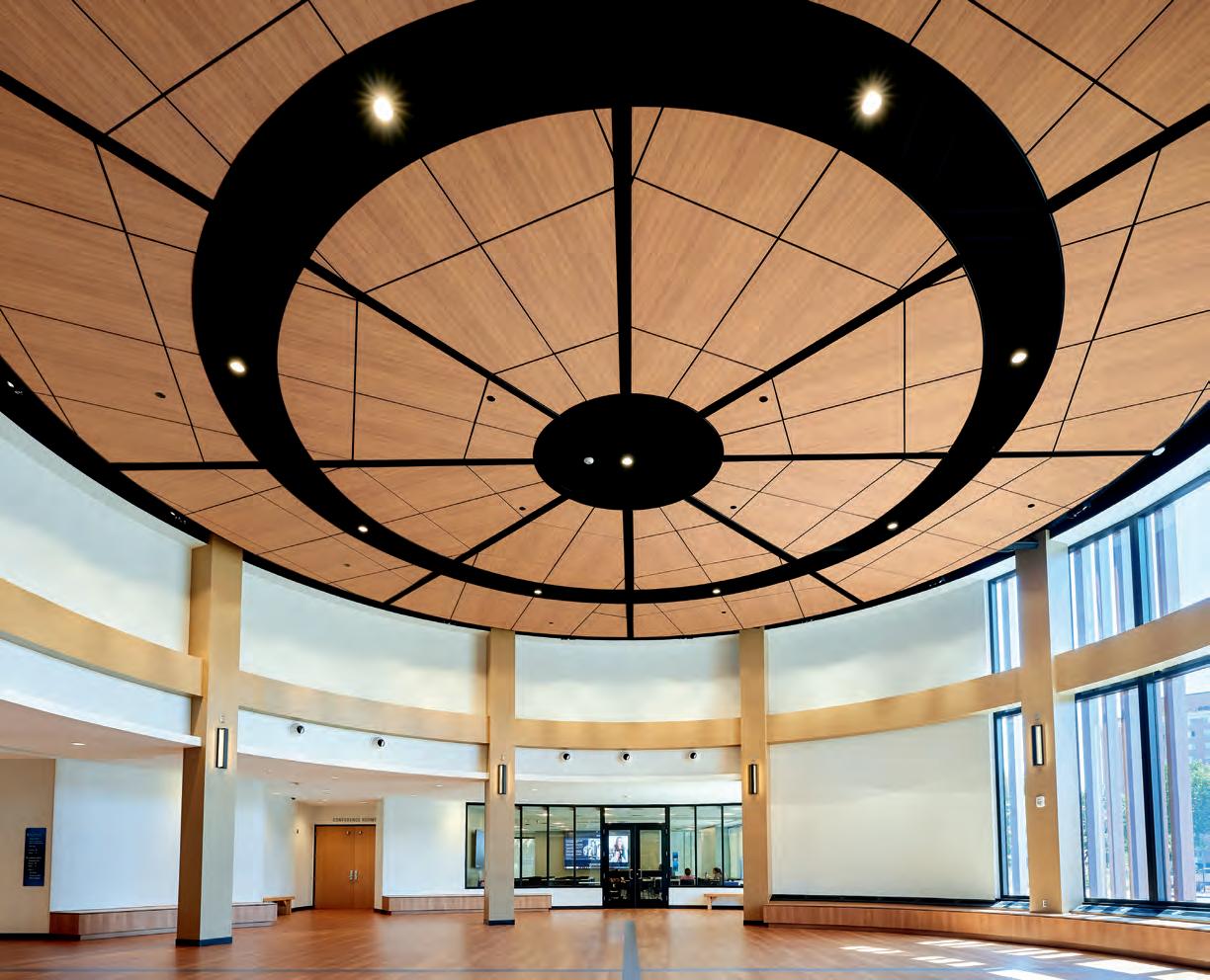
Capture the natural warmth and beauty of real wood with Lyra® PB wood-look ceiling panels. These panels offer superior acoustics with up to 0.95 NRC along with sustainability attributes. Choose from a variety of realistic wood-look finishes and versatile edge details to create a sleek visual that transforms any space.
Visit armstrong.com/inspiredbynature to learn more and order samples.
Lyra® PB Tegular Ceiling Panels; Minneapolis American Indian Center – Minneapolis, MN; Cunningham and Full Circle Indigenous Planning + Design