Raise the Bar


Raise the Bar is a campaign to shape the way leadership looks, sounds, and feels across Renovo. It reflects a shared commitment to growing as individuals, empowering teams, and building a highperformance culture grounded in trust, clarity, and everyday action.
This brand identity provides the visual foundation for the campaign. It’s intentionally aligned with the broader Powered by Renovo brand, while giving Raise the Bar its own clear tone: bold, practical, energized, and leadership
driven. Every element — from color and typography to layout and imagery — is designed to engage leaders and bring the idea of leadership in motion to life.
These guidelines are the standard for how Raise the Bar should appear across internal and external communications. As a sub-brand within the Renovo ecosystem, the Marketing and Design team is encouraged to adapt and apply elements to ensure cohesion and consistency across platforms.
Maintaining a unified look and feel helps reinforce our message at every touchpoint — making it unmistakable, professional, and aligned with our values.
If you’re creating or sharing Raise the Bar content, you’re helping shape the leadership culture of Renovo. This guide is here to help you do that with purpose, clarity, and confidence. For questions or support, contact the Cegos US team.
Raise the Bar is a campaign to activate leadership across every level of the business. Built around practical tools, clear behaviors, and real voices from across our companies, this initiative is designed to help leaders grow themselves and grow others — so that culture drives performance.
We’ve built a brand to reflect the energy, clarity, and drive of Renovo. A brand that leaders across all partner companies can connect with and bring to life in their own way.
Every leadership journey with Raise the Bar is distinct. Each person who connects with the campaign charts their own growth—developing new skills, forging fresh relationships, and gaining broader perspectives.
Raise the Bar is designed to open that gateway to possibility across Renovo. Our logo embodies this invitation. The bold wordmark ends with a confident red underline beneath Bar, signaling momentum and the commitment to push standards higher. When shown in full color, the underline’s energetic red anchors the mark and echoes the campaign’s drive and clarity.
As a sub-brand within Renovo, Raise the Bar should use this visual identity consistently across all touchpoints — print, web, social media, and internal events —whenever communicating leadership development programs or resources affiliated with the campaign.
The clear zone is like breathing room for the logo. Specifically, it’s the (0.5 inch) protected area around a logo or other official mark—as indicated by the dotted perimeter margin—ensuring that no other design elements (text, shapes or images) interfere with the logo. As a reminder, elements of the different marks cannot be combined to make a new mark. Regardless of the clear zone rule, elements of different marks cannot be in close proximity to each other. These elements cannot appear to be “locked up” to create a new mark. Let it breathe.
Brand Identity Standards
The positive version of our logo is preferred in full color. It is to be used on light photography or white backgrounds.
The use of properly colored logos establishes a unified and professional appearance. Even the best logos can be lost or confused through poor legibility.
There are two versions of our logo: reverse and positive.
the Bar
Raise the Bar
The reverse version of our logo is primarily used over photography if needed and a black background.
Brand Identity Standards
The logo also may be rotated 90° counter clockwise, but only when it is scaled up and serves as the primary focal point of the layout.
The logo may appear in outline form only when scaled to at least 2x the size of the primary text and used as a visual or background element to support brand identity. It must not serve as the primary logo, nor be used in isolation to represent the brand.
Whenever this outline or logo-inspired graphic is used, the full original logo must also be present within the same layout or design to maintain clear brand recognition.
The logo should not be unevenly resized.
The colors of the logo should never be altered.
The red line element should not be tilted or put at an angle.
Raise the Bar
Raise the Bar Raise the Bar Raise the Bar Raise the Bar Raise the Bar
The logo’s leading should always remain the same.
The logo may not be tilted. See previous page for guidance on placing the logo at 90°.
Never apply a drop shadow or effects to the logo.
Raise the Bar Raise the Bar Raise the Bar
The logo should not be stretched or distorted.
Do not lower the opacity of the logo.

Brand Identity Standards
The red line should not be removed.
The Raise the Bar logo has been carefully crafted—please use it exactly as provided. Any tweaks, stretches, or color swaps may feel creative, but they dilute recognition and risk confusing our audience. Consistency keeps the campaign strong.
Raise the Bar Raise the Bar Raise the Bar
Keep the contrast and background in mind when using the logo.
Ensure that no elements obscure the logo.
The color of the red line should not be altered.

When used alongside another institution logo, please refer back to the clear zone around the corresponding logos.
When being used for external communications, the Raise The Bar must be accompanied with the Renovo logo.
For internal usage, the Raise The Bar logo may be used individually.
Brand Identity Standards
Emphasis Tool
Use the red line horizontically or vertically to emphasize keywords, taglines, or calls to action.
It should always appear either above, to the right or left of text, not below.
Placement and Alignment
The red line should not float independently—it must always anchor text or a design element.
Color Specifications
Do not alter color of the line. The line should always be the specific Raise the Bar red.
Consistent Proportion
Maintain the original height-to-width ratio as seen in the logo when scaling. The thickness of the red line should remain proportional to the text size it’s used with.
The red line is more than just a design detail—it’s a bold visual cue that ties our message together. Altering its shape, color, or placement can break that connection and disrupt the visual identity we’ve built. For clarity, impact, and brand unity, always use the red line as originally designed.
Brand Identity Standards
Typography sets a calm, steady tone for the campaign.
Using Gotham as our primary typeface—and keeping tracking at zero—keeps every word neat and direct, reflecting the clear, straightforward approach we value. The text stays focused, letting the message come through without distraction.
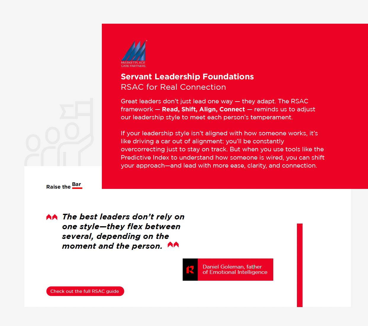
Where a quote is included, use two Renovo arrows pointing 90° upwards in place of speech marks.
In place of bullet points, use the Renovo arrow at its’ regular angle.
Please note also the template for buttons.
Buttons can be red or black, and must always be in a horizontal pill shape.

Brand Identity Standards
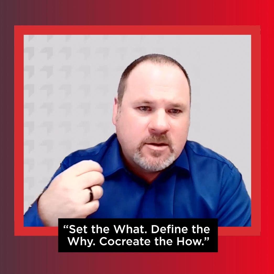
Only for use in Videos.
For all campaign materials, the main color used should be the Renovo red, along with the secondary colors.
All copy should be either black or red if on light backgrounds, or white if on a dark background.
Brand Identity Standards
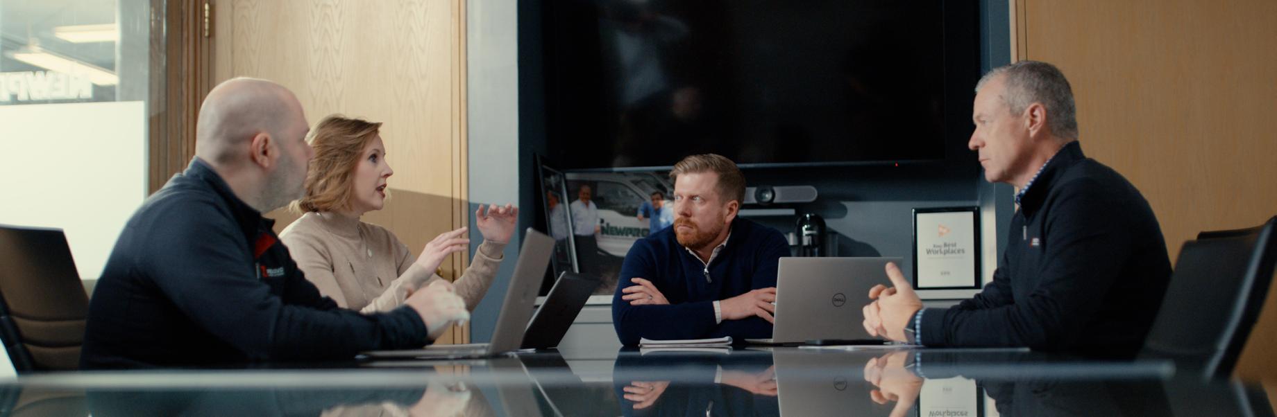
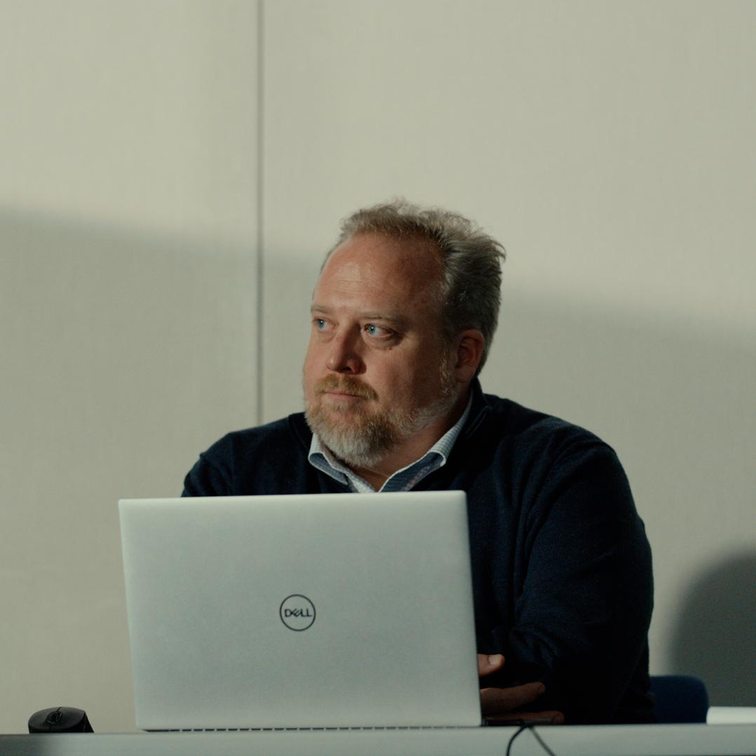
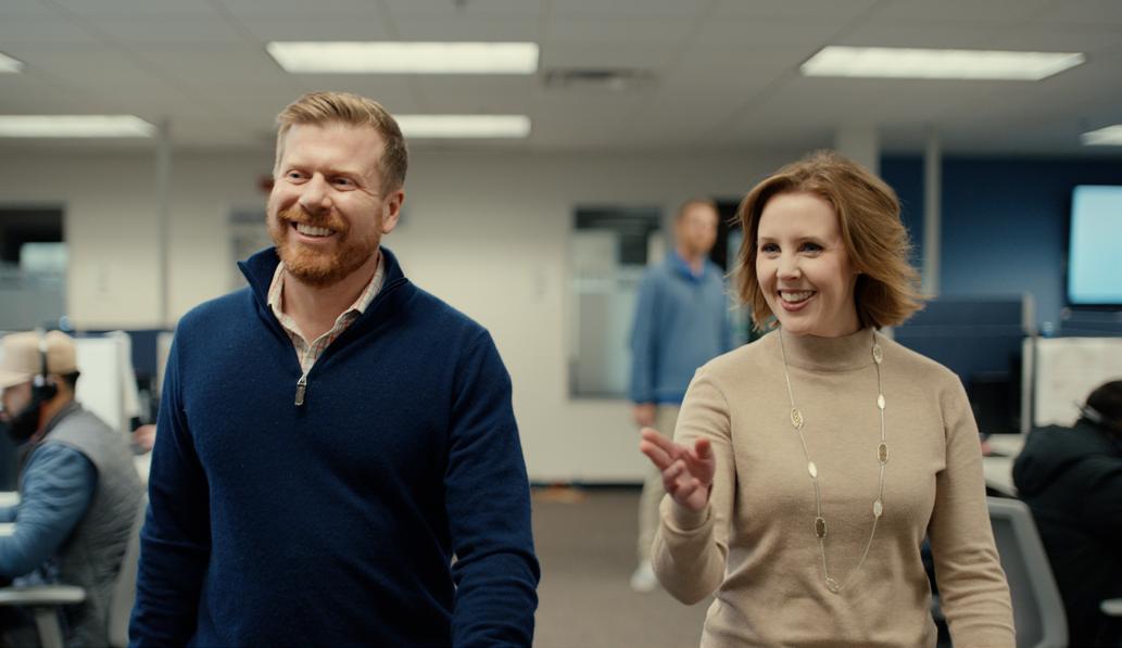
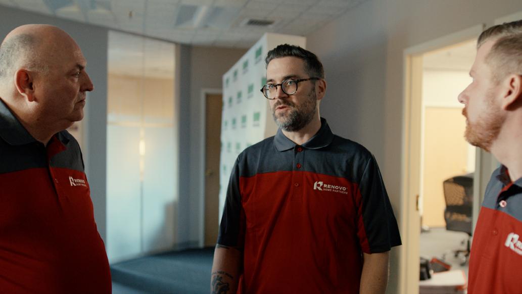
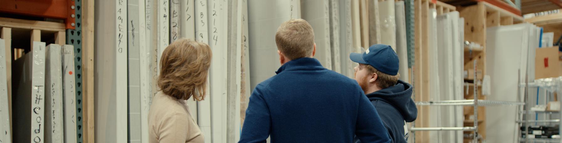
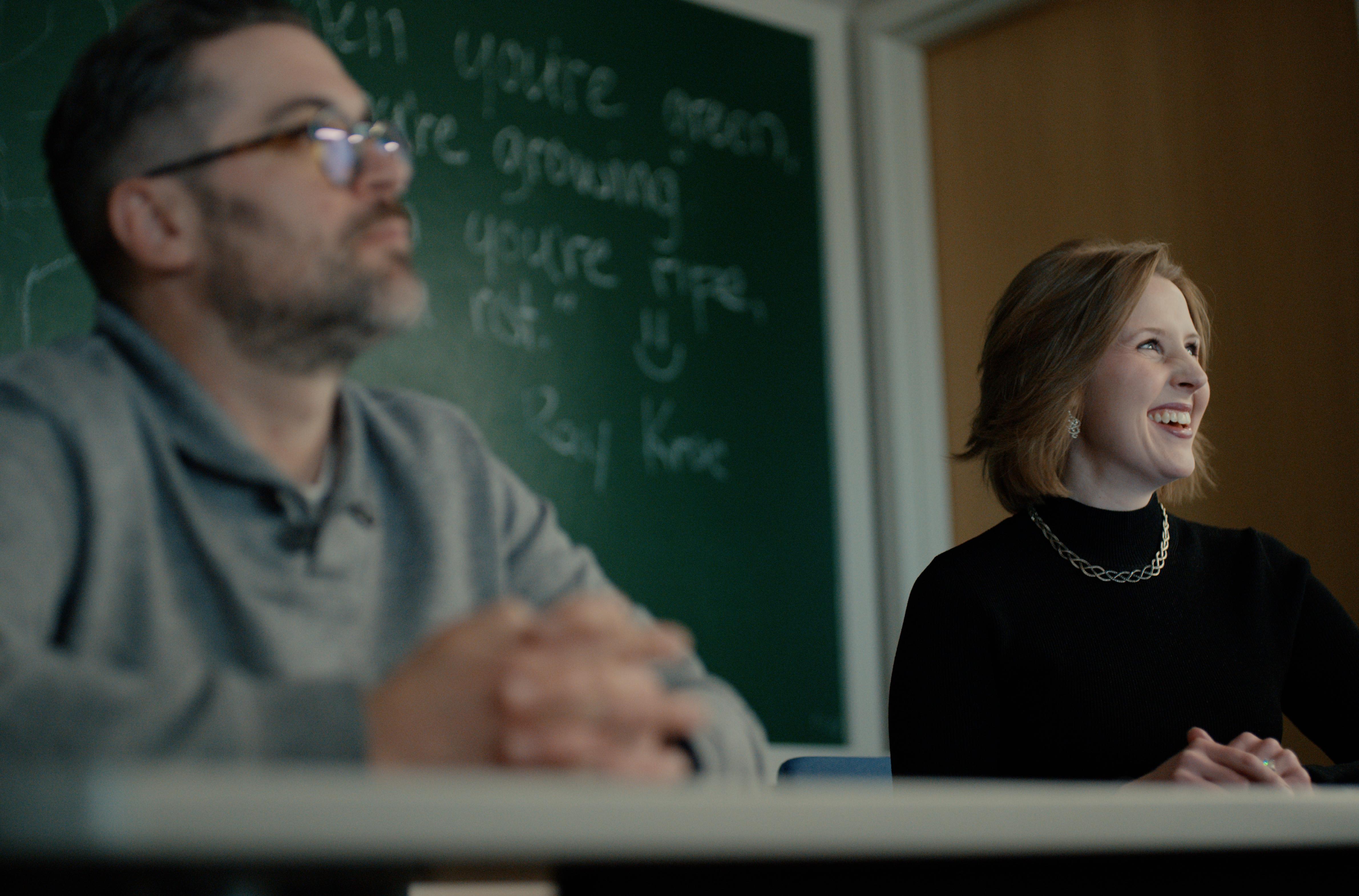
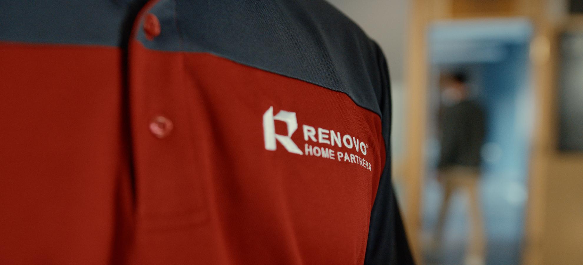
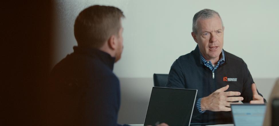
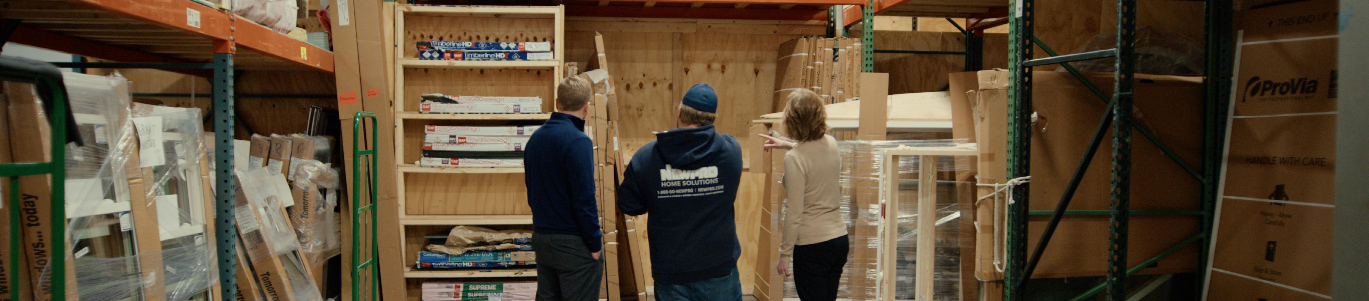
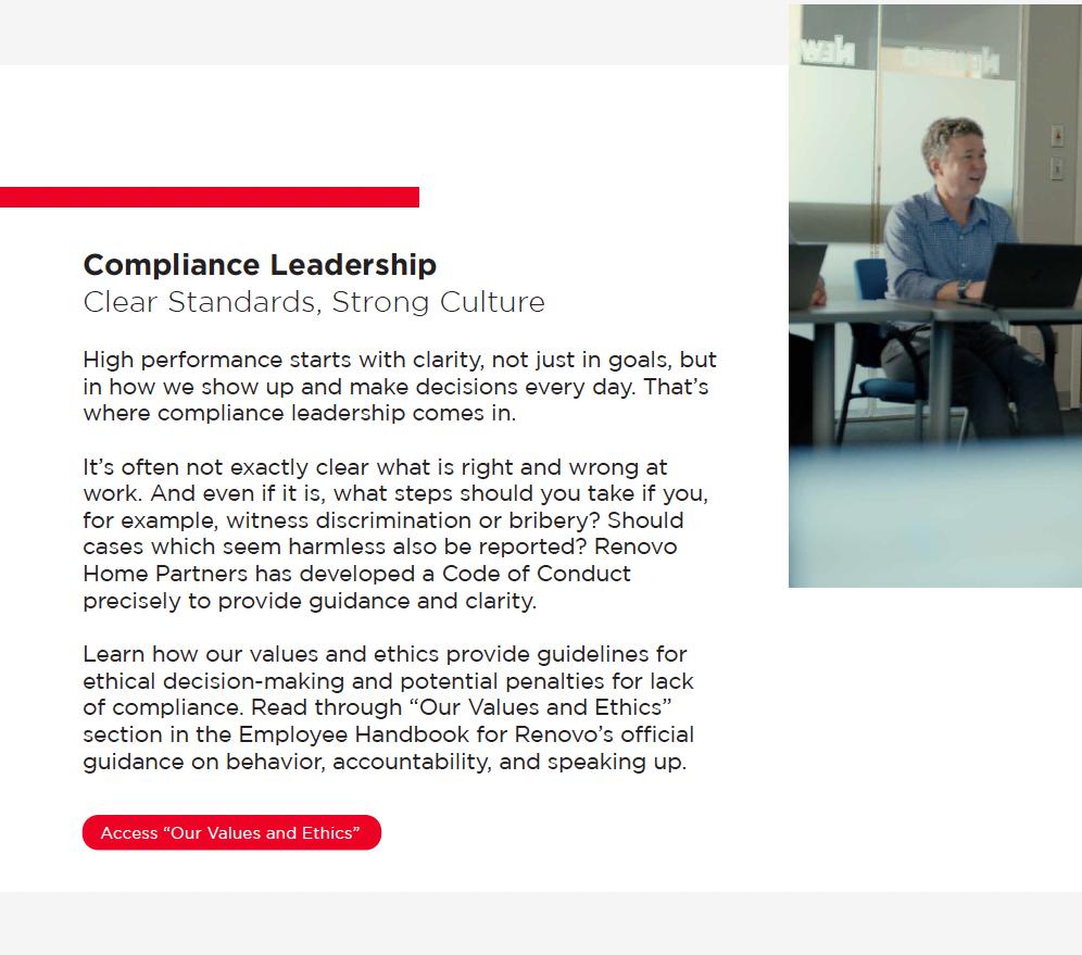
Whenever possible, use photos of actual Renovo employees to ensure authenticity and consistency with our brand.
Featuring team members from across different roles, locations, and partner companies reinforces the inclusive, people-first culture that Raise the Bar represents. Candid, high-quality images that capture real moments of leadership, collaboration, and connection are preferred.
Davooda icons are the standard Raise The Bar. Stick to light or medium-weight strokes to maintain clarity and align with the overall visual style.
Where
You can access the approved set of Davooda icons via Shutterstock. Icons are organized by category for easy selection.
Creating
If you need to design a new icon, follow the existing Davooda style: use consistent stroke weights (light or medium), simple and clear line work, and rounded corners where applicable.
Brand Identity Standards
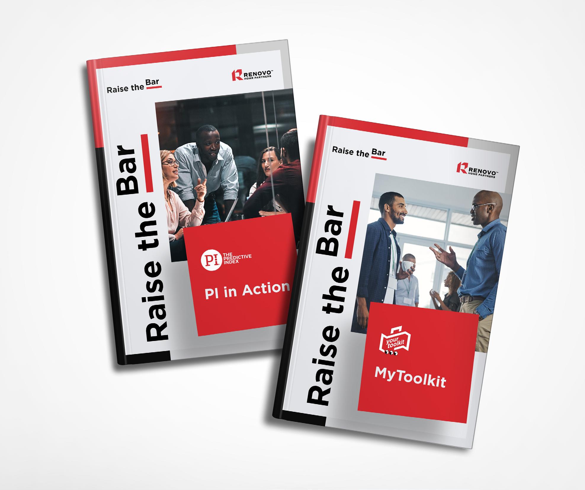
Let’s see how the brand comes to life in print and digital usage.
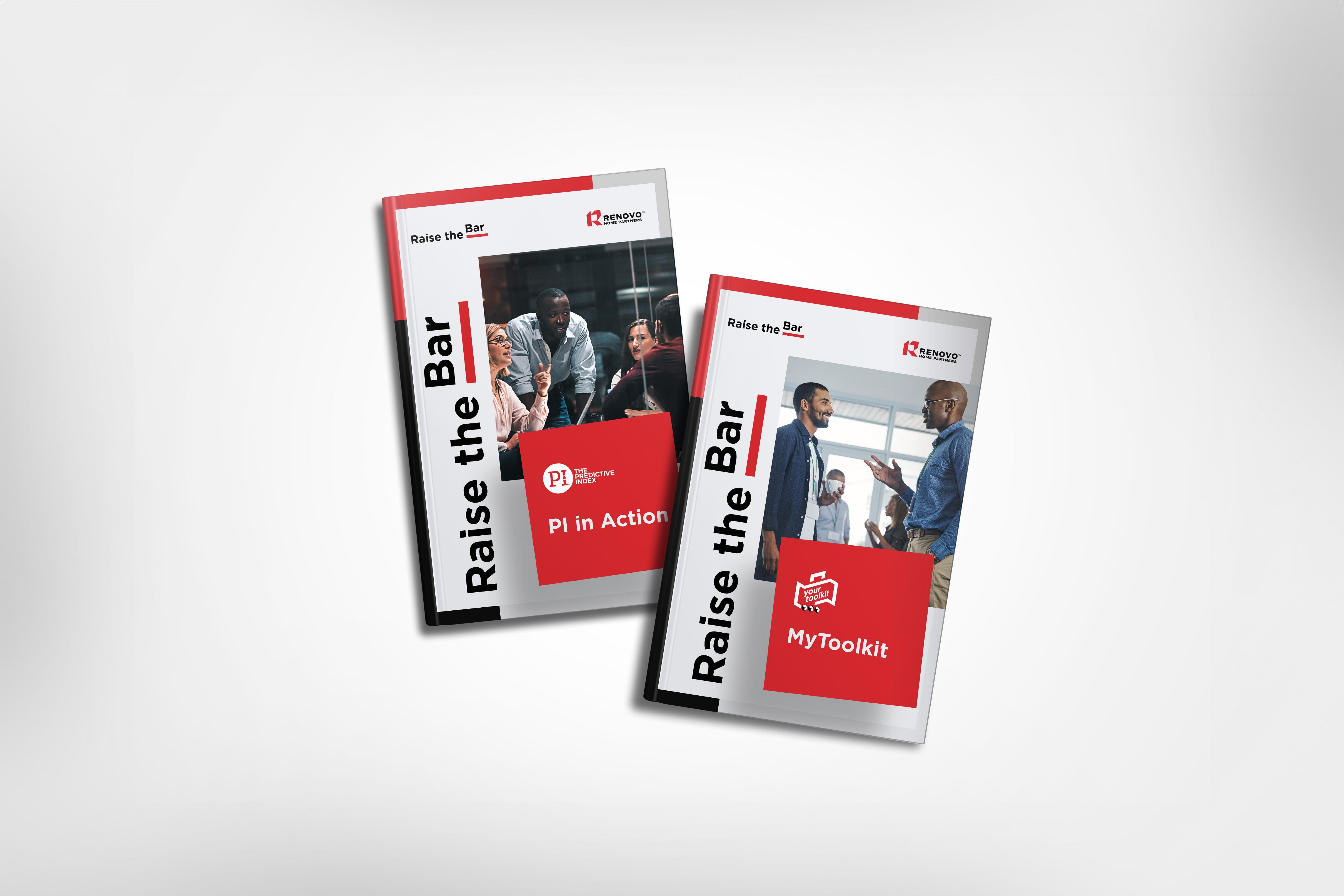
When used on print materials, the Raise The Bar logo must always be on the top left-hand side if it is accompanied by text. If it is stand-alone, it may be centred with the background.
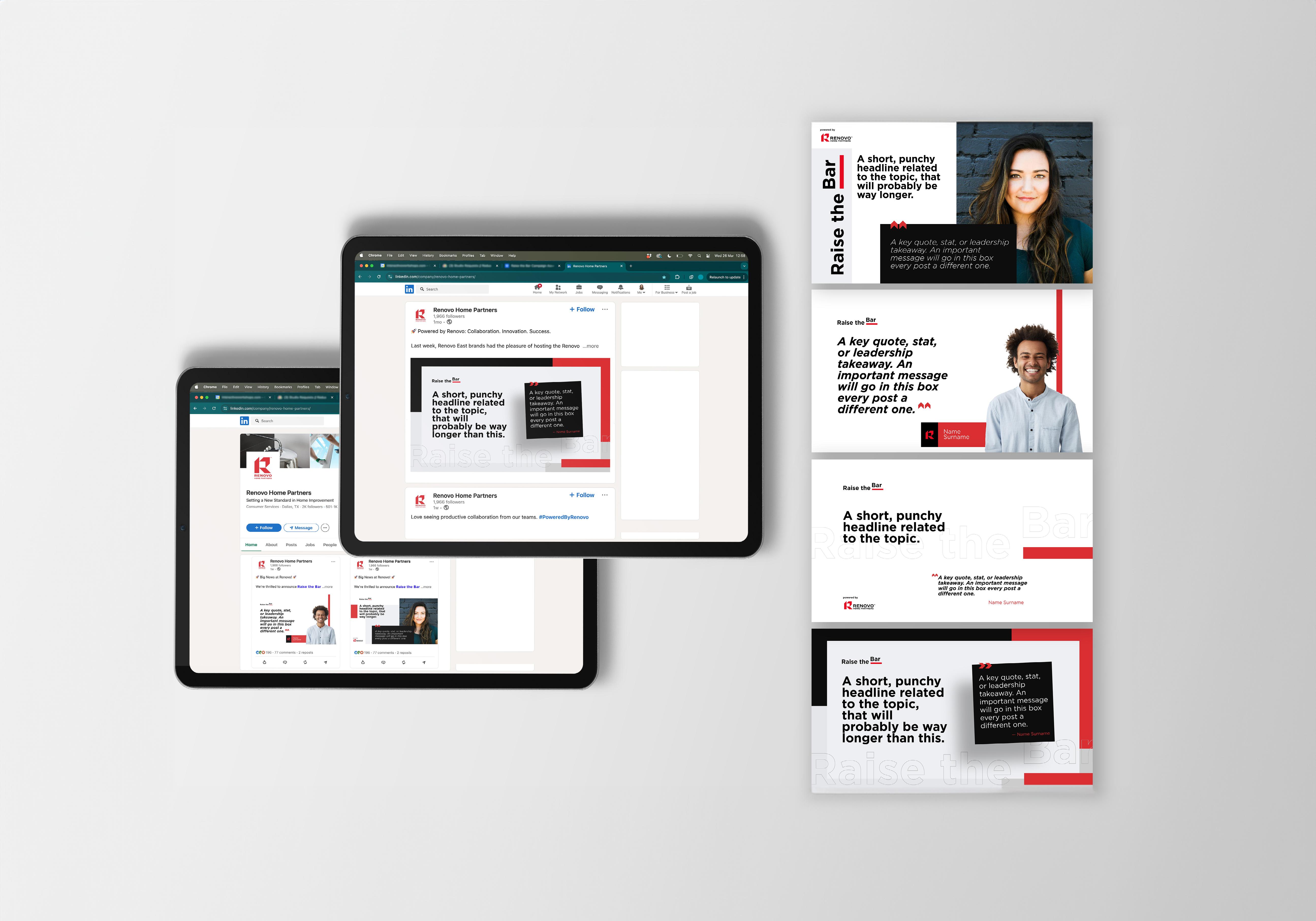
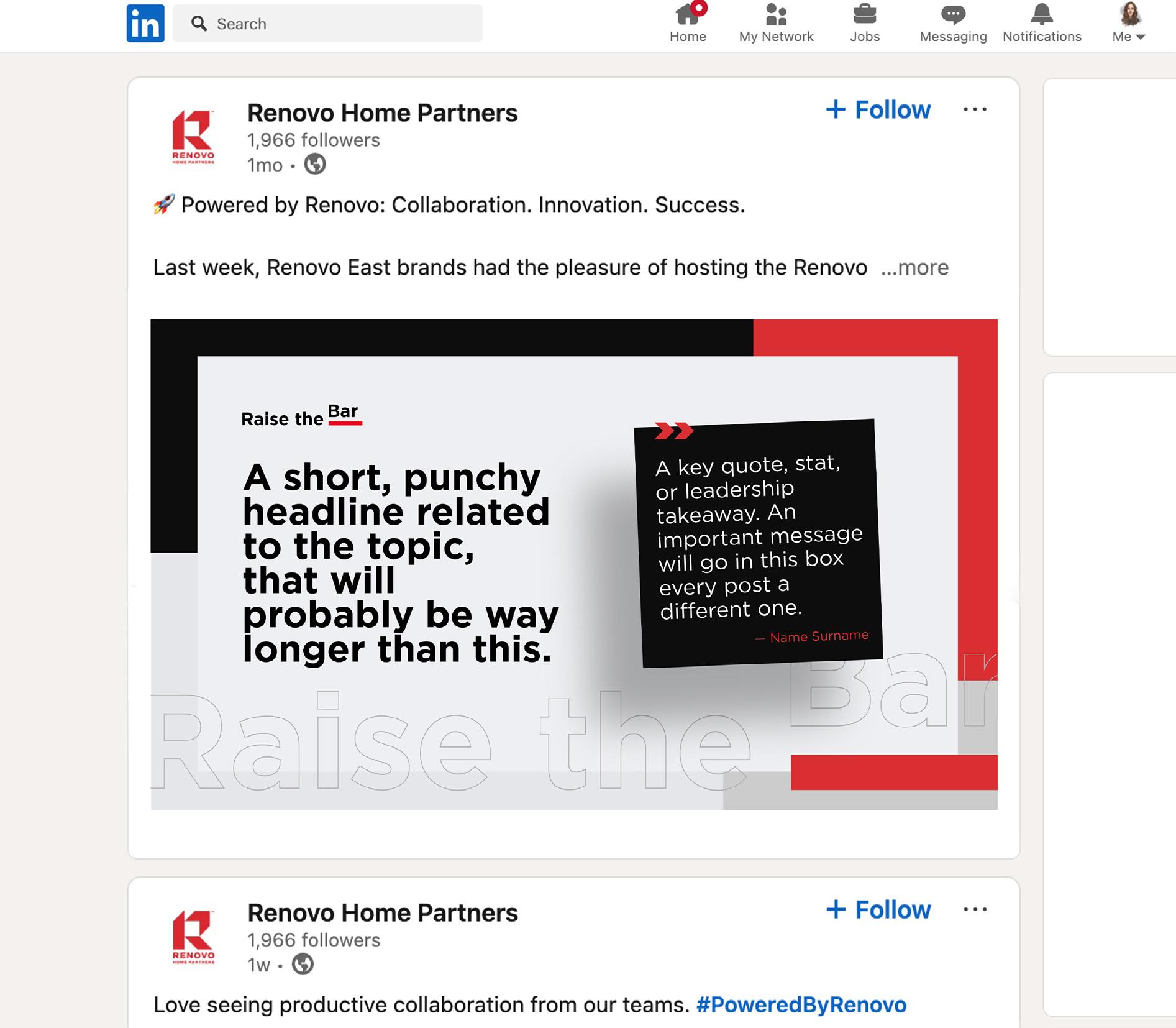
Examples of how to apply the Raise The Bar brand identity to social media and LinkedIn posts.
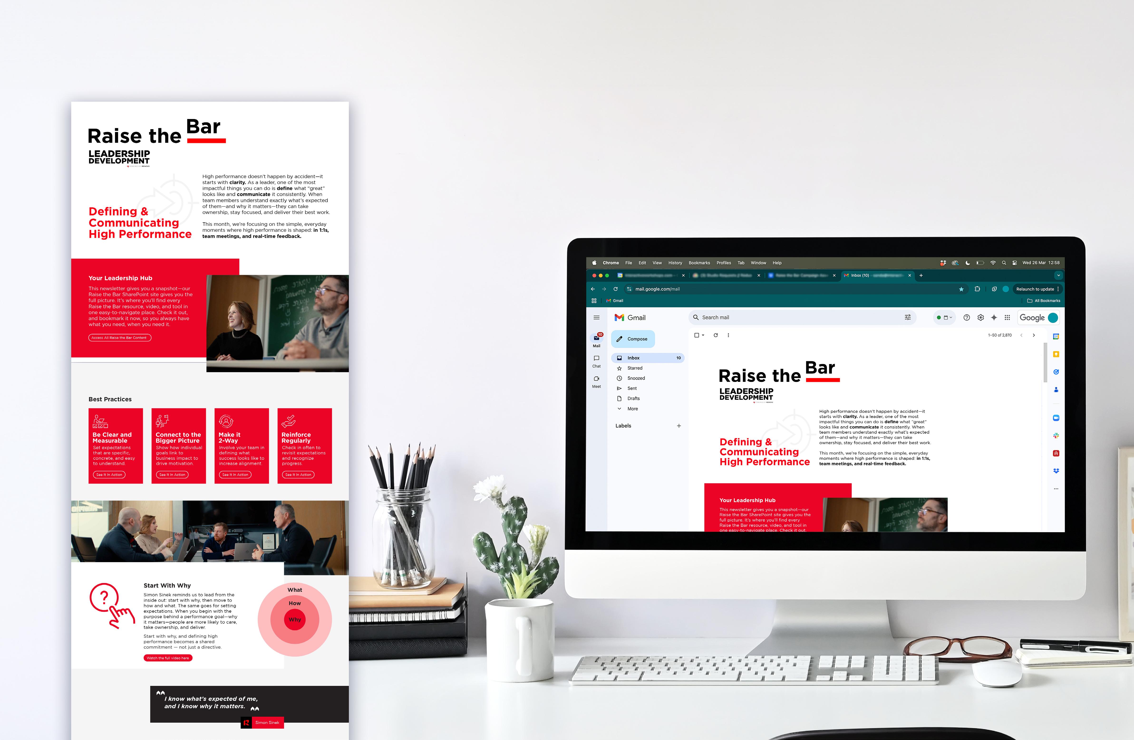
Examples of how to apply the Raise The Bar brand identity to the newsletter and digital comms.
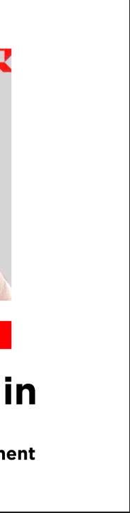
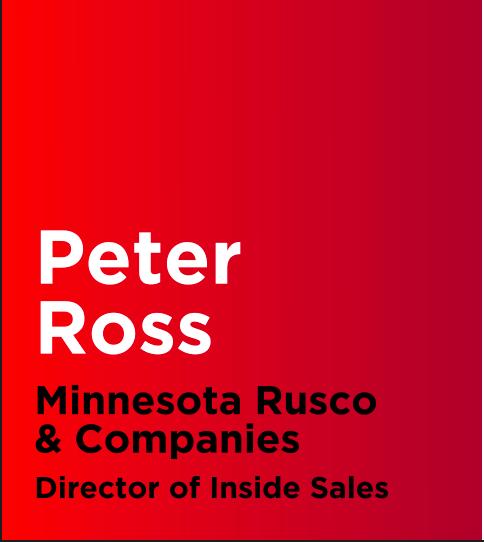
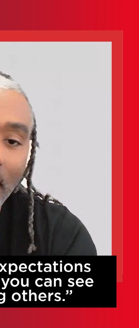
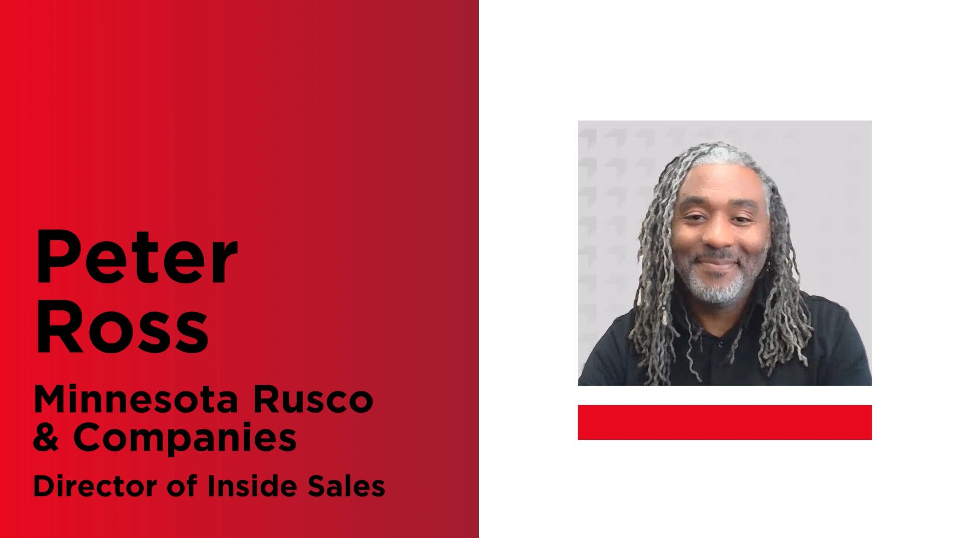

Videos should follow the set of templates and presets, with space available to insert and adjust quotes, name, job title and company.