LUXURY STORE AUDIT
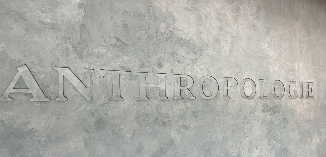
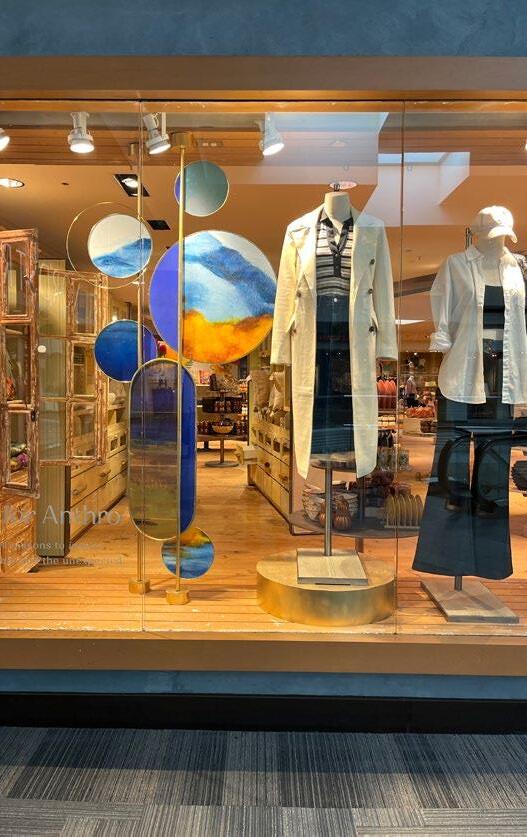
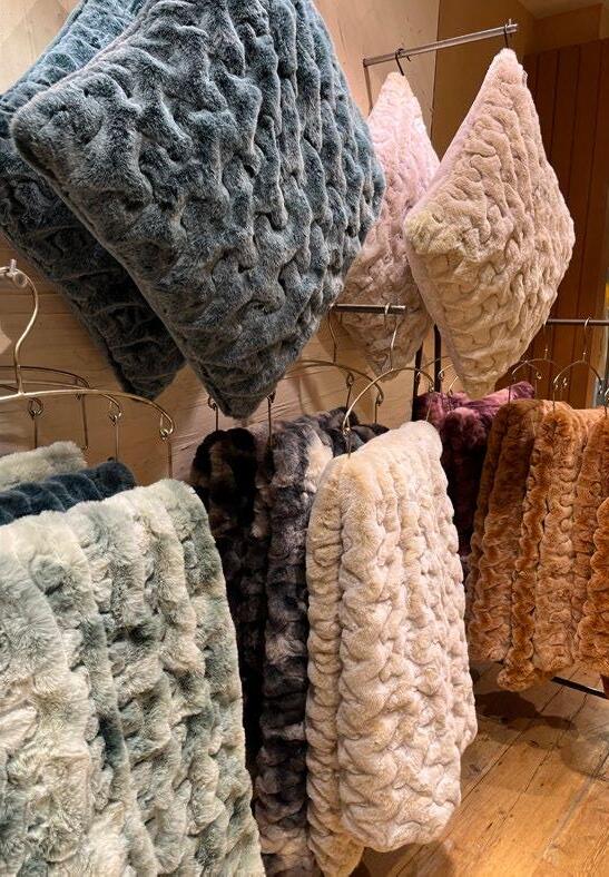
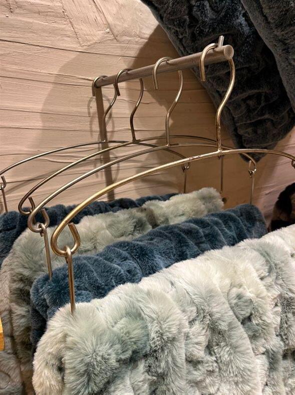
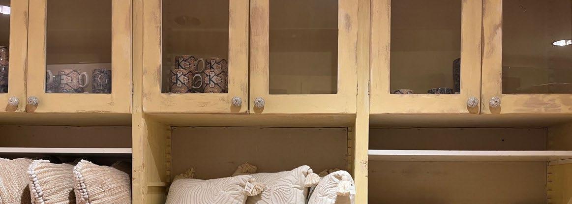
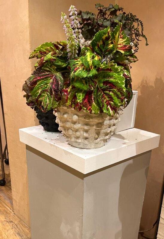
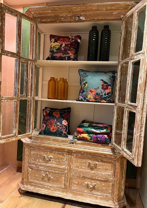
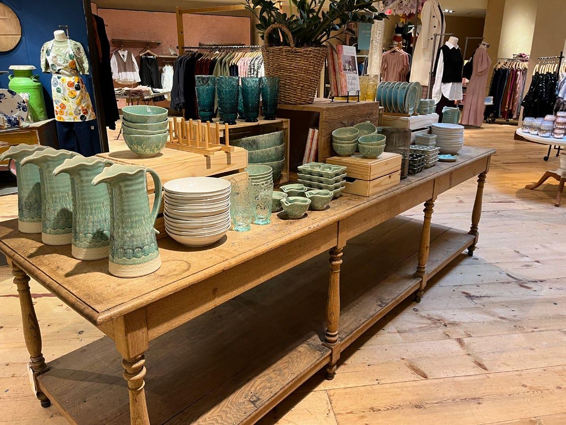
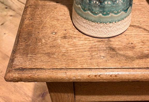
ANTHROPOLOGIE
STORE NOTES:
• A lot of different materials are used in their retail merchandising.
• Their store has a vintage feel.
• They use a lot of soft colors, which are easy on the eye (pastels, grays, muted metallics).
• They mix a lot of materials which makes their store visually interesting.
• It seems achievable for someone to have this “style” in their own home.
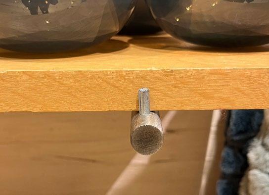
• A lot of simple fixtures and floating shelving units.
• Reused wood, steel, and furniture.
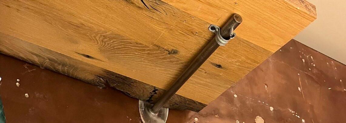
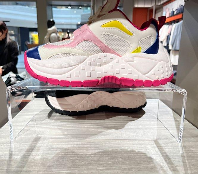
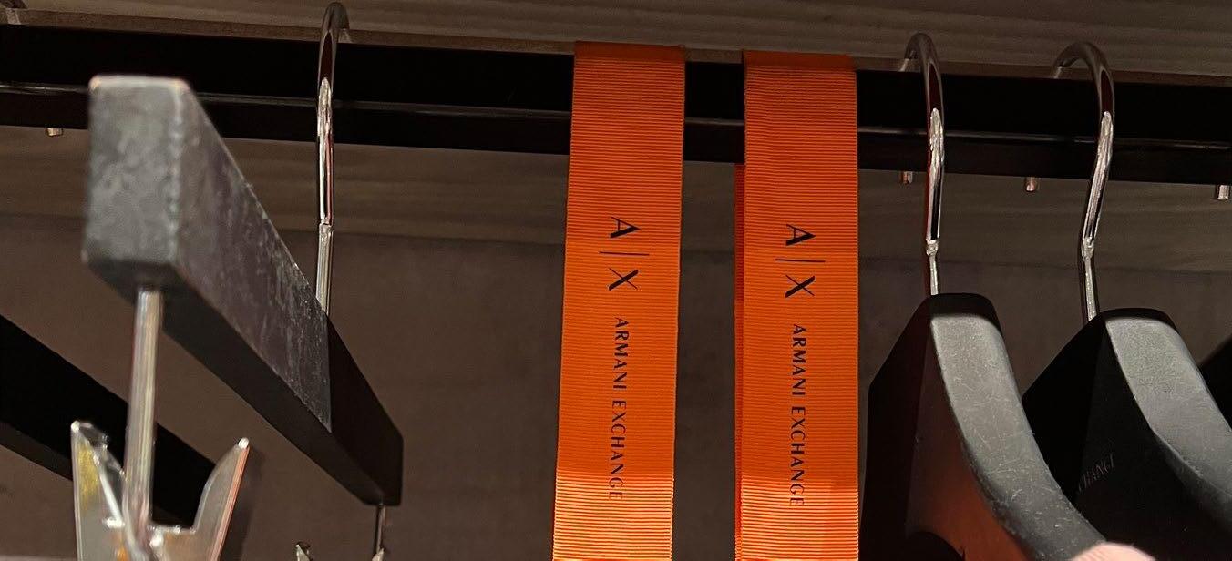
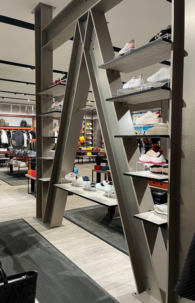
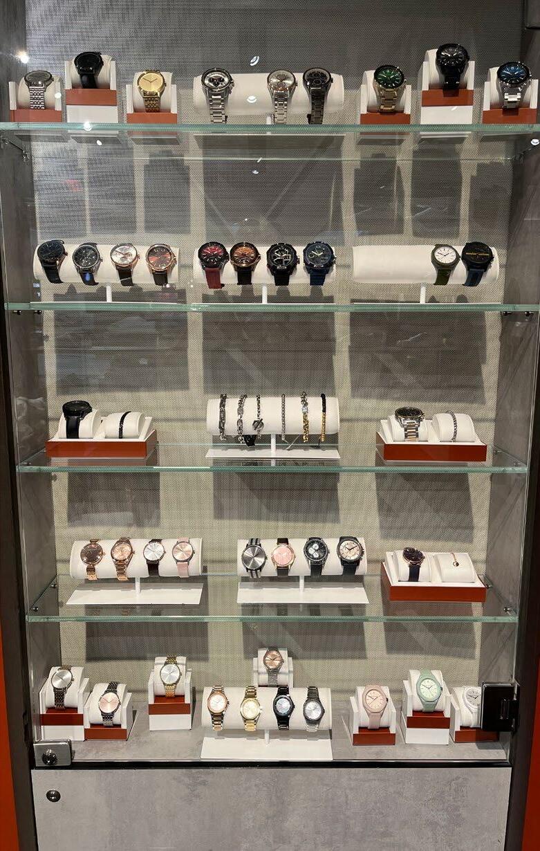
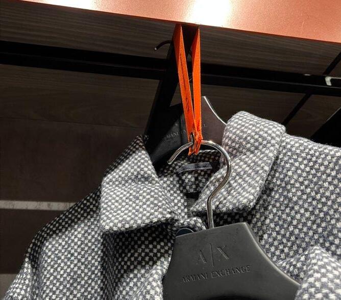
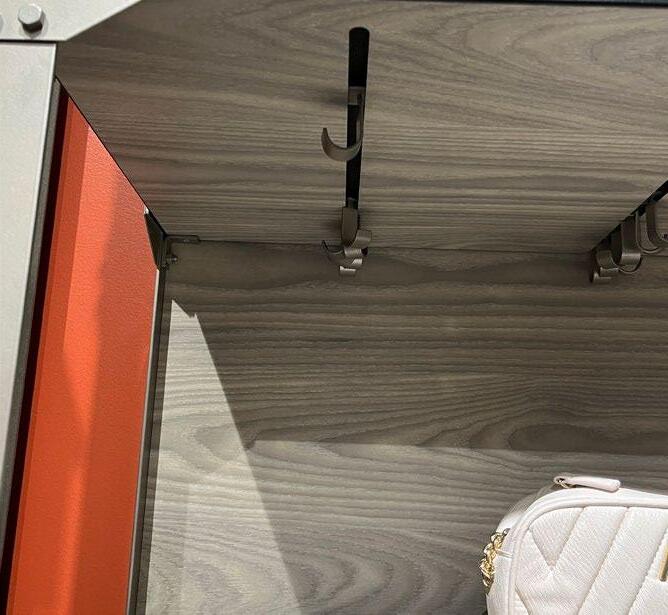
ARMANI EXCHANGE
STORE NOTES:
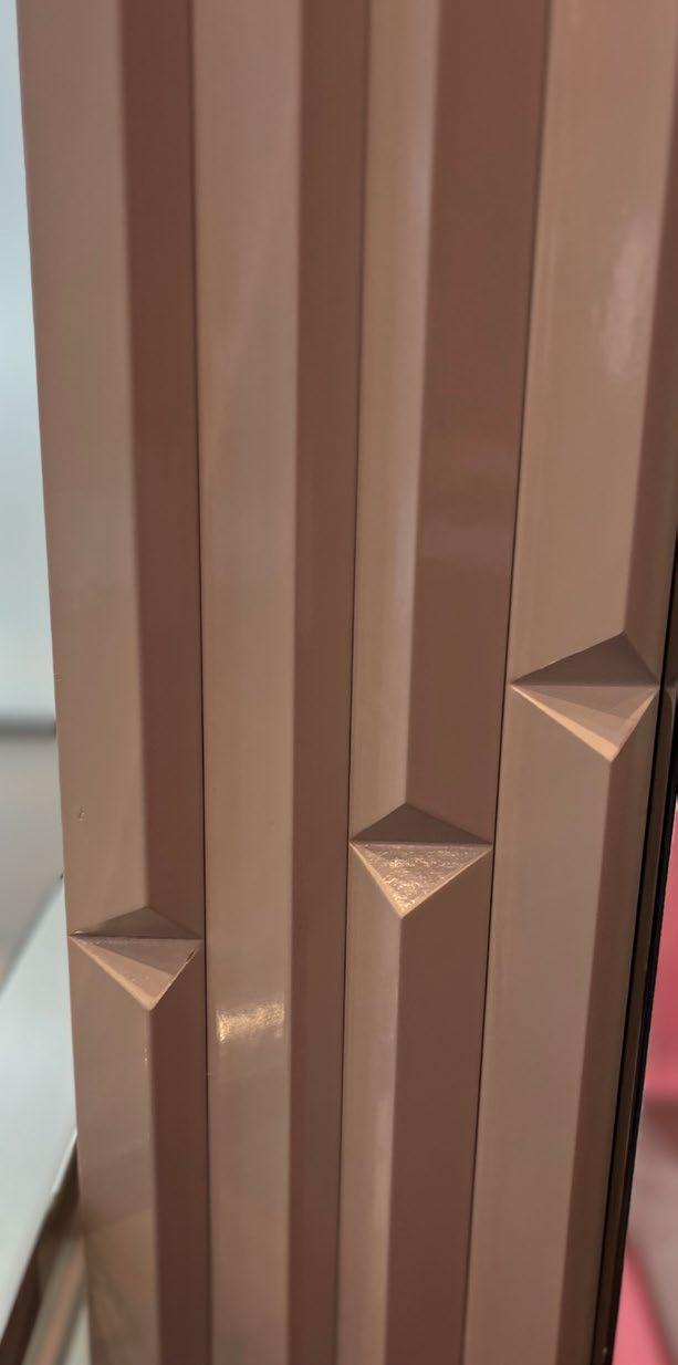
• Industrial look - exposed screws and large steel beams.
• Stone background paired with metallic accents.
• Interesting ways of displaying their logo (hangers and wall decals).
• Environment is more on the masculine side.
• Spotlights used throughout the store.
• Hooks to hang product and shelves to elevate merchandise.
ARMANI EXCHANGE
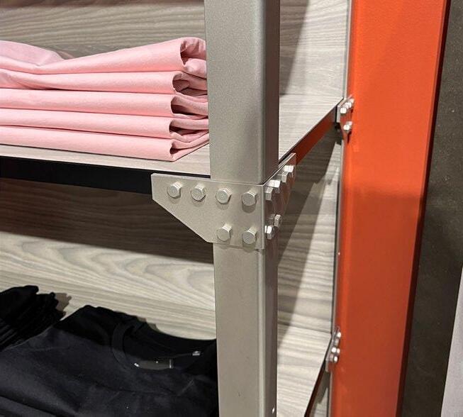
ARMANI EXCHANGE
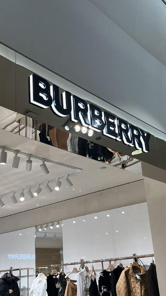
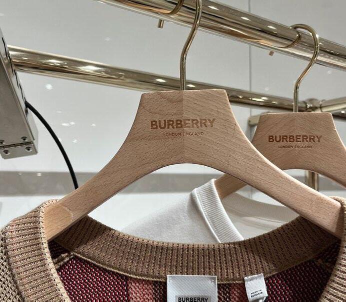
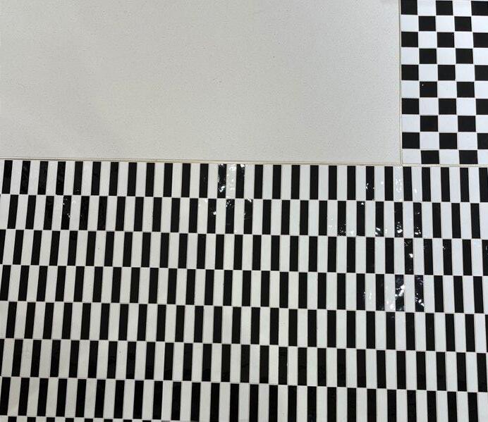
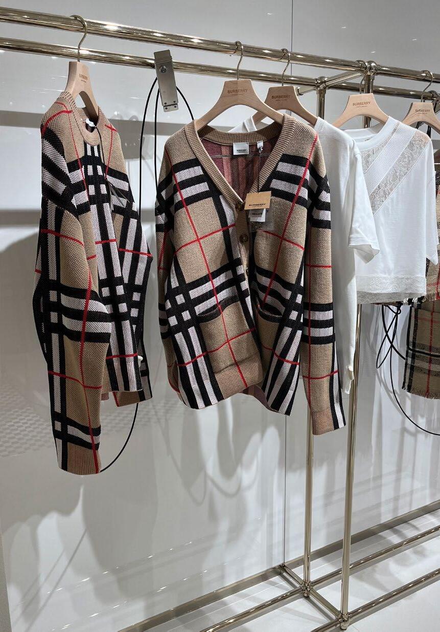
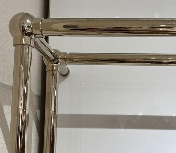
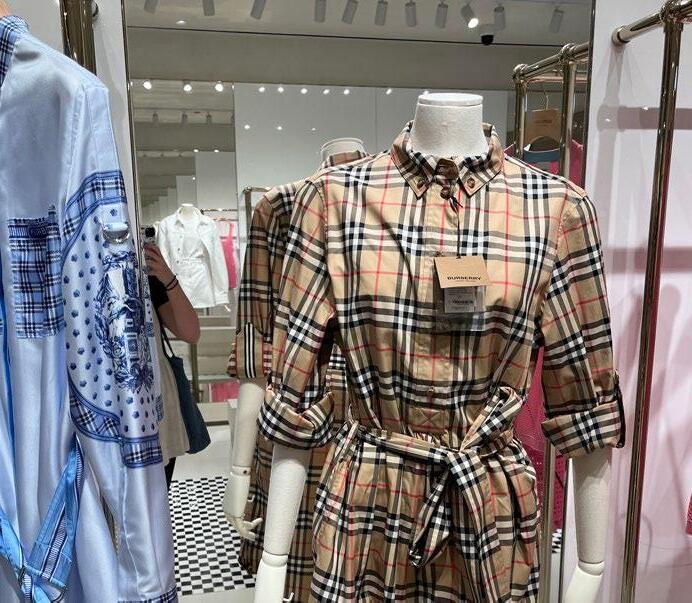
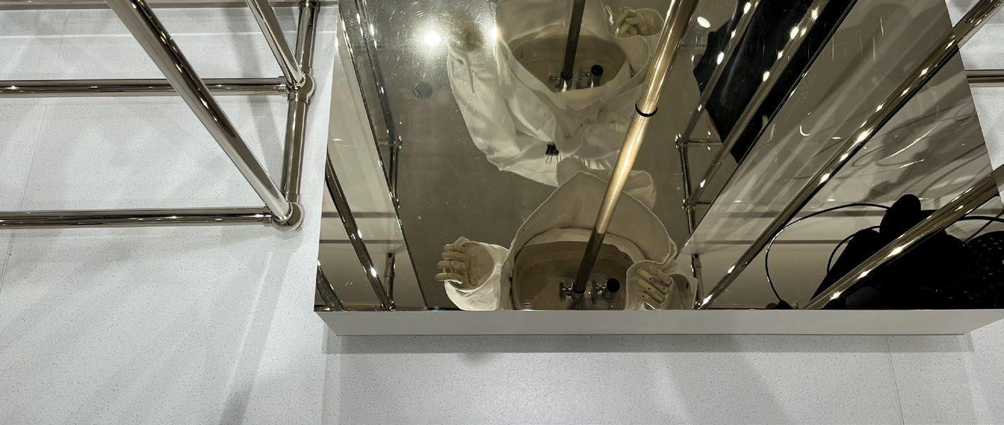
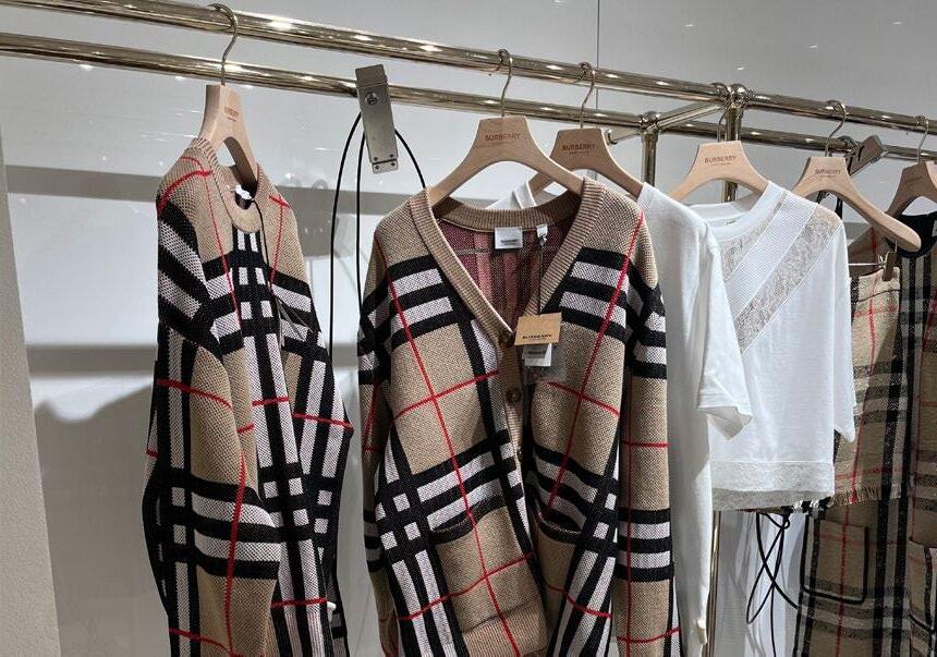
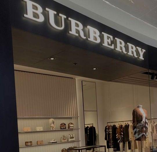
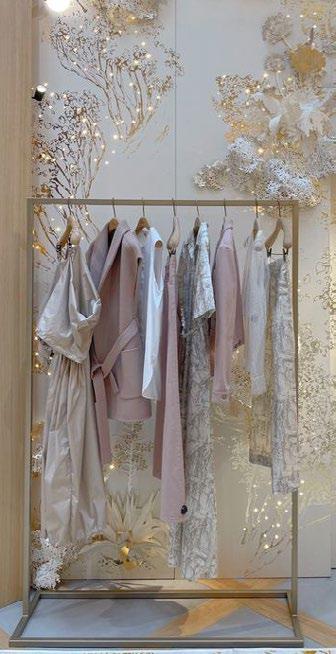
BURBERRY
STORE NOTES:
• Exterior of building is wrapped with their branding to draw attention to the store.
• They use a lot of mirrors around the store to make the space feel bigger.
• Very bright lights throughout, and everything is reflective.
• A lot of metallic gold accents are used.
• There is a lot of black, white, and red in the store.
• The checkout counter looks expensive.
BURBERRY
BURBERRY
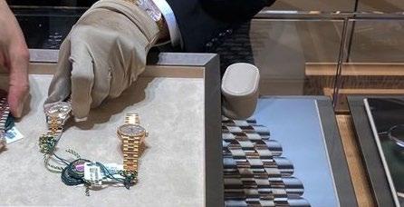
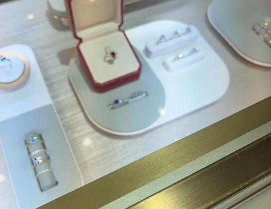
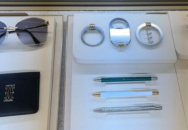
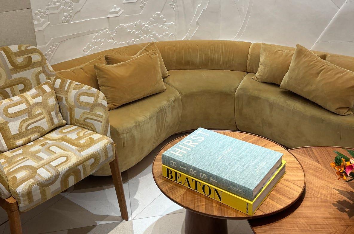
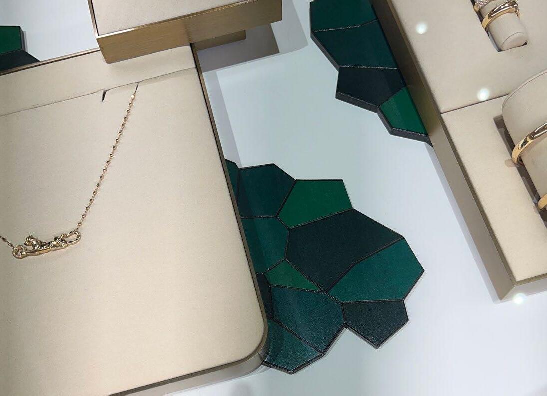
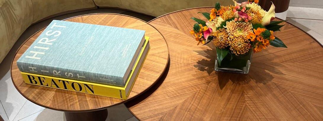
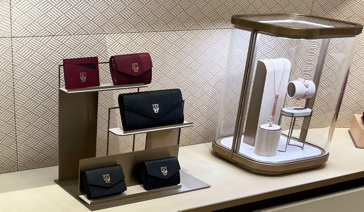
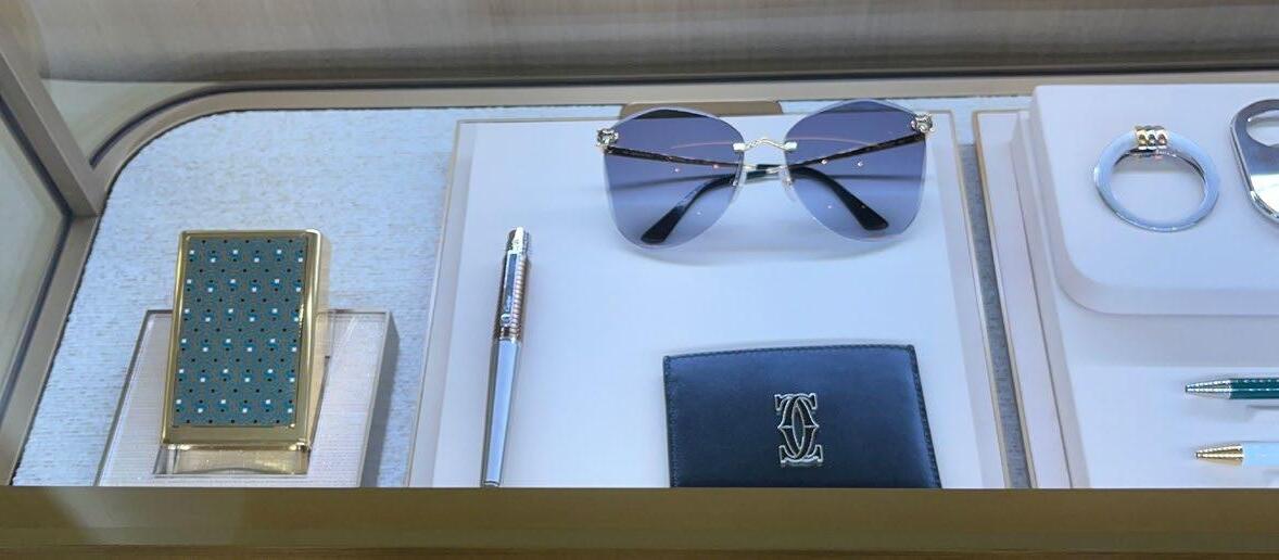
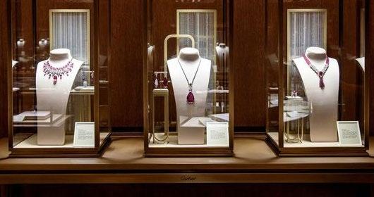
CARTIER
STORE NOTES:
• Security at the entrance makes the store feel exclusive and luxurious.
• Very high class and elevated.
• This store doesn’t use too much black.
• There are a lot of seating areas for shoppers to sit and enjoy the space. It makes it feel welcoming.
• Unique small details throughout the store - green geometrical shapes and wall detailing.
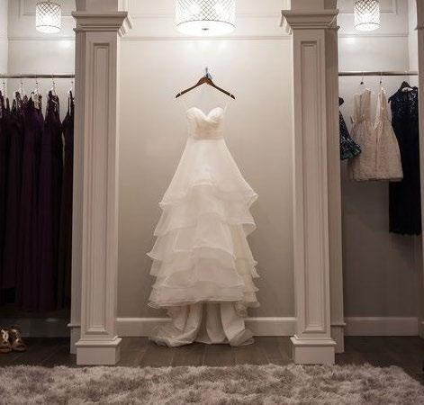
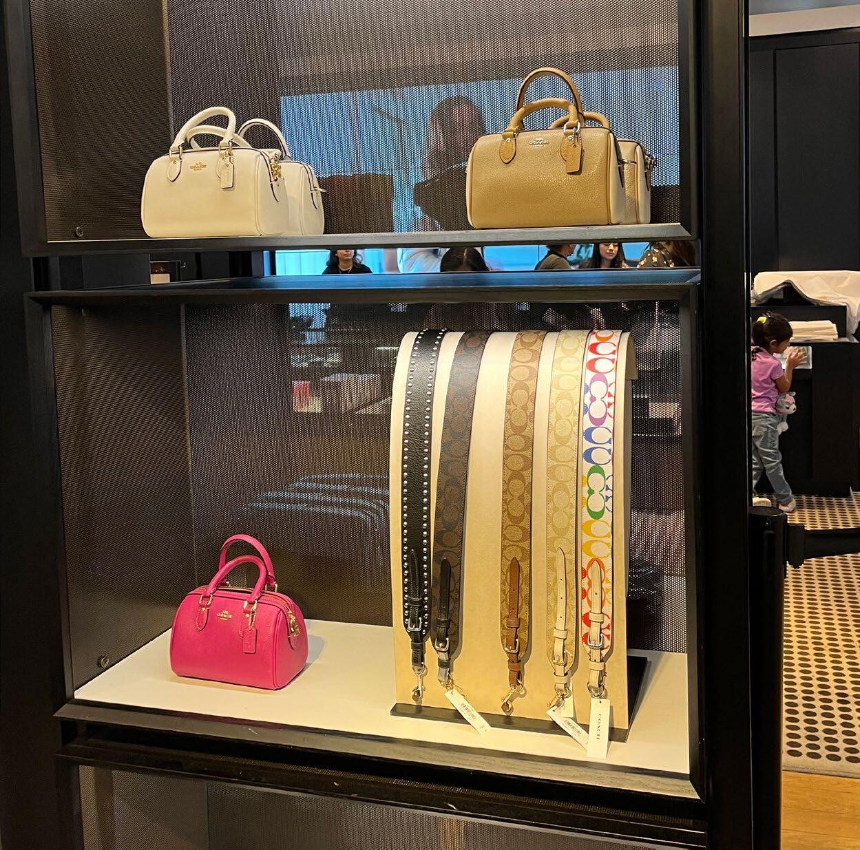
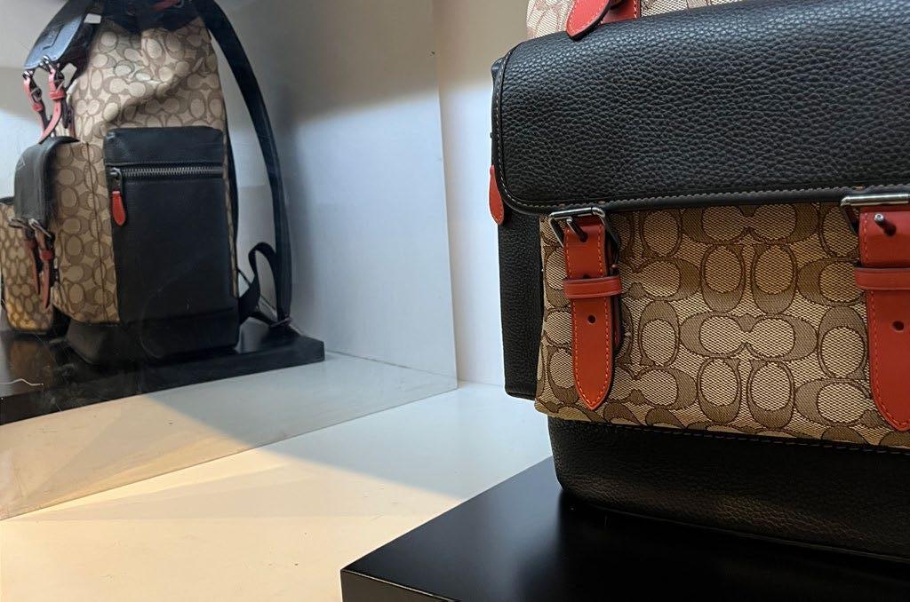
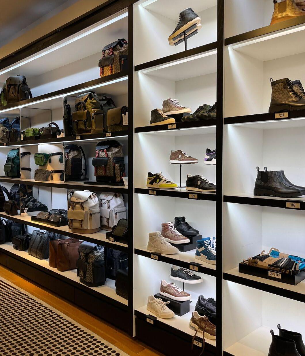
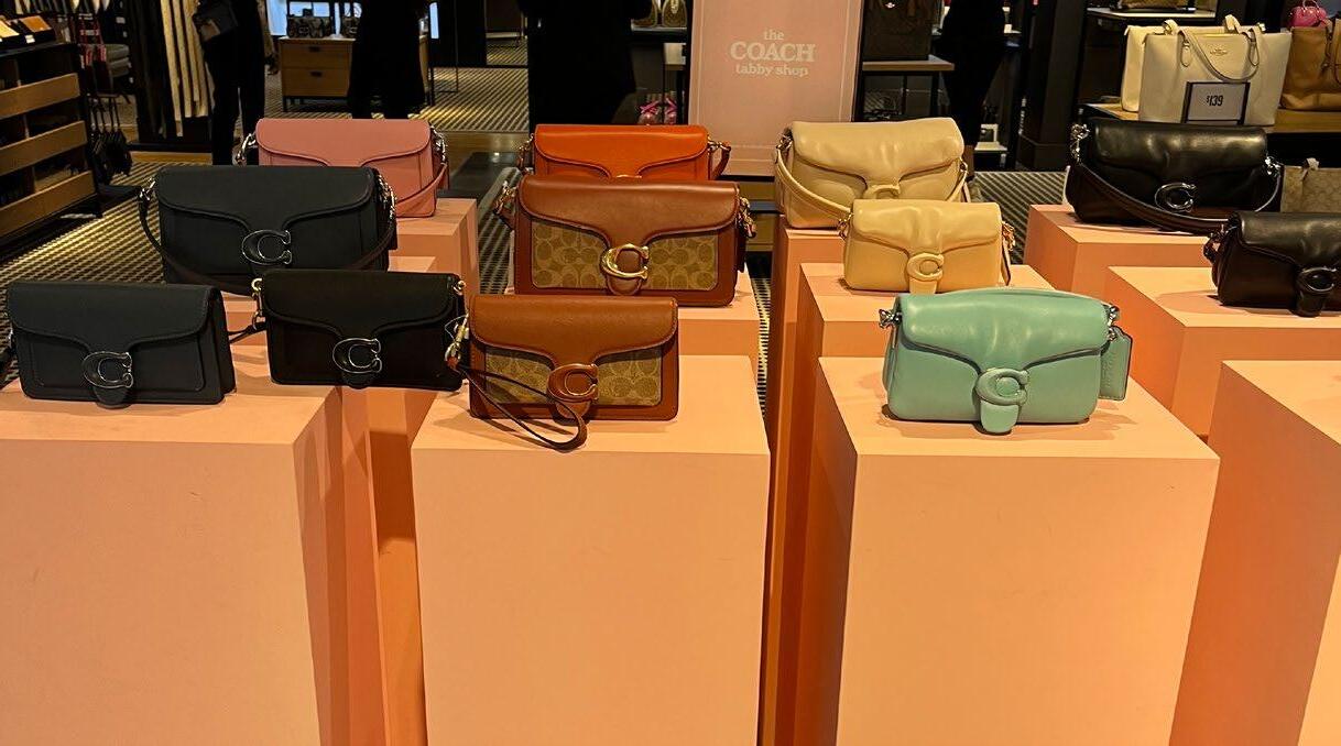
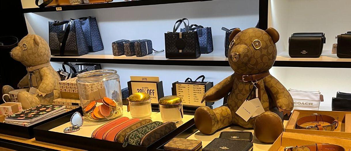
COACH
STORE NOTES:
• Dark colors used in the retail environment.
• All of the product is elevated and sitting on shelves.
• They use elevation to emphasize hierarchy.
• A lot of LED strip lighting is used.
• They mix-and-match a variety of products on each shelf.
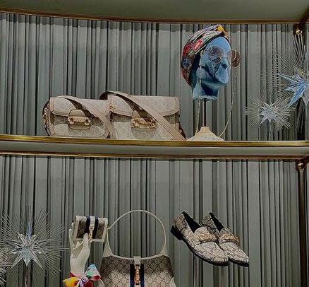
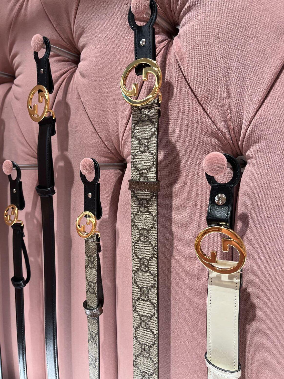
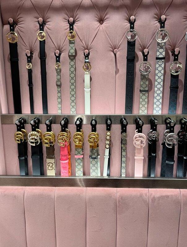
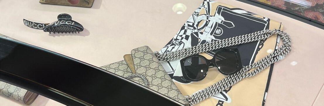
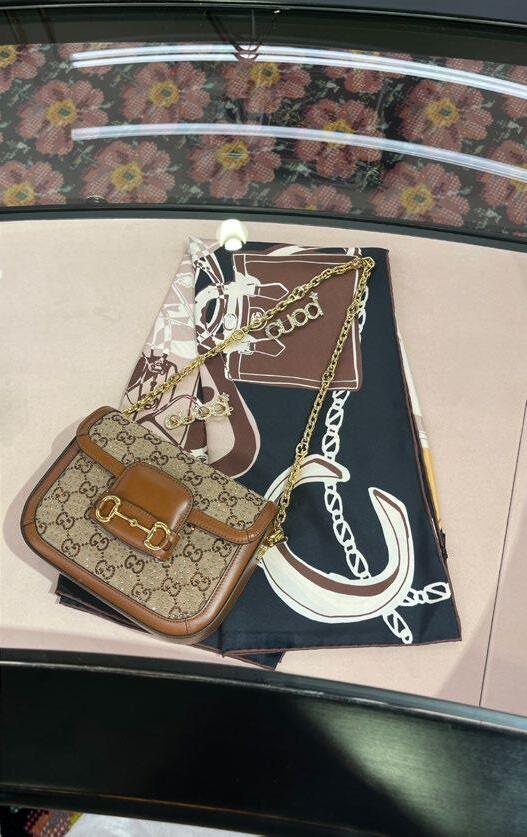
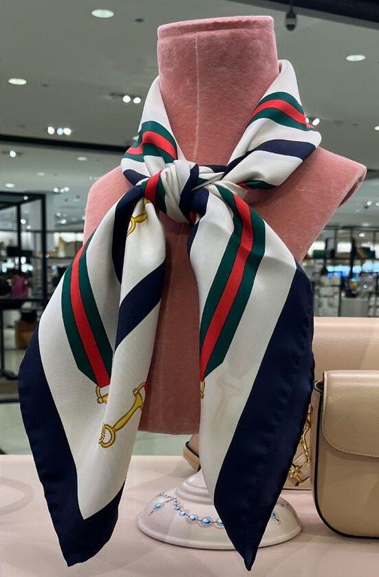
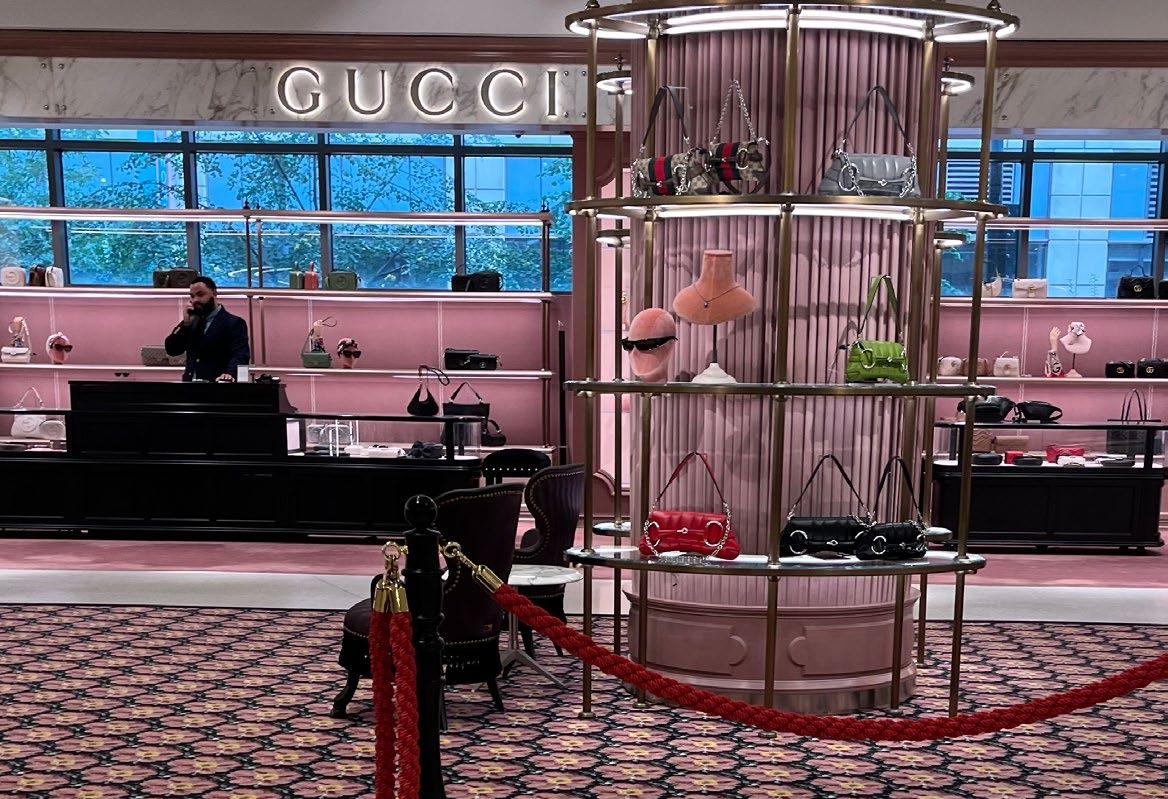
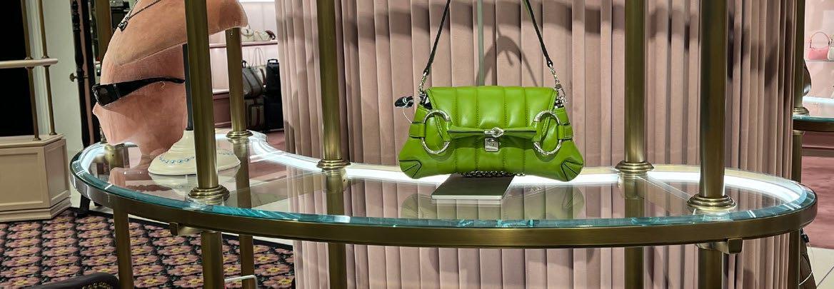
GUCCI
STORE NOTES:
• Blush pink was used all over the store.
• Everything was soft to touch.
• The store has a lot of glass and gold accents.
• They use red ropes to emphasize their luxury and exclusivity.
• A lot of products are in glass cases and are not out for the public to handle.
• Glass cases create friction in purchasing, but reinforces exclusivity of their items.

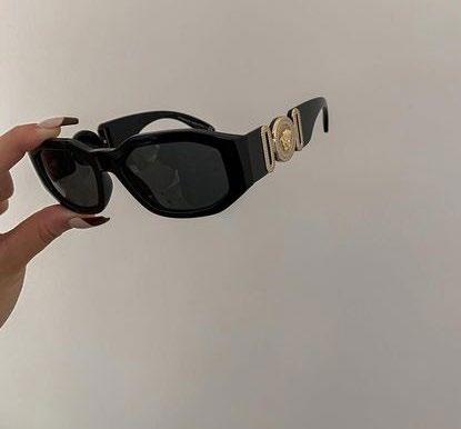
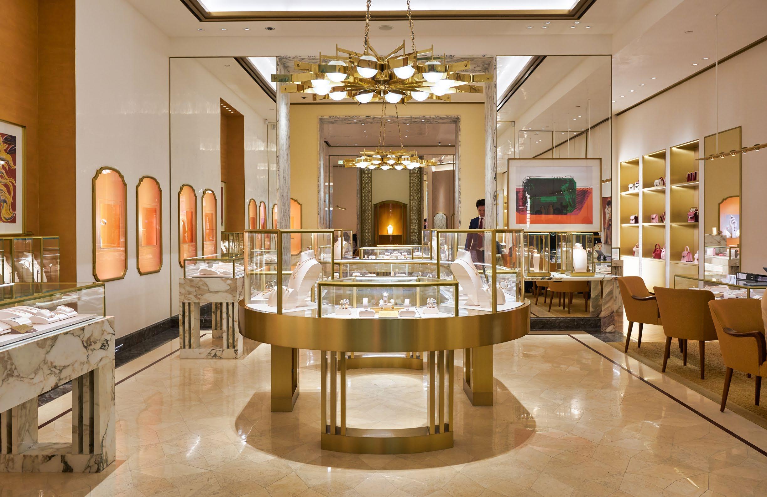
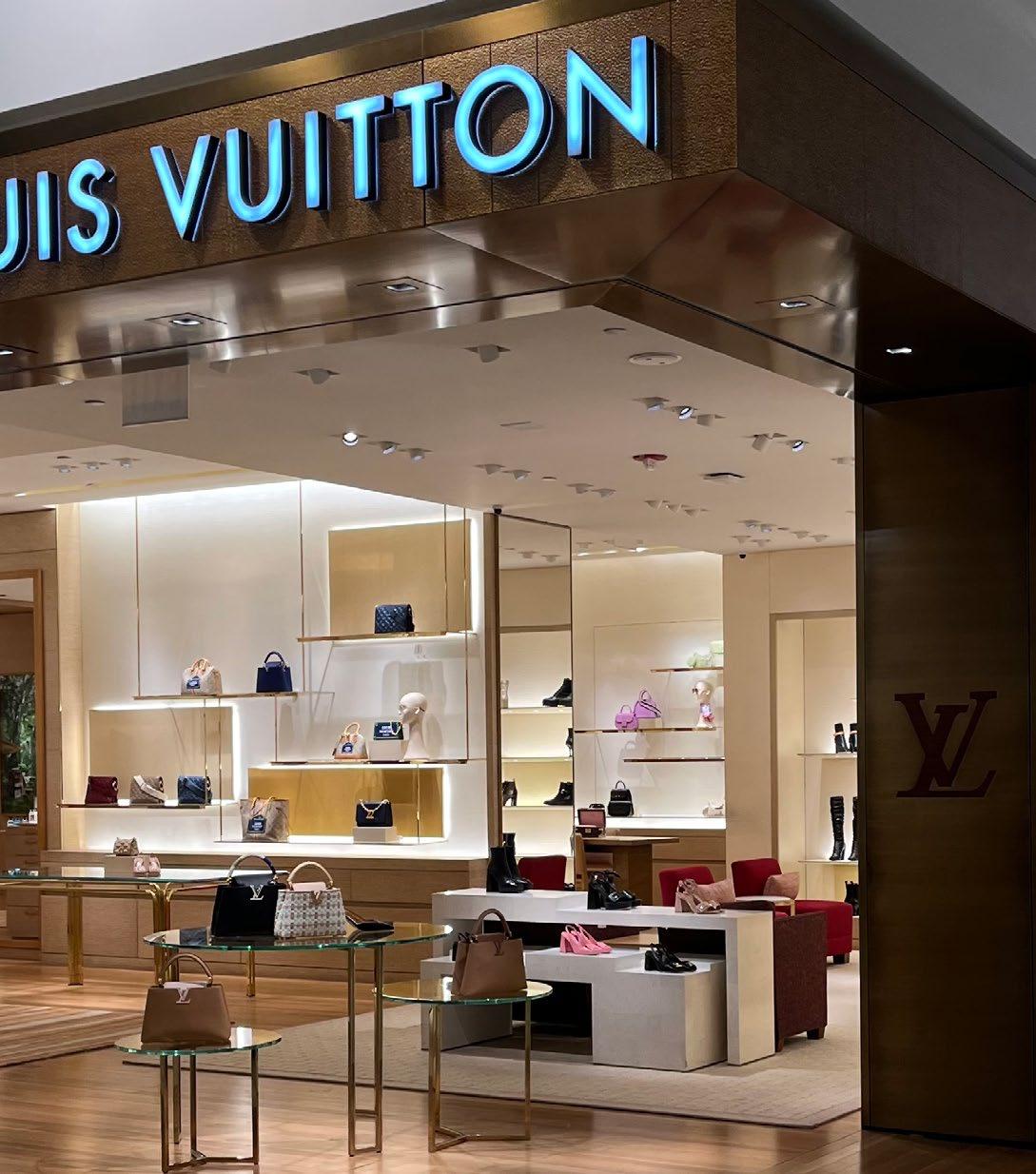
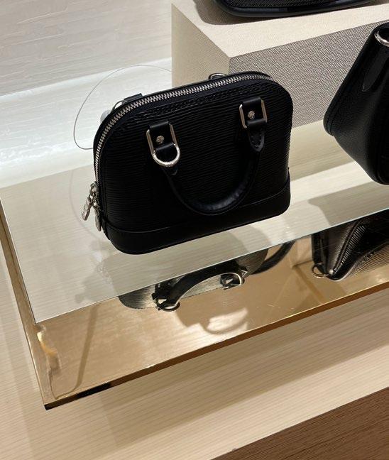
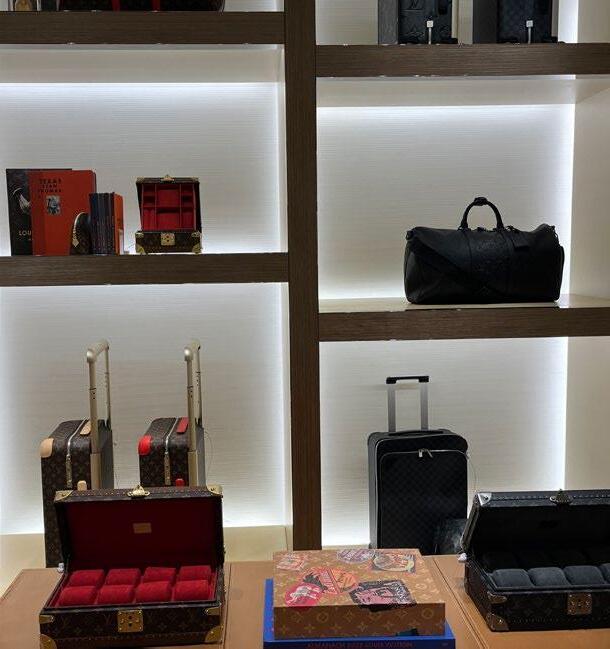
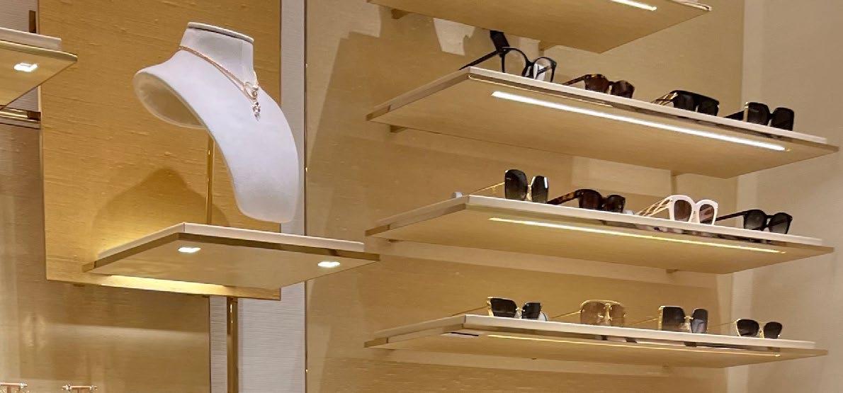
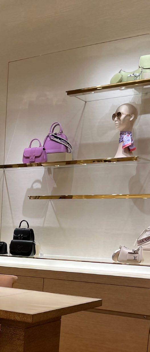
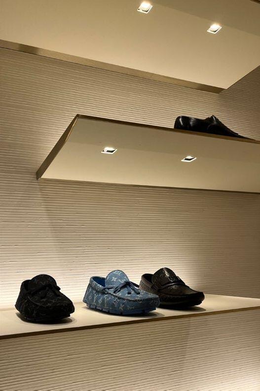
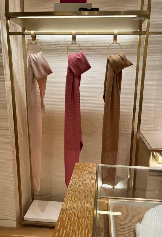
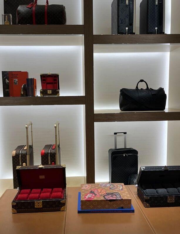
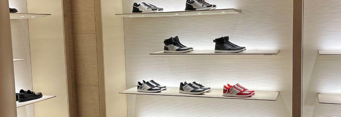
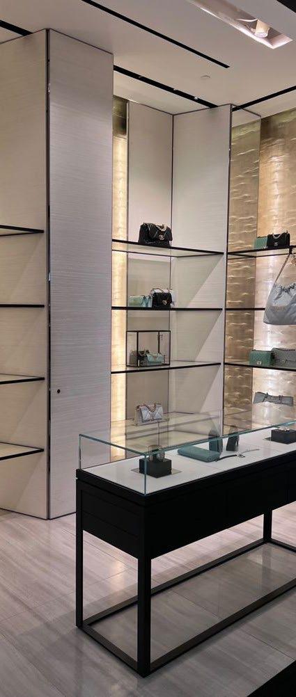
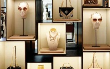
LOUIS VUITTON
STORE NOTES:
• Product is illuminated from behind or above in order to draw attention.
• Product is organized into different categories - purses, sunglasses, luggage, etc.
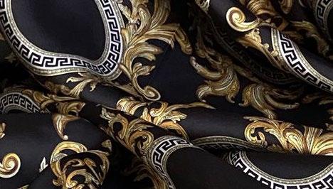
• The store is mainly gold, white, and black with pops of color coming from their merchandise.
• Pattern is repeated throughout the store.
• There is a lot of space between items.
LOUIS VUITTON
LOUIS VUITTON
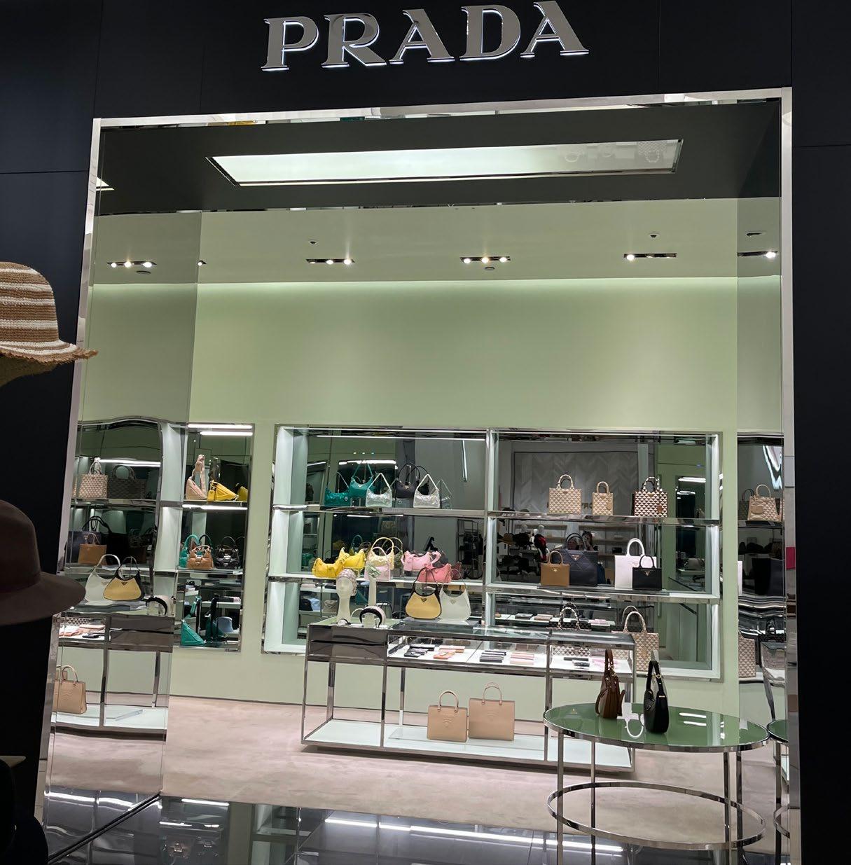
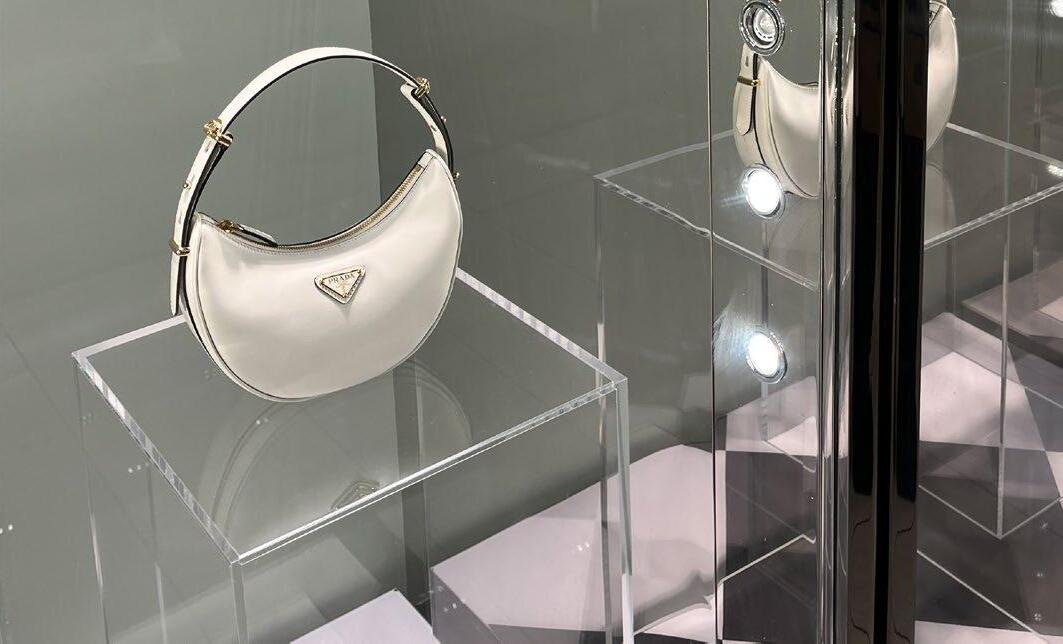
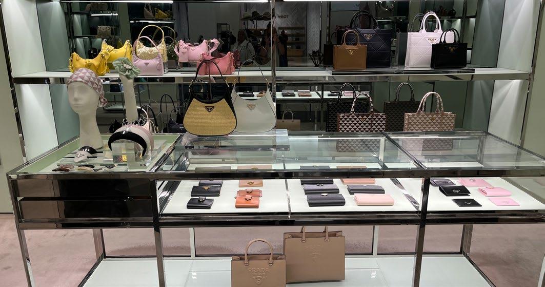
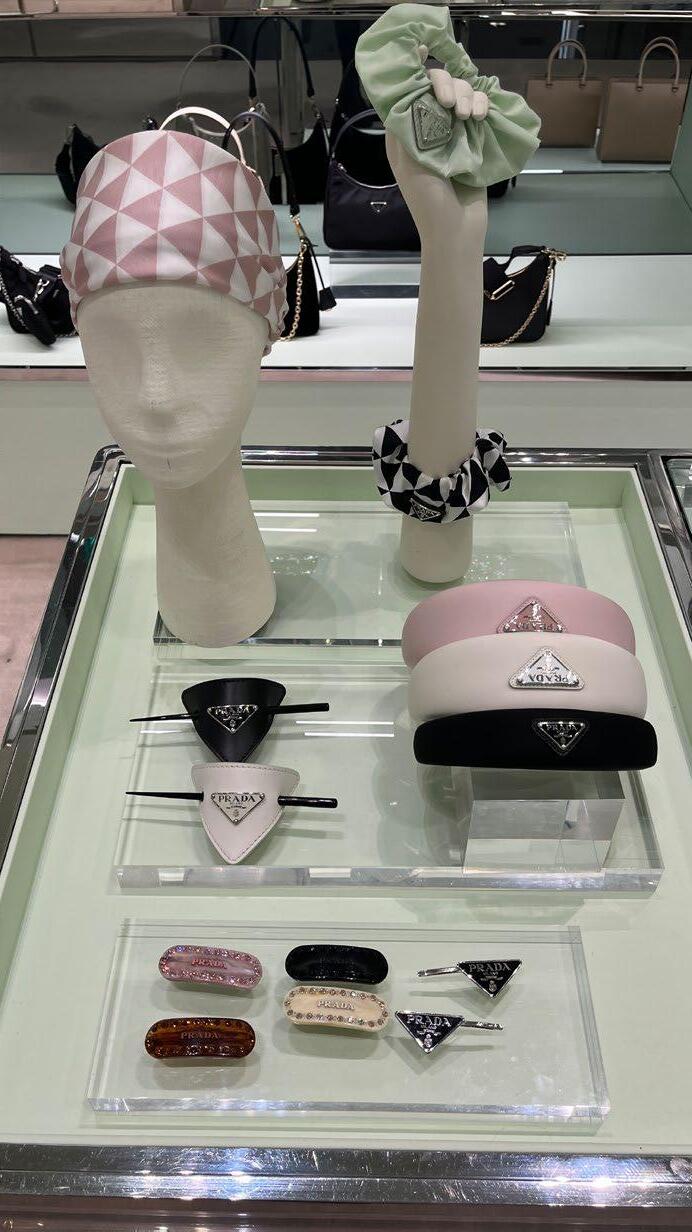
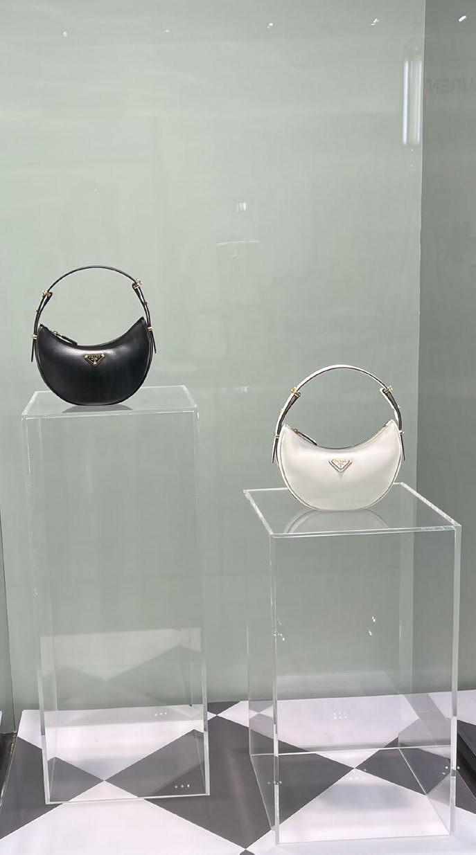
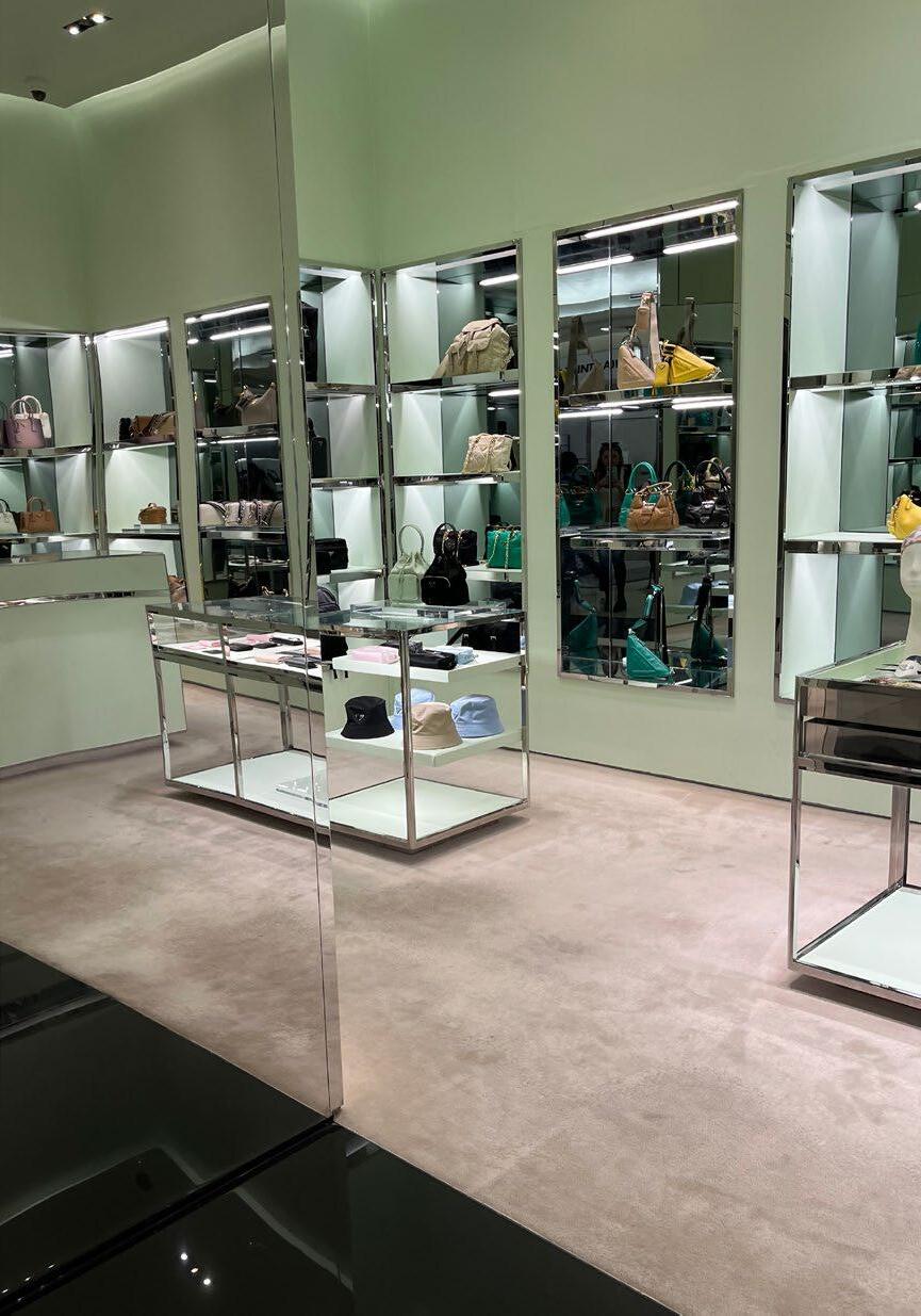
PRADA
STORE NOTES:
• Mint green, silver, and black were the main colors used in the store.
• A lot of glass and clear material is used throughout the displays.
• The outside of the store draws attention to get people to come inside.
• A variety of materials are used such as leather, steel, and glass.
• Mirrors are used as a tool to make the space seem bigger.
PRADA
PRADA
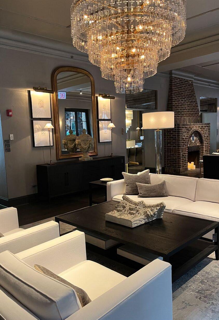
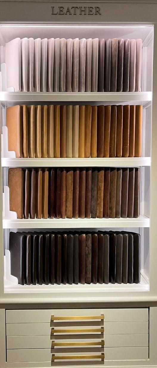
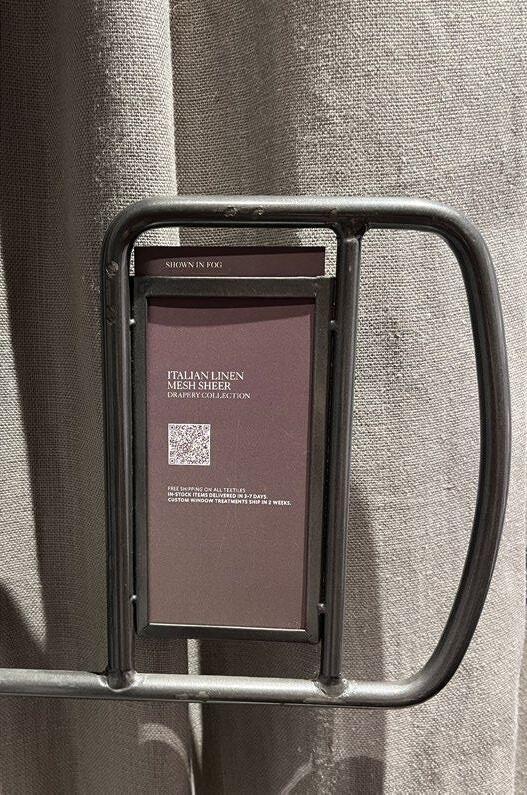
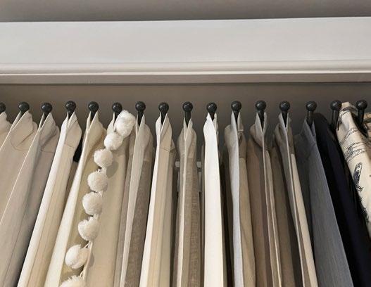
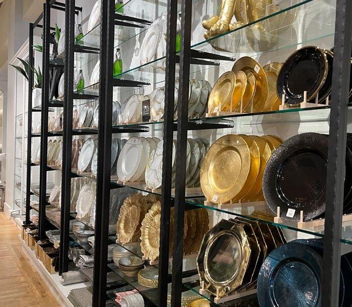
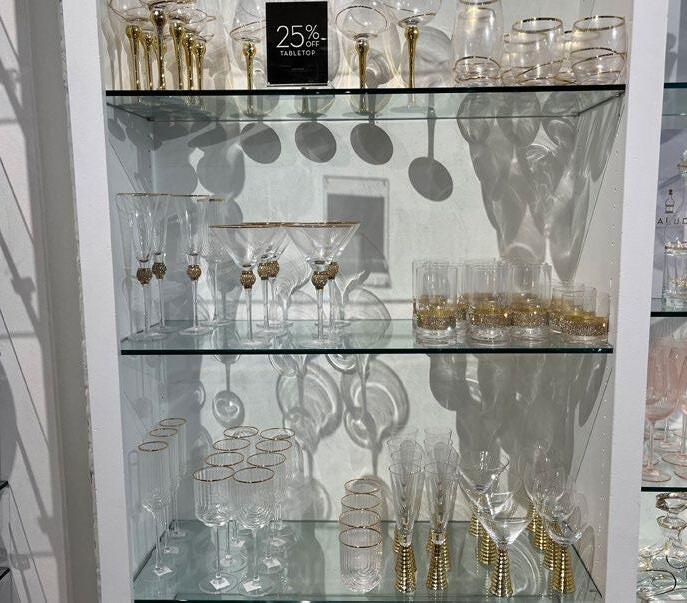
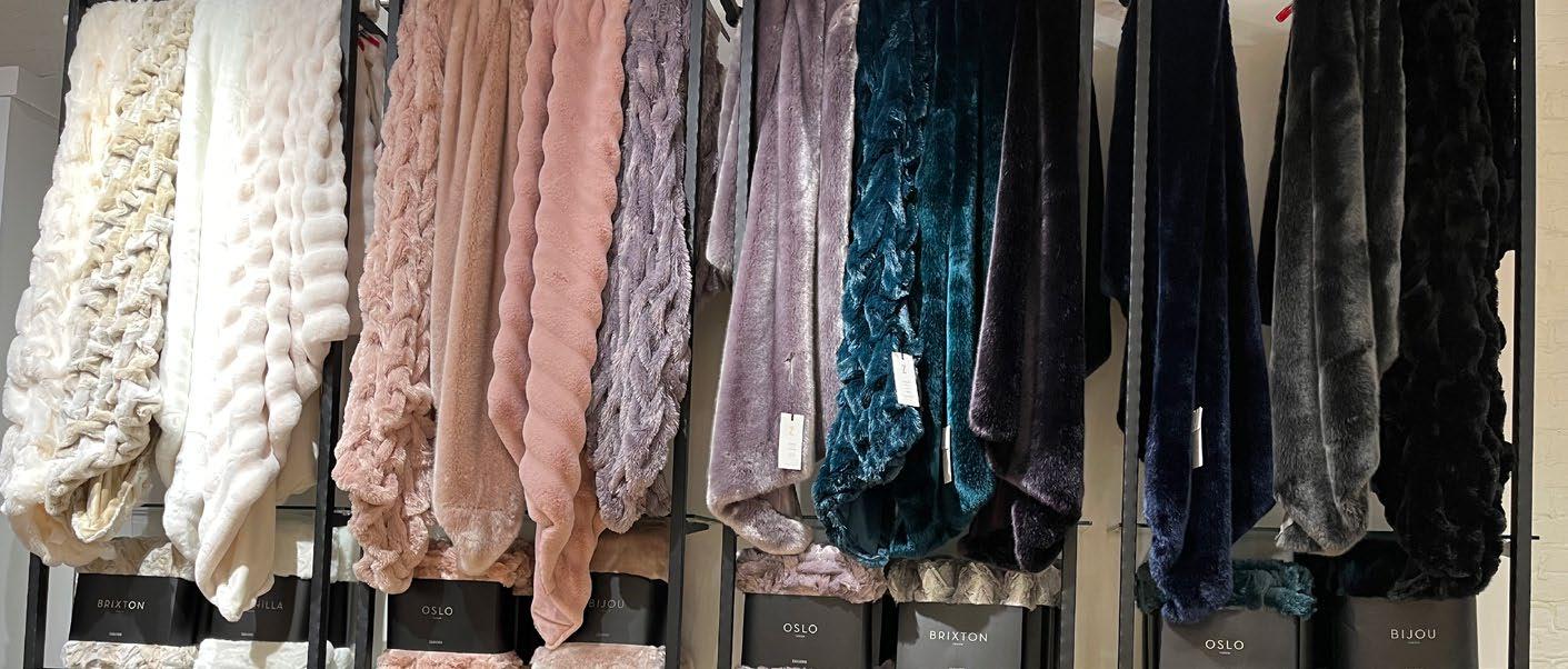
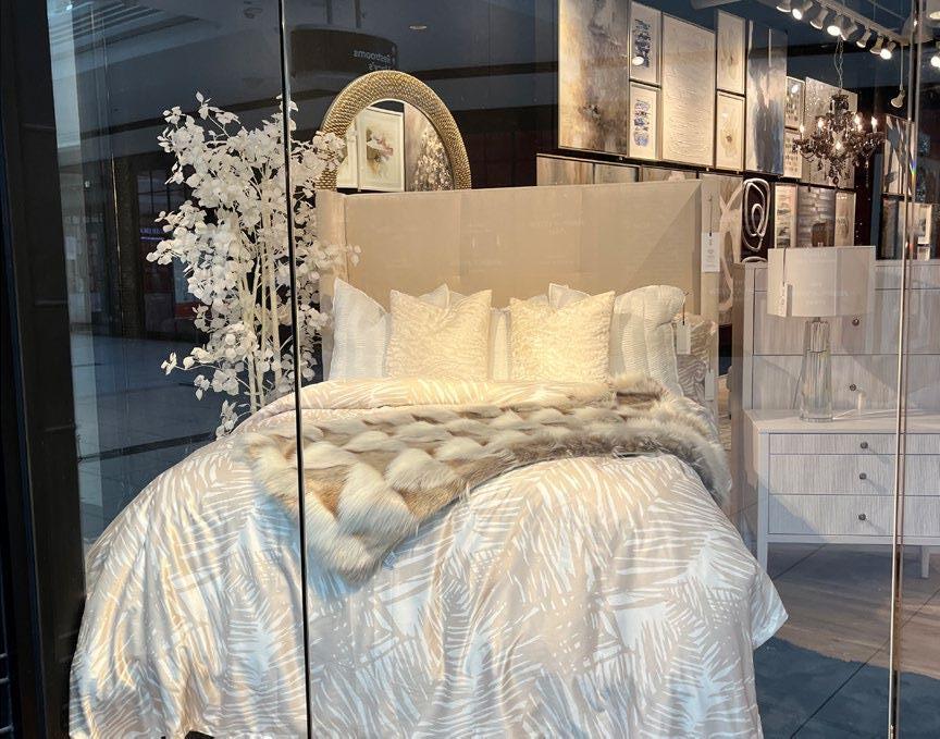
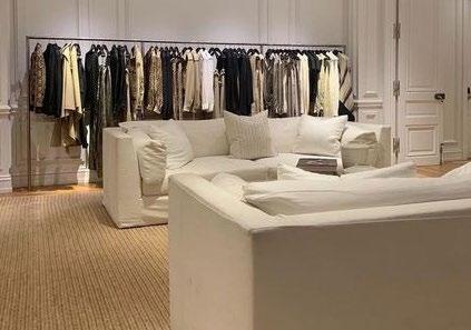
RESTORATION HARDWARE
STORE NOTES:
• Each floor is designated to a different type of room.
• The product is very organized.
• Displays look like something that could be in a home.
• Very easy to compare items.
• Visiting Restoration Hardware is a full experience - you can spend all day there.
• It was amazing to explore all of the floors, the different style rooms, and eat at the restaurant.
RESTORATION HARDWARE
RESTORATION HARDWARE
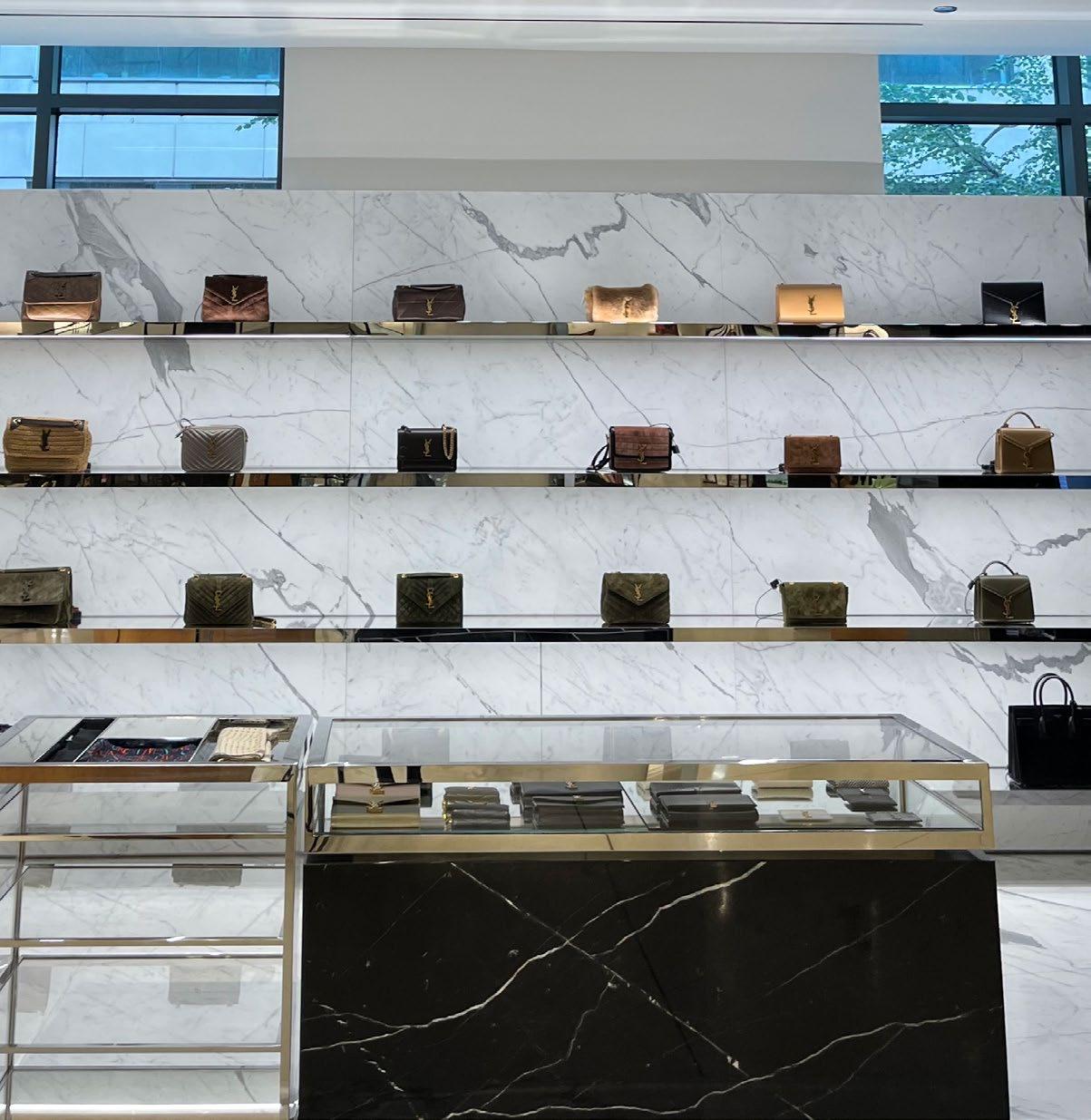
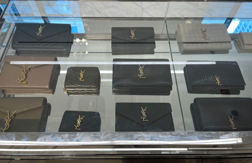
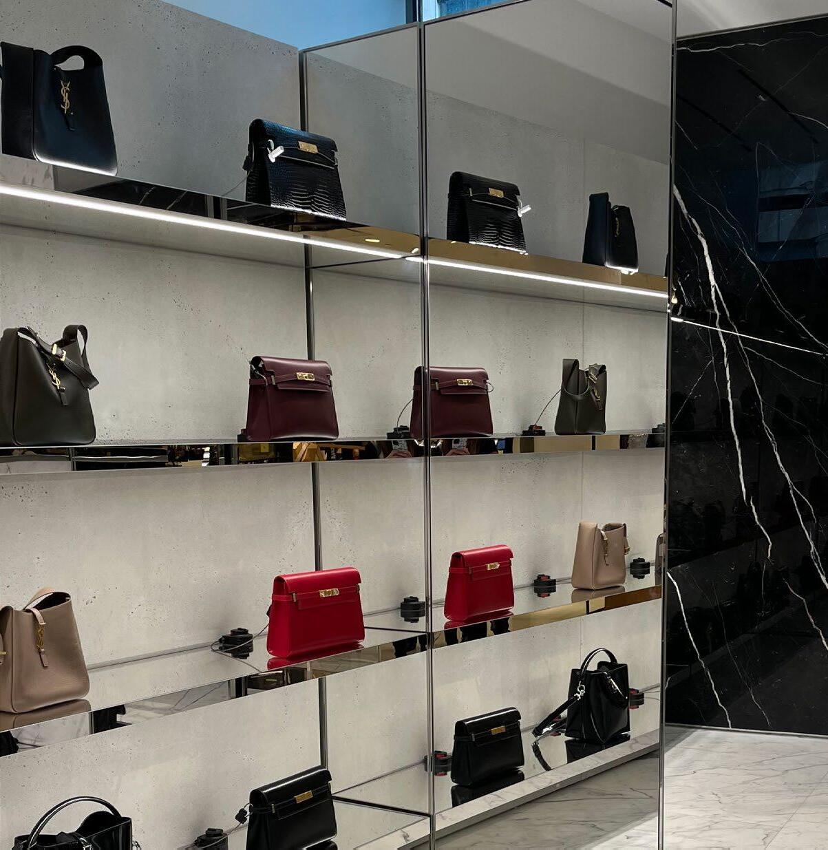
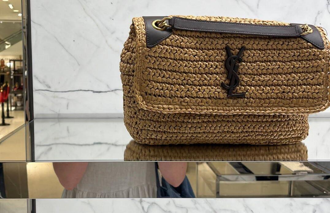
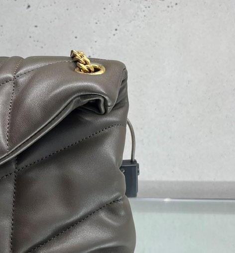
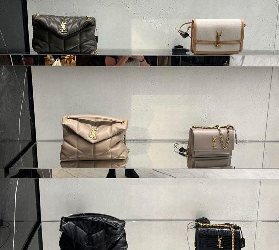
SAINT LAURENT
STORE NOTES:
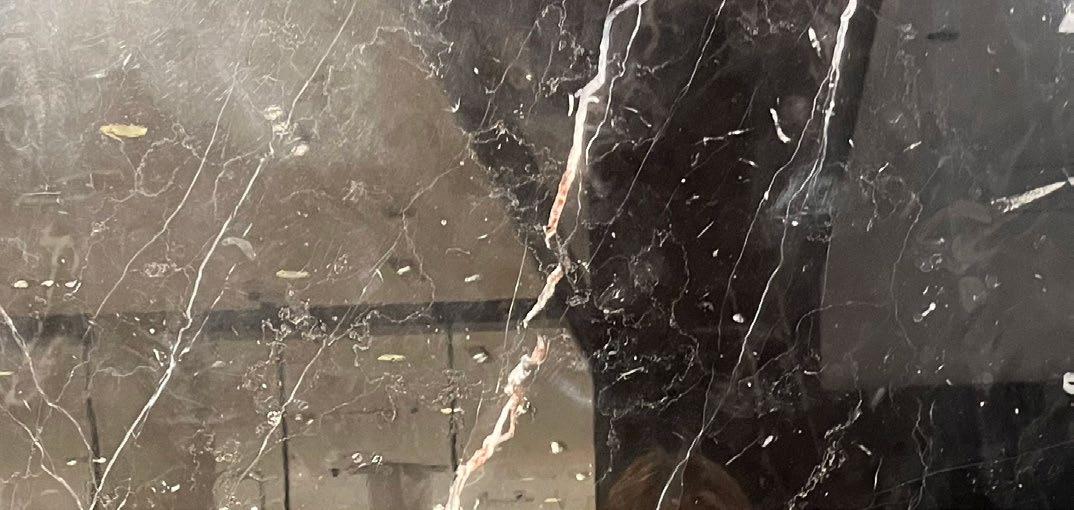
• Mix of natural materials like marble and stone used throughout the store.
• Products are merchandised in glass cases.
• Items have a lot of space between them.
• Gold accents used throughout.
• The merchandise creates a pattern along the back wall.
SAINT LAURENT
SAINT LAURENT
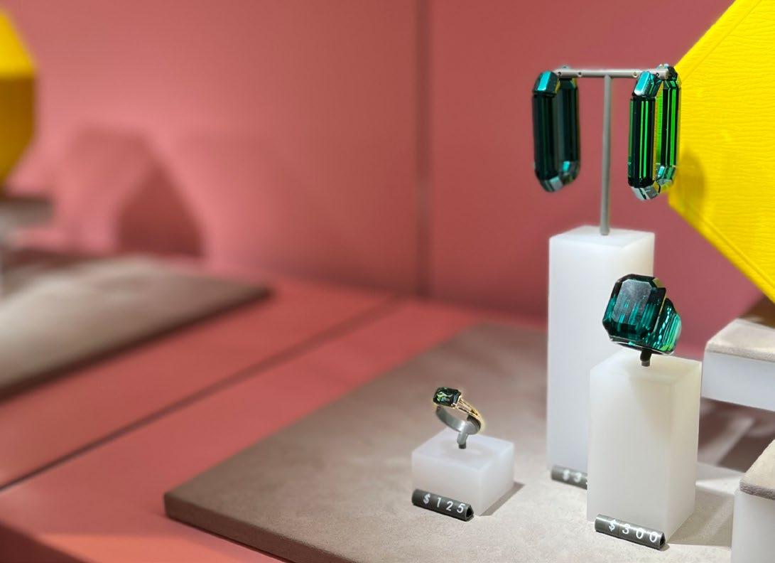
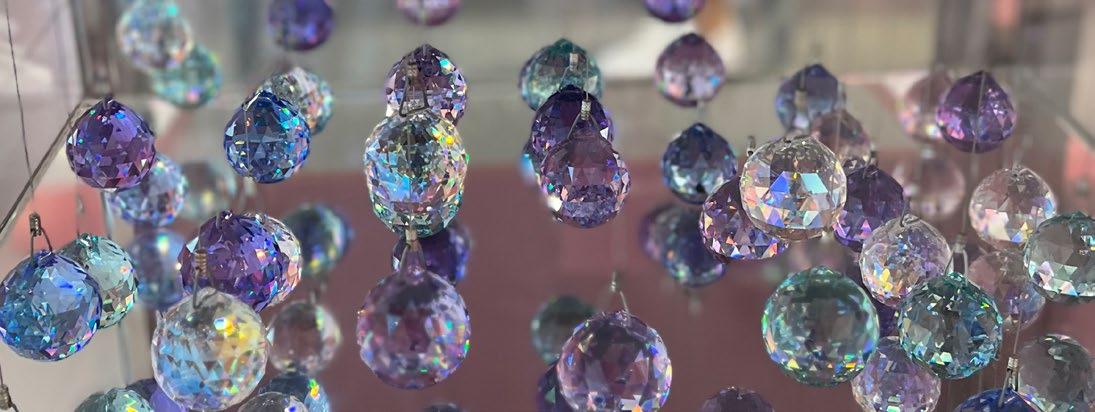
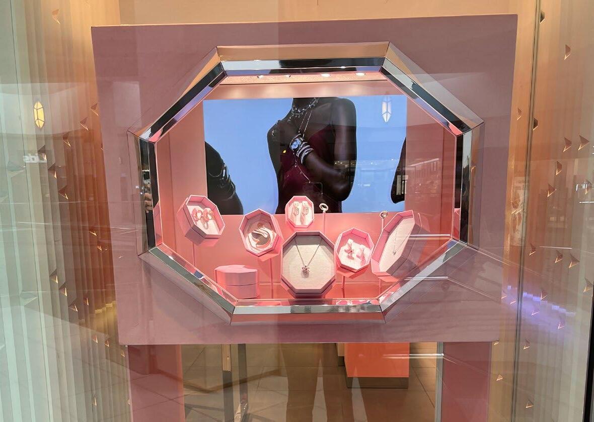
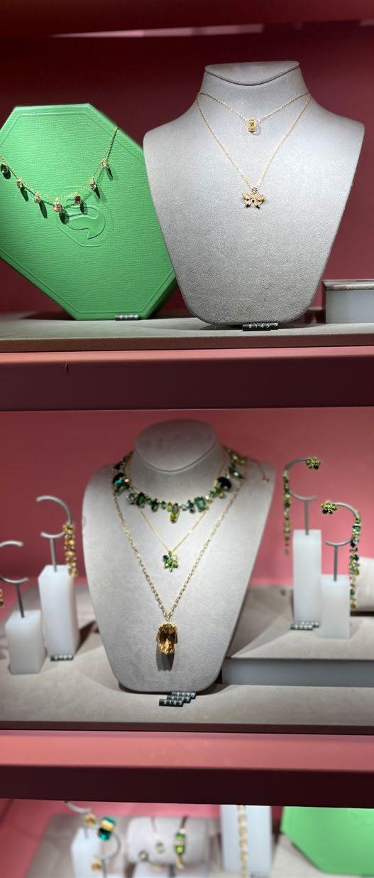
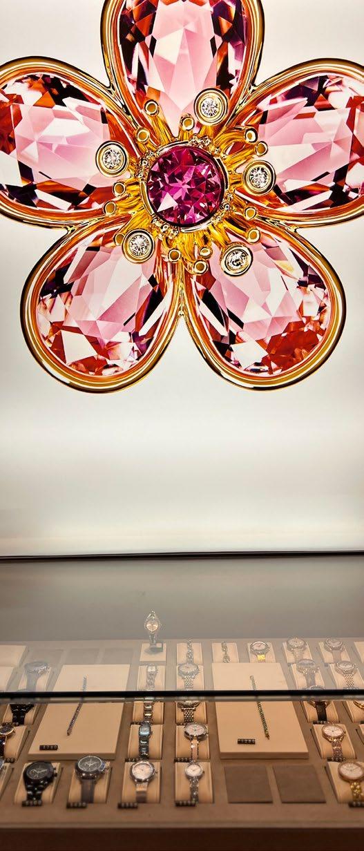
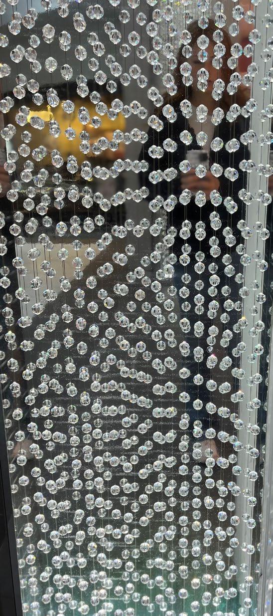
SWAROVSKI
STORE NOTES:
• Beautiful gemstones featured throughout the space.
• A lot of mirrors and reflection used as a focal point.
• Very bright and colorful space.
• Posters and imagery used to show the stones at a larger scale.
SWAROVSKI
SWAROVSKI
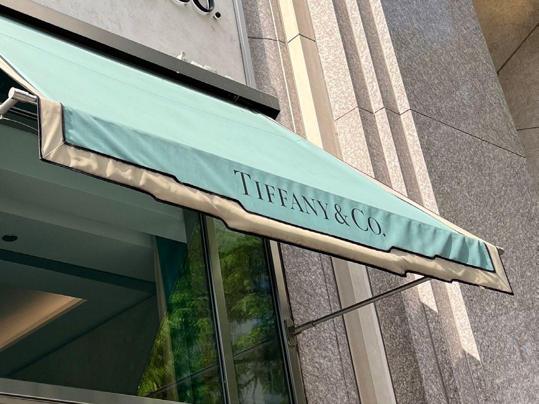
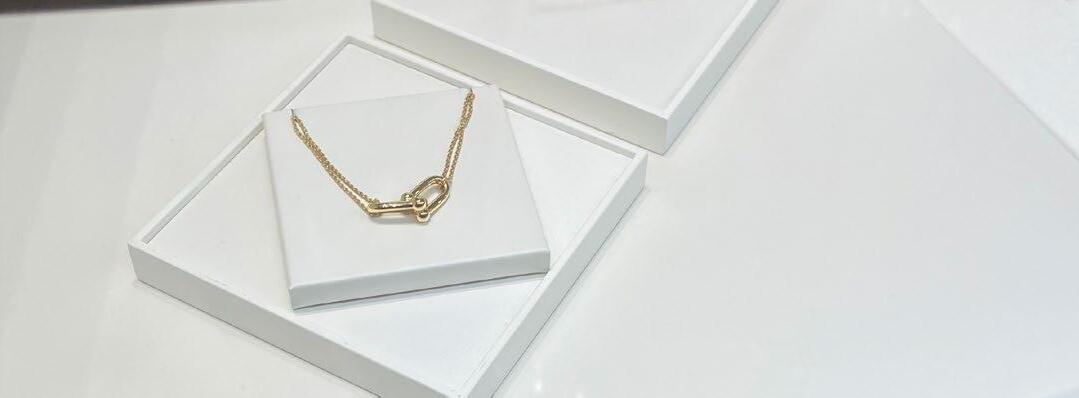
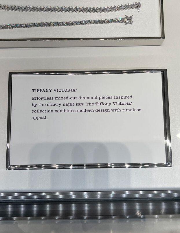
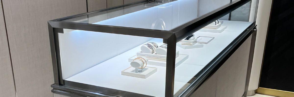
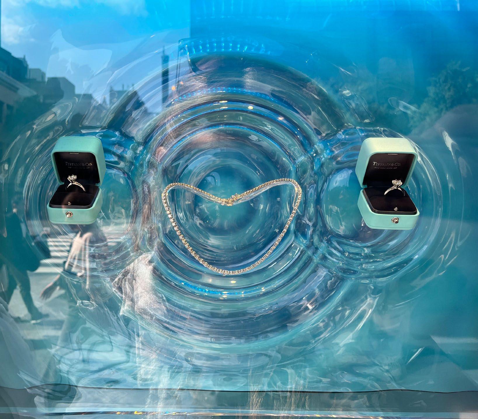
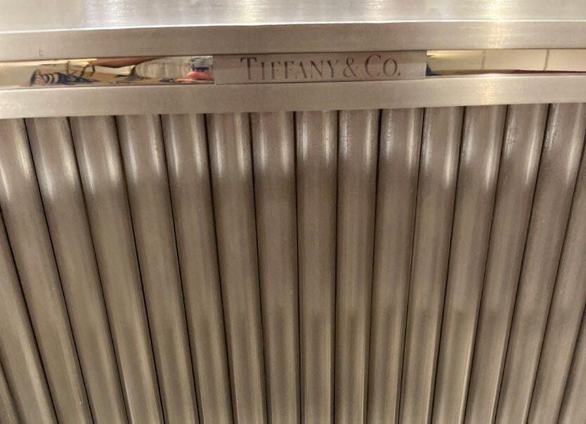
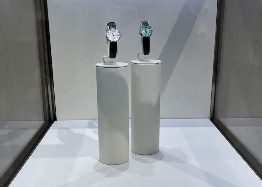
TIFFANY & CO.
STORE NOTES:
• Very fancy and large space.
• Beautiful chandeliers.
• The space feels nostalgic.
• It feels almost like a museum due to their use of plaques.
• “Tiffany Blue” used throughout the store.
• Glass cases hold all of their product.
• Merchandise is on pedestals within the glass cases.
TIFFANY & CO.
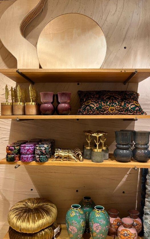
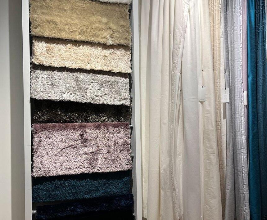
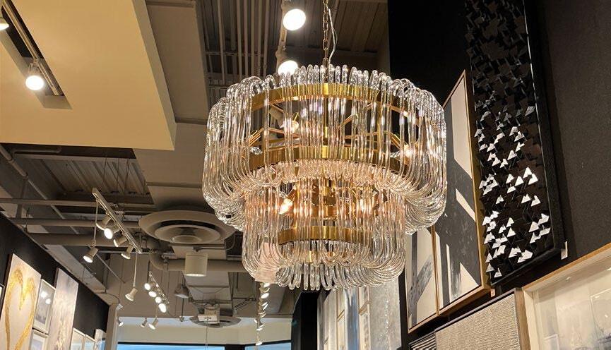
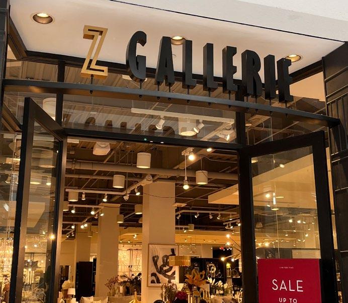
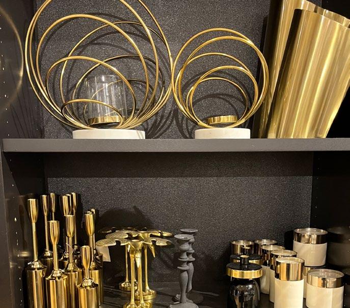
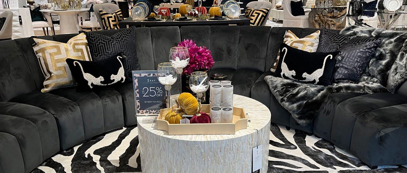
Z GALLERIE
STORE NOTES:
• Displays are staged like an actual home.
• They feature a lot of different design aesthetics.
• It is a very large space, and there are a lot of different areas to explore.
• There is a lot of glass, black, white, and gold in their design.
• Mixed materials and textures throughout.
Z GALLERIE
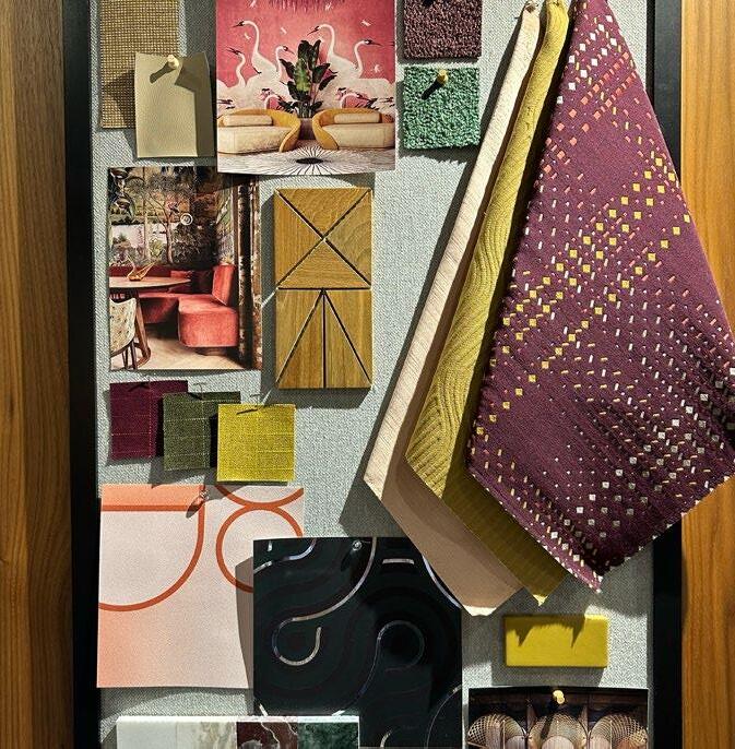
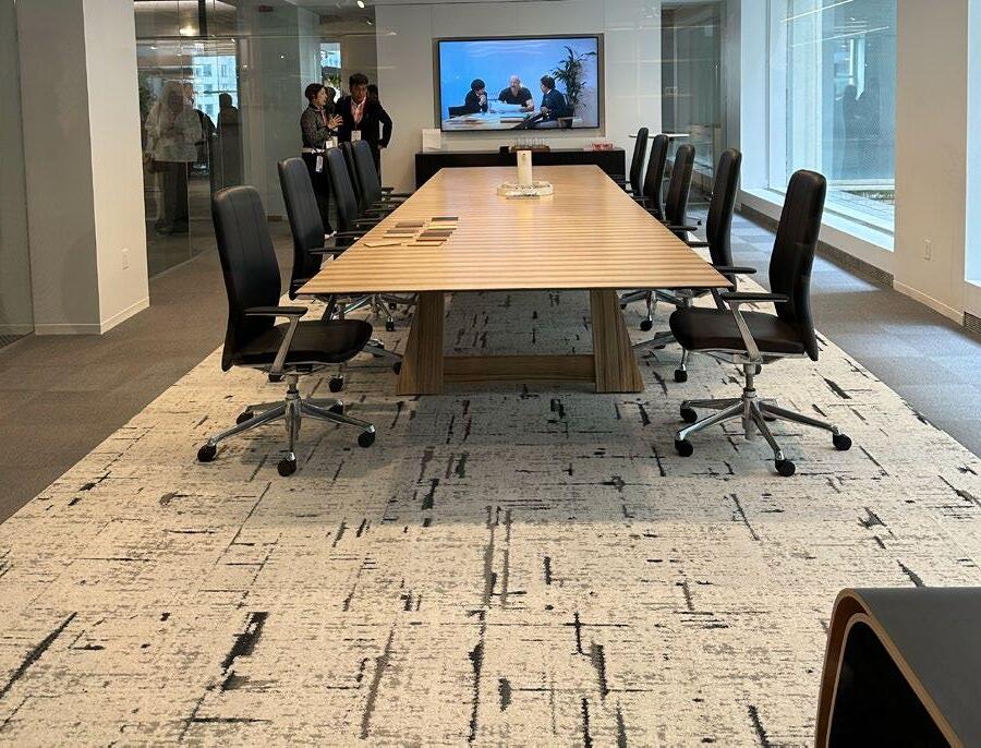
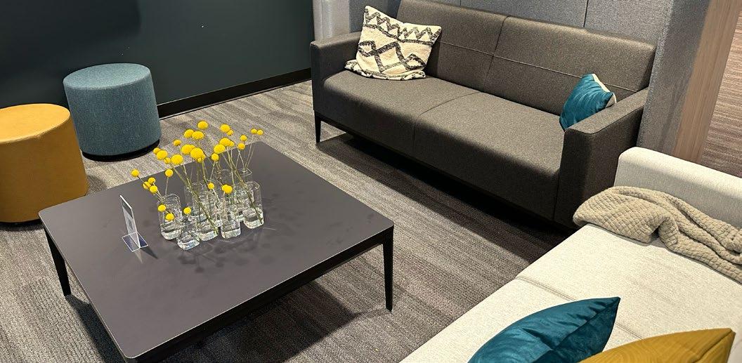
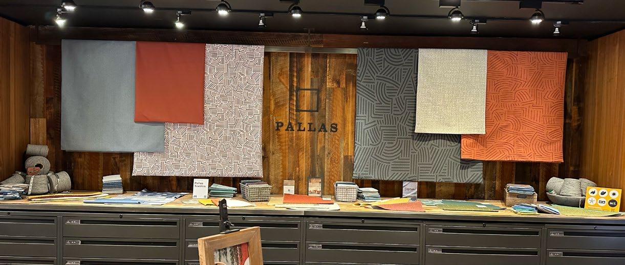
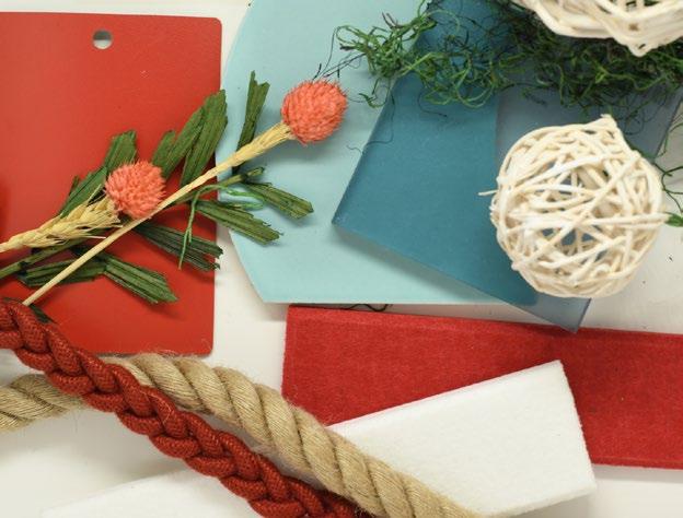
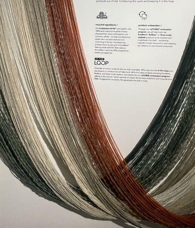
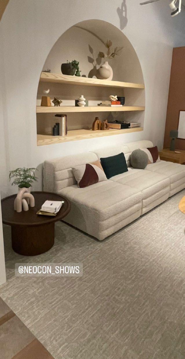
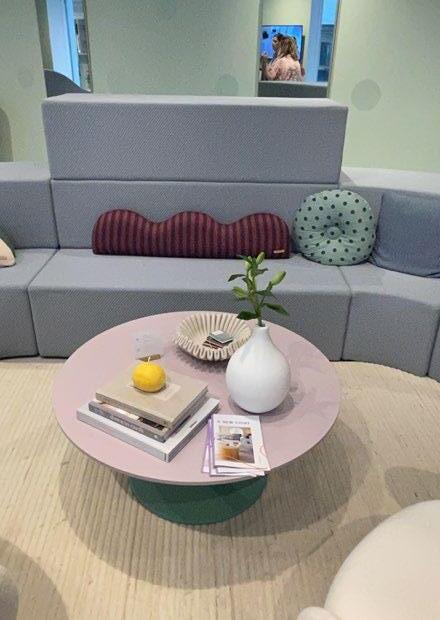
NEOCON 2023
NOTES:
• NeoCon was an exciting event to explore to learn more about upcoming trends and design styles.
• Upscale work environments was a popular trend.
• Geometric shapes and patterns used to create spaces in offices.
• Organic shapes used in furniture and decor calls back to previous decades.
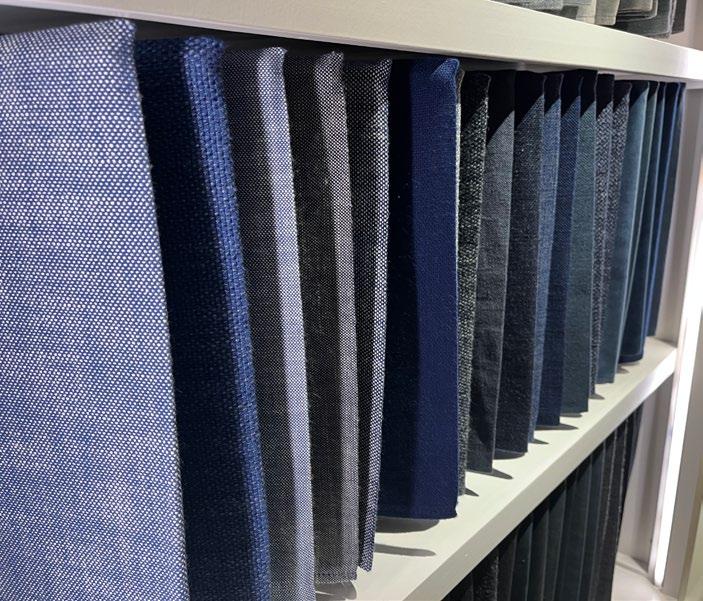
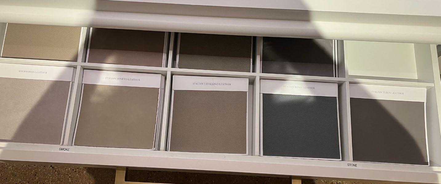
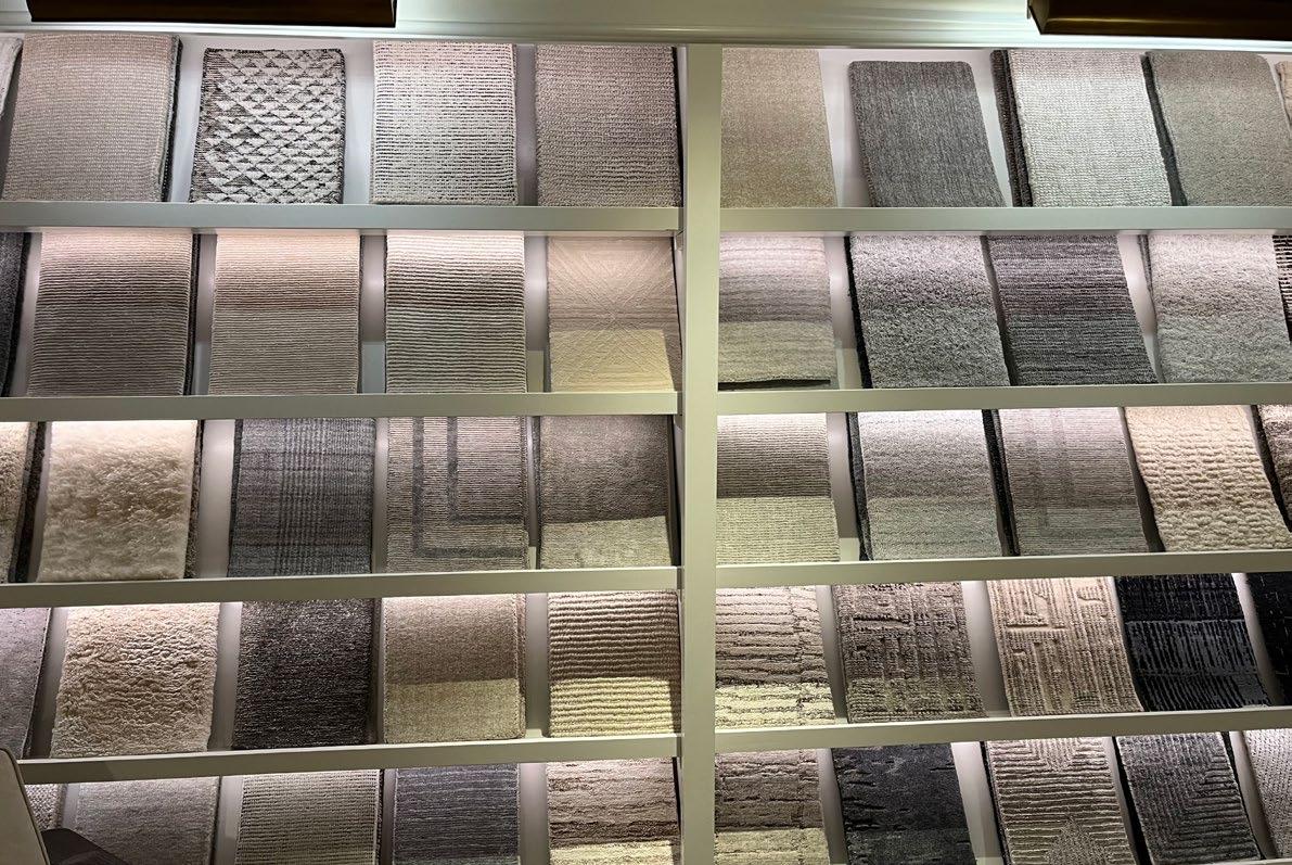
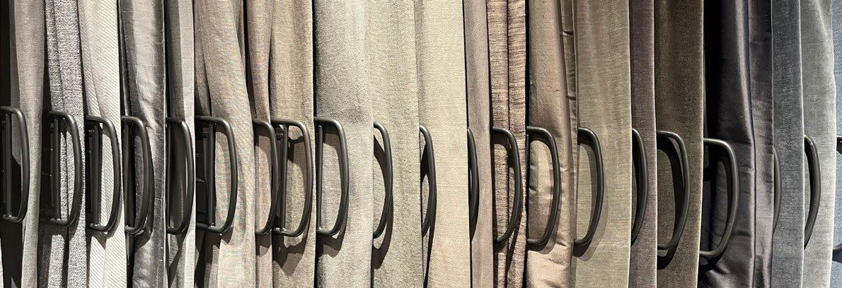
• Material and texture exploration was featured in many showrooms.
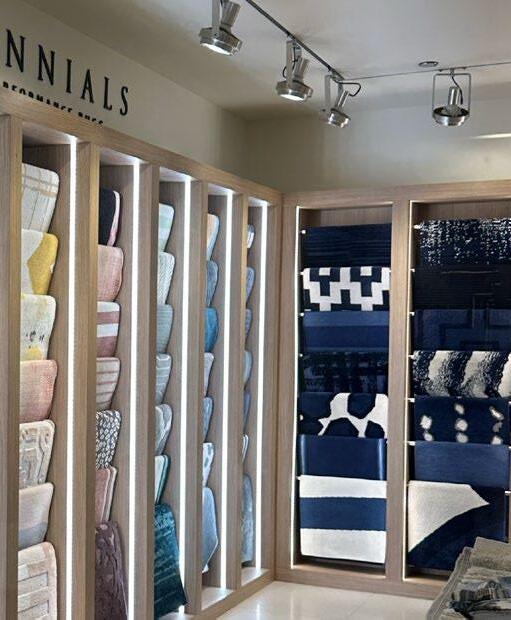
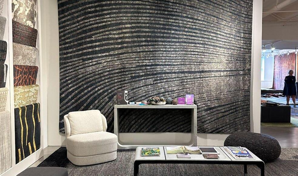
NEOCON 2023
NEOCON 2023
ADDITIONAL ONLINE RESEARCH
ADDITIONAL ONLINE RESEARCH
ADDITIONAL ONLINE RESEARCH