EUR 35.00 | USD 45.00 | wonder.ifdm.design
Summer 2026
THE DESIGN DIRECTORY
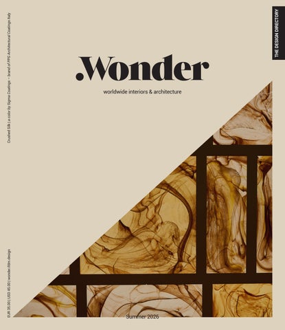
Crushed Silk | a color by Sigma Coatings – brand of PPG Architectural Coatings Italy
worldwide interiors & architecture
Summer 2026
QUIET ONLY IN APPEARANCE.
Loungescape sofa, design Antonio Citterio
Summer 2026 Features
Next in the world
The Design Directory
14 London: Europe’s capital for new high-end hotels
81 A selection of the most innovative products for the contract sector by international brands
Color stories
82 Design B&B Italia | Cantori | Desalto | Desiree Fantoni | Lema | Living Divani | Marac Midj | Novamobili | Poliform Poltrona Frau | Riflessi | Zalf
THE DESIGN DIRECTORY
Summer 2026
Crushed Silk | a color by Sigma Coatings – brand of PPG Architectural Coatings Italy
22 Color as a cultural project
People 26 Guillaume Rolland 76 Chris Godfrey
worldwide interiors & architecture
142 Nevius Glussi
Projects EUR 35.00 | USD 45.00 | wonder.ifdm.design
30 Hotel du Couvent Nice, France 38 Casa Damiani Seoul 44 Hotel Trame Rome Summer 2026
I_Cover.indd 1
52 ST550 & TT550 Invictus Yacht 17/06/26 14:59
ON COVER
Casa Damiani, Seoul Photo © courtesy of Damiani Group Crushed Silk | a color by Sigma Coatings – brand of PPG Architectural Coatings Italy
58 Raffles Sentosa Island, Singapore 64 imperialart Merano, Italy 146 Publicis Groupe Shanghai 154 Castel Badia San Lorenzo di Sebato, Italy
Wonder 16 Greater Bay Area Sports Centre
Nansha District, Guangzhou, China
18 Hobby House Pordenone, Italy 20 Caffé Nazionale Arzignano, Italy 70 Private villa Porto Rafael, Italy
160 Moksha Portola Valley, USA 164 Casabianca Como, Italy 170 Tafelberg Blaricum, Netherlands 174 Little Venice House London 178 METT Barcelona
72 Orient Express Venezia Venice, Italy
Passwords
74 Sornells 21 Valencia, Spain
184 Ideas from Milano Design Week 2026
6
90 Editions Artemide & Danese Milano | Bolzan Campomarzio70 | Cappellini | De Padova Flexform | Gallotti&Radice | Meridiani Neutra | Zanotta 96 Lifestyle Acerbis | Baxter | Karakter x Cassina cc-tapis | Elie Saab Maison | Armani/Casa and Jannelli&Volpi | La DoubleJ LCD Textile Edition | Sahrai | Sicis Technogym | USM | Visionnaire | Venini 104 Lighting Flos | Italamp | Linea Light Group Luceplan | Martinelli Luce | Nemo Lighting Preciosa Lighting | Slamp | Venini | Zafferano 110 Living kitchen Aran Cucine | Arrital | Boffi | Euromobil Febal | L’Ottocento | Molteni&C Officine Gullo | Poliform | Scavolini 116 Outdoor Arrital | Ethimo | Fast | Fim | Gandiablasco Pedrali | Pratic | Poliform | Roda | S•CAB Talenti | Varaschin | Vermobil | Vondom 124 Performance as art Electrolux | Elica | Falmec | Gaggenau Glem Gas | Kitchen Aid | Liebherr | Miele SKS | Smeg 130 Surfaces Atlas Concorde | Cedit | Cosentino Cromatica Marcegaglia | Iris Ceramica Marca Corona | Margraf | Quartzforms® Refin | Sigma Coatings 136 Wellness & beyond Agape | Aquaelite | Cropelli | Fantini Inda | Kartell by Laufen | More Quadro design | Roca | Tubes
Summer 2026 Features
YEAR XI | SUMMER
02
Publisher & Editor-in-Chief Paolo Bleve | bleve@ifdm.it
Managing Editor Giulia Guzzini | giulia@ifdm.it
30
Deputy Editor, Features & Content Curator Alessandra Bergamini | alessandra@ifdm.it
170
Editor-at-Large Veronica Orsi | orsi@ifdm.it
Contributors Alessandro Bignami, Manuela Di Mari, Elena Luraghi, Ruben Modigliani, Francesca Oddo, Salvatore Peluso, Sabrina Sciama
International Contributor New York | Anna Casotti
Digital Editorial Team redazione@ifdm.it
Brand Relations Matteo De Bartolomeis | matteo@ifdm.it Camilla Guffanti | camilla@ifdm.it Annalisa Invernizzi | annalisa@ifdm.it Spain | Pilar Tendero | pilar@ifdm.it
Graphic Department
44
Marco Parisi | grafica@ifdm.it Maripina Cappelletti | mari@ifdm.it
Closed by the editorial staff 3rd June 2026
.Wonder is a brand of
Owner and Publisher Marble srl | Corso Venezia 8 - 20121 Milano, Italy Tel. +39 02 40701449 - info@ifdm.it - www.ifdm.design
Printed by Faenza Printing Spa - Faenza, Italy All rights reserved. No part of this publication may be reproduced, stored in a retrieval system or transmitted in any form or by any means, electronic, mechanical, photocopying, recording or otherwise, without the prior written permission of the copyright owner. A record and picture file is available at Marble.
146 8
LET’S KEEP IN TOUCH
ifdmdesign |
FOR THOSE WHO KNOW Set the stage for the extraordinary. Introducing the Vario cooling Expressive series. The difference is Gaggenau
Summer 2026 Editorial
PAOLO BLEVE Publisher & Editorial Director
Design begins with the product
T
he Design Directory 2026 celebrates the product not as the final outcome of a design process, but as the genesis of creative thinking. The interviews in this issue reflect this philosophy, offering the perspectives of three distinguished professionals. Different in background, expertise, and geography, they share how projects can evolve from the space itself, while always keeping in mind the objects destined to inhabit it. The product therefore takes center stage throughout these eighty pages of inspiration, where research, innovation, and aesthetic sensibility converge to inspire new creative visions. This is confirmed by Guillaume Roland, a long-time collaborator of design icon Christian Liaigre, who offers insight into the fascinating dialogue between product and project, revealing how each continuously informs the other. Nevius Glussi, a leading expert in hospitality finance and development across
Europe and Asia, extends his conversation far beyond strategy, revealing a profound sensitivity for the relationship between concept and geography. For Glussi, development never begins with a sterile spreadsheet, but with a powerful mental image that expresses both the space and its content from the outset. As co-CEO of HBA, Chris Godfrey has expanded the firm’s creative horizons by establishing HBA Residential. This fosters a multidisciplinary approach embracing lighting, furnishings, and landscape design, resulting in a continuous exchange between residential and hospitality – two worlds that increasingly inspire one another. The projects featured in this edition span a wide range of typologies. Nature emerges as a protagonist in two properties conceived to blend seamlessly into their surroundings: Tafelberg in the Netherlands by Studio Massimo, and Yabu Pushelberg’s vision for Raffles Sentosa Singapore.
Two boutique hotels offer distinct approaches to hospitality. ImperialArt in Merano is an exercise in stylistic layering, where diverse influences create a unique guest experience with art as a constant companion. In Rome, Hotel Trame occupies the historic Palazzo Roberti-Conti-Datti. Preserving the building’s original character while introducing bold spatial interventions, the project challenges conventions of materiality and form, delivering a new expression of serendipity that only Rome can offer. This issue also explores two remarkable adaptive reuse projects: the Benedictine monastery transformed into Castel Badia by Droulers Architecture, and the former convent in Nice reimagined as Hotel du Couvent by Festen Architecture. Having experienced the latter, I was struck by its rare ability to slow time, inviting guests to rediscover the life that thoughtful design can restore. Enjoy the read. 11
Discover the allure of Venetian light and glass art at VENINI Milano San Babila Flagship, Via Durini 27, Milan VENINI Rome Flagship, Via Dei Due Macelli 64, Rome VENINI Murano Boutique, Fondamenta Vetrai 47, Murano VENINI Bologna Boutique, Galleria Cavour 4H, Bologna Cabbage table lamp by Peter Marino
venini.com
Summer 2026 Curator’s letter
ALESSANDRA BERGAMINI Deputy Editor
Experiencing space
L
a Sagrada Familia – whose Tower of Jesus Christ, the tallest in the complex, was inaugurated just this June by Pope Leo XIV on the centenary of Antoni Gaudí’s death – became the Catalan architect’s residence between 1925 and 1926, the final years of his life. It was an early and decidedly extreme example of an ‘architect-in-residence,’ where the architect lives within the very place he is designing and building, consumed by the obsession for his grand architectural and religious vision. Short of the asceticism of Gaudí’s final years, living within the site of a project – for instance, one of restoration and transformation – undoubtedly fosters a deeper connection, reveals unique perspectives, and grants a greater understanding of a place’s context, history, construction techniques, and relationship to the landscape. This is precisely the experience architect Louis-Antoine Grégo of Studio Méditerranée recounts
about his time as an ‘architect-in-residence’ during the research and transformation phase of the Couvent de la Visitation in Nice, now the Hotel du Couvent: “To fully understand the space, I decided to live in the abandoned convent during the research phase. This wasn’t just about being present – it was about experiencing the land and the building intimately, feeling its rhythms, and learning from it. I gathered a team of students who also became immersed in the space, some even moving in to study the site more deeply. Together, we explored the convent’s history, architecture, and unique atmosphere, in the most direct way possible.” These are places and spaces, ancient and modern architectural works, that are (re)designed to be lived in and livable, to preserve their historical and cultural heritage by blending past with present. Examples here include the aforementioned Hotel du Couvent, the Castel Badia
fortress, Hotel Trame in Rome’s historic Palazzo Roberti-Conti-Datti, and the Orient Express Venezia at Palazzo Donà Giovanelli, whose visionary interiors are featured in the ‘Wonder’ photo spreads of this issue. Other spaces selected for this Wonder Book Summer are conceived from scratch as “livable works of art.” The 12 rooms of the imperialart hotel in Merano allow guests to live inside a work of art, each one entirely commissioned from a different artist, where artistic inspiration and expression have the power to define space, evoke emotion, and provoke interpretation. Beyond this particular example, the role of art is becoming increasingly prominent in the hospitality sector, a trend confirmed by Chris Godfrey, Co-CEO of HBA, in his interview: “We’ve moved from a superficial and purely decorative use to an approach where art can become the central element, the ‘raison d’être’ of a project.” 13
Summer 2026 Wonder
NANSHA DISTRICT, GUANGZHOU, CHINA | GREATER BAY AREA SPORTS CENTRE | ZAHA HADID ARCHITECTS (ZHA)
Situated on the western bank of the Pearl River Delta, the sports centre will offer all residents of the Greater Bay Area sports facilities of the highest standards and host a diverse programme of major national and international sporting events, as well as cultural performances. 16
© courtesy of CRLand
Summer 2026 Wonder
17
Summer 2026
© Dario Borruto
Wonder
PORDENONE, ITALY | HOBBY HOUSE | LOCUS ARCHITETTI
The dwelling is built around two complementary passions, a double-height model-making room, and a music room, inspired by the 19th-century studio of Felix Mendelssohn Bartholdy, designed for listening and rehearsal. 18
Summer 2026
© Simone Bossi
Wonder
ARZIGNANO, ITALY | CAFFÉ NAZIONALE | AMAA MARCELLO GALIOTTO AND ALESSANDRA RAMPAZZO
Through the colonnade of the 19th-century City Hall, a sequence of spaces, reminiscent of theatrical stages, establish a visual dialogue between the public square and the interior hall, highlighting the concept of layered memories, urban moments, and the interplay of ancient and contemporary materials. 20
© Gaia Anselmi Tamburini
Velwood The warmth of wood. The softness of velvet.
abetlaminati.com
Summer 2026 Color Stories
Color as a cultural project Sigma Coatings explores how color influences architectural spaces and design. With its Authentic palette, it champions authenticity, natural materials, and a perceptual luxury that creates atmospheres designed to improve over time Author: Veronica Orsi
The concept of color as a mere aesthetic or decorative act is now outdated. Today, color signifies a holistic design approach. This principle guides the research at Sigma Coatings, a brand of PPG Architectural Coatings Italy. Color becomes space, space supports the object, and the object engages in a dialogue with the design. This represents a fundamental cultural shift in understanding the importance of chromatic choices in architecture. Indeed, while color is often considered a final touch, studies show that chromatic information is among the first processed by the visual system and decisively contributes to our emotional assessment of a space. In other words, color guides perception, defines visual hierarchies, and creates an emotional experience. Sigma Coatings’ research thus follows a twofold approach: on one hand, expanding the technical performance of its paint solutions (such as color fidelity, stability, reproducibility, and measurable 22
sustainability), and on the other, analyzing color trends that foster effective design. Starting with the “Color of the Year” identified by PPG’s experts – a team of stylists and color specialists who pinpoint the prevailing chromatic direction for projects and products – Sigma Coatings, as a brand in the Architectural Coatings division, translates the findings and insights from these studies into sector-specific deep dives that help architects and designers create welcoming, comfortable, and sensorially impactful spaces. This year’s color is “Secret Safari”: a nuanced yellow-green with an organic and mineral quality, which serves as an invitation to slow down in a fast-moving world. A distinctive feature of this hue is its versatility, which allows it to stand out or recede depending on the lighting, texture, and function of the space. Secret Safari finds its affinity within a broader color palette that completes it, encapsulated in the 2026 color theme “Parallels”.
In connection with the Color of the Year, PPG has identified three distinct design trajectories, expressed through three corresponding color moods: Authentic, which explores groundedness and the value of materials; Visionary, which investigates technological hybridization and the impact of Artificial Intelligence; and Expressive, which interprets energy, identity, and transformation. Thanks to the collaboration between IFDM and Sigma Coatings, each Wonder Book explores a different mood, highlighting the concept of an integrated system on its cover: a color from the 2026 Color Trends paired with a design element supported by that chromatic field. While the Spring Edition featured Secret Safari, the Summer Edition turns the spotlight on Authentic: the warmest, most reassuring, and timeless palette within “Parallels,” which includes the cover color Crushed Silk PPG1024-3, a soft, caramel greige with bronze undertones.
DESIGNED FOR DAYDREAMS W H E R E S T I L L N E S S U N F O L D S , T H E L I G H T S O F T E N S A N D D AY D R E A M S D R I F T BY T H E WAT E R ’ S E D G E . C R A F T E D F O R M O M E N T S W H E N T I M E S L O W S A N D T H E D AY B E L O N G S O N LY T O YO U .
Ocean Master MAX Bolero: Ombré Blossom Marquesa Double Sun Lounge
TUUCI.COM
Summer 2026
Guillaume Rolland
People | Guillaume Rolland
You have been with Liaigre for more than twenty years. When you joined, did you ever imagine you would one day become creative director? No, it wasn’t something I had in mind. But just a few months after I arrived, Christian Liaigre made me his right hand. There was already a strong relationship, a shared way of thinking. He had more of a decorator’s background, an extraordinary talent for objects, and a very special attention to them – at the end of a project, he would photograph only the furniture. At the same time, he had a highly refined sense of space, though without the rigidity of architectural training. Architecture can sometimes give you conditioned reflexes: you think in a certain way, you make decisions almost automatically. Our collaboration was precisely about merging two perspectives. I unlearned certain habits, while bringing in my own architectural vision. Out of that blend, a different way of designing emerged. Is that the best way to work? Yes, because it takes you further. You have to let go of certainties, of things you know well, and accept another vision that expands your perspective. 26
ARCHITECTURE AS SCRIPT WRITING Guillaume Rolland, head of the Christian Liaigre studio, discusses his method: a balance between rigor and poetry, space and furniture, precision and vision. Between skepticism toward “Instagram aesthetics” and a strong focus on the client, his approach combines problemsolving with the crafting of emotion Author: Ruben Modigliani Projects photo: Mark Seelen Projects photo: Kyleyu Photo Studio, Alex Profit, Mark Seelen, Stephen Kent Johnson
Looking back, how has the role of the interior designer changed? When I arrived, Liaigre was already a style icon. His furniture had changed some of the rules of the industry and was already widely copied. The Mercer Hotel in New York and other iconic projects had made him very well known. The studio was small – we were twelve; today we are about fifty. What has really changed is public perception. With phenomena like Instagram, people have become extremely attentive to the visual aspect of interiors. But this can be superficial: something can be very seductive in a photograph, yet not work when you actually live in it. Our projects photograph well, but when you experience them, there is a deeper dimension. Spatial scenography is like a film – you have to think like a director. Architecture, like cinema, is about precision. I feel that this obsession with precision is sometimes being lost. You may not see it in a picture, but you feel it in space – and that’s when it becomes emotion.
In what sense are architecture and cinema connected? For me, both generate emotion through sequences. It’s about orchestrating a journey: a succession of moments, compressions and openings, anticipation and revelation. It’s the same principle as directing. But even more important than precision in execution is precision in thinking. The organization of functions, the relationships between volumes, the geometry, the axes – how a rectangle and a circle come together perfectly. Architecture is almost a science, but infused with poetry. It’s the combination of the two that creates something truly powerful. Our approach is also rooted in classical culture: the 18th century, interiors built on symmetry, correspondence, balance. It’s a very rich vocabulary, which is why I speak of poetry. Understanding the language of classical architecture gives you tools to express yourself more clearly. Poetry, cinema, music and architecture share similar conceptual structures – you have to say the most with the least. That’s when something memorable emerges.
Summer 2026 People | Guillaume Rolland
27