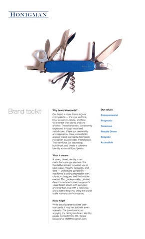

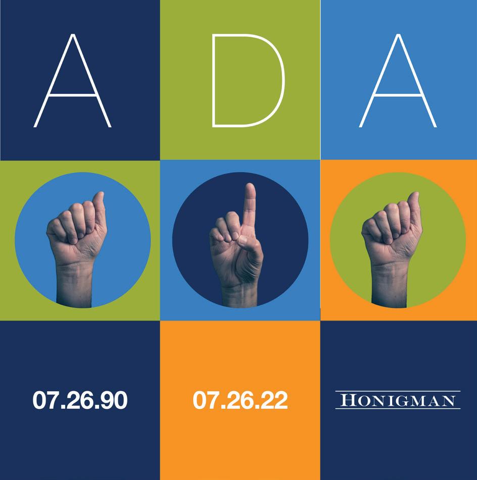
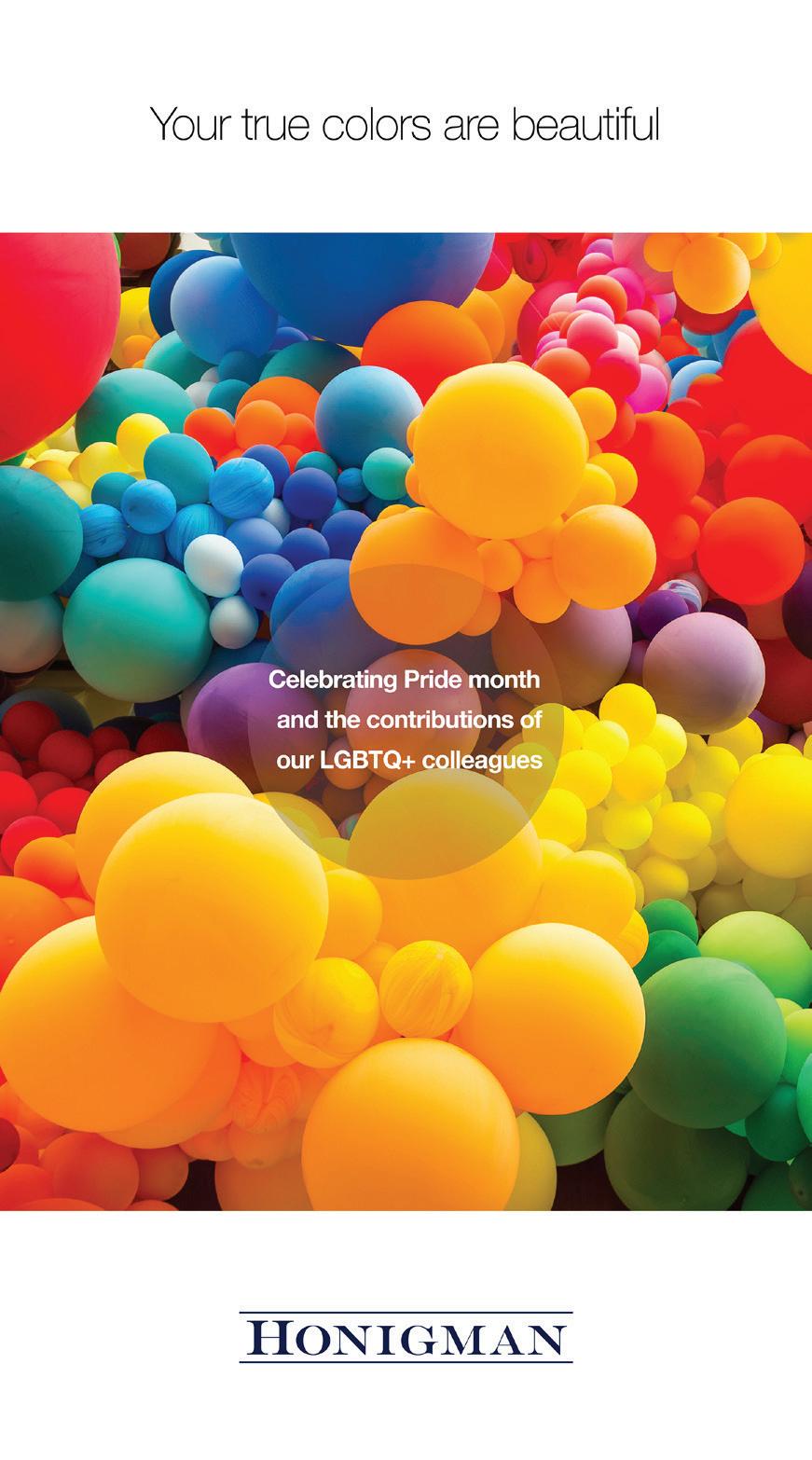
Brand toolkit
Why brand standards?
Our brand is more than a logo or color palette — it’s how we think, how we communicate, and how we interact with clients and one another. These behaviors, consistently expressed through visual and verbal cues, shape our personality and reputation. Clear, consistently applied brand standards distinguish Honigman in a crowded marketplace. They reinforce our leadership, build trust, and create a cohesive identity across all touchpoints.
What it means
A strong brand identity is not made from a single element. It is the deliberate and repeated use of type, color, imagery, language, and tone — unified and consistent — that forms a lasting impression with clients, colleagues, and the broader market. This guide provides detailed direction on how to use Honigman’s visual brand assets with accuracy and intention. It is both a reference and a tool to help you bring the brand to life in every communication.
Need help?
While this document covers core standards, it may not address every scenario. For questions about applying the Honigman brand identity, please contact Krista Hill, Senior Designer at khill@honigman.com.
Our values
Entrepreneurial Pragmatic Tenacious
Results Driven Bespoke
Accessible
Corporate identity communicates the spirit of a company. A visual identity projects that company as unique and makes a memorable impression. The logo is the cornerstone of that visual identity, and its consistent application, coupled with the color palette and selected type styles, gives clients a memorable impression of our firm. Inconsistent or incorrect application of the visual identity creates confusion in the client’s mind.
Adequate clear space should be maintained around our logo. Do not place type or images in the clear space. Use the distance between the top and bottom rules in the logo as a guide to determine proportional clear space, as demonstrated.
Use only provided logo. Do not create artwork for logo by typing text. Do not stretch or otherwise manipulate logo proportions. Do not change logo colors.
Minimum clear space
Do not place text in the designated clear space.
Do not place a subhead, service, or department name in the designated clear space around the logo.
Do not stretch or otherwise manipulate logo proportions.
Lorem ipsum dolor sit amet, consectetur adipiscing elit, sed do eiusmod tempor incididunt ut labore et dolore magna aliqua.
Corporate Department
Do not change the color of the logo. Do not use a typed name in place of the logo.
Do not place the logo on a complementary color or color of a similar value.
Honigman
Honigman’s color system is designed to reflect the strength, clarity, and modernity of the firm’s brand. The primary palette—anchored by Dark Blue and Light Blue—serves as the foundation for core communications and brand recognition. Black and White provide essential structure and contrast, ensuring legibility and balance across all media.
The secondary grayscale palette supports layout flexibility, allowing for depth, hierarchy, and subtle emphasis without competing with core brand colors. These tones are especially useful in charts, diagrams, and background treatments.
The tertiary colors offer accent options that bring energy, diversity, and differentiation to the brand when needed—particularly in infographics, digital interfaces, and industry-specific materials. These should be used strategically and sparingly to maintain visual cohesion and brand integrity.
For best results, apply colors consistently and in accordance with the hierarchy outlined here, using CMYK for print and RGB or Hex for digital applications.
Secondary Tertiary
90% Black
CMYK RGB Hex
C0 R65 404041
M0 G64
Y0 B66 K90
80% Black
CMYK RGB Hex
C0 R88 58585b
M0 G89
Y0 B91 K80
70% Black
CMYK RGB Hex
C0 R109 6d6e70
M0 G110
Y0 B113 K70
60% Black
CMYK RGB Hex
C0 R128 808284
M0 G130
Y0 B133 K60
50% Black
CMYK RGB Hex
C0 R147 939597
M0 G149
Y0 B152 K50
40% Black
CMYK RGB Hex
C0 R167 a7a9ab
M0 G169
Y0 B172 K40
30% Black
CMYK RGB Hex
C0 R188 bbbdc0
M0 G190
Y0 B192 K30
20% Black
CMYK RGB Hex
C0 R209 d1d2d4
M0 G211
Y0 B212 K20
10% Black
CMYK RGB Hex
C0 R230 e6e7e8
M0 G231
Y0 B232
K10
Green 1
CMYK RGB Hex
C28 R155 9cae3a
M12 G174 Y97 B58 K16
Orange
CMYK RGB Hex
C0 R247 f79323
M50 G148 Y97 B35 K0
Red
CMYK RGB Hex
C25 R167 a72248
M98 G34 Y61 B72 K16
Gold
CMYK RGB Hex
C22 R206 808284
M23 G181 Y100 B44 K.15
Green 2
CMYK RGB Hex
C84 R46 2e616e
M50 G97 Y45 B110 K20
Color
Tint values
Tint values provide designers with a range of tonal variations derived from Honigman’s core brand colors. These lighter tints (10%–90%) help introduce visual flexibility while maintaining brand consistency. Tints can be used to:
Create visual hierarchy and depth in layouts
Define background panels or overlays without overwhelming content
Distinguish content sections or infographics using a monochromatic approach
Add visual interest while avoiding unnecessary use of tertiary or accent colors
When applying tints, always start with primary and secondary colors to preserve the integrity of the brand. Tints should not be used to create new, unofficial colors. Ensure that accessibility and contrast standards are maintained—especially for body text or essential information layered over tinted backgrounds.
For consistency, apply tint percentages through defined color styles in design software (e.g., Adobe InDesign, Illustrator, Figma), rather than manually adjusting opacity or mixing with white.
Typography
Fonts were chosen to embody practicality, accessibility and business-focus, and sophistication. We are communicating to our clients and institutions who want clear facts, transparency, precision, and accuracy. Not only will the words we use reflect our message, but so too will their appearance. The typography is clear and readable, focusing attention on the content. The Linotype® Helvetica Neue typeface is simple and timeless.
Whenever possible use Linotype® Helvetica Neue, but when it is not available, use the TrueType versions of Arial.
Our primary fonts for all client-facing materials is the Helvetica Neue Pro family. These fonts are used for all client communications.
Our primary font for email correspondence and Microsoft® documents that will be shared between users on other systems/ machines is Arial. A primary example would be a contract or other legal document.
Text style
Text should be aligned left, ragged right (as throughout this manual). Use single or half-line spaces between paragraphs, which are not to be indented. For example, when working with large amounts of text in a brochure, review the overall piece for legibility and use subheads to make it easier to read.
All specifications of type, point size, alignment, and leading have been embedded into our Microsoft® Word and PowerPoint 2000 templates. Using these templates free us from having to worry about adjusting these settings each time we write a letter or create a presentation.
Clear, practical, timeless.
Developed in 1957 by Swiss typeface designer Max Miedinger with input from Eduard Hoffmann.
Licensed by Linotype and renamed Helvetica in 1960, which in Latin means “Swiss,” capitalizing on Switzerland’s reputation as the center of modern graphic design.
Firm collateral and BD materials are designed using Helvetica and a modern grid system from the same International style, and the principle of form follows function.

From April 2007 to March 2008, the Museum of Modern Art in New York City displayed an exhibit called “50 Years of Helvetica.”
Primary Brand Typeface
Helvetica Neue Pro Ultra Light
ABCDEFGHIJKLMNOPQRSTUVWXYZ abcdefghijklmnopqrstuvwxyz
Helvetica Neue Pro Thin
ABCDEFGHIJKLMNOPQRSTUVWXYZ abcdefghijklmnopqrstuvwxyz
Helvetica Neue Pro Light
ABCDEFGHIJKLMNOPQRSTUVWXYZ abcdefghijklmnopqrstuvwxyz
System-compatible substitute font
Arial Regular
ABCDEFGHIJKLMNOPQRSTUVWXYZ abcdefghijklmnopqrstuvwxyz
Arial Bold
ABCDEFGHIJKLMNOPQRSTUVWXYZ abcdefghijklmnopqrstuvwxyz


Used by great corporations present and past

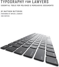
In Typography for Lawyers, Matthew Butterick, Harvard educated lawyer and typophile puts Helvetica on his A list.
Helvetica Neue Pro Roman
ABCDEFGHIJKLMNOPQRSTUVWXYZ abcdefghijklmnopqrstuvwxyz
Helvetica Neue Pro Medium
ABCDEFGHIJKLMNOPQRSTUVWXYZ abcdefghijklmnopqrstuvwxyz
Helvetica Neue Pro Bold
ABCDEFGHIJKLMNOPQRSTUVWXYZ abcdefghijklmnopqrstuvwxyz
Monotype’s Arial, created for IBM and also used by Microsoft, is indistinguishable from Helvetica by most non-specialists. Created as a substitute for Helvetica: Arial is metrically identical to the PostScript version of Helvetica, so that a document designed in Helvetica could be displayed and printed correctly without IBM having to pay Linotype for a Helvetica license on its printers.
Typography
Primary brand typeface
Font: Helvetica Neue Pro (various weights)
Usage:
All external-facing brand materials (marketing brochures, website, advertising, signage)
Designed templates created in InDesign or Adobe Creative Suite
Use case
Internal Word documents
PowerPoint presentations
Fonts to use
Arial
Arial
System-compatible substitute font
Substitute: Arial
Rationale: Arial is the closest system-default match to Helvetica Neue Pro in terms of x-height, spacing, and neutrality. It is pre-installed on all operating systems and supported across Microsoft Office and web platforms.
Consistent rendering across users, platforms, and printers
Avoids font substitution errors during client delivery
Outlook emails Arial Clean, legible, and email-safe sans-serif
Maintain consistent line height and letter spacing across templates.
Avoid mixing Arial with Calibri or other sans-serifs in the same document.
Embed fonts in PDF exports if using Helvetica Neue Pro.
Text style
Text should be aligned left, ragged right (as throughout this manual). Use single or half-line spaces between paragraphs, which are not to be indented. For example, when working with large amounts of text in a brochure, review the overall piece for legibility and use subheads to make it easier to read.
All specifications of type, point size, alignment, and leading have been embedded into our Microsoft® Word and PowerPoint 2000 templates. Using these templates free us from having to worry about adjusting these settings each time we write a letter or create a presentation.
Don’t justify running text
Text should be aligned left, ragged right (as through-out this manual). Use single or half-line spaces be-tween paragraphs, which are not to be indented. For example, when working with large amounts of text in a brochure, review the overall piece for legibility and use subheads to make it easier to read.
All specifications of type, point size, alignment, and leading have been embedded into our Microsoft® Word and PowerPoint 2000 templates. Using these templates free us from having to worry about adjusting these settings each time we write a letter or create a presentation.
Don’t… Do…
use italics in headlines:
We are proud to partner with Susan B. Anthony and the entire team at FlagWorks.
use all upper case in headlines:
WE ARE PROUD TO PARTNER WITH SUSAN B. ANTHONY AND THE ENTIRE TEAM AT FLAGWORKS.
use color breaks for emphasis:
We are proud to partner with Susan B. Anthony and the entire team at FlagWorks.
use initial caps for headlines or subheads
We are Proud to Partner with Allison Koehler and the Entire Team at BarkBox.
use upper and lower case — it is friendly, approachable, and easier to read.
We are proud to partner with Susan B. Anthony and the entire team at FlagWorks.
stretch, condense, or outline fonts:
We are Proud to Partner with Allison Koehler and the Entire Team at BarkBox.
We are Proud to Partner with Allison Koehler and the Entire Team at BarkBox.
We are Proud to Partner with Allison Koehler and the Entire Team at BarkBox.
reserve initial caps for titles only
We are proud to partner with Allison Koehler and the entire team at BarkBox.
Imagery

Imagery
Our imagery should reflect our values and speak to our audience, who are business-savvy, sophisticated and refined.
In addition, images should be distinctive and unique to set us apart from other competitive firms. We are using stock photography, but curating our library of images to look original, to the best extent possible.
Please contact Krista Hill if you need an image or library of images.
Krista Hill khill@honigman.com 312.771.4845
Image categories
In order to direct the emphasis, there are three image categories, each having a singular purpose:
Hero images
Evoking a meaning, emotion, metaphor or mood, these images tell a story and are in support of the overall message.

Atmospheric images
Large or small, these images are textural in nature and recede on the page, providing tone and atmosphere to an otherwise plain page. Because they need be part of the background, they should be of lower contrast and pattern-like.
Spot images
When words need visual punctuation and emphasis, a small outlined object can be used.


Visual style
Keep it simple
While this book outlines many applications of the Honigman brand, needs may arise that are not specifically addressed here. When creating materials, try to follow the spirit of these guidelines. As a general rule, keep it simple. As our brand evolves, more off-the-shelf materials and document templates will become available.
When we use the word simple, we don’t mean ordinary or unsophisticated. We mean simple as in a business voice: clear, easy to understand, and without frill. When thinking about layouts and the delivery of information, ask whether the presentation is too busy, cluttered, or difficult to follow. Less is more.
Intention
As in the practice of law, we want to make a clear and convincing business case, free from extraneous, distracting and irrelevant information. Our visual style is one of intention and purpose and should be free of excess decoration that has no purpose.
Linework
Another part of the Honigman identity is the use of linework. It may be used as a tool to organize information or as a graphic element. When using linework, show restraint when using rounded elements. There are examples of linework and rounded elements throughout this toolkit (e.g., page numbers and the color, brand architecture, and charts and graphs sections).
Typography
Use of large pull quotes, facts, evidence and statistical information is encouraged and an effective way to bring attention to our firm’s accomplishments, credibility, and substance.
White space
“White space” relates to the layout and design of any materials we produce. It is a term which denotes the considered use of empty space to allow for a clearer, more thoughtful presentation of information. White space prevents clutter and longwindedness; it forces us to communicate concisely, to trim fat. As seen in the example to the right, white space is not always white, and is very effective at directing a readers attention to an important point.
Look here.
(white space)
Writing Guidelines
The following are some general guidelines for writing.
For more information on style, tone, and well written English, please consult Strunk and White’s The Elements of Style, which states:
“Vigorous writing is concise. A sentence should contain no unnecessary words, a paragraph no unnecessary sentences, for the same reason that a drawing should have no unnecessary lines and a machine no unnecessary parts. This requires not that the writer make all sentences short or avoid all detail and treat subjects only in outline, but that every word should tell.”
Our writing is to be precise, simple and professional. Use strong, active verbs; focus on the benefits that we offer our clients; and if you can say something in 10 words instead of 30, do so. Written communication should not digress or wander into jargon. Don’t dilute important information with watery rhetoric. Being longwinded is not being respectful of an audiences valuable time or attention. In other words, keep it simple.
In written correspondence, always use the name Honigman LLP” initially and subsequent references can use just “Honigman”.
Why?
Why does any of it really matter?
And what does it all mean?
The Honigman brand may at first seem like a lot of little rules designed, arbitrarily, to make our lives more difficult. In fact, quite the opposite is true. These standards are the culmination of research, deliberate thought, and strategic positioning. They are designed to simplify. The philosophy behind our brand is a direct extension of the firm’s business strategy and vision for the future.
Being consistent not only creates an impression of thoughtfulness — we are a unified firm that speaks with one voice — it also allows us to focus on our message. Instead of always starting at square one each time new materials are created, we are able to build on these guidelines and templates quickly and efficiently. Each element of the Honigman brand has been carefully considered and crafted. Together, these elements present to the marketplace a consistent image of what we stand for and who we are. Our brand is our signature, our thumbprint; it’s what makes us stand out from the crowd.
Architecture
Superbrand
Visual symbol system for departments
Internal and external subbrands
Human Resources and GPS
Recruiting Business Development
Information Technology
Diversity, Equity + Inclusion
Workgroup
Visual symbol system for groups

Diversity, Equity and Inclusion Workgroup
Brand application examples

HR Jim Smith, Attorney Corporate Department
2290 First National Building 660 Woodward Avenue Detroit, MI 48226-3506
313.465.7000
RE: Benefits Enrollment
Subbrand/department symbol
Lorem ipsum dolor sit amet, consectetur adipiscing elit, sed do eiusmod tempor incididunt ut labore et dolore magna aliqua. Arcu bibendum at varius vel pharetra vel turpis. Laoreet sit amet cursus sit amet dictum sit. Eu scelerisque felis imperdiet proin. Elementum tempus egestas sed sed risus pretium quam vulputate. Quis risus sed vulputate odio ut enim blandit volutpat maecenas. Aliquet nibh praesent tristique magna sit amet. Venenatis cras sed felis eget. Suspendisse interdum consectetur libero id faucibus nisl tincidunt eget nullam. Egestas tellus rutrum tellus pellentesque eu tincidunt tortor aliquam nulla. Proin sagittis nisl rhoncus mattis. Ipsum a arcu cursus vitae congue mauris rhoncus. Id cursus metus aliquam eleifend mi. Volutpat ac tincidunt vitae semper quis lectus nulla at. Sed elementum tempus egestas sed sed risus pretium quam vulputate. Nec sagittis aliquam malesuada bibendum arcu.
Eleifend donec pretium vulputate sapien nec sagittis aliquam malesuada. Sit amet massa vitae tortor condimentum lacinia. Enim blandit volutpat maecenas volutpat blandit aliquam etiam. Tempus urna et pharetra pharetra. Duis convallis convallis tellus id interdum velit laoreet. Ut consequat semper viverra nam libero justo laoreet. Ultricies mi quis hendrerit dolor magna eget est lorem. Arcu cursus vitae congue mauris rhoncus aenean vel elit. Nisl rhoncus mattis rhoncus urna neque viverra justo. Consectetur a erat nam at lectus urna duis convallis. Pharetra convallis posuere morbi leo. Nec dui nunc mattis enim ut. Leo a diam sollicitudin tempor id. Elementum tempus egestas sed sed risus pretium quam vulputate dignissim. Turpis egestas integer eget aliquet nibh praesent. Viverra aliquet eget sit amet tellus cras adipiscing. Volutpat ac tincidunt vitae semper quis lectus nulla at.
Thank you,
Grapentin
Gayle
Training Manager
Lorem ipsum dolor sit amet, consectetur adipiscing elit, sed do eiusmod tempor incididunt ut labore et dolore magna aliqua. Arcu bibendum at varius vel pharetra vel turpis. Laoreet sit amet cursus sit amet dictum sit. Eu scelerisque felis imperdiet proin. Elementum tempus egestas
nisl rhoncus mattis. Ipsum a arcu cursus vitae congue mauris rhoncus. Id cursus metus aliquam eleifend mi. Volutpat ac tincidunt vitae semper quis lectus nulla at. Sed elementum tempus egestas sed sed risus pretium quam vulputate. Nec sagittis aliquam malesuada bibendum arcu.
Eleifend donec pretium vulputate sapien nec sagittis aliquam malesuada. Sit amet massa vitae tortor condimentum lacinia. Enim blandit volutpat maecenas volutpat blandit aliquam etiam. Tempus urna et pharetra pharetra. Duis convallis convallis tellus id interdum velit laoreet. Ut consequat semper viverra nam libero justo laoreet. Ultricies mi quis hendrerit dolor magna eget est lorem. Arcu cursus vitae congue mauris rhoncus aenean vel elit. Nisl rhoncus mattis rhoncus urna neque viverra justo. Consectetur a erat nam at lectus urna duis convallis. Pharetra convallis posuere morbi leo. Nec dui nunc mattis enim ut. Leo a diam sollicitudin tempor id. Elementum tempus egestas sed sed risus pretium quam vulputate dignissim. Turpis egestas integer eget aliquet nibh praesent. Viverra aliquet eget sit amet tellus cras adipiscing. Volutpat ac tincidunt vitae semper quis lectus nulla at. Elementum integer enim neque volutpat. Amet dictum sit amet justo donec enim diam vulputate ut.
Placerat duis ultricies lacus sed turpis tincidunt. Amet tellus cras adipiscing enim eu turpis egestas pretium aenean. Ac placerat vestibulum lectus mauris ultrices. Senectus et netus et malesuada fames ac turpis. Elit scelerisque mauris pellentesque pulvinar pellentesque habitant morbi. Et netus et malesuada fames ac turpis. Rhoncus est pellentesque elit ullamcorper. Nibh sed pulvinar proin gravida hendrerit lectus. Neque laoreet suspendisse interdum consectetur libero id faucibus nisl tincidunt. Faucibus pulvinar elementum integer enim neque volutpat ac. Purus sit amet luctus venenatis. Ultricies lacus sed turpis tincidunt. Bibendum enim facilisis gravida neque convallis a. Ut porttitor leo a diam sollicitudin tempor id eu nisl. Feugiat nibh sed pulvinar proin gravida hendrerit. Pellentesque massa placerat duis ultricies lacus sed turpis tincidunt. Sed ullamcorper morbi tincidunt ornare massa eget egestas. Fermentum posuere urna nec tincidunt praesent semper feugiat nibh. Nullam eget felis eget nunc lobortis mattis aliquam. Ultricies lacus sed turpis tincidunt id. Consectetur purus ut faucibus pulvinar elementum integer. At ultrices mi tempus imperdiet nulla malesuada pellentesque elit eget. Arcu odio ut sem nulla pharetra diam sit amet. Nibh ipsum consequat nisl vel pretium lectus. Consectetur purus ut faucibus pulvinar elementum. Augue lacus viverra vitae congue eu. Tortor aliquam nulla facilisi cras fermentum odio eu. Nisl rhoncus mattis rhoncus urna neque viverra justo nec ultrices. Habitasse platea dictumst quisque sagittis. Hendrerit gravida rutrum quisque non tellus. Integer malesuada nunc vel risus commodo.
Growth. Professionalism. Success.
Jim Smith, Attorney Corporate Department 660 Woodward Avenue Detroit, MI 48226-3506
313.465.7000
RE: GPS for Attorneys
Quis risus sed vulputate odio ut enim blandit volutpat maecenas. Aliquet nibh praesent tristique magna sit amet. Venenatis cras sed felis eget. Suspendisse interdum consectetur libero id faucibus nisl tincidunt eget nullam. Egestas tellus rutrum tellus pellentesque eu tincidunt tortor aliquam nulla. Proin sagittis nisl rhoncus mattis. Ipsum a arcu cursus vitae congue mauris rhoncus. Id cursus metus aliquam eleifend mi. Volutpat ac tincidunt vitae semper quis lectus nulla at. Sed elementum tempus egestas sed sed risus pretium quam vulputate. Nec sagittis aliquam malesuada bibendum arcu. Eleifend donec pretium vulputate sapien nec sagittis aliquam malesuada. Sit amet massa vitae tortor condimentum lacinia. Enim blandit volutpat maecenas volutpat blandit aliquam etiam. Tempus urna et pharetra pharetra. Duis convallis convallis tellus id interdum velit laoreet. Ut consequat semper viverra nam libero justo laoreet. Ultricies mi quis hendrerit dolor magna eget est lorem. Arcu cursus vitae congue mauris rhoncus aenean vel elit. Nisl rhoncus mattis rhoncus urna neque viverra justo. Consectetur a erat nam at lectus urna duis convallis. Pharetra convallis posuere morbi leo. Nec dui nunc mattis enim ut.
Thank you,
Gayle Grapentin Training Manager
Department title Department
Honigman LLP | Human Resources | 660 Woodward Avenue Detroit, MI 48226
Growth. Professionalism. Success.
ut enim blandit volutpat maecenas. Aliquet nibh praesent tristique magna sit amet. Venenatis cras sed felis eget. Suspendisse interdum consectetur libero id faucibus nisl tincidunt eget nullam. Egestas tellus rutrum tellus pellentesque eu tincidunt tortor aliquam nulla. Proin sagittis nisl rhoncus mattis. Ipsum a arcu cursus vitae congue mauris rhoncus. Id cursus metus aliquam eleifend mi. Volutpat ac tincidunt vitae semper quis lectus nulla at. Sed elementum tempus egestas sed sed risus pretium quam vulputate. Nec sagittis aliquam malesuada bibendum arcu.
Eleifend donec pretium vulputate sapien nec sagittis aliquam malesuada. Sit amet massa vitae tortor condimentum lacinia. Enim blandit volutpat maecenas volutpat blandit aliquam etiam. Tempus urna et pharetra pharetra. Duis convallis convallis tellus id interdum velit laoreet. Ut consequat semper viverra nam libero justo laoreet. Ultricies mi quis hendrerit dolor magna eget est lorem. Arcu cursus vitae congue mauris rhoncus aenean vel elit. Nisl rhoncus mattis rhoncus urna neque viverra justo. Consectetur a erat nam at lectus urna duis convallis. Pharetra convallis posuere morbi leo. Nec dui. Lorem ipsum dolor sit amet, consectetur adipiscing elit, sed do eiusmod tempor incididunt ut labore et dolore magna aliqua. Arcu bibendum at varius vel pharetra vel turpis. Laoreet sit amet cursus sit amet dictum sit. Eu scelerisque felis imperdiet proin. Elementum tempus egestas sed sed risus pretium quam vulputate. Quis risus sed vulputate odio ut enim blandit volutpat maecenas. Aliquet nibh praesent tristique magna sit amet. Venenatis cras sed felis eget. Suspendisse interdum consectetur libero id faucibus nisl tincidunt eget nullam. Egestas tellus rutrum tellus pellentesque eu tincidunt tortor aliquam nulla. Proin sagittis nisl rhoncus mattis. Ipsum a arcu cursus vitae congue mauris rhoncus. Id cursus metus aliquam eleifend mi. Volutpat ac tincidunt vitae semper quis lectus nulla at. Sed elementum tempus egestas sed sed risus pretium quam vulputate. Nec sagittis aliquam malesuada bibendum arcu.
Eleifend donec pretium vulputate sapien nec sagittis aliquam malesuada. Sit amet massa vitae tortor condimentum lacinia. Enim blandit volutpat maecenas volutpat blandit aliquam etiam. Tempus urna et pharetra pharetra. Duis convallis convallis tellus id interdum velit laoreet. Ut consequat semper viverra nam libero justo laoreet. Ultricies mi quis hendrerit dolor magna eget est lorem. Arcu cursus vitae congue mauris rhoncus aenean vel elit. Nisl rhoncus mattis rhoncus urna neque viverra justo. Consectetur a erat nam at lectus urna duis convallis. Pharetra convallis posuere morbi leo. Nec dui nunc mattis enim ut. Leo a diam sollicitudin tempor id. Elementum tempus egestas sed sed risus pretium quam vulputate dignissim. Turpis egestas integer eget aliquet nibh praesent. Viverra aliquet eget sit amet tellus cras adipiscing. Volutpat ac tincidunt vitae semper quis lectus nulla at. Elementum integer enim neque volutpat. Amet dictum sit amet justo donec enim diam vulputate ut. Placerat duis ultricies lacus sed turpis tincidunt. Amet tellus cras adipiscing enim eu turpis egestas pretium aenean. Ac placerat vestibulum lectus mauris ultrices. Senectus et netus et malesuada fames ac turpis. Elit scelerisque mauris pellentesque pulvinar pellentesque habitant morbi. Et netus et malesuada fames ac turpis. Rhoncus est pellentesque elit ullamcorper. Nibh sed pulvinar proin gravida hendrerit lectus. Neque laoreet suspendisse interdum consectetur libero id faucibus nisl tincidunt. Faucibus pulvinar elementum integer enim neque volutpat ac. Purus sit amet luctus
Brand application examples
Human Resources
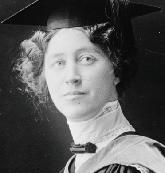
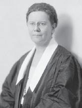
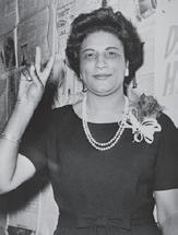
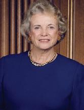
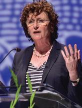
HR image library examples


Brand application examples


Honigman’s commitment to diversity, equity and inclusion (DEI) is a fundamental part of our culture and our continued success. We truly believe that the diversity within our firm enhances our ability to attract and retain talented attorneys and staff and helps us better relate to and
Honigman
As
All in all, we recognize that it takes time, commitment, and an investment in the success of individuals to create an environment where diversity, equity, and inclusion can flourish. Honigman is proud of the hard work we have done and continue to do to be an inclusive and rewarding workplace that contributes to a more equitable society.
Honigman also participates in the ABA Model Diversity Survey, Minority Corporate Counsel Association’s Law Firm Diversity Survey, Vault Diversity Survey and Justice Bid. Lastly, Honigman is currently participating in the Diversity Lab’s 20212022 Mansfield Rule 5.0 certification process.
joined the Law Firm Antiracism Alliance in 2020.
Providing mentors to support attorneys with their growth and development as professionals; Regularly requiring diversity and inclusion training and programming;
Allowing flexible work schedules to help accommodate work/life balance; and Assisting each attorney in developing their business through the use of internal and external business development resources.

honigman.com
honigman.com
Our Brand Values Entrepreneurial Pragmatic Tenacious Results Driven Bespoke Accessible