Ja m co .
OBJECTIVE
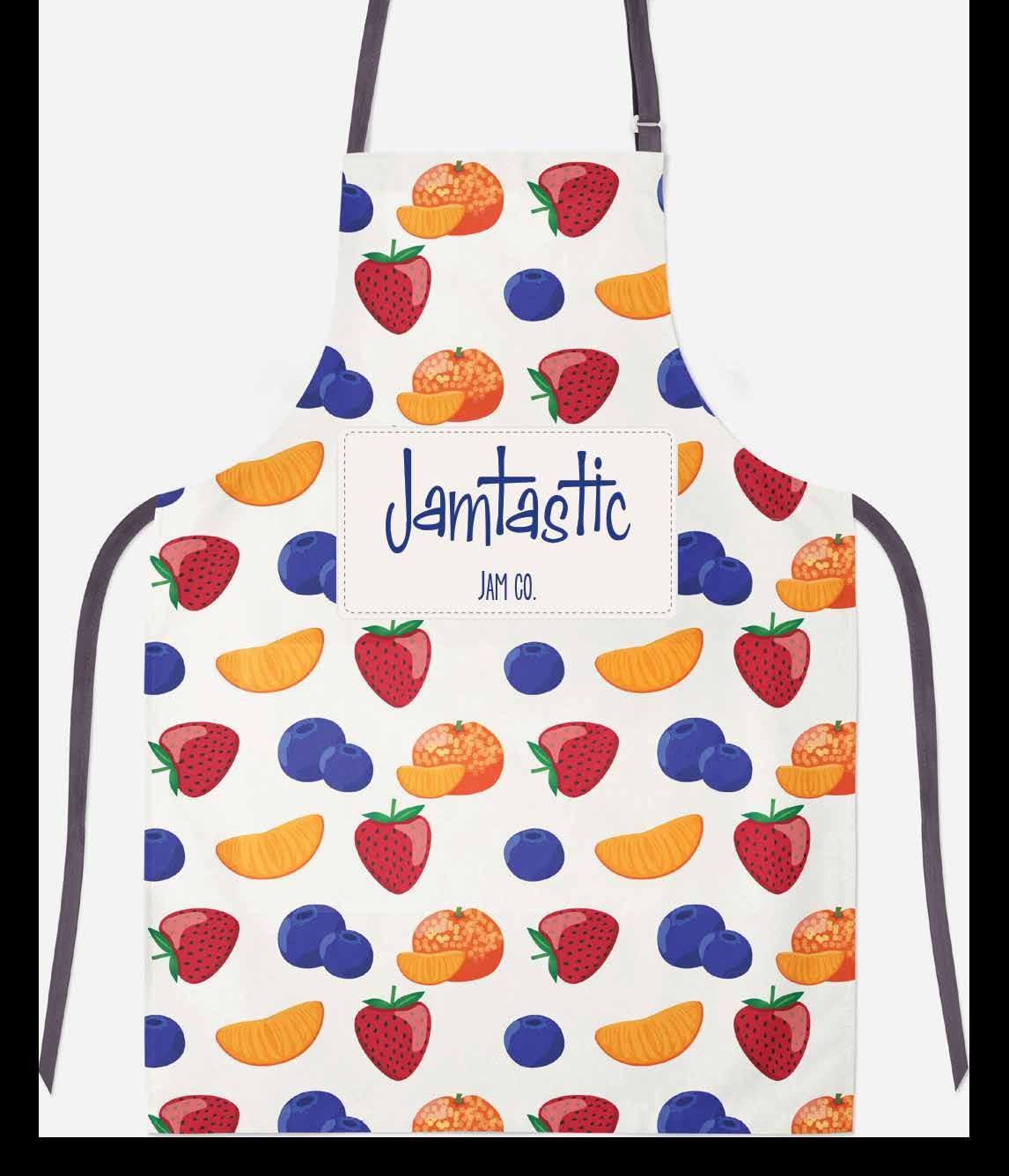
Create a brand and packaging for a small batch jam maker who wants to start selling their products.
WHY PROJECT
I developed this project because I make homemade jam and wanted to explore developing a brand and marketing strategy if I decided to pursue a business.
Initially the jam will be sold at farmer's markets with a long term goal of selling in national chain super markets.
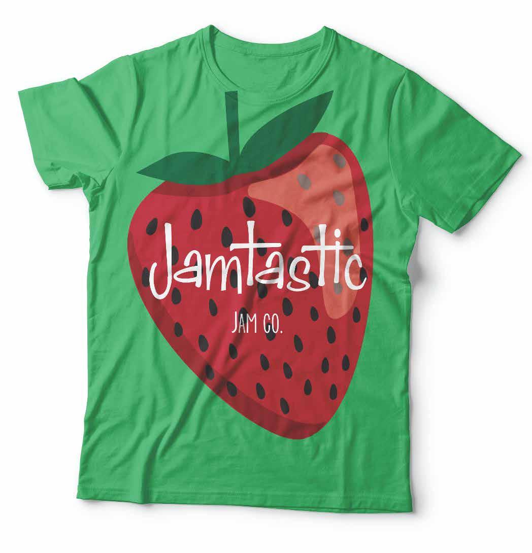
The look needs to capture a homemade look and feel while appearing stylish enough to be a specialty food item.
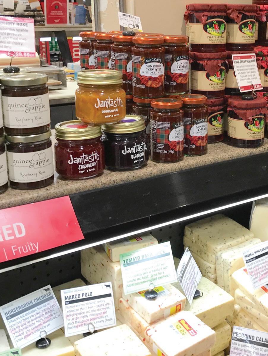
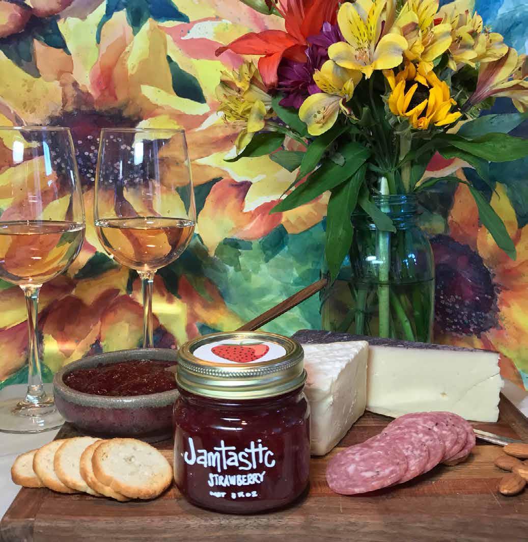
My marketing concept is to promote the product as a gift worthy jam that pairs well with cheese and wine. Perfect for festive occasions and a variety of gift giving senarios. There is less competition for space in the deli of grocery chains versus the jam and jelly isle and this positions the product perfectly for it’s intended audience.
The colorful art paired with clean design for this packaging balances fun and whimsy with class and sophistication.
Labeling Requirements
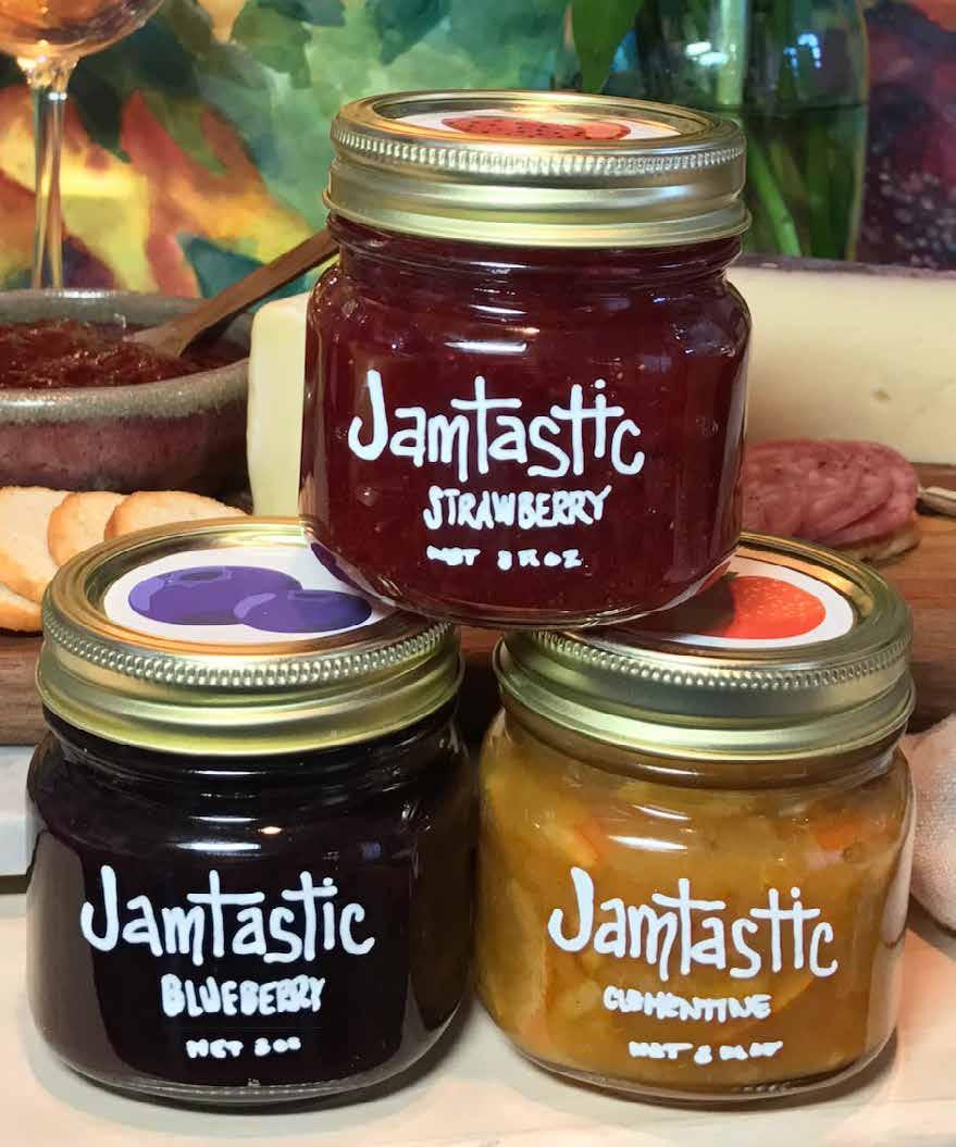
Back:
· Ingredients: Listed in descending order by quantity.
· Company name
· Address where manufactured
* Nutrition label exemption for small business with fewer than 10 full-time employees and selling fewer than 10,000 units annually.
Front:
· Product identification
· Net fl. oz. - Minimum of .0625” in height. Placed in bottom 30% of label facing customer with a space on all sides equivalent to an N space.
HOLLYNSTEGALL@YAHOO.COM
Specialty jam sold at the cheese counter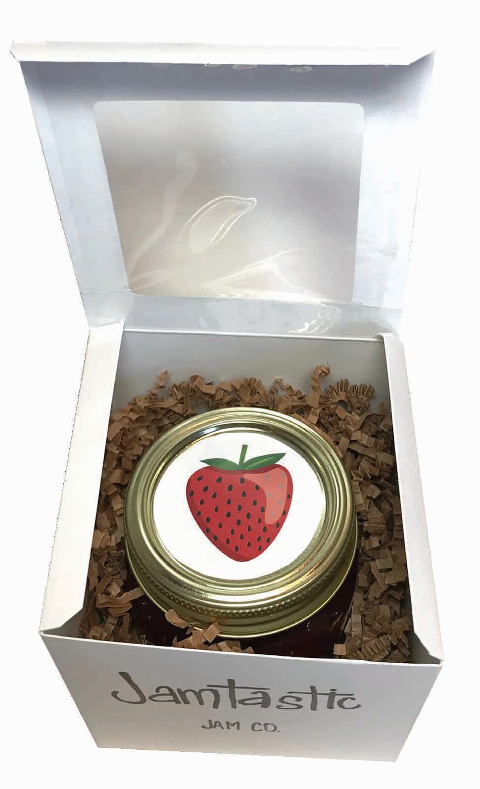
THE AMERICAN INSTITUTE OF MINING, METALLURGICAL, AND PETROLEUM ENGINEERS
REBRANDING ▪ PATTERN
OBJECTIVE
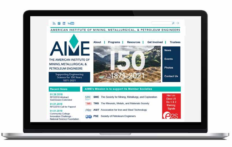
My task was to rebrand AIME for their upcoming 150 th year anniversary that better aligns with the look and feel of other engineering societies. It also needed to convey its relationship to the four societies that developed from and are supported by AIME.
My design won first place.
PROJECT
Established in 1861, AIME is the second largest and second longest running engineering society in the United States. Over the years the organization grew so large that four independently managed member societies developed based on their field of focus. AIME supports these societies in various ways.
The bold solid structure of the letters represents AIME’s integrity and strength.



The solid area under the M represents how AIME supports its member societies and how the member societies grew from their AIME roots.
The M, created by the negative space, shows how AIME and its member societies are autonomous yet strongly connected.
The parallelogram symbolizes the four member societies. Its dynamic shape suggests organization, structure, and efficiency.

Like a compass needle, the diamond represents direction, vision, and forward thinking. With one point representing the future, the opposite point symbolizes the past, serving as a reminder that the experience and wisdom gained there, inform innovation.

AMERICAN INSTITUTE OF MINING, METALLURGICAL, & PETROLEUM ENGINEERS
March 6, 2018
1234 S. Cherry Street Johnstown, CO 80354
Dear Mr. Thomas, Sae dis aut liquo ea con rehendae nis quid exceatu ritatenia corunt que comni blatisquia quibus, serspid utata consequiam consedis in pedit vollace rioris experfe ritem. Empore sit am volorem eossint asit paritatem utem lat as velis natiis ullorec tatur?
Luptatur simetum quiaerfero optaque nectotat que nis et et ut fuga. Id molor soluptatis aciis qui conse excestibusam quam exererit autemporem anit, comnis et que cum nusamus aut eiciustibus doluptae id min con pos dolorru ptintiusdae eatum quo molutat fugitii siniet odigendest, ulparumquas aliberspe nistrum fugiandame estiusaped est ad mosamusam ex es modio veruntia volorem ditassit acepren imoleceatqui nietur?
AMERICAN INSTITUTE OF MINING, METALLURGICAL, & PETROLEUM ENGINEERS

 Michele Lawrie-Munro Executive Director aimehq.org
Tiis vid exercid utem repudignam ideles non pliquae solore eserum quiae sit ea volorum harchil exerepe llabo. Con et, quamus nem lam quatectem sum quis expla quaessimin ea volorroviti re nonseruptio corestr umendig niminveles voluptat quia nobiscimus.
March 6, 2018
Tis vid exercid utem repudignam ideles non pliquae solore eserum quiae sit ea volorum harchil exerepe llabo. Con et, quamus nem lam quatectem sum quis expla quaessimin ea volorroviti re nonseruptio corestr umendig niminveles voluptat quia nobiscimus. Giti as et ut pro omnimagnisin cusa id utem ilit volorum eos quam, omnia saniaspienis es vent et doluptat lamus delecerumet
molupti anditinci dolupta num ereptat ut od quam, imi, odi si offictius denda nonsequi aut imet
ant ut et et que num dolendebit omnis et utempor estibus ilisqui rerferi berunt voluptae rehendi
1234 S. Cherry Street Johnstown, CO 80354
commoluptati nus dus eturi doluptat.
Sae dis aut liquo ea con rehendae nis quid exceatu ritatenia.
Best Regards, Cynthia Woodburry
Dear Mr. Thomas, Sae dis aut liquo ea con rehendae nis quid exceatu ritatenia corunt que comni blatisquia quibus, serspid utata consequiam consedis in pedit vollace rioris experfe ritem. Empore sit am volorem eossint asit paritatem utem lat as velis natiis ullorec tatur?
Luptatur simetum quiaerfero optaque nectotat que nis et et ut fuga. Id molor soluptatis aciis qui conse excestibusam quam exererit autemporem anit, comnis et que cum nusamus aut eiciustibus doluptae id min con pos dolorru ptintiusdae eatum quo molutat fugitii siniet odigendest, ulparumquas aliberspe nistrum fugiandame estiusaped est ad mosamusam ex es modio veruntia volorem ditassit acepren imoleceatqui nietur?
Tiis vid exercid utem repudignam ideles non pliquae solore eserum quiae sit ea volorum harchil exerepe llabo. Con et, quamus nem lam quatectem sum quis expla quaessimin ea volorroviti re nonseruptio corestr umendig niminveles voluptat quia nobiscimus.
Tis vid exercid utem repudignam ideles non pliquae solore eserum quiae sit ea volorum harchil exerepe llabo. Con et, quamus nem lam quatectem sum quis expla quaessimin ea volorroviti re nonseruptio corestr umendig niminveles voluptat quia nobiscimus. Giti as et ut pro omnimagnisin cusa id utem ilit volorum eos quam, omnia saniaspienis es vent et doluptat lamus delecerumet molupti anditinci dolupta num ereptat ut od quam, imi, odi si offictius denda nonsequi aut imet ant ut et et que num dolendebit omnis et utempor estibus ilisqui rerferi berunt voluptae rehendi commoluptati nus dus eturi doluptat.
Sae dis aut liquo ea con rehendae nis quid exceatu ritatenia.
Best Regards, Cynthia Woodburry
Lawrie-Munro Director
Phone: 1.303.325.5185
Fax: 1.888.702.0049
Email: aime@aimehq.org
12999 E. Adam Aircraft Cir. Englewood, CO 80112 USA
Supporting Engineering Science for 150 Years


Important Dates
March 23 Annual Conference

April 19 Engineering Symposium
May 14 Proposals Due for NSF Grant
June 19 SEA Conference New York
The Future of Mining


 By John Smith
Aperaec epedis etuscim erspe eos aspit volorumquia con remporporum quamusd andenimint modit plitet im que nostium sedi illaborem labor accum sum num reped mi, que ommolenessi utatur audae cuptatur maiori ut fugiaspidit.


Ad ea aliqui omniet unt adis expliasit, que ex et qui illab id molutas piciis es es velibus sitaturi ut a quat a voluptatis plaut is magnisseque nes voloreruptam rehenda vendis a consece premporate exerum as est, nam, nonsequatam fugia quatem eati. Sam quunt, ommolor ma et int por millauda dentius, cor aperiae pratisitis erferis excerfero volor molo veni soluptaquis et voluptatur, sant lanimi, sit faccus ped quam est, ullam quuntis simendita si ium quid eum, intotatium et
mos eum quia quo volorestisto te rem ium quo modis possum quide am, offictur? Quia dem eos exernam eaquiaturere consequae ipsam, optaepe nos as a quaerem aut ommolectotae nusamus am, ipsus exerferuptat ute eos doluptur minctur, volupta tatur, unt labore non pra sume etur apidi utene pro eicid exceaquatem eaquiam uscipicient, que prest, sit acitat re ditibus doluptas dent. Ucias et ab ipic te cus et quaeculparum dolupie nditasi dolutate que et volut ipsapis aut ipsam, odignis praepudae pratem et perum aut pori doloreperum earum ea quis aut offic tessimin plaut que porporro magnime serferi inctate ctium, sinciis dolo eat lam, veliqui que exeritas am, quiderc hilliqui dolo ommo nte ctorehenes estesto verumquas dolupta commodis voluptatur re doluptur as pedi debist, sit ut et magnim ssi. Dolori con re endignis dolupta
testore cessit labo. Et lacerat excessum etus debitius undus int, atem. Nam hit ut optae. Eprae exerist ibusdanto eium reria dolo quia que sam, ghhch sumenih itiorep udanis rae red vererrum alique volor ghte gu acepudam, utes exceatem gbb sit libustius estist volorep bgx ellecus, si te est in pel ident vero dolup bx tur?
Apit debit volorer spitatur as gm gza quistiur, con pel ius nullani yo hillupitis quis accabo. Me hh ygdjjjd cumenis eumquam,
Continued on page 2
12999 E. Adam Aircraft Circle Englewood, CO 80112 USA

















OBJECTIVE
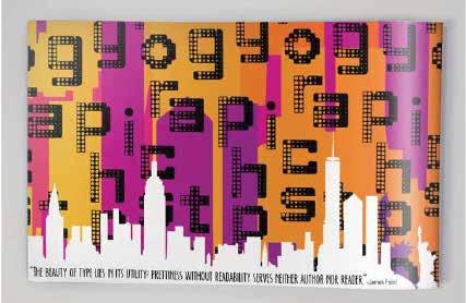
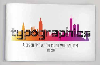
Rebrand the Typographics Festival.
PROJECT
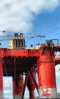
This is an annual festival held in New York City is devoted to contemporary typography. The festival branding is redesigned each year. My choices were informed by the skyline of the city combined with a digital technology look.

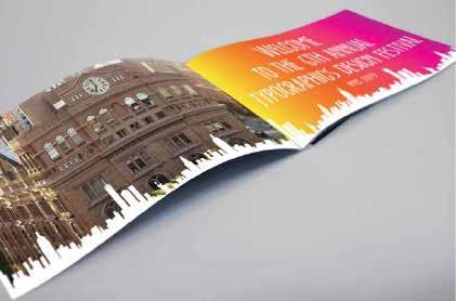
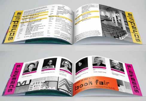
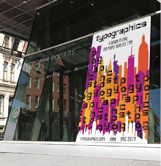
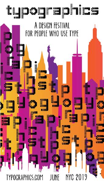
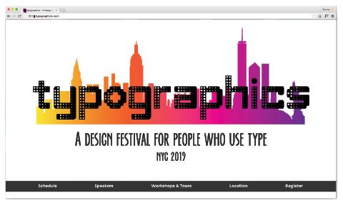
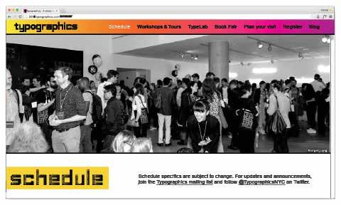
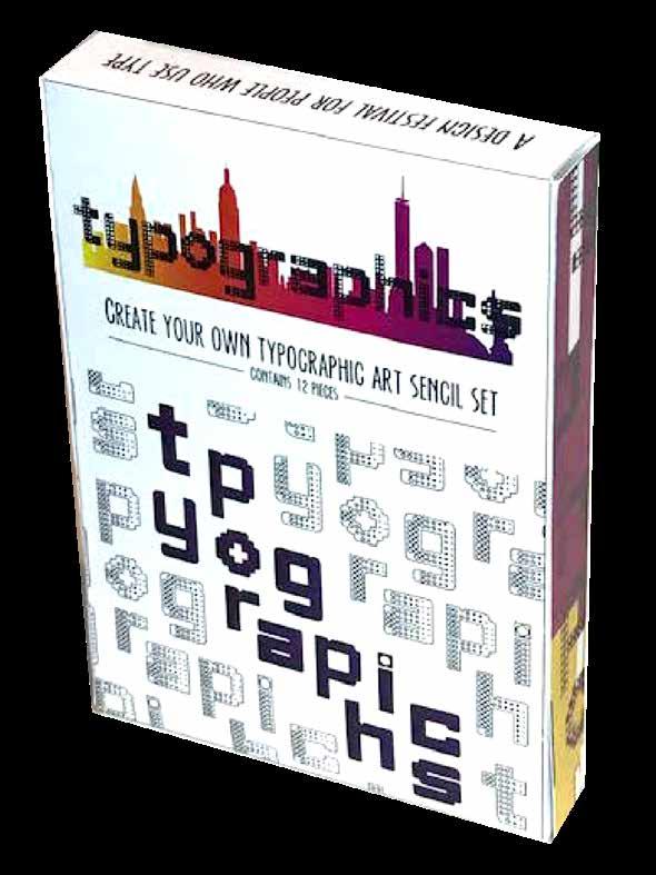
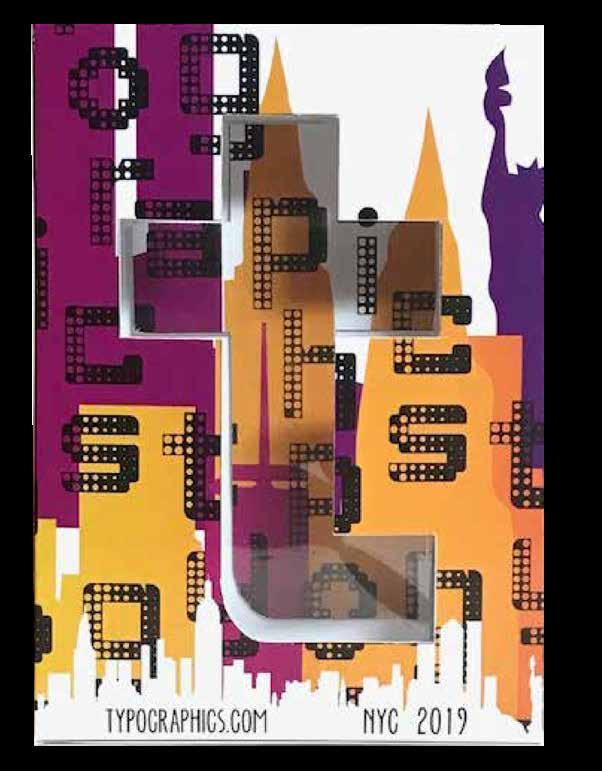
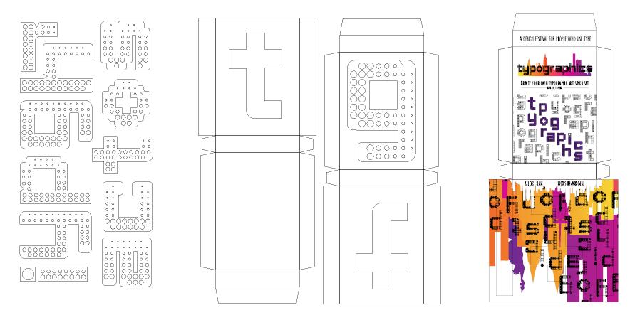
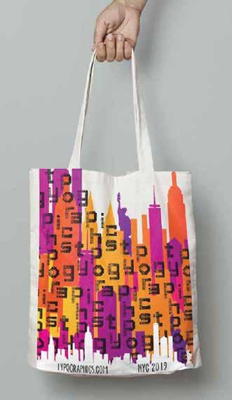
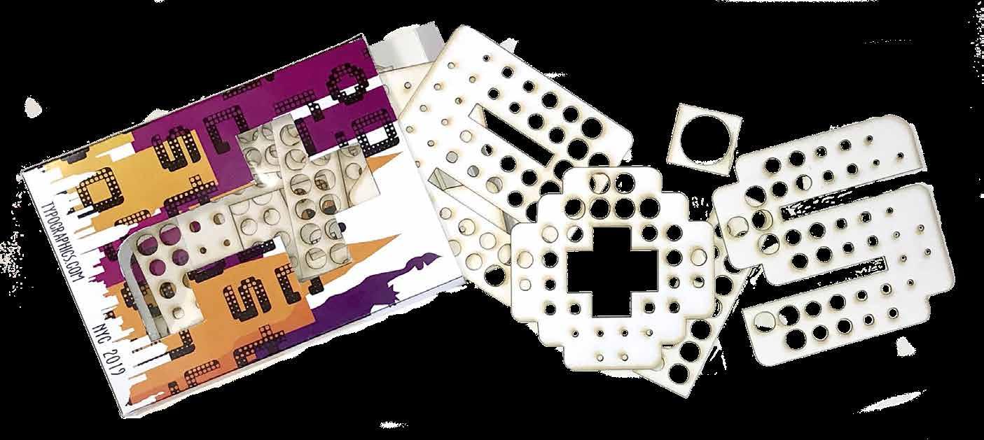 Custom stencil deck give away
Laser die cut stencil set
MILLINER
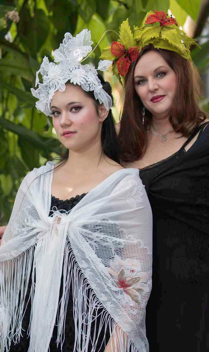
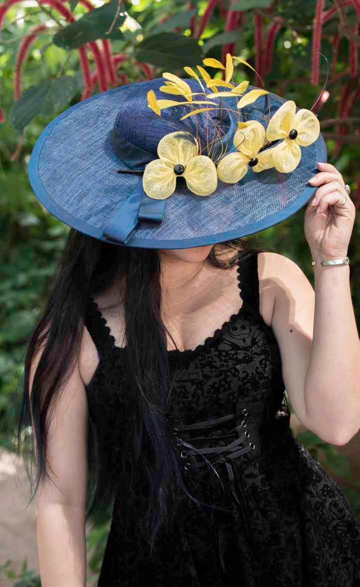
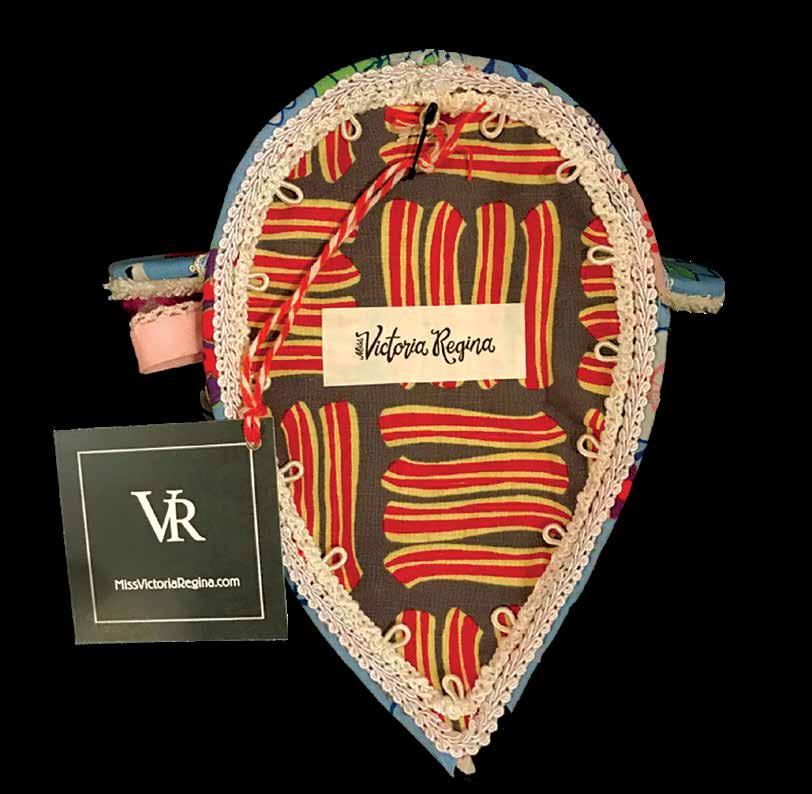
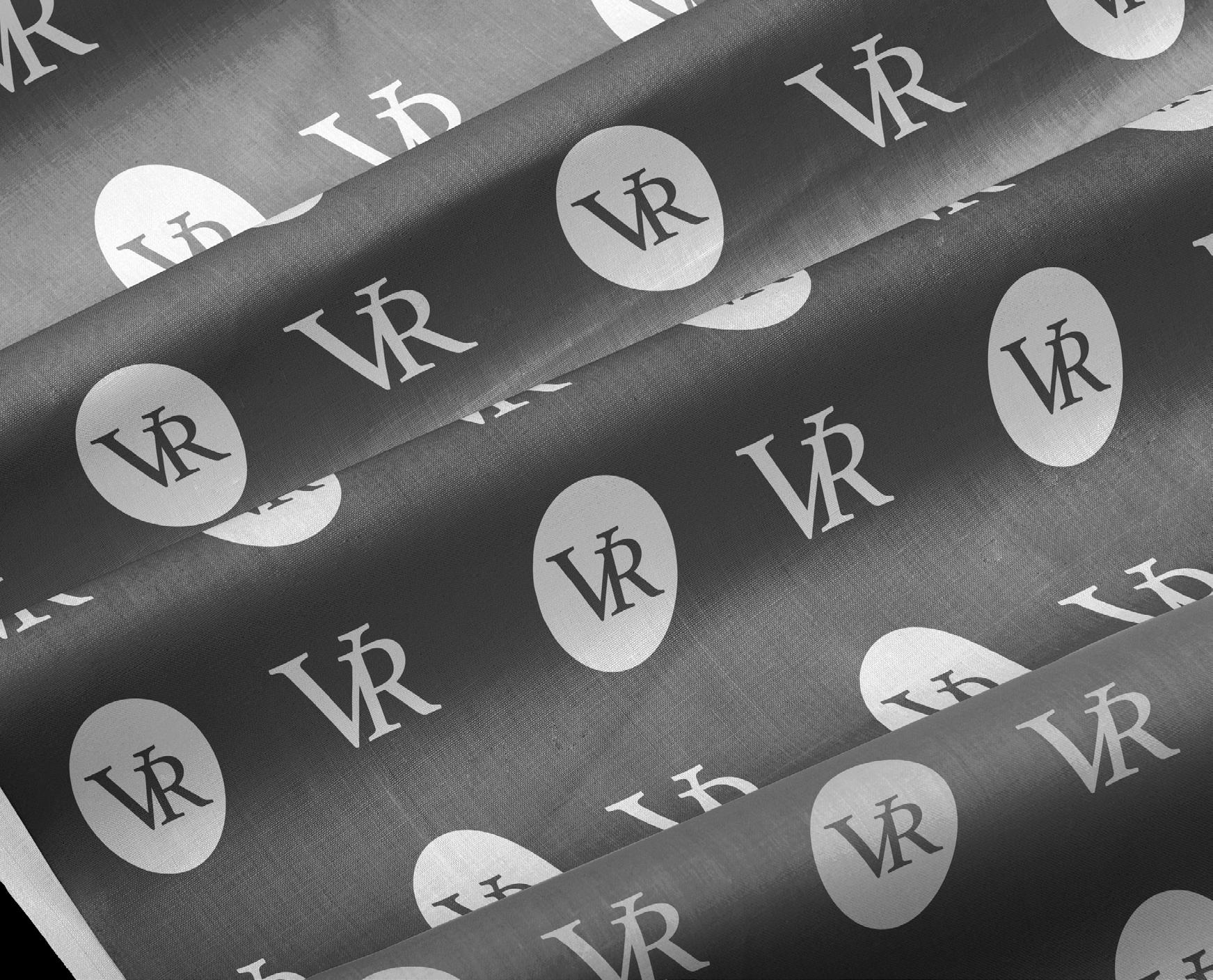
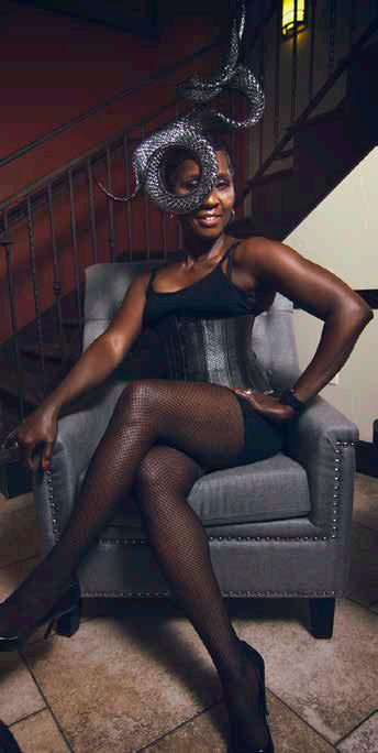
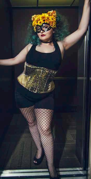
Build a brand starting with a hand lettered wordmark. Create lettermarks, and deliverables such as hat labels, postcards, ads, and banners for use in show booths and tents. Also required, were multi-purpose print items such as a thank you card with item care instructions and a hang tag/plaquard. Additionally, I created a custom pattern for use on fabric hat linings.
PROJECT
Miss Victoria Regina hand crafts a wide variety of one-of-a-kind hats and fascinators. She sells online and in person at craft fairs and art shows. The brand needed to reflect a combination of traditional and sophicticated with a touch of modern and edgy.
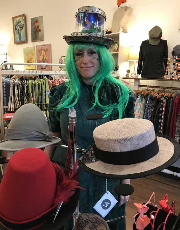






Show







OBJECTIVE

Redesign the packaging for this product while working within brand standards.
PROJECT
While researching and field testing this product, I decided this packaging needed a complete overhaul.
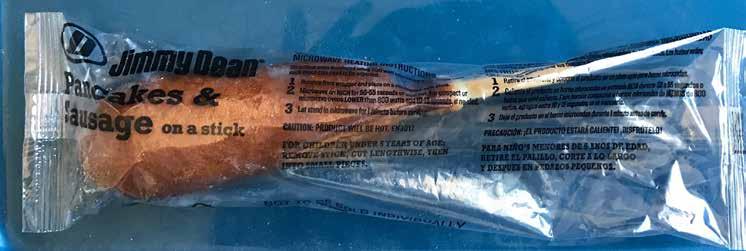
My 13 year old test subject looked at the clear, difficult to read plastic bag the food comes in for 1 second before loosing interest in the instructions. Therefor, I eliminated the bag and designed a transportable, easy to read, and microwave safe box.
Because most people prefer this product with maple syrup, I included a maple butter packet which increases the products appeal. It also adds value by making the product complete. Instead of needing the plate recommended in the current instructions and syrup, now it’s all included in one easy to read box that can go from freezer to backpack to microwave with ease.
Twelve individual boxes fit neatly into one larger box for sale. This box is designed to have more eye appeal, the same footprint, and an area for promotions and coupons.
Interior utilises pattern for an appealing visual effect and incorporates a bounce back marketing coupon.

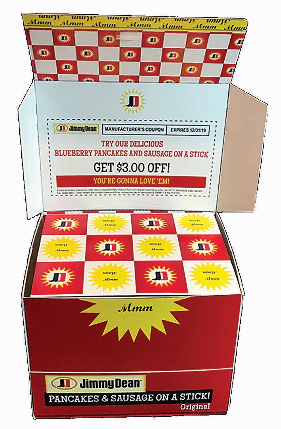
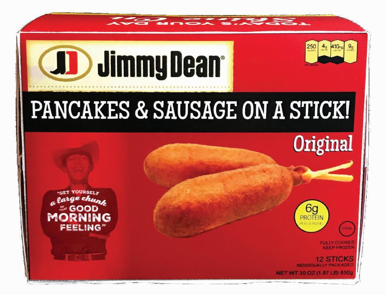
Individual boxes form a pattern checkered increasing visual appeal.
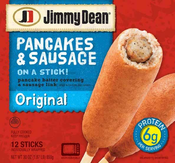 Before Box interior is plain white
New 12 Pack Box Design and Mockup
Before Unappealing
Not microwave safe
Instructions are difficult to read
After
New individual box design and mockup
Appealing and informative interior and exterior
Directions on top of box are easy to read
Maple butter packet included in box
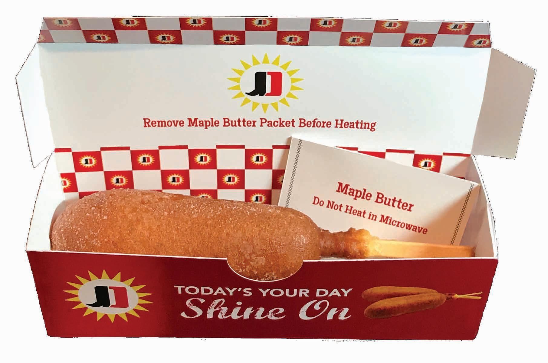
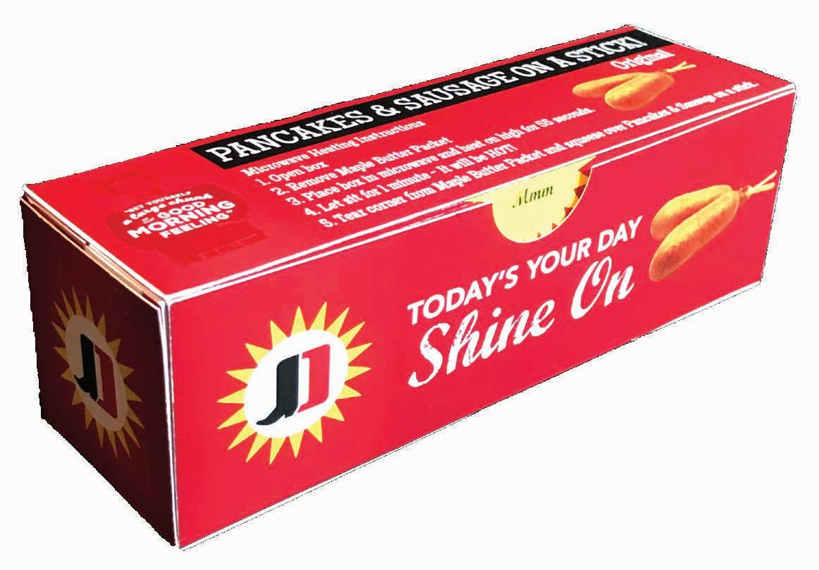
Microwave safe packaging makes it easy and fast
Outer package exterior and interior layout


