EDUCATION
Graduation: May 2026
Fay Jones School of Architecture and Design - University of Arkansas
Bachelor of Architecture
SUMMARY
I am a multi disciplinary designer who is passionate about story telling, graphic design, and community and urban design. I am looking for the opportunity to apply my problem-solving skills and engage with mentors that can help me learn and grow.
JOB EXPERIENCE
Architecture Intern - Buf Studio- Summer 2024-current I produce Revit models, construction documents, programming analyses, graphic site plans, renderings, diagrams, and research on workplace, hospitality, and housing projects.
Architecture Intern - International Architects Atelier - Summer 2023
I updated drawings and digital models by piecing together historic documents and renovation construction documents in Revit. I worked on punch lists, schedules, site visits, rendering and graphic design, and award presentation applications, helping the firm earn the 2023 AIA Central States Award for Interior Design.
Teaching Assistant - Design Thinking I - Fall 2023
I worked as one of three teaching assistants for a class of over ninety students. I lectured on Photoshop, Illustrator, Rhino, and Indesign, co-wrote project assignments with the professor, and helped students troubleshoot technical and design related issues.
Student Editor - Architectonic Parametric Design for Beginners - 2022
I collaborated with my architecture professor Rachel Smith-Loerts on her book Architectonic Parametric Design for Beginners. I provided feedback on the clarity of Grasshopper directions.
AWARDS & RECOGNITION
Competitor, ULI HINES Urban Design Competition- January 2026
Leadership Award- Fall 2021-Spring 2026
Presenter, Urban Land Institute Place Summit conference- Fall 2025
Exhibitor, ELEVATE AIA Conference- Fall 2025
Exhibitor, Super Jury- Spring 2024
Semi-Finalist, UARK housing competition- Fall 2023
AIA Kansas City Young Architect Scholarship - Fall 2021
Exhibitor, high school tours- Fall 2021
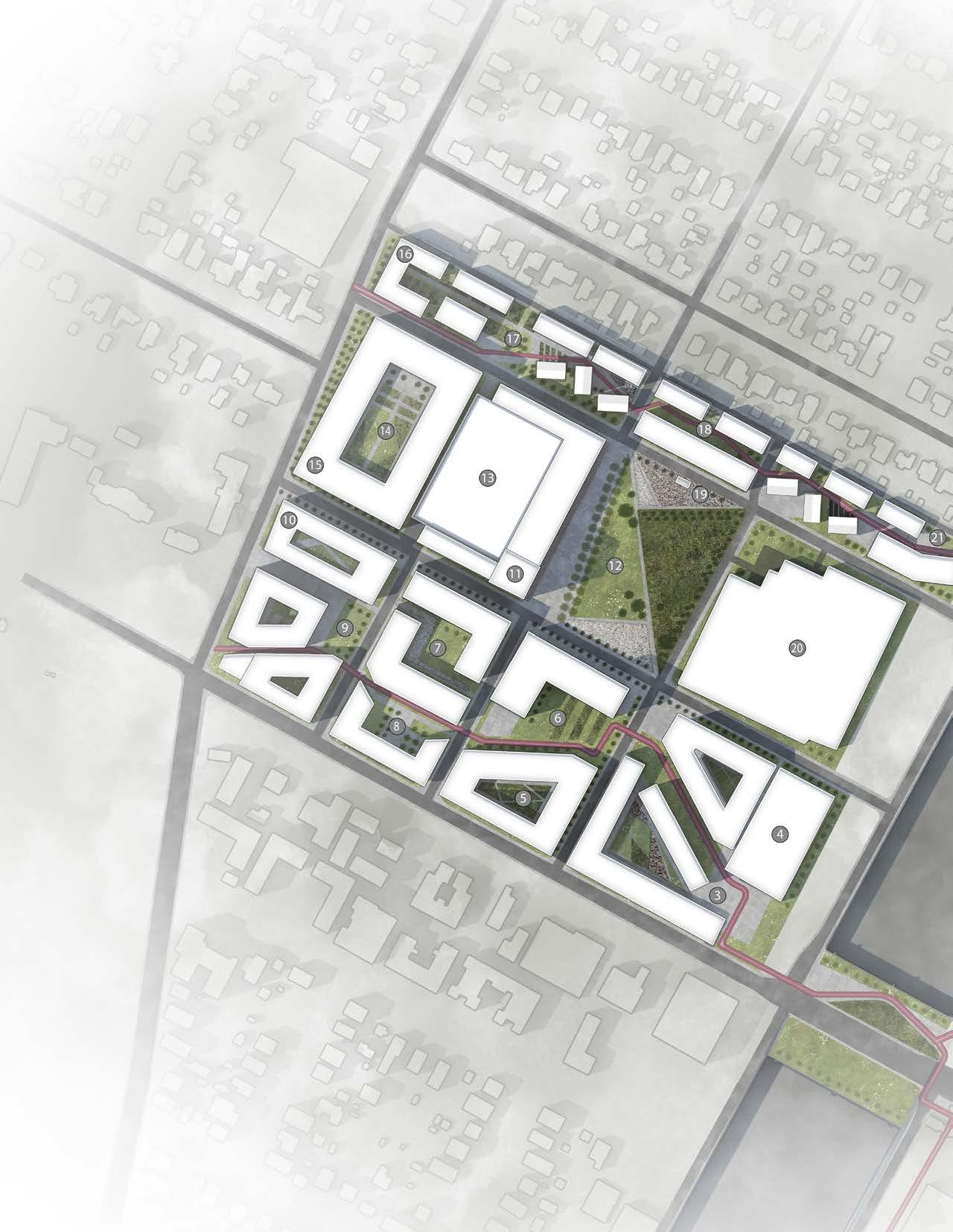
THE STITCH
AUSTIN, TEXAS VENICE, ITALY
JANUARY 2026
HINES URBAN DESIGN COMPETITION UNIVERSITY OF ARKANSAS TEAM
SPONSORED BY KEN MCCOWN AND JESSICA HESTER
TEAM MEMBERS: CALEB ROTHELL (FIFTH YEAR BARCH), NICHOLAS GERIK (THIRD YEAR LARC), MUHAMMAD ALI MUHAMMAD (MBA CANDIDATE), AND LANEY KELLYBREW (POLITICAL SCIENCE MAJOR, URBAN PLANNING MINOR)
I was on the University of Arkansas’s inaugural Hines Compeition team and seminar class. Caleb Rothell and I led an interdisciplinary team designing a financially feasible urban design for northern central Austin.
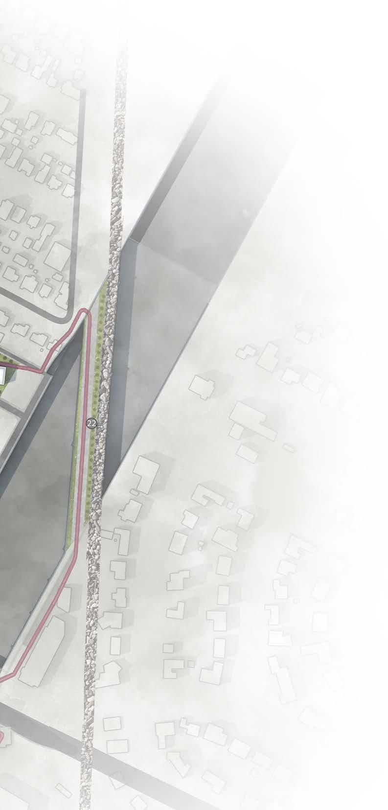
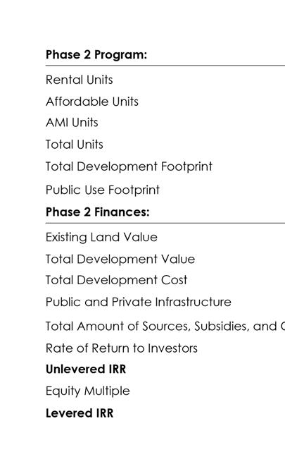
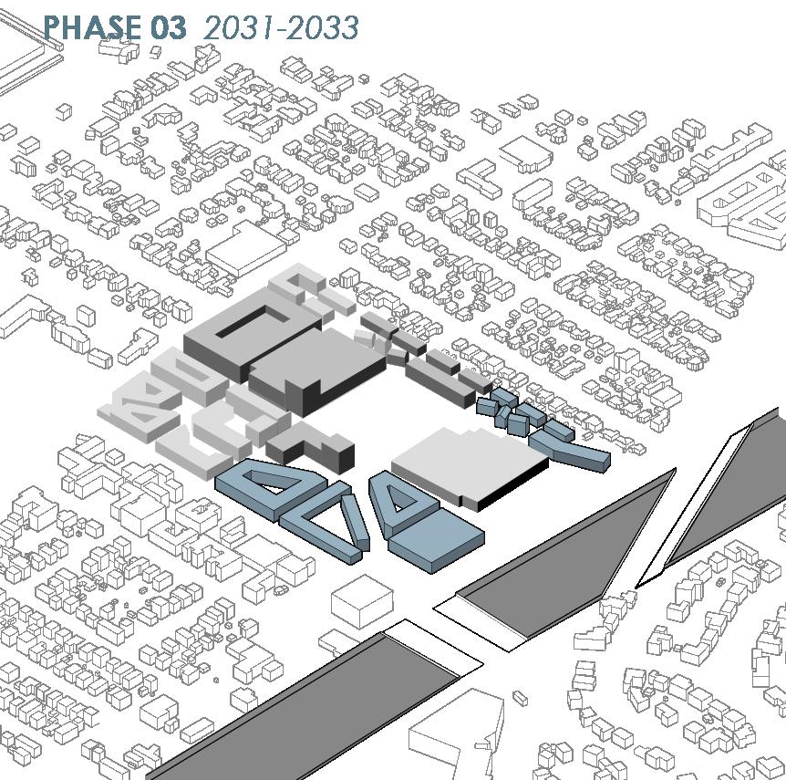
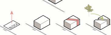
The Stitch is centered around physical and social reconnection in a highway-fractured neighborhood in Austin, Texas. The Texas Department of Transportation plans to lower I-35 and construct a series of boulevards and parks, (“stitches” and “caps”) to reconnect the east and west sides of I-35. One of these stitches is number 22 on the site plan (left). The Stitch expands on this with a strategy dubbed “block stitches” for social, economical, and ecological sustainability. This strategy integrates nearby trails and the busiest bus route in Austin, which services the University of Texas Austin campus. The university is nearby, so the site reflects the needs of the community. 28% of the housing available is affordable, 30% is student housing, and 8% is senior alumni living.


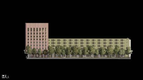


Left: The diagram shows uses for each floor of each building in the project. The site boundary is visible and the park is in the central white space. The white building is Central Health clinic. The warm toned colors, shown in the key, show multi-family housing and the hotel on the site. This is where large groups of people will exist after hours. During the daytime, the restaurants, gyms, offices, and retail will. Ground level parking garages are a strategy employed on the outer edges of the site where there will be less pedestrian traffic.
Far Above: Section drawing showing the density strategy applied to the site. The district furthest north (on the right side) has the lowest density to meet the single family housing north of the site. The central area of the site is the tallest and densest and then tapers off moving south since the neighboring apartment blocks are much smaller.
Above: The forms of the housing strategies are informed by density and the block stitch strategy. The character in the northern, central, and southern areas of the site are different based on the massing strategy needed to achieve the desired density. The desired density is derived from context and the proforma.
Section drawing by Nicholas Gerik.
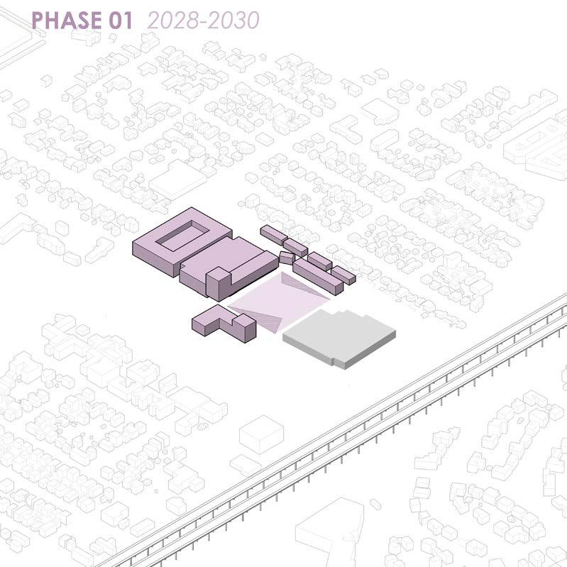
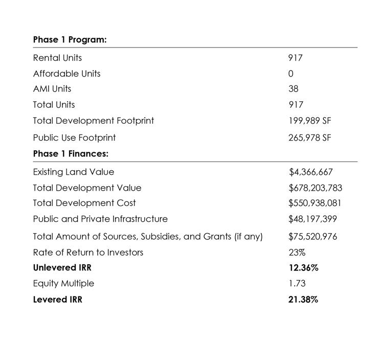
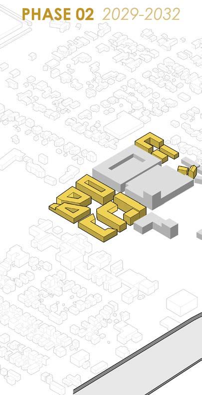
In the Hines compeition, teams make a proforma for their project, including phasing the project. I worked closely with Muhammad Ali Muhammad to balance the cost and design aspirations.
The phasing accounts for upfront infrastructure and the development of highway I-35, which is set to undergo construction for the cap and stitch program timeline outlined my TxDot.
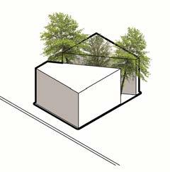
Left: “block stitch” strategy, which carves pedestrian paths and public spaces through blocks in the site to disincentivize driving and create a unique character in each district.
ECOLOGICAL
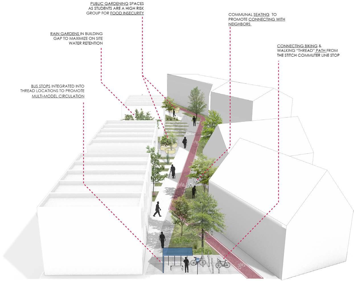
The site features bioswales, public lawns, and food forests, healthy interactions with the environment and promotion of physical activity. The focus on sustainability, transit, and equity is particularly significant due to the site’s proximity to formerly-redlined districts and student populations.
Diagram by Caleb Rothell.
Diagram by Caleb Rothell.
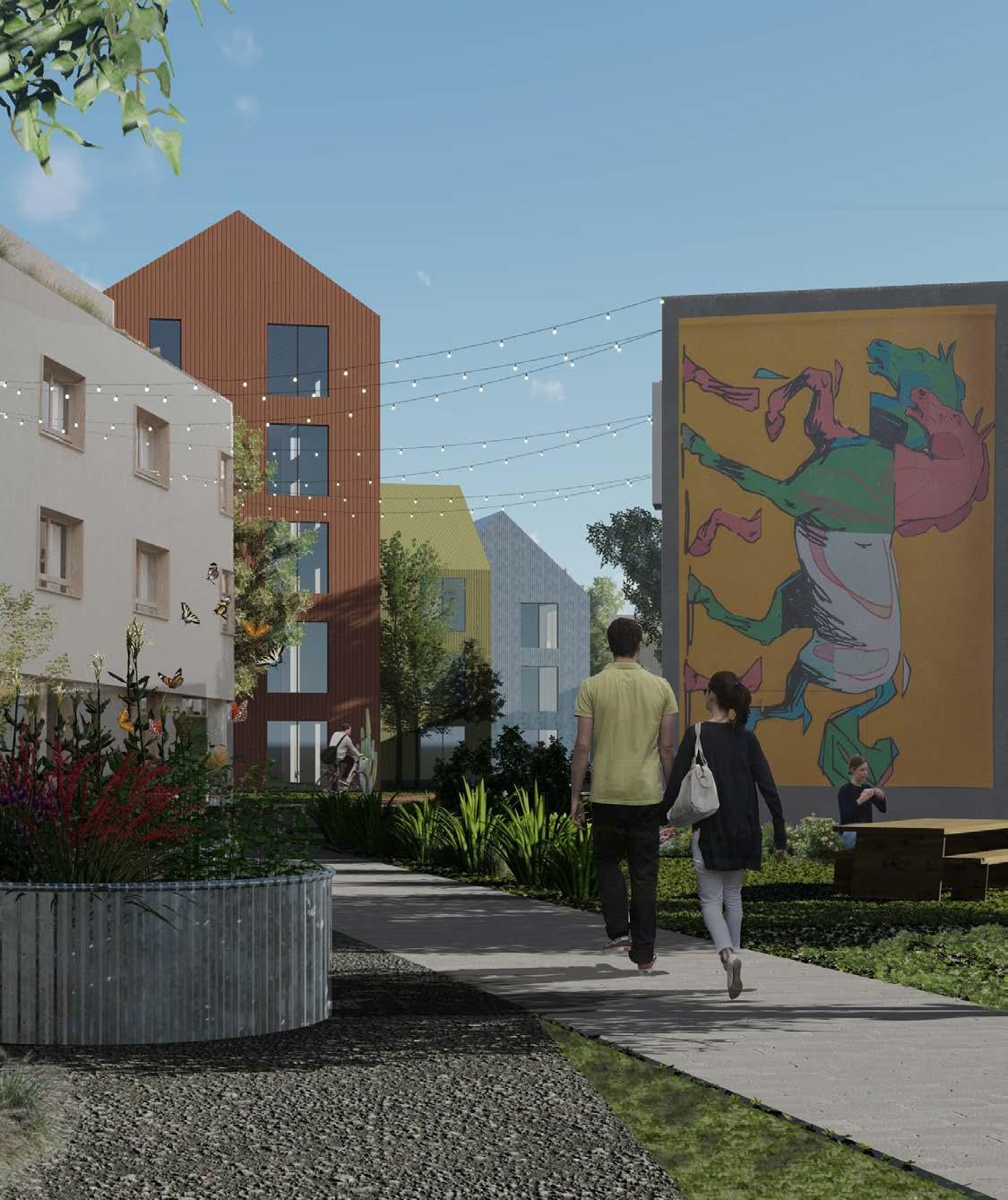
SOCIAL
The project centers public spaces like porches, community spaces, and community amenities. It serves residents’ daily needs while addressing the complicated history of in the neighborhood through trails and green spaces. The buildings have been organized to privilege views for pedestrians, cyclists, and park-goers, shown above.
Rendering by Caleb Rothell.
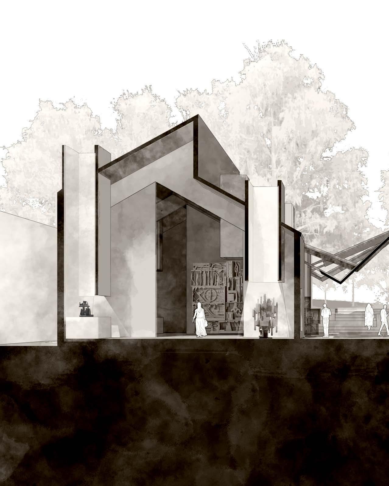
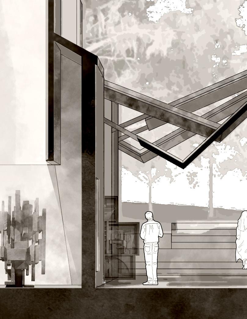
HEARTHLIGHT
VENICE, ITALY
YEAR 4 - SPRING 2025
PROFESSOR VANESSA MINGOZZI
WITH EVAN RICHARD ROBERTS
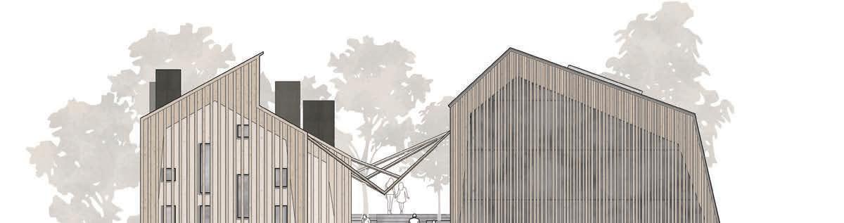
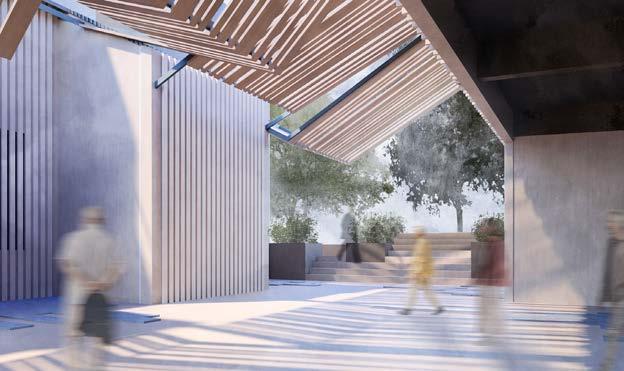
The U.S. pavilion in the Venetian La Biennale is not just an building, but architectures of urban and rural America make something beautiful and
The building must serve as a backdrop for the exhibitions of artists and structure and wide open spaces. The building mimics community spaces organizational system for the exhibitions. It is inspired by city life as well, spaces of urban architecture through the utilization of the between-spaces of, as shown above.
Hearthlight isn’t a building, it’s a stage for gathering and storytelling.
but a reflection of an ever-evolving diametric identity of the United States. The seemingly incongruous and interesting, larger than the sum of its parts. and architects alike. The Hearthlight pavilions draw inspiration from rural American vernacular with flexible spaces of vernacular architecture through utilizing “hearths”, a gathering place, as a lighting device and well, with architecture based on density and controlled circulation. The alley created mimics community between-spaces with hardscape and overhangs. This creates an array of conditions for exhibitions to take advantage
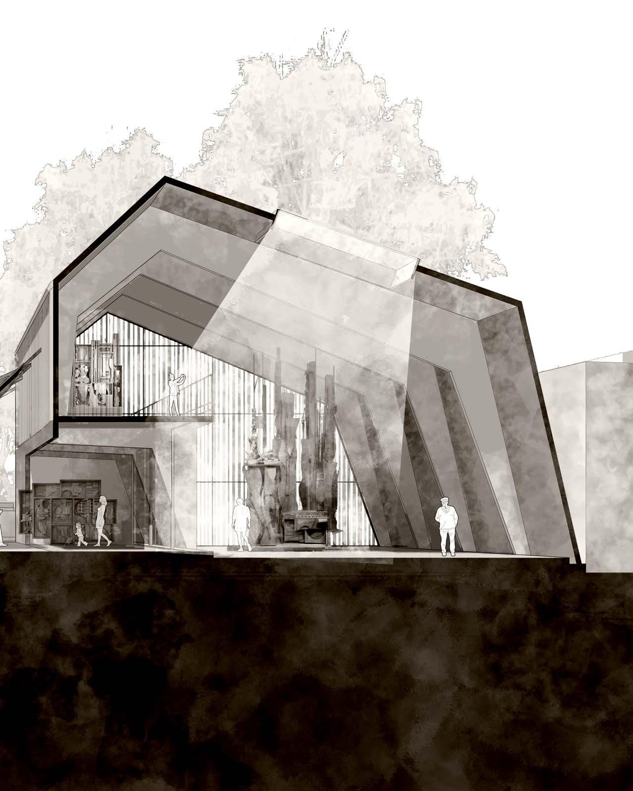
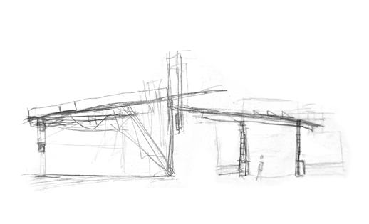
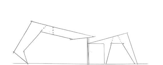
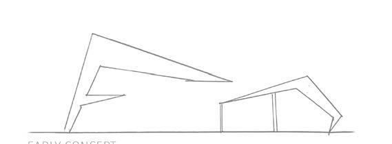
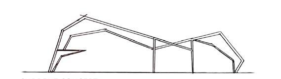
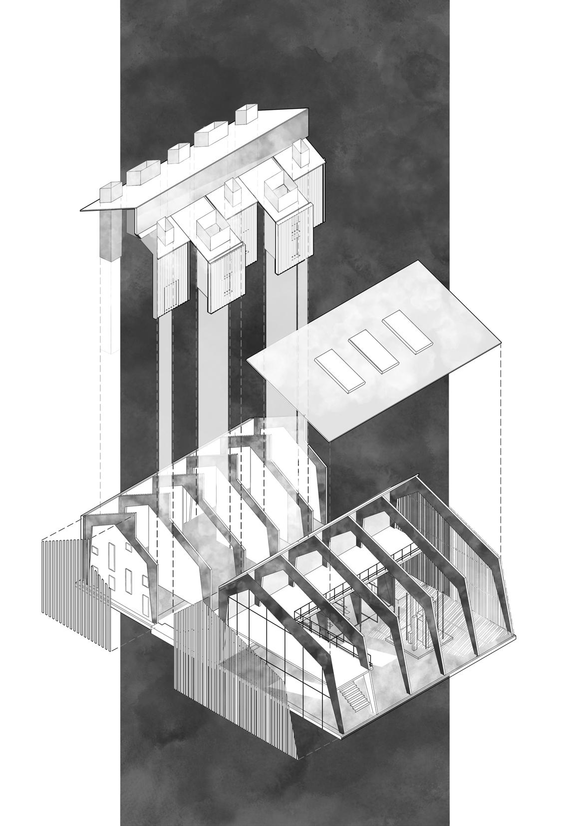
Left: Hand sketches showing the development of the concept in section.
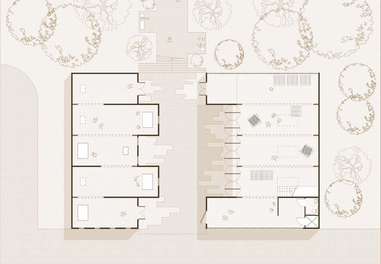
Top: the floor plan describes the organization and varying sizes of the exhibit spaces between the two pavilions and the material experience that blends the interior with the walkway
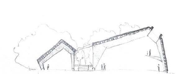
Bottom: An elevation with the grade changes and materiality in context
Plan by Evan Richard Roberts
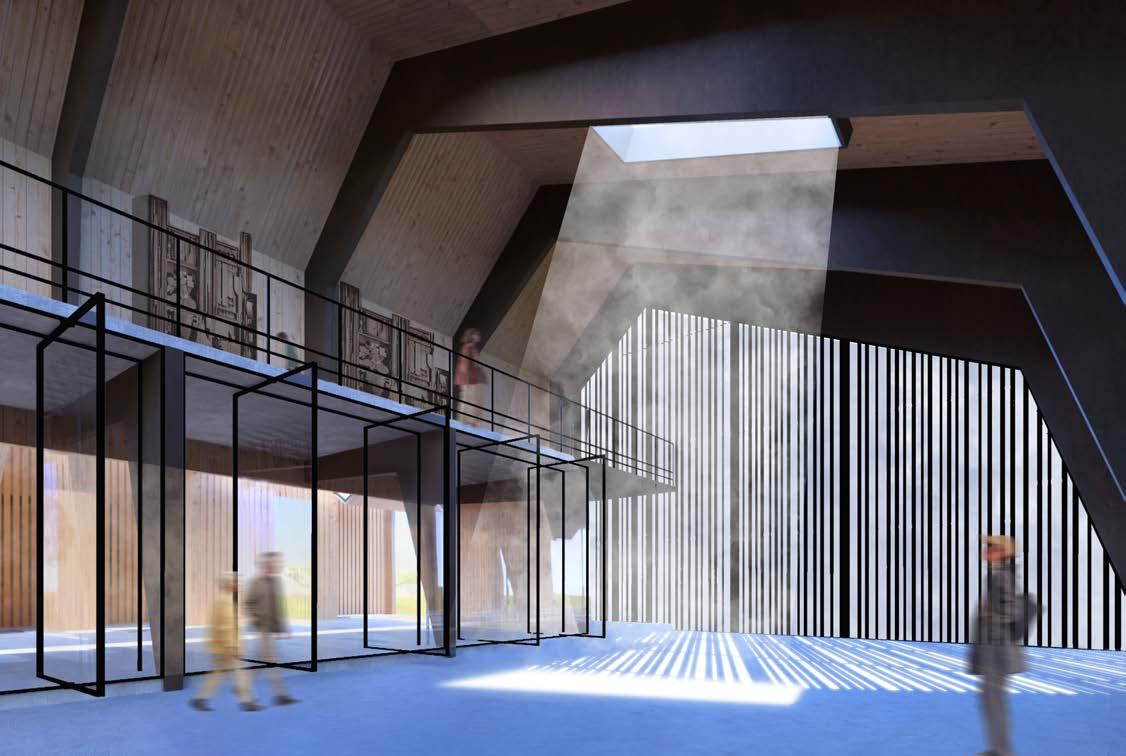
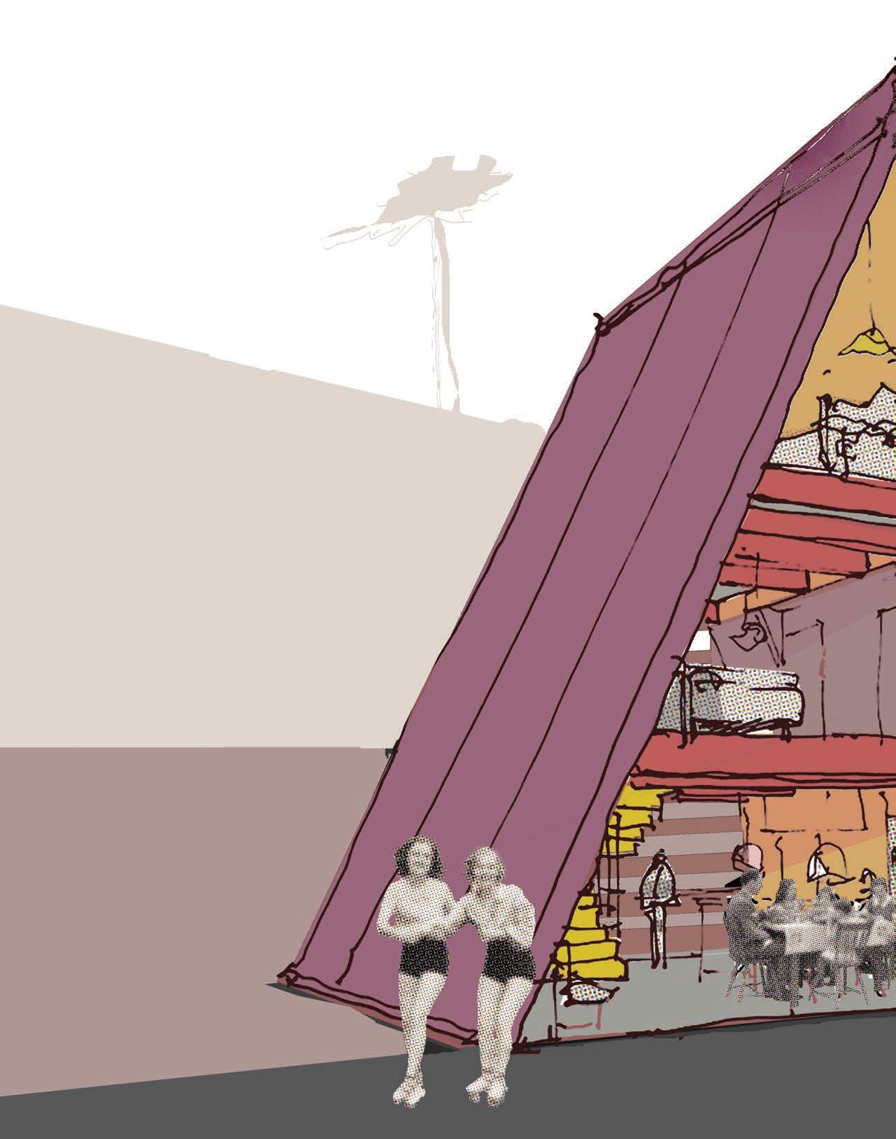
Left: An exhibition begins in the smaller pavilion. It employs a series of “light chimneys” to naturally spotlight human-scale artworks. The circulation is denser and more controlled with many directed focal points.
Right: Viewers are directed outside for shade and rest. In their own time they may enter the second pavilion through any of the open doors.
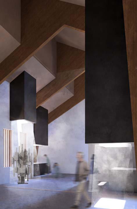
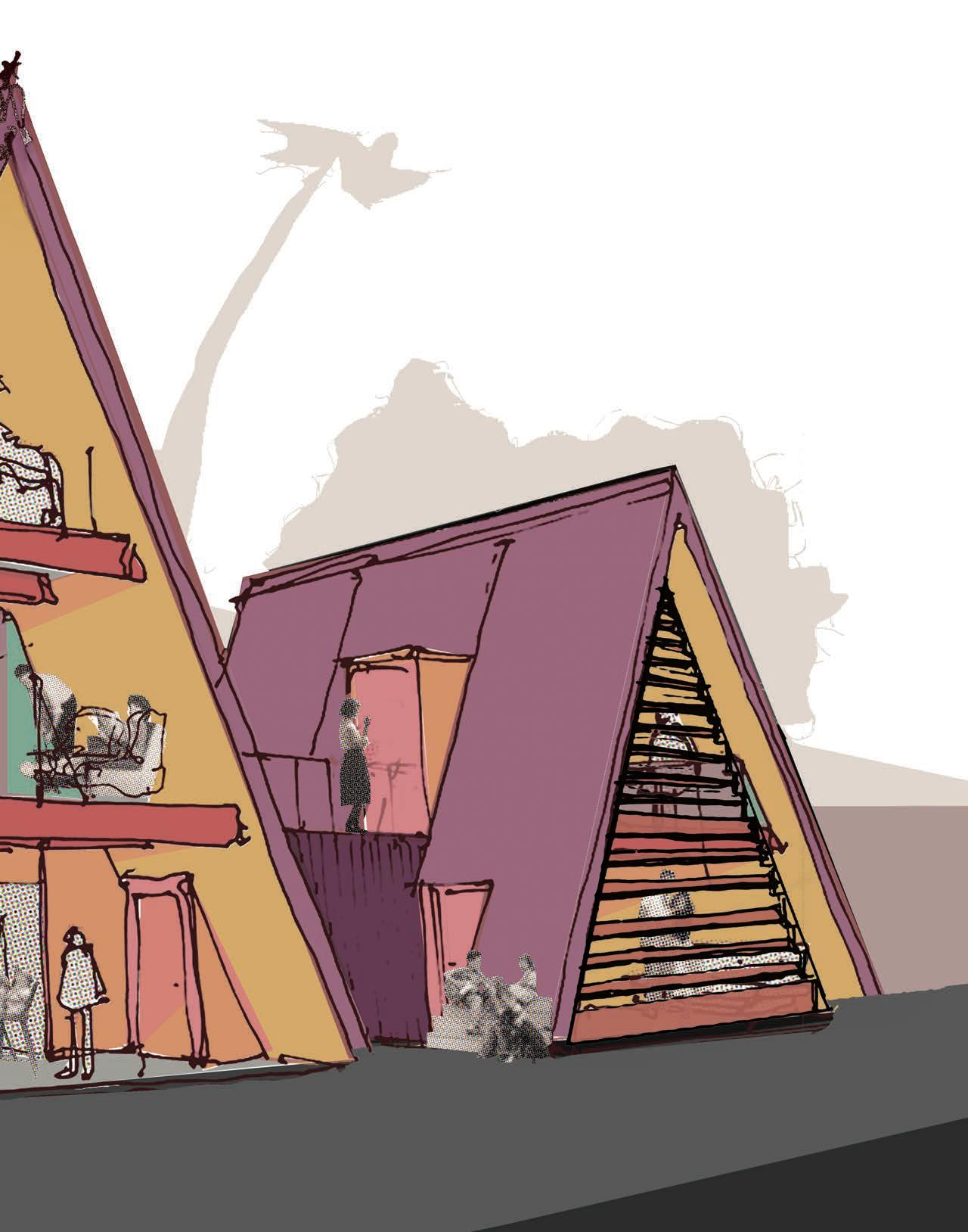
Top: The second pavilion It is more vast than the first, with one large space, a viewing deck, and another skylight. The circulation is open and exhibition designers can end with a flourish.
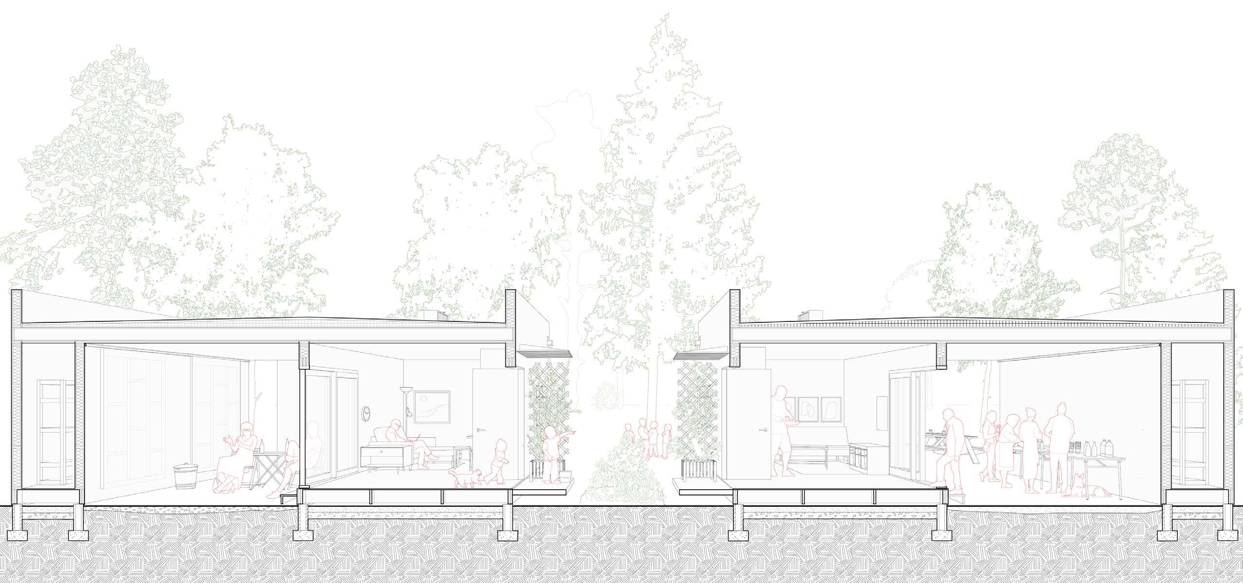
SANTA MONICA, CALIFORNIA
YEAR 3 - FALL 2023
PROFESSOR ALEXANDRA WALLER
PROFESSOR BRIAN HOLLAND
WITH JOHN BLAKE
This project is a submission for the international Los Angeles Affordable Housing Challenge issued by Buildner. I worked closely with my partner John Blake for the duration of the project.
The houses are an exercise in gateway densification, meaning they use less intrusive and lower density solutions for less resident resistance and wider.
Each pair of units is designed to be built and owned within a shared economic model between individuals without the need for developers. Use of local materials, prefabrication methods, and innovative on-site assembly techniques lead to fast construction and low overall costs.
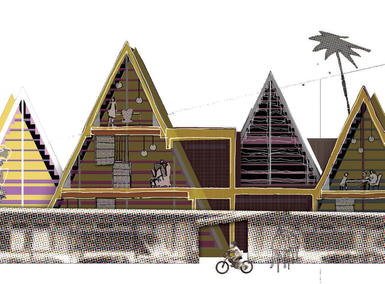
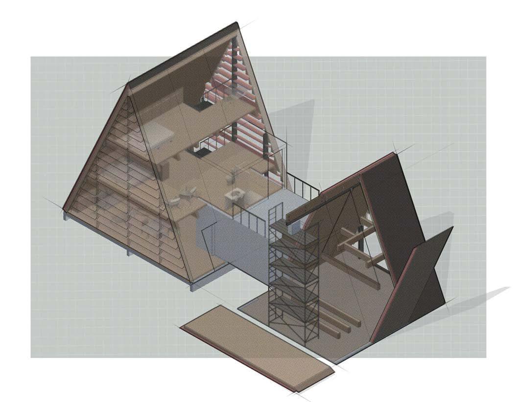
The A Frame Kit is easily and quickly assembled due to its prefabricated elements and a dowel assembly system on the ridge beam. Plumbing is consolidated in the core, the element connecting the two households. This logic also helps consolidate the footprint.
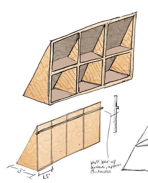
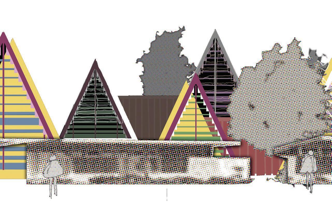
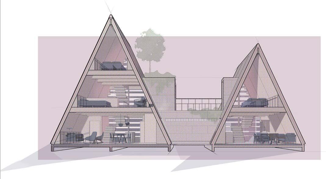
Left: There are three sizes of A-frames: either 1, 2, or 3 floors. They each have the same roof pitch and therefore use the same prefabricated plywood furniture to optimize storage and utilize the edges of rooms.
Below: A collage depicting the existing Mar Vista tract homes in elevation with the A frames integrated. One of the A frames is shown in section, depicting the relationship of scale between them and the 1940s housing in the foreground.
Integration of the units into existing environments relies on the use of interstitial space such as backyards. Using the aggregated A-frames as a backdrop, a porosity of existing housing tracts is retained.
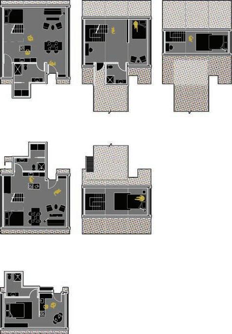
Near right: The floor plan for one three-story A frame is filled with life on every floor.
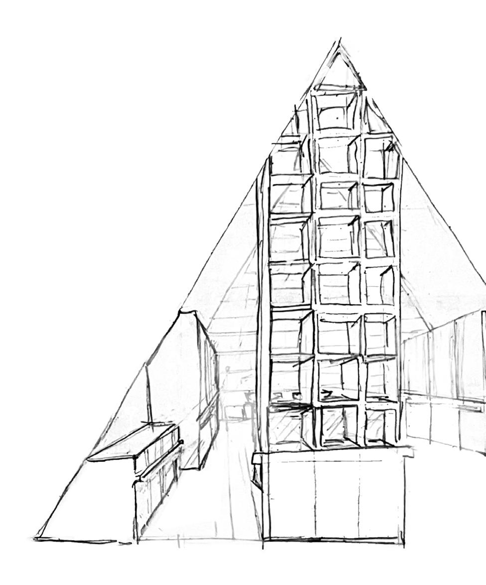
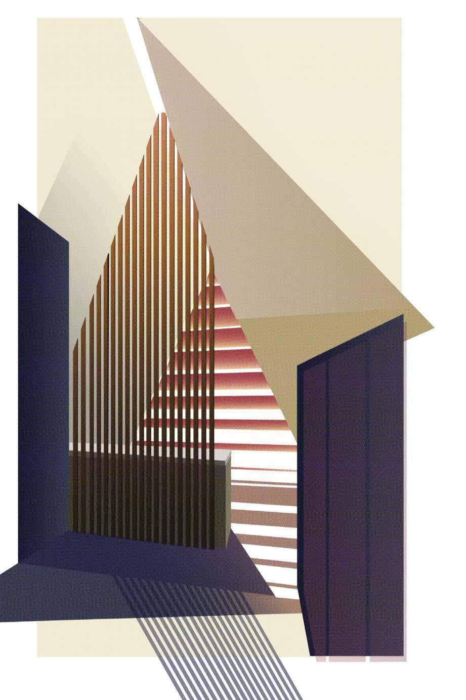
Right: A sketched section perspective of the one-story A frame interior, taken from the kitchen looking into the bedroom. The open plan optimizes space and uses a shelf as a display, storage, and room divider.
This illustration shows the inside of the smallest a-frame. The horizontal pink blinds contrast the vertical dark wood screen that separates the living space and the bedroom
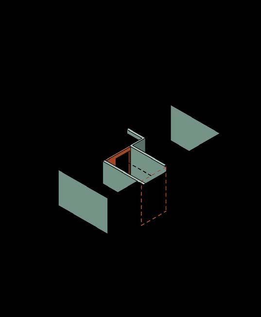
Top: The axonometric shows the on-site assembly of the prefabricated parts of the A frame. The ridge beam is held in place by scaffolding until the panels can be tilted in and anchored in place.
Bottom: A section Perspective shows the experience of the A-frame pairs.
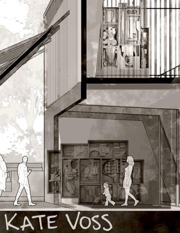
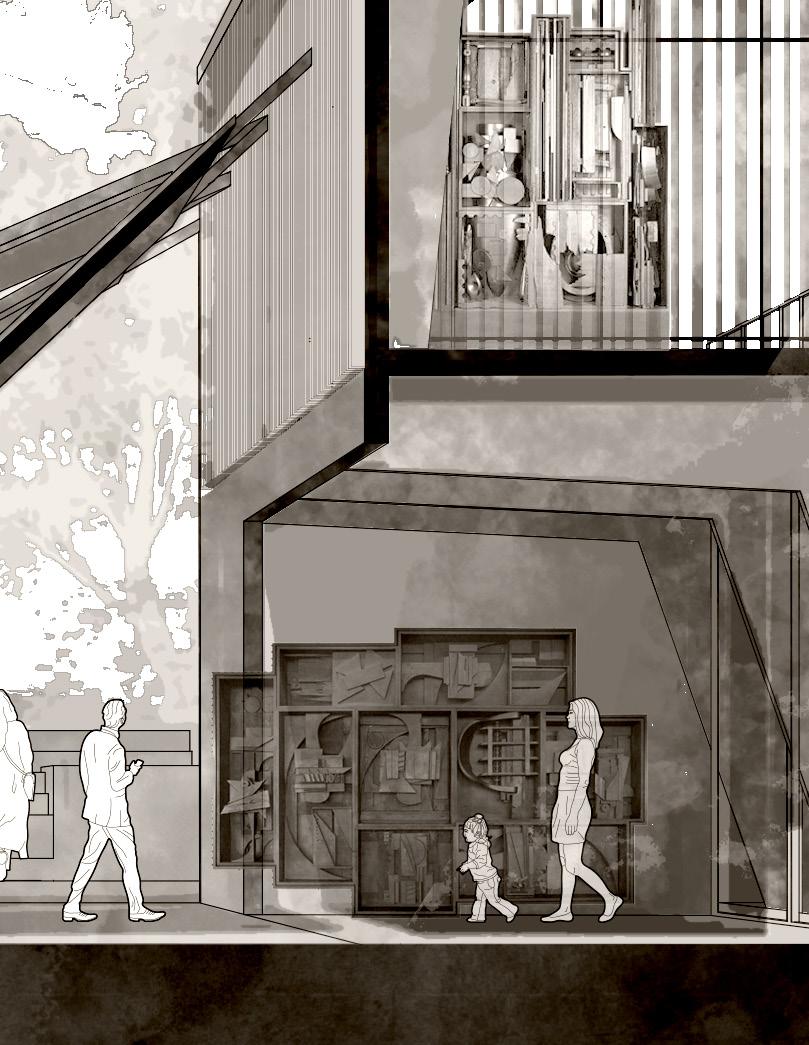
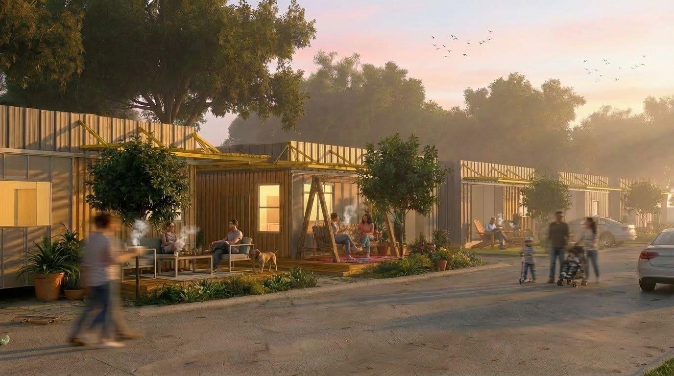
“UNTITLED”
FAYETTEVILLE, ARKANSAS
YEAR 5 - FALL 2025
PROFESSOR JOHN ENDA FOLAN AND MARY BETH WASHBURN
GROUP PROJECT WITH INTERIOR STUDENTS AUBYN BASKIN, BRANDI MEREDITH, ANNELIZABETH WILLIAMS, EMERSON FOLEY, FINLEY CONDON, EMMA ZENTHEOFER AND ARCHITECTURE STUDENTS EDWARD FRANKLIN, KIERSTIN HOOVER, TREY MELTON, JOHN BLAKE, STOCKTON PYLE, SYDNEY WINKLER, MACY WATSON, KATE VOSS, LAYLA RILEY
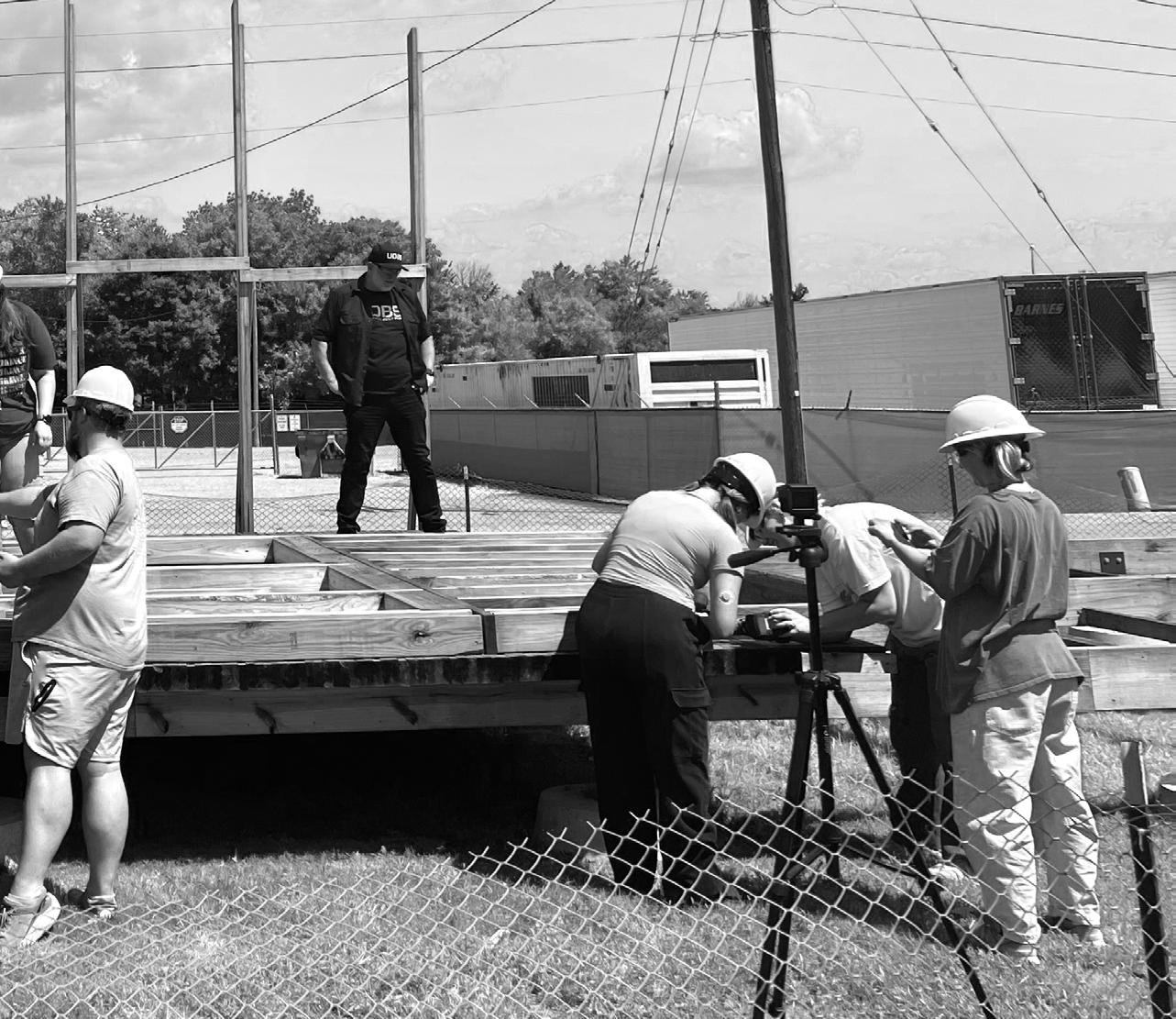
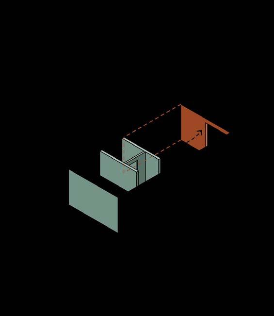
The Urban Design Build Studio in Fayetteville, Arkansas is working on John Enda Folan to deconstruct the past studio’s construction, evolve empowers students to use tools, understand their designs through a to be constructed in the community. The students’ deck construction
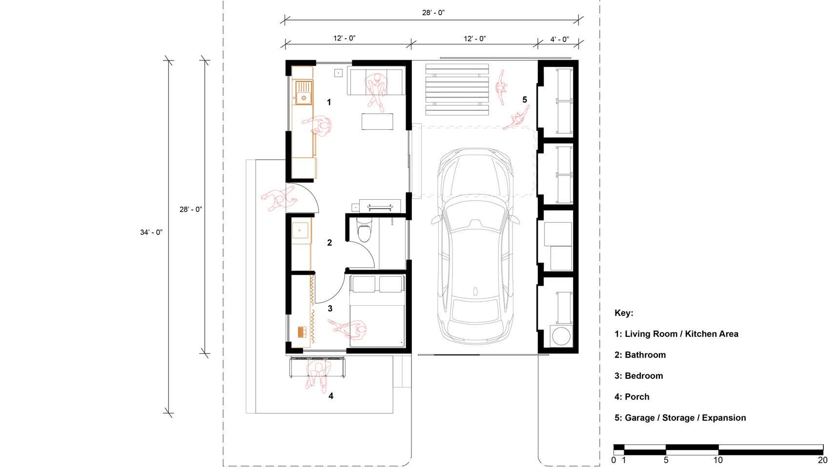
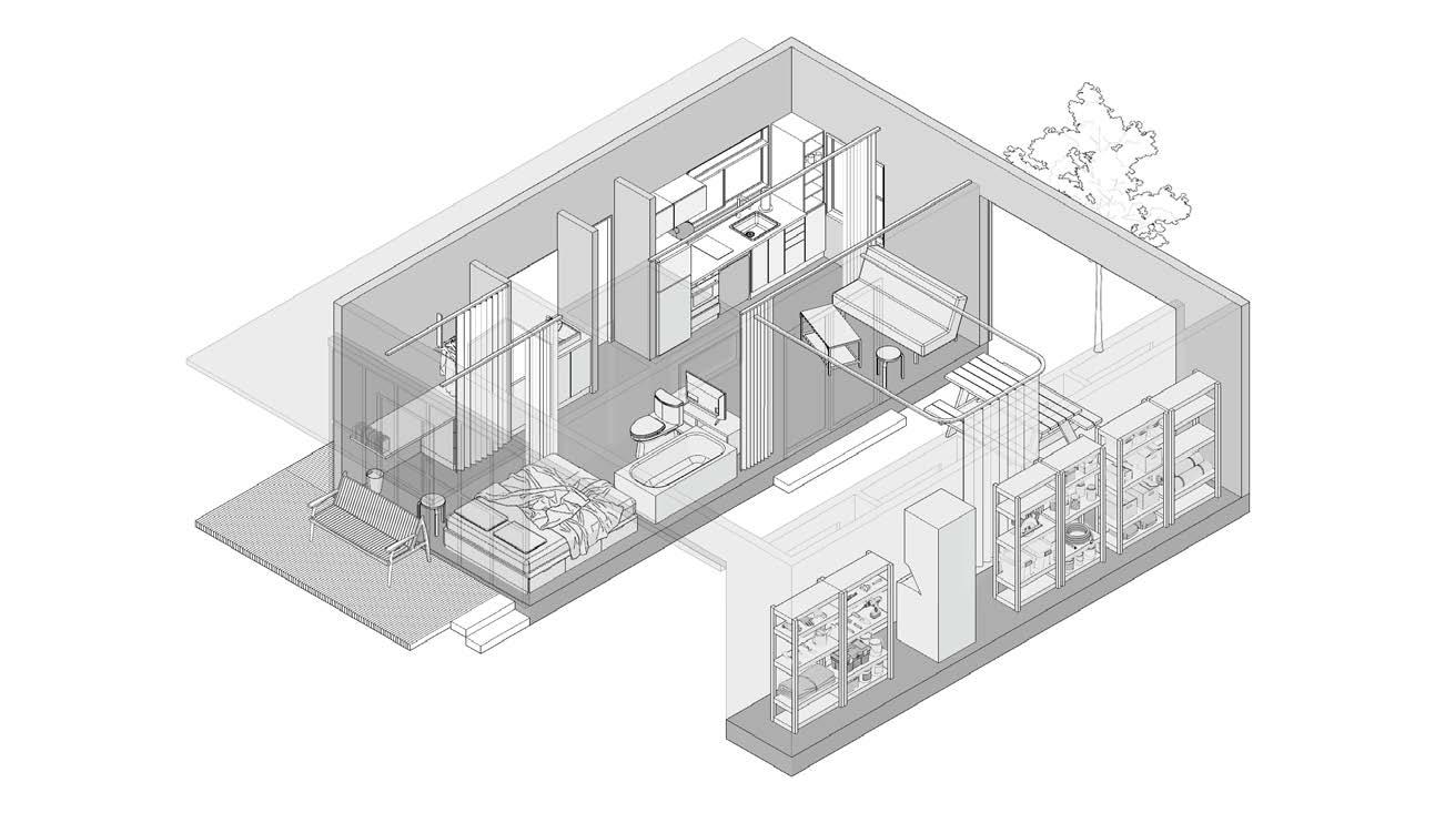
At the end of the semester students document their experiences thoroughly left us a floor plan and the carport expansion concept to work from. home to 12’x28’. The “Untitled” house from the 2025 Urban Design Build of the project, the appliances, closets, sinks, and counter tops, are consolidated opportunities. The homes are designed with neighbors and community
Below: Students deconstruct the previous iteration of “Untitled” project were spotted. This material would be used to construct the full-scale
on an ongoing affordable housing prototype called “Untitiled“. This twelve-person studio worked under evolve the design to reflect new constraints and priorities, and construct the framing for the house. The studio construction lens, and gives back to the community by working on a real-world affordable housing project construction passes inspection and will be part of one of the Untitled homes.
thoroughly and leave notes for the incoming students to continue the project. The students from the year prior Professor Folan directed us to use the floor plan as a starting place for our work and set the footprint for Build Studio is a small-footprint home with a carport for future expansion and personalization. The spine consolidated to one side of the home to maximize floor space and allow for a wide variety of expansion community in mind, with community gardens and porches to encourage connectivity
project to harvest the material. Material was then organized, inventoried, and treated for pests after termites full-scale framing sketch model students made later in the semester.
The house utilizes the carport as an expansion opportunity for the residents. The original plans of the house are conceptualized with a series of potential expansions in mind. Such customization allows users to tailor their house to their own needs and for their house to grow with them and their family.
Drawing by John Blake
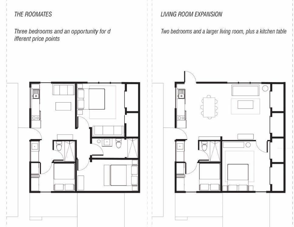
The Roommates
Three bedrooms of varying sizes for a variety of prices points for renters.
Living Room
This plan features a larger living room, two bedrooms, and a kitchen table.
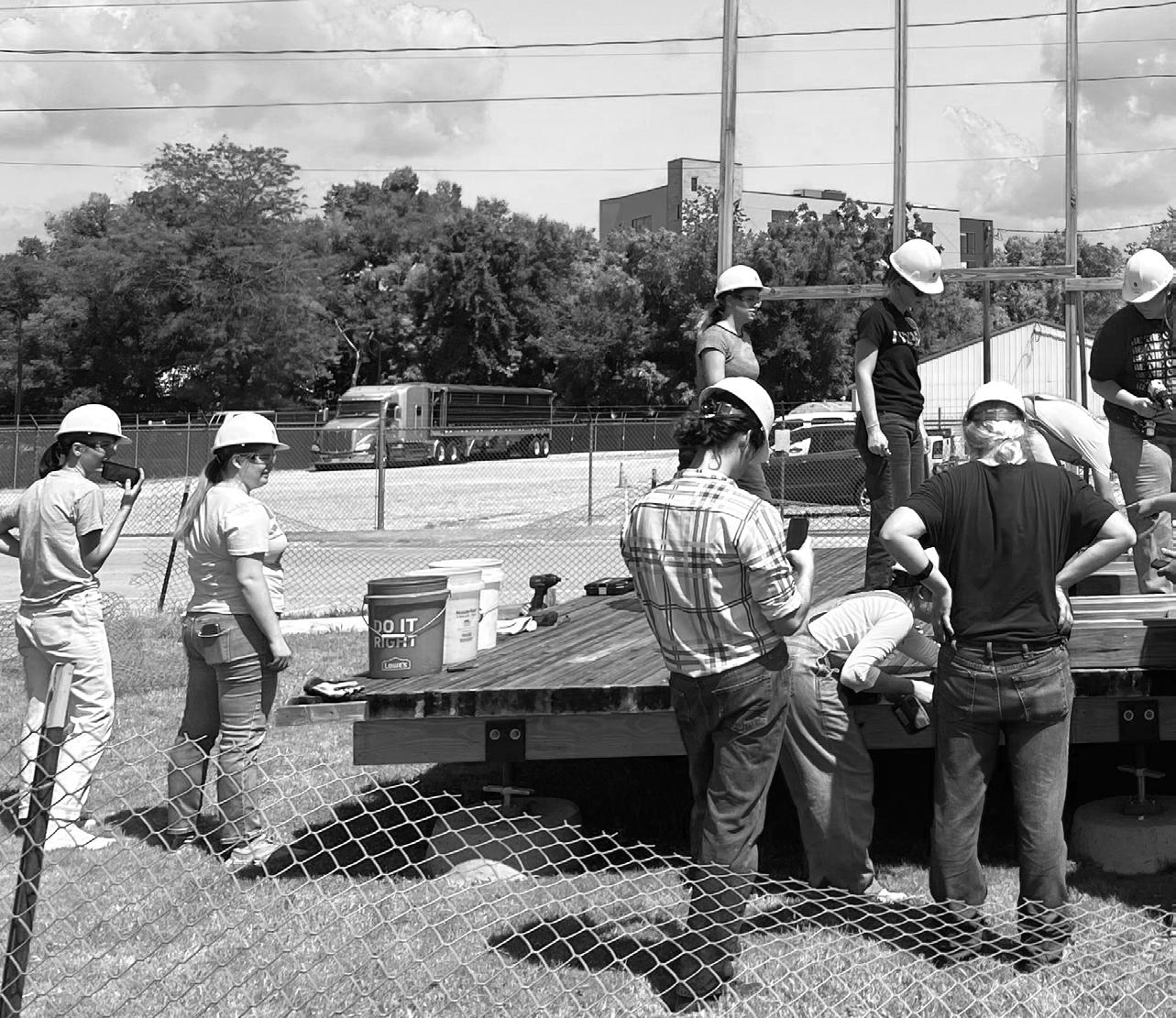
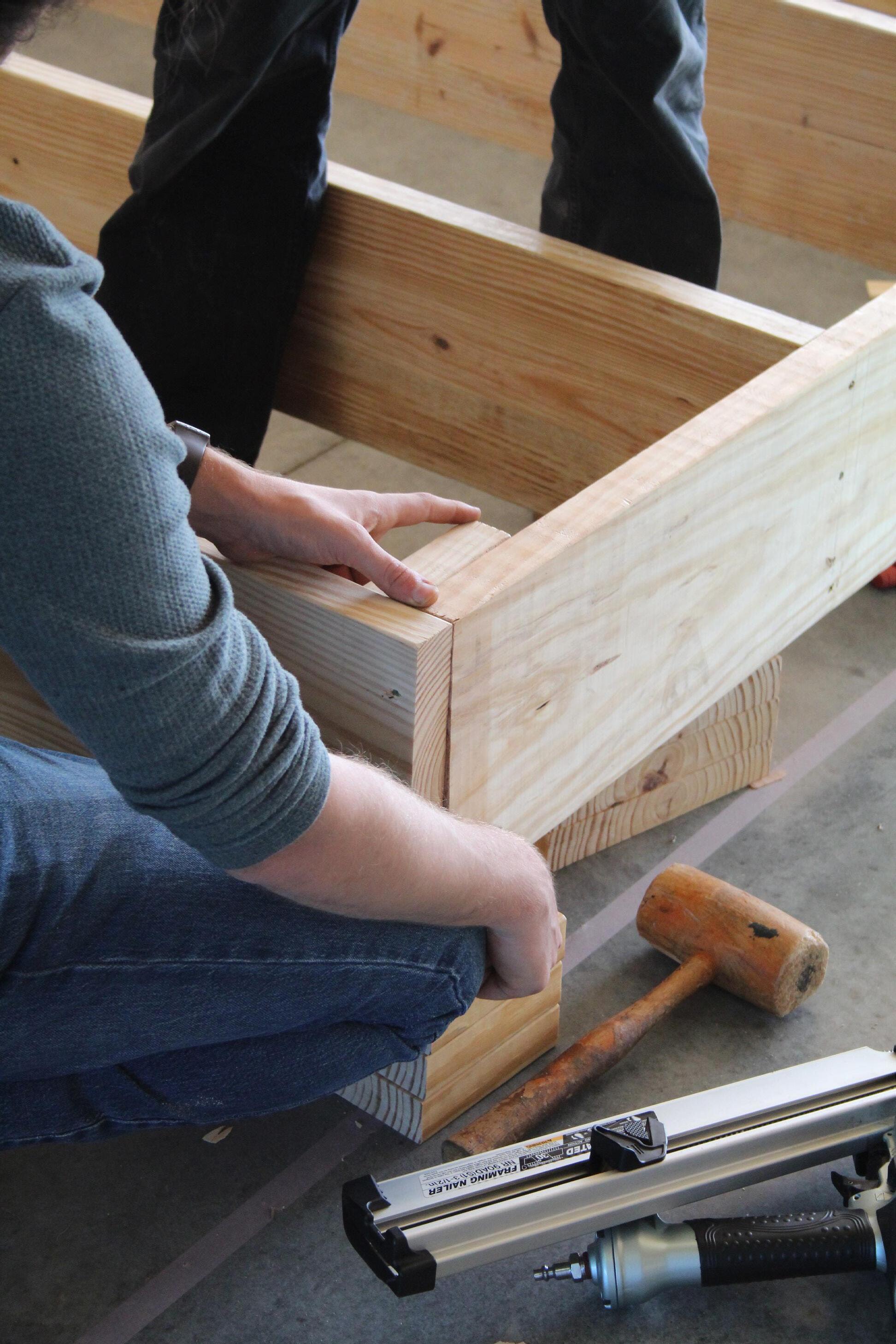
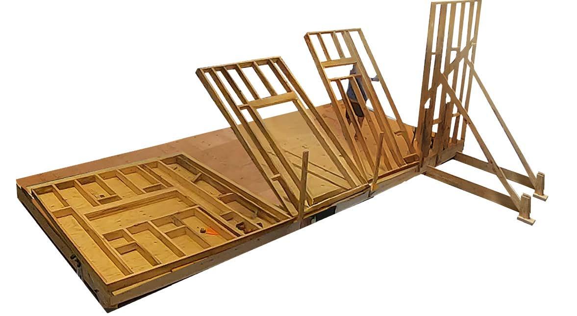
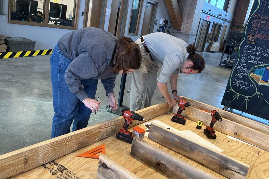
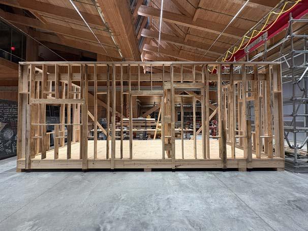
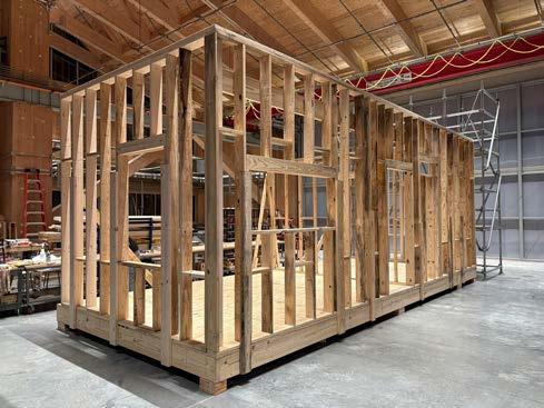
The group was tasked with framing the project. Working inside the Anthony Timberland Center, the team framed the deck, the exterior walls, and one interior wall. This exercise happened at the same time as design development and the construction became a full-scale sketch model to test ideas, understand scale, and educate students.
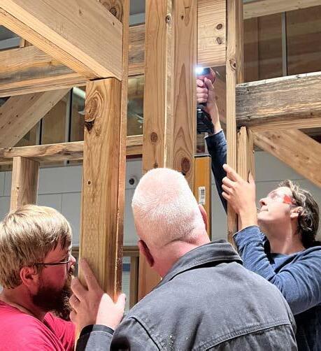
Professor John Folan shows students how to align sheathing on joists.
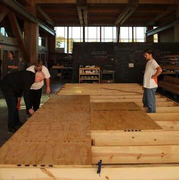
Deck after the installation of bridging
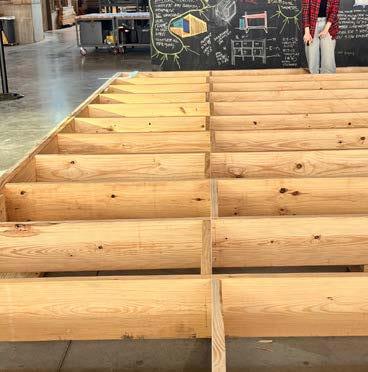
Students correcting the construction to ensure decking is up to code
Preparing to nail in the rim joist on the deck.
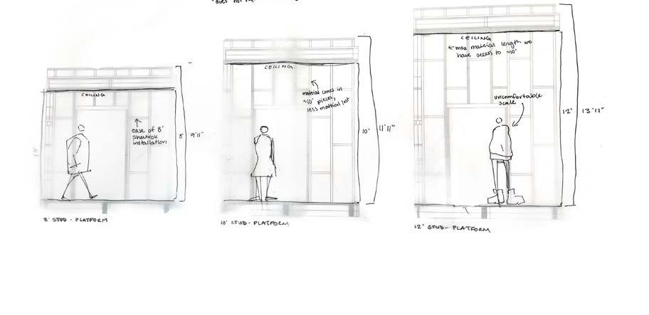
Top: A study weighs the benefits and consequences of 8’, 10’, and 12’ ceiling heights. This sketch was instrumental in deciding ceiling height. The group decided on an 8’ ceiling height to save on material cost and maintain coziness in the space.
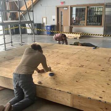
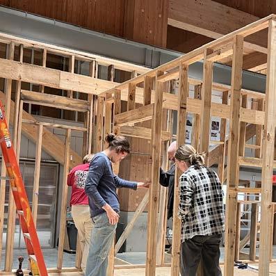
Bottom: The photo collage shows the way students sectioned the wall in order to tilt it up and reinforce with bracing. This method was used for every constructed wall, included the interior one.
The images above show stud wall assembly, securing the interior stud wall, and the overall framing students completed, which featured the deck, two exterior walls, and one interior wall.
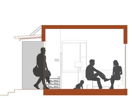
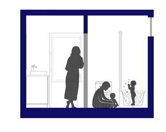
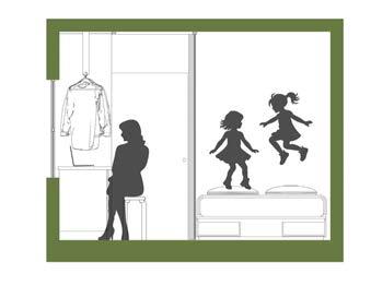
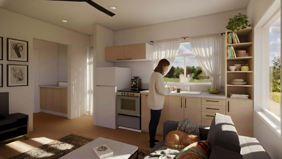
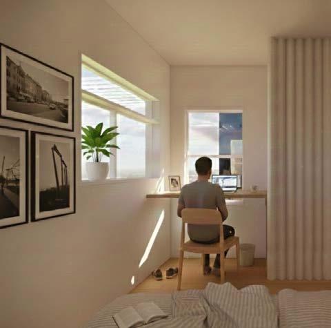
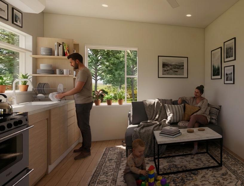
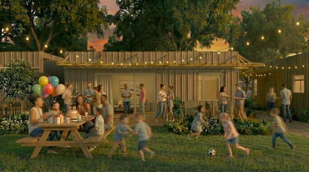
The top images capture the way various residents might use Untitled in their day-to-day lives. These domestic moments are what make the project: coming home from work and being greeted by your family, bathing your kids, or letting your little girls play on the bed while you work. It’s about organizing the space so that it is easy to have these moments.
Above: axonometric shows the density of the house. The curtains are used to divide up spaces and create various degrees of privacy throughout the house. Similarly, there are several degrees of inside and outside from interior to covered exterior and exterior. It was also important to the project to maximize storage space, which is seen in the shelves in the garage.
Right: The perspectives show the “Untitled“ house alive with people and life. Gemini AI-generated perspectives with post-processing in Photoshop. Images by John Blake, Sydney Winkler, Aubyn Baskin, Emerson Foley, and Finley Condon.
Drawings by Trey Melton
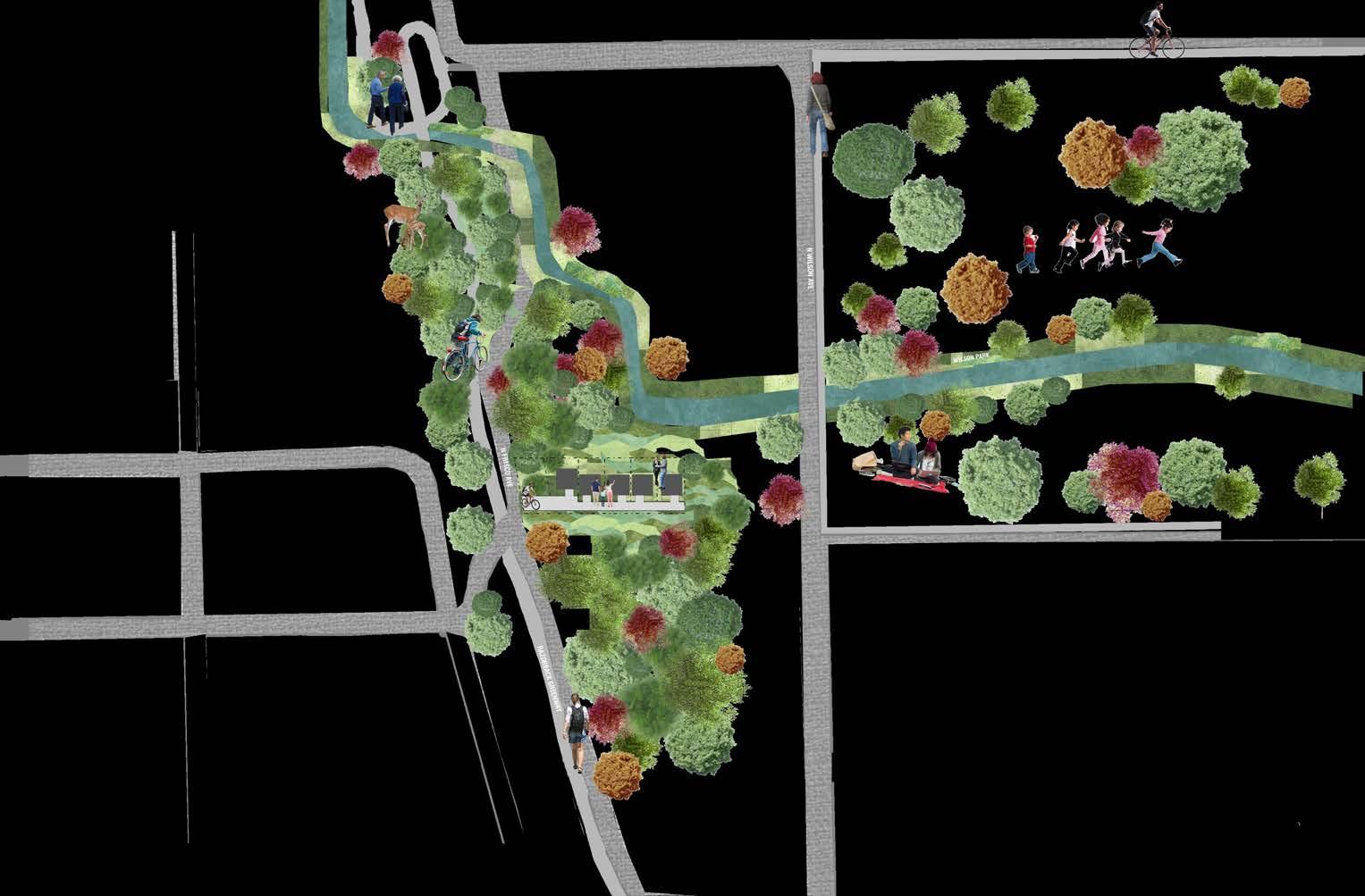
NThe relationship between the Untitled houses and their community at large is instrumental in the success of affordable housing projects. The group chose to study this through site analyses like the one above. The site for the project is located on the Greenway, a 40-mile long trail linking the towns of Northwest Arkansas. Scull Creek is shown in blue. The trails and green spaces are represented as well. The children playing in the upper right represents Wilson Park in Fayetteville, Arkansas. The above image was created by Sydney Winkler, Annie Williams, and Aubyn Baskin.
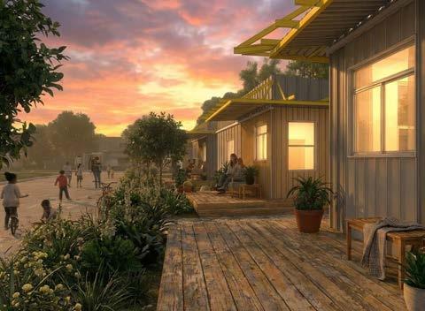
The rendering above shows the space between the Untitled houses and the way residents might use their porches. The space between the houses can be used for community gardens, bike parking, deck extensions, and more. The rendering is based on a model created by the team, which was placed in Gemini AI for rendering, and a series of the results were post-processed in Photoshop by John Blake.