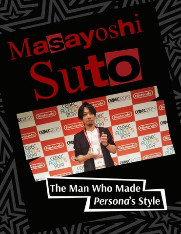

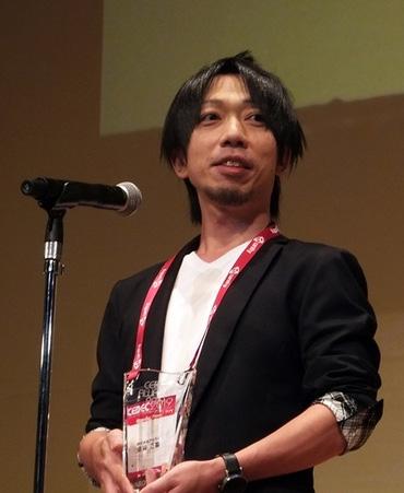
Masayoshi
Suto
The Man Who Made Persona’s Style
When one thinks of the art of video games, Most people’s minds go to the environments, the characters, the gameplay. Very rarely is the first thing that comes to mind the game’s UI. UI and menus act as purely functional aspects of a game, there to serve a purpose outside of the actual gaming experience. While effort is of course spent on keeping the look of the UI in line with the game at large, it’s not usually something worth admiring in its own right. The Persona franchise, most notably Persona 5 released in 2016, is where all of that turns on its head.
The Persona series is a series of JRPGs, or Japanese roleplaying games. The core component of the games is that you play the role of a high-school student who gets wrapped into supernatural happenings, awakening to a power called “Persona” and gaining the ability to fight malicious creatures called “shadows” in some otherworldly space. The main gameplay loop has you balancing your regular daily life with your other world travels and combat. This gameplay split leads to a lot of varying actions to take, and lots of menu and UI navigation as well. There’s the gameplay centered around building bonds with other characters, there’s various shops and overworld activities to do to gather materials or raise stats, there’s the actual combat itself; the list goes on. With how many different menus one would be navigating throughout the games, games that people will typically be pouring hundreds of hours into, it’s important that the menus be intuitive and appealing. It’s here where Masayoshi Suto comes into play, having aimed to make UI that was exactly that- “intuitive and casually guiding.”
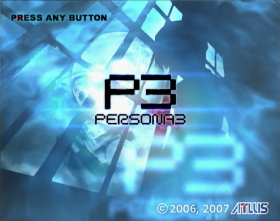
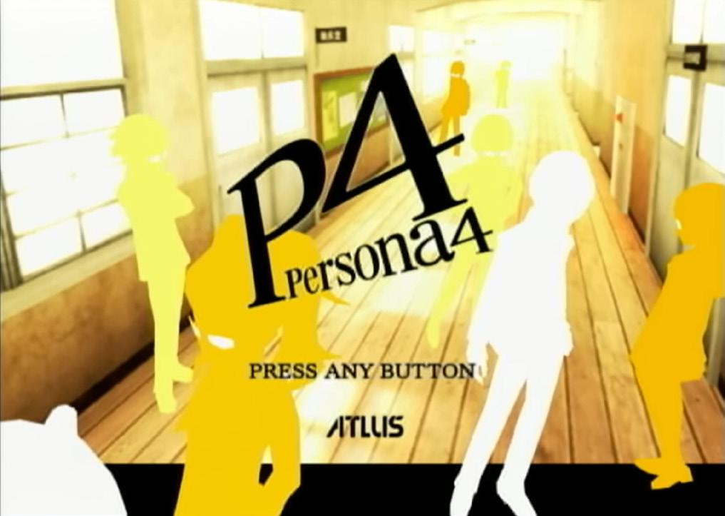
Masayoshi Suto joined ATLUS, the video game company behind such franchises as Shin Megami Tensei, Persona, Catherine and more, in 1999. He initially came on as a general designer, before beginning to work specifically on interface design. Persona 3 was his first game as an Interface Design Leader, and he would continue in that role for multiple other games leading up to Persona 5. Persona 5 was the biggest undertaking for him, as he served as both Chief Interface Designer and overall Art Director. From Persona 5 on he’s taken a slight step back, serving instead as an Interface Design Supervisor in most subsequent games, but the impact of his work on the franchise and especially Persona 5 is still felt to this day, permanently shifting the approach ATLUS takes with its UI and menu design.
Masayoshi Suto
When I was in elementary school my drawings were also 1st place in a lot of competitions, although I preferred to look at people’s drawings rather than draw myself. As I began playing Video games I enjoyed the way the characters were animated and how it all moved and decided from that point that I wanted to become a game designer.
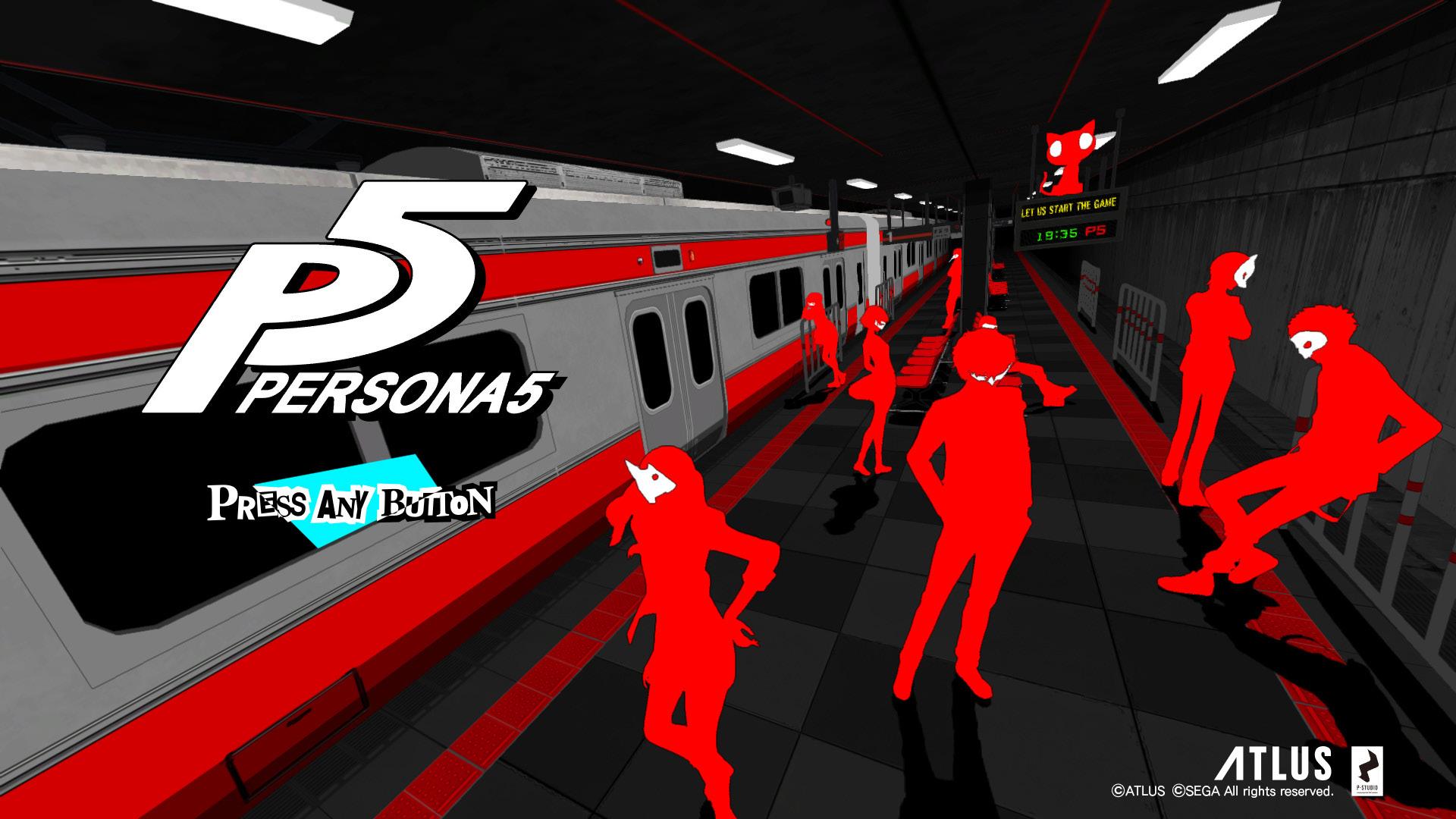
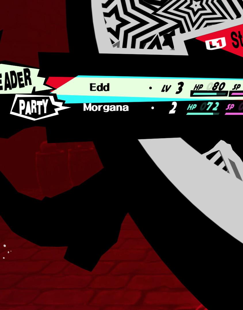
There are certain factors of Suto’s design process that are consistent across the three main-line games of Persona 3, 4, and 5 (And likely the other games he’s worked on as well, though we’ll be narrowing our scope to the Persona franchise). Most importantly is each game’s core color. A core color is selected for each entry in the series, and plastered all across the game. Each entry is recognizable for these colors alone- blue for 3, yellow for 4 and red for 5. From here, certain subcolors are selected to help break up or highlight information. For 3, a “moonlight yellow” was selected in line with the game’s narrative focus on the moon. 4 primarily continues to work in varying shades of yellow, into oranges and browns, though it also utilized stylized multi-colored lines reminiscent of TV color bars, again tying into a narrative theme of the game. Persona 5 however did its best to utilize only black and white as the sub-colors, helping the red stand out even more. Some electric blues and yellows are thrown in sparingly, but the red-blackwhite color scheme is the highlight of the game’s style.
As mentioned with Persona 3 and 4, certain aspects of the UI reflected narrative symbols, like the moon or TV. With Persona 5, this is extended into the entire style of the UI. Persona 5’s UI is deeply embroiled with a poppunk aesthetic- It has bold, jagged edges, sharp lines, and unique and dynamic textures. This is born from the game’s overall theme of rebellion- of fighting the machine of society, making your voice heard, and fixing the world around you with your own hands. The UI seeps with this attitude, the vigilante justice of the game even further pushed by the ransom note/magazine cutout text effect used throughout the menus.
The UI also does something incredibly unique regarding its inclusion of the figure. A technique that Suto and the ATLUS team first dabbled in with the game Catherine, a 3D model was referenced and posed interacting with the menu before being stylized into the 2D menu look. This effect leads to dynamic transitions between screens, and dramatic character poses plastered across the menu.
This technique is further explored in Persona 3 Reload by Suto’s successor, Tomohiro Kumagai. It’s an excellent way to bring the character-focused intentions of the game into the menu, having your player character interact with the menu as you do, and also serves to add characterization to them even outside of proper gameplay.
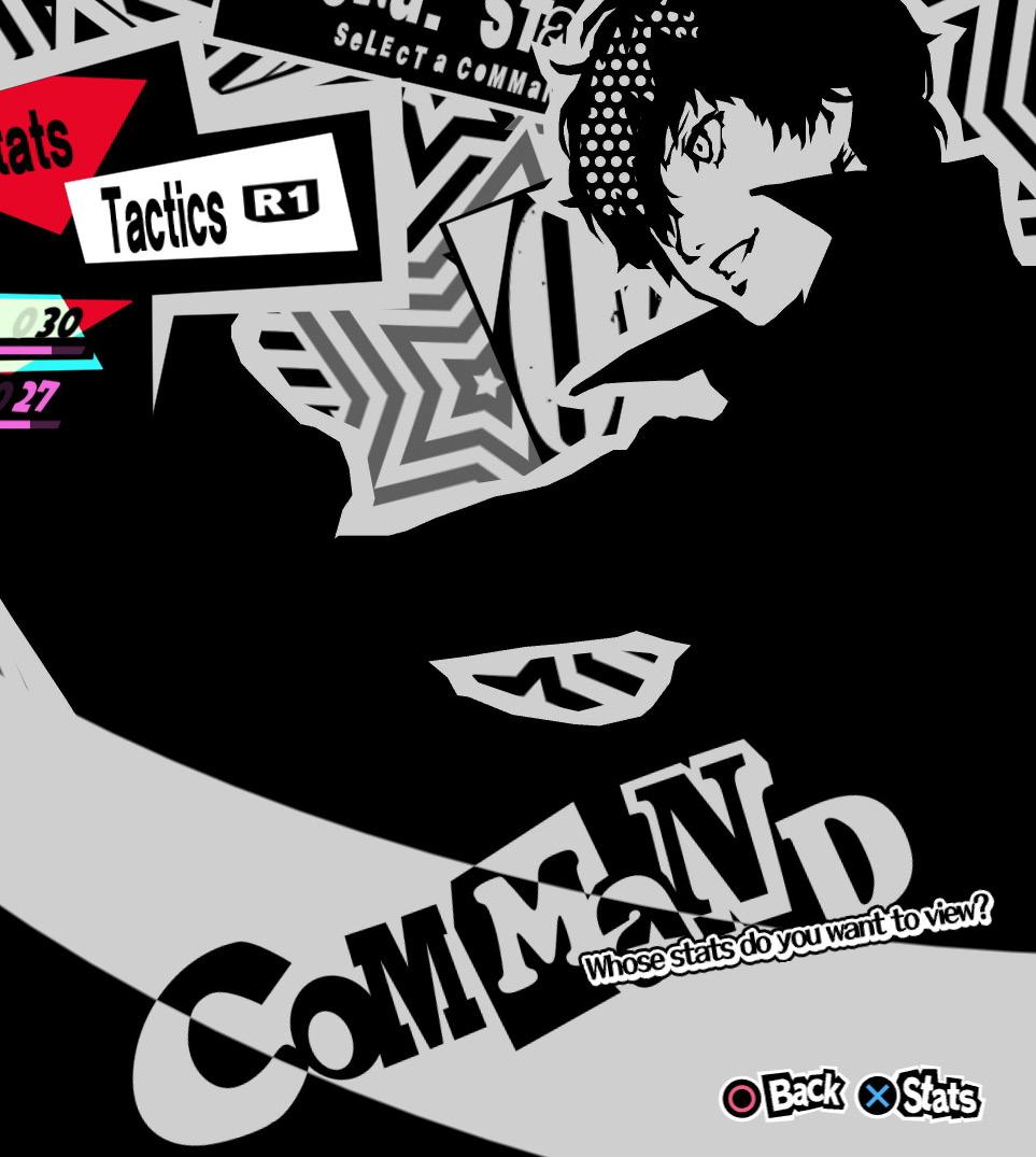
Even with all this style woven into the UI, it still does an excellent job at being functional and legible. Suto uses what he describes as “the nature of line of sight” to guide users through the information being provided to them. Bold, clear lines are drawn across the screen to bring a viewer’s eyes to the important text, and the layout and angles of these lines are adjusted live between screens to stay positionally aware based on the new text. The lighting/colors also push legibility, with high-priority information receiving high lighting and vice versa. This is how the UI can balance both functionality and style, making a menu players will never tire of having to navigate through.
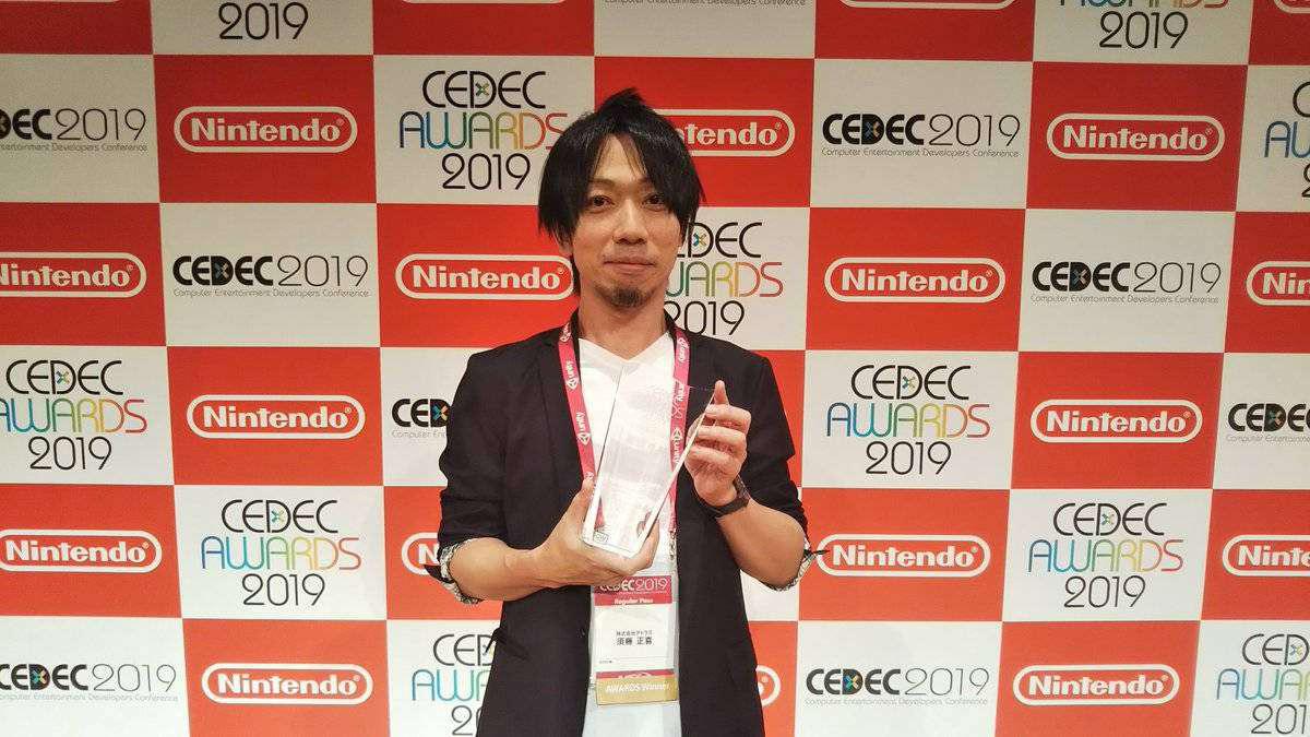
It’s really no wonder the UI of Persona 5 has garnered the attention it has. The stylish combat menu that surrounds the player character has been cosplayed at conventions, to the delight of many who wish to pose within the setup. Fans of the series joke that it’s the only franchise that can put menu screens in its trailers and get the audience excited at the sight of them. Masayoshi Suto spent many years working on UI design for ATLUS, and with Persona 5 he truly struck goldeven being awarded a CEDEC Award in Visual Arts in 2019 at the Computer Entertainment Developers Conference, Japan’s largest annual game developers conference. His work is still talked about to this day whenever game UI and design is discussed, and surely will continue to be discussed for many more years to come.
Bibliography
Alex. “Persona 5 Developer Interview About UI Design, Sound Design and Music.” Persona Central, 24 Nov. 2017, personacentral.com/persona-5-interview-ui-design-soundmusic
Reggy. “Panel on the Concept and Development Behind Persona 5’s UI.” Persona Central, 24 Nov. 2017, personacentral.com/persona-5-panel-concept-development-ui
Reggy. “Persona 5 UI Designer Masayoshi Sutoh Wins Visual Arts Award at CEDEC Awards 2019.” Persona Central, 5 Sept. 2019, personacentral.com/cedec-awards-2019-persona-5-masayoshisutoh-visual-arts