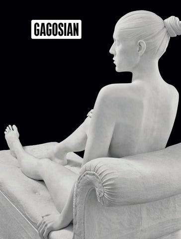
fter a year that put the ways we engage with the world into question, excitement is rising for reimagining our arts spaces and cultural institutions. In this issue William Middleton explores the newly unveiled Bourse de Commerce, François Pinault’s foundation for global contemporary art in Paris. Art historian and curator Constance Lewallen focuses on the 150-year history of the San Francisco Art Institute, its evolution, its pioneering presence, and the complexities the school faces in navigating its future. We reflect on the tremendous legacy of Eli Broad, whose philanthropy transformed art institutions, supported scientific innovations, spearheaded civic revitalization, and created groundbreaking educational opportunities. We call your attention to the Gallery Climate Coalition, a collaborative effort to motivate the art world to examine and change its habits in relation to climate change. Andisheh Avini’s conversation with Patrick Seguin about mid-twentieth-century architecture and design touches on Jean Prouvé’s mission to develop easily and rapidly built houses for refugees displaced by World War II and provides a deeply informed perspective on the creative business of celebrating the iconic figures of modern design. An exhibition at ArkDes in Stockholm, accompanied by an impressive new monograph, point us to the singular buildings and landscapes of the Swedish architect Sigurd Lewerentz. A series of recent exhibitions, publications, and a generous institutional gift on the part of Georg Baselitz lead to a dynamic conversation between the artist and Richard Calvocoressi, Max Hollein, and Katy Siegel. John Currin speaks with Natasha Stagg about his latest paintings—images of erotic sculptural assemblages depicted in grisaille—and his weaving together of many of his long-standing motivations: a devotion to art history, an affinity for sex and satire, and pleasure in the challenges of technical skill. Our cover features Reclining Woman, a marble sculpture from Damien Hirst’s celebrated Treasures from the Wreck of the Unbelievable, a series currently on view as part of a breathtaking exhibition that sets Hirst’s work in the incredible spaces of the Galleria Borghese, Rome, and alongside its historical collections. Alison McDonald, Editor-in-chief
54 On the Dot In the first of a two-part feature, John Elderfield discusses how dots found a special place in the vocabulary of painting with the work of the French artist Georges Seurat and continue to be used to this day, most famously by Damien Hirst and Yayoi Kusama.
62 An Eye on the Market Clare McAndrew heads Arts Economics, a Dublin-based research and consulting firm, which she founded in 2005, that works with international art fairs, dealers, trade associations, auction houses, and national and transnational public institutions. Here she speaks with the Quarterly’s Alison McDonald about the intricacies of her artmarket research.
66 Sigurd Lewerentz On the occasion of Sigurd Lewerentz: Architect of Death and Life at ArkDes, Stockholm (October 1, 2021–August 28, 2022), Gagosian director Mark Francis speaks with Kieran Long, director of ArkDes and cocurator of the exhibition; Adam Caruso, of Caruso St John Architects, the exhibition’s designers; and Swedish arts critic Anna Nittve about the research that went into the exhibition, the enduring legacy of Lewerentz, and the singular qualities of the revered architect and his work.
74 Eli Broad An homage, composed of statements from friends, artists, and colleagues.
92
Patrick Seguin Andisheh Avini speaks with the gallerist and publisher about his enduring passion for architecture, design, and art. Photo credits: Front cover: Damien Hirst, Reclining Woman, 2011, Carrara marble, 51 ¼ × 24 ⅞ × 61 ⅞ inches (130 × 63 × 157 cm), edition of 3 + 2 AP © Damien Hirst and Science Ltd. All rights reserved, DACS 2021. Photo: Prudence Cuming Associates Top row, left to right: Jean Prouvé, Maison des Jours Meilleurs, 1956. Photo: © Galerie Patrick Seguin João Menegussi and Calvin Royal III in Touché (2020), choreographed by Christopher Rudd. Photo: courtesy Matador Content Bottom row, left to right: Interior of the Bourse de Commerce – Pinault Collection © Tadao Ando Architect & Associates, Niney et Marca Architectes, Agence PierreAntoine Gatier. Photo: Patrick Tourneboeuf Installation view, Georg Baselitz: Archinto, Museo di Palazzo Grimani, Venice, May 19, 2021– November 27, 2022. Artwork © Georg Baselitz 2021. Photo: Matteo De Fina
46
Bourse de Commerce William Middleton writes about what makes the newest Pinault Collection space in Paris unique and speaks with artists about the singular experience of working with François Pinault.
76 John Currin: Monuments to Lust
110 Fashion and Art, Part 7: Inez & Vinoodh
Natasha Stagg reports on a trip to John Currin’s New York studio and his new paintings.
The photographers speak with Derek Blasberg about their practice, their art-historical influences, and the beauty of living in the gray area between fashion and art.
84 The San Francisco Art Institute Constance Lewallen marks the 150th anniversary of the San Francisco Art Institute, exploring the school’s evolution, its pioneering faculty, and the challenges and innovations necessary for its preservation.
100 Social Works: Kahlil Irving A portfolio of sculptures.
124 River Girl, Outer World For the third installment of our collaboration with pen America, dreaming Out Loud participant t. jahan reckons with matters of displacement, returning home, and labor, all with a surreal twist.
140 Gallery Climate Coalition Gallery Climate Coalition founders Victoria Siddall and Heath Lowndes speak with Adele Minardi from Gagosian, London.
162 The Clean Stream
Rare-book specialist Douglas Flamm speaks with Staffan Ahrenberg about the history and evolution of the storied publishing house.
Carlos Valladares investigates how our being at home, tied to the streaming platforms, is altering the form and content of film and television production.
150 Leaders in the Arts Chris Kraus and Hedi El Kholti, coeditors of the legendary press Semiotext(e), speak with Kandis Williams, the founder and editor of Cassandra Press, and Lisa Pearson, the founder and editor of Siglio Press.
154 Kon Trubkovich Historian Victoria Phillips speaks with the artist about his new paintings.
166 Thomas Houseago: Encountering Rodin Thomas Houseago and Amélie Simier, director of the Musée Rodin, Paris, speak with Gagosian director Richard Calvocoressi about contemporary sculpture and its foundation in Auguste Rodin’s radical forms.
118
Touché Choreographed for American Ballet Theatre during the onset of the pandemic, Christopher Rudd’s pas de deux, originally presented as a dance film, follows dancers João Menegussi and Calvin Royal III through a charged, vulnerable, and ultimately tender love story. In conversation with scholar Clare Croft, the artists reflect on the politics, poetics, and process of bringing this groundbreaking duet to life.
172 Building a Legacy Yayoi Shionoiri, executive director of the Chris Burden Estate and Nancy Rubins Studio and an art lawyer, speaks with the Quarterly’s Alison McDonald about the recent legal victory for the Burden Estate in Indonesia, how to navigate the blurry lines of fair-use law so as not to impinge on creative freedom, and how artists respond to the world around them, building on the work of earlier generations.
183 Game Changer: Anna Halprin
38
Georg Baselitz: Pulling Up the Image In celebration of five recent projects related to Georg Baselitz, Richard Calvocoressi, Max Hollein, and Katy Siegel speak with the artist and look at his prolific career.
Jacquelynn Baas celebrates the late choreographer, dancer, and teacher, showing the profound influence she had on the worlds of dance and art.
TABLE OF CONTENTS FALL 2021
144 Book Corner: Cahiers d’Art
Gagosian Quarterly, Fall 2021
Editor-in-chief Alison McDonald
Founder Larry Gagosian
Managing Editor Wyatt Allgeier
Published by Gagosian Media
Text Editor David Frankel
Publisher Jorge Garcia
Online Editor Jennifer Knox White Executive Editor Derek Blasberg
For Advertising and Sponsorship Inquiries Advertising@gagosian.com
Associate Editor Gillian Jakab
Distribution David Renard
Online Layouts Andie Trainer
Distributed by Pineapple Media Ltd
Design Director Paul Neale
Distribution Manager Alexandra Samaras
Design Alexander Ecob Graphic Thought Facility
Prepress DL Imaging
Website Wolfram Wiedner Studio
Cover Damien Hirst
Printed by Pureprint Group
Contributors Staffan Ahrenberg Andisheh Avini Jacquelynn Baas Georg Baselitz Bill Bell Maria Bell Derek Blasberg Richard Calvocoressi Adam Caruso Clare Croft John Elderfield Hedi El Kholti Douglas Flamm Mark Francis Larry Gagosian Joanne Heyler Max Hollein Thomas Houseago Kahlil Irving t. jahan Chris Kraus Constance Lewallen Kieran Long Heath Lowndes Vinoodh Matadin Clare McAndrew Alison McDonald João Menegussi William Middleton Adele Minardi Anna Nittve Lisa Pearson Victoria Phillips Calvin Royal III Christopher Rudd Ed Ruscha Antwaun Sargent
Patrick Seguin Yayoi Shionoiri Victoria Siddall Katy Siegel Amélie Simier Natasha Stagg Kon Trubkovich Carlos Valladares Inez van Lamsweerde Kandis Williams Thanks Karrie Adamany Richard Alwyn Fisher Ashleigh Barice Priya Bhatnagar Erwin Bouroullec Ronan Bouroullec Michael Cary Serena Cattaneo Adorno Brooke Chartash Michael Childress Iu-Hui Chua Vittoria Ciaraldi Annie Cicco Adam Cohen Jeanne Collins John Currin Viviane Eng Chrissie Erpf Andrew Fabricant Elsa Favreau Kate Fernandez-Lupino Jesse Frohman Natasha Garcia-Lomas Brett Garde Nicole Gervasio Darlina Goldak
Rosa Gubay Jeff Gunderson Jacqueline Hulburd Sarah Jones Alexa Kemalyan Marc Kroop Sabyrzhan Madi Lauren Mahony Tahani Marie Samiri Rob McKeever Deborah McLeod Lily Mortimer Olivia Mull Louise Neri Albert Oehlen Kathy Paciello Kelly M. Quinn Stefan Ratibor Virginia Regan Coleman Bridget Riley Antwaun Sargent Laurence Seguin Georgia Siampalioti Eeo Stubblefield Tatiana Trouvé Kelsey Tyler Kara Vander Weg Janique Vigier Hanako Williams Marina Williams Millicent Wilner Ottilie Windsor Sarah Womble Kelso Wyeth Eirian Yem Jason Ysenburg
5
CHANEL CELEBRATES N°5 In 1921, Gabrielle Chanel has an idea for a perfume which she calls N°5, her lucky number. This vision of creation owes its singularity to the permanence of one perspective: the idea above all else. In 2021, a High Jewellery collection celebrates the House’s emblematic number with a creative act that combines the audacity of a technical challenge with the freedom of an original approach. CHANEL High Jewellery creates the N°5 Collection, with a centrepiece that reveals a unique geometric virtuosity: a necklace whose design reflects all the defining features of the N°5 perfume bottle, composed of more than 700 diamonds set around a diamond specially cut to weigh 55.55 carats. The perfection of the idea has determined the weight in carats. This is an unprecedented approach: to start with a rough diamond, aiming not for the greatest weight but for the perfection of the stone, cut to the exact dimensions of an idea. Diamonds are eternal. To CHANEL, éternité, the French word for “eternity,” is first and foremost an anagram of étreinte, the word for “embrace.” As such, this is how the House defines creation: an embrace between matter and spirit, which alone can give birth to a style. CHANEL reaffirms it today: creation is eternal.
chanel.com
N°5 NECKLACE IN WHITE GOLD AND DIAMONDS, FEATURING A 55.55-CARAT EMERALD-CUT DFL TYPE IIA DIAMOND.
TOWARDS A DREAM
Fall Winter 2021 2022
Amazona bags, 2021
loewe.com
6 Place Vendôme
Paris
repossi.com
CONTRIBUTORS Yayoi Shionoiri
Richard Calvocoressi
Yayoi Shionoiri serves as executive director to the Estate of Chris Burden and the Studio of Nancy Rubins, where she is responsible for stewarding Burden’s art-historical legacy and promoting Rubins’s ongoing artistic practice. She has degrees from Harvard University, Cornell Law School, and Columbia University. Photo: Munemasa Takahashi
The scholar and art historian Richard Calvocoressi has served as a curator at Tate, London, as director of the Scottish National Gallery of Modern Art, Edinburgh, and as director of the Henry Moore Foundation. Calvocoressi joined Gagosian in 2015.
Georg Baselitz Painter, printmaker, and sculptor, the German artist Georg Baselitz is a pioneering postwar artist who rejected abstraction in favor of recognizable subject matter, deliberately employing a raw style of rendering and a heightened palette in order to convey direct emotion. Photo: Martin Müller
Katy Siegel Katy Siegel is the Thaw Endowed Chair at Stony Brook University and senior research curator at the Baltimore Museum of Art. Her exhibitions include Postwar: Art Between the Pacific and the Atlantic, 1945–1965 at the Haus der Kunst, Munich, and High Times, Hard Times: New York Painting, 1967–75. She is the author of Since ’45: America and the Making of Contemporary Art.
Inez van Lamsweerde & Vinoodh Matadin The photography team of Inez and Vinoodh seems endlessly able to explore new visual territories. In the 1990s they were among the first to show the possibilities of digitalimaging technology as a creative medium, and their signature pairing of visual seduction with provocative narratives infused new ideas into photography. Since the early 1990s they have created groundbreaking editorial for such publications as V Magazine, the New York Times Magazine, W Magazine, and American, British, French, and Italian Vogue. Their innovative approach has also featured in campaigns and films for fashion houses including Balenciaga, Calvin Klein, Chanel, Dior, Gucci, and Valentino.
28
Max Hollein Appointed director of New York’s Metropolitan Museum of Art in April 2018, Max Hollein is responsible for guiding the museum’s artistic vision and all of its programming, research, and collection initiatives.
Christopher Rudd Christopher Rudd is a Jamaicanborn dance maker. Having trained at Armour Dance Theatre, the New World School of the Arts High School, and the Dance Theatre of Harlem School Summer Intensive, he has performed with the Carolina Ballet, Les Grands Ballets Canadiens, the Alberta Ballet, and Cirque du Soleil. Rudd has choreographed for the American Ballet Theatre, the Alvin Ailey School, Duke University, Harlem Stage’s E-Moves, and others. In 2015, he founded RudduR Dance, which has presented works globally and made its SummerStage debut in a Juneteenth Tribute in 2020. A Guggenheim Choreography Fellow in 2019, Rudd is currently working with Works & Process at the Guggenheim and New Victory Theater to develop Witness.
Clare Croft Clare Croft is a dance theorist, historian, dramaturge, curator, and associate professor of American culture at the University of Michigan. She is the author of Dancers as Diplomats: American Choreography in Cultural Exchange; the editor and curator of the anthology and website Queer Dance: Meanings and Makings; and the producing curator of the explode Queer Dance Festival.
Calvin Royal III Calvin Royal III began his formal dance training at the Pinellas County Center for the Arts at Gibbs High School in St. Petersburg, Florida. In April 2006, he was a finalist at the Youth America Grand Prix Scholarship Competition and was awarded the Ethan Stiefel Scholarship to attend American Ballet Theatre’s Jacqueline Kennedy Onassis School. Royal joined ABT II (now ABT Studio Company) in 2008, and the Main Company as an apprentice in 2010. In 2020, he was appointed Principal Dancer. He has soared in numerous ABT productions of Swan Lake, Manon, Fancy Free, Apollo and Romeo & Juliet. He has been named the 2020/21 artist-in-residence at Vail Dance Festival, in Vail, Colorado.
Constance Lewallen Constance Lewallen is adjunct curator at the University of California, Berkeley Art Museum and Pacific Film Archive, where she was first matrix curator, subsequently senior curator, and organized many major exhibitions.
João Menegussi Originally from Brazil, João Menegussi began his professional dance studies at Tanz Akademie Zürich in 2012. While there, he performed with Ballett Zürich in Giselle, and also participated in the Tanz Prize Gala. Menegussi joined the American Ballet Theatre Studio Company in 2016, becoming a member of the corps de ballet in 2018. His repertoire includes the Spanish Dance in Alexei Ratmansky’s Nutcracker, a featured role in Deuce Coupe, as well as roles in all of the company’s full-length ballets.
John Elderfield John Elderfield is chief curator emeritus of painting and sculpture at New York’s Museum of Modern Art and was formerly the inaugural Allen R. Adler, Class of 1967, Distinguished Curator and Lecturer at the Princeton University Art Museum. He joined Gagosian in 2012 as a senior curator for special exhibitions.
29
R A LPH L AUR EN
Adele Minardi
Victoria Phillips
Adele Minardi joined Gagosian in 2013. Based in London as an artists’ liaison and exhibitions coordinator, she is a member of the gallery’s sustainability task force.
Victoria Phillips is the author of Martha Graham’s Cold War: The Dance of American Diplomacy. A visiting fellow in the Department of International History at the London School of Economics (LSE), Dr. Phillips runs the school’s History, Culture and Diplomacy project and is the director of the Cold War Archival Research project (CWAR).
Victoria Siddall
Carlos Valladares
Victoria Siddall is board director at Frieze. She has worked with Frieze since 2004 and previously held the position of global director, overseeing the running of all four Frieze Art Fairs in London, New York, and Los Angeles. Siddall is a founding member of the Gallery Climate Coalition, a trustee of the Ampersand Foundation, and chair of the board of trustees of Studio Voltaire.
Carlos Valladares is a writer, critic, programmer, journalist, and video essayist from South Central Los Angeles, California. He studied film at Stanford and began his PhD in History of Art and Film & Media Studies at Yale University in fall 2019. He has written for the San Francisco Chronicle, Film Comment, and the Criterion Collection. Photo: Jerry Schatzberg
Kahlil Irving
Heath Lowndes
t. jahan
Born in San Diego, California, in 1992, Kahlil Irving has an MFA from the Sam Fox School of Design and Visual Arts, Washington University, St. Louis, and a BFA from the Kansas City Art Institute. In 2019, Callicoon Fine Arts mounted his second solo exhibition in New York, Black ice. He was awarded a Louis Comfort Tiffany Foundation Biennial Award in 2019 and a Joan Mitchell Foundation Grant in 2020. In the fall of 2021, Irving will participate in the New Museum Triennial, cocurated by Jamillah James and Margot Norton.
Heath Lowndes is managing director and cofounder of Gallery Climate Coalition (GCC), which he has led since its launch in October 2020. GCC is an international charity and membership organization set up to provide sector-specific resources and guidelines for environmental sustainability.
t. jahan is a writer working on a children’s book, a novel set in 1970s Bangladesh, and narratives and memoirs intended to bring awareness to the Asian experience of immigration and diaspora. Their work has been published in The Margins, pen America’s dreaming Out Loud Anthology, NYWC’s The Journal, and more.
Kon Trubkovich Kon Trubkovich was born in Moscow in 1979 and now lives in New York. His work appears in the collections of the Whitney Museum of American Art, New York, the Hood Museum of Art, Hanover, New Hampshire, and others. Solo exhibitions include No Country for Old Men, at MoMA PS1, New York, in 2006, and Kon Trubkovich, Joslyn Art Museum, Omaha, Nebraska, in 2015. Leap Second, a monograph on the artist’s work edited by Cay Sophie Rabinowitz, was published by OSMOS in 2015. Photo: Jesse Frohman
32
Clare McAndrew Clare McAndrew is a cultural economist specializing in the arts, antiques, and collectibles markets. In 2005, she founded the Dublin-based firm Arts Economics, which works with a network of private consultants and academic scholars to provide art-market research, analysis, and consulting services to the global art trade and financial sector.
Lisa Pearson Lisa Pearson is a publisher, editor, and designer as well as the founder of Siglio Press, an independent publishing house driven by a feminist ethos and committed to publishing uncommon books that live at the intersection of art and literature. She lives and works in the Hudson River Valley, New York.
Patrick Seguin Patrick Seguin is the founder of the Galerie Patrick Seguin, Paris, which specializes in twentieth-century furniture designed by French architects. He is a member of the Compagnie Nationale des Experts and of the Syndicat National des Antiquaires.
Andisheh Avini Andisheh Avini is an artist and a senior director at Gagosian, New York, where he has worked for more than twenty-five years. He works with a number of the gallery’s artists and estates, including Adam McEwen, Piero Golia, and the estates of Steven Parrino and Duane Hanson. He also plays an integral role in curating and producing the gallery’s numerous exhibitions and presenting art fairs.
Staffan Ahrenberg Staffan Ahrenberg is a Swedish art collector, entrepreneur, film producer, and the owner and publisher of Cahiers d’art, the legendary journal that he relaunched in 2012. In 2018, Ahrenberg was honored as a Chevalier de l’ordre des arts et des lettres in France. Photo: Staffan Ahrenberg Archive
William Middleton The Paris-based writer William Middleton is the author of Double Vision, a biography of the legendary art patrons and collectors Dominique and John de Menil, published in 2018 by Alfred A. Knopf. He has contributed to such publications as W, Vogue, Harper’s Bazaar, Architectural Digest, House & Garden, Departures, Town & Country, the New York Times, and T.
34
Amélie Simier
Anna Nittve
Amélie Simier holds a diploma from the École du Louvre and the École Nationale du Patrimoine. As an art historian, she’s been working on modern sculpture and sculptors for the last two decades, as well as on the artist’s studio. She has recently been appointed director of the Musée Rodin in Paris.
Anna Nittve is an art critic and art historian based in Stockholm. As a regular contributor to Svenska Dagbladet, she reviews exhibitions in Sweden and abroad.
Adam Caruso
Jacquelynn Baas
Adam Caruso was born in Montreal and studied architecture at McGill University. He established Caruso St John Architects with Peter St John in 1990. The practice has offices in London and Zurich and has built throughout Europe, undertaking projects ranging in scale from major urban developments and cultural projects to intricate interventions in complex historic settings.
Jacquelynn Baas is a cultural historian, writer, curator, and director emeritus of the University of California, Berkeley Art Museum and Pacific Film Archive. Her books include Buddha Mind in Contemporary Art (2004), Smile of the Buddha: Eastern Philosophy and Western Art from Monet to Today (2005), and most recently Marcel Duchamp and the Art of Life (2019).
Natasha Stagg
Kieran Long
Mark Francis
Natasha Stagg’s books Surveys and Sleeveless: Fashion, Media, Image, New York 2011–2019 were published by Semiotext(e). Her writing also appears in the books You Had to Be There: Rape Jokes, by Vanessa Place, Intersubjectivity, Volume 2, edited by Lou Cantor and Katherine Rochester, Excellences & Perfections, by Amalia Ulman, and The Present in Drag, edited by DIS, among others.
Kieran Long is the director of ArkDes, Sweden’s National Centre for Architecture and Design. He has twenty years of experience in architecture and design, first as a writer, critic, and teacher and more recently as a curator. In 2012 he worked with David Chipperfield to curate the Venice Biennale of Architecture.
A director at Gagosian since 2002, Mark Francis was formerly founding director and chief curator of the Andy Warhol Museum, Pittsburgh. He has been a curator at the Centre Pompidou, Paris; the Fruitmarket Gallery, Edinburgh; the Whitechapel Art Gallery, London; and the Museum of Modern Art, Oxford, England.
Thomas Houseago Thomas Houseago was born in 1972 in Leeds, England. He studied at Jacob Kramer College, Leeds, from 1990 to 1991, received a BA in 1994 from Saint Martin’s School of Art, London, and studied at De Ateliers, Amsterdam, from 1994 to 1996. He lives and works in Los Angeles. Photo: Amanda Demme
36
GEORG BASELITZ
In celebration of five recent projects related to Georg Baselitz, Richard Calvocoressi, Max Hollein, and Katy Siegel speak with the artist and look at his prolific career.
38
PULLING UP THE IMAGE
39
RICHARD CALVOCORESSI We are celebrating five sep-
arate projects related to Georg Baselitz: First of all, his astonishingly generous gift of six of the earliest upside-down portraits from 1969 to New York’s Metropolitan Museum of Art. Sec ond, t he ex h ibit ion of new work s, Springtime, at Gagosian in New York this past spring. For the first time in Georg’s career, objects are attached to these canvases, rather like collage. The fact that they’re women’s nylon stockings introduces an erotic or fetishistic element that is also new in his art, although it recalls Dada and Surrealist artists from an earlier period, such as Man Ray, Francis Picabia, and Hans Bellmer. But it has to be said that Baselitz has an obsession with legs and feet going right back to the 1960s, if you recall that extraordinary cycle P.D. Füsse [P.D. (Pandemonium) feet, 1960–63]. Third, an exhibition of new work at the Museo di Palazzo Grimani, Venice. This can be seen until November 27, 2022, including the period of that year’s Venice Biennale. It’s a longterm installation in this wonderful palazzo, for which the artist has painted a series of portraits entitled Archinto, inspired by Titian’s two portraits of Cardinal Filippo Archinto, one in the collection of the Metropolitan, and the other, showing Archinto half-concealed by an extraordinary veil, in the Philadelphia Museum of Art. There were empty niches in the palazzo, and Georg generously created a series of colorful site-specific canvases for them. 40
Finally there are two publications: a monograph by me—the first in English—based on several years’ research, published by Thames & Hudson; and a book published by Gagosian, reproducing a selection of Elke Baselitz’s photographs of her husband’s painting and sculpture studios in Imperia, Italy, on the Mediterranean. This second book, covering roughly a twelve-year period, from 2007 to 2019, is a unique record of progress on a large number of paintings, sculptures, and works on paper and offers invaluable insight into Georg’s working methods. There are also a few happy snapshots of his family enjoying life in the sun—swimming, eating in a local trattoria, and so on. Let’s begin with the gift of six portraits to the Met. Max, as the museum’s director, would you take us through how this came about? Perhaps you could also provide insights into the pivotal importance of these first upside-down portraits, from 1969? MAX HOLLEIN It’s a most generous gift by the artist and his family. Georg made the offer on the occasion of the Met’s 150th anniversary, asking whether we’d be interested in having these paintings in our collection. I could not have been more pleased and excited, of course, not only because they are such landmarks within Georg’s oeuvre but also because they’re outstanding paintings within all of art history. And they find a proper home in the Met, not only in our twentieth-century collection—we have other important work by Georg there—but also in the tradition of portraiture.
These, for me, are outstanding works. Among the first works in which Georg used his strategy of inversion, they also clearly show him pushing himself more broadly, trying to make the process more complicated and finding a new way of painting. Because they’re portraits of friends, it was probably even more challenging for Georg to find a way to ensure that they’re first and foremost about the organization of color and form, and that the picture becomes two-dimensional, less about the motif and more about the surface. They resonate clearly with this deeply rooted idea of figuration, but they find a very different way of expressing a painterly attitude. RC I think it would be very interesting to hear from Georg about these works and how they came about. GEORG BASELITZ I made many different things before I started to paint upside down, and I was never happy with the result. At a certain point I had this idea to bring a completely different and radical point of view to painting: to put the paintings upside down, to get away from the idea of realistic depiction and to focus on painting itself. The first time these paintings were shown, at Franz Dahlem’s gallery at the Cologne art fair, I anticipated a big reaction, but to my surprise, there was no feedback at all. People didn’t even realize what was happening—they thought, It’s a joke, which it certainly wasn’t. For me, there was a deeper meaning and intention behind putting the motif in painting upside down.
Previous spread: Installation view, Georg Baselitz: Archinto, Museo di Palazzo Grimani, Venice, May 19, 2021–November 27, 2022. Photo: Matteo De Fina Opposite left: Georg Baselitz, Porträt Elke I (Portrait of Elke I), 1969, synthetic resin emulsion paint on canvas, 63 ¾ × 51 ¼ inches (162 x 130 cm). Photo: Jochen Littkemann, Berlin Opposite right: Georg Baselitz, Versperrter Maler (Blocked Painter), 1965, oil on canvas, 63 7⁄8 × 51 1⁄8 inches (162 × 130 cm), MKM Museum Küppersmühle für Moderne Kunst, Duisburg, Germany, Collection Ströher. Photo: Jochen Littkemann, Berlin This page: Installation view, Georg Baselitz: Archinto, Museo di Palazzo Grimani, Venice, May 19, 2021–November 27, 2022. Photo: Matteo De Fina
As for the decision to give those paintings to the Metropolitan Museum, it’s one of the most important museums in the world, if not the most important museum in the world. And walking through it, you see art from all over the world. That said, my personal impression is that there isn’t a lot of German art in this museum. And you see this omission in other institutions throughout the world as well. So I wanted to know if it’s possible to bring those typical European paintings into the American context, and to see how they will be integrated into this collection. RC Let’s go back in your career to the Helden (Heroes) paintings of the mid-1960s. Katy, you’ve written very interestingly about the tightrope the artist was walking between abstraction on the one side and representation on the other. In these paintings we begin to see him attacking the figurative tradition, but without totally abandoning it. KATY SIEGEL Thanks, Richard. First I want to add, in regard to what Georg was just saying about German art in the context of the Metropolitan, that I think in general, Americans, especially artists, haven’t had as much of a chance to see his work in recent years as they might have. I’m excited there’ll be an opportunity for them to see the earlier work and to understand the radicality of the gesture of inverting the paintings, which is really understood by German painters, younger painters, like Albert Oehlen, but not so much by Americans. So I think in that context it’s really an important and generous offer to American audiences.
About abstract ion and representat ion, Georg’s stance has been to refuse ideological positions, whether social and political—those that surrounded him in the postwar context— or the artistic choices that those positions were aligned with. Over the years he’s found a number of different ways to refuse those positions and find his own way. His earliest strategy may have been the interference of materiality and tactility with stereotypical representational images in the Helden paintings. RC Max, you organized a very powerful traveling exhibition of those paintings a few years ago in Europe [Georg Baselitz: The Heroes, 2016–17]. What do you think these battered, bleeding, disheveled figures are saying? MH Well, to reiterate what Georg has already addressed, he doesn’t work with guiding principles, it’s more about the radicality of painting and the radicality that you as a painter can sustain over your entire career. These inverted portraits are really about finding a way to objectify the painting, to almost unlearn some of the ways you would do portraiture and come up with different suggestions or solutions. The gift of that is enormous. With the Helden paintings, which came before the inverted ones, you see an artist going down a path nobody has gone before, and it’s basically a path that I would say nobody would believe in. It’s radical on multiple levels. First of all, to paint a series of “heroes”—or “new types,” as they were also called—was already
at that time a high risk. It was a time in the ’60s when basically nobody was looking for heroes. Tackling that subject in itself was subversive and daring. One has to remember that these works were made by a painter in Germany, a country that had experienced multifaceted destruction—economic and physical destruction for sure, after the Second World War and the Nazi regime—but also ideological destruction, political destruction. It was a country in tatters. It was just about to build itself up during the ’60s, the time of the economic miracle. Everybody wanted to look to the future, wanted to see optimism, wanted to see other art, abstraction, Zero art, anything that would bring them forward and had nothing to do with the past. So for Georg to paint these types that looked a little like ghosts from the past—as if they were just coming out of the war, reappearing again at a time when everybody was ready to forget all that—was probably provocative for many people. Then if you look at how they’re painted, it’s clear they don’t really have color schemes, it’s all in a brownish palette—they’re actually noncolors, suggesting a painterly attitude running against anything that would traditionally be a representative painting. And these are tattered figures in worn-out battle dresses—while they’re called “heroes,” they’re clearly also about failure and resignation, a certain level of melancholy, and definitely about trying to find a new place, a new way—trying to find out how they fit in. I don’t know if Georg agrees, but at the end of 41
This page: Georg Baselitz, Spaziergang am Meer (A Walk by the Sea), 2021, acrylic, dispersion adhesive, fabric, and nylon stockings on canvas, 118 1⁄8 × 157 ½ inches (300 x 400 cm). Photo: Jochen Littkemann, Berlin Opposite: Georg Baselitz, Leneh, 2020, oil on canvas, 82 ¼ × 52 inches (210 × 132 cm). Photo: Jochen Littkemann, Berlin
the day, I also see them as self-portraits. They’re a bit like portraits of a radical artist in a period when you feel you don’t fit in, or never will fit in, and you’re trying to find your way with all the heavy baggage you have to carry. So in that sense, it’s heroism that’s put in question, on multiple levels, in these works, but it’s also painting that’s put in question and the painter, the artist himself, that’s put in question. RC Many of the works actually show attributes of the painter—a palette, a brush, and so on. Others— Der neue Typ (The new type, 1965), for example— seem trapped or pinned down. There’s a heaviness about them, as if they’re unable to—they can stand upright, but that’s about it. MH In that sense they’re dramatic and also contradictory. They’re massive paintings, monumental, and I remember when we initially started to talk about that show, Georg asked me, Do you think people will understand what they are, what they mean, and how they fit in this current time? Basically the exhibition was a test: a) how do these paintings fit in our current time, and b) can they also properly be perceived in different contexts? That was why we wanted to make sure the show traveled: first exhibited in Frankfurt, it then traveled to the Moderna Museet in Stockholm, the Guggenheim Bilbao, and the Palazzo delle Esposizioni in Rome. In a sense, the exhibition was trying to see different contexts, not only about history 42
but also about the history of painting in itself. RC Let’s discuss the so-called Frakturbilder (Fracture paintings), which come between the Helden paintings and the first upside-down portraits. I think it would be appropriate to ask Katy to say a few words about these, where Georg’s attack on the figure, his undermining of the figure, is clearly being carried to greater extremes than in the Helden. KS These are the first paintings in which that enormous radicality is completely visible. They’re absurdly incommensurable, in that he’s taking the most traditional genres and settings—portraits, landscapes—and combining them with the most experimental techniques of abstract painting. This combining of supposedly incommensurable categories is a hallmark of Georg throughout his career, in his social attitudes as well as in his painting. You’re supposed to be conservative or else progressive, but he refuses those terms of the debate. I n e a rly 1969, when G eorg bega n t he Waldarbeiter (Woodsman) paintings, the f igures were turned sideways. And then in June of that year, with the woodsmen and then a series of gouaches, he began to turn the figure upside down. I like these three transitional works very much because they make the gesture so clear: by turning the figure, the artist puts his perspective and his being into a state of absurd conflict with the world around him. One wants to say this is
something that Georg himself experienced, a friction with social and artistic conventions of the time. It’s as if he were saying, I see the world differently; I’m in some state of conflict with the accepted view of the world. Throughout the 1950s and ’60s he’s really desynchronized, first with American modern art and then with Pop art in the United States and West Germany. RC We might introduce or interject a tiny biographical element regarding these woodsmen: Georg wanted to study forestry, passing his forestry exams in Germany’s most famous forestry school, in Tharandt. He’s always been deeply familiar with woods and forests and plants, and there’s a hint of that in these paintings of woodsmen, foresters, lumberjacks, and so on, with their axes. When an ax appears in a painting, it can often be read as showing the way these figures have been chopped up into body parts and, sometimes, are sent spinning around the canvas. Georg’s origins were in Deutschbaselitz, a village in Oberlausitz, or Upper Lusatia, a forgotten part of eastern Germany—he was a country boy. And these verdant, rural, rustic paintings—at a time, as you said, Katy, when what was fashionable were the bright, shiny, consumer colors of Pop art—must have seemed extraordinary to anybody looking at them: “What on earth is he doing?” But as we now know, they were more radical than people perceived at the time. Georg, would you like to comment?
43
This page: Georg Baselitz, Sandteichdamm 1953 (Remix) (Sand pond dam 1953 [Remix]), 2006, oil on canvas, 103 × 121 inches (262 × 307.5 cm), Galleri Bo Bjerggaard, Copenhagen. Photo: Jochen Littkemann, Berlin Opposite: Georg Baselitz working on Madame Demoisielle weit weg von der Küste (Madame Demoiselle a long way from the coast) (2019). Photo: © Elke Baselitz 2021 Artwork © Georg Baselitz 2021
GB One thing is very important: everything I did had to do with my biography. Everything is very personal. In relation to artistic expression, it’s very important to say that I was and still am hypersubjective, always having it in my mind that in Germany people usually ask for objectivism. One might also remember, maybe, that I came to painting on a very naïve path, without any knowledge or education. The very first exhibition that I saw was in West Berlin when I was twenty, a big exhibition of the American Abstract Expressionists, with Jackson Pollock and so on. This had a big impact on me. And I don’t think anybody can really understand what kind of impact this situation had on a young artist of my age. My life in [East] Germany wasn’t fun, it wasn’t easy, wasn’t what we’d call free, and there was no hope. Everybody was extremely poor, and there were many artists with no success. My parents were very concerned about my future when I was young: “You will never have a chance as an artist. You can be a painter on porcelain at Meissen, or you can go and work in the forest.” There were a lot of forests around where I grew up, and forestry was a big business at the time. So I went to Tharandt to work in the woods. RC You told me once that you would have made a very good forester. GB Yes. And I started to go to school to become a forester, but at the same time I was accepted at art
44
school in East Berlin, so I decided on art school. The other problem when I was starting out was that artists either got stuck on the École de Paris or they jumped over to American movements such as Abstract Expressionism or Pop art. I felt I knew exactly what I had to do. And even if you don’t understand that, you can understand that my strange way of painting had a kind of basis. RC I’d like to discuss sculpture, given that it’s been such an important part of Georg’s work. The title of the first sculpture that he showed publicly, Model for a Sculpture [1979–80], emphasized its own experimental status. It caused an outcry when it was shown in the German pavilion at the Venice Biennale of 1980 for all sorts of associations that it brought, particularly the raised right arm. But I think, as Georg said at the time, the figure isn’t standing to attention, it’s waving rather than saluting, and the prototype was very much the kind of African sculpture that he had in his own collection. As Max was saying about the hero paintings, it signified an attempt to remind people of the past, rather than let them sink into denial or into a kind of obsession with the economic miracle, which at this time had enormously benefited West Germany. One of the things Georg has always said is that it’s very difficult to escape being a German. However much you try, you come back to your roots. There’s no such thing as a clean slate. I think this is particularly evident in his sculpture and in
his woodcuts. In the German tradition, woodcuts and wood sculpture ultimately go back to Gothic art and more recently to Die Brücke, the German Expressionists of the early twentieth century. This sculpture by Georg from the early 2000s, Volk Ding Zero [Folk thing zero], was inspired by medieval Central and Eastern European folk art depicting the so-called Pensive Christ. We see here again this fascination with legs and feet, which I think is echoed in the sculpture itself and also in certain paintings of Georg’s of the period. The work was made crudely, using a chainsaw—it’s a kind of primordial sculpture, if you like, a sculpture that goes back to the origins of shape- and figure-making, way before any tradition of Renaissance sculpture supervenes. One painting, Sandteichdamm [Sand Pond Dam 1953 (Remix), 2006], connects with what Georg was just saying about the autobiographical element in his paintings, in all his work. The Sandteichdamm was the sand-pond dam or embankment at Deutschbaselitz, the village where he was born and grew up, and which is surrounded by fishponds and lakes. So it’s as if these feet from the later period are moving back into his childhood and the landscape of his childhood. KS Yes, it’s really interesting to connect the way Georg makes art, makes a painting, makes a sculpture, with his biography. He talks, for instance, about making a sculpture as an act of digging.
He’s using the chainsaw to dig into the wood and draw up material. The wood, the paint, his memory, his past, are all thick surfaces or materials that he goes down into to pull up an image, he says, like a fisherman’s pail, or like Samuel Beckett’s barrel—a literal container for characters on stage, most notably in Endgame [1957]. It isn’t a thin surface we’re talking about. This comes out emphatically in the works where he’s revisiting his childhood and the landscape of his childhood, both in actuality and as it was painted historically. His feet are down on the ground, not up, as they were in the inverted paintings, and Georg talks about putting his head down and looking down into the dark pond of that landscape, those memories. He draws together the act of making and the act of looking into himself—a deep reflection that’s almost metaphysical and at the same time intensely visual and physical as well. RC I thought it would be interesting to have a look at a new technique that Georg discovered, experimented with, about two years ago, for transferring a painted image from one canvas to another. In Madame Demoiselle [2019], he painted on a whiteground canvas, then laid a black-ground canvas on top of the first canvas and applied pressure with a broom before peeling them apart. The paint transferred from one canvas to the other, and the final work is on the black-ground canvas, which he hasn’t actually touched with his hands or his brush. One has to remember that he’s been painting on
the floor for something like thirty years. So he gets very, very close to these images, often so close that he can’t actually see whether they’re working or not. From time to time, he needs to peel them off, or even tack them to a stretcher and place them on the wall, to see whether they work. Many of these later works have been concerned with his own body and the body of his wife, Elke, naked. There’s a poignancy and vulnerability to many of these late paintings. But I’d like to ask, Georg, what was so important about having a painting in which the artist’s touch is reduced almost to nothing? Is it intended to achieve some kind of impersonal, anonymous painting without style? GB One accusation I was always confronted with was my “handwriting,” my personal touch in the paintings—that this was so fierce and was always a big part of my work. And yes, I wanted to escape from it. I tried to find a way in these recent works to confront this challenge. Over the last sixty years I’d done a lot of prints on copper, on wood—a big body of work—and what I experienced with printing was that prints stand alone, they become independent. The personal artistic touch gets lost when you make prints. And for sure, with age there’s a physical problem. So I tried to find a solution to deal with those physical problems, and I actually thought it might become easier with this method of printing, of using two canvases. I made very
simple paintings—you could compare them with a child’s painting—in oil on canvas, and I took another canvas and put it on it and made this print, and somehow a beautiful painting came out. So I took the Elke portrait, which you can see now at the Metropolitan, and I painted it very simple, like a copy, very naive, and the outcome, again, was wonderful. So this whole series of Elke portraits is based on this very first one from 1969, which I produced in this manner. I had this idea in my mind throughout my whole career, but it was the kind of thing I didn’t allow myself to do. I never allowed myself to paint in the manner of Andy Warhol, Roy Lichtenstein, Willem de Kooning; I always tried to avoid someone seeing those influences in my work. Now I let myself do it, because I actually didn’t do it. It happened by coincidence. And Katy, what you said earlier about Samuel Beckett is exactly how I think about it. I really like this idea. What you have, what you’ve experienced in your life, you have it in your pocket. Sometimes you just look at what you have in your pocket, and this is what you carry with you throughout your life. You have to deal with it.
45
About Love
Tiffany.com | © 2021 T&CO.
William Middleton traces the development of the new institution, examining the collaboration between the collector François Pinault and the architect Tadao Ando in revitalizing the historic space. Middleton also speaks with artists Tatiana Trouvé and Albert Oehlen about Pinault’s passion as a collector, and with the Bouroullec brothers, who created design features for the interiors and exteriors of the collection.
BOURSE DE COMMERCE
47
I
see him as a real collector,” says Tatiana Trouvé of François Pinault, “in that I see a collector as someone who, rather than just accumulating rare objects, wants to acquire some part of an overall artistic vision. It is as though every piece that enters the collection is, for him, the chance to open a door and enter another room.”1 Pinault, of course, is the collector and patron behind the Bourse de Commerce in Paris, which, upon its inauguration this spring, immediately became one of the city’s most exciting cultural institutions. It is the result of the fusion of the collector’s artistic vision, the architectural talent of Japanese master Tadao Ando, and the design skills of Ronan and Erwan Bouroullec. The Bourse de Commerce, a former stock exchange built in the eighteenth century, is a majestic circular building with a central rotunda topped by a massive steeland-glass skylight that in turn is ringed by a nineteenth-century mural of international trade. Ando has sliced through this historic space with a thirtyfoot-tall cylinder in the most impeccable lightgray concrete. The result is a 113,000-square-foot concentration of great art, architecture, and design. The first exhibition, Ouverture, which runs through December 31, was actually curated by Pinault. Pulling from over 10,000 pieces in his collection, he and his curatorial team have come up with a focused look at an international selection of contemporary artists, both well-known and lesserknown, particularly those focused on issues of social and racial justice, identity, and the fragility of contemporary society. In the central rotunda stands Urs Fischer’s monumental Untitled (2011), a full-scale re-creation of Giambologna’s marble The 48
Rape of the Sabine Woman (1579–83), surrounded by seven humble chairs representing the continents, all in wax, pigment, steel, and candle wicks, and all meant, over the life of the exhibition, to melt down to nothing. Other works in the exhibition range from Michel Journiac’s 24 Hours in the Life of an Ordinary Woman (1974), a series of self-portraits in drag, to a retrospective of twenty-seven paintings and sculptures by David Hammons. “Ouverture is a manifesto on the multiplicity of practices—painting, sculpture, video, installation, photography, sound works, light works, and performance—of the balance between the generations, cultures, origins, and genders of the artists present within the collection,” Martin Bethenod, the deputy CEO of the Bourse de Commerce, writes in the exhibition catalogue. “It is also a manifesto on the diversity of its themes, its driving forces: obsessive questions about death; the ‘passage of time’; vanity; the passion for minimalism; an affirmation of a modest materiality; the radicality of approaches engaged with issues of politics, society, gender, etc.; a profoundly humanist vision, in short, turned toward artworks that tirelessly question the human figure, the face, the body.”2 Pinault has tremendous respect for the role of the artist, and Ouverture is a manifesto for his approach. “Artists are people who are constantly working, always questioning themselves,” Pinault has said. “And it’s not a walk in the park—they can struggle, be anguished. They are constantly reevaluating everything and they have a vision of the world that we don’t have, because they are not just settling for comfort. Not all of them, of course, but the ones that I like.”3
The Bourse de Commerce is the third major institution built by Pinault and Ando. Their first project began in 2001, when the architect, winner of the Pritzker Prize in 1995, began planning a building for the Pinault Collection on the Île Seguin, an island in the Seine on the west side of Paris. That idea was abandoned after several years of complications, leading the collector to focus instead on Venice. There, he had Ando renovate the imposing eighteenth-century Palazzo Grassi, on the Grand Canal, which opened in 2006, and the Punta della Dogana, a seventeenth-century former customs house, inaugurated in 2009. In 2013, Ando also did the Teatrino di Palazzo Grassi, a 225-seat auditorium for lectures, education, and performance. The Bourse de Commerce, an imposing but long-overlooked structure, is made up of layers of French history. The oldest element dates from 1575: this is the Medici Column, a ninety-foot-high fluted column erected in front of the building by Catherine de Medici so that her astrologer could watch the stars from the top. The circular interior of the building dates to 1767, when it was known as the Halle au Blé, the grain exchange. The dome was added in 1813, when the building became known as the Bourse de Commerce, or commodity exchange. The sixty-five-foot-tall mural along the top of the interior facade was installed for the Exposition Universelle of 1889, which also gave the world the Eiffel Tower. Pinault and Ando first visited the Bourse de Commerce in April 2016. Seeing the scale of the space and the grandeur of the rotunda, their teams broke into applause. From that first moment, Pinault made it clear to Ando, through a FrenchJapanese interpreter, what the project needed to
Previous spread: Installation view of Urs Fischer’s Untitled (2011) in the exhibition Ouverture, Bourse de Commerce – Pinault Collection, Paris, 2021. Artwork © Urs Fischer, courtesy Galerie Eva Presenhuber, Zurich; Bourse de Commerce – Pinault Collection © Tadao Ando Architect & Associates, Niney et Marca Architectes, Agence Pierre-Antoine Gatier. Photo: Stefan Altenburger Opposite, left: Exterior of the Bourse de Commerce – Pinault Collection, featuring Studio Bouroullec’s Drapeau (2020). Artwork © Studio Bouroullec. Photo: Studio Bouroullec, courtesy Bourse de Commerce – Pinault Collection
Opposite, right: Interior of the Bourse de Commerce – Pinault Collection © Tadao Ando Architect & Associates, Niney et Marca Architectes, Agence Pierre-Antoine Gatier. Photo: Maxime Tétard, Studio Les Graphiquants, Paris This page: Interior of the Bourse de Commerce – Pinault Collection © Tadao Ando Architect & Associates, Niney et Marca Architectes, Agence Pierre-Antoine Gatier. Photo: Patrick Tourneboeuf Following spread: Installation view of works by David Hammons in the exhibition Ouverture, Bourse de Commerce – Pinault Collection, Paris, 2021. Artwork © David Hammons, courtesy the artist and Bourse de Commerce – Pinault Collection. Photo: Aurélien Mole
achieve. “The architecture that he has to create is that of the twenty-first and twenty-second centuries,” Pinault has explained. “It needs to be completely radical. It has to have a respect for the past but turned to the future.”4 The architect was clear about the significance of the project, Pinault’s largest to date and his first in Paris. Ando was pleased to note that his work with Pinault has involved all of the essential forms of geometry: the square, at Palazzo Grassi; the triangle, at Punta della Dogana; and now the circle. He was immediately struck by the magnificent rotunda, seeing it as an echo of ancient forms. “I think the Pantheon in Rome, built by Hadrian, is the most important architectural masterpiece in 2,000 years of history,” Ando has said.5 And the architect has made it clear that one important objective was to achieve a sense of the sacred: “François Pinault told me one day that the ideal museum, in terms of its architecture, should be like a Gothic cathedral and Romanesque chapel, to be a building filled with nobility, meant for serenity and introspection,” Ando has stated. “For twenty years, I have tried to respond as well as possible to his request. In this way, the Bourse de Commerce has been designed as a place of meditation.”6 Trouvé, who has known Pinault since 2007, is well placed to study his relationship with architecture. “François Pinault is someone who is very faithful and that is seen in the architects with whom he works,” she points out. “So he called on Tadao Ando, who very much reflects the spirit of François, meaning connected with history but also completely contemporary. Tadao Ando is able to intervene perfectly in a historic monument but with something that is still extremely contemporary.
And there is no compromise in his work. It is very recognizable visually and yet the two periods are able to live together beautifully, two eras that appear to be fused together, without one overpowering the other.” When it is suggested that Ando seems intent on producing architecture that is respectful of art, Trouvé is more specific. “Respectful of the art, yes, while still being an architecture that is incredibly strong,” she points out. “It is not just a white cube. There is a principle of construction, of molding the concrete in a way that leaves the technical specificities visible, but with a very graphic element to his architecture. It is very present and yet it disappears at the same time—and I find that fascinating.” Trouvé ’s f irst insta llat ion for t he P inault Collection was in 2011, at Punta della Dogana, so she has observed firsthand how the collector interacts with artists. “He is someone who is very, very passionate, who really loves,” she explains. “He is not afraid to go to artists’ studios. The first time he came to mine, it was in the suburb of Pantin, and it was also a living space. It was in the middle of nowhere. But he had no problem coming—he is someone who really loves going to places where artists work.” And Trouvé has a sense of what inspires him as a collector. As she says, “I think that he’s looking for pieces that are really pivotal, works that speak to what came before and what will come after. It’s really a history that he’s looking for, a continuity. When looking at the works in his collection, we see that he often takes works from a moment for the artist that really represents a shift in their work.” Trouvé has eight sculptures in Ouverture. For this exhibition, the collector and the artist 49
50
FRANÇOIS PINAULT IS SOMEONE WHO HAS GREAT RESPECT WHEN HE IS IN FRONT OF AN ARTIST. HE WANTS TO UNDERSTAND, HE WANTS TO KNOW, HE WANTS TO BE ON AN EQUAL FOOTING — Ronan Bouroullec
51
decided to concentrate on her sculpture series The Guardian, which he had begun acquiring in 2017. They selected pieces that he had already acquired and he commissioned new works for the show. “I have always made sculptures that are in dialogue with a space,” Trouvé explains. “But at the Bourse, I wanted to make pieces that were in dialogue with the collection, in dialogue with other artists, with their visions, with their universes. The ‘guardians’ are supposed to take the place of a true guard in an exhibition, but in fact they are sculptures that guard other works of art. They are benevolent forces.” Trouvé was struck by the collaborative spirit of Pinault and his team, which she had first encountered for her earlier show in Venice. “The curators had an idea where they wanted to install the pieces but they called me to ask me to come and make sure that I was happy, and if it was not quite right, to move them. It was really a conversation and that is very, very rare.” Albert Oehlen is another artist whose work Pinault has acquired for many years. He, too, sees Pinault as an enlightened collector. “Monsieur Pinault is a real visionary,” Oehlen explains. “His personality and connections with artists are truly unique. He provides artists with great platforms and spaces for the work to be shown. When he supports an artist, he engages with them completely.”7 In 2018, Oehlen was the subject of a major solo exhibition, Cows by the Water, at Palazzo Grassi, curated by Caroline Bourgeois. The exhibition included eighty-five works, from the 1980s forward. Pinault and Bourgeois made trips to Oehlen’s 52
Zurich studio to discuss the making of the exhibition. “I felt like I was given total freedom with that show, a rare and generous opportunity,” the artist says. “With every exhibition, a collaborative spirit is evident. With Pinault, you can tell that the artist comes first, and that feels really good. Beyond that, his team is remarkable.” Ronan Bouroullec and his brother Erwan have known Pinault for twenty years. In the spring of 2016, just as work was beginning on the Bourse de Commerce, the Bouroullec brothers were the subjects of four exhibitions in Rennes, the capital city of Brittany, the region where Pinault was born and raised. The four presentations, each in a very visible spot in the city, offered a complete look at the designers’ oeuvre: multimedia screens, room dividers, and wall systems; urban-design projects such as fountains, pergolas, and tents; a full-scale modular building; as well as a full retrospective of their twenty-year career as industrial designers with such manufacturers as Vitra, Magis, Alessi, Hay, Artek, and Samsung. The collector asked if they would give him a tour of the exhibitions, and then flew them to Rennes for it. “Several weeks later, he called to ask if we would be interested in thinking about the Bourse de Commerce, about everything that is around the building,” recalls Ronan Bouroullec. “And that is the way it began.”8 The Bouroullec brothers ended up having a profound impact throughout the project. Outside, they designed dramatic metal masts holding minimalist banners of a silvery metallic fabric, with no lettering or image, as well as benches of low curving tubes of copper-aluminum alloy. They also
This page, left: Installation view of Tatiana Trouvé’s The Guardian (2020) in the exhibition Ouverture, Bourse de Commerce – Pinault Collection, Paris, 2021. Artwork © Tatiana Trouvé/ADAGP, Paris, 2021. Photo: Aurélien Mole This page, right: Installation view of works by Martin Kippenberger, Florian Krewer, and Thomas Schütte in the exhibition Ouverture, Bourse de Commerce – Pinault Collection, Paris, 2021. Photo: Aurélien Mole
Opposite: Installation view of Louise Lawler’s Helms Amendment (1989) and Sherrie Levine’s After Russell Lee (2016) in the exhibition Ouverture, Bourse de Commerce – Pinault Collection, Paris, 2021. Artwork © Louise Lawler; © Sherrie Levine. Bourse de Commerce – Pinault Collection © Tadao Ando Architect & Associates, Niney et Marca Architectes, Agence Pierre-Antoine Gatier. Photo: Aurélien Mole
used cobblestones to create a new plaza around the building. “He came to our studio a lot to discuss every detail,” Bouroullec says. “He is never satisfied, and neither are we, so our mandate began to increase progressively, until eventually we did all of the interior of the Bourse.” Inside the building, from the entrance to the restaurant on the top floor, the Bouroullec brothers designed chairs, benches, tables, rugs, textiles, window coverings, bannisters, and lamps. They worked with century-old Jacquard looms from northern France to create rugs with abstract designs, they placed their light-gray “Rope” chairs and benches in front of Ando’s concrete walls, and they executed such standout pieces as a crystal lighting fixture that drops down several f loors through a marble and wrought-iron staircase, tying together the modernism of Ando’s architecture and the historic structure. This was not the first time the designers had intervened in a monumental space. In 2013, they installed a remarkable lamp in the Château de Versailles, suspended from the ceiling of the grand staircase to the king’s apartments—interlocking chains of LED lights within 800 blocks of Swarovski crystal, the first piece of modern design in the eighteenth-century palace. In March of 2019, just before the pandemic, they unveiled a series of six fountains at the Rond-Point of the ChampsÉlysées, with rotating masts of bronze, aluminum, and Swarovski crystal. But they had never worked on this scale before, interior and exterior design for an entire museum. “One of the things that’s unusual about our work is that we can design a
small piece of jewelry as well as something monumental like the fountains for the Champs-Élysées,” says Roman Bouroullec. “So we ended up working on elements that required a great amount of time and technical prowess as well as those that were incredibly light.” Their most notable contribution might in fact be their simplest. “One of the things that touches us the most are the banners out front. They ended up having an extraordinary impact. So many pieces were incredibly complicated and expensive to make, while one that has such a surprising effect, a presence that is very absolute, is something that was not complex at all and cost 500€. It is nice to see something so spectacular that is done with practically nothing—it’s a good lesson.” W hen touring the f inished building with his team, Pinault asked whether the blank banners should instead say “Pinault Foundation.” Reminded by Bethenod that the banners are meant to be objects, that they are better this way, Pinault acquiesced. “He was only joking,” Bouroullec recalls of that moment. “We had discussed this for a long time, that today, we don’t need such overt signals, that everyone has Google Maps to direct them. And he agreed right away. We made fullscale mock-ups, hesitating for some time between gold or silver banners. But he is someone who likes to test, François Pinault. He likes to make sure that people are certain about their choices. And he often reposes a question that has already been settled, just to verify. Because there are a lot of people around him who are very docile, ‘Oh yes, Monsieur, of course!’ So I think that when artists,
or designers like us, resist, are sure of our choices, that’s important for him.” Like Trouvé and Oehlen, the Bouroullec brothers are stuck by Pinault’s reverence for the role of the artist. “It’s a little surprising from someone who is such a force, who has so much power,” points out Ronan Bouroullec. “He is someone who has great respect when he is in front of an artist. He wants to understand, he wants to know, he wants to be on an equal footing. He’s someone who in other situations might not hesitate to use his power, but as soon as he steps into an artist’s studio, it’s as though he makes himself small. You can tell that he is impressed by the inventive capacity of artists and creators. He is just really passionate about that—it fascinates him.”
1. All quotations of Tatiana Trouvé are from an interview with the author, June 23, 2021. This and all later translations from the French are the author’s. 2. Martin Bethenod, “Une Saison manifeste,” in Ouverture: Bourse de Commerce–Pinault Collection (Paris: Éditions Dilecta, 2021), 18. 3. François Pinault, in Arte Concert, Le Musée et la milliardaire anticonformiste, March 2021, online video. Available online at https://www.arte.tv/fr/videos/078722-000-A/le-musee-et-lemilliardaire-anticonformiste/ (not available in the United States). 4. Pinault, in ibid. 5. Tadao Ando, in ibid. 6. Ando, in Francesco Dal Co, “Interview de Tadao Ando,” in La Bourse de Commerce (Paris: Éditions Dilecta, 2021), 56. 7. All quotations of Albert Oehlen are from an e-mail to the author, June 22, 2021. 8. All quotations of Ronan Bouroullec are from an interview with the author, July 13, 2021.
53
54
In the first installment of a twopart feature, John Elderfield discusses how dots found a special place in the vocabulary of painting with the work of the French artist Georges Seurat and continue to be used to this day, most famously by Damien Hirst and Yayoi Kusama. Elderfield asks: what is it about dots that attracted modern artists, and what functions do they serve?
Damien Hirst is said to have made over 1,000 paintings of dots that he calls Spot paintings and a good number further that he calls Colour Space paintings. Fans of Yayoi Kusama claim that she has made many more dots than he has; but who knows, he may well ask for a recount. This would raise the question, well-known in Florida, of chads—more specifically of the controversial “hanging” chads caused when the round holes produced by Votomatic-style punch card ballot machines, used by that state in the 2000 US presidential elections, are incompletely punched. Chads, it appears, first literally dropped into view in the 1930s in the form of the small round pieces of paper cut out by a perforator from the tapes used in telegraphy. Hirst’s and Kusama’s respective uses of dots in artmaking have a more distant origin, but a none-too-dissimilar mechanical one: the so-called “metal cutting in the dotted manner” known as Schrotblätter (shot sheets) or manière criblée (crible = sieve) of German and French late-fifteenth- and early-sixteenth-century printmaking. 1 After the main drawn lines of a composition were engraved on a thin copper plate, areas of the rest of the image
were created by repeated use of the same metalwork punch to produce a uniform pattern of white dots that simulated continuous-tone shading. The technique was quickly superseded by different forms of printmaking, but László Moholy-Nagy’s Space Modulator compositions of the mid-1930s, with grids of perforated zinc holes, are among its early modern successors.2 And the mixture of compositional lines and areas of filled dots in the manière criblée suggests a third contemporary artist renowned for his use of repeated identical dots, Roy Lichtenstein. Once you start thinking about dots, in fact, they do seem to be everywhere, innumerable, infinite.
Dots on the Disappearing Surface I am not going even to attempt surveying the field of artistic dots, which would take us back to the tiny, hardly visible ones used by painters as different as Fra Angelico and Vermeer; nor those found in the form of drill marks on the earliest beautifully worked stones, amber, shells, and the like. Rather, I shall mention only some of the artists who have made important and compelling use of them in
55
either of the two basic ways in which they appear in modern paintings: at first, to make the surface disappear; then, to affirm the surface. I shall address the first approach in the text that follows and the second in the next issue of the Quarterly. The emergence of surface-dissolving dots was the subject of a book by the French painter Paul Signac, D’Eugène Delacroix au Néo-Impressionisme, published in 1899.3 As that title implies, Signac described Neo-Impressionism—which had begun in the mid-1880s with the “pointillism” of Georges Seurat, which used petits points (small dots) of pure color—as built on the earlier achievements of Delacroix. His book is a salutary reminder of what would become a recurring theme of philosopher Isaiah Berlin’s writings, that “ideas rarely have consequences their authors intended” and that “no idea can ever be implemented without adulteration or distortion.”4 Signac begins with how Delacroix was struck by the English painter John Constable’s Haywain of 1821, exhibited at the Paris Salon of 1824, which used a multitude of different greens rather than a uniform tint to paint fields and foliage. In consequence, Delacroix reworked the background of his Massacres of Chios, on which he was working at the time. This was a perfect starting point for Signac since it goes to the very heart of the technical issue. As he put it, Delacroix realized that, to create any
56
color, “the touches should not be blended materially. They blend naturally with one another at a distance. . . . The color thus obtained has greater energy and freshness.”5 In Signac’s account, Impressionist painters refined this approach through their use of pure colors only and of brushstrokes in the form of short, usually commalike “taches” whose edges remained unblended; and Seurat, in turn, systematized this tactic, developing a methodical technique informed by contemporaneous color theory— namely, pointillism.6 This is broadly true, yet in one important respect Signac was, I believe, misleading. He emphasized the increasing sophistication of the production of optical fusion at a distance by, first, Delacroix’s brushstrokes; second, the Impressionists’ taches; and third, Seurat’s petits points. The distance at which representation disappears into, and emerges from, the agent of the representation is a subject with a long history, going back to Plato and Horace, and was extensively discussed in the seventeenth-century epistemology of the Académie Française. The conclusion of the theorist Roger de Piles was characteristic: “It is enough that [paintings] produce their effect from the place at which people usually look at them, except that connoisseurs, after seeing them from a reasonable distance, wish to come closer to examine the artifice.”7 Delacroix wanted much more than the revelation of artifice, being emphatic on
the importance of the visibly marked surface of a painting, which he believed would express a unique interpretation of its subject through the marks of the artist’s hand. He would hardly have been pleased to be thought answerable for painting in mechanically repetitive dots, and dots that disappear when seen from a reasonable distance.8
Performing the Painting Long before Delacroix began work, those painters whom the art historian Heinrich Wölfflin would call malerische (tactile, painterly) had exploited, not effaced, evidence of touch.9 From Delacroix to Willem de Kooning, most modern artists did the same. Seurat did not adopt what art historian Richard Shiff aptly calls “the non-touch look of efficiency and anonymity” that we find in the canvases of many of Wölfflin’s “linear” painters, and of whom Hirst, in his Spot paintings, is a distant descendant.10 Coming up close to Seurat’s canvases, we see, rather, the visible-touch look of efficiency and anonymity— which then disappears at a distance. Seurat removed his own presence from his paintings whatever way you look at them. 11 The point of pointillism was not that it produces an expressive, autographic surface— although that surface is nonetheless of interest to connoisseurs—but that it makes the viewer stand back from a painting at a distance sufficient for the
Previous spread: Master of Jesus in Bethany (Netherlandish, late 15th century), Christ Crowned with Thorns, c. 1470–80, metalcut with one star and several dot punches, hand-colored, 9 1⁄8 × 6 ¾ inches (23.2 × 17.1 cm), The Metropolitan Museum of Art, New York; Bequest of James Clark McGuire, 1930 Opposite: Georges Seurat, Le Pont de Courbevoie (Bridge of Courbevoie), 1886–87, oil on canvas, 18 ¼ × 21 inches (46.4 × 53.3 cm), The Samuel Courtauld Trust, The Courtauld Gallery, London This page: Georges Seurat, Poseuses (Models), 1886–88, oil on canvas, 78 ¾ × 98 3⁄8 inches (200 × 249.9 cm), The Barnes Foundation, Philadelphia
optical fusion of the dots of color to occur, as if they had actually been mixed. Or else to stand just short of that distance, when the surface will seem to flicker and glimmer, owing to a faint perception from time to time of its constituent colors—a phenomenon commonly described as “sheen” or “luster.” What happens is technically known as a shift from a “surface” mode to a “film” mode, in which an object appears as frontal in a two-dimensional plane but is extremely difficult to localize spatially.12 Such an effect had long been produced by painters skillful enough to represent the sheen of light reflected from folds of silk or satin, gold braiding, polished metallic or glass surfaces, and sparkling reflections on water. The Impressionists, Monet and Renoir in particular, sought to expand these effects to represent the flickering, colored vibrations of light on landscape, and especially water, by means of fields or shoals of repeated taches of a similar size. They did this so successfully in the early 1870s as to produce paintings of a novel, stunning allover brightness—but eventually so frequently and extremely bright as to implausibly suggest that in France the sun was always shining; lovely, but a bit monotonous. However, fields of taches applied uniformly over a surface were incapable of picking out details for special treatment, as older painting techniques had; and pointillism made that even more difficult.
Purposefully so, for unless the independence of details was mitigated even more than it was by Impressionist technique, they would inhibit free movement of the viewer’s eyes across the picture surface to induce lustrous effects wherever they happened to focus. Of course, we viewers know that we create all paintings for ourselves in the process of looking at them; but we rarely see that we do so. To an unprecedented extent, the participation of the viewer gained prominence in the experience of pointillist paintings. When the dots of color appear to be neither fused nor entirely distinct, a lively ephemerality ensues, and viewers are tempted to shift their viewing position between fusion and separation, performing the painting as an optical instrument. All of this sounds exciting, and Seurat’s paintings usually are. The viewer is not tempted to move much, content to see a sufficiency of both the fusion and the grain of the dots simultaneously, but this is breathtaking enough. Seurat wrote to Signac that he had wanted to find “something new, an art entirely of my own,” and he succeeded. 13 Paintings with prominent repetitive brushstrokes had been compared to the products of craft labor since mid-century, and pointillist paintings sometimes were as well.14 However, they were also on occasion thought to have been done not by hand but mechanically, 15 and they do belong to a period of mechanical mass
57
Bridget Riley, White Discs 2, 1964, emulsion on board, 41 × 39 inches (104 × 99 cm) © Bridget Riley 2021. All rights reserved.
production; of the loss of “all individual character” of the products of industry, decried by Karl Marx and Friedrich Engels’s Communist Manifesto of 1848; 16 and of innovations in methods of mass printing that used arrays of dots.17 Nonetheless, Seurat’s technical achievement is among the few that can truly be called unparalleled in the history of painting, and is so entirely his own that nobody else could convincingly make it solely their own. True, the pointillist method proved unsuited to Seurat’s goal of creating great figure compositions. His largely prepointillist Une Baignade, Asnières (Bathers at Asnières, 1884) is as great as any nineteenth-century figure composition, an extraordinary achievement for a twenty-five-year-old painter, but as Kenneth Clark unfashionably observed, the silhouetted shapes that Seurat was forced to use to demarcate the cast of characters in his pointillist Un Dimanche après-midi à l’Île de la Grande Jatte (Sunday Afternoon at the Grande Jatte, 1884–86) produce “the effect of pasteboard pictures in a toy theater.”18 And Seurat’s late figure compositions suffer comparably. In contrast, his pointillism was stunningly successful in open landscape subjects, especially those with areas of sparkling water. 19 As Clark nicely observed, “he used it for antiimpressionist ends, working out every millimetre of surface with the industry of a coral insect and the logic of a mathematician.”20 By “anti-impressionist” he meant the works avoided the usual picturesque attraction of such seascapes. They were also antiimpressionist in being “sometimes about nothing,” as the critic André Lhote wrote in 1948, perhaps recalling William Hazlitt’s famous description of J. M. W. Turner’s work: “pictures of nothing, and very like.”21 In this vein, Signac complained that on the studio wall behind the figures in Seurat’s large composition Poseuses (Models), of 1886–88, no representation occurred; nothing happened except the apparent movement of the colored dots. 22 Signac appears to have recognized that there was something uncanny about a painting of a section of flat wall that looks less like a wall than like what it is, a canvas covered 58
with tiny dots—an incomprehensible self-referentiality at that time. The meritoriously patient, constructional aspect of Neo-Impressionist paintings was a quality that later artists working with masses of dots would need to develop—or else find assistants willing to do such craft labor. Nonetheless, the method was there for a specific representational purpose, aided by Seurat’s readings in the color theory that he used to plot which color dots should go together. But even those theories did not help him to solve the problem that pointillism, densely applied, had the effect of neutralizing color at a distance, to monotonous effect. And they had a worse effect on Seurat’s followers, whose canvases of blue and orange dots are, more often than not, disappointingly bland, fastidious in their craftsmanship but made timid by following the blueprint of a theory.
The Responsive Eye Henri Matisse dabbled with pointillism in 1899, undoubtedly inf luenced by Signac’s D’Eugène Delacroix au Néo-Impressionisme, published that year. He approached it more seriously in 1904 with the so-called “divisionist” version of it that employed small squares and rectangles of color, only to discard the approach a year later. It did continue to be of interest to some new painters, being picked up by Futurists to create stroboscopic effects, most notably in Giacomo Balla’s meretricious masterpiece Girl Running on a Balcony of 1912, but soon fell out of favor. It would be more than half a century before successors of Neo-Impressionism would gain wide attention for works that enrolled viewers in the creation of very striking optical effects. At the Museum of Modern Art’s 1965 exhibition The Responsive Eye, visitors were delighted, bewildered, and disturbed by such effects in paintings by Bridget Riley, Victor Vasarely, and others. Riley’s direction was critically influenced, she acknowledged, by copying Seurat’s Le Pont de Courbevoie (Bridge at Courbevoie, 1887) as a student at the Courtauld Institute of Art in London. By the
early 1960s she was making paintings in black and white, mainly works composed of dots but some using other basic geometric forms. Her announced aim was the recording of remembered sensations, particularly of lustrous surfaces: “the shine of hair, the shine of skin, of certain fabrics, of leaves, of water, of many other things.” White Disks of 1964, for example, was a memory of “looking directly into the sun over a foreshore of rocks exposed by the tide—all reduced to a violent black and white contrast, interspersed, here and there, by the glitter of water.”23 The painting is actually composed of black disks; the “white disks” of its title are afterimages produced when you stare at the black ones. Such effects, familiar from books on optical illusions, had appeared in earlier abstractions, notably in the mid1930s Animated Circle paintings of Sophie TaeuberArp; 24 but in none pursued with such Seurat-like industry and logic as Riley’s. I referred earlier to a shift from a “surface” mode to a “film” mode, in which an object appears as frontal in a two-dimensional plane but is difficult to localize spatially. Self-evidently, the surface mode refers to perception of a visual array attached to experience of the object on which that array is represented. Perception in the film mode, which is how Riley’s black and white disks are captured by sight, is detached from experience of the surface of the object. Riley’s statement that her paintings only come to life when looked at from a certain distance is continuous with Neo-Impressionist practices. 25 However, it also carries them to their logical conclusion. To modify de Piles’s words: if connoisseurs come close to her paintings to examine the artifice, they will in fact be disappointed. These works only reward in the viewer’s perception at a certain, reasonable distance. That is to say, their surfaces disappear in their viewing. As Riley acknowledges, in a way her paintings do not exist factually at all. And when they were first exhibited, even as ecumenical a critic as David Sylvester was not sure that “reward” was the best description of what they provided, writing that “the eye-hurting tendency of Riley’s work . . . can make her pictures impossible to hang at
eye-level in a room in constant use (short of putting curtains in front of them).”26 So much for the lively flicker and glimmer of pointillist paintings. The critic Thomas B. Hess, like Sylvester a friend of de Kooning’s, had fun reviewing The Responsive Eye. In an article entitled—perhaps in response to Sylvester’s—“You Can Hang it in the Hall,” he referred to visitors who “‘bob and wave’” in front of paintings, “shake their heads back and forth, make little jumps, like penguins at a mating dance,” to gain responsive movement from the works. 27 This was an even sillier review than Sylvester’s, but such performative inducements do anticipate the audience-friendly walk-through installations we see today, varying from truly transcendent spaces to intellectual cotton candy. Among these, Kusama’s universe of dots assumes a special obsessive-compulsive place. Seeing even a relatively large group of her dots from a reasonable distance, we see that they have not escaped from a surface to a film mode; they are firmly attached to experience of the surfaces on which they are represented. Yet the cumulative experience of them in vast numbers, occupying every conceivable surface, means that our vision may rest anywhere but can settle nowhere. Vision is claimed everywhere, and therefore, everywhere is denied. 28 The move into the film mode this produces means that oscillation between surface and film modes of viewing persists unsettlingly in the
experience of Kusama’s installations. Kusama has made no secret of the fact that she was afflicted, as a child, by various neuropsychiatric disorders leading to hallucinations so strong and frequent that the line between the real and the imaginary eventually disappeared. 29 Psychoanalytical writers from Sigmund Freud to Didier Anzieu have spoken of the ego as a mental projection of the surface of the body, which is, therefore, “a place from which both external and internal perceptions may spring”; therefore, a “contact barrier” that individualizes each one of us, but may be breached by early deprivations even less extreme than those Kusama seems to have suffered.30 Sources, including biographical ones, may or may not be called into play in the creation of works of art, and viewers must decide for themselves whether or not Kusama’s installations reenact “a perceived threat to the Self’s individuality of its borders being undermined.”31 But it does seem fair to say that her seamless, pliant, cutaneous surfaces invite thoughts of protective bodily wrapping, and that the alternating loss to and gain of perception of surface materiality created by the dots makes for a disorienting uncertainty. The surface is there, everywhere; and everywhere, soon lost—precisely because the dots are everywhere. “The earth is a dot,” Kusama has said. “I am a dot. The moon is a dot. The sun is a dot. The stars are dots. Dots are innumerable, infinite. . . . ”32
Installation view, Yayoi Kusama: Life Is the Heart of a Rainbow, National Gallery Singapore, June 9– September 3, 2017. Artwork © Yayoi Kusama. Photo © Suhaimi Abdullah⁄Getty Images
59
Full Stop The four small dots ending that last sentence should remind us that innumerable dots lurk in printed texts. I would guess there are getting on for a thousand in this one—most in the letter i, but also in the letter j; and in colons, semicolons, ellipses, periods, one question mark at the beginning, and an unnecessary exclamation point here, just to complete the list! I began with punches that made dots in late-fifteenth- and early-sixteenth-century printmaking. This was just after punctuation had assumed increased importance, as the amount of printed material grew with the invention of movable type. Punch, puncture, and punctuation are etymological relatives, all referring to spatial marking and pointing; and, in the case of punctuation, of pausing and resting to aid understanding during rapid reading— and, in the case of the dot alone, to bring a sentence to a conclusion in what in England is called not a period but a full stop. To paint a dot on a canvas requires not making a directional movement with the brush, as with even a short tache—not making a brushstroke, but making as full a stop as possible with the brush. Painted dots may be mobilized in their juxtapositions, especially if they are of varying sizes, as in Riley’s paintings and Kusama’s installations. Nonetheless, those of more or less the same size often yield a frozen, airless, silent quality. This is one reason why NeoImpressionist figure compositions seem unnatural: it is impossible to believe that anyone represented in them is capable of speaking, just as, in even the most beautiful of Seurat’s marine paintings, that the water will ever move. Everything is at a full stop. Muteness and immobility—the result of using dots purged from tactility in a mechanically repetitive process—may be judged a price worth paying for the distant, classic serenity of the result. But not everyone has felt so, as we shall learn in the second part of this essay. 1. Armin Kunz tells me that the standard text on these works remains W. L. Schreiber’s Handbuch der Holz- und Metallschnitte des XV. Jahrhunderts. Volume 5 (Leipzig: Karl W. Hiersemann, 1928) catalogues “Metallschnitte (Schrotblätter)” and a section in the historical overview in volume 7 (1929) deals with the “Metallschnitte.” Most readers may be satisfied with the Wikipedia entry “Metalcut,” and with the two references cited in it. 2. László Moholy-Nagy’s works of this kind include Space Modulator L3 (1936), in the collection of New York’s Museum of Modern Art. There are numerous examples of this type of composition: Jesús Rafael Soto’s Displacement of a Luminous Element (1954), for example, which, however, has vinyl dots, lies in the same collection. 3. Paul Signac’s book was serially published in La Revue blanche in 1898 before its one-volume publication by Éditions de la revue blanche the following year. I refer to the first English translation of the volume, translated from the third, 1921 French edition, which includes an excellent study of Signac’s book, his sources, and their relationship to later color theory: Floyd Ratliff, Paul Signac and Color in Neo-Impressionism (New York: Rockefeller University Press, 1992). A useful recent study, “Seurat’s Point and Signac’s ‘Non-Dot,’” appears in Øystein Sjåstad, A Theory of the Tache in Nineteenth-Century Painting (2014, reprint ed. London and New York: Routledge, 2016), 102–21. 4. John Gray, “Foreword: Children of Two Worlds,” in Isaiah Berlin, The Roots of Romanticism (1965, 2nd ed. Princeton and Oxford: Princeton University Press, 2013), xiii. 5. Signac, in Ratliff, Paul Signac and Color in Neo-Impressionism, 210. 6. A short history of taches appears in Anthea Callen, The Work of Art: Plein Air Painting and Artistic Identity in Nineteenth-Century France (London: Reaktion Books, 2015), 197–203. Sjåstad, A Theory of the Tache, also contains a survey—mainly a semiotic study—that begins before Impressionism and continues through NeoImpressionism to Henri Matisse. 7. Roger de Piles, Conversations sur la connaissance de la peinture et sur le jugement qu’on doit faire des tableaux (Paris, 1677), 27, quoted in Jacqueline Lichtenstein, The Eloquence of Color: Rhetoric and Painting in the French Classical Age, 1989, Eng. trans. Emily McVarish, New Historicism: Studies in Cultural Poetics (Berkeley: University of California Press, 1993), 162. The subject is elaborated
60
in Thomas Puttfarken, Roger de Piles’ Theory of Art (New Haven and London: Yale University Press, 1985). 8. See Delacroix’s journal entries in The Journal of Eugène Delacroix. Translated from the French by Walter Pach, 1937 (reprint ed. New York: Grove Press, 1961), 533 (January 11, 1857), 546 (January 13, 1857), 566 (January 25, 1857). 9. Heinrich Wölfflin, Principles of Art History: The Problem of the Development of Style in Later Art, 1915, Eng. trans. M. D. Hottinger (New York: Dover Publications, 1950). 10. Richard Shiff, “Bridget Riley in Particular,” in Lynne Cooke and Karen Kelly, eds., Robert Lehman Lectures on Contemporary Art, no. 4 (New York: Dia Art Foundation, 2009), 46. 11. In this respect, Georges Seurat’s stance is just as disassociated as Charles Baudelaire’s had been from the molecular flux of the Paris he described—more so than that of the Impressionists, to whose paintings Baudelaire’s attraction to ever-changing surface appearances is more frequently compared. 12. A useful account of this and related subjects is Sanford Wurmfeld, “Color in Abstract Painting,” in Kurt Nassau, ed., Color for Science, Art and Technology, vol. 1 (Amsterdam: Elsevier, 1998), 169–84. 13. Seurat, quoted in John Rewald, “Seurat: The Meaning of the Dots,” Studies in Post-Impressionism (New York: Harry N. Abrams, 1986), 157. 14. See Callen, The Work of Art, 193–94, and Sjåstad, A Theory of the Tache, 107–11, the latter a fine discussion that draws on the extensive literature on workshop practice of the period, including its comparison to pointillism. 15. Art critic Thadée Natanson reported a conversation at an 1894 Neo-Impressionist exhibition: “It’s done mechanically?” “No, Monsieur, by hand.” “Expositions,” La Revue blanche 6 (1894), 187, quoted in Robert L. Herbert, “Introduction,” Georges Seurat 1859–1891, exh. cat. (New York: Metropolitan Museum of Art, 1991), 3. 16. Karl Marx and Friedrich Engels’s Communist Manifesto (1848) is easily accessed at https:⁄⁄www.marxists.org ⁄archive⁄marx ⁄work s⁄1848⁄communist-manifesto⁄index.htm (accessed June 17, 2021). The quotation here appears in chapter 1, which speaks of how the worker “becomes an appendage of the machine, and it is only the most simple, most monotonous, and most easily acquired knack, that is required of him.” 17. Among these was chromotypogravure, unique to France: see Norma Broude, “New Light on Seurat’s ‘Dot’: Its Relation to PhotoMechanical Color Printing in France in the 1880s,” Art Bulletin 56, no. 4 (December 1974): 581–89. 18. Kenneth Clark, Landscape into Art (Harmondsworth: Penguin Books, 1956), 128. 19. On the importance of marine subjects for Impressionist and Neo-Impressionist painters, see Sjåstad, A Theory of the Tache, 36–40. The importance of the experience of water for Bridget Riley’s painting, mentioned in Shiff, “Bridget Riley in Particular,” 63–64, associates it with the work of the earlier artists. 20. Clark, Landscape into Art, 125. 21. André Lhote, Seurat (Paris: Braun, 1948), 8, quoted in Shiff, “Bridget Riley in Particular,” 56, in a discussion of comparable effects in Riley’s work; and William Hazlitt, “On Imitation,” 1816, in The Collected Works of William Hazlitt, ed. A. R. Waller and Arnold Glover (London: J. M. Dent & Co., and New York: McClure, Phillips & Co., 1902), 1:76. 22. Signac, “Extraits du journal inédit de Paul Signac,” ed. Rewald, Gazette des beaux-arts, no. 39 (April 1952): 270, quoted in Shiff, “Bridget Riley in Particular,” 56. 23. Riley, “Something to Look At,” 1995, in Riley, The Eye’s Mind: Bridget Riley. Collected Writings 1965–1999, ed. Robert Kudielka (London: Thames & Hudson, 1999), 128, 130. I discuss such effects at length in “The Change of Aspect,” Bridget Riley: Reconnaissance, exh. cat. (New York: Dia Center for the Arts, 2000), 11–43. 24. See Anne Umland and Walburga Krupp, eds., Sophie TaeuberArp: Living Abstraction, exh. cat. (New York: Museum of Modern Art, and Basel; Kunstmuseum, 2021), 171–72; for their possible influence on works by Paul Klee, 175–76; for illustration of Animated Circle works, 214–15. 25. See my “The Change of Aspect,” 17. 26. David Sylvester, untitled essay for a catalogue of Riley’s solo exhibition at Gallery One, London, September 9–28, 1963, repr. in Sylvester, About Modern Art: Critical Essays 1948–96 (London: Chatto & Windus, 1996), 178–79. 27. Thomas B. Hess, “You Can Hang it in the Hall,” Artnews, April 1965, repr. under the title “‘Op Is Out-of-Town Art’: Thomas B. Hess on MoMA’s Show ‘The Responsive Eye,’ in 1965,” Artnews, January 29, 2016, available online at https:⁄⁄www.artnews. com ⁄art-news⁄retrospective⁄op-is-out-of-town-art-thomas-b-hesson-momas-show-the-responsive-eye-in-1965-5742⁄ (accessed June 17, 2021). 28. This effect may also be produced by the optical dazzle of repeated stripes and other forms of repetitive patterning. I give examples in “Describing Matisse,” Henri Matisse: A Retrospective, exh. cat. (New York: Museum of Modern Art, 1992), 38–39. 29. See Cristina Bigliatti, “Yayoi Kusama, Dots Obsession,” Platform, December 15, 2016, available online at https:⁄⁄www. platformarchitecture.it ⁄yayoi-kusama-dots-obsession ⁄ (accessed June 17, 2021). 30. Didier Anzieu, The Skin-Ego, 1985, Eng. trans. Naomi Segal (London and New York: Routledge, 2018), contains many relevant passages, including discussion of Freud’s readings. The quotations here are on, sequentially, 90 and 81; a discussion of how “the skin provides a phantasmatic core to patients who have suffered early deprivations” is introduced on 21, and developed with reference to schizophrenia on 111–12, 169. 31 Ibid., 111. 32. Yayoi Kusama, quoted in Bigliatti, “Yayoi Kusama, Dots Obsession.”
EVERYTHING IS AT A FULL STOP. MUTENESS AND IMMOBILITY— THE RESULT OF USING DOTS PURGED FROM TACTILITY IN A MECHANICALLY REPETITIVE PROCESS—MAY BE JUDGED A PRICE WORTH PAYING FOR THE DISTANT, CLASSIC SERENITY OF THE RESULT.
judygeib.com Swoosh necklace, 18k gold.
62
ALISON MCDONALD What do you see as
the core elements of the art ecosystem? CLARE MCANDREW Well, as an economist, I look at supply and demand as the fundamental components. Supply is represented by ar t ists and demand is represented by collectors and patrons of the arts. But my research often tends to focus on everybody in between, all the different intermediaries.
an eye on the market
and auction houses, or directly with consumers and artists, and on—a wide range of platforms. The number of intermediaries focused on sales alone has expanded substantially. And then there are all of the information intermediaries—there have always been critics and media, but now there are data providers, financial art advisors, a whole advisory network, and that’s before you
ecosystem, they’re all the support services, logistics, insurance, banking, all those things that are often very niche, specialized services. Some of them wouldn’t exist at all without the art market, such as the specialized appraisers and conservators, but there are also specialized areas of mainstream industries like insurance and banking.
or they can impact the market indirectly—how they tax the wealthy can stimulate or suppress sales, and regulations that they impose can restrict art exports. So they can be positive or negative. When I started researching the art market, my focus was on artists—I was working for arts councils back then, to suggest ways the government could better support artists’ livelihoods and careers. Some of that
Clare McAndrew is the founder of Arts Economics, a Dublinbased research and consulting firm, established in 2005, that works with international art fairs, dealers, trade associations, auction houses, and national and transnational public institutions. Here she speaks with the Quarterly’s Alison McDonald about the intricacies of her art-market research and analysis, detailing the ecosystem behind the business and the inherent challenges of addressing a notoriously opaque and subjective market. When I first started doing my Art Basel annual art-market report, many years ago, things were simpler: the intermediaries were galleries, dealers, auction houses, and fairs, and that was it. Now there are press agencies, advisors, online initiatives that work with galleries
even look at events and all the different businesses and experts attached to them. Something I’ve looked at in my research for institutional clients is the wider economic impact of the art market, and then you get a sense of all the ancillary and side businesses that support it—they’re in the
One very important intermediary is the government, which can be a little bit of a double-edged sword. On the one hand, the government is a consumer and a supporter of the arts and a very important funder and protector. On the other hand, it has a role in direct and indirect regulation of the art trade, and that doesn’t always have a positive impact. So you have all these systems that interact together, and it’s expanding. AMCD It’s fascinating to think about the different roles that governments can play, both directly and indirectly. Perhaps you could elaborate on that, or provide an example? CMCA They’re very important. They can provide aid directly, for example by offering subsidies for artists,
research showed how policies can be put into place that won’t necessarily have the impact that the government thinks they will. At the time, governments were looking for alternatives to direct subsidies, but in hindsight we’ve found out that, in a lot of ways, policies like subsidies, which drive supply and encourage a healthy, thriving market, actually work better than trying to interfere with the market’s prices and other mechanisms. AMCD What do you see as submarkets? And what role do auctions, art fairs, and private sales play in the marketplace? CMCA They’re all fundamental parts of the market. Private sales have g rown considerably since I f irst started looking at the market. The
an eye on the market
public-auction sector has had a couple of years of double-digit declines, and even without that it’s become a smaller element overall, but auctions are still fundamentally important as the public barometer of value in the marketplace. Fairs are also critical because they allow galleries to collaborate and rival the one-room excitement that you can get at an auction. What makes the submarkets for art really interesting is the relationship between the primary and the secondary markets, because it’s so different from other industries. The primary market, where galleries and artists interact, is generally a highrisk, uncertain market because the works are of variable quality and less information is available about a lot of artists operating in it. Then in the secondary market, where most of the art trade is in terms of value, there’s more information, quality has been established, and prices have tended to rise over time. This is totally different from other industries, where it’s typically the opposite: the primary market is the one that people trust and feel comfortable buying in, and where they’re willing to pay high prices, and the secondary market is the one they’re wary of. Just look at cars, and think about buying a used car on the secondary market versus buying a new car. It’s an interesting difference. AMCD Would you describe the difference between primary and secondary markets as similar to the difference between stocks and bonds, at least insofar as it relates to risks and more cautious investing? Take the risks of
the stock market and you can win big rewards, but you can also invest in more reliable ways where t he potent ia l rewards may be less. CMCA Yes, absolutely. It’s rea lly tr ue. But again, if you look at the car analogy, the issue there is the lack of informat ion in the secondar y market. People find it difficult to distinguish between good and bad quality, and although they may get something really good, especially if they have a dealer they can trust, they’re not willing to pay as much for a secondhand car because they’re scared of buying something that doesn’t work. To overcome this informationasymmetry problem in the primary art market, galleries try to signal their artists’ quality to make sales. And it’s often difficult for galleries that they can’t use prices the way they would in other markets—they can’t just drop prices to get people to buy because that sends the wrong signal. This is where reputation and historical markers of success are so important. AMCD Do you think that when a gallery has historical markers of success in the market, and has done well selecting artists to represent and supporting their long-term careers strategically, people pay more attention to what it’s doing and are justifiably more reassured by its guidance and expertise? CMCA Absolutely. AMCD Is there an equivalent to that in other markets? Art is so subjective. CMCA Although it’s a market built around aesthetics and taste, people are often nervous relying on their own taste, and even regular collectors tend to want guidance. Art is typically a large, infrequent purchase, so if you’re unfamiliar with an artist or a gallery, the easiest way to reduce your risk, or lower the costs of searching for information, is to only buy really well-known artists and do what you think successful collectors are
doing. Now, if you’re an established collector, you can do that through a gallery, and you know whether the gallery has been successful at editing and curating artists’ careers. But if you don’t have that gallery relationship, you probably look at what wellknown collectors are doing or what’s getting the most hype in the media. So while it’s all based on taste, I find people often don’t trust their own taste exclusively—they want reassurances with a proven history of success. AMCD What sectors of the art world have you found to be most engaged in the research and analysis that you produce? Do you get more inquiries and feedback from auction houses, art fairs, or gallerists, dealers, and so on? CMCA In terms of commissioning the research, it’s definitely the larger institutions that have the budgets for it, but I also work with gallery associations, or with people trying to present a case to government. I used to get a lot of financial institutions and funds, and they’re starting to come back quite a bit again. At the moment, there’s a flood of queries from tech startups—they tend to want data, but my research is often specific, so it usually can’t be taken out of context easily. AMCD How do you t rack such a n opaque market? Do you think your work and that of other art economists will make the art market more transparent and accessible over time? CMCA Sometimes I really wish I’d picked a more transparent market! [laughs] The auction sector is in the public domain for the most part, but even there it’s not that straightforward to get good data—I’m doing a report on Spain at the moment, and some of the auction houses might only publish their ten best results, for example. You can’t just use the ten best ones, so if they don’t publish the rest, the auction house has to drop out of the analysis. And the dealer sector is even less transparent in terms of individual transactions. As you know, private dealers recently started
63
posting prices online, but that’s not really opening the transparency of the market—certainly from my macro vantage point, it doesn’t necessarily help that much to know what things are posted for, because you don’t know what things sell for, or what additional deals are done privately. So it’s difficult—there’s no good database you can just go to and think, “What interesting things can I analyze with this data?” You have to do it from scratch. AMCD Does that opacity mean that more people reach out to you with questions they can’t answer in any other way? CMCA It does, and I think people are appreciative about having some kind of benchmark. But while the coverage gets better all the time, I know I still don’t have really good information for a few countries with smaller but interesting art markets. Today there are plenty of people working to try to make things more transparent— new data companies doing interesting analytics with exhibition data, more data scientists and sociologists working in interesting ways with the data they have—but it’s limiting. And even the people scraping the huge data sets aren’t necessarily solving the problem—I’ve come across a lot of issues using some of that data. So while it seems like there’s a real push toward transparency and more accessible information online, we may have moved a few steps back as well. AMCD Are there many economists focused on the art market? CMCA Well, most of the people I connected with when I was first starting out were academic economists. The Association for Cultural Economists International has mainstream economists who focus on cultural industr ies including ever y t hing from theater to the visual arts, and I made many contacts there early in my career. But the problem I encountered with a purely academic approach is that while there are some really good models that are robustly designed, a lot of the things you want to understand don’t fit into a quants model, no matter how good it is. You can’t
64
quantify a lot of the issues that arise when you’re creating reports on an industry, so it’s always a case of trying to bridge the gap between academic economics and econometric modeling, on the one hand, and the elements actually at play in the art market on the other. AMCD Does that have something to do with the fact that the art industry has smaller data sets than most mainstream business markets? CMCA Yes. Econometric models generally require robust data sets, the bigger the better, and people to clean them. In the art trade you have to spend a lot of time cleaning data before you even think about all the things you can do with it—correcting data that’s entered wrong, scraped wrong, et cetera. There are databases out there now but none of them is perfect by any means, even for auction data. AMCD What influence or impact have you seen result from the work you’re doing? CMCA We’ve helped to lobby government on a lot of issues. A few years
an eye on the market
Federation in the UK. They’re a good example of how the industry can come together—a lot of galleries work well with their associations, and while the bigger auction houses are experienced at lobbying government, it’s when they come together with one voice that they’re really powerful to support change. They’re dealing with the same issues, even if they’re very different businesses. Now that the British government is out of the European Union, the kinds of things we’re suggesting to it are, again, getting rid of import VAT—the UK used to have no import VAT and was made to introduce it through an EU directive. AMCD You’ve worked for quite a while with artist resale royalties. CMCA Yes, and it may surprise you to learn that I’m actually against the way they’re set up. AMCD That is surprising. CMCA The artists who need support and subsidies the most are often at the beginning of their careers—they don’t tend to be later-stage, estab-
society that gathers the funds. And they take a 15 percent commission, so they’re doing quite well out of it as well [laughs]. AMCD W hat i f you’re not a DACS artist? CMCA Then there’s another organization, the Artists’ Collecting Society (ACS), which also looks after copyr ight and resa le r ights and a lso charges 15 percent. You basically have to be a member of these collecting societies, which all take commissions. Looking at how the payments are made, heirs are at the top of the pyramid, then collecting societies, then successful living artists, and then most other artists are at the bottom, getting little or most often nothing. The collecting societies are up there getting their 15 percent share. AMCD Do you feel that the resale royalty has an adverse effect on collectors? Does it inhibit their buying habits? CMCA Yes, it does. Basically, if an artist is hanging on to part of the own-
CMCA Yes,
exactly. It’s not that governments shouldn’t help: most artists have poor or at least variable income, sporadic employment, and an unpredictable marketplace, and governments have a number of means at their disposal—direct subsidies, targeted tax breaks, income averaging, et cetera—to try to help improve the economic situation of artists dealing with these factors, which may be especially difficult in their early careers. All of these measures help to drive supply in the market but do it without interfering directly with prices or other mechanisms at work. Resale royalties, on the other hand, apply what amounts to a tax on sales of the works of living artists, damage the art trade, and discourage investment. The best way to help artists is to create the best possible markets for their new work, and applying a tax is probably one of the worst ways to do that. AMCD This could be the focus of an entirely separate conversation, but
While most artists’ programs don’t include economics, they do increasingly incorporate business studies and business practices for artists, which are important. — Clare McAndrew back, the art trade in France was facing an increase in import VAT, and together with some of the main gallery associations and auction houses, we demonstrated to the government how impor ta nt it wa s in a n a r tmarket hub to have goods coming into the country. We showed them that it’s not only works produced domestically that sell in an art hub, but also imported works of art, and therefore it’s crucial to have a freer flow of goods coming in and out. We were able to show that actually cutting import VAT, rather than raising it, could increase their tax revenue. AMCD Fascinating. CMCA Art creates so many positive externalities, not just in the sales, revenues, and employment it generates but also throughout the cultural industries that it supports—events, tourism, all those things. In the end the French government reduced its VAT to 5.5 percent, which at the time was the second lowest in Europe. We’re working on something similar now for the British Art Market
lished artists, or even more definitely their heirs. It may be reassuring for artists to know that future generations of their families are going to get some money, but it doesn’t affect their working lives. AMCD That makes perfect sense, but what would be a better way? CMCA Most artists don’t ever make it to the resale market and many artists struggle to have their work sell on the primary market. My preference would be to find ways to help those artists who need it the most, earlier in their careers, through direct funding and finding ways to make more sales. I’d also help them make better use of their images online and look at potential revenue from copyright, rather than looking at the sale of the actual object—having a better rollout of ways they can use their images and protecting those rights. AMCD And collecting societies such as DACS [the Design and Artists Copyright Society] connect to the artists and collect on the resale? CMCA Yes, DACS is the UK collecting
ership rights of a work, a potential buyer is likely to want to pay less than if he or she were buying 100 percent of it. And when artists need the money the most—when they’re selling a work for the very first time in the primary market—they’re asked to forgo a percentage of their earnings in the hope it might get resold at some point in the future, which for most artists never happens. And there’s a further deterrent to buyers: if they buy a work of art and then make a loss because they resell it at a lower price, they still have to pay a royalty to the artist on the full price of the resale. That really deters investment. The way it’s set up in Europe, say I buy a work for $100 and resell it for $200, I have to pay the artist a royalty on the full $200 price, not the $100 gain. And if I sell it for a loss, say for $50, I still have to pay a royalty on that $50, even though I’ve actually lost $50. AMCD Does that relate to what you said earlier about how it’s often best to leave the market alone rather than interfere directly?
when I think about copyright protections and all the money funneling through the copyright permissions process, it feels like that’s going to the same system you’re describing— to heirs, or to artists who are very successful already. It’s not reaching or encouraging young, emerging artists in any real way, and those are the people who require support the most. CMCA Ye s. A nd it ’s u n for t u nate, because once the government has done something like resale or copyr ig ht roya lt ie s, t hat somet i me s makes it harder to get direct funding, because the government feels it’s already done something positive for artists. There’s a crowding out in the policy offers from government—it will have an array of them to consider, and if it thinks the problem’s taken care of, it feels it can pull back in other areas of funding. AMCD It’s so obvious when you say it, but I’d never thought of it that way. I always assumed the resale royalty was a good program for artists.
an eye on the market
CMCA They do a slightly better job in some countries than in others. In Germany, for example, they pay a certain amount back into a social insurance fund for artists. AMCD Can you speak a bit about your academic and professional path, how you ended up where you are now? Are there any student programs for an economics education focused on the fine arts? CMCA My background was in economics, and then at the postgraduate level I started to look at the differences between the art industry and other industries in terms of trade and things like that. So I started at the postgraduate level, and I think that’s what most people tend to do. I did just design a course called “Art Market Economics” at Christie’s Education. And I started a course for artists a couple of years back at the National College of Art and Design, the art college here in Dublin, to teach them about different aspects of business, everything from accounting to busi-
for sure, but people really did make a big effort. The first half of the year left many people in a fluster, including collectors—everyone was very distracted. But a lot of people were sitting at home, not traveling, not having the same kind of expenses they usually have, but in many cases still earning. There was still money and interest in buying, but they didn’t have the opportunities to do it the same way. There was an obvious push toward more online selling, and toward generating the content that goes along with that—the bigger galleries were already well advanced, but other galleries had been talking about having to do more online for years and this really gave them the kick to put some of those things into practice. AMCD How do we bring that forward? As you mentioned, the online space helped people emerge from the crisis, but there’s going to be a strong desire to return to seeing and experiencing
future, but even in the time that I’ve been in the art world, I’ve seen several crises, different types of economic fallout, and now a worldw ide healt h cr isis t hat led to an economic crisis. What lessons can we take, not just f rom t he most recent downturn, but historically, when we’ve seen t hese k inds of moments in the market? How do we future-proof for whatever crisis will come next? CMCA We’ve seen very different crises and people have emerged differently from them. A lot of galleries don’t do a five-year plan, which is definitely something they should be trying to do. When you’re looking at the data, seeing how different regions have fared, it’s clearly important to keep quite diversif ied in terms of your collector base and your artists, your outlook and your program, because the more diversified you are, the less likely you are to get stuck in an area when it’s suffering a downturn. You have to keep finding new segments,
65
be interesting to see those developments because it’s not just financial wealth but also art. Art can be difficult to divide between heirs, which means it’s likely to come onto the market as well. In the next twenty, thirty years, it’ll be interesting to see how both wealth and art are transferred between those generations. So regionally, Asia’s still pretty strong, but generationally, how that plays out in the United States is going to be quite interesting. AMCD Art is subjective. What does data show us that’s unexpected? CMCA When I started out, I thought everything could be fitted into an econometrics model and you could just figure out the best investment using data. Over the last twenty years I’ve realized that it doesn’t work like that: it’s impossible to model what goes on in the art market completely quantitatively, factoring in the very fickle nature of people’s tastes. Even looking at auction data, for example, when you think of what some-
We needed this pause, in a lot of ways, for people to do the serious auditing they’re doing now. The online experience for collectors still has a long way to go, but I think that can only improve. — Clare McAndrew ness plans to marketing. While most artists’ programs don’t include economics, they do increasingly incorporate business studies and business practices for artists, which are important. AMCD How do you feel the art market has dealt with the covid health and economic crisis? What has stood out as a success? CMCA We did two reports last year, the global report and another one, done halfway through the year, with contemporary and modern galleries. And when we looked at the midpoint, things were looking pretty bad—sales were 30 to 40 percent down overall. By the end of the year things had improved, the art trade really did push through to make it a better year than it could have been—whether by launching an online viewing room or just making an effort to sell online, or reach out on the phone, a lot of galleries worked very hard to change up how they presented works. They tried new things, some of which worked better than others
art in person. What will your report look like next year? CMCA [Laughs] People have learned a lot, in terms of how we can all do well with a little less—although in all the high-net-worth-collector surveys, everyone was very keen to go back to live events. And despite the fact that sales went down, some galleries were more profitable, or just as profitable, when they took out all the expenses of fairs and travel. We needed this pause, in a lot of ways, for people to do the serious auditing they’re doing now. The online experience for collectors still has a long way to go, but I think that can only improve. Obviously it goes without saying that there were a lot of negatives for the art trade over the last twelve months, but people have learned to think differently in terms of their profitability, their bottom line, their sustainability, and the calendar. Many people will think more carefully about every single event they take part in or produce in the future. AMCD It’s impossible to see into the
whether demographic or regional. If you look back at the global financial crisis, China did well during that period. But this recent crisis was totally different—it really was a global crisis, it happened everywhere, so nowhere was particularly safe. AMCD Are there any regions that you feel are particularly well positioned for the next generation of collectors to emerge? CMCA I f yo u l o ok a t t h e we a l t h dynamics, many of the regions that are the strongest in terms of potential growth are in Asia. And predictions that big economic firms are making in terms of the growth of high-networth wealth—they’re still betting on Asia, so that’s certainly where wealth is going to be, and art does tend to gravitate to where money is. A lot of the wealth in Asia is self-made, but in the United States in the next couple of decades there’s going to be a big wealth transfer between generations—literally trillions are going to be handed down from boomers to millennials and Gen Z, and it’ll
thing sells for, people put all the best appraisers, all the facts, all the data they can into an estimate, and then something goes for a really irrational price. There’s an irrational premium that nobody can predict. It’s down to competitiveness, down to people falling really passionately in love with something—it’s all those things that the data can’t show us. In a ll socia l sciences, for a model to be good, it has to be replicable, you have to be able to do it again and again and again. If you can’t replicate the results in data, then it’s not really valid for forecasting. The art market is such a good example of having all the right knowledge, but just something on the day goes a different way, or people’s taste changes for some reason and you’ll only understand much later, after years of hindsight, why it happened that way. AMCD So the data reaffirms just how subjective art is? That feels like a great ending! CMCA Indeed, it does [laughs].
On the occasion of the exhibition Sigurd Lewerentz: Architect of Death and Life at ArkDes, Stockholm (October 1, 2021– August 28, 2022), Gagosian director Mark Francis speaks with Kieran Long, director of ArkDes and cocurator of the exhibition; Adam Caruso of Caruso St John Architects, the exhibition’s designers; and Swedish arts critic Anna Nittve about the research that went into the exhibition, the enduring legacy of Lewerentz, and the singular qualities of the revered architect and his work. MARK FRANCIS Kieran, to start, would you like to say something about the purpose and range of the exhibition? KIERAN LONG The project began more than four years ago, probably the first day I arrived in Stockholm as director of ArkDes. The fact that the museum had Lewerentz’s archive was one of the reasons I’d taken the job, quite honestly—it’s a large archive, somewhere near 17,000 objects in total. While some of the materials have been shown in various contexts, there’s never been a comprehensive exhibition of Lewerentz’s work, and there’s never been a truly comprehensive book. I grew up with generations of architects in London who were very influenced by Lewerentz. Adam, you’re partly responsible for this, due to your time teaching. They’d travel to Sweden to see the projects, and they kept a huge passion for his work alive. His name was everywhere when I was first learning to be an architecture critic and journalist, but there was also a mystery about his work. As I write in the exhibition catalogue, there were architects, especially overseas, for whom
Lewerentz felt like their own discovery. It was like, Wow, I’ve found this practitioner, and he’s doing all these things that mainstream modernism doesn’t do. In Sweden it’s uncommon for a museum—and this applies to ArkDes—to do monographic exhibitions at all. It’s a bit of an unfashionable format, and I guess I wouldn’t be doing a monographic exhibition about a dead white man if the museum had done it before. Given that absence in the institution’s history, it felt like we had to do the basic work of researching the life and work of this very great architect, using the original material, and also of giving the architecture culture here in Sweden the opportunity to gather around this artist and to acknowledge his work, see it again and see it afresh, and to satisfy the fascination and passion of practitioners around the world who love his work. So those were the starting points. We’ve gone back to all of the original material we have, I’ve traveled up and down the country to every archive that has anything to do with Lewerentz in it, we’ve located every object—we think—that Lewerentz or his office touched. We’ve had to write his life story without the benefit of living testimony. One can’t help but wish that the work had been done twenty years ago, when more of the people who knew and worked with Lewerentz could have filled in some of the missing pieces. But it’s a very large presentation, by architecture-exhibition standards— just over 500 objects. In the book there are around 900 objects, out of 17,000 total. It’s a fraction of the whole, but we think a comprehensive, deep attempt to represent the full range of his work. Our motivation in telling the story is, we hope, captured in the exhibition’s title: Sigurd Lewerentz: Architect of Death and Life. If you know anything about Lewerentz, you most likely know about his cemeteries and churches. They’re fantastically powerful works of architecture and they have to do with our existential selves. They’re deep, complex, rich works of art about what it means to be a human being. That’s the death part. But in our research we also focused on the late 1920s and 1930s, when Lewerentz was part of a vital architecture culture in Stockholm. He was inventing the modern metropolis in Sweden, alongside a very talented generation of architects. He traveled widely in Europe and brought back ideas
from Paris, from his student life in Berlin and Munich, from Zurich, and from Italy. He was a decisive influence on the Stockholmsutställningen, the Stockholm Exhibition of 1930—the fabled entry of modern architecture into Swedish culture in a very big way. We focused on that moment to balance the existential work with the sense of an architect deeply engaged with the life of the city. ANNA NITTVE Even the death side of the equation, I’d say, is more complex than existential questions. While he certainly worked on many cemeteries, when I look at, for instance, Skogskyrkogården, the Woodland Cemetery in Stockholm [1915–1961], or Östra kyrkogården, the Eastern Cemetery in Malmö [1916–1971], I see reflection, meditation; I see perspective, scale, and vanishing points. I don’t see it so much as grief, I see more the sacred and its ritualization through art. KL Absolutely. There’s much more than just gloominess in the cemeteries. Through our work, I think, you can see that a little bit more in its historical perspective, where it was this amazing moment of creativity just before modernism arrives. In the exhibition we have a short film showing Skogskyrkogården over which will be playing “The Death of Aase” from Peer Gynt [1875], by the Norwegian composer Edvard Grieg. We have a competition drawing for Skogskyrkogården on which Lewerentz and his collaborator Gunnar Asplund drew a stave of music from Grieg, linking the design directly to probably the most important national romantic artist of any art form in the Nordic region. There’s so much artistic richness in the conception of the cemeteries that’s not just to do with death. ADAM CARUSO The character of those cemeteries was part of a transnational movement about death and cremation, and a critique, really, of more classical cemetery design. Asplund and Lewerentz invented a lot, for sure—there are these elements of the role of walking and perception in the landscape, and they’re actually very different in Stockholm and in Malmö, partly because the settings are so different—but the cremation movement, and the idea that one would commemorate death within a natural setting, was a bigger cultural movement, and one that had particular resonance with the romantic making of national identity that was so strong in the Nordic countries. It means that death isn’t
SIGURD LEWERENTZ 66
67
68
only about grieving, it’s also about contemplation, about the cycles of life, things that all religions touch upon. I think I told Kieran this story when we started working on the project. My father is an architect. The only Lewerentz building he knew— and he graduated in the late 1950s—was the Malmö Stadsteater [1944], a, a theater that’s by far Lewerentz’s most widely published project in the postwar modernist narrative. And the reason he knew about it was because it was incredibly innovative technically. KL Every journalist in Europe came to Malmö to see it, and it was published very widely; it was on the front cover of L’Architecture d’aujourd’ hui, a very important publication at the time. And of course, what was celebrated in those publications was the auditorium, which was Lewerentz’s key contribution—I mean, he won the competition for that building three times, and then he didn’t really get to build what he wanted, but the auditorium was definitely his creation. AC The technical research that went into making the theater was incredible. KL And there are extraordinary things in the design that you could say play into a Swedish mythology, like the conditions for people back of house. There are a lot of drawings relating to headheight clearances and natural light for the working environment; it’s one of the few theaters in the world that has natural light in the back-of-house spaces, and that was thought of as a humane thing. T he o f f ic e bu i ld i n g for t he R i k s f örsäkringsverket, the National Insurance Board [1932], was decisively important as well. It’s categorically different from other modern office buildings; it’s a palazzo type, in a way, with three facades facing the city—all more or less identical, one with the entrance in it—and then an oval glass curtain-walled interior. There’s nothing like it in Sweden. AC What’s very particular about it is the way it’s faintly classical, but it’s not deco at all, because it has this incredible sense of modernity. It’s also where he first applied what became Idesta, the architectural-hardware firm he founded; it deploys this steel-and-glass assembly system extensively. It has a very particular atmosphere. KL And quite an extreme atmosphere.
We could say that Lewerentz used styles. He was never really into them, but he used them. He used classicism in the Uppståndelsekapellet, the Resurrection Chapel in Skogskyrkogården, but it’s not classicist. The famous villa that he did in Falsterbo in the 1930s, when functionalism was so in fashion in Sweden, started off in functionalism but ended up in something that you could say was almost Brutalist. He allowed himself to experiment freely and he left the bricks and the construction exposed, instead of hiding it behind plaster, as was common in functionalism. I would say he used styles in the ways that suited him, not according to the book. His work is a lot about sensitivity for light, for darkness, for shadows. I would imagine that growing up in northern Sweden in the dark forest must have created this extreme sensitivity for it. You see this in the Uppståndelsekapellet, where we have the darkness and a lot of white, white, white— AC White inside, yes. AN And when it comes to the two churches that he did late in his life, the Markuskyrkan in Björkhagen [1956–60] and the Sankt Petri Kyrka in Klippan [1962–66], which are both so dark—he’s using daylight to set the focus on both function and architecture, to highlight both the pulpit and the rough brick walls. KL We have Lewerentz’s library at the museum— it plays a small role in the exhibition—and you can see that he was extremely broad in his architectural interests. He didn’t talk a lot about his work, but through the books you find references that lead you to wonder what influenced what. The brick in the late churches, for example—suddenly he was making these extraordinarily free brick buildings. Where did that come from? History has judged them curiosities of a late-flowering master, but they have lots in common with Danish architecture of the modern period; he had many Danish architects in his office, and earlier in his career he was much more recognized in Denmark than in Sweden, so it could have been a material reference that he picked up there. Or, he had an office in Stockholm in the Centrumhuset building, by Cyrillus Johansson, which was made of brick; that could have been the reference. Then in the library, books fall open at certain pages, and you wonder. You see lots of Italian Renaissance churches with AN
brick courtyards—bricks from different eras, bits of buildings jammed up against one another— and then you see a lot of Islamic architecture in brick and in tile. We’ll never know for sure, but Lewerentz was a very cultured person and a very cultured architect, with wide references and a freedom in using them. He was by no means dogmatic in any of his stylistic tics. AC The other thing about Lewerentz is his fascination with how things are made—technically but also artistically—and with their capacity for affecting the person who’s going to be in and around the building. What’s so interesting about him to me is that even though he didn’t build an enormous amount, his work is extremely diverse. I wouldn’t say it’s eclectic, though, because certain themes are consistent—like getting the most out of a material assembly, or the way a single material affects you when you’re confronted by a building, whether it’s stucco in the Riksförsäkringsverket or brick in the late churches. There’s a lot of freedom and diversity in his work. MF Kieran, you write in the book about the idea that his work is anachronic—it’s not so much to do with a particular time, although obviously you can trace his career from early to late, but there are connections with ancient cultures, or with ancient cultures that are still alive in certain ways. KL All of Lewerentz’s work has a sense that it produces its own time, that it has its own time scale. When you’re there, it calls to you from the future or from the past in some strange way. That’s most clear to me at the Markuskyrkan, where the floors are this extraordinary layout of found and recycled waste, terra-cotta materials—it’s through every room in the church and extends out into the landscape. There’s a clear relationship to Cosmatesque floors in Roman and Florentine churches, but in a mass-produced material that’s broken and rejected. You feel this Renaissance reference that’s filtered and played down and buried in the garden. One thing that’s so extraordinary about it is that it doesn’t read like a pastiche, it reads like a quiet whisper from another time. There’s something very beautiful and rare about that. And I think that happens in the 1930s work as well. AN I think it’s important to consider Lewerentz’s role as a landscape architect, because his starting point for his buildings was where to place them:
Previous spread: Markuskyrkan (St. Mark’s Church), Björkhagen, Sweden, 1956–60 Opposite: Riksförsäkringsverket (National Insurance Board), Stockholm, 1932 This page: Almhöjden meditation grove, Skogskyrkogården (Woodland Cemetery), Stockholm, 1915–1961
69
could the landscape be preserved, or could he create a “natural” Swedish landscape? The reshaping of the land at Skogskyrkogården, the creation of the hill that you see when you enter through the huge port, is more an antique Italian way of designing the landscape, but you also find a more Swedish aspect in another area of the same cemetery with mixed natural forest. The views you get in the cemetery—I don’t think it’s too much to relate them to land art. I can see correspondences between Lewerentz’s landscape architecture and the land art work of, for example, Walter De Maria and Michael Heizer. I am thinking about their common interest in perspectives and viewpoints, scale and vanishing points. AC I would say that Lewerentz’s landscape sensibility, and it was in the air in Sweden in his time, is an English sensibility. I think Skogskyrkogården is a picturesque landscape in the tradition of Humphry Repton and Capability Brown. You try to be as efficient as you can, so you use the things that are there—the mixed forest, for instance, and certain main features of the topography—but then you’re also not afraid of moving land in order to make the narrative you’re talking about happen. I think Malmö, although it’s a much more classical landscape, also works in a picturesque way. There’s a series of episodes that are all about walking, about seeing things close by and then seeing things in the distance, and going toward them and anticipating them. For sure, some land art works in precisely the same way. KL I would agree about the landscapes to a degree, but I don’t think the picturesque is exactly where Lewerentz was coming from—partly because he brought so much back from Germany, so there’s also clearly a Romantic sensibility driving at least Skogskyrkogården, I think. At Östra kyrkogården, it’s interesting to think about the major gesture, an existing berm that’s clarified and made into something quite intimate and physical. Unfortunately, when you visit the cemetery today you don’t have quite the same experience of it, because the entrance is no longer where Lewerentz planned it. You tend not to go up on that extraordinary grassy berm. It seems to me that in all of the cemeteries, Lewerentz wanted to do less and less as he got further into the design process. They began very
bombastic: in Östra kyrkogården, a very significant classical building was proposed on top of the ridge. In the end, though, it was taken away, the ridge has nothing on it at all, it has buildings built into it. So I agree that the landscape is a starting point for Lewerentz, but it’s also something he got to by discarding buildings, taking away interventions, and leaving more and more of it the way it is. I think you see that as well in his competition project for the Kviberg cemetery in Gothenburg. AN My understanding is that in his earliest works, his drawings were extremely detailed and precise, but as he grew older, or as he grew more wise or more mature, he started to work in a more fluid and artistic way. When construction started on the Sankt Petri Kyrka, for example, the drawings weren’t even completed, and he worked with the bricklayers to capture the light. If the walls didn’t meet the light in the way he expected them to, they had to tear down what they had built. This was in the mid-1960s, when he was almost in his eighties and the Minimalists were young. Lewerentz put up the same type of restrictions as the Minimalists and let those restrictions influence the form. He decided, for instance, that the bricklayers were never to be allowed to cut a brick, and this steered the outcome of the building. He also took advantage of opportunities that happened during the building process, so it wasn’t all set in advance. KL There’s certainly a game going on with being in control and not in control of certain processes in the late churches, but it’s even more complicated than that, it’s layered back in on itself in so many complex ways, especially for a historian. My favorite example is the deep collaboration he had with artists at some of the crucial moments in the building of the Markuskyrkan. In the competition entry, for instance, it’s clear that the baptismal font is a critical part of his thinking. Even in the competition drawings, he draws it in several different locations; there’s no mistaking that it’s one of the crucial hinges, spatially and artistically, of the church. In the end, he effectively gave away the job of designing it to the artist Robert Nilsson, and Nilsson I think made an extraordinary Minimalist artwork, a kind of bush-hammered piece of stone with curves at the bottom, just a circle for the font, moved very slightly to one side, where the priest would stand. And the whole piece, which
is basically a quadrilateral block, is turned at not quite 45 degrees. This font becomes a hinge around which the whole drama acts, and Lewerentz didn’t design it himself. He knew that artists are better at some of those things, and brought the very greatest ones in. MF I was wondering whether Asplund’s death, in 1940, might have freed up Lewerentz’s imagination in some way? KL It’s an interesting thought. I think actually one thing that’s very clear is that Lewerentz, almost his whole life, was considered the best living architect in Sweden by other Swedish architects, probably including Asplund. It sounds like a big claim, but he was clearly an extraordinary talent in this context. I do think Asplund’s death meant a lot to him—they had a falling out in 1934, and I think he regretted that they didn’t reconcile before Asplund’s untimely death. But I think what led to his later freedom was that the work he’d done was really good, he had good clients, and he was able to do what he wanted to do. He had an extraordinary client at the Markuskyrkan, who protected him and collaborated with him and generated ideas for him. There’s a legacy of loving that building that you can feel when you go there today. So I think it was really, really good clients who recognized his artistic value. MF What can we say about how interesting his work is to a generation of younger architects today? AC A few years ago, someone asked me how I first saw Lewerentz. I knew about Skogskyrkogården at school, but I discovered Lewerentz, really, through an issue of Quaderns [d’Arquitectura i Urbanisme]. This was in the late 1980s, early 1990s, when Josep Lluis Mateo was the editor and it was really the most interesting architectural magazine. I was working for Florian Beigel at the time, and we got this issue with an article by Claes Caldenby in it, and also excerpts from Janne Ahlin’s book on Lewerentz. I remember Florian and I spending two hours poring over these six pages from the book. Florian was completely smitten by the work, which connected to so many things he was interested in. We very quickly copied the windows from the late churches for a project. Then [Colin St John] Sandy Wilson’s book came out, so that was another narrative, a more phenomenological reading of Lewerentz’s work. This page: Sigurd Lewerentz outside Markuskyrkan (St. Mark’s Church), Björkhagen, Sweden. Photo: Pål-Nils Nilsson Opposite: Uppståndelsekapellet (Resurrection Chapel), Skogskyrkogården (Woodland Cemetery), Stockholm, 1961
70
71
72
Opposite: Markuskyrkan (St. Mark’s Church), Björkhagen, Sweden, 1956–60 This page: Crematorium, Östra kyrkogården (Eastern Cemetery), Malmö, Sweden, 1971 Photos: Johan Dehlin, courtesy ArkDes, Stockholm
A few of us were teachers so our students got interested in it as well. It’s interesting that it was in Britain that there was this real attention to Lewerentz’s work, because much later, in Holland and in Switzerland, there were reassessments of Alison and Peter Smithson, let’s say, and Lewerentz was part of that somehow. His connection to the Smithsons and to Brutalism is rather slight, I think, but they knew the work, they talked about it. And what’s his relevance today? I don’t talk to my students so much about Lewerentz anymore, but I think it’s so important that this show is happening, and it has to happen in Sweden, because, as Kieran said, there’s a recognition in Sweden of how great this architect was. He was one of the great artists working in Sweden in the twentieth century. AN I don’t think I’m exaggerating if I say that Lewerentz created a baseline in Swedish architecture, and the generations of architects coming after him somehow had to relate to him. It happened both directly and indirectly. We know that the KTH school of architecture in Stockholm, which opened in 1970—a very controversial and famous building, built by a team of the school’s faculty in a Brutalist
style—was deeply influenced by Lewerentz. AC It’s such a great building. I first met Bengt Edman when he was teaching there, so we did crits for two days in the court space of that building. AN Exactly—indirectly, younger generations of architects are also influenced by Lewerentz. KL The inheritance of Lewerentz in Sweden is extremely interesting. There are three important architects from Lund who kept Lewerentz’s flame alive for a long time: Bernt Nyberg, Bengt Edman, and Klas Anshelm. They all knew him at the end of his life and worked or collaborated with him to different degrees, and of course all three of them are very interesting architects. The thing I tried to point out in my introduction to the book, though, is that they had time-specific reasons for needing Lewerentz to be a certain type of architect. For them he represented artistry and the extraordinary achievements of the field, but also craft and commitment to process and to building, at a time when the Swedish construction culture was industrializing and removing the possibility of architects being in charge of construction. So they framed his legacy in that context. There’s nothing wrong with that, it’s not incorrect, but with this project we’re
trying to expand the focus. Lewerentz was many things in addition to being extraordinarily committed to craft processes. I hope two kinds of argument will come out of this project: one about the artistry of our field, what it means to be a great architect, and the other about what it means to have a process like Lewerentz’s. I hope that can filter into a contemporary culture dominated by computer drawing, dominated by things that go very quickly to their conclusion. Lewerentz represents a whole set of other things, which I hope will be an influence. In recent years a series of architects from outside the mainstream modern movement have been rediscovered in major exhibitions: Lina Bo Bardi, Charlotte Perriand. I hope this exhibition will contribute similarly to broadening the understanding of what the mainstream of the modern movement is, and will bring it to visibility for a new generation of architects who can do whatever they want with it. I don’t know what they’re going to do based on that, but I think it’s our responsibility to bring it forward in a forthright, reliable, hopefully spectacular way that will make people passionate about the work again.
73
ED RUSCHA
Eli Broad. City Father. Father of Culture in the City. Dreamer and Builder of Museums. Donor for Institutions. Aggressive in Philanthropy. There seems to be a vacuum in our future without him. Will the next Eli Broad please step up?
Top: Eli Broad and Ed Ruscha, 2011, Los Angeles. Photo: Stefanie Keenan/ WireImage/Getty Images
Bottom: Eli Broad and Larry Gagosian, 1986, New York. Photo: Oliver Morris/Hulton Archive/Getty Images
LARRY GAGOSIAN
The light Eli Broad shone on an artist could single-handedly alter their fate, change their market, revise their reputation. That’s a kind of influence not many in the art world wield, and it’s a form of power that’s rarely built from the ground up. But Eli was a builder, and had an entrepreneur’s respect for the business of art. “Passion” is too weak a word to describe his drive. Eli’s mission was epic and philanthropy was a vocation he was called to. His collecting had purpose beyond personal enjoyment or the thrill of the hunt, and his strategies of acquiring the artists of his own time with a depth that is rarely achievable ensured that his collection would be a unique testament. Guts and luck always play a part in collecting art, but you don’t achieve what Eli did on guts and luck alone. Like all the great victors, he was a superior tactician. The legacy he leaves on the cultural landscape is not only a monument to his acumen but a gift for the ages.
We honor the legendary collector, philanthropist, and businessman with a collection of statements by artists, colleagues, and friends.
ELI BROAD 74
MARIA AND BILL BELL Laser focused, tenacious beyond belief, able to see around corners, unreasonable—these descriptions of Eli are all accurate in the extreme. There was no one more intent on solving problems than Eli, whether at the Museum of Contemporary Art, in the city, in education and health, or simply giving exceptional personal advice. His incredible life speaks for itself. But what we will miss is our friend Eli, whom we were lucky to travel the world with for decades on a dedicated mission to see as much art as possible. Yes, he moved at warp speed, but he wanted never to miss anything. His desire to get to everything, consider everything, check that box, take it in, was incredible and sometimes exhausting. No one could slow him down, though we tried. On an African safari we sensed his impatience after the first day; he’d seen the animal, he was ready to move on. But he didn’t, and there were the little moments where he unexpectedly had to stop—stuck in a gallery in a rainstorm with a video work he ended up buying for The Broad, trying to hail a cab in the theater district to no avail, the time Maria’s excessive luggage made us late for a flight and we forgot the food. Though he was not a foodie—a turkey sandwich from Viand and a slice of chocolate layer cake was perfection for him. Things didn’t always go as planned and that drove him crazy. That’s what we will never get over: he had so many plans still to rush through. So much left he wanted to do. He was never done. And now he’s gone, we can hear that impatient voice saying “OK. . . . Next!” We will always wish there was a next time with our dearest friend. We wish he’d stayed longer in front of that painting, but there was always more to see and do. We wish we had him here longer. But it was his time. Top right: The Cy Twombly gallery at The Broad, Los Angeles, 2017. Artwork © Cy Twombly Foundation. Photo: Santi Visalli/Archive Photos/Getty Images
Right: Jeff Koons’s Rabbit (1986) at The Broad, Los Angeles, 2017. Artwork © Jeff Koons. Photo: Santi Visalli/Getty Images)
JOANNE HEYLER
Eli’s profound achievements as a philanthropist, businessman, and civic leader leave an incredible legacy, especially for Los Angeles arts and culture, and it was a privilege to work with him for so many years. But since losing him, it is Eli the collector that I reflect on most. Every artwork on the walls of the Broad has a story: a studio visit, a long trip to see an important exhibition, a discovery, a moment when Eli let his “addiction” to collecting, as he called it, take hold when considering an exciting new artist or during a bidding war at auction. Over and over, I witnessed his strong eye for spotting the work that most captured where an artist was at a particular moment, as in the stunning example of Jean-Michel Basquiat’s Untitled (Head) (1981). Eli acquired this incomparable work at the time it was created, and it is now one of the most recognizable paintings of the late twentieth century as well as one of the artworks most identified with the Broad museum.
Eli always said that collectors are just the caretakers of art—that ultimately art belongs to everybody. The Broad is his way of ensuring the works he and Edye collected are shared generously. They bought works year in and year out by so many artists, across decades, resulting in unmatched, intensive, careerspanning groupings of works by Basquiat, Roy Lichtenstein, Ed Ruscha, Andy Warhol, and younger artists too—all now on the Broad’s walls, available for all to see with free general admission. Eli’s vision—with Edye, whom he always credited as the first collector in the family—was to collect ambitiously but, most important, to create something lasting. For all his famed toughness, what I see on the walls of the Broad, along with all my recollections of building a collection with him, is evidence of someone who ultimately and truly cared—about art, artists, and making our world better. Top left: Eli Broad and Joanne Heyler, 2016, Los Angeles. Photo: Stefanie Kennan/Getty Images for MOCA
Bottom left: Maria Bell, Eli Broad, Edythe Broad, and Bill Bell, 2011, Santa Monica, California. Photo: Michael Kovac/WireImage/Stringer/Getty Images
75
JOHN CURRIN MONUMENTS TO LUST NATASHA STAGG REPORTS ON A TRIP TO JOHN CURRIN’S NEW YORK STUDIO.
77
78
“When I try to make up a face, Rachel ends up in it. It starts to become Rachel,” says the artist John Currin in his Gramercy studio, staring at one of his own unfinished works. Currin’s wife, the artist Rachel Feinstein, has never minded this, he insists. In fact, he continually checks in with her to see if she has changed her mind, depending on what type of body her face ends up on. He is quick to point out, though, that these aren’t portraits. None of his paintings are, really. “I’ve never considered myself a portraitist in the sense that I don’t capture a person’s pain, or her memories, or her aspiration,” he says. “It’s never entered into my work, that anything is being shown about the actual person who sat there. When I make Rachel, she’s both the default ideal and also the most specific thing I could possibly do. So it seems right as the anchor to a kind of obscenity. It’s jarring to me, and I find that interesting.” Currin started working on this new series of paintings, the first he has shown in New York since 2010, in January of 2020. In some ways they represent a departure and in others a return to form. The realistic renditions of what he calls “monoliths” are almost colorless, drained of the glowing flesh tones that bring his best-known paintings to life. Stone figures are set in niches, effecting trompe l’oeil versions of bas-relief carvings. “The irony is that they’re pictures of Rachel and big breasts. My same shtick,” he laughs. “There’s been this thing going on between the face and the body.” Currin is pointing to one figure’s stoic gaze and then her nippleless, waterballoon-like breasts, which hover impossibly over a birdlike body, which in turn is piled atop a similarly shaped nude that appears to be bent in half.
Each figure’s face is recognizably Feinstein’s. When Currin started painting “the enormous breasts, the looming breasts,” as he says, over twenty years ago, he negotiated their cartoonish quality by going the opposite route with faces. Painted with a palette knife from the neck up, figures in The Magnificent Bosom and The Bra Shop (1997) hold two erotic ideals in one hand: that of the inflated sex doll and that of the tortured painter’s muse, or, more simply, the unnatural and the natural. “When I put Rachel’s face on these,” he says, “it’s a little bit like that, like opening a yawning gap between the two realities of the body and the mind or the face.” Also, “When you paint someone’s face, you are both knowing it intimately and turning it into something that you can never know.” For a long time, critics didn’t know what to do with Currin’s work, which baldly referenced 1980s catalogue poses and Mad-magazine illustrations, but also the brushwork and subject matter of the old masters. His sensitivity to the similarities between so-called low and high styles often found a middle ground in a recognizable emotion, the real feelings, say, that a catalogue model might not intend to express but are there all the same as she smiles, looks straight ahead, and appears slightly pained or oblivious. One type of feminist critique questioned the motivation behind creating such characters. If these paintings could talk, would they pass the Bechdel test? Of course not, but that’s because, as Currin reminds me, none of the people are real. “Their actions are not their own. They’re mine.” He goes on, “These are all dolls being played with. Everything you’re doing is a big lie. This whole thing is not really happening. It’s like that
argument about when you look at Olympia, she’s looking right at you, messing up the male gaze. I’m not saying [Édouard Manet] didn’t intend to defeat the male gaze as he understood it, but if he did, he’s doing that because he likes to defeat the male gaze. He’s not doing it because it’s a good thing for society. He likes to do it, just like other people like to dunk a basketball. They’re not doing that to defeat people who side with the hoop.” He laughs again. “Sorry, that’s a stupid metaphor.” For a long time, Currin underlined this idea of “dolls” or otherwise agencyless characters by only using faces he found in playbooks and magazines. “They were sort of a contemporary version of having a Boucher face, where it’s always the same, a face that you don’t have a connection to.” Painting the face of his wife of twenty-four years comes more naturally, though, it being the face he sees most often, but also, “That’s my wife and so it makes me feel more what I’m doing. Whatever misogyny or humiliation or sexism or negative things are in these images, it’s more interesting that I’m doing it to her, to somebody I love.” In one painting, a pointed foot transcends the niche’s frame, a move typical of the type of display depicted, as well as of comic book frames. It’s meant to further the illusion of dimensionality but also, Currin suggests, to act as an olive branch from artist to viewer. “When you look at Van Eyck’s statues, they’ll have a little bit come over the frame and cast a shadow. It’s these delightful little illusions that matter.” These “acts of generosity,” he says, are especially important when a painting is this “cold,” which isn’t how it started out, by the way. He’s pulling out an earlier canvas to explain how
Previous spread: John Currin, Memorial, 2020 (detail), oil on canvas, 62 × 40 inches (157.5 × 101.6 cm) Opposite: John Currin, Sunflower, 2021, oil on canvas, 68 × 36 inches (172.7 × 91.4 cm) This page: John Currin, Pinup, 2021, oil on canvas, 54 × 36 inches (137.2 × 91.4 cm)
79
he got here: similarly pornographic poses in color felt too overt, but in alabaster they’re less assuming. Stone is appropriate for public viewing, he adds, since it is the historical medium of public art. Plus, “your physicality is not invoked. It’s not made out of flesh.” These are the considerations of an artist at work, which are necessarily affected by time and context, and the statues’ white eyes and frozen poses do capture something like the general mood of 2020. First, it was the “mounting horror” of the pandemic and subsequent quarantine mandates. Then, coming back to Manhattan after a summer of familial isolation, Currin was confronted by another type of existential dread, brought on by a boarded-up New York. “This insane shutdown of the whole world,” he says, pouring me coffee from a thermos on one of the first chilly days of October, “pushed me toward the idea of these being melancholy. Closed. There’s no color. There’s all this really explicit nudity but it’s defeated, in a kind of comedic way.” Each of the images I’m looking at shows a configuration of women whose thighs taper into tiny, splayed feet in pumps that have no beginning or end. Vaginas and anuses are dashes and exes, as if in some bachelorette version of pin-the-tail-onthe-donkey. The women appear uncomfortable, bloated even, as they attempt a sexy display, fingers on privates. The triangular shape of each formation, Currin says, helps the monolith theme along. “They’re pyramidal. It’s like a parody of monumental composition. It’s like what’s-his-name in Close Encounters making mountains out of mashed potatoes.” He laughs, but adds, “They’re not meant to be glib, like, an old master painting of porn—which is
the glib description of a lot of my work, I suppose— but it’s the inappropriate solemnity that I’m interested in. And also, I can’t help but mention, because I can’t help but think about all the anger directed at statues in the last six months.” At fifty-eight, Currin is firmly a part of the canon, taught in schools and shown in major museums. His paintings often make news by selling at auction for millions. Still, in conversation he often reverts to the language of a self-doubting student. “I had some vague idea that over time my work would get sort of classical,” he says, almost wistfully. “But it never did. It still has all the same awkwardness that it had when I was starting out.” When he was starting out, Currin wanted his art to be impenetrable, like that of his Ab-Ex idols of the time. His early works show a frustration with their own genre, smudging color palettes that seem to be taken from other eras, blur-censored versions of other people’s paintings. Eventually, Currin had what he calls a breakthrough when he realized that the doodles he did outside of his studio work could become conceptual studies—paintings of women with anatomically impossible features, commercial poses in classical styles, and other experiments that poked at the implied neutrality of portraiture. He had his first solo show at White Columns, New York, in 1989. As soon as the ’90s started, Currin’s paintings of women of all ages, made uncanny by cartoon characteristics and childlike expressions, were considered controversial. They were seen by some as mocking, or at least at odds with the more politically minded art of the day. Not only were these paintings explicitly figurative, they did not attempt to neatly parallel art and commerce,
like an Andreas Gursky, or skewer identity objectification, like an Adrian Piper. Currin let criticism roll off him, happy he was at least getting noticed. “When you’re young and you’re trying to get attention, it’s good to not imagine in too much detail what the attention’s going to be,” he tells me. “If I think the water’s going to be cold no matter what, it’s a way to not worry about how cold the water’s going to be.” The accusation of misogyny left the artist an open target for other kinds of ire, and there is much of that to go around in the art world, especially after something sells for seven figures. Reducing Currin’s success in 2004 to a “sodden heap of gimmicks,” a 5,000-word takedown in The New Republic admittedly got the artist’s attention. Elsewhere, his work was repeatedly described as anachronistic or nostalgic, words that sometimes house passive aggression. As a defense mechanism, Currin absorbed the critique, leaning into the expectations that detractors set out for him. “I wanted to do what I’d been accused of doing,” Currin has said of a painting of three women, each with the face of Feinstein (Thanksgiving, 2003). “That’s why I included the old-fashioned mirror and the Corinthian columns.” The paintings I am looking at could be called pornographic anachronistic nostalgia on paper: women in lingerie are piled onto one another, spread-eagled or smothered by genitalia, affecting Greco-Roman statuary or Chandela-dynasty stone carvings of the positions of the Kama Sutra. But there is a solemnity here that needs to be accounted for. The offenders in these works are more frozen than posed, perhaps stunned by the gaze of a
This page: Kama Sutra sculpture, Khajuraho, Madhya Pradesh, India. Photo: Sushil Chikane/ ephotocorp/Alamy Stock Photo Opposite: John Currin, Memorial, 2020, oil on canvas, 62 × 40 inches (157.5 × 101.6 cm)
80
81
Medusa-eyed critic. They’re “monuments to lust,” Currin says. One wall of the studio is covered with wigs on mannequin heads, creating a backstage-like setting for sketches of women flashing the viewer or sitting on a face. We’re on the topic of offensiveness again. “Sometimes I wish I was doing different imagery that wasn’t embarrassing,” says Currin, “in the way that it might be embarrassing to whoever-buys-the-painting’s kids’ friends’ nannies. But then again, I’ve gotten used to it. And really, over time, all that stuff is pH neutral after a while. It will look old-timey in another fifty years, if even that.” When Currin was younger, he says, he liked “the idea of offending people” because at least that meant he was being recognized. “I wanted to become a famous artist. I don’t feel the same way now.” Perhaps, I suggest, that’s because he is a famous artist now. It’s also that he’s older, he answers. “There’s an aspect of flirtation to being offensive. . . . When you’re young and attractive, it’s easier to feel that.” Not that he ever set out to offend, specifically. “If I was honest about what I really wanted, it would be that people would fall in love with me by looking at my paintings. That they were so beautiful people would start crying and fall in love with me, you know? That’s what I want, is to be like Botticelli. I don’t want it to be a succès de scandale.” Later, he clarifies, “People mistake
my being offensive for slumming in a lower order of sophistication. I do indulge myself sometimes and enjoy people’s distaste for how easy my work might seem, as a result. If I ever fell prey to being gimmicky, it would be that the form should be as stupid as possible, but you should be able to keep peeling it forever.” Looking around the studio, he says, “I don’t know what a woman would think of these . . . but men might find these as offensive as women might. It’s unsexy to everyone. And yet it’s porn. And then, being sculpture, you know, the form carries the meaning, literally and figuratively. The decisions about form carry sociological meaning. There’s no narrative.” “No narrative” might be a way to describe many of Currin’s artistic ideas, meaning that the images are rife with stories yet hope not to project any, opting for a pantomime or joke instead. “It was a revelation to me,” he says, “to realize that Poussin is funny. I used to dislike Poussin because of the narrative. I didn’t like that a story was being told by the poses. I don’t want to know whether it’s Udipious and Ferinthius being surprised by Sledonius or something like that; I don’t know the story.” Poussin’s paintings must only depict his own feelings, using mythology as metaphor, says Currin, darting around his studio to find the right book and paging through it. “They’re about him looking around his own world and thinking it was crummy
and not classical and disappointing. Everything looked to him like Route 1 in Connecticut, with Arby’s and shit everywhere. I may be imagining, but I get a sense that he’s dissatisfied with the way his world looks. That it doesn’t jibe with the way he thinks things ought to look, and not just aesthetically. He’s embarrassed by his world, maybe in the same way that I feel sort of embarrassed by my world.” This revelation led to more, says Currin. He kept finding a similar uneasiness, or “just a nagging feeling of inauthenticity—hence all the classical Romanlooking people running around, and then, in the landscape, you see something real happening. It’s all about nostalgia, about pining for some other time and kind of creating it there, Arcadian Earth. That’s part of all painting, rather than just my situation as an American painter.” It’s helped Currin find his place in the art world, or at least in an art-history timeline. “I’m sort of born with a clown suit on and I can’t help it,” he says. “As an artist, I’m never going to make something that’s going to be unpolluted. . . . It’ll never be classic. My work is based on the vache period of [René] Magritte, [Francis] Picabia, and [Gustave] Courbet, all that goofball stuff. Then, the older I get, I can start to see little echoes of that in supposedly classic art and I’m starting to realize, yeah, maybe all art’s this way. Maybe that’s part of being a good artist, just living with that feeling.”
John Currin, Mantis, 2020, oil on canvas, 68 × 36 inches (172.7 × 91.4 cm) Artwork © John Currin
82
MEMBERSHIP 2021
—
AT HOME & IN THEATER
metrograph.com
THE SAN FRANCISCO ART INSTITUTE: ITS HISTORY AND FUTURE Constance Lewallen marks the 150th anniversary of the San Francisco Art Institute, exploring the school’s evolution, pioneering faculty, and the challenges and innovations necessary for its preservation. 84
It’s a cruel irony that just as the San Francisco Art Institute (SFAI) is celebrating its 150th anniversary, it is struggling to survive. Alas, it is not an isolated case: many institutions of higher learning, especially art schools, with fewer than a thousand students have been under financial strain for a number of years. According to Deborah Obalil, president and executive director of the Association of Independent Colleges of Art and Design (AICAD), most have needed to change their operating structure in one way or another. Some stopped granting degrees (Lyme Academy of Fine Arts, Old Lyme, Connecticut, in 2019); some have merged with colleges and universities (School of the Museum of Fine Arts, Boston, with Tufts University, in 2016); some, such as the Memphis College of Art, have closed altogether (2020).1 Before we get into the specifics of what led to SFAI’s current crisis and what is being done to overcome it, we should know something of its remarkable history. The school’s roster of teachers and students, to say nothing of the guest lectures, conferences, and exhibitions that have taken place there over the years, speaks to why it has occupied such a critical role in the cultural life of the region. The oldest art school in the West was born in 1871 in the living room of a local painter, J. B. Wandesforde, who convened a group of artists and writers to discuss the establishment of a society to promote the arts. Until its recent travails, the school was a center of artistic activity in the Bay Area. In its early days, as the California School of Fine Arts, it was located on Nob Hill; in 1926 it moved to Chestnut Street, on Russian Hill, to a
Opposite: California School of Fine Arts (now SFAI) catalogue cover, 1940–41, featuring a photograph of the campus by Ansel Adams. Image: courtesy SFAI, reproduced with permission from The Ansel Adams Publishing Rights Trust
Above: Plein air life drawing class, SFAI, c. 1958. Photo: courtesy SFAI Below: Diego Rivera, The Making of a Fresco Showing the Building of a City, 1931, installation view, SFAI. Artwork © Banco de México Diego Rivera and Frida Kahlo Museums Trust, Mexico City/Artists Rights Society (ARS), New York. Photo: courtesy SFAI
campus with sweeping views of the city and the bay. The design, by architects Bakewell & Brown, was inspired by a typical Italian hillside town, with its tower, piazza, and cathedral (the school’s gallery).2 In 1930, Henri Matisse visited the new campus. “He said he had never seen such magnificent lighting and working conditions in Europe,” according to an account of his tour.3 Not long after, Diego Rivera created his monumental fresco The Making of a Fresco Showing the Building of a City (1931) in the school’s student gallery, where it remains. The fresco portrays the creation of both a city and a mural and depicts several of the people who commissioned the work, as well as the artists, engineers, architects, and sculptors involved, but, as always, Rivera celebrates the common laborer, here epitomized by the outsize figure in the center. Rivera himself, paint brush and palette in hand, is shown from the rear, sitting on a beam as he supervises the project. Rivera created three murals in San Francisco, all intact and available to the public. The SFAI mural is considered the standout, a prime example of his mastery of the medium, and has made the school an international destination for the study of his work. In 2019, Patti Smith performed in front of it; a passionate admirer of the Mexican artists of his generation, particularly Rivera himself and Frida Kahlo, and of the revolutionary spirit of their country, she wrote of the event, “It was a moving experience, to sing so close to his work. The historic SFAI is a jewel, a work centric atmosphere of communal process and artistic evolution.”4 Since the middle of the twentieth century the school has been at or near the heart of each new national and regional artistic movement. After the end of World War II, its enrollment surged in part due to an influx of older artists taking advantage of the GI Bill. In his role as president of the school, legendary educator and curator Douglas MacAgy hired Elmer Bischoff, Dorr Bothwell, former student Richard Diebenkorn, Claire Falkenstein, David Park, Hassel Smith, and Clyfford Still, and invited New York artists Ad Reinhardt and Mark Rothko to teach summer sessions, making the school a center for Abstract Expressionism. Although Still was only at the school from 1946 to 1950, he was especially influential, espousing a romantic, intensely anticommercial view of the role of the artist that, as we shall see, persisted across departments long after he departed. 85
The Painting Department continued to be the engine of the school. Major figures of the Bay Area Figurative movement Theophilus Brown and Paul Wonner, in addition to the aforementioned Bischoff, Diebenkorn, and Park, taught there for a time, and many students would become prominent artists, among them Dara Birnbaum, Don Ed Hardy (responsible for elevating tattoo to a fine art), Mike Henderson, Paul McCarthy, and Jason Rhoades. Kehinde Wiley, whom Barack Obama chose to paint his official presidential portrait in 2018, has said of his time there, “SFAI is where I honed in on my skills and identity as an artist, and I’ve carried that experience with me throughout my career.”5 In the 1950s, San Francisco had the Beat scene. Allen Ginsberg famously gave his first reading of Howl in 1955 at the Six Gallery, which was run by artists of the school. Jay DeFeo taught at SFAI even as her magnum opus The Rose (1958–66; now in the collection of New York’s Whitney Museum of American Art) slowly deteriorated for years behind a temporary wall in the school’s conference room (it was conserved in that same location in 1995). DeFeo and fellow teachers Joan Brown, Bruce Conner, Wally Hedrick, Lawrence Ferlinghetti, and Kenneth Rexroth were key figures in the artistic and literary community that gave rise to the San Francisco Renaissance, a blossoming of underground art that transformed the city into a center of the avantgarde. Conner would later propose an undergraduate seminar described in the course catalogue as “Wasted Time: unproductive activity of no practical application.”6 A decade later, Peter Selz included SFAI alumni Roy De Forest, Peter Saul, and William T. Wiley 86
in his 1967 exhibition Funk, at the University Art Museum, Berkeley, which gave a name to this regional movement characterized by the personal, the antiformal, the irreverent, and, often, the crude. By that time SFAI was fully immersed in the counterculture, from anti–Vietnam War protests to the Black Liberation Movement. The gallery showed psychedelic rock posters in November 1966, Sun Ra performed in the courtyard in December 1968 and again in April 1969, and mind-expanding drugs were prevalent among faculty members and students. In that spirit, in 1966, several SFAI photography students organized The Experience, an exhibition of “hallucinatory photography among five people over a twelve-hour period” in which the artists took hallucinogenic drugs and collectively documented the experience.7 Annie Leibovitz began photographing for Rolling Stone in 1968 while still a student (she became the magazine’s chief photographer in 1973).8 SFAI faculty member James Robertson designed Artforum magazine, its square format mimicking that of the school’s catalogue; and alumni photographers Ruth-Marion Baruch and Pirkle Jones documented Black Panther rallies, Haight Street hippies, and Sausalito’s off-thegrid houseboat community. Angela Davis joined the faculty five or so years after being on the FBI’s Most Wanted list. The school responded to the emergence of experimental performance, video, and Conceptual forms in the 1970s by establishing the Performance/ Video Department (later renamed “New Genres”). The main members of the area’s nascent Conceptual scene populated the department: Howard Fried was the first chair, followed by Paul Kos (a former
This page, above: SFAI alumnus Kehinde Wiley unveiling his portrait of former President Barack Obama, National Portrait Gallery, Washington, DC, 2018. Photo: Mark Wilson/ Getty Images This page, below: Bill Berkson in front of Jay DeFeo’s painting The Rose (1958–66), 1995. Artwork © The Jay DeFeo Foundation/ Artists Rights Society (ARS),
New York. Photo: courtesy SFAI Opposite, top: Henri Matisse at SFAI, with Spencer Macky, dean (left), and Lee Randolph, director (right), 1930. Photo: courtesy SFAI Opposite, bottom: “Western Roundtable on Modern Art,” SFAI, 1949. Photo: William Heick, courtesy SFAI
painting student at the school) and, soon after, Sharon Grace and Doug Hall. Eventually, former student Tony Labat joined the faculty, along with Kathy Acker. Guest instructors and visiting artists over the years have included Marina Abramović, Vito Acconci, Laurie Anderson, Chris Burden, Terry Fox, the Kipper Kids, Shigeko Kubota, Gerhard Lischka, Mary Lucier, Linda Montano, Nam June Paik, David Ross, and Bonnie Sherk. Karen Finley was one of the department’s first students, and Nao Bustamante, Kota Ezawa, and David Ireland are among its many other notable graduates. The atmosphere was nonhierarchical, irreverent, open to all forms of expression. Kos described it as “arrogant and pompous. And humble and unassuming . . . brusque, brazen, and alive, welcoming and scary.”9 Former student Carol Szymanski remembers, “Ours was a small, close-knit department, with no interaction with the other departments. I felt as though I was experiencing something very important about what art and life were and could be. Nothing was saddled with convention or history. It was all about the act of creating and discussing.”10 Barry McGee, Alicia McCarthy, Ruby Neri, and Rigo 23, all SFAI graduates, were the core artists of San Francisco’s Mission School, which flourished during the 1990s and 2000s and grew from the region’s vibrant mural and graffiti street art. McGee summed up his experience as a student: “I think about all the weird kids and teachers, how we all came together in SF at 800 Chestnut. It’s one of the strongest art communities I have been involved with. SFAI is steeped in SF art history . . . the real deal. Its location and relaxed campus make it one of the last great art schools in America.”11 From the beginning, film and photography have been central to the school’s curriculum. For starters, the first public showing of a moving picture occurred there in 1880 with Eadweard Muybridge’s presentation of his Zoopraxiscope. In 1945, Ansel Adams founded the country’s first department of art photography at SFAI, and hired leading photographers of the day including Imogen Cunningham, Dorothea Lange, Lisette Model, Edward Weston, and Minor White. Other notable faculty followed: Jones, Ellen Brooks, Jerry Burchard, Linda Connor, John Collier, Reagan Louie, Larry Sultan, Henry Wessel, and current chair Lindsey White. Among those who studied in the department are Jim Goldberg, Sharon Lockhart, Mike Mandel, and Catherine Opie. While technique was taught in the foundation classes, the stress was always on innovation and experimentation. Leibovitz discovered
her true talent was for photography in the department, although she was a painting major. (She also took a sculpture class taught by Bruce Nauman.) According to Leibovitz (and the same sentiment was expressed by several other former students), “A lot of schools teach you technique. At the [San Francisco Art Institute], they teach you how to see.”12 Former student Jane Reed recalls, “We were a very closeknit group of people dedicated to making art for the creative impulse not the commercial return.”13 SFAI’s Film Department, established in 1969, became a home to the country’s burgeoning avantgarde filmmaking scene. (Well before that, beginning in 1947, the first noncommercial film classes anywhere were taught at the school by Sidney Peterson. Stan Brakhage studied at the school in the early 1950s.) Robert Nelson, the first filmmaker hired when the Film Department was established, set the tone, stressing self-expression and experimentation. Eventually the faculty included filmmakers James Broughton, Ernie Gehr, Lawrence Jordan, George Kuchar, and Gunvor Nelson, as well as famed film curator Edith Kramer. The department also established a residency program that attracted Chantal Akerman, Hollis Frampton, Carolee Schneemann, and others. Steve Anker, director of the San Francisco Cinematheque and, later, dean at the California Institute of the Arts (CalArts), Los Angeles, as well as a faculty member at SFAI, organized regular screenings in the auditorium. Even when video was attracting students in the 1980s and ’90s, Anker would write, “Most students were still excited by the sensuality of celluloid.”14 The department continues its commitment to avant-garde film while also teaching narrative and documentary approaches. Graduates include the Taiwanese installation artist Su-Chen Hung; Ruby Yang, who in 2007 received the Short Film Documentary Academy Award for The Blood of Yingzhou District, about HIV in China; Lance Acord, cinematographer on Sofia Coppola’s awardwinning Lost in Translation (2003); and Kathryn Bigelow (a painting major who also studied film), whose film The Hurt Locker (2008) made her the first woman to win a Best Director Academy Award. In accepting the honorary doctorate bestowed on her by the school in 2013, Bigelow said that “art education really is vital and unique.”15 Documentary filmmaker Laura Poitras, who studied experimental
SINCE THE MIDDLE OF THE TWENTIETH CENTURY THE SCHOOL HAS BEEN AT OR NEAR THE HEART OF EACH NEW NATIONAL AND REGIONAL ARTISTIC MOVEMENT.
87
filmmaking at SFAI, won the Academy Award for best documentary feature for Citizenfour (2014), and Peter Pau, who studied photography with Jones and filmmaking with Kuchar at the school in the 1980s, won an Academy Award for Cinematography for Ang Lee’s movie Crouching Tiger, Hidden Dragon (2000). Sculpture, too, is vital to the program. Sargent Johnson, a pillar of the Harlem Renaissance, graduated from the school in 1923. In later decades, some of the area’s leading ceramic artists—Jim Melchert, Ron Nagle, Manuel Neri, and Richard Shaw— taught there full- or part-time, and Nauman was
a part-time instructor in the department in the late 1960s. Stephanie Syjuco wrote of her experience as a student in the department, SFAI has always been super experimental— many students were pushing the envelope in terms of performance, new genres, and conceptual works. . . . the program at SFAI created feral artists. . . . SFAI didn’t seem to care about training students toward even thinking about [the art market] at all. . . . The legacy of SFAI is huge and I will always remain thankful that I went there. SFAI felt a bit out of time and place, adhering to the primacy of a fine-arts degree over the decades while other schools added architecture and design programs to bolster their student numbers and financial support. But I do appreciate the purely fine arts focus it had, despite its potentially unmarketable reality. This defiance feels very much like the spirit of SFAI.16 The Humanities Department’s outstanding teachers attracted students throughout the school. Poet and art critic Bill Berkson taught art history and poetry classes. One of his students was singer/ songwriter and visual artist Devendra Banhart, who says, “I am certain that without Bill Berkson’s guidance and encouragement I would 100% not have a career, no doubt about it.”17 Other faculty included Davis (aesthetics), composer Charles Boone (music), and Bernard Mayes, the openly gay ordained priest and radio broadcaster who, in 1961, having learned of San Francisco’s high suicide rate, singlehandedly created the nation’s first suicide hotline. Given the sheer breadth and ambition of the lectures and public programs that SFAI has hosted,
88
the question is less who has spoken at the school than who hasn’t. For over twenty years, Berkson ran a speaker program that included not just artists of all stripes, from Robert Rauschenberg to David Hammons, but also prominent art critics and curators such as Arthur Danto, Lucy Lippard, and Walter Hopps, internationally recognized poets (John Ashbery), and cultural figures from Emory Douglas of the Black Panthers to John Cage and Rem Koolhaas. As for conferences, in 1949 MacAgy hosted the landmark “Western Roundtable on Modern Art.”18 The object was simply to examine the art of that moment. To name just a few of the participants: cultural anthropologist Gregory Bateson (who also taught at the school), the artists Marcel Duchamp and Mark Tobey, the critic and art historian Robert Goldwater, the composers Darius Milhaud and Arnold Schoenberg, and the architect Frank Lloyd Wright, whose antipathy to the avant-garde was on full display. Seventeen years later the school sponsored another conference, “The Current Moment in Art,” to assess the art of that era. It featured Hopps, Selz, Roy Lichtenstein, Claes Oldenburg, Larry Rivers, Frank Stella, Wayne Thiebaud, and others.19 Between 1989 and 1991, former student and painting faculty member Carlos Villa organized a series of symposia, part of his “Worlds in Collision” project. I would be remiss if I didn’t recognize the importance of the school’s gallery, which over the years and under its various directors has mounted many provocative shows. 20 Among them: The Hot Rod Aesthetic (1968); American Primitive and Naive Art (1970); 21 18' 6" × 6' 9" × 11' 2 1/2" × 47' 11 3/16" × 29' 8 1/2" × 31' 9 3/16" (1969), which brought the work of artists such as Michael Asher, Edward Kienholz, Joseph Kosuth, and Lawrence Weiner to SFAI and was an early example of institutional support for the Conceptual movement; and Other Sources: An American Essay (1976), a pioneering exhibition and performance series, organized by Villa, that celebrated cultural diversity and a more inclusive art world by showcasing the work and cultural traditions of artists of color. Another groundbreaking exhibition, Touch: Relational Art from the 1990s to Now (2002), cocurated by Karen Moss and Nicolas Bourriaud, featured an international roster of artists associated with Bourriaud’s concept of “relational aesthetics,” the first exhibition in the United States to fully explore the phenomenon of social interaction that Bourriaud had identified.
Despite its stellar history, the school reached a crisis point in March 2020. What went wrong? SFAI has had financial difficulties off and on for years but always rose phoenixlike from the proverbial ashes. There is not just one cause of the current dire circumstance; as noted earlier, SFAI is one among many art schools that are in jeopardy. Historically, most started as community-based art centers. Once they shifted to the category of degree-granting colleges, they were required to increase administrative staff to satisfy nonprofit guidelines and federal regulations, such as Title IX. AICAD’s Obalil observes that such costs never level off; they always increase.22 Most art schools lack an ample endowment and traditionally have not attracted major philanthropy. Consequently, they rely on tuition. That leaves two options: raise tuition, which is usually quite steep (SFAI’s, which is fairly typical, is around $45,000), or increase the size of the student body. In the case of SFAI, neither one, nor even both, can meet the yearly operating budget of approximately $18 million. In fact, enrollment in SFAI has fallen off in recent years from its peak of around 1,000 in the late 1960s and early ’70s to 300 or so in recent years. This
Opposite, top: Pirkle Jones, Black Panthers and crowd, Free Huey Rally, Bobby Hutton Memorial Park, Oakland, CA, from A Photographic Essay on the Black Panthers, 1968 © The Regents of the University of California; courtesy Special Collections, University Library, University of California, Santa Cruz, RuthMarion Baruch and Pirkle Jones Photographs
This page, right: Poster for “The Films of Bruce Conner,” SFAI, c. 1983, designed by Sharon Chickanzeff and Marcia Smith. Photo: courtesy SFAI This page, below: Poster for the Spring 1985 lecture series at SFAI, designed by Peter Belsito. Photo: courtesy SFAI
Opposite, bottom left: Kathy Acker reading from In Memoriam to Identity, SFAI, 1990. Photo: Sven Wiederholt, courtesy SFAI Opposite, bottom right: Flyer for a Sun Ra concert at SFAI, 1968. Photo: courtesy SFAI
was due in part to rising tuition costs and in part to a decrease in the number of foreign students, who traditionally have made up a good portion of the student body and who pay full tuition. Most other students take out substantial loans to finance their education, a deterrent when a fine-art degree doesn’t clearly lead to a financially secure career. In this way, SFAI’s dedication to a purely fine-arts education has made it difficult to attract students in today’s economy. Those art schools that also offer design and other applied arts, such as the California College of the Arts (CCA), based in San Francisco, have fared better. Then there was the decision to develop a second campus. In 2015, the school secured a sixty-year lease on one of the piers at nearby Fort Mason, a former military site administered by the National Park Service and now home to nonprofit artsoriented venues. The school struck an attractive deal whereby Fort Mason offered a very favorable lease. In return the school was responsible for a much-needed, costly renovation. It seemed like a good idea at a time when enrollment was still relatively healthy and the school had outgrown the rented, rather dismal graduate studios and classrooms in the Dogpatch neighborhood across town. However, just as the new campus opened in 2017, enrollment began to decline (the school had lacked a director of admissions for over a year). Moreover, the fundraising goal for the build-out was not met— SFAI’s alumni base had been somewhat mystifyingly neglected—raising the debt to $19 million.23 This resulted in a bank loan, the collateral for which was the Russian Hill property and all other assets of the school. The yearly interest was crushing. By March 2020, it looked as if the school might not make it this time. The coup de grâce was that, just as negotiations to merge with the University of San Francisco, a local private Jesuit university, were all but finalized, the deal fell victim to the covid19 pandemic and other contributing factors. Once the merger collapsed, then-SFAI-president Gordon Knox and board chair Pam Rorke Levy announced that the school would not enroll new students in fall 2021 and laid off adjunct faculty and all but a skeleton staff. That so alarmed the community that there was a significant uptick in fundraising, which, along with the receipt of a second round of funds from the federal Paycheck Protection Program, averted the school’s closure. But what really saved the day was that the board was able to 89
renegotiate the bank loan by reaching an agreement with the University of California, which assumed the loan and allowed SFAI six years to repay the debt, including a year of relief. The school was also able to secure permission from Fort Mason to sublet the new campus and found a short-term tenant, with others expressing interest in renting part or all of the space in the future—a viable arrangement as long as the tenant fits Fort Mason’s guidelines that it be a nonprofit. In July 2020, the board created the Reimagine Committee, made up of SFAI faculty, alumni, staff, and artists unaffiliated with the school, along with local cultural leaders and external consultants. This body was charged with addressing the school’s problems and coming up with ideas on how to make it healthier economically and more relevant to today’s world. The committee identified many of the school’s weaknesses—a lack of transparency in its decision-making, for example—and proposed, among other ideas, decentralizing the current organizing structure in favor of collective leadership (a bottom-up rather than a top-down approach). Unfortunately, an adversarial relationship between the board and the committee ensued when the committee, which felt its findings weren’t sufficiently appreciated, announced that it wouldn’t present them to the board until then-chair Levy stepped down. Levy and other stalwarts had stayed on through the worst of the crisis and had fought to enable the school to stay open and to retain its tenured faculty. The school was the subject of a great deal of negative press when it was leaked that negotiations were underway to monetize the Rivera mural. According to Levy and other trustees, it was the board’s fiduciary responsibility to investigate all avenues to shore up the school’s finances in the short term, including by selling the mural, while exploring longer-term solutions. The fresco was appraised at approximately $50 million, and it was hoped that a partner would endow it in place.24 To that end, trustee and architect John Marx came up with a brilliant plan that would allow the fresco to remain in its present location by opening the gallery to the public (the gallery has an exterior wall facing the fresco). It could then become a pocket museum, classroom, and center for the study of
90
This page, above: Mark Rothko teaching at SFAI, 1949. Photo: William Heick, courtesy SFAI This page, below: Rendering of a proposal to add a new entrance to SFAI’s Diego Rivera Gallery, December 2020. Image: Form4 Architecture/Teapot
Opposite, top: Sargent Johnson in his studio, Berkeley, California, c. 1930. Photo: Alpha Stock/ Alamy Stock Photo Opposite, bottom left: Angela Davis teaching at SFAI, c. 1978. Photo: Julie McManus, courtesy SFAI Opposite, bottom right: John Cage speaking at SFAI, 1991. Photo: courtesy SFAI
fresco, conservation, Rivera, and the Mexican mural movement. Former faculty artist Mildred Howard had drafted a petition signed by dozens of artists (both affiliated and unaffiliated with the school), curators, arts-organization leaders, and gallerists across the country, urging the sale of the fresco only as a last resort. Unfortunately, the press focused on the possibility of removing the mural, which was not the board’s preferred option; in fact it was vehemently opposed. For one thing, while the removal of the fresco from the wall is technically possible (although not without endangering it), on a symbolic level it would be tantamount to tearing the soul out of the school. This is a moot point now, since the fresco is up for landmark status, which, if achieved as expected, would decrease its value. (The Chestnut Street campus is itself landmarked.) The mural could still generate funds, however, if another donor is identified who would endow it in place, or by making it the focus of a public space such as Marx conceived, or, ideally, both. The new board chair, the photographer, educator, and alumnus Lonnie Graham, is exploring ways to keep the school afloat for three years (he calls it a “runway”) while preparing for a long-term solution. To that end, he and the other trustees, now numbering seven (all but three had resigned during the Rivera controversy), have embarked on a series of listening tours with faculty, staff, alumni, and current students (who seem especially energized by being included) in order not only to hear their points of view but also to establish much-needed trust among these groups. If all goes well, the plan is to be able to rehire those adjunct teachers and staff who were laid off. The school has remained open (a handful of students will graduate this spring) and is expecting to enroll approximately 50 students for fall 2021, 100 the following year, and 300 the year after that, numbers that should allow time to develop a sustainable operating structure. There are plans for a 150th-anniversary exhibition and benefit sale at the school in November of 2021. Titled Looking Forward, it will include a large selection of works by artists, both local and
national, donated by the artists themselves, as well as by alumni, friends, collectors, foundations, current and former trustees, and prominent galleries. The following is a partial list of the artists to be represented: Cunningham, Diebenkorn, Ireland, Kienholz, Opie, Diane Arbus, Michael Heizer, Hans Hofmann, Lynn Hershman Leeson, Hung Liu, Julie Mehretu, Gary Simmons, and William T. Wiley. In addition, major works by Hall, Rivers, and Thiebaud are being offered for sale before the exhibition. The long-term solution would most likely be a partnership with a college or university, or perhaps an alliance of art schools with complementary strengths. No one believes that returning to the way the school has operated in the past could or should be the goal. It must be noted that one contributor to the school’s troubles has been a lack of consistent leadership: between 1987 and 2021 there were six presidents or interim presidents. Currently, SFAI has no president but rather a chief academic officer and an interim chief operational officer. Perhaps it’s unnecessary to have a single president; instead, several officers could share responsibility for the governance of the school according to their expertise. Meanwhile, the covid-19 pandemic has shown that there are educational models that do not require on-site presence. Some students might be on campus, others could learn from afar. The same goes for faculty, guest teachers, and speakers. San Francisco, after all, is situated in the center of the tech world and should be in an advantageous position to devise new models. Where do things stand now? The school’s debt has been deferred and recruitment and marketing officers have been retained. While working to increase enrollment, the board is also seeking a guarantor for a $7 million bridge loan. Several new, promising trustees have joined the board and there has been some impressive success in fundraising. The Access 50 Scholarship Fund, established under Knox’s presidency and directed at people of color, has received donations from artist Sam Gilliam and from Julie Wainwright, founder and CEO of RealReal, an online consignment market for luxury goods, who transferred a substantial amount of stock. The fund is currently valued at $750,000,
and the first scholarships will be awarded in the fall of 2021. Expected income from leasing the Fort Mason campus might well yield $1 million a year over the fifty-five-year duration of the lease, which the school can borrow against. Over time, the new leadership is committed to implementing many of the Reimagine Committee’s suggestions, not least of which is finding new, more equitable and sustainable models that will enable it to lower tuition. It seems that the school has been able to retreat from the abyss. Peppered throughout this text are quotations from former students about their love for the school. Why does it inspire such passion? According to what they have said over and over, it is because of SFAI’s unique commitment to a purely fine-arts education that teaches students not only to be artists but, just as important, to think and see, to innovate and experiment. The school isn’t for everyone. Some former students cite the prohibitive cost and the lack of sufficient facilities, but most have positive, even rapturous memories of their time there. Many appreciate that they were treated as artists from day one; others cite the cultural and artistic diversity of the student body, and still others the support of the faculty.25 Dara Birnbaum wrote simply, “I was able to fall in love with art there.”26
I wish to acknowledge the many people who helped me with this article. I couldn’t have written the history of the San Francisco Art Institute without the good-natured help of Jeff Gunderson, librarian and archivist at the school, and his assistant Rebecca Alexander, whose chronology I drew upon and who helped me identify sources and answered what must have seemed endless questions. Steve Anker guided me through the history of the school’s Film Department and Linda Conner did the same for the Photography Department. I couldn’t have navigated the twists and turns of recent events and future plans without the assistance of Deborah Obalil, Lonnie Graham, John Marx, Doug Hall, Jennifer Rissler, Gordon Knox, Jeremy Stone, Lindsey White, Leonie Guyer, and Joyce Burstein. Finally, I am grateful to Judy Bloch, who deftly edited the essay, as she has so many of those I have written in the past. 1. Deborah Obalil, telephone conversation with the author, March 9, 2021. 2. Bakewell & Brown designed many San Francisco landmarks, including City Hall, and Arthur Brown Jr. later designed Coit Tower. A 1969 addition to the campus was designed by Paffard KeatingeClay. The school changed its name from California School of Fine Arts to San Francisco Art Institute (SFAI) in 1961; for simplicity, the school is referred to by its current name throughout this article. 3. San Francisco Art Association Bulletin, April 1930, 4. SFAI Archives, Anne Bremer Memorial Library, SFAI.
4. Patti Smith, Instagram post, thisispattismith, January 19, 2019. Available online at https://www.instagram.com/p/Bs1Mcx_hpUx/ (accessed June 7, 2021). 5. Kehinde Wiley, quoted in SFAI, “Kehinde Wiley to deliver keynote address at San Francisco Art Institute Commencement and receive honorary degree,” March 21, 2018. Available online at https://sfai.edu/uploads/about-sfai/2018_SFAI_Commencement_ Release_03212018.pdf (accessed June 7, 2021). 6. Gunderson, illustrated chronology, 1954–69, unpublished. 7. “The Experience,” press release, SFAI, May 23, 1966. SFAI Archives. 8. Annie Leibovitz had been a student in Bruce Nauman’s sculpture class. 9. Paul Kos, “Studio 10,” in San Francisco Art Institute MFA Catalog, 2002 (San Francisco: SFAI, 2002). 10. Carol Szymanski, quoted in Taylor Dafoe, “‘I Fell in Love With Art There’: As the San Francisco Art Institute Closes, 5 Celebrated Artists Reflect on How the School Shaped Them,” Artnet News, April 1, 2020. Available online at https://news.artnet.com/artworld/san-francisco-art-institute-alumni-1820244 (accessed June 10, 2021). 11. Barry McGee, quoted in “10 Famous Artists You Didn’t Know Went to SFAI,” (im)material Blog, SFAI, n.d. Available online at https://sfai.edu/blog/ten-famous-artists-who-went-to-sfai (accessed June 10, 2021). 12. Leibovitz, quoted in Cynthia Robins, “Celebrities Wow Art Crowd,” San Francisco Examiner, March 18, 1996. 13. Jane Reed, email to the author, April 9, 2021. 14. Steve Anker, “Radicalizing Vision: Film and Video in the Schools,” in Anker, Kathy Geritz, and Steve Seid, eds., Radical Light: Alternative Film & Video in the San Francisco Bay Area, 1945–2000 (Berkeley, CA: University of California Press, 2010), 155. This account was drawn from Anker’s essay, 152–58. 15. Kathryn Bigelow, quoted in “SFAI Alumna Spotlight: Kathryn Bigelow,” Art & Education, June 26, 2013. Available online at https:// www.artandeducation.net/announcements/108449/sfai-alumnaspotlight-kathryn-bigelow (accessed June 10, 2021). 16. Stephanie Syjuco, quoted in Dafoe, “‘I Fell in Love With Art There.’” 17. Devendra Banhart, email to the author, April 20, 2021. 18. A transcript of the conference is available online at https://www. ubu.com/historical/wrtma/transcript.htm (accessed June 10, 2021). 19. The transcript is currently being digitized; see https://sfai. edu/press-releases/sfai-receives-prestigious-grant-to-digitizerecordings-featuring-some-of-the-most-prominent-names-in-20thcentury-art-history (accessed June 24, 2021). 20. Directors of the exhibition program over the years have included James Monte, Phil Linhares, Helene Fried, David Rubin, Richard Pinnegar, Jeanie Weiffenbach, Karen Moss, Hou Hanru, Andrew McClintock, Hesse McGraw, Katie Morgan, and Kat Trataris. 21. Artists represented in American Primitive and Naïve Art were W. L. Caldwell, Carlos Carvajal Sr., Jim Colclough, Flipper, B. J. Newton, Harold Pedersen, Jane Porter, Martín Ramírez, Pauline Simon, P. M. Wentworth, and Joseph Yoakum. 22. Obalil, telephone conversation with the author. 23. A group of alumni, noting that fundraising outreach to alumni had virtually and inexplicably fallen off, have formed their own committee, SF Artists Alumni, to promote a collaborative way forward. They maintain and expand outreach to alumni all over the world and publish a newsletter covering alumni activities. 24. See Zachary Small, “San Francisco’s Top Art School Says Future Hinges on a Diego Rivera Mural,” New York Times, January 5, 2021. 25. See “San Francisco Art Institute Reviews,” Niche. Available online at https://www.niche.com/colleges/san-francisco-artinstitute/reviews/ (accessed June 10, 2021). 26. Dara Birnbaum, quoted in Dafoe, “‘I Fell in Love With Art There.’”
91
PATRICK 92
SEGUIN
Andisheh Avini speaks with the Paris gallerist and publisher about his passion for architecture, design, and art.
93
ANDISHEH AVINI No
one has led the charge in twentieth-century design in the way you have. Your stable of architects and designers is specific and you’ve never really swayed from them. That’s an important decision; you’re in a tight market and you’re the leader of it. How do you approach that philosophically? PATRICK SEGUIN I opened the gallery in 1989 and for the thirty-two years since, I’ve always represented only five names in mid-twentieth-century French architecture and design: Jean Prouvé, Charlotte Perriand, Le Corbusier, Pierre Jeanneret, and Jean Royère. As you know, my initial and enduring passion is Prouvé. Prouvé’s father was a painter, Victor Prouvé, and his godfather was the early-twentieth-century glassmaker Émile Gallé, a major figure in the École de Nancy, the aim of which was to bring all the métiers d ’art together as one total art. His family let his genius blossom. Because he used industrial techniques and his work is totally devoid of ornament, we tend to forget that Prouvé was raised in a very artistic environment and always remained close to artists. His father, for instance, once told him that a flower with a hollow stem offers much more resistance than a solid stem, which folds. All Prouvé’s constructional logic ensues from there: solid will never compete with hollow. By bending a steel sheet to form a hollow shape, Prouvé set his fundamentals: robustness, lightness, and material rationality. The legs of his Standard chair, and the compas [axial portal frame] of his demountable architectures, are hollow shapes; as Prouvé said, there’s no difference between building a piece of furniture and building a piece of architecture. Also, Prouvé was thinking about ecology and the environment before anyone else. He didn’t want waste, and he said, I’d love an architecture that leaves no trace on the landscape. He was a visionary, a generous humanist, and ahead of his time. AA His architecture comes from a place of humanity, and efficiency as well, the innovations of tubular metal in architecture. It’s not only about being efficient and avoiding waste, but also about weight. One of my favorite things to talk about when discussing his houses is how quickly they can be built, how a team of men and women can put together a Prouvé 6x6m (360-square-foot) house in one day, and that, I’m sure, has a lot to do with weight. I think of Prouvé as the godfather of efficiency leading to sophistication and ultimately beauty. The sum of the parts creates the elegance we cherish in the homes and objects he created in the middle of the last century. PS Prouvé wanted to industrialize housing. He said, The house of my dreams is made in a factory. Not only should the windows be industrially prefabricated, the complete house should be industrially prefabricated and shipped to the site. And he did exactly that. Prouvé operated this factory, with 250 people, in Nancy, where he was born. Then World War II came and Prouvé joined the French Resistance. Nancy and the entire area bordering Germany suffered intense bombing. After the war, the priority of the reconstruction ministry was to get rid of the rubble and mines before even thinking of rebuilding. So Prouvé said, With my factory I can build these small houses. I’ll send three trucks with a team of three people, and three families will get a house in one day. He’d already explored rapidly and easily movable structures before the war, with a 4x4m military barracks, but after 1939, when he patented his construction system with inversed 94
95
U- or V-shaped axial portal frames, he really went into developing his concept. I was speaking with Jean Nouvel about this history, and about the precariousness of these significant architectural creations. We realized that they were all going to disappear unless we adapted them and gave them a second chance to live again. And that’s been a deeply important project. I have twenty-four Prouvé houses in my gallery inventory and two of them have been adapted by Jean Nouvel. And a 6x6 house that I asked Richard Rogers to adapt consistently for modern usage is on loan to my friend Paddy McKillen at Château La Coste in Provence, where it’s currently operated as an additional room of the hotel. AA If a new client, or even an existing one, wants to educate themselves about an architect or designer, what do you recommend they do? Museum exhibitions, books—what do you think is the best way to learn? I know you’ve published a great deal on these designers, especially Prouvé. PS Twenty years ago I published 800 pages on Prouvé in two volumes, one on furniture and one on architecture. Over 100 pages are dedicated to contemporary art collectors’ interiors. One can see the synergy and dialogue that exist between art, architecture, and design. I updated and republished it around five years ago. AA You’re very generous with those books. You give them out to people you want to educate— whether it’s a collector or just someone who’s interested, they have information at their fingertips when it comes to Patrick’s books. PS Yes, I like seeing them out in the world. I published a three-part box set with five volumes in each. So it’s fifteen volumes on Prouvé’s architectures, and I published another five, so in total I’d say twenty books on Prouvé. I also published a book retracing the history of Le Corbusier and Pierre Jeanneret’s project in Chandigarh, as well as an extensive monograph on Jean Royère. I produced that together with Jacques Lacoste, with whom I share Royère’s massive archive. AA You’re definitely an educator. There’s always
96
a new collector seeking information and something fresh on the eyes, so it never ends, you’re constantly educating. I assume most of your time is taken up by restitution and conservation and bringing these things back to life, whether it’s a house or furniture—as you say, these things could have been lost to history, but you seek them out and find them and bring them back to their glory. PS Yes, but this has evolved. I began over thirty years ago. Now the government realizes that it is patrimony that must be saved. Those Prouvé houses—how many survived? Who knows? A very few. Most of these houses are unique or very limited in number. I remember thirty years ago, people used to say, Oh, but you want to live in this barrack? People didn’t realize they’re not barracks, they’re the cabanas of our dreams when we were kids! I have built five of those houses on our land in the South of France, near St. Tropez. They’re hidden in woods throughout 110 acres of cork oak trees and oak trees. I visit them every day. I arranged one as a hunting and fishing lodge, another as a library, a third as a quiet study. . . . They’re historic and inspiring, and highly charged emotionally. AA That brings us to an interesting place where our worlds converge. When a collector says, Hey, I’m going to Paris, I say, I need you to go meet Patrick, I need you to see his home. Because the way you live, the way you bring art, furniture, and design together and create this infectious kind of setting—people are mesmerized, they just want to be involved. You invite everyone into your world. And art plays a big role in that, because you have a great collection and it works with such a nice synergy with everything that supports it and functions around it. Tell us a little bit about your passion for art. And let’s not forget some of the collaborations we’ve done bringing artists together with Prouvé— Alexander Calder and Prouvé, John Chamberlain and Prouvé—those were amazing shows. PS Thank you, Andy. I’ve collected contemporary art from the beginning. I’m very close with artists who incidentally find themselves very fond of Prouvé. I had
Opening spread: Galerie Patrick Seguin, Paris Previous spread: Jean Prouvé’s Villejuif Temporary School (1957) reassembled in the south of France © Galerie Patrick Seguin This page: “Methods of construction, types of housing created by the Ateliers Jean Prouvé,” advertising brochure for the Ateliers Jean Prouvé Studal, Paris, c. 1950 Opposite, top: Jean Prouvé, Cafétéria no.512 table, a.k.a. “Compas” table, 1953 © Galerie Patrick Seguin Opposite, bottom: Jean Prouvé, Awning, Sécurité Sociale du Mans, 1952 Following spread: Installation view, Chamberlain | Prouvé: In collaboration with Galerie Patrick Seguin, Gagosian, 555 West 24th Street, New York, February 27–April 4, 2015. All sculpture by John Chamberlain © 2021 Fairweather & Fairweather LTD/Artists Rights Society (ARS), New York. © Estate of Jean Prouvé/Artists Rights Society (ARS), New York/ ADAGP, Paris. Photo: Tom Powel Imaging Photos: courtesy Galerie Patrick Seguin, Paris
97
many group shows early on, and not long ago I published a catalogue of one of those shows, PiècesMeublés, organized with Bob Nickas in 1995. The title has a double meaning: pièce in French means “piece,” in the way you call a work of art a “piece,” and it also means a “room.” Meublé means both “furnished apartment” and simply “furniture.” There were twenty-five artists in the show (John Armleder, Louise Lawler, Olivier Mosset, Albert Oehlen, Rudolf Stingel, Franz West . . . ) and each was invited to make a work incorporating a piece of furniture chosen out of my inventory. Most of them picked a Prouvé. AA You also have your Carte Blanche program, where you stage exhibitions in collaboration with gallerists. PS Yes, for Carte Blanche I’ve invited twelve galleries so far—Paula Cooper, Sadie Coles, Gagosian, Presenhuber, Kordansky, Massimo De Carlo, et cetera—to do a show in my gallery space during fiac in Paris. I give them total freedom. AA While Prouvé is all about efficiency and simplicity and a kind of literalism of architecture and materials, you also deal with the work of Jean Royère, who I think is at the other end of the spectrum—his works are about color and whimsy, they feel like things plucked out of your dreams. Tell us about that back-and-forth between your passions for Prouvé and for Royère. PS Royère’s life is pretty amazing. Among his predecessors he admired the designers JeanMichel Frank and Pierre Chareau. He brought fantasy, color, and humor into his furniture, in the Yo-Yo piece, for example. But what I like in Royère is that his work is very serious. There’s a street near my gallery in Paris, the rue du Faubourg SaintAntoine, in la Bastille. In the early twentieth century, every furniture-maker was there or in the small streets around. So Royère worked for one of these manufacturers, Pierre Gouffé, as a designer making amazing drawings, blueprints, and watercolors. But that wasn’t enough for him; he said, I want to go into fabrication, and he went to the factory to see how things were made. After that, he wanted to see the commercial side, how to make a company. Then he felt ready to build a company of his own. I think Royère is singular with color, shape, line—the Polar Bear Sofa, the Eiffel Tower line of furniture. The straw-marquetry furniture pieces take hundreds of hours to make: first you build the frame, then you cut the straw in the middle, flatten it, and glue it delicately to the furniture, making a pattern with it. It’s sophisticated and beautiful but never bourgeois. AA Can you tell us a bit about your involvement in art fairs? What you do is always spectacular, it’s always the biggest effort made at a fair. PS I always build something. Otherwise I’d just stay home. One year, at Design Miami/Basel we brought a 6x6 Prouvé house, one of his houses for refugees. When visitors walked in on the first day, at 11 in the morning there were only crates in the booth. My team opened the crates and took out all the components of the house. In the ninth or tenth hour of the fair, we were setting up the house, building the floor, fixing the compas, and sealing the structure. The house was completed by the end of the day. And that was the entire presentation, no furniture. It was like a performance: we built a house in a booth that looked empty at first sight. On the first day people just saw guys opening crates, but then they understood there was a process going on, like a staged happening, and there were more people every day gathering to watch it. It was quite rewarding. 98
99
100
Kahlil Irving, Downtown Norfolk, Nebraska (1998), 2017, unglazed and glazed ceramic, enamel, luster, and image transfers. Photo: Dusty Kessler
You make ceramic sculptures that also use found debris, sourced from the streets. How did this come about? KAHLIL IRVING The work has grown over the past ten years, but it originates in my first time going to New York City—seeing the ground partitioned by roads from the airplane, and then seeing the big buildings coming out of Manhattan. This implied texture or geometry in three-dimensional space made me think about where I am and where things are, and then about my education in sculpture in relation to my lived experience. Making sculptures ANTWAUN SARGENT
that reference the street or the built environment has been a way to decipher the problems and the infrastructure behind the life we’re all living but few are really seeing. It really came about in college, when I was studying abstraction and listening to artists, specifically Kerry James Marshall, talk about representation and content colliding to tell narratives in painting. So I went forward past the nonrepresentational abstract works I was making to a place where I was adding forms—to-go boxes, soda bottles—to give an engagement with scale that the viewer could understand. Another thing,
though: everything in my sculptures is made in the studio. The current work has an even more layered presentation of being found or weathered with time, but in fact it’s all constructed that way. AS What is it about the street that you want to situate within an artwork? KI To pull up a piece of asphalt exposes the layers underneath the road on which we’re walking or driving, and at the same time puts up a direct, physical impediment in front of people. It’s a gesture for those who cannot perceive the issues of this world, even though they’re hypervisible for 101
102
Opposite: Kahlil Irving, Street and STRIPES – (Crosswalk = Cross FIT/Coors) “Real Road Relief ”{Blood, Tar, Grass}, collograph and collaged found objects, 42 3⁄8 × 94 5⁄8 inches (107.6 × 240.3 cm). Printed at Bedrock Art Editions, Kansas City, Missouri This page: Installation view, Kahlil Irving: Black ice, Callicoon Fine Arts, New York, September 8–October 20, 2019. Photo: Phoebe D’Heurle
the people who are affected by that built environment. For me, the ground is this infinite frame by which narratives and stories are told or understood or traversed; the objects embedded in the asphalt hold stories that aren’t getting told, they’re just getting built over and on top of. How do you deconstruct and reconstruct a reality in this very terse and ambiguous history that’s all built around material? In Saint Louis, where I grew up and where I’ve returned to, it’s all built out of bricks and ceramic, or I should say silicate material. Silicate is a glass agent that occurs in the earth and can be pulled
out and extracted. It’s what makes clay hard. It’s what makes glass a slow-moving material that’s always in motion. Or concrete, a material that goes through either an endothermic or an exothermic reaction that then catalyzes materials and gives them stability. AS How are you thinking about the objects you re-create, from the car air-freshener to the Newport box? How are you thinking about their relationships to the people in the communities that walk that ground? KI Downtown Norfolk, Nebraska, 1998 [2017], for
instance, comes through an experience of making a specific autobiographical narrative and relationship present. It signifies a personal lived experience, and then these Newports are a signifier or a moment that many people can connect around and understand and relate to. There are multiple entry points into the work, but the signifiers I’m using are either situational or relevant or pertinent to a specific narrative. And with the sculpture, I’m also invested in exploring a signifier that is illegible. They’re so abstract that that complication almost leads to an end. 103
104
This page, and opposite (details): Kahlil Irving, Star Wars [{street wars}], 2019, unglazed and glazed ceramic, enamel, luster, and image transfers, 1 × 55 ¼ × 55 ¼ inches (2.5 × 140.3 × 140.3 cm). Photo: Dusty Kessler Artwork © Kahlil Irving
That play between legibility and illegibility is fascinating. Could you talk about that interplay? KI By refusing to make everything explicitly legible, the work allows there to be space for the ways Black people live . . . for more of the complicated nature of our existence in places and spaces. There’s a certain level of freedom there that I appreciate. AS For me, one of the great powers of this work is that these objects that you create are gateways to memories, and that in making these objects, a lot of them are flattened or crushed onto the surface. AS
KI I’m going to describe it like this: as I was growing up, one of the most important albums for me was Still Standing by Goodie Mob featuring OutKast, from 1998. The song “Black Ice” has remained key. I did an interview for the New Museum Triennial and I talked about Michael Eric Dyson, who wrote this book Holler If You Hear Me: Searching for Tupac Shakur [2001], which is about how Tupac constructed his music in relationship to how he lived and navigated his life within the reality of being Black in America. The way Professor Dyson talked about Tupac in an interview on 60
Minutes brought out the complicated reality in which my work aims to participate, where signs and symbols can exist and be collapsed but also be very present, forthright, and direct. Only certain experiences will be able to decipher that. I cherish lyricism and the lyrical—a lyrical flourish comes not only through the complicated nature of word usage, but also with the reality of having to navigate multiple spaces, inhabitable for some, uninhabitable for others, but also a space for freedom. Blackness is space for invention.
105
FASHION AND ART Inez van Lamsweerde and Vinoodh Matadin, known better as Inez & Vinoodh, real-life partners and professional photography duo, built their career in the gray space between fashion pictures and fine art photography. Which wasn’t by accident. As they tell Derek Blasberg in this exclusive conversation, they used their educational foundation amongst Old Dutch painters to inform their practice with some of the biggest names in contemporary fashion, including Chanel campaigns, Lady Gaga music videos, and editorials in editions of Vogue from around the world.
PART 7: INEZ & VINOODH
DEREK BLASBERG: Fashion and art isn’t a new idea, of course. We know the big references, like Coco Chanel asking Pablo Picasso and Jean Cocteau to create sets, or Gianni Versace incorporating Andy Warhol’s imagery into his designs. INEZ VAN LAMSWEERDE: The two disciplines have always informed each other and it’s always been an inspiration to go back and forth. There’s this cross-pollination; ultimately, you’re dealing with expressing the human condition.
academies. She was always around fashion and showed me everything. My whole life, she was always in Paris for fashion week—she saw Dior’s New Look show right after the war, we’d always have French Vogue at the house. It informed my ideas about how women should look and behave. I grew up with the pictures of Helmut Newton, Guy Bourdin, that whole generation. That was the imagery I was fed. There was never an alternative. DB: When did you pick up your first camera? IVL: 1984.
VINOODH MATADIN: We grew up going to Amsterdam’s museums, like the Rijksmuseum, every week. It was part of our education and it was built into the primary-school curriculum. It’s the basis of our knowledge of art.
DB: Had you thought about being a photographer before that?
DB: When you were young, did you guys know you’d work in the arts in some capacity? Was that the plan?
IVL: No, because the school where we met was a fashion-design school. I thought I was going to be a designer or an illustrator, but it turned out I kept taking pictures of my friends that looked great, and I’d style them and compose the photographs. Then, I was modeling in a show in Paris with Rineke Dijkstra, this phenomenal photographer, and she said to me, You should be taking pictures. She told me to quit even thinking about the design stuff, and I believed her. I applied to the Gerrit Rietveld Academie, where she was studying, and I got in.
VM: Yes.
DB: Is that where you met Vinoodh?
IVL: Yes. My mom was a fashion journalist and later taught fashion design, fashion history, drawing, and painting in different art schools and
IVL: We first met when I was a model for his fashion brand.
IVL: From the influence of Dutch painting on composition to the colors of Van Gogh. The Dutch are proud of that heritage, and of the importance of the collections in the museums in Amsterdam and in all of Holland. It’s instilled in you at an early age.
DB: That’s right, you were a fashion designer before you were a photographer. When did you first pick up a camera? Previous spread: Inez van Lamsweerde and Vinoodh Matadin, Fashion Plate No. 3, 2020, 2020, pigment print on watercolor paper, 60 × 46 ½ inches (152.4 × 118.1 cm) This page: Inez van Lamsweerde and Vinoodh Matadin, Cindy Sherman—The Gentlewoman, 2019, 2019, pigment print on watercolor paper, 60 × 60 inches (152.4 × 152.4 cm) Opposite, top: Inez van Lamsweerde and Vinoodh Matadin, Anyieth as the Statue of Liberty—Virgil Abloh / Louis Vuitton Campaign, 2019, 2019, oil on canvas, 96 × 126 inches (243.8 × 320 cm); installation view, Inez & Vinoodh: Hi-Lo Transformers, Palazzo Reale, Milan, October 31–November 13, 2019 Opposite, bottom: Inez van Lamsweerde and Vinoodh Matadin, Roos and Anne Catherine— Balenciaga Campaign,1999, 2019, oil on canvas, 96 × 126 inches (243.8 × 320 cm); installation view, Inez & Vinoodh: Hi-Lo Transformers, Palazzo Reale, Milan, October 31–November 13, 2019
VM: When I was sixteen, but I never thought I’d be a photographer. I always thought I’d be a fashion designer too. I remember seeing a book of [Yves] Saint Laurent’s exhibition [at the Metropolitan Museum of Art] in Manhattan, which was curated by Diana Vreeland, and I was like, This is it. This is fashion and art together, and this is incredible. That was my spark to go into fashion. DB: For many people, Vreeland was the one who put fashion into an academic context. She invented the world of fashion exhibitions we see so much of today. VM: That was a revolutionary show, especially for when it happened, in the early 1980s. She had so many incredible ideas and I loved them. Then, when I did my first fashion show, I asked several art people to be my models. DB: And that’s when you met? IVL: When he did his first collection, he asked me to take the pictures for the invitation. We worked together on the casting, the styling, all of it. VM: And we were like, Oh my God, we have so much in common. IVL: That’s how the whole thing started. It was 1986. DB: But how did you go from that collaboration to becoming artists together, and abandoning your fashion line? VM: When we went to New York in 1992 for PS1. IVL: We were artists in residence at PS1 and Vinoodh gave up his whole designing thing. DB: Was that hard to do? VM: No, because I wanted to be with Inez. I felt like, Let’s go to New York, let’s do this! IVL: And very quickly, we just started to make everything together.
112
113
114
VM: At first, Inez was working on my things, and I was working on her things, and it was separate credits. Then we were like, Let’s just do it all together. DB: In many ways it’s become easier now to be fluid with working relationships and even genres. There was a moment when you were a photographer, or you were an artist, or you were a model, or you were a designer. Now, you guys are artists. Sterling Ruby is now a fashion designer. Virgil Abloh is all over the map. There are people who do many things now. IVL: I clearly remember being shocked in the early 1990s when all of a sudden artists started turning up in Vogue’s best-dressed lists. I was like, What’s going on? Why are they now part of this? For so long, people thought it was selling out or a dirty secret. Then, slowly, that started to change, and thank God all those lines are blurred now. VM: When we started, it was hard because the fashion world said we were artists and the art world said we were too fashion. I think that’s why we now have this feeling of not caring what you call us. IVL: We deliberately try to stay on that middle line between the two worlds. That’s always been the part that’s the most interesting for us.
Opposite: Inez van Lamsweerde and Vinoodh Matadin, Hannelore Post Grunge—Yohji Yamamoto Campaign, 1999, 1999, chromogenic-print, 65 × 53 inches (165.1 × 134.6 cm) This page, top: Inez van Lamsweerde and Vinoodh Matadin, Freja and Raquel with Tourists by Duane Hanson, 2009, 2009, pigment print on watercolor paper, 60 × 93 inches (152.4 × 236.2 cm) This page, bottom: Inez van Lamsweerde and Vinoodh Matadin, Lady Gaga / Jo Calderone—You & I, 2011, 2011, pigment print on watercolor paper, 60 × 60 inches (152.4 × 152.4 cm)
VM: And keeps us independent. IVL: We feel independence in the images we’re making. We’re questioning both sides and embracing both sides, all at once. When a photograph has a clothing credit underneath it, it’s a fashion picture, and when the name of the person in it is mentioned, it’s a portrait. When I give it a cynical title, it’s an art piece. For us, the context is interesting, and playing with the notion of it. Especially when we started, there was irreverence. When we began shooting for Vogue, we felt like it was a joke, an experiment. We were thinking, Let’s see what this feels like. When we were shooting for The Face in the beginning, we wanted to get those big brands in but as a joke, as an experiment, because we didn’t take it seriously.
VM: The magazine told us, You don’t have to do that, we’re The Face, we don’t have advertisers. IVL: And we explained to them that we liked that. We liked the connotation of what it said. We like to subvert from the inside. At some point we said to each other, How long are we going to stay cynical? Does it feel like we need to embrace both worlds more, and actually go fully into both worlds at the same time? VM: At that moment, Yohji Yamamoto asked us to do his campaign. That was like an art form for us, because we had total freedom to do what we wanted. We had no discussion with the designer, we just did the campaign. In those days that took two to three months from start to finish. It was a long, slow process. IVL: We’d see the show, react to it— VM: And then we’d see Yamamoto’s reaction to our reaction. It became an entire dialogue. DB: What I liked about your pictures in The Face was that they seemed to take things that everyone else thought was precious, like couture dresses, and treat them unpreciously. IVL: That’s because we felt like outsiders looking at that world. I remember clearly when we started shooting for Vogue, our favorite thing to do was sit in the office of the bookings director and just observe everyone. We were absorbing, learning, trying to understand that American Vogue woman. VM: Where does she come from? And who makes these rules that they all follow? Why are they not free? IVL: It was definitely educational. Also, in a good way, we didn’t realize what a big deal it was to work for Vogue. We were just laughing, and thinking, What’s going on? DB: Your exposure to all this fashion, drama, excitement, rules— did that inform the way you created your pictures? IVL: You start to learn more about stereotypes. DB: By stereotypes you mean trends. I never realized that they’re 115
the same thing! IVL: Yes, exactly. Status symbols! That’s the language of clothes. You’re expressing through clothes. Today, for example, you’re an intellectual because you’re wearing a New Yorker T-shirt. DB: Wow! For the record, this T-shirt came with the subscription! IVL: That’s what I mean. You have a subscription. You read it. Everything is a status symbol. VM: Even if you’re not in fashion, it’s a statement. IVL: Every person who wakes up in the morning has to ask, on some level, Who do I want to be today? Do I have a meeting, or am I on mom duty, or am I trying to impress a date? VM: And the codes can be learned from your parents, your grandparents, from old movies you’ve seen or books you’ve read. IVL: A Rolex means one thing, a Cartier watch means something else, a white shoe something different from a black shoe. Nostalgia is such a big part of fashion. That’s why fashion keeps changing, because people in it are younger all the time. They bring in their inspiration from when they were sixteen, eighteen, and finding their own identity, knowing which music they listen to. I think music is the biggest influence, actually. We long for those formative times and we bring our nostalgia with us. VM: We find it endlessly fascinating, but it always comes down to this nostalgia element, and a mash-up of different elements into something new. It’s the same thing for art: a good art piece reminds you of the past, but in Inez van Lamsweerde and Vinoodh Matadin, Dutch Tulip, 2019, 2019, pigment print on watercolor paper, 60 × 60 inches (152.4 × 152.4 cm)
the past you never saw it the way you’re seeing it now. That’s why it triggers something in you and you understand why it’s so good. IVL: You feel it. DB: Tell me about your process. I’ve been on the set with you, but how do you describe the way you work to someone who hasn’t? IVL: It’s very easy. We shoot together at the same time. I usually direct the person, and that person usually gets directed to look in my lens. Vinoodh is like a voyeur and walks around the situation, and finds his angles to get a different side of what’s going on in front of my lens. What’s exciting for both of us is that we look at the same thing but make very different images of it. Once we’re in the editing process, it’s always like, Oh, what did you do? VM: We throw everything on one big pile and we don’t know who took what anymore. We also try to really prepare ourselves, but then the moment you’re in the studio, you have to improvise. IVL: That’s actually the beauty of taking a fashion image: a large part is improvisation. Much more than with making a feature film. It’s really close to working as an artist, where no one’s telling you what to do and you’re relying mostly on your own thing. It starts with the girl, the hair and makeup, the clothes, but after that, it’s whatever works. That’s the most exciting part. VM: The last time we did a portrait, they said, Oh my god, you guys are people whisperers. You know how to seduce me and make me relax! IVL: That’s how we find the person’s most heroic moment. VM: Sometimes people will say to Inez, I want to record your voice and play it every morning! IVL: Part of it is concentration, too. Whether it’s a portrait session or a fashion picture, the whole team has to line up their energy to the one beautiful moment where the subject looks great. I always imagine it as these arrows going to this person, who just grows bigger and bigger and bigger. DB: You cross so many different categories or genres: There’s fashion work, obviously; I love the flowers in the still lifes; the stuff around politics and activism is something else. VM: Yes, speaking of activism, let’s talk about our work with Double Dutch, which is a social impact gifting platform. DB: Yes, I see all these cool images and messages on your Instagram. Tell me about it. IVL: Double Dutch is a platform where we aim to change the way we communicate with gifts and bring attention to the charitable causes we stand for. It’s an innovative and creative way to make everyday connections with people simple and more meaningful. DB: How does it work? VM: Users choose from a library of virtual greeting cards curated by iconic and emerging artists from around the world, and then customize them with a personal message and send them to a friend with a donation to their charity of choice. It is our way to leverage our extensive network of artists, curators, celebrities, and designers for a
116
good cause and bring exposure and income to young creators and artists while empowering them to change lives in return with the donations. We are making giving cool. IVL: The artist relationships we've formed through the Double Dutch community have been especially rewarding for us. When we see the artists’ careers take flight as a result of the exposure on our platform, it’s beautiful. Our current co-curator is Francesco Bonami, and partnerships for special card sections with brands like Calvin Klein and worthy charities are in the works. DB: When you’re doing different types of work, is there a different process? VM: They’re all part of life. IVL: It’s all an expression. VM: Our culture. We’re reacting to all the things that happen to us. Our last big art show was in Milan, and we decided to make ten big paintings of our digital work. IVL: We had Colossal, a company that creates enormous billboards on the street, to help us realize the works. The show was at the Palazzo Reale and they asked us to do a retrospective. The space is super ornate and decorated— VM: It’s a hard place to make a photograph stand out. IVL: We realized that at some point these rooms were living rooms. They were where people used to live. Why not bring the outside inside? Go full Pop art. We’ve always viewed our billboards for brands as art in public space. We said, Let’s take that process and ask the guys from Colossal to paint our works. It looked fantastic. VM: Nowadays, because of the Internet, most people only see pictures on a small square, their phone screens. It’s like an inch by an inch. When they see the real thing, it’s a whole different thing.
Inez van Lamsweerde and Vinoodh Matadin, 3 Yellow Roses, 2013, 2013, pigment print on watercolor paper, 60 × 60 inches (152.4 × 152.4 cm) Artwork © Inez & Vinoodh
IVL: Yes, bigger than you would ever experience flowers in real life. It becomes an abstract painting for us. That’s how we view the experience of our flower images. VM: We also see them as self-portraits. Because in the end, everything you make is about self-reflection. DB: Last question, and it’s a tricky one: Is fashion art? And is art fashion?
DB: It’s interesting you say that, because I do think there’s something glorious about these big images, and it’s probably because I spend so much time with little images.
IVL: I think not [laughter]. No. No would be my answer. DB: Okay, perfect.
IVL: Yeah, you want to be overwhelmed by it— VM: But they do feed each other. DB: Drowning in the picture— IVL: But they’re not the same, and I wouldn’t want them to be, either. IVL: Drowning in the beauty of it! Maybe you can only really see the image when you take a couple of steps back. We really miss that. VM: You can’t underestimate scale. IVL: Billboards are a major way of communicating and they really can change culture. That Milan show was like a Pop art moment, but as a retrospective. It’s the same when we exhibit in galleries: seeing a person’s face so much larger than life is exactly the effect that we want. It’s like you said, drowning in it, and being overwhelmed by it, and by its beauty or its grotesqueness. DB: I’m always moved by your large-scale flower images.
VM: Do people want them to be the same? IVL: It doesn’t need to be one or the other. They are what they are. And I think we find ourselves in the happy middle of it. VM: Where we grew up, in Amsterdam, the economy was booming in the seventeenth century, people had money and they wanted to have a painting of themselves. So they went to Rembrandt, asked for a painting, and paid him a lot of money for it. IVL: At that moment, it was a fashionable thing to do, and they were wearing the height of fashion. But today, we see it as art. 117
Choreographed for American Ballet Theatre (ABT) during the onset of the pandemic, Christopher Rudd’s pas de deux Touché, originally presented as a dance film, follows dancers João Menegussi and Calvin Royal III through a charged, vulnerable, and ultimately tender love story. The work is unique for its challenge of ballet’s traditional gender roles and its use of an intimacy director to navigate choreographic consent. In conversation with scholar Clare Croft, the artists reflect on the politics, poetics, and process of bringing this groundbreaking duet to life. Touché will have its stage premiere in ABT’s fall 2021 season.
TOUCHÉ 118
119
Previous spread: João Menegussi and Calvin Royal III in Touché (2020), choreographed by Christopher Rudd. Photo: Christopher Rudd and João Menegussi
I started dancing at Armour Dance Theatre, a classical ballet school. I love ballet with all of me. Contemporary ballet feels better in my body; rather than forcing steps, it takes the foundation of ballet and allows for organic movement. When I joined Cirque du Soleil, my imagination for movement changed. I started looking up. Not only are there elements of acrobatics and circus practices in Touché, but the balletic conventions are also overturned: in the classical tradition, men don’t partner men and men don’t get partnered. Being able to take the time to focus on that dynamic—mutual partnering—within the choreography was really important to this work. —Christopher Rudd
120
This spread: João Menegussi and Calvin Royal III in rehearsal for Touché (2020), choreographed by Christopher Rudd, Silver Bay, New York, 2020. Photos: Christopher Rudd and João Menegussi
At a moment when we couldn’t touch each other due to covid, seeing something dealing with the importance of touch was potent. Some of the touches are more obviously coded as sexual or sensual, when the dancers’ hands move toward each other’s hips and so forth, but by the end, every touch feels powerful and coded, even, in the final moment, holding each other’s ankles. I don’t think of touching somebody’s ankle as a super intimate thing. Yet over the course of the work, the choreography teaches us how to experience touch through watching others’ bodies, which resonates deeply in the context of the pandemic. And for those of us who are queer and gay and lesbian and trans folks, we don’t get to see people touch in the way we yearn for in public all that often. To have this explicitly homosexual relationship—very intimate, very sensual, very sexual—beaming into my home was incredibly moving. —Clare Croft
121
In the process of creating the characters in this piece, we each referenced our own stories. What I like about the evolution of the piece are the moments when something from the beginning is mirrored later. Although we were on our individual journeys, there are parallels to what each of us was going through; from the beginning to end, for me at least, it’s like an unveiling. The first half has a sort of tension and shame and loathing, expressed through an internal approach to the movement. And as the piece evolves, we grow in ourselves and we grow in the choreography. Those layers, including the clothing, are slowly stripped back to reveal what’s beneath. By the second half, we may not necessarily be 100 percent free or safe, but we’ve been able to expose ourselves and be bare with each other in the bigger context of the world that these characters are residing in. —Calvin Royal III
122
This spread: João Menegussi and Calvin Royal III in Touché (2020), choreographed by Christopher Rudd. Photos: courtesy Matador Content
This was the first time I’ve ever worked with an intimacy director. It was an experience from another world. When we’re in the studio, we’re basically naked, in tights and leotards—there’s a feeling of exposure. Bringing an intimacy director into the studio changes the game, because that person is there to watch after us and make sure we feel comfortable in the process of creation. In our field, we’re trained not to speak and to listen only. We never have a voice. I say that with full confidence because it is what it is. I can’t lie about this. Having Sarah Lozoff there gave us a voice. She gave us the opportunity to express how we feel about this, what we think of it, and tell our story. —João Menegussi
123
She moved along the River’s current on something of a cloud. Her feet hung off the edges, toes bathing in the translucent shimmer. Up ahead, a tiny, blinking red light beckoned to her. < . . . come closer . . . > She leaned forward, directing the cloud and gathering speed in the rushing flow of white, as her rainbow-petaled skirt and beaded top fluttered. As she got closer, a parting mist revealed the little light coming from atop a tower. And then it stopped blinking. Suddenly, a flood of golden light burst from the tower. A thick beam began to draw a circle around its surroundings. She lifted her arms and tried to cover herself as the beam inevitably made its way to her. She felt the flash of overwhelming brightness catch her whole and winced as she heard a dark, scratchy voice and an agonizing scream. Buck, buuck, buuuck. A disgruntled hen ran by her bed, chasing its chicks. She opened her eyes only to close them immediately. Her sleepy eyes could not bear the sunlight making its way through the gaps of old wood on the thatched roof. It was especially loud that morning, with the sounds of the ferry and its passengers moving down the River just yards from the Village. She groaned in resistance, having lost the dream. Fresh, unfiltered morning-thoughts traveled her mind: where do those dreams go? Why can’t I remember them when I’m awake? Is it that I hold onto them, ever ready to visit them again in the world of sleep? Or maybe I’m slowly letting them out into this world as I speak, as I touch, as I live? She stretched her hands out as if grasping for the forgotten dream. She yawned as her eyes widened and turned back toward the persistent sunlight and stared at the narrow beams of light that were catching bits of dust in the air. Past the midpoint of sleep and wakefulness, she folded her arms behind her head and thought, A moon has passed since Ammu and Baba have gone. I suppose I can sleep in as long as I’d like. The Elders say there’s nothing to do but wait out the heaviness. Deciding not to soak herself in grief, she got up, folded a thin cotton sheet, and shook the jute atop her stone bed to relieve it from what it had caught from her body as she slept. She could be sixteen, though no one knew for sure. Her Baba said she was born when the rice paddies were ready for harvest. Her Ammu said that the calf had been born a few days before. She wondered if the calf was still alive; the Elders sold it down the River to clothe the Village when her parents passed away, as was tradition. Everyone by the River wore the same beaded cream-colored tops with light petaled skirts or loincloths. And everyone listened to whoever was oldest. She finished all the schooling available on her side of the River but held off on going to the college, a thirty-minute ferry-ride away. After Ammu and Baba’s passing, she felt the need to bask in the sun for as long as possible. She spent her days sweeping, feeding the chickens, ducks, and goats, and collecting water from the well. She sat meditatively with the Elders and fanned them when it was especially warm. Mostly she walked, watched the crops grow, and spoke lightly with her neighbors. That morning she sauntered to the well with a bucket for water, hoping to dislodge the remaining sleep from her body. There, a Village child ran to her. Barefoot with a toothy smile, he was panting in glee to tell her there was a call from the Outer World. Fupa Chaji, her uncle and aunt, had called the Village phone. She quickly cupped water from the bucket, swished it around her mouth, smoothed her face with her wet palms, and followed the child, leaving the bucket behind. The last time Fupa Chaji had called was when Ammu and Baba passed away, to offer condolences and remittances for the Elders.
125
It was always a talking point when someone called from the Outer World, which was anywhere beyond the scope of the River and the Island. So naturally the entire Village had gathered round the stand where their only phone was stationed. The stand also sold herbs, potato chips, and, sometimes, kerosene for lamps. The Elder man in charge of the stall waved everyone off, but they merely shuffled. The Village watched her take the phone. On the call, Fupa Chaji said they had sorted out Papers for her to visit the City and consider schooling there. She told them about the college down the River but they scoffed. “Come an’ see fo’ yourself. Juss one buildin, you’ll be finin’ three o’ the bes’ schools. Us River folk out here makin’ a life an’ you tryna stay?” After a pause, they added, “Come now, jussa visit. Y’know yuh parents always did wantchya ta see the City.” She hesitantly agreed, thinking of Ammu and Baba. She passed the phone to the stand’s Elder. She watched the Elder nod diligently and agree to Fupa’s rapid commands. The phone clicked with a slight ring. Beaming, the Elder announced, “In half a moon, you’ll be brought down the River to the airport.” The Village applauded. She gave a feeble smile and ran, remembering the bucket by the well. She forced herself to move forward despite being encapsulated by the bright hot lights. The painful squeals were growing louder and louder. She grasped her head to close her ears from the agony only to realize she was holding on to something white and serrated in her hand. The red light blinked at her: < . . . let it go . . . > And so she did. It fell onto her feet. Quiet and tranquillity returned. She scrambled to look at her feet. Five toes on one foot. Her eyes widened. And four on the other. She counted over and over again. Four toes spaced out evenly and perfectly. As if she was born that way. After two ferry rides down the River, an Elder woman handed her a folder with the Papers and emphasized a small book with an embroidered cover. “Your Entry Book,” the Elder said importantly. “Without this you cannot leave. Stick it to your body like it’s part of your soul.” At the airport entrance she held a ticket in her hand. Barcodes, dates, her name next to the Entry Book number. Her insides seemed to shape-shift. For the fifth time, she felt around to check she had her Entry Book. It felt foreign yet vital to her, and seemed to be the heaviest thing she was carrying besides the ticket. She hadn’t even opened it until after she had submitted her luggage and people in uniforms flipped through its pages and asked, “Where? Who? Why?” Now she was sitting and waiting to board the plane staring at the Book. “I’m really leaving the River.” She looked at a frozen version of herself and inspected all the details deemed necessary to leave the River home. Below her name, a birth date. Ammu said that the calf was born between the fifth and the sixth season. But was this really the day she was born? She frowned. The month didn’t match Ammu’s words. Then she counted backwards. According to the Book, she was three years older. Nineteen. Did Fupa Chaji know more about her than she knew about herself ? Because this was a forever date. What else would define her forever, and be absolutely wrong? Fupa Chaji had told her that there were opportunities to make a life in the City. It seemed impossible to think so, as she struggled to place herself among its gray buildings. She wondered,
126
What does it mean to make a life for yourself ? Is what I’ve made here by the River meant to be discarded for something more? She was wearing the same cotton top and petal skirt she always did, and her feet were in a pair of jute sandals she had made herself. She wiggled her toes, letting a draft of wind sweep into the open spaces of her feet. Her pinky toe was always the strongest despite being the smallest, able to stretch the farthest from its companions. She stared at her toes amused—they moved as if they had lives of their own. She heard the boarding call and rose to attention. The City airport was teeming with people that looked unlike her. Her legs felt the sudden cold of the new world she had arrived in. Fupa Chaji were standing primly and waved to her. She burst out smiling as she saw them from afar and pulled at the luggage behind her. The two were wearing clothes that she had never thought of them wearing. She felt a bit out of place in her colorful skirt. Fupa looked her over and spoke first, “Juss like a River girl.” He glanced at Chaji and they laughed. “A Transporter’s waiting. Quickly!” They motioned her to follow. Everything passed by in a blur. Next thing she knew she was sitting in the backseat of a car with Chaji. Fupa was at the front next to the Transporter. She looked at a little box set underneath the mirror, numbers rising as they drove. It blinked like time yet grew in an indecipherable pattern. Though the view out of the window ought to have excited her more, she kept glancing at the growing numbers, wondering how far up they would go. Chaji turned to her, “We finally have you.” Fupa added, “An’ soon, you’ll be City folk. We gon’ getchu ta stay.” The Transporter raised his eyebrows and looked up at the mirror. She watched his eyes find hers. “New here?” She nodded at the eyes in the mirror. He gave a sigh and took a sharp left turn. “We’re a City alright. City o’ Hustlers. Pay you mind, don’t be Hustled now.” She looked at Chaji perplexed, and Chaji mouthed, Pay no mind. Fupa clapped his hand over the Transporter’s arm. “Ain’t you right?” The two guffawed. She saw the numbers jump up again. As they drove, she saw houses decorated with figures of all sorts—frogs, birds, winged babies. But what surprised her was statues of stumpy men with tall hats. They looked like squashed versions of Shadho Baba, a mythical entity said to bring blessings to the River. The car stopped at a light and she saw yet another of these figures next to a little windmill. “What are those?” She pointed at the hatted figure. “Birdhouses, statues . . . ” Chaji said absentmindedly. “Yes, but what about those?” She jutted her finger against the window harder and then gestured toward a beard and a cone-shaped hat. Fupa looked at her bewildered. A look of clarity shone on the Transporter’s face. “Them gnomes? Little things, long cones for hats?” “Yeah. What are they?” she asked the Transporter.
127
“Come from another Island. Meant to protect and keep watch over what’s hidden by their Owners. Guard what’s underground.” “Guard what’s underground . . . ” she echoed. Fupa interjected, “Nuthin’ us River folk are familiar wit’ but—” he jerked as the car gave a start—“ugly lil’ things though.” The car parked in front of a white house with a red roof. It was in need of repairs but still impressed her: it was vastly different from the tin and wooden River homes. Fupa extracted the luggage from the trunk while Chaji paid the Transporter. “Wait, but—” the Transporter pointed at the meter. Chaji tched and shooed him away. The Transporter’s jaw tightened. He slapped the meter, resetting it to the number it began on at the airport, and drove angrily away. Chaji jabbed an elbow at her. “Riggin’ meters. Then givin’ us big talk ’bout Hustlin.’” Then, remembering something important, Chaji opened her hand: “Bes’ give the Entry Book and Papers here.” She furrowed her eyebrows, remembering the Elder woman: “Stick it to your body like it’s part of your soul.” Even if she left the River, Chaji Fupa were still the oldest, so she should listen to them. But she mustered, “I can keep them safe.” “Can’t be too sure. Come, they’ll go in the safebox. Plus, we need ’em to sort out the rest.” “The rest?” “Mhm, not easy to get in an’ out of this City. You know the trouble we went through to getchu?” Chaji’s eyes became smaller and held a glint: “Iss whatchyuh parents wanted.” Waves of guilt and grief crashed over her in sequence. Chaji Fupa had brought her to the Outer World for Ammu and Baba. She handed over the folder with her birth certificate, return ticket, and, tucked into a corner, the Entry Book. “There we are. We’ll lock this away,” Chaji said as Fupa unlocked the front gate. “Now let’s go.” She was brought to the attic of the house, where she plopped herself down onto a large plush mattress on the floor. There were full plastic bags lying about her on all sides. Fupa Chaji must not use the room for much except storage, she guessed. She went to a small window, curious to observe what could be seen from the house. The sun was setting and the sky was darkening with hues of indigo. She mostly saw the tops of trees and the roofs of houses, but if she looked hard enough, she could see the top of a Lighthouse. It was like a guard on duty, aware of her arrival, blinking at her from afar with its red light, as if communicating something. Suddenly she was enveloped with a peculiar feeling, as the light blinked at her. “I have seen that light before,” she thought. She nodded off, looking forward to the next two weeks of being shown around the gray city, curious what her parents wanted her to see. The City was known in the Outer World for many things, many of which were intangible. But one of the things worth seeing was the Lighthouse. It was absurdly large, and out of commission, but below it was a mecca of people who had come to witness its absurdity. At 11 pm, it shone a bright
128
light around the city. No matter where you were, there would be a flood of golden light, as though roaring thunder would soon follow. Whenever she saw the Lighthouse, she could not look away. Why was it built there? Who was the light shining for? And so, every night at 11, she sat by the attic window, watched the red blinks, and awaited the spectacular rush of light. The first week, she learned how to ride the City’s above-ground trains and walk its wide, busy roads, which were embroidered with offices and shops. She was shown the cobbled-together neighborhoods of people who came from the River and other Island countries near it and watched Fupa Chaji haggle in markets. On the eighth night, as she was peering out the window, counting red blinks, awaiting the flash of light, Fupa Chaji came up to tell her she ought to gather her things in the morning. They needed her to shift rooms. The next day, Fupa unlocked a door blocked off by a large fridge in the kitchen on the ground floor. She had never noticed the door until then; it opened less than a foot before it banged against the fridge. She watched as Chaji slipped sideways into the narrow gap and took rehearsed steps down into a dark basement. Fupa wore a glycerin smile and urged her to follow. She took a deep breath, unsure whether she could fit her bones and skin through the gap. Somehow she managed, finding her footing on the narrow staircase and holding onto the walls. Below, Chaji turned on a single light bulb, pointed out a small fridge and a stove, and then whispered, “The others might be sleepin’.” Others? Sleeping? She thought. It was 1 pm. “Some o’ them work in the evenin’, buh mos’ are out now. We good help, y’know, hard to find space in this City.” She noticed Chaji’s tone had changed slightly. Chaji grabbed her hand and continued whispering, “Listen, Fupa and I, we not doin’ so well spendin’ so much on the Papers to getchu.” Her insides writhed with guilt as Chaji pulled her down a hall. “Now there’s some trouble with them Papers. Follow me.” There was a narrow corridor of doors. She counted seven, including one at the end of the hall, the one Chaji was opening. Strange, she thought, the doorknob is reversed. Usually people open a door with a key from the outside and lock it from the inside. But with these doors, anyone could lock it from outside. You needed the key to get out. “This is where you’ll stay ’til we get them Papers sorted.” There was a narrow bed, a wooden desk, and a plastic lawn chair. A small out-of-reach window showed a bit of light and pavement. Chaji sat on the bed and motioned for her to join. “Had ta cancel your return ticket . . . don’t know how much money we need ta fix the issue. ’Course, you need to pay for this room and Papers. . . . ” “Pay? But how—?” Chaji wore a strange smile. “There’s a job in a gift shop inside a nice hotel. The Owners agreed to have you. They’ll give us your wages. We can use ’em to pay for you.” “Can’t I jus—“ Before she could suggest another plan, Chaji pulled a plastic bag from under the bed. Dust billowed throughout the room. “The Owners are givin’ us a big chance. Look—work clothes.”
129
Her aunt took out a black blazer, pants that were less black, and a pair of awfully worn dress shoes that looked plastic. She stared at the clothes. “You’ll work ’til we get things sorted, yeah?” She gulped as Chaji’s piercing eyes met hers. “Then . . . I can go back to the River?” Chaji shot up and walked to the door. “Of course, but dear, bes’ only go ta work an’ come straight here. Speak to no one of this. Dangerous not ta have Papers in the City. Fupa, me, the other tenants, we all gotta leave if anyone knows.” Chaji twisted the doorknob. “By the way, we got a matta’ to tend to. So Fupa and I need ta leave the City tomorrow.” “When will you be back?” “Couple o’ months,” Chaji said vaguely. “Now be ready by 4 am tomorrow.” Chaji quickly shut the door. The gift shop was shaking, its fragile items threatening to fall. She heard the familiar horn of an approaching above-ground train. Her palms and nose pressed up against the locked glass doors as she watched the train rush past. When it finally came to a crawl, the doors of the last car opened. The Conductor motioned her to board, but she gestured toward the chains in front of the glass doors blocking her from escape. The Conductor came out of his control center and unlocked the chains with one of his many keys hung around his belt. Hearing the beeping of the train doors, she knew that time was running out. At 4 am the next day, she left the basement through its separate side door. Fupa Chaji stood in front of the house as a Transporter came out of a sleek black car and took their luggage. Fupa handed her an envelope before entering the car. Inside was an address, directions, a TrainPass, and money for essentials. She waved bravely as the car drove away and took a deep breath. “They’re gone,” she admitted to herself as she walked to the train station. At the station, she circled her eyes around the map to memorize her path. She heard the morning train approaching and ran, remembering they seldom came. She leaped onto the train. Its passengers resembled zombies, looking straight ahead with barely open eyes. After some wrong turns, she found the hotel crammed among tall gray buildings. The Doorguard opened its brass door and, with an odd smile, said “Welcome.” Her mouth fell open as she walked into the lobby. She was struck by gold banisters, crushed velvet, and explicit lavishness beyond imagination. The walls were decorated with fine oil paintings and everything looked soft yet untouchable. She approached the Concierge, a suited man with slick hair. He scanned her top to bottom and pointed to a gold sign fixed on a wall: “Gift Shop,” with an arrow pointing down a set of wide red-carpeted stairs. The carpet made the tightness in her shoes somewhat bearable but her comfort ended at the threshold of the tiny shop, where the Trainer stood. The shop was filled to the brim with everything from toe trimmers to umbrellas, from miniLighthouses to medicines. With barely any room to move, a careless turn could send things to the ground. She was immediately overwhelmed by the heat from the shop’s tiny lights, which were far
130
too many. She heard a low-pitched scream that rattled her insides. She looked down instinctively at her left shoe. It looked ready to burst at the seams. The Trainer studied her briefly, reached for the phone by the till, and said in a nervous whisper, “Gotta call the Owners.” His hand shook as he placed the receiver against his ear and pressed a red button. She heard warbling from the other end and was reminded of when Fupa spoke to the Elder at the Village stall. This went on for about five minutes, though felt much longer. The Trainer sighed as he put the receiver in its place. When she pushed at the glass door, she saw through the glass it was chained shut. She was locked in from the outside. The Concierge waved at her from the other side. He snapped his fingers and a velvety Chair with dark-mahogany wood appeared beside him. “Help me,” she said, though no sound came out. He smoothed his hair, flashed a wide smile, and vanished. He whispered, “Show the Guests class and respect. Not just anyone can stay in this hotel. The Owners say we gotta match the environment.” The Trainer taught her how to operate the till and count its money. From the till he pulled out a long scroll of receipt paper. “Price changes.” He studied the list. “Red umbrellas up by two, and that Lighthouse up by five.” “The Owners leave notes at night?” He shrugged. “Maybe. Never seen ’em.” “Fuck,” he hissed and continued reading. She looked at him curiously. “Careful counting. Come up short and it’s out of your paycheck. They like to take a bit more to make sure it won’t happen again.” He growled, “At this rate I’ll never get out of here.” “The Owners change the prices, then say to memorize ’em because it’s classier. No price stickers.” She looked around bewildered. There were hundreds of items. She spent the next six hours learning prices and reciting them to the Trainer until he was satisfied. Her feet felt as if they were about to burst into flames and melt her fake-leather shoes off. The Trainer introduced her to the Concierge and the Doorguard in the lobby. Her left toe squirmed as the Concierge tsked, “Young thing. Standing all day. We’ll need a Chair for you.” The Doorguard said nothing and stared at her darkly. The Trainer took out a chain and a lock from his pocket. “Come, you’re ready.” They walked back down the stairs and she watched the Trainer close the shop’s twin glass doors, thread a chain between the handles, and snap a lock on. Handing the key to her, he said, “Everyday 6 am to 8 pm.” Before she could say anything, he jumped up the stairs, saluted the Doorguard, and left. She was surrounded by floating slips of paper with items listed with their changing prices. Toe trimmers 4.99 // Solotoids 3.25 // Hope Bar 4.25
131
Memorize them, it’s classier. Staticky warbled voices echoed amid bright lights. She tried to grasp the pieces of paper. ClawLock 16.99 // Hedgate 5.99 // Highlow Patches 4.99 The lights stung her eyes, yet she felt compelled to count the cash in the till. If she counted everything she could go home. She awoke from a stupor on the train home. It was a vibrant day and the sun was shining through the train windows. She felt soothed by the natural light, having escaped the sickeningly bright lights of the gift shop. The blue sky felt out of reach and looked smudged because of the unwashed windows. She thought to herself that the skies had a way of remaining no matter where people went in the world. She thought of the River, where she could easily venture outside, take walks, and greet her neighbors. But now, she was alone, without her Papers and Book, far from the River and living in a City basement. From afar, the Lighthouse was watching her with its one red eye. She pressed the red button to call for the Owners but no answer. As if the only way to reach them were the pieces of paper, she grabbed a floating bit of paper and scribbled, “I’m trapped.” But these markings shapeshifted, turning into forever changing prices: Everuby 21.99 // InterChargers 15.99 // Boasty Biscuits $1.99 She could see the Doorguard smiling down at her. She waved her hand feebly at him, unlocked the chain, and entered the shop. Numbers still fresh in her head, she took a roll of receipt paper and a pen and began to expunge the information from her brain. A Guest walked in holding their stomach. She greeted them. They grimaced—at her or at their own pain, she didn’t know. They grabbed a pink box and grunted while pressing some bills to her. “6.99,” she recited and carefully operated the till as she had been trained, relieved it was cooperating. The Guest pressed their stomach a bit more, grabbed the receipt, and left unsteadily. < . . . never say much, do they? . . . not even a thank you . . . > A scratchy voice echoed. She jumped up and looked around the empty gift shop. < . . . especially when they’re trying to hold in a shit . . . > She gasped—the voice felt as if it came from her head. She glanced around nervously and saw a periwinkle-blue ceramic Gnome staring from a pile of flag-adorned sweatshirts. She picked it up and held it against her ear. But nothing. She shook her head and placed it next to a Lighthouse. <Hm, I didn’t see you before and I don’t know how much you cost.>
132
The Gnome continued staring with its black eyes. After her shift, she locked the glass doors. And as she did, she thought she saw a blinking red light come from one of the Gnome’s eyes, as if winking at her. The numbers faded in and out and kept changing. Still, she tried to remember them. Catchews 2.45 // Controllite 2.99 // Lighthouse 10.99 Wearing a skirt and jute sandals below her blazer, she crossed one leg over the other, feeling naked and ill-prepared. The Guests . . . Respect . . . Class . . . match the environment. Another 6 am arrival. She yawned in spite of herself and caught eyes with the Doorguard, who grimaced at her. “Wear that smile,” he said gravely. Or was he saying “Where that smile?” She never knew. Still, her face broke into a plastered expression on just-woken skin. She fumbled around for the key and unlocked the chain on the glass-door handles. She turned on the excruciatingly bright lights with her eyes closed, hoping that would help her acclimate to the shiny shop. The shop felt more and more like a holding cell every day. All the Guests ever seemed to need were pink tablets to relieve their upset stomachs and tiny breakable umbrellas on rainy days. Why does this gift shop house so many ornate trinkets? she wondered resentfully. She glazed over the ceramic and plastic statues scattered throughout the shop. “26.99, 34.99, 8.99, 12.99. . . . ” Her head hurt as she matched their most recent prices to their image. Lately all her dreams consisted of memorizing the ever-changing prices of sewing kits, batteries, miniature statues, yet the Owner never once listed the Gnome on the sheets of paper tucked inside the till. They never picked up her calls. She gave a hard stare in the direction of the Gnome, which had found itself a new place between a bejeweled elephant and a row of toe trimmers. <When and how did you move?> The Gnome’s eyes pierced hers. Its carved smile seemed more pronounced and was saccharine sweet. Its voice scratched inside her head: < . . . new Guests . . . > Her eyes darted to the lobby. Three children and two adults walking in front of a bellboy carting a pile of luggage over the thick carpet. No carpet here, she thought. The Concierge had told her yesterday, for the sixth or seventh time that month, that he would bring a Chair. She heard an agonizing scream from her toe below. Her right hand writhed over her left and her eyes shifted this way and that. She freed her feet from the shoes, for just a moment, and took a slow breath. She had to take matters into her own hands. The small room in the basement flashed with an intense white light. The Lighthouse. . . . It must be 11 pm, she thought. Her feet were throbbing and pulsating. Her toe’s screams were ringing and
133
coursing through her body like hot thick blood. “Shhh. . . . ” she tried to soothe it and closed her eyes, falling onto the bed. “You’re killing me.” Basking in the light, she breathed out, took the white knife in her hand, and effortlessly swiped the toe clean off. It floated away before her, its last word marked with blissful accusation: “Murderer.” Having finished the job, she smiled softly. It’ll never cry again, it’ll never accuse me again. I won’t even miss it, she thought peacefully. She was enveloped in a rushing current, cold and refreshed. She opened her eyes. Just a dream. But there was quiet in the room and relief in her body. She scrambled to look at her feet. Five toes on one foot. Her eyes widened. And four on the other. She counted over and over again. Four toes spaced out evenly and perfectly. As if she’d been born that way. She flexed her toes and realized she was gripping a white plastic knife. It was bent awkwardly and its serrated edges had dulled. She gasped and let it go. The next day she came in springing up and down and unlocked the gift shop in a chipper mood. The Gnome had placed itself by the till. It seemed to narrow its eyes at her. But she smiled anyway. Her shoes fit perfectly and everything felt bearable. The Concierge came in with a smirk: “Darling. . . . ” She greeted him brightly. He peered down at her worn shoes. “Perhaps . . . they’ll be bringing the Chair tomorrow,” he said silkily. “Very well,” she said with a bounce. He looked at her with an expression of alarm. As the Concierge left, the Gnome’s voice scratched at her. < . . . think he knows? . . . > <Knows?> The last word echoed in her head as she opened the till. No notes from the Owners, she thought happily. < . . . that you cut it off . . . that you’re a murderer . . . > Her smile broke. Eyebrows twisted, she picked up the Gnome and stared at it fiercely. <I did what I had to do.> She set the Gnome down hard by the till. It made a large clunk. She fumed. Her forehead grew hot and the lights became unbearable once more. Cackles ricocheted between the temples of her forehead as she pulled her hair. < . . . you’re a liar . . . a pretender . . . > <I’m not! I’m not . . . lying or pretending. Fupa Chaji are getting paid by the Owners. This is only until we sort out the Papers. I’m just doing what the Owners say. Then I get to go home and ...> A young boy in a striped white-and-blue shirt and khaki shorts had walked in, looking wideeyed and surprised. He looked at the Gnome, then at her. “Oh!” her ears burned. “How can I help you?” He shifted his feet nervously and held a PayCard in his fist. She folded her hands as her Guest smile slowly made its way onto her face. The Gnome whispered, < . . . he’s just like you . . . >
134
<Odd. Don’t you usually have something horrid to say about the Guests?> < . . . oh, he’s not a Guest . . . > A feeling of dread invaded her. She peered over to see the boy staring longingly and sadly at the items around him. She watched him intently, then approached him. “What are you looking for?” she asked gently. Startled, he leaped up, and dropped the PayCard. She smiled and bent down to pick it up. She read the name on the card aloud. “Is this you?” He shook his head fiercely. “Oh,” she replied simply, handing the card back to him. “Sorry, but I can’t sell to you then.” He pursed his lips and stared at the card. Then he looked back up and nodded slowly. She heard a pounding whisper in her left ear. < . . . thief ? . . . > And then in her right ear. < . . . or just doing what the Own— . . . > Two children ran in, one of them screeching, “Stupid, what’s taking so long? We’re waiting.” The boy looked up, sighed, and spoke with downcast eyes. “Sir needs to buy it. I can’t.” One of them gave a snort, grabbed the PayCard from the boy’s hand, and shoved him aside. The other ran up the stairs and whined, “Father!” The boy kept his head down as the other child in the shop began touching items carelessly. His shoes were tattered and ripped around the edges. The other child seemed to be wearing the cleaner, newer version of them. <No, not a thief,> she decided. <But out of place.> < . . . very out of place . . . yet in his place . . . > said the Gnome darkly. < . . . just like you— . . . > As the other child came back with their Mother and Father, she heard the sound of something breaking. Their Mother gasped. “Darling, are you alright?” The child took a step away from the shattered pieces of ceramic with a defensive look: “I didn’t do anything, it fell by itself!” The woman looked at the boy menacingly. “You’re supposed to watch them!” The boy continued to look down. The Father kicked the shattered pieces to the side, said “Get me a lighter” dismissively, and pulled out another PayCard from his pocket. She swallowed the chaos, wore her Guest smile, and gestured to a row of lighters. “Here you are, Sir.” He rolled his eyes, grabbed one at random, gave it a trial flick, and slammed his card down. She inhaled sharply but discreetly while she rang him up and handed him a receipt. As the Guest and the boy were about to leave, she stopped them. “Sir . . . ” pointing at the broken ceramic on the floor. At that moment she realized it was the Gnome, in pieces, blue and white, scattered and smashed. “What?” The Guest growled, knowing exactly what she was implying. But she just continued to stare at the broken Gnome. <Can you hear me?> She thought at it. <I can.> But it wasn’t the Gnome’s voice. It was the boy’s. She turned to him swiftly. They both looked surprised to have heard each other’s thoughts.
135
<You heard us before?> <Yes.> “I’m not paying for that shit,” the Father said. The Mother herded her children as Father huffed out of the shop. The boy followed them unwillingly and looked over his shoulder with tired eyes. <I’m not the thief. I’m the one who’s been stolen.> She widened her eyes wanting to grab the young boy. <Just like you.> And the Guests and the boy left. Guests were lining up in front of the shop, their faces contorted as they held their bellies angrily and waved their PayCards. As if genius had struck, she grabbed a sign marked “Closed” and pushed it against the glass doors like a magic talisman. They finally disappeared. The next morning, she scanned the shop for the Gnome. It was nowhere to be seen, or heard. She opened the till and gasped. Her birth certificate, a return ticket, and the Entry Book were in the drawer. Making sure no one could see her, she inspected everything carefully. She was filled with elation. Everything was hers, everything was right . . . yet no date on the ticket. Suddenly, the sensation of being betrayed. “The Owners . . . Fupa Chaji. . . . ” But before she could make the connection, she was overwhelmed by the ghostly pain of her severed toe and a wooden door appeared beneath her feet. She had never seen it before. Something was pulling her to it. It took over her body and mind, overriding her fears of not attending to the Guests, of the notes from the Owners, even of the looks from the Doorguard and the Concierge. She hurriedly chained and locked the glass doors from the inside and taped up a sign that read “Closed.” Now that the Gnome was gone, there was no scratchy voice overseeing her every move. And with the Entry Book and Papers, she could go anywhere. She crouched down to open the door by its brass-ring handle with great effort. As she peered down, she could only see a narrow set of stairs leading into the dark and dusty infinite. Holding onto her Papers and Book, she crept down, the darkness of the unknown more promising than the white-hot lights of the gift shop. In the dark, she saw a familiar red light fade away as the sound of shattered ceramic echoed into silence. She walked, realizing it was not cement below her but ground. She took off her shoes. This was land she knew well. And she knew that the darkness was not the absence of fluorescent light but the momentary absence of the sun. She heard the sound of water rushing in her head, pounding in her eardrums. Her heart gave a leap and a beam of light shone from her breast, circling everything around her. She felt its brightness eviscerate her work clothes, Entry Book, and Papers from her body. The sounds of the River became louder and louder. She heard the hens buuucking and the chicks chirping. Gathering speed in the rushing flow of white, her rainbow-petaled skirt and beaded top fluttered. She ran nine-toed and barefoot towards the morning sun, the River running its course beside her.
136
For the 2021 fiction section of the Gagosian Quarterly, we have teamed up with pen America to highlight a selection of writers from pen’s advocacy and literary programs. Founded in 1922, pen America is part of an international network dedicated to fostering freedom of expression through numerous initiatives at the intersection of literature and human rights. This fall installment presents pen dreaming Out Loud participant t. jahan. Out Loud is pen America’s tuition-free creative-writing workshop series for young and emerging immigrant writers, primarily those who are undocumented, daca recipients, and/or dreamers who came to the United States when they were children. dreaming
To learn more about dreaming Out Loud and the rest of pen’s work, please visit pen.org. Text © t. jahan
GALLERY CLIMATE COALITION
140
THE BIGGER PICTURE GALLERY CLIMATE COALITION FOUNDERS VICTORIA SIDDALL AND HEATH LOWNDES SPEAK WITH ADELE MINARDI FROM GAGOSIAN, LONDON, ABOUT THE ORIGINS OF THE COALITION, ITS GOALS, AND CONCRETE STEPS THAT EVERY ACTOR IN THE ART INDUSTRY CAN TAKE TO REDUCE CARBON EMISSIONS.
It’s been almost a year since you approached Gagosian, introducing us to the Gallery Climate Coalition [GCC]. How did the project begin? What were the initial ideas behind it? VICTORIA SIDDALL We started this conversation in London before the pandemic and we had our first formal meeting in January 2020. A group of us came together with this feeling that somebody in the art industry needed to take a lead in raising awareness around our impact on the environment in order to share resources to reduce carbon emissions. We knew that galleries and artists cared deeply about the climate but felt somewhat powerless to do anything about it. That was where the idea of a coalition came from. In the art world you have a lot of individuals and small businesses; we thought if we could bring everybody together, we could effect some real change across the industry. [London gallerist] Thomas Dane initially had the idea to plan a summit, for summer 2020. We’d bring in leaders from other industries to share their wisdom and we’d see what came out of it. Then the pandemic struck, so our plans to bring everyone together in person had to change, but that gave us a bit more time to build GCC. We brought a group together weekly throughout 2020. [Website designer] Artlogic built an incredible carbon calculator for us; Scott & Co positioned our mission to the press. It was an amazing collaborative effort and GCC formed into what it is now because of the attention that people like this were able to give it. It started, really, with us agreeing on a goal in line with the Paris Agreement, which is a 50 percent reduction in carbon emissions by 2030. The next steps were to give galleries the tools and the means to actually achieve this goal, which is where the carbon calculator came from. That’s on the GCC website [https://galleryclimatecoalition. org/] and it’s tailored specifically to galleries. It’s very easy to use and it’s free. We’re encouraging all our members to do an annual carbon audit through the calculator. And Adele, your bringing Gagosian on board was an incredibly important moment for us. GCC has grown so fast, given that we only made it public in October, and already we’ve got 500 members and chapters forming in different parts of the world. It’s been inspiring to see how motivated people are to make this change. AM You mentioned that you grew from a group of individuals and galleries in London. Do you think there was something about the London scene in particular that gave rise to this coalition? HEATH LOWNDES In terms of environmentalism, I wouldn’t say that the London art community was any more advanced than other cities; we just came together at the right moment and shared information, rather than working in isolation. As we spoke to our counterparts in Berlin, it became apparent that the situation there was similar. Individually, they had this drive to make a difference but hadn’t joined the dots yet within their own community. It was Thomas Dane who brought together the original team. He knew that [Frieze cofounder] Matthew Slotover and Victoria had already been thinking about this topic for some time at Frieze. Thomas was also aware that [London gallerist] Kate MacGarry had been part of a panel discussion on climate issues at Art Basel, and that journalists Louisa Buck and Daisy Garnett also had interest in this area. Finally, [London gallerist] Sadie Coles, Greg Hilty [of Lisson Gallery], Peter Chater [of Artlogic], and Richard Scott [of Scott & Co] joined and we had our founding committee. Thomas was ADELE MINARDI
able to bring together this team of people who were passionate but not necessarily experienced—we’re all amateur environmentalists. The missing piece of the puzzle was Danny Chivers, our environmental advisor, who guided us through the process of research and resource development. VS With each city we engage, we see more people feeling the same way around the world. The galleries involved from the beginning were crucial; they showed there was this willingness to collaborate. AM Everyone has a common goal and you’ve built a forum to bring people together in achieving it. Your digital-events series Conversations on Climate offers roundtable discussions, workshops, and more. Can you tell us more about your relationship with this community and the 500 members you’ve reached? HL We’re a membership organization and we want members to be as active as possible. We ask members to return annual carbon reports, which entails collecting their information and entering it into the carbon calculator to record their emissions. Implementing the GCC guidelines is another way for members to be proactive: the climate crisis often feels insurmountable on a personal level, but these structures let individuals have a positive impact on it in a way that relates to their profession. We have research groups consisting of volunteer members across the world who contribute to research, which is then verified with our advisor and added to the website resource sections. That’s a very tangible contribution our members can make. AM Along with a number of other organizations in the field, the coalition recently launched this new model, pact. Will you share more about that? HL pact stands for “Partners for Arts Climate Targets.” When we started, we found there were already a few people working at this intersection of climate activism and culture in the visual arts. So rather than being competitive and territorial, we instantly went to the space of collaboration. The group includes Art to Zero and Galleries Commit in New York, Art/Switch and Ki Culture in Amsterdam, art 2030 from Denmark, and Art + Climate Action in San Francisco. We wanted to launch as a unified group to show that we’re working collaboratively toward the same targets. Each organization has its own programs, its own newsletters, but everyone has been inviting each other to their events and to share their resources. AM How can a gallery, or a private individual, an artist, say, become a member? And what, as a member, would they sign up for? VS When we started this, we wanted to tailor it for galleries, for the commercial art world. But of course anyone would be welcome as a member. We’ve had individuals, artists, nonprofits, and collectors want to be part of this program. GCC is a charity, so we run on donations, which primarily come from our members and a few other generous individuals. But there’s no obligation to give money; we didn’t want barriers to people signing up. What we ask them to do is commit to the goal and give us a contact who will take responsibility for filling in the carbon calculator every year and for keeping their organization or studio, whatever it is, thinking about the goal. Those are the essentials, but people can be much more involved than that if they want to; we have committees devoted to different topics and in different parts of the world—London, Berlin, and now Los Angeles. We’ve got other international committees in formation, in Belgium, in Italy, in Brazil. AM One of the most important instruments you’ve 141
provided is the carbon calculator tailored for the art world. Can you describe how it works? HL Yes, but it’s worth mentioning that there’s another art-sector calculator created by the London nonprofit Julie’s Bicycle, which predates ours and is much more complex. Their tool provides a very thorough audit of an organization. We can’t call ours an audit because we’ve favored user friendliness over gaining 1 or 2 percent more accuracy. It gives an incredibly accurate total for your carbon estimate without any hurdles. It was built in collaboration with our climate advisor, Danny Chivers, and Peter Chater. The tool was based on the results of carbon audits of our founding galleries that Danny conducted. The data showed that the most significant carbon emissions in the gallery sector quite clearly came from three sources: individuals’ air travel, the shipping of artworks by air freight, and building energy. We focus our resources and tools on those categories. The idea is that members can quite straightforwardly enter information relating to flights they’ve taken, shipments they’ve made, and their energy consumption for the year, and, completely for free, get an accurate estimate of their carbon emission. VS Knowledge and information are vital in the fight against climate change. If you can’t measure, you can’t reduce. You need to know where your emissions are coming from to be in a position to solve the problem. The other thing the tool is useful for is comparison. It’s useful for understanding the difference between an air shipment and a sea shipment, or traveling by train and traveling by plane, for example. Some of the differences are quite eye-opening. AM You mentioned that shipping, traveling, and the gallery building’s energy consumption are the three main areas of carbon emission. Of course we work in an industry in which we’re all used to traveling and to shipping art, so how can we overcome this challenge? VS The biggest category of emissions from the gallery audits that we’ve done so far is shipping. Coming from organizing art fairs, I’ve spoken with galleries over the years about shipping by sea and land rather than by air, which radically reduces carbon emissions. Galleries are often keen to do this but have faced challenges for a variety of reasons. What we realized we can do at GCC, as well as providing tools, is to lobby shippers and insurers, and have this conversation on behalf of galleries, large and small, from all over the globe. To their credit, we’ve found these industries to be very open to this conversation and we have made some positive progress already. Information is power and allows for better decision-making, not just for galleries but for artists, collectors, everybody. That’s how we’re going to achieve this; that’s why the coalition aspect of it is really important. HL People working in isolation wouldn’t have the same influence over suppliers, shippers, and other bodies in the industry. We have the power to align people with science-based, sector-specific information and apply pressure in effective ways to instigate systemic change. AM What would you suggest a private individual in the art world, an artist or collector, could ask and push for? VS It’s the same for everybody: being aware and mindful in decision-making. Galleries are often in the middle and how they ship a work isn’t always their decision. If the work is ready in time to ship by sea and land, great; if it’s not, the gallery may 142
not have a choice. It’s important to raise awareness so that everyone in the chain can make consistent decisions together. We’re not being critical of any group or individual here, we don’t want to hinder anybody’s business, we just want to allow for informed and mindful decisions. We’re not an activist organization; we’re here to support an industry to do better. AM So a gallery joins GCC, uses the carbon calculator—what happens next? HL Calculating annual emissions is the very important first step. You won’t know your target without measuring. We advise starting with 2019 as a pre-covid baseline. After that, members will understand the impacts of all their activities. The next step would be to apply the guidelines incrementally toward the final target. Another major step is to communicate those operational changes to colleagues, clients, artists, and everyone in the supply chain. It’s essential that they understand the reason why delivery times have changed, or why a two-day transatlantic trip isn’t possible anymore, or why they can’t use certain packaging materials. By explaining the reasoning, you’re more likely to get people to be accommodating about potential compromise, and the transition will be smoother. It’s ultimately about incremental steps and meaningful changes that are long-lasting and effective rather than temporary. AM What we don’t often think about is that reducing carbon emissions often means reducing costs. That’s something that should really help organizations make this change. VS That’s a really important point: these changes can improve people’s business. Shipping by land and sea is often cheaper than shipping by air, as well as having lower emissions. So, a double win. AM Do you think that governments will eventually make changes in environmental regulations and will ask the art world to step forward in calculating and showing its goals and emissions? VS Very possibly, but I also think it’s important that we’re not relying on any one government here. The art industry is global, it operates across many countries, and those countries have very different political systems. I don’t think we should wait for all those governments to put policies in place. We can take the lead as an industry and decide to do better than we’re required to by law. HL I agree with that, totally. Having said that, governments will have to respond; they will have to implement legislation to enforce this. The British government increased its reduction target to 78 percent by 2035, which seems hugely ambitious and begs further explanation as to how they intend to reach that. But as Victoria said, it’s not about waiting for other people to give you these instructions. When governments do step up and introduce robust carbon laws, GCC members will be well prepared to respond and already well on their way to sustainability. AM This October will mark the first year since your launch. What are your proudest accomplishments over the past year? VS The speed with which the galleries and the art world have embraced this mission and goals. The support has been global and has gone beyond the gallery world. We have all the leading galleries signed up, across the whole spectrum. The auction house Christie’s has signed up and made the same commitment, as has Frieze. Artists and nonprofits have signed up: MoMA PS1, Nottingham Contemporary, and others. So it’s a really interesting mix.
Above: GCC Founding Committee. Photo: courtesy Gallery Climate Coalition
HL I would say I’m proud of the membership structure. We’ve had these incredible volunteers who have mobilized in a way to make it possible. In addition to our very small core team, we have a few freelancers and pro bono contributors without whom we couldn’t have got this far. But it’s our network of generous volunteers who are really the engine of the machine. The art world can be competitive; they’ve put all that aside to work together for the greater good. That’s incredibly inspiring. Another achievement we’re proud of is being invited to present at the United Nations as part of a high-level event on the cultural response to the climate crisis. It was an honor to be recognized in that space. AM What do you expect to achieve in the next year and beyond? VS Over the next couple of years, I see a group coming together in every significant gallery city in the world. Each will run independently and have its own local advice and principles for sustainability. Ideally this movement should become something that if you’re not part of, if you haven’t signed up to this goal to reduce emissions, people raise an eyebrow. We’re a lso work i ng to ra ise f u nds for ClientEarth, an international law firm that acts on behalf of the planet and holds governments to
account. While the art world certainly produces emissions, its share in the grand scheme of the planet is relatively small. ClientEarth recently closed down a coal-fired power station in Poland whose annual emissions were three times that of Europe’s biggest airline. It’s making huge changes that are vital to the future of the planet. In the art world, we’re very good at generating attention and raising funds. To raise the profile of ClientEarth, and of the urgent work they do, within the art community, GCC is planning a series of auction sales that will run over the course of a year, starting in October, to coincide with COP26 [the United Nations Climate Change Conference of the Parties] this fall. We didn’t want to hold a single auction in a single location because we didn’t want to ship work from all over the world to one place. We also wanted a sustained campaign that would generate attention over a period of time. The first sale will be a painting that Cecily Brown has very generously donated, which will be sold in a Christie’s evening sale in London. We then have a series of works given by artists, including a painting by Rashid Johnson and a sculpture by Antony Gormley, that will be sold at Christie’s over the next twelve months. The proceeds will enable ClientEarth to continue in their incredibly important work.
INFORMATION IS POWER AND ALLOWS FOR BETTER DECISIONMAKING, NOT JUST FOR GALLERIES BUT FOR ARTISTS, COLLECTORS, EVERYBODY. — Victoria Siddall
143
144
BOOK CORNER
CAHIERS D’ART Rare-book specialist Douglas Flamm speaks with Staffan Ahrenberg about the history and evolution of the storied publishing house.
DOUGLAS FLAMM For those unfamiliar with the history
of Cahiers d’Art as a press, could you give a quick synopsis of its founding? STAFFAN AHRENBERG The founder of Cahiers d’Art, Chr ist ian Zer vos, was from Greece—born in Cephalonia and educated mainly in Alexandria, which was really the place for the intellectuals at that time. He was born shortly after [Pablo] Picasso. He came to Paris in the 1910s and continued his studies, and in 1926 started the review Cahiers d’art [also known as La Revue]. Cahiers d’art translates simply to “art notebooks,” but cahiers in French also has the connotation of a literary or artistic review. DF He started it on his own? SA Yes, there’s a great book on this histor y published in 2019 for an exhibition at the Benaki Museum in Athens. Written in both Greek and English, it chronicles the whole history, year by year, and includes documentary material. Looking at the history, you could see he always had a passion for publishing. After creating the review Cahiers d’art, Zervos launched an eponymous publishing house and gallery. Very quickly, one could see what Zervos did differently from the few peers he had. First of all, he had a very good sense of typography and design, and he really wanted to illustrate the images in a strong way. He himself wrote a lot for the review and he had many great poets and writers contributing. And he mixed the European contemporary art of his time with African art, Chinese art, lots of Greek, Hellenic, and Cycladic art. He published and wrote incredible books about a wide array of art. If you think of his peers, one was Tériade, who worked with him and later went on to start Verve. Verve is a wonderful publication but it is very different from Cahiers d’art. Issues of Verve are more like picture books. DF Derrière le miroir is another good comparison; it was a combination of an exhibition catalogue and a stand-alone monograph. But Derrière le miroir didn’t have the sort of serial aspect that Cahiers d’art did. SA Yes, it was singular. Zervos launched the first issue of Cahiers d’art with [Henri] Matisse in January 1926. Gradually the review grew to become thicker and gained renown. In 1928/1929, he met Picasso, and I think it was in 1929 or 1930 that they first spoke about publishing his catalogue raisonné, something Picasso wanted 145
to do. The two of them got along very well and the catalogue raisonné became a sort of life’s work—I would say he had two life’s works, for his other life’s work was the publishing house itself with the review and the books. The gallery was another story and was run by his wife, Yvonne; he really didn’t work from the premises. He created the books and reviews directly with the authors and artists. He published the first volume of the Picasso catalogue raisonné in 1932. In reality, he had no idea it would be so many volumes. DF [Laughs] I mean, that’s why I think it became a life’s work. SA Both men died while working on it. It took forty-six years to make the raisonné, or the Zervos, as it’s known today. It is really the bible of Picasso, and it’s still unfinished, but we do have plans to complete it at some point. Irrespective of that, it stops in 1978. What’s interesting is that Zervos died in 1970 and Picasso in 1973, and when Zervos died, Picasso wrote a letter to Cahiers d’Art saying, You must continue my catalogue in the same style and manner as before, et cetera, dated 1970, signed by Picasso. And so when Picasso died it continued. I would say that by the time Zervos passed away, maybe eighteen volumes or so had come out, with the remaining volumes published between then and 1978. DF It’s remarkable that Zervos had the foresight to do this project from its inception, and then, later on in life, to continue it in the same format. He had this idea and this understanding of how to make it complete—the beginning has to feel like the end and it all has to fit together as one complete multivolume work. And then, you have volumes one through four that progress and they realized, by the time they got to the fifth volume, that it stood as a supplement to volumes one through four. They then picked up at volume six, moved forward, and added other supplements later on in the series of volumes. SA Zervos did amazing things. In the early 1930s he really took the time to go back to Greece and create his amazing books on the Cycladic art of
146
Greece, as well as on Mesopotamian art, Sardinian art, and so on. For each book he organized a trip to visit the sites. He was completely immersed in the subject matter, and each time he came out with a new publication on these ancient civilizations, it was just more striking than the last. DF Each volume of Cahiers d’Art was groundbreaking; he was presenting things that hadn’t been published before. He wasn’t just recycling other ideas. SA He also published architecture. He published Le Corbusier very early on. He published Russian architecture. He published Frank Lloyd Wright’s first monograph in French, which we are going to republish in English with Jean-Louis Cohen. DF I think the incorporation of Le Corbusier and Frank Lloyd Wright and other architects into the fold of Picasso and other artists at the time is a very interesting combination. I’m cur ious about your relat ionship to Cahiers d’Art. I know that your family was close with artists when you were growing up. Did you ever meet Zervos when you were younger, or did you have any introduction to Cahiers d’Art growing up? SA No, I never met him. I don’t think my father ever met him. We had the Zervos catalogue raisonné at home and we had many of the Cahiers d ’art journals. So the imprint was familiar to me from my teenage years. But I never had the pleasure of meeting him nor had discussions about him
with my father. Which is why it’s so strange how I stumbled onto acquiring the publication—I’m going to jump to how it happened, because you know, I bought Cahiers d’Art by accident. DF [Laughs] I don’t know that you can buy something by accident. SA It happened by accident, I promise. In 2010, I was walking my son to his friend’s house on rue de Dragon for a playdate. Right after I dropped him off, I turn around and I’m standing in front of Cahiers d’Art. I’d walked on the street a thousand times and I had never seen the imprint! Okay, I look and there’s a table with a bunch of old, great Cahiers d’art reviews on it. I see there’s a man sitting in the back. I decide to try to find out why they are open, because I know they’re not publishing much anymore or I would have seen it. I ring the bell. I walk in and I change my question. Instead of asking this person why they’re open, I ask him who owns Cahiers d’Art today? He replies, “My brother.” I ask, “Would your brother sell it?” He said that he didn’t know if his brother would sell because he couldn’t answer for him. I said, “Okay, here’s my card. Why don’t you ask your brother if he would have the kindness to call me?” And I walked out. The next day the brother called me. It was all a little surreal because there was no reason that I would ask that question and there was no reason that the brother would call me. When I arrive, the brother who I first spoke to, Pierre de Fontbrune, lets me up the stairs and as I have my one foot on the upper floor, the other on the stairs, I see the brother upstairs, Yves, who is smiling. He says, “You’ve come at the right time. I was thinking of selling.” Like that. And as I put my last foot on the floor, I say, “Okay, I’ll buy it, but what do you have exactly?” And then he invited me in, he had two armchairs in the space and it was a wonderful room. There were all these books—it was very pleasant to sit there. Have you been? DF Ye s, a nd I t h i n k at t he t i me, Yve s de Fontbrune was sitting at the same table that you describe [laughs]. SA Yes, exactly. So that’s when he tells me his and his brother’s life story. Their father, Marc de Fontbrune, was Zervos’s secrétaire/manager from the end of World War II until past Zervos’s death. He stayed with Cahiers d’Art until 1976, when he retired, and Yves managed to get his father’s job. When he was twenty-seven years old, he became the new manager of Cahiers d’Art. DF They continued the business as a legacy business—not necessarily adding anything new to it, but just continuing to sell whatever stock they had on hand. SA Yes, they were a rare-book business, essentially. They became like a rare-books-and-prints shop, also selling catalogues raisonnés, plus they had an extra business, which was putting together
complete sets of the Zervos and also assembling complete sets of the historical Cahiers d’art reviews, which were very valuable and sought after. DF Yes, so they did add that piece; they developed the rare-book business, rather than just simply passively selling off everything. So here we are, 2010, and you have the keys to the door. Where did the seed for republishing the Picasso catalogue raisonné, “Zervos: Picasso,” as we call it, idea come from? I mean, for you, was it just the natural thing to do: if you have ownership of this publishing house whose masterwork, if you will, is the catalogue raisonné of Picasso that’s been so inaccessible to so many, your desire to bring that to the market would be your first piece of work? SA I was completely clear I wanted to restart the publishing house. The beauty was that nothing had been published since Zervos, besides one book, the Index général 1926–1960. That was a very helpful tool, the general index of the Cahiers d’Art publications sorted by authors, artists, and themes. But they had not restarted publishing books, only the occasional reprints. I wanted to relaunch the review. I thought that was essential. And obviously I wanted to republish the Picasso catalogue raisonné. My first priority was to try to put together the right people to work with me, because I’ve never published anything and I’m not from the museum or institutional world. I was very good friends with Sam Keller [director of the Fondation Beyeler, Riehen, Switzerland] and I like his intuitive intelligence. So I called Sam and he said, “Staffan, I don’t believe you [laughter]. It’s not possible.” I said, I agree it’s surreal, but it’s true. The reason I’m calling you is because I’d like to create a little think tank to brainstorm how to bring this imprint back to life. And he said, “Staffan, I’m in, 100 percent.” He said, “I think you need an editorial team around you and I think we should bring in Hans Ulrich Obrist.” We ended up having dinner with him and Isabela Mora, who has worked with both Hans Ulrich and Sam for a long time. DF So they’re sort of the editorial board? SA Yes, we put together an editorial board and Sam and Hans Ulrich joined me as coeditors of the journal. And then we made a list of people we wanted to work with, sort of a dream list. The one artist we wanted to restart the review with was Ellsworth Kelly, because he had lived in Paris and we thought, Had Zervos gone to America, he would have loved Ellsworth Kelly in 1961. This was obviously a— DF A pipe dream. SA [Laughs] Yes, but we decided to try. Sam knew him because of the Beyeler. DF Yes, because they had an exhibition there, sure. SA Beyeler showed him and there were many important works at the foundation. So Sam called Ellsworth. And it was an immediate yes. He had been there in 1947, and explained how he had a few issues of Cahiers d’Art in his possession. This is how it started. Then we restarted the publishing house and the gallery, and created a new Cahiers d’Art team with Anya Bondell. We built a space across the street and it was slowly growing. The decision was to, at whatever cost, take our time to reestablish the brand and the publishing house at the highest quality with the best possible artists. In addition to republishing the Zervos catalogue raisonné, I wanted to continue making new catalogues raisonnés. It’s an absurd endeavor from a financial point of view, but I thought it was
Previous spread: Volume 20 of Christian Zervos’s Pablo Picasso catalogue raisonné in the window of Cahiers d’Art, Paris, 1969. Photo: Studio Chevojon, courtesy Bibliothèque Kandinsky/ MNAM-CCI – Centre Pompidou, Cahiers d’Art collection Opposite, below: Christian Zervos and Pablo Picasso, 1960s. Photo: David Douglas Duncan Opposite, top: Christian Zervos’s Pablo Picasso catalogue raisonné, originally published by Cahiers d’Art between 1932 and 1978 and reprinted in 2014 This page: Selection of covers from Cahiers d’art. Photo: Editions Cahiers d’Art
important as part of the brand. So I asked Ellsworth if he was doing a catalogue raisonné. He said he had been working on one for ten years but that it wasn’t ready. And I said, Do you have a publisher? He replied, “No, I haven’t thought of that.” I said, Would you consider Cahiers d’Art? There was a silence. I said, You would be next to Picasso. We asked scholar Yve-Alain Bois to write the texts. Volume one was published in 2015 and won the Prix Pierre Daix, created by Christian Pinault. Unfortunately Ellsworth died shortly thereafter. We are continuing this precious collaboration with Jack Shear and the Ellsworth Kelly Foundation in Spencertown, New York. Then I met Frank Gehry through a very kind introduction by Maja Hoffmann while he was in Paris. We had the same conversation and he said, Yeah, this is my dream; of course I want to do it. I asked my friend the renowned architecture historian Jean-Louis Cohen to be the author. The publication of the Kelly and the Gehry catalogues raisonnés inspired me to create the Cahiers d’Art Institute as a nonprofit in the United States. It’s a 501(c)(3). I’ve engaged Scott Stover as the executive director. He is American French and was responsible for the Centre Pompidou Foundation in Los Angeles, where he raised close to $50 million. He’s very knowledgeable about 147
nonprofit structures in the art world. Our idea is to create the United Nations of catalogues raisonnés of important artists and architects. Cahiers d’Art, because of its legacy, prestige, and most important its neutrality—we don’t represent artists—would be like Geneva, to spin a metaphor. This has been formed and our plan is to hopefully get all the galleries to be patrons or users in one way or another. DF What is it that you bring to the table? I mean, if they’re doing all the work, if they’re putting together the catalogue raisonné material anyway, what is the advantage of publishing it via the Cahiers d’Art Institute rather than either going to a commercial publisher or doing it in-house? SA Several. The future is online but in certain cases, subject to market demand, it will be published in book form. We are continuing to print the Ellsworth Kelly and the Frank Gehry catalogues; over time they will be digitized to be accessed online at the Institute. Second: our new software upgrade in the making will have incredible search tools, it will be anchored in the blockchain, which means that the data will be secure: if someone hacks into the system with a fake painting or work, it will be immediately known to the user. I think that is another major bonus. The other advantage is, I would say, the legacy of the Cahiers d’Art brand. It’s attractive for artists, foundations, and galleries. DF I think it’s fantastic. I would like to circle back to some of the things that we were talking about.
I’m curious: what was Zervos’s editorial process in the late 1920s and early 1930s? Was it simply that he wanted to work with Picasso and would speak with Picasso, or were there other influences too? SA In practical terms, yes. The world was small and it was very Paris-centric. One contact led to another. Everyone was hanging out together. And he was serious about what he was doing, and had this ability to get things out get things out at a very high level, intellectually and visually, which was very enticing for these people. DF The way he disseminated the review was through a subscription, which probably accounted for the majority of the sales, is that correct? They weren’t necessarily available for sale as individual copies, or were they? SA It’s a bit like today. He had subscribers and he had individual sales. And then of course he had sales at exhibitions of the featured artists. We could see in correspondence that when Picasso had an exhibition at the Kunsthaus in Zurich, there was a problem since Zervos wasn’t able to finish his publication on time. I remember I found a very interesting letter Zervos had written. He was friendly with [Museum of Modern Art Director] Alfred Barr and he had written sort of a wish list to him. It said, If I could only have each member of MoMA as my subscriber, Cahiers d ’art could come out in English. But it never happened. I mean, there were some books that came out in French and English, also
Below: Taryn Simon’s The Color of a Flea’s Eye: The Picture Collection, published by Cahiers d’Art in 2020. Photo: Rob McKeever Above: Staffan Ahrenberg’s seventh birthday celebration, attended by Jean Tinguely and Niki de Saint Phalle, 1964. Photo: Ahrenberg Archive
in German. But I don’t even know that Zervos ever went to America. I don’t think he did. I don’t even know if he spoke English fluently. DF There are a lot of similarities in how you go about things compared to the model, if you will, that was set up. Do you feel beholden to Cahiers d’Art as a historical institution when you’re creating new works—that to do this under the imprint of Cahiers d’Art, it must reach certain standards, or are those more just self-imposed? SA I do feel very beholden. I feel almost like I’m running with the Olympic torch. I have a responsibility. This is why I took it so slowly—I was lucky that we could afford not to pay so much attention to money in the first years and be able to create Cahiers d’Art basically without having a market for it. We could focus on the right mixture of quality: who the artists are, who writes, how we print it. I’ll give you an example, Taryn Simon’s book The Color of a Flea’s Eye: The Picture Collection [2020] took seven years. We took the time to do it right. I think we’ve managed step one here: we’ve managed to bring Cahiers d’Art back to life at the same level on which it began. In terms of Zervos’s editorial process, I have no comparison between myself and Zervos, because I don’t write, I’m not an art historian, I’m more of a producer, but in some ways we share aspects of artistic and graphic taste and other affinities. And, of course, I am working with a great team. When we took over, in restarting the review, Hans Ulrich Obrist, Sam Keller and I wanted to keep this dialogue going, like a metronome, between the contemporary art of the time of Zervos and the contemporary art of today, as well as working with historical art, like Goya, that will be celebrated in the next issue of Cahiers d’art. Because I think that is part of the DNA of Cahiers d’Art.
148
Leaders in the Arts
Publishing Edition 150
We invited Chris Kraus and Hedi El Kholti, coeditors of the legendary press Semiotext(e), to discuss the current landscape of independent publishing in the arenas of art and theory with two innovators of their choice. They picked Kandis Williams, founder and editor of Cassandra Press—a publishing and educational platform that produces readers, artist’s books, and a series of classroom sessions with leading theorists and Black scholars—and Lisa Pearson, founder and editor of Siglio Press, which concentrates on the intersection of literature and art, with a feminist and experimental ethos. CHRIS KRAUS: Lisa, I know Siglio Press’s publications, but to get started, could you tell us a little bit about the history of Siglio? How did it begin? How many people are involved? LISA PEARSON: I founded the press in 2008 and it’s a one-person operation in collaboration with the artist-writers I publish. The first book was The Nancy Book, by Joe Brainard, which really epitomizes Siglio’s exploration of the often marginal and uncategorizable spaces between art and literature. CK: What made you have that idea at that time? LP: Fifteen years ago, when I first started thinking about Siglio, so much of the work I loved seemed to fall into an abyss—artists who use language and narrative structures weren’t often truly read; artistwriters, a special species who often work smallscale in ephemeral or book forms, were easily ignored. Some of my heroes—Sophie Calle, Ray Johnson, Nancy Spero—weren’t known by literary readers: anything with a visual element rarely hit the radar because it couldn’t possibly be “literature.” Of course that’s changing, I hope, in small part due to Siglio. And because I’m dedicated to rendering the invisible visible, I’m constantly moving out toward the margins, to publish what seems impossible or improbable as a book, as something to be read. CK: Were you coming from the art world or the literary world yourself? LP: I’ve been a bit of nomad, working in various interdisciplinary nonprofit arts spaces—so not really the art world, per se—and I got my MFA in writing, but I was never at home in either world; certainly I have no allegiances. CK: Oh, wow. Were you more of a poet or a fiction writer? LP: A fiction writer, but an experimental one, so . . .
CK: That’s really interesting. Do you continue to write fiction? LP: I have zero time to write because it’s all Siglio. That muscle has completely atrophied. But I’m very good at writing press releases [laughs]. CK: How many titles does Siglio publish a year? LP: I’ve worked my way up to three to five, but this year it’s eight if you count all five volumes of “It Is What It Is”: All the Cards Issued to Donald Trump, a set of artist’s books by Richard Kraft. This year Siglio will easily pass forty books cumulatively. CK: Kandis, could you talk a little bit about how Cassandra started? I know it’s a very different situation, because it’s part of your art practice. KANDIS WILLIAMS: Yes, Cassandra comes out of my practice, but it’s similar in that it’s about seeing work and authors that I love consistently iterated in margins. Starting in 2016, with Black Lives Matter and the wide-ranging philosophical call to reworking and rereading and reunderstanding a lot of information—how we read and how we understand truth—the urge to expand my practice into publishing really took off. Before I started Cassandra, I think a lot of the elements that were active in my art practice were thought of as revisionist history, and starting Cassandra, and getting to build a language that doesn’t communicate the margins as a revision or as an excess but as a center, has been clarifying. Naming it Cassandra, after the prophetess who’s not believed, speaks to that impulse. CK: I’m familiar with the pamphlet part of the project. Is that what it is completely, or do you have another part of the project that publishes booklength works? KW: We have a pedagogical part that orients itself toward classrooms; we generate textbooks and educational resources, and they’re taught by various Black scholars for institutional occasions. CK: When did you start doing longer projects? KW: I think it’s always been a really long project, in a way. For instance, the first compilations I was making always had editions, so every time I went to reprint them, they’d be in new form. The Misogynoir reader is the first one I really started assembling text for, and now it has five volumes, so it’s been a four-year project. And then it gets applied in various workshops, in artworks, in conversations. CK: Editorially, it’s ver y much a solo operation, right? It follows your interests and your thought process. KW: With a press that’s centered on Black scholarship, there’s an ethos around the ideas; they are circulating through me and my collaborators, so in that way, it’s like curatorial work. It’s weird to say, but the curatorial work is really done by a lot of exterior forces, be they political or journalistic. . . . Content emerges as content is needed. LP: Not that Semiotext(e) needs an introduction, but Chris and Hedi, could you run through the history of the press, and speak about its various evolutions?
CK: Semiotext(e) was started by Sylvère Lotringer in 1974, out of Columbia University, at first as an academic semiological journal done by grad students and younger faculty, but by 1975 or 1976 it was more of an uptown/downtown project. As Sylvère got more involved with the club world and the art world, the identity of the press really expanded. I guess starting with Nietzsche’s Return [1977] but then particularly with SchizoCulture [1978], the desire emerged to create this bridge between European and American theory, between high and low culture, between club culture and philosophy, between philosophy and literature. Schizo-Culture had an all-star lineup and really made Semiotext(e) a prominent force in publishing—William Burroughs, John Cage, Laurie Anderson, Jean Baudrillard, Gilles Deleuze, and Félix Guattari. His next project was the Foreign Agents series, which started in 1982–83 with the publication of Baudrillard’s Simulations. Baudrillard was completely unknown at that time in the United States, and Simulations didn’t even really exist as a book in France, it was more a matter of Sylvère culling through a couple of books and editing them together for an American art-world audience. And then from Simulations, Foreign Agents continued with Deleuze, Guattari, François Lyotard, et cetera. I didn’t come into the picture until 1990. I had met Sylvère; we had become a couple. I saw him working his heart out on these books and I saw how incredibly successful they were. I mean, they had an amazing impact—maybe not commercially, but they had tremendous cultural capital and cachet. I also noticed that they were entirely European white men, and I asked him, Why don’t you publish any women? And he said, There are no important female philosophers in France; they’re all psychoanalysts and psychoanalysis doesn’t interest me. And I said, Well, okay, what about fiction? I had many friends in New York—people like Eileen Myles, Ann Rower, Barbara Barg, Lynne Tillman— whose work really needed to be better known, and I thought if Semiotext(e) published them, somehow the prestige of French theory could be grafted onto these writers. So Cookie Müeller’s book [Walking through Clear Water in a Pool Painted Black, 1990], actually, was the first book with Native Agents. It went along that way, and then Hedi joined us in 2004 and it all changed. HEDI EL KHOLTI: Yes, I met Sylvère in the late ’90s while going to Art Center in Pasadena. I worked as a designer on a publication he was editing for the school, and then on the Williams Burroughs collected interviews project that took him a few years to assemble. Little by little, I got more involved with the press, and around 2004 you made me a coeditor. At that point we were only publishing maybe one or two books a year. Sylvère was only doing things that were very important to him: the Black Panthers book Still Black, Still Strong, in the late 1990s, with Dhoruba bin Wahad, Assata Shakur, and Mumia Abu-Jamal; the Burroughs book, because it linked back to his friendship with William Burroughs and an event that he did with John Giorno in the late 1970s, the Nova Convention, which brought Burroughs back in a major way from being associated with the Beat generation and bridged him back into the punk era. Patti Smith, Keith Richards, Susan Sontag, and Timothy Leary took part of the festivities.
151
CK: Yes, I remember at that time Sylvère wanted to drop the whole project. He was about to retire from Columbia and he’d done this long enough. It would have been a terrible mistake if he’d done that; it was really his life’s work. And when you were around and close to joining us, I really saw that as the chance for Semiotext(e) to continue into the future. So we changed things up a little bit, and you also started working full-time as managing editor, and things got set onto a more businesslike model. HEK: Yes—I mean, semibusinesslike [laughter]. We started making more publications, between eight and fourteen books a year from then on. And then we had a major moment with The Coming Insurrection [2009]— CK: That was huge, getting denounced by— HEK: Glenn Beck. LP: You guys were denounced by Glenn Beck? CK: He held up the book three times on his show, and every time he did that, to say, This is the most evil publication in the world, the sales spiked. KW: That’s so good. HEK: I remember Sylvère showing me some old issues of the magazine that were out of print: Schizo-Culture, Autonomia, The German Issue. They were incredible documents, made with such care, and I felt that the objective would be to continue publishing interesting work that fell within the parameters you had both set while protecting the legacy of the press by reissuing some of these classic works. Sylvère’s friendship changed my life. I’ve learned so much from him. I’m curious, Kandis and Lisa, who in your lives brought you to this place you are now? KW: I think about that mentor question a lot. There are definitely practices that have brought me to where I am, community-based practices for recording and disseminating information that are counter to the historical record. And with the surrounding issues of Black scholarship, I think about Sylvia Wynter, who started Black studies departments, despite the lack of students and general institutional support, and that carries on today. There are very few critical race theorists who are accessible to young Black minds and creatives. There are many ways in which we’re really siloed off from each other experientially. I can think of so many names I would consider mentors, because their work ideologically undergirds so much of not just my image-making practice but also many contemporary Black image-making practices—people like Hortense Spillers, W. E. B. Du Bois, people living and dead—but they’re people I haven’t met. I think Cassandra gets to initiate practices of mentorship in interesting ways. Ebony Haynes is doing our Black-art-student sessions, which are free sessions for Black art students to meet, congregate, and form more art-historical models of mentorship. Having open classes has been really amazing—open classrooms that don’t rely on highereducational payments or fees. That’s been really fruitful. LP: Siglio’s progenitors are the outsiders who worked on and in small presses. These are almost 152
invisible communities, except to their friends and cohorts and the lucky, random people gifted mimeographed copies of rather extraordinary things. That said, Dick Higgins is really a totemic spirit for Siglio—if you don’t know him, he was a key member of Fluxus and the founder of Something Else Press, the first person to disseminate artist’s books to a wider audience, to ask, How do you have people encounter the avant-garde who might not otherwise encounter it? How do you exploit and subvert the mechanisms of trade publishing to get radical work with little commercial appeal into the wider world? If a mentorship is a means to foster and cultivate relationships, really help other publishers as comrades-in-arms and cultivate the next generation, then it can be something other than hierarchal. It’s small-press people helping each other, sharing knowledge generously. I get so much from my colleagues and I’m always happy to reciprocate. Everybody in this community knows we’re not in it for the money or the glory; we’re in it because we believe in what we publish and we want people to read and engage with those works. And it’s those works—the books—that are my real mentors. That’s where I always turn. HEK: I grew up in Morocco in the 1970s and ’80s and there was very little access to culture there, so I’ve really had to seek it out—it’s all very self-taught. When I moved to Los Angeles, in 1992, I barely spoke English, I was working different jobs, and lived near Beyond Baroque [Literary Arts Center]. I would go there for events but also spend time in their bookstore which had a lot of small press books and poetry chapbooks. Later on, I worked for Adam Parfrey at Feral House for a few years after I graduated. I learned everything about running a small press from him. CK: All of us, all of our enterprises, have very unusual structures, in that they’re not like the oldfashioned nonprofit world, where there’s an advisory board and meetings and a committee deciding what should be published. It sounds like the editorial choices are all driven by us personally, not by a group of people. And neither are we like corporate publishing, where decisions are made according to other criteria like commercial, businesslike algorithms. I used to say that Semiotext(e) was an intellectual diary of the people who make it. It’s like a personal art project, in a way. And yet, all of our enterprises have much larger communities that are not just the audiences for them, but part-time participants. Our work couldn’t be sustained without this larger community. Could we talk a little bit about that? LP: That’s a great question. People tend to think that publishing is either a corporate thing or a nonprofit thing, but there’s all this wildness in between, everyone teaching themselves and each other what they need to know because we’re often wrestling with the unknown. I think we have a particular kind of appetite: we want to chew on something that we haven’t before. And if there’s a structure, it’s an ever-expanding web with multiple points of connection. Siglio’s place is at the edge of that web. A while back, I wrote a manifesto for Siglio, called “On the Small and the Contrary,” about what it means to subvert the paradigms of publishing. It’s about embracing heterodoxy and the uncategorizable, both anathema to algorithms. And it’s about believing in and cultivating that community
of readers, supporters, and cohorts. There’s no way to survive if you’re all alone.
HEK: Ariana Reines, Kathryn Bigelow—I mean, the list is endless.
CK: Kandis, you don’t have an advisory board, the way a university press does, or academics passing on recommendations, but there’s a larger community of people that you draw from, right?
KW: Yes, the longevity of Semiotext(e) has always been superinspiring. I think of Sternberg Press and Semiotext(e) as the intellectual versions of a zine. I wanted to ask about digital, Semiotext(e) having such a long legacy of paper. How’s the dispersion of the digital affecting your sense of publishing, or the urgency of publishing, right now?
KW: Yes, for sure. We actually received nonprofit status this year, so we do have a small board of close friends and people who inform my practice in various ways and now also inform the press. After college, I directed a nonprofit that created art programs in public schools, so it’s like a return for me in forming the classrooms. But now, as we expand and enter the nonprofit space, we’re running into a lot of issues with permissions, and that’s a whole ordeal. One issue in terms of community that Cassandra’s really trying to fight and press back against is how much the archive, or the practice of archiving Black civic life, doesn’t fall into Black hands or Black organizations. So we’ve been thinking about partnering with new organizations. We’re in a really interesting place of constantly countering structural imperatives that put Black bodies at disadvantages. We’re developing strategies and legal forms that can intervene in these ver y exploitative, consumer-based, consumpt ion-based pract ices around Black thought, Black bodies, and Black labor. Coming out of the studio and giving Cassandra its own business structure and its own legal structure has been really challenging because of all the socioeconomic issues around Black futurity, especially economic stability. LP: So Chris, can I ask you a question? When you ask about structure, do you mean the literal and conceptual structures of Semiotext(e) itself and what it publishes, or are you talking more about pushing back on larger, societal structures, or the confines of the publishing world? Did you and Sylvère consciously think about the structure of Semiotext(e)? And Hedi, I wonder if you’ve reenvisioned that or if you’ve continued it? I partly ask because one thing Kandis and I don’t have is the kind of longevity Semiotext(e) has. I mean, it has history. CK: Sylvère did a really smart thing when he first started the magazine, by saying, This is not going to be a collective, collectives don’t work. The reality is, Semiotext(e) was the central thing in his life, it was his project. Other people were collaborating with him but he didn’t try to make it a cooperative; he was the editor-in-chief. We haven’t consciously maintained that model, but it’s just kind of rolled along that way. Many people participate and contribute, but decisions are made, big and small, by the three of us. HEK: Semiotext(e)has been a rite of passage for someone interested in culture or independent presses: they’re going to have a Semiotext(e) moment in their trajectory, and hopefully they will connect with us, and do something with us or want to work on a project, and then they’ll move on to something else. It’s a place many people pass through. If you look at the special thanks in the books going back to the 1970s, you get a list of people who later ended up in major roles or with incredible projects: Tim Griffin, John Kelsey— CK: Andrew Berardini, Giovanni Intra—
HEK: We’re not really that interested. CK: We’ve completely avoided it. HEK: For me, the little romance left in publishing is tied to print, materiality. I’d rather do a zine than put something online. LP: Kandis, it seems like you’re really engaged with these issues, and they’re knotty. There’s the conflict between dissemination and commodification, because we want one and not the other, but for Cassandra there’s also the context for that dissemination, so that the work you publish is read by Black readers who can take ownership of it. Clearly the digital is very important for this. What I do is very material: the book is not a transparent delivery device, it’s a thing that shapes the reader’s experience, so it really doesn’t translate to the digital without losing its integrity. But I’m now trying to figure out ways to also use the digital environment organically—to understand how that form shapes the experience. I wonder how the digital environment works for you, and what its relationship is to the analog world? KW: One thing I’ve been thinking a lot about, especially with the classrooms and in the context of a Black pedagogical practice, is how much freer I am in terms of material in the courses we can offer online. Breaking down those white-cube walls in 2020, through the necessity brought about by the pandemic, changed a lot of the quality of the engagement with the press. I’ve been thinking too about longevity, critical engagement, and sales. We’ve experienced these violent spikes in sales, around the uprising last summer, George Floyd’s murder, police shootings. White audiences’ engagement with whiteness and the growth and acceleration of that idea in a popular vernacular has created an engagement with the press that I’m very dubious of in some ways, and the online engagement is a major component of that. I’ve been thinking about how Blackness acts online, and what Blackness and virality offer for community growth. The breaking down and deconstructing of interpersonal and internalized white-supremacy values within our culture, and within our experiences with each other as Black people, Black publishers, Black authors, Black scholars, thinkers, bodies, subjects, and citizens, happens online. There’s so much velocity there, but there’s also the very dubious nature of being accelerated by something like questioning the reality of racism, the reality of white supremacy. For a lot of small Black presses, these huge spikes in interest are going to cause huge structural disadvantages in the near tax-future; they’re going to have to form financial structures to even accept donations, right? This summer we had so many donations under blanket egalitarian white-savior charity hashtags that I had to figure out how to be able to capture them without
endangering my own personal life and stability. So it’s interesting thinking about those social scripts. The online experiences of the classrooms have really allowed us to defy so many social scripts as Black educators—we don’t have to be exhibitionists because I organized a press, and I can talk to teachers about exactly how much of their information, or how much of their curriculum, or how much of their style of teaching, is exposed with the textual or printed matter. CK: Given each of your unique engagements with publishing, perhaps we could end the conversation with any advice we’d have for those looking to embark on a publishing project? LP: Well, first know that it’s supremely difficult, yet people find a way, kind of like water moving around rocks. As Kandis pointed out, every mechanism in publishing is fraught and deserves to be interrogated. So you have to figure out what the good questions are that help you not only challenge the paradigms but also exploit them, make new ones, just as Dick Higgins did with Something Else Press. And you start with whatever you can afford to make, and find ways to keep making—if that’s what you want to do. I wish prospective small-press publishers fortitude, perseverance, imagination, and a lot of curiosity. HEK: Yes, it always makes me feel less alone when I’m at Printed Matter and I discover a new publisher. I mean, we have a table, but then I roam around and I buy a bunch of stuff—sometimes with the money from selling our books [laughter]. LP: Yes. CK: Always. HEK: One thing I’ve noticed in the last years is the reality of LA’s gentrification: the conditions of producing this sort of independent culture have changed drastically, and now I don’t know what options there are for new publishers. My question is, How do we also keep access to publishing for people who don’t have backing? KW: Yes, it totally reminds me of the scariest part of the research for our cultural-property reader in the last year or so: thinking about patents and copyrights in medicine, and how important publishing is on the global scale right now. There’s this race to publish or withhold—publishing becomes an act of sequestering or binding information or status or value. So I guess I’ve been in post-shock, learning all the ins and outs of that—it’s really still related to spoils and war and conquer and conquest. I’m thinking so much about how to stay unstructured and allow fluidity—fluidity in terms of reacting and also the fluidity of archaeology and citation. Especially with Cassandra, I feel like what needs to be made is going to be urgent, and it’s the nature of pushing out these small worlds [laughs] that we do. CK: An independent press is similar to an artist-run gallery or any other cultural project: it doesn’t have to last forever. Longevity isn’t necessarily the benchmark; people can do a couple of projects and move on. A lot of things shouldn’t last forever. So it is, as everyone says, increasingly hard to live in a city or create anything independent without a lot of money behind it, and yet somehow, things slip through. It’s possible. 153
KON TRUBKOVICH Historian Victoria Phillips speaks with the artist about his new paintings, memory and its relationship to media, and the continuing impact of the Cold War.
154
155
Three images of Ronald Reagan’s mid-profile open on my screen and I’m transported to Berlin 1987. In the midst of the pandemic, the paintings reach me as clearly as if I were standing in a gallery, museum, or studio. Cold War triumphalism is ringing hollow and telling me the story of Kon Trubkovich, although I do not yet know the details. Trubkovich himself is telling us the story of ourselves: I am seeing myself. This is the power of his work. As a student and scholar of the great modernist dancer and choreographer Martha Graham, I recall her consistent call for us as dancers to find “a blood memory that can speak to us,” can bring us from “some deep memory of a time when the world was chaotic” into an artistic creation with the potential to reach across human boundaries. “How else to explain those instinctive thoughts that come to us, with little preparation or expectation,” Graham asked, other than through this blood memory. It is the sense of knowing something instantly, or, for artists, that moment of creation when all is silent and without boundaries. Graham studied under a Jungian, and Carl Jung had given this a name: “the collective unconscious.” Jung also wrote a phrase that better explains it in relation to Trubkovich: “Image is psyche,” he concluded, as though knowing what I know, what we know, seeing these images. And, Jung asked, “Who has fully realized that history is not contained in thick books but lives in our very blood?” Trubkovich knows, and lets us 156
answer Jung, “We do.” By definition, the personal becomes the political and the political the personal. Through Trubkovich’s approach to portraiture, biography, and memory, an abstract embodiment creates kinesthetic experiences: blood memories. From paint on canvas to VHS or film, this is his genius. —Victoria Phillips As a historian of Soviet and Communist h istor y, I’m fascinated by your upbr i ng i ng. W hat a re your f irst memor ies of Moscow? KON TRUBKOVICH For a Soviet childhood, mine was somewhat idyllic. My family lived in Moscow. Anywhere outside of Moscow or St. Petersburg would have been a more difficult place to grow up. On my father’s side my family was artistic: my grandfather was a children’s-book illustrator, and my father too. Then on my mother’s side they were almost all psychiatrists. It’s this witches’ brew that’s my family: on one side they were doctors in the mental-health field, and on the other they were all artists, illustrators, and different kinds of creatives. Moscow in the 1980s was an interesting time for a kid, because we didn’t have anything Western. Everything was Soviet issue. We were really cut off and shielded, anything from the West was superexotic and novel, so there’s some nostalgia for that sheltered austerity. Today there’s a lot of political VICTORIA PHILLIPS
maneuvering in Russia to get back to the appeal of that time. My family members were all university educated and were part of a kind of bohemian milieu. That’s how I grew up. And then, of course, in 1986, Chernobyl happened. That’s when my parents realized they had to go. VP And how did they manage to get out? KT By 1990, the trickle became a flood. [Soviet President Mikhail] Gorbachev made a deal, if I’m not mistaken, that involved the easing of borders. The Americans agreed to send, I believe, Pepsi concentrate, and in return the Russians were going to allow the Jews out [laughter], which is absurd. VP All these exchanges were made for Pepsi. Pepsi, Marlboro Man, the frontier, and the “Truth” were the Cold War tropes that the US was pushing. In terms of artistic upbringing, I have a clear memory of the first time I wrote something. Do you remember when you first created art? Or was it just something you always did? KT Always, from the very beginning, I was drawing, making things. I don’t remember not making art. In Russia when I was growing up, the [Second World] War was a pervasive theme. The victory permeated almost every childhood propaganda message; for my generation the creation myth of the nation was so infused with winning the war. So all the boys thought they wanted to be a soldier or a
Previous spread: Kon Trubkovich in his studio, Brooklyn, New York, 2021. Photo: Jesse Frohman Opposite: Kon Trubkovich, The Golden Ratio, 2019, oil on canvas, 79 × 110 inches (200.7 × 279.4 cm). Photo: Rob McKeever
This page: Kon Trubkovich, The Antepenultimate End, 2019, oil on canvas, 77 × 110 inches (195.6 × 279.4 cm). Photo: Rob McKeever Next spread: Kon Trubkovich’s studio, Brooklyn, New York, 2021. Photos: Jesse Frohman
policeman. Early on, I thought I was going to draw mugshot pictures as my job [laughs]. I was going to split the difference. VP Did you go to a specialty school for art, or was art part of the standard curriculum? KT I wasn’t good at academic drawing, I was just really good at drawing people and kind of getting them right. I did printmaking with an artist friend of my parents, too. I’m glad they didn’t send me to one of the formal academies, because those were really about that old, strict, European pedagogic style—academy drawing, shading of the still life, folds, apples, and bottles. There wasn’t a lot of room for creativity. A memor y I have, the thing that really attracted me to art early on, is my grandfather’s materials. He had his illustration studio in the house, and there were different pencils and erasers and brushes, and everything had this patina, old stuff with paint on it. I wanted them so badly, and sometimes he would gift me some pencil or brush and I would treasure it. I think that carries into my work now in the way I deal with video. To me, it’s a material thing, a temporal thing, something that’s happening, something you can touch. VP I remember taking film courses as an undergraduate in the old days when there really was film, right, and holding it and literally cutting it—a very physical, material memory, like you described. KT I’ve worked with actual cellulose film in
my videos, where I drew on the stills and played around with them, so I understand exactly what you mean. [Andrei] Tarkovsky talks about this; he has this great book, Sculpting in Time [1984], an autobiography with musings on art, and he talks about film in material relation to painting and how similar they are. VP Forgive me if this is the West’s myth of the Soviet period: I’ve heard from people who came from East Germany over to the West that there was this sense of shock about color—the US advertisements with their saturation, even the yellow of butter, right? It can feel like an assault on the eye, or it can feel like, Oh, isn’t this seductive? Did you have that experience with color? KT Yes, but not only with color, it was a general sensory overload. It’s color, it’s smell, it’s the idea that there’s fruit in winter. I lived in Berlin for a little bit, and some of my contemporaries lived through the reunification. I remember hearing stories of people who woke up, realized they could walk to the West, and ran, because they’d heard there were bananas on the other side. It may seem absurd, but you couldn’t get a banana in winter in Soviet times. So the smell of fruit in the winter, saturated colors, and just the opulence of choice, walking into a mega-supermarket for the first time—it was an insane experience for a Soviet person. VP Yes, I’m just looking at the colors of the painting behind you and thinking about that vibrancy. 157
158
Yes, but Byzantine icons also fascinate me, and the vibrancy of that Russian palette, and the exchange between that and Italian Renaissance— that’s a specific thread in my work that isn’t necessarily tied to the post-Soviet experience. To me, part of the fascination of painting is what a continuum it is from the beginning of human history. Of course my work deals with my own personal history, with trying to understand my sense of displacement, but when I approach painting, it’s as much about collective memory as about personal memory. VP So it’s kind of Jungian, in a sense. KT Yes. There’s an internal catalogue that I draw on, and a kind of collective unconscious. VP I ca n see t he Byza nt ine, a nd now t hat you’re t a l k i ng about it , t here’s t hat g ra nd Russian tradition— KT Some of it’s purely Russian, some of it’s parroting Europe—the way Russia integrated itself into the West over the centuries is such a complicated weave. It was cut off by the Mongols, it opened up with Peter the Great, it was again cut off by the Communists, and each time, something purely Russian came out of this strange salad of historical happenstance. So the other thing is, if we’re talking about formative childhood memories, the Golden Ratio paintings are based on a series of images that I saw pop up on the Internet a couple of years ago, grouped under a series of memes called “Accidental Renaissance.” It’s a picture of a fight, and I recognized the faces as totally Slavic, Eastern European faces right away. I thought, Why does this image grab me?, and as I was thinking about it I remembered, it really reminded me of a painting I saw as KT
a little kid in a book at home, Rembrandt’s Blinding of Samson [1636]. It’s this grand Baroque masterpiece. Samson is super-foreshortened, he’s being blinded by this massive saber, and Delilah is above him with a lock of his hair, which is the source of his power. I was little, I had to have been like four years old, and I was fascinated by the fact that this painting felt forbidden, an image of violence. I remember looking at it and just being absolutely riveted, “Wow, this is what I want to make,” even then. Part of me thinks that’s what made me really want to be an artist—to say, Hey, this is possible, I want to do something like this. When I saw this fight image online, it brought me back to that memory of the painting. So there’s the connection to a Baroque European tradition, and then, of course, that image, once you get deeper into it, is a fight between Russian nationalists and Ukrainian separatists in 2015. It’s fully the product of post-Soviet chaos and Russia reasserting itself. So there’s that duality: having this kind of intimate connection to an image, then understanding how the politics of it affect me personally, and then seeing it through this filter of transmission. My way of making paintings is to retransmit them through this old, archaic, VHS format. When you layer those three subtexts, you get something that’s kind of uncanny, where you don’t know exactly what you’re looking at anymore. VP Yes. Martha Graham calls it “blood memory.” KT Oh, that’s great. VP I had that sense with Diversion of Angels [1948], her dance piece after [Vasily] Kandinsky, which is also about love—she was channeling something of youthful first love, but it went back through the generations. She’d tapped into
something much bigger than a particular person, a particular time. KT I think that’s art operating at a high level. It’s primordial—you tap into a human undercurrent, that connective tissue between us. It doesn’t happen often, and when it does, it’s transcendent. The thing that animates me to make art is a fear of forgetting—a fear that if I forget what all of this is, it will just disappear, and then with it, I will disappear. Luis Buñuel said, “Life without memory is no life at all. . . . Without it we are nothing.” So video, for me, is also a way to archive, or at least a metaphor for the archiving of these memories, of keeping them internal or not losing them, because the truth is that where I was born, and how I lived, no longer exist. That may be true in some sense for everybody, but it’s really, really true for me and people like me. VP I was so fascinated by the idea of VHS in your paintings, because I remember videotapes would catch and they made a sound, that hissing. I almost hear the sound and have a physical reaction when looking at some of these paintings. KT I collect VHS players—I have a dozen of them, different ones, and I use them in the way somebody would use a drum kit. VP Can you explain that? KT Each one has its own function—like you use a cymbal and you know what a cymbal does, you use a bass drum, you use a snare, each for different effects. Right before they break, they’re just the best. But I know which ones do what—they have their own affect, patina, attitude—and I dub and redub these images or videos, the material that I’m going to make the paintings with, through these different machines. 159
Kon Trubkovich, Untitled, 2020,oil on canvas, in 3 parts, overall: 24 × 60 inches (61 × 152.4 cm) Artwork © Kon Trubkovich
How did you first begin working with this material? KT I went on a cross-country trip in the United States, and I took an old video recorder with me. This was in 2002 or 2003. When I got back, I started watching the footage I shot. When I paused the tape on the TV, a million narratives just shot out of every frame. I felt supercharged all of a sudden. So I thought, How do I make this into a painting? Lately I’ve been thinking, Why did I have this charged experience with TV? In these new works, I’ve been painting about the putsch attempt of 1991 and the dissolution of the Soviet Union, that whole society crumbling, but I wasn’t there to witness it; I watched it on television in the United States. We’re always reliving these strange childhood memories. I think my connection to video footage comes from the fact that I saw that event happening, my old world fade away, through the screen. And through that texture I was able to make sense of it, somehow. It wouldn’t work for me as a photographic image. So I think of these video stills, and this aesthetic of the television screen, as the physical manifestation of memory, that collective memory, that blood memory, in Graham’s words, which is an amazing way to describe what I’m talking about. VP The thing that strikes me there is, a picture is a moment frozen with a click, whereas video is ongoing. Your paintings create a sense of only a momentary pause. KT Exactly. You’re always anticipating the moment before and after with these stills, they’re not static. That’s a play on words, because you see static, but they’re not static in the kinetic sense. There are all these layers of transmutation of VP
160
the initial video or image, it becomes something entirely different—things break down, things gain. There’s a video I made, my first video, called Repeat Offenders [2005]. It went from digital to VHS back to digital. I’d fast-forward through the VHS, then slow the video down, fast-forward again, slow it down again, and in the end it had completely fallen apart. It was just down to its atoms, this very strange, molecular image, not at all what you would consider a photographic or realistic image. In a way, that’s how I paint as well. In the beginning, I’m trying to unify the canvas, make it into a whole plane, to play with the color and how it creates space. But once that’s set, the finishing of the painting is very molecular. I’m painting pixel by pixel, replicating the logic of the screen. VP Tell me a bit more about this rhythm and your practice. KT My rhythm changes. As I described, the paintings go through different stages. There’s an initial exploration, looking for images, searching, whether it’s on the Internet or through archives or through personal videos. Then something burrows itself into my mind. It takes a long time for me to settle on a painting, settle on an idea, settle on a body of work, but once I do, the images start to coalesce into groups, and then it’s time to work on making them into these video stills. I’m sitting there with machines, pressing play or pause, and I can only do that for a couple of hours, because it’s just pause, click, pause, click—it’s a very mechanical process. When I start to paint, everything moves very slowly. You put a color down and then just spend days of sitting and looking at it, and feeling alternately useless and excited. That process of looking and beginning to arrange things on the canvas is
fraught. The painting is just there and you don’t see the end of it yet, you don’t even have a sense that it’s a thing yet, you’re just feeling for it in the dark. And then the final finishing process is the detailed painting of the pixels, of the television screen, and that’s eight hours a day of really technical, Renaissance-style work—like those Dutch collars with every little lace detail in there, that’s me all day long, painting that lace collar with a little tiny number-one brush. These are the stages and they’re all dependent on each other. And each time, the rhythm in the studio changes. I can’t overlap them, somehow, I have to go through the stages, which is why I like to work on several paintings at a time, because otherwise I get stuck on one painting. VP So you don’t find your mind going to the next series while you’re in one project? KT Oh yes, absolutely. But I can’t do anything about it, so it’s a bit of torture. The works feed off each other, and if I walk away from the whole project to go do another thing entirely, it feels untethered, and then I can’t even do that other thing, because that feels untethered too. It’s a bit of a psycho-game that I think painters play with themselves. VP I was really struck by the Reagan trio. It just summed up something for me. How did you come to the composition of that work? KT Well, he’s reading the Brandenburg Gate speech. He looks down and up; he’s got the speech in front of him. There’s no preconceived reason for the three figures; I made three, and then when I saw them together, they seemed like one work. With the Reagan series I took one second of the Brandenburg Gate speech and painted almost every still in that section. At least that was the
conceptual framework for that project. It lent itself to a sequencing of images, so I could have these three stills and they’d feel like a random sequence of the same event. There were two bodies of work in one: the images of my mother from the last party we had before we emigrated in one second, and in another second the Brandenburg Gate speech. In my mind, it happened simultaneously, these two seconds in time. So the idea was to paint just these two seconds, and there’d be forty-eight paintings in total, twenty-four frames of one event and twenty-four frames of the other. I’ve finished that project, but now sometimes I’ll go back into it and make smaller versions from those stills, and that’s what those three little Reagans are. VP We spoke about the influence of art-historical traditions on your work. Do you have favorite painters? KT The painters who inform this work are Rembrandt, Fra Angelico, Filippo Lippi, Hercules Seghers, Petrus Christus . . . I looked at a lot of early and high Italian and Northern Renaissance. Bob Thompson and Per Kirkeby are very important to me. VP W h a t i s it a b out t ho s e p a i nt e r s t h a t attracts you? KT I’m most interested in these painters specifically in the way they deal with space. There’s another set of artists I looked to in terms of content in relation to this work, including Beatriz González, Doris Salcedo, Leon Golub, Andrzej Wróblewski, Tadeusz Kantor, and Bruce Nauman; from them I drew on ways of dealing with political subject matter, personal or poetic subject matter, historical subject matter. But in terms of painting generally, what I think about the most is creating space. A
painting can create space or it can take up space, and I think I’m on the side of creation. That’s why I really love Byzantine art, because its space is so abstracted and yet you really feel life coursing through it. Actually one of the main influences on this body of work is a film, Sergei Loznitsa’s The Event [2015]. Loznitsa is a kind of artist/archivist who works mostly with found footage. In this case, I don’t know how, he discovered hours and hours of footage of St. Petersburg during the failed coup, the 1991 putsch, and he put together a chronological narrative of what happened, but he did it in an intuitively powerful way. The way it’s edited, the sound—it’s just deeply moving. Some of it had to have been recorded after the fact, but the sound brings you right into the crowds. And the whole time, Swan Lake is playing in the background, because when the putsch started the generals took over the state TV station and just played Swan Lake on repeat all day on all channels. I saw that movie when it came out, and I was already thinking about the putsch and looking for images, so it gave me agency to take ownership of them the way Loznitsa gave himself ownership of this found footage. It’s almost not even appropriation, it’s more like identification, because you lived it. It’s not just an aesthetic thing and it’s not just a conceptual thing, it really is a reliving of this history. VP I’ve written about how many of the American modern dancers in the 1930s interwar period were card-carrying Communists. KT Was that the time of Paul Robeson? VP Exactly, Robeson sang for some of these dancers. They did revolutionary dances and a lot of the dances were done to poems that were
written by Communist poets. When I went into the US Communist Party archives, Moscow would say, Now we’re going to talk about hunger and the Depression, and then there’d be a play about hunger, and a film about hunger, and a dance about hunger. So there’s a link, right? And then I showed the way these dancers basically fueled American modern dance. Without the Communist American dancers there’d be no American modern dance as we know it today. KT A nd w it hout Russia n Const r uc t iv ists, American modernism wouldn’t be what we know today. The project I’m starting to work on deals with paintings that were confiscated and hidden away during Stalin’s purges, because they were considered degenerate art, and then they reappeared in the 1990s but are unattributable, no one can prove their provenance. They don’t know whether they’re fake, if the Soviets destroyed the originals, or whether they’re the real deal. So they’re orphaned, in a sense. You wouldn’t have a [Willem] de Kooning, you wouldn’t have a [Jackson] Pollock, you wouldn’t have a [Piet] Mondrian, you wouldn’t have any of our modernist canon if it weren’t for these artists from Ukraine and Russia, like [Kazimir] Malevich, [Olga] Popova, and Kandinsky, who completely changed the course of art history. VP That’s very true. It’s a good parallel. The funniest thing was, they wouldn’t mount my research as an exhibition in the United States because I used the word “Communist,” and this was in 2006. They said, We’ll make this into an exhibition if you call them leftists, and I said, But they weren’t leftists. The Cold War lives [laughs]. KT The Cold War is alive and well. Getting warmer, I think, sadly.
161
THE CLEAN STREAM 162
What to make of the new streaming revolution helmed by Amazon, Netflix, and Disney/Hulu, the curious Cerberus of postmodern media? In “The Existence of Italy,” a landmark essay on film from Fredric Jameson’s Signatures of the Visible (1990), the modernist critic of postmodernism describes the “symbolic cancellations” that occur collaterally with every major technological shift. From the advent of photography to the arrival of sound in movies, these annulments gravely alter both the form and the content of the visual creation of the time. What Hollywood, and US cinema more broadly, lost in the transition from silent to sound cinema was, the Marxist theorist writes, “a symbolic cancellation of the operatic pathos and high tragedy, the gestural expressionism, of the silent era and its distant, glamorous, and legendary idols.”1 What we see emerging in a postpandemic world dominated by the aforementioned streaming giants is a style of content in which plot reigns supreme over the poetic aside; in which up-and-coming directors fall back on rote blocking and treat their new films and TV shows like chores, assignments, keeping the dimensions of home screens always in mind. Jostling for attention as the feed and the watchlists balloon, the creators of the moving images streamed by the Cerberus tend to forego what John Cassavetes once proclaimed as the goal of his films: “I want something that challenges the audience’s own intelligence, and awakens their own emotions.”2 The new style, which I’m choosing to call the Clean Stream, is eerily omnipresent, whether it postures as radical-revolutionary agitprop, PC reboots of network and cable TV, musicals touting a skim-milk diversity, or melodrama straining too hard to be trashy soap.3 Like history, the Clean Stream is hard to pin down, but one senses it every time one hears the cheap, eerie piano that tears chills out of you as you watch a Netflix truecrime reenactment. It’s seen in the blurry pubs of Hulu’s Normal People, where the scripters and cinematographer don’t let you get a sense of the scratched-up booths, billiard tables, and bitter teen alcoholics that would add place and depth to a storyworld built of little but stock pathos and declarations of “I love you, I need to leave you, I love you.” It’s felt in the mechanical pulse of obvious story beats: the empathy you feel for the tragic Black snitch and his equally tragic white FBI father figure in Shaka King’s Judas and the Black Messiah, which premiered in theaters and on HBO Max. Basically what defines the Clean Stream, the default font of US movies and TV that’s been exported globally, is expediency, niceness, a love of the ego, and square identities that have no mess, no edge, no hint of unmanageable desperation. The Clean Stream maps the swiftest path to the easiest reactions. Not just Hollywood but also the purportedly independent cinemas and filmmakers orbiting it now sap the image of all its unruliness and thus its chance at sneak wonder, chaining it in place and making it as unobtrusive as white wallpaper. To despair of today’s streaming style is to admit that it exists. The stream is just one graduated step beyond the formerly dominant analog TV’s status as an “appliance,” as Pauline Kael described it in the 1970s. Once, she wrote, the square TV was for most Americans “not to be used selectively but to be turned on.”4 Now, one doesn’t even turn on the device. Whether from laptop, smartphone, or television, the omnipresent images projected are incorporated into the daily, pummeling the twentyfirst-century subject with stories in bed as sleep is delayed hour by hour, inundating her with a not-false world of app-produced reality that never stops blooming in its numbness. These interactions serve as glorious distractions from affect, pandemic, and racial capitalism—which these images’ producers,
including all the major streamers, hope the subject will ignore. Each of the devices we tote in our pockets and in our kitchens is perfectly tailored to the viewer’s hyperspecific taste. Whether it’s TikTok T&A, your close friends’ lists on Instagram, or the Netflix-and-chill viewing fare of you and your Hinge-Raya-Grindr type, the algorithms powering twenty-first-century life make it undesirable, and almost impossible, to stray outside the lines of what the streamed subject has marked as an online habit. But an Internet identity, and the anxieties that come with maintaining such a profile, can only go so far inward before it begins to collapse under the weight of its own decadent narcissism. The element that connects so much of the pop fare consumed during the covid crisis of 2020–21—Emily in Paris, Malcolm and Marie (both Netflix), Normal People—is precisely this orderliness. In these air-sealed worlds, where bowls and wineglasses look like they’ve never been knocked about in sinks or by drunken friends, the images are bereft of any tension, action, or the art brut-ish malignance and refreshing amateurishness that characterized a number of past revolutions of movingimage history (the Nouvelle Vague, Cassavetes, Abbas Kiarostami in the 1990s, etc.). And it’s becoming clearer what the major streamers of America want from this televised revolution: to dominate the image banks of the world with squeaky-clean, digital IP to which they, like manor feudalists, own the sole rights. The end result: a slow yet systematic eradication of the memory of works that the streaming companies don’t control (i.e., the grand majority of film history) in favor of content made with terrifying predictability. The shows and movies that Cerberus does bankroll reveal a cultural landscape not unlike what the Cahiers du cinéma critics of the 1950s (François Truffaut, Jacques Rivette, Jean-Luc Godard) felt they were up against: a new Tradition of Quality, in which showrunners trained to work in the Clean Stream style eagerly work in the wake of the fêted examples of a few highly publicized “masterpieces” held up as the best that can be accomplished by New Prestige TV (The Sopranos, The Wire, Mad Men, Breaking Bad, in the first big wave on cable; Fleabag, I May Destroy You, Atlanta, in the second). The execs who run Netflix and Amazon have decided that entertainment and serious reflection cannot coexist; one must inevitably trump the other (and the winner is usually entertainment). So give the arthouse people what they want (their mubis , their Criterions) and give “the rest of us,” the “normal people,” what “everyone” “actually” “wants” to watch—which, to name just the most wildly popular program of the past year, is apparently a toxic, dull Irish romance that’s too repressed to be a soap and too bland to be pornography. The Clean Stream is bolstered in no small part by the neoliberalist discourses that have arisen today about saving Hollywood through “diversity and inclusion” and the #OscarsSoWhite campaign. As seen in the 2021 Oscars, we have now a larger range of underrepresented voices being nominated and winning, for their female stories, their Black stories, their Korean-American stories. (And probably by next year, with this year’s feckless In the Heights and Steven Spielberg’s West Side Story, their Latine stories.) Regardless of the wildly varying quality of these works (on the high end, Time and the tad-precious Minari; the rest and grand majority, grotesque and orderly gestures in the proud Stanley Kramer tradition), Hollywood pats itself on the back, assured in the feeling that it has filled some quota and met the discourse of its own imagination. Despite the massive and long-overdue efforts of producerpublicists such as Ava DuVernay and Jordan Peele to make Hollywood less white, the talk and the thought around such underseen artists remains thunderingly static, and audiences are still going back to the same insular, formulaic, unexciting
163
stories, seeking myths and salvation: In the Heights, Crazy Rich Asians (2018), and the Black Panther film Judas and the Black Messiah.5 A slick, dutiful glossiness powers this latter work, which was hailed on its February 2021 debut as one of the first Hollywood films to be released on a streaming site—the thenrecently launched HBO Max—before making its appearance in theaters. The industry buzz around it had more to do with this revolution in Hollywood’s mode of production than with the revolution sparked by the film’s subject: the Black Panther Party and the Communist head of its Chicago chapter, Fred Hampton (Oscar-winning Daniel Kaluuya, suppressing his British accent and doing his best impersonation of the good chairman). The polished chromatic sheath of the film’s digital visuals, the vast empty interiors in which a chunk of Panther action takes glum place, and the dour palette allows people to shift focus away from acting, script, rhythm, in order to focus, once again, on the plot. And what is the plot? Simply a rehash of the biblical Judas vs. Jesus struggle. Both leads, Hampton and FBI informant and Panther snitch William O’Neal (LaKeith Stanfield), know their place in capital-H History (exactly where genuine history, as Jameson has written astutely in the past, cannot be located) and are inexorably pulled toward a fate that was written far before either of their actors were born, far before Oscar campaigns were a gleam in director King’s eye.6 One must be suspicious about the prestige laurels of Judas, an arthouse superhero film queasily stuck between entertainment and history lesson while not particularly satisfying as either. This is the inverse of the type of film Jameson pinpointed in the 1970s as the “nostalgia film,” the well-regulated period hunk of shiny, bedazzling surface (Bernardo Bertolucci’s The Conformist [1970], George Lucas’s American Graffiti [1973], Roman Polanski’s Chinatown [1974]) that goes to great lengths to immerse the viewer in a bath of authentic-feeling memories from a period the audience vaguely if imprecisely recalls.7 In Judas, by contrast, the characters are all historical figures who must replicate, exactly and to a T, real people as they were once documented and Black people as they exist (or as a white publicist demands they exist). King’s film is just as much a “cult of the glossy image” (Jameson), but a tired-looking one, in which the space is lit in the flattest of colors, the historical characters proclaim exactly what they mean to say without a hint of spontaneity or accident or stumbling, and text reigns over texture. Jameson described this style well: “Such sheer beauty [or what I call cleanliness] can seem obscene, the ultimate form of the consumption of streamlined commodities.”8 But there is a green ray on this dim horizon. The premier paid platforms du jour—more than the prestige-wracked streaming giants—are the Criterion Channel, Ovid, Tubi, and mubi . Their programming of a diverse array of popular and yet-unseen movies and TV shows inspires the viewer to an emotion or an action beyond the flick of a thumb. Meanwhile, HBO Max’s appeal to various moviegoers, from the casual to the cinephilic, is the broadest. What it sacrifices in curatorial depth it makes up in its sheer Muchness; I can’t think of another platform that gives the viewer easy access to deep cuts like Truffaut’s Two English Girls (1971) and Guy Green’s A Patch of Blue (1965) alongside more publicized fare like Crazy Rich Asians, all the seasons of Friends, and the complete films of the Japanese animation studio Ghibli. HBO Max has taken over what used to be Netflix’s role in rangy selection, though we’ll see how lasting the “low” cost of an ad-free $14.99 monthly fee will be. All of the above correct the abysmal lack of historical representation of cinema that bigger services like Hulu, Netflix, and Disney+ encourage. Even during times of pandemic, there’s a hunger and a
164
curiosity for movies. Just glean the riches that one finds on YouTube and Vimeo. Even though YouTube isn’t usually even mentioned in the same category as the Clean Stream Cerberus, it is the most egalitarian and open of the streaming platforms. You don’t need a subscriber fee to access scores of (pirated) free films, clips, music videos, compilations from the now-defunct Vine (a more fertile platform for inventive humor than TikTok), and more. Take, too, what the feminist film magazine Another Screen was doing in late May to promote—simultaneously!— films by Palestinian women and Marguerite Duras. Godard said in a 1962 interview, “This is why the Cinémathèque [Française] is so good, because there one sees films pell-mell, a 1939 Cukor [The Women] alongside a 1918 documentary.”9 Similarly, an embrace of contingency and of errant paths in streaming beyond the mainstream is the norm on YouTube, and needed in order to weather the next evolutionary change of media, history, memory, and the future of moving images. It’s at the precise moment of the disappearance of much of the world’s visual history on the major streaming platforms that one can get a much better sense of the long history (the absences) of film and of history, those things that don’t get officially registered by a common culture (despite those “missing” works being spoken in a common language: love, romance, weirdness). It is only when it disappears that the world emerges.10 And cinema, if anything, has always been an art of absence, of the fact that what we’re seeing is a trace of bodies in motion that no longer move the same way. The best works—Bill Gunn’s Personal Problems (1980), Val Lewton’s Curse of the Cat People (1944), Kenji Mizoguchi’s Crucified Lovers (1954)—bring out this ghostliness. Criticism, too, is well equipped to meet these issues head-on, in an eclectic mode that pays due attention to history while being involved in the present and projecting toward a future (a time sheet à la Alain Resnais). Jameson says as much in his 2013 interview with Nico Baumbach, Damon R. Young, and Genevieve Yue: “Criticism should minimally involve some sense of history, even if it is only a heightened sense of the present.”11 Likewise, existing in whatever the 2020s turn out to be involves a heightened sense of past-present-future, a rejection of whatever history the major streamers spoon-feed the viewer, and a demand that viewers ask of moving images what Cassavetes demanded: “Come on baby, show me something!”12 1. Fredric Jameson, “The Existence of Italy,” in Signatures of the Visible (New York: Routledge, 1990), 174. 2. John Cassavetes, “Television Sucks!,” 1978, television interview posted on YouTube on June 13, 2009. Available online at https://www.youtube.com/watch?v=ePptcNqXRJA (accessed July 11, 2021). 3. See, especially, Crime Scene: The Vanishing at the Cecil Hotel (2021) and Conversations with a Killer: The Ted Bundy Tapes (2019), both directed by Joe Berlinger and streaming on Netflix. 4. Pauline Kael, “On the Future of Movies,” The New Yorker, August 5, 1974, repr. in Kael, Reeling (New York: Warner Books, 1976), 434. 5. For more on the insidiousness of mythical types, especially as they relate to Black filmmakers who don’t want to play by Hollywood standards, see Kathleen Collins’s excellent master-class at Howard University in 1984, available online at https://vimeo.com/203379245 (accessed July 20, 2021). Made available thanks to Milestone Films and the Estate of Kathleen Collins. 6. Jameson makes his point specifically in relation to film throughout Signatures of the Visible. He later said, “I have written a lot about the disappearance of history, of historicity, about the becoming simulacrum of the past, the reduction to the present. I also call it a reduction to the body, because if you’re in the present that’s really all you have. This has its effect on all kinds of artistic forms, which used to be able to draw on longer and larger temporalities but which now seem incapable of doing that.” In Nico Baumbach, Damon R. Young, and Genevieve Yue, “Revisiting Postmodernism: An Interview with Fredric Jameson,” Social Text 34, no. 2 (127) (June 1, 2016): 143–60. Available online at https://doi. org/10.1215/01642472-3468026 (accessed July 12, 2021). 7. Jameson, “Historicism in The Shining,” in Signatures of the Visible, 85. My language here is occasionally touched by Manny Farber’s astute and unorthodox readings of films in his criticism, particularly the essays “The Gimp,” “The Wizard of Gauze,” “Cartooned Hip Acting,” “Clutter,” and of course “White Elephant Art vs. Termite Art.” 8. Jameson, “Historicism in The Shining,” 85. 9. Jean-Luc Godard, Godard on Godard (New York: Da Capo Press, 1986), 223. 10. See Jameson’s “High-Tech Collectives in Late Godard,” in The Geopolitical Aesthetic: Cinema and Space in the World System (Bloomington: Indiana University Press, 1992). 11. Baumbach, Young, and Yue, “Revisiting Postmodernism: An Interview with Fredric Jameson,” 150. 12. Cassavetes, “Television Sucks!”
BY CARLOS VALLADARES
165
Thomas Houseago and Amélie Simier, director of the Musée Rodin, Paris, talk with Gagosian director Richard Calvocoressi about contemporary sculpture and its foundation in the radical forms of Auguste Rodin. In the context of an exhibition in September 2021 at Gagosian, Davies Street, London, pairing sculptures by Rodin and Houseago, the three discuss process in both artists’ practices, including their common use of classical materials such as bronze and plaster. The conversation illuminates Houseago’s ongoing exploration of human representation and abstraction.
THOMAS HOUSEAGO: ENCOUNTERING RODIN
167
168
Previous spread, left: Thomas Houseago, 2021. Photo: Amanda Demme Previous spread, right: Auguste Rodin, L’Homme qui marche, conceived 1907, cast 1913 by Fonderie Alexis Rudier, bronze, 84 × 28 ¼ × 61 5⁄8 inches (213.5 × 71.7 × 156.5 cm). Photo: Musée Rodin, Paris Opposite: Thomas Houseago’s Gold Walking Man (2021) in progress © Thomas Houseago This page: Eugène Druet, Rodin au milieu de ses oeuvres dans le Pavillon de l’Alma à Meudon (Rodin among his works at the Pavillon de l’Alma in Meudon), c. 1902, gelatin silver print, 10 1⁄8 × 9 5⁄8 inches (25.6 × 25.2 cm). Photo: courtesy Musée Rodin, Paris
I’d like to begin by looking at the form of the walking or striding man in European art. Thomas, could you speak a bit about this subject in your work? And then Amélie, maybe you could link it to the work of Rodin. THOMAS HOUSEAGO I made my very first walking man in Amsterdam as a student. I read Gravity and Grace [1947] by Simone Weil, which is about spiritual and political gravity and grace, and it made an impact on my thinking. There’d also been a sculpture exhibition curated by Jon Thompson at the Hayward Gallery in London [in 1993] about gravity and grace that stuck in my mind—a sculpture should have both these elements, right? In addition to weight, it has to have a lightness. I created Walking Man [1995] the summer before I left Amsterdam, and in a way, making the work led me back to Rodin, an artist I hadn’t really thought about for a while but one who understood gravity and grace deeply. Reexamining his work led me back to the idea of energy and the importance of movement in sculpture, these very fundamental ideas of sculpture that I’d shied away from in school. Walking Man bridged my student thinking into my next stage. Sculpture, when it’s at its best, when I’m at my most at ease with it, feels like it stretches back in time. It’s prehistoric, almost. You see the walking figure in ancient Greek sculpture and you see it in Egyptian art. The stepping pose symbolizes something between, a bridge. Rodin’s love of ancient and diverse sources was another thing that astounded me about him—you could say he was the original modernist, in that he was opening up what it meant to be an artist, drawing from different cultures, different perspectives on how the figure, for example, is depicted. Most sculpture doesn’t necessarily feel of this time. I think it’s because it’s such a difficult art to do—it takes a toll on your personal life, space, economics, everything. It’s a very brutal commitment. You’re forced to look back and marvel at what was done and realize that in some ways you can’t get better than the Venus of Willendorf. You can’t get better than Egyptian temple sculpture. It’s as good as it gets, and I don’t want to destroy that, I want to RICHARD CALVOCORESSI
highlight it. I don’t think Rodin was saying, Hey, I’m this modern figure who’s destroying the past; I think he constantly tried to reference the past. I had no idea he collected so deeply until I went to the Musée Rodin, in the Hôtel Biron in Paris, where his work, including a headless striding man, is exhibited among his collection of antiques. RC What do you think it is about his headless, and in this case armless, figures that’s so powerful, so expressive? TH I think what he was saying is, The body itself is a presence. He was really talking about somatic experience—the sense that to feel things you don’t need the brain, the head, the personality. You don’t need to create portraiture to gain insight into the human condition. The body itself is this thing we all share. We all share the experience of its vulnerabilities and its strengths, and we live in it for a while and then we leave it. That’s not really about the head. He was a master at that: removing what he felt was unnecessary to the experience. RC He’s also, in a way, referring to the fact that so much of classical antiquity has come down to us in fragmentary form, with arms broken off, heads broken off, other limbs broken off. Yet they still have this expressive power—the power of the fragment, I suppose. AMÉLIE SIMIER Rodin himself would say that he would look for “the inner truth,” and that somehow the fragment leads you to it—it concentrates the way you look at it more clearly. It certainly helped concentrate Rodin’s own way of looking at things. The late Rodin regularly worked with those fragments; he started enlarging them, radically rethinking them. RC The energy that we find both in Rodin’s L’ homme qui marche [1907] and in Thomas’s Walking Man seems to come from an earlier prototype: the Winged Victory of Samothrace in the Louvre, from the second century bc, one of the most famous sculptures in the world, a great masterpiece of Hellenistic sculpture, which again has no head. That work seems to embody a feeling of onward, forward movement. It has a dynamism that’s exceptional in the sculpture from that early period.
Yeah, this is my own fantasy: to keep going. What I perceive as successful sculptures are objects, they’re not actually living, but they manifest another energy. People talk about sculpture in three dimensions, but I think there’s a fourth dimension, 4-D. I believe sculpture has a unique relationship to death. It’s used a lot in funerary traditions—it always has been. Rodin’s Gates of Hell [1880] is about this space between life and death. The energy you feel in, say, the Winged Victory is like this massive signal of hope, of lightness, a celebration of that which is beyond our bodies. There is in Rodin this very pagan concern for the life-death continuum: clay as a manifestation of life and death. You constantly see in his figures the living and the dead, like they’re almost falling apart, and zombielike. Some of his figures come from the depths of hell. They come from the earth, and he called a lot of sculptures La Terre. It was a way of reminding us about the complexity of being in a body, being alive, and about an energy that’s in our hearts, in our souls, and how that links to our body mass, to having fingers, to having eyes, to having mouths. RC I’m curious about material. A lot of your sculptures are made in plaster, and this again makes an interesting link with Rodin. At Tate Modern in London now there’s an exhibition of Rodin’s plasters. Amélie, can you say a little about that exhibition, and about the status of plaster in the sculptural tradition: What role does it play? Has it changed over the years? AS That show started from a visit to the lesserknown Musée Rodin in Meudon, the suburban annex of the Paris Musée Rodin. This was Rodin’s former home and studio; it is now a studio museum with a remarkable collection of his plaster sculptures. Our storage rooms are there, too—it’s the place where we keep, for example, all the original molds taken by Rodin and his assistants from the original plasters, the same molds from which we still cast original bronzes. Rodin had a very intimate relationship with plaster. His use of plaster casts was at the center of his process: he cast works from clay, modified them, assembled them, resized them, repeated them, reproduced them, enlarged TH
169
This page: Collection of casts donated by Auguste Rodin to the French state in 1916, Meudon, France. Photo: courtesy Musée Rodin, Paris Opposite: Thomas Houseago, Ocean Demon Portrait, 2021, mixed media, 20 ¾ × 12 3⁄8 × 18 ½ inches (52.7 × 31.4 × 47 cm) © Thomas Houseago. Photo: Amanda Demme
them—a whole set of practices that are very modern, very radical to my mind, and that he developed his whole life long. Rodin’s experimentation with white plaster was first publicly displayed in 1900, in a show he self-curated at the Pavillon de l’Alma in Paris, at the time of the Exposition Universelle. He later reconstructed the Alma pavilion in Meudon, as a sort of memory of this iconic show, and this is what the curators at Tate Modern decided to show. They were interested in exhibiting this very experimental, almost contemporary way of working, showing the materiality of the works and the absence of limits on Rodin’s imagination—his playing with clay and plaster, found objects, recycled materials, sketches and fragments. RC It’s a way of working rather like assemblage or collage on a very large scale, using different materials and objects. Did Rodin also color his plasters, as Henry Moore often did? AS He didn’t color plaster but he did try his hand at colored sculpture, working with other artists and craftspeople—ceramists, bronze casters, glass casters . . . there are wonderful efforts in glass by Jean Cros giving color to masks, like the fabulous mask of the dancer and actress Hanako. RC Thomas, hasn’t this reevaluation of plaster as a material in its own right, rather than as a preparatory stage in the casting of a bronze, really only happened in the last few years? I can’t imagine a show of only Rodin’s plasters taking place twenty years ago. TH That’s an interesting point. In my mind, the plaster would be the most important part of it. Personally, I started with plaster because I wanted to get out of the found-object discourse that was so prevalent when I was at art school—then, that was the thing to do, and I wanted to escape from it. It didn’t reflect anything I felt inside; I felt at odds with that mechanical kind of Pop world. I also used plaster because it was cheap—a cheap way to escape. The very early works I made in Amsterdam, which I consider my first artworks, were painted really bright. Once I did that first walking figure, leaving it raw, I saw how plaster reacts to light, and that really blew my mind. I suddenly saw that a sculpture has an inside and an outside. It has a made, finished quality, but it also has a relationship to the very act of making. Once I saw that, that was it. I saw the link 170
between drawing, which I love—I draw all the time— and plaster. In some of my early works I would draw on boards, pour plaster on the boards, lift it, and I didn’t realize this would happen but it would print the drawings on the back of the plaster. I see Rodin’s studios as sanctuaries of process, and I think he knew that plaster could do that and that it was a very accessible feeling. Bronze always carries with it the sense of the monument, money, casting, you know, the whole shebang. Plaster is immediate. RC I think this whole reevaluation of plaster is quite fascinating and relatively recent. When Moore, for example, was trying to find a home for his large collection of plasters, the preparatory plasters for his bronzes, he couldn’t find anyone in the United Kingdom who was interested. Thankfully the Art Gallery of Ontario in Toronto offered him this amazing space where he could go and arrange them as he wished under natural light. TH It’s one of the greatest installations of sculpture I think I’ve ever seen, those plasters in Toronto. It’s mind-boggling, the sort of things going on in them that you don’t think of Moore doing. RC This September in London there’s a joint exhibition of your work and Rodin’s. Can you give a little background as to how this came about? AS Certainly. We like to offer people new ways of viewing Rodin. Recently we had an Anselm Kiefer/ Rodin exhibition, for example. We like to associate or confront Rodin’s works with the work of his own contemporaries, his own collection, and with the work of contemporary artists. It’s important for us, as Rodin’s heirs, to be able to keep his work living with new ways of looking at it. So I’m looking forward to seeing the dialogue with Thomas’s work, because as we all know, when we put two works that come from two different places together, they show us intimate truths. RC Thomas, have you any idea what you’ll be showing in this exhibition? TH For me, you know, it was scary at first because I’d stopped sculpting for a bit—I was in a hard time in my life, a breakdown in fact, and I thought I’d never go back to sculpture. It scared me too much, it was overwhelming. I was painting exclusively, and it was really the concept of the show that got me back to sculpture—I didn’t want to say no. I felt like Rodin was, from the grave, kind of saying, Come
on, dude, sculpt. How could I say no to an artist I adore passionately? So I’m nervous, you know. I’m nervous about exactly what you’re saying, Amélie, about what happens when objects are put together. Something does happen that’s mysterious. What I’m really excited about is showing one of the last sculptures I made before I went into treatment, which is a walking figure. It’s one I couldn’t solve. It doesn’t have a head. It was unsettling for me at the time. And then returning from treatment I realized it was finished and it was a gem. So that’s in, and then there are really new things. I go to the beach with my kids in the morning, we pick up trash, rocks, and shells—I started making new sculptures with those materials, and I realized they were in some ways influenced by Rodin’s ancient bowls and vases, where he would add his own sculpture to these found vessels. RC Will visitors be allowed or even encouraged to pick up and feel and touch these things? TH One hundred percent. With my work, that’s always the deal. RC After the period we’ve just lived through, where we’ve all been pretty well forbidden from physical contact with one another, I think the sense of touch needs to be reawakened in everybody. And maybe sculpture can perform a valuable function in that respect. TH That’s a beautiful point, and I think there’s always a temptation to shy away from it, but in Rodin there’s sex, there’s love, there’s touch, there’s sensuality, right? There’s a celebration of bodies throughout. The Kiss [1882]—think about it, it’s a sculpture almost reproducing, right? AS I so agree with you, Richard. We have many photos of Rodin cradling in his hands a small object that he had collected, picked up, or put together himself. And as you know, the hand is so present in his work: those numerous cast hands, photos of hands, hands enlarged or drawn. And tactility is definitely one of the great pleasures of sculpture. We curators, you and I, we know we’re so spoiled because we can touch sculpture. Part of the great pleasure of collecting sculpture is to be able to caress it, touch it, hold it in the hand. The tactility of bronze is very singular, as are the unique sensations of clay or plaster. They’re certainly among the great pleasures of life.
171
Building a Legacy In this ongoing series we speak with experts in the field of artists’ estates and legacy stewardship to offer insights that might prove useful to artists, their staffs, foundations and estates, scholars, and others. In this installment we consider the complexities of intellectual property and copyright law. Yayoi Shionoiri, Executive Director of the Chris Burden Estate and Nancy Rubins Studio and an art lawyer, speaks with the Quarterly’s Alison McDonald about the recent legal victory for the Burden Estate in Indonesia, how to navigate the blurry lines of fair-use law so as not to impinge on creative freedom, and how artists respond to the world around them, building on the work of earlier generations.
Please share a bit about your background and shed some light on how you got to be the director of the Chris Burden Estate and Nancy Rubins Studio. Your personal career trajectory and skill set are really interesting. YAYOI SHIONOIRI I’ve been a lawyer for close to twenty years now, with many years of experience in corporate law before I started working in the art world. I’ve been very fortunate in that I’ve been able to support many parts of the art world ecosystem: artists, nonprofits like the Guggenheim, tech startups like Startbahn, which is an art blockchain company that’s trying to make art-world transactions more reliable, and others. And now I have the great honor of working for the Chris Burden Estate and the Nancy Rubins Studio. AMCD And you worked at Artsy, and before that with Takashi Murakami. YS Yes. AMCD Were you a lawyer that whole time? YS With Takashi Murakami, it was a hybrid of my legal expertise and a business-focused job, in addition to all the cultural nuances of working with a Japanese artist who is internationally renowned and has a global presence. Of course there are considerations around legal issues, like working on intellectual property [IP] and copyright, but also thinking about general matters like property and applying it in an art-specific way, with transactions, consignments, and more. AMCD What were some of the unique challenges that you encountered when you started your current role? What were you well positioned to do? YS In my current role, I have the honor of doing two jobs! For the Chris Burden Estate, my focus is broad, stewarding his art-historical legacy. With Nancy Rubins, who is a living artist, my role is more closely related to traditional studio-management. I’m lucky to have an incredibly dedicated team that supports both efforts, including a core group in Topanga. ALISON MCDONALD
172
What’s both challenging and interesting is that estate stewardship and studio management have similar objectives: keeping an artist and their work art-historically and art-critically active. But the strategies needed are divergent, in the sense that an estate is a more static body of work, so there are elements of preservation, stewardship, care, and legacy-handling, whereas a studio practice continues to evolve and diverge from past practices. Regardless of whether the subject is an estate or a living artist, each requires a bespoke group of goals and actions that should be based on that artist or their estate, the arc of their career, their practice, their materials, their relationships, their intellectual property, and so forth. AMCD Speaking of intellectual property, would you take us through the events that led to the copyright-infringement case surrounding Burden’s Urban Light [2008] that you filed in Indonesia? YS Burden often wrote short text descriptions about his artworks. Here’s a portion of what he wrote about Urban Light: “Urban Light is an artwork that I have created by amassing and restoring a huge collection of 1920s cast iron streetlamps from Los Angeles. Streetlamps are one of the fundamental building blocks of an urban metropolis. The richly detailed, fluted lamps are an ornate totem to industrialism and represent a form of public art. My artwork Urban Light is ultimately a statement about what constitutes a civilized and sophisticated city: safe after dark and beautiful to behold.” As you know, Urban Light is a public artwork installed at the Los Angeles County Museum of Art, where it’s so beloved that it has become an iconic landmark representing LA to the world. Its presence in the city has created optimism about the power of site-specific installations in communal spaces. That public-facing element has also created opportunities for people to learn about it and to copy it, and unfortunately that’s what happened.
In a very contemporary way, we first heard about the situation online, via Instagram, through an @diet_prada post in 2018 mentioning a theme park called Rabbit Town in Bandung, Indonesia, that was charging admission and additional fees to take selfies in front of “attractions.” One of those “attractions,” called Love Light, looked extremely similar to Urban Light. Other experiential installations, including something that looked very similar to Yayoi Kusama’s Obliteration Room [2002– ], were also “attractions” at Rabbit Town. We first sent Rabbit Town correspondence noting that they were using Chris Burden’s copyright without permission. We also had our law firm in Indonesia, IABF, meet and negotiate with Rabbit Town, through early 2019. As those conversations did not result in our desired outcome, in June of 2020 we eventually filed a lawsuit. We argued that Rabbit Town, a commercial entity, had infringed on Burden’s copyright by copying Urban Light without permission and was capitalizing on that infringement by charging admission. AMCD Urban Light is obviously an iconic landmark, but how did you prove that they knew about the sculpture? YS Again, the Internet can be a fount of information—in fact, we ended up submitting as evidence images retrieved online to prove that the owners of Rabbit Town knew about Urban Light. AMCD Take us through some of the legal arguments at the center of the case itself, and perhaps a few brief examples of evidence surrounding your arguments. YS After close to a year in court, in April 2021, the Indonesian court concluded that there was copyright infringement, essentially agreeing with our position. Its substantive analysis focused on two aspects: first, the court determined that these works are substantially similar—this is an analysis in copyright law about whether or not two objects look the same. Urban Light and Love Light were
We sometimes expect our artists to be shamanic, to sit outside society and to help us see the world in a different way. That type of shamanic role requires a certain amount of transgression and subversion, and we love artists because they push boundaries. But they still must abide by the law, and without clearer guidelines as to protected versus unprotected expression, we may be tamping down the very creative freedoms we expect from our artists. — Yayoi Shionoiri
deemed to be substantially similar in terms of their large-scale sculptural format, the use of streetlamps, the materials, and the gridlike arrangement of the lamps. Second, the court agreed with us that Love Light was not an original work by Rabbit Town, because the defendant had previous knowledge of the existence of Urban Light. We submitted into evidence Instagram images of the owner of the theme park in front of Urban Light in LA, so they could not claim to have been unaware of Burden’s work. AMCD How did the fact that the case was being decided in Indonesia affect things? YS That goes to significant procedural questions of jurisdiction, applicable law, and whether there are similarities in analysis between US copyright law and Indonesian copyright law. Interestingly, the two bodies of law are quite similar when it comes to copyright, because copyright, for better or for worse, is a relatively long-standing legal framework and there are multilateral treaties and conventions in which many countries have agreed either to participate or to ratify. When a country decides to confirm its participation in an agreement or to ratify a convention or a treaty, they confirm their adoption of local laws similar to the standards that are applicable across the signatory countries. Indonesia and the United States have similar bodies of copyright law because they have both agreed to conventions and treaties including the Berne Convention for the Protection of Literary and Artistic Works, as well as the World Intellectual Property Organization Copyright Treaty. AMCD That’s interesting. I wonder how much harder it would have been if that weren’t the case. YS While we believe that this is an open-andshut case from a US copyright perspective, without understanding the similarities between US law and Indonesian law it would have been much harder to analyze whether we had a possibility to prevail. AMCD So much money, time, and effort go into these
cases. And of course they can be very demanding emotionally as well. Why did you and the estate feel it was important to take a stand and protect artists’ rights in this instance? YS Yes, lawsuits are a drain on so many levels, including time and financial resources. But even more than that, one has to consider the potential emotional drain of an ongoing adversarial situation. In some ways we were at a disadvantage: Indonesian courts don’t often hear copyright claims, and previous IP cases in Indonesia had tended to support the viewpoint of domestic parties. So this is really a landmark win. But of course we didn’t know that going in. AMCD Why did you ultimately decide to proceed? YS A commercial entity was monetizing an artist’s rights without permission. And it was such a direct infringement that if we didn’t take a stand, we thought it could set a bad example for other potential scenarios down the line. AMCD This was a rather direct violation of copyright. Recently there have been quite a few cases where judges are wavering on where the lines of copyright protection should be drawn. What are your thoughts on the blurry lines that exist at the moment? Why is that happening? YS Yes, we’re in blurry territory. I personally think there’s an inherent contradiction in what we’re asking our judges to do when it comes to copyright. Judges are not art historians, they’re legal experts. They’re supposed to analyze the facts and apply legal analysis. Yet with the preexisting copyright framework, we ask certain courts to analyze facts based on specific circumstances behind the creation of works of art that may lead judges to have to contextualize, compare, and ultimately decide which work of art is given protection over another. Put a different way, in order to determine whether there’s been infringement, judges are looking at the circumstances behind artists creating work, and thinking about the circumstances
by which the second artist or creator is potentially copying the first. These analyses may result in the development of case law that is very case-specific and fact-specific. AMCD Many judges seem to be deciding what is and is not copyright infringement and where those lines should be drawn. In my understanding, a lot of debate goes on around “fair use,” a standard based on four aspects: transformative use, commercial use, how much a reuse changes the original work, and the shared marketplace between the two works. With those in mind, the copyright case that you just won in Indonesia feels like direct copyright infringement—the law should be on your side in all four of those. YS The concept of fair use is an affirmative defense for a defendant. When a plaintiff believes their work has been infringed, and brings a lawsuit, the defendant can say in response, “No, this is not infringement, because my work is original and I came up with it on my own.” That’s actually what the defendant in our case attempted to argue. The other fair-use strategy for a defendant is to say, “Yes, I did copy you, but I have a fair-use defense as to why I should be permitted to do so.” Based on the four factors you mentioned, the reasoning could be “The change was transformative,” or “I barely copied you, I just took a little piece from you,” or “My market is different from yours.” But the defendant in our case wasn’t relying on a fair-use defense, they were saying, “We didn’t copy you, this is original, we didn’t know anything about Urban Light.” And we were able to present proof that they did know about Urban Light. AMCD Artists have always looked to their predecessors and the world around them for inspiration. Is confusion over copyright law limiting to artists? Why is that dangerous? YS That question is both legal and philosophical. Particularly with respect to a US lawsuit called Warhol v. Goldsmith, I do think it could have a 173
I believe we need to ensure that artists and creators at all levels are able to monetize their work and be compensated for their labor. The legal framework should ideally guarantee that creative voices have the freedom to create and the opportunity to reach audiences. — Yayoi Shionoiri
chilling effect on artists and creators. Copyright law exists to ensure that artists can protect the assets they create, because we think of the outputs of artistic practice as property worthy of protection. Separately, we sometimes expect our artists to be shamanic, to sit outside society and to help us see the world in a different way. That type of shamanic role requires a certain amount of transgression and subversion, and we love artists because they push boundaries. But they still must abide by the law, and without clearer guidelines as to protected versus unprotected expression, we may be tamping down the very creative freedoms we expect from our artists. Specifically, in terms of this recent case, protection of the practices of artists who think of themselves as appropriation artists, or mash-up artists, or even Internet artists who use online source material and recombine or adapt it in certain ways, may be unfortunately further limited. That has a souring effect on creation. And any third party that commissions work by such an artist may need to be more thoughtful than ever before about the directives and reference materials they provide. AMCD Who can artists look to for legal advice that’s affordable and understandable around copyright issues? YS As just one example of an interesting and evolving model, Creative Commons [https://creativecommons.org/] has been around for about two decades now, and it continues to set standards and to provide permissions language that’s understandable and malleable to the needs of the user. Especially for collaborations involving different types of artists and creators, using or adapting Creative Commons licenses may be an avenue to consider. AMCD From your vantage, how can we support our artists and ensure that they have the freedom of protections without copyright restrictions limiting their creativity? YS We need to use copyright to protect artists 174
but also to ensure that it’s not limiting to them. Copyright has value in ensuring that artists’ legacies remain valid and thriving, but artists comment on the world around them, and on earlier generations of creators, as part of their practice. That commenting, reflecting, or even opposing is part of the lineage and contextualization of art. So how do we try to assure that continuance? For me, copyright can be applied in different ways based on use and purpose. For the Burden Estate and the Rubins Studio, it’s a priority to provide open, flexible, and liberal access to the public, scholars, and other artists, because we think that’s a community standard that we should uphold. But when it comes to commercial use—if an entity wants to capitalize on Urban Light being iconic— that’s where we’re more vigilant and protective. If an entity wants to use our intellectual property for their commercial purposes, we not only have the right to approve such use but also to charge a fee, and we do monitor unauthorized commercial use. It’s important to achieve this delicate balance between ensuring that the artist’s work is celebrated, so that it continues to be reinterpreted and recontextualized, and third-party unauthorized copying. At least from my perspective, that line is different if an artist uses another artist’s work to make transformative commentary. AMCD In that sense you’re favoring scholarship and legacy, allowing other artists interested in Burden’s work to have access to it—to be able to build on what he created, to comment on it, to bring it forward into the future, and to inspire later generations. That sounds like something most artists want. But recent legal decisions seem to be struggling with questions about how to determine where the lines get drawn, and there are lots of situations in the gray area between clear infringement and a new work of art. All of that in-between feels legally risky for artists, especially when every decision that gets made reverses or steps back from a decision in an earlier court case. The Warhol v. Goldsmith case
is a good example of a case being won and then reversed on appeal. Your ruling in Indonesia and the Warhol v. Goldsmith ruling both happened very recently. They’re very different cases, but what do you think the impact might be in the future? Where might those decisions influence future laws? YS Regarding the Chris Burden case, this is one of the first times an Indonesian jurisdiction has recognized and acknowledged a foreign artist’s rights within the current, existing copyright framework. That Burden’s intellectual property rights are so recognized is a win not just for the estate but for artists’ rights more generally. Unfortunately, Warhol v. Goldsmith has a separate effect. Now I understand that the Warhol Foundation is likely to appeal, which means the case may be ongoing, and again, the facts are very specific: a photographer, Lynn Goldsmith, took portraits of Prince, then licensed one image to a publisher who provided it to Warhol for use as source material. Warhol not only created an illustration for the publisher but also, later, created sixteen works that became the Prince Series. After Prince’s death, the publisher published an image from that series online in an augmented reprint of the original article. That led to a lawsuit in which, earlier this year, it was found that Warhol had infringed Goldsmith’s copyright—that his use of her image wasn’t fair use. Warhol was of course a very successful artist but had a signature practice that he made uniquely his own. I believe we need to ensure that artists and creators at all levels are able to monetize their work and be compensated for their labor. The legal framework should ideally guarantee that creative voices have the freedom to create and the opportunity to reach audiences.
Collectors with a previously unauthenticated or unknown work by Balthus in their possession are invited to contact the editorial team at contact@fonds-balthus.com to submit the work for potential inclusion in the forthcoming catalogue raisonné. Those whose works were featured in the 1999 catalogue raisonné are requested to submit updated provenance and exhibition history details as well as high-resolution digital images for inclusion in the new publication before December 1, 2021.
GAGOSIAN ART ADVISORY Curatorial Advice Appraisals and ValuationT Insurance, Estate Tax, Charitable Donation Collection Management Short and Long-Term Strategic Planning Collection Database MBOBHFNFOU (MPCBM "SU .BSLFU "DDFTT (BMMFSJFT "VDUJPO "SU 'BJST 1SJWBUF 4BMF /FHPUJBUJPO &YQFSUJTF
Contact Information Laura Paulson – Director and Principal lpaulson@gagosianartadvisory.com 917.755.9233 Mary Phelps – Director of Collections Management mphelps@gagosianartadvisory.com 917.636.8126
Jenny Mittica – Associate Director of Collections Management jmittica@gagosianartadvisory.com 917.853.4459 Bernard Lagrange – Director blagrange@gagosianartadvisory.com 609.751.8303 Lindsay Wade – Appraisal Coordinator lwade@gagosianartadvisory.com 347.225.3057
Michael Walker – Director mwalker@gagosianartadvisory.com +44 782.729.7223 Nicole Fromer – Advisory Administrator nfromer@gagosianartadvisory.com 917.756.7518
Lucas Samaras Box #119 Christie's Post-War to Present | March 9, 2021 Estimate: $200,000–300,000 Price Realized: $662,500 Sold on behalf of a client of Gagosian Art Advisory
Your destination for the past, present, and future of art.
Choose from our extensive range of lecture series, special lectures, panel discussions, workshops, conferences, exhibition openings, and join the conversation.
ifa.nyu.edu/events
Carnegie Hall at Home Enjoy recent broadcasts and curated playlists available worldwide for streaming on demand, including programs for kids and families. carnegiehall.org/WatchAndListen
Jeff Goldberg / Esto
Lunch Monday–Saturday 12–3pm Dinner Monday–Saturday 6–11pm 976 Madison Avenue, New York T. 212 906 7141 reservation@kappomasanyc.com
GAME CHANGER ANNA HALPRIN
Jacquelynn Baas celebrates the choreographer, dancer, and teacher, tracing the profound influence she had on the worlds of dance and art.
After 100 radiant years of life, the flame that was Anna Halprin went dark on May 24, 2021. A choreographer, dancer, and influential teacher, Halprin radicalized dance, breathed life into performance art, and explored the potential of art for ecological and social reconciliation and healing. The extraordinary combination of physical and intellectual energy that was Anna Halprin was the result of both her own innate abilities and the environment in which she grew up. Halprin attended elementary school in Winnetka, Illinois, home to the Winnetka Plan: a progressive, experience-based curriculum in the public schools, informed by John Dewey’s theories linking pedagogy with individual development and social reform. Dance was offered from the time Anna was in kindergarten, and by high school, dance was part of everything she did: “I was placed in ‘slow’ classes. . . . Now, they call it ‘motor learning’; I’m a motor learner, I learn through motor
activities.”1 As a motor learner, Anna—who was also a natural teacher—excelled to such a degree that by the age of twelve she was leading classes in movement and improvisation for her friends and their mothers. Dewey’s influence on Halprin’s artistic career continued in college: from 1938 to 1942, she studied at the University of Wisconsin—Madison with the legendary dance teacher and theoretician Margaret H’Doubler, whose teaching was based on knowledge of the capabilities of the human body. H’Doubler had studied at Columbia with Dewey, whose theory of “art as experience” was influential for many artists. For Dewey, the interaction of the body with its environment was key to making explicit the implicit aesthetic quality of everyday life.2 The implications for dance as a fundamental art form were not lost on H’Doubler or on her student. Halprin would later go on to apply Dewey’s theories regarding the importance of emotions
within the art process.3 As her work developed, she would court occasions for physical and emotional tension, both between dancers and with the environment, to achieve new levels of equilibrium. In 1946, Halprin and her husband, the Bauhaustrained environmental designer Lawrence Halprin, moved to Northern California, a region that opened her up to new ways of seeing and working. She saw California as a promised land offering her the opportunity “to reassess and redefine dance in the same way that my husband Larry redefined landscape architecture.”4 Halprin’s new way of thinking about dance was based on her unconventional understanding of form: “Like [seeing] the stillness of the tree in relationship to the bird that just flew by . . . that’s form. That’s organizing the way you experience things. Form is not necessarily cause and effect, because there was no cause or effect, when I absorbed that bird moving. Perception is giving form to sensory experience.”5 In 1953, Lawrence Halprin, working with theater designer Arch Lauterer, designed an outdoor wooden dance deck for Anna. Fifty feet below their house on Mount Tamalpais, Marin County, this small amphitheater built into the hillside was in effect an open-air studio that made it possible for Halprin to work in proximity to her children and to experience herself as part of nature. Informed by the interdisciplinary process of the Bauhaus, Halprin’s workshop concept approached creativity as group problem-solving by individuals who together generated work that none of them could have created alone. The dance deck became the site for Halprin’s groundbreaking San Francisco Dancers’ Workshop, which she established in 1955 (and later for the Tamalpa Institute, cofounded with her daughter Daria in 1978). Despite its remote loc at ion in Kent f ield, California, the Dancers’ Workshop had immense ramifications in the world of art and performance. John Cage and Merce Cunningham spent time with her there, and her students included Trisha Brown, Simone Forti, Meredith Monk, Robert Morris, and Yvonne Rainer, all of whom moved to New York and led the 1960s explosion of performance and interdisciplinary art. Halprin’s own work from the late 1950s and ’60s was prophetic of developments to come. Her collaborative improvisation Duet, for example—a 1958 performance that involved energetically moving while exchanging breath by “playing” opposite sides of the same harmonica—presaged the interactive performance art of Ulay and Marina Abramović in the 1970s. In 2015, Janine Antoni (who had traveled to California to study with Halprin) and Stephen Petronio collaborated on Swallow as a ”visceral ritual of communication.”6 Avant-garde musicians including Pauline Oliveros, Terry Riley, and La Monte Young were part of Halprin’s workshop process. Young wrote many of his seminal Compositions 1960—instructions to be performed or imagined in open-ended ways—while working with her. After moving to New York, he became involved with the intermedia 183
Previous page: Anna Halprin in The Prophetess, 1955. Photo: Tamalpa Institute This page: Eeo Stubblefield, Still Dance with Anna Halprin, Underworld Series, 1999 © Eeo Stubblefield
art enterprise Fluxus, whose impresario, George Maciunas, announced in an early prospectus for Fluxus Yearboxes that Halprin would contribute her Landscape score for a 45 Minute Environment (1962) to Fluxus 1.7 Landscape Score was indeed published in 1964 in Fluxus 1 (or in some versions of it—the contents varied slightly). According to Halprin, “We used to send scores back and forth, but at the time we weren’t calling them scores. . . . I called them ‘events.’ On the East Coast, they were calling them ‘happenings.’ . . . I remember setting up correspondence with Yoko Ono. She would send me events. One of them was a falling event, and I remember doing it in San Francisco, where every five minutes people would just let loose in the city— every five minutes fall, wherever you are.”8 Fluxus 1 also included the score for Young’s Trio for Strings, which had accompanied Halprin’s seminal Birds of America, choreographed and performed in 1960 by her Dancers’ Workshop.
In the late 1960s and early ’70s, the Halprins o r g a n i z e d a s e r i e s o f c r o s s- d i s c ip l i n a r y “Experiments in Environment” workshops that brought together dancers, architects, environmental designers, and artists in actions designed to foster environmental awareness and group creativity. The workshops took place in three distinct environments: the urban environment of San Francisco, the suburban environment of Kentfield, and the wildness of the Pacific Coast, at Sea Ranch (for which Lawrence had created the master plan). Participants engaged in a series of multisensory activities based on loosely structured open scores— collective building projects using driftwood, for example.9 Among the participants in the 1968 “Experiments in Environment’ was architect and artist Chip Lord, who would go on to cofound the alternative-architecture-and-media collective Ant Farm (1968–78). Halprin was also an innovator in artistic explorations of social and ecological realities. At a time of racial tension, she trained and then brought together Black performers from the Watts neighborhood of Los Angeles with white performers from San Francisco in her Ceremony of Us (1968). The challenging situations Halprin created for her dancers were intended to “integrate emotional responses through an art process. . . . I wanted the dancer to be a whole, [socially aware] person.”10 She organized workshops with HIV-positive and cancer patients (she herself was a cancer survivor) and created group rocking-chair events with elderly people. Halprin’s annual community ritual on Mount Tamalpais, Planetary Dance, began in 1981 and continues to this day. As she aged, Halprin explored themes of change and the body’s relationship with nature in performances that deployed the expressive power of her own naked body to powerful effect. Performing in 2002 with Eiko & Koma in the dance program Be With, Halprin became a “slow-moving traveler inching toward death,” according to one critic: “Dance is life, she suggests, as she recalls her prancing as a 5-year-old. ‘When I was 40, I danced for social justice and peace,’ she tells the audience and thrusts her arm up. . . . At 110, she says, ‘I will dance the way things really are.’ . . . In short, she reverts to the childlike prance with which she began. She repeats it, and then touches the floor (earth) with her palm.”11 Farewell Anna Halprin, still dancing.
1. Anna Halprin, in Jacquelynn Baas, “Life as Art: Anna Halprin Interviewed by Jacquelynn Baas,” in Mary Jane Jacob and Baas, eds., Chicago Makes Modern: How Creative Minds Changed Society (Chicago: University of Chicago Press, 2012), 242. 2. See John Dewey, Art as Experience (New York: Minton, Balch, 1934), 11–15. 3. Ibid., 15–17. 4. Halprin, in Baas, “Life as Art,” 240. 5. Ibid., 244. 6. See Adrian Heathfield, ed., Ally: Janine Antoni, Anna Halprin, Stephen Petronio, (Philadelphia: Fabric Workshop and Museum; Munich: Hirmer Verlag, 2017), 95–111. 7. See Baas, “Revolving Together Like Stars: The Art of Anna Halprin,” in ibid., 155. 8. Baas, Chicago Makes Modern, 246. 9. See Graham Foundation, “Experiments in Environment: The Halprin Workshops, 1966–1971,” 2014. Available online at http:// grahamfoundation.org/public_exhibitions/5241-experiments-inenvironment-the-halprin-workshops-1966-1971 (accessed June 21, 2021). 10. Halprin, quoted in Janice Ross, Anna Halprin: Experience as Dance (Berkeley: University of California Press, 2007), 267. Bracketed clarification: personal communication to Baas, April 10, 2016. 11. Anna Kisselgoff, “Travel Companions on Life’s Inevitable Journey,” New York Times, January 31, 2002. Available online at http://eikoandkoma.org/sites/ek/images/ek_3563_pdf.pdf (accessed June 2021).
184