Diorissima
GAGOSIAN QUARTERLY ONLINE Studio visits, interviews, behind-the-scenes access, and more on gagosian.com/quarterly
New York
London
Marcel Duchamp: The Creative Act
Christo: Air In conjunction with the exhibition Christo: Air at Gagosian, Grosvenor Hill, London, artist and stage designer Es Devlin joins Vladimir Yavachev, director of projects for the Christo and Jeanne-Claude Foundation, for a conversation. Their exchange revolves around the first-ever presentation of Christo and Jeanne-Claude’s large-scale indoor installation Air Package on a Ceiling. Conceived in 1968 but never realized, the luminous form belongs to a series that renders its invisible subject tangible.
In this video, the Quarterly’s Alison McDonald discusses the artist’s most iconic readymades and their connection to New York City.
Venice
New York
Jenny Saville: a Ca’ Pesaro In this video, Jenny Saville sits down inside her first major exhibition in Venice to discuss how the great Venetian artists of the past and the city’s heritage influence her work. The show brings together more than thirty canvases and works on paper from the 1990s to the present, tracing the development of her practice, which is deeply rooted in the history of painting.
Giuseppe Penone: The Reflection of Bronze Left: Video still: Maco Film Above and right: Video stills: Pushpin Films
Giuseppe Penone and curator Adam D. Weinberg sit down to discuss the genesis of the artist’s recent exhibition.
Gagosian Quarterly, Fall 2026
Editor-in-chief Alison McDonald
Founder Larry Gagosian
Managing Editor Wyatt Allgeier
Publisher Jorge Garcia
Editor, Online and Print Gillian Jakab
Published by Gagosian Media
Text Editor David Frankel
For Advertising and Sponsorship Inquiries Advertising@gagosian.com
Executive Editor Derek C. Blasberg Digital and Video Production Assistant Alanis Santiago-Rodriguez
Distribution David Renard Distributed by Magazine Heaven
Design Director Paul Neale
Distribution Manager Alexandra Samaras
Design Alexander Ecob Graphic Thought Facility
Prepress DL Imaging
Website Wolfram Wiedner Studio Proofreading Lindsey Westbrook
Printed by Pureprint Group
Contributors Isabel Abascal Cecilia Alemani Wyatt Allgeier Alessandro Arienzo Kathrin Barutzki Derek C. Blasberg Richard Calvocoressi Federico Campagna Michael Cary Valentina Castellani Alex Da Corte John Elderfield Martin Germann Christopher Graham Christian House Y.Z. Kami Glenn Lowry Myles Mellor William Middleton Makiko Minagawa Tyler Mitchell Ottessa Moshfegh Hans Ulrich Obrist Helen Oyeyemi Phyllis Posnick Vicky Richardson Mike Stinavage Carlos Valladares Jordan Wolfson
Thanks Richard Alwyn Fisher Jin Auh Lisa Ballard Bliss Beyer Priya Bhatnagar Serena Cattaneo Adorno Joshua Chuang Vittoria Ciaraldi Charlotte Desplan Peter Doig Tyler Drosdeck Maggie Dubinski Raymond Foye Paatela Fraga Mark Francis Brett Garde Eleanor Gibson Lauren Gioia Sarah Godfrey Darlina Goldak Leta Grzan Andrew Heyward Jerson Hondall Shiori Kawasaki Léa Khayata Katie Levine Lauren Mahony Helen Marden Melia Marden Mirabelle Marden
Parinaz Mogadassi Olivia Mull Cady Noland Kathy Paciello Anna Polke Stefan Ratibor Helen Redmond Antwaun Sargent Abram Scharf Jasper Sharp Allyson Spellacy Putri Tan Harry Thorne Natasha Turk Kara Vander Weg Timothée Viale Julia Westner Joshua White Millicent Wilner
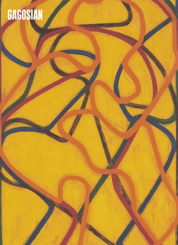
Cover: Brice Marden, The Propitious Garden of Plane Image, Second Version, 2000–06 (detail), oil on linen, six panels, each: 72 × 48 inches (182.9 × 121.9 cm); overall: 72 × 288 inches (182.9 × 731.5 cm) © 2026 Estate of Brice Marden/ Artists Rights Society (ARS), New York
FALL 2026 FROM THE EDITOR
The first major survey of Brice Marden’s paintings in over twenty years will go on view at Gagosian, New York, this fall. A detail from The Propitious Garden of Plane Image, Second Version (2000–06), a monumental painting in that exhibition, graces our cover this issue. At the same time, Gagosian and the artist’s estate will publish a catalogue raisonné documenting the entire six decades of the artist’s painting. To honor these momentous occasions we invited Glenn Lowry, a friend of Marden’s and the former director of New York’s Museum of Modern Art, to share a personal reflection on the artist’s legacy and the enduring power of his work. Across the ocean in London, an exhibition of works by René Magritte honors the maker of some of the most iconic imagery of the past century. A conversation between Alex Da Corte and Michael Cary considers the uncanniness inherent in Magritte’s work, the ways he creates tension through his flirtation between desire and perversity, and his unique ability to hint at the unseen. New paintings by Peter Doig, recently on view in Paris at Le Corbusier’s architectural gem Maison La Roche, are discussed by writer William Middleton. Doig told Middleton, “It is a challenge to make exhibitions in places where you’re up against such great paintings, or such profound architecture. People who saw the show at the Maison La Roche responded to the building as much as the paintings. . . . It was almost like
exhibiting within a sculpture.” Continuing our architectural focus, Vicky Richardson looks at the inspiringly minimalist, nature-oriented buildings of Byoung Soo Cho, while the duo behind the Mexico City architectural firm lanza atelier answers Hans Ulrich Obrist’s questionnaire. Elsewhere, Derek C. Blasberg takes us behind the scenes with Phyllis Posnick, a fashion legend who collaborated with Irving Penn for over twenty years to create some of the most striking images ever to publish in Vogue. Textile designer Makiko Minagawa, whose work over the years has helped shape the Issey Miyake brand, talks to Wyatt Allgeier about her focus on sustainability and her blending of Japanese and Indian craftsmanship. Cady Noland’s artist’s book The Clip-On Method (2021) is the focus of an essay by Martin Germann. The celebrated novelist Ottessa Moshfegh takes us through Jordan Wolfson’s studio in a discussion that considers his newest works. And Tyler Mitchell speaks with Cecilia Alemani about his recently unveiled billboard, the latest installment of the Highline Art Initiative in New York. We close this issue with a tribute to Georg Baselitz by curator Richard Calvocoressi. On a personal note, it was always a privilege to work on publications for Baselitz, an artist who redefined postwar art and whose work will surely continue to inspire subsequent generations. Alison McDonald, Editor-in-chief
FALL 2026 TABLE OF CONTENTS
52 Thinking About Brice Marden Glenn Lowry, a friend of Marden’s and former director of the Museum of Modern Art, reflects on moments spent with the artist and on the enduring power of his art.
66 Peter Doig at Maison La Roche An exhibition of fifteen recent paintings by Peter Doig was on view in Paris this spring at the Maison La Roche. William Middleton reports on this special presentation.
72 Fashion and Art, Part 27: Phyllis Posnick Phyllis Posnick speaks with the Quarterly’s Derek C. Blasberg about her storied career at Vogue.
78 Rossellini by Godard by Linklater Carlos Valladares presents a series of notes illuminating the layered references in Richard Linklater’s newest film, Nouvelle Vague (2025).
84 Jordan Wolfson and Ottessa Moshfegh Novelist Ottessa Moshfegh visited Jordan Wolfson at his Los Angeles studio to get a preview of new works he has been creating for an exhibition in New York this fall.
Opposite: Tyler Mitchell, Untitled (Mou with Boat Hat), 2024, gelatin silver print mounted on Dibond in artist’s frame, 20 × 14 ⅝ inches (50.8 × 37 cm) © Tyler Mitchell Above: Still from Nouvelle Vague (2025), directed by Richard Linklater. Photo: © Jean-Louis Fernandez/ Cannes Film Festival
90 Byoung Soo Cho: The Language of Dreams On the occasion of a new book published by Thames & Hudson, Vicky Richardson surveys the meditative work of the South Korean architect Byoung Soo Cho.
98 On René Magritte Alex Da Corte speaks with Michael Cary about the contemporary appeal of René Magritte.
104
128
Hans Ulrich Obrist’s Questionnaire: lanza atelier
An Eye on the Market
For our Fall 2026 installment we are honored to present Isabel Abascal and Alessandro Arienzo, founders of the Mexico City architecture studio lanza atelier.
108 Cady Noland Martin Germann considers Cady Noland’s self-published artist’s book The Clip-On Method.
114 Tyler Mitchell and Cecilia Alemani Cecilia Alemani joined Tyler Mitchell in his Brooklyn studio to discuss the unique considerations taken into account for his High Line Art billboard.
120 Tension and Beauty: The Textiles of Makiko Minagawa In a conversation with the Quarterly’s Wyatt Allgeier, Makiko Minagawa, creator of Issey Miyake’s HaaT division, details the label’s unique ethos of blending Japanese and Indian craftsmanship through a sustainable, waste-minimizing philosophy.
124 A Palazzo of Ideas: Palazzo Diedo and Berggruen Arts & Culture
Valentina Castellani, author of the just-published book Trading Beauty: Art Market Histories from the Altar to the Gallery, examines the rise of Impressionism through the economic model of creative destruction.
132 As You Wish, Part III Helen Oyeyemi develops her four-part short story with the third installment: “listening party.”
138 Francis Bacon’s Painting John Elderfield shares colorful memories about working with Francis Bacon.
142 Standout Stories from Cannes
152
Mike Stinavage highlights five films from the seventy-ninth edition of the Cannes Film Festival.
Y.Z. Kami and Federico Campagna
146
Y.Z. Kami tells the philosopher Federico Campagna about his new portraits, some of the nineteenthcentury mystic and artist Georgiana Houghton, some inspired by the Fayum funerary portraits of ancient Egypt.
Sigmar Polke In 1986 Sigmar Polke was asked to contribute to the West German Pavilion at the Venice Biennale. Famously elusive, he offered pavilion visitors Athanor. To commemorate its fortieth anniversary, Christopher Graham speaks with Dr. Kathrin Barutzki about the installation.
170 Game Changer: Georg Baselitz Gagosian director Richard Calvocoressi shares a personal tribute to the visionary German artist.
Christian House reports from Palazzo Diedo, the Venetian home of Nicolas Berggruen’s Arts & Culture project. This page: Sigmar Polke working on his wall painting in the conch of the German Pavilion ahead of the 42nd Biennale di Venezia, 1986 © Archive of the Anna Polke Foundation
FALL 2026 CONTRIBUTORS
Vicky Richardson
Carlos Valladares
William Middleton
Valentina Castellani
Vicky Richardson is a curator, journalist, educator, and architectural adviser. She is the former head of architecture at the Royal Academy of Arts, London, and director of the makerspace Grymsdyke Farm. She recently set up Pick Up Architecture Ltd. to produce exhibitions, books, and collaborative international projects.
Carlos Valladares is a writer and critic from Los Angeles. He studied film at Stanford University and began his PhD in History of Art and Film & Media Studies at Yale University in the fall of 2019. He contributes regularly to Art in America, n+1, and Frieze. He lives in New York. Photo: Jade Sacker
The Paris-based writer William Middleton is the author of Double Vision, a biography of Dominique and John de Menil, and has contributed to such publications as W, Vogue, Harper’s Bazaar, and the New York Times. Middleton’s most recent book is Paradise Now: The Extraordinary Life of Karl Lagerfeld.
Valentina Castellani has held leading roles at Sotheby’s and Gagosian and has worked as an independent dealer. She is an adjunct professor in NYU Steinhardt’s MA program in Visual Arts Administration.
Makiko Minagawa
Helen Oyeyemi
Martin Germann
Hans Ulrich Obrist
Makiko Minagawa is a leading Japanese textile designer, widely recognized internationally. She joined the Miyake Design Studio in 1971 and for many years was responsible for the textiles of Issey Miyake clothing. In 2000 she launched her own Miyake label, HaaT.
Helen Oyeyemi’s eleven books include the novels Peaces, Parasol against the Axe, and A New New Me, and the short-story collection What Is Not Yours Is Not Yours. She lives in Prague. Photo: Milan Bureš
Martin Germann is an author and curator who lives and works in Berlin. Recently he organized exhibitions at Museum Dhondt Dhaenens, Deurle, Belgium, and the Jewish Museum of Belgium, Brussels. From 2019 to 2025 he worked for the Mori Art Museum in Tokyo.
Hans Ulrich Obrist is artistic director of the Serpentine, London. He was previously the curator of the Musée d’Art Moderne de la Ville de Paris. Since his first show, World Soup (The Kitchen Show), in 1991, he has curated more than 350 exhibitions. Photo: Tyler Mitchell
31
Jordan Wolfson
lanza atelier
Jordan Wolfson was born in New York in 1980 and lives and works in Los Angeles. Filtering the languages of online and broadcast media through digital and mechanical technologies, and employing an array of invented characters, he crafts enigmatic narratives that explore uncomfortable social and existential topics. Photo: Collier Schorr
The Mexico City–based architecture studio lanza was founded in 2015 by Isabel Abascal and Alessandro Arienzo. The office is a winner of two prizes awarded by the Architectural League of New York: the 2017 Prize for Young Architects and Designers and the 2023 Emerging Voices Award.
Ottessa Moshfegh Ottessa Moshfegh is the author of six books of fiction, including the novels Eileen and My Year of Rest and Relaxation. Her next novel, Only Children, comes out in July 2027. She lives in Pasadena, California. Photo: Jaxon Whittington
Mike Stinavage Mike Stinavage is a writer and waste specialist from Michigan. During his political science master’s program at CUNY Graduate Center he was awarded Fulbright and Martin Kriesberg fellowships to research the politics of waste in northern Spain. He currently lives in France.
Alex Da Corte
Michael Cary Michael Cary organizes exhibitions for Gagosian, including thirteen Picasso exhibitions in collaboration with John Richardson and members of the Picasso family. He joined Gagosian in 2008 after six years working with the late Kynaston McShine, then chief curator at large at the Museum of Modern Art, New York. Photo: Clive Smith 34
Alex Da Corte is an artist, writer, and teacher working in sculpture, painting, installation, film, and performance. He has been the subject of recent monographic survey exhibitions at the Modern Art Museum of Fort Worth; the 21st Century Museum of Contemporary Art in Kanazawa, Japan; and the Louisiana Museum of Modern Art, Humlebæk, Denmark. In October 2026, with the Whitney Museum of American Art’s Meg Onli, he will co-curate the first Roy Lichtenstein retrospective in New York in more than thirty years. Da Corte lives and works in Philadelphia.
Glenn D. Lowry
Kathrin Barutzki Dr. Kathrin Barutzki has been the project manager for curatorial projects and educational outreach at the Anna Polke Foundation in Cologne since 2018. She has worked as a curator and research associate at institutions including the Ludwig Forum für Internationale Kunst in Aachen, Germany.
Glenn D. Lowry is director emeritus of the Museum of Modern Art, New York (MoMA). During his tenure (1995–2025) he dramatically expanded the collection, oversaw the physical transformation of the museum’s campus through two building campaigns that more than doubled the size of MoMA’s galleries, quintupled its endowment, created an education and research center, and inspired a new model for the presentation of modern and contemporary art. Lowry has championed innovation, both onsite and online, to grow MoMA’s annual visitation to nearly three million in the galleries and over thirty-five million across all digital platforms.
Tyler Mitchell
Christopher Graham Christopher Graham is an artist and educator based in Los Angeles. His paintings embrace experimental materials and explore the subject matter of perception. He works for Gagosian in Beverly Hills. Photo: Marina de Blas
Tyler Mitchell is an artist, photographer, and filmmaker based in Brooklyn. He earned his Bachelor of Fine Arts in Film and Television from NYU Tisch School of the Arts. Mitchell’s images offer new narratives about beauty and desire, exploring the intersection of historical themes and fictionalized future possibilities. His aesthetic is defined by a portrayal of Black life that foregrounds tenderness, camaraderie, and self-determination and often draws inspiration from the pastoral landscapes and domestic scenes of his youth in suburban Georgia. In 2018 he made history as the first Black photographer to shoot the cover of American Vogue, for Beyoncé’s appearance in the September issue.
Cecilia Alemani
Christian House Christian House worked as a proposals writer at Sotheby’s for a decade before a period as an obituarist for the Telegraph. He now writes on visual arts, literature, and history for such publications as the Financial Times, Canvas, and CNN Style.
Cecilia Alemani is an Italian curator based in New York. Since 2011 she has been the Donald R. Mullen, Jr. Director & Chief Curator of High Line Art, the public-art program presented by the New York High Line. In 2025 she curated Once within a Time, the twelfth site santa fe International. From 2020 to 2022 she served as the artistic director of the 59th Venice Biennale, where she curated the acclaimed exhibition The Milk of Dreams, which was visited by over 800,000 people. She previously served as the curator of the Italian Pavilion at the 57th Venice Biennale in 2017. In the fall of 2027 she will oversee the fifteenth edition of the Taipei Biennial. Photo: Liz Ligon, courtesy The High Line
35
“I “I wowo rkrkininlayers andfragments fragments layers of of color color and of of li gh—t — h ar mo onni es ies ttha hat t ranslate r y.”y.” l ight harm ranslateinto intojewel jewelr UR RM –—SSYYBBI ILL YYU MA AN N
MERCER COLLECTION WOMEN
John Elderfield John Elderfield is chief curator emeritus of painting and sculpture at New York’s Museum of Modern Art and was formerly the inaugural Allen R. Adler, Class of 1967, Distinguished Curator and Lecturer at the Princeton University Art Museum. He joined Gagosian in 2012 as a senior curator for special exhibitions.
Richard Calvocoressi The scholar and art historian Richard Calvocoressi has served as a curator at Tate, London; as director of the Scottish National Gallery of Modern Art, Edinburgh; and as director of the Henry Moore Foundation.
Y.Z. Kami
Derek C. Blasberg Derek C. Blasberg is a writer, fashion editor, and New York Times best-selling author. He has been with Gagosian since 2014 and is the executive editor of Gagosian Quarterly.
Y.Z. Kami was born in Tehran and now lives in New York. His work reflects a diverse range of interests, from portraiture to architecture, from photography to sacred and literary texts. Kami’s work has entered public collections including, in New York, the Metropolitan Museum of Art, the Whitney Museum of American Art, the Solomon R. Guggenheim Museum, and the Museum of Modern Art; in London, the British Museum; and many other institutions worldwide.
Federico Campagna
Wyatt Allgeier Wyatt Allgeier is a writer and editor for Gagosian Quarterly. He lives and works in New York City.
38
Federico Campagna is an ItalianBritish philosopher. He is the author of Otherworlds: Mediterranean Lessons on Escaping History, Prophetic Culture, and Technic and Magic. He teaches at the Royal College of Art, London, and at ECAL, Lausanne, and is an associate fellow at the Warburg Institute, London. He is the cofounder and director of the art and philosophy platform Agora, produced by the Centre d’Art Contemporain Genève. He is also a cofounder of the Italian philosophy publisher Timeo and works at the British and American radical publisher Verso.
IN SEASON Gagosian Quarterly presents a selection of new releases coming this fall.
The Full Picture
Brice Marden: Catalogue Raisonné of Paintings, 1961–2023 This volume documents nearly five hundred paintings made by Brice Marden over the course of his sixdecade career, between 1961 and 2023. Edited by Tiffany Bell, it is the most definitive and comprehensive study to date of Marden’s painting oeuvre. A master of color and touch— from his early subtle, shimmering monochromes to the calligraphic compositions that characterized his later work—Marden extended and refined the traditions of lyrical abstraction. The book includes an introduction by Larry Gagosian, an essay and note to the reader by Bell, and a detailed, illustrated chronology by Bell and Anna Gray. Two texts by Marden, from early and late in his career, provide bookends to his approach to painting.
Brice Marden: Catalogue Raisonné of Paintings, 1961–2023 (Gagosian in collaboration with the Estate of Brice Marden, 2026)
40
Left: Another View: The Vibrant World of Contemporary Black Artists (Phaidon, 2026) Right: Marcel Duchamp (Gagosian, 2026) Below: Fabric sculpture from Loewe x Cosima von Bonin. Photo: courtesy Loewe
In the Studio
Another View: The Vibrant World of Contemporary Black Artists Step inside the creative sanctuaries of twenty of today’s most influential Black artists with Phaidon’s landmark volume Another View: The Vibrant World of Contemporary Black Artists. Edited by curator Isolde Brielmaier with an introduction by scholar Henry Louis Gates Jr., this book offers an intimate, behind-the-scenes tour of art studios across the United States. Packed with 150 never-beforepublished photographs by Awol Erizku alongside candid interviews, it captures dynamic icons of visual art—from Nina Chanel Abney to Fred Wilson—at the peak of their craft.
Readymade Reading
Marcel Duchamp This book was published on the occasion of Marcel Duchamp at Gagosian, 980 Madison at 76th Street, New York. Inaugurating the gallery’s new space on the ground floor of this historic building, the exhibition brought a selection of works—including all of the artist’s most iconic readymades—back to the location where these editions made their US debut in a 1965 show at Cordier & Ekstrom Gallery. The catalogue contains plates and installation photographs of all exhibited works, along with quotations by and about the artist. Fashion’s Fauna
Loewe x Cosima von Bonin For its Fall/Winter 2026 show, Loewe turned the runway wonderfully surreal in collaboration with Mombasa-born, Cologne-based artist Cosima von Bonin. Known for using humor and pop culture as social critique, von Bonin populated the venue with darkhued, hand-sewn textile sculptures of her signature sea creatures and canines, including octopuses, killer whales, and bulldogs. A collection of handbags and accessories builds off of this fruitful collaboration.
42
A new revolutionary anti-aging solution to target signs of advanced skin aging. /LSWZ JVYYLJ[ LZ[HISPZOLK ]PZPISL ZPNUZ VM HNPUN! ^YPURSLZ SVZZ VM ÄYTULZZ HUK K\SS JVTWSL_PVU ;HYNL[Z UL^ ZPNUZ VM HK]HUJLK ZRPU HNPUN! KY`ULZZ [OPUUPUN HUK \UL]LU ZRPU [VUL Bringing new vibrance to skin. Distributed at select retailers, Sisley Maison, and online at sisley-paris.com
Left: Simon Hantaï: the last studio (Gagosian and Skira, 2026) Right: Photo: courtesy Louis Vuitton Below: Maurizio Cattelan’s Yes! Light Bulb
In the Fold
Simon Hantaï: the last studio This book was published on the occasion of Simon Hantaï: the last studio at Gagosian, Gstaad. Curated by Anne Baldassari, the exhibition featured sixteen of Hantaï’s dernier atelier (the last studio) paintings of 1982–85, which are distinguished by vibrantly colored abstract forms derived from a combination of folding and dripping techniques. In the book, edited by Baldassari, images and text function together as a guide to Hantaï’s series and subseries, revealing aspects of their development, chronology, and display.
Get In!
“Woody Wagon Colognes” Collection: A California Escape by Alex Israel x Louis Vuitton Louis Vuitton and artist Alex Israel take fragrance on the ultimate West Coast road trip with the release of the “Woody Wagon Colognes” collection. Handcrafted by sixty artisans over seven thousand hours, the mahogany-andleather miniature station wagons serve as artful displays housing all six of the maison’s signature colognes. The sun-drenched collaboration also debuts translucent resin travel cases clad in vibrant, sunset-inspired gradients for scents like Sun Song, California Dream, and Afternoon Swim.
Bright Idea
Maurizio Cattelan: Yes! Light Bulb This limited-edition porcelain LED light bulb by Maurizio Cattelan is modeled after an exaggerated representation of the artist’s distinctive likeness and bears a printed inscription, “Made in Catteland.” Cattelan has been making playful use of his own image since the late 1990s, when he began producing hyperrealistic figurative sculptures such as La Rivoluzione Siamo Noi (2000), in which he appears in the form of a doll clad in a Joseph Beuys–style felt suit and hanging from a coat rack, or Untitled (2001), in which his wax effigy emerges from a rough hole in the floor. This functioning light bulb is accompanied by a numbered certificate of authenticity.
44
Exhibition Catalogue
Robert Rauschenberg: Important Early Works from the Cy Twombly Foundation This book was published on the occasion of Robert Rauschenberg: Important Early Works from the Cy Twombly Foundation at Gagosian, 980 Madison at 76th Street, New York, which presented six significant early works by the artist. The exhibition was organized during the centennial of Rauschenberg’s birth and featured one of Rauschenberg’s earliest known surviving sculptures, an assemblage from 1950; a photogram made in collaboration with Susan Weil; and other key works.
Left: Robert Rauschenberg: Important Early Works from the Cy Twombly Foundation (Gagosian, 2026) Right: Richard Avedon, Hiroko Matsumoto in Cardin, November 1961 © The Richard Avedon Foundation Below: Edward Ruscha Catalogue Raisonné of the Books, Prints, and Photographic Editions, 1960–2022 (Gagosian and Steidl, 2025)
Catalogue Raisonné
Edward Ruscha Catalogue Raisonné of the Books, Prints, and Photographic Editions, 1960–2022 This three-volume catalogue raisonné chronicles Ed Ruscha’s pioneering artist’s books, prints, and photographic editions from 1960 through 2022. The first volume contextualizes these essential aspects of his oeuvre and includes an essay by editor Siri Engberg, the 1971 text “Information Man” by Ruscha, two essays by Clive Phillpot, and selected bibliographies and exhibition histories for his books, prints, and photographic editions. The second volume focuses on Ruscha’s books, from Twentysix Gasoline Stations (1963) through Double Americanisms (2018), together with a selection of images that provide a glimpse into the artist’s involvement with the book as art form across his career. The third volume provides a record of prints and photographic editions by Ruscha and includes a visual archive of the artist’s collaborations with printmakers.
46
Picture Perfect
Richard Avedon: The Harper’s Bazaar Years Step back into the golden age of fashion photography with Abrams Books’ Richard Avedon: The Harper’s Bazaar Years. As the first volume dedicated exclusively to the artist’s transformative two decades at the magazine, this 352-page monograph pairs iconic and rare images with a never-before-published oral history recorded by Avedon himself. Complete with multi-page gatefolds, a foreword by Samira Nasr, and an essay by Derek C. Blasberg, the book offers an intimate look at a revolutionary era.
Left: Carol Bove (Guggenheim New York, 2026) Right: Richard Prince: Folk Songs (Gagosian, 2026) Below: Photo: courtesy Dior
Artist Book
Carol Bove This book was published on the occasion of Carol Bove at the Solomon R. Guggenheim Museum, New York, the first museum survey of the artist’s work. Edited by Katherine Brinson, the two-volume catalogue featuring 130 color images is housed in a diecut slipcase, which includes a unique, diamond-shaped paper element selected and hand cut by Bove for the first-edition printing. The first volume contains illustrated essays by Kelly Baum, Brinson, Cathleen Chaffee, Jennifer Y. Chuong, Bellara Huang, Suzanne Hudson, and Mariët Westermann on aspects of Bove’s work.
Lucky Strikes
Richard Prince: Folk Songs This book was published on the occasion of Richard Prince: Folk Songs at Gagosian, 555 West 24th Street, New York. The exhibition featured a body of paintings, drawings, and collages produced from 2018 to 2023, along with five sculptures dating from 2007 to 2025. In Prince’s words, the works in Folk Songs picture “hobo smokestack buckteeth and scarred upper lips exhaling chimney clouds of Lucky Strikes drifting over broken-down houses sitting in fields of exaggerated flowers, thousand-yard stares, cardboard caskets, and Mt. Rushmore weeds.” An essay by art historian Sydney Stutterheim places Prince’s idiosyncratic motifs and methods in context, examining his manipulation of reality through self-reference and appropriation, buried meanings and apocrypha.
Dining with Dior
The “Fantastique Voyage de Monsieur Dior” Collection Dior Maison turns literary nostalgia into luxury tableware with “The Fantastique Voyage de Monsieur Dior” collection, inspired by Christian Dior’s childhood love for Jules Verne’s Around the World in Eighty Days (1872). Nurtured by Cordelia de Castellane, the line’s central hot-air-balloon motif floats across exquisite Limoges porcelain plates and serving dishes detailed with signature house emblems like the star, bee, and CD monogram. The whimsical lineup also features glazed earthenware trinket trays crafted in collaboration with the historic Manufacture des Émaux de Longwy. Bearing poetic names like Survol au siècle des lumières, each creation seamlessly transforms a dreamlike fantasy journey into an art of living.
48
CROSSWORD This puzzle, written by Myles Mellor, brings together clues from the worlds of art, dance, music, poetry, film, and beyond.
Across
11 Iconic line from the Beatles “All
Frank , recently passed architect and artist with major impact on Los Angeles and beyond 4 Classic David Bowie lyric, “Ground Control to Tom” 7 Al Held’s Taxi series (1959–60) 9 Revolutionary German art and design school from the early twentieth century 10 Avatar director James 1
1
2
31 John Constable’s nationality 32 The Hobbit fire-breather
You Need Is Love” (two words) 13 The Red Studio painter, Henri 15 Coyote Ugly setting 16 French city well known for its nineteenth-century ceramics 19 The Help star Davis 21 “Best Song ,” song by One Direction 24 Nina , civil rights activist and singer of “Feeling Good” 26 Dove of Peace painter 29 Makers of the Silverado truck 30 Driveway material
3
4
5
Solution
35 Coffee order, abbr.
36 Experimentation area
38 Drivers’ licenses, et cetera
39 Olivia , who had a 2026
number one hit with “Vampire”
41 Balloon Girl painter
42 Long robe with wide sleeves
redefined by Itchiku Kubota
6
7
8
Down “Sledgehammer” singer Peter Nicole Kidman won best actress for her performance in The (2002) 3 Sure! 4 Johnny Mathis hit 5 Hugh , who starred with Kate Hudson in the Neil Diamond tribute film Song Sung Blue 6 Pirate’s drink 7 Wrapped Vestibules artist from Bulgaria, noted for large-scale, site-specific environmental installations 8 Antonio , who voices Puss in Puss in Boots 12 Eva Perón, for one 14 Argon’s symbol in the periodic table 17 She’s depicted in an Albrecht Dürer engraving 18 Compass point, abbr. 20 Place to share photos and shortform videos 22 Engine power measure, abbr. 23 Jimi Hendrix’s genre (two words) 24 McCartney, a fashion designer and long-term partner with peta 25 French Kiss star, first name 27 Film actors’ org. 28 Gold in Spanish 29 Uncredited authors 33 Tom Clancy novel The Hunt for October 34 ’80s art movement -Pop 37 Dylan or Marley 40 -X demographic 1 2
9
10
11
12
13
14
15
16
17
18
21
24
19
22
25
20
23
26
27
29
28
30
31
32
33
34
35
36
37
41
50
38
39
40
42
THINKING ABOUT BRICE
On the occasion of the publication of Brice Marden: Catalogue Raisonné of Paintings, 1961–2023 this fall and of a corresponding exhibition of the artist’s work at Gagosian, New York, we invited Glenn Lowry, a friend of the artist’s and former director of the Museum of Modern Art, to reflect on moments spent with Marden and on the enduring power of his art.
MARDEN
53
B
rice Marden died three years ago but I continue to think about him all the time. One reason for this is that I am often in Tivoli, the small Hudson River Valley town near Bard College where he and his wife, Helen, left such a vivid mark. They moved there in 2002 to restore Rose Hill, an old house on a bluff above the river, and to find the tranquility Brice needed to paint. Over time, he and Helen helped to transform the town, most memorably by turning a run-down hotel into the Corner—a gathering place with a generous veranda, a fine restaurant, and a remarkable art collection that includes work by Brice, Helen, and many of their friends, as well as an eclectic group of Indian paintings and sculptures and much more. Another reason Brice remains so much a part of my life is that his work remains a critical part of my visual landscape. Even when I am not looking at his paintings and drawings, I sense their presence and Previous spread: Brice Marden, New York This page: Brice Marden, New York, c. 1984. Photo: Joe Maloney Opposite: Brice Marden at Cézanne’s tomb in Aix-en-Provence, France. Photo: courtesy the Estate of Brice Marden
54
They are meditations on time and space, the passing of seasons and of life— feelings encoded in their titles and in the networks of lines that give structure to these remarkable works.
I hear Brice’s voice. I carry with me an enduring image of him from shortly after he moved to Tivoli. He is seated in his studio. It is a large building adjacent to his house. There are several rooms, each a kind of atelier for projects he is working on. The floors are bare, some spattered with paint; a few pieces of worn but comfortable furniture are scattered about. Drawings are pinned to some walls, with below them tiers of meticulously labeled flat files. Large paintings in progress lean against other walls. The light is strong and even, flowing in from large windows, some facing the Hudson River, others a large rock just outside that fascinated Brice. After a while we get up and walk around the room. Brice talks about moving here from New York City and about the pleasure he finds in working in his spacious new studio. I am struck by the way new colors have taken prominence in many of his paintings: deep greens, rusty oranges, dark reds. They were always there but now they feel more evident, more important to his palette. 55
I ask him if moving to the country has influenced his paintings. Conversations with Brice always unfold elliptically. He says a few words, then later circles back to them. He can seem laconic and laid back. He talks slowly. But he is always focused on his work, scrutinizing it for any detail out of place, for a brushstroke that does not work, a color that feels wrong. After a long hesitation he says no— the light, maybe, but not the landscape. I find that hard to believe as his paintings are suffused with the feel of the woods, with the richness of leaves seen through sunlight. Maybe the relationship is not direct but refracted, a memory of something glimpsed that finds its way back into a painting or a drawing years later. I thought of this conversation years later when I saw an exhibition of Brice’s drawings in Paris in 2025. Many were made between 2010 and 2015, great years for Brice. I was attracted to several that were suffused with the colors of autumn, others with the colors of spring. They unfolded in sweeps and gestures, densely built layers of lines and color, marks rapidly applied and then worked over. They were rich and powerful. Beautiful. In one, jagged tendrils of green and red form large blocks of color seeping over a mustard background; in another, a patchwork of compressed marks in shades of green, red, and blue forms blocks of color against a soft 56
This page: Brice Marden, Moon III, 1977, oil and beeswax on canvas, three panels, each: 84 × 40 inches (213.4 × 101.6 cm); overall: 84 × 120 inches (213.4 × 304.8) Opposite: Brice Marden, 4 (Bone), 1987, oil on linen, 84 × 60 inches (213.4 × 152.4 cm)
57
They unfolded in sweeps and gestures, densely built layers of lines and color, marks rapidly applied and then worked over. They were rich and powerful. Beautiful.
green background. Most of the time the lines and marks seem to fall vertically, as they do in Season Studies (1–4) (2009–10), but sometimes they flow horizontally, as if blown by the trade winds, as they do in the sublime Nevisian Triptych (2007– 08), made in his studio at Golden Rock, the hotel he and Helen restored on the Caribbean island next to Saint Kitts. These drawings are radiant. They are meditations on time and space, the passing of seasons and of life—feelings encoded in their titles and in the networks of lines that give structure to these remarkable works. Even when Brice just uses large blocks of color, as he does in River Study 1 (2015), you sense the layers of pigment and the washes of color that have gone into the work, the drips at the bottom of the page revealing each pass that he made with the brush. It is easy to see Brice as part of a generation of artists who studied at Yale University in the early 1960s and then made New York their home— Richard Serra, Chuck Close, and Nancy Graves, to name just a few. Many were his close friends. But Brice was also a singular voice whose work evolved slowly and along its own trajectory. If you look carefully at his paintings, you can see traces of the artists he admired: Édouard Manet and Edgar Degas, Jasper Johns and Robert Rauschenberg,
Brice Marden, The Propitious Garden of Plane Image, Second Version, 2000–06, oil on linen, six panels, each: 72 × 48 inches (182.9 × 121.9 cm); overall: 72 × 288 inches (182.9 × 731.5 cm)
Brice Marden in his studio, Hydra, Greece, 1990. Photo: Bill Jacobson
among others. These traces may appear as a color or tone remembered from one of their works and repurposed, or in the way a series of drips forms an edge. Brice was constantly looking and converting what he saw into form and color—his paintings are resolutely painting, crafted with enormous skill. I continue to marvel at the smooth, burnished surfaces of his encaustic paintings from the 1960s and ’70s. He found a way to make even the most neutral colors—grays and taupes—luminous by layering of pigments. Whether from early in his career or his final years, Brice’s paintings reveal an archaeology of effort. They were made slowly, over very long periods of time. They were built up of layers and erasures, each mark leaving its trace: one color over another, one sedimented layer giving way to the next, but always present if you look closely enough. The edges of the paintings tell the story. He wanted us to see and think about the labor and decisions that went into their making, even if at first glance these are not immediately evident. His paintings and drawings unfold in richly textured chapters. What seem like exercises in abstraction—single or multiple blocks of color, or webs of entangled lines—are always explorations of the idea of pictorial space opening over extended time. Time is the great denominator in Brice’s work—the duration of production multiplied
64
Brice was constantly looking and converting what he saw into form and color—his paintings are resolutely painting, crafted with enormous skill.
Brice Marden in his studio, Tivoli, New York, 2017. Photo: Mirabelle Marden Artwork © 2026 Estate of Brice Marden/Artists Rights Society (ARS), New York
by the temporality of contemplation. To appreciate the work requires the ability to slow down and look, to become immersed in the space of the drawings and paintings and in their teeming universe of marks and lines, colors and erasures. I have another enduring image of Brice. It is 2006 and we are walking through his retrospective exhibition of paintings and drawings at the Museum of Modern Art, moments before it is to open to the public. It is a large show with over fifty paintings and an equal number of drawings that chart the full breadth of his career up to that moment. At some point we find ourselves standing before The Propitious Garden of Plane Image, Third Version (2000–06), a luminescent six-panel painting of interlocking and knotted lines that he had just finished. It is one of the largest and most complicated paintings he ever made. I turn to ask him a question about the painting but stop because I can see how intensely he is looking at it. After a few moments he says, softly, really to himself, “Not bad.” It is typical Brice. Understated. To the point. Matter of fact. There is nothing to add to that other than to nod in agreement, and to recognize how lucky we are to be touched by his genius. 65
PETER DOIG
AT
MAISON LA ROCHE
67
An exhibition of fifteen recent paintings by Peter Doig, all but one previously unseen by the public, was on view in Paris this spring at the Maison La Roche, the iconic modernist house built by Le Corbusier and Pierre Jeanneret in 1923–25. Here, William Middleton reports on this special presentation, which was curated by Parinaz Mogadassi.
By the early 1920s, the Paris-based Swiss collector Raoul La Roche had assembled the most important collection of Cubism in the world: dozens of exceptional paintings and sculptures by Georges Braque, Juan Gris, Fernand Léger, Jacques Lipchitz, and Pablo Picasso. La Roche had also acquired Purist paintings by Amédée Ozenfant and Charles-Édouard Jeanneret, the artist and architect better known as Le Corbusier. The young architect, who advised La Roche on his purchases of paintings, was determined to turn the collector into a client. “With a collection as outstanding as yours,” Le Corbusier told La Roche, “You need a house that will do it justice.” La Roche’s response: “OK, Jeanneret, build me that house!” Begun in 1923 and completed in 1925, the Maison La Roche—codesigned by Le Corbusier and his partner and cousin, Pierre Jeanneret—is one of his earliest Paris townhouses and the first completed example of his Purist approach to architecture. It is a three-story structure with walls of pale reinforced concrete, horizontal bands of windows, and a flat roof that doubles as a terrace. One wing is built on pylons (or pilotis, in the architect’s term), providing exterior space at the ground floor and elevating perspectives from inside the house. Le Corbusier’s interiors include soaring doubleand triple-height ceilings, natural light filtering down from above, and sculptural balconies, walkways, and ramps to facilitate movement. The design constituted a manifesto, the first example of Le Corbusier’s five points for a new architecture: free floor plans, non-load-bearing facades, pylons, banded windows, and rooftop terraces. Adjacent to the Maison La Roche is the Maison Jeanneret, designed for Le Corbusier’s brother, Albert, his wife, Lotti Raaf, and their two children. “One of the houses accommodates a family with children and thus comprises a number of rooms and all the amenities required by a family,” was Le Corbusier’s description of the architectural program, “whereas the second is designed for a bachelor who owns a collection of paintings. The second house will therefore be a bit like an architectural promenade.” The two townhouses sit at the end of a private street, the square du Docteur Blanche, in the furthest reaches of the sixteenth arrondissement, on the edge of the Bois de Boulogne. La Roche was captivated by the house that Le Corbusier had created for him and maintained it impeccably, often at great personal expense. After donating his remarkable art collection to museums, primarily the Kunstmuseum Basel, he gave his house to the architect’s foundation. The Maison La Roche and the Maison Jeanneret have been the headquarters of the Fondation Le Corbusier since 1970 and have been listed as a unesco World Heritage Site since 2016. From the moment the Maison La Roche was completed, however, there was a certain tension between the purity of the architecture and the power of the art. The top-floor bedroom, known as the Purist Bedroom, was almost monastic, with a double-size bed, dark floors, white walls, two paintings by Ozenfant, and one canvas by Le Corbusier. The second-floor art gallery, the most dramatic space in the house, was a much different affair: La Roche filled the double-height room with as many as two dozen of his Cubist masterpieces, hung salon style floor to ceiling, propped up against the walls, and placed on a table designed by Charlotte Perriand. From the architect’s point
68
of view, the paintings and sculptures could overwhelm the design. In a letter to Le Corbusier of May 1926, La Roche described the dilemma: “The finished house was so beautiful that upon seeing it for the first time, I exclaimed, ‘It is almost a shame to put art in it,’” the collector wrote. “I did, however. How could I not? Don’t I have certain obligations to my painters? Which, after all, you are one, as well. I had asked you to design ‘a frame for my collection.’ You provided me with ‘a poem written with walls.’ So really, who is to blame?”1 It was exactly one century after that exchange that the Maison La Roche achieved the balance between great art and great architecture: From April 10 through May 30 of this year, the house was the setting for an exhibition of new and recent work by Peter Doig. Working with the independent curator Parinaz Mogadassi, who also happens to be his wife, Doig filled those Le Corbusier rooms with fifteen paintings, all but one shown for the first time, in his distinctive, complex style: mysterious yet vivid, lyrical but potent, hallucinatory yet crystal clear. This was not the f irst time that Doig, who divides his time primarily between London and
Trinidad, has taken on ambitious projects in Paris. In Reflections of the Century at the Musée d’Orsay in 2023–24, Doig installed his own paintings in one gallery and hung adjacent rooms with a selection of works from the museum’s collection by artists who had inspired him over the years, including Paul Gauguin, Édouard Manet, Henri Rousseau, and Georges Seurat. “It is a challenge to make exhibitions in places where you’re up against such great paintings, or such profound architecture,” says Doig. “People who saw the show at the Maison La Roche responded to the building as much as the paintings. The craft is very evident. When it was built you couldn’t just buy a shelf, or the lighting fixtures, or the tiling. Everything had to be made, and you feel that in the space. It was almost like exhibiting within a sculpture.” The artist, long interested in architecture, has also had a personal and artistic connection with Le Corbusier. As a student at Saint Martins, he met the German architect Pascal Schöning, who was in the city teaching at the Architectural Association and became part of a group of young architects, including Peter St John, now of Caruso St John. With
Ron Kenley, Schöning founded La Première Rue, which took space in Le Corbusier’s Unité d’Habitation in Briey-en-Forêt, in eastern France. “Pascal had gathered a group of architects and theorists to take over a floor of the Unité, which had been more or less abandoned,” Doig recalls. “The idea was workshops, exhibitions, residencies. I spent a lot of time in the building and ended up painting it. I had never thought about painting a modernist structure, but this one sat in a landscape, next to the forest. Seeing it through the trees reminded me of Cézanne. I had been making paintings of buildings in forests, though very different kinds of buildings. I made one and it gathered momentum over the next few years.” The resulting series, Concrete Cabin, made between 1991 and 1996, places the rational grid of the modernist high-rise in the background and envelops the foreground with moody dark vines and dense dark forest. In conceiving the exhibition for the Maison La Roche, one of the goals was to make it human in scale. “We wanted the tone to be quiet,” explains Mogadassi. “The house was originally an intimate space, designed for a collector who lived privately 69
among his works and shared them occasionally with close associates and friends. So it was interesting to put together a very intimate show that established the house again as a private home, rather than thinking of it as a sort of gallery space.” Although two of Doig’s paintings at the Maison La Roche were monumental—Yellow Painting (Double Tap) (2026), in the entrance, and Studio Painting (2 Girls) (2026), in the gallery—the scale was intentionally modest. “While we were installing the show alongside our family, team, and friends, the people from the Fondation remarked that the space felt entirely reanimated—almost as if it had become a living home again,” says Mogadassi. “That’s the sense that we wanted to convey, that when you’re in the space you feel you have an intimate understanding or an intimate experience with the work.” Abstraction We imagine that we can hear what certain painters heard as they worked: Pollock the cacophony of traffic, O’Keeffe the engines of certain lilies, Bearden cornets muffled in velvet, Peter Doig the brooding, breeding silence of deep bush, the chuckle of a lagoon, the soundless coupling of butterflies, the green thickness that is there in Conrad and Marryat or the rusty hinge of a century turning— sounds that surround the work of Peter Doig. —Derek Walcott 2 Having lived and worked in the United Kingdom, France, Germany, New York, Montreal, and the Caribbean, Doig has led something of a peripatetic existence. Born in Scotland, he spent much of his childhood in Canada and Trinidad. He studied art history at Saint Martins and obtained his MA from Chelsea School of Art, London. Since 2002, he has divided his time primarily between London and his home and studio in the mountainous jungles of Trinidad. The title of an essay on Doig by the art historian Richard Shiff is “Drift.” The text refers to one of the artist’s paintings, a self-portrait wearing a cowboy hat, set in western Canada, entitled Drifter (1999). “The term drifter has complex connotations,” Shiff observed. “On the negative side, it is a person who lacks roots, stability, and perseverance; on the positive side, someone with the capacity to adjust to shifting conditions and turns of fortune. Doig has shown that he is far more the latter type than the former. But any drifter, including an artist-drifter, remains enigmatic, a challenge to evaluation.”3 But it is Doig’s expansive vision of the world that can give his work such authority. One striking painting, French Painter (Caribbean) (2026), is a full-length portrait of an elegantly dressed, bearded gentleman posed against a palm tree in a tropical setting. It is actually a portrait of the Impressionist artist Camille Pissarro, who was born on the island of Saint Thomas. “That is also my homage to the poet Derek Walcott because he was slightly obsessed with Pissarro, starting from the fact that he was born in the Caribbean,” Doig explains. “Derek always had a longing for Pissarro to be regarded as a Caribbean artist, even the great Caribbean artist, and he lamented that Pissarro did not stay and describe that part of the world. When I was working with Derek on a book, Morning, Paramin, I visited his house on Saint Lucia a number of times, and saw his book on Pissarro. 70
There was a photograph of Pissarro that had been taken somewhere in France, so I transposed him to Derek’s garden. Not many people know that but that is the thought process behind that painting.” French Painter (Caribbean) is also an example of the interaction between Doig’s palette and the Maison La Roche. In the painting, the grass is vivid green, the seas a bold blue, and the artist wears a brown velvet waistcoat with yellow slacks. The bold colors of the canvas are set off by the pale blue walls of the room. (The interiors of the Maison La Roche contain seventeen specific shades, from ivory to blue cerulean to burnt umber.) Another striking canvas, Boat Fight (2 Sailors) (2026), depicts two men, wearing blue-and-whitestriped naval shirts, wrestling on the ground. “The source material is a still from a film called Fire Down Below, which starred Rita Hayworth, Robert Mitchum, and Jack Lemmon,” Doig says, “and it was filmed in Trinidad. It’s more a beautiful film to watch than a great film, but it’s quite compelling and there’s this rivalry for her. She was in an earlier version, standing in the background, trying to stop this
fight and being held back, but I took her out of the painting. I thought the more interesting thing was the two men grappling in those matelot T-shirts. It’s not particularly well articulated—Lemmon actually has a chain around Robert Mitchum’s neck trying to throttle him, so it’s quite brutal. The painting is hung in a room on its own. If you think of the house as a place where someone was living, it could be this private room, a view into another world.” One remarkable aspect of the exhibition is the interplay between the art, the architecture, the intensity of the daylight, the views of lush landscaping, and the glimpses of the cityscape. “The light is an active participant in anything that happens here,” points out Jasper Sharp, a curator who often works with Doig and was at Maison La Roche for the installation. “The house has different moods. I’ve been there on dark, rainy days and it can feel as though it’s in need of some conservation and a new coat of paint. And then when the sun comes out, and the garden is lush, suddenly you just see these bright white walls and modernist curves, and the whole thing feels so elegant, like a beautiful motor car.”
Throughout: Installation views, Peter Doig, Maison La Roche, Paris, 2026. Artwork © Peter Doig. All rights reserved. Photos: Nicolas Brasseur
paintings that find a direct echo in Le Corbusier’s architecture,” points out Mogadassi. The paintings were not made with this in mind, but we thought the correspondence was worth building on rather than simply noting. One motif runs through three rooms. A first study hangs in the smallest of them. A medium-sized work hangs beside the windows, where the painted landscape and the actual one are held in a single view. Finally, the largest and most recent version of the work is revealed in the double-height gallery. The intention was to let the house set the terms on which each is seen. What compels me about Peter’s practice is the singular voice held across the tangents he allows himself. Some works are highly resolved, others are deliberately left open. He might return to a canvas years later and rethink it entirely, as he did with Boat Fight (2 Sailors). The pictures never quite settle, and that is what keeps you in front of them. Doig was still finishing the paintings right up until the moment they were collected from his Trinidad studio for transport to Paris. “I didn’t really know, apart from the two big paintings, where they were going to be installed,” Doig recalls. “Parinaz has a much better grasp of the space itself. Once the paintings arrive, I can say, ‘No, it should go a little bit higher.’ But she’s very, very good at making installations—she did the Musée d’Orsay show too, which was complicated, with its exaggerated volumes. This one was complicated too because there are so many viewpoints where you can see three or four paintings at any one time, all in different rooms and at different heights. It was a surprise to me when we got there and started seeing the pictures in their places—I was very excited by the choices and the placements. I can’t really take full credit for that, though,” he adds with a laugh. “I can take credit for making the paintings.” 1. Raoul La Roche, letter to Le Corbusier, May 24, 1926, in Katharina Schmidt and Hartwig Fischer, Ein Haus für den Kubismus. Die Sammlung Raoul La Roche: Picasso, Braque, Léger, Gris—Le Corbusier und Ozenfant, exh. cat. (Ostfildern-Ruit: Verlag Gerd Hatje, for the Kunstmuseum Basel, 1998), 8. 2. Derek Walcott, “Abstraction,” in Walcott and Peter Doig, Morning, Paramin (London: Faber & Faber, 2016), 77. 3. Richard Shiff, “Drift,” in Shiff and Catherine Lampert, Peter Doig (New York: Rizzoli, 2011), 341.
One of the most powerful examples of how the elements work together is the largest painting in the exhibition, Studio Painting (2 Girls), which takes over the main wall of the second-floor gallery. Measuring 240 cm. in height and 360 cm in width (c. 94 by 142 inches), it depicts the artist’s two daughters in his studio in Trinidad, sitting facing one another, with green ping-pong tables behind them, stereo speakers, and red cable snaking around the floor. Le Corbusier’s use of horizontal windows placed high means that sunlight fills the room from the top of both main walls in the gallery. Looking from the ramp that sweeps upstairs exposes the windows above the painting framing the gray rooftops of Paris. And the windows depicted in the Trinidad studio are not unlike those designed by Le Corbusier. There are two other versions of the same subject, one small canvas from 2017 and a medium-sized painting that is hung in a dramatic position on the second floor of the entrance hall, next to a wall of windows opening out onto trees. “There are these uncanny apertures in Peter’s 71
FASHION AND ART PART 27: Phyllis Posnick met with the Quarterly’s Derek C. Blasberg to reminisce about her storied career at Vogue, from assisting Diana Vreeland to working with Anna Wintour and such legends as Irving Penn, Helmut Newton, and Annie Leibovitz on crafting some of the most singular images in the magazine’s history.
72
PHYLLIS POSNICK
73
DEREK C. BLASBERG Shall we start at the very beginning? Where were you born, where did you grow up? PHYLLIS POSNICK Glen Cove, Long Island. I was a very sporty girl—I played basketball, if you can believe it. My father owned a hardware store and I went to a bluecollar high school. Suffice it to say, it wasn’t obvious I was going to land at Vogue. DCB Did you care about fashion when you were young? Did people think you were stylish? PP In third grade, my parents moved me to another school in a town called Glenwood Landing, which was more progressive. For the first time I saw how other people lived. There were parents who worked in the city, kids who were into magazines, and slowly I was exposed to life beyond my own little world. In high school I was a cheerleader, of course. I became obsessed with Vogue. I wanted to escape, and Vogue was my escape—it was an era when Vogue Previous spread: Phyllis Posnick. Photo: © Annie Leibovitz/Trunk Archive editors and photographers travThis page, from top: Behind-the-scenes photograph of Irving Penn and Phyllis Posnick. Photo: Dan Belknap; elled all over the world to shoot Irving Penn, John Galliano Silk Wool Jacquard Jacket with Red Feather Headpiece, New York, 2007 © Condé Nast sweeping editorials. That became my world away from Glen Cove, and that’s when I knew I wanted to work for Vogue. DCB When I was young, my family in Missouri would say the same sort of thing: Go to law school, become a lawyer. Go to med school, become a DCB Did your family encourage this dream? doctor. What can you do with an English major if everyone already speaks PP Of course not! Everyone said I couldn’t do it. My parents told me I didn’t have the right background, I didn’t go to the right schools, and I didn’t know English? the right people. I attended Syracuse University, which is not a chic school. PP Exactly. So there I was, bored in business classes and enrolling in more And I started by studying business. and more arts courses because I was much more inspired by them. Up until then, I’d probably never even been to a museum, and suddenly I was DCB Did you believe them, that fashion wasn’t for you? exposed to a whole new world. I loved it. I took so many liberal arts classes PP Not really. But for a liberal arts degree you had to learn a language, and I didn’t think I could do that. Also, I thought, What can you do with a liberal that when it came time to graduate, I almost didn’t have enough for a major. arts education? Is that a real job? Not my best decision! DCB And you figured out what you didn’t want to do, which was work in business. PP Yes, I wanted to work in the fashion industry, and I got a job—although it wasn’t quite “fashion”—at Formfit Rogers, a lingerie company. I’d been offered a job at Seventeen magazine, but I didn’t like Seventeen magazine. Even then I was kind of fussy. DCB I like that. “Fussy.” PP Particular? Specific? Ha! Formfit Rogers had a line designed by Emilio Pucci, which I thought was fabulous. And I had great bosses who were very creative. I was in the advertising department. I got married, my first husband was an art director, his agency opened an office in London, so we moved there for four years. It changed my life. It was fantastic. Formfit Rogers had gotten working papers for me; as soon as I got them I started to look for another job and I became a secretary to a director at the J. Walter Thompson advertising agency. But I still wanted to work for Vogue. I didn’t know how to get into Condé Nast, but my husband met someone who knew someone and got me an interview. DCB That would have been when Beatrix Miller was the editor in chief of British Vogue, right? PP Yes, but the interview turned out to be with the editor in chief at Brides. Somehow I knew Brides was on the same floor as Vogue, so when she offered me a job, I was honest: I told her, “This sounds very interesting, but I really want to work for Vogue, and the first chance I get, I’ll go down the hall and try to get a job there.” I don’t know what made me do that, but she liked that I said it. DCB That you were so honest? PP Yes. She appreciated it. Within a week there was an opening at Vogue. I interviewed and I got it. I was the assistant to Sheila Wetton, who wasn’t famous but in Vogue lore was one of the great editors. She’d been a model; she was very chic and very proper and was probably in her sixties when I worked with her. She had gunmetal-gray hair, she wore it in a chignon, and every other word out of her mouth was “fuck.”
74
DCB You’re kidding! I love it when a woman looks like a lady and cusses like a sailor. PP She was heaven. She was doing more conservative fashion stories at the time. I had enough time to work with some of the other editors too. I liked that because I wanted to see what everyone’s process was. I remember I worked on an over-thetop story with Liberace, which was shot by Helmut Newton. I was soaking it all in. DCB At that time you knew you wanted to be a sittings editor? PP I did, but my husband, whom I’d separated from by that point, decided he wanted to go back to New York, and I was trying to figure out what I could do. As you can imagine, the job paid next to nothing. I was making $35 a week, so I couldn’t afford to stay in London on my own. When I told Beatrix Miller I had to leave, she was great. She was always accessible and she promoted people that she thought had some talent, so she told the New York office that one of her girls was coming to New York. Two weeks before I went back, someone from HR called to ask when I could start, and I said the next week. They said, “Can you start on Monday?” The job was for Diana Vreeland. DCB Wow! What a thrill, what a call! PP It was the late ’60s, so she was already a legend in New York, but I was still very young and I wasn’t aware of the type of person she was. I soon found out! She had three assistants. Number one was British and she took a leave of absence, so I was hired to cover for her. I’d come from England with a slight English accent, and a few weeks into the job, she said to me, “I really
He often wanted to push the image to be more extreme. I was afraid. Anna gave us tremendous freedom, but I feared that if the picture went too far, she’d kill it. When I finally admitted that to Penn, he looked at me and said, “I’d rather have a good picture killed than have a mediocre picture run.”
love English secretaries because you know they do such good work.” It was a great compliment, but I was such a dummy, I said “Oh, I’m an American,” and the honeymoon was over. DCB Tell me more about working for her. PP She was just very correct. She’d call in every morning at around nine o’clock and dictate for an hour. By the time she got into the office, we secretaries were supposed to have transcribed everything into letters for her to review and sign, and then we’d dash them off. She wore bells around her ankle so we could all hear her coming down the hall—and the day would begin. She was tough, but as long as you got the work done she was fine with it. DCB I love seeing images of her red-lacquered office, with the leopard carpet, the magazine laid out, and a Scotch on her desk. PP She’d ask for enduring run-throughs with all the fashion editors critiquing the clothes for the issue. Those were brutal. She challenged everything everyone did, which was Irving Penn, Christian Lacroix Duchesse Satin Dress, Paris, 1995 © Condé Nast good for the magazine, and she was . . . specific. DCB How long did you work there? PP I worked for her until her assistant came back, and then a job opened up with Babs Simpson, another legendary fashion editor who worked with Irving Penn as the editor on his most iconic photographs. That’s when I first met him. Babs used to do huge shoots where we’d move into his studio on 40th Street for two weeks with trunks and trunks of clothes, racks for the shoes—I mean racks with eight shelves, filled up entirely with shoes—and long tables for accessories. One day, after we’d been there on a long shoot, I was packing everything up and he walked into the room, sat down in a chair, and watched me put everything away. As you know, as an assistant, I was taught to be invisible— D C B Yo u m u s t h a v e b e e n intimidated. PP Absolutely! He watched for a while, and after a little bit of time, he asked, “Where did you come from?” I told him I’d worked in London and I was back in New York— and we talked for a little while. When I came back for another sitting, he’d be there, and over time we got to know each other better and better. One day, after I’d worked for her for a few years, Mrs. Simpson said to me, “Dearie, I think it’s time for you to move on. You’ve learned everything you can here.” A job opened as the beauty sittings editor of Glamour, which was a fashion magazine at the time. But I was
75
Penn taught me to think beyond the obvious way to illustrate a subject. He also changed what I thought was beautiful. always wanting to go back to Vogue, of course, and eventually I did. DCB Diana Vreeland was the editor-in-chief of Vogue until 1971, and then Grace Mirabella got the job. She brought you back into the Vogue fold as the beauty and health editor, and in 1988 Anna Wintour took the top job. How did things change for you? PP By then, I’d left Vogue as beauty and health editor and returned in 1987 as executive fashion editor. One day, Anna called me into her office and said, “We need to do more beauty, and Alex [Alexander Liberman, editorial director of Condé Nast] and I would like you to do the beauty sittings.” And that was that. Almost immediately, one of the fashion editors told me, “You know that Anna doesn’t like beauty. She finds the beauty pictures boring and predictable.” Encouraging words, no? [laughter] DCB What were Penn’s shoots like? PP Well, first of all, he told me, “Never call them shoots.” He said, “We don’t shoot anyone here. It’s a love story. We try to make people look beautiful.” There was no music in the studio. No smoking. No noise except for the squeaky floors. If there was noise, he’d stick his head into the dressing room to see what was going on. He had very good radar. DCB Did you and Penn have a working camaraderie? PP Not at first. Many of the photos we did were to illustrate beauty or health articles. Anna’s Vogue was different than the old Vogue, and she was hoping that Penn would approach these illustrations in a new, surprising way. When I’d meet with Anna to discuss what we were planning, she’d say, “Please don’t
let him do this, and don’t let him do that.” I was frozen. It wasn’t easy. Penn wanted to do Penn. The first sittings weren’t good. Completely my fault! To Anna’s credit and to Alex’s credit they published them and encouraged us to keep trying. Finally, one day we were doing a hair-color picture with Linda Evangelista, and I thought: Fuck it, I’m just going to let go and take a chance. The picture was charming. Was it a great picture? No. But it was the beginning of a change. DCB When did you two click? PP In the early ’90s Anna asked Penn to do a story called “The Art of Couture” to illustrate the Costume Institute exhibition at the Metropolitan Museum of Art, and wanted me to be the editor. In my research, I went through his old couture collection images from decades before, when he’d used natural daylight. I loved those pictures. So when I talked to him about our couture sitting in Paris, I said, “I was looking at your beautiful couture photos from the ’50s—were these shot in available light?” He said yes. And I said, “Would you consider doing that again?” And he said he would—if I could find him the same studio he used in the 1950s. DCB What a great response! PP As I said, he wasn’t easy. DCB Did you find it? PP No. Of course that one had been demolished. But our brilliant Paris editor found a studio almost exactly like it, with the same light—the same dirty windows, which filtered the light. And he liked it. We did the sitting and the pictures are quite beautiful. After that he didn’t use strobe, unless it was for a still life. Using daylight instead of strobe changed the character of his photographs. Models didn’t need big hair and strong makeup; they were now more accessible like they were in his early pictures. I loved them. DCB Did he feel that momentum change? PP Yes. The photos from that sitting were a surprise and the sitting was a
Irving Penn, Gisele Reading (A), New York, 2006 © The Irving Penn Foundation
76
This page, from top: Irving Penn, Nicole Kidman in an Olivier Theyskens Design for Rochas, New York, 2003 © Condé Nast; Irving Penn, Bee on Lips, New York, 1995 © Condé Nast
success. By then, I was comfortable working with him and not afraid of Anna not liking his work. That was liberating. Anna wanted more. She wanted Penn in every issue, and during the seventeen years I worked with him, we collaborated on over four hundred photographs. DCB What was your process of working together? PP We spoke at least once a week. We’d have a conversation about the beauty or health or food article, or personality, or fashion that we hoped he’d photograph. Then another conversation. Sometimes it took two months to settle on a direction. He was famous for sending models away, so I’d arrange a fitting on our model. He’d ask, “What’s on her head, are there accessories, what will her hair look like,” and on. He taught me to be prepared by considering every element of a photograph in advance. Of course, things changed on the day of the sitting, but he was testing me. He’d test the hair and makeup artists, test everyone, even the models. He could be difficult and demanding, but he was also gentle and sweet. DCB He was already marinating it. PP Sometimes when I was talking, he’d start to draw. He’d sketch the picture. He had the clothes, and he had the model, and he’d be working out the rest of it. With Penn, you’d better be prepared. He didn’t welcome a hair change, he didn’t want a shoe change, and he didn’t want any interruption. You really had to know what you were doing with him. DCB I love the picture you did with Gisele [Bündchen]. PP The nude? DCB Yes, even though there’s not a lot of styling in a nude. PP That’s a perfect example of Penn’s ability to push us and test us. Vogue was doing a story on the back—strong, beautiful backs in backless dresses. He liked that idea, but he said he only wanted to work with Gisele. He added, “And please tell her that her face won’t show.” DCB There’s the test!
PP I said okay. And of course she did it. And of course her face showed. But he’d always test us to see if we believed in the picture. He’d make it difficult, and we’d have to—in our own way, not in language—justify our choices, which made us better at our jobs. DCB Was he available when you’d call him with concepts and stories? PP Always. Yes. He’d reached a point then—he was in his eighties—where he didn’t have to take another picture. He only wanted to take pictures that either challenged him or gave him the opportunity to do something he hadn’t done before. DCB I love the photographs of Nicole Kidman. PP Which ones? DCB I’m talking about the famous couture shoot for the cover of the May 2004 issue. PP Before that cover story we had to convince him to shoot her for a portrait, which wasn’t easy. It took Anna and me two years before he agreed. DCB You had to convince him to shoot Nicole Kidman? PP Yes, because Penn didn’t like to photograph actors—he felt that he couldn’t get beyond the face that they presented. They were acting. I kept bringing up Nicole Kidman and he kept saying no. Finally she did The Hours [2002]. She played Virginia Woolf. I described the film, and I told him she wore a prosthetic nose in it—and this interested him because he thought, OK, maybe she didn’t mind stripping away her vanity. He thought for a minute, and he said, “I will photograph her. But only with the nose.” Somehow I talked him out of that, and then they fell in love, and the next year we did that couture sitting, which became that cover story. DCB What lessons would you say you learned from these Penn tests? PP Penn taught me to think beyond the obvious way to illustrate a subject. He also changed what I thought was beautiful. There’s a picture he did for an article about chocolate by [food writer] Jeffrey Steingarten. I called Penn, he thought for a minute and said, “I always loved the look of children after they’ve been eating fudge. They have chocolate all over their mouths. Yes! Let’s try it.” I had to do casting for the right mouth! The image was beautiful. DCB Did it feel good when he pushed you out of your comfort zone? PP Absolutely, and that’s another lesson I learned from him. As we got to know each other better, we’d sometimes argue on the day of the sitting about the direction of a picture. He often wanted to push the image to be more extreme. I was afraid. Anna gave us tremendous freedom, but I feared that if the picture went too far, she’d kill it. When I finally admitted that to Penn, he looked at me and said, “I’d rather have a good picture killed than have a mediocre picture run.” DCB Wow, that’s a good line. PP That freed me. And that line has been in my head on every shoot since.
77
78
ROSSELLINI BY GODARD BY LINKLATER
79
An essay by Carlos Valladares In honor of Jean-Luc Godard, I present this essay in praise of Richard Linklater’s newest film, Nouvelle Vague (2025)—which details the making of Godard’s Breathless (1960)—as a series of notes. (Godard never wrote out any of his films’ scripts; instead, he’d carry around a pocket-size notebook with phrases culled from novels and poems, ideas for shots, and dialogue for the day.) Twenty-three notes, to be specific—to correspond with the twenty-three days it took Godard to film his revolutionary deconstructed film noir. My notes weave in and out of sense and reference, but they will, I hope, illuminate what Nouvelle Vague is. Alongside the twin film that Linklater released in the same year, the devastating chamber drama Blue Moon, Nouvelle Vague is an extraordinary achievement for the director, a veritable manifesto for his aims that is as galvanizing, in a more muted, classical, and idiomatic register, as his first film, Slacker (1990), which rewired the grammar of 1990s independent cinema in the United States. 1 Disguised as a cute, fun, rompy tribute to the French New Wave, Nouvelle Vague doubles as a profoundly moral letter written in secret code to the next generation of filmmakers and film critics, to rouse them into belief, discipline, and action. But what does the message say? Well: 1 Roberto Rossellini, 1954: “I am a very simple man swimming in a flood of myths that’s been poured upon me for no apparent reason.”2 2 Core memory from when I lived in Paris: walking into the Vidéo Club de la Butte in Montmartre on February 25, 2024, to rent Michelangelo Antonioni’s Zabriskie Point (1970), and noticing tiny f limsy sheets of paper plastered all around the store that read “casting—urgent—long-métrage: pour le nouveau film de Richard Linklater (Boyhood, Slacker . . . ).” Now every amateur and student filmmaker posts up fliers like this around the city, the Vidéo Club de la Butte surtout. But this was a first: such an established studio filmmaker leaving such a notice? Ah, but Linklater is no studio shill. To play Jean-Pierre Léaud in a scene in his new film, he was seeking a kid between the ages of sixteen and eighteen who bore a physical resemblance to Léaud at fourteen. Any self-respecting cinephile in that store would know two things: (1) The notice had to do with Linklater’s much-ballyhooed upcoming feature about the making of Breathless, and (2) Linklater evidently planned to restage that mythic scene in film history when, at the premiere of François Truffaut’s landmark feature debut The 400 Blows at the 1959 Cannes Film Festival, Léaud (the kid star of the film) was lifted into the air by jury president Jean Cocteau to wild hosannas from the spectators, who had just witnessed a new cinema being born before their eyes.3 It was one of those rare, precious moments when you genuinely think, I walk in the shadows of giants. Léaud himself was (and is) still alive, and here was Linklater, street-casting in Paris in the exact way that he had street-cast his own auspicious debut, Slacker, in the summer of 1989 in Austin, Texas. 4 History is made by us. It’s palpable. Revolution can look so ordinary. Our hands trace the paths of aesthetics and history. This is certainly what Godard proved to himself by making Breathless in the 1960s, what Linklater proved to himself by making Slacker
80
in the 1980s, and what Linklater now communicates to a broad, Netflix-weaned audience in the 2020s by distributing Nouvelle Vague on that mass streaming platform.
Previous, left: Still from Nouvelle Vague (2025), directed by Richard Linklater. Photo: © JeanLouis Fernandez/Cannes Film Festival
Following spread, clockwise from bottom left: Still from The Age of the Medici (1973), directed by Roberto Rossellini. Photo: courtesy Criterion
3 Jean-Luc Godard, reviewing Frank Tashlin’s Will Success Spoil Rock Hunter? (1957): “The shooting of an American comedy is a very serious business. Frank Tashlin would be the last to disagree. As he wrote to me: ‘The better I know the cinema, the more I realize that it is an art which is dangerous to take lightly, even if one is working in comedy.’”5
Previous, right: Guillaume Marbeck as Jean-Luc Godard alongside Richard Linklater on the set of Nouvelle Vague (2025), 2024. Photo: © Jean-Louis Fernandez/Cannes Film Festival
Still from Nouvelle Vague (2025), directed by Richard Linklater. Photo: © JeanLouis Fernandez/Cannes Film Festival
4 Jean-Luc Godard, delivering a lecture on the history of cinema in Montreal in 1978: “I wrote a few articles for the newspapers. I began in cinema around twenty, twenty-one years of age, without making films, just in my head—reading magazines, things like that, the way a young man is crazy about one thing or another. I believe I made À bout de souffle [Breathless] after ten years which weren’t really cinema. But it was already ten years of cinema.”6 5 When Linklater made Slacker in 1989, his notebook held these five notes under the heading “script.” They show that Linklater was taking a next step after Godard’s dazzling send-up of the noir with Breathless. Slacker, we could say, belongs to no genre—except, perhaps, the genre of being human. a. A film where anything goes—anything people do can be integrated into this film b. A film of people posing problems, even in a confused state (possibly to be solved or addressed differently elsewhere) c. Optimistic cinema: anything is possible, nothing is prohibited d. Avoiding the “mechanically intellectual . . . ” e. “Something filmed is automatically different from something written, and therefore original.” — Jean-Luc Godard
Below: Jean Pierre Léaud’s ovation at the Cannes Film Festival, 1959. Photo: © AGIP/ Bridgeman Images Opposite: Still from Before Sunrise (1995), directed by Richard Linklater; pictured: Julie Delpy and Ethan Hawke. Photo: © Columbia, courtesy Everett Collection
Still from Slacker (1990), directed by Richard Linklater. Photo: courtesy Everett Collection
criticism. We were filmmakers talking about other films. . . . When we made the New Wave, we were people who talked about films because we couldn’t make them. We weren’t sad, because we were just starting out. I think that’s it: I didn’t see myself as a film critic. I saw myself as someone who talked about a film because he wanted to make one, and talking about a film was already making one. It was a way of being in cinema.11 Likewise, in 1985 Linklater would found the Austin Film Society—a homegrown Cinémathèque Française—as a way of mapping out his and his generation’s filmmaking enthusiasms. He created a space to watch widely, to discuss intelligently, and to put practice into theory. This, too, is criticism. “Film criticism,” Godard wrote, “is film programs. ‘Today at the Imperial from two o’clock to four o’clock: a film by Steve McQueen.’ That’s film criticism.”12 Criticism, curation, filmmaking: For artists like Godard and Linklater, these are all the same process. 6 Here is the text of the flier distributed by the team working to cast Slacker in the summer of 1989: I’m helping cast a low-budget movie to be shot around Austin beginning this June. Most of the roles in the film will be filled by non-professional actors so stage and film acting experience is not required or even necessarily preferred. . . . At this point we are primarily looking for unique faces and attitudes. If your schedule allows and you are interested in working on this project, please call and set up an appointment at Austin Media Arts (2118 Guadalupe). This will be not so much an audition as a videotaped interview. No monologues or acting will be necessary at this point. Just come prepared to talk about yourself to help us match personalities with characters in the film. Once production begins, what will be required is a few rehearsal sessions to be followed by generally no more than one day’s shooting. Because of the extreme low-budget nature of this project, everyone involved is working for deferred wages and a corresponding percentage of ownership.7 As Linklater would later write, “Unfortunately, some of the most impressive and true slackers were the ones who couldn’t manage to make it to the first interview.”8 7 Nouvelle Vague is a tip of the hat from a maverick who changed the history of cinema and art in 1989 to a maverick who changed the history of cinema and art in 1959. Thirty-five years of making movies has not diminished Linklater or compromised his method of making cinema. Although Nouvelle Vague might seem more prestigious than Linklater’s usual fare, it is totally consistent with his discerning politics and memory of art: I love the studio system. I would like to have been Vincente Minnelli or Howard Hawks making a film or two a year in the studio system. But you know, that had its downside. I think you had to sublimate your own ego on the surface. . . . When I do a studio film I’m not slumming. I work just as hard on that to make it be as good as it possibly can and push everyone around me to work well.9
Nouvelle Vague is a mythic conjuring of a time and place. It is not exactly Paris 1959, it is how Paris 1959 is remembered by a cinephile. How deep the cinephilia runs is demonstrated at the point when Godard (uncannily brought to life by Guillaume Marbeck, who was not an actor before Linklater cast him) rolls a paper into a makeshift telescope, sets it on the lens of the movie camera, and intones, as if in prayer, “Thank you, Sam Fuller. Thank you for Forty Guns, and thank you for this shot.” (Samuel Fuller’s Forty Guns, 1957, features a shot from the perspective of a rifle.) When Jean Seberg (Zoey Deutch) accusingly cries out “Plagiarist!,” Godard responds, “Not plagiarism. Homage.” Quotes, quotes, quotes. That is all the modernist innovator has in an age of postmodernity: what has already been said, what needs to be said again, for fear of amnesia. 8 Godard was not only a filmmaker, he was also a critic, and proudly so. The rifle-view shot in Forty Guns is singled out in his review of Fuller’s movie: Each scene, each shot of this savage and brutal Western, shot in black and white CinemaScope in under ten days, is so rich in invention—despite an incomprehensible plot—and so bursting with daring conceptions that it reminds one of the extravagances of Abel Gance and [Erich von] Stroheim, or purely and simply of [F. W.] Murnau. To note some of the most striking: . . . Gene Barry is courting ravishing young Eve Brent, making her charming début before the cameras in an eyeshade borrowed from Samuel. Eve sells guns. Jokingly, Gene aims at her. The camera takes his place and we see Eve through the barrel of the gun. Track forward until she is framed in close-up by the mouth of the barrel. Next shot: they are in a kiss.10 C’est-à-dire: Godard’s reviews double as his future films’ screenplays. Better yet, his criticism is a “roadmap”—to use Linklater’s term for the “notes” he worked from to direct Slacker. 9 Godard, 1978: Film criticism should make films and above all not critique, or critique by making films. Our strength, when we did criticism, was that it wasn’t
10 In all the reviews I’ve read of Nouvelle Vague, I have not seen anyone make a comparison to a filmmaker who, to me, is of utmost relevance to Linklater’s theory of filmmaking: Rossellini, father of Italian neorealism and one of cinema’s great innovators. But Linklater is less taken by early Rossellini masterworks such as Rome, Open City (1945) and Paisan (1946) than he is by the director’s later films. From the huffy makeup woman to the jealous and confused husband of the starlet, Linklater’s Nouvelle Vagueans walk and talk and pontificate about the making of Breathless in such a stridently on-thenose manner, they gesticulate so conspicuously and demonstratively, that it would be difficult for a graduate of the school of pure, high-minded “realist” acting to accept the “reality” of their performances. And how can they act realistically if they’re given dialogue like this: Godard: Face facts: I’m the last one from Cahiers to direct. [Jacques] Rivette, yes; [Éric] Rohmer, yes; [Claude] Chabrol, two times yes; Truffaut, yes; Rohmer even wrote a novel. Truffaut is a year younger than me. But Godard, no! Suzanne Schiffman: How longer until you pick up the courage? It’s put-up-or-shut-up time, the best moment.13 Later, Godard, stuck in Paris as his buddy Truffaut’s film is premiering at Cannes, broods, “I would suffer 400 blows to see the premiere at Cannes.” Yet these garishly direct flourishes make sense in the school of acting inaugurated by Rossellini for his still-unmatched made-for-TV films about the forging of Western civilization: The Taking of Power by Louis XIV (1966), Acts of the Apostles (1969), Socrates (1970), Blaise Pascal (1972), The Age of the Medici (1972–73), Cartesius (1974), and The Messiah (1975). As Slavoj Žižek once said in a YouTube video when he was picking DVDs from the Criterion Collection’s Criterion Closet, “Rossellini’s history films, I prefer them [to his earlier, more canonical films such as Germany Year Zero, 1948]. These late, long, boring, TV movies. I think this is the Rossellini to be rehabilitated.”14 But why? The best description I’ve read of Rossellini’s history films comes from Jerry Johnson, the former programming director for Linklater’s Austin Film Society:
81
In 1963, the most influential director in the history of European cinema at the time declared cinema was dead and that going forward he would only make television shows with the sole purpose of educating viewers about history. Art be damned. He would make these cheaply, on twoweek shooting schedules, and with non-actors. The Age of the Medici (a 4.5 hour epic shot with a $750,000 shoestring budget) was a brand new kind of cinema. These non-actors, who appear to be reading their lines from off-stage cue cards, pop and crackle off the screen like live wires of knowledge within immutable backdrops of Renaissance art. It’s an even more radical approach to acting than [Robert] Bresson’s.15 Nouvelle Vague, in its ow n idiosyncrat ic and Linklater-ish way (i.e., it is far warmer and more palatable than Rossellini’s films to a modern audience, which might not have the patience to listen to minutes-long exegeses of Masaccio’s crucified Jesus), owes a lot of its rigor to the example set by Rossellini’s late work. Linklater’s film, like Rossellini’s histories, is the clear product of mountains of deep research into the circumstances of the groundbreaking and historical event in question, the making of a film that provoked multiple global revolutions—political, aesthetic, cultural—at the beginning of the 1960s. The anecdotes about the use of wheelchairs as cinemaof-poverty dollies, the fistfights between Godard and his fearless producer Georges de Beauregard over Godard’s peculiar methods, are all taken directly from firsthand accounts of the making of Breathless by cinematographer Raoul Coutard and assistant director Pierre Rissient. 16 Figures of the Nouvelle Vague—from major players such as Truffaut, Resnais, Agnès Varda, and Jacques Demy to less-heralded figures such as Rissient, Schiffman, Jacques Rozier (a favorite director of Linklater’s), and Breathless editors Lila Herman and Cécile Decugis—step in and out of the film and are silently announced with a close-up and their name. They might not even figure in the “drama”—what little action-oriented drama there is in Nouvelle Vague—of Godard’s and Beauregard’s “folly.” Linklater simply knows that on Netflix he automatically possesses a mass audience . . . and
he will make sure that they know the names of the people who made this crucial film. This is the pedagogical function that compelled Rossellini to make history films not for an increasingly rarified cinema experience but for small-screen TVs, to which the masses had full access—a principle that Linklater inherits and embraces. The debt is repaid, the source is cited, when Linklater puts Rossellini himself in the film (played by Laurent Mothe) in order to give eternal tidbits of advice to the upstart Nouvelle Vagueans, including, “I’m always trying to create a movement.” 11 Rossellini in Nouvelle Vague: “Cinema is a moral affair. There is no technique for grasping reality. Only a moral position can do so.”
17 Rissient, quoting Jean-Paul Sartre to Godard in Nouvelle Vague: “Genius is a not a gift but a way out invented in desperate circumstances.”
12 Rossellini in Nouvelle Vague: “The camera is a pen, but it is also dumb. It’s worth nothing if you have nothing to say.”
18 Rossellini, 1970:
13 Rossellini in Nouvelle Vague: “The best way of filming is the simplest. Real art avoids artistic effects like the plague.” 14 Rossellini in Nouvelle Vague: “True freedom is logical; it does not care about rules or habits.” 15 Rossellini in Nouvelle Vague: “Filming should only be done in a state of urgency and necessity. Don’t be mystical. I’ll be watching.”17 16 Rossellini couldn’t make it to film his slated scene in Breathless, where he was to play an author exiting an airplane who is interviewed by Jean Seberg’s character. So at the last minute the director Jean-Pierre Melville was cast instead. Improvised out of urgency and necessity, the scene is a pillar of the innovative Nouvelle Vaguean penchant for long conversations allowed to play out in near-real time.
Today, something quite marvelous is happening in the world. The youth of America, for instance, have been born into a pragmatic world, and therefore in a place where the object of life is to take as much as possible, where there has been no class struggle, where a man of a lower class is permitted to rise to a higher one, where belonging to the upper class means having money, and it is money that buys power. And yet it came about, and I saw this happen in 1967, that they took poverty as their ideal. All the hippie movements and so on have the same staggering significance of a rejection of wealth. It’s a very positive sign, a return to the moral ideals which have basically always ruled the world.18 19 A cinema of poverty. A cinema born from lack. Rossellini saw it in American youth, and what he observed would fuel his own late-career masterpieces, shedding light on the world and on the history from which we were all formed. Linklater, too, remembers the cinema of poverty from his youth, and by using those memories he pays tribute to doing the most with the least, by any means necessary. Wheelchairs as dollies. A pushcart on the street with the camera jutting out from a hole inside it, the cameraman beneath a tarp on the top. Sound dubbed in later, the better to shout directions and lines at the actors as in the days of silent cinema. Writing dialogue the morning of a shoot, making plans and then immediately changing them simply because of bad weather in the afternoon. By doing the “least,” you test the limits of how far cinema can go. 20 What was Linklater’s goal in making this film? To write a manifesto for his cinematic project of reality. And the manifesto is written in the ink of slow backward-tracking shots, the walk-and-talk that the theatrical Aaron Sorkin can only dream of. Linklater, along with Max Ophüls, is one of the rare filmmakers whose plots can be summarized not through the conventions of literature or theater but through the movements of cinema. Ophüls tracks through space, knowing that each player is locked into his or her romantic fate. Bresson hones in on expressive hands, unsteady feet, objects that communicate the inhuman nature of language clearer than a face in speech or silence. Linklater gently sashays backward—the best position for him to see a conversation unfold. Note I said “see,” not “hear,”
82
succeed. But who cares, really? The answer must be in the attempt.” 23 Godard, 1967: We have to red isc over ever y t h i ng about everything. There is only one solution, and that is to turn one’s back on the American cinema. I deplore the fact that the Soviet dream now is to imitate Hollywood, just when Hollywood has nothing more to say. This, if you like, is my own personal way of deploring Soviet-American collusion. Up until now we have lived in a closed world. . . . The same thing has happened in painting. There have been periods of organization and imitation, and periods of rupture. We are now in a period of rupture. We must turn to life again. We must move into modern life with a virgin eye.20 Go out, says Linklater to the young, and make your films. Investigate life—change it. Use the rupture to your advantage. Rediscover the cinema. I’ll be watching.
for Linklater is pointedly more interested in how people communicate than in what they literally say. Barely perceptible framings, like the gentle backward sashay, make what seems to unfurl casually before the viewer’s eye seem as inevitable as the fates of Ophüls’s characters. Take the sequence in Nouvelle Vague where Beauregard and Godard walk around Cannes and discuss the parameters of the latter’s upcoming shoot for Breathless, based on a scenario written by Truffaut. The film is now a fait accompli; those who know the lore of Breathless know that not only will it be made but it will change the face of cinema. Yet for those who know nothing of these artists, Linklater’s backward track makes each negotiation, each of Beauregard’s practical, production-minded ripostes to Godard’s gnomic aphorisms, seem as natural as a late-night dormroom conversation. This connection between the planned and the unexpected brings back the thrill of illusion, much lauded by Jean Baudrillard in such directors as Michelangelo Antonioni, Jim Jarmusch, Robert Altman, Andy Warhol, and Godard himself; directors who, like Linklater, “explore the insignificance of the world through the image, and through their images they contribute to the insignificance of the world, they add to its real, or hyperreal, illusion.”19 The illusion of continuity constitutes an enchantment of a banal world that increasingly thinks discontinuity for its own sake is enough of an endpoint. Linklater’s backward tracks show that each conversation is a piece in a soon-to-be-classical mosaic whose dimensions we are as yet only dimly aware of. 21 With Nouvelle Vague, Linklater adds Godard to his stable of classic slackers: not just the teens and twenty-somethings of Slacker and Dazed and Confused (1993), but also Jack Black’s Dewey Finn in School of Rock (2003), Ellar Coltrane’s Mason in Boyhood (2014), and the romantics Céline (Julie Delpy) and Jesse (Ethan Hawke) who wander
through European cities in the Before trilogy (1995– 2013). If you think about it, Godard is a slacker par excellence. He chain-smokes as he types film reviews for a cabal of buddies and reads a zine they started. He wears sunglasses so that no one enters his eye zone, so that he can size people up from a hip distance, and so that he carries the darkness of the cinema with him long after he’s left the cinemas along the rue Champollion in the fifth. He waits until the very last minute to write dialogue, not because he doesn’t want to do it earlier but because he simply can’t do it any other way. For the kind of film he wants to make, spontaneity is of the essence. This, not Truffaut’s clean scenario, is the true raison d’être of the text. As brought to life by Marbeck, Godard’s lispy distance from the world he’s re-creating cinematically is not overplayed, nor is it a cutesy, cloying imitation. He is a slummin’-around guy who loves art and sports a tendency to quote a lot—who among us dares cast the first stone? 22 The final moving image of Linklater’s film is of Godard and Truffaut embracing each other when they finish projecting the first rough cut of Breathless. Alas, their friendship would not last long, but after Truffaut’s death Godard would always praise him as among the greatest critics France has ever known. In fact Truffaut’s spirit animated everything Godard was to do, even when it put the two of them at artistic odds. This is what Linklater wants to emphasize: friendship, the ensemble, the camaraderie between two people, the romance of connection. You could draw a line from this final image of smiling New Wave brotherhood to the holy love Céline seeks in Before Sunrise (1995), in a patch of dialogue that can double as the thesis for all Linklater’s films: “I believe that if there’s any kind of God, it wouldn’t be in any of us. Not you or me. But just this little space in between. If there’s any kind of magic in the world, it must be in the attempt of understanding someone sharing something. I know, it’s almost impossible to
1. Slacker had its theatrical release in 1991 but made its way around festivals in 1990. 2. Roberto Rossellini, “I Am Not the Father of Neorealism,” 1954, in My Method: Writings and Interviews, ed. Adriano Aprà, trans. Annapaola Cancogni (New York: Marsilio, 1995), 45. 3. I had tried to get on the set of Nouvelle Vague while I lived in Paris to report on it for the Gagosian Quarterly—alas, to no avail. 4. Linklater’s first feature film was It’s Impossible to Learn to Plow By Reading Books (1988), shot for $3,000 on Super 8—a paragon of slow cinema in the style of Chantal Akerman or James Benning. But this intriguing film received no distribution. Undaunted, Linklater pressed on and made Slacker, culled from five years of notes in journals he had accumulated since 1984. 5. Jean-Luc Godard, “23: Will Success Spoil Rock Hunter,” Godard on Godard, 1968, Eng. trans. ed. Jean Narboni and Tom Milne, trans. Milne (New York: The Viking Press, 1972), 61. 6. Godard, Introduction to a True History of Cinema and Television, trans. Timothy Barnard (Montreal: Caboose, 2014), 26–27. 7. Linklater, Slacker (New York: St. Martin’s Press, 1992), 15. 8. Ibid. 9. Linklater, quoted in Rob Stone, Walk, Don’t Run: The Cinema of Richard Linklater (New York: Columbia University Press, 2018), 46. 10. Godard, “24: Forty Guns,” Godard on Godard, 61–62. 11. Godard, A True History of Cinema, 137–38. 12. Ibid., 137. 13. Suzanne Schiffman was assistant director and script supervisor for many great New Wave films and was the codirector of one of its once unavailable Holy Grails, Jacques Rivette’s Out 1: Spectre (1972), a twelve-hour fever dream on the post-’68 world as gleaned through the perspective of two warring theater troupes. 14. Slavoj Žižek, on the Criterion Channel’s Criterion Closet Picks web page, n.d. Available online at https://www.criterion.com/shop/ collection/609-slavoj-zizek-s-closet-picks (accessed June 2, 2026). 15. Jerry Johnson, “The Age of the Medici,” Letterboxd, February 18, 2014. Available online at https://letterboxd.com/m_penalosa/film/ the-age-of-the-medici/ (accessed June 2, 2026). 16. See the Criterion Channel video “Coutard and Rissient on breathless,” available on the Criterion Collection DVD of Breathless and online to subscribers to the channel at https://www. criterionchannel.com/videos/coutard-and-rissient-on-breathless (accessed June 2, 2026). 17. These quotations are spoken by the Roberto Rossellini character in Nouvelle Vague; they were presumably written by the film’s screenwriters, not by Rossellini himself. In their ideas, though, they correspond accurately to Rossellini’s own thoughts as discussed in his interviews and writings. His views on cinema and morality had a profound effect on the Cahiers du Cinéma critics and on the films they would eventually make. See, for instance, My Method and Tag Gallagher’s definitive biography The Adventures of Roberto Rossellini: His Life and Films (New York: Da Capo Press, 1998). 18. Rossellini, “A Panorama of History,” My Method, 211. 19. Jean Baudrillard, “Aesthetic Illusion and Disillusion,” The Conspiracy of Art (South Pasadena: Semiotext(e), 2005), 115. 20. Godard, “One or Two Things,” 1966, in Godard, Jean-Luc Godard: A Critical Anthology, ed. Toby Mussman (New York: E. P. Dutton, 1968), 283.
83
Jordan Wolfson
Ottessa Moshfegh
Ottessa Moshfegh, author of the novels My Year of Rest and Relaxation (2018), Lapvona (2022), and more, visited Jordan Wolfson in his Los Angeles studio to get a preview of new works he has been creating for an exhibition in New York this fall.
85
O
everything’s okay in the end, all good people. recently that you reread My Year Okay, I’m going to virtually walk you through of Rest and Relaxation. Why? the exhibition at the gallery. This remote is the joyJORDAN WOLFSON Because my stick; when you press this, it will put a box on the show has references to 9/11. floor, and when you release it you jump into that OM Oh ye a h , I saw t he box. So it moves you. Here are the VR goggles— reference in terms of the Twin Towers work you OM I get it. How much time per day do you spend showed me at an earlier point. in this reality? JW And the Freedom Tower one. We’ll show that JW A lot. It’s unpleasant. one to you. But first I have a question for you: What OM That’s the cast of SNL from 19– made you end Rest and Relaxation the way you did? JW –92. I’m not talking about the inclusion of 9/11, I’m talk- OM I was going to say that. Wow. Chris Rock. So ing about how the character who has struggled for you walk in, there’s nothing on the wall over there, the entirety of the story finally says she feels com- and then you see this kid. pletely alive. What was the impetus for ending the JW It’s a Renoir portrait. OM I like how the image is set in the metal. book that way? OM Well, it’s first person, so it’s someone present- JW It’s reflective. See the band in the middle? ing a story about herself. I don’t write in first person That’s polished, so it’s all going to be a mirrored anymore; Lapvona is in third person, as is another surface. book I just finished six weeks ago. I’m really into OM But you can’t see through it? third person because though I’m not the narrator, JW No. my authorship and the decisions I make feel more OM When conceiving something like this, at what in tune with what I want from the book than let- point are you like, “I think there will be this reflecting my narrator, who’s the protagonist, dictate the tive band across the metal”? How do you get to that terms. She’s not going to say at the end of My Year decision? of Rest and Relaxation, “I made a terrible mistake,” or “I failed to feel better.” She’s recalling the Many artists think you must connect few moments of clarity when the dots so the viewer’s not left in a she was stunned by the realstate of confusion, but that confusion ity outside of herself, these tiny is actually very productive. And glimpses of ecstasy when she goes to a museum, or when she’s you should leave them in a formal feeding squirrels in the park, or state—not an intellectual state—of whatever. She takes images and puts them together, not because ambiguity, a kind of liminal space. that’s what really happened, but it’s the voice singing the end of the song that she wants you to hear. And I wanted JW We made a number of these objects. There her to get her way; she was really in charge of that was a simple one with what’s called a nail finish, narrative. When I was writing it, I was imagin- which is how it comes out of the fabrication proing . . . [the model] Alex Consani kind of looks cess. And then we polished it. That was because like the protagonist in my head. And that person I’d gone to [the architecture firm] Herzog & de is just unreachable—I could never understand that Meuron’s storage facility for their prototypes and person. There was this sort of intimidating thing. models in Basel, I was on a tour there, and I saw Because I’m so not blond. I mean, I’m defending this piece of aluminum they had polished in a band the end of the book now, but I feel like I would through the center. The idea was to clad one of the never end the book that way again. There’s a whole Prada stores in Tokyo with it. And I thought, Oh, other book that I wrote about what happened to her, that would be an interesting thing to do to one of where she wakes up on a plane and doesn’t know these pieces. Then we developed the idea and I where she’s going, and then she gets to Paris. concluded it would be stronger if all of them had JW Is this an alternate ending of the same book? that, rather than if just some of them did, because OM It’s hundreds of pages. It’s not an ending, it’s it would create two visual bands of reflection in the development of the story. She sets up for herself, the space that would potentially distort how you while she’s on Infermiterol in a blackout— would feel. JW Is that a real drug? OM I recognize these spike motifs from your earOM No. lier horrorlike pieces. JW Infermiterol, you made that up? JW Yes, I’ve developed those over time. OM Yeah [laughter]. She sets up for herself a psyThis image of Bob Dylan is going to be a piece. chosexual fantasy game. In her unconscious state, It’s a CGI image that we created. she selected and designed an experience for her- OM I thought that was a picture of you. self that she wanted to force herself into when she JW No [laughs], it’s a young Bob Dylan. The face became conscious. So she arrives in Paris, she’s is not perfect. met by a driver who takes her to this building in OM Is that sweat? Montmartre, and there’s this really unattractive JW It’s water. He’d just jumped into a pool. This man who’s in charge of letting the apartments. was at the Newport Folk Festival, where everyone She’s rented herself an apartment for a month. And was staying. he locks her in there. With this approach, I couldn’t OM What does Bob Dylan mean to you? have gotten to the part in the original ending where JW He’s the representative of the time from the artist, Ping Xi, is used by the protagonist to which he came. But he also represents a rejection create this interior space for herself to, whatever, of that time; he ultimately rejected his position. transform. And he also represents singularity—the loneliness JW The original ending you’re talking about is of artmaking, or the autonomy of the creative expea kind of a salvation story. That’s very American: rience. What does he represent to you? 86
TTESSA MOSHFEGH You told me
OM
me.
You’re not going to like what he represents to
Really? Well, I did not grow up with parents who knew who Bob Dylan was. My parents are both classical musicians and I was trained at a very early age to only sing in tune. And for a really long time, up until today, I can’t listen to Bob Dylan because it makes me angry that he sings so lazily. It’s like a trauma response. JW It’s wired in. There’s Allen Ginsberg in London chanting. OM Did he really sit in that thing? JW Yeah, he sat in something like that, an approximation. OM You say it’s AI, but how much input did you have? What did you tell AI to do? Did you give it an image? JW We gave it the original of this image and then we changed it so all the eyes were looking at him. OM Did you tell it to put that New York Times in? JW There was a newspaper in the original image and then AI hallucinated some gibbily-gobbily text. OM Except for the cool guy in the polo, they all kind of have the same look on their face. JW Yeah, the AI takes all emotions and simplifies them. OM Do you find that helpful for your project? JW I just think it’s interesting. You have this tool, and you distort images, and it then simplifies the complexity of the image and creates a new complexity. That’s Jeff Koons and his ex-wife Cicciolina, who was a porn star. This is from a very famous artwork. I’m curious what he’ll think; he’s an appropriation artist too. OM This side of the exhibition is very different from the other side. JW In what way? OM This one feels more, I don’t want to say narrative, but I have associations with all of these images—even the Jeff Koons one, which I didn’t initially recognize because it just looks like AI cartoon porn. With the selection of works on this wall, I can understand—even if I feel endangered—and my brain wants to interpret them linearly. Whereas on the other side, I’m more suspended in the works, like this one— JW The Philip Guston painting. OM As a whole, it’s really jarring. JW The show? OM Yes. Yet it has a kind of intimacy. Maybe it’s the nostalgia of the ’90s. Somehow it feels personal in a way that’s jarring. JW Can I take that as a compliment? OM Yes. JW Thank you. OM I mean obviously it’s personal, you picked these images very intentionally. JW I picked them intuitively. We tried so many images. OM Well, your intuition is the deepest part of you. JW Right, the deepest signal. OM Okay, I’m going to take off these VR goggles. There’s something incredibly heartbreaking about the SNL work. He’s dead; they’re alive; he’s dead. JW There’s also something particularly racial about it. You have the group and you know they divided up the Black people and the white people and made a pattern out of them. I don’t think that’s an accident. And the Shrek one is interesting because those are people who are putting on a musical of an animation, and that also becomes potentially a JW
OM
87
88
Opening spread: Jordan Wolfson, Los Angeles, 2026. Photo: Joshua White Previous spread: Jordan Wolfson, Untitled, 2026 (detail). Photo: Jake Rajs This spread: Jordan Wolfson, Untitled, 2026 (detail). Photo: David Gahr/ Getty Images
problematic, racist image, or racial image, because how to look at something and just try to feel or of the depiction of the donkey as a Black man and relate to it in some other way. Right? Shrek as this kind of stupid white hillbilly. JW I think when art doesn’t work, it tells you OM Are you obsessed with race? something immediately, with intention, and then JW I think I’m obsessed with the times we live you leave having just received a message. The artin. It’s not so much about race, it’s about the idea ist is trying to get ahead of what the hypothetical that you would create separatism toward another phantom viewer’s desires might be, and by doing individual based on a physical attribute that they that, they fail, because there’s no experience of have, and the absurdity of that. And your initial ambiguity, or of one’s own consciousness, when assumption would be that this individual or group something appears attached and deliberated. of individuals is less good than me, or specifically OM It’s all been decided for you in advance. less conscious than I am. JW It’s been decided for you because the artist is OM My question was sort of joking because afraid that if they hadn’t laid it out in such a way, you’re not obsessed with race, but your work han- you would dismiss them. And I think that’s the misdles a kind of racism. take most artists initially make. I’ve been guilty of JW I t h i nk it’s present i n day-to-day l i fe. that as well. But I make an effort to basically treat Separatism has been in the human experience myself as the first viewer, so what you’re looking and the human condition probably as long as at is something I made essentially for myself to put we’ve been in tribes, as long as we’ve interfaced myself in a state of limbo or a state of confusion, like with someone different from us. a kind of bardo of understanding. And my hope is OM I think it’s the reason we’ve evolved. The curi- that when you see a show like this, you walk away osity about the other. and the show ferments inside you and then reminds JW Yeah, curiosity helps break down the fear, or itself to you in future days. To me, that’s a sign of those assumptions of difference. a good artwork, book, film, in the same way that OM What am I not asking you? your novels continue to linger inside me—because JW It doesn’t matter. It’s just about what you want they’re not necessarily things I understand, specifto ask me. ically Lapvona. Many artists think you must conOM Why do you think you’re special? nect the dots so the viewer’s not left in a state of JW I don’t. confusion, but that confusion is actually very proOM Come on. You don’t think you’re special? ductive. And you should leave them in a formal JW [Laughs] I don’t know. I don’t like to—see, state—not an intellectual state—of ambiguity, a kind that’d be me creating separatism, walking around of liminal space. thinking I’m special and someone else isn’t special. But everyone is special in a different way. We’re not talking about autobiography, OM Yeah, what way are we’re talking about hypothetical you spec ia l? Is t hat a n annoying question? narratives, all contrived yet all JW No, that’s an interestauthentic, because they’re taking ing question, because it’s place within this court of the game. a question a lot of artists, or anyone for that matter, wouldn’t want to answer; people would want to deny that they think they’re special. But of course, everyLet’s say I put in an image that’s so overtly about one inherently believes that in some way they’re race, or so specifically about war, for example, that special. We have self-belief. We’re the protagonist it pulls the show down, like a sinker on a fishing avatar of our lives. rod. And I want these pieces to be buoyed by one OM Many of the works in your show are extremely another and by themselves independently. provocative, like the Jeff Koons. Although, Koons OM I think the idea you mentioned earlier, disand Cicciolina don’t actually look turned on. tortion as a form of concealment, is fascinating. Nothing feels excited in their genital area. We’ve been telling ourselves that concealment is JW It’s kind of interesting that the harder you go, always about hiding, like covering up something the less the image does, because it holds no mys- with something fake or invisible. So yes, I think tery. It just becomes flat. That they’re not aroused, your show will stay with you. like you said, makes for so much more mystery in JW Right, concealment is not necessarily about this image. The same thing goes for the show, in a hiding. I think it’s about pretending. It’s about putway: We tried using a lot of explicit images—polit- ting on a mask at the ball. So there’s that tension ically explicit, morally explicit—and we realized and artifice of play. that if an image was overtly explicit, it flattened OM I agree with you. It’s why I can’t write when the exhibition. It wasn’t concealing anything. The I’m really depressed: The playfulness is key. I don’t images in the show, the reason I think I intuitively think people really talk about that with enough liked them, was that each felt like it was conceal- respect. ing something and there was a tension to that. The JW And concealment within this space allows Saturday Night Live image is concealing racism. So us to be in a kind of fiction. No matter how dangeris the Shrek image. The Bob Dylan image is con- ous that fiction is, it always remains safe because cealing sexuality, and it’s also a distortion gener- it’s play. We’re not talking about autobiography, ated through technology. It goes on and on. we’re talking about hypothetical narratives, all OM When I look at your work, my first instinct contrived yet all authentic, because they’re taking is to break it down so it makes sense to me and place within this court of the game. And I think the person I was before I saw it. And then I’m like, that’s what you and I create as artists. That’s stupid [laughs]. This is what I think good art does—lets me suspend everything I know about 89
BYOUNG SOO CHO THE LANGUAGE OF DREAMS
On the occasion of a new book published by Thames & Hudson, Vicky Richardson surveys the meditative work of the South Korean architect Byoung Soo Cho.
91
A
window is an element of architecture. At its most practical it is an opening for the exchange of light and air. There are actually very few conventional windows in the work of the architect Byoung Soo Cho, yet he describes a window as an opportunity to “awaken stories of nature and life.” He has reduced architecture to its bare minimum in order to focus on the experience of place and the relationship of a building’s occupant with the sky and surrounding landscape. Words are an important part of Cho’s practice, which spans architecture, drawing, and painting. A prolific writer, he uses prose and poetry to expand the ways in which the universal truths of Korean tradition and philosophy relate to the contemporary world. Cho is an important figure in the revival of the knowledge of traditional architecture and culture that has taken place in Korea in recent decades. For the past thirty years he has explored concepts central to Korean culture, such as mahk, meaning “rough” or “humble,” and bium, meaning “emptiness.” Cho’s architectural firm, BCHO Architects, is highly regarded, but he has never been part of a scene or aspired to grow his practice internationally. In 2023 he served as director of the Seoul Biennale of Architecture and Urbanism, which that year took the theme “Land Architecture, Land Urbanism,” but for most of his career he has focused on designing modestly sized buildings. He is known for extraordinary houses in rural locations, structures that in various ways relate to the hanok, the Korean I- or L-shaped single-story house, as well as responding to their sites. Each commission has been an opportunity to develop a contemporary architectural expression of “experience and perception,” which Cho sees as the key concept of Eastern architecture. Sixteen of these projects have recently been published in a beautiful new publication, Earth Works: Houses by Byoung Cho (Thames & Hudson). The book comes protected by a heavy gray cardboard box, which mimics the concrete of one of his houses and also contains a companion volume, Art Works, which features his paintings, sketches, and installations and an essay on the subject of mahk by Jiyoon Lee, former director of the National Museum of Modern and Contemporary Art in Seoul.
I met Cho in London at the launch of the book and the opening of an exhibition of the same name within atmospheric spaces in the Coronet, a dilapidated late-Victorian theater in Notting Hill. Built in 1898, the Coronet was originally a grand playhouse for large-scale theatrical productions featuring stars such as Ellen Terry and Sarah Bernhardt. Its historic spaces, with their peeling paint and dim lighting, provided a beautiful backdrop for Cho’s minimal, textured works—an expression of mahk. Experiencing art and architecture in a performance space changes the relationship of the visitor to time and place. So often we navigate exhibition spaces as bodies in motion, weaving our way between other visitors, with the works making only a fleeting visual impression on us. Cho’s principal installation, Forest, was displayed in the auditorium. Canvases painted with traditional Korean pigments derived from stone and soil were hung horizontally on thin wires, and viewers sat watching while their eyes adjusted to the light and their ears to a faint soundscape by the artist Kiran Arora. It was a reminder that some of the most powerful memories are based on moments of stillness, where the range of sensory stimuli is reduced and simplified. In conversation Cho often returns to sensory experiences in childhood, such as a memory of lying on the floor looking at the sky, or—as he writes in Byoung Cho: My Life as an Architect in Seoul, a short memoir published by Thames & Hudson in 2023—“falling asleep to shadows dancing across the paper windows on windy nights.” He describes his life and career as a “happy journey” during which he has followed his natural curiosity, exploring the human condition, love, and nature. Such language is unusual from an architect or artist (it is practically unheard of for anyone to admit to being happy these days!), and my journalistic skepticism made me question Cho’s sincerity. But having spoken to architectural critics in Korea, I am reassured that he is widely respected for his consistency, honesty, and singular dedication to his ideas. Cho was born in Seoul in 1957, a few years after the end of the Korean War (1950–53). His parents had been farmers who had lived in a rural village in the southeast of the country before moving to the capital. Returning to their village for childhood holidays, Cho grew up walking in the mountains and living frugally—the village still lacked Previous spread: Aerial view of Earth House, 2009, Sugok-ri, South Korea. Architect: BCHO Architects. Photo: Kim Jae Kyung Left: The courtyard of Earth House, 2009, Sugok-ri, South Korea. Architect: BCHO Architects. Photo: Wooseop Hwang Above: Concrete Box House, 2004, Sugok-ri, South Korea. Architect: BCHO Architects. Photo: Wooseop Hwang
92
electricity when he was a teenager. Following the Korean government’s liberalization of rules governing education abroad in the early 1980s, Cho came to the United States to study architecture, choosing Montana State University for its mountainous setting, which he hoped would remind him of home. Unexpectedly, he discovered a connection between his Confucian upbringing and the Montana frontier spirit of community and relationship to the land. He was particularly drawn to the state’s vernacular agricultural barns. Continuing his studies at Harvard Graduate School of Design, Cho pursued his interest in simple buildings with single-minded independence. While his peers were experimenting with emerging architectural styles, including postmodernism and deconstructivism, Cho was interested in dirt, wood, rivers, and trees. At Harvard Cho became at once fascinated and disconcerted by Mark Twain’s existential book What Is Man? (1906). Rejecting its cold rationalism, he began to draw and paint intuitively, often in a dark room where he couldn’t see what he was drawing. He realizes now that many of his recent
installations and artworks are a direct continuation of those early experiments. His tutor at Harvard, the leading postmodern architect Peter Rose, had no sympathy with this eccentric behavior, although other critics—including Alberto Pérez-Gómez, a pioneer of phenomenology in architecture—were supportive. Rose had recently completed the construction of the Canadian Centre for Architecture in Montreal, and although Cho disagreed with him on many things, he respected the architect’s connection to Louis Kahn, a major influence on the design of that building. In a recent interview Cho said that he greatly admired Kahn for breaking away from the Western concept of axial architecture. Like Frank Lloyd Wright, who had spent time in Japan, Cho believes Kahn brought an Eastern emphasis on emotion and experience to modernism. In his graduate year, 1990–91, Cho began to produce designs for homes making the most minimal architectural intervention he could think of—a hole in the ground covered by branches. With his first “earth house” (an unbuilt design for a museum in Lugano) he discovered an approach to building
that he has pursued ever since. Burrowing into the ground was a way of avoiding form or buildings as objects, which he felt was the major concern of his peers. The “earth house” idea emphasized the experience of a space rather than its visual impact as an object. It was inspired by a memory that had stayed with him since childhood: When walking in the woods, he had chanced upon the freshly dug grave of a friend’s mother. The image of a rectangle of red earth contrasting with blue sky continues to influence his designs. Living in the United States had made Cho aware of the large scale of East Asian immigration to the country and of the immigrants’ lack of knowledge of their own culture. His thesis project focused on developing an understanding of the Eastern concept of “experience and perception” through the design of a cultural center for East Asians. The premise seems remarkably prescient. Cho raised such issues as “how to define what is American, what is tradition, what is modern, and how should identity or cultural heritage be reflected.” Identitybased thinking is mainstream today, but Cho was 93
motivated less by concern for his own identity than by a sense that an Eastern approach was essential for everyone, and that it represented a way forward for modernism with direct relevance for the contemporary postindustrial context. Returning to Korea in the early 1990s, Cho did not initially see his future in architecture. He thought he would become a builder or fabricator and began by talking to workers on construction sites, stonemasons in their yards, and joiners in workshops. “Through making, you meet people, get together and talk,” he says. He took pride in understanding how structures worked, and in hiring engineers only for the calculations required to get a building permit. He gradually developed an economical kind of practice, using what he found, adapting existing buildings, working with small budgets, and allowing the shape and form of readily available building materials to inform his designs. Architectural practice was tough to begin with and it took Cho ten years before he completed a project that he was proud of. Concrete Box House (2004), which he built for himself in Sugok-ri, a 94
rural spot not far from Seoul, is the first project featured in the Earth Works book. Because of problems with underwater drainage, it was not buried in the ground, but by enclosing the interior with windowless concrete walls and focusing views on two small courtyards, he created the feeling of enclosure he was looking for. Other houses followed, all experimenting with emotion and experience, using raw unrefined building materials, and creating moments of reflection with nature. In 2008 Cho completed Community House, in dense woodland about an hour from Seoul. A small concrete building of 123 square meters (a little over 1,300 square feet), it has a domestic feel but is a space for social gatherings. Its form follows the contour of the hillside and it is buried underground, creating a rooftop landscape that doubles as an outdoor meeting area. The concrete walls were beautifully cast with vertical planks of wood, which left their impression and form a connection to the surrounding trees. Earth House (2009), perhaps Cho’s most reduced and simple building, comes closest to the idea of a hole in the ground covered by branches, or to his
childhood memory of a friend’s mother’s grave. Cho dedicated the project, also located in Sugok-ri, to the poet Yun Dong-ju, known for a posthumously published collection titled (in English translation) “Sky, Wind, Star and Poem.” Written in the 1940s during the Japanese occupation of Korea, these poems express a quiet act of resistance at a time when the Korean language was banned and Korean culture was suppressed. Earth House expresses the idea that the earth offers comfort. According to Cho, it is an answer to the “fundamental human yearning for the safest and most nurturing place.” The house has a simple rectangular plan that is divided into a covered space and an open one. There are six rooms, each measuring 3.3 square meters (one pyeong, to use the Korean unit of measurement—just big enough for an adult to lie down in), arranged alongside each other without corridors or other connecting spaces. Despite its simplicity, the house expresses layers of complex ideas, including the paradox that by being buried in the ground, it creates the perception of being closer to the sky, because the walls frame views upward.
Jipoung Guesthouse, completed in 2018 in Geoje-si, is one of Cho’s more complex residential projects, providing a row of seaside guest houses and a social space for visitors. Responding to the tendency of coastal development to “ravage the natural coastline,” Cho aimed to “heal” the ground by burying most of the accommodation below it. As with the Earth House, the effect is that occupants feel a connection to their surroundings, since viewing channels to the sea are cut into the cliff. With this project Cho experimented with a new decorative technique, using high-pressure jets to erode the freshly poured concrete and expose the aggregate, which later allowed plants to grow on the rough exposed surfaces. Returning to the element of a window, it is interesting that Cho has generally avoided designing conventional windows, despite his interest in the connection between interior and exterior. The openings in his walls are dematerialized and are conceived as voids. Usually they lead to a mediating space such as a courtyard or terrace, reflecting the tradition of the madang, an in-between space and one of the most important features of Korean architecture. By avoiding conventional windows,
Cho bypasses the need for detailing and form usually involved in their design. This is a departure even from the traditional Korean window, with its wooden frame, covered in hanji paper, found in the traditional honok, the common house type that Cho grew up in. Rapid urbanization in Seoul has reduced the number of honok to around eight thousand, where once this was the dominant mode of housing. In 2021, Cho completed the restoration of a 1910 honok in the historic Tongui-dong (Seochon) area of the city. Here he runs Project Space Mahk, a cultural space and gallery but most of all a space for contemplation and bium, the sense of emptiness. Across the road from Project Space Mahk, Cho runs a café and gallery, Onground, a renovation of a hundredyear-old Japanese house and a 1960s commercial building. Nearby he set up a bar, Theground, with a painting studio above it, so that he could enjoy listening to music with friends after a day working. Cho has created an idyllic world around himself, away from the golf courses, professional dinners, and networking events frequented by his peers. Here you’ll find him painting early in the morning, enjoying the play of light on the studio floor.
Above: Jipoung Guesthouse, 2018, Geoje-si, South Korea. Architect: BCHO Architects. Photo: Sergio Pirrone Right, above: Installation view, Byoung Soo Cho: Earth Works, Coronet Theatre, London, May 29– June 6, 2026. Photo: Dimitri Djuric Right, below: The Sky Pavilion at the Seoul Biennale of Architecture and Urbanism, 2023, “Land Architecture, Land Urbanism”; director: Byoung Soo Cho. Photo: Yongjoon Choi
95
Alex Da Corte
Ahead of an exhibition on the enduringly influential Belgian artist René Magritte at Gagosian, London, the artist Alex Da Corte welcomed Gagosian director Michael Cary to his studio to discuss the qualities of Magritte’s work that both confound the contemporary moment and offer novel paths into new futures.
On René Magritte
M
ICHAEL CARY A lex, per-
haps we could start talking about Mag r it te by discussing the project you did at the Museum Boijmans Van Beuningen, Rotterdam, back in 2015. That show was called Le Miroir Vivant (The Living Mirror): Magritte Meets the Collection. What drew you into working with Francesco Stocchi on that project? ALEX DA CORTE It was similar to the way I became involved with the Roy Lichtenstein show coming up at the Whitney [Museum of American Art, New York]. When I started working on the Lichtenstein show, [Whitney director] Scott Rothkopf and I were talking about what might limit the show. Scott is so whip smart and he k nows ever y t hing t here is to k now about Lichtenstein, but that could actually be the thing that would get in the way of doing a new show about him: There’s a certain kind of framing that would happen because he loves the work so much. And I love Lichtenstein, but I wondered about people who might have grown to take him for granted. Why might people not think about this guy who’s everywhere? Is it a problem to be ubiquitous? Why is the work still here? Why does it get copied so many times over? With Magritte it’s a similar thing. The starting point for the Boijmans show, The Living Mirror [1928], is so opaque. It’s four pieces of text in these speech bubbles: “person roaring with laughter,” “bird calls,” “armoire,” and “horizon.” I thought it looked like comic book bubbles; it was words, but it had so little to offer and yet was so important—it was a big moment for the Boijmans to acquire this work. So I delved deeper. There’s an opacity, an alienation effect that happens, where it’s not about liking an artwork. This is the thing that then makes me want to know more. It’s against the times, because we live in a time when the way people make things
is generally about an audience—awareness of an audience, and catering to them. It’s against the grain to produce something that’s so opaque, so completely removed from society, or not about society. This becomes a new kind of appeal, and is embodied in work like Magritte’s for sure. MC Is that part of the subversive— ADC No, because I don’t think he’s doing it to provoke. It’s not opaque in the way Marcel Duchamp is opaque—there isn’t a sense of being a trickster, or some sort of naughtiness. I think about this phrase from Magritte: “My work is not about dreams.” All of the things he’s painting are from the world. If we imagine that dreams and Surrealism are about a kind of nonspace, a space that people cannot live in or cannot access, you would be wrong to describe his work in those terms, because there’s a boot or some hair or some wood or a tree or an apple or a rose. And these things are from the world. It’s not from dreams; what makes them perverse is a matter of scale, a matter of composition or context or collage. And I don’t think those things are just about provocation, about saying, You don’t understand this. If anything I find Magritte’s work is oriented around a desire that I believe he had about wanting to share the ways he felt about an object. There’s a painting called Prince of Objects [1927] and it makes me think, He just liked stuff. He liked objects and therefore he painted them big and he painted them over and over again. It makes me think about how can you paint or speak to abstraction through a kind of f lat-footed approach to material stuff in the world. And that’s quite generous. It’s not about trickery; it represents a generosity of spirit to say, I believe there’s an alchemic energy in all things and things can be transformed. MC Magritte also talked about objects as problems—the problem of the window, the problem of the door, the problem of the mountain. Can a mountain become a problem because you love it too much?
If you’re painting it, yeah. Images of objects will fail you because they’re not the object itself. The promise of a window or the promise of a mountain could be a problem in that it’s just a painting. An apple on its own is not a problem at all, unless you want to frame it, or if the apple’s bad and you want to eat it, but that’s again about the problem of our purpose. If the purpose of our action is cruelty, then it’s a problem. If the purpose is for some kind of zeal, or some kind of ill intention, then maybe it’s a problem. When is a mountain bad? I guess when you want to scale it and conquer it—but that’s about control. Otherwise a mountain is just doing its thing. It’s not a problem at all. And the painter then is a problem because the painter wants to catch nature, or define nature, or frame nature. So much of it I think is about the problem or limits an artist might have in trying to frame, catch, confine, depict, limit, control the things that they see, but also in just seeing those things and letting them be. If you’re an artist, what do you then have to report about? MC Yeah, you have to intervene. ADC I think about this kind of communion with what you’re looking at, which is pure in that when you look at the sunset, of course it’s like, I want to paint it. Of course I want to fall in love with it. Every time I look at the moon, I’m like, Oh my god, you again. And it’s wonderful. The problem comes when you’re wanting more than just that; there’s a limit to our desires. It’s the same now with screens—there’ll always be a wall that you hit. Just like the paint on the canvas, there’s also the limit of everything that we look at through the screen as it’s been mediated. MC This is one of the things that always bothers me about Magritte: I can’t tell what he’s thinking. For me, when I encounter a painting, I want to be able to follow the painter’s train of thought. ADC Because you want to be a painter? MC No, because I feel like the content of that work is what the artist has done. ADC
Previous spread: René Magritte, Le lieu commun (The Commonplace), 1964, oil on canvas, 39 3⁄8 × 31 7⁄8 inches (100 × 81 cm). Photo: Album/ Alamy This page: René Magritte, Le miroir vivant (The Living Mirror), 1928, oil on canvas, 21 3⁄8 × 28 ¾ inches (54.4 × 73 cm), Museum Boijmans Van Beuningen, Rotterdam Opposite: René Magritte, Le secret du cortège (The Secret of Courtship), 1927, oil on canvas, 29 7⁄8 × 39 5⁄8 inches (73.5 × 100.5 cm), Museo Nacional Centro de Arte Reina Sofía, Madrid. Photo: Album/Alamy
100
Sure. And Magritte denies. He doesn’t let us see the discovery, the problems he solves, the hesitation. ADC Well, what he does is not painting in the way a Cy Twombly is a painting, or a Jackson Pollock is a painting, or even a Van Gogh. It’s not Picasso, where you’re thinking through a world through paint, where the world is born out of some kind of arrival, out of how paint exists, and of that confluence of paint, desire, intention, and dexterity of hand. If it’s recognizable from the world, that’s only secondary after all of those other movements in front of the canvas. That’s painting. Illustration, on the other hand, is like, I have an idea and then I execute it. And that’s sort of what Magritte is doing. We don’t talk about him as an illustrator, necessarily, but of course he is. Illustration has a kind of negative connotation because the handling of the paint is so refined and he’s using little brushes and he cares about light . . . but it’s more like a distorted camera and he’s the photographer. And that’s potentially a more interesting way to think about what the output is versus talking about painting. Of the Magrittes I’ve seen in person, there’s not a great change that happens between the picture of the painting and the painting itself. That’s different from a Van Gogh or other painters, where the paint is the thing that matters on the canvas. Here paint is secondary to image. MC Stages feel like an important thing. The fact ADC MC
that one of the ways Magritte pays the bills is he does wallpaper, he does window display, he does these commercial projects that involved staging. How do you think that factors into his paintings? ADC Well, the viewer is always positioned in a specific way. The paintings are very frontal. That plane that’s looking into the painting is nearly always like a window, or, if you were the one making it, you’re looking into a room, you’re the voyeur or the camera. You’re always looking at a scene, there are for the most part three walls in it, and ostensibly you’re the fourth wall. But I think of False Mirror [1929]—there’s no walls there, but it’s an eye looking back at you. In the Treachery of Images exhibition catalogue that LACM A [Los Angeles County Museum of Art] did for the Baldessari-designed show [2006–07], they cite CBS’s use of a similar eye for their logo some thirty years later. It was interesting to me that Magritte’s tableaulike, outwardly facing, stagelike work looks like and predates a television cube and that magical wall. MC There’s something science fiction-y about Magritte. Those works are more of a genre in cinema or television than in painting. There’s almost a Twilight Zone sense to them— ADC Like Alfred Hitchcock Presents, yes. MC Have there been Magritte works that you encountered that really stuck with you? ADC A fantastic painting that I saw at the Reina Sofía in Madrid really took me out—The Secret of
Courtship, from 1927. There are these Stonehengelooking panels and then this wisp of smoke. He works with absence so well, and that’s not about what’s on the canvas; it’s what you were saying— you can’t get into his train of thought when he’s making the paintings, and that puts it back onto the audience: Take this prompt and go find it in the world. It’s maybe like a mirror—a false mirror, because it pushes you away from the work, it alienates you, but it takes you to a place. So much of that is about a kind of invisibility that would be too goofy to try to define. It’s hard—it’s impossible— to paint invisibility. There’s something meaningful to me about that aspect of that work. I’m less interested in the big apple in the room than in the thing behind the apple. That’s the uncanniness of it. MC Is it fair to say that in Magritte there’s always something unseen? There’s always something you can’t get the full picture of. It’s the picture of the picture. It’s picturing a picture— ADC Totally. It’s like a mountain only presents a problem if you want to see the other side of it. MC Yeah. ADC Actually, this is why I think it’s contemporary—that opacity, that inscrutability. We live in a time where there’s a great cultural movement around transparency, legibility, access, and he offers none of that. Even in the ways that he talked about the work, there is none. There’s not a lot of language given over. There’s a lack of generosity 101
there, but no lack of content, or of the ability to generate meaning and care and poetry. It’s there if you want it. MC Are you saying there’s something brave in these qualities of not being legible, not being transparent? ADC No. Simply that we don’t live in a world where the illegible, the opaque, muttering, not looking at the audience, turning away from the audience, looking down, being in the shadows, has currency. There’s never been a better time to reflect on this particular weirdness of Magritte. MC It’s fascinating, that contradiction: Magritte is withholding, not fully legible compared to the way we experience images today with this hyperlegibility, and at the same time Magritte is so iconic. We know these images by heart. ADC Absolutely. The work has a continued appeal or allure for broad audiences. That likability . . . do you think it lies in seeing a bunch of people in fancy dress with apples for heads and bowler hats floating in the sky, perhaps in giving license to audiences to engage with fantasy, or at least with thinking that the world could be somehow other? There’s an allowance or celebration of a freedom of thinking, a joy in thinking, a thinking strangely, that most people don’t necessarily embody in their everyday. There’s a generosity to the audience in that. MC And you have to think, some of these were painted a hundred years ago. ADC Yeah, the early work. The Treachery of Images was made in 1929. It’s funny, I was thinking about The Living Mirror recently, and that was from 1928, which is one year after The Jazz Singer—a problematic film in many obvious ways, but the first talkie, the introduction of this idea of melding sound and picture. And how wild! So what happens post-’27, when a solution seems to be presented of a more accurate reflection of the world mirrored back to us? When we could go and see fictive portrayals played out in front of us with sound? That renders a new problem for painters, people who are trying to do the same thing with a paintbrush and canvas. It seems so crude, so silly. That seems like a new mountain that you’d have to climb. MC It’s funny you say that because, when I think about it, I feel like Magritte’s paintings have sounds. You can hear a Magritte painting. ADC Yes—it’s almost like everything in them is a Foley object. They feel like they’re born from a 102
prop department or something. Umbrellas, keys, doors, shoes, so many shoes— MC We think he’s dealing with objects from everyday life, but they’re so specific that they end up being weirder than the things of everyday life. They’re props. There’s also something about Magritte paintings feeling like the opening act of a story, right? They feel like the inciting incident. ADC They’re like a clue. Also like Clue. MC Like Clue? ADC The movie. And the board game. What’s interesting about that movie and board game, of course, is that they give so much power to the inanimate object without personifying them. There’s no animism, no magic realism, but they do frame all objects as a potential threat, give them a kind of space to occupy that could be quite dangerous. And I think you could read Magritte’s paintings in an analogous way. All these objects balance in a kind of gaming that Duchamp and a lot of these folks were about. Gaming the meaning of things. Knowing that there were words, that words were being introduced in a mechanized way, and that words were going out into the world more and more—those artists were interested in introducing and catching the slippages or gaps where words meant less, where images meant less, or meant different things within the multiplication of them. That fallibility of images is understood now with AI and things like that, so that to me feels like an urgent and very relatable way in which we can maybe reread Magritte. And the way Magritte was relying on props, and on their ability to change, or to be good or bad, a problem or a solution—that’s a quite contemporary way of thinking about things. It’s also, again, very generous that they all live on a kind of spectrum of purpose. MC Can you talk to me about Young Girl Eating a Bird (The Pleasure) [1927]? What’s the attraction? What’s the weirdness of that? The exhibition will have a version of it. ADC That painting has always appealed to me because eating birds is both not what girls do and
This spread, left to right: René Magritte, Les droits de l’homme (The Rights of Man), 1948, oil on canvas, 57 × 45 1⁄8 inches (144.8 × 114.6 cm) René Magritte, La Lampe philosophique (The Philosopher’s Lamp), 1936, oil on canvas, 19 ¾ × 26 inches (50 × 66 cm). Photo: courtesy Private Collection, Brussels, Kingdom of Belgium René Magritte, Le plaisir (The Pleasure), 1927, gouache on paper, 14 ¼ × 19 ½ inches (36 × 49.5 cm). Photo: © 2026 Phototheque R. Magritte/ADAGP/DACS Images Artwork © 2026 C. Herscovici/Artists Rights Society (ARS), New York
also, of course, what people might do, could do, and do enact all the time, if they eat meat. I eat chickens. One could eat quail. There’s a world where you can do that and it’s not so violent. And here in the painting, she’s dressed up and seems completely ready to go to tea or something, and there she is just eating a bird off one of the branches that this bird lives in, and this tree is populated with other birds. So it’s not only quite savage, it’s also kind of sadistic: She’s doing it in front of this bird’s family. I mean, it’s like a total violence. It’s like that Michael Haneke film Funny Games [1997]. It’s pretty cruel. I think what’s appealing is a lack of language, or an antipsychological read of the work. From Magritte’s point of view, there should be no read, it’s against any kind of interpretation, which is comical because it feels so deeply related to a certain psychological state. There could be so much interpretation there, yet it’s just plainly put. But it’s also painted in a way that’s closer to realism than many other Magritte paintings. There’s no perversion or deformity of form. It’s almost the most plain painting he ever made, and it could be painted from the world, while so many of his other works evoke something against nature. MC There’s nothing weird going on here. ADC Nothing to see here, completely unremarkable. But it’s the exact opposite, too. I find it one of his more successful paintings in that it never veers into camp, or into some kind of superalienation technique where he really wants to provoke. It’s just so banal that you can’t stop thinking about it.
Simply a girl eating a bird, and that’s the title. So we’ve been orbiting this question, but what’s the nugget, what makes Magritte still important to engage with? ADC I was thinking about his Dominion of Light [1954] recently when there was the hundred-year anniversary of Surrealism, and thinking about Dorothea Tanning, Leonora Carrington, and Cecilia Alemani’s Biennale, and all of these ways in which an abstract—but not too abstract—alternate universe becomes more and more appealing. And that’s when one’s own actual, lived experience is becoming harder and harder. The joy and appeal of—just for a time—letting your mind enter a space where things aren’t as they seem: These things still exist as a great oasis. This is important when all that we were promised, all that we were told would be there for us, fails. How things are governed, how things are societally, how things are environmentally—when all those things start to fall apart, maybe there’s something to gain in imagining alternate ways in which we could exist. And some of these artists are depicting that, or at least trying to. The Frida Kahlos of the world are trying to get after other ways of communing with the stuff of the world, but through a distorted lens; I think that’s the thing that makes their work relatable. MC That’s what’s appealing now. ADC I think so. And there may not be men in bowler hats with no faces falling out of the sky, but we live in a time when video games and simulated MC
life and artificial intelligence are more and more common, and are real safe havens for how people want to be in the world. Being alone and on your phone is more appealing than being in social crowds. This is evidence of a real moment in time where looking back to pictures that also depict a kind of peripheral, outsider type of existence becomes more appealing. MC I don’t know if that’s depressing. Is that depressing? ADC I mean, Michael, we live in depressing times. What are you talking about? Culture’s in crisis. We’re talking about Magritte. MC I know. ADC I don’t think that’s totally a depressing note to end on. If anything, for me, it puts faith in thinking through these abstract realities and saying, Thank god we have them. I’m thankful for the ability to let the mind wander into those spaces—that’s quite joyous, and joyous when the world is failing you, and when the structures that you thought would be built and be righteous are not. We do have other spaces or avenues to think abstractly, and maybe that can realize those things too. I don’t necessarily want to see one of Magritte’s worlds come to life in some great way, but even eating a green apple, and thinking about that as a place for some kind of mind travel, is a great generosity to a public that maybe doesn’t have access to that at all.
103
Hans
Ulrich
Obrist’s Questionnaire
lanza 104
atelier
HansUlrich Ulrich Obrist In this ongoing series, the curator Hans Obrist has devised a set of thirty-seven questions that invite artists, authors, musicians, and other visionaries to address key elements of their lives and creative practices. Respondents select from the larger questionnaire and reply in as many or as few words as they desire. For our Fall 2026 installment we are honored to present Isabel Abascal and Alessandro Arienzo, founders of lanza atelier. atelier the Mexico City architecture studio lanza The duo’s work for London’s Serpentine Pavilion, a serpentine (2026), is on view through October 25, 2026.
2.
Does money corrupt art?
5.
What is your most recent work?
AA:
Money corrupts artists, not art.
AA:
A serpentine pavilion.
3.
What is the role of titles?
IA:
Either enhancing or misleading.
6.
What is your unrealized project?
IA:
From the midwife’s hut to the operating room, architecture renders our arrival into the world. I want to bring our collective attention back to the spaces where birth happens.
AA:
8.
What was your first museum visit as a child?
IA:
The Prado. On Sundays I was taken to the Velázquez rooms and to Goya’s Black Paintings [1820–23]. I vividly remember Saturn Devouring His Son. I always wondered why the child was so small.
AA:
My first memory is in Venice looking at some [Salvador] Dalí painting. Maybe it was at Peggy Guggenheim’s.
A painting.
7. What role does chance play? AA:
I don’t believe in chance.
IA:
Our planet orbits a young star at exactly the right distance for water to exist.
12.
What is energy?
AA:
Movement.
9.
What keeps you coming back to the studio?
AA:
Discipline. The studio also works as a second home.
IA:
Naivete and hope.
105
13.
The future is . . . ?
16. Your favorite color?
AA:
now!
IA:
White. Or black. They’re the same.
AA:
Klein Blue.
15.
How would you like to die?
AA:
Listening to “On Some Faraway Beach” [1973] from Brian Eno.
IA:
Before my sons do.
17.
Has the computer changed the way you work?
AA:
No, but the Internet has.
106
25.
Tell me about an exhibition that inspired you?
AA:
19.
What have you forgotten?
AA:
Almost everything!
21.
What achievements of yours are you especially proud of?
AA:
Sharing with the love of my life while raising two kids without forgetting about my dog and my architecture practice.
22.
Do you have rituals?
A recent one was Lygia Clark at the Neue Nationalgalerie in Berlin.
IA:
Observing the beauty of flowers.
26.
Who or what would you have liked to have been?
AA:
Opuntia. [A nopal cactus.]
27.
What was your biggest mistake?
AA:
Starting smoking.
30.
What is the first entry in your catalogue raisonné?
IA:
When I was seven, I made a graphic dictionary of every word I knew containing the letter X—the most mysterious letter to me. It remains unfinished.
31.
What music are you listening to?
IA:
Bach, Omar Souleyman, and Tropa do Bruxo.
33.
What couldn’t you live without?
AA:
Paper and pencil. And a camera.
34.
What is your advice to a young artist?
AA:
Don’t listen to anyone.
38.
Any miracles lately? [Question added by Precious Okoyomon]
AA:
More than ever.
37.
Is the mirror broken?
AA:
I wish!
32.
What is your favorite book?
IA:
The Odyssey. Ulysses is the first rapper I know of.
36.
What is your plan for the coming years?
AA:
Keeping working and trying to build a second story for our house.
44.
What is a nightmare? [Question added by Luca Guadagnino]
AA:
Something that makes you wake up.
45.
What is your most important seed? [Question added by Holly Herndon]
AA:
The one that makes you grow.
43.
Is this the right question? [Question added by Frida Escobedo]
AA:
There is no right or wrong.
46.
Be self-critical: What do you think is problematic about your own work? [Question added by FormaFantasma]
AA:
That I call it mine.
107
Martin Germann writes on Cady Noland’s 2021 self-published artist’s book The Clip-On Method.
CONNECTIONS AND NARRATIVES: ON CADY NOLAND’S ‘‘THE CLIP-ON METHOD’’
108
In the mid-1980s, Cady Noland gained international attention with a material language, grounded mostly in metal, that both reconciled and splintered the inheritance of the alleged ground-zeroism and neutrality of Minimalism while also giving symbolic form to managerial doctrines, emerging from the early 1970s on, that began to penetrate the social and political fabric under the label “neoliberalism.” The timeframe of Noland’s life runs parallel with the West’s transformation from a “disciplinary society” to a “society of control,” as Gilles Deleuze put it in the early 1990s, and in her work we detect the underlying psychopathological patterns carrying this transition further—patterns, according to the artist, “indigenous” to the history of the United States. On the one hand, Noland’s work remains closely connected to artistic registers of the 1960s through its use of industrial materials, seriality, repetition, the readymade, the document, and photographic reproduction. These mediums and procedures, however, enter a field in which metal appears as barrier, support, fencing, scaffolding, weapon, or commodity display, while information circulates as evidence, publicity, criminal record, spectacle, and reputation. Noland’s work produces “stand-ins” for the social cycles of inclusion and exclusion, situating her artistic output in relation to the way institutions, understood as gatekeepers, have received and administered it. The conditions of a work— how it is exhibited, altered, reproduced, attributed, withdrawn, or allowed to continue under her name— factor into this thinking. In 2021, Noland self-published The Clip-On Method. It consists of two volumes: one contains Noland’s own writings, their dates mostly running up to the mid1990s, and the other, apart from one text by Robert Bogdan from the art magazine Parkett entitled “Freak Shows and Talk Shows,” comprises sociological essays, occasionally accompanied by the artist’s handwritten notes and remarks. The volumes are connected through a sequential line of 120 photographs, mostly black and white and occasionally in color, showing Noland’s work in exhibition and studio situations. Empty pages also appear repeatedly, sometimes doubled or tripled. Mostly the page numbers are missing, which suspends a too-easy navigation, whereas the contents page indicates everything in good order. A f ter one volume star ts w it h a quote on t he sensationalist-driven publishing activities of William Randolph Hearst, and the other with an entry on “Types of Police Patrol,” both carry a dedication to Noland’s mother and to Stephen N. Butler, the sociology teacher whose writing and correspondence about minority representation in universities appears among the selected texts. Both dedications work against the grain of how much thinking about Noland begins with her father, the painter Kenneth Noland. Here, the mother stands in place of the father; the teacher, a sociologist, stands in place of any art-historical mentor. Cady Noland’s operating framework, the diagnosis of psychopathology as the essential logic of American power, did not descend from either Clement Greenberg’s or Minimalism’s debates around the autonomy of the artwork. It has often been said, and is well illustrated in The Clip-On Method, that Noland returns to prototypical events and figures of a specifically American culture of spectacle, ranging from Patty Hearst to Lee Harvey Oswald to the Manson family, but also to President Abraham Lincoln as a model of political schizophrenia in waging war for the Union while privately abhorring slavery, and in championing emancipation while
109
110
111
112
Throughout: Pages from Cady Noland’s The Clip-On Method (2021) © Cady Noland
favoring the subjugation of the very people he freed. These figures partly disappear into the texture of the book’s pages, with their liminal borders where image and matter connect, like the countless physical borders in Noland’s work. Going deeper into American history, these icons might also renegotiate and exceed the archetypal figure of the cowboy, with his endless hunger for space, for a perpetual extension of the frontier. At the same time the cowboy has been associated with courage, with walking upright in the face of danger, and that uprightness is also staged as an ethical position. His body became an architectural axis, a vertical monument planted in a horizontal, threat-ridden landscape, an order that asserted itself through posture alone. But what makes, for example, Howard Hawks’s El Dorado (1966) symptomatic—it arrived just as the United States entered Vietnam in earnest—is not just that this verticality collapses but that it can no longer be told apart from its own ruin. John Wayne plays a man whose spine carries a bullet he dare not have removed; simultaneously upright and internally destroyed, the vertical posture is sustained only by refusing to look at its own damage. The foundational fiction of the genre splits, holding both positions at once without resolving them. Clint Eastwood carries the myth of the upright man forward while no longer quite believing in it; his Dirty Harry (1971), not a cowboy but a cop, is neither hero nor villain but both at once, the cowboy’s moral clarity having curdled into vigilante cynicism without ever fully abandoning its claim to rectitude. The logical endpoint is Joaquin Phoenix’s Joker (2019), anorexic and hunched—a direct photographic negative of Wayne’s silhouette, carrying the same American appetite for spectacle and violence while inverting its posture entirely. Yet even here the two poles do not cancel each other out; they coexist in the same cultural body, upright and collapsed, monument and ruin, without synthesis. Maybe, and this would be my assumption, it is this irresolvable doubleness—not decline, not fall, but perpetual schizophrenic split—that Noland’s work structuralizes. Noland herself describes something close to this split as a “holding pattern”: Disparate elements are kept within the same narrative until some eventually “break free.” The Clip-On Method seems to follow a similar logic, holding together sociology, criticism, photographs, her own writings and handwritten remarks—and blanks. In her 1987 lecture/essay “Towards a Metalanguage of Evil” Noland develops an alphabet about the language of American violence and spectacle, a metalanguage naming the mechanics by which figures are as hungry when built up as they are when broken down, in both cases sharing the same malign narcissism. The movie genre of the Western could be considered as staging this collapse cinematically, in bodies; Noland might reenact this premediated family constellation in her work while at the same time naming it theoretically, in a vocabulary borrowed from psychopathology. Her term for the underlying system is “the game”: social advancement modeled on psychopathic charm and self-interest, leaving behind, in her phrase, a trail of “broken, discarded” others. The frontier migrates: from land into image, from territory into reputation, from the physical conquest of space into the perpetual conquest of attention. Noland’s essay also supplies the operative term for her own working method: the “clip-on,” a name that stems from an earlier work of hers titled Clip-On Man (1989). She describes a process by which a person is reduced to a fragmented “photo-object” through cropping and zooming, isolating a hand, a wound, a gesture from the body that once held it together. It is almost like the fate traced above that overtakes the upright body.
This becomes the methodology executed throughout the book: Verticality gives way to a set of disassembled parts circulating as evidence, souvenir, trophy. Noland’s silkscreened Oswald, perforated with the bullet holes that killed him, restages this collapse in the tabloid’s own vocabulary, the hero’s body moving from architectural axis to riddled surface, the image doing to the man what the bullets already did. But a clip-on is also something provisionally attached. This leads to another of Noland’s short texts, “Back-Ups”: “A thing will end well or badly,” she writes, depending on what happens between its beginning and its end. Where these interim activities become critical, an alternate set of activities and equipment is needed in case the first set of functions fails. Her list includes “straps, seat belts, shoulder belts, cushions, air bags, oxygen masks, parachutes, emergency rip cords, flotation devices, roll bars, double locks, emergency brakes, shock and defense mechanisms, generators, emergency heart-lung machines”—and, funnily enough, “proofreading.” It is hard to resist reading this list back into Noland’s work. Rails, supports, barriers, chains, walking aids, and metal constructions are things that hold, protect, separate, attach, or allow something damaged to continue. Perhaps Noland’s work has always been concerned with what happens when the primary system fails. (Wayne’s damaged spine already carries this logic, the upright body continuing with the bullet inside it, so that the cowboy acquires supports.) The clip-on can be a backup; something is attached after the fact, provisionally or out of necessity, allowing a body, an image, a narrative, to continue. The transition Deleuze traced from a “disciplinary society” of fixed enclosures to a “society of control,” in which power follows and attaches to bodies rather than containing them, finds its material form in Noland’s own shift: from the stockade and fence to the clip-on, from steel to an increasing amount of plastic and plexiglass in the 2020s, from the institution as gatekeeper to the self-published book as portable, dissociated backup system. Here we also arrive at the many blanks of the book, and at its missing page numbers. A passage cannot simply be located again by returning to page 147. One remembers an image nearby, a position in the volume, a distance, and one starts flipping back. Orientation becomes physical and mnemonic. The blanks also occur between narratives, which seems important in view of Noland’s text “Strapped to the Narrative,” where “a flight, a ride on a highway between exits, a meal, an engagement, a marriage, an illness, a personality, a career, acting in a play, a sexual act and an operation” appear as situations one enters and cannot easily leave once they have begun. Elsewhere in the same text she describes the effort to adhere to one narrative at a time until disparate elements “break free,” or a new personality gathers the splintered data. The space between narratives is therefore hardly empty. This interval, again, belongs to the psychopath, who moves across social situations with peculiar ease, attaching himself to one narrative and then another, while others remain strapped to theirs. Noland opens this interval materially in the book—the blank page makes this jump visible, while the accompanying scientific texts, and Noland’s countless notes, blur the borders between context and work into one entity. What the psychopath crosses without difficulty appears here as a naked but vacuous contingency. Within Noland’s list of narratives, “the book,” held together by its backups, itself belongs with the empty space between one narrative and the next: a dissociated form of autonomy, and by then perhaps a structurally split backup of her career. 113
Opposite: Tyler Mitchell, Time for a New Sky II, 2026; installation view, High Line Billboard, New York, June–September 2026. Photo: Timothy Schenck, courtesy the High Line Following spread, left to right: Tyler Mitchell, Laundry Line, 2020; installation view, Tyler Mitchell: I Can Make You Feel Good, International Center of Photography, New York, October 1, 2020–January 3, 2021 Tyler Mitchell, Curtain Call, 2018 Final spread: Tyler Mitchell, Seaside Scene, 2026, pigmented inkjet print mounted on Dibond in aluminum artist’s frame, 60 × 75 inches (152.4 × 190.7 cm) Artwork © Tyler Mitchell
On June 29, Tyler Mitchell unveiled Time for a New Sky II, a newly commissioned photograph for a billboard on Tenth Avenue and Eighteenth Street in New York. The project is the latest installment of the High Line Art initiative, the public-art program directed and curated by Cecilia Alemani. Ahead of the installation, Alemani joined Mitchell in his Brooklyn studio to speak about the unique considerations for this project, questions of scale, and his approach to exhibition-making more generally. CECILIA ALEMANI Thank you for welcoming me in your
IN CONVERSATION
TYLER MITCHELL AND CECILIA ALEMANI 114
studio. We’re very excited about the High Line project, and I’m curious to hear you talk about your process and what it means to create a new artwork for such a major platform in the middle of New York City. TYLER MITCHELL It was exciting to work with you, and I’ve respected High Line Art over the years. I was nervous when I first saw the invitation—my first thought was, Where will my work be? Once I understood that it would be on a billboard at Eighteenth Street and Tenth Avenue, I was able to better think through what would suit the space. I’ve never done a public artwork in this way before, even though photography is so public by nature. I’ve worked in the fashion and advertising contexts, which are public of course, but to make an image devoid of those demands and constraints is a different thing altogether. How does a work cut through the noise? What do I want to say? I remember our studio visit was really defining for me in the process. You and Taylor [Zakarin, associate curator of High Line Art] brought up some key things with a project like this. People will interact with it in so many different ways, long-looking ways, very-short-looking ways. CA People driving— TM People running on Tenth Avenue or what have you. Walking their dog. All of that informed what I thought could work on the billboard to start. CA I think one of the special aspects of the High Line is that, yes, it’s an outdoor park, but it’s a very urban park. You’re immersed in this oasis of trees yet you can see the skyline, you see the Empire State Building, you’re surrounded by so many new buildings under construction, and then you turn around and you see the river. There’s a dialogue between all these aspects, and a little bit of friction. In a way, the billboard negotiates all these elements, and I think your proposal very much captures that friction. TM That’s exactly it. With a billboard you’re trying to make something that immediately grabs the viewer in a way that freezes time. You want to capture that combination of seeing the skyline and the city and the park below. I really responded to the park when we did our first visit. People wouldn’t associate most of my work with New York City itself; they’d associate it with, let’s say, natural or pastoral or rural environments. But I thought this beautiful natural park is what the High Line is—it plops nature down in the middle of the city. That
115
contrast was exactly what the photo ended up doing on its own. It was about the meeting of artificial and natural, the meeting of a figure with the environment, the act of shaping one’s surroundings anyway, and, of course, the psychology of that. The interaction of looking upward and contending with the skyline—a billboard interrupts the sky, that’s simply what it does. So I thought, What if the interruption is itself a sky? A second sky pulled up over the real one? CA And there’s something very beautiful about the scale. It’s a giant billboard, seventy-five feet wide, yet the boy depicted in the picture is pulling the fabric of the billboard in this very poetic, almost intimate gesture. So how did you think through this composition? TM I had a show at the International Center of Photography in 2020, and exhibitions and their unique spaces often get my mind turning in new ways. People will ask, “How did you arrive at making these fabric works?” They evolved from my laundry-line installations—laundry lines were initially a big motif in my photographs and they developed into installations. And in the ICP show there was a narrow hallway where I realized that hanging my framed photographs wouldn’t work, and I just asked myself if photographs could be printed on fabric, hung and strung, to create a different interaction between the viewer and the image. The billboard is similar. You realize it’s essentially fabric draped over a stretcher. The layering of the fabric being pulled up in the photograph over the canvas of the billboard aligned with this gesture that I’ve been turning over in my work. I remember my first idea was, “Could it be a fabric hanging loose on the billboard frame?” And someone on your team was like, “Well, that would be a sail. It would be very unsafe” [laughter]. And I was like, “Oh yeah, that won’t work.” That was my initial pipe dream. CA I know it’d be nice. That’s a beautiful image. TM Yes, but with that out the window, I returned to the question of, How can we somehow free the image from its confines a little bit? I do think the finished work is successful in that it suggests a dialogue with the world beyond the frame. CA Is this the biggest that you’ve seen your work enlarged to? TM For sure. CA In your work, especially when it comes to the exhibition design, you’re so often engaging with a
116
sense of scale. The act of looking, looking up, looking through—this billboard literally invites you to look up to see your work against the sky. Do you see it as flowing logically with your other projects? TM Definitely. This project picks up on something that’s already in the work. With public artwork you’re always a little fingers-crossed. I remember showing Catherine Opie a preview of one of my first gallery shows; I was so nervous because I respect her so much and I asked, “What’s your first impression of this?” And she said something like, “You’re asking the viewer to reconcile these different notions of scale, of grandeur versus the intimate, and seeing a landscape broadly versus zooming in on a finite moment, let’s say.” It was so great, because yes, it’s exactly that. That play of scale is already there in the exhibitions and I’m glad it can translate to the billboard: You have this tiny little figure pulling up this grand skyscape, which feels somewhat dreamlike or surreal, this theatrically sized, painted scenic backdrop of the sky being pulled over the sky. CA There are certain atmospheres in your work, a sense of serenity, especially in the landscapes. How do you think your work will be translated in an urban context? Are you thinking of offering the viewer a pause, a break? Is it by juxtaposing, or by offering a different kind of pace from the rhythm of the city? TM It’s an equal tension of both that I’m interested in. It’s not simply “I want this billboard to be a reprieve from the city,” though it could and might certainly be read as such. And that would be wonderful too. I like the tension you see in the figure’s strain of pulling up the canvas. This also needs to be highlighted. There’s the mise en abyme layering of multiple skies and skylines, as well as this active and highly labored assertion suggested by the act of him pulling up the sky. There’s this tension between the laboring active body itself and this reprieve and escape from the cacophony of buildings that sit behind it. I’ve always liked my photographs to ask the viewer to wrestle with that tension. I think a lot about a Kerry James Marshall quote where he’s talking about his brilliant Vignettes (2003– 07), those paintings of Black lovers in parks. He said it better than I ever could. The paintings could be read simply as paintings about love, or even as saccharine, but in fact he was responding to a landscape in which the social and political concerns he had spent his whole career addressing were being dismissed as tired by the
mainstream. As he put it, “On some level, I thought maybe the only thing that was left to do was to make paintings about love.” There’s always this spectrum, and this question of how to address our layered history and still allow art to be visceral and met with many layers of emotion. For me this billboard, in an adjacent vein, is as much about reprieve as it is about tension, the body, the psychological relationship to the horizon itself. And that’s not to say a viewer has to get all of that from looking, but these are my wheels turning about my work. CA The billboard form was originally created for advertising, and I know you have experience working in fashion. Has that type of work informed you as an artist? TM I’m pretty uninterested in the hierarchy of low and high, that’s for sure, and I think that’s clear in my work. I’m certainly not interested in the borders of what photography can do when it’s segregated into buckets, which people seem to love to do—when it’s put in this context versus that one. I love to work across what’s available to me. Speaking of the billboard, I’ve dreamed of having that lovely Calvin Klein billboard on Lafayette and Houston [in downtown Manhattan]. It’s always struck me as an arena where photography can be discussed with friends— whether you like it or not, whether any given image is worthy of that spot. I’ve had some great conversations with friends about photography catalyzed by what’s on that particular billboard. I feel like that’s what the world of fashion holds for all of us. One big call to action in my own journey was interning at a photo agency called Art Partner, where my job was archiving all the work that the artists made commercially. It completely changed how I saw images. I started to go into the subway stations and see the pictures in public, and I’d know what hair artists had contributed to the Chanel ads or what stylists had done the Chloé ads. And I realized that at that time most of these images were made by five men. CA Is that right? TM Completely. Ninety percent of what I was seeing on the bus stops, in the subway stations, was by a very small elite group. That’s largely changed now, which is beautiful, but it was a real call to action for me as someone completely from the outside. I wanted to contribute to that conversation, to offer other possibilities. It was really what got me excited to work in that realm. CA How do you approach an exhibition in a gallery or museum? I feel like you succeed in disrupting traditional exhibition patterns. TM I’m always fighting “the line,” so to speak. I call it the line, this sort of cultural imagination of a photography exhibition: a single, uniform, evenly hung line of many black-and-white matted small-format photographs, which I have nothing against but just have never aesthetically been drawn to for myself. I feel exhibitions should have surprise and cadence and rhythm. But it’s also probably my generation, because I had access to a wealth of imagery from the age of thirteen or fourteen. Now kids have it from day zero; I’m interested in how that’s changing what they’re doing. But for myself, having that access to imagery, like on Tumblr— CA Tumblr. Oh my gosh. TM This was a big part of my education. The exhibition, for me, had to disrupt that. It had to be intentionally crafted. Because I experienced photographs in such a deluge online, a physical experience had to be a physical experience with deep intentionality, one in which the artist wants to surprise the viewer with questions of scale and frame and object and all of these things. It was never a question for me. 117
118
Did you have any mentor or teacher who was particularly vital in your work? TM Deborah Willis at NYU [New York University]. And it was only by virtue of sneaking onto the photo floor, basically, even though I was a film student, which was against the rules. Professor Willis saw me enough times on the floor, and the photo major is such a small group, and she said, “If you want to use the equipment more, you should take a course, because you’re not technically supposed to be here” [laughter]. Her course was called Black Body in the Lens, and that was a big eyeopener—I learned about Carrie Mae Weems, Dawoud Bey, Roy DeCarava, Gordon Parks, all these titans of Black image-making. So Deb was huge for me, and we’re still very close. CA Did your early formation in film and moving image inf luence your practice? How, as a photographer, do you create a sense of narrative or storytelling using still photography? TM My exhibitions and series are definitely informed by a filmic sensibility. They want to be self-contained narratives. The photographs are more or less—on a spectrum— staged. I’m constructing a lot of the work, as I have for the billboard, and I’m thinking about what the construction of the moment means, or what it suggests. The picturemaking aspect comes to me, I have to say, quite easily; I love it and I’m good at it. But it’s finding the conceptual frame that more excites me, finding the idea, the landscape, the setting, the character, the question, where I’m at emotionally. CA Do you have a dream space where you’d like to show your work? Do you like the white cube, or do you like a more industrial space? Does it even matter to you? Are you trying to neutralize the container or to establish a dialogue with it? TM I’ve always loved townhouse galleries, old domestic spaces. I’ve always loved the home, maybe because the Southern Black home is so established as a genre in my mind. I see these “neutral” middle-class American aesthetics, which are often written off as “poor taste,” as actually being worthy of continual examination in the art context. The beige carpet, the mantel, these sites of very familiar conventions of homemaking, are potent to look at now because they’ve been exploded and chopped and changed so much in our current age. I think something about that has a comforting value, but also an uncanny one. I think about [Robert] Gober a lot, and the way he deploys the domestic. I also think about the garden. I’ve always wanted to realize a major installation or work in a garden. I always joke that if I weren’t an artist I’d be a gardener. I’m so obsessed. CA How many of your photos are shot in the South, or how often do you try to re-create the Southern landscape? TM I don’t even know what percentage, but most are made in the South. It’s increasingly where I want to work, and where I want to root my project. If I’m not in the South, I’m thinking of it anyway, and finding connections and through lines in other places back to where I’m from. I do want to add the Global South, because I’m more interested in going to the Caribbean, Brazil, and other places now and I’m increasingly interested in the poetics and politics of the Global South. The more I can root those landscapes and textures within my work, the more I’m doing something that I like and that excites me. CA And how important is it to you that the viewer understands that you’re hinting at a specific landscape? TM It’s not important. Most of the work is about the body and its psychic and political relationships to landscape or environment. The work is about many other things too—masculinity as a notion, the existential search for agency in this world, what have you—but one doesn’t need to understand the specificities of these landscapes to engage with them. I like that the viewer can meet it on many levels. CA
119
120
Following her tenure as the textile director for Issey Miyake from 1971 through 2000, Makiko Minagawa established HaaT, a new label within the Miyake company, to protect and sustain the vital skills of the traditional artisans and mills she had collaborated with for decades. In this conversation with the Quarterly’s Wyatt Allgeier, Minagawa-san details HaaT’s unique ethos of blending Japanese and Indian craftsmanship through a sustainable, waste-minimizing philosophy.
TENSION AND BEAUTY
WYATT ALLGEIER From earlier interviews, I under-
stand that the name “HaaT” has at least three associated meanings: village market, heart, and loom. Could you speak about these varied meanings and their connections to the overriding spirit of HaaT? MAKIKO MINAGAWA HaaT develops its collections from a textile-oriented perspective, proposing a form of craftsmanship that thoughtfully integrates the traditions of both Japan and India. By making functional wear or textiles from natural materials, HaaT aims to create garments that can be appreciated and worn for a long time. Our collections are structured in three distinct lines, designed to respond to the diverse needs of contemporary lifestyles, as well as pieces produced in India. “every month” presents original designs and materials created by highly skilled artisans, “every week” offers high-quality fabrics that bring a sense of vitality, and “every day” provides practical and versatile pieces that accommodate seasonal and temperature variations in everyday life. WA Long before “sustainability” was a buzzword, HaaT was working with local artisans in ecologically responsible ways. How has your approach to the environment evolved since 2000, if it has? MM In India’s use of resources I encountered a philosophy of minimizing waste. Thin cotton fabrics were layered and repurposed into jackets and bedding, giving rise to the beautiful technique known as kantha, which resembles sashiko stitching in Japan. I was deeply impressed that such a sustainable way of thinking was so deeply rooted in a country rich in resources. Kantha continues to be widely appreciated as a timeless technique. This experience profoundly inf luenced my approach to textile design. Since then, I have consistently incorporated the principles of minimizing waste, valuing resources, and approaching design with recycling in mind. At the time, Japan was largely focused on maximizing productivity, and such considerations were not yet widely shared. At HaaT we depart from the kantha traditions of the Bengal region—such as running kantha, utility kantha, and running stitch—and apply only simple sashiko stitching techniques, called kabira. Having been raised in Kyoto, I was already familiar with principles of simplicity and austerity and had an appreciation for the beauty of modest living, so I felt a natural affinity for this
THE TEXTILES OF MAKIKO MINAGAWA 121
Previous spread: HaaT’s GLASSLEAF jacket This page: The loom used for HaaT’s KOKUYU Jacquard Opposite, from top: Makiko Minagawa. Photo: Yasuaki Yoshinaga The dyeing process for a HaaT garment All photos: © Issey Miyake Inc.
122
mindset. I have always believed that those with means should live if anything more simply rather than less. In India I felt I had rediscovered the origins of this philosophy. Even in a land abundant in resources, the importance of living with restraint is deeply embedded, reflecting principles, akin to those of Mahatma Gandhi, that continue to inform the work and thinking of India’s people to this day. WA Could you tell us about starting HaaT after thirty years of designing textiles for the main Issey Miyake line? What new directions did you want to explore, and what did you bring with you from your time with Issey Miyake? MM Our use of natural materials and traditional looms is not simply a matter of familiarity. From 1971 through the Fall/Winter 2000 season I was the textile director at the Miyake Design Studio. Through this long period I engaged closely with fabrics and techniques that have had a lasting influence on my approach. Following a change in brand direction, the studio’s use of synthetic fibers increased, but I felt a strong responsibility to continue supporting the mills and artisans with whom I had worked over many years. It was this intention—to sustain their skills and craftsmanship—that led me to begin my own initiatives. WA I believe you started working with artisans in India in the 1980s. Could you speak about those
initial trips, and about the ways in which they reordered your approach to materials and techniques? MM In the 1980s, when I visited India for work, I had the opportunity to visit a workshop of the Sarabhai family, with which I would later develop a long-standing professional relationship. At the time, awareness of industrial wastewater pollution was still limited in Japan. In the Sarabhai workshop, though, in Ahmedabad, in northwestern India, water was already being filtered multiple times and ultimately returned to the river after natural purification using earthworms. And in that hot climate they also demonstrated ingenious methods of cooling, such as allowing air to circulate through boxes filled with khas grass through which water was also passed, creating a natural cooling system. Our India-made collections are produced by highly accomplished artisans based in Ahmedabad workshops. Grounded in traditional garmentmaking techniques, their work demonstrates an exceptional level of precision, often surpassing what one might expect from handicraft. Deeply inspired by the rich cultural heritage of the region, we have continued this collaborative approach to creation with great respect for its traditions. WA In a world of fast fashion and 3D printing, why is the traditional Japanese loom, the hata, still
at the center of everything you do? Along similar lines, HaaT doesn’t follow trends. How do you design a piece of clothing so that it still looks modern twenty years from now? You’ve spoken about human warmth in clothing; perhaps these are related? MM I believe that high-tension, high-speed finishing processes can compromise the natural qualities of a fabric. Conversely, we find significant value in traditional power looms. While they may be less efficient or slower compared to the latest machinery, they allow natural fibers to be woven without excessive tension or stress. As a result, the fabric develops a soft, full texture, revealing the inherent character of the material. For example, to make what I call tenmoku cotton, we work with functional yarns on power looms, followed by dyeing and discharge techniques, in denim factories in Japan. The process introduces a sense of both casualness and depth to the textile. At the same time, by adding stretch properties we make the fabric gently conform to the body, enhancing comfort. While I do use the latest looms, my ultimate objective is always to achieve a natural feel. By working with a variety of yarns and complex weave structures, and by paying close attention through every stage of the finishing process, I strive to preserve a tactile quality that resembles hand craftsmanship. I hope that the resulting textiles embody both natural beauty and a high level of refinement—pieces that one would wish to keep close for many years. The garments are not driven by fleeting trends but are designed to be worn and appreciated timelessly. WA As you approach texture, could you detail some of your considerations? Are there particular textiles or techniques whose texture holds a special place in your heart? MM In developing these textiles, I sometimes draw inspiration from the depth and subtlety of color found in ceramic tea bowls. By translating such qualities into fabric, I aim to create garments that convey the intrinsic beauty of the material itself. We also incorporate synthetic fibers when appropriate. We have no hesitation in applying treatments to achieve a natural texture, and I carefully select methods according to the desired material expression and the functional requirements of daily life. That said, natural materials remain the foundation of my work. Synthetic fibers are used as a complementary element, often in combination with traditional handicraft techniques. For example, we blend natural and synthetic fibers to enhance shape retention. As seen in expressions such as kumo shibori [a traditional Japanese tiedye technique producing a spiderweblike design], this approach is not solely for visual effect but also serves to maintain functionality. WA Could we hear more about the division between “every month,” “every week,” and “every day” garments? MM In creating fabrics we place great importance on practicality, particularly in terms of ease of storage and handling. If a fabric is too difficult to care for, it is ultimately less likely to be worn. For this reason we prioritize functionality, such as lightness and ease of use. We also consider the intended frequency and purpose of wear when developing each piece. With fabric worn only occasionally—perhaps once a month—I hope the clothes will be cherished and worn over many years. The week line
is designed to offer a level of comfort that invites regular, weekly use, while the day line provides essential everyday pieces that integrate naturally into daily life. By proposing textiles suited to each context, I aim to support a lifestyle that is both light and comfortable. WA In the past few years, are there textiles you are particularly proud of? Maybe a technique that surprised you or generated a lot of new ideas? MM We make it a point to include at least one textile each season that highlights the value of handicraft and traditional techniques. Continuously commissioning work from skilled artisans is essential not only for sustaining their craft but also as a gesture of respect for their expertise. For example, dye artisans in Kyoto use a unique brush, a shike-bake, which we adopted to create the sazanami series. Using multiple brushes aligned in parallel, artisans apply dye in a single continuous motion—often holding their breath—to create precise linear patterns by hand. By using such techniques to make a summer dress, we seek to express the tension and beauty inherent in handwork. WA I believe you’ve been exploring two dyeing techniques recently, itajime and “hand brush t.” Is there something about these techniques—perhaps the unique nature of each run—that has fascinated you? MM Yes, itajime is one of the shibori techniques
we work with. In this traditional method, fabric is sandwiched between two boards to create patterns through resist dyeing. In our approach, however, we further enhance the resist effect and reduce color bleeding by using a vise to apply strong pressure. This allows for the creation of clearly defined patterns, such as distinct polka-dot motifs. We also place great emphasis on the selection of the material. For the kyo chijimi series, for example, we use a traditional fabric, yoryu, developed for Kyoto’s hot summers: a finely spun cotton that is tightly twisted and finished to give the surface a crinkled texture, which reduces contact with the skin and enhances breathability, providing a light and cooling sensation when worn. The hand brush t line is shaped by dynamic sweeping brushstrokes, hand-painted across the surfaces of the textiles by specialist artisans in Kyoto. The white undyed edges along the side seams further sharpen the visual contrast while also bringing an innate sense of harmony to each painted piece. Every item of clothing is rooted in its own unique atmosphere, shaped by the movement of the artisan’s hands in that moment. By integrating traditional techniques and materials with contemporary refinements, we aim to achieve both visual clarity and functional performance, elevating these textiles into forms that naturally support everyday life. 123
Christian House reports from Palazzo Diedo, the Venetian home of Nicolas Berggruen’s Arts & Culture project. “I went to school here in the 1970s, between the ages of six and eight. The school was coed, like most schools in Venice then, and I wore a blue jacket, girls a white one,” recalls Mario Codognato as he walks me through the interiors (now galleries) of Palazzo Diedo, the imposingly grand eighteenth-century Venetian property overlooking rio della Maddalena. During its three-hundred-year history the building has been a residence, a courthouse, an elementary school, and, now, a contemporary-art hub. And the boy in the blue jacket is today the director of Berggruen Arts & Culture, the palazzo’s current custodian. In 2022, the American investor, collector, and philanthropist Nicolas Berggruen bought the palazzo, which had lain derelict for decades, as a base for his latest initiative, Berggruen Arts & Culture. The venture is a creative spinoff from his Los Angeles–based think tank the Berggruen Institute, which focuses on issues surrounding democratic governance, the climate crisis, and the digital age. But an interest in art is in the financier’s DNA: His father, Heinz Berggruen, was the celebrated German art dealer whose collection of works by Pablo Picasso, Georges Braque, Henri Matisse, and other modern masters became the Berggruen Museum in Berlin. The repurposing of Palazzo Diedo as a school in the mid-twentieth century was not unusual, explains Codognato, the former chief curator at Madre, the museum of contemporary art in Naples. “Most public buildings in Venice were, and still are, housed in former patrician palaces. I remember that the big hall on the ground floor was used as a gym.” What was it like to study here? “Within Italy, it is a Venetian peculiarity that its schools mix pupils of different social classes, with all the pros and cons that go with that. In my case, a lot of bullying, on the receiving end,” recalls Codognato. “But also, I gained some form of street wisdom and spirit of adaptation which happened to be useful later in life, especially in my Naples years.” The restoration was whip quick. Berggruen’s team entered the building in 2023 and opened an exhibition of permanent works the following year. There were colossal practical issues to overcome: “It’s a huge building by Venetian standards, but it doesn’t have any public space in front of it,” says Codognato. “There was nowhere to put building materials. The streets around it are tiny and people need to walk down them. Everything had to be collected by boat, and the canal is very low. Logistically it was a nightmare.” Designed in the early eighteenth century by the Italian architect Andrea Tirali, the palazzo was originally intended as an outsized home for the Diedo family, one of Venice’s ruling dynasties. The vast, five-floor, 43,000-square-foot building features magnificent eighteenth- and nineteenth-century stucco work and frescoes and is something of a behemoth in the neighborhood. “I’ve lived for a long time in the Cannaregio district; walking along strada Nuova, the imposing silhouette of Palazzo Diedo stands completely out of proportion to the surrounding small houses,” observes Silvio Fassi, the architect who was tasked with restoring this masterpiece. “What’s more, Tirali’s minimalist Neo-Palladian design, combined with the aging of the materials, gave it a strangely contemporary look.” The biggest challenge for Fassi was the tight schedule required in order for the building to take part in the 124
A PALAZZO OF IDEAS
PALAZZO DIEDO AND BERGGRUEN ARTS & CULTURE
125
2024 Venice Biennale. “Coordinating the restoration work with the installation of the new artworks was truly complicated—an almost heroic effort during the pre-opening stages of the first exhibition,” recalls Fassi. But the undertaking produced moments of wonder. “The greatest discovery was that of the frescoes in the hall on the first piano nobile, which had been covered for hundreds of years by low-quality overpainting. Seeing the original early eighteenth-century decoration revealed day by day was an incredibly moving experience.” It can sometimes feel as if Venice has more art foundations than pasticcerie. What can Berggruen Arts & Culture offer that the others cannot? The answer, Codognato says, lies in the palazzo’s program, which is unapologetically intellectual. “Great art, great thinking, needs to be a challenge,” says Codognato. “It takes an effort and someone has to do it. I’m not expecting people to queue up like they are going to a show on Monet’s Water Lilies.” 126
In 2025, the Berggruen exhibition The Next Earth: Computation, Crisis, Cosmology explored the role of architecture in shaping the planet’s future. And the current show, Strange Rules, presents the concept of “Protocol Art,” a practice that “engages with the underlying rules that dictate how culture is produced, distributed, and perceived in a digital age.” These exhibitions are the result of a dialogue between various parties—artists, scholars, curators, and Nicolas Berggruen himself—and attempt to balance artistic rigor with audience accessibility. Codognato and I discuss the program over lunch at Ostaria Santa Fosca, a bustling cavernlike establishment opposite the palazzo. “This is the best kept secret in Venice,” he tells me. Its crab-packed black ravioli proves his point. Taking our order, Natasha, the restaurant’s manageress, tells me that the regeneration of Palazzo Diedo has fascinated locals. “No one had any idea what was inside it and now everyone can see.”
Venice has “a different taste to other places,” says Codognato. The city’s Biennale draws the entire art world for a short, intense period and then things quiet down. Palazzo Diedo stages one big exhibition project a year, launched alongside the opening of either the art or the architecture biennial and supported by seminars and lectures. Out of season, it offers events specifically targeted to locals: Last winter, the palazzo’s frescoed ballroom contained an ice-rink installation conceived by the German artist Olaf Nicolai. Codognato works closely with the Berggruen Institute. “We exchange ideas and they will have seminars here, on topics such as on the ethical implications of AI.” Meanwhile, his curatorial team also orchestrates an exhibition each year at Casa dei Tre Oci, the institute’s neo-Gothic Venetian headquarters on the Giudecca island. The current presentation focuses on the American conceptual artist Joseph Kosuth, and includes a newly commissioned neon installation titled A Chain of Resemblance. Is there a fundamental objective or ethos to the program? “There’s a vision but not a master plan. For example, one of the highly original decisions we took was not to wait for the end of the restoration to start a program. We would start immediately with the building not even half finished. So, it’s become a continuous work in progress. I hope we continue to do things that are normally not presented in this context. The Biennale was founded to show the new. And it still does. But this,” he waves a hand toward the palazzo, “is the new new.” One of the palazzo’s new elements echoes its oldest: The very fabric of the building has once again become a canvas, as it was when frescoes of classical beauties and angelic cherubs were painted on its walls and ceilings. Codognato’s first curatorial decision was to commission a series of new sitespecific works from contemporary artists, including Urs Fischer, Hiroshi Sugimoto, Lee Ufan, Jim Shaw, and Carsten Höller, and many of these interventions turned out to be fresh takes on the fresco tradition: Shaw produced a ceiling painting inspired by the myth of Alexander the Great while Sugimoto created a ceiling fabric based on his Lightning Field series of electrically charged photographic prints. Meanwhile, Sterling Ruby created three lanterns in homage to twelfth-century Venetian alleyway lights. And Höller’s work was structural and experiential. When Berggruen acquired the building, there were two staircases, including a seventeenth-century main staircase climbing from the entrance to the first floor. In a corner of that floor was a gap where another staircase had originially been intended, continuing on up to the second noble floor, but was never built. “It was quite remarkable that it was missing. Nobody knows why,” says Höller. To fill this silent echo of what might have been, Höller created Doubt Staircase, a spiraling, discombobulating addition to Palazzo Diedo. “Everything is tilted by five degrees except the steps, which are straight,” Höller explains. “The walls and everything are tilted five degrees. But you don’t see it, because everything is tilted, even the balustrades and the details inside the walls. Everything is at an angle, it’s not vertical, it’s five degrees off. This is something you can’t see, but you feel it right away when you walk up.” The Belgian artist had worked with staircases before, including one that is part of his freestanding spiral slide (2014) on the campus of the Swiss furniture manufacturer Vitra at Weil am Rhein, near Basel. But Doubt Staircase is more than an adjunct to another work—it is the work. And it is one in tune
Previous spread: Palazzo Diedo, Berggruen Arts & Culture, Venice. Photo: © Alessandra Chemollo This spread, clockwise from top left: Urs Fischer, Omen, 2024, installation view, Palazzo Diedo, Berggruen Arts & Culture, Venice. Artwork © Urs Fischer. Photo: © Massimo Pistore Carsten Höller, Doubt Staircase, 2024, installation view, Palazzo Diedo, Berggruen Arts & Culture, Venice. Artwork © Carsten Höller. Photo: © Massimo Pistore
Jim Shaw, The Alexander Romances, 2024, installation view, Palazzo Diedo, Berggruen Arts & Culture, Venice. Artwork © Jim Shaw. Photo: © Massimo Pistore Sterling Ruby, Lantern (3), 2024, Palazzo Diedo, Berggruen Arts & Culture, Venice. Artwork © Sterling Ruby. Photo: Alessandra Chemollo Photos: courtesy Palazzo Diedo, Berggruen Arts & Culture, Venice
with its surroundings. “In Venice everything is chaos, nothing is straight,” says Höller. “You don’t get a better sense of reality by looking out the window.” It is also a city with a magnificent history of fancy flights of stairs. “The two most amazing spiral staircases in the world are in Venice,” says Höller, referring to Andrea Palladio’s scala ovata (oval staircase) at the Accademia and the spiral staircase on the external facade of the Palazzo Contarini del Bovolo. “They were a big inspiration.” I climbed Doubt Staircase on my visit, following a very confused gentleman whose hand repeatedly sought the rail for reassurance. He was freaked out, I tell Höller. “That’s my job,” he says, laughing. “I do it all day long.” Another permanent work in the palazzo is Fischer’s Omen, a tempest of six hundred glass raindrops that hang from the ceiling to fill an entire room. Each drop was specially crafted by Adriano Berengo and his team; his glassworks on the island
of Murano in the Venice Lagoon has been collaborating with artists for decades. “We hand-blew every raindrop for the installation in clear cristallo glass,” Berengo tells me. “First you have this huge shoal or shower of little clear raindrops and then each one was transformed by hand into the mirrored version you see today. It really does feel like magic.” In the world of art there is “always room for more voices. In the same way, in Venice there will always be room for more foundations,” says Berengo, who also crafted Tony Cragg’s Invisible Man, a sculpture in red glass, for the city’s Fondazione Dries Van Noten in 2024. “I would much rather a beautiful palazzo was rescued to become an arts foundation rather than another hotel.” Berengo is interested in Berggruen’s global perspective. “I admire his focus on the importance of ideas themselves. He’s not afraid to show things that people won’t necessarily expect. Fischer’s installation is a prime example. He doesn’t want to simply please people, he wants to make them think, contemplate, and question, and I think that’s important.” “I boug ht it sig ht u nseen ,” says Nic ola s Berggruen about his palatial art center. He might just as easily be talking about buying a sweater on Amazon. “It’s mad. I wouldn’t recommend it.” He explains that Codognato, a longtime friend, had helped him to untangle the knotty Italian bureaucracy involved in the purchase of Casa dei Tre Oci and then had another suggestion: “There’s a school I went to and it’s going to become available.” From there, things moved fast. I meet Berggruen not in Venice but in Paris, in a small café near his home overlooking the Jardin du Luxembourg. He is a trim, engaging sixtysomething with many things on his mind. For Berggruen, the pursuit of ideas is an end in itself, and Palazzo Diedo provides another platform—and approach—for philosophical exploration. When Berggruen eventually visited his new Venetian property, he was charmed. “It really has a presence and a soul,” he says, adding that the two piano nobile floors deliver voluminous spaces for installations while the side rooms are ideal for hanging smaller works. “You have so much light. Not only are the ceilings very high, you have light from every side and water on three sides, which makes it almost like a peninsula.” Great as a museum, he notes, but perhaps “not so great as a home.” The contemporary palazzo commissions fit his interest in renewal. “Part of the idea is that Venice used to be a place of creation; now it’s just a window,” he says. “The idea is to make things that are made for Venice and will stay in Venice. I don’t think that people are inviting enough artists to do it. We are going to have an artist-in-residence program and invite artists to live in Palazzo Diedo and create.” Venice is “like a meta city, it literally floats above the water,” says Berggruen. And Palazzo Diedo is a sort of meta gallery floating above the regular art world—especially in its inquiring, rather than fatalistic, investigation into the role of technology and AI in society and art. Does Berggruen have any AI-created art in his personal collection? “No, but there are a couple of things that are AI-ish,” he replies. “I would buy art made by AI, but I don’t know what it means.” His remark is telling. The search for meaning—in art, science, and society— lies at the heart of his Venetian adventure. Seen in this light, visitors to his exhibitions become curious pupils. And Palazzo Diedo returns to being a sort of school. 127
128
Creative Destruction and the Birth of the Impressionist Market Valentina Castellani, author of the justpublished book Trading Beauty: Art Market Histories from the Altar to the Gallery, examines the rise of Impressionism through the economic model of creative destruction. In the history of the art market few moments appear as decisive—both aesthetically and structurally—as the emergence of Impressionism in late nineteenth-century Paris. It is a story that has often been told as one of stylistic rupture: a group of young artists abandoning the conventions of academic painting in favor of a radically new visual language attuned to modern life. Yet this narrative, while accurate, is incomplete. What unfolded in these decades was not merely an artistic revolution but a profound transformation of the mechanisms
128
an eye on the market
through which art was produced, circulated, validated, and sold. To better understand this transformation, it is useful to draw on a concept from economics: creative destruction. First articulated by Joseph Schumpeter in the midtwentieth century, and later developed and formalized by Philippe Aghion, who was awarded the 2025 Nobel Prize in Economics for his contributions to the idea, creative destruction is the process by which innovation disrupts existing structures, renders old technologies and organizational forms obsolete, and in doing so creates new systems of production, value, and growth. S c h u m p e t e r, w h o t a u g h t a t the Universität Bonn and later at Harvard, saw creative destruction as the central force of capitalism: a dynamic process driven by entrepreneurs whose innovations continually reshape the economic landscape. Aghion, currently a professor at the Collège de France, the international business school insead, and the London School of Economics, has mapped this insight into a rigorous modern theory of economic growth, using formal models and empirical research to show how innovation, competition, and institutions
interact to sustain economic renewal over time. I believe the concept of creative destruction offers a remarkably precise lens through which to interpret the Impressionist movement and the systemic changes it generated. Impressionism did not simply introduce a new style of painting, perceived as radical at the time; it dismantled an entire institutional order—the academic system that had governed artistic production in France for centuries—and replaced it with a market-driven model centered on the art dealer. Furthermore, applying the concept of creative destruction to the art world reveals something fundamental: Artistic innovation very often triggers institutional change. A new artistic language cannot fully emerge without new structures capable of supporting, legitimizing, and distributing it. Conversely, when existing institutions become too rigid to accommodate innovation, they are eventually bypassed or replaced. This is precisely what happened in
Paris in the second half of the nineteenth century. Before the rise of Impressionism, the French art world was dominated by the Académie des Beaux-Arts and its annual Salons. Founded in 1648 as a free association of painters under the name Académie Royale de Peinture et de Sculpture, it quickly fell under the patronage, and increasingly strict control, of the crown. This was the period when Louis XIV was turning Versailles into his grand residence, and his finance minister, JeanBaptiste Colbert, fully grasped the power of art as a tool for royal glorification. To serve this purpose, a system of rigorous rules governing both subject matter and style was established and imposed on artists. For nearly three centuries, the Académie des Beaux-Arts shaped artistic production in France, positioning itself as both arbiter and enforcer of tradition. Its authority was amplified by the official Salons, above all the Salon de Paris, founded in 1667 and held in the Salon Carré of the Louvre. In
an eye on the market
129
129
130
an eye on the market
Previous spread: Mary Cassatt, At the Theater, 1879, pastel on paper, 21 7⁄8 × 18 1⁄8 inches (55.5 × 46 cm), Nelson-Atkins Museum of Art, Kansas City. Photo: Impaint/Alamy This spread, left to right: Pierre-Auguste Renoir, Portrait of Paul Durand-Ruel, c. 1910, oil on canvas, 25 ½ × 21 5⁄8 inches (65 × 55 cm) Gustave Courbet, L’Atelier du peintre (The Painter’s Studio), 1854–55, oil on canvas, 142 1⁄8 × 235 ½ inches (361 × 598 cm), Musée d’Orsay, Paris Édouard Manet, Le Déjeuner sur l’herbe (The Luncheon on the Grass), 1863, oil on canvas, 82 × 104 inches (207 × 265 cm), Musée d’Orsay, Paris Alexandre Cabanel, Naissance de Vénus (The Birth of Venus), 1863, oil on canvas, 51 1⁄8 × 88 ½ inches (130 × 225 cm), Musée d’Orsay, Paris
a predealer system, these exhibitions were not simply cultural events but the primary mechanism of artistic visibility. As Sue Roe points out, before the rise of galleries the Salons were the only venues in which artists could present their work, build reputations, and attract patrons and institutions. 1 The Académie thus functioned as a centralized system of validation: It established a strict hierarchy of genres—privileging history painting over landscape, portraiture, and everyday scenes—and imposed rigorous standards of technique, favoring polished sur faces and precise execut ion. Furthermore, by controlling admission to the Salons, it also controlled access to the market. Without participation in the Salons, artists had little chance of securing commissions and finding buyers for their work. The Académie thus regulated both legitimacy and demand. By t he m id-n i ne t e e nt h c e ntury this system was increasingly under strain. The first signs of creative destruction appeared not with Impressionism itself but with earlier acts of defiance. Gustave Courbet’s Pavillon du Réalisme (Pavilion of realism), which he organized in 1855 in response to the rejection of his works by the jury of that year’s Exposition Universelle, was a radical 130
gesture: an artist creating an independent exhibition space outside the official system. The pavilion functioned as a self-curated counterSalon where Courbet presented his realist vision, which, in works such as L’Atelier du peintre (The Painter’s Studio, 1854–55), elevated ordinary scenes to the scale and dignity of history painting. Courbet’s essay “Le Réalisme” in the accompanying catalogue became the manifesto for realism in painting. Less than a decade later, an even more decisive rupture unfolded with the notorious Salon des Refusés. Authorized by Napoleon III in 1863 a f ter t he Sa lon had rejec ted a n unprecedented number of submissions, this exhibition was installed in a space adjacent to the off icial one in the Palais de l’Industrie on the Champs-Élysées, to which the Salon had moved in 1848. It brought together hundreds of works deemed unacceptable by the Académie. The so-called “refused” artists included Paul Cézanne, Édouard Manet, and Camille Pissarro; over forty of the participants were women. Manet’s Le Déjeuner sur l ’ herbe (The Luncheon on the Grass, 1863) soon became the most controversial and scandalous work on display. Where Alexandre Cabanel’s
Naissance de Vénus (The Birth of Venus), exhibited to great acclaim at the official Salon and purchased by Napoleon III, is an idealized nude, Manet’s painting presents a naked, recognizable woman, the model Victorine Meurent, seated beside two bourgeois men in modern attire, without the veil of mythological narrative. Her direct, defiant gaze, and Manet’s flattened space and visible brushwork, were perceived as challenging both social decorum and academic conventions. As Pierre Assouline has noted, the Salon des Refusés marked a point of no return: It invited a broad public to evaluate the rejected works for themselves, undermining the authority of academic institutions and of a small elite of official arbiters.2 Seen through the lens of creative destruction, these alternative salons represented the initial cracks in the existing system. They did not yet replace it, but they destabilized it and opened space for new mechanisms. The artists who would later be known as the Impressionists—Mary Cassatt, Edgar Degas, Claude Monet, Berthe Morisot, Camille Pissarro, Pierre-Auguste Renoir, Alfred Sisley, and others—emerged from this context of tension. Their innovations were both formal and conceptual:
painting en plein air, capturing transient effects of light, and focusing not on historical, mythological, and allegorical subjects but on contemporary life. Repeatedly rejected by the official Salon, they were therefore excluded from the primary channel of visibility and market. The consequence was not merely aesthetic marginalization but economic precarity. In 1874, t hese a r t ists ba nded together, under the name Société a nony me de s a r t iste s pei nt re s, sc u lpteurs, et g raveurs, etc., to organize their own exhibition. The term “Impressionism” did not exist yet; it would be coined later by the critic Louis Leroy to mock Monet’s Impression, soleil levant (Impression, Sunrise, 1872). The show was held in the vacated Paris studio of the photographer Nadar and opened on April 15, just weeks before the official Salon; the admission was one franc and the works on display—165, by thirty-one artists—were for sale. By creating an independent exhibition platform, the participants bypassed the academy’s validation, and in doing so redefined the relationship between production and market. The results, however, were highly disappointing: Only four works found a buyer, and the Societé was liquidated with a significant debt.
an eye on the market
The success of Impressionism ultimately depended on the courage and vision of the art dealer Paul Durand-Ruel, who not only championed the movement but also pioneered the gallery model as we know it today. T hroughout his career, Durand-Ruel organized around 200 exhibitions in Paris and 130 in New York, while acquiring vast numbers of works by Cassatt, Degas, Manet, Monet, Pissarro, Renoir, and Sisley. Yet his impor tance extended far beyond these staggering figures. As Assouline points out, the figure of the dealer/entrepreneur he embodied was still a novel phenomenon in the mid-nineteenth century, uniting the roles of patron, organizer, and intermediary between artists and collectors.3 T he son of a Par is ar t dea ler, Durand-Ruel originally intended to pursue a military career before being captivated by Eugène Delacroix’s La Mort de Sardanapale (The Death of Sa rd a n a pal u s, 1 827), now i n the Louvre, at the 1855 Exposition Un iversel le. It wa s a for t u itous encounter with Monet and Pissarro in 1871 in London, where all three had gone to escape t he Fra ncoPrussian War, that changed his professional trajectory and the fate of the Impressionists. Recognizing
the radical originality of these artists’ language, when Durand-Ruel returned to Paris he began purchasing their works in large quantities, in the face of widespread ridicule: “Everybody agreed that I had gone mad and lost all sense of taste,” he would later recall. 4 W hereas his father, who had begun as a stationer and supplier of artists’ materials, operated a traditional gallery that catered to existing demand—the prevailing model of the time—Paul acted as a market-maker, actively creating demand rather than merely responding to it. His innovative model combined exclusive representat ion, publications, international expansion, and strategic control of supply. Furthermore, he supported artists with financial stipends, organized landmark monographic exhibitions (practices utterly uncommon at the time), promoted them at auction, and opened his own apartment to show their work and educate the public. Central to his strategy was the conquest of new international markets, particularly the American one. The turning point came in 1886, with his acceptance of an invitation from the American Art Association to organize an exhibition in New York. Works in Oil and Pastel by the Impressionists of Paris successfully
introduced Impressionism to the American public and market, and was accompanied by a significant number of sales. Its positive impact reverberated in Europe, demonstrating that artistic validation no longer depended on t he Ac adém ie but increasingly on an international network of galleries, collectors, and critics operating across borders. From a Schumpeterian perspective, this history illustrates a key dynamic: Innovation often requires new markets. When existing struct u re s re sist cha nge, ex pa nsion becomes a mechanism of survival a nd g row t h. D ura nd-Ruel t hus embraced the risk that the Académie had refused to take, betting on and investing in a radically new artistic language. By the end of the nineteenth century, the dominance of the Académie had been irreversibly weakened. Alternative salons proliferated, galleries emerged as central players, and collectors gained increased autonomy in shaping taste. This does not mean that the Académie disappeared; it continued to exist, but its role was profoundly eroded. It was no longer the sole arbiter of artistic value—the market, mediated by dealers and influenced by collectors, had assumed that function.
131
This shift represents the “destruction” phase of creative destruction. The old system was not eliminated but it lost its centrality. In its place— in a “construction” phase—a marketdriven structure emerged. DurandRuel’s model was not an isolated innovation but established a template. Later dealers—from Ambroise Vollard, who established the market for Cézanne, to Daniel-Henry Kahnweiler, the champion of Cubism; from Peggy Guggenheim, who promoted the young Abstract Expressionists, especially Jackson Pollock, to Leo Castelli and Ileana Sonnabend, who propelled the careers of artists such as Jasper Johns, Robert Rauschenberg, and the Pop generation, to the gallerists of today—would refine and expand that template, but its core principles were already in place.
1. Sue Roe, The Private Lives of the Impressionists (New York: Harper Perennial, 2007), 8. 2. Pierre Assouline, Discovering Impressionism: The Life of Paul Durand-Ruel (New York: Vendôme Press, 2004), 71. 3. Ibid., 86. 4. Paul Durand-Ruel, Paul Durand-Ruel: Memoirs of the First Impressionist Art Dealer (1831–1922), ed. Flavie Durand-Ruel and Paul-Louis DurandRuel (New York: Rizzoli, 2014), 103.
131
133
h e l e n oy e y e m i
pa rt i i i
part iii
listening party
The dinner table at Lupe and Tiffany’s house is round, and everyone’s already seated and tucking into bowls of tteokbokki when Mumtaz and Tiffany arrive—there are no obvious ways for Mumtaz to tell the host and the guests apart. The situation clarifies when six pairs of eyes stare at Tiffany as if they’ve never seen her before. The seventh starer stands up and asks if Tiffany’s done something to her hair. Tiffany shakes her head. Technically it was the stratosphere that “did” her hair while she and Mumtaz were freewheeling across oceans and seas, and that isn’t something these spicy rice-cakescoffing strangers need to know. She pulls Lupe into the kitchen, beckoning for Mumtaz to follow so they can talk in private. Mumtaz watches Lupe closely as she receives the news that Tiffany’s very recently become a genie. Lupe seems excited, but no more than one is when one’s partner gets a promotion . . . she’s wondering if the ascent is worthwhile, and if so, in what ways. Lupe greets Mumtaz warmly and offers her the same food the people at the dinner party are eating. Mumtaz shyly holds Lupe’s hand and feels close to her: why? Why, why, why, she asks herself. It’s something in the nature of Lupe’s listening. It’s a match for the way Mumtaz used to listen. It could be that she and Lupe are meeting on an escalator between listening and acting on what you hear. She, Mumtaz, has moved into wish-granting, but little by little Lupe is going the other way. From Tiffany’s perspective, this is a pity.
When Tiffany Schnell looks at Lupe Joronosco she gets an almost overwhelming sensation that everything is going to work out for the better. Lupe ripples and gleams like runes etched by a righteous and unfaltering hand, her contrasts as complementary as chalk imprinted on slate (or vice versa). And her attitude matches her image. In need of glad tidings? The sight and sound of Lupe fast-forwards onlookers to the extraspecial reversal nature has been preparing all this time. For once, evil will face one of those catastrophic tests that good is so often subjected to, and evil will . . . fail the test. Love will let loose and beat the crap out of hatred. These are the outcomes you perceive standing at Lupe’s side. All the stuff you thought you wouldn’t live to see, you will. Just breathe in and out a few more times and we’ll be at the brink! Tiffany wants to share absolutely everything she has with this goddess of victory. That’s what marriage means to her. Lupe is frank about wanting to share everything she has with Tiffany, and equally frank about marriage not being the only way for them to do this. Tiffany’s sat her down and gone through all the practical benefits of being officially registered next-of-kin, all the power this certificate would give them to look after each other come what may. Lupe tells her that she’s not indifferent to this data, or to the desire that makes Tiffany keep bringing it up. It’s just that there’s no need to get married. This is Tiffany’s last-ditch attempt at getting Lupe to accept a marriage proposal: bringing Mumtaz home to tell Lupe
134
h e l e n oy e y e m i
the story of becoming a genie and then accidentally recruiting another genie. Being married to a genie seems like the kind of thing that Lupe just might go for. It’s romantic. The more Mumtaz speaks with Lupe, though, the more it dawns on her that this is more than a two-genie job. Ten genies couldn’t make a dent in Lupe’s “No thanks.” Tiffany’s girlfriend takes Mumtaz’s story to heart—she really does, it’s all there in the deep intake of breath and the starry smile—and then she sits Mumtaz and Tiffany down with the other diners. She has a story to tell Mumtaz too. Mumtaz looks around at the other guests: “What, here?” They all look normal enough, if slightly frayed around the edges somehow. They’re eating without hunger and seem much more interested in talking to each other. They talk and nod while their conversational partner is talking, nod some more, sometimes smile wonkily while describing something grim. It’s perfectly alright for Lupe to say whatever she likes here because everyone else is telling their stories too. They can hear her, but their main responses are to the person beside them. So far, so good, but there’s still one factor keeping Mumtaz overly self-conscious as a listener: Each guest has an item standing between their bowl and their water glass. No two items are alike. From her seat Mumtaz can see a neatly folded flannel shirt, a pince-nez, a wooden comb, and a battered cigarette lighter. She, Lupe, and Tiffany are the only ones free of bric-a-brac. “What’s the significance of these?” she asks Lupe, pointing at the cigarette lighter and then the comb. Once Lupe has told her what uses cigarette lighters and combs tend to be put to, Mumtaz says, “Quite right. And why have they been brought to this dinner?” “Oh. We’re having a Waste Not, Want Not dinner. The aim is to dispel unrequited longing. It was Mark’s idea . . . ” Mark raises his hand. “I thought that maybe if we swap items belonging to people our feelings are wasted on, those people might cross our minds less often.” “Not thinking about someone who doesn’t think of you? You could just make a wish,” Mumtaz says. “Then that comb won’t affect you anymore.” “Thanks,” says Mark, “but I’d rather give it away to someone who could do with a new comb—Patrick, maybe— and remove something that’s affecting somebody else. For instance, I like the look of that shirt Oli brought.”
l i s t e n i n g pa rt y
“This shirt would look great on you,” Oli says, patting the flannel shirt in front of her. Her expression signals that if Mark did indeed take the shirt off her hands she’d start avoiding him. Mumtaz starts telling them this is an unintelligent application of free will, but Tiffany quickly cuts her off: “It’s all up to you guys, of course.” That intervention is a bit rich considering that Mumtaz is here to wear down resistance to Tiffany’s marriage proposal, but it does remind her that none of this is for her to judge; all she needs to do is lend an ear to the story Lupe’s telling: the story about not needing to get married. Necessity is truly a fixed point in this matter. No amount of romance can shift it. If marriage was a strategic decision that made a difference to the quality of her survival, there’d be no question of Lupe Joronosco getting it done, and striking the most advantageous bargain available to her while she was at it. Lupe’s betrothal would’ve been mapped out and executed with the same watertight coherence as the plotlines of her novels. Instead, a series of accidents and alternate endeavors (birthplace, birth year, education, early-teen insomnia keeping her up just late enough to stray upon a profoundly desolate foreignlanguage adaptation of Agatha Christie’s And Then There Were None that galvanized her soul even though she’d watched it without subtitles and wasn’t sure what language the actors were speaking) led to Lupe’s relative independence in the year 2026, penning murder mysteries in a glassroofed Massachusetts study filled with potted plants. She’s a person whose days and nights are scribbled over with the connections she devises between her characters. Each link drives discovery forward; that’s its purpose. But when there’s no culprit to be caught, the connections Lupe trusts the most are the ones she couldn’t find a narrative function for even if she sought one out. Lupe sounds weary as she recites her position. This is far from the first time she’s defending her love from her lover, a fact Mumtaz takes in along with the delicious tteokbokki, which wobbles as she chews. A chemical reaction transpires as Lupe notices that Mumtaz isn’t trying to guide her thoughts in the opposite direction. Lupe gets angry. Properly, tears-rising-like-a-rash angry. Tiffany turns away from the story Oli’s telling her and reaches out
135
h e l e n oy e y e m i
to Lupe, but Lupe draws her arm back and leaves Tiffany clutching at the air. “I’d like you to leave,” Lupe says. “You have no real respect for my wishes or anybody else’s. It’s mostly just background noise to you.” Mumtaz eats more tteokbokki and doesn’t say a word. After all, it has to be Tiffany Lupe’s referring to. “I’m not going anywhere,” Tiffany says. “I live here too.” She has a point, but anger doesn’t listen. Listening is completely off the table. One by one, the circle of dinner guests speaks up. “We’d like you to leave.” “We’re going,” Mumtaz says, leading Tiffany out of the room. She grabs a Waste Not Want Not item at random on their way out, because they do respect wishes: See? We’re helping. Outside the house, Tiffany paces along the driveway as she begs a favor of a cousin of hers on the phone. And Mumtaz takes a close look at her new acquisition. It’s a glass hexagon the size of her palm. She might have called it a terrarium—it appears to be replete with soil and greenery—but it can’t be organic, it’s too small, the contents must be plastic. There’s a label on the lid: It reads iago. Iago? Mumtaz holds the terrarium up to her face, looking for somebody that can be identified by a human name. She isn’t expecting a living creature; it could be a pet rock. But she doesn’t see anything that hints at personality. Anyway . . . luck is on the genies’ side. Tiffany’s cousin knows someone who’s about to take a monthlong trip and needs a house sitter. We started with two wish-granters and now we have three: Tiffany, Mumtaz, and Iago. They’re perfect house sitters. Tiffany and Mumtaz keep the property spick-andspan and answer FaceTime calls at random hours, ready to display any room or furnishing the homeowner suddenly feels like being reunited with. Iago’s plastic terrarium makes a low-maintenance contribution to its surroundings. In between FaceTime home inspections, Tiffany and Lupe go on long, silent walks. All they want is each other. Tiffany’s “all” is divided from Lupe’s, yet a seam can be traced out. It’ll take longer than a month. In the meantime, the house sitters get to know each other a bit better. Together they watch all five seasons of I Dream of Jeannie. Mumtaz embraces the fashion from
pa rt i i i
season 1, sourcing gray clothes that somehow cast gaudy outlines. Neighbors start calling her “the 1960s goth.” Tiffany’s view of the sitcom is more academic. She takes color-coded notes as they watch. She has questions about proceeding with their vocation: best practices, higher authorities, taboos. While Mumtaz either talks people into making wishes or declines requests left and right, Tiffany’s wish-granting rubric has a looseness to it. Anyone who wanders past her, lost in a wish for somebody else’s well-being, gets her backing. Still, Tiffany doubts that wish-granting can be as permissive as it seems. There has to be a catch, some piece of conscience you relinquish each time life gets better for the recipient of an unfair advantage. Granting wishes feels neither taxing nor rewarding: It opens a channel of tension that runs between her eye sockets. Now that she’s capable of bending circumstances this way and that like a fistful of fiber-optic cables, Tiffany Schnell is very clear in her mind about what she herself doesn’t wish: to do or say anything she’s ashamed of. Faintheartedness can’t always be helped, but she’s been battling it ever since she was little. Tiffany’s gift—if one can call it that—lay in presenting as a person who was easy to understand. No matter who you were, or what you thought about anything, you’d think, “We’re on the same page, me and that girl; I can see it in her eyes.” Such projections should’ve made it easy for her to navigate human nature. If only her nerves would mind their own business. What was it in her that wilted every time she allowed a pariah to be created while she was standing right there? The person who couldn’t comprehend why they stood out in a bad way would seek eye contact with the people around them, and Tiffany tried hard not to connect, but that look of confusion always hit her and sank in, exactly as if she was its intended target. Oh no, oh shit. Why her, when she was no rebel? She’d fire up her excuse engine: We—me and this proto pariah—are already outnumbered. Making a fuss right now only pins clearer targets on both our backs. This isn’t going to stop just because I refuse to go along with it. If I side with her she’s going to think we’re friends when it really isn’t like that . . .
13 6
h e l e n oy e y e m i
. . . and such reasoning runs on and on. None of the excuses rang particularly false, and all of them were sensible. That’s why they worked so well on a person who never pretended to be brave anyway. Tiffany identified as an honest and rational coward who frequently trembled with shame. Donning sunglasses helped her express firm dissent and lessened the trembling. Less direct eye contact, fewer insane expectations. Tiffany Schnell had been counting on geniehood to make her even more shameless. She had a notion that every genie must openly dare to stand by the rearrangements they make. Surely that was part of the genie deal; how could it work otherwise? But since she’s still treading as lightly as ever and is keen to assemble a rulebook that’ll displace her own judgment, the situation isn’t looking good. Mumtaz can’t resist sharing a few thoughts: “At least you’re innovating? You must be the first prozombie wishgranter. That’s the only thing that could possibly explain your decision to extend the lifespan of a rotten clump of cells who spends his days stealing time, ideas, and peace of mind. . . . He gets to live on out of consideration for a raw and wide-eyed version of him that exists in the memory of some guy who kept all the sonnets they used to write to each other back when they were students . . . ” Tiffany lets those words hang on the air for a while. She could be glaring through the lenses of her sunglasses; it’s impossible to tell. “I’m just checking that this is how you want to be,” Mumtaz says, by way of softening the atmosphere. She doesn’t succeed. Here’s what Tiffany can’t put into words on the spot: Never mind how I want to be, this is how I’m choosing to be! I’m saying that once you’ve seen beauty, it appears again and again until it’s everywhere. The disciplines that curve our minds into shapes compatible with mortality—history, philosophy, science, each branch of the arts—prepare us to be parted from what we love. Sooner or later it’ll happen, and you’ll think you can’t bear it, but you can. That’s the message. Tiffany has an inkling this isn’t true. But it’s difficult for her to articulate anything to do with her inklings. As soon as she starts,
l i s t e n i n g pa rt y
it feels like she’s composing an attention-grabbing caption for a photo. It’s too embarrassing. But the pressure to explain grows until Tiffany gives in: “I remember the wish you’re referring to, but you’ve misrepresented it. It was: Please, please, let him find his way back.” “Right,” says Mumtaz. “But there’s no way back.” “You don’t know that.” “Listen . . . I was dust, and now I’m this. Whatever I am next, it’ll be something even less recognizable. So yes, I do know.” Tiffany changes tack: “OK, but there are things we know and things we believe. . . . ” “So? If you know one thing and believe something quite different, you’ve got two faculties working against each other and making you all scatterbrained.” Tiffany shakes her head. She’s thinking about times she’s believed one thing, known another, and then been singed by something—some strange, irrefutable, whole, and flamelike thing flickering at the midpoint of the contradiction. If that flicker is what’s true, then knowledge and belief can’t be adversaries. “So, Mumtaz . . . when you told me you could grant a wish and I wished,” she says, “everything I’ve personally observed and everything I’ve learned about the way things work told me to doubt you. No one’s able to make life do as it’s asked to. That’s what I know. I felt properly stupid for taking you at your word. Yet I did. And now I’m this. What do you have to say about that?” Suddenly Mumtaz is all What’s that tone of voice about? Were we arguing? Maybe you felt criticized, but that wasn’t how I meant it . . . Tiffany taps the lid of Iago’s terrarium. “Do you hear that, Iago? Mumtaz doesn’t want to argue. What about you?” Iago takes her joke seriously and scuttles out from the fronds of the tiny plastic palm tree that’s sheltered him all these weeks. He’s calm as Tiffany and Mumtaz push their faces up against the glass and confirm that he looks like a ladybird. He doesn’t want to argue either, but he’s scrupulously polite: He speaks when he’s spoken to, and not a millisecond before. “Might I offer some advice?” he asks.
Typeface: PicNic by Mariel Nils (Velvetyne Type Foundry)
138
Francis Bacon’s Painting John Elderfield shares a collection of colorful memories related to Francis Bacon.
In 1948, Alfred H. Barr Jr. purchased two paintings titled Painting for New York’s Museum of Modern Art (MoMA), where at the time he was director of collections. One was the most abstract of Willem de Kooning’s new canvases, packed with organic black shapes outlined in white. Dating to 1948, it had been in the artist’s first solo, breakthrough exhibition, in the spring of that year at the Charles Egan Gallery in New York. The other was a far-from-abstract composition by Francis Bacon, its black center dimly showing a man under an umbrella beneath a hanging carcass set against a pink and red ground. Dating to 1946, it had been painted a year after a breakthrough display of Bacon’s work at the Lefevre Gallery, London, in April 1945, alongside works by the sculptor Henry Moore and the painter Graham Sutherland, who is thought to have recommended the then unknown artist to Lefevre. That exhibition famously included what Bacon considered his first mature canvas, Three Studies for Figures at the Base of a Crucifixion (1944), which is said to have created a sensation, coming at the end of World War II and effectively marking a change in the course of English art. The critic John Russell would write of this triptych in 1971, “There was painting in England before the Three Studies, and painting after them, and no one . . . can confuse the two.”1 That view seems to have been shared in New York. In 1953, the same year London’s Tate Gallery received the Three Studies as a gift, MoMA acquired two more paintings by Bacon; another followed in 1956 and a further one in 1962. Bacon appears to have become the English painter, the only one chosen by curator Peter Selz among two dozen international artists, each with five or six works, for his 1959 New Images of Man exhibition at MoMA. (Interestingly, Selz included three English sculptors, Kenneth Armitage, Reg Butler, and Eduardo Paolozzi, all certainly far less remembered now than Bacon.) That show, however, came at a time when expressionist art, whether abstract or figurative, was beginning to fall into disfavor. Bacon’s retrospectives at the Tate in 1962 and the Guggenheim, New York, in 1963 were well enough received, but in the mid-1960s and the ’70s, on both sides of the Atlantic, expressionist figure painting was increasingly supplanted in critical interest by abstraction, Minimalism, and conceptualism. Even de Kooning’s 1968 retrospective at the Tate received a decidedly cool reception: “His reputation has been legendary,” one critic wrote. “Yet the exhibition has been, by and large, a disappointment. It seems to have come from another age. . . . [De Kooning] looks like the end of a tradition, the representative of a now historical style, rather than part of a tradition which still has anything to teach us.”2 Bacon’s gallery, Marlborough Fine Art, aided the regular appearance of Bacon exhibitions, the most prominent of which, at the Grand Palais in Paris in 1971, coincided with the publication of the first monograph on his work, the Russell book quoted above. Nonetheless, a clear sign that English figurative painting was under siege was the coinage of the term “School of London,” first used in the catalogue of a 1976 group exhibition at the Hayward Gallery, London, curated by the artist R. B. Kitaj. An American long domiciled in England, Kitaj felt that “there are artistic personalities in this small island more unique and strong and I think numerous than anywhere in the world outside America’s jolting artistic vigor”—a compliment to the figurative painting of Bacon, Michael Andrews, Frank Auerbach, Lucian Freud, Leon Kossoff, and others that in the same breath acknowledged the centrality of the American art of the time. Yes, the British work might have seemed traditional because figurative, but it was controversial because it set itself against abstraction, Minimalism, conceptualism, and what Kitaj nicely 139
described as “provincial and orthodox vanguardism.” The School of London, he continued, offered “potent art lessons for foreigners emerging from this odd old, put upon, very singular place.”3 A little over half a decade later, Bacon’s reputation was enhanced by an enormously popular exhibition in 1984 at the Galerie Maeght-Lelong in Paris, its opening mobbed by crowds. The following year came a second retrospective at the Tate, to be followed by yearly exhibitions at Marlborough in London. In 1989, though, Marlborough was keen to see a museum exhibition in America on the occasion of Bacon’s eightieth birthday; and so, it seemed, did the artist. It was then that I had a phone call at my office at MoMA from Jim Demetrion, director of the Hirshhorn Museum and Sculpture Garden in Washington, DC, saying he would like to come to New York and talk to me about a project. I was working at the time with curators in other museums on a complicated exhibition and publication on the paintings that Henri Matisse made in Morocco, to be shown in Washington in the spring of 1990 before going to Moscow and the city then called Leningrad as well as MoMA. Politeness required me to agree to a meeting, however, and I invited Jim to lunch at Aquavit, a wonderful fish restaurant then on East 54th Street opposite the MoMA garden.
Two Fish Restaurants Aquavit turned out to be a bad choice since it turned out that Jim never ate fish. But the restaurant came up with Swedish meatballs, over which he explained that he was doing a Francis Bacon show for the Hirshhorn in celebration of the artist’s forthcoming eightieth birthday. It was planned to travel to the Los Angeles County Museum of Art, but Bacon wanted it shown in New York as well, and Gilbert Lloyd, at Marlborough Fine Art, had told him that I was the person to talk to. Gilbert was a friend who had been of inestimable help to me four years earlier when I was working on a retrospective exhibition of the work of Kurt Schwitters, whose estate was represented by Marlborough, so I felt I needed to help. Dick Oldenburg, MoMA’s director, thought I would be overextended, given what I had to do for the Matisse exhibition, but with the help of Bill Rubin, chief curator of painting and sculpture at the time, he was persuaded that basically all I would have to
140
do was install the exhibition at MoMA, since the catalogue was in place with essays commissioned from Lawrence Gowing and Sam Hunter. So I was able to phone Jim with the news that this was going to work; and then I called Gilbert, who said he would inform Bacon. He called back in a couple of days to say Bacon was delighted but would like to meet me before everything was settled. So it was arranged that I would meet him for lunch at an equally wonderful fish restaurant in London, Wiltons on Jermyn Street, not far from Fortnum & Mason and the Royal Academy. This was a very different lunch from the one at Aquavit. Wiltons had (and still has) a dress code: “We ask that gentlemen do not wear short sleeved shirts, shorts, open-toed shoes, sportswear, graphic tee shirts, or hooded tops whilst dining at Wiltons.” But that wasn’t the problem. The problem was that when Bacon arrived, getting on for about half an hour after the appointed time, he appeared to be drunk. And, after volubly greeting me and patiently sipping the house Chablis, he immediately began calling for something more to drink. Then, ignored, he sat down and started waving his napkin after passing waiters, who quickly kept their distance. I was wondering whether we would ever get served when, not to be ignored, he began throwing our cutlery at the nearest waiter. Most missed; a couple hit his back; but a fish fork at the back of his neck could not be ignored, and I felt sure that the lunch would be over before it had begun. In fact the maître d’ suddenly appeared and scolded Bacon, who then gave the waiter what looked to me like a big banknote, appeared to be no longer drunk, and we had a long conversation over Dover sole and more Chablis. Part of it pertained to our common friendship with David Sylvester, who had done more than anyone else to advance understanding of Bacon’s art. 4 But the talk soon turned to how Francis (as I could now call him) especially wanted a show at MoMA because it was the first museum to have acquired— indeed purchased, for £240—one of his canvases, the critical Painting, in 1948. As noted earlier, it would not be until five years later, in 1953, that the Tate received the Three Studies as a gift. Five years mattered a lot for an emerging artist, and Francis did remember that the Tate’s tardy acquisition was more than matched by MoMA adding two more of his paintings to its collection that same year. But Painting was for Bacon, and for those who had followed his work, the real stepping stone for the
Previous spread, left to right: Francis Bacon, Painting, 1946, oil and pastel on linen, 77 7⁄8 × 52 inches (197.8 × 132.1 cm), The Museum of Modern Art, New York. Photo: The Museum of Modern Art/Licensed by SCALA/Art Resource, New York Installation view, Francis Bacon, The Museum of Modern Art, New York, May 30–August 28, 1990. Photo: Mali Olatunji, photographic archive, The Museum of Modern Art Archives, New York
This page: Francis Bacon, Three Studies for Figures at the Base of a Crucifixion, 1944, oil paint on 3 boards, each: 45 ¾ × 37 ¾ inches (116.2 × 96 cm), Tate, London. Photo: © Tate, London/Art Resource, New York Opposite: Installation view, Francis Bacon, The Museum of Modern Art, New York, May 30–August 28, 1990. Photo: Mali Olatunji, photographic archive, The Museum of Modern Art Archives, New York Artwork © The Estate of Francis Bacon. All rights reserved. DACS, London/ Artists Rights Society, New York 2026
1. John Russell, Francis Bacon (London and New York: Thames and Hudson, 1971), 22. 2. David Thompson, “The End of a Tradition,” New York Times, January 19, 1969. 3. R. B. Kitaj, “School of London,” in The Human Clay: An Exhibition Selected by R. B. Kitaj, exh. cat. (London: Arts Council of Great Britain, for the Hayward Gallery, 1976). 4. David Sylvester’s book The Brutality of Fact: Interviews with Francis Bacon had recently appeared in its third, enlarged edition (London: Thames & Hudson, 1987). 5. Lawrence Gowing, in Gowing and Sam Hunter, Francis Bacon, exh. cat. (New York: Thames & Hudson, for the Hirshhorn Museum and Sculpture Garden, Washington, DC, 1989), 14. 6. L’Informe: Mode d’emploi (Paris: Editions du Centre Georges Pompidou, 1996); translated as Formless: A User’s Guide (New York: Zone Books, 1999). 7. (London and New York: Thames and Hudson, 2005). Reviewed by Frank Whitford, The Sunday Times, March 20, 2005. 8. Reported by T. J. Clark, “A Tribute to Michael Fried,” The Brooklyn Rail, Vol 26, Issue 1, 45, in a support of Fried’s position on English art.
growth of his development and reputation—and, as Lawrence Gowing observed in the 1989 Hirshhorn catalogue, “the picture by which he is best known all over the world to this day.” Gowing continued, “At just under forty, Bacon had arrived as one of the dominant figures in the art of his day. Painting brought the ominous incongruities, the dramatic fall of light around the umbrella and the catastrophic implication for the first time. The scene might be a butcher’s shop in a luxurious crimson interior behind drawn blinds, where the carnivorous protagonist, no more butcher than priest, waited for his prey or for his doom among the sides of meat displayed around him.”5 Three Studies had begun the attention paid to Bacon, but Painting was the true starting point for what followed. It was already clear that the pastelinfused surface of the former meant it would not travel outside the walls of the Tate. Bacon may have used pastel in the pink oil paint of the upper areas of the latter, so it remained to be seen whether it could be shown in the other two venues of the forthcoming exhibition as well as at MoMA. In any event, before our lunch was over, Francis had said he wanted to come to New York to look at it.
Two Visitors Conservators in museums, MoMA included, rightly understand that it is their responsibility to address the condition of works in the permanent collections, and that their tasks can be aided by input from the artists who made the works. This can make them nervous, though, when artists want to participate in their examinations, for they tend to think that the artist’s role ends when they give up their work as finished. Bacon wanted all of his works framed behind glass, believing that the flat areas of color that compose his paintings would be brought together when seen through the glass, and it didn’t matter that the glass caused reflections. This meant that, when he came to see Painting at MoMA, the first thing that had to happen was the removal of the work from its frame. It looked naked; and the conservators did look nervous as Francis moved alternately close up to the surface and then back away from it. Perhaps to give him direction, they did say that they were concerned that the upper pink part contained some
pastel. The result was sudden and shocking: Bacon walked up to the painting; put his cupped hands together in front of him; spat into those hands; and rubbed them together, and then across the upper part of the canvas. It happened so fast that none of us could say a word, even when he turned around with a smile, lifted up clean hands, and said, “Looks good to me.” He then thanked the conservators, saying he trusted them to clean the glass when they reframed the painting, then turned to me and said, “Where do we go for a drink?” We went to the Dorset Hotel, behind MoMA and across 54th Street from Aquavit. And Francis seemed pleased with himself to the point of looking smug. It then dawned on me that his conjurerlike move had been a feint: He hadn’t touched the surface of his painting. But he seemed to have seen some pastel on it, as did the conservators. So it did go into the MoMA version of the forthcoming exhibition but did not travel to the other venues. Not long after the exhibition opened at MoMA, on May 30, 1989, Dick Oldenburg told me he had just had a call from the British consul that a VIP was in New York and wanted to come and be walked through it outside public hours. Dick explained that since I was both British and the curator, I would be glad to take on this task. I knew, of course, that Princess Diana had been in New York for three days in February and had visited the Metropolitan Museum of Art, but I had no idea who the woman was whom I met with the consul in the MoMA lobby on a weekday at 10 a.m., an hour before the public opening. Some minor member of royalty, I assumed. She turned out to be Sarah Ferguson, then the Dutchess of York. In any event, taking it for granted that she had come because she was interested in Bacon’s work, I explained that the plan was for a less-than-an-hour visit for the fifty-nine paintings. We managed that, but with stops for comments like, “These are not very attractive,” and questions including, “Why does he keep painting people screaming or being sick?” I seem to remember calling up for her my memory of Diderot saying that a painting may look unpleasant at first sight but that it was possible to salvage objects of disgust through sheer talent. But I don’t think she was convinced, and she walked very smartly past the picture of a man on a toilet and similarly challenging later works. In any event, we were back in the museum
lobby at ten to eleven, when I handed her a copy of the catalogue. “Thank you, but I don’t want it,” she said. Then, looking into the museum shop, which had just opened, she added, “Perhaps there is something there I would like,” and marched into it with us in her trail. Then a formal occasion took a very unexpected turn in which the privileged met its match with the plebeian. Having located a few trifling things, she took them to the young New York woman at the till, along with the catalogue, which she said she wanted to exchange. The conversation ran like this: “Can I have your receipt?” “I don’t have a receipt.” “If you don’t have a receipt for the catalogue, I can’t exchange it.” “But it was given to me, I don’t have a receipt.” “Well, you will have to get the receipt.” Then, the foolish move: “You are being silly. I just want to exchange the catalogue and get these few things.” And the unanswerable response: “No receipt. No exchange.” Francis had learned about this possibly regal visit—presumably Gilbert Lloyd had told him—and he called me to ask how it went. He was amused by a minor royal scooting past a man on a toilet, but broke into laughter about “No receipt. No exchange,” and said that he was going to get Marlborough to adopt it if anyone changed their mind after purchasing one of his paintings. Needless to say, Marlborough did not think this was as funny as we did.
Academics and After The last I heard from Francis was a note in early April of 1990 thanking me for arranging the MoMA exhibition. He died on April 29, 1992. These years had seen continuing exhibitions and publications on his art, which kept on coming long after his death. However, what also occurred was that many academic art historians began ignoring him almost entirely. He was excluded from the 1996 exhibition L’Informe: Mode d ’emploi, curated by Yve-Alain Bois and Rosalind E. Krauss, at the Centre Georges Pompidou in Paris, which included a section based on Georges Bataille’s article, “Abattoir,” that did include paintings by André Masson on the theme of the butcher.6 And these authors were joined in 2004 by two other academics, Hal Foster and Benjamin H. D. Buchloh, as authors of the volume designed as a college textbook, Art Since 1900: Modernism, Antimodernism, Postmodernism, of which a review observed that the four professors of art history seem to think that theoreticians are more important than artists. “Why else would the philosopher Jean Baudrillard be given more space than the painter Francis Bacon?”7 Even ten years later, in 2014, another such professor, Michael Fried, paying tribute at the Tate to the recently deceased Anthony Caro, ended his speech with the words, “He was the greatest English artist since Turner.”8 Needless to say, many of the admirers of Caro’s work who were there, me included, disagreed. It is difficult to imagine so exclusive a pronouncement being made today. But in the verychanged present climate of which and how artists are appreciated, the theoreticians no longer occupy center stage. We are back to the point when it is not the professors, but those who spent time writing about art after long looking at it—even talking to the artist—whose opinion matters. And, of course, we rely upon our museums to exhibit art that matters. It has, therefore, been disappointing that, while I was writing this essay, MoMA had not put Bacon’s Painting on its walls. 141
Near the end of the opening ceremony of the seventy-ninth edition of the Cannes Film Festival, Jane Fonda took the stage. “I believe that cinema has always been an act of resistance because we tell the stories, and stories are what make a civilization,” she said. Shortly thereafter, Fonda declared the festival’s official start, and the opening film, The Electric Kiss (La Vénus Électrique), began. In it, director Pierre Salvadori willfully entertains, however superficially, with the story of Antoine (Pio Marmaï), a grieving, alcoholic and unproductive painter who is seduced by the tales of a swindling circus performer, Suzanne (Anaïs Demoustier). If only for a moment, Suzanne profits financially from Antoine’s misfortunes and desperation, and Antoine profits artistically from her deceits. Then romance gets in the way. The Electric Kiss, like many films before it, revisits a familiar premise: A discontent artist—filmmaker or otherwise—spins sorrows into a creative project or delusion only to expose the futility of that activity. When the excitement fades, the protagonists land back where they’ve started, having managed, if nothing else, to aggravate themselves and others. In the official selection alone, Asghar Farhadi’s Parallel Tales, Pedro Almodóvar’s Bitter Christmas, and Ira Sachs’s The Man I Love follow suit. Koji Fukada’s Nagi Notes and Hirokazu Koreeda’s Sheep in the Box aren’t far off. “My life doesn’t have meaning if I’m not filming,” says filmmaker Raúl (Leonardo Sbaraglia) in Bitter Christmas. While all of these films hold glimmers of brilliance, the filmmakers’ appetite for artists stuck in their own upsets and their painstaking attempts to produce art is as shortsighted as it is tiresome. More than a century has passed since Franz Kafka’s short story “The Hunger Artist,” and the dogma of the artist rooted in martyrdom lives on.
Five standout f ilms craftily transcend the creative-production premise or avoid it entirely, providing a compelling and well-balanced study of the human condition.
Teenage Sex and Death at Camp Miasma Opening the section of the festival called Un Certain Regard, Jane Schoenbrun’s hilarious Teenage Sex and Death at Camp Miasma employs the creativeproduction premise in its favor. During a winter storm, a filmmaker, Kris (Hannah Einbinder), visits a reclusive actress in a slasher-film franchise who lives at the abandoned sleepaway camp where the movies were shot. The beguiling actress, Billy (Gillian Anderson), welcomes Kris and gives her a tour of the camp. “Bought myself a private, alternate universe,” Billy says. Hoping to reboot the franchise with a heady new remake underpinned by “queerness and cultural depictions of monstrosity,” Kris tumbles headlong into both her own and the slasher franchise’s confounding fixation on victimhood, gender, and violence. Camp, gore, and a few bizarre cinematic decisions send this strange alternate universe into a wild romp. Along the way, Schoenbrun does not forsake insight for unruly entertainment alone. As Hollywood struggles to find its footing with new stories, Schoenbrun races ahead and exposes the absurdities and fragilities of the American film industry. This comes as whispers about the impact of AI on the global film industry circulate in Cannes theaters and beyond. If at times the audience gets dizzy as Teenage Sex swirls, it’s only after Schoenbrun has cleverly enticed the viewer with brilliant, biting humor and social commentary.
Atonement As part of the celebrated Quinzaine des cinéastes series, a sidebar of the Cannes Film Festival, Reed Van Dyk presented Atonement, his debut feature film, which is based on Dexter Filkins’s New Yorker article of the same name (2012) on the Iraq War and its aftermath. Early in the war, a blast hits near the home of an Iraqi family, the Khachaturians. The three-generation family pack their belongings and drive to a neighboring area seeking safety. On the way, they come under fire from US Marines. Years later, a disturbed marine veteran, Lou (Boyd Holbrook), contacts the survivors with help from a New Yorker journalist. The family’s surviving matriarch, Mariam Khachaturian (Hiam Abbass), takes the call. Told from multiple perspectives, the film bares with clarity the haunting and devastating emotional nuances of trauma. “I remember reading [“Atonement”] because I cried all the way through it,” Van Dyk said at the screening. Months into another US grab for imperial control, his film is an unsettling and quietly gripping reminder of the ongoing aftermath of war. As one character says, “The bullet moves both ways.” It’s easy to imagine an American film on this subject matter sliding toward sentimentality, activism, and self-pity, but Van Dyk falls into no such trap. His careful construction encourages reflection without sensationalizing. The cutting edge of Atonement, though, may lie less in its cinematic ingenuity than in its psychologically compelling study of grief, emotional belligerence, and forgiveness. No simple solution to grief or sorrow exists. Van Dyk deftly stands out of the way, allowing the film to speak for itself, unadorned by distracting cinematic effects or obtuse motifs. The subject matter, however heavy, breathes. While Lou
An early look at five standout films from the seventy-ninth edition of the Cannes Film Festival. By Mike Stinavage
Standout Stories from Cannes 142
143
desperately attempts to free himself from his sorrows, Mariam accepts her own. “Silence,” she says, “is God’s language.”
The Beloved (El ser querido) From the opening scene, Rodrigo Sorogoyen’s recent drama enthralls. Competing in the official selection category, The Beloved centers on Esteban Martínez (Javier Bardem), a prolific filmmaker who returns to his native Spain and offers his estranged daughter, Emilia (Victoria Luengo), a role in his film Desierto (Desert), a period drama about Spain’s colonization of the Western Sahara in the 1930s. Together with longtime collaborator and cowriter Isabel Peña, Sorogoyen treats time and location in a way that intensifies the dynamic between the characters. As he demonstrated in his 2022 thriller The Beasts, Sorogoyen and his team excel at revealing nuanced insights, no matter the scene’s turbulence or stillness. Bardem’s and Luengo’s performances dial into anger, disappointment, and defiance. Though blood may be thicker than water, only Desierto, it seems, holds father and daughter together. “The idea was to emotionally think about these memories that became part and parcel of our body,” Luengo said during the Cannes press conference. Under Sorogoyen’s direction, she and Bardem did not cross paths offscreen until their characters met onscreen in an improvisation in front of the camera; perhaps it is improvisation that gives the film the natural and tender edge from which Bardem’s and Luengo’s striking performances emerge. Sorogoyen finds in these two actors a chillingly conducive pair. Sorogoyen “achieved this final result thanks to the script and the way he directed us,” Bardem says. “There was such extraordinary freedom that was given to us, but at the same time 144
Previous spread: Still from Teenage Sex and Death at Camp Miasma (2026), directed by Jane Schoenbrun; pictured: Gillian Anderson. Photo: © MUBI This page, top to bottom: Still from The Beloved (2026), directed by Rodrigo Sorogoyen; pictured: Victoria Luengo and Javier Bardem. Photo: courtesy Festival de Cannes Still from Atonement (2026), directed by Reed Van Dyk; pictured: Hiam Abbass. Photo: Jon Peter Still from Fjord (2026), directed by Cristian Mungiu. Photo: courtesy Festival de Cannes Opposite: Still from Yesterday the Eye Didn’t Sleep (2026), directed by Rakan Mayasi; pictured: Rim Al Mawla. Photo: courtesy Festival de Cannes
we had very specific notes which pertained to the smallest details.” In The Beloved, the filmmaking within the film conveys more than myopic self-reference or industry appeal. Sorogoyen doesn’t send his characters diving into the veneer of cinema or storytelling to f lee from sorrow. Instead, he uses the premise of creative production to expose the intimate underpinnings of adoration, approval, and abandonment. “There are more important things than cinema,” Emilia tells her father. “You can’t pretend that movies fix everything.” From bus stops and boucherie windows to the Promenade de la Croisette to the monumental staircase leading into the Palais des Festivals, Susan Sarandon’s inquiring gaze on a purposemade poster of Ridley Scott’s Thelma & Louise, which premiered at Cannes in 1991, was inescapable. It’s not hard to imagine that someday, instead of Sarandon and Geena Davis sitting atop a sunbeaten convertible, the festival’s poster will show Luengo and Bardem.
a journalist, based the screenplay on lengthy field research. “I started by talking to people in such cases. I watched films about such cases. I talked to people from the police,” he said during the press conference. “I talked to judges and attended such trials in the court of law. I talked to NGOs and journalists, and then I realized there’s a pattern to this kind of story. I followed the pattern of one of the most prominent cases.” The result is this fictional film. In its objective treatment of both the family unit and a community’s progressive politics, Fjord holds traditional and modern dogmas in tension. Mungiu adroitly challenges both our perceptions and our readiness to understand the actions and intentions of others. “I knew [Mungiu] likes to remove subjectivity and be as objective as he can with the scene, the characters, and where he places the camera,” Reinsve told the press, while Stan for his part passed on a quote from Anton Chekhov once cited by the writer George Saunders: “Art doesn’t have to solve a problem. It just has to embody it correctly.”
Fjord
Yesterday the Eye Didn't Sleep
Cristian Mungiu won his first Palme d’Or in 2007 with 4 Months, 3 Weeks and 2 Days. This year, as strong winds lashed the Côte d’Azur, Fjord won him his second. T he Ghe org h iu s , a de vout Nor weg i a nRomanian couple with five children, move to the shores of a Norwegian fjord. At first they are welcomed with open arms, but the family’s traditional and educational practices soon come under question and the community begins to challenge the couple’s values and parenting. The father, Mihai (Sebastian Stan), and mother, Lisbet (Renate Reinsve), must set aside pride and emotion. Mungiu, who has worked as both a teacher and
One of the few films in this year’s festival set outside urban areas, Rakan Mayasi’s Yesterday the Eye Didn’t Sleep, which showed in Un Certain Regard, resists the drones of loud, divisive news cycles to provide a portrait of a family both complex and human. Yesterday hinges on the fate and free will of two Bedouin sisters, Rim and Jawaher (Rim and Jawaher Al Mawla), who are pulled into tribal negotiations after their brother accidentally runs over and kills a man from another tribe. Shot in Lebanon’s Beqaa Valley during a fragile ceasefire in hostilities between Hezbollah and Israel in 2025, the film provides a gentle and deeply nuanced depiction of life during war. Mayasi began
it as an extension of his 2021 short film Trumpets in the Sky, which explores themes of memory and tradition. This and his desire to work with nonprofessional actors led him to the Bedouin, a nomadic Arab population inhabiting desert regions across the Arab world. After much searching, he encountered the Al Mawla family, with whom he would generate the film and a long-standing relationship. Every few months over three years, Mayasi visited the family in Lebanon and observed their activities. “I did not want to judge or do anything more than observe and make the film with minimal intrusion,” he told me shortly after the end of the festival. With nonprofessional actors and no script, Yesterday the Eye Didn’t Sleep breaks out of classical and commercial modes of cinema while still offering the audience the guardrails of a narrative structure. Here, cinema fuses with life and the passage of time. Like his contemporaries Carla Simón and Apichatpong Weerasethakul, Mayasi achieves brilliance in both the film and the filmmaking process through a patient observational eye. “Nuance is important to me,” he says. “It raises questions more than answering them. Nuances help me to not judge, to not demonize men or victimize women, to not preach or say what is right and wrong. I have my standpoints, but it is not part of the film to teach. It is a question to be raised. [Yesterday the Eye Didn’t Sleep] may be an answer to [today’s] fast life. To observe is to take your time. Let the shot flow, let things happen in their authenticity in front of the camera.” Together, these five exceptional films—along with many others, including Andrey Zvyagintsev’s Minotaur, Emmanuel Marre’s A Man of His Time, and Arthur Harari’s The Unknown—stand to say that there is more to life than telling stories and more to human civilization than any singular belief system. 145
146
In 1986, Sigmar Polke was asked to represent West Germany at the Venice Biennale. Famously elusive, he offered pavilion visitors Athanor. Named for an alchemist’s kiln, Polke’s show included among other things light-reflective lacquer paintings, a color-shifting mural painted with cobalt chloride pigment and flakes of gold leaf, a silk cloth colored with purple Tyrian dye that the artist had extracted from murex snails, and natural objects: a cinnabar stone, a quartz crystal, and a meteorite. Polke was already well-known for his raster-dot paintings and use of decorative fabrics; Athanor was the culmination of his experimental shift in the 1980s toward unusual materials and techniques. Creating most of the works shown within the preceding six months, he embarked on his most ambitious effort yet. —Christopher Graham
CHRISTOPHER GRAHAM For those unfamiliar with
Polke, could you speak about his role in postwar German art? KATHRIN BARUTZKI Sigmar Polke was born in 1941, in the middle of the Second World War. His family lived in Silesia, from which they fled to East Germany at the end of the war to later settle in Düsseldorf, in West Germany. There, Polke trained as a stained-glass painter and afterward studied at the Düsseldorf Kunstakademie. The city had a small but vivid art scene; Gerhard Richter and the artist-turned-gallerist Konrad Fischer were Polke’s peers at the Kunstakademie, and they worked together under the label “Capitalist Realism” as they tried to establish themselves in West Germany’s postwar art scene. I think what readers should know about Polke is that he started off with a very strong signature style, his so-called rasterdot paintings of mass media images, but afterward he developed in many directions and styles, with work ranging from painting to photography
to objects and even film. That’s maybe his signature, or his special position, within the German postwar art scene. CG In addition to his use of different painting techniques and styles, he used a wide array of materials in his practice. Where did his embrace of these different mediums come from? KB There wasn’t one defining reason—it was more a convergence of interests, experiences, and influences. There was his training as a stainedglass painter, which he took on very early. He was always very interested in materials, in techniques, and in crafts, modes of artisanry. Beyond that, we see in the 1980s his interest in history, art history, and culture expand. In his studio he had a very large library, with books about alchemy, Hermetic writings ascribed to Hermes Trismegistus, ancient translations, popular literature and comic books from the 1970s, and many other topics. He just drew from everything—anything could be an inspiration for him.
SIGMAR POLKE’S CONSTELLATIONS THE 1986 VENICE BIENNALE AND ATHANOR NOW This year marks the fortieth anniversary of Sigmar Polke’s Athanor exhibition at the 42nd Venice Biennale. To commemorate the occasion, the Anna Polke Foundation in Cologne, an organization run by Polke’s daughter Anna, staged Sigmar Polke: Athanor now, an international and interdisciplinary research and educational initiative celebrating the link between Polke’s original installation and an extensive network of artists, curators, art historians, and scholars from other disciplines. Here, Christopher Graham speaks with Dr. Kathrin Barutzki, head of research for Athanor now at the Anna Polke Foundation, on the subject of the artist’s 1986 installation and the development of this yearlong celebration. 147
Previous spread: Sigmar Polke working on the wall painting in the conch of the German Pavilion ahead of the 42nd Biennale di Venezia, 1986 © Archive of the Anna Polke Foundation This spread: Installation views, Sigmar Polke: Athanor, German Pavilion, 42nd Biennale di Venezia, 1986. Photo: © Giorgio Colombo, Milano/ Archives of the Anna Polke Foundation
Today, alchemy and Polke’s work seem to go hand in hand. Athanor helped cement this reputation. How did Polke’s involvement in the Biennale come about? KB From 1980 to ’81, Polke had traveled in Southeast Asia, Australia, and Papua New Guinea, an experience that deeply influenced him and changed his way of thinking about and working with colors and materials. After his return he started to create paintings in which he focused on processes and interactions among materials. He also worked with colors and substances from various sources, such as ancient pigments like lapis lazuli and cinnabar red, natural colors like the purple from murex snails, as well as industrial colors with certain qualities, such as sensitivity to temperature. Subsequently he was called the “alchemist painter,” although we know that he was quite skeptical about the term himself. The overarching topic of the 1986 Biennale was “Arte e Scienza,” art and science, and one section was even called “Arte e Alchimia.” So when Dierk Stemmler, the commissar and curator of the West German Pavilion that year, invited Polke to do a solo show–which by the way was really special at that time, only Richter had done a solo exhibition at the German Pavilion previously—Polke took it as a challenge to work with and against this term at the same time. CG Athanor was an ambitious exhibition. What was the development and installation process like? KB Polke came to the pavilion several times before installing. It’s a building with a troubled history—it was partly rebuilt by the Nazis in 1938— and like many artists right up to today, he felt that he needed to respond to this history and to the pavilion’s function as a site of national representation. So he first approached the empty building with his film and photo cameras and tried to capture its structure and character, its light and atmosphere. Later in the installation, this process was reflected in the transformative nature of the works CG
148
he installed, such as a wall painting reacting to the humidity of the environment—the weather in the lagoon and also the presence of the visitors. Because Polke was interested in ancient pigments, he included in his research for Athanor a visit to the Stazione Zoologica Anton Dohrn, in Naples, a renowned institute for ocean biologists worldwide, and another to the Ruhr Museum in Essen, where he encountered the crystal and the meteorite from the Krupp collection that he later included in his installation. The meteorite originally came down in Namibia, so it has a complicated story of its own—a product of nature becoming a cultural object through migration. The geologist Ulrike Stottrop, who guided Polke through the collection of the Ruhr Museum and today is one of many contributors to Athanor now, recalls Polke’s fascination with the meteorite’s history. His idea of including it in his installation went far enough that he considered having it crash through the ceiling of the pavilion, like a natural disaster or a cosmic force. But the institutions involved of course did not agree [laughter]. CG Several distinct painting styles appear in the paintings displayed in Athanor, from his famous raster-dot-pattern imagery to a washy, temperamental pigment that shifts hues over time. This variety of working methods shows many of the “different Sigmar Polkes” up until this point. Why did he choose to engage such a variety of painting styles? KB Polke’s idea of being an artist was always about exploring the boundaries, not only of painting but also of the other media. He was interested in handmade work, but then very interested in where he could give up control, leaving more freedom to the pigments, the lacquer, and other materials. The Athanor installation demonstrated this. Polke included new raster-dot paintings based on images from mass media or film, and commented with those on contemporary political topics with works such as Amerikanisch-Mexikanische Grenze
(American-Mexican border) and Polizeischwein (Police pig). But he paired them as a kind of dialogue partner with natural objects, like the meteorite and the quartz crystal, with their perfect shapes created by nature. The installation brought culture and nature together and arranged them as things that didn’t compete but added aspects to one another. I think this site specificity, where natural and artistic forces joined each other and produced a certain energy, made the exhibition so iconic and special. CG It’s clear that Polke wanted to create a total environment. Was there a precedent for this, or was it unique to this exhibition? KB T he site specif icit y here—t he Ger man Pavilion, as architecture and environment—really challenged him and was very special. And of course, along with the national and representational aspects, Polke was also reflecting on the Biennale itself, with its history as a canonized art institution, and on Venice as a unique place, with its fragile and at the same time inspiring environment, the Giardini and the lagoon. He would work later on in a similar way, painting directly on exhibition walls and using pigments and colors that changed with humidity or heat, as in Athanor— at the Musée d’Art Moderne in Paris in 1988, for example, he used thermosensitive paint, and at the San Francisco Museum of Modern Art in 1990–91 he painted with ancient and sometimes toxic pigments such as azurite, malachite, and realgar. So I think Athanor is very special because so many aspects came together in this specific constellation of works. You can see in it that Polke was an artist making many references: to German history, colonial history, nature, art history, and mass media. He simply did not differentiate between past and present, high culture and low—rather, he was interested in the transformation of these highly coded contexts, images, and materials. CG The work you’ve been doing with Athanor now is impressive in scale, ranging through guided
tours, lectures, workshops, performances, publications, and exhibitions. How did the development of Athanor now start? KB It started in 2021, when we at the Foundation organized an anniversary project on Polke’s eightieth birthday. In collaboration with the Kunsthalle Düsseldorf we organized a group exhibition, Productive Image Interference: Sigmar Polke and Artistic Perspectives Today. We also prepared a festival with artists and scholars, but had to adapt it as an online program owing to the pandemic. It still resulted in many different perspectives coming together, and in the course of this we realized there were still many questions to ask regarding Polke’s paintings, especially those of the 1980s, for which Athanor was a kind of nucleus. Dealing with the historical Athanor installation presented challenges; you cannot reconstruct an exhibition like that. The works in that show are today in different collections worldwide. So we had to take a different approach, and we asked ourselves what we could do to activate these works and get the collections involved in our aim to reactivate Athanor. I spoke to people at the Museum Abteiberg in Mönchengladbach, for example, where the large lacquer paintings are held. Those paintings can’t travel, so the museum
is organizing guided tours throughout the year. We’re also currently working with students at the Kunsthochschule für Medien in Cologne on a program of artistic interventions. The whole project would not have been possible without the generous support of the Thomas & Doris Ammann Foundation, Zurich. Among other things, their funding enabled us to launch an open call inviting artists, curators, and scholars to engage with the anniversary from different perspectives. CG In the United States, I’ve often heard Polke referred to as “an artist’s artist.” What do you think of this reputation? KB I would agree, and I suppose that’s why we received so many proposals from contemporary artists for the Athanor now open call. The artist Nico Joana Weber, for example, is currently developing a video installation on the meteorite and the crystal rock from the Athanor exhibition, and she’s putting her artistic research in dialogue with Polke’s loans from the Ruhr Museum this fall. The artist Ulrike Arnold, who creates paintings with meteorite dust, is working on an exhibition to be presented at the San Diego Museum of Art from August into next year, and to be accompanied by an interdisciplinary educational program.
I think this shows us that Polke’s work is interesting not only to us as art historians but also to people in other disciplines, and that it’s especially inspiring for other artists—even those not working in the medium of painting, but in film, sound, or sculpture, for example. CG And there’s the Polke show opening in the fall of 2026 as well— KB Ye s , Si g m a r Pol k e: T h e Kn owl e d ge of Colours, at the De Pont Museum in Tilburg, the Netherlands. This is one of the central projects in Athanor now. Coorganized by the Anna Polke Foundation and the De Pont Museum, the exhibition will circle around the museum’s beautiful Hermes Trismegistos group, from 1995, and will bring together paintings from the 1980s until the late works of the 2000s, giving an overview of the variety of Polke’s techniques and of his experimental approach to materials and to color in general. For the first time since his retrospective at the Stedelijk Museum in Amsterdam in 1992, the show will unite a large number of works from public collections in the Netherlands, as well as from public and private collections internationally, revealing Polke’s wide range of technical skills and painterly references and showing his work as a multilayered creative process. The main focus of the exhibition
149
My mother and I traveled to Venice three days before the opening of the Biennale and found my father still hard at work in the German Pavilion. He was installing the large Lackbilder (Lacquer paintings) and finishing the wall painting in the conch [a curved wall opposite the pavilion’s entrance], together with artist Stephan Runge, who assisted him. It was important to him to work out which pictures I could see depending on where I stood in the space, what lines of sight emerged, and he asked for my opinion. He was working on an overall composition and wrestled right up to the last moment with how to position the pictures to invite the viewers’ visual habits into new perspectives. During the opening he stood on the balcony and threw little snippets of gold leaf down on the visitors. Forty years later, I’m still fascinated by the transformation of the installation reacting to the climate in the lagoon, and by the interactions of his paintings outside and inside the architecture and with the quartz crystal and the meteorite. Athanor was a special project for my father. He did a lot of research beforehand and I’m sure he would be delighted that his installation continues to inspire dialogue among art lovers, researchers, and artists to this day. —Anna Polke, Sigmar Polke’s daughter and founder of the Anna Polke Foundation
150
lies in the knowledge and experimental use of color and its transformation. The works selected, such as Polke’s well-known series Farbproben (Color samples, 1978–92), explore the physical and expressive possibilities of colors and materials. The way paint flows across the surface, how pigments and lacquer intervene in each other, how they shimmer and change their appearance depending on light and the viewer’s perspective, all these stress a central aim of the exhibition: They present Polke’s profound understanding of painting as an open and permeable artistic practice. CG What would you like people to take away from Athanor now, whether they’re artists, scientists, or more general viewers? KB The most beautiful thing would be to show how open Polke’s practice was, and how you can still link so many topics from current discourses and our life today to his complex body of work. The way it deals with history, politics, ecology, its alchemic aspects, its precise and transformative use of colors and pigments—all these are still relevant today. It refers to the canon of art history (Tintoretto, Dürer) while at the same time its experimental approach questions these historical predecessors and takes painting beyond
common practices. Intermediacy is so important in Polke’s work, and in Venice he showed it all, working with the site, the architecture, painting, photography, film, installation. He wasn’t looking to categorize art, but the opposite—he was looking to free his art and to find a language for the topics that interested him. That language was not based only on painting and other conventional image carriers, but rather on the context, and on his ideas about finding the right material. It could be cheap and affordable, like industrial paint, but it could also be rare and expensive, like lapis lazuli or Tyrian purple—difficult to produce and hard to get. I hope people visit the Athanor now website (sigmar-polke-athanor-now.com) and look around to see how many different topics they can find in Polke’s work. Of course, a participant in a lecture in Australia will have a very different experience from someone participating in a seminar here in Cologne. That’s something I really like, the social aspect of the project. That’s what the foundation stands for and that’s what our work always tries to do, building new networks, expanding ideas, and bringing people together. And it’s great to see how that’s realized this year with Athanor now.
Opposite: Sigmar Polke with a journalist in the German Pavilion, 42nd Biennale di Venezia, 1986. Photo: © Dierk Stemmler/Archive of the Anna Polke Foundation The page, from top: Ulrike Arnold, Crashing Rocks, Utah. Photo: Victor van Keuren © Ulrike Arnold Visitors in the German Pavilion during Sigmar Polke: Athanor, 42nd Biennale di Venezia, 1986 © Archive of the Anna Polke Foundation Detail, Sigmar Polke: Athanor, German Pavilion, 42nd Biennale di Venezia, 1986. Photo: © Udo Dewies/ Archives of the Anna Polke Foundation Artwork © The Estate of Sigmar Polke/Artists Rights Society (ARS), New York
151
A GLIMPSE OF TRANSCENDENCE
Y.Z. Kami tells the philosopher Federico Campagna about his new portraits, some of the nineteenth-century mystic and artist Georgiana Houghton, some inspired by the Fayum funerary portraits of ancient Egypt. The conversation explores the thresholds of memory and imagination, revelation and concealment.
153
154
F
EDERICO CAMPAGNA It’s nice to be in your
studio, even if remotely. We have a similar selection of books on our shelves, from what I can see. Y.Z. KAMI I just read your book Technic and Magic [: The Reconstruction of Reality, 2018]. I studied philosophy when I was very young, decades ago. I’m no kind of authority, but from my perspective you’re extremely original! You have your own voice. It was stunning for me to discover your interest in and references to Suhrawardi, Ibn Arabi, [Henry] Corbin, [Carl] Jung, and Mircea Eliade. I thought to myself, these are books that I’ve lived with for decades! FC Yes, yes. And more recently I’ve also been looking into Toshihiko Izutsu. YZK The Japanese scholar. I’m familiar with his work on mandalas. FC Yes, a form you’ve employed in your paintings. Unfortunately I’m not an art critic so my engagement is just that of a viewer, but I was enchanted by the paintings of yours I’ve seen, especially the Fayum portraits. In a way, seeing them kind of unlocked what these paintings might be. Is that correct? YZK Yes, that’s correct. I’ve been very interested in Fayum paintings since my student years; I discovered them for the first time at the Louvre and I’ve been seeing them in different museums ever since. My earlier portraits often referred to that tradition, but in this new series I’m working on, I’m making paintings after specific Fayums in the British Museum, the Metropolitan Museum, the Louvre, et cetera. I paint them in my own way of painting, my “style.” They’re all the same height of forty-eight inches. On the wall behind me in the studio you can see some works in this ongoing series, and I’ve also included paintings of contemporary people among them—in the same format and the same “mood.” FC Do you think of your own Fayums as funerary paintings? YZK The function of the Fayums themselves was funerary; they were made to be buried with the corpse. I don’t see mine as having that function but there’s a reference to that tradition, obviously. I see two ideas: the idea of death—that any face you see is going to disappear; and at the same time the idea of eternity behind it. [The philosopher] Emmanuel Levinas talks about what he calls the “epiphany” of the face, and this is how I see them. FC Maybe along the lines of Levinas, I was going to ask if there was the idea that the face is the place where God, for lack of a better name, reveals itself. The place of this ultimate responsibility that falls on everybody who encounters the face—is that how you think about them as well? YZK The face as a reflection of the divine, yes, I feel it that way. It depends how you see the divine, the transcendence. . . . FC The style of your portraiture reminds me of Russian icons and of a particular form of medievalEuropean portraiture. When I show those paintings to my students, I use them as examples from art history to explain philosophical ideas. I explain to them that in those paintings the background is usually gold; in your series it’s usually white? YZK Shades of gray. FC If they’re looking for a representation of God, it’s never at the level of the image of the figure; it’s always at the level of the background. The gold of the background is the symbolic representation of transcendence. Transcendence is the background against which figures that are not transcendent appear. Then of course the students ask, But why
didn’t they paint monochromes, just gold? Because God appears only in the difference. The mention of God is apprehensible only through the difference of what is not God. YZK On that point I have this series of works I call Dome paintings [2011–] that are these simple cyclical mandalas. And actually some of them are gold, done with actual gold leaf, twenty-four-karat gold. I use the term “dome” but they’re obviously abstract because they have no perspective. So that was very interesting what you said about the gold in the background. For me the idea of gold comes from the backgrounds in Russian icons, Italian primitives from the twelfth and thirteenth centuries, the illuminations of sacred books and Persian miniatures, and the idea of gold in alchemy as an inner quest. FC To return to the faces: In Persian art, not so much, but in Islamic art, faces in paintings are often covered with white flames or a veil. YZK Yes, the face of the saint. FC Is this something you’ve ever done? YZK Not intentionally. But you are correct. The only portraits you see in Islamic art, as a matter of fact, show either the prophet or the imams, and they’re always covered. Because the face shouldn’t be seen. But in Persian art you do see faces in the miniatures. I painted a depiction of the face of the great Indian saint Ramakrishna, a Hindu mystic connected to the Advaita Vedanta tradition. It’s a huge painting that I showed at Gagosian in Rome a few years ago. I made it after a nineteenth-century black-and-white photograph of Ramakrishna standing, and he’s supposed to be in samadhi, in ecstasy. But then the face disappeared—I disappeared it gradually, without a preconceived decision, but little by little the face of the holy man disappeared. FC That’s interesting. There’s also something about the overimposition of fire. In Christian art, for example, when you see fire over a head, it’s usually the Holy Ghost, the Holy Spirit in Pentecost. That’s the fundamental spirit of revelation. In fact, in the gospels Jesus says that if you blaspheme against him or against God, it’s okay, but blaspheming against the Holy Ghost is unforgivable. The same thing that in Christian art is about
One of the reasons I keep them blurry . . . is memory: Whenever one thinks of a face, it’s never a fixed image. There’s always a tremor. – Y.Z. Kami
revelation in Islamic art is about concealment. For Suhrawardi these are the two aspects of the metaphysics of light, which is the thing that illuminates, but at an excess of luminosity becomes invisible. YZK Right. FC But in your work I see that there seems to be a kind of constant light in the paintings, to a certain extent—except some very, very dark ones, like the one of yourself as a child. But your works tend to have a stable luminosity. YZK You mean the painted portraits? Yes. And the series of white Domes have this white light, this luminosity, at the middle, and then it dissolves. It relates to the white light that is referred to in different mystical traditions—that experience of the white light, which is whiter than white. FC For me, in philosophy, it’s quite interesting engaging with this kind of thinking, because I’m in a kind of double bind. People like Corbin and the Eranos philosophers’ circle and so on are always
Previous spread: Y.Z. Kami, Faces and Time Series #1, 2025 (detail), oil on linen, 48 × 24 inches (121.9 × 61 cm). Photo: Owen Conway Opposite: Y.Z. Kami, Ramakrishna (The Great Swan), 2018, oil on linen, 132 × 108 inches (335.3 × 274.3 cm). Photo: Rob McKeever This page: Y.Z. Kami, Gold Dome (Emerald), 2025, gold leaf on oil on linen, 30 × 33 × 1 ½ inches (76.2 × 83.8 × 3.8 cm). Photo: Owen Conway Next spread: Y.Z. Kami, Dahlias for Georgiana Houghton, 2024–25, oil on linen, 90 × 72 inches (228.6 × 182.9 cm), in the artist’s studio, New York, 2025. Photo: Owen Conway Artwork © Y.Z. Kami
155
I don’t paint for myself; I paint for the viewer, for someone, whoever that person is. And I really want to convey something beyond words, perhaps a glimpse of transcendence. – Y.Z. Kami on the threshold between esoteric and exoteric, which basically means that if I’m engaging with that thinking, and I’m making it public or publishing in a broader context, on the one hand I want to explain it but on the other hand I understand that I shouldn’t, because it’s part of the thing to not reveal itself. It’s part of the kind of esoteric ethos to withdraw. Do you have a similar thing in your art? YZK Yes, exactly similar. But in my case it’s easier than yours, or different, because you work with words and writing. With paint and painting you can feel things without revealing anything. It’s two different experiences to paint and to write. FC But is that why you keep the faces blurry? YZK That’s an interesting idea I haven’t thought of, but perhaps that’s one of the reasons I keep them blurry. And another is memory: Whenever one thinks of a face, it’s never a fixed image. There’s always a tremor. FC I’ve also thought and written about memory quite a lot. In a book called Prophetic Culture [2021] I write about memory theaters, and now I’m writing a new book about world-building, the construction of reality. And one of the aspects of it is the way in which things appear to us as memories. One of the qualities of memories is that they’re ever-changing and ungraspable. Maybe it’s just me, but when I close my eyes and try to think of the face of my mother, or someone I know very well, I can’t picture it. YZK Yes, I think that’s it. FC Memory as a mode of presence through vanishing. I don’t know how better to describe it. YZK That’s also the way I see the memory of the face—nothing fixed, just something blurry. FC One other, maybe related thing: You live in New York but you were born in Iran. YZK Yeah, I was born and grew up in Iran, and I left Tehran when I finished high school to study abroad. That was right before the revolution there. So I went to university in Paris and then in the 156
mid-’80s I moved to New York, and I’ve lived in New York for the past four decades. FC I moved away from Italy when I was twentyone, so a little bit older than you when you left Iran, and I’ve been here for twenty years. YZK So London is home? FC Yeah, in a way. I always try to be a stranger in a strange land as a general attitude, but yes. Something that fascinates me very much is the ways in which people move, and how they reinvent places from which they came in their imagination. My latest book [Otherworlds: Mediterranean Lessons on Escaping History, 2025] is all about this—stories of migrants in the Mediterranean, and reinventions of this kind. To my mind there’s a certain experience of leaving a place for good that changes a person’s understanding in a way that nothing else quite can. In a way, I find migrating a necessary step, certainly in Islam but also in many traditions—in Judaism as well, for example. And I noticed that, for me, references to Italy exist very much as memories—that I’m creatively reconstructing a certain world, in particular Sicily, that has very little to do with what it ever really was. I had this fantasy of Sicily that didn’t coincide with the real place, but it was better, in a way. When I think about Sicily, for example, my memory is made of weather; it’s a collage of weathers that form a particular sensation, which doesn’t correspond to anything real. Do you have anything like that with Iran? YZK I lived all my childhood and teenage years there, but the thing is, the Iran that I grew up in was before the revolution. The revolution took place once I’d already left, and then the country changed so much—it was a different country from the one I knew. The before and after were two different worlds. But my connection to Iran after all these years comes mostly from language and Persian poetry. Throughout my life I’ve connected with Iran through reading Persian poets like Hafez, like Rumi; there are many great poets. That’s my strongest connection. FC You talk a lot about poetry as an inspiration. I confess I always have difficulties talking with my students about poetry, because in philosophy there’s an idolizing of poetry—people say poetry does what philosophy cannot do, and so on and so forth. But we tend to undertheorize it. I’ve found contemporary students don’t usually read poetry. I don’t know why. I’m at a loss explaining what it is, how it’s different from Twitter, with its short lines, or from adjacent forms like rap. Can you help me out? Do you have a way of understanding the peculiarity of poetry compared to other things? YZK There’s a certain connection, or certain state of mind, that happens with poetry, at least for me, that doesn’t happen with other forms of reading, like novels or critical writing. Besides Persian poets I love so many others, like the Greek poet of Alexandria C. P. Cavafy, Emily Dickinson, William Blake, Baudelaire. . . . FC Poetry has a way of conveying something that is conducive to meaning but is not meaning directly. It creates some sort of atmosphere in which certain things appear without having to describe or to explain them. In Hindu theater this is called rasa, the taste, the atmosphere, of a certain scene. Is this also part of your work? YZK I think so. And it’s beautiful the way you explained it. Yes, in these new paintings I’ve been doing, besides the Fayums that I mentioned, I’m working on a group of paintings based on a photograph that I found of an English painter and
spiritualist from the mid-nineteenth century by the name of Georgiana Houghton. I will actually show some of them in London at Gagosian this coming winter. So hopefully you will see them! FC Fantastic. With pleasure. YZK G eorg ia na Houg hton wa s t h is myst ical, extraordinary woman who did these totally abstract, beautiful watercolors and gouaches—very innovative. I mean, you’d be surprised when you see the date is like 1865! And I discovered her work some twenty years ago by coincidence. She wasn’t known, but now she’s becoming better known. The Courtauld did a small show of her work in London. Well, the atmosphere that I felt in this photograph of her as a young woman captured me, and I started a series of paintings called Visiting Georgiana Houghton. In this series there’s an atmosphere that I can’t explain with words. It doesn’t come across in photographs, but I’m happy that you’ll see the actual works and will tell me what you think about them next winter in London! Georgiana Houghton also wrote a book, Evenings at Home in Spiritual Séance, that was published before her death, in 1884; it’s a sort of autobiography. FC The photograph looks like an apparition. It looks like something you’d see in a séance. YZK I want the paintings of her to look somehow like apparitions. FC There are preoccupations or cares or concerns behind your work that aren’t so different from some behind my own—for example, the relationship between transcendence and presence, or between silence and language, that particular threshold. How do you find this in today’s world? How do you show or imply this? I find it personally quite difficult. YZK I sometimes have this intense feeling that there’s a disconnect between what I do, my painting, and what’s going on in this world, this endless bombardment of images and new ways of communication. FC I feel something similar. Do you ever see that as a problem? Or just as a— YZK No, just as an observation, because I cannot do otherwise. FC Well, for a philosopher, they usually ask that philosophy be useful to the contemporary world. And the public might tell us off if we don’t work in this way. What are you asked to do as a painter? Do you feel an expectation? YZK I don’t paint for myself; I paint for the viewer, for someone, whoever that person is. And I really want to convey something beyond words, perhaps a glimpse of transcendence. FC How do you create an object? What are the limits? When do you say this object is complete? YZK When I see a face I want to paint, the process is, first I choose the size of the canvas. Then the surface is prepared, and I usually then draw with a pencil, although it’s not a drawing per se, more of a sketch. Then I just start to paint, which I imagine is a very different process from writing, since I’m not thinking at all. It’s when I stop painting and look at the canvas that thoughts come to me. I’m not one of those painters who stands in front of a canvas and creates an object quickly with a few brushstrokes. . . . For me it’s a time-consuming process of layers over layers. I have truly never had the sense that a painting is really finished, that an object is done. But at one point—while working, for instance, on a face—I feel as if the face of that sitter on the canvas is breathing. That’s the moment I abandon the painting.
157
Dennis Hopper, Sunbathers on the beach, Malibu © Dennis Hopper, courtesy Hopper Art Trust
41 Main Street, East Hampton, NY Open daily 10am–5pm
Sable Elyse Smith: Clockwork
Sable Elyse Smith. skin suit, 2026. Video with sound 18:31 TRT, Edition 1 of 3, 1 AP. Courtesy the Artist and Regen Projects, Los Angeles
Atelier Calder announces 2027 Artists in Residence
Eric N. Mack Yuko Mohri
atelier-calder.com
Postcard showing aerial view of Calder’s home and studio in Saché, c. 1976. © 2026 Calder Foundation, New York / Artists Rights Society (ARS), New York
Sally Mann, Virginia, Untitled (Ben Salem), 1993 © Sally Mann
Sally Mann Macula et Materia
17.07.2026 — 18.10.2026 Kutxa Fundazioa Artegunea Curator: Anne Morin, diChroma Photography Plaza de las Cigarreras Tabakalera building, ground floor 20012, San Sebastián, Spain www.kutxafundazioa.eus
Thucydides Fever Dream
GAME CHANGER GEORG BASELITZ, 1938–2026 Gagosian director Richard Calvocoressi shares a personal tribute to the visionary German artist.
The first time I saw Georg Baselitz’s work was in the exhibition A New Spirit in Painting at the Royal Academy, London, in 1981. This groundbreaking show demonstrated that painting, and especially expressive, large-scale, figurative painting, was alive and kicking after a decade or more in which avant-garde movements such as Minimalism, Conceptual art, performance, and Land art had seemed to question its relevance and longevity. The exhibition also showed that what was happening in cities such as Berlin, Cologne, Vienna, Milan, and London was as exciting as anything coming out of New York. By 1984, the American curator and critic Henry Geldzahler was writing, “For the first time in recent memory America’s art audience has turned its admiring attention to European contemporary artists, for the most part Italian and German.” In the same year, New York’s Museum of Modern Art considered appointing a curator based in Europe, with his or her pulse on the latest developments in art there, but it later dropped the idea. German artists were well represented in A New Spirit, among them Anselm Kiefer, Markus Lüpertz, A. R. Penck, Sigmar Polke, and Gerhard Richter. Baselitz shared a large gallery with Willem de Kooning, one of his heroes. Shortly after the exhibition closed, in my role as the curator responsible for modern German art at London’s Tate Gallery, I visited Michael Werner, Baselitz’s dealer, in Cologne. Occupying all the gallery walls was Baselitz’s multipart Strassenbild (Street picture, 1979–80), a series of eighteen canvases, in predominantly reddish browns and pale blues, each two meters high and showing the head or upper half of a woman gesticulating or shouting at a window. I was deeply impressed. At the same time I realized that it would be extremely difficult to persuade the Tate to acquire such a space-consuming work as the first to enter the collection by a relatively unknown foreign artist. I had to find 170
something more manageable. The opportunity came the following year, 1982, when we bought Rebel (1965), one of Baselitz’s so-called “Hero” paintings, from Werner— in reality, antiheroes, bleeding, bedraggled, disoriented youngsters in destroyed landscapes, reminding West Germans preoccupied with material prosperity of uncomfortable truths they would rather have forgotten. Following the Tate’s acquisition I went to see Baselitz at Schloss Derneburg, the abandoned castle near Hildesheim in Lower Saxony that he and his wife, Elke, had bought in 1975 and were gradually restoring. It was the first of several occasions over the next fortyodd years when they warmly welcomed me to their various homes. On one memorable visit with my family to their property on the shore of Lake Ammersee in northern Bavaria, where they moved in 2007, after selling Derneburg, into a house they commissioned from the architects Herzog & de Meuron, we all swam with Georg and Elke in the lake. Afterward Elke served us a meal of the local Weisswurst with sweet mustard and pretzels, followed by a delicious homemade apricot tart. The last time I saw the artist was a month before his death, at their farmhouse near Salzburg. Although Baselitz was physically frail, his mind was as sharp and inquiring as ever. In a nearby converted barn hung a group of the vast gold-ground paintings that he had been working on until only a few weeks before my visit, predominantly naked portraits of Elke. Unsentimental reflections on aging and mortality, they nevertheless—with their arbitrarily placed smears and patches of brightly colored paint, deliberately evoking de Kooning—seemed imbued with a sense of irrepressible life. I was also shown photographs of Baselitz’s final sculpture, which had gone to Berlin to be cast into bronze by the Noack foundry. Like a giant but emaciated wooden doll, Stravinsky (2026) was inspired by the puppets
Georg Baselitz with Modell für eine Skulptur (Model for a Sculpture, 1979–80), Whitechapel Art Gallery, London, 1980. Photo: courtesy Archiv Georg Baselitz
171
“By working in wood,” he once said, “I want to avoid all manual dexterity, all artistic elegance, everything to do with construction.”
that the artist had designed for the Salzburger Marionettentheater’s production of Igor Stravinsky’s Soldier’s Tale (1918) in 2025. Head down, sticklike arms and legs at rest or even collapsed, its entire form coated in limewash, the body had a silent, spectral look, as if it had already passed into another world. Baselitz told me that he had been thinking of the great German sculptor Wilhelm Lehmbruck. Looking at images of Lehmbruck’s grieving Seated Youth (1917; National Gallery, Washington, DC), made in response to the slaughter and waste of World War I—and an almost exact contemporary of The Soldier’s Tale—I can see what he meant. Seated Youth was also Lehmbruck’s last sculpture before his death. Both sculptures share a poignant, valedictory quality. In Baselitz’s studio at Derneburg during that first visit in the summer of 1982, I saw some of the new paintings that he would exhibit later that year in West Berlin’s Zeitgeist exhibition, a successor to A New Spirit in Painting but with more emphasis on younger artists. By the early 1980s Baselitz had been painting the subject— head, figure, landscape, still life— upside down or on its side for over a decade. Having experienced life under two totalitarian regimes, National Socialist and Communist, with their misuse of figurative art for propaganda purposes, he had become increasingly disillusioned with painting that sought to convey a message of any kind. Instead, he hoped to direct the viewer’s attention away from narrative content or meaning and toward the process of painting itself, without ever surrendering to pure abstraction, which he thought escapist. Following a subsequent visit to Derneburg on a cold, snowy weekend in early 1983, I recommended to the Tate that it acquire Adieu (1982), a powerful example of his new painterly idiom, with its aggressive brushwork 172
Above: Georg Baselitz, Adieu, 1982, oil on canvas, 98 ½ × 118 3⁄8 inches (250 × 300.5 cm), Tate, London Opposite, from left to right: Richard Calvocoressi and Georg Baselitz, Schloss Derneburg, West Germany, February 1983. Photo: © Daniel Blau 2026 Georg Baselitz, Rebel, 1965, oil on canvas, 64 × 51 ¼ inches (162.7 × 130.2 cm), Tate, London. Photo: Friedrich Rosenstiel, Cologne, Germany Artwork © Georg Baselitz 2026
and bright colors—possibly a response to the “savage” or “wild” painting of a younger generation in Germany, the so-called Jungen Wilden, who regarded him as their spiritual father. Adieu was bought from Xavier Fourcade, which in 1981 became the first New York gallery to show Baselitz. Fourcade was also de Kooning’s dealer. One of the figures in Adieu is shown waving, recalling, in Baselitz’s own words, the “very primitive sculpture” he had exhibited a couple of years earlier in the German Pavilion at the 1980 Venice Biennale. Some critics were appalled because they thought the reclining figure’s raised arm was giving a Nazi salute (illegal in Germany and Austria). Baselitz claimed that the gesture was
in fact inspired by an African Lobi sculpture from his own collection, a male figure holding up his hand to see if it’s raining. Baselitz knew, however, that Anselm Kiefer, with whom he shared the German Pavilion that year, had taken photographs of himself giving the Hitler salute as part of his Occupations series, first published in 1975. Both artists were among the first in postwar Germany to face up to recent German history, challenging what they saw as the collective denial of their parents’ generation: In order to exorcise or come to terms with the past, you have in a sense to relive it. When I moved from the Tate in 1987 to become director of Edinburgh’s Scottish National Gallery of Modern Art, one of the
first acquisitions I made was of a sculpture by Baselitz from the excitingly productive period of the early 1980s. Untitled (1982–84) is an eightfoot-high figure carved in limewood and partly painted in primary colors. “Carved” is misleading since Baselitz used a chainsaw and axe, woodcutter’s tools, to fashion his sculptures, often from whole tree trunks. “By working in wood,” he once said, “I want to avoid all manual dexterity, all artistic elegance, everything to do with construction.” The figure’s left arm extends vertically upward. At the time I did not know that originally the sculpture’s front was its back, so that its left arm was its right arm. After it was shown in its original state in an exhibition of his sculpture in Bordeaux in 1983, Baselitz took it back to the studio and reversed it, paring down the face and torso to turn them into its back and applying oil paint to its new front. Perhaps the raised right arm elicited painful memories of the row provoked by his sculpture at the Venice Biennale three years earlier. I have always thought that Baselitz was happiest in the country. After leaving West Berlin in 1966, he never lived permanently in a city again. When he briefly had a studio
in New York in 1975, he did not engage with the city’s dynamism but painted, from memory, landscapes of the inaccessible East German countryside of his childhood and made drawings of eagles. Early photographs of him at Derneburg show him walking his dogs, feeding sheep, and chopping up a large fallen tree with a chainsaw, like a lumberjack. Before applying to art school he had, after all, passed the entrance exams to study forestry at Tharandt, the oldest forestry school in Germany. He might have made a natural forester, given his extensive familiarity with the woods around his boyhood home—with their oaks, birches, pines, beeches, and juniper bushes— and with the orchards of apples and pears in Deutschbaselitz and nearby villages. All became motifs in his art, together with foresters themselves in the so-called “Fracture” paintings of the late 1960s, works preceding the first upside-down paintings. There, for example, the dismembered bodies of a woodcutter and his dog are set free in disconnected fragments to spin around the picture plane, together with his axe and the logs he has chopped. The title of one of these paintings identifies the subject as woodsmen from Meissen, in Saxony northwest of Dresden. Perhaps Baselitz was recalling the hundreds of thousands of Germans who fled or were expelled from Silesia, East Prussia, and Pomerania, many of whom were foresters, farmers, and agricultural workers. He would have seen such people passing through Deutschbaselitz as refugees in 1945, as the Third Reich collapsed. Of all the Baselitz exhibitions I’ve seen, the one that moved me most was held in 2018 in the Musée Unterlinden at Colmar in northeastern France, not far from the German border. Entitled Corpus Baselitz, it contained a series of paintings in which, following periods spent in hospital, the artist mercilessly scrutinized his own decaying body. The proximity in the same museum of
Matthias Grünewald’s celebrated Isenheim Altarpiece (1512–16), with its depiction of an agonized Christ covered in sores, could not have been more telling. Baselitz saw himself as belonging to a cultural tradition of disharmony and Hässlichkeit (ugliness) in art. “I’m brutal, naive, and Gothic,” he once said. Whatever medium he took up—painting, sculpture, printmaking, designs for opera—he rethought its conventions, questioning accepted constraints, deliberately making things difficult for himself, distrusting familiarity or slipping into a formula or recognizable style. It was as if he was trying to project himself back into an age before the Western Renaissance— even before art itself—had been invented. 173