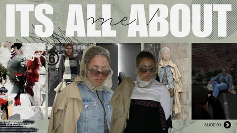
ITS ALL ABOUTme!
BY FAY WALSH

BY FAY WALSH


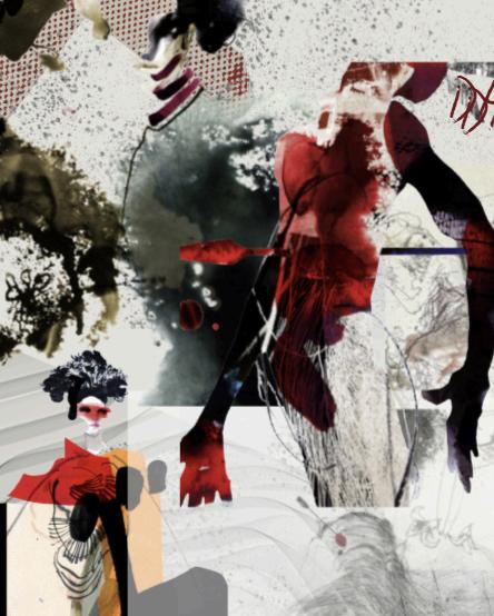
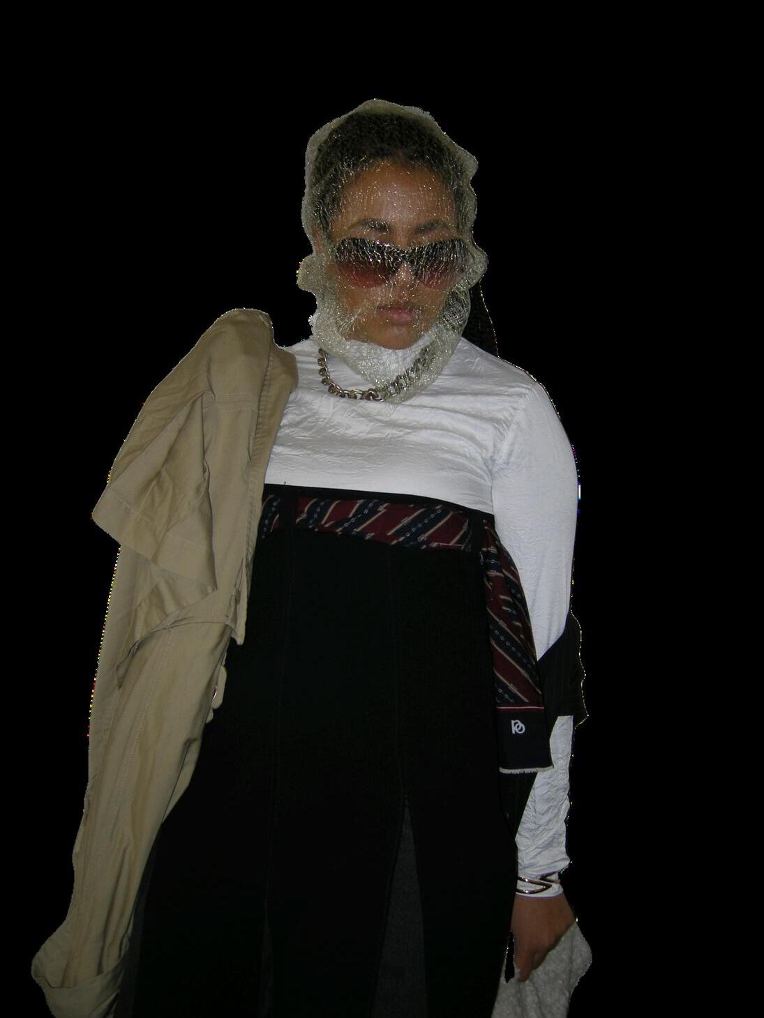
nd Me has been about stripping ly the essentials remain — the e colours, the codes that feel urite colour, light green, became a : a symbol of balance, growth, rest, ing to protect beneath the intensity makes me me is that duality — the d strength at the same time, to be d visually intentional. I’m drawn to nd coded identity because they ugh the world: present, but not but never loud for the sake of it. en less about inventing a persona ng the patterns that were already


Finding my place within the fashion industry has meant recognising that my work sits firmly within the conceptual and editorial sphere — the part of the industry that prioritises ideas, emotional depth, and visual philosophy over trend cycles or commercial spectacle. I’m drawn to the spaces where fashion becomes a form of cultural commentary, where ambiguity, minimalism, and coded identity are treated as creative tools rather than limitations. This positions me alongside the designers and creative directors who use fashion to question, disrupt, and reframe how we see the body, rather than simply dressing it. My market is the thoughtful, research‑driven end of contemporary fashion: the niche where storytelling, restraint, and visual intention matter more than noise. It’s a space that values mood, theory, and atmosphere — a space where I can build work that feels intelligent, emotionally resonant, and quietly powerful.
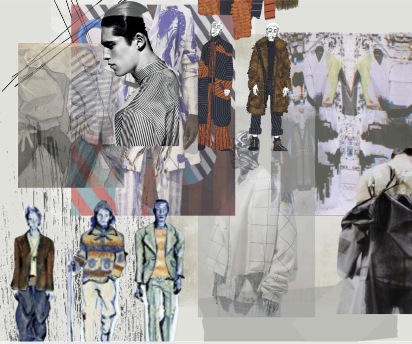
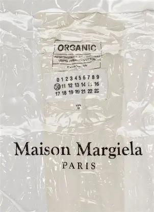
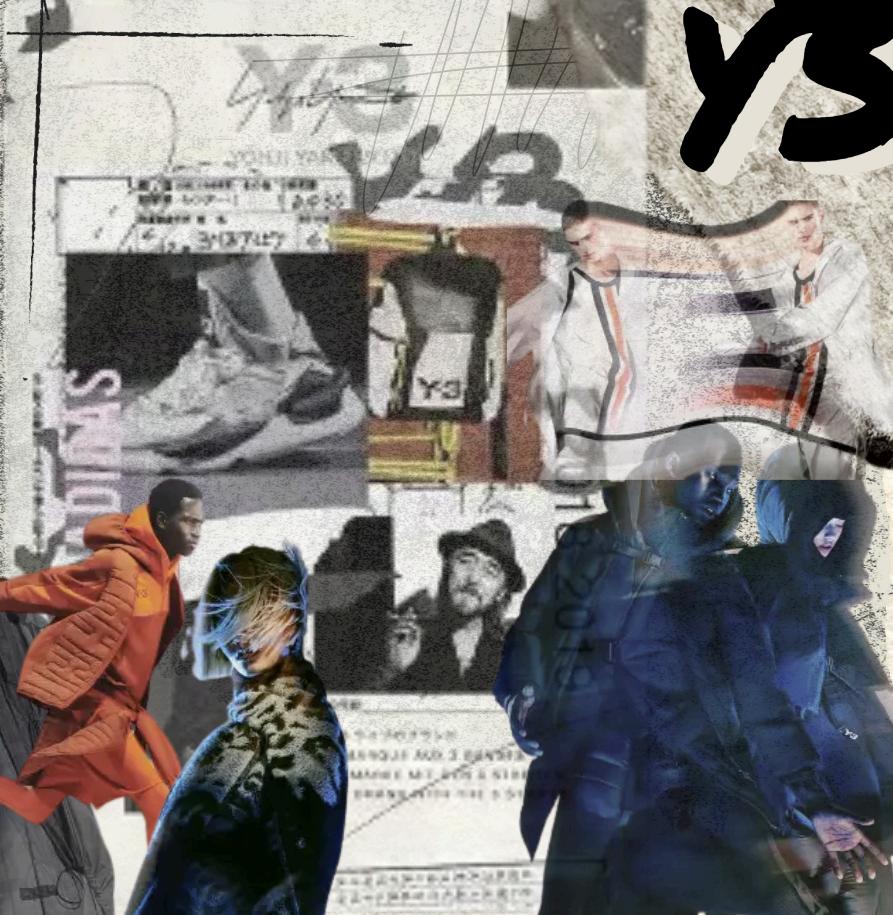
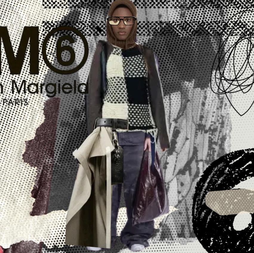
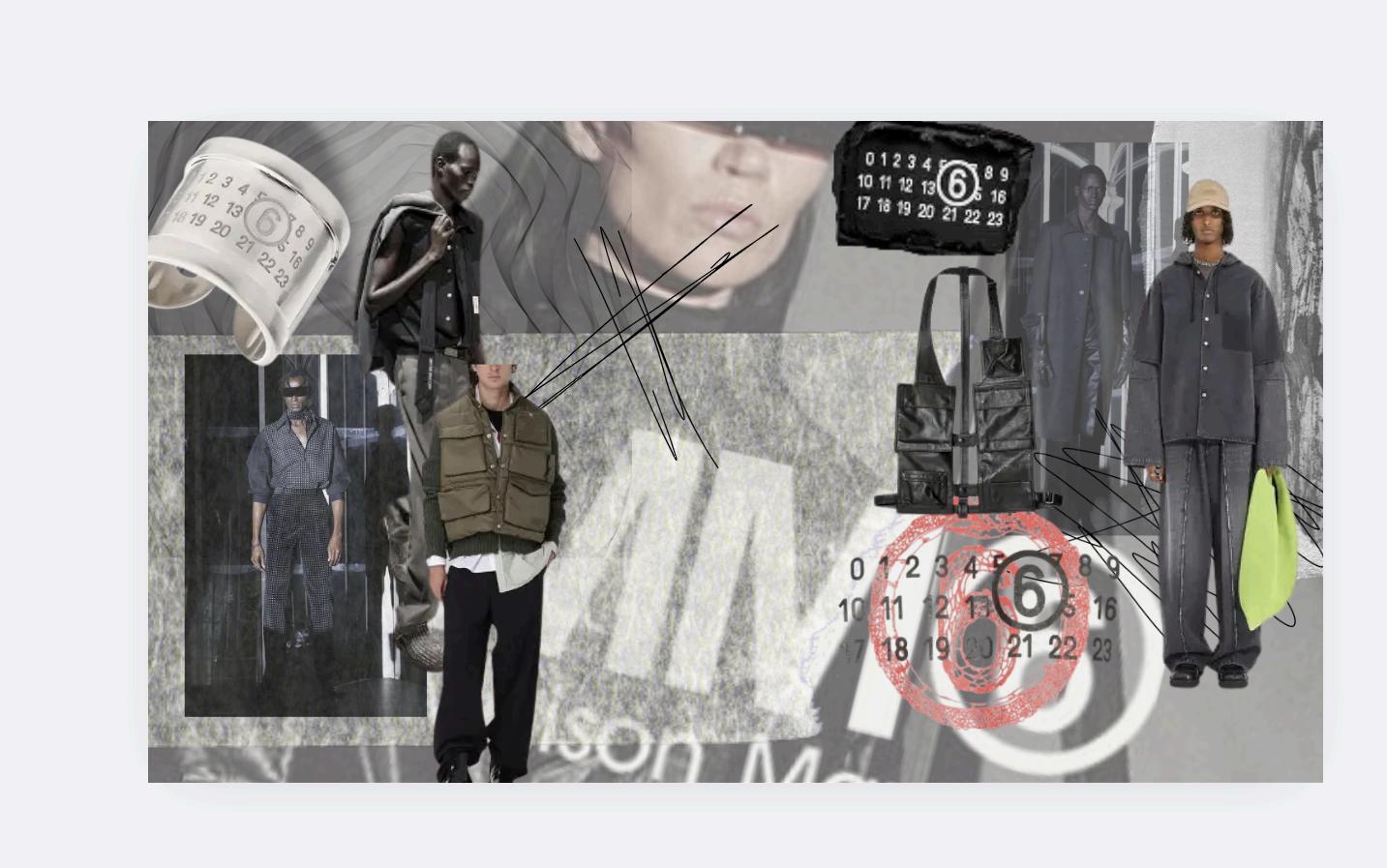
The brands that influenced my work are the ones that treat fashion as a language rather than a product — labels like Rick Owens, Yohji Yamamoto, Margiela, Jil Sander, and Y‑3. Each of them shaped my thinking in different ways: Owens for his sculptural darkness and emotional intensity, Yamamoto for his poetic minimalism, Margiela for his anonymity and refusal of the obvious, Sander for her clarity and restraint, and Y‑3 for its balance of functionality and conceptual identity. What connects them, and what connects me to them, is their commitment to mood, silhouette, and philosophy over trend. They create worlds, not outfits. Their work gave me permission to lean into ambiguity, to prioritise feeling over decoration, and to build a visual identity that is quiet, coded, and deeply intentional.


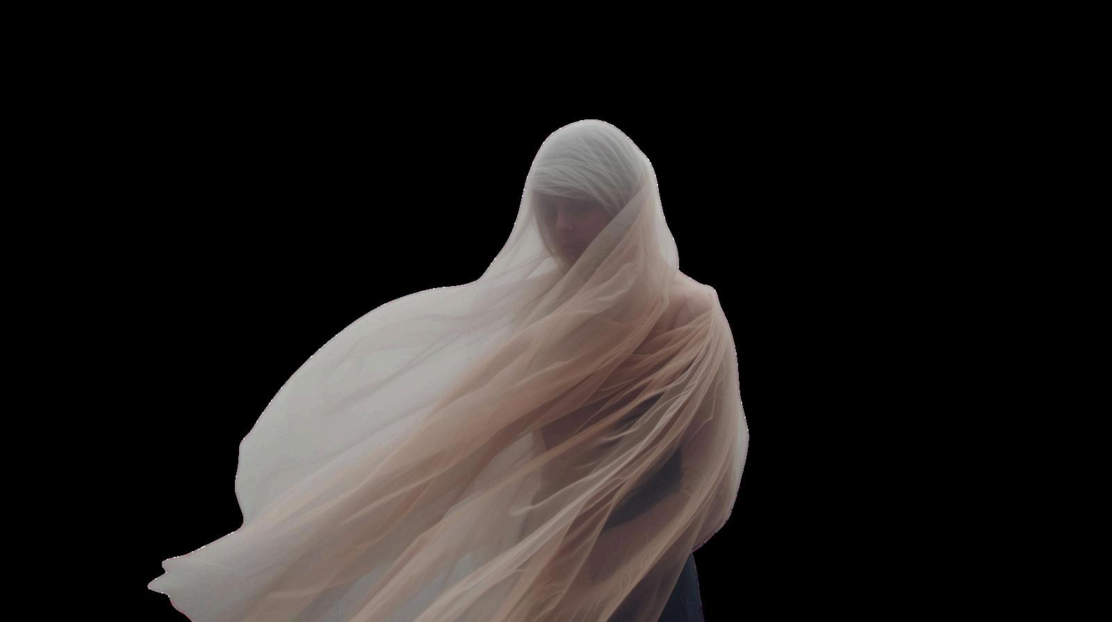
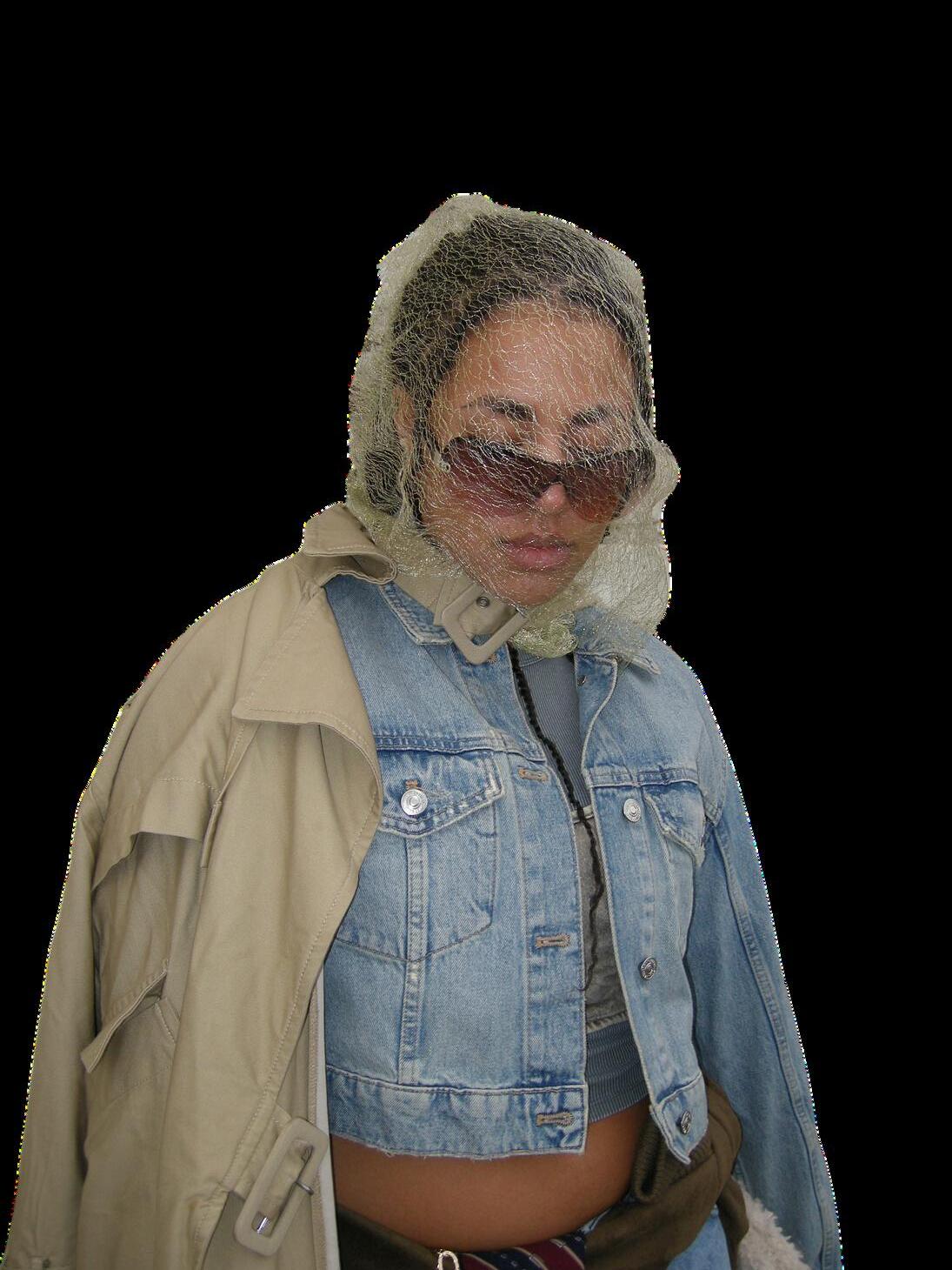
My Big Idea, The Right to Disappear, is built around the belief that fashion can express the parts of ourselves we choose to protect rather than expose. It challenges the assumption that visibility is always empowering, instead exploring how ambiguity, restraint, and quietness can become forms of agency. The concept uses minimalism, coded identity, and emotional subtlety to question the pressure to constantly perform the self. The Right to Disappear isn’t about absence — it’s about choosing when and how you show up, and reclaiming the space between being seen and being understood.
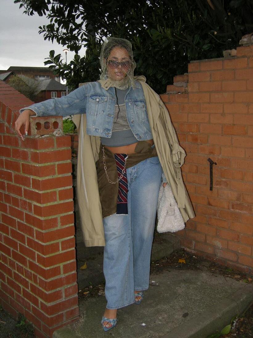
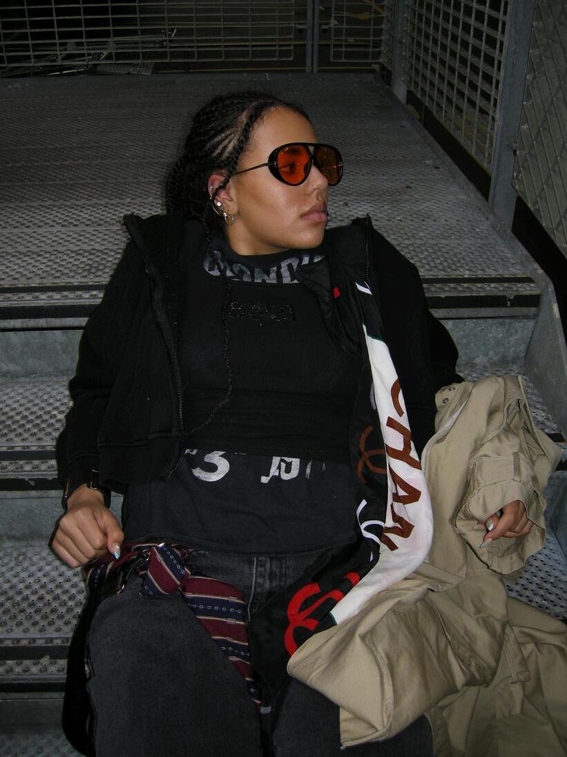
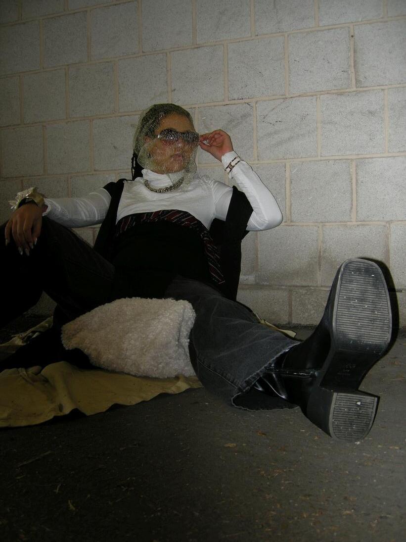
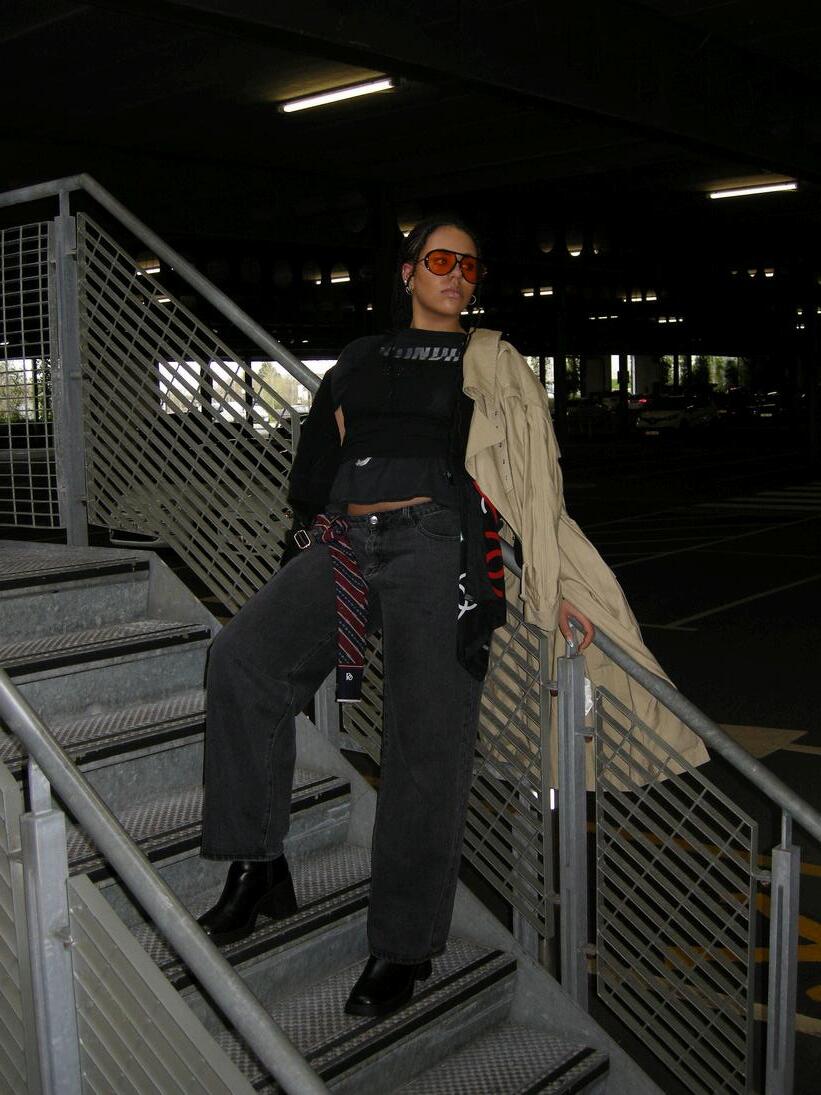
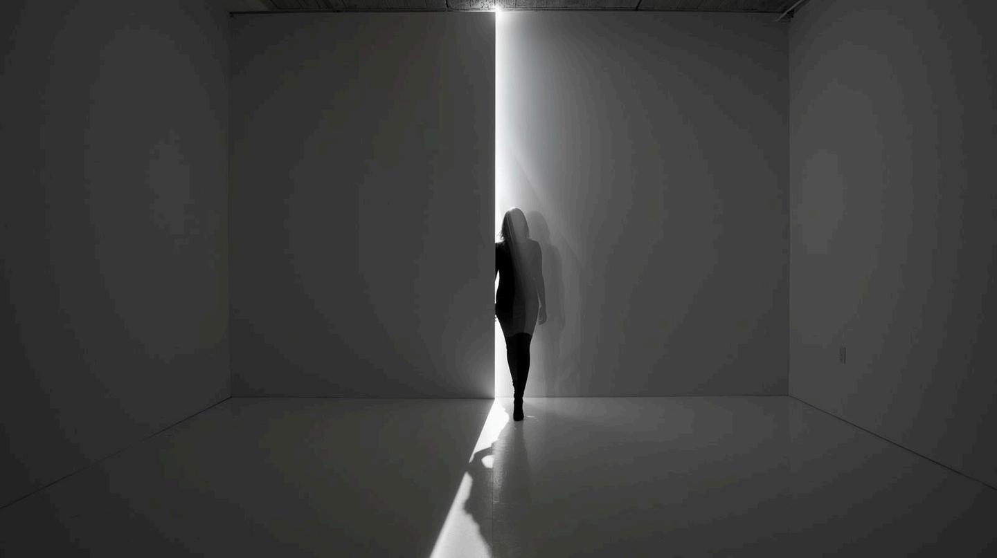
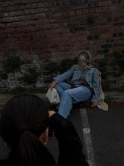
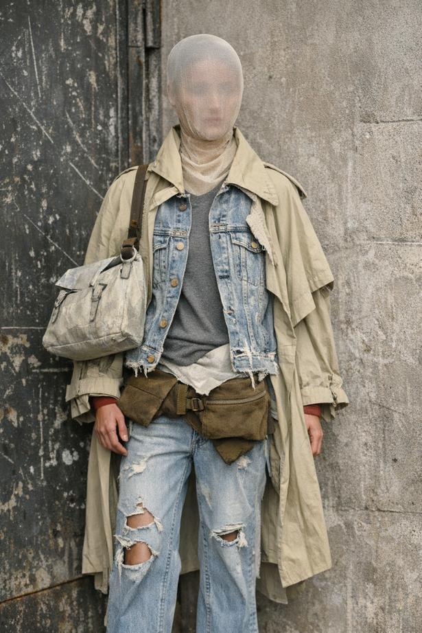
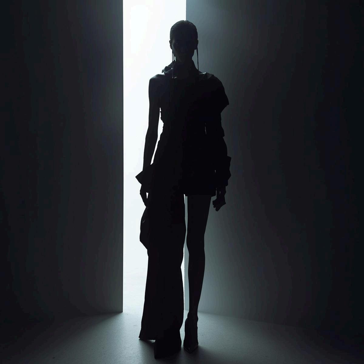
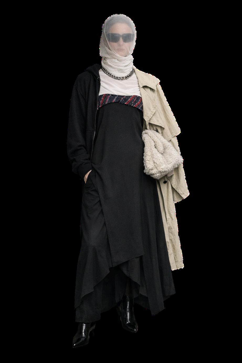
The final images from my shoot capture the exact mood and visual language I set out to build — quiet, coded, and emotionally restrained, yet visually strong. Each look sits naturally within the industrial and urban locations, allowing the textures of metal, brick, and concrete to frame the styling without overpowering it. The layered denim, trench coats, mesh coverings, ties, and sunglasses create silhouettes that feel intentional and slightly withdrawn, reinforcing the themes of ambiguity and self‑possession. The poses — leaning, sitting, reclining, turning away — avoid performance and instead create a sense of stillness within the chaos of the environment. Together, the finals feel cohesive and atmospheric, showing a clear understanding of mood, styling, and space while reflecting the conceptual depth behind the project.