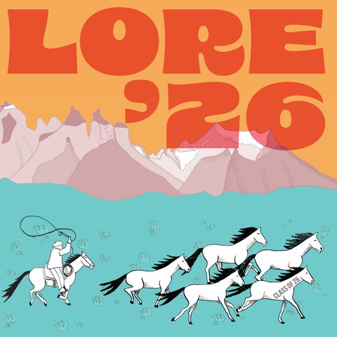
It is a real pleasure to be introducing the 2026 edition of Lore. Our course publication and graduate showcase has been put together by a whole team over the last six months, and seeing the work here is always a proud moment. Our students come from different locations and backgrounds but all spend their time with BA Illustration online pursuing development and excellence in their practice. It is a joy to see illustrators we are now sending into the world, and as a course team we are always thrilled to see their next steps. With its variety of interests and specialisms, I hope you will enjoy delving into Lore and discovering new favourite pieces and illustrators of your own. We are very proud of the best of our class of 2026.
why lore?
SUZI KEMP: INTRODUCING LORE
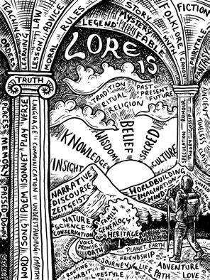
Lore describes knowledge, wisdom or information about a subject. Lore may be mythical and made up or it could be rooted in a very real experience. Lore might make meaning out of something ordinary, or find magic in a daily ritual. Lore might affect or reflect culture and the way people live. Lore could be the study of something specific, or the creation of a new tradition.
Lore often communicates as narrative, and within the pages of this publication our students tell the stories behind selected illustration projects. Each student has chosen a project to present, and have shared their experiences working through this, from the process, (the ‘journey’), to the final outcomes (the ‘destination’). Some students have presented their responses to a Lore themed brief, while others have chosen to celebrate their personal journeys with the course and their developing practice.
This collection of work demonstrates the imagination, creativity and curiosity present in this student group, and represents the exciting growth and development which has emerged as a result of this immersive and dedicated approach. Students, thank you for sharing your story so far – we can’t wait to see where it leads!
Amy Deacon
Illustrator and Maker
I am an illustrator and maker based in South Devon. Inspired by the world around me, I work across both digital and analogue mediums to create work full of character and narrative. I enjoy exploring a variety of techniques, from watercolour and embroidery to 3d modelling. I love experimenting, problem-solving and pushing ideas in unexpected directions, creating work that feels honest, emotionally engaging and genuinely connects with my audience.
SOMETIMES I FEEL...
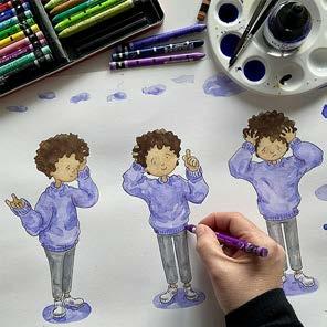
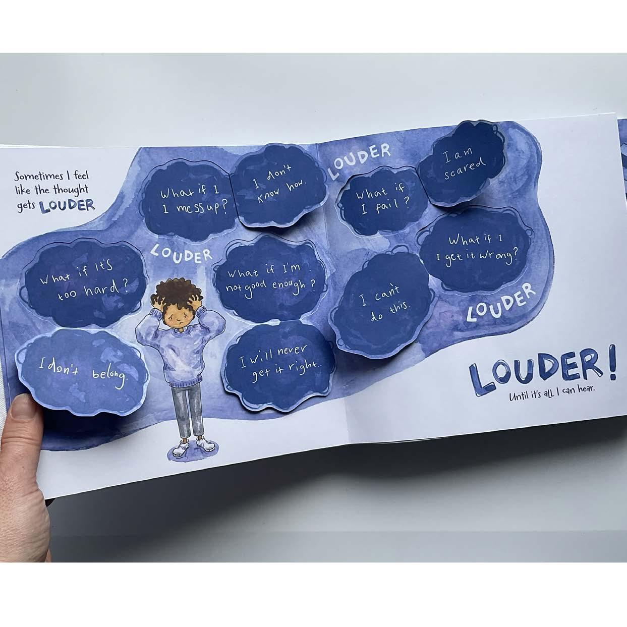
My project explores emotional lore and the inner beliefs we have about ourselves, such as feeling not good enough. Research, including insights from a therapist, SEMH teacher and child focus group, informed both my narrative and design decisions. I worked iteratively between analogue, digital and physical making, experimenting with mixed media, including watercolour, coloured pencil and ink. I investigated paper-engineering to find new ways to connect with my audience. Using mechanisms such as flaps, pull-tabs and expanding structures, I tested how interaction could also mirror emotional experiences. It was important that these elements were not decorative but became part of the storytelling.
amydeaconillustrator@gmail.com
instagram.com/amydeaconillustrator
behance.net/amydeaconillustrator
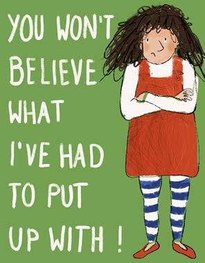
My journey led me to create an interactive children’s book designed to support emotional literacy with a focus on self-doubt. Aimed at children aged 5–8, the book is suitable for use in therapy settings, schools, or at home, offering opportunities to discuss mental health. I combined illustration with interactive mechanisms, encouraging the reader to physically engage with the narrative. Visually modelling how thoughts can grow and feel overwhelming, the book offers simple coping strategies that can be used in everyday life. Through this project I have developed skills I can carry into future practice, providing me with new ways to connect with my audience.
Annie FalconerGronow
Creative Designer
With a career in design and publishing, I am enjoying blending illustration into my professional practice. Having a life-long interest in history, folklore, and our rich heritage and landscape, my philosophy is to capture the essence of my environment by using mediums that are sympathetic to a project’s ambience and atmosphere. I enjoy the freedom of expression using analogue materials, but through exploring printmaking and other media, these processes are evolving my eclectic palette of digital and traditional mediums.
A WINTER TITHE
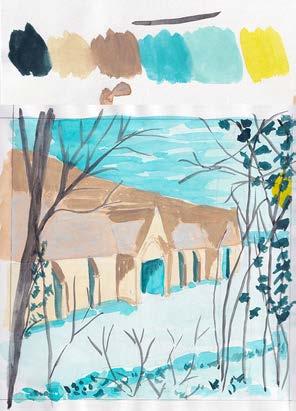
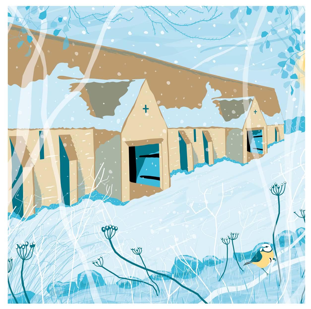
History and culture have been woven into the fabric of my illustrative journey since beginning my degree. For the creation of this Christmas card, I stepped back into the place I feel truly at peace – my home town and its historical narrative. With many iconic buildings to choose from, the 700-year-old stone tithe barn lent itself to the challenge. This behemoth of a building enticed me to distil its presence into a recognisable landmark for visitors, and embed our town’s gentle love for it through sensitive eyes. Researching with on-site sketching, photography, and working mock-ups in watercolour and gouache, the final design and limited palette was transferred to Illustrator to design digitally.
mail:annie@annief-g.com
mail:anniefg@icloud.com
www.annief-g.com
instagram.com/annief g
linkedin.com: Annie Falconer-Gronow
The construction of this illustration was a delicate and meditative process. As each element was added, I could feel the timeless story of this remarkable building sitting quietly within nature and the winter weather. Distilling my vision into a digital version of a screen or lino print was harder than I anticipated, requiring me to test line widths and strength of colour transparencies in each layer until I felt I had depth, and each tangible element wasn’t too dominating. This whole process tested me to create a narrative from my immediate environment in a subtle and sensitive way, through a mix of analogue and digital, to critically assess, and push my practice.
Cat Sarabia
Illustrator
I am inspired by a love for stories, imagination and finding joy in small magical moments. My work explores identity and human interaction, through playfulness and humour. My visual language leans on analogue processes to create stories with the marks I make. For me, play and exploration of media is a vital part of my practise as it often creates exciting, unexpected results.
THE ROUNDABOUT WAY
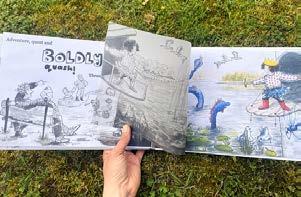
This project began with research and then reflection on the lore we build around our own lives and childhood. I drew my own childhood memories, reflecting on the confidence, fondness and deep connection that I had with places I knew well. I considered how a child’s imagination makes what could be a mundane experience into something playful and magical. Through playful experimentation I developed an overlay concept, showing glimpses of a magical world through the translucent everyday image. Thumbnailing supported me to problem-solve and create a cohesive narrative, while a mixed media approach gave me the flexibility to match the marks I made to the story I wanted to tell.
instagram.com/catsarabiaillustration
catillustrates.wixsite.com/illustration
The Roundabout Way communicates a daily journey. I used familiar places, intertwining them with the creativity of imagination, using a translucent overlay. This made scenes that spark conversations between adult and child, as well as a book that can be revisited, finding new connections on each read.
Targeted at an audience of children aged 3-6, I incorporated prepositional language, as well as a rich vocabulary, visualised dynamically through lettering and images. By carefully selecting words that are fun to say and easy to represent visually, I hoped to create work to support children’s vocabulary development.
Imaginative element of the park scene from The Roundabout Way. “Adventure, quest and boldly quash! Through the park.”
Hua En Kuang
Illustrator
I am an artist and illustrator based in Taiwan. My passion for illustration is expressed through both hand drawn and digital art. I like using vibrant colours and textures to express my message in my art. My interests are nature, culture, wildlife, and gaming.
mail: laohuyatzi1453@gmail.com
instagram.com/laohuyatzi153
CETACEANS’ LIFE
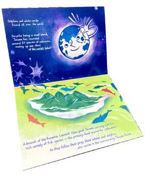
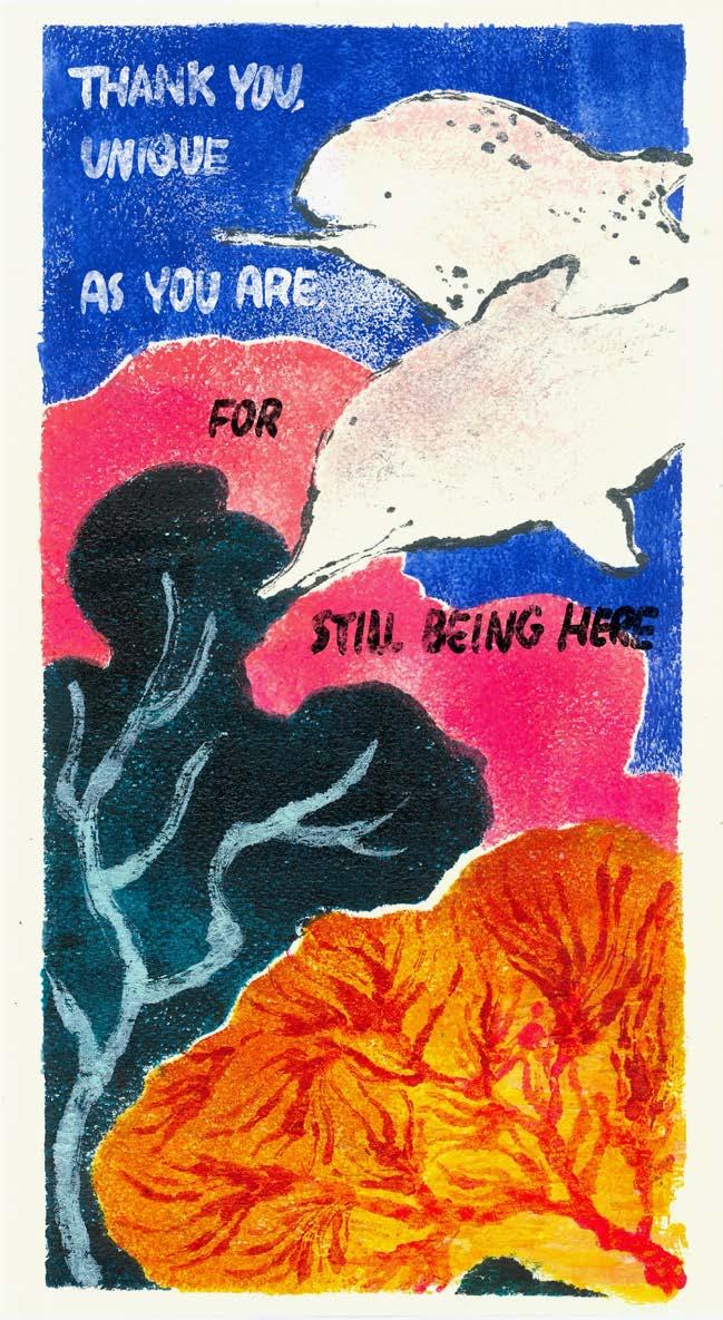
I explored the connection between environmental awareness and personal identity, focusing on the survival challenges faced by cetaceans in the Taiwan Ocean. The aim of this project is to encourage greater public understanding of and engagement with issues relating to marine ecology and cetacean conservation. Through the use of texture and vivid colour, I hoped to convey the sense of wildness and vitality present within the natural world. To support this visual direction, I drew inspiration from the stylistic approaches of Fauvism, particularly in my use of colour and simplified forms. Using the Pochoir (stencil printing) technique, I created a poster that tells the story of the Taiwanese
white dolphin (Indo-Pacific humpback dolphin), alongside a digitally illustrated zine publication. Due to the crisp lines and vibrant colours characteristic of Pochoir printing, I intentionally employed simplified shapes and compositions throughout the work. Research into different methods of visual communication used in illustrated books also helped me refine and further develop my visual language. The final outcome follows a narrative approach in which imagery serves as the primary method of communication, supported by minimal text, allowing the audience to understand the intended message in a clear and accessible way.
The post shares the story of severely injured, nearly extinct white dolphin that had survived for 13 years despite a harsh environment.
Hannah Neuberger
Illustrator
I am an illustrator from Vienna, Austria. My environment is incredibly important to my work, which heavily focuses on urban sketching, storyboarding, and character development. In my process, I aim to work inclusively, making my work accessible to people with sensory or cognitive impairments, while also being thoughtful about who and what I choose to represent.
ILLUMINATE
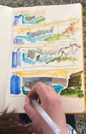
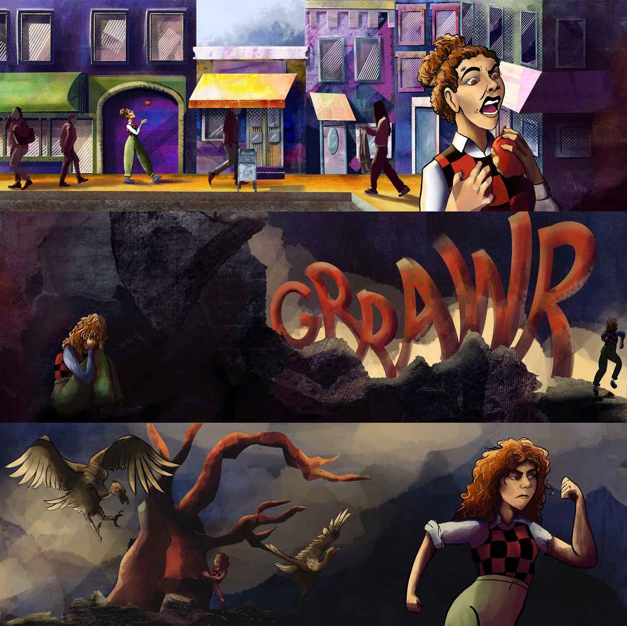
I started with a feeling. I struggled to bring it onto the page. A self-authored script, combined with real-life observations, thumbnails, and collages, slowly formed a new visual language. From this, a character emerges as a guide through the environment. She represents fragments of my values, my experiences, and my questions. In the story her reality has been swept away from under her: she runs, she falls, she drowns, and she climbs back up. Each story beat is rooted in inspiration drawn from being present in everyday life and is heavily influenced by findings and theories in the field of resilience.
hannahneuberger.myportfolio.com
My outcome plants the idea in the viewer’s head that even when you feel down, there is a way out. There is no standing still in my story, movement is the core of this change. My illustrations provide a visual anchor for difficult to grasp emotions. They are intended to be discussed in a coaching setting, making the experience inherently interactive. Within my wider creative practice, this project continues my ongoing exploration of diverse media and themes of emotional complexity.
Hannah W. Sommerfeld
Illustrator
I am an illustrator/artist/printmaker based in Santa Cruz, Bolivia. I have a diverse practice that includes linocut printing, watercolour paintings, digital designs, and hand drawn motifs of fairy tales and Santa Cruz identity. I enjoy creating images depicting my Bolivian culture and sharing my unique perspective through my illustration practice.
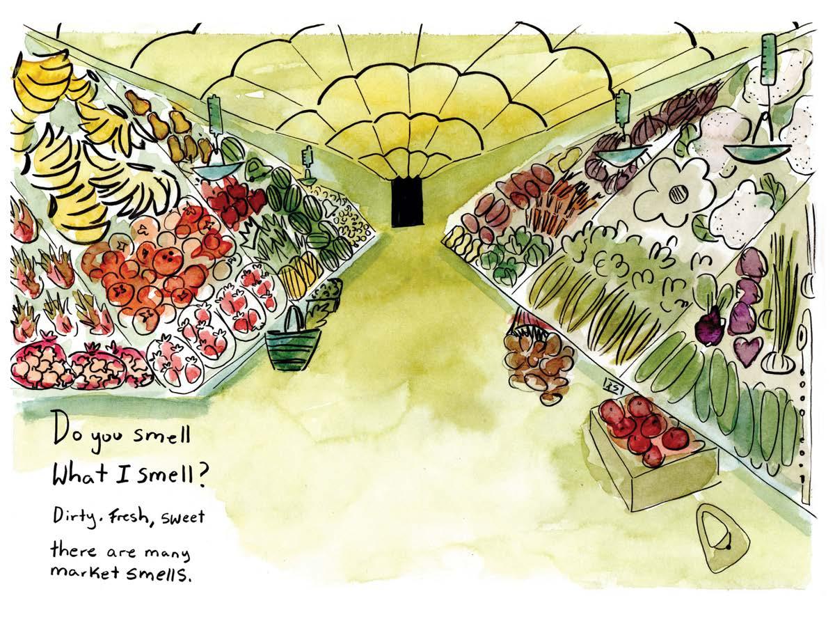
My approach to this project was very natural. My illustration practice is diverse and this project allowed me to experiment freely within my process. I chose to explore themes of nostalgia and childhood memories through place. This led me down a path of remembering how I interacted with places as a child using the five senses. I was conscious of how my illustration characteristics affected the visual aspect of this project. From the colours to the text and composition every choice was made with very careful and thorough consideration.
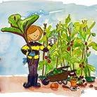
My final designs for the Lore project exude the playful, comforting, and energetic essence of their locations. My goal was to successfully produce a children’s book of hidden object illustrations showcasing classic places from my childhood. This scene displays the variety of produce from weekly trips to the market and evokes the smell of organic vegetables. Other illustrations in the book highlight the rest of the five senses. This project has allowed me to explore the term “lore” through a nostalgic and personal lens. I have learned to be confident in my practice and will continue to experiment and grow.
Irka Blosser
Illustrator
I illustrate for children with a bright, expressive style built from gouache, inks, pencils, and digital layers. I love creating characters and worlds full of texture, humour, and energy. My scientific background keeps me curious, and I love making pictures that invite children to look closely and use their imaginations.
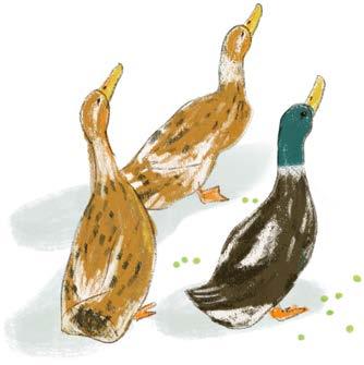
I look for inspiration in everyday things: anything from a seed catalogue to something I notice on a walk. I start by sketching out loose ideas, then experiment with mark making, shape, form, and colour using traditional media like gouache, watercolour, and coloured pencil. These analogue textures form the foundation of each piece. I scan everything in and layer it digitally in Photoshop, refining the composition and adding detail with digital brushes. I love the depth and warmth this hybrid approach creates, and how it allows the hand-made qualities to stay present in my final illustrations.
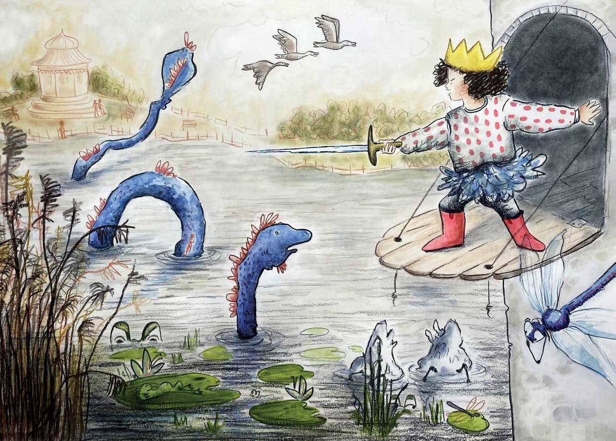
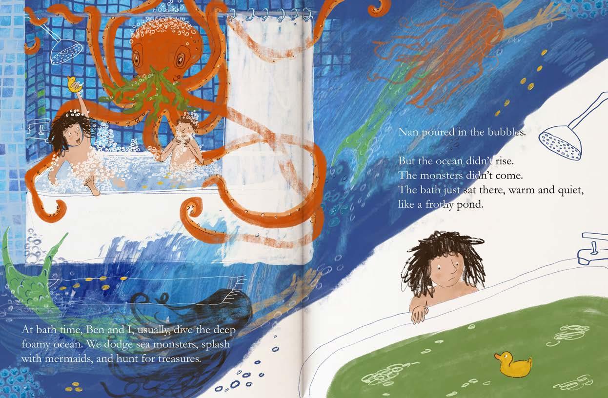
This double page spread comes from the picture book I created in response to the Lore brief. Drawing on my interest in everyday rituals, the story explores how children cope with worry when their routine is disrupted by an unexpected event. In the book, the protagonist (Nell) spends a day and night with her Nan while her brother (Ben) is in hospital, navigating both her concern for him and the strangeness of his absence. This illustration contrasts the lively, imaginative world she shares with her brother during play with the quiet, “magic gone” feeling of facing bath time alone.
James Edward
Illustrator
I am an artist and illustrator based in Brittany, France. My work is greatly inspired by the natural world and a desire to protect and conserve our fragile planet. With a background rooted in traditional watercolour, I have experience working in a range of analogue and digital mediums. More recently, I have been exploring illustrated poetry, nurturing my ambition to author and illustrate books for children and young adults.
FADING VOICES
With creative roots in Earth’s fertile soil,
Inspired by Nature’s long and endless toil,
I set about to find Fading Voices,
Pushed to the brink by ignorant choices,
By pen and by poem, to tell their story,
The sound of their hearts in all its glory,
The lore of the land, the sea and the skies,
Captured in colour to open your eyes,
So grab your hat and hiking shoes,
Discover what we stand to lose!
Listen to those with no words of their own,
The creatures with which we share our home,
In hope they stir a deep sense of duty,
mail: Jebbartist@gmail.com
jamesedwardart.com
www.youtube.com/@jebbart
To recognise our planet’s rare beauty.
From ocean to sand, forest and tundra, Our world is teeming with life and wonder,
Although it appears to be in a mess,
And sometimes we may feel so powerless,
It’s never too late to make a small change,
As tiny sparks bring great fires to rage, How will the future look back on us now?
Did we simply stand back and allow,
The wonder to fade from before our eyes?
Or open them in time to realise,
This journey is long, perhaps with no end, It’s on our actions Earth’s future depends.
Kelly Callan
Mixed media illustrator and animator
I am a mixed media illustrator based in Ireland, blending traditional and digital techniques to create layered, expressive work. My practice is driven by curiosity and research often exploring narrative, texture and visual storytelling through symbolism and metaphor. With a growing interest in animation and motion poetry, I bring still images to life, adding movement and depth to the ideas that shape my work.
AWAKENING
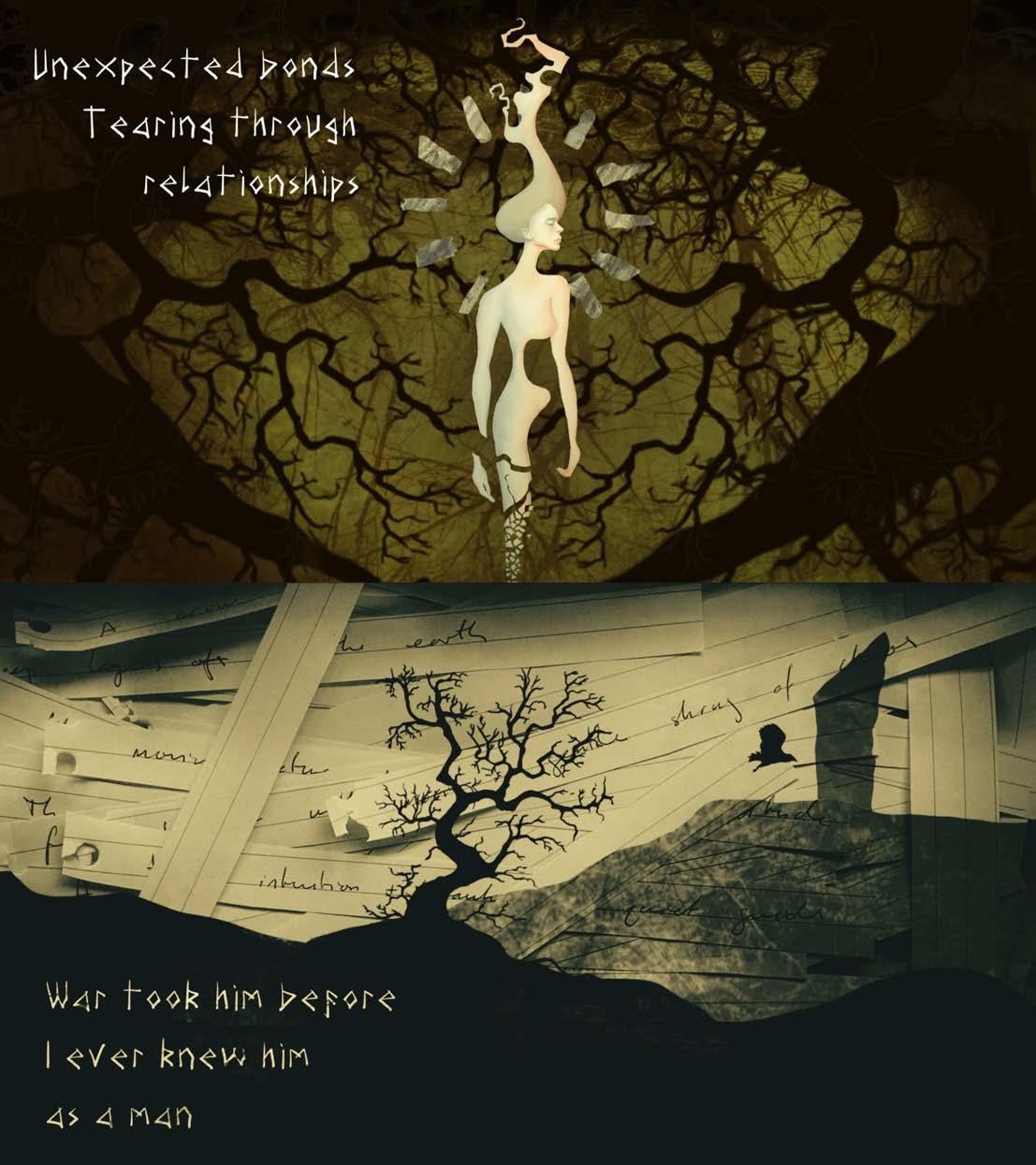
My journey through the Lore project represents the culmination of a creative idea I first began to develop in second year, where I explored motion poetry and its potential to move beyond the static words into a more immersive form. Through this project, I investigate how contemporary affect theory can deepen and shape our experience of the digital poem. The combination of motion, sound and text creates a layered sensory field, allowing meaning to emerge through duration and attention.
mail: kellycallan.illustration@gmail.com
behance: kellycallan
linkedin.com/in/kelly-callan-908a55407
Inspired by the Irish tradition of oral storytelling and poetry, I created an original poem where I was able to improve both my technical abilities and conceptual narrative storytelling. It draws on a mythological narrative to communicate an anti-war message, of what war takes and leaves behind — a story of a mother’s grief forced into a life she would never choose.
Inspired by the Irish legends of the Spring goddess Brigid and the lore of life returning after winter, tracing the movement from destruction, survival and the fragile but resilient act of continuing. Grief can bury those left behind but the cycle of spring after winter moves us on.
Leah EasonSoparfait
Illustrator
As a practitioner I have a fine art and fashion background which is something I believe highly influences my work. I have always been highly inspired by the Japanese ‘superflat’ movement, as well as ‘kawaii’ aesthetics and motifs. Collage, mixed media and pattern work are key elements to my projects. By converging the digital and analogue worlds of illustration, I hope to bring an alternative and new perspective.
WHIMSICAL WORLDBUILDING
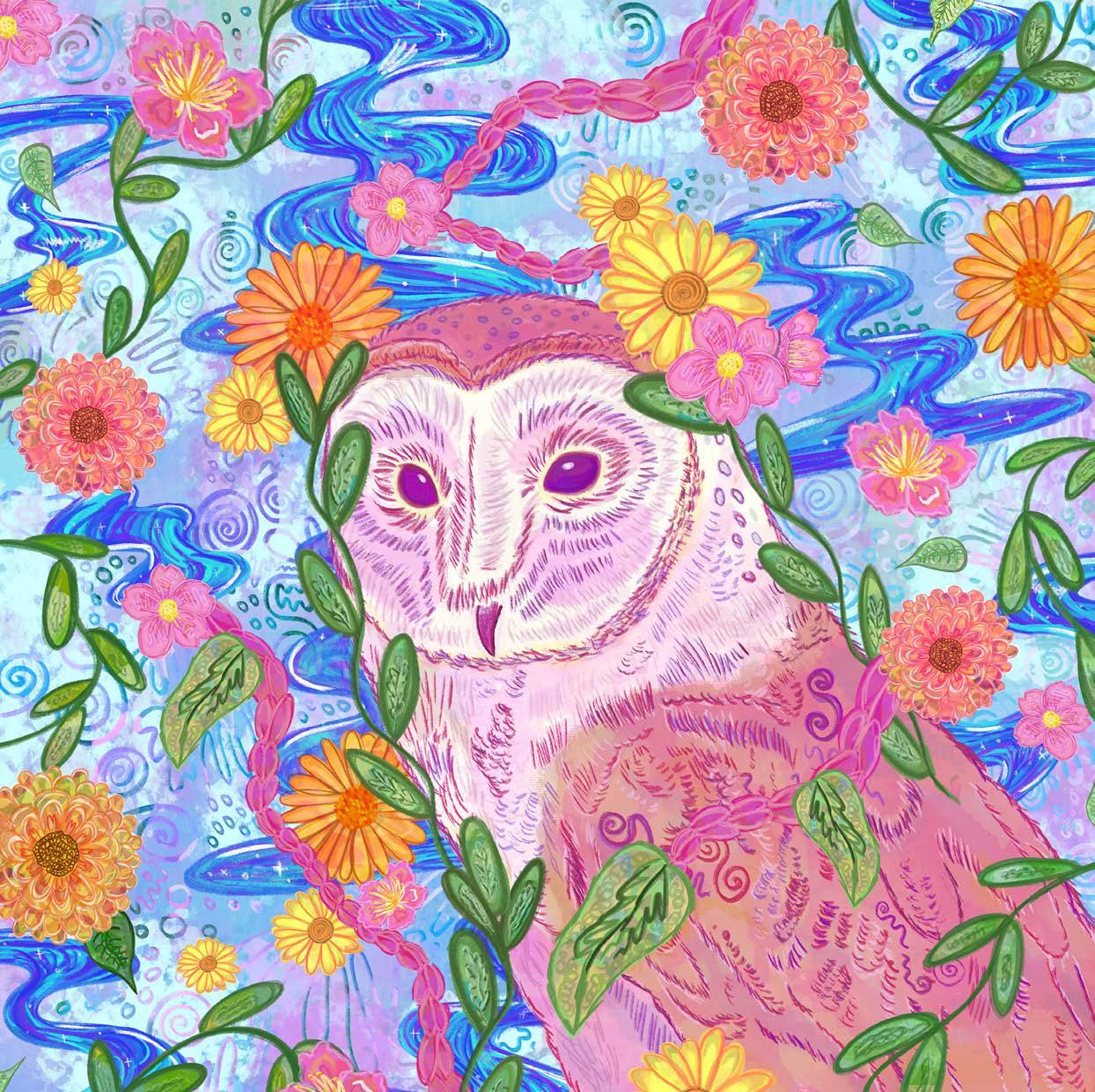
For this specific project I focused on themes of ‘fantasy’ and ‘whimsical’ world-building. Flora and fauna subjects were the focus of my project, in combination with the experimental practices of combining analogue and digital work together. I investigated a range of fantasy-based practitioners and also looked at real-world cultural influences for my project. By thoughtfully combining meaning and implied messages together, I hoped to construct a celestial and otherworldly feeling throughout my four final outcomes, acting as an insight into a fictional and vibrant otherworld.
soparfaitillustrations@gmail.com
instagram.com/parfait.princess
I created all of my outcomes with the intent of product application and therefore formatted them to be adaptable to a range of aspect ratios. I always consider potential merchandising for my work, as I want to develop my own business and work freelance after university. I hope to expand my illustration portfolio more widely with this specific project, as it differs from my more personal practices which take a more hyperspecific focus on contemporary pop culture influences.
The Owl Guardian, one of four media analogue textures.
Miriam Alblas
Illustrator
I am an illustrator driven by a love of storytelling with a particular passion for children’s literature and sculpture. My work is bright, whimsical, and playful. I am most at home working with analogue materials, where I can create with my hands and let the process shape the story. I aspire to write and illustrate my own children’s books, as well as bring other people’s stories to life through my illustrations.
mail: miriamalblas@gmail.com
instagram.com/miriam.in.the.margins
OOPS, I ATE A BANANA. A COLLABORATIVE PROJECT
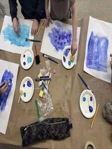
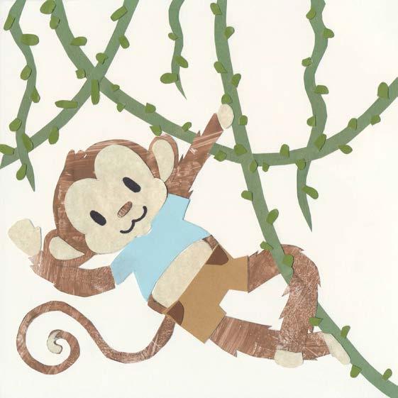
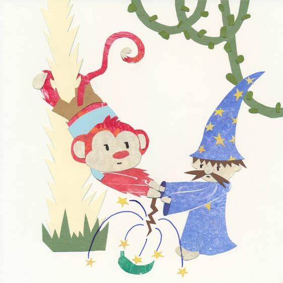
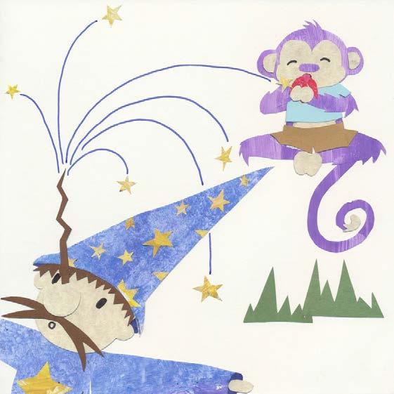
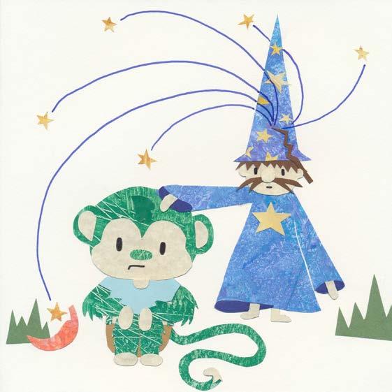
This project was an exciting new direction for my practice, giving me first hand experience working with a young audience to create a children’s book. I collaborated with a local elementary school and created Oops, I Ate a Banana with them. The book follows a monkey named Bob Jr. who keeps changing colours because a Magic Man makes the bananas he eats into different colours. A class of young students wrote the story and helped shape the characters’ attributes and attitude as well as the scenes that took place within the book. I was able to receive live feedback from the class and interacted with them to deepen my understanding of the lore they had created surrounding their book.
Inspired by Eric Carle’s illustrative style, I got the students to paint paper with different colours and textures for me to use in the final designs. This whole project helped me gain experience with working as a group. It also brought me a deeper understanding of what young readers want to see in their books. Most importantly, I learned that a book can never be too playful or silly for young readers.
Natasha Cook
Illustrator
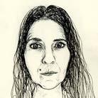
I am interested in depicting social, environmental and political issues through illustrations that evoke emotions and encourage people to think and take action. I am drawn to authorial and cause-related projects, including campaigns and activism. I work in pen and ink, with mixed media and digital collage.
MYCELIUM
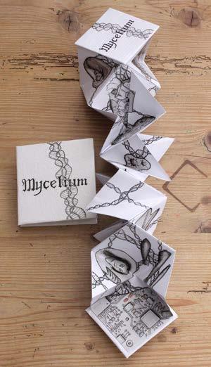
Mycelium explores the changing ‘lore’ of our socio-political system and the idea that we are being ‘played’ by forces surrounding us. Merlin Sheldrake’s Entangled Life provided the inspiration of mycelium as both visual and conceptual metaphor for power connections. Research took me from high fashion, to dissident female artists and art activism, to system and data visualisation. I explored how to visually depict intangible power relations and aspects of our lives, and experimented with paper folding to extend the metaphor through format. The journey took me from being bound by linear storytelling, to a more expansive approach open to interpretation.
natashalcook@gmail.com
instagram.com/neophytedoodle
behance.net/NatashaC Illustrator
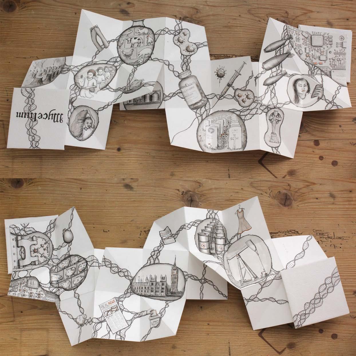
The final folded book format mirrors the mycelium connections within it. There is no start or end, or epicentre, or right way up, reflecting the nature of power dynamics. The drawings leave room for interpretation as do the potential number of connections, depending on how Mycelium unfolds.
It is also a playful object reminiscent of paper fortune tellers we made as children so I created pocket-sized printed replicas for people to handle, explore and take away. Mycelium is a call to open our eyes to what really shapes our lives.
Mycelium unfolds in various ways, showing different sets of illustrations. As the work twists, multiple connections are revealed.
Rowan AyrtonBrierley
Illustrator
I am a multimedia illustrator from Hertfordshire, UK. Working both digitally and using analogue mediums, such as gouache paint and coloured pencils, I create feminine, whimsical work with a variety of influences.
mail: rowanbrierley@gmail.com
@rowanbrierleyxo
rowanbrierley9.wixsite.com/illustration
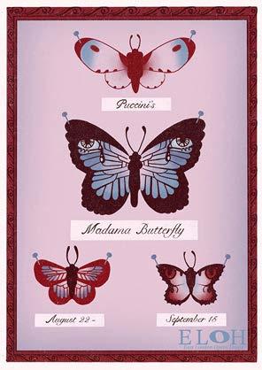
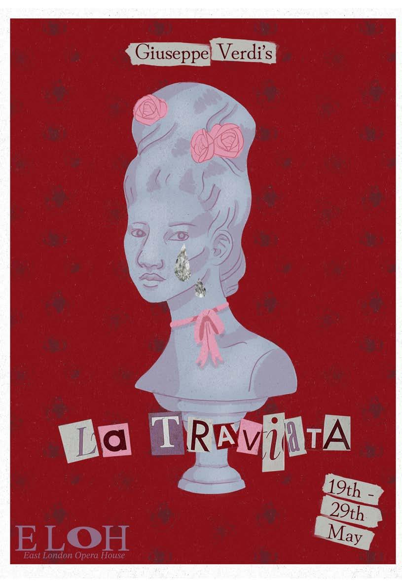
OPERA: CONTEMPORARY REPRESENTATION AND DEPICTION
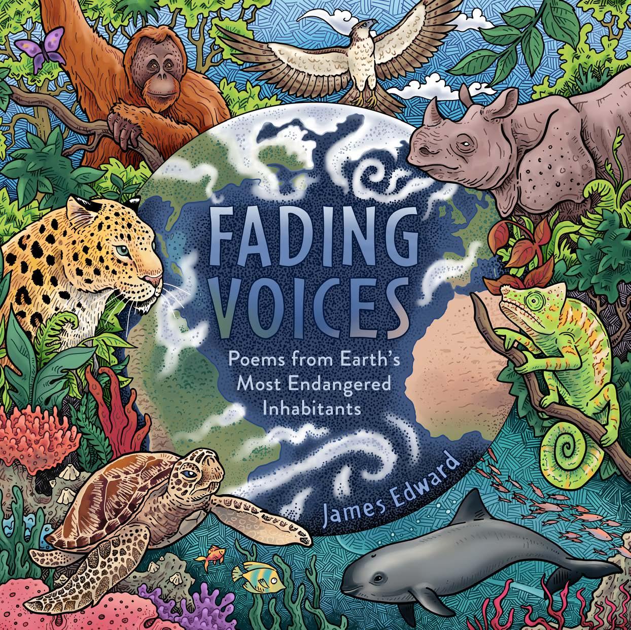
This project marries the visual elements associated with opera performance to modern trends and aesthetics. The aim is to engage younger generations engage younger generations and those who feel opera is inaccessible to them. Inspired by a visit to the iconic Palais Garnier opera house in Paris, traditional decorative motifs are featured alongside stars, bows and ‘ransom note’ lettering. A real mixed media labour of love, these pieces contain hand embroidery, collage and printmaking using real roses; this embodies the many moving parts required for operatic stage performance.
Similarly, the imagery depicted relates deeply to stories on which each opera is based; in La Traviata, Violetta gives her love a rose and asks him to return once it begins to wilt. This inspired me to print with live roses. This melting pot of disparate ideas seeks to create a less intimidating invitation into the world of opera performance, one where class and status create no barrier to entry.
La Traviata (2026) Mixed Media
Ruben Ramires
Illustrator
I am an illustrator based in Houston working across children’s picture books and community-based projects such as zines and workshops. My work is driven by nature, emotion and a playful approach to image-making, and explores observation, activism and material experimentation.
instagram.com/rubenramires
www.rubenramires.com
SOFT REBELLIONS
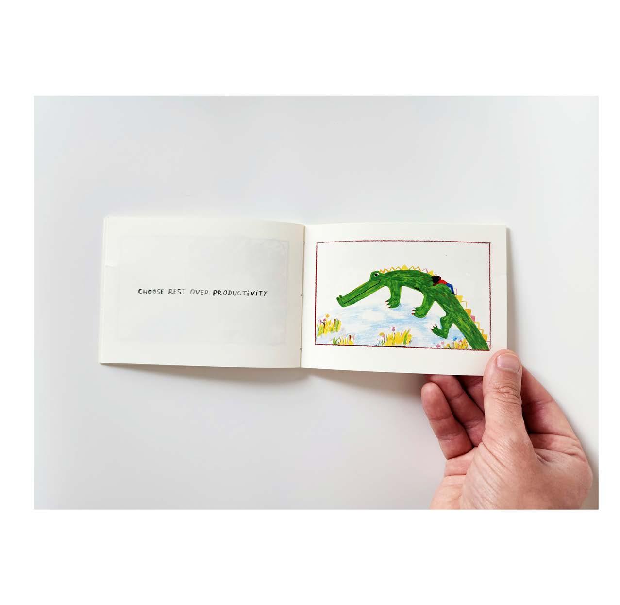
Soft Rebellions is a zine where I developed an approach based in observation, play and material experimentation. Using the sketchbook as a research tool, I responded to everyday moments through loose drawing and testing materials, allowing unexpected outcomes to shape the work. I pushed past the point where idea generation felt finished, reworking illustrations and testing materials to arrive at more unexpected and playful outcomes. Although the zine does not follow a traditional narrative, it moves through sequences of moments.
Pacing and composition create subtle shifts in mood, using humour and visual metaphor to evoke emotion and invite the reader to slow down and engage with everyday details. Soft Rebellions is about resisting urgency. It invites a quieter way of seeing, one that values attention, reflection and the overlooked. The small format supports this intimate experience, allowing each page to feel like a pause. Through this project, I developed a more open, processled way of working, using play and experimentation as tools to shape how I communicate visually.
Sunny-D-Activate
Illustrator
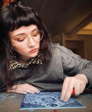
I am an artist and illustrator working under the alias Sunny-D-Activate, specialising in printmaking and graphic wall art. My work focuses on building a distinct visual identity and recognisable style, with aspirations to expand into book cover design and illustration. Later this year, I’ll also be launching my first range of clothing and tote bag designs
THE TREASURY OF RITUALS
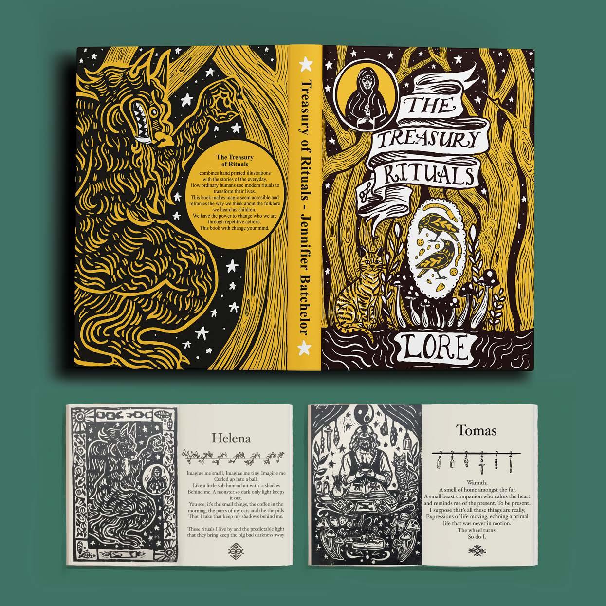
The journey of this project can be understood through four key stages: research, idea development, stylistic exploration, and outcomes. Through research, I gained a broader understanding of ritual, exploring both historical practices and their continued presence in contemporary life. This allowed me to recognise the psychological impact rituals have on us as human beings, particularly in creating structure and meaning. I began translating this research into visual concepts, moving towards more personal, everyday experiences. I used the project as an opportunity to adapt and expand my style, experimenting with a folk-art aesthetic, adding another feather to my illustrative cap.
My outcome for this project exceeded the initial outlines of my self-negotiated brief; I managed to create a more finished concept than I initially set out to. I simplified my artistic style to work within the context of linoleum carving, aiming to imitate a folk-art aesthetic. This process allowed me to create visual assets that I can continue to develop and apply within my personal practice. Experimentation played an important role throughout. On reflection, I recognise the importance of balancing creative exploration with clear intentions. Stylistically, this project has expanded my illustrative repertoire influencing work beyond university.
Victoria Mattison
Illustrator
My main interest is creating strong visual identities in illustration and design, from branding and packaging to combining illustrations with graphics and layouts. I particularly like working with small businesses. I really enjoy experimentation and process-led making, working in analogue with ink, oil pastel, coloured pencil, exploring line quality and combining elements digitally. I am practical, conscientious and approachable with a professional working knowledge of Abode InDesign, Illustrator and Photoshop.
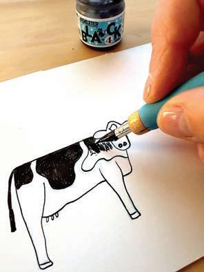
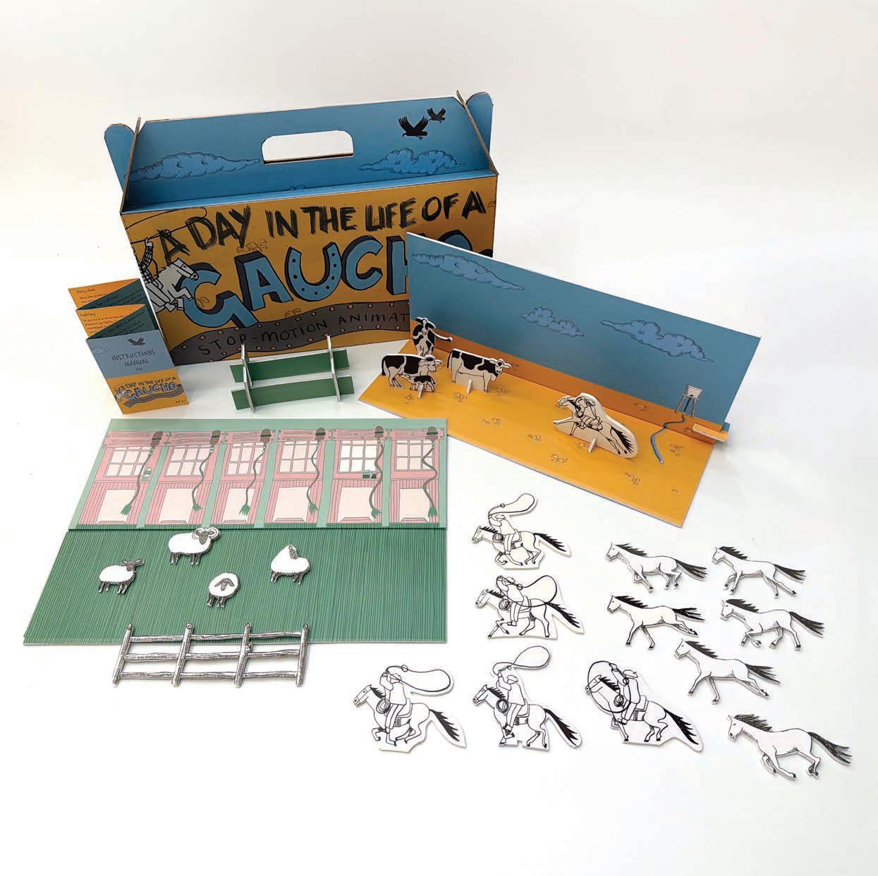
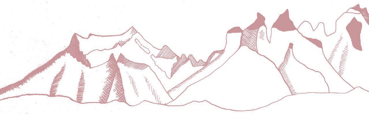
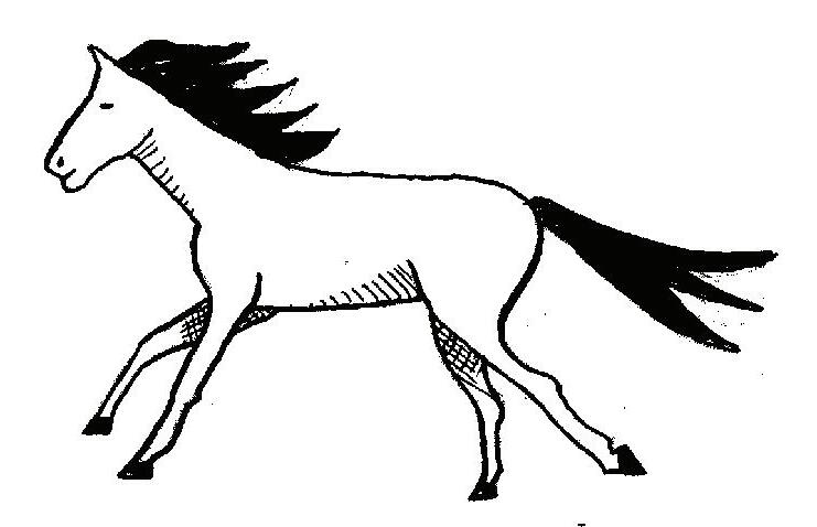
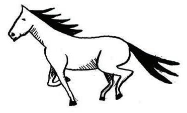
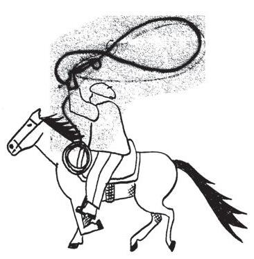
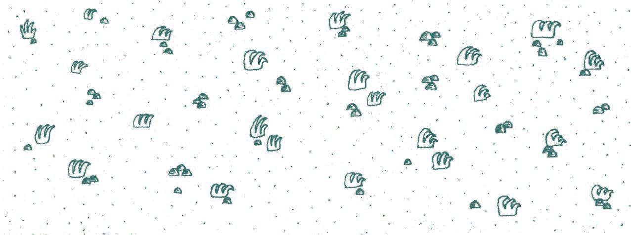
A Day in the Life of a Gaucho started from a desire to save a unique way of life that is slowly becoming obsolete. A way of life that lives alongside the animals and nature that, in this case, are endemic to the Patagonian landscape. A magical way of life, albeit harsh. My journey took me to folk festivals, interviews with a real-life gaucho and to old huts and stables. Old-world dip pen and ink, combined with new-age digital seemed like a metaphor for this disappearing old way of life, giving way to digital and mechanised new ways.
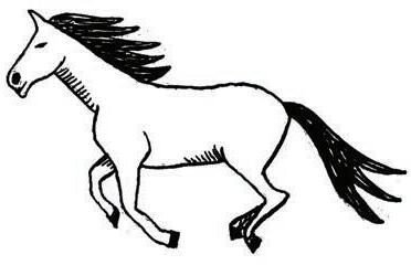
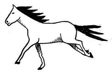
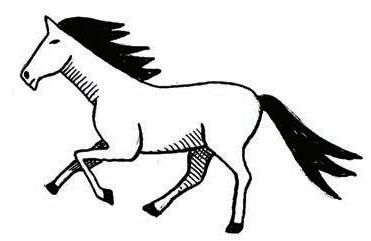
The outcome also reflected the old with the new, a stop-motion kit for children and adults alike to recreate scenes from a day in the life of a gaucho. Using analogue methods, the oldest-known ways to create movement, but captured using mobile phones and apps. A juxtaposition of how the old and the new are now living together. The stop-motion kit uses our favourite collective gadget, the mobile phone, but lets us explore analogue creativity and learning, and lets us become modern-day explorers, imagining life from a different time and place.
Lore is a publication of BA Illustration Online
Falmouth University 2026
Many people contributed to the success of this project and publication.
The Lore Project was conceived by Suzi Kemp in dialogue with colleagues Shefali Wardell, Kit Mead and Jessica Jenkins. The module was taught in 2026 by Joel Merriner and Helen Friel.
Our students have developed their practice since joining with us with the help of all our amazing tutors: Naomi Batts, Peter Blodau, Angela Chick, Helen Friel, Joel Merriner, Connie Noble, Verity Slade, and Pete Williams, as well with the insights of many visiting lecturers.