Logo System
Master Logo
Brand Fundamentals
Divisions*
Color Variants
With Tagline
Regions

Logo System
Master Logo
Divisions*
Color Variants
With Tagline
Regions



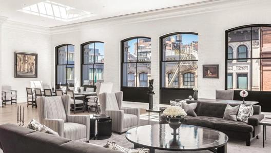



We are perceptive, pro cient and personable. We bring real estate intelligence and intuition to our clients and customers with a contemporary and kinetic energy that is felt through every single touchpoint—from our o ces to our agents, and our digital ecosystem to our brand marketing.


*For designated agents only.
Note: DE logo must be present on all assets. If an agent has custom branding, kindly include both logos in the same size, with DE rst in order.
Our tone of voice is always professional but never pretentious, elitist or cold. We’re well-spoken and knowledgeable yet remain accessible and authentic at all times.

The words and phrases we choose—the number syllables and where the emphasis falls— determine how a reader “hears” what we say. The shorter the headlines and fewer the words we use to communicate, the more con dent and sophisticated we will sound.



In subheads, we use both Sainte Colombe and Euclid Circular. For smaller usage, we only use Euclid Circular regular to achieve legibility and a clean look.
Our agents are the face of the Douglas Elliman brand, and agent photography puts a face to the expertise our clients are looking for. Our agents are featured on a clean white background for a sharp and modern presentation.



Euclid Circular A Semibold with Sainte Colombe Light in the same point size.
Bold with Times New Roman Regular in the same point size.