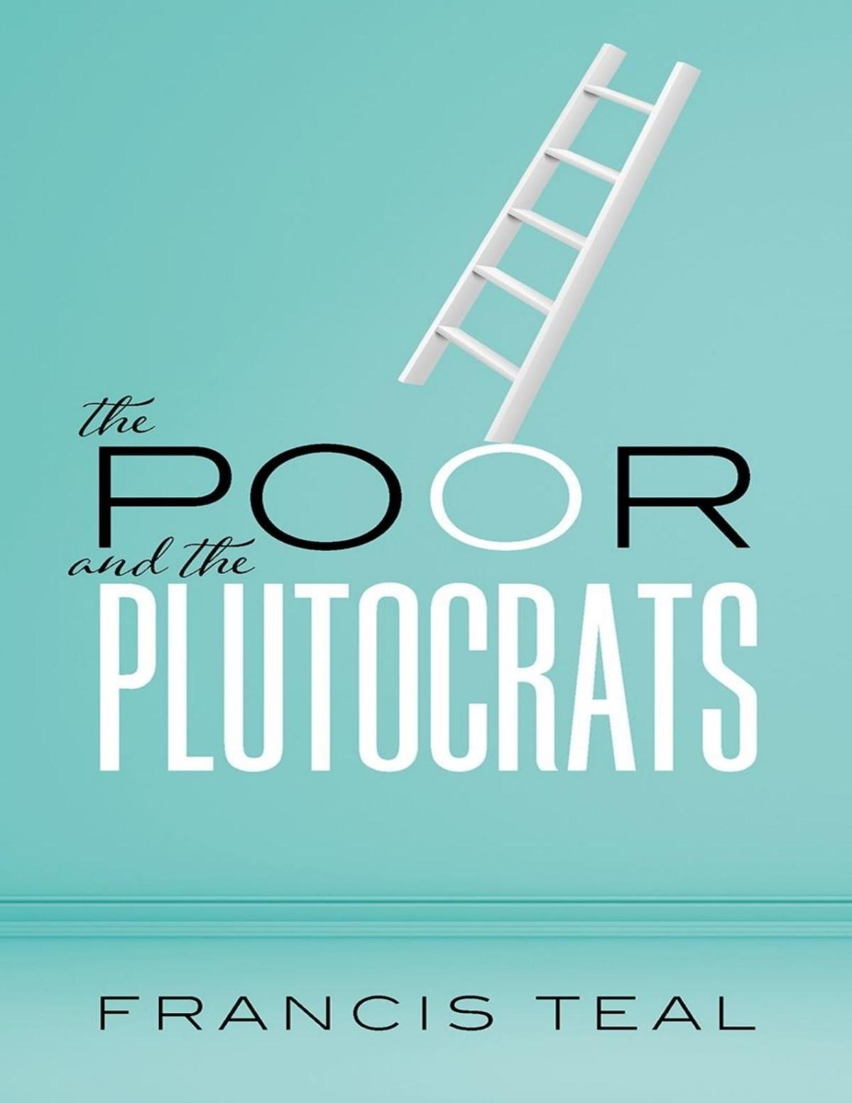
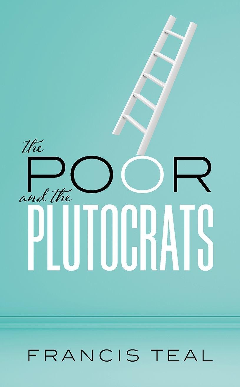
From the Poorest of the Poor to the Richest of the Rich
FRANCIS TEAL
Great Clarendon Street, Oxford, OX2 6DP, United Kingdom
Oxford University Press is a department of the University of Oxford. It furthers the University’s objective of excellence in research, scholarship, and education by publishing worldwide. Oxford is a registered trade mark of Oxford University Press in the UK and in certain other countries
All rights reserved. No part of this publication may be reproduced, stored in a retrieval system, or transmitted, in any form or by any means, without the prior permission in writing of Oxford University Press, or as expressly permitted by law, by licence or under terms agreed with the appropriate reprographics rights organization. Enquiries concerning reproduction outside the scope of the above should be sent to the Rights Department, Oxford University Press, at the address above
You must not circulate this work in any other form and you must impose this same condition on any acquirer
Published in the United States of America by Oxford University Press 198 Madison Avenue, New York, NY 10016, United States of America
British Library Cataloguing in Publication Data Data available
Library of Congress Control Number: 2020941872
ISBN 978–0–19–887014–2
ebook ISBN 978–0–19–264275–2
Printed and bound in the UK by TJ Books Limited
Links to third party websites are provided by Oxford in good faith and for information only. Oxford disclaims any responsibility for the materials contained in any third party website referenced in this work.
In memory of Caroline Dinwiddy
Preface
Incomes in the world range from less than £1,000 a year to the hundreds of millions—the poor and the plutocrats of the title of this book. How has a world come about that has this extraordinary level of inequality? In this book I seek an answer to that question. The answer proposed in the book is that the fate of the poor depends on how the price of relatively unskilled labour is changing. Its dramatic rise in most now-rich countries, which occurred in the first three quarters of the twentieth century, is the key to understanding the decline in both poverty and inequality that occurred in that period within those countries. The poor own their labour and sometimes low-quality land. Plutocrats own a lot more, partly more skilled labour, partly more capital and partly more high-quality land. Just as the fortunes of the poor depend on how the price of its most important asset—its labour—changes, so the emergence of the plutocrats depends on how the prices of their assets are changing. We document in detail those changing fortunes for both the US and the UK.
While the level of current plutocratic incomes is a phenomenon which dates from the late twentieth century, poverty is not. Being poor has been the fate of almost everyone in human history, until the last 300 years. It is not poverty we need to explain, it is why some countries have exited it, by such large amounts, and some have not exited it at all. The poorest of the poor almost always live in countries which are poor. So, the path we wish to understand, from the poorest to the richest, crosses country boundaries first, and then focuses within rich countries on the fate of the relatively poor and rich there. In the world’s richest economy, the US, the price of relatively unskilled labour stopped rising in the 1980s, in the UK it fell substantially after the financial crash of 2007–08. In both countries
that reversal of fortunes for the relatively poor in those countries was the background to a political revolution in the shape of the Trump presidency and the decision by the UK to leave the EU. Both represent radical breaks with the past political processes in those countries.
Political rhetoric in both countries speaks of the resulting inequality as a ‘rigged system’, the abuse by the 1 per cent of political processes to distort economies to benefit the few, not the many—to paraphrase two currently used political slogans. In the chapters that follow I look in detail for the US and the UK at how the relatively poor and rich have fared under the different parties since the advent of the premiership of Margaret Thatcher and the presidency of Ronald Reagan; what is often described as the coming of neoliberal economics. I show that the popular picture of their periods in office, as ones where the rich gained far more than the poor, is wholly accurate. However, while in the US, in the main, that pattern continued, in the UK it was decisively reversed by New Labour whose period in office saw faster rises in income for the bottom 20 per cent than the top 20 per cent. Further, under that administration the incomes of the bottom 10 per cent rose to exceed the bottom 10 per cent in the US. New Labour’s success in these respects is one of the best-kept secrets of the current leadership of the Labour Party.
In the latter chapters of the book I explore how current plutocratic levels of income have arisen, how at the top of the distribution, in both the US and the UK, those at the very top have raced way from the rest of the rich. It is not simply that these plutocrats have seen their incomes grow relatively to the poor, it is that they have grown very rich relatively to most of the rich. These super-rich individuals are hard to find in the data as they are so scarce but in Chapter 8 I provide estimates. While in the UK the average incomes of the top 0.1 per cent in 2014 was $1.5 million, some 100 individuals had incomes that exceeded $30 million. These numbers are dwarfed by those for the US where, in 2014, the average income of the top 0.1 per cent was $3.6 million. Within that top 0.1 per cent, some 100 individuals had incomes that exceeded $100 million.
It is the super-rich, within the rich, who have been so visible. They are not short of critics and the source of their incomes has been contentious. Is it, as their critics argue, that they are the beneficiaries of markets distorted by the free flow of capital and the decline of worker power, summarized as globalization? Alternatively, can some at least of their income be seen as reflecting a combination of talent with the new digital age technology. The pay of the top Premier League football players exceeds £200,000 a week, enough comfortably to make the top 0.01 per cent in either the UK or the US. I try and evaluate how much of the incomes of the super-rich can be seen as reflecting these alternative sources in Chapter 10.
My objective has been to understand the sources of both those high and those vastly lower incomes. To provide you with a map that enables you to see the path from the poorest of the poor to the richest of the rich. It is a path whose length has been steadily increasing for many years.
Francis Teal
London March 2020
Acknowledgements
Providing this map has required a large number of data sources and my principal debt is to those researchers who have made comparative data available so that what would have, in the past, required months of painstaking work now requires a click of a mouse. On inequality the data provided by the late Tony Atkinson and his collaborators has transformed our knowledge of both inequality and the incomes of the very rich. Two vital web-based data sources are The Chartbook of Economic Inequality and the World Wealth and Income Database (WID). Researchers at the Institute for New Economic Thinking (INET) at the John Martin School in Oxford have brought together a large number of data sources and provided a comparative perspective. The World Bank has organized the collection of data on poor countries which has given us an unparalleled insight into the comparative incomes of the poor, presented at PovcalNet. Economic historians, looking to provide a measure of how incomes have changed over the long term, have ensured that we can now see the long-run changes of income in a comparative historical context across both poor and rich countries. Much of this work has been consolidated by the Maddison Project which is extending and updating the work of Angus Maddison. The Maddison data is combined with the GDP data from the PENN World Tables 9.0. In this version of the Tables it is possible to use different GDP series depending on whether it is the time series or crosscountry dimension which is the focus of analysis. Longer time series of GDP and earnings have been compiled on the Measuringworth website for the UK and the US, of which I have made extensive use, and The Billionaire Characteristics Database provided vital information on the world of the richest. Needless to say, all this data is contentious, with disagreement as to the accuracy of measurement and of interpretation. However, without such data we
would be arguing about the sources of inequality and poverty without the basic tools to make progress, namely data. In the chapters that follow I acknowledge those sources more fully. It is the authors of these sites who have made this book possible.
Three anonymous reviewers for Oxford University Press made very valuable suggestions for improvements and pointed out errors as well as directing me to data sources of which I was unaware. Only I am responsible for the uses made of the data and any misinterpretations and errors are entirely my responsibility.
Table of Contents
List of Figures and Tables
From Hundreds to Billions of Dollars of Income
The Poor and the Rich in the UK in the Twenty-First Century
Five Countries: The United States, United Kingdom, Brazil, China, and India
The Rise (and Rise) of the World Economy
The Growing Equality across Countries and Inequality within some Countries
Inequality and Poverty across the World
The Fall and Rise of the 1 Per Cent
The Incomes of the Plutocrats in a Comparative Perspective
Sources of Increasing Inequality: Earnings of the Relatively Unskilled
The Distribution (in percentages) of UK Annual Income for Tax Purposes for the Rich
The Distribution (in percentages) of UK Annual Income for Tax Purposes Excluding the Richest
UK Real Hourly Earnings from 1997 to 2016
The Distribution (in percentages) of UK Annual Equivalized Incomes in 2014
The Distribution (in percentages) of UK Annual Equivalized Expenditure in 2014
The Standard Normal Distribution
The Distribution (in percentages) of the Log of UK Annualized Incomes and Expenditures (showing log scale)
The Distribution (in percentages) of the Log of UK Annualized Incomes and Expenditures (showing levels scale)
The Distribution (in percentages) of the Log of UK Annual Incomes for Tax Purposes in 2014–15
The Distribution (in percentages) of UK Real Hourly Earnings (2014 prices) for 1997 and 2016
UK Earnings (in 2014 prices) 1200–2015
Earnings in the United Kingdom: 1820–2015 Log of Real Hourly Earnings and Log of Real Average Annual Earnings (2014 prices)
Annual Growth Rate of Real Average Earnings in the UK (%pa) 1820–2015
2.13. 3 1
3.2.
3 3 3.4. 3.5. 3.6. 3.7. 3.8. 3.9. 3.10. 3.11.
4 1 4.2. 4 3 4.4. 4 5 4.6. 4 7 4.8.
4 9 5.1. 5 2 5.3. 5 4 5.5.
Annual Growth Rate of Real Average Earnings in the UK (%pa) 1970–2015
GDP per Capita for US, UK, Brazil, India, and China 1500–2014
Population for US, UK, Brazil, India, and China 1500–2014
GDP for US, UK, Brazil, India, and China 1500–2014
Average Annual Growth Rates of GDP per Capita for the UK and US 1700–2014
Earnings for the Relatively Unskilled in the US 1820–2018
Earnings of Production Workers and GDP per Capita in the US 1820–2018
Unskilled Labour Costs and GDP per Capita in the US 1820–2015
Earnings of Production Workers and GDP per Capita in the US 1980–2015
Real Average Full-Time Earnings and GDP per Capita in the UK 1820–2015
Real Average and Median Earnings and GDP per Capita in the UK 1997–2015
Average Annual Manufacturing Wages for Labourers in (2011 PPP) US$: 2005–2008
The Size of the World Economy
The Growth Rate of the World Economy 1700–2014
The Distribution (in percentages) of Growth over Epochs since 1950
The Rise of the ‘West’
GDP per Capita Across the Rich and Poor World 1950–2014
The Rise of China
The Distribution of Country Growth Rates 1820–2014
Growth Rates and Initial Income Levels 1700–2014
Growth Rates and Average Income Levels 1700–2014
Distribution (in percentages) of Log of GDP per Capita in (2011 PPP) US$ from 1700 to 2014 (unweighted)
Comparing GDP per Capita in Rich and Poor Countries 1950–2014
Measures of the Standard Deviation of Incomes (in 2011 PPP US$) across the World
The Gini and GDP per Capita 1981–2014
The Gini and Growth
5.6.
5.7.
5.8.
6.1.
6.2.
6.3.
6.4.
6.5.
6 6
6.7.
6 8 7.1.
7 2
7.3.
7 4
7.5.
7 6
7.7.
7 8
7.9.
7 10 7.11.
8 1 8.2.
8 3
Average Gini and GDP per Capita from The Chartbook of Economic Inequality, 1975–2014
The Changes in the Gini Across Countries 1970–2012
The Gini for Anglo-Saxon and Nordic Countries
The Two Waves of Globalization: 1700 to 1913 and 1950 to 2014
Comparing the Numbers Poor with Different Poverty Lines
The Changing Shape of the World Income Distribution
Annual Incomes per Capita by Income Decile (in US$(PPP) 2011 prices) for Poor and Rich Countries
Changes in the Distribution of Incomes (in US$(PPP) 2011 prices): in Poor and Rich Countries from 1988 to 2008
Lorenz Curves for Poor and Rich Countries
The ‘Elephant’ Chart
Success and Failure in the Two Waves of Globalization: 1700 to 1913 and 1950 to 2014
Changes in the Shares of the Top 1 Per Cent
The Fall and Rise of the 1 Per Cent in the 10 Per Cent
Household Market Incomes and GDP per Capita in the UK and the US
Household Incomes in the UK and US: 1979–2000
Household Incomes in the UK and US: 2000–2016
Household Incomes in the UK and US: 1979–2016
The Bottom and Top Deciles in the UK and the US from 1979
Incomes from Tax Data for the UK and US
Household Incomes within the Top 10 Per Cent in the US: From Ragan to Obama
Household Incomes within the Top 20 Per Cent in the US: 1979–2016
US Failure and New Labour Success in Reducing Inequality
The Distribution (in percentages) of Household Expenditure per Capita in the UK and Ghana
The Distribution of the Log of Household Expenditures per Capita in Ghana and the UK as a Density Function
The Probability of Observing Someone Richer than You
8.4.
8 5
8.6.
8 7 8.8. 9.1. 9.2. 9.3. 9.4. 9.5.
9 6 10.1.
10 2 10.3.
10 4 10.5. 11 1 11.2. 11 3 1.1. 2 1 3.1. 5 1 6.1.
Ranking UK Households by Income
The Log of Rank and Log of UK Incomes in 2014–15
Looking for the Plutocrats in the UK
Looking for the Plutocrats in the US and China
Rank and Expenditure
Earnings and Labour Productivity in the UK and the US: 1950 to 2014/15
Earnings and Labour Productivity in the UK and the US after the Financial Crash
GDP and Employment in the UK and the US: 2000–14
United Kingdom, 1997–2015: Real Average and Median Annual Earnings (both in £ (2011) prices) and Net Immigration (in Thousands)
Chinese Exports and Manufacturing Employment in the US
How Much Did Imports from China Reduce US Employment?
The Rise of the Super-Rich
Average Incomes from Labour and Capital in the US: 1962–2014 (in Thousands of 2014 US Dollars)
Numbers of Billionaires and the Richest One in the UK and US
Average and Total Wealth of Billionaires in the UK and the US
The Growth of Average and Total Wealth of Billionaires 1996 to 2014
The Changing Shape of the World Income Distribution
Total Factor Productivity Relative to the US across the World: 2014
The Distribution of World GDP per Capita: 1700–2014
Share of the Top 1 Per Cent
From Levels to Logs
Average Annual Growth Rates of GDP per Capita for the UK and US 1–2014
Measures of Incomes Used for the Gini in The Chartbook of Economic Inequality
Changing Places: 1700 to 1913
6.2.
6 3
7.1.
7 2
7.3.
8.1.
8.2. 11.1. 11.2.
World Income per Capita: 1988 and 2008
Rankings for the Second Wave of Globalization 1950 to 2014
Unchanging Gini and Rising Dispersion of Incomes
Trend Growth Rates for the UK and the US in Per Cent Per Annum
Trend Rates of Growth of Tax Income
The Incomes of the Super-Rich in the UK in 2014 in (2011 PPP US$)
The Incomes of the Super-Rich in the US and China using a Paretian slope parameter of 1.55
Trend Rates of Growth of Tax Income (per cent per annum)
The UK EU Referendum: The Roles of Age and Education
1 From Hundreds to Billions of Dollars of Income
The Poor and the Plutocrats
In August 2018 Apple became the first company with a market capitalization of US$1 trillion—a trillion is a million million. In recent years its net income has been running at an annual rate of about US$50 billion—a billion is a thousand million. In 2014, the most recent year for which readily comparable data is available, the size of the world economy was US$100 trillion (approximately, what’s the odd trillion between friends). So, the net income of Apple is some 0.05 per cent of the income of the whole world. Some 100 countries in the world had total incomes in 2014 less than the revenues of this one company. The population of these countries was just under 750 million and in those countries per capita incomes for some 50 per cent of the people there were US$4,000 a year or less (that’s less than US$350 per month).1
As trillions are a bit hard to imagine let us come down from the stratosphere of mega US tech companies to the humble UK taxpayer and ask what, in 2014, income you would need to get into the top 0.05 per cent of taxpayers. The answer is about £2 million or in current US$ about US$2.6 million. To get into the top 1 per cent you would ‘only’ need £150,000 as your annual income. Indeed 95 per cent of UK taxpayers in 2014 had incomes below £70,000 and that
income would be unimaginable wealth for those at the bottom of the UK income scale.2
This book is about what can explain these extraordinary numbers. In particular we want to explain the co-existence of people with incomes in the hundreds with those whose incomes is in the hundreds of millions, even billions—the poor and the plutocrats. We are not short of explanations. The principal villain (or hero, possibly depending on whether or not you are an Apple shareholder) is globalization which is seen as having benefited the elites of the top 1 per cent at the expense of the bottom 99 per cent. There are other candidates for the gross inequalities these numbers suggest—they include openness to trade, the threat posed by migrants to domestic workers and the demise in much of the rich world of the role of trade unions. The attempts to prevent workers organizing, which has a history as long as labour movements have existed, by governments controlled by the mega rich seems to many an obscene abuse of the relatively powerless. A mirror image of the view that trade unions are a conspiracy against those who need jobs as their activities price them out of employment.
The figures on inequality which are widely cited, and which form the basis for the impact of Thomas Piketty’s book Capital in the Twenty-First Century, add fuel to the fires of resentment. That the share of the top 1 per cent in incomes in the US is argued to have increased from some 8 to nearly 20 per cent from the 1980s until the early part of the twenty-first century and the share in the UK from 5 to 15 per cent, over a similar period, while wages for the relatively unskilled in the US have stagnated seems the basis for revolution.3 While those advocating less inequality would be horrified by its methods, a revolution is just what is currently taking place in the US. The UK is not far behind with immigration being the toxic issue which has rendered advocacy of membership of the EU politically impossible for both the major UK parties.
In this book I seek to address these issues from a longer-term historical perspective. The quality and extent of information that is currently available on both incomes and inequality, through the efforts of many researchers making their data readily available, is without parallel. My objective is to use this information, and put it into
a narrative, as to what has determined the fall, and rise, of inequality over the last 300 years.
Incomes across the World: Absolute and Relative Poverty
How has a world emerged when incomes can range from a few hundred dollars to ones in the billions; in other words, how can so many be so poor and so few plutocrats be so very rich? Posing the question in that way, as is often done, suggests a world of tiny islands of the super-rich surrounded by a rising tide of massed, and increasing, poverty. In fact, exactly the opposite is true. For the first time in human history we live at a time when the numbers of people who are absolutely poor—living on less than US$2 per day—is falling.4 The picture often painted of rising inequality at the country level is simply false. It is true that the 100 countries with annual incomes less than Apple’s net income are mired in acute poverty. However, in contrast stands China and, to a much lesser extent India, whose combined populations is 2014 were some 2.7 billion and whose incomes, since their reforms of the late 1970s, have been rising rapidly. Once we allow for differences in population across countries we will see that, at the country level, there has been a more or less continuous decline in inequality since the 1980s.
Within countries it is a different story and for measures of poverty to be interesting a relative approach is essential. Pointing out to the average worker in the richer world that their incomes of US$20–30,000 are unimaginable wealth for those in the poorest countries is not a winning political strategy. Relative poverty is determined by the extent of inequality in a country and, in many rich countries since the 1970s, inequality has been rising. For some in those countries their wages have not risen for decades, for some this has meant their incomes have fallen. Changes in inequality within a country arise because incomes grow at different rates. If, as was the case from the early part of the twentieth century until the 1970s, the relatively poor
saw faster rates of growth of their incomes than the relatively rich then inequality will fall. If this process reverses as has happened in some countries for some periods since the 1970s then inequality will rise. There is a measure—the Gini coefficient—which offers us a way of summarizing the shares that the relatively poor obtain of total income and we will use it to show how inequality is related to levels of income in Chapter 5.
Once a longer term and comparative perspective is taken on incomes and inequality we see that our problem is not to explain a rising tide of poverty—there isn’t one—nor is it to explain how capitalism generates ever-increasing inequality—it hasn’t. Our problem is much more complicated. What can explain such large changes in both incomes and in inequality as have occurred since the start of sustained global growth in the early part of the nineteenth century? We need to reformulate our question so that it is not about the levels of income and inequality but about what determines their changes. We start with incomes.
Do You Want to Get Richer Faster than Others?
If you do you need to be aware that rates of growth have differed greatly across countries and over time as we show in Chapter 4. These differential growth rates are by far the most important factor in explaining where the poor have lived and where they live now. So, if you want to be rich the first step is to make sure you are born into a rich country. The second step is to make sure you own an asset whose price is increasing relative to that of other assets. In this context labour is an asset and for many it is their only asset. If that is your asset you need to make sure you live during a period when the price of labour is rising rapidly. So, best to avoid the twenty-first century, and opt for the middle part of the twentieth century—and, of course, make sure it’s a relatively rich country. In his book A Farewell to Alms Gregory Clark documents the scale of the success in raising the price of labour initially in the US and the UK and then spreading
out from there, albeit to only a small part of the world until very recently.
It may seem a little odd, in an age dominated by the visible incomes of super-rich people, to be talking about the poor seeing faster growth in their incomes than the rich. Indeed, a little selfcontradictory, as wouldn’t the poor soon cease to be the poor? Odd yes, but that is exactly what happened for most countries that were rich relative to others at the start of the twentieth century. For the next seventy years the income of relatively unskilled labour rose very rapidly and their share of incomes rose too. Now, given the size of the gap between the rich and the poor at the start of the twentieth century, the rich were still ahead, even after seventy years of a closing gap, but they were very much less ahead.
It is the reversal of that process from the 1980s onward in nowrich countries that dominates current political discourse and on which we too wish to focus. However, the longer-term perspective is important. If inequality fell due to the rise in the price of the unskilled labour then logic dictates that it may well rise once that rise ceases as, at different times, and to varying extents it has, in most rich countries.
The big exception, currently, to the general rule that the poor only own their labour, and that labour is unskilled, which is why an increase in its price is essential for them to exit poverty, is subSaharan Africa where the poor, in many of those countries, own their land as well as their labour. Poverty here flows, as it did in all countries before the nineteenth century, from the low productivity of that land. More generally the rise in the price of any asset depends on increases in its productivity. It is the link from ownership of assets (whether it be labour, land or capital) to their productivity that explains, in part, why some get so much richer than others. The other part of the explanation is when individuals capture for themselves the productivity of assets they steal. Kleptocratic rulers not being a new phenomenon, although the productivity of the assets they can steal is.
Productivity and Skills
While productivity is widely discussed it is less widely understood; both in the sense that its meaning is not understood, and in the sense that the reasons for its change are not well understood. When we talk of the productivity of an asset we mean how much output it produces per unit of input. Thus, you could measure the productivity of an acre of land by how much output was produced on that land. You could also measure the productivity of labour on that land by knowing how much was harvested per year by a labourer. So that would give you a measure of land and labour productivity respectively. However, rather obviously, you need both land and labour to produce the farm’s output. So how do we measure the productivity of a farm? To do that you need a way of combining the inputs to jointly produce the output. That economists can do so with a joint measure of inputs, then we can ask how much output those inputs combined will produce. Robert Gordon’s (2016) The Rise and Fall of American Growth provides a comprehensive account as to how this can be done. We can do this not only for farms, we can do it for factories where we need labour and capital and a new asset— skills. It is not that farms don’t need skills, it is assumed they need less (economists tend not to farm).
Now let’s move from a farm, or firm, to an economy, which is the basis for Robert Gordon’s study. We have already said that the growth of the output of economies has varied enormously. Why is that? Well you might have thought that the rather obvious answer to that is that input growth has varied enormously too. It is true it has, but one of the major puzzles in economics is that when we measure inputs and outputs we find that much of the increase in outputs is not explained by those inputs. When physicists discovered that the universe was expanding, and they did not know why, they invented the term ‘dark energy’ to explain the expansion. Now economists are just as good as physicists in thinking up names for things they don’t understand, so they term this mysterious factor increasing output ‘total factor productivity’ (TFP). As with dark energy, while we don’t know what it is, we do know that whatever it is, it is very important. If TFP acts to increase the demand for labour—and it appears to have
done so for long periods of time—then that is very good news for the owners of labour whose productivity, and price, will go up. But, of course, it may not help labour, it may help capital, or it may all be tied up in the brain of Steve Jobs inventing Apple. In which case the price of labour, particularly of the unskilled kind, will not rise.
As with poverty only a relative definition of skills is useful for understanding the evolution of incomes in an economy. Since the late nineteenth century there has been a steady expansion of education levels so that jobs which required simply secondary education now require university degrees. It is those at the bottom of the education ladder, however long that ladder is, that constitute the unskilled in that society. In poor countries low skills means those with no education, in rich countries they have ten years but leave with no formal qualifications.
You may well think that the obvious factor we have not mentioned so far that will be driving TFP is ‘skills’ broadly defined so it can include the ability of Steve Jobs to invent Apple. However, if by skills we mean the more prosaic kind, such as years of education, then the news is not good. Such measures explain relatively little of TFP—the mysterious X factor continues to dominate the factors that drive output.
Inequality in Markets and Inequality across Households
But we are in search of the plutocrats. So, given that people are seeing different changes in their incomes, is that all we need to know for what drives the inequality that gives us the plutocrats? The answer is clearly no as these prices drive market outcomes, not personal and household incomes. There has, since the Napoleonic Wars, been some form of tax on incomes although not continuously —it was formally repealed in 1816, a year after the Battle of Waterloo, but it was reintroduced in 1842 by Sir Robert Peel to deal with a massive public deficit (some things never change)—so there
is a gap between what workers earn and what they can spend. Nowadays there is much more than income taxes to consider. Further there is more to the incomes of labour than the wage rate. We have, so far, not mentioned the self-employed who are in many poor countries most earners and are increasingly important in rich countries.
In Chapter 7 we will use data for both the UK and the US for the current range of benefits and taxes which drive the gap between what the market pays labour and what the household with that income can afford to spend. In the case of the UK the distinction made by the Office of National Statistics (ONS) is between ‘Original Income’ which is what we have been considering so far, the direct cash benefits that a family may receive, and ‘Final Income’ which allows for all the direct and indirect taxes and transfers and implicit benefits that households receive. For the US we will make a similar distinction, although the data is organized differently from that of the UK ONS. There is indeed a large gap between original and final incomes.
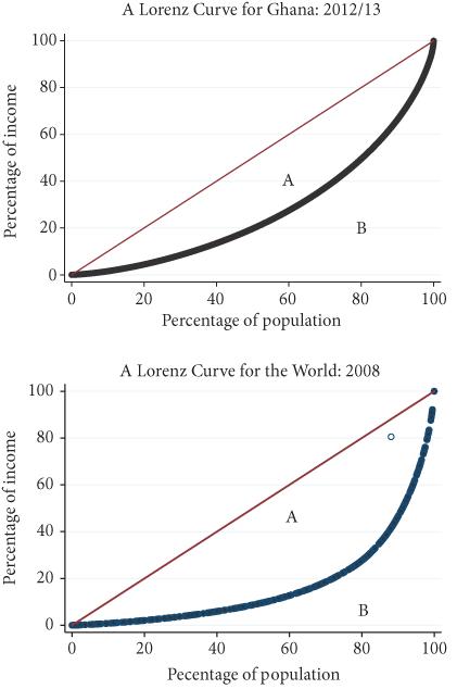
When analysing inequality we need to be clear not only which income we are considering but whether we are considering the distribution of an individual’s income or that of the household. In the chapters that follow we will look at both individual incomes and that of households. As we want to compare rich and poor countries, we begin our comparison with households as that allows us, for the moment, to sidestep the problems of societies where incomes are hard to measure as many do not work for wages. The income measure in Figure 1.1 below is based on household per capita incomes.5
Figure 1.1. Lorenz Curves
Sources: Ghana GLSS survey and author’s calculations using unweighted data. World Lorenz curve data from Lakner and Milanovic (2013) World Panel Income Distribution (LMWPID) database.
The measure of inequality on which we will mainly focus is the Gini and the Gini has a ready graphical representation. We show two examples in Figure 1.1 of plots which will give rise to different values of the Gini. The curve in the chart shows how much income any
percentage of the population captures, it is the Lorenz curve, named after its inventor. In the top panel we show a Lorenz curve for data we will be using in Chapter 8 for incomes in Ghana in 2012/13. Ghana is a relatively poor country compared to countries in Europe and America but certainly not among the poorest countries in the world. In the bottom panel we show a Lorenz curve for the population of the world in 2008.
On the horizontal axis we show the percentage of people, on the vertical axis the percentage of the total income they have. So, the graph shows that for Ghana the bottom 20 per cent of people get less than 5 per cent of total income while the top 20 per cent get more than 50 per cent and the top 10 per cent 35 per cent of income. A rather unequal distribution of income you may well think. The Gini coefficient is one means of summarizing this fact. The Gini coefficient is the area A in the figure divided by (A+B). In words, it is the proportion of the area under the 45-degree line which is above the Lorenz curve. The word proportion in that last sentence is important. The Gini coefficient is telling us about the proportional distribution of income. It is not telling us how big is the gap between incomes. In the figure the Gini coefficient for Ghana is 45.0 which tells you that the Lorenz curve divides the area under the 45-degree line roughly into half. Now it is clear from the figure that the more unequal is income the further to the right will be the Lorenz curve so if we look at the bottom panel, we see that here the area A is much bigger and in fact the Gini for the world in 2008 is 66.5. You can read off the graph that the top 20 per cent of people in the world get some 85 per cent of its income. Even more unequal, and there are reasons to believe this number may understate the true extent of inequality which we will discuss in Chapters 5 and 6.
Now we are interested in more than simply proportions. We are also interested in how big is the gap in incomes between the rich and the poor To measure that gap we need to measure incomes and doing so is difficult and much of our concern in the chapters that follow will be to compare incomes both within and across countries. To anticipate some of that discussion we need to note two problems when it comes to comparing incomes. The first is that a dollar in a poor country buys far more than a dollar in a rich country. One