ACKNOWLEDGMENTS
Professional. So, if I know anything at all about teaching, it is what I have picked up along the way from my own teachers: first and foremost I must thank them. First, those who taught me epidemiologic methods in class: Wayne Rosamond, Beverly Levine, Charlie Poole, Jane Schroeder, Jay Kaufman, Steve Marshall, William Miller, and Michele Jonsson-Funk. The textbooks I learned from (and continue to learn from) included Epidemiology: An Introduction by Kenneth J. Rothman; Modern Epidemiology (3rd edition) by Rothman, Sander Greenland, and Timothy L. Lash; and Causal Inference by Miguel Hernán and James Robins. I recommend reading all three books.
Next some key mentors: my doctoral advisor Annelies Van Rie (as well as the members of my doctoral committee who have not yet been mentioned: Prof. Patrick MacPhail and Joseph Eron). My postdoctoral advisor Stephen R. Cole, to this day a trusted mentor, collaborator, and friend, and who in particular I want to credit with introducing me to key ideas in causal inference and suggesting I teach risks and incidence rates from the survival curve.
Some peers in my learning process included Kim Powers, Abby Norris-Turner, Brian Pence, Elizabeth Torrone, Christy Avery, Aaron Kipp, Chanelle Howe—and too many more to name.
My frequent collaborators, including some of the above as well as Michael Hudgens, Adaora Adimora, Enrique Schisterman, Robert Platt, Elizabeth Stuart, Jessie Edwards, Alex Keil, Alex Breskin, Catherine Lesko, and some of those already named, all of whom have taught and challenged me.
At the University of North Carolina at Chapel Hill, my Chairs Andy Olshan and Til Stürmer; Nancy Colvin and Valerie Hudock; and my many faculty peers, who are a delight to work with.
My former students, who have certainly taught me more than I taught them, including Alex Breskin, Mariah Kalmin, Jordan Cates, Sabrina Zadrozny, Ruth Link-Gelles, Elizabeth T. Rogawski McQuade, Cassidy Henegar, as well as numerous others—including current students.
Noel Weiss, for helping set me on this path many years ago. Allen Wilcox, for general encouragement, and for publishing my first epidemiologic writing (a sonnet!) in a journal. Moyses Szklo, for his unending support. Jeff Martin, Martina Morris, and Steve Goodreau for their encouragement. Sandro Galea and
Katherine Keyes, for showing me it could be done. Steve Mooney, for being on this long, weird journey with me. Stanley Eisenstat, for helping teach me how to think. And anyone, at UNC and Duke and the Society for Epidemiologic Research (especially Sue Bevan and Courtney Long!) and at American Journal of Epidemiology and Epidemiology and other journals, who helped guide my way.
This book is framed within causal inference: here, I owe a particular debt of influence to what I have learned in person and from the publications of several people not already named above, including (alphabetically, and incompletely) Maria Glymour, Ashley Naimi, Judea Pearl, Maya Petersen, Sonia HernándezDíaz, Eric Tchetgen Tchetgen, Tyler VanderWeele, as well as the Causal Inference Research Lab crew and others. My mistakes, of course, remain my own.
Finally, a big thank you to Chad Zimmerman at Oxford University Press who nurtured this project from its inception.
Peer reviewers. This book is deeply indebted to the volunteer labor of numerous epidemiologists (and occasionally others) who helped review chapters and gave selflessly of their expertise.
Round 1 peer reviewers: Charlie Poole, Stephen R. Cole, Molly Rosenberg, Jay S. Kaufman, Katherine Keyes, Matt Fox, Alex Breskin, John Jackson, Stephen Mooney, Beverly Levine, Elizabeth Torrone, Chanelle Howe, Alex Keil, Brian Pence, Holly Stewart, Ali Rowhani-Rahbar, Ghassan Hamra, Jacob Bor, Joanna Asia Maselko, Elizabeth T. Rogawski McQuade, Catherine Lesko, Jessie Edwards.
Round 2 peer reviewers: Katie Mollan, Hanna Jardel, Emma Elizabeth Navajas, Joelle Atere-Roberts, Jake Thistle. And thanks to all EPID 710 students in the Fall of 2018, who put up with a half-baked textbook. It is now, I promise you, at least two-thirds baked.
Round 3 peer reviewers: Christy Avery, Renee Heffron, Maria Mori Brooks, Rachel Ross, Alex Breskin, Sheree Schwartz, Julia Marcus, M. Maria Glymour, Stephen Mooney, Mariah Kalmin, Lynne Messer, Jordan Cates.
Personal. My dear friends and community who encouraged this work: among them Melissa Hudgens, Emily McGinty, Michael Bell Ruvinsky, Laura Wiederhoeft, Jana Hirsch, Josie Ballast, Sammy Sass, Rose Campagnola, Ethan Zoller, Cheryl Trooskin, Hilary Turnberg, Emma Kaywin, the Bozos, and many others.
My family: Dad and Dale, Mom, Luke and Anne Marie, Marilyn and Carlos, Dave and Naomi, Erica and Deron, Mary and Mario, Lily.
And my home: Katie, and Eli, and Nova. I love you.
Overview
The study of epidemiology is, to a large extent, about learning to ask good questions in population health. To do this we first must understand how to measure population health, both in a single sample (Chapter 1) and when comparing aspects of population health between two groups (Chapter 2).
This dispensed with, we consider what makes a “good question.” In this work, we regard a good question, broadly, as one which is specific and well-formed, and therefore which can be answered rigorously. And one which, answered rigorously, will lead us to better population health outcomes. We mean these as guidelines, not dogmatically as rules: there are excellent questions in epidemiology and population health generally which do not meet all of these guidelines. We do, however, believe that when questions do not meet these guidelines, it is incumbent on scientists to probe the nature of the question at hand to see if it can be refined to better meet these guidelines.
In line with this, the view of this text is that most (by no means all) of the questions we want to ask in epidemiology are fundamentally causal in nature (Chapter 3), rather than predictive or descriptive (Chapter 4). But it is worth calling out that the process by which causal questions emerge often flows from description of what’s happening (often in the form of public health surveillance of the world at a single time point) or prediction about what might happen: both these approaches can help us to develop causal hypotheses about how to improve health or direct us to populations in which there is the greatest need to invest resources for improved health.
How do we learn to ask better questions? “Intuition accelerators” are one name for methods which help us to think more clearly about our research questions and which help us to understand the world more fully. As an example, understanding randomized trials (Chapter 5) can help us form good research questions even when we aren’t conducting a randomized trial ourselves. Specifically, it is often much easier to understand how to frame an observational data analysis (such as those discussed in Chapters 6–8) by articulating a hypothetical randomized trial that would address the question of interest. I personally find that nearly all study designs are intuition accelerators for some other aspect of epidemiologic
methodology, especially around biases. This is a—if not the key reason that this book is organized around study designs.
Finally, in considering what makes a good question, we should consider the ultimate impact of our scientific studies: not just in the small sample of people we are studying, but in the larger population as well, and under more realistic conditions than a small controlled study environment typically admits (Chapter 9).
A commentary by Kaufman and Hernán in the journal Epidemiology was titled (paraphrasing Picasso) “Epidemiologic Methods Are Useless: They Can Only Give You Answers.” This book, then, hopes to teach you not just epidemiologic methods, but also—by doing so—how to ask better questions.
We now describe in slightly more detail the three sections of the text and the chapters of each section.
SECTION I: INTRODUCTION AND BACKGROUND
In this first section of the book, we lay the groundwork for understanding how study designs work, what they estimate, and how they can fail. To do so, we give an overview of prevalence and incidence, measures of contrast, causal inference, diagnostic testing, screening, and surveillance.
In Chapter 1, we describe prevalence and incidence in single samples (a single population), as well as how to quantify these measures. For incidence in particular we focus on the survival curve as the central measure of incidence of disease over time in a population and then describe how simpler measures such as the incidence proportion (i.e., the risk), incidence rate, incidence odds, and measures such as relative time can be derived from the survival curve.
In Chapter 2, we discuss measures of contrast between two groups within our population; whereas in Chapter 1 we might describe the total number of cases of disease in a large population as a whole, here we are interested in (for example) contrasting risk among those exposed to a drug and those unexposed to that drug within our large population. In this chapter, we primarily focus on difference and ratio measures. This chapter introduces the 2 × 2 table, a widely used tool for learning epidemiologic methods.
Chapter 3 discusses basic concepts in causal inference, beginning with an introduction to potential outcomes and definitions of causal contrasts (or causal estimates of effect). We discuss sufficient conditions for estimation of causal effects (which are sometimes called causal identification conditions), causal directed acyclic graphs (sometimes called causal diagrams), four key types of systematic error (confounding bias, missing data bias, selection bias, and measurement error/information bias), and we briefly discuss alternative approaches to causal inference. Finally, in Chapter 4, we discuss concepts in diagnostic testing, screening, and disease surveillance, including concepts of sensitivity, specificity, and positive and negative predictive value. In this chapter, we briefly touch on differences between clinical epidemiology and public health epidemiology.
In Chapters 1 and 2, we assume for simplicity and conceptual clarity that all variables (including exposures, outcomes, and covariates) are measured correctly. In Chapter 3, we introduce issues related to measurement error in causal inference; in Chapter 4, we address issues of measurement in more detail. In all these chapters, and indeed in the book in general, we will be primarily concerned with dichotomous outcomes: those with two clear categories such as “alive or dead” and “diagnosed with cancer or not diagnosed with cancer.” However, we will give some space to continuous outcomes—especially time to an event—in Chapters 1 and 2.
SECTION II: EPIDEMIOLOGY BY DESIGN
In the second section of the book, we build on the core concepts of measuring disease and assessing causality to describe the study designs that are the core tools of epidemiology.
In Chapter 5, we describe randomized trials. We give a broad overview of types of trials, steps in conducting a trial, and describe how trials meet (and fail to meet) core causal identification conditions. We provide a brief introduction to analysis of randomized trial data. We introduce factorial trials as well as subgroup analysis of trials as a way of explaining differences between causal interaction and effect measure modification. Finally, we describe issues in the generalizability and transportability of trials and quantitative approaches to these issues.
In Chapter 6, we address observational cohort studies in much the same way as the previous chapter addressed trials: types of cohort studies, steps in conducting such a study, the ways in which such studies meet or do not meet causal identification conditions, and a brief introduction to analysis. We expand our discussion of interaction and effect measure modification, as well as generalizability, in this setting.
In Chapter 7, we echo the structure of the previous two chapters to discuss case-control studies. Here, our focus will be on understanding the relationship between cohort studies and case-control studies and how the interpretation of the odds ratio estimated from the case-control study depends on the relationship of the case-control study to a cohort study and how controls are sampled.
Chapter 8 briefly discusses several other key study designs, including systematic reviews, meta-analysis, case-crossover, case reports and series, cross-sectional studies, and quasi-experiments.
SECTION III: FROM PATIENTS TO POLICY
Chapter 9 discusses the causal impact approach to epidemiologic methods for moving from internally valid estimates to externally valid estimates to valid estimates of the effects of population interventions. Then we briefly address the lessons of the previous chapters for the so-called hierarchy of evidence (hierarchy of study designs).
1 Measuring Disease
Epidemiology is largely concerned with the study of the presence and occurrence of disease and ways to prevent disease and maintain health. Our first task, therefore, is to understand in some depth the concepts of prevalence and incidence, how to quantify them, and the key types of error that can affect measurements of each. Prevalence (Section 1.1) is about the presence or absence of a disease or other factors in a population. Incidence (Section 1.2), on the other hand, is about how many new cases of a disease arise over a particular time period. Both are measurements in data, and both can be subject to various kinds of error, both systematic error and random error (Section 1.3).
Before we go into more depth on these concepts, however, it will be useful to explain the idea of a cohort—in which prevalence and incidence are typically measured. A cohort is any group of people, usually followed through time; this might be a study population in an observational or randomized study or another group of individuals. Epidemiologists speak of both closed and open cohorts. For our purposes, a closed cohort is a cohort where we start following everyone at the same time point. For example, we could start following individuals on their 40th birthdays; alternatively, we could start following them at time of randomization in a randomized trial. Further, a closed cohort never adds new members after enrollment ends; for example, no one is added to the “start on your 40th birthday” cohort on their 43rd birthday. As such, over time, a closed cohort either stays the same size or gets smaller (as people drop out of or exit a study, or die). An open cohort for our purposes is one that may add more people over time and so may get larger or smaller over time. For the remainder of the text, if we do not specify whether we are discussing a closed or open cohort, the reader should assume we are discussing a closed cohort.
In the remainder of the chapter, we will discuss prevalence and ways to measure it, incidence and ways to measure it, and the broad categories of error, systematic and random, which can affect both.
1.1 PREVALENCE
Prevalence is a description of the extent to which some factor—an exposure or a disease condition—is present in a population. For example, we might ask about the prevalence of obesity in a population: what we are asking about is the
Epidemiology by Design: A Causal Approach to the Health Sciences. Daniel Westreich, Oxford University Press (2020). © Oxford University Press.
DOI: 10.1093/oso/9780190665760.001.0001
proportion or, alternately, number of people currently living in that population who are obese.
Broadly, prevalence is discussed as either point prevalence or period prevalence. Point prevalence is the prevalence of a disease at a single point in time, whereas period prevalence is the prevalence of a disease over a period of time. Of course, as the duration over which prevalence is considered shrinks, period prevalence will converge to point prevalence. On the other hand, point prevalence is often operationalized (put into practice) as “period prevalence over a reasonably short time window.” For example, if you want to know the prevalence of HIV infection in a cohort of 1,000 people, it is difficult to imagine getting blood samples to test from all those people simultaneously (e.g., if all 1,000 participants give blood at exactly 1:00 pm this Friday). In practice, you would obtain blood samples over as short a time period as possible and test them thereafter. Alternatively, you could also define such a prevalence as “point prevalence at time of testing” while acknowledging that the testing occurred at a different calendar time for each participant.
One key circumstance when point prevalence can and should be measured is at the beginning of a research study, such as the moment after participants are enrolled in a randomized trial (Chapter 5) or observational cohort study (Chapter 6). Specifically, it is often relatively straightforward to estimate the point prevalence of a disease such as anemia at baseline (first) study visit.1 A second circumstance when point prevalence can be measured is in a large electronic medical record database: the prevalence of a particular disease or other condition (e.g., smoking) can be assessed in all existing records in the database today—or on any other day of interest.
We measure prevalence using three main types of quantities: proportions, odds, and counts. A prevalence proportion is a measure of the percentage of the population that presently has the disease or who presently has a history of the disease of a specified duration in the past (e.g., “history of cancer in the past 10 years”). Since at fewest none and at most all of the members of a population can have a condition or a history of that condition, the prevalence proportion ranges from 0 to 1, much like a probability. This is the most common and perhaps clearest way of expressing prevalence, and we can assume this definition when “prevalence” is used without further explanation. It is typically what is meant by “prevalence rate,” as well (see Box 1.1, well below). Prevalence proportions are sometimes expressed using simple numbers instead of percentages for ease of communication. For example, instead of reporting that 4% of the US population is living with
1. However, as we noted earlier, the baseline study visit will not occur at the same calendar time (or at the same age!) for all study participants; thus, such a prevalence is only a point prevalence on the timescale of the study. At the same time, it might be a period prevalence on the timescale of the calendar or age. Every observation exists on multiple timescales at once—as noted, the time of baseline study visit, day of the year, and age are all timescales operating simultaneously and are not precisely aligned with each other. You can consider how a cohort, therefore, may be considered closed on some timescales but open on others.
Box 1.1
What Are Odds, and Why?
In mathematical terms, an odds is defined as a function of a probability P such that odds = P/(1 − P). Thus, if the probability is 5% or 0.05, then the equivalent odds is 0.05/(1 − 0.05) = 0.05/0.95 = 0.053. If probability is 10% or 0.10, then the equivalent odds is 0.10/(1 − 0.10) = 0.1/0.9 = 0.11. If probability is 0.25, odds is 0.25/0.75 = 0.33 (sometimes expressed as 1:3). If probability is 0.50, then odds is 0.5/0.5 = 1 (sometimes 1:1 or “even odds”), and a probability of 0.75 is equivalent to an odds of 0.75/0.25 = 3 (3:1). Where probability is constrained to [0, 1], odds can range from 0 to infinity. Figure 1.1 illustrates the relationship between a probability (x-axis) and the odds (y-axis), which likewise applies to both the relationship between prevalence proportion and prevalence odds and the relationship between incidence proportion and incidence odds (see Section 1.2 for more on incidence).
You may observe that at low probability (e.g., 0.05), the odds are quite similar to the probability (0.053), but as probability increases (e.g., 0.80), the odds looks increasingly dissimilar (0.80/0.20 = 4). The usual guideline is that when P ≤ 0.10 in all strata of all relevant variables (not just overall!), odds is a reasonable proxy for probability; when P > 0.10, more caution is needed. This is evident on the right-most panel of Figure 1.1, in which both axes are shown log-scale: this rule of thumb is shown as the (nearly) straight line between (0.01, 0.01) and (0.1, 0.1).
Why do people report odds instead of probabilities? They are convenient in gambling, of course, but the more likely reason is that they are often easier to estimate and have some convenient statistical properties. While we omit discussion of those properties here, we encourage you to seek out some of the many works on this subject to supplement this book, including Bland and Altman (2000) and Greenland (1987).
chronic obstructive pulmonary disease (COPD), we might instead report that 40 out of 1,000 Americans live with COPD.
A prevalence odds is a simple function of the prevalence proportion, just as the odds in general is a simple function of probability (see Box 1.2), and are typically reported out of convenience or for their desirable statistical properties. The prevalence odds, then, is simply the prevalence proportion divided by 1 minus the prevalence proportion. Prevalence odds will approximate the prevalence proportion when the prevalence proportion is low but may otherwise overstate prevalence proportion. As shown in Figure 1.1, as the prevalence proportion (the probability, on the x-axis) ranges from 0 to 1, the prevalence odds (y-axis) ranges from 0 to infinity (not shown, because space in this book is finite).
A prevalence count is exactly what it sounds like: a count of the number of cases of disease present in a population at a point in time or over a short period.
Probability
Probability
The relationship between prevalence proportion and prevalence odds, or more generally (and as it is labeled) between probability and odds. Left panel shows natural scales for both axes, middle panel shows natural scale for the probability and log 10 scale for the odds, right panel shows log 10 scale for both.
Figure 1.1
Odds
Box 1.2
Incidence Proportion, Risks, and “Risk Factors”
Incidence proportion and “risk” are sometimes used interchangeably in epidemiology, and we use risk as a synonym for incidence proportion here (although incidence proportion is less ambiguous). It is worth, however, parsing out “risk factor” as another term that is frequently used in epidemiologic investigations but which is far less clear. Sometimes “risk factor” means “a cause of disease,” and sometimes it merely means “something whose presence is associated with an increased risk (or rate, or prevalence, or odds, or hazard) of disease, but which may or may not be a cause.” The difference between these two usages will become clearer in the next chapters.
Prevalence counts are sometimes useful in communicating the public health importance of a disease condition or in contexts where incidence is difficult to define and so you want to have a sense of numbers of events for surveillance purposes. Unfortunately, prevalence counts are just as often used to overhype that importance by reporting large-sounding numbers without appropriate context. Prevalence counts are therefore of most use when their context is well-understood by the audience: for example, since most residents of the United States have a general sense of the total population of that country, a report to a US audience of the prevalence count of US residents living with COPD (at this writing, about 13 million) might be adequately contextualized.
As with all counts, the prevalence count is an integer between 0 however many possible cases exist in the population being examined. For a recurrent event measured over a sufficiently long period of time (e.g., upper respiratory infections), the prevalence count might exceed the number of individuals in the population: however, in such a case, calculating an incidence might be more straightforward.
1.2 INCIDENCE
Where prevalence is a measure of how many cases of disease or condition are present at a given moment or over a period, incidence is a measure of how many new cases of a disease arise over a specified period of time. A critical difference between prevalence and incidence is that, unlike prevalence, incidence is a measure of occurrences, or events: incidence counts the number of transitions from a condition being absent in an individual to that condition being present.
We can measure the incidence of both one-time events (incidence of Parkinson’s disease or incidence of first cancer diagnosis) and recurrent events (number of respiratory infections in a calendar year). Thus, to measure incidence, we must start from a population at risk of the disease outcome: for example, to measure the
incidence of Parkinson’s disease in our cohort, we must not include people who already have Parkinson’s disease at cohort inception. It is important to note that we can turn a recurrent event into a one-time event by restricting our study to the first occurrence of that event: for example, first respiratory infection for each individual in the calendar year.
We measure incidence in many of the same ways as we measure prevalence: as incidence proportions, incidence odds, and incidence counts (i.e., counts of new cases of disease in a population). In addition, we use incidence rates and measures of elapsed time to an event. All of these measures, however, can be productively viewed as derivations, or simplifications, of a survival curve or cumulative incidence curve. Thus, we discuss the survival curve.
1.2.1 Survival and the Survival Curve
Survival, it has been argued, is the core measure of public health because health outcomes in a population typically occur over time.2 The most unambiguous health outcome is death (the one incident outcome which—by convention—we never describe as prevalent). Here we consider timing of death for any reason, an example termed “all-cause mortality” and chosen for its simplicity. Date of death can often be measured without appreciable error (due to death records—although cause of death is a different story); death is a one-time event; death ultimately will affect everyone.
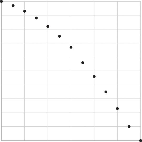
We start with 1,000 30-year-olds in the imaginary city of Calvino: at the moment they turn 30, all 1,000 are alive. By age 35, 30 of those individuals have died; by age 40, another 40 have died, leaving 930 Calvinians alive. By age 90, all 1,000 of these 30-year-olds have died.
How would we collect such data? Suppose we begin studying 1,000 individuals who are 30 years old: all these participants are living, and our study continues until they have all died. We collect numbers of those individuals who have died every 5 years, generating data as shown in Table 1.1.
How would we depict the data in Table 1.1 visually? Two methods are widely used: the Kaplan-Meier method and the life table method, both of which are described in detail in Chapter 5, when we apply these methods to analysis of randomized trial data. Here we show a modified Kaplan-Meier approach for tabled data.
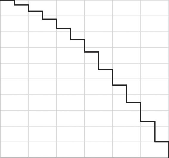
We can draw a survival curve, or cumulative incidence curve, for these data by placing points for each number surviving (Figure 1.2, left) and then connecting these with a step function (Figure 1.2, right). We use a step function to indicate that we only know what happens every 5 years: for example, at age 35 there were 970 participants still alive, and the next piece of information we have is that at
2. Although time is irrelevant, or nearly so, in counting deaths from certain natural disasters such as earthquakes.
Table 1.1 Sample data of 1,000 30year-olds followed until death
age 40 there were only 930 participants still alive. In between those times we do not know what happened, and thus we only update our curve when we acquire new information. Note that we could also draw a cumulative incidence curve here in which a curve starts at 0 and rises toward 100% as cases accumulate (Cole & Hudgens, 2010; Pocock, Clayton, & Altman, 2002).
What we have described is a (very) special case of the Kaplan-Meier curve. The Kaplan-Meier curve is formally defined for data collected in continuous time (i.e., exactly how old was each individual when they died?) and such a curve can account for individuals who go missing during follow-up (and are “censored”).
Again, we give more detail on the Kaplan-Meier curve (and the alternative life table method, which does not assume a step function) in Chapter 5.
Figure 1.2 Graphical displays of data shown in Table 1.1.
1.2.2 Incidence Proportion (Risk)
Incidence proportion, a phrase we use interchangeably with “risk” in this work, is defined as the proportion of those at study inception who are capable of experiencing the outcome (sometimes called the population “at risk”) and who experience an outcome in a fixed period of time. Incidence proportion is bounded between 0 (no one experiences the outcome) and 1 (all those at risk experience the outcome). Assuming outcomes are measured correctly (including accurately in time), incidence proportion can be estimated without further assumptions when all those at risk are followed for the full time period of follow-up.
Here, we indeed assume that all participants are followed for the full study period and we have outcome information on all of them (complete follow-up). In the context of the Kaplan-Meier estimator in Chapter 5, we will discuss how to calculate risks when we lose track of some study participants (e.g., they are lost to follow-up) or do not record their study outcomes for some reason (they have missing data).
Under these assumptions, however, incidence proportion can be derived directly from the survival curve—well, these assumptions and one more. The additional assumption is that all events shown happen at the last possible moment in each time interval. There are 1,000 people alive from age 30 up until the moment before age 35, and, at that last possible moment, all 30 people die at once. Similarly, until one instant before age 40, all 970 people are alive; then 40 people die, leading to 930 people alive at age 40. This is obviously not realistic!3 But it helps us illustrate our points.
In Figure 1.3, we redraw the survival curve from Figure 1.2 in terms of percentages rather than participants, and then we draw a dashed line through that curve at 40 years of age. The dotted line intersects the survival curve at 93% on the y-axis, indicating that 93% of those participants present at baseline remain alive. We can then calculate the 40-year risk of death as 1 − 93% = 7%.
In general, an incidence proportion is exactly what its name implies: the proportion of the at-risk population who experienced an outcome within a given time period. The incidence proportion can be estimated without reference to the survival curve: you could obtain the same estimate of risk as from Figure 1.2 (or the data in Table 1.1) directly, simply by observing that 930 individuals were alive at age 40, noting that this means 70 had died, and dividing 70 by the original number in the study (1,000) to get 7%.
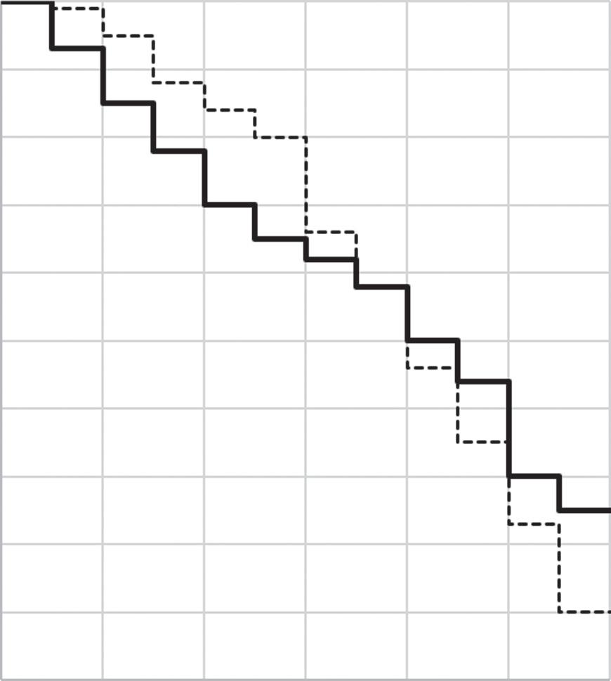
Incidence proportions are not commonly thought of in terms of the underlying survival curves: in this case, as we have illustrated, no knowledge of the intervening survival curve is necessary to estimate the 40-year risk. But it is still the underlying survival curve which is the better description of the shape of survival in these participants. In Figure 1.4, for example, the new data shown are all consistent with a 20% incidence proportion (80% survival) at age 40 but all three are different. On
3. In reality, the 30 people who have died between ages 30 and 35 all died at some intermediate point in that interval—probably at a rate increasing with age—so more died at 34 than at 31. If this is true—but we only see the deaths at the end of the interval—we consider the deaths to be interval censored. That is, we know they happened between ages 30 and 35, but we don’t know when.
Figure 1.3 Figure 1.2 redrawn using percentages instead of counts.
the left, the deaths occur equally before and after age 35; in the center, the deaths occur mostly after age 35; and, on the right, the deaths occur mostly before age 35. If you were a 30-year-old to whom these figures applied (if, for example, these figures estimated risk of death among individuals with a deadly but treatable condition), it would likely matter a great deal to you which of these three figures represented the truth: an incidence proportion of 20% doesn’t give you this information.
It is critical to reiterate that incidence proportions are only meaningful when paired with a fixed period of time. This may be illustrated most clearly with the outcome of death: the “risk of death” in humans is universally 1, in that all humans will eventually die. Thus, telling someone that, in your study, the “risk of death was 10%” is unhelpful; more helpful would be to tell them that, for example, the “1-year risk of death was 10%.” It is more difficult to state such a risk clearly when length of follow-up is reasonably well-defined and yet differs by time scale: for
Figure 1.4 Three curves, all showing the same cumulative incidence of death by age 40.
example, people discuss the “lifetime risk” of cancer or depression, but such risks strongly depend on how long you live. Likewise, risk of infection during a hospital stay may not be well-defined when length of stay varies, but may nonetheless be a useful measure to discuss.
1.2.3
Incidence Odds
The relationship of incidence odds to incidence proportion is precisely the same mathematical relationship as that of prevalence odds to prevalence proportion (though incidence odds seem to be estimated less often in practice than prevalence odds). If the 30-day incidence proportion of hospital readmission following a first myocardial infarction was 20%, then the 30-day incidence odds would be 0.20/(1.00 − 0.20) = 0.25. You can easily generalize further details from the preceding section on prevalence odds however like incidence proportions, incidence odds require a set period of time. But, as with prevalence odds, for example, the incidence odds ranges from 0 to infinity (and Figure 1.1 may again be useful).
The derivation of the incidence odds from the survival curve is likewise straightforward. Consider Figure 1.3 again and death at age 40 among those who started follow-up. Rather than taking 1.00 − 0.93 to get an incidence proportion of 0.07 at age 40, we would now take the ratio of distance above the curve (0.07) to distance below the curve (0.93) and get 0.07/0.93 = 0.0753. Note that, in line with the “10% rule of thumb” given in Box 1.1, the odds here is not too far from the risk of 0.07. See also Box 1.3.
1.2.4 Incidence Rate
As noted earlier (Figure 1.4), incidence proportions can obscure differences between two groups over time. Look at the two survival curves in Figure 1.5,
Box 1.3
Slim to None
“The odds are slim to none” is a phrase in occasional usage and is meant to indicate a small probability. But it is misleading if taken literally. Suppose we take a “slim” probability to be 1 in 100; then “the odds are slim to none” (slim:none) literally means that the odds is calculated by dividing the probability of slim by the probability of none, or (1/100)/0. We calculate, of course, an infinite odds (or perhaps one which is undefined). Thus, the cliché, taken literally, yields precisely the opposite of its intended meaning, wherein “the odds are slim to none” means in fact that the odds are extremely (infinitely!) high. “The chances are slim to none,” on the other hand, conveys the intended meaning without sacrificing accuracy.
Figure 1.5 Illustrating incidence rates using two survival curves.
one solid, one dotted (note that we have shifted our y- axis back to counts of people rather than percentages). Each curve represents a group of 1,000 participants. While the two curves cross at 65 years of age, they are fairly different until that point: the dotted curve stays high until age 60 and then dips sharply, while the solid curve declines more steadily over time. The curves clearly represent different experiences of mortality, and the area under the curves might well be different— but, nonetheless, at age 65 the incidence proportions are identical.
We might wonder whether there is a way to summarize these two curves that preserves the differences between them. There are several: here, we concentrate on the incidence rate. The incidence rate is a measure of the average intensity at which an event occurs in the experience of people over time, and, for a population followed from baseline, it is calculated as the number of cases in that population divided by the amount of person-time at risk accumulated by that population.
Person-time is the amount of time observed for all people under study while at risk of experiencing an incident outcome: if a woman is followed for 1 month, then she experiences (and contributes to analysis) 1 person-month of time. If 10 women are followed for 1 year, they contribute 10 × 1 = 10 person-years; if 1 woman is followed for 10 years, she also contributes 1 × 10 = 10 person-years. This
Table 1.2 Calculation of risks and rates for data shown in Figure 1.5
aIncidence rate given in deaths per 100 person-years.
calls attention to a basic assumption of person-time: that any unit of person-time is exchangeable with any other unit of person-time under study.4
How do we calculate the incidence rate from the curves shown in Figure 1.5? In both curves the numerator is the number of cases; in both situations the denominator is the amount of person-time accumulated to that point—in this case, we’ll consider the incidence rates until age 65. Conceptually, that person-time can be calculated: because the y-axis is measured by a count of people, person-time for each incidence rate is simply the area under each survival curve. In this case, the dotted line has accumulated person-time of 33,500 person-years, the solid line has accumulated person-time of 30,550 person-years. The incidence rates are calculated in Table 1.2. We see that the incidence rate for the outcome is higher for the solid line. Thus, while being in the solid versus dotted group seems to give you an equal chance of surviving until age 65, you may nonetheless live longer (e.g., die later in that interval) if you are in the dotted group.
Unlike the incidence proportion, the incidence rate does not need to be reported with a specific time period attached5; for example, the incidence rate in the dotted cohort could be reported with or without the bracketed statement: “the incidence rate of death in the dotted line group (over a period of 35 years) was 1.25 per 100 person-years.” On a related topic, because person-time is flexible, incidence rates can be reported on a variety of scales. For example, note that 100 events per personyear is equivalent to 100 events per 12 person-months is equivalent to 8.33 events per person-month is equivalent to 10,000 events per 100 person-years. Because we can scale up or down the actual numbers of an incidence rate as we need to, the range of the incidence rate is 0 to infinity; in general, incidence rates should be reported on a scale appropriate or standard to the substantive context.
Two key differences between the incidence proportion and incidence rate are worth highlighting. First, consider a situation in which we have data on 10 people, each followed-up for a different length of time. In this case a straightforward risk calculation would likely be invalid: the proportion of those 10 people who
4. This is not always true, of course, and can be relaxed in practice under certain assumptions or by examining the rate as it changes over time. But it is nonetheless important.
5. Although it can and perhaps should be! You might interpret a rate differently knowing it had been measured over 1 year, 5 years, or 10 years.
experienced an outcome would not be in a fixed period of time and thus would not typically or simply be interpretable as an incidence proportion. On the other hand, we could calculate the total person-time accumulated by those individuals and use that as the denominator for an incidence rate without concern that each individual contributed a different amount of time over follow-up. However, it is important to note that this difference only applies to the risk calculation from a straightforward proportion: we could use a Kaplan-Meier estimator or other method to estimate the risk at a given point during follow-up (see Chapter 5).
Second, the incidence rates can account for recurrent events, whereas incidence proportions cannot. Recall that the incidence proportion is constrained to be between 0 and 1: thus, with N people, the incidence proportion may falter at fully describing the occurrence of 2N events (as might happen if we were studying the number of upper respiratory infections experienced by individuals over a period of 6 months). Where an incidence rate can accumulate both a count of events and an experience of cumulative person-time among study participants and calculate an incidence rate, the incidence proportion might be forced to study the risk of first upper respiratory infection (and then, among those who had a first upper respiratory infection, the risk of a second and then third). These are different scientific questions and might both be of interest to public health.
1.2.5 Times to Event
So far, all the summary measures of incidence (incidence proportion, odds, rate) have simplified the survival curve by putting a vertical line through the curve at a given time. Consider instead putting a horizontal line through the survival curve at a given percentage incidence. See in Figure 1.6, where the y-axis remains as a percentage survival, we have placed a dotted line starting at the 50th percent mark: when we extend this line to the right, we find that it intersects with the survival curve at an x-value of 70 years. This may be interpreted as follows: in this population, median time to death is 70 years. The interpretation would be complicated if the event under study was not inevitable—see competing risks, discussed later—or if the entire cohort hadn’t been followed until everyone in it had experienced it (it is very rare to follow a cohort until everyone in it has had the outcome!).
Median time to event (or other percentiles in addition to the median) is an extremely useful way to describe events in time but is not widely used in the epidemiologic and biomedical literature. We will expand on this point in the next chapter, when we discuss contrasts between times to event.
1.2.6 Confusions Between Prevalence and Incidence
As noted in Box 1.4, there is substantial confusion about naming conventions of prevalence and incidence measures, and of rates, risks, and odds. We wish to point out one additional trap into which epidemiologists, and the published literature, sometimes fall. It is almost always a serious mistake to interpret a point
Using a survival curve to illustrate time to event.
prevalence measured after the baseline of a study (e.g., the prevalence of cancer 5 years after the start of a cohort study) as an incidence proportion. To see why this is so, consider a study in which everyone is free of depression at baseline, and the prevalence of depression (assessed in a survey of all participants) at 2 years is 20%: it is tempting (is it not?) to interpret this as the incidence of depression at 2 years. But that 20% does not consider at least two groups of people who are critical in assessing incidence: those who developed depression and then died before 2 years had elapsed and those who developed depression and then successfully treated that depression all before 2 years had elapsed.
1.2.7 Challenges in Calculating Incidence Measures
There are several key challenges in estimating the measures of incidence noted previously; we list some key challenges here, focusing on risks (incidence proportions) but also noting that some of these challenges do not apply equally to other measures of incidence. Related points are explored in greater detail in subsequent chapters.
1.2.7.1
Loss of Participants
As noted earlier, if you lose track of participants over time, you cannot know what happened to those participants in terms of the outcome under study—without
Figure 1.6
Box 1.4
Proportions, Rates, and Units
Incidence proportions are a proportion in which the numerator has the implicit unit of “cases” or “events,” which can also be thought of as “people (who experienced new onset of the outcome)” and the denominator also has the unit of “people (who were at risk of the outcome).” Because people are in both the numerator and denominator, they cancel, and therefore the incidence proportion is unitless.
The incidence rate has a similar numerator and a denominator of people time × ; as such, when the “people” units cancel, the incidence rate is left with units of 1/ time . This is why the reciprocal of the incidence rate has the unit simply “time.” Relatedly, when certain conditions are met, this inverse of the incidence rate can be interpreted as the average waiting time to the event. However, it is clearer for most audiences to express incidence rates as “events per units of person-time.”
Not all rates (or things which look and behave like rates) have this unit, however! For example, one can calculate a rate of traffic fatalities per 1,000 miles driven; this has the units “1/miles” rather than “1/time” but is otherwise highly analogous to incidence rates as we have described them.
Finally, numerous things are referred to as “rates” which are not in fact, rates. For example, the “unemployment rate” as it is usually described is a unitless measure of the proportion of those unemployed at a particular moment in time: a prevalence proportion, rather than a rate. The infant mortality “rate” is really a risk over the first year of life; birth defect “rates” are almost always a prevalence at live birth. The “attack rate” is generally held to mean “incidence proportion” or something similar (Porta, 2014). And, as earlier, “prevalence rate” often means “prevalence proportion” as well. Similarly, “risk” is likewise used to mean a great many things, including incidence proportion—our sole usage of “risk” in this work—but sometimes is used to mean incidence rate, hazard rate, and even prevalence.
So when you read “rate” or “risk” in popular press contexts—and even in scientific reports—take a moment to make sure you understand what measure is being discussed.
assumptions, then, you can’t calculate risk. For example, you are studying heart attack in 100 people, and 20 people drop out of your study: of the remaining 80, 16 had heart attacks. If the study ends before all individuals have had events, resultant “administrative censoring” may present similar issues. In either case, it is tempting to calculate the risk only in those you observe, as 16/80 = 20%, and use that as your estimate of the risk of the outcome among all 100 people who started the study.
But to do so would be reasonable only if the 20 missing people looked just like the 80 non-missing people: specifically, if missingness were completely unrelated
to the risk of heart attack, and therefore 4 of the missing 20 people had a heart attack. This might be true! But what if, instead, individuals who drop out are at higher than average risk of heart attack so that, in fact, 10 of the 20 missing people had a heart attack? Then the true risk would be (16 + 10)/100 or 26%. The key issue is that since these individuals are missing, you don’t know whether 4, or 10, or 18, or indeed 0 of them had heart attacks, and thus taking the 16/80 as your estimate of risk among all 100 of the participants relies on possibly quite strong assumptions. Although incidence rates do not require that everyone under study is followed for the same length of time, we would likewise expect incidence rates to be biased if individuals who exit the study (and on whom we therefore lack outcome data) are systematically different from those who remain in the study.
1.2.7.2 Competing Risks
Competing risks are outcomes that prevent the occurrence of the outcome under study. For example, in a study of the occurrence of cancer, death from stroke (for example) is a competing risk for the outcome in that, once a participant has died from stroke, they cannot develop cancer.
Estimating incidence proportions or other measures of incidence with survival curves and time-to-event methods under competing risks is complex and largely beyond the scope of this book. It is worth clarifying, however, that the risks estimated by the simple survival curve methods shown earlier (and throughout the remainder of this book) are all risks under the hypothetical absence of any competing risks. This is easy when the outcome is death from any cause because there are no competing risks for this outcome. In other cases, the assumption is often far less reasonable, but we may be comfortable making it if competing risks are quite rare (Cole & Hudgens, 2010).
1.2.8 Relation Between Prevalence and Incidence
Briefly, it is worth explaining how prevalence and incidence relate to each other, conceptually and mathematically. Conceptually, prevalence over a time period is a function of both incidence (how many new cases are showing up?) and duration of disease (how long does each case last?). This is because the longer the duration of disease, the more incident cases accumulate during a time period. Consider a population of 100 people, 10 of whom get an upper respiratory infection on the first day of each month. If the infection lasts a full month, then, on average, the prevalence of such infections over time will be 10%: 10/100 for the first month, then a new 10/100 for the second month. But if the infection lasts 2 months, then, after the first month, the prevalence of infection will be about 20%: 10 cases from the first month and 10 more from the second month.6
6. Or perhaps only 9 out of the remaining 90 for the second month, for a prevalence of 19%. This points toward the need to calculate cumulative incidence using more complicated methods.
This suggests a rough equivalency between prevalence, incidence, and duration, of the form
Prevalence Incidence ≈× Duration
where the squiggly equals sign (≈) means “approximately equal to.” More precisely, the relationship is
Prevalence proportion
Prevalence proportion 1 =×IncidencerateAvverage duration of disease
where the left side of the equation is exactly prevalence odds. This relationship will hold when the population is in “steady-state”; that is, constant (or nearly so) in composition and size and with constant (or nearly so) incidence rate and disease duration (Rothman, 2012; Rothman, Greenland, & Lash, 2008). If prevalence of the disease is low (typically, <10%), then this calculated prevalence odds will approximately equal to the prevalence proportion.
1.2.9 Relation Between Risk (Incidence Proportion) and Incidence Rate
In our preceding example, we might not get 10 cases in the second month: after the first month, there are only 90 people left who are not infected. If the incidence were 10% per month, we would expect 9 new cases, rather than 10, because the population at risk of infection declines over time. This points to the relationship between the incidence rate and the incidence proportion (sometimes in this context called the cumulative incidence). In a closed cohort with a constant incidence rate, these two measures are related by the exponential formula as follows:
Riske IncidencerateTime =− −× 1
where e = 2.71828... and time is the amount of time over which we wish to estimate risk (Rothman et al., 2008). Note again that here we are assuming a closed cohort (such that the number of individuals is diminishing over time), whereas in the relationship between prevalence and incidence, we assumed a steady-state population (people who leave the cohort are replaced by people entering the cohort). However, in parallel to the preceding relationship between prevalence and incidence, when risk is <10%, this relationship can be estimated as
Risk Incidencerate ≈× Time.