No part of this publication may be reproduced or transmitted in any form or by any means, electronic or mechanical, including photocopying, recording, or any information storage and retrieval system, without permission in writing from the Publisher. Details on how to seek permission, further information about the Publisher’s permissions policies and our arrangements with organizations such as the Copyright
Clearance Center and the Copyright Licensing Agency, can be found at our website: www.elsevier.com/permissions
This book and the individual contributions contained in it are protected under copyright by the Publisher (other than as may be noted herein).
Notices
Knowledge and best practice in this field are constantly changing. As new research and experience broaden our understanding, changes in research methods, professional practices, or medical treatment may become necessary.
Practitioners and researchers must always rely on their own experience and knowledge in evaluating and using any information, methods, compounds, or experiments described herein. In using such information or methods they should be mindful of their own safety and the safety of others, including parties for whom they have a professional responsibility.
To the fullest extent of the law, neither nor the Publisher, nor the authors, contributors, or editors, assume any liability for any injury and/or damage to persons or property as a matter of products liability, negligence or otherwise, or from any use or operation of any methods, products, instructions, or ideas contained in the material herein.
Library of Congress Cataloging-in-Publication Data
A catalog record for this book is available from the Library of Congress
British Library Cataloguing-in-Publication Data
A catalogue record for this book is available from the British Library
ISBN: 978-0-12-818202-4
For information on all Morgan Kaufmann publications visit our website at https://www.elsevier.com/books-and-journals
Publisher: Katey Birtcher
Acquisition Editor: Steve Merken
Editorial Project Manager: Chris Hockaday
Production Project Manager: Radhika Sivalingam
Cover Designer: Patrick C.Ferguson
Typeset by TNQ Technologies
Foreword
Acknowledgments
Introduction
CHAPTER
This page intentionally left blank
Foreword
Jeff Johnson’s impactful books on user interface design are distinct in emphasizing the foundations of good design decisions in practical human psychology. This remains a key insight into design generally and user interface design specifically. Design is rarely just a matter of knowing and following rules; more typically, it involves recognizing how and when rules apply and do not apply, adapting rules in context, and formulating new rules.
How can designers manage such open-ended complexity? Johnson’s answer is that designers should understand the rationales and foundations for design rules in the psychology of human perception and cognition. Humans perceive, think, and act in distinctive ways, with distinctive strengths and weaknesses. Understanding human characteristics allows designers to reason creatively about the applicability of design rules in context and to better explain and justify their decisions.
Designs ultimately succeed or fail because humans can understand them, enjoy them, learn from them, and use them effectively. This can seem obvious, until we take a critical look at our world, filled with designs that don’t effectively convey what they do or how they do it, frustrate us and waste our time, and do not respect or leverage the amazing human mind. Designing with the Mind in Mind is an important tool to help designers succeed.
—John M. Carroll
John M. Carroll is Distinguished Professor of Information Sciences and Technology and Director of the Center for Human-Computer Interaction at Pennsylvania State University.
This page intentionally left blank
Acknowledgments
Although I am listed as the author of this book, I could not have written it without a lot of help and support from many people.
First are the students of the human–computer interaction course I taught as an Erskine Fellow at the University of Canterbury in New Zealand in 2006. It was for them that I developed a lecture providing a brief background in perceptual and cognitive psychology—just enough to enable them to understand and apply user-interface design guidelines. I expanded that lecture into a professional development course to present at conferences and client companies, then further expanded it to produce the first edition of Designing with the Mind in Mind
In 2013, I had another Erskine Fellowship at the University of Canterbury and used the first edition to teach another human–computer interaction course there as well as give computer science department lectures at the UoC, the University of Waikato, and the CHI-NZ 2013 conference. I especially thank my colleagues at the University of Canterbury who provided ideas and illustrations for the second edition’s new chapter on Fitts’ law: Professor Andy Cockburn, Dr. Sylvain Malacria, and Mathieu Nancel. I also thank my colleague and friend Professor Tim Bell for sharing user-interface examples and for other help and support while I was writing the second edition.The feedback I received motivated me to add more comprehensive psychological background material, expand the topics covered, improve the explanations, and update the examples in producing the second edition, which was published in 2014.
I used the second edition as the basis for conference keynotes, guest lectures, and conference tutorials in the USA and elsewhere. In August 2016, I joined the Computer Science faculty of the University of San Francisco and now use the book in an upperdivision UX design course I teach there.
By 2019, it became clear that Designing with the Mind in Mind needed updating again. Not only were many examples again looking dated, but digital technology had entered a new era in which mobile, artificial intelligence, and speech technology are much more prominent. It also was clear that the book, originally intended mainly for professional UI/UX designers, was being widely used as a college textbook. I suppose that should not have been surprising, since teaching college students was my inspiration for writing the first edition and is the main way I currently use the book.
The reviewers of all three editions made helpful comments and suggestions that allowed me to greatly improve the book:
• Edition 1: Susan Fowler, Robin Jeffries, Tim McCoy, and Jon Meads.
• Edition 2: Susan Fowler, Robin Jeffries, James Hartman, Victor Manuel González y González, Mihaela Vorvoreanu, and Karin M. Wiburg.
• Edition 3: Darren Hood, David W. Meyer, Matt Swaffer, Emily Wenk, and KS.
Acknowledgments x
I am also grateful to several cognitive science researchers who directed me to important references, shared useful illustrations with me, or allowed me to bounce ideas off of them:
• Professor Edward Adelson, Department of Brain and Cognitive Sciences, Massachusetts Institute of Technology.
• Dr. Dan Bullock, Department of Cognitive and Neural Systems, Boston University.
• Dr. Eva Hudlicka, College of Information and Computer Sciences, University of Massachusetts, Amherst; Principal Scientist at Psychometrix Associates.
• Dr. Marisa Knight, Department of Psychology, University of San Francisco.
• Dr.Amy L. Milton, Department of Psychology and Downing College, University of Cambridge.
• Professor Dan Osherson, Department of Psychology, Princeton University.
I also am extremely grateful to Professor John M. “Jack” Carroll, Penn State University, for contributing a foreword to this new edition of the book.
The book also was helped greatly by the care, oversight, logistical support, and nurturing provided by the staff at Elsevier.
Last but not least, I thank my wife and friend, documentary photographer Karen Ande, for her love and support throughout the many years that I have been researching, writing, and revising this book.
Introduction
USER-INTERFACE DESIGN RULES: WHERE DO THEY COME FROM AND HOW CAN THEY BE USED EFFECTIVELY?
For as long as people have been designing interactive computer systems, some have attempted to promote good design by publishing user-interface design guidelines (also called design rules), including these early ones:
l Cheriton (1976) proposed user-interface design guidelines for early interactive (time-shared) computer systems.
l Norman (1983a,b) presented design rules for software user interfaces based on human cognition, including cognitive errors.
l Smith and Mosier (1986) wrote perhaps the most comprehensive set of userinterface design guidelines.
l Shneiderman (1987) included “Eight Golden Rules of Interface Design” in the first edition of his book Designing the User Interface as well as in all the editions that followed.
l Brown (1988) wrote a book of design guidelines appropriately titled Human–Computer Interface Design Guidelines.
l Nielsen and Molich (1990) offered a set of design rules for use in heuristic evaluation of user interfaces, and Nielsen and Mack (1994) updated them.
l Marcus (1992) presented guidelines for graphic design in online documents and user interfaces.
More recently, in the 21st century many more user-interface design guidelines have been published:
l Several authors have written books that include UI/UX design guidelines: Stone et al. (2005), Koyani et al. (2006), Johnson (2007), Shneiderman and Plaisant (2009), and Rosenberg (2020).
l A few organizations have published usability guidelines for the Web:W3C (2016), Yale University (2020).
l Computer companies have published guidelines for designing desktop apps on their platforms: Microsoft Corporation (2018), Apple Computer (2020a).
l Providers of mobile application platforms also have published guidelines to help developers create more usable apps for mobile devices: Oracle Corporation (2017), Google (2019), Apple Computer (2020b).
USER-INTERFACE DESIGN AND EVALUATION REQUIRES UNDERSTANDING AND EXPERIENCE
But how valuable are user-interface design guidelines? That depends on who applies them to design problems.
Following user-interface design guidelines is not as straightforward as following cooking recipes. Design rules often describe goals rather than actions. They are purposefully very general to make them broadly applicable, but that means their exact meaning and applicability to specific design situations is open to interpretation.
Complicating matters further, more than one rule will often seem applicable to a given design situation. In such cases, the applicable design rules often conflict: they suggest different designs. This requires designers to determine which competing design rule is more applicable to the given situation and should take precedence. Design problems, even without competing design guidelines, often have multiple conflicting goals—for example:
l bright screen and long battery life
l lightweight and sturdy
l multifunctional and easy to learn
l powerful and simple
l high resolution and fast loading
l WYSIWYG (what you see is what you get) and usable by blind people
Satisfying all the design goals for a computer-based product or service usually requires trade-offs—lots and lots of trade-offs. Finding the right balance point between competing design rules requires further tradeoffs.
Given all these complications, user-interface design rules and guidelines must be applied thoughtfully, not mindlessly, by people skilled in the art of user-interface design and/or evaluation. User-interface design rules and guidelines are more like laws than like rote recipes. Just as a set of laws is best applied and interpreted by lawyers and judges well versed in the laws, a set of user-interface design guidelines is best applied and interpreted by people who understand the basis for the guidelines and have learned from experience in applying them.
Unfortunately, with a few exceptions (e.g., Norman, 1983a), user-interface design guidelines are provided as simple lists of design edicts with little or no rationale or background.
Furthermore, although many early members of the user-interface design and usability profession had educations that included studying cognitive psychology, most newcomers to the field do not. That makes it difficult for them to apply user-interface design guidelines sensibly. Providing that rationale and background education is the focus of this book.
COMPARING USER-INTERFACE DESIGN GUIDELINES
Table I.1 places the two best-known user-interface guideline lists side by side to show the types of rules they contain and how they compare (see the Appendix for additional guideline lists). For example, both lists start with a rule calling for consistency in design. Both lists include a rule about preventing errors. The Nielsen–Molich rule to “help users recognize, diagnose, and recover from errors” corresponds closely to the Shneiderman–Plaisant rule to “permit easy reversal of actions.” “User control and freedom” corresponds to “make users feel they are in control.” There is a reason for this similarity, and it is not simply that later authors were influenced by earlier ones.
Table I.1 Two Best-Known Lists of User-Interface Design Guidelines
Shneiderman (1987); Shneiderman and Plaisant (2009)
Strive for consistency
Cater to universal usability
Offer informative feedback
Design task flows to yield closure
Prevent errors
Permit easy reversal of actions
Make users feel they are in control
Minimize short-term memory load
Nielsen and Molich (1990)
Consistency and standards
Visibility of system status
Match between system and real world
User control and freedom
Error prevention
Recognition rather than recall
Flexibility and efficiency of use
Aesthetic and minimalist design
Help users recognize, diagnose, and recover from errors
Provide online documentation and help
WHERE DO DESIGN GUIDELINES COME FROM?
For present purposes, the detailed design rules in each set of guidelines, such as those in Table I.1, are less important than what they have in common: their basis and origin. Where did these design rules come from? Were their authors—like clothing fashion designers—simply trying to impose their own personal design tastes on the computer and software industries?
If that were so, the different sets of design rules would be very different from each other as the various authors sought to differentiate themselves from others. In fact, all of these sets of user-interface design guidelines are quite similar if we ignore
differences in wording, emphasis, and the state of computer technology when each set was written. Why?
The answer is that all the design rules are based on human psychology: how people perceive, learn, reason, remember, and convert intentions into action. Many authors of design guidelines had at least some background in psychology that they applied to computer system design.
For example, Don Norman was a professor, researcher, and prolific author in the field of cognitive psychology long before he began writing about human–computer interaction. Norman’s early human–computer design guidelines were based on research—his own and others’—on human cognition. He was especially interested in cognitive errors that people often make and how computer systems can be designed to lessen or eliminate the impact of those errors.
Similarly, other authors of user-interface design guidelines—for example, Brown, Shneiderman, Nielsen, and Molich—used knowledge of perceptual and cognitive psychology to try to improve the design of usable and useful interactive systems.
Bottom line: User-interface design guidelines are based on human psychology. By reading this book, you will learn the most important aspects of the psychology underlying user-interface and usability design guidelines.
INTENDED AUDIENCE OF THIS BOOK
This book is intended mainly for software design and development professionals who have to apply user-interface and interaction design guidelines. This includes interaction designers, user-interface designers, user-experience designers, graphic designers, and hardware product designers. It also includes usability testers and evaluators, who often refer to design heuristics when reviewing software or analyzing observed usage problems.
A second important audience is students of interaction design and human–computer interaction. In fact, the second edition of this book turned out to be a popular textbook for college-level courses on UI/UX design. Because of that, one of my goals in updating and refining the book to produce this third edition has been to make it a better textbook.
A third intended audience is software development managers who want enough of a background in the psychological basis of user-interface design rules to understand and evaluate the work of the people they manage.
Our Perception is Biased 1
Our perception of the world around us is not a true depiction of what is actually there. Our perceptions are heavily biased by at least three factors:
l The past: our experience
l The present: the current context
l The future: our goals
PERCEPTION BIASED BY EXPERIENCE
Experience—your past perceptions—can bias your current perception in several different ways.
Perceptual priming
Imagine that you own a large insurance company. You are meeting with a real estate manager, discussing plans for a new campus of company buildings. The campus consists of a row of five buildings, the last two with T-shaped courtyards providing light for the cafeteria and fitness center. If the real estate manager showed you the map in Fig. 1.1, you would see five black shapes representing the buildings.
Now imagine that instead of a real estate manager, you are meeting with an advertising manager. You are discussing a new billboard ad to be placed in certain markets around the country. The advertising manager shows you the same image, but in this scenario the image is a sketch of the ad, consisting of a single word: LIFE. In this scenario, you see a word, clearly and unambiguously.
When your perceptual system has been primed to see building shapes, you see building shapes, and the white areas between the buildings barely register in your
Designing with the Mind in Mind. https://doi.org/10.1016/B978-0-12-818202-4.00001-5
Building map or word? What you see depends on what you were told to see.
FIGURE 1.2
Image showing the effect of mental priming of the visual system. What do you see?
perception. When your perceptual system has been primed to see text, you see text, and the black areas between the letters barely register.
A relatively famous example of how priming the mind can affect perception is an image, supposedly by R. C. James,1 that initially looks to most people like a random splattering of paint (see Fig. 1.2) similar to the work of the painter Jackson Pollack. Before reading further, look at the image.
Only after you are told that it is a Dalmatian dog sniffing the ground near a tree can your visual system organize the image into a coherent picture. Moreover, once you have seen the dog, it is hard to go back to seeing just a random collection of spots.
1 Published in Lindsay and Norman (1972), Figs. 3.17, p. 146.
These priming examples are visual, but priming can also bias other types of perception, such as sentence comprehension. For example, the headline “New Vaccine Contains Rabies” would probably be understood differently by people who had recently heard stories about contaminated vaccines than by people who had recently heard stories about successful uses of vaccines to fight diseases.
Familiar perceptual patterns or frames
Much of our lives is spent in familiar situations: the rooms in our homes, our yards, our routes to and from school or work, our offices, neighborhood parks, stores, restaurants, etc. Repeated exposure to each type of situation builds a pattern in our minds of what to expect to see there. These perceptual patterns, which some researchers call frames, include the objects or events usually encountered in a particular situation.
For example, you know most rooms in your home well enough that you need not constantly scrutinize every detail. You know their layout and where most objects are located. You can probably navigate much of your home in total darkness. But your experience with homes is broader than your specific home. In addition to having a pattern for your home, your brain has one for homes in general. It biases your perception of all homes, familiar and new. In a kitchen, you expect to see a stove and a sink. In a bathroom, you expect to see a toilet, sink, and shower or bathtub (or both).
Our mental frames for situations bias our perception toward seeing the objects and events expected in each situation. They are a mental shortcut: by eliminating the need for us to constantly scrutinize every detail of our environment, they help us get around in our world. However, mental frames also make us see things that aren’t really there.
For example, if you visit a house in which there is no stove in the kitchen, you might nonetheless later recall seeing one, because your mental frame for kitchens has a strong stove component. Similarly, part of the frame for eating at a restaurant is paying the bill, so you might recall paying for your dinner even if you absentmindedly walked out without paying. Your brain also has frames for backyards, schools, city streets, business offices, supermarkets, dentist visits, taxis, air travel, and other familiar situations.
Anyone who uses computers, websites, or smartphones has frames for the desktop and files, web browsers, websites, and various applications and online services. For example, when experienced Web users visit a new website, they expect to see a site name and logo, a navigation bar, some other links, and maybe a search box. When they book a flight online, they expect to specify trip details, examine search results, make a choice, and make a purchase. When they shop online, they expect a shopping cart and a checkout stage with a payment step.
Because users of computer software and websites have these perceptual frames, they often click buttons or links without looking carefully at them. Their perception of the display is based more on what their frame for the situation leads them to expect than on what is actually on the screen.This sometimes confounds software designers, who expect users to see what is on the screen—but that isn’t how human vision and attention works.
For example, if the positions of the “Next” and “Back” buttons on the last page of a multistep screen sequence2 are switched, many people would not immediately notice the change (see Fig. 1.3). Their visual system would have been lulled into inattention
1.3
Users may always perceive the Next button on the right, even when it isn’t.
by the consistent placement of the buttons on the several pages that came before. Even after unintentionally going backward a few times by mistakenly clicking “Back” for “Next,” they might continue to perceive the buttons in their standard locations This is why consistent placement of controls is a recommended user-interface guideline, to ensure that reality matches the user’s frame for the situation.
Similarly, if we are trying to find something but it is in a different place or looks different from usual, we might miss it even though it is in plain view because our mental frames tune us to look for expected features in expected locations. For example, if the “Submit” button on one form in a website is shaped differently or is a different color from those on other forms on the site, users might not find it. This expectationinduced blindness is discussed more later in this chapter in the “Perception Biased by Goals” section.
Habituation
A third way in which experience biases perception is called habituation. Repeated exposure to the same (or highly similar) perceptions dulls our perceptual system’s sensitivity to them. Habituation is a very low-level phenomenon of our nervous system: it occurs at a neuronal level. Even primitive animals like flatworms and ameba, with very simple nervous systems, habituate to repeated stimuli (e.g., mild electric shocks or light flashes). People, with our complex nervous systems, habituate to a range of events, from low-level ones like a continually beeping tone, to medium-level ones like a blinking ad on a website, to high-level ones like a person who tells the same jokes at every party or a politician giving a long, repetitious speech.
We experience habituation in computer usage when the same error messages or “Are you sure?” confirmation messages appear again and again. People initially notice them and perhaps respond, but eventually they click them closed reflexively without bothering to read them.
FIGURE
Habituation is also a factor in a recent phenomenon variously labeled “social media burnout” (Nichols, 2013), “social media fatigue,” or “Facebook vacations” (Rainie et al., 2013); newcomers to social media sites and tweeting are initially excited by the novelty of microblogging about their experiences, but sooner or later get tired of wasting time reading tweets about every little thing that their “friends” do or see—for example, “Man! Was that ever a great salmon salad I had for lunch today.”
Attentional blink
Another low-level biasing of perception by past experience occurs just after we spot or hear something important. For a very brief period following the recognition— between 0.15 and 0.45 second—we are nearly deaf and blind to other visual stimuli, even though our ears and eyes stay functional. Researchers call this the attentional blink (Raymond et al., 1992; Stafford and Webb, 2005).3 It is thought to be caused by the brain’s perceptual and attention mechanisms being briefly fully occupied with processing the first recognition.
A classic example: You are in a subway car as it enters a station, planning to meet two friends at that station. As the train arrives, your car passes one of your friends, and you spot him briefly through your window. In the next split second, your window passes your other friend, but you fail to notice her because her image hit your retina during the attentional blink that resulted from your recognition of your first friend. When people use computer-based systems and online services, attentional blink can cause them to miss information or events if things appear in rapid succession. A popular modern technique for making documentary videos is to present a series of still photographs in rapid succession.4 This technique is highly prone to attentional blink effects—if an image really captures your attention (e.g., it has a strong meaning for you), you will probably miss one or more of the immediately following images. In contrast, a captivating image in an auto-running slideshow (e.g., on a website or an information kiosk) is unlikely to cause attentional blink (i.e., missing the next image) because each image typically remains displayed for several seconds.
PERCEPTION BIASED BY CURRENT CONTEXT
When we try to understand how our visual perception works, it is tempting to think of it as a bottom-up process, combining basic features such as edges, lines, angles, curves, and patterns into figures and ultimately meaningful objects.To take reading as an example, you might assume that our visual system first recognizes shapes as letters and then combines letters into words, words into sentences, and so on.
3 Chapter 14 discusses the attentional blink interval along with other perceptual intervals.
4 For an example, search YouTube for “history of the world in 2 minutes.”
But visual perception—reading in particular—is not strictly a bottom-up process. It includes top-down influences too. For example, the word in which a character appears may affect how we identify the character (see Fig. 1.4).
Similarly, our overall comprehension of a sentence or a paragraph can even influence what words we see in it. For example, the same letter sequence can be read as different words depending on the meaning of the surrounding paragraph (see Fig. 1.5).
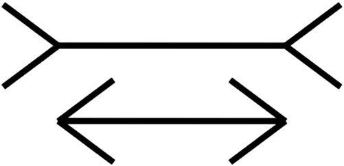
Contextual biasing of vision need not involve reading. The Müller-Lyer illusion is a famous example (see Fig. 1.6): the two horizontal lines are the same length, but the outward-pointing “fins” cause our visual system to see the top line as longer than the line with inward-pointing “fins.” This and other optical illusions (see Fig. 1.7) trick us because our visual system does not use accurate, optimal methods to perceive the world. It developed through evolution, a semirandom process that layers juryrigged—often incomplete and inaccurate—solutions on top of each other. It works fine most of the time but includes many approximations, kludges, hacks, and outright “bugs” that cause it to fail in certain cases.
FIGURE 1.4
The same character is perceived as H or A depending on the surrounding letters.
Fold napkins. Polish silverware. Wash dishes.
FIGURE 1.5
The same phrase is perceived differently depending on the list it appears in.
FIGURE 1.6
Müller-Lyer illusion: equal-length horizontal lines appear to have different lengths.
The examples in Figs. 1.6 and 1.7 show vision being biased by visual context. However, biasing of perception by the current context works between different senses too. Perceptions in any of our five senses may affect simultaneous perceptions in any of our other senses. What we feel with our tactile sense can be biased by what we hear, see, or smell. What we see can be biased by what we hear, and what we hear can be biased by what we see.The following two examples of visual perception affect what we hear:
l McGurk effect. If you watch a video of someone saying “bah, bah, bah,” then “dah, dah, dah,” then “vah, vah, vah,” but the audio is “bah, bah, bah” throughout, you will hear the syllable indicated by the speaker’s lip movement rather than the syllable actually in the audio track.5 Only by closing or averting your eyes do you hear the syllable as it really is. I will bet you did not know you could read lips, and in fact do so many times a day.
5 See youtube.com/watch?v = PWGeUztTkRA, or search YouTube for “McGurk effect.”
(C)
(B) (A)
l Ventriloquism. Ventriloquists don’t throw their voice; they just learn to talk without moving their mouths much.Viewers’ brains perceive the talking as coming from the nearest moving mouth: that of the ventriloquist’s puppet (Eagleman, 2012).
An example of the opposite—hearing biasing vision—is the illusory flash effect. When a spot is flashed once briefly on a display but is accompanied by two quick beeps, it appears to flash twice. Similarly, the perceived rate of a blinking light can be adjusted by the frequency of a repeating click (Eagleman, 2012).
Later chapters explain how visual perception, reading, and recognition function in the human brain. For now, I will simply say that the pattern of neural activity that corresponds to recognizing a letter, a word, a face, or any object includes input from neural activity stimulated by the context. This context includes other nearby perceived objects and events and even reactivated memories of previously perceived objects and events.
Context biases perception not only in people but also in lower animals. A friend of mine often brought her dog with her in her car when running errands. One day, as she drove into her driveway, a cat was in the front yard. The dog saw it and began barking. My friend opened the car door and the dog jumped out and ran after the cat, which turned and jumped through a bush to escape. The dog dove into the bush but missed the cat. The dog remained agitated for some time afterward.
Thereafter, for as long as my friend lived in that house, whenever she arrived at home with her dog in the car, he would get excited, bark, jump out of the car as soon as the door was opened, dash across the yard, and leap into the bush. There was no cat, but that didn’t matter. Returning home in the car was enough to make the dog see one—perhaps even smell one. However, walking home on foot, as the dog did after being taken for his daily walk, did not evoke the “cat mirage.”
PERCEPTION BIASED BY GOALS
In addition to being biased by our past experience and the present context, our perception is influenced by our goals and plans for the future. Specifically, our goals:
l Guide our perceptual apparatus, so we sample what we need from the world around us;
l Filter our perceptions—things unrelated to our goals tend to be filtered out preconsciously, never registering in our conscious minds.
For example, when people navigate through software or a website, seeking information or a specific function, they don’t read carefully. They scan screens quickly and superficially for items that seem related to their goal. They don’t simply ignore items unrelated to their goals; they often don’t even notice them.
To see this, glance at Fig. 1.8 and look for scissors, and then immediately flip back to this page. Try it now.
Did you spot the scissors? Now, without looking back at the toolbox, can you say whether there is a screwdriver in the toolbox too?
Our goals filter our perceptions in other perceptual senses as well as in vision. A familiar example is the “cocktail party” effect. If you are conversing with someone at a crowded party, you can focus your attention to hear mainly what he or she is saying even though many other people are talking near you. The more interested you are in the conversation, the more strongly your brain filters out surrounding chatter. If you are bored by what your conversational partner is saying, you will probably hear much more of the conversations around you.
The effect was first documented in studies of air traffic controllers, who were able to carry on conversations with the pilots of their assigned aircraft even though many different conversations were occurring simultaneously on the same radio frequency, coming out of the same speaker in the control room (Arons, 1992). Research suggests that our ability to focus on one conversation among several simultaneous ones depends not only on our interest level in the conversation, but also on objective factors, such as the similarity of voices in the cacophony, the amount of general “noise” (e.g., clattering dishes or loud music), and the predictability of what your conversational partner is saying (Arons, 1992).
This filtering of perception by our goals is particularly true for adults, who tend to be more focused on goals than children are. Children are more stimulus-driven; their perception is less filtered by their goals.This characteristic makes them more distractible than adults, but it also makes them less biased as observers.
A parlor game demonstrates this age difference in perceptual filtering. It is similar to the Fig. 1.8 exercise. Most households have a catch-all drawer for kitchen implements or tools. From your living room, send a visitor to the room where the catch-all drawer is with instructions to fetch you a specific tool, such as measuring spoons or a pipe wrench. When the person returns with the tool, ask whether another specific tool was in the drawer. Most adults will not know what else was in the drawer. Children—if they can complete the task without being distracted by all the cool stuff in the drawer—will often be able to tell you more about what else was there.
Perceptual filtering can also be seen in how people navigate websites. Suppose I put you on the home page of New Zealand’s University of Canterbury (see Fig. 1.9)
FIGURE 1.8
Toolbox: Are there scissors here?
and asked you to find information about financial support for postgraduate students in the computer science department. You would quickly scan the page for words that were in the goal I gave you: “departments,” “scholarships,” “computer science,” or “postgraduate.” If you spotted a link containing one or more of those words, you would probably click on it. If you are a “search” person, you might instead go to the search symbol (magnifying glass, top right), click it and enter words related to the goal, and click “Go.”
Whether you browse or search, it is likely that you would leave the home page without noticing that you were randomly chosen to win $100 (bottom right). Why? Because that was not related to your goal
What is the mechanism by which our current goals bias our perception? There are two:
l Influencing where we look. Perception is active, not passive.Think of your perceptual senses not as simply filtering what comes to you but rather as reaching out into the world and pulling in what you need to perceive. Your hands, your primary touch sensors, literally do this, but the rest of your senses do it too. You constantly move your eyes, ears, hands, feet, body, and attention to sample exactly the things in your environment that are most relevant to what you are doing or about to do (Ware, 2008). If you are looking on a website for a campus map, your
FIGURE 1.9
University of Canterbury website: navigating sites requires perceptual filtering.
eyes and pointer-controlling hand are attracted to anything that might lead you to that goal. You more or less ignore anything unrelated to your goal.
l Sensitizing our perceptual system to certain features. When you are looking for something, your brain can prime your perception to be especially sensitive to features of what you are looking for (Ware, 2008). For example, when you are looking for a red car in a large parking lot, red cars will seem to pop out as you scan the lot, and cars of other colors will barely register in your consciousness, even though you do in some sense see them. Similarly, when you are trying to find your spouse in a dark, crowded room, your brain “programs” your auditory system to be especially sensitive to the combination of frequencies that make up his or her voice.
TAKING BIASED PERCEPTION INTO ACCOUNT WHEN DESIGNING
All these sources of perceptual bias of course have implications for user-interface design. Here are three.
Avoid ambiguity
Avoid ambiguous information displays, and test your design to verify that all users interpret the display in the same way. Where ambiguity is unavoidable, either rely on standards or conventions to resolve it, or prime users to resolve the ambiguity in the intended way.
For example, displays on digital devices often add drop-shadows to user-interface components to make them look raised in relation to the background surface (see Fig. 1.10 ). This appearance relies on a convention, familiar to most people who use digital devices, that the light source is at the top of the screen. If a technology user does not know this convention, it may be ambiguous to them whether the object is raised or sunken.
Be consistent
Place information and controls in consistent locations. Controls and data displays that serve the same function on different pages should be placed in the same position on each page on which they appear. They should also have the same color, text fonts, shading, and so on. This consistency allows users to spot and recognize them quickly.
Understand the goals
Users come to a system with goals they want to achieve. Designers should understand those goals. Realize that users’ goals may vary and that their goals strongly influence what they perceive. Ensure that at every point in an interaction, the information users