- Summary -Site Analysis -Progress of Form -Exploded Structure -Structure -Plans
-How Art is Viewed -Users -Elevation -Assembly -Model
- Summary
- Summary
-Form Development -Structure -Sections, Plans -Model
- Summary
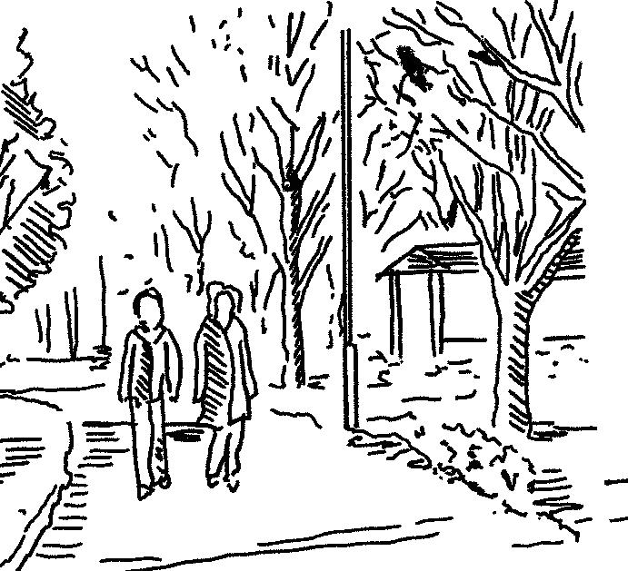
- Work in Practice
Summary Quarter of Light
The project positioned architecture as a way to analyse and reorganise social structures. The brief asked for a new home for the Nobel Peace Prize within Salisbury Cathedral Close, yet the deeper challenge was understanding how a global institution centred on dialogue and humanitarian work could operate within a fragile local context. Conversations with residents of different ages revealed a structural discontinuity in the city. People often stay through school, leave to pursue opportunities, and return much later. This pattern weakens intergenerational exchange and limits local economic momentum.
Architecture became a means of addressing this condition. The project focused on four user groups that reflect both the city’s present and its potential. These groups are the elderly, young professionals, researchers at Porton Down and volunteers of Doctors without Borders. Each was given a spatial programme with an adaptation phase and a maturity phase so the building acts as an incubator for social, economic and intellectual exchange rather than a static cultural venue.
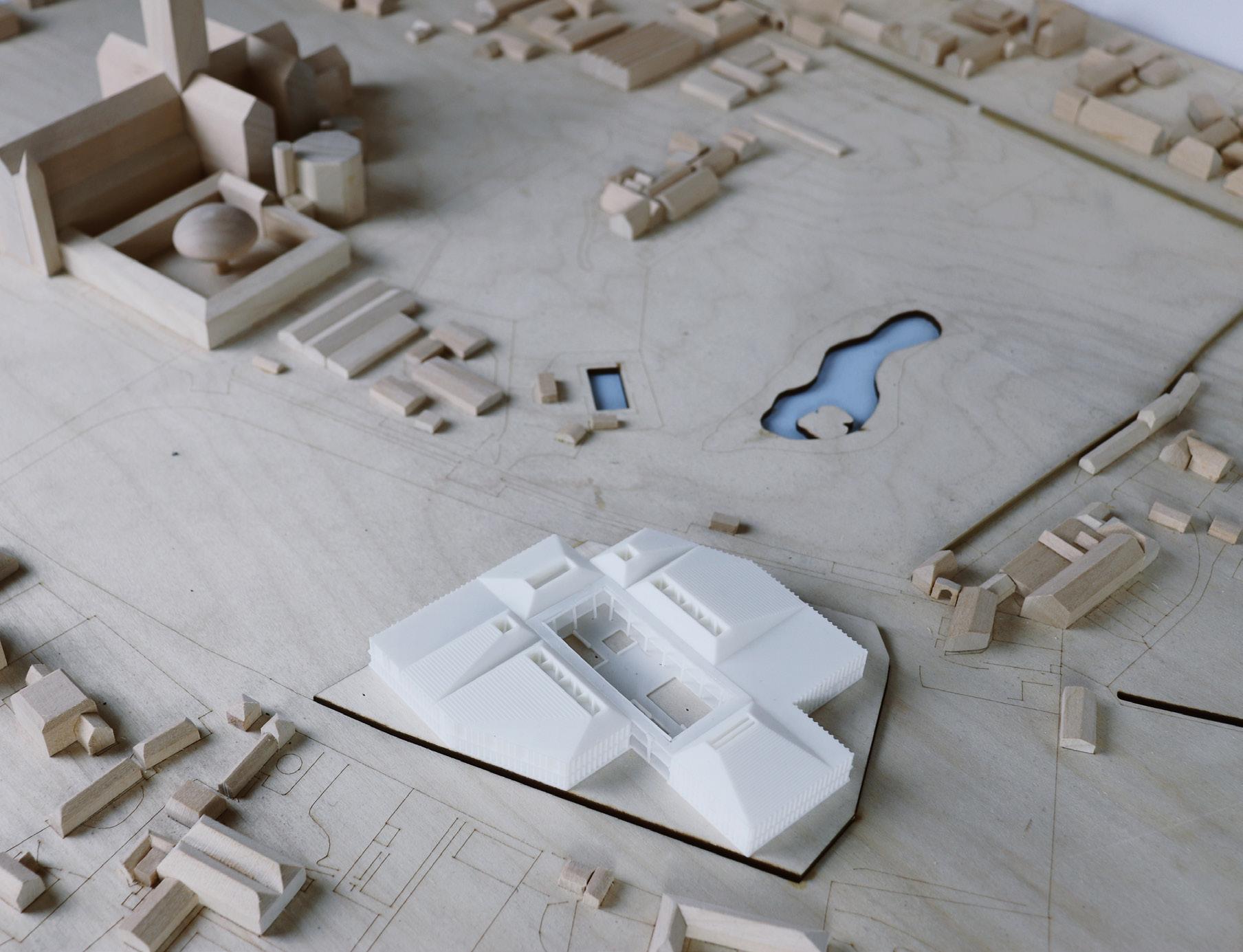
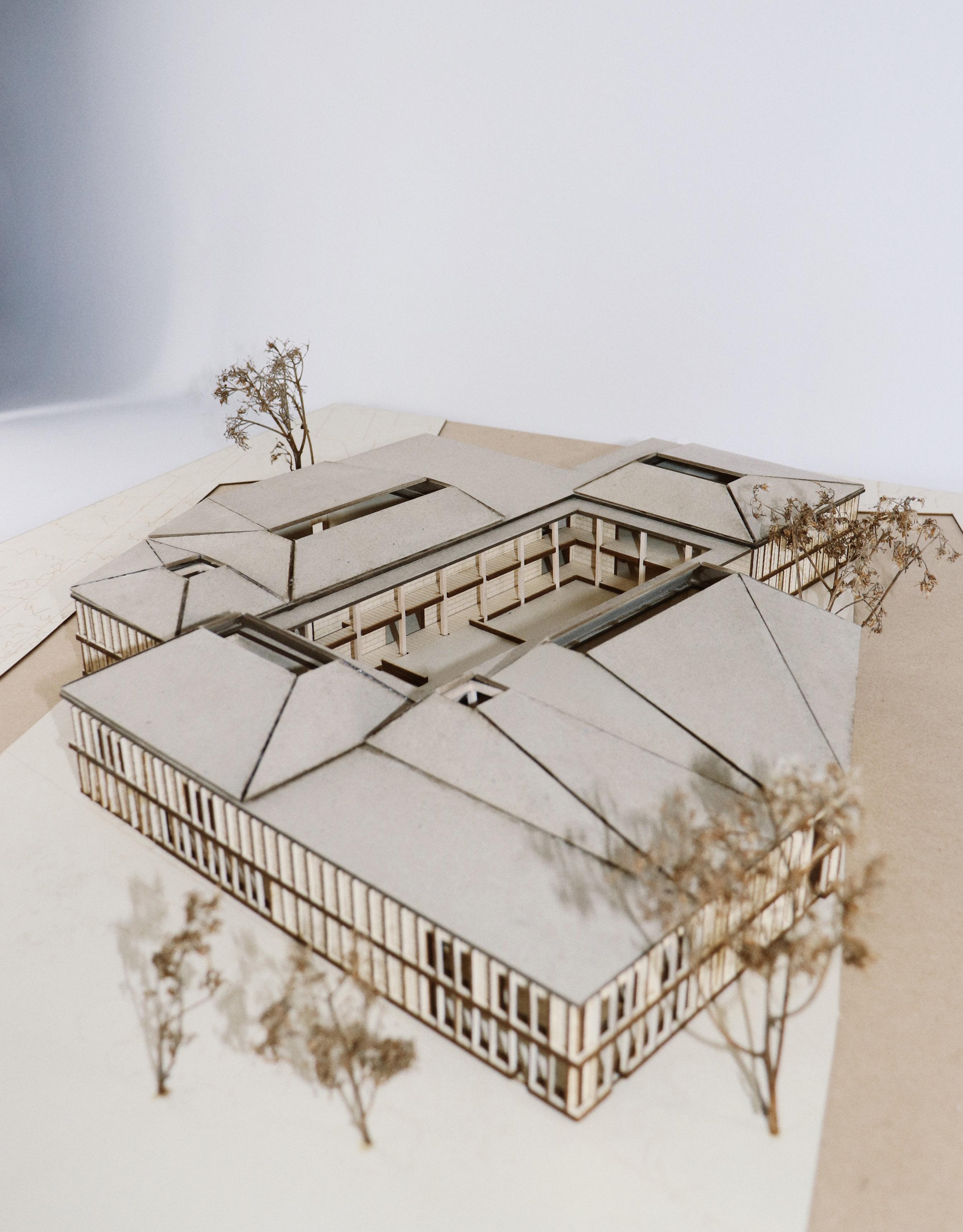
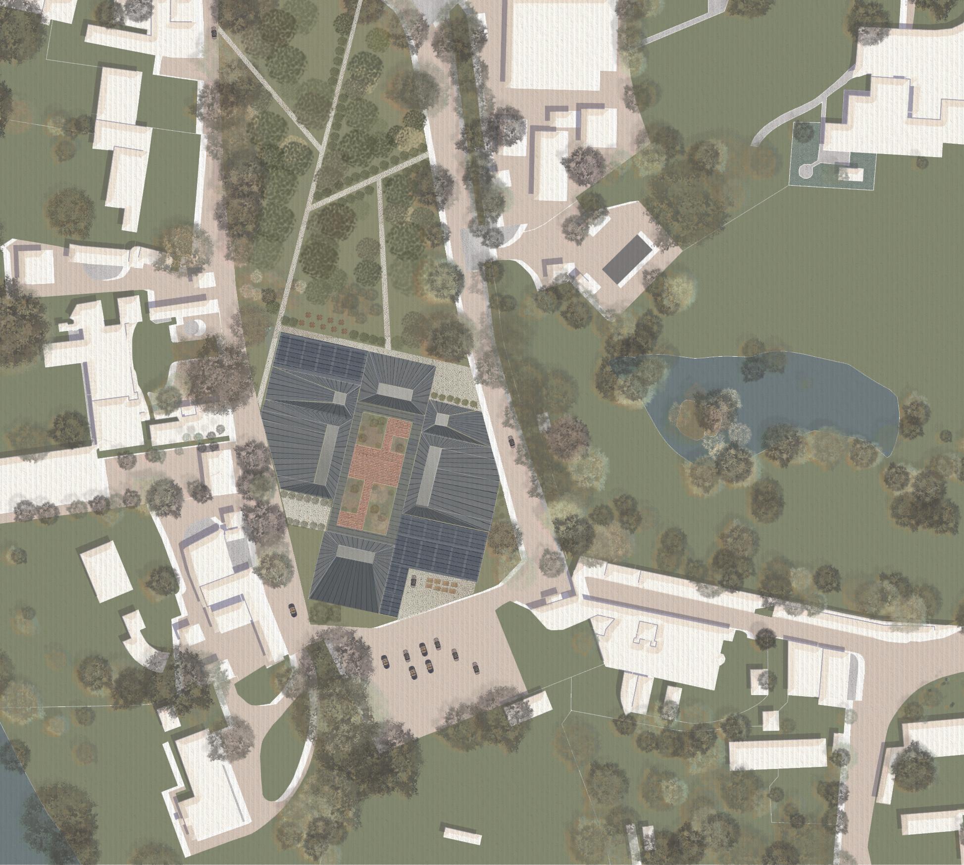
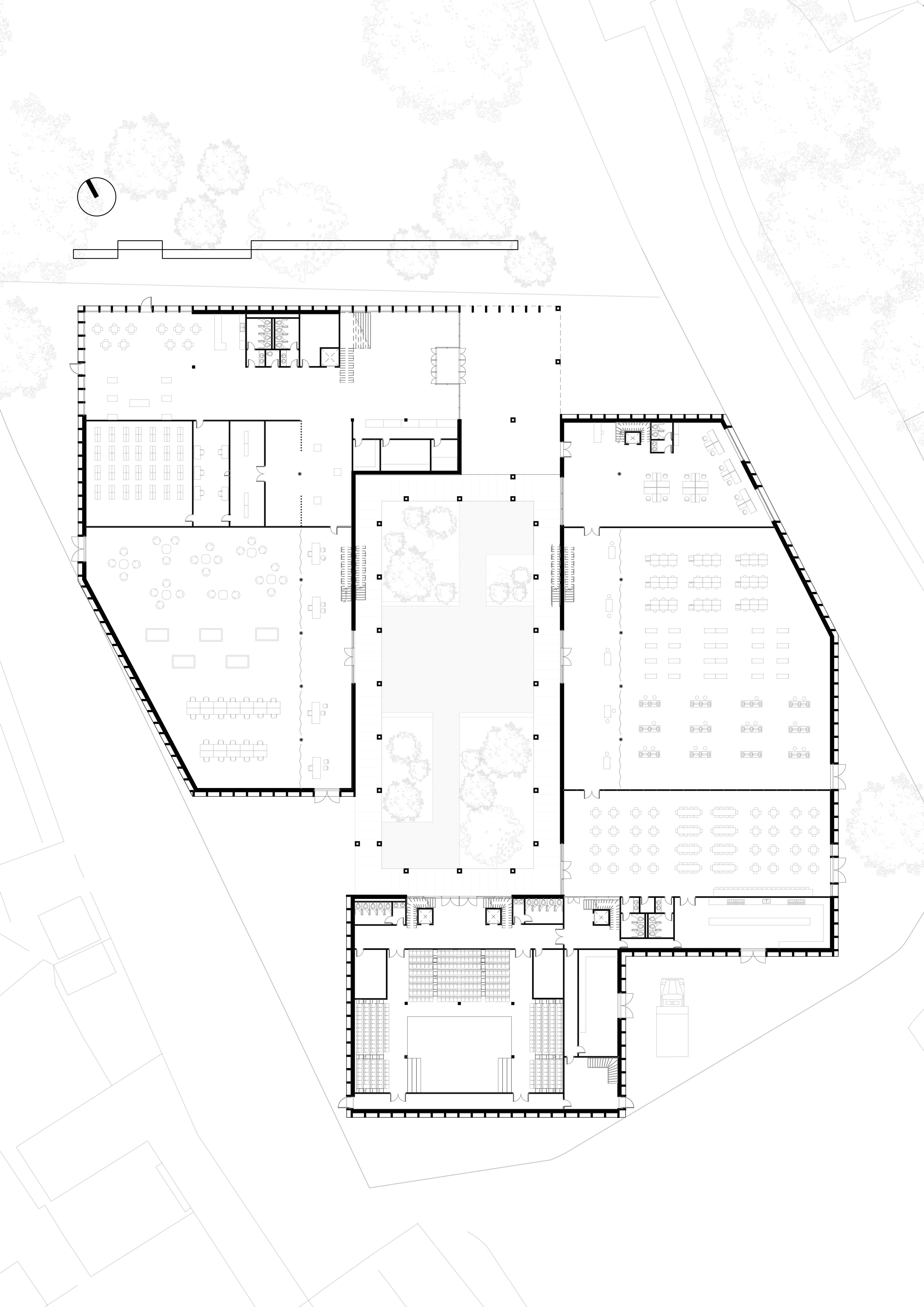
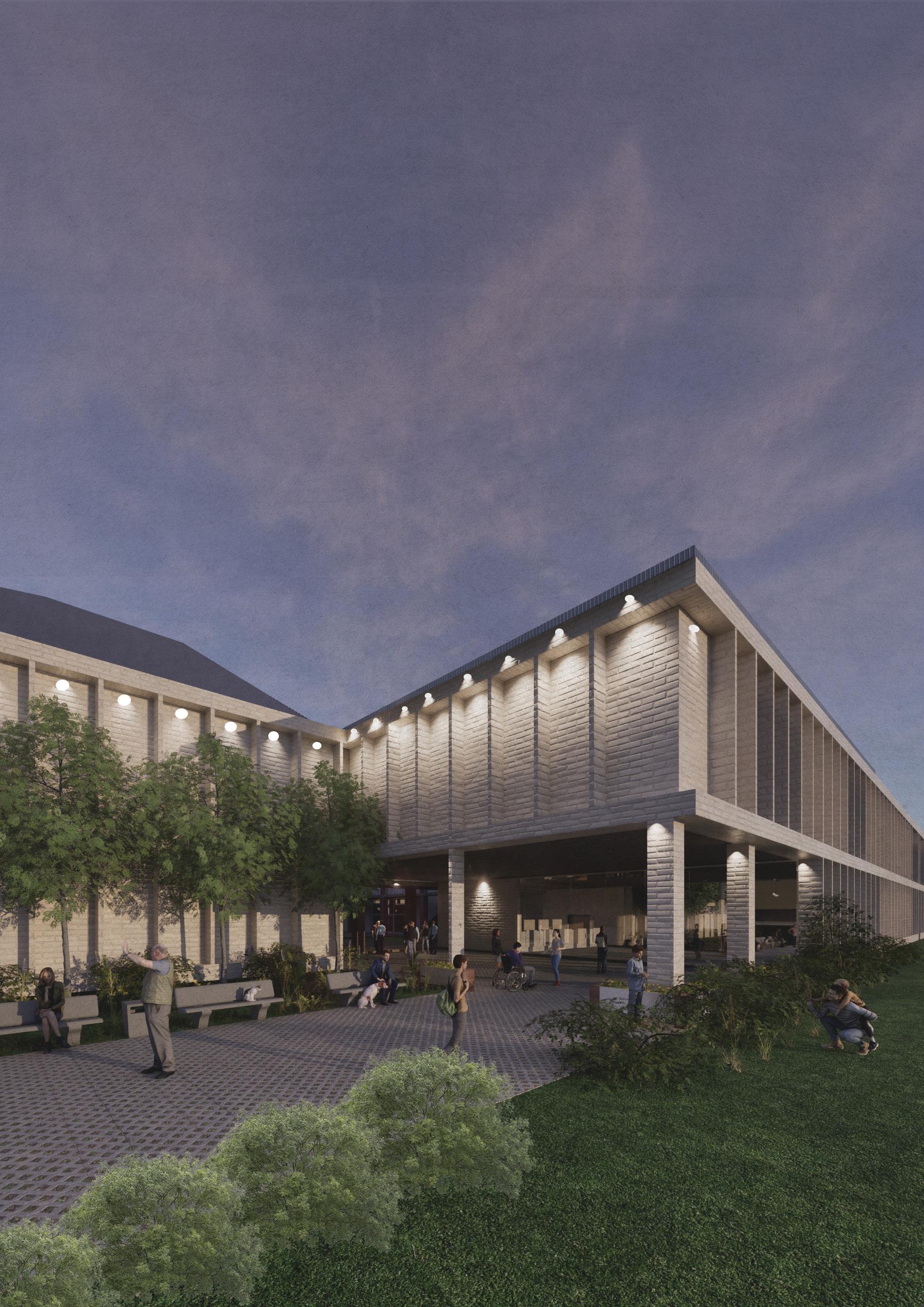
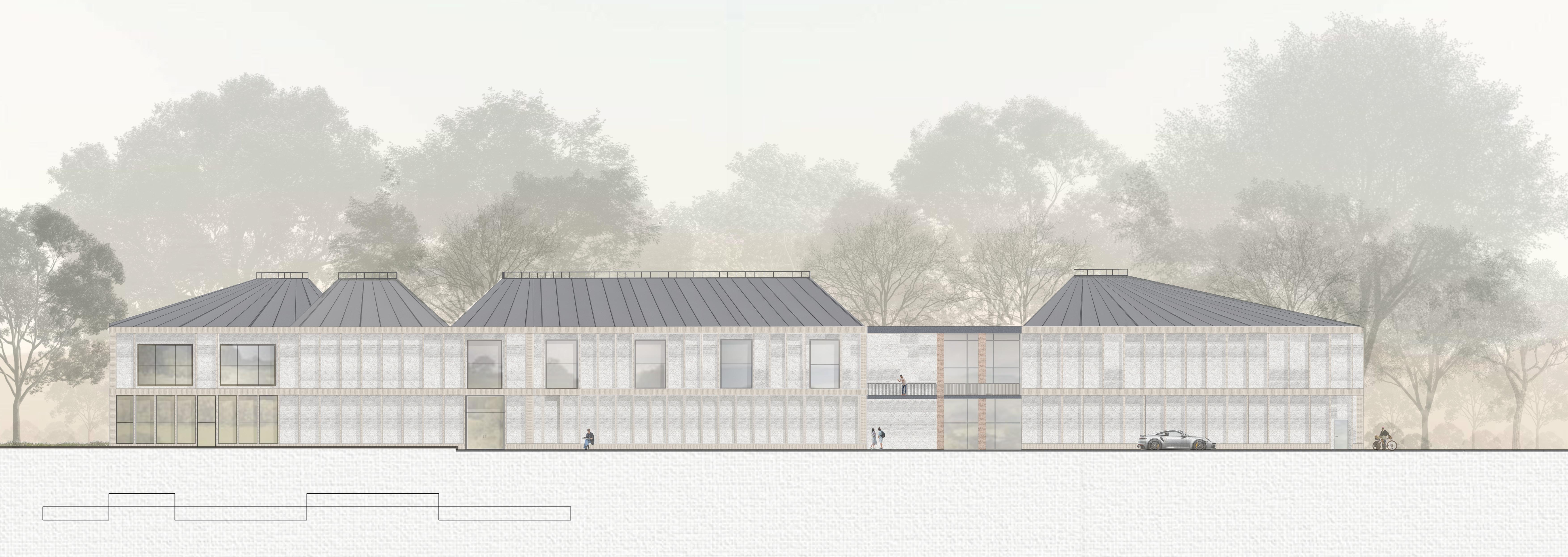
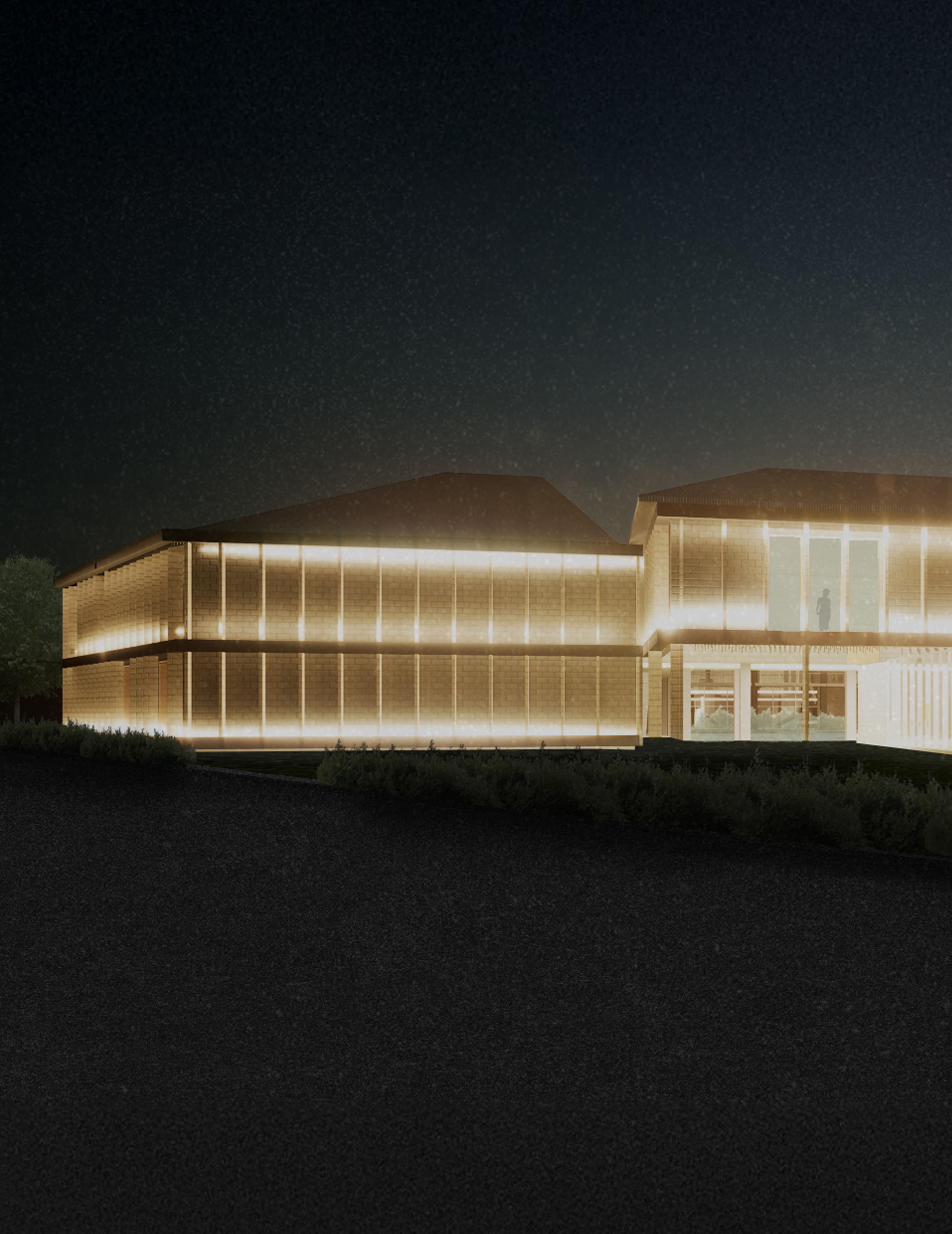
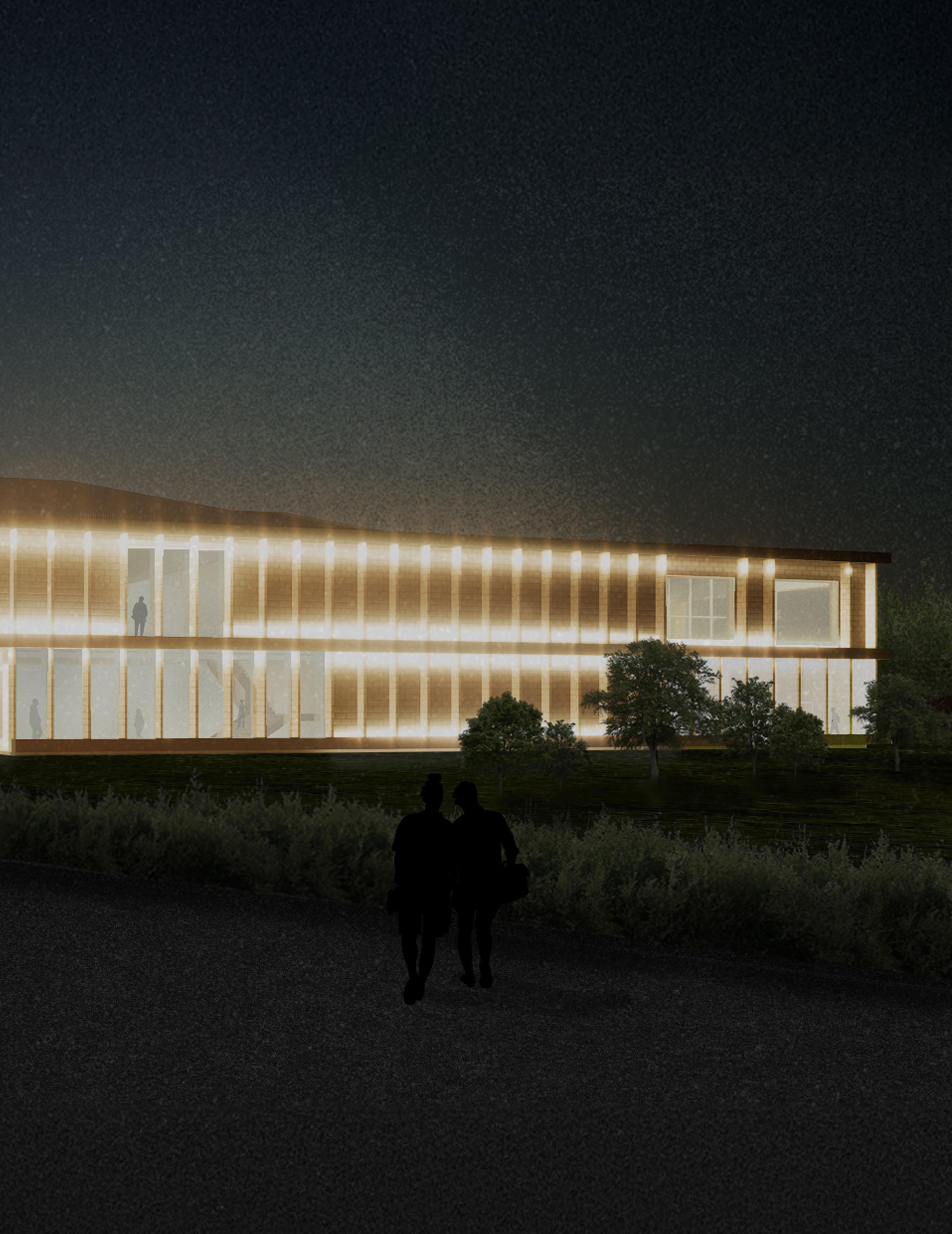
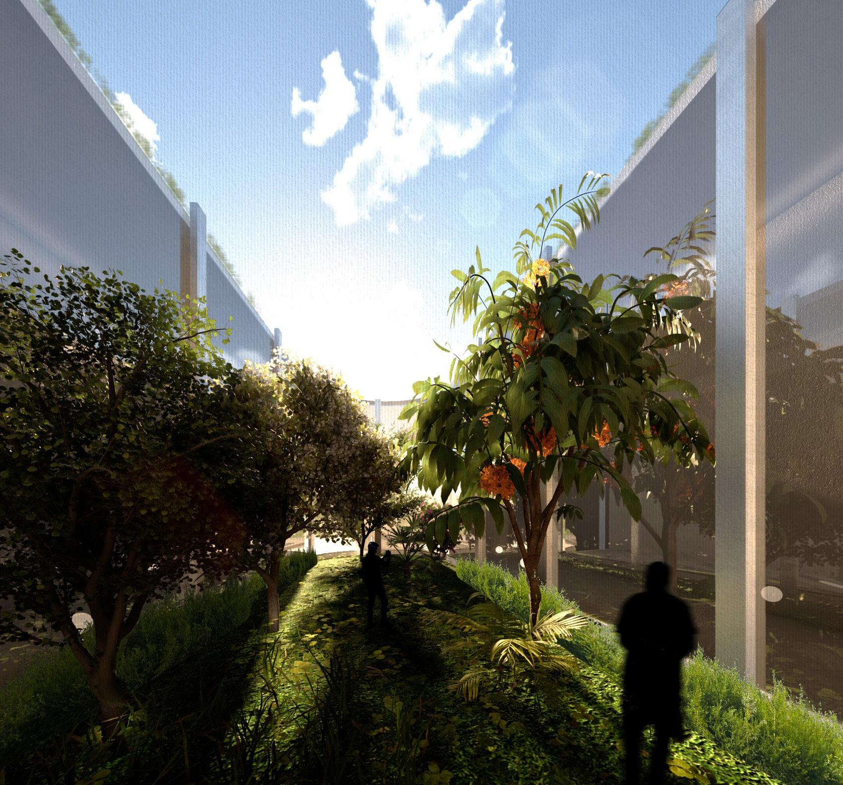
Salisbury Cathedral Close added further complexity. Its formal gateways, long views and protected greenery required a strategy that could fit within a centuries old spatial order without repeating it. A courtyard became the organising form. It roots the building in the landscape while allowing the four wings to remain distinct and interdependent. Roof geometry, openings and massing adjustments control light, microclimate and movement while respecting heritage sightlines.
Environmental performance shaped the design from the start. Orientation based glazing, raised skylights, MVHR, ground source heat pumps, thermal mass and rainwater harvesting create a carbon conscious system suited to Salisbury’s climate. Reclaimed brick from the Leaden Hall demolition strengthens the idea that the project continues the life of the site
The result is a building that negotiates between global and local scales. It supports internationally recognised events while reinforcing Salisbury’s aims for decentralised growth, intergenerational connection and cultural resilience. The project uses architecture to hold programmes and to propose a new social logic for the city.
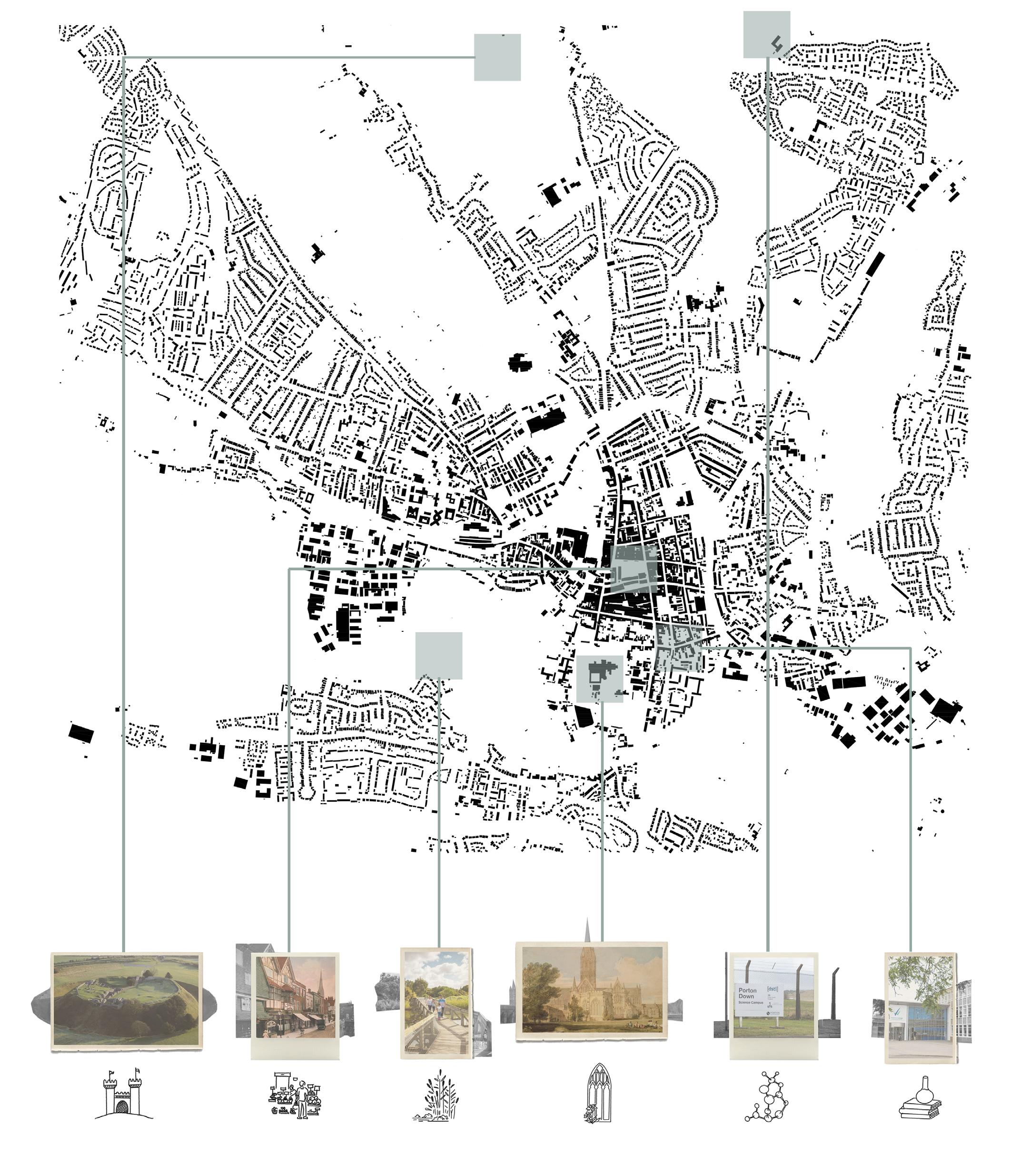
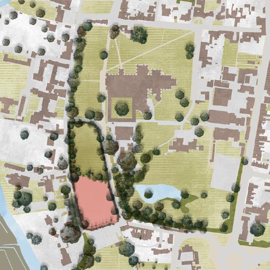
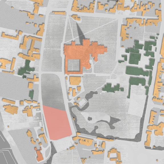
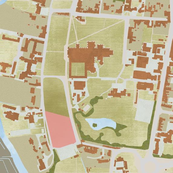
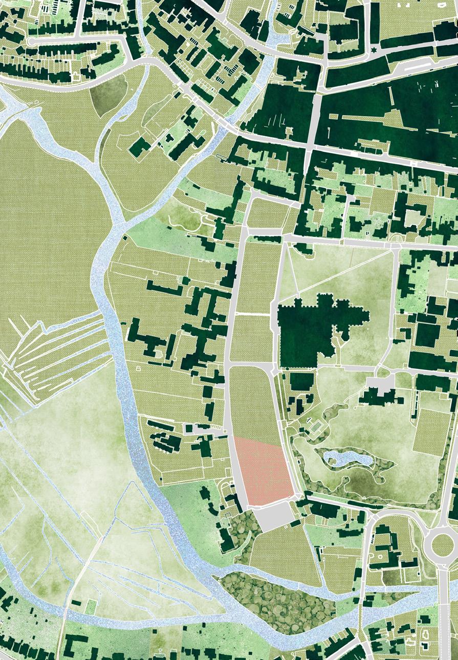
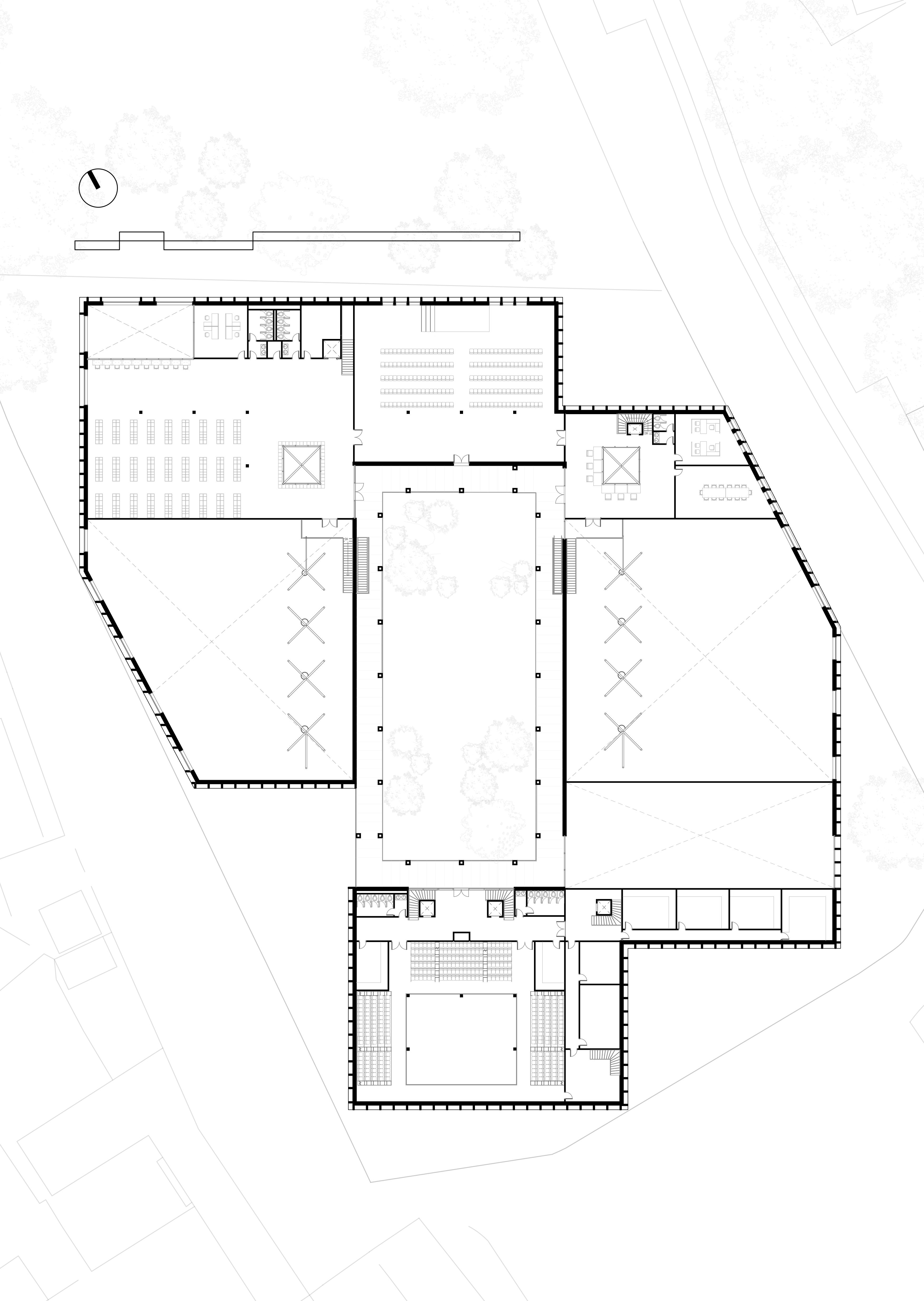
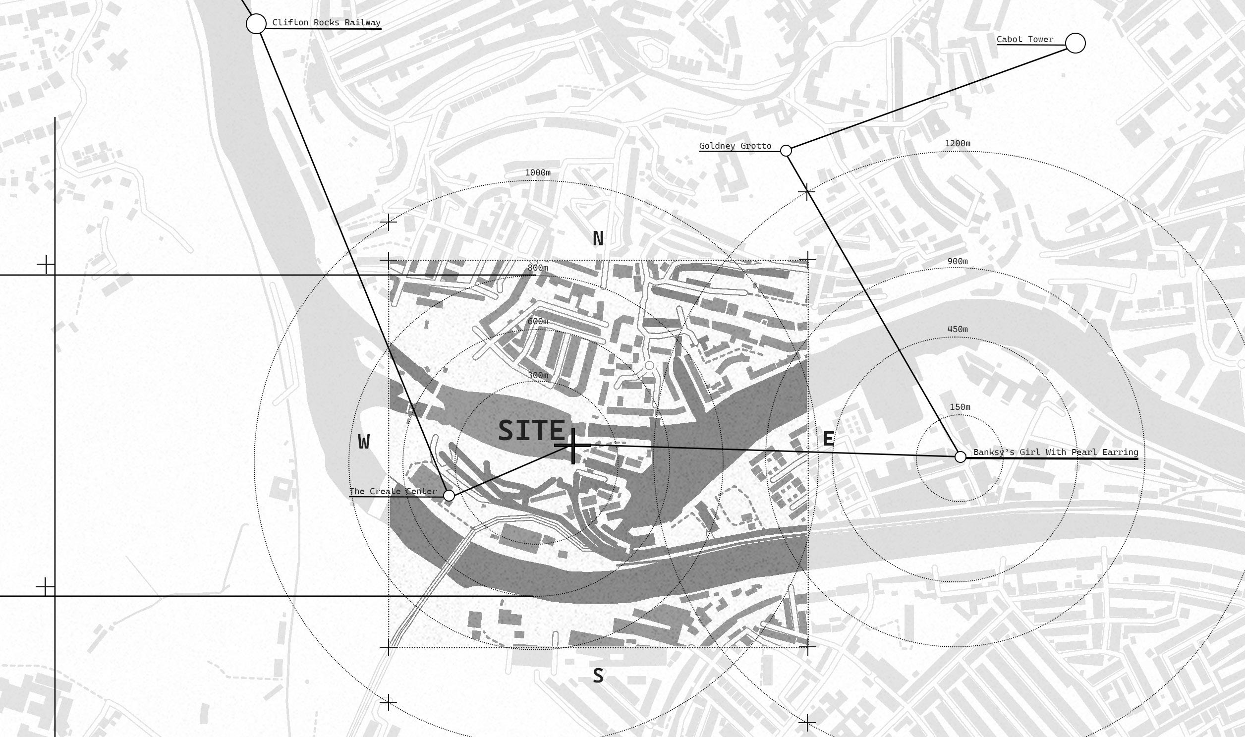
Site Analysis
The site sits within the calm and enclosed landscape of Salisbury Cathedral Close, surrounded by mature trees, protected views and axial alignments toward the cathedral spire, while its wider context includes historic and contemporary anchors such as Old Sarum, the Charter Market, Harnham Water Meadows, Porton Down and Wiltshire College. Open southern light, sheltered microclimates created by planting, and predominantly pedestrian circulation across the lawns establish a quiet spatial character shaped by heritage sensitivity, tree constraints and significant green space that invites a landscape led architectural response. Daily rhythms are defined by visitors and event guests who move through the Close during peak hours and by work regulars and staff who occupy it more continuously, producing overlapping layers of public and private use that shift throughout the day.
Context plan
Climate + Flood Risk
User Requirements
one of Europe’s largest surviving medieval enclosures, shaped by centuries of carefully protected landscape and
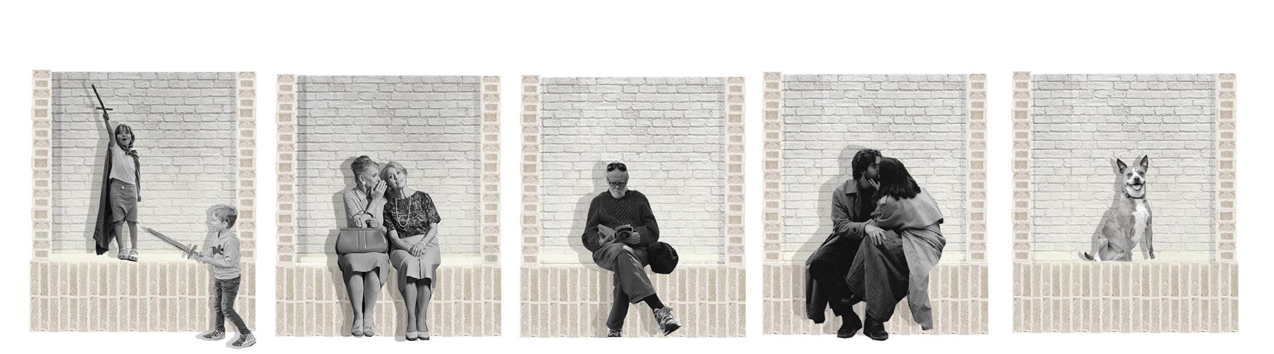
Our proposal hosts a variety of users. These users can be divided into four groups. Two of these are more public, visitors and event guests, and two are more private, the work regulars (refer to 4 spaces) and the staff.
Avon places it within a designated making drainage and ground-level
Sound Vehicular Pedrestian
Circulation
Sound Vehicular Pedrestian
Landscaping Plan
Landscaping Plan
1 to 700 @ A2
1 to 700 @ A2
Approach from Cathedral Road and pavement access from North of scheme
Approach from Cathedral Road and pavement access from North of scheme
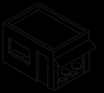
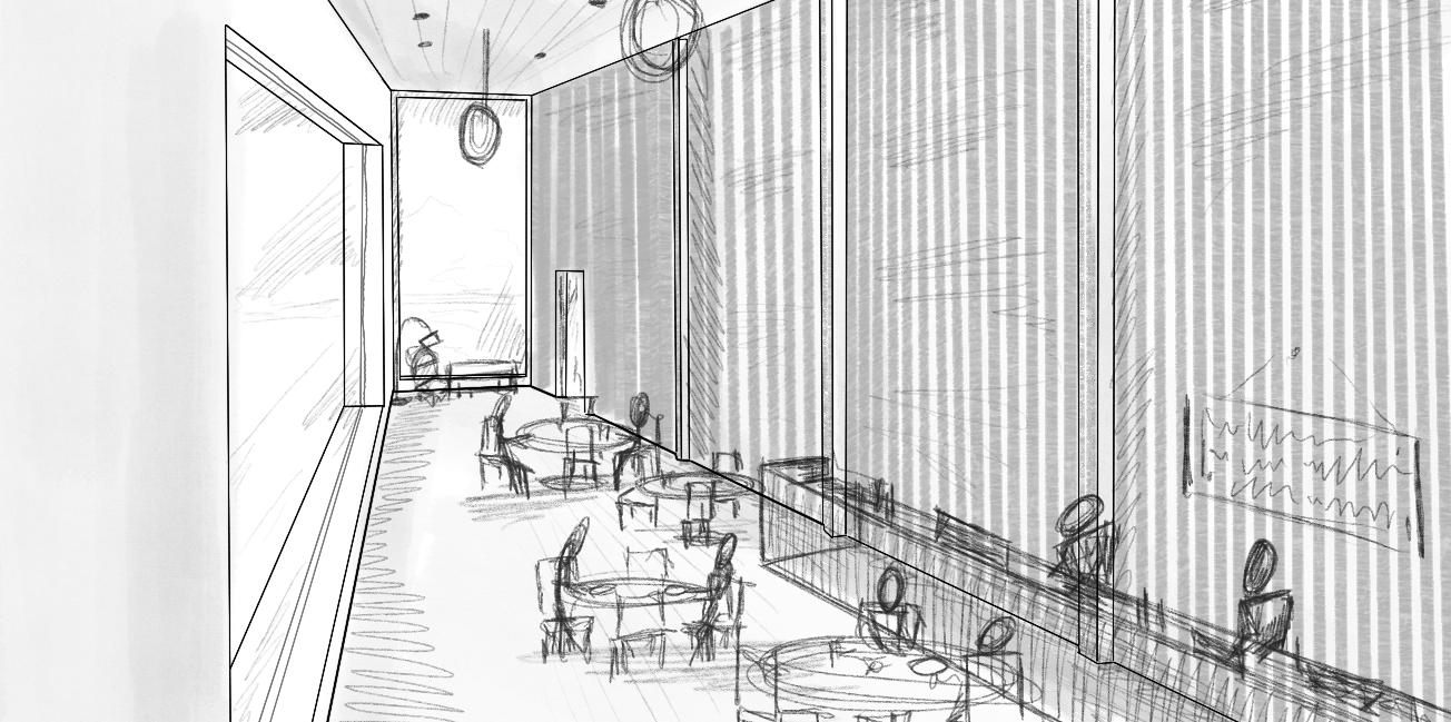
Outdoor Seating
Outdoor Seating
Cafe outdoor seating with views of greenery above and entrance to building through cafe
Cafe outdoor seating with views of greenery above and entrance to building through cafe
Open Entrance
Open Entrance
Entrance with staff reception for tourists and visitors to access
Entrance with staff reception for tourists and visitors to access
Central Courtyard
Central Courtyard
Hard landscaping using reclaimed brick from the Leadenhall demolition
Hard landscaping using reclaimed brick from the Leadenhall demolition
South Entrance
South Entrance
Open entrance into courtyard for locals of Salisbury and direct access for visitors of the auditorium
Open entrance into courtyard for locals of Salisbury and direct access for visitors of the auditorium
Solar Panels
Solar Panels
Solar panels for renewable energy on flat roofs
Solar panels for renewable energy on flat roofs
Delivery Bay
Delivery Bay
South of scheme, deliveries for back of house, kitchen, and servicing plant rooms
South of scheme, deliveries for back of house, kitchen, and servicing plant rooms
Access through visitors coming from neighboring areas with vehicles
Access through visitors coming from neighboring areas with vehicles
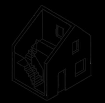
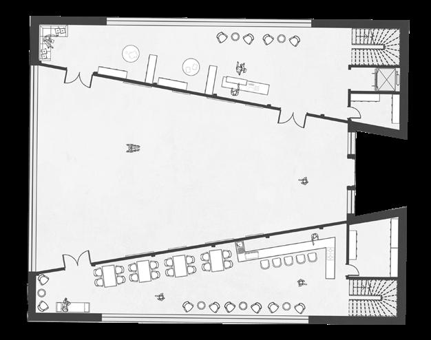
Ground Floor
External view
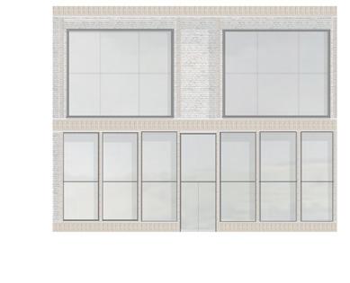
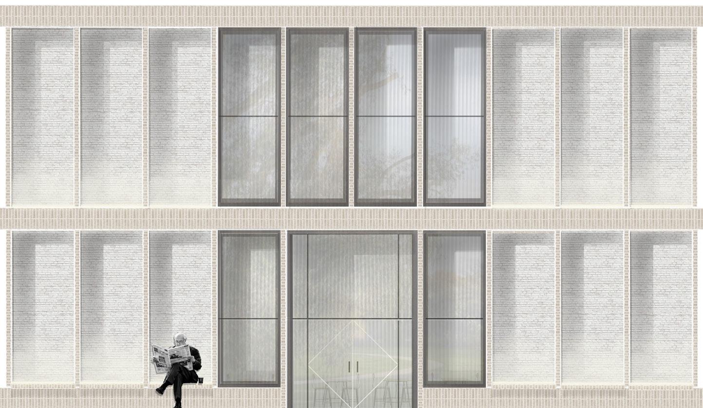
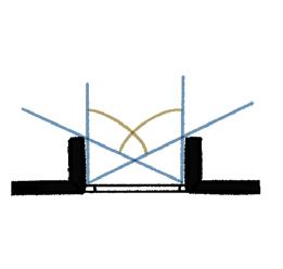
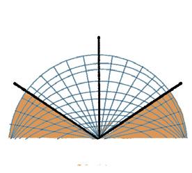
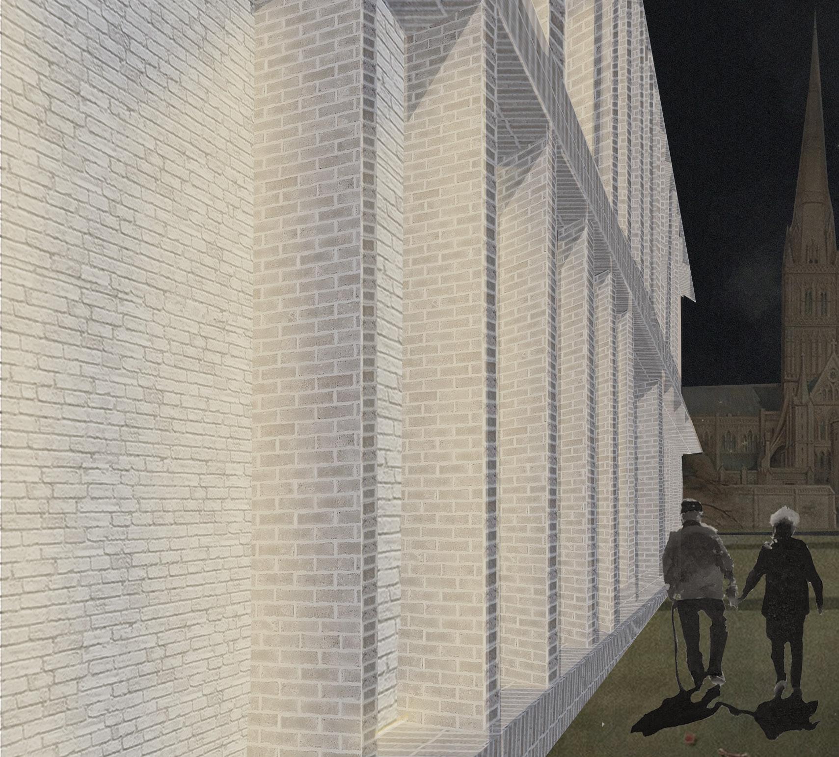
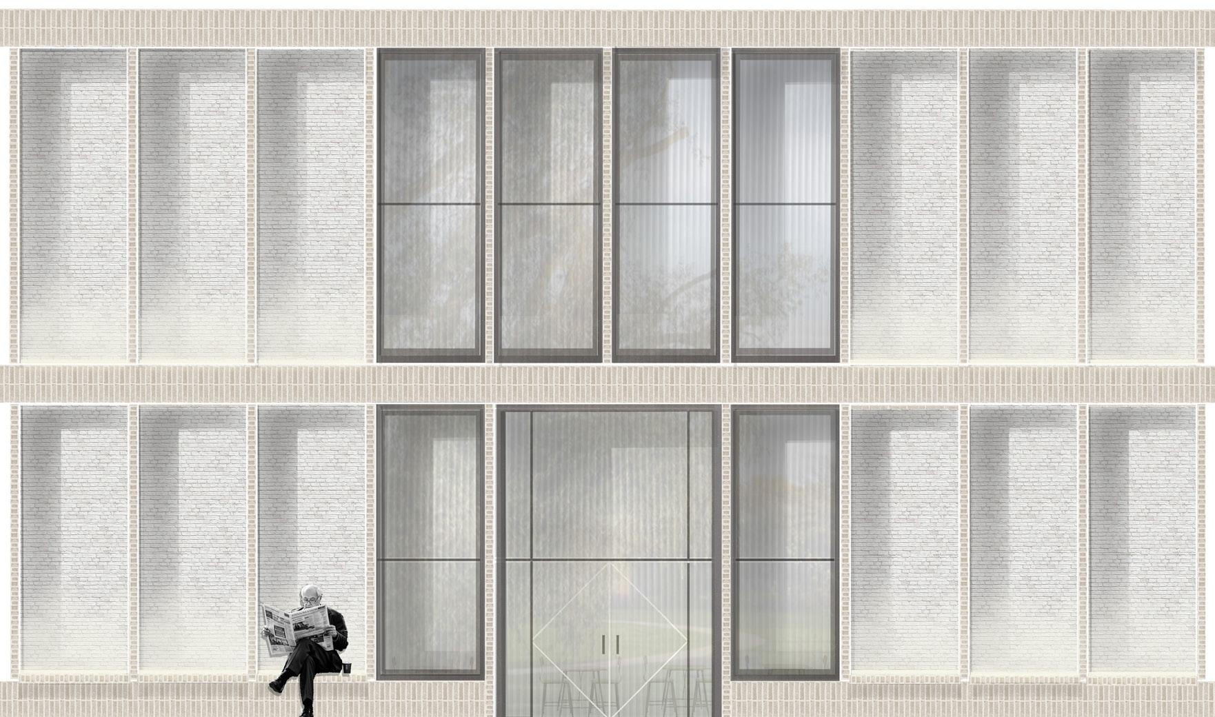
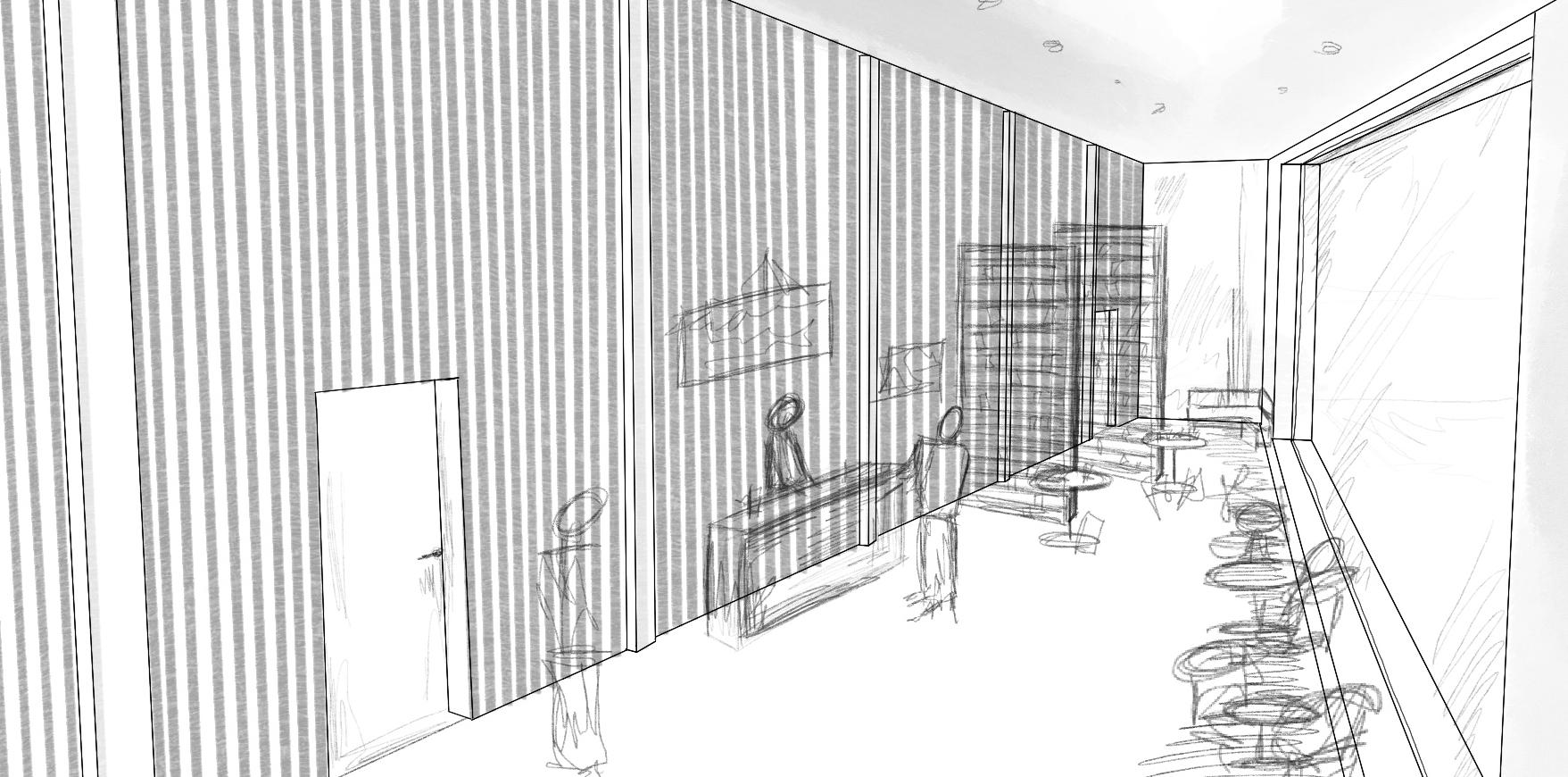
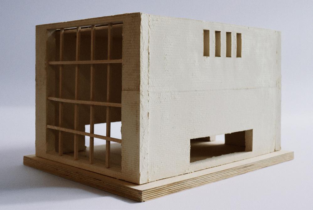
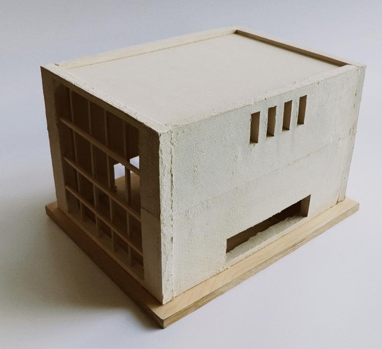
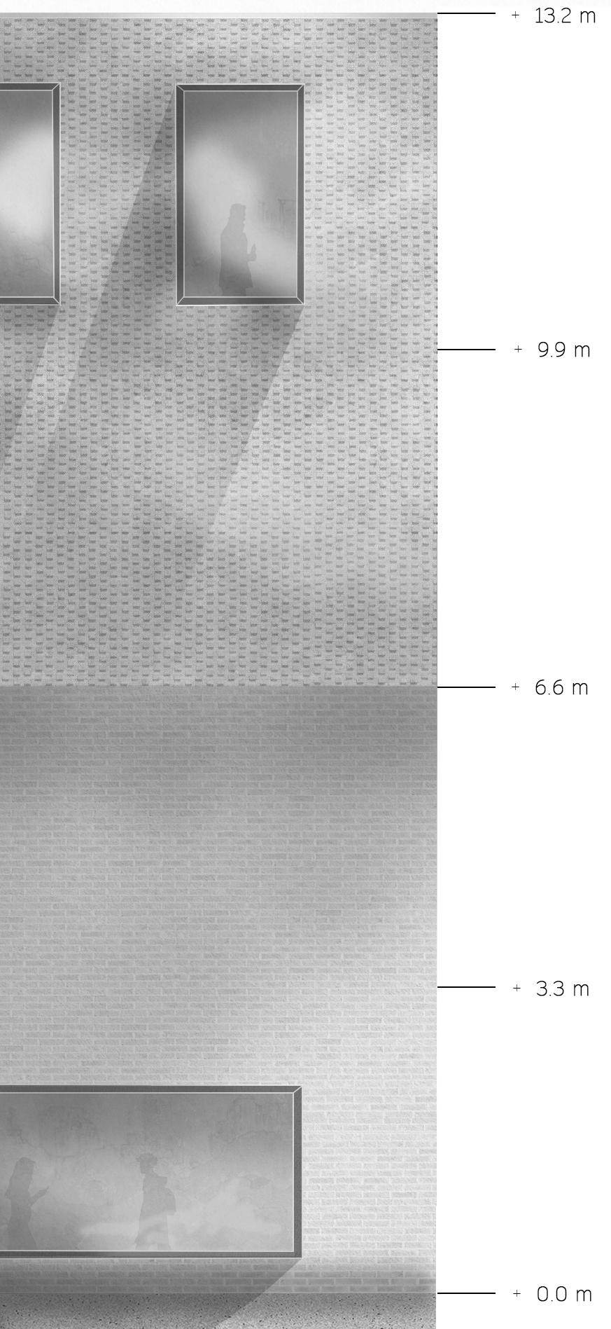
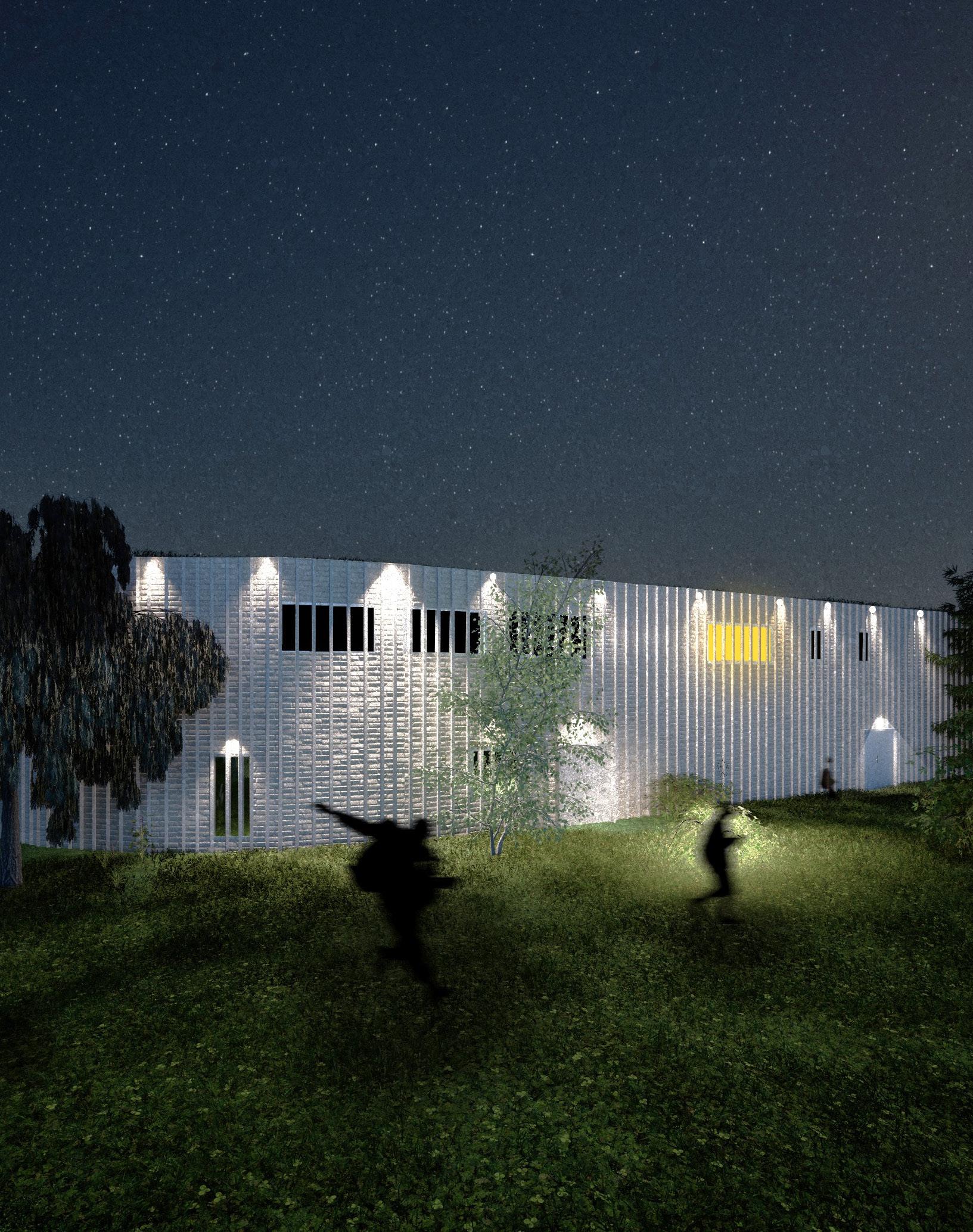
The Habited Facade
Facade Frequency
Alignment
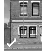
The Salisbury Neighborhood Development plan section ‘Relate ground floor features’ specifies that:
Capturing Moments of Intimacy
With a depth of 500mm, and frequency of their positions being every 1500mm, the facade creates a more intimate, private, and engaging experience with the outer shell of the building before entering and experiencing the scheme,
By providing intimate hubs for people to connect, we create opportunities for different users to engage with the space.
This strengthens the building’s purpose for connection and dialogue.
‘In order to achieve a balance in the building facade, it is important to relate the ground floor features with those above.’
By mantaining a consistent linear facade across the entirety of the building, the necessary glazing on first floor level is positioned to respond in symmetry and function to the glazing on the ground floor, with all dimensions consisting of standardised elements.
Elevation of Facade Shading
uninteractive brick facade engaging brick facade
Sections, Elevation
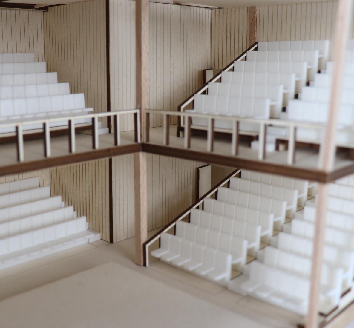
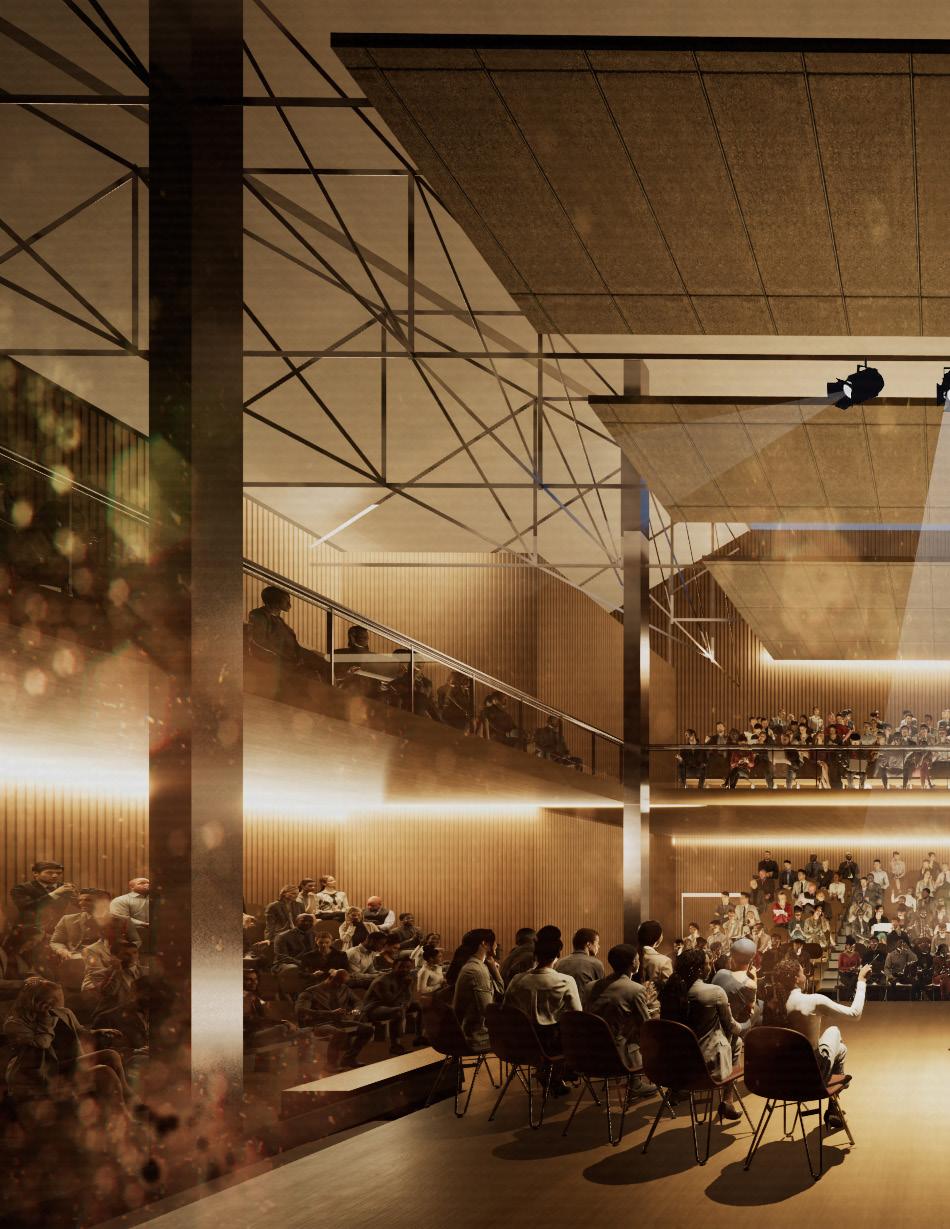
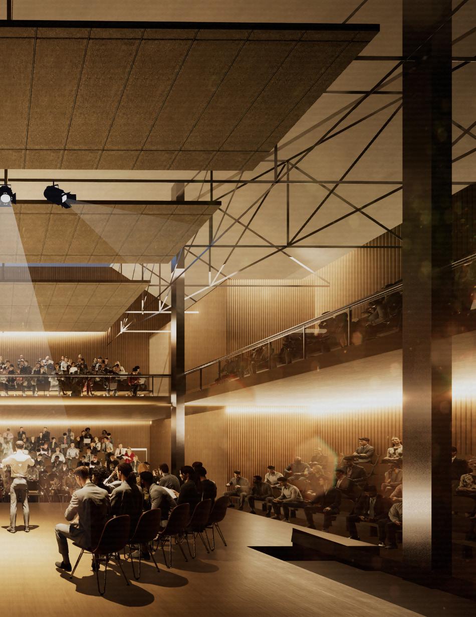
Auditorium
Birds-eye view of auditorium layout
The Art House Summary
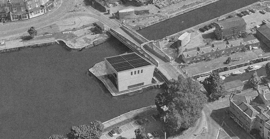
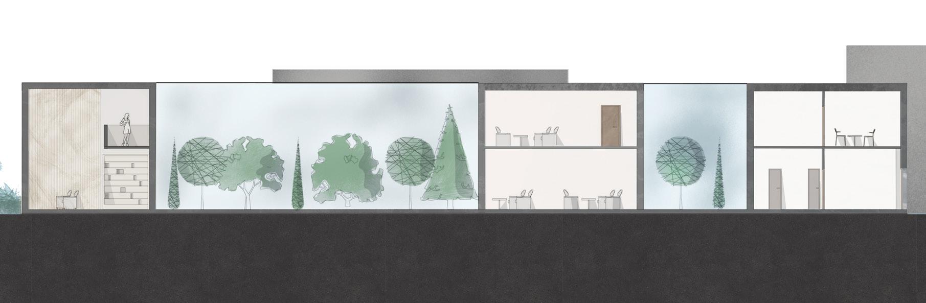
The project investigates how an industrial landscape can support new cultural roles by treating the manmade river deck at Spike Island as an active architectural ground. A restrained massing of lime brick and textured brickwork establishes a clear spatial order that acknowledges the working harbour while positioning the gallery as a civic figure within it. The interior is organised around an unfolding sequence that compresses the entry and gradually opens toward the river, using anticipation and calibrated shifts in light and proportion to structure how visitors read the space.
People engage the building by inhabiting the waterfront as part of the gallery experience. Large flexible exhibition floors accommodate changing artistic practices, and smaller rooms support teaching and community use. The defining behaviour emerges in the transition toward the riverfacing volume. As circulation angles subtly widen, visitors slow down, gather at thresholds and reinterpret the quay as an extension of the cultural interior, merging the industrial edge with public life.
The environmental strategy focuses on few essential principles: thermal mass stabilises interior conditions, controlled openings manage daylight and ventilation, and rooftop photovoltaics support on-site energy generation. These systems remain legible within the spatial order, ensuring that environmental performance strengthens the logic of the building.
The result is a gallery that uses precision to reconceive its setting. The project uses industrial context and spatial clarity to shape a place that belongs to its site and invites people to inhabit the waterfront as an extension of the gallery.
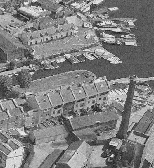
Site Analysis
~40% of buildings are former warehouses are solid brick shells now reused as studios and workshops. They form the industrial backbone of the island.
~25% host creative and educational uses. Light, open interiors promote exchange and adaptability within industrial shells.
~15% occupied by cafes and small offices. Glazed ground floors connect the public realm, activating the waterfront edge.
~15% occupied by cafes and small offices. Glazed ground floors connect the public realm, activating the waterfront edge.
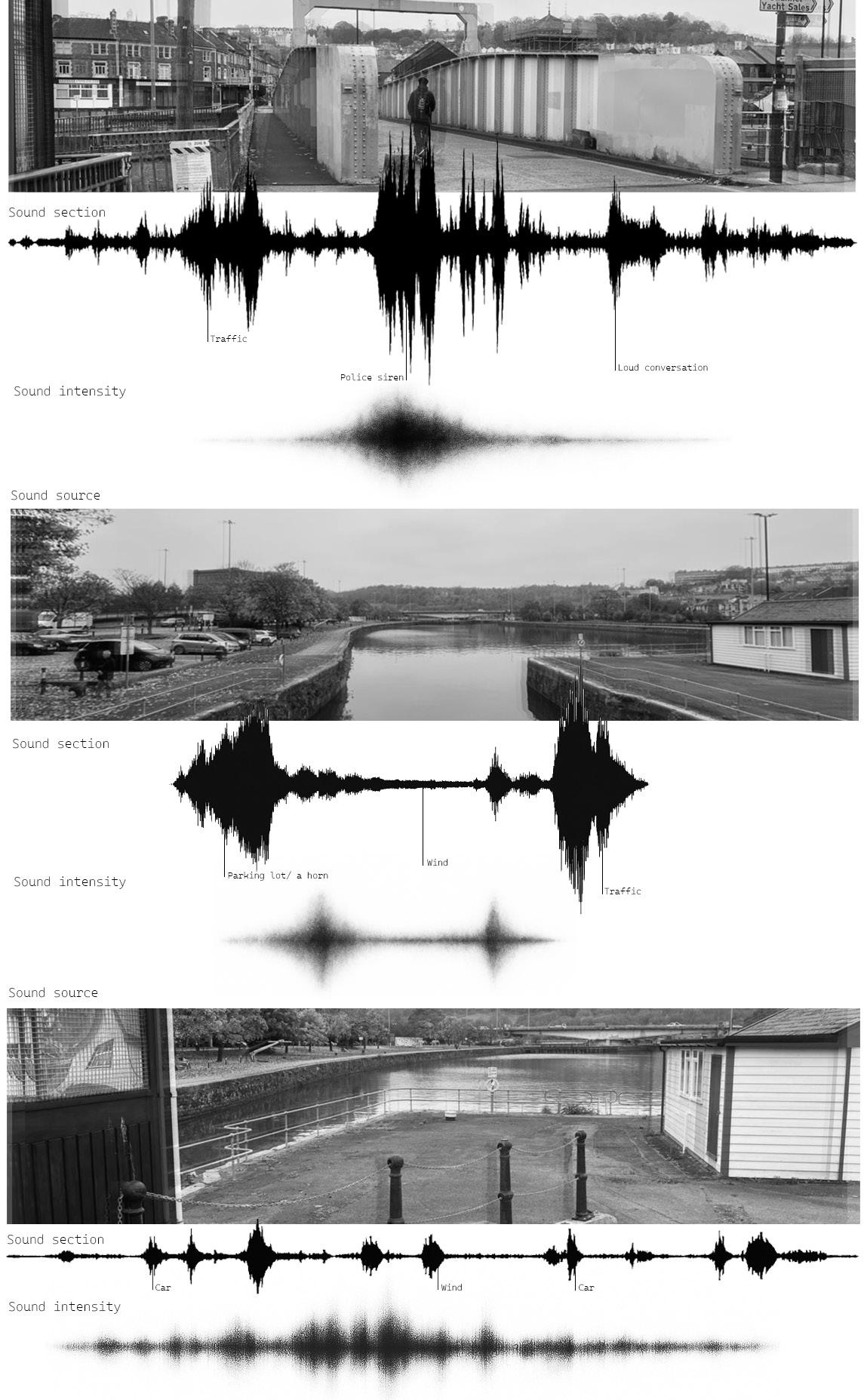
The site occupies a transitional edge of Spike Island where water, infrastructure and industrial remnants converge. Positioned between the Floating Harbour and the tidal River Avon New Cut, the ground has a dual maritime orientation and an unusual acoustic openness created by the elevated deck and lack of enclosure. These conditions make environmental variation across the site sharply perceptible.
The acoustic study reveals a spatial gradient, with the northern and eastern edges carrying the more active sound climate and the southern and western edges registering a markedly calmer field. This asymmetry became a structuring device for the project. Quieter programme zones are placed to the south and west where the site offers greater environmental stability, while more communal and outward oriented spaces occupy the north and east where higher sound levels can be integrated into collective use.
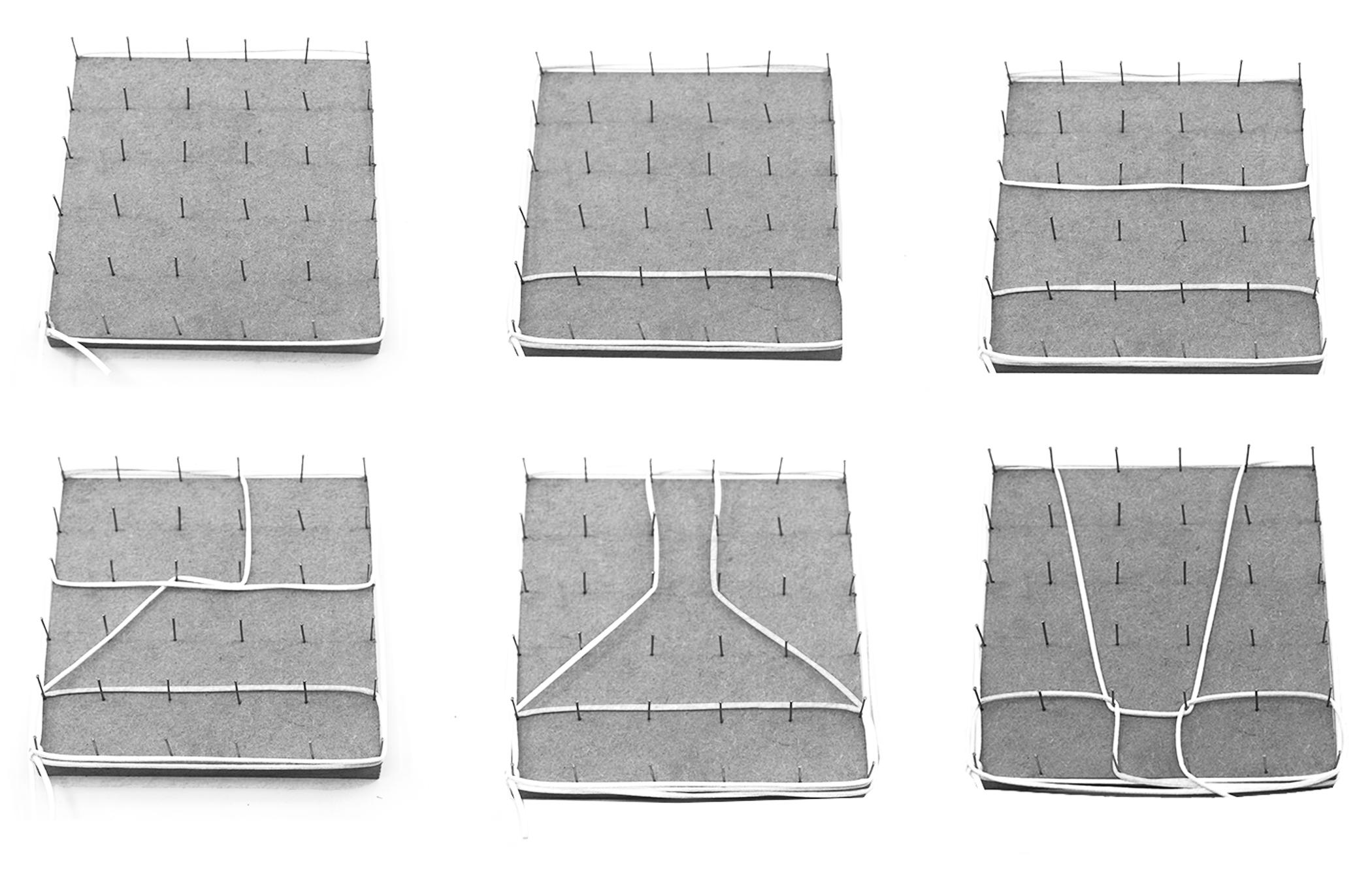
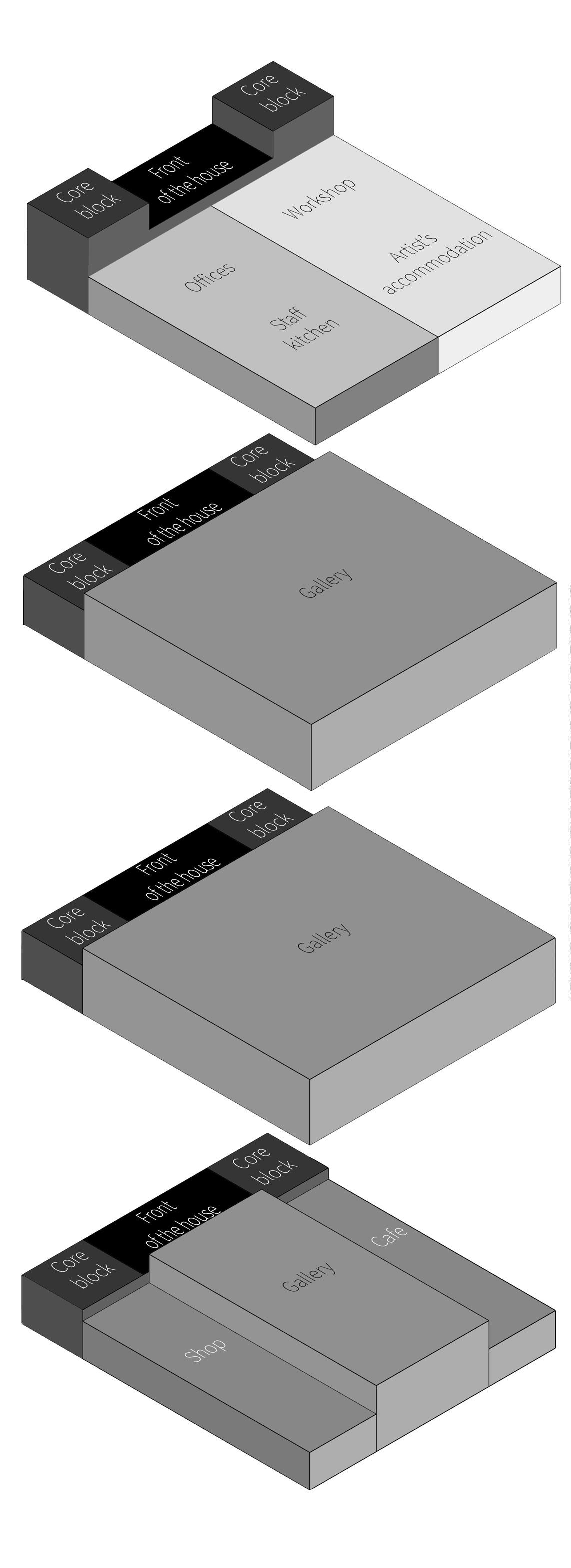
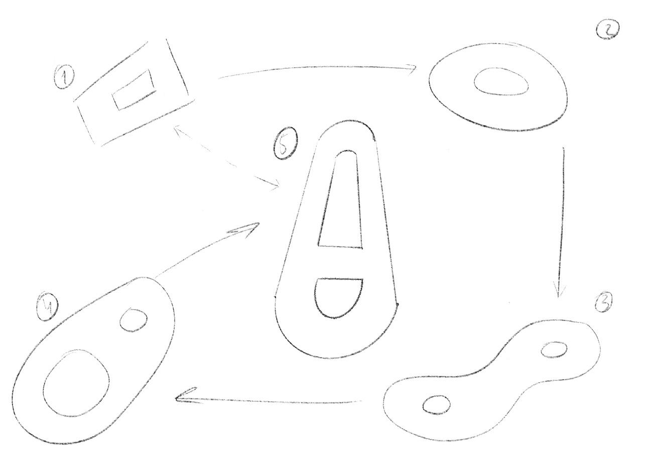
Progress of form
Development of internal zoning
The form developed through a process of reduction and clarification. Early studies tested multiple spatial configurations on the deck, exploring how a compact volume could register the site’s shifting acoustic and environmental conditions without overwhelming its industrial surroundings. As the iterations progressed, the plan was gradually refined into a pair of angled lines that open toward the water, establishing a clear directional reading and setting up the unfolding sequence that structures the interior.
This conceptual geometry was then translated into programmatic massing. The lower levels were consolidated into large gallery plates to maintain spatial continuity, while the upper level shifted to accommodate studios, workshops and living spaces, creating a differentiated but interdependent stack Each refinement moved the project closer to an architecture shaped by the specific pressures of the site: sound gradients, light exposure and the need for a legible public frontage facing the waterfront.
Function of a building
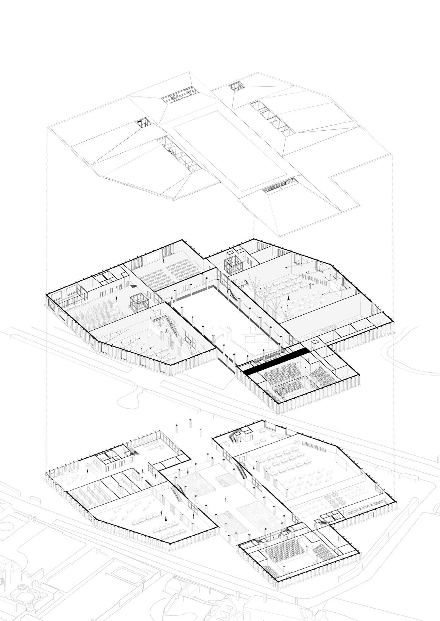
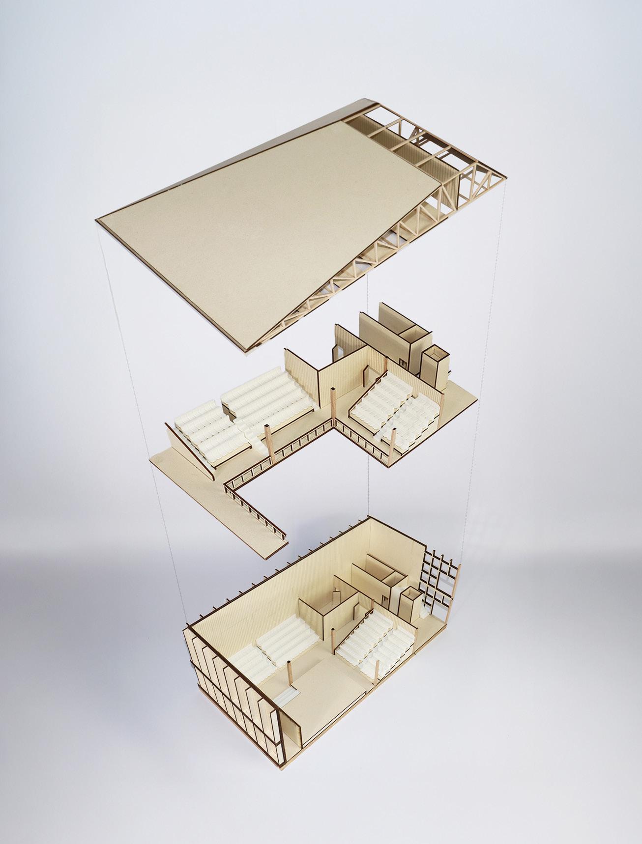
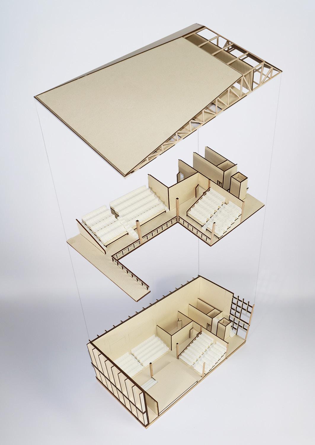
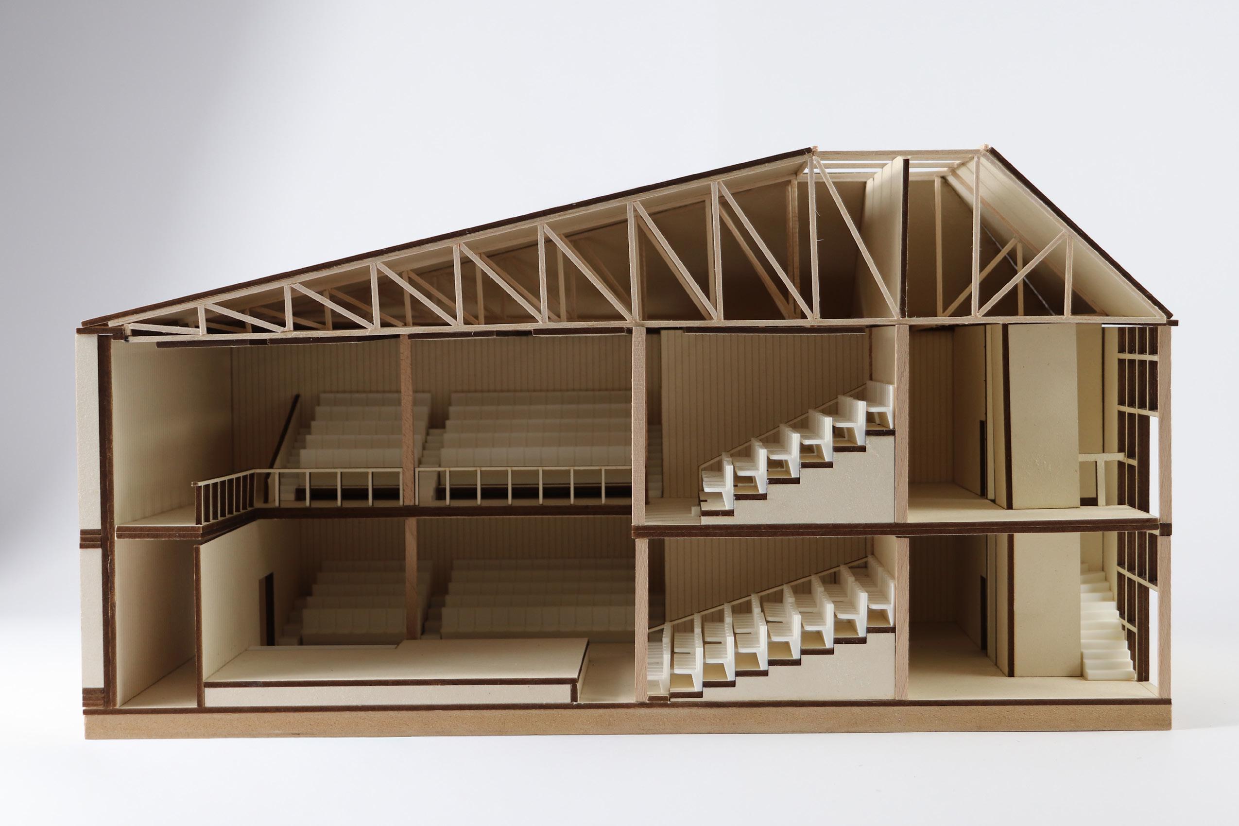
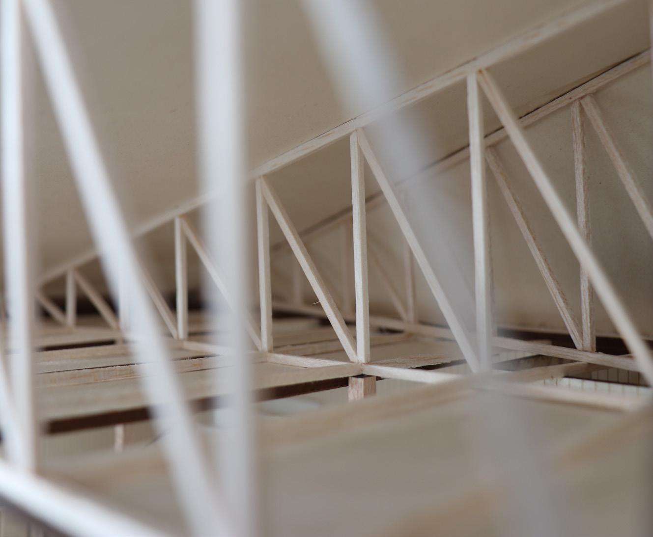
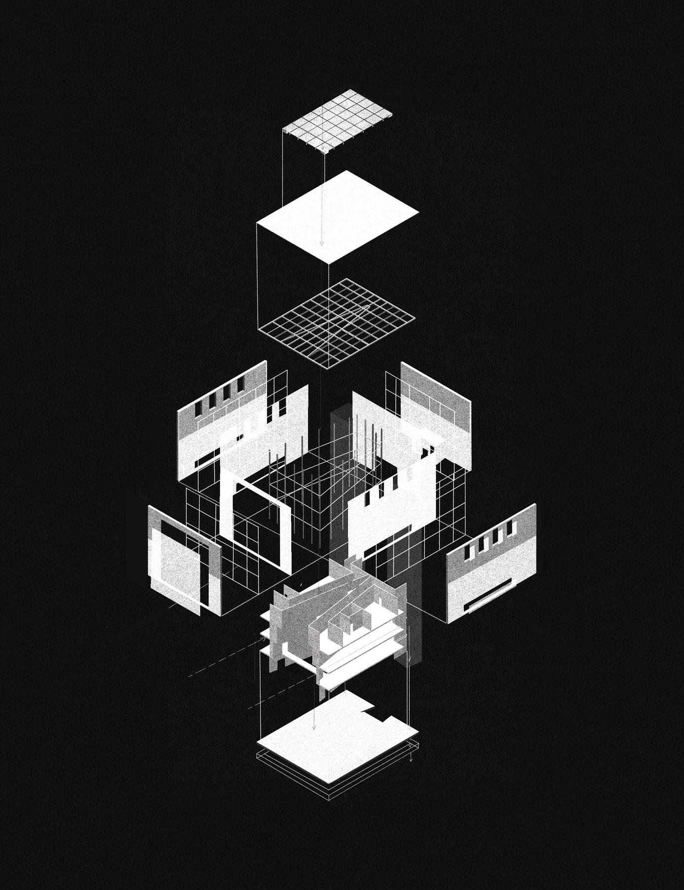
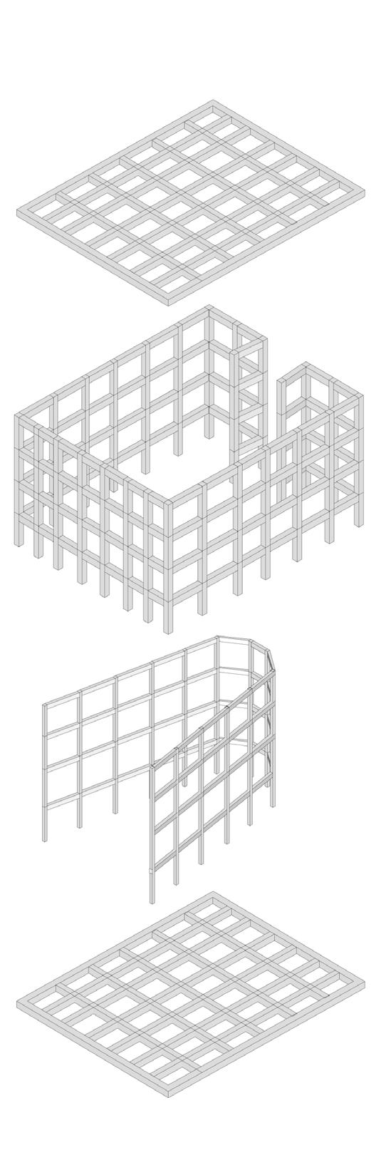
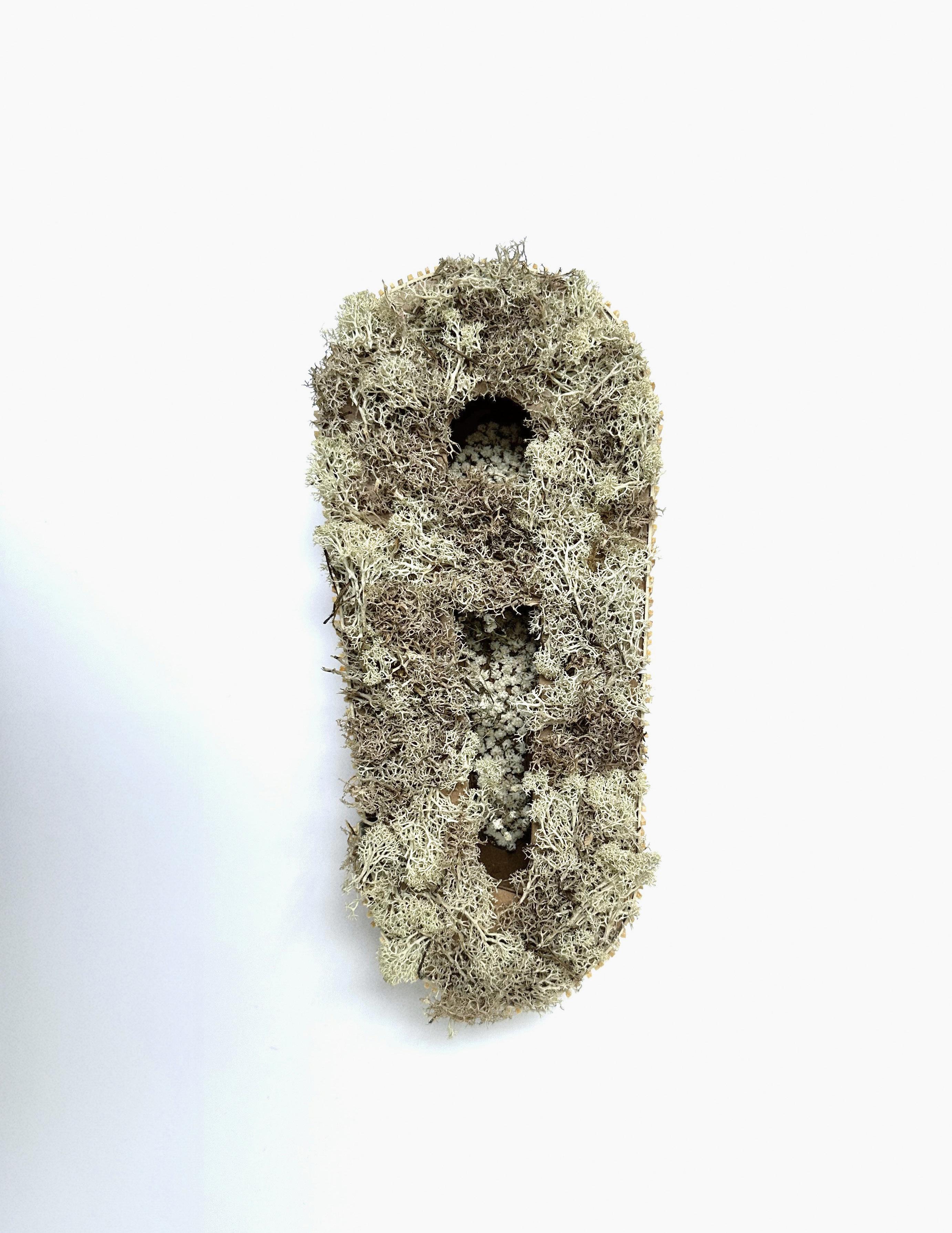
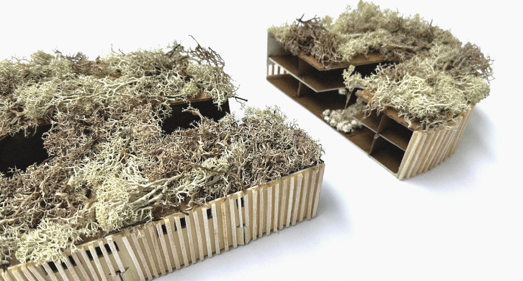
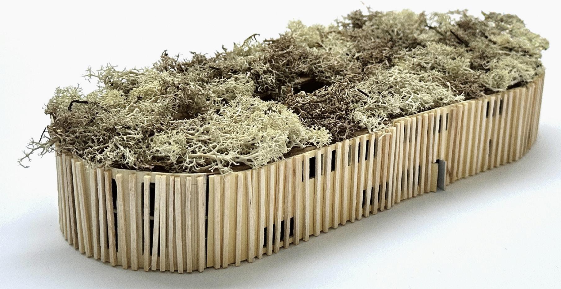
Exploded structure
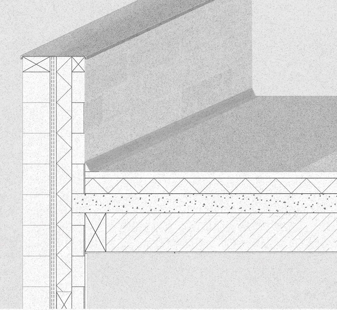
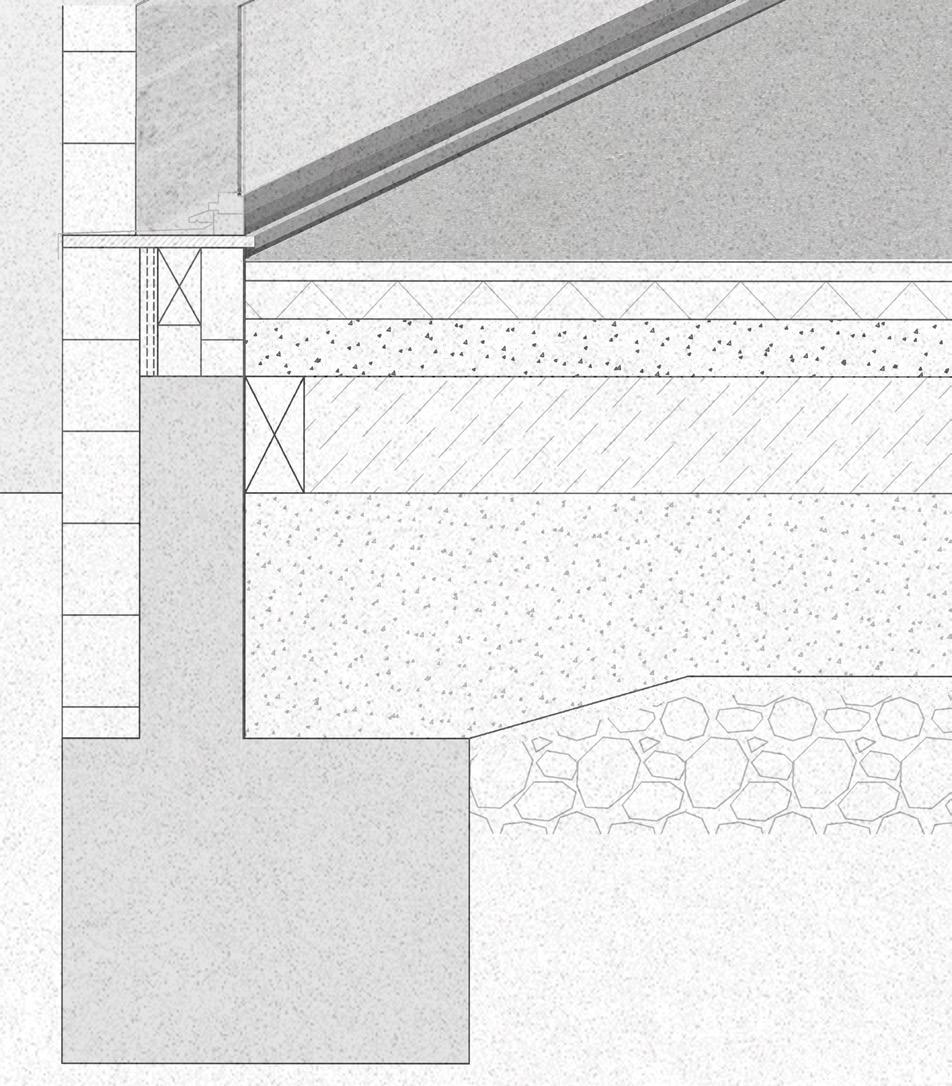
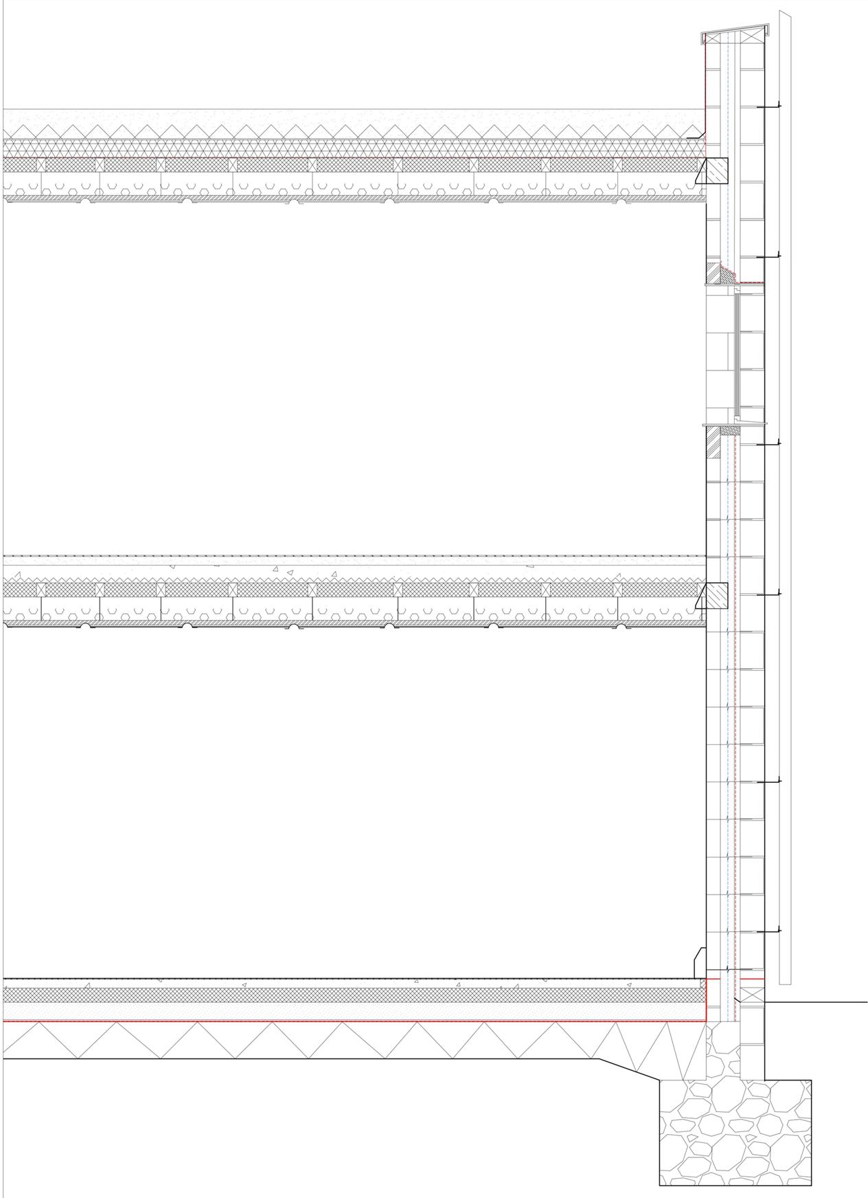
Structure
12.5mm plasterboard ceiling
305mm service zone with structural timber beam
RC roof slab 150mm (diaphragm)
VCL (sealed)
120mm tapered insulation to falls 1:60 - internal RWO
50mm fully bonded waterproofing membrane
200mm polshed concrete screed finish
5mm acoustic underlay
100mm thermal insulation
RC floor slab 150mm
DPM
305mm service zone with structural timber beam
Compacted hardcore
Gravel
Structural grid axonomentric
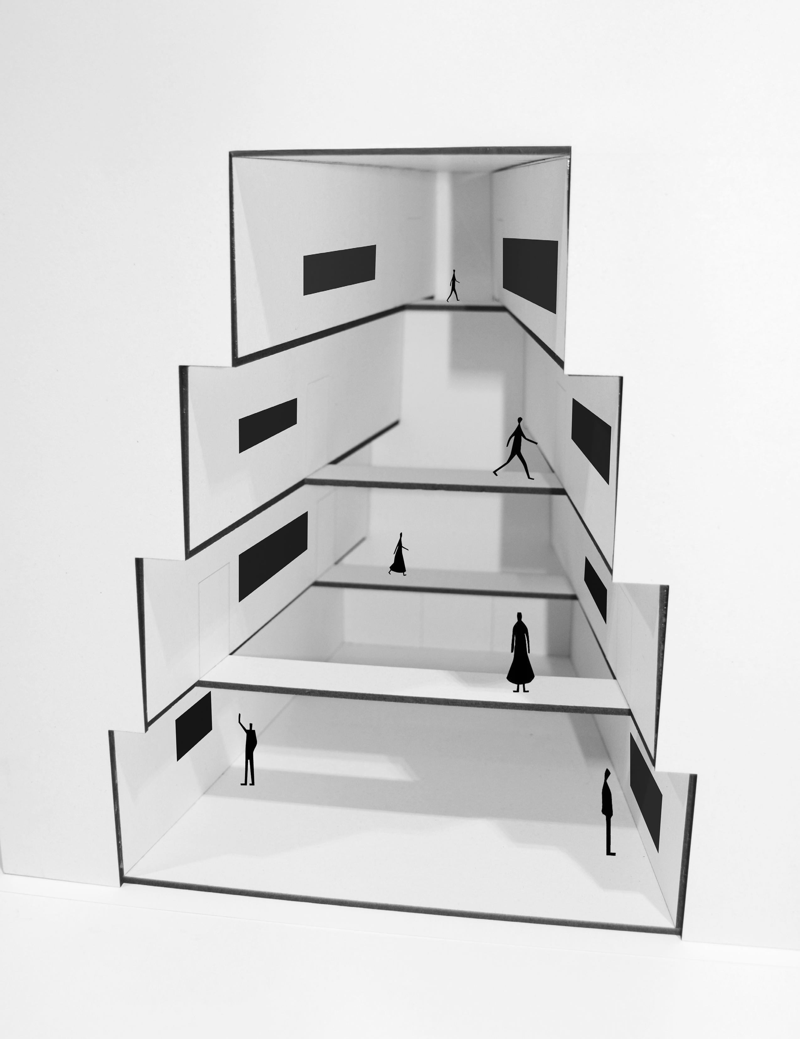
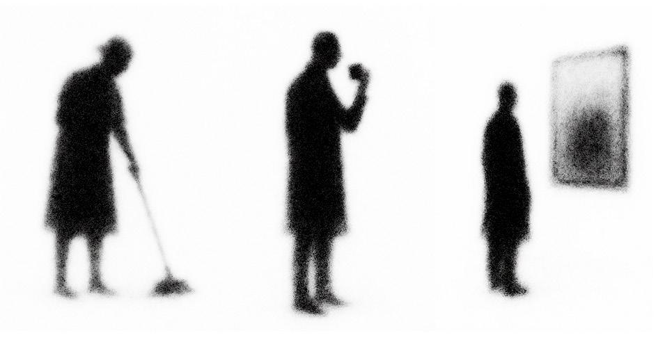
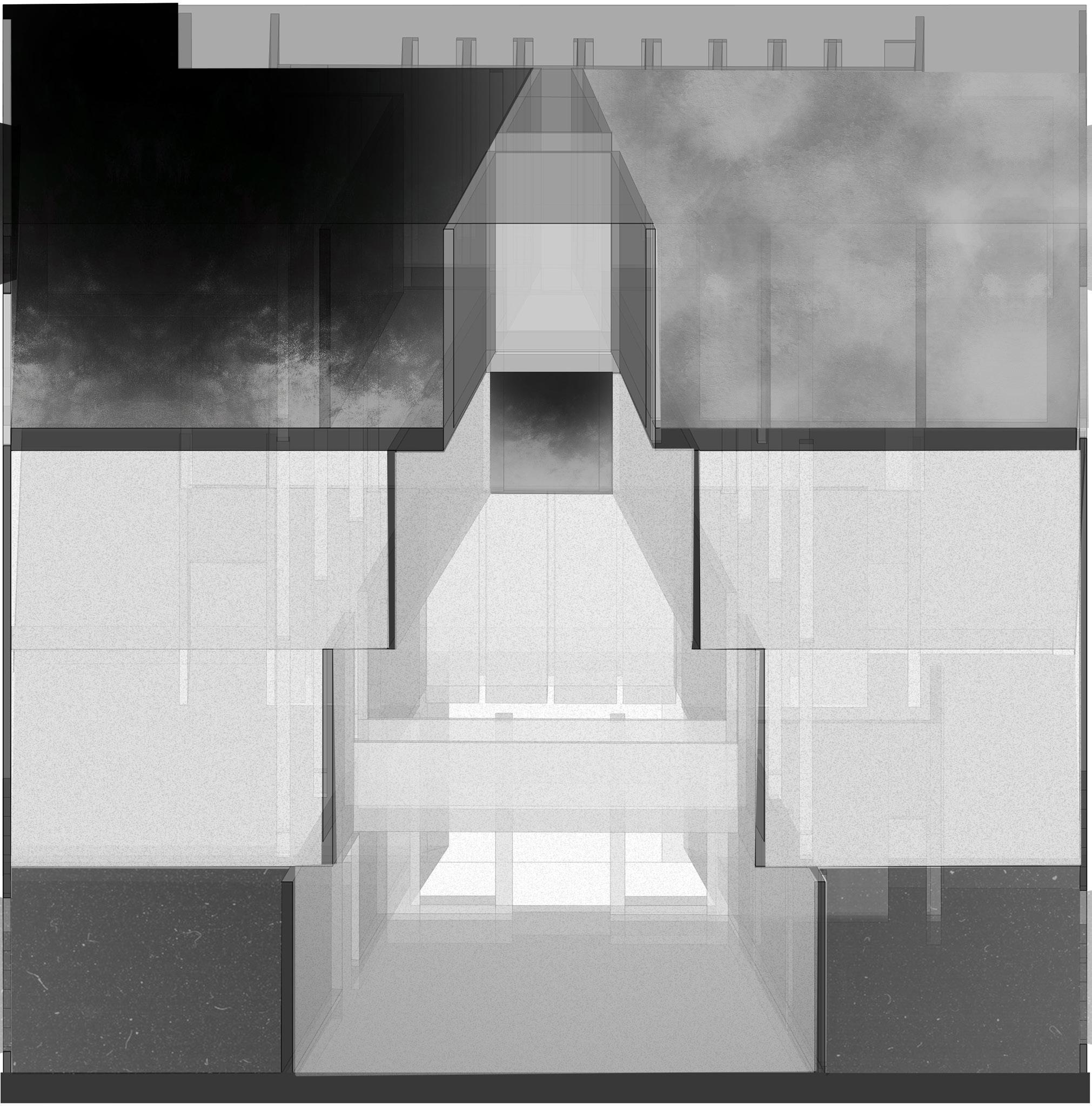
Plans + How Art is Viewed
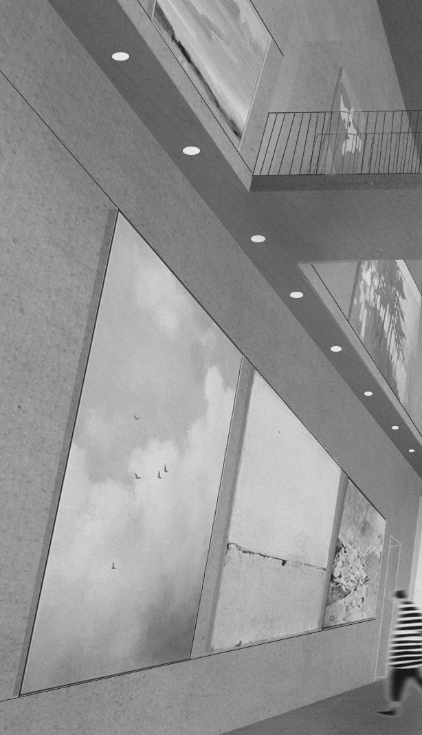
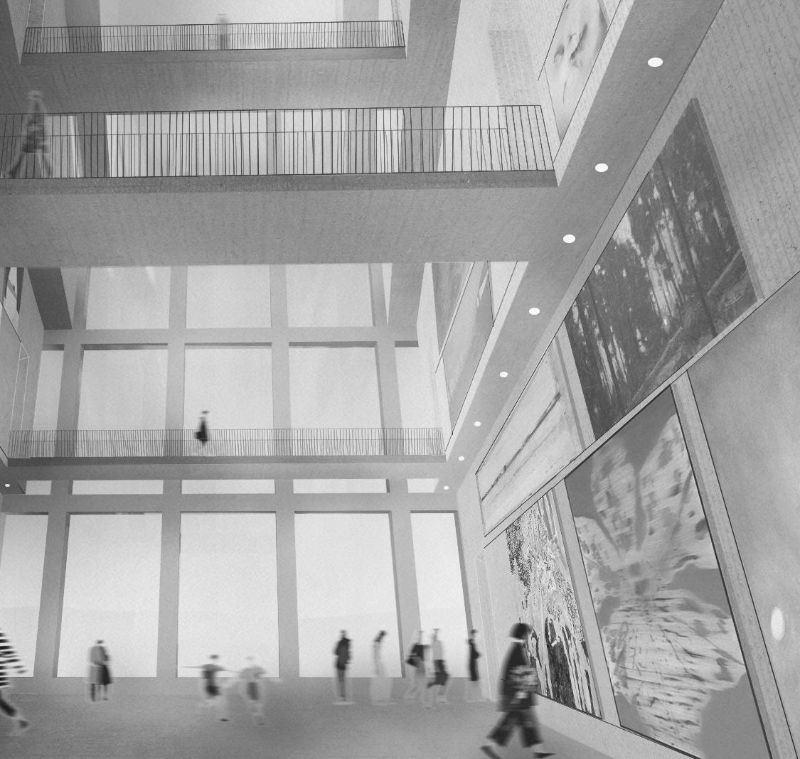
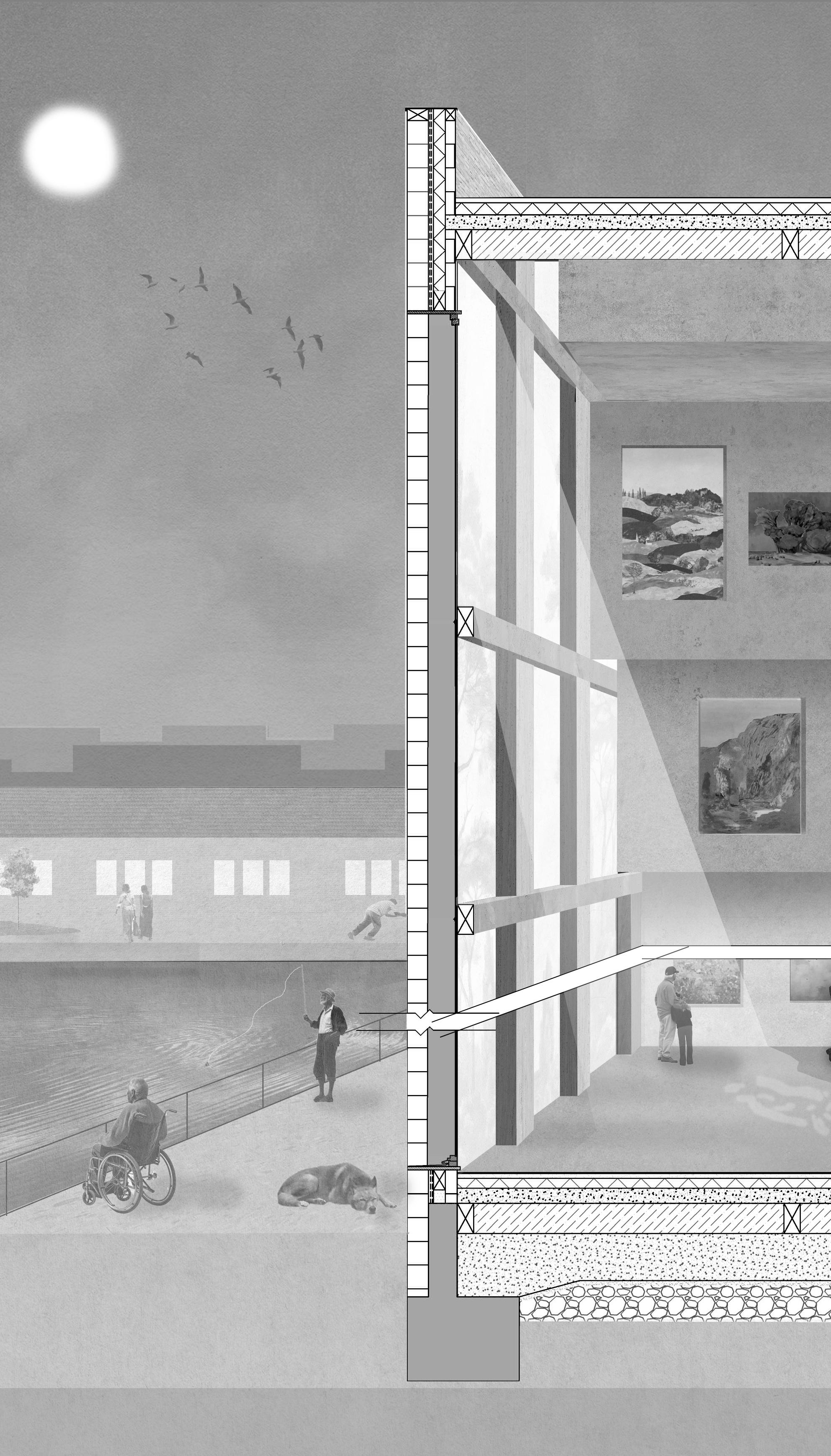
Art is viewed through a spatial sequence that privileges clarity, distance and controlled variation. The angled planes of each gallery floor create subtle shifts in orientation, allowing artworks to be encountered from calibrated perspectives rather than fixed frontal positions. Vertical surfaces are kept uninterrupted and evenly lit, giving the pieces a consistent visual field while allowing the viewer’s movement to determine changes in scale and proximity. The sectional model shows how the staggered floor plates produce alternating moments of compression and release, enabling long views across multiple levels while preserving the intimacy of close viewing. Large openings toward the river introduce a secondary register of perception, where the presence of water and shifting light reframes the artwork without competing with it. Together these decisions form an environment in which art is situated within a spatial logic that guides the pace, orientation and quality of looking.
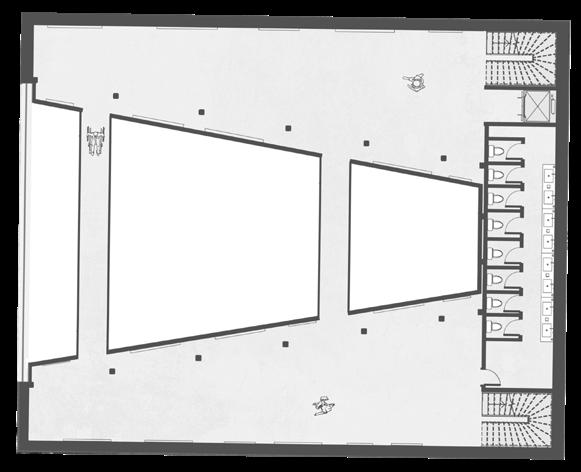
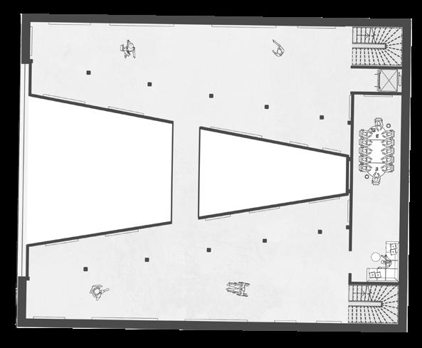
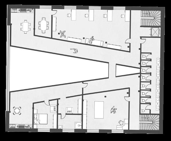
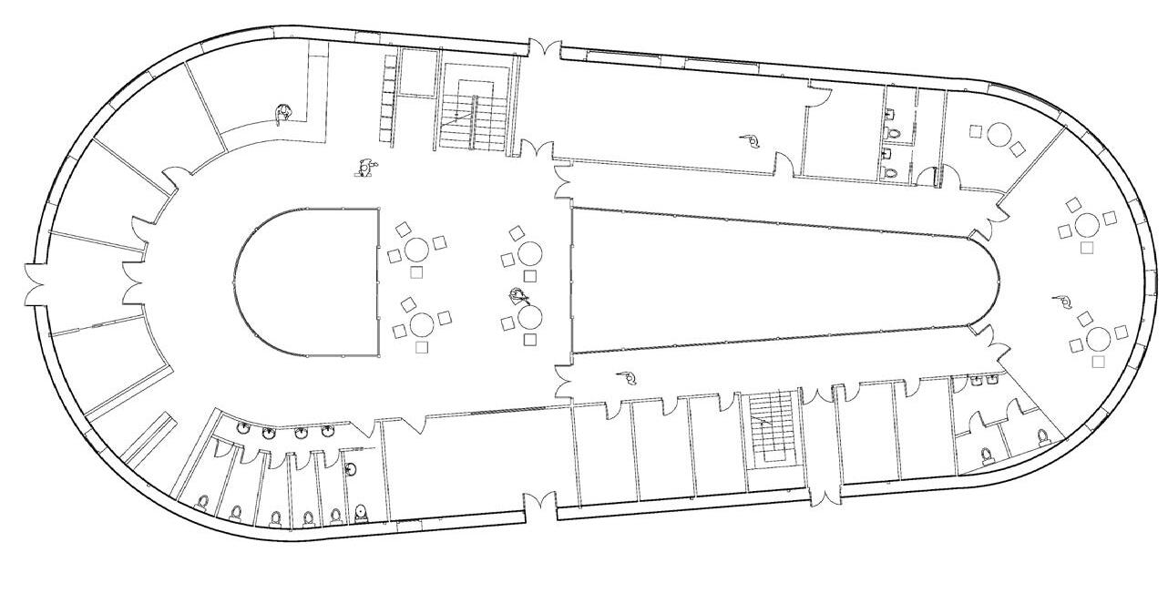
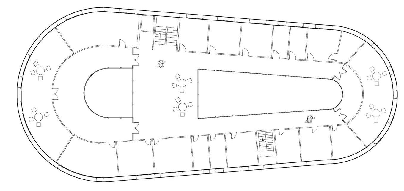
Ground Floor Plan
First Floor Plan
Second Floor Plan
Third Floor Plan
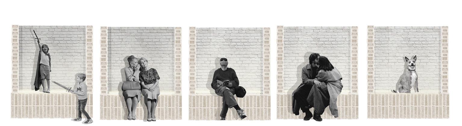
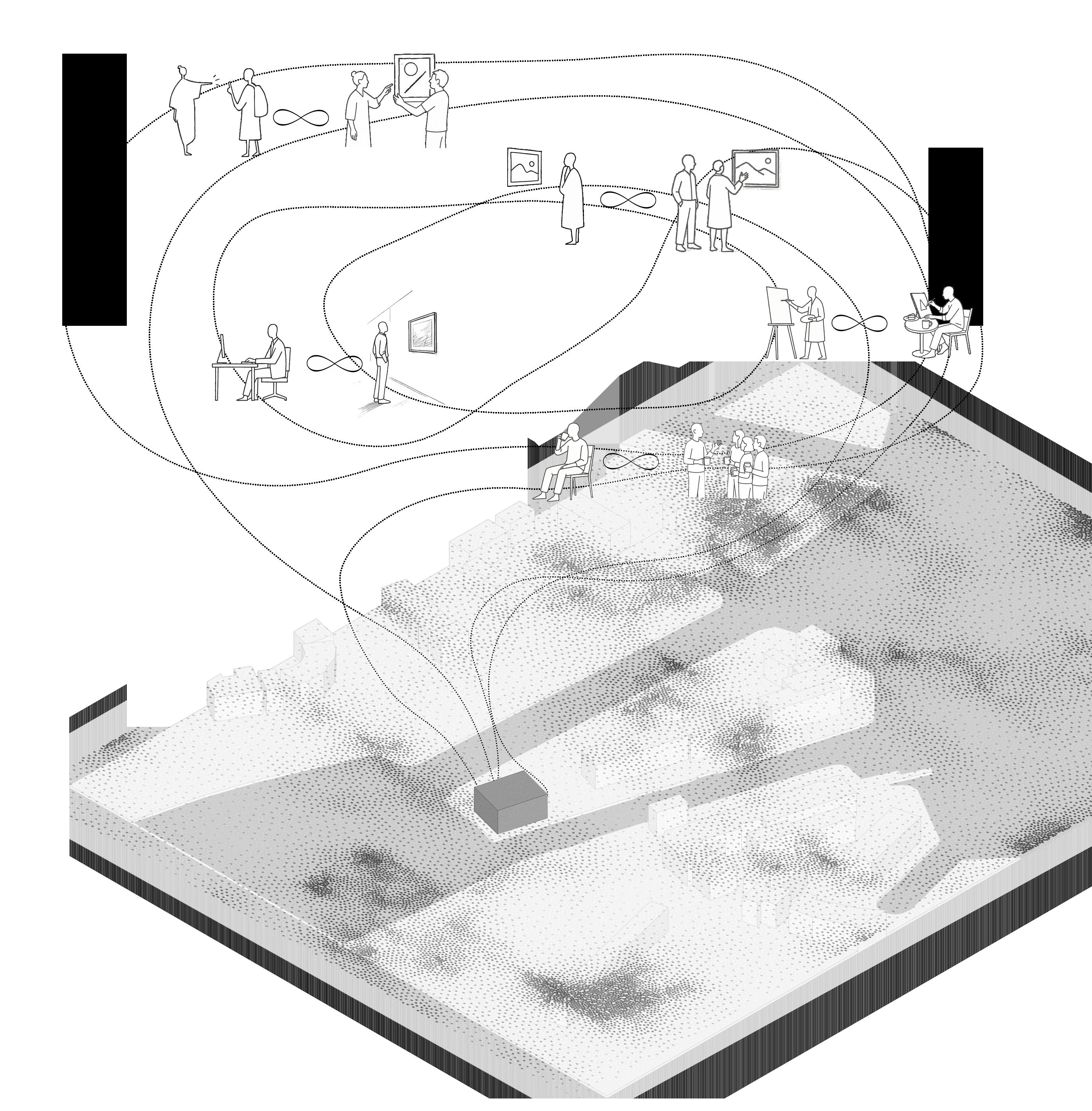
Users
Coffee-rush customer Staff
Staff maintain continuous operation of the building, moving between café, shop, and visitor-support roles by day, with cleaning teams taking over during night hours.
This user appears briefly in the early morning, engaging only with the café zone before dispersing back into the city flow.
Gallery visitors occupy the full public realm of the building from 9–5, navigating all exhibition spaces while remaining separated from the private upper level.
The resident artist inhabits the building 24/7, rooted primarily in their private accommodation but occasionally descending into public areas for interaction and observation.
Office staff work within a secluded top-floor environment from 9–5, forming the building’s most controlled and least publicly exposed user group.
Office workers Artist Exhibition goers Front of house staff
Office workers
Artist
Gallery visitor
Circulation diagram
Although each user group occupies a distinct zone in the building, the architectural intention is to dissolve these boundaries through moments of overlap and exchange. Front-of-house staff, present from early morning, naturally intersect with the resident artist, allowing informal learning and dialogue to become part of their daily routine. Office workers, though based in a private upper floor, are encouraged to move through the exhibition spaces and engage with the artistic processes unfolding around them. Visitors are not passive observers but can encounter the artist directly, gaining insight into the work and its intentions. The artist, likewise, is not confined to a studio; he can sketch, reflect, or interact within shared spaces such as the café. Even the brief presence of coffee rush-hour users becomes an opportunity for social connection and shared rhythms. In this way, the building becomes a living ecosystem of communication, where defined roles remain, but their edges are deliberately porous.
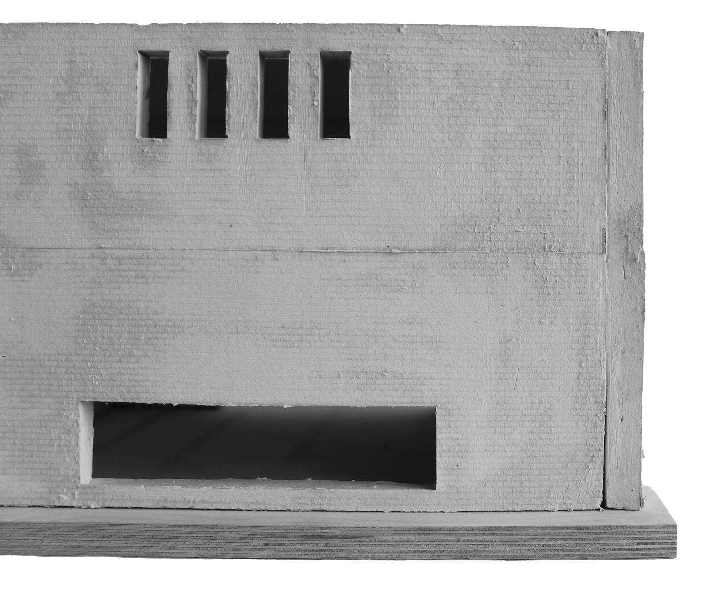
Elevation, assembly, model
Elevation view - physical model
Elevational slice
Brick assembly studies
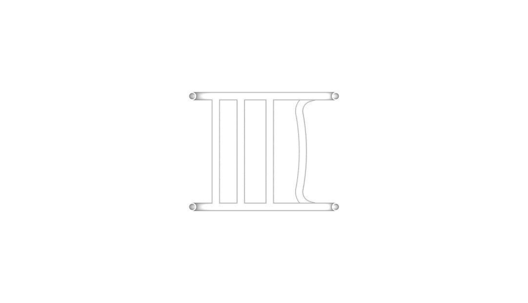
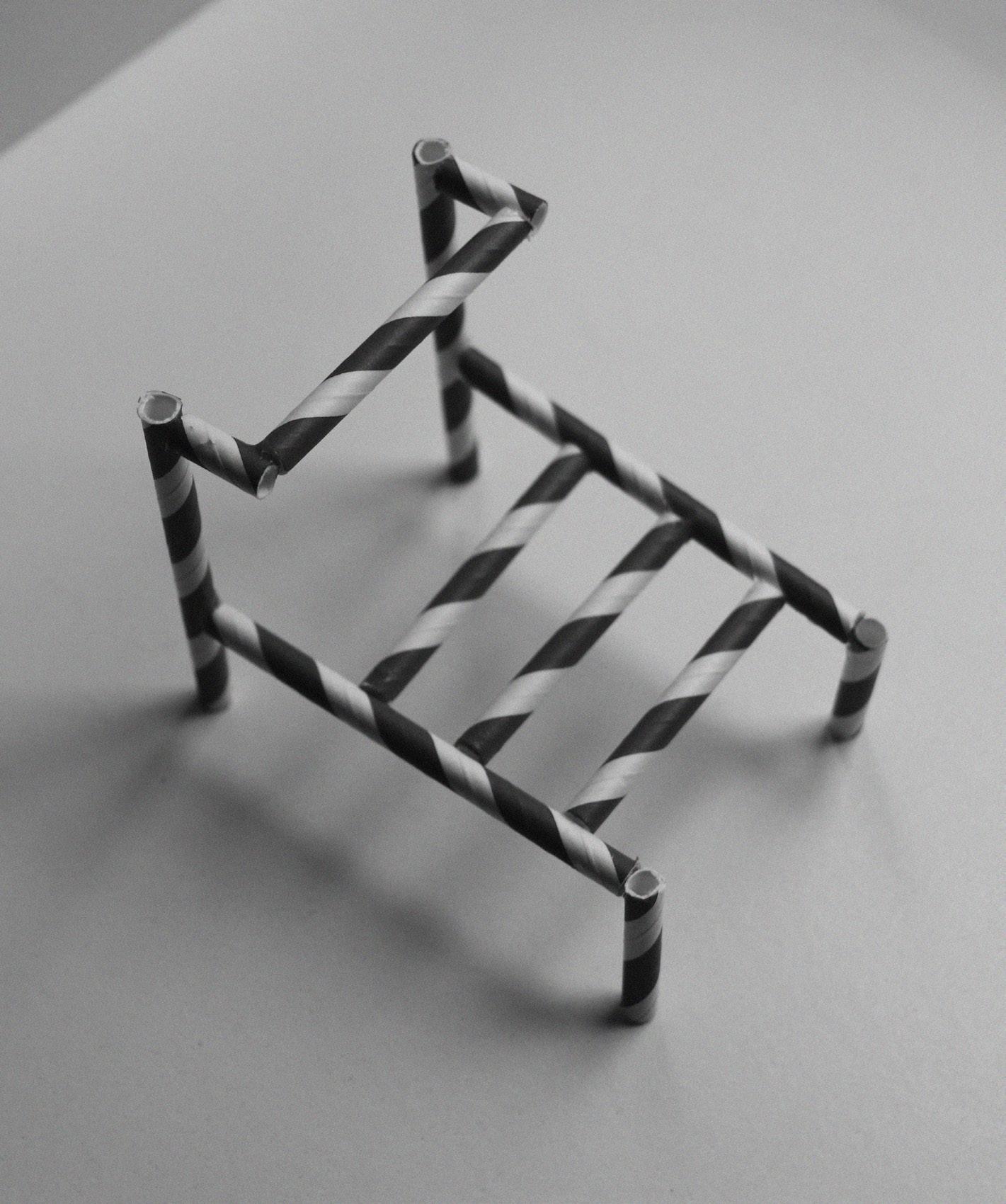
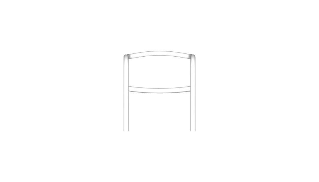
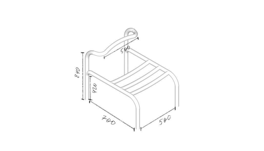
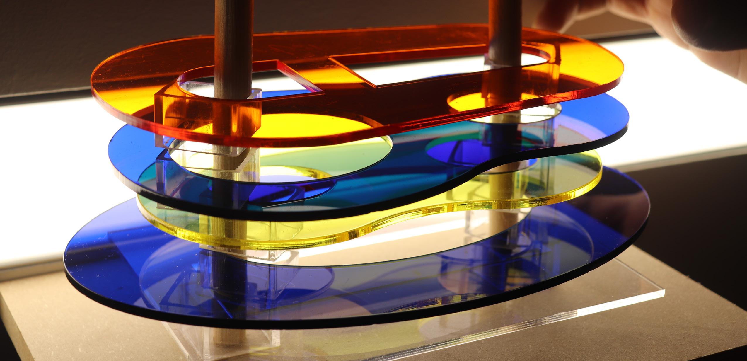
The Tube Chair
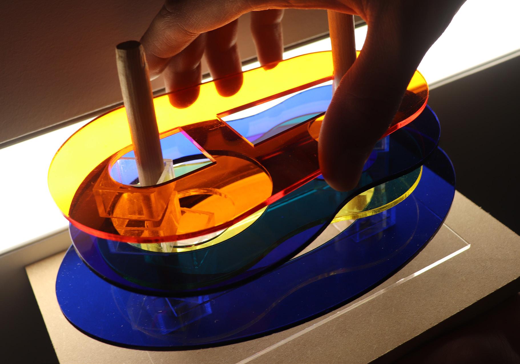
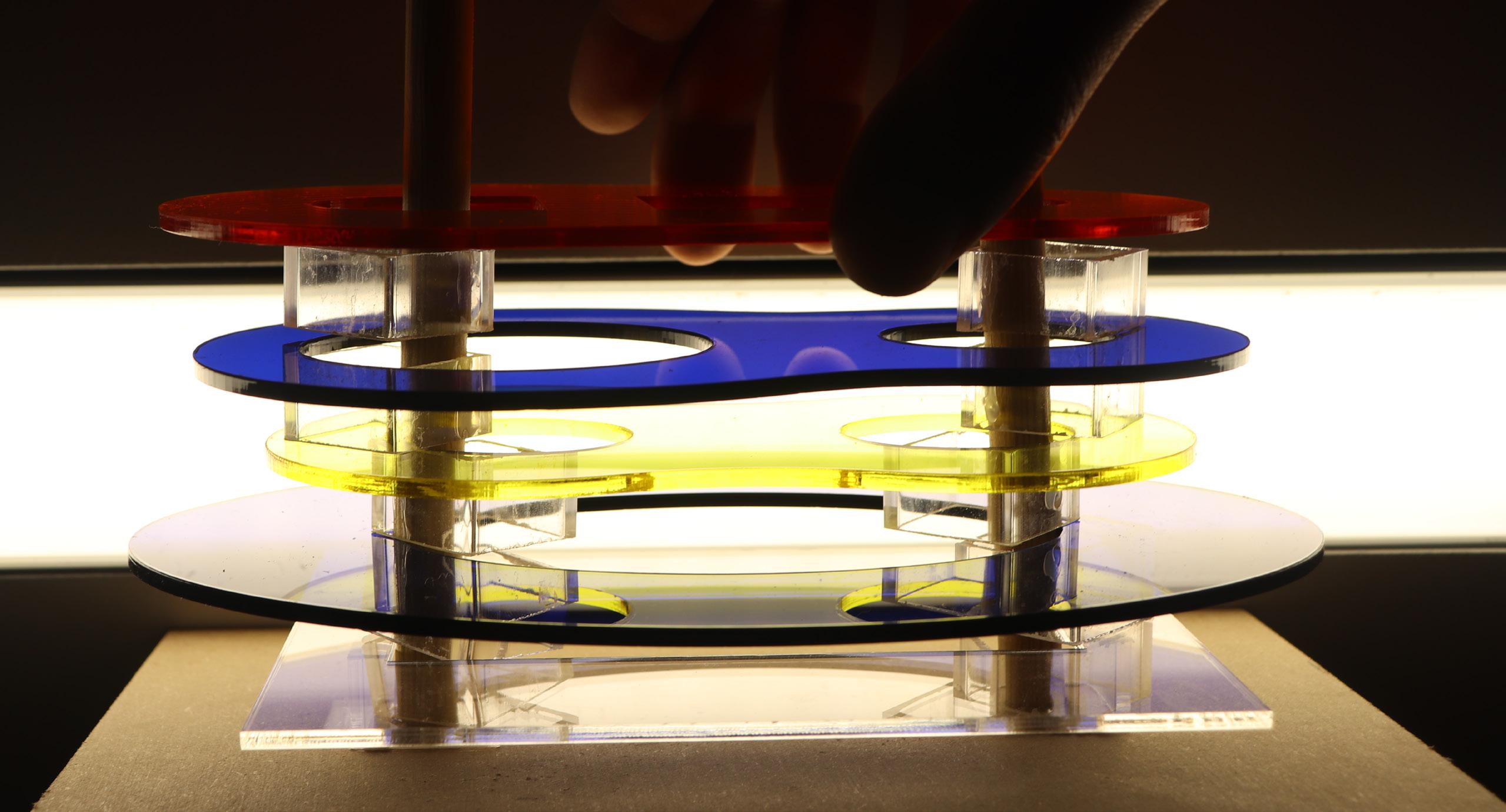
Physical concept model
Digital model
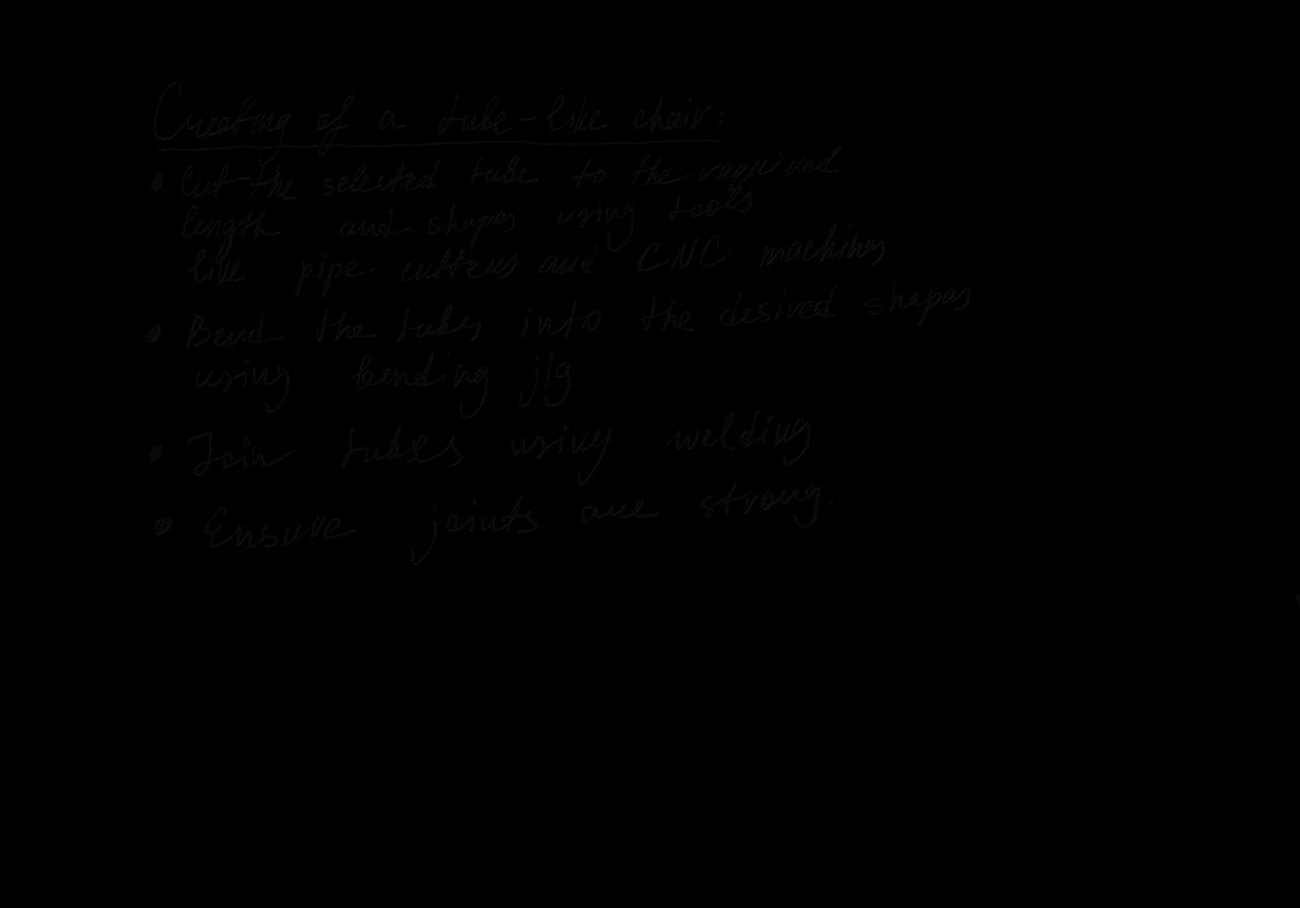
The Tube Chair tests how a single industrial material can organize structure, ergonomics, and form without relying on secondary elements. Steel tubing was chosen for its predictable bending behavior, high recycled content, and capacity to carry both compression and tension in a continuous loop. In this constraint, the project investigates how far reduction can be taken before performance decreases.
The geometry adjusts two key variables: seat length and backrest angle. A longer seat and decreased angle open the posture, while slight changes in tube radius have a direct impact on load distribution and stability of the user. These decisions are considered functional tests, with each adjustment measured against the chair’s ability to support the body effectively.
Material sourcing and fabrication form part of the conceptual argument. Recycled steel minimizes embodied energy, while the fabrication sequence: cut, bend, weld - minimizes both waste and complexity. The final form reveals the results of such constraints rather than disguising them.
The project positions furniture design as a study in structural logic, resource efficiency, and the limits of formal reduction. The work evaluates what a minimal system can achieve and where its limitations appear, framing the chair as a small but precise investigation into material intelligence and performance.
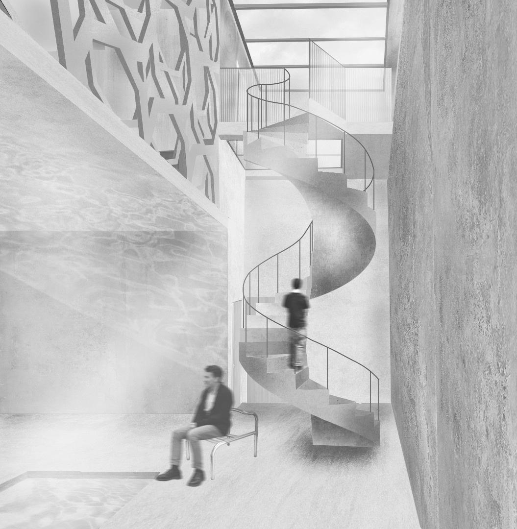
Chair in the context
The Medical Center Summary
This project resists a typical clinical and encased medical environment that is emotionally burdensome. It is aimed at constructing a health space that, by being open, clear and with controlled visual continuity, speaks safety and psychological ease. The threat common to treatment spaces is diminished in the design. Instead of occluding boundaries and narrow corridors, calibrated openness, predictable sightlines and daylight that distributes across public and semi-private areas are used.
In this case, courtyards serve as intentional psychological stabilisers. They break up the clinical sequences with open views and soft transitions that allow patients to get their bearings and recover briefly before they enter treatment rooms. This tactic presents emotional wellbeing as a foremost design requirement and positions architecture as an active participant in patient behaviour, rather than as a neutral backdrop.
Limestone and lime render form a warm, matte envelope that avoids the harsh reflectivity and sterility attributed to most medical interiors, while white oak introduces a tactile, climate-appropriate surface that helps to reinforce a more subdued sensory environment. These materials work in concert to produce an atmosphere that is rooted, consistent and non-threatening.
The concept therefore reframes health care as a spatial system that reduces fear and increases psychological safety. The medical center is now a place where calm, clarity, and measured openness operate as functional tools for improving the experience of the patient and supporting the staff in the delivery of care.
Courtyard perspective
Form development
Form development model
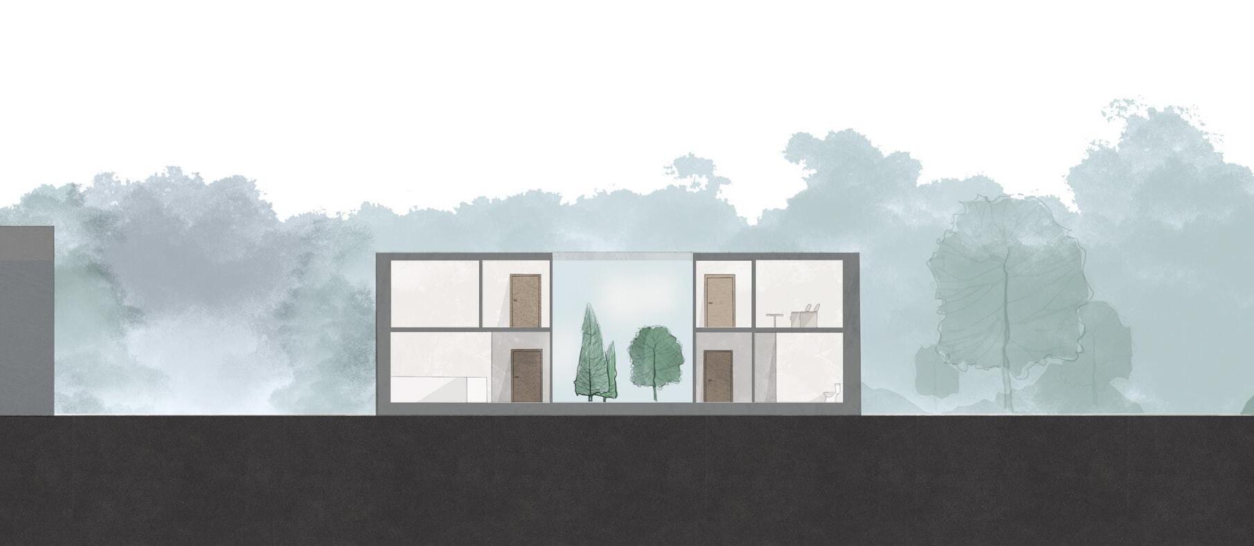
Early rectangular schemes generated unused pockets and reinforced the enclosed qualities typical of clinical buildings, prompting a shift toward smoother, curved geometries that reduce sharp boundaries and create a more welcoming spatial profile. The courtyard concept is divided into two distinct voids to organise the plan into public and private zones, while the threshold between them forms an open waiting space that replaces the conventional, enclosed waiting room with a calmer and more legible alternative. The final configuration stretches the plan into a set of clear corridors and rounded volumes that support intuitive navigation, steady daylighting and a perceptual softness aligned with the project’s aim to reduce clinical anxiety.
Structure + Sections + Plans
Long section
The Bridge Summary
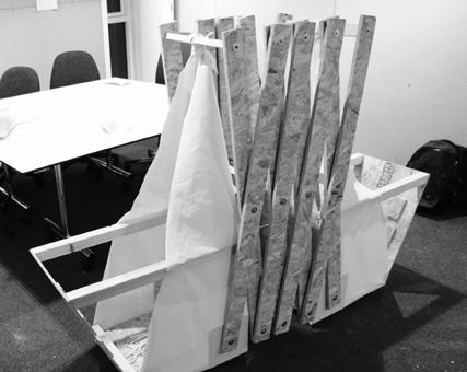
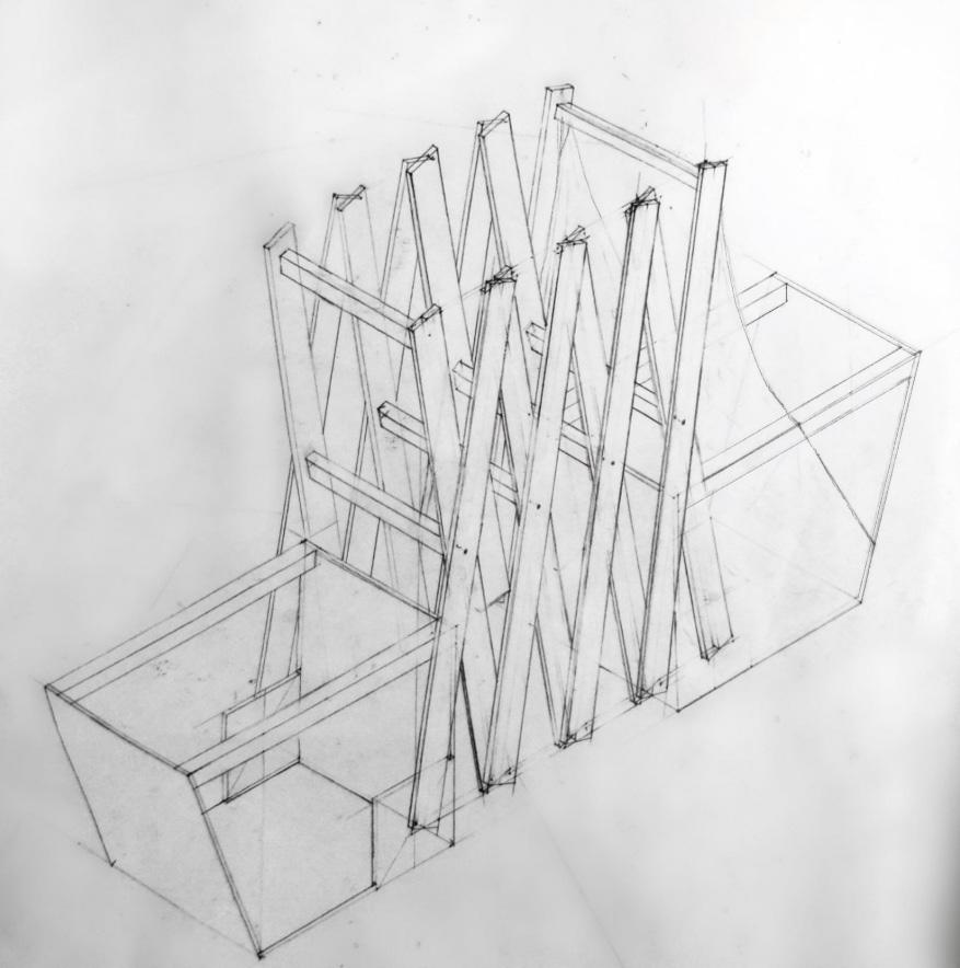
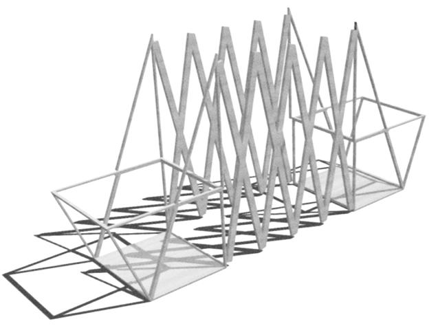
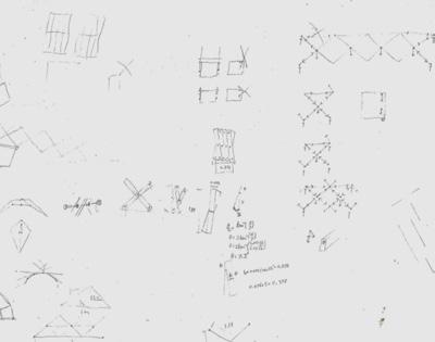
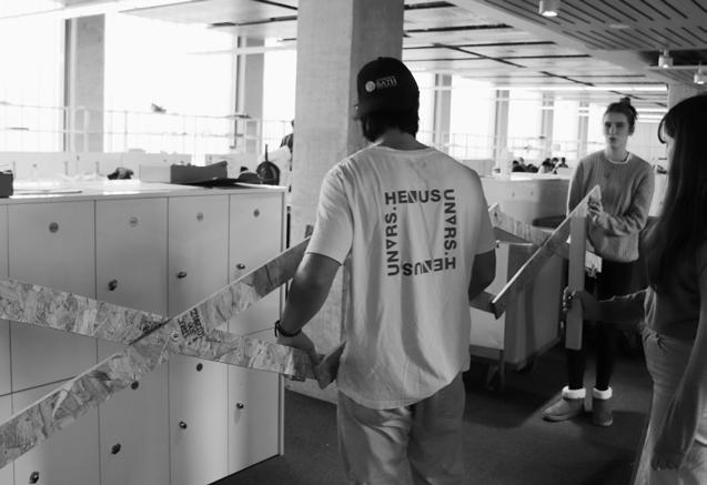
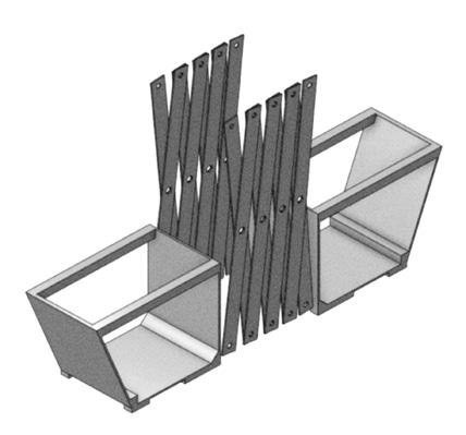
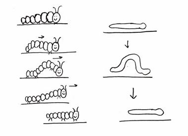
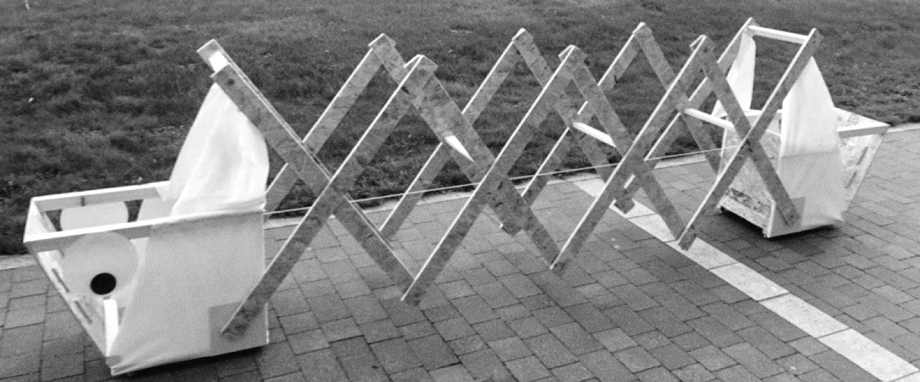
The Bridge project explores crossing as a spatial and behavioural transition. Early research showed that literal bridge forms limited the design, leading the group toward play, bodily movement and exploration, themes aligned with the uncertainties and discoveries that mark the shift from childhood to adulthood.
The design draws from the segmented, wave like motion of caterpillars, resulting in an accordion mechanism that expands to 3.6 metres and contracts to 0.5 metres. Children activate the scissor system through body weight and overhead handles, turning crossing into a physical negotiation shaped by balance, timing and shared effort.
The bridge functions as a tool for active learning, requiring coordinated action and operating as a portable device for testing how motion and spatial change can occur on any safe, flat surface. The project demonstrates how a conceptual reading of crossing can yield a playful, adaptable and structurally clear mechanism, shifting movement from passive passage to participatory engagement.
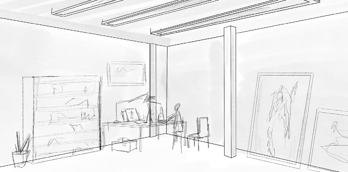
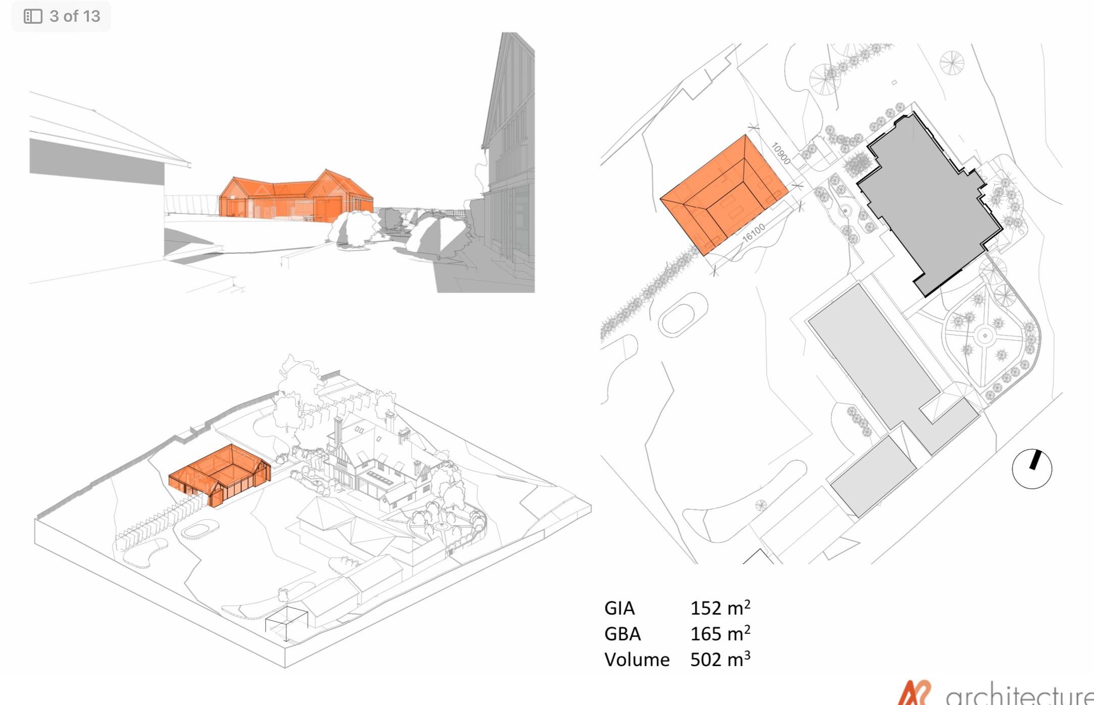
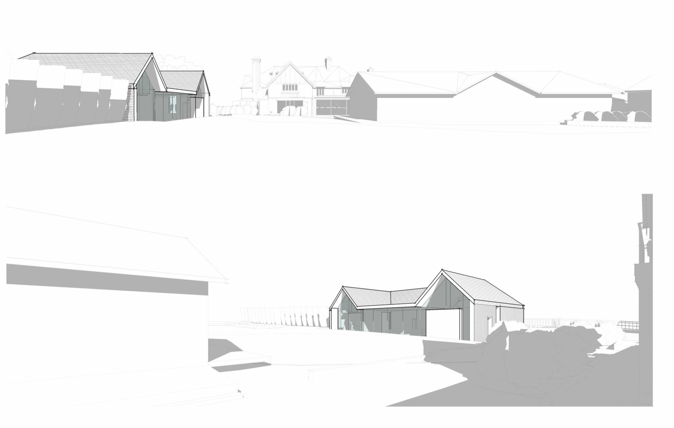
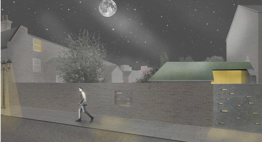
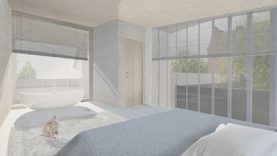
Other work Work in Practice
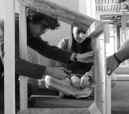
The work practice focused on digital representation, interior design, and joinery, giving exposure to how architectural ideas move from an early concept into detailed execution. Much of the work centred on transforming existing structures into customized interior environments, including the redesign of a historic stable and the conversion of domestic rooms into a multi function recreational suite that combined a snooker room, yoga studio, bar, seating area, and golf simulator. These projects required balancing inherited conditions with new programmatic demands and developing drawings and visualisations that communicated the intended spatial character with clarity.
The renovation of the stable represented the most technologically challenging process, which had to balance the identity of the original with the insertion of contemporary functionality. Digital modeling and detailed joinery studies played a central role in aligning architectural intent with construction logic. The bespoke interior suite expanded this experience by showing how a variety of room types and activities can be orchestrated into a coherent spatial system tailored to a specific client.
A major component of the work included preparation and presentation of design materials directly to clients. The leading of these meetings strengthened the ability to articulate design decisions, receive feedback, and adjust proposals accordingly. The practice thus insisted on a broader understanding of architectural workflow from initial brief through representational development and client communication, and demonstrated how design precision and clear visualization support decision-making throughout a project.