Solutions Manual for Business Statistics Canadian 4th Edition by Black, Bayley, Castillo
ISBN: 9781119983187

ISBN: 9781119983187
In performing market research and other similar studies, it is important to properly identify target populations. In the case under study, the identification of the target population is important for the Canadian Agricultural Safety Association (CASA) because the farming industry represents a key sector of Western Canada’s economy. Stress among farmers is a growing cause for concern and as such, accurate survey results will benefit the future of the industry. In this type of research, it is also important to identify the sampling frame, the type of survey to be conducted, the type of data to be collected, the level of measurement of the collected data, and any other pertinent statistic that will ensure that the results of the research that is to be conducted by Western Opinion Research Inc. on behalf of CASA are pertinent, reliable, and usable.
1. One population that was identified was the population of farmers across Canada. Western Opinion Research conducted the research and survey throughout Canada and used the population of Canadian farmers to obtain its results. There were no other populations that were contacted by the opinion firm. Instead of attempting to contact the entire population of Canadian farmers, the research group conducted their survey by using a sample from the population of interest. The survey was completed by 1100 farmers across Canada. The measurements obtained from the survey were generally qualitative and percentages were used to describe them. The results allowed the CASA to infer on potential consequences of the stress encountered by farmers, and used these results to initiate preventative actions that would at least stabilize the stress levels of farmers, but with the added intention of decreasing them. The inferences made with statistical results were imperative in offering stress counselling resources to farmers.
The type of research that is conducted using the data obtained from studies such as the one commissioned by CASA allow organisations to use data analysis procedures in their normal course of business, whether it is for profit or not. The advantage of using inferential statistics, which are based on relevant samples, is that conclusions can be effectively drawn and which then pertain to the entire population under study, without having to conduct a census, which would most probably negatively impact the efficiency of the business operations.
2. a. ranking of the level of stress
b. number of farmers asking for help
c. number of farmers aware of help resources
d. number of farmers who try to manage stress
e. number of farmers interested in access to resources
Ordinal level
Ratio level
Ratio level
Ratio level
Ratio level
f. number of farmers nearly out of business
g. number of farmers who prefer dealing with stress on their own
h. number of farmers who prefer dealing with professionals on the phone
i. number of farmers who prefer dealing with professionals in person
j. age of respondent
k. gender of respondent
l. geographical region of respondent
m. time farmers spend dealing with stress
n. rating of stress-related factors
o. rating of reasons for not seeking help for stress
Ratio level
Ratio level
Ratio level
Ratio level
Ratio level
Nominal level
Nominal level
Ratio level
Ordinal level
Ordinal level
1. Shown below are three samples of visuals that could be generated to present the data. The student is encouraged to explore their own visualization options such as these and then write a brief report comparing WestJet to the other airlines.
250,000,000
200,000,000
2.
The Pareto Chart is a graphical technique for displaying problem causes. Question 2 of this case presents various causes for the problem of lost airline passenger luggage. Shown here is a Pareto Chart for the frequency of various causes associated with lost luggage.
The vertical bars of a Pareto Chart display the most common types of causes ranked in order of occurrence from left to right. This Pareto Chart shows that the number one cause of lost luggage is transfer from one plane to another (51% of lost luggage) followed by a damaged or lost routing label (an addition 20%). If an airline is undertaking an effort to significantly reduce the numbers of lost luggage, then they should start by tackling the “transfer” issue. In the quality improvement circles, this would be referred to as starting with the “low lying fruit.” That is, if the transfer problem could be completely solved, an airline could reduce the numbers of lost luggage by 50%.
3.
Student answers will vary. There’s a strong correlation between the number of passengers and the seats per aircraft, with two exceptions around 100 seats and 140 seats, both with extremely high passengers. There’s a high, rather linear correlation between the number of passengers and the number of flights, with two exceptions around 600,000 flights and 750,000 flights, both with
low passengers. For both of these apparent outliers, further investigation might be warranted to determine reasons for the extreme high and low number of passengers.
Chapter 3
Coca-Cola Develops the African Market
1. Shown below is output describing the sample of 50 bottle fills.
Descriptive Statistics: Bottle Fills
95%ConfidenceIntervalforMean
95%ConfidenceIntervalforMedian
95%ConfidenceIntervalforStDev
Note that the mean fill is 340.12 oz. with a standard deviation of 0.42. The minimum fill is 339.20 oz. and the maximum fill is 341.10 oz. The median fill is 340.15 oz. The measure of skewness (.0367) demonstrates a very slight positive skewness. However, the
histogram and the high p-value associated with the normality test indicate that the data are approximately normally distributed. The mean fill of 340.12 oz. indicates that, on average, the sample fills are very near to 340 oz. and are, if anything, giving a slight amount of free product away to the consumer. Under the empirical rule, using µ = 340.12 and = .42, 68% of the fills should be within 340.12 + .42 or between 339.70 and 340.54 oz. and 95% of the fills should be within 340.12 + .84 or between 339.28 and 340.96 oz.
2. The bottles have a label that claims there are 20 U.S. oz. of fluid therein. This sample of 150 bottles has an average of 20.008 oz. with a median of 19.997. The standard deviation of fills is 0.101 oz. The normality statistics and histogram overlaid with the normal curve indicate that the data are approximately normally distributed. We can apply the empirical rule. Approximately 68% of the fills are within 20.008 + 1(.101), from 19.907 to 20.109 oz.; and 95% within 20.008 + 2(.101), from 19.806 to 20.210.
The measure of skewness (.08) indicates very little skewness. The box plot indicates that there is an outlier at the lower end (extreme under filled bottle). Production and quality management people can better interpret these extreme fills in light of company goals and specifications. Overall, the fills are averaging very close to 20 oz., the fills are approximately normally distributed, and the standard deviation of fills is about .101 of an ounce.
1. Here we have two events that have to be defined;
Let A = event that a St. Mary’s resident is in the 45-64 age range; Let B = event that a St. Marys resident (household) uses the new recycling bins.
The first probability is the probability that a St. Marys resident is in the 45-64 age range:
P(A) = 0.28
The second probability is a conditional probability, namely, the probability that a St. Marys resident is in the 45-64 age range given that he/she uses the new recycling bins:
P(A|B) = 0.27
The probability of having a St. Marys resident use the new recycling bins is provided in the text:
P(B) = 0.94
If age were independent of the initial use of the new recycling bins, we would have the following relationship:
P(A) = P(A|B)
Because the above relationship is not satisfied, it is clear that the two events are not statistically independent.
2. The probability that a randomly selected resident of St. Marys is either in the 45-64 age range or used the new bin during the initial two-month period is an application of the General Law of Addition:
P(A or B) = P(A) + P(B) – P(A∩B)
The probability P(A∩B) is obtained from a calculation using probabilities listed in Part 1, namely:
P(A∩B) = P(A|B) x P(B) = (0.27)(0.94) = 0.254
Therefore,
P(A or B) = 0.28 + 0.94 – 0.254 = 0.966
3. Let A = Awareness through advertising; N = Awareness not through advertising; Let Pi = Prior Probability
The advertising campaign of the new recycling system was effective because the revised probability of the awareness campaign increased.
1. n = 25, p = .30
The expected number is:
= n p = 25(.30) = 7.5
The probability that twelve or more have a high level of concern about food safety:
Prob(x > 12 n = 25 and p = .30) =
If 30% of consumers have a high level of concern about food safety (p = .30), the expected number of purchasers from a sample of 25 is 7.5. Twelve or more are considerably more than the expected number (7.5). How often would one get twelve or more out of twenty-five when only 7.5 is expected? – about 4.43% (.0443) of the time. Therefore, if twelve or more out of twenty-five actually have a high level of concern about food safety, there is some evidence that the level of concern about food safety might actually be greater than 30%.
2. Let = 3.4 customers per minute. Shown below are some of the values for the Poisson distribution with = 3.4:
Store managers want to staff enough checkout lines such that only 1% of the time can demand not be met. Examining the probabilities for = 3.4, the sum of the probabilities for x > 9 is .0059 + .0019 + .0006 + .0002 = .0086 or 0.86%. Thus, if store management staffs enough lines to be able to handle 8 or fewer customers, they will be able to meet demand over 99% of the time (100% - 0.86%). Less than one percent of the time will they be unable to meet demand because 9 or more customers should only occur 0.86% of the time.
The = 3.4 is for one minute. However, the question being posed here is: What is the probability that 12 or more customers will want to check out in a two-minute period? In order to work this problem, we must double lambda to = 6.8 for two minutes. From Table A.3 in the Appendix, the following probabilities are obtained for = 6.8:
The probability that x > 12 when = 6.8, is .0448.
3. Age Study:
This is a hypergeometric problem with:
N = 30, n = 10, A = 17, and x < 3
Out of 30 total workers (N), 17 (A) are at least 40-years-old. If we randomly sample 10 (n) of these workers, what is the probably that three or fewer (x) will be at least 40-years-old?
The probability is computed as:
.0388 + .0058 + .0004 + .0000095 = .0450
Visible Minority study:
This is a hypergeometric problem with:
N = 30, n = 10, A = 9, and x = 7
The probability is computed as:
1. Data provided:
Mercedes C300E: µ = $56,900; σ = $3,991
BMW 330E: µ = $54,900; σ = $3,379
a.)
Prob(x > 55,400= 56,900 and = 3991): = 0.3758
Using the Standard Normal Distribution table provided by the textbook, the area for z = -0.3758 is .1462.
Prob(x > 55,400) = .5000 + .1462 = .6462 = 64.62%
Almost 65% of Mercedes dealers would be priced out of competition with this BMW model.
Prob (x > 56,900= 54,900 and = 3379):
Using the Standard Normal Distribution table provided by the textbook, the area for z = 0.59 is .2224.
Prob(x > 56,900) = .5000 - .2224 = .2776 = 27.76%
Almost 28% of the BMW dealers are pricing the BMW 330E more than the average price of the Mercedes C300E. If BMW dealers are pricing the 330E at the same price or higher than the average price for the Mercedes C300E, it means the cars will be directly competing on features other than price.
Prob(x < 54,900= 56,900 and = 3991): �� = �� ��
=�� = 54,900 56,900 3,991 = 0.50
Using the Standard Normal Distribution table provided by the textbook, the area for z = -0.5 is .1915
Prob(x < 54,900) = .5000 - 1915 = .3085 = 30.85%
Approximately 31% of Mercedes dealers are pricing the C300E less than the average price of the BMW 330E.
2. a = 2.2 b = 7.0 x1 = 3.1 x2 = 5.9
Prob. = (5.9 – 3.1) / (7.0 – 2.2) = 58%
a = 2.2 b = 7.0 x1 = 2.2 x2 = 2.8
Prob. = (2.8 – 2.2) / (7.0 – 2.2) = 12.5% a = 2.2 b = 7.0 x1 = 5.4 x2 = 7.0
Prob. = (7.0 – 5.4) / (7.0 – 2.2) = 33%
3. = 1.37 cars/3 hours, = 1/1.37 = .73 of 3 hours = 2.19 hours
For 1 hour:
1 hour = .333 of 3 hours. x0 = 0.333. The cumulative probability of this time interval is .3663. This means that there is a 36.63% chance that there will be less than one hour between sales.
For 12 hours: 12 hours = 4 times 3 hours. x0 = 4. The cumulative probability for this time interval is .9958 meaning that there is a 99.58% chance that there will be less than 12 hours between sales. The complement of this is that there is a 1 - .9958 = .0042 = 0.42% chance that there will be more than 12 hours between sales.
Managers know that there is an almost 37% chance of a sale within every hour. They need to determine how much staffing it takes to sell a car every hour or less. Given that it
takes several potential buyers and often multiple visits to the dealership to sell one car and that it is relatively likely (probability almost 75%) that they will close a sale every 3 hours (x0 = 1), the dealership should never go without having salespeople around and may have to have several employees around all the time.
By having good exponential and Poisson distribution data, one can, to some extent, track the impact of advertising on sales by testing values of using random arrival data in time periods following advertising to determine if has increased. For example, if = 1.37 every 3 hours but following a advertising campaign, there is a randomly selected 3 hours period and 5 cars are sold, then management might be able to statistically justify that the has increased and then conclude that the advertising campaign was the cause.
In many businesses, the value of lambda changes with time of day, day of the week, and season of the year. In the car business, there may be an increase in sales on the weekend, in the evening, or perhaps in the fall when new models arrive. Students should always be cautioned about using the same value of lambda for all time periods. Many students know intuitively that lambda varies over time.
1. The answers to this question will vary. Students should select one of the four types of random sampling or a hybrid (e g. area – stratified) to use in their sampling plan. The target population is that group of people to whom the researcher wants to infer. For example, if 3M wanted to determine the value of the index, usage rates, and general attitudes toward the index amongst all adults in the U.S., then all adults in the U.S. should be their target population. The frame is the list or roster of this target population from which the researchers sample. What is the frame of all adults in the U.S.? This is a difficult question. Many national lists pertain to some specialty group such as registered Republicans, Visa card users, Internet users, Catholic church members, etc. which really do not capture all U.S. adults. Instead of searching for a national frame, the researcher might want to use some form of area sampling such as selecting a test market city which is thought to be similar in demographics to the U.S. This might make frame identification easier because some test market city directories such as the phone book or voter registration list might be accessible and include most adults. On the other hand, it might make sense to use a list of all adopters of the Value Index Score as the frame and sampling from this frame, attempt to answer questions about the index’s value and usage rates along with general attitudes towards the index. If such a frame were available, researchers might choose to stratify the population by user including providers, customers, patients, etc. along with geographic location, level of usage, length of time using the index, among others.
2. Prob.( x > 16.0 = 15.3, = 4.5, and n = 35):
From Table A.5, the area for z = 0.92 is .3212
Prob.( x > 16.0) = .5000 - .3212 = .1788
There is a 17.88% probability that the sample mean of more than 16.0 was obtained by chance. It is not conclusive from this that the population mean is longer 15.3. This is a good place for the instructor to mention .05 as a common standard for low probability and begin the groundwork for chapter 9.
Prob.( x > 9.0 = 9.9, = 4.5, and n = 60):
From Table A.5, the area for z = -1.55 is .4394
Prob.( x > 9) = .5000 + .4394 = .9394
There is a 93.94% probability that a sample mean of more than 9.0 was obtained by chance. This is a very likely event given that the population mean is 9.9.
Prob.(20.0 < x < 22.0 = 20.3, = 4.5, and n = 43):
From Table A.5, the area for z = 2.48 is .4934
From Table A.5, the area for z = -0.44 is .1700
Prob.(20.0 < x < 20.8) = .4934 + .1700 = .6634
There is a 66 34% probability that the sample mean of between 22.0 and 20.8 was obtained by chance. This is a very likely event given that the population mean is 20.3.
3. On a previous survey, 62% of device owners wanted better color, p = .62.
A new survey of n = 450 is taken, what is the probability that more than 65% of these device owners want better color? That is, p ˆ > .65?
Prob.( p ˆ > .65 n = 450 and p = .62):
= n q p p p
From Table A.5, the area for z = 1.31 is .4049.
Prob.( p ˆ > .65) = .5000 - 4049 = .0951
If 62% of device owners want better color, then the probability of sampling 450 such owners and having more than 65% want better color is .0951 or will occur about 9.51% of the time.
On a previous survey, 29% of device owners wanted more realistic colors, p = .29.
A new survey of n = 270 is taken, what is the probability that 25% or fewer of these device owners want more realistic colors? That is, p ˆ < .25?
Prob.( p ˆ < .25 n = 270 and p = .29):
= 1.45
From Table A.5, the area for z = -1.45 is .4265.
Prob.( p ˆ < .25) = .5000 - .4265 = .0735
If 29% of device owners want more realistic color, then the probability of sampling 270 such owners and having 25% or less want better color is .0735 or will occur about 7.35% of the time.
On a previous survey, 18% of device owners wanted bolder colors, p = .18.
A new survey of n = 950 is taken, what is the probability that between 152 and 200 want bolder colors?
152/950 = .16 and 200/950 = .21
What is the probability that between .16 and .21 of device owners want bolder colors?
Prob.(.16 < p ˆ < .21 n = 950 and p = .18):
16− 18
1.60
From Table A.5, the area for z = -1.60 is .4452.
From Table A.5, the area for z = 2.41 is .4920.
Prob.(.16 < p ˆ < .21) = .4452 + .4920 = .9372
If 18% of device owners want bolder colors, then the probability of sampling 950 such owners and having between 16% and 21% want bolder color is .9372. This is a very likely occurrence.
1. n = 115 For 95% confidence, z = 1.96
Use: n q p z p ˆ ˆ ˆ
1) Yes: 115 73 ˆ = p = .6348
.6348 + 1.96 115 (.6348)(.3652) = .6348 + .0880
.5468 < p < .7228
2) Yes: 115 81 ˆ = p = .7043
.7043 + 1.96 115 (.7043)(.2957) = .7043 + .0834
.6209 < p < .7877
3) Yes: 115 88 ˆ = p = .7652
.7652 + 1.96 115 (.7652)(.2348) = .7652 + .0775
.6877 < p < .8427
4) Yes: 115 66 ˆ = p = .5739
5739 + 1.96 115 (.5739)(.4261) = .5739 + .0904
4835 < p < .6643
2. n = 21 df = 20 For 95% confidence, t.025,20 = 2.086
Use: n s t x
1) x = 42.4 s = 5.2
42.4 + 2.086 = 42.4 + 2.37
40.03 < < 44.77
2) x = 44.9 s = 3.1
44.9 + 2.086 = 44.9 + 1.41
43.49 < < 46.31
3) x = 38.7 s = 7.5
38.7 + 2.086 75 √21 = 38.7 + 3.41 35.29 < < 42.11 21 (5.2) 21 1) (3
4)
5)
1.
a)
H0 = 0 80
H a ¹ 0.80
Let 0.05= For a two-tailed test /20.025=
The critical value for this test is 1.960025=z
The sample size is: n = 800 x = 615
The sample proportion is: p Ù = 615
800 = 0 7688
z = p - p Ù p q n = 0.7688 - 0.80 ( 80)( 20) 800 = -2 21
Since the observed z = -2.21< z0 025 = -1.96, the decision is to reject the null hypothesis. The proportion of Gen Z who eat meat alternatives is not 0.80. The sample data indicate that the proportion is lower than 0.80
The probability of discrediting the claimed percentage (of 80%) if in fact it were true is the probability of committing a Type I error, also known as the level of significance, . In this case, this probability is 005=
H0 = 0.50
b)
H a > 0 50
The level of significance is not given in this case. We will use the p-value approach to test the above hypothesis.
The sample size is: n = 500 x = 381
The sample proportion is: p Ù = 375 500 = 0.762
z = p - p Ù p.q n = 0 7620 - 0 5 (.5)(.5) 500 =11.717
The p-value is equal to the probability that the observed z-value exceeds 11.717. This probability is very close to 0. Hence the null hypothesis will be rejected for any level of significance, which is greater than the p-value, and as such, the test will be significant for practically any p-value. In conclusion, the sample result provides sufficient evidence to conclude that a higher proportion of consumers in the age range of 25 to 35 have increased their consumption of non-meat burger..
��:��=016
����:�� ≠0.16
Let 0.05= For a two-tailed test /20.025=
The sample proportion of Canadian vegetarians who live in British Columbia obtained from the sample of 1,200 Gen Z folk is 0.1442. The 95% confidence interval is (0.1275, 0.1608); since the hypothesized value of 0.16 is within the confidence interval it is likely that the population proportion of Canadian vegetarians who live in British Columbia is 0.16. Using the hypothesis testing approach would result in the same conclusion as evidenced by the large p-value (0.1346). At a significance level of 0.05, since the p-value is greater than 0.05, the null hypothesis will not be rejected that the population proportion of Canadian vegetarians who live in British Columbia is still 0.16.
H0 = 32
2. a)
H a < 32
Let 0.01=
Withthegiven assumptionthatthe distribution of theean ageof Millennial consumerswho consume the Beyond Meat burger is normally distributed, and with the size of the sample at 28, it is appropriate to use the t-distribution to test the population mean, along with the fact that the population standard deviation is unknown.
For a left-tailed test, the observed t0 01,27 = -2 473. The value of the t-statistic, as given in the output provided is -1.713. Since, the observed t = -1.713 < t0 01,29 = -2.473, the decision is not to reject the null hypothesis. There is therefore insufficient evidence to conclude that the mean age of Millennial consumers who consume the Beyond Meat burger is less than 32 years old. The p-value for this test yields the same results, by definition. It can be seen from the computer output that the p-value is 0.0491, meaning that the test performed would be significant for any level of significance greater than 0.0491; in this case the level of significance is only 0.01.
H0 = 65
b)
H a < 65
Let 0.05=
With the given assumption that the distribution of the number of Beyond Meat burgers Millennials purchase each year is a normally distributed variable, with the size of the sample at 30, and with the fact that the population standard deviation is unknown, it is appropriate to use the t-distribution to test the population mean.
For a left-tailed test, the observed t0 05,29 = -1.699.
The value of the test statistics is x = xi å n = 1325 30 = 44.17
Because the population standard deviation is unknown, we will use the sample standard deviation as its estimate. s = x 2xå( )2 n å n -1 = 681271325( )2 30 29 =18 2002
t = x -m s n = 44.17 - 65 18.2002 30 = -6 2686
Since the observed t = -6 2686 < t0 05,19 = -1 699, the decision is to reject the null hypothesis.Theaverage numberof frozen pizzas that Millenials purchaseperyear is much less than 65. The p-value for this test is less than 0.001, which corroborates the statistical decision of rejecting the null hypothesis.
1. Comparing last year’s mean transactions to this year’s:
n1 = 20 1x = 2300 s1 = 500
n2 = 25 2x = 2450 s2 = 540 H
: µ1 - µ2 = 0
Because t = -0.96 > t.025,43 = -2.021, the decision is to fail to reject the null hypothesis There is not enough evidence here to say that there is any difference in the average dollar amount of sales between this year and last.
2. Comparison of tractors at two plants using a confidence interval:
n1 = 45 x1 = 18 n2 = 51 x2 = 12
(.40 - .2353) ± 1.96
(.2353)(.7647) 45 (.40)(.60)+ = .1647 + .1845
-.0198 < p1 - p2 < .3492
The point estimate of the difference in quality of tractors at the two plants is 16.47%. However, due to the relatively small samples, the error of the interval is 18.45% which is greater than the point estimate. Combining the error of the interval with the point estimate results in the confidence interval shown above. Note that zero is in the interval indicating that there is a possibility that there is no difference in the quality ratings of tractors produced at the two plants. If this were a hypothesis testing problem, then the decision would be to fail to reject the null hypothesis based on the confidence interval’s inclusion of zero.
3. 2020 vs. 2021:
t = -1.85 with a p-value of .066. This is not significant at = .05. There is no significant difference in the mean ratings between 2020 and 2021. This is underscored by the confidence interval that includes zero. However, if = .10 were used, there would be a significant difference. Examining the means reveals that the mean score for 2021 was higher. The sample sizes were 75 for 2013 and 93 for 2021.
4. Comparison of variances for week 1 and week 5:
Since the observed value of F = 0.485 is > the left tail critical value of F = 0.167, the decision is to fail to reject the null hypothesis. The variances of product being produced these two weeks are not significantly different. Management would probably like this because this indicative of consistent production patterns. Wide swings in variance would
be of concern because it would indicate that some weeks the variability is more out-ofcontrol than others and a less consistent product is being produced.
1. The two by three factorial design is analyzed using a two-way ANOVA. There are two independent variables, temperature and supplier. Temperature has three treatment levels: 23oC, 49oC, and 68oC. Supplier has two classification levels: supplier 1 and supplier 2. The dependent variable is air pressure, measured in psi. Shown below is the Excel output for this analysis.
First we examine the observed F for interaction which is 0.05 with a p -value of 0.9469. Since interactionisnotsignificantforanycommonlyusedsignificancelevel(),weproceedtoexamine main effects. There is no significant difference between the two suppliers ( 0.9375) 0.006, = = pvalue F . There is a significant in the strength of the new valve by temperature for any significance level greater than 0.0616. The mean psi for 23oC is 2355.167, for 49oC is 2348.167, and for 68oC is 2195. It appears that at 68oC, the valves are not as strong. Before concluding, it would appear appropriate to validate this conclusion by performing pairwise t-tests between each pair of temperature.
The results from Excel for each test are as follows:
A) t-Test: Two-Sample Assuming Equal Variances
Observations 6 6
Pooled Variance 14629.17
Hypothesized Mean Difference 0 df 10
t Stat
t Critical two-tail 2.228139
B) t-Test: Two-Sample Assuming Equal Variances
Pooled Variance
Hypothesized Mean Difference 0
df 10 t Stat 2.880415
P(T<=t) one-tail 0.008187
t Critical one-tail 1.812461
P(T<=t) two-tail 0.016374
t Critical two-tail
C) t-Test: Two-Sample Assuming Equal Variances
Variance
Hypothesized Mean Difference 0 df 10
t Stat 2.69741
P(T<=t) one-tail 0.011206
t Critical one-tail 1.812461
P(T<=t) two-tail 0.022413
t Critical two-tail 2.228139
The two-tail p-value for the test between the temperatures 23C and 49C is 0.9221, while the pvalues for the other two tests are 0.0164 (for 23C vs 68C) and 0.0224 (for 39C vs 68C). Hence, the mean strengths are significantly different the latter two comparisons, and not for the first one (23C vs 49C). This clearly indicates that the mean strength is clearly different (lower) at 68oC. The implications of these results wouldindicate that under conditions of extreme heat, the valves might not be as strong as compared to temperatures in the vicinity of 50oC and below.
2. The data are analyzed using a one-way ANOVA. The independent variable is country with 4 classifications: Canada, Spain, Japan, and the U.S. The dependent variable is the cost reduction
incurred in using the energy-efficient Red hat valves. Shown below is the Excel output for this analysis.
ANOVA
Total 46.1375 19
The results show that there is no significant difference in the cost reduction incurred among the four countries studied ( 0.2203) 1.64, = =pvalue F . The management of ASCO should be confident that it can market the new Red hat valves in the four countries that were part of the analysis without having to implement special procedures in any one of the four countries, because, there is no statistical evidence that would suggest that any of the four countries would incur cost reductions which would be significantly different (lower) in any one of the four countries.
3. This test uses a randomized block design. The main independent variable of interest is the type of valve (two-way, three-way, or four-way). The blocking variable is the day of the week. Shown below is the Excel output for this analysis.
2.189333 14
The results of the analysis indicate that lead time for the type of valve is not significantly different from one type to another, and this is valid for any level of significance greater than 0.0841. We can observe from the ANOVAtablethattheobserved F-value is less thantheF critical at 0.05= . Hence, the low confidence on any significant difference between type of valve. From the results of the analysis, each type of valve has a mean lead time of 1.62, 1.9, and 2.16 weeks. However, these means are not significantly different on the basis of the sample results.
Tosubstantiatetheaboveconclusion,the95%confidenceintervals for each ofthethreepopulation mean lead times for all two-way, three-way, and four-way Red had valves are as follows: for two-way valves: (1.159; 2.081) for three-way valves: 1.589; 2.211) for four-way valves: (1.835; 2.485)
All three confidence intervals overlap, which corroborates the conclusion that there is no significant difference between the mean lead time for each type of Red Hat valve.
1. Shown next is Excel output from a regression analysis to predict the haul cost of a 12-cubic-yard end-dump vehicle by the speed of the vehicle.
SUMMARY OUTPUT For 12-Cubic-Yard Vehicle Model
Regression Statistics
Observations 7
ANOVA
The r2 of the model, .794, is relatively high indicating strong predictability of haul cost by the speed of the vehicle. The p-value associated with both the overall model F value and the t test of the slope of the regression model is .007 indicating statistical significance at = .01 further supporting the strength of the model. The standard error of the regression model is 0.341 or 34.1 cents. Examining the residual output shown next, we can see that 6/7 = 85.7% of the residuals (errors) are less than .341.
The regression model for the 12-cubic-yard end-dump vehicle is:
Haul Cost = 2.3549 -0.0434 Speed
The slope of the model indicates that there is a negative correlation between speed and haul cost. That is, higher speed indicates lower haul cost per cubic yard. As was mentioned in the case discussion question, faster speeds occur on flat, straight, and wide roads. In addition, faster highway speeds would result in shorter driving times, perhaps reducing the cost of labor, etc.
The haul cost for the 12-cubic-yard end-dump vehicle for 35 mph is:
Haul Cost = 2.3549 - 0.0434 Speed = 2.3549 – 0.0434 (35) = 0.8359
The haul cost for the 12-cubic-yard end-dump vehicle for 45 mph is:
Haul Cost = 2.3549 - 0.0434 Speed = 2.3549 – 0.0434 (45) = 0.4019
Shown next is Excel output from a regression analysis to predict the haul cost of a 20-cubic-yard bottom-dump vehicle by the speed of the vehicle.
SUMMARY OUTPUT For 20-Cubic-Yard Vehicle Model
Regression Statistics
Observations 7
The r2 of the model, .781, is relatively high indicating strong predictability of haul cost by the speed of the vehicle. The p-value associated with both the overall model F value and the t test of the slope of the regression model is .008 indicating statistical significance at = .01 further supporting the strength of the model. The standard error of the regression model is 0.285 or 28.5 cents. Examining the residual output shown next, we can see that 6/7 = 85.7% of the residuals (errors) are less than .285.
The regression model for the 20-cubic-yard end-dump vehicle is:
Haul Cost = 1.8805 – 0.0348 Speed
The slope of the model indicates that there is a negative correlation between speed and haul cost. That is, higher speed indicates lower haul cost per cubic yard. As was mentioned in the case discussion question, faster speeds occur on flat, straight, and wide roads. In addition, faster highway speeds would result in shorter driving times, perhaps reducing the cost of labor, etc.
The haul cost for the 20-cubic-yard bottom-dump vehicle for 35 mph is:
Haul Cost = 1.8805 – 0.0348 Speed = 1.8805 – 0.0348 (35) = 0.6625
The haul cost for the 20-cubic-yard bottom-dump vehicle for 45 mph is:
Haul Cost = 1.8805 – 0.0348 Speed = 1.8805 – 0.0348 (45) = 0.3145
2. Shown next is Excel output for a regression model to predict Caterpillar’s Sales and Revenue by Year (see Section 12.9).
SUMMARY OUTPUT
The R2 for the model is very low at .004 indicating that this is a very weak regression model.
The p-values of .832 for the overall F test and the t test for the slope are not significant for = .05. Examining the Excel-produced scatter plot shown below, it appears that the trend more curvilinear than linear.
Adding a trend line to the Excel scatter plot as shown below, highlights the notion that a line does not fit the graph well and that some form of curvilinear model might work better.
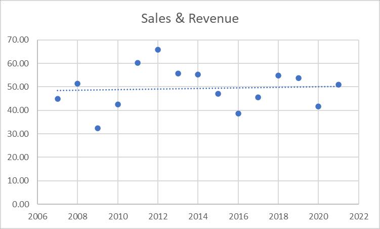
The regression model for the trend line is:
Sales = -185.921 + 0.117 Year
An interpretation of this model is that, on average, sales and revenues are increasing $0.117 billion per year. In this particular case, the y-intercept has no practical meaning other than if the company would have been in business in the year 0, it would have been losing a lot of money!
This model could be used to predict sales and revenues for Caterpillar in the year 2022:
Sales = --185.921 + 0.117 Year = --185.921 + 0.117(2024) = $50.887 billion
The student can experiment in Excel with placing nonlinear models through the data in an attempt to explore for better fits. In chapter 14, the text presents polynomial fit models.
1. This model uses four independent variables in an effort to predict the amount of money people spend on their debit card. Overall, the model has modest to good predictability with an R2 of .755 and a standard error of $22.15. This standard error indicates that about 95% of the time, the model will be within +2($22.15) or +$44.30 of the actual figure which is not particularly good. While the overall test of the model is significant (F = 15.38, p-value = .000007), an examination of the t tests and their associated p-values shows that only one of the predictors, income (t = 6.69, p-value = .000002) is significant. None of the other variables are even close. Had a simple regression model been developed using just income to predict the amount of the prepaid card, the R2 would be .723, the t value for income would increase to 7.74, the standard error of the estimate would reduce to $21.96, and the overall F test would increase to 59.90.
2. This model attempts to predict the number of days per month that a customer frequents Starbucks. The predictor variables are age, income, and number of cups of coffee per day. The Excel results of this analysis are shown below. The model is modest to weak with an R2 of just .416. The standard error of 3.28 days indicates that the model would predict within + 2(3.28) or + 6.56 days about 95% of the time. A perusal of the data shows that the range of number of days is 16 days. The relatively large size of the standard error to this range is further evidence of the model’s weakness. A study of the t statistics reveals that the predictor variable, cups, is the only significant predictor (t = 3.40, p-value .0027). The number of cups of coffee that a person drinks per day seems to be a good predictor of the number of times per month the person frequents Starbucks. Heavy coffee drinkers come often (the coefficient indicates a positive relationship between cups and frequency). In attempting to increase store traffic, Starbucks could target their marketing efforts at the more heavy coffee drinkers or develop and market products that might lure lighter coffee drinkers to their outlets for different reasons. If a simple regression model is used to predict number of days by cups of coffee, the R2 is .345 and the standard error is 3.32.
SUMMARY OUTPUT Regression
3. Shown below is the output from an Excel multiple regression analysis to predict sales revenue by number of stores, number of drinks, and average weekly earnings. The predictability is extremely high with an R2 of .9998. In predicting sales revenues that range from 400 to 2600, the standard error of the estimate is only 16.69. The overall F of 4539.21 is significant at alpha = .00001. While number of stores is not a significant predictor (t = -0.95, p-value = .41145), both number of drinks (t = -7.47, p-value = .00497) and average weekly earnings (t = 13.70, p-value .00084) are significant at = .01. Notice that for the predictor, number of drinks, both the t value and the coefficient are negative. This indicates that, at least in this model with other variables in the model, there is a negative relationship between number of drinks and sales revenue. However, a cursory examination of the raw data shows that as sales revenues increase so do the number of drinks. This points out one of the dangers in over interpreting the regression coefficients (discussed in Chapter 14 in section on multicollinearity). When a simple regression model is run using number of drinks as the sole predictor of sales revenue, the r2 is .929, and more importantly the regression coefficient is positive as is the t statistic. This might serve as an informal/intuitive introduction to the notion of collinearity. The correlation between the two significant predictors in the multiple regression model, number of drinks and weekly earnings, is .984.
SUMMARY OUTPUT
1. Shown below is the Excel multiple regression output which contains a model to predict total size of purchase (expressed in thousands of dollars) using three predictors: Company size (in millions of sales), cost of delivery (in dollars), and number of similar products. Below that is a stepwise regression analysis for the same data. The full multiple regression model has an 2R of 77.3%. However, the adjusted 2R is only 71.1% which indicates there are some non significant predictors in the model. the analysis of the p-values shows that only company size makes a useful contribution to the overall model, while the number of similar products could be useful for any significance level greater than 7.5%. Cost of delivery is clearly non-significant (p-value = 0.9481). The overall F value is significant at 0.01= . The stepwise regression analysis confirms the usefulness of only one variable, namely, company size. The 2R value of the stepwise regression model is 68.5%, all accounted for by only one variable. This result is consistent with the analysis madewith theoverall model.Inconclusion,themost effectivemodelin predicting sizeofpurchase is a single regression model with company size as the only predictor: Size of purchase = 23.90411 + 1.78177 (Company Size), with size of purchase expressed in thousands of dollars and company size in millions. The positive sign for the regression coefficient confirms that the larger the size of the company, the larger the size of purchase; the cost of the delivery and the number of similar products do not seem to have any significant impact on the size of purchase for any significance level lower than 7.5%.
X1 entered.
No other variables could be entered into the model. Stepwise ends.
These findings may also beconfirmed when individual simple regression models are run for each independent variable, the summarized results of which are presented below:
ANOVA
Independent
The independent variable “Company Size” has the strongest R2 value, and is significantly larger thantheR2 valuesforthe remaining two independent variables. As anext step,and without having stepwise regression available, would be to run a multiple regression by adding the independent variables in order of the R2 beginning with the greatest value and working towards the lowest value. Once the Adjusted R2 for the multiple regression model is no longer increasing then adding variables should stop. This is confirmed through the use of the stepwise regression model.
2. The regression analysis attempts to develop a model that can be used to predict average sales (in $ million) on the basis of two predictors, hours worked per week and number of customers. The scatter plots of each of these two predictors have a slight linear shape, but each display a somewhat similarshapeto theupperleft quadrant ofTurkey's 4-quadrant approach. Neithersimple regression models using hours worked per week or number of customers by themselves produced a significant t-statistic, and the 2 r values of each were quite low, indicating that neither variable is significant by itself as a predictor. The simple regression model using hours worked per week has a 2 r value of 6.7% and the p-value of the regression coefficient is 0.4707. The simple regression model using number of customers has a 2 r value of 5% and the p-value of the regression
coefficient is 0.5337.A multiple regression analysis was conducted using both variables as predictors, andtheresultingmodelhasa 2R valueof17.05%,withbothvariablesbeingstatistically not significant (the p-values are 0.3473 and 0.3808 for hours worked per week and number of customers, respectively). An analysis of the correlation between the two predictor gives a correlation coefficientof -0.315, whichdoes not indicatemuch collinearity between thepredictors. The overall analysis seems to suggest that the one possibility for this model to work is by adding more data (observations), perhaps using quarterly data instead of annual data, or possibly, monthly data, if it is available. Also, the use of a non-linear regression model should be considered and explored to see if there would be a better fit than the linear model currently shows.
3. The scatter plot of the Sales and Number of Employees is shown below.
From the above graph (with sales on the vertical axis and number of employees on the horizontal axis, notice how the graph rises and then flattens out. This pattern fits closely with the upper left quadrant of Tukey's 4-quadrant approach. From this, and before attempting any model transformation, we performed a simple regression analysis using number of employees as predictor. The model obtained is:
x y117064013665 + = where the p-value of the regression coefficient is 0.0288, indicating that number of employees makes a significant contribution to the prediction of sales; however, this simple regression model has a 2 r value of only 46.9%. We attempted to transform the model by adding a second predictor, the log of the number of employees, which is consistent with the patter of the scatter plot and as suggested by Tukey's 4-quadrant approach. The new model obtained is:
2 1
803.91,1097462xx y + = where 1x represents the number of employees and 2x represents the log of the number of employees. The p-values for both predictors are 0.0136 and 0.0077, respectively. it is also interesting to note the the inclusion of a second predictor has significantly increased the 2R value to 82.02%, and as such, the predictability of the transformed model has also increased significantly. However, management must be careful in using this model and other
analyses (such as optimization) must be performed in order to obtain a solid understanding of the range of employees it can hire before the model reaches an optimum value. It can be easily verified that the model just obtained will peak in expected sales at $39.2 million when the number of employees is 180. Hiring beyond the 180 emplyeee figure will generate expected sales lesss than $39.2 million. furthermore, it can be verified that hiring to a level of 320 employees will not generate any expected sales, based on this model and its parameters. This means that the range of the x-value has to be less than 320.
1. The decomposition analysis shows several elements of the Dofasco monthly sales data. First, the seasonal indices for each of the 12 months are as follows:
There appears to be seasonal effects in the data. For example, the seasonal indices are less than 100 from january to march and from September to December. Dofasco sales peak from April to August where the seasonal indices are greater than 100.
The following scatter plot and time series graph show the unseasonalised data plotted against time:
Overll, saleshas increasedovertheperiod January 1998(t=1)to December2005(t=96).Theupper trend is combined with seasonal effects, and a close inspection of the scatter plot helps the detection of seasonality.
The seasonalised trend line for the Dofasco sales data is given below:
t yt132.27544.838845 + = where 1,2,3,.....96=t
The trend line with seasonalised sales does not give the correct view of sales behaviour because the seasonal effect is not included in the model. Instead, with a more appropriate decomposition model, one that includes both trend and seasonality, the trend line will look as follows (sales data has been deseasonalzed):
t yt12806534947276 + =
The above trend line used with the corresponding seasonal index will yield the forecasted monthly sales. For example, the forecasted sales for January 2006 will be:
2.UsingExcel,severalforecastingtechniqueswereexplored.Threemovingaveragemethodswere used. These were unweighted moving averages of 4 years, 3 years, and 2 years producing MADs
of 3.9043, 2.6794, and 1.9004. The 2-year moving average produced the smallest MAD and seemed to be the best fit.
Next, single exponential smoothing models were examined with various values of . For 0.3= , the MAD is 3.847. For 0.6= , the MAD is 5.7872. For 0.9= , the MAD is 13.251. The lower the value of , the better the forecast. This means that the error has less impact on the new forecast, which is likely to be similar to the old one. At this point, we can clearly see that moving average forecasting produces a smaller error than exponential smoothing. This is attributable to the downward trend in the data, where high damping factors produce larger forecasting errors.
Trend analysis was performed on these data by fitting a line through the data. The Excel trend analysis resulted in MAD = 4.9418. A quadratic fit resulted in MAD = 2.8865. The model produced by this analysis is 29199912635441027929t t yt + = . The quadratic model reduces the estimating error much more efficiently than the linear trend model.
Overall, for Dofasco, the forecasting method that is the most effective in reducing error is the 2year moving average, with MAD=1.9004. This is supported by a decreasing trend and as such, exponential smoothing is not as effective. On the other hand, a quadratic model is effective in reducing error, but not as much as a moving average method (2-year moving average in this case). With a bigger data base, a quadratic model might have been robust enough to reduce the error as effectively as the moving average method, if not more effective. This assertion can only be corroborated with more data, and under the present circumstances (a horizon from 1995 to 2008), a 2-year moving average is the recommended choice for forecasting the price-unit labour cost at Dofasco.
1. Has the distribution of shoe sales by Price Category changed from the year 2005 to the year 2024? A chi-square goodness-of-fit test can be used to test this. Let the 2005 distribution be the expected frequencies and the 2024 values be the observed frequencies.
First, we work out this Chi-square Goodness-of-Fit test “long-hand” with the help of Excel:
The total of the 2024 observations is 297, but the total of the 2005 observations is only 291. So the first step is to determine the proportions of each year 2005 value as it is using the total of 291. Next multiply each of these proportions by 297 to get the expected values to compare to the year 2024. After that, compute the chi-square contribution of each pair and then sum the column to get the observed chi-square value.
Using the sample size of n = 8, df = 7, and = .05, a critical chi-square value of 14.0671 is attained. Since the observed chi-square is less than the critical chi-square, the decision is to fail to reject the null hypothesis. There is not enough evidence to declare that the 2024 distribution of shoe sales is any different than the 2005 distribution of shoe sales. Implications to Foot Locker and Nike is that the target market has not changed. This might mean that marketing attempts to change the target market have not been effective. It might also mean that the production schedule for various types of shoes need not change. Demand for shoes at the various price levels remains constant. If the companies desire to sell more high-end shoes, they need to make a renewed effort to effect changes in these distributions. This result basically tells them that they are where they were.
2. A chi-square test of independence is used to determine if Sex is independent of Location. Shown below is output for the analysis of this question.
Expected
DF = 5, P-Value = 0.000
An observed chi-square of 28.716 was obtained with an associated p-value of .000 on this question. This indicates that sex is not independent of location when it comes to the number of formal suggestions. A cursory examination of the observed values reveals that more suggestions were submitted by females than males in the U.S. West and the U.S. East. However, more suggestions were submitted by males than females in all other regions. In the U.S. South and in Europe the ratio of formal suggestions of males to females was over two to one. What this result says is when it comes to making suggestions, the regional culture has an impact on who makes the suggestions. Foot Locker might make a concerted effort to increase participation by the sex with fewer suggestions in each region and perhaps make an attempt to change corporate culture so that regional tendencies do not affect the employee suggestion program.
1. Since two independent samples are being compared and the shape of the population distribution is unknown, the Mann-Whitney U test is used to analyze the data rather than the t test for two independent samples. The null hypothesis is that there is no difference between the age of Schwinn customers in Colorado Springs and the age of Schwinn customers in Alberta and British Columbia. The Minitab computer output for the Mann-Whitney test is shown below. The analysis reveals that the median age for a customer in Colorado Springs was 31 years of age and the median age for a customer in Alberta and British Columbiais 14 years. It appears that the target market in Colorado Springs is young adult versus Alberta and British Columbia where it is children and early teens. Since one of the sample sizes is greater than 10, a large sample Mann-Whitney U test is the appropriate test. As noted in the text, the Minitab Mann-Whitney test does not yield a z statistic but rather gives the value of W and a p-value. Since the p-value is .0030, the null hypothesis is rejected at = .01. There is a significant difference between the age of Schwinn customers in Colorado Springs and those in Alberta and British Columbia. The median ages support the theory that a much older group of customers purchase Schwinn bikes in Colorado Springs perhaps to be used in mountain biking. The St. Louis population appears to be a youth market.
Method
η₁: median of Colorado Springs
η₂: median of Alberta and British Columbia
Descriptive Statistics
2. Since three independent groups are being compared, it would appear that this is a completely randomized design and that a one-way ANOVA could be used to analyze the data. However, it is uncertain whether the data are normally distributed or not, so a Kruskal-Wallis test is used to analyze the data. The independent variable is supplier with three classifications: supplier 1, supplier 2, and supplier 3. The dependent variable is the weight of the handle bar. The null hypothesis is that there is no difference in the weight of handle bars supplied by the three suppliers. The alternative hypothesis is that there is a difference in the weights of handle bars by supplier. Minitab was used to analyze these data. The results, given below, show that there is no significant difference in the weights of handle bars according to supplier. The H value (3.09) is Minitab’s equivalent to the Kruskal-Wallis K value. The associated p-value (.213) denotes that there is no significant difference even at = .10. The differences in the medians, shown in the Minitab output, are merely due to chance. To Schwinn this might mean that, at least on handle bar weight, these suppliers are interchangeable.
Descriptive Statistics
Null hypothesis H₀: All medians are equal
Alternative hypothesis H₁: At least one median is different
3. The Minitab output for the Runs Test contains a p-value of .9083 that is not significant (underscored by Minitab’s statement – Cannot reject at alpha – 0.05). This indicates that the paint flaws are occurring in a random manner. In this sample, there are 19 observations above K and 56 below (out of 75 bicycles). Since the data were coded with a 1 to indicate at least one flaw and a 0 to indicate no flaws, there are 19 bicycles with at least one flaw out of the 75 bicycles. The proportion of flawed bicycles is 75 19 = .2533 (shown as K in the output). While Schwinn management may be happy to know that there appears to be no systematic pattern of flaws, they are likely to be unhappy about having at least one flaw in 25.33% of the bikes. Perhaps, an intense, manufacturer-wide quality effort could be made to reduce the percentages of flaws. After, studying chapter 18 (Statistical Quality Control), the student might be able to recommend the use of a Pareto Chart to prioritize the types of flaws that are occurring and a Fishbone diagram to assist managers and production engineers in searching for causes of the flaws which might include such things as raw materials, machinery, technique, and workers.
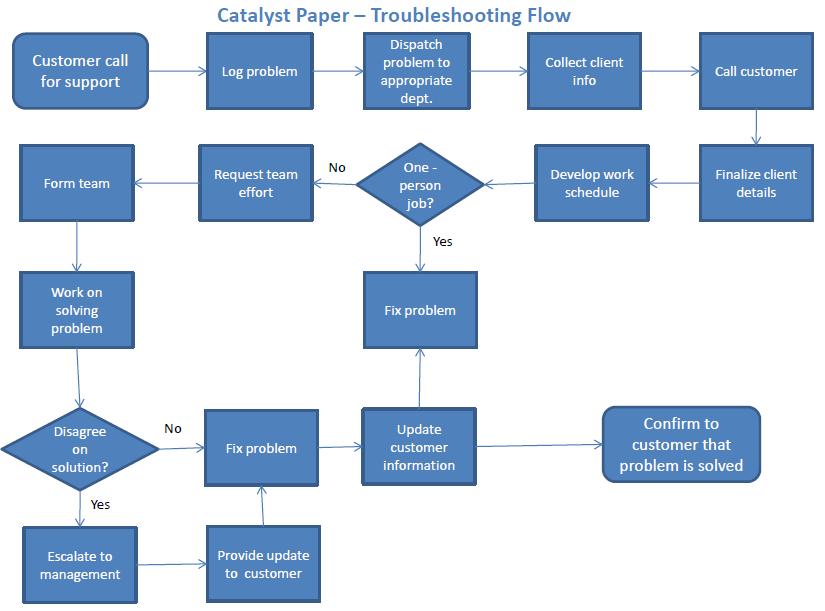
2. The variables that are most likely be used by catalyst to improve quality are many fold. Among the important ones, we have: time reduction in handling customer requests; increased productivity expressed in reduced time to perform tasks; percentage of errors in the operations of the CRM system; number of clients served by the customer service representative; accuracy of pricing and quotes. Quality characteristics that should be taken into consideration. The quality characteristics that should be kept in mind for the manufacturing and sales processes for catalyst might be: a) for manufacturing: performance, reliability, durability of the product manufactured, and b) for sales: the speed to which the product is delivered, the price of the product, lead time to deliver to the customer, and the responsiveness to customer needs and demands. All three types of control charts can be used to monitor whether the manufacturing and sales processes are in control or not. The variables discussed are either continuous or discrete. In the former case, x-bar charts and R-charts are used together to determine the pattern of variation of the collected data on the variables. If the data is discrete, then either a p-chart will be used if the data is expressed in binary form (success/failure, i.e., percentage of errors) or a c-chart
if the data is expressed in rates (value per unit, i.e., number of clients served by customer service representative). Patterns of variation must be carefully analyzed to ensure that special cause variation is eliminated if it is present. In doing so, the process will be stabilized (in control). In order to ensure that the quality monitoring process is well managed, data collection methods must be free of any bias, either in selecting the samples or in collecting the data from them.
3. Control charts are an important aspect and tool of the quality control process and overall management of quality. However, there are other quality tools which are very useful in driving the quality initiative effectively. Catalyst should consider the use of process flow diagrams to help in the identification of possible points in the process where problems occur; Pareto charts are also useful in helping catalyst focus on the most important problems;andCause-and-effectdiagrams(alsoknownas"Fishbonediagrams")whichhelp in the approach to seek the possible causes of a problem. These three tools, and other secondary ones such as checklists, histograms and scatter plots will help the overall problem solving and continuous improvement objectives for Catalyst. These tools combined with the appropriate use of control charts help management address the entire quality initiative, which includes after-process inspection.
1. There are several decisions that management had to make during this time including 1) whether or not to invest in technology, 2) expand its line of offerings through imports, 3) conduct a significant planning process, 4) attempt to increase market share, 5) develop new products, 6)create greater employee involvement, 7) invest in employee education, 8) invest in plant improvements, and 8) implement a participatory management system.
Several states of nature occurred which could have affected Fletcher-Terry’s outcomes. Some of these include: 1) its largest customers decided to introduce their own privatelabel cutters made overseas, 2) the technology that Fletcher-Terry invested in would not work, 3) dollar weakened, 4) slow-down in demand for cutters, 5) employees do not respond to company efforts.
2.
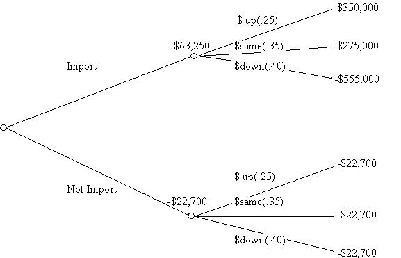
The expected monetary value (EMV) for each of these alternatives is: Import: (.25)($350,000) + (.35)($350,000) + (.40)(-$555,000) = -$63,000 Not Import: (.25)(-$22,700) + (.35)(-$22,700) + (.40)(-$22,700) = -$22,700
The EMV’er would choose the highest of these alternatives which is to not import and take a $22,700 loss. The risk avoider would also choose to not import. However, a risk taker might decide to import gambling that the dollar does not go down.
The decision table and the expected values are displayed below in a decision tree.
Question 1:
a. Answer: Nominal
b. Answer: Interval
c. Answer: Interval