Auction | Melbourne | 29 April 2026
Auction | Melbourne | 29 April 2026
Lots 1 – 57
Auction | Melbourne | 29 April 2026
Lots 1 – 57
Wednesday 29 April 7:00 pm 105 Commercial Road South Yarra, VIC telephone: 03 9865 6333
Tuesday 14 – Sunday 19 April 11:00 am – 6:00 pm 36 Gosbell Street Paddington, NSW telephone: 02 9287 0600
Thursday 23 – Tuesday 28 April 11:00 am – 6:00 pm
Saturday 25 April ANZAC Day 1:00 pm – 6:00 pm 105 Commercial Road South Yarra, VIC telephone: 03 9865 6333
email bids to: info@deutscherandhackett.com telephone: 03 9865 6333 fax: 03 9865 6344 telephone bid form – p. 152 absentee bid form – p. 153
www.deutscherandhackett.com/watch-live-auction
www.deutscherandhackett.com | info@deutscherandhackett.com


Chris Deutscher
Executive Director — Melbourne
Chris is a graduate of Melbourne University and has over 40 years art dealing, auction and valuation experience as Director of Deutscher Fine Art and subsequently as co-founder and Executive Director of Deutscher~Menzies. He has extensively advised private, corporate and museum art collections and been responsible for numerous Australian art publications and landmark exhibitions. He is also an approved valuer under the Cultural Gifts Program.
Crispin Gutteridge
Head of Indigenous Art and Senior Art Specialist
Crispin holds a Bachelor of Arts (Visual Arts and History) from Monash University. In 1995, he began working for Sotheby’s Australia, where he became the representative for Aboriginal art in Melbourne. In 2006 Crispin joined Joel Fine Art as head of Aboriginal and Contemporary Art and later was appointed head of the Sydney office. He possesses extensive knowledge of Aboriginal art and has over 30 years’ experience in the Australian fine art auction market.
Veronica Angelatos
Art Specialist and Senior Researcher
Veronica has a Master of Arts (Art Curatorship and Museum Management), together with a Bachelor of Arts/Law (Honours) and Diploma of Modern Languages from the University of Melbourne. She has strong curatorial and research expertise, having worked at various art museums including the Peggy Guggenheim Collection, Venice and National Gallery of Victoria, and more recently, in the commercial sphere as Senior Art Specialist at Deutscher~Menzies. She is also the author of numerous articles and publications on Australian and International Art.
Alex Creswick
Managing Director / Head of Finance
With a Bachelor of Business Accounting at RMIT, Alex has almost 30 years’ experience within financial management roles. He has spent much of his early years within the corporate sector with companies such as IBM, Macquarie Bank and ANZ. With a strong passion for the arts Alex became the Financial Controller for Ross Mollison Group, a leading provider of marketing services to the performing arts, before joining D+H in 2011.
Jennifer Terace
Front of House Manager – Melbourne
Jennifer holds a Bachelor of Visual Arts from Edith Cowan University and has experience across event management, retail operations, and community arts program coordination. She has worked as a practicing artist, artist’s assistant, and gallery assistant, gaining valuable insight into both the creative and logistical aspects of the visual arts sector.


Damian Hackett
Executive Director — Sydney
Damian has over 30 years’ experience in public and commercial galleries and the fine art auction market. After completing a BA (Visual Arts) at the University of New England, he was Assistant Director of the Gold Coast City Art Gallery and in 1993 joined Rex Irwin Art Dealer, a leading commercial gallery in Sydney. In 2001, Damian moved into the fine art auction market as Head of Australian and International art for Phillips de Pury and Luxembourg, and from 2002 – 2006 was National Director of Deutscher~Menzies.
Henry Mulholland
Senior Art Specialist
Henry Mulholland is a graduate of the National Art School in Sydney, and has had a successful career as an exhibiting artist. Since 2000, Henry has also been a regular art critic on ABC Radio 702. He was artistic advisor to the Sydney Cricket Ground Trust Basil Sellers Sculpture Project, and since 2007 a regular feature of Sculpture by the Sea, leading tours for corporate stakeholders and conducting artist talks in Sydney, Tasmania and New Zealand. Prior to joining Deutscher and Hackett in 2013, Henry’s fine art consultancy provided a range of services, with a particular focus on collection management and acquiring artworks for clients on the secondary market.
Ella Perrottet
Senior Registrar
Ella has a Masters of Arts and Cultural Management (Collections and Curatorship) from Deakin University together with a Bachelor of Fine Art (Visual Art) from Monash University, and studied in both Melbourne and Italy. From 2014, Ella worked at Leonard Joel, Melbourne as an Art Assistant, researcher, writer and auctioneer, where she developed a particular interest in Australian women artists.
Eliza Burton
Registrar
Eliza has a Bachelor of Arts (English and Cultural Studies and History of Art) from the University of Western Australia and a Master of Art Curatorship from the University of Melbourne. She has experience in exhibition management, commercial sales, and arts writing through her work for Sculpture by the Sea and The Sheila Foundation.
Poppy Thomson
Gallery Manager, Sydney
Poppy holds a Bachelor of Art History and Curatorship (Honours) from the Australian National University and has professional experience as a curator and research assistant. Prior to this role, she spent time in Paris after winning the 2023 Eloquence Art Prize, and now sits on the board of Culture Plus.
Chris Deutscher
Damian Hackett 0411 350 150 0422 811 034
Henry Mulholland Crispin Gutteridge 0424 487 738 0411 883 052
Veronica Angelatos 0409 963 094
Administration and Accounts
Megan Mac Sweeney Poppy Thomson (Melbourne) (Sydney) 03 9865 6333 02 9287 0600
Absentee and Telephone
Jennifer Terace 03 9865 6333
Shipping
Ella Perrottet 03 9865 6333

Roger McIlroy
Head Auctioneer
Roger was the Chairman, Managing Director and auctioneer for Christie’s Australia and Asia from 1989 to 2006, having joined the firm in London in 1977. He presided over many significant auctions, including Alan Bond’s Dallhold Collection (1992) and The Harold E. Mertz Collection of Australian Art (2000). Since 2006, Roger has built a highly distinguished art consultancy in Australian and International works of art. Roger will continue to independently operate his privately-owned art dealing and consultancy business alongside his role at Deutscher and Hackett.
Scott Livesey Auctioneer
Scott Livesey began his career in fine art with Leonard Joel Auctions from 1988 to 1994 before moving to Sotheby’s Australia in 1994, as auctioneer and specialist in Australian Art. Scott founded his eponymous gallery in 2000, which represents both emerging and established contemporary Australian artists, and includes a regular exhibition program of indigenous Art. Along with running his contemporary art gallery, Scott has been an auctioneer for Deutscher and Hackett since 2010.
Lot 15
Arthur Boyd
Hillside (Shoalhaven), c.1975 (detail)
Lots 1 – 57 page 12
Prospective buyers and sellers guide page 148
Conditions of auction and sale page 150
Telephone bid form page 152
Absentee bid form page 153
Attendee pre-registration form page 154
Index page 165
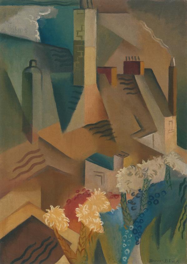
Dorset cottages, 1935
also known as Houses on the corner
oil on canvas on cardboard
33.5 x 37.5 cm
signed lower left: Dorrit Black inscribed on label verso: Dorrit Black / Dudley Court Hotel / 13 Inverness Terrace / London W2 / No 6. / Dorset Cottages
Estimate: $80,000 – 120,000
Provenance
Estate of the artist
Thence by descent
Mary Leask, Salisbury, England (inscribed on label verso)
Thence by descent
Private collection, Perth
Exhibited
Paintings by Dorrit Black, Macquarie Galleries, Sydney, 18 – 28 March 1936, cat. 25
Exhibition of Oils, Watercolours and Lino Cuts by Dorrit Black, Royal South Australian Society of the Arts, Adelaide, 7 – 23 July 1938, cat. 14
Dorrit Black Memorial Exhibition, Royal South Australian Society of the Arts, Adelaide, 1952, cat. 35
Dorrit Black: Unseen Forces, Art Gallery of South Australia, Adelaide, 14 June – 7 September 2014
Literature
North, I., The Art of Dorrit Black, Art Gallery of South Australia, Adelaide, and Macmillan, South Melbourne, 1979, cat. 0.51, p. 122 (as ‘Houses on a Corner, c.1935’)
Lock-Weir, T., Dorrit Black: Unseen Forces, Art Gallery of South Australia, Adelaide, 2014, pp. 79, 83 (illus.), 191 (illus.)
Dorrit Black was a pioneer of Australian modernism. In London and Paris during the late 1920s she studied with key international figures, learning about contemporary developments in modern art at their source. At home – in both Adelaide and Sydney – she later shared her experiences, disseminating her knowledge and making a significant contribution to the evolution of the local iteration of modernism. A newspaper article published after her return in 1929 declared: ‘Miss Black… is a modern of moderns, and is all for the new school of painting’ 1 which, as she went on to explain, ‘does not aim at realism, [but] is founded on design, harmony, and rhythm in forms.’ 2
Black’s formal art education began at the Adelaide School of Design, and she undertook private watercolour painting lessons with Gwen Barringer before moving interstate to continue her studies at Julian Ashton’s Sydney Art School. It is likely that Black was introduced to the techniques of linocut printmaking by Thea Proctor, but her deepest engagement with the medium began in late 1927 at the Grosvenor School in London where she attended classes with Claude Flight, a passionate advocate for the colour linocut which he regarded as the modern medium for the modern age. Studying with Flight for several months, Black absorbed his example of the use of bold colour, the reduction of subject matter to simplified shapes, and patterns based on a dynamic system of opposing rhythmic lines and forms. Critical recognition of her efforts in the medium came early, with The pot plant, 1933 being purchased by the Victoria and Albert Mu seum, London.
Encouraged by her friends and fellow-artists, Anne Dangar and Grace Crowley, Black left London for Paris at the end of 1927, her intention being ‘to acquire a definite understanding of the aims and methods of the modern movement and, in particular – of the Cubists.’ 3 Her primary teacher in this undertaking was André Lhote, whose academy in Montparnasse (and summer school at Mirmande in the south of France) attracted students from all around the world. Lhote’s approach to Cubism incorporated the theory of dynamic symmetry and compositional principles based on the golden mean. Subjects were simplified according to geometry and organised into flattened, planar arrangements. As Black wrote, ‘He judges the work from standards of rhythm, balance, proportion and line, and applies these standards to its three properties – form, tone and colour.’4 Her understanding progressed further in mid-1929 when she and Crowley attended a series of classes with Albert Gleizes whose teaching ‘offered… a bridge from cubism to pure abstraction: from the static to the dynamic.’ 5
Dorset cottages, 1935 was painted during an extensive overseas trip between March 1934 and September 1935 during which Black travelled with her mother in Continental Europe, England, Scotland, Wales, the United States and Canada. The places they visited sometimes feature in Black’s work, from Mirmande (with surrounding hills), 1934 (Art Gallery of New South Wales) to The mountain lake, 1935 (National Gallery of Victoria), a linocut depicting a view from Neuschwanstein Castle in the foothills of the Alps in the south of Germany. Black reconnected with friends
Dorrit Black Mirmande (with surrounding hills), 1934 oil on canvas on paperboard
35.6 x 45.9 cm
Art Gallery of New South Wales, Sydney
during the trip and in the summer of 1934, she joined Claude Flight and his partner, Edith Lawrence, on a sketching holiday in Dorset. ‘I had one of the most enjoyable times of my life down there, such an awfully jolly & interesting lot of people. Claude got me painting rapid watercolour sketches most of the time, though I did do some of my usual careful constructed & deliberate oils.’ 6
They made day trips to Corfe Castle and to nearby swimming spots, including Chapman’s Pool which she depicted in a 1935 linocut, but staying in the village of Worth Matravers it was the limestone cottages that captured Black’s attention and which feature both here in Dorset cottages, 1935 and another related painting. The present work, thought to be the first she made of the subject, was painted in Salisbury following the visit to Dorset. Using a subdued palette of earthy colours, it describes the simple form of the cottages as they step up the hill, their angular architectural geometry contrasting with the stylised clouds and bushes, and the dramatic curve of the path which sweeps across the foreground, containing the view and introducing a sense of dynamic movement to the composition.
1. Leigh, E., ‘Disciple of modern art’, Register News Pictorial, 5 September 1929, cited in Lock-Weir, T., Dorrit Black: unseen forces, Art Gallery of South Australia, Adelaide, 2014, p. 57
2. ibid.
3. Black, D., ‘Account of travel and work 1927 – 29’, cited in North, I., The Art of Dorrit Black, Art Gallery of South Australia and The Macmillan Company of Australia, South Melbourne, 1979, p. 139
4. ibid.
5. Lock-Weir, op. cit., p. 56
6. Dorrit Black, postcard to her sister, 31 July 1934, cited in Lock-Weir, ibid., p. 79
Kirsty Grant
Dorrit Black House-roofs and flowers, 1935 (painted London, England) oil on canvas
50.2 x 38.0 cm
National Gallery of Australia, Canberra
oil on canvas
47.0 x 67.0 cm
bears inscription verso: A bears inscription verso: 60
Estimate: $80,000 – 120,000
Provenance
Rosalind Humphries Gallery, Melbourne
Private collection, Melbourne
Niagara Galleries, Melbourne
Private collection, Sydney, acquired from the above in August 2001
Estate of the above
Exhibited
Homage to Clarice Beckett (1887 – 1935): Idylls of Melbourne and Beaumaris, Rosalind Humphries Gallery, Melbourne, 30 October – 20 November 1971
Clarice Beckett Retrospective Exhibition 1921 – 1935, Realities Gallery, Melbourne, 11 October – 1 November 1979
Clarice Beckett: Politically Incorrect, Ian Potter Museum of Art, University of Melbourne, Victoria, and touring to: S.H. Ervin Gallery, Sydney; Orange Regional Gallery, New South Wales; Art Gallery of South Australia, Adelaide; Bendigo Art Gallery, Victoria; Tasmanian Museum and Art Gallery, Hobart and Burnie Regional Art Gallery, Tasmania, 5 February 1999 – 22 May 2000, cat. 34 (label attached verso)
Blue Chip III: The Collector’s Exhibition, Niagara Galleries, Melbourne, 27 February – 31 March 2001, cat. 13 (illus. in exhibition catalogue, p. 14)
Clarice Beckett: The Present Moment, Art Gallery of South Australia, Adelaide, 27 February – 23 May 2021
Literature
Hollinrake, R., Clarice Beckett: Politically Incorrect, The Ian Potter Museum, Melbourne, 1999, p. 75 Lock, T., The present moment: The art of Clarice Beckett, Art Gallery of South Australia, Adelaide, 2021, pp. 145 (illus.), 186 (illus.)
Clarice Beckett’s enduring connection to the Bayside region of Port Phillip Bay was forged in early childhood. Although raised in Casterton in regional Victoria, her family often holidayed at Beaumaris, a coastal suburb to the south of the city of Melbourne.1 Beckett’s mother counted the artists Walter Withers and Ola Cohn among her friends and on their advice, she enrolled Clarice (and her sister Hilda) in National Gallery School in 1914, studying under Frederick McCubbin. Upon attending a lecture by the artist-theorist Max Meldrum, Beckett was inspired to change direction and joined his classes for nine months. Meldrum taught his own theory of ‘optical science’ aka Tonalism, which, as its name implies, revolved around building an image based on tonal
values alone. Although she remained within the Meldrumite orbit thro ughout her subsequent career, Beckett’s paintings were truly a combination of the Gallery School’s academic teaching, Tonalism – and herself. As her colleague Elizabeth Colquhoun noted, her paintings were more ‘fragile’ than Meldrum’s. ‘It was a different kind of thing, but it was very truthful.’ 2
With her handmade painting trolley in tow, Beckett would wander the same areas repetitively, always approaching a scene with a different ambition as to the mood she wished to capture. Indeed, when asked why she never felt the desire to travel more widely, she responded ‘I have only just got the hang of painting Beaumaris after all these years, why should I go somewhere else strange to paint?’ 3 From the earliest days of colony, this locale attracted pleasure seekers with the first public swimming baths dating from the 1840s. By the turn of the century, clusters of bathing boxes were built within the ti-tree scrub by private individuals, or to service the patrons of nearby guesthouses. In The bathing boxes, Watkins Bay, 1928, Clarice Beckett turns her gaze to one such group located in the curve of Watkins Bay, at the end of the street where the artist lived. Beckett’s distinctive style is immediately recognisable and, when seen collectively, her paintings provide an unsurpassed record of the changing landscape of the Bayside region. By the late 1920s, when The bathing boxes, Watkins Bay was painted, such huts could be found on all beaches in the area, sometimes two or three deep. A related work, Bathing boxes, Beaumaris, 1928 – 30 (Important Australian and International Fine Art, Deutscher and Hackett, Sydney, 14 September 2022, lot 26), is the same location but viewed from the rear, whilst this painting reveals the front of the huts instead with the Beckett family’s own hut included. The artist’s compositional skill and mastery of colour is evident with the looming green of the background foliage bisected by the grey path leading up to Beach Road. The orange upturned boat also provides an alternate directional trigger, and both emphatically anchor the solidity of the horizontal march of the huts themselves.
A second related work, Bathing boxes, Beaumaris, c.1932 (Important Australian and International Fine Art, Deutscher and Hackett, 21 April 2021, lot 24), depicts the same huts from the opposite and seaward southerly aspect. Ultimately, these idyllic views no longer remain as a huge storm in 1934 destroyed huts up and down the coast, most of which were not replaced. The bathing boxes, Watkins Bay, therefore, retains historic as well as aesthetic importance.
1. The family subsequently lived at ‘St Enoch’s’, Dalgetty St, Beaumaris, from 1919. The house burned down in 1945.
2. Elizabeth Colquhoun, cited in Peers, J., More than just gumtrees: a personal, social and artistic history of the Melbourne Society of Women Painters and Sculptors, Dawn Revival Press, Melbourne, 1993, p. 197
3. Clarice Beckett, c. 1928, cited in Hollinrake, R, Clarice Beckett: the artist and her circle, Macmillan, Melbourne, 1979, p. 21 Andrew Gaynor
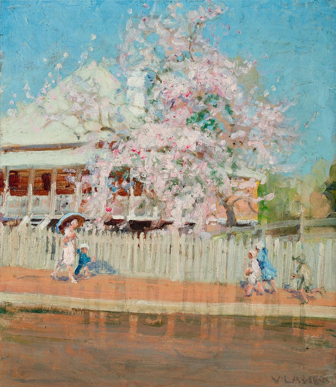
Bauhinia in bloom, Brisbane, 1929
oil on canvas on composition board
36.0 x 31.0 cm
signed lower right: V LAHEY
signed and inscribed with title on label verso: ... / Brisbane / Vida Lahey / Corinda Brisbane
Estimate: $40,000 – 60,000
Provenance
Mrs Harry Southwell
Edna O’Sullivan, by 1989
Private collection, Melbourne
Thence by descent Private collection, Melbourne
Exhibited
Vida Lahey: Oils and watercolours, Gainsborough Gallery, Brisbane, 16 May – 6 June 1929, cat. 1
Paintings by Vida Lahey, The Macquarie Galleries, Sydney, 18 – 28 September 1929, cat. 13
Paintings by Miss Vida Lahey: from seashore and garden, Everyman’s Lending Library, Melbourne, 24 October – 4 November 1933, cat. 5
Exhibition of paintings of Brisbane and of other things, Union Trustee Chambers, Brisbane, 20 May – 6 June 1936, cat. 4
Literature
‘Art of Miss Lahey: Oils and Water Colours [sic]’, The Brisbane Courier, Brisbane, 16 May 1929, p. 24 ‘Art Exhibition. Miss Lahey’s Paintings’, The Sydney Morning Herald, Sydney, 19 September 1929, p. 10 MacAulay, B., Supplement to Songs of Colour. The Art of Vida Lahey, Works Located to 1989, Queensland Art Gallery, Brisbane, 1989, pp. 6, 30, 31, 37
Vida Lahey’s Bauhinia in bloom, Brisbane, 1929, shows a scene located on Gregory Terrace in Brisbane, a long stretch of road facing parklands.1 In the 1920s and 1930s, the Terrace was home to numbers of the now-iconic raised ‘Queenslander’ houses similar to the one pictured here. The precinct was also home to the Exhibition Building and Concert Hall, built 1891, which housed a modest art gallery to which Lahey was closely connected. Indeed, in 1931, when a new gallery was built within the former Concert Hall, Lahey and her close friend and colleague, the sculptor Daphne Mayo, were honoured by having key examples of their work placed at the entrance, ‘a remarkable testament to the high standing these women had won.’ 2 In Lahey’s case, it was her powerful and immensely popular painting Monday morning, 1912 (Queensland Art Gallery I Gallery of Modern Art, Brisbane), an honest appraisal of her sister and another woman at work in the family laundry. Lahey was the eldest of twelve children but
shared her younger brother Romeo’s ‘interests in planning and environmental issues. In the 1920s and early 1930s, (she) painted as many scenes of industry and civic construction as women in social, work and leisure settings. Both men and women display the dignity of labour and service.’ 3 Whilst Monday morning illuminated domestic labour, the focus of Bauhinia in bloom, Brisbane is the flipside – a relaxed outdoor stroll with young children.
Bauhinia trees are a feature of the city, blooming typically from October through to December alongside the purple of Jacarandas and the vivid red-orange of Flame trees. Given its location, it is likely this Bauhinia was one she saw regularly as she commuted between the gallery and her studio. Through such details, her paintings have become important matters of record regarding Brisbane’s changing architecture, heritage and flora, with two other key examples being (Carts in Eagle Street), c.1913, and Early morning, Brisbane River, 1932 (Important Women Artists + Selected Important Australian and International Fine Art, Deutscher and Hackett, Melbourne, 10 November 2021, lots 6 and 7 respectively). Whilst this particular Queenslander no longer stands on Gregory Terrace, Lahey’s painting has captured it and its personal Bauhinia for posterity. The season is likely to be early Spring when the fragrant flowers are most profuse, but whose petals have yet to carpet the footpath below. The figures are all bundled in Sunday-best coats and the woman at left holds an umbrella as, despite the brilliance of the blue sky, a recent heavy shower has left the road surface wet and reflective. The bright colour and post-Impressionist brushwork is lively, reminiscent of her friend Ethel Carrick Fox’s paintings, with whom Lahey studied at Colarossi’s atelier in Paris in 1919.
Lahey was often noted for her ‘really beautiful sense of colour’4, and indeed, when Bauhinia in bloom, Brisbane was exhibited in Brisbane, Sydney and Melbourne, a number of critics singled it out for praise. The Sydney Morning Herald ’s reviewer, however, went further by highlighting Lahey’s technical virtuosity, noting that the whole scene revolved around ‘the riot of pink blossom, to which the remainder of the picture is artistically keyed, (and) is treated wit h great delicacy.’ 5
1. Gregory Terrace is identified as the location in the catalogue for: Exhibition of paintings of Brisbane and of other things, Union Trustee Chambers, Brisbane, 1936
2. McGuire, M. E., All things opposite: essays on Australia art, Champion, Melbourne, 1995, p. 108
3. MacAuley, B., Vida Lahey: paintings and watercolours, Philip Bacon Galleries, Brisbane, 2012
4. Howard Ashton, cited in: ‘Tasmanian pictures. Exhibition in Sydney. Miss Vida Lahey’s work’, The Mercury, Hobart, 4 September 1926, p. 11
5. ‘Art Exhibition. Miss Lahey’s Paintings’, The Sydney Morning Herald, Sydney, 19 September 1929, p. 10 Andrew Gaynor
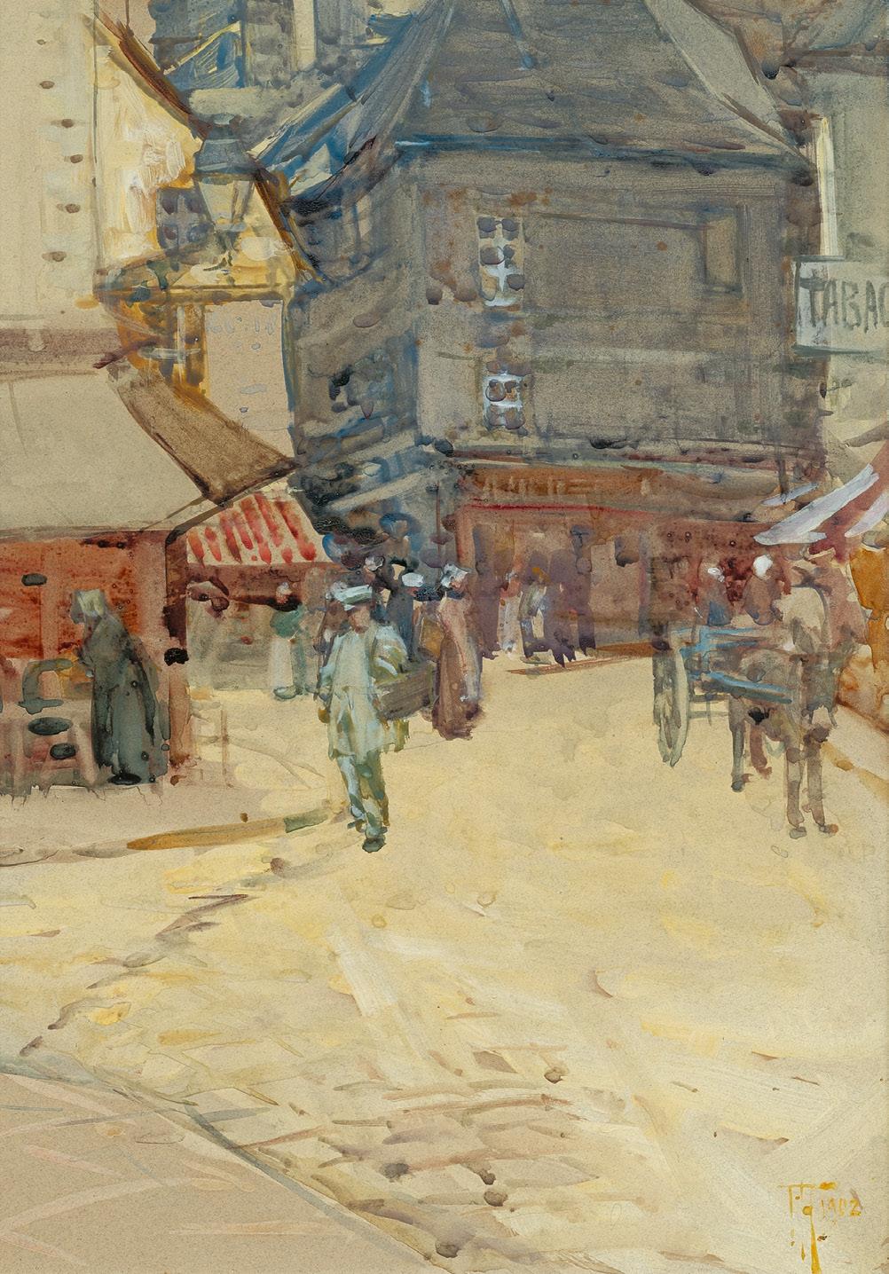
Old Street, Dinan, 1902
watercolour on paper
35.5 x 24.5 cm
signed with initials and dated lower right: FH / 1902 inscribed with title verso: Old Street / Dinan
Estimate: $30,000 – 40,000
Provenance
Private collection, Sydney
Exhibited
possibly Frances Hogkins, McGregor Wright and Co., Auckland, opened 26 August 1902 [37 watercolours, ‘chiefly scenes in France, Italy, and Cornwall’] Auckland Society of Arts, Auckland, opened 8 November 1902, cat. 193
Literature
McCormick, E. H., Works of Frances Hodgkins in New Zealand, Auckland City Gallery, New Zealand & Oxford University Press, London, 1954, p. 226
Related work
Rue de L’Horloge, Dinan, 1902, watercolour on paper, 37.0 x 27.0 cm, cat. FH0379, The Complete Frances Hodgkins: https://completefranceshodgkins.com/explore
When Frances Hodgkins set off for Europe in 1901, she left with the intention of spending a couple of years gaining overseas experience before returning once more to Aotearoa New Zealand to teach. Having come from a childhood immersion in the Otago landscape, cities such as London and Paris seemed overwhelming, too crowded, and too expensive. Instead, it was the fishing villages of Cornwall and Brittany, with their picturesque architecture and traditions, that initially captured Hodgkins’ imagination.
She spent the summer of 1901 in Caudebec-en-Caux, Normandy, in the company of Irish artist Norman Garstin and his retinue of pupils, although Garstin, having seen her work, said there was nothing he could teach her. She enjoyed the company of other artists – not least the daily criticism (carried out with good humour) where they discussed the travails and successes of the day.
Hodgkins returned the following year to Dinan in Brittany, where Garstin had taken up residence for his summer school. She stayed throughout the summer, taking rooms above the famous Swiss-run Patisserie Taffatz, the advertisements for which boasted the best of English teas. She described to fellow artist Dorothy Kate Richmond how she liked to be painting out
of doors by 7.30am, as the streets were ‘just as busy then, in fact busier than later in the day. Dinan is a first-rate place – a variety of everything – old streets, peasant women, fruit stalls, river scenery, feudal castles & 2 ‘dashing’ cavalry regiments…’ 1
The summer was plagued by constant rain, and Hodgkins was grateful for the shelter of the arcades that allowed her to overlook the local market and the comings and goings of the old medieval town. Old Street, Dinan, 1902 is an excellent example of Hodgkins’ practice at this time. The convergence of several cobbled streets that meandered through the haute ville provides an appropriate vanishing point, drawing the eye before the viewer settles on the activities taking place either side. The centre background is dominated by a dark, four storeyed building, standing in contrast to the pale awning of the shop on the left.
A woman wearing a traditional Breton cap attends to something on a table beneath it, the white of her bonnet serving as a visual counterpoint to her sombre gown and the brown shutters behind. Another shop is shaded by a red and white canvas awning, a detail that found their way into several of her watercolours of the time, the bold lines adding a dash of pattern and warmth to the blocks of colour either side.
A cluster of women emerge from the street beyond, while others stand further back, hastily sketched. Others gaze at what might be a vegetable stall on the right. Unlike much of Hodgkins’ work, only the man in white, his body tilted to balance the large basket on his arm, is in clear focus – captured before he turns the corner and moves out of sight. Across the expanse of street that opens out in front of the artist, a donkey patiently waits between the shafts of a blue wooden cart, but such is the rapidity of Hodgkins’ brushstrokes that we cannot tell if a figure is loading it or not. This motif of donkey and cart appears in a number of the artist’s French watercolours, including Rue de l’horloge, 1902 which was painted the same summer. A common form of transport, they allowed Hodgkins to deftly capture the circular structure of the wheels. Many of her Dinan watercolours focused on the streets adjacent to her lodgings. One has to focus closely to make out the gas lamp attached to the building on the corner, allowing us to imagine the same streets in the evening, softly illuminated in their glow.
1. Letter to Dorothy Kate Richmond, 22 July 1902 at: https://completefranceshodgkins.com/ objects/29230/letter-from-frances-hodgkins-to-dorothy-richmond#field_description (accessed March 2026)
Mary Kisler
Flowers and books, c.1935
oil on plywood
81.0 x 60.0 cm
signed lower left: Bessie Davidson signed verso: Bessie Davidson bears inscription verso: 14
Estimate: $200,000 – 300,000
Provenance
Osborne Art Gallery, Adelaide Private collection, Sydney, acquired from the above in 1967
Exhibited
4e Exposition du Salon des Tuileries, Néo-Parnasse, Paris, 21 May –5 July 1936, cat. 416 (as ‘Nature morte’, partial label attached verso)
Exhibition of Paintings by Bessie Davidson, Osborne Art Gallery, Adelaide, 31 May – 13 June 1967, cat. 14
Bessie Davidson was part of a group of trailblazing Australian women artists who travelled and studied in Europe during the early twentieth-century. Paris, in particular, was a favoured destination, ‘the only truly cosmopolitan city of the world for artists, whose work stands a better chance there than in any other art centre of being judged on its merits.’ 1 Offering a pluralist and progressive approach to art with private academies that provided tuition to women, the City of Light provided opportunities for them to exhibit alongside their male counterparts. Being away from home also had the added advantage of freeing these artists from family expectations and gendered social conventions of marriage and motherhood. When Davidson and her friend, Margaret Preston, arrived in Paris following several months in Munich in late 1904, they joined the ranks of other antipodean expatriates including Kathleen O’Connor, Hilda Rix Nicholas and Iso Rae. While many returned home after their study and travels, sharing what they had learned of international modernism, Davidson and a small number of others – including Agnes Goodsir, Anne Dangar and Stella Bowen – remained, establishing
successful careers and living overseas for the rest of their lives, part of a transnational group of artists whose experiences and work radically extend traditional narratives of Australian art. 2
Davidson returned to Adelaide in late 1906 but within four years she was again back in Paris. She reconnected with friends including the artist René-Xavier Prinet, who had taught her at la Grande Chaumière – probably also taking classes with him – and in 1912 moved to Montparnasse, where there was a large community of expatriate artists, into a studio apartment on Rue Boissonade. Located on the second floor of a late nineteenthcentury building, the apartment had high ceilings and large windows that looked out over a central courtyard. Its interior and those of Davidson’s friends’ country houses often provided the settings for her paintings, revealing ‘… an ambience of bourgeois refinement, not grand but testifying to lives full of interest and occupation. Furniture is elegant but comfortable, shelves are filled with books and ornaments and walls hung generously with paintings. The many different interiors… reveal something of the lives and personalities of their owners.’ 3
Bessie Davidson
Tulips with white pot, c.1935 oil on board
34.5 x 98.5 cm
National Gallery of Australia, Canberra
First exhibited at the Salon des Tuileries, Paris in 1936, Flowers and books, c.1935, depicts an intimate corner of one such interior. It is an ambitious painting, significant in scale and complex in terms of its painterly approach. An informal arrangement of familiar objects sits atop a small table in a scene that is alive with movement, energised by short parallel brushstrokes that jostle and vibrate against each other. Contrasting white and red flowers in the centre of the image and the lemons in the foreground provide touches of vibrancy and bright colour within what, at first glance, seems like an overall subdued palette but which, on closer inspection, reveals a rich chromatic range. From the crumpled tablecloth that has casually been pushed aside to the reflections that are carefully recorded in the glass specimen vase, Davidson’s painterly prowess is on full display, as is the intense pleasure she found in her craft. ‘I can’t help this life that is in me – and I must paint or I feel ill…’4
Apart from visits to Australia in 1914 and again in 1950, Davidson remained in France, a resident of Rue Boissonade, for the rest of her life. As well as speaking fluent French, she developed a wide network of friends, was well-connected within the artistic community and established a successful career, exhibiting regularly at the Salons and having her work acquired by the
French State and represented in important collections including the Centre Georges Pompidou, Paris. In 1920 she was elected as an associate member of the Société Nationale des Beaux-Arts, only the fourth Australian to receive this acknowledgement –following George Lambert, Rupert Bunny and George Coates –and the first Australian woman ever to do so. Two years later, she was the first Australian artist to receive full membership. Davidson was a founding member of the Salon des Tuileries (1923) and the Société des Femmes Artistes Modernes (1930), serving as vicepresident for its first decade of operation. Arguably the greatest accolade, however, came in 1931 when Davidson was made a Chevalier de la Légion d’Honneur for services to the arts, the only Australian woman to have received this honour at the time. 5
1. Edith Fry, cited in Speck, C., ‘Paris Calls’ in Bessie Davidson: An Australian Impressionist in Paris, Bendigo Art Gallery, Bendigo, 2020, p. 17
2. See Rex Butler and A.D. S. Donaldson, ‘French, Floral and Female: A History of UnAustralian Art 1900 – 1930 (part 1), Emaj, issue 5, 2010, at: https://www.index-journal. org/media/pages/emaj/issue-5/french-floral-and-female-by-rex-butler-and-adsdonaldson/010624421e-1727496756/butler-and-donaldson-french-floral-female.pdf (accessed March 2026) and Freak, E., Lock, T., and Tunnicliffe, W., ‘Dangerously Modern’ in Dangerously Modern: Australian Women Artists in Europe 1890 – 1940, Art Gallery of New South Wales and Art Gallery of South Australia, Sydney and Adelaide, 2025, pp. 13 – 19
3. Little, P., A Studio in Montparnasse: Bessie Davidson: An Australian Artist in Paris, Craftsman House, Melbourne, 2003, pp. 64 – 65
4. Bessie Davidson, cited in Little, ibid., p. 10
5. All biographical information is drawn from Little, op. cit.
Kirsty Grant
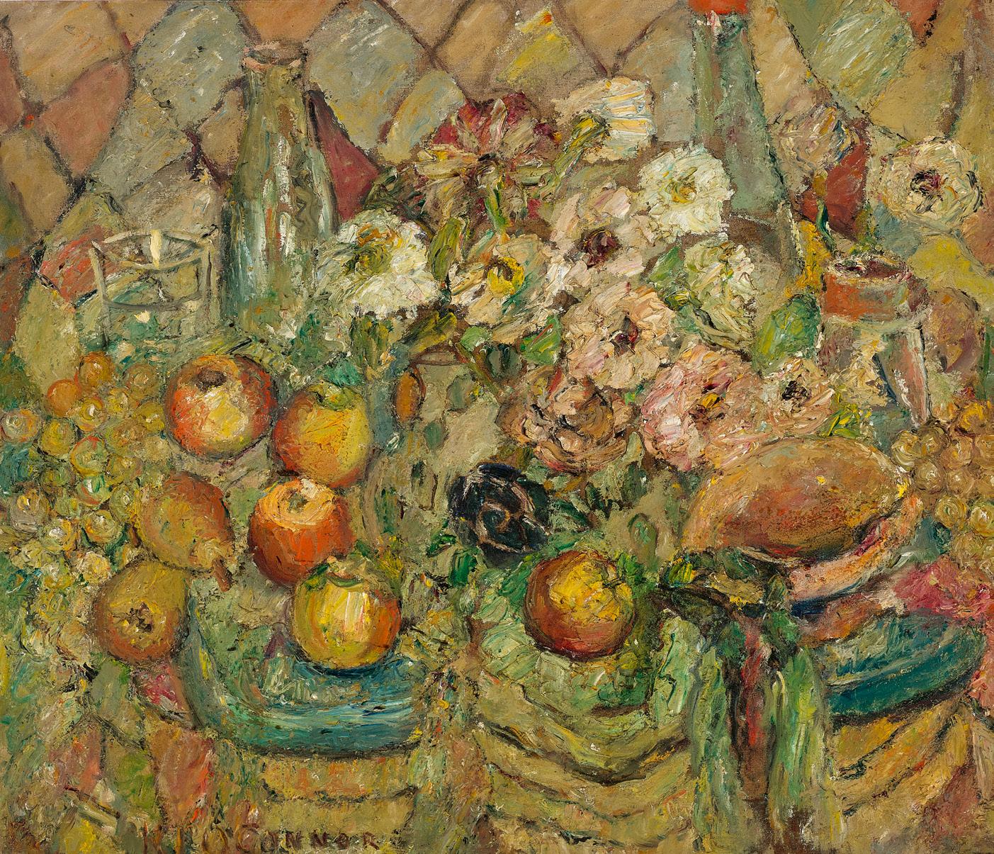
oil on canvas on composition board
65.5 x 77.5 cm
signed lower left: KL O’CONNOR
Estimate: $40,000 – 60,000
Provenance
Osborne Art Gallery, Adelaide Private collection, Sydney, acquired from the above in 1965
Exhibited
Exhibition of paintings by Kathleen O’Connor, Osborne Art Gallery, Adelaide, 28 April – 11 May 1965, cat. 28
‘A very free style of drawing of a skill that is the greater for being unobtrusive, is accompanied by a luminous colour scheme, of admirable freshness… [and] perceptive harmony. All this bears witness to the delicate and sensitive temperament of the artist Kathleen O’Connor, whose reputation is already secured and whose successful exhibition is a joy to the eyes for lovers of new and authentic modern art.’ 1
This is how the critic writing for La Revue Moderne described Kathleen O’Connor’s art in her first solo exhibition in Paris in 1937. Held at Galerie J. Allard and opened by the curator of the Jeu de Paume in the presence of artists including Édouard Vuillard and Lucien Simon, it heralded a significant moment in her career, confirming her place among the ranks of those working in Paris at the time as a contemporary artist of note.
Born in New Zealand in 1876, Kathleen O’Connor moved to Australia as a teenager following her father’s appointment as the Western Australian Engineer in Chief. Travelling to Europe with her mother and sister in 1906 and eager to visit Paris, then the centre of the western art world, she experienced the enticing ‘dream life of [the city], the restaurant life, the café life… glasses glittering with reflections, and with it all the music of many voices, the babble of many tongues.’ 2 She attended painting classes in London during the summer of 1908 but by the end of the year was back in Paris, the place that she would call home for most of the next four decades. Although many questions remain about the details of O’Connor’s life there, we know that she studied at the Académie de la Grande-Chaumière around 1910, and that she knew fellow-artists Bessie Davidson (lot 5) and Frances Hodgkins (lot 4) – who was also New Zealand-born –attending watercolour classes at her school between 1911 – 12.
Janda Gooding has observed that O’Connor’s contribution to the 1921 Sa lon d’Automne ‘[marked] a transition from the figurative paintings, preoccupied with painterly concerns and impressions of a fleeting moment, towards a commitment to explore the still life.’ 3 With its focus on familiar domestic objects, this genre became a strong theme in her art and ‘the table top became the site for her explorations of modernism.’4 Painted in 1947, Domestic scene is characteristic of O’Connor’s approach, depicting a complex grouping of flowers, fruit, glass bottles and vessels so densely arranged that the surface beneath them is barely visible. We see glimpses of the harlequin pattern that forms the backdrop to the image however and a similar fabric appears in Australian riches, c.1949 – 51 (Art Gallery of Western Australia) and the earlier painting, Between hours, c.1928 – 30 (Queensland Art Gallery I Gallery of Modern Art, Brisbane), a reflection of O’Connor’s interest in pattern and ornament, as well as a nod to her work as a textile designer in Paris and Sydney during the 1920s. Pictorial space is tightly compressed and the prominent texture of the brushstrokes, expressive and energetic, reflects the pleasure O’Connor found in the process of painting and in her medium, as well as the assured way in which she manipulated it across the canvas to create images which are intimate, aesthetically rich and atmospheric.
1. Hesset, C., review in La Revue Moderne, no. 5, 15 March 1937, pp. 8 – 9, cited in Gooding, J., Chasing Shadows: The Art of Kathleen O’Connor, Craftsman House, Roseville East, 1996, p. 55
2. O’Connor, K., ‘Paris in the Latin Quarter’, The West Australian, Perth, 17 May 1913, cited in Gooding, ibid., p. 25
3. Gooding, ibid, p. 39
4. ibid., p. 49
Kirsty Grant
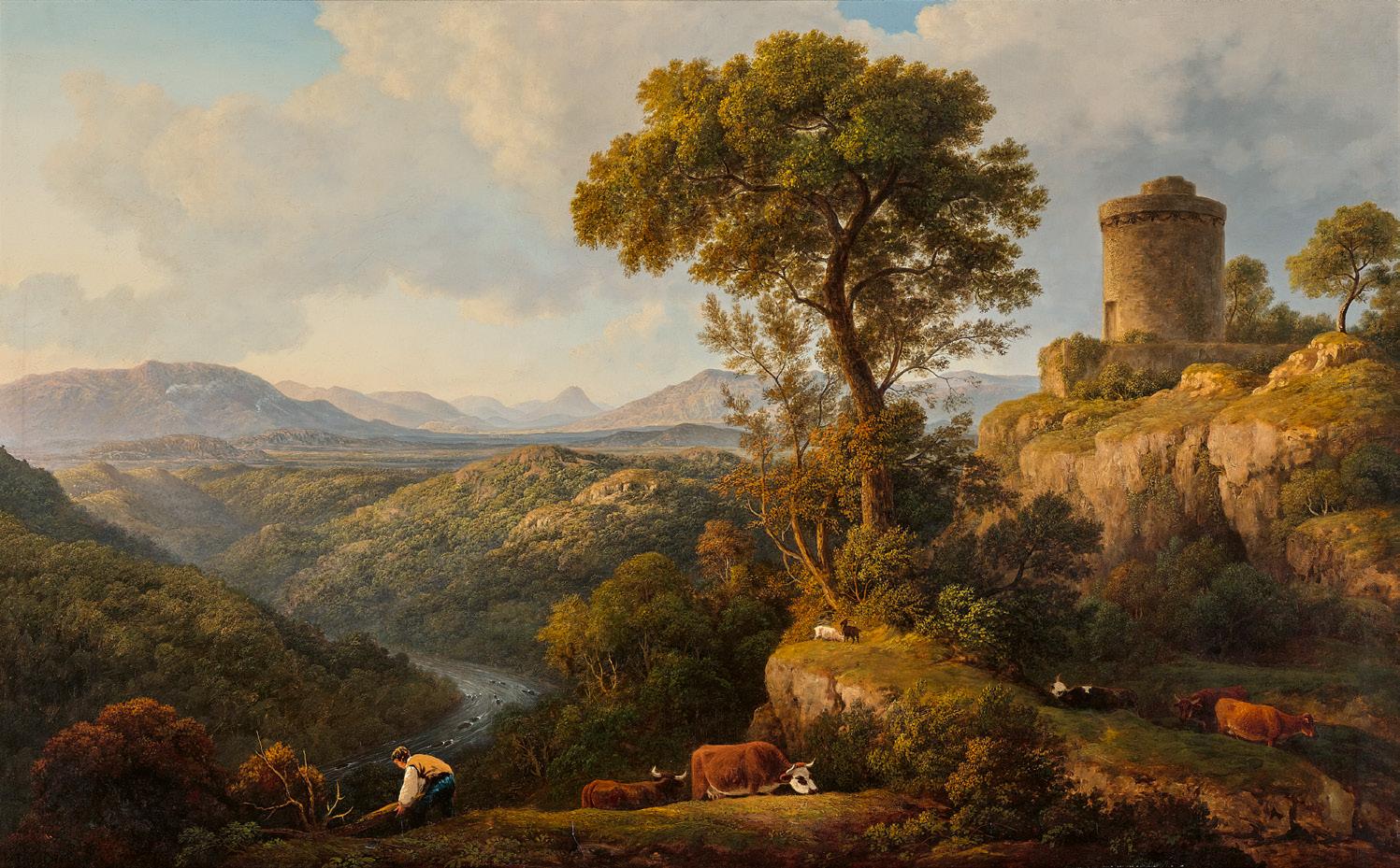
oil on canvas
77.0 x 122.5 cm
Estimate: $80,000 – 120,000
Provenance
Thomas Agnew and Sons, London (label attached verso, no. 32719)
Private collection, acquired from the above in October 1970 Leonard Joel, Melbourne, 8 November 1989, lot 261 (as ‘Dinas Brann Castle Near Llangollen’)
Private collection, Hobart
‘Glover possesses the talent of seizing upon an advantageous feature, or fixing a fleeting beauty. His sphere is locality; but his choice is classic; his eye acute, his mind replete with science and glowing with genial images… He excels, in the representation of particular [atmospheric] effects… without affecting the clearness of the hills in the distance.’ 1
This praise of John Glover’s art was written in 1809 by art critic William Carey and is one of many such reviews Glover received from London contemporaries and connoisseurs during his long career. Although many of his paintings of British and European landscapes are well known, Glover’s status and reputation as a fashionable painter of watercolours and oils in England over several decades is underappreciated in Australia. Rather, he is widely recognised and appropriately admired as one of the most significant landscape painters in the Australian colonies in the nineteenth century. This antipodean component of his oeuvre occurred only in his later years, having arrived in Van Diemen’s Land (Lutruwita / Tasmania) on 18 February 1831, his sixtyfourth birthday. Yet even in Australia, Glover continued to paint European scenes, their topography prompted by the numerous sketchbooks he had brought with him which were filled with swift annotations of sights seen during his frequent sketching tours through the British Midlands, Lakes District, Wales, Scotland, Switzerland, France, the Rhineland, Italy and elsewhere.
The present expansive scene is typical of Glover’s output, combining the key elements described by Carey. A heavily wooded valley stretches to the distant sun-tipped mountains,
our eyes directed to the curving river and beyond by the bending figure’s light c lothing. In the foreground, cattle and goats gently animate the scene, grazing contentedly, immersed in the folds of the rocky hilltop. The well-preserved stone fortification that overlooks the valley may be a medieval round tower seen during Glover’s travels, among the innumerable castles, churches, classical buildings and ruins that he sketched. Alternatively, it might be an imaginary feature, a compositional device inspired by classical edifices in the seventeenth-century art of Nicolas Poussin and Claude Lorrain whose luminous arcadian tranquillity Glover sought to emulate. His Classical landscape (Art Gallery of New South Wales), identified by David Hansen as Landscape with a Sybil’s temple: Composition, and painted the year before Glover first visited Italy, has a comparable tower in the mid-distance.
All of these elements – wilderness and pastoral peace, contemporaneity and antiquity – are united by the sinuous curves of the towering tree, arboreal features for which Glover is most widely recognised today, particularly in his depictions of centuries-old gum trees on his northern Tasmanian farm. And across the painting we have the atmospheric effects for which Glover was so often admired: the soft raking light of the low sun to our left, the misty haze in the valley, the cumulus clouds filling much of the sky, and the reddish tints in the foreground foliage that perhaps hi nt at approaching autumn.
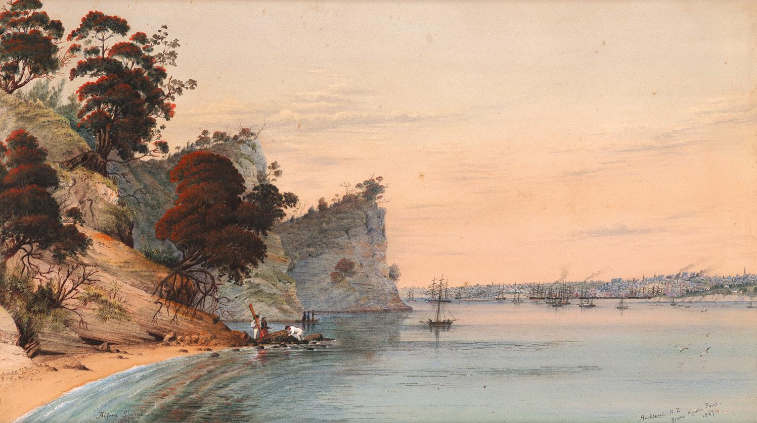
Auckland, New Zealand – from Kauri Point, 1887
watercolour on paper
37.0 x 64.0 cm
signed and dated lower left: Alfred Sharpe / – 1887
dated and inscribed with title lower right: Auckland. N. Z. / from Kauri Point. / 1887
Estimate: $30,000 – 40,000
James Hooke, Dungog, NSW, until 1912
Thence by descent
James Theodore “Theo” Morpeth Hooke, Dungog, NSW, until 1965
Thence by descent
James Calvert Hooke, Dungog, NSW, until 1979
Thence by descent
Lucy Scott, Dungog, NSW
Thence by descent
Private collection, NSW
‘Why is so little known of such a man, whose sense of colour was beyond that of [his] contemporaries? I think the answer is that he was born deaf and never taught to speak…’ 1
Few figures in nineteenth-century New Zealand art embody the paradox of obscurity and significance more compellingly than Alfred Sharpe. Although today recognised as one of the most accomplished watercolourists of the colonial period, for much of the twentieth century his works were regarded primarily as topographical curiosities or historical records rather than aesthetic achievements – their critical reception further overshadowed by Sharpe’s reputed deafness and the perceived isolation of his life. In recent decades however, such assumptions have fortunately been replaced by a more nuanced understanding of the artist whose painterly vision and cultural sensitivity were exceptional among his contemporaries.
Born in Birkenhead, Cheshire, Sharpe arrived in Auckland in 1859, lured by the opportunities afforded to colonial settlers. Although his early farming venture at Mangapai proved unsuccessful, these formative years spent in Northland left an indelible imprint upon his imagination, with the dramatic transformation of the New Zealand landscape under settler expansion later becoming one of the defining preoccupations of his art. Indeed, Sharpe remarkably diverged from the prevailing colonial attitudes of his generation through his profound sensitivity to the destruction of native forests and Māori settlements – as such, his landscapes are often imbued with a deeply melancholic and elegiac tone, betraying a rare empathy for the violence of Indigenous displacement.
Ironically perhaps given the silence imposed by his deafness, Sharpe has since emerged as a lively and articulate commentator
upon nineteenth-century New Zealand art. As elucidated by the endu ring authority on the artist, Robert Blackley, in his groundbreaking publication, recent scholarship has revealed Sharpe to be a prolific newspaper contributor in both New Zealand and Australia, publishing both in his name and, more candidly, under numerous pseudonyms including ‘Asmodeus’, ‘Censor’, and ‘A Well-Wisher to Art’. 2 Moreover, through essays such as his ‘Hints for Landscape Students in Watercolour’, Sharpe also articulated sophisticated views on technique, atmosphere, and artistic theory – establishing him as arguably the era’s most vocal colonial artist.
Painted shortly after Sharpe’s departure from Auckland in 1887, Auckland, New Zealand – from Kauri Point, 1887 represents the culmination of his luminous mature style. Having relocated to Newcastle, New South Wales, following personal and professional disappointments, Sharpe continued to rework sketches brought from New Zealand into ambitious finished watercolours. In the present composition, his meticulously layered washes and heightened chromatic sensibility are brought to their fullest expression, with the atmospheric brilliance of the sky – likely inflected by the extraordinary sunsets witnessed globally after the 1883 eruption of Krakatoa – suffusing the harbour with an almost visionary radiance. Structured around a striking contrast between the rugged, tree-clad cliffs of Kauri Point in the foreground and the encroaching colonial settlement across the distant shoreline (where clustered masts and architecture signal Auckland’s expansion), Sharpe highlights the tension between untouched landscape and increasing urban presence – thus subtly articulating his awareness of colonial transformation and loss.
Significantly, the impeccable provenance of the present work further enhances its colonial resonance. First acquired by James Hooke of Wirragulla, near Dungog – approximately 80 kilometres north of Newcastle where Sharpe was based – the watercolour entered the collection of one of the district’s foundational settler families most likely towards the end of the nineteenth century, and has descended through subsequent generations of the family until the present. Having emigrated from England to Tasmania in 1817, before later establishing themselves in Dungog in 1828, the Hooke family were notably among the earliest European landholders in the region. With its provenance inextricably bound to the very processes of colonisation that Sharpe so poignantly recorded, the watercolour thus represents not only a work of considerable artistic distinction but, moreover, bears heightened historical appeal - encapsulating the layered complexities of colonial enterprise, cultural memory, and the transformation of place.
1. H.M., ‘Auckland discovering unrealised heritage’, Auckland Star, 12 September 1963, p. 4
2. Blackley, R., The Art of Alfred Sharpe, Auckland City Art Gallery, Auckland, 1993. Veronica Angelatos
The Blackwood tree, 1911
oil on canvas on composition board
50.5 x 76.5 cm
signed and dated lower right: F McCubbin / 1911 bears inscription on handwritten label verso: Col & Mrs. E. H. B. Neill / ‘The Blackwood Tree’/ No: 79. Fred McCubbin
Estimate: $120,000 – 180,000
Lieutenant Colonel and Mrs E. H. B. Neill, Melbourne (inscribed on label verso)
Thence by descent
Private collection, United Kingdom
Exhibited
The Paintings of the Late Frederick McCubbin, The New Gallery, Melbourne, 25 November – 9 December 1924, cat. 1
In the distinguished three-quarter-length self-portrait that Frederick McCubbin painted the year after The Blackwood tree, 1911, the artist is shown as he was fondly remembered by his Gallery School students – a wise and gracious presence, enlivened by a luxuriant moustache. McCubbin was then at a stable yet inspired period of his life. Previously, on his sole journey to Europe in 1907, he had seen significant works by masters such as Rubens, Turner, and Constable, whom he felt had ‘caught it alive’ 1 and upon his return to Australia, his palette changed as he pursued these new understandings. Further, ‘McCubbin no longer found it necessary to tell narratives, or to people the landscape. Instead he painted images radiant with colour and energy.’ 2
Close friend Arthur Streeton saw this as an ongoing quest for ‘freedom and fresh knowledge’ 3, and the transformation was also popular with gallery audiences, with one critic noting in 1911 that McCubbin’s ‘colour is fuller and richer than ever, and each canvas reveals his sensitiveness [sic.] to the beauties which are offered often in apparently the most commonplace subjects.’4
All such elements may be found in The Blackwood tree, which was painted the same year as the magnificent Violet and gold (National Gallery of Australia) where ‘there are portions in which he handled his paint so freely that he almost splattered it over the coarse canvas – animating it with flecks of colour, layering pure colour upon colour.’ 5 A similar strategy appears in The Blackwood tree and similarly, both were painted near the McCubbin family’s country property ‘Fontainebleau’ at Mt Macedon – a place where ‘he didn’t need to wander very far because there were so many paintable pictures right there close to the cottage.’ 6 McCubbin adored Mt. Macedon and it is likely that this particular blackwood grew on the hill behind ‘Fontainebleau’ as indicated by the flash of illumination upper centre which reveals the steep incline beyond.
This land belonged to William McGregor’s property ‘Ard choile’ (meanin g ‘height of the woods’), and McCubbin masterworks such as The pioneer, 1904 (in the collection of the National Gallery of Victoria), were painted there amidst the mountain ash, manna gums and blackwood – a tree that thrives in wet forests and gullies. In the current painting, the blackwood claims its position, the twisted limbs attenuated to the space around it.
In these same years, the McCubbins also lived at South Yarra amidst a second tangled garden where he painted another masterwork in 1911, The old stone crusher (the quarry), (Art Gallery of South Australia); and its companion, Rainbow over Burnley, 1910, formerly owned by Sir Keith and Dame Elisabeth Murdoch.7 In an obituary following the artist’s death in 1917, he was lauded for his ‘remarkable skill in dealing with and realising the intricacies, colour and atmosphere of the Australian bush; especially the artistic tangle of the undergrowth, and the charm of solitude and silence.’ 8 Sadly, the landscape of McGregor’s farm no longer exists having been virtually stripped of its larger trees, as was much of the Mt Macedon area. Bushfires have also raged and much has now been subdivided into cleared paddo cks for grazing horses.
1. Clark, J., ‘A happy life’: Frederick McCubbin’s small paintings and oil sketches, National Gallery of Victoria touring exhibition, City of Ballarat Fine Art Gallery, Victoria, 1991, p. 6
2. Gray, A. (ed.), McCubbin: Last impressions 1907 – 17, National Gallery of Australia, Canberra, 2009, p. 45
3. Arthur Streeton, 1921, cited ibid., p. 102
4. ‘Art notes. Mr. Fred McCubbin’s exhibition of pictures’, The Age, Melbourne, 8 April 1911, p. 14
5. Sullivan, L., Frederick McCubbin: whispering in the wattle boughs, Geelong Art Gallery, Victoria, 2021, p. 31
6. Kathleen Mangan, cited in McKenzie, A., Frederick McCubbin 1855 – 1917: ‘The Proff’ and his art, Mannagum Press, Melbourne, 1990, p. 144
7. See Important Australian and International Art, Deutscher and Hackett, Melbourne, 28 August 2024, lot 7
8. ‘Mr F. McCubbin. A distinguished artist’, The Argus, Melbourne, 21 December 1917, p. 11 Andrew Gaynor
oil on canvas
51.5 x 61.5 cm
signed and dated lower left: A STREETON / 1935
Estimate: $100,000 – 150,000
Provenance
Henrietta Gulliver, Melbourne, acquired directly from the artist, c.1937
Thence by descent
Private collection, United Kingdom
Exhibited
probably Arthur Streeton’s Exhibition of Paintings, Athenaeum Gallery, Melbourne, 24 August – 4 September 1937, cat. 23
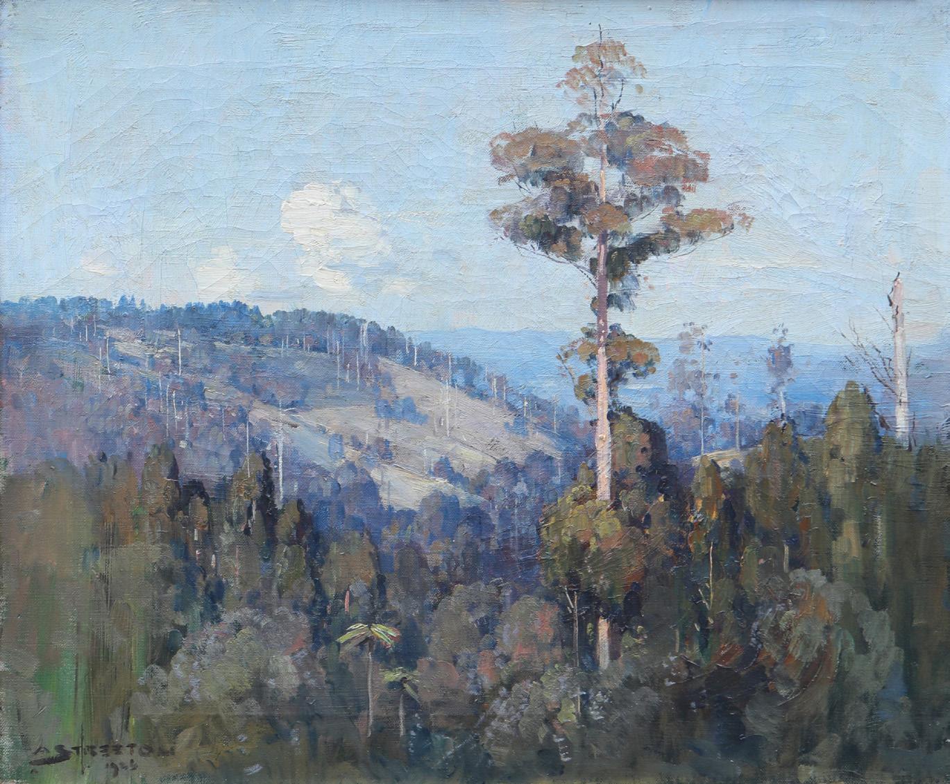
With their remarkable evocation of light, atmosphere, colour and form, Arthur Streeton’s landscapes remain among the most highly regarded and much-loved paintings in Australian art. From his sun-drenched impressionist scenes of the 1880s, to his joyful depictions of Sydney’s beaches and harbour in the 1890s and grand pastorals of the 1920s and 30s, he has bequeathed a rich legacy of images that celebrate Australia’s unique natural environment and continue to define our national consciousness. Among his later landscape achievements arguably most poignant are those inspired by Streeton’s time at Olinda in the Dandenong ranges – encapsulated magnificently by the present, Olinda landscape, 1935. Not only do such works remain unparalleled in their concerted quality, but they are significant for their sensitivity to place and to the conservation concerns of the artist who was staunchly opposed to the increasing devastation of the area’s native forests and trees.
After twenty-three years abroad as an expatriate in London, Streeton returned to Australia permanently in September 1923 and, following the private sale of his iconic Golden Summer, Eaglemont, 1889 (acquired by the National Gallery of Australia in 1995) for the extraordinary sum of 1000 guineas in 1924, was able to build a house on land he had purchased in 1921 at Olinda in the Dandenong Ranges. Initially a weekend retreat and place of contemplation before becoming his permanent home in 1939 after the death of his wife Nora, the house he built there – ‘Longacres’ –and the surrounding hills and panoramic vistas offered the perfect setting for Streeton to consolidate his appreciation of momentary sensations of colour and light and to explore new ways of representing the Australian landscape. As he wrote to his dear friend and fellow artist, Tom Roberts, ‘It’s refreshing to note how the old Dandenong Range takes hold directly as soon as you get there…’ 1 Living in this landscape, nurturing the indigenous trees on
his property, and blending them into a garden of introduced plants and flowers led to an intimate knowledge of the environment 2 –and in turn, some of his most enduring and memorable works.
Capturing the ephemeral beauty of the area, Olinda landscape exudes a tangible sense of the arcadian pleasure Streeton found in his self-made paradise through the charm of everyday domestic detail, the verve of the brushwork, and the easy harmony of the composition. Bathed in a gentle light that is uniquely Australian, indeed the work is notably bereft of political overtones in the vein of other Olinda paintings such as Last of the messmates, 1928 (private collection); The vanishing forest, 1934 (Art Gallery of Ballarat, on loan from the Estate of Margery Pierce), or particularly, the starkly confronting Sylvan Dam and Donna Buang AD 2000, 1940 (private collection) where Streeton not only documents the damage being wreaked on the natural world, but condemns with growing vehemence the commercial motivations underlying it. A passionate environmentalist in his later years, Streeton famously questioned why ‘should we suffer hundreds and hundreds of acres of valuable timber to be destroyed to facilitate some work of the moment when so little is gained for it?’ 3 Moreover, cultural historian Tim Bonyhady, has observed that from 1930 onwards ‘…one of Streeton’s refrains became that his ideal of an afterlife was not the ‘ghastly monotony’ of either heaven or hell but to come back to Olinda, haunt his Blackwoods and ‘scare the life’ out of anyone who cut down any of the t rees he had planted.’4
1. Streeton letter, 7 May 1923, cited in Galbally, A. (ed.), Letters from Smike: The Letters of Arthur Streeton, 1890 – 1943, Oxford University Press, Melbourne, 1989, p.170
2. Tunnicliffe, W., ‘The Big Picture: National Landscapes’ in Streeton, Art Gallery of New South Wales, Sydney, 2020, p. 260
3. Argus, Melbourne, 27 November 1925, p. 23, quoted in Eagle, M., The Oil Paintings of Arthur Streeton in the National Gallery of Australia, National Gallery of Australia, Canberra, 1994, p. 164
4. Bonyhady, T., ‘Beware of the Axe’ in Streeton, op. cit, p. 313 Veronica Angelatos
oil on canvas
65.0 x 81.0 cm
label attached verso: 6
Estimate: $1,200,000 – 1,800,000
Provenance
Madam Lecoin, Brittany, France Thierry-Lannon & Associés S.A.R.L., Brest, France, 10 December 2011
Private collection, Melbourne Private collection, Perth
Exhibited
John Peter Russell, Galerie G. Denis, Paris, 1941 / 1943 (?), cat. 50 (label previously recorded by Galbally verso, as ‘Les Meules a Monte Cassino’)
John Peter Russell 1858–1931: Australian Impressionist, Wildenstein & Co. Ltd, London, July – August 1965, cat. 12
Literature
Galbally, A., The Art of John Peter Russell, Sun Books, Melbourne, 1977, cat. 75, pl. 18 (illus.), p. 101
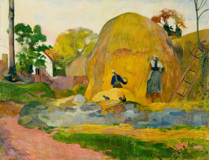
Vincent Van Gogh Haystacks, 1888
Gifted to John Peter Russell by Vincent van Gogh in 1888 reed and quill pens and brown ink over graphite 24.0 x 31.0 cm Philadelphia Museum of Art, Philadelphia

Auguste Rodin
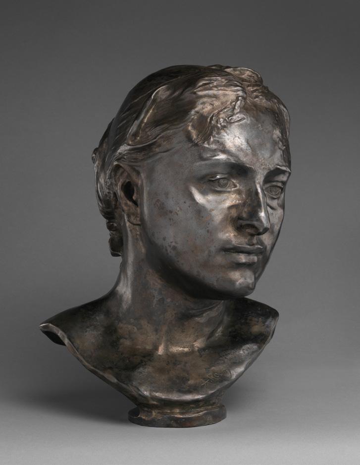
Mrs. Russell (Mariana Mattioco della Torre), 1888, cast 1979
Cast by Georges Rudier (active 1954 – 1969, French)
silvered bronze
35.2 cm (height)
The Metropolitan Museum of Art, New York
John Russell’s inherited wealth afforded many freedoms, setting him on a unique path unlike that of any other Australian artist of the time and bringing him into direct contact with some of the masters of European Impressionism and PostImpressionism. No longer expected to join the family business following the premature death of his father and now in possession of a substantial fortune, he sailed to England in 1880, enrolling at London’s Slade School the following year. Continuing his studies at Fernand Cormon’s atelier in Paris in the mid-1880s, he worked alongside Émile Bernard, Henri de Toulouse-Lautrec and later, Vincent Van Gogh. The two artists established an enduring friendship which is documented in their personal correspondence.1 Russell was also one of the few artists to paint Van Gogh and the 1886 portrait, now in
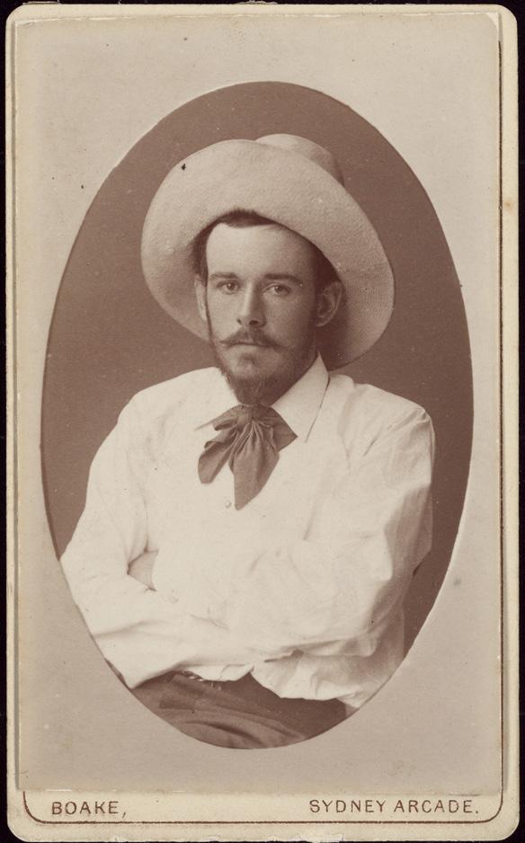
John Russell, c.1883
photographer: Barcroft Capel Boake
National Art Archive
Art Gallery of New South Wales Archive
the collection of the Van Gogh Museum in Amsterdam, was treasured by the Dutchman who asked his brother Theo to ‘take good care of my portrait… which means a lot to me.’ 2
Around 1884 Russell met Marianna Mattiocco, probably in the studio of his friend, the British artist Harry Bates. Born into a farming family at Cassino, Italy, in 1865, Marianna and two of her brothers had moved to Paris, initially working as roving street performers and later, as artists’ models. Widely regarded as a classical beauty, Marianna was probably the model for Bates’ bas-relief sculpture, Dido, Queen of Carthage, 1885 (National Museum of Wales, Cardiff). 3 Russell’s first dated drawings of Marianna are from 1886 and as Russell scholar Ann Galbally has noted, their inscriptions, which refer to her
65.0
Private collection, on loan to The National Gallery, London
as Marianna Antonietta Russell (or M.A.A.R.), indicate the strength and seriousness of their relationship at the time even though they didn’t marry until early 1888.4 In the lead up to their marriage, Russell commissioned Auguste Rodin to sculpt a portrait of Marianna which he requested to be cast in silver so that it would have ‘all the delicacy of [the master’s] touch.’ 5 This commission initiated a longstanding friendship between the two artists and the silver bust, now in the collection of the Musée d’Orsay in Paris, was followed by a unique variation in bronze which is held by the National Gallery of Victoria.6
During the summer of 1886, the couple spent several months on Belle-Île, one of a group of small islands off the coast of Brittany. It was a momentous visit. Captivated by the rugged beauty of the island and attuned to the possibilities that the environment and the simple, rural way of life presented for his art, Russell bought land overlooking the inlet of Goulphar the following year, writing to his friend, Tom Roberts, ‘I am about to build a house in France. Settle down for some five years. Get some work done. It will be in some out of the way corner as much as a desert as possible.’ 7 It was during the same summer that Russell met and befriended Claude Monet who he saw working en plein air, famously
introducing himself by asking if Monet was indeed ‘the Prince of the Impressionists’. Monet, who was eighteen years Russell’s senior, took a liking to the young Australian and dined with him and Marianna, enjoying their hospitality and company during his stay on the island. Monet also allowed Russell to watch him work and on occasion, to paint alongside him – experiences that provided an extraordinary insight into the techniques and working method of one of the founders of the Impressionist movement.
Soon after, Russell and Marianna went to Italy, visiting her family in Cassino and in spring of the following year, travelling to Sicily where they established a base in the hilltop town of Taormina. The influence of the encounter with Monet on Belle-Île was significant and, stimulated by the clarity of the Mediterranean light, almost immediately Russell began working in a new way, creating compositions made up of pure strokes of high-keyed colour and removing black from his palette altogether. 8 The clean, bright colours of Peasant women at Monte Cassino, 1886 (National Gallery of Australia) reflect these changes in approach, but it is in later paintings made around the time of a second visit to Cassino in 1889, such as The terraces of Monte Cassino, c.1889 (private collection) and the current work, Meules
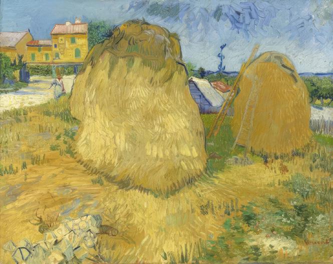
Vincent Van Gogh
Haystacks in Provence, 1888 oil on canvas
73.5 x 93 cm
Kröller-Müller Museum, Otterlo, Netherlands
Vincent Van Gogh
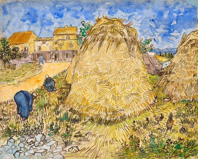
Meules de blé, 1888 gouache, watercolor, pen and brush and black ink over pencil on paper
48.5 x 60.4 cm
Private collection
Sold Christie’s, New York, 11 November 2021, for USD 35,855,000 (inc. bp)
Paul Gauguin
Les Meules jaunes, 1889
73.0 x 92.5 cm
Musée d’Orsay, Paris
de Blé à Monte Cassino, c.1889, which show increasingly bold colour choices. Monet’s brilliantly coloured paintings of Antibes, which Russell saw in Paris in 1888, also influenced his chromatic experimentation during these years, feeding into his development as a brilliant and often daring colourist. Writing to Tom Roberts, Russell’s excitement about the possibilities of colour (and specifically the subject-matter of Belle-Île) is palpable, ‘But when we get to color. The gorse & heather. Yellow & purple, orange boat sails, blue sea, red rocks, green sea. All a matter of feeling. Tis in the man with brush & paint pot or it is not.’ 9
Meules de Blé à Monte Cassino takes in a view of the distant mountains, purple and white beneath a band of blue sky, with green fields in the middle distance and in the foreground, a vernacular stone building and trio of dome-shaped haystacks that glow in dazzling shades of orange, yellow and red. Deep purple shadows contrast with the shimmering golden hues of the central haystack, suggesting late afternoon and adding emphasis to the labouring lone figure. Such subject matter reflects the prevailing influence of Barbizon School painter Jean-François Millet (1814 –75), whose paintings celebrated the nobility of peasant workers and a growing recognition at the end of the nineteenth century that this way of life was disappearing. This romantic notion of rural life was popular among contemporary artists and in addition to featuring in their imagery, was reflected in the choice that some made to live outside of the city centres.10 With the aim of
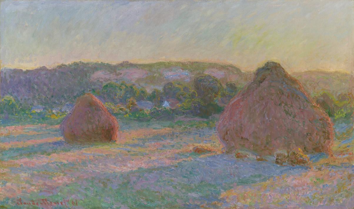
Claude Monet
Stacks of Wheat (End of Summer), 1890 – 91 oil on canvas
60.0 x 100.5 cm
Art Institute of Chicago, Chicago
establishing ‘a studio of the south’, Van Gogh moved to Arles in the south of France in early 1888, where harvest scenes became a familiar part of his subject matter. Indeed, one of the twelve ink drawings that he gave to Russell in 1888 – and one which Russell later gave to Matisse when he visited Belle-Île11 – describes a pair of haystacks similar to those depicted in Meules de Blé à Monte Cassino. Writing to Russell in the summer of 1888, Van Gogh said, ‘For ever so long I have been wanting to write to you – but then the work has so taken me up. We have harvest time here at present and I am always in the fields… Am working at a Sower. The great field all violet, the sky and sun very yellow.’ 12
The work of Paul Gauguin, who joined Van Gogh in Arles for two months in late 1888, also featured similar subjects and his painting, Yellow Haystacks (Golden Harvest), 1889 (Musée d’Orsay, Paris) celebrates local agricultural workers in a vibrant and bucolic rural scene. It was, however, Monet who made the subject most famous in his renowned series of haystack paintings created between 1890 – 91. Towering stacks of hay in the field adjacent to his house at Giverny inspired the series of thirty or so canvases which he developed en plein air, moving between several easels at a time, as well as in the studio. It was the first series in which Monet focussed on a single subject, revisiting it at different times of the day and in different seasons, under varied weather and light conditions, his primary motivation being to record the full scope of chromatic and atmospheric effects.
‘For me a landscape hardly exists at all as a landscape, because its appearance is constantly changing; but it lives by virtue of its surroundings, the air and the light which vary continually.’ 13
1. Although Russell did not see van Gogh again after he departed for Arles in the south of France in early 1888, their friendship continued via correspondence. See Galbally, A., A remarkable Friendship: Vincent van Gogh and John Peter Russell, The Miegunyah Press, Carlton, 2008.
2. Taylor, E., ‘John Russell and friends: Roberts, Monet, van Gogh, Matisse, Rodin’, Australian Impressionists in France, National Gallery of Victoria, Melbourne, 2013, p. 56
3. See Onfray, G., translated by Lucie Reeves-Smith, ‘The most Breton of foreign painters of the era’, John-Peter Russell, Un impressionniste australien, Musée des Jacobins, Morlaix, 1997, pp. 8 – 9; Galbally, A., The Art of John Peter Russell, Sun Books, Melbourne, 1977, p. 28; and Tunnicliffe, W., (ed.), John Russell: Australia’s French Impressionist, Art Gallery of New South Wales, Sydney, 2018, p. 26
4. Galbally, ibid., pp. 28-29
5. John Peter Russell to Auguste Rodin, 17 October 1888, cited in Dunn, J., ‘An enduring regard: Russell and Auguste Rodin’ in Tunnicliffe, op. cit., p. 123
6. See Dunn, ibid., pp. 122 – 125
7. John Peter Russell to Tom Roberts, 5 October 1887, cited in Tunnicliffe, op. cit., p. 193
8. See Taylor, op. cit., p. 60
9. ibid., p. 195
10. See Galbally, 1977, op. cit., p. 45 – 49
11. See Spurling, H., ‘Henri Matisse on Belle-Île’ in Tunnicliffe, op. cit., pp. 130 – 137
12. Vincent Van Gogh to John Peter Russell, cited in Tunnicliffe, ibid., pp. 204 – 205
13. Claude Monet, cited in Getty Museum Collection database, entry for Wheatstacks, Snow Effect, Morning (Meules, Effet de Neige, Le Matin), 1891 at: https://www.getty.edu/art/ collection/object/103RK8 (accessed 30 March 2026)
Kirsty Grant
(conceived in 1884, this bronze version was cast in an edition of 12 by the Musée Rodin, Paris, completed in 1963)
bronze
62.0 x 29.8 x 25.0 cm
edition: 12/12
signed at base: A. Rodin
bears foundry inscription at base: Georges Rudier / Fondeur. Paris. bears inscription at base: © by Musée Rodin 1963
Estimate: $120,000 – 160,000
Provenance
Musée Rodin, Paris
David Jones Art Gallery, Sydney
Private collection, acquired from the above in November 1965
David Jones Art Gallery, Sydney
Michael and Suzanne Kent, Adelaide, acquired from the above in March 1986
Private collection, Adelaide and Melbourne, acquired from the above in June 2003
Thence by descent
Private collection, Melbourne
Exhibited
Rodin – sculpture and drawings, David Jones Art Gallery, Sydney, 2 – 26 June 1965
Rodin, National Museum of Western Art, Tokyo, 23 July – 11 September 1966, cat. 24 (another example)
French & English: Sculpture, Paintings, Drawings, Browse and Darby, London in association with David Jones Art Gallery, Sydney, 6 February – 1 March 1986, cat. 8
Rodin et la Porte de l’Enfer (Rodin and the Gates of Hell), National Museum of Western Art, Tokyo, 21 October – 17 December 1989, cat. 39 (another example)
Auguste Rodin, Das Höllentor: Zeichnungen und Plastik, Städtische Kunsthalle Mannheim, Mannheim, Germany, 28 September 1991 – 6 January 1992, cat. 56 (another example)
Rodin. L’exposition du centenaire, Musée Rodin and Réunion des Musées Nationaux – Grand Palais, Paris, 22 March – 31 July 2017, cat. 278 (another example)
National Touring Exhibition of Western Art from the NMWA: When Here and Afar Meet: Western Art in Yamagata / Western Art in Takaoka, Yamagata Museum of Art, Yamagata, 17 July – 27 August 2021; Takaoka Art Museum, Toyama, 10 September – 24 October 2021, cat. Y1_6 | T3_39 (another example)
Renoir, Monet, Gauguin: Images of a Floating World: the Collections of Kōjirō Matsukata and Karl Ernst Osthaus, Museum Folkwang, Essen, Germany, 6 February – 15 May 2022 (illus. in exhibition catalogue, another example, p. 237)
Literature
Grappe, G., Catalogue du Musée Rodin, Paris, 1938, cat. 97 (illustration of the plaster)
Hubacher, H., Rodin, Editions Muckleman, Zurich, 1949, pl. 37 (illus., another example)
Charbonneau, J., Les Sculptures de Rodin, Fernand Hazan, Paris, 1949, cat. 38, pl. 38 (illus., another example)
Jianou, I. & Goldscheider, C., Rodin, Arted Editions d’Art, Paris, 1967, p. 90 (other examples)
Le Normand-Romain, A., The Bronzes of Rodin, Catalogue of the Works in the Musée Rodin, Éditions de la Réunion des Musées Nationaux, Paris, 2007, vol. 2, p. 628 (illus., another example)
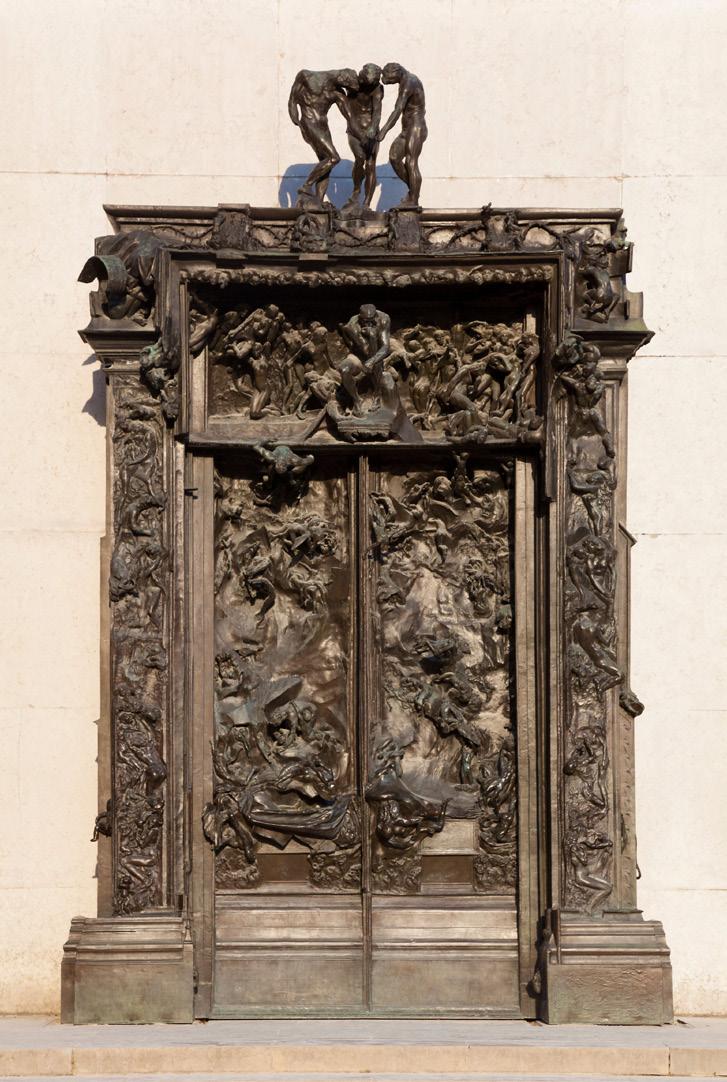
635.0
In 1880, Auguste Rodin, growing in fame as a figurative sculptor within the Parisian salons, was awarded a commission from the French Government for a monumental entranceway for a planned, democratic Musée des Art Décoratifs in the place of the old Cour des Comptes, which had burnt to the ground during the 1871 Paris Commune. Although never fully realised during his lifetime, the resulting huge gate, La Porte d’Enfer (Gates of Hell), conceived with a slow and cumulative genesis over several decades, became the ultimate masterpiece of Rodin’s illustrious career. Although Rodin had completed by the mid-1880s a life-size plaster maquette, the construction of the intended museum had stalled.1 An incomplete version of the plaster maquette (devoid of its high-
relief figures) was exhibited only once during Rodin’s lifetime, at the Exposition Universelle, in Paris in 1900, and full bronze casts of the gates were only fabricated posthumously from 1917.
Towering over six metres high and containing a great compendium of Rodin’s figurative oeuvre with over two hundred distinct forms, the Gates of Hell was a daringly modern Symbolist composition. Gestural and metamorphic, the writhing, anonymous spectres in bas and high relief throughout the Gate were the product of an extraordinary creative endeavour, the intensity of which ‘had no precedent in the history of art.’ 2 While informed by Charles Baudelaire’s controversial modernist poetry in Les fleurs du mal (1857), Rodin’s tormented vision of modern life portrayed within the gates was also inspired by two iconic medieval works. Thematically based in the conception of hell presented in Dante Alighieri’s fourteenth century epic poem The divine comedy – with Rodin including a handful of named characters – the format of the Gates’ panelled double doors was intended to be an infernal, disordered counterpoint to Lorenzo Ghiberti’s gilded bronze doors, Gates of Paradise, 1425 – 52, at Florence’s Baptistery of San Giovanni.
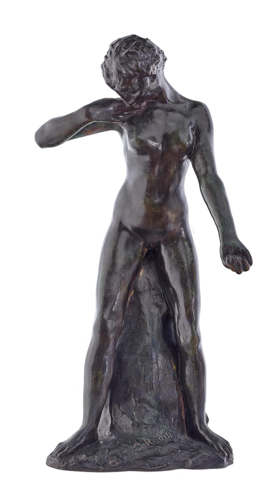
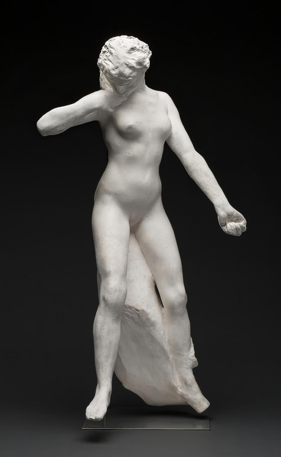
The plaster life-size maquette of the gate remained within Rodin’s studio throughout the remainder of his career, becoming a cumulative receptacle for all his ideas and fantasies, and in turn feeding his oeuvre. By the mid-1880s, it became the source of his most famous, standalone works – including The thinker, 1904 and The kiss, 1882 and a myriad of smaller individual figurines, including the present La faunesse debout, 1884 which Rodin began to isolate and exhibit independently.
La faunesse debout, a female mythological creature, had been a semi freestanding projection in high relief in the far right of the gate’s tympanum. Rodin generated a series of faunesses in various poses from this same section, in plaster (posthumously editioned in bronze), and later also carving larger marble sculptures of the motif. A fragment of the monumental whole, here the fauness is transferred into an independent context, as an intimate figure study based in a non-Christian past. 3 Although some of these figures were
truncated as a result of their extraction, La faunesse debout remained intact and formally complete. Rodin kept many of these figures in small sizes, to dispel rumours that his expressive and lifelike forms had been moulded from nature.4
Brazenly showing her naked body in the uninterrupted light at the front of the tympanum, and even more so later as an individual figurine, La faunesse debout is an expression of Rodin’s unorthodox iconography based on a self-taught understanding of mythology and literature. In classical Greece and Rome, the faun was the spirit of the woods, the ‘selva oscura’ at the beginning of Dante’s canto. During the 19th century, however, the male faun took on erotic connotations for writers, artists and choreographers, becoming the embodiment of natural desire. While Victor Hugo spoke of the faun being a ‘god of ill repute’ with a ‘lustful eye’, the sensual figure was taken to extremes in Stéphane Mallarmé’s 1876 symbolist poem L’après-midi d’un faune, infamously performed by the Ballets Russes in 1912. 5
Presenting the extricated figurines in various forms of formal completion, Rodin invited the viewer into a privileged creative position. Here he emphasises the faunesse’s smooth, sinewy and sensual figure, while leaving her head and hair roughly hewn from the plaster mass, suggesting a oneness with nature. Looking to the sculptors of antiquity, Rodin sought to create a lively and expressive physicality, the tension of the faunesse’s arm and body contrasting with the solidity of her supports. Her weight is physically and metaphorically counterbalanced on the rock behind her, while she stretches languorously. While some critics deplored that individual figures became ‘indecent’ when removed from the literary and thematic contexts of the larger Gates, Belgian critic Raymond Nyst wrote of the La faunesse debout in 1899, declaring her a ‘little wonder’, radiating with freshness and sensuality.6
1. Masson, R. and Mattiussi, V., Rodin, Flammarion and Musée Rodin, 2015, p. 29
2. Blanchetière, F., ‘La Porte d’Enfer’, Rodin. Livre du Centenaire, Réunion des Musées Nationaux, Grand Palais, Paris, 2017, p. 60
3. Elsen, A., ‘The Gates of Hell: What They Are About and Something of Their History’ in Rodin Rediscovered, National Gallery of Art, Washington, 1981, p. 63
4. Auguste Rodin cited in Masson and Mattiussi, op. cit., p. 25
5. Bonafoux, P., Rodin and Eros, Thames and Hudson, London, 2012, p. 89
6. Nyst, R., ‘Rodin’, La Gerbe, Brussels, no. 1, Juillet 1889, p. 7
Lucie Reeves-Smith
Auguste Rodin
Faunesse standing, before 1887 plaster statuette
61.5 x 24.7 x 16.0 cm
Musée d’Orsay, Paris © Rodin Museum Photographic Agency / Pauline Hisbacq
Godfrey Miller (1893 – 1964)
Summer (2), 1960 – 64
oil, pen and ink on canvas
68.5 x 86.0 cm
signed lower right: Godfrey Miller
Estimate: $200,000 – 300,000
Provenance
Artarmon Galleries, Sydney Private collection, Melbourne, acquired from the above in 1980s
Exhibited
possibly Godfrey Miller (self organised exhibition), Cell Block Theatre, East Sydney Technical College, Sydney, 24 – 25 October 1962
Godfrey Miller, on loan from the artist, Australian Galleries, Melbourne, 8 – 12 July 1963, cat. 3
Godfrey Miller Memorial Exhibition, Darlinghurst Galleries, Sydney, 16 February – 27 March 1965, cat. 2
Godfrey Miller 1893 – 1964, Art Gallery of New South Wales, Sydney, 15 March – 5 May 1996; National Gallery of Victoria, Melbourne, 15 May – 17 June 1996 (label attached verso)
Literature
Henshaw, J., Godfrey Miller, Darlinghurst Galleries, Sydney, 1965, n.p., pl. 38 (illus., as ‘Summer’)
Keavney, K., ‘Godfrey Miller. The man who became a legend’, Australian Women’s Weekly, Sydney, 16 November 1966, p. 10
Edwards, D., Godfrey Miller 1893 – 1964, Art Gallery of New South Wales, Sydney, 1996, pl. 69, pp. 76, 79 (illus.), 125
Related work
Summer, 1955 – 57, oil, pen and ink on canvas, 62.5 x 82.5 cm, private collection, illus. in Edwards, D., Godfrey Miller 1893 – 1964, Art Gallery of New South Wales, Sydney, 1996, pl. 68, p. 78 (as ‘Summer, c.1957 – 58’)
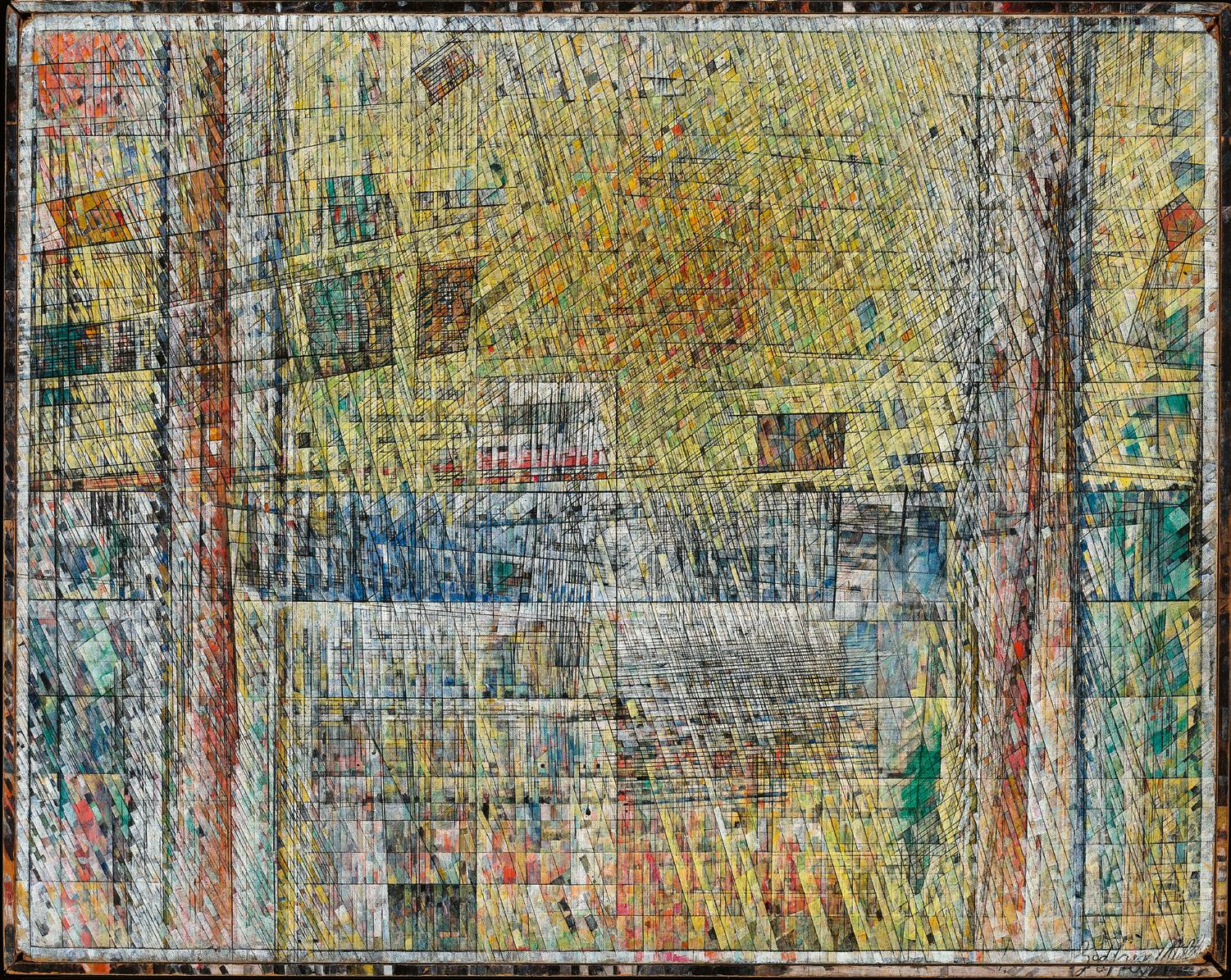
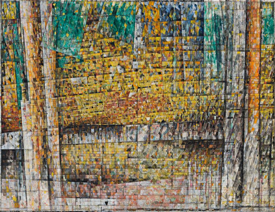
Private collection, Sydney
Following the death of Godfrey Miller in his near-derelict terrace house in Paddington, th e story of the reclusive artist and his unconventional life became widely discussed in magazines and the tabloid media. An article in the widely read Australian Women’s Weekly two years later for example, was richly illustrated with images of his work, and the lead photograph was Summer (2), 1960 – 64, pictured alongside some of the most abstract and intellectually rigorous paintings ever to grace their pages. Summer (2) was found sitting on the artist’s studio easel, leading the artist’s friend and biographer John Henshaw to identify it as the last work he had completed. Miller was known to work obsessively on each canvas, some over many years, enhancing and editing to the point that when he displayed a selection at Australian Galleries in 1963, the catalogue noted that the artist ‘was reported to have only finished thirty-nine paintings in his life.’ 1
Miller was also renowned as a draughtsman who created a raft of sketches over his career which are so spare of detail as to appear elemental. Henshaw’s monograph contains numerous examples of these, and those related to Summer (2) simply feature a series of vertical lines at eithe r side bis ected by a low
horizon. 2 A minimal three sets of lines which successfully invoke thrust, direction, design, tension, and balance, an armature for transmutation into the tessellated vision that is the final painting. Miller began his art studies prior to World War One and following his enlistment, was grievously wounded at Gallipoli in 1915. He underwent an epiphany during his long recuperation, deciding that he would ‘set himself to capture a feeling for the essence of things in the flux of changing experiences: to find a pictorial technique capable of celebrating both permanence and change at the same time.’ 3 From 1917, he recommenced his studies, first at the National Gallery School, Melbourne, then the Slade School of Art in London in 1929. Uncomfortable with the strictures of formal teaching, he explored Buddhist thought and in the late 1930s, participated in a three-month Rudolph Steiner course on colour at the Anthroposophical Centre in Switzerland. Miller observed that ‘Steiner uses the term ‘web-like’. ‘Lattice’ is the word of my own… When you have solid things you have no unity; when you draw them out to their parts (Plato would say their divine parts) you leap from solidness to an openness, a web or lattice.’4 Considering that Summer (2) was his final painting, it may also be interpreted as a total summation of Miller’s determination to reflect such underlying ‘truths’ and harmonies.
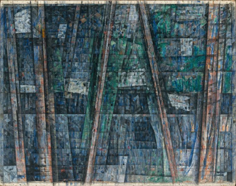
Godfrey Miller Blue unity, 1954 – 55 oil on canvas
69.8 x 88.2 cm
National Gallery of Australia, Canberra
One of the artist’s recorded aphorisms was: ‘reality is made of cadences, rhythms, materials – all that science ignores. The world is a beautiful mathematical unity which is unfolding in accord with its exact nature.’ 5 In Summer (2), Miller places as much emphasis on radiance as he does on structure. Its subject – the sun hovering over a low mountain range bracketed by trees – dissolves before the viewer’s eyes into tiny tiles of fragmented colour before re-assembling into the complete image, only to dissemble again, a continuous rhythm of entropic interplay that rewards each subsequent examination.
1. Caroline Field, Australian Galleries: the Purves family business. The first four decades 1956 – 1999, Australian Galleries, 2019, p. 100
2. Henshaw, J. (ed.), Godfrey Miller, Darlinghurst Galleries, Sydney, 1965
3. Smith, B., Australian Painting 1788 – 1970, Oxford University Press, Melbourne, 1971, pp. 302 – 303
4. Pearce, B., Parallel Visions: works from the Australian Collection, Art Gallery of New South Wales, Sydney, 2002, p. 104
5. John Henshaw, ‘Godfrey Miller’, Godfrey Miller, Charles Nodrum Gallery, Melbourne, September 2004, non-paginated Andrew Gaynor
Woman in a bath 5, 1963 – 64
oil, tempera and collage on board
213.0 x 183.0 cm
signed lower centre: Whiteley inscribed verso: FOR Whitechapel signed, dated and inscribed with title verso: “WOMAN IN A BATH” 5 1963 – 64 / OIL, TEMPERA + COLLAGE / Brett Whiteley
Estimate: $1,500,000 – 2,500,000
Provenance
Marlborough-Gerson Gallery, New York (label attached verso, as ‘Woman in a Bath No. 5’)
Marlborough Fine Art, London
Nevill Keating Pictures, London, acquired from the above in July 1985 Private collection, Melbourne, acquired from the above in 1985
Exhibited
Brett Whiteley, Marlborough New London Gallery, London, 1964 (exhibited but not catalogued in the 1964 exhibition)
The New Generation: 1964, Whitechapel Gallery, London, March – May 1964, cat. 45 (illus. in exhibition catalogue)
On Loan Private Collection, Bendigo Art Gallery, Victoria, December 2005 – May 2006 on long term loan to Bendigo Art Gallery from 1985
Literature
Pearce, B., Brett Whiteley: Art and Life, Art Gallery of New South Wales, Sydney, 1995, pl. 31 (illus.), p. 227
Sutherland, K., Brett Whiteley: A Sensual Line 1957 – 67, Macmillan Art Publishing, Melbourne, 2010, cat. LL2, pp. 100, 101 (illus.), 270
Wilson, A., Brett Whiteley: Art, Life and the Other Thing, Text Publishing, Melbourne, 2016, p. 105
Sutherland, K., Brett Whiteley: Catalogue Raisonné, Schwartz Publishing, Melbourne, 2020, cat. 69.63, vol. 1, p. 171 (illus.), vol. 7, pp. 138 – 139
Related works
Woman in a bath 1, 1963, oil, tempera and collage on composition board, 183.0 x 188.0 cm, private collection, Switzerland Woman in a bath 2, 1963, oil, tempera and collage of canvas strips on board, 182.9 x 188.0 cm, Tate Gallery, London
Woman in a bath 3, 1963, oil, charcoal, tempera, material and collage on board, 146.8 x 120.2 cm, TarraWarra Museum of Art, Victoria Woman in a bath 4, 1963, reworked 1964, oil, paper, graphite and tempera on board, 183.1 x 218.7 cm, Art Gallery of New South Wales, Sydney
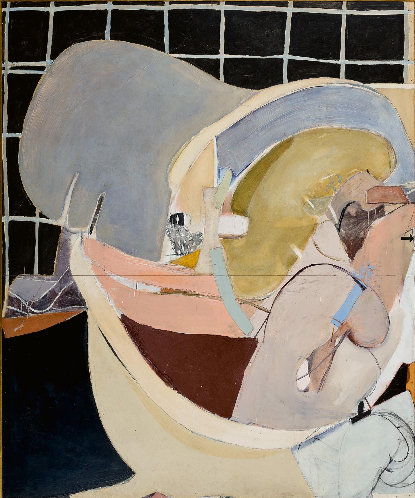
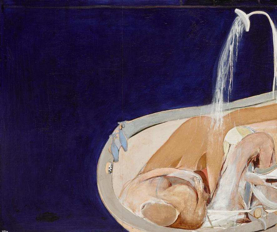
Brett Whiteley Woman in a bath 4, 1963, re-worked 1964 oil, paper, fabric collage, graphite and tempera on plywood
183.1 x 218.7 cm
Art Gallery of New South Wales, Sydney © Wendy Whiteley/Copyright Agency, 2026
The sophistication of Brett Whiteley’s abstract paintings astounded audiences upon his arrival in London in November of 1960, quickly drawing the attention of fellow artists, influential curators and directors of museums. The late inclusion of three of his paintings, as a ‘perfect youthful climax... serving as its focal point’ to Bryan Robertson’s survey exhibition of Recent Australian Art at Whitechapel Gallery in June 1961, and the subsequent acquisition of one of these by the Tate collection, secured without a doubt the noticeable arrival of the young Australian into the international art scene.1 In October 1959, the wunderkind Whiteley had won the Flotto Lauro Italian Government Travelling Art Scholarship, enabling him to travel from Australia to Florence and Rome with a ten-month bursary. The wholly original abstract paintings that came from Whiteley’s exposure to the Italian landscape and the influence of its Renaissance masters resonated with an astounding authority and a material richness that would continue to develop throughout his career. The pivotal professional opportunity provided by this scholarship, however, came at the cost of a physical separation from Wendy Julius, a young arts student in Sydney with whom he had begun a passionate relationship.
Whiteley’s first sustained body of work, painted in London, was a suite of thirty-one abstractions of the landscape, executed in a restrained and sonorous palette of Italian sienna reds and creams, and composed of layered blocks of collaged textures. In March 1962, this large suite of paintings was exhibited in Whiteley’s first one-man exhibition at Matthiesen Gallery in London’s Bond St. While ostensibly working in the contemporary idiom of abstraction, Whiteley’s early paintings were undeniably sensual. Within their flat interlocking arrangements of voluptuous forms, they revealed the ever-present idea of her, the artist’s lover with whom he had reunited in June 1960. The presence of Whiteley’s eternal muse by his side in London, and their marriage in March 1962, became catalysts for the artist’s daring first steps towards figuration and provided the genesis of what would become his celebrated series of ‘the most sacred of secular subjects’ – a suite of nudes known as the ‘Bathroom series.’ 2
With its fusion of ambiguous, anatomically derived forms and bold monochrome and patterned planes, Woman in a bath 5, 1963 – 64 is the last in a suite of five monumental compositions of a female nude in a bathtub – the culmination of Whiteley’s
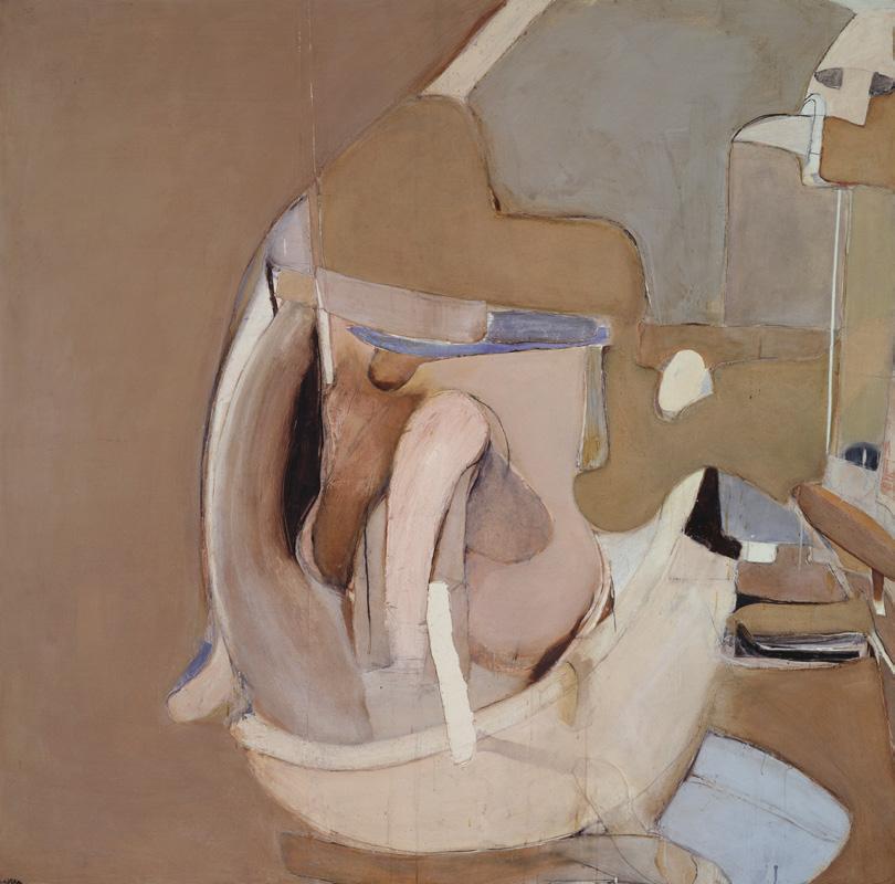
Brett Whiteley
Woman in a bath 2, 1963
oil and tempera on board, with collage of canvas strips
183.0 x 188.0 cm
Tate, London
© Wendy Whiteley/Copyright Agency, 2026
most lyrical and intimate expression of matrimonial love and dom estic harmony. Compressed within a shallow pictorial space, the rounded and simplified forms of Wendy’s naked body are curled in the right-hand corner of the frame, surrounded by sweeping blue arcs of water, barely contained by the graceful contours of an Edwardian clawfoot bathtub. The series of five interrelated paintings of Woman in a bath created between 1962 and 1964 were supported by a sequence of dynamic, largescale charcoal drawings executed in situ and then later worked into major semi-abstract and collaged paintings in the studio. As evidenced by Whiteley’s self-referential inclusion of a sheet of paper fixed to a board with a bulldog clip in the lower right-hand corner of Woman in a bath 5, the artist’s paintings record in one plane the observed cumulative movements of daily sessions of his wife bathing in their London flat at 13 Pembridge Crescent.
The fragmented forms within Woman in a bath 5 oscillate between representation and abstraction, the human figure not as easily discernible as in other versions of Woman in a bath. Anchored by the curved shapes of her back, Wendy’s arms
move through the spray of water, creating an active and dynamic figurative composition. These textured and collaged slabs are reminiscent of the shapes within Whiteley’s earlier abstractions, which ‘yearned to become figurative’ and seemed to encapsulate a sense of passing time. 3 A startling Pop Art inclusion into the picture plane – a small black arrow on the right-hand edge –indicates an attempt to depict movement and fluidity among the artist’s collection of compressed, flat shapes. A graphic device the artist would put to emphatic use in later works, such as Alchemy, 1972 – 73, the semiotic power of the arrow is explained another associated painting of the series, Bather showing arm movement, 1963, where at least five arrows are arranged in a clock-wise formation atop the centre of the painted image, accompanied by a note handwritten in pencil on the picture plane ‘arrows show the arm movement’. As noted by the critic from the Times reviewing the suite of Bathroom paintings when they were exhibited in Marlborough Galleries in April 1964, Whiteley’s emphasis on the flat and compact functionality of the apartment’s bathroom, devoid of ‘decorative overtones’, emphasised the ‘sensuous impact of the movements of the human bo dy which occupies it.’4
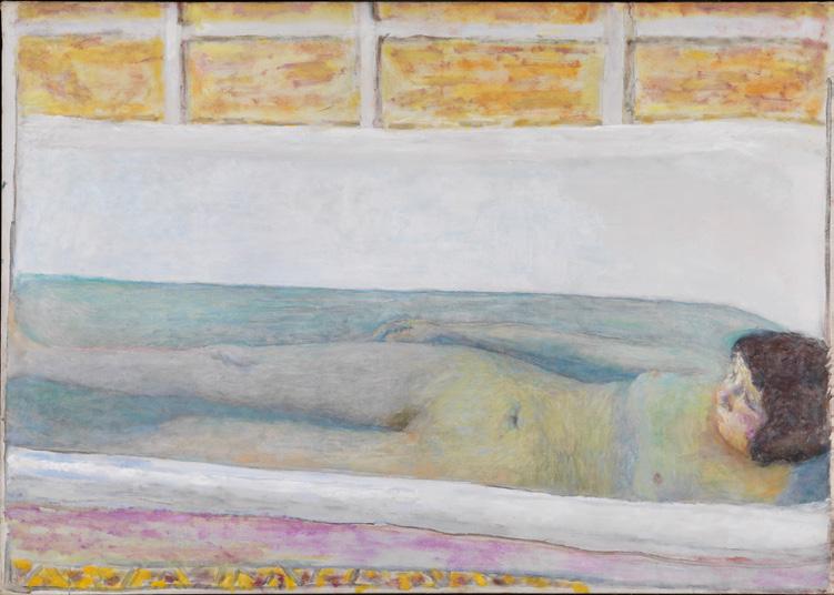
In March 1964, Woman in a bath 5 was selected alongside three large bathroom sketches on paper and board by Whiteley (Bather and mirror, 1964, Figure at the basin, 1963 and Sketch for large mirror painting, 1964) for inclusion in the inaugural exhibition of ‘The New Generation’ of British painters under thirty years old at Whitechapel Gallery, joining works by David Hockney, John Hoyland and Bridget Riley. Reviewers noted amongst these ambitious and confident large-scale works, a tendency for ‘extreme precision’ and ‘clear, flat colours.’ 5 Mostly devoid of modelling, the organic shapes within Woman in a bath 5, are presented as a collage of pure coloured blocks, brought to the front of the canvas, towards the viewer and the artist as he’s recording the scene, close enough to ‘reach out and tenderly caress the forms of his beloved.’ 6 Although Whiteley wrote in a statement for the catalogue of the Whitechapel exhibition in 1964, ‘all the paintings I have made in the last four years have been concerned one way or another with sex and the desire to record sensual behaviour’ 7, the disarticulated, awkward pose of Wendy in the bath here is intimate, but not erotic. His studies of her mundane, unguarded actions are reminiscent of Edgar Degas’ renowned series of pastel drawings of bathers produced circa 1890 – 1900. Like the French Impressionist had done, Whiteley’s obsessional recording of this domestic scene from an
adjoining room explored a restless series of variations in posture and position, her human form anchored by its relationship to the fixed objects of furniture in the room, and, in this version, the regular, graphic cross-hatching of black tiles in the background.
Whiteley’s departure from Australia and his travels through Italy, France, the UK and America between 1960 and 1964 had brought him into physical contact with the works of European Masters of the Italian Renaissance (according to Robert Hughes, reproductions of Piero della Francesca littered Whiteley’s London studio), alongside close collegiate contact with major figures in the artworld at the time such as William Scott, Willem de Kooning, Roger Hilton, Philip Guston and Francis Bacon – all of whom would have a stylistic impact on Whiteley’s Bathroom series as he was finding his feet between abstraction and figuration. From these peers he adopted jarring passages between floating forms, a containment of a wild figurative energy, a childlike simplification of the human body and a fragmented manipulation of the human form within a contained space. The formidable presence of Francis Bacon in particular, is keenly felt within these paintings. Whiteley had been introduced to the titanic figure of contemporary figurative painting in 1961 following the opening of the Whitechapel exhibition, and the elder artist went on to actively
mentor Whiteley throughout the 1960s. Both artists during this time were applying themselves to the observation of mundane actions of everyday life, striking a balance between abstraction and figuration, consciously highlighting the vulnerability of the isolated human body with their raw, flowing and muscular manipulations of form. Reviewers of Whiteley’s exhibition of the Bathroom series in Marlborough Gallery in April 1964 were quick to point out what Sandra McGrath described as the ‘BonnardBacon axis.’ 8 Indeed, for all the stylistic distortions inherited from his peers practising a post-abstract revival of figuration, Whiteley’s avowed ‘compromise between abstraction and sensuality’ was imbued with the warm and candid adoration of Pierre Bonnard’s portraits of his new wife, Marthe at her toilette. 9
Whiteley’s association in London with the British painter William Scott provided the context for a crucial encounter with Bonnard’s daring investigations into the theme of the bathing nude. Wendy recalled that soon after their arrival in London, ‘we visited Bill Scott and there was the most amazing copy of that reclining Martha [sic] in the bath, the one that lies down, the Tate one... so it was incredible, but of course, Bonnard taught all of these people, Bill Scott, Brett, everyone.’ 10 Pierre Bonnard’s 1925 masterpiece, The bath, 1925 held in the collection of London’s Tate Gallery but first viewed by Whiteley as a painted copy, was Bonnard’s first realisation of a full-length reclining nude in the bath, an image that would preoccupy him over the next twenty years. Whiteley was undoubtedly struck by Bonnard’s fresh and confident manipulation
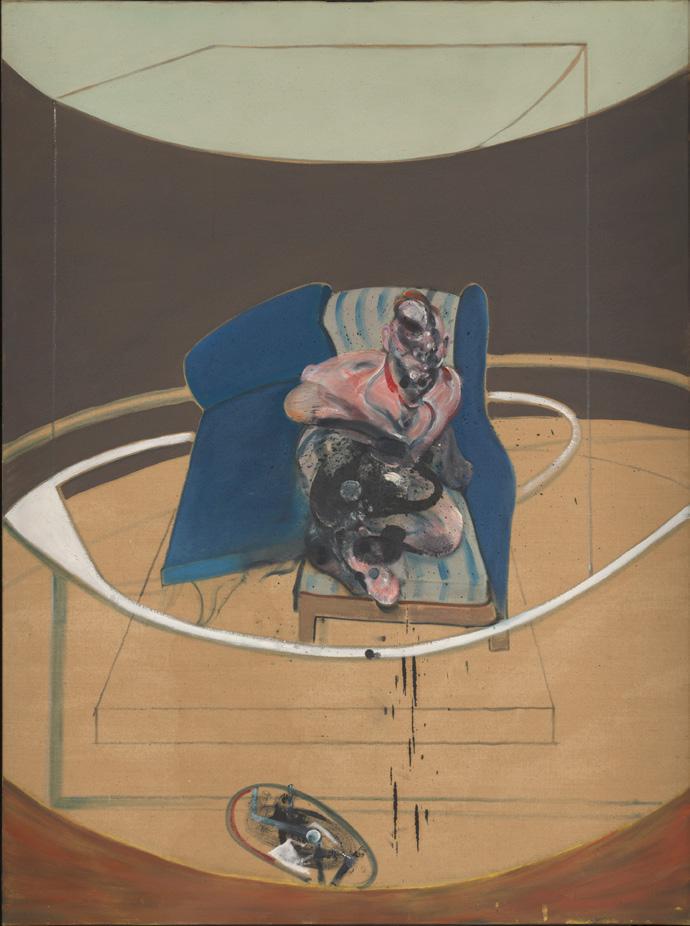
Study for Portrait on folding bed, 1963 oil and sand on canvas
78.0 x 58.0 cm
Tate, London
© The Estate of Francis Bacon
of perspective in this image, replicating it within his own Woman in a bath suite. Painted the same year Bonnard married Marthe, the quotidian regularity of his wife’s ablutions provided a stable subject for endless variations on a theme, as it did for Whiteley some thirty years later. As Bonnard had in versions of this theme, Whiteley has also inserted himself as an observer into the picture frame, not with a glimpse of his body but instead with the tools of his trade left evident in the foreground. Woman in a bath 5, replicates the patterning of The bath in particular its strong background of square tiles in the background, the cross hatching of its white grout loosely painted. The inky darkness of these tiles, and within sections of the bath in the foreground provide a recessive counterpoint to the apricot yellows, salmon pink and cream hues of the human forms viewed from above.
Brett Whiteley’s tender and confidently experimental suite of paintings of his new wife Wendy in the bath in their London flat, painted as his star was rising on the international art scene, constitute an early high point in their creative partnership.
They were Whiteley’s first forays into figuration and reveal his confident adoption of a myriad of artistic influences, both historical and contemporary. These paintings of a timehonoured tradition would become the first series in the theme of the female nude, which became the most celebrated and persistent motif within Whiteley’s extensive oeuvre.
1. Robertson, B., ‘The London Years’, in Pearce, B., Brett Whiteley: Art and Life, Art Gallery of New South Wales, Sydney, 2000, p. 9
2. Sutherland, K., Brett Whiteley. A Sensual Line, 1957 – 67, Macmillan Art Publishing, Melbourne, 2010, p. 91
3. McGrath, S., Brett Whiteley, Bay Books, Sydney, 1979, p. 35
4. ‘Painters New and Old from Three Continents’, The Times, London, 13 May 1964, p. 16
5. Wallis, N., ‘New Generation: 1964’, The Spectator, London, 3 April 1964, p. 18
6. Pearce, op. cit., p. 23
7. Brett Whiteley, cited in Recent Australian Painting, Whitechapel Gallery, London, 1961, n.p.
8. McGrath, op. cit., p. 40
9. Brett Whiteley, cited in a letter to George Sheridan, April 1964, cited in Sutherland, K., ‘The Nude: the Bathroom, the Bedroom and the Beach’ Sutherland, K., Brett Whiteley: Catalogue Raisonné, Schwartz Publishing, Melbourne, 2020, vol. 7, p. 12
10. Wendy Whiteley, cited in Sutherland, 2010, op. cit., p. 91
Lucie Reeves-Smith
Brett
oil on composition board
112.0 x 92.0 cm
signed lower right: Arthur Boyd
Estimate: $180,000 – 240,000
Provenance
Joseph Brown Gallery, Melbourne
Ted Lustig, Melbourne
Savill Galleries, Sydney (label attached verso) Private collection, USA, acquired from the above in 2007
Exhibited
Arthur Boyd, Savill Galleries, Sydney, 7 – 31 March 2007, cat. 8 (illus. on front cover of exhibition catalogue)
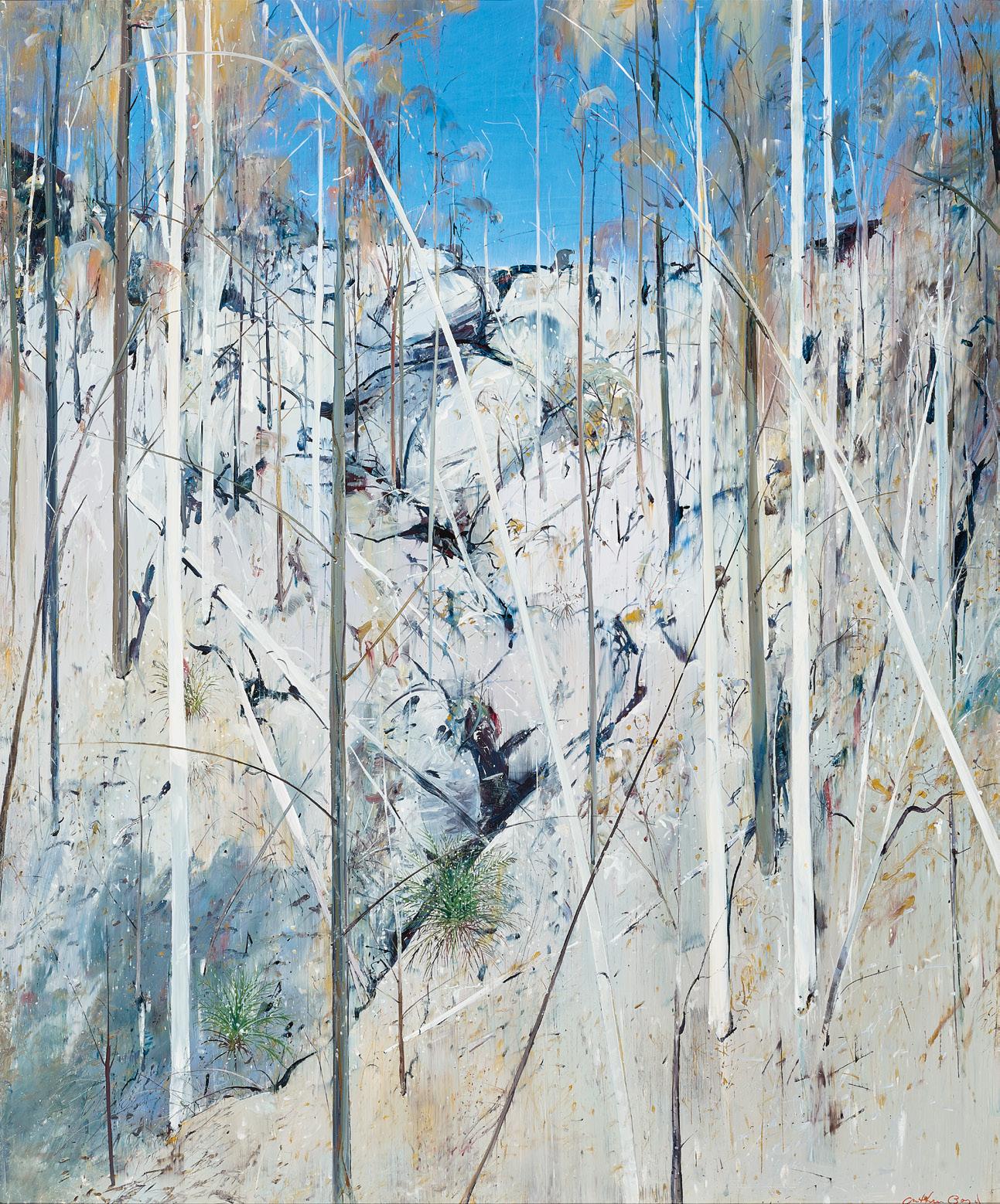
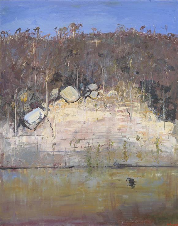
Arthur Boyd
On the banks of the Shoalhaven, 1980 – 85 oil on canvas
152.0 x 121.5 cm
National Gallery of Victoria, Melbourne © Arthur Boyd / Copyright Agency
‘The natural beauty of the Shoalhaven area caused Boyd to marvel constantly. His paintings are a celebration of grandeur and wonder of Nature. It is to Boyd’s credit that a single landscape can inspire such diversity of work. He gives us the impression that there are infinite possibilities, as long as we train ourselves to see.’ 1
Eager to rediscover his roots, his ‘Australianism’, after more than a decade abroad, in 1971 Arthur Boyd returned to the country of his birth to take up a Creative Arts Fellowship at the Australian National University in Canberra. Over the blazing summer of 1971 – 72, Boyd and his wife Yvonne were invited by the Sydney art dealer Frank McDonald to visit Bundanon for the weekend, staying at a home he shared on the south coast of New South Wales with art historian Sandra McGrath and her husband Tony. Here the artist’s joyful rediscovery of the Australian bush with its stark contrasts and clarity of light was nothing short of an epiphany, and thus in 1974, Boyd purchased the nearby property Riversdale on the banks of the Shoalhaven River. Once again, the magic of the dour, untamed Australian landscape became the impetus for his art, and over the subsequent twenty-five years until his death in 1999, Boyd would dedicate himself almost exclusively to capturing the myriad moods of the Shoalhaven in images that are today imprinted upon the national psyche as some of our most beloved and iconic.
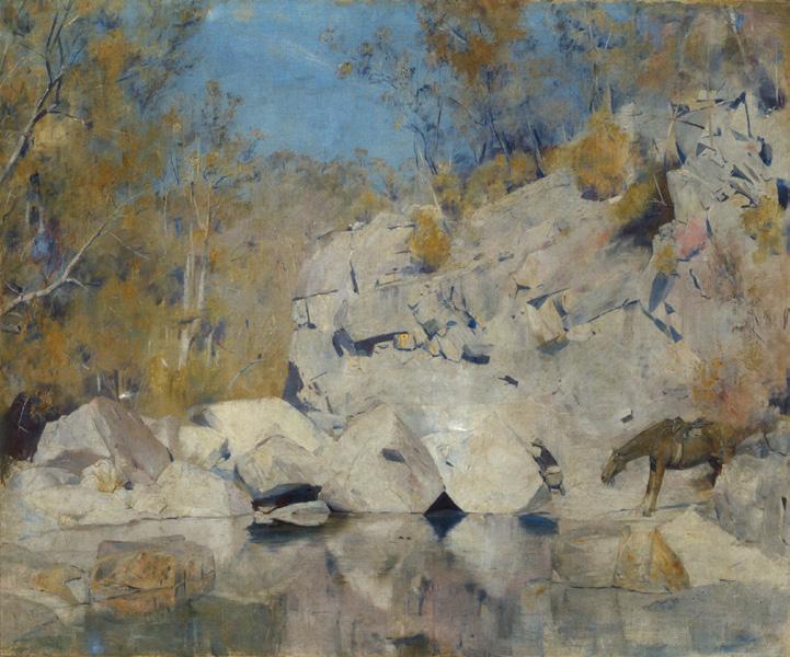
National Gallery of Australia, Canberra
Soul-piercing in its beauty, the Shoalhaven region offered both refreshing solace for the artist’s world-weary eyes, and endless potential as a subject – ‘the variation in the area with its great deep tones and high keys’ bearing strong affinities with music. As Boyd elaborated, ‘in the desert there is only one note, just one low singing note. In this landscape the tonal range – not tonal in the obvious sense of colour, but the actual fact of the horizon which can vary from very high to low, to infinite, depending on your line of vision – makes it a greater challenge. It has a knife-edged clarity. Impressionism could never have been born here, but Wagner could easily have composed here.’ 2
Wild and primordial, the region differed completely from the ordered English countryside to which he had grown accustomed and thus, a new vision was required to unlock its tangled mysteries. If previously Breughel and Rembrandt had offered inspiration, now Von Guérard, Piguenit and Buvelot became Boyd’s spiritual mentors. Yet at times, as McGrath notes, he also could not ‘resist the temptation to paint the landscape in the manner of the early Box Hill painters’ 3 – as witnessed by the present Hillside (Shoalhaven), c.1975 which evokes strong affinities with masterpieces of Heidelberg Impressionism such as Tom Roberts’ In a corner on the Macintyre, 1895 (National Gallery of Australia), both works featuring the motif of majestic sandstone
Arthur Boyd in his studio at his Bundanon property, November 1993 photographer: Robert Pearce
cliffs standing timelessly in the scorching sun to convey the unique stilln ess, light and poetry of the Australian bush.
Suffused with warmth and lyricism, Hillside (Shoalhaven) offers an exquisitely painted example of the early, ‘pure’ Shoalhaven landscapes which – devoid of the mythological creatures and symbolic narrative punctuating later versions –simply pay homage to the sheer beauty, grandeur and wonder of Nature. Capturing the region in the blistering heat of the midday sun, indeed the work is a poignant reminder of how Boyd, comfortable once more with the eternal diversity of the Australian landscape, ultimately did tame his wilderness: ‘... what was unfamiliar became familiar, what was menacing became friendly, what was awe some became intimate.’4
1. McKenzie, J., Arthur Boyd at Bundanon, Academy Editions, London, 1994, p. 42
2. Arthur Boyd, cited in Pearce, B., Arthur Boyd Retrospective, Art Gallery of New South Wales, Sydney, 1993, pp. 26 – 27
3. McGrath, S., The Artist and the Shoalhaven, Bay Books, Sydney, 1982, p. 63
4. ibid., p. 79
Veronica Angelatos
oil on canvas
101.5 x 107.0 cm
signed lower right: Fred Williams. inscribed with artist’s name, title and date on artist’s label verso bears inscription on artist’s label verso: No-36
Estimate: $300,000 – 400,000
Provenance
Private collection
Sotheby’s, Melbourne, 19 April 1993, lot 310
Private collection, Melbourne Private collection, Queensland Deutscher and Hackett, Sydney, 2 December 2015, lot 53
Private collection, Indonesia
Exhibited
National Travelling Exhibition: Fred Williams – paintings, gouaches, lithographs (Adelaide Festival Exhibition), Contemporary Art Society of Australia (SA) Inc., Adelaide, 16 March – 6 April 1978, cat. 41
Related works
Dry Creek Bed, Werribee Gorge I, 1977, oil on canvas, 182.3 x 152.2 cm, Tate, London
The river, Werribee Gorge, 1977, oil on canvas, 182.4 x 152.0 cm, Art Gallery of New South Wales, Sydney
We are grateful to Lyn Williams for her assistance with this catalogue entry.
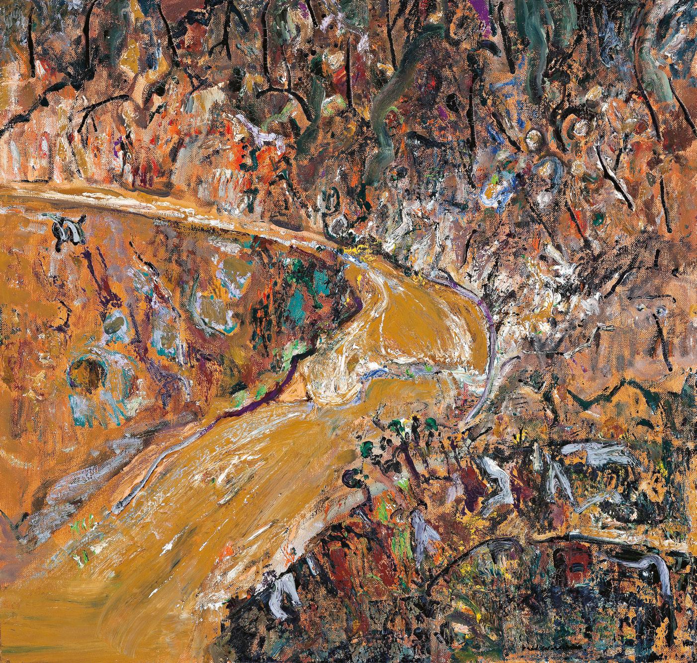
Fred Williams
Dry Creek Bed, Werribee Gorge I, 1977 oil on canvas, 182.3 x 152.2 cm Tate, London
© Estate of Fred Williams/Copyright Agency
On returning to Australia in December 1956 following art studies in London, Fred Williams stopped at Fremantle en route to Melbourne where he ‘h ad a moment of revelation when he saw the landscape around Perth and realised that under this huge sky, with its sweeping horizontal distances, the landscape was never going to compose classically. He thought, if it doesn’t compose then I’ll capitalise on that, and make the paint the focus of the picture.’ 1 In so doing, he laid down the template which saw him become Australia’s most significant postwar landscape artist, elevating relatively humble patches of scrub into sophisticated, painterly essays. By the late 1960s, his paintings had become so sparse, lean and devoid of colour that they were almost minimalist. In 1971, however, he visited Albert Tucker at his property in Queensland and at his host’s suggestion, experimented with synthetic polymer paints triggering a suite of paintings full of unexpected verve and colour. 2 Although he soon discarded the polymer, the experience unleashed what can only be considered as a second flowering in William’s career, with a disparate range of images bursting with richly hued vitality. He ‘became fascinated with the new palette and the properties of colour to the point of constructing colour charts and wheels. Yet these were largely discarded in the field. He followed his instinct.’ 3
To accomplish his ambitions, Williams, who had never learned to drive, initiated a weekly ritual whereby a fellow artist, beginning with John Perceval, would pick him up on a Wednesday and travel to the bush before setting up their easels ‘rain, sun or cold… [painting] feverishly for six hours.’4 In a newspaper interview, Williams said: ‘I accept any spot as a challenge. I find a trigger in the landscape for what I want to do.’ 5 The canvases would then be reworked wet-on-wet in the studio. Although the locations were usually non-heroic or epic, Williams was by 1976 increasingly attracted to gorges and waterfalls, ‘drawn to an elemental landscape where forces, which shaped the land, could be observed and painted.’ 6 These developed into what is now known as the ‘Gorge series’ of 1976 – 77, and Flooded creek, 1977, is one of his last responses to the motif before beginning a commission from Comalco Ltd to paint the Weipa district in farnorth Queensland. It appears to be a companion to such works as Dry creek bed, Werribee Gorge I (Tate Gallery, London) and The river, Werribee Gorge (Art Gallery of New South Wales), both painted the same year, and is a vivid response to the raging torrent of water engorged by recent rains. A number of the ‘Gorge series’ paintings feature sharply angled bends, described by Patrick McCaughey as ‘the great-angle hooks (whose) wiry, irregular
Fred Williams
The river, Werribee Gorge, 1977 oil on canvas
182.4 x 152.0 cm
Art Gallery of New South Wales, Sydney © Estate of Fred Williams/Copyright Agency
black line uncurves [sic] like a whiplash across the painting.’ 7
In Dry creek bed, Werribee Gorge I, an ancient creek bed lies exposed, deeply etched into the surface of the land. Although the landscape appears parched, Williams conveys a sense of renewal with signs of life seen in the scatter of plants around the creek bed. Flooded creek may well be from a similar location in Werribee Gorge, likely driven there by artist Fraser Fair – only now the vegetation blooms in response to the sudden amount of water.
The paint surface of Flooded creek is animated and vital, benefiting from Williams’ unusual tactics. John Brack, for example, who shared a studio with Williams in the late 1940s, described his approach as ‘‘farouche’: Tubes of paint were not unscrewed, they were simply chopped in half. The procedure was frenetic. Frequently, when the brush seemed too slow, the paint was added impatiently… with a rag.’ 8 This same sense of energy, an impatience to get his ideas onto the canvas, percolates throughout Flooded creek. Williams was once quoted as saying he didn’t like the Australian bush and the constant repetition of this contradictory statement in articles on the artist caused his wife Lyn to compose a firm rebuttal, stating ‘(c)ertainly he d id not like the bush the way a 19th century
Banjo Paterson-man liked it, because he was a 20th century city-bred person, as 90% of us are. He was not involved with the romantic myths of our bush-bred past but about how he perceived it today... He tried to maintain his objectivity, but as one of our daughters said, you only have to look at his paintings to know whether he cared about the landscape.’ 9
Flooded creek was also painted in the same year that Fred Williams became the first Australian artist to have a solo exhibition at the prestigious Museum of Modern Art in New York, which his dealer Rudy Komon proudly announced had completely sold out.10
1. James Mollison, cited in Balla Starr, ‘Interview with James Mollison’, Fred Williams: Pilbara series, University of Melbourne, Victoria, 2000, p. 4
2. Mollison, J., ‘Williams, Frederick Ronald (Fred) (1927 – 1982)’, Australian Dictionary of Biography, Volume 18, Melbourne University Press, Melbourne, 2012
3. McCaughey, P., The Later Landscapes of Fred Williams, La Louver, California, 2005, p. 11
4. McGrath, S., ‘Williams just can’t relax’, The Australian, Canberra, 6 May 1978
5. Fred Williams, cited ibid.
6. McCaughey, op. cit.
7. McCaughey, P., Fred Williams 1927 – 1982, Murdoch Books, Sydney, 1984, p. 297
8. Mollison, J., Fred Williams, Australian National Gallery, Canberra, 1987, p. 4
9. Williams, L., ‘Letter to the Editor’, The National Times, Canberra, 9 – 15 May 1982, p. 33
10. Fred Williams: landscapes of a continent, Museum of Modern Art, New York, 11 March – 8 May 1977
Andrew Gaynor
ink, pencil and a leaf on ruled paper on card
72.0 x 52.0 cm
dated lower centre: 7/9/73 dated lower right: 6/9/73 inscribed lower right: David / Genius…inventions. stamped lower right with artist’s chop
Estimate: $40,000 – 60,000
Private collection
Lasseter’s Gallery, Canberra, from 1989 Private collection, Canberra Private collection, Sydney
Literature
Sutherland, K., Brett Whiteley: Catalogue Raisonné, Schwartz Publishing, Melbourne, 2020, cat. 111.73, vol. 7, p. 281
Upon Brett Whiteley’s return to Australia in 1969, he left behind the surrealism, violence and social activism of his works produced in America, and stimulated by a brief sojourn in Fiji, henceforth devoted his art to ‘Baudelairean poems of the landscape’, dreams of a natural paradise, and self-reflexive ideas of life, death and artistic genius.1 Images of birds watching over their fragile eggs were central to these balancing, lyrical works of the 1970s, with Whiteley viewing the motif as a potent symbol of life force and creative renewal. As a young boy, Whiteley had been fascinated with birds’ eggs, collecting them obsessively and storing them in tiny cotton nests within a compartmented wooden case, which was later incorporated into the artwork The egg within, 1983.
(Study for a bird’s nest), 1973, drawn vigorously and freely in ink and pencil on graph paper and annotated with colour notes, is a large preparatory study for a painting that is yet to be identified, or was perhaps never realised. Drawing was a cornerstone of Brett Whiteley’s artistic practice and, for him, an activity ‘as normal as breathing.’ 2 Striking in its compositional simplicity, the titular bird with the large curved beak of a honeyeater or bee-eater guards proudly her nest tucked in the junction of thick, snaking branches of a tree. These branches are drawn authoritatively with the ‘quick + daring + precise’ medium of pencil on paper, counterbalanced by a series of emphatic, long black lines running down the right-hand side of the image. As can be ascertained from Whiteley’s hand-written notes, the background of the subsequent painting was intended to be a deep, monochrome plum hue against which the cream limbs of the tree would stand out. Depicted from above and tilted towards the viewer to provide a clear view, the concentric spirals of the bird’s nest are a clear focal point of this composition. They contain two or three speckled eggs, which gleam like precious
stones against their mother’s streaked plumage. Inserting a degree of authenticity to this sketch, Whiteley has affixed a real leaf to the drawing’s surface, linking it to a large suite of bird paintings of the 1970s and 1980s featuring collaged physical tree branches, birds’ nests, eggs and taxidermied animals.
The post-card decorative perfection of Whiteley’s bird paintings and drawings concealed psychological subject matter beyond the visible. Indeed, in the catalogue to his exhibition in 1979 at Robin Gibson Gallery, Whiteley explained that his paintings on the avian theme were linked to ‘states of mind.’ 3 (Study for a bird’s nest) was created shortly after two international trips taken by the Whiteleys: to Africa in June 1973, and to France in August 1973. Both trips brought Whiteley to places of significance in the lives of Charles Baudelaire and Arthur Rimbaud, luminary figures for the artist, to whom they represented the creative spirit – that of a tortured and romantic hero. Continuing his new-found habit of including written messages, warnings, presentiments and predictions within the picture plane, Whiteley has written a revelatory note in the lower right-hand corner of this sketch, linking the image of the egg to the idea of creative genius. ‘ David / Genius is really knowing which remark it is that convinces another person that one is in possession of genius. That’s all, in other words, genius is the most sensitive of human discovered inventions’, Whiteley writes, reflecting on the weight and responsibility of these qualities he admired in others and hoped to find in himself.4
1. McGrath, S., Brett Whiteley, Bay Books, Sydney, 1980, p. 94
2. Sutherland, K., Brett Whiteley: Catalogue Raisonné, Schwartz Publishing, Melbourne, 2020, vol. 7, p. 3
3. Brett Whiteley, cited in McQueen, H., ‘Brett Whiteley’, Art and Australia, Fine Arts Press, Sydney, vol. 17, no. 1, September 1979, p. 51
4. Wendy Whiteley has suggested that this reference could be to David Schaffer, a friend from London days with whom Brett reconnected later, in New York, email correspondence with Kathie Sutherland, March 2026 Lucie Reeves-Smith
Brett Whiteley (1939 – 1992)
2pm light early January 1984, 1984
mixed media on card on board
76.0 x 76.0 cm
signed, dated and inscribed lower left: ‘For Bob / 2pm light early January 1984 / study for the idea of playing with sound. ‘Gurgles’ / or Gurgling is better. / brett whiteley 2 – 9/1/84
Estimate: $400,000 – 600,000
Provenance
Private collection, Sydney, acquired directly from the artist Sotheby’s, Melbourne, 4 May 2004, lot 5 Company collection, Sydney Private collection, Sydney Deutscher and Hackett, Sydney, 2 December 2015, lot 50 Private collection, Indonesia
Literature
Sutherland, K., Brett Whiteley: Catalogue Raisonné, Schwartz Publishing, Melbourne, 2020, cat. 154.84, vol. 4, p. 269 (illus.), vol. 7, p. 639
Brett Whiteley
Summer at Carcoar, 1977
oil and mixed media on pineboard
244.0 x 198.7 cm
Newcastle Art Gallery, New South Wales
© Wendy Whiteley / Copyright Agency 2026
‘Of all the subjects Whiteley painted in his career, landscape gave him the greatest sense of release…’ 1
From his auspicious start as the youngest non-British artist ever to have a work acquired by London’s prestigious Tate Gallery, Brett Whiteley’s artistic trajectory was nothing short of astounding. Hosting his first solo exhibition at Matthiesen Gallery, London in 1962 at the age of 22, the fiery, tousle-haired wunderkind quickly made a name for himself internationally as an urgent, flamboyantly talented artist. After launching himself on New York for a brief period of turbulence, in late 1969 Whiteley returned to Sydney and embarked upon an artistic pilgrimage to rediscover his homeland. Captivated afresh by the beauty, vastness and variety of the Australian landscape, he explored first the changing chromatic illusions and ‘optical ecstasy’ of Sydney’s Lavender Bay in sumptuous Matisse-inspired tableaux, before subsequently revisiting the rolling landscape of his boyhood in the Western New South Wales towns of Oberon, Kurrajong, Marulan, Carcoar and Bathurst. Significantly, within the decade he had won all three of Australia’s most coveted art awards – both the Archibald Prize for portraiture and Sulman Prize for genre painting in 1976; the Wynne Prize for landscape in 1977; and all three prizes again in 1978 (the only artist ever to be so honoured in the same year).
By the early eighties when Whiteley painted 2pm light early January 1984, 1984, his fame was at its zenith. Yet lurking below such myriad accolades and the ostensible serenity of his art during this period was an increasingly torturous struggle with addiction – a self-destructive legacy borne from a visceral need to test his gift that had now become inextricably intertwined with his prodigious creative efforts. Which makes all the more remarkable the inherent calm and lyricism of the present exquisite landscape that captures the tough, arid beauty of a drought-ravaged Australian landscape in mid-summer. Bereft of angst or any trace of the psychologically gruelling challenges plaguing his life at the time, indeed the work exudes a quietude that perhaps reflects the brief success of his treatment abroad only months earlier. As Barry Pearce, Emeritus Curator at the Art Gallery of New South Wales, has elaborated, nature offered both a conceptual and real escape from not only the realities of daily existence, but from the equally clamorous pressures of his successes and vices: ‘… if in many of his other themes Whiteley confronted the difficult questions of his psyche, landscape provided a means of escape, an unencumbered absorption into a painless, floating world.’ 2
Oscillating between periods of extreme dependence on narcotics and restorative sojourns in the countryside (where the Whiteleys would invariably stay at the home of influential radio host, John Laws, in Oberon, or Michael Hobbs in Carcoar), significantly these years witnessed the production of some of
Brett Whiteley
The river at Marulan (…Reading Einstein’s geography), 1976 oil, electric light bulb and stones on plywood
20.3.2 x 122.0 cm
TarraWarra Museum of Art, Victoria © Wendy Whiteley / Copyright Agency 2026
the most beautiful, highly acclaimed landscapes of Whiteley’s career – aptly earning him the epithet of ‘chronologist of the golden paddocks, sensual hills and willow-strewn rivers of the central west.’ Culminating most famously in the two Wynne Prize-winning paintings – River at Marulan (…Reading Einstein’s geography), 1976 (private collection), and Summer at Carcoar, 1977 (Newcastle Art Gallery) – such works immortalised the sweeping landscape of his boarding school years in all its transient moods and seasons, bringing together birds, rivers, trees, rocks, skidding insects, and shy mammals (both painted and assemblage) with an elegiac majesty that defines the series.
Recalling the legacy bequeathed by artistic predecessors
Russell Dysdale and Sidney Nolan in their stark portrayal of the country’s parched interior, thus 2pm light early January 1984 similarly evokes the colour and drama of drought – presenting a theatre of death and survival in the same reductive palette of pale desiccated yellows and browns that Whiteley had so favoured in masterworks such as To Yirrawalla, 1971 (Art Gallery of New South Wales). Equally influential were the compositions of Lloyd Rees which Whiteley had first admired at Macquarie Galleries one day after school – landscapes deeply poetic in their contemplation of soft, voluptuous curves and arabesques all rendered with impeccable tonality. As he later recalled in a letter to his artistic mentor, ‘…They contained nature and ideas, they contained naturalism but seemed also very invented, and the adventure of them was that they showed
the decisions and revisions that had been made while they had been painted. I had never seen anything like that before… it set me on a path of discovery that I am still on today – namely that change of pace in a painting is where the poetry begins.’ 3
A romantic celebration of this region on a blazing summer afternoon, 2pm light early January 1984, encapsulates superbly such poeticism – featuring the artist’s signature stream meandering through the centre of the composition, amidst a sun-parched beige ground and rounded ochre boulders punctuated with the occasional hardy perennial. In stark contrast to his more troubled, visually demanding canvases of previous years, there is no artifice here – no anthropomorphic forms or flamboyant burlesques. To the contrary, the work is radiant with calm contemplation, lyrical lightness and keenly observed immediacy – a poignant homage to the landscape of his boyhood whose beauty had so profoundly influenced his choice of métier all those years ago. As Whiteley himself reflected upon these landscapes at the time, ‘…Sometimes I have to paint pictures that have an effortless naturalness, not artificial or synthetic, not manufactured – pictures that have no affectation through mental tricks, but graceful and according to nature.’4
1. Pearce, B., Brett Whiteley: Art and Life, The Art Gallery of New South Wales, Sydney, 1995, p. 196
2. ibid.
3. Whiteley cited in Klepac, L., Lloyd Rees – Brett Whiteley: On the Road to Berry, Heide Museum of Modern Art, Melbourne, 1993, p. 7
4. Whiteley cited in McGrath, S., Brett Whiteley, Bay Books, Sydney, 1979, p. 216
Veronica Angelatos
oil on composition board
65.5 x 82.5 cm
signed and dated lower left: JEFFREY SMART 64 inscribed with title verso: OUTSKIRTS ATHENS
Estimate: $300,000 – 400,000
Provenance
Macquarie Galleries, Sydney
Private collection, Sydney, acquired from the above in 1965 Christie’s, Melbourne, 2 May 2002, lot 70 Private collection, Sydney Deutscher and Hackett, Sydney
Private collection, Sydney, acquired from the above in April 2018
Exhibited
Jeffrey Smart, Galleria 88, Rome, 8 – 23 April 1965, cat. 9 Exhibition of Paintings, Jeffrey Smart, Macquarie Galleries, Sydney, 29 September – 11 October 1965, cat. 10
Literature
Quartermaine, P., Jeffrey Smart, Gryphon Books, Melbourne, 1983, cat. 454, pp. 109 (dated as 1965)
Capon, E., et al., Jeffrey Smart: Drawing and Studies 1942 – 2001, Australian Art publishing, Melbourne, 2001, fig. 8, pp. 70 (illus., dated as 1965), 202 Allen, C., Jeffrey Smart Unpublished Paintings 1940 – 2007, Australian Galleries Publishing, Melbourne, 2008, p. 127 (illus.)
Related work
Study for Outskirts, Athens, 1965, ink and watercolour on paper, 15.5 x 23.0 cm, illus. in Capon, E., et al., Jeffrey Smart: Drawing and Studies 1942 – 2001, Australian Art publishing, Melbourne, 2001, cat. 68, p. 70
We are grateful to Stephen Rogers, Archivist for the Estate of Jeffrey Smart, for his assistance with this catalogue entry.
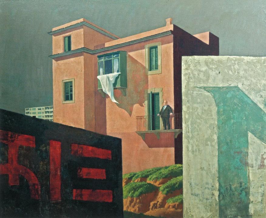
Jeffrey Smart
The Owner, 1964 oil on board
65.4 x 81.3 cm
Private collection © The Estate of Jeffrey Smart
Jeffrey Smart’s immaculately conceived landscape, Outskirts, Athens, 1964, with its arrangement of various corrugated hoardings in a harmonious palette of creams and pastels, presents a subtle interrogation on architecture, heritage and modernity. After having assiduously saved for many years, the young artist left Australia for Europe, arriving in London in February 1964 alongside his friend, painter Justin O’Brien. Each delighting in the history and culture of the continent, they visited museums and galleries in London and Paris, before purchasing a Simca touring car to make a 6000km journey to Greece for the spring and summer.1 The summer of 1964 in Greece would mark a period of prodigious creativity for both artists, with many great paintings, including Outskirts, Athens, realised during their long and idyllic sojourn on the Aegean island of Skyros.
With repeated corrugated fences obscuring views and the horizon line, Smart has deliberately truncated the scene presented within Outskirts, Athens. In contrast to the straightness of the fence blocking out the foreground, cleanly bisecting the picture plane, a multicoloured, patchwork fence runs along the crest of the hill in a jaunty zigzag throughout the middle of the picture plane. Smart has chosen to show the most coloured section of this barrier (and indeed the whole image) on an oblique angle, sharply shadowed against its pale and luminous flanks – a reference perhaps to the bleaching effects of time and the Athenian sun on a polychrome past?
The meticulously painted corrugation of these fences, rhythmic and alternately shadowed, starkly contrasts with smooth horizontal streaks of Smart’s unnatural sky. Throughout the centre of the frame, the embankment, the only organic element of the composition, is crumbling, its grassy topping spilling over the edges. Imposing control on the environment with structures both hard and straight edged, these painted hoardings herald the promise of post-war newness, hiding ground slated for destruction. Only a fragile string of freshly laundered clothes on a washing line visible in the centre of the image hints at human activity concealed in residential areas behind the series of hoardings. Ever the master of theatrical lighting, Smart intended to highlight this motif, noting in his preparatory sketch ‘light washing against shadowed fence.’
Outskirts, Athens, is set on the fringes of an ancient metropolis, where built structures ‘sit like monoliths.’ 2 Through the geographical specificity of the painting’s title and its carefully constructed composition, Smart evokes the hilltop citadel of classical Greek antiquity, the Acropolis. While in Athens, Smart had taken photos of promising motifs, contrasting the gleaming Parthenon with crowded tenements and factories at the foot of the Acropolis. 3 This tongue-in-cheek compositional reference equates the mundane and grimy architecture of the suburban fringe with the UNESCO world heritage site – the cradle of democracy, Western civilisation and great oratory. Ironically, the
Jeffrey Smart
Corrugated Giaconda, 1976 oil on canvas
80.8 x 116.6 cm
National Gallery of Australia, Canberra © The Estate of Jeffrey Smart
massive lettering painted on the foremost fence is tightly cropped and only partly visible, the Greek letters of alpha and theta being the only two letters clearly defined. This semiotic obscurity was Smart’s preferred way of visually critiquing a world in which so much is said loudly, yet so little is effectively communicated. These letters are the only indication that directly locates this scene to somewhere in Greece – the rest of the scene suitably anonymous and uniform to post-war continental Europe.
Painted on Skyros, in a rudimentary fisherman’s cottage the artists had rented for the summer, Outskirts, Athens, is in fact a composite image based on motifs seen during Smart’s travels through Europe up until this point. The extended stay on Skyros provided Smart with the first uninterrupted period of painting since he had left Adelaide. While Peter Quartermaine noted that the time in Athens provided Smart with ‘enough material for the whole Skyros period’4, with Smart producing images of suburban and industrial Athens during this time (including views of the port of Piraeus), Edmund Capon identified, through an ink and watercolour preparatory sketch, that the multicoloured fences and line of washing derived from a view from Porta Portese – one of the ancient city gates of Rome, where the friends had holidayed before arriving in Athens in April. 5
Outskirts, Athens was included in Jeffrey Smart’s first exhibition overseas, at Galleria Ottantotto, one of the best galleries in Rome
for contemporary art in the 1960s. Smart delivered the painting to the gallery in October 1964, with more works added before the exhibition opening in April 1965. This Roman exhibition marked the start of a period of artistic prosperity for Smart. Outskirts, Athens contains an array of Smart’s preferred motifs, many of which were reused in later artworks. Clearly pleased with its visual effect, Smart reused this same motif many years later in the background of The plastic tube, 1980 (private collection). While the concealing effect of placing large built structures in the foreground was reused in similar compositions around the same time, for example with similar truncated advertising lettering in The owner, 1964 – 65 (private collection), the motif of corrugated fencing became a favourite of Smart’s – used to great effect in Corrugated Gioconda, 1976 (National Gallery of Australia), The painted factory, 1972 (private collection), The construction fence, 1978 (TarraWarra Museum of Art) and Portrait of Clive James, 1991 – 92 (Art Gallery of New South Wales).
1. Pearce, B. and Wilson, N., Justin O’Brien: The Sacred Music of Colour, Art Gallery of New South Wales, Sydney, 2010, p. 166
2. Gleeson, J., ‘Jeffrey Smart’s ‘still lives’’, Sydney Morning Herald, Sydney, 4 October 1965, p. 20
3. Pearce, B., Jeffrey Smart, The Beagle Press, Sydney, 2005, p. 143
4. Quartermaine, P., Jeffrey Smart, Gryphon Books Pty Ltd, Melbourne, 1983, p. 20
5. Capon, E., Jeffrey Smart Drawings and Studies 1942 – 2001, Australian Art Publishing, Melbourne, 2001, p. 70
Lucie Reeves-Smith
oil on board
31.0 x 63.0 cm
signed lower left: Jeffrey Smart
Estimate: $120,000 – 180,000
Provenance
Macquarie Galleries, Sydney Private collection
Deutscher~Menzies, Sydney, 8 December 2004, lot 46
Private collection, Melbourne
Exhibited
Jeffrey Smart, Macquarie Galleries, Sydney, 15 – 23 September 1959, cat. 6
Literature
Thornton, W., ‘Exhibition of Paintings by Jeffrey Smart’, Sydney Morning Herald, Sydney, 15 September 1959, p. 2
Gleeson, J., ‘Strange Design in Art by James Gleeson’, Sun, Sydney, 15 September 1959
Quartermaine, P., Jeffrey Smart, Gryphon Books, Melbourne, 1983, cat. 337, p. 106
We are grateful to Stephen Rogers, Archivist for the Estate of Jeffrey Smart, for his assistance with this catalogue entry.
In Jeffrey Smart’s featureless foreground of monochrome brown earth, two men converse intently, the shirtless labourer apparently unfazed by the absurd commedia dell’arte Pierrot costume worn by his partner in dialogue. This enigmatic scene of cinematic stillness presented within The Argument, 1959 takes place in a remote outback railyard composed of ‘commonplace things fraught with significance’ 1 – a couple of empty sheds of corrugated metal, a streetlamp and a cross-hatched fence topped with barbed wire on which is hung a truncated warning sign. Topped by a pair of canary-yellow cranes, a freight train is stationed here, the chain of its wagons receding into the distance. Providing a pop of colour within Smart’s eerily dark scene, a bright red utility vehicle is parked between the buildings, partially obstructed by a lone wooden barricade painted in lustrous white.
‘The Argument’ was a theme Jeffrey Smart addressed in at least three different paintings over various periods in his life – first in Adelaide in 1950 (The Argument, Naples, private collection); then while living in Sydney in 1959 (the present work); and finally, when comfortably settled in Tuscany, in 1982 (The Argument, Prenestina, Art Gallery of South Australia). Each image of this motif featured a group or pair of people in deep conversation against a perspectival backdrop of either
towering facades of apartment blocks or an array of stationary vehicles. Undercut with humour by the inclusion of a stock character of pantomime, The Argument, 1959 remains taut with what the quality James Gleeson identified as ‘those pauses between moments of action and... the silence that presages a crucial confession, an accusation or a bitter denial.’ 2
The Argument comes from a particularly fertile period for Smart in Sydney prior to his departure for Europe in 1963. Alongside the burgeoning fame of regular solo exhibitions at Macquarie Galleries, Smart strung together stints as an art critic for the Daily Telegraph, as an art teacher at private schools and as a life-drawing teacher at East Sydney Technical college. At the recommendation of Bernard Smith, in 1950 Smart was offered the role as art educator for the ABC Radio programme The Argonauts Club for the Children’s Hour. He spent the next decade as an influential character in the cultural life of Australia, even appearing on ABC television broadcasts of the show after 1956.
Exhibited amongst seventeen paintings in Smart’s solo exhibition at Macquarie Galleries in September 1959, Wallace Thornton of the Sydney Morning Herald was quick to point out the ‘surrealistic influence of Europe’s Delvaux.’ 3 Smart’s setting of this staged argument in the deserted terminus of a train station indeed invites comparison with the oneiric works of Belgian modernist Paul Delvaux, with both painters showing a predilection for placing figures frozen in rhetorical gestures in classical, industrial and urban scenes.
Smart’s paintings stood apart from the mainstream of contemporaneous Australian art. Maintaining a staunch resistance to the tide of abstraction, his art tended towards a crisp and detailed magical realism with an imagery exclusively his own. By 1959 the artist had ‘developed his own form of romanticism: which is to isolate and dispose his forms and colours in strange tones and perspectives so that they seem to live in some timeless, faintly desolate tranquillity.’4 The Argument was singled out in the Sydney Morning Herald review of the Macquarie Galleries exhibition ‘as one of the more successful paintings, for the artist paradoxically achieves his best effects from his flattest and least textured paintings – paradoxically, that is, because it is these works which come closest to the dangers of theatrical design.’ 5
1. Gleeson, J., ‘Strange Design in Art’, Sun, Sydney, 15 September 1959
2. Gleeson, J., ‘Artist implies his drama’, Sun, Sydney, 24 August 1955,
3. Wallace, T., ‘Exhibition of Paintings by Jeffrey Smart’, Sydney Morning Herald, Sydney, 15 September 1959, p. 2
4. ‘Artbursts’, The Bulletin, Sydney, vol. 80, no. 4154, 23 September 1959, p. 25
5. Wallace, op. cit.
Lucie Reeves-Smith
Goomoolahra Falls, Queensland, 1971
synthetic polymer paint on composition board
91.0 x 113.0 cm
signed lower right: Fred Williams inscribed with artist’s name, title, date, medium and dimensions on artist’s label verso
Estimate: $250,000 – 350,000
Provenance
Rudy Komon Gallery, Sydney (label attached verso, stock no. 3048)
Private collection, Sydney
Exhibited
Thirteenth Anniversary Exhibition, Rudy Komon Gallery, Sydney, December 1972 – January 1973, cat. 17
Daramalan Invitation Art Prize, Daramalan College, Canberra, April – May 1973, cat. 65
Related works
Goomoolahra Falls II, 1971, synthetic polymer paint on composition board, 111.5 x 91.5 cm, private collection, illus. in Mollison, J., A Singular Vision: The Art of Fred Williams, Australian National Gallery, Canberra, 1987, p.153 Rain forest, 1971, gouache on paper, 54.0 x 55.4 cm, National Gallery of Victoria, Melbourne
We are grateful to Lyn Williams for her assistance with this catalogue entry.
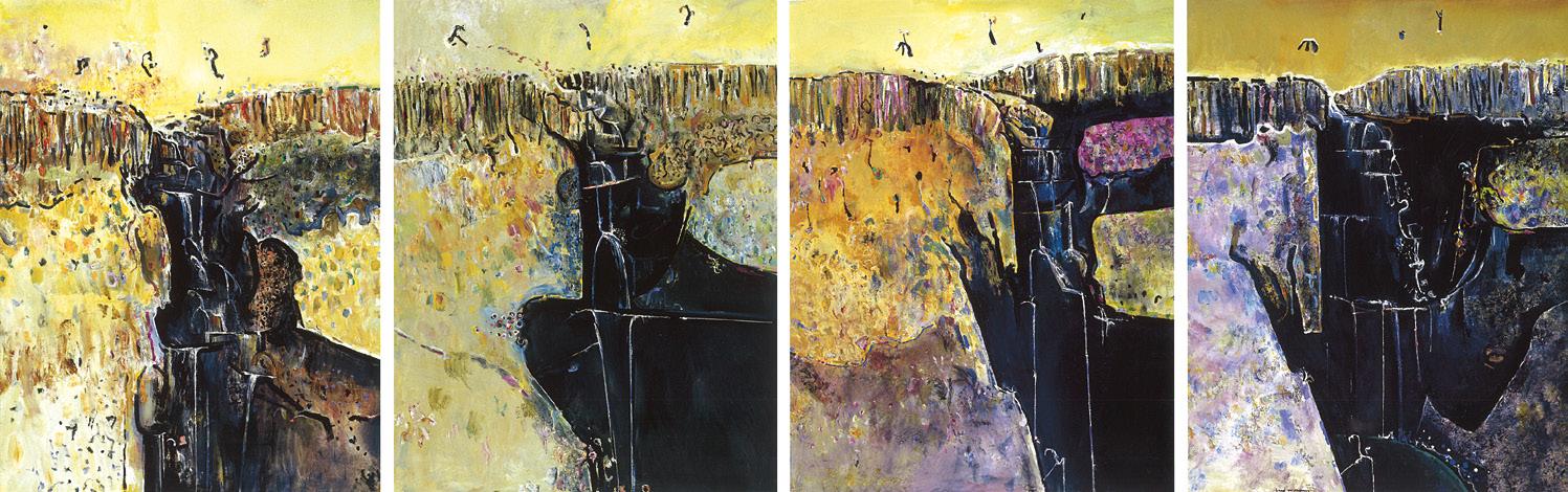
‘I have a fierce desire to paint colour… I decide to completely alter my palette – the primary colors & the corresponding color[s] on either side of [them] [on the colour wheel] plus the secondary Orange, Green & Violet – I am ready to do this.’ 1
Fred Williams’ diaries from the late 1960s and early 1970s offer revealing insights into the way that his use of colour changed during these years. Describing the transformation, Patrick McCaughey wrote that while colour had been implicit in Williams’ earlier work, at this time it became boldly explicit. 2 While his palette had been based on a traditional range of muted colours – albeit, sometimes with the inclusion of strokes of vividly coloured paint, perfectly placed to finish and energise the composition – this period witnessed a marked expansion in his chromatic approach.
His friend and fellow artist, Albert Tucker (1914 – 99), contributed to these developments, encouraging Williams to use acrylic paint (also known as synthetic polymer paint) instead of gouache for his work outdoors. In the weeks leading up to a family trip to visit Tucker and his wife, Barbara, in Queensland in 1971,
Williams took the leap and began using the new medium. Writing in his diary on 13 August he noted: ‘My idea to put a greater emphasis on color is having reasonable success so far – the sketches in Q[ueensland] should prove interesting.’ 3
Located in the Gold Coast hinterland, the Tuckers’ property at Springbrook was one of three adjacent eighteen-acre blocks that had been acquired in a collective effort to protect this area of lush rainforest. The others were owned by the artist Stephen May, who introduced the Tuckers to the region, and Arthur Boyd.4 As Lesley Harding has observed, Tucker’s paintings of this landscape are unlike anything else in his oeuvre, ‘Rolling hills and idyllic waterfalls and escarpments are rendered evocatively… and both the changeability of the sky and the shape and undulation of the land become new interests.’ 5 Williams also responded enthusiastically to the new landscape, writing at the end of his first day there, ‘one of Bert’s many blocks of land... [is] a very beautiful valley in a horse-shoe shape with [a] water-fall in the middle.’ 6
Williams painted Goomoolahra Falls on his second day at Springbrook. After working from the lookout all day making
Fred Williams
Goomoolahra Falls II, 1971
synthetic polymer paint on composition board
111.5 x 91.5 cm
Private collection
© Estate of Fred Williams/Copyright Agency
acrylic sketches on paper, he wrote, ‘I find the acrylics very hard to get used to – I almost give up but by tonight I’m glad I persevered, because they are obviously superior for outdoor work – and I can get a much fuller range of color-glazing & scumbling, which is my real forte.’ 7 The other advantage of the fast-drying acrylic paint was that he could work over previous layers, revising compositions on the spot. Upon returning to his studio in Melbourne, Williams reviewed the sketches from the trip, as well as making more from memory. We know that Goomoolahra Falls II, 1971 (private collection) was based on a studio sketch and given the close relationship between it and Goomoolahra Falls, Queensland, 1971, it is probable that they both followed the same process.
Despite Williams’ focus on colour, Goomoolahra Falls, Queensland is painted in a mostly subdued palette – although shades of purple and green hint at the transformation which was occurring as well as the distinctive vegetation and atmosphere of the sub-tropical location. Clearly engaged with the features of the landscape, Williams observed them carefully, from the smooth band of pale sky to the energetic and painterly depiction of trees and cascading
water. Although Williams maintained a preference for painting his major canvases in oil, of those works painted in acrylic he must have regarded this one highly, as it was the only such painting to be exhibited publicly during his lifetime. 8 The subject of the waterfall continued to interest Williams and in the late 1970s, he embarked on a major series of paintings of Victorian waterfalls. 9
1. Fred Williams Diary, 4 April 1972, cited in Mollison, J., A Singular Vision: The Art of Fred Williams, Australian National Gallery, Canberra, 1989, p. 158
2. McCaughey, P., Fred Williams 1927 – 1982, Murdoch Books, North Sydney, 1996, p. 225
3. Fred Williams Diary, 13 August 1971, cited in Mollison, ibid., p. 152
4. The Tuckers later purchased May’s block which, with their own, was sold in 2007 to the Queensland Government and is now a national park. See Harding, L., Hinterlands: Albert Tucker’s Landscapes 1960 – 1975, Heide Museum of Modern Art, Bulleen, 2008, p. 38
5. Harding, ibid., p. 39
6. Fred Williams Diary, 22 August 1971, cited in Mollison, op. cit., p. 152
7. Fred Williams Diary, 23 August 1971, cited in Mollison, ibid.
8. I am grateful to Lyn Williams AM for her assistance with this essay.
9. This series includes Wild Dog Creek, 1977 (TarraWarra Museum of Art) and Waterfall polyptych, 1979 (Art Gallery of New South Wales).
Kirsty Grant
Split ring, 1968
painted aluminium
58.0 cm (height)
edition: 2/6
signed, dated and numbered on base: Meadmore / 2/6 1968
Estimate: $60,000 – 80,000
Provenance
Lillian Heidenberg Fine Art, New York, acquired directly from the artist Private collection, Melbourne
Deutscher and Hackett, Melbourne, 16 April 2008, lot 4 Private collection, Sydney
Related work
Split Ring, 1969, steel, 355.5 x 386.0 x 335.0 cm, Portland Art Museum, Oregon, USA
‘I am interested in geometry as a grammar which, if understood, can be used with great flexibility and expressiveness.’ 1
One of the most highly regarded and internationally acclaimed Australian artists of his generation, Clement Meadmore remains revered for thoughtful, impeccably executed sculptures that unify pure stark geometry with expressive gesture. Invariably constructed from one single square-sectioned beam that has been bent and coiled to achieve his artistic aim, indeed Meadmore’s masterful constructions evince a seemingly implausible sense of dynamism and musical rhythm that belies their unyielding medium. Whether monumental outdoor commissions or smaller scale domestic maquettes, Meadmore’s forms typically twist, turn and writhe – their suggested animation thus adding a humanising balance to the all-too-often bland immobility and visual harshness of our modern built environments. As Gibson astutely observes, the opposition between line and mass lies at the very core of Meadmore’s sculptures: ‘…in their form they suggest the rapid motion through space of a limb or body… or the residue of such motion. They have more in common with purely aesthetic things such as a drawn line, than with a recognisable object existing in the world even though, by virtue of their sheer physical bulk and size and scale, they are undeniably that…’ 2
Closely related to the artist’s iconic Janus, 1968 – created the same year as a commission for the ‘Ruta de la Amistad’ (Route of Friendship) to commemorate the 1968 Olympic Games in Mexico City – the present maquette offers a superb example of Meadmore’s sculptures from 1967 to 1969 in which the general
configuration recalls, in whole or in part, a circle or nascent coil. Subs equently realised on a monumental scale in multiple versions – including one now installed at the Portland Art Museum, Oregon – indeed Split ring encapsulates well the possibilities offered by this new torsional module. As Gibson elucidates,
‘…Meadmore made volumes turn and move through space in ways that were freer, more emphatic, and more expressive in character than previously. In the process, his sculpture became richer in feeling and more ambitious in outlook… Now, the combined actions of rotating the volume so that it was a horizontal, extending it and introducing more complexity all resulted in fully abstract sculpture in which the sculptural volume functioned in the manner of a line moving through space. Mass was transformed into line, and line into signified direction, an impulse of movement.’ 3
In this new work, thus Meadmore simultaneously contradicts and extends this Constructivist idea of ‘drawing in space’: ‘…contradicts it, because his ‘drawing’ retains, indeed is constituted by the mass characteristic of premodern sculpture, and extends it, because he sets that line in motion – imparting to it something of the velocity of a drawn line – yet without resort to kinetics or technological tricks. Meadmore’s sculptures displace, occupy space as much as had his Minimalist pieces... Yet at the same time, they begin to move through space in a variety of ways, freely and gracefully...’4
1. Clement Meadmore cited at: https://emuseum.toledomuseum.org/people/749/clementmeadmore/objects (accessed March 2026)
2. Gibson, E., The Sculpture of Clement Meadmore, Hudson Hills Press, New York, 1994, p. 52
3. ibid., p. 37
4. ibid.
Veronica Angelatos

“Tulips”, 1996
synthetic polymer paint on canvas
135.0 x 120.0 cm
signed, dated and inscribed with title verso: Howard Arkley / Stillife Tulips / 1996 / Acrylic on Canvas / Howard Arkley 96
Estimate: $150,000 – 250,000
Provenance
Tolarno Galleries, Melbourne Private collection, Germany, acquired from the above in November 1996
Exhibited
Tolarno Galleries at Art Cologne, Cologne, Germany, 10 – 17 November 1996
Literature
Ericsson Telecommunications company brochure, 1996 (illus.) Howard Arkley Online Catalogue Raisonné: https://www.arkleyworks. com/blog/2026/02/05/stillife-tulips-1996/ (accessed February 2026)
Arkley produced three variants of earlier works for a proposed collaboration with Ericsson: Explosion, Stillife “Tulips”, and Zappo (all 1996), all three were amongst the five works exhibited at Art Cologne, Germany 1996.
Related works
Stillife, Tulips, 1995, synthetic polymer paint on canvas, 135.0 x 119.5 cm, private collection, sold Deutscher and Hackett, Melbourne, 9 May 2007, lot 44
Still Life Tulips, c.1997, synthetic polymer paint on canvas, 130.0 x 125.0 cm, collection unknown

A master of revisiting and resampling his own works, the theme of the still life appears intermittently across Howard Arkley’s oeuvre. First materialising in 1986 (see Tulips and spotted vase, Deutscher and Hackett, Important Australian + International Fine Art, Melbourne, 26 November 2024, lot 24), vases of petunias – and, more often, tulips – emerge from amongst his iconic suburban imagery right up until the artist’s death in 1999. Wellversed in art history, Arkley’s Stillife “Tulips”, 1996 is a Day-Glo contemporary nod to the vanitas tradition, with the blousy open blooms of the tulips and their joyous pops of colour serving as a poignant reminder of the transience of both beauty and life. The open and wilting tulips seem to strain against the strength and containment of Arkley’s assured airbrushed outlines, creating a tension in the work between the exuberance of the artist’s imagery and deft handling of paint and the rich symbolism of the flower within momento mori (translating as ‘remember you must die’ in Latin). Given Arkley’s well-known love of decoration and ornamentation, Stillife “Tulips” is a relatively restrained painting; the product an artist at the height of his powers who can command our attention with a mesmerising combination of elegant, fluid linework and an innate understanding of complementary colour and its impact (seen here in the opposition between the bright blue and orange, and pink-violet and green). An admirer of Swiss-born German artist Paul Klee, who coined the notion of drawing as ‘taking a line for a walk’ 1 , Arkley confessed early in his career: ‘I draw rather than paint.’ 2
Howard Arkley Explosion, 1996
synthetic polymer paint on canvas
135.1 x 120.0 cm
National Gallery of Victoria, Melbourne
© The Estate of Howard Arkley. Licensed by Kalli Rolfe Contemporary Art
Arkley’s work has often been compared to American and British Pop artists Roy Lichtenstein and Patrick Caulfield, whose practice shared a penchant for areas of bold flat colour and the depiction of everyday utilitarian objects such as vases, bowls and jugs. However, on this occasion the fascinating story behind Stillife “Tulips” is more akin to the crossover potential of the ultimate Pop artist, Andy Warhol, who late in his career balanced his own interview segment on MTV ( Andy Warhol’s Fifteen Minutes, 1985 – 87), and appearances on a Japanese TV commercial (TDK video tapes, 1983) and the long-running American TV series The love boat (1985), with the making of art. In 1996, Arkley was commissioned to produce Stillife “Tulips”, and two other works – Explosion, 1996 (National Gallery of Victoria) and 96 Zappo, 1996 for the Australian arm of the Swedish telecommunications company Ericsson. 3 Inspired by the success of the European version of the company’s ‘The Art of Communication’ project, which saw three works by a star-studded range of artists (Karel Appel, Keith Haring, Pablo Picasso, László Moholy-Nagy, Antoni Tàpies , and Ulrica Hydman-Vallien) reproduced as interchangeable covers (or ‘flips’) for the Ericsson flip phone, Arkley’s paintings were intended to appear on a new limited edition series of the Ericsson GF388 mobile phone. Australian heavyweight John Olsen and Ricky Howell, ‘who was unknown and fearful of being kicked off the dole’ at the time of the project4, were the other artists represented. Characteristically, the paintings Arkley produced for this project were a sample of his practice rather than a series; a group of three distinct interchangeable images – ‘an explosion, a zappo thing, which was to do with amphetamine addiction, although I don’t know if they’ll want that said’ 5 – that could be used to personalise your mobile according to mood. As the press release declared:
‘The GF 388 has a stylish flip which can protect your keypad when in your purse or pocket and provides extra privacy to the caller. This flip is removable, allowing you to purchase the Art of Communication series set of flips and make your Ericsson mobile phone stand out from the crowd.’ 6
While Arkley didn’t own a mobile phone at the time of the project, he embraced the notion of his art being used in this way, seeing this unique form of circulation of his artworks as part of the continuum of his practice: ‘It’s the idea of mass
culture, not specifically phone users, just the fact that so much of my imagery comes from mass culture to art and back to mass culture.’ 7 However, despite having progressed as far as having brochures designed, receiving media coverage, and establishing launch dates 8, the Ericsson ‘Australian Artists Limited Edition’ series was ultimately canned. 9
But despite the time and effort involved, all was not lost. Arkley went on to successfully exhibit Stillife “Tulips”, Explosion and Zappo Head 96 at Art Cologne, Germany in November – thus building upon a year of international exhibitions in Korea and Singapore that ultimately led to his representation of Australia in Venice at the 48th Venice Biennale in 1999.
1. Paul Klee cited in ‘Background and Early Influences’, NGV Howard Arkley Education Resource, at: https://www.ngv.vic.gov.au/school_resource/howard-arkley/ (accessed 5 March 2026)
2. Howard Arkley in Carmichael, R., ‘Erasing the Drawn Line’, The Sun, 2 November 1983, cited ibid.
3. The commission was organised by Arkley’s representative Tolarno Galleries, Melbourne. See Gregory, J., Arkley Works at https://www.arkleyworks.com/blog/2009/11/26/1996/ (accessed 5 March 2026)
4. Barclay, A., ‘Mobile Message’, Herald Sun, 16 August 1996
5. Arkley cited ibid.
6. ‘Ericsson Art of Communication Media Release’, 8 August 1996, Howard Arkley Archive, State Library Victoria (YMS 16096 John Gregory: Howard Arkley Research Collection 1996, Ericsson Box 3/8)
7. See Barclay, op. cit.
8. The series was to be launched at the Art Gallery of New South Wales, Sydney on Monday 12 August 1996 and at the National Gallery of Victoria, Melbourne on Tuesday 13 August, see ‘Ericsson Art of Communication Media Release’, op. cit.
9. According to John Gregory, this was ‘apparently on economic grounds’: see Arkley Works, op. cit.
Kelly Gellatly
New Zealand, born 1968
Kapa Haka (Pango), 2003
automative paint on fibreglass
188.0 x 60.0 x 50.0 cm edition of 15
Estimate: $150,000 – 200,000
Provenance
Roslyn Oxley9 Gallery, Sydney Private collection, acquired from the above in 2009
Exhibited
Michael Parekowhai, Kapa Haka, Michael Lett Gallery, Auckland, 21 – 22 December 2003
Paradise Now? Contemporary Art from the Pacific, Asia Society and Museum, New York, 18 February – 9 May 2004 (another example)
Rainbow Servant Dreaming, Roslyn Oxley9 Gallery, Sydney, 28 April – 21 May 2005, cat. 2 (another example)
Unnerved: The NZ Project, Queensland Art Gallery | Gallery of Modern Art, Brisbane, 1 May – 4 July 2010, NGV International, National Gallery of Victoria, Melbourne, 26 November 2010 – 27 February 2011 (another example)
A World View: The Tim Fairfax Gift, Queensland Art Gallery | Gallery of Modern Art, Brisbane, 28 May 2016 – 16 April 2017 (another example) Simon Denny, Mine, Museum of Old and New Art, Hobart, 8 June 2019 – 19 March 2020
Literature
Leonard, R., ‘Michael Parekowhai: Kapa Haka Pakaka’, Auckland Art Gallery News, Auckland, March – June 2005, n.p. (another example)
Related work
Kapa Haka (Whero), 2003, automotive paint on fibreglass, 188.0 x 60.0 x 50.0 cm, Queensland Art Gallery | Gallery of Modern Art, Brisbane
Standing guard and surveying the audience with a blank face, Michael Parekōwhai’s lifesize Māori bouncer, while instantly recognisable, maintains a slippery and elusive identity. New Zealand sculptor of Ngāti Whakarongo, Ngā Ariki and Pakeha (European) descent, Parekōwhai places intriguing solitary objects as polished and open-ended intrusions into the art and performance space, carrying with them playful and critically incisive allusions to underlying issues in New Zealand | Aotearoa’s postcolonial reality. Kapa Haka (Pango), 2003 fashioned of fiberglass and lustrously painted with the artist’s signature two-pot polyurethane finish, leans into and subtly subverts racial, social and economic stereotypes affecting Pacific peoples in contemporary society.
Created during a period of contemporary revival of Māori tikanga and matauranga (customs, laws and traditional knowledge), Michael Parekōwhai’s security guard is a subtle reminder of the
quiet and steadfast presence of Indigenous peoples in New Zealand. Kapa Haka (Pango) is one of fifteen figures, a full rugby team, each with an identical physical morphology that the artist gently mocks: big bellied, arms crossed over a barrel chest, the white shirts of their uniform straining against paunches and ill-fitting trousers gathering at their ankles. While their facial features are smoothed and airbrushed to the point of anonymity, Parekōwhai’s figures were modelled on the artist’s elder brother, Paratere, who works in the security business. Each figure is named for a colour, ‘like the gangsters in Reservoir Dogs’, their names inscribed in te reo Māori on the access cards hanging from their belts.1 ‘Pango’ refers to black or a dark colour, and is famously featured in the All Black’s haka Kapa o Pango ‘the Team in Black’. Although grounded in the economic reality of the prevalence of Māori and Pasifika peoples employed in low-paid service positions, Parekōwhai subtly restores cultural dignity to their disenfranchisement, applying the collective title of Kapa Haka to the group – the te reo Māori term for performing arts. With a hint of irony, with this title Parekōwhai equates the guards’ solid stance into that of a fearsome haka performance, uniting these individual figures in the camaraderie of the collective activity.
Appearing in the landmark exhibition of contemporary art from the Pacific, Paradise Now in New York’s Asia Society Galleries in 2004, Parekōwhai’s performative and tragicomic security guards have been installed, individually and collectively, in various exhibition contexts over the last twenty years. Their startling presence was noted in a one-night only happening at Michael Lett’s gallery on Auckland’s busy K-road in 2003, each facing out of the full-length glass windows, with critic Justin Paton noting ‘the sight of five of them guarding a room full of nothing was enough to make the space crackle with politics.’ 2 In May 2026, a version will be installed out the front of Queensland Art Gallery | Gallery of Modern Art as part of Rising Voices: Contemporary Art from Asia and the Pacific, a celebration of 30 years of the Asia Pacific Triennial of Contemporary Art. With their high-gloss polish of a commercially manufactured toy, the Kapa Haka guards are parachuted into different contexts, their unyielding large volumes intruding in the physical space. Undermining the power and authority afforded by their epauletted uniform and solid physicality, their passive and static presence is easily circumvented. Removed from the phalanx of their collective performance, this lone guard valiantly attempts to protect assets that are not his own. Temporarily rootless, his meaning and purpose changes according to his placement.
1. Leonard, R., ‘Michael Parekowhai: Kapa Haka Pakaka’, Auckland Art Gallery News, March – June 2005 at: https://robertleonard.org/michael-parekowhai-kapahaka-pakaka/ (accessed 30 March 2026)
2. Justin Paton, cited in Derby, M., ‘Māori humor – te whakakata – Māori humour in the 2000s’, Te Ara – the Encyclopaedia of New Zealand, September 5, 2013 at: http://www. TeAra.govt.nz/en/photograph/40401/kapa-haka-by-michaelParekōwhai (accessed 30 March 2026)
Lucie Reeves-Smith
The lot no. 4, 2009
oil on linen
110.0 x 140.0 cm
signed, dated and inscribed with title verso: The Lot no. 4 / 2009 / Ben Quilty
Estimate: $60,000 – 80,000
Provenance
Private collection, Sydney, acquired directly from the artist in March 2010
Exhibited
Trigger Happy, ANU Drill Hall Gallery, Canberra, 9 November – 15 December 2013
Related work
The lot, 2006, oil on linen, 150.0 x 160.0 cm, Art Gallery of South Australia, Adelaide
Painted in 2009, in a series following on from a metamorphic painting of his squalling infant son as a hamburger, Joe burger, 2006, The lot no. 4 is an expressive display of a solitary, precariously stacked hamburger. Quilty’s still lives of the ubiquitous fast food are gutsy, reflecting plainly the attractions and dangers of the world in which we live today.
Ben Quilty is the closest thing Australia has to a celebrity artist and as Brooke Turner suggested, some of his public acclaim can be attributed to his blokey charisma and masculine subject matter: ‘artists do better if they’re blokes first, artist second… with references to cars and soldiers, birds, burgers and babies.’ 1 Quilty’s longstanding dedication to the reflection of the activities and machismo of the Australian white male would not be complete without images of the occasional burger, packed with bacon, egg, beetroot and a hashbrown – humorously known throughout the land as ‘the lot’!
The genre still life historically was associated with grandiose displays of food, the rarity and fragile nature of which illustrated the wealth of the painting’s commissioner and in a succinct vanitas, reminds us of the fleeting nature of life. Viewed in the context of Quilty’s early motifs associated with suburban reckless youths: the muscle cars, portraits of catatonically drunk mates and skulls, this seemingly anodyne appetizing burger acquires a slightly more sinister and cautionary subtext.
In its ‘loaded’ form, the local hamburger is a little different to the simple cheeseburger, an epitomising symbol of American consumer culture and high capitalism. As an artistic motif, popularised by artists such as Roy Lichtenstein, Andy Warhol and Claes Oldenburg, the burger has historically been a vehicle for cultural criticism. Warhol, in particular, emphasised the democratising effect of the burger in American culture, as a unifying commodity available and enjoyed by all Americans regardless of class or social standing, mass-produced and enjoyed by the masses.
Painted quickly with cake decorating implements, in emphatic swathes of heavy impasto, Quilty’s painting becomes more than the faithful representation of subject matter. Instead, it tends toward becoming the subject itself, recreating the viscous contents of a burger sliding from the crusty bun top, and collapsing across the canvas. No wonder the Art Gallery of South Australia chose to hang their version above the Art Gallery Food + Wine foyer during Quilty’s 2019 retrospective exhibition, in a cheeky exploitation of hungry audiences!
1. Turner, B., ‘Ben Quilty on the burden of being Australia’s artist from central casting’, Good Weekend, Sydney Morning Herald, Sydney, 23 February 2019 at: https://www.smh.com. au/entertainment/art-and-design/ben-quilty-on-the-burden-of-being-australia-s-artistfrom-central-casting-20190219-p50ypb.html (accessed March 2026)
Lucie Reeves-Smith
Bird, 2021
painted bronze
165.0 cm (height, including bronze base)
edition: A/P aside from an edition of 3 signed with initials: BA stamped at base with Perin Sculpture foundry mark
Estimate: $60,000 – 80,000
Provenance
Private collection, Melbourne
Related work
Bird, 1993, cypress pine and synthetic polymer paint, 160.0 x 90.0 x 90.0 cm, Art Gallery of Ballarat, Victoria
Birds reign supreme in Bruce Armstrong’s private sculptural bestiary, their aloofness and commanding presence echoing the ancient and mystical power they hold for many cultures across the world. ‘Birds are everyone’s allegory, a totem for all personalities. Every culture had bird stories… one can sift through the history of art and find images of birds in the earliest of humanity’s imagery’, the artist explained in 2003.1 Indeed it was the artist’s introduction in art school to ancient Egyptian sculpture and American Indian totemic carving that would stimulate a lifelong interest in the animistic power of these animals, and lead to a series of wooden carvings of birds created throughout his career. Many of these sculptures were later industrially fabricated into monumental and well-loved public sculptural installations – including Eagle (Bunjil), 2002 in Docklands, Melbourne and Owl, 2010 in Belconnen, Canberra.
The symmetrical, columnar silhouette of Bird, 2021, presents an essential expression of the animal, reduced to its most identifying feature – a beaked jaw running in one smooth arc. While many of Bruce Armstrong’s bird sculptures include identifying physical features which link them to specific species – the talons of a sea eagle, or the long tail of the powerful owl – this Bird is the platonic ideal of the animal, smoothed to a simple graphic outline. The heraldic, two-dimensional quality of Bird also evokes the hieratic forms of Egyptian art, where the sky god Horus, protector of the pharaohs, took the form of a bird of prey. Surveying the viewer with a painted beady and rounded eye, this focal point of Armstrong’s bird references the importance of the eyes of Horus. The right one was said to be the sun, while the left was the moon,
while the disembodied eye became the wedjat-eye imbued with protective magical powers. Armstrong’s birds are not only mediators between the physical and celestial planes, but also become watchful guardian sentinels, at times safely encircling the built world with their outstretched wings, as in Obelisk, 2008.
Sculpting from massive fallen trunks, often hundreds of years old, Armstrong has steadfastly persisted with a style of artmaking reliant on brawn and a high degree of technical craftsmanship. The carved muscularity of his burly and rustic forms creates a raw commanding physical presence. Originally conceived as a timber totem hewn from a Cypress trunk – Bird, 1993 (Art Gallery of Ballarat) – this bronze casting from 2021 simulates almost exactly the materiality, appearance and texture of the artist’s original timber maquette, its cold surface invitingly woven with directional chisel markings. The simplified colours and volumes of Armstrong’s fabricated sculptures serve to highlight the tactile surface texture of the bronze, the woodworker’s grooves and rough traces left unpolished throughout the casting process. Bird’s emphatic mass retains a trace of the cylindrical structure of the original tree trunk, evoking the verticality of carved totem poles from the Indigenous peoples of the Northwest coast of Canada. Softening the imposing volumetric weight of this form, Armstrong’s Bird is simple, raw and vernacular, providing a blank canvas for interpretation and engagement with each environment and viewer.
1. Bruce Armstrong, cited in ‘Why Birds?’, Webb, V., MCA Unpacked II: Six Artists Select from the MCA Collection, Museum of Contemporary Art, Sydney, 2003, p. 8 Lucie Reeves-Smith
hand-coloured woodblock print on tapa cloth
35.5 x 34.5 cm (image)
signed with initials and dated in image lower left: MP / 1940 signed and inscribed below image: Tapa Cut Aboriginal Hunt Margaret Preston
Estimate: $20,000 – 30,000
Provenance
Private collection
Christie’s, Melbourne, 21 May 1990, lot 144
Private collection, Sydney, acquired from the above Estate of the above
Exhibited
Society of Artists Annual Exhibition, Education Department’s Art Gallery, Sydney, 6 – 25 September 1940, cat. 62 (another example, as ‘drawing’ [sic])
The Art of Margaret Preston, Art Gallery of South Australia, Adelaide, 23 May – 22 July 1980, and touring to the National Gallery of Victoria, Melbourne, and Art Gallery of New South Wales, Sydney, cat. 28 (another example)
Literature
Christesen, C. B. (ed.), Meanjin Papers 2, The Meanjin Press, Brisbane, vol. 2, no. 2, Winter 1943, p. 3 (illus. as ‘Aboriginal Hunt Design’, another example)
Draffin, N., Australian Woodcuts and Linocuts of the 1920s and 1930s, Sun Books, South Melbourne, 1976, p. 54 (illus., another example)
North, I., The Art of Margaret Preston, Art Gallery Board of South Australia, Adelaide, 1980, P.28, p. 56 (illus., another example) Butler, R., The Prints of Margaret Preston, A Catalogue Raisonné, Australian National Gallery, Canberra, Oxford University Press, Melbourne, 1987, cat. 228, pp. 196, (illus., another example), 197
Related works
Other examples of this work are in the collections of the National Gallery of Australia, Canberra and the National Gallery of Victoria, Melbourne (as ‘Aboriginal design – The hunt’)
oil on canvas
42.0 x 34.0 cm
signed and dated lower right: Margaret Preston / –52
Estimate: $60,000 – 80,000
Provenance
Macquarie Galleries, Sydney Private collection
John Martin & Co., Adelaide (labels attached verso)
Joseph Brown Gallery, Melbourne
Queensland Fine Art Auctioneers, Brisbane, 1989 Sotheby’s, Melbourne, 22 April 1996, lot 134 (as ‘Still life of native flowers’)
Henry Krongold, Melbourne
Thence by descent
Private collection, Melbourne
Exhibited
Macquarie Galleries Exhibition: Sydney painting 1952, Finney’s Gallery, Brisbane, 15 – 25 July 1952, cat. 43
Fine paintings, Queensland Fine Art Auctioneers, Brisbane, 25 February – 2 March 1989, lot 68 (as ‘Native flowers’)
Literature
Margaret Preston Catalogue Raisonné of paintings, monotypes and ceramics, Art Gallery of New South Wales, Sydney, 2005, CD-Rom compiled by Mimmocchi, D., with Edwards, D., and Peel, R. cat. 1952.01 (illus.)
Flowers proliferate throughout Margaret Preston’s oeuvre, set within striking still life arrangements though none are merely pretty. They are decorative in the modernist sense of the word but were never dashed off in the afternoon over a nice pot of tea. Preston approached each canvas as an exercise unto itself, one which built on lessons gleaned over the course of her long and sustained career. For noted historian Humphrey McQueen, ‘Margaret Preston was Modernism in Australia between the wars… because she was the one artist who persistently attempted to engage, in various media, the complex of problems which gave rise to Modernism.’ 1 Preston saw art as being ‘a problem of relationships… where every form or shape realized on the canvas alters the nature and character of the original stimulus.’ 2 Her paintings from the mid-1920s bear testament to such ideas with, for example, Gum blossom (or eucalyptus), 1928 (Art Gallery of Western Australia), which contrasts spikey Australian flora set against a streamlined background informed by contemporary interior design, or those from the 1940s, infused by her selective understanding of the palette integral to Australian Indigenous art.
Echoes from each of these stages may be found in Bottlebrush, 1952, painted at the artist’s home in Mosman, NSW. In related paintings such as Western Australian wildflowers, c.1951 (private collection), the table outline is bold and uninterrupted, whilst in Bottlebrush and flannel flower, c.1951 (private collection), there is no line at all – space is only delineated by tone and vigorous brushwork. These steps underscore the later painting, Flannel flowers, 1952 (collection unknown), where Preston now has the table-top merging directly into the backyard lawn through an orchestrated pattern of strokes in a myriad choice of greens. Between these three extremes sits Bottlebrush, whose black jug is set against its own fugitive background of indeterminate space, the table’s surface anchored only by minimal brushwork to the right which, by its very fluidity, seems to follow direction – the curved sweep of white cloth – rather than demarcation of the actual edge. By contrast, to the left, the background implodes into an entropic space of three tonal regions, black, white and grey. This causes the black jug to visually step forward, its own surface agitated by expressive but controlled brushwork. The plants also stand out from the dissolve, their red, green, yellow and blue flowers – so distinctive of Australian flora – coming to the fore.
The blooms in Bottlebrush are bottlebrush, wattle, yellow pea, and Dampiera (fan flower), and since these all favour Spring to early Summer for their flowers, the painting was likely begun late in 1951 but completed in the first months of 1952 before exhibition at the Macquarie Galleries-affiliated Finney’s Gallery, Brisbane, in July. Throughout her career, Preston was often dismissed by critics due to her gender and, as Art Gallery of New South Wales director, Hal Missingham, noted upon her death that ‘if Margaret Preston had been a man, I feel sure she would have enjoyed a public reputation equally as great as Dobell, Drysdale or Nolan.’ 3 Time has eased this view of the status quo, and Preston is now rightly regarded – and loved – for the strength, vigour and intelligence of her art.
1. Humphrey McQueen, 1979, cited in Edwards, D., Mimmocchi, D., and Peel, R., Margaret Preston, Art Gallery of New South Wales, Sydney, 2005, p. 9
2. Margaret Preston, ‘Aphorisms 25 & 27’, in Gellert, L., and Ure Smith, S., (eds), Margaret Preston: recent paintings 1929, Art in Australia, Sydney, 1929, non-paginated
3. Missingham, H., ‘Margaret Preston’, Art and Australia, Sydney, vol.1, no. 2, August 1963, p. 100
Andrew Gaynor
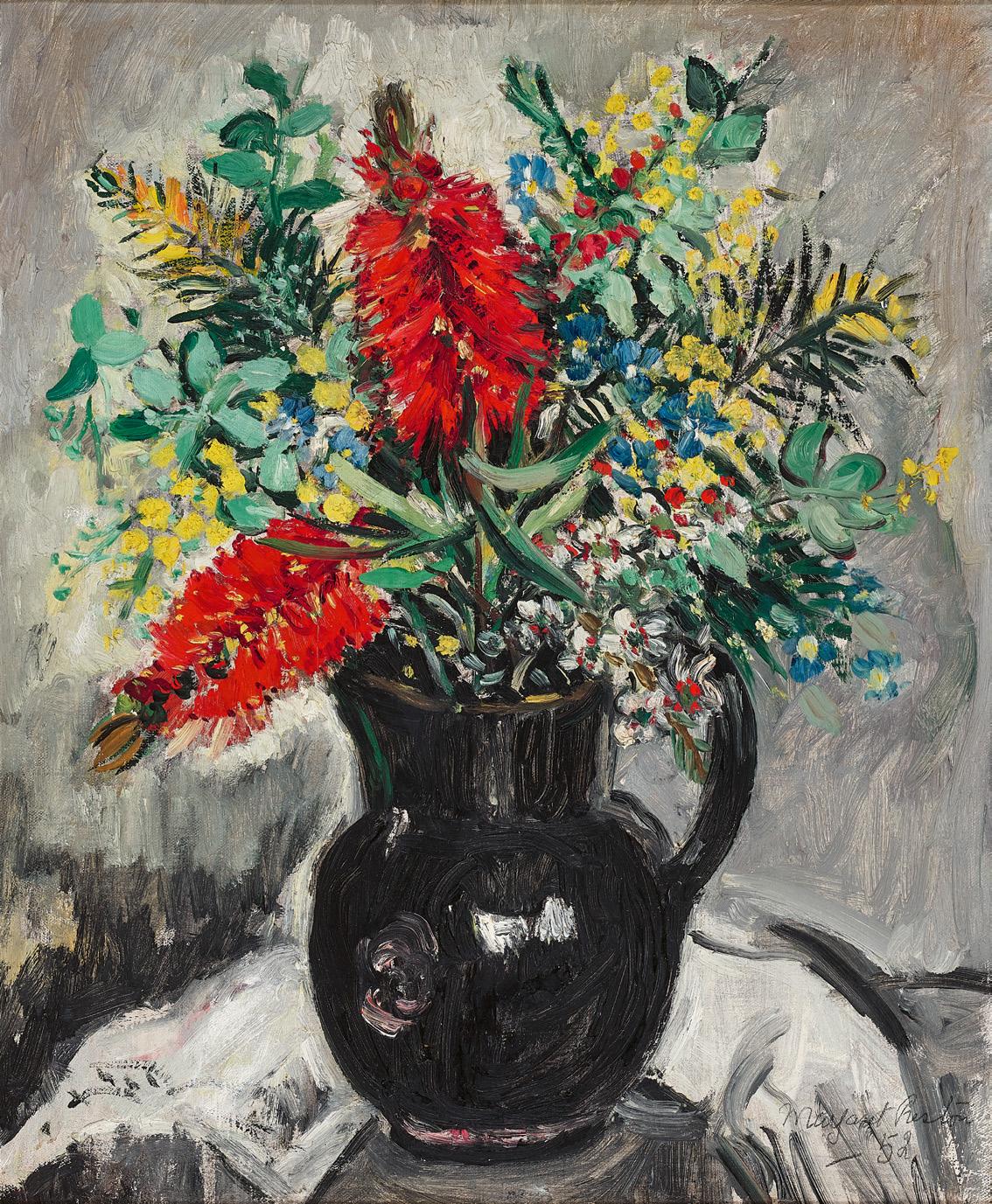
oil on canvas on board
47.0 x 72.5 cm
signed indistinctly with initials lower right: LR
Estimate: $30,000 – 40,000
Provenance
Stanly Wilson, Sydney, a gift from the artist, c.1929
Thence by descent
Private collection, Sydney
Thence by descent
Private collection, Brisbane
Exhibited
Eight Painters, Grosvenor Galleries, Sydney, opened 19 March 1926 (as ‘The Riverbank’)
Literature
‘Paintings at Grosvenor Galleries’, The Sydney Morning Herald, Sydney, 20 March 1926, p. 14 (as ‘The River Bank’)
When looking at Lloyd Rees’ early paintings, there are two things to keep in mind. First, that he was drawn to architecture from an early age, fascinated particularly by the spiritual ‘presence’ of cathedrals and churches, and second, that he was not interested in painting topographically accurate views. Instead, he experimented, introducing elements whilst removing others. This led a contemporaneous critic to perceptively note that ‘Mr Rees dreams his picture, and then strives to render the dream.’ 1 Some of these additions were quite fanciful, as seen in Lennox Bridge, 1926, where an imposing European Gothic-spired church rises dramatically from the riverbank above Lennox Bridge, located in Parramatta, 24 kms to the west of Sydney. Rees spent some years living there in the early 1920s attracted by the clear skies as the Sydney skyline was already ‘blurred by fog.’ 2 In 1923, Rees travelled to Europe where he did numerous drawings of ecclesiastic architecture only to lose his sketchbooks on a bus in Paris. He returned to Paramatta the following year where he continued to paint ‘under the general influence of Corot and Max Meldrum.’ 3
The humble Lennox Bridge is a single span, arched bridge over the Parramatta River constructed of sandstone and completed in 1839. In the current painting, the bridge now has a gently curved upper level, a Rees distortion which sympathetically enhances the near circularity of the arch and its reflection. He did several studies and paintings of the location and one of these, Crossing the Lennox Bridge, 1925, is surprisingly accurate and the distant skyline includes the silhouette of the singlespired St Patrick’s Cathedral to the right. It is plausible that in Lennox Bridge, Rees built this visual trigger into a somewhat fanciful suggestion of what could be possible for Parramatta.
In a way, it was not so extreme as within four years, the town welc omed its own secular cathedral for the masses with the Hollywood-inspired, Egyptian-temple-themed Roxy Cinema.
Although the cathedral in Lennox Bridge is imaginary, it finds its genesis within a mixture of sources. The tall spire, for example, may acknowledge Chartres, but its lower battlement echoes Notre Dame, while Rees’ use of red oxide for the smaller tower suggests the brickwork of the Italian campanile (bell towers) from the Renaissance. The scatter of houses and moorings at the base could even come from Polperro in Cornwall. The foreground, however, remains firmly antipodean and the total effect is akin to one of Claude Lorrain’s ‘threestep’ landscapes. When exhibited as The riverbank in 1926, a review spoke of how ‘the architectural forms in the distance – particularly in the upper right – dissolve into soft light nothingness, supporting the reviewer’s observation that the background is “so high in tone, that they may be there or not.”’4
This painting sits at an important junction in Rees’ career for soon after the painterly optimism of Lennox Bridge, disaster struck the following year when his wife Dulcie died after giving birth to their stillborn child. The grief-stricken artist attempted to continue painting – mostly still lifes – before he had a complete nervous collapse six months later. He did not retur n to painting until 1935.
1. ‘Work of Lloyd Rees. An Australian romantic’, The Daily Mail, Brisbane, 3 August 1921, p. 8
2. Rees, L., Small Treasures of a Lifetime: some early memories of Australian art and artists, Collins, Sydney, 1969, p. 144
3. ibid.
4. R. W. C., ‘Eight painters’, The Triad, Sydney, vol.11, no. 6, 1 April 1926, p. 53 Andrew Gaynor
oil on composition board
43.0 x 61.0 cm
signed with initial and dated lower left: R / 43 bears inscription verso: Weaver Hawk [sic] / ‘SLEEPER’
Estimate: $20,000 – 30,000
Provenance
Private collection, Sydney
Private collection, Sydney, acquired from the above in the 1970s
Related work
A green room (dancers resting), 1943, oil on composition board, 59.3 x 69.8cm, Queensland Art Gallery | Gallery of Modern Art, Brisbane
Widely revered as one of Australia’s most distinctive and i mmediately recognisable artists, Weaver Hawkins remains best known for his bold palette and rhythmic compositional structures that brilliantly encapsulate the formal innovations of early twentieth-century modernism. Trained in England during a time of profound artistic upheaval, indeed Hawkins was drawn in particular to the Cubist-inspired dynamism of Wyndham Lewis and the Vorticists, while simultaneously cultivating an intellectual framework informed by ‘compositional theories such as Dynamic Symmetry, Platonic Solids, Magic Squares and the Modular’ 1 –resulting in him becoming ‘one of the finest and most original mid-century painters working in Sydney… for forty years.’ 2
Born in Sydenham, London in 1893, Hawkins’ early ambitions towards a career in art education were irrevocably disrupted by the outbreak of the First World War. Enlisting in 1914, he was severely wounded on the Somme in 1916 and subsequently endured extensive surgeries that rendered his right hand unusable and his left barely functional. Undeterred, Hawkins set about painstakingly relearning his craft, training himself firstly to draw and then, unbelievably, to etch with remarkable sensitivity using his non-dominant hand – an almost miraculous feat achieved over an eighteenth-month period. In 1923, he held his first solo exhibition, yet critical reception inevitability foregrounded his disability, thus prompting Hawkins to adopt the pseudonym ‘Raokin’ in the late 1920s – an act of quiet defiance intended to redirect attention from biography back to the art itself.
Subsequent sojourns in France and Italy witnessed Hawkins’ style absorb a distinctly modernist inflection, particularly in his depictions of quotidian life. The growing spectre of war in early 1930s Europe, however, eventually led him to seek distance from the continent, embarking upon an extended journey through the South Pacific with his young family where he lived for a time in Tahiti and New Zealand, before ultimately migrating to Australia in 1935. Settling at Mona Vale on Sydney’s
northern beaches, Hawkins soon became part of the local creative enclave that included figures such as Rah Fizelle and Arthur Murch, and it was within this vibrant artistic milieu that his mature visual language would crystallise – fusing formal vigour with an expressive, often deeply humanist sensibility.
Although arguably most celebrated for his ambitious allegorical murals that conflate the trauma of the two World Wars with the existential anxieties of the Cold War, Hawkins’ oeuvre was notably diverse – also encompassing depictions of athletes, bush landscapes and scenes of modern life. Closely related to A green room (dancers resting), 1943 (Queensland Art Gallery | Gallery of Modern Art), the present Sleeper, 1943, offers a superb example of Hawkins’ intimate domestic compositions that reveal a quieter, more contemplative dimension of his practice. Beautifully rendered in softly modelled volumes and interlocking curves, here the reclining female figure conveys a profound sense of inwardness, the rhythmic geometry of her depiction underscoring both repose and latent tension, while the stylised foliage and compressed pictorial space attest to the artist’s enduring commitment to formal synthesis.
A leading figure within Sydney’s more progressive artistic circles, Hawkins served as President of the Contemporary Art Society from the mid-1950s until 1963, and continued to champion the principles of rigorous graphic design and abstract values through to his retirement from active painting in 1972. Today his remarkable achievements stand not only as a testament to his personal resilience, but as a compelling articulation of a modernist vision forged in the crucible of twentieth-century conflict – with order and expression, discipline and feeling, existing in perpetual, dynamic equilibrium.
1. Thomas, D., ‘Weaver Hawkins’, Project 11: Weaver Hawkins, Art Gallery of New South Wales, Sydney, 7 February – 14 March 1976
2. Radford, R., ‘Foreword note’, Weaver Hawkins 1893-1977: Memorial retrospective exhibition 1977 – 1979, Ballarat Fine Art Gallery, Victoria, 1977 (n. p.) Veronica Angelatos
oil on canvas
43.5 x 59.0 cm
signed and dated lower right: DONALD FRIEND ‘56
Estimate: $25,000 – 35,000
Provenance
Macquarie Galleries, Sydney James O. Fairfax, Sydney
Christie’s, Sydney, 25 October 1994, lot 21 Martin Browne Fine Art, Sydney (label attached verso) Private collection
Philip Bacon Galleries, Brisbane (label attached verso) Private collection, Sydney
Exhibited
Donald Friend – Paintings, Macquarie Galleries, Sydney, 8 – 27 May 1957, cat. 2
Donald Friend, Retrospective, Art Gallery of New South Wales, Sydney, 9 February – 25 March 1990, and touring to; National Gallery of Victoria, Melbourne, 14 April – 6 June 1990 and Tasmanian Museum and Art Gallery, Hobart, 26 June – 19 August 1990, cat. 65 (label attached verso)
Literature
Pearce, B. & Klepac, L., Donald Friend, Art Gallery of New South Wales and The Beagle Press, Sydney, 1990, cat. 65, p. 86 (illus.)
Related work
The Painted Chest, wood and enamel paint, 114.5 x 48.0 x 53.0 cm, private collection
The following excerpt is from the diary of Donald Friend, 21 February 1953, reproduced in Hetherington, P. (ed.), The Diaries of Donald Friend, Volume 3, National Library of Australia, Canberra, 2005, p. 194:
‘I have painted with bright enamels crazy scenes and people all over the chest that carried my goods from Italy. It looks very pretty, so convincingly like a genuine piece of folk art. Ken [Kenneth Rowell] and I have joked about selling it to Americans. The scenes show our bête noir, Pertwee showing off, also Maggie, Dick, their dog, Moira Combe and her burglar, also hunting stags, and Ken being pestered by Nan, who is an infuriating woman who haunts the place with gifts, and Omu going to Sweden, Lady Docker in her Rolls and Rita Hayworth with Ali Khan – all this in startling rather rude colours. To use them so freely is a joy. I wish I could paint my senior works as unrestrainedly, but I cannot. Good taste and craftsmanship and a dozen more weighty spoilsport considerations creep in, while spontaneity flies out.’
Quaraitnama, MacDonnell Range, c.1945
watercolour on paper on card
39.5 x 28.5 cm
signed lower right: ALBERT NAMATJIRA
bears inscription on paper label attached to backing verso: No.33 / “Kwaratnama”/ Quaraitnama / MacDonnell Range / 25 Gns
Estimate: $40,000 – $60,000
Provenance
Private collection
Lawson-Menzies, Sydney, 22 July 2003, lot 131 (as ‘Kwaratnama Quaraitnama (The Organ Pipes) MacDonnell Range’)
Private collection, New South Wales, acquired from the above
Exhibited
WATER COLOURS of Central Australia by Albert Namatjira
– Arunta Artist, Royal S. A. Society of Arts Gallery, Adelaide, 12 – 25 March 1946, cat. 33 (25 Gns)
Related works
Quarritana, 1942, watercolour on card, 38.5 x 27.5 cm, private collection, illus. in McGregor, K., The Life & Times of Albert Namatjira, Badger Editions, Melbourne, 2021, p. 258 Quarritana, Finke River (Organ pipes), c.1948, watercolour on paper, 34.5 x 52.0 cm, National Gallery of Australia, Canberra Kwaritnama (Organ pipes), c.1945 – 53, watercolour on paper, 39.0 x 28.5 cm, Ngurratjuta/Pmara Ntjarra Aboriginal Corporation Collection, Alice Springs, illus. on front cover and p. 74 of French, A., Seeing the Centre, The art of Albert Namatjira 1902 – 1959, National Gallery of Australia, Canberra, 2002
Albert Namatjira’s luminous watercolours of the country surrounding Glen Helen (Yalpalpe) and the Finke River (Lherre pirntea) in central Australia, provided the artist with a continued patrilineal connection to locations of deep significance which formed the bedrock of his art and provided plural meanings for those viewers who could read them. Landforms as discrete entities held a certain fascination for the artist. Whether large mountains or monoliths on a smaller scale, they also hold spiritual meaning for the traditional owners and, as with many locations in central Australian, can be read as both ‘sights’ and ‘sites’.1
Painted in 1945, this beautifully resolved composition of Quaraitnama, MacDonnell Range is a finely detailed view of a geological formation in the West MacDonnell Ranges in the Northern Territory known as the Organ Pipes. Located on the Finke River, just south of Glen Helen Gorge, this is a place and subject Namatjira returned to regularly, but at different times of the year and day, in times of drought and in flood, to capture its ever-changing moods. Here the artist observes
the site with lush growth after seasonal rains. Namatjira’s familiarity with his country is evident in these views of particular sites and places that provide a rich range of possibilities and responses that arise from constantly re-engaging with the same subject.’ 2 They also resonate with important personal symbolism for the artist as statements of belonging – as coded expressions embodying the memory and knowledge of traditional ancestral sites, of his totemic places. 3
Transporting his evocative landscapes of Central Australia into the lounge rooms of White Australia in the mid-twentieth century, his depictions of country were fundamental to how Australians viewed their island home. Namatjira’s entry into the Australian art world was both inspired and inspiring. Despite his personal vicissitudes, he inspired his own and subsequent generations of Aboriginal people and artists across Australia and sought to educated non-indigenous Australians about the spiritual link between indigenous people and land. Brenda Croft contends that the artist’s gift to indigenous and nonindigenous people is ‘more than the sum parts of watercolour paints on paper. It is an essence that resides in the strength of Namatjira’s work – his courage, his sorrow, his spirituality… where the enduring influence of this one man upon the entire indigenous arts and culture industry continues to be felt.’4
1. French, A., Seeing the Centre: The Art of Albert Namatjira 1902 – 1959, National Gallery of Australia, Canberra, 2002, p. 93
2. ibid., p. 96
3. ibid., p. 96
4. Croft, B., ‘Albert’s Gift’ in French, A., Seeing the Centre: The Art of Albert Namatjira, 1902 – 1959, National Gallery of Australia, Canberra, 2002, p. 148
Crispin Gutteridge
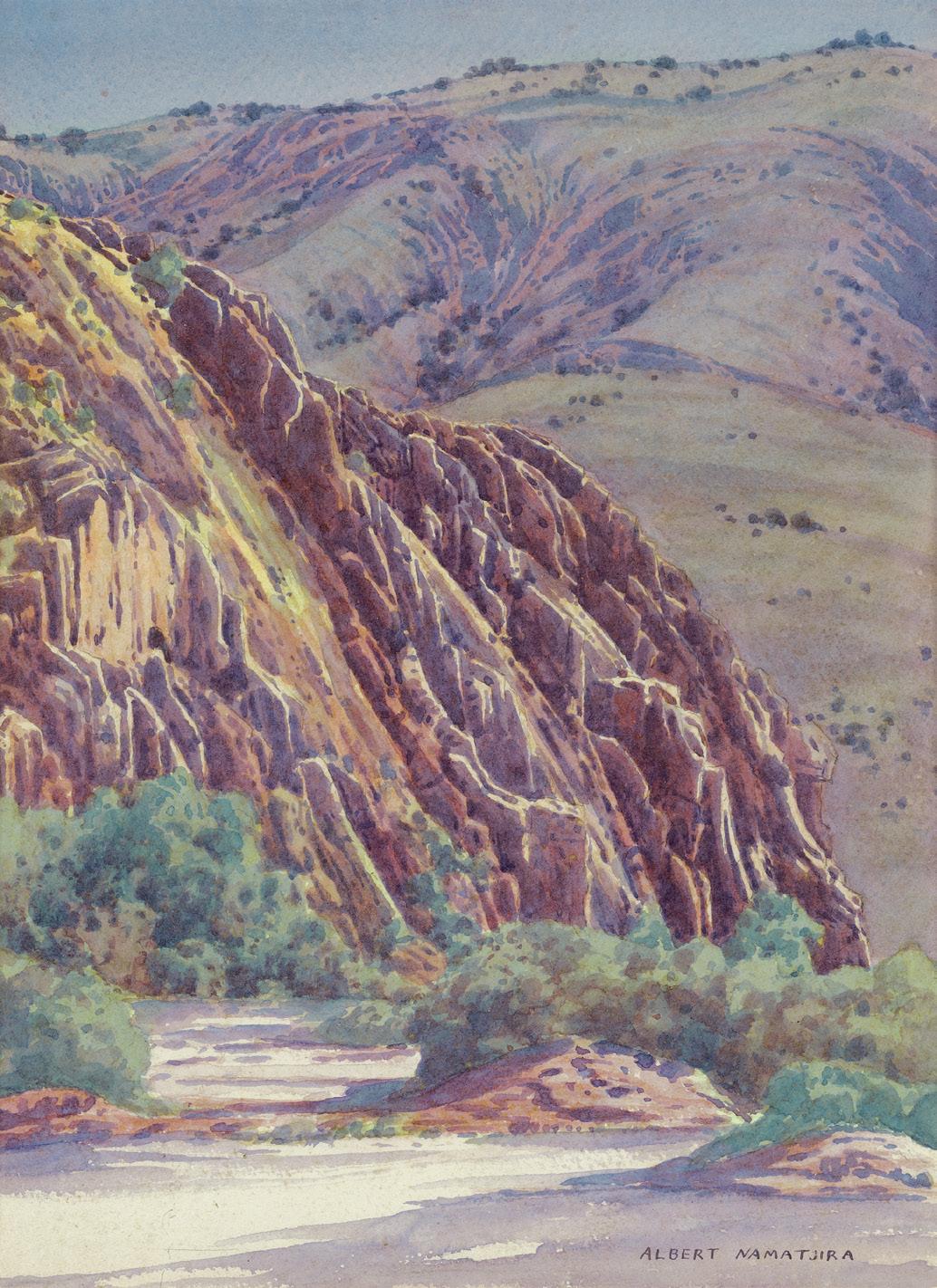
oil on composition board
19.0 x 27.5 cm
signed lower right: Arthur Boyd
Estimate: $35,000 – 45,000
Provenance
Private collection
Sotheby’s, Sydney, 14 August 1990, lot 212 (as ‘Wimmera Landscape with Grazing Sheep, Ploughed Field Figure and Birds’)
Private collection, Melbourne
Thence by descent
Private collection, Melbourne
Related work
Dam and shelter, 1958, tempera on board, 49.0 x 73.5 cm, formerly in the collection of Douglas Carnegie, New South Wales
An untiring and extremely skilful painter of landscapes, Arthur Boyd is undoubtedly among Australia’s most revered artists with his highly personalised images of his homeland now iconic within the national consciousness. Among the more revelatory and widely acclaimed of his achievements, the extended sequence of luminous, sun-parched landscapes inspired by his travels to the Wimmera region in north-west Victoria are particularly celebrated. As Janet McKenzie elaborates, ‘…[in these paintings] Boyd created an archetypal Australian landscape. Possessing both a poetic lyricism and a down to earth quality and capturing the glorious light, these works… [offer] a sense of acceptance that many country-dwelling Australians could identify with.’ 1
Boyd first encountered the Wimmera region during the summer of 1948 – 49 when he accompanied the poet Jack Stevenson on a number of expeditions to Horsham in north-west Victoria. With its flat, semi-arid paddocks and endless horizons, the wheatfarming district presented Boyd with such a stark contrast to the verdant, undulating hills of Berwick and Harkaway (where he had recently undertaken an expansive mural series of Brughelesque idylls at his uncle’s property, ‘The Grange’) that he found himself required to develop a new visual vocabulary in order to capture this desolate landscape. Although the Wimmera could not be described as ‘uninhabitable’, it was for Boyd, his first glimpse of the vastness of Australia’s interior. As Barry Pearce notes, ‘…He discovered there a hint of something that had drawn other painters of his generation, a subject tentatively recorded by a few artists of the nineteenth century and touched on by even fewer of the twentieth: the empty spaces of the great interior. Of course, the Wimmera was wheat country and not by any means forbidding, nor forsaken. But in hot dry weather it could have, over sparse, unbroken horizons, a searing expanse of sky that elicited an acute sense of the infinite…’ 2
When initially unveiled at the David Jones Gallery in 1950, the Wimmera landscapes were greeted with universal acclaim – no doubt, as more than one author has observed, ‘because their sun-parched colours were so reminiscent of the Heidelberg school.’ 3 Significantly the paintings resonated not only amongst the public, but also with institutions such as the National Gallery of Victoria who purchased arguably the most famous work from the series, Irrigation Lake, Wimmera, 1950, and the Art Gallery of New South Wales who acquired Midday, the Wimmera, 1948 – 49 – thereby representing the first works by Boyd to enter a major public collection. Imbued with the spirit of the land, these works represented for many their first encounter with these ‘more intimate aspects of the Australian landscape’4 and thus, not only established Boyd’s reputation as ‘an interpreter of the rural Australian environment’ 5, but moreover, launched his career on the international stage, with Boyd subsequently awarded the honour of representing Australia at the Venice Biennale in 1958.
So profound was the impact of the stark simplicity and shimmering light of the Wimmera upon Boyd’s psyche that he would subsequently revisit the subject on several occasions over the following decades – whether painting at his property ‘Riversdale’ on the Shoalhaven river in southern New South Wales, or abroad while residing in London and Italy. A later iteration most likely completed towards the end of the fifties, Wimmera landscape with dam and shelter, 1958 is one such ‘re-imagining’ of the Wimmera region, illustrating well the complexity of Boyd’s vision which is invariably an amalgam of visual observation, artistic experience and emotional response. Offering a sophisticated reappraisal of the theme in its absolute sparseness, economy of detail and restrained palette, the image is one of intimacy and warmth, enhanced by the slightly rose-tinged sky which infuses the entire composition with a sense of joyous optimism. Here there is no angst, no challenge, no dramatic dialogue between man and nature as may be found elsewhere in Boyd’s oeuvre; to the contrary, the work exudes a mood of stillness and calm acceptance, as Franz Philipp astutely observes of such Wimmera paintings ‘…the phrase ‘landscapes of love’ comes to mind.’ 6
1. McKenzie, J., Arthur Boyd: art and life, Thames and Hudson, London, 1967, p. 62
2. Pearce, B., Arthur Boyd Retrospective, The Art Gallery of New South Wales and The Beagle Press, Sydney, 1993, p. 20
3. Campbell, R., ‘Arthur Boyd (1920 – )’, Australia: Paintings by Arthur Streeton and Arthur Boyd, XXIX Biennale, Venice, 1958, n. p.
4. Pearce, op. cit., p. 20
5. Philipp, F., Arthur Boyd, Thames and Hudson, London, 1967, p. 67
6. ibid., p. 64
Veronica Angelatos
gouache on paper
58.5 x 79.0 cm
signed lower left: Fred Williams.
Estimate: $35,000 – 45,000
Provenance
Lewis and Dorothy Cullman, New York, USA, acquired in 1977 Thence by descent Private collection, New York, USA
Exhibited
Fred Williams: Landscapes of a Continent, The Museum of Modern Art, New York, 11 March – 8 May 1977, cat. 22, and touring to: Norton Gallery, Florida, 1978; Joslyn Art Museum, Nebraska, 1978 and University of Texas Art Museum, Austin, 1 February – 18 March 1979 (label attached verso)
We are grateful to Lyn Williams for her assistance with this catalogue entry.
At the age of 43, Fred Williams’ radical reimagining of the dry, rural Australian landscape, honed over fifteen years of continuous practice, was significantly recognised as a defining and unique national view. In his first museum exhibition in October 1970, Heroic Landscape at the National Gallery of Victoria, he was paired with the father of Australian impressionism, Arthur Streeton – a recognition of both artists’ personal and emblematic engagement with the inland natural environment. Continually refining his painterly interpretation of the landscape, throughout 1969 Williams had pushed his practice to the point of strikingly minimal abstraction. Traversing a series simply titled Australian Landscape, with its painterly gestures lightly dancing across a monochrome ground, the artist found himself at a creative impasse. In need of a ‘sea change’, a return to nature itself, Williams and his young family booked a holiday house over the summer of 1970 – 71 in Walkerville, in Gippsland’s picturesque Waratah Bay, 190km south-east of Melbourne, on the lands of the Gunai nation.1
Painted during this restorative and inspiring sojourn, The bay and the bluff, Walkerville, 1970 presents a layered sequence of four horizontal, panoramic views of the steep cliff face at South Walkerville Beach. Each depicting the same view at different times of day, tidal and atmospheric conditions, Williams contrasts the dramatic focal point of the impasto limestone headland and its constellations of jagged, submerged rocks (known locally as ‘Bird Rock’) with the smooth, graduated sweeps of blue, teal and lilac denoting the waters of Waratah Bay. Experimenting with a
new format of gouache painting en plein air – known as ‘strip gouaches’ – Williams’ use of cropped narrow bands to isolate the motif within a larger landscape, eliminating a muddying and superfluous foreground or sky, was a ‘revelation in conception.’ 2 This format, devised earlier in 1970, while Williams had been painting views of the mouth of the Yarra river from the 24th floor of the AMP tower in Bourke St, was particularly well adapted to painting riverscapes and seascapes. Within a systematic and unvarying grid, Williams’ intense observation of the subject resulted in the recording of nuanced chromatic changes between each strip. Painted with diversified, luminous colour hitherto unseen within his oeuvre, over the summer Williams’ delicate and swift notations had ‘almost got to handwriting.’ 3
Of the new seascapes painted in gouache in Walkerville and other short holidays around the Mornington Peninsula that summer (Western Port Bay, Queenscliff and Sorrento), those in Walkerville were the most comprehensive, painted over a sustained period of ten days. In contrast to Williams’ paintings of rural Australia, where uniformity causes a disorienting lack of scale, the artist felt free in these gouaches to paint the naturally picturesque views of this southernmost point of the Australian mainland. Within his diaries, Williams recorded his admiration of the ‘natural state’ of the scrubland along the tops of the cliffs; while ‘beautiful’, he qualified Walkerville as a ‘curious kind of landscape.’4 Furthermore, like Claude Monet’s series of Rouen Cathedral, the repeated depiction of a motif allowed for the reintroduction of the effects of light and atmospheric conditions within his works, moving from a generalised Australian landscape to specific locations and times of day.
The bay and the bluff, Walkerville was included in Landscapes of a Continent, a showcase of Williams’ gouaches held in New York’s Museum of Modern Art in 1977 – the first solo exhibition of any Australian artist to take place at this prestigious location.
1. Hart, D., Fred Williams. Infinite Horizons, National Gallery of Australia, Canberra, 2011, p. 109
2. ibid.
3. Fred Williams, cited in Mollison, J., A Singular Vision: The Art of Fred Williams, Australian National Gallery and Oxford University Press, Canberra, 1989, p. 145
4. Fred Williams, cited in McCaughey, P. and Timlin, J., The Diaries of Fred Williams. 1963 – 1970, The Miegunyah Press, Melbourne, 2024, pp. 487, 611 Lucie Reeves-Smith
gouache on paper
39.0 x 47.0 cm
signed lower left: Fred Williams
Estimate: $40,000 – 60,000
Provenance
Private collection
Christie’s, Sydney, 23 September 1985, lot 601 (as ‘Landscape’)
Private collection
Savill Galleries, Sydney, May 2000 (label attached verso)
Private collection
Leonard Joel, Melbourne, 2 December 2014, lot 23 (as ‘Untitled (Lysterfield Landscape)’)
Company collection, Melbourne
Deutscher and Hackett, Melbourne, 4 May 2016, lot 80
Private collection, Melbourne
We are grateful to Lyn Williams for her assistance with this catalogue entry
By the mid-1960s, Fred Williams was reaching maturity as a painter, confidently entering a period of outstanding creativity. His ability to ‘find form in a seemingly featureless landscape’ transformed the familiar rural landscape of the Australian impressionists into a new, gestural, and decidedly contemporary aesthetic experience.1 Lysterfield landscape, c.1966 – 67 is painted with an expressive and sensual touch, with Williams’ discrete brushstrokes laid plainly on a velvety flat ground ranging from full-bodied and laden with pigment in the foreground, to delicate dry apostrophes along the crest of the Lysterfield hillside.
Inching towards a more reductive expression of the landscape, Fred Williams’ Lysterfield landscape, painted in gouache on paper, presents an airy and balanced minimalism, a quality in his works of the period that appeared to critics at the time ‘almost Chinese in [the] mixture of immediate gesture, spontaneous notation, with contemplation and serenity.’ 2 Here, Williams continues to rework the motif of the hillside which had already captivated his attention for many years, explored in various proportions, degrees of precipitous incline and elaborations of brushstrokes. Against a flat and monochrome golden ochre ground, Williams has removed all tonal variation between land and sky, together with the clear horizon line that had previously characterised his Hillside compositions. Williams’ gently sloping incline, its distant edges implied through a differentiation of painted touches, unevenly bisects the sheet of paper, providing animation to his simple composition.
Today a suburb in Melbourne’s southeast, Lysterfield was then sparsely settled countryside of rolling hills and scrubby plains. Lying a short drive from the Williams’ Upwey home, the area became a regular destination for weekday plein-air painting
trips. The quick-drying and fluid medium of watercolour mixed with opaque white pigment provided Williams with an effective and immediate way of recording colouristic impressions of the landscape, creating valuable visual records for larger painted works in the studio while also remaining resolved artworks in their own right. Williams often exhibited the gouaches alongside his oil paintings. In 1971, he devoted an entire exhibition to ‘watercolours’, with fifty works selected by the artist from his own collection from the years 1957 to 1971 shown in Newcastle Art Gallery. The importance of gouaches to his oeuvre continued to be recognised within subsequent exhibitions, including the National Gallery of Australia’s 2011 retrospective, Fred Williams: Infinite Horizons.
Looking to the Barbizon School of landscape painters, in particular the work of Gustave Courbet, Williams had begun to use diagonal structuring lines to compose his landscapes, placing objects of focal importance in the intersection of these invisible vectors. In Lysterfield landscape, amongst the white, yellow and lilac accents lie two black fallen trunks, close to the horizon line. Providing an elegiac quality reminiscent of Arthur Streeton’s environmentally conscious paintings of Olinda in the late 1920s – 30s (see lot 10), the ‘chopped tree’ became a recurring motif within Fred Williams’ Lysterfield landscapes, reflecting the artist’s alarm at the number of trees being felled in the district around Upwey. He wrote in his diaries of the ‘continual swing of the axe and chainsaw... its prettiness cannot last much longer, and this makes me very sad – it is the reason we came to live here.’ 3
1. McCaughey, P., Fred Williams, Bay Books, Sydney, 1980, p. 154
2. Lynn, E., ‘Poetic Bushland’, The Bulletin, Sydney, vol. 88, no. 4520, 22 October 1966, p. 54
3. Fred Williams, cited in Mollison, J., A Singular Vision: The Art of Fred Williams, Australian National Gallery and Oxford University Press, Canberra, 1989, p. 97
Lucie Reeves-Smith
oil on canvas
60.0 x 91.5 cm
signed and dated lower left: L REES 77
Estimate: $30,000 – 40,000
Provenance
Macquarie Galleries, Sydney Private collection, Sydney
Deutscher and Hackett, Melbourne, 29 April 2009, lot 11 Private collection, Sydney
Exhibited
Lloyd Rees: The Australian Centre and other works, Macquarie Galleries, Sydney, 29 June – 11 July 1977, cat. 1 (label attached verso)
Literature
Borlase, N., ‘Lloyd Rees – visions of Central Australia’, Sydney Morning Herald, Sydney, 2 July 1977, p. 16
Related works
Mid morning – the Olgas, 1977, oil on canvas, 94.0 x 115.0 cm, Australian National University, Canberra Twilight, the Olgas, 1977, oil on canvas, 93.9 x 115.0 cm, Newcastle Region Art Gallery, New South Wales
The great rock – dusk, 1977, oil on canvas, 95.2 x 116.9 cm, Art Gallery of New South Wales, Sydney
In the winter of 1976, Lloyd Rees, accompanied by his wife Marjory, made his first and only journey to central Australia. What he encountered there caused a personal revelation, describing it as ‘my most wonderful landscape experience in Australia yet. It’s that elemental feeling of coming up against the immensity and miraculousness [sic] of nature.’ 1 Basing themselves in Alice Springs, Rees had the benefit of transport via a station wagon belonging to Stanford Pollard, and together they visited Ayers Rock (Uluru), the Macdonnell Ranges (Tjoritja) and the spectacular Olgas (Kata Tjuta) – a group of red, conglomerate domes to the west of Uluru. The Olgas are sacred to the Anangu people and Rees too was deeply affected by their monumental scale, organic form, and sense of deep spiritual significance. Having access to transport meant he could be driven to a particular site, set up in the shade and use the bed of the station wagon as a table for serious drawings as opposed to rapid sketches.
The Olgas – the dawning, 1977, was one of a sequence of canvases he painted after his return featuring the domes at differing times of day. While its companions such as Mid morning – the Olgas, 1977, (Australian National University) place as much emphasis on the expansive skies as the rock formations, in the
present work the emphasis is the rounded form of the domes themselves. The painting is also a significant example of the new direction Rees had taken with his technique since 1970, where ‘everything his art had previously stood for was upended in these luminous works. Turner and Monet became his guiding lights and the evanescent, not the enduring, became his theme.’ 2 The Olgas – the dawning exemplifies this with the monolithic forms executed in atmospheric creams and apricot as they slowly reveal themselves in the radiance of the early morning light, whilst patches of green and pink at their base hint at the hardy vegetation which grow between the rocks. In an article on the exhibition containing these works 3, Sandra McGrath pronounced Rees to be ‘a new, mystical master at the Centre’, observing further that he had made ‘cathedrals of the rocks’4, a reference to his lifelong fascination with such buildings (see also lot 29). The sensuous, organic curves also recall paintings done of the Olgas by Rees’s great admirer Brett Whiteley in 1970, and again in 1985.
Rees’ paintings from the Centre were popular with audiences too, with the Art Gallery of New South Wales purchasing The great rock – dusk (a study of Uluru), while the Newcastle Region Art Gallery chose Twilight, the Olgas, both dated 1977. Also of significance was that The Olgas – the dawning was singled out for comment by the reviewer for the Sydney Morning Herald, who described the exhibition as ‘a visionary world of changing light, dissolving forms, soft pastel colours: cherubic pinks and blues, gorse yellow, liquescent green, lit by the pale, incandescent glow of ‘The Dawning’, one of the most sweetly lyrical of the Centre paintings.’ 5
1. Lloyd Rees, cited in Short, S., ‘At 81, Lloyd Rees finds the Centre’, National Times, Sydney, 23 – 25 May 1977. See: Rees, J. and A., Lloyd Rees: a source book, The Beagle Press, Sydney, 1995, p. 34, fn. 98
2. McCaughey, P., Strange country: why Australian art matters, The Miegunyah Press, Melbourne, 2014, pp. 309 – 310
3. Lloyd Rees: The Australian Centre and other works, Macquarie Galleries, Sydney, 29 June – 11 July 1977
4. McGrath, S., ‘A new, mystical master at the Centre’, Australian, 29 June 1977, p. 8
5. Borlase, N., ‘Lloyd Rees – visions of Central Australia’, Sydney Morning Herald, 2 July 1977, p. 16
Andrew Gaynor
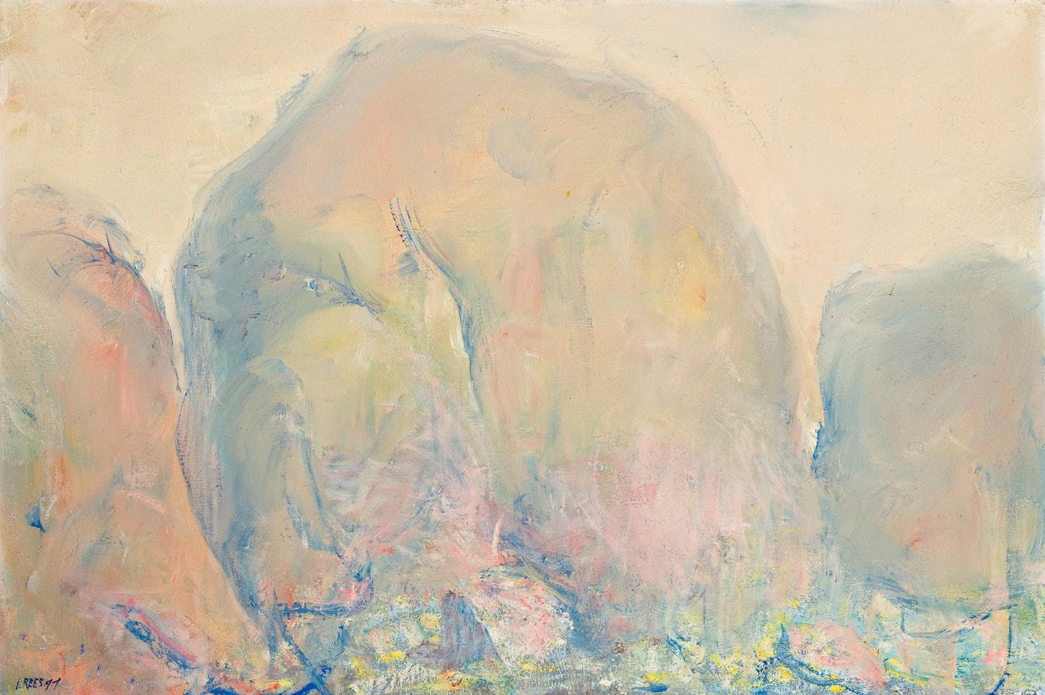
oil on canvas
90.0 x 110.0 cm
signed lower right: Coburn signed, dated and inscribed with title verso: JOHN COBURN MAQUETTE FOR TAPESTRY / “TREE OF LIFE” / 11/67
Estimate: $30,000 – 40,000
Private collection
Christie’s, Melbourne, 22 August 2000, lot 99
Private collection
Lawson~Menzies, Sydney, 22 July 2003, lot 99
Queensland Art Brokering, Queensland
Private collection, Sydney
Company collection, Melbourne
Deutscher and Hackett, Sydney, 2 December 2015, lot 67
Private collection, Indonesia
Related work
Tree of Life, 1968, wool tapestry, 1/6, 182.0 x 220.0 cm, formerly in the collection of Mrs Mary Alice Evatt, Sydney, illus. in Art and Australia, Ure Smith, Sydney, 1974, vol. 3, no. 11, p. 253
Throughout the 1960s and ’70s, the overarching theme of John Coburn’s work was his religious faith. Indeed, given the colour and exuberance of his paintings from this period, they may be considered among his most vibrant and theatrical achievements. Frequently highlighted with gold or silver paint, these works are imbued with a precious, almost devotional quality, endowing them with a palpable sense of the sacred. Their often-symmetrical compositions further echo the art and architecture of Christian places of worship.
Alongside his faith, Coburn drew deeply upon nature for inspiration. Tree of life (maquette for tapestry), 1967, stands as a quintessential example of the artist’s celebration of belief, incorporating stylised ecumenical symbolism as its central motif. Within this work, Coburn appears to merge two generative forces: the artist as creator and a higher, divine presence as the origin of all things. Alan Rozen succinctly articulates this duality: ‘He is constantly aware of the abstraction of a feeling for beauty and achieves his aims by a union of this feeling and beliefs in religion and nature. This then presents a twofold approach by Coburn to his work: first, he wants to produce something that is beautiful and pleasing to look at and, secondly, on a more profound level, he wants to relate his religion to nature, and nature to his religious beliefs.’ 1
While abstract painting in Sydney at this time was largely characterised by a lyrical sensibility, Coburn’s direct application of opaque paint and his personal repertoire of
forms became hallmarks of his mature style. His broad, elemental forms, articulated in slabs of secondary colour, offered a cool and measured counterpoint to the more gestural, arabesque tendencies of artists such as John Passmore, John Olsen, Robert Dickerson Johnson and Brett Whiteley.
Robert Hughes made a prescient observation in a review of an early Coburn exhibition at the Macquarie Galleries: ‘Coburn is unlike any other significant Australian non-figurative painter in that his works are deadpan, unmarked by the evidence of struggle which gives other abstracts their peculiar intensity… It may all look effortless and inevitable, as though the problems of painting had given way to those of assembling a jigsaw puzzle. His intuition does not, it seems, unfold itself during the final creative act; everything is thought out beforehand.’ 2
What Coburn may have lacked in lyricism, he more than compensated for through an astute instinct for colour and design. His popularity has not only endured but grown steadily over subsequent decades. Through numerous solo exhibitions, important commissions and prestigious awards, he has firmly cemented his place within the canon of Australian painting.
1. Rozen, A., The Art of John Coburn, Ure Smith, Sydney, 1979, p. 10
2. Hughes, R., ‘Coburn Jigsaws’, Nation, Sydney, 19 November 1960
Henry Mulholland
watercolour, gouache and pastel on paper
100.0 x 95.0 cm
signed, dated and inscribed with title lower left: John / Olsen 97 / Lily Pond
signed, dated, titled and inscribed with title verso: Morning Sun & Lily Pond / John Olsen 97 / Southbank Gallery
Estimate: $50,000 – 70,000
Australian Art Resources, Melbourne (inscribed verso)
Private collection, Melbourne
Deutscher and Hackett, Melbourne, 31 August 2011, lot 21
Private collection, Melbourne
‘The urge for life is a staggering thing and we just ought to take notice… There is such fecundity in this universe called a lily pond.’ 1
With his distinctive meandering line, exuberant mark-making and masterful command of colour, John Olsen is widely revered as one of the most significant figures of a generation that reshaped Australia’s perception of its natural environment. Across a career spanning more than seven decades, he sustained an unerring fascination with the natural world in all its myriad forms, producing evocative visions of the landscape that arguably captured the spirit and character of the country more eloquently than any other non-Indigenous artist before him. Self-described as a ‘wandering minstrel’ 2, Olsen travelled extensively throughout Australia and beyond, absorbing each terrain with poetic attentiveness; yet it was the extraordinary fecundity of the continent’s fertile waterways – its teeming wetlands, estuaries and lily ponds – that would emerge as his most enduring muse.
Olsen’s first sustained encounter with the Australian interior occurred in the early 1970s, when he was invited by filmmakers Ken Duncan and Robert Raymond, together with esteemed naturalist Vince Serventy, to participate in the ‘Wild Australia’ film series commissioned by the Australian Broadcasting Commission. Immediately awestruck by the incredible diversity of ecosystems he encountered during the journey, Olsen thus began his lifelong fascination with observing and painting not only individual species, but a sense of the whole, pulsating mass – ‘a carnival of life’. Indeed, Olsen’s sheer wonderment at the miracle of mother nature and her life-affirming properties reached its apogee in 1974 upon travelling to Lake Eyre where he witnessed the arid, salt-encrusted plains of the South Australian desert erupt into abundance following the extraordinary floods of 1973 (only the second such occurrence since white settlement): ‘… I draw studies of insects, animals and birds that will eventually be
realised as prints and watercolours. My devotion to Chinese art and philosophy finds a fulfilment in this experience. Nothing too small or too strange should escape my attention – an insect’s wing, the leap of a frog, the flight pattern of dragonflies. They all induce poetic rapture.’ 3 Equally too, Olsen became acutely aware of the vast cycle of death that ensued when the water receded –thus reiterating his Taoist belief in the total interconnectedness of all living forms and heralding a new spirituality in his art.
Over the ensuing decades, repeated visits to Lake Eyre and North Queensland would provide the impetus for some of Olsen’s most lyrical meditations on this fertile universe. Encouraging contemplation of the relationship between the tiny and the vast, the microcosm and the macrocosm, Morning sun and lily pond, 1997 is one such enchanting example from his mature period of watercolours on this theme. Now confronted with the realities of old age, significantly Olsen does not abandon hope in the redemptive, life-enhancing possibilities of nature; to the contrary, he embraces the principle of ecological integration and its capacity to enliven the spirit. As he had poignantly mused earlier that decade, ‘A search for completeness and ecstasy so lacking in our time. Probably will fail… Examination of different frogs, some sleek and streamlined with delicate fingers. Tiny tree frogs that hang from wet leaves, green on top and yellow underbelly, with spongy pads on feet and hands.’4 A luminous work teeming with his emblematic amphibians – sleek, streamlined or delicately suspended mid-leap – thus Olsen here captures with joyous abandon the fleeting instant when morning sunlight breaks after rain, evoking both the jewel-like richness and the exquisite fragility of this watery world he so revered.
1. John Olsen, cited in Hart, D., John Olsen, Craftsman House, Sydney, 1991, p. 123
2. John Olsen, cited ibid., p. 125
3. John Olsen, cited in Olsen, J., Drawn from Life, Duffy and Snellgrove, Sydney, 1997, p. 116
4. John Olsen cited ibid., pp. 307 – 08 Veronica Angelatos
oil on canvas
101.5 x 81.0 cm
signed lower right: Perceval signed, dated and inscribed verso: flowers / Perceval / 00
Estimate: $35,000 – 45,000
Provenance
Private collection
Savill Galleries, Sydney
Private collection, USA, acquired from the above
In the mid-1980s, John Perceval experienced a certain renaissance as a painter after an extended period of ill health. An exhibition in 1986 of drawings created during his convalescence generated much media attention and portrayed the ageing artist in the romantic stereotype of the troubled artist, ‘echoing myths of Van Gogh.’ 1 The subsequent paintings produced during Perceval’s twilight years were vibrant and high-keyed, their naive quality signalling a return to the artist’s earliest beginnings and the joie de vivre that had characterised his landscape paintings throughout the 1950s and 1960s.
Sunflowers, 2000 was painted during the last year of Perceval’s storied life, rendering its ebullient expression all the more poignant. One of many still life compositions of these sunny blooms that proliferated in the artist’s later paintings, Sunflowers is a resolved and emphatic counterpoint to (Van Gogh) Sunflowers, c.1935 (private collection), recorded in Traudi Allen’s catalogue raisonné as Perceval’s first painting in oils, completed at the tender age of 13. An almost perfect copy of Vincent Van Gogh’s Sunflowers, 1888 held in the Neue Pinakothek, Munich, Perceval’s early painting emulated the celebrated post impressionist’s distinct and textured brushstrokes in the honoured tradition of self-education, exhibiting a precocious understanding of the artist’s handling of materials, colour and technique. Painted some sixty years later, Sunflowers, 2000, likewise loosely refers
to the famous still life composition, featuring the same bisection of th e canvas with a yellow table against a blue background, a bulbous, two-toned ceramic vase and a floral arrangement of two kinds of sunflowers – single-petaled and pompom, fully double blooms. The disposition of flowers within the vase no longer exactly corresponds to Van Gogh’s painting, but is instead an exuberant recollection, painted with joyful abandon.
Perceval’s high-keyed palette, applied with a brush loaded with unmixed colour or in calligraphic coils straight from the tube, creates a radiant composition, swirling with energy. The artist’s emulation of plein-air impressionist techniques throughout the 1960s gave him an understanding of spontaneous and immediate painting before the subject, applying his brushstrokes authoritatively, and without revision. Leading Robert Hughes to accuse Perceval’s art of being ‘roly-poly’, the vigorous and loose gestural quality of Perceval’s brushwork became his hallmark, particularly later in life. 2 Here, far removed from Van Gogh’s crisp and static composition, Perceval’s idiosyncratic touch brings a life force, making the petals of the titular sunflowers tremble, as if flutterin g away in a strong breeze.
1. Reid, B., Of Light and Dark: the art of John Perceval, National Gallery of Victoria, Melbourne, 1992, p. 37
2. Hughes, R., ‘Irrational Imagery in Australian Painting’, Art and Australia, Ure Smith, Sydney, vol. 1, no. 3, 1963, p. 157 Lucie Reeves-Smith
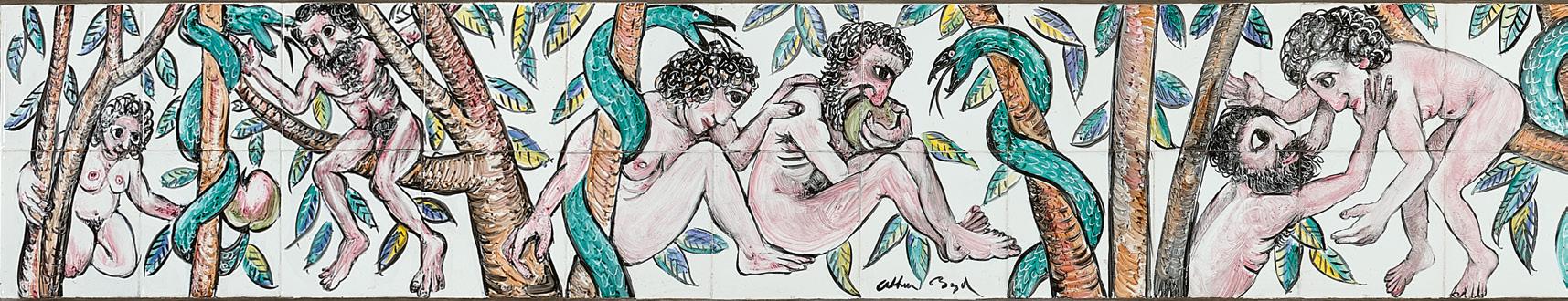
44 glazed ceramic tiles
15.0 x 15.0 cm (each)
30.0 x 330.0 cm (overall)
signed lower centre: Arthur Boyd
Estimate: $70,000 – 90,000
Provenance
G. D. Hillas Pty. Ltd., Melbourne, commissioned directly from the artist
Private collection, Sydney Deutscher~Menzies, Melbourne, 9 May 2001, lot 20 Private collection, Melbourne
Exhibited
The works of Arthur Boyd, Savill Galleries, Sydney, 12 May – 6 June 1998; Savill Galleries, Melbourne, 1 – 18 July 1998
Literature
Philipp, F., Arthur Boyd, Thames and Hudson, London, 1967, cat. 6.73, p. 252
The career of Arthur Boyd is distinguished by his mastery across media, be it painting, drawing, printmaking or ceramics. The son of Australia’s first studio potter Merric Boyd, Arthur learnt first by example, then through his own experimentation on his father’s equipment at the family compound known as ‘Open Country.’ In 1944, he formed his own business, AMB Pottery, in partnership with his brother-in-law John Perceval and their colleague Peter Herbst. Sited in a former butcher’s shop in Neerim Road, Murrumbeena, the pottery utilised some of Merric’s old machinery bolstered by a new gas kiln, stillage and electric wheel. The immediate aim was mass manufacture of utilitarian crockery to meet the demand caused by wartime shortages but once released from these restrictions, they set about making earthenware to their own design with under-glaze painted decorations featuring flowers, animals and joyous, boisterous scenes. Concurrently, Boyd was also painting significant works such as The Mockers (Art Gallery of New South Wales) and The Mourners (private collection), both from 1945, based on biblical stories inspired in part by his grandmother’s practice of reading aloud ‘from an illustrated bible, the tinted engravings in the text being as marvellous as they were bizarre, often even gruesome.’ 1 The frieze Adam and Eve, 1950 – 52, reflects all of these sources.
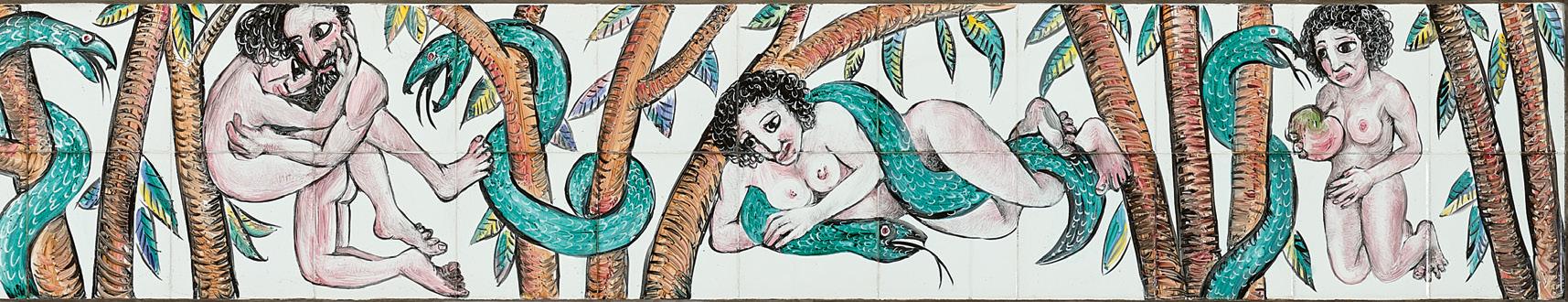
The mid-1940s was also the period when Boyd became enamoured of the imagery of Rembrandt and the Flemish artists Pieter Brueghel and Hieronymus Bosch, as well as the simplified passages of rich colour in the paintings of Tintoretto. With the added impetus of his involvement in the AMB Pottery, he started experimenting with an ‘‘idiosyncratic’ combination of oxides and slip mixed to the consistency of oil paint.’ 2 Boyd was quickly dazzled by the results, recalling in later years his excitement as he took the first tile out of the kiln: ‘It was the most marvellous feeling… a painting doesn’t have anywhere near the impact of pulling something out that has been almost purged by being through fire… It is a pure object and it is changed. It’s formed in the fire and so the surprise is marvelous.’ 3 He and Perceval further explored painting directly onto commercially produced tiles, some later fixed to small coffee tables, but Boyd was excited too by the possibility of these being used for extended friezes incorporating narratives depicted in episodes.
In Adam and Eve, Boyd employs the serpent as a unifying motif that also punctuates the events. The figure of Eve is based on Betty Burstall, identifiable by her curly black hair. Her presence links the frieze to Boyd’s earlier painting The expulsion, 1947
– 48 (Art Gallery of New South Wales), painted in a fury after she had conducted an adulterous affair with Perceval. Adam, however, is based on imagination, a wild and hirsute man who is initially shown living in harmony in the Garden before the serpent’s intervention. His emotions then erupt, first in violence then with desire, before ending with Eve firmly within the snake’s embrace. Boyd’s fluidity with the brush is exemplary and the narrative is further energised by ‘a dominant pictorial rhythm, (with) a strong telling and pervading gesture.’4
1. Gunn, G., ‘Tribute. Arthur Boyd: 1920-1999, Art and Australia, Sydney, vol. 37 no. 2, December 1999/January 2000, p. 207
2. See Pearce, B., Arthur Boyd: retrospective, Beagle Press, Sydney, 1993, p. 170
3. Arthur Boyd, cited in Pearce, ibid., p. 169
4. Philipp, F., Arthur Boyd, Thames and Hudson, London, 1967, p. 68
Andrew Gaynor
Leda and swan, 1960
polyvinyl acetate on composition board
152.0 x 122.0 cm
signed lower right: N
bears inscription on stretcher bar verso: Private collection / Not to be sold / Australian Galleries / Collingwood LEDA AND SWAN. 1960
SIDNEY NOLAN
bears inscription verso: CASE 3 / J. METCALFE [sic] / No 3 / 6th JUNE 1960 / nolan / 276
Estimate: $40,000 – 60,000
Provenance
The Matthiesen Gallery, London John Metcalf, London, acquired from the above in 1960
Thence by descent
Private collection, London
Exhibited
Sidney Nolan: Leda and the Swan and other recent work, The Matthiesen Gallery, London, 16 June – 16 July 1960
Sidney Nolan at Australian Galleries, Australian Galleries, Melbourne, 31 October – 17 November 1961, cat. 3
Sidney Nolan: Retrospective Exhibition, Paintings from 1937 to 1967, Art Gallery of New South Wales, Sydney, 13 September – 29 October 1967; National Gallery of Victoria, Melbourne, 22 November – 17 December 1967; The Western Australian Art Gallery, Perth, 9 January – 4 February 1968, cat. 100 (label attached verso)
Literature
Lynn, E., Sidney Nolan: myth and imagery, Macmillan, London & Melbourne, 1967, pl. 35, pp. 53, 71 (illus.)
1960 was a vibrant year for Australian artists in Britain with acclaimed exhibitions by Arthur Boyd, Albert Tucker and Sidney Nolan. Such was their presence that one critic advised ‘when in London ‘do as Melbourne does’ looks like becoming the keynote of the British art world this summer.’ 1 With the London opening in June of his extensive series based on the Greek myth of Leda and the Swan at Matthiesen Gallery, Nolan can truly be said to have arrived on the international scene. What made this even more remarkable was that it was the first time he had presented works based on a universal story rather than a purely Australian one. Financially, the show was an outstanding success, and purchasers included Her Majesty Queen Elizabeth the Second, Sir Kenneth Clark (then Chairman of the Arts Council of Great Britain), the Earl of Drogheda (Chairman of both the Financial Times and the Royal Opera House, Covent Garden), Agatha Christie, and the Art Gallery of New South Wales.
To have experienced the original Sidney Nolan: Leda and The Swan exhibition (which most likely featured the present work) would no doubt have been akin to walking into a chapel filled with stained glass. Viewed as if through a watery veil, the chaste maiden Leda is in constant animation as she first rebuffs the swan’s advances (being the Greek god Zeus in disguise), then participates in a dangerous courtship dance before succumbing to his feathered charms. Sometimes the mood is calm, in others it is fierce, a battle of wills; and the Leda and swan, 1960 on offer here depicts the transformative conclusion in an image redolent with poetic synthesis. 2 In a later interview, Nolan observed that ‘in a way, Leda (is) the idea of a nude figure being overcome by some force or other… of Leda being overwhelmed by God.’ 3 In this Leda and swan, Zeus is triumphant yet gentle, hovering behind a crouching Leda with his outstretched wing curving to embrace his expectant companion.
Nolan had been experimenting for the previous eighteen months with the recently developed polyvinyl acetate medium applied with squeegees, fingers, and brush. His fluid handling of this cutting-edge material in the Leda paintings enhanced the perception that his figures were swimming within the paint – sometimes above, often through, the viscid surface, flowing in and out of visibility. In a famed quote from one of her books, Cynthia Nolan recorded the process: ‘During the day he painted on the floor, first placing areas of colour on prepared board, next sweeping on polyvinyl acetate until the whole 4 x 5 feet area was thick with paint, then seizing a short-handled squeegee and slashing and wiping, cornering and circling like a skater, until another painting was completed… Now over and over again, he was painting Leda and the Swan.’4 In the present work, Nolan’s mastery of this painterly technique is on full display with drips seeping through the swan’s neck and scraped areas giving the wings a sensation of blurred flight. Even when separated from its companions, this Leda and swan remains an image of complete harmony and unification, and its own unique statement.
1. Stephen May cited in: Burke, J., Australian Gothic: a life of Albert Tucker, Knopf, Sydney, 2002, p. 361
2. All paintings in the series bear the same title.
3. Sidney Nolan cited in Souter, G., ‘An artist who stood in the acid’, Sydney Morning Herald, Sydney, 7 October 1967
4. Nolan, C., Open Negative: An American memoir, Macmillan, London, 1967, p. 224 Andrew Gaynor
pencil, watercolour, ink and crayon on paper
9.5 x 12.0 cm
signed and dated lower right: Moore 47
Estimate: $20,000 – 30,000
Provenance
Roland, Browse and Delbanco, London
C.H. Spiers, London
Sotheby’s, London, 22 June 1977, lot 186
Piccadilly Gallery, London, 1977
Mathilda and Emanuel M. Terner, Florida USA
J.A. Bauer, New York
Christie’s, New York, 10 November 1999, lot 132
Spink-Leger Pictures, London (label attached verso, as ‘Two Seated Figures’)
Private collection, acquired from the above in August 2000
Christie’s, London, 21 June 2016, lot 126
Private collection, Sydney
Literature
Garrould, A., (ed.), Henry Moore, Complete Drawings 1940–49, Much Hadham, London, 2001, vol. 3, no. AG 47.5, HMF 2393b, pp. 254, 255 (illus.)
43
William Kentridge South African, born 1955
Untitled V, 2007
bronze
38.0 cm (height)
edition: 5/14
signed with initials and numbered on base: WK 5/14
Estimate: $20,000 – 30,000
Provenance
Annandale Galleries, Sydney Private collection, Sydney
Exhibited
William Kentridge Telegrams From the Nose, Annandale Galleries, Sydney, 11 June – 19 July 2008 (illus. in exhibition catalogue, p. 24)
oil on canvas
96.5 x 66.0 cm
signed and dated upper right: A.M.E Bale 25 bears inscription verso: MOLLIE A.M.E Bale bears inscription verso: 6
Estimate: $20,000 – 30,000
Provenance
Estate of the artist
Leonard Joel, Melbourne, 25 May 1973, lot 414
Diana Gribble, Melbourne
Thence by descent
Private collection, Melbourne
Exhibited
7th Annual Exhibition, Twenty Melbourne Painters Society, Athenaeum Hall, Melbourne, 15 – 26 September 1925, cat. 8 (as ‘Mollie’)
Archibald Prize Finalist 1925, Art Gallery of New South Wales, Sydney, 16 January – 15 February 1926, cat. 54
Exhibition of Paintings, Athenaeum Art Gallery, Melbourne, 2 – 13 December 1930, cat. 44
A M E Bale & Victor E Cobb, Athenaeum Art Gallery, Melbourne, September 1933, cat. 5
Centenary Art Exhibition, Commonwealth Bank Building, Melbourne, 8 October – December 1934 (label attached verso)
A Century of Australian Woman Artists, Deutscher Fine Art, Melbourne, 4 June – 3 July 1993, cat. 58 (as ‘Mollie’)
Literature
‘Art Notes: The Society of Twenty Painters’, The Age, Melbourne, 15 September 1925, p. 9
Streeton, A., ‘Art Exhibitions: Fine Work at Athenaeum’, The Argus, Melbourne, 2 December 1930, p. 9
‘Art Notes’, The Age, Melbourne, 2 December 1930, p. 10 Bell, G., ‘Ten Artists Hold Display’, The Sun, Melbourne, 2 December 1930, p. 15
Streeton, A., ‘Paintings and Etchings: Miss Bale and Victor Cobb’, The Argus, Melbourne, 26 September 1933, p. 8 Centenary Gift Book, published for The Women’s Centenary Council,
Melbourne, 1934, p. 49
Deutscher, C., A Century of Australian Women Artists, Deutscher Fine Art, Melbourne, 1993, p. 36 (illus., as ‘Mollie’)
Perry, P., & Perry, J., Max Meldrum & Associates Their Art, Lives and Influences, Castlemaine Art Gallery and Historical Museum, Victoria, 1996, pp. 75 – 77
Perry, P., A.M.E. Bale: Her Art and Life, Castlemaine Art Gallery and Historical Museum, Victoria, 2011, pp. 88, 89 (illus.)
Related work
Miss Mollie Agnew (The yellow dress), 1924, oil on canvas, 90.0 x 69.5cm, Horsham Regional Art Gallery, Victoria
We are grateful to Peter Perry for his assistance with this catalogue entry.
Miss Alice Marian Ellen Bale exhibited remarkable artistic ability from an early age, beginning formal instruction at just seven years old. Her first significant teacher was Miss May Vale (1862 – 1945), who had recently returned from studies in Europe and England, where she trained in London under Sir James Linton. Bale further developed her skills with additional lessons from Hugh Ramsay, before enrolling at the Melbourne National Gallery School where she studied under Fred McCubbin and Bernard Hall.
A pivotal moment in Bale’s artistic development occurred with the return to Australia of Max Meldrum in late 1911, following eleven years of painting and study in France. Bale became a committed supporter of Meldrum between 1916 and 1918 and studied with him for a period of six months during those years.
While Bale is widely recognised as one of Australia’s most accomplished painters of flowers, her portraits reveal a subtlety and psychological sensitivity that are equally significant. The present portrait, Mollie (Miss Mollie Agnew), 1925 was exhibited in the 1925 Archibald Prize at the Art Gallery of New South Wales. Between 1922 and 1942, Bale was represented in the Archibald
Prize on thirteen occasions. Her exhibition record also includes nine works selected for the Wynne Prize for landscape and one work accepted for the Sulman Prize for genre painting.
Throughout her career, Bale took gender equality as a given. As she succinctly stated, ‘…there is no gender in art, only good and bad artists.’ 1 Her confident and assertive nature suited her to leadership roles, and she served with distinction as honorary secretary of the Twenty Melbourne Painters Society for a remarkable thirty-five years.
When the present work was first exhibited in the 7th Annual Exhibition of the Twenty Melbourne Painters Society in 1925, The Argus critic noted, ‘From Miss A. M. E. Bale an interesting portrait of rich colour scheme entitled “Mollie” claims attention by its sound and craftsman-like qualities of tone and form.’ 2 The Age similarly praised her achievement, observing: ‘Miss Bale is showing some admirable work. No. 8 (“Mollie”) is a clean and well-painted study of a girl, and No. 9 is an excellent still life. No. 13 (“Autumn”) is the best landscape effort of this painter we have seen.’ 3 Further acclaim followed in 1930, when Sir Arthur
Streeton, reviewing an exhibition at the Athenaeum Gallery, wrote: ‘Seven exhibits by Miss A. M. E. Bale are dominated by No. 4 4, “Mollie”, a figure picture well-conceived and thoroughly well painted. It is a thorough success, and it stands upon a much higher plane than the artist’s flower painting.’4
Little is known about the sitter of this portrait, Miss Mollie Agnew. She was the daughter of Mrs Dunbar Ainslie Agnew and Dr James Francis Agnew, principal medical officer of the Commonwealth Repatriation Department and a founding figure of Bethesda Hospital, established in 1906 at 30–32 Erin Street, Richmond, one of Australia’s earliest intermediate hospitals. Mollie Agnew had one sister and two brothers and may have met Bale while the artist was living in Richmond. The Agnew family resided at 10 Erin Street, Richmond, and Mollie attended Erin Street State School.
1. Bale, A.M.E., ‘No Sex in Art’, The Argus, Melbourne, 20 December 1937, p. 10
2. ‘Art Exhibition: Twenty Melbourne Painters Group’, The Argus, Melbourne, 15 September 1925, p. 6
3. ‘Art Notes: The Society of Twenty Painters’, The Age, Melbourne, 15 September 1925, p. 9
4. Streeton, A., ‘Art Exhibitions: Fine Work at Athenaeum’, The Argus, Melbourne, 2 December 1930
In the shade, 1910
oil on canvas
76.0 x 64.0 cm
signed and dated lower left: George Bell 10
Estimate: $10,000 – 15,000
Provenance
Elizabeth Glenn (née Balderstone) (pupil of George Bell), purchased direct from artist, Melbourne
Thence by descent
Private collection, Melbourne
Exhibited
First solo exhibition, Athenaeum Gallery, Melbourne, 14 – 25 September 1920, cat. 36
Literature
‘Exhibition of Painting works by George Bell’, The Argus, Melbourne, 14 September 1920, p. 8
We are grateful to Peter Perry for his assistance with this catalogue entry.
No history of Australian art would be complete without acknowledging the pioneering classical modernist painter George Bell, famously described as ‘the revolutionary in a bowler hat.’
As James Mollison, then Director of the National Gallery of Victoria, wrote in his foreword to the landmark exhibition Classical modernism: the George Bell circle, ‘Bell occupies a unique position in the development of Australian art. After spending a significant portion of his career working in a traditional manner, he was converted to modern art and spent the remainder of his life instilling its principles into two generations of Australian painters… He was convinced that the language of form was universal and that this language, based on drawing, composition, craftsmanship and a study of the old and modern masters, could be taught.’ 1
Much of Bell’s earlier Edwardian work remains elusive, however paintings such as the present In the shade, 1910 demonstrate a high level of accomplishment. This work was exhibited following Bell’s fifteen-year sojourn in the major art centres of Europe and appeared in his first solo exhibition in Melbourne in 1920. Reviewing the exhibition, The Argus art critic observed: ‘A series of pictures of figures in landscape is hung, and ‘John Nicholson, Gypsy’, ‘A Summer Day’, ‘Gypsy Camp’, and ‘In the Shade’ are proof of skill in draughtsmanship and instinct for selection that have led to pleasing results.’ 2
A significant influence on Bell during the period 1908 – 1915 was the British painter Philip Connard (1875 – 1958). As June Helmer has noted, ‘Connard and Bell had a similar academic
training; both had studied with Jean-Paul Laurens at the Académie Ju lian in Paris, both belonged to the Chelsea Arts Club and exhibited at the same societies. They became close friends, went on painting trips together, painted the same scenes and shared many ideas on how to paint a picture.’ 3 Writing in March 1938 for The Melbourne Sun, Bell himself noted that ‘Connard’s work showed a keen appreciation of paint quality—an understanding and love of the material used.’4
Bell painted a portrait of Connard’s youngest daughter Jane in 1914, titled Little lady, which was included in his 1920 exhibition. The National Gallery of Victoria acquired a major portrait by Connard of his two daughters, Helen and Jane, c.1913, through the Felton Bequest in 1933 – although this work is now rarely displayed.
Reviewing Classical Modernism: The George Bell Circle, Robert Rooney observed that ‘the characteristics of the New Classicism—its figural basis, formal order and serene mood— were ideally suited to Bell’s training and tempera ment.’ 5
1. Mollison, J., ‘Director’s Foreword’ in St John Moore, F., Classical Modernism: The George Bell Circle, National Gallery of Victoria, Melbourne, 1992, n. p.
2. ‘Exhibition of Paintings: Works by Mr George Bell’, The Argus, 14 September 1920, p. 8
3. Helmer, J., George Bell: The Art of Influence, Greenhouse Publications, Richmond, 1985, p. 37
4. Bell, G., The Melbourne Sun, March 1938
5. Rooney, R., ‘Long overdue but Bell strikes the right note,’ The Australian Weekend Review, 13 – 14 June 1992
watercolour on pre-prepared sketching board
27.0 x 18.5 cm (sheet)
signed and dated lower right: F McCubbin / 1909
Estimate: $15,000 – 20,000
Provenance
Fred Scarlet, Melbourne, a gift from the artist
Thence by descent
Private collection, Melbourne
Thence by descent
Private collection, Melbourne
Private collection, Melbourne, a gift from the above
47 Clara Southern (1860 – 1940)
Yarra at Warrandyte oil on canvas on board
35.0 x 29.0 cm
signed lower right: C Southern bears inscription on old label verso: Yarra at Warrandyte Clara Sothern [sic]
Estimate: $10,000 – 15,000
Provenance
Henrietta Gulliver, Melbourne
Thence by descent
Private collection, United Kingdom
Related work
A cool corner, c.1915, oil on canvas, 76.5 x 61.5 cm, Ballarat Art Gallery, Victoria (gift of Mr J.T. Tweddle)
tempera on card
26.0 x 35.0 cm
signed lower left : CARRICK FOX
signed and inscribed with title on artist’s label verso: 46 / The Pont Neuf, Paris / E. Carrick Fox
Lucien Lefebvre-Foinet, Paris, label attached verso (stock no.4988)
bears Bouane Centale Exportation Paris, stamp verso
Estimate: $20,000 – 30,000
Provenance
Estate of the artist
Collection of Pictures by the Late E. Phillips Fox and E. Carrick Fox, Leonard Joel, Melbourne, 26 September 1952, lot 5 Osborne Art Gallery, Adelaide, acquired from the above in 1952 Private collection, Sydney
Exhibited
Exhibition of Paintings by the late E. Phillips Fox and Ethel Carrick, Athenaeum Art Gallery, Melbourne, 27 February – 10 March 1934, cat. 119
Literature
‘Australian Artists at the Athenaeum’, The Age, Melbourne, 27 February 1934, p. 7
Nora Heysen (1911 – 2003)
Mixed flowers in a silver jug, 1931
oil on canvas on board
29.0 x 19.0 cm
signed and dated lower right: Nora Heysen / 1931
Estimate: $15,000 – 20,000
Provenance
Private collection, Adelaide
Elder Fine Art, Adelaide, 10 July 2022, lot 36 (as ‘Mixed Flowers from the Artist’s Garden in Classical Silver Jug’)
Private collection, Sydney
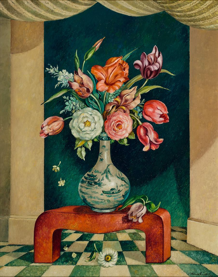
Flowers in a Chinese vase, 1955
oil on canvas
51.5 x 41.0 cm
signed and dated lower right: Adrian Feint / 1955
Estimate: $12,000 – 18,000
Provenance
Artlovers, Sydney, acquired directly from the artist in 1958
Private collection, Sydney Bonhams, Sydney, 10 September 2024, lot 38 (as ‘Still Life’)
Private collection, Sydney
Literature
Feint, A. & C. J. Smith, Adrian Feint catalogue of paintings, 1928 – 1971, State Library of New South Wales, Sydney, n.p.
Diana wounded, 1905
bronze
36.5 cm (height)
41.0 cm (including base)
signed and dated at base: 1905 / B. Mackennal
Estimate: $30,000 – 40,000
Provenance
Private collection, France
Senequier-Crozet, Grenoble, 30 September 2025, lot 251 (as ‘Diane blessée’) Private collection, France
Exhibited (selected)
The Exhibition of the Royal Academy of Arts, Royal Academy of Arts, London, 1906, cat. 1648 (another example)
Exhibition of Bronzes by Sir Bertram Mackennal K.C.V.O., R.A., Macquarie Galleries, Sydney, 7 – 20 October 1926, cat. 11 (another example)
Bertram Mackennal: The Fifth Balnaves Sculpture Project, Art Gallery of New South Wales, Sydney, 17 August – 4 November 2007 and touring to National Gallery of Victoria, Melbourne, 30 November 2007 – 24 February 2008 (another example)
Literature (selected)
‘Royal Academy Exhibition, Australian Pictures’, The Register, Adelaide, 20 June 1906, p. 6 (another example, as ‘Diana’) ‘Memorial Exhibition Statuettes by Mackennal’, The Examiner, Tranter, R. R., Bertram Mackennal: A Career, Parker Pattinson Publishing, New South Wales, 2004, cat. 58, p. 137 (another example) Edwards, D., Bertram Mackennal: The Fifth Balnaves Sculpture Project, Art Gallery of New South Wales, Sydney, 2007, pp. 66 (illus., another example), 67, 68, 116 – 118
Related works
Diana Wounded, c.1907, marble, 147.3 x 81.9 x 62.2 cm, Tate, London
The mythological tales of the huntress Diana inspired many artists over the centuries – with Diana and Actaeon, 1556 – 59 (National Gallery, London) by Venetian Renaissance master Titian being one of the most celebrated examples. By contrast, Bertram Mackennal’s bronze Diana wounded, 1905 is a far cry from Actaeon being torn to pieces by his own hounds. Stripped of her godly attributes, ‘her bow and hounds’, here Diana is presented, rather, as a blithe nude in all her virgin splendour, with her contemporary appearance as a nubile Edwardian beauty the subject of much commentary by writers.1 During the 1890s, Mackennal’s mind was very much occupied, like many of the best fin de siècle artists and writers, with the femmes fatales of both his time and of past ages – smart, alluring women capable of persuasion and emasculation. Witness for example, his various portrayals of the world’s greatest
contemporary actress at the time, Sarah Bernhardt – the living image of that mesmerisingly seductive woman – in her in the role of Cleopatra and a bold bronze relief (c.1892 – 93) in the collection of the Art Gallery of New South Wales, alongside bronzes immortalising prominent female figures of antiquity, including his infamous Circe, 1893 (National Gallery of Victoria) and Salome, c.1895 (Art Gallery of New South Wales). Although Mackennal’s approach changed in the first decade of the new century with his women becoming outwardly more genteel, refinement did not reduce their considerable appeal.
Diana, in Roman mythology, was the moon goddess of the hunt and birthing – the equivalent of the Greek goddess Artemis, daughter of Zeus and twin sister of the sun god Apollo. According to mythology, Jupiter gave Diana permission ‘to live in perpetual celibacy’ and, as ‘the patroness of chastity’, ‘to shun the society of men’ 2; notably however such mythological references are avoided in Mackennal’s interpretation which is purposely more tongue-in-cheek. Indeed, here the vicious Roman moon goddess in Ovid’s Metamorphoses is inverted; it is she, not the quarry Damasichthon, son of Amphion and Niobe, who is injured in the leg. 3 Considering the association of Diana with ‘heavenly’ and ‘divine’, Mackennal carried this further. Divine in looks rather than status, she is a sight perilously tantalising to the mortal male – with the action of bandaging her thigh, inspired by the more explicit sight of ‘a model doing up her stocking’, effectively enabling the artist to show off her bodily attributes without loss of modesty.4 This teasing play between the appealing and the unobtainable epitomised that beguiling blend of poise and pleasure so typical of la belle époque and its English Edwardian counterpart. Although calling freely upon ancient Greek and Roman sculptures of the goddess of love, Aphrodite and Venus, she is a thoroughly modern Edwardian maiden. Effectively using the contrapposto pose, Mackennal created an ideal image endowed with grace, but sensuous of modelling. When Mackennal made a marble life-sized version in 1907 – 08, he crowned Diana with her crescent moon. It was smartly acquired by the Chantrey Bequest for the Tate Gallery in London in 1908 and subsequently hailed by The Times as ‘one of the most beautiful nudes that any sculptor of the British school has produced.’ 5
1. Edwards, D., Bertram Mackennal: The Fifth Balnaves Sculpture Project, Art Gallery of New South Wales, Sydney, 2007, pp. 67 – 68
2. Lemprière, J., Lemprière’s Classical Dictionary of Proper Names mentioned in Ancient Authors, Routledge and Kegan Paul Ltd, London, revised edition, 1972, p. 204
3. Hutchison, N., ‘Here I am!’: sexual imagery and its role in the sculpture of Bertram Mackennal’, in Edwards, op. cit., p. 116
4. ibid.
5. ‘The Royal Academy: second notice’, The Times, London, 8 May 1908, p. 6, cited in Edwards, op. cit., p. 67
Hans Heysen (1877 – 1968)
Ambleside landscape, 1948
watercolour on paper on card 32.0 x 41.0 cm (sheet)
signed and dated lower right: HANS HEYSEN 48
signed and inscribed with title verso: No 30. “Ambleside Landscape” / Hans Heysen
Estimate: $20,000 – 30,000
Provenance
Private collection
Sotheby’s, Sydney, 17 November 1988, lot 320 (as ‘Ambleside Landscape (No. 30)’)
Private collection
Sotheby’s, Melbourne, 19 April 1994, lot 149
Henry Krongold, Melbourne
Thence by descent
Private collection, Melbourne
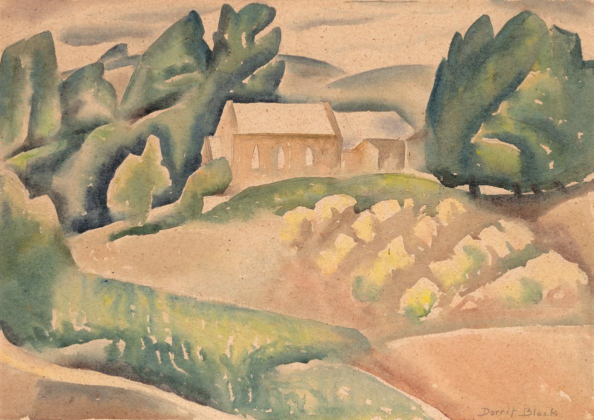
The church on the hill, c.1935 – 38
watercolour on paper
29.0 x 39.0 cm
signed lower right: Dorrit Black inscribed with title on sheet verso: The Church on The Hill
Estimate: $8,000 – 12,000
Provenance
Estate of the artist
N.H.B Paton, Perth
Ian North, Adelaide, acquired from the above in 1973
Private collection, New South Wales
Private collection, New South Wales, acquired from the above in 2004
Literature
North, I., The Art of Dorrit Black, Macmillan and Art Gallery of South Australia, Adelaide, 1979, cat. W.32, p. 127
Ben Quilty born 1973
Bird, 2018
oil on canvas
50.5 x 40.5 cm
signed, dated and inscribed with title verso: Ben Quilty, 2018 ‘Bird’
Estimate: $25,000 – 35,000
Provenance
Private collection, Sydney, acquired directly from the artist in 2018
Philip Wolfhagen born 1963
Second Reverie, 2019
oil and beeswax on linen
120.0 x 96.0 cm
signed with initial and artist’s stamp, dated and inscribed with title lower right: W WINTER / 2019 / “Second / Reverie”
signed, dated and inscribed with title verso: PHILIP WOLFHAGEN / “Second Reverie” 2019
Estimate: $20,000 – 30,000
Provenance
Philip Bacon Galleries, Brisbane (label attached verso)
Private collection, Sydney
Exhibited
Philip Wolfhagen: Reveries, Philip Bacon Galleries, Brisbane, 15 October – 9 November 2019, cat. 7 (illus. in exhibition catalogue, p. 3)
Sidney Nolan (1917 – 1992)
Queensland beach scene, 1948
Ripolin enamel on composition board
61.0 x 73.0 cm
signed and dated lower right: 10 Dec 48 / Nolan
Estimate: $28,000 – 35,000
Provenance
Private collection, Melbourne
Private collection, Sydney, acquired from the above c.1984 (as ‘Untitled, 1960’ [sic])
Deutscher and Hackett, Melbourne, 21 April 2021, lot 62 (as ‘Untitled landscape’)
Private collection, Adelaide
57 Tim Storrier born 1949
Noon blaze line, c.1990
synthetic polymer paint and rope on paper
103.0 x 152.0 cm
signed and inscribed with title lower right: ‘Noon blaze line’ / Storrier
Estimate: $30,000 – 40,000
Provenance
Fischer Fine Art, London
Private collection, London, acquired from the above in 1990
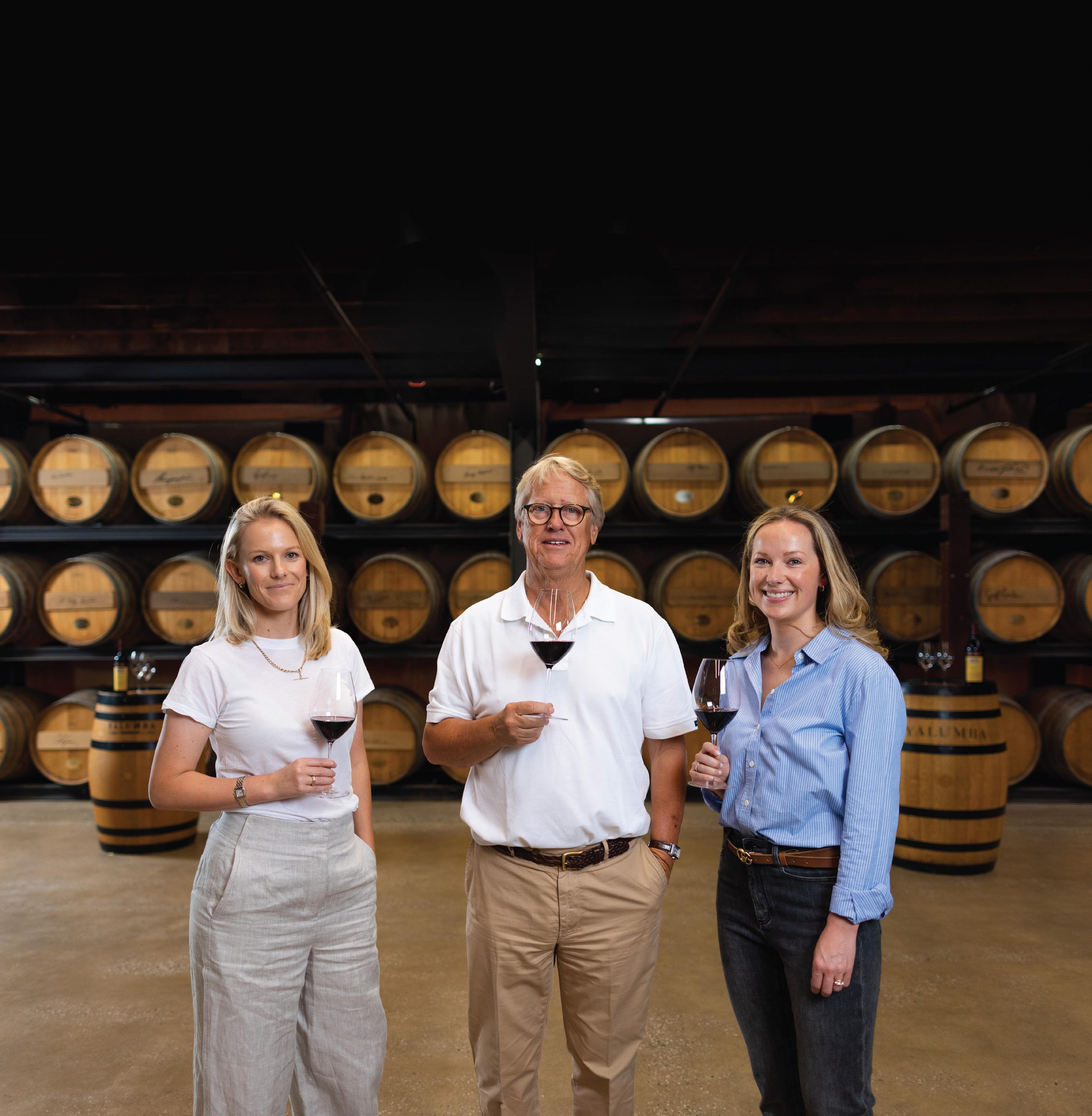
While we are ever grateful and respectful of our past, it’s our future that excites us the most. And always has done. Any business that has managed to flourish across three centuries won’t ever be accused of resting on its laurels or wishing for yesteryear. We stand on the shoulders of those who went before us and in doing so, we have a clearer view of what lies ahead.
And while it rests with the fifth and sixth generations of the Hill-Smith family to guide the ship, it’s all those who make up the wider Yalumba family today we are most grateful for. From our staff to our suppliers, trade partners and supporters. Every one of them has an undying passion for fine wines and great quality in all they do. They inspire us and push us to greater heights, and we look forward to further collaboration with them, as well as new partners, in the years ahead.
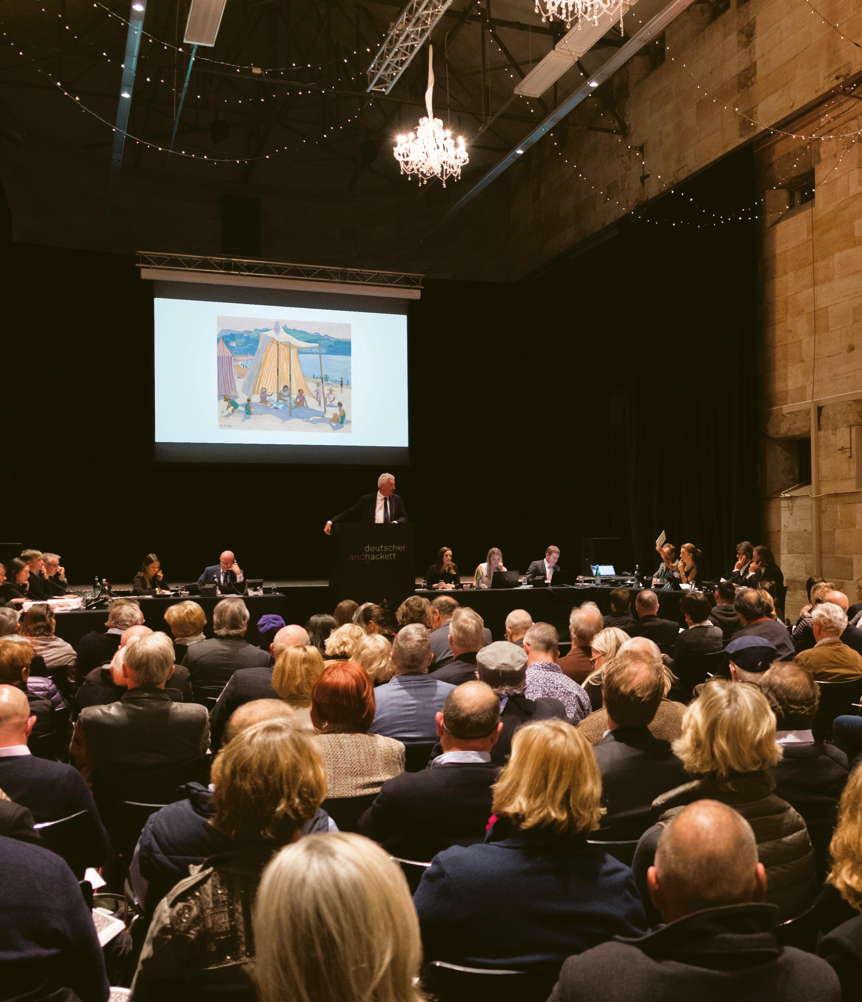
ALL PARTIES ARE STRONGLY URGED TO READ THE CONDITIONS OF AUCTION AND SALE INCLUDED IN THIS CATALOGUE
CATALOGUE SUBSCRIPTIONS
Catalogues can be obtained at Deutscher and Hackett offices or by subscription (see the Catalogue Subscription Form at the back of this catalogue or online for more information).
PRE-SALE ESTIMATES
The price range estimated against each lot reflects the opinion of our art specialists as to the hammer price expected for the lot at auction and is informed by realised prices for comparable works as well as the particularities of each lot including condition, quality, provenance and rarity. While presale estimates are intended as a guide for prospective buyers, lots can be sold outside of these ranges. Pre-sale estimates include GST (if any) on a lot but do not include the buyer’s premium or other charges where applicable.
The reserve is the minimum price including GST (if any) that the vendor will accept for a lot and below which the lot will not normally be sold.
PRE-AUCTION VIEWINGS
In both Sydney and Melbourne pre-auction viewings are scheduled for several days in advance of each auction. Deutscher and Hackett specialists are available to give obligation free advice at viewings or by appointment and prospective buyers are strongly encouraged to thoroughly examine and request condition reports for potential purchases. Pre-auction viewings are open to the public and are free to attend.
SYMBOL KEY
▲ Unless ownership is clearly stated in the provenance, this symbol is used where a lot is offered which Deutscher and Hackett owns in whole or in part. In these instances, Deutscher and Hackett has a direct financial interest in the property or means that Deutscher and Hackett has guaranteed a minimum price.
● Used to indicate lots for sale without a reserve.
EXPLANATION OF CATALOGUING PRACTICE AND TERMS
All information published in Deutscher and Hackett catalogues represent statements of opinion and should not be relied upon as fact. All dimensions are listed in centimetres, height before width and are approximate. All prices are in Australian dollars.
ARTIST’S NAMES
All reference to artists make use of common and not full names in accordance with the standards outlined in the National Gallery of Australia reference publication Australian Art: Artist’s working names authority list. For instance, John Brack rather than Cecil John Brack; Roy de Maistre rather than Leroy Leveson Laurent De Maistre; Rosalie Gascoigne rather than Rosalie Norah Gascoigne.
Terms used in this catalogue have the meanings ascribed to them below:
a. NICHOLAS CHEVALIER: in the opinion of Deutscher and Hackett, a work by the artist.
b. Attributed to NICHOLAS CHEVALIER: in the opinion of Deutscher and Hackett, probably a work by the artist, in whole or in part.
c. Circle of NICHOLAS CHEVALIER: in the opinion of Deutscher and Hackett, a work showing the influence and style of the artist and of the artist’s period.
d. Studio/Workshop of NICHOLAS CHEVALIER: in the opinion of Deutscher and Hackett, a work possibly executed under the supervision of the artist.
e. School of NICHOLAS CHEVALIER: in the opinion of Deutscher and Hackett, a work by a follower or student of the artist.
f. Manner of NICHOLAS CHEVALIER: in the opinion of Deutscher and Hackett, a work created in the style, but not necessarily in the period, of the artist.
g. After NICHOLAS CHEVALIER: in the opinion of Deutscher and Hackett, a copy of a work by the artist.
h. “signed” / “dated” in the opinion of Deutscher and Hackett, the work has been signed/ dated by the artist.
i. “bears signature” / “bears date” in the opinion of Deutscher and Hackett, the work has possibly been signed/dated by someone other than the artist.
Where appropriate, Deutscher and Hackett will include the known provenance, or history of ownership of lots. Non disclosure may indicate that prior owners are unknown or that the seller wishes to maintain confidentiality.
Auctions are open to the public and are free to attend. Deutscher and Hackett may exclude any person at any time in its discretion.
Bidders must register to bid prior to the commencement of an auction. Deutscher and Hackett may impose other obligations on the registration of bidders in its discretion.
Lots are offered for sale on a consecutive basis. Deutscher and Hackett will determine the conduct of the auction in its absolute discretion, including the regulation of bidding. Consecutive or responsive bids may be placed by the auctioneer on behalf of the vendor up to the reserve.
As a courtesy service, Deutscher and Hackett will make reasonable efforts to place bids for prospective buyers in absentia provided written or verbal instructions (as indicated on absentee bid forms included at the back of this catalogue or online) are received 24 hours prior to auction. Where successful, lots will be purchased at the lowest possible bid and in the event of identical absentee bids, the bid received earliest will take precedence. Deutscher and Hackett accepts no responsibility for errors and omissions in relation to this courtesy service and reserves the right to record telephone bids.
Unless indicated otherwise, all lots are subject to a confidential reserve price determined by the vendor. Deutscher and Hackett or the auctioneer may place any number of bids on behalf of the vendor below the reserve price and is not obliged to identify that the bids are being placed on behalf of the vendor.
Bidding usually opens below the listed pre-sale estimate and proceeds in the following increments (the auctioneer may vary the bidding increments at his or her discretion):
$500 – 1,000 by $50
$1,000 – 2,000 by $100
$2,000 – 3,000 by $200
$3,000 – 5,000 by $200 / $500 / $800
$5,000 – 10,000 by $500
$10,000 – 20,000 by $1,000
$20,000 – 30,000 by $2,000
$30,000 – 50,000 by $2,000 / $5,000 / $8,000
$50,000 – 100,000 by $5,000
$100,000 – 200,000 by $10,000
$200,000 – 300,000 by $20,000
$300,000 – 500,000 by $20,000 / $50,000 / $80,000
$500,000 – 1,000,000 by $50,000
$1,000,000+ by $100,000
SUCCESSFUL BIDS
The fall of the auctioneer’s hammer indicates the final bid and the buyer assumes full responsibility for the lot from this time.
Where a lot is unsold, the auctioneer will announce that the lot is “bought in”, “passed”, “withdrawn” or “returned to owner”.
Payment must be made within seven days of the date of sale in Australian dollars by cash, cheque, direct deposit, approved credit cards or electronic funds transfer. If payment is made by credit card the price will increase by any merchant fees payable by Deutscher and Hackett (1.15% (including GST) for Visa and Mastercard and 1.65% (including GST) for American Express). In certain circumstances, extension of payment may be granted at the discretion of Deutscher and Hackett. Cleared funds will be held in an interest bearing trust account by Deutscher and Hackett until remitted to the vendor. Deutscher and Hackett will be entitled to retain any interest earned during this period. Payment by the vendor of any charge to Deutscher and Hackett is to be made within fourteen days of invoice.
The purchase price will be the sum of the final bid price (including any GST) plus a buyer’s premium set at 25% (inclusive of GST) of the final bid price. Buyers may be liable for other charges reasonably incurred once ownership has passed.
Buyers are required to pay a 10% G.S.T which sum is:
a. included in the final bid prices where buying from a GST registered vendor; and b. included in any additional fees charged by Deutscher and Hackett; and c. included in the buyer’s premium.
Where GST applies to some lots the final bid price will be inclusive of the applicable GST. If a buyer is classified as a “non-resident” for the purpose of GST, the buyer may be able to recover GST paid on the final purchase price if certain conditions are met.
Lots paid for in full may be collected from Deutscher and Hackett premises the day after the auction occurs but lots paid for by cheque may not be collected until all funds have cleared. Proof of identification is required upon collection and lots not collected within seven days of the sale may incur costs associated with external storage and freight.
Risk in the lot, including risk of loss or damage, will pass to the buyer on either the date payment is due, whether or not it has been made, or on collection by the buyer, whichever is earlier. The buyer is therefore encouraged to make arrangements to ensure comprehensive cover is maintained from the payment due date.
Deutscher and Hackett directly offers services including storage, hanging and display, appraisals and valuations, collection management and research and in all instances will endeavour to coordinate or advise upon shipping and handling, insurance, transport, framing and conservation at the request and expense of the client. Deutscher and Hackett does not accept liability for the acts or omissions of contracted third parties.
Prospective bidders are advised to enquire about export licences — including endangered species licences and cultural heritage permits, where relevant — prior to bidding at auction. Telephone the Cultural Property and Gifts Section, Museums Section, Ministry for the Arts, on 1800 819 461 for further information. The delay or denial of such a licence will not be grounds for a rescission of sale.
The copyright in the images and illustrations contained in this catalogue may be owned by third parties and used under licence by Deutscher and Hackett. As between Deutscher and Hackett and the buyer, Deutscher and Hackett retains all rights in the images and illustrations. Deutscher and Hackett retains copyright in the text contained in this catalogue. The buyer must not reproduce or otherwise use the images, illustrations or text without prior written consent.
ALL PARTIES ARE STRONGLY URGED TO READ THE CONDITIONS OF AUCTION AND SALE INCLUDED IN THIS CATALOGUE
The terms and conditions of business set forth below are subject to amendment by verbal or written notice prior to and during the auction and sale. They constitute the entire contractual agreement with the buyer in respect to any lot offered at auction. By bidding at auction in any manner compliant with bidding procedures, the buyer and all bidders agree to be bound by these terms and conditions and the terms of the prospective buyers and sellers guide contained in this catalogue, as amended. To the extent that an agent acts on behalf of the buyer, liability for obligations arising from these conditions of business will pass to the buyer. Multiple buyers are jointly and severally liable for obligations arising from this agreement.
1. Definition of terms:
a. The ‘buyer’ refers to the party with the highest accepted bid for any lot at auction and/or such party’s principal where bidding as agent.
b. The ‘vendor’ refers to the party consigning property for sale and/or such party’s principal where acting as agent.
c. ‘Deutscher and Hackett’ refers to Deutscher and Hackett Pty Ltd ACN 123 119 022, its subsidiaries, officers, employees and agents.
d. The ‘hammer price’ refers to the final bid price (including any GST) accepted by the auctioneer, or in the case of a post-auction sale, the agreed sale price (including any GST).
e. The ‘buyer’s premium’ refers to the 25% (inclusive of GST) payable by the buyer calculated as a percentage of the hammer price.
f. ‘GST’ refers to the goods and services tax imposed by the A New Tax System (Goods and Services) Act 1999 as amended.
g. The ‘lot’ refers to the item(s) described against any lot number in the catalogue.
h. The ‘reserve’ refers to the minimum price (including any GST) the consignor will accept for a lot.
2. Agency: Deutscher and Hackett acts as agent for the vendor and the contract of sale for the lot will be between the buyer and the vendor.
3. Property is sold ‘as is’: To the extent permitted by law:
a. no guarantees, warranties or representations are made (express or implied) by Deutscher and Hackett or the vendor in relation to the nature and condition of any lot; and
b. Deutscher and Hackett disclaims liability for any misrepresentations, errors or omissions, whether verbal or in writing, in the catalogue or any supplemental material.
All factual information provided by the vendor is merely passed on by Deutscher and Hackett from the vendor or other source. Deutscher and Hackett has made no attempt to verify this information. All additional statements of opinion represent the specialist opinions of Deutscher and Hackett employees and should not be relied upon as statements of fact.
4. Responsibility to inspect: Responsibility remains with the buyer to satisfy its, his or her self by inspection and evaluation prior to purchase as to the nature and condition of any property.
5. Registration: Bidders must register to bid and obtain a bidder’s paddle prior to the commencement of the auction. Registration requires that bidders provide proof of identity and Deutscher and Hackett may impose other obligations on the registration of bidders in its discretion.
6. Auctioneer’s discretion: Deutscher and Hackett reserves the right to absolute discretion over the conduct of the auction including the regulation of bidding and its increments. This discretion extends to the challenge or rejection of any bid, the right to withdraw any lot and the right to determine the successful bidder or reoffer a lot in the event of a dispute. The prospective buyers and sellers guide details an indicative process for the conduct of auctions. All parties are strongly urged to read the prospective buyers and sellers guide included in this catalogue.
7. Bidding: Deutscher and Hackett may sell each lot to the highest bidder at auction provided the reserve price has been met or where the net amount accounted to the vendor is at least equivalent to the net amount that would have been achieved for a sale at the reserve price. The fall of the auctioneer’s hammer marks the acceptance of the highest bid and the conclusion of a contract for sale between the vendor and the buyer. Unless otherwise agreed in writing with Deutscher and Hackett, the individual physically present at the auction who signals the bid accepts personal liability to pay the purchase price, including the buyer’s premium and all additional fees, taxes and charges.
8. Amounts inclusive of GST: Unless otherwise specified, all amounts specified in this section as payable by the buyer, or otherwise used to calculate payment to Deutscher and Hackett, are inclusive of any GST component. Deutscher and Hackett will provide buyers with a tax invoice that meets the requirements of the Australian Taxation Office.
9. Application of GST to buyers: Buyers are required to pay a 10% GST which sum is:
a. included in the final bid prices where buying from a GST registered vendor; and
b. included in any additional fees charged by Deutscher and Hackett; and
c. included in the buyer’s premium.
If a buyer is classified as a “non-resident” for the purpose of GST, the buyer may be able to recover GST paid on the final purchase price if certain conditions are met.
10. Post auction private sale: Should the lot fail to sell at auction, Deutscher and Hackett is authorised to sell the lot privately for a period of seven days in which event this agreement shall apply to the relevant buyer to the full extent of its provisions.
11. Payment: The buyer will not acquire title until payment has cleared in full. Interest at a rate of 17.5% p.a. will be charged over outstanding accounts where no extension of terms has been granted. Interest will be payable from the payment due date. With respect to each lot purchased, the buyer agrees to make the following payments within seven days from the date of sale:
a. The hammer price.
b. In exchange for services rendered by Deutscher and Hackett, a buyer’s premium calculated at 25% (inclusive of GST) of the hammer price.
c. Post sale packing, handling, shipping and storage where applicable.
d. If payment is made via Visa, Mastercard or American Express, any merchant fees payable by Deutscher and Hackett on the transaction as indicated in the prospective buyers and sellers guide.
Payment must be made within seven days of the date of sale in Australian dollars by cash, cheque, direct deposit, approved credit cards or electronic funds transfer using the form and/or trust account details provided at the back of this catalogue. In certain circumstances, extension of payment may be granted at the discretion of Deutscher and Hackett. Once funds have cleared, the proceeds of the sale less the buyer’s Premium, GST and any commission or costs charged as agreed will be remitted to the vendor within thirty-five days of the date of sale provided payment has been received in full. Funds will be held in an interest bearing account by Deutscher and Hackett until remitted to the vendor. Deutscher and Hackett will be entitled to any interest earned during this period. Application for a cultural heritage export licence or any other licence in no way affects the buyer’s obligation to make payment or collection within the periods specified in sections 10 and 13a.
12. Risk and Title: Risk in the lot, including risk of loss or damage, will pass to the buyer on the earlier of:
a. the date payment is due, whether or not it has been made; and b. collection by the buyer.
The buyer assumes risk for the property in all respects from this date and neither Deutscher and Hackett nor the vendor will be liable for loss or damage occurring after the payment due date. The buyer is encouraged to make arrangements to ensure comprehensive cover is maintained from this date. Title in the lot does not pass to the buyer, even if the lot is released to the buyer, until the buyer has paid all sums owing to Deutscher and Hackett. If a buyer makes a claim against Deutscher and Hackett for damage or loss after sale, the buyer’s premium and the final bid price shall be payable notwithstanding.
13. Freight:
a. The buyer may only remove a lot from the Deutscher and Hackett premises once payment has been cleared in full and must be removed no later than seven days after the date of sale. Should
items not be removed by this time, storage and insurance costs may be charged to the buyer. If a lot has not been collected within 30 days after the date of sale and alternative arrangements have not been with Deutscher and Hackett, the lot may be re-sold by Deutscher and Hackett without reserve at the next auction and Deutscher and Hackett may set off any amounts owed for storage and insurance costs and its standard commission before remitting the proceeds to the buyer.
b. Buyers are required to make their own arrangements for packing, handling, shipping and transit insurance for their property. Deutscher and Hackett does not accept responsibility or liability for the acts or omissions of any third party, such as a shipping agent, whether or not such a party has been recommended or suggested by Deutscher and Hackett.
14. Limited Warranty of Authorship: If a buyer is able to establish that a lot is a forgery in accordance with these conditions for sale within five years of the date of sale, the buyer shall be entitled to rescind the sale and obtain a refund of the hammer price from the vendor. The buyer must return the lot in the state in which it was sold within fourteen days of notifying Deutscher and Hackett of the forgery allegations. For a lot to be established as a forgery, the following conditions must be satisfied:
a. the buyer must supply two independent expert testimonies attesting to the forgery. Deutscher and Hackett is entitled to request further expert evidence where it deems the evidence provided to be unsatisfactory;
b. there must be no conflict of opinion among accepted experts in the field; and
c. the forgery must be able to be proven through means that at the time of publication of the catalogue were commonly employed and that will not damage or otherwise put the lot in jeopardy.
The limited warranty and the right to rescind the sale is not assignable and the buyer must have retained title to the lot without disposing of any interest in it up until the buyer notifies Deutscher and Hackett of the forgery allegations. The buyer acknowledges that it has no rights directly against Deutscher and Hackett if a lot is established to be a forgery.
15. Termination, Breach and Legalities:
a. Deutscher and Hackett breach: To the extent permitted by law, the sole and maximum remedy to a buyer for breach of warranty is a refund of original purchase price, including buyer’s premium. In such an event the sale contract shall be rescinded and all costs associated with returning the property (in the state in which it was sold) to the premises of Deutscher and Hackett are to be borne by the buyer. Deutscher and Hackett is not liable for any indirect or consequential loss or damage for any matter arising directly or indirectly as a result of the sale.
b. Buyer breach: Deutscher and Hackett may, in addition to other remedies available by law, exercise one or more of the following rights or remedies for breach:
i. Cancel the sale and retain any payment or property in Deutscher and Hackett custody as collateral or liquidated damages.
ii. Charge the buyer interest at the rate of 2% above the rate fixed under section 2 of the Penalty Interest Rates Act 1984 (Vic).
iii. Resell the property without reserve at the next auction or privately on five days notice. Any disparity between sale and resale prices, including associated costs such as, but not limited to, legal, storage and sale expenses, will be to the account of the defaulting buyer.
iv. Apply any part payment received from the buyer in respect of any lots at its discretion.
v. Retain any of the buyer’s property held by Deutscher and Hackett until the buyer has satisfied its obligations to Deutscher and Hackett.
vi. Take any other action Deutscher and Hackett deems necessary or appropriate.
vii. Refuse to permit the buyer to participate in future auctions.
viii. Provide the vendor with the buyer’s details to permit the vendor to take action against the buyer to recover the money.
16. Governing law and jurisdiction: These terms and conditions and any matters concerned with the foregoing fall within the exclusive jurisdiction of the courts of the state in which the auction is held.
17. Severability: In the event that any provisions of this agreement should be found unenforceable in a court of law, that part shall be discounted and the remaining conditions shall continue in full force and effect to the extent permitted by law.
(Mr/Mrs/Ms/Miss) Name (please print) Billing address (PO Box insufficient)
*Not including buyer’s premium or GST (where applicable). Bids are made in Australian dollars.
Please refer to the Prospective Buyers and Sellers Guide and the Conditions of Auction and Sale in this catalogue for information regarding sales.
By completing this form, I authorise DEUTSCHER AND HACKETT to contact me by telephone on the contact number(s) nominated. I understand it is my responsibility to enquire whether any Sale-Room Notices relate to any lot on which I intend to bid. I also understand that should my bid(s) be successful, a buyer’s premium of 25% (inclusive of GST), will be added to the final hammer price. I accept that DEUTSCHER AND HACKETT provides this complimentary service as a courtesy to its clients, that there are inherent risks to telephone bidding, and I will not hold DEUTSCHER AND HACKETT responsible for any error.
SALE CODE: Whitechapel
SALE No.: 086
Important Australian + International Fine Art
M elbourne Auction 29 April, 7:00 PM Lots 1 – 57 105 Commercial Road South Yarra, VIC 3141
please email, post or fax this completed form to:
deutscher and hackett 105 commercial Road South Yarra VIC 3141
tel: 03 9865 6333 fax: 03 9865 6344
info@deutscherandhackett.com
RECEIVED BY
SALE CODE: Whitechapel
SALE No.: 086
Important Australian + International Fine Art
M elbourne Auction 29 April, 7:00 PM Lots 1 – 57 105 Commercial Road South Yarra, VIC 3141
(Mr/Mrs/Ms/Miss) Name (please print) Billing
(PO Box insufficient)
please email, post or fax this completed form to:
deutscher and hackett 105 commercial Road South Yarra VIC 3141
tel: 03 9865 6333 fax: 03 9865 6344
info@deutscherandhackett.com
INTERNAL USE ONLY
RECEIVED BY
DATE TIME
*Not including buyer’s premium or GST (where applicable). Bids are made in Australian dollars.
Absentee bids must be received a minimum of twenty-four hours prior to auction. All absentee bids received will be confirmed by phone or fax. In the event that confirmation is not received, please resubmit or contact our office.
Please refer to the Prospective Buyers and Sellers Guide and the Conditions of Auction and Sale in this catalogue for information regarding sales. By completing this form, absentee bidders request and authorise DEUTSCHER AND HACKETT to place the following bids acting as agent on their behalf up to and including the maximum bid specified. Lots will be bought at the lowest possible bid authorised by a bidder in absentia.
Should the bid be successful, the buyer will be obliged to pay the final bid price plus buyer’s premium of 25% (inclusive of GST) of the final bid price. DEUTSCHER AND HACKETT provides this complimentary service as a courtesy to clients and does not accept liability for errors and omissions in the execution of absentee bids.
(Mr/Mrs/Ms/Miss) Name (please print)
SALE CODE: Whitechapel
SALE No.: 086
Important Australian + International Fine Art
M elbourne Auction 29 April, 7:00 PM Lots 1 – 57 105 Commercial Road South Yarra, VIC 3141
please email, post or fax this completed form to: deutscher and hackett 105 commercial Road South Yarra VIC 3141
tel: 03 9865 6333 fax: 03 9865 6344
info@deutscherandhackett.com
SALE CODE: Whitechapel
SALE No.: 086 Important Australian + International Fine Art M elbourne Auction 29 April, 7:00 PM Lots 1 – 57 105 Commercial Road South Yarra, VIC 3141
please email, post or fax this completed form to:
deutscher and hackett 105 commercial Road South Yarra VIC 3141
tel: 03 9865 6333 fax: 03 9865 6344
info@deutscherandhackett.com


A major survey from one of Australia’s most exciting contemporary artists FREE exhibition until 24 May
Adelaide Biennial of Australian Art 27 February — 8 June 2026
Art Gallery of South Australia
Samstag Museum of Art Adelaide Botanic Garden
On Kaurna Yarta Free Entry
TYPEFACE: Protocol-4d33881f899d.otf / GENERATED: 202508-15 [06:46:43] / VARIABLE 1: outline: offset=38, cap=square, connection=round / VARIABLE 2: translation: stroke:angle=23, stroke:width=56
David Hockney’s A closer winter tunnel, February–March 2006 was purchased with funds provided by Geoff and Vicki Ainsworth, the Florence and William Crosby Bequest and the Art Gallery of New South Wales Foundation 2007 For further information or to discuss your bequest in confidence, visit agnsw.art/leave-a-gift or phone +61 2 9225 1746
70 YEARS. COUNTLESS STORIES. ENDLESS FUTURES.
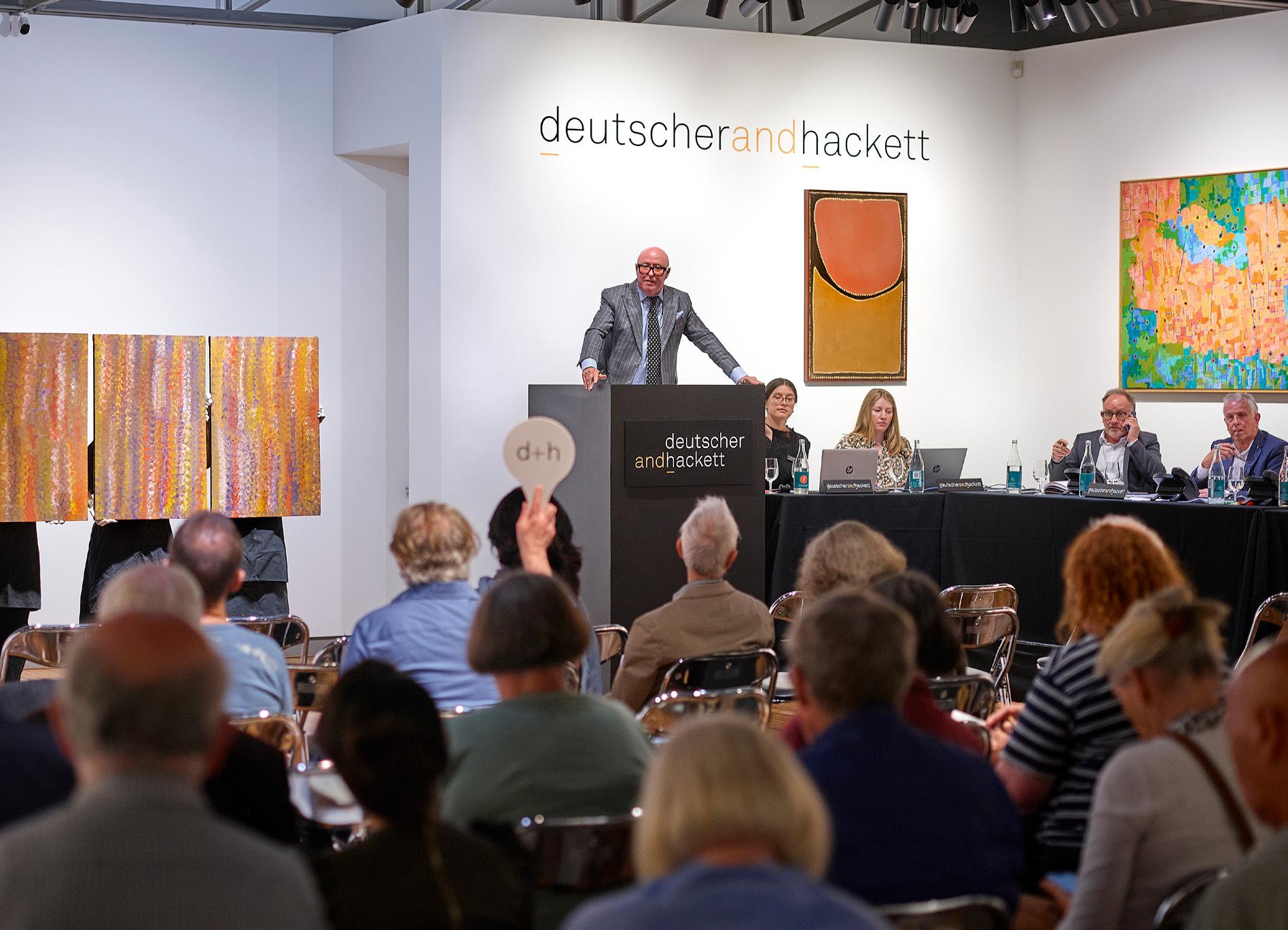
The highest total for an Indigenous Art auction in Australia in almost 20 years
Live Auction Melbourne 25 March 2026, achieves total sales of $4.6 M
Entries Invited for forthcoming auctions, 2026
105 Commercial Rd, South Yarra, VIC Enquiries: 03 9865 6333
sydney enquiries
36 Gosbell St, Paddington, NSW
Enquiries: 02 9287 0600 melbourne enquiries
info@deutscherandhackett.com www.deutscherandhackett.com for appraisals please contact
COPYRIGHT CREDITS
Lot 12 © Musée Rodin
Lot 13 © Estate of Godfrey Miller
Lot 14 © Wendy Whiteley/Copyright Agency, 2026
Lot 15 © Arthur Boyd/Copyright Agency 2026
Lot 16 © Estate of Fred Williams/Copyright Agency 2026
Lot 17 © Wendy Whiteley/Copyright Agency, 2026
Lot 18 © Wendy Whiteley/Copyright Agency, 2026
Lot 19 © courtesy of The Estate of Jeffrey Smart 2026
Lot 20 © courtesy of The Estate of Jeffrey Smart 2026
Lot 21 © Estate of Fred Williams/Copyright Agency 2026
Lot 22 © Meadmore Sculptures, LLC/ VAGA. Copyright Agency, 2026
Lot 23 © The Estate of Howard Arkley. Licensed by Kalli Rolfe Contemporary Art
Lot 24 © Michael Parekōwhai
Lot 25 © Ben Quilty
Lot 26 © Bruce Armstrong
Lot 27 © Margaret Preston/Copyright Agency 2026
Lot 28 © Margaret Preston/Copyright Agency 2026
Lot 29 © Alan and Jancis Rees/Copyright Agency 2026
Lot 30 © Weaver Hawkins Estate, 2026
Lot 31 © Donald Friend/Copyright Agency 2026
Lot 32 © Namatjira Legacy Trust/Copyright Agency 2026
Lot 33 © Arthur Boyd/Copyright Agency 2026
Lot 34 © Estate of Fred Williams/Copyright Agency 2026
Lot 35 © Estate of Fred Williams/Copyright Agency 2026
Lot 36 © Alan and Jancis Rees/Copyright Agency 2026
Lot 37 © John Coburn/Copyright Agency 2026
Lot 38 © John Olsen/Copyright Agency 2026
Lot 39 © John de Burgh Perceval/Copyright Agency 2026
Lot 40 © Arthur Boyd/Copyright Agency 2026
Lot 41 © The Sidney Nolan Trust. All rights reserved, DACS/Copyright Agency 2026
Lot 42 © reproduced by permission of The Henry Moore Foundation
Lot 43 © William Kentridge
Lot 52 © Hans Heysen/Copyright Agency 2026
Lot 54 © Ben Quilty
Lot 55 © Philip Wolfhagen/Copyright Agency 2026
Lot 56 © The Sidney Nolan Trust. All rights reserved, DACS/Copyright Agency 2026
Lot 57 © Tim Storrier
LOTS CONSIGNED BY GST REGISTERED ENTITIES
Lot 40 Arthur Boyd
Lot 46 Frederick McCubbin
Some lots consigned for this sale may be subject to the Resale Royalty Right for Visual Artists Act 2009 (Cth). Any payments due under the obligations of the Act will be paid by the vendor.
Under the provisions of the Protection of Movable Cultural Heritage Act, 1986, buyers may be required to obtain an export permit for certain categories of items in this sale from the Cultural Property Section:
Department of Infrastructure, Transport, Regional Development, Communications and the Arts GPO Box 2154
Canberra ACT 2601
Email: movable.heritage@arts.gov.au Phone: 1800 819 461
Design and Photography:
Danny Kneebone
Danny Kneebone
Design and Photography Manager
With over 25 years in the art auction industry as both photographer and designer. Danny was Art Director at Christie’s from 2000–2007, Bonham’s and Sotheby’s 2007–2009 and then Sotheby’s Australia from 2009–2020. Specialist in design, photography, colour management and print production from fine art to fine jewellery. Danny has won over 50 national and international awards for his photography work and art practice.
© Published by Deutscher and Hackett Pty. Ltd. 2026
ISBN 978-1-7643578-2-1
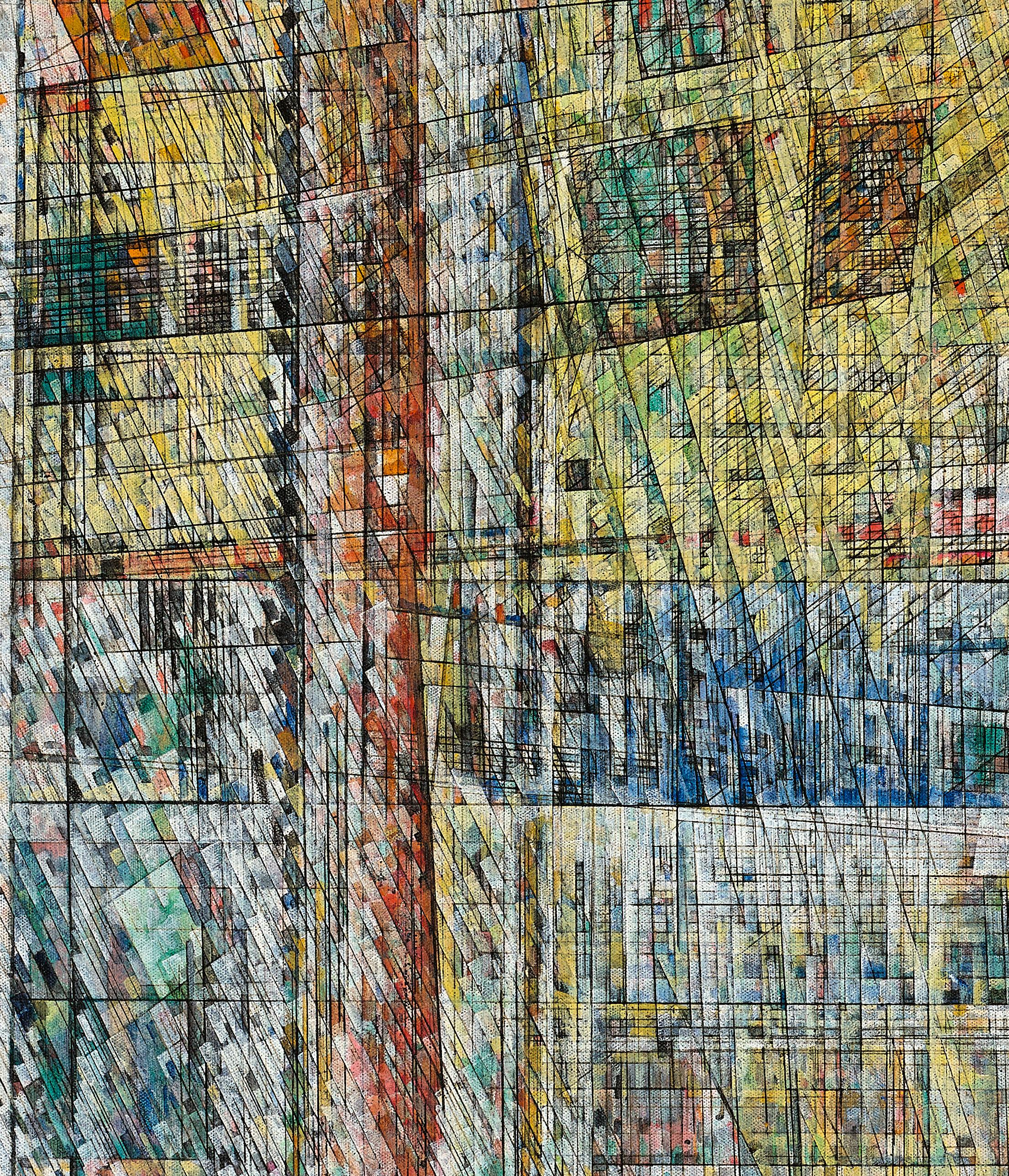
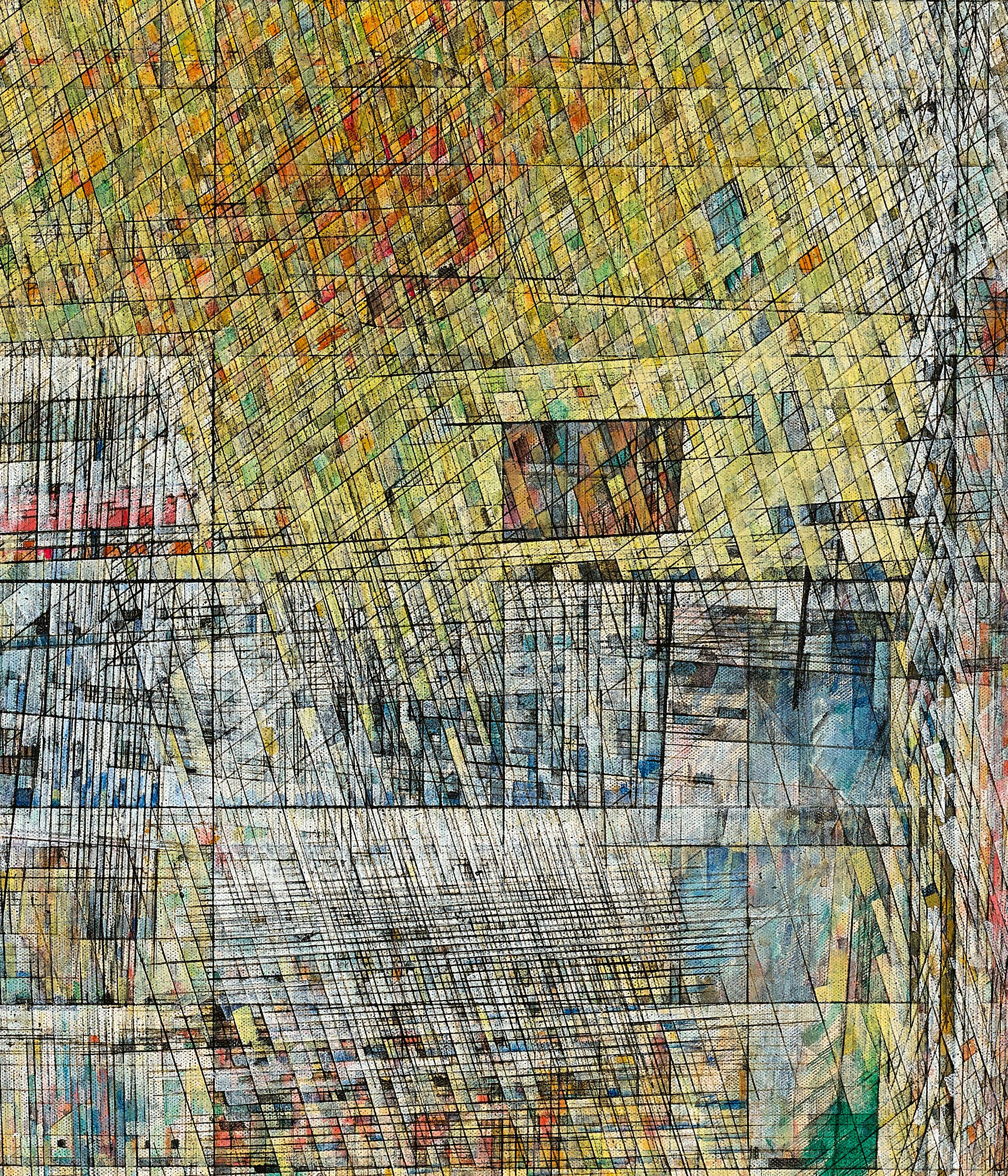
specialist fine art auction house and private gallery