Design Library Refresh
Ethan Pawlak & Joseph Angelo
Background
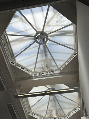
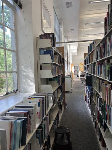
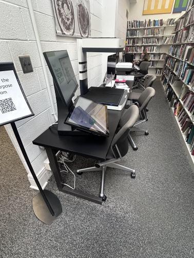
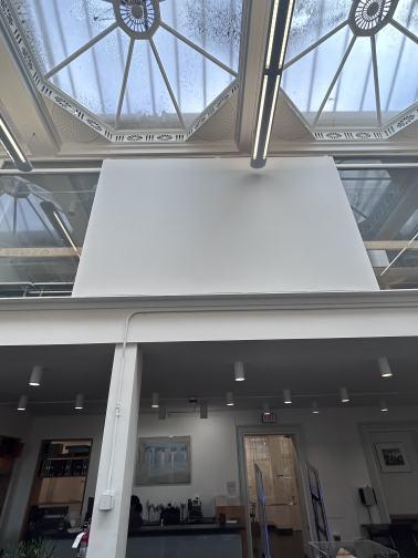
Currently, the library: Is under-utilized Amenities are damaged or worn out Is the last library to be remodeled Has a sterile feeling and is uninviting
Research
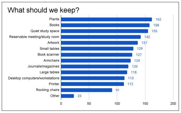
Interviews with Faculty, Graduates, Staff, and Undergraduates were conducted. The top 5 most requested aspects to keep were:
Plants Books Quiet Study Space Reservable room
Artwork
Three of the top five most requested features to keep in the library were related to study (books, quiet space, and reservable room) while two were in relation to the library’s atmosphere (plants and artwork)
Research
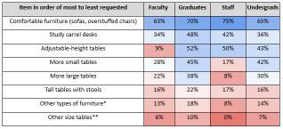
Our first finding is that students want to keep the library as a location to be able to study. If we probe further into how the atmosphere should be adjusted we find this:
There is a unanimous priority of more comfortable seating (sofas, cushioned/stuffed chairs)
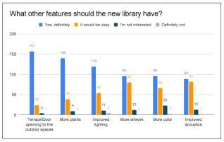
Of the top five additional features, four pertain to aesthetics (more plants, improved lighting, more artwork, and more color)
Key Findings
Users want to keep the library as a center for study
More plants, color, artwork along with better lighting and furniture would make users feel more comfortable
User As a member of the College of Design,
Need I want a more characteristic energy in the library Benefit In order to feel more comfortable utilizing its resources
Direction
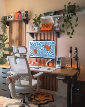
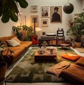
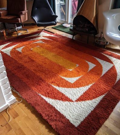
By including a more natural color scheme, plants, comfortable seating options, better lighting, and artwork we create an environment similar to that of a personal living space. Based on current trends, a retro style with modern touches appeals to the tastes of a large portion of our target users.
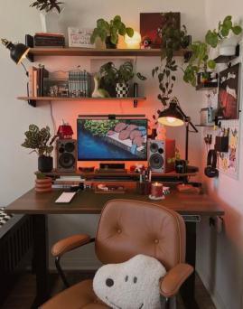
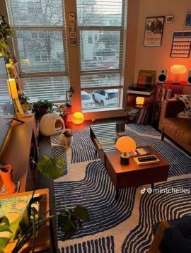
Stylistic Era
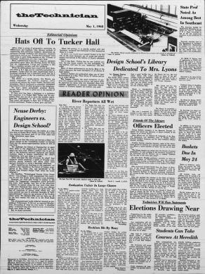
Harrye B. Lyons was the librarian of the design library from its founding in 1947 until she passed away in 1968. That year the library was named after her in memoriam. As an homage to Mrs. Lyons, we decided to base the retro style on designs of the late 60s and early 70s.
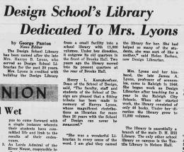
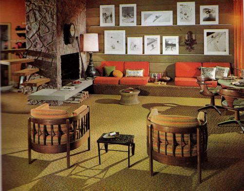
image 9 from article, “Home ’65: A Groovy Look at Mid-Sixties Interior Décor”
Floorplan
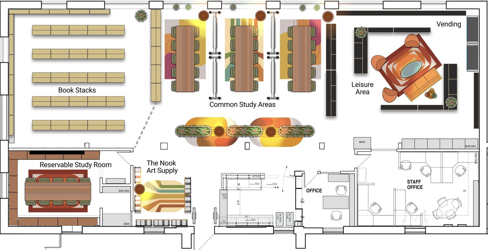
Book Stacks
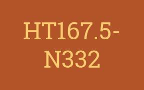
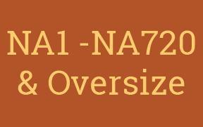
examples of new book stacks labels
Relocated to one area of the library Avoid distractions, placed away noisier area
New signage to match with new library branding
Book Stacks
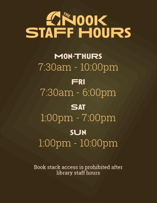
We plan to extend access to the design library to 24/7, however, using collapsing gates, the book stacks will be closed outside of staff work hours to preserve the safety of the books.
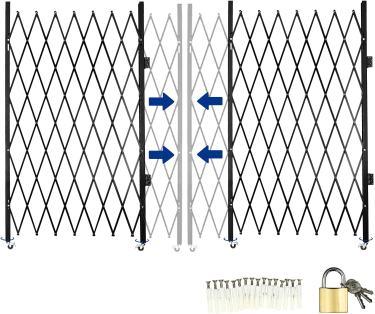
Noted within the schedule of staff work hours
Common Study Area
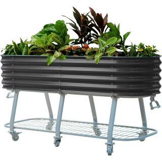
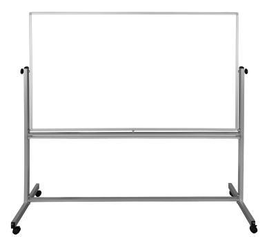
Bookshelves divide study area from other sections Interior “rooms” are divided by whiteboards Natural light supplied from windows Not reservable, first come first serve Study area behind entryway plant life
Leisure Area
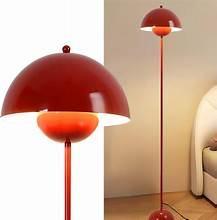
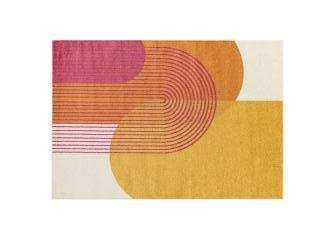
The leisure area has been placed on the right side of the library to allow the most natural light for users in the afternoon.
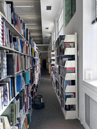
Image facing the left side of library
Image facing the right side of library
*remember, improved lighting is one of the users’ most requested features from the research
Leisure Area
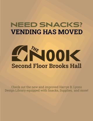
Vending machines moved from first floor
Feel of your friend’s living room
Comfortable collaboration
Relaxation space away from studio signage to redirect students
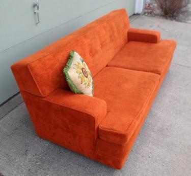
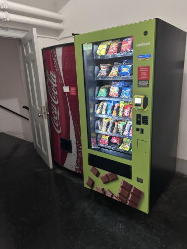
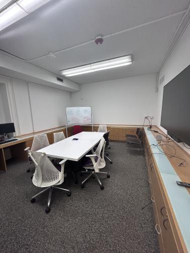
Reservable Room + Supply Store
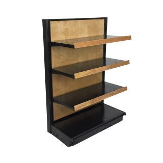
Maintain current group reservable room Better signage to know it is available to reserve Materials from Outfitters stock supply store Extra inventory will be kept in staff office Inspo from the Schoolastic Book Fair Similarly to the book stacks, the nook art supply will close outside of staff work hours
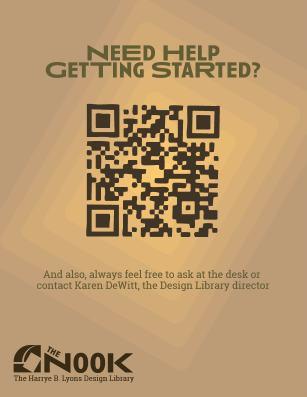
General Help Poster
The Nook Art Supply Area
Checkout Desk
Floorplan
Branding
Stylistic Era
Typography
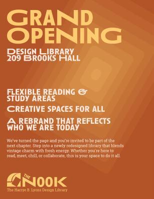
Our branding kit draws influence from several different areas of inspiration to give our elements meaning and effectively convey the intended atmosphere of the new design library.
Logo
Nestled into the corner nook of the dome, the negative space depicts a rectangle representing the books of the library
The ‘N’ is stretched which conforms to the idea behind the chosen typography and allowing ‘The’ to be nestled into the nook of the ‘N’ as well
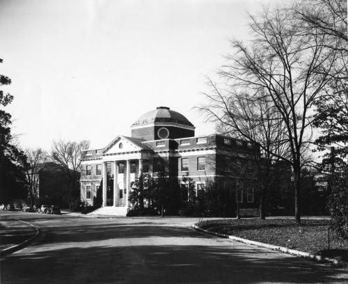
The positive space of the stamp logo resembles the iconic dome atop Brooks Hall (where the library is located)
Congruent angular alignment
Typography
The Public Theater in New York features a logo with a variable typeface. The variation of letter width and weight conveys a sense of inclusion for the viewers. It conveys an inviting nature in addition to communicating that the establishment is welcoming of all types of people.
AniSeTte
Using a case study of the Public Theater in New York, we decided to use the typeface “Anisette” as our expressive typeface.
WIDE condensed
Roboto Slab Bold Regular
Capital letters are expressed as wide characters and lowercase letters are expressed as condensed characters.
The combination of the two within one word helps us to convey a playful and inclusive message in our library, similar to that of New York’s Public Theater.
Copy typography utilizes “Robotto Slab” in accordance with NC State’s branding guidelines.
Color Palette
Based on the chosen era and aesthetic, we gathered inspirational photos to draw a color palette from.
Color Hex Codes
B15228 Primary Secondary Tertiary
https://flashbak.com/home-65-groovy-look-mid-sixties-interiordecor-381852/
https://docs.google.com/document/ d/1IPcagiXsc4b8ItCNTssopJAv4tO8RQ3aljfZtaUUPCA/edit?usp=sharing
https://www.lib.ncsu.edu/design/history
https://pmc.ncbi.nlm.nih.gov/articles/PMC8957666/