Northville Parks & Recreation, MI - Brand Guidelines
Usage Guidelines
This style guide has been developed to ensure consistent use of the Northville Parks & Rec brand. Please follow the instructions provided.
The value of our brand and the investment made toward it can most readily be realized through consistency and repetition, thereby ensuring brand saturation across all target markets.
BRAND IDENTITY
Community Within a Park
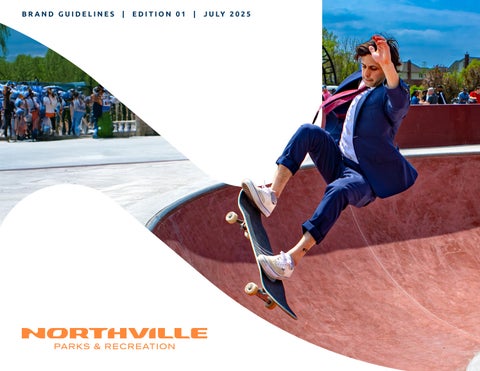
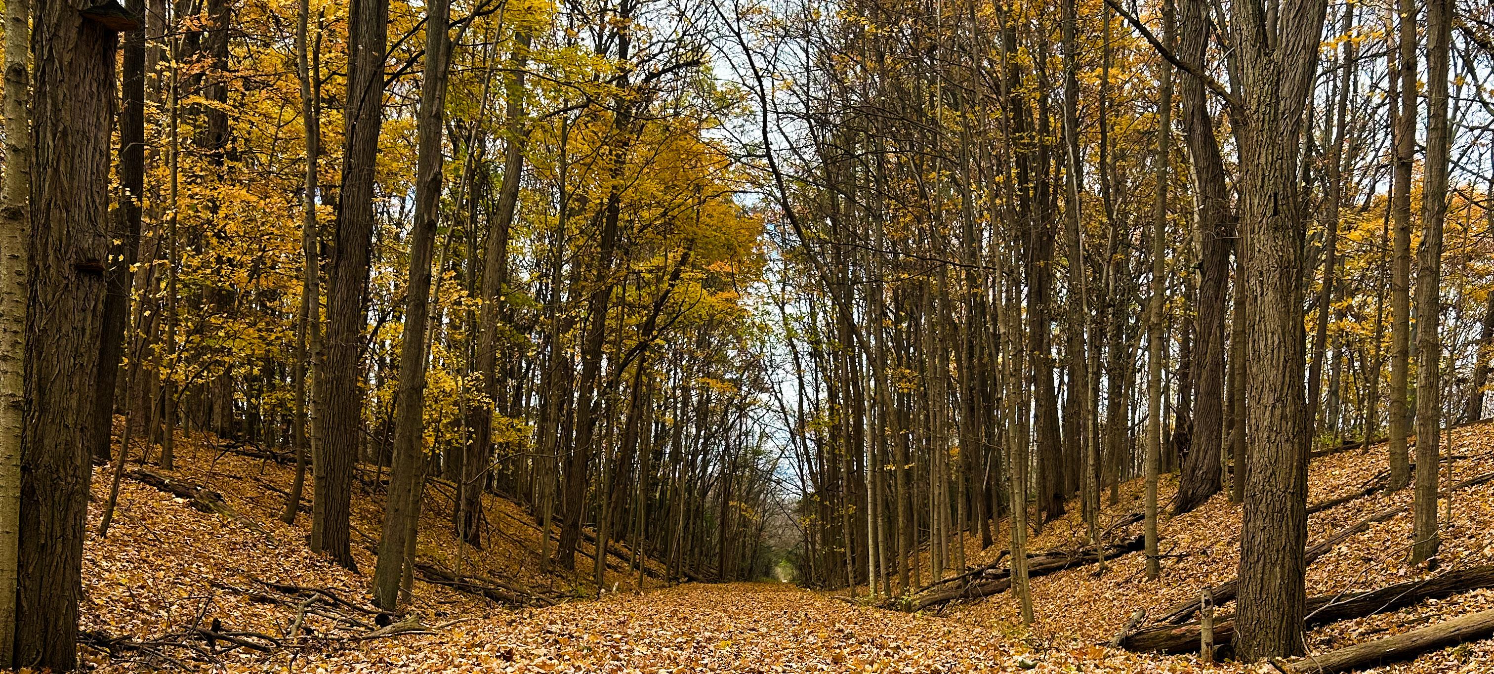
Northville’s interconnected park system, linked to its historic downtown via scenic pathways, creates a harmonious vision of a “community within a park” - a serene sanctuary of lush tree canopies where nature and daily life emerge.
LOGO
THE HEART AND SOUL OF OUR BRAND
Custom crafted ‘N’ built for Northville Parks & Rec
Traveling path connecting all of Northville
True visualization of the brand, “A community within a park”
‘N’ inspires and informs the creation of the full logo-type
The Northville P&R ‘N’ serves double-duty. It can be used independently on it’s own and as a part of the primary logo
A FLEXIBLE IDENTITY SYSTEM
Solid Patches
Alternate Logo
Primary Logo
Logomark
Horizontal logo
Stacked Logo Patch
WORDMARK - CENTERED
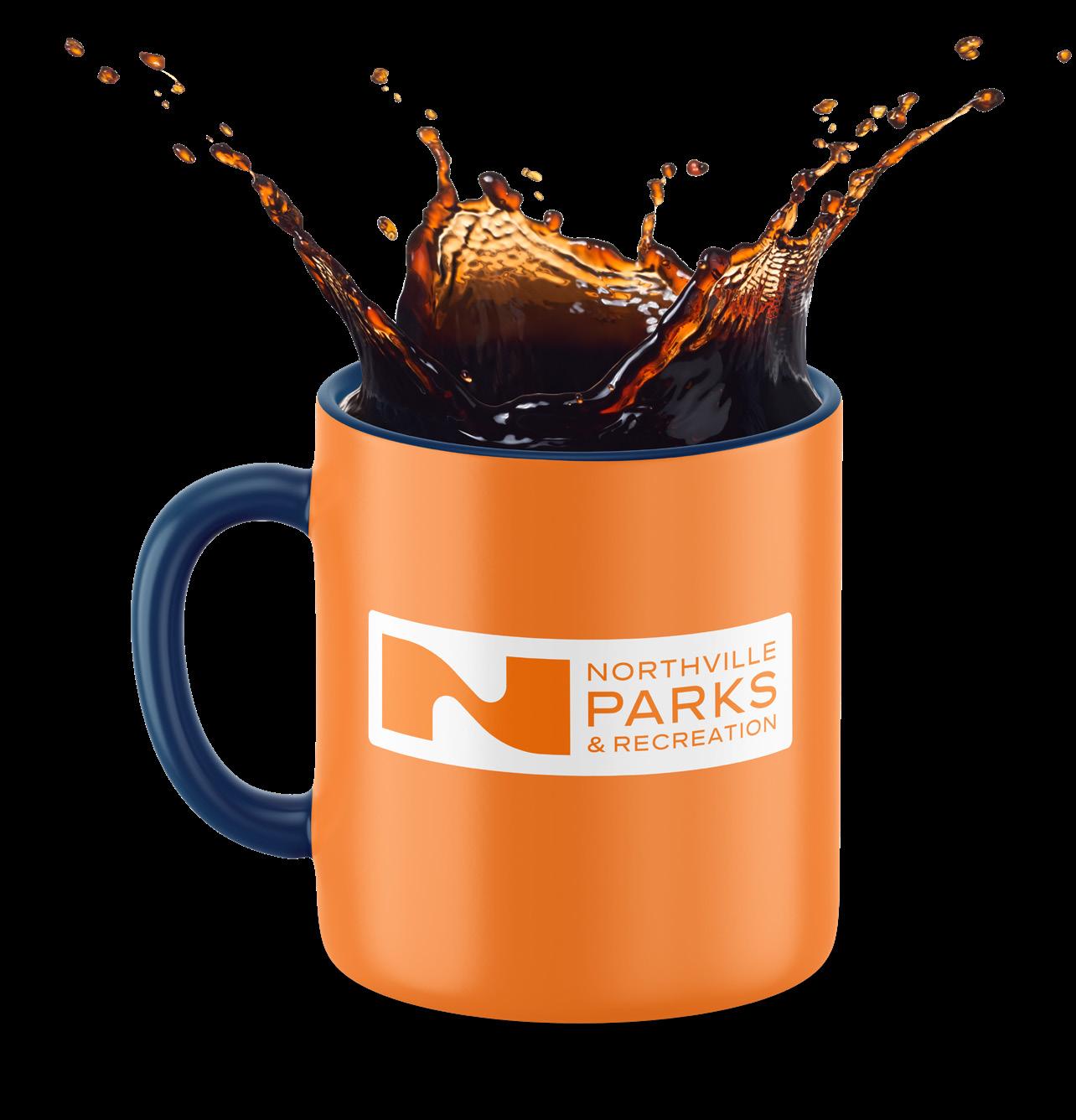
The workmark is a text-only identification of Northville P&R as a whole to the public. Use this logo in campaigns, locations, products, and merchandise as needed.
ON ORANGE
WORDMARK - RIGHT ALIGNED
A right-aligned variant of the primary wordmark, this is an alternate text-only identification of Northville P&R as a whole to the public.
LOGOMARK
The Northville P&R brand logomark is the visually distinctive and instantly recognizable symbol that serves as a powerful and memorable representation in the minds of viewers.
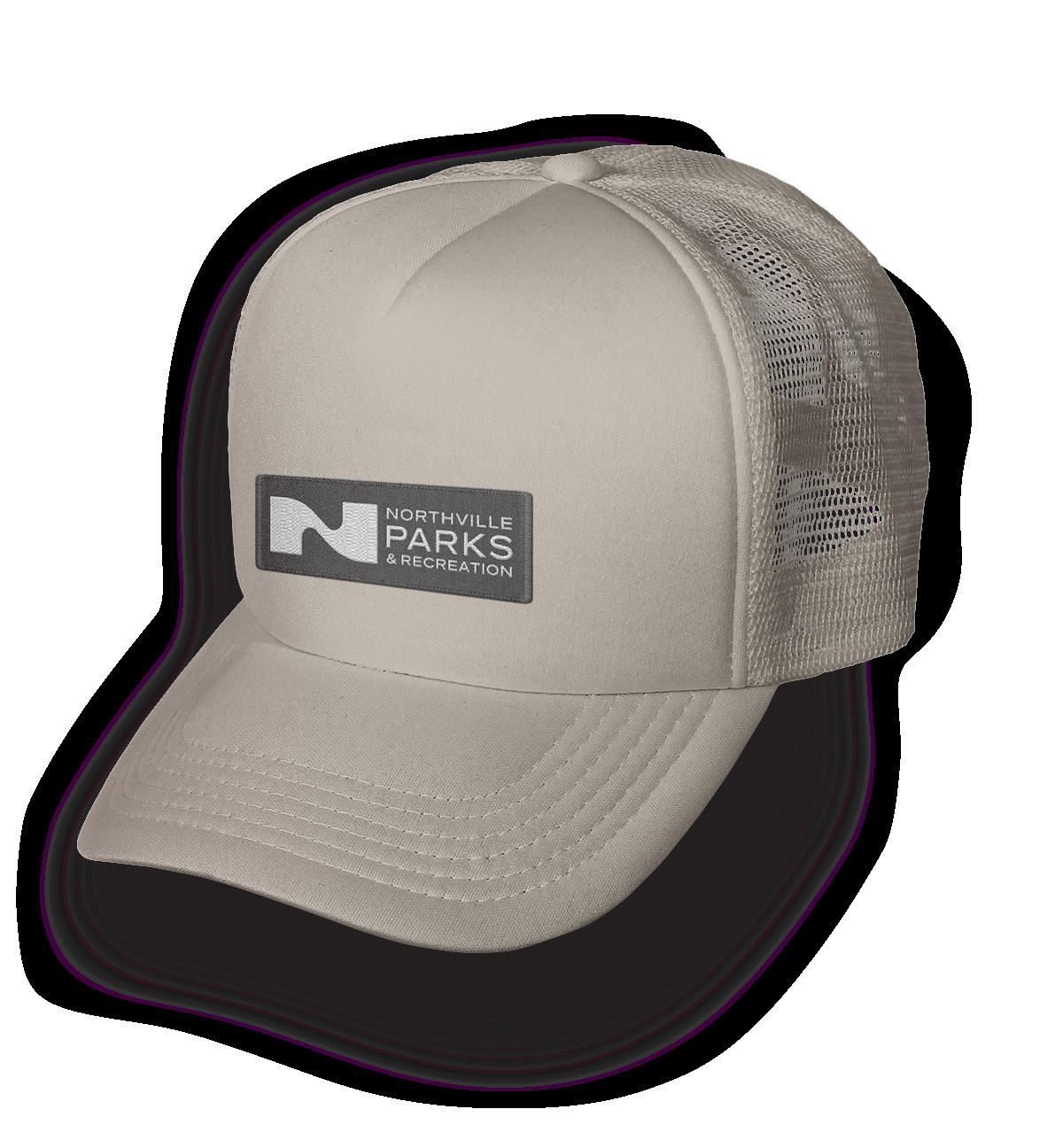
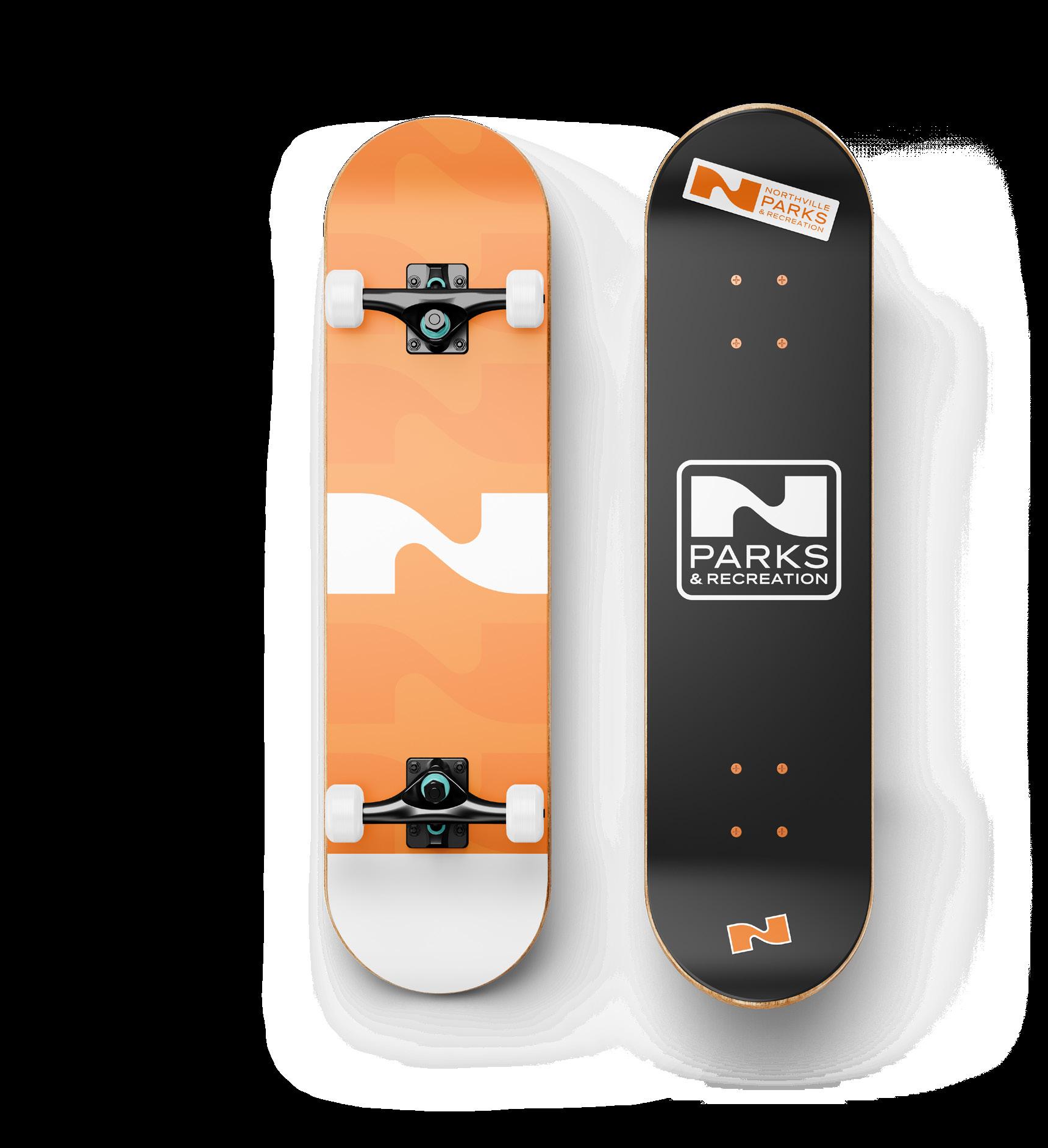
This mark is the most widely usable piece of the brand, seen on clothing, stationery, phone cases, stickers, tote bags, websites, social media, and much more.
HORIZONTAL MARK
The horizontal mark identifies Northville P&R in general as a whole to the public. Use this logo to represent individual locations, products, and merchandise as needed.
Use this mark in situations where there isn’t much vertical space available.
VERTICAL MARK
The vertical mark identifies Northville P&R in general as a whole to the public. Use this logo to represent individual locations, products, and merchandise as needed.
Use this mark in situations where there isn’t much horizontal space available.
ON ORANGE
VERTICAL OUTLINE
The vertical outline mark identifies Northville P&R in general as a whole to the public, while providing a container for the mark. Use this logo to represent individual locations, products, and merchandise as needed.
Use this mark in situations where there isn’t much horizontal space available.
HORIZONTAL BADGES
The horizontal badges identify the Northville P&R in general as a whole to the public. Use this logo to represent individual locations, products, and merchandise as needed.
Use this mark in situations where there isn’t much vertical space available.
VERTICAL BADGES
The vertical badge identifies the Northville P&R in general as a whole to the public, while providing a container for the mark. Use this logo to represent individual locations, products, and merchandise as needed.
Use this mark in situations where there isn’t much horizontal space available.
PATTERN
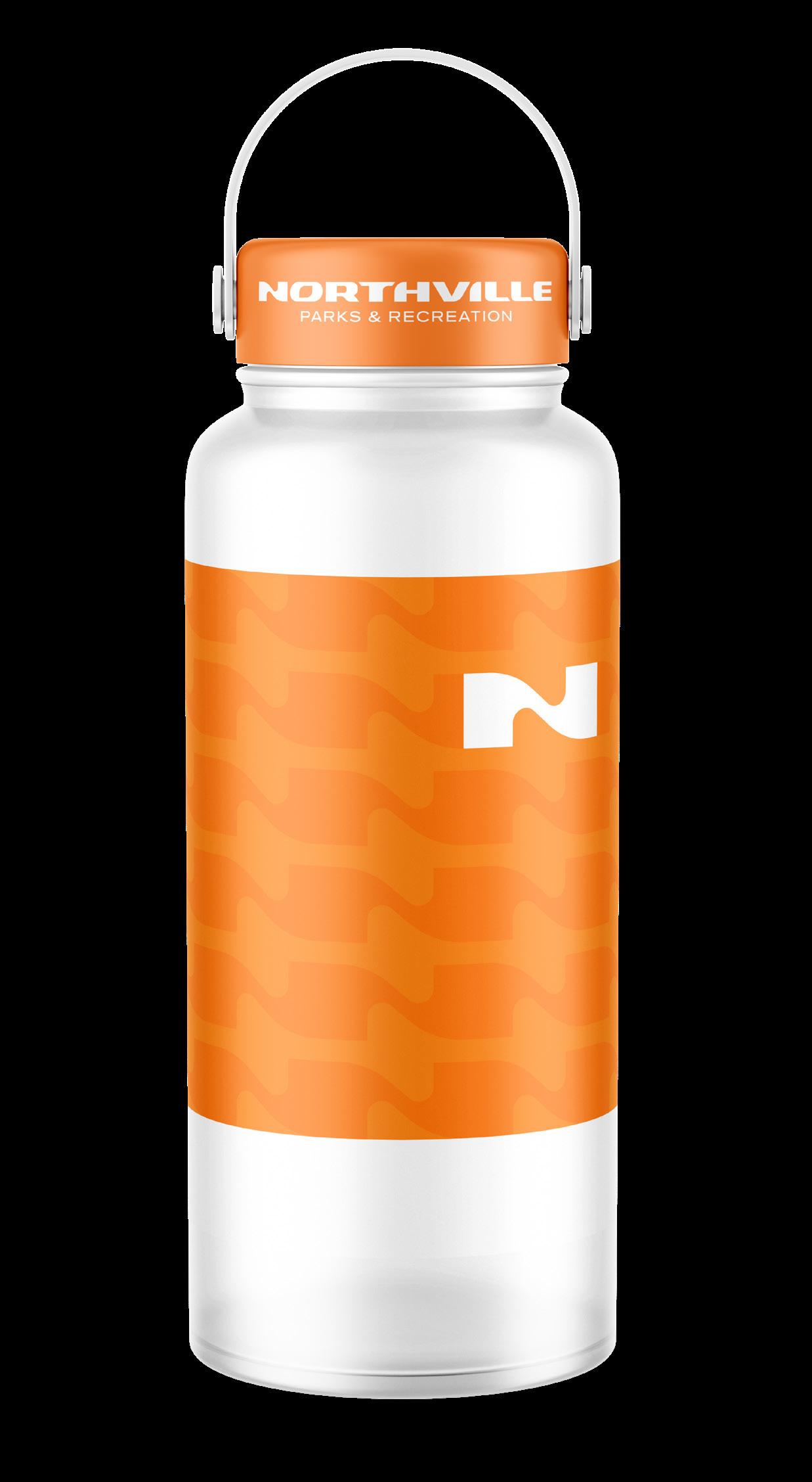
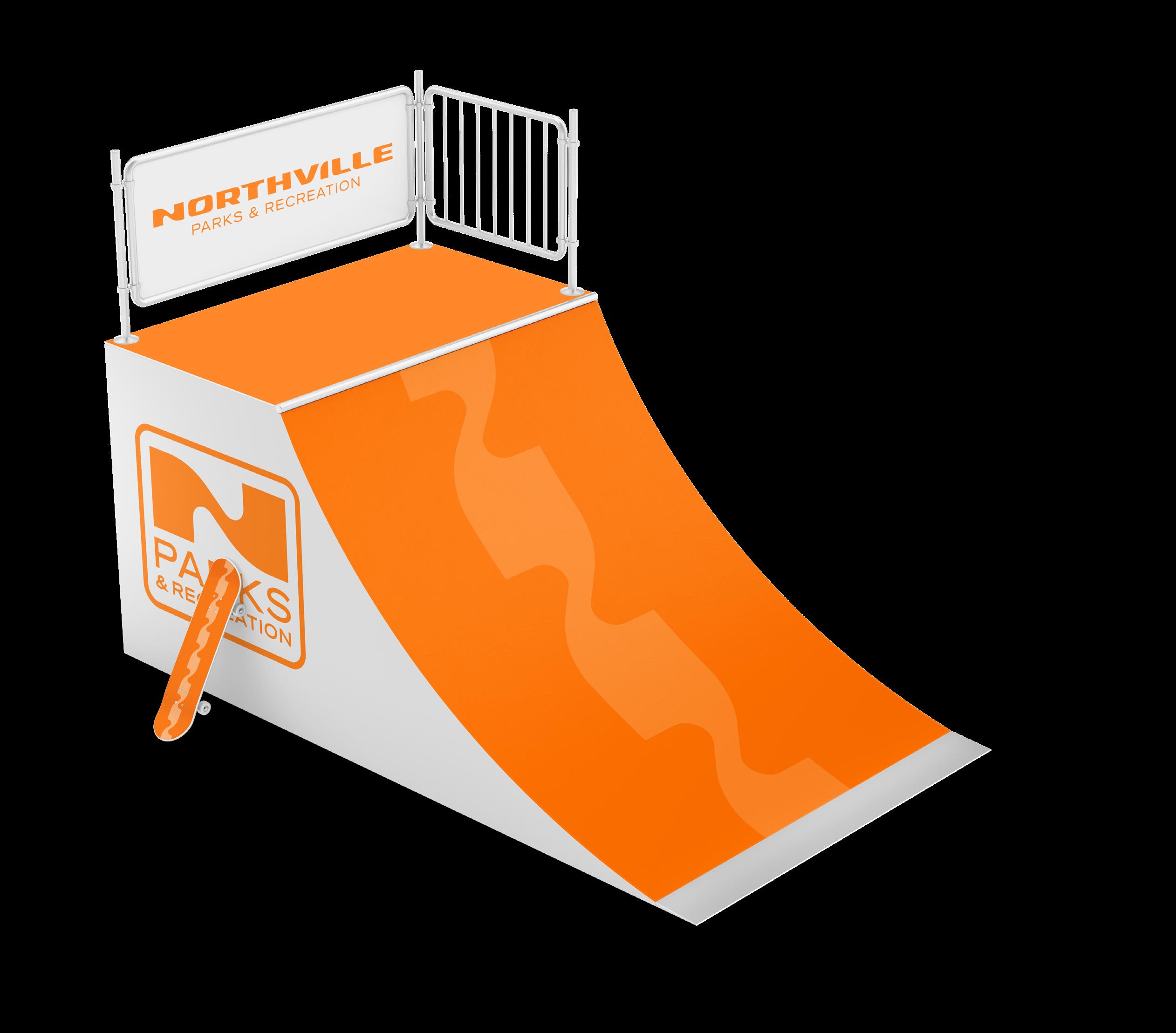
The Northville P&R pattern provides an aesthetic element that can be used in nearly any situation the brand is being displayed.
Examples of use cases are street banners, signage, posters, billboards, merchandise, and more.
USAGE
HOW TO USE (AND NOT USE) OUR NEW BRAND IDENTITY
INCORRECT USAGE
Don’t rotate the logo. Don’t distort, compress or stretch the logo dimensions. Don’t change the layout or relationship between logo elements.
Don’t make alterations to elements within the logo or wordmark that are not consistent with the brand.
Don’t use gradients in or on the logo. Don’t use shadows, bevels or other effects on the logo.
BACKGROUND CONTROL
Our logo works very well on a plain white background. Never use the logo on 100% black background. Use an 85% tint of black instead.
Orange is a great background color for the logo. If you are using one of the patterns, make sure there is proper transparency so that the logo stands out.
Be careful placing the logo over a photo. Make sure you have a transparent Orange layer on top of the photo if at all possible. Use the full color or white versions of the logo.
COLORS & FONTS
CONSISTENCY TO THE “T”
BRAND COLORS
The consistent use of color is vital to effective brand recognition.
Our brand should always be represented in one of the colors on this page, aside from specific recommendations within this guide.
Do not use any other/ unauthorized colors.
DIGITAL
HEX - #FF8939
RGB - 255, 137, 57
ORANGE WHITE NAVY
PRINT
PANTONE - 1575 C
CMYK - 0, 46, 78, 0
DIGITAL
HEX - #FFFFFF
RGB - 255, 255, 255
Recommended guideline for the presence of each color that you will use when implementing your brand identity.
DIGITAL
HEX - #03355E
RGB - 3, 53, 94
- 648 C
- 97, 44, 0, 63
APPROVED PRIMARY PAIRINGS
Nearly all of the colors within our primary palette can be used in combination. Whenever possible, strive for legibility with contrast, especially when setting typography.
White text and elements on an Orange background.
High contrast, demands attention.
Orange text and elements on a White background.
Slightly lower contrast, demands attention.
EXPANDED COLOR PALETTE
An expanded selection of colors from the primary palette.
These extra color options offer more versatility in various formats like websites and signage.
DIGITAL
HEX - #B03D04
RGB - 176, 61, 4
PANTONE - 1525 C CMYK - 0, 65, 98, 31
DIGITAL
HEX - #066FB7
RGB - 6, 111, 183
PANTONE - 7461 C
CMYK - 97, 39, 0, 28
DIGITAL
HEX - #D65D0B
RGB - 214, 93, 11
PANTONE - 1595 C
CMYK - 0, 57, 95, 16
DIGITAL
HEX - #0F4F84
RGB - 15, 79, 132
PANTONE - 301 C
CMYK - 89, 40, 0, 48
DIGITAL
HEX - #EA680F
RGB - 234, 104, 15
PANTONE - 1505 C
CMYK - 0, 56, 94, 8
DIGITAL
HEX - #01263F
RGB - 1, 38, 63
PANTONE - 289 C
CMYK - 98, 40, 0, 75
NEUTRAL COLOR PALETTE
A neutral selection of colors that can function on their own, or complement the primary color palette.
These extra color options are more friendly with print collateral.
DIGITAL
HEX - #363636
RGB - 54, 54, 54
PANTONE - 447 C
CMYK - 0, 0, 0, 79
DIGITAL
HEX - #E9E9DE
RGB - 233, 233, 222
DIGITAL
HEX - #6D6660
RGB - 109, 102, 96
PANTONE - 405 C
CMYK - 0, 6, 12, 57
DIGITAL
HEX - #C5BBB1
RGB - 197, 187, 177
PANTONE - WARM GRAY 3C
CMYK - 0, 5, 10, 23
DIGITAL
HEX - #FFFFFF
RGB - 255, 255, 255
PANTONE - 4239 C
CMYK - 0, 0, 5, 9
PROXIMA NOVA EXTRA WIDE
SEMAI-BOLD - 10 PT
PROXIMA NOVA BOLD - 80 PT
EYEBROW
PROXIMA NOVA EXTRA WIDE SEMI-BOLD - 28 PT
HEADER SUBHEAD
PROXIMA NOVA MEDIUM - 21 PT
INTRODUCTION SENTENCE LOREM IPSUM DOLOR SIT
AMET, CONSECTETUER ADIPISCIN
PROXIMA NOVA REGULAR - 11 PT
Lorem ipsum qui derumqu odissi te voluptam a volut ere consect urectiur soloreria quia sanderia aut pa volut odio. Otatendicit, ut et alic te volest hilluptatem.
Ligendam, consequi quias a volupic iatur, iliquia ad magnimus eni imeni consecaepudi core eatur? Ovid que atia sumet quid quisit adite ex eum quiassi magnis.
FONT CHOICES
Proxima Nova was chosen for its clean, modern aesthetic and versatility, providing a strong foundation for clear communication. With its balanced proportions and approachable geometry, the typeface supports a cohesive and contemporary brand identity, enhancing legibility across both digital and print applications.