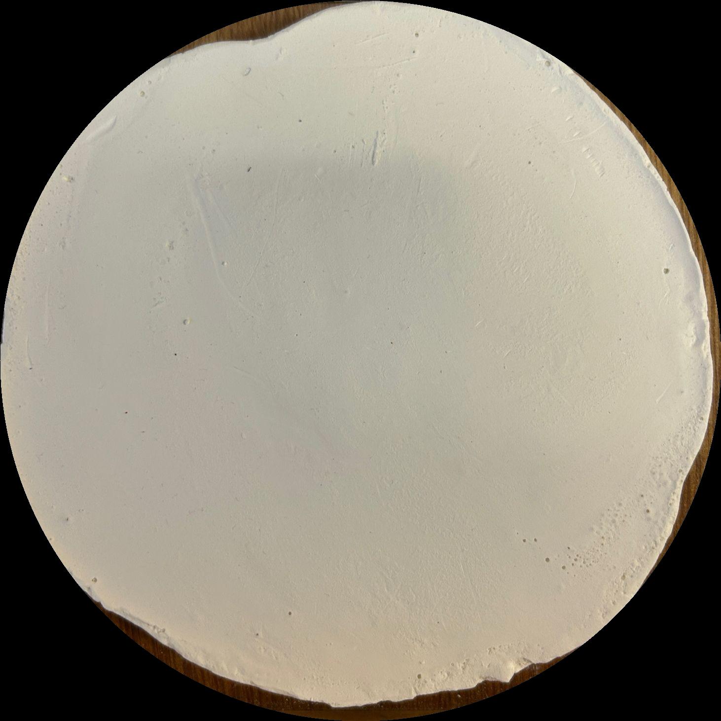
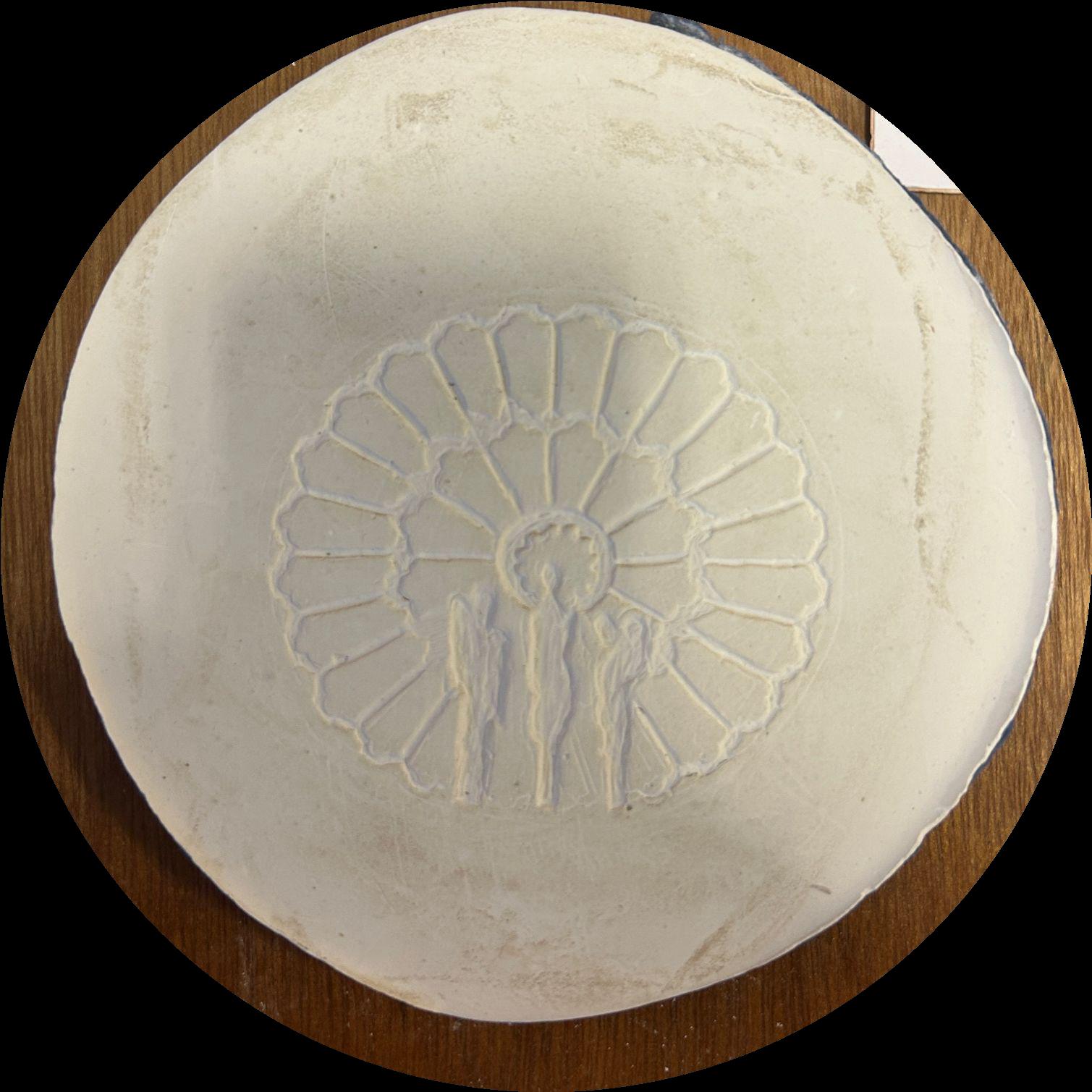
applied ( unfired )
Watercolour drawing in progress
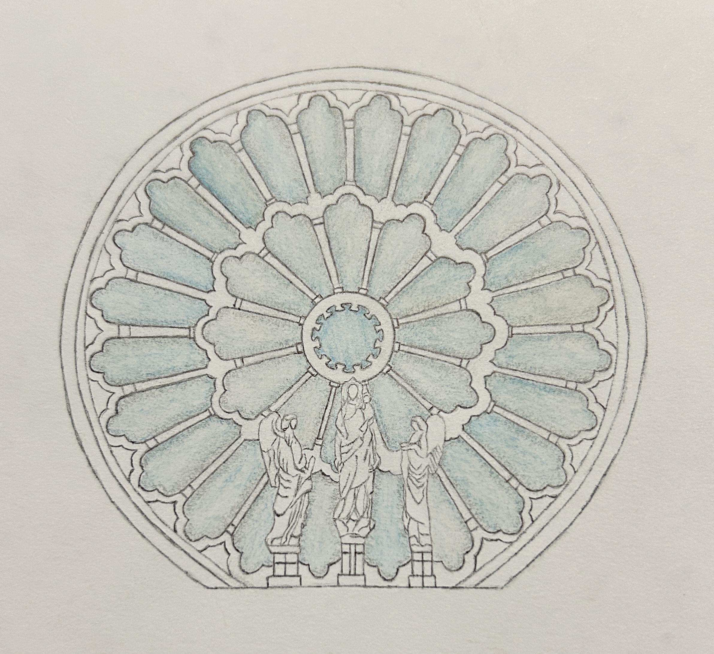
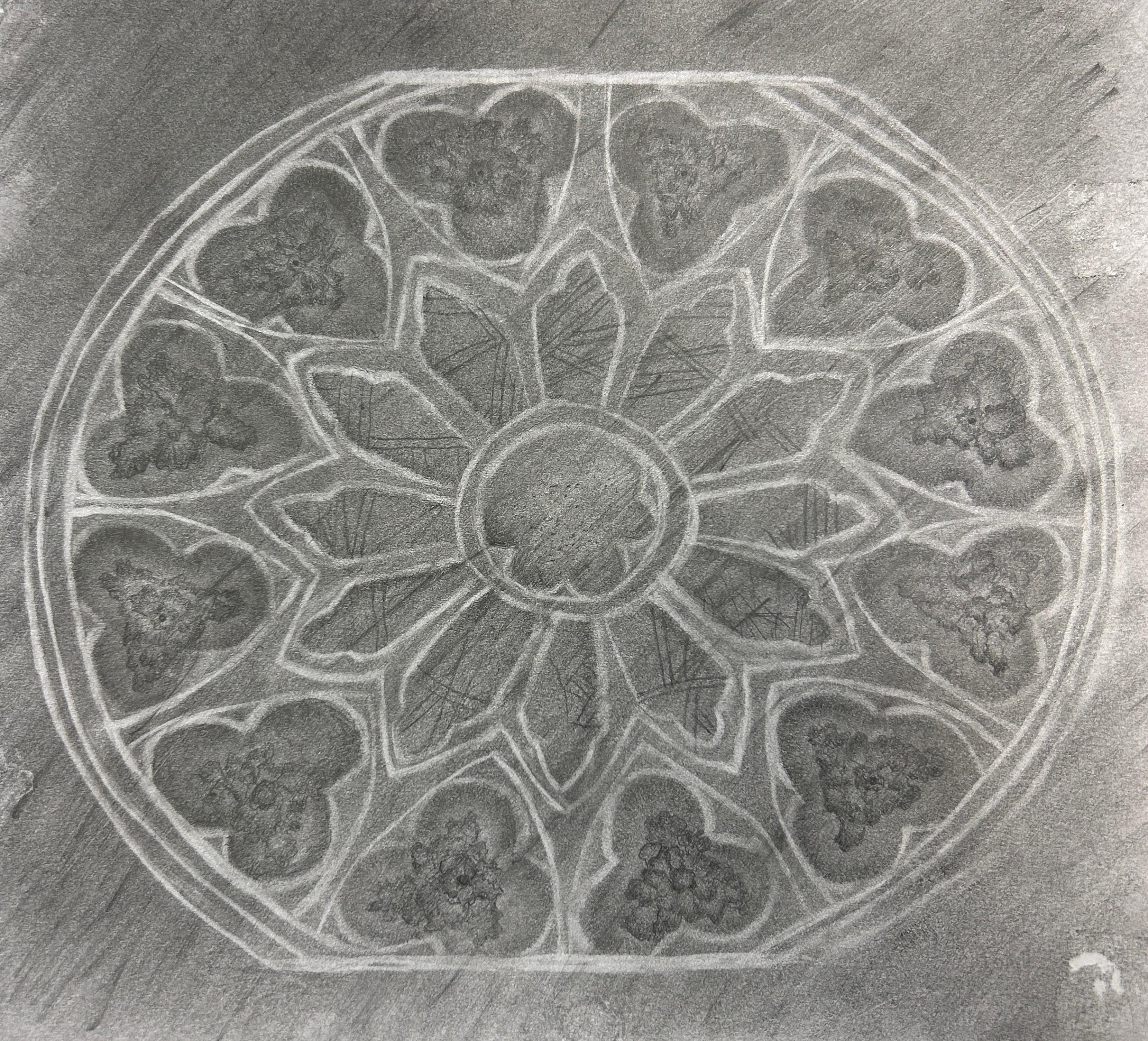
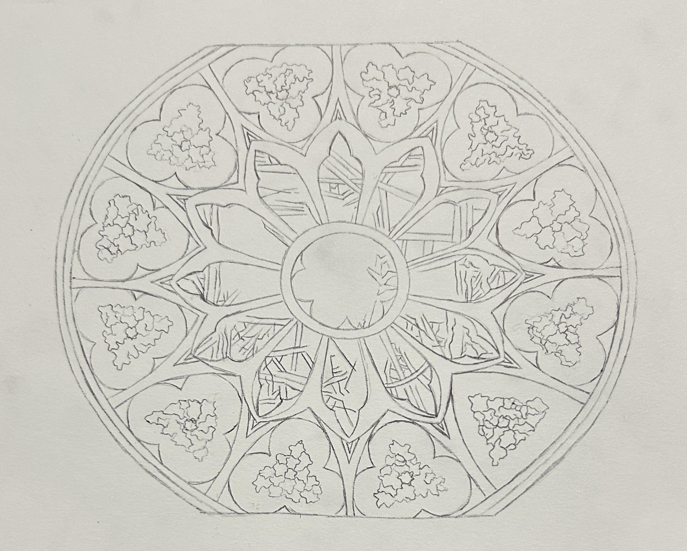
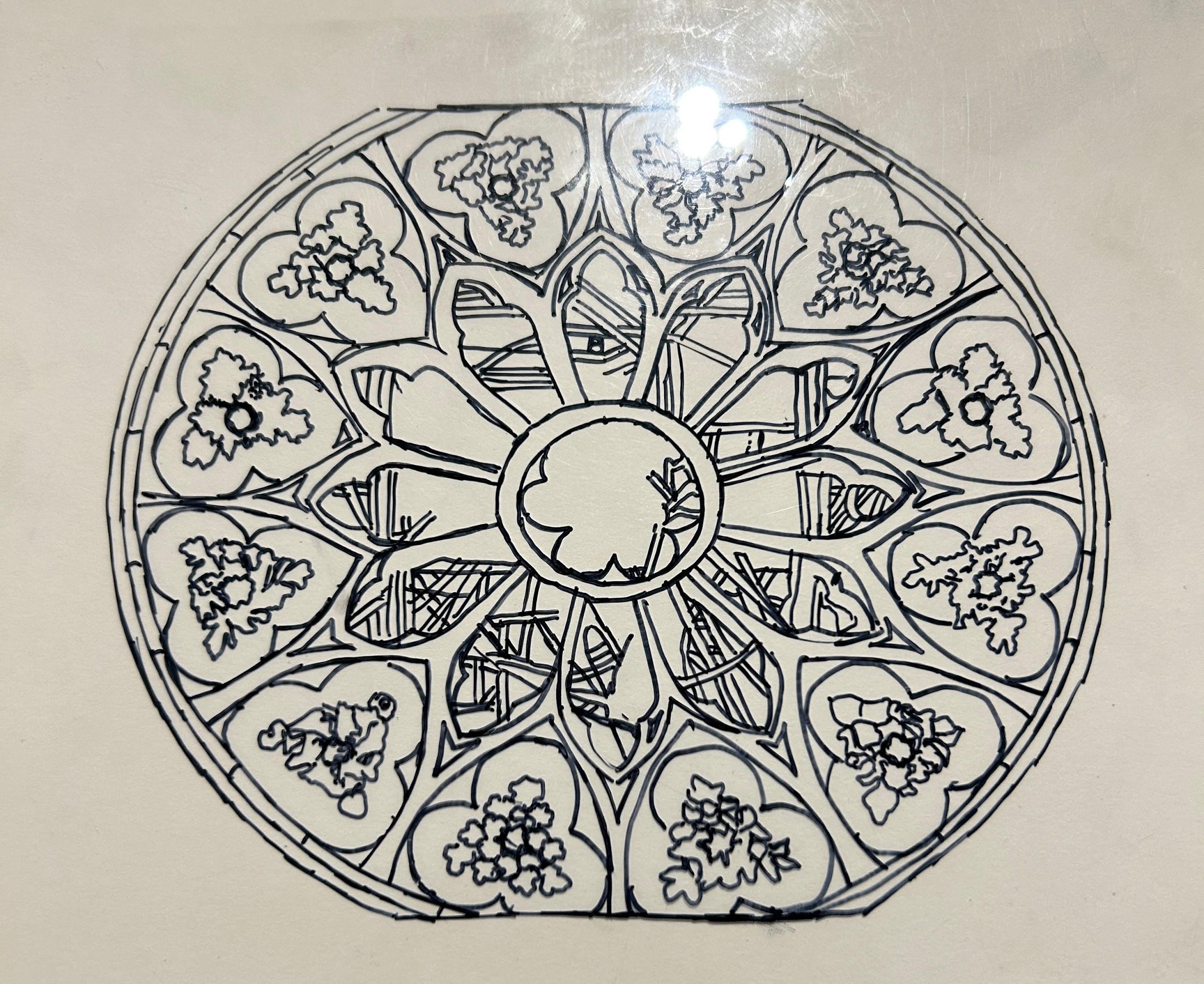
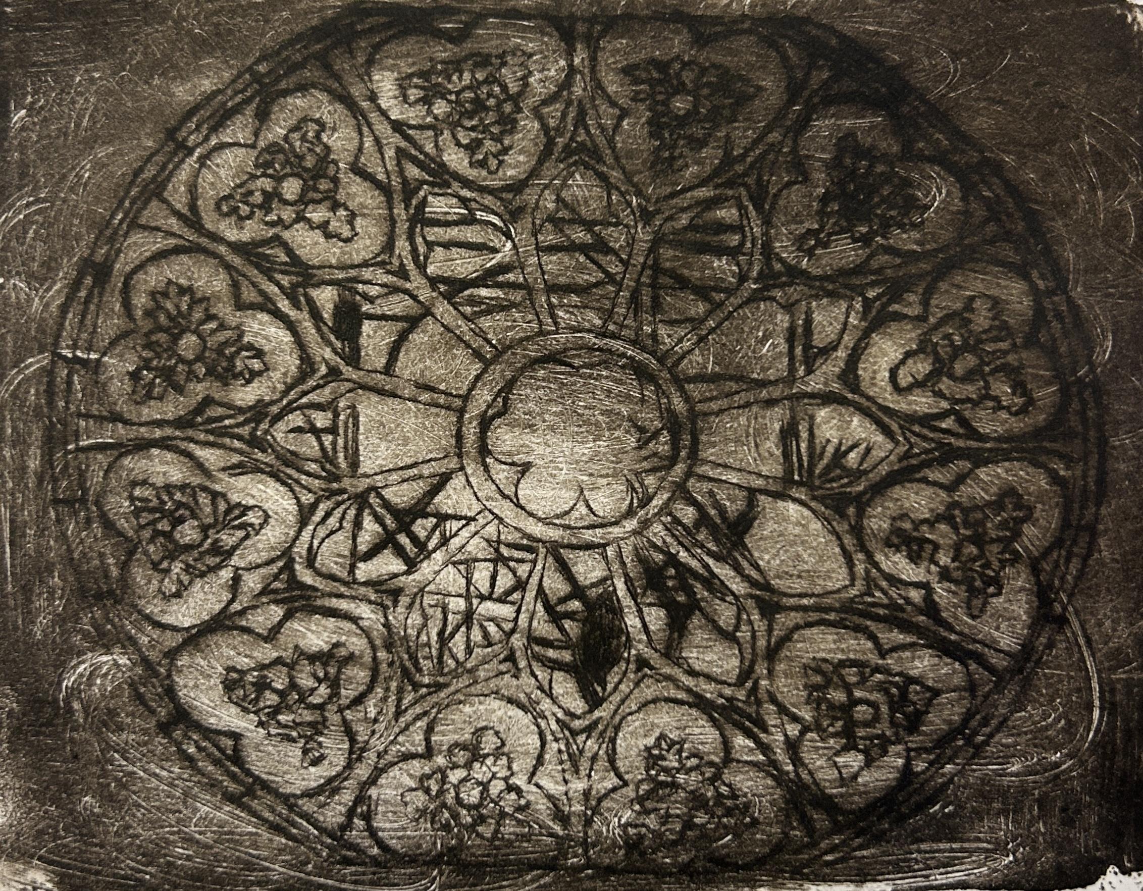
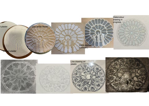
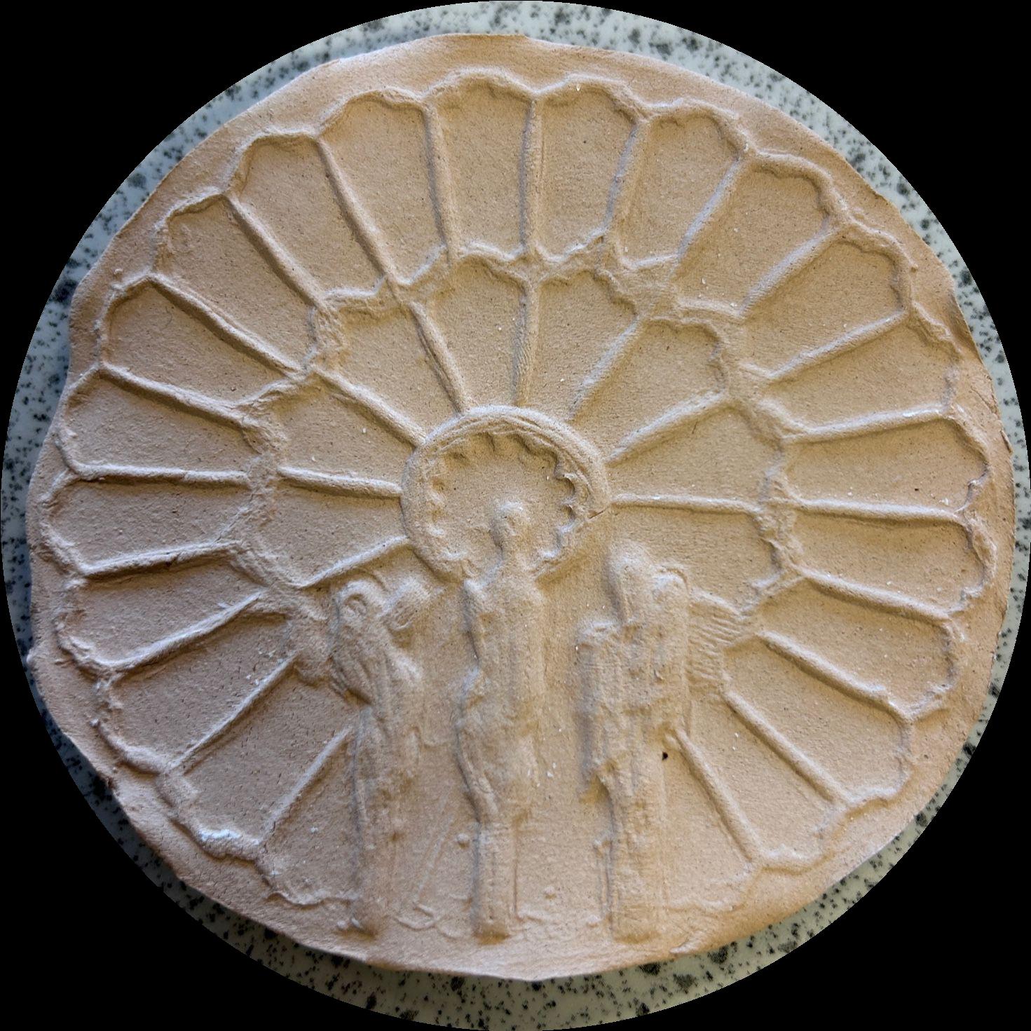
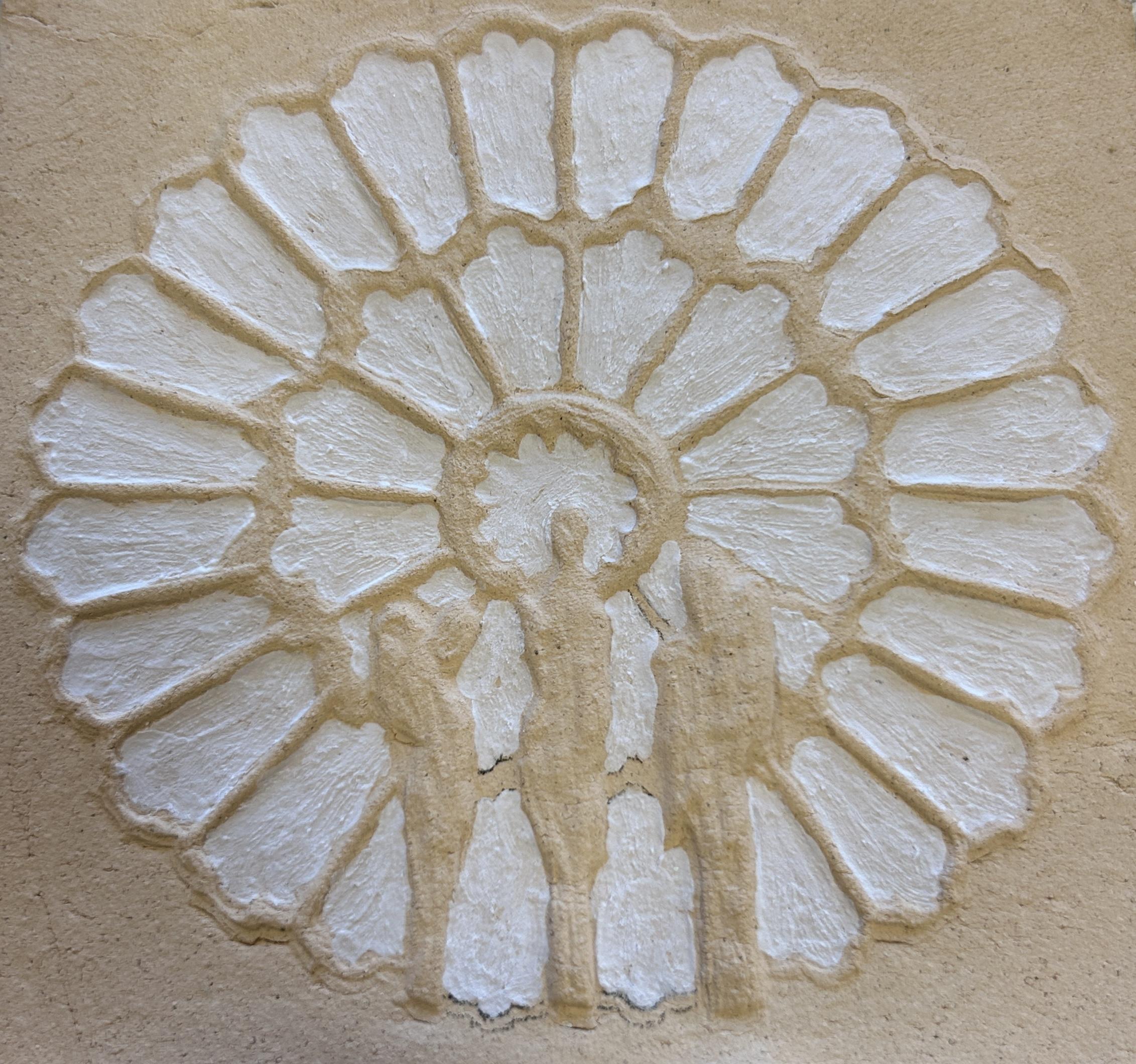
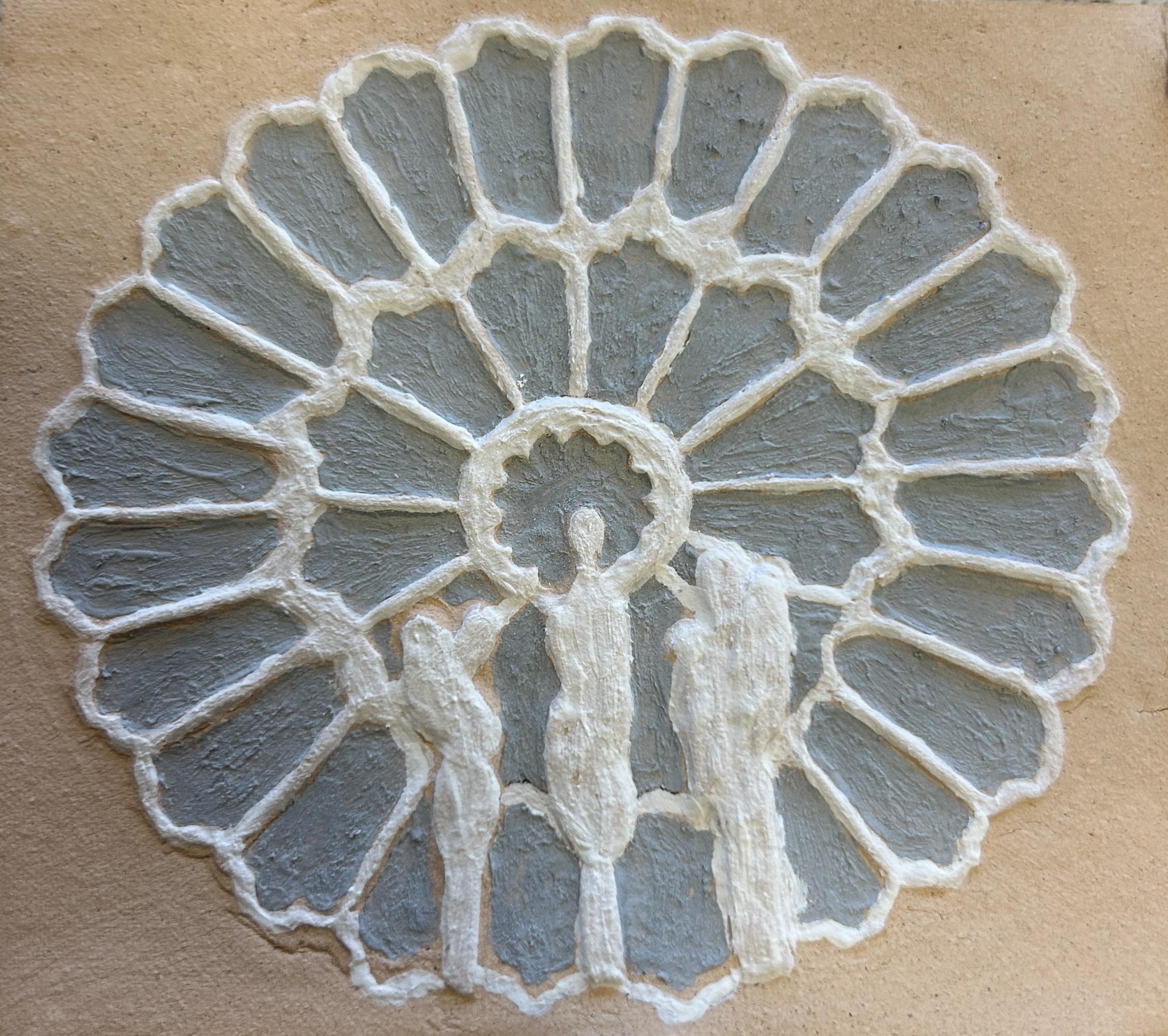
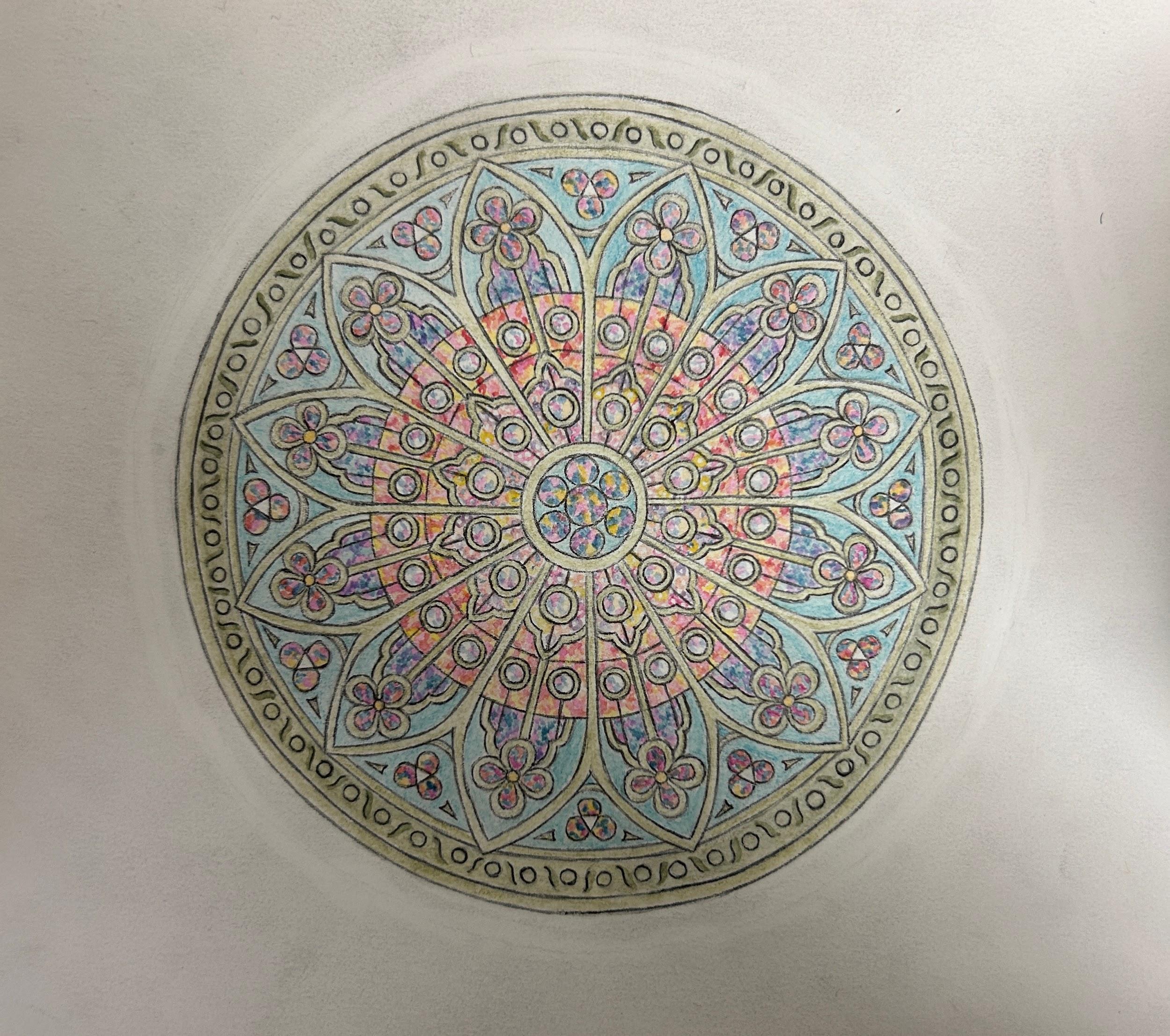
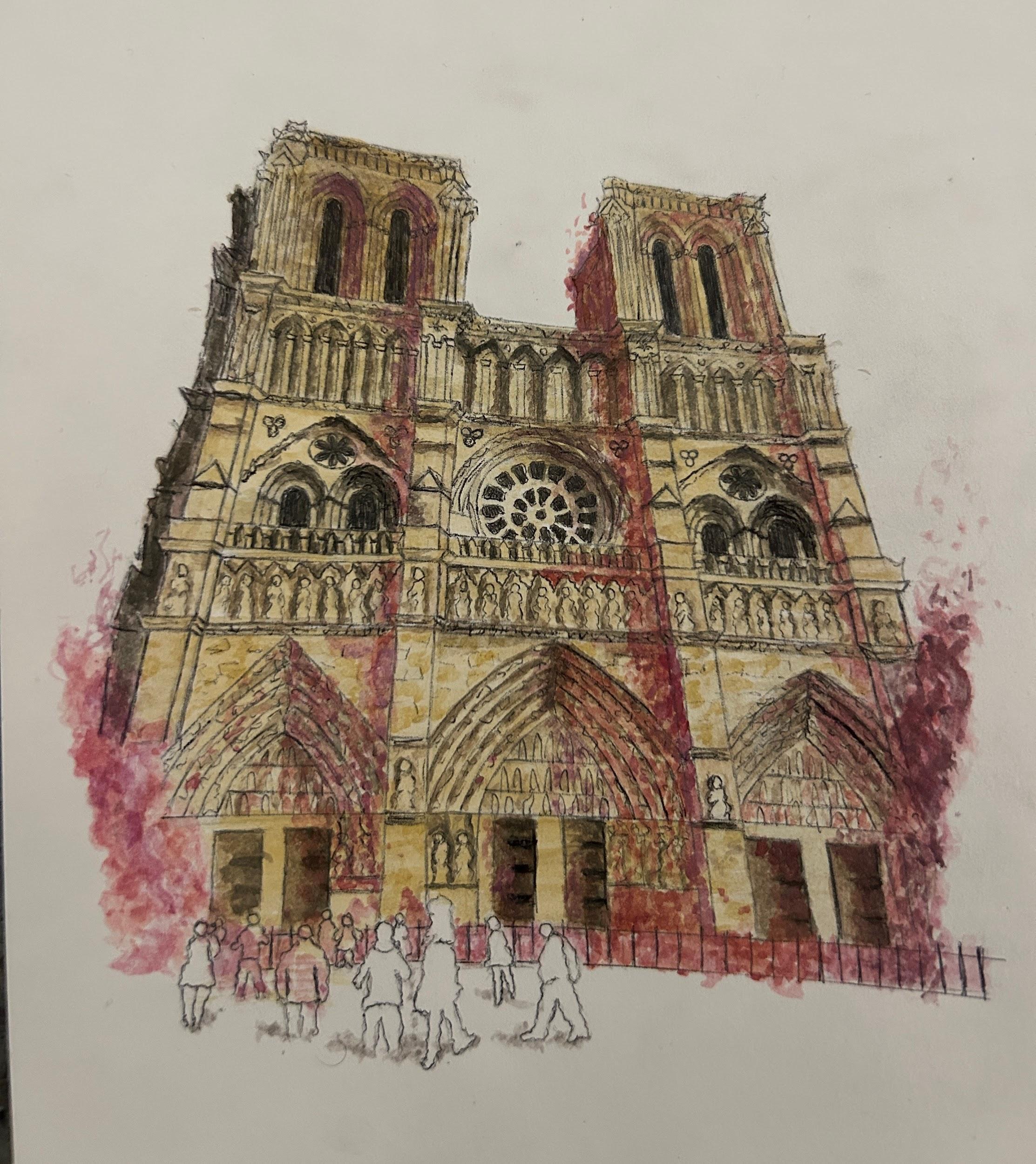
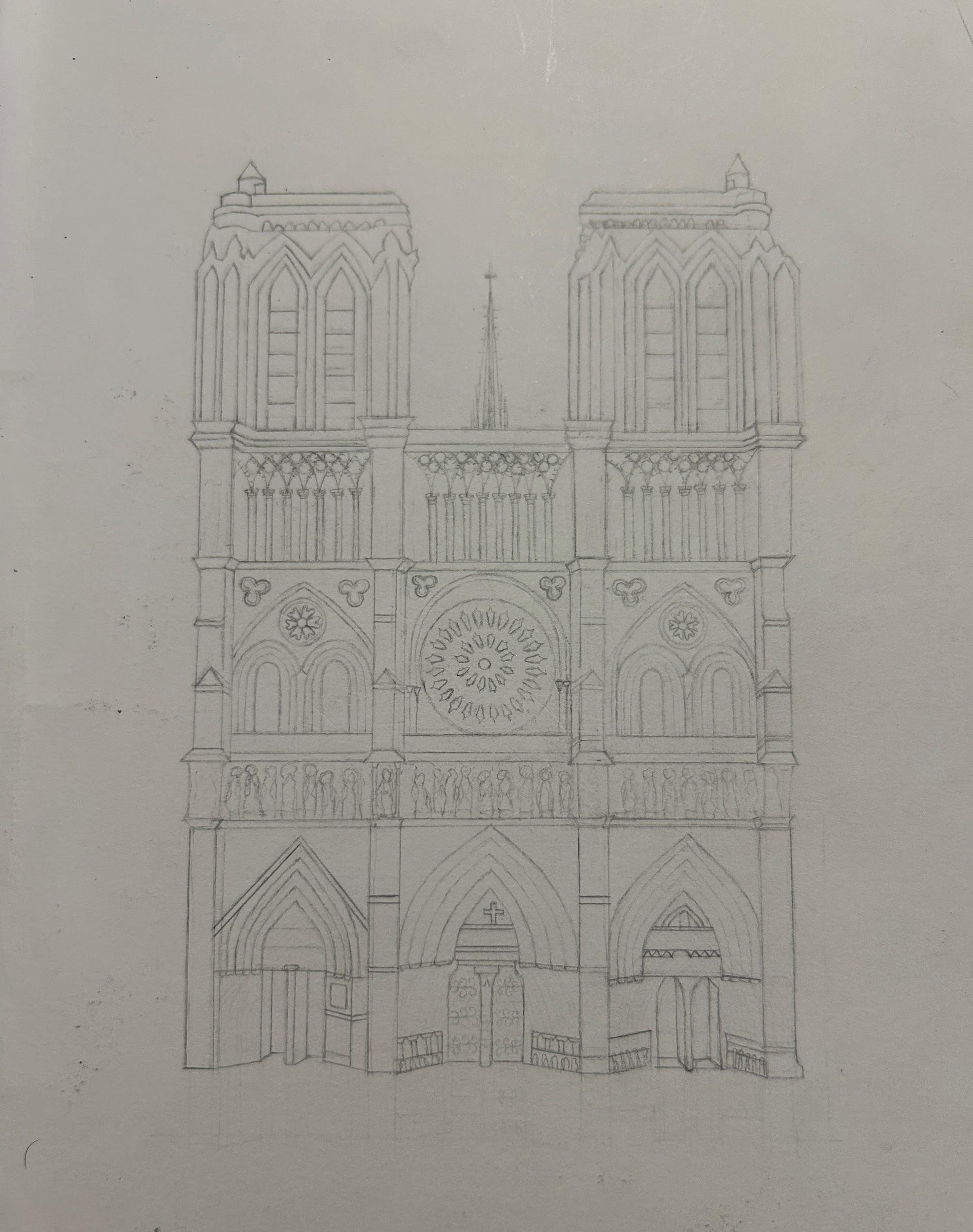
Notre Dame window designs
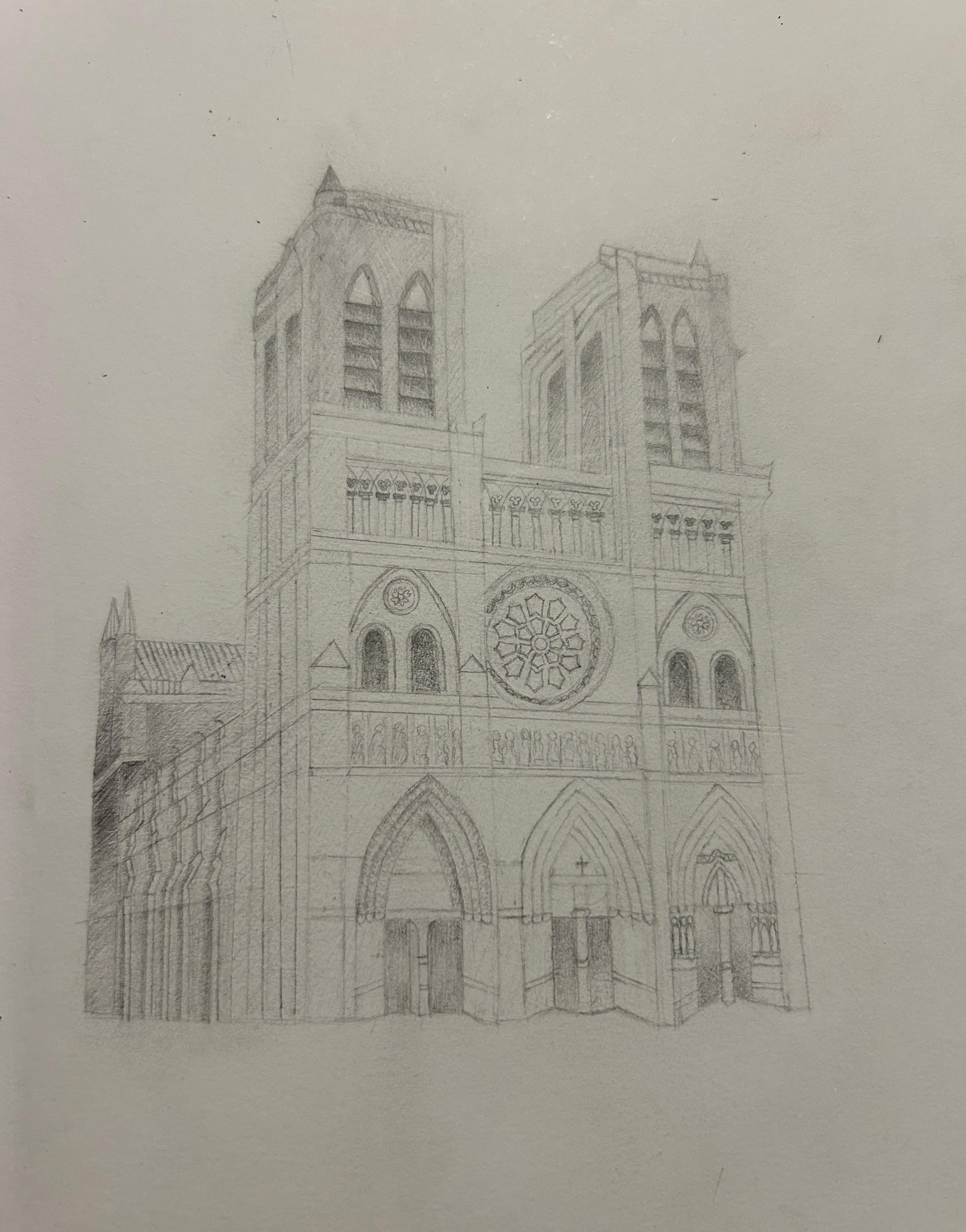
In progress
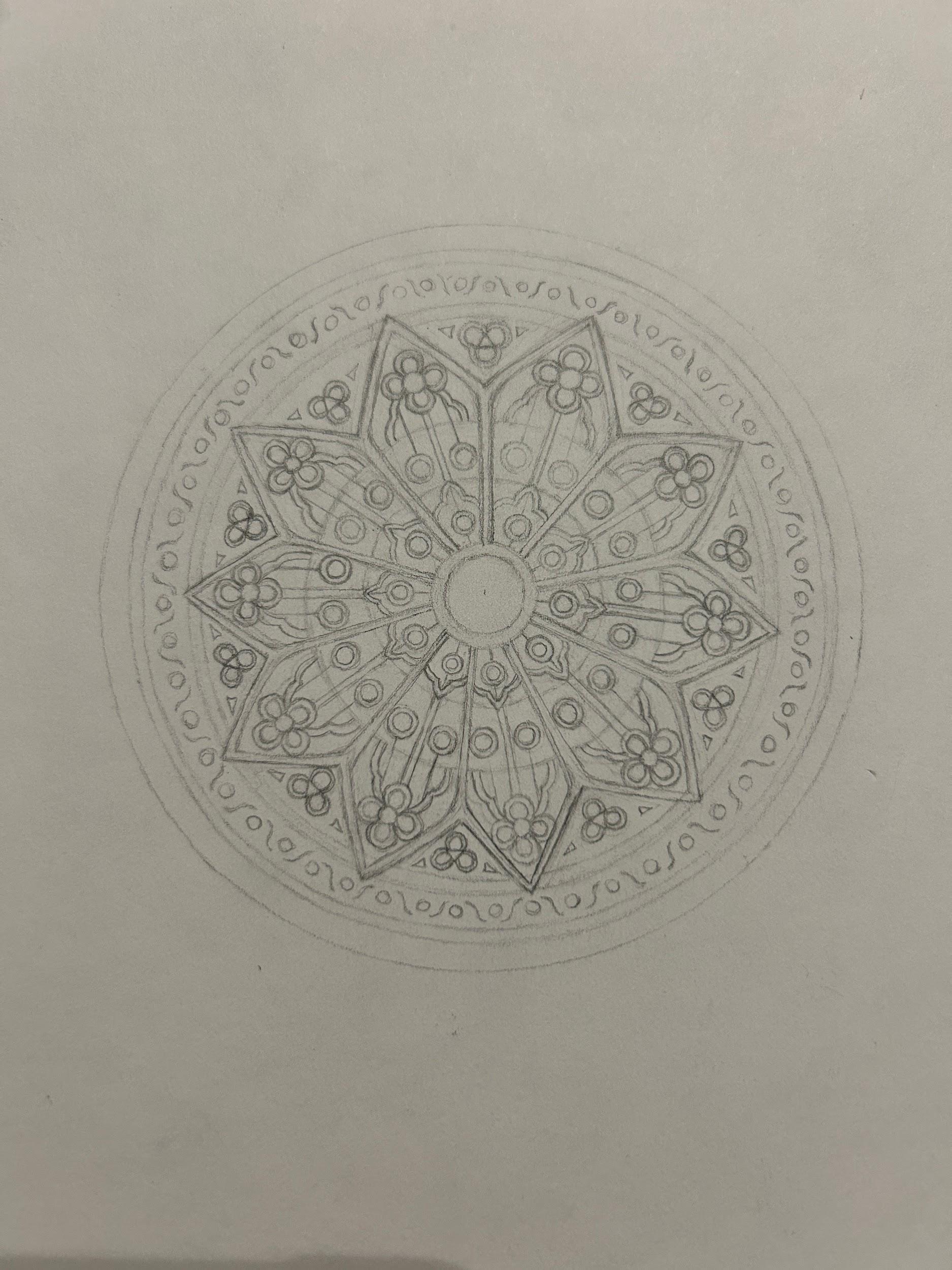
1. Initial designs inspired by market research -
I found that the outer layer of petals pointed outward too much which disrupted the smooth,downward flowing form I was aiming for.I addressed this by adjusting the angle of the petals in the following drawings improving the visual flow of the design.
2. Petal material development lead me to decide against using blocked ( like full leaf of ?) paint, clay and regular paper as it would block the light.
3.I created a Paper model to work out the scale and structure of my design.
this allowed me to discover that I couldn't curve or position paper freely without extra support which led me to using wire to curve the paper petals into natural, organic shapes, which strengthened the flower like appearance and provided better structural support.
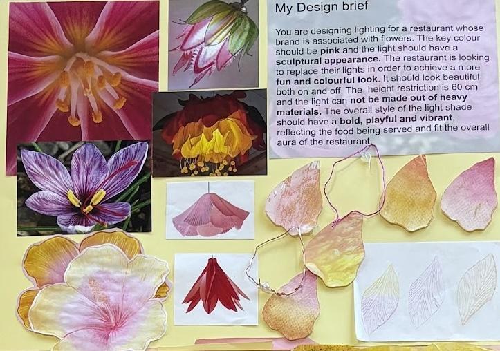
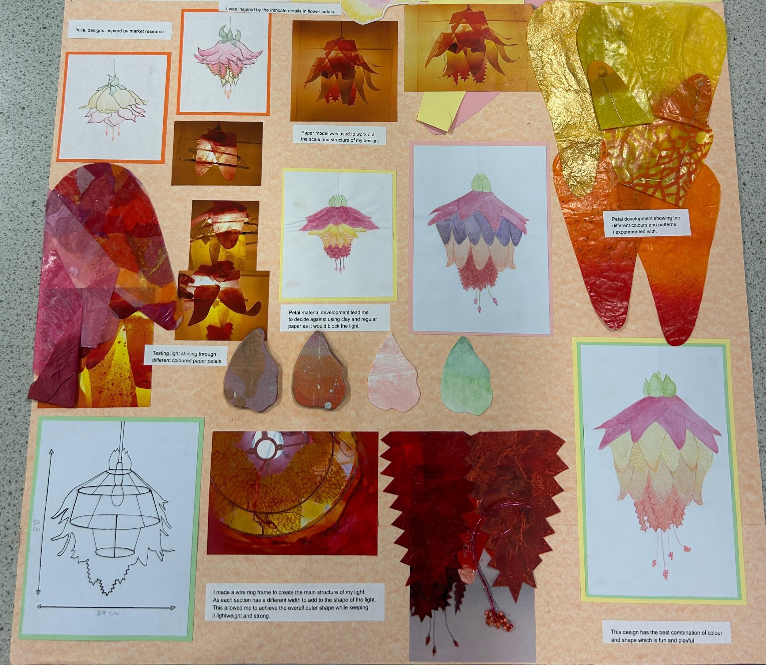
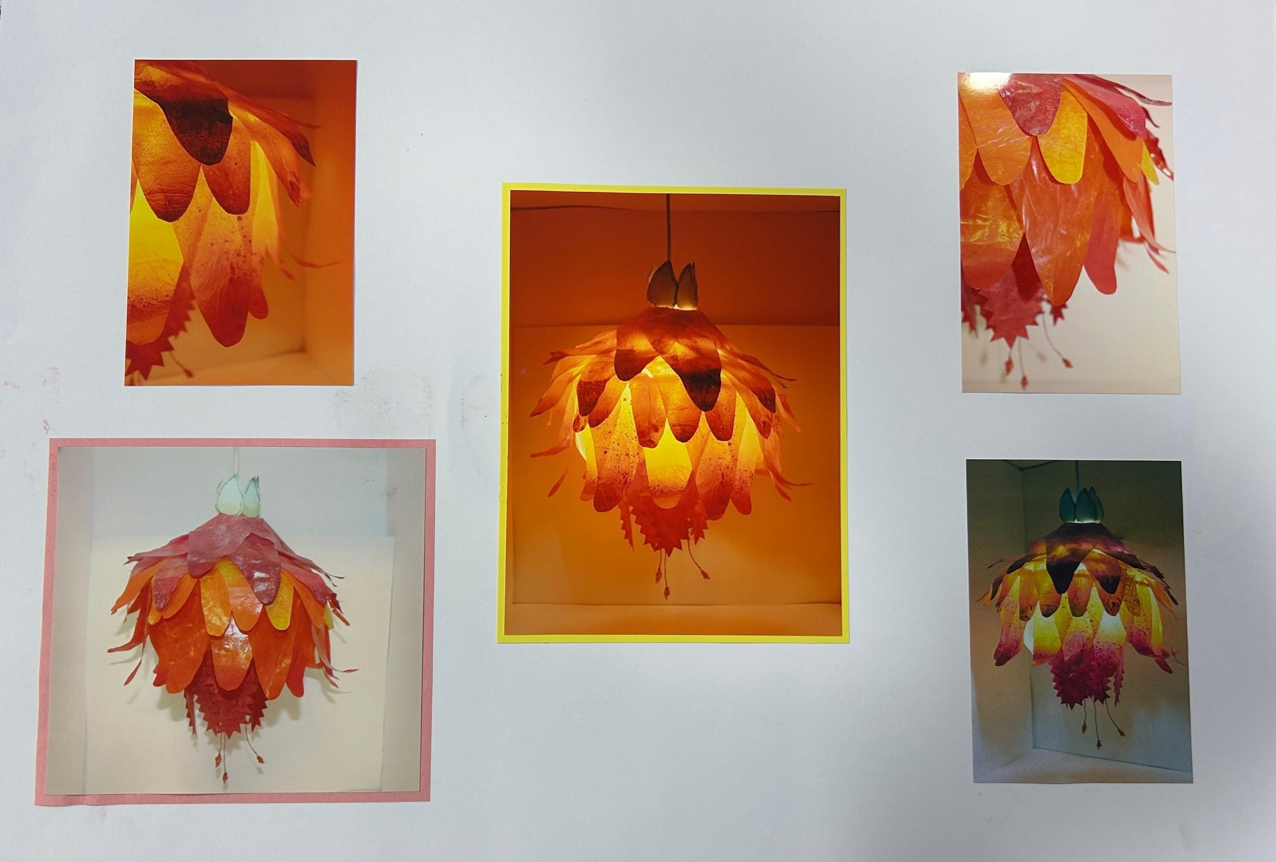
I drew different patterns on the tissue paper using paint and spray paint and checked how light passed through and interacted with the material.Then I went on to determine the intensity of the colours on the paper and how they softened the light.
I experimented with adding purple as a second layer because it's in harmony with pink so they normally go well together. However,I felt that they didn't go together well as the purple was too dark and clashed with the lighter aesthetic.
I decided to use yellow for the second layer, this brought back the brighter, more vibrant look and complemented the pink well.