Our brand guidelines explain how to use the CPAmerica visual identity with confidence and clarity. The guidelines have been designed to ensure consistancy within our brand, helping to create strong, recognizable and innovative communications.
The following pages demonstrate the flexibility within the CPAmerica identity and should be used to inspire and motivate creative expression. Our unique identity color palette and graphic style creates a distinctive framework which helps us stand out from our competitors.
Our values
Our brand values begin with our mission and beliefs, and radiates throughout our organization, culture and codes of conduct. It’s how we behave and act as we do business. It’s also the promise we make to our memebers.
We promote a spirit of trust, sharing and openness.
We enable connections that get business results.
We look ahead with confidence to tomorrow’s possibilities.
We take our members on a rewarding professional journey.
Putting collaboration first, we inspire the success of America’s independent CPAs. As a trusted source of advice, training and events, we enable you to access a potent, expert business network – extending your reach and enhancing your firm and people’s potential.
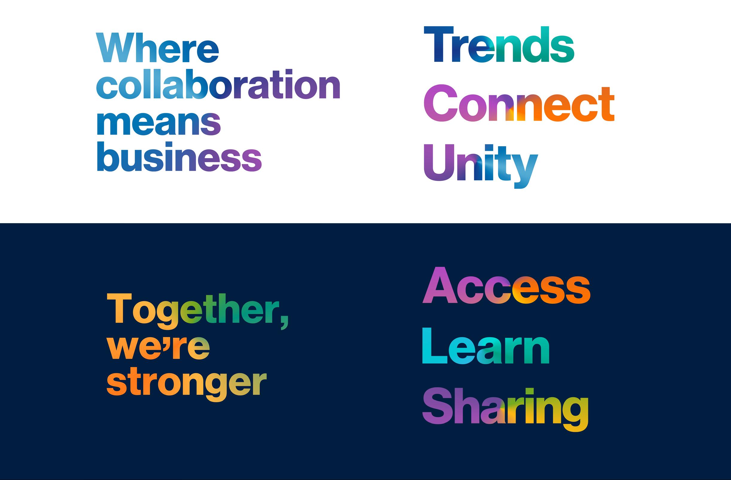
Where collaboration means business.
CPAmerica.
At CPAmerica, what we say makes a clear statement about who we are – and influences how our members, co-workers and stakeholders perceive us. So, in our marketing and communications channels, it’s important that we not only say the right things, but express them in the right way. We call this approach to communication our ‘tone of voice’.
By creating a unique style of language, it will help to set us apart from our competitors, create a clear space for us in the market, engage and inspire our audiences and enable us to speak clearly, confidently, consistently...and with conviction.
As we evolve our communications, these principles establish a benchmark and inform everyone who works on the CPAmerica brand. By referencing our communications against these principles over time, we can judge how well we are living up to our promise.
How we speak
Warm
Human, conversational, empathic
We are not: Stilted, corporate, instructional
We know that it can be lonely at the top, so we show that we understand our members’ challenges and opportunities, writing with real warmth, empathy and relatability. We’re welcoming, human and conversational from the outset – though not overly chatty – speaking in a friendly, modern way by peppering our communications with contemporary phrases and sayings. We make things clear and easy to understand for all our audiences, avoiding excessive use of jargon, acronyms and in-jokes
Confident
Dynamic, upbeat, self-assured
We are not: Arrogant, boastful, shouty
At CPAmerica, we are rich in self-belief, reflecting who we are and what we enable. We demonstrate this confidence in the positivity of our language, and by writing in an upbeat and dynamic way, varying our use of longer and shorter sentences. Just like this. As well as by making bold, positive statements and headlines that turn heads and capture the attention. Our writing should also reflect our experience and expertise –‘owning’ our sector and our subject matter, and provoking thought, interaction and debate.
Helpful
Open, honest, supportive
We are not: Uncooperative, inauthentic, patronising
At CPAmerica, we leverage our collective strength to help our members succeed, so we use the language of collaboration in all that we doinviting participation and offering valuable advice. We act as a potent enabler and guiding hand: always open, honest and supportive. We don’t make assumptions about our audience. Rather, we are accessible to them and show the way ahead, bringing our partnership approach to life, and writing inviting calls to action to ensure that no-one is left out.
Emotive
Passionate, inspirational, engaging
We are not: Introspective, detached, overly emotional
We are fundamentally interested in making a difference to our members and their businesses, so we express our active interest in them – caring deeply about their challenges and their potential. We know how they feel, not just what they think.
So we seek to engage and inspire, speaking personally, directly and informally to demonstrate our human touch. We use consistently enthusiastic and positive language to reach out, connect and encourage participation in our broad and supportive community.
The logo
The logo is a graphic entity that identifies the association and must always be represented as shown. No components may be added or removed from the logo.
Clear space
The CPAmerica logo should occupy its own space. Clear space is the required empty space around the logo that is equal to the height of the lowercase “m” in the logo as a guide all around the logo. No other element should violate this space. This includes: No text, other logos, or art work.
Logo options
There are four basic color options for the logo from which to choose: blue and yellow color version using the approved colors; reversed version, in which the entire logo is shown in white against a solid, dark background; reversed version, in which the entire logo is shown in white and the pinnacle symbol in yellow; and grayscale, when printing in one color.
Artwork
Digital files with .tif, .eps or .ai extensions should be used for printed materials. Those with .png or .jpg extensions should be used for online viewing.
Electronic files of the CPAmerica logo are available on the members-only website, in the sharing library, under Association Documents and CPAmerica Branding.
Visual brand style
Our brand style encompasses every visual element of CPAmerica, from our color palette and its typography to the layout of our website and marketing materials. Together, these elements create a visual identity that serves as the symbolic meaning of our organization.
Colaborative. Connected. Visionary. Inspiring.
A strong brand style allows us to put out the right message about our purpose, mission, and values. It’s about ensuring that the images, colors, fonts, and other visual elements we use support each other across mediums.
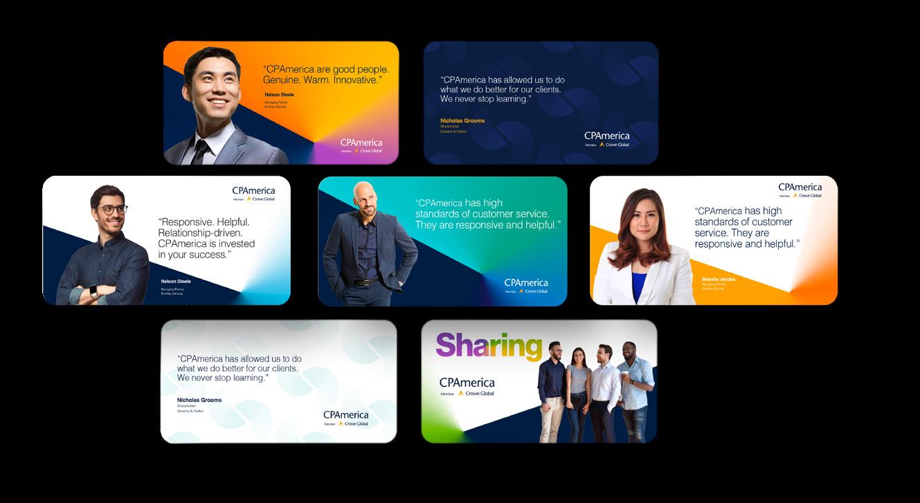
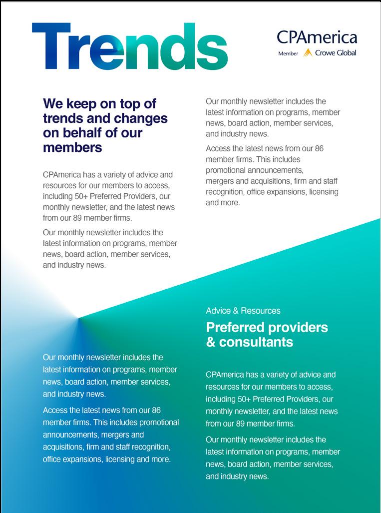
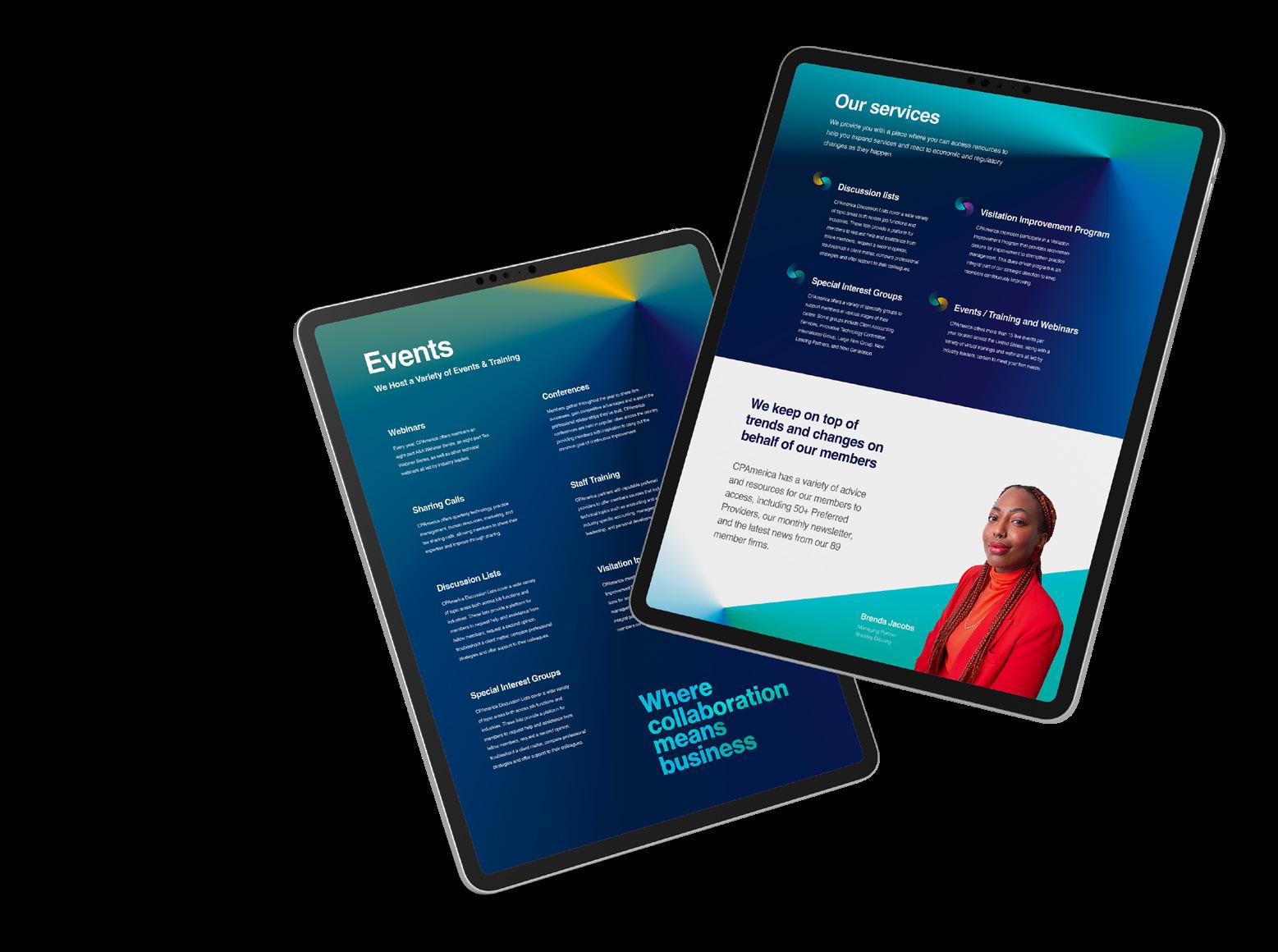
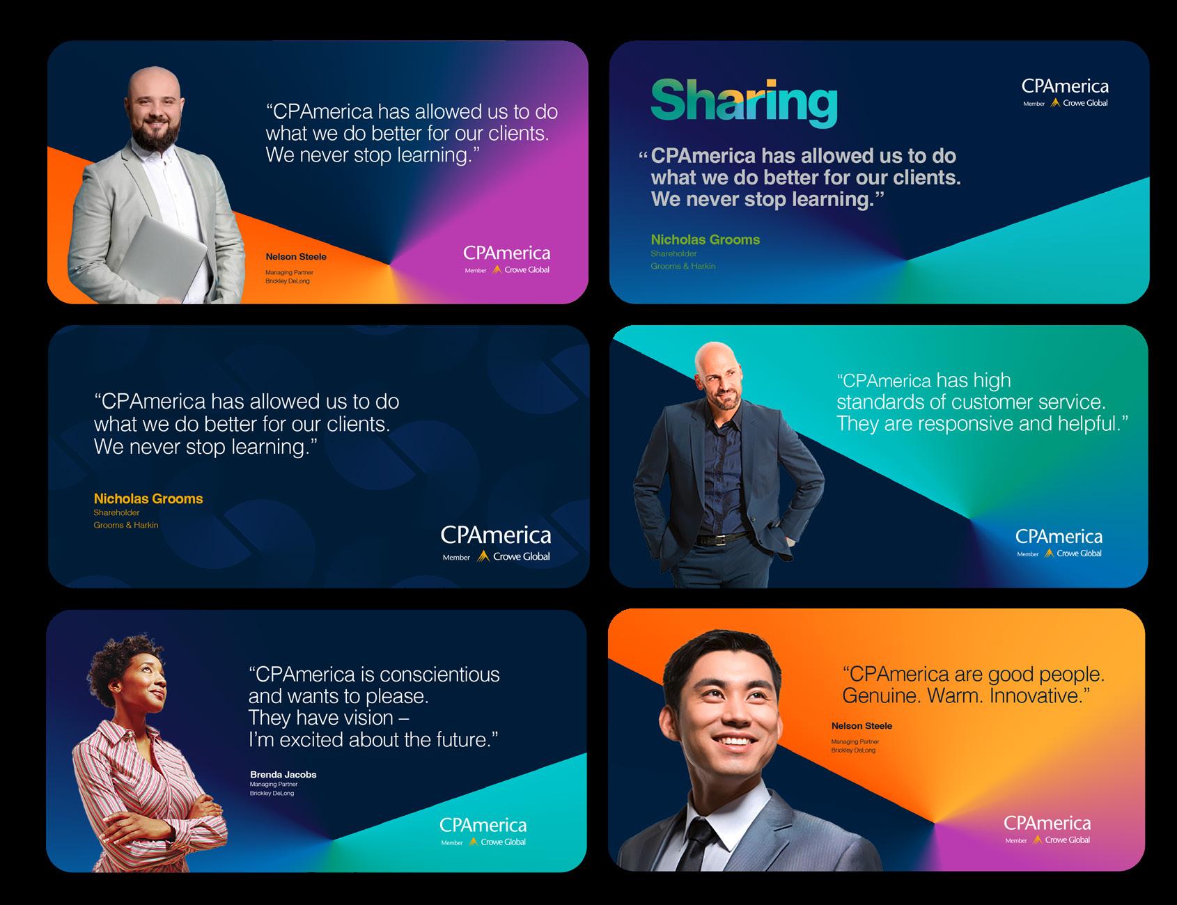
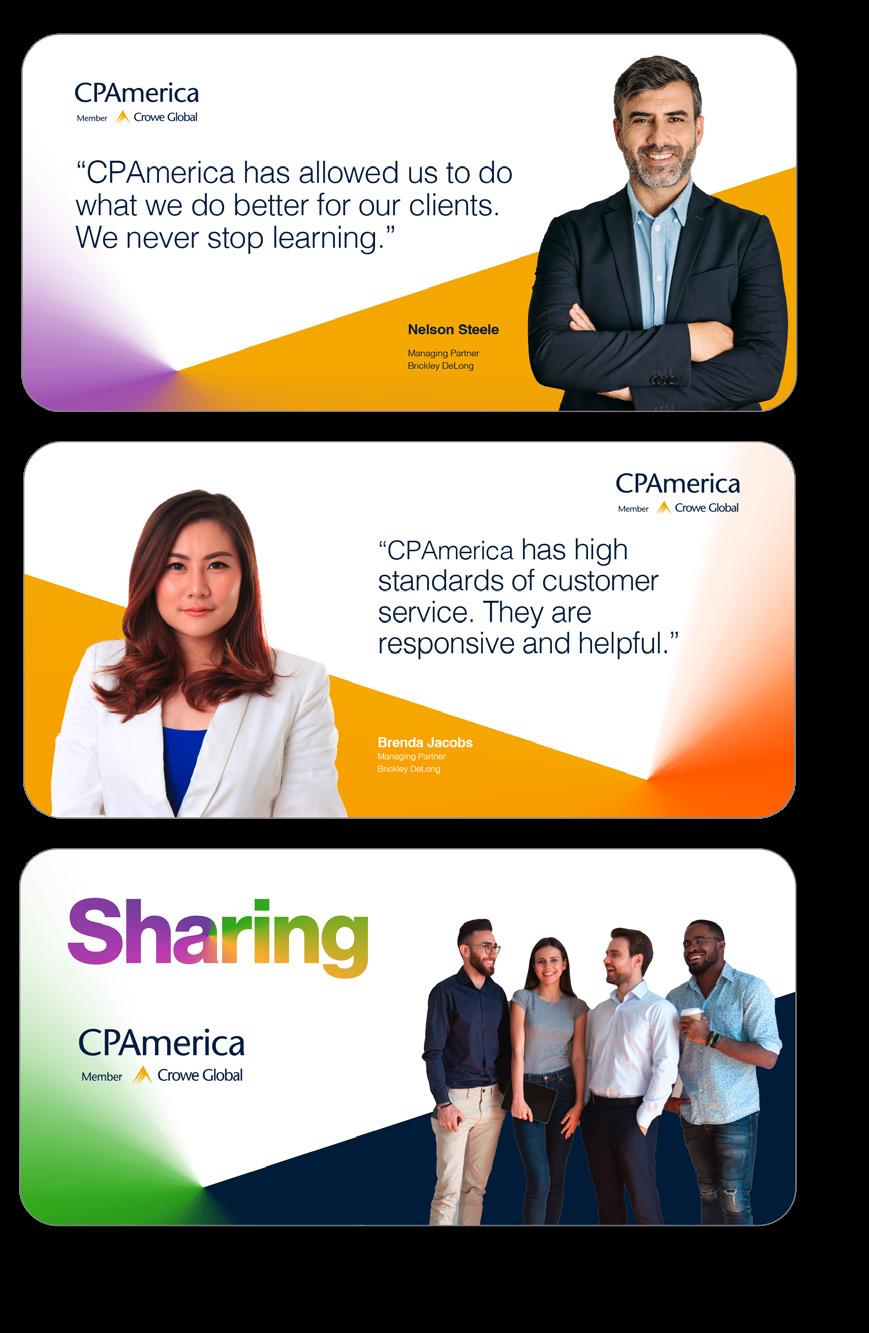
Sample marketing pieces
Colors
From logo, website, social media, and more –color palette branding plays an important role across all CPAmerica marketing platforms. It is a tangible component of the brand that people notice first and foremost.
Our colors have been carefully selected to reflect a sense of enthusiasm and community. Our brand colors have been carefully selected to reflect how we want people to feel when thinking of CPAmerica. Bold. Fresh. Optimistic.
#011E41
Indigo Yellow Violet
Cool Gray Aqua
Corporate Blue (Logo) Navy Dark Gray Lime Orange Purple Royal Blue Steel Blue Teal
Typography
Typography plays an important part in ensuring a lasting impression of our brand.
Helvetica
As undoubtedly one of the most famous and popular typefaces in the world, Helvetica is loved for its clean lines, no-nonsense shapes and simple efficiency. The sans serif typeface combines elegance with bold minimalism and is especially loved and appreciated by the design community.
Approved MS system fonts are those that are common to most users and therefore will not be substituted when a PowerPoint file is shared with a wide range of people and displayed on various devices.
While Helvetica is widely available, Arial is the shares many of the same cheracteristics and is the perfect substitute when Helvetica is not available.
Arial Bold
ABCDEFGHIJKLMNOPQURSTUVWXYZ
abcdefghijklmnopqurstuvwxyz
1234567890
Arial Regular
ABCDEFGHIJKLMNOPQURSTUVWXYZ
abcdefghijklmnopqurstuvwxyz 1234567890
Background art
Born from our of promise of collaboration–dynamic, engaging, proprietary backgrounds have been created as the base of the graphic design system.
CPAmerica: Point of collaboration
The decision path leads to a central ‘point of collaboration’ for members. Collaboration leads to development, growth and opportunity.
The concept is progressive and the colors used are vibrant, optimistic and generous. The ‘point of collaboration’ graphic offers flexibility and longevity.
The decision path
The point of collaboration
Background gradient artwork
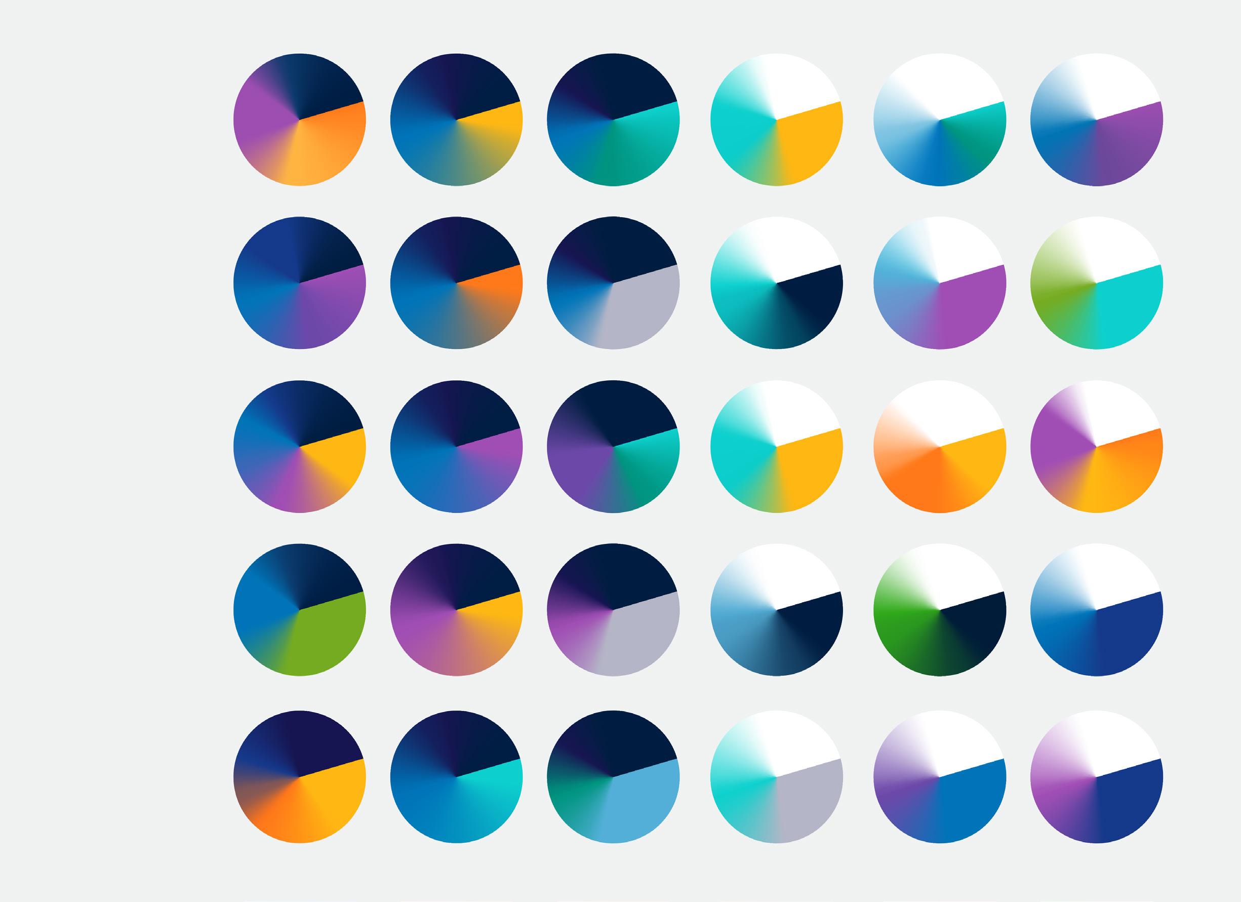
Two sets of background gradients have been created. One for indigo backgrounds and one for white backgrounds. These gradients can be cropped to fit layouts of any proportion.
The gradient can be rotated providing a variety of dynamic angles.
Brand statements
Memorable and striking typography
The harmonious interplay of brand colors, brand promises, and brand typography forms a powerful visual statement.
Leveraging the art of typography, we elevate the advantages of CPAmerica membership through a series of impactful statements and benefit words to incorporate into marketing materials.
Eye-catching and distinctive, its adaptability allows for seamless customization and extension across various applications.
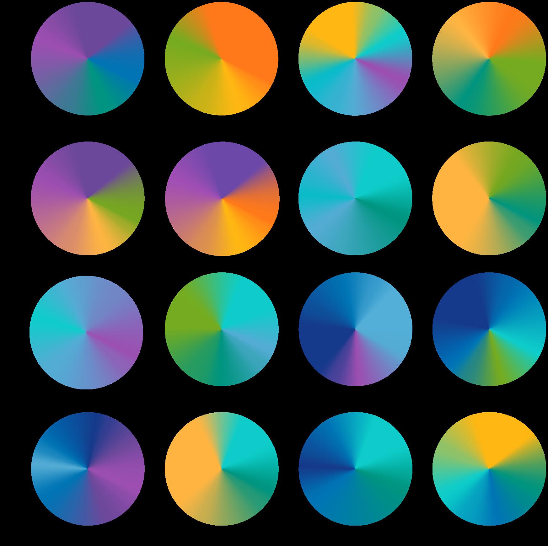
Approved gradient mesh artwork
Brand statement gradient artwork
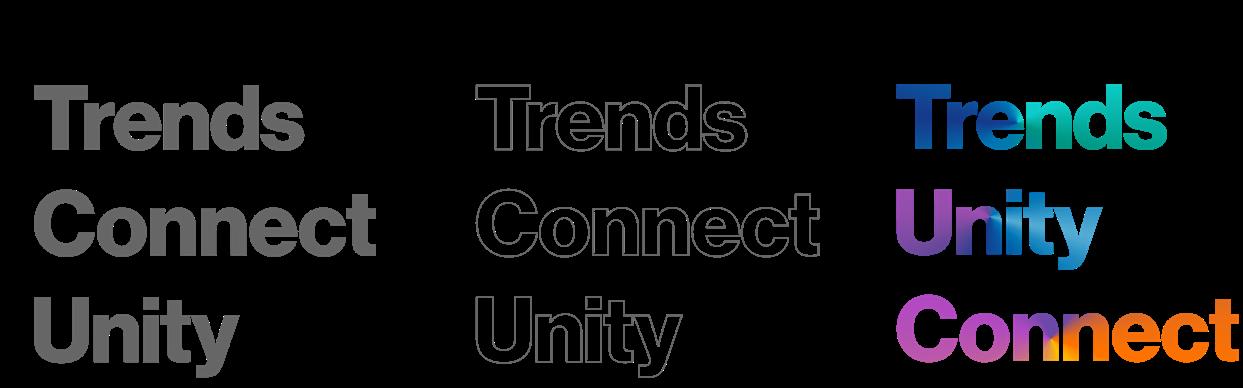
Brand statements are created by using typography as a mask.
The gradient can be rotated providing a variety of dynamic angles.
Using Adobe Illustrator–set your type.
Outline to the font. Make it a compound path. Place the path over a gradient mesh and make a clipping mask.
People imagery
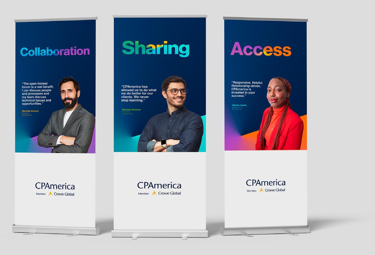
At the core of our visual brand style, our members take center stage. We are building a library of profesionally photographed portraits of our members and associates.
Subjects are posed in a way that makes them look comfortable, natural and engaging. Some looking at the camera, some gazing elsewhere. Smiles are not mandatory, as we aim to capture the natural essence of each individual.
We employ a three-point lighting setup, which consists of a main light, a fill light, and a backlight.
Please note: These image are for illustrative purposed only and have not been purchased for use.
Photography style
At CPAmerica we pride ourselves on being down-to-earth, plain speaking people who work in genuine partnership with our members. It is important that our photography expresses this sentiment. Representing our members in action, collaborating, the imagery should have a documentary feel. Candid images of people interacting with one another in realistic scenarios tell the story of CPAmerica’s ongoing activities, events, training and sharing.
Photos should feel spontanious, relaxed and real. Shooting with a narrow depth of field focuses on our people, with less distraction of background setting.
Proprietary overlay
We have developed a set of transparent “point of collaboration” graphics, in a variety of colors, to overlay selected images. This effect should be used judiciously when several images apear together.
Please note: These image are for illustrative purposed only and have not been purchased for use.
Approved transparent gradient artwork
Transparent gradient artwork
Transparent gradients in a variety of colors can be used to overlay photographs.
The gradient can be rotated providing a variety of dynamic angles.
The opacity of the overlay can be adjusted to best compliment the image.
Overlays are generally placed at the bottom of an image. Be aware not to place a sharp line across featured faces.
Layouts
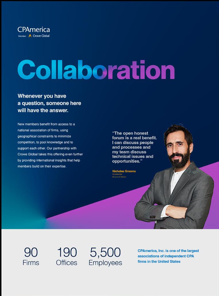
A well-designed document is more likely to be read in part or entirely by the intended audience and increases reader comprehension. Good design also reflects well on the individual, business or organization presenting the document, lending credibility and a sense of professionalism.
The CPAmerica layout style imposes a unique character on all print and digital materials. Our design distinguishes us from all others, and encourages people dive in with curiosity. Here are some examples of how to implement it effectively with beautiful and functional layouts.
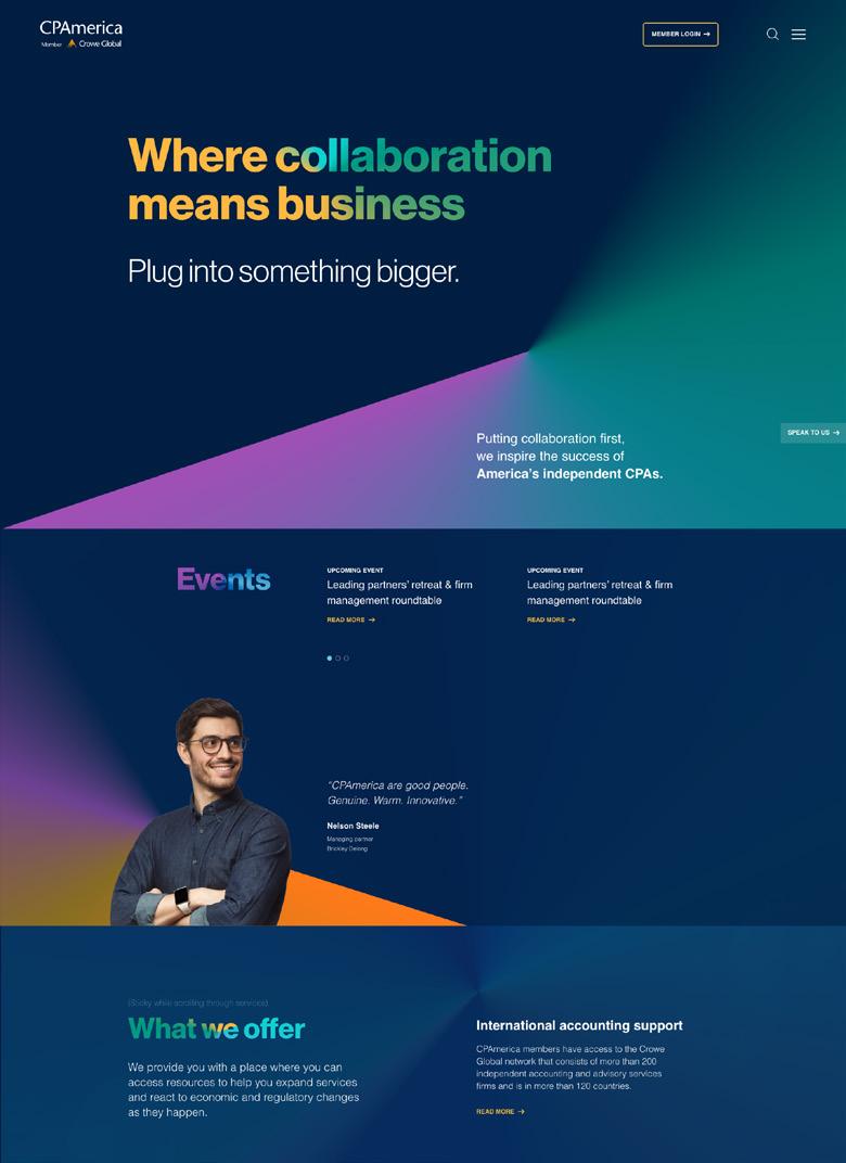
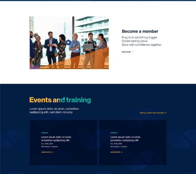
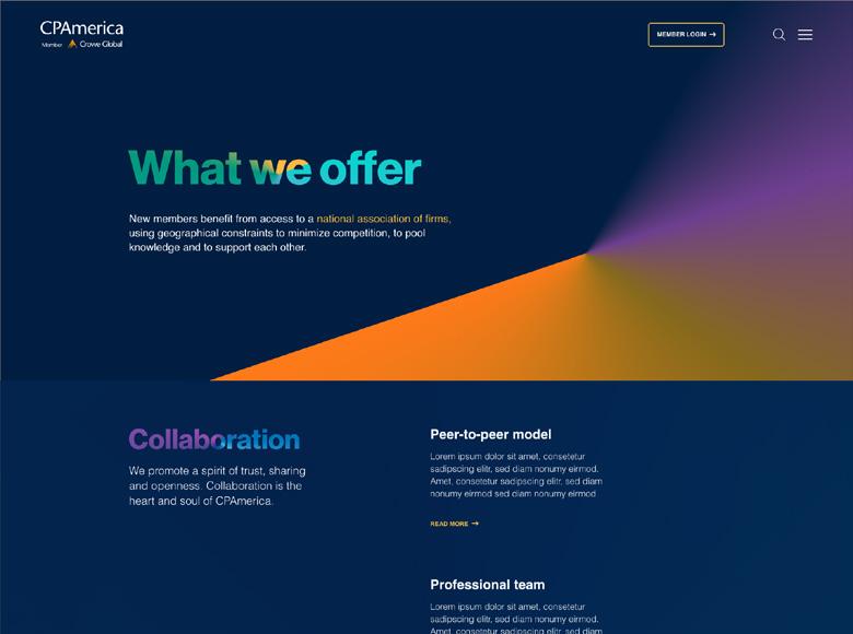
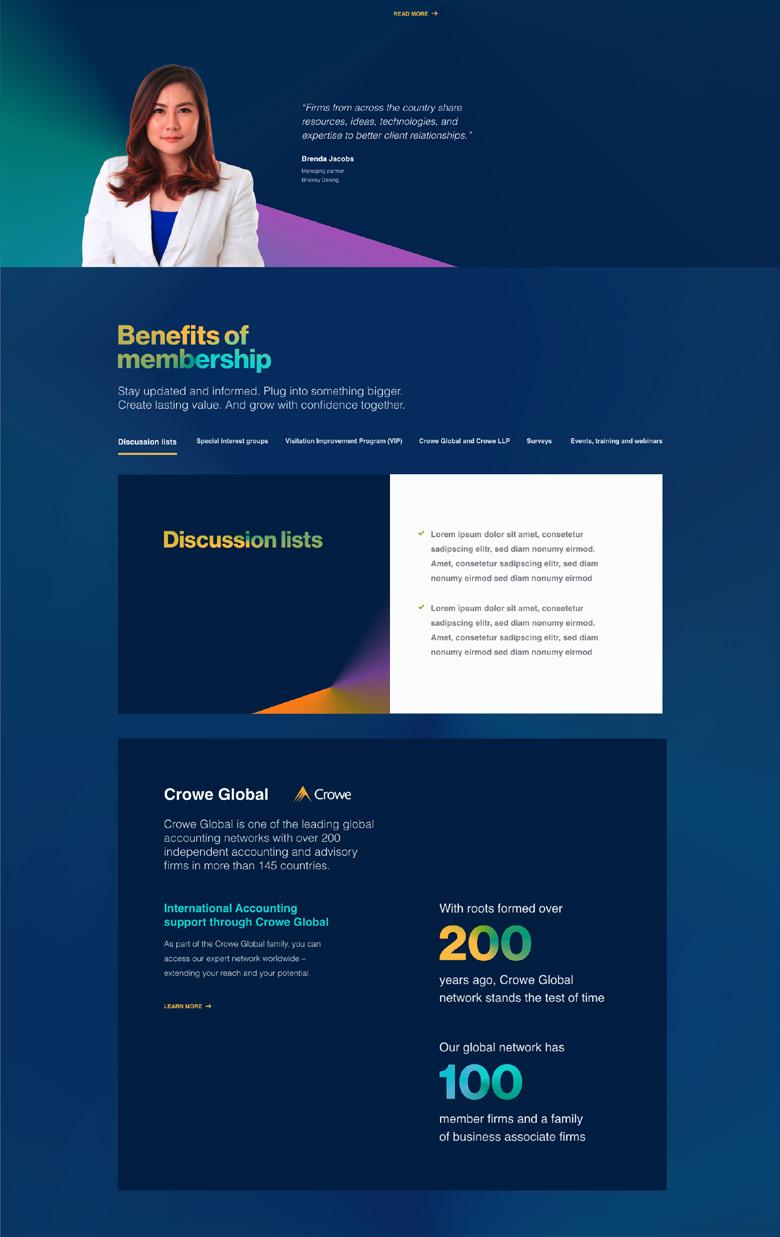
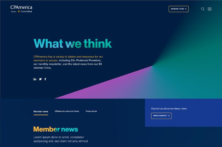
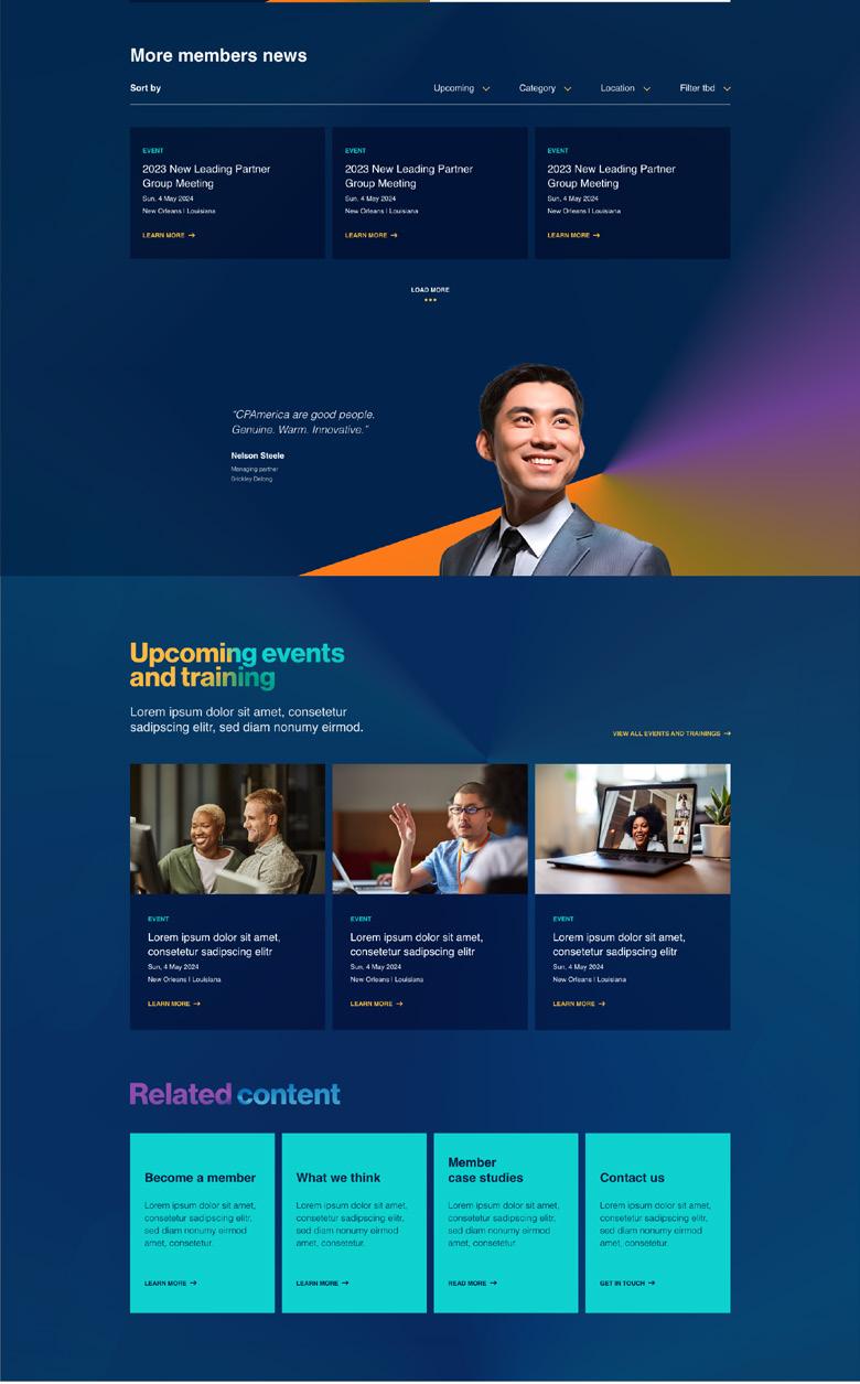
Website
The new website is designed to help CPAmerica maintain a professional impression with current members, and nurture leads with prospects. It provides a good user experience that helps visitors access and navigate our website with ease.
Clear navigation helps visitors access information quickly and easily.
Responsive design ensures that your audience has a good experience on your site, regardless of the device they use.
Purposeful visuals and information that engage visitors and support CPAmerica messages.
Compelling copy that informs and keeps readers engaged.
Call-to-action options to get our audience to proceed to the next step or learn more.
Social media
The main goal of our social media design is to create visually appealing content that captures the audience’s attention and encourages them to engage. Our brand style is designed to stand out on a feed.
Aim for consistency and cohesion
Consistency on social media means sticking to a our visual theme. With our wide range of brand colors, visual posibilities are endless. The design system strikes a perfect balance of variety and consitency.
Design has a volume switch
Consider what your social post is intended to accomplish, the information portrayed, and what reaction you want to invoke. Some posts may be bold, colorful and energetic. Others, more more calm and sedate. Color plays a major role in turning up or turning down the volume.
Collaboration background
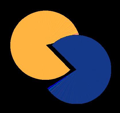
For limited use, we have created a graphic pattern that represents the collaboration of the CPAmerica community. The graphic is used as a subtle background on select design pieces. The graphic represents unity, connection, sharing, alliance and togetherness.
We are a membership of equals, each unique, with much in common, joining together, to make better things happen.
For ease of use, we have created these patterns as a pattern swatches in Illustrator. Now any shape can be filled with one of these backgrounds as easily as using a fill color.
The collaboration graphic
Amy Azoulay aazoulay@cpamerica.org
Grace Horvath ghorvath@cpamerica.org
Online link to assets: http://tinyurl.com/2t8dry2s