Spring 2026 Catalogue: Select Masterworks of Canadian & International Art
May 27 th , 2026
Wednesday, May 27th at 7 pm EDT
The Globe & Mail Centre
351 King Street East, 17th Floor, Toronto, Ontario
SELECT MASTERWORKS OF CANADIAN & INTERNATIONAL ART
PREVIEW EXHIBITIONS
Calgary
A selection of artworks will be on display.
Cowley Abbott
607 Confluence Way Southeast April 23 - 25: 10 am - 5 pm
Montreal
A selection of artworks will be on display.
Galerie Eric Klinkhoff
1200 Sherbrooke Street West May 7 - 9: 10 am - 5 pm
Toronto
Cowley Abbott
326 Dundas Street West
May 13 - 27:
Monday - Friday: 9 am - 5 pm
Saturday and Sunday: 11 am - 5 pm May 27: 9 am - 12 pm
AUCTION PARTICIPATION
In‒Person Bidding
Please contact our offices to reserve your seat and register to bid.
Live Stream
A live stream of the auction will be available at CowleyAbbott.ca on May 27.
Absentee
& Telephone Bidding
Electronic submission of bids and printable bidding forms are also available at CowleyAbbott.ca.
Online Bidding
Online bidding is available to our clients via Auction Mobility at live.CowleyAbbott.ca, allowing real‒time bidding via web browser or Apple/Google app.
Lots purchased by bidders through the Auction Mobility online platform are subject to a Buyer's Premium of 26% of the successful bid price of each lot up to and including $25,000 and 21% on any amount in excess of $25,000, plus any applicable taxes.
Buyer's Premium
A Buyer's Premium of 25% of the successful bid price of each lot up to and including $25,000 and 20% on any amount in excess of $25,000 is paid by the buyer, plus any applicable taxes.
With more than a decade of exemplary service in the Canadian art market, Cowley Abbott has established a reputation for consistently exceeding client expectations. Through a comprehensive suite of offerings— including auctions, private sales, and appraisals—our team leverages extensive expertise, longstanding industry relationships, and an unwavering commitment to providing clients with the highest level of assistance. We invite you to contact our firm to learn more about our specialized departments and services.
Lydia Abbott
Rob Cowley
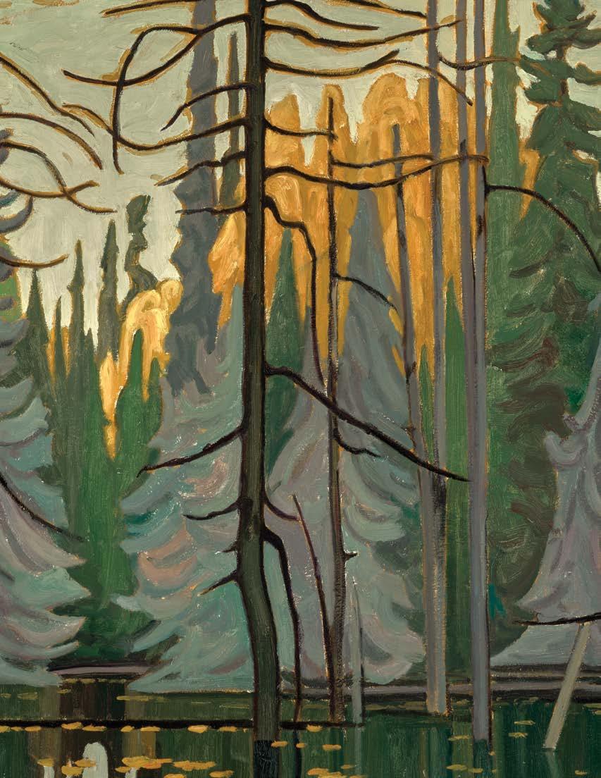
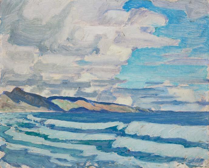
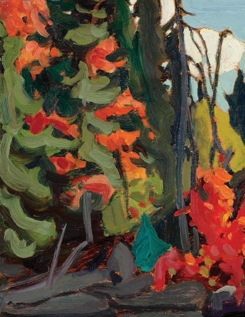
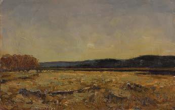
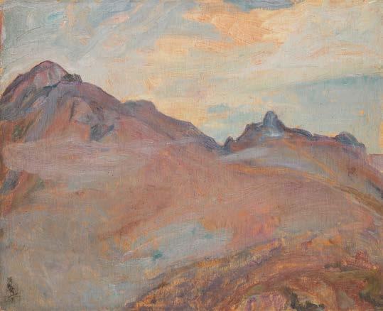
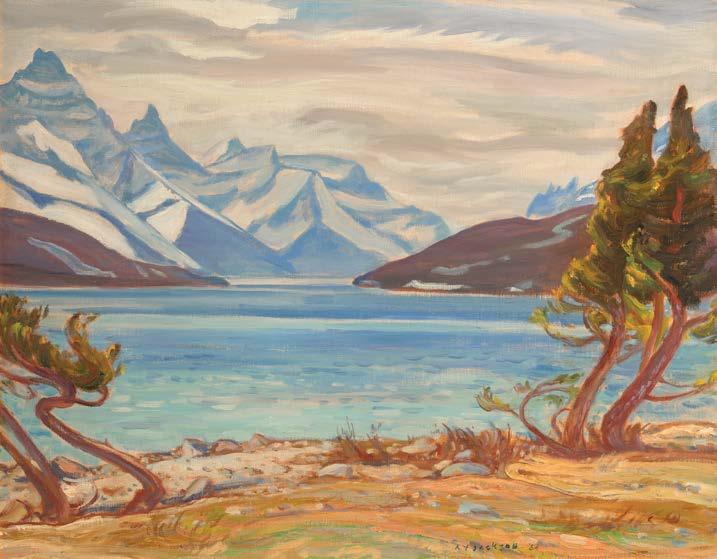
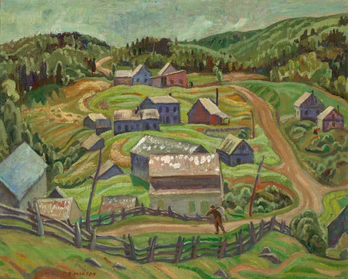
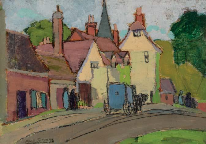
PETER CLAPHAM SHEPPARD
Bloor Street Viaduct, 1915 oil on board signed lower right; estate stamp (LG097) on the reverse 13.5 ins x 9.75 ins; 34.3 cms x 24.8 cms
PROVENANCE
Estate of the Artist
Private Collection, Toronto
LITERATURE
Tom Smart, Peter Clapham Sheppard: His Life and Work, Richmond Hill, 2018, reproduced page 104
Peter Clapham Sheppard
The Bridge Builders, Construction, Bloor Street Viaduct, 1915 oil on canvas, 58 x 40 ins
Private Collection (Sold at Cowley Abbott, 28 May 2025, lot 35)
Price Realized $180,000
Not for sale with this lot
Peter Clapham Sheppard displayed a fascination throughout his career with the architecture and apparatus of the modern city, whether in Toronto, Montreal or New York. Gasworks and locomotives, skyscrapers and shacks, freighters and tugboats—these were the recurring protagonists of many of his works.
It was therefore almost inevitable that he would turn his attention to the Bloor Street Viaduct as it began spanning the Don Valley in 1915. Few infrastructure projects better embodied Toronto’s urban ambitions. Authorized by referendum in January 1913, the viaduct represented Toronto’s most audacious municipal undertaking to date. For years the Don Valley had formed a formidable natural barrier east of downtown. The proposed bridge promised to bind the historic core to the rapidly suburbanizing east end and to facilitate the movement of workers, goods and services across the widening metropolis.
Construction began on June 16th, 1915. Conceived as a multi-deck truss-arch structure in reinforced concrete, the viaduct was celebrated as a bold feat of modern engineering. Its central span—approximately 85.8 metres (281.5 feet) across the Don—soared above the valley floor, while additional sections extended westward over the Rosedale Ravine and eastward toward Danforth Avenue. Opened in 1919, the viaduct was an assertion that Toronto was a modern city, capable of mastering its geography and shaping its own urban destiny.
The massive construction site offered everything that appealed to Sheppard’s modern eye: the restless geometry of cranes pivoting above the ravine, cables strung in taut diagonals, skeletal pylons climbing upward from concrete footings. He painted several oil sketches of the site as well as at least one large canvas in 1915, The Bridge Builders, Construction, Bloor Street Viaduct (sold by Cowley Abbott in May 2025).
In this sketch, as in his other industrial scenes, Sheppard responded not merely to the structure itself but to what it represented: energy, expansion and optimism. He constructed the composition through sweeping, sinuous railway tracks whose converging lines accelerate the viewer into the heart of the construction site. A string of open-topped freight cars curves along the rails, reinforcing the sense of motion and industrial momentum. Smoke rises from below the crane, dissolving into a pale, scumbled sky. Against this haze, shafts of sunlight catch the yellow lattice of the derrick tower and flare through drifting vapour. The cumulative effect is one of kinetic optimism: a city in the act of building itself, rendered in swift, responsive paint.
We extend our thanks to Ross King, art historian and author of Defiant Spirits: The Modernist Revolution of the Group of Seven, for his assistance in researching this artwork and contributing the preceding essay.
$10,000–$15,000
COWLEY
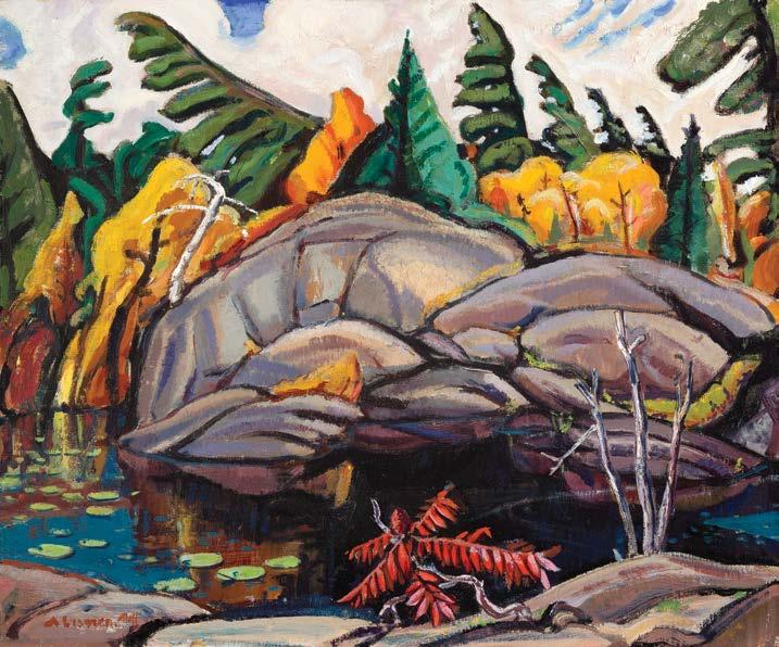
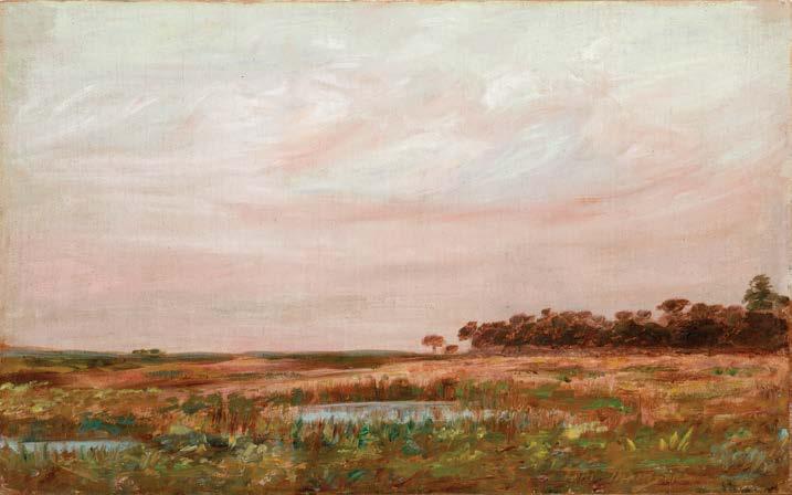
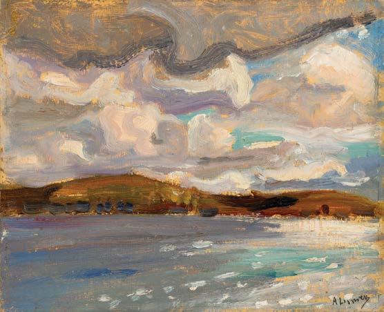
ARTHUR LISMER
Seal Cove, Grand Manan, N.B., circa 1930 oil on board signed and dated indistinctly lower left; signed, titled and dated indistinctly 193[?] on the reverse 12 ins x 15 ins; 30.5 cms x 38.1 cms
PROVENANCE
Alex Fraser Galleries, Vancouver
A Distinguished Private Collection, Vancouver Heffel, auction, Toronto, 31 October 2024, lot 515 Private Collection, Calgary
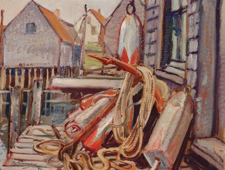
During the 1930s, Arthur Lismer travelled along Canada’s eastern seaboard, sketching harbours, fishing communities, and maritime industries. In Lismer’s Seal Cove, Grand Manan, N.B., the clustered wooden buildings, wharves, and fishing gear evoke a site that, around 1930, was at the height of its economic activity, with structures and labour practices closely integrated into the coastal landscape.
Seal Cove on Grand Manan, an island in the Bay of Fundy, is a small community historically known for its smoked herring fishery. By the late nineteenth and early twentieth centuries, the island had
become one of the world’s major producers of smoked herring, and the shoreline at Seal Cove was lined with dozens of small smokehouses used to cure and export fish to markets in the United States, the Caribbean, and Europe. Many of these buildings stood densely arranged along the tidal inlet on wooden stilts, accommodating the dramatic rise and fall of the Fundy tides. At the industry’s peak, entire families participated in the work: fishermen harvested herring offshore, while women and children split, salted, and strung the fish.
Lismer’s choice of subject aligns with a broader Canadian modernist interest in regional identity, but here the emphasis shifts from untouched nature to a vernacular, working environment shaped by human hands. Rather than rendering the scene with photographic clarity, Lismer simplifies and distorts shapes—boats, ropes, and buildings twist into rhythmic, almost animated lines. Thick, directional brushwork and an earthy palette—punctuated by flashes of red and ochre—create a sense of tactile immediacy, suggesting both the materiality of the fishing equipment and the hard labour that shaped this small coastal community.
Through its expressive distortions and emphasis on the rugged vitality of maritime life, Seal Cove, Grand Manan, N.B., transforms a specific maritime locale into a broader meditation on environment, labour, and national identity in early twentieth-century Canadian art.
$15,000–$20,000
CLARENCE ALPHONSE GAGNON
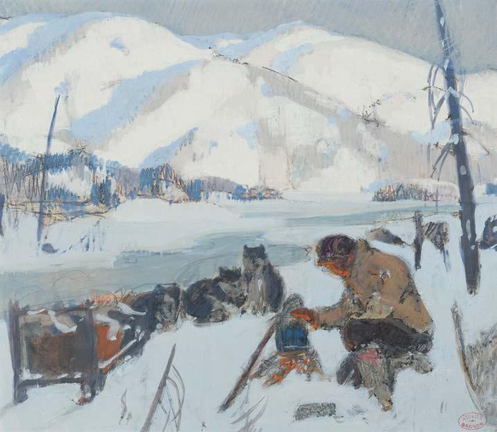
Study for "François Paradis Camping in the Snow" (Maria Chapdelaine), circa 1929 mixed media on paper stamped "Atelier Gagnon" lower right; titled and dated circa 1929 on a label and certified by Lucile Rodier Gagnon as "Trappeur et ses chiens" (no. 810) on the reverse 7 ins x 8 ins; 17.8 cms x 20.3 cms
PROVENANCE
G. Blair Laing Galleries, Toronto Roberts Gallery, Toronto Private Collection, Toronto
LITERATURE
Ian M. Thom, Clarence Gagnon: "The Maria Chapdelaine" Illustrations, Kleinburg, 1987, pages 24-28, the final work reproduced page 37 Louis Hémon, Maria Chapdelaine, Paris, 1933, pages 39-40, the final work reproduced page 38
Maurice Constantin-Weyer, "Au pays de Maria Chapdelaine", Illustration (5 December 1931), unpaginated, the final work reproduced
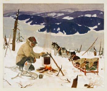
Clarence Gagnon, François Paradis Camping in the Snow, 1928-1933 gouache with watercolour and coloured pencil and/or pastel on paper, 7.25 x 8.75 ins
Gift of Colonel R.S. McLaughlin (1969.4.12) McMichael Canadian Art Collection Not for sale with this lot
Despite his vow to evade book illustration projects, in 1928, Clarence Gagnon was easily persuaded to take on the 1933 Mornay Publications edition of Maria Chapdelaine. A romance novel published in 1914 by French writer Louis Hémon, who was residing in Quebec at the time, Maria Chapdelaine was aimed at French and Quebec adolescents. The novel achieved great success and has been extensively analyzed, adapted and translated throughout the decades. The story has caught the imagination of many artists and commercial illustrators, especially those from Quebec, who sought to capture the landscape and traditional life of Quebec. Gagnon was offered the project by Mornay Publications, who agreed to all of the artist's strict demands regarding the book's production. Gagnon laboured over three years on these illustrations, devoting great care to each image.
Ian Thom writes that “Gagnon avoids portraying individual faces, often showing figures from behind or rendering the features by a few simple lines. In effect, the text is left to speak for the characters.” Gagnon created forty-two images to accompany the Maria Chapdelaine story, as well as multiple preparatory works, including this study. He employed an illustration process similar to the one he used for Louis-Frédéric Rouquette's novel, Le Grand Silence blanc, executing monotypes augmented with pastel, coloured pencil and other drawing media. On the detail, quality and influence of Gagnon’s illustrations, Thom declared, “Greater in number, and in colour rather than black and white and of a different character, the illustrations set a new standard for book illustration. Gagnon made numerous preliminary studies for many of the Maria Chapdelaine works, the final paintings being among his highest achievements.”
$20,000–$30,000
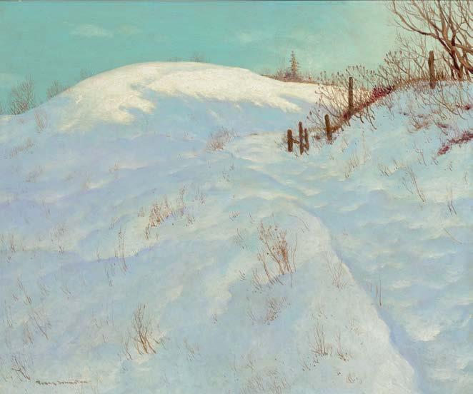
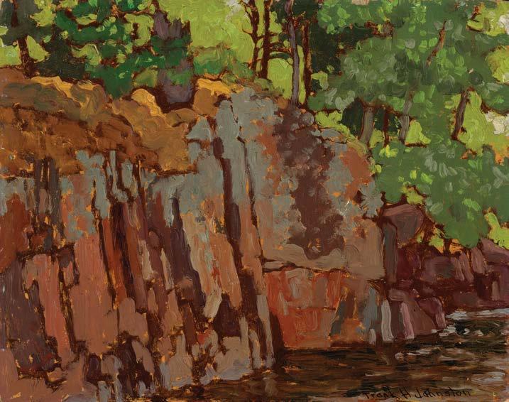
FRANK HANS JOHNSTON
The Golden Dome oil on board
signed lower left; signed, titled and inscribed "an Ontario Hillside" on the reverse
20 ins x 24 ins; 50.8 cms x 61 cms
PROVENANCE
H. Hutchinson
Mr. and Mrs. F. Benisch
Kaspar Gallery, Toronto Private Collection, Vancouver, October 1979
By descent to the present Private Collection, Kingston
EXHIBITED
Group of 7 and Their Contemporaries, Kaspar Gallery, Toronto, October 1979
Frank Johnston’s landscapes, more atmospheric and decorative than those of his fellow Group of Seven members, reflect turn-of-the20th-century training. This stylistic difference may explain why he participated only in the Group’s first 1920 show. In 1921, he
left Toronto to become principal of the Winnipeg School of Art and formally broke with the Group in 1922. As his career evolved, Johnston’s landscapes increasingly reflected his interest in turn-of-thecentury ideals, displaying much greater atmospheric and decorative qualities than his fellow Group of Seven members. The Golden Dome is a strong example of the artist's ability to capture the interplay of light, colour and pattern in nature. The setting of a snow-covered hillside lends itself especially well to Johnston’s decorative interpretation of the landscape, due to the effect of shadows and shimmering light reflections.
Johnston was praised for his talent in capturing contrasts between sunlit colour and depths of shade. The Golden Dome showcases the artist’s ability to transform the ordinary into the ornate, as a thick blanket of soft snow envelops the field, with only sparse vegetation emerging through its surface. The only sign of human life appears along the crest of the hill, where a small building sends a plume of smoke from its chimney. The painting’s restrained blue palette is particularly striking, articulating delicate variations in light in the land and sky. Johnston’s romanticization of his subjects continued throughout his career. Even his titles, such as The Golden Dome, lean toward the poetic rather than the literal.
$18,000–$22,000
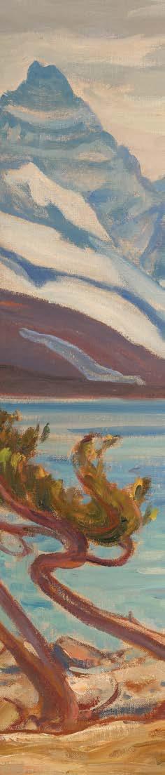
JAMES EDWARD HERVEY MACDONALD
Surf, Barbados, 1932 oil on board
dated "Feb. 27" lower right; signed, titled and dated 1932 on the reverse and titled "Sunny Barbados" on the gallery label on the reverse 8.5 ins x 10.5 ins; 21.6 cms x 26.7 cms
PROVENANCE
Dominion Gallery, Montreal Private Collection, Montreal
By descent to the present Private Collection, Oakville
LITERATURE
Paul Duval, The Tangled Garden: The Art of J.E.H. MacDonald, Scarborough, 1978, page 151
The late 1920s marked a period of industrious activity for J.E.H. MacDonald. Having earned accolades as a founding member of the Group of Seven by this time, MacDonald became increasingly occupied with his work at the Ontario College of Art and various commissions involving book design, illustrations and architectural design. MacDonald carried out yearly painting trips to British Columbia, returning with accomplished oil sketches of the Rockies. MacDonald became the Principal of O.C.A. in 1929, and the following year, he was elected to the Royal Canadian Academy.
Following a mild stroke in late 1931, the artist travelled with his wife to Barbados, where he benefited from the warm climate during the winter months. MacDonald produced a number of oil sketches during his three-month stay, observing this new locale with his keen sense of visual structure and pattern. Sky and sea tend to dominate his landscape sketches of the period. In Surf, Barbados, bands of shifting blues undulate across the composition. Of the Barbados sketches, art historian Paul Duval wrote, “they prove, once again, MacDonald’s ability to quickly adjust to a new landscape environment...In the Barbados, as in Nova Scotia, he luxuriated in the sense of freedom he always found by the sea.”
$25,000–$35,000
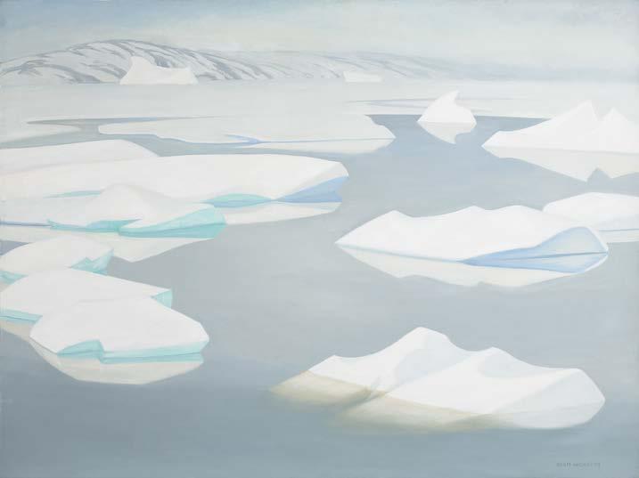
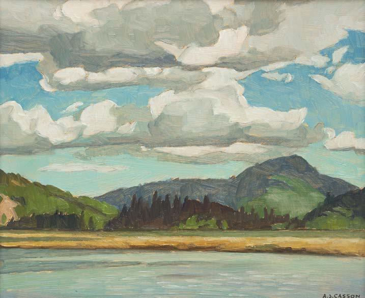
DORIS JEAN MCCARTHY
Grey Fog Arctic, 1981 oil on canvas
signed lower right; dated "810731" (31 July 1981) on the reverse; titled and dated to a gallery label on the reverse 36 ins x 48 ins; 91.4 cms x 121.9 cms
PROVENANCE
Aggregation Gallery, Toronto Private Collection, Toronto
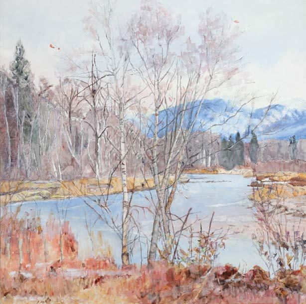
Doris McCarthy’s Grey Fog Arctic belongs to a mature phase of the artist’s career, when decades of travel and observation culminated in a refined and personal vision of the Canadian landscape. Throughout her life, McCarthy was driven by a desire to paint the varied regions of Canada, developing a style responsive to each environment she encountered. The Arctic proved especially transformative.
Beginning in 1972, McCarthy returned repeatedly to the north, travelling over five consecutive years to Cape Dorset, Frobisher Bay, Pangnirtung, Resolute Bay, Arctic Bay, and Pond Inlet. These expeditions continued through the 1980s and 1990s, extending across the Yukon and Arctic regions to Greenland, Inuvik, Holman Island, Paulatuk, and Sacks Harbour, sharpening her sensitivity to the north’s quiet luminosity and the elusive tonal shifts of ice and atmosphere.
The composition unfolds in a broad horizontal field, with icebergs dispersed across a calm, fog-laden sea. The ice floes drift along the canvas as gently contoured, sculptural forms—pared down to their essential geometry. Their surfaces seem to absorb and release light, articulated through a spectrum of soft greys, veiled whites, and glacial blues. These subtle tones evoke both the density and translucency of ice, allowing it to appear at once solid and dissolving. Unlike the monumental Arctic visions of Lawren Harris, McCarthy’s approach is intimate and atmospheric. The fog flattens depth and softens edges, producing a quiet, suspended space that resists dramatic interpretation. This restraint reflects the artist’s departure from the heroic nationalism of earlier Canadian landscape painting, toward a contemplative rendering of the natural world.
Although McCarthy’s landscapes are not overtly religious, they are deeply imbued with a sense of reverence. A devout Christian, McCarthy often described her engagement with nature as a way of encountering the divine: “The mystery of creation convinced me that God was immanent as well as transcendent in the rocks, the trees, the animals and me—still creating but not exercising the authority I had once believed.” The absence of human presence shifts the focus to stillness and quiet, transforming this Arctic scene into a space for meditation. The fog plays a particularly important role in this regard. Rather than presenting the Arctic as a place of stark clarity, McCarthy renders it as elusive and transient, where perception slows, forms soften, and meaning emerges through careful looking.
In its quiet restraint and atmospheric subtlety, Grey Fog Arctic aligns with McCarthy’s broader artistic goal of conveying the lived experience of a place—its shifting light, weather, and mood—transforming the Arctic landscape from merely observed terrain into a contemplative space imbued with presence, humility, and wonder.
$50,000–$70,000
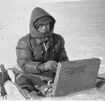
Doris McCarthy sketching in the Arctic, undated photograph. Photographer unknown. Not for sale with this lot
EMILY CARR
Wind, 1936 oil on canvas
signed lower right; signed, titled and inscribed "M.E. Carr 316 Beckley St., Victoria" and "90 over [72]" on the reverse 28 ins x 19.25 ins; 71.1 cms x 48.9 cms
PROVENANCE
Estate of the Artist
Dominion Gallery, Montreal, October 1945 (Estate list no. 90S, Dominion Gallery inventory no. 892E)
The Fine Art Galleries, T. Eaton Co., Toronto, October 1945 (Eaton inventory no. 2797)
Dominion Gallery, Montreal, 1946
Henry Eugene Sellers, Winnipeg (1886-1970) By descent to Edward A. Sellers (1916-1985), Winnipeg/Toronto By descent to the present Private Collection, Kingston/Ottawa
EXHIBITED
Emily Carr, Art Gallery of Toronto, 20 March-2 April 1937
Emily Carr, Picture Loan Society, Toronto, 1937
Emily Carr, The Fine Art Galleries, T. Eaton Co. College Street, Toronto, November 1945
LITERATURE
Charles Band Fonds (R10249), Files 1-13 to 1-22, Library and Archives of the National Gallery of Canada, Ottawa Correspondence with Artists, 1.12 Carr and 7.1-Carr, Library and Archives of the National Gallery of Canada, Ottawa
Lawren Harris and T. Eaton Co., and Sales Book 2, Library and Archives of the National Gallery of Canada, Ottawa
E.P. Taylor Research Library and Archives, Douglas Duncan Fonds (CA OTAG SC095) File 1-2, Art Gallery of Ontario, Toronto
Phyllis Inglis Collection (MS-218, reel A1225, Journal 10 (August 1935-February 1936), Royal BC Museum, Victoria “Vibrant West Coast Life Caught in Carr Canvases,” Toronto Telegram (25 March 1937)
Graham McInnes, "World of Art," Saturday Night (3 April 1937), page 8 Emily Carr, Hundreds & Thousands: The Journals of Emily Carr, Toronto/Vancouver, 1966, pages 185-188, 192-193, 214, 273-279, 283-289
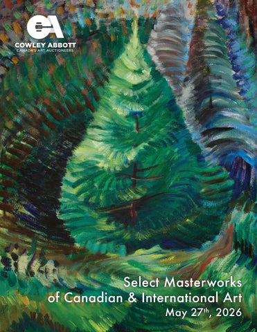
In June 1935 Emily Carr painted at Albert Head on the Metchosin Road, about eighteen miles west of Victoria. Ensconced in her van, the summer’s sketching was very productive as she painted in oil, thinned with gasoline on cheap manila paper, a medium she had adopted in 1932. The technique allowed for the freedom of painting in watercolour with the density of oil paint. In addition, it was economical, an important consideration for the impecunious artist.
At Albert Head Carr returned to subjects she had painted in 1931 and 1932, second-growth trees amidst dense undergrowth. In Forest Interior (Belkin Gallery, University of British Columbia), dated 1932, brushstrokes are blended to create the moulded forms that enfold the young tree. However, in 1935 movement became Carr’s prime
concern. On 12 June she wrote in her journal, “… a picture equals a movement in space…. The idea must run through the whole.” Carr returned to Albert Head for a brief visit in September. Plagued by rain, she nonetheless found shelter in the woods to try and elude the wind. “Sketching in the big woods is wonderful,” she wrote. “You go, find a space wide enough to sit in and clear enough so that the undergrowth is not drowning you…Everything is green. Everything is waiting and still. Slowly things begin to move, to slip into their places. Groups and masses and lines tie themselves together. …Air moves between each leaf. Sunlight plays and dances. Nothing is still now. Life is sweeping through the spaces. Everything is alive.” As Doris Shadbolt has observed, in these new paintings “the brush stroke [became] the agent of the dissolution [of form] and the generator of movement within the new animated form,” as evident in Heart of the Forest (sold by Joyner, 26 November 1985) painted that summer.
If Carr increasingly saw her oil on paper sketches as paintings in themselves, they were also the kernels for reinterpretation in future canvases. “I like to find definitely what my summer’s work was about before trying to ‘canvas’,” she wrote to Edythe Brand, “You are generally, I find, going for some specific thing but if you leave it in the air it stays there until they [the sketches] are pulled together and mounted so that you can meditate on them.”
During the winter Carr worked at her “jungle” sketches. “An organized turmoil of growth, that’s what those thick undergrowth woods are… There is nothing to compare with the push of life.” Heart of the Forest formed the basis for Carr’s canvas Alive (Private Collection). The flowing brush of the oil on paper was translated into short, parallel strokes, similar to her treatment of the trees in A Rushing Sea of Undergrowth (Vancouver Art Gallery 42.3.17) and Reforestation (McMichael Canadian Art Collection 1966.16.17) painted that same year. The surging forest floor in the foreground sets off the central motif of the young tree whose inner branches open up to energize the surrounding growth. The brown tonalities of Heart of the Forest became glowing greens and blues. The rapid brushwork of the central motifs breaks down into dabs of variegated colours upper left contrasting with the conical spirals of the trees upper right.
Emily Carr, Forest Interior, 1932 oil on paper, 36 x 24 ins Belkin Gallery (BG117), University of British Columbia Gift of John McDonald, 1988 Not for sale with this lot
COWLEY ABBOTT
The sketches from the summer of 1935 were shown at the Women’s Art Association in Toronto in early December where they were praised by Graham McInnes in the pages of Saturday Night on 7 December. “[Emily Carr] paints quickly and with a fierceness and passion that are completely convincing. Her technique is astonishing. Viewed closely, the sheer audacity of her rapid brushstrokes compels admiration, while each picture, regarded as a whole, has in it the concentrated essence of the impact of a deeply sensitive and fervent nature on a scene for which she feels with an intensity that only prolonged study and profound conviction can bring. … [Carr is] an artist who is, in her own way, as possessed with the creative urge as that powerful and tragic figure of the last century whose name was Vincent van Gogh.”
It was from this exhibition that the Toronto collector Charles Band purchased Carr’s British Columbia Landscape (now National Gallery of Canada (16555), Gift from the Douglas M. Duncan Collection, 1970) that he loaned to the Canadian Group of Painters exhibition in January 1936. On 8 December 1936 Carr wrote Band, “Glad you are enjoying the sketch you got from the exhibition. Feel I learned a lot from those paper sketches which I am now trying to take into my canvases. There is such scope for freedom and they are so easily carried about.”
Carr was writing in response to Band’s request that she send some paintings east for his consideration, Band having bought Carr’s Indian Church (now Art Gallery of Ontario) from Lawren Harris the previous month. Carr sent a selection of paintings but on 10 January 1937 she suffered a heart attack.
The British art critic Eric Newton was in Vancouver lecturing for the National Gallery and the Gallery’s Director, Eric Brown, knowing that Carr was financially strapped, asked Newton to visit the artist to select paintings for possible purchase. Among the works Newton selected was Wind , described by Carr’s friend W.A. Newcombe as “Forest movement 1936 – (canvas on an old picture frame) – no name, not signed.” Carr subsequently titled it Wind and signed it in the hospital before it was shipped to Ottawa. The address on the back of the canvas is the house she moved to in the spring of 1936.
Wind was not bought by the National Gallery but was sent with the other unpurchased paintings to Toronto at the request of Charles Band. These and the other paintings Carr had previously sent to Toronto were included in a solo exhibition at the Art Gallery of Toronto from 20 March to 2 April 1937. The exhibition resulted in a flurry of purchases by Band, J.S. McLean, Eleanor Lyle and the Toronto gallery.
Carr was frequently frustrated by her correspondents’ failure to keep her informed about the whereabouts of paintings she had sent east. The unsold paintings shipped to the Women’s Art Association, to Charles Band and to the National Gallery for exhibitions and purchase consideration, were now handed over to the Picture Loan Society, an artist’s cooperative currently managed by Douglas Duncan. An exhibition of Carr’s paintings was held that year and among the works shown was Wind which was kept by the Society for rental or possible sale by instalment. Antagonistic correspondence was kept up until May 1939 when Carr wrote to Duncan, “I do not care about the principle of instalment purchase, in pictures or anything else. I think it causes people to hate a thing by the time it is fully theirs. I was brought up to save up & then buy. Nor do I care about the borrowing plan. It is very hard on pictures.” In the interim Wind was returned to the artist.
Wind remained unsold when Carr died in March 1945. In June 1945 Carr’s co-executors, Lawren Harris and Ira Dilworth, agreed to consign all remaining paintings to the Dominion Gallery in Montreal. No. 90 in the list of consigned paintings was Wind which was sold to Richard Van Valkenburg of The Fine Art Galleries at the College Street store of the T. Eaton Company in Toronto and exhibited there in November. Wind was then returned to the Dominion Gallery and purchased by a private collector. The painting has been a cherished work in the family's collection for decades.
We extend our thanks to Charles Hill, Canadian art historian, former Curator of Canadian Art at the National Gallery of Canada and author of The Group of Seven: Art for a Nation , for contributing the preceding essay.
$500,000–$700,000
Emily Carr, Heart of the Forest, 1935 oil on paper, 34 x 22.25 ins Private Collection (Sold at Joyner, auction, Toronto, 26 November 1985, lot 37) Not for sale with this lot
CORNELIUS KRIEGHOFF
A Trip to Town, 1861 oil on canvas
signed and dated 1861 lower right; titled and dated on a gallery label on the reverse
13.25 ins x 18 ins; 33.7 cms x 45.7 cms
PROVENANCE
Private Collection, Toronto
By descent to a Private Collection, Toronto Galerie Alan Klinkhoff, Montreal Private Collection, Ontario
This oil painting depicts a rural Quebec landscape, with a large wooden cross standing tall in the snow. Thousands of these ‘wayside crosses’ were erected throughout rural Quebec as early as 1534, when Jacques Cartier raised the first crosses in Canada to affirm his claim to the territory. Later, many explorers and missionaries followed suit, and the custom was subsequently passed on to the first settlers, who erected crosses upon opening new roads or staking land claims. The wayside cross, with a decorative rooster, is finely crafted and stands as a symbol of the influence of the church in rural Quebec at the time. Signed and dated 1861, the canvas, A Trip to Town , marks another stage in the evolution of this type of genre scene, integrating additional elements that have become characteristic of Krieghoff’s repertoire.
This vast panorama depicted here suggests the Quebec Laurentians, a region the artist knew and frequented as a sportsman. A farmhouse sitting solidly in the distant upper left contrasts with the horse and sleigh, which are the dynamic focus of the composition. The little horse pulls hard to advance the sleigh through the heavy snow, encouraged by the driver to speedily deliver passengers to their destination, and out of this chilly weather.
$70,000–$90,000
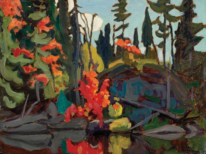
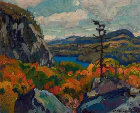
FRANKLIN
CARMICHAEL
Autumn Landscape, circa early 1920s oil on pressed paperboard panel inscribed "This is a genuine sketch painted by Franklin Carmichael. A.J. Casson, April 13, 1978" on the reverse 9.75 ins x 12 ins; 24.8 cms x 30.5 cms
PROVENANCE
Wedding Gift from the Artist By descent to the present Private Collection
LITERATURE
Jon S. Dellandrea, The Great Canadian Art Fraud Case: The Group of Seven & Tom Thomson Forgeries, Fredericton, 2022
A.Y. Jackson, A Painter's Country: The Autobiography of A.Y. Jackson, Toronto/Vancouver, 1976, page 138
Between 1919 and 1923, the focus of Franklin Carmichael’s painting practice was the geography between Orillia and his home in Lansing. Unlike his Group of Seven cohorts, he did not join the famous Algoma Box Car trips of 1918-1920, or the early trips to Lake Superior beginning in 1921. These subjects were closer to home, where Carmichael’s family had settled in the City of Orillia, and where he and his wife Ada lived beginning in 1919, in today’s District of North York, Toronto. Between 1920 and 1924, Carmichael’s focus was on developing his skills in painting the fall season in its many varieties, especially at the height of colour as shown in this sketch with its radiant pinks, oranges and yellows contrasted against the perennial greenery and a sun-filled blue sky. It was sketches like this one that led Carmichael’s friend, A.Y. Jackson, to describe him as “a lyrical painter of great ability” in his autobiography first published in 1958.
Carmichael began showing his plein air oil sketches in the Little Pictures exhibitions of the Ontario Society of Artists and the early exhibitions of the Group of Seven. Often though, he left them untitled and undated, simply showing them as numbered sketches, as was the case in 1921 for both the Group of Seven and O.S.A. exhibitions. When left without a signature or date on either the front or back of the work, such early works present a certain degree of obscurity to the onlooker. But the inscription on the back of this painting, written by his friend, A.J. Casson, tells an important story, assuring succeeding generations that this work indeed had its origins in Carmichael’s Lansing studio.
It was in the early 1960s that A.J. Casson began working with the Ontario Provincial Police to untangle a complex fraud case pertaining to falsely signed works attributed to the Group of Seven. After the case was resolved in court in 1963, Casson was often called upon to ‘authenticate’ the works of his peers, thus his inscription on the verso of this painting as documented above. Casson and Carmichael had been very close friends since in 1919, after Carmichael hired him to be his apprentice at Rous and Mann Ltd. and they remained lifelong friends. With the deaths of J.E.H. MacDonald in 1932 and Carmichael in 1945, these and other painters’ legacies were left vulnerable to unprincipled conduct, and Casson felt it essential to protect the works of his esteemed colleagues. In the event of an unsigned sketch like this one, Casson’s inscription adds much to the history of this painting, while also alluding to a ‘mystery solved’ chapter of Canadian art history thoroughly detailed in Jon Dellandrea’s 2022 insightful book.
We extend our thanks to Catharine Mastin, PhD, art historian, curator, and Adjunct Member of the Faculty of Graduate Studies in Art History at York University, for contributing the preceding essay. Catharine curated the exhibition Franklin Carmichael: Portrait of a Spiritualist, organized by the National Gallery of Canada, Ottawa, which toured Canada between 1999 and 2001.
$80,000–$100,000
ARTHUR LISMER
Dark Pool, Georgian Bay, 1944 oil on canvas
signed and dated 1944 lower left; signed, dated and inscribed "Big Rock, Georgian Bay" and "2" in a circle on the reverse, titled on the stretcher 20 ins x 24 ins; 50.8 cms x 61 cms
PROVENANCE
The Artist
The Fine Art Galleries, T. Eaton Co., Toronto, January 1946-September 1947 (Eaton Inventory no. L39)
Signy Hildur Stefansson (Mrs. John D. Eaton), Toronto, 1947
Henry Eugene Sellers, Winnipeg (1886-1970)
By descent to Edward A. Sellers (1916-1985), Winnipeg/Toronto
By descent to the present Private Collection, Kingston/Ottawa
EXHIBITED
Arthur Lismer, The Fine Art Galleries, T. Eaton Co., Toronto, JanuaryJuly 1946, no. 39 as Dark Pool, Georgian Bay at $260
Arthur Lismer Paintings 1913-1949, Art Gallery of Toronto; travelling to National Gallery of Canada, Ottawa; Art Association of Montreal and the Vancouver Art Gallery, 13 January-4 September 1950, no. 46 as Dark Pool, Georgian Bay (loaned by Mrs. John D. Eaton)
LITERATURE
T. Eaton Co. Fine Art Galleries Correspondence, Files 1-9, Arthur Lismer and Marjorie Bridges Fonds, Art Gallery of Toronto
Arthur Lismer Paintings 1913-1949, Toronto/Ottawa, 1950, reproduced page 22, plate 12, no. 46 as Dark Pool, Georgian Bay, 1944
John A.B. McLeish, September Gale: A Study of Arthur Lismer of the Group of Seven , London, 1955, reproduced page 181 as Dark Pool, Georgian Bay (collection of Mrs. John D. Eaton, Toronto)
Lois Darroch, Bright Land: A Warm Look at Arthur Lismer, Toronto/ Vancouver, 1981, page 15
Dennis Reid, Canadian Jungle: The Later Work of Arthur Lismer, Toronto, 1985, page 42
Arthur Lismer’s contribution to Canadian art was vast, comprising his capacities both as an exceptional artist and a visionary art educator. In 1940, Lismer moved to Montreal to join the Art Association of Montreal and became an assistant professor at McGill University in 1945. During this period, Lismer took regular summer sketching trips to Georgian Bay. The distinct vistas of Georgian Bay represented a return to Lismer’s artistic roots. The artist had painted there extensively during the formative period of the Group of Seven. Along with Frederick Varley, Lismer had been invited by Dr. James MacCallum to spend time at his cottage on Go Home Bay in the fall of 1913 and spring of 1915. Lismer’s early response to the location had been one of joyful enthusiasm. He wrote, “Georgian Bay! Thousands of islands, little and big, some of them mere rocks just breaking the surface of the Bay—others with great, high rocks tumbled in confused masses and crowned with leaning pines, turned away in ragged disarray from the west wind, presenting a strange pattern against the sky and water. Georgian Bay—the happy of isles, all different, but bound together in a common unity of form, colour and design. It is a paradise for painters.”
In August of 1944, the artist visited Temagami, then travelled to Manitou Dock, as he had the previous summer. Lismer’s later ink sketches and oil paintings of Georgian Bay demonstrate his masterful ability and a newfound ease. Art historian Dennis Reid observed, “This new sense of stability in his life is increasingly apparent in the confidence we can see in Lismer’s work. During the early forties in particular he developed his brush technique in ink in ways that reveal not only his characteristic sense of mass and expressive line, but a vital exuberance of spirit and a growing sense of scale that raises these studies of fragments of landscape to a level approaching the heroic.”
Dark Pool, Georgian Bay features the iconic imagery the region is well-known for—the distinct, immense boulders of the Canadian Shield, and the graceful, sweeping pines. Painted in bold forms, strong outlines, and crisp colours, the composition is dramatic. The bright red of the sumac in the foreground directs the viewer’s gaze into the picture. The orange foliage complements the green pines. At left, lily pads dot the subtly-painted reflections on the water. Lismer has aptly captured the strong, clear light of the scene.
According to letters between Arthur Lismer and Richard Van Valkenburg of The Fine Art Galleries, T. Eaton Co., Dark Pool, Georgian Bay is recorded as being in their care for exhibition and sale beginning in January 1946. The painting was presented in an exhibition at Eaton's illustrious gallery, and a sale was potentially in play as Van Valkenburg shared in a letter dated February 5th, 1946. The painting was then purchased by Signy Hildur Stefansson in 1947. Signy, wife of John David Eaton (President of Eaton's from 1942 to 1969), was an art collector. Works by Marc Chagall, Georges Roualt and Jean Paul Riopelle were displayed in their Dunvegan house in Toronto. Henry Eugene Sellers of Winnipeg then acquired Lismer's Dark Pool, Georgian Bay. Sellers served as President of Federal Grain Limited from 1931 to 1955 and was heavily involved in Winnipeg's cultural and charitable sectors.
$100,000–$200,000
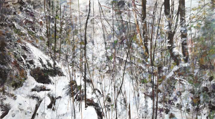
COWLEY
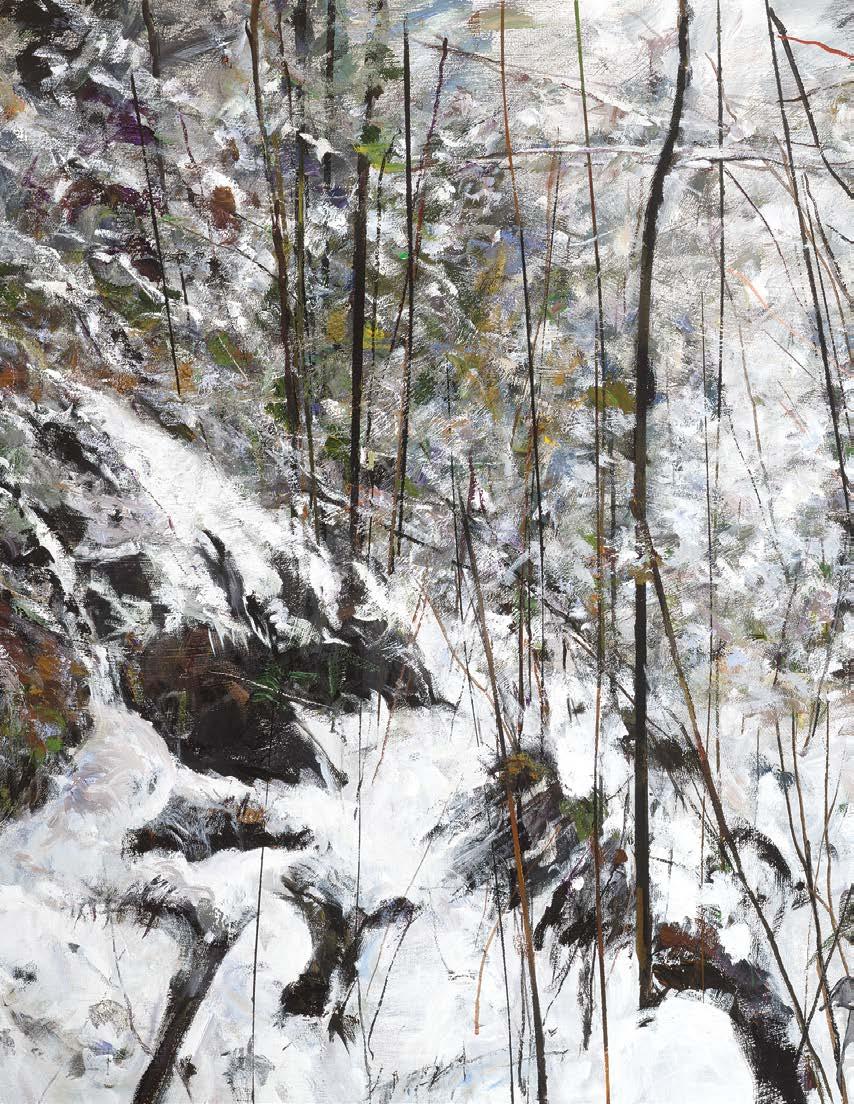
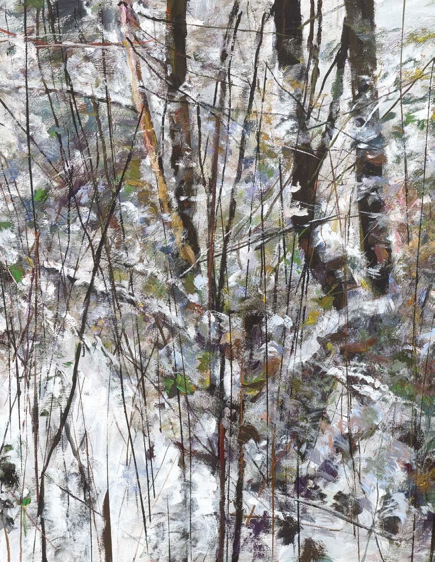
GORDON APPELBE SMITH
Winter Forest M, 2004
acrylic on canvas signed lower right; titled on the reverse of the frame; titled and dated 2004 on a gallery label on the reverse 50 ins x 90 ins; 127 cms x 228.6 cms
PROVENANCE
Equinox Gallery, Vancouver Canadian Corporate Collection
LITERATURE
Ian M. Thom and Andrew Hunter, Gordon Smith: The Act of Painting, Vancouver, 1997, pages 122, 126
Robin Laurence, "The Grand Synthesizer: Gordon Smith and the Tradition of Painting" in Border Crossings, September 2014
Gordon Appelbe Smith has been a significant figure in Canadian art from the 1950s to the present. Smith’s diverse and inventive oeuvre encompasses printmaking, sculpture, assemblage and photography, though the artist’s commitment to painting was paramount. Born in England in 1919, Smith settled in Canada in 1933. In 1951, Smith studied with Elmer Bischoff at the California School of Fine Arts. This proved to be a pivotal, formative experience. Bischoff helped to introduce Smith to action painting, encouraging him to work spontaneously with large, unwieldy brushes and house paint on large sheets of canvas laid out on the floor. Prolific and experimental, Smith’s painting career was marked by a series of creative breakthroughs that manifested as distinct shifts in his visual style over the course of his artistic career.
While exploring various modes of abstraction, Smith also returned repeatedly to the influence of the West Coast. Smith’s love of the land remained consistent throughout his life, and the artist continually incorporated this vital subject into his work. The artist’s experiences of time spent in the vast forests of British Columbia provided rich inspiration. Art historian Andrew Hunter noted that in the early 1980s, Smith “travelled throughout British Columbia and into the dense forest landscapes of the province… Smith found his new bridge, and he made a breakthrough. Like Emily Carr before him, Smith wandered out into the wilderness and found his voice… Smith was renewed: the vigour and intensity of his painting, the inquisitiveness that marked his first probings into abstraction in the 1950s, returned.”
Through the act of painting, Smith transformed the forest into an imaginative and ambiguous space, which he used as an armature for his painterly concerns. Winter Forest M depicts a closely cropped, snowy thicket. Light pours down in a column from the top centre, creating a visual opening in the undergrowth. The painting offers startingly different experiences when viewed from a distance or in close proximity. From several steps back, the image appears solidly realist and meticulously rendered. Up close, the loose, energetic brushstrokes of Winter Forest M become wonderfully vital and chaotic. The full range of colours in the work is also revealed. On the subject of Smith’s forest paintings, Hunter wrote: “I imagine Smith in the space of the painting, watching him move, thrusting and drawing back, stumbling and wiping, and try to imagine the associations—the pressing weight of moist cedar bows, wet snow heavy on the foliage, the tension on the arching branches as the pure white mass holds them down, forming a canopy over the decaying undergrowth.”
$70,000–$90,000
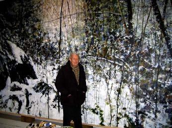
Gordon Smith in his studio, January 2004
Photo: Warren Goodman Not for sale with this lot
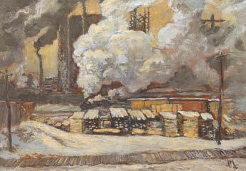
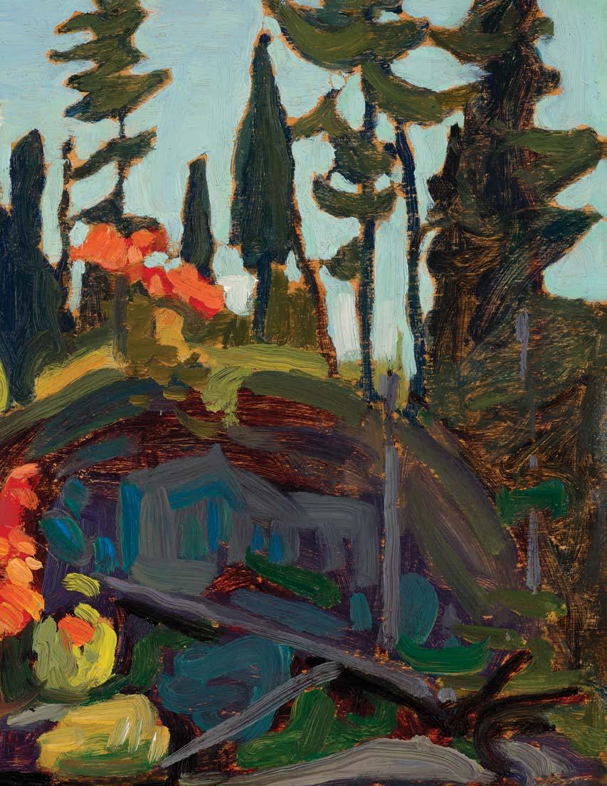
PETER CLAPHAM SHEPPARD
The Gas Works, 1912 oil on board signed lower right; titled and dated 1912 on a label and estate stamp (LG033) on the reverse 8.25 ins x 10.25 ins; 21 cms x 26 cms
PROVENANCE
The Estate of the Artist Private Collection, Toronto
EXHIBITED
Defiant Spirits: The Modernist Revolution of the Group of Seven, McMichael Canadian Art Collection, 2 October 2010-30 January 2011
LITERATURE
Tom Smart, Peter Clapham Sheppard: His Life and Work, Richmond Hill, 2018, reproduced page 63
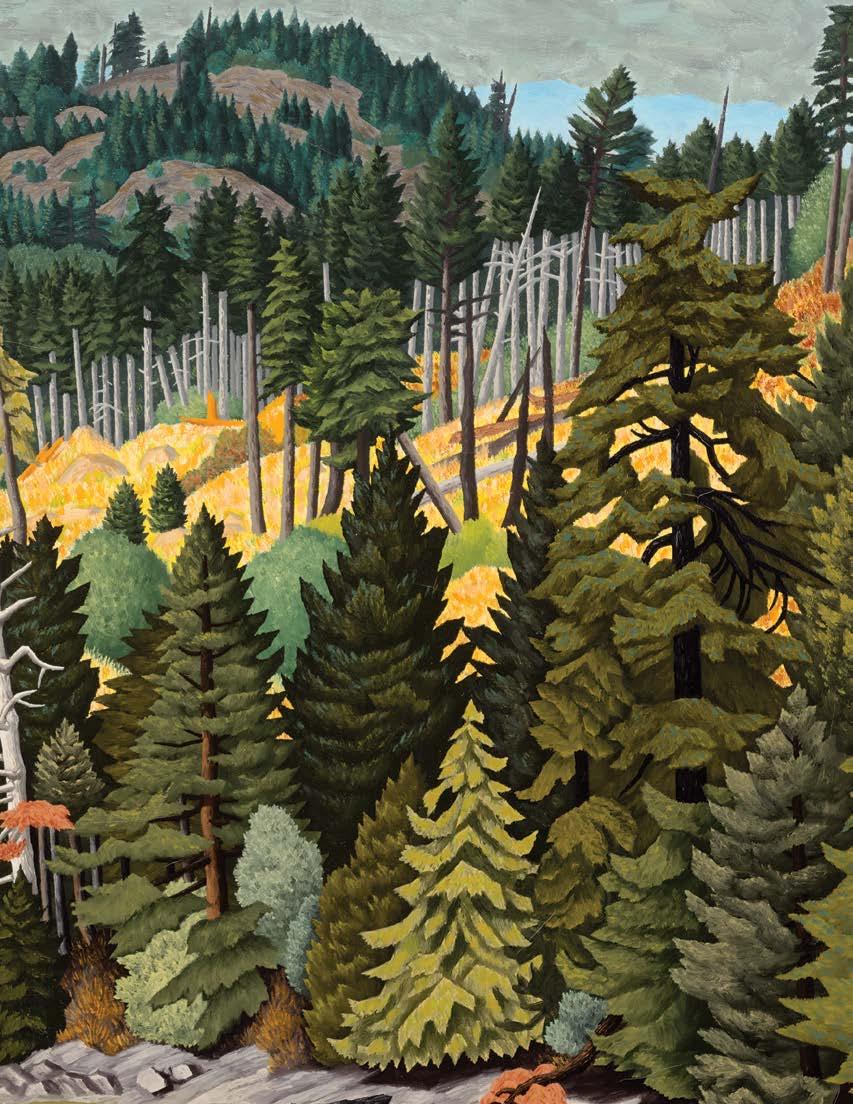
In the winter of 1912, Peter Clapham Sheppard ventured to Toronto’s industrial waterfront near the foot of Bathurst Street. Crisscrossed by railway sidings and dominated by the vast cylinders of the Toronto Gas Works, the site was hardly picturesque. Gasometers, lumberyards, foundries and carriage works stood on land recently infilled along Lake Ontario. Yet for a young artist intent on staking a claim to modernity, such motifs offered potent possibilities.
Then thirty-two and trained at the Central Ontario School of Art and Industrial Design, Sheppard belonged to a generation alert to new artistic imperatives. Across Europe and Britain, critics were urging painters to abandon historical reverie in favour of contemporary life. Industrial structures—railway tracks, smokestacks, gasometers— became emblems of a new aesthetic. To set up one’s easel amid steam and coal smoke in 1912, and to treat industry as worthy of artistic contemplation, was to announce oneself a modernist.
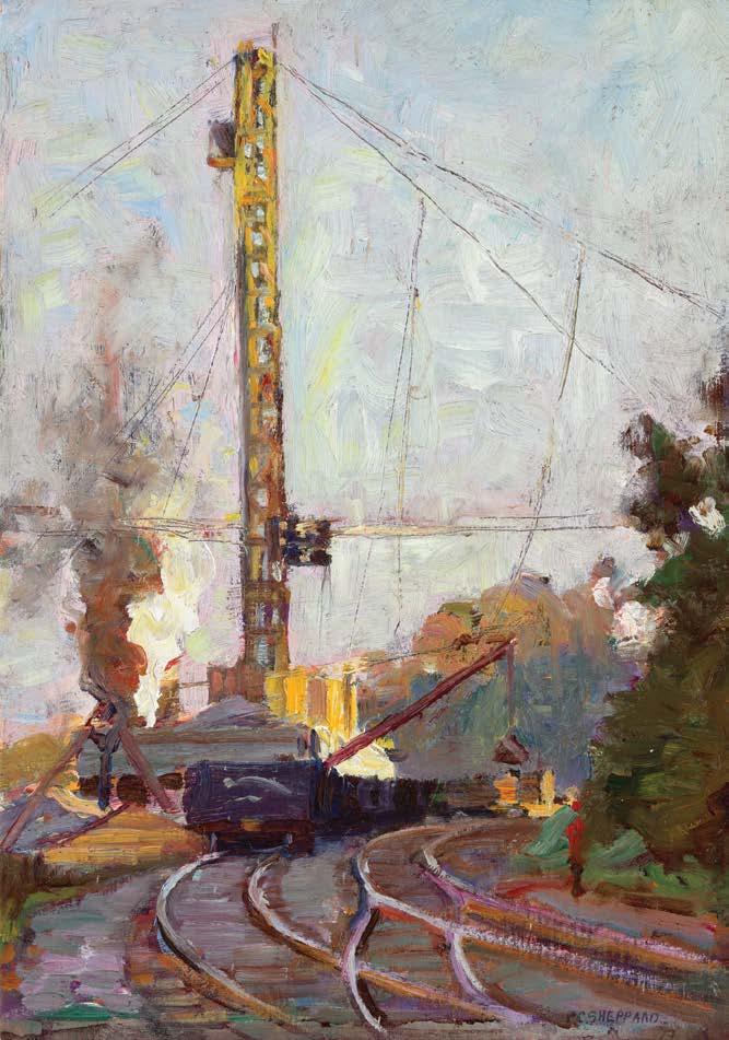
J.E.H. MacDonald, Tracks and Traffic, 1912 oil on board, 7.5 x 10.5 ins
Private Collection (Sold at Cowley Abbott, 22 November 2016, lot 40)
Price Realized $230,000 Not for sale with this lot
The early twentieth century had been a period of explosive growth for Toronto, which more than doubled its population between 1900 and 1912. This transformation, with the construction of skyscrapers, factories and infrastructure projects, became the subject of a small but significant body of painting of which Sheppard would be the leading exponent. In Toronto this aesthetic choice carried an added resonance. Since Confederation, factories and locomotives had been celebrated as engines of national progress. Smoke signified prosperity, while steam implied momentum and ambition. To paint the industrial waterfront was to engage, however obliquely, in a patriotic act.
Sheppard may have been accompanied on this plein air expedition by two other young painters, Lawren Harris and J.E.H. MacDonald, future members of the Group of Seven. Around this same time, they painted their own industrial scenes along this stretch of waterfront: Harris produced The Gas Works; collection of the Art Gallery of Ontario; (setting the massive form beyond a foreground of modest houses) while MacDonald’s Tracks and Traffic (sold by Cowley Abbott, 22 November 2016) featured a dark locomotive crossing the snowladen yard. Together with Sheppard’s interpretations, these works suggest that, on Toronto’s lakeshore in 1912, a distinctly Canadian modernism was announcing itself.
Rather than depicting the vast telescopic gasometer that dominated the Toronto skyline, Sheppard focused on part of the retort house complex —a cylindrical ventilator drum or small governor holder associated with the production and regulation of coal gas. This was the functional core of the plant, and Sheppard’s choice indicates how he was drawn to the industrious, heat-filled heart of modern manufacture itself.
The painting exemplifies Sheppard’s plein air practice, its surface alive with swift, assertive brushwork and passages of loaded impasto. Form is constructed through abbreviated strokes that privilege sensation over description, capturing the structure’s mass and atmosphere with immediacy rather than topographical precision. Thickly laid paint—sometimes dragged, sometimes pressed—creates a tactile surface of distinct, unblended marks. Particularly striking are the pale vertical strokes that suggest icicles forming along the eaves and walls, a credible winter effect on a heat-generating retort structure where escaping vapour would freeze on contact with the cold air. The result is less a record of architecture than an evocation of light, vapour and cold air in motion.
We extend our thanks to Ross King, art historian and author of Defiant Spirits: The Modernist Revolution of the Group of Seven, for his assistance in researching this artwork and contributing the preceding essay.
$10,000–$15,000
FRANKLIN CARMICHAEL
Study of Trees: Autumn, circa early 1920s oil on pressed paperboard panel titled and inscribed "OS 51" with "Estate of Franklin Carmichael" stamp on the reverse 10 ins x 12 ins; 25.4 cms x 30.5 cms
PROVENANCE
Estate of the Artist
Private Collection
EXHIBITED
Franklin Carmichael: paintings, water colours and prints, the Art Gallery of Ontario, Extension Department, travelling to Orillia Public Library; York Public Library, Toronto; Museum and Art Centre, Sudbury; Tom Thomson Memorial Art Gallery, Owen Sound; Cobourg Art Gallery; Robert McLaughlin Gallery, Oshawa; Barrie Art Club and London Public Library and Art Museum, 11 September 1970-14 June 1971, no. 1, 2 or 3 as Study of Trees: Autumn
LITERATURE
Augustus Bridle, "Are These New Canadian Painters Crazy?" Canadian Courier XXV:17 (22 May 1920), page 10
Dennis Reid, The Group of Seven , Ottawa/Montreal, 1970
Joan Murray and Claire Haggan, Franklin Carmichael: paintings, water colours and prints, Toronto, 1970
"Franklin Carmichael: Honor Orillia-Born Artist", Orillia Packet (26 September 1970)
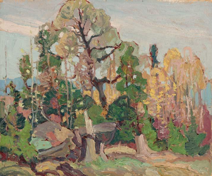
The year 1970 marked the fiftieth anniversary of the Group of Seven’s inaugural exhibition held at the Art Gallery of Toronto in May 1920. The milestone moment led to many cultural initiatives across central Canada. From May through fall, the Art Gallery of Ontario, National Gallery of Canada, and Montreal Museum of Fine Arts presented a major exhibition on the Group of Seven with a book and bibliography, authored by the late Dennis Reid (1943-2023). On September 18, Canada Post launched the fiftieth event by issuing a new 6-cent stamp depicting Arthur Lismer’s Isles of Spruce, 1922 (University of Toronto Art Museum, HH1928.006). That year too, the Art Gallery of Ontario organized a solo exhibition of Carmichael’s work which toured to nine venues throughout the province. Comprised mostly of sketches and small works, it was the first time that his work had been given significant attention since the two memorial exhibitions organized by the Art Gallery of Toronto in 1947, and the Orillia Artists’ Guild in 1961. The sketch known today as Study of Trees: Autumn was among those shown in the provincial tour. The title was not given by the artist but rather was descriptive, assigned during the exhibition development in order to keep track of Carmichael’s many untitled early sketches.
In the exhibition, Franklin Carmichael: paintings, water colours and prints, the sketch Study of Trees: Autumn introduced audiences to Carmichael’s early work in oil, followed by his paintings in watercolour and works as a printmaker. As a representative sketch from this early period of his career, this fall scene includes a warm palette of complementary colours comprised of taupe, yellows, and greens. Carmichael has often been recognized for his work as a colourist, and it was the critic Augustus Bridle who once described such sketches by Carmichael as “little gems of poetic colour.” In the absence of an artist’s title, knowledge of Carmichael’s subject cannot be confirmed, but his preferred sketching areas in those years extended from Orillia to Collingwood and Lansing in north Toronto.
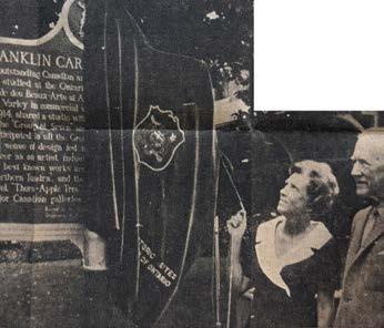
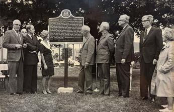
Unveiling of a commemorative plaque in honour of Franklin Carmichael, located on the lawn between the Orillia Public Library and City Hall, Orillia, 26 September 1970. Pictured left of plaque, Mary Mastin, daughter of the artist; right of plaque, A.J. Casson. Not for sale with this lot
"Franklin Carmichael: Honor Orillia-Born Artist," Orillia Packet, 26 September 1970. Pictured right, Mary Mastin, daughter of the artist, and A.J. Casson, friend of the artist. Not for sale with this lot
It was fitting that Carmichael’s touring exhibition opened at the Orillia Public Library on September 11, 1970, since Orillia was the artist’s place of birth. The exhibition was said to be a great success when it was recorded afterwards in the circulating exhibition report prepared for the Art Gallery of Ontario, that it was “a splendid show—one of the most popular we have ever had.” The exhibition coincided with the unveiling of a commemorative plaque in honour of Carmichael on September 26, erected by the Ontario Archeological and Historic Sites Board, near the Orillia Public Library. Local press documented the unveiling with much enthusiasm, as the artist’s daughter, Mary Mastin, and Carmichael’s friend, A.J. Casson were both in attendance. When Casson spoke, he remarked that Orillia and the surrounding countryside were a favourite painting ground in the early days of Carmichael’s career. It was a fitting tribute that Study of Trees: Autumn served to introduce visitors to Carmichael’s early paintings in this exhibition.
We extend our thanks to Catharine Mastin, PhD, art historian, curator, and Adjunct Member of the Faculty of Graduate Studies in Art History at York University for contributing the preceding essay. Catharine curated the exhibition Franklin Carmichael: Portrait of a Spiritualist, organized by the National Gallery of Canada, Ottawa, which toured Canada between 1999 and 2001.
$70,000–$90,000
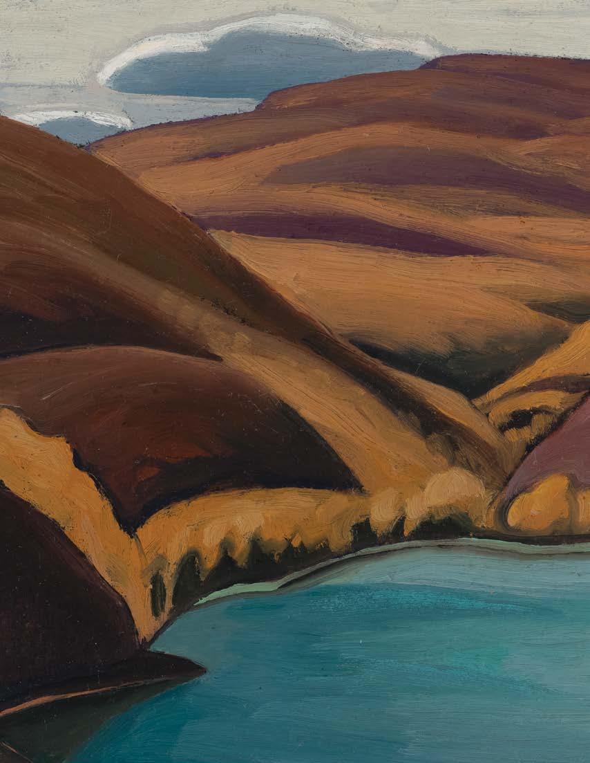
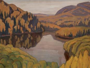
LAWREN STEWART HARRIS
Above Coldwell Bay, North Shore, Lake Superior (Lake Superior Sketch XV), 1925 oil on beaverboard
signed, titled, inscribed "Bess Harris Collection, property of Bess Harris", "BCH-76", "3" and "15" on the reverse 12 ins x 15 ins; 30.5 cms x 38.1 cms
PROVENANCE
Bess Harris Collection
The Art Emporium, Vancouver
Sotheby's, auction, Toronto, 5 November 1979, lot 156 as Lake Superior Sketch XX
Private Collection, Calgary
LITERATURE
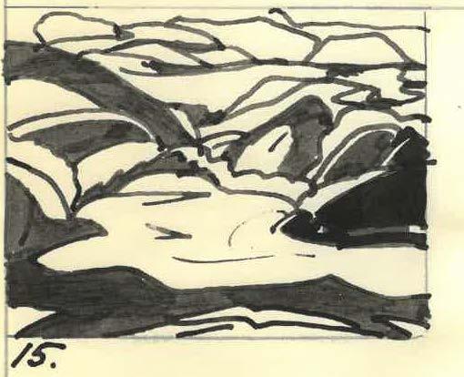
The Paintings of Lawren Harris Compiled by Mrs. Gordon Mills, JulyDecember 1936, Library and Archives, National Gallery of Canada as Lake Superior Sketch XV with drawing by Hans Jansen
Charles C. Hill, "Quiet Lake (Northern Painting 12)," in An Important Private Collection of Canadian Art - Part II, Cowley Abbott, Toronto, 8 June 2023, lot 125
Charles C. Hill, "Northern Lake 1922," in Select Masterworks of Canadian and International Art, Cowley Abbott, Toronto, 28 May 2025, lot 53, incorrectly identified as Lake Superior Sketch XX
Price Realized
Not for sale with this lot
A.Y. Jackson and Lawren Harris first travelled to the north shore of Lake Superior in October 1921, painting at Schreiber and Rossport. The following autumn they visited Port Coldwell, a small fishing village, on the eastern edge of present-day Neys Provincial Park. From there Jackson wrote to his cousin Florence Clement on 7 October 1922, “Today we walked three miles to a big hill and [climbed] it about a thousand feet up, and the view over Lake Superior was a wonder, about twenty or thirty miles each way, and in front some big husky islands that make [Georgian Bay’s] Giant’s Tomb look like a shoal.” Three years later Jackson and Harris returned to Port Coldwell with Frank Carmichael. Once again, on 7 October Jackson wrote a letter, this time to his friend Norah Thomson, book buyer for the T. Eaton Company. “It looks like a cold autumn though the leaves are still hanging on. We are back in our old haunts, and it is pretty good stuff. It is three years since we did any work here and it all looks new.”
Harris’ cold, sculpted landscapes of the late twenties depicting the unique light effects and vast expanse of Lake Superior and Pic Island from a foreground height are well known, but during his first sketching trips at the lake he largely focused on the rocky terrain and foliage along the shore as well as isolated, inland lakes. The title of this sketch identifies the site, above Coldwell Bay, and he probably first painted here in 1922 as there are oil sketches of similar lakes, such as Northern Lake (sold by Cowley Abbott, 28 May 2025, lot 53) painted on the small panels he used at that time (approximately 10.5 x 14 ins or 26.6 x 35.6 cms). In 1925, to better encapsulate his widening vision of this austere landscape, he began painting on slightly larger supports measuring approximately 12 x 15 ins or 30.5 x 38.1 cms., the dimensions of this sketch.
Gift
Not
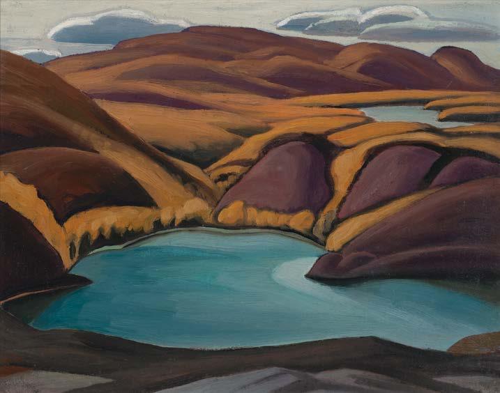
Lawren S. Harris, Northern Lake, 1922 oil on wood, 10.5 x 13.75 ins
Private Collection (Sold at Cowley Abbott, 28 May 2025, lot 53)
$266,200
Hans Jansen, drawing of Lawren S. Harris' Lake Superior Sketch XV from Doris Mills' 1936 inventory of Harris paintings stored in Toronto Library and Archives of the National Gallery of Canada
of Margaret Knox, 1997
for sale with this lot
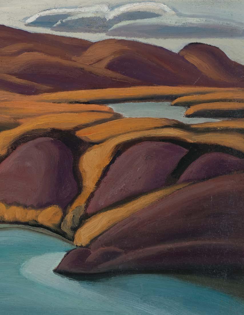
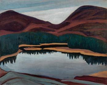
In the May 1926 Group of Seven exhibition at the Art Gallery of Toronto, Harris exhibited a somewhat dark and moody canvas titled Northern Lake (sold by Heffel Fine Art, Vancouver/Toronto, 22 May 2025, lot 118) depicting a small lake encircled by a brown shoreline and dark, bluish-green trees that are reflected in the water. Conical hills rise left and right in the background revealing the overcast sky in the centre. This canvas was worked up from a sketch painted the previous fall and is now in the McMichael Canadian Art Collection (1969.17.1).
Above Coldwell Bay includes Harris’ characteristic foreground ledge that defines the observer’s viewpoint, yet it differs from the other related sketches incorporating a vast, panorama of the rocky hills in the distance with another small lake glimpsed upper right. The predominant palette is a range of browns depicting the sculpted rocks and foliage contrasting with the blue lake, off-white sky and grey clouds that float above the horizon. The austerity of form, palette and subject matter is softened by the warmth of the cliffs’ embrace of the still blue water.
We extend our thanks to Charles Hill, Canadian art historian, former Curator of Canadian Art at the National Gallery of Canada and author of The Group of Seven: Art for a Nation , for contributing the preceding essay.
$500,000–$700,000
Lawren S. Harris, Northern Lake, 1925 oil on board, 12 x 14.75 ins McMichael Canadian Art Collection (1969.17.1) Not for sale with this lot
15
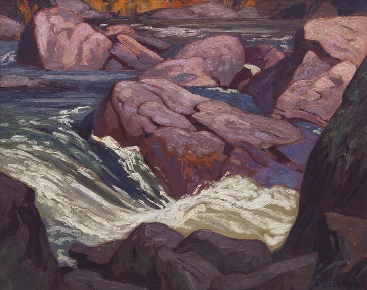
ALFRED JOSEPH CASSON
Rapids on the Madawaska—at Palmer Rapids, circa 1975
oil on board
signed lower right; signed, titled and inscribed "The property of my wife.
A.J. Casson" on the reverse
12 ins x 15 ins; 30.5 cms x 38.1 cms
PROVENANCE
Private Collection, Toronto
The Palmer Rapids are a well-known stretch of whitewater along the Madawaska River in eastern Ontario. Characterized by rocky channels, rolling waves, and shifting currents, the site has become a local landmark, embodying the rugged qualities of the Ontario wilderness that inspired Canadian landscape painters such as A.J. Casson. The artist painted many scenes of rapids across Ontario and Quebec during his long career, including the Oxtongue River and the Rouge River.
The linear forms and decorative patterns in the rocks of Rapids on the Madawaska —at Palmer Rapids demonstrate Casson’s mature landscapes with reductive, abstract designs, foregoing literal atmospheric portrayal. Casson’s notable dedication to Ontarian subject matter meant that the artist developed an expert eye in rendering the subtlety of the landscape. The distinct seasons in Ontario meant the artist was constantly provided with changing environs that inspired him without having to leave the province, like many of his contemporaries. Here, the rapids dominate the composition, with traces of fall foliage visible along the upper edge. The surging water of the falls against the muted tones of a rocky channel saturates this oil sketch with great vitality and gives the viewer the sense that they are standing on one of the rocks in the rapids.
$18,000–$22,000
EMILY CARR
Grey Trees, circa 1930 oil on paper titled on gallery labels on the reverse 13.5 ins x 11.75 ins; 34.3 cms x 29.8 cms
PROVENANCE
Roberts Gallery, Toronto Warwick Gallery, Vancouver Private Collection, Calgary Masters Gallery, Calgary Private Collection, Edmonton
EXHIBITED
Emily Carr Retrospective, Masters Gallery, Calgary, 13-20 March 2013
This striking monochromatic work by Emily Carr exemplifies the artist’s ability to distill the British Columbia forest into an orchestration of form, rhythm, and tone. Tree trunks rise through the picture plane, set against a dense, shadowed interior that recedes into near abstraction. Loose, sweeping strokes create a sense of movement, like wind through the landscape.
In the early 1930s, Carr made a significant change in her sketching method by adopting the new medium of oil on paper. Carr sought to combine the spontaneity of watercolour sketching with the intensity of oil pigments, and she found this to be possible by diluting oil paint with generous amounts of turpentine and applying the mixture to Manila paper. She was able to attain the structure of oil paint with this medium as well as the delicacy of watercolour. It also dried immediately, was easy to layer pigments, and retained its colour intensity—all providing additional convenience.
Works such as this reflect Carr’s interest in East Asian aesthetics. Carr was interested in Japanese woodblock prints and Chinese ink paintings, which had become popular in the West by the late 19th and early 20th centuries. She admired the precision of line, the emphasis on brushwork, and the use of negative space in these works, all qualities central to her later ink and wash drawings.
Artists often work in a greyscale palette as it enables them to concentrate on tonal relationships, emphasizing form, depth, and clarity. Rendered in a restrained palette of greys, blacks, and whites, the composition is enlivened by areas of exposed Manila paper, which function as a luminous fourth tone. The result is an atmospheric interpretation of the forest—less a specific place than an evocation of its enduring presence and inner life.
$75,000–$85,000
COWLEY
Collection of Beam Canada Inc. (Canadian Club)
Cowley Abbott is privileged to be entrusted with the collection of ten historical Canadian artworks from Beam Canada Inc., formerly in the collection of The Canadian Club Brand Centre, a building with a rich history in the development of Windsor and Canadian Club whisky.
American farmer and entrepreneur Hiram Walker began making his own whisky and selling it out of the back of a grocery store in Detroit in the 1850s. He noticed that it was being purchased and blended with other products and then sold at a higher profit. Wanting more control in the quality and production of his product, Walker purchased 468 acres of land across the river in what is now known as Walkerville, Ontario—a town that laid
the foundation for the modern city of Windsor. He built a distillery, and in 1858, Walker officially established Canadian Club Whisky. It took nearly eight years to perfect the recipe that remains unchanged to this day.
Walker’s business ventures included many industries that supported the distillery—a ferry and rail lines, barrel-making and grain farming. He also built schools, supplied fire and police services, and had homes built for his employees. Walker created the town, controlled every aspect of it and introduced amenities Windsor did not have, such as running water and streetlights. A bronze statue of Hiram Walker was unveiled in Walkerville in 2022 to commemorate his immeasurable influence on the city of Windsor.
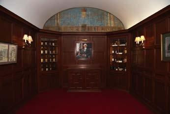
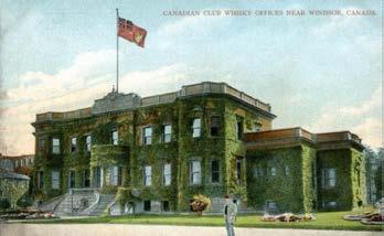
The Canadian Club Brand Centre in Walkerville opened in 1894 as Hiram Walker’s office and the headquarters of Canadian Club Whisky. The imposing red brick and terra cotta building is considered one of North America’s finest examples of Italian Renaissance architecture. It was modelled after the Palazzo Pandolfini in Florence, a design that inspired Hiram while on a trip to Italy. The inside is fitted with marble fireplaces, elaborate woodwork and ornate brass fixtures, and includes an indoor swimming pool, a basement speakeasy, and a wood-panelled boardroom showcasing paintings by the Group of Seven.
Featured prominently in the art room was Marsh, Lake Scugog, a 1911 oil painting by Tom Thomson depicting a favourite fishing destination on the outskirts of Toronto. The room displayed one painting by each of the original Group of Seven members depicting classic scenes of Canada’s varied landscape. Evening Light, The Kootenays by Frederick H. Varley and Waterton Lake, Alberta by A.Y. Jackson reflect western Canada. Manitoba is represented by Frank Hans Johnston’s impressionist oil sketch Rocky Shore, Lake of the Woods. Depictions of the Ontario wilderness include Maple Bushes, one of
Lawren Harris’s favoured subjects, as well as Franklin Carmichael’s Still Morning, painted in La Cloche, and Arthur Lismer’s Shoreline, Georgian Bay. Atlantic Canada is evoked through the colourful sailboats in Petite Rivière, N.S. by J.E.H. MacDonald.
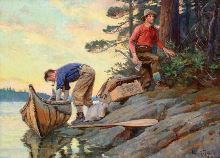
A unique artwork in the Canadian Club collection is a commissioned painting by Canadian artist Henry Sandham, Golf—Canadian Club (The Club's The Thing), completed in 1898, just one year before Hiram Walker’s death. In the festive summer party scene, we see a Canadian Club labelled wooden crate stowed beneath the serving table. A 1916 oil painting by American artist Philip Russell Goodwin, Camping—Canadian Club, was also commissioned for the Canadian Club offices. The idyllic sunset of two canoeing men arriving at shore features the iconic Canadian Club wooden crate on the rocky edge.
The Canadian Club Brand Centre formerly offered tours of the building, teaching visitors about the Walkers, the origins of the Canadian Club brand and the history of the building, including its art collection. A whisky tasting often concluded the tour. Cowley Abbott is honoured to be offering this art collection linked to a significant part of Windsor’s and Canada’s history.
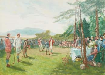
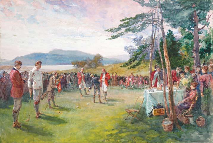
HENRY SANDHAM
Golf—Canadian Club (The Club's The Thing), 1898 watercolour on paper 20 ins x 30 ins; 50.8 cms x 76.2 cms
PROVENANCE
Beam Canada Inc. (Canadian Club) through acquisition by Hiram Walker & Sons Ltd., Walkerville/Windsor
LITERATURE
Michael Flannery and Richard Leech, Golf Through the Ages: 600 Years of Golfing Art, Karlsruhe, Germany, 2004, reproduced on the inside front cover
Born in Montreal, Henry Sandham first exhibited at the Art Association of Montreal in 1865. He was employed by the photographer William Notman from 1864, becoming a partner in Notman & Sandham from 1877 to 1882. That same year, 1877, he was commissioned to prepare illustrations on Canadian subjects for the American periodical Scribner’s Monthly, for which he would also illustrate four Canadian articles by George Munro Grant in 1880. While active as a photographer and illustrator, Sandham also exhibited with Montreal’s Society of Canadian Artists (Art Association of Montreal) from 1868, with the Ontario Society of Artists from 1874, and was appointed a charter member of the Royal Canadian Academy of Arts in 1880. Shortly thereafter, Sandham moved to Boston, but continued to be a prolific illustrator of articles on both Canadian and American subjects. He built a successful career as an illustrator for major publications such as Scribner’s Magazine and Harper’s Weekly. His work often depicted historical narratives with a strong sense of storytelling, careful attention to detail, and an academic approach to composition. Today, Sandham is remembered as part of a generation of artists who bridged fine art and illustration, helping to popularize historical subjects through widely circulated prints and magazines.
Sandham painted Golf—Canadian Club (The Club's The Thing) for the Canadian Club Brand Centre in Walkerville, Ontario. The building opened in 1894 as founder Hiram Walker’s office and the headquarters of Canadian Club Whisky. The elaborate brick-and-terra cotta building included an indoor swimming pool, a basement speakeasy, and a wood-panelled boardroom showcasing an art collection. Sandham’s painting was likely commissioned by Hiram Walker for the company headquarters shortly after it was built, and it was completed in 1898, just one year before Walker’s death. In the festive summer scene at a golf club, likely Algonquin Golf Course in St. Andrews, New Brunswick, where Walker had a rambling estate, we see a Canadian Club labelled wooden crate stowed beneath the serving table. The watercolour painting is classic Sandham, with attention to detail and a strong narrative, recalling his training in illustration. A photogravure of the watercolour was printed by Goupil & Co. of Paris, acting as an advertisement for Canadian Club Whisky.
Cowley Abbott is honoured to be offering the Canadian Club Brand Centre art collection, reflecting an important part of Windsor’s and Canada’s history.
$10,000–$15,000
Henry Sandham, The Club's The Thing, 1898 coloured photogravure Not for sale with this lot
TOM THOMSON
Marsh, Lake Scugog, circa 1911
oil on canvas
signed lower right; titled and dated 1911 to two labels on the reverse; catalogue raisonné no. 1911.16
8.5 ins x 13.5 ins; 21.6 cms x 34.3 cms
PROVENANCE
McDowell Gallery, Toronto, 1978
Beam Canada Inc. (Canadian Club) through acquisition by Hiram Walker & Sons Ltd., Walkerville/Windsor
LITERATURE
L.S. Harris, "The R.C.A. Reviewed", The Camps, vol. 1, no. 2 (December 1911), page 9
Letter from H.B. Jackson to Blodwen Davies, 5 May 1931
Letter from Stanley Kemp to Martin Baldwin, 21 November 1934, Tom Thomson Accession Files, Art Gallery of Ontario Archives
Harold Town and David Silcox, Tom Thomson: The Silence and the Storm, Toronto, 1977, reproduced page 40
Joan Murray, Tom Thomson Catalogue Raisonné, 2016, https://www.tomthomsoncatalogue.org/catalogue/entry.php?id=91, no. 1911.16
In Tom Thomson’s Marsh, Lake Scugog, the viewer sees a Tom Thomson poised to dive into a career as a painter. Here Thomson has confidently essayed the effect of a late afternoon sky on an expansive but simple landscape, proof that he already was regarding painting seriously. He got his first painting outfit in the spring of 1912, according to his friend H. B. Jackson.
The painting is surprisingly stark and trees, later, one of his favourite subjects, appear only in the distant background as a largely undifferentiated mass. Yet the technical handling of the sketch is accomplished and assured, especially for such a relative newcomer to oils as Thomson. In finding his way, Thomson has given the painting of the marsh a quiet, even, reverential beauty. Everything is understated, even perhaps the quiet luminosity of the sky.
Art Gallery of Ontario Purchase, 1934 (2188)
Not for sale with this lot
At this time, Thomson was making regular sketching trips to places around and in Toronto. He likely chose to paint the marsh because the Scugog marshlands were known as a favourite fishing spot and fishing was dear to his heart and his family. He may have travelled to Port Perry, Ontario, to go there. That small town would have had inexpensive overnight accommodation.
A work related to the painting with much the same title, The Marsh, Lake Scugog, 1911 (Art Gallery of Ontario) was gifted by Thomson to a friend, Stanley Kemp, in the fall of 1913. In a letter from Stanley Kemp to Martin Baldwin, curator of the Art Gallery of Toronto, on 21 November 1934, Kemp recalls receiving the painting from Thomson in the fall of 1913, sharing “The picture is not his preliminary sketch but a later painting from the sketch. It depicts a marsh or swamp on the edge of Lake Skugog (or Scugog) with evening settling down."
Like Marsh, Lake Scugog, this larger canvas is equally simple and assured. Though painted more towards evening, it heralds a theme which would become in time one of the major parts of Thomson’s body of work, his sky studies.
At this time, Thomson was still working at Grip Limited, a leading photo-engraving firm in Toronto where he had, around 1906, been hired in the Design Department. The head of the department was J.E.H. MacDonald, who had become his mentor and inspiration, not only because MacDonald was an inspired designer trained extensively in Canada and in a top firm in London, England, Carlton Studios, but he was one of the few artists at Grip who actually sold their artwork. Besides such reasons, MacDonald was a kindly man who looked at the work members of the firm essayed on weekends and helpfully (and no doubt, hopefully) criticized it.
Another influential person at Grip Ltd. was the dynamic art director, A.H. Robson, who called together the members of the creative team and told them to sketch outdoors on weekends to get new imagery for their commercial work.
Thomson, like his fellow artists, obliged. One friend, another employee at Grip like Stanley Kemp, H.B. Jackson, recalled later that in 1911, “we visited Lake Scugog two or three times when Tom did some sketching” as they had more or less been told by Robson to do.
Not for sale with this lot
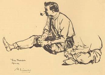
Arthur Lismer, Tom Thomson, 1912-1913 pen on paper, 9.75 x 11.75 ins (sight)
McMichael Canadian Art Collection
Tom Thomson, The Marsh, Lake Scugog, circa 1911 oil on canvas, 11 x 17 ins
It is hard to realize now what an innovation sketching in Canadian nature was but in those long-ago days, landscape painting often was conventional and drawn from European models. Marsh, Lake Scugog is important because it is a Canadian subject with a distinct Canadian identity, a rarity at this date, proof that Thomson was already among the vanguard artists of his period.
Lawren Harris, in reviewing the Royal Canadian Academy of Arts exhibition of 1911, wrote: “In each succeeding exhibition, one notices fresher, more vigorous and original work; not so much in choice of subject as in the spirit of the thing done.” Thomson embodied this spirit and became in time, for many Canadians, one of its most exciting exponents. But his introductory steps took place in paintings such as Marsh, Lake Scugog.
We extend our thanks to Joan Murray, Canadian art historian, for contributing the preceding essay.
Cowley Abbott is honoured to be offering the Canadian Club Brand Centre art collection, reflecting an important part of Windsor’s and Canada’s history.
$100,000–$200,000
Letter from Stanley Kemp to Martin Baldwin, 21 November 1934.
Courtesy of the Art Gallery of Ontario, 2026 Not for sale with this lot
19
FREDERICK HORSMAN VARLEY
Evening Light, The Kootenays oil on panel signed lower left; titled, Varley inventory no. 431 and inscribed "Mountain Scene, B.C." on the reverse 12 ins x 15 ins; 30.5 cms x 38.1 cms
PROVENANCE
Origine Beaux Arts, Montreal, 1972 Beam Canada Inc. (Canadian Club) through acquisition by Hiram Walker & Sons Ltd., Walkerville/Windsor
LITERATURE
Robert Stacey, "The Fabric of All Things Celebrating F.H. Varley," in Varley: a Celebration, Unionville, 1997, page 9
In 1920, Frederick Horsman Varley became a charter member of the Group of Seven. He was mainly a painter of portraits and figures in landscapes during these years, not a landscape painter like the other members of the Group. In the early part of the decade, Varley traveled to the Jasper area, often working alongside A.Y. Jackson. His Alberta works—especially from Jasper National Park—are increasingly expressive and emotionally charged, with swirling forms and dramatic colour, marking a shift away from the more structured compositions of some of his peers.
In 1926 Varley was offered a job in the recently established School of Decorative and Applied Arts in Vancouver and moved there with his family that fall. He was entranced by the landscapes of British Columbia and in the summer of 1927 he painted in Garibaldi Park
Ten of Varley’s mountain sketches were included in the Exhibition of Canadian West Coast Art Native and Modern at the National Gallery in Ottawa in December 1927. The artist remained in British Columbia through the late 1920s and early 1930s, producing many of his most expressive West Coast landscapes and portraits. By 1936, he left the province and returned to Toronto.
Varley’s time in British Columbia was a high point in his creative life. Between 1957 and 1967, he returned to British Columbia to make several sketching trips to the Kootenay Lake region in the company of his close companion, Kathleen McKay. Varley’s paintings of British Columbia from both the earlier and later years are highly atmospheric and focused on effects of light, often in a blue-green and violet colour palette. This is demonstrated in Evening Light, The Kootenays, with the soft, pastel brushwork in the mountains and the glowing sky. Robert Stacey remarked on the changes in Varley’s paintings, writing: “Inevitably, as his brushwork loosened yet grew more muscular, his palette broadened through the rich chromatic range of the ‘Varley colours’ – iridescent green‒mauve, ‘Chinese’ gold, fireweed pink, gentian purple.”
Cowley Abbott is honoured to be offering the Canadian Club Brand Centre art collection, reflecting an important part of Windsor’s and Canada’s history.
$20,000–$30,000
with fellow teacher Jock Macdonald. They travelled by steamer and train, then trekked twelve miles ascending 2500 feet to the Taylor Meadows above Garibaldi Lake.
20
ARTHUR LISMER
Shoreline, Georgian Bay, 1928 oil on board
signed lower right; dated 1928 on the reverse; titled on a gallery label on the reverse; titled on three labels on the reverse of the frame 8.5 ins x 10.5 ins; 21.6 cms x 26.7 cms
PROVENANCE
Collection of Doris McCarthy, 1928
The Framing Gallery, Toronto Origine Beaux Arts, Montreal, 1973 Beam Canada Inc. (Canadian Club) through acquisition by Hiram Walker & Sons Ltd., Walkerville/Windsor
EXHIBITED
Exhibition of Paintings, Sketches and Drawings by Arthur Lismer, A.R.C.A., O.S.A., Canadian Group of Painters, Galleries of J. Merritt Malloney, Toronto, 4-24 May 1935, no. 55 as Shoreline, Georgian Bay, 1928, $60
At the invitation of art patron Dr. James MacCallum, Arthur Lismer’s first experience of Georgian Bay took place in the Fall of 1913. The unique and distinctive landscape of the bay had an indelible impact on the painter. With its crisp light, primordial geology, uncountable rocky islets and windswept pines, the region offered inspiration for a bold new form of expression in Canadian painting. Lismer enthused over his “happy isles”, returning for many repeat visits, often staying at McGregor Bay, up until the late 1940s.
In the late 1920s, Lismer travelled on painting expeditions to the Rocky Mountains, Algoma and the shores of the St. Lawrence, in addition to Georgian Bay. Shoreline, Georgian Bay exudes the confidence of a masterful painter in vital engagement with his surroundings. The dramatic sky churns with energy. Dabs of white paint highlight the water’s surface in an Impressionistic manner. At right, dramatic gaps of blue sky break through the clouds and are mirrored in the lake’s reflection. This rapidly painted plein air sketch exemplifies the wonderful immediacy of Lismer’s Group of Sevenperiod oil sketches. Soon after its creation, this work was acquired by one of Lismer’s art students, a budding painter of enormous potential by the name of Doris McCarthy.
Cowley Abbott is honoured to be offering the Canadian Club Brand Centre art collection, reflecting an important part of Windsor’s and Canada’s history.
$18,000–$22,000
21
FRANKLIN CARMICHAEL
Still Morning, 1936 oil on board
signed and dated 1936 lower left; signed, titled (twice) and inscribed "Cranberry Lake" on the reverse; titled on two labels on the reverse; titled on two labels on the reverse of the frame 10 ins x 12 ins; 25.4 cms x 30.5 cms
PROVENANCE
Origine Beaux Arts, Montreal, 1972 Beam Canada Inc. (Canadian Club) through acquisition by Hiram Walker & Sons Ltd., Walkerville/Windsor
EXHIBITED
Exhibition of Little Pictures, Ontario Society of Artists, Art Gallery of Toronto, December 1936, no. 160 Department of Small Pictures, Canadian National Exhibition, Toronto, 27 August-11 September 1937, no. 339 as Still Morning
LITERATURE
Megan Bice, Light & Shadow: The Work of Franklin Carmichael, Kleinburg, 1990, page 43
The oil sketch Still Morning, 1936, was painted one year after Frank Carmichael completed a new family cottage in La Cloche in 1935, a region that compelled him for nearly two decades, and where many artists joined him on sketching excursions. From then on, it was this area, north of Manitoulin Island near Whitefish Falls, Ontario, which was the focus of his attention as painter into the early 1940s. An inscription on the verso of this sketch in red crayon made by his wife, Ada Carmichael, confirms that he was looking onto Cranberry Lake, the same lake on which he built his cottage. Although he didn’t detail where he was precisely located to create this sketch, the curved peninsula in mid-ground may well be the sand beach where he and his family camped for many years before they built the cottage. His viewpoint looks down over a wide and shallow bay below, of which there is only one of such width on Cranberry Lake.
Carmichael was often quite thoughtful about the titles he chose for his paintings, including this one, Still Morning. The label on the verso in his handwriting from the 1937 Canadian National Exhibition, where it was shown for a second time after the 1936 OSA Little Pictures Exhibition, confirms that what commanded his attention was the essence of calm offered on a summer morning when the lake is so tranquil that not a ripple courses the water surface, and not the faintest of cloud formations can be found in the sky. There is little doubt that this was a summer landscape as Carmichael was particularly attentive to the many varieties of green to be found in forested landscapes in this season. Cranberry Lake is a long and narrow body of water protected by high ridges on both the north and south sides; as artist his vantage point looks from north to south, the distant hills beyond sharply contoured to evoke the rugged geological quartzite formations. Cranberry Lake is sufficiently sheltered that it can calm to mirror-like stillness, as he suggests with the mid-ground peninsula where the hills are perfectly reflected in the water below. For Carmichael, it was these precious moments which offered him seemingly endless subject matter as painter. Carmichael made several sketches of Cranberry Lake in 1936, including two in the National Gallery of Canada collection, Cranberry Lake (38413), and Hills, Cranberry Lake (38414), but this one is among the most contemplative of his efforts that year.
Cowley Abbott is honoured to be offering the Canadian Club Brand Centre art collection, reflecting an important part of Windsor’s and Canada’s history.
We extend our thanks to Catharine Mastin, PhD, art historian, curator, and Adjunct Member of the Faculty of Graduate Studies in Art History at York University for contributing the preceding essay. Catharine curated the exhibition Franklin Carmichael: Portrait of a Spiritualist, organized by the National Gallery of Canada, Ottawa, which toured Canada between 1999 and 2001.
$50,000–$70,000
LAWREN STEWART HARRIS
Maple Bushes, circa 1920 oil on panel
signed lower right; signed, titled and inscribed with a cross in a circle on the reverse
10.5 ins x 13.75 ins; 26.7 cms x 34.9 cms
PROVENANCE
Kaspar Gallery, Toronto Beam Canada Inc. (Canadian Club) through acquisition by Hiram Walker & Sons Ltd., Walkerville/Windsor
EXHIBITED
Windsor Collects: 150 Years of Canadian Art, Art Gallery of Windsor, 19 July-28 September 1997, no. 38
LITERATURE
Windsor Collects: 150 Years of Canadian Art, Windsor, 1997, no. 38, listed as a loan of Hiram Walker & Sons Ltd. (an Allied Domecq Spirits & Wine Company)
Algoma District became one of the foundational landscapes for the Group of Seven, where they developed the style that would define Canadian art. Algoma offered exactly what the Group was searching for: untamed wilderness that felt uniquely Canadian—rocky hills, windswept pines, lakes, and dramatic seasonal changes. The Algoma Central Railway gave them access deep into the wilderness where they could camp and paint on-site. Artists moved away from academic and European traditions to paint more modern and colourful landscapes that felt distinctly Canadian.
From the streets of Toronto to the Laurentian hills, to Algoma and the north shore of Lake Superior, from the Rocky Mountains to the Arctic, Lawren Harris constantly explored the varying aspects of Canada’s many landscapes, seeking out new forms reflective of a burgeoning Canadian identity. Harris frequently returned to the same sites, reinterpreting similar subjects in new pictorial languages.
Lawren Harris first painted in Algoma in the spring of 1918, when he travelled on the Algoma Central Railway from Sault Ste. Marie with Dr. James MacCallum, Tom Thomson’s patron and fellow sponsor of the construction of the Studio Building in Toronto. Enchanted by what he saw, he returned there with J.E.H. MacDonald and Frank Johnston that fall to paint the same locations. Inviting MacDonald to join them Harris wrote, “I hanker after fall colouring.” In September 1919, Harris returned to Algoma once again with Johnston, MacDonald and A.Y. Jackson, in preparation for the inaugural Group of Seven show in spring 1920.
Only a few of Harris’ Algoma sketches are dated and the locations of his subjects are rarely identified. Rocky cliffs, beaver dams and beaver-drowned swamps, panoramic views across rolling hills and innumerable lakes and dead trees populate Harris’ Algoma sketches. The central character of this oil sketch is the striking red maple tree hovering above the shoreline and reflecting in the lake. The landscape is animated by crisp, saturated colour; vivid red and orange foliage contrast with the deep green forest and bright blue sky, applied in confident, clearly defined brushstrokes.
Cowley Abbott is honoured to be offering the Canadian Club Brand Centre art collection, reflecting an important part of Windsor’s and Canada’s history.
$120,000–$150,000
Maple Bushes by Lawren S. Harris on display in the art room of the Canadian Club Brand Centre in Windsor. Not for sale with this lot
23
JAMES EDWARD HERVEY MACDONALD
Petite Rivière, N.S., 1922 oil on board titled, dated 1922 and certified by Thoreau MacDonald (197[?]) and inscribed "The Sandy Stretch Petite Rivière" and "To Judy, Jan 16/56" on the reverse 8.5 ins x 10.5 ins; 21.6 cms x 26.7 cms
PROVENANCE
Continental Galleries of Fine Art, Montreal, 18 June 1952 Origine Beaux Arts, Montreal, 1972 Beam Canada Inc. (Canadian Club) through acquisition by Hiram Walker & Sons Ltd., Walkerville/Windsor
EXHIBITED
Windsor Collects: 150 Years of Canadian Art, Art Gallery of Windsor, 19 July-28 September 1997, no. 61
Windsor Collects: 150 Years of Canadian Art, Windsor, 1997, no. 61, listed as loan of Hiram Walker & Sons Ltd. (an Allied Domecq Spirits & Wine Company)
Robert Strath, J.E.H. McDonald [sic] A.R.C.A. Sketching, Petite Rivière Collection of the Art Gallery of Nova Scotia
Not for sale with this lot
During the early years of the Group of Seven, the landscapes of northern Ontario figured as their primary subject matter, though several members also painted in Nova Scotia. Arthur Lismer taught in Halifax from 1916 to 1919, while A.Y. Jackson and Lawren Harris also painted in the region periodically. J.E.H. MacDonald travelled to Nova Scotia in the summer of 1922, visiting fellow artist Lewis Smith and his sister Edith in the coastal village of Petite-Rivière. Situated southwest of Halifax, Petite-Rivière provided ideal sketching subjects for MacDonald. The village lies among rolling hills surrounding a river of the same name, and featuring an extensive sandbar. MacDonald sketched the sand bar repeatedly, working up his studies into the canvas Sea Shore, Nova Scotia, which was purchased by the National Gallery of Canada in 1923.
Petite Rivière, N.S. presents a simplified view of the same subject. Here MacDonald has concentrated painterly details across the middle of the picture. The foreground is occupied with an open, sandy expanse, depicted with subtle shifts in hue. The crimson sail and brightly coloured figures serve adeptly as focal points. Art historian Nancy E. Robertson observed, “On the Atlantic coast of Nova Scotia in 1922, MacDonald concentrated in his sketches on the long lines of the horizon repeated in the shore and the waves. In keeping with the simplicity of his subject and the subdued grey-blue of the sky and the sea, he restrained his handling.” MacDonald’s Nova Scotia paintings mark an important transition in the artist’s work, from the dense, textured brushstrokes of his Algoma canvases to the greater clarity of his Rocky Mountain compositions, which were to follow.
Cowley Abbott is honoured to be offering the Canadian Club Brand Centre art collection, reflecting an important part of Windsor’s and Canada’s history.
$20,000–$30,000
ALEXANDER YOUNG JACKSON
Waterton Lake, Alberta, 1954 oil on canvas
signed and dated 1954 lower right; titled on the stretcher; titled on the gallery label on the reverse 25 ins x 32 ins; 63.5 cms x 81.3 cms
PROVENANCE
Roberts Gallery, Toronto, 1969
Beam Canada Inc. (Canadian Club) through acquisition by Hiram Walker & Sons Ltd., Walkerville/Windsor
LITERATURE
A.Y. Jackson, A Painter's Country, Toronto/Vancouver, 1958, page 146 Catharine M. Mastin (ed.), The Group of Seven in Western Canada , The Glenbow Museum, Calgary, 2002, page 114
An avid traveler, Jackson undertook extended sketching trips to his preferred painting regions, journeying across Canada from the Maritimes to British Columbia, and north to the Arctic and the Northwest Territories. Since 1906, A.Y. Jackson’s brother Ernest had been living in Lethbridge, Alberta. Though Jackson visited frequently, it was not until the late 1930s that he would sketch in the area. He described the appeal of the west in a letter to Anne Savage in 1933, writing “the great open prairies tugged strongly with [their] promise of vast space and unfettered movement, of an escape to freedom, of renewal.” Southern Alberta offered expansive, windswept vistas, with rolling foothills leading to the majestic Rocky Mountains. The distinctive landscape would prove to be well-suited to Jackson’s rhythmic, flowing compositions. From 1937 on, Jackson visited Lethbridge more frequently, finding a wealth of inspiration in the
area. In his autobiography, Jackson noted, “…the foothills of Alberta, with the mountains as a backdrop, afford the artist endless material.” Jackson would paint in the area with focussed regularity for the next two decades. Over time, the artist nurtured friendships with a number of local residents, including members of the Lethbridge Sketch Club. These Alberta artists would act as helpful guides and painting companions on excursions throughout the area.
Jackson taught summer courses at the Banff School of Fine Arts from 1943 until 1949, where he led outdoor sketching excursions. In 1954, Jackson was one of eighteen Canadian artists commissioned by the Canadian Pacific Railway to paint a mural for the interiors of new Canadian transcontinental train cars. In order to undertake the mural project, a member of CPR’s design team contacted the president of the Royal Canadian Academy of the Arts, who in turn selected Canada’s leading artists at the time. The artists, including A.J. Casson, Edwin Holgate and Charles Comfort, each completed a mural depicting a different national or provincial park; Jackson's was Kokanee Glacier Provincial Park.
During the same year as the CPR mural project, Jackson completed this oil painting of Waterton Lake, situated at Alberta’s southern boundary, bordering Montana with British Columbia close by. The region had been shaped by pummelling winds, resulting in stunted trees and scrubby vegetation. The shores of the lake offer spectacular views of the Rockies. Waterton Lake, Alberta wonderfully exemplifies Jackson’s depictions of southern Alberta. The artist’s undulating, rhythmic brushstrokes imbue the composition with energy and vitality. Gracefully curved trees frame the breathtaking Rocky Mountains. The warm hues of the foreground are set off against the cooler hues in the distance. Jackson’s Alberta works would continue to figure prominently in the artist’s later period. Repeat visits offered new territory to explore, along with deepening personal connections in the area.
Cowley Abbott is honoured to be offering the Canadian Club Brand Centre art collection, reflecting an important part of Windsor’s and Canada’s history.
$70,000–$90,000
Waterton Lake, Alberta by A.Y. Jackson on display in the Canadian Club Brand Centre in Windsor. Not for sale with this lot
25
FRANK HANS JOHNSTON
Rocky Shore, Lake of the Woods, 1921 oil on panel signed lower right; titled, dated 1921 and inscribed "$80.00" on the reverse 10.5 ins x 13.25 ins; 26.7 cms x 33.7 cms
PROVENANCE
Collection of L. Bruce Pierce (no. 35) Roberts Gallery, Toronto Origine Beaux Arts, Montreal, 1971 Beam Canada Inc. (Canadian Club) through acquisition by Hiram Walker & Sons Ltd., Walkerville/Windsor
In the early years of the Group of Seven, Frank Hans Johnston, along with fellow Group members, made a number of painting expeditions to Ontario’s Algoma region on the northern shores of Lake Superior.
Johnston also looked westward and, in 1921, moved to Winnipeg, where he became principal of the city’s art school and director of its public gallery. Eric Brown, the director of the National Gallery of Canada, had encouraged Johnston to make the move. Johnston travelled to the Lake of the Woods, situated on the borders of Manitoba, Ontario and Minnesota. With its dense wilderness and thousands of small, rocky islands, the distinctive region provided ample inspiration for painting. Johnston would return each summer with his family, renting the same cottage on the shoreline. The artist produced a significant body of work depicting the picturesque cottage destination that is relatively uncommon within historical Canadian art. In doing so, he extended a visual record of the region established slightly earlier by Walter J. Phillips, one of the first artists to consistently chronicle these landscapes.
Significantly, Rocky Shore, Lake of the Woods was completed during the brief period while the artist was a member of the Group of Seven. With the lessons learned from his experiences in Algoma, Johnston applied a similar style and technique to his work in Lake of the Woods. The composition of this panel is filled with a brilliant patchwork of brushstrokes. The dense foliage crowning the rocky shore is illuminated with sunlight. Both immediate and precise, Johnston has captured the setting before him with vitality. Rocky Shore, Lake of the Woods marks an important early period for the artist. As Johnston settled in Winnipeg, his painterly style shifted toward more realistic and academic renderings of the landscape.
In January 1922, Johnston held an exhibition at the Winnipeg Art Gallery that included 326 artworks. He claimed that he had no disagreement with the Group of Seven, only that he wanted to remain independent when it came to exhibitions. He formally broke with the Group later that year. In 1925, Johnston changed his name to the more exotic first name of 'Franz' Johnston, and by 1927, he was back in Toronto, working as the principal at the Ontario College of Art.
Cowley Abbott is honoured to be offering the Canadian Club Brand Centre art collection, reflecting an important part of Windsor’s and Canada’s history.
$15,000–$20,000
PHILIP RUSSELL GOODWIN
Camping—Canadian Club, 1916 oil on canvas
signed and dated 1916 lower right 24 ins x 33 ins; 61 cms x 83.8 cms
PROVENANCE
Acquired directly from the Artist Beam Canada Inc. (Canadian Club) through acquisition by Hiram Walker & Sons Ltd., Walkerville/Windsor
LITERATURE
Larry Len Peterson, Philip R. Goodwin: America's Sporting & Wildlife Artist, Missoula, 2007, page 95
During the late nineteenth and early twentieth centuries, as the North American frontier rapidly industrialized and urban centres expanded, a profound cultural nostalgia for the untamed wilderness began to take root in the public imagination. At the forefront of this movement was Philip R. Goodwin, a preeminent figure of America’s “Golden Age of Illustration” and an unequalled chronicler of the sporting life. A prodigy who sold his first illustration to Collier's magazine, Goodwin trained under Howard Pyle, who also educated N.C. Wyeth, Maxfield Parrish, Harvey Dunn, and Frank Schoonover. He later shared a studio with artists who would define the visual vocabulary of the American West, including Charles Marion Russell and Carl Rungius. His exceptional ability to capture the thrill of outdoor adventure, wildlife, and the rugged archetype of the frontiersman earned him commissions from the era's most prestigious publications and figures, including the illustration of Jack London’s seminal novel The Call of the Wild and Theodore Roosevelt’s African Game Trails
The Hudson Bay trading post site at Lake Temagami, Ontario, offered the perfect setting for Goodwin to photograph and sketch native people, animals, and the landscape. Upon his arrival, the region was home to native people, loggers, and trappers—hardly a tourist destination. Later, the railroad brought travellers eager to hike the trails or canoe the waterways. In 1909, Goodwin ventured to Twin Butte and Pincher Creek, Alberta, for a sketching trip. He then travelled west to the Canadian Rockies, boarding the Canadian Pacific Railroad in Montreal and telling his mother, “They say these mountains around here are as fine as anything up to Banff, but are not so much advertised.”
By 1915, Goodwin travelled less frequently and focused on studio work, drawing on his past experiences for reference. Building on his earlier explorations, he continued to choose subjects that interested him, and his ability to blend themes of friendship and wilderness earned widespread popularity. Most of his clients were advertisers who used his paintings for magazine and catalogue covers, posters, calendars, and prints. Advertisers were satisfied when he incorporated specific items such as rifles, fishing poles, or signboards. The presence of a Canadian Club Whisky crate indicates a probable commission, designed to resonate specifically with a Canadian audience.
To ensure his works met publishers’ expectations, Goodwin created watercolour sketches for review by the publisher’s art director before starting his canvases. He would then make corrections in response to feedback and proceed with the painting. Once the canvas was complete, it was sent to the publisher and assigned to a printer. Publishers especially sought yellow skies to express warmth, prompting further colour enhancement before printing. When these proofs received approval, they were produced in editions from a few hundred to several thousand. Today, Goodwin’s original oil paintings are rare. Often stored away after use, these works were frequently forgotten or destroyed during company moves or renovations. Thus, art historians rarely have the chance to compare the prints with the original paintings.
Camping—Canadian Club stands as a quintessential example of Goodwin’s mastery. It bridges the realms of fine art painting and commercial illustration. During this period, prominent outdoor equipment brands, firearms manufacturers like Winchester, and beverage companies often commissioned major artists. Their goal was to create evocative, narrative-driven images for calendars, posters, and print advertisements. These campaigns targeted an urbanized middle class of men who yearned for the primal escapism of hunting, fishing, and wilderness exploration. In this oil on canvas, Goodwin anchors the narrative with a remarkable piece of product placement: the iconic Canadian Club Whisky wooden crate resting on the rugged shoreline. The crate does not detract from the composition. Instead, it acts as a vital narrative prop, signifying both the reward after a gruelling day and the infiltration of refined comforts into the remote backcountry.
The composition is staged along a rocky, uneven shoreline, framed by the towering silhouettes of evergreens on the right, establishing a sense of geographic isolation. Goodwin presents an intimate, quiet moment of transition during the day, focusing on the division of labour between two seasoned outdoorsmen. On the left, a figure dressed in a rich cobalt-blue shirt bends over a traditional birchbark canoe, a pipe casually clenched in his teeth as he secures or retrieves their gear. To the right, his companion stands watchfully upon the rocks while holding an axe. Dressed in a vibrant crimson shirt that serves as the painting’s primary focal point, this figure gazes off into the distance, perhaps assessing the fading light or scanning for approaching wildlife. Their clothing—supple earth-toned trousers, heavy woollen socks, and sturdy leather boots—is rendered with a meticulous attention to detail that Goodwin’s core audience of seasoned sportsmen would have instantly recognized and admired.
Goodwin’s technical execution in this painting elevates the commercial subject matter into a realm of atmospheric beauty. The artist uses an impressionistic handling of light and colour, shifting away from the strict realism often associated with standard commercial illustration. A luminous sky, rendered in thick impasto, dominates the background. Strokes of golden yellow, soft neutrals, and pale blue are applied with textured brushstrokes that capture the fleeting, incandescent glow of sunlight. The glassy surface of the lake mirrors these radiant tones. Vertical streaks of gold and yellow reflect upon the rippling water in the foreground. By juxtaposing the luminous expanse of the water and sky against the textures of the rocky foreground and the shadowy woods, Goodwin balances the dual nature of the wilderness: its transcendent beauty and its more unforgiving terrain.
The men in the present work are idealized embodiments of Roosevelt’s doctrine of “The Strenuous Life”, a speech delivered in 1899, championing outdoor exertion to maintain physical and moral fortitude. Through his use of colour, command of atmospheric light, and authentic detail, the artist immortalizes a fleeting moment of wilderness tranquility. The painting endures not merely as a fascinating artifact of early twentieth-century commercial art, but as a timeless celebration of the enduring human connection to the great outdoors.
Today, Goodwin’s paintings and prints are held by the Buffalo Bill Historical Center in Cody, Wyoming, as well as by other major American institutions, including the National Museum of Wildlife Art
Cowley Abbott is honoured to be offering the Canadian Club Brand Centre art collection, reflecting an important part of Windsor’s and Canada’s history.
$150,000–$250,000
near Jackson, Minneapolis Institute of Art, the Stark Museum of Art, and the Smithsonian Institution. The Glenbow Museum in Calgary holds most of Goodwin’s collected works, along with the largest collection of works by his friend, Carl Rungius.
PIERRE-AUGUSTE RENOIR
Paysage du Midi, circa 1900 oil on canvas signed (initialed) lower left: R 8.25 ins x 12.75 ins; 21 cms x 32.4 cms
PROVENANCE
The Artist
Ambroise Vollard, Paris
Galerie Bénézit (?), Paris
Joseph Mirisola, New York
Shorr Goodwin Fine Art and Rare Jewels of the World, Scottsdale Private Collection, Canada, 1987
LITERATURE
Guy-Patrice and Michel Dauberville, Renoir: Catalogue raisonné des tableaux, pastels, dessins et aquarelles, Volume 3, 1895-1902, Paris, 2010, listed and reproduced page 87, no. 1831, dated 1900-1902
Colin B. Bailey, Christopher Riopelle, John House, Simon Kelly, and John Zarobell (ed.), Renoir Landscapes: 1865-1883, London, 2007, pages 51, 53
At the beginning of the twentieth century, Pierre-Auguste Renoir entered a profound phase of his career that reshaped his approach to light, form, and colour. By the late 1890s, the artist began suffering from arthritis, a debilitating condition that compelled him to seek the temperate climate of the South of France. He settled in the Mediterranean region, first visiting Grasse and Le Cannet, then acquiring a residence at Les Collettes in Cagnes-sur-Mer in 1907. There, he was captivated by the mythic, sun-drenched landscape of the Midi. This move sparked a stylistic transformation. He abandoned the sharp, linear precision of his “Ingres period” from the 1880s and embraced a looser, more fluid application of paint. Paysage du Midi, executed around 1900, exemplifies this period, capturing the warmth and idyllic serenity of the Mediterranean scenery.
For Renoir, the landscape of southern France was not just a topographical subject but a timeless vision. Unlike his earlier Impressionist scenes that recorded the bustling modern life of Paris and its suburbs, his late landscapes lack contemporary markers. Instead, they offer an idealized vision of nature, heavily influenced by the Barbizon masters, considered the godfathers of the modern movement. The Mediterranean light, with its clarity and golden warmth, led Renoir to elevate his palette, adopting rich, saturated hues that seem to glow from within the canvas. In this lush environment, he sought to paint the sensation of heat and the gentle rustle of olive and almond trees, transforming the physical world into a visual symphony of pure joy.
In Paysage du Midi, the viewer is immediately immersed in a radiant, sensory world. The composition is open and fluid, with rapid, sweeping brushstrokes that prioritize atmospheric feeling over rigid architectural structure. On the left side of the canvas, a mass of what appears to be foliage anchors the scene. Renoir applies long, vertical strokes of pale yellow, soft peach, and vibrant chartreuse. These suggest cascading leaves of a weeping tree or a sun-bleached thicket moving in the breeze. The forms are unmoored from harsh outlines. They dissolve at their edges and merge seamlessly into the hazy, azure sky above. The foreground features a dynamic interplay of textures and tones.
A meandering pathway or stream, rendered in swift, horizontal dashes of cerulean blue and sandy ochre, leads the eye deeper into the middle distance.
The palette of this painting is masterfully arranged with harmonious tones. Soft pastels dominate the composition and contrast with the lively energy of Renoir’s brushwork. The artist forms the landscape not by outlining, but by layering coloured strokes. Luminous patches of rust-orange and terracotta emerge in the distance and in the foliage on the far right. These warm hues provide a counterpoint to the cool greens dispersed across the surface. The paint is applied in varied thicknesses. Some areas feature thin, translucent washes that allow the weave of the canvas to breathe, while others are built up with dense impasto that catches the light. This varied application produces a dynamic surface that conveys the shimmering atmospheric heat of the Midi as a tactile, physical presence.
This dissolution of strict form in favour of atmospheric resonance aligns Renoir’s late work with the ultimate trajectory of Impressionism, pushing the movement to the very edge of abstraction. As the art historian Colin B. Bailey observed regarding Renoir’s landscapes, “details of site and setting were of less interest to Renoir than the creation of an Arcadian vision, timeless, natural and unchanging.” Despite the physical pain he endured during the execution of these late works, there is absolutely no trace of suffering in the brushwork. Instead, the work is radiant, testifying to Renoir’s optimism. Monet’s influence on the evolution of Renoir’s pictorial language after 1873 is undeniable: “In their quest to capture the effects of daylight in nature—what Mallarmé would later term ‘the natural light of day penetrating and influencing all things’—both artists developed a shared synoptic handling and liberated colour that fully rejected traditional chiaroscuro.”
In his later years, Paul Durand-Ruel continued to play an influential role in Renoir’s career, even as dealers such as Ambroise Vollard, Gaston and Joseph Bernheim of Bernheim-Jeune entered the market. According to Vollard’s records, his professional relationship with Renoir began in October 1894, when Renoir purchased two Manet watercolours exhibited at Vollard’s gallery at 37, rue Laffitte, near the Hotel Drouot in Paris. Soon after this initial transaction, Vollard began selling Renoir’s works for prices below 1,000 francs. Over the years, Vollard attracted the attention of prominent critics—including Julius Meier-Graefe, who wrote the first Renoir monograph in 1911—and artists such as Roger Marx, Camille Pissarro, and Maxime Maufra. As Renoir's professional relationships evolved, so too did the nature of his artistic achievements, culminating in works that went beyond traditional landscape painting.
Paysage du Midi goes beyond a simple landscape study, serving as a sanctuary for both artist and viewer. Through fluid brushwork and vivid colour, Renoir captures fleeting sunlight, preserving its beauty on canvas. The painting shows the mature vision of an artist in full command of his medium, guided by intuition and emotional resonance. This work stands as a clear emblem of Renoir’s legacy and his belief in the transformative power of art, reflecting his dedication to portraying the beauty of the natural world.
The work will be included in the forthcoming Digital Catalogue Raisonné, currently being prepared under the sponsorship of the Wildenstein Plattner Institute, Inc.
$150,000–$250,000
MARY PRATT
Fruit Bowl in the Dining Room Window, 1995 mixed media signed and dated 1995 lower right; titled on a gallery label on the reverse 25 ins x 16.5 ins; 63.5 cms x 41.9 cms
PROVENANCE
Mira Godard Gallery, Toronto Private Collection, Montreal Waddington's, auction, Toronto, 19 November 2018, lot 28 Private Collection, Vancouver
LITERATURE
Anne Koval, Mary Pratt: A Love Affair with Vision , Fredericton, 2023, page 241
Although Mary Pratt is best known for her mastery of oil painting, her expansion into other mediums in the 1980s marked an important and invigorating shift in her practice. Working with a combination of watercolour, chalks, and oil pastel, Pratt was able to approach her subject with greater immediacy and gestural freedom, while also adapting to increasing physical constraints. Years of working with fine brushes and oil paints had exacerbated her arthritis and this exploration into mixed media offered a more sustainable and less physically demanding alternative. While Pratt would never fully abandon oil painting, these drawings and watercolours sustained her artistic production while also providing much-needed relief.
In Fruit Bowl in the Dining Room Window, Pratt has captured what initially appears to be a standard assemblage of grapes and fruit in a silver vessel. Using a flurry of gestures, Pratt has enlivened this serene scene by using a combination of blues, greens, and purples to cast the setting of this still life. Shadows are suggested with rich purples and can be found in the edges of the window seam. The silver vessel is reflected upon the pane with a hint of light blue and white. This is contrasted by the warm hues of the fruit and the sharpness of the silver vessel. Fruit Bowl in the Dining Room Window is an expert exploration of colour and gesture, using contrast and movement to transform an otherwise quiet still life into a dynamic and rich composition.
$8,000–$12,000
29
MARY PRATT
Amaryllis Flower with Two Stone Birds, 2002 mixed media signed and dated 2002 lower right; titled and dated on a label on the reverse
20.5 ins x 30 ins; 52.1 cms x 76.2 cms
PROVENANCE
Douglas Udell Gallery, Edmonton Hodgins, auction, Calgary, 25 February 2025, lot 52 Private Collection, Toronto
LITERATURE
Mireille Eagan, Sarah Fillmore, Sarah Milroy, Catharine Mastin, and Caroline Stone, Mary Pratt, Fredericton, 2013, page 23
Mary Pratt's sustained engagement with the still life genre was a central and defining thread throughout her artistic practice. Here she found her primary method of investigating and interrogating the overlooked beauty of her surroundings. As Pratt describes, “the ability to find intensity in other things, the apparently inanimate… It serves me well. It allows me solitary moments of intense bliss. It asks nothing and gives everything.” From illuminated jars of jelly to carefully arranged dinner tables, Pratt captures still lifes as moments suspended outside of time. They neither decay nor do they progress. Rather, they are in a state of quiet permanence.
In Amaryllis Flower with Two Stone Birds, a luminous bloom occupies the centre, floating in water and seemingly resistant to time. The glass vessel remains perpetually clear, catching and reflecting light onto the surface below. Each element of this still life is rendered in a state of perfect stillness.
This work marks the third appearance of bird sculptures in Pratt’s still life practice. In 2002, the same pair appears in both an oil painting and a print. By revisiting familiar objects, Pratt constructs new visual arrangements to generate distinct effects. In Amaryllis Flower with Two Stone Birds, the flower asserts a compositional dominance, while the stone birds recede into the background, quietly supporting the scene.
$15,000–$20,000
DAVID LLOYD BLACKWOOD
Wesleyville Fleet in the Labrador Sea, 1995 etching and aquatint signed, titled, dated 1995 and numbered 13/75 in the lower margin 35.5 ins x 23.5 ins; 90.2 cms x 59.7 cms
PROVENANCE
Gallery One, Toronto Private Collection, Ontario
LITERATURE
Katharine Lochnan, Black Ice: David Blackwood Prints of Newfoundland, Toronto, 2011, unpaginated, a similar work illustrated plate 60
In Wesleyville Fleet in the Labrador Sea , David Blackwood renders the North Atlantic as both a physical and mythic space, where human enterprise appears fragile against the immensity of nature. The dramatic composition—dominated by the looming, shadowed body of a whale beneath a scattering of schooners—collapses multiple perspectives into a single, visionary image. Light filters through the water in striated beams, a hallmark of Blackwood’s technical mastery, while the restricted palette of blacks, greys, and cold blues evokes a landscape shaped by memory, oral tradition, and lived experience. The fleet itself, dwarfed by both sea and creature, underscores the precariousness of Newfoundland’s fishing culture, a recurring subject rooted in the artist’s upbringing in the community of Wesleyville.
Blackwood’s etchings function as narrative vessels, merging autobiography with collective history to produce images that are at once documentary and dreamlike. Here, the whale assumes an almost supernatural presence, embodying what critics have identified as the mythic dimension of his work—an expression of powerful forces that shape both environment and identity. The scene resists straightforward realism; instead, it operates as a visual legend, where memory, danger, and survival converge. Blackwood’s Wesleyville Fleet in the Labrador Sea exemplifies the artist’s lifelong devotion to preserving a disappearing maritime world, transforming the specific histories of the Labrador fishery into lasting symbols of human endurance within an unforgiving, elemental landscape.
$8,000–$12,000
31
DAVID LLOYD BLACKWOOD
Loss of the Flora Nickerson, 1993 etching and aquatint signed, titled, dated 1993 and numbered "AP IX/X" in the lower margin
31.75 ins x 19.75 ins; 80.6 cms x 50.2 cms
PROVENANCE
Private Collection, Toronto
Consignor Canadian Fine Art/Cowley Abbott, auction, Toronto, 25 May 2017, lot 65
Private Collection, Toronto
LITERATURE
William Gough, David Blackwood: Master Printmaker, Vancouver/Toronto, 2001, a similar work illustrated page 16
Katharine Lochnan, Black Ice: David Blackwood Prints of Newfoundland, Toronto, 2011, a similar work illustrated plate 61
David Blackwood came from a family with a long seafaring history. Growing up in Newfoundland, the artist spent his childhood summers fishing off the Labrador coast aboard his father’s schooner, the Flora S. Nickerson. Blackwood’s sharp focus on Newfoundland's history and culture positions his body of work in a unique space within the Canadian art historical dialogue. In his signature grand narrative style, Blackwood's Loss of the Flora Nickerson poses questions of one's scope and scale within their environment. The artist exploits the full expressive range of etching and aquatint to construct a layered, almost cinematic depth, guiding the viewer’s eye between the turbulent surface and the shadowed, immersive world below. The diagonal thrust of the lifeboat and its oars cut across the composition, creating a sense of instability that echoes the scene’s precariousness, while the whales’ softly modulated tonal fields contrast with the sharper, more agitated textures of the sea above. This interplay between line and tone underscores a tension between chaos and calm, reinforcing the emotional weight of the story as it unfolds.
The whale in the foreground arches protectively around the younger. In the distance, the Flora S. Nickerson is foundering in the unforgiving waters as its crew and passengers row to safety. The sorrow of the loss is ingrained in the solemn, downturned expressions of the men aboard the lifeboat. Mirroring what is taking place below water, a father protectively holds his young boy above water. The sublime power of the composition highlights the notion of one's mortality within a moment of loss, compassion and comfort. Such technical sophistication is understood as central to Blackwood’s practice, where printmaking serves as a vehicle for translating personal memory into a collective visual language, preserving not only the event itself but also the psychological and emotional reverberations it carries.
$8,000–$12,000
VINCENT VAN GOGH
Homme à la Pipe: Portrait du Docteur Gachet, 1890 etching on laid Japan paper, with wide margins with the red Gachet stamp 7 ins x 5.75 ins; 17.8 cms x 14.6 cms
PROVENANCE
Paul Ferdinand Gachet (Lugt 2807c) Christopher-Clark Fine Art, San Francisco Private Collection, La Jolla Bonhams, auction, Los Angeles, 3 October 2023, lot 152 Private Collection, Canada
LITERATURE
Vincent Van Gogh, Letter to Paul Gauguin: Around 17 June 1890. RM23
Nienke Bakker, Emmanuel Coquery, Teio Meedendorp and Louis van Tilborgh, eds., Van Gogh in Auvers-sur-Oise, New York, 2023, pages 44, 97, 120, 182, similar works illustrated 119, 178 H. Anna Suh, ed., Vincent van Gogh: A Self-Portrait in Art and Letters, New York, 2006, page 296
Homme à la Pipe: Portrait du Docteur Gachet occupies a unique and significant place in the history of printmaking and within Vincent van Gogh’s graphic oeuvre. It is the only etching the artist ever produced. This etching, executed at Auvers-sur-Oise in the spring of 1890, marks a departure in medium and was completed in the final weeks of Van Gogh’s life. The work is imbued with emotional and biographical significance that few works on paper can rival.
The circumstances surrounding the creation of this work are integral to its interpretation. On May 20th, 1890, after more than a year of confinement at the asylum of Saint-Paul-de-Mausole in Saint-Rémyde-Provence, following his breakdown in Arles and the self-inflicted wound to his ear, Van Gogh was transferred to Auvers-sur-Oise, a village near Paris known for its artistic community. This arrangement was facilitated by his brother and dealer, Theo, who sought a physician capable of supporting Vincent’s mental health while permitting him to continue his artistic practice. The recommendation came from Camille Pissarro, who suggested Dr. Paul Ferdinand Gachet, a homeopathic physician, dedicated Impressionist collector, and enthusiastic amateur printmaker. Dr. Gachet had previously treated Pissarro and maintained close relationships with artists such as Renoir, Manet, Cézanne, and Courbet.
Gachet played an active role in the development of French modernism. Using the pseudonym Paul van Ryssel, he practiced etching from the 1870s and encouraged Cézanne to create his first prints at Auvers. He established a modest studio with a printing press in the attic of his home, which he made available to visiting artists. In this setting, Van Gogh, within weeks of beginning treatment with Gachet, engaged in intaglio printmaking for the first and only time. Dr. Gachet supplied the materials, while Van Gogh contributed a vision marked by exceptional directness and intensity.
Van Gogh's first and only etching at Gachet’s house on June 15th. The subject chosen was the doctor himself. The composition presents Gachet seated, with furrowed brows and deep-set eyes. He gazes slightly away from the viewer, a pipe between his fingers. The pose closely echoes the two celebrated oil portraits Van Gogh painted of Gachet that same month—one now in the Musée d'Orsay, Paris, the other sold at Christie's New York in May 1990 for $82.5 million, a record-breaking price that confirmed the Portrait of Dr. Gachet as one of the most sought-after images in the history of art.
Rendered on a more intimate scale and executed in the monochrome intaglio technique, the etching conveys a similar psychological atmosphere: a pervasive sense of sorrow and melancholy that reportedly affected both artist and subject. Van Gogh recognized his own existential pain in Gachet’s “deeply sad expression of our time.” This characterization is equally applicable to the etched impression, where the artist’s distinctive, animated linework translates his brushwork into the incised medium of metal. In a letter dated June 12th, 1890, Van Gogh described the painted version as depicting Gachet “with a melancholic expression that may well seem like a grimace… Sad, yet gentle, but clear and intelligent—that’s how many portraits ought to be painted.” This portrait is considered the most personal work Van Gogh produced in Auvers and, in many respects, functions as a form of self-portrait.
The technique employed is notably direct. Paul Louis Gachet, the doctor’s sixteen-year-old son, was present during the creation of the etching and later recounted the process. In the garden, after lunch, both Van Gogh and the doctor smoked their pipes while the artist rapidly drew the portrait onto the prepared copper plate. They printed the etching together in the studio, with Van Gogh experimenting with various colours in this new medium. Van Gogh approached the etching needle in a manner similar to his use of the pen, constructing form through accumulated, energetic strokes rather than employing the graduated cross-hatching characteristic of academic printmaking.
This technique produces a surface of notable vitality, with the coat depicted in dense, closely packed lines and the hair rendered with a more fluid, undulating touch that recalls the artist's late painted style. The impression in the present work is printed on laid Japan paper, a support highly receptive to fine inked lines, which imparts a luminous quality that enhances the delicacy of the image. The date is inscribed in drypoint in the upper right with a stamp in the form of a cat’s face in red ink in the lower margin, which corresponds to impressions bearing Gachet's collector mark (Lugt 2807c), used by both the doctor and his son.
The rarity of this work cannot be overstated. Van Gogh lacked formal training or sustained practice as a printmaker, and this etching was never issued as a commercial edition. The copper plate survives to this day in the collection of the Musée d'Orsay, having been donated to the Musée du Louvre around 1950. Impressions are held in the permanent collections of the world's foremost institutions of prints and drawings, including the Museum of Modern Art in New York, the Metropolitan Museum of Art, the Victoria and Albert Museum in London, and the Museum of Fine Arts in Boston.
Van Gogh's death by suicide on July 29, 1890, less than two months after completing this work at the age of thirty-seven, redefines this etching as both the culmination and the sole testament to a printmaking career that remained unrealized. The acquisition of this work constitutes the possession of an object of exceptional historical significance: a print without precedent or successor in Van Gogh's oeuvre, created in collaboration with one of the nineteenth century's most prominent physician-patrons and directly linked to the sitter.
As a record of one of art history's most notable relationships between an artist and a physician, and as a work of subtle yet compelling expression, Homme à la Pipe: Portrait du Docteur Gachet ranks among the finest prints ever presented at auction.
A letter from the Van Gogh Museum will be provided to the purchaser.
$150,000–$250,000
JEAN (HANS) ARP
Amphore et ses ombres, 1964 collage on paper signed lower left; signed, titled and dated 1964 on a label on the reverse 16.25 ins x 11.25 ins; 41.3 cms x 28.6 cms
PROVENANCE
Sophie Taeuber-Arp
Harvey Lubitz Fine Art, New York Elca London Gallery, Montreal Private Collection, Toronto
LITERATURE
Eric Robertson, Arp: Painter, Poet, Sculptor, New Haven and London, 2006, page 74
Jean (Hans) Arp, a founding figure of the Dada movement in Zurich and a pioneer of biomorphic abstraction, transformed twentiethcentury art by prioritizing intuition and chance over deliberate design. Throughout his career, he often used collage with cut and torn paper ( papiers découpés and papiers déchirés). This method let him eliminate unnecessary detail and create a universal visual language. Amphore et ses ombres reflects the distilled forms of Arp’s mature period and highlights his interest in natural growth and geometric abstraction.
The composition features a central white form, the “amphore,” set against a solid black background. Instead of a literal vase, Arp presents a stylized silhouette that tapers at the base and flares at the top, evoking both anatomical and botanical forms. The white shape interacts with three surrounding elements: a crimson wedge near the upper rim, a muted yellow shape to the left of the base, and a jagged red form with internal cutouts to the right.
Arp’s collages often have a pronounced sculptural quality, both visually and conceptually. Rounded, organic forms suggest volume and physical presence, appearing to extend beyond the picture plane. Rejecting geometric precision, the artist employs smooth, flowing contours reminiscent of eroded stones or abstracted human forms, creating a unique, tactile sense that exceeds flat arrangement.
This sensibility reflects the artist’s broader practice across collage and sculpture, with each medium informing the other. His collages read as configurations of object-like forms, while his sculptures can be seen as material extensions of shapes first explored on paper. Arp’s Amphore et ses ombres bridges two- and three-dimensional art, integrating surface and form while emphasizing balance and organic structure.
The title, Amphore et ses ombres (Amphora and its shadows), encourages a philosophical interpretation. Arp does not depict literal shadows. Instead, he creates conceptual ones—distinct, colourful forms with their own presence. Using flat colour and sharp edges, he explores the relationship between solid and empty space. The black background becomes an active part of the composition and emphasizes the contours of the paper forms.
This collage demonstrates Arp’s ongoing commitment to “concrete art,” which creates new realities rather than imitating the external world. It evokes André Breton’s notions of “objets vides” and “intervalles pleins” while also anticipating what Roland Barthes described as “the infinite withdrawal of the signified.”
This work is from the collection of Sophie Taeuber-Arp, Arp's wife and pioneer of Constructivist art. They met after she attended his 1915 exhibition, and they began a creative partnership that lasted nearly thirty years.
We are grateful to the Fondation Arp for confirming the authenticity of this work.
$25,000–$35,000
COWLEY
FRANKLIN CARMICHAEL
The Carmichael Family Cottage, after 1935 oil on pressed paperboard inscribed "OS 131" with "Estate of Franklin Carmichael" stamp on the reverse 10 ins x 12 ins; 25.4 cms x 30.5 cms
PROVENANCE
Estate of the Artist Private Collection
LITERATURE
Mary Mastin, "The La Cloche Decision," in Megan Bice, Light & Shadow: The Work of Franklin Carmichael, Kleinburg, 1990, pages 106-111
Derek J. Coleman, Jim Waddington, D'Arcy O'Neill, La Cloche Country: Its History, Art and People, circa 2008
In 1935, Franklin Carmichael and his family built a summer home in La Cloche, Ontario, nestled into a bay on the north side of Cranberry Lake, just east of Whitefish Falls. Carmichael had been quite taken with La Cloche when he was introduced to it for the first time in 1927; afterwards, it became a recurring subject in his art practice. Carmichael’s vision for the cottage was for it to be in harmony with its surroundings, and thus it was built from locally sourced logs assembled by artisanal workers using Carmichael’s design. A photograph taken soon after completion gives a sense of how well it sat within the surrounding landscape; it was located high up on the rock formations before the rise of the lake level after the Frood Lake Dam was completed in 1960. The commitment to a cottage meant that he had more time to work there, sometimes making up to three trips there annually for family holidays and sketching.
In this scene, Carmichael includes a tiny view of the new cottage on the far shore, looking north across Cranberry Lake. With its green entry door and windows left and right, and a tiny kitchen off to the right, the building was finished by the time of this sketch, thus confirming that it would have been painted in or after July 1935.
That he chose yellow to depict the exterior suggests the logs were only recently peeled of their bark, a still radiant warmth exuding from their natural poplar colour before inevitable weathering set in. His view across Cranberry Lake includes the building being placed back from shore on a large white quartz formation, which he balanced with a much larger one in the foreground. The clear blue lake in the middle ground offers contrast against the white and lichen-covered quartz, and the gnarly pine in the foreground strategically bridges the distance across the water to the cottage on the far shore.
Carmichael is known to have produced some house portraits of subjects elsewhere in Ontario, including those in Cobalt, Bissett, Severn River, Newton Robinson, and Bradford. However, rarely did he offer up his own places of refuge as subjects for his art. Even in the painting Old Orchard , 1940 (private collection) of the property in Lansing where the Carmichaels lived after 1919, the buildings viewed are those of his neighbour, not those of the Carmichaels. That the family cottage found a presence in this charming sketch is an indicator of the roots he put down in La Cloche. In the painting Scrub Oaks and Maples, 1935 (McMichael Canadian Art Collection, 1977.44), Carmichael painted the view from the cottage looking back towards that scraggy pine, but not often did he look back on his own encampment. Carmichael made a handful of drawings of the new cottage, such as the tiny maquette included on a sketch and print proof sheet in the McMichael Canadian Art Collection, but this is the only known oil sketch he did to include this subject. On a modest scale, it documents a moment of great joy for him and his family as they embarked on annual holidays, and his preferred sketching haunt provided a constant source of inspiration.
We extend our thanks to Catharine Mastin, PhD, art historian, curator, and Adjunct Member of the Faculty of Graduate Studies in Art History at York University for contributing the preceding essay. Catharine curated the exhibition Franklin Carmichael: Portrait of a Spiritualist, organized by the National Gallery of Canada, Ottawa, which toured Canada between 1999 and 2001.
$30,000–$40,000
The Carmichael Cottage, circa 1935 photograph Envelope 39, Library and Archives of Canada (PA 172763) Not for sale with this lot
Franklin Carmichael, Study sheet with rose motif wood (cropped) engraving (proof) on paper, 6.5 x 9 ins Gift of Mr. and Mrs. R.G. Mastin
McMichael Canadian Art Collection (1985.18.158) Not for sale with this lot
COWLEY ABBOTT
EDWARD JOHN HUGHES
Sooke Harbour Landscape, 1951 oil on canvas
signed and dated 1951 lower left; signed, titled and dated on the stretcher on the reverse; titled "Sooke Harbour" on a gallery label on the reverse; catalogue raisonné no. 0573
25 ins x 32 ins; 63.5 cms x 81.3 cms
PROVENANCE
Dominion Gallery, Montreal
Private Collection, Montreal
Gift of Carl Hildebrand, 16 February 1952 to the present Corporate Collection
LITERATURE
Letter from Max Stern to E.J. Hughes, 18 September 1952
Joan Lowndes, Vancouver Province (October 6, 1967)
Doris Shadbolt, E. J. Hughes: A Retrospective, Vancouver, 1967, unpaginated
Sooke Harbour Landscape of 1951 is an exciting discovery among the paintings of Edward John Hughes. Created in his early period immediately after his discovery by Dr. Max Stern of the Dominion Gallery, it was soon sold and has remained essentially unknown in a corporate collection ever since.
Max Stern wrote to E.J. Hughes on September 18, l952: “P.S. [I should]mention that [a company] has acquired one of your paintings for one of their buildings... in Montreal. Also the Tower Company has acquired a painting for their office in Montreal. SOOKE HARBOUR, B.C. was sold to the Department of Foreign Affairs.”
The image comes from a period in Hughes’ life which has never been properly described. Lawren Harris was an executor of Emily Carr’s estate after her death in 1945. Many of Carr’s paintings, which were not given to the people of the Province of British Columbia, were sold
through the Dominion Gallery in Montreal. The proceeds were used to create the Emily Carr Trust, a scholarship for British Columbia artists. Joseph Plaskett was given the first award in 1946 but, as soon as Hughes was demobilized after his work as a war artist, he was granted the next $1,200 award.
In the spring of 1947 Hughes used some of that money to travel up the B.C. coast to Prince Rupert on the CPR ship Princess Adelaide. The trip resulted in some useful sketches but Hughes found that travelling on a ship was not satisfactory for his purposes. The ship rarely stopped long enough for him to sketch, and he found the presence of the other passengers intrusive. Additionally, he was seasick.
In May of 1948 Hughes and his wife Fern moved to a small house at 1341 Vining Street in the Fernwood area of Victoria. As soon as they were settled, the artist took off on a two-week expedition to Sooke, a small community 35 kilometres west of Victoria along the Strait of Juan de Fuca. Every day a Vancouver Island Coach Lines bus made a round trip to Jordan River, beyond Sooke along the southern coast of the island. It was a gravel road at the time, and provided access for the logging operations and other construction projects which were active in the region. This trip was to be a test for Hughes, to see how he would get along travelling by bus and setting up for a week or two in a single location. This was the only time he sketched at Sooke.
Hughes was in the Sooke Harbour area for about two weeks, staying at the Sunny Shores Auto Court at Saseenos. Remarkably, five tiny cabins dating from 1942 when the campground was established, are still standing at the water’s edge. Since the artist had no car, he walked from there to all his sketching sites. From Sunny Shores, Hughes could hike along the rail line which curved around the Sooke Basin, and a range of prospects opened to him from positions above the shoreline. These days the rail line is gone, and the right-of-way has become part of the Galloping Goose bicycle trail. Access is easy, but as the trees have grown up the sightlines are no longer clear.
Edward John Hughes, Sooke Harbour Landscape, 1948 graphite
Private Collection
Not for sale with this lot
Sunny Shores Auto Court, Saseenos, B.C., 2015
Photo: Robert Amos
Not for sale with this lot
In 2015, Robert Amos, the official biographer of E.J. Hughes, visited the waterfront of Sooke and Saseenos in the company of Elida Peers, the founding director of the Sooke Regional Museum. With her deep knowledge of the area, Elida helped locate the sites of almost all the sketches Hughes did there, and the subsequent paintings. At least thirteen pencil sketches resulted, from which he painted oils and watercolours for years to come. At this time he also created three small oils on wooden panels on location, following the tradition of A. Y. Jackson and the Group of Seven. It is reasonable to conclude that he was encouraged to do this by Lawren Harris, who had worked that way himself, and was the driving force behind the Emily Carr Scholarship, which was providing Hughes with backing for the trip.
Subsequent paintings from these sketches in Sooke include:
• A Windy Day at Sooke Harbour, n.d., oil on panel (Private Collection, CR0425.1)
• Above Coopers Cove, n.d., oil (Gifted by E.J. Hughes to his mother, the Barbeau Owen Foundation, CR046)
• Above Sooke Harbour, 1962, watercolour (Sir George Williams University, CR0908)
• Looking South over Sooke Harbour, 1966, oil (Private Collection; formerly Torben V. Kristiansen Collection, CR0978 )
Like Sooke Harbour Landscape, the majority of Hughes’ sketches and paintings made during his two weeks in Sooke focus on Coopers Cove, a quiet basin close at hand to Sunny Shores. It was named by members of the Royal Navy survey, which sailed these waters in 1846. This little bay had seen a great deal of industry in the previous century. A plaque along the railway right-of-way explains that The Flowline, a huge project to bring water from the Sooke Reservoir to the city of Victoria in 1912, was centred on this bay. It was also for many years the site of Munn’s Mill, and the shores still held traces of the log dump structures down which the logs and poles from the Sooke Hills were slid. When they hit the water they were gathered in the log booms, which filled the Cove at the time when Hughes sketched it.
The painting Sooke Harbour Landscape shows a log boom on the left. What appears to be a few fallen logs on the shore were identified by Mrs. Peers as the Phillips log dump, “probably not in use in 1948”. Above the shore on the left is the railway line and on the hillside above is a slash pile of leftovers from the logging operation. Rising in the distance are the hills of Mount Manuel Quimper.
Unlike the Group of Seven, Hughes did not romanticize the unpeopled wilderness, nor did he celebrate the industrial might of Canada’s development. He simply looked at what was in front of him and did his best to assemble the forms and colours into a work of art. The rhythmic disposition of the shapes and the beautiful harmonies of tone and colour have come together in Sooke Harbour Landscape to create a deeply satisfying painting of the west coast shoreline.
Well-respected local critic Joan Lowndes reviewed Hughes’ first retrospective show in the Vancouver Province: “Suddenly as you step into the large Emily Carr gallery, you are overwhelmed by the strength of the artist’s forms, by the supernatural quality of his light, and by the intensely personal nature of his vision. That Geiger-counter sensibility which art lovers develop starts to tick furiously. Here is a painter whom we must revalue upwards”.
Curator of that show, Doris Shadbolt, wrote in the catalogue: “There is from the beginning his feeling for clarity, order and precision. And from the beginning the possibility of the hallucinatory super-reality of things which have been held long and hard by the unblinking eye… It is when he takes up his position in the open, painting ‘scenes’ – settings with or without figures and with the action taking place at a distance – that the formal style which we identify with Hughes appears. The hard-edged stone by stone, wavelet by wavelet, blade by blade of grass form of realism, with its pattern distributed rhythmically and equal across the canvas, the carefully balanced sharp contrasts of tone, the flattening areas of unmodulated dense colour, the rather isometric handling of space which causes a shipping dock or a road bed to rear up and spread to its full extent: these are the continuing components of his style… “to make art out of picturesque and popular subjects” he has stated as his intention; or even more modestly “in a matter of fact way to organize nature as well as possible in the rectangle provided.” Hughes knows that in staying so close to nature in its detail and its picturesque habits he is courting banality. But his success lies precisely in not skirting the banal, but in pushing his own inner vision of reality through it. In the resulting tension lies his characteristic quality… it is a particular part of the coast world he chooses; not untouched primeval nature nor nature a subdued backdrop for man’s activities. It is man (as individual) and nature still in vital and meaningful confrontation. They get along together but in a state of mutual resilience.”
After his two-week stay at Sooke, Hughes looked forward to his summer of sketching with confidence. In June he made day trips to Sidney, north of Victoria, and then planned a major adventure travelling up the east coast of Vancouver Island as far north as Courtenay. The drawings which he made on that trip were the foundation of his future career.
We extend our thanks to Robert Amos for contributing the preceding essay. Robert is the official biographer of E. J. Hughes and is compiling the catalogue raisonné of this artist’s work.
$200,000–$300,000
A map of the coastline showing the location of Sooke Harbour. Not for sale with this lot
ALFRED JOSEPH CASSON
Conroy Marsh, 1968 oil on board signed lower right; titled and dated 1968 on the reverse 9.25 ins x 11.25 ins; 23.5 cms x 28.6 cms
PROVENANCE
Private Collection, Toronto
A.J. Casson held his first one-man show at Roberts Gallery in March of 1959, followed by five more solo exhibitions between 1959 and 1972. This new association with Roberts Gallery in Toronto allowed the artist freedom from his commercial art career and led to a great period of artistic production for Casson from the 1960s onward. In 1967, Casson was awarded the Silver Centennial Medal and his work was included in Three Hundred Years of Canadian Art, an exhibition held at the National Gallery of Canada.
The Conroy Marsh is a wetland in Renfrew County, Ontario, located at the junction of the Madawaska, York and Little Mississippi Rivers south of the village of Combermere. With its rocky hills flanking the shorelines of the Little Mississippi and York Rivers, before they merge and empty into the Madawaska River at Negeek Lake, the environment offered a variety of secluded areas for artistic inspiration. In this intimate depiction of Conroy Marsh, Casson presents the tranquil wetland landscape, with a band of golden marsh grasses leading the eye into the central shoreline. The broad expanse of sky above is animated by stylized, billowing clouds, rendered in soft greys and creams against a clear blue ground.
$20,000–$30,000
LAWREN STEWART HARRIS
Tamarack Swamp, Algoma, circa 1950 oil on board
signed lower right; signed, titled and inscribed “60 Belmont Avenue, Vancouver, B.C.” on the reverse 22 ins x 26.75 ins; 55.9 cms x 67.9 cms
PROVENANCE
Henry Eugene Sellers, Winnipeg (1886-1970) By descent to Edward A. Sellers (1916-1985), Winnipeg/Toronto By descent to the present Private Collection, Kingston/Ottawa
EXHIBITED
Possibly Exhibition and Sale: Sketches by Lawren Harris, The Fine Art Galleries, T. Eaton Co., Toronto, from 15 October 1951
In the late 1940s and early 1950s, Lawren Harris revisited the forests of Algoma, a region central to his early development, with a markedly refined and stylized approach. In Tamarack Swamp, Algoma, Harris presents an abstracted vision of the forest with four distinct layers of trees leading the eye into the painting. A screen of tall, leafless trees
with stylized branches fills the foreground, with a few scattered yellow leaves floating on the still water. Behind are rows of teal, forest green and orange trees under a pale aqua sky.
This painting is based on an oil sketch titled Algoma Sketch LIV –Beaver Drowned Algoma (University of Lethbridge Collection) which he likely completed around 1920. Members of the Group spent time at Mongoose Lake at the time and Jackson wrote about their propensity to explore beaver-drowned lands in the area. J.E.H. MacDonald also created an oil sketch of what is likely the same swamp, seemingly painted at the same time. The sketch is very similar to the final painting, with the same compositional structure, colour scheme and stylized branches. The sketch has much of the original wooden board showing through, particularly around the branches. In Tamarack Swamp, Algoma, executed on a white ground, Harris deliberately painted in ochre areas to replicate the effect of the exposed wooden board seen in the original sketch.
The note on the verso of the Algoma Sketch LIV suggests perhaps the prominent Winnipeg art collector John A. MacAulay had this sketch set aside for him—or perhaps it was even owned by him for a time. Algoma Sketch LIV was owned by Dr. Margaret Perkins Hess, a well-known Canadian art historian and philanthropist. Following her death, her estate donated it, along with approximately one thousand artworks, to the University of Lethbridge.
There are two other large oil-on-board Algoma pictures by Harris that were both owned by MacAulay. One is now in the Winnipeg Art Gallery (Agawa River, Algoma). The other (Pines and Clouds, Algoma) was in a selling show in 1951 at Eaton’s in Toronto, advertised in The Globe and Mail. Tamarack Swamp, Algoma was likely executed circa 1950 and included in the exhibition of works by Lawren Harris at T. Eaton Co. in 1951.
In the late 1940s and early 1950s, Harris painted several larger landscapes on board based on Group period sketches. The later date for the execution of the work is also confirmed by the partial address on the verso—Harris’ Vancouver address. It is likely that this was a repurposed piece of Masonite that was previously used to house, ship or transport artworks. Then the board was cut down and used as a support for Tamarack Swamp, Algoma (hence the partial address).
Tamarack Swamp, Algoma was possibly included in the Exhibition and Sale: Sketches by Lawren Harris at The Fine Art Galleries at T. Eaton Co. in October 1951 and subsequently purchased. Three generations of a family have since enjoyed the painting as a treasured part of their art collection.
We extend our thanks to Alec Blair, Director/Lead Researcher of the Lawren S. Harris Inventory Project, for assisting with the research on this artwork.
$200,000–$300,000
Lawren S. Harris, Algoma Sketch LIV-Beaver Drowned Algoma, circa 1920 oil
University of Lethbridge Art Gallery, Bequest of Dr. Margaret Perkins Hess Not for sale with this lot
COWLEY ABBOTT
ALEXANDER YOUNG JACKSON
Summer Day in the Laurentians, circa 1950 oil on canvas signed lower left; titled on a gallery label on the reverse 21 ins x 26 ins; 53.3 cms x 66 cms
PROVENANCE
G. Blair Laing Galleries, Toronto
Henry Eugene Sellers, Winnipeg (1886-1970)
By descent to Edward A. Sellers (1916-1985), Winnipeg/Toronto By descent to the present Private Collection, Kingston/Ottawa
This vibrant landscape by A. Y. Jackson depicts a rural Quebec village nestled within the rolling hills of the Laurentians. The composition is structured through a series of undulating lines, with winding roads, split-rail fences, and clustered rooftops guiding the eye across the terrain. Jackson simplifies forms into bold, rhythmic shapes, while his palette of lively warm greens, ochres, and blues conveys the vitality of the land and the shifting light of the season. The scattered buildings suggest a quiet, lived-in rural community, while the lone figure in the foreground adds a subtle human presence within the expansive landscape. The overall effect is one of movement and harmony, with soft and rounded forms, and a rhythm that is known as Jackson’s trademark.
Born in Montreal, A.Y. Jackson studied art in Chicago and France, but returned to Canada in 1910 when his funds were low. His early paintings were strongly influenced by the Impressionists, followed by the work of Canadian artists Maurice Cullen and J.W. Morrice who led him further in the discoveries of snow and other elements of Canadian subject matter. Upon returning to Canada, Jackson took up residence briefly in Montreal and made many sketching trips to the surrounding countryside before moving to Toronto.
In February and March of 1921 he began painting in the Lower Saint Lawrence region and would return every year, either alone or with other artists. The rural landscapes of Quebec came to be known as A.Y. Jackson’s hallmark subject matter. The artist’s treatment of the Quebec landscape differed significantly from his depictions of northern Ontario. While his compositions of Algoma and Lake Superior emphasized the absence of man, the undulating hills of Quebec were often punctuated with signs of human influence. These rural communities appealed to Jackson, as they preserved a traditional way of life amidst a rapidly modernizing and growing society. This oil painting demonstrates Jackson’s skill and dedication in rendering the charming Quebec landscape. Throughout his long life, the artist depicted an incredibly wide range of landscapes in the province, from Montreal and the Eastern Townships early in his career to the Laurentians and along the St. Lawrence River, to the Gatineau region in his later years.
$60,000–$80,000
COWLEY
LOUIS-PHILIPPE HÉBERT
Dollard des Ormeaux, 1916 bronze signed (incised), titled, dated 1916, inscribed "5" and with the foundry mark "Hohwiller Fondeur" on the base 36 ins x 13.5 ins x 11.5 ins; 91.4 cms x 34.3 cms x 29.2 cms
PROVENANCE
Acquired from the Artist by Patrick Martin Wickham (1856-1937), Westmount, circa 1915
By descent to Dr. John C. Wickham, (1887-1961), Westmount, circa 1930
By descent to Elizabeth M. Wickham-La Prairie (1922-2020), Westmount/Gatineau, circa 1950
Estate of Elizabeth M. Wickham-La Prairie
LITERATURE
Daniel Drouin, Louis-Philippe Hébert, Quebec, 2001, a similar work reproduced page 296
Louis-Philippe Hébert
Esquisse (?) du "Dollard des Ormeaux" graphite, 6.25 x 4 ins Private Collection
Not for sale with this lot
Louis-Philippe Hébert was a leading Canadian sculptor best known for his public monuments and bronze statuettes that helped shape the country’s identity in the late 19th and early 20th centuries. Drawing inspiration from Canadian history and literature, his work combines academic training with a lively, expressive approach to form and narrative. Some of his most recognizable monuments include Queen Victoria in Ottawa, Maisonneuve, Jeanne Mance, Monseigneur Bourget and Edward VII in Montreal, and six sculptures in front of the Quebec parliament in Quebec City.
Although Hébert’s legacy is more associated with public monuments than with private or retail settings, his body of work also includes a large number of statuettes, busts, medallions, and medals depicting both historical figures and his contemporaries—politicians, authors, wealthy financiers, clergy, and close friends.
In 1911 and 1912, Hébert was awarded three large contracts for public monuments that crowned his flourishing career. The work enabled him to go to Paris with his family late in 1911 for a final sojourn, which would conclude in the spring of 1914 with a visit to Italy. This bronze sculpture was completed in 1916, shortly after his return from Europe. It depicts Adam Dollard des Ormeaux, an iconic figure in the history of New France. Arriving in the colony in 1658, Dollard des Ormeaux was appointed the position of garrison commander of the fort of VilleMarie (now Montreal). In this sculpture, the central figure raises his sword to the sky, encapsulating a moment of triumph in the battle of Long Sault, in May 1660.
A recurring historical subject of Hebert’s statuettes was characters in the history of New France and Indigenous peoples. In these smaller bronzes, Hébert moves away from the traditional focus on well-known figures in his public monuments. These works emphasize the figures’ actions and the dramatic quality he imbues them with, which often draws on early Canadian literature, particularly the poetry of Louis Fréchette. Dollard des Ormeaux was inspired specifically by Fréchette’s poem La Légende d’un Peuple
The battle that Adam Dollard des Ormeaux waged with a handful of comrades against an entire Iroquois army in 1660 left its mark on the collective memory of Quebec society. The festivities in honour of his Long Sault exploit reached its peak during the 1920-1970 period and was celebrated in many ways, most notably the Fête de Dollard celebrated every year in Quebec on the same date as Victoria Day in the rest of Canada.
Dollard des Ormeaux and the Battle of Long Sault are an enduring part of French-Canadian culture, particularly in Quebec. Hébert was commissioned to create a bas-relief of Dollard des Ormeaux as a component of the ‘de Maisonneuve’ monument in Place D’Armes, Montreal. The monument was unveiled of July 1, 1895 to celebrate the 250th anniversary of the founding of the city in 1642.
This important sculpture is also in the collection of the Musée national des beaux-arts du Quebec, Quebec City, as well as in the collection of the National Gallery of Canada, Ottawa.
$60,000–$80,000
COWLEY ABBOTT
40
JAMES PATTISON COCKBURN
The Lower Town and King's Wharf from the Upper Town, Quebec, 1833
watercolour on paper mounted to card titled in the lower margin; signed, titled, inscribed "The Lower Town and King's Wharf from the Upper Town" on the reverse 15.75 ins x 22 ins; 40 cms x 55.9 cms
PROVENANCE
G. Blair Laing Galleries, Toronto John Rogers, Toronto By descent to the present Private Collection
James Pattison Cockburn
The Lower City of Quebec From the Parapet of the Upper City, 1833 colour aquatint, 17.25 x 26.5 ins
C. Hunt, Ackermann & Co., London, 1833
Not for sale with this lot
James Pattison Cockburn began his military training at age fourteen at the Royal Military Academy in southeast London, where future officers were taught drawing. He studied under the renowned watercolourist and engraver Paul Sandby, a founding member of the Royal Academy of Arts. There, he learned to observe and record topography with precision, capturing even the smallest details of defensive structures and fortifications. As a British officer, Major Cockburn was stationed in Quebec City briefly from 1822 to 1823, and again for a longer period from 1826 to 1832.
He became known for his precise renderings of the city’s sites, which he appears to have aimed to document in their entirety, including both the Upper and Lower Towns. This watercolour shows a view along the stone parapet that runs along the edge of the cliff at Cap Diamant. The wall encloses the lower portion of the governor’s garden, marked by picket fences, and extends to the governor’s private grounds. At the cliff’s edge stands his residence, the Château Saint-Louis, while further inland to the left are the administrative buildings of Château Haldimand. Beyond, a panoramic view opens onto the harbour and the rolling hills along the Beauport coast.
In the foreground, the King’s Wharf serves as the city’s main deepwater dock. Beyond it lies the Cul-de-Sac harbour, filled with an array of sailing vessels. An elegantly dressed officer and a young woman stroll along the parapet, reflecting the refined character of this part of the city.
Ackermann & Co. of London executed a folio of six handcoloured aquatints depicting scenes of Quebec by Cockburn in 1833. An aquatint of The Lower Town and King's Wharf from the Upper Town by Cockburn is included in this rare set.
$10,000–$15,000
41
FREDERIC MARLETT BELL-SMITH
On London Bridge, 1897 oil on canvas signed lower middle 25 ins x 36 ins; 63.5 cms x 91.4 cms
PROVENANCE
Richard Sugden Williams, Toronto (1834-1906)
By descent to Sarah Norris Williams (1835-1926), wife of R.S. Williams Bequeathed to Mabel Williams
By descent to the present Private Collection, Montreal By descent to a Private Collection Skinner, auction, Marlborough, Massachusetts, 17 November 2022, lot 53
Private Collection, Montreal
EXHIBITED
18th Annual Exhibition, Royal Canadian Academy of Arts, National Gallery, Ottawa, from 9 March 1897, no. 18 as On London Bridge, 1897
Frederic Marlett Bell-Smith captures a moment of observation along London Bridge as a group of young figures lean over the stone parapet, looking out toward the River Thames. In the hazy distance, the dome of St. Paul's Cathedral emerges through the mist, anchoring the scene within the familiar London skyline. Rather than focusing on the activity below or behind the figures, Bell-Smith turns his attention to the act of looking itself. Set apart from the group, a seated elderly
man looks downward, in contrast to the outward focus of the others. This subtle division introduces a narrative tension between old and young, and between individual and collective experience—devices characteristic of Bell-Smith’s anecdotal approach to painting.
On London Bridge was originally owned by Richard Sugden Williams, a Canadian manufacturer of musical instruments. For many years this painting hung on the drawing room wall of the Williams home at the corner of Wellesley and Sherbourne Streets in Toronto. Bell-Smith painted a portrait of R.S. Williams' wife, Sarah Norris Williams in 1898. This painting was bequeathed to Mabel Williams, and from there it descended two more generations within the family. The Williams mansion was demolished in 1954 to make way for the construction of the Wellesley Hospital in Toronto.
$10,000–$15,000
The Williams Residence, Toronto. The F.M. Bell-Smith painting is hanging at right, in the drawing room. Not for sale with this lot
42
ANNE DOUGLAS SAVAGE
Concarneau, 1924 oil on board
signed lower left; titled and dated 1924 on a gallery label on the reverse 8.75 ins x 12.5 ins; 22.2 cms x 31.8 cms
PROVENANCE
H.D. Savage
Galerie Walter Klinkhoff, Montreal Private Collection, Toronto
Anne Savage, Concarneau, 1924 pencil on paper, 10 x 7.5 ins
Sketchbook no. 4S
Collection of the Leonard & Bina Ellen Art Gallery, Concordia University Not for sale with this lot
EXHIBITED
43rd Spring Exhibition, Art Association of Montreal, 26 March-18 April 1926, no. 111 as Concarneau
Although women were not invited to join the Group of Seven landscape painters, who first exhibited together as a group in Toronto in 1920, in Montreal that same year, a number of men and women artists together founded the Beaver Hall Group. Known for their bold, modern approach, Beaver Hall artists captured the energy of the 1920s, embracing a period shaped by cultural change, jazz, and the rise of the automobile. Group of Seven member A.Y. Jackson was the group’s first president, and Jackson and Savage became lifelong friends.
Savage accepted a teaching job in 1922 at Montreal’s Commercial and Technical High School. A year later, she transferred to the new Baron Byng High School, where she remained on the teaching staff until 1948. Savage travelled to Europe in the summer of 1924. During this trip, she explored French and British cities such as Concarneau, Quimper and Oxford, where she produced urban and architecturally inspired works. Savage infused her canvases with light, colour, and rhythm, as exemplified in Concarneau , a rare surviving work from her 1924 trip to the coastal fishing town in Brittany. While the Group of Seven focused on remote wilderness landscapes, Savage and the women of the Beaver Hall Group were painting scenes of Montreal, windows, gardens, horse-and-carriage teams, as well as figural works.
$15,000–$20,000
FREDERICK ARTHUR VERNER
Elk Browsing, 1888 oil on canvas
signed and dated 1888 lower right 24 ins x 36 ins; 61 cms x 91.4 cms
PROVENANCE
Henry Winnett (b. Killaloe, Ireland, 1846-d. Toronto, Canada, 1926), and Jessie Anna Winnett (1850-1919)
By descent to Ellen North Winnett Holmes (married to Alfred Bertam Holmes)
By descent to Jessianna Louise Holmes Johnston (d. 1994)
By descent to a Private Collection, California
Cowley Abbott, auction, Toronto, 22 November 2021, lot 53 Private Collection, Ontario
EXHIBITED
Possibly 20th Annual Exhibition, Ontario Society of Artists, Society's Art Gallery, Toronto, from December 1892, no. 177 as Elk Browsing Possibly Fine Arts Department, Toronto Industrial Exhibition, Toronto, 5-17 September 1892, no. 99 as Canadian Elk Browsing
LITERATURE
The Dominion Illustrated, Vol. 1, no. 17 (27 October 1888), page 159 R.F. Gagen, Ontario Arts Chronicle, Toronto (around 1918), page 58 Mary Dawson Snider, "A glimpse into the early days of the Queen's Hotel," Toronto Telegram (5 January 2013)
In 1888, when Frederick Arthur Verner painted Elk Browsing, he was at the height of his career, renowned in Canada for his paintings of First Nations people and for his Buffalo paintings. In 1880, he had relocated to live in London, England, and there achieved fame and acceptance, showing his work in the Royal Academy and elsewhere, and receiving praise in the London Daily News and other publications.
Elk Browsing reflects his confidence in broadening his range of both his home and his art. Elk would have seemed to him a noble game animal, worthy of interest on both sides of the Atlantic. What the viewer sees in the picture are elk with spirit and even majesty, pictured sympathetically in their habitat. Like the buffalo Verner liked to paint, these elk are painted in their free state in nature, at peace with the universe and themselves. The landscape in which the elk browse with its fallen tree trunks lying horizontally across the grassy hillside convincingly conveys the “atmosphere, poetry and subtle characteristics” of western Canada, as the secretary of the Ontario Society of Artists, painter R. F. Gagen, wrote about Verner in his Ontario Arts Chronicle
Verner chose elk as a subject in the fall of 1888, when he returned to Canada on a trip. He had gone first to Montreal to hold a sale of his pictures at Hicks Auction, then to Sandwich, near Windsor (the two towns were incorporated in 1935), Ontario, to visit his family home. He made the trip because his mother was ill: she died that October. In 1889, Verner travelled to British Columbia to paint the Selkirk Mountains and then stayed in Canada because his father, Arthur Cole Verner, a former school principal and mayor of Sandwich, was ill, dying in 1890. That year, Verner visited relatives in Victoria, British Columbia. He remained in Canada till the summer of 1892, when he returned to England.
Where he sketched Canadian elk from life is unknown but it must have occurred shortly after he arrived in 1888, between the auction in Montreal and his trip to Sandwich, perhaps in a zoo. He painted them on canvas that fall. Elk were a new subject for him but a congenial one. He made elk the subject of a painting titled The Alarm that he showed at the Royal Academy in London in 1889. He must have been proud of it as he illustrated a sketch of it in The Dominion Illustrated , in November 1890. It showed the male elk with the impressively large antlers that appears in Elk Browsing but in reverse so that he seems to face an unseen danger in the depths of the picture.
Verner probably would have saved this imposing painting for the Ontario Society of Artists Twentieth Exhibition in 1892, since he would have wanted to show the other members that he was still producing work worthy of their attention, having shown in every exhibition since the Society had been founded in 1872. It may be the oil titled Elk Browsing exhibited in the 1892 show, no. 177, and then again in the Toronto Industrial Exhibition, 1892, no. 99, as Canadian Elk Browsing
Study of the animals and people as well as the sources of his paintings was a key to his success, as he well knew. He often had been judged “admirable for his mellow atmospheric canvases” and “mellow tone”. In this painting, the browsing elk echo the mood established by the tranquil scene. More than that, by stressing the family aspect of the group—there is a male elk, a female elk and two younger members of the elk family—Verner approximated in his own way, through his pictures of animals or the First Nations, the nineteenth century's version of the genre picture, known as the conversation piece, informal domestic portraits of families sitting about their ideal homes. Verner as an artist respected a tranquil family life, regarding it with approval. After all, he was not only on a trip to see his family, but he had married his former Toronto landlady, Mary Chilcott, in England in October 1882, when he was aged forty-six.
The Queen's Hotel, Toronto Not for sale with this lot
Henry Winnett, who originally purchased the painting, was known as the “Queen's Hotelier” and during his career, was the proprietor of the Queen’s Hotel in Toronto, which was closed in 1927 and demolished to build the Fairmont Royal York Hotel. In 1874, he purchased the Queen's Hotel with a partner, Thomas McGaw, and after McGaw's death, he purchased the partnership from the estate and formed a company to own it with himself as president in 1920. He was the sole proprietor until his death in 1926. Winnett also was involved with other hotels, such as the Tecumseh House in London, Ontario, where
he learned his trade, and the Queen's Royal Hotel in Niagara-on-theLake. In his obituary in the London Advertiser, July 9, 1927, in London, Ontario, he was called not only a millionaire but “one of the bestknown hotelmen on the continent”. An article in the Toronto Telegram rounds out this picture, telling the story of the hotel, and adding that Henry Winnett was widely known and well-liked.
We extend our thanks to Joan Murray, Canadian art historian, for contributing the preceding essay.
$15,000–$20,000
LUCIUS
RICHARD O'BRIEN
The Great Peak of the Selkirks, British Columbia, 1889
watercolour on paper laid down on paper mounted to board signed and dated 1889 lower right; titled on a label on the reverse; inscribed "A Ford on the Illecillawaet. Western descent of the Selkirk Range" on a label on the reverse 40 ins x 29.5 ins; 101.6 cms x 74.9 cms
PROVENANCE
John Bryce Kay (1857-1952), Toronto/Victoria By descent to Joanna Armour Richards, 1956 By descent to the present Private Collection, Australia
EXHIBITED
Possibly A Selection of Twenty-seven Water Colour Drawings, Illustrating Scenery in "The Rocky Mountains" and "Pacific Coast" British Columbia. By L.R. O'Brien, Esq. President of the Royal Canadian Academy, Thomas McLean's Gallery, London, from 22 June 1889
Lucius O’Brien Exhibition, Matthews Brothers, Toronto, from 10 December 1892, no.1 as The Greak Peak of the Selkirks at $400 14th Annual Exhibition, Royal Canadian Academy of Arts, Art Association of Montreal, from 1 March 1893, no. 235 as The Great Peak of the Selkirks wc at $250
The Canadian Department of Fine Art, World's Columbian Exposition, Chicago, 1 May-30 October 1893, no. 177 at $350
Lucius O'Brien was the most prominent Canadian artist of his generation, yet he did not become active in Toronto’s art circles until 1873, at the age of forty, when he joined the newly established Ontario Society of Artists. He became vice-president of the society the following year and was chosen to be the first president of the Canadian Academy of Arts in 1880.
The nationalist landscape movement of the 1860s to the 1890s was closely tied to the expansion of the railways, which played a key role in developing and unifying Canada. Working in both oils and, more often, watercolour, Lucius O'Brien depicted scenes from the Baie des Chaleurs, Quebec City, the Saguenay, Gaspé, and various regions of Ontario. In 1871, the federal government committed to building a transcontinental railway to British Columbia. The Canadian Pacific
Railway was completed in 1885, with its first commercial run in the summer of 1886. To attract settlers and passengers, the company actively promoted the route and the landscapes it passed through, first through photography and later through painting. Its general manager, William Cornelius Van Horne, targeted an English audience and sought strong images of mountain scenery for display at the Colonial and Indian Exhibition in London in May 1886. Van Horne offered artists free transportation and accommodation to paint sites along the railway line in the mountains.
Lucius O’Brien left Toronto for the Rocky Mountains in June 1886 with his friend and fellow artist John Colin Forbes, travelling directly to the Selkirks. O’Brien travelled west on the CPR on two more occasions. In 1887 he sketched from late June to mid-August in the Banff, Lake Louise, and Kicking Horse Pass regions of the Rocky Mountains, and then worked his way west, reaching Victoria in September. In June 1888 he went to Vancouver and spent the whole summer in Howe Sound and vicinity, travelling with two Chinook guides in a sailing canoe.
Prominently included in the Canadian section of the Colonial and Indian Exhibition, held in London in 1886, O’Brien had one of his mountain watercolours accepted by the Royal Academy of Arts of London, in 1887, and over the following two years showed his watercolours in various exhibitions there. In Canada he was featured with Frederic Marlett Bell-Smith in a two-man exhibition of mountain work at the Art Association of Montreal in March 1888, and in February 1889 his Howe Sound watercolours were part of a special AAM exhibition. Van Horne helped organize O’Brien’s exhibition at Thomas McLean's Gallery in London in June 1889, which presented twenty-seven watercolours depicting the landscape of British Columbia. Possibly included in this important exhibition, The Great Peak of the Selkirks, serves as a strong example of O’Brien’s large-scale watercolours commemorating this important period in the history of Canada and Canadian art.
The original owner of this watercolour, John Bryce Kay (1857-1952), spent significant time in British Columbia exploring and staying in surveyor's camps in the 1890s. Kay loved the province and eventually retired in Victoria. Presumably purchased in Toronto circa 1894, the watercolour has remained in the family's collection through the generations, representing John Bryce Kay's love for British Columbia.
$15,000–$20,000
COWLEY ABBOTT
EFA PRUDENCE HEWARD
Near Cowansville, Quebec, 1944 oil on panel
signed with initials lower right; signed, titled and dated 1944 on the reverse
12 ins x 14 ins; 30.5 cms x 35.6 cms
PROVENANCE
Studio of the Artist
Continental Galleries, Montreal
Private Collection, Montreal
Sotheby's, auction, Toronto, 19 May 1993, lot 282
Private Collection, Calgary
Masters Gallery, Calgary
Private Collection, Edmonton
EXHIBITED
Exhibition organized by the Canadian National Committee of Refugees, National Gallery of Canada, Ottawa, 1945
Near Cowansville, Quebec by Efa Prudence Heward is a compelling and emotive study of the Canadian landscape. Although Heward is best known for her figurative work, the use of the landscape, both urban and rural alike, played a vital compositional role in amplifying the emotional resonance of the artwork. In the absence of a human subject, the landscape must then assume full responsibility to engage with the viewer. Heward rises to this challenge in Near Cowansville, Quebec, through simplicity and sensitivity.
Here, Heward uses deliberate and expressive brushwork to compose her landscape using horizontal movement that animates an otherwise serene scene. Beginning in the lower left corner, the viewer is guided by the rhythmic pull of blades of grass and brush across the panel. Tracing the foliage’s path, the viewer is met by a fence line that recedes into the far distance. This draws us deep into the image and into rolling hills and softly swaying trees.
$14,000–$18,000
46
MARC-AURÈLE FORTIN
Maisons à Ste-Rose oil on canvas
signed lower right; titled on a label and inscribed "284" on the reverse, catalogue raisonné no. H-0868 13 ins x 16.75 ins; 33 cms x 42.5 cms
PROVENANCE
Galerie Bernard Desroches, Montreal Canadian Fine Arts, Toronto Private Collection, Toronto
Born in Sainte-Rose, Marc-Aurèle Fortin’s early artistic training began close to home under the tutelage of artists including Ludger Larose and Edmond Dyonnet before his studies would take him to Chicago, New York, Boston and, later, to France. It was after a brief trip to France in 1920 that Fortin began to work full-time as a painter and
to show his work, which included scenes of the island of Montreal, predominantly rural at the time, and of his birthplace, Sainte-Rose, north of the island. During the summers, he travelled to Quebec City, Île d’Orléans and the Charlevoix region, sketching and painting houses and rural scenes. Fortin became renowned for capturing the charm of small-town Quebec in his vibrant works, as exemplified in this oil painting Maisons à Ste-Rose
The enchanting painting reflects the distinctive high-contrast colour palette that Fortin adopted in the late 1930s, known as the ‘black period’. After an inspirational year-long sojourn in France between 1934 and 1935, the artist returned to Sainte-Rose and began experimenting with the application of pure colours onto a black surface. Using a support of wood, canvas or metal, Fortin painted a thick layer of black pigment, which he left to dry before painting his subject in brushstrokes dipped in vivid colours. By deliberately leaving the black paint of the first layer visible in certain areas, the artist achieved luminous and brilliant colour juxtapositions, as seen in this nocturnal scene of Sainte-Rose.
$10,000–$15,000
RITA LETENDRE
Sans titre, 1967
acrylic on board signed and dated 1967 lower right 12 ins x 24 ins; 30.5 cms x 61 cms
PROVENANCE
Galeries Bellemare Lambert, Montreal Private Collection, Toronto
Rita Letendre, Espace , 1967
acrylic on canvas, 50 x 72 ins
Musée national des beaux-arts du Québec, 2004.323 Not for sale with this lot
Rita Letendre began her career in the 1950s as an Automatiste painter, influenced by Paul-Émile Borduas’ revolutionary gestural abstract paintings of the period. Although the Automatistes were instrumental in the evolution of her style, Letendre developed a singular vision in her body of work that resulted in a unique style that pushed boundaries of colour, light and space. After winning first prize in the Concours de la Jeune Peinture in 1959 and the Prix Rodolphe-de-Repentigny in 1960, the prize and the additional sales that followed would allow Letendre to dedicate herself to painting full-time.
The 1960s was a decade of well-deserved recognition for Letendre’s work, beginning with a solo exhibition at the Montreal Museum of Fine Arts in 1961. In 1962, Letendre travelled to Europe, visiting Paris, Rome and then Israel. As the Automatiste group and its affiliates began to abandon their commitment to spontaneity in favour of a more controlled and deliberate structure, Letendre chose to maintain the impulsive and expressive brushstrokes in her work for a few more years. In the late-1960s she took a decisive shift into a structured, hard-edge style. She incorporated sharply defined forms and flat planes of colour, exploring her fascination with speed and vibration. These compositions, frequently articulated through diagonal or arrow— demonstrating a new clarity and control.
Sans titre, 1967 was completed during this key moment of transition for the artist. It serves as the preparatory work for a larger painting titled Espace of the same year, in the collection of the Musée national des beaux-arts du Québec. These works are Letendre’s first foray into hard-edge forms, before she would add bright colours during the 1970s.
$15,000–$20,000
SOREL ETROG
Mannequin, 1972
marble
20 ins x 4 ins x 4.75 ins; 50.8 cms x 10.2 cms x 12.1 cms
PROVENANCE
Private Collection, Toronto
EXHIBITED
Sorel Etrog, Staempfli Gallery, New York, 25 April-13 May 1972
Although he adopted a mechanical visual language as a central structural and thematic device, Sorel Etrog’s work never lost sight of the human condition, suggesting an ongoing dialogue between the two. So many of the resulting compositions appear at once organic and engineered—qualities often seen as oppositional, yet in Etrog’s practice, they become inseparably linked.
In the 1970s, Etrog pushed further into experimentation, expanding into mediums he had not previously explored. Mannequin (1972) stands as a rare example of his work in marble. He also ventured into film, writing and directing the avantgarde Spiral (1974), which traces the arc of human life from birth to death. Later in the decade, he brought his distinctive visual language to the stage, designing sets and costumes for The Celtic Hero: Four Cuchulain Plays by W. B. Yeats, produced in Toronto in 1978.
$12,000–$15,000
49
JAAN POLDAAS
Vertical Composition (Black Yellow), 1990 oil on canvas (diptych) signed, titled and dated 1990 to the stretcher; titled and dated to a gallery label on the reverse
90 ins x 36 ins; 228.6 cms x 91.4 cms
PROVENANCE
Costin & Klintworth Gallery, Toronto Private Collection
Jaan Poldaas was born in Sweden to Estonian refugees and raised in Northern Ontario. Initially trained as an architect at the University of Toronto, he developed a geometric abstract painting practice grounded in experimentation and conceptual thinking. Beginning in 1972, Poldaas explored various methods of generating colour sequences through numerical, mechanical, and chance-based systems. Often outlining his approach in writing before beginning a painting, he established self-imposed rules for each body of work, drawing on mathematical principles, physical laws, and elements of chance to organize colour within structured, rectangular formats. In some cases, he even used dice or playing cards to determine compositional arrangements.
Known for his precision and rigour, colour is central to Poldaas’s practice. While his paintings may appear minimal at first glance, they are highly controlled and deliberate, prioritizing optical experience over expression or narrative. His approach is distinctly analytical, examining how subtle shifts in colour and proportion shape visual perception. He consistently emphasized the flatness of the picture plane and the relationships between tonal variations.
This painting belongs to Poldaas’s Vertical Composition series of 1990, a group of ten oil paintings, each measuring 90 by 36 inches and composed of varying arrangements of black, red, blue, and yellow rectangular bands. In 1991, two works from this series were included in the exhibition Abstract Practices at the Power Plant Contemporary Art Centre in Toronto. Paintings from the series are also held in the permanent collections of the Buffalo AKG Art Museum and the Art Museum of Estonia.
$15,000–$20,000
50
CLAUDE TOUSIGNANT
Koan, 2017
acrylic on board
signed, titled, dated 2017 and inscribed "en mauve et vert" on the reverse 24 ins x 24 ins; 61 cms x 61 cms
PROVENANCE
Private Collection, Montreal
Originating in Zen Buddhism, a Koan is a paradoxical question, statement, or anecdote used in meditation to disrupt logical thinking and provoke insight or enlightenment. A classic example of a Koan is “Two hands clap and there is a sound. What is the sound of one hand?” The point is not to solve it rationally, but to move beyond reason into a different kind of understanding.
In choosing the title Koan , Claude Tousignant is inviting contemplation rather than interpretation, perhaps suggesting a meditative experience. Tousignant’s groundbreaking career has been closely aligned with Op Art, an extension of hard-edge painting characterized by lines, shapes and movement that appear to the viewer as a result of optical illusions. The artist also advocated turning the painting into an autonomous and self-referential object in itself, rather than an object of representation. It is fitting that Tousignant has remained committed to exploring new modes of perception, from his Op Art investigations of the 1960s through to Koan in 2017.
$6,000–$8,000
CLAUDE TOUSIGNANT
Suite en Hommage à Malevich, 2015
acrylic on board relief signed, titled, dated 2015 and inscribed "Suite en Hommage à MalevitchRelief en bleu et noir" on the reverse 24 ins x 24 ins; 61 cms x 61 cms
PROVENANCE
Private Collection, Montreal
In Hommage à Malevich, Claude Tousignant directly engages with the legacy of Kazimir Malevich and the radical reduction of painting proposed by Suprematism. Emerging in Russia in the 1910s, Suprematism rejected representational subject matter in favour of pure geometric forms, most famously the square, as a means of expressing a sense of spiritual or transcendent reality beyond the visible world. Malevich’s Black Square, 1915 became its defining image—an assertion of painting at its most essential and absolute.
Tousignant, known for his exploration of geometric abstraction and perceptual experience, built his career around the effects of colour, form, and optical vibration to activate the viewer’s perception rather than depict external reality. In Hommage à Malevich, he returns to the iconic black square exactly one hundred years later, but subtly reanimates it by introducing a small blue square in relief at the centre of the composition. This intervention adds both colour and physical depth, shifting the work away from Malevich’s flat surface toward a more dynamic engagement with space and perception. In doing so, Tousignant both acknowledges the foundational role of Suprematism and reinterprets it through his own lifelong investigation of how colour and form operate as lived visual experience.
$6,000–$8,000
52
JACK HAMILTON BUSH
Pleasant Day, 1953
watercolour
signed and dated 1953 lower right; titled, dated and inscribed "Lake of Bays" on a label on the reverse of the frame; titled on two gallery labels on the reverse of the frame; catalogue raisonné no. 1.190.1953.195 22.75 ins x 31.25 ins; 57.8 cms x 79.4 cms
PROVENANCE
The Artist (April 1953-1974)
Estate of Jack Bush
Grace Borgenicht Gallery, New York
William McWillie Chambers III, New York
R. David and Annette Raddock, Colorado
Heffel, auction, Toronto, 25 March 2010, lot 13 Cosmo Barranca
Waddington's, auction, Toronto, 18 November 2019, lot 85
Collection of Joan Murray, Whitby, Ontario
By descent to the Collection of Adam & Shannon Murray, Victoria
EXHIBITED
Jack Bush, Early Work, Art Gallery of Ontario, Toronto, 1985, no. 65
Jack Bush: Selected Works, 1930-1976, Grace Borgenicht Gallery, New York, 1988
Jack Bush: The Decade of Discovery 1952-1962, Miriam Shiell Fine Art, Toronto, 1996
Modernist Paintings, La Parete Gallery, Toronto, 2011
LITERATURE
Christine Boyanoski, Jack Bush: Early Work, Toronto, 1985, pages 27, 28, reproduced pages 24 and 73
Jack Bush: Selected Works, 1930-1976, New York, 1988, unpaginated, reproduced
Jack Bush: The Decade of Discovery 1952-1962, Toronto, 1996, unpaginated, reproduced
“Annette and David Raddock Residence,” The Denver Post, 16 December 2011
Sarah Stanners, Jack Bush Paintings: A Catalogue Raisonné, Volume 1: 1920-1954, Toronto, 2024, reproduced page 439, no. 1.190.1953.195
Jack Bush's striking Pleasant Day, executed in August 1953, is a key in Bush's body of work to his evolution from representational to abstract art. Executed on a breezy day at Lake of Bays, where the Bushes summered in the fifties, this watercolour is rooted in land and seascape, and specifically, spatial depth. Seemingly simple, it is abstractly complex, informing the viewer in oblique ways about the day and about Bush himself.
In her catalogue raisonné of the artist, Dr. Sarah Stanners suggests that the shapes of sailboats appear but gestures, as in his paintings Sailboats and Lake of Bays. Simplified floating forms and colours were becoming increasingly free from the shapes Bush had derived them from.
A 1997 survey exhibition organized by the Art Gallery of Algoma, Hymn to the Sun, Early Work (inspired by the title of a painting by Bush), noted the sun motif in the artist's practice. The source of this fascination with the red sun likely came from the hymn, Every Morning the Red Sun. First published in 1848, the sun was used as a metaphor for the human spirit.
From 1947 to 1948, Bush often used the image of the red sun in response to midlife crisis and depression; however, having undergone therapy by 1953, Bush was coming closer as he proceeded towards abstraction, his real red sun. Here, Bush is commenting on his pleasant day or perhaps illustrating here, the essence of a pleasant day as in the weather proverb, “Red sky at night, sailors delight. Red sky in the morning, sailors take warning”.
Bush used the medium of watercolour, which he loved, in a number of works on paper to show the influential critic Clement Greenberg who visited his studio in Toronto in 1957. Greenberg admired them and suggested using them “to go towards his strengths.” Bush concentrated on applying an all-over coverage of thinly applied bright colour. He began to make large, thinly brushed paintings exploiting enlarged versions of his characteristic "handwriting"—his own highly personal colour and so-called "depicted shapes." By 1958, he felt he had achieved his "breakthrough," as he titled one painting of that date which is in the collection of The Robert McLaughlin Gallery, Oshawa. His watercolours, therefore, document his change "towards the light"—his later paintings.
Pleasant Day is one of the best illustrations of this transformation and was selected by the Art Gallery of Ontario to illustrate these changes in his work in its publication about his early work in 1985, Jack Bush: Early Work. As Christine Boyanoski wrote, that Bush was already headed toward abstraction is clear. Greenberg “may only have hastened the process by giving Bush the nod and confirming his chosen direction”.
David and Annette Raddock, who are listed among the distinguished owners and galleries who once owned or handled the work, were collectors of important though modest-scale works, often on paper, by such notable artists as Joan Miró, Milton Avery, Lee Krasner, Joan Mitchell and Antoni Tàpies.
We extend our thanks to Joan Murray, Canadian art historian, for contributing the preceding essay.
$12,000–$15,000
LARRY POONS
Louise, 1978
acrylic on canvas
signed, titled, dated 1978 and inscribed "78 A-5" on the reverse 81 ins x 36.25 ins; 205.7 cms x 92.1 cms
PROVENANCE
The Artist Private Collection
LITERATURE
Barbara Rose, Karen Wilkin, David Ebony, and David Anfam, Larry Poons, New York, 2021, page 95
Larry Poons was a successful, leading practitioner of early 60s Op Art. His work was characterized by mathematically precise arrangements of dots and ellipses. But by the early 1970s, driven by a desire to push the physical boundaries of his medium, he undertook a radical departure. Poons abandoned the paintbrush and strict geometry and adopted a visceral, gravity-driven approach, creating the so-called Throw paintings. He began hurling and pouring heavy buckets of acrylic paint onto vast stretches of canvas stapled to the walls of his studio. This process allowed the paint to cascade downward, forming thick, layered surfaces with a strong sculptural presence. Poons’ act of throwing paint “was a means to a very specific result: a painting that glorified, above all, the character of its physical materials, with a particular emphasis on color.”
Executed in 1978, Louise exemplifies this mature, tactile phase of Poons’s career. The towering vertical composition is defined by an intense downward flow, with the weight of acrylic paint shaping its internal architecture. Poons evokes an organic, almost geological landscape. The canvas is cloaked in a complex, muted palette of stony grays, dark taupes, chalky whites, and earthy browns. These sombre tones intermingle and bleed into one another as they drag down the surface, creating a striated, bark-like texture that is both chaotic and grounded.
Within this heavy, sweeping cascade of pigment, Louise reveals delicate, unexpected details upon closer inspection. Small, raised rings and bubbled textures are suspended within the thick vertical runs of paint, echoing the floating dots of Poons’s Op Art period. Warm ochre hues peek through the fissures of the heavier gray impasto, hinting at a luminous underpainting partly hidden by the upper layers.
By yielding control and letting gravity and acrylic paint shape the image, Poons transforms the canvas into a scene of raw energy. In Louise, the tension between his vigorous action and the downward pull of gravity resolves into a mesmerizing expanse, proving Poons’s enduring mastery over both colour and the literal substance of paint.
$40,000–$60,000
SOREL ETROG
Standing Figure, 1975-1976 patinated bronze signed (stamped) and numbered 5/7 on the base 69 ins x 13 ins x 13 ins; 175.3 cms x 33 cms x 33 cms
PROVENANCE
Acquired directly from the Artist, 1976 Collection of Al Green By descent to the present Private Collection
LITERATURE
Theodore Allen Heinrich, Introduction to Etrog: Painting on Wood/ Sculptures/Drawings, Toronto, 1959, unpaginated Ihor Holubizky, Sorel Etrog: Five Decades, Art Gallery of Ontario, Toronto, 2013, page 13
The Sorel Etrog Collection at the Hennick Family Wellness Gallery, Toronto, 2016, a similar work illustrated page 50
After the Screw and Bolt series, Sorel Etrog’s Hinges period (1973–1979) further simplified the figure, emphasizing its essential geometric forms. Remarking on the inspiration for this new phase in his work, the artist explains: “On a vacation in Israel, visiting my family, I picked up a child’s drawing pad and began to draw doodles of flat and organic surfaces connected by hinges. At first, new ideas feel like illegitimate children of the brain. The hinge started to obsess me and so I adopted it.” The hinge, writes Ihor Holubizky, functions both as “a tangible link to the European avant-garde between the wars and a hinge to the past, the Mediterranean world of antiquity and non-Western culture; the hinges, metaphorically, bring the past into direct contact with the present.” Etrog worked simultaneously in two categories within the Hinges series: Introverts and Extroverts. His Introvert sculptures are geometric abstractions that incorporate hinges. By contract, this lot, "employing hinges as an articulation device" and resembling an active, walking figure "concerned with open space and implied movement", is what he would characterize as an Extrovert.
Standing Figure stands at five feet nine inches tall, with a distinct human-like presence. Its figurative shape makes it a prime example of an Extrovert. A hinge separates the shoulders from the torso, and another hinge separates the hips from the legs. Unlike many of Etrog’s Extroverts which appear to be in motion, Standing Figure is an elegant and stoic sculpture, merely suggesting the capability of movement. Describing Etrog’s understated yet compelling sculpture, Theodore Allen Heinrich wrote: “[Etrog] has a strong musical sense for rhythms, balances and silence. He has a profound capacity for experiencing and conveying emotion. His work is imbued with poetic fantasy... Above all he has something to say. The adventurous art of Sorel Etrog is centred on increasingly simple but constantly more meaningful form in conjunction with intricately subtle balances of movement, weight and colour.”
$40,000–$60,000
55
JACK HAMILTON BUSH
Desert Dream, 1953 oil on board
signed and dated 1953 lower right; dated 1953 and inscribed "The Sleeper" on labels on the reverse; catalogue raisonné no. 1.189.1953.185b
30 ins x 40 ins; 76.2 cms x 101.6 cms
PROVENANCE
Collection of the Artist Estate of the Artist, 1974
EXHIBITED
77th Annual Exhibition, Royal Canadian Academy of Arts, Montreal Museum of Fine Arts, 16 November-19 December 1956, no. 10
Jack Bush: Hymn to the Sun, Early Work, Art Gallery of Algoma, Sault Ste. Marie, 1997
LITERATURE
Robert Ayre, "The Royal Canadian Academy Display, Mostly LowPressure Work," The Montreal Star (17 November 1956), reproduced page 27
77th Annual Exhibition, Royal Canadian Academy of Arts, Montreal, 1956, no. 10, unpaginated, reproduced
Michael Burtch, Jack Bush: Hymn to the Sun, Early Work, Sault Ste. Marie, 1997, reproduced page 90 as The Sleeper Sarah Stanners, Jack Bush: Catalogue Raisonné Volume 1: 1920-1954, Toronto, 2024, page 434, reproduced page 435, no. 1.189.1953.185b
Jack Bush worked as a commercial artist in his father’s business, Rapid Electro Type Company, in Montreal before relocating to work at the Toronto office in 1928. His interest in fine art grew through contact with members of the Group of Seven, the Ontario Society of Artists, and the Canadian Group of Painters. Bush painted and took night classes at the Ontario College of Art throughout the 1930s, studying under Frederick Challener, John Alfsen, George Pepper, J.E.H. MacDonald, and Charles Comfort. After forming the commercial
design firm Wookey, Bush and Winter in 1942 with Leslie Wookey and William Winter, Bush remained active in graphic design until his retirement in 1968. Like many Toronto artists of his generation, he had limited exposure to international modernism in his early career. For nearly two decades, his landscape and figural work was shaped largely by artists associated with the Ontario Society of Artists and the Canadian Group of Painters. While he began introducing non-representational elements in the late 1940s, his more deliberate experiments with abstraction in the early 1950s reflect the growing influence of modern art he encountered in Toronto and later in New York.
In the spring of 1953, Bush created this austere landscape Desert Dream, depicting abstracted forms in the foreground, the central geometric tree and pointed hills in the distance. The structure of the composition, including the colourful circles floating in the sky, foreshadows his impending move into abstraction less than a year later. Toward the end of 1953, Bush joined the newly founded Toronto artist group that would exhibit as Painters Eleven the following year. By 1954 he had adopted a fully non-representational style and never looked back. Jack Bush created approximately 250 paintings during his Painters Eleven period (October 1953 to 1960), best known for their bold, often audacious abstractions.
Dr. Sarah Stanners states in Jack Bush: Catalogue Raisonne Volume 1, "The records of the artist’s Estate, including Bush’s own inscription on the Estate label found on the verso, misidentified this painting as The Sleeper (cat. no. 1.189.1953.183), likely due to the figure in slumber in the lower section of this composition. The Sleeper, however, is recorded in the artist’s first record book with altogether different dimensions than the present painting. The Sleeper is 23 × 48 inches (58.4 × 121.9 cm), and was illustrated in the 75th Annual Exhibition of the Royal Canadian Academy of Arts (cat. no. 13) from 1954. Furthermore, the present painting, Desert Dream, was illustrated in the 1956 catalogue for the 77th Annual Exhibition of the Royal Canadian Academy of Arts (cat. no. 10). These exhibition catalogues, including images, confirm that the title assigned when the Estate was formed was incorrect."
$30,000–$40,000
COWLEY
RAYMOND JOHN MEAD
Cloud Cover, 1994
acrylic on canvas
signed and dated 1994 lower right; titled on a gallery label on the reverse 40 ins x 52 ins; 101.6 cms x 132.1 cms
PROVENANCE
Private Collection, Ontario
La Parete Gallery, Toronto
Private Collection, Toronto
Miriam Shiell Fine Art, Toronto
Private Collection
LITERATURE
Iris Nowell, Painters Eleven: The Wild Ones of Canadian Art, Vancouver/ Toronto, 2010, pages 234-35
Studying at the Slade School of Fine Art at University College London from 1936 to 1939, Ray Mead received a progressive art education that encouraged experimentation beyond traditional academic approaches. There, he began exploring abstraction and incorporating influences from Cubism and early modernism into his work. Through his friendship with Hortense Gordon, he also connected with a group of like-minded artists in Toronto who would later form Painters Eleven.
In this striking late painting, Ray Mead reduces the composition to a bold interplay of black and white, emphasizing gesture, balance, and spatial tension. A dense, sweeping black form dominates the upper portion of the canvas, evoking storm clouds in keeping with the painting’s title, Cloud Cover. The brushwork is assertive and fluid, with visible drips and irregular edges that lend the form a sense of immediacy and movement. Subtle touches of warm colour along the upper edge punctuate the otherwise restrained palette, hinting at depth and atmosphere without disrupting the painting’s stark simplicity.
Iris Norwell writes that “many experts consider Mead’s late work his most successful, achieved on the strength of his Painters Eleven period. At that time his colours and forms began to exert their power, and would flourish in his works in the 1980s and ‘90s. His large canvases are noted for his signature black and white shapes with discreet colour highlights.”
$15,000–$20,000
57
HAROLD BARLING TOWN
Garden for Sotatso, 1957 oil and collage on composition board signed and dated "6 24 1957" upper left; signed, titled and dated 1957 on the reverse 49 ins x 49 ins; 124.5 cms x 124.5 cms
PROVENANCE
Estate of the Artist, Toronto
Iris Nowell, Toronto
Private Collection, Toronto
EXHIBITED
The National Gallery Presents: 1958-1959, Painters Eleven, Park Gallery, Toronto, travelling to l’École des beaux-arts, Montreal and the National Gallery of Canada, Ottawa, 1958-1959, no. 25
Fifteen Canadian Artists, Museum of Modern Art, New York, travelling to the Hunter Gallery of Art, Tennessee; Currier Gallery of Art, New Hampshire; Phillips Exeter Academy, New Hampshire; University of Texas, Austin; Washington Gallery of Modern Art, D.C.; Mercer University, Georgia; Columbus Gallery of Fine Arts; Colorado Springs Fine Arts Center; San Francisco Museum of Art; City Art Museum, Saint Louis and Minneapolis Institute of Arts, 1963-7 September 1964, no. 1
LITERATURE
Evan H. Turner and William Withrow, Fifteen Canadian Artists, New York, 1964, unpaginated, reproduced, no. 1
The National Gallery Presents: 1958-1959, Painters Eleven, Ottawa, 1959, unpaginated, listed no. 25 as Garden for Sotatsu at $600 Iris Nowell, Painters Eleven: The Wild Ones of Canadian Art, Vancouver, 2010, reproduced page 180 as Garden for Sotastso, 24 June 1957
A compelling early example of Harold Town’s exploration of mixed media abstraction, this 1957 work reflects a pivotal moment in the artist’s career and in the development of post-war Canadian painting. Town came to prominence in the late 1950s. Prolific and inventive, he achieved international recognition while remaining rooted in Toronto.
In Garden for Sotatso, a richly layered surface combines torn and overpainted elements with gestural calligraphic forms. A dominant central structure rendered in deep reds and black suggests an architectural or mechanical presence, set against a field of ochres, creams, and dark tonal contrasts. Town has created a dynamic tension between order and spontaneity, rugged and smooth, opaque and transparent. Extensively exhibited throughout the United States in 1963/1964, Garden for Sotatso marks a pivotal moment in Town's practice and career.
$18,000–$22,000
58
JAMES WILLIAMSON GALLOWAY MACDONALD
North Wind, 1957
oil and Lucite 44 on masonite signed and dated 1957 upper right 48 ins x 29 ins; 121.9 cms x 73.7 cms
PROVENANCE
The Artist
Mr. and Mrs. Avrom Isaacs, Toronto, 1960
The Isaacs Gallery, Toronto, 1978 Mae and William S. Nurse, Whitby Collection of Joan Murray, Whitby, 2019 By descent to the Collection of Adam and Shannon Murray
EXHIBITED
Painters Eleven, The Park Gallery, Toronto, 31 October-16 November 1957, no. 18
Painters Eleven, École des beaux-arts, Montreal, 3-23 May 1958, no. 18
The National Gallery Presents: 1958-1959, Painters Eleven, Park Gallery, Toronto, travelling to l’École des beaux-arts, Montreal and the National Gallery of Canada, Ottawa, 1958-1959, no. 18
Jock W. G. Macdonald: A Retrospective Exhibition, Art Gallery of Toronto, May 1960, no. 25
Painters Eleven in Retrospect, The Robert McLaughlin Gallery, Oshawa, travelling to The Gallery/Stratford; Art Gallery of Windsor; London Regional Art Gallery; Agnes Etherington Art Centre, Queen’s University; Hart House Gallery, University of Toronto; Sir George Williams Art Galleries, Concordia University, Montreal; Beaverbrook Art Gallery, Fredericton; Art Gallery of Nova Scotia, Halifax; The Saskatoon Gallery and Conservatory Corporation; Kitchener-Waterloo Art Gallery and Macdonald Stewart Art Centre, University of Guelph, 30 October 1979-30 November 1981, no. 26
Jock Macdonald and F.H. Varley: Friends, The Frederick Horsman Varley Art Gallery, Markham, 1 April-27 June 2004
Abstracts at Home(s), The Robert McLaughlin Gallery, Oshawa, 21 September 2007-21 September 2008
LITERATURE
The National Gallery Presents: 1958-1959, Painters Eleven, Ottawa, 1959, unpaginated, listed no. 18 as North Wind at $600 Paul Duval, "Artist's Honor and Challenge," Toronto Telegram (7 May 1960)
Joan Murray, Painters Eleven in Retrospect, Oshawa, 1979, no. 26, reproduced
In North Wind , one of Jock Macdonald’s most beautiful works, Macdonald painted what he conceived of as inconceivable: wind which is, after all, an unseen force. North Wind evokes what British astrophysicist Sir James Jeans used as the title of his book, The Mysterious Universe (first published in 1930), the deep mystery of the fundamental substance of the universe, unseen by mortal eyes but powerful.
Macdonald had come to create this work through a long process of experimentation and thought. In 1943, in Vancouver, he had begun experimenting in depth with 'automatism', “by which is intended to express… the real process of thought” (First Surrealist Manifesto), influenced by the British Surrealist artist and psychologist Dr. Grace Pailthorpe, who had arrived in the city that year with her partner, Reuben Mednikoff. Using her methods, he hoped to discover nature's hidden laws and to convey his feelings and intuitive impressions. For these works, usually small, he used the watercolour medium.
In 1947, when he moved to Toronto from Calgary, to teach at the Ontario College of Art, he remained committed to automatic expression. His work began to evolve to larger, bolder watercolours and to oils, but the latter medium did not offer the fluidity he wanted.
Studying with Hans Hofmann in 1948 gave Macdonald a chance to reformulate his thoughts. He gradually developed abstraction in his larger paintings, aided by conversations with Jean Dubuffet in France in 1955 (he told Macdonald to make his paintings more like his watercolours), but it was only in 1957, that Macdonald developed a new and “abstract” interpretation of space in oil.
Harold Town had told him to use Lucite 44 (a new solvent-borne acrylic resin) mixed with oil in his paintings and the medium allowed him to paint with “a flow” more like watercolour, as Macdonald wrote his friend, artist Maxwell Bates. He also gained confidence from a visit to Toronto by the major New York art critic Clement Greenberg, who critiqued his work and that of several other members of Painters Eleven.
Using Lucite, Macdonald created his most important works and he used the new medium along with “straight” oils until his death in 1960. Paintings such as North Wind, Flood Tide, Airy Journey, and Iridescent Journey, all done in 1957, demonstrate the huge change that had taken place in his work. Composed of seemingly shifting planes and interlocking areas of colour, they give an increased effect of freedom. The forms too, as in North Wind, are more imposing, the canvas size much larger.
Macdonald used the oblong shape of North Wind in only a few other paintings that year, most notably in Real as in a Dream , which like North Wind, concentrates on a powerful, central image. The images come alive primarily through colour and through the tension established between the seemingly fluid shapes. The effect suggests growth and life and may refer to one of Macdonald's teaching methods at the Ontario College of Art, where he liked to surprise students with slides of forms under the microscope.
The title, as with many of Macdonald’s works of this and later dates, suggests something insubstantial, transitory, and difficult to convey, because in these works, he sought to show the new discoveries of science in his era. He wanted to indicate the exploration of the atom, the cosmos, the analogous patterns between small and large, and the continuity of order throughout the universe.
Thus, he might use the images of the slides taken under the microscope in his work, believing that they corresponded to larger patterns of matter. He made the forms real using mostly muted colour and shape, as in North Wind, here turquoise, white and black.
Critics noted the painting’s importance and beauty. In his review of the exhibition in the Toronto Telegram, the notable art critic Paul Duval praised it, along with Slumber Deep (Art Gallery of Ontario), calling them “admirable” pictures.
The work was shown in Macdonald's retrospective at the Art Gallery of Ontario in 1960 and was owned by the prestigious Toronto art dealer Avrom Isaacs and his wife, Norma Renault. Isaacs told curator Joan Murray that he felt it contributed to his decision to be an art dealer and not just a framer. Owning it, he said, made him realize the potential in modern art.
We extend our thanks to Joan Murray, Canadian art historian, for contributing the preceding essay.
$18,000–$22,000
59
JULES OLITSKI
Twelfth Tribe, 1982
acrylic on canvas signed, titled, dated 1982 and inscribed "82-15-0" on the reverse 65 ins x 34.25 ins; 165.1 cms x 87 cms
PROVENANCE
André Emmerich Gallery, New York Gallery One, Toronto Private Collection, Toronto
LITERATURE
Alex Grimley, “An Expression of Order: Jules Olitski’s Traditional Painting,” in Jules Olitski: 100 Years, 100 Paintings: A Centennial Exhibition, New York, 2023, page 17
A leading figure of 1960s Color Field painting, Jules Olitski's work had been characterized by his ethereal, airbrushed canvases until he radically shifted his practice during the following decade. By the late 1970s and into the 1980s, Olitski abandoned the smooth, atmospheric gradients of his earlier work in favour of an intense exploration of surface texture and extreme materiality.
Twelfth Tribe, executed in 1982, exemplifies this transition. The artist uses an all-over dark purple tone stretching vertically while experimenting with the physical boundaries of the surface. The heavy brushstrokes are interspersed with thin, vaporous layers of blue and green along the left and upper edges, breaking the otherwise muted surface. This edge-drawing, common to Olitski’s late 1960s and earlyto-mid 1970s works, serves an important aesthetic function, not only registering the artist’s hand but also contrasting the texture and colour of the interior of the painting.
At the outermost edges of the canvas, subtle slivers of lighter, contrasting pigment—faint flashes of green and soft blue—peek out from beneath the heavy, dark central expanse. This delicate framing technique is a hallmark of Olitski, ensuring the vast, energetic interior field does not simply bleed out into space but is tightly anchored within the canvas’s boundaries. Art historian Alex Grimley suggests, Olitski’s works offer viewers “new avenues for active, embodied perception. The effect of his painting is to concentrate attention, to heighten awareness of sensory stimulation, and to sharpen visual acuity.”
$10,000–$15,000
PIERRE GAUVREAU
Ont des oreilles attentives, 1977 oil on board
signed, titled and dated "23 September 1977" on the reverse 36 ins x 42 ins; 91.4 cms x 106.7 cms
PROVENANCE
Private Collection, Montreal
Montreal-born artist Pierre Gauvreau’s impact on the cultural legacy of Quebec is significant. Following his service in the Second World War, Gauvreau completed his studies at l'École des beaux-arts. He was among the original signatories of the famous Refus Global manifesto in 1948, along with his brother, poet and writer Claude Gauvreau. Active with Les Automatistes, Gauvreau participated in multiple groundbreaking exhibitions which advanced the cause of abstract art in Canada.
In 1952, Gauvreau made a significant career change, becoming a newsreader for Radio-Canada. Gauvreau continued work in the field of television production for the next few decades. This contributed to a long hiatus from painting, lasting from the early 1960s until the mid-1970s. Gauvreau then returned to painting with a renewed gusto, creating exuberant and innovative works rooted in his earlier experiments with automatism. Ont des oreilles attentives dates from this period, and exudes the artist's vigorous re-engagement with painterly materials. Energetic strokes and dabs fill the entire surface in a flurry. The lively palette is dominated by complementary reds and greens. The painting’s poetic title hints at an artistic message sent from the former broadcaster to his audience.
$12,000–$15,000
ERIC FISCHL
Untitled, 1987 oil on glassine signed and dated 1987 lower left; titled and dated on a gallery label on the reverse
30.5 ins x 21.75 ins; 77.5 cms x 55.2 cms
PROVENANCE
Collection of Jared Sable Barbara Edwards Contemporary, Toronto Private Collection, Toronto
Executed at the height of Eric Fischl's critical recognition in the mid-to-late 1980s, this work belongs to a technically inventive chapter of his career. Fischl first adopted glassine—a translucent, semi-glazed paper with a sleek, resistant surface—in the late 1970s, drawn to its transparency as a compositional tool. Layering oiled sheets allowed him to float figures in and out of arrangements, testing relationships between bodies and spaces in a manner that prefigured his later digital collaging methods. By 1987, glassine had evolved from preparatory device into finished statement, its inherent luminosity and capacity for gestural markmaking carrying the full narrative weight of his vision.
The work depicts two figures set against a field of acid-green and olive, applied in broad, sweeping strokes that function simultaneously as landscape and painterly abstraction. To the right, a dark-haired male figure boldly raises the dress of a female figure, with her back turned to the viewer. Their forms are delineated by dripping paint that pools at the lower edge, their limbs emerging from and receding into the surrounding colour. The lower quarter of the composition dissolves into a nearwhite zone where figuration surrenders to the luminous glassine ground.
This interplay between figuration and dissolution is characteristic of Fischl's oeuvre. Throughout his career, he has sought the moment of heightened psychological tension, suspended just before or after a pivotal event. Here, figures are present yet unanchored, semi-transparent and caught between articulation and erasure. A rare example of Fischl's work in this medium at full maturity, Untitled bridges the experimental energy of his early glassine paintings and the monumental oils on linen for which he is best known.
$15,000–$20,000
62
ROBERT GWATHMEY
Tree Flowers and Mouth Organ Music oil on canvas
signed upper right; titled on a label on the reverse 30 ins x 40 ins; 76.2 cms x 101.6 cms
PROVENANCE
Isaacs Gallery, Toronto
Private Collection, Toronto
Robert Gwathmey established himself as the first white American painter to depict African American subjects in a dignified manner, blending the rigour of European modernism with a commitment to social realism. Renowned for his depictions of rural African American life, Gwathmey developed a signature aesthetic characterized by flat, unmodulated planes of vivid colour bound by stark black outlines, a technique that often draws aesthetic comparisons to the luminous qualities of stained glass or the compartmentalization of Cubism.
In Tree Flowers and Mouth Organ Music, this geometric approach elevates a quiet, intimate moment into a striking composition. The
scene is anchored by two figures around a small wooden table in an enclosed interior. On the left, a figure is seated in an elaborately rendered wicker chair, their hands raised to play the harmonica—the titular mouth organ. His companion sits opposite, leaning heavily on an elbow as if deeply absorbed in the music.
The visual rhythm of the canvas is driven by Gwathmey's interplay of colour, pattern, and line. The figures’ clothing creates patchworks of vibrant hues, in blocks of golden yellow, cerulean blue, vivid red, and deep green. These sharply contrast with the more subdued, earthy ochres, browns, and siennas defining the background and the floor. At the centre, a stylized, geometric vase holds the “tree flowers.” The plant's intersecting branches and delicate white blossoms act as a bridge between the two figures, echoing the angular fragmentation of their clothing while introducing a touch of natural vitality to the rigid interior.
Gwathmey’s careful compartmentalization of form ensures his subjects are not reduced to simple anecdotes. The detailed wicker chair contrasts with the flat colour planes, creating a dynamic interplay of texture and depth. The work ultimately reflects on community, shared experience, and the significance of music in African American life.
$18,000–$22,000
WILLIAM KURELEK
Barbara Bawling for Her Baby, circa 1974 mixed media on board signed with initials lower right; titled on the reverse 12.5 ins x 5.75 ins; 31.8 cms x 14.6 cms
PROVENANCE
Acquired directly from the Artist, 1974 By descent to the present Private Collection, Toronto
LITERATURE
Andrew Kear, William Kurelek: Life & Work [online publication], Art Canada Institute, Toronto, 2017, page 3
Raised in the rural farming community of Stonewall, Manitoba, during the Depression—when his family depended on dairy farming for survival—William Kurelek developed an intimate familiarity with livestock, especially cattle, that would reappear throughout his work as both subject and symbol. These animals are rarely sentimentalized. Instead, they occupy a complex position within what Andrew Kear describes as the artist’s dual vision of “Eden and Hell,” where nostalgia and suffering coexist.
In Barbara Bawling for Her Baby, circa 1974, the central image of a cow seen from behind—isolated before a darkened barn doorway—embodies this tension. The animal is rendered with careful naturalism—complete with cow dung underfoot—yet its posture conveys a palpable emotional weight. The stark red barn and void-like doorway heighten the sense of unease, suggesting abandonment or existential dread rather than pastoral comfort. Kurelek’s title introduces the viewer to the subject—a mother cow named Barbara—and casts her distress over the loss of her calf as a deeply felt, almost human sorrow. The removal of newborn calves from their mothers, typically within hours or days of birth, is standard practice in the dairy industry and can cause significant distress to both animals. Kurelek’s use of the term “bawling” echoes this natural behaviour, referring to the loud, repeated cries that mother cows make when separated from their young—sounds he would have experienced firsthand during his upbringing.
Drawing on memory and lived experience, the scene is an unsentimental portrayal of the harsh realities of farm life, where care, labour, and loss are inseparably bound. Rather than idealizing the rural trade, Kurelek foregrounds the emotional and physical demands of dairy farming, from the routine separation of mother and calf to the ongoing pressures of sustaining agricultural life. In its measured realism, Kurelek neither romanticizes nor overtly condemns but instead offers viewers a clear-eyed view of farm life marked by both necessity and hardship.
$12,000–$15,000
SOREL ETROG
Kabuki, circa 1971
painted bronze signed (stamped) and numbered 4/6 on the base 24.5 ins x 14.5 ins x 6.75 ins; 62.2 cms x 36.8 cms x 17.1 cms
PROVENANCE
Private Collection, Toronto
LITERATURE
Sorel Etrog, Dunkelman Gallery, Toronto, 1972, unpaginated, a similar work reproduced no. 7 Alma Mikulinsky, Sorel Etrog: Life & Work [online publication], Art Canada Institute, Toronto, 2020, page 55
During the 1960s and 1970s, Sorel Etrog made several trips to Florence, Italy, where he created sculptures at the Michelucci Foundry. Etrog had become friends with the architect Boris Zerafa, of the firm Webb Zerafa Menkes Housden. Zerafa commissioned the artist to create work for the Bow Valley Square in Calgary, an iconic office tower complex designed by his firm. Kabuki is a study for the monumental sculpture produced for the site, along with the closely related sculpture, Sadko
Ordinary objects could be a source of inspiration for Etrog. An eye screw found on a street in Toronto motivated Etrog to develop a new Screws and Bolts series in the early 1970s. Incorporating the forms of nuts, bolts and screws into anthropomorphic figures, Etrog explored themes of the increasing mechanization of humanity. With the artist’s characteristic wit and humour, Kabuki juxtaposes both industrial and bodily forms. Art historian Alma Mikulinsky observed, “One way to understand Etrog’s approach to visualizing this tension between organic and mechanical elements is through his interest in existentialist and absurdist philosophy, which developed as he searched for ways to create meaning out of an irrational world.” Etrog’s visual language was rich with metaphor. As connecting devices, screws and bolts also carry the association of emotional and physical attachment. Unusual in the artist’s oeuvre, Etrog coated both Sadko and Kabuki with vibrant enamel paints, colouring the sculptures with glossy red and yellow respectively. Installed together, the two full-scale works become a sculptural couple, representing the dichotomy of male and female. Infused with personality, Sadko and Kabuki form a notable example of engaging public art.
This artwork is a study for the monumental sculpture commissioned for Calgary's Bow Valley Square between 1971 and 1972.
$12,000–$15,000
Sorel Etrog, Kabuki (left), 1971-1972 and Sadko (right), 1971-1972 painted bronze, 143.75 ins (h) Not for sale with this lot Bow Valley Square, Calgary
NORVAL MORRISSEAU
Old Shaman, 1968
acrylic on canvas signed with syllabics along left side; titled and dated 1968 on the gallery label on the reverse 40 ins x 30 ins; 101.6 cms x 76.2 cms
PROVENANCE
The Pollock Gallery, Toronto Kinsman Robinson Gallery, Toronto, 8 August 1989 Private Collection, Guelph
Norval Morrisseau is considered to be a trailblazer of contemporary Indigenous art. Following Anishinaabe customs, he was sent to live with his maternal grandparents at the Sand Point First Nation (now known as Bingwi Neyaashi Anishinaabek), located on the shores of Lake Nipigon in Ontario. It was there that Morrisseau immersed himself in the rich stories and cultural traditions of his people, guided by his grandfather, Moses Potan Nanakonagos, who was a shaman trained in the Midewiwin spiritual tradition. He enjoyed learning about traditions and wanted to depict things he had heard about or seen in his community, as evidenced in Old Shaman, 1968.
Morrisseau was represented by Jack Henry Pollock, founder of The Pollock Gallery in Toronto. A painter, educator, author, and influential dealer, Pollock played a defining role in the Toronto art scene for over three decades. In the summer of 1962, while teaching government-funded workshops in Northern Ontario, he met Norval Morrisseau, immediately recognized his talent, and arranged a solo exhibition that September. The show sold out and was widely praised, marking both the launch of Morrisseau’s career and a pivotal moment in Toronto’s emerging art scene. Morrisseau would go on to become one of Canada’s most important artists, and Old Shaman was painted during his rise to fame in the 1960s. Pollock was also known for championing young talent, supporting artists such as Ken Danby, Charles Pachter, Robert Bateman, Ron Martin, and Jack Bush, while introducing major international figures— including Willem de Kooning and David Hockney—to Canadian audiences. His legacy remains most closely tied to his discovery and promotion of Morrisseau.
$20,000–$25,000
DAVID LLOYD BLACKWOOD
Fire Down on the Labrador, 1980 etching and aquatint signed, titled, dated 1980, numbered 38/50 in the lower margin 31.75 ins x 19.75 ins; 80.6 cms x 50.1 cms
PROVENANCE
Gallery Moos, 1984
Private Collection, Ontario
LITERATURE
William Gough, David Blackwood: Master Printmaker, Vancouver/Toronto, 2001, a similar work illustrated page 108
Gary Michael Dault, “Ice and Fire: An Interview with David Blackwood” in Katharine Lochnan, Black Ice: David Blackwood, Prints of Newfoundland, Toronto, 2011, page 37, a similar work illustrated no. 71
Alexa Greist, David Blackwood: Myth & Legend, Toronto, 2025, a similar work illustrated page 47
David Blackwood was born in Wesleyville, on the coast of Bonavista Bay, in Newfoundland. Following his studies at the Ontario College of Art, Blackwood launched his decadeslong career. The National Gallery of Canada purchased etchings by the artist when he was only twenty-three years old. Awarded the Order of Canada in 1993, Blackwood is now celebrated as one of the country’s most acclaimed printmakers.
Blackwood’s most famous etching Fire Down on the Labrador depicts a terrifying maritime disaster, with a ship aflame and the crew fleeing aboard a small lifeboat. However, the picture is utterly dominated by the enormous whale submerged in the icy waters and visible to the viewer but not to the fishermen. Here, the human scene is dwarfed by immense, unfathomable forces of nature. Blackwood has based this work on a narrative with personal roots. Raised in a seafaring Newfoundland family, both the artist’s father and grandfather were ship captains. Blackwood was aware of the myriad perils facing mariners.
Speaking with Gary Michael Dault in 2010, the artist discussed his most celebrated image, noting the immense risk which fire presented at sea, a grease fire in the gallery posing a serious threat which could quickly escalate to catastrophic destruction and the crew being at the mercy of an unforgiving sea. “And then you’d be facing the worst possible scenario, the thing that was the greatest fear of all – to be caught in the Labrador Sea all alone, and having to abandon… So in my print ‘Fire Down on the Labrador,’ it’s the ultimate disaster that I’m depicting – to be caught in that environment, and having to abandon ship.”
$100,000–$150,000
DOROTHY ELSIE KNOWLES
Drifting Clouds (AC-4-96), 1996
acrylic on canvas signed, titled and dated "February 1996" on the reverse 48 ins x 48 ins; 121.9 cms x 121.9 cms
PROVENANCE
Art Placement, Saskatoon
Miriam Shiell Gallery, Toronto Private Corporation, Canada Private Collection, Ontario
Dorothy Knowles was raised on a farm in Saskatchewan with no intention of becoming an artist; rather, she enrolled in the biology program at the university in Saskatoon. Upon her graduation in 1948, a friend convinced her to enroll in a six-week summer art course given by the University of Saskatchewan at Emma Lake, led by Reta Cowley and James Frederick Finley. Knowles’ interest in painting
blossomed and she returned to the workshops in the following years. Knowles’ participation in the Emma Lake Workshops in the 1950s and 1960s greatly influenced and encouraged her interest in landscape painting. She took Clement Greenberg’s advice to continue painting from nature, and discovered the importance of working en plein air. Knowles found it difficult to find time to station herself outside for extended periods of time to paint while raising her three daughters. She produced some finished paintings outdoors, but she often made sketches and took photographs to use back in the studio. Drifting Clouds (AC-4-96), dating to 1996, would have been painted after her children had grown up, thus enabling her to spend more time outside. The landscape captures a season in transition. Slender, leafless birch trees stand in the foreground, their delicate branches lightly brushed against a pale sky, while a calm river winds through the composition. Knowles uses a restrained palette of muted greys, browns and blues, punctuated by warmer ochres and russet tones along the riverbank. The distant hills, rendered in cool blue, add depth and atmosphere, drawing the eye beyond the immediate scene.
$15,000–$20,000
WILLIAM HODD MCELCHERAN
Men on the Move, 1984 bronze
signed (incised), dated 1984 and numbered 6/8 on a briefcase 6.75 ins x 10 ins x 8 ins; 17.1 cms x 25.4 cms x 20.3 cms
PROVENANCE
Private Collection, Toronto
After graduating from the Ontario College of Art in 1948 at the top of his class, William McElcheran went on to become chief designer for Bruce Brown and Brisley Architects where he helped co-ordinate the planning and designing of churches and university buildings. With this shift to a more corporate career path, McElcheran still sought to work on his own practice and began building a client base of corporate professionals—his inspiration for his businessmen series.
McElcheran spent a significant amount of time in Pietrasanta, Italy, living near a foundry and other artists skilled in bronze casting. Influenced by Italian modernism, the artist’s simplified, smooth figural forms reflect both this aesthetic and his mastery of bronze, developed through work with expert casters. In post-war consumer society, William McElcheran’s businessmen sculptures gently satirize corporate life while preserving their subjects’ humanity, recasting the modern hero as an ‘Everyman.’ In Men on the Move, a group of eight businessmen walk briskly in unison, suggesting the rhythm of a rushhour commute.
This work is considered a maquette for the 28.5 x 24 x 39 inches bronze sculpture, The Hunting Party of 1998.
$8,000–$12,000
MAUD LEWIS
Digby Harbour, circa 1965 mixed media on board signed lower middle 11.5 ins x 13.75 ins; 29.2 cms x 34.9 cms
PROVENANCE
Acquired directly from the Artist, 1965 Private Collection, Toronto By descent to the present Private Collection, Toronto
The 1960s marked the most profitable period of Maud Lewis’ career. It was in 1964 that the Premier of Nova Scotia, Robert L. Stanfield, visited the artist and paid $6 for two of her paintings. One of the paintings was featured on the Premier’s Christmas card that year. In 1963, the Alms House of the Poor Farm closed its doors. Maud’s
husband, Everett Lewis, was nightwatchman and a former inmate of the Poor Farm. The artist’s rise in popularity came just in time for the couple. With the closure of the Poor Farm, the picture business became their sole source of income. Everett salvaged many items from the institution, including tins of red, white and green house paint. It seems likely that these tins of paint were then used not only to paint the Lewis’ House, but also to paint the pictures sold at their roadside business. As finances were tight in the Lewis household, it is unlikely that the paint went unused. The colours were versatile: white and red could be turned into pink, and green and red became brown.
This Digby harbour scene was painted during this active period for the artist. It encapsulates Lewis’s signature folk style and her sentimental portrayal of rural life in Nova Scotia. Lewis’s trademark flattened perspective and bold colour palette lend her work a sense of cheer and clarity, capturing everyday moments with a unique and heartfelt vision.
$18,000–$22,000
DORIS JEAN MCCARTHY
The Complete Barachois (Gaspé, Quebec), 1954
watercolour
signed lower right; titled on a label on the reverse 20 ins x 24 ins; 50.8 cms x 61 cms
PROVENANCE
Kensington-Calgary, April 1977
L.G. Hubley, 7 June 1977
Joyner Fine Art, auction, Toronto, 24 November 1992, lot 5
Joyner Waddington’s, auction, Toronto, 1 June 2004, lot 25
Private Collection, Toronto
EXHIBITED
30th Annual Exhibition, Canadian Society of Water Colour Artists, Art Gallery of Toronto, February 1956
Doris McCarthy’s The Complete Barachois, 1954 offers a richly detailed portrayal of a coastal fishing village, where the rhythms of daily life unfold across an interconnected landscape of modest houses, cultivated plots, and working waterfronts. Devoted to the ecology of a coastal Quebec settlement shaped by the barachois, the scene shows boats resting along the tidal inlet, their placement emphasizing the community’s dependence on the sea, while narrow roads and footpaths weave between buildings, linking domestic and labour spaces into a cohesive whole. The carefully tended fields and clustered structures suggest a self-sustaining rural economy, shaped as much by human effort as by the surrounding terrain.
McCarthy distills the barachois into a vivid microcosm of Gaspé coastal life, where land, water, and human activity are seamlessly intertwined. This sensitivity is rooted in her plein air practice: immersing herself in the scene, she responded with urgency to shifting conditions of light, weather, and tide, translating observation into essential form with clarity and speed. In this synthesis of observation and structure, McCarthy’s love of nature and attention to detail capture the character of each region she visited, transforming place into a resonant expression of lived experience and enduring visual harmony.
$12,000–$15,000
Rob Cowley President Managing Director
Lydia Abbott Vice-President Director of Fine Art
Peter Ohler
Western Canada Representative Director of Private Sales
Duane Imambaksh Director of Technology & Innovation
Katherine Meredith Montreal Representative
Canadian Art canadianart@cowleyabbott.ca
International Art internationalart@cowleyabbott.ca
326 Dundas Street West, Toronto, ON M5T 1G5 mail@cowleyabbott.ca www.cowleyabbott.ca 416-479-9703 1-866-931-8415 (toll-free)
Private Sales
Peter Ohler combines connoisseurship with personalized marketing strategies to connect clients with a broad network of collectors, ensuring confidential and convenient transactions at mutually agreed-upon prices. Whether you are searching for a specific artist or have long-term collecting goals, Peter Ohler is dedicated to providing a customized experience.
Peter Ohler
Western Canada Representative Director of Private Sales peter@cowleyabbott.ca
Fine Art Appraisals & Art Collection Management
We provide formal, USPAP-compliant appraisals for private collectors, corporations, and professional advisors, including wealth managers and legal counsel. Our ISA-credentialed appraisers deliver market insights tailored for insurance, estate planning, and charitable donations. Beyond valuation, we offer comprehensive collection management to safeguard the physical integrity and long-term investment value of fine art assets.
appraisals@cowleyabbott.ca
J.E.H. MacDonald, Early Autumn, Montreal River, Algoma, c. 1919 (detail)
224 pages in full colour
100 photographs and artworks throughout
Available October 2026
Preorder now wherever fine books are sold Hardcover • $49.95 pcsheppard.com ◆ louisgagliardi@rogers.com
The provisions of these Terms and Conditions of Sale shall govern any proposed or actual transaction between Cowley Abbott (aka Consignor Auctions Limited) (“CAL”) and the prospective buyer/ bidder (“Bidder”). CAL is acting as agent for the person who has consigned the property to CAL for sale, whether as principal, owner or agent (“Consignor”).
1. The descriptions of items offered by CAL (“Property”), including artist, title, medium, size, date of execution, provenance, exhibition history, inclusion/reproduction within literature sources, attribution and genuineness, are subject to change leading to the final sale of said Property (including the process during which bidding is active for the Property during CAL online auctions). Descriptions of Property provided by CAL are not meant to stand as a representation to Bidders and no guarantee or warranty of complete accuracy of the provided descriptions is intended or should be assumed. Bidders are provided the opportunity to view and inspect all Property offered for sale by CAL through public and/or pre‒arranged private viewings prior to a sale’s completion. No sale shall be rescinded due to a lack of correspondence between the provided description of the Property by CAL and the Property itself, including the illustration of the Property provided by CAL. It is the sole responsibility of a Bidder to make arrangements for the inspection of the Property of interest (by the Bidder itself and/ or by the Bidder’s advisors) prior to sale, and to bid in accordance to this actual inspection and/or reliance upon their advisors’ guidance.
2. The Bidder who has successfully bid on Property (the “Successful Bidder”) confirms that any claims relating thereto shall be claims against the Consignor, without recourse to CAL. CAL represents the Consignor exclusively and makes no representation or warranty, express or implied, regarding legal title or ownership of the Property offered by CAL and has relied upon the Consignor confirming same to CAL, without further independent investigation. The Bidder shall be solely responsible for satisfying itself of the legal title or ownership of the Property and liens or encumbrances affecting same and the capacity of the Consignor to sell the Property offered.
However, notwithstanding the stipulations listed above, the Successful Bidder may make arrangements for a recognized and fully‒qualified authority, who is accepted by CAL, to inspect the Property prior to collection by the Successful Bidder from CAL’s premises. Should this authority submit in writing to CAL a statement regarding the challenge of genuineness and/or authenticity of the lot in question, the sale may be rescinded by CAL and a full refund will be provided to the Successful Bidder. The above process must take place within seven days of the final sale of the Property.
3. CAL is pleased to offer a service of providing condition reports on the lots which are offered through its auctions. Please note that these reports are matters of opinion and are prepared by CAL specialists and are not a substitute for a physical inspection of the artwork by the Bidder or their advisors. CAL specialists are not trained restorers and the provided condition reports are not meant to equal a comprehensive report created by a professional restorer. The reports provided by CAL are meant to provide assistance to the Bidder through observations of the artwork and the report will not disclose any imperfections which might be revealed through the process of subsequent restoration. In all cases, the Bidder is advised to consult their own conservator for a complete report with regard to condition (CAL is happy to provide access to the artwork by conservators through public previews and private pre‒arranged appointments). Bidders should be aware that CAL’s warranties with regard to the Property offered through their auctions are limited to the terms listed in the Terms and Conditions of Sale and in no case extend to the condition of the artwork.
4. A Buyer's Premium of 25% of the successful bid price of each lot up to and including $25,000 and 20% on any amount in excess of $25,000 is paid by the buyer (A Buyer's Premium of 26% of
the successful bid price of each lot up to and including $25,000 and 21% on any amount in excess of $25,000 is paid by the buyer to CAL as part of the purchase price where the Auction Mobility technology is used to bid successfully during a live/ catalogue auction). In addition, 13% HST (Harmonized Sales Tax) is applied to the successful bid (hammer) price and buyer’s premium. However, HST will not be charged on purchased Property which is shipped outside of Canada. Where purchased Property is shipped outside of the Province of Ontario but within Canada, the applicable HST or GST will be charged based on the tax applications within the province or territory of destination. In both cases, the Property must be collected from the offices of CAL with a waybill provided indicating the destination. It is the sole responsibility of the Purchaser to provide acceptable details and make the necessary arrangements to meet the requirements for altered tax responsibilities based on the destination of the shipped Property. Alterations of invoices and/or crediting of tax payments will not be possible once CAL has released the Property.
5. The Bidder acknowledges that CAL may collect a commission and associated fees through its agreement with the Consignor of a lot included in a CAL auction.
6. Purchases completed through CAL auctions are not represented to necessarily include copyright allowances to the Successful Bidder for the purchased Property.
7. CAL reserves the right to withdraw any Property from sale for any reason whatsoever and without liability. This withdrawal may occur up to the close of bidding for the Property. CAL also reserves the right to divide lots of Property into smaller lots or to combine individual lots of Property into larger lots. The above can be carried out at the sole discretion of CAL and can occur without notice.
8. Each Bidder must register with CAL, agreeing to the Terms and Conditions of Sale. Registered Bidders represent that they are bidding on their own behalf and are responsible for those lots in which they are the successful high bidder (becoming the Purchaser or Successful Bidder). In the event that a registered Bidder is representing another party, CAL must be contacted regarding this arrangement at least twenty‒four hours prior to the opening of bidding for a particular auction and CAL reserves the right to refuse this arrangement for any reason whatsoever. Failure to abide by this provision shall entitle CAL to deem the Bidder as bidding on its own behalf. Splitting of and/or transferring of an invoice to an individual and/or organization other than the registered Bidder can only be completed at the discretion of CAL and must meet the requirements of such an amendment, including written authorization from both the registered Bidder and its beneficial buyer and the individual or representative of the individual who will become the new invoiced client in such an arrangement.
9. CAL reserves the right to refuse any bid and/or bidd ing registration application at their absolute discretion. Further, CAL also reserves the right to suspend or cancel any account used for bidding at their sole and absolute discretion. CAL also reserves the right to refuse any bid which is not in relation to the provided pre‒sale auction estimate provided by CAL and also reserves the right to not accept a bid recognized to not fall within the set bidding increments during sale. Additionally, CAL reserves the right to accept any bid which does not meet any pre‒established reserve. In no instance may a Bidder withdraw or alter their submitted bid.
10. CAL reserves the right to accept and execute absentee or telephone bids on behalf of prospective purchasers, unable to directly participate in the particular auction. In such a case, CAL provides the service of absentee or telephone bidding as a privilege and shall not be responsible for failure to execute the absentee bid(s) for any reason whatsoever and shall also not be responsible for errors and/or omissions related to the process. Bidders who wish to employ CAL in the process of absentee or telephone bidding
must complete and sign the required documentation (absentee/ telephone bidding form) prior to the start of bidding for the particular auction. In the event that two identical absentee bids are submitted to CAL, the bid which is received earlier (and which has been submitted through a completed and signed absentee bidding form) will take precedence over the later bid(s), allowing the earlier submitted bid(s) to potentially purchase the lot(s) at bid level submitted.
CAL reserves the right to request and charge a deposit to a Bidder submitting an absentee or telephone bid, in relation to the value of the artwork, to a maximum of $10,000 CAD. CAL reserves the right to hold and apply this Deposit to the invoice, should the Bidder become the Successful Bidder. In the event that final payment and invoice settlement is not made within 30 days following the completion of the live auction, then CAL shall have the right to rescind the purchase and the Deposit shall be retained by CAL as liquidated damages. In the event that the Bidder is not successful, the Deposit will be refunded within 10 business days following the completion of the auction.
11. CAL is pleased to provide the opportunity for bidders to participate through online bidding during live auctions via Auction Mobility, a third‒party provider of these services. Please be aware that CAL is not responsible for errors or issues associated with this service which may have an adverse effect on the Client’s ability to bid. A Buyer's Premium of 26% of the successful bid price of each lot up to and including $25,000 and 21% on any amount in excess of $25,000 is paid by the Successful Bidder to CAL as part of the purchase price where the Auction Mobility technology is used to bid successfully during a live/catalogue auction.
12. At the completion of the sale, the Successful Bidder shall be recognized as the Purchaser and shall then take on complete responsibility and risk for the purchased Property, adhering to all of the Terms and Conditions of Sale. In the event of a dispute between the Successful Bidder and any other Bidder regarding the result of the auction, CAL will have absolute discretion to rescind any transaction with the Successful Bidder and designate a new winning buyer or to withdraw the Property from the auction. In such a case, CAL may choose to re‒offer the Property in a future auction or private sale. In all such cases, final decision shall be made solely by CAL.
13. The Successful Bidder shall make arrangements with CAL for the payment of the whole invoiced amount following the immediate close of the auction, unless alternate arrangements are agreed by CAL for payment of a portion of the invoiced amount. Until full and final settlement of the invoice is completed by the Successful Bidder, the purchased Property will not be released to the Successful Bidder. Failure to pay for purchases may lead to the cancellation of the sale with no promise of re‒offering in a future auction. In the event of failure of payment by the Successful Bidder, CAL reserves the right to suspend and/or delete the bidding account of the Bidder and/or their representatives, all at the sole discretion of CAL. The artwork must be collected by the Successful Bidder or his/her representative or delivered to the shipping destination within 14 days of the invoice date.
14. Immediately following the completion of a CAL online auction, the Successful Bidder shall be charged 10% up to a maximum of $10,000 of the hammer price (the “Deposit”), which amount will be held as a deposit against payment for the Property purchased. The Successful Bidder hereby authorizes CAL to charge the Successful Bidder’s registered credit card with the Deposit. The Successful Bidder shall settle final payment and collect their purchase(s) from CAL within five business days following the completion of any CAL auction. Failure to settle payment and/ or collect the property from CAL within five business days may lead to monthly interest charges of 1.5% in addition to the invoice amount and/or storage charges for the Property being held on the premises of CAL. Property being held by CAL is being stored
at the sole risk of the Successful Bidder and may be stored either on the premises of CAL or at a secondary storage location. In the event that final payment is not made within 30 days following the completion of the auction, then CAL shall have the right to rescind the purchase and, if it is in an online CAL auction, the Deposit shall be retained by CAL as liquidated damages.
15. CAL, its employees or agents, shall not be liable for the loss or damage of any Property purchased through a CAL auction (through negligence or otherwise) while the Property remains in the possession of CAL and once the allowed five business days following an auction closure or completion of a private sale has passed.
16. In any event resulting in failure by the Successful Bidder (Purchaser) to pay for Property purchased either through the defined auction process or a private sale within the five day period following the sale, CAL, in its sole discretion, may re‒offer the Property in question without limiting the terms in place with the Consignor of the Property. Should CAL reoffer the Property, the original Successful Bidder (Purchaser) shall be responsible to CAL and the Consignor for the following: any difference marked as a deficiency between the price achieved and amount invoiced upon the re‒sale of the Property versus the price achieved and amount invoiced to the Purchaser upon the original sale of the Property; any storage charges to CAL for the holding of the Property between its original offering and the reoffering; and the total in sales commissions which CAL would have collected had the original sale of the Property been completed.
17. CAL accepts payment by cash, certified cheque, wire transfer, VISA, Mastercard and/or American Express (AMEX) for the settlement of invoices. To offset third-party processing costs, a 2.00% convenience fee is applied to credit card payments, a standard practice in the global auction industry. This fee applies across all payment transactions by credit card, including online, in person, or by phone. Cowley Abbott accepts Visa, Mastercard, and American Express for transactions up to $25,000 per lot. Artwork purchased with a certified cheque will not be released by CAL until the clearance of the cheque has been confirmed by CAL's bank. Payments arranged by wire transfer may be subject to administrative charges related to the transfer and banking processes.
18. CAL is pleased to assist clients in arranging for the shipment of their artwork from our Toronto premises. However, it is the responsibility of the Successful Bidder to make these arrangements in full, including the packing, insuring and actual shipment of the Property. Assistance provided by CAL in this regard is provided as a service and CAL carries absolutely no liability through this courtesy. CAL carries absolutely no liability to possible damage of framing (including glass) during shipment arranged by CAL or otherwise.
19. Without limitation, the Purchaser accepts that any lot (Property) purchased through CAL may be subject to provisions of the Cultural Property Export and Import Act (Canada).
20. CAL reserves the right to refuse admission, enrolment and/ or participation in any of their events and/or auctions. Further, CAL reserves the right to refuse admission to their premises to any individual or group of individuals.
21. These Terms and Conditions of Sale and all agreements related to the business of CAL shall be construed under the laws of Ontario and the parties hereby attorn to the exclusive jurisdiction of the Ontario Courts.
22. This agreement may be executed and delivered in a number of counterparts, each of which when executed and delivered is an original but all of which taken together constitute, as applicable, one and the same instrument.
Arp, Jean (Hans) (1886-1966) 33
Bell-Smith, Frederic Marlett (1846-1923) 41
INDEX OF ARTISTS
Blackwood, David Lloyd (1941-2022) 30, 31, 66
Bush, Jack Hamilton (1909-1977) 52, 55
Carmichael, Franklin (1890-1945) 9, 13, 21, 34
Carr, Emily (1871-1945) 7, 16
Casson, Alfred Joseph (1898-1992) 15, 36
Cockburn, James Pattison (1779-1847) 40
Etrog, Sorel (1933-2014) 48, 54, 64
Fischl, Eric (b. 1948) 61
Fortin, Marc-Aurèle (1888-1970) 46
Gagnon, Clarence Alphonse (1881-1942) 3
Gauvreau, Pierre (1922-2011) 60
Goodwin, Philip Russell (1881-1935) 26
Gwathmey, Robert (1903-1988) 62
Harris, Lawren Stewart (1885-1970) 14, 22, 37
Hébert, Louis-Philippe (1850-1917) 39
Heward, Efa Prudence (1896-1947) 45
Hughes, Edward John (1913-2007) 35
Jackson, Alexander Young (1882-1974) 24, 38
Johnston, Frank Hans (1888-1949) 4, 25
Knowles, Dorothy Elsie (1927-2023) 67
Krieghoff, Cornelius (1815-1872) 8 Kurelek, William (1927-1977) 63
Front Cover
Emily Carr, Wind, 1936 (detail) (Lot 7)
Back Cover
Pierre-Auguste Renoir, Paysage du Midi, circa 1900 (Lot 27)
Inside Front Cover
Edward John Hughes, Sooke Harbour Landscape, 1951 (detail) (Lot 35)
Inside Back Cover
Arthur Lismer, Dark Pool, Georgian Bay, 1944 (detail) (Lot 10)
Artwork Features
Page 1: Philip Russell Goodwin, Camping—Canadian Club, 1916 (detail) (Lot 26)
Page 2: Gordon Appelbe Smith, Winter Forest M, 2004 (detail) (Lot 11)
Page 4: Lawren S. Harris, Tamarack Swamp, Algoma, circa 1950 (detail) (Lot 37)
Pages 24/25: Gordon Appelbe Smith, Winter Forest M, 2004 (detail) (Lot 11)
Letendre, Rita (1928-2021) 47
Lewis, Maud (1901-1970) 69
Lismer, Arthur (1885-1969) 2, 10, 20
MacDonald, James Edward Hervey (1873-1932) 5, 23
Macdonald, James Williamson Galloway (1897-1960) 58
McCarthy, Doris Jean (1910-2010) 6, 70
McElcheran, William Hodd (1927-1999) 68
Mead, Raymond John (1921-1998) 56
Morrisseau, Norval (1931-2007) 65
O'Brien, Lucius Richard (1832-1899) 44
Olitski, Jules (1922-2007) 59
Poldaas, Jaan (1948-2018) 49 Poons, Larry (b. 1937) 53
Pratt, Mary (1935-2018) 28, 29
Renoir, Pierre-Auguste (1841-1919)
Sandham, Henry (1842-1912)
Savage, Anne Douglas (1897-1971)
Sheppard, Peter Clapham (1882-1965) 1, 12 Smith, Gordon Appelbe (1919-2020)
Additional images, details and extended essays related to the works of art included in the auction can be viewed at cowleyabbott.ca
Pages 32/33: Lawren S. Harris, Above Coldwell Bay, North Shore, Lake Superior, 1925 (detail) (Lot 14)
Pages 60/61: Pierre-Auguste Renoir, Paysage du Midi, circa 1900 (detail) (Lot 27)
Pages 74/75: Edward John Hughes, Sooke Harbour Landscape, 1951 (detail) (Lot 35)