
This edition of the City of College Park’s Style Guide, provided by the Communications and Marketing department, aims to maintain consistency in all graphic representations of the City used for both internal and external communications.
To ensure a consistent look, all materials produced or published on behalf of the City should include one or more brand components. Please note that the City’s logo is required on all materials, with only a few minor exceptions. If you have any questions, please contact the Communications department for clarification.
The City’s entire photo library is available at the following web address. www.flickr.com/ photos/cityofcollegeparkga/albums Remember to select the “DOWNLOAD” button. Dragging the preview of an image to your desktop will give you poor-quality, unusable imagery.

The College Park maroon should be the prominent color for all day marketing. When in doubt about what to use, use maroon. Use the College Park gold as a primary accent or a solid flood of color along with the maroon. The color white or gold should be used as a splash of color, content divider, highlight or even as a solid fill, as long as it does not overpower the primary colors or is used in a multi-faceted marketing piece that already uses a lot of other colors. Black can be used for text and smaller fills of color. (Black can also be used of for text when in doubt, but do not use black ad a color fill or highlight)
HEX:82263c
RGB: 137-23-54
CMYK: 0-83-61-46
PMS: 7624C
HEX: FFFFFF
RGB: 255-255-255
CMYK: 0-0-0-0
HEX: AD9761
RGB: 182-151-87
CMYK: 0-17-52-29
PMS: 7555C

WHITE REVERSED LOGO:
The white reversed logo is good for one color options or on a busy layout. It can be used on any background color where the white is readable. It should not be used over an image unless that background image has enough space to clearly read the logo.

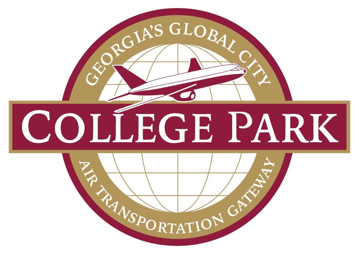
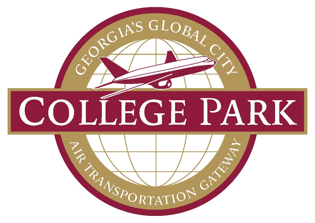
COLOR LOGO: The Maroon and Gold logo is the primary logo and should be used for all city marketing efforts. A white border must be used when placing this logo over a color or background image to ensure visibility and brand consistency.
SOLID COLOR LOGO: The Red and White logo is the main logo that should be used in most instances, either in Red or Black. The white border should be used when using this logo over a color or background image.
BLACK & WHITE LOGO: The black and white logo should be used only in limited situations where color printing is not available or practical, such as in black-and-white documents, newspaper ads, faxes, or other monochromatic formats. It may also be used for specialty items like embossing, engraving, or where color use is restricted due to production limitations.


Do NOT
Do NOT stretch or distort the logo. The proportions must be kept when scaling.
Do NOT stretch or distort the logo. The proportions must be kept when scaling.
Do NOT re-color the logo. Original colors must be used unless only one color is allowed and in that case use red or black.
Do NOT re-color the logo. Original colors MUST be Used unless only one color is allowed and in that case use white or black. The red and white logo is obsolete.
Do NOT re-color the logo. Original colors must be used unless only one color is allowed and in that case use red or black.
Do NOT use logo without the white background and outline.
Do NOT
Do NOT use logo without the white background and outline.
USE THE CORRECT LOGO
Do NOT stretch or distort the logo. The proportions must be kept when scaling.
Do NOT re-color the logo. Original colors must be used unless only one color is allowed and in that case use red or black.

USE THE CORRECT LOGO
USE THE CORRECT LOGO
There are three logo options: 1) Red with White Outline, 2) Black, or 3) White Reversed.
There are three logo options: 1) Red with White Outline, 2) Black, or 3) White Reversed.
There are three logo options: 1) Maroon and White Outline 2) Black, or 3) White Reversed
Do NOT use logo without the white background and outline.

Try to give the logo its space by keeping copy, imagery and other design elements away from the logo. Use the width of the College Park red band as a general guideline.
COLOR
LOGO MINIMUM SIZES
Due to the complexity of the logo and copy around the globe, the logo must not be smaller than .875” / 100 pixels as a one color logo or .625” / 100 pixels reversed out in white.
LOGO
SIZE ALTERNATIVE
In the rare case that you need the logo smaller than recommended, use the City of College Park alternative logo. Use this logo on when no other options will work for readability.
COLLEGE PARK TYPOGRAPHY
Use Proxima for headlines and body copy.
PROXIMA STACKS WELL AND
PROXIMA STACKS WELL AND LOOKS
PROXIMA REGULAR - REGULAR ITALIC
ABCDEFGHIJKLMNOPQRSTUVWXYZ0123456789
abcdefghijklmnopqrstuvwxyz
PROXIMA BOLD - BOLD ITALIC
ABCDEFGHIJKLMNOPQRSTUVWXYZ0123456789
abcdefghijklmnopqrstuvwxyz
Use Proxima Regular for your main body copy and call out important information using Proxima BOLD. Try to use a good bit of leading (the line spacing between sentences) to allow the reader to more easily read the content you created. Here’s some Greeking just to finish out this paragraph.
Lorem ipsum dolor sit amet, consectetuer adipiscing elit, sed diam nonummy
nibh euismod tincidunt ut laoreet dolore magna aliquam erat volutpat.
Ut wisi enim ad minim veniam, quis nostrud exerci tation.
PROXIMA SEMI BOLD - SEMI BOLD ITALIC
ABCDEFGHIJKLMNOPQRSTUVWXYZ0123456789
abcdefghijklmnopqrstuvwxyz
PROXIMA BLACK - BLACK ITALIC
ABCDEFGHIJKLMNOPQRSTUVWXYZ0123456789
abcdefghijklmnopqrstuvwxyz
Use Iowan sparingly as subheads & call-outs. It works well in ALL CAPS as well as Title Case
IOWAN OLD STYLE ROMAN - ROMAN ITALIC
ABCDEFGHIJKLMNOPQRSTUVWXYZ0123456789
abcdefghijklmnopqrstuvwxyz
IOWAN OLD STYLE BOLD - BOLD ITALIC
ABCDEFGHIJKLMNOPQRSTUVWXYZ0123456789
abcdefghijklmnopqrstuvwxyz

Graphics and Flyers are useful for sharing news, event details, and other important information with customers or community members. To help you create eye-catching and effective flyers that align with our city's brand, we've compiled the following tips to make your message memorable and attract your target audience.
A standard flyer is generally made up of four elements:
• Graphics or pictures
• An attention-grabbing headline
• A focused message
• Location and/or contact info
The best flyers answer the 5 W’s:
• Who: Who is putting on the event?
• What: What is actually happening?
• When: When will the event occur?
• Where: Where will the event be held?
• Why: Why should people attend the event?
It’s considered best practice to go by the 5 W’s (who, what, when, where, and why). If your flyer answers those basic questions, then you’re ready to move from content to design.
What makes a good flyer? When developing flyers that reflect our city's brand, please consider the following principles to guide your approach to visual design and content marketing:
• Employ design elements that effectively capture the audience's attention.
• Present all essential information with clarity to ensure ease of understanding. The flyer should convey information directly, facilitating quick comprehension for the reader.
• Ensure that comprehensive contact details for the business are prominently displayed, enabling interested parties to easily seek additional information.
• Anticipate and address potential inquiries by providing pertinent content that clearly directs the audience on subsequent actions, locations, or contacts.
Tips on how to consistently create effective flyers.
• Create a focal point - What do you want the viewer to see first? Make that the focal point of the flyer and build around it.
• Adopt the Rule of Thirds - The Rule of Thirds, though often used by photographers, can divide the space of your flyer and guide the eye to the visual's geometric harmony. This universally appealing concept works both vertically and horizontally.
• Consider various approaches to establish harmony, contrast and structure in your designs. Feel free to experiment with colors, shapes, fonts, scale and whitespace to refresh your flyer's appearance, preventing it from being monotonous or overly consistent. You might choose contrasting colors using color theory, use interesting shapes to highlight your message, or adjust image scales to reflect their significance. There are endless possibilities for how you present your message.
When designing your flyer, consider the following:
• Reflect the personality of your advertisement: Capture the specific vibe or ambiance of what you are advertising. Choose colors, fonts, and images that resonate with that feeling and align with your event, business, or brand.
• Maintain brand consistency: Select colors that align with your brand while also complementing our city's logo usage. Ensure your flyer design fits your brand aesthetic by using your existing brand colors or complementary colors.
• Utilize available templates: If visual design isn't your expertise, use platforms like Canva or Adobe Express. These tools offer a variety of flyer templates to guide you.
Content tips for designing effective flyers:
• Singular message: Focus on the most relevant content for your advertisement, given the limited space.
• Brevity: Use images and white space to break up text blocks and avoid overwhelming viewers. Bullet points and infographics can also help to convey information concisely.
• Call to action: Include information on how people can follow you and stay involved with your business.
• Target audience: Design with your audience in mind by imagining yourself as the viewer.
• Contact information: Provide your business contact information and location directions, and include accessibility information for your space.
• Proofread: Have someone else look over your work, as even experienced copy editors can miss errors.
Standard Sizes: Flyers come in various sizes. Choose one based on your print distribution method. Common sizes include:
• Letter (8.5" x 11”): Standard size for printing.
• Half-Sheet (5.5" x 8.5"): Smaller and more compact.
• A5 (5.8" x 8.3"): Common for event flyers and handouts.
• DL (3.9" x 8.3"): A long, narrow flyer, often used for promotions and invitations.
• LED Sign (70.833” x 24”)




The recommended dimensions of Facebook post images are 1200x630 pixels. You can also use square (1080x1080 pixels at 1:1 aspect ratio) or portrait (1080x1350 pixels at 4:5 aspect ratio) images. Facebook story post 1080 x 1920 pixels. Facebook ad post 1080 x 1080 pixels.
Instagram has officially switched to a 3:4 grid ratio on profile pages! We recommend sizing your graphic for instagram posting (1080x1350px, 4:5 ratio) The app now automatically crops the sides to fit the new profile view.
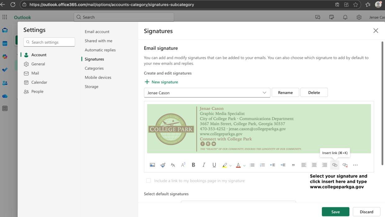
Dear City of College Park Staff,
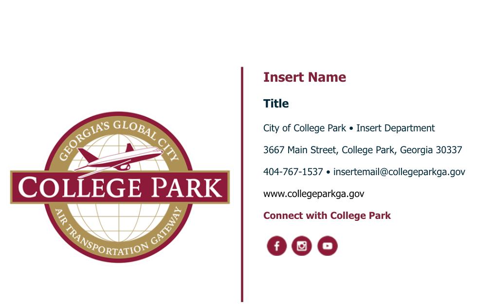
As we continue our transition to the new City website, we will be reverting to the traditional City of College Park color scheme and re-establishing a uniform email signature for all employees. This update is an important part of maintaining a consistent, professional, and recognizable brand across all City communications.
E
ffective October 22, 2025, all staff are required to update their email signature to the official City of College Park format shown in this document.
Brand Guidelines (Do Not Modify)
• Font: Tahoma
• Font Size: 12pt
• Font Color: City of College Park traditional maroon and gold color scheme
• Maroon: HEX: 82263c
• No quotes, emojis, personal images, or decorative text
• Logos, icons, and colors may not be altered, resized, or recolored