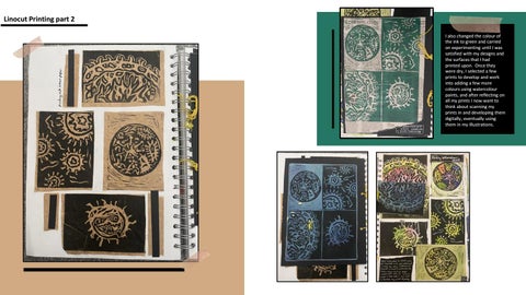
Linocut Printing part 2 I also changed the colour of the ink to green and carried on experimenting until I was satisfied with my designs and the surfaces that I had printed upon. Once they were dry, I selected a few prints to develop and work into adding a few more colours using watercolour paints, and after reflecting on all my prints I now want to think about scanning my prints in and developing them digitally, eventually using them in my illustrations.
yellow leaving me with a base colour for my piece.
Stage 1- This was printing a fresh piece of lino with the colour
Reduction Linocut Printing
Stage 4- re-cutting into my lino piece removing areas that I want to keep green.
Stage 5- printing my final design using black ink.
Stage 3- Inking up my piece with green ink and printing on top of my previous printed yellow block.
Stage 2- Cutting out my design on lino
Design Development workshop
This was a visual task of completing small design development studies, which meant producing drawings in certain times with a certain technique that was given. These quick drawing visual tasks helped me to focus my project and helped me to explore different perspectives that I wouldn’t usually explore. The drawing tasks included continuous line, drawing with different hands, as well as zooming in on an image and exploring shapes and patterns. I completed a total of 20 small studies all using black fine liners which will enable me to scan and edit my results, I focused on drawing viruses/cell like structures, paying particular attention to patterns, lines and shapes. From this online lesson I learnt that timings can be a very important aspect within art and design, sometimes the quick timed drawings turn out to be the best, so I will take this useful skill and apply it to my project, and perhaps by developing one quick drawing it could lead to much more.
Plate 2
In the workshop I worked with clay as my canvas and transferred patterned images onto the clay to create a repeat pattern design. I had to think carefully about the order of elements and the placement of pattern within my designs. My aim for this day was to complete 3 platters that were concentric and therefore stack so that they sit inside each other. So, I started off by carving my design into linoleum which was then cut up into sections and superglued to a wooden block, therefore allowing me to print my design into the clay for my repeat pattern. For my design I picked out previous line drawings and inspiration from other pieces of work to create simple designs related to viruses
Ceramics- Artist research 6 and workshop development
Plate 3
With my first two plates I cut out the shape I wanted before completing the design, so therefore once I was happy with the shape I began stamping my design into the clay however due to the stamps being rectangular and my plate being circular I was left with gaps all around the plate. Therefore for my last plate I decided to take a different approach and printed out the design first and then cut the shape and therefore this prevented the gaps between the designs.
Plate 1
As additional research to this project I came across an artist that inspired me to create the specific shape of my plate, her name is Alice Ballard and I was inspired by her ‘garden impressions’ series, not only did I like the overall appearance of her ceramics but also her technique and process behind it all was very interesting to read into. The project was made very personal to herself, and hopefully by referencing and researching into this artist it will help me to make my designs personal to my own project.
Artist research 7, workshop exploring Humument
Here I explored The Humument by Tom Philips, Humument has been a work in progress since 1966 when the artist set himself a task to find a second hand book for three pence and alter every page by painting, collage and cut-up techniques to create an entirely new version. His work is very inspiring with each page telling a different story through his design and patterns that simply make his work unique. I even managed to look through one of the book copies of A Humument, and I took this opportunity to scan in pieces that initially inspired me, with a few patterns relating to my subject them.
Double page of research highlighting what elements of the artists work inspired me as well as annotating some scanned in pages from his book.
I have completed a double page spread of artist research , I began to annotate some of his work that I had photocopied from yesterday , highlighting his techniques and what aspects I liked about his work. I then wrote a bit about the artist as well as watching an online YouTube video of the artist explaining about his work, I focused on certain pages of his book and started to analysis them talking about form, process, mood etc.
Developments and responses from workshop
I began by tearing random pages out of a collection of second hand books, I started to pick out words and sentences that had some sort of link/connection to my project, I circled these and started to draw designs and ideas around the words. I started off using pens and pro-markers to colour in and create my designs, and I even developed some using acrylic paints and inks. I filled a total of 6 pages with colourful designs and illustrations, with words relating to my subject matter, in some text I even created words by circling single letters to make the words themselves.
On the screenshot above I developed my work by adding in more facts in relation to the coronavirus, and also edited out the letters that were previously circled as a response to Tom Phillips, therefore I was developing my own ideas and turning my piece into more of my own design.
Here I chose two particular designs that I thought were my most successful and started to develop them digitally using Adobe Photoshop. With both of my pieces I decided to experiment with the tools on photoshop, I selected sections of my work, adapting and changing colours adding extra drawing details, adding hand drawn text, duplicating some designs etc. This aspect of producing a design and then editing it digitally is the process that I feel the most comfortable with and therefore want to develop this as I produce my illustrations.
These are screenshots of my work when I was in the process of editing them on photoshop, as you can see I started to add additional text and began editing colours using various tools.
Developments from workshop- editing my designs digitally
My design before and after printing onto fabric- you can see how the colour has gotten much lighter.
Workshop- printing onto fabrics using the heat press
Scanning my design and editing using photoshop and illustrator
This session focused on using the heat press to print a design onto fabric, which was then sewed and stuffed to create a small cushioned piece. Again this was all very new to me however I enjoyed learning the process and the technique behind it. I actually started to realise as I was doing this task that even though this was textiles based it made me realise the connections that this has to graphic design, as many brands, logos and designs that are created in graphics are printed onto material like clothing which was just like I was doing with the design that I had just created. For my design I focused on creating a pattern linking to my subject theme, this was painted onto paper using inks, then printed four times onto fabrics, each one came out differently as you started to see the ink get brighter and lighter, therefore I felt my first print onto fabric worked out the most successful.