CHÂU NGUYỄN
T F O O L I T
F O O L I
T F O O L I T
F O O L I


(+84) 0904 574 119
chaunguyenarc.ntqc@gmail.com facebook.com/chaunguyenarc.ntqc
2014 - 2019
2019 - 2020
University of Architecture Ho Chi Minh City
Arena Multimedia
03/2020 - 01/2021: Worked for JSC
Consulting and Construction Planning Urban Infrastructure Hoang An (HAPICO) as an urban planning architect.
04/2019 - at present: Freelancer.
Vietnamese
English
Sketching Layouting
Model Making Painting
Illustrating

Photo Editing

Adobe Photoshop
Adobe Illustrator
Adobe Indesign
Adobe Animate
Adobe Dreamweaver
AutoCAD Figma
Hi! My name’s Châu Nguyễn. I’m an Urban Planner and Graphic Designer based in Ho Chi Minh City, Vietnam. I’m a kind of self-starter, trustworthy, conscientious and a passionate person.
I love all parts of creative process. I want to be in a team where I could express my ideas wildly, and capable of working under high pressure. Working with my passion, always eager to improve myself, never stop searching for new styles for my clients. I like challenges and am not easily give up on it.
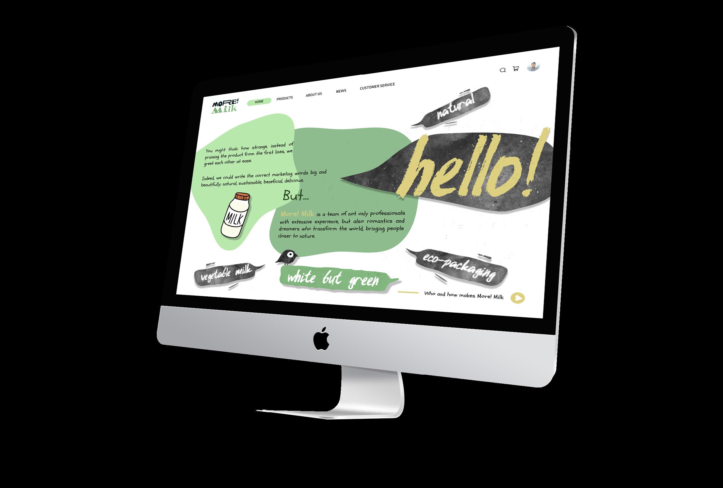
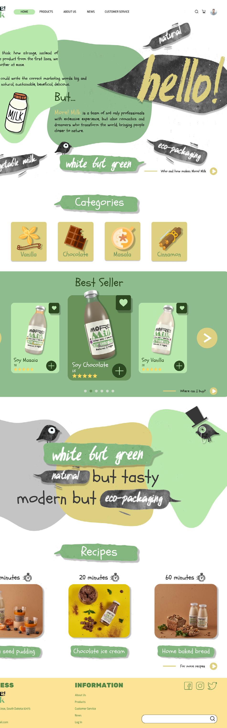
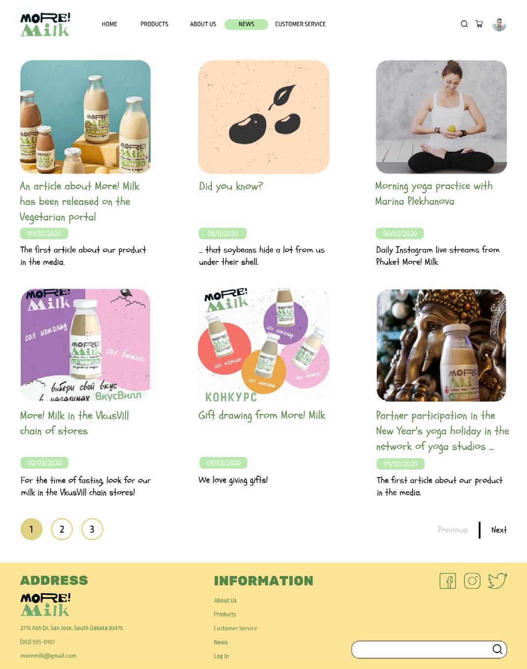
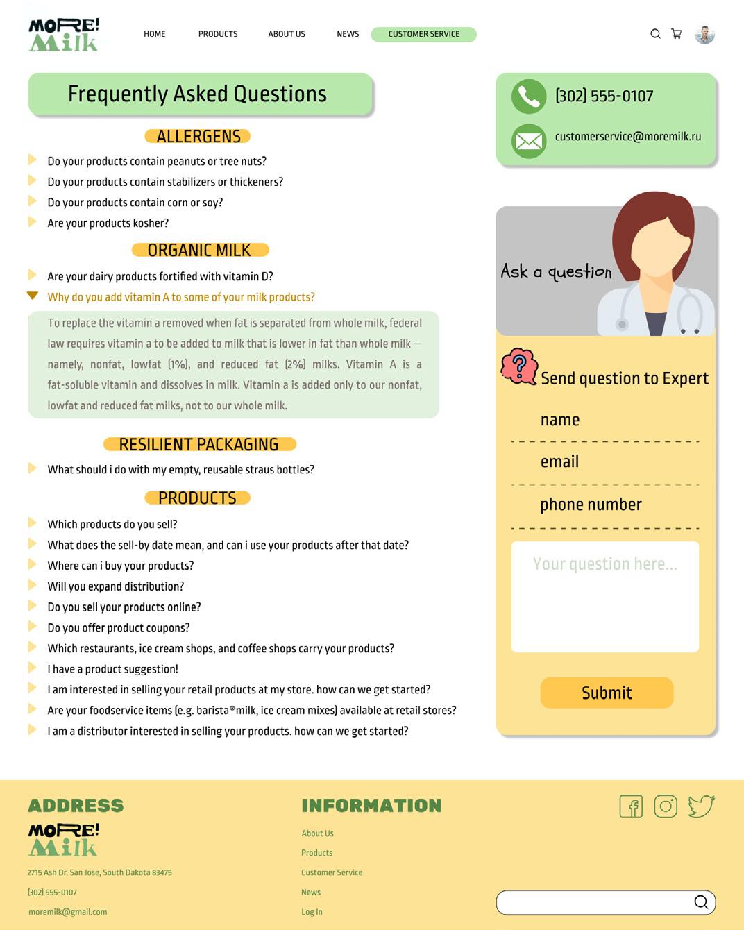
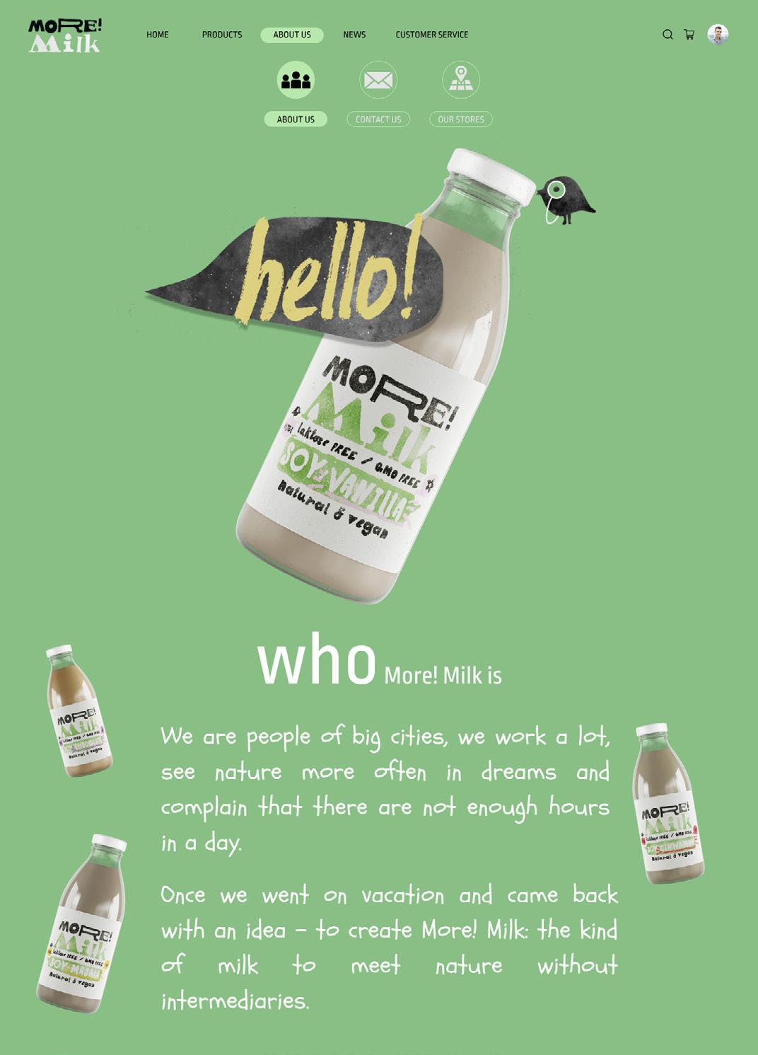
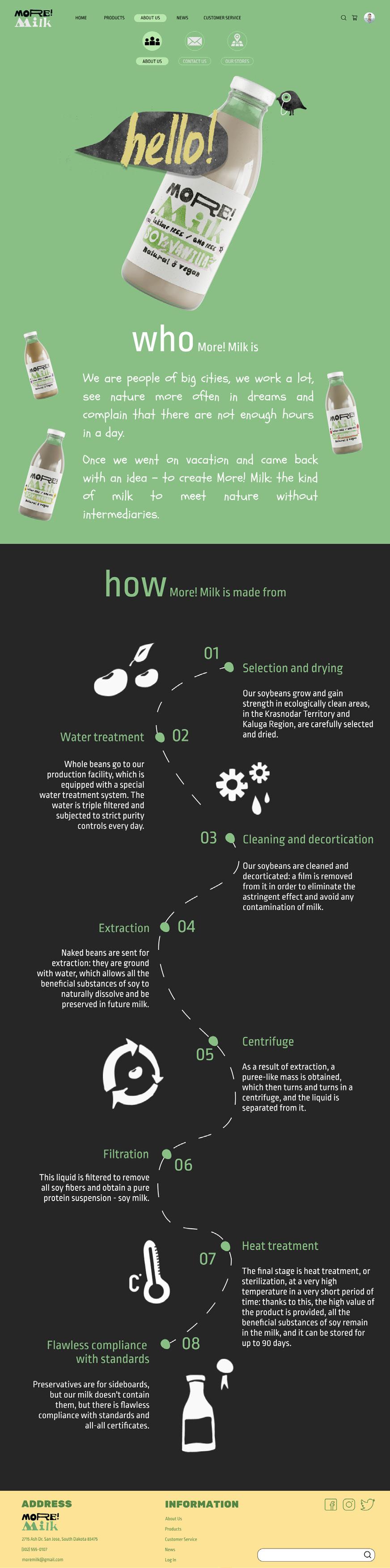
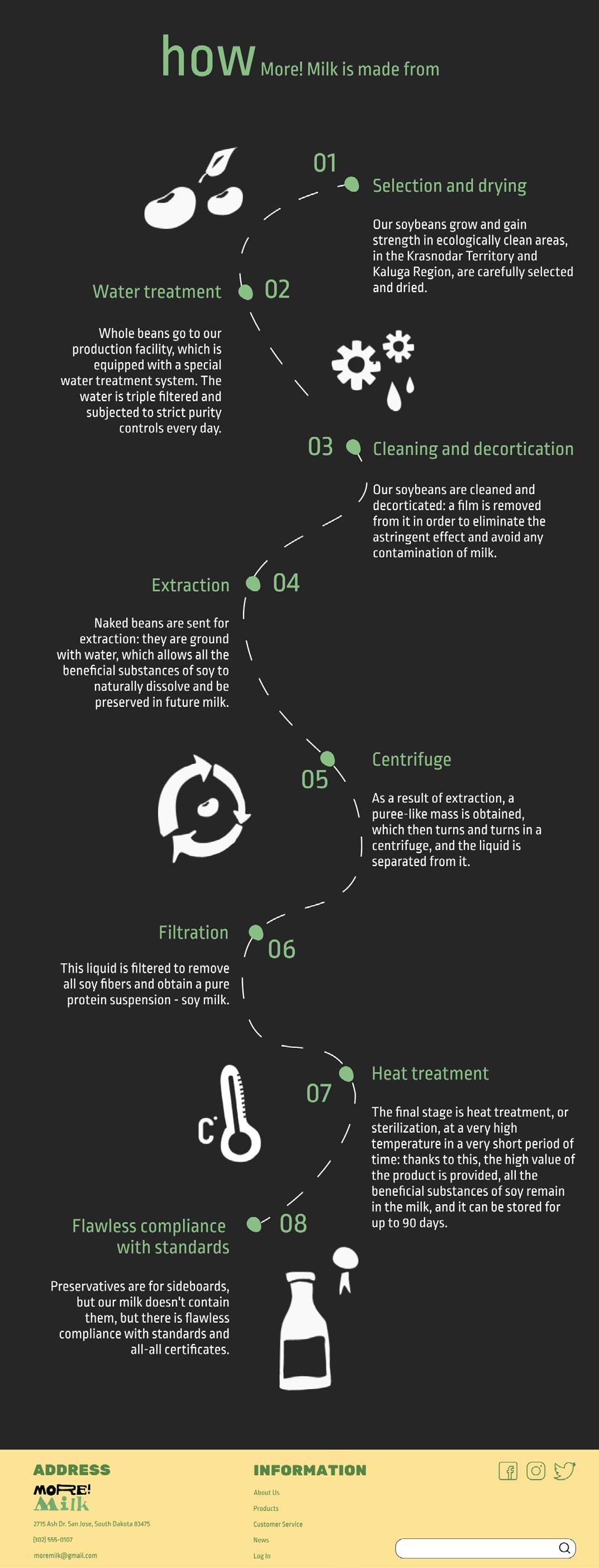
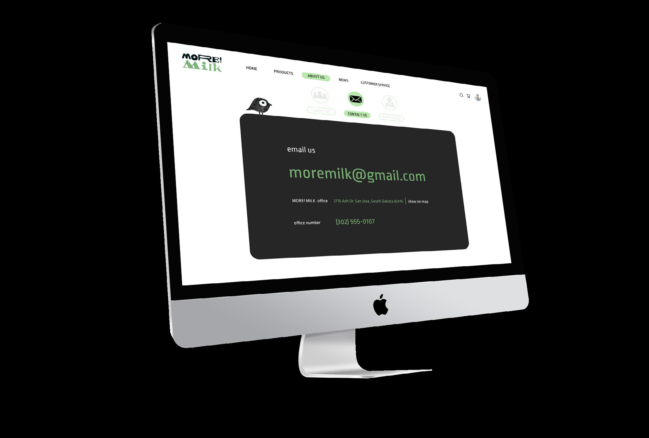
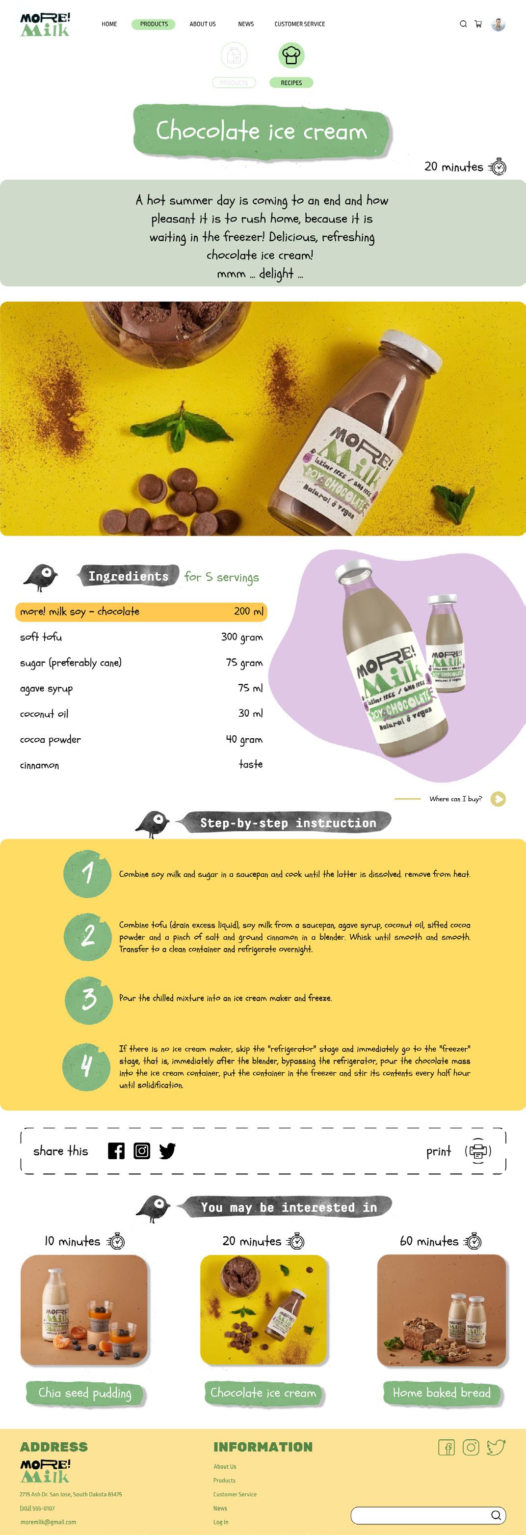
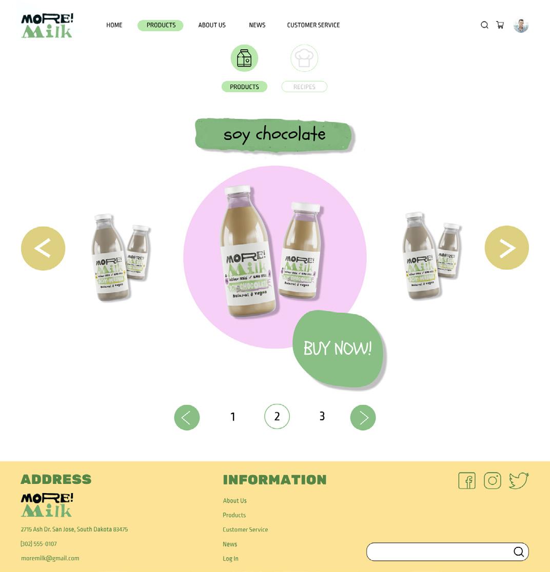
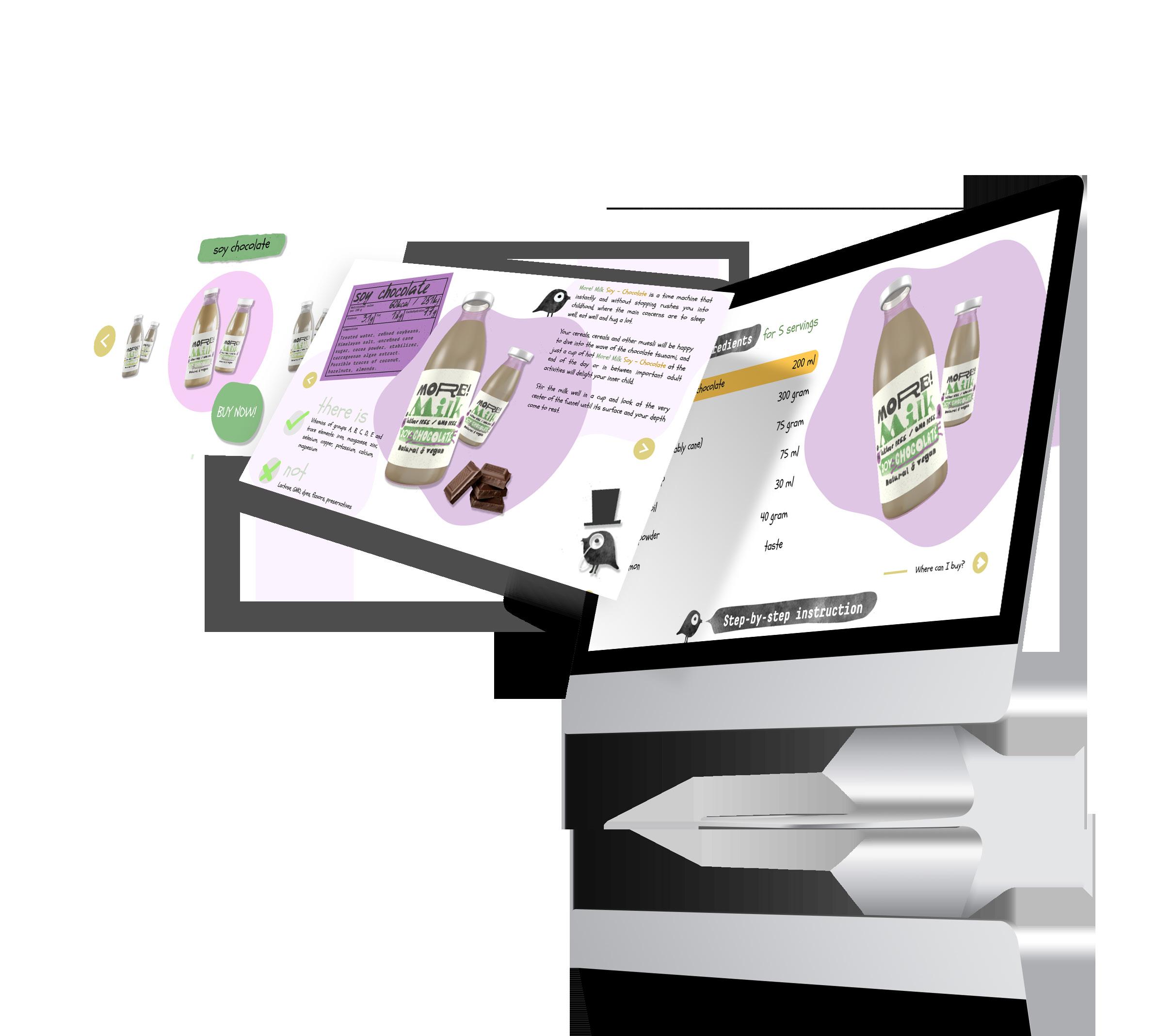
More!Milk is an excellent herbal product that is suitable for everyone: for those who, for personal reasons, are not friends with cow’s milk, and for those who want new taste experiences.
Besides that, More!Milk is our desire to leave a mark on the world, but only exclusively in the form of benefits, not rubbish. That is why More!Milk is packaging in beautiful glass bottles, which you can take to a glass collection point convenient for you.
The overall design of the website is lovable, minimal, and clean. Using cute and lively illustrations and adapted colour scheme from the brand’s strategy.

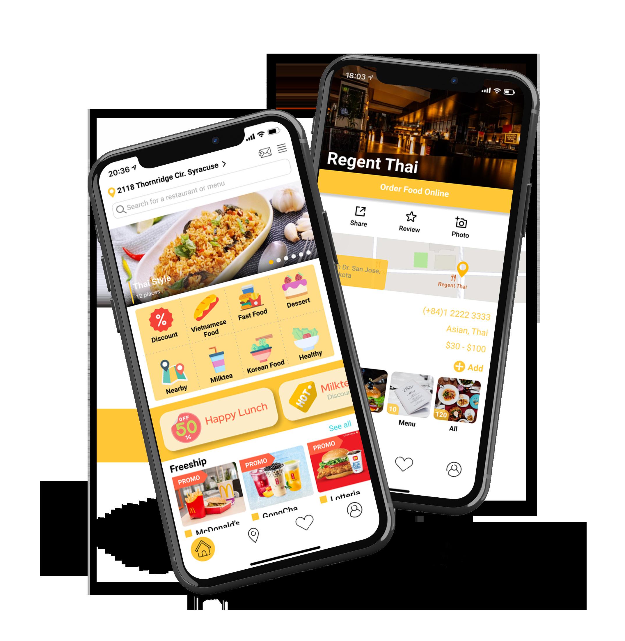
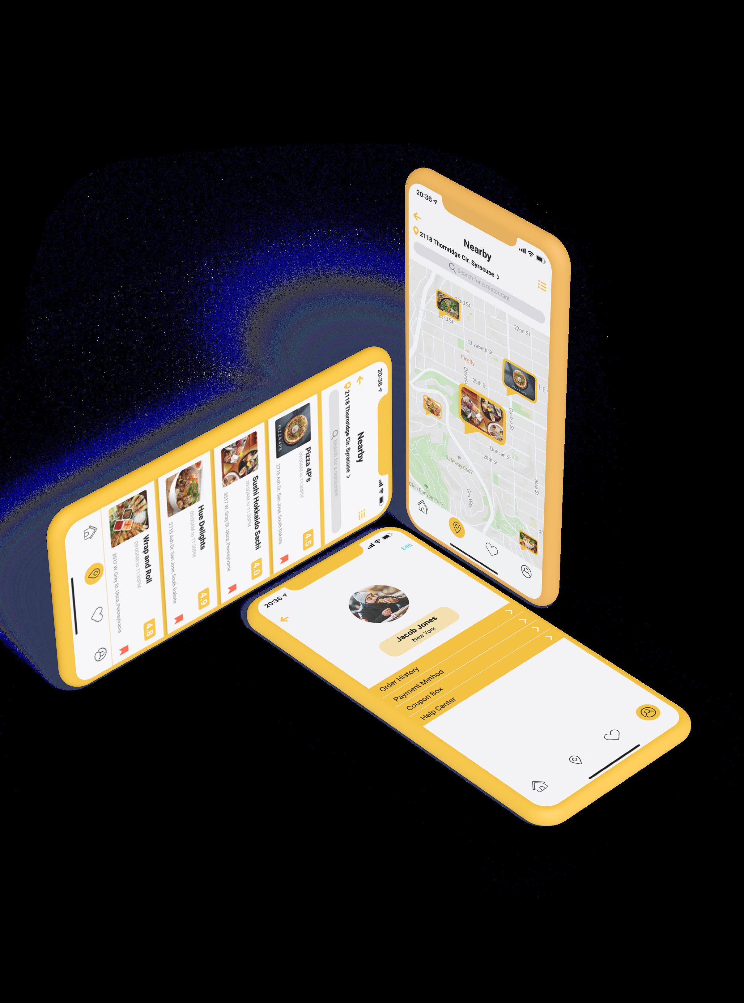
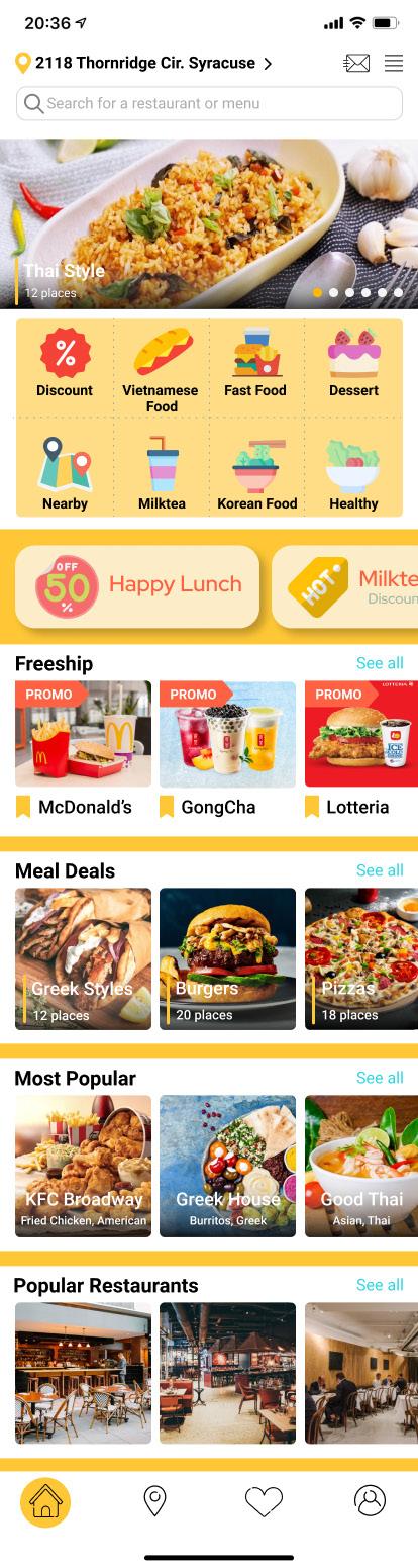
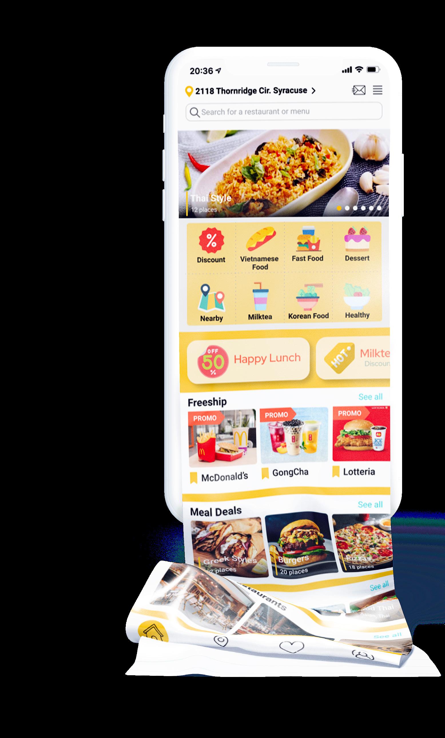
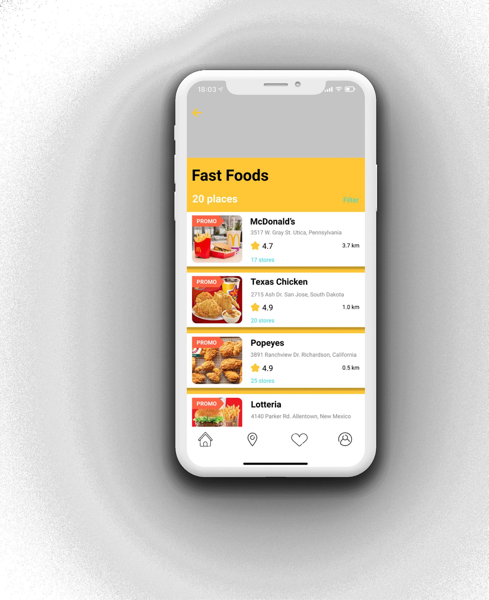
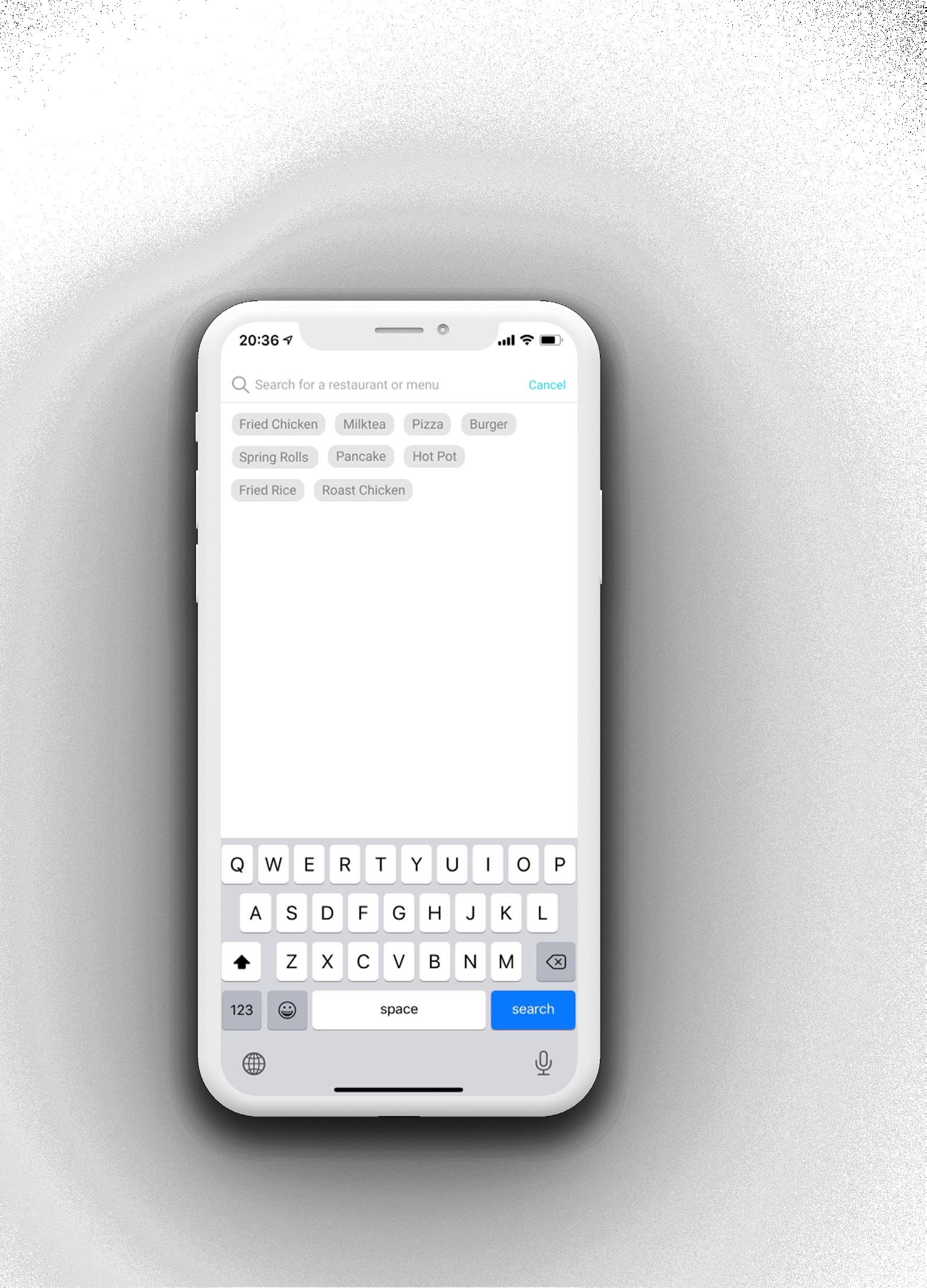
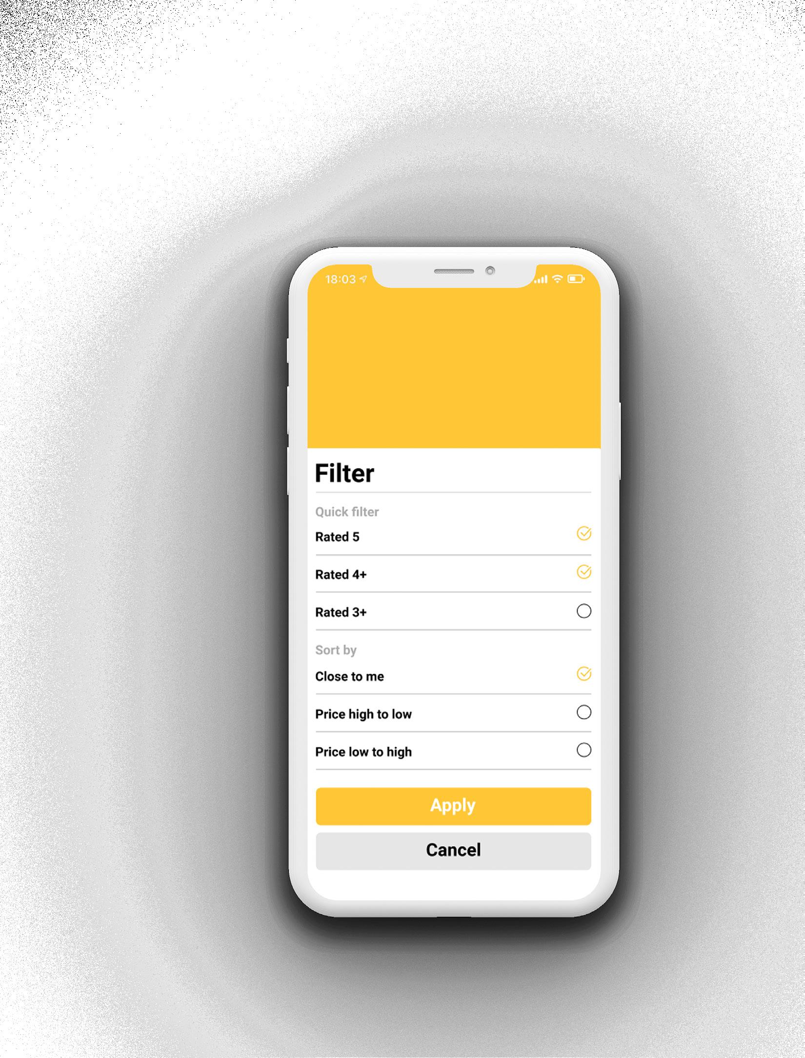
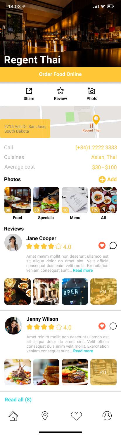
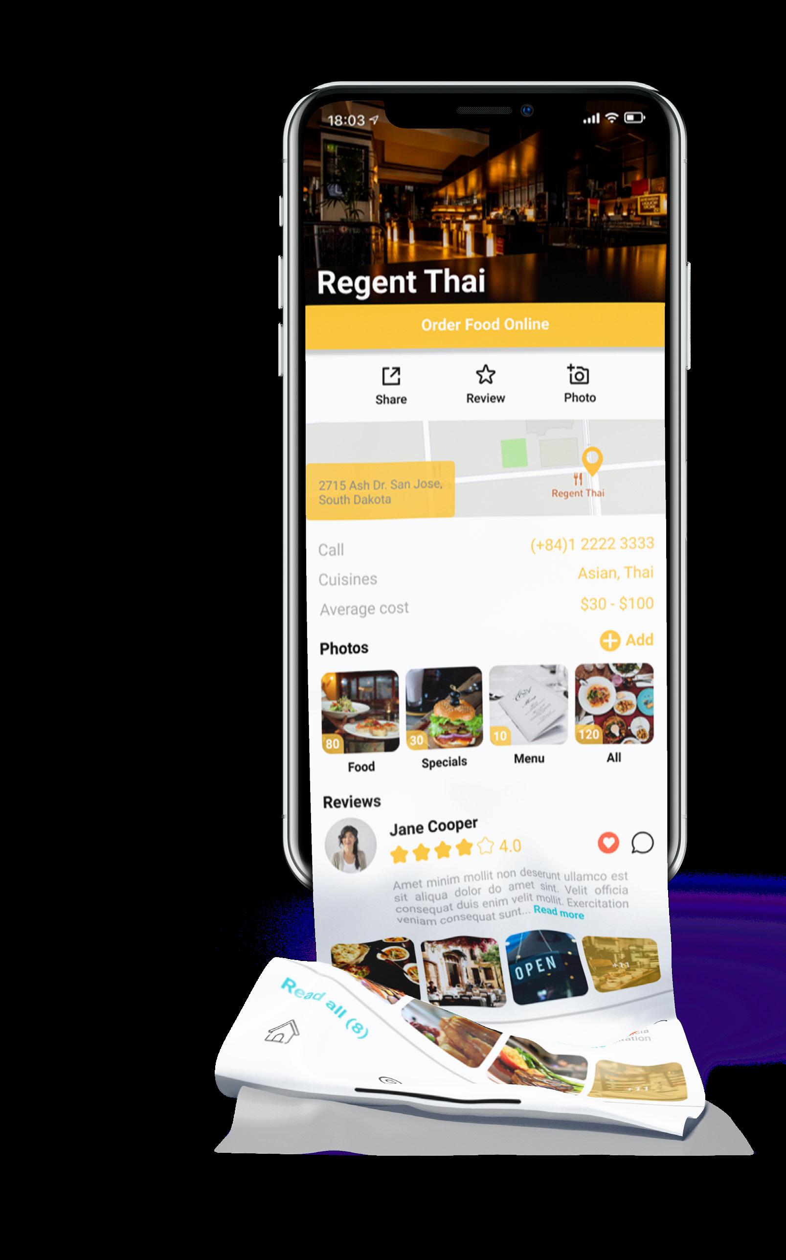
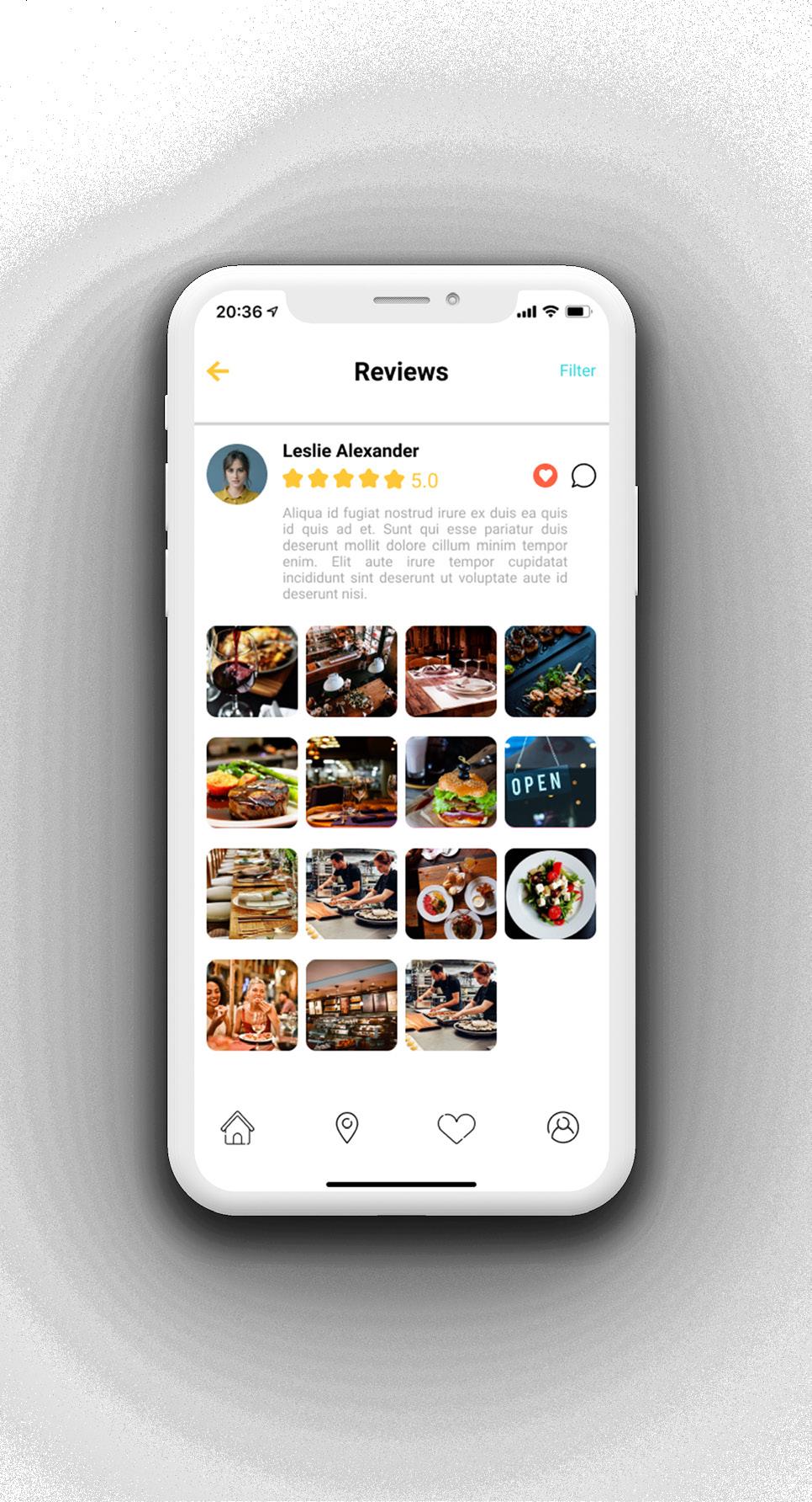
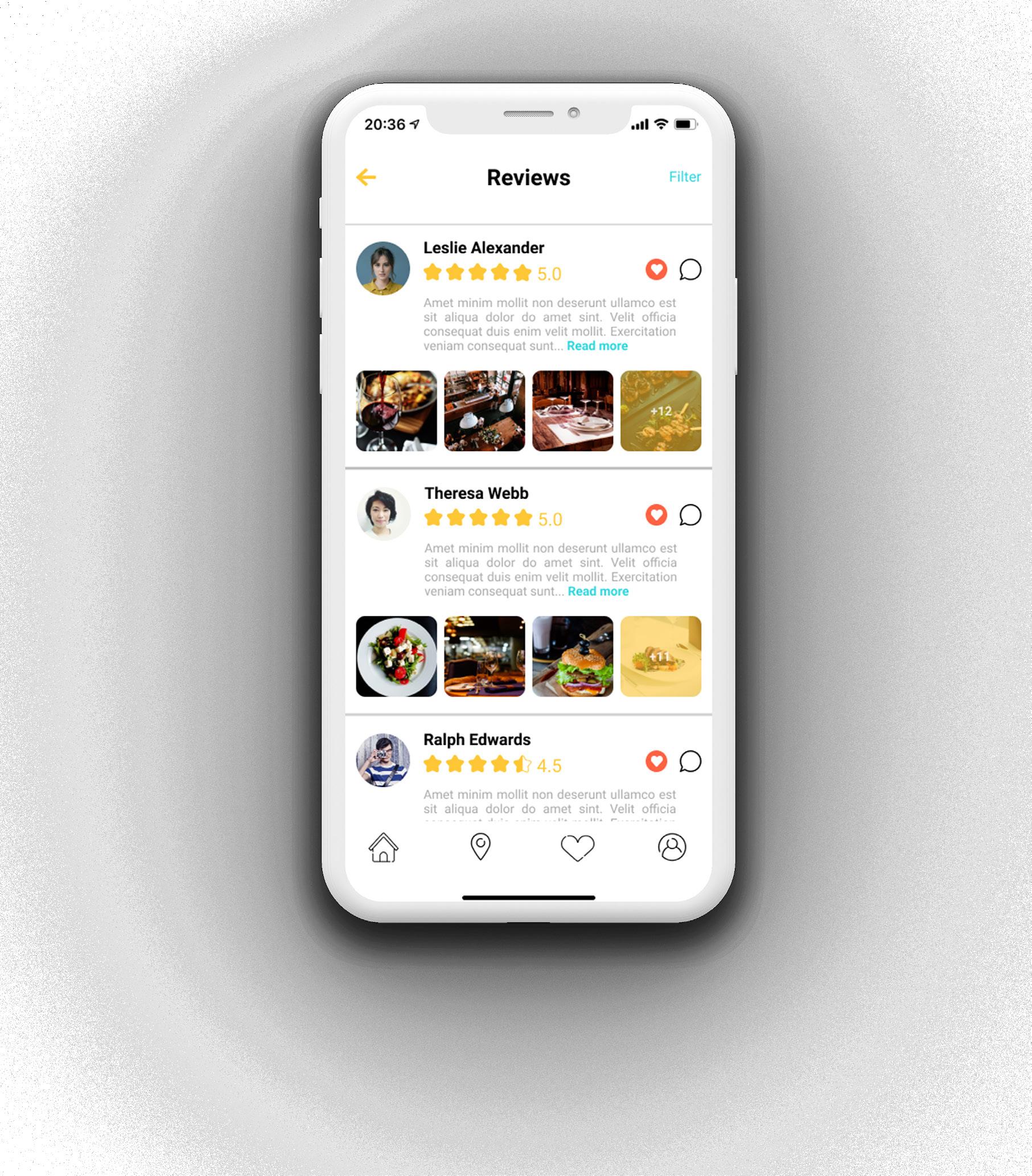
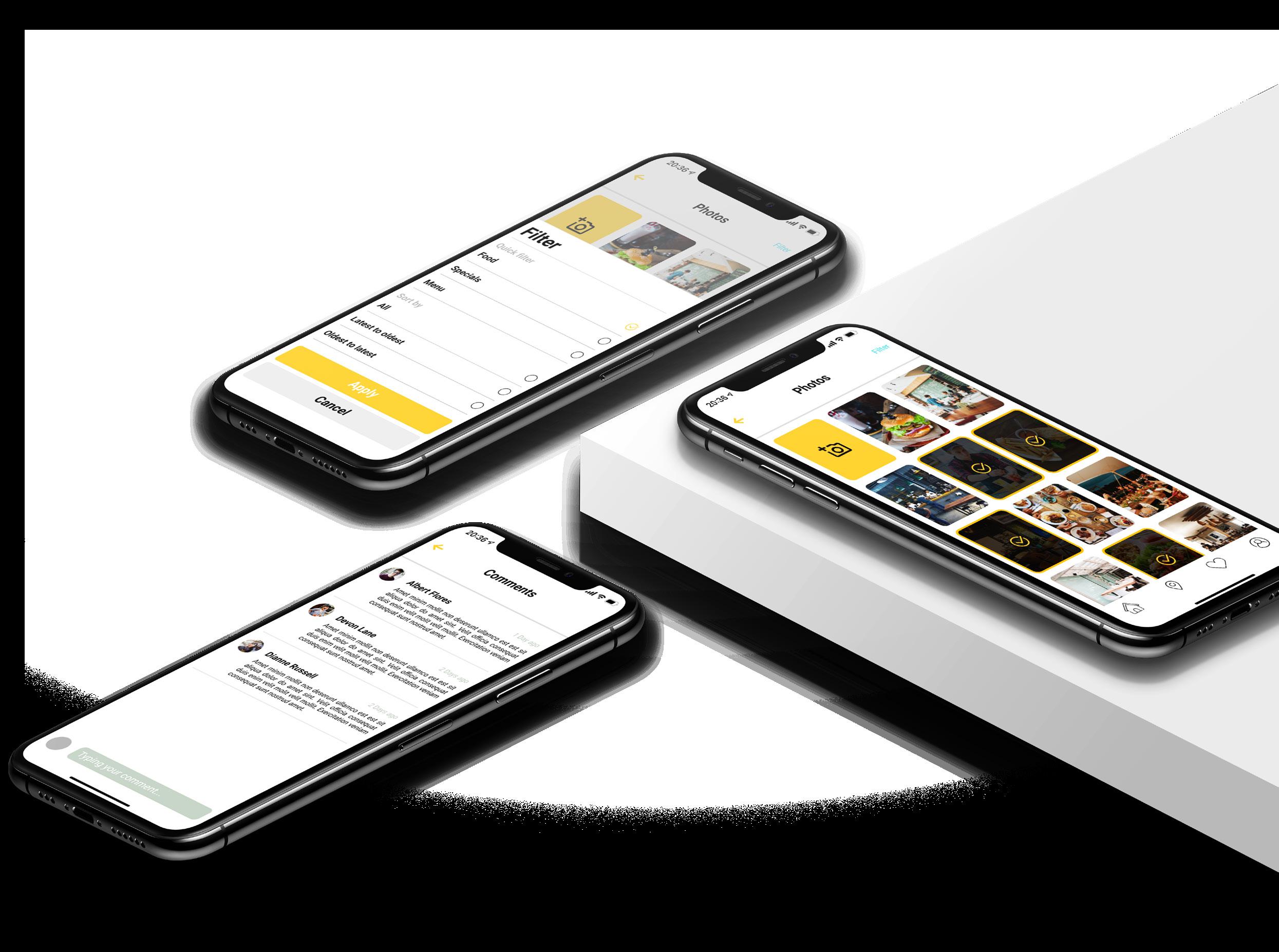
Click-To-Eat is an application with a food delivery function that delivers breakfast, lunch, dinner and even has at midnight. Find a favourite local restaurant and discover new ones with this application. Get chilled, chef-crafted meals delivered straight to your door on your schedule. Best of all, these meals have priced so much lower than similar dishes at restaurants.
Great functions:
- Suggest delicious restaurants with many promotions.
- Easy to find nearby restaurants.
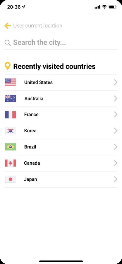
- Automatically locate users.
- There’re comments, photos, and reviews of users. Before order something, you can read it to decide your orders.
- Image and comment filters help you select things you want to see easily.

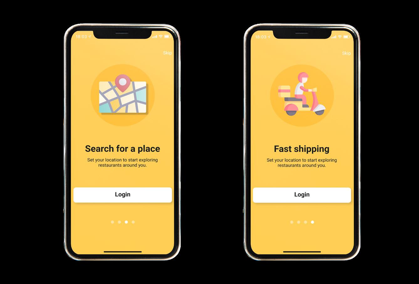
When you’ve downloaded the application.
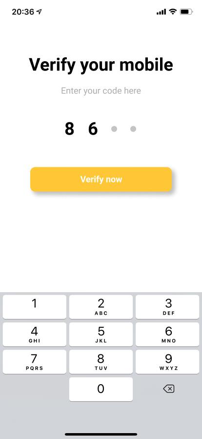
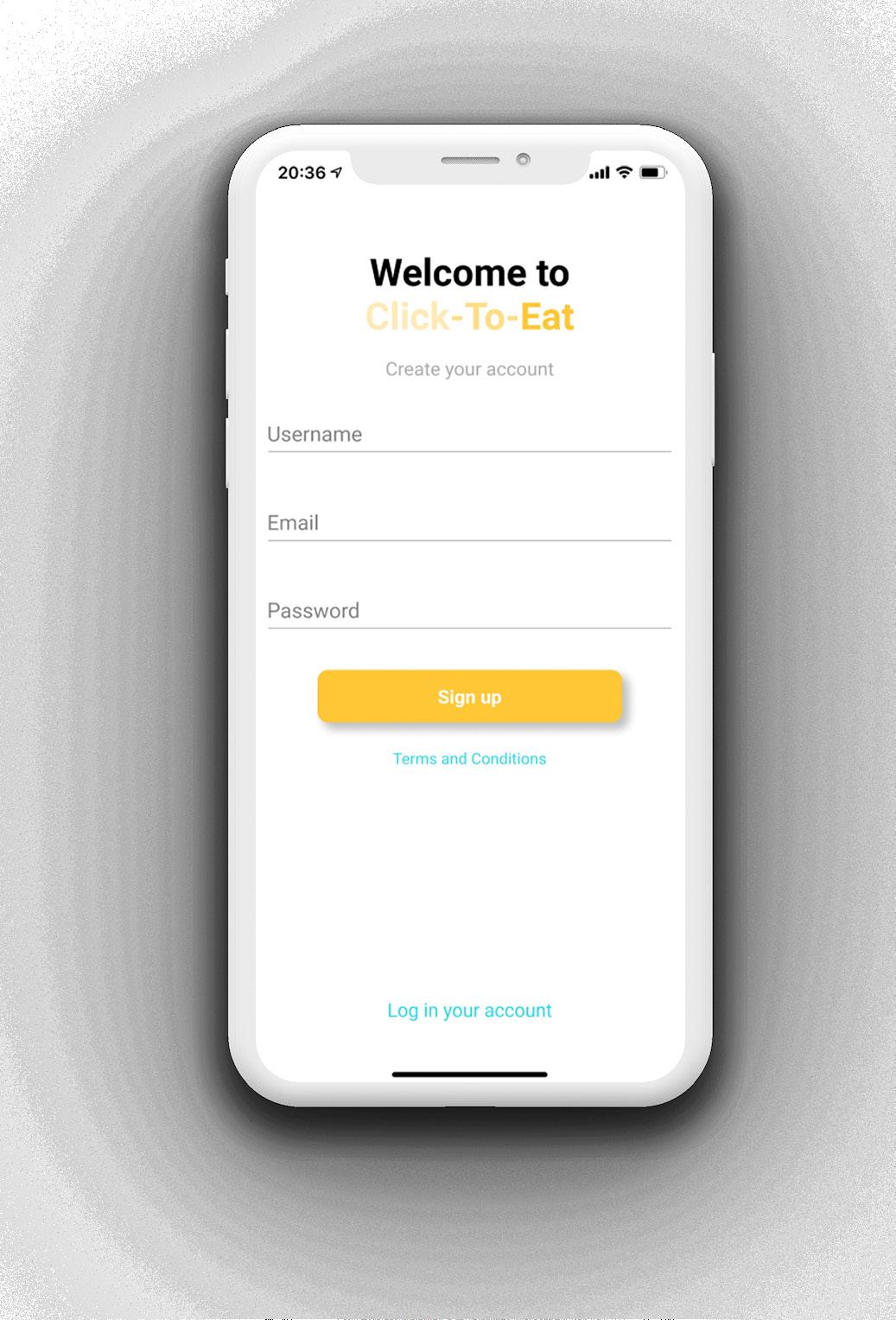
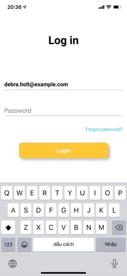
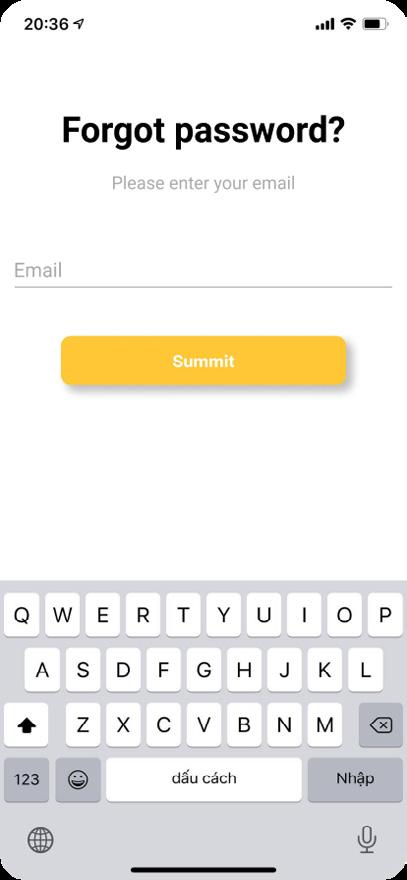
You don’t have any accounts. You already have an account and forgot your password.


#CC5541
#C2B59B
#34355D
#754C29
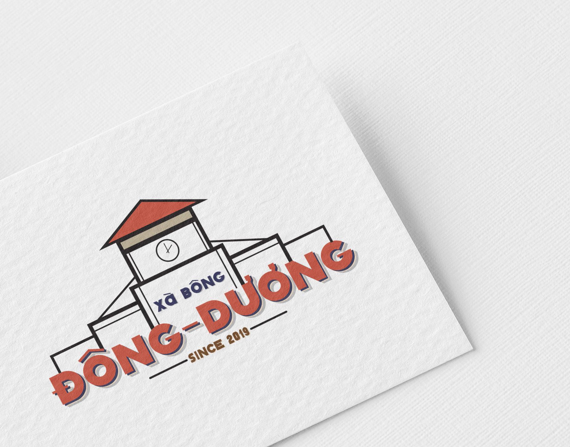

Đông Dương is a Vietnamese cosmetic brand with ingredients from natural herbs exclusively for women. The style that the brand wants to build is classic and nostalgic, like product packaging in the 70s-80s in Vietnam, reminding us of old Saigon.
Choose Ben Thanh Market as the main image of the logo, bring closeness and nostalgia to users. “Xà bông” is a familiar name of the previous period for the word “xà phòng” - it means soap.
White logo on the color background.
White logo on the black background. (Option 1)
Black logo on the color background.
Black logo on the white background. (Option 2)
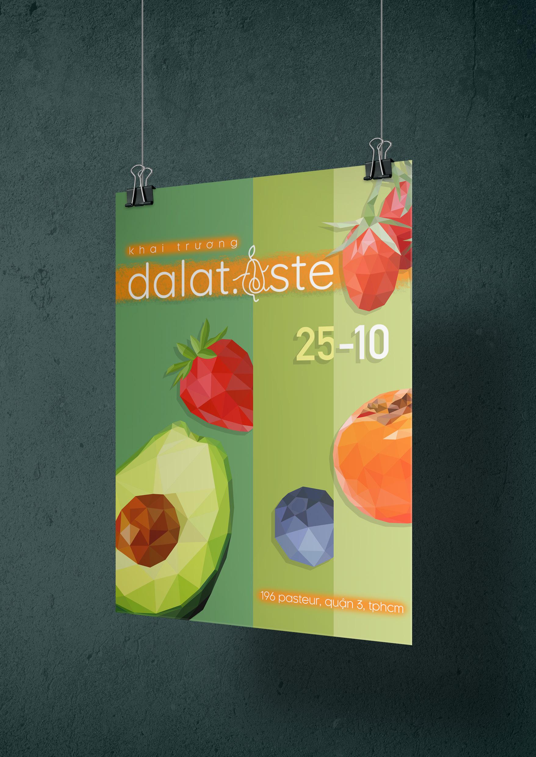
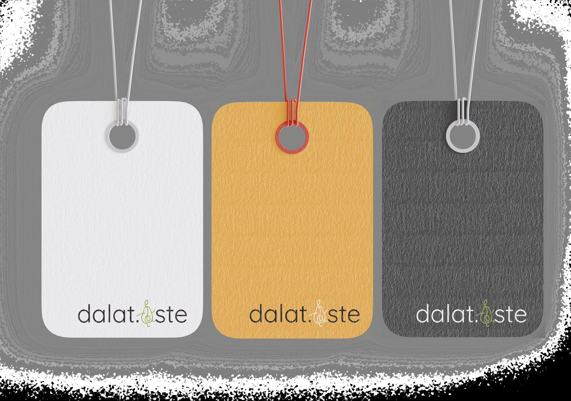
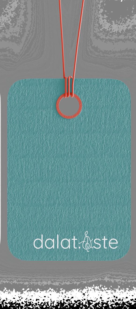
Dalat.aste is a brand specializing in providing fresh fruit from Đà Lạt in Sài Gòn, with the desire to bring good food to everyone.
Mentioning Đà Lạt refers to the cold air, early morning fog, steep winding roads through the green pine forest, all of it creating a mysterious beauty for Đà Lạt. Besides, gifted with a temperate climate and fertile soil, Đà Lạt is famous for various fresh agricultural products, especially fruits such as strawberries, laba bananas, avocados, persimmons. From these features, I created the logo of dalat.aste based on the following elements.
Logo idea:
- The logo should be designed to be simple, modern, and easy to remember.
- Use two words, “Đà Lạt” combined with “taste” to create the logo. “Taste” in English means the flavour of something. “Đà Lạt-taste” means “the flavour of Đà Lạt”. Dalat.aste is committed to providing customers with a delicious taste of Đà Lạt in each fruit.
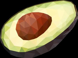
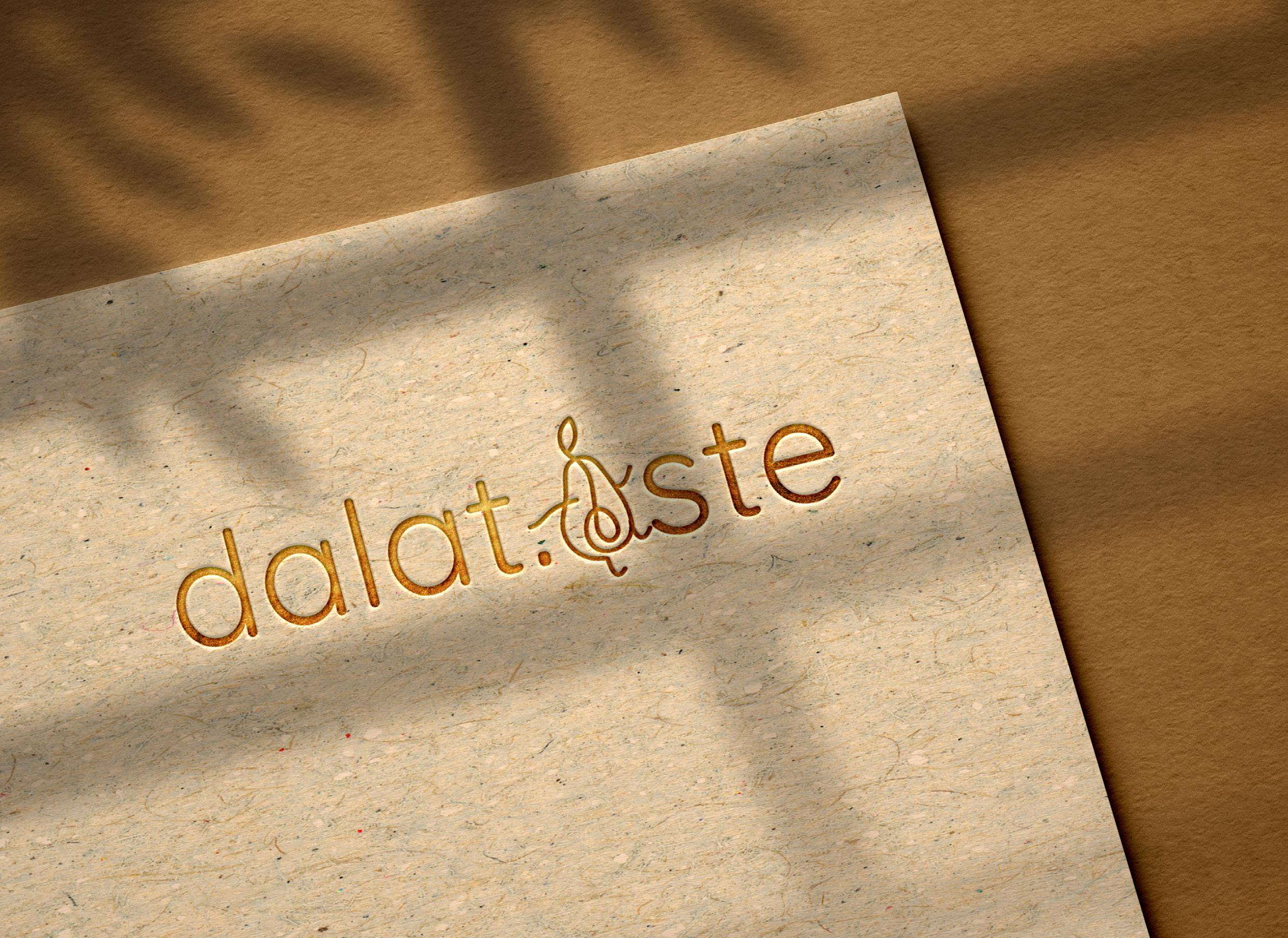
- The letter A is stylized into an avocado shape, drawing more lines to personalize the image. I created a playful, cute logo as a brand highlight. To bring a friendly feeling, remembering easily, and expressing the spirit that the brand wants to get to customers every time they use the product - always happy.
- The logo is arranged horizontally by the text, showing simplicity and sophistication in the design.
- Use font Quicksand Regular, a slim and modern font to meet the requirements.
“ĐÀ LẠT” “TASTE”
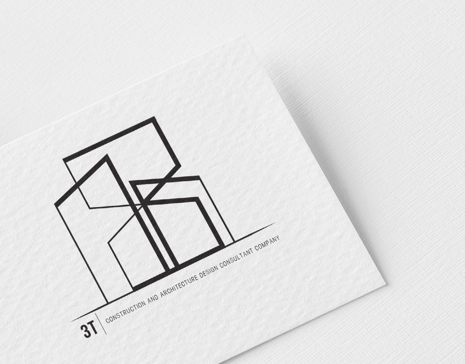
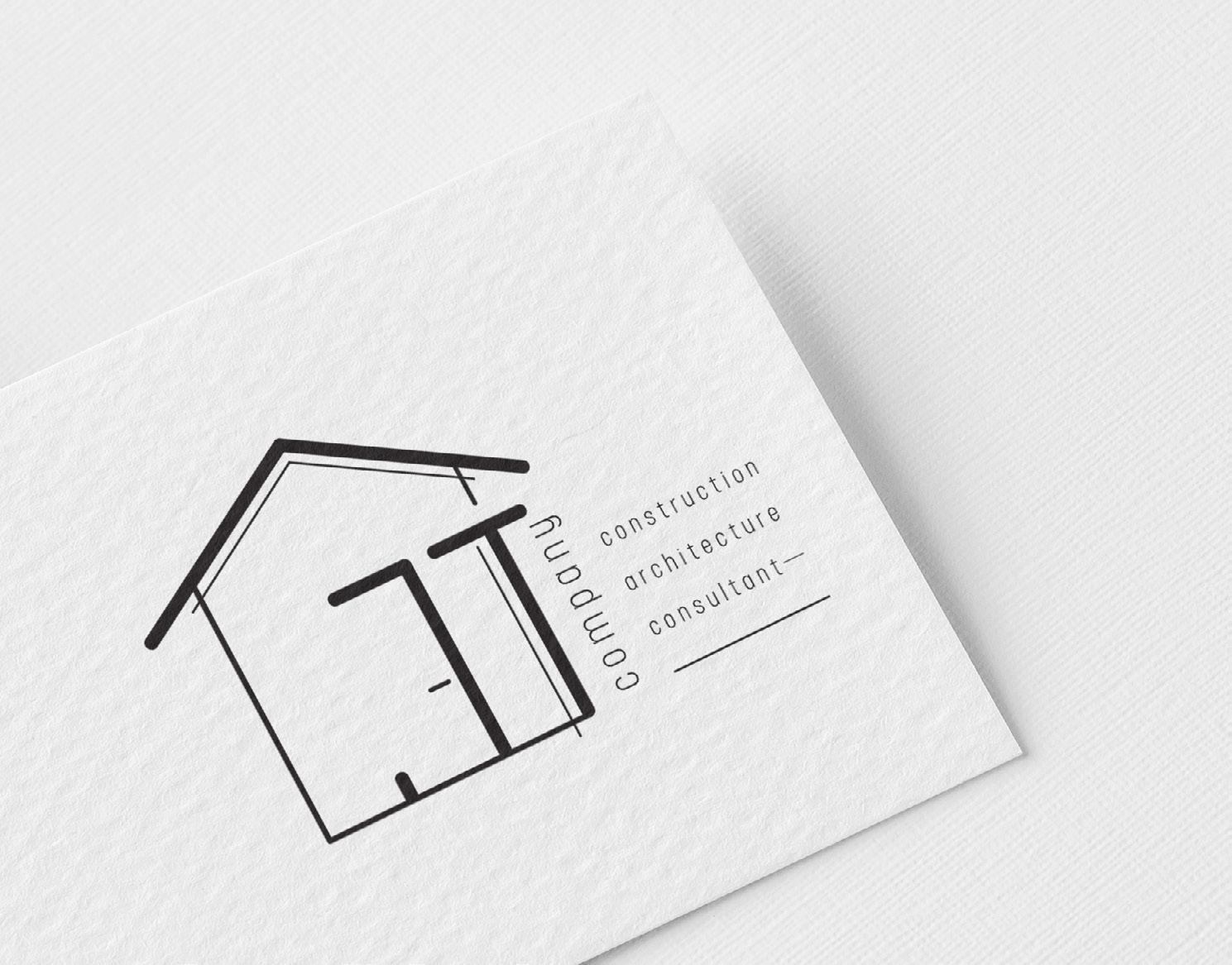
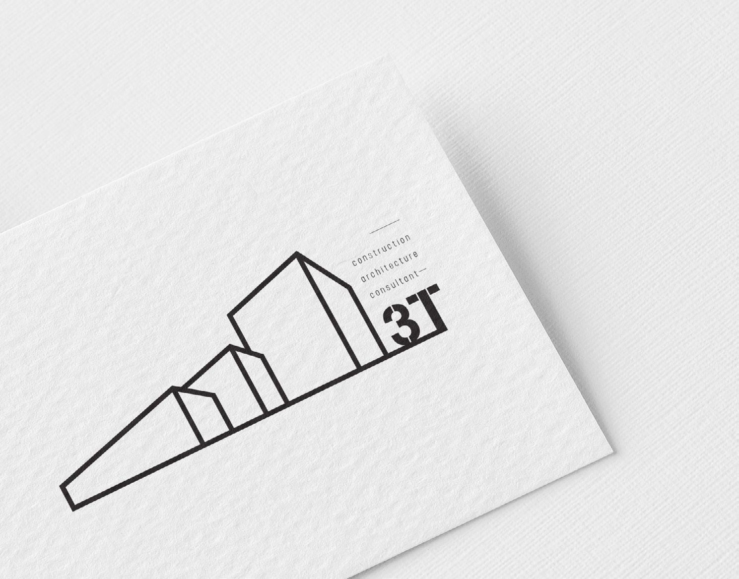
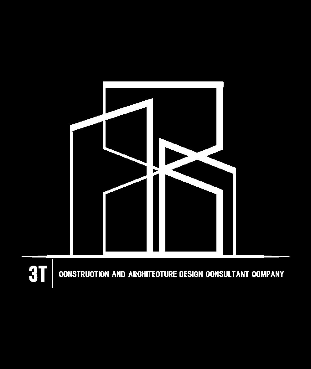
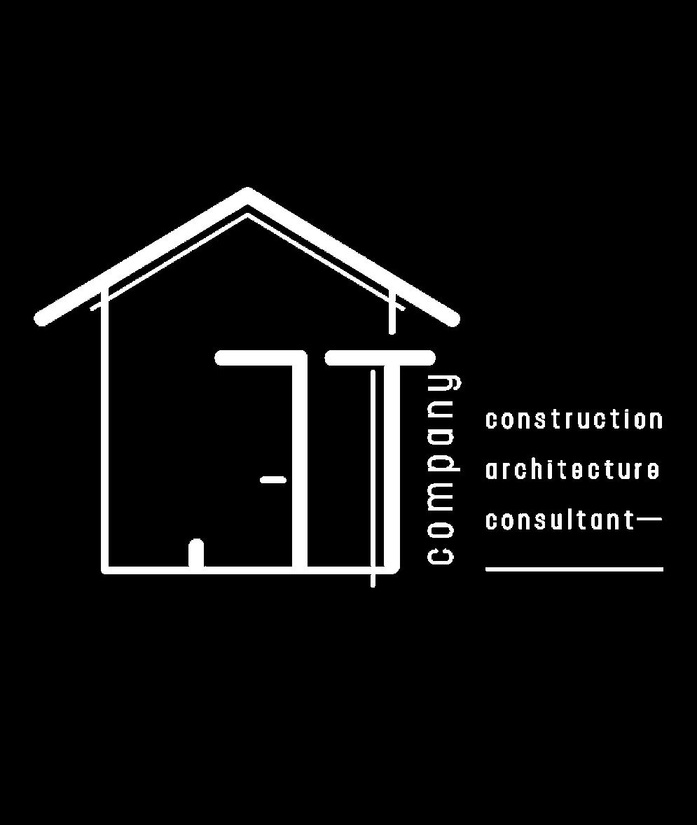
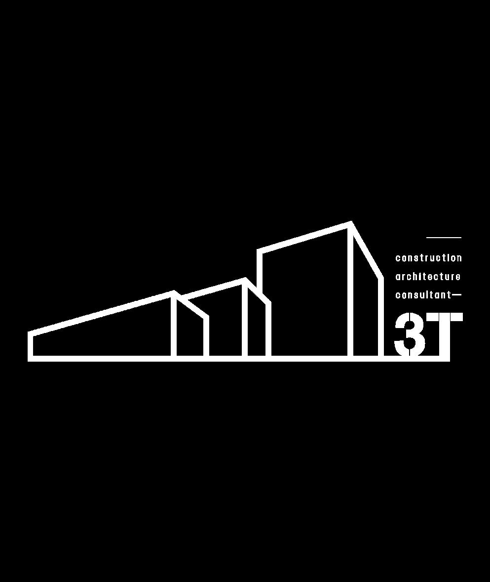
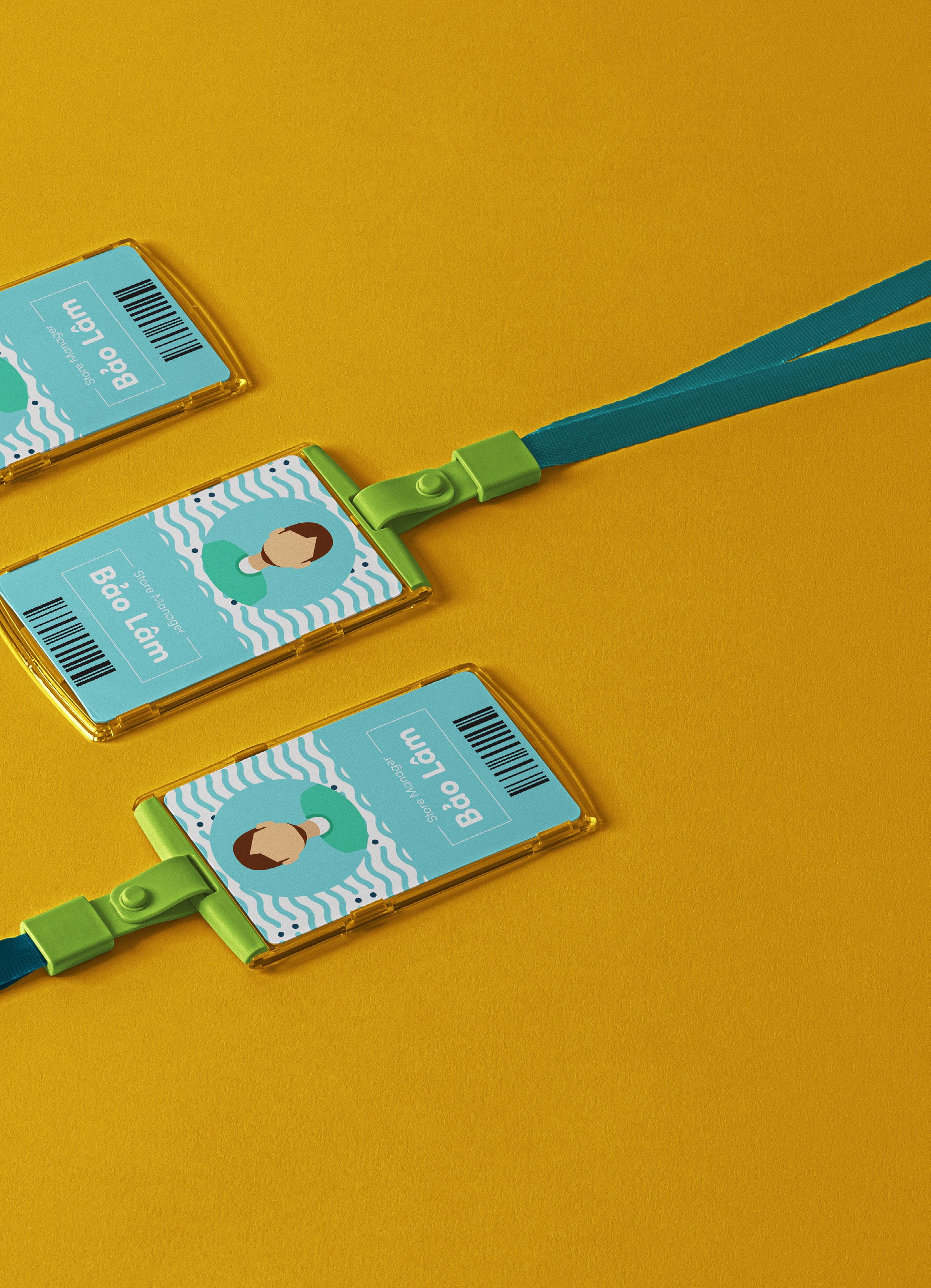
3T is an architectural design, construction and consulting company. The name 3T has assembled from the first letter of the father and son’s name in a family with a tradition of the architectural design.
The customer’s request is to identify the brand quickly. When looking at the logo, you can immediately know that it’s an architectural design company. The logo should be of a minimalist, sophisticated and modern design.
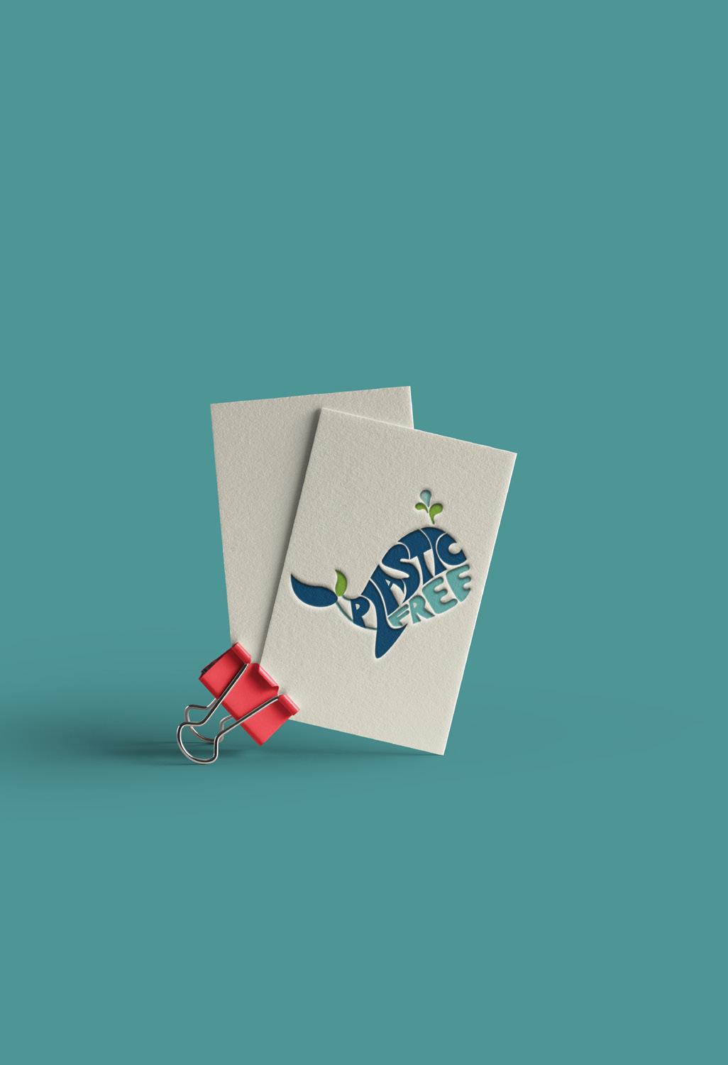
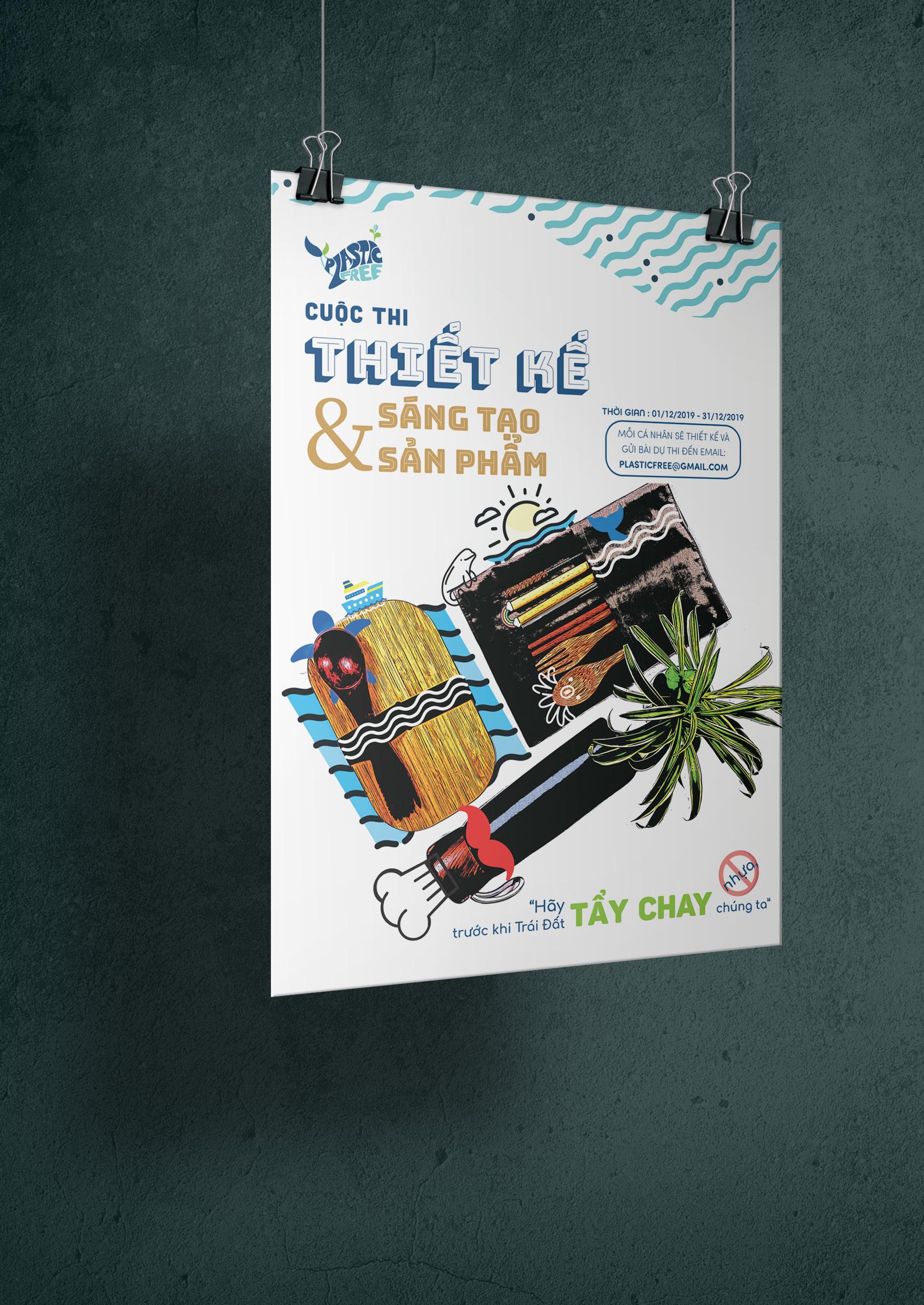
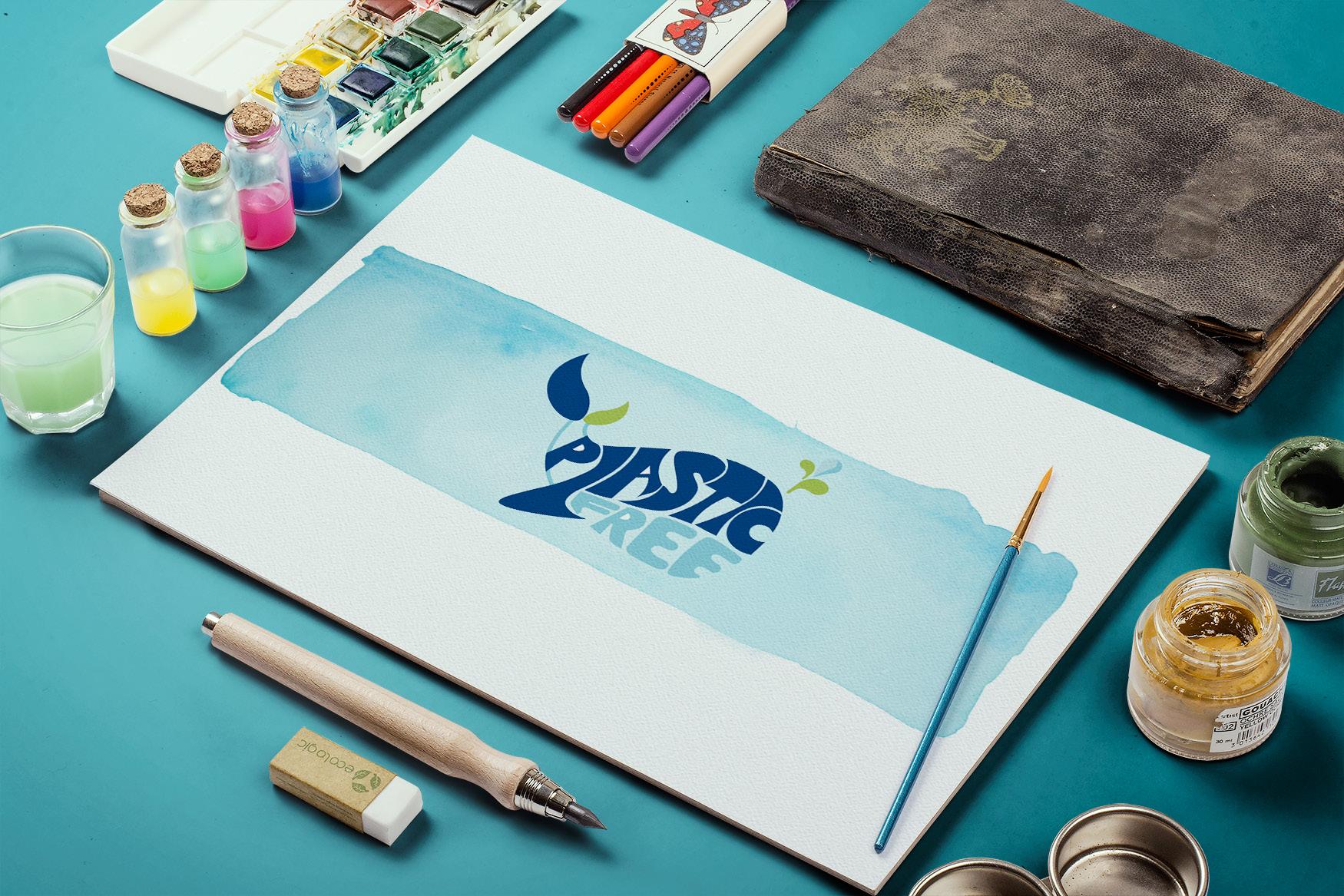
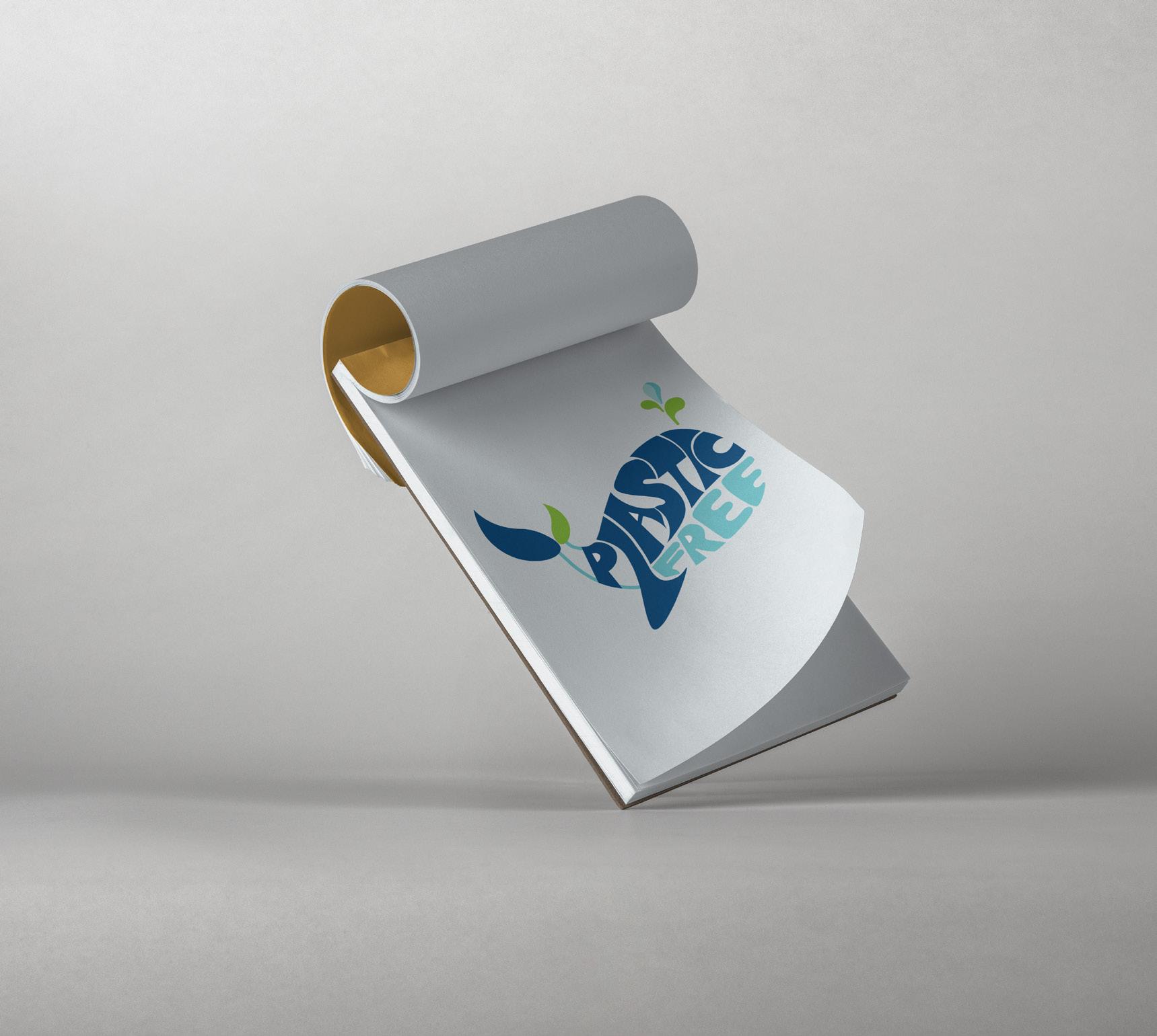
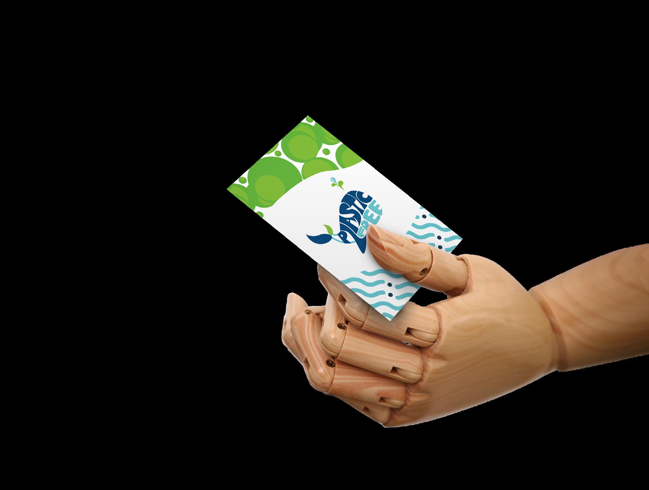
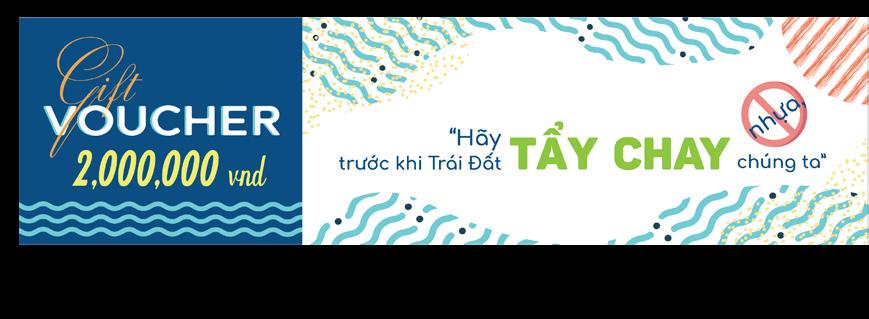
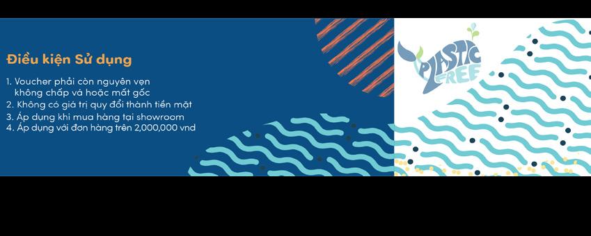
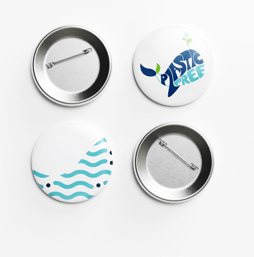
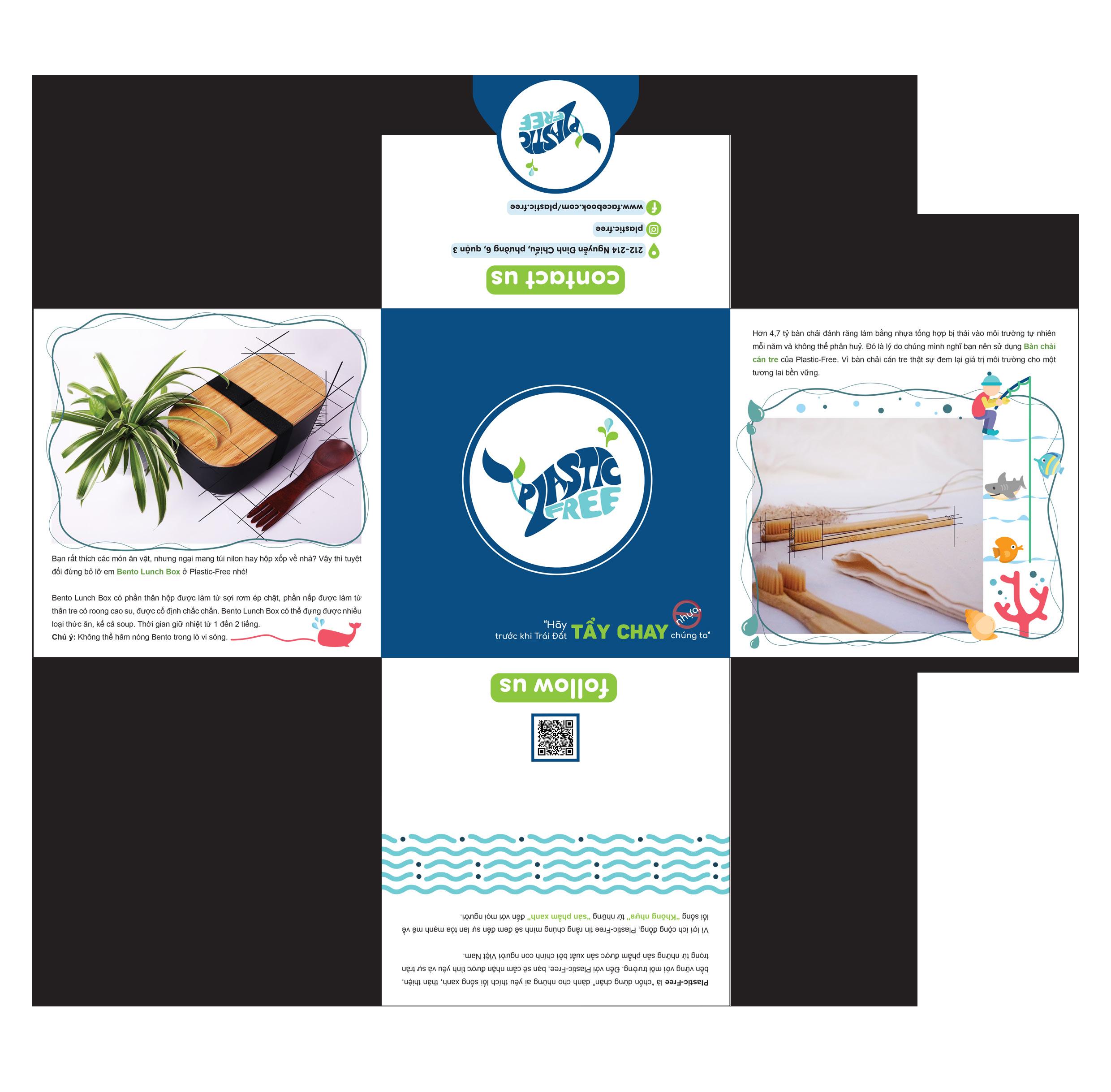
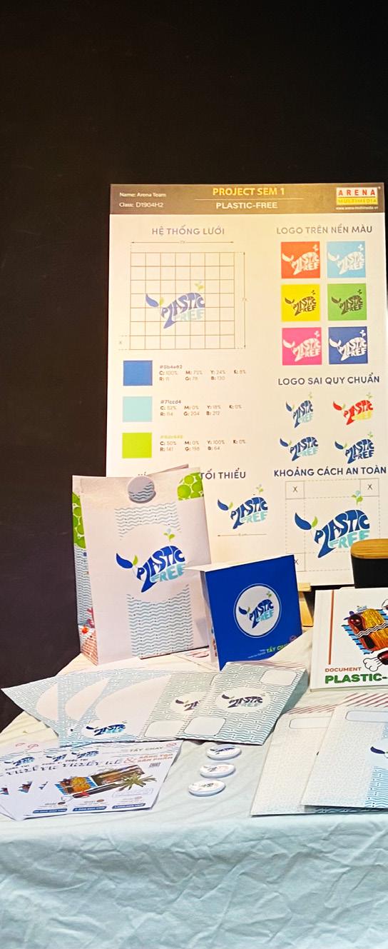
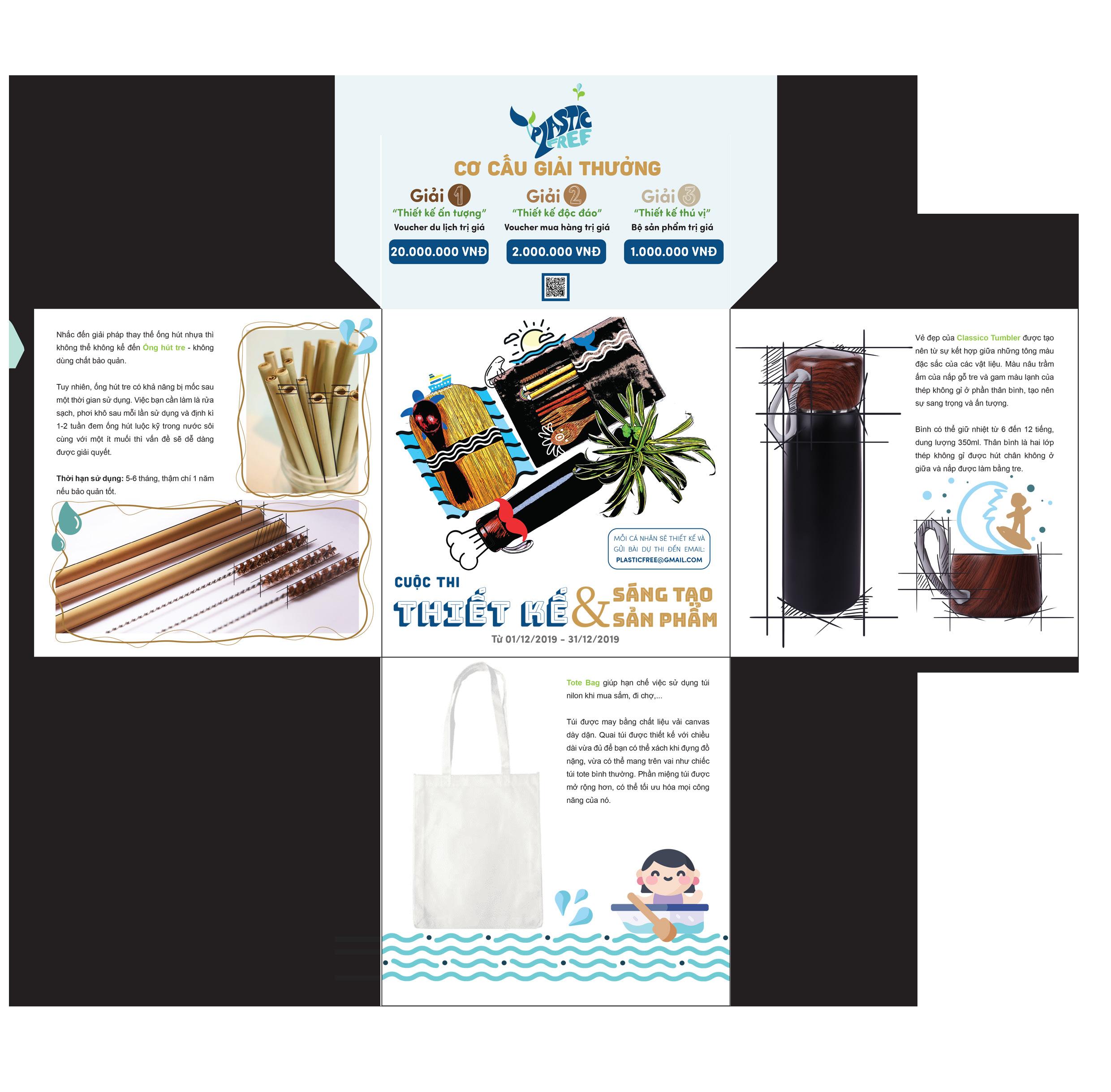
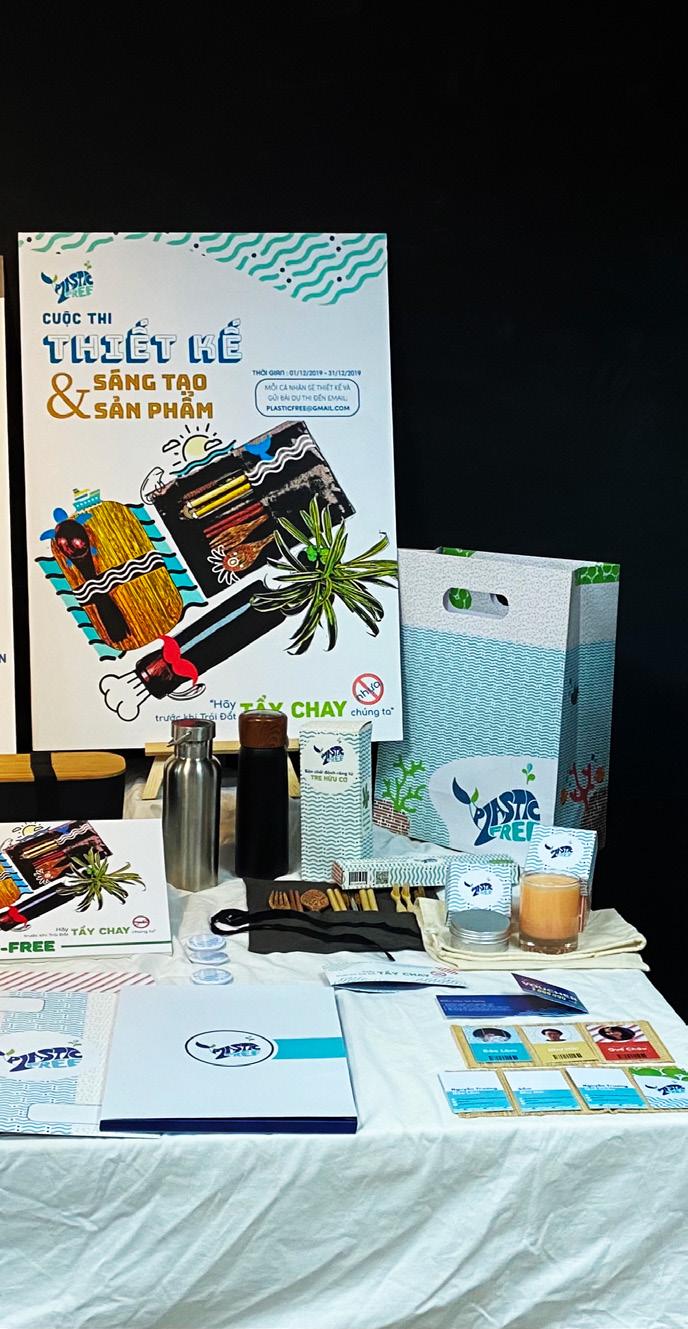
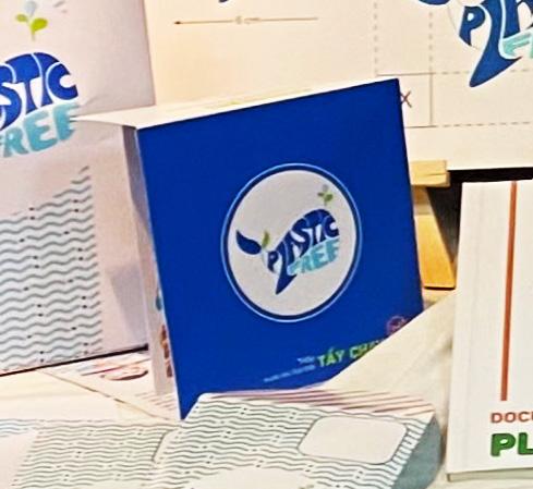
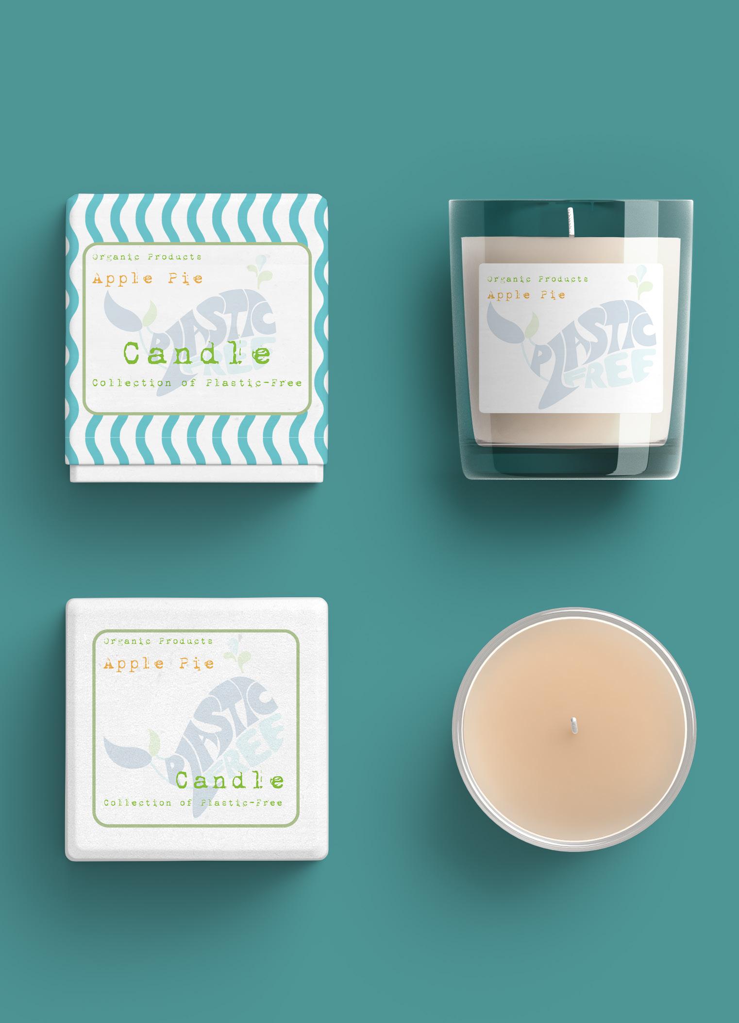
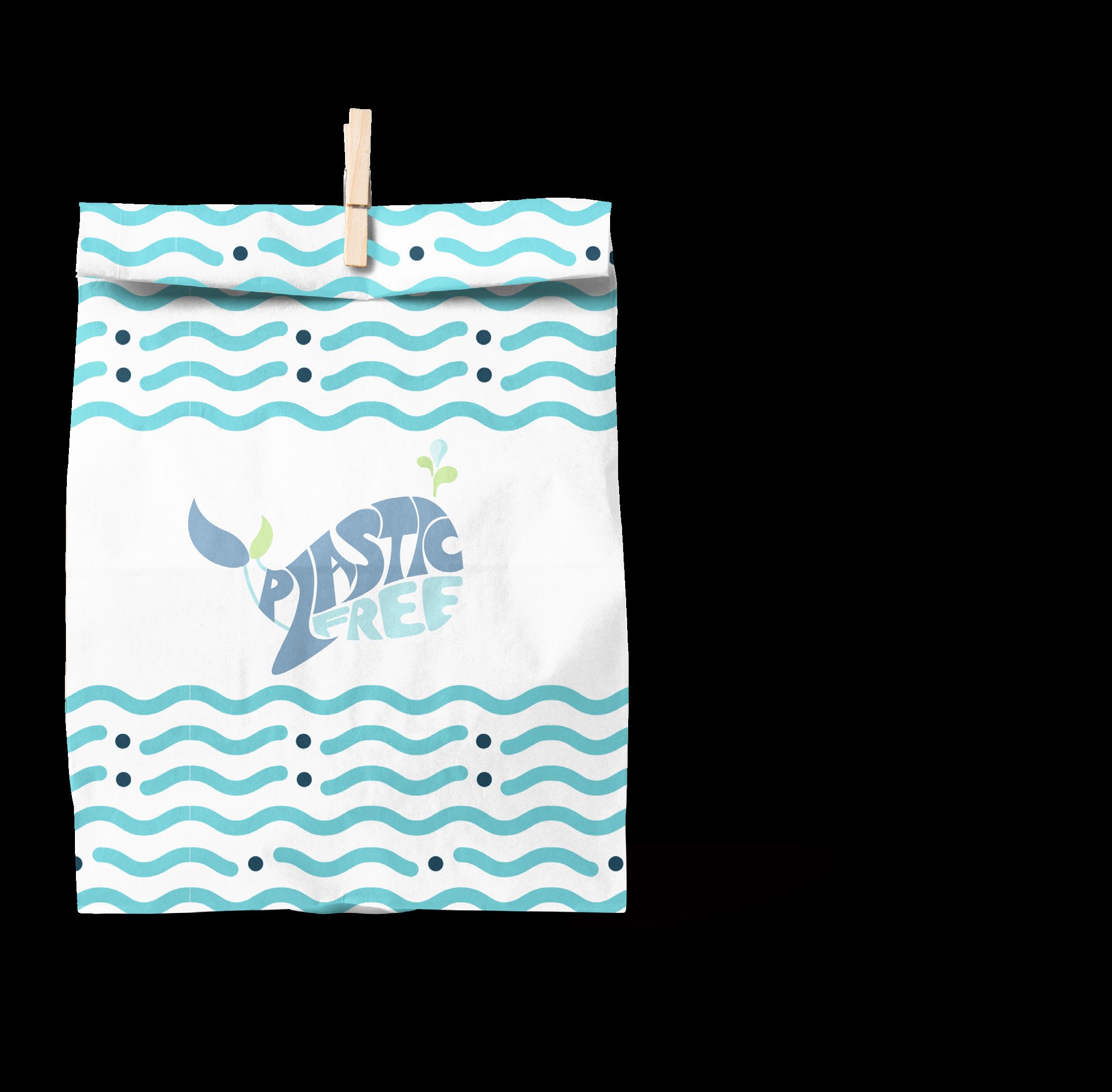
Plastic-Free is a retail brand of products made from nature such as bamboo, wood and says no to products made from plastic.
Logo idea:
- Plastic-Free’s logo has designed in a cute, chibi style that brings positive energy to everyone.
- Choose the whale as a brand image for the moving whale’s story who died from eating the enormous amount of trash ever in the Philippines.
- In Vietnam, especially in the seas, whales are sacred animals and bring luck, positive thoughts to everyone. Therefore, Plastic-Free wants to bring luck, positive thoughts, spread to people when using or seeing Plastic-Free products.
- Besides, according to Western culture, the whale is a symbol of the container. It could be a hidden treasure or sometimes a threatening disaster. With the current situation, perhaps it is a disaster threatening to take this large marine creature. When there is always plastic waste in its stomach.
From all of the meanings, combined to get the complete Plastic-Free logo:
- Use the letters contained in the Plastic-Free, arrange and stylize it into a whale image.
- The word “Plastic” has placed horizontally on the whale’s body, while the word “Free” has placed under the belly. In a sense, if everyone says no to plastic, then whales die from eating plastic waste will no longer happen.
- The fishtail has stylized from combine two leaves together.
The three colours that have used for this brand is cool colours. It’s blue in the sea, green in the tree. These colours represent a cool and comfortable look.
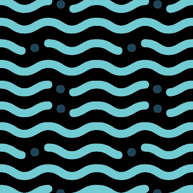
Pattern idea:
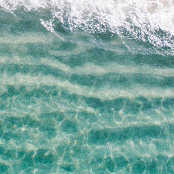
Wave pattern: It represents the sea, the ocean, as well as the origin of all life. It is a familiar and essential image - oceans make up more than 71% of the Earth’s surface. So this is the top concern of everyone when pollution is on the rise.

Forest pattern: It represents nature, the lungs of the Earth. Currently, the forests are gradually becoming less and less, mainly due to human causes.
Through those patterns representing Plastic-Free’s strategy: we should live in harmony with nature, starting with the smallest things, together making more positive changes for the Earth.
Letterhead

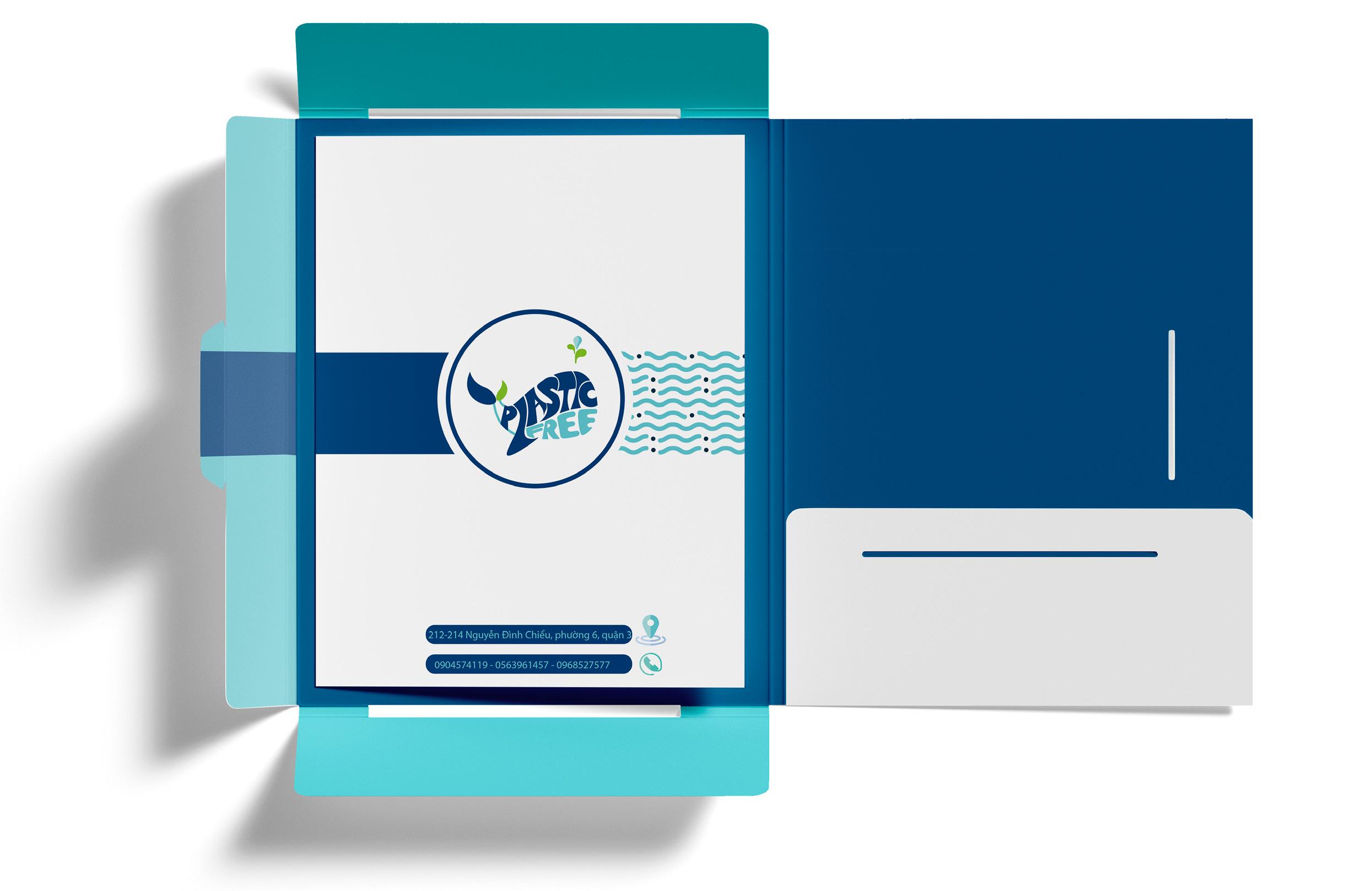
Brochure:
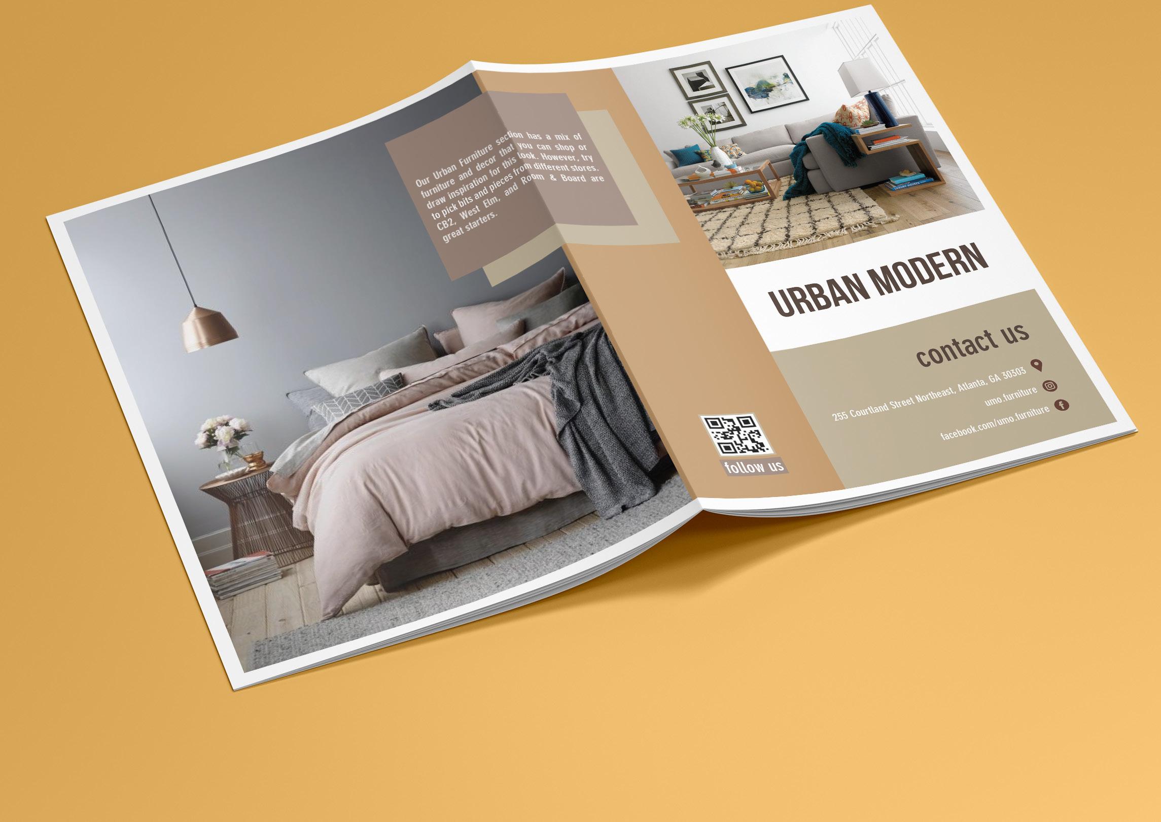
Plastic-Free’s brochure is designed in a new style, does not follow the old-style design. After folding the four corners of the booklet according to the available folds, we will create a compact square with 16x16cm.
New style but still very easy to use. Information will be printed on both sides, inside and outside of the paper. When customers want to read data, open a corner of the brochure to read it. It’s still easy for customers who want to open fully; the pamphlet’s size is still very compact and does not take up many areas.

typography design