TestDate: Processed:10-05-2015
Thetransitionperiodisfromdrydateto40daysaftercalving.
Superiormanagementofthetransitionperiodenablescowstobeginlactationsreadytomeetorexceedgeneticcapabilities.
ManagementMonitors:Thesesevenmonitorsformanagementofthetransitionperiodenablemanagerstofocusonthelogical challengesincludingdryperiods,firstmilk,fatproteinratio,udderhealth,daystofirstbreeding,survivalandstress.Usethese measurestoidentifyareasoffocusintransitioncowmanagement.
ThisreportassessesinformationbyCALVINGPERIOD.Eachperiodincludesallcowsthathavecalved.Becauseitisimportantto drawconclusionsandmakemanagementdecisionsbasedonsufficientinformation,cowsweregroupedaccordingtotheaverage numberthatcalvedpermonthinthepastyear:40ormorecalvings=monthly;20to39=bi-monthly,and;lessthan20=quarterly. Forcomparison,eachgraphalsoincludesthelastcorrespondingCalvingPeriodfromthepreviousyear.

ForeachManagementMonitor,a100pointscaleindicatesthelevelofsuccess.Thisconsistentmeasureofperformanceenablesa methodicalandquickassessmentofprogresstowardgoals.Goalsaresetatthesuccesslevelineachmonitorachievedbythetop 10%ofherdssimilarinsizetoyours.AlthoughthegoalofeachManagementMonitormightbedifferent,inallcases,atallbaronthe chartisbetterthanashortbar.And,100%meansthatthemanagementteamhasachievedalevelofmanagementofthetransition periodthatoptimizessuccess.
Pleasenoticethattwomanagementmonitorsarenotavailableasquicklyasothers.ForReproduction,informationisnotavailable untilafterVoluntaryWaitingPeriod(VWP)plus30days.Survivalinformationisnotavailableuntil60daysaftercalving.These graphswilldisplaycalvingperiodsthataredifferentfromtheothergraphs.
Overview
WhichelementsofTransitionCowManagementareworkingwell?
ThisgraphincludesonesetofbarsforeachofthesevenManagementMonitorsonthefollowingpages.Thecoloredbars representtheperformanceforcowsthatcalvedinthemostrecentperiod.Thepurplelineoneachbarmarkstheperformanceof thetop10%herdsforthespecificManagementMonitor.Performancehigherthanthepurplelinemeansthatyoursisa"top herd",and,lowerperformanceindicatesanopportunityforimprovement.Thisgraphshouldidentifyarea(s)thatdeserve managementattentioninthemostrecentperiod.Usegraphsandtablesonthefollowingpagesformoreinformation.
ForallgraphsexceptFatProteinRatioandUdderHealth,thenumbersofcowsassessedineachperiodaresummarizedinthetable below.ForFatProteinRatioandUdderHealth,anadditionaltableofcowcountsisincludedfollowingtheappropriatesectionto allowanassessmentofthe"power"ofthebarsonthegraphs.Ifthenumberofcowsincludedislessthan25andlessthan66%of thecowsthatcalvedhavesampledata,thenthebarsaredisplayedwith“lowconfidence”indicators.
10-02-2015 DAIRY DHI-403 Page1of6
TRANSITIONCOWMGTu
#1stLactCalved #2+LactCalved Aug14Sep14Oct14Nov14Dec14Jan15Feb15Mar15Apr15May15Jun15Jul15Aug15
NumberofCowsCalved 16152716251811141314212013 32282821321721252216253124
©2008-2015,DairyRecordsManagementSystems
TRANSITIONCOWMGTu
DryPeriods
TestDate:
Processed:10-05-2015
Researchintoshorteneddryperiodssuggested30dayshasadvantages.However,severalstudiesfounddryperiodsshorter than30daysresultedin5%to15%reducedmilkproduction.Dryperiodslongerthan70daysresultedin10%lessofmilk.


FirstMilk
Earlylactationmilkprovidesclearinsighttohowwellcowssurvivedthetransitionperiod.Loworzeromilkonthefirsttestday priorto40daysindicatesproblemsthatcouldbecausedbyseveralfactors.Highermilkpriorto40daysindicatesthatdrymatter intakeisincreasingproperlyfollowingcalving,and,highmilkcanmakeiteasierforcowstoreachtheirpotentialforpeakmilk.
10-02-2015
DAIRY
HENRYSMITH DHI-403 Page2of6
SMITH
FARM
<30Days PercentofDryPeriodsOutside30to70dayRangefor2+Lactation >70Days 2+Lact Aug14Sep14Oct14Nov14Dec14Jan15Feb15Mar15Apr15May15Jun15Jul15Aug15 #1stIncluded Aug14Sep14Oct14Nov14Dec14Jan15Feb15Mar15Apr15May15Jun15Jul15Aug15 #2+Included Top10% Weretheytheproperlength? Arefreshcowsproducingwell? >120Days Top10% PercentofFreshCowsinAug15WithFirstMilk... 1stLact <20lbs<30lbs<40lbs<50lbs<60lbs 64 6834 3 1610241320128121313151913 31222520291218222016202920 88846 551015 ©2008-2015,DairyRecordsManagementSystems
FatProteinRatio(FPR)

Theratioofmilkfat%toprotein%(FPR)canindicatemetabolicproblemsresultingfromaninadequatetransitionmanagement program.AnormalFPRof1.0to1.6indicatesthatcowsbeganthelactationeatingwell,aremaintainingbodyweightandhave alowincidenceofmetabolicandinfectiousdisorders.AlthoughFPRdoesnotindicatewhetherfat%orprotein%isatthe improperlevel,itisanalertforpotentialproblems.
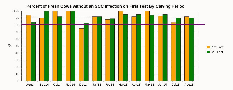
AlthoughthereisnoabsolutethresholdofSCCforsubclinicalmastitis,itisusuallyacceptedthatacowwith200,000cellsperml or4.0SCCscorehasmastitis.Ahighpercentageofinfectedcowsearlyinlactationindicatespotentialproblemsindrycow treatmentprogramsordrypenconditions.Note:cured=highatdryoffbutlowatcalving,andchronic=highatdryoffandcalving.
10-02-2015 SMITHDAIRYFARM HENRYSMITH DHI-403 Page3of6 TRANSITIONCOWMGTu TestDate: Processed:10-05-2015 55-99-9999
UdderHealthfor2+LactationByCalvingPeriod %NewCases #Included %Chronics %Cures Aug14Sep14Oct14Nov14Dec14Jan15Feb15Mar15Apr15May15Jun15Jul15Aug15 #1stIncluded #2+Included #1stIncluded #2+Included Aug14Sep14Oct14Nov14Dec14Jan15Feb15Mar15Apr15May15Jun15Jul15Aug15 Aug14Sep14Oct14Nov14Dec14Jan15Feb15Mar15Apr15May15Jun15Jul15Aug15 Top10% Top10% Isitappropriateonthefirsttest? WhatpercentoftheherddoesnothaveanSCCinfectiononthefirsttest? 1610241320128121313151913 31222520291218222016192920 1610241320128121313151913 31222520291218222016192920 3122252028618222016192920 10876556535 67675 13273225296733321525371410 ©2008-2015,DairyRecordsManagementSystems
UdderHealth
55-99-9999
Reproduction
Arecowsreadytobreedsoonenough?
TestDate: Processed:10-05-2015
AlthoughlengthofVoluntaryWaitingPeriods(VWP)canvary,cowsshouldbebredthefirsttimewithin30daysoftheendof theperiod.Effectivemanagementofthetransitionperiodincludingfeedmanagementandminimizationofstressorswillenable cowstobereadytoreturnsoontoreproductiveactivity.ThirtydaysafterVWPallowsallcowstoexhibitheatatleastonce.
SurvivalArecowssurvivingto60daysinmilk?

Anearlyexitfromthedairycanresultfromproblemsassociatedwiththetransitionandcalvingperiod.Whencowsleaveprior to60days,theyprobablyperformedatalowlevelsincecalvingandhavenothadanopportunitytopayforthecostsofthedry period.Thelevelofdeathsduringthisperiodisaparticularlyimportantindicatorofhowwellthetransitionperiodismanaged.

10-02-2015
SMITHDAIRYFARM HENRYSMITH DHI-403 Page4of6
TRANSITIONCOWMGTu
Top10% #1stIncluded Jun14Jul14Aug14Sep14Oct14Nov14Dec14Jan15Feb15Mar15Apr15May15Jun15 #2+Included 22151615271625181114131421 29273228282132172125221625
1stLact-Died 2+Lact-Died PercentofCowsLeft+DiedandDiedinFirst60DaysByCalvingPeriod 1stLact-Left 2+Lact-Left 46 45 86 6203019469 713142953141216 #1stIncluded #2+Included Jul14Aug14Sep14Oct14Nov14Dec14Jan15Feb15Mar15Apr15May15Jun15Jul15 15 27 16 32 15 28 27 28 16 21 25 32 18 17 11 21 14 25 13 22 14 16 21 25 20 31
Top10%
©2008-2015,DairyRecordsManagementSystems
DistressedCows

Whatpercentofcowswerenotdistressedduringtransitionperiod?
Cowsthathavebeendistressedduringthetransitionperiodareatriskforlessthanoptimumperformancewhentheyleavethe freshcowprogram.Often,multiplestressorscompoundproblemsandcancausecowstofailduringthelactation.An examinationofinformationfromthesecowscanofferinsightstoopportunitiesforimprovementinfuturemanagementofthe transitionperiod. Top10%
10-02-2015 SMITHDAIRYFARM HENRYSMITH DHI-403 Page5of6
u TestDate: Processed:10-05-2015 55-99-9999
TRANSITIONCOWMGT
PercentofCowsNotDistressedbyReasonforLactation1ByCalvingPeriod Abortion SCCInfection Clv.Easeis3-5 Stillbirth Twins %NotDistressed Aug14Sep14Oct14Nov14Dec14Jan15Feb15Mar15Apr15May15Jun15Jul15Aug15
PercentofCowsNotDistressedbyReasonforLactations2+ByCalvingPeriod Abn.DryPeriod SCCInfection Clv.Easeis3-5 Stillbirth Twins Abortion Aug14Sep14Oct14Nov14Dec14Jan15Feb15Mar15Apr15May15Jun15Jul15Aug15 %NotDistressed 911009610010010010010010094929796 949010010075928810092100938492 8410092100839289959594959090 100100100100100100100100100100100100100 100100100100100100100100100100100100100 10080939496100100100100100959592 9493931009410090929594848783 100100100100100949110010010095100100 10089100956982100929188928488 100100100100100100100100100100100100100 9710096100100100100100100941009796 9480939480839110092100908585 81868995567681848675766875 ©2008-2015,DairyRecordsManagementSystems
Thefollowinglistincludescowsthatcalvedinthe40dayspriortotherecenttestdaywithanSCCinfectionand/ormilklessthan: Holsteinlactation1=40,lactation2+=50;otherbreedslactation1=30,lactation2+=40.RedhighlightslowmilkorhighSCCand yellowindicateotherstressors.Thesecowsarecurrentlystressedandmightneedattention.
10-02-2015 SMITHDAIRYFARM HENRYSMITH DHI-403 Page6of6
Processed:
TRANSITIONCOWMGTu TestDate:
10-05-2015 55-99-9999
Calving Date Peak DIMMilkMilkFPR ProFat Days Dry Lact SCC Test SCCT wSBEase Clv 1stPrev Lact 1st Test Pred1st Test 1st Test Grp Ab BarnName FreshCowswithLowMilkORHighSCCCalvingfrom08-24-15to10-02-15 413737 Aug2722131495.03.31.50 107 373230 374027 Sep624118524.62.91.60 98 3430107 394319Sep145323802.93.50.80 44 149362 426313 Sep2022135524.03.31.20 115 214246 355612 Sep2125119535.13.21.60 93 1600303 39656Sep275923966.64.01.70 60 3033940 42535 Sep2822113535.74.91.20 82 214348 SB=StillbirthTw=TwinsAb=Abortion ©2008-2015,DairyRecordsManagementSystems
