ABOVE: LOUISE PARAMOR Supermodel (Installation Shot), 2014 BELOW: PETER MALONEY Black Sheep - White Goat, 2014, acrylic on polyester, 170cm x 130cm
ABOVE: ARCHIE MOORE Courting Blakness, 2014 Installation Shot FRONT: PETER VANDERMARK Lux ductor (tryptich), 2014, plywood, acrylic paint, acrylic mirror, 20 x 45 x 5.5cm
MODULATIONS PETER VANDERMARK
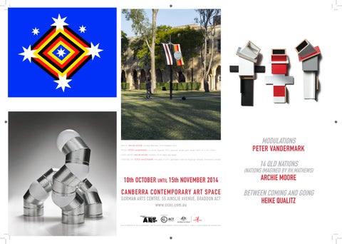
OVER ABOVE: ARCHIE MOORE Kamilaroi, 2014, digital flag design OVER BELOW: PETER VANDERMARK Articulation III, 2011, galvanised metal ductingacrylic spheres, dimensions variable
14 QLD NATIONS
(NATIONS IMAGINED BY RH MATHEWS)
10th OCTOBER UNTIL 15th NOVEMBER 2014
ARCHIE MOORE
CANBERRA CONTEMPORARY ART SPACE
BETWEEN COMING AND GOING HEIKE QUALITZ
GORMAN ARTS CENTRE, 55 AINSLIE AVENUE, BRADDON ACT www.ccas.com.au
CCAS IS SUPPORTED BY THE ACT GOVERNMENT, AND THE AUSTRALIAN GOVERNNENT THROUGH THE AUSTRALIA COUNCIL, IT’S ARTS FUNDING AND ADVISORY BODY.