By

By


In today’s regulated building industry, achieving full accreditation isn’t just a milestone – it’s a necessity. Accreditation empowers building designers to align with the latest laws, codes, and best practices, ensuring they remain competitive in a challenging built environment.
The Building Designers Association of Australia (BDAA) is dedicated to supporting building designers on this journey by streamlining the accreditation process. We’ve modernised our systems, removed outdated documents, and refined the application process to make accreditation simpler, faster, and more accessible than ever.
Accreditation is more than a title – it’s a formal recognition of your expertise, issued by state or federal authorities. It demonstrates your ability to meet industry standards and deliver exceptional results for your clients. In Tasmania, Queensland, and Victoria, building designers are required to be licensed or registered to comply with state-specific regulations. Accreditation provides the proof of competency and quality that both regulators and clients demand.
For building designers, accreditation isn’t just about compliance; it’s about earning the trust of your clients. It assures them that their projects are in the hands of a skilled professional who is committed to delivering outstanding results. Every accredited building designer helps raise the bar for the industry, guaranteeing the quality of homes and businesses across Australia.
Interiors shape the way we live, work, and connect. They are not just backdrops but finely tuned environments that reflect innovation, purpose, and an ongoing dialogue between tradition and modernity.
In this edition, we explore a series of projects that embody that dialogue. A Federation-era home in Neutral Bay finds new life through a striking steel-and-sandstone addition that frames an unforgettable Harbour Bridge view. In Melbourne, the compact “Itty Bitty House”
transforming a small site into a generous, uplifting home. And in Kiama, a once utilitarian basement becomes the Cedar Cutters Sports Bar, a vibrant space where detail, materiality, and atmosphere combine to
Alongside these features, we examine the materials and approaches shaping interiors today, from the enduring strength of polished concrete to the warmth of timber panelling and the revival of patterned tiles. These insights speak to the power of detail and the way craft
This issue celebrates interiors that are elegant, efficient, and deeply
All the information needed to create your own winning designs in By Design


This free event invites building designers, industry professionals, and product specialists to connect, share and explore.
Whether you are seeking cutting-edge products, business support services or inspiration for your next project, the Trade Show delivers practical value.

Take part in keynote talks, panels, workshops and networking.
This conference will challenge assumptions, showcase innovation, and elevate the role of design in shaping the housing future of our nation.

The National Awards Gala Dinner is the premier social and celebratory event of the Festival of Design.
This black-tie evening brings together Australia’s leading building designers, architects, energy assessors, consultants, and industry supporters to honour the year’s most outstanding design achievements.


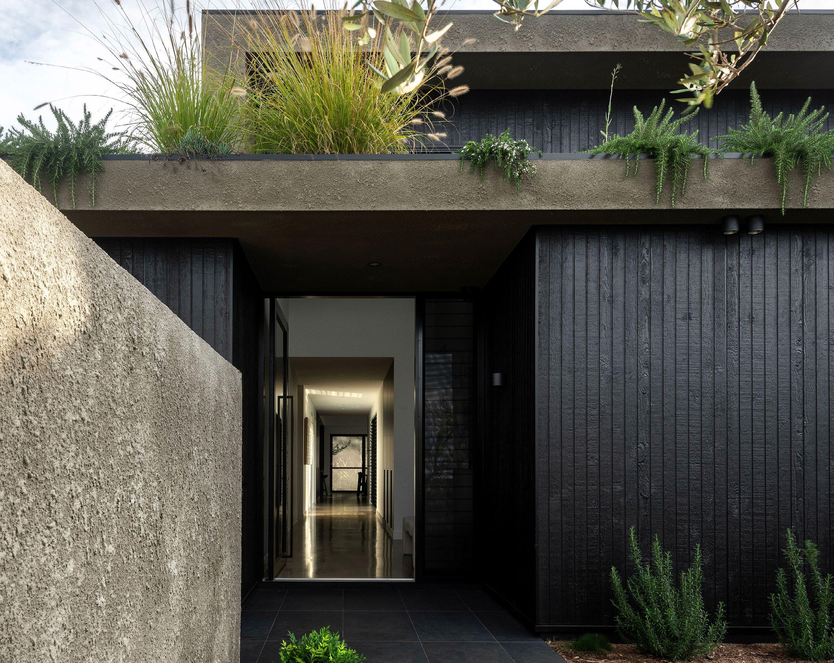
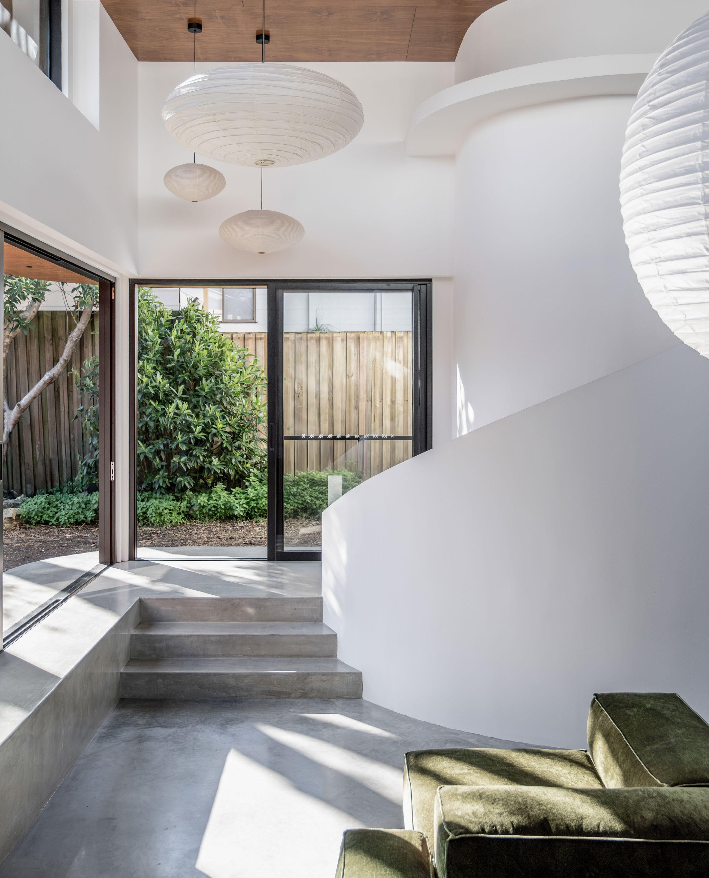
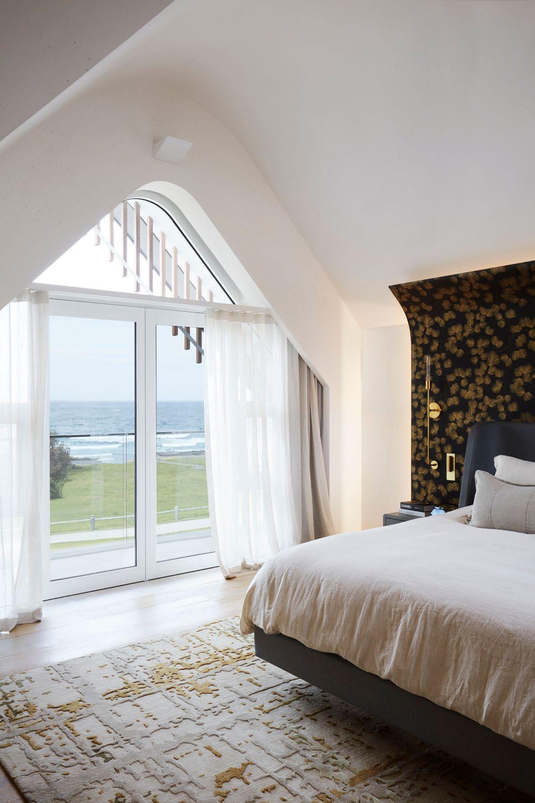
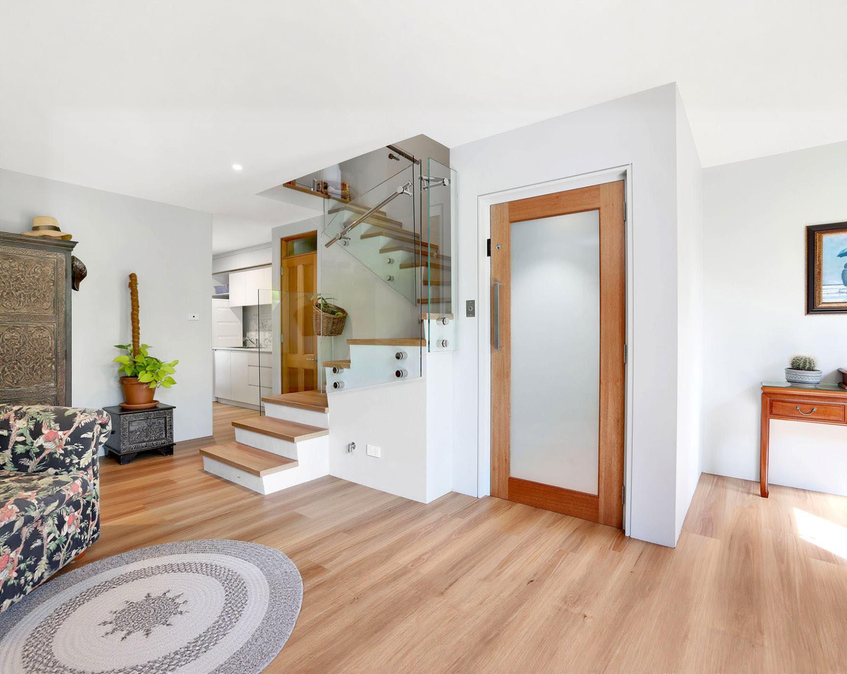
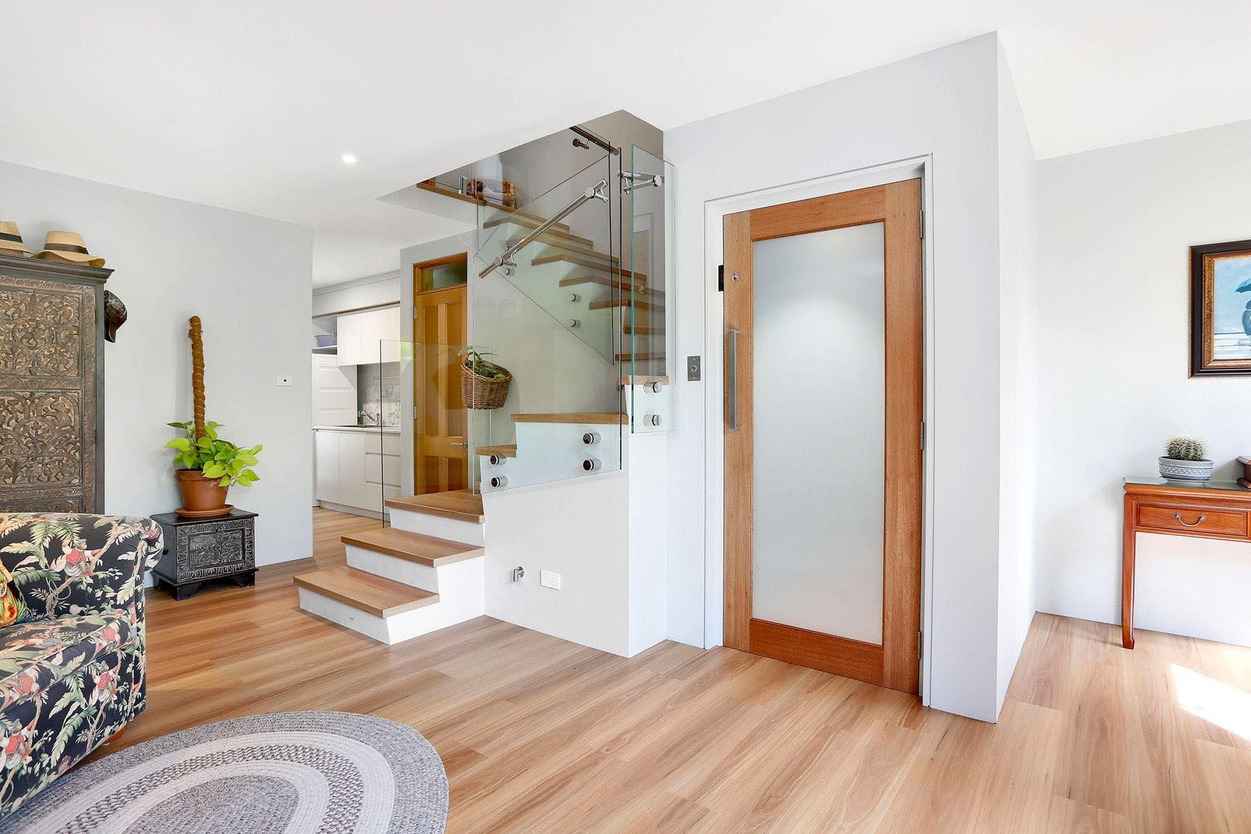
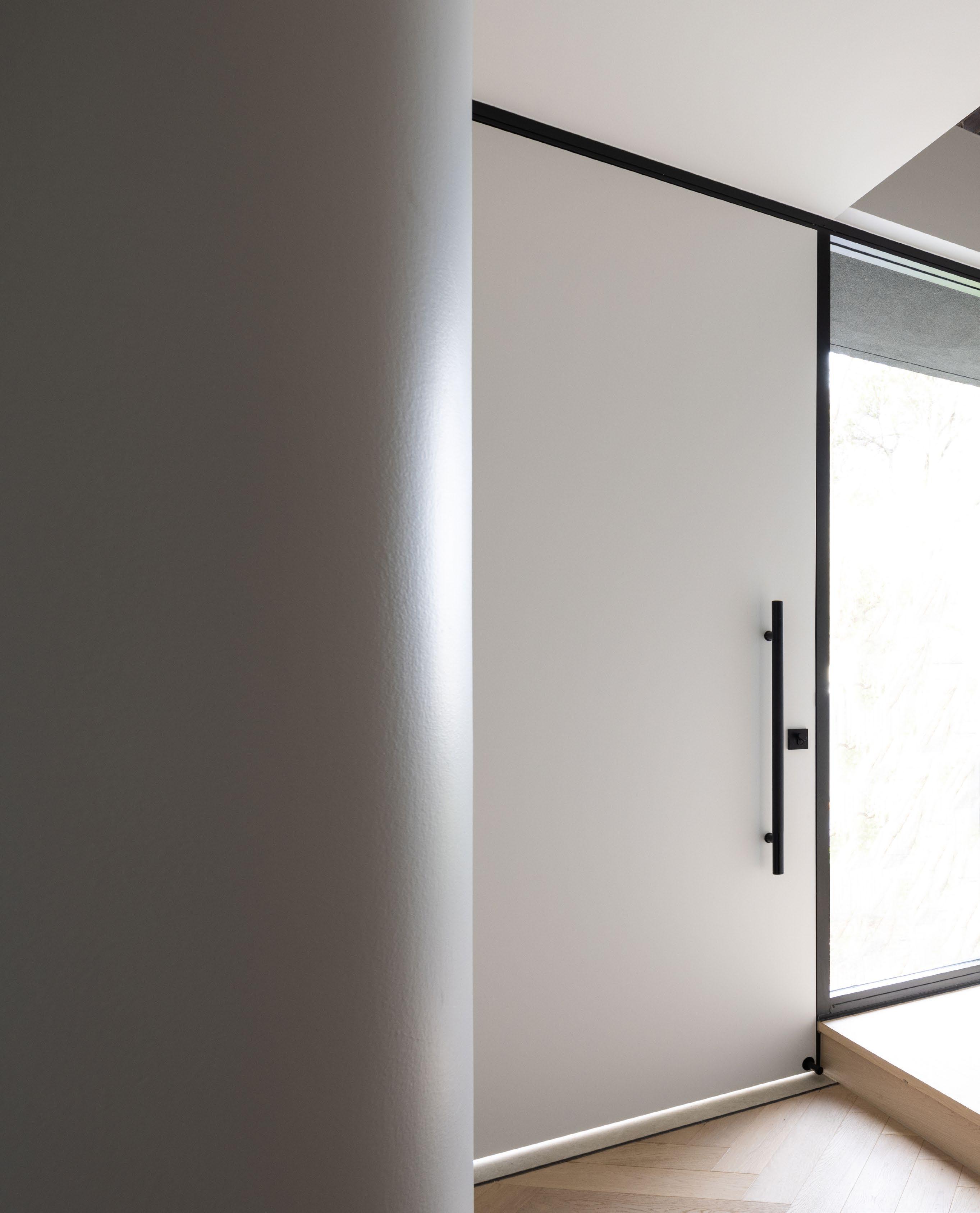
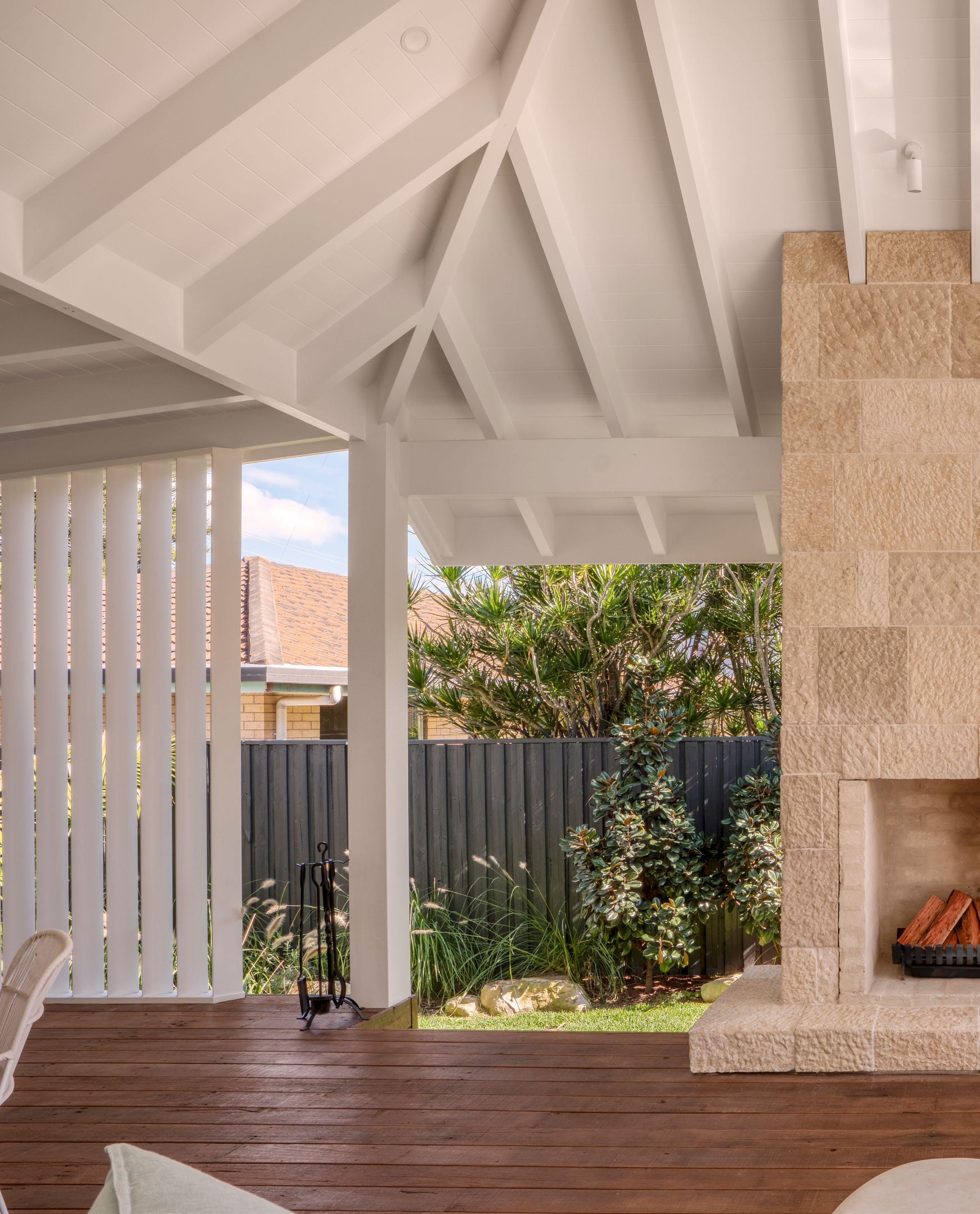
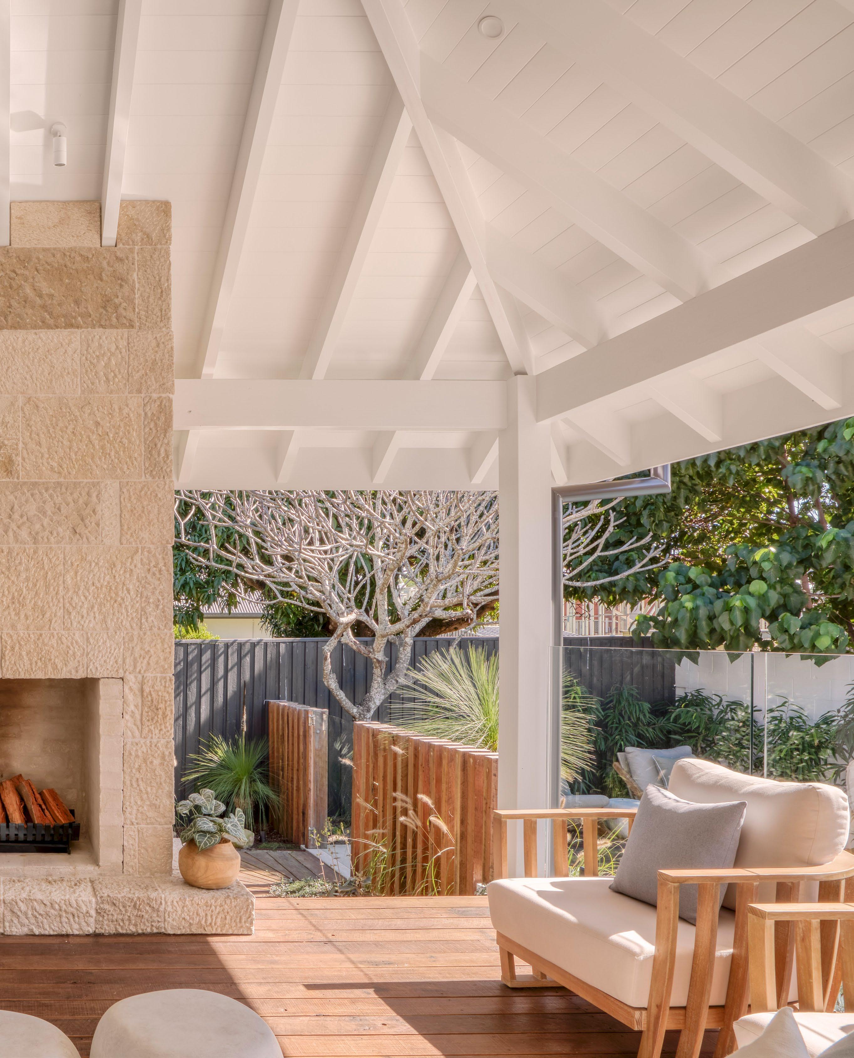
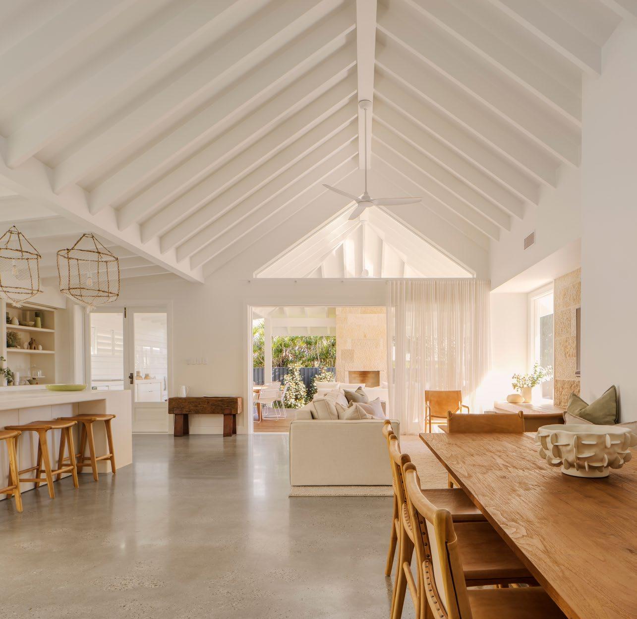
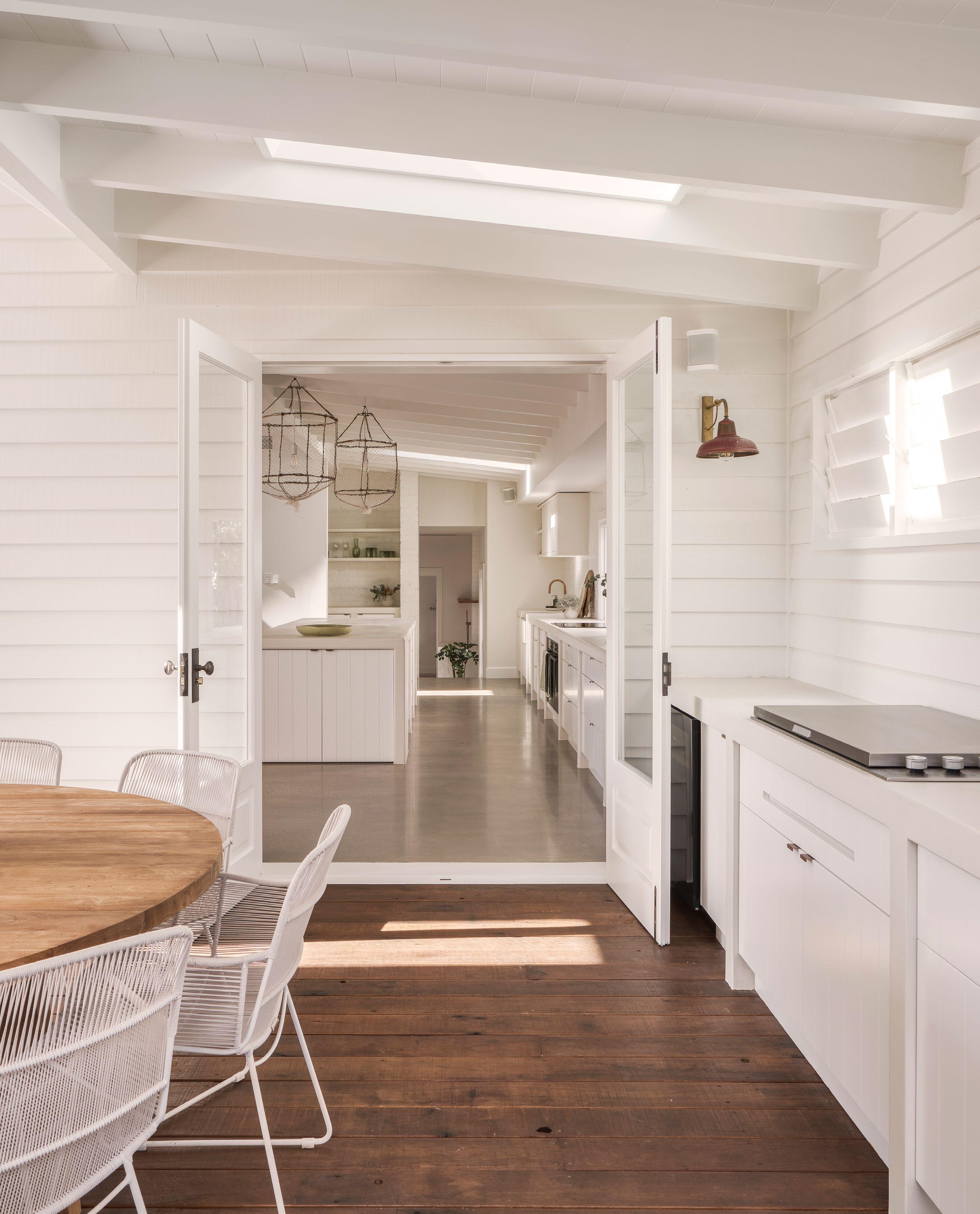
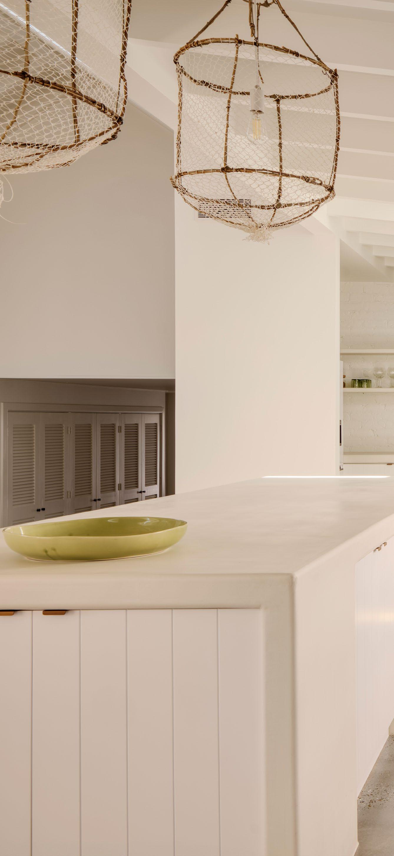
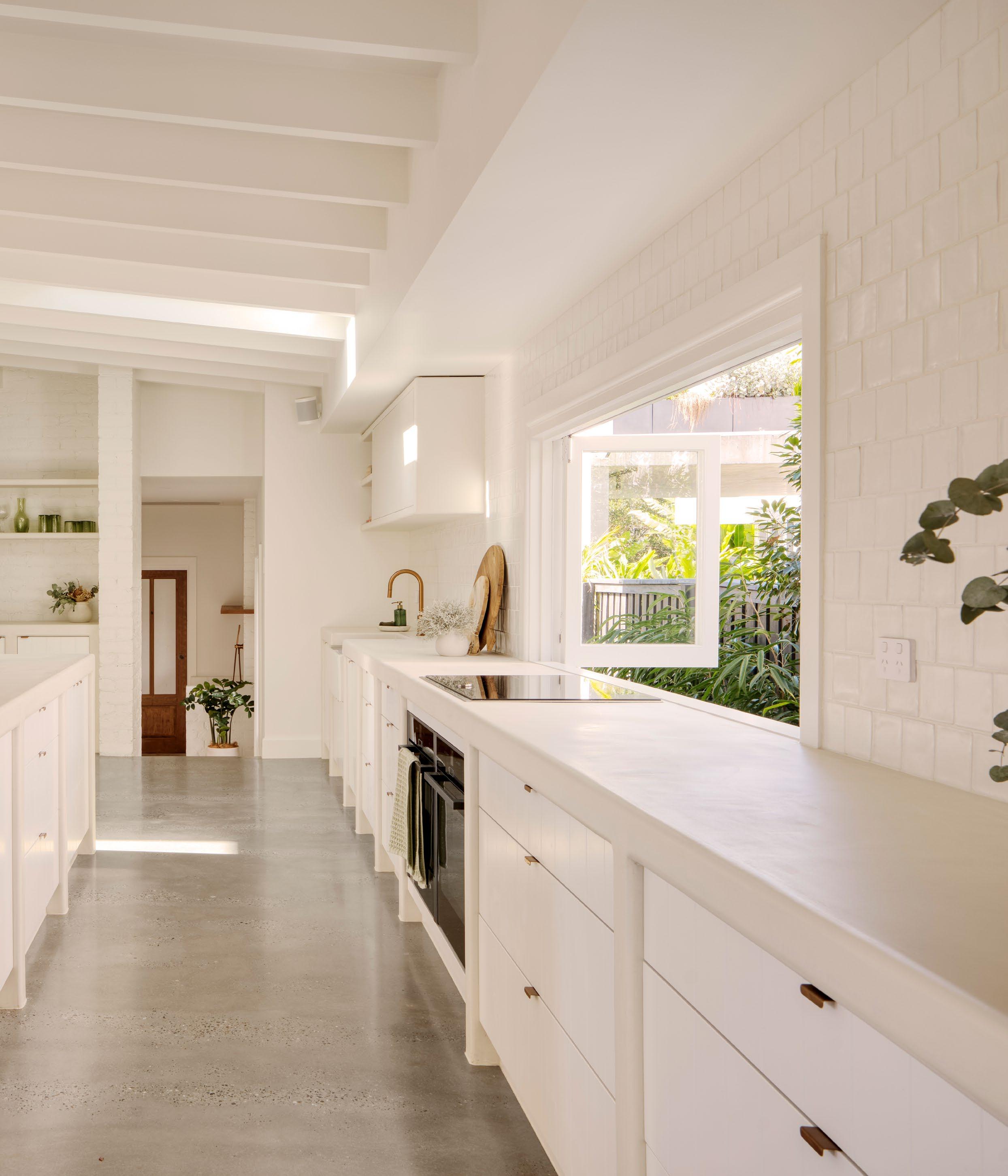
In Sydney’s Neutral Bay, a Federation-era residence is reimagined with a sculptural black steel and sandstone extension that balances legacy and light.
The renovation of Bay House is less about reinvention and more about respectful evolution. When Space Chasers took on the transformation of this Federation home, they inherited not just ornamental plaster ceilings and leadlight windows, but a sense of architectural memory - one that the new owners were eager to preserve even as they sought openness and functionality.
The brief was precise: erase the dark, disconnected conservatory at the rear and replace it with a contemporary space worthy of the city views it had long concealed. At the same time, the existing home - rich with heritage details - needed a quiet but confident partner, not a competing statement. The result is a clean-lined, highceilinged pavilion of sorts, sheathed in black steel and paired with traditionally pointed sandstone to mirror the materiality of the original structure.
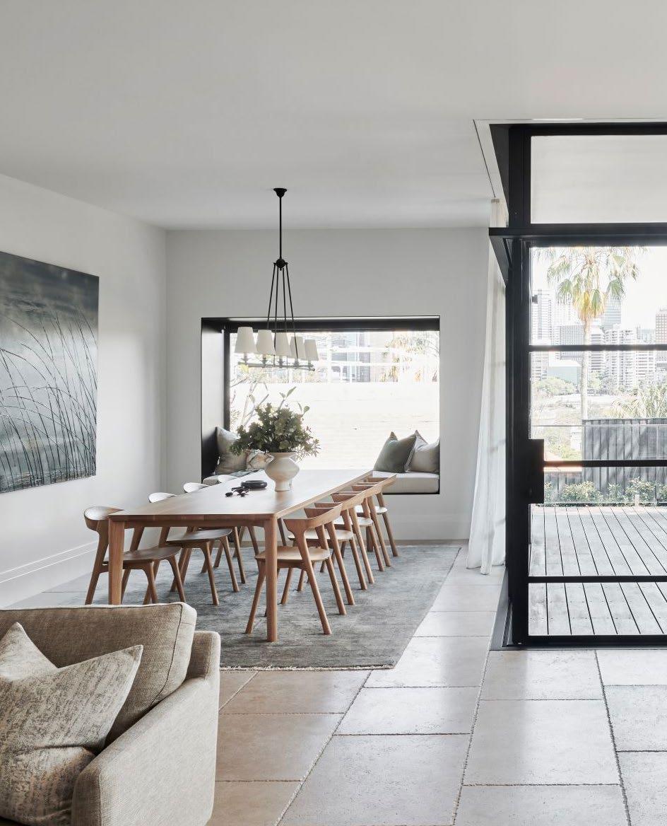
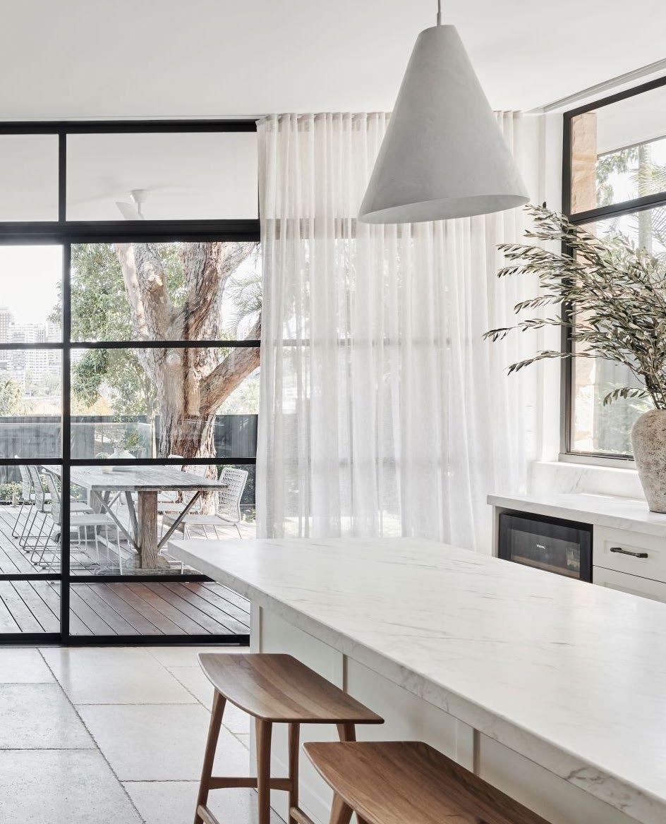
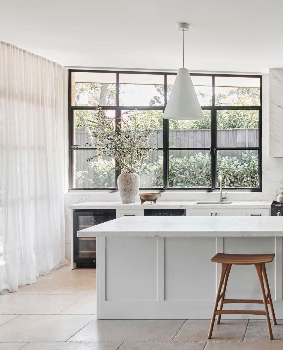
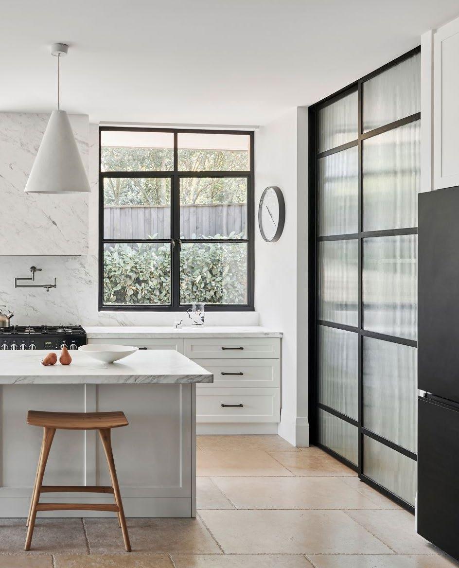
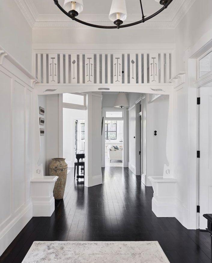
It’s the interplay of contrasts that defines the project. Inside, the interiors are unified by a palette of white, pale sandstone flooring, and crisp detailing - especially evident in the new kitchen, where black steel-framed glazing wraps around marble benchtops and cabinetry. The open-plan layout is uncharacteristic of Federation homes but handled here with sensitivity, allowing the historical and the contemporary to co-exist rather than clash. A standout gesture is the cantilevered roof over the rear deck - both a feat of engineering and an architectural punctuation mark, creating a shaded outdoor room while framing a cinematic view of the Harbour Bridge.
The project’s spatial elegance is matched by its precision. The site’s steep drop and constrained access demanded ingenuity - cranes were used to lift oversized elements, including a custom-fabricated steel-framed window that now anchors the living area. Throughout the build, the language of the home was never lost: details such as the decorative steel grill at the front gate inspired the use of steel inside, allowing a subtle thread to run from entry to extension.
For a family entering a new chapter - downsizing but not compromising - Bay House offers a retreat that is at once grounded in heritage and future-facing. It is a house where light, material and memory are given equal weight, and where the design speaks in quiet, confident tones.
It is a house where light, material and memory are given equal weight.
Weathertex provides commercial projects with robust, sustainable cladding solutions designed to perform under pressure.
From bold architectural statements to high-traffic spaces that demand resilience, Weathertex brings together style and strength in one solution. Architects, designers and builders can rely on our cladding to achieve their vision without compromising on performance.
FREE ONLINE sample service. Simply go to weathertex.com.au for cladding you can trust, naturally.
All Weathertex products are Global GreenTag PHD PLATINUM certified!
Plus Weathertex Natural Range was the first manufactured product globally to receive a Platinum LCARate™ and first in the cladding category to receive Platinum HEALTH HealthRATE™ certification from Global GreenTag for Weathertex’s Natural Range.
Explore our sustainable third party accreditations online. Visit weathertex.com.au to create the look you want, naturally.
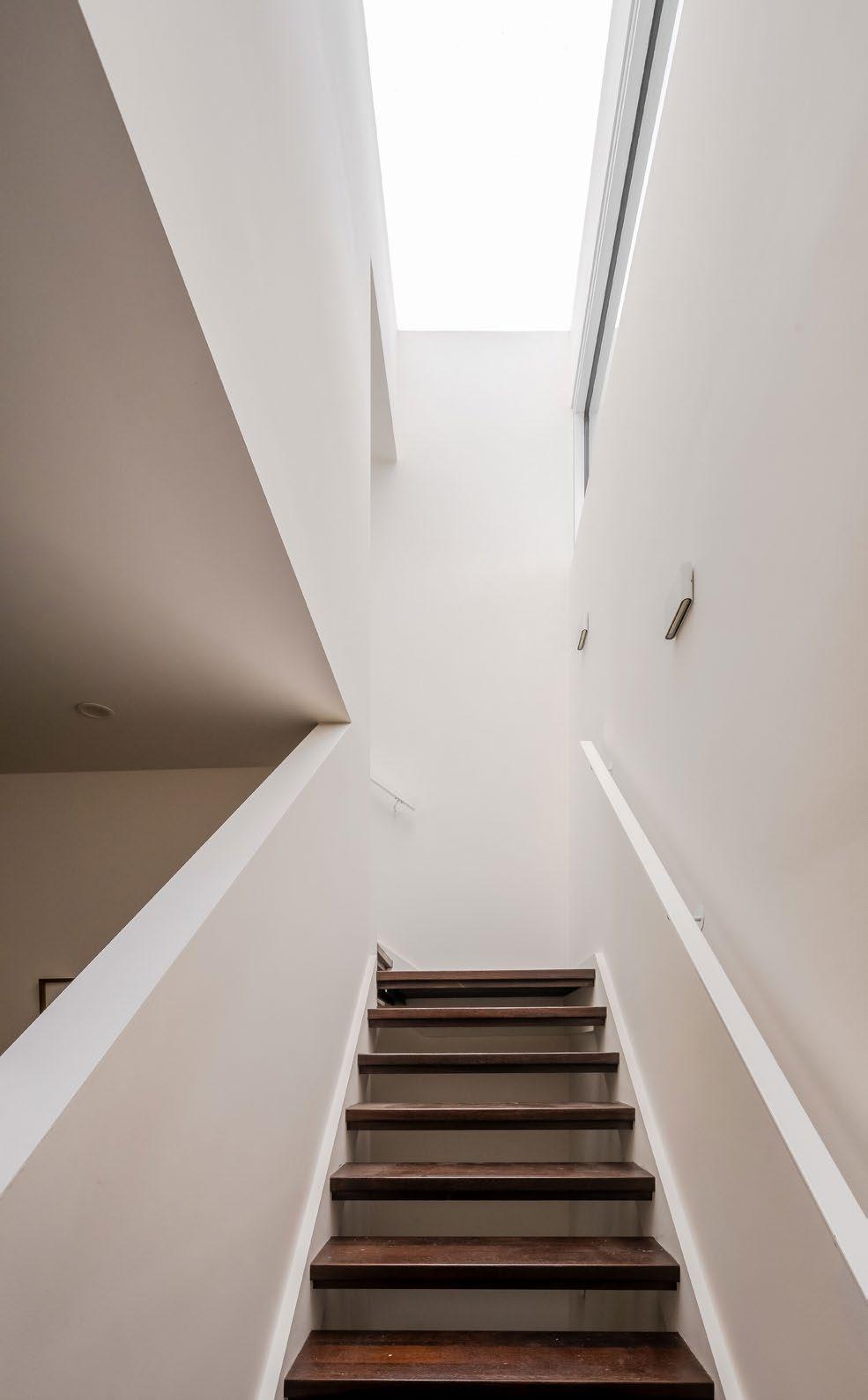
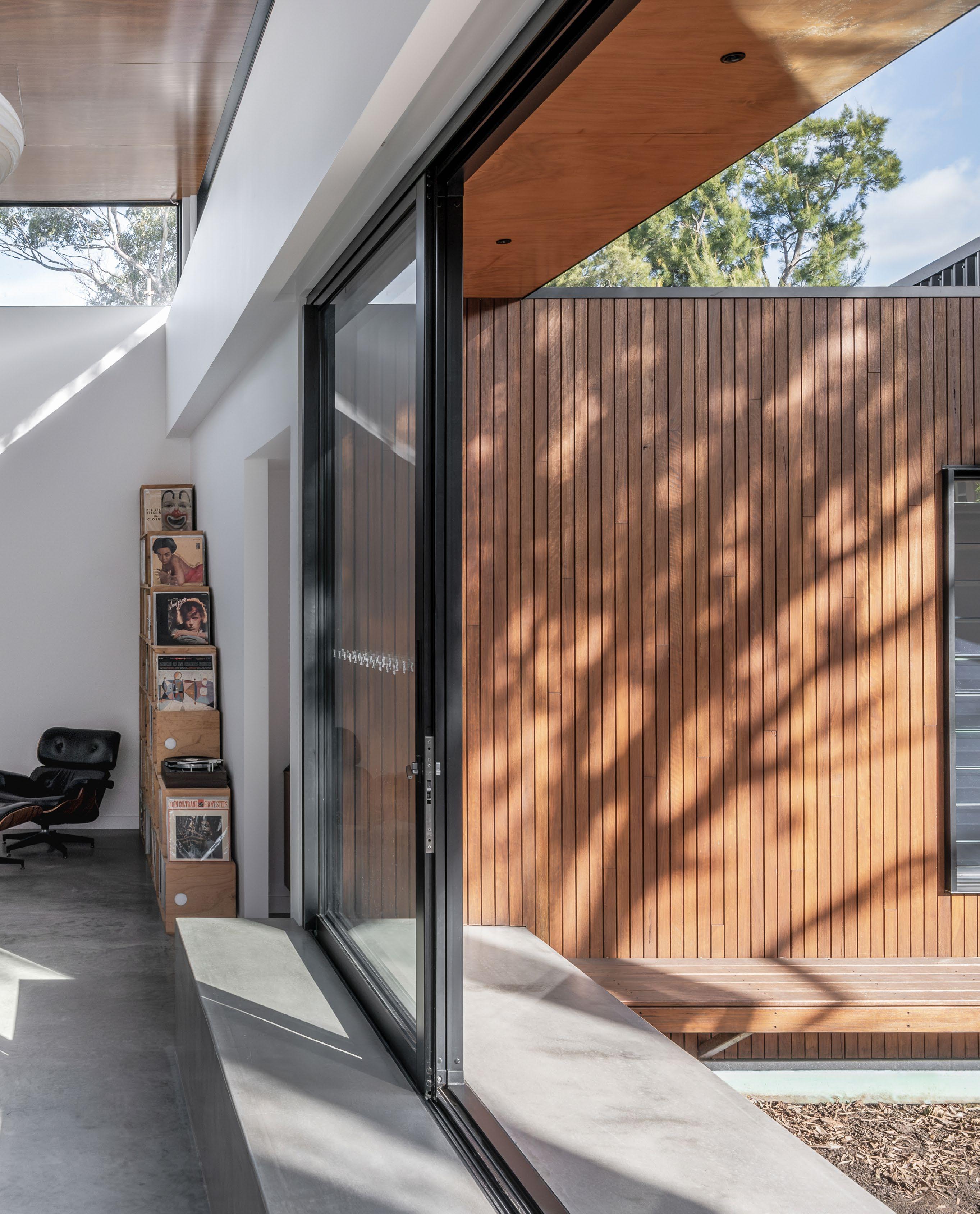
Sky Architect Studio turns a 4.88 metre wide heritage frontage into a luminous layered interior where tight constraints become the source of spatial clarity and urban delight.
On Melbourne’s Whitehall Street, where terraced homes line up shoulder to shoulder, the Itty Bitty House lives up to its playful name until you step inside. Designed by Sky Architect Studio for a young couple with big aspirations and a modest footprint, this transformation from a single storey dwelling into a three storey urban sanctuary is a triumph of light, logic and liveability.
What distinguishes this project is not just its boundary pushing nine metre party wall, controversial enough to require council exception, but the way light is treated as an architectural material. The interior is awash with it, from full height double glazed sashless windows to a meticulously positioned custom skylight that floods the staircase with borrowed brightness. Inside, pure white surfaces expand perception while rich timber flooring adds grounding warmth.
Spaces are so fluid and light filled that they erase the usual limitations of a 152 square metre site.
Preserving the heritage frontage, Sky Tiong, architect and builder, carved a new narrative at the rear, an elegant modern volume topped with an open roof terrace that captures uninterrupted views of Melbourne’s skyline. From this elevated perch, vertical timber battens act as both privacy screen and sculptural element, framing city vistas while maintaining a seamless silhouette.
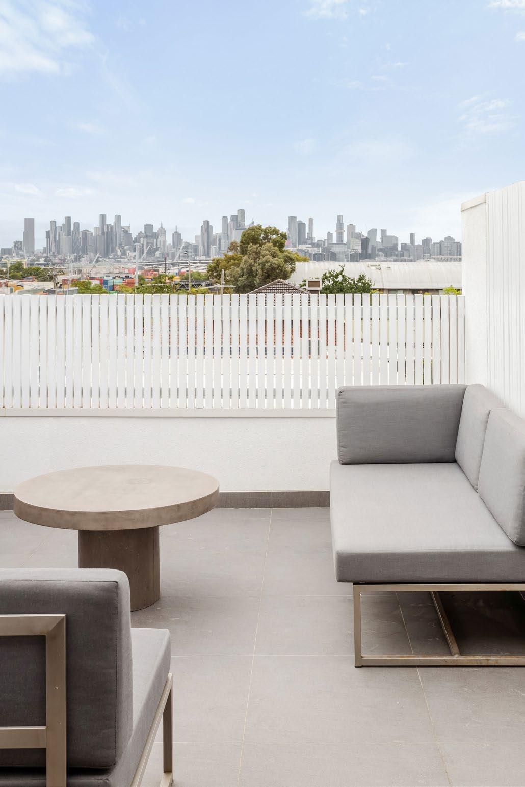
In Itty Bitty House, every centimetre counts and counts beautifully.
The interior program reads like a vertical journey. Ground level merges the kitchen, dining and living zones into an open plan arrangement, perfectly calibrated for entertaining. Tucked alongside are a guest room, bathroom and laundry, with both front and rear decks extending living outdoors. Upstairs, the family hall anchors bedrooms and a minimalist master suite, while the final ascent delivers that open air moment, a terrace that feels both urban and serene.
Despite a pandemic era timber shortage and access constraints that forced manual installation of Hebel panels, the build embraced ingenuity. Light gauge steel framing, concealed services and fold over scaffolding all speak to a problem solving ethos.
Sky Architect Studio’s signature is visible throughout, with restraint, brightness and a respect for what small scale urban housing can achieve. In Itty Bitty House, every centimetre counts and counts beautifully.
Inside or out, we’ve got you covered.
Trusted by professionals, Hardie™ Secura™ Flooring is
Trusted by builders, Hardie™ Secura™ Flooring is a versatile solution for both indoor and outdoor structural flooring.
Easy to install
Easy to install
With
With a tongue and groove joint that can help to speed up the installation process, Hardie™ Secura™ Flooring is gun-nailable without the need for pre-drilling.
Flooring
Peace of mind
Peace of mind
Resistant
Hardie™ Secura™ Flooring
Resistant to rot, and damage from termites and moisture, Hardie™ Secura™ Flooring is

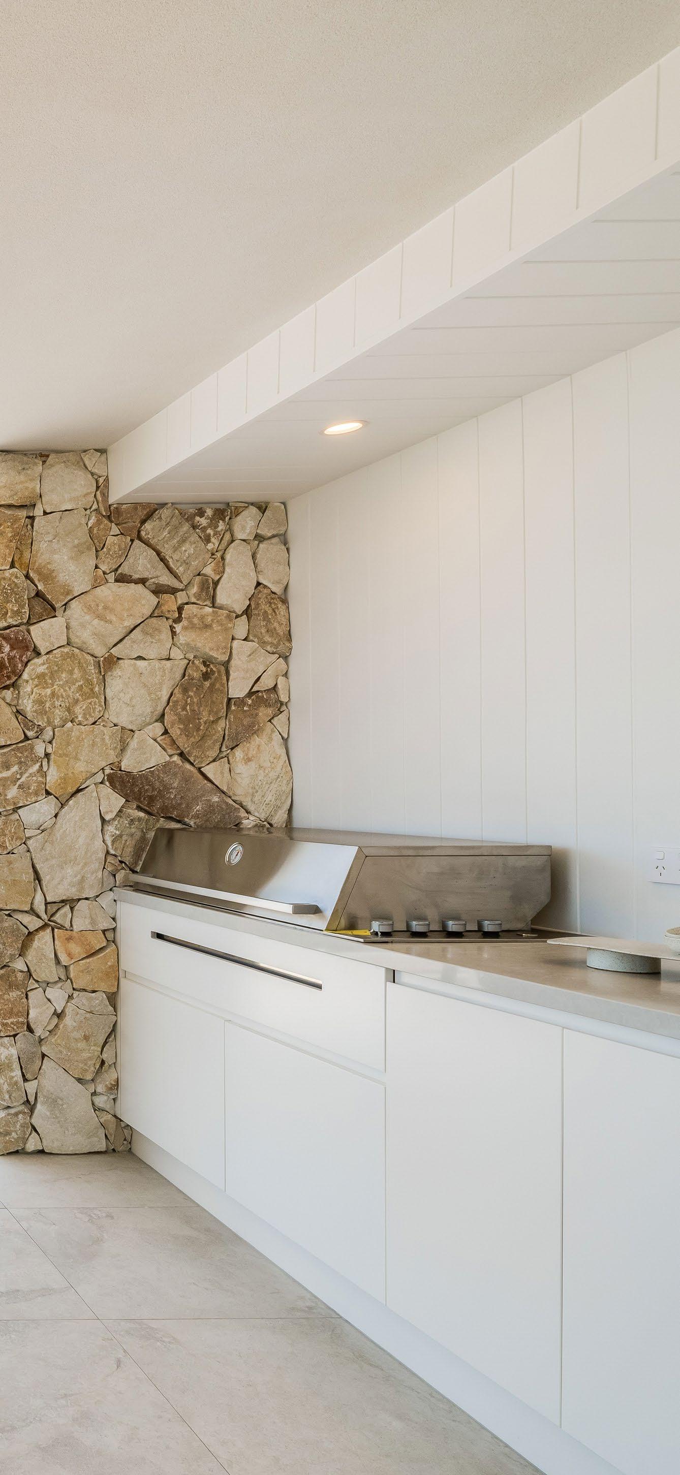
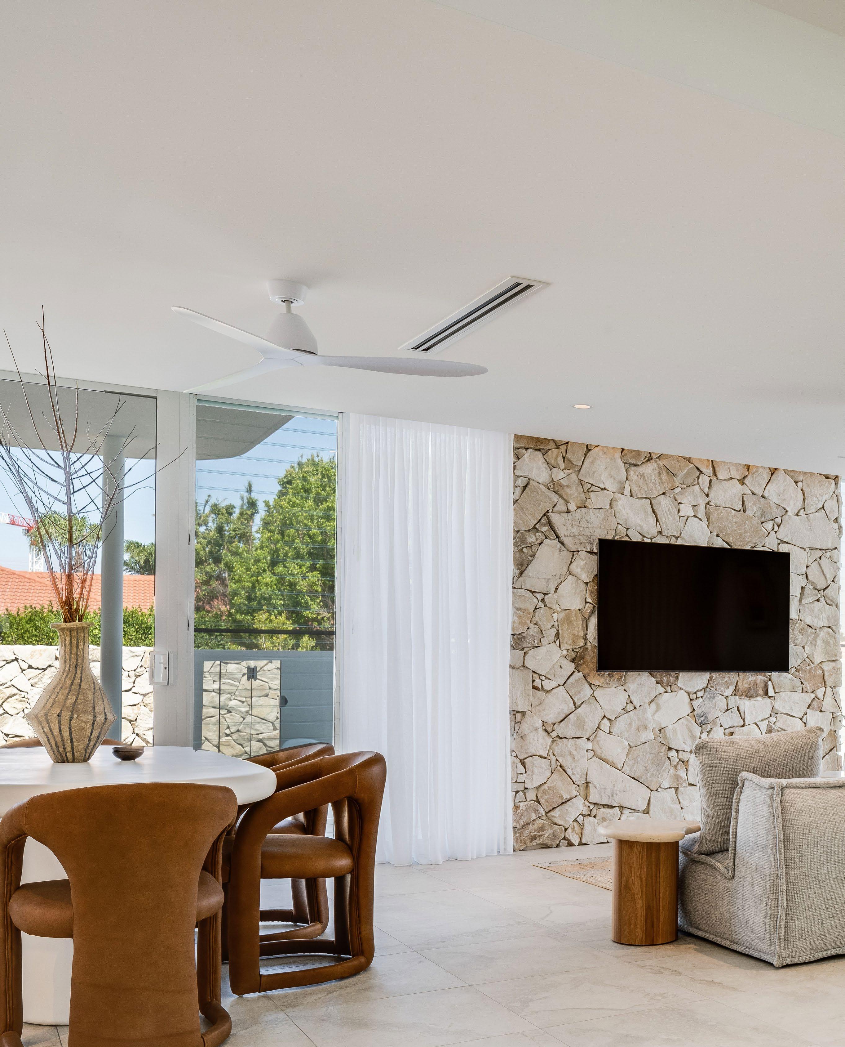
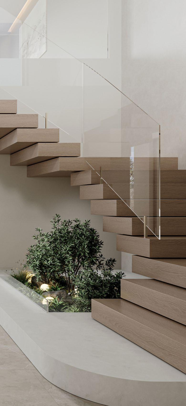
Once the domain of rustic retreats, stone-clad feature walls are emerging as sculptural centrepieces in contemporary interiors bringing mass, material honesty and a sense of permanence.
In an age of plasterboard efficiency and digitally flat finishes, the resurgence of stone-clad internal walls signals a shift toward depth, weight and tactile realism. More than just a visual accent, these walls restore a kind of architectural gravity to interiors increasingly defined by openness and blur. Whether rendered in dry-laid slabs, split-face textures or precisely coursed cladding, stone walls are reclaiming their role as both spatial dividers and emotional anchors.
Stone walls do not merely decorate, they sculpt.
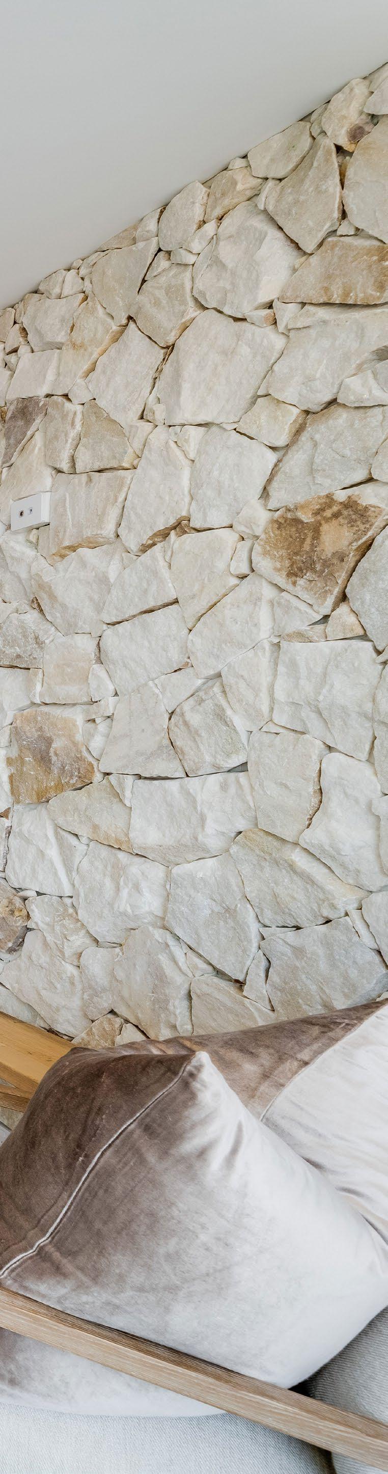
At their best, stone walls do not merely decorate, they sculpt. They catch light, temper acoustics and absorb the visual noise of surrounding surfaces. Their textural irregularities reward touch and observation, while their mass creates a sense of intimacy in even the largest volumes. Designers are now using them not just at fireplaces or facades, but as integrated internal gestures: wrapping voids, marking transitions between open zones, or flanking staircases with enduring elegance.
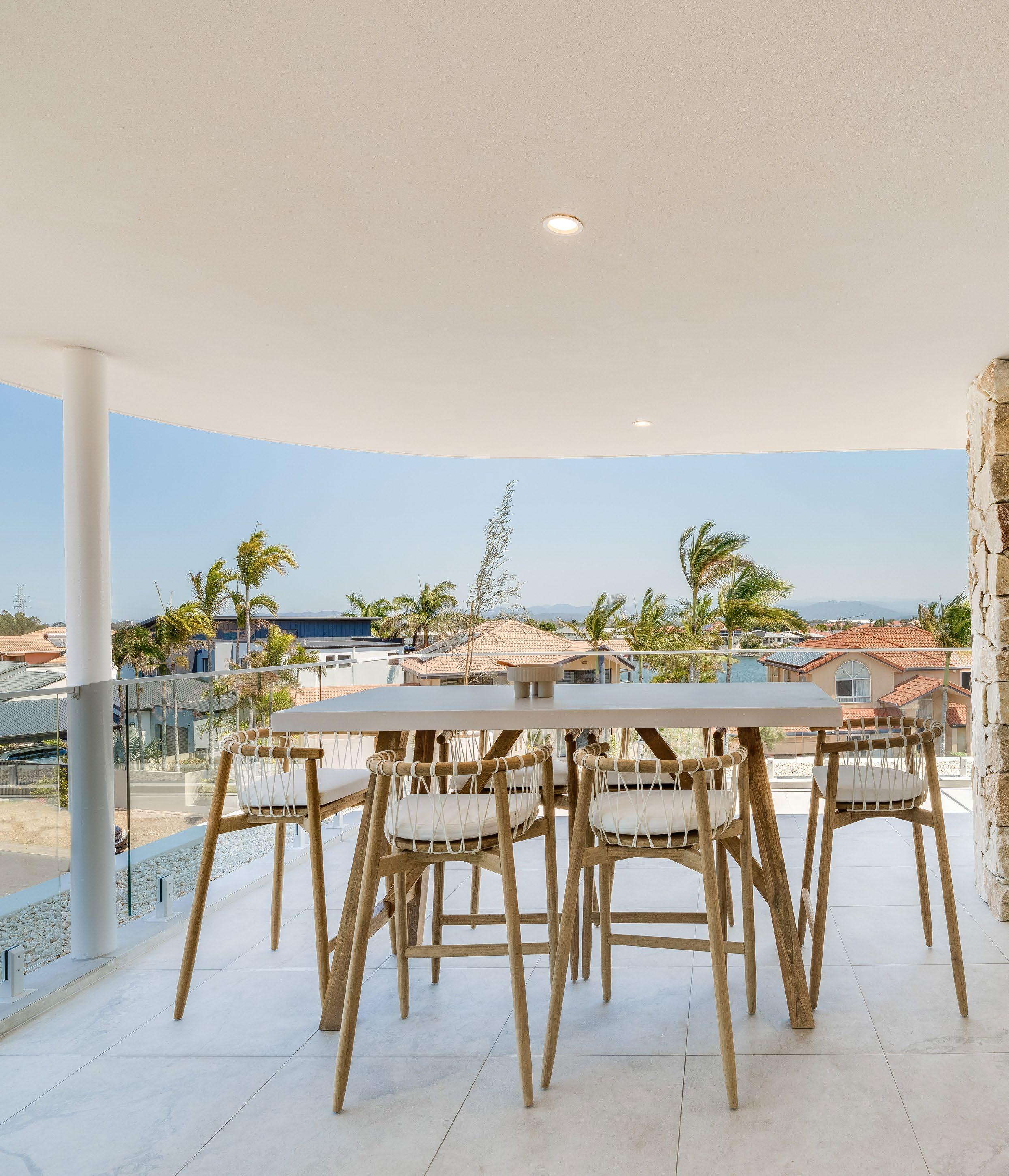
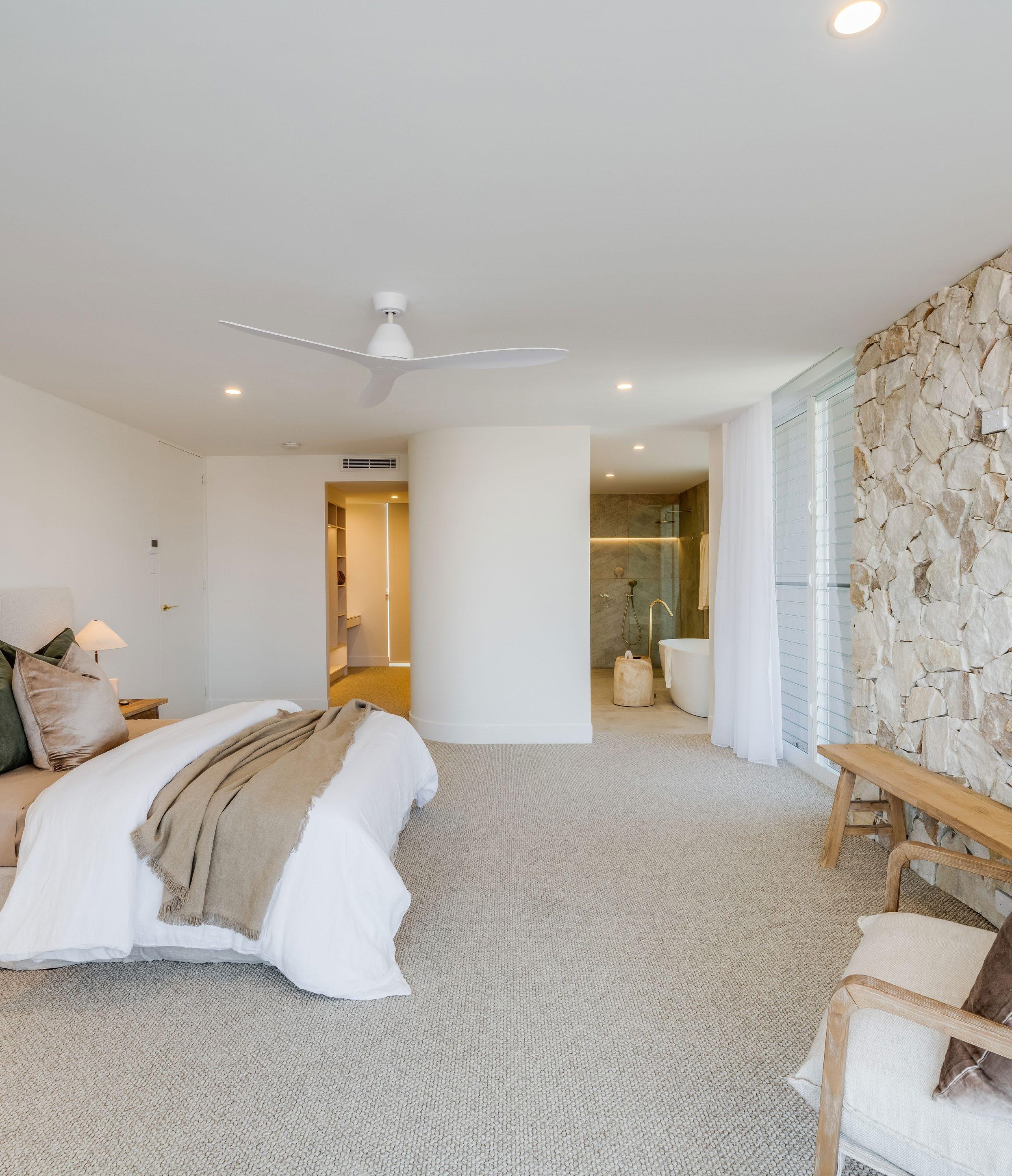
One notable example of this practice appears in Cayman, a dual-villa coastal project designed by Stuart Osman Building Designs. Inside its airy, three-level interiors, warm-toned stone cladding defines several key walls within open-plan living zones. Amid the light-drenched volumes and crisp white cabinetry, these surfaces deliver warmth, variation and a visual counterweight to expanses of glazing and tile.
The result is a textural pause a moment of weight within the architectural lightness.
What makes these walls effective in Cayman is restraint. They are uninterrupted, unpatterned and free from overstyling. Their strength lies in surface, not embellishment. And in doing so, they quietly embody a broader design principle: that not everything need be smooth, sleek or synthetic to feel modern. Some of the most contemporary spaces are those brave enough to show their grain.
Stone-clad internal walls are more than a material trend— they are a return to atmosphere. A reminder that surface can hold memory, and that weight can, paradoxically, make a space feel more at ease.
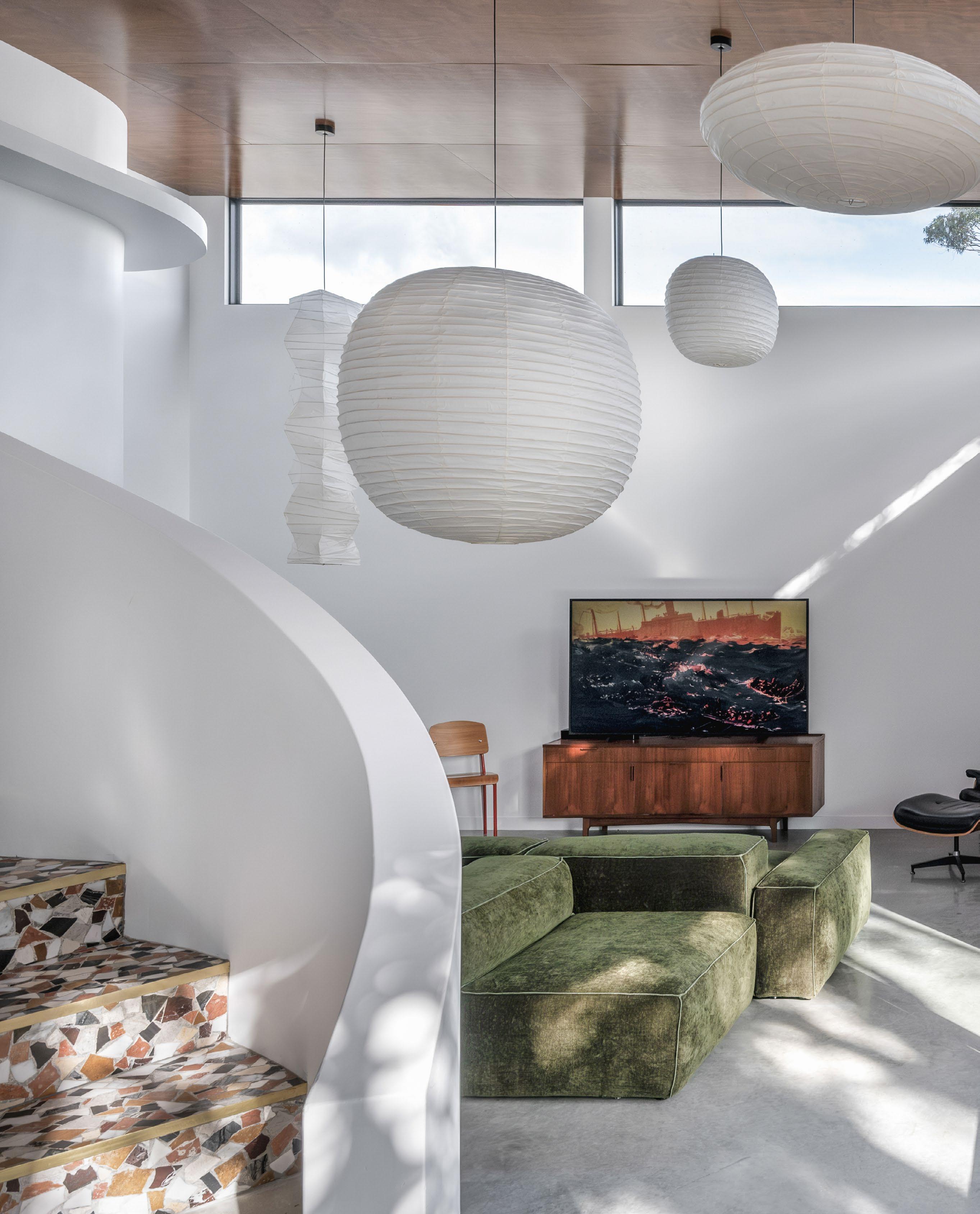
Far more than aesthetic flair, filtered natural light and organic forms like those seen in the central void of Bliss play a transformative role in how we feel, focus and flourish indoors.
In architecture, light is often treated as a tool. But when it is allowed to move freely casting shape, shadow and rhythm it becomes an atmosphere. A pulse. A quiet choreography that shifts not only the look of a space, but our physiological and psychological response to it. At Bliss, a Brisbane residence designed by Michael Ross of Michael and Ruysch Building Design, this principle is at work with remarkable clarity.
Inside the home’s double-height curved void, sunlight does not simply enter it performs. Slatted white cladding along the wall refracts daylight into vertical bands that stretch and contract with the time of day, while the sculptural mesh pendants amplify the softness of ambient glow. These light patterns ripple across curved surfaces, bending around corners, activating the architecture itself.
But this play of light and shape isn’t just beautiful it is deeply beneficial. Exposure to dynamic daylight has been shown to support the body’s circadian rhythms, regulating sleep, alertness and mood. In residential settings, this can help reduce stress and increase clarity, especially in spaces like living rooms, stair voids or home offices that serve as daily transition points.
Sunlight that changes across the day keeps us connected to time and season, grounding us in natural cycles.
Designing for this kind of movement requires more than large windows. It involves orienting forms to the arc of the sun, layering materials that interact with light, like timber treads, white cladding, or curved plaster and shaping spatial volumes that invite light to linger, not just enter. In Bliss, even the stair void feels like a moment of pause: sunlight descends with you as you move from one level to the next, creating a gentle rhythm that mirrors the pace of the home.
There is also an emotional intelligence to this approach. Harsh, even light can feel artificial or disorienting. But spaces where daylight is filtered, where shadows are allowed to soften walls and corners, offer a sense of retreat and tactility. Just as in nature, where dappled light beneath a tree canopy feels calming, interior spaces benefit from variation light that flows, breaks, reforms.
Michael Ross’s use of filtered light through both form and material doesn’t just tick a sustainability or comfort box.
It reminds us that wellness begins with sensation. With how we feel when we enter a space, with the way light lands on our skin, with the shadows that tell us time is passing.
To live well indoors is to be in conversation with light. To let it shape space, mood and health in tandem. In homes like Bliss, that conversation is not just heard, it is felt.

Join the Archicad 29 Launch Events with Central Innovation
Experience Archicad 29 firsthand with live demonstrations, insights into the latest updates, and industry news.

Learn more about Archicad

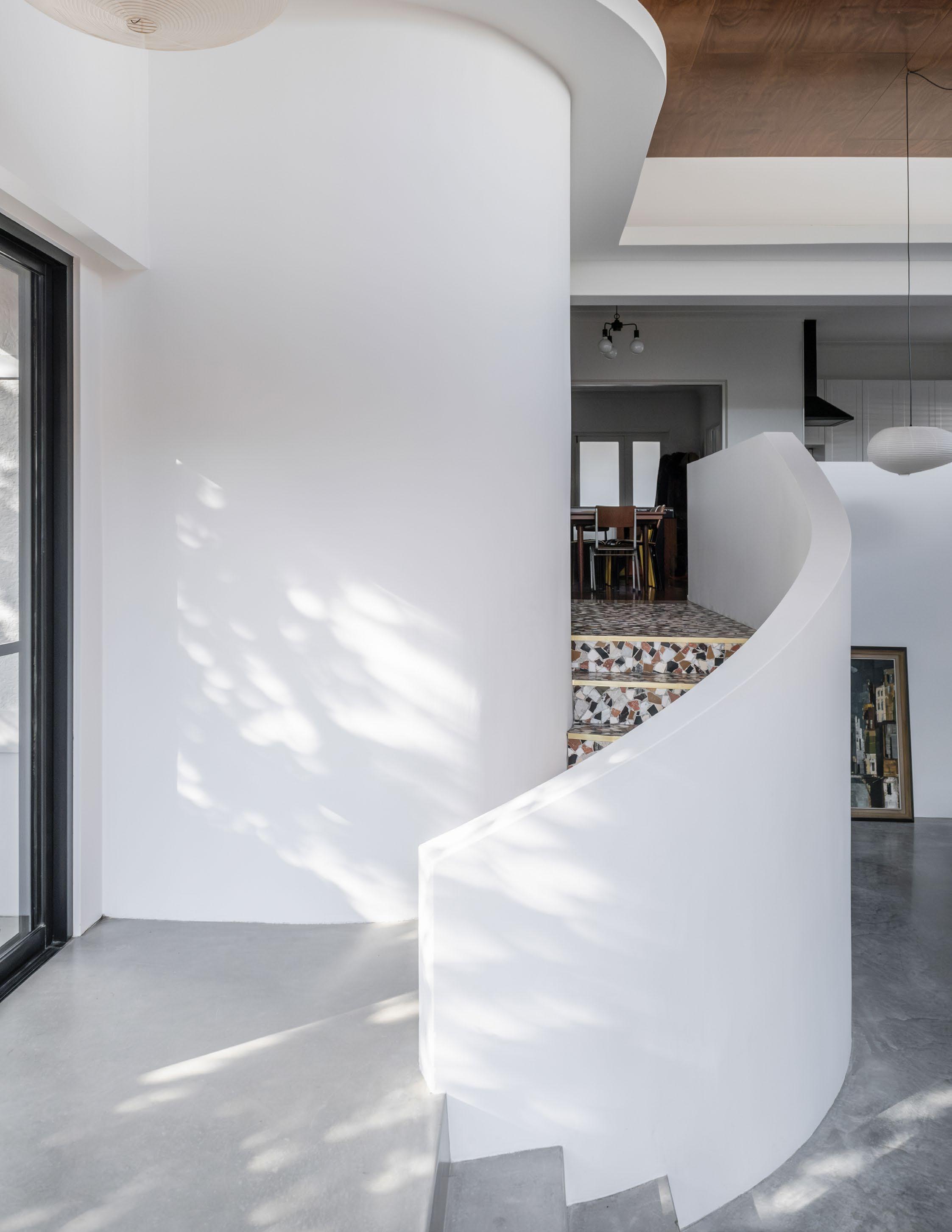
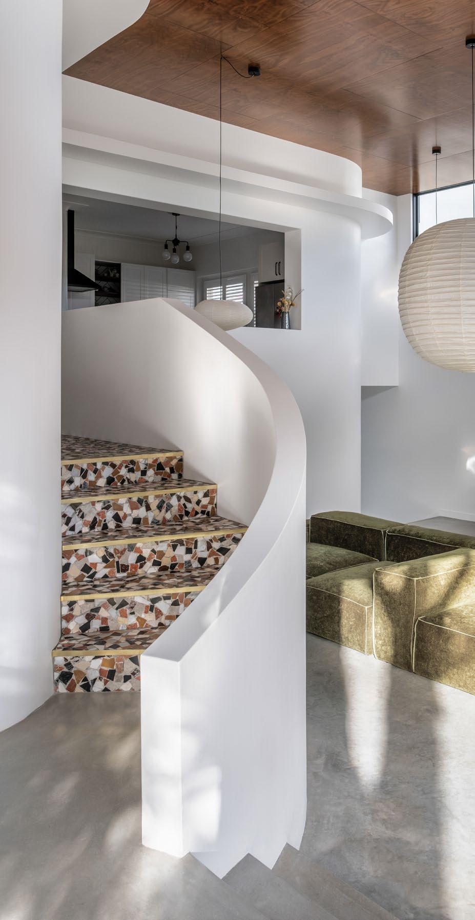
From the glamour of the early twentieth century to the fluidity of contemporary design, the return of Art Deco curves speaks to a timeless fascination with softness, strength and sculptural grace.
Curves are having a moment. But for those who understand design history, they never truly left. The rounded lines now appearing in staircases, façades and furnishings are not just contemporary flourishes they are architectural echoes of a movement born a century ago: Art Deco.
Originating in the 1920s and reaching its peak in the 1930s, Art Deco emerged as a bold celebration of progress, glamour and craftsmanship. It was an aesthetic that merged the machine age with opulence. Zigzags, chevrons and sunbursts were iconic, but so too were curves streamlined, confident arcs that softened buildings and objects alike. This era marked the birth of modern rounded corners, from cinemas and cruise ships to sweeping apartment facades.
Art Deco’s curves weren’t only stylistic. They suggested movement. Speed. Optimism. They wrapped around corners like ribbons, inviting the eye to travel rather than stop. They softened the urban grid. In interior design, these arcs framed mirrors, banquettes and built-ins, delivering an architecture of elegance and sensuality.
Curved walls also allow light to bend and fall in ever-changing patterns an effect that is as emotive as it is functional.
Today, these forms are returning with renewed sensitivity. Projects like Art House in Mount Ousley, by DeBu Studios, remind us that curves can hold history and innovation in the same breath. Originally a heritage-listed Art Deco home, the residence has been respectfully extended with curving walls, staircases and pavilions that reference the past while adding a contemporary edge. The new white forms wind through the plan like sculptural vessels, echoing the original stucco geometry in scale and gesture.
Where early Art Deco celebrated decorative expression, today’s interpretations shift toward spatial clarity. Curves are used not just as ornament, but as movement makers. They guide you around corners, soften transitions between rooms and lend a human touch to otherwise rectilinear plans. Curved walls also allow light to bend and fall in ever-changing patterns an effect that is as emotive as it is functional.
In a world of sharp lines and digital interfaces, curves offer something deeply primal. They evoke comfort. Femininity. Continuity. Neuroscience supports this preference: studies show that humans are neurologically inclined to feel more at ease in spaces that are curved rather than angular. This makes the return to Art Deco shapes not just nostalgic, but innately human.
From terrazzo-lined staircases to rounded parapets and softly contoured ceiling lines, today’s curved details offer a language of care and craftsmanship. They are not merely decorative throwbacks, but active agents in spatial storytelling.
The journey of Art Deco’s curves once radical, now revered proves that the best design movements don’t fade. They evolve. And when treated with care, they find new ways to move us.
From vaulted curves to softened thresholds, the Hai Lang Residence shows how sculptural interior geometry can elevate spatial experience and emotional wellbeing.
The language of interior architecture is not just one of function, it is deeply emotional. In the Hai Lang Residence, located on the eastern coastline of New South Wales, the story is told not through ornament but through form. Curves soften every edge. Vaulted ceilings sweep overhead. Even cabinetry and corridor junctions resist the hard angles of convention.
This is a home that uses shape to soothe.
Designers Jason Harb of JIH Building Design and Sarah Nolan of Birdblack Design have taken a sculptural approach to interior geometry, developing an architectural language where rounded edges and arched forms work both visually and psychologically. The curved roofline continues into the interiors, culminating in subtle barrel vaults and elliptical forms that stretch across ceilings and down into corridor transitions.
There are no jarring lines here. Everything flows. And that sense of flow has a profound effect on how the occupants experience the home. It is no accident that curves are often used in therapeutic and hospitality environments. Studies have long shown that curved architectural features can reduce stress and increase comfort by eliminating the visual tension of sharp intersections. They invite movement. They suggest calm.
The residence also reinterprets feng shui principles through form. Energy, or chi, is encouraged to circulate gently. The curved corners of cabinetry and archways prevent stagnation, and the organic geometry of the plan promotes a harmonious progression through each space.
In the living areas, even built-in joinery is detailed with radial finishes. In the bathroom, the junction between floor and wall is smoothed into a crescent threshold, visually anchoring the room while maintaining its organic essence. Light too is shaped by these curves, travelling across walls in soft gradients rather than harsh lines.
From a design standpoint, the use of curves also creates a distinct identity. In an era of modular boxes and rectilinear grids, the Hai Lang Residence offers a refreshing break from orthodoxy. It is not just about aesthetics. It is about spatial character. About movement. About serenity.
Shapes, it turns out, have a language all their own. And in this residence, they speak of comfort, elegance and cultural resonance.
Designer: Jason Harb
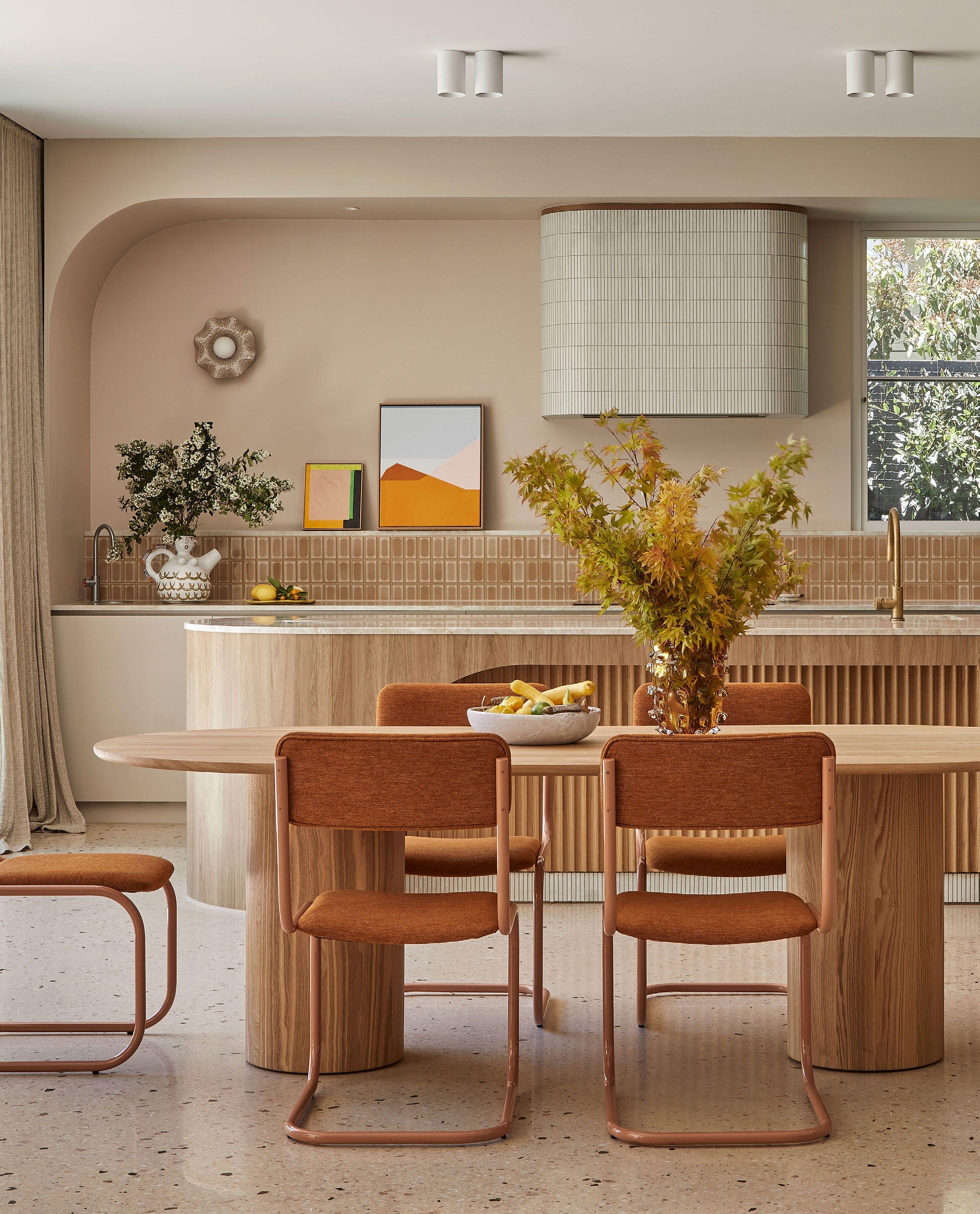
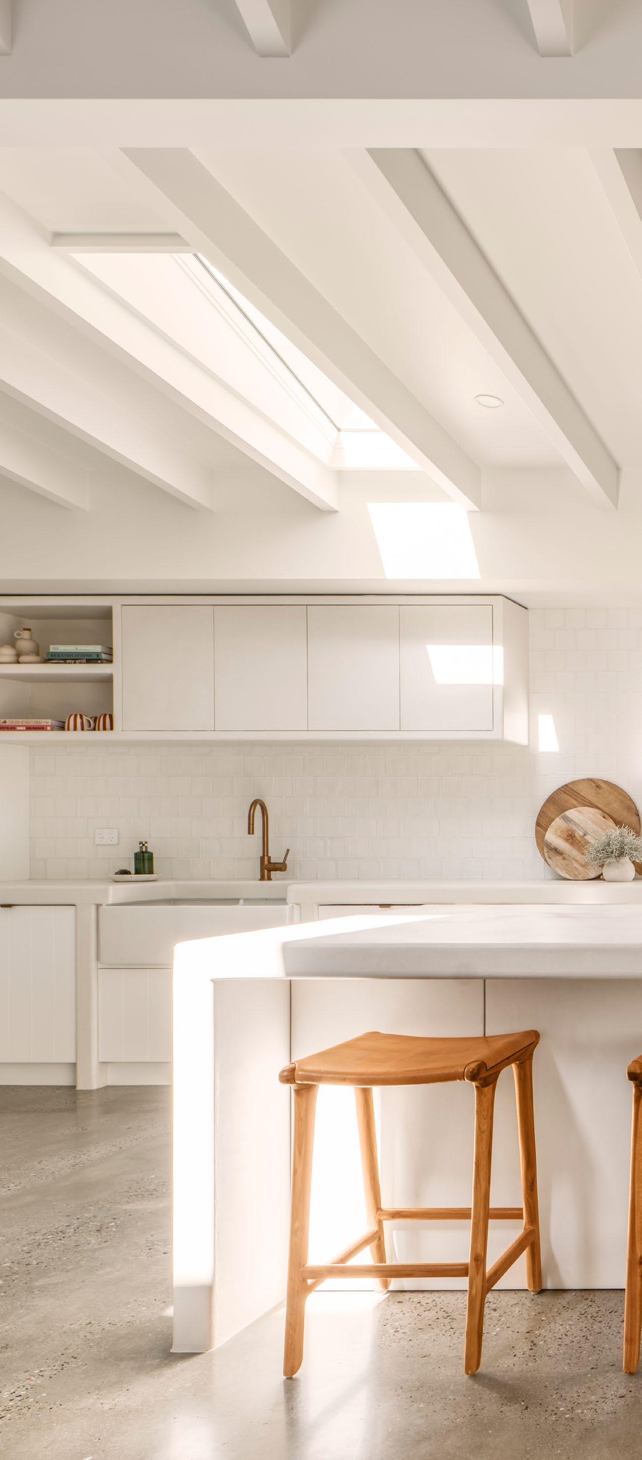
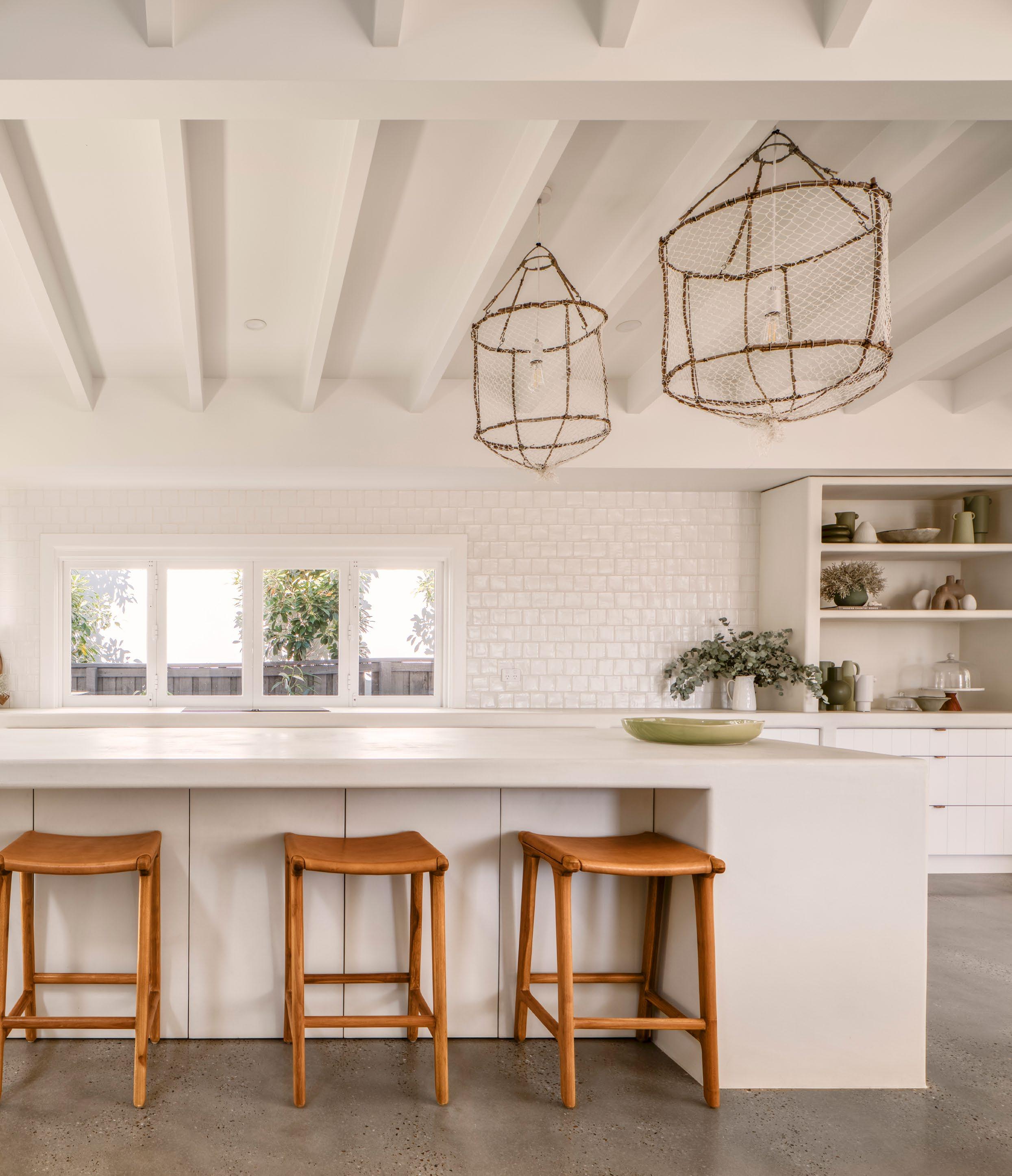
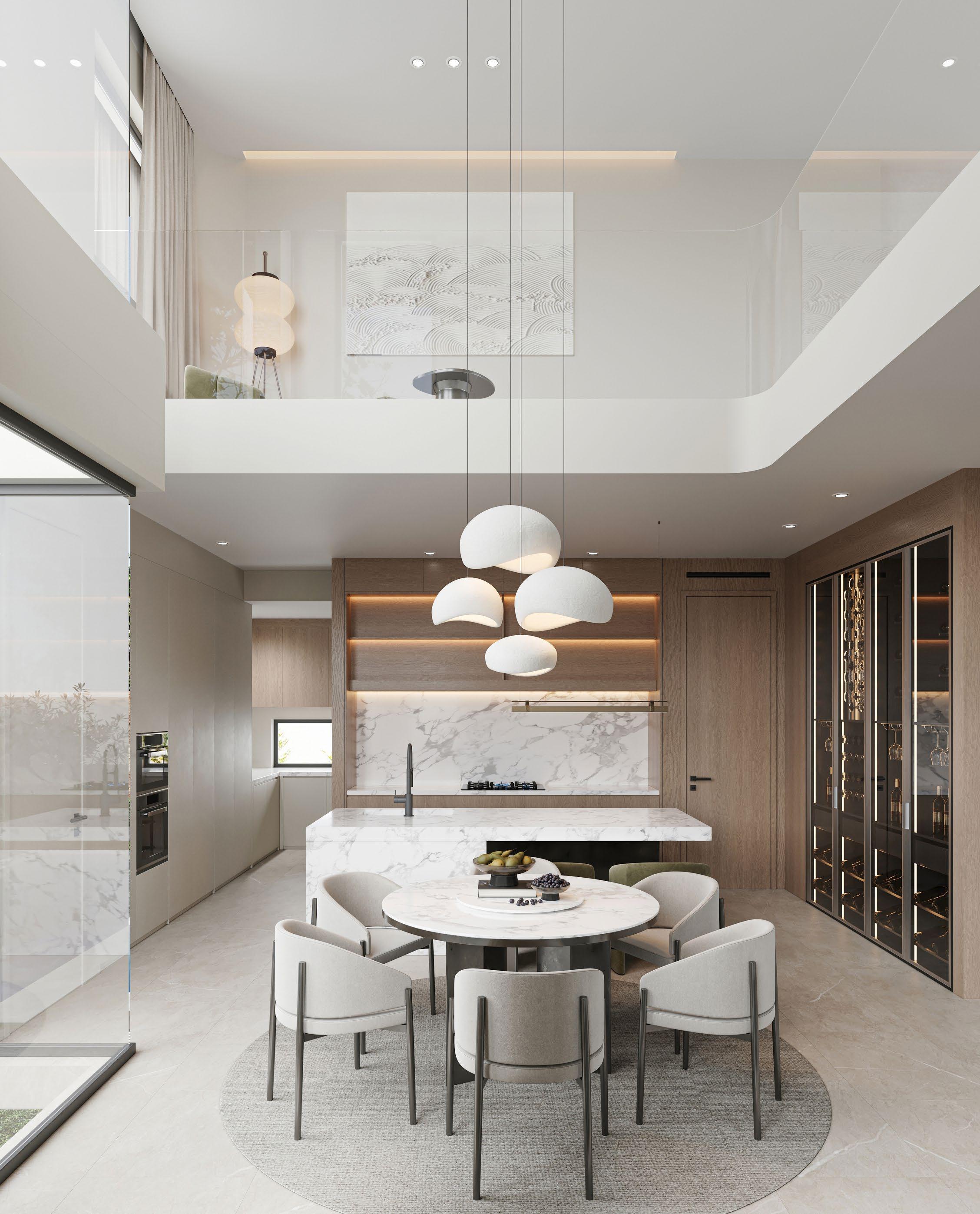
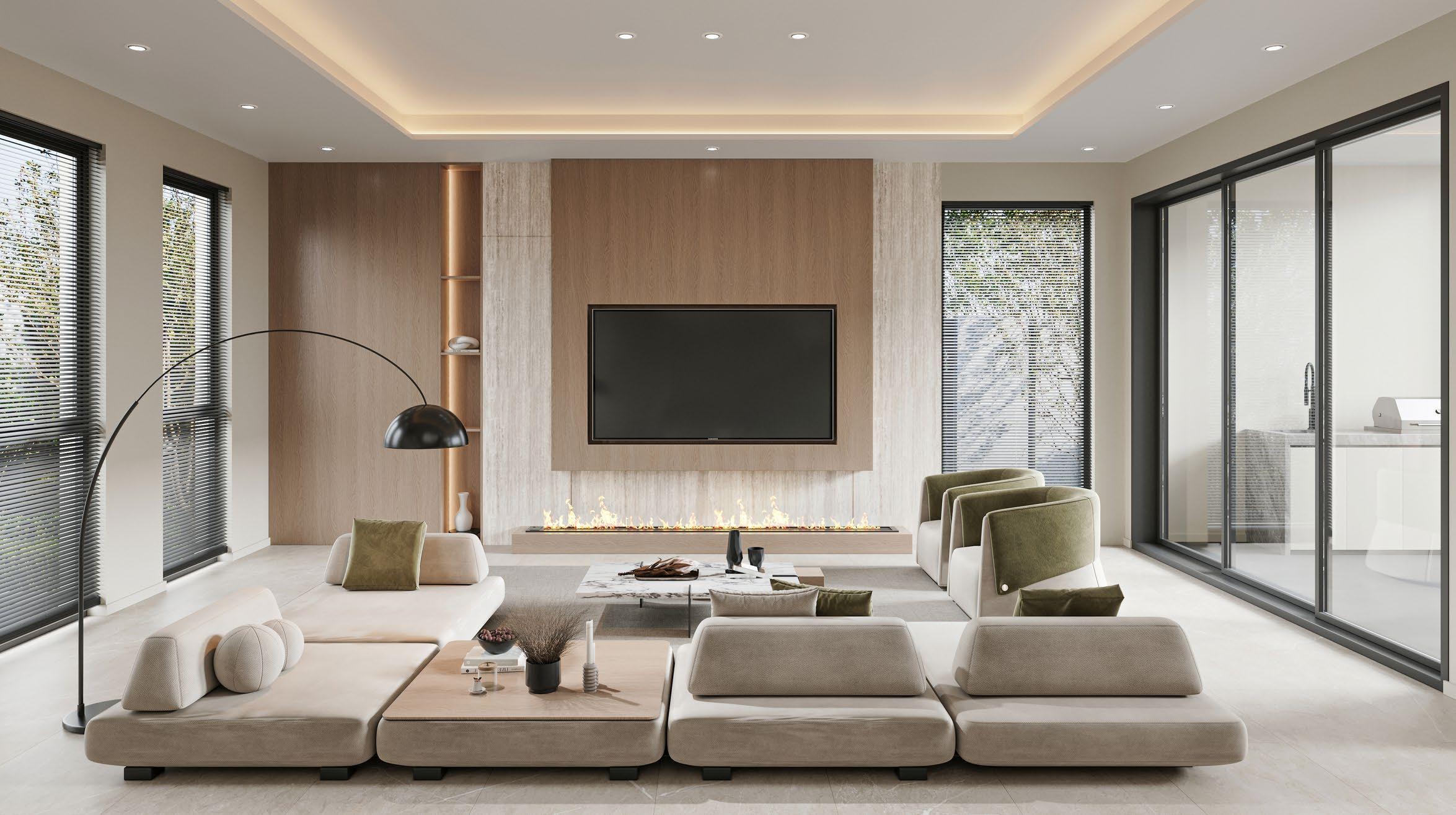
From task visibility to ambient mood, well layered lighting is becoming the most underestimated design tool in the modern kitchen.
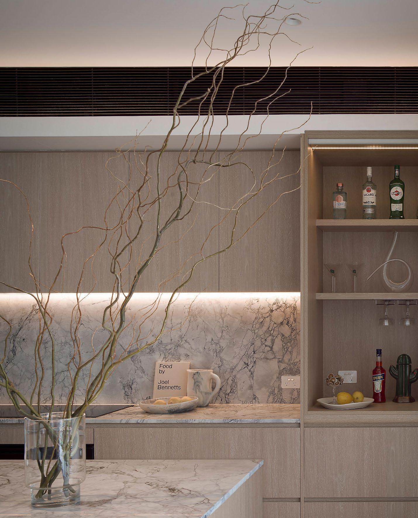
A well lit kitchen typically relies on three tiers of lighting: ambient, task and accent.
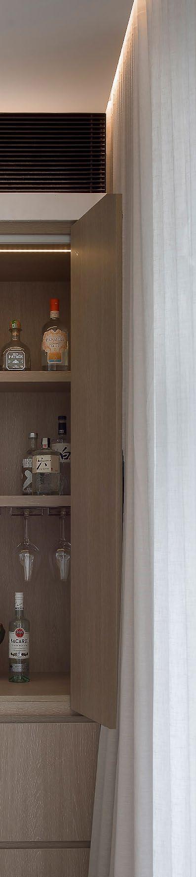
Once purely functional, kitchen lighting has evolved into a layered art form that balances clarity with atmosphere. Today’s kitchens are not just food preparation zones. They are social hubs, homework stations, wine bars and quiet morning retreats. And in this shift, lighting must do more than illuminate countertops. It must shape experience.
A well lit kitchen typically relies on three tiers of lighting: ambient, task and accent.
Ambient lighting provides overall illumination. Usually this comes from ceiling-mounted fixtures, recessed downlights or even indirect light washes that bounce off walls or cabinetry. Ambient lighting sets the tone of the space and should be soft but strong enough to create a sense of openness.
Task lighting targets work zones - think under-cabinet LED strips that light up the benchtop, or pendant lights over an island where chopping and mixing take place. Good task lighting reduces eye strain and shadow interference, making the kitchen safer and more efficient to work in.
Accent lighting adds dimension. It can be as subtle as a toe kick glow under the cabinetry or a strip of light tucked into a shelving niche. Used thoughtfully, accent lighting brings out the depth and materiality of surfaces like stone, timber or glass. It also adds mood, transforming the kitchen into a gentle, glowing space after dark.
One increasingly popular design move is integrated strip lighting, recessed into cabinetry or shelving, which provides an uninterrupted wash of light without visible globes or fixtures. These strips create a modern and clean aesthetic and are ideal for highlighting textural backsplashes or open storage.
Equally important is colour temperature.
Warmer tones around 2700K to 3000K create a welcoming environment, ideal for residential kitchens. Cooler tones may suit ultra-modern spaces but risk feeling clinical. Dimmable systems allow for greater flexibility across time of day and function - bright and energising in the morning, subdued and atmospheric at night.
Lighting can also signal hierarchy. A statement pendant above an island acts as a visual anchor, while hidden lighting cues reveal functional intent behind seemingly seamless surfaces. In contemporary minimalist kitchens, this can bring life to spaces otherwise restrained in palette.
What lighting achieves in a kitchen is far more than visibility. It directs attention, enhances materiality, supports functionality and modulates mood. A beautifully lit kitchen invites lingering, not just cooking.
The best lighting plans do not simply follow rules. They respond to the lifestyle of the users, the rhythms of day and night, and the emotional tone of the home.

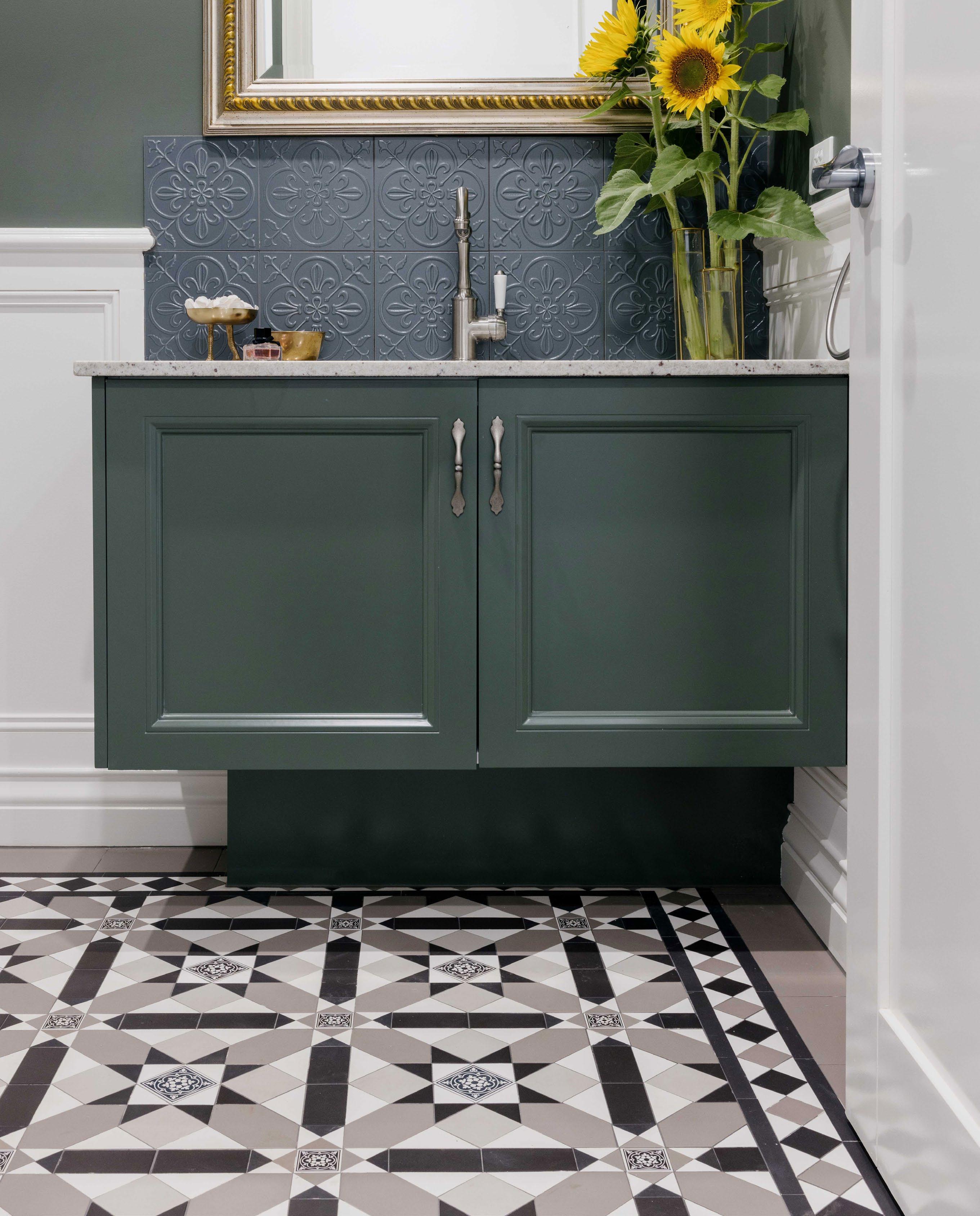
From heritage echoes to modern contrast, patterned tiles are staging a powerful return in bathrooms and beyond.
Patterned tiles are enjoying a renaissance, not as mere flooring, but as expressive canvases beneath our feet. Once associated with European villas or heritage foyers, these ornamental surfaces are now stepping boldly into contemporary homes, redefining how we experience colour, texture and geometry in wet zones.
Unlike minimalist slabs or neutral stone, patterned tiles bring rhythm and storytelling into interior spaces. Whether classic monochrome motifs or intricate encausticinspired designs, they ground a room with personality. Their appeal lies not just in visual interest, but in their ability to evoke time and place, Moroccan courtyards, Victorian powder rooms, or Mediterranean holiday homes.
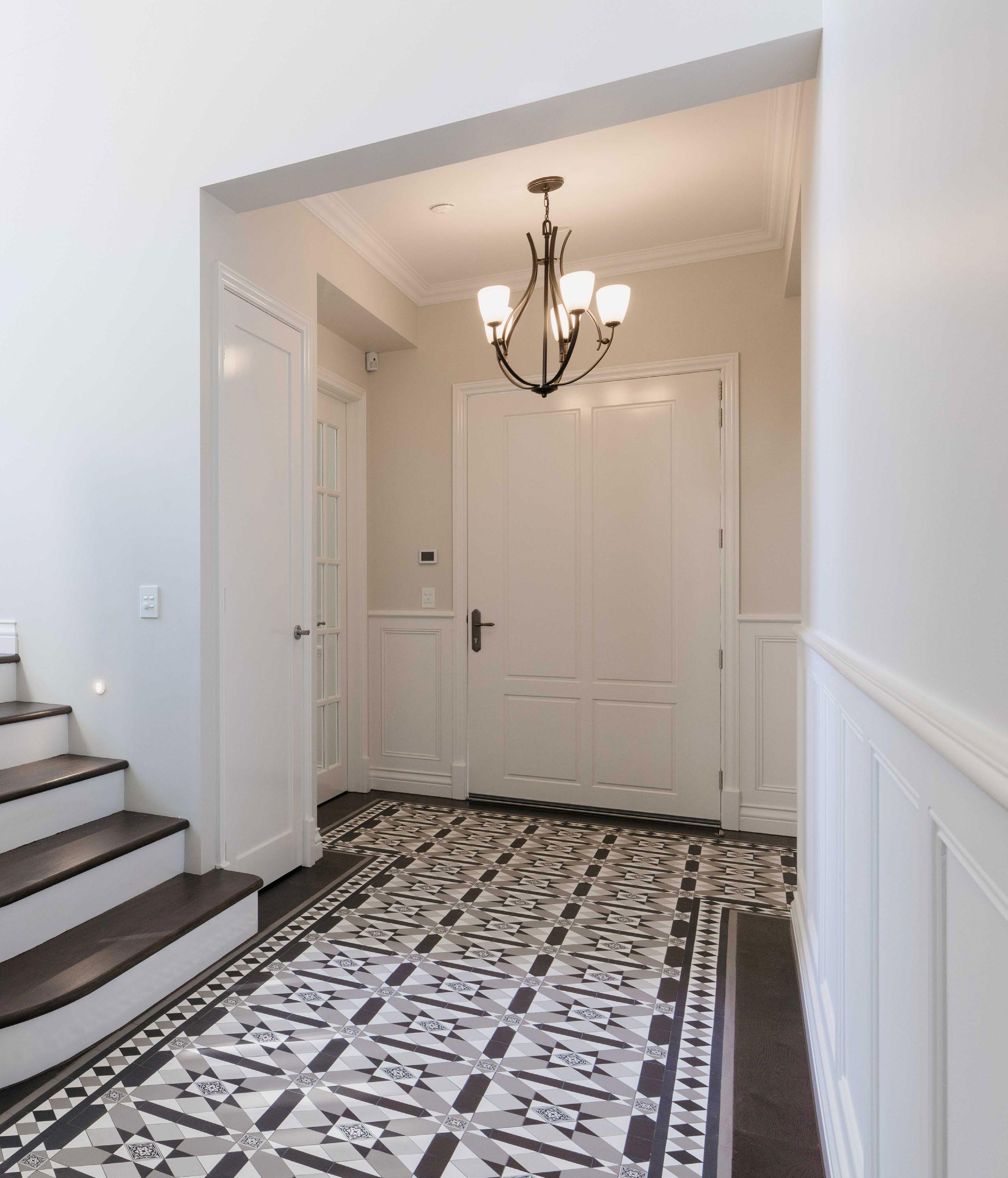
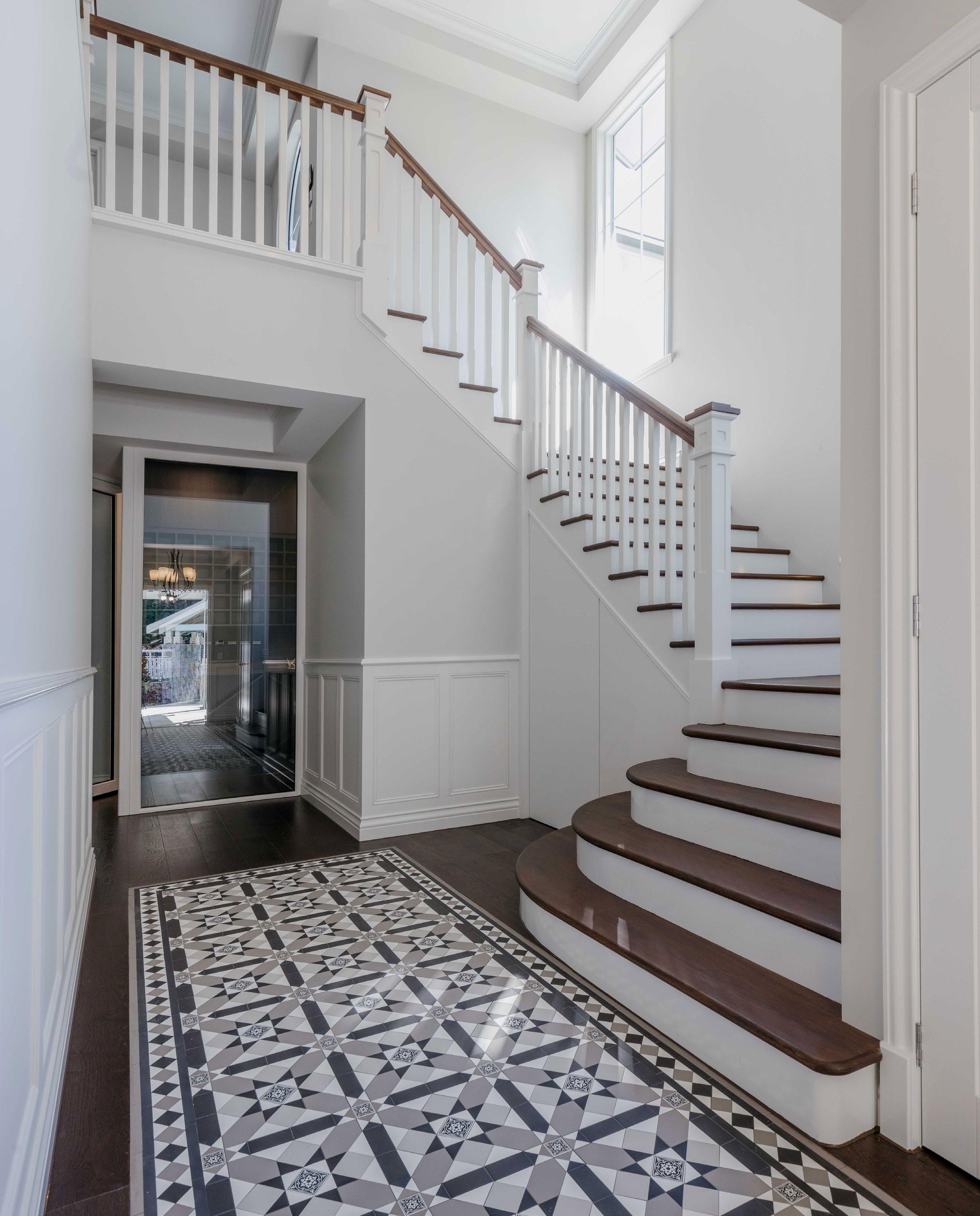
Today’s designers are leveraging patterned tiles in highly intentional ways. In bathrooms, they provide a counterpoint to white cabinetry or bold paintwork. In powder rooms, they become the hero feature. In laundries and mudrooms, they offer a sense of delight where it’s least expected. The durability of porcelain and advances in digital printing also allow for near-endless design freedom, from modern geometric repeats to heritage mosaics with worn-in charm.
In the projects showcased, patterned floors serve different roles. In one bathroom, a navy and white tile anchors the space with nautical elegance, framing the freestanding tub like a stage. In another, a muted encaustic tile complements deep green joinery and brass fittings, striking a balance between sophistication and whimsy.
The use of consistent colour palettes across tiles and wall finishes ensures cohesion without visual clutter.
For designers, patterned tiles are also an effective way to define zones without walls. A change in tile underfoot can signal a transition from utility to retreat or introduce texture into otherwise streamlined spaces. Used sparingly, they offer drama. Used generously, they become art.
Importantly, the resurgence of patterned tiles aligns with a broader movement toward individualised interiors. As homeowners move away from formulaic finishes, surfaces that tell a story through shape, pigment or historical reference - are back in demand.
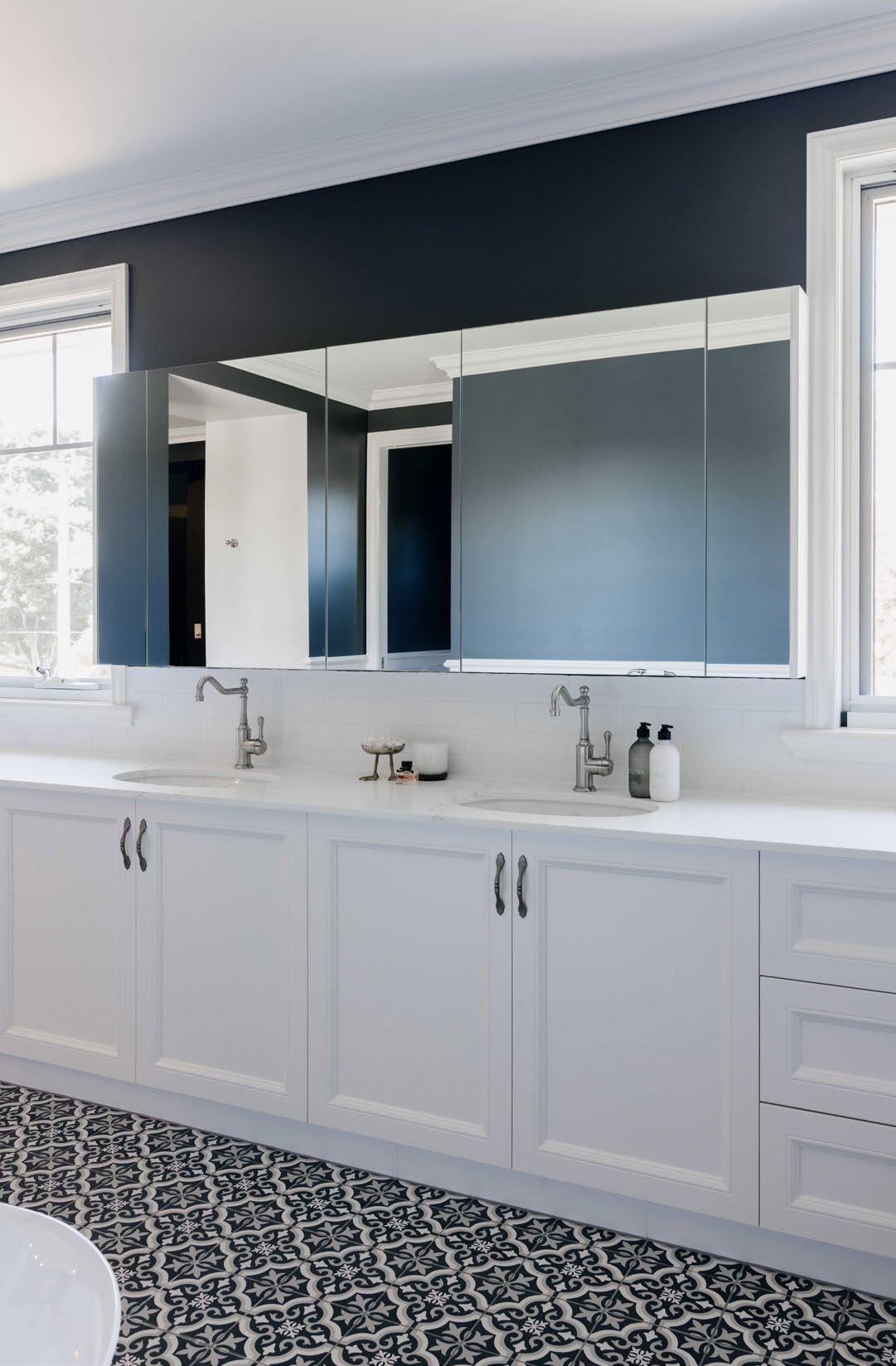
Whether laid wall-to-wall or confined to a framed inlay, patterned tiles remind us that detail matters and the floor is far from forgotten in the interior composition.
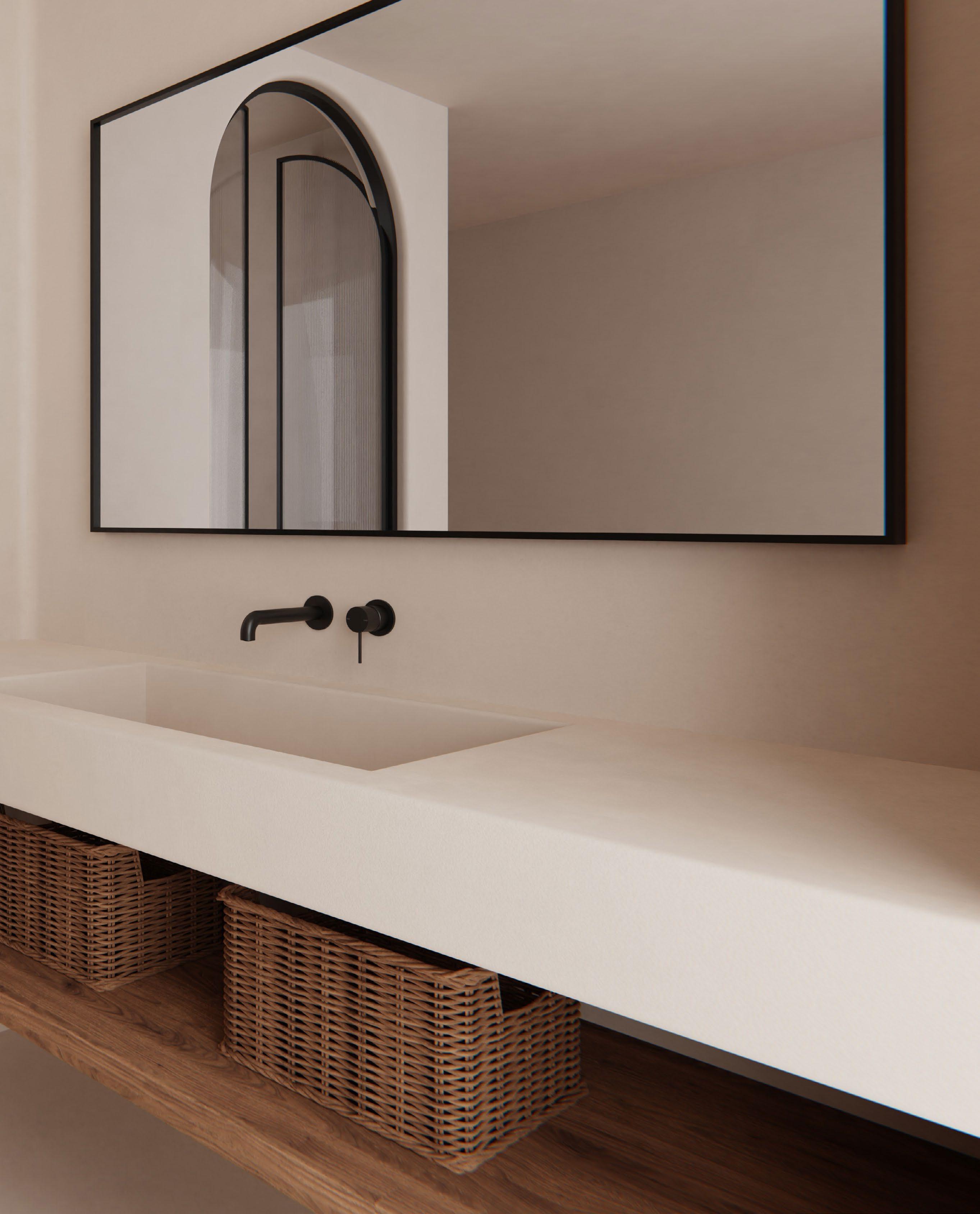
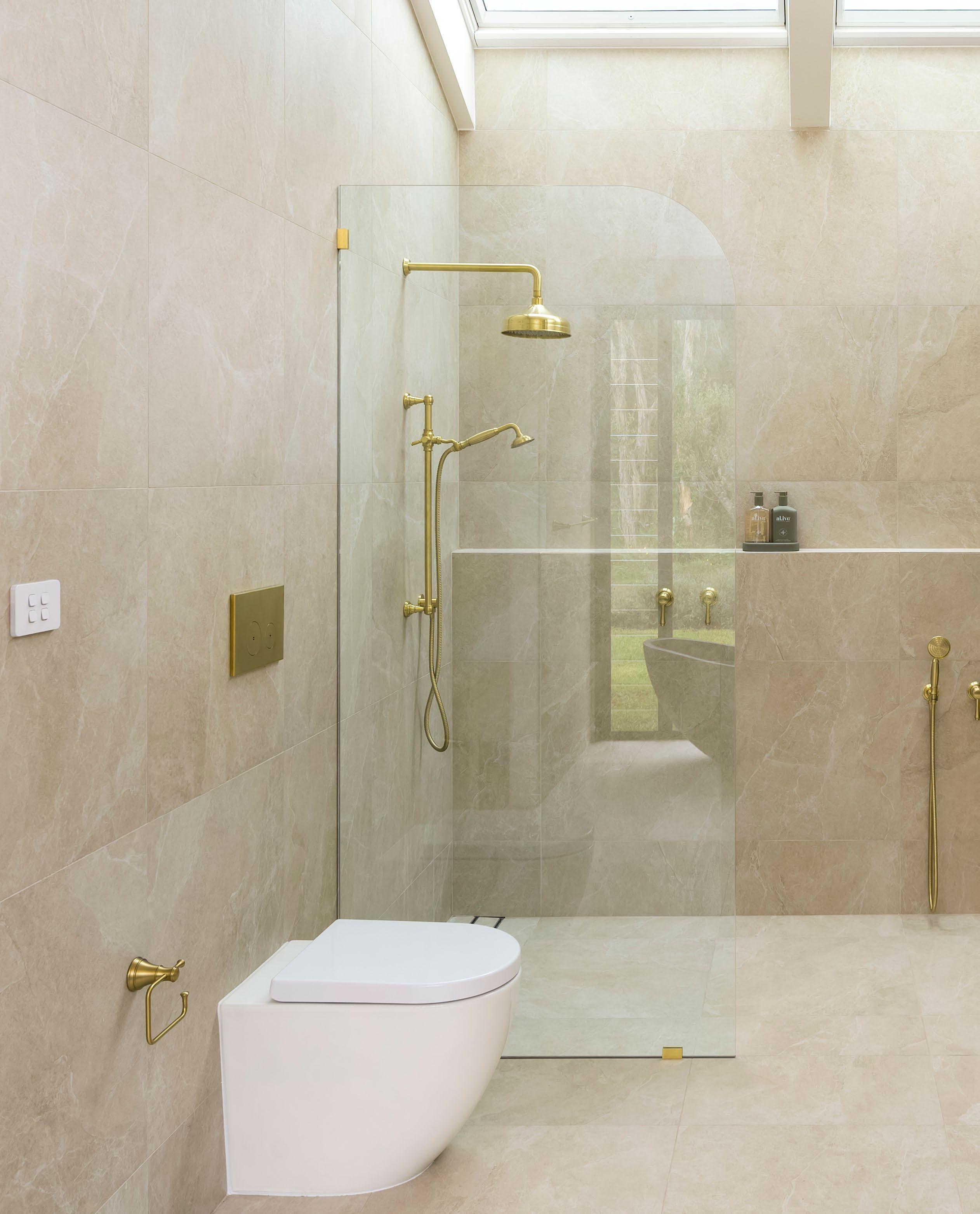
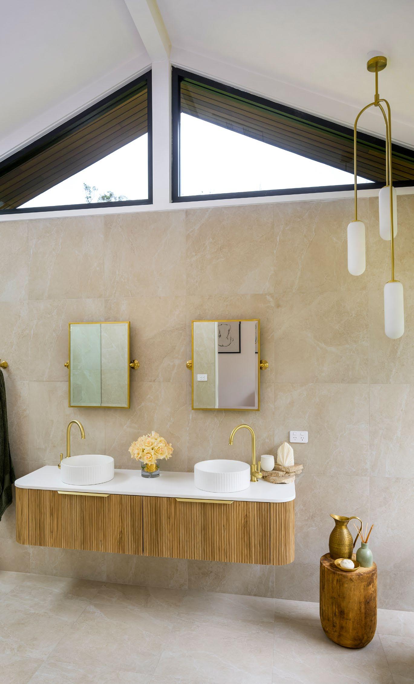
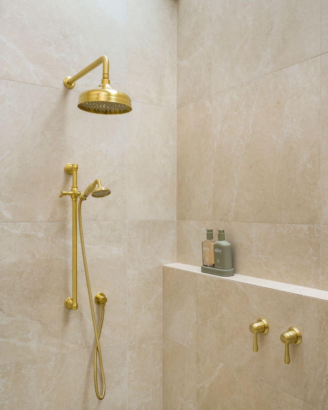
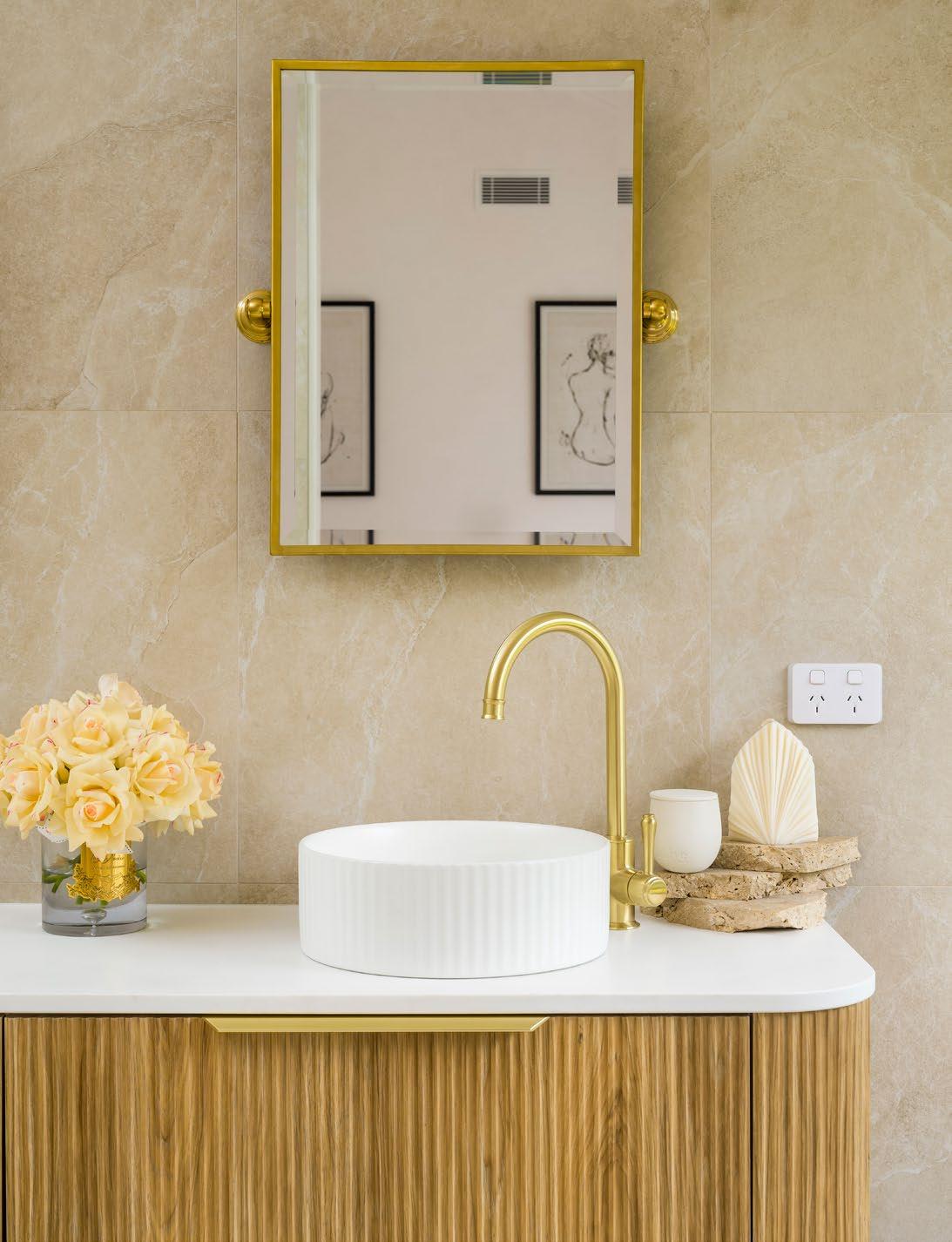
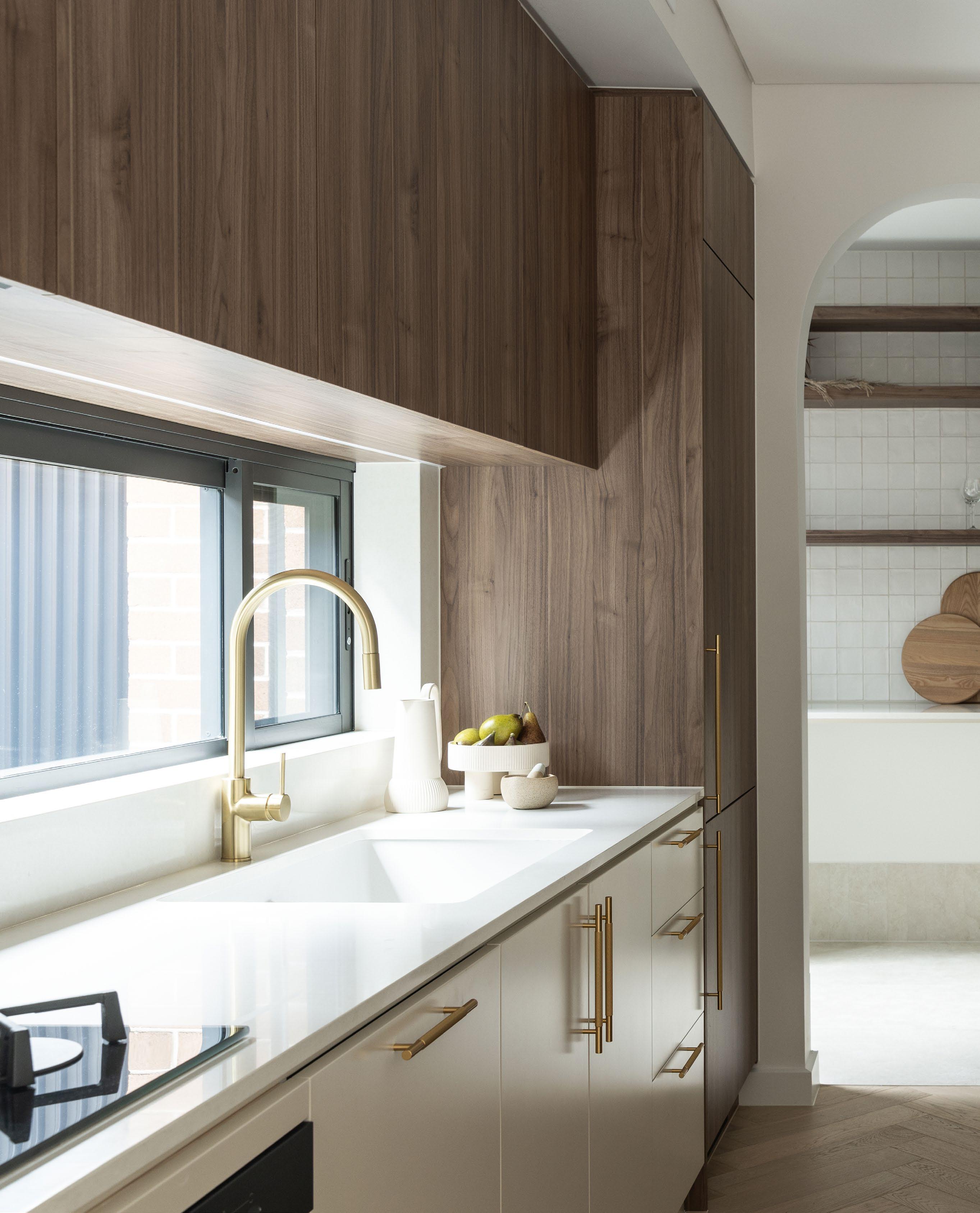
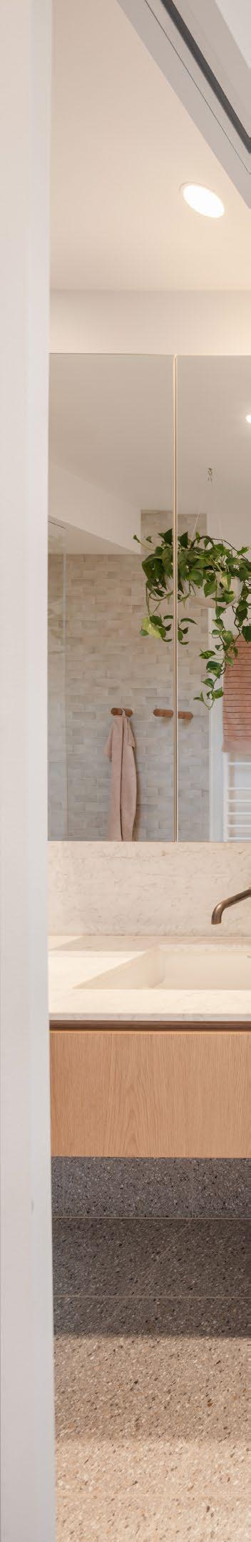
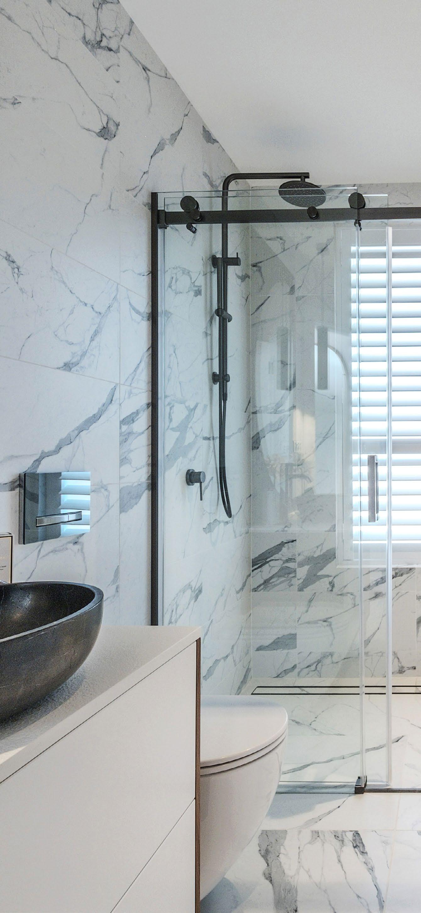
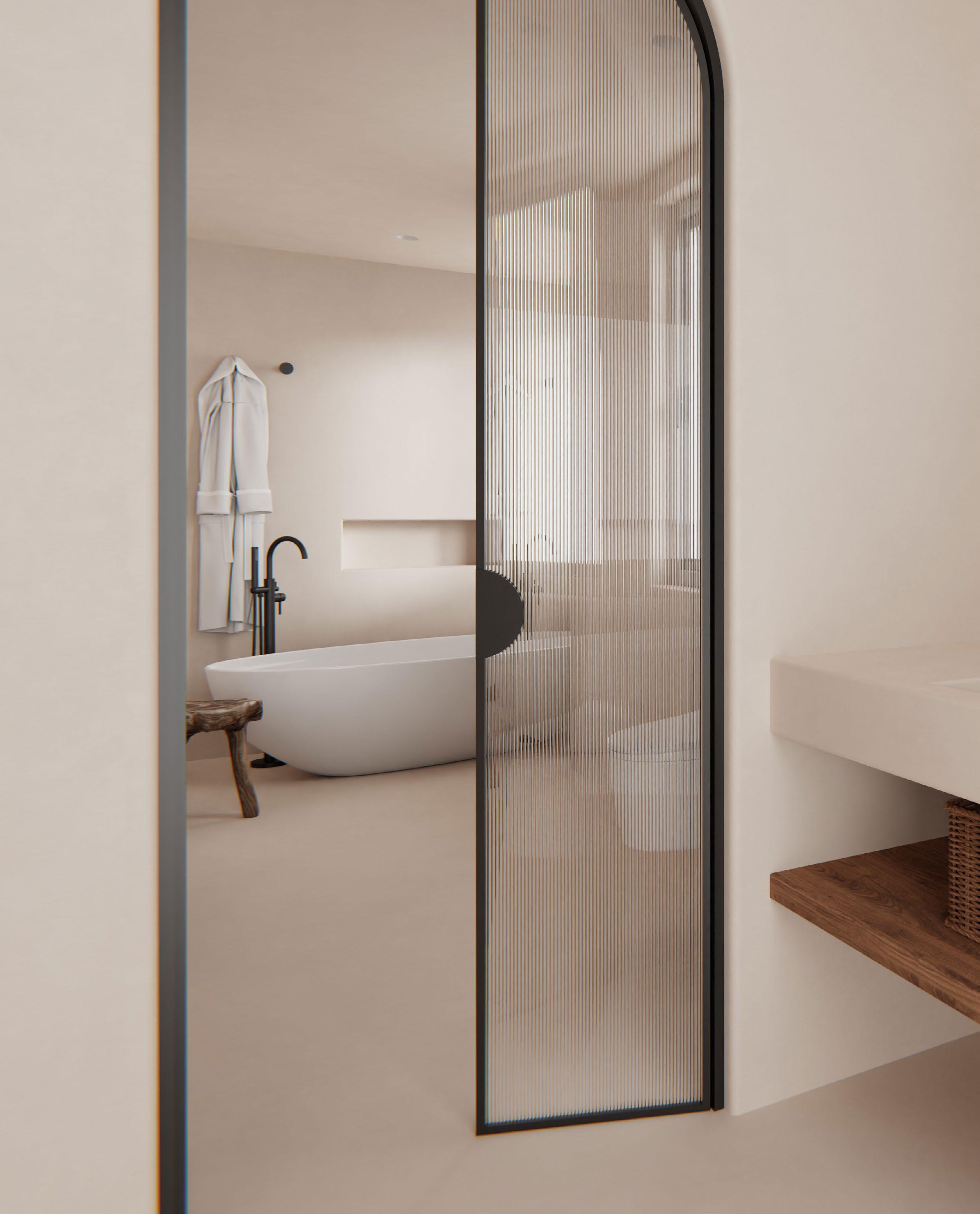
From functional spaces to luxurious escapes, today’s bathrooms are redefining wellness through material warmth, sensory design and clever planning.
Bathrooms are no longer simply utilitarian zones. In the evolving language of interior design, they have become sanctuaries of self care, tailored to offer both aesthetic pleasure and everyday functionality. Whether nestled in a suburban family home or a remote modern farmhouse, contemporary bathrooms now speak fluently in the dialects of comfort, light and bespoke materiality.
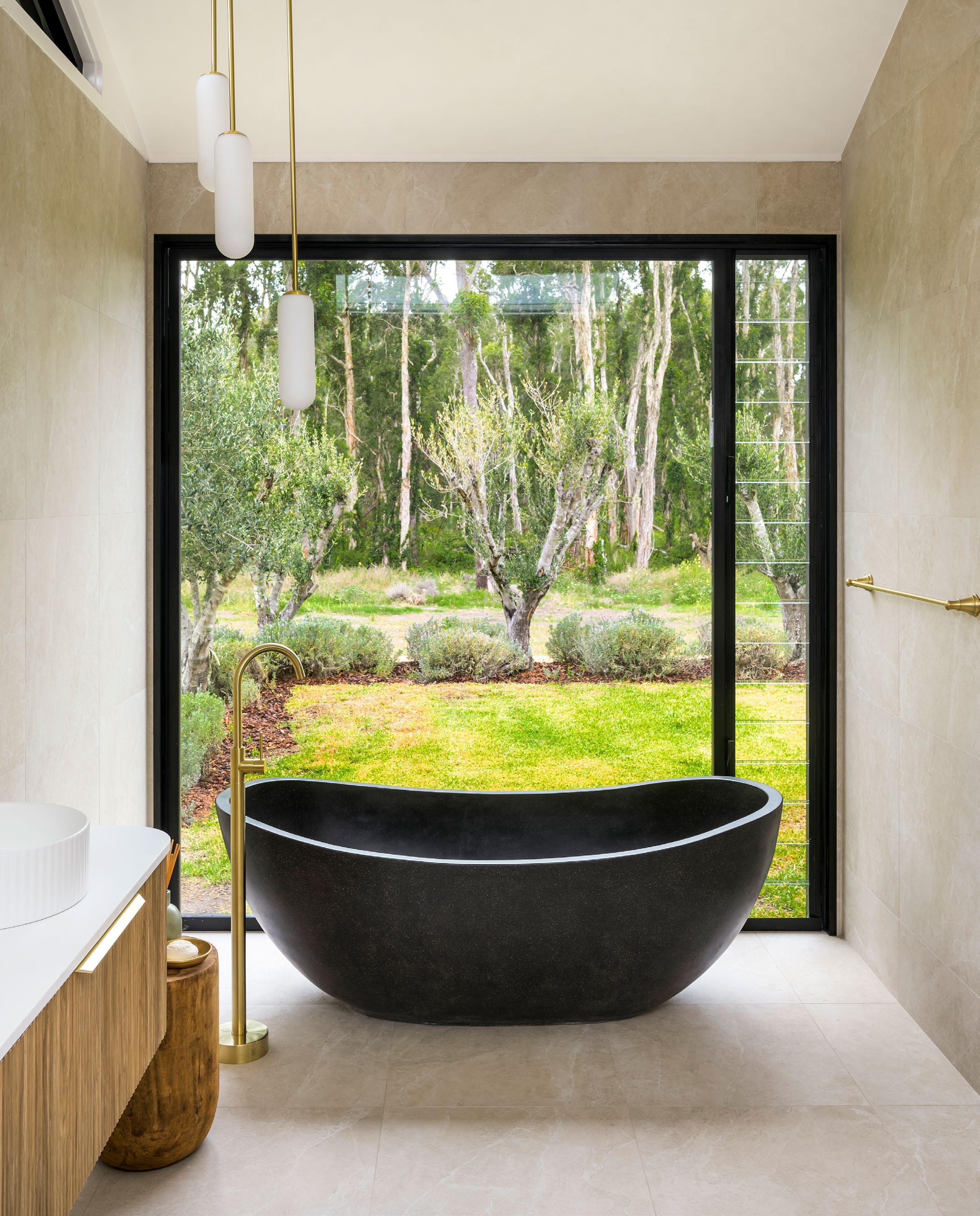
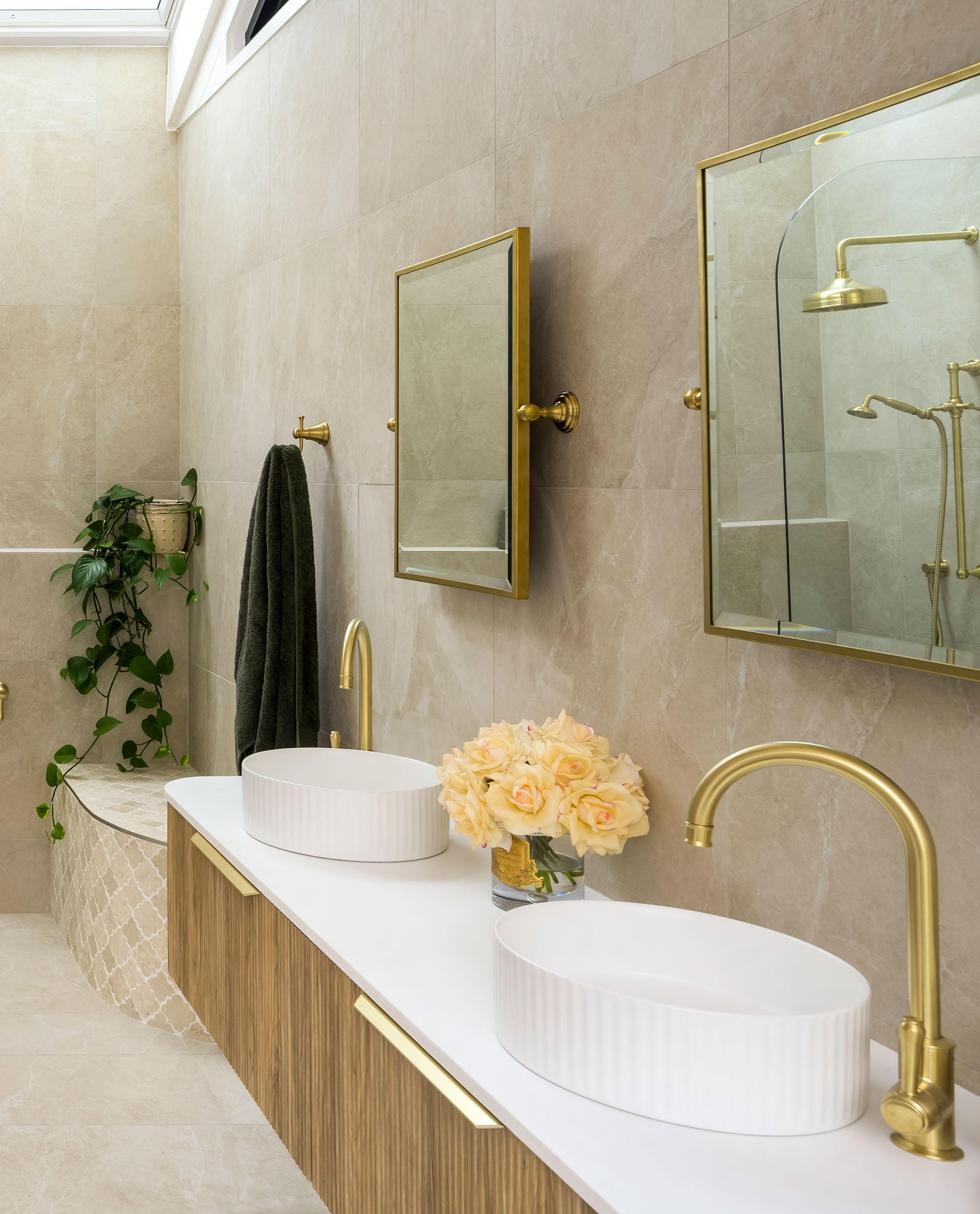
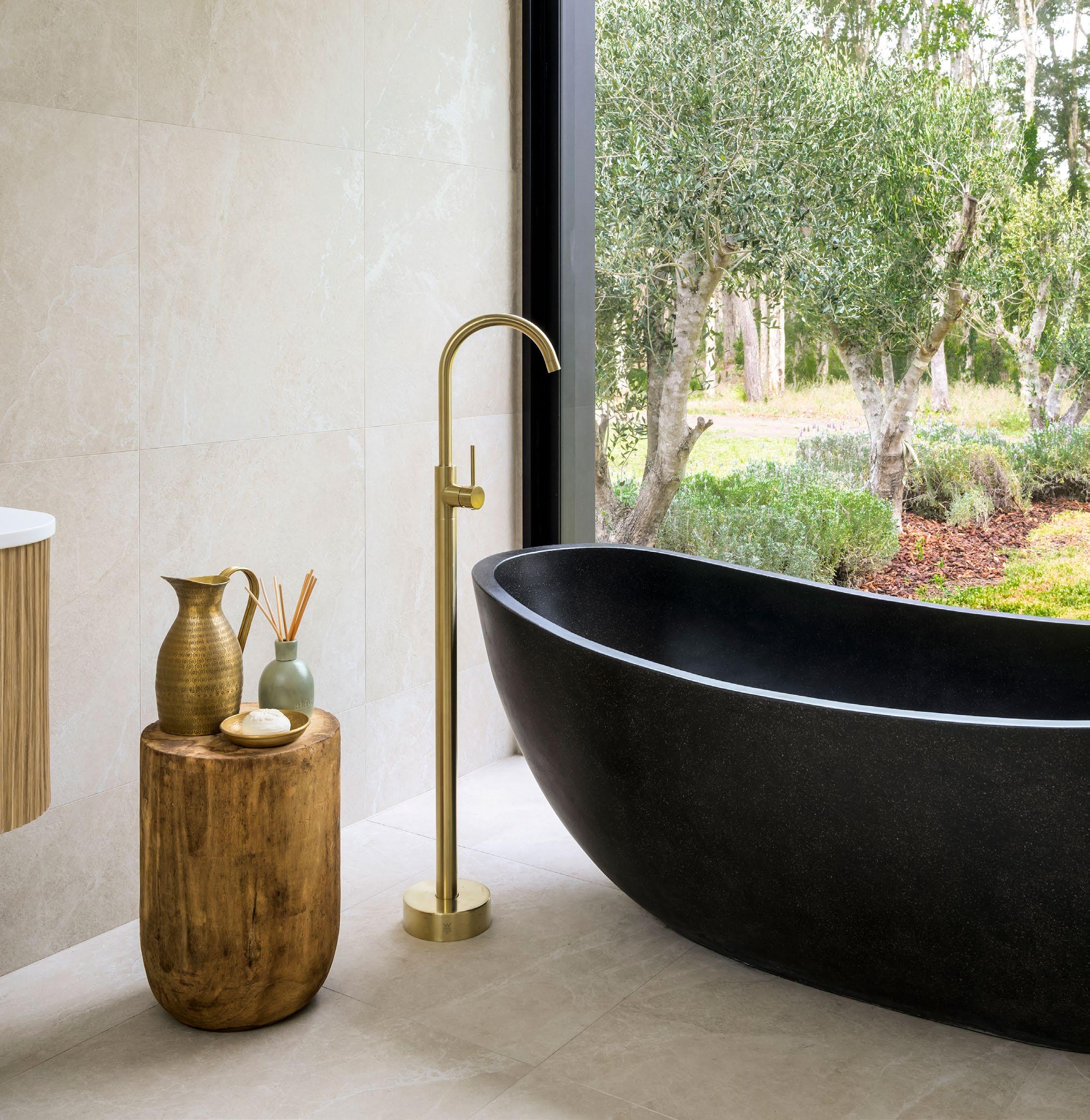
One of the most defining shifts in modern bathroom design is the rise of natural textures. Matte travertine, timber grain and brushed brass are increasingly specified for their ability to soften clinical edges and introduce a spa like calm. These materials bring a tactile richness to the everyday, while ensuring visual cohesion with the broader architecture. In many homes, bathroom palettes are now mirroring the tones of nature such as bone, sand, eucalypt and soft slate. The result is a restorative link between indoors and outdoors.
Lighting plays a crucial role in amplifying this mood.
Skylights and clerestory windows invite daylight into even the most tucked away ensuite, while warm LED wall lights or sculptural pendants shift the space into an evening retreat. The aim is layered illumination that can flex from energising morning routines to wind down rituals at dusk.
Spatially, bathrooms are embracing openness and flow. Floating vanities and open showers are liberating floorplans, often with no threshold between wet and dry zones. Organic curves are appearing in unexpected places such as mosaic clad bench seats, rounded baths and arched mirrors. Each of these features lends softness to the spatial envelope.
Take for instance the bathroom at Bakker Design’s Modern Farmhouse project in Anna Bay. Here, curved timber cabinetry and twin sculptural basins sit beneath triangular highlight windows that echo the geometry of the roofline. A freestanding stone bath faces floor to ceiling glazing, revealing a secluded garden of olive trees and lavender. This creates a literal view to calm.
Elsewhere, a soft toned stone palette continues across walls and floors, punctuated by elegant brass fittings and a trio of pendants that hover like sculpture. Every surface, from the fluted cabinetry to the tiled shower bench, invites touch. While rooted in luxury, the design never feels excessive. Instead, it reads as quietly confident, designed for living, not just for display.
Whether minimal or layered, symmetrical or sculptural, the modern bathroom is a canvas of wellbeing.
The best designs elevate the daily routine into something intentional and sensory. And in doing so, they reflect a broader truth. The spaces we retreat to should be as thoughtfully crafted as those we entertain in.
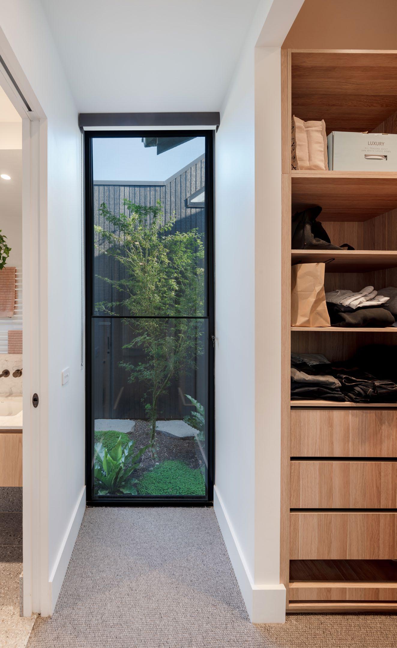
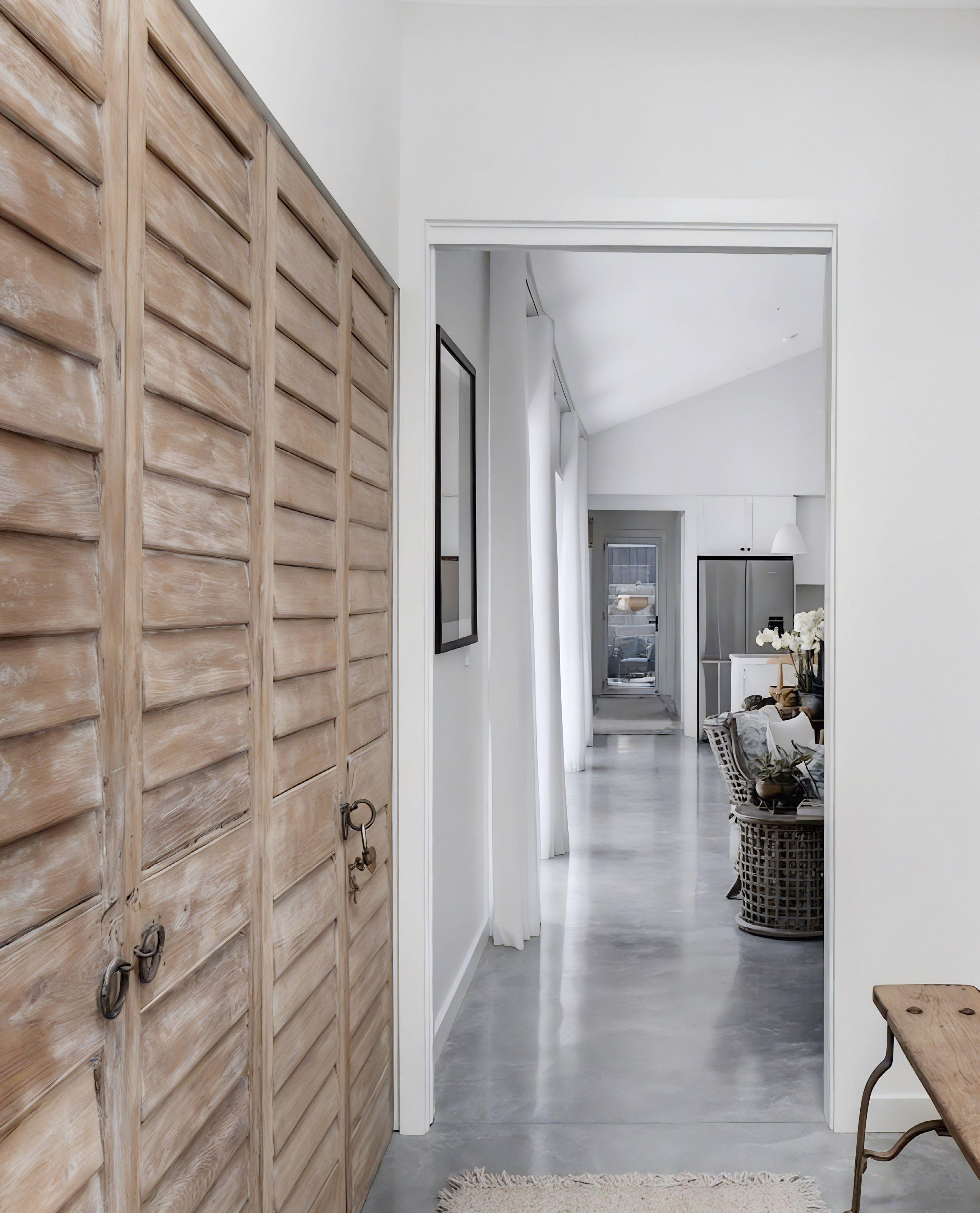
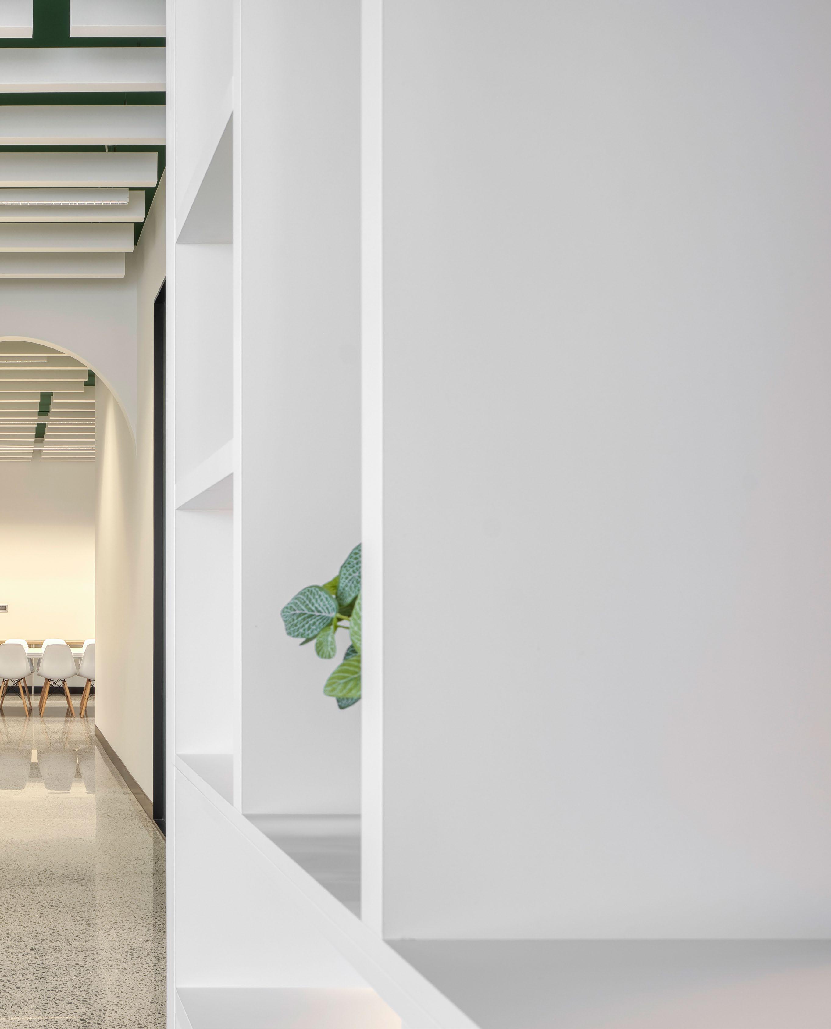
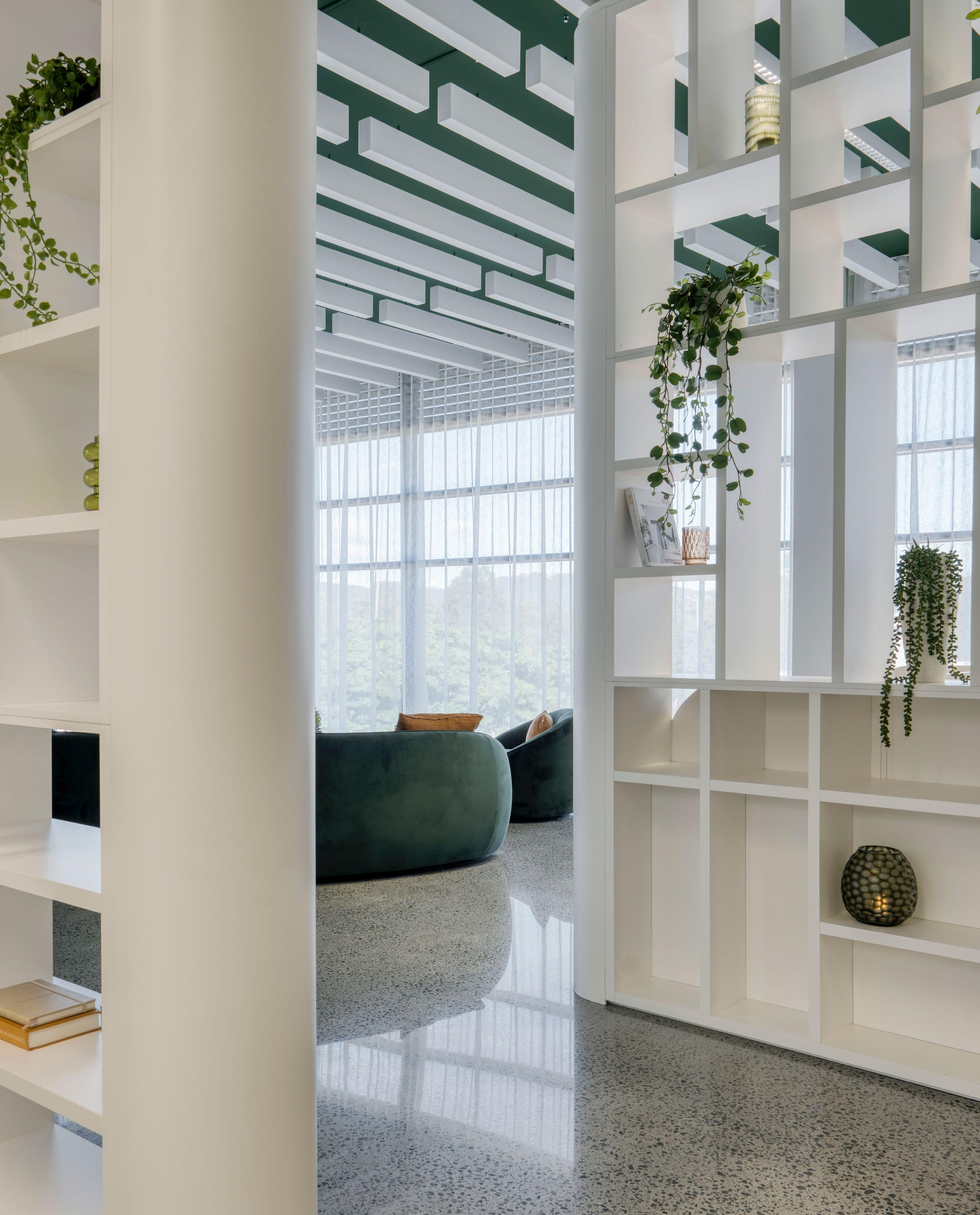
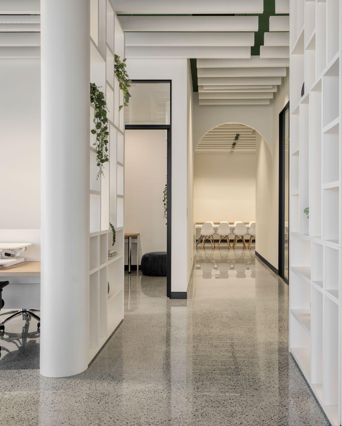
From subtle cues to sculptural gestures, spatial navigation is an invisible art form shaping how we live, move, and feel within our homes.
Spatial navigation is not just about how we get from room to room. At its best, it is the architecture of movement itself an orchestrated experience shaped by thresholds, transitions, textures, and light. Increasingly, designers are rejecting rigid zoning in favour of intuitive, flow-led interiors that feel as good to move through as they do to look at.
The design process behind this kind of navigation begins well before material choices. It starts with questions: Where does the eye land first? What rhythm does the body fall into when rounding a corner or entering a room? Where does a pause feel natural and where does momentum want to build?
Spatial navigation is expressed in a multitude of ways. At its most literal, it can be a framed sightline that draws you down a hallway or an archway that signals progression from public to private. At its most poetic, it is a narrowing of corridor width to induce compression, followed by an open living space that releases it echoing the inhale and exhale of human breath.
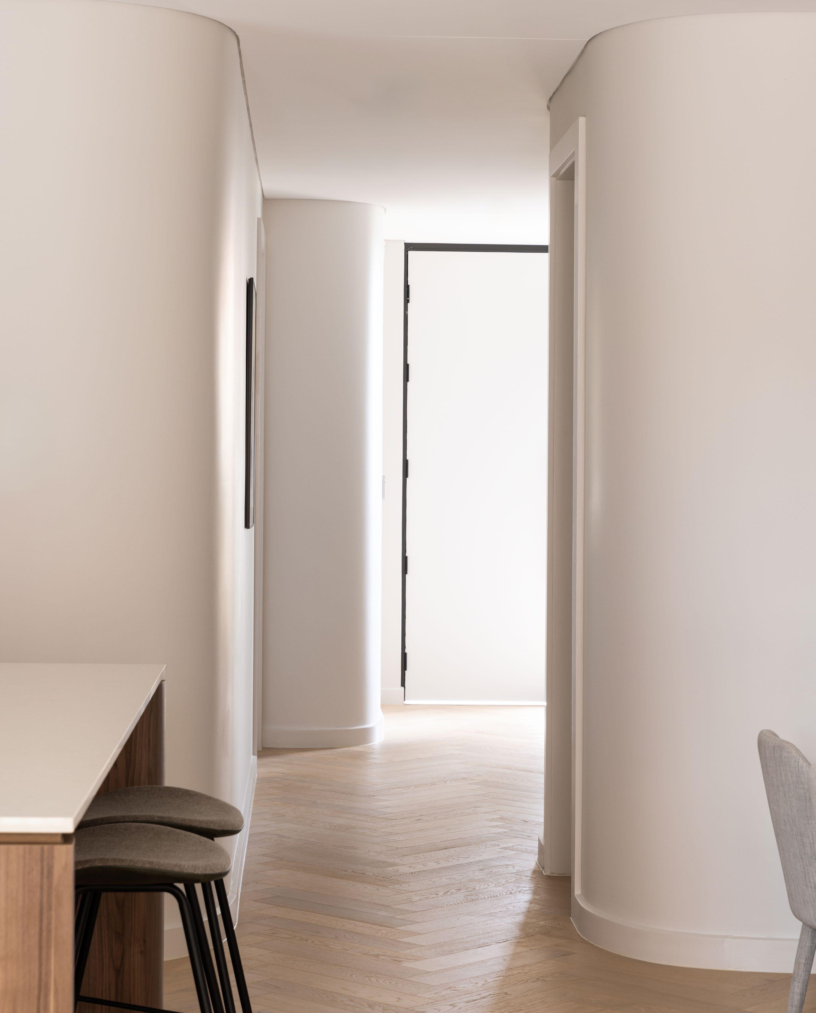
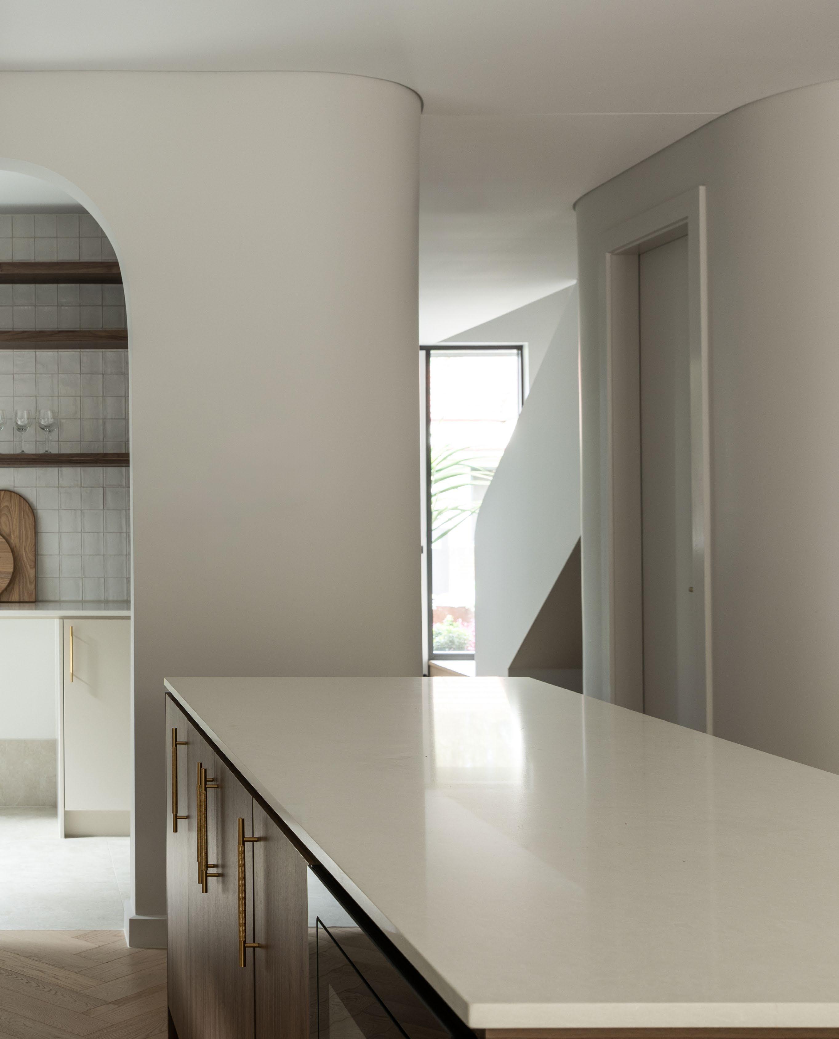
Spatial navigation is the architecture of movement itself an orchestrated experience shaped by thresholds, transitions, textures, and light.
In contemporary design, this choreography often blends visual softness with formal restraint. Wall curves invite rather than obstruct, integrated handles and shadow lines guide the hand, and overhead transitions such as changes in ceiling height or lighting tone cue psychological shifts between tasks or times of day.
Crucially, successful spatial navigation does not demand vast footprints. Even compact homes can harness movement through considered layering and subtle spatial reveals. A change in flooring direction, a glimpse of a garden beyond a hallway, or a pivoting wall panel can all create meaningful directionality.
Ultimately, spatial navigation is an emotional as much as a functional design strategy.
Ultimately, spatial navigation is an emotional as much as a functional design strategy. It determines how welcome a home feels, how confidently a guest can orient themselves, and how seamlessly daily routines unfold. It is not the route taken, but the experience of taking it.

There are many levers a designer can pull to meet the design intent and building code performance requirements and each has a different cost impact.
Cost informing design is about understanding the cost impact of these decisions as early as possible in the design cycle. This means the costing has to be accurate and responsive to the design details. That is YourQS!
For example, our H1 Value Engineering Service allows NZ designers identify the most costeffective selections that meet the requirements while considering design preferences.
Fast accurate 3D estimating for residential building
www.yourqs.com.au www.yourqs.co.nz
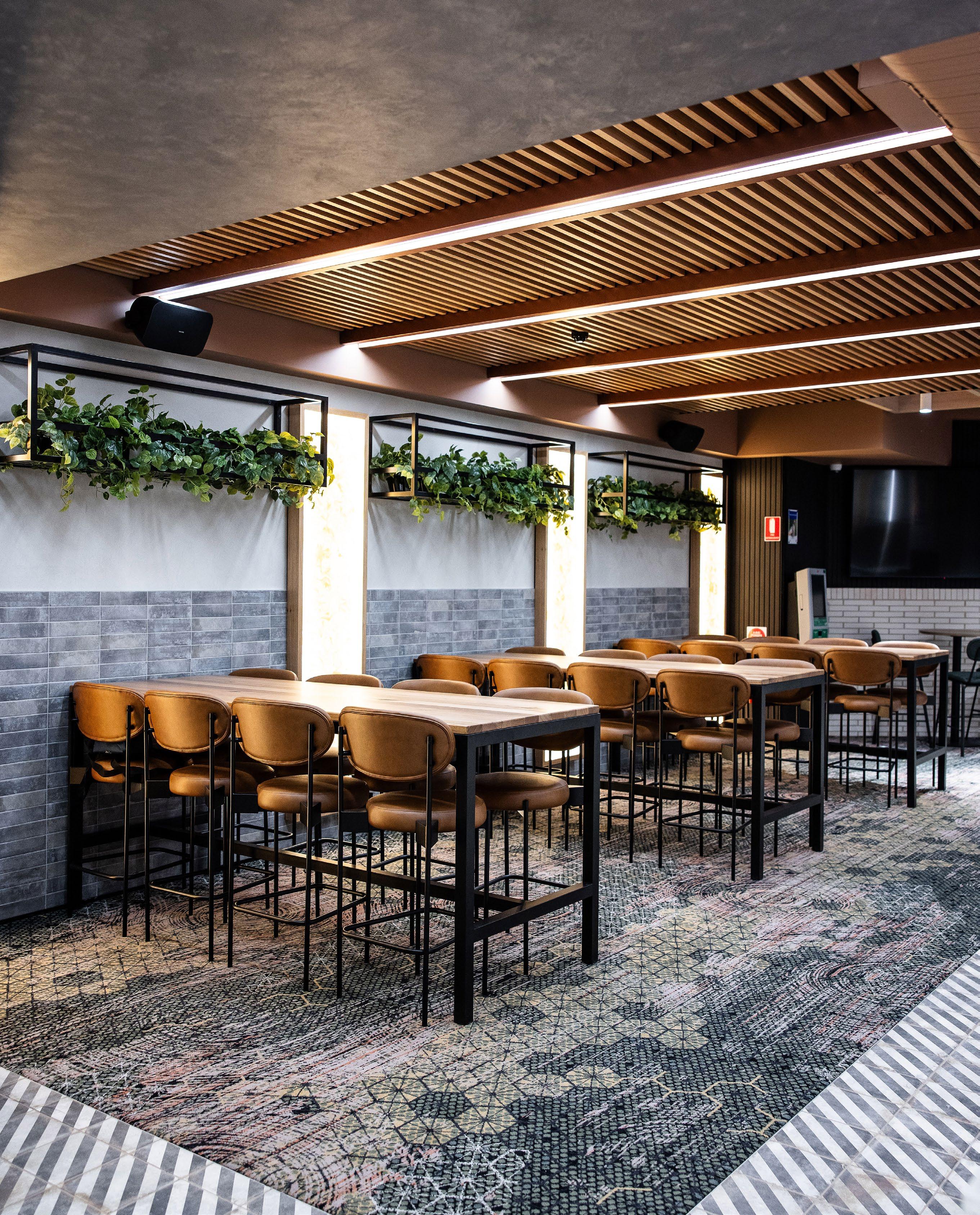
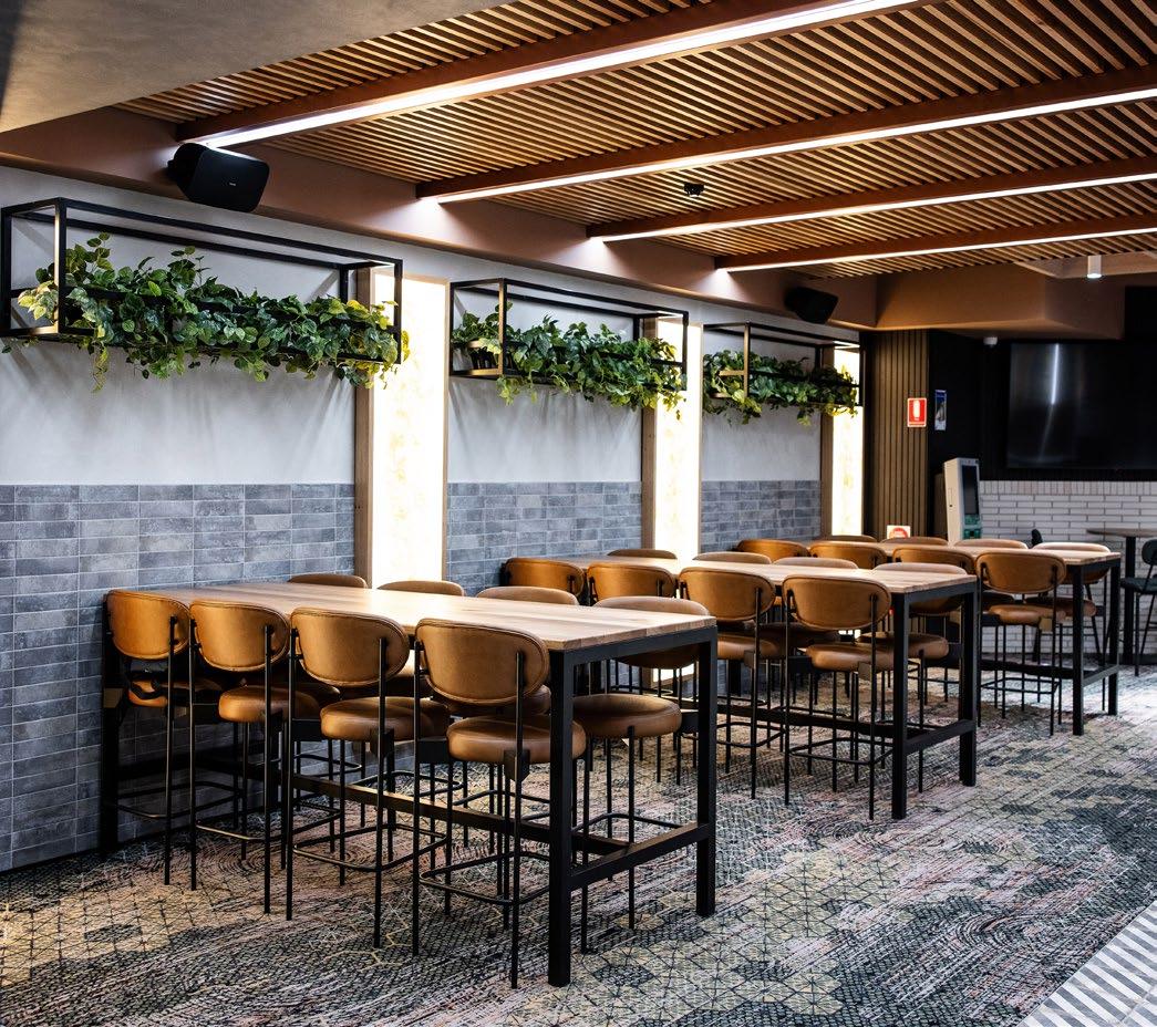
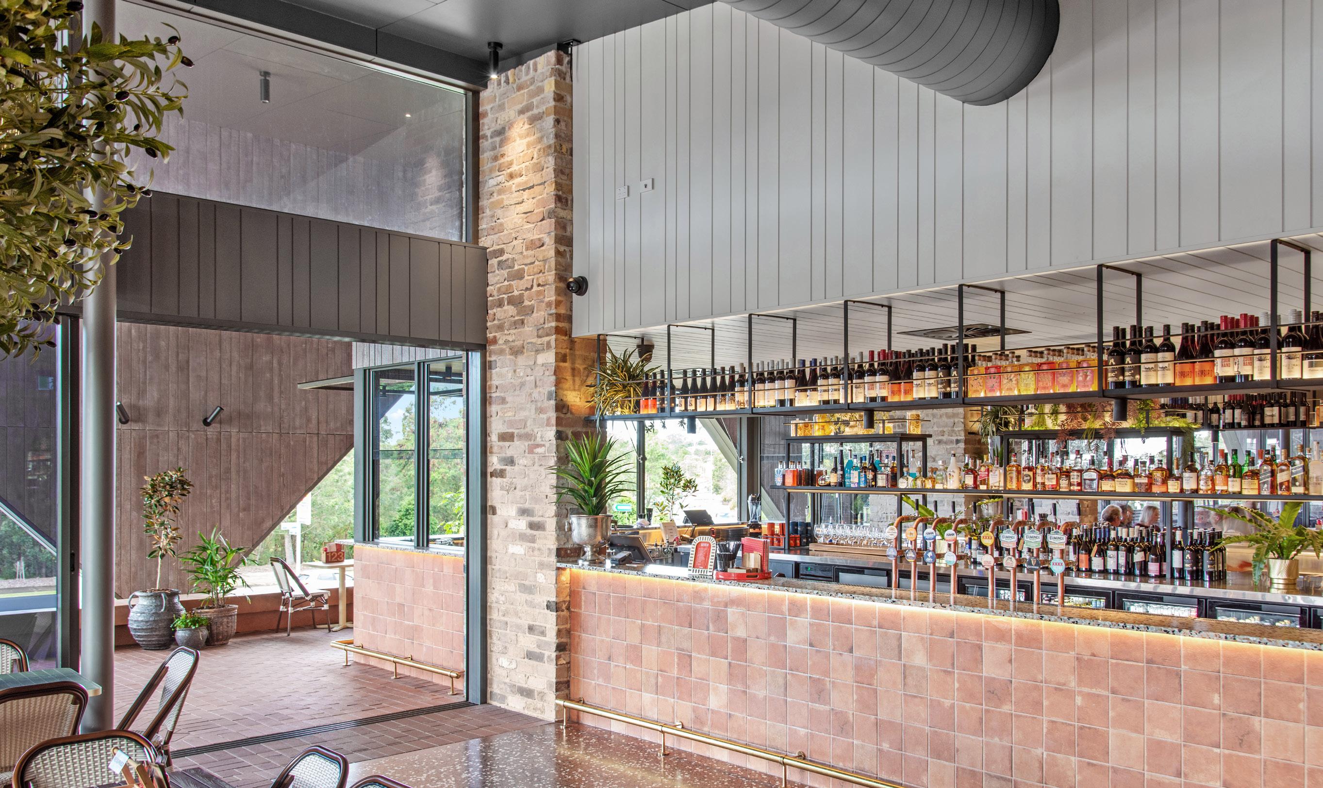
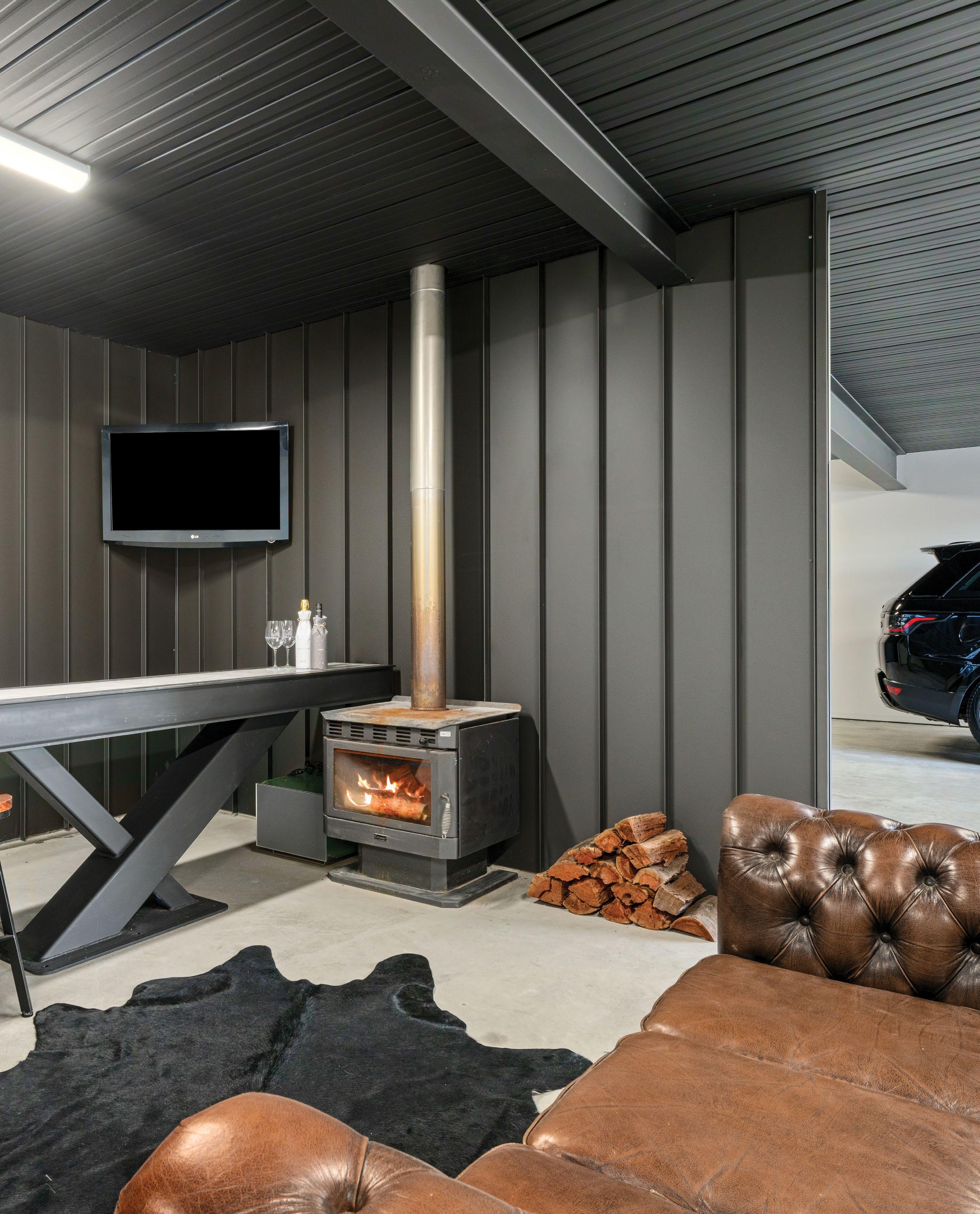
From underutilised basements to bold hospitality landmarks, commercial interiors today are driven by the art of spatial reinvention and emotional connection.
Contemporary commercial interiors are evolving far beyond their functional brief. Where once efficiency and durability ruled, today’s best spaces serve as strategic brand tools, social catalysts, and emotional experiences in themselves. They must connect with diverse demographics, adapt to shifting commercial patterns, and simultaneously offer moments of comfort, curiosity, and surprise.
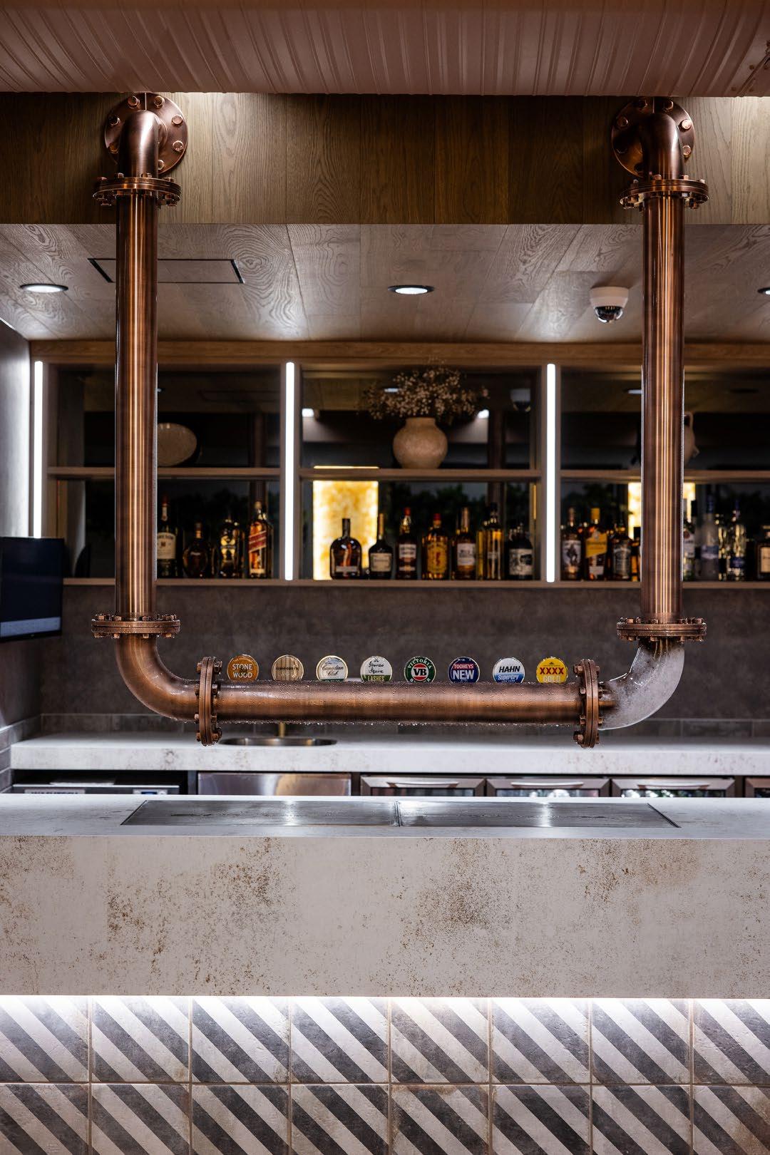
EMVY resisted the usual palette of dark timbers and steel mesh, instead opting for salmon-painted ceilings, Italian marble mosaics, and rose bronze beer fonts.
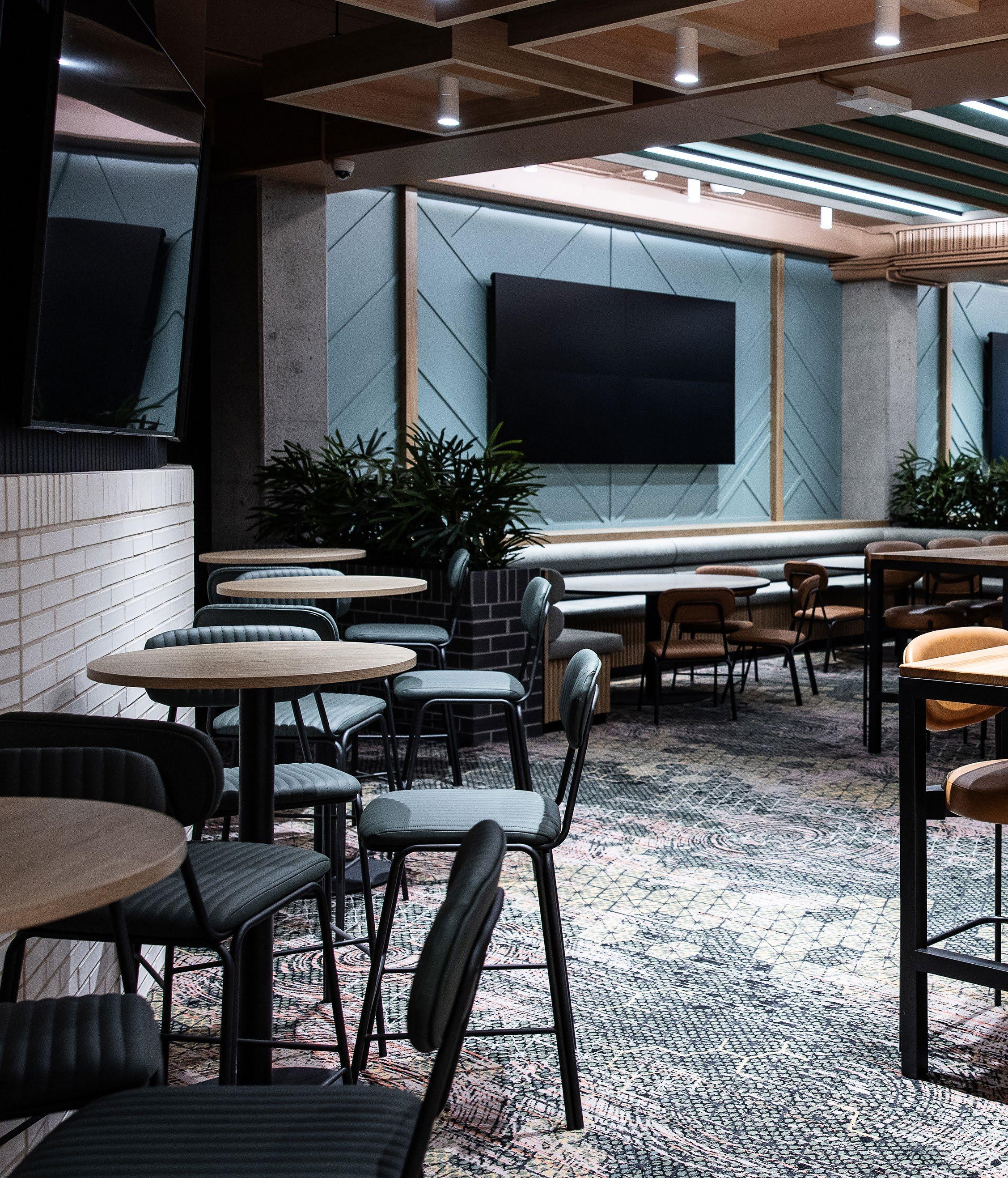
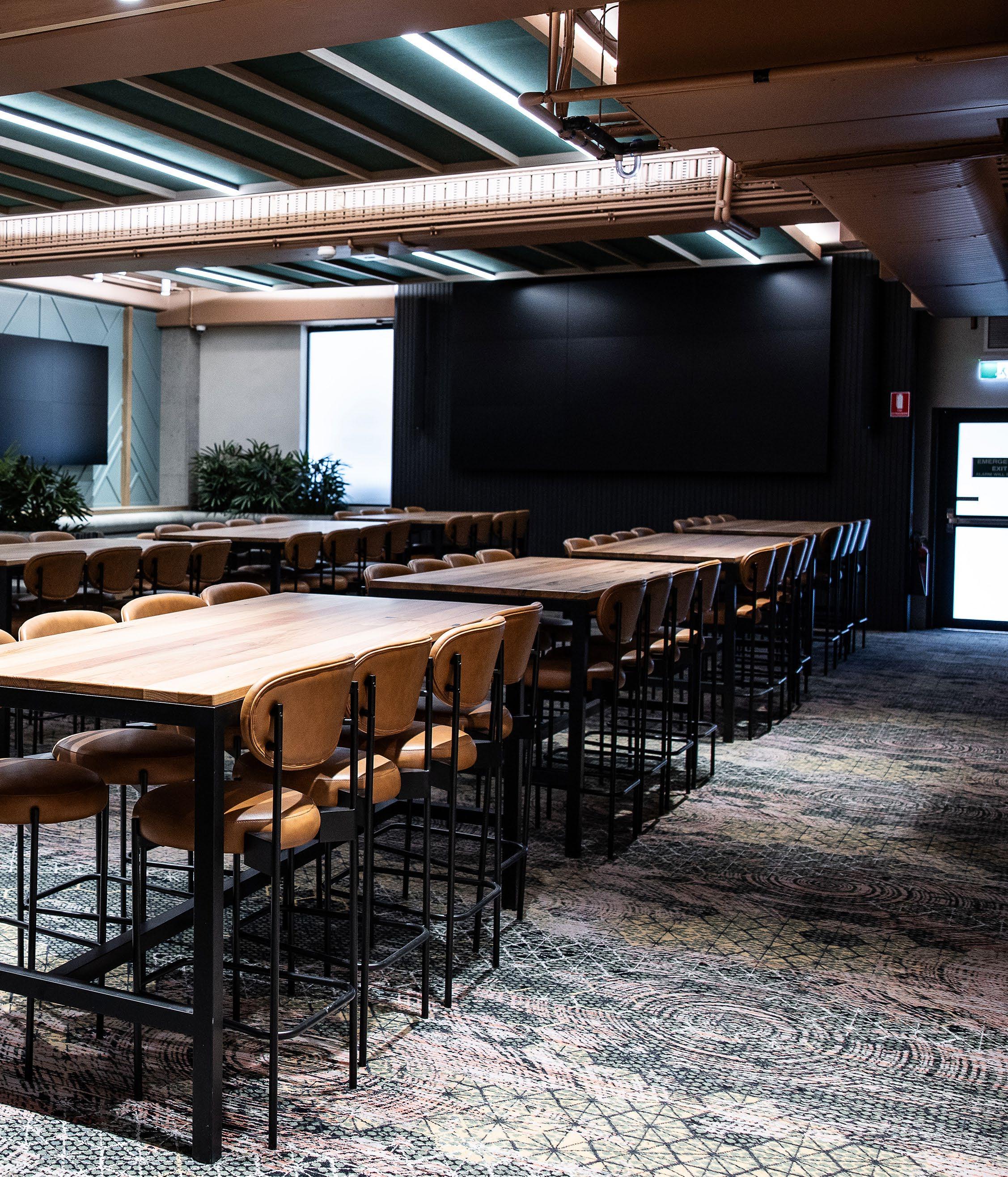
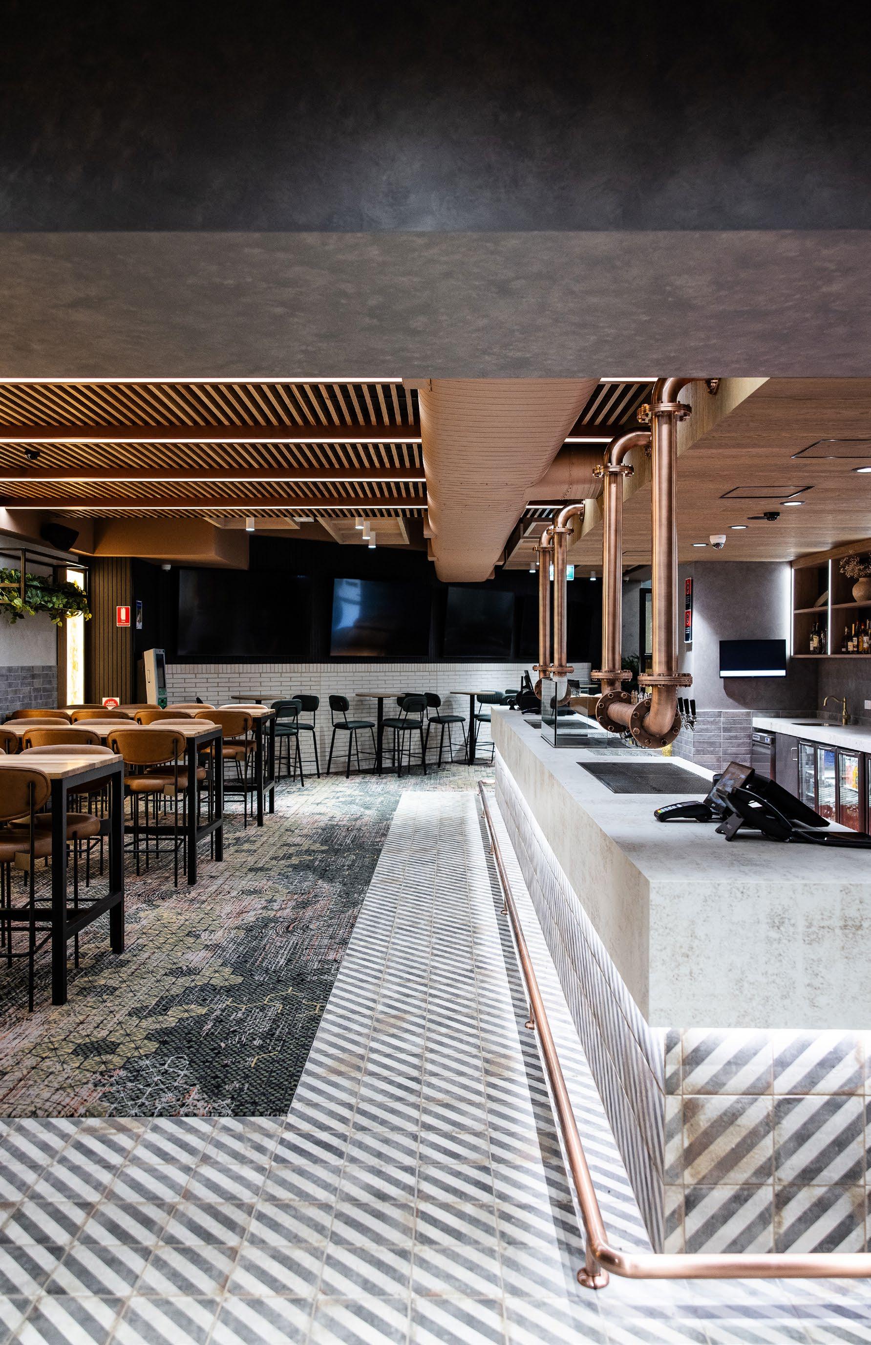
Take, for example, the transformation of an unremarkable concrete basement into the vibrant Cedar Cutters Sports Bar in Kiama, NSW. The project, designed by EMVY Design, exemplifies the genre’s growing complexity. It is not merely a venue - it is an intervention into the expectations of what a sports bar should feel like. The space had to contend with significant structural limitations, requiring inventive solutions like carbon fibre structural reinforcement to maintain integrity while introducing services and ventilation into the original concrete shell. This kind of behind-the-scenes ingenuity is increasingly typical in commercial design where space reuse is both environmentally and economically strategic.
However, what elevates this example is its conceptual courage. EMVY resisted the usual palette of dark timbers and steel mesh, instead opting for salmon-painted ceilings, Italian marble mosaics, and rose bronze beer fonts. The result is a hospitality environment that both challenges and welcomes, offering a refined theatricality more akin to boutique hotel bars than the traditional sports venue. It is this embrace of surprise and material storytelling that characterises the best of modern commercial interiors.
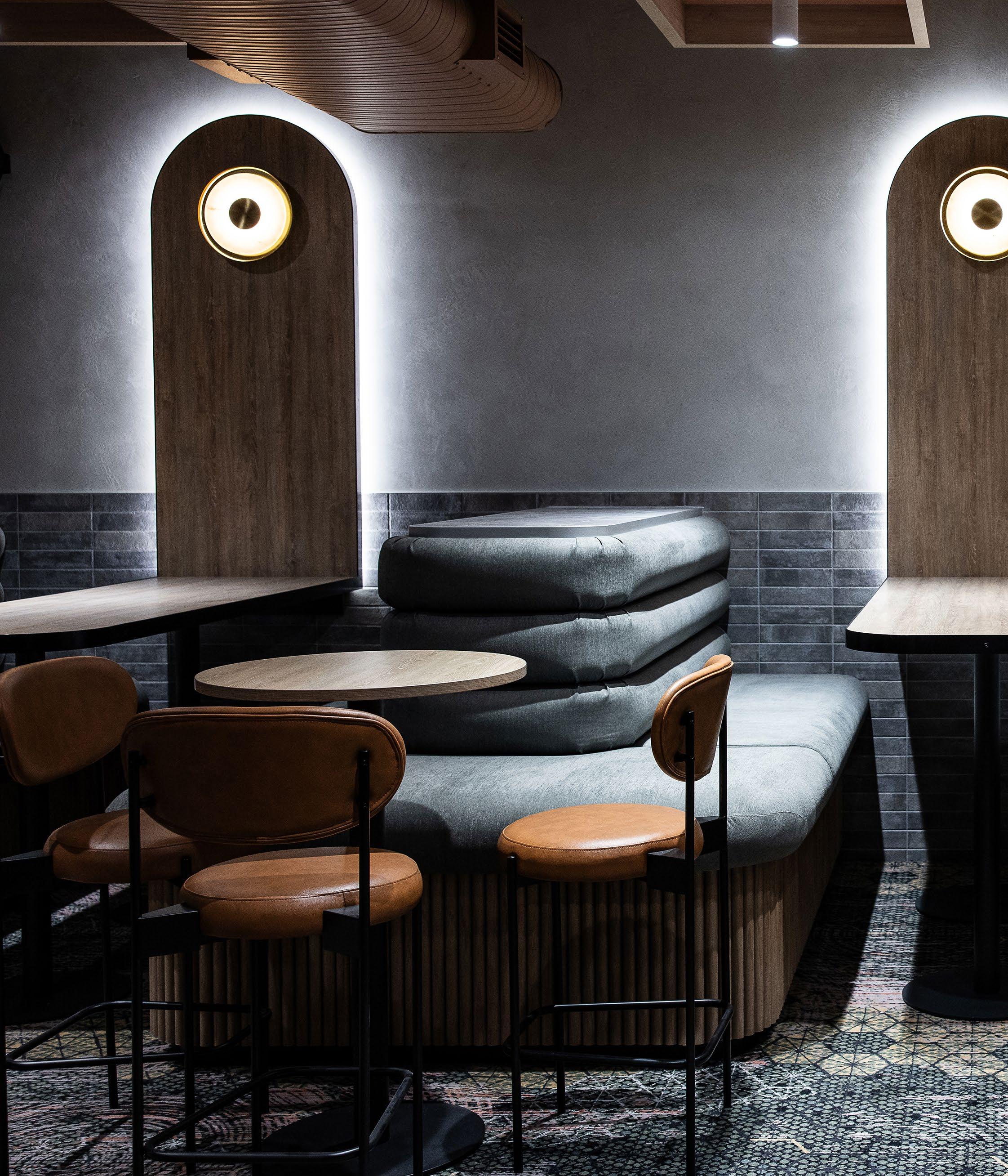
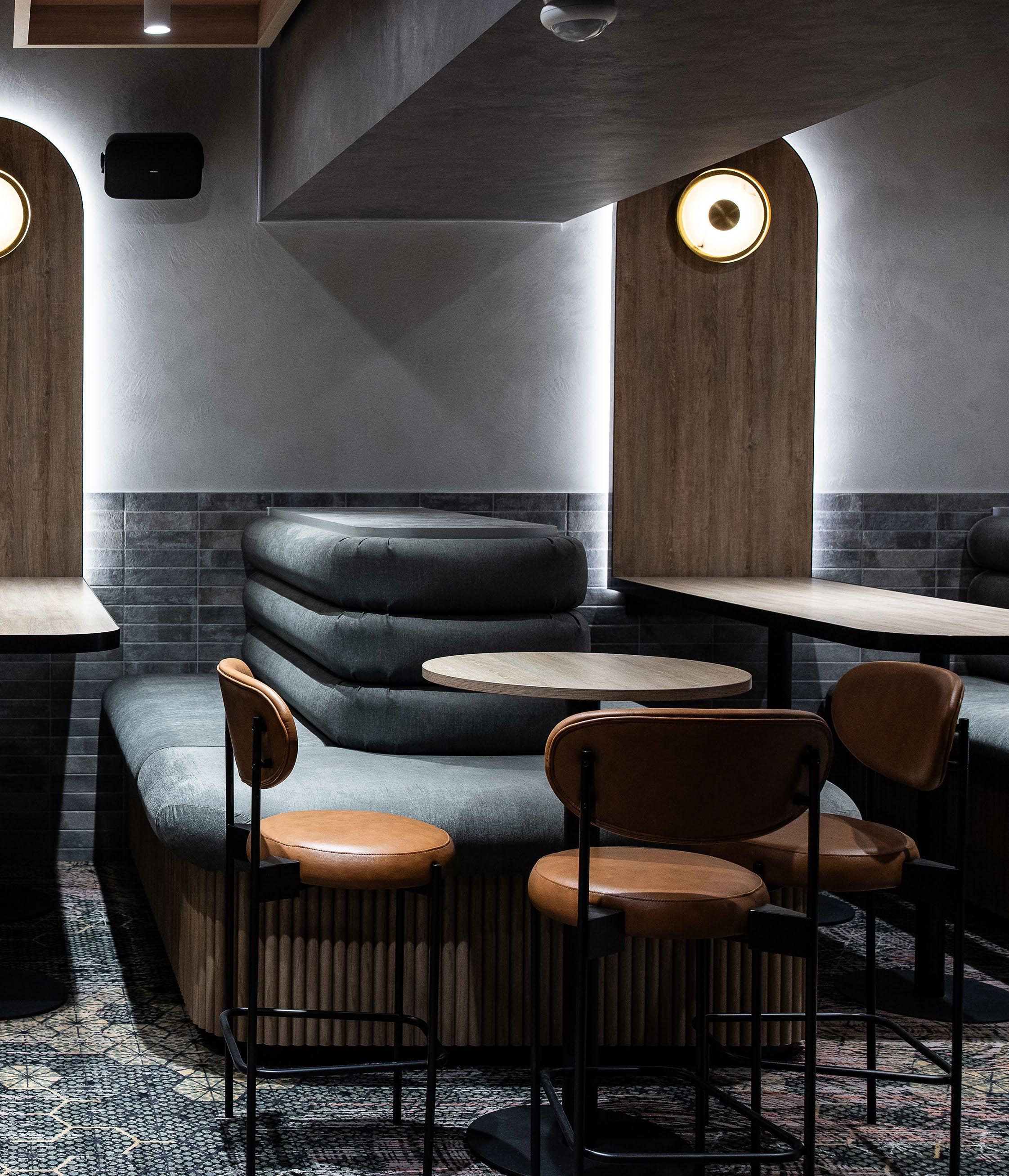
Beyond aesthetics, functionality and zoning remain paramount. The spatial layout must anticipate varied occupancy patterns, from solo patrons to large groups, while maintaining a coherent and legible flow. The seating options, lighting levels, and acoustic treatments all operate in concert to ensure the space feels vibrant when full and intimate when sparse. In Cedar Cutters, different areas cater to different moods and needs without explicit signage.
The architecture speaks quietly but clearly, a crucial success metric for any public-facing interior.
Commercial designers today must also consider temporal adaptation. The ability for a space to flex its function across seasons, hours of trade, or shifts in business strategy is now built into the brief. The kitchen at Cedar Cutters, for instance, was designed for a casual menu but structured to support future expansion into full dining service. This kind of foresight ensures spatial relevance without the need for disruptive renovation down the line.
Ultimately, commercial interior design now occupies a space between narrative and necessity. It is where structural problem-solving meets sensory choreography. Whether tucked beneath a club or rising as a new retail flagship, the best commercial spaces are no longer just containers of activity - they are active participants in the brand story, cultural context, and community experience.
Proudly Australian made, Weathertex cladding is the dependable
Proudly Australian made, Weathertex cladding
interiors
Walk in wardrobes are no longer just a storage zone. Today, they are immersive, curated spaces for everyday ritual and refined living.
Once hidden behind doors and relegated to a purely functional role, the modern walk in wardrobe has evolved into a statement of personal luxury and spatial clarity. It is not simply where clothing lives—it is where the daily narrative begins.
At its core, the walk in wardrobe is a space of transition. It bridges the private sanctuary of the bedroom and the outward-facing rhythms of the day. Designers are now treating these zones as fully fledged interiors rather than utility appendages, aligning them in both materiality and mood with the architecture of the home. Soft lighting, refined timber joinery, integrated seating, and plush underfoot finishes combine to create an experience that is as tactile as it is visual.
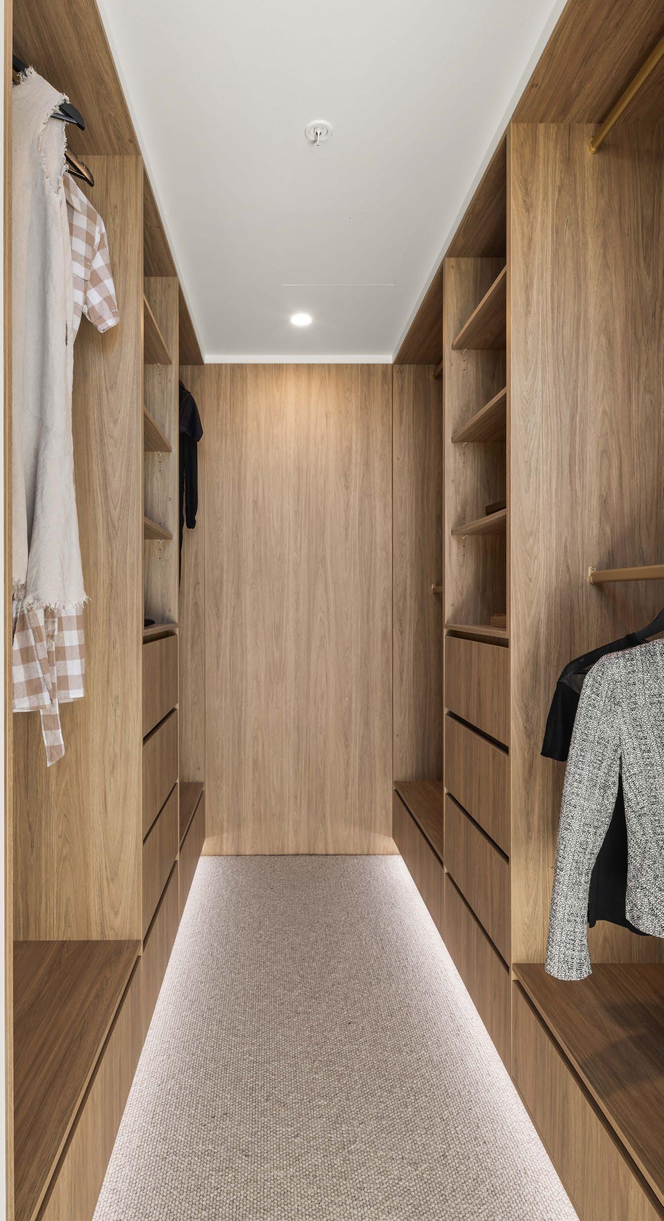
One of the defining features of a contemporary walk in robe is its zoning logic. Sections are often tailored to functionm - formalwear, everyday items, accessoriesand even emotional rhythms, with display-style shelving for beloved pieces or seasonal rotation. High-end examples integrate soft close drawers, mirrored panels, and concealed compartments with a fluidity that evokes boutique retail design.
In the image, we see how the cabinetry becomes part of the room’s aesthetic identity. The pale timber provides visual warmth and softness, while the integrated LED lighting above each rail illuminates garments with both practical purpose and sculptural effect. The use of an unexpected blue carpet adds a sense of domesticity and comfort, grounding the experience in quiet indulgence.
sensors and programmable dimming options are increasingly common in more premium builds.
Lighting is especially important. Gone are harsh ceiling globes and fumbling through shadows. Instead, ambient lighting schemes and targeted illumination showcase textiles without glare and add a sense of calm and clarity. Motion sensors and programmable dimming options are increasingly common in more premium builds.
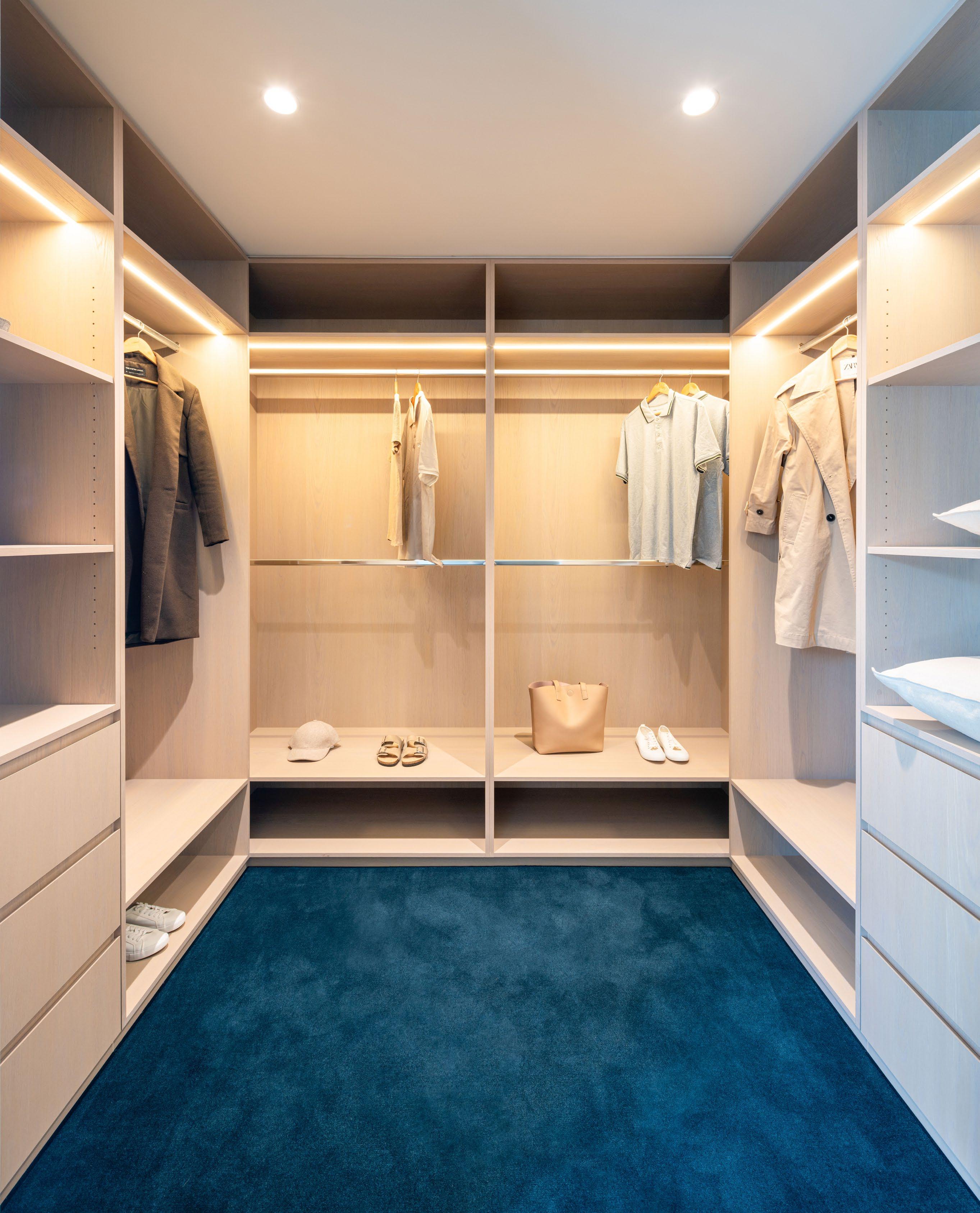
Spatial generosity also plays a role. While not every home can offer the footprint of a full dressing room, clever planning can create the illusion of expanse. Floor to ceiling joinery and mirror placement extend the volume. Open shelving at eye level offers clarity while drawers below streamline storage. Pull out hangers, sliding accessories, and concealed laundry chutes bring function to finesse.
More than anything, the walk in wardrobe now reflects a broader design philosophy: that everyday moments deserve design attention. That the act of selecting what to wear should feel composed, unhurried, and reflective of personal style. These are no longer passive spaces. They are stages for self expression, ordered calm, and the quiet luxury of time.
While not every home can offer the footprint of a full dressing room, clever planning can create the illusion of expanse.
Exploring how overhead battens bring rhythm, acoustics, and visual refinement to contemporary interiors.
Ceilings are often treated as the forgotten plane, quietly functional and typically flat. But in a growing number of contemporary interiors, designers are elevating this surface—literally and figuratively by introducing battened ceiling treatments that frame light, control acoustics, and contribute to a sense of spatial rhythm.
At its most basic, a battened ceiling involves the application of linear timber or fibreboard strips across a ceiling, either in flush or dropped formats. The battens can run parallel for uniformity or be layered to create shadowplay and dimensionality. Yet their design potential extends well beyond pattern-making. Battens have become a device for unifying open plan zones, diffusing natural or artificial light, and bringing a tactile warmth to rooms often defined by harder materials like stone, steel, or concrete.
In residential contexts, battened ceilings are commonly used in kitchens and living areas to subtly separate functions without walls.
In residential contexts, battened ceilings are commonly used in kitchens and living areas to subtly separate functions without walls. The ceiling in these spaces acts as a directional cue drawing the eye along or across, depending on the orientation of the battens. When used alongside skylights or clerestories, battens can filter daylight, creating soft variations in tone that shift with the time of day.
The materiality of battens also contributes to acoustic softening. Their grooves disrupt soundwave travel, particularly in homes with polished concrete or tiled floors. When paired with insulation or fabric linings behind the battens, the effect is even more pronounced offering not just beauty, but comfort.
The beauty of battened ceilings lies in their versatility.
In commercial settings, ceiling battens have evolved from purely aesthetic gestures into performancedriven elements. In restaurants, education hubs, or wellness studios, battens help balance openness with intimacy, dampen echo, and conceal HVAC or lighting systems with elegance. Designers often opt for darker timbers or colour-matched profiles that blend with other ceiling services, avoiding the cluttered effect of exposed utilities.
The beauty of battened ceilings lies in their versatility. They can be used to exaggerate height or create a cozier volume. They can stretch uninterrupted across a large space or be broken into zones that mirror activity beneath. With timber choices ranging from pale oak to smoked ash and profiles ranging from chunky to bladelike, the design expressions are near infinite.
Most importantly, battens remind us to look up. They reinforce the idea that ceilings are not just structural terminations, but architectural opportunities. As homes and workplaces continue to favour open plans, the ceiling has become the new canvas and battens, the brushstroke that animates it.
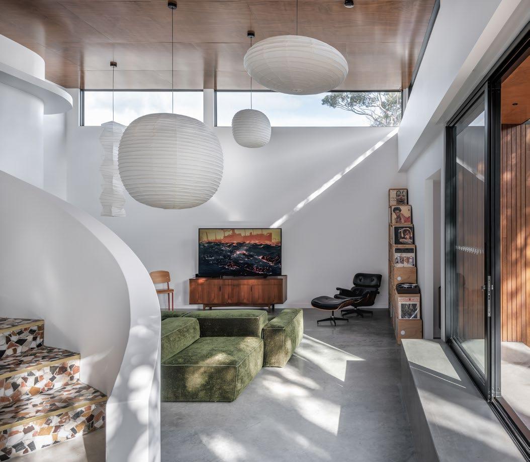
Why concrete floors are stepping into the spotlight for durability, reflectivity and minimalist appeal.
Long regarded as a purely structural element, concrete flooring has evolved into a celebrated interior finish that merges resilience with refined aesthetics. From residential homes to commercial fitouts, polished concrete floors are increasingly specified not just for their toughness but for their quiet sophistication and design versatility.
The appeal begins with performance. Polished concrete is hard wearing, making it ideal for high traffic areas such as corridors, offices, kitchens and retail spaces. It resists scratching and staining more effectively than many other flooring types when properly sealed and it can last decades with minimal maintenance. For commercial clients and homebuilders alike, this longevity translates into value.
Aesthetically, polished concrete offers a palette of subtlety. Its mineral tones and light reflectivity introduce a grounded elegance while the high gloss or satin finishes provide a textural counterpoint to more porous materials like timber or plaster. Concrete’s ability to mirror overhead lighting and bounce daylight adds brightness to interiors that might otherwise feel heavy or enclosed.
What makes polished concrete visually compelling is its variation. Depending on the level of grind and polish, aggregate exposure can range from light speckling to full stone reveal. Designers often use this to their advantage, customising floors to suit the mood of the space from raw and industrial to gallery smooth. In open plan designs, the uninterrupted concrete surface also supports spatial flow, eliminating the visual breaks of thresholds or transitions.
Because concrete is already part of the structural build in most projects, using it as a finished floor reduces the need for additional materials. It can also support thermal mass strategies, retaining heat during the day and releasing it at night for improved energy efficiency.
In the example shown, the polished floor enhances more than just function. It reflects the rhythmic battened ceiling above, drawing the eye upward while its seamless plane anchors the monochrome palette with a soft glossy base. The effect is clean yet characterful, robust yet refined, demonstrating why concrete floors are no longer just the domain of warehouses and workshops.
Polished concrete is not simply a floor underfoot. It is a design gesture that reflects light, sustains temperature and supports a spectrum of aesthetics from coastal minimalism to contemporary commercial. In the hands of skilled designers, it becomes both canvas and anchor.

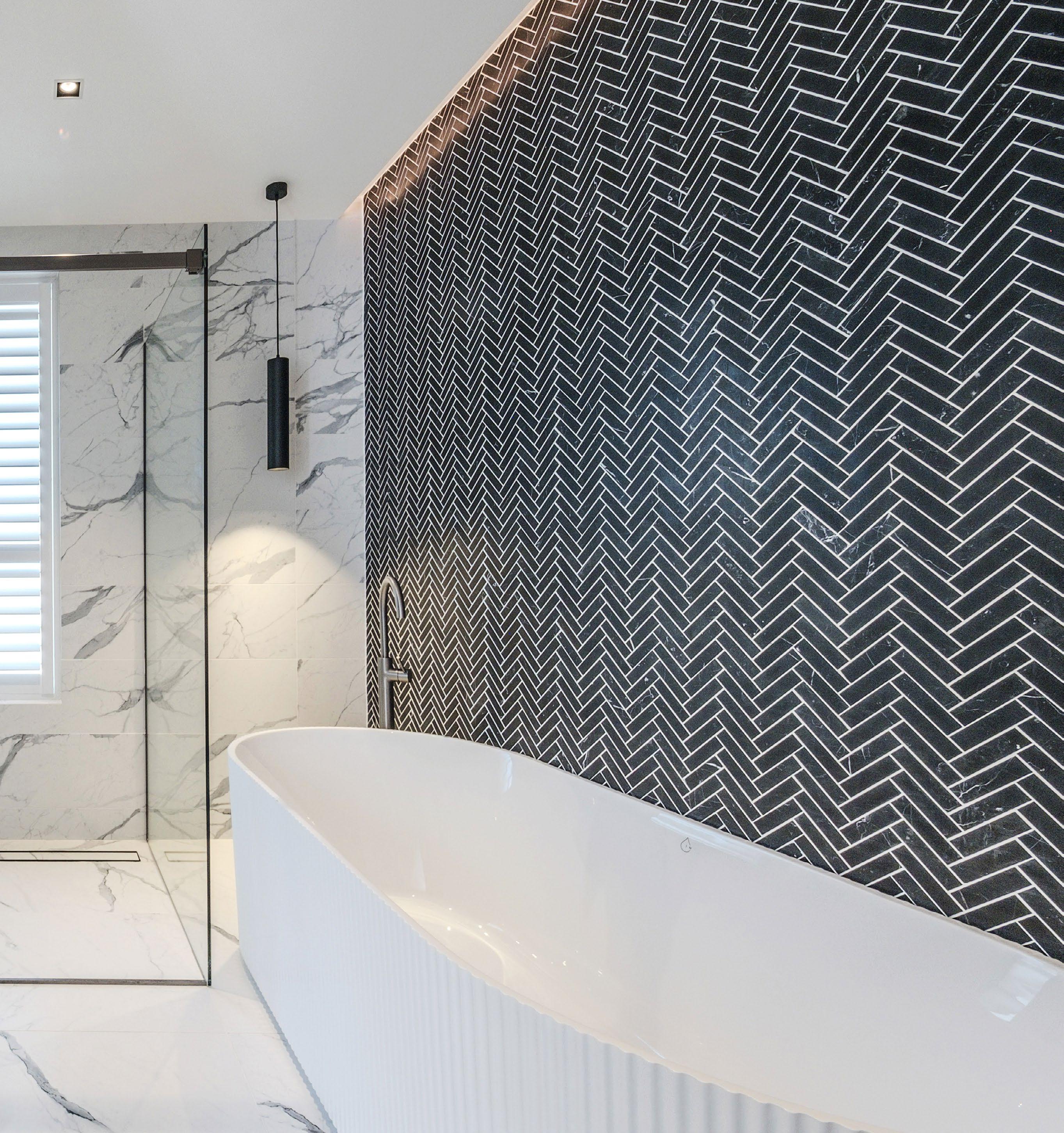
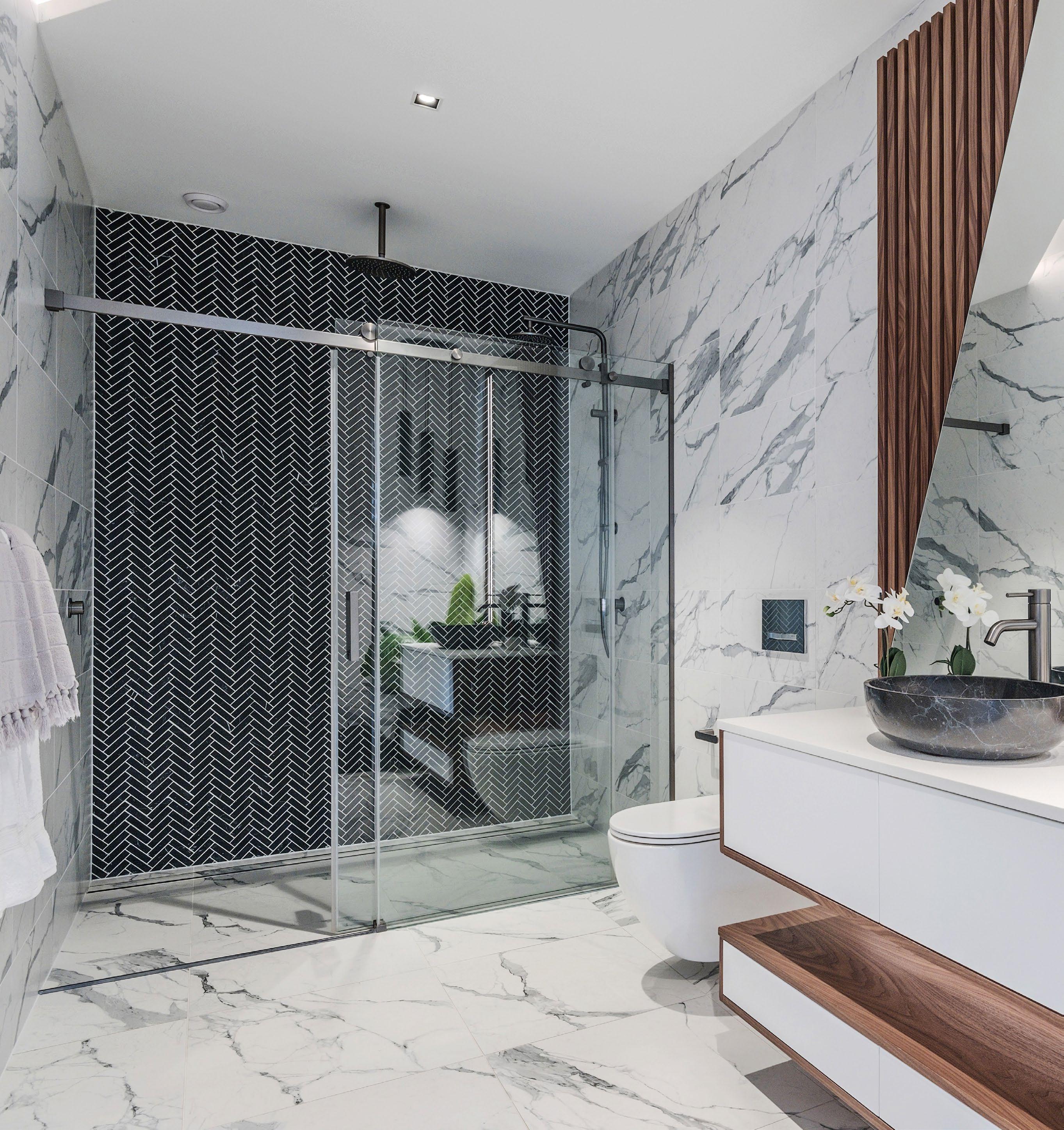
From bathrooms to feature walls, the herringbone tile shape brings depth, direction and a sense of luxury to modern interiors.
layout transforms the simple rectangle into a dynamic visual experience.
Among the pantheon of classic tile patterns, few carry the visual weight and enduring appeal of the herringbone. Defined by its distinctive V shaped arrangement, the herringbone tile layout transforms the simple rectangle into a dynamic visual experience. Often mistaken for chevron due to its similarity, herringbone tiles differ subtly but significantly. The ends are square rather than angled, creating a broken zigzag that feels sophisticated, textured and directional.
The featured bathroom showcases this design language at its most expressive. Set against white marble look porcelain slabs, the matte black herringbone feature wall introduces contrast, rhythm and bold character. The fine grout lines create a graphic repeat that draws the eye from floor to ceiling, delivering verticality and a sense of architectural intent.
This tile layout is especially popular in bathrooms due to its ability to add movement and dimension. In monochrome palettes, it lends drama. In warmer or pastel tones, it softens and adds craft. The pattern also excels at catching light differently across the surface, producing subtle shadows and visual texture.
While the herringbone pattern is ancient in origin, seen in Roman roads and textiles, it has found new relevance in contemporary interiors. Part of its resurgence can be credited to its versatility. It works just as well in large format stone as it does in slender mosaics. It pairs elegantly with timber, concrete and terrazzo. And it can be installed in small niches, full walls or even on floors where its sense of motion adds energy to everyday zones.
To elevate the effect, designers often align lighting to emphasise the directional grain. In this bathroom, a subtle LED strip casts light along the black wall, enhancing the herringbone’s tactile dimension and highlighting the texture within each tile.
As a design device, herringbone offers more than just aesthetic patterning. It signifies a level of craftsmanship, especially when cut precisely at corners or wrapped seamlessly into shower niches and edges.
Whether used in dramatic black, traditional terracotta or glazed white finishes, herringbone remains a go to pattern for those seeking sophistication with an edge. In this space, it commands attention without overwhelming, reminding us that the arrangement of even the most humble tiles can have architectural consequence.
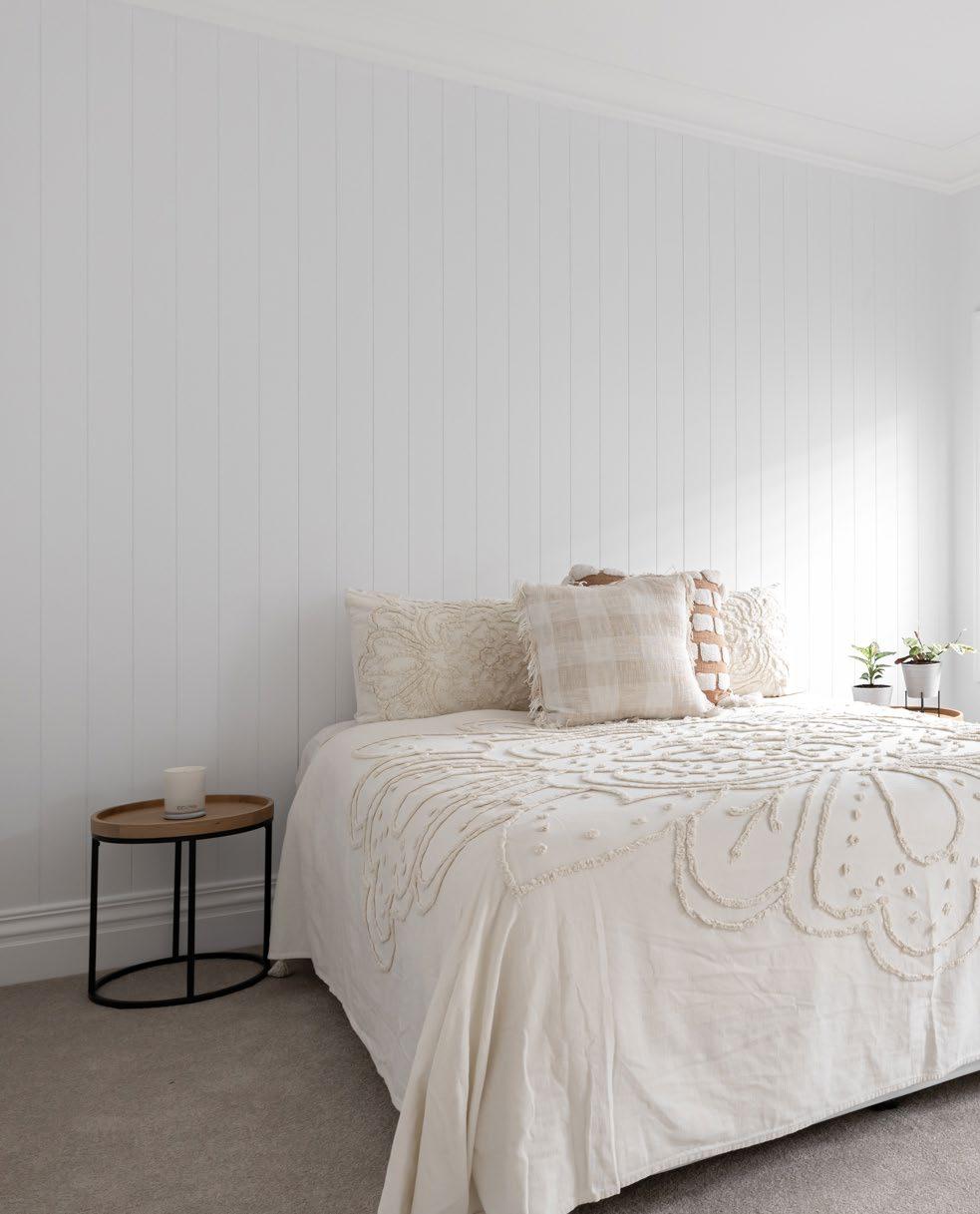
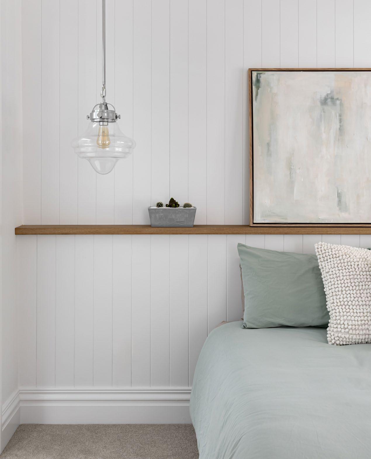
From classic charm to modern restraint, vertical timber panelling brings atmosphere and architectural rhythm to contemporary bedrooms and beyond.
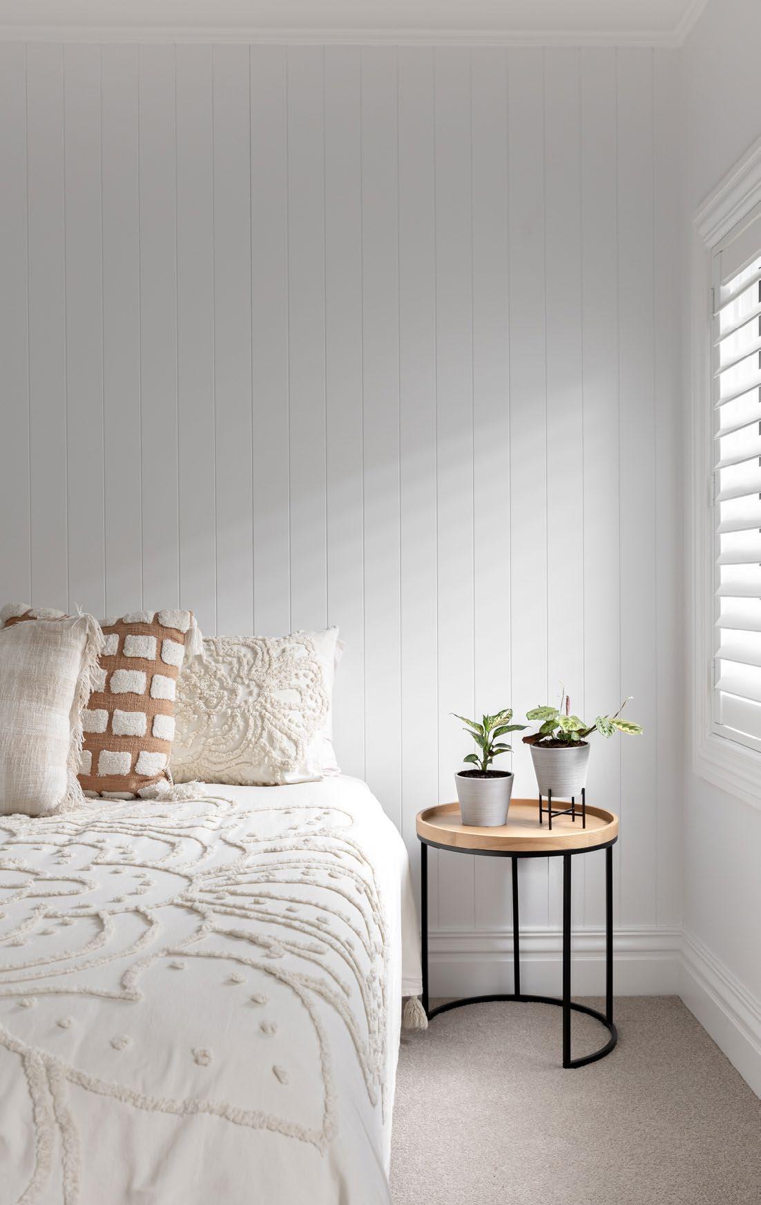
Timber panelling is equally suited to a beach house retreat or an urban renovation.
Once a hallmark of historic cottages and Federation-era homes, timber panelling has undergone a quiet resurgence as a preferred interior surface - especially in bedrooms where visual calm and subtle texture are paramount. Its vertical rhythm offers a tactile warmth that plasterboard cannot match, grounding spaces in soft shadowplay and textural continuity.
Designers are turning to timber panelling not only for its aesthetic contribution but also for its practical benefits. It conceals imperfections, reduces visible wear over time, and can visually elongate or soften the scale of a room depending on the profile and paint treatment. Whether finished in crisp white for a coastal sensibility or sealed to reveal the natural grain, panelled walls lend a crafted finish that feels both contemporary and familiar.
Crucially, the evolution of available products has made the look more accessible than ever. Weathertex offers a range of smooth and grooved boards suitable for internal use, manufactured from certified sustainable Australian hardwoods without added silica, glues or formaldehyde. Their products offer a natural finish while also being low maintenance and impact resistant.
James Hardie’s interior panelling options, including the popular Linea profile, replicate timber’s appearance while offering the dimensional stability of fibre cement. For those seeking a lightweight or decorative alternative, CSR’s range includes pre-primed profiles designed to be installed quickly and painted in place, making them ideal for bedroom feature walls or built-in elements.
Whether used full height, half wall or as a concealed door detail, timber panelling invites a dialogue between form and feeling. It is equally suited to a beach house retreat or an urban renovation, working quietly in the background to elevate even the simplest material palette.
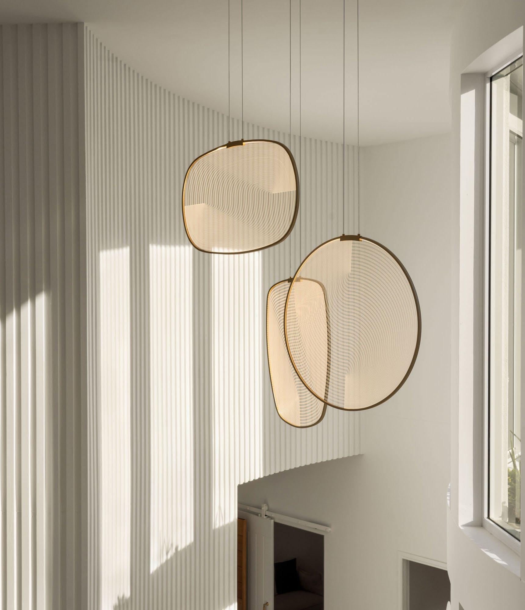
In contemporary interior design, lighting has become more than a practical requirement. It is a sculptural tool that defines mood, directs movement and deepens spatial identity.
Lighting has evolved from a basic necessity into a sophisticated design discipline. In thoughtfully composed homes like the Woolooware Residence, it is clear that illumination is not treated as an afterthought but as an essential element of architectural storytelling. The result is an interior that shifts in tone and emotion throughout the day, depending on how the light is engaged.
layout ensures that every space is well lit without being overexposed.
At the heart of this lighting philosophy is layering. A singular source of light rarely serves all purposes. Instead, the interplay of ambient, task and decorative lighting creates depth and atmosphere. One of the most compelling examples is the cove lighting integrated into the ceiling recess of the living room. This gentle halo of light hugs the perimeter of the space, eliminating the need for overhead glare and giving the room a sense of calm and spatial clarity. It is subtle yet powerful, drawing the eye upward and expanding the perceived volume of the room.
Suspended over the dining table is a trio of sculptural pendant lights. These forms, reminiscent of seashells or floating stones, cast a soft and inviting glow across the surface. They are not only functional but also sculptural, contributing to the room’s identity and rhythm. Their materiality and curvature are in dialogue with the rounded backrests of the dining chairs and the soft edges of the furnishings below. In this way, lighting becomes part of the design language rather than a separate component.
Elsewhere in the home, the kitchen employs integrated lighting in a way that feels architectural. Slim LED strips tucked beneath shelving provide targeted illumination for work surfaces without interrupting the linearity of the cabinetry. The placement is precise, offering both visibility and aesthetic order. It is a detail that enhances the function of the kitchen while preserving its visual calm.
The ambient downlights throughout the residence are carefully spaced to avoid hot spots or harsh beams. They are modest in appearance but considered in placement. The layout ensures that every space is well lit without being overexposed, allowing the materials to speak and the textures to remain visible.
Natural light also plays a significant role in the overall scheme. Floor to ceiling glazing allows sunlight to wash over the interior during the day, while the artificial lighting takes on a more active role in the evening. This transition from day to night is seamless, thanks to the consistency of tone and intent across all lighting types.
What makes this lighting design so effective is its restraint. There is no reliance on novelty or excessive brightness. Instead, each light source is purposeful, measured and in harmony with its surroundings. The lighting is not simply added in after the design is complete. It is embedded from the outset as an integral part of the experience.
This approach invites a rethinking of how lighting is specified and implemented. It encourages designers to consider how light will move across surfaces, how it will interact with color and material, and how it will make people feel. Ultimately, it is not just about visibility but about enhancing the sensory and emotional quality of space.
In homes that aim for timeless sophistication and lived in comfort, lighting should be as thoughtfully composed as the furniture or finishes. The Woolooware Residence serves as a refined example of how light can be used not just to reveal architecture but to enrich it.
Each light source is purposeful, measured and in harmony with its surroundings.

The Leader in the Energy Assessor Accreditation Industry since 2006, ABSA is a part of the BDAA which is a nationally based not-for-profit member organisation that provides information, accreditation, support and advocacy for professionals to promote and foster building sustainability in Australia.
As one of its functions, ABSA accredits HERS assessors (also called Residential Building Thermal Performance assessors) under the Federal Government’s Nationwide House Energy Rating Scheme (NatHERS) protocols. ABSA aims to provide all its members with a high level of professionalism and support. Why do we count accreditation as one of our chief functions and missions? Because the Australian government cares about accreditation. Homeowners care about accreditation. And, above all, our assessors care about accreditation.
As of 11 November 2019 all NatHERS Accredited Assessors must hold a Certificate IV in Home Energy Efficiency and Sustainability (Thermal Performance Assessment) (CPP41119). As the nation and world have come to realise that sustainability and thermal conservation are essential to the survival of the built environment, both designers and homeowners are insisting on more sustainable, ecoefficient designs. In order to expedite the accreditation process, ABSA has set out the steps that will need to be fulfilled in order to gain accreditation.
ABSA Accredited Assessors are recognised as the best in the industry undertaking regular auditing and continuous formal and informal training ensuring that the ABSA accredited assessors are held in the highest regard.
THE FUTURE SUSTAINING
Let’s work together to sustain and energise the future!

For You, For the Industry, For the Future of the Built Environment

The voice for the building design sphere and everyone who works to fill and define a more sustainable built environment, the Building Designers Association of Australia is a true home for designers and those in related fields.
BDAA offers education, advocacy, representation, national conference and design awards programs, certification, CPD and networking opportunities, and much more.
SCAN HERE
• Aaron Schumacher
• Andrew Brown
• Arman Gouniaei
• Bianca Gemmill
• Carley Austis
• Elie Sleiman
• Graeme Bakker
• Hugo Grozdanovic
• Jake French
• Jason Harb
• Joel Etherington
• Michael Ross
• Paula Fletcher
• Sky Tiong
• Stuart Osman
• Vera Liu
• bdaa.com.au
• candasurveyors.com.au
• centralinnovation.com
• fv.com.au
• jameshardie.com.au
• lysaght.com
• nerotapware.com.au
• weathertex.com.au