
Branding Style Guide 2025
It includes guidlines on how to use the EWENE logo, colour palette, typefaces,
Section 1
Visual identity
Logos
This soft, rounded form suggests the shape of a pregnant woman holding her unborn child. The rounded, flowing lines reflect a nurturing environment and speaks to the protective nature of maternal and newborn care.
This logo does not rely on literal or culturally specific imagery, in line with the EWENE partners’ call for universal, inclusive motifs that resonate across cultures and communicate health, unity and compassion.
The logo captures EWENE’s mission to accelerate maternal and newborn health and reduce stillbirth.
Primary logos
The primary logo is locked up with the full name plus the acronym EWENE.
Please use these logos whenever possible, they best represent the brand name and will fit on most material.
The logos with the full name may not work on smaller applications. The full name must always be legible. In these cases use the secondary logo with the tagline ‘Healthy Futures’.
Primary Logo
Full lockup reversed Full lockup mono
Full lockup mono reversed
Secondary Logos
For use where the primary logo with the full name is too small to be legible, or when a simpler message is needed. It is only permissible to use a solid colour version of the logo in black or white.
Logo space and size
Clear space
The logo must be used with clear space around it, ensuring its integrity in the design from other elements. The exclusion zone is equal to the length of the dark blue swoosh shape in the logo as indicated. This is the minimum space allowed between the logo and other elements. No other elements should intrude into this boundary area.
Minimum sizes
The logo has a minimum size to ensure legibility and prominence.
It has no maximum size limit.
Minimum print and digital size
Incorrect logo usage
Consistency is key with branding. The logo has been designed to work in a specific way across a range of mediums.
In order to keep the branding consistent the logo should be used only as described.
Here are examples of what NOT to do when using the EWENE logo.
Do not resize any parts of the logo. The logo must be resized so all elements scale together.
Do not squash or stretch the logo.
Do not move any part of the logo.
Do not rotate the logo.
Do not recolour the logo.

Do not use the full colour logo over a busy image.
Logo placement
The logo should be consistently positioned. The preferred placement of the logo is at the top left of the media it is being used on.


Section 2 Colours
Colour palette
Primary Colours
Dark Blue anchors the brand identity and is primarily applied to background elements and logo design, reinforcing consistency and visual hierarchy.
Teal acts as a contrasting background colour to the core blue, adding diversity. It is used for all main headings.
White is used as the primary content colour on all material where any other colour is used as a background.
Primary palette
Secondary palette
The secondary palette introduces emphasis and visual intrigue across designs. Its use should remain less frequent than the primary colours.
The tertiary palette consists of highlight colours, used sparingly to accentuate key design features.
Tertiary palette
AA Accessibility
It is important for inclusion of all people to meet AA Accessibility colour contrast standards. These colours have been tested using the APCA Accessible Colour Contrast Checker to pass these standards in certain combinations and at specific font weights. Please use only these colours.
Colour proportions
To ensure a cohesive and visually striking aesthetic, colour use across all branded materials should follow a defined proportion system.
Primary Colours – Dark Blue & Teal (≈ 80%)
These colours form the structural backbone of the visual identity. Apply Dark Blue predominantly to backgrounds and containers to establish consistency and gravitas.
Teal serves as a dynamic counterpart—ideal for headings, subheadings, callouts, or alternate section backgrounds.
When combining Dark Blue and Teal, ensure the blue remains dominant to maintain visual stability.
Secondary Palette (≈ 15%)
Used to inject personality and guide attention. Employ these colours for accents, infographics, or supporting icons that require differentiation without overpowering primary elements.
Integrate thoughtfully—too frequent use can dilute brand impact.
Tertiary Palette (≈ 5%)
These are strategic highlight tones reserved for enhancing emphasis—such as buttons, links, or brief interactive elements.
Use sparingly for maximum effect. A touch of these colours can provide lift and direction without disrupting overall harmony.
Section 3
Typography
Typography - print
The primary typeface used for all communications is MANROPE.
Manrope is a modern, open-source sans-serif typeface. It blends geometric precision with a subtle humanist touch, making it both clean and approachable. With rounded corners, uniform stroke widths, and open apertures, Manrope offers excellent legibility across digital and print formats.
This is a freely available Google font available directly from their website:
https://fonts.google.com/specimen/Manrope
Manrope can be used for print and digital media.
Body text can be blue, black or white depending on how it is being used and on what medium.
Minimum print font size: 8pt (ideally 12pt)
Headings - Manrope Extra Bold Subheadings
- Manrope Extra Bold
Body - Manrope Regular
The issue Progress has stalled
Every seven seconds, a woman or a baby dies due to complications in pregnancy, childbirth or the first few weeks after birth. Mortality declines have stalled since 2016 and funding diverted to other issues.
Globally, newborn deaths nearly halved between 1990 and 2017 and deaths from complications in pregnancy and childbirth dropped by 44% between 1990 and 2015; but this progress has near-flatlined since 2016.
Typography - office use
The secondary office typeface is Arial.
This is available on any computer with Microsoft Office installed.
Arial is a widely used sans-serif typeface known for its clean, modern look and excellent readability.
Headings - Arial Bold
Subheadings - Arial Bold
Body - Arial Regular
Section 4 Language
Language and Tone of Voice
EWENE’s voice is inclusive, compassionate, and globally conscious. It reflects the lived experiences of women and newborns across diverse cultures and contexts. Every word should feel like it’s written with care, clarity, and a sense of shared responsibility.
Voice Characteristics
• Warm and empathetic: Speak with kindness and understanding. Avoid clinical or detached language.
• Collaborative and inclusive: Use language that reflects partnership, co-design, and community.
• Clear and confident: Be direct without being blunt. Avoid jargon and overly complex phrasing.
• Globally aware: Acknowledge cultural diversity and avoid region-specific idioms or assumptions. Avoid
• Overly formal or bureaucratic tone
• Passive voice that distances the speaker from the message
• Language that implies hierarchy or exclusion
• Use active voice and inclusive pronouns (e.g. “we,” “our partners,” “you”)
• Prioritize clarity and accessibility — aim for plain language
• Reflect EWENE’s values of care, equity, and shared responsibility
Name and Pronunciation “eeweenee”
The acronym ‘EWENE’ should be referred to with the pronunciation ‘eeweenee’, to reflect each letter and ensure global clarity.
The full name “Every Woman Every Newborn Everywhere” should be prominent initially in all external communications as people outside the organization might not know what EWENE stands for.
The correct pronunciation of the acronym for Every Woman Every Newborn Everywhere - EWENE
EWENE sounds like ‘a win’—and that’s exactly what we want for women and newborns.
— A phonetic observation that supports acronym use and positive association.
If the brand can’t travel across borders, it can’t live up to its name.
—A powerful statement reinforcing the need for global adaptability.
Section 5 Imagery
Brand imagery
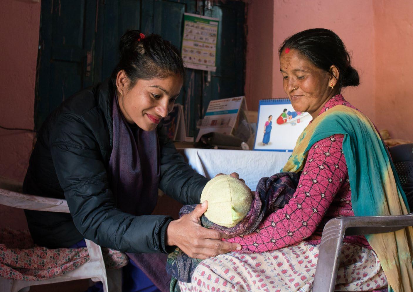
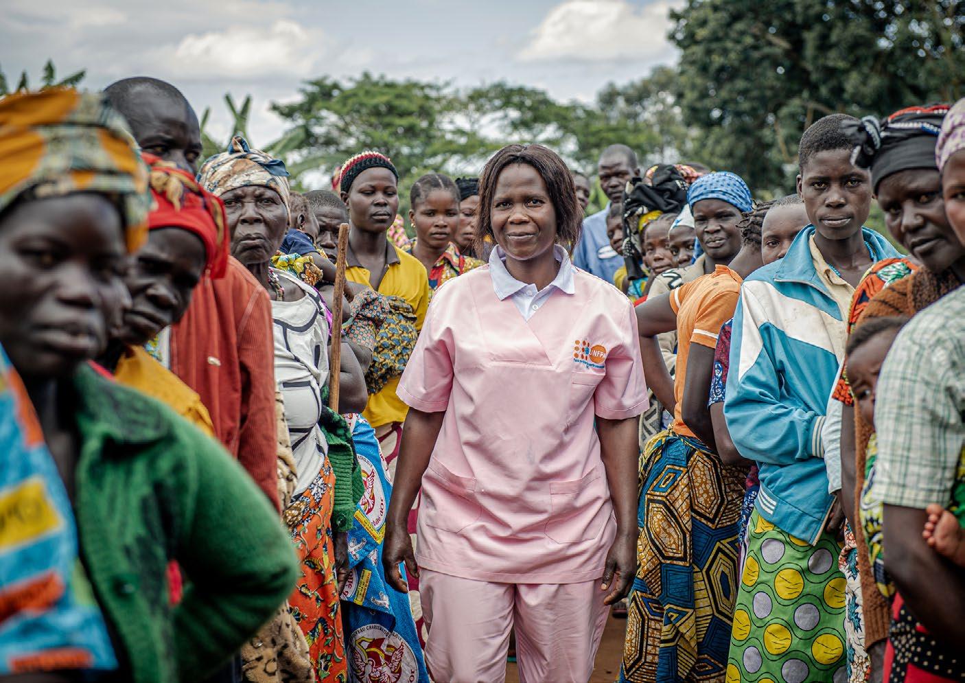
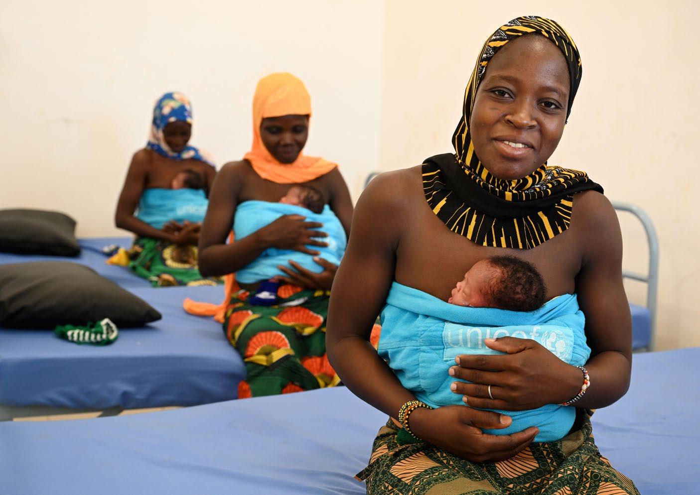
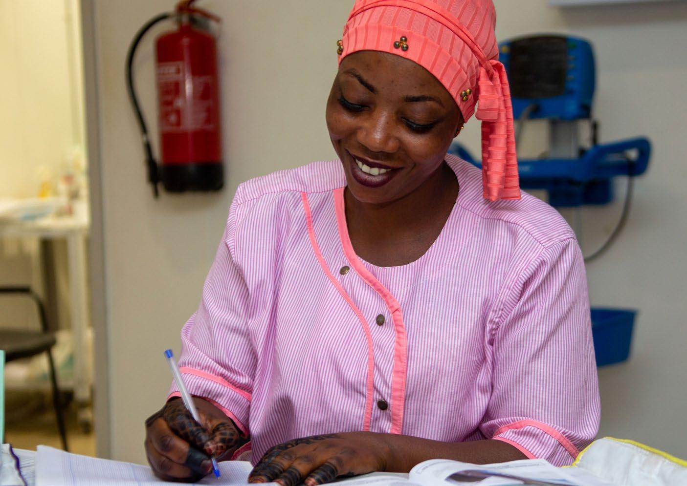
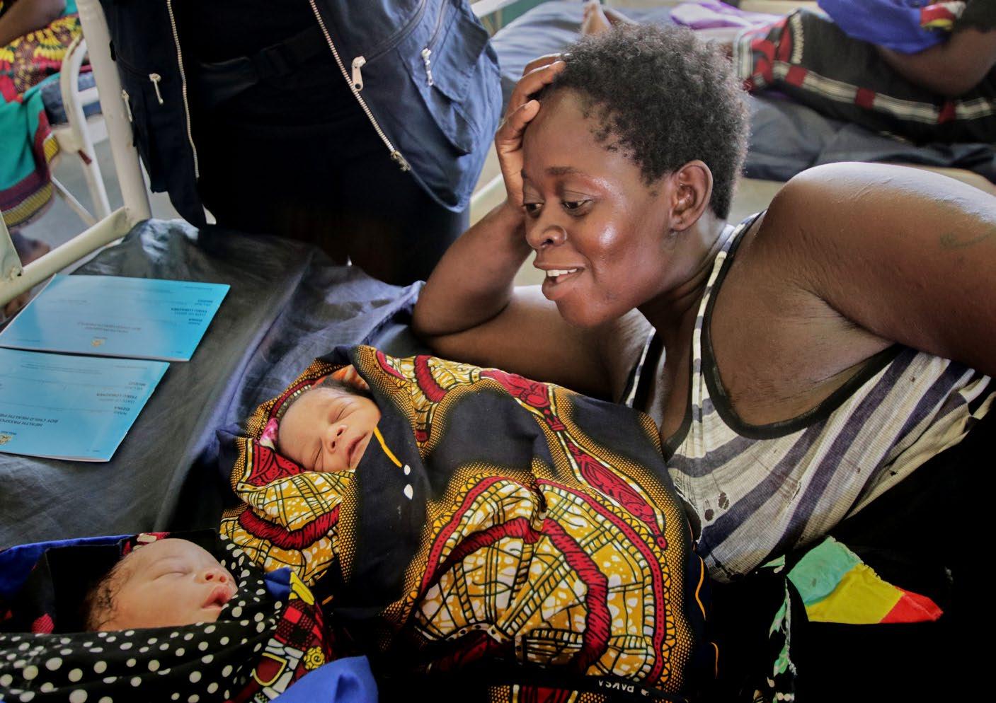
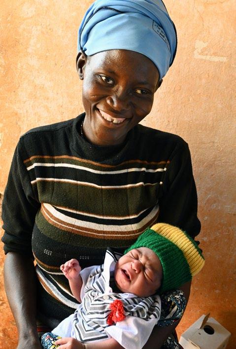
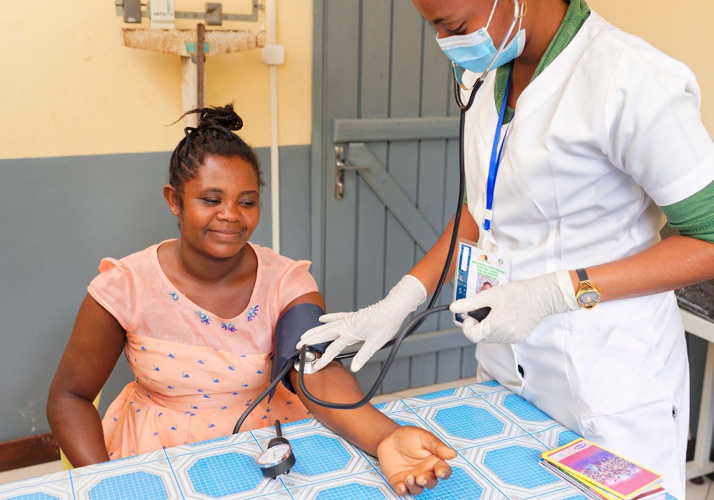
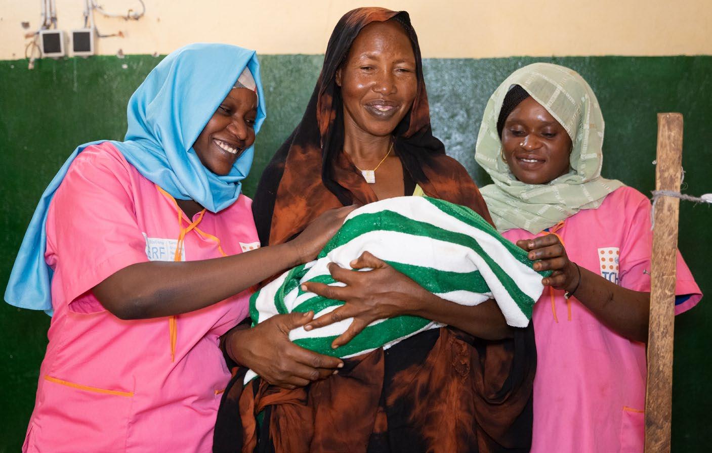
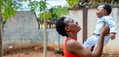
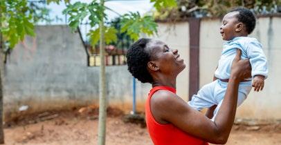
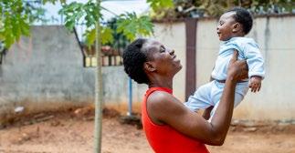
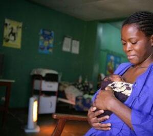
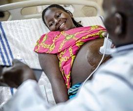
EWENE’s imagery is designed to evoke warmth, dignity, and global solidarity. It reflects the lived experiences of women and newborns across diverse cultural and geographic contexts, using visuals that are both emotionally resonant and universally accessible.
Key Characteristics
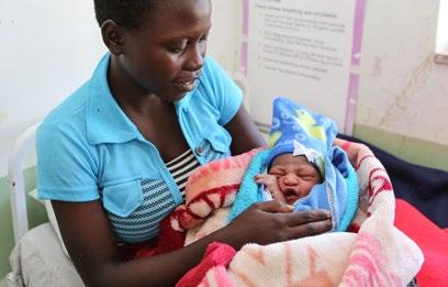
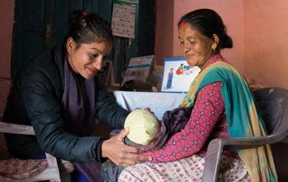
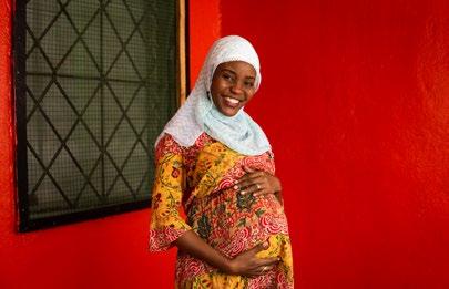
• Human-centered: Imagery often features real people — mothers, newborns, caregivers, and health workers — in authentic, everyday moments.
• Inclusive and diverse: Photos represent a wide range of ethnicities, ages, and settings, reinforcing EWENE’s global reach and commitment to equity.
• Soft and supportive: Visuals use gentle lighting, rounded shapes, and calm compositions to convey care and connection.
• Symbolic elements: Abstract forms (like the logo’s protective curve) suggest themes of safety, nurturing, and collective responsibility.
Usage Guidelines
• Choose photos carefully to depict people in a respecteful manner (e.g. no image of a severely sick child), avoid clichés and stereotypes.
• Prioritize high-resolution, professionally sourced photography.
• Avoid overly stylized or commercial stock images. Contact the us directly for more details on how to acquire photography.
Email: info@EWENE.org
• Credit photos and include a caption describing the people in the photo, the action, the place and date.
• Ensure representation aligns with EWENE’s values of inclusion and respect.
Section 6
Branding examples
Flyers & Documents

Quality of Care Standards Framework

Quality of Care
Powerpoint templates

Social media
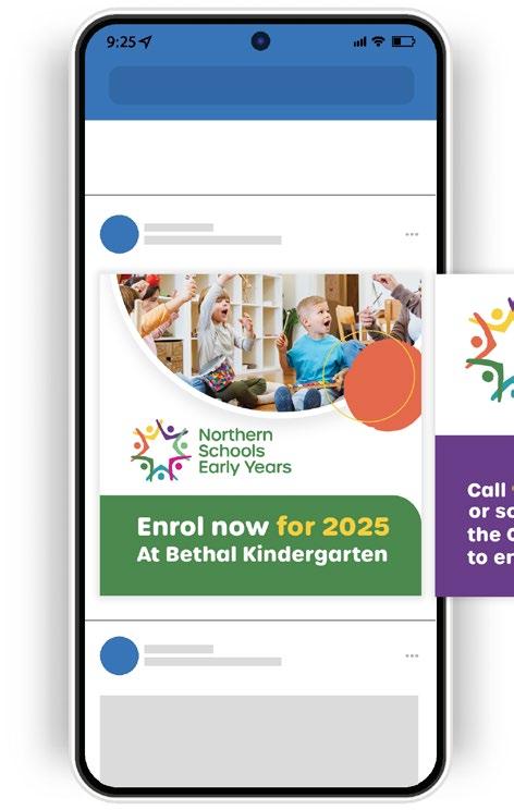


Banners

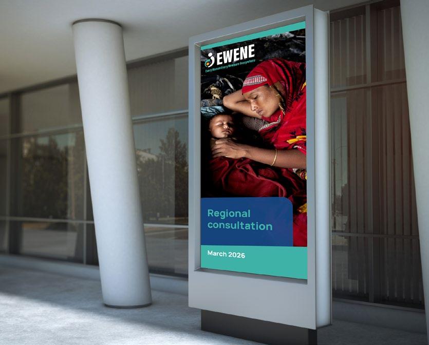
* Please note: The layout and content displayed are for design and demonstration purposes only.
For any information relating to our brand or style guide please contact the Secretariat of Every Woman Every Newborn Everywhere
Email: info@EWENE.org
Website: ewene.org/contact
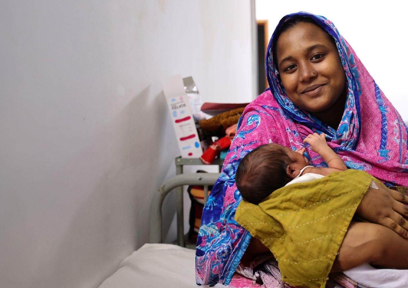
This style guide was prepared for EWENE by Blick Creative:
Website: blickcreative.com.au
Email: info@blickcreative.com.au
