Before it began, I knew this project needed to be a bookend—bringing together the creative disciplines I’ve developed as a designer while returning to a chapter of my life in music that I’ve long wanted to revisit. Before I chose this career path, I was a musician who lived and breathed practice, chased weekend gigs, and studied jazz performance, all the while working 40 hours a week. Over time, challenging experiences in my education led me to step back from music for almost a decade. That distance has since become a source of introspection and creative growth, reconnecting me with an outlet I thought I had lost. Over the course of my academic career, I’ve learned to take complex problems and shape them into structured, intentional designs. As I began to consider where to focus my thesis, I realized that the instincts guiding my music ran parallel to those guiding my design approach. With that in mind, I decided to explore the intersection of design and music and how they influence each other, blurring the lines between sight and sound. I treated this as a deliberate step outside my comfort zone. I’ve performed across many genres—from classical chamber orchestra to ’70s funk and R&B to modern pop—yet I’ve never fully stepped into writing and performing within the post-punk scene. Songs by Joy Division, Echo & the Bunnymen, Siouxsie and the Banshees, and The Cure made up the soundtrack of my childhood, and paired with their distinct visual language, this direction became a natural fit for my capstone. Music and art in post-punk is driven by restless experimentation, and by drawing from that ethos, this work intends to create a pathway for others to work across both practices.
RESEARCH
Creating an album traditionally involves two essential but often separate roles: the musician and the graphic designer. Musicians can work with a record label’s art team or seek out independent artists to bring their visual ideas to life. Notable partnerships, such as A Tribe Called Quest/Brandon Breaux, U2/Anton Corbijn, and Radiohead/ Stanley Donwood, have created visual identities spanning decades, cementing a cohesive visual language fans can come to expect. However, long-term collaborations, despite their success, are rare when it comes to an artist’s clear visual interpretation of what they hear. This gap widens significantly in the connection between musicians and a label’s art department, which can introduce bias and artistic limitations from top executives. For those capable of working across these roles, there is an alternative choice: the multimodal artist, who can make unilateral
creative decisions. By eliminating the need for an interpretive collaborator and the associated costs, these multidisciplinary individuals can communicate their identity more directly and effectively to their audience. Such an advantage would particularly benefit those releasing their music independently and elicits authentic elements difficult to reproduce through large-scale production. DIY recording and graphics have been established practices since the 1970s, spearheaded by punk and post-punk, and have since become a democratizing force in the music industry. But in today’s modern streaming landscape and with greater access to home recording and generated graphics, the independent music marketplace has become overcrowded, making it hard for musicians to stand out. The multimodal artist role offers a strategic edge in a crowded music industry, and this study seeks to examine this distinction.
HISTORY
To give my project a stable foundation before ideating, I wanted to understand what distinguishes post-punk graphics. Before the 1970s, when visual and sonic transformations began, structured, idealistic, and clean layouts were the framework for both design and songwriting. Graphics in the music industry relied heavily on formulas rooted in clear communication, often featuring a portrait of the artist set against negative space, with typography placed atop. Like its visual counterpart, popular music during the mid-20th century was structured around the AABA or 32-bar form, which dominated during the British Invasion of the 1960s.1
However, as experimentation increased—especially with the Beatles and the Rolling Stones—the traditional pop song structure and the familiar artist-profile album cover
began to decline in favor of informed and expressive experimentation. This move away from conventional norms reflected a broader cultural shift often associated with postmodernism. While clean and recognizable minimalist elements define modernist design, postmodernism’s scope is much wider. It blends diverse media and embraces everything from maximalism to minimalism, creating fertile ground for post-punk to push boundaries in both its sound and its visual identity.
How does the post-punk genre relate to postmodernism? As the rebellious, provocative energy of punk reached its peak with acts like the Sex Pistols, The Clash, and the Ramones signing to major labels, the punk bubble of four-chord progressions was on the verge of bursting, and emerging artists began to question where to go next.
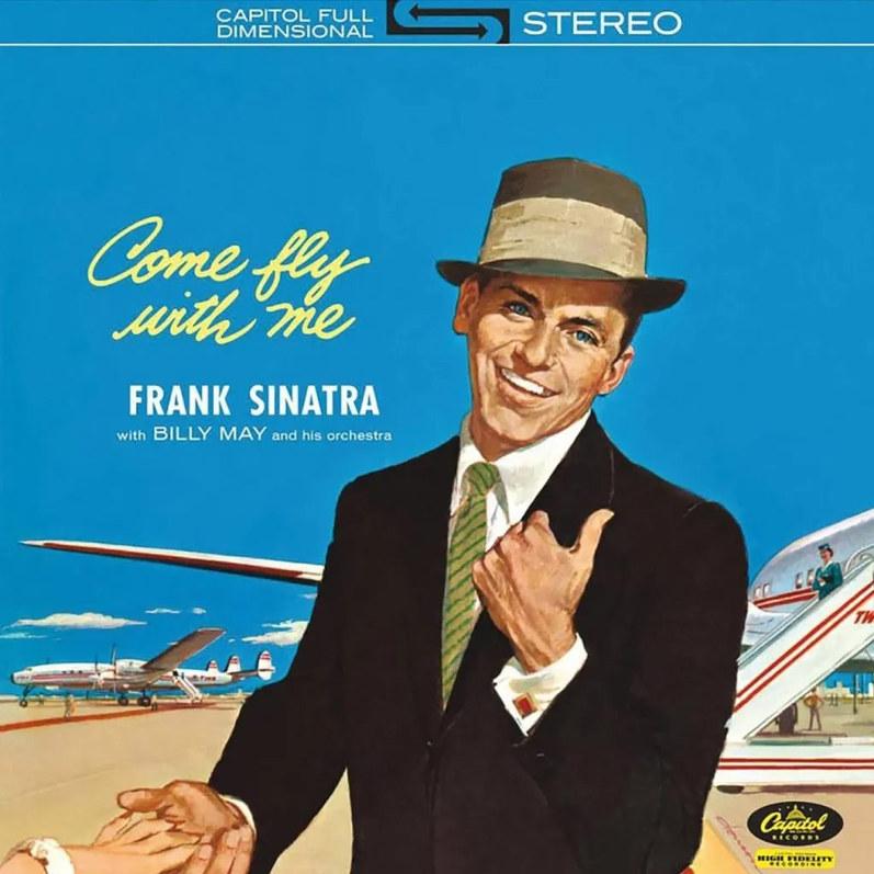
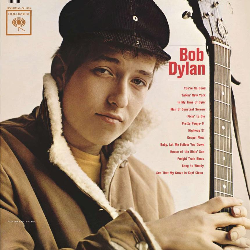
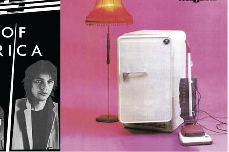
Frank Sinatra, Come Fly With Me (1958) Capitol. Designed by Jim Jonson. Bob Dylan, S/T (1962). Columbia. Design credited to Bob Cato and John Berg.
To define what post-punk is in a broad sense would encompass everything that came after punk in the mid-70s, including hardcore, Riot Grrrl, and Glam Punk, among others. However, in the context of genre, post-punk is a continuation of punk’s rebellion blended with a multitude of outside influences that journalist Jon Savage initially called “textural sublimity”. These outside forces ranged from recording techniques borrowed from reggae and dub to instrumental additions found in the contemporary German avantgarde , as well as themes and tones that he characterized as “nuclear nightdreams”, “sublime and subliminal,” and “Looking for a TV plug after the bomb’s dropped.”2,3
What I gathered from my research is that post-punk’s evolution from punk closely mirrors postmodernism’s departure from modernism. Both shifts moved beyond simple
frameworks that appealed to the masses, pushing past the limits of minimalist structure to explore new possibilities. Due to its broad spectrum and ambiguity, how can we determine what constitutes postmodern design and what doesn’t? Poynor asserts that, despite the rule-breaking and open-ended nature of the movement, post-punk visuals that fit under its umbrella can be assessed by specific criteria. Through the lens of Charles Jencks, one of the leading postmodern theorists of his time, album art that exemplifies the era “is hybrid, double-coded, and represents a partial return to tradition.”4
Given these conditions by Jencks, it’s no coincidence that these young musicians and designers, who witnessed the dawn of the post-punk movement, came from formal art education backgrounds. Bands such as Scritti Politti and
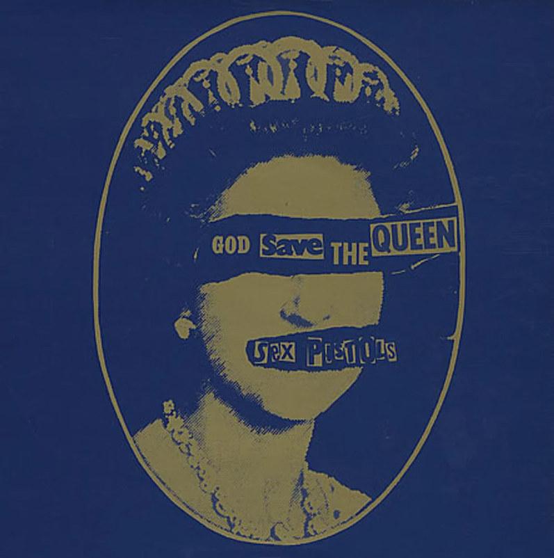
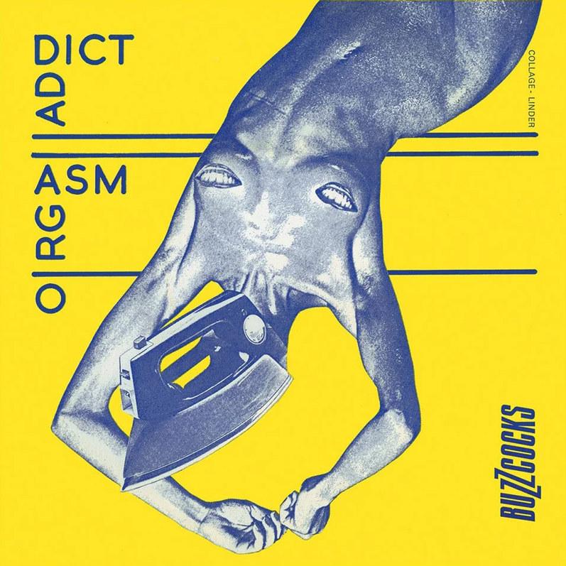
Sex Pistols, God Save The Queen (1977). Virgin. Designed by Jamie Reid. Buzzcocks, Orgasm Addict (1958). New Hormones. Designed by Linder.
Gang of Four drew inspiration from their time at school in their lyrics.5 At the same time, artists such as Barney Bubbles and Malcolm Garrett expressed their academic influences, drawing on Dadaism and imagery inspired by the Third Reich, respectively. A college education certainly wasn’t a prerequisite, however, and mere influence was an obstacle to overcome in a budding postmodern world. As their careers progressed, acts like U2 and The Cure were fortunate enough to achieve commercial success, but like their contemporaries, who had to be discovered at the entry level, they got off the ground by doing the hard work themselves.
Bobby Gillespie of The Jesus and Mary Chain and Primal Scream offers keen insight into the appeal and accessibility of post-punk’s graphics. As mentioned earlier, rock and roll legends had reached the pinnacle of success and popular songwriting structure in the 1960s, and to those at the base, a class divide was forming. While they initially appeared to be someone you could run into on the street, the wealth and fame created a disconnect for youths seeking representation in the music they listened to.6 To Gillespie and Geoff Travis, post-punk had attracted young, aspiring musicians because of a DIY community that propped-up and empowered them, rather than dictating what they could write and release:
“We thought if [large record companies] could do it, and we’ve met them and they’re human beings, we can do it too. These labels broke the myth that the music industry was something where you had to be in a high-rise office with thick carpets to be a part of it.” 7
Graphic artists also relied on this welcoming atmosphere to create relatable and approachable posters and album artwork. Before becoming heavily involved in performing music, Gillespie learned how to manipulate Xerox printers and experimented with typesetting to produce materials for friends in local music acts, which paved the way for him to create his own work for Primal Scream.8 Obtaining these fundamental tools was foundational to the genre’s authentic, handmade touch, which contradicted the outof-touch, big-label designs popular music was known for. By adopting a DIY approach across all aspects, post-punk music became accessible to anyone eager to create and established itself as a leader in postmodern counterculture.
ALBUM COVERS
D = Denotes artwork designed by the band, credited to one or more of its members
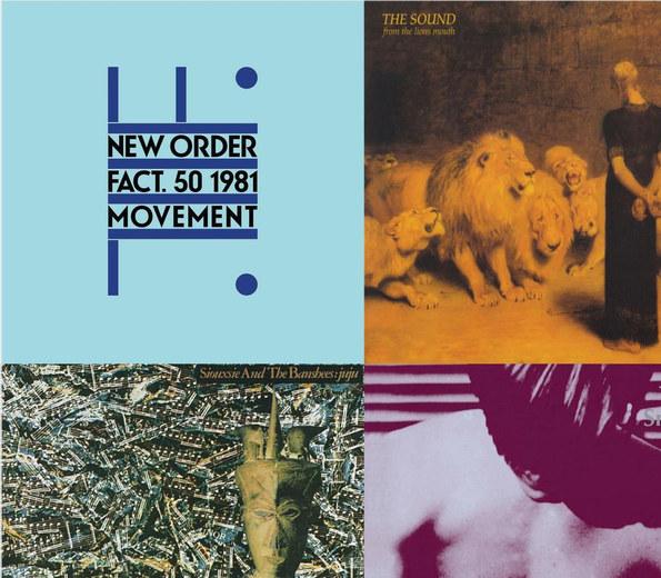
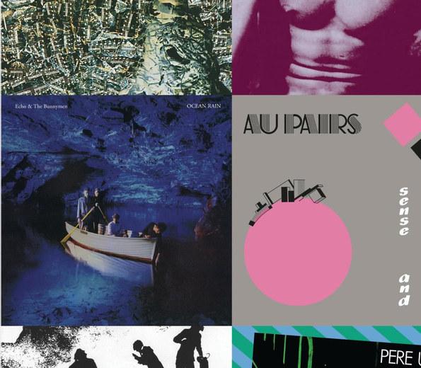
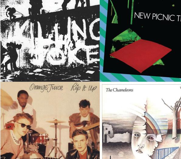
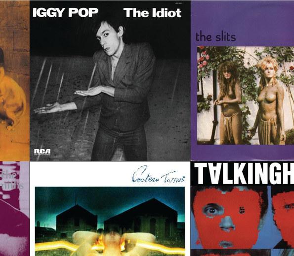
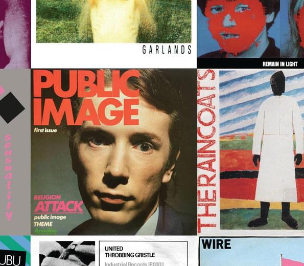
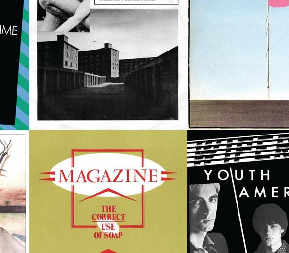
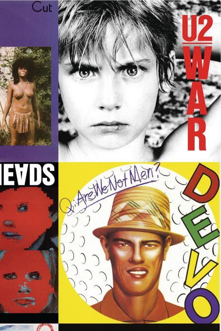
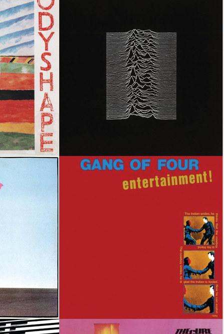
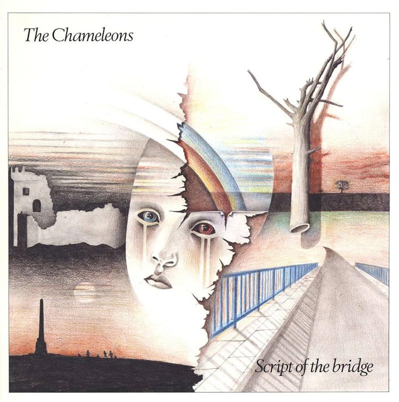
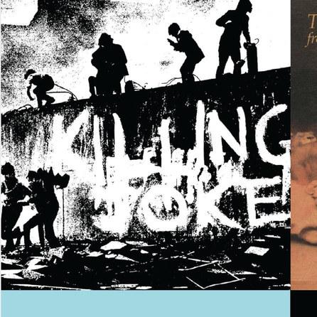
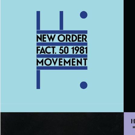
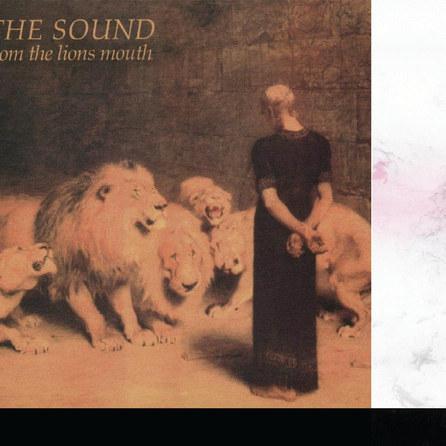
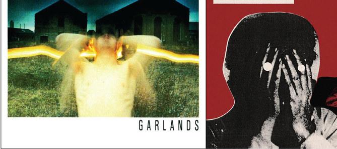
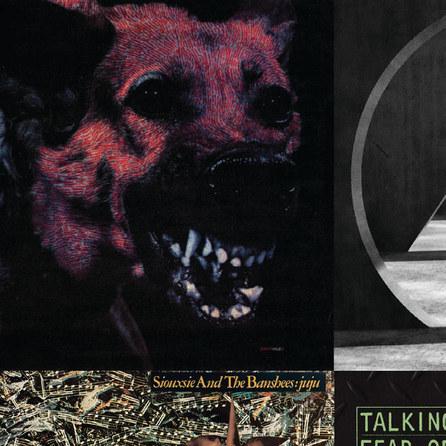
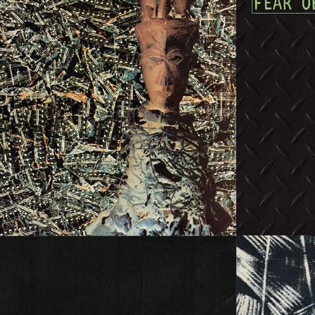
From left to right: New Order, Movement (1981). Factory. Design by Peter Saville/The Sound, From the Lion’s Mouth (1981). Korova. Design by Howard Hughes and Briton Riviere/ Iggy Pop, The Idiot (1977). RCA Victor. Design by Andy Kent/The Slits, Cut (1979). Island. Design by Bloomfield Travis/U2, War (1983). Island. Design by Steve Averill/Siouxsie and the Banshess, Juju (1981). Polydor. Design by Rob O’Conner/D The Smiths, S/T (1984). Rough Trade. Design by Morrissey/Cocteau Twins, Garlands (1982). 4AD. Design by Vaughn Oliver and Nigel Grierson/D Talking Heads, Remain in Light (1980). Sire. Design by Chris Frantz and Tina Weymouth/D Devo, Q: Are We Not Men? A: We Are Devo! (1978). Warner Brothers/Virgin. Design by DEVO Inc./ Echo and the Bunnymen, Ocean Rain (1984). Korova. Design by Martyn Atkins/Au Pairs, Sense and Sensuality (1982). Kamera. Design by Martin Culverwell and El Lissitzky/ Public Image Ltd., First Issue (1978). Virgin. Design by Terry Jones and Dennis Morris/D The Raincoats, Odyshape (1981). Rough Trade. Design by Kazimir Malevič and The Raincoats/Joy Division, Unknown Pleasures (1979). Factory. Design by Peter Saville/Killing Joke, S/T (1980). Malicious Damage. Design by Mike Coles/Pere Ubu, New Picnic Time (1979). Chrysalis. Design by John Thompson/D Throbbing Gristle, United/Zyklon B Zombie (1978). Industrial. Design by Peter Christopherson/Wire, Pink Flag (1977). Harvest. Design by David Dragon/D Gang of Four, Entertainment! (1979). EMI. Design by Jon King and Andy Gill/D Orange Juice, Rip It Up (1982). Polydor. Design by Orange Juice/DThe Chameleons, Script of the Bridge (1983). Statik. Design by Reg Smithies/Magazine, The Correct Use of Soap (1980). Virgin. Design by Malcom Garrett/Wipers, Youth of America (1981). Park Avenue. Design by Curtis Knapp/The Cure, Three Imaginary Boys (1979). Fiction. Design by Bill Smith
MODERN PERSPECTIVES
As post-punk hit the airwaves at the start of the 1980s, rapidly emerging subgenres like shoegaze, indie rock, and dream pop quickly developed from its sounds and aesthetics, while still retaining elements that create a visual and musical language recognizable today. Understanding post-punk’s roots provides a foundation for modern acts to shape their album artwork and helps observers identify new releases based on design cues established in the genre’s early days.
Several modern post-punk bands that have influenced my songwriting serve as prime examples with their cover designs. As vocalist and lyricist for the Detroit-based Protomartyr, Joe Casey serves as the principal designer for all of their releases and tour materials. His work heavily
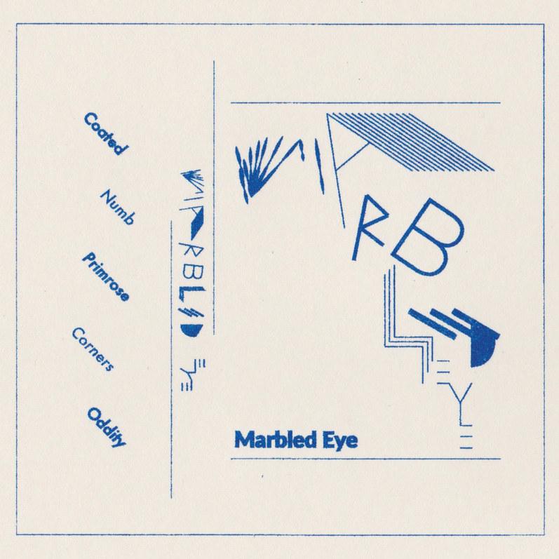
relies on photocopying, collage, and Letraset-style typography, creating a raw, DIY approach to their identity. Similarly, Oakland’s Marbled Eye uses composite and photocopied images, but what most caught my interest was their mixed typography on their earliest self-titled releases. Arranged twice on the cover, the band’s name combines abstract shapes and modern type in a dynamic curve, keeping the viewer’s attention on what it’s spelling out. The diagonal layout of the song titles creates a contrary movement to the rest of the composition, and the inclusion of the name in a sans-serif font is playfully redundant, reminiscent of Buzzcocks’ Orgasm Addict.
FACS from Chicago is another act that pushes the envelope with ambiguous artwork for every new release. 2023’s Still
Protomartyr, Relatives in Descent (2017) Domino. Designed by Joe Casey. FACS, Still Life in Decay (2023). Trouble in Mind. Photography by Michael Vallera.
CREATIVE AUTHORSHIP
Life In Decay is simple in its composition; a photo of tile work taken from a diagonal point of view. But by manipulating the shot through inverting the original value and incorporating a duotone treatment, the contrasting materials create an otherworldly landscape, evoking details reminiscent of sci-fi visuals and topographic map design.
These contemporary designs are strong templates for developing my own visual identity. This DIY language of bold typography, experimental layout, and re-contextualized photography works because listeners already know it instinctively. Although most of my work has been done in a digital workspace, my goal is to incorporate similar raw techniques, introducing a subtle yet deliberate imperfection to my project.
Centering the visual elements of my music is essential to the project’s overall cohesion and plays a key role in setting it apart from a crowded field in today’s digital music marketplace. According to a musician’s census report from Right Chord Music and Musosoup, over 70% of today’s independent artists identify as unsigned, with 24% releasing their music through their own independent labels. When asked about the biggest challenge of being an independent artist, respondents often mentioned the sheer number of new releases and the difficulty of building a loyal fan base.9 In response, a distinct identity and consistent design touchpoints can shape the audience’s perception before any music is heard.
In their interviews with industry professionals, Cheţan and
Marbled Eye, S/T (2016). Independent Release. Designed by Marbled Eye.
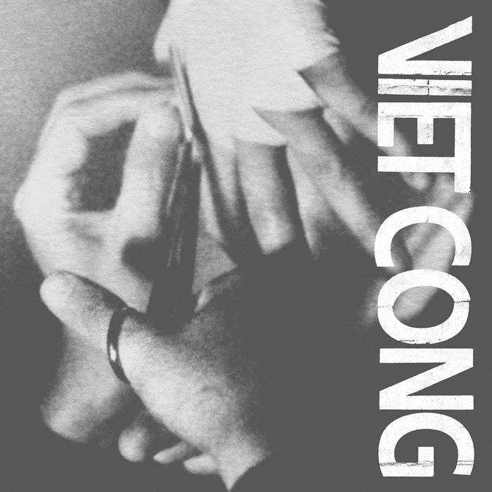
Preoccupations, Viet Cong (2015). Jagjaguwar. Designed by Nathaniel David Utesch.
Iancu found that negative opinions of an artist’s visual quality can challenge the music itself; one interviewee identifying as an artist manager remarked, “The public did not listen to the music in order to have a proper opinion, or even if they listened to it, they did not take it seriously, because the pictures were amateurish.” Their findings suggest that judgment can also be guided by the quality of packaged music, particularly when it aligns with the music’s tone.10 Synchronizing these elements, they argue, can strengthen perceived authenticity and the relationship between the artist and the fan base.
However, for the independent musician, these marketing insights can become overly commercialized, leading to potential disconnection from their audience. Because of the industry’s corporatization of modern music, artists may feel pressure from marketing agencies to conform to brandbuilding models that are “managed and manicured” for commercial success. Frew and McPherson argue that these outside collaborators can take full control of the musician’s visual identity to meet the demands of popular music trends, which “McDonaldizes” visual touchpoints that overrule the artist’s sound.11
Bringing these findings together creates a strategy that gives the multimodal artist an advantage. As Cheţan and Iancu argue, optimal fan engagement results from a unified brand identity whose tone echoes the music it represents.
REFERENCES
1. Ralph von Appen and Markus Frei-Hauenschild, “AABA, Refrain, Chorus, Bridge, Prechorus — Song Forms and Their Historical Development” Samples 13, no. 10 (2015): 69.
2. Simon Reynolds, Rip It Up and Start Again: Postpunk 1978-1984 (New York: Penguin Books, 2006), 18.
3. Jon Savage, “New Musick.” In Time Travel: From the Sex Pistols to Nirvana: Pop, Media and Sexuality, 1977-96 (New York: Penguin Books, 1997), 37-38. Originally published in Sounds Magazine, November 26, 1977.
4. Rick Poynor, No More Rules: Graphic Design and Postmodernism (New Haven: Yale University Press, 2003), 35.
5. Russ Bestley, Turning Revolt Into Style : The Process and Practice of Punk Graphic Design (Manchester: Manchester University Press, 2025) 57-58.
6. Bobby Gillespie, “The Image Is Cracked.” In Punk 45: The Singles Cover Art of Punk 1976-80, edited by Jon Savage and Stuart Baker (London: Soul Jazz Books, 2022), 15.
When the same person controls both outputs, it removes the commercial gap that outside collaborators might accidentally create when adapting optics to industry trends. Indeed, the musician’s workload increases significantly, and it is reasonable to suggest that assuming total creative control risks bias.
Yet this bias is exactly what audiences look for in new music. Another interviewee, identified as a promotional executive, noted that “people tend to get drawn towards artists that reflect either who they are or who they want to be; and having someone reflect that in their image can help connect with the music’s emotions more.”12 By leveraging their skill set, multimodal artists communicate their authenticity and integrity directly to their audience in the face of oversaturated markets and limited resources.
7. Geoff Travis, “Do-It-Yourself.” In Punk 45: The Singles Cover Art of Punk 1976-80, edited by Jon Savage and Stuart Baker (London: Soul Jazz Books, 2022) 81.
8. Gillespie, 16.
9. Mark Knight, The Musician’s Census 2024. Right Chord Music, 2024 https://www. rightchordmusic.com/musicians-census
10. Adrian Cheţan and Ioana Iancu, “The Role of Visual Identity in Music Perception: A Talk with Specialists on Song Likability, Perceived Quality and Emotional Reactions,” KOME — An International Journal of Pure Communication Inquiry 11, no. 1 (2023): 120–124
11. Matt Frew and Gayle McPherson, “The Brand in Music: Entrepreneurship, Emotion and Engagement” (unpublished manuscript, May 2015), originally published in Music Entrepreneurship, ed. Allan Dumbreck and Gayle McPherson (London: Bloomsbury Publishing, 2015), 241–268.
12. Cheţan and Iancu, 121.
INTERVIEWS
My creative direction is inherently subjective, but I wanted to understand how the creative process shapes an album. So I interviewed fellow cross-disciplinary artists to explore the link between how music sounds and how it looks. Each person I spoke with has some formal education in art or design, which isn’t surprising given the caliber of their work.
What I didn’t expect was how candid and engaging they’d be. Jared and Brandon of experimental act Open Head were remarkably transparent about their latest release, What Is Success. The album draws on themes of “brutalism, dada, world events, wealth disparity, and collage,” ideas they developed across both mediums, though they were clear that these themes informed the visuals more than they literally shaped the music.
What does experimentation mean to you and how far do you go without pushing the limit?
Experimentation is a huge thing for us in terms of getting to a place where we’re happy with what we create without falling into a particular trend or idea in the public zeitgeist. The limit for us usually is something like “this looks (or sounds) too much like these several things” Or “this looks like jumbled up garbage and doesn’t really say anything back to us.” So usually we’ll pick out things that we like a lot and extract all the inspiration we can while throwing in some outlandish ideas to keep things fresh.
How do you collaborate when working on artwork? Is it similar to songwriting or does it take on a different shape?
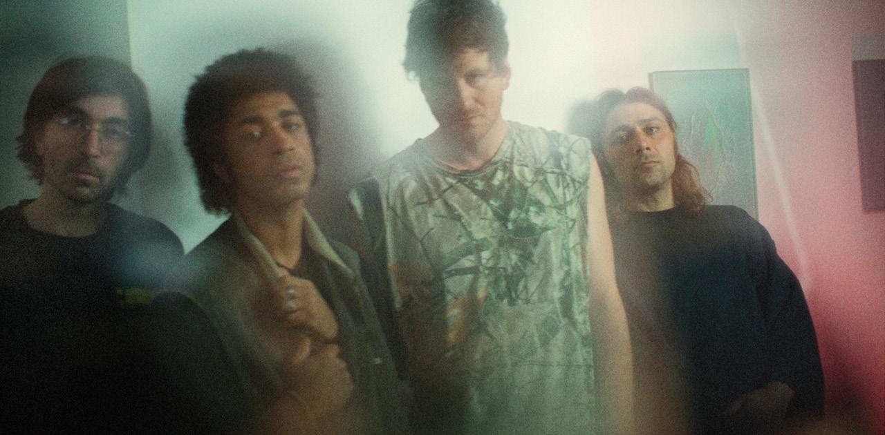
Members of Open Head From left to right: Jon McCarthy, Jared Ashdown, Dan Schwartz, Brandon Minervini
It’s totally similar to how we make music. We make all the music together so why not make the visual art together too? Jon has a background in visual art and is amazing painter, while Brandon and I have dabbled in collage here and there for years. We try to move as a unit as much as possible, leaving space for one another and also surprising one another with ideas as well. It’s pretty democratic. Discussion is better when everyone has a voice that is heard.
Are their particular songs that give design a place to start?
Weirdly enough it wasn’t so much the songs that informed the artwork. It was more about topics and ideas? Like we were obsessed with brutalism, dada, world events, wealth disparity, and collage when we were making the cover for this recent album. Those ideas were explored in the music as well. That could change for the next thing, but we think in terms of this cover it was mainly informed by the things behind the music instead of the music itself.
Who’s been the most influential to you when it comes to music and design?
It varies, as we’re always going through cycles of what’s influencing us. Brandon and I are pretty obsessive with our music taste hahaha. In terms of music: everything on the Faitiche label (Jan jelinek, Romeo Poirer, Mark Templeton, Ursula Bogner, Andrew Pekler) also Ulla, Jandek, Coltrane, Arca, Burial, Deantoni Parks, Women, Sophie, Housewives, Playboy Carti, Earl… it’s a long list haha. Started listening to a lot of Robert Ashley lately. What a voice. Visually… Definitely Man Ray, Francis Bacon, the Dada Movement, and Alison Smithson. Jandek’s album covers. El Lissitzky and the suprematism movement for sure as well. Jon could pitch in later with more of his influences. All of this said: it’s why we like collage so much. We love things that stand alone in the way they exist in the world so it’s important to make visual art that reflects that. Collage happens to be the perfect vehicle for touching all of the things you love. Every segment is allowed to breathe its own life while still being part of something larger.
Which bands have given you inspiration in terms of image and visual style?
Just doubling down on Faitiche here. Their choices for album covers is pretty minimalist yet incredibly poignant. I think we went pretty absurdist, architectural, maximalist on this cover but will be informed by minimalism pretty heavily in the future. More inspirations…. Probably U.S. Maple’s “Purple on time” and “Hair in Long Stages”. Helvetia with “This Devastating Map”, Robert Ashley “private parts”, Arca’s album covers were a big one for me personally (Jared). Also Jon Hassell “Listening to Pictures”. That cover is incredibly beautiful. The self titled Women album. The JMC ep series that had Big Neck Police and Palm. So much, haha. u
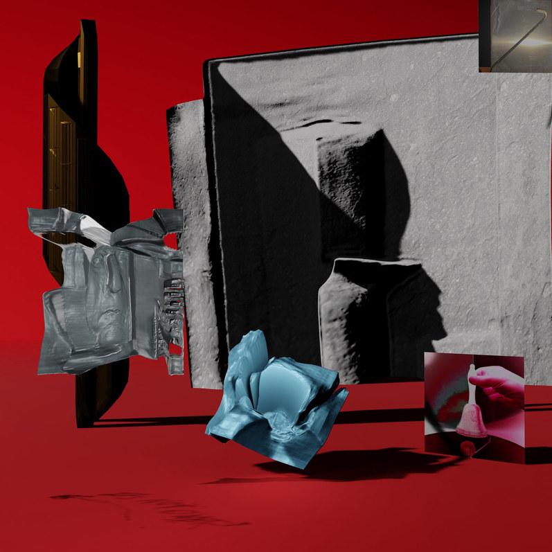
Open Head, What Is Success (2025) Wharf Cat. Designed by Open Head.
Andrew Palamara’s approach is similar and instinctive. Like Open Head’s informed but inexplicit artwork, he creates his album covers to ‘...act as its own component and be open to interpretation.’His view of similar artists in the singersongwriter realm aligns with my research, especially in discussing the common template of a portrait and type in negative space in artwork. Our interview also touched on the current trend of intentionally editing artwork to look vintage. This notion is one I’m putting at the front of my project, because although I want to emulate a specific era, I don’t want to distract my listeners by going overboard with my final product.
When you’re beginning your visual creative process, do particular songs act as a springboard for ideas or do they come more independently?
It tends to be more of an independent process, something that happens concurrently with the writing and recording phases. The music will often dictate the tone of the visuals, and rightfully so. I think it would be jarring in the wrong way if the album cover and the music didn’t seem to go together. But I don’t think very literally about how the visuals and the music are connected. I don’t always expect that to be the case, though. As I write this, I’m currently working on a new record, and the image that I have in mind for the cover is a reference to one of the songs on the record. Having said that, I don’t consider any of my record covers to have easter eggs or loads of coded references to the lyrics.
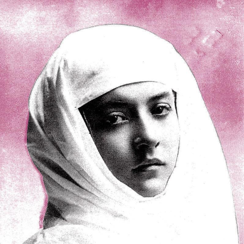
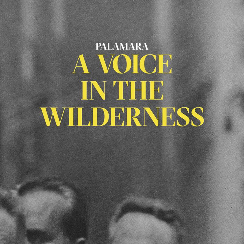
Usually, I like the cover to act as its own component and be open to interpretation a bit. With the cover for A Voice in the Wilderness, I was intentional about the way I cropped the original photo, taken by Ted Russell for Life Magazine
Andrew Palamara
in the ‘60s, and converted it from a color photograph to grayscale, so that you only see the foreheads of the men in the foreground. I think it relates to the music without being literal, and that’s my ultimate goal with the visual side of things.
Your covers often stick to black-and-white imagery with a single pop of color in the typography. What inspires that look for you?
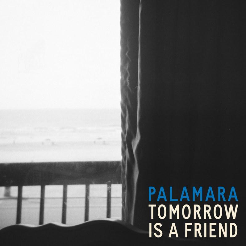
Black and white photos have a cinematic quality to them that I’ve always liked. I don’t see the world in black and white, so when I look at black and white photos, I’m seeing something representational, but in a different light. And I think that’s what good music does, too. That’s probably why I gravitate toward black and white photos on my covers. My color choices tend to be more intuitive and not necessarily related to something specific from the record, like I was saying earlier. On A Voice in the Wilderness, I latched on to using yellow as an accent because it added nice contrast to the photo while also sticking out on its own. In hindsight, I guess that yellow makes a lot of sense because so much of the record revolves around coming of age and wanting to be seen and recognized. Few colors stand out like yellow does. And with Tomorrow is a Friend, I took the same approach, but not consciously. I knew that I wanted to rely on blue and cream as the main color palette from the start, even before I had finished making the record. I just find those colors soothing.
The imagery of intimate spaces for Tomorrow Is A Friend and its singles, like the window scene or the calm shoreline, carries a strong emotional weight. How do those choices reflect your own relationship to the music?
All of the photographs on Tomorrow is a Friend were taken by my friend Jessica Fuentes, who’s a brilliant photographer. She gave me a dozen or so to choose from. I tried to make those choices intuitively, but I also couldn’t help but think about how each single could relate in some shape or form to the photograph. The cover photo is part of a diptych, and I used one half for the cover, and then I cropped the other
half and placed it at a smaller scale on the back cover. I wish I had distinct reasons for gravitating toward that photo for the cover, but I don’t! I just knew from the moment I saw it that it fit with the record. Jessica felt the same way, which helped me feel more convinced that it was the right choice. And like I mentioned in my answer to the previous question, I want the covers to provoke something else on its own that the music doesn’t, or at least that’s my aim.
The photo I used for the “How They Begin” single has this mix of abstract and concrete energy that fit the tone of the song.
“Along the Path of Least Resistance”, in my opinion, seems to be about the ways we talk at each other, not with each other, and the idea of pairing it with a high contrast photo of a back-lit window at night was interesting to me. Art for singles seems to be a bit out of style these days, so it felt a bit old fashioned to be thinking about it all that way. But I think
Palamara, Tomorrow Is a Friend (2025) Self-Release. Designed by Andrew Palamara.
those three songs can stand alone while serving a purpose in the context of the record.
Who’s helped shape your sound and who/what inspires your visual direction?
I’m sure I’ll leave out many things that have inspired me. The simple answer is that everything does, good and bad. It informs my view of what’s happening around me and gives me a sense of where to begin with what compels me to make music and what doesn’t. And the same goes for my approach to the art direction. But there are some standouts. Bob Dylan’s lyrical prowess, Joni Mitchell’s comprehensive artistry, Otis Redding’s melodies, Radiohead’s creative destruction, Randy Newman’s incisive commentary, Nina Simone’s emotional pull. I could go on and on.
Visually, I came of age with a love for Swiss design and typography of all kinds. I tend to start with a typeface before I think about the imagery, and that was definitely the case with both A Voice in the Wilderness (Grilli Type’s Sectra) and Tomorrow is a Friend (Vocal Type Co’s Carrie). Stanley Donwood’s work on Radiohead’s covers was a big inspiration when I started out. Lawrence Azzerad’s work on Wilco’s covers sticks out, too. Chip Kidd’s book covers, Stefan Sagmeister’s posters, and Paula Scher’s maps are all things that got me excited when I was in design school, and all still hold up to me. I don’t keep up with the design world as much as I used to, so there are probably a lot of good designers that I’m neglecting to acknowledge. But then there’s a lot that pops up here and there that I like. Bonny Light Horseman is a great example of a folk/country band that doesn’t rely on the stereotypical aesthetic for that kind of music. Bon Iver’s done the same thing. But I also still love old Blue Note Records covers. Really, anything that feels fresh and clever is going to stick out to me.
More than anything else, I think I want people to be intrigued by the covers and be curious enough to check it out without a ton of preconceived notions. There is a distinct aesthetic that tends to permeate in the broader folk and country singer/songwriter world. It usually revolves around a photo of the artist with type set in the negative space. These days, I see a lot of added artificial texture to make it seem like it’s a classic-looking record. Some of that stuff is nice, but I think there’s too much of it. And I think it sets a precedent that folk music is supposed to look and feel a certain way. So I’m keen on doing something different with the visual components of my records, not simply to be contrarian or anything like that, but to follow a lead that feels right to me. While I don’t think that my music is groundbreaking in any dramatic way, I’m not making trad folk records, either. And I think the aesthetics of my record ought to reflect that. u
Palamara, A Voice in the Wilderness (2018) Self-Release. Designed by Andrew Palamara.
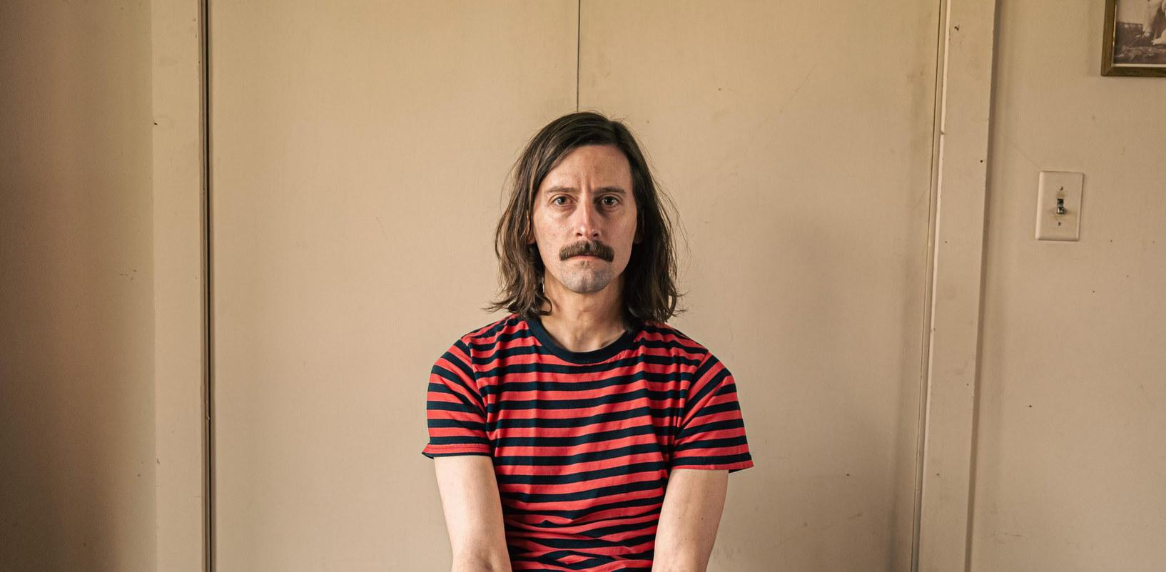
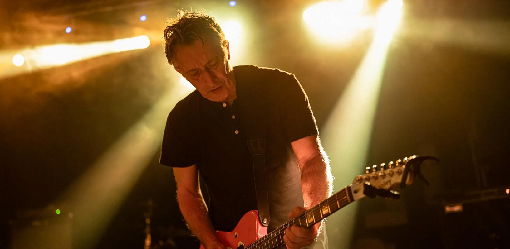
Finally, I spoke with Reg Smithies, the lead guitarist of The Chameleons. Throughout most of their discography, Smithies has designed the covers using colored pencils, creating otherworldly collages. Talking with one of my biggest influences was a highlight of my research, and while his responses were unexpectedly curt, they still hold intrinsic value for my own process. The other members of the band let me know in advance that Reg tends to be introverted when talking about his own work, but after speaking with him at the end of a recent show, he agreed to answer my questions. He and the other band members hadn’t released new material together in over twenty-five years and expressed that getting back into both music and art took some time. Learning that one of my heroes went through the same kind of creative gap makes me feel less alone. It’s never too late to start again.
When you’re beginning your creative process, do particular songs act as a springboard for inspiration or do ideas come independently?
The ideas come independently and they develop over time.
Across both music and visual art, who’s had the biggest impact on your work?
The [musicians] I grew up with were David Bowie, Alice Cooper, The Beatles. Also my mum listened to classical music and my dad listened to things like Bing Crosby and the Mills Brothers. In art I just like the way an idea develops . One of my favourite paintings is Two Children Being Threatened by a Nightingale by Max Ernst.
Reg Smithies
How much do your bandmates shape and inform your concepts and ideas for your artwork?
They don’t, I do it on my own but my partner Nicola helps when I get stuck.
As both guitarist and illustator, you’re unique in shaping both the sound and vision for The Chameleons. How do both speak to each other in creating a full experience for your listeners?
I suppose it makes it more personal to people the more input the band has in what they’re creating.
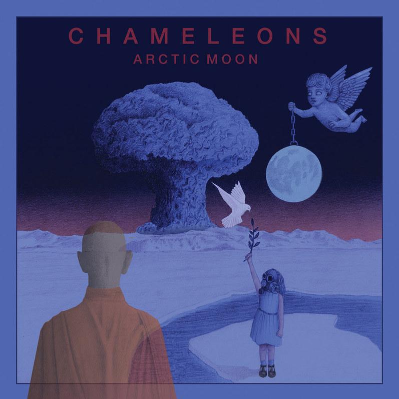
With your first full album in almost 25 years, the cover for Arctic Moon sits right alongside your earlier artwork. How was stepping back into the music and visual creative processes? Did it come back naturally or did it take time to find your rhythm again?
It’s taken a bit of time to get back into it. u
The Chameleons, Script of the Bridge (1983) Statik. Designed by Reg Smithies. The Chameleons, Arctic Moon (2025) Metropolis. Designed by Reg Smithies.
PROCESS
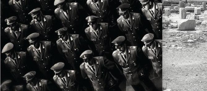
My initial songwriting and visual inspiration took a sharp detour over the course of my research. Originally, the album had no concept or unifying theme. Just a collection of songs. But the escalating brutality of the U.S. government made me reconsider what the album could be. A quote from Lauryn Hill reframed my outrage as responsibility: “As artists, we have an opportunity to help the public evolve, raise consciousness and awareness, teach, heal, enlighten, and inspire in ways the democratic process may not be able to touch. So we keep it moving.” Balancing a full-time job and being a full-time student left little time to express myself through my art. Nonetheless, I saw this project as my chance to speak up through music and design, and I wasn’t going to waste it.
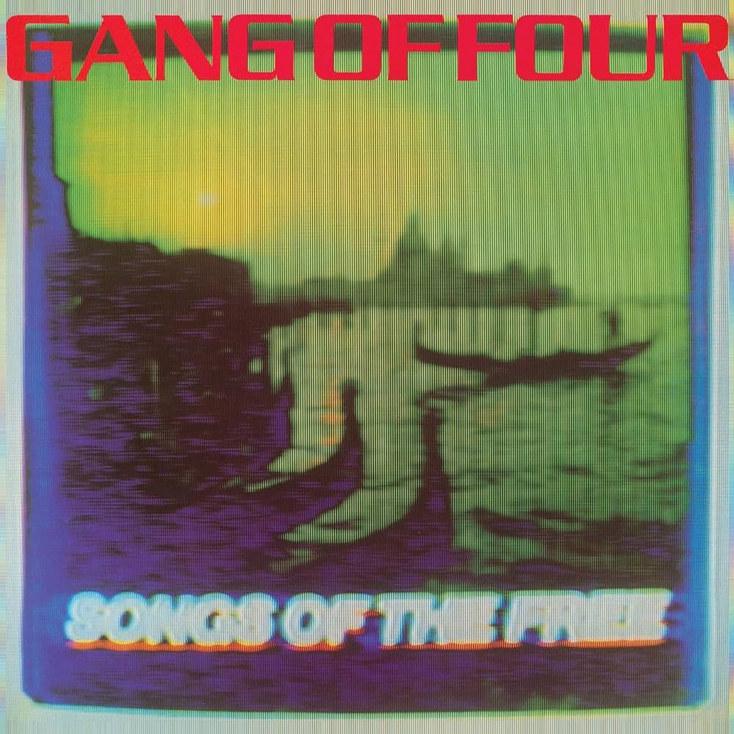
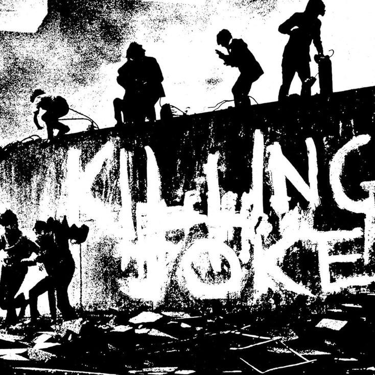
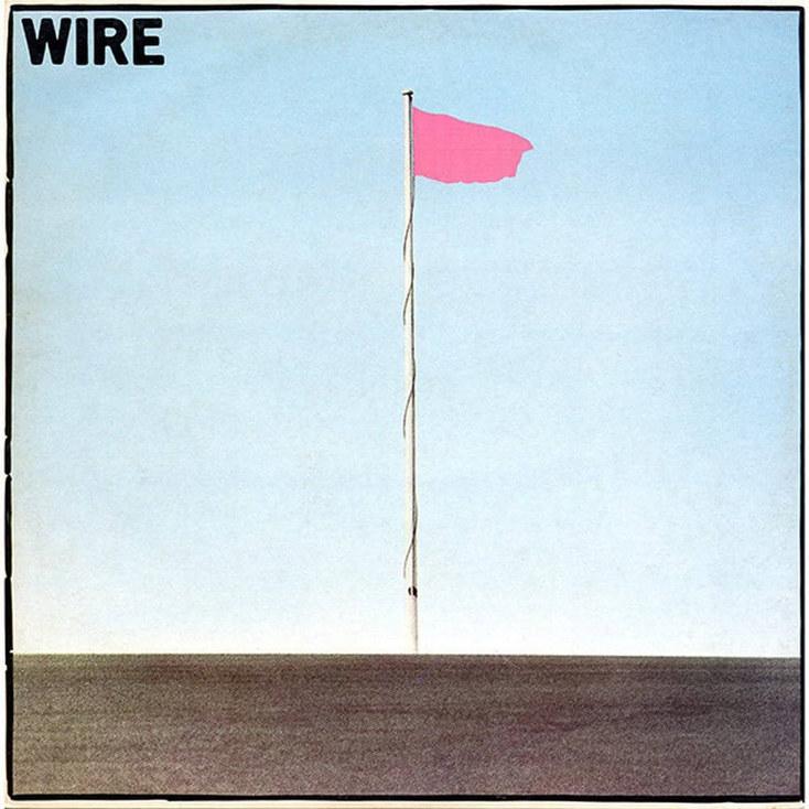
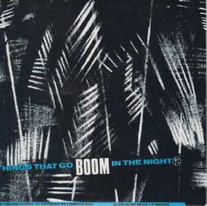
Clockwise from left: Gang of Four, Songs of the Free (1982). EMI. Designed by Shot That Tiger!; Wire, Pink Flag (1977). Harvest. Designed by David Dragon; Killing Joke, S/T (1980). E.G./Polydor. Designed by Mike Coles.
IDEATION
Under this new direction, I chose the title Rules of Engagement for the album and considered how political urgency could sharpen my design direction. I turned to a few of my inspirations as case studies. Gang of Four’s Songs of the Free (1982) is a prime example of pushing outside the margins, using mixed media to build a layered, opaque composition. Wire’s Pink Flag (1977) adopts a more conservative title but achieves immediacy through minimalism. Killing Joke’s debut (1980) borrows directly from contemporary history, using a heavily edited photograph from the front lines of Northern Ireland. All three bands emerged at the genre’s inception and, despite ranging from minimalist to highly textured in both sound and graphics, each maintains a visual style that supports their politically charged songwriting — and aligns with my album blueprint.
These albums had a significant influence on my songwriting, but outright copying them would detract from my creativity and personal goals. I decided to step into my own history to give the project the strong identity it needed. Growing up, my family and close friends were all obsessed with vintage Italian scooters, and as I’ve gotten older, I’ve followed in their footsteps, from forming a club to organizing nationwide rallies. Scooter culture delivered the same liberating spirit that post-punk offered to youth culture in the 70s. The parallel between the two couldn’t be closer. From the beginning, I knew I wanted a name for this project that reflected my return to music, and I found it in Primavera, the Italian word for “springtime”. Spring is a season of growth and new beginnings, and the fact that it shares a name with a beloved Vespa model made it an effortless choice.
1979 Vespa Primavera 125
BRANDING
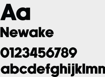
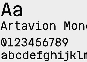
I began asking myself how Primavera might look through a post-punk lens. The meaning and sound of ‘primavera’ evoke a soft, elegant sensibility, and when I think of Spring, I picture pastel colors, green fields, and music from Beethoven and Vivaldi. From a design perspective, elegance is inherent to serif and calligraphic styles, and to subvert ‘primavera’s’ softness, I focused exclusively on bold sans-serif typefaces.
I scrutinized every detail, from letter height to the sharpness and angle of each corner, and ultimately arrived at Newake from Indieground Design and Artavion Mono by Valentino Vergan. Newake caught my eye for drawing from classic 70s and 80s type, but also for its subtly rounded corners. I found this detail unique because it doesn’t detract from the font’s weight and leans into the DIY overprint feel. Its legibility and commanding presence led me to use it as my primary logo. The angular letterforms of Artavion Mono convey a strong
sense of hierarchy when paired with Newake as body text, and its stark, monospaced style underscores my music’s critique of government bureaucracy. These typefaces together open the door for Primavera’s identity to be multifaceted and threaded with meaning.
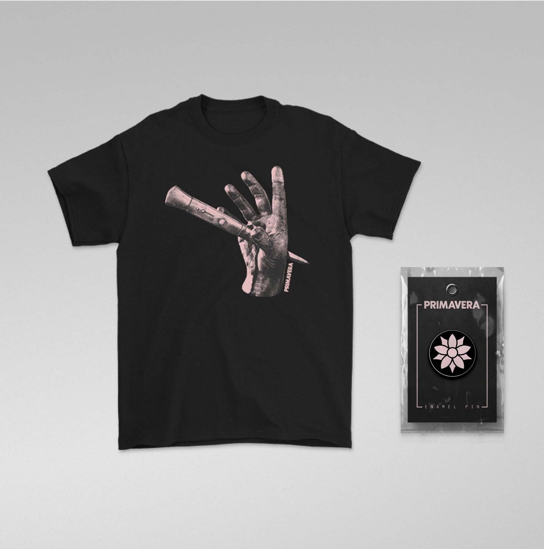
Creating a wordmark established my primary logo, but I wanted to include another mark that can grow with the project over time. Outside of post-punk, secondary logos are common as part of an artist’s identity, and can act as signifiers for die-hard fans. A quintessential example of this is The Flaming Lips’ understated skull logo. Across their discography, the artwork takes center stage, but somewhere on the packaging, it appears as a discreet emblem of approval. I saw this as a way to strengthen the bond between Primavera and its listeners, especially if it’s included in future releases.
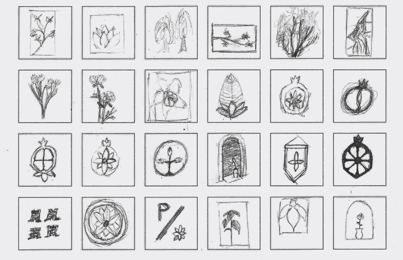
Memories with my grandmother started to point me toward a solution. She introduced me to Medieval England and feudal Japan through museum visits and History Channel specials when I was a teenager. Learning about prolonged wars and decisive events instilled in me a love for history as a whole, and what stayed with me most was the heraldry and family crests that warriors donned to signal their allegiance.
Floral emblems were a prevalent theme in both English and Japanese heraldic traditions, notably in the Oda clan crest and the Tudor rose. Using these two designs as a foundation, I created an abstracted columbine mark inspired by my home state of Colorado. I adopted the five point petal motif to strengthen the logo as an emblem, and when used discreetly, it provides that seal of approval quality I was searching for.
Above: Primavera secondary mark
Right: Oda clan mon, 16th Century. Tudor rose, designed by Henry VII c. 1486
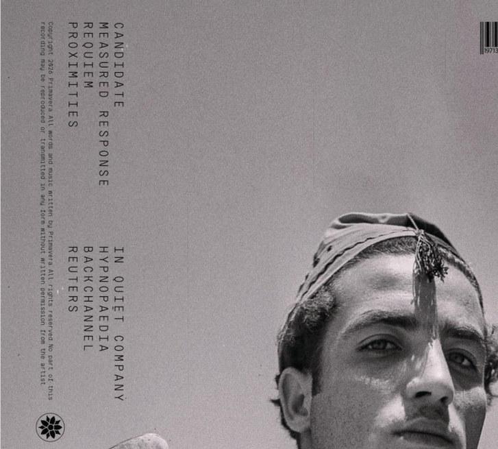
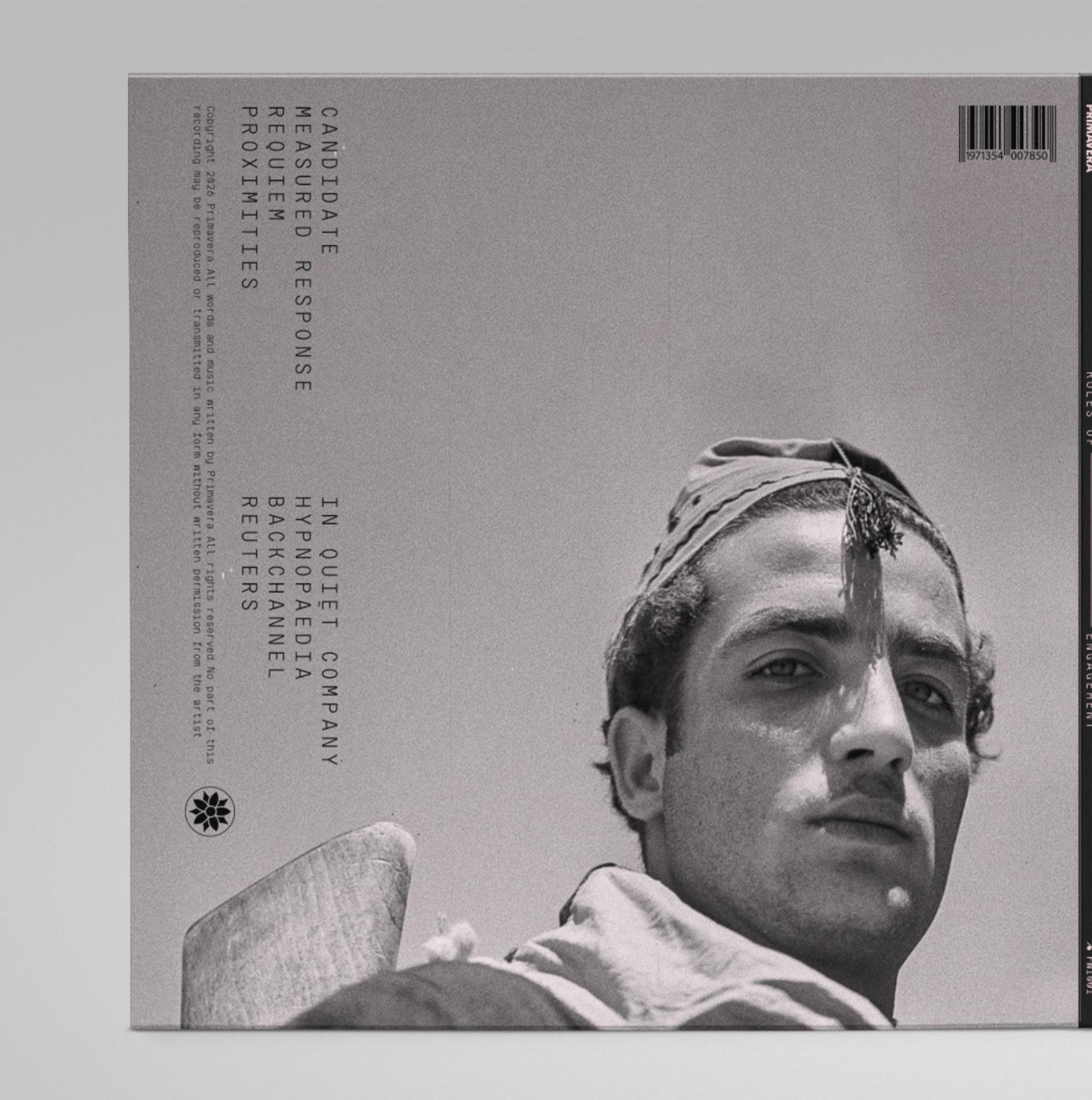
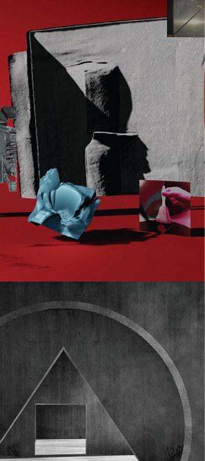
ALBUM PACKAGE
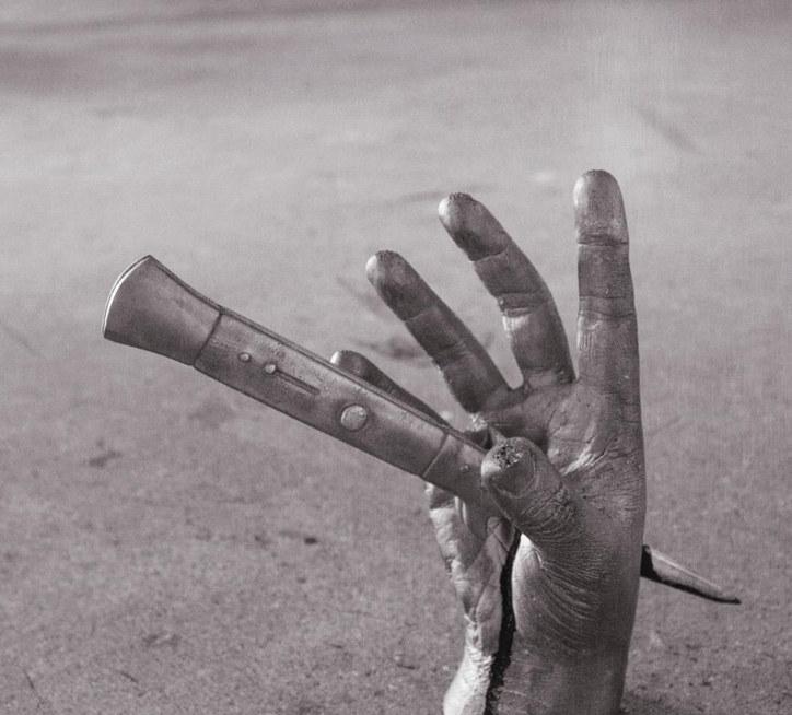
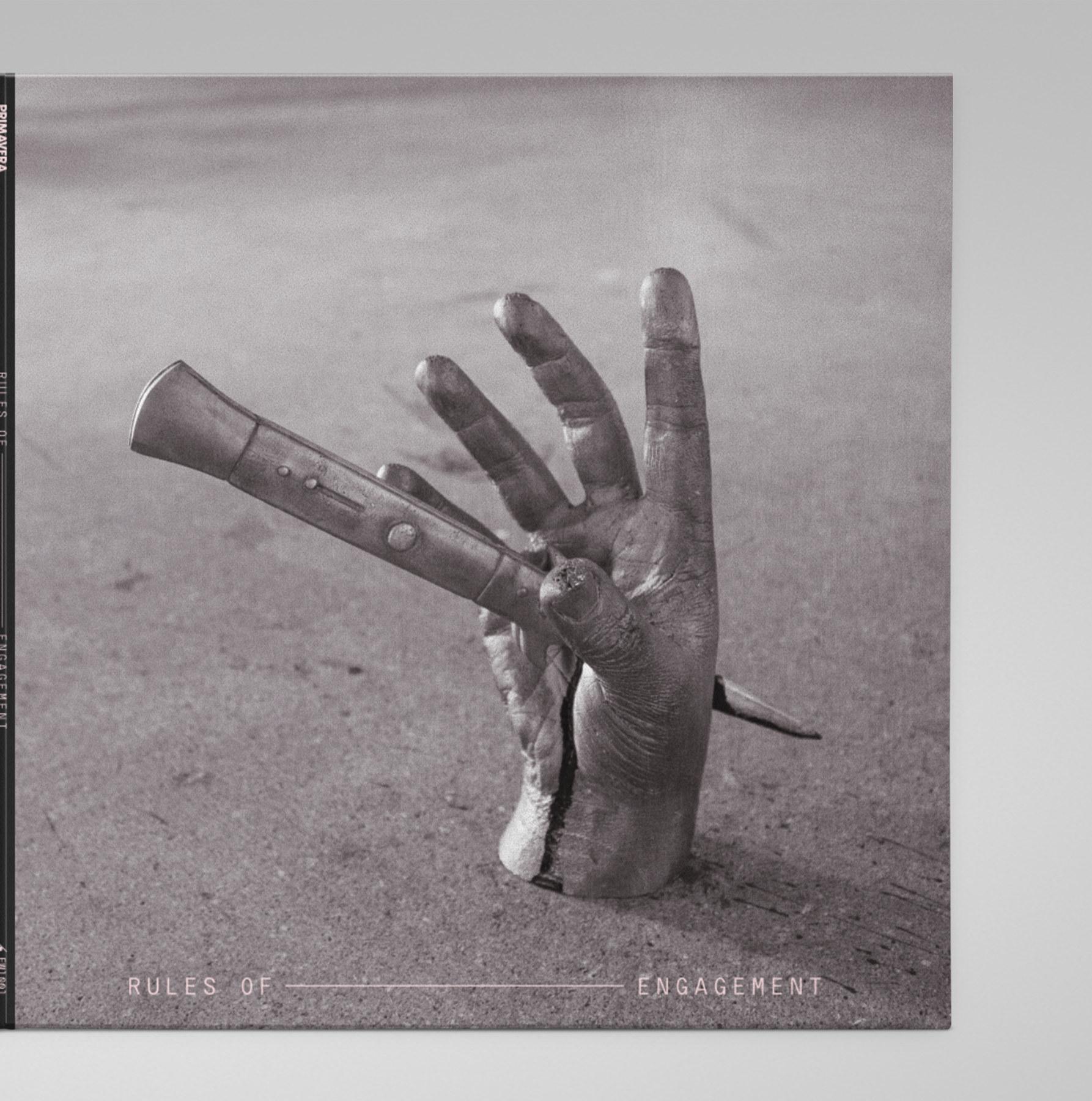
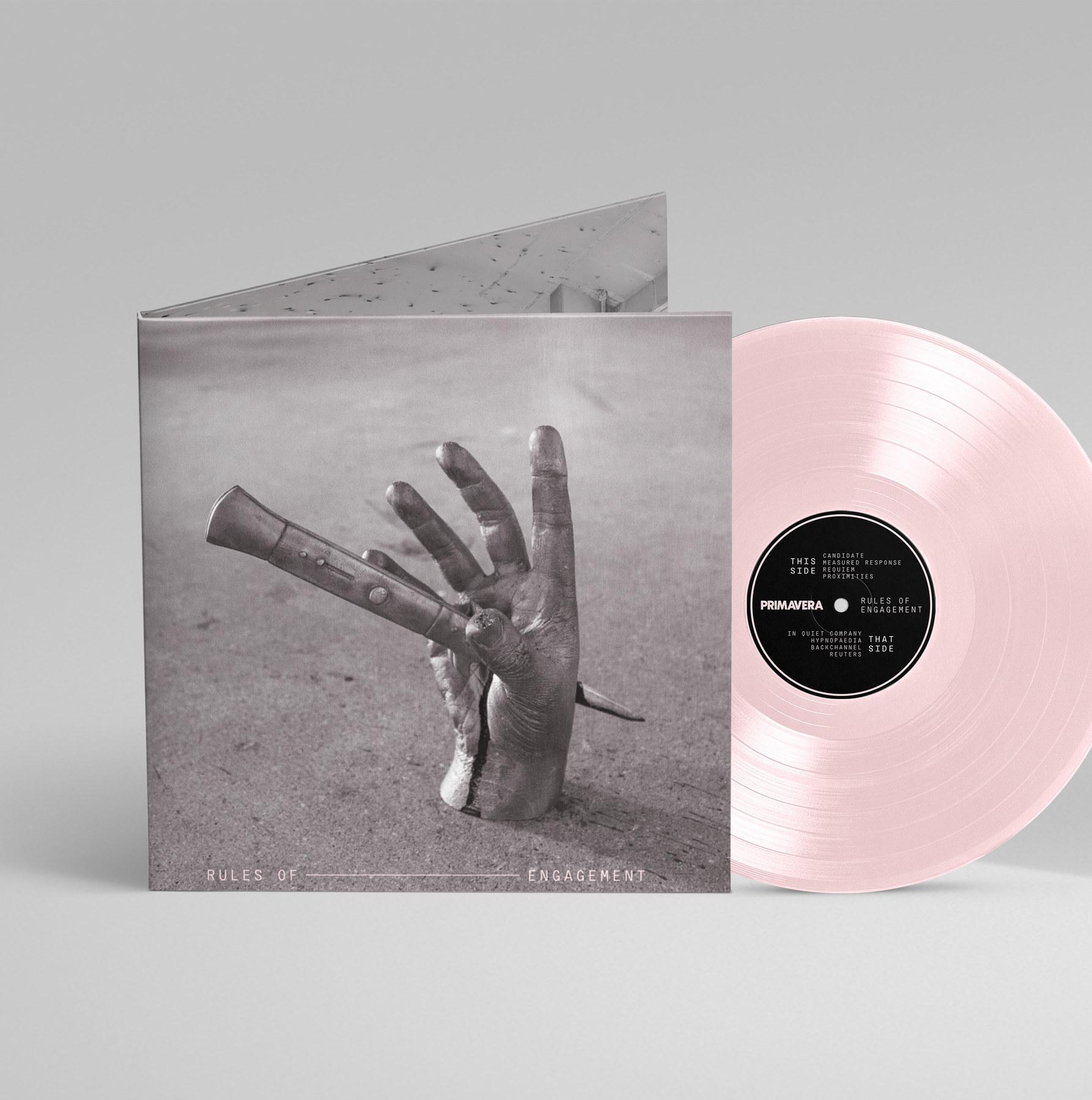
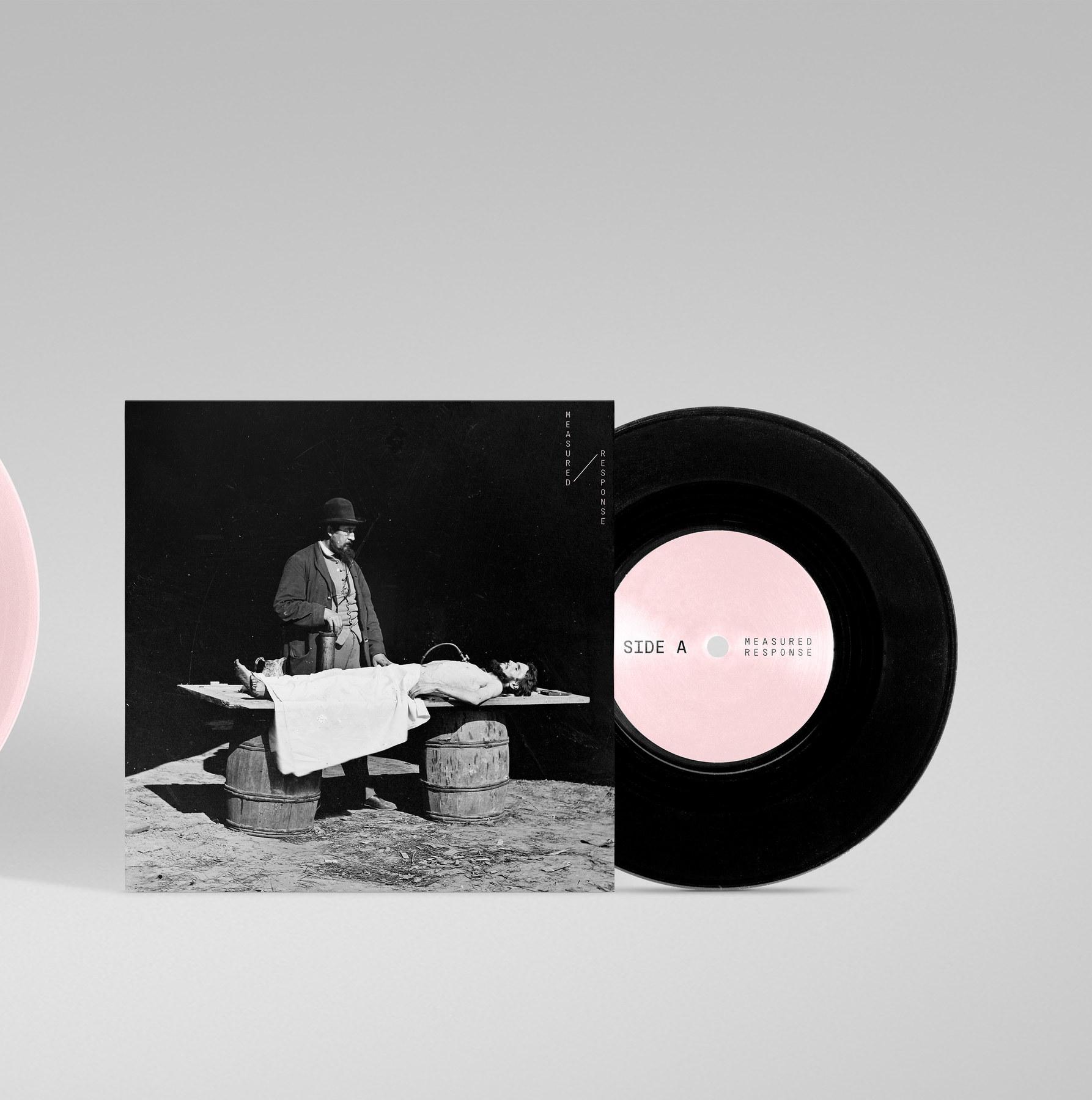
My first goal for the album cover was to establish a foundation for the rest of the project. Second, was to combine my love for history, photography, and sculpture. From the outset, I had a clear vision of I wanted to create for this project, and I enlisted every resource at my disposal to make them a reality. Driving my decisions throughout was making the same juxtaposition I had created with my font choices. Most of the images I had in mind weren’t going to be found in photo archives, so in true post-punk fashion, I set out to make them myself.
At the same time I was conducting my research, I had the idea to use one of my sculpture projects from another class for the front cover. I’ve always been drawn to the
provocative visual language of street culture, and that fascination blended with my findings in the form of a switchblade-stabbed hand in cast bronze. To lean further into the visual aesthetic, I utilized concrete for the photo backdrop. The paint-splattered floor inside CU Denver’s Experience Gallery was the texture I was looking for, and converting the image to grayscale gave it a grainy, archival energy. Laying out the type, I separated the words with a line to span the width of the sculpture. I used this as a subtle refrence to trench warfare, and coloring it in pink provided the ideal amount of visual contrast.
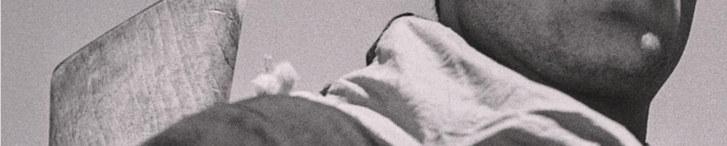
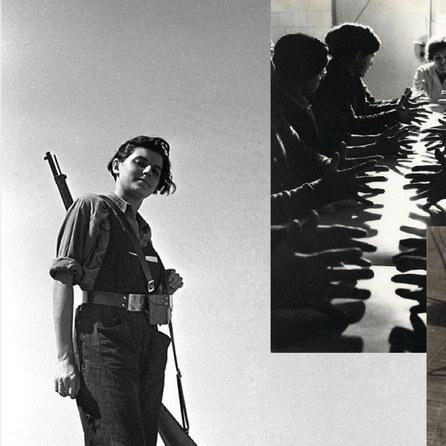
I opted for a more subdued photo for the back to prevent a competition with the front. I came across a candid shot by
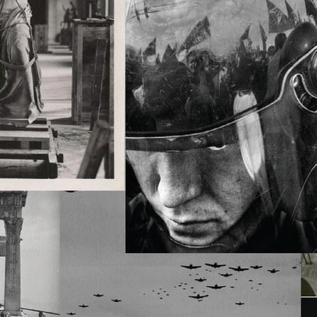
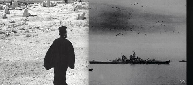
Antoni Campañà, a photographer on the Republican side of the Spanish Civil War. His depiction of a soldier staring down the camera against a clear sky was refreshing compared with overused war photography themes, and I found it a suitable counterbalance to the sculpture. Rather than centering it in the sky’s negative space, I aligned the tracklist with the soldier’s gun stock, so reading the album’s tracklist requires the viewer to physically rotate the cover in their hands.
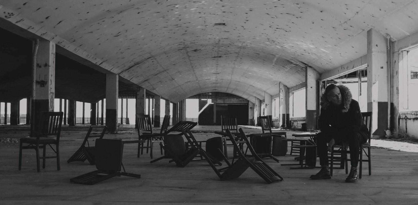
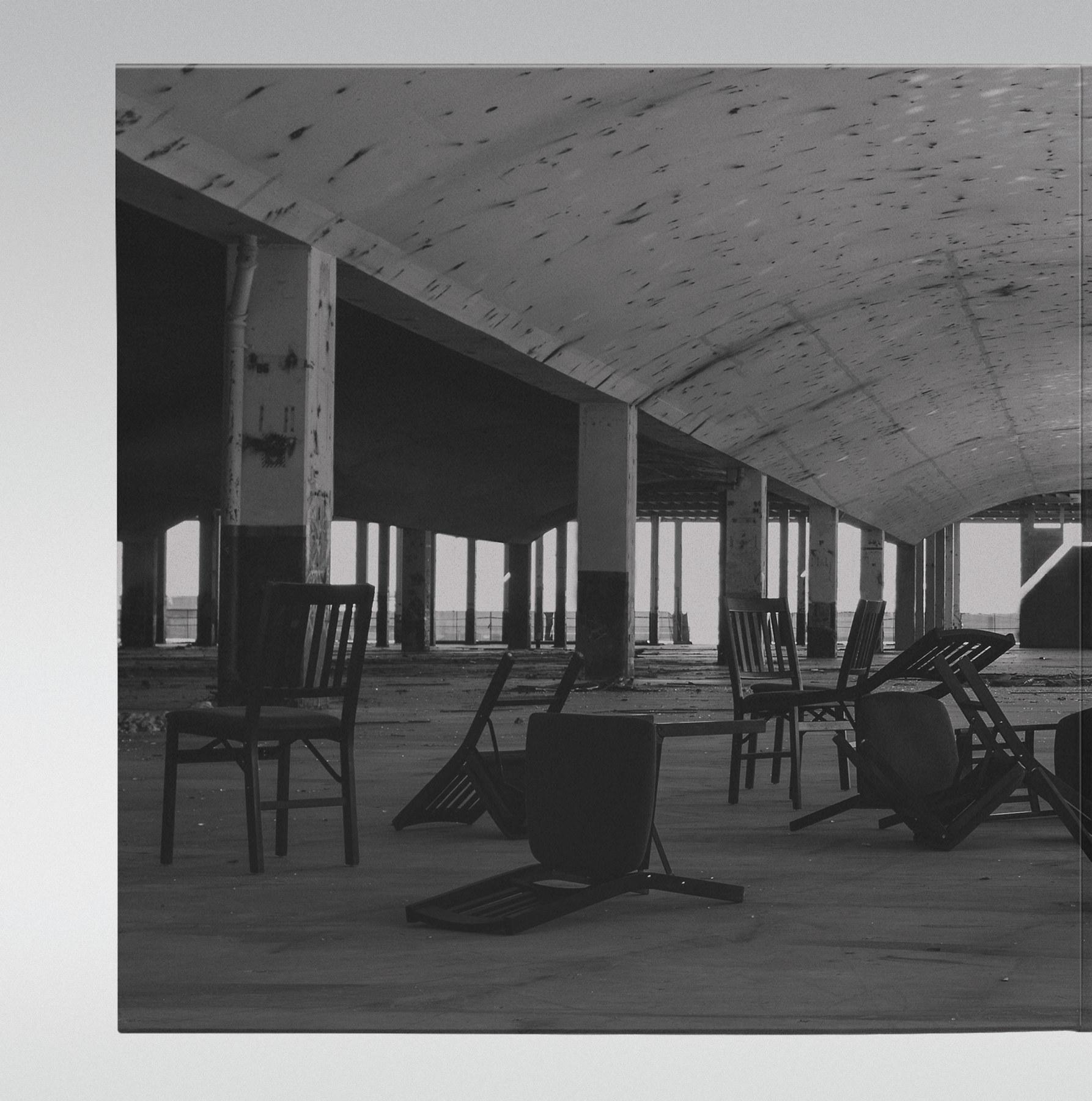
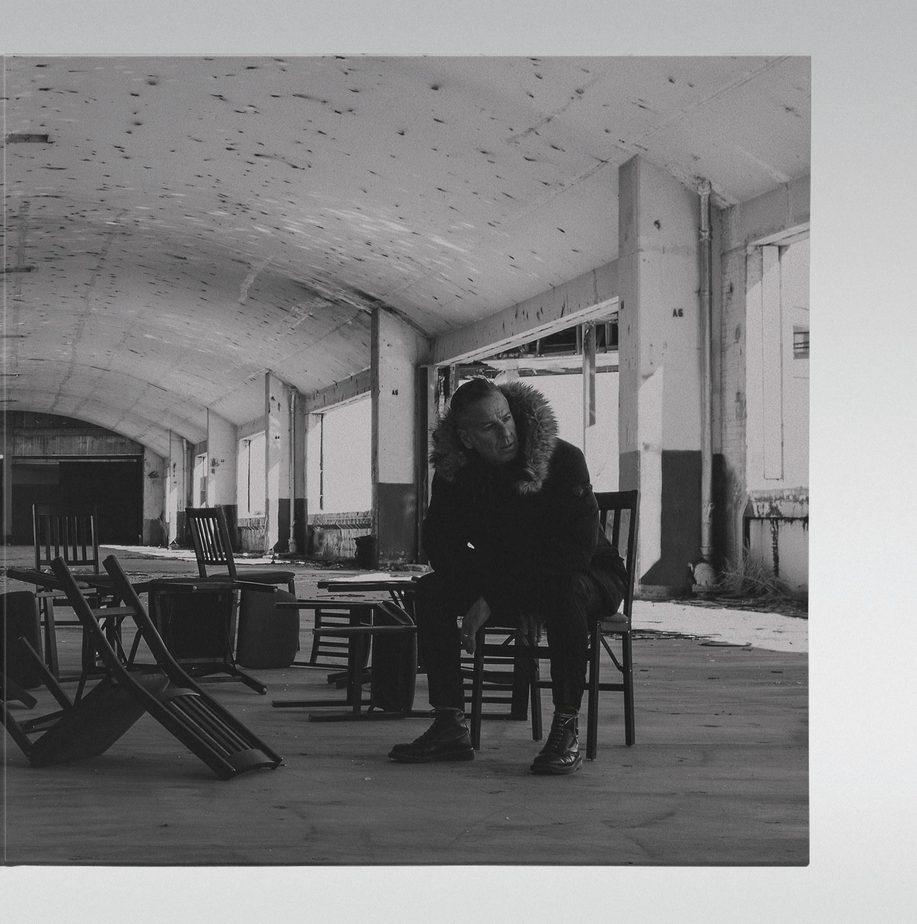
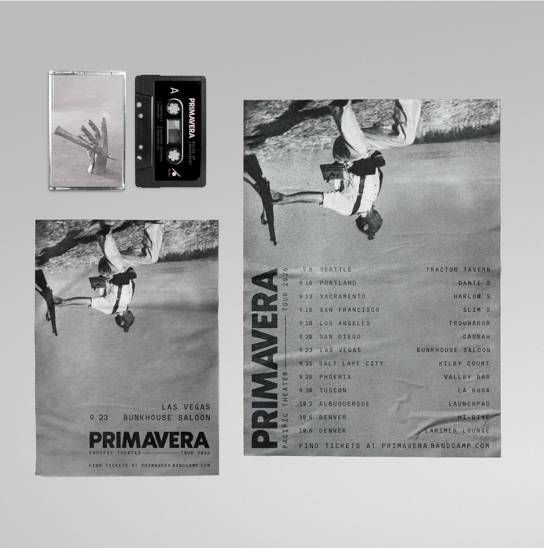
From the moment I had the album’s name, an image burned into my mind of a treaty signing gone horribly wrong, and I saw including a gatefold as a way to incorporate it. The setting was an abandoned, war-torn building, and to get
the shot I wanted, I reached out to my friends in the local skateboarding scene for the perfect spot. After borrowing a few chairs from the Emmanuel Art Gallery on campus and sneaking past a police squad car, my friend Chris and I staged the scene in a massive, deserted factory on the north side of Denver. Chris has been part of my life since birth and the most vocal in convincing me to return to college, so he was the natural choice for my photo model.
To match the historical feel of the cover, I digitally removed all traces of graffiti from the interior. The image completed the album’s visual system and was ready to translate to posters, merchandise, single artwork, and a cassette.
FUTURE CONSIDERATIONS
At the time of this writing, the songwriting and recording process for the album is still in progress. For most artists, including those I interviewed for this project, having a cover before the music is done goes against convention. But what I’ve discovered over the course of this work is that making music and designing its aesthetic don’t have to be isolated from each other. In the process of creating a visual system based on a few songs, the final product has enhanced my songwriting in composing the second half of the album. Because of this mutual influence, the art becomes inseparable from the music in a way other albums are unable to achieve. Looking to the future, I plan to use the same approach to my next album and tailor it to my professional practice when designing for other musicians.
Elizabeth Pugliano • Mark Rabideau • Stephen Schaf
Family
Lynda & Terry Cox • Pam & Paul Italiano • Mia Italiano
Kevin & Alexise Martinez • Richard Martinez
Melissa Furness • Vivian George
Darija Medic • Andrew Palamara
Travis Vermilye • Walter Ware
Liesel Jacoby
Linnea & Gabor Romhanyi
Julia Sharp • Gennipher & Paul Sjodin • Chris Shauinger & Missi Walker
Friends
Adam Baker • Josh Arango • Collin Adams • Ian Ancelin
Bret Baker
Chris Martinez • Jordin Martinez
James Ruden • Jim & Cheryl Sharp
Jessica & Matt Thurber • Seth Weber
Bonnie Barr
Cole Beneda • Josh Benson
Jared Berger • Greg Bethmann• Lora Bird
Ben Blanton
Cameron Booker
Nick Campbell
Ian Cannon • Shon Cobbs
Curtis Cole • Jimmy Duong • Nick Ernster
Matt & Karen Espeseth
Brad Iskyan • Rich Italiano & Tom Settlemire
Tyler Jacobson
Sam Freese
Dawn Hemmerle
Janel Huff • Chris Irvin
Jon Kroge
Keller Krug
Eli Labadie
Bryan & Kathy Langston Evert Lee • Phil Lombardo • Josh Manke
Clyde McConnell
Matt Meygesi
Jon Mikkelson
Ina Minx • David Noble
Dolphin Overton • Morgan Parrish • Landen Prueitt
Michelle Ramirez
Pamela Rieke
Becca Roman • Jill Schladweiler
Colin Shattuck • Jason Sommerville • Brian Stevens
Kyle Struble
Tim Sunset
Kristin & Randy Teuscher • Michael Trundle • James Tsvetkofski
Joe Wallace
Tim Wieser
Special Thanks
Jared Ashdown • Brandon Minervini • Andrew Palamara • Reg Smithies Jimmer, Marisha, Maddie, Mateo & Quinn at Bardo Coffeehouse on 38th Ave.
BLAKE MARTINEZ
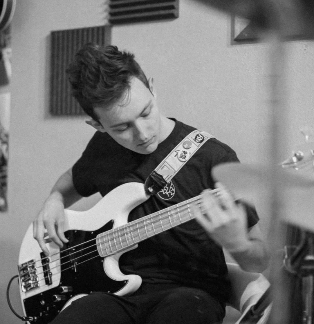
is a brand designer who believes that less isn’t just more—it’s everything. Educated in Digital Design at the University of Colorado Denver, his creative approach produces clear, strategic visual systems rooted in International Style principles. Outside of design, Blake is a classically trained musician, a veteran bicycle mechanic, and a patron of avant-garde cinema. His creative work extends into photography, songwriting, and cast-bronze sculpture, which ground his decisiveness under creative constraint. As he transitions from academic to professional practice, he aims to be a guide and collaborator in bringing visual identities to life.
Project Start 8 August 2025
Typography
Header: PP Museum Light
Subheader: PP Museum Light
Body: Greycliff CF Medium, Bold
Caption: Greycliff CF Regular, Thin
Photo and Studio Locations
University of Colorado Denver
Experience Gallery, Denver, Colorado
University of Colorado Denver Foundry & Sculpture Studio, Denver, Colorado