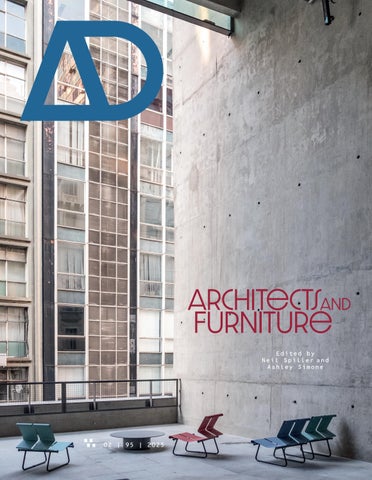

Architectsand Furniture
Edited by Neil Spiller and Ashley Simone


Architectsand Furniture

| 95 | 2025
Edited by Neil Spiller and Ashley Simone





1 ARCHITECTURAL DESIGN
SEPTEMBER 2025
EDITORIAL BOARD
Editorial Offices
Axiomatic Editions, an imprint of ORO Editions
250 Bowery
New York, New York 10012
Editorial Director
Ashley Simone
Editor
Neil Spiller
Managing Editor
Caroline Ellerby
Contributing Editor
Abigail Grater
Publisher Gordon Goff
Assistant Production Editor
Sarah Fingerhood
Design
Artmedia Ltd, London
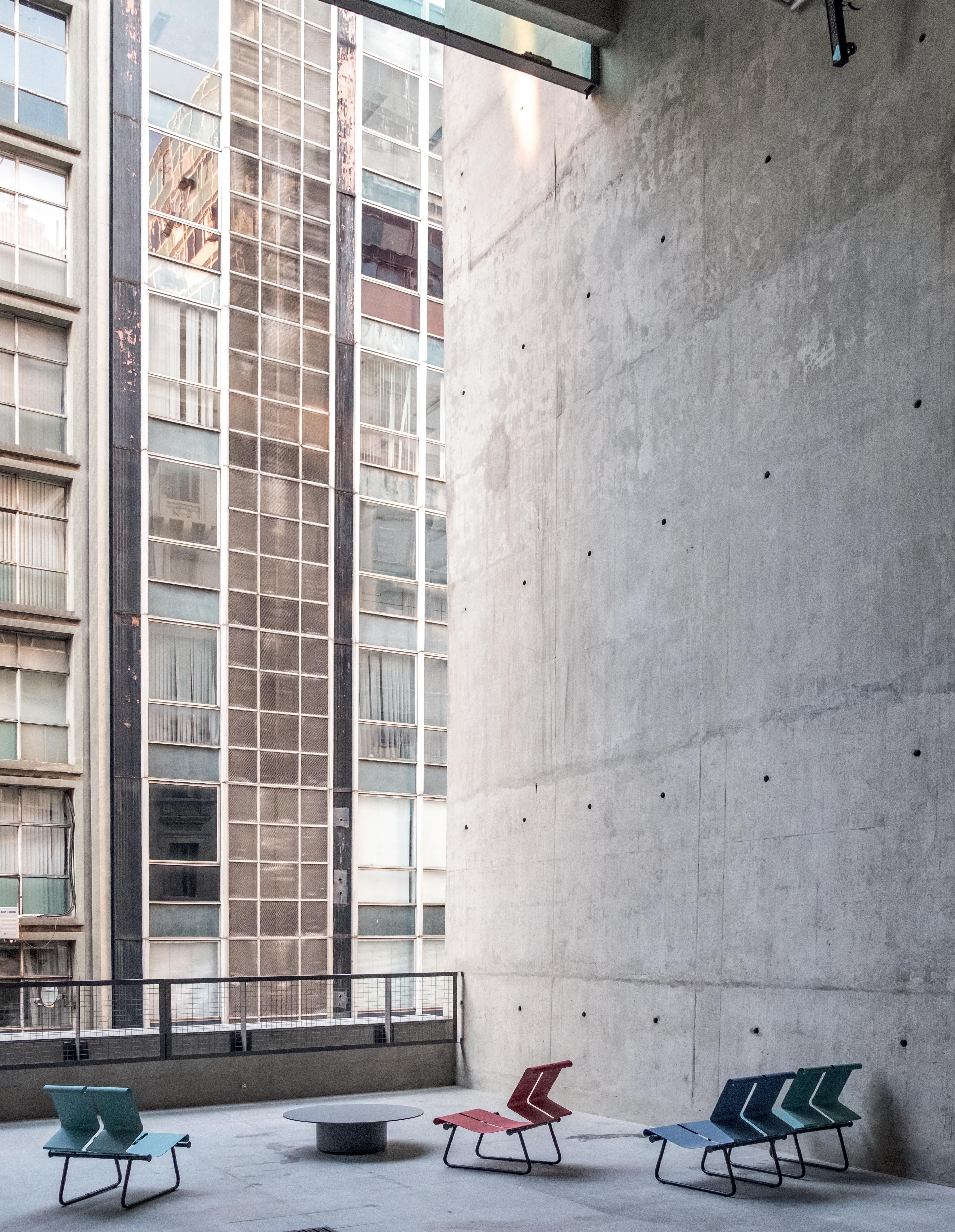
Front cover
Nigel Coates, Gallo collection, Poltronova, Florence, Italy, 1989.
© Poltronova, photo Carlo Gianni
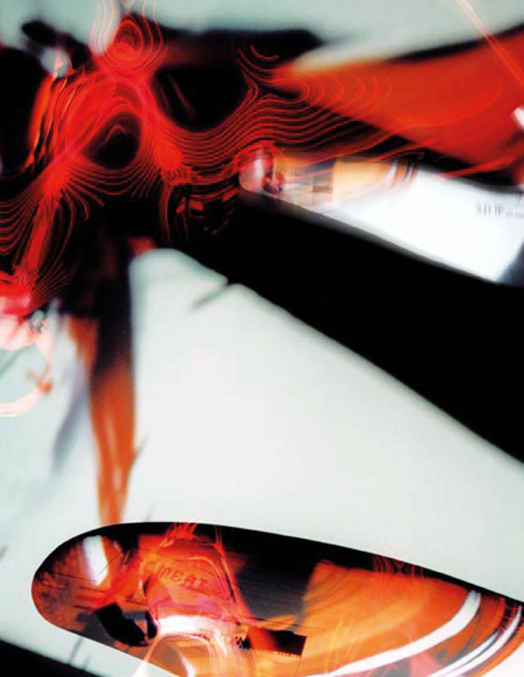
Inside front cover
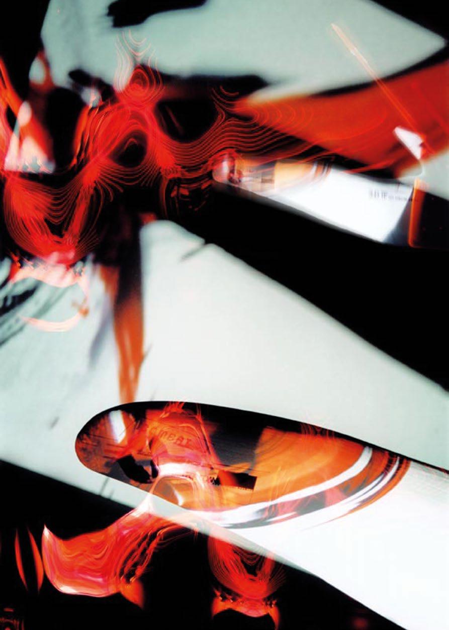
Stuart Munro, Traumatic Furniture, 2000
© Stuart Munro
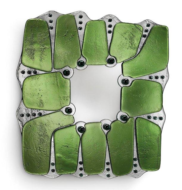
Page 1
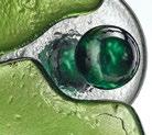
Kiki Goti, Nuphar Mirror, 2024.
© Vetralia Collectible
VOLUME 95 | ISSUE 02
Denise Bratton
Paul Brislin
Mark Burry
Helen Castle
Nigel Coates
Peter Cook
Kate Goodwin
Edwin Heathcote
Brian McGrath
Jayne Merkel
Peter Murray
Mark Robbins
Deborah Saunt
Patrik Schumacher
Jill Stoner
Ken Yeang
Disclaimer
The Publisher and Editors cannot be held responsible for errors or any consequences arising from the use of information contained in this journal; the views and opinions expressed do not necessarily reflect those of the Publisher and Editors.
Journal Customer Services
For ordering information, claims, and any enquiry concerning your journal subscription please go to www.archdesignjournal.com
Print ISBN: 978-1-961856-98-1
Print ISSN: 0003-8504
Online ISSN: 1554-2769
Institutional
$950 print and online
$850 print only
$850 online only
Individual $190 print and online
$160 print only
$120 online only
Individual issues
$40
All prices are subject to change without notice.
All content of 2 and archdesignjournal.com is copyright Axiomatic Editions and may not be reproduced in any manner, either in whole or in part, without written permission from the publisher. All rights reserved.


ABOUT THE EDITORS
NEIL SPILLER AND ASHLEY SIMONE
Architect and Editor of 2 Neil Spiller is based in London. He was Visiting Professor of Architecture at Carleton University in Ottawa, Canada (2020–22) and Visiting Professor at IUAV Venice in 2021. He was previously Hawksmoor Chair of Architecture and Landscape and Deputy Pro Vice-Chancellor of the University of Greenwich, London. Prior to this, he was Dean of the School of Architecture, Design and Construction and Professor of Architecture and Digital Theory at Greenwich, and Vice-Dean and Graduate Director of Design at the Bartlett School of Architecture, University College London (UCL).
His architectural design work has been published and exhibited worldwide.
He has guest-edited eight 2 issues, including Architects in Cyberspace I and II (1995 and 1998), and Drawing Architecture (2013), and more recently edited the issues Emerging Talents: Training Architects (2021), Radical Architectural Drawing (2022), California Dreaming (2023), and, with Aleksandra Wagner, Lebbeus Woods: Exquisite Experiments, Early Years (2024). His books include Visionary Architecture: Blueprints of the Modern Imagination (2006), Architecture and Surrealism (2016), and Educating Architects (2014), all published by Thames & Hudson. He is also the author of How to Thrive in Architecture School: A Student Guide (RIBA, 2020).
He is the founding director of the Advanced Virtual and Technological Architectural Research (AVATAR) group, which conducts research into the impact of advanced technologies such as virtuality and biotechnology on 21st-century design.
Educator and Editorial Director of Axiomatic Editions Ashley Simone is based in New York City, where she teaches and works on books and other publications about architecture and design.
Ashley is an Associate Professor at the Pratt Institute School of Architecture and a Lecturer at the College of Architecture, Planning and Landscape Architecture at the University of Arizona.
Her writing has appeared in numerous books and journals published by 2, Actar, BOMB Magazine, Lars Müller, ORO Editions, and Thames & Hudson. Select essays include “Polymorphic Matters” in 2 Lebbeus Woods: Exquisite Experiments, Early Years (2024), and “Value and the Metaphor of Phenomenology” in the anthology Modern Architecture and the Lifeworld (Thames & Hudson, 2020), edited by Karla Britton and Robert McCarter.
Among other books on architecture and design, she is the editor of Kenneth Frampton’s A Genealogy of Modern Architecture (2015), Allan Wexler’s Absurd Thinking Between Art and Design (2017), and Michael Webb: Two Journeys (2018), all published by Lars Müller, and Frank Gehry Catalogue Raisonné, Volume One, 1954–1978 by Jean-Louis Cohen (Cahiers d’Art, 2020), and The Other Modern Movement by Kenneth Frampton (Yale University Press, 2021). 2
Text © 2025 Axiomatic Editions. Images: (t) © Robbie Munn; (b) © Willis Roberts

An Intimate
Are You Sitting Comfortably?



Relationship Then I Shall Begin …

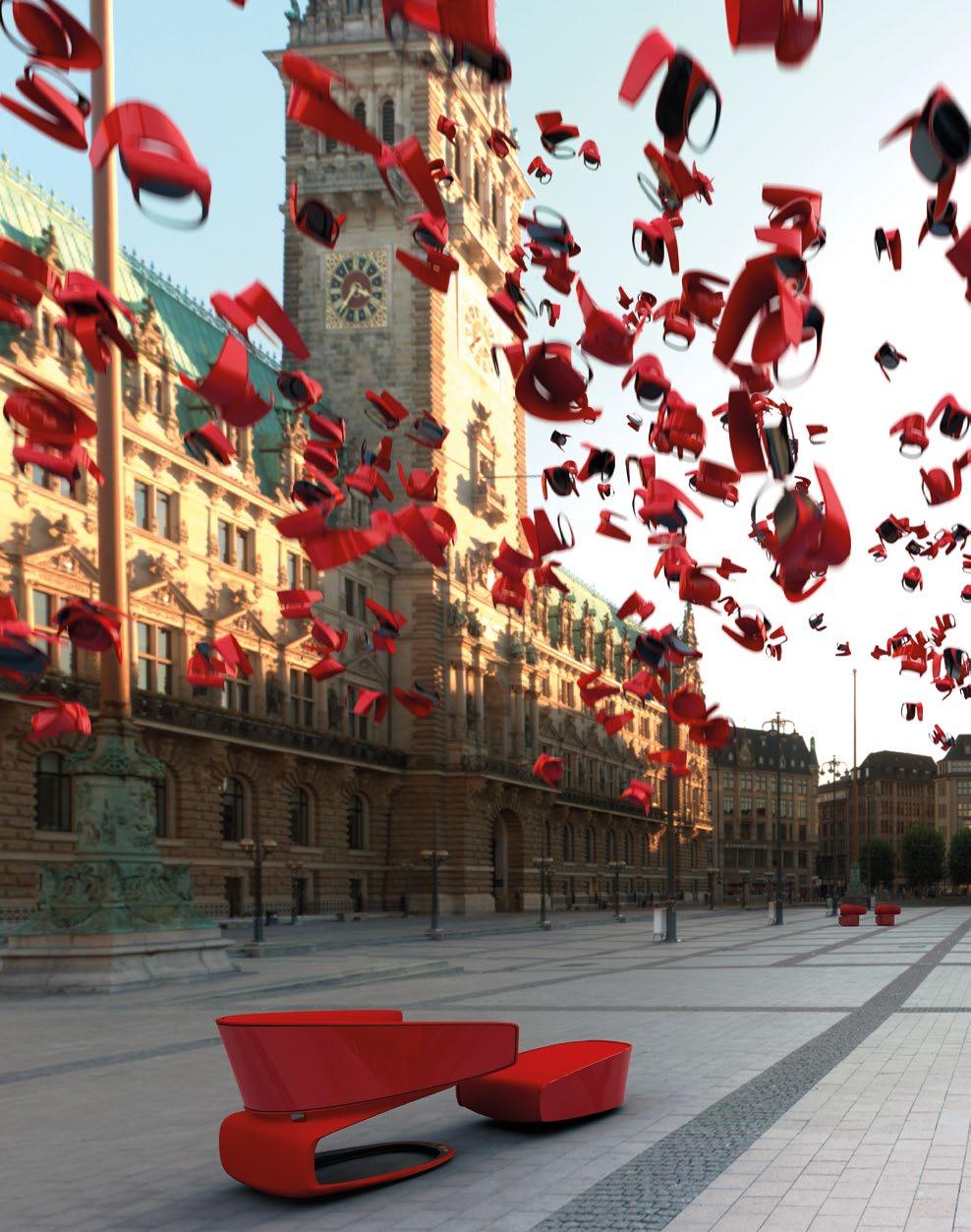
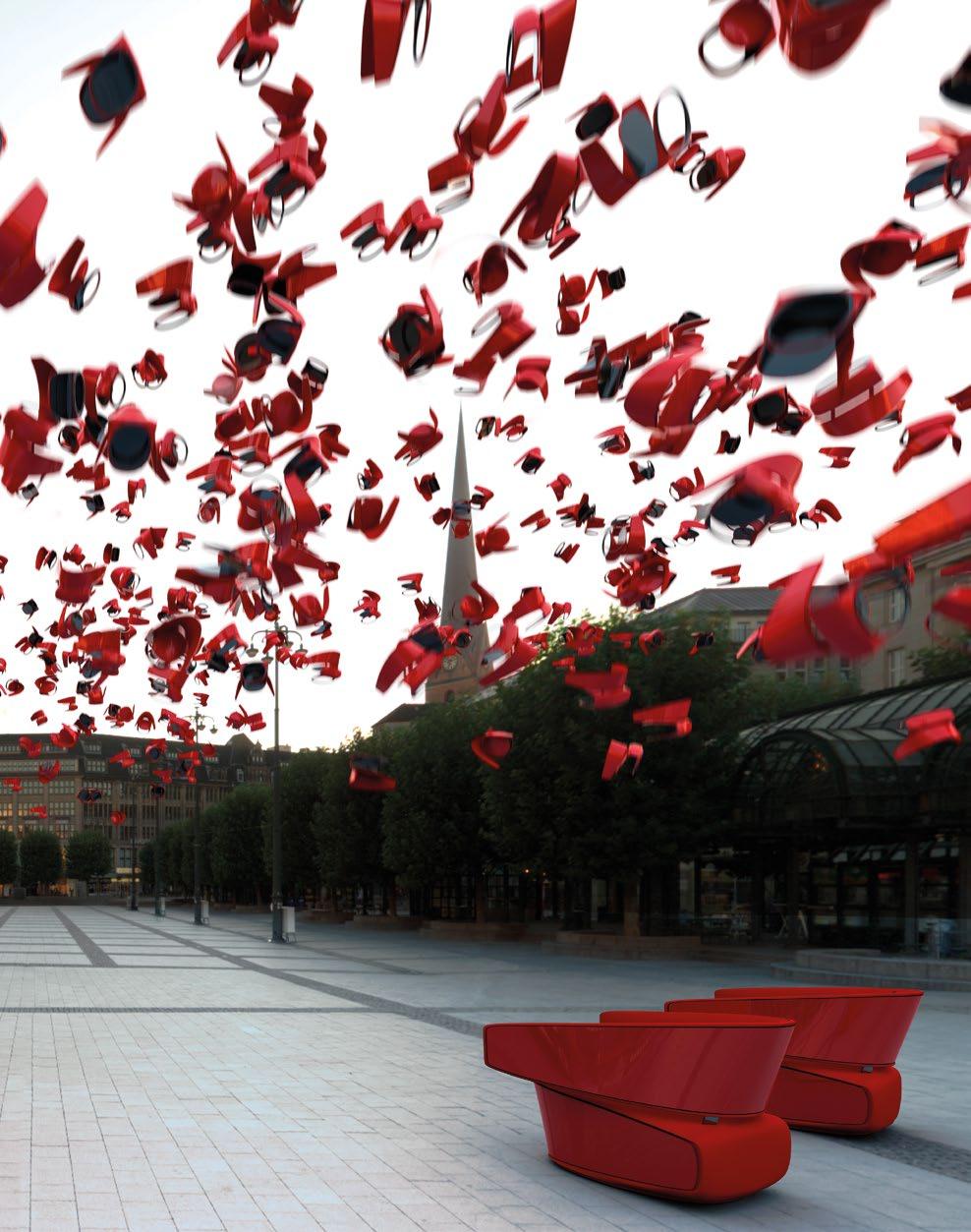
Moxon Architects, Mull chair for Tacchini, Milan, Italy, 2007
The Mull chair was the result of a competition win in 2006. Manufactured by design brand Tacchini, it consists of post-formed lacquered plastic shells skinned with upholstered suede padding. It has a removable and deployable footrest that at other times can be stored in the underbelly of the chair.
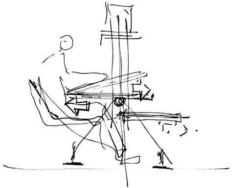
: An initial design sketch by
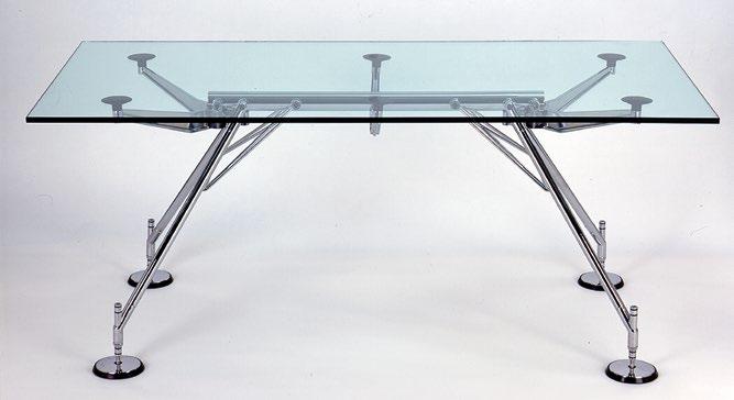
opposite top : The Nomos table can be part of a modular office system or can be deployed as a one-off. The table’s design language is one of rejoicing in its material efficiency and its beautiful structural economy.
Of all the relatively inert objects we haptically experience in our lifetimes, the relationship between our flesh and our furniture is perhaps the most intimate. While architecture can be seen as providing a protective environmental carapace around our bodies, furniture is about ergonomically cosseting and making these bodies comfortable in repose—particularly in the case of chairs, tables, and beds. Likewise, when we engage with the fabric of buildings, via handrails, door furniture, and the like, we find elements that are tailored to our human grip. Architects have often been fascinated by this close intimacy between body and design. Their interests in furniture can on one level create a displacement design activity in times of sparse architectural work, or conversely pander to their sense of creating the complete holistic great work where their architectural prowess and lexicon is explored and demonstrated at all scales—furniture is the ideal vehicle for such endeavors.
This edition of 2 commences with Sandy Jones, Assistant Curator of Architecture and Urbanism at London’s Victoria and Albert Museum (V&A). Through examples in the V&A’s collection, her article “If an Architect Were a Chair” considers why architects cross over into furniture design, how they apply their design thinking to smaller-scale projects, and the ways in which their furniture and building projects share a distinct design language. Examples include pieces by Marcel Breuer, Nathan Silver, Venturi Scott Brown, and Ron Arad. It traverses through varied stylistic preoccupations—Adhocism, Postmodernism, and Mid-century Modernism among them.
Canadian architect based in Los Angeles, Frank Gehry, needs no introduction: he and his office have developed a signature approach to designing buildings and artifacts that are at once complexly curvilinear and breathtakingly inviting. Likewise, his maverick furniture exploits the curvilinear and is highly inventive. Vanessa Grossman, Assistant Professor at the University of Pennsylvania Stuart Weitzman School of Design, explores some of these designs and their materiality. She focuses on Gehry’s “Easy Edges” series of chairs (1969–73), constructed from cardboard as a way of playing creatively to understand the material’s qualities and exploit them. Different but similar in its exploitation of its constituent materials, this time glass and steel, is Foster + Partners’ Nomos table (1987), which pushes its materials to high-tech limits.
Dada and Decon
In the 1980s a new exuberance seemed to invade furniture design, particularly that posited by architects. They explored using different materials in different ways and playfully, often distanced from the structural expediency of designers like Norman Foster. One such rising star was Zaha Hadid. Before completing any of her subsequent building projects, Hadid designed furniture and products for a handful of companies across Europe, America, and Japan. Like her interiors and exhibition designs, her furniture designs functioned as templates for trying out architectural strategies. Hadid believed that the satisfaction of designing products is that the process between idea and result is so quick and uncomplicated compared to a building. In terms of form, though, design and architecture interested her equally—there is a useful dialogue between the two. For her, design objects were fragments of what could occur in architecture. What were the key design strategies? How did these collaborations come about? And in what ways did furniture design shape Hadid’s career in architecture more broadly? Johan Deurell—curator, researcher, and latterly of the Zaha Hadid Foundation—investigates.
Like his friend Hadid, London- and Tuscany-based architect Nigel Coates is known for his extravagant and arresting buildings as well as for his domestic products that include furniture, lights, rugs, and vases. Some examples have a baroque playfulness, some an amorphous voluptuousness, and some a Modernist organic purity, or sometimes a mixture of all three and more. His work is eclectic, sensuous, tactile, and welcomingly amenable, as he rejoices in the movements and interactions between the human body and his pieces. Each item is narratively and imaginatively named to evoke its conceptual inspirations. Here he takes us on a journey of discovery that started during a period parallel to that of Hadid’s.
Similar to Hadid and Coates, at the same time in New York, Jesse Reiser and Nanako Umemoto were developing and exploring their own unique architectural lexicon through their fledgling practice, and articulating and manifesting their architectural ideas in highly surreal furniture pieces for both interior and exterior spaces. They developed and constructed a suite of designs informed by literary but mainly off-piste writings such as Alfred Jarry’s ’Pataphysics and Raymond Roussel’s Impressions of Africa (1910). This already heady mix of associations is further
Foster + Partners, Nomos table for Tecno, 1987
right
Norman Foster showing the Nomos table in various articulations.
Reiser+Umemoto, RUR Architecture, Lounge Chair, New York, 2018
below : Like many architects, the architectural and artistic lexicon of Reiser+Umemoto has changed and developed over the years. The Lounge Chair is an ecology of amorphous forms that can be used in multivalent ways. The composite skin was stretched and compressed to generate the appearance of a seamless tailored topology with local gradients.
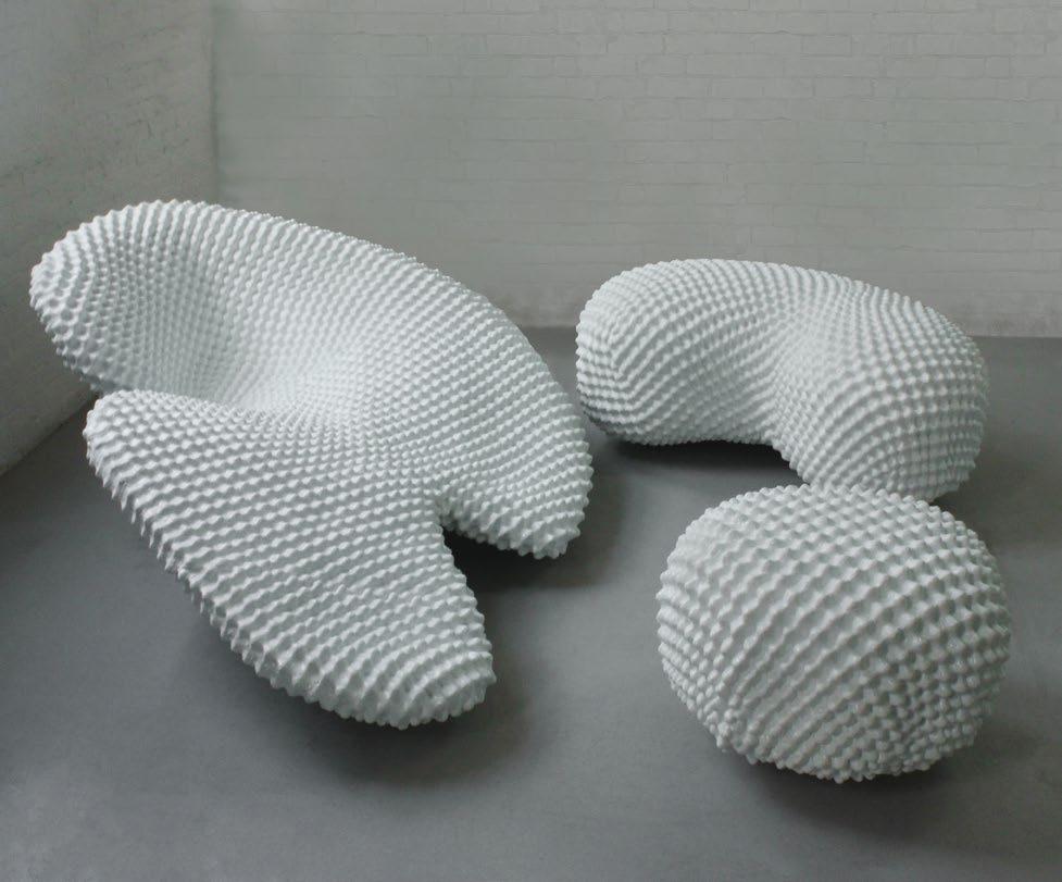
augmented with visual references to Dada artist Marcel Duchamp’s works, architect Daniel Libeskind’s vectors, and architect John Hejduk’s lyrical presences, thereby creating highly original and strangely beguiling architectonic performative forms.
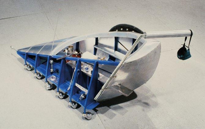
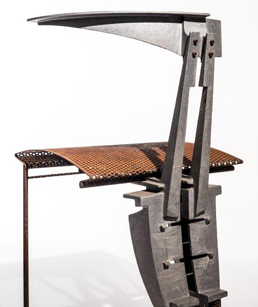
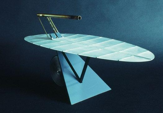
During this period, other Dada/Surrealist-inspired architects such as Ken Kaplan, Ted Krueger, and Christopher Scholz produced metallic furniture more akin to vehicles and airplane forms inspired by shoes, insects, human limb prosthetics, and fish, to name but a few of their influences.
As the 1980s decade waned and the avant-garde of the architectural profession was gripped by the stylistic and formally liberating nihilism of deconstruction, Morphosis cofounder and Angeleno Thom Mayne and others designed the Nee chair (1989)—a Deconstructivist symphony in miniature. Each element of the chair, whether seat, backrest, or leg, was individually designed and composed, and then joyfully joined together with a celebration of such junctions—again a manifesto piece for buildings yet to come.
Multivalent Design
An architectural firm that has been highly successful and yet, while practicing all over the world, has also managed never to let go of the small-scale joyful product and its conceptual relationship with the larger whole, is New York-based Steven Holl Architects (SHA). Producing furniture and fittings that resonate with the same rigor and joy as the practice’s buildings and their spaces, they have a reputation as multivalent designers adept at trying their hand at all manner of design scales and products. Dimitra Tsachrelia Holl—Principal at SHA—runs us through some of their recent design escapades in this respect.
Similar to SHA, Japanese architect Shigeru Ban and his practice have a reputation for designing buildings and furniture that can be viewed as three-dimensional poetry. The work has a presence that does not celebrate and expose its structure in the way that, for example, Norman Foster’s Nomos table does, but structure is integral to Ban’s designs, part of their holistic material geometry. Ban’s long-time partner Dean Maltz, who leads the New York office, describes this design approach and its outcomes. Like Gehry’s “Easy Edges” furniture, the experimentation with materials pays dividends and offers a designed, gentle humanity to architecture and products alike.
We then travel to Brazil, and alight on the work of Paulo Mendes da Rocha who, during a lengthy career, made a great contribution to many of the cultural buildings in São Paulo and is often referred to as a Brazilian Brutalist. He augmented such architectural endeavors with furniture designs, illustrating his multivalent design lexicon and bringing it down to the bodily scale. He was an original and instantly recognizable architect. Guilherme Wisnik is a tenured professor and Vice Dean of the Faculty of Architecture and Urbanism at the University of São Paulo. His article focuses on da Rocha’s emblematic Paulistano chair, originally designed in 1956.
All good architects exhibit a design philosophy that sees creative opportunities in all manner of materials, technologies, and original applications, and turning received design logics on their head. New York-based architect John Szot examines some of the forays into furniture by Los Angeles architect Greg Lynn and his creative design methodology that makes whatever he tries his hand at result in distinctly different outcomes from project to project.
Recently
In recent years, Amanda Levete and her London-based firm of architects AL_A have created some audacious works of furniture alongside some stunning buildings. The practice’s work always has a fluid dynamism about it, again instantly recognizable at any scale. Design writer William Richards investigates their productbased oeuvre and interviews Levete in a wide-ranging and insightful conversation.
CRAB Studio has had a longstanding preoccupation with designing tables, originally instigated with ex-fellow office founder Sir Peter Cook. While AL_A’s furniture utilizes curves and contemporary materials and technologies, CRAB Studio’s tables are simply made and designed yet still have a quotidian beauty. The tables populate some of CRAB’s built projects such as the Abedian School of Architecture at Bond University, Gold Coast, Queensland, Australia, and have the designed-in ability to cluster together, if need be, in various combinations. Member of the CRAB office Eoin Shaw describes their evolution, their progeny, and their ongoing metamorphosis.
In another act of quotidian lateral thought, University of Arizona School of Architecture faculty Carrie Eastman explores a trajectory of work by the architect and industrial designer Andrew Skey, beginning with a static wooden slab and progressing to dynamic constructs. The narrative moves from a table to a shelf to a pared-down skateboard: a rideable piece of wood.
Ken Kaplan and Ted Krueger with Christopher Scholz, Crib-batic, 1986
opposite : This children’s stroller is conceived as a vehicle for stimulation and as a tool cart, with the capacity to move through space and to present the child with a selection of tools to aid in exploration. These tools, rich in reference to simple mechanics and elemental material, were selected to be especially stimulating to the absorbent memory and intelligence of a three-year-old.
Morphosis (Thom Mayne with Kazu Arai, Craig Burdick, and Paul Burnsweig), Nee chair for Tom Farrage & Co., 1989
top : Another example of the inventiveness of the late 1980s that architects injected into furniture design. Morphosis’s Nee chair showcases the then-fashionable “Deconstructivist” aesthetic, with elements finely articulated relative to each other.
Christopher Scholz with Ken Kaplan and Ted Krueger, Lamp-Table, 1986
left : This design proposes that furniture be both transforming and dynamic, changing states and locations to fulfill different functions. When horizontal, it is a table capable of seating six people. Its leaves can be folded up and raised vertically to become a mobile standing lamp. Materials include translucent Lexan polycarbonate, aluminum, brass, and rubber.
Some architects not only design furniture for others to make but also make it too, sometimes taking a more artisan approach yet utilizing contemporary methods of jointing, prefabrication, computer-aided materiality, and forming. Los Angeles architecture practice Oyler Wu Collaborative has a remarkably hands-on design ethic. Jenny Wu also designs jewelry; all their design outputs at whatever scale are highly articulated, finely detailed and honed. Over recent years they have worked on furniture pieces both in the private and public realm. Todd Gannon, Professor of Architecture at The Ohio State University’s Knowlton School, describes Oyler Wu’s approaches to such designs, their material palette and fabrication techniques.
Digital Anatomies
The synthesis between digital sensing and dynamic furniture, particularly in relation to the Internet of Things, is only now being explored and exploited. The potential of such technologies can create motive furniture designs, able to have a sense of themselves and the shifting context that they find themselves within. This notion consequently offers a new terrain in which furniture designs can become much more dexterous, accommodating differing, even digital, anatomies—as for example in the Traumatic Furniture (2000) designed by Stuart Munro in the final year of his studies at the Bartlett School of Architecture, University College London.
What happens when a table is designed to incorporate all manner of technologies, is adaptable, and operates at many differing scales both conceptually and contextually? 4/16 Architects, steered by architect Nick Elias, a design tutor at the University of Greenwich in London and principal of his own architectural practice, have posited and built such a table. Elias explains the motivations behind this project and its beginnings, uses, and material consistency.
Stuart Munro, Traumatic Furniture, 2000
opposite : When a final-year student at the Bartlett School of Architecture, University College London, Stuart Munro developed a series of furniture forms that could be used to lay on, sit on, eat off, etc. Each piece surfed on an invisible “energy carpet” that provided each furniture element with a sense of itself and its relationship with its peers. Once a new piece was introduced in the room, the others would readjust accordingly like magnets in a box finding a new state of equilibrium.
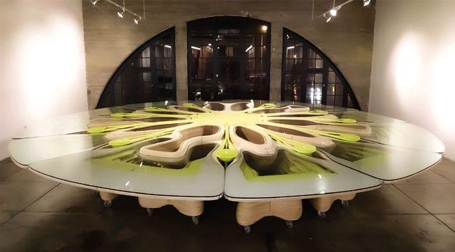
Ramiro Diaz-Granados and Heather Flood, C-Hub table, Southern California Institute of Architecture (SCI-Arc), Los Angeles, 2008
is
organic
Other furniture can be inspired by nature: the petals, buds, leaves, or the bloom of flowers. A good example is Ramiro Diaz-Granados and Heather Flood’s almost triffid-like Board of Directors table for the Southern California Institute of Architecture (SCI-Arc) in Los Angeles, called C-Hub (2008). While organically symmetrical, it is also wired—a fixed centerpiece cossets the main computer equipment. Around this central core are positioned 11 potentially independent “Chubbies”—outer sections that have their own internet, and USB ports. The whole is alive digitally as well as aesthetically. The table provides a focal point to the Kappe Library at SCI-Arc, with students and staff dismantling and reassembling the table for their own transient purposes.
Another designer who has a mechanized organic aesthetic is Greek architect and New Yorker Kiki Goti. Her furniture and fittings work has a certain vitality, almost blossoming into rooms, creating a sense of uncanny cyborgian nature. The pieces are often constellations of brightly colored materials—modern but rejoicing their almost Postmodern formal qualities.
Finally, the organic quotation and inspirational approach is continued in my own forays into furniture design; some made it off the drawing board, others didn’t. The set featured in this issue takes inspiration from biological forms found in nature: some microscopic, others not.
This 2 illustrates the profound breadth and originality architects have brought to furniture design. While our selections are not exhaustive—nor could they be in a publication of this size—we have endeavored to provide the reader with a comprehensive and chronological spectrum to delineate the broad scope of contemporary architects and their furniture-related preoccupations and triumphs.
The hope is that these microcosmic architectural sojourns into slightly different realms will themselves motivate and inspire a new generation of architect-designed furniture.2
© Foster + Partners, photo Peter Strobel; p. 9(b) © Reiser+Umemoto, RUR Architecture; pp. 10, 11(b) © photos Christopher Scholz; p. 11(t) © Morphosis, photo Jasmine Park; p. 12 © Stuart Munro; p. 13 © Photo Ramiro Diaz-Granados
left : This seemingly organic design
a contemporary retake on Art Nouveau formmaking and
inspiration, yet with machine-cut, layered build-up and a mobile modular construction.
Sandy Jones
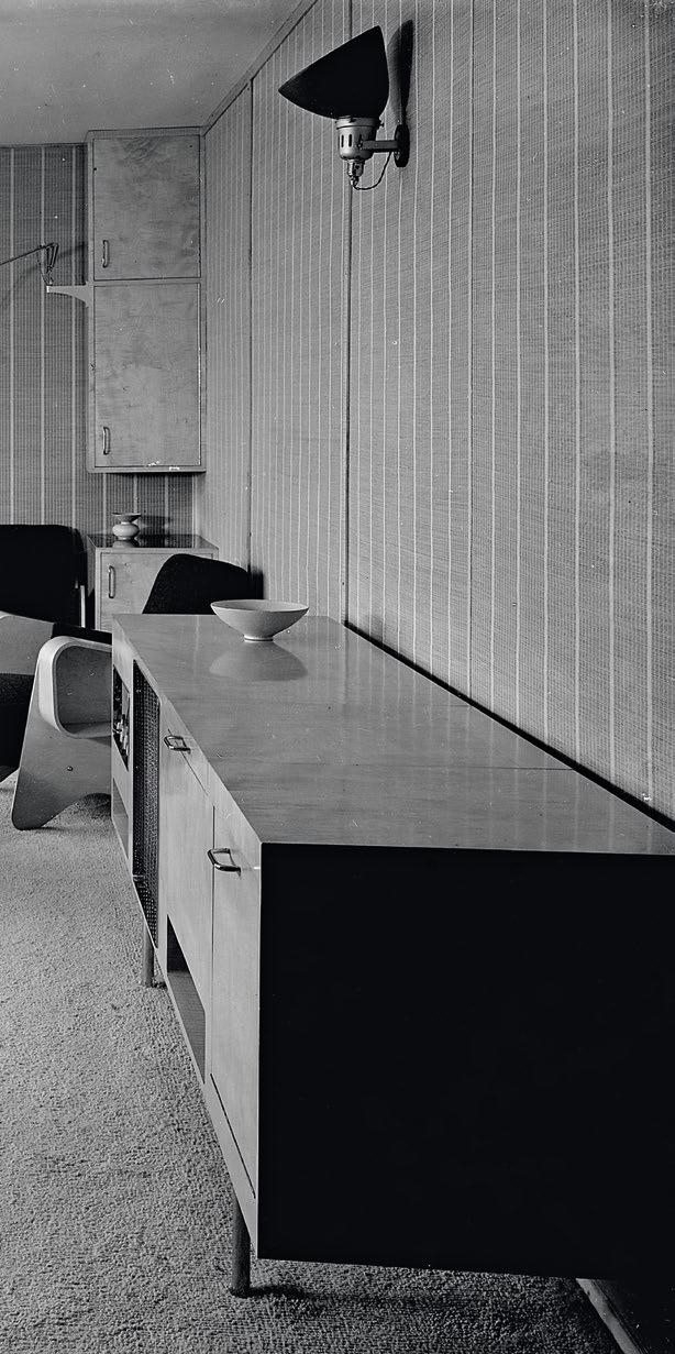
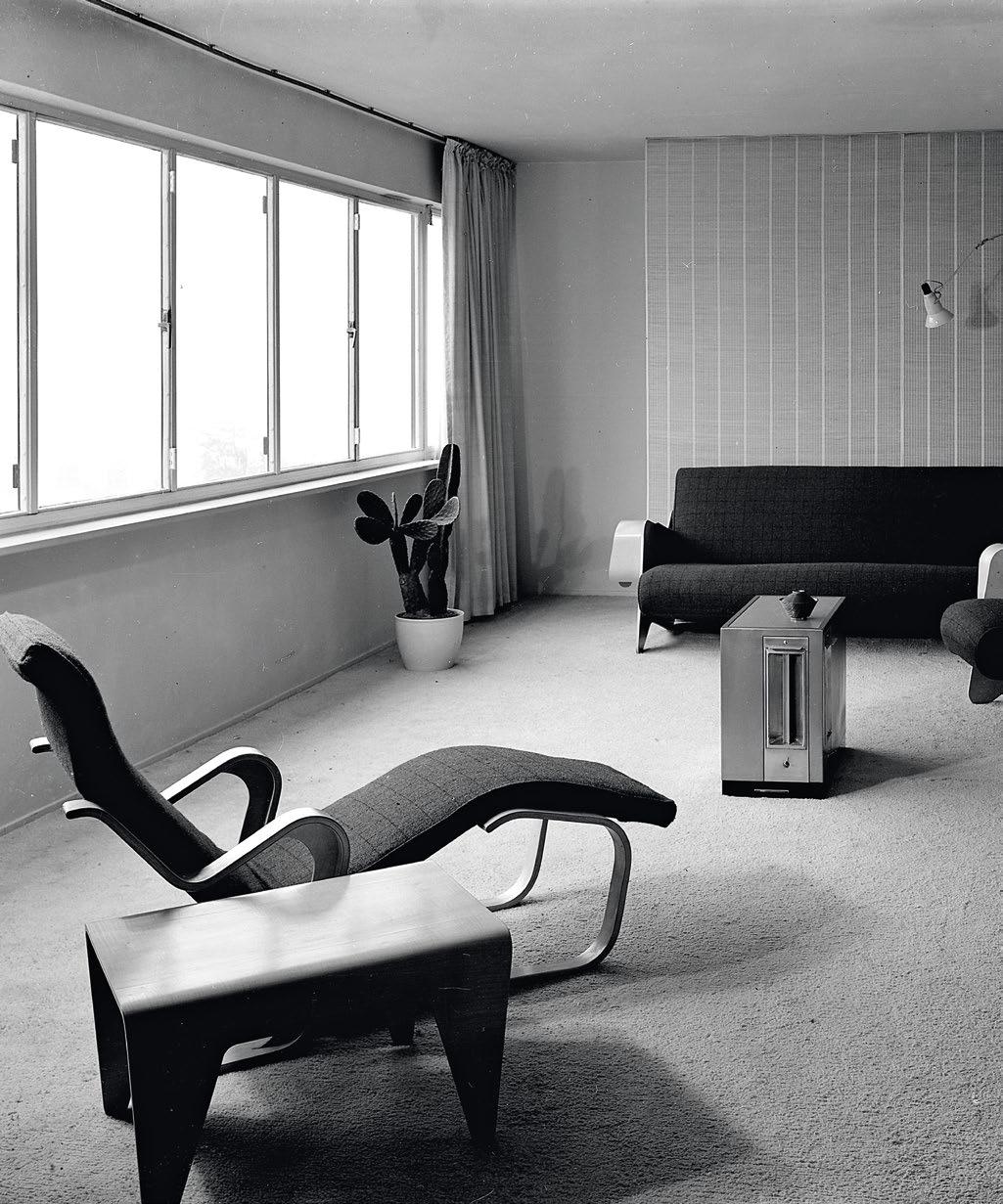
Marcel Breuer and F.R.S. Yorke, Ventris living room at Highpoint One, London, 1937
For art collector Dorothea Ventris’s apartment in the Highpoint One block designed by Berthold Lubetkin and his Tecton group, Breuer and Yorke envisioned the finished interior with woven tatami-style wall panels and furniture arranged around a centrally placed floor heater. In the foreground is Breuer’s Long Chair (1936), influenced by Finnish architect Alvar Aalto’s earlier seating furniture designs.
If an Architect Were a Chair
Furniture as an Extension of Architecture Collections
Architects’
engagement
with furniture design has a long and illustrious history. Sandy Jones, Assistant Curator of Architecture and Urbanism at London’s Victoria and Albert Museum, considers a few examples of “Mid-century Modern” design held within its collections. She gives us a quick tour of architects’ different stylistic approaches during the latter half of the 20th century.
The Victoria and Albert Museum (V&A) in South Kensington, London, is home to the national collection of architecture and holds models, drawings, and sketchbooks by some of the best-known architects from the 15th century to the present day. Architecture’s history is visible throughout the museum, from its Architecture Gallery and monumental Cast Courts to large-scale architectural fragments and reconstructions of historic rooms. The new V&A East Storehouse features the only complete Frank Lloyd Wright interior outside the US, the office he designed in 1937 for Pittsburgh department-store owner Edgar J. Kaufmann.
Architects are also responsible for the design of furniture in the collection, including one of the most historically significant, technical, and highly visible pieces of furniture in society: the chair. As an opportunity to experiment with structure, form, materials, ergonomics, and aesthetics on a small scale, the chair is unrivaled. As designer-maker and curator Huren Marsh observes, “you can put a lot into it, which you wouldn’t put into other furniture.”1 What motivates architects to design chairs, and how do the design elements of their buildings and chairs intersect? Six chairs in the V&A’s collection offer some valuable insights and trace the history of modern furniture design.
Early “Mid-century Modern”
Although he always thought of himself as an architect, the HungarianGerman Modernist designer Marcel Lajos Breuer spent the first years of his career designing furniture and interiors. Breuer graduated from the Bauhaus in Weimar in 1924 and returned as Master of the carpentry workshop in 1925 when the school moved to Dessau. He is best known for his tubular steel furniture, particularly the Club Chair Model B3 (1925–6), much later marketed as the Wassily Chair. In 1934, following the school’s closure the previous year by the Nazis, its former director and Breuer’s mentor, Walter Gropius, emigrated to London to form a partnership with architect Maxwell Fry. With an uncertain professional future in Europe, Breuer followed Gropius, arriving one year later to work as a partner to architect F.R.S. Yorke. Breuer stayed for less than two years before following Gropius again, accepting an appointment to teach architecture at Harvard Graduate School of Design. His work in England, however, made a significant impact on British architecture and design.
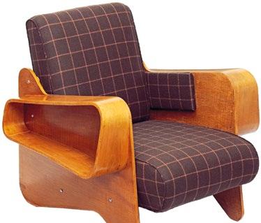

As part of a commission to design an interior in a Modernist style for art collector Dorothea Ventris’s apartment in Highpoint One, North London—which was designed by Berthold Lubetkin and his Tecton group in 1935—Breuer designed a pair of armchairs and a matching sofa to furnish the living room. Produced by P.E. Gane for Isokon, for whom Breuer worked and designed numerous pieces of furniture, they were made from large, cut-out plywood sheets for the frames, and feature molded armrests with distinctive plywood loops attached to the arms for storage and display. Breuer’s decision to design curvilinear architectural pieces in preference to the severe geometry of his tubular furniture reflected, in part, the need to soften his earlier designs to suit British taste, which favored the warmth of wood, as well as a material and production method cheaper than tubular steel. The origins of what has come to be called “Midcentury Modern” design are clearly visible in Breuer and Yorke’s interior, which was part of a trend toward biomorphic shapes evoking the natural world that emerged in the avant-garde art of the 1930s.
During this period, Breuer worked with F.R.S. Yorke on several buildings that served as testing grounds for his architectural ideas. A notable project was the design of the Gane Pavilion at the Royal Agricultural Show in Bristol in 1936, where he incorporated regional, even rustic, materials to express a more accessible Modernist aesthetic.
This period of experimentation and change in creative direction would be seen in the interiors and armchairs he later designed for the Pennsylvania Pavilion at the New York World’s Fair in 1939.
Marcel Breuer, Armchair for the Ventris flat, London, England, 1936
The chair is made from sycamore-veneered plywood and the side panels are cut from flat sheets, using a template.
Breuer’s decision to design curvilinear architectural pieces in preference to the severe geometry of his tubular furniture reflected, in part, the need to soften his earlier designs to suit British taste, which favored the warmth of wood
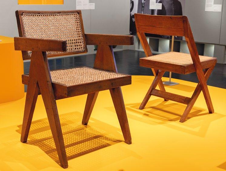
The 2024 V&A exhibition “Tropical Modernism: Architecture and Independence” highlighted how architecture became intertwined with postcolonial independence and nation-building in India and West Africa during the 1940s and 1950s. Following India’s independence from British rule in 1947, Prime Minister Jawaharlal Nehru commissioned Le Corbusier, Pierre Jeanneret, Maxwell Fry, and Jane Drew to build a new administrative capital, “unfettered by the traditions of the past,” in Chandigarh, northern India. The project also aimed to become a training ground for local architects.
Eulie Chowdhury was India’s first female architect and the only Indian woman on the Chandigarh project team. A fluent French speaker, she was responsible for designing the Home Science College, the Women’s Polytechnic, and several houses for government. She also prepared drawings for Le Corbusier, and designed furniture, including the Library Chair for the Palace of Justice, although she has not always been credited for her work. The chair’s design reflects the functional simplicity and geometry of her brick buildings. Local teak and cane were used to make the chairs in the workshops
surrounding Chandigarh. Today, these humble chairs, regarded as design classics due to their association with Le Corbusier and Jeanneret, command high prices, with the origins of their design and manufacture mostly overlooked. The Chandigarh Chairs project seeks to fill the gaps in the story of Chandigarh’s Modernist furniture and critically examine its construction and dissemination.2
Eulie Chowdhury, Le Corbusier, and Pierre Jeanneret, Library chair and Officer’s chair, Chandigarh, India, 1950–55
Eulie Chowdhury adapted Le Corbusier’s universal system of proportions, based on the average French man’s height, to design furniture for smaller frames. Fifty years later, after the 2005 refurbishment of Chandigarh’s Palace of Justice, the chairs appeared for sale on the open market.
“Ad Hoc” and Playful Pastiche American architects Charles Jencks and Nathan Silver’s influential book Adhocism: The Case for Improvisation (1972)3 explores the practice of “bricolage” in both everyday material culture and professional design. Challenging the formality of Modernism and the notion that true innovation only originates from “eureka” moments, it urged architects and designers to take pleasure in designing ad hoc by working with resources immediately to hand for the “resolution of present needs.” Viewed as a core Postmodern text, its themes and early examples of recycling strategies have become increasingly important in subsequent years and the book was updated and reprinted by the MIT Press in 2013.
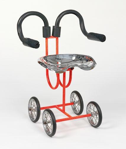
The Ad Hoc chair (1968) is one of the most memorable and well-known furniture designs of that period. Made entirely from improvised parts, it was designed to solve a problem in a particular context. Having refurbished the dining-room floor of
his Cambridge, England, home with a rough brick paving, Silver wanted seating that would not be damaged or produce a scraping sound when moved. His solution was to design a chair mounted on wheelchair wheels with a frame made from gas piping, bicycle axles and bearings for the wheels, and a chrome-plated tractor seat attached by auto-bumper bolts. Silver comments, “my architectural training with primary structural and materials knowledge instigating ideas that I developed, has always inevitably come into critical play for me when I’ve designed the likes of chairs, tables, restaurant trolleys … .”4
Venturi Scott Brown (VSB; now VSBA) are among the most influential architects of the 20th century, known for their architecture and contribution to Postmodern theory, including their seminal work Learning from Las Vegas (1972), co-authored with Steven Izenour.5 Denise Scott Brown describes their design approach, which includes cross-cultural and historical research, as “a troika: we
move between observing-studying, designing, and theorizing-writing.”6 This research-led practice is evident in architectural projects such as the National Gallery’s Sainsbury Wing extension in London (1991).
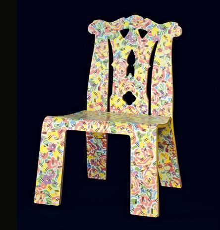
Knoll first asked Scott Brown and Robert Venturi to redesign its Madison Avenue furniture showroom in 1980. Four years later, the business commissioned them to design a furniture collection. The result was a Postmodern comment on the history of the chair, with the Chippendale Chair with Grandmother Pattern being one of five pieces launched in 1984 along with the Queen Anne, Sheraton, Empire, and Art Deco styles.
Inspired by Thomas Chippendale’s British rococo chairbacks, VSB’s chair is a witty historical pastiche yet its reference point is instantly recognizable. Made from plywood with a cut-out detail on the backrest and “ears” either side, it was designed for ease of manufacture and affordability. The surfaces are printed on both sides with a pattern featuring two layered motifs. The floral motif was inspired by an old tablecloth belonging to the grandmother of their colleague, Robert Schwartz, which is overlaid with a series of dashes. Venturi observed, “we wanted a pattern … that was explicitly pretty in its soft, curvy configurations and sweet combinations of colors, and represented as well something with nice associations, those of flowers.”7
Nathan Silver, Ad Hoc chair, 1968
This is the first Ad Hoc chair created by Silver, which was featured on the cover of Adhocism: The Case for Improvisation (1972). The vermillionenameled prototype cost approximately £30 in 1968.
Art
and Utility
Venturi Scott Brown, Chippendale Chair with Grandmother Pattern, 1984
right : The chair was one of five designed by VSB for manufacturers Knoll International. It featured in the 2018 exhibition “Thomas Chippendale, 1718–1779: A Celebration of British Craftsmanship & Design” at Leeds City Museum, England, which marked the tercentenary of Chippendale’s birth and highlighted how his legacy had become part of 20th-century popular culture in Britain and America.
Ron Arad, Little Heavy chair, 1991
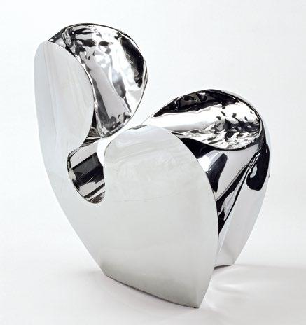
opposite left : One of the last chairs produced in Arad’s London workshop, it is number 9 of a limited edition of just 20. Arad works with a variety of metals including tempered steel strips and the woven metal used for industrial conveyor belts.
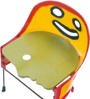
Gaetano Pesce, Crosby child’s chair, 1998
opposite right : Made from molded and poured polyurethane resin, each chair features a unique color palette and detailing, while the dimensions remain consistent. Individuality and humor are themes of Pesce’s designs.
In the early 1980s, British-Israeli architect Ron Arad set up the One Off design studio with Caroline Thorman. At that time, he experimented with making furniture out of welded tempered steel, which he manipulated, shaped, and crushed into sculptural forms. His first furniture piece was the iconic Rover Chair (1981), which he made with a Rover V8 SL car seat salvaged from a scrapyard. Legend has it that fashion designer Jean Paul Gaultier saw the first chairs Arad made and bought them all.
The Little Heavy chair (1991) is part of the “Volume” series in which Arad explored the “illusion” of volume. Designed as an edition piece, it is crafted from highly reflective stainless steel, giving it an overall smooth, organic appearance, yet the traces of the maker remain visible in the rough surfaces of the backrest and seat. These imperfections, created with a rubber hammer, not only reveal the material’s inherent characteristics but also challenge the machine-driven
perfection of Modernism. Cool, unyielding and fixed, the chair blurs the boundaries between furniture and sculpture in the same way that his architectural commissions—such as ToHa1, completed in 2019 as part of an office complex designed in collaboration with Avner Yashar Architects in Tel Aviv—merge into monumental art forms.
Arad’s process of design is collaborative and involves a continual reworking and reconceptualization to push form and materials to their limits. His experimentation with Little Heavy led to a new interpretation designed for mass production and comfort, the Soft Little Heavy (1991–3), which retained the volume and profile of the original but was produced in a soft, upholstered foam.
Described at the time by then New York Times critic Herbert Muschamp as “the architectural equivalent of a brainstorm,” Italian architect Gaetano Pesce’s multidisciplinary work is characterized by a vivid use of color and material, tireless
experimentation, and playfulness. Pesce was part of the Italian Radical Design movement active at the end of the 1960s and beginning of the 1970s. The movement embraced kitsch and historical eclecticism in its rally against Modernism, proposing instead that architects and designers should actively and critically engage in social and political issues through their work. Throughout his life and practice, Pesce upheld these ideals and the belief that architecture should both represent and support the place and community it inhabits, observing: “long gone is the time of mute objects and decorative architecture. Today, they should express the places where they are built on, the identity, culture, geography, and should no longer transport ‘the same’ to different locations.”8 This approach is evident in Pesce’s nine-story residential block, Organic Building (1993), in Osaka, Japan. In its red steel façade, Pesce integrates the precursor to contemporary “living walls” through a system of small bays with built-in
irrigation, which ingeniously support a vertical garden that includes over 80 varieties of plants and trees.
In furniture, Pesce’s humanistic approach is expressed in anthropomorphic and symbolic forms designed to be in dialogue with the user. His most famous piece is the UP5_6 chair (1969), known as “La Mamma,” which invited debate about the objectification and oppression of women. Pesce named his Crosby chair after the location of his studio and produced it in adult and child versions. The seat is the profile of a head, and the piercing in the chair’s backrest evokes a smiling face. Produced with molded and poured polyurethane resin, the candy color palette of each chair is as individual as the user, while the dimensions remain consistent.
The appeal of his work endures. Four hundred of Pesce’s Come Stai? chairs provided an exuberant colorsaturated swirl of seating at couture house Bottega Veneta’s Summer 2023 show in Milan, Italy.

A Shared Design DNA Architects design chairs for various reasons: to furnish their own buildings, to fulfill commissions, from a desire to experiment with form and materials, or to critically engage with contemporary issues in an easier-toachieve form than building. Perhaps it is also the challenge of balancing creativity, structure, and ergonomics in one of the most essential pieces of furniture we own.
This brief survey has shown that their building projects and chair designs share a distinctive design DNA: it would not be difficult to identify who designed each one in a line-up. Chairs designed by architects not only represent a moment in their creative practice; they reflect the culture, society, and technology of their time. 2
Text © 2025 Axiomatic Editions. Images: pp. 14–15 Architectural Press Archive / RIBA Collections; p. 17 © Victoria and Albert Museum, London, photo Pip Barnard; p. 18 © FLC/ADAGP, Paris/Artists Rights Society (ARS), New York 2025. Photo © Victoria and Albert Museum, London, photo Peter Kelleher; pp. 19–21 © Victoria and Albert Museum, London
Notes
1. Huren Marsh, video call with the author, November 29, 2024.
2. See the Chandigarh Chairs project www.chandigarhchairs.com.
3. Charles Jencks and Nathan Silver, Adhocism: The Case for Improvisation, Secker & Warburg (London), 1972.
4. Nathan Silver, email to the author, November 26, 2024.
5. Robert Venturi, Denise Scott Brown, and Steven Izenour, Learning from Las Vegas: The Forgotten Symbolism of Architectural Form, MIT Press (Cambridge, MA), 1972.
6. Denise Scott Brown and Robert Venturi, “Interview with Denise Scott Brown and Robert Venturi: Is and Ought,” Perspecta 41, 2008, p. 41.
7. VSBA Archives, project statement, July 19, 1990: venturiscottbrown.org.
8. Gaetano Pesce, “No More Silent Objects” exhibition by Salon 94, New York, September 14–October 30, 2021: https://salon94design.com/exhibitions/gaetano-pesce.


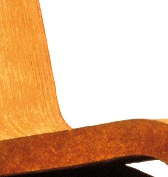
Easy Edges in Uneasy Times



Vanessa Grossman
Reflections on Frank Gehry’s Cardboard Furniture Design
Architect Frank Gehry’s cardboard furniture has become iconic in the design world. Vanessa Grossman, Assistant Professor of Architecture at the University of Pennsylvania Stuart Weitzman School of Design, discusses the evolution of his “Easy Edges” series in the 1970s, which unlocked the potential of designs made from waste.
The
Frank O. Gehry, Wiggle side chair, “Easy Edges” cardboard furniture series, 1972
Wiggle side chair is one of the most iconic pieces in the “Easy Edges” collection, celebrated for its sculptural form and innovative use of cardboard.
Frank O. Gehry, “Easy Edges” series sales catalog, 1972
right : A “Test of Resistance” with three “Easy Edges” chairs supporting a Volkswagen Beetle, which became the most iconic promotional image for the line, was featured in a 1972 sales catalog for “Easy Edges.”
Frank O. Gehry, “Easy Edges” cardboard furniture series, 1969–73
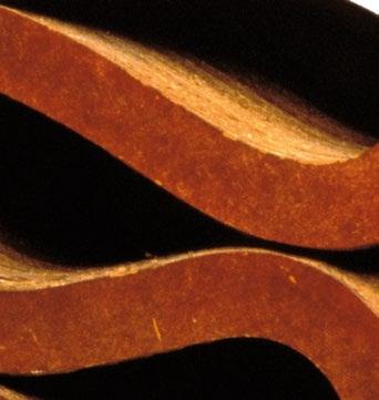
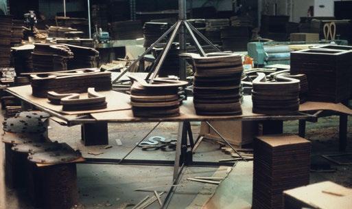
opposite left : The assembly line of “Easy Edges” pieces in the workshop, with the laminated board edging.
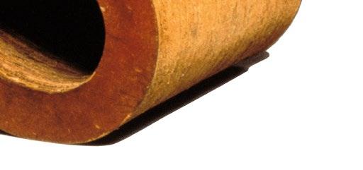
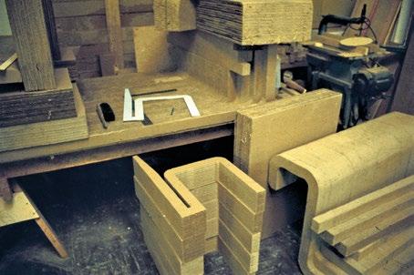
opposite right : The stacked pieces of corrugated cardboard used to make “Easy Edges” furniture in the workshop.
Frank Gehry’s innovative furniture design of the “Easy Edges” cardboard furniture line (1969–73) quickly gained widespread attention. Building on his earlier interior design work, “Easy Edges” featured unconventional materials and playful forms that propelled Gehry to celebrity status in the furniture world— though he did not fully embrace this role. As he puts it, “When I get excited about a material—like cardboard—I try to find out what that material does. I play with it until I get something that is comfortable and that expresses the character of the material. What I’m doing is very personal, exploring a material, seeing where it goes and where it takes me. It’s something that keeps me interested in between projects, like some people play chess.”1 Gehry’s experiments with cardboard were driven not only by the desire for affordability—echoing modern designers’ push to mass-produce and democratize furniture—but also by the rise of ecological thinking in car-centric Los Angeles. As he explains, “When I did the cardboard furniture in 1972, I was trying to make the Volkswagen—a really cheap line of furniture for people. Since then, the fish lamps and the new line of cardboard furniture haven’t been designed with the idea of selling them. I’m simply interested in the materials—the Formica and the cardboard.”2
Above all, “Easy Edges” reflected Gehry’s drive to shape architectural form using non-precious materials that bridge aesthetics and technology. Like many of his early works, the furniture range captured the intersection of the low-tech, utopian culture that emerged in California in the 1960s and the high-tech, research-driven environment that fused art and technology—a

high- and low-tech that continues to define the region today, with Silicon Valley’s entrepreneurs and Gehry’s architecture as landmarks. The patenting of “Easy Edges” eerily mirrored the fleeting rise of today’s startups that develop low-cost technology— an innovation whose potential was cut short, as it diverted attention from Gehry’s true calling as an architect.
In 1983, Gehry’s rising prominence led to his selection as a juror for the Third International Furniture Competition of Progressive Architecture magazine, alongside Kenneth Frampton and Arata Isozaki. Gehry’s reflections on the winning projects, as well as his broader comments about the competition, offer valuable retrospective insights into his “Easy Edges” designs. He remarked, “You must understand that I’m very interested in comfort and tactile qualities,”3 and also mused, “It would be very expensive. Are we being reactionary? I like it.”4 Regarding the role of fantasy in design, he commented during the competition’s general discussion—without pointing to any specific project: “The pieces that had something to do with fantasy were not really strongly brought off as fantasy.”5 Among the awarded furniture designs was a side chair by Michael Graves, with the first prize going to another side chair by Roger Crowley, both crafted from wood veneer. “Easy Edges,” in today’s context, holds potential as a model for the still-elusive circular economy, which seeks to combat climate change. It also resonates with Gehry’s sevendecade legacy of fusing artistry with technology—creating projects that can be “really strongly brought out as fantasy,” even if they do not conform to mass-market ideals, like the Volkswagen Beetle.
The Untapped Potential of Waste and Paper Gehry became acutely aware of waste economy while working for Joseph Magnin, the San Francisco merchant and founder in 1919 of the Joseph Magnin department-store chain. Gehry later explained that he was “disturbed” that half of the construction budget went toward store fixtures that would soon be obsolete due to “changing fashion and retail methods.”6 Gehry’s solution was to use disposable, inexpensive fixtures. He was not alone in his pursuit of creating furniture from locally available—and even discarded—materials. His experience designing shopping malls, interiors, and retail spaces in Los Angeles influenced his focus on using the city’s waste products. In 1970, architect and furniture designer Jim Hull, along with his wife Penny, founded Hull Urban Design Development Laboratory, Etc. (H.U.D.D.L.E.), a Los Angeles-based brand that recycled industrial waste into affordable, experimental furniture. Like Gehry, Jim Hull had worked for Victor Gruen Associates, though Gehry had left before Hull started. They eventually met in the 1970s, when Gehry, no longer running his furniture company, advised Hull on H.U.D.D.L.E.7 Shaped by their experiences working with figures like Gruen and Magnin, both developed a keen awareness of the wastefulness and environmental impact of the retail economy—in particular, of what since the 1990s has come to be called “fast fashion.”
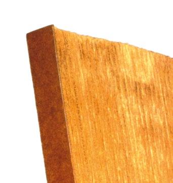
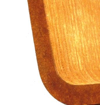
While H.U.D.D.L.E.’s furniture primarily used formed-fiber hardboard—made from fiber by-products of the lumber industry, as well as reconstituted newspapers and cardboard boxes for tubular chairs and sofas upholstered in less environmentally friendly petroleum-based polyurethane foam—Gehry favored the simplicity and ubiquity of cardboard. His breakthrough came from a pile of corrugated cardboard, or “Edgeboard,” that he kept in his office for architectural models. In 1969, when it was
decided that a NASA-sponsored symposium on art and science would be held in the studio of artist Robert Irwin, Irwin enlisted the help of Gehry and artist Larry Bell to transform the space on a shoestring budget. In response, Gehry designed innovative seating made of stacked cardboard.8
Working with artist Josh (Joshua) Young, Gehry embarked on an experimental process to explore the potential of paper, which, in his words, evolved “very scientifically” as they developed “a whole assembly-line technology.”9 Young was a student of Irwin’s at the University of California, Irvine (UC Irvine), and played a key role in developing the Market Street Program (1970–74) in Venice, California. Frequently listed as a “curator” for the initiative, he also collaborated closely with Gehry, working in his office throughout the 1970s. Their research with paper led to the creation of Edgeboard Sections, a groundbreaking design in which Gehry emphasized the raw, exposed edges of the cardboard rather than its flat surfaces. This approach was inspired by the layered construction of architects’ contour models. He also discovered that stacking single sheets of cardboard exponentially increased their strength. This insight led him to transform the material into sculptural, ribbon-like folded chairs and tables, with hardboard facing applied to the flat surfaces—thick, laminated layers of corrugated cardboard that acquired the strength and solidity of durable material. “Easy Edges” emerged as the most economical and robust design to produce. Gehry’s use of the Volkswagen Beetle was not merely a metaphor for mass production, as he had initially suggested, but rather a more literal—and somewhat sarcastic—gesture.10 By placing a two-thousand-pound Beetle on three of his cardboard chairs, Gehry turned the scene into a striking art installation, which became one of the most iconic advertisements for the design.
Gehry’s and H.U.D.D.L.E.’s designs were featured in the 1973 book Nomadic Furniture 1, subtitled How to Build and Where to Buy Lightweight Furniture that Folds, Inflates, Knocks Down, Stacks, or Is Disposable and Can Be Recycled. 11 Part instruction manual, part catalog, the book was aimed at offering easy-to-move furniture solutions for a nomadic lifestyle. Design theorist Victor Papanek, a strong advocate for socially and environmentally responsible design, co-organized the publication with James Hennessey. Their goal was to create a book that, unlike other DIY projects of the Whole Earth Catalog era, would teach readers how to build furniture suitable for the “nomadic living” of Americans, who are said to move about every two to three years on average, through furniture “that also folds, inflates or knocks down, or else is disposable while being ecologically responsible!”12
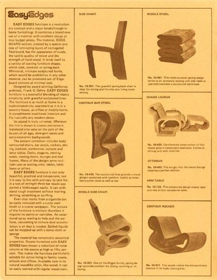
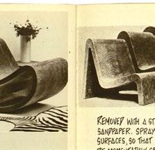
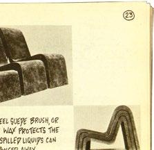
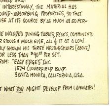
The book also highlighted Gehry’s new-material furniture, describing it as an “excellent example of design made from ‘waste,’”13 emphasizing its low maintenance and acoustic properties. It featured Gehry’s “springy rocking chair,” hailed as his “most maturely developed design.”14 Its tactile quality was described as “similar to velvet, but … stronger than hardwood.”15 The material, Edgeboard, was noted for its resilience: “nearly impervious to denting, marring [sic] or scratching,” with even cigarette char marks easily removed using a steel suede brush or sandpaper.16 Spray wax protected the surface, allowing spilled liquids to be quickly wiped away. Most notably, the material exhibited unique sound-absorbing properties, reducing noise at its source by up to 50 percent.
The remarkable development of so many versatile properties from such a simple material even led mainstream media, like the New York Times, to dispel concerns about its flammability.17 The paper emphasized that cigarettes left burning on the surface would not ignite, as the material could be made flame-retardant with a deterrent spray, applied either during manufacturing or by consumers at home, “at only a small additional cost.”18 The collection, which included 17 patented pieces—such as “bodycontoured chairs,” bar stools, rockers, and dining tables—was introduced in major department stores in New York and Los Angeles. The East Coast newspaper dubbed it “paper furniture for penny pinchers,” noting, “It’s the price that represents a real breakthrough for items of good modern design.”19
A page from the catalog showcases the Side chair, Contour bar stool, Wiggle stools, Chaise Lounge ottoman, Wiggle side chair, and Body Contour rocker—celebrated as a revolutionary concept and a groundbreaking advancement in home furnishings.
Frank O. Gehry, “Easy Edges” series sales catalog, 1972
Frank O. Gehry, “Easy Edges” cardboard furniture series, 1969–73
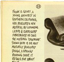
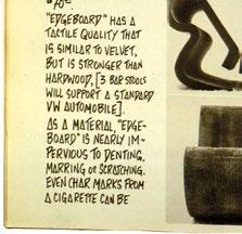
“A springy rocking chair” featured in James Hennessey and Victor Papanek’s Nomadic Furniture 1 (1973), a book that highlighted the durability and sound-absorbing qualities of “Edgeboard,” the innovative, velvety material developed by Gehry.
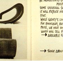
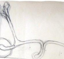

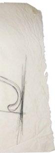
Frank O. Gehry, Study sketch for a lounge chair for the “Easy Edges” cardboard furniture series, c . 1969–72
The drawing, rendered in graphite on tracing paper, reflects the design language of the bentwood furniture pioneered in the mid-19th century by the German-Austrian pioneer in the industrialization of furniture manufacture, Michael Thonet.
Frank O. Gehry, Cross Check chair, bentwood furniture series for Knoll, 1992
below : Manufactured by Knoll since 1992, this chair is crafted from continuous wood strips, with no upholstery or traditional chair frame, showcasing a sleek, minimalist design.
Frank O. Gehry, Body Contour rocker, “Easy Edges” cardboard furniture series, 1969–73
opposite : The rocker boasts a distinctive profile, shaped by a single layer of laminated fiberboard.
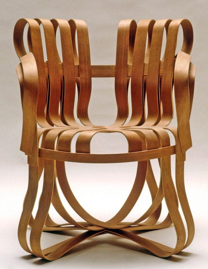
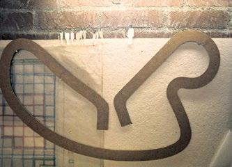
While the 20th-century Finnish architect Alvar Aalto’s influence on Gehry’s “Easy Edges” designs has been noted,20 the virtuosity, sleekness, and sculptural curves of certain pieces also recall the mid-19th-century pioneering bentwood designs of the German-Austrian cabinetmaker Michael Thonet. This connection extends to Gehry’s later work, such as his 1992 series of bentwood furniture for Knoll, including the Cross Check chair designed in 1990. As early as 1972, the New York Museum of Modern Art added the “Easy Edges” Body Contour rocker (1971) to its design study collection.21 However, by 1973, what had begun as a way to fill time between architectural projects was at risk of becoming a full-time pursuit—a direction Gehry ultimately chose to abandon. Production ceased after the initial run, and since 1986, Vitra has reissued four models from the “Easy Edges” collection, transforming them from affordable, household furniture into high-priced couture pieces—far removed from their original reference to the Volkswagen “people’s car.”
Outside the Global North, the parallel economies of a city like São Paulo are defined by the work of catadores de papel—cardboard pickers who work independently or within cooperatives, earning a living by collecting and selling cardboard and other recyclables. From these alternative labor networks, remarkable grassroots social initiatives have emerged, such as Dulcinéia Catadora, a project born from a collaboration between the catadores and artists like Lúcia Rosa at the 27th São Paulo Art Biennial in 2006. Dulcinéia Catadora operates as a recycling collective in São Paulo, where members develop inclusive editorial projects featuring authors working outside the commercial publishing circuit, with research-based works of art, poetry, and storytelling. On the design front, Brazilian brothers Humberto and Fernando Campana were inspired by the work of the catadores to create their “Papelão” collection (1993), which includes sofas, chairs, and coffee tables. These designs, however, also echo Gehry’s “Easy Edges” in their use of cardboard. While the Campanas have often framed their work as a social critique of Brazilian poverty, they have faced criticism for aestheticizing and commodifying22 what Italian-born Brazilian architect Lina Bo Bardi called “design at the impasse”23—everyday objects crafted from scarcity. Though this may be seen as “reactionary,” as Gehry suggested in 1983, the Campanas’ luxury furniture reflects a trajectory like Gehry’s own shift from affordable, experimental cardboard designs to high-end pieces produced by Vitra. In both cases, this evolution illustrates the inevitable fate of “good design.”
Fantastic Visions for Ecological Imagination
In the context of today’s environmental crises—exacerbated by the toxicity of fast fashion and the waste generated by Amazon’s packaging—it is timely to revisit Gehry’s “Easy Edges,” a groundbreaking exploration from the late 1960s that playfully reimagined the untapped potential of waste and paper. While shopping centers are reportedly “making a comeback,”24 defying even pre-Covid-19-pandemic predictions of a retail apocalypse, the true crisis may lie elsewhere. Consider fast fashion: despite an overabundance of clothing “sufficient to outfit the next six generations,” production in the Global North continues to surge, flooding countries like Ghana with discarded garments— primarily from the UK, US, and China, as highlighted in a disturbing 2024 report.25 These textiles, often dumped into the ocean, harm marine life and ecosystems. As concerns grow over the export and dumping of recyclables, there is increasing support for phasing out non-recyclable products, and designing for reuse. Today, the waste generated by students’ 3D-printed models produces harmful emissions and ultimately ends up in the trash, despite students being taught critical perspectives on sustainability in the age of the Anthropocene. In these uneasy times, Gehry’s original concept for “Easy Edges”—despite the challenges it faced in the commodity market—feels more relevant than ever. It offers a vision of how (environmental) imagination might be “strongly brought off as fantasy,” providing an edge over mainstream architectural theory and practice.2
Notes
1. Frank Gehry in “Furniture: Seven Leading Architects Talk About What Works, What Doesn’t— and Why,” Architectural Digest, August (no. 8), 1988, p. 58.
2. Ibid.
3. Ibid., p. 176.
4. Ibid., p. 171.
5. Ibid., p. 180.
6. Cited in Jean-Louis Cohen, Frank Gehry: Catalogue Raisonné of the Drawings Volume One, 1954–1978, Cahiers d’Art (Paris), 2020, p. 252.
7. Jim Hull, interview with the author in Malibu, Los Angeles, January 5, 2010.
8. See “Interview with Robert Irwin about the First National Symposium on Habitability of Environments,” Weisman Art Museum, October 1, 2018: https://wam.umn.edu/interview-robertirwin-about-first-national-symposium-habitability-environments.
9. Robert Irwin, quoted in Joseph Giovanni, “Edges, Easy and Experimental,” in Rosemarie Haag Bletter (ed.), The Architecture of Frank Gehry, Walker Art Center (Minneapolis, MN), 1986, p. 67, cited in Cohen, Frank Gehry, p. 255.
10. See Francesco Dal Co, “The World Turned Upside-Down: The Tortoise Flies and the Hare Threatens the Lion,” in Francesco Dal Co and Kurt W. Forster, Frank O. Gehry: The Complete Works, Monacelli Press (New York), 1998, p. 47.
11. James Hennessey and Victor Papanek, Nomadic Furniture 1, Pantheon Books (New York), 1973, pp. 20–23 and 46.
12. Ibid., p. 2.
13. Ibid., p. 46.
14. Ibid., p. 22.
15. Ibid.
16. Ibid.
17. Norma Skurka, “Paper Furniture for Penny Pinchers,” The New York Times, April 9, 1972.
18. Ibid.
19. Ibid.
20. Francesco Dal Co in Dal Co and Forster, Frank O. Gehry: The Complete Works, p. 60, n. 30.
21. “Cardboard is for Jumping,” Life, July 14, 1972.
22. See Adriana Kertzer, Favelization: The Imaginary Brazil in Contemporary Film, Fashion, and Design, DesignFile (New York), 2014.
23. See Lina Bo Bardi, Tempos de grossura: o design no impasse, Instituto Lina Bo e Pietro Maria Bardi (São Paulo), 1994.
24. Joe Gose, “What Retail Apocalypse? Shopping Centers Are Making a Comeback,” The New York Times, June 9, 2024.
25. Fleur Britten, “Where Does The UK’s Fast Fashion End Up? I Found Out on a Beach Clean in Ghana,” The Guardian, September 24, 2024.
Johan Deurell
Fragments of The Role of Design in Zaha
Architecture
Hadid’s Early Practice
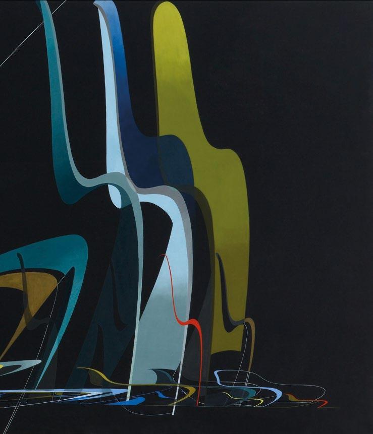
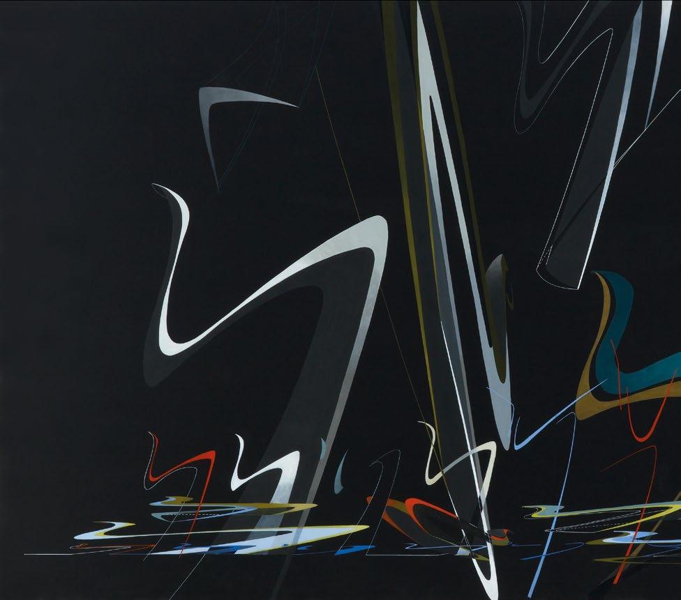
Zaha Hadid Architects, Hommage à Verner Panton, 1990
In 1989, Zaha Hadid was commissioned by the Vitra furniture company to make a painting paying tribute to Danish designer Verner Panton’s cantilevered chair. Hadid was a fan of the classic Panton Chair and would furnish her office and home with it.
When Zaha Hadid set up her London office in the early 1980s, it was mostly sustained by furniture and small interior design commissions. These projects were embryonic but highly influential in Hadid’s continuing trajectory to architectural superstardom, and were important testbeds for her early nascent talent. Curator and writer Johan Deurell describes these heady days, the ethos of the office, its clients, and the furniture it designed.
The satisfaction of design is that the production process between idea and result is so quick and uncomplicated compared to a building. In terms of form, though, design and architecture interest me equally—there is a useful dialogue between the two. You might say that design objects are fragments of what could occur in architecture.
— Zaha Hadid, 20061
After finishing her diploma at London’s Architectural Association (AA) and spending a year as a partner of Office for Metropolitan Architecture (OMA) in Rotterdam, the Netherlands, Hadid set up her own architectural office in 1979. From then until the completion of her first building—the Vitra Fire Station in Weil am Rhein, Germany—in 1993, Hadid used interior commissions to experiment with space and think about furniture in relation to buildings. Much like the practice’s early architectural projects, interiors and furniture were frequently exhibited and publicized. In fact, they represent the first time the world experienced how Hadid’s Suprematist-inspired architecture could be transformed into something tangible and useable.
Three design projects chart the development of Hadid’s practice during the 1980s and the role of furniture and interiors: 59 Eaton Place
(1981–2), 24 Cathcart Road (1985–7), and Edra (1987–8). What were the design methods used to deliver the projects? How did these collaborations come about? In what ways did interiors and furniture contribute to Zaha Hadid Architects’ reputation?
Explosions and Dynamism
Zaha Hadid’s office initially worked between her home and the AA, where she taught, and from 1985 in a studio in a 19th-century former school building in London’s Clerkenwell district. It operated almost like an atelier, with a handful of Hadid’s former students and other young, aspiring architects working under her direction. She made no rigid distinction between architecture, interiors, furniture, and product design, and often the same people worked across disciplines. For example, Hadid’s architectural paintings had multiple authors.
During her student years, Hadid was introduced to the early 20thcentury Soviet avant-garde, notably Kazimir Malevich; his work would inform her ideas on abstraction. Influenced by OMA, she started using abstract painting as a design strategy for architecture, as much for concept development as a presentation tactic. Many of the early paintings were conceived as exploded views with hovering fragments, offering multiple
perspectives and viewpoints. The different elements in the paintings relate to an assortment of sketches, technical drawings, existing sitemaps, photography, and other material. Former collaborators have described how they would sit around a table late into the night painting together, and the idiosyncratic language Hadid used to describe her techniques: “whooshing” for gradation and “beams” for slabs.
For the interior commission of her brother’s home at 59 Eaton Place in London’s Belgravia district, Hadid developed a concept inspired by an explosion at the nearby Italian consulate. Her paintings show architectural elements, supportive structures, and furniture, all scattered across space in exploded views. She recalled: “My brother wanted something really quite extraordinary. He wanted something new. He wanted to have an unconventional house.”2 This 19th-century townhouse had been renovated and extended in the 1960s and divided into apartments, of which her brother’s occupied three floors. The perspective drawings, aerial views, and floor plans show how she intended to divide the space into two zones: one for entertaining (with a cloakroom, kitchen, dining and living room), and one for living (where six rooms were turned into three bedrooms). By removing internal
walls and inserting columns that doubled as light fixtures, Hadid sought to obtain flexibility and dynamism through mobile partitions, warped bookshelves, oblique canopies, and walls that seamlessly curved into floors. She said: “In the end every object in that house was seen as a piece of architecture. The inside of the house, the terrain, was seen as a landscape. The objects were designed as if they were buildings.”3
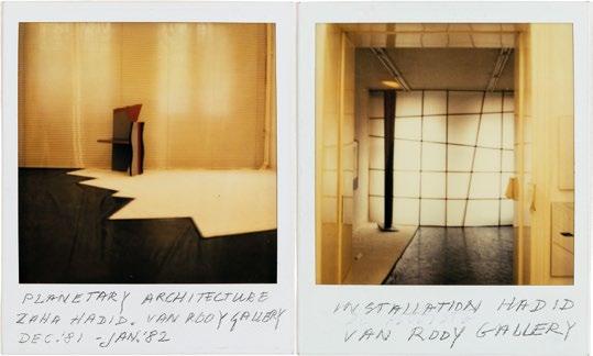
Although this interior was never completed, it gained critical attention as her paintings were exhibited in architectural galleries. Hadid’s exhibition “Planetary Architecture” opened at Amsterdam’s Van Rooy Gallery in November 1981, and featured student work and 59 Eaton Place. Her first known furniture design was also shown here: a chair constructed out of three different irregular wedges in painted wood (backrest/leg, armrest/leg, and seat), coming together in an inverted explosion. A year later, when critic Kenneth Frampton reviewed the second iteration of the exhibition at the AA’s gallery, he described the furniture as “neo-Futurist chairs which jump off the floor like Boccioni’s fist.”4 For Frampton, the chairs were part of the same universe as Hadid’s architecture, namely, an exploration of spatial fluidity and dynamism.
Zaha Hadid Architects, “Planetary Architecture I” exhibition, Van Rooy Gallery, Amsterdam, The Netherlands, 1981-2
For her first solo presentation at the Van Rooy Gallery in Amsterdam, Hadid presented her first known furniture design, an “exploded” chair.
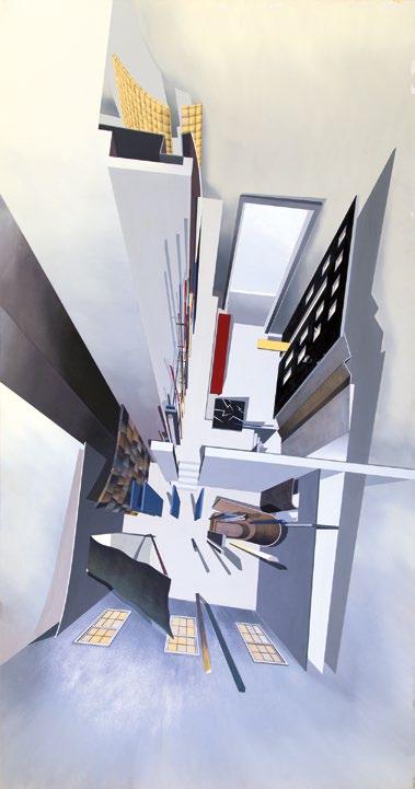
Zaha Hadid Architects, 59 Eaton Place, aerial perspective of master bedroom and library, 1981-2
This interior painting disrupts conventional architectural representations by playing with perspective, showing furniture and structural elements in an “exploded view.” The overall scheme won 2’s gold medal in 1982.
Interior as Landscape
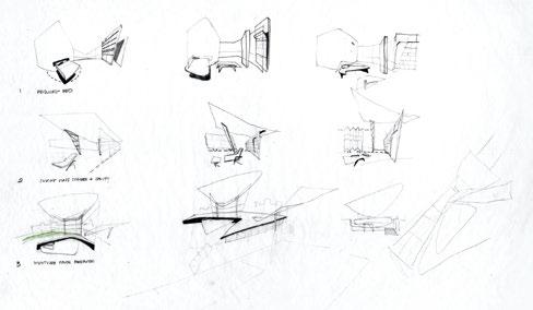
In 1985, Hadid worked on several interior concepts in London, such as broadcasting studio Harlech Television (HTV and private residences Melbury Court and Halkin Place. Through the addition of penthouses, the opening up of floor plans, and introduction of mechanized partition walls and oblique canopies to these 19th- and early 20thcentury structures, her team sought to create landscapes furnished with sofas in irregular shapes, glass and steel tables, rotating beds, and boomeranglike recliners. The furniture shares qualities with mid-century pieces by the Brazilian architect Oscar Niemeyer and the Danish designer Verner Panton, and would not look out of place in the Jetson family’s living room. In its eclecticism and historicism, including its references to the Soviet avant-garde, the furniture relates to Postmodern design strategies proliferating at the time. Although these interior commissions were never realized, they can be seen as speculative research projects. The archive at the Zaha Hadid Foundation includes drawings that map London interiors, connecting disparate projects to each other and the city at large. The paintings and technical drawings for Halkin Place, for example, present interiors and furniture as forms of
urban intervention. Arguably, this kind of critical engagement allowed Hadid to formulate links between architecture and design. Tellingly, a few years later, technical drawings for an art and media center at Zollhof 3 in Düsseldorf, Germany (1989–93), an unrealized major urban project, featured furniture originally created for 24 Cathcart Road in London’s Kensington district.
The 24 Cathcart Road commission came from timber heir William Bitar, and the brief was simple: white furniture and no timber surfaces.5
Conceptually, the furniture engaged with ideas of flexibility (the pieces were multifunctional) and dynamism (either by design or construction), and turned the client’s generic 1960s apartment into a site of architectural innovation. Hadid said, “the furniture developed out of the idea of creating an environment.”6 For this project, sketches and model-making, instead of Hadid’s Suprematist-styled paintings, were the chief methods for achieving the dynamic shapes. Michael Wolfson, one of the key architects in the early office, designed and developed many of the pieces. A briefing could be a drawing on a Post-it or notepad. For example, the bronze base of the Sperm Table derived from a quick squiggle by Hadid.
Zaha Hadid Architects, Halkin Place, rotations of interior design sketches, 1985
Hadid’s sketches of Halkin Place use a repertoire of warped walls, oblique canopies, and rotating or boomerangshaped furniture. These design concepts reoccurred across interiors, furniture, and architectural projects in the 1980s.
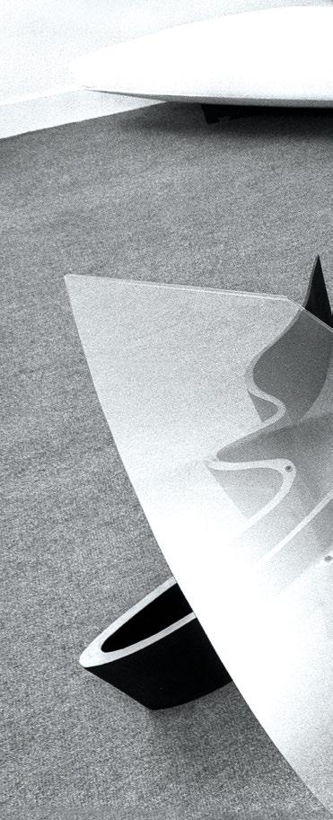
This portrait shows Hadid with her furniture designs, the Whoosh sofa and Sperm table. During this time, fashion and lifestyle magazines became increasingly drawn to her star qualities, making her the ideal architect to feature.
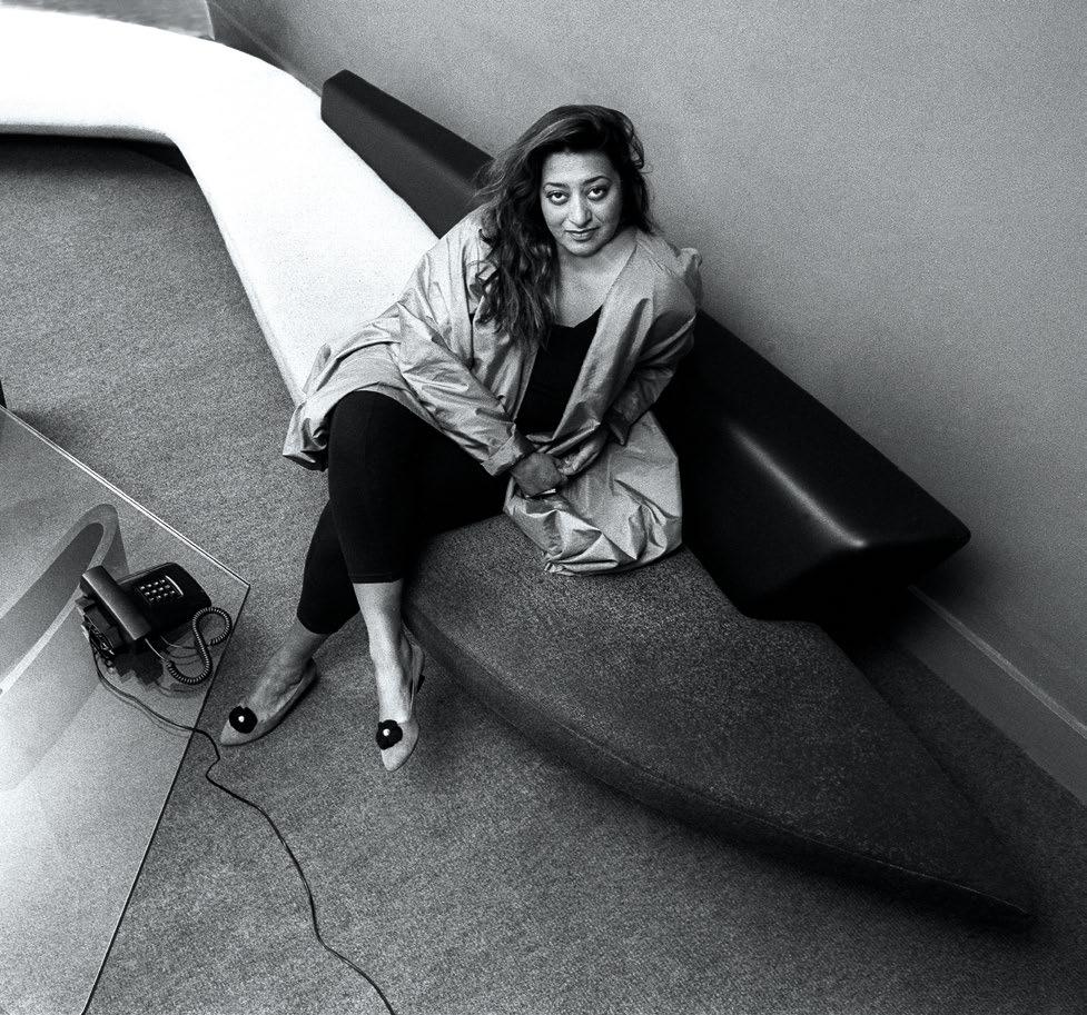
Portrait of Zaha Hadid in Studio 9, 10 Bowling Green Lane, London, England, 1985
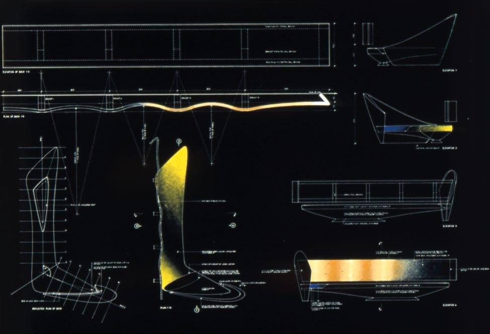
Technical
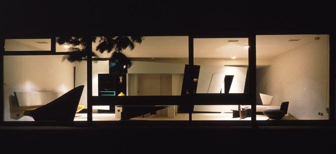
Zaha Hadid Architects, 24 Cathcart Road interior, London, England, 1986
The 24 Cathcart Road furniture was featured in Casa Vogue, where the Edra team spotted them and initiated a commercial furniture line with Hadid.
Zaha Hadid Architects, 24 Cathcart Road (Interior), Wavy-back sofa, 1986-7
drawings of the 24 Cathcart Road furniture were reverse printed and painted on, which turned them into artworks. These were exhibited in Hadid’s furniture exhibition at the Architectural Association’s members’ room, London, in 1988.
As with her unrealized London interiors, Hadid treated these furniture designs as part of an architectural landscape of movement. The Wavyback sofa wraps around a corner of the room, with its separate backrest attached directly to the wall, implying an exploded view. The boomerangshaped Whoosh sofa with its oblong “beam” backrest has a seat covered in a fabric spray-painted in a grayscale gradation to suggest speed. Other pieces physically moved. The storage unit, which was also a partition wall, was set on an oblique with elements that open and slide. The Metal Carpet coffee table rotated around its own orbit. Allegedly, the more complex furniture required the input of structural engineer Peter Rice at Arup,7 who was a mentor to Hadid during those early years. In 1986, when the furniture was in situ, 24 Cathcart Road became Zaha Hadid Architects’ first completed project. Within a year, however, the client returned the furniture in exchange for a couple of paintings. The sofas and coffee tables ended up in Hadid’s own living room: “His mother didn’t like the furniture, so I said, ‘fine, I’ll take it back.’”8
Furniture as Commercial Strategy
Before the furniture was returned, Hadid commissioned photographer Richard Bryant to document the project, and his images appeared in magazines such as Casa Vogue, Blueprint, and Architectural Record Invariably, the articles described the furniture as Suprematist, dynamic, gravity-defying, and architectural. At this stage, Hadid’s interest in abstraction was just as much a design method as a marketing asset. And the publicity campaign paid off. In late 1987, the director of the newly established Italian furniture company Edra, Valerio Mazzei, and creative director Massimo Morozzi, who had co-founded Archizoom in the late 1960s, spotted the Cathcart Road interior in a magazine. Mazzei recalls: “[We] were fascinated by the harmony of the volumes and the dynamism of the furniture in its relationship with space.”9
After meeting with Hadid in London, Edra developed the Whoosh and Wavy-back sofas and the Metal Carpet table for commercial release, and added a new, smaller cantilevered sofa called Projection. The latter’s
constructivist design of three slabs coming together, supported on a zigzag base, was conceived by Hadid through sketches and models. While the design of the original Whoosh and Wavy-back remained the same, the construction had to change. Padding was introduced to increase seating comfort, and medium-density fiberboard (MDF) bases were changed to solid wood for quality purposes. At a time pre-dating computernumerically controlled (CNC) milling, curvilinearity was achieved using molded wood, plywood, and fiberglass, by a model maker who had previously worked for motorcycle company Piaggio. Leonardo Volpi, research and development manager at Edra, says: “We tried to reproduce them as faithfully as possible, because any curve created by Zaha was not up for interpretation.”10
Zaha Hadid Architects, Projection sofa model for Edra, 1987-8
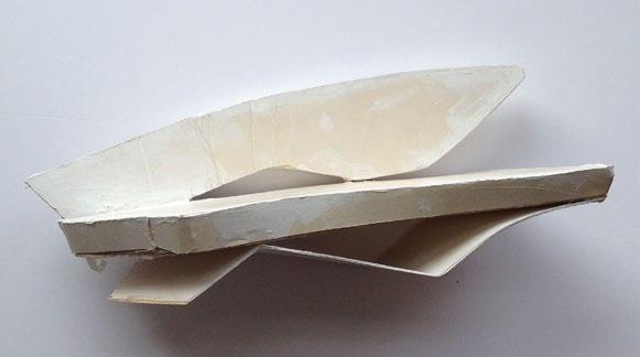
Hadid’s team made small furniture models in cardboard and wireframe for the 24 Cathcart Road and Edra projects to experiment with shapes and functions.
created a

In September 1988, the collection launched at the Salone del Mobile, the annual international furniture trade fair in Milan, Italy. For the occasion, Edra published a handout featuring Hadid’s much-publicized competition win for a leisure club in Hong Kong, The Peak (1983), as well as her signature-style paintings of the red Projection sofa. To the launch party (which kept going to 4 AM), she wore a custom jacket embellished with beaded capital letters spelling out ‘Zaha Hadid’. She also made a name for herself in the international press: the furniture was featured in several articles, which talked as much about their design merits as her persona. A typical example comes from Interior Design’s recollection of the launch party: “That evening, with her black hair flowing like her loose vowels, and with a cigarette dancing on her lips, the 39-year-old designer gazed regally over the heads of her harem of design groupies.”11 Hadid recuperated this exoticizing narrative and performed to a Western audience. In a sense, she and her designs were the whole ticket.
Dialogues Between Design and Architecture
When the Edra line launched, journalist Cristina Morozzi suggested in the company’s brochure that Zaha Hadid’s universal vision for architecture led her to think about interiors as means to “solve space,” and furniture helped her do so.12 Indeed, Hadid inserted her own furniture designs and those of Verner Panton into her technical drawings for architectural projects, as well as her physical office. Incidentally, for a celebration of Panton’s cantilevered chair at Cologne’s furniture fair, the Swiss furniture company Vitra commissioned Hadid to make the painting Hommage à Verner Panton (1990). Abstracted into a rotational drawing in her signature style, the chair painting was exhibited, and reproduced in advertising material and on beer bottles. Rolf Fehlbaum, then chairman of the company, also asked her to design a chair for them. However, this proved too complicated, so they commissioned Hadid’s first building instead, the Vitra Fire Station.
Furniture and interior designs intersected with Zaha Hadid’s
architectural projects from the beginning. The same design strategies were used, the same people worked on them, and the same ideas were applied across the two. Interiors and furniture design helped Hadid formulate an architectural vision for living in the 21st-century city and made her famous outside architecture circuits. 2
Notes
1. Kenny Schachter, “Celebrating Zaha: The Late Architect’s Interview from Pin-Up’s Debut Issue,” Pin-Up 1, 2006: www.pinupmagazine.org/articles/zaha-hadid-interview.
2. Alvin Boyarsky, “Post-Peak Conversations with Zaha Hadid: 1983 and 1986,” in Yukio Futagawa (ed.), GA Architect 5: Zaha M. Hadid, A.D.A. EDITA (Tokyo), 1986, reprinted 1990, p. 13.
3. Ibid.
4. Kenneth Frampton, “A Kufic Suprematist: The World Culture of Zaha Hadid. Planetary Architecture II,” AA Files
6, May 1984, p. 101.
5. “Deconstructed Kensington,” The Sunday Times Magazine: House Style, Autumn 1988, pp. 46–50.
6. “Alvin Boyarsky Talks with Zaha Hadid” (October and December 1987), in Joseph Giovannini et al., Zaha Hadid, Guggenheim Museum Publications (New York), 2006, p. 48.
7. Deborah Dietsch, “Furniture by Zaha Hadid,” AA Files 17, Spring 1989, p. 76.
8. “Alvin Boyarsky Talks with Zaha Hadid,” p. 50.
9. Gloria Mattioni, “Zaha Hadid,” Edra Magazine, October 2023: www.edra.com/en/art/223406/Zaha-Hadid.
10. Leonardo Volpi, video call with Francesco Fiammenghi, October 23, 2024.
11. Jonathan Turner, “Royal Flush: Zaha Hadid,” Interior Design 17, 1989, p. 74.
12. Cristina Morozzi, Zaha Hadid in Milano Settembre 1988, Edra marketing material (Pisa).
Zaha Hadid Architects, Edra Furniture, Projection sofa, 1988
Zaha Hadid Architects
signature-style architectural painting for the launch of the Edra collection. Here, several abstract components come together in a piece of furniture.
Zaha Hadid Architects, Edra furniture collection, MAXXI—the National Museum of 21st Century Art, Rome, Italy, 2022
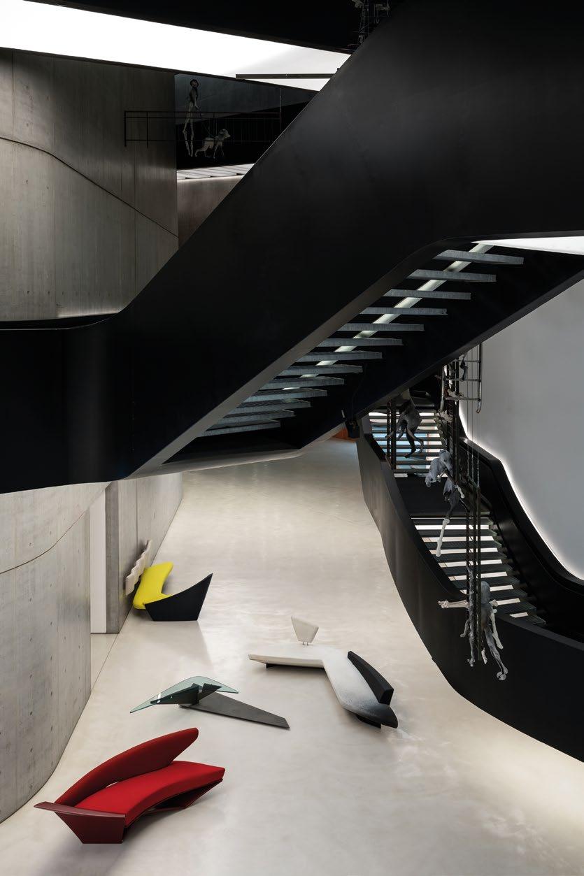
The Edra collection consisted of the Whoosh and Wavy-back sofas, and the Metal Carpet coffee table, all created for 24 Cathcart Road, as well as the newly designed Suprematiststyle Projection sofa. The line was produced between 1988 and 1993. Here, the collection is photographed inside one of Zaha Hadid’s most important architectural projects, MAXXI (2009).
© 2025
Text
Axiomatic Editions. Images: pp. 30–1, 33(b), 34(l), 36(t), 37, 38 ©
Zaha Hadid Foundation; p. 33(t) © Drawing Matter Collections; pp. 34–5 © Christopher Pillitz; p. 36(b) © Richard Bryant/ Arcaid.co.uk; p. 39 Photo Alessandro Moggi


Form Follows …
Coates


Nigel Coates UNPACKS HIS Furniture Oeuvre


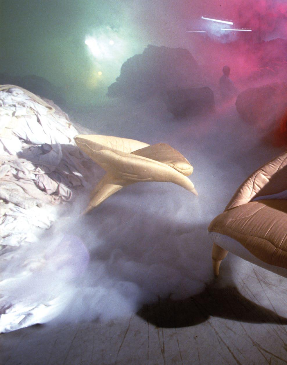
Nigel Coates, Gallo collection, Poltronova, Firenze, Italy, 1989
The Gallo armchair was inspired by the wings of a cockerel, the sofa stretched a single wing into an upholstered back, and the console has a carved and curved bow supporting a glass top and a single sculpted leg. They are still in production today.
Nigel
If there is one overriding word that describes the buildings and product design of architect Nigel Coates, it is “playful.” His work is imaginatively eclectic, combining many tropes from the history of art and design in his own inimitable way to create objects of desire. Here he describes his personal creative journey in respect to his furniture and the myriad inspirations that inform it.
In London in the early 1980s, during the fallout from punk, my work developed a rough spontaneity and often included fragments retrieved from old buildings. The future was on hold as my students at the Architectural Association and I reinvented the here-and-now as a salvage operation. By 1985, I had realized my first interior project in Japan, the Metropole restaurant, for which I had been commissioned to design the furniture. I was following in the footsteps of my Italian heroes—those architects who had opted not only to build, but to think and make, especially furniture.
By then, Italian design companies were hitting a plateau and were not addressing the needs of a more factional market. Their owners were looking for something other than sleek Milanese taste. But in London something different was happening among design protagonists. A new factionalism, yes. But a more local, family-and-friends approach to your audience, avoiding theorizing and making things that, despite a sophisticated silhouette, were meant to be rough and ready.
In 1983, some smart students and I formed an architecture group called NATØ (Narrative Architecture Today), and we disseminated our work through a magazine of the same name. NATØ 2, the “Apprentice Issue,” had a lifestyle feature that
included rooms with shutters made out of corrugated-iron sheets, and a wardrobe fabricated from repurposed security bars, all in the mood of a mechanic’s den. This DIY approach to design resonated with fashion at the time which, emanating from Vivienne Westwood, had angry details and buckles everywhere. This was the stage we strutted onto, and it was an altogether new act. In reality it had stemmed from NATØ’s warts-and-all interpretation of the city we lived in, a London that had been cleared of docks and was left with gaping holes and half-baked ideas about what should fill them.
As Gareth Williams and Nick Wright expounded in their book Cut and Shut: The History of Creative Salvage (2012): “If Mendini played with ideas of the city as found, Nigel engaged with the urban culture as found.” 1 And at that time London was pretty down-at-heel, and street culture was on the rise. Tom Dixon was making furniture pieces out of oily car parts and I was doing the same with interiors, most of which were in Tokyo. Williams and Wright continue: “Caffè Bongo was a Tokyo restaurant [Coates] designed in 1986. An airplane wing, its jet engines attached to the underside, covered an entrance designed as a ‘pop-classical collage’. The silver wing anticipated Mark Newson’s Lockheed lounge chair.”2
… Farmyard
Years later, with success as an architect in Japan under my belt, I began to spend more time in Italy and bought an old farmhouse in the Siena countryside. I was asked by “anarchitect” Gianni Pettena to design a furniture collection for a Florentine company called Poltronova. Founded in 1957 by Sergio Cammilli, Poltronova was formative in the blossoming era of the Italian economic miracle. Effectively it offered a playground for designer architects like Ettore Sottsass who, for a period spanning the 1960s and 1970s, was its creative director. In 1972, its work featured prominently in the exhibition Italy: The New Domestic Landscape held at the Museum of Modern Art (MoMA), New York. I would be part of the company’s line-up of thinker-doers I had admired from afar. In England, interiors and furniture were always relegated to second-class. Why spend all that time studying architecture unless you wanted to build? But my reply would always be vicarious; I wanted to explore architecture from the “other.” I was interested in the city as a simultaneous cramming of people, vehicles, and advertising as well as buildings. Cities vibrated from multiple vantage points and rather than tidy them up I wanted to amplify them. Conversely, I had already intuited that furniture could command space, depending on what language it spoke and where you positioned it. Rather than the decorous connotation of the English word “furniture,” I preferred the Italian nomenclature “mobile,” as opposed to “immobile” (or real estate); their equivalence carries an oscillating parity.
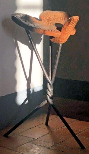
… Fiction
My first collection for Poltronova, Gallo, was presented at the Salone del Mobile in 1989. It consisted of an armchair, a sofa, and a console. There are beautiful photographs of all three in a shoot staged in a rag factory. We were on a roll. Other designs for the company followed, including a table and stools representing the kneeling figure. And in the late 1990s I asked Roberta Meloni, the new and present owner of the company, if she would edition a one-off exhibition piece I had shown in London in 1988—the larger-than-life Genie stool.
The Genie is a true manifesto piece and was made for a show at the Institute of Contemporary Arts (ICA) in London, Twentieth Century British Chair Design (1988). It was displayed in front of a large hand-painted drawing in Indian ink of the same object as though rising from the lamp like a genie. This piece made the sexualized body central to my discourse. And it did it well, despite its diminutive size. It could invoke the body of the sitter who, when straddling its frontal protuberance, could steady themselves as though their legs were part of the design.
Like a compass, the Genie stool pointed toward many of our projects of the 1990s—the Legover chaise, Ecstacity (1992)— which featured a reclining giant—the Oyster House (1998), and especially the Body Zone (1999). Collecting these up into one portfolio, the Genie was the sexual body, the Geffrye Museum (1998) traced the body’s motion through space, and the National Centre for Pop Music (1998) framed as-yetundetermined choreographies. Within the terms of the word “mobile,” my furniture had taken up its part in the hierarchy of spatial figures, as though corresponding to Kandinsky’s Point and Line to Plane (1926).3
By the early 2000s, Poltronova had tightened its catalog into a spread of luminous design icons—including the Joe armchair, the Ultrafragola mirror, and the Superonda wavey bench. Meloni had her eye on gradually introducing new designs, but before going full tilt she would have to re-train her team in product engineering. She was willing to gamble on a new group of pieces for Aaron Betsky’s 2008 Venice Architecture Biennale, Out There: Architecture Beyond Building. Betsky wanted an erotic “home” that turned out to be situated at the end of a parade of other living spaces occupying the entire Corderie in the Arsenale.
Nigel Coates, Genie stool, 1988
The wrought-iron base twirls upward to support an anthropomorphic seat hand-carved from French oak and sandblasted to raise the grain.
Nigel Coates, Hypnerotosphere, Venice Architecture Biennale, Venice, Italy, 2008
In collaboration with Poltronova, all four pieces were based outwardly and inwardly on the archetypal English saddle.
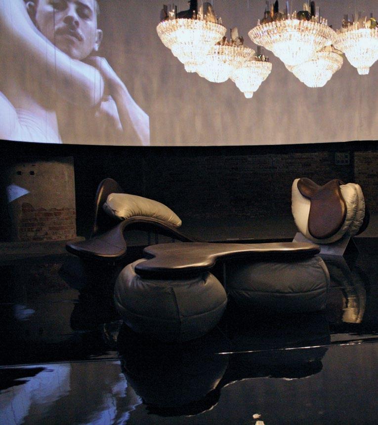
Together, the furniture sat comfortably inside the ring of dancers representing a confluence of bodies—a convention of mini-architectures you could sit on while watching the dancers in the film
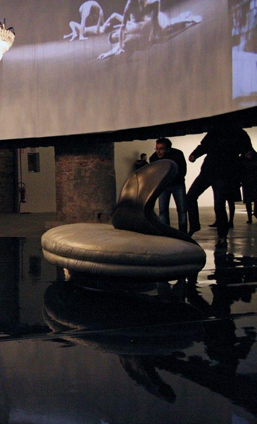
… Friction
With a film directed by John Maybury and choreographed by Rafael Bonachela, the resulting Hypnerotosphere installation featured a circular video screen of two male dancers “performing architecture” that hovered above a group of very sensually shaped furniture pieces, all realized by Poltronova. With its flaps, stirrups, and cushions, the key erotic reference was the English saddle. I visited a saddle factory in Wolverhampton, where I learned how various soft attachments are built up in layers from a steel “bone” that lies parallel to the horse’s spine. For my purposes, I reduced the saddle to an outer double-sided flap that maintains contact with the sitter, and under it, two oversized cushions that extended under the top flaps to define a fleshy inner body. For the sofa, the chaise, and the table, I took these forms and adapted them—tilting them or enlarging them to fulfill the intended function. Together, the furniture sat comfortably inside the ring of dancers representing a confluence of bodies—a convention of mini-architectures you could sit on while watching the dancers in the film as they moved against each other as though each was un mobile supporting the other.
Hypnerotosphere was my first attempt at configuring an architectural space purely from furniture and film. With its circular screen in a darkened space, and giant bodies slipping and sliding across it, architecture was being performed in the manner of murals of Titans in Venetian salons. These pieces also captured new phenomena of making and process. Each design was generated digitally. The core of the saddle was CNC-ed in hard foam that in turn was upholstered in leather, while the rider’s seat contained the labial cushions representing the second body, the whole mounted on a steel support. We had fulfilled the exhibition brief while achieving something technically challenging and unique.
Poltronova has never made anything in enormous numbers. The company ethos not only rests in the manifesto, but also in the handmade, in the not common. The company always insists on the value of the “project.” Not one of their pieces was ever conceived to supply the mass market. Each one carries the essence of its architect-designer’s approach to architecture. You may not be able to live in any one of them, but you can live with them and sit on them. Each and every one demands to be a fully active partner in and of your intellectual and artistic life.
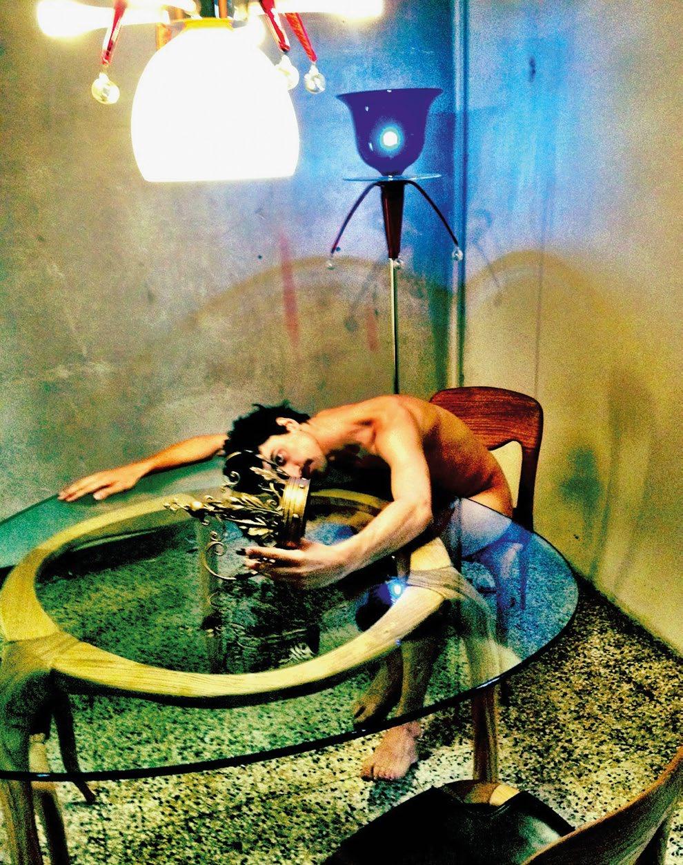
Nigel Coates, Domo collection, Casa Reale, Entratalibera, Milan, Italy, 2012
Each Domo piece reworked the Gallino console table to become a dining table, a dining chair, or an occasional table.
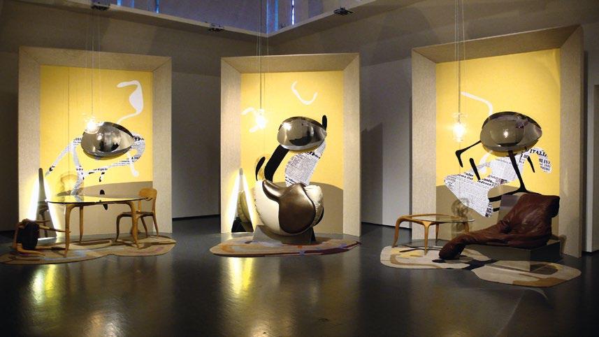
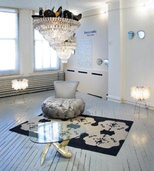
… Factions
By the same token, sexual identity came into play with several exhibitions of editioned design objects—Baroccabilly (2011) and Picaresque (2012-3), both of which featured the Hypnerotosphere saddle. Based on an imaginary figure, the Baroccabilly commanded a living environment with a highly individual taste. Like Ludwig of Bavaria with his grotto at Linderhof, or Barbarella in her animated clam bed, my invented character cherished his interests in music and self-image to expand into a world of uniqueness and rockabilly style. Along with the saddle, we created the Pompadour sofa, the Aviator sofa, the Wings table, and the Aviator mirror—one half of an enormous pair of aviator sunglasses that suited his Bohemian yet opulent instincts.
In 2012, Casa Reale proposed another narrative environment based on a fictional character, this time a monarch without a throne. It featured a group of three Domo pieces that reinterpreted the leg of the original Gallino console. With its charged anthropomorphic poise, the chair turned out to be surprisingly elegant. Later that year, all three pieces appeared again in the Picaresque installation across town at the Triennale. This time, the framing device was a triptych in the manner of Francis Bacon. I had always seen his triptychs as defining their own space—as though three walls of a room (we are the fourth) had opened like an altarpiece. Instead of enclosing a room, this installation implied one. Furniture spilled from each frame into the room, establishing an invisible line between the viewer and the picture plane.
Nigel Coates, Picaresque, Kama: Sex and Design, Triennale Museum of Design, Milan, Italy, 2012-3
top : A freestanding triptych framed three vignettes in which the implied body in the frame burst onto the floor—as carpets and furniture.
Nigel Coates, Baroccabilly, Cristina Grajales Gallery, New York, 2011
bottom : In this exhibition, a domestic environment was inferred by merely placing the objects in the gallery space, so as to construct a home in the mind of the visitor.
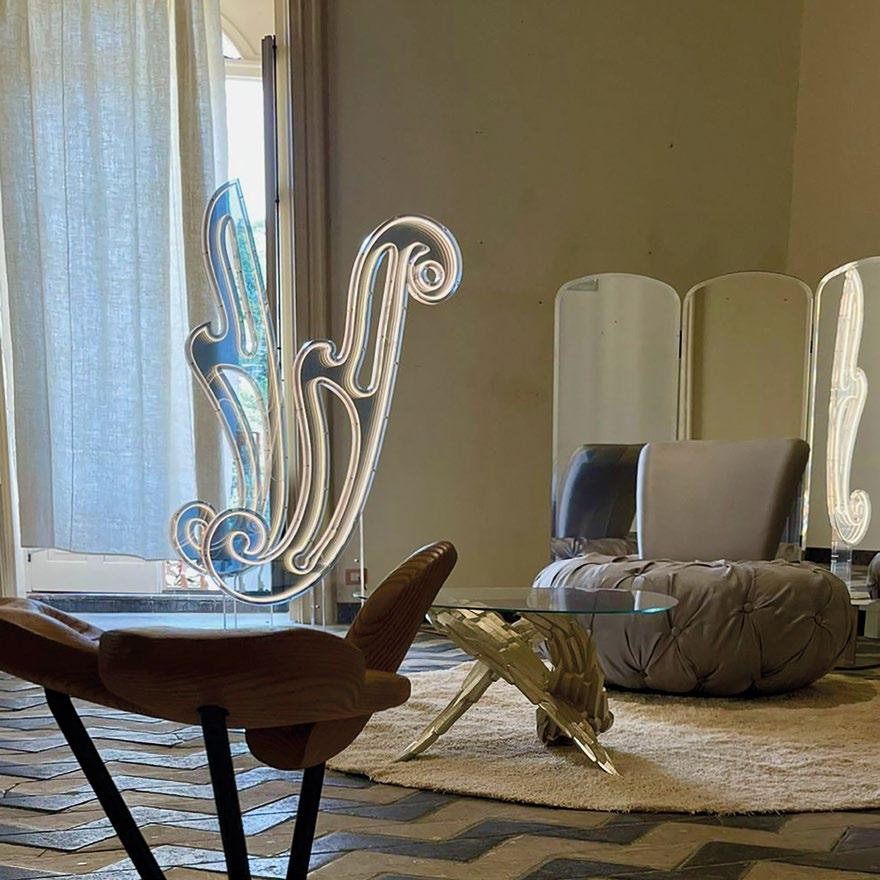
Nigel Coates, Echo & Narcissus, Barocco e Neobarocco design festival, Palazzo Cosentini, Ragusa Ibla, Italy, 2024
Five layers of Plexiglass, with its outside layers being partially reflective, generate an infinite tunnel of light. The piece shared the room with the Aviator mirror, Pompadour armchair, Wings coffee table, and Genie stool. Orchestrated by Roberto Semprini with Brera Academy, Milan.

The room’s zigzag stone floor worked magic with the light-piece, creating an uncanny resonance in the Lynchian manner
The more recent Plasma outdoor chair and footstool sits well within Poltronova’s manifesto parameters; conceptually it is a fine-line drawn in space that subsequently invites six cushions to meet inside its three-dimensional outline. Although conceived in 2011, it continued to evolve over a ten-year period, finally being released in 2022. The Plasma has an inside and an outside. Why Plasma? Because the four cushions have a spontaneous tilted symmetry that is activated by bright colors seemingly emerging from a liquid state.
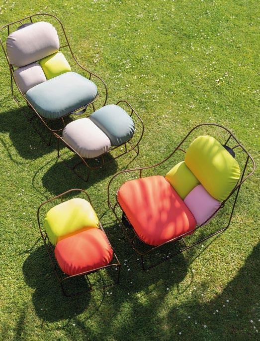
Nigel Coates, Plasma outdoor lounge chair and footstool, Poltronova, Milan Design Week, 2023
The offbeat group of gloopy cushions seems suspended within a frame that is thin and flowing enough to look like a drawing in space.
… Re-edition
In 2024 I undertook an ambitious double light-piece made of multiple layers of Plexiglass. They are Echo & Narcissus, two oversized French curves drawn in light, with LED strips at their core reflected to infinity. This was my response to the Baroque Sicilian town of Ragusa Ibla, which briefly hosted the 2024 edition of the Barocco e Neobarocco design festival. Along with various other pieces by Poltronova, including the Aviator mirror and the Pompadour chair, Echo & Narcissus was the central generator in an exquisite room in one of the festival venues, the ultra-baroque Palazzo Cosentini. The room’s zigzag stone floor worked magic with the light-piece, creating an uncanny resonance in the Lynchian manner.
The inspiration came from Giorgio de Chirico’s “metaphysical interiors” in which seemingly random compositions of design objects—of furniture, drawing instruments, and French curves— come together to suggest a parallel, meta-human inhabitation of a room. My pair of French curves, or curvelinee in Italian, also channels the essence of the Baroque imagination. Standing close to one another, they are a bound entity, and yet exist in collective play with the other objects. They cast penetrating gazes across the room like discreet lovers trying to avoid attention. 2
Notes
1. Gareth Williams and Nick Wright, Cut and Shut: The History of Creative Salvage, Williams Wright Publications (London), 2012, p. 188.
2. Ibid.
3. Wassily Kandinsky, Point and Line to Plane, originally Punkt und Linie zu Fläche, Verlag Albert Langen (Munich), 1926.
Text © 2025 Axiomatic Editions. Images: pp. 40–1 © Poltronova, photo Carlo Gianni; p. 43 © John Maybury; pp. 44–8 Courtesy of Nigel Coates Studio; p. 49 Centro Studi Poltonova, photo by Serena Eller





Strange Lineaments


Neil Spiller
Super-saturated Solutions
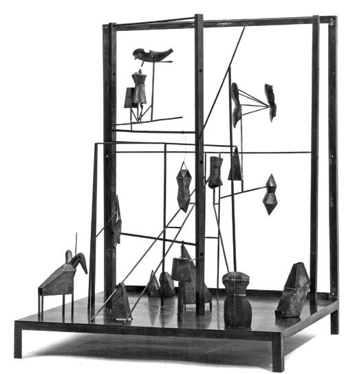
Reiser+Umemoto, RUR Architecture, Villa Farsetti, Venice Architecture Biennale, Venice, Italy, 1985
This concept model, reminiscent of Marcel Duchamp’s Large Glass (1923) and Alberto Giacometti’s The Palace at 4 AM (1932), seeks to explore the formal relationships between the various narrative furniture characters of this project for the historic Venetian villa’s gardens.
The cusp of the late 1980s and early 1990s was an exciting time to be setting up practice. The hegemony of late Modernism was in decline, and more innovative and individual ideas about architectural design were emerging. 2 Editor Neil Spiller examines the idiosyncratic furniture designed by architects Reiser+Umemoto during this period as they established their New York-based firm.
Jarry succeeded in pushing Symbolism to new limits while at the same time anchoring it to traditional forms and themes. He drew its strands together, seeking contrasts and paradox, turning its energies inwards and against themselves. He did not ‘explode’ Symbolism so much as implode it, producing a concentrated creative chaos which either resists the reader, or allows him to grow his own crystals in its super-saturated solution. — Paul Edwards, 20011
There is a strand of symbolist/absurdist thought in literature and theater that has permeated some of the most important artistic output for over a century and a half yet is seldom recognized or discussed. The impact of the oeuvre of French writer Alfred Jarry has been especially shadowy but fecund, influencing Dada, Futurism, Surrealism, the Theatre of the Absurd, Marcel Duchamp, James Joyce, Samuel Beckett, and Harold Pinter, to name but a few notable writers and artists. It has also impinged on furniture design, through the early work of New Yorkers Jesse Reiser and Nanako Umemoto, for example. Jesse Reiser graduated with a Bachelor of Architecture from the Cooper Union in New York in 1981, and completed his Masters of Architecture at the Cranbrook Academy of Art in Michigan. A stint at the American Academy in Rome, and work/training within the offices of John Hejduk (Dean of the Cooper Union’s School of Architecture from 1975 to 2000) and Italian architect Aldo Rossi, followed. Nanako Umemoto received her Bachelor of Architecture degree from the Cooper Union in 1983, having previously studied at the School of Urban Design and Landscape Architecture at the
Osaka University of Art. Together, in 1986, they founded Reiser+Umemoto, RUR Architecture. Their education and training was within the heady broth of some of the most interesting, enigmatic, and thoughtfully inspiring architects of their time. Hejduk’s interest in poetry, narrative, and the creation of archetypal lyrical architectural forms; Rossi’s interest in the historic dynamics of the city, scale, and metaphysical rationalism; and Cranbrook Artist-in-Residence Daniel Libeskind’s interests in attempting to define the fundamental nature of architecture, historic avant-garde art and literature (including Surrealism and Symbolism) and reinventing architecture through its theatrical first principles, can all be seen as influential in Reiser+Umemoto’s early furniture projects.
An early opportunity to architecturally express these assimilated and multiple influences came in 1985, via Aldo Rossi who was curating that year’s Venice Architecture Biennale. One of the project sites chosen by Rossi was the gardens of the Villa Farsetti—once famous but by then an empty plot. Reiser+Umemoto’s scheme was a mechanical garden to coincide with the Venetian rites of Carnival. Rambunctious revelers were to interact with numerous thaumata (architectural/ mechanical constructions), “reenacting the inevitable temporal sequence engendered by the Phallic rite. Thus the garden is divided into three major zones corresponding to the sequence: the Agon (Contest), the Marriage, and the Komos (Triumphal Procession).”2 The inspiration came partly from the French artist Marcel Duchamp—an Alfred Jarry fan—and specifically from the “Malic Molds” (“Bachelors”) in the lower zone of his Large Glass (1923).
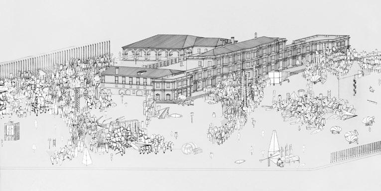
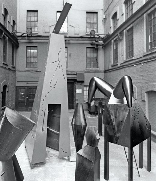
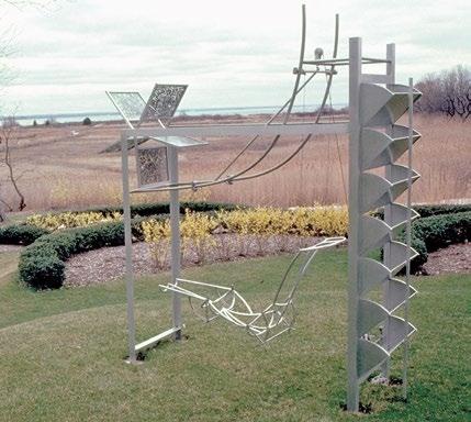
On December 10, 1896, Jarry premiered his play Ubu Roi (King Ubu) at the Théâtre de l’Œuvre in Paris. In both literature and theater, the play resonates to this day with its seemingly illogical structure, obscene references, and wordplay that oscillates between sound poetry and child-like jibes. The play’s infamous opening word “Merdre” (the French word for “shit”, with an extra “r”) set the tone and caused a near riot. While the play itself ridicules the pomposity of mankind with its portrayals of vanity, dishonesty, vulgarity, and selfishness, it also introduces the notion of ’Pataphysics.
’Pataphysics
Alongside the creation of Père Ubu (the main protagonist of Ubu Roi and his ‘Ubu’ cycle of plays), Jarry is best known for his later book, Exploits and Opinions of Doctor Faustroll, ’Pataphysician (published posthumously in 1911)3 and his invention of the poetic pseudo-science of ’Pataphysics. Canadian experimental poet Christian Bök more recently defined its modus operandi of composition and poetic juxtaposition as being governed by three declensions: “anamalos” (the principle of variance), “syzygia” (the principle of alliance), and “clinamen” (the principle of deviance)—the last of which Jarry used in Exploits to describe a system’s ability to swerve.4 In short, Jarry believed that the ubiquitous laws of physics are a great disservice to humanity; they neither celebrate, respect, nor predict the spectacular, exceptional nature and particularity of events in human existence. Jarry’s world, like that of the Surrealists who followed him, is a world of one-offs, of marvelous occurrences and ideas provoked by objects in close association or intimate juxtaposition—a kind of conceptual reconciliation of opposites.
Reiser+Umemoto, RUR Architecture, Villa Farsetti, Venice Architecture Biennale, Venice, Italy, 1985
opposite : A drawing showing a possible articulation of pieces as outside furniture, on its site—awaiting Bacchanalian revelers and their rituals of chemical and physical pleasure.
top : Some of the built pieces give a sense of scale to the project, and their enigmatic presences and geometries create furniture to inhabit and ride.
Reiser+Umemoto, RUR Architecture, Métier à Aubes, Wolf Residence, Sands Point, New York, 1987
left : Métier à Aubes is here positioned in the early spring landscape of Sands Point, an area surrounded on three sides by water. The surreal mechanism facilitates views of the flat and watery terrain.
A Pantheon
After splitting from the Dadaists, the so-called Pope of Surrealism André Breton formed an embryonic Surrealist group of mainly writers, including Paul Éluard, Louis Aragon, and Philippe Soupault, and wrote the Manifeste du surréalisme (Manifesto of Surrealism, 1924). The manifesto evoked the unbound creativity of children, the symbolism of Freudian dream interpretation, and the importance of automatic writing, and sought to establish Surrealism as a new “vice.” Breton’s own Surrealist pantheon of precedents is instructive:
Swift is Surrealist in malice.
Sade is Surrealist in sadism.
… Baudelaire is Surrealist in morality.
Rimbaud is Surrealist in the way he lived, and elsewhere.
Mallarmé is Surrealist when he is confiding.
Jarry is Surrealist in absinthe.
Nouveau is Surrealist in the kiss.
Saint-Pol-Roux is Surrealist in his use of symbols.
Fargue is Surrealist in the atmosphere.
Vaché is Surrealist in me.
Reverdy is Surrealist at home.
Saint-Jean-Perse is Surrealist at a distance.
Roussel is Surrealist as a storyteller.5
To this pantheon list he also added the names of the alchemic magi Ramon Llull and Nicolas Flamel. This opus, to which Llull and Flamel dedicated their lives, with its emphasis on the transmutation of mind and material from the lowly to the profound, proved to be a major inspiration for the Surrealists and continues to be so in contemporary architecture, and particularly in the early work of Reiser+Umemoto.
The whole assembly operates as an optical furniture machine of which elements are sometimes recognizable and sometimes highly abstract. A true mechanism of enigma
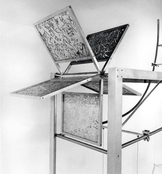
Carnival and African Impressions
Another writer who also tapped into literary conceits similar to Jarry’s is Raymond Roussel—likewise a Frenchman. His two most important pieces of writing are 1910’s Impressions d’Afrique (Impressions of Africa),6 a novel, later turned into a play, and 1914’s Locus Solus, 7 a novel. Impressions of Africa is mesmerizing in the descriptions and activities of its characters who partake in bizarre performances, including a zither-playing worm, a marksman who can peel an egg at fifty yards, a railway car that rolls on calves’ lungs, and fabulous machines that paint, weave, and compose music—all set in a mythical African country ruled by a crazy monarch. The composition of the story is predicated on a complexity of narrative developed by puns and double-entendres. The book was reportedly one of artist Salvador Dalí’s favorites and was a go-to reference and inspiration for the Surrealists generally.
In 1987, Reiser+Umemoto designed and made Métier à Aubes—an enigmatic piece of furniture that takes its name from a machine mentioned in Roussel’s Impressions of Africa. “The construction may be divided into two, mutually informing mechanisms suspended in a framework; the upper a language loom consisting of a communicating series of prescribed metal plates and, [sic] the lower, an adjustable reclining chaise (figura) from which the plates can be ‘read’.”8
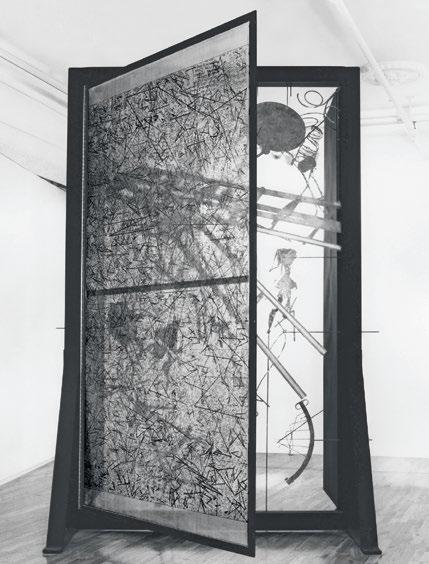
The Shadow and the Geoscope
The following year (1988), another opportunity opened for the firm to further explore Jarry’s ’Pataphysical world of everyday exceptions and the Duchampian screen in one composition. The final artifact is reminiscent of Duchamp’s 9-foot-high (2.7-meter) Large Glass (1923) and is called The Shadow Theater. Jarry defined ’Pataphysics in Exploits and Opinions of Dr Faustroll, Pataphysician as “the science of imaginary solutions, which symbolically attributes the properties of objects, described by their virtuality, to their lineaments.”9 Reiser+Umemoto use this convoluted definition to explain the strange anatomy of their Shadow Theater. 10 What is clear is that the first leaf consists of everyday items such as the shadow of a ladder, one of Jarry’s favorite mechanisms. The bicycle is also suggested. The whole has the feeling of another Surrealist/Dada tactic: that of artist/ photographer Man Ray’s “rayographs”—a method of making photographic prints by laying items directly on the surface of developing photographic paper—from the 1920s and 1930s. The second panel, which overlaid this first composition, consists of a series of lines/scratches that interfere with the semi-recognizable forms below. The whole assembly operates as an optical furniture machine of which elements are sometimes recognizable and sometimes highly abstract. A true mechanism of enigma.
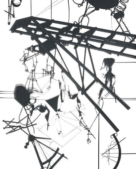
Reiser+ Umemoto, RUR Architecture, Métier à Aubes, New York, New York 1987
opposite : In this particular piece of furniture, a series of “reading” plates are positioned on a revolving armature that allows the viewer to see through a set of perforated striations that interfere with and remix its context and site.
Reiser+Umemoto, RUR Architecture, The Shadow Theater, New York, New York 1988
above left : The Shadow Theater is a movable furniture screen predicated on two leaves of transparency hinged together. As with Métier à Aubes, the first transparent skin consists of a constellation of abstract shapes and lines that subvert the viewer’s perception of the second skin.
above right : The second skin of the Shadow Theater revels in the suggestion of flattened everyday items and plays off its more abstract sister leaf. The whole can be seen from front and back.
Reiser+Umemoto, RUR Architecture, co-curated with Daniel López-Pérez, Geoscope 2: Worlds, Venice Architecture Biennale, Venice, Italy, 2021
This hybrid between furniture and optical machine simultaneously broadcasts multiple images of the world and humanity’s actions and inventions within it—across multiple scales.
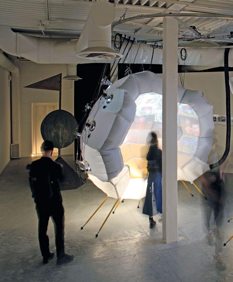
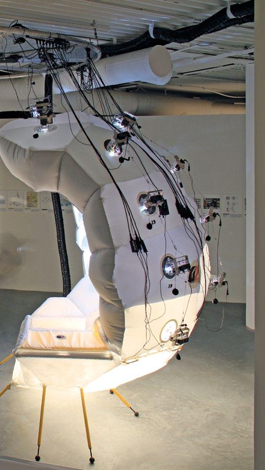
Another Reiser+Umemoto optical machine furniture piece— Geoscope 2: Worlds, co-curated with architecture professor Daniel López-Pérez—was constructed for the Venice Architecture Biennale of 2021, a first iteration having been exhibited at Princeton University in 2020. It was constituted of a pneumatic, split sphere which, once the viewer was inside, revealed a multimedia series of vignettes of multiple worldviews by architects, philosophers, and many others shown on its 42 internal facets—a representation of the complexity and varied standpoints of our contemporary world, its meanings, and its ecologies. Reiser+Umemoto describe their installation thus: “In response to the Biennale’s question ‘How will we live together?’ Geoscope 2 flouts the idea of a single world body in favor of ‘many worlds’—chaos generated by multiple bodies interacting with each other—by literally splitting the sphere in half and opening it up to multiple contributors and perspectives.”11
From Small Beginnings
Reiser+Umemoto, RUR Architecture now have a thriving New York practice, have taught around the world, and have never fallen back on repeating themselves design-wise: each project is created from first principles, and this has created an architectural record that is constantly evolving as new programs and sites are encountered. This must be due both to their initial pedagogic experiences as students and to their continued architectural inquisitiveness and design vitality as time has gone by. One thing is sure: these early furniture pieces installations have contributed to their experimental guile and continued success. From small acorns mighty oaks grow. Surely architecture is a science of imaginary solutions, where at the point of design, imaginary, virtual objects are “placed,” within the mind of the architect, relative to their lineaments. 2
Notes
1. Paul Edwards, “Introduction: Alfred Jarry: from Reading to Writing and Back Again,” in Alfred Jarry, Adventures in ’Pataphysics: Collected Works I, Atlas Press (London), 2001, p. 18.
2. www.reiser-umemoto.com/reiser-umemoto-selected-projects/villa-farsetti.
3. Alfred Jarry, Exploits and Opinions of Dr Faustroll, Pataphysician [1911], in Alfred Jarry, Three Early Novels: Collected Works II, eds. Alastair Brotchie and Paul Edwards, Atlas Press (London), 2006.
4. Christian Bök, ’Pataphysics: The Poetics of an Imaginary Science, Northwestern University Press (Evanston, IL), 2002, p. 18.
5. André Breton, “Manifesto of Surrealism” [1924], in André Breton, Manifestoes of Surrealism, tr. Richard Seaver and Helen R. Lane, University of Michigan Press (Ann Arbor, MI), 1972, pp. 26–7.
6. Raymond Roussel, Impressions of Africa [1910], Calder Publications (London), 2018.
7. Raymond Roussel, Locus Solus [1914], Calder Publications (London), 2017.
8. www.reiser-umemoto.com/reiser-umemoto-selected-projects/mtier-aubes.
9. Jarry, Exploits and Opinions of Dr Faustroll, p. 145.
10. www.reiser-umemoto.com/reiser-umemoto-selected-projects/the-shadow-theater.
11. www.reiser-umemoto.com/reiser-umemoto-selected-projects/geoscope-2.
Text © 2025 Axiomatic Editions. Images © Reiser+Umemoto, RUR Architecture
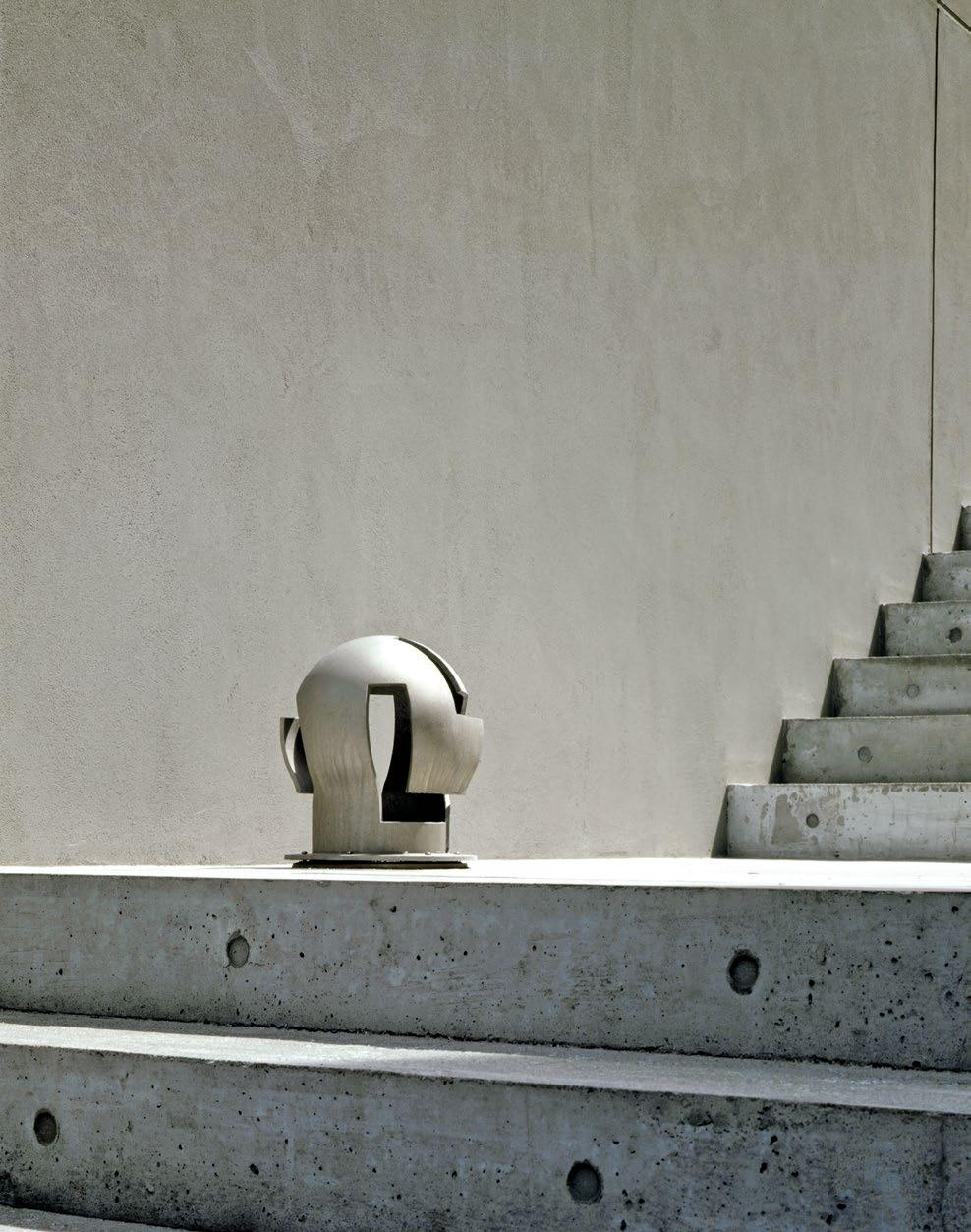


Spatial Artifacts
Steven Holl Architects’ Objects in Dialogue with Architecture

Steven Holl Architects designs all elements of a building from first principles, to lights, door furniture, chairs, and seats.
PRINCIPAL


Dimitra Tsachrelia Holl explains the inspiration for some of the office’s signature pieces, and its preoccupation with light and material—a holistic approach that has contributed significantly to the practice’s award-winning international presence and portfolio of highly original buildings all over the world.
Steven Holl Architects, “Boxing glove” bollard, Makuhari Bay New Town, Chiba, Japan, 1996
This cast aluminum exterior lighting bollard features orthogonal cuts that boldly break through its curved, globe-like form. The void space materializes when the fixture illuminates.
Dimitra Tsachrelia Holl
Architecture is bound to situation. Unlike music, painting, sculpture, film, and literature, a construction (non-mobile) is intertwined with the experience of a place. The site of a building is more than a mere ingredient in its conception. It is its physical and metaphysical foundation.
—
Steven Holl, Anchoring, 19891
For Steven Holl Architects (SHA), light fixtures do not simply emit light, but treat it as a material, crafting it into tangible, almost sculptural manifestations. A reversal occurs when the space is modified by the very piece conceived for it, creating a dialogue between object and environment. A similar intensity applies to furniture design, where the balance of materiality and gravity brings architectural concepts to a human scale.
Crafting Light and Space
Light has always been central to Steven Holl’s work. In his words: “It is not surprising that some architects have written that the entire intention of their work revolves around light, just as some painters have focused completely on the properties of color. The perceptual spirit and metaphysical strength of architecture are driven by the qualities of light and shadow shaped in solids and voids, by opacities, transparencies, and translucencies.”2
The furniture and fixture designs of SHA are not standalone objects; rather, they emerge in dialogue with a work of architecture, translating its concept to a smaller scale.
The Planar Light fixture, designed in 1983 for the Cohen Apartment in Manhattan, embodies this integrated approach to design. Conceived as a total work of art, the apartment interiors were organized around three compositional modes: “the linear, planar, and volumetric.”3 The Planar Light was specifically created for the studio and bedroom, arranged in planar mode, where wall planes unfold to doors. The patinated copper of its backplate and brackets contrasts with the soft, sandblasted translucent glass of its planes. Transformed when illuminated, the copper’s green patina takes on a golden hue. This fixture was also incorporated into two other SHA projects: the House at Martha’s Vineyard (1988) and the L-House in Hudson, New York (2024). In the latter, the homeowner—a furniture collector—unexpectedly came across the original design and chose to integrate it into his new residence. Both instances highlight how site-specific architectural elements can adapt and establish meaningful relationships with their new surroundings.
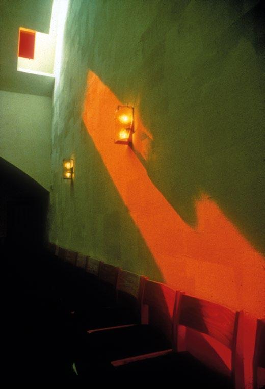
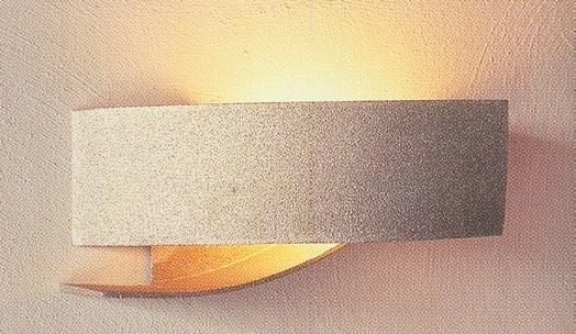
The Cast Glass Light is one of several pieces of furniture conceived by the practice for its widely celebrated Chapel of St. Ignatius in Seattle, Washington (1997), where natural light emerges from the roof, shaped and colored by its varying volumes and baffles, metaphorically referencing “seven bottles of light in a stone box.”4 The sand-cast glass luminaire takes on a freely defined shape, held gently in place by three brackets. This wall fixture reflects the overall materiality and polychromy of the chapel. Together with suspended blown-glass lights and four fused-glass windows along the procession hall, it enhances the chapel’s layered qualities of illumination and its unique spatial atmosphere.
The cast-aluminum bollard nicknamed the “boxing glove” was created for the exterior of a housing block in Makuhari, Japan, to commemorate the challenges of the design and construction process. Over time, it has been installed in other SHA-designed projects, including Simmons Hall Dormitory at the Massachusetts Institute of Technology (2002), the Sliced Porosity Block, a mixeduse complex in Chengdu, China (2012), and the Architectural Archive and Research Library in Rhinebeck, New York (2023).
The geometry of the Kiasma Museum of Contemporary Art in Finland’s capital Helsinki, designed by Holl, inspired his castaluminum wall-mounted fixture bearing the same name. The museum’s primary arrival and circulation spaces are shaped by intersecting curvilinear walls that maximize natural light. The fixture celebrates the interplay of light, material, and geometry. It was later produced by the Italian company FontanaArte.
The glass pendants at the Chapel of St. Ignatius were blown in organic shapes, while recent explorations evolved into suspended lights with Euclidean geometry. Inspired by the concept of space curves, intersecting spheres in blown glass were developed for the Institute for Advanced Study’s Rubenstein Commons in Princeton, New Jersey (2022), paying homage to professor Albert Einstein. Wooden molds for glass blowing were digitally cut (through computer numerical control—CNC) at SHA’s fabrication shop, which is equipped for experiments and full-scale mockups.
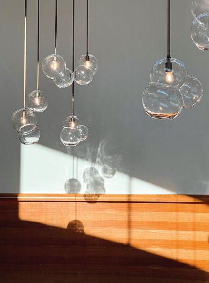
Steven Holl Architects, Space curve light, Rubenstein Commons, Institute for Advanced Study, Princeton, New Jersey, 2022
above : Each spherical intersection shapes a curve in space, like the bend of the horizon. For philosopher Peter Sloterdijk, each sphere of experience intersects with others to create a seamless continuum of meaning.
Steven Holl Architects, Cast Glass Light, Chapel of St. Ignatius, Seattle, Washington, 1997
opposite top : Daylight filtered through colored lenses and the Cast Glass Light converge in a chromatic and material exploration. The projected light and the light emitted from the fixture amplify their material presence as they wash the scratch-coat plaster on the wall. The material intensity is experienced in the detail of the glass itself, where sand texture leaves its subtle imprint on the sand-cast glass luminaire.
Steven Holl Architects, Kiasma wall fixture, Kiasma Museum of Contemporary Art, Helsinki, Finland, 1998
opposite bottom : The geometric concept of intertwining is explored as a two-handed gesture of embrace. The simply arched plate reveals itself in both side and front views, embodying lightness while offering light.
Steven Holl Architects, Carved stone fixture, Lewis Center for the Arts, Princeton University, Princeton, New Jersey, 2017
below : This art-inspired architectural detail creates an illusion of depth. The recessed light is embedded within the building’s 3-inchthick (76-millimeter) Lecce stone exterior wall panel, carved using a five-axis digital router. The forms and lighting were refined through 3D-printed iterations in the Steven Holl Architects fabrication shop.
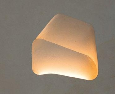
Sculpting experiments for lighting also include wood and stone materialitis. SHA’s Lewis Center for the Arts, Princeton (2017), provides a home for Princeton University’s arts programs in dance, musical theater, and theater. The steel and cast-in-place concrete structure of the three buildings is clad in thick limestone from an ancient quarry in Lecce, located in southern Italy, and renowned for its light-beige color and exceptional workability. The carved stone exterior fixtures, CNC-carved from Lecce stone panels, are seamlessly integrated into the building’s stone façade, with master stone sculptors completing the design on-site. For the interior, carved-wood wall sconces were crafted from CNC-cut solid walnut at the Walla Walla Foundry in Washington State, adding warmth and contrast to the concrete walls.
In 2024, SHA developed a variation of this design for the Meander Housing in Helsinki. Varying in height from two to seven floors, the housing structure is 590 feet (180 meters) long and traverses its rectangular site, rising in section toward the sea horizon. The carve-out of the Meander wall sconce is an interpretation of the building’s curvilinear geometry, introducing a freeform element to the linear carving of the original fixtures installed at the Lewis Center in the previous decade. The sconces are produced by Made by Choice in Helsinki.
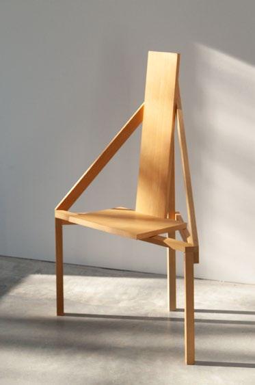
The Philosophy of Furniture Design
Designing objects offers SHA a means to explore geometry, proportions, and material integrity—values central to their practice. Influences such as Pierre Chareau, Carlo Scarpa, Sigurd Lewerentz, and Alvar Aalto continue to inspire Holl’s pursuit of timeless quality in a corporate-dominated era. His practice takes a diachronic approach, creating forms and ideas that are forward-thinking while celebrating materials that age gracefully. This philosophy embraces natural weathering and imperfection, reflecting the Taoist concept of “wabi-sabi,” where use and patina enhance beauty over time.
As architect and writer Annette LeCuyer observes for the Chapel of St. Ignatius, visitors are drawn to touch the surfaces slowly and with reverence.5 The texture of the trowel, the irregularity of blown glass, and the mark of the chisel reveal the human hand’s ability to create beauty through imperfection. Similarly, as Kenneth Frampton notes, Holl has “an alchemical
opposite right : The “A” Chair aspires to a conceptual urban statement: four chairs placed back-to-back form a block, while four spread apart define the corners of a square. This example of it was made to order in 2018 for the

The carve-out of the Meander wall sconce is an interpretation of the building’s curvilinear geometry, introducing a freeform element to the linear carving of the original fixtures

obsession with the transformation of material; thus glass is sandblasted, copper etched, or otherwise treated to impart a gloss, or, alternately, to impose the verdigris of age.”6 This philosophy has remained consistent throughout Holl’s career, evident in works and details such as the patinated copper candlesticks designed for Swid Powell (1987) or the bronze door pulls at the Institute for Contemporary Art at the Virginia Commonwealth University (2018).
Chairs are among the most challenging forms of furniture design and hold a personal significance for Holl. Over the years, he has collected numerous iconic chairs, including Frank Lloyd Wright’s metal office side chair for the Larkin Administration Building in Buffalo, New York (1906), Le Corbusier and Pierre Jeanneret’s Chandigarh Chair (1950s), and Paulo Mendes da Rocha’s Paulistano chair (1957).
above : A subtractive sculpting process defines this wooden wall sconce, which inscribes the shape of the housing building whose lobby it illuminates. Through an experimental approach of carving solid, opaque material, the resulting light achieves a fuller, warmer quality.
Steven Holl Architects, “A” Chair, 1980
exhibition “Half Earth” at the Antonia Jannone Gallery in Milan, and is pictured here at the Steven Myron Holl Foundation Architectural Archive, Rhinebeck, New York, in 2024.
Steven Holl Architects, Meander wall sconce, Meander Housing, Helsinki, Finland, 2024
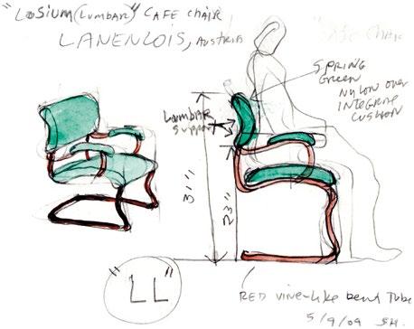
Holl’s first chair design, the “A” Chair, was created in 1980 for the exhibition Pamphlet Architecture Reading Room: Exhibit A in New York. The project, displayed in an empty storefront, was initiated by Holl to provoke debate among architecture enthusiasts. The exhibition featured pamphlet proposals and new chair designs by contributors including Zaha Hadid, Lebbeus Woods, Mike Metz, James Holl, and Mark Mack.
Holl’s “A” Chair, much like a building in an urban setting, was conceived in groups of two or four, engaging in dialogue with one another. The underside of the original prototype’s seat bears handwritten notes and sketches, inscribed with the phrases “City of Chairs,” “Chair Blocks,” and “Chair Courts.” Similar to conceptual art, the “A” Chairs shape their context rather than existing solely as objects. These three-legged ash-wood chairs continue to be produced by the Schmidinger company in Austria.
In 1991, Holl designed the Manchester Chair, alongside the Tower of Silence in Manchester, Washington (1992). Nestled among three 150-foot-tall (45-meter) Douglas fir trees that create a cathedral-like void, the wood-frame studio designed by Holl for painting and writing is clad in natural cedar boards. The chair, intended for the cantilevered porch overlooking Puget Sound, Blake Island, and Seattle—Holl’s birthplace—is crafted from thin 1-by-12-inch (25-by-305-millimeter) raw western
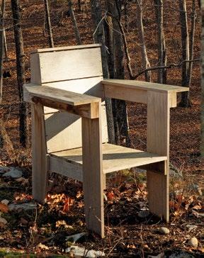
cedar planks that weather to silver-gray. Serving as a West Coast alternative to the Adirondack chair type which evolved from the 1903 Westport Chair by Massachusetts native Thomas Lee, the Manchester Chair combines Adirondack’s comfort and wide armrests suited for outdoor use with a thinner, orthogonal back and seat geometry. Several Manchester Chairs have been produced by local carpenters and are now placed on the East Coast, around Holl’s family home and architectural archive space in Rhinebeck, New York.
Holl designed the Lumbar Chair in 2004 for the Loisium Hotel in Austria’s wine country, a SHA building featuring a fine restaurant, conference spaces, and meeting facilities. This cantilevered steel and leather chair provides lower-back support, a response to Holl’s own experience of sciatica pain at the time. The chair has been adapted for dining and bar heights and has since been incorporated into several SHA projects, including the Institute for Advanced Study in Princeton (2022).
SHA’s furniture designs are mostly created for their specific architectural projects and in collaboration with skilled craftspeople, rather than commercial manufacturers. Among the few exceptions was the collaboration with Luciano Marson at Horm, which introduced mechanical innovation to the Riddled furniture series (2006–11). Using a patented and remarkably

SHA’s furniture designs are mostly created for their specific architectural projects and in collaboration with skilled craftspeople
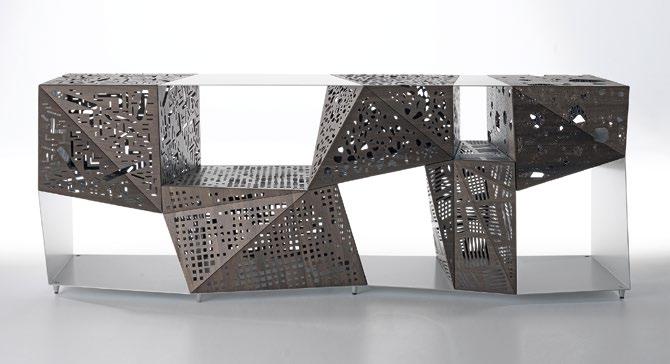
lightweight fabrication technique, wood and fabric are layered and folded along laser-inscribed incisions without hinges. Like origami, the faceted geometry of the perforated boxes maintains structural stability, whether positioned vertically as a totem or horizontally as a buffet.
A thirst for experimentation, technological intuition, and an in-depth understanding of materials give shape to objects at Steven Holl Architects, harmonizing with the concepts of each building they design. During a conversation in December 2024, Holl reflected on the value of architecture: “It is the most fulfilling of all focuses in life to realize an inspiring idea in space, light, and material as a gift to future generations—even if in smaller scales. A passion for art is integral to architecture, just as the desire to express is integral to life.”7 2
Notes
1. Steven Holl, Anchoring, Princeton Architectural Press (New York), 1989, p. 9.
2. Steven Holl, Juhani Pallasmaa, and Alberto Gómez, Questions of Perception: Phenomenology of Architecture Architecture and Urbanism special issue, A+U Publishing (Tokyo), July 1994, p. 63.
3. Holl, Anchoring, p. 63.
4. Steven Holl, The Chapel of St. Ignatius, Princeton Architectural Press (New York), 1999, p. 16.
5. Annette LeCuyer, “Chapel of St. Ignatius by Steven Holl,” Architectural Review, 3 August 2015 (first published in the same journal in August 1997): www.architectural-review.com/archive/chapelof-st-lgnatius-by-steven-holl.
6. Kenneth Frampton, “On the Architecture of Steven Holl,” in Holl, Anchoring, p. 6.
7. Conversation with the author, December 2024.
Text © 2025 Axiomatic Editions. Images: pp. 58, 62(l) © Paul Warchol; pp. 60–1, 64(l) © Steven Holl Architects; pp. 62(r), 64(r) Susan Wides © 2025. All rights reserved; p. 63 © Angel Gil; p. 65 Courtesy of HORM ITALIA
Steven Holl, Lumbar Chair concept watercolor, 2004
opposite left : “Lumbar” refers to the lower part of the spine, and this chair is specifically designed to support the lower back. Constructed from metal tubes that bend and rise like a vine, it was originally conceived for the Loisium Hotel in Langenlois, Austria, an SHA-designed building. The chair elegantly balances gravity and grace, combining necessity with a free, organic form.
Steven Holl Architects, Manchester Chair, 1991
opposite right : The Manchester Chair exists as a philosophical object: it carries the message of ecology and economy, with its significance co-created by the user, whose experience it shapes. It is shown here in the context of the Ex of In House (2016)—an experimental work of architecture by SHA on a woodland reserve in Rhinebeck, New York, that explores ideas of compression—for which this version was made to order in 2023.
Steven Holl Architects, Riddled Buffet for Horm, 2006
above : Using a high-tech textile layered between thin Canaletto walnut veneers, the cabinet doors function hinge-free like sculptural origami. The buffet is part of a series produced in collaboration with Luciano Marson for production by Horm, the Italian furniture manufacturing company he co-founded.
Dean Maltz

Big and Small

The Ethos of Shigeru Ban

Shigeru Ban Architects, Triangular Scale Pen, 2004
Manufactured by ACME Studio, a pen point emerges with a twist from an architectural scale ruler.
Whatever the medium or scale of his projects, Shigeru Ban applies the same design ethos. Mottainai (もっ たいない or 勿体無い)—a Japanese phrase conveying a sense of regret over waste—is at its heart, leading to a method that avoids waste and seeks a low carbon footprint. These principles are brought to bear throughout his practice, from schemes as vast as the 500,000-square-foot (45,000-squaremeter) Swatch and Omega Campus
in Biel, Switzerland (2019), to items as small as the six-inch-long (15-centimeter) Triangular Scale Pen (2004) that doubles as an architect’s ruler. They even apply to the humblest of objects, such as his Square Core Toilet Paper, whose angular core tube both prevents overuse due to accidental unrolling and configures aggregated toilet-paper “rolls” into cuboids, allowing for more efficient packing for shipping.
Having first met Shigeru Ban when they were students at New York’s Cooper Union in the early 1980s, and later becoming his New York-based managing partner, Dean Maltz has had a lengthy creative relationship with the practice. Here he discusses Shigeru Ban Architects’ innovative use of materials, and the relationship of the practice’s unconventional furniture to its built projects—a trajectory of exploration that has produced some unique designs for furniture and buildings alike.
Ban’s interest and dexterity in furniture making—often overshadowed by his architecture— first appeared following his time as a student in New York City, where he graduated from the Cooper Union in 1984. One year after his graduation, he designed the Keiko light fixture, which blurred the boundary between building and object. While his later furniture designs emanate from material explorations, Keiko conveys
a preoccupation with architecture and tectonics. Comprising a straight fluorescent tube bulb and a truss frame, its translucent and removable shade is made of Japanese washi paper. It can be installed as a standing fixture or cantilevered from a wall, demonstrating Ban’s commitment to multifunctional design. The blurring of boundaries between architecture and furniture that we see in this early design has
extended throughout his long career. Ultimately, he is an environmentally compassionate designer who adaptively navigates many mediums to support the exploration of the potential, limits, and responsibility of architecture in all its forms and sizes—whether products or buildings.
Each Furniture House uses structural furniture units (SFUs), a new building system inspired by the notion of prefabrication that combines aesthetic simplicity, spatial efficiency, material sustainability, cost-effectiveness, and reduced on-site construction work
Humanitarian Design
Ban’s concern for the planet, its natural resources, and those who inhabit it, is especially apparent in his design projects for humanitarian efforts. In 1995 he conceived the Paper Log House for a small community in Kobe, Japan, where many had lost their homes during the Great Hanshin Earthquake. In the aftermath of the disaster that displaced more than 45,000 and killed more than 6,000 people, he recognized how architecture and design could be used to rethink preconceived notions of permanence, resilience, sustainability, and accessibility to comfort, when helping to shelter those rendered vulnerable during their time of greatest need. Through low-cost DIY intelligent design, he created the Paper Log House to provide temporary housing for a sector of society that is generally forgotten. For more than 30 years he has been traveling around the world helping victims of natural
disasters. International recognition for his efforts has included being awarded the Pritzker Architecture Prize in 2014, the Mother Teresa Memorial Award for Social Justice in 2017, and most recently, in 2024, the highest award bestowed upon Japanese architects: the Praemium Imperiale.
As Ban says: “Earthquakes don’t kill people, buildings do.” Reflecting on the life-saving potential of design, he considers the role of architects and their responsibilities to all sectors of society when he asks the question: How can permanent buildings be made safer? While his Paper Log House model was successful in providing emergency relief for victims of natural disasters, his Furniture Houses—the first of which was built in Yamanashi, Japan, in 1995—allow us to observe his design ethos embodied in idealized everyday projects. Each Furniture House uses structural furniture units (SFUs), a new building system inspired by the notion of
prefabrication that combines aesthetic simplicity, spatial efficiency, material sustainability, cost-effectiveness, and reduced on-site construction work. The SFUs function both as modular storage and as load-bearing structure in place of conventional columns and walls. Since the safest place to be when trapped in a building during an earthquake is a doorway or large cabinet, the SFUs also help create a safe place for inhabitants.
In the same year that the first Furniture House and the first Paper Log House were constructed, Ban founded the Voluntary Architects’ Network, a non-governmental agency and nonprofit organization dedicated to building disaster-relief projects. The synchronicity of these projects is a testament to his capacity to uphold and translate his driving ethos into an array of design outlets beyond the confines of traditional architecture.
The truss-frame lamp with a removable washi-paper shade contains a single fluorescent tube bulb. The fixture can stand on the floor or cantilever from a wall.
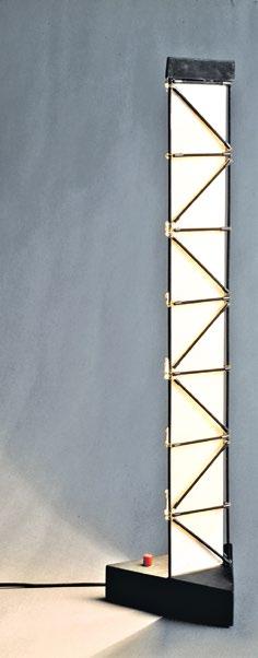
Ban Architects, Paper Log House, Kobe, Japan, 1995
After the Great Hanshin Earthquake, 30 Paper Log Houses were constructed for a displaced community in Kobe. Each house consists of of paper tubes, plywood, milk crates, and a membrane roof.
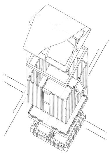
Shigeru Ban Architects, Furniture House 1, Yamanashi, Japan, 1995
Furniture House 1 is composed of prefabricated structural furniture units (SFUs) that divide spaces, provide storage, and support the roof. Prefabrication reduces on-site material waste and makes construction more efficient.
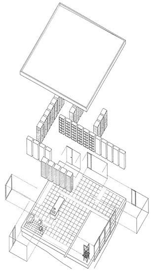
Shigeru Ban, Keiko light fixture, 1985
Shigeru
Freestanding Paper Furniture
As well as demonstrating the use of furniture to make architecture, and of DIY to make disaster relief architecture, Ban has brought the same ethos into making freestanding furniture. His furniture designs help inform a more holistic understanding of his practice and influence, beyond the architecture for which he is so renowned. Similarly to certain 19thand 20th-century master architects— such as Frank Lloyd Wright, Mies van der Rohe, Le Corbusier, and Alvar Aalto—he produces bespoke furniture designs for his buildings, which explore concepts on a differing scale. The concepts and practice of exploration vary from project to project, spanning topics of materiality, sustainability, and functionality.
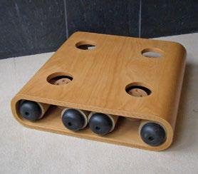
Starting in 1997, Ban began experimenting with paper-tube furniture in the Paper Tube and Plywood Stool. Uniquely, the stool is supported by cardboard-tube legs that can be shipped inside the bent plywood seat to minimize shipping costs. The stool is easily assembled when removed from the shipping box, as the four tubes can be inserted in holes at the bottom of the seat. Although at this point he had been using paper tubes in his architecture for a decade, the stool had pivotal meaning as the first use of paper that could be sat upon. Through this new use, Ban embodies the empowering potential of design as he displays that a weak material—paper—can do a strong thing.
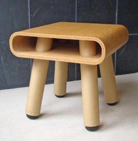
Ban was not the first architect to make cardboard furniture: Frank Gehry had designed the Contour and Wiggle chairs in the 1970s. What sets Ban’s stool apart is its structure of cardboard tubes rather than sheet cardboard.
The use of cardboard tubes commonly found in toilet-paper rolls, rolled paper cores, fabric bolts, and other industrial materials represents a common trait of his ethos: creating a new product from off-the-shelf products used in an alternative way. In doing so, he explores new approaches to making buildings or furniture.
One of the most well-known and perhaps the most iconic of Ban’s furniture collections is the Carta Collection, designed in 1998 for Cappellini. This collection has been expanded over the years to include
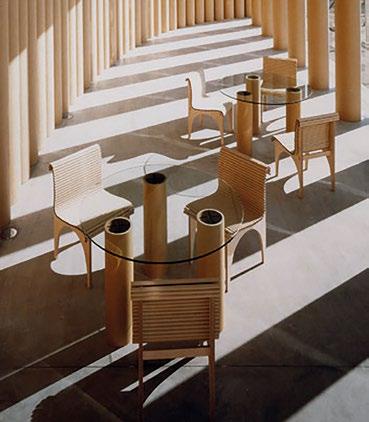
Shigeru Ban Architects, Papertube Sofa, 2022
right : The sofa’s legs and back are built from paper tubes, with a seat made of solid wood. It is shown here installed in the lobby of the ShishiIwa House No. 2 in Karuizawa, also designed by Ban.
Shigeru Ban Architects, Paper Tube and Plywood Stool, 1997
above left and right : In this stool, paper-tube legs support a bent plywood seat. The legs can be removed and inserted into the seat for compact storage, thereby reducing packaging waste.
a dining chair, lounge chair, chaise longue, stool, coffee table, and side table, all made of dowel-sized paper tubes and plywood. Since 2015, he has explored the concept of mixing paper and plywood with upholstery, a natural evolution of his long investigation into the strength of paper tubing.
In 2022, Ban revisited these early designs and integrated them with other materials to produce the Papertube Sofa, which features a wooden platform carrying a seat cushion and a paper-tube backrest covered with upholstery, and is supported by paper-tube legs. Once again, it shows him exploring the limits of material strength, but now also playing with reincorporating elements of more traditional design and comfort.
The concepts and practice of exploration vary from project to project, spanning topics of materiality, sustainability, and functionality
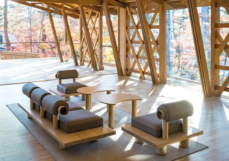
Shigeru Ban Architects, Carta Collection for Cappellini, 1998
below : The Carta Chair is made of paper tubes with plywood legs. It has since been developed into a collection including tables and a chaise longue.
Ban’s relentless exploration of materiality, specifically in paper tubing, underlines his passion to make designs for all people, regardless of whether the end user is wealthy, middle class, or economically disadvantaged. His previous furniture prepared him to design the DIY Cardboard Bed in 2022 for displaced people in evacuation centers. This design was used in Kanazawa after the Noto Peninsula earthquake on January 1, 2024. Developed in collaboration with Ryohin Keikaku Co., this inexpensive cardboard bed sought to improve conditions, including comfort and hygiene, for refugees during the disaster. Designed for restricted spaces, the cardboard frame is multifunctional as it also provides storage under the bed.
Limiting Waste
While Ban’s material research into paper allowed him to explore architecture’s duty to be accessible, his other work investigates architecture’s responsibility to avoid making waste (mottainai). Through his use of carbon fiber in the elegant Carbon Fiber Chair of 2009 and Yumi lamp of 2011—the latter currently sold by FontanaArte— he has sought to see how minimal furniture can become.
Recycling is another tenet for reducing waste. In 2007, the wellknown Finnish furniture company Artek asked Ban to design its pavilion for the Salone Internazionale del Mobile in Milan, Italy. The result embodies his innovative and creative dedication to exploring how architecture and design can promote
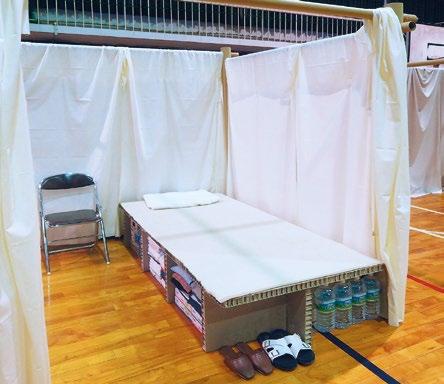
sustainability. He created a truss system out of L-shaped sections that spanned over 15 feet (4.5 meters) using ProFi, a composite material made in Germany by Finnish forestry industry company UPM. Relatively new at the time, UPM ProFi is made from recycled plastic and paper partially sourced from the waste of self-adhesive label materials used at the Artek factory. The paper pulp is from renewable and sustainably sourced wood.
Artek were so impressed with the strength and durability of the pavilion structure that they went on to commission Ban to design the 10Unit System for them to manufacture and market. Based on the solid-wood L-Unit System that he had invented back in 1993, the 10-Unit System
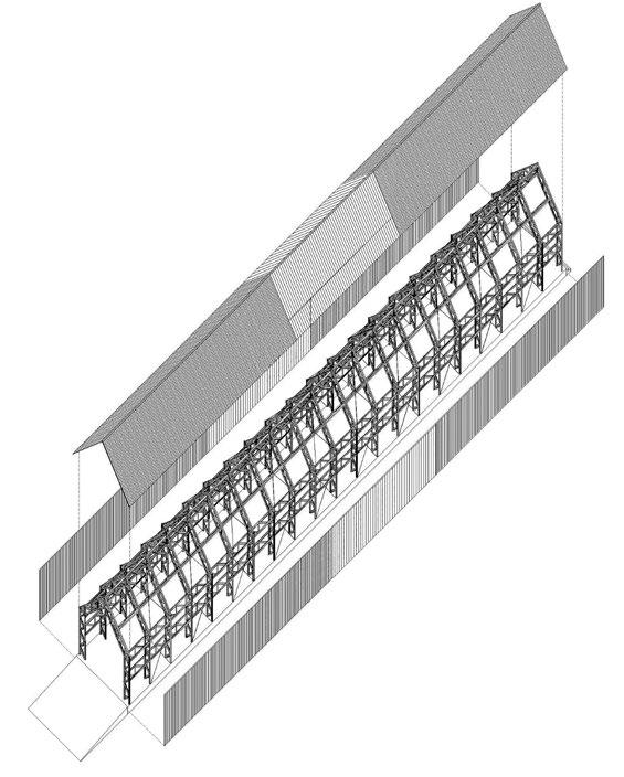
limits waste, as it finds new purpose for excess packaging labels that would have been discarded. The chair, designed in 2009, is made up of 10 identical L-shaped elements that, when put together, create the seat, legs, and backrest. The design can be used indoors or outdoors and its elements can be combined to become a bench, double seat, or any other configuration. Finishes come in black and white, allowing a range of looks. The end user can configure and reconfigure the 10-Unit System in multiple ways, making this a DIY multifunctional design. From its fabrication approach, extending the life of the material through upcycling, to its ability to be dismantled and reassembled, the furniture is ecological and regenerative. In 2018
Ban again adapted the L-Unit System for the furniture for the Shishi-Iwa House hotel in Karuizawa, Japan. Whether designing an enormous industrial campus, a hand-held instrument, or anything in between, Ban’s design ethos remains the same. Throughout his practice and body of work, he demonstrates his commitment to designing with sustainability, accessibility, and multifunctionality in mind. In doing so, he highlights the symbiotic relationship that blurs the line between architecture and furniture. 2
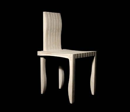
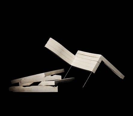
Ban Architects, 10-Unit System, 2009
left :
Italy, 2007
opposite right : The pavilion designed for this international furniture design fair for the Artek furniture company was built of prefabricated L-shaped elements made from ProFi, a woodplastic composite manufactured by UPM. The truss structure is 135 feet (41 meters) long and 20 feet (6 meters) in width and height.
above : The chair’s 10 identical L-shaped elements are made from UPM ProFi wood-plastic composite, simply joined with two metal rods. The chair is manufactured by Artek, the original maker of Alvar Aalto’s furniture.
Shigeru Ban Architects, DIY Cardboard Bed, 2022
opposite
In a refugee shelter in Japan, the sustainably designed Cardboard Bed enables underbed storage in incredibly cramped conditions, in contrast to typical metal folding cots.
Shigeru Ban Architects, Artek Pavilion, Salone Internazionale del Mobile, Milan,
Shigeru
Text © 2025 Axiomatic Editions. Images: p. 66 © ACME Studio, Acmestudio.com; pp. 69, 70(l&c), 71–2 © Shigeru Ban Architects; p. 70(r) © Hiroyuki Hirai; p. 73 © Aino Huovio
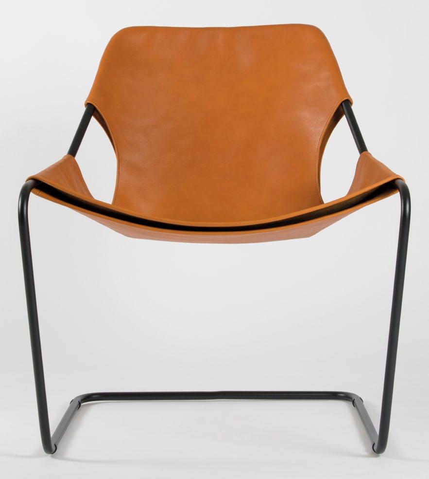
The Virtues of Technique in the Service of Culture
Crafting the Continuous Line
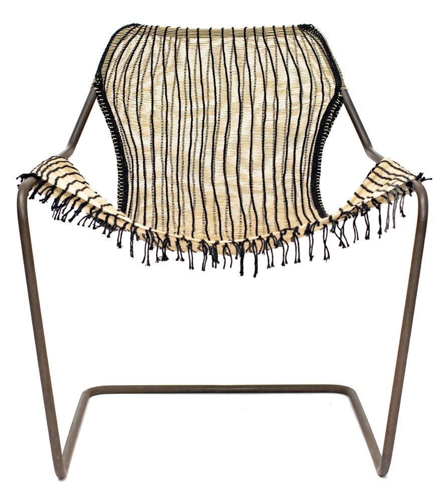
Paulo Mendes da Rocha, Paulistano chair, 2004
opposite : A version of the chair in black carbon steel and whisky-colored vegetan leather cover, manufactured by French company Objekto. The Paulistano chair was originally designed in 1957 for the leisure areas of Club Athlético Paulistano in São Paulo, and reflects experimentation in industrial design and the creation of genuine and innovative furniture in Brazil during that period.
Paulo Mendes da Rocha and Kaiti Kamayurá, Paulistano Xingu chair, 2020
above : Final version of the Paulistano Xingu chair with a
buriti fiber and black cotton cover.
Guilherme Wisnik
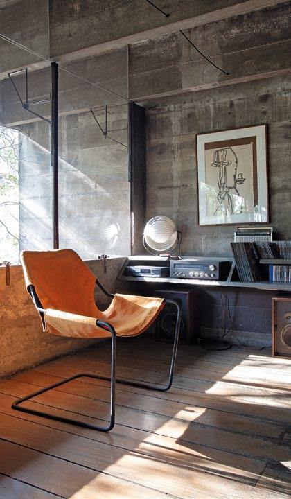
Paulo Mendes da Rocha, Paulistano chair, Butantã Twin Houses, São Paulo, Brazil, 1964
The Paulistano chair in a 2006 version made of steel and canvas by Objekto, photographed in that year in the architect’s home, the Butantã Twin Houses—one of his most experimental projects. In the background are concrete shelves and steel frames, elements designed as integral parts of the house’s architecture.
The work of renowned Brazilian architect, the late Paulo Mendes da Rocha, is stringent but beautiful in its Brutalist minimalism. Guilherme Wisnik, Vice Dean of the Faculty of Architecture and Urbanism at the University of São Paulo, looks at his experimental furniture designs, and in particular the architect’s original intent for his iconic Paulistano chair in 1957, with a hammockinspired cover made from native natural fibers—a vision that was eventually fulfilled by his daughter Nadezhda Mendes da Rocha’s more recent collaboration with the Indigenous peoples of the Amazonian Basin.
Paulo Mendes da Rocha was a renowned figure in the history of Brazilian and global architecture, yet his ventures into furniture design remain largely underexplored. Among his most emblematic creations is the Paulistano chair, designed in 1957 for the leisure areas of Club Athlético Paulistano in São Paulo. The chair, one of the few furniture pieces that he designed, has become a global design icon.
Mendes da Rocha studied architecture at São Paulo’s Universidade Presbiteriana Mackenzie in the early 1950s. At that time, this quintessentially industrial city was absorbing cultural references from the US. In architecture, the Californian school was particularly influential, with designs like the Case Study Houses commissioned from major architects by Arts & Architecture magazine and built in Los Angeles in the 1940s and 1950s,1 and the works of the Austrian-American architect Richard Neutra and the Hungarian-German-American architect Marcel Breuer, which emphasized interior design using slender metal profiles, wood paneling, concealed handles, and foldable elements. The Paulistano chair emerged in this context, reflecting experimentation in industrial design and the creation of authentic, innovative furniture.
The chair is made with a single tubular steel bar, forming a continuous line with only one welding point, maximizing the material’s strength and “memory.” This approach recalls the solutions of the Dutch designer Mart Stam (Cantilever Chair, 1926) and Marcel Breuer (Chair B33, 1927) within the German Bauhaus context. However, while their designs feature flat and rigid seats, the Paulistano adapts to the user’s body. Its flexibility is achieved through its fabric cover and spring steel structure, which eliminates rear vertical bars where body weight is concentrated. The spring steel, sourced from the Brazilian company Villares Metals, was traditionally used for elevator shock absorbers, as its cold-formed elasticity ensured durability. This quality imbues the chair with a pleasant swaying motion.
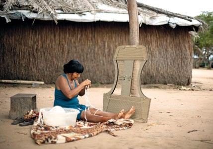
Indigenous Modernity
The story of the chair’s first prototype is both amusing and emblematic. Together with his blacksmith friend, Angelim, Mendes da Rocha traveled by motorcycle to collect steel bars from the Villares factory, carrying them on their laps over 30 kilometers (20 miles) to Angelim’s workshop in the working-class district of Mooca. Angelim’s wife then crafted a fabric cover using flour sacks, and the load test was improvised with bags of cement.
Mendes da Rocha had initially envisioned the chair’s structure being dressed in a cover made of natural fibers, inspired by hammocks used by Indigenous peoples of Brazil, such as those made from tucum or buriti palm fibers. But after unsuccessful attempts to connect with Indigenous communities through official channels, in the 1980s he adapted the chair to use canvas or leather covers. This version won top place in the first of the Design MCB Award contests, run by São Paulo’s Museu da Casa Brasileira, in 1986. Subsequently, the chair was produced by the Brazilian creative group Nucleon 8; and since 2004 it has been manufactured by the French company Objekto, becoming globally recognized. In 2009, the Paulistano chair became part of the permanent collection at the Museum of Modern Art (MoMA) in New York.
However, a pivotal moment came in 2018 with a film documentary by the architect’s daughter Joana Mendes da Rocha, called Tudo é Projeto (Everything is Design), which revealed Paulo’s initial intent to use natural fibers for the chair’s cover.2 This uncovered a new dimension to the design—one that combined technical ingenuity with a critique of colonial processes in the Americas. By integrating industrial techniques with ancestral knowledge, Paulo envisioned a dialogue that valued and celebrated Indigenous cultures.
In 2019, inspired by this vision, Nadezhda Mendes da Rocha—the architect’s youngest daughter—collaborated with the Kamayurá people of the Upper Xingu region of Brazil to create a limited edition of natural fiber covers for the Paulistano chair. She explains: “Supported by Casa Vogue and Objekto, we visited the Xingu region and developed a loom-like jig to weave the covers to the exact chair specifications. Over time, this collaborative effort resulted in covers that reflected both the collective spirit of Kamayurá culture and the individual artistry of each weaver. This project, called Paulistano Xingu, fulfilled Paulo’s original vision, and I was able to present it to him in January 2020, almost a year before his passing.”3
Kaiti Kamayurá, Kamayurá village, Alto Xingu, Brazil, 2020
Kaiti Kamayurá, an Indigenous woman, weaving the buriti fiber cover for the Paulistano Xingu chair—a project led by Paulo’s daughter Nadezhda Mendes da Rocha that resulted from a design investigation aiming to fulfill her father’s original vision in the conception of the Paulistano chair.
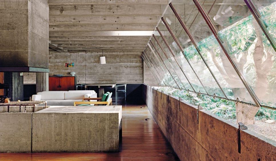
The Butantã Twin Houses are certainly among the architect’s masterpieces and are a symbol of the so-called Paulista School of architecture, which is strongly influenced by Brutalism
The Living House Paulo’s appreciation for technical craftsmanship reflects the challenges of working in a country like Brazil, where industrial development was limited. Mendes da Rocha often collaborated with manual laborers, like blacksmiths, to incorporate unconventional elements into his projects. This reinforced his personal appreciation for the manual construction of playful artifacts and gadgets that he made for himself in his office, such as pendulums, paper ships, models of sculptures, and indefinable objects made of wire, threads, small pieces of wood, washers, weights, and counterweights.
All these issues relating to his appreciation of detail are summarized in one particular work, which is key to his career: the Twin Houses in Butantã (1964), built for his own family and his sister. There, without the restriction of an external client, Mendes da Rocha was able to dedicate himself to developing constructive solutions in a way that was very much in line with the enjoyment of everyday life, imagining that the solemn spaces of a house made of reinforced and exposed concrete would have to be invested with a playful grace that would allow them to be fully enjoyed by his then-young children.
The architectural design of the houses is radical. Each is a suspended single-story house, supported by only four pillars, and with large spans and cantilevers. With a structure conceived by Japanese-Brazilian engineer Siguer Mitsutani, the concrete slab is reduced to a minimum dimension of 4 centimeters (1½ inches). This causes the structure to move a lot over time, depending on the presence of people or climate changes, for example.
In this regard, Nadezhda Mendes da Rocha tells us the following story: “When I was a child or pre-teen, I remember asking my father why the house was making noise, since the wooden floor would sometimes creak. And I remember him giving me a beautiful answer, saying that the house was not static, it was always working. Because the expansion of the concrete, with exposure to the sun or cold weather, makes the house move. And in the case of this delicate work of architecture, whose materials are so thin, it behaves as if it were an animal’s house, a shell. Which is a reminder of how much we, humans, are also animals.”
The Butantã Twin Houses are certainly among the architect’s masterpieces and are a symbol of the so-called Paulista School of architecture, which is strongly influenced by Brutalism. In them, much of the furniture, such as tables, beds, and shelves, is made
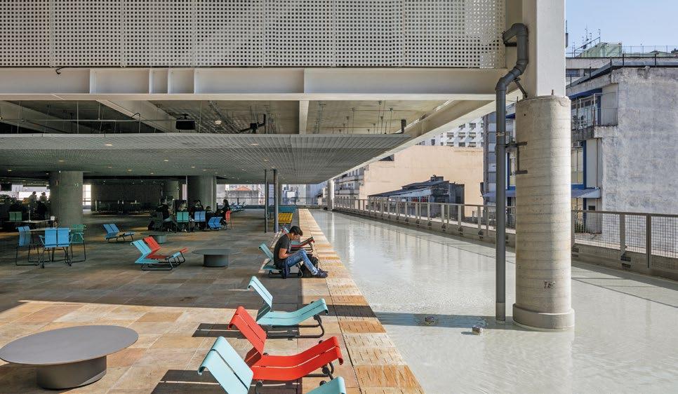
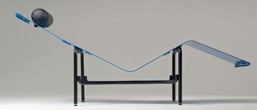
Paulo Mendes da Rocha, Butantã Twin Houses, São Paulo, Brazil, 1964
opposite : The main room of the architect’s house, where almost all the furniture is in concrete: fireplace, sofa, tables, and cabinets. The window frames in steel are supported solely by the transverse roof beams, allowing the openings on both façades to remain completely uninterrupted. Photographed in 2001.
Paulo Mendes da Rocha, PMR lounge chair, 2018
above : Side view of the chair, made of steel, which can be reclined into four different positions. Produced in this version by Objekto, it was initially designed in 1985 for the Brazilian creative group Nucleon 8 and it is another project that explores the virtues of the techniques and industry of the time.
Paulo Mendes da Rocha and MMBB Arquitetos, SESC 24 de Maio, São Paulo, Brazil, 2017
top : View of the café/terrace at the cultural and leisure center—a place for rest and respite in the bustling metropolis. On hot days, the reflecting pool transforms into a sort of urban beach where children play in the water.
of concrete as an integral part of the architecture, and not as separate pieces brought from outside to the house. Still thinking about the dynamic aspect of this construction, Nadezhda reminds us of another interesting fact: “Today, my brother Lito lives in the house. I remember that when he bought the house, he had a big wedding party. And suddenly there were a lot of people there who, as always in these situations, started to gather around the food. And I saw that my father was tense, with a worried look on his face, walking to the other side of the house. So I went to ask him what was happening, and he told me to call some people to go to the other side, to help balance the spatial distribution, because the work had not been calculated to withstand so much load concentrated in one point.”
The Butantã houses are a prime example of Paulo Mendes da Rocha masterfully incorporating improvisation and the appropriation of existing elements into his project. There, for example, he used materials from the automotive industry—felt and aluminum trim typically found in Volkswagen windows for Beetles and Kombis—to create innovative window frames. And he also chose to leave the hot-water pipes exposed, using their heat to warm bath towels.
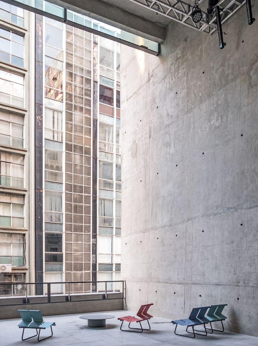
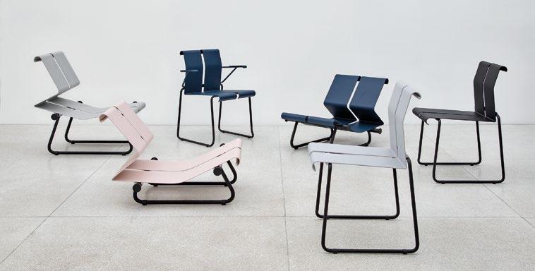
Appropriating the Objet Trouvé
Always a champion of the virtues of industrial techniques, in 1985 he designed a reclining chaise longue for Nucleon 8 featuring two metal plates supported by a tubular structure, with an adjustable incline for ergonomic comfort. Produced since 2018 by Objekto as the PMR lounge chair, it can be manipulated into four different positions and is made up of two strips of flexible steel connected by circular rods that lock it into these positions. It is placed on a rigid stand, which is circular as well. The space between the strips serves to adjust the position of the plastic neckpiece cushion.
Decades later, these concepts resurfaced in his designs for furniture for São Paulo’s SESC 24 de Maio, where steel plays a pivotal role in accommodating heavy public use. Serviço Social do Comércio (SESC) is a nonprofit organization created by Brazilian businesses for the welfare of their employees and the community, and this is one of several major leisure and cultural facilities that it has spawned. With massive visitor numbers—some 10,000 people per day—the SESC 24 de Maio required highly resistant furniture. These objects (chairs and table, 2000–17) were developed with MMBB Arquitetos and later evolved into the 22 Line, produced by São Paulo company Ovo with a fresh color palette for residential and corporate environments.
In this case, too, the architect was inspired by an element found on the building’s construction site: a metal tripod crowned by a fork, made by the workers to keep pipes and electrical conduits off the ground, and well adapted to uneven terrain. Enchanted
by this objet trouvé, he designed the structure of the SESC table based on it, in a pyramidal shape, including diagonal rods in each of the three metal bars to attach them to the top. The table’s triangular shape, with its interesting angular edges, is intended to cater to the mobility of contemporary life: these slender units for only three people can, when desired, allow combinations that transform them into squares, by joining two tables.
Mendes da Rocha’s legacy transcends traditional boundaries, blending technique, culture, and critical thinking. His work, marked by a dialogue between industrial precision and traditional craftsmanship, continues to inspire, offering a bold and inclusive vision for design and architecture.
For him, technique and imagination always go hand in hand. As he often remarked, emphasizing the importance of technical ingenuity in design: “It is impossible to think of formal transformations if you don’t know how to make them. … You reason with possible ingenuity; you don’t think in forms autonomous from a vision of how they are fabricated.”4 2
Notes
1. See Elizabeth A.T. Smith, Case Study Houses: The Complete CSH Program 1945–1966, Taschen (Cologne), 2021.
2. The complete movie can be seen on Amazon Prime Video. The trailer is on YouTube: www.youtube.com/watch?v=SF3UACEqfYo.
3. All quotes from Nadezhda Mendes da Rocha are from a video call with the author in January 2025. For further information on this project, see: https://satelite.studio/paulistano-Xingu.
4. Paulo Mendes da Rocha, “The Genealogy of Imagination,” in Rosa Artigas (ed.), Paulo Mendes da Rocha, Cosac Naify (São Paulo), 2000, p. 71.
Text © 2025 Axiomatic Editions. Images: pp. 74, 79(b) © Objekto – www.objekto.fr; pp. 75, 77 © Andre Sigwalt; pp. 76, 80–1 © Ruy Teixeira; pp. 78, 79(t) © Nelson Kon
Paulo Mendes da Rocha and MMBB Arquitetos, SESC 24 de Maio, São Paulo, Brazil, 2017
opposite : Interior view of the café/terrace showing the building’s relationship with the city, with the furniture serving as an integral part of the whole.
Paulo Mendes da Rocha, 22 Line for Ovo, 2020
left : A new color palette for the SESC 24 de Maio furniture, adapted and marketed by the São Paulo company Ovo, for residential and corporate use.
Soft Seats
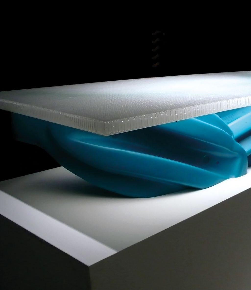
Lynn’s toy furniture as exhibited at the Venice Architecture Biennale. In this piece, multiple units of a children’s plastic kickboard have been cut apart, rearranged, and welded into a base for a coffee table. The bright colors, anonymous character of the plastic, and the cryptic complexity of the amalgamated fragments fall right in line with Lynn’s interest in a highly contrived future based on the computational prowess of the computer.
Greg Lynn, Recycled Toy Furniture, Venice Architecture Biennale, Venice, Italy 2008
Greg Lynn
Toys With Furniture
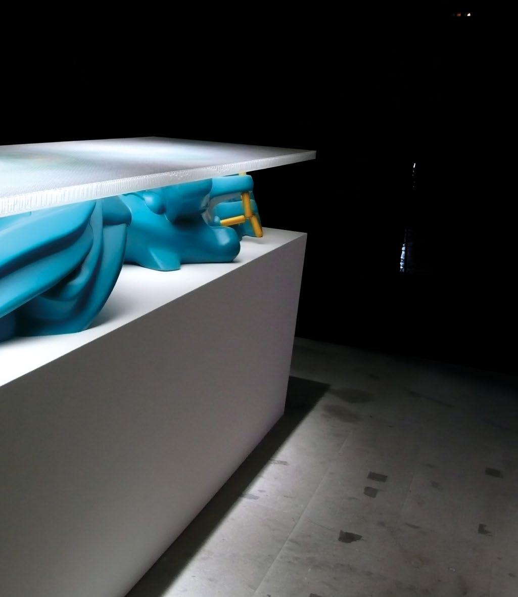
Greg Lynn first became internationally visible when he guest-edited the 2 Folding in Architecture issue in 1993 while teaching one of the digital “Paperless Studios” at Columbia University’s Graduate School of Architecture, Planning and Preservation in New York. Lynn’s work continues to be highly innovative, combining his interest in computational design and fabrication, robotics, and materials. Here, New York-based architect John Szot focuses on some of the objects from his industrial design portfolio.
John Szot
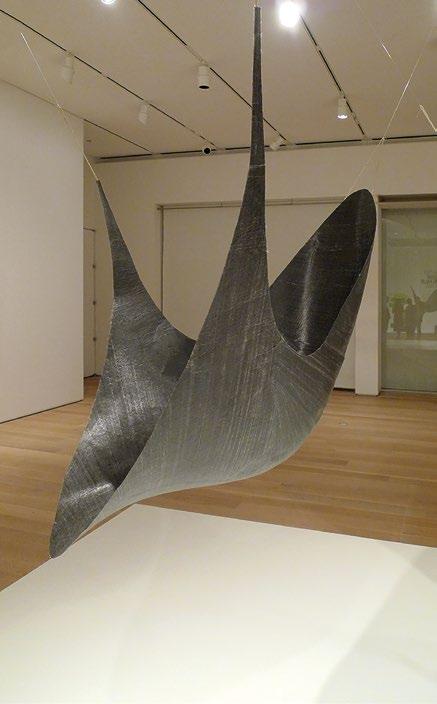
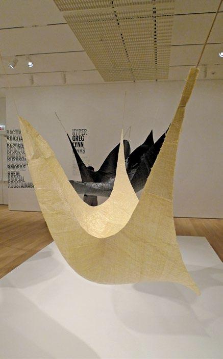
Greg Lynn needs no introduction to those who have been following architecture since the turn of the century. Synonymous with the parametric experimentation that arrived shortly after digital tech swept through the profession in the early 1990s, Lynn was at the forefront of the effort in the 2000s to establish a theoretical basis for the exotic, fluid geometries that flowed from architecture’s newfound computational prowess.1
Lynn’s dense ideological work has preceded him throughout his impressive career, which has touched almost every corner of the design industry. While architecture was the basis for launching his practice, his industrial design portfolio contains the majority of his built works, making it the best place to find physical evidence of the impact of his ideas. Perhaps it is because Lynn’s blobs and blebs2 are better suited for objects (as opposed to buildings). Regardless of the reason, attempting to encapsulate the career of someone as versatile as Lynn would be controversial and doomed to fail, especially considering he is still building his legacy. However, an insightful story about the relationship of Lynn’s work to technology emerges from looking at three items from his industrial portfolio out of chronological order: the 3Di Chair (2011), the Microclimate Chair (2016), and his Recycled Toy Furniture (2008). The story is only a fragment, but it sheds light on the nature of Lynn’s ideological project because it mirrors the evolution of technological experimentation and philosophical thought in architecture while paying homage to Lynn’s narrow genius.
Polemical Perches
The playful 3Di Chair is a sleek catenary form suspended in the air and rendered in spread filament tape, a proprietary product of industrial sailmaker 3Di. More swing than chair, the tensile forces describing its shape are also a declaration of how it works. This is possible by virtue of the extraordinary strength of the material employed, allowing Lynn to reduce the design to a single, elegant gesture. In this way, the chair is a reflection of high Modernism in its search for the perfect abstraction of utility and beauty unencumbered by other distractions, but with a slight exception. While the versions of the chair cut from slate-gray material have a dressed knife-edge along their perimeter, the one fashioned from a translucent off-white version of the tape has a rough edge of bristling fibers that bring its comfort into question. This subtle decision signals a shift in priorities from simple utility to an explicit message about the material science underwriting the work, consistent with Lynn’s reputation as a provocateur.
Lynn’s dense ideological work has preceded him throughout his impressive career, which has touched almost every corner of the design industry
Greg Lynn, 3Di Chair,
“Reimagining Mobility for Los Angeles” event, Petersen Automotive Museum, Los Angeles, 2018
opposite left : The elegant catenary-based form of the chair, originally designed in 2011, is a reflection of the tensile forces that provide the basis for its support.
opposite right : The natural-toned version features a ragged edge along its perimeter, which is an overt material statement that clashes with the effortless appearance of its dark-gray cousins.
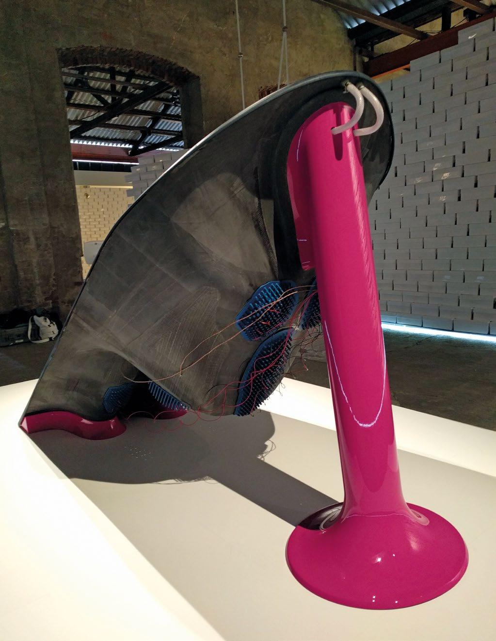
opposite : A rear view of the Microclimate Chair, showcasing the stark contrast between the carbon-fiber shell, the hotpink supports at head and base, and the unprotected electronic wiring dangling from the embedded thermoelectric arrays.
below : The chair, featured here in its own microclimate defined by a wall of shoe boxes. The thermographic display in the foreground allows viewers to witness the performance of the chair’s Peltier thermoelectric pads in real time.
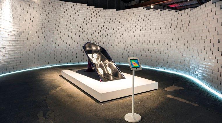
The Microclimate Chair, produced for Nike, is also informed by Lynn’s preoccupation with curvaceous shapes. But unlike the 3Di Chair, this piece contains overt technical components that Lynn managed with a notably different design strategy. Built to be a performance-enhancing lounge chair for athletes, it features naked arrays of Peltier thermoelectric pads embedded in the seat, back, and legs. The pads are able to cool or warm the body of the occupant on the scale of an individual pad, which grants the chair an uncanny ability to fine-tune body temperature for optimum recovery from strenuous athletic activity. The dark-gray carbon-fiber body of the chair is a seamless fluid shape suspended between glossy, hot-pink plastic supports at the head and base. It tracks the contours of the occupant in a single gesture that also partially envelops them in order to reciprocate the efforts of the chair’s electric temperature-regulating infrastructure. The rectangular Peltier pads that generate this effect are embedded in the surface of the chair body and appear raw compared to the sensitive curvature of the seat, an effect that is amplified by the white silicone bezel that forms the interface between each pad array and the surrounding carbon-fiber shell.
These decisions suspend the components in a casual, emulsive relationship such that they can still be read independently and with poignant consequences. In its assembly, the chair recalls that branch of the late Modernist period in which building technology became an opportunity for didactic demonstration. Applied at the scale of an industrial design project, this approach compromises the integrity of the end product’s presentation in a way that might be endured by something as large as a building, but Lynn appears willing to accept the effects of these contrivances if it means the carbon-fiber form that plays surrogate to his technological agenda can remain conceptually inviolate.
Greg Lynn, Microclimate Chair, 2016
Lynn’s work has the quality of a fresh sketch where principles override practical concerns that threaten to dilute the argument he is pursuing in everything he does
Lynn’s Recycled Toy Furniture series completes our narrative from Modernist purity to Post-structuralist complexity in its ingenious meta-manipulation of plastic children’s toys. Originally presented at the 2008 Venice Architecture Biennale in which they were recognized with the Golden Lion, these pieces are constructed from large-scale toys produced via the roto-mold process. There are several pieces in the series, each using a different toy, and the toys employed in each instance are identical hollow plastic shells that are deftly manipulated by a secondary process of remilling and reassembly executed via CNC five-axis milling equipment. Lynn’s ingenuity lies in developing the means to recycle the toys in this manner, which results in an arresting composition of jumbled appendages recalling the work of body-horror auteur David Cronenberg or controversial artists Jake and Dinos Chapman. The rich layering of messages makes a potent conceptual statement where the whimsy of their colorful palette and bubbly shapes collides with the stern heroism of successfully recycling one of the most tenacious pollutants (plastic) and the saccharin pathos invoked by dismembered children’s toys. In an interesting twist of fate, the work resembles the kit-bashing popular with a later generation of designers that followed the parametric focus of Lynn and his peers, albeit unrelated on a philosophical basis.3
Greg Lynn, Recycled Toy Furniture, Venice Architecture Biennale, Venice, Italy, 2008
Several of the pieces from the collection contain enough visual information about their origins such that they project a palpable and poignant tension: the mindless joy evoked by the toy clashing with the repulsion one feels when encountering a brutally disfigured animal suggests the new digital tools responsible for these confections are both extremely capable and dangerously indifferent to the tasks to which they are assigned.
Waxen Wings
Between these three objects from Lynn’s furniture portfolio we see an ideologue wrestling with one of the questions that has nagged architecture since industrialization: what is technology’s role in design? At the start of his career Lynn positioned himself as the designer with the latest answer to this intractable question. However, the straight line between technology and design he was pursuing has become blurry in the physical experiments he has conducted since. The heaviest-hitters in architecture’s cadre of theoreticians sometimes find themselves in the unenviable position of having to fill a challenging prescription in their work due to the high expectations set by their writings. Lynn belongs to this club, so in order to fully grasp the value of his work one has to sidestep obvious questions of utility and comfort to capture the didactic lesson they offer. Lynn’s work has the quality of a fresh sketch where principles override practical concerns that threaten to dilute the argument he is pursuing in everything he does. This might clash with the traditional model for a design practice, but luckily anti-heroes are fashionable at the moment, and while it might be possible to argue that Lynn is actively making progress toward the social and experiential harmony suggested in his writings, it could also be that his willingness to prioritize experimentation over utility will yield his most valuable contributions to design culture regardless of how far he strays from Vitruvian orthodoxy.
And our world will be richer as a result. 2
Notes
1. Greg Lynn, Animate Form, Princeton Architectural Press (New York), 1999; Greg Lynn, Folds, Bodies and Blobs: Collected Essays, La Lettre Volée (Brussels), 1998.
2. Greg Lynn, “Machine Language,” Log No. 10, 2007, p. 63; see also various course syllabi from Lynn’s academic career between 1999 and 2001.
3. See Mark Foster Gage, “Killing Simplicity: Object-Oriented Philosophy in Architecture,” Log No. 33, 2015, pp. 95–106.
Text © 2025 Axiomatic Editions. Images courtesy of Greg Lynn, FORM
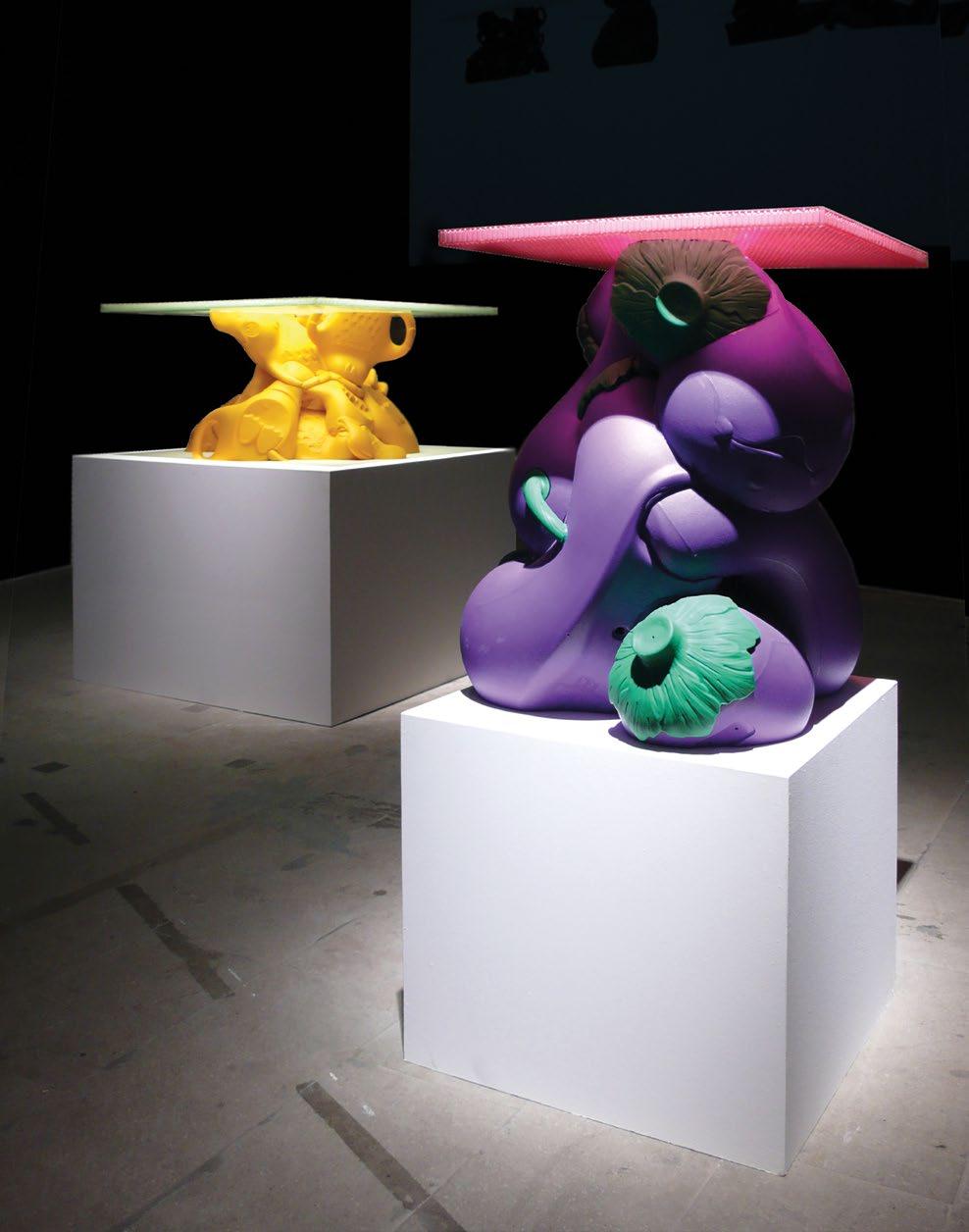
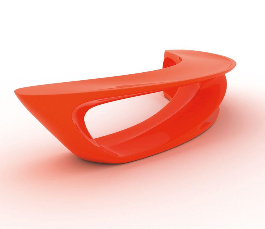
William Richards
Benches The Serial Drift of Amanda Levete

Can Be More Than Benches
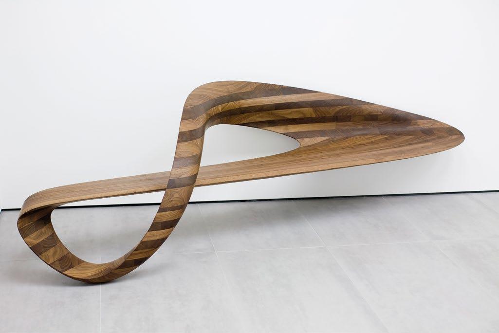
AL_A, Drift (fiberglass), 2006
opposite : The Drift bench’s parti is a line that has been gently pulled in one direction, and completed in a myriad of materials to different effects.
AL_A, West, Around the Corner, 2008
above : West (pictured) and North were part of Levete’s showcase of Established & Sons pieces that nestled into corners as “consoles— for keys, and for letters that arrive.”
As a partner at Future Systems, and founder of her subsequent firm AL_A, Amanda Levete has designed some of the most recognizable buildings in recent architectural history, including the extension to the Victoria and Albert Museum in London, and the Museum of Art, Architecture and Technology in Lisbon. As with her built works, her furniture designs seek a narrative of function and form. Writer and editor William Richards talks to her about her inspirations and design proclivities.

In 2006, architect Amanda Levete debuted Drift, a bench she produced for the upstart furniture company Established & Sons, which is now fully established after two decades and a longtime client of Levete’s. The bench is bowed and, at nearly 9½ feet (about 3 meters) long, doesn’t curve so much as it cossets. In section, its main supports are elegantly torqued to create two enormous cavities, revealing the minimum quantity of material to raise its seat off the ground and support the lateral forces of the sitter or sitters: sitting or lying, slouching or sleeping.
The organic form Levete gave Drift is pleasantly familiar at first glance with the same delicacy of sinews and ligatures that are as seamless, optimal, and essential as any scalpel would uncover in an autopsy. At second glance, Drift is obviously a bench with a clear top and a bottom, but Levete doesn’t seem to be prescriptive about orientation as one must be with, say, a chair—the classic design challenge that, for many designers, might seem more testing than almost any other sort of brief.
“The chair is the most difficult thing to do, which is why I do benches,” says Levete, who has completed three other pieces for Established & Sons—two other benches and an occasional table called Around the Corner for odds and ends in an entry hall. “The chair is complicated for all those reasons—the ergonomics, the balance. A bench or a table is much easier to do without constraint.”1
Levete produced several versions of Drift, in fiberglass at first, followed by marble, wood, and concrete. Its origin, she says, is a single line that has become slack and drifted backwards. Identical in their shared form, the Drift benches are formidable presences despite their obvious delicateness, or even despite the parti of a single, sinuous line drifting into space. When seen as a series representing a single form repeated in different materials, Drift suggests more than its function as a place to sit or an object that participates in design canons. It suggests its own strategy—its own coherent set of rules and tactics—bringing it closer to the realm of architecture and away from that of furniture.
Functionality, Above All
Furniture is suggestive of functions and purposes in the same ways that buildings suggest realms of possible uses, which is probably why lots of architects design furniture. There are no deeper pathologies or latent tendencies at play here, and nothing in the Myers-Briggs evaluation that would explain why architects might be interested in designing furniture. It is occupational and fundamental, and from the spoon to the city, it is a kinship. All architects will tell you about chairs they designed in school—or even, wistfully, the chair they designed. However, a much smaller number have gone on to incorporate furniture design in their own practices—for clients, for provocation, or even just for themselves. Despite this kinship, furniture is also specifically suggestive of human functions and purposes in ways that architecture is not (cat towers and dog houses notwithstanding). This is probably why we anthropomorphize chairs, tables, beds, and armoires to have legs, feet, arms, headboards, and backsplats. It used to be that cabinetmaking was the gateway to designing sofas and sideboards—the geometries and massing of a good cabinet being sufficient training to design nearly anything. Thomas Chippendale and Duncan Phyfe both apprenticed as cabinetmakers, as did George Hepplewhite and Thomas Burling—all household names today as they were in their day, and all arguably qualified to draft plans for a bank or a home. Yet, none did so in any productive way.
AL_A, Around the Corner, 2007
Sketching for her consoles, Levete looked to render what she calls “looped continuity,” the inevitable logic of moving around a fourwalled room.
AL_A, Drift (fiberglass), 2006
opposite top : Besides rapid production, the chief advantage of fiberglass is color, which carries its own symbolism when paired with the Drift form.
Conversely, Gustave and Christian Herter were both trained as architects in their native Germany, but they made a career stopping short of designing a building, and instead designed nearly everything that might go inside one. Conspicuously absent here is a commentary about architects such as Gerrit Rietveld, Victor Horta, Le Corbusier, Frank Lloyd Wright, Auguste Perret, Louis Kahn, Alvar Aalto, Eero Saarinen, or Mies van der Rohe. (This is an unofficial and inexhaustive list because it would obviously take up too much space to cite the number of Modernists who created both furniture you could sit on and environments you could sit in.) For all of these names and more, there is a fluidity to the training and practices of furnituremakers and architects; they sit tête-à-tête, facing different figurative directions and each other at the same time, locked on the same issues like structural integrity, or the same obsessions with the hows and whys of function and form.
Amanda Levete, CBE and recipient of the RIBA Stirling Prize, trained at the Architectural Association (AA) in London, and apprenticed as an architect with Richard Rogers before co-founding her first firm Powis & Levete in 1985. In 1989 she joined Jan Kaplický as a partner at Future Systems before starting her own firm AL_A in 2009. AL_A has completed commissions including the BSkyB Media Campus in London (2016), two college buildings for Oxford University (2021), and a Maggie’s cancer care center in Southampton (2021)—all plumb jobs that have the potential to transform their contexts in addition to advancing a singular design treatise. Levete has also worked on a range of furniture types in different materials, from a Swarovski crystal light to laser-cut tables and chairs for Moroso at the Victoria and Albert Museum, to restaurant trolleys in carbon fiber and a Corian seafood bar.
On balance, Levete has devoted more time to work under the conventional architecture vertical than the furniture vertical, but when it comes to the generative ideas that unite the two, it is not about balance, but about pursuing what she calls a “narrative” about function and form—design that has purpose to support an activity rather than merely purposeful design activities. “The furniture I have done is not mass produced. It’s a way for me to push the limits of a material in the way you don’t have the latitude to in a building,” she says. “I think one of the reasons I don’t seek to do [more] furniture is because, for me, as an architect, the idea behind something is so central. I find it difficult to make decisions if there isn’t a strong narrative, or a notion behind something, because you can’t always invest a piece of furniture with that.”
AL_A, Drift (marble), 2006
opposite middle : The marble version of Drift was the riskiest of the series, as subtracting too much from the marble, and compromising the bench’s structural integrity, could have resulted in a costly error.
AL_A, Drift (concrete), 2006
opposite bottom : Drift in concrete is the only one of the series intended for outdoor use—a flat seat prevents rainwater from pooling.
Enrichment is Levete’s chief interest when it comes to furniture—separate and apart from some other motives that, say, Eero Saarinen might have had when devising his 1948 Womb Chair (was it Jungian or merely comfortable?) or Charlotte Perriand might have had when devising the 1953 Tabouret stool (a perch for milking or cocktails?). These are the pools and eddies of creating, no matter the medium, which are connected in ways that are sometimes hard to categorize, are suffused with personal motivations, and refined by the individual’s skill. Don’t call it art, though. Not for Levete. “I do not think about furniture as art,” she says. “For me, there is a distinction—and it’s all to do with functionality.”
In a world of half-broken things—count how many exist in your home, for instance—it seems as if the functionality Levete heralds is the same thing we should celebrate as the ultimate cause of design. What better way to do that than to re-create that functional thing repeatedly in a serial fashion?
Seriality, Across It All
Seriality is the common language that unites all designers, whose benches, lithographs, or architectural iterations are related arguments that advance a single theory. Levete’s “Drift” theory drifts into Guy Debord’s dérive—the “line” of the bench she describes is as capricious as it is principled.2 When repeated in marble, wood, concrete, or fiberglass, the line becomes set— the once experimental journey of a drifting line becomes praxis. The benches speak less about their singular form and more about a set of rules that can apply to lots of materials—why stop at marble, wood, concrete, or fiberglass? This is not the same as repeatability or replicability—copy after copy, uniform in their fidelity. Seriality’s power comes from its paradox of sameness and difference.
Looking at differences, then, the marble Drift was a collaboration between Levete and carvers who knew, she says, precisely how much material they could subtract from the block without compromising its integrity. It is perhaps the most improbable serial version to our eyes—how could that marble possibly be carved to such thinness. But that is the point of this iteration, to draw attention to its making as well as its form. “It’s knowledge handed down over generations and the intuitive sense the stone carvers have for the material,” she says. “They know how far you can push the material and how you can finesse the line to catch the light.”
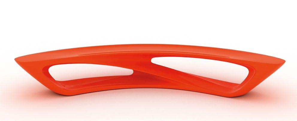
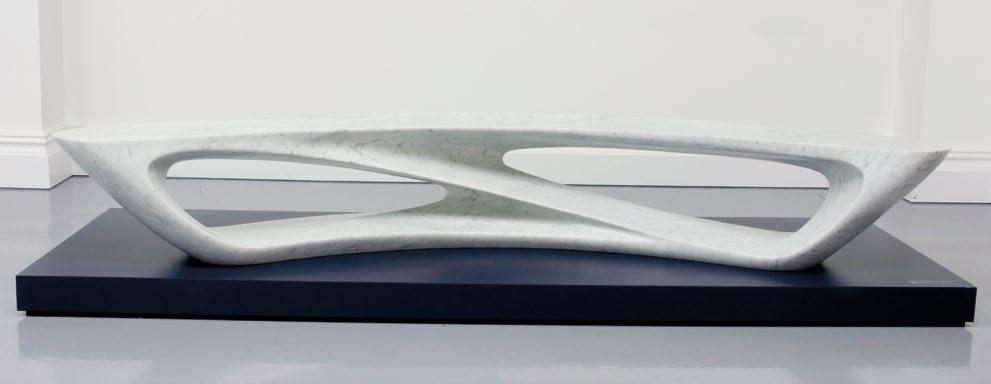
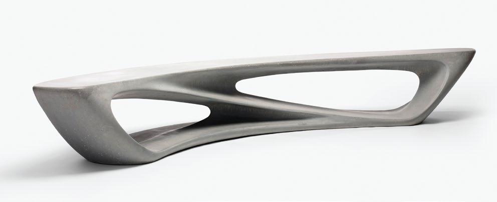
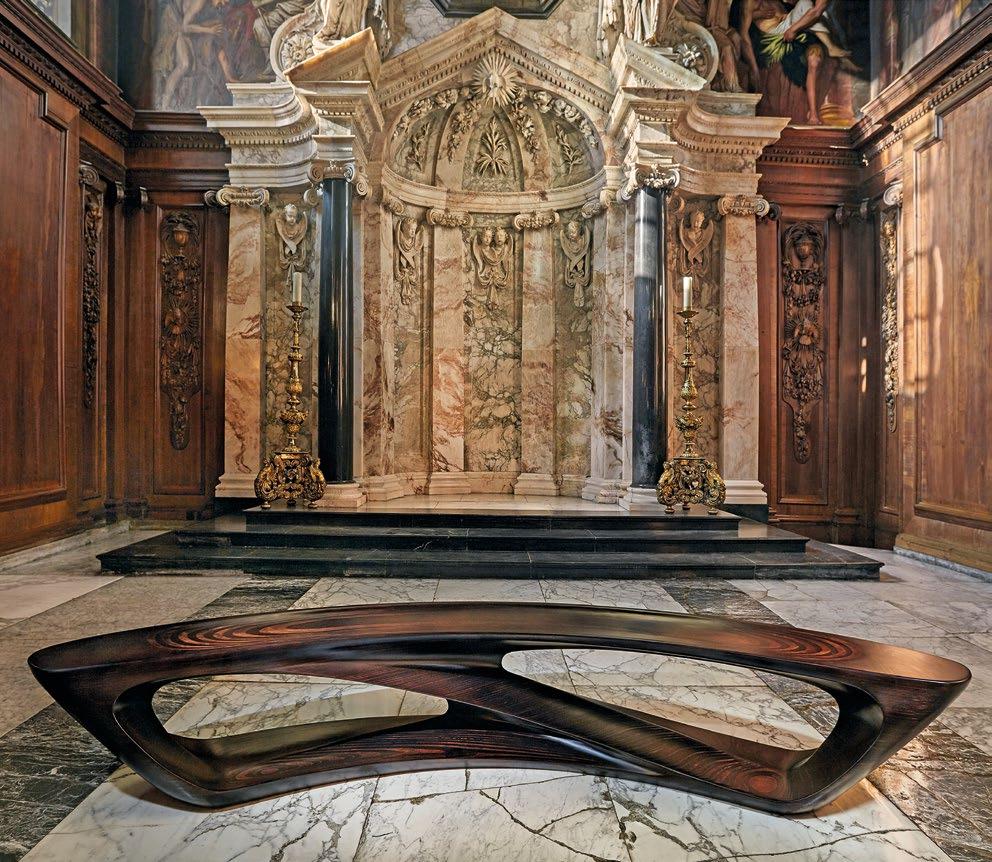
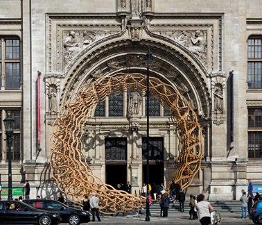
The timber Drift is the most unusual serial version—not because wood cannot possibly be delicate, but because the piece remains graceful while also possessing the same massing as a room’s midbeam or a forgotten bole felled in the forest. The twist here is that it is layers of plywood that have been assembled and stained—not quite a bait-and-switch, because plywood can certainly be elevated to fineness, but a knowing wink for anyone who closely inspects it. Its distant cousin in AL_A’s oeuvre is the red oak Timber Wave, which Levete and her team installed in time for the 2011 London Design Festival around one of the entrances to the Victoria and Albert Museum. The entry pavilion, completed in collaboration with Arup, the American Hardwood Export Council, and Cowley Timber, was up for just a month, but it perfectly expressed the vitality that parametric modeling could deliver—here a layered, helicoidal grid—with the familiarity that timber could represent. Drift was born of the same process as Timber Wave but with considerably less anxiety for Levete. “We didn’t do any stress tests because we didn’t have to,” she says. “We just knew it would work.”
The concrete Drift is the most provocative, a commentary, perhaps, about concrete’s quickness, cheapness, and ubiquity, but rendered in a way that obviously took time to consider, certainly isn’t cheap to purchase as a finished piece, and is a singular expression of an everyday material that one might truly covet. It is also an outdoor bench, not an indoor one, says Levete, which is why the seats are flat rather than slightly indented so that rainwater doesn’t pool. This deviation in form is subtle but privileges functionality ever so slightly above form. It is not the only deviation in the series, though. Levete’s fiberglass versions come in a range of colors—added dimensions that suit different tastes. (In black, Levete says, “it’s not just about switching materials, it’s about switching an ambiance,” which is also
AL_A, Drift (plywood), Make Yourself Comfortable at Chatsworth, Chatsworth House, Bakewell, Derbyshire, England, 2015
opposite : Drift combines the grace and heft of solid timber, but upon closer inspection Levete’s use of stained plywood is a wink to the Modern tradition of furniture making, as well as the time-honored practices of prototyping.
AL_A, Timber Wave, Victoria and Albert Museum, London, England, 2011
left : A distant cousin to her earlier Drift experiments in plywood, the red oak Timber Wave was designed by Levete and installed temporarily as an entry pavilion to the V&A.
certainly true of dayglo orange or bone white.) In canary yellow or barn-red fiberglass, Drift might double as a commemorative ribbon. In black or brown, it could be entwined bootlaces. In green, a palm frond at Easter.
The fiberglass Drift—the first in the series—is the most expected of the serial versions because of its material. Fiberglass makes sense for this form. We are used to seeing fiberglass shaped and contorted in lots of ways, molded to whim and whimsy, and pressed into service as a durable and reliable material. In fiberglass, our expectations of heft do not register as immediately—if at all—as they do with concrete, marble, or wood, and so the “softness and the cut-outs” that Levete herself signals as the form’s main attributes make the bench as easy to physically move as you would expect.
The other piece in the Levete universe that is remarkably easy to move is a fiberglass table that seats 20 people in her own home in London (paired with Gio Ponti chairs). As with the fiberglass Drift, its lightness does not belie an imagined heft thanks to its sheer size, but rather becomes instantly understood. The bench and the table seem light, and we are rewarded with an easy lift if we decide to move them around.
It is the same reward of functionalism, too: a building designed around its purpose with materials suited to a purpose will fulfill that purpose. The greater spoils, as Levete notes, can be found in the realm of the narrative—Drift is not just a functional seat, but in its serial versions proof that you can ask more of a bench. 2
Notes
1.
Les Lèvres Nues, 9, 1956, pp. 6–10.
All Amanda Levete quotations are from a conversation with the author on November 25, 2024. 2. Guy Debord, “Théorie de la dérive,”
Text © 2025 Axiomatic Editions. Images: pp. 90, 92, 95(t), 96 © AL_A; p. 91 © Photo by Mike Goldwater; p. 95(c) © Mark O’Flaherty; p. 95(b) © Peter Guenzel; p. 97 © AL_A, photo Dennis Gilbert
Doodling with a Jigsaw
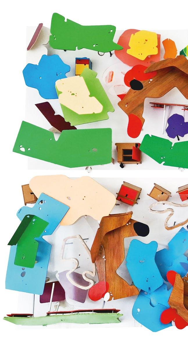
Eoin Shaw
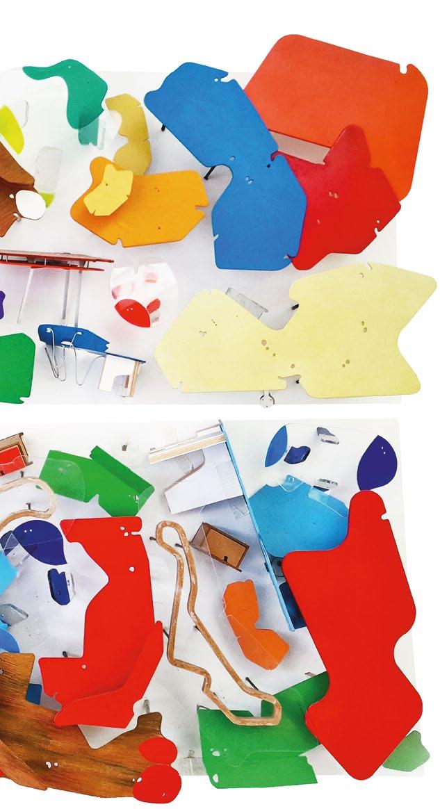
CRAB Studio’s Turning of the Tables
CRAB Studio, Models of CRAB tables, 2021
Models of the Bond Table, Vienna Table, Club 360 Lollipop Table, and AUB Innovation Hub CLT Table on display in the CRAB office.
Designed to be individual or infinitely clustered and reconfigurable, the instantly recognizable cheerful tables of CRAB Studio often populate the practice’s architecture as well as their own studio. CRAB designer Eoin Shaw describes their history and deployment, continuous development and experiment, looking also at the studio’s Hong Kong street furniture—all part of the extended family.
Blobby. Curvy. Nibbled. Weird. Fun. Islands. Meandering. Organic. Colorful. Wayward. Distractions. Twisting. Turning. Drifting. Strange. Just some of the words used to describe CRAB Studio’s furniture, the making of which has more in common with play than with traditional design methodologies. Reactive, loose, and joyful, the process is rooted in handmade making and thinking without any particular set philosophy.
Jigsaw Doodling
CRAB’s practice began with making a table. In 2006, Peter Cook and Gavin Robotham had just gotten a small office in London, and they needed a table. They didn’t have much money, nor too much time to indulge, so the table needed to be easy to make. No complicated legs, or joints, or materials. But it still had to hold the ambition and joy they had for design.
They recalled the coffee table that was in Peter’s office at the Bartlett School of Architecture, University College London (UCL). It was DIY, in an odd and impactful little shape, and so they decided to revive and refine it. They added some extra touches,
tweaking the surface with circular cut-outs, 1 inch (25 millimeters) in diameter originally. These “beauty spots” could be used to thread through cables, or to suspend small pencil-holders, or could simply be gazed at, letting the eye easily float across the table.
They had made a table in a shape that was hard to pin down. Its meandering outline could have been an island, maybe some greenery, bacteria, a puddle, or perhaps a splat. But it was none of these things. It was just what it was, it was just that.
Made by hand in the studio on the first day, the table set the energy, character, and direction of CRAB—a practice willing to indulge just long enough in the surprise and peculiarity of form and all it can bring, paired with a pragmatic and un-intellectualized approach to material and making.
The table still exists in the office, where it has since been reformed a few times with a jigsaw, gained five different layers of paint, pencil marks, and scalpel cuts on top, and been given some new rolling legs. This is a common theme in CRAB tables. The studio’s office tables have all been reused, reshaped, and rearranged many times over.
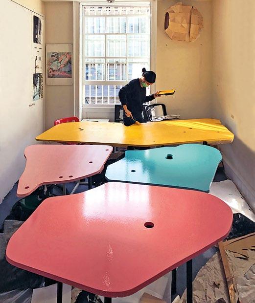
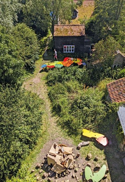
Another table the studio made for a convention at the Excel London exhibition center in 2011 has since been on a 10-year journey. From the Excel, the sprawling, colorful Welcoming Island Table was moved to the first-year floor at the top of the Bartlett where it became a home for tutorials, presentations, meetings, sunrise breakfasts, and a shared studio for all kinds of work. Following nearly a decade-long stint in the memories of the Bartlett, it moved to its new home as a host for large dinner parties in Norfolk.
The reason for this easy reuse is the table’s simple DIY origins. Its making is closer to sketching than fabrication; it is loose and instinctual, as if doodling with a jigsaw, twisting and turning around the meandering ribbon outline. This sketch-like approach to making means it is cheap and easy to adjust, and its quick creation stops too much over-rationalization; it prevents the furniture from being bogged down in self-important meaning. There is also an inescapable joy and frivolity in its making, which continues into and is evident in the finished table.
CRAB Studio, Office tables, London, England, 2018
above left : Office tables being repainted after some jigsaw adjustments. Every few years the tables are rearranged, re-cut, and repainted as the office changes shape.
CRAB Studio, Welcoming Island Table, Norfolk, England, 2023
above right : First made for a design expo at the ExCel London exhibition center, the Welcoming Island Table is here set out for an office dinner party, with some elements repurposed as benches.
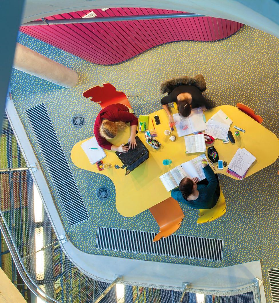
CRAB Studio, Vienna Tables, Departments of Law and Central Administration, Vienna University of Economics and Business, Vienna, Austria, 2013
Students studying around a cluster of Vienna Tables, which sit on a mezzanine above the library at the CRAB-designed Departments of Law and Central Administration.
Ambiguous Use
As an object, the Welcoming Island Table is slightly bewildering, and disarming enough that there is no straight and narrow path on how to use it. It has no clear hierarchy, no exact places or orientations to sit. Eyes drift across the undulating outline, darting from nibbles, to notches, to the small circles and associated blobs that punctuate the surface.
In 2013, CRAB designed the architecture, interiors, and furniture for the Departments of Law and Central Administration at Vienna University of Economics and Business. The amorphous form of the studio’s Vienna Table, with its carved-out nooks, allows students to work and study together, while isolated pockets off to the side provide a place to gather their individual thoughts and materials. The form thus allows for the fluid separation of function.
In “Queer Use” (2018), Sara Ahmed discusses use, both intended and unintended (a wrong use, an odd use), how use is often an instruction, how it is employed to maintain social boundaries and order, and how it can be “a restriction of possibility.”1 The Vienna Table, through the oddity of its form, dissociates itself enough from any limited category. It is neither just a hierarchical rectangular table, nor is it just a collaborative circular table. The meandering amorphous curve removes as much intended use as possible. There is no correct way to sit at or around it; only unintended/wrong/queer uses.
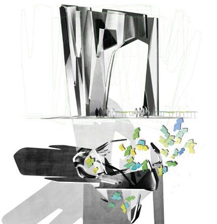
Beyond the Object: A Tool of the Architecture
Furniture is a key part of how CRAB considers space in its architecture. It can be considered as a spatial gesture, a small, simple, affordable act offering enough peculiarity to completely change how we respond, move, act, talk, and gaze within a space. Instead of reading the space, one reads the tables. They control and warp the space they inhabit, creating a complexity that is otherwise expensive and time-consuming to execute in the walls, floors, and ceilings.
When designing the Abedian School of Architecture for Bond University on Australia’s Gold Coast (2013), CRAB extended the complexity and possibility of the architecture through the tables. Scoops, railings, cupboards, ceilings, walls, roofs, furniture; all these elements together become a connected ecosystem that is the architecture of the school. This ecosystem, however, is not dogmatic. Instead, each element is slightly ambiguous in intention, and so suggests rather than instructs. This suggestion is key to encouraging students and teachers to keep questioning, to not lie back on assumptions even if they are as simple as how to lay out the tables.
A concept drawing makes clear the relationship between the scale of the scoops—the main motif of the architecture—and the tables. In plan, the tables are scattered around the scoop. Some clusters remain in the curves of the scoop, nestled into the towering concrete corners. In the center, others encircle an open space, mirroring a small chunk of scoop opposite. This clearing in the tables might be for a presentation, or a group workshop, or could work simply as a studio space within the drama of the scoops. Outside the scoop, some tables stick near to the outside edges, a space that enjoys the scale and embrace of the form while being more secluded. Other tables appear to spill out, bursting into the open space the scoop loosely surrounds. They twist freely, and join together at different angles and in different pairings, creating the impression of the channels between archipelagos, the winding rhythm of streets and squares in old European towns, or clearings in a forest with desire paths darting out in all directions.
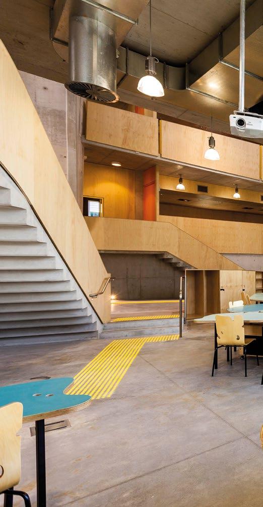
CRAB Studio, Bond Tables, Abedian School of Architecture, Bond University, Gold Coast, Australia, 2013
opposite : Conceptual drawing made to explain the relationship between the sculptural scoop elements that are the main architectural motif of the scheme, and the people and tables that fill the space around and within them.
below : The meandering clusters of the Bond Tables, part of CRAB’s design for the Abedian School of Architecture, here a part of the studio spaces where they could also be easily rearranged for tutorials, presentations, and group work.
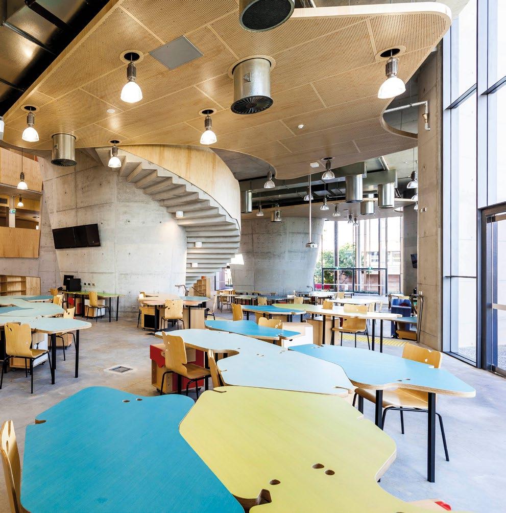
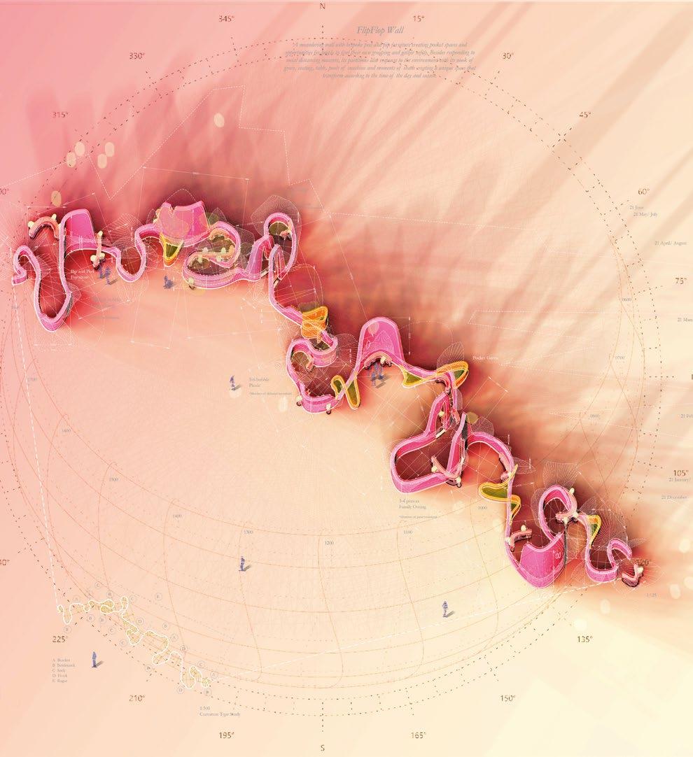
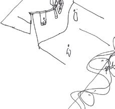
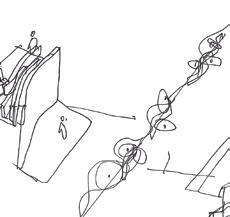
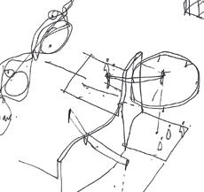

Joyful Curves in the Face of Standardization
CRAB’s curves have expanded since that early fun with a jigsaw. The nobbles and notches have been scaled down to become the practice’s logo, and scaled up to form their building, landscape, and city plans. Rather than a style or type with rules and order, they work more like a language that is learned through immersion, constantly working with hand sketches and models.
A pure expression of this is the Flip-Flop Wall that CRAB designed in 2021 as a piece of street furniture scaled up to the length of a 985-foot (300-meter) street for the public realm of Kai Tak Sports Park in Hong Kong. A curve wobbles in and out, working as a transition between two different levels, and between the scale of stadium crowds that hurry past in their thousands and that of daily life. The flip-flop of the wall-like bench carves out seating, quiet corners, and communal squares along its run. Its undulating elevation creates points of privacy and peeking through, a continuation of the unraveling of the interruptions to the table’s edge, but now interrupting the straight lines and standardized panel façades of its site.
CRAB’s work is often born out of a reaction to standardized design. The original table reacted to another white box room, and the Flip-Flop Wall to the lack of character in the contemporary public realm of commercial Hong Kong developments.
In 1929, the early Modernist Eileen Grey and critic Jean Badovici summed up their feelings toward such standardization in a dialogue titled “From Eclecticism to Doubt,” which outlined their entangled concern, hope, and disappointment in the
CRAB Studio, Flip-Flop Wall, Kai Tak Sports Park, Hong Kong, 2021
opposite : Part of CRAB’s work on the Arts Masterplan for the sports park, the Flip-Flop Wall is a largescale piece of street furniture.
left : The street furniture design transitions between the higher and lower ground, and between the relaxed pace of daily life and the rush of the stadium crowds through the coves casually nestled in a ribbon-like curve.

direction of Modernist and functionalist design. Toward the end of the dialogue, Grey says: “The world is full of living references, living symmetries, difficult to find, but real nevertheless. Their [contemporary designers] excessive intellectualism tends to suppress what is marvellous in life … Their rigid precision has made them neglect the beauty of so many forms: spheres, cylinders, undulating and zigzag lines, ellipsoidal lines and straight lines in movement. Their architecture has no soul.”2
Today, contemporary design practice has become obsessed and consumed with and by standardization and all the rectangular forms within it. There is of course an important place for this, but there also needs to be a connection to Grey and Badovici’s “living references” and “living symmetries.” Rather than encouraging biomimicry, their intention was instead to encourage designers to look to the world: how people live, how they move, and the shapes the hand sketches when it isn’t intellectualizing every form. In the new absence of ordered ornament, they were calling for marvelous forms full of life that humans can connect with, that make us think about associations, memories, and our bodies as we navigate their curves, nooks, and beauty spots. This is how CRAB Studio began, using just a sheet of ply, some standard legs, a tin of paint, and a jigsaw. 2
Notes
1. Sara Ahmed, “Queer Use,”, Feministkilljoys blog, 2018: https://feministkilljoys.com/2018/11/08/ queer-use/. 2. Eileen Grey and Jean Badovici, De l’eclectisme au doute, Altamira (Paris), 1994, p. 5.
Text © 2025 Axiomatic Editions. Images © CRAB Studio
From Static to Dynamic Floating the Plane

Carrie Eastman
University of Arizona School of Architecture faculty and landscape architect Carrie Eastman writes about three simple timber designs by New York-based architect Andrew Skey, which, in the hands of the subversive artist, oscillate between the static and dynamic, making a transition from docile objects to floating planes—a tactic used by architect Carlo Scarpa and in the textile designs of Anni Albers.
Carlo Scarpa, Olivetti Showroom, Venice, Italy, 1958
The marble treads of Scarpa’s staircase seen from above, shifting in the horizontal plane.
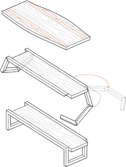
Does a single piece of wood offer limited or limitless possibilities? The response to this may depend on worldview, the pessimist stifled by the singularity of the material and the optimist liberated by purity.
Architect and designer Andrew Skey presents as the latter. He believes he can move freely among the design disciplines, and that there is no difference between making a tile-patterning system and a 30,000-square-foot building. The principles of design and the sensibility of the maker do not depend on scale. And between the scales of small and big exists an entire category of items.
Skey, Loop Table, 2019
left : Cut from a single piece of walnut, the components of Loop Table conceptually unfold and assemble into the tabletop and continuous loop ribbon.
below : The lateral shift of the tabletop is evident as it moves past the verticals of the looped ribbon.
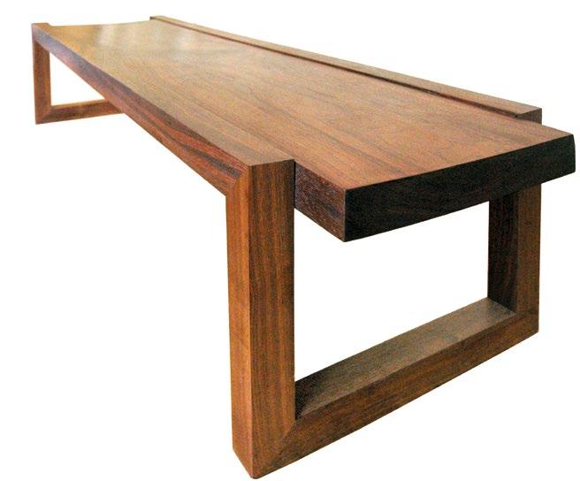
Andrew
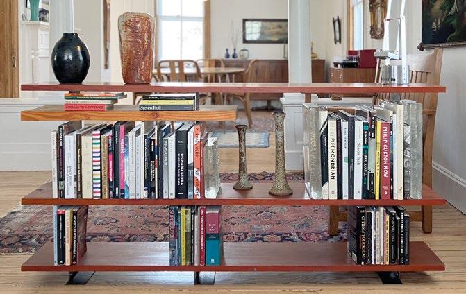
Equipment for Living
There is the equipment of buildings we humans occupy that is not essential for life but that makes life better. Rest your tired body on this cushion-covered platform. Come eat with me. Work here. Bed, dining table, desk—Skey has made all of these. But these aren’t the items of discussion today.
Instead, three pieces of equipment are foregrounded to demonstrate a specific trajectory in Skey’s work. All three, like the previously mentioned bed, dining table, and desk, start with a single piece of wood.
In the case of Loop Table (2019), that wood is thick walnut from which the two components—the tabletop and the loop—are cut. Conceptually, these components fold from the slab and assemble like a balsa-wood toy plane. The rectangular tabletop is heavy and dark in character and is supported by the loop, which appears as a continuous ribbon that runs beside the top, then turns down 90 degrees toward the floor. When the ribbon hits the floor, it turns inward to run the width of the board, at which point it turns up toward the tabletop where the sequence repeats, hence the loop. The parallel relationship of the tabletop to the floor does not vary in distance but there is a lateral shift; neither short edge of the top aligns with the loop legs.
This shift of a horizontal plane resembles elements of many projects, from the terraces of Frank Lloyd Wright’s 1937 Fallingwater that emerge into the southwestern Pennsylvania landscape, to the treads of Carlo Scarpa’s 1958 staircase in his Olivetti Showroom in Venice, Italy. It has been said that the marble treads of the showroom staircase appear to float, a phenomenon that counters the reality of the material, and an effect enabled by brass pedestals that cantilever the stone.
Similarly, Skey’s Float Shelf (2020) gives the illusion of hovering horizontal components (wood rather than marble) that are supported by metal (steel rather than brass). It comprises three Afzelia wood planks and a shorter, thicker piece of Douglas fir. Each piece of wood is punctured by 1/8 -inch thick vertical steel plates that fold when they hit the floor to become feet, and fold again to become surfaces on which the top shelf rests. The structure (vertical plates that are thin in elevation) is visually suppressed, as is the structure (the brass pedestals) of the Olivetti staircase. This contrasts with the structure of Loop Table, the walnut ribbon of which lands solidly on the ground.
Andrew Skey, Float Shelf, 2020
The structure is barely visible, giving the illusion that the horizontal wood planks are floating. Float Shelf, never pushed against a wall, both elevations meant to be seen, is an architectural element that divides space.
Because the steel plates of Float Shelf intercept the wood discreetly, there is no distinction between the front and back elevations. And because it is not sided, Float Shelf should not be pushed against a wall; rather it is a wall, an element dividing space. In elevation, the influence of the Germanborn collaborators and couple Josef and Anni Albers is evident, specifically the work of Anni, whose textiles often exhibit strong horizontals. That the ground plane at the Olivetti Showroom references mosaics by Josef Albers solidifies Skey’s connection to Scarpa and the Albers.1
Diagrams by Mies van der Rohe have also impacted Skey’s aesthetic. Mies hid the columns of his 1929 Barcelona Pavilion in plain sight, their reflective surfaces simultaneous with the reflective glass walls. Here, the beamless construction of Modernism “favors suppression of the frame,” so that the “illusion of levitation is strengthened by the uninterrupted planar continuity of the ceiling and floor.”2
The wood planks of Float Shelf are this ceiling and floor, and its levitation is similarly illusion; no component is truly hovering. In Loop Table, there is lateral shift, but that motion is contradicted by the grounded ribbon. These two objects, again, are the equipment of buildings. To expand the notion of what is permitted within these confines is to expand the realm of what is possible in design.
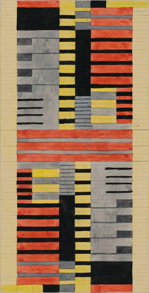

Equipment for Moving
The optimist with his range defies these parameters. Skey’s first built work in the early 1990s was a vertical half-pipe skateboard ramp in the backyard of his childhood home. But it is his second built work that is more relevant. In this split-level house, he burrowed into the attic to make a sleeping quarter and converted his bedroom into an indoor half-pipe ramp, albeit one with tight transitions, which began at attic height, spanned the length of the room, and moved up the opposite wall. He introduced motion to a space where it is not typically present.
Motion is not typically considered present in a cut piece of wood. Loop Table and Float Shelf gesture toward movement. With Board Skateboard (2022), things change. Around the time he built the indoor ramp, Skey screwed wheels and trucks on a simple board and rode it. He started doing this again several years ago.
To get his wood constructions to move, he pared them down rather than building them up. In Board Skateboard there is no tricky illusion or concealed structure. It is not fancy or finicky. It is not sculpted for feet or aerodynamism. The edges are not filleted. The back does not turn upward for any kick. It is just a maple board. There is a
Text © 2025 Axiomatic Editions. Images: p. 108 seier+seier. Creative Commons Attribution 2.0 Generic license; pp. 110–11, 113 © Andrew Skey; p. 112 © The Josef and Anni Albers Foundation / Artists Rights Society (ARS), New York / VG Bild-Kunst, Bonn, Photo © President and Fellows of Harvard College, BR48.47
rectangular piece of grip tape on the top, inset from the edges. It is simple, pure, and styleless.
There is nothing to it, yet it is completely unexpected. There have been many instances of people on the street stopping Skey with board. One time, Skey was riding his Board Skateboard through New York’s Union Square when street skateboarder and artist Mark Gonzales called out: “I really like that board.” Skey thanked him and kept going.
Many choices are made even when a finished product gives the impression that there are none. Material is selected with intention. The heaviness of wood appears static, and this staticity is teased by Loop Table and Float Shelf and contradicted by Board Skateboard. But hints of vitality are present the moment the grain of the material is revealed as an active component. Every piece of wood is the memory of a living, growing, sentient tree, knots revealing the character of branching, grain revealing how the tree lived and lost its life. And in this, it possesses the possibility of wild dynamism. 2
Notes
1. Maria Antonietta Crippa, Carlo Scarpa: Theory, Design, Projects, MIT Press (Cambridge, MA), 1986, p. 157, quoted in Kenneth Frampton, Studies in Tectonic Culture: The Poetics of Construction in Nineteenth and Twentieth Century Architecture, MIT Press (Cambridge, MA), 1995, pp. 299–300.
2. Frampton, Studies in Tectonic Culture, p. 177.
Anni Albers, Design for a Silk Tapestry, 1925
opposite : Horizontal lines, often present in the work of Albers, dominate this textile study in black, yellow, and red.
Andrew Skey, Board Skateboard, 2022
above : The designer photographed himself while riding his Board. A soap finish maintains the true tone and texture of the maple plank.


Todd Gannon


All Part of the Game


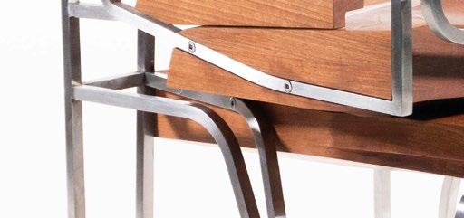
Classics, Conventions,


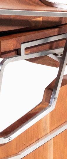

and the Curious Case of
Oyler Wu Collaborative




Architects Dwayne Oyler and Jenny Wu have a long history of architecturally blurring the boundaries between inside and out, void and mass, and between wall and furniture. Oyler Wu Collaborative’s furniture pieces, like their buildings, are formal symphonies of varying degrees of enclosure—multilayered cornucopias of material and jointing techniques. Todd Gannon, Professor of Architecture at The Ohio State University’s Knowlton School, investigates some of their recent creations.
The most striking thing about Oyler Wu Collaborative’s portfolio of custom chairs, tables, cabinets, and other curiosities is the way each piece conforms to and confounds conventions established by more than a century of architect-designed furniture.
Before You Begin
“Classic designs have less to do with style or period than with a solution of a defined problem,” proclaimed the AustralianAmerican designer Clement Meadmore in his 1979 study The Modern Chair. “Through a combination of practical qualities and elegance, [they] have transcended the confines of time and fashion.”1 The Olympian tone here is perhaps a bit much for 21st-century ears, but it jibes with the sort of talk that has attached itself to high-stakes furniture design since at least the nineteen-teens, from De Stijl pioneer Theo van Doesburg’s paeans to “the abstract-real sculpture of our future interior”2 to the breathless copy of today’s interior-design glossies.


Oyler Wu Collaborative, Jack and Jill chairs, 2023
The chairs mirror one another while maintaining subtle variations. When not in use, they interlock into a single prismatic form reminiscent of Oyler Wu’s recent architectural designs.

And yet, there seems to be something to all this bluster. Look again at Mies van der Rohe’s elegant couch (1930), Charles and Ray Eames’s timeless lounge chair and ottoman (1956), or Greg Lynn’s saucy Ravioli chair (2005).3 These are iconic, even classic objects, self-contained wholes “that stand free and clear in space,” as that other De Stijl pioneer Gerrit Rietveld insisted they should,4 imbued with the sort of presence that allows them to take command of almost any interior. Yet when we encounter them in situ—snapped to the grid, as Mies’s Farnsworth House (Plano, Illinois, 1951), positioned just so at the Eames House (Case Study No. 8, Los Angeles, 1949), or mewing like a starlet at Lynn’s Bloom House (Los Angeles, 2010)—they seem to stand a little less free and clear than they do on their own. Indeed, classic pieces installed in spaces designed by their authors always appear to have been recast in supporting roles. Triumphant solutions of defined problems or not, they are compelled by the still-powerful legacy of the 19th-century Gesamtkunstwerk to cede the spotlight to an immersive architectural milieu to which they are, undeniably, subject.


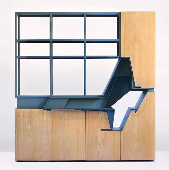
Objective
Dwayne Oyler and Jenny Wu operate differently. Though the studio often aims to produce objects that stand free and clear in space like the icons of the previous century, they never design furniture as accessories to their architecture. They design furniture as avatars of it.
Now entering their third decade in practice with an impressive portfolio of completed buildings ranging in scale from residential additions to high-rise towers, Oyler and Wu have yet to relent in demonstrating with every commission their drive to do more than strictly called for by the task at hand. Thus, most of their furniture is better described as “furniture” with scare quotes to signal an ever-present ambition to exceed conventional expectations. As such, none of this work can accurately be described as iconic or classic. The architects harbor no aspirations to the commercial showroom and refuse to submit to the vulgar compromises of efficient mass production. As Oyler quips, “We like to do things the hard way.”5
How to Play
A pair of children’s chairs provides an initial case in point. At first, the Jack and Jill chairs (2023) present themselves as a single rectilinear prism, a little more than double its width in height, loosely defined by thick slabs of wood suspended in a tangle of stainless steel. Tug at the steel in just the right spot and the assemblage slides apart, liberating an upper chair that may then be flipped over and placed in dialogue with its twin. Flip it back, align the armrest, and the system slots back together with a satisfying click.
Like much of Oyler Wu’s furniture, Jack and Jill echoes the Modernist frame-supporting-planes template Rietveld pioneered with the Red Blue Chair (1917), Dutch architect Mart Stam distilled to its essence with the s33 chair (1926), and American industrial designer David Rowland stacked with prismatic efficiency with the 40/4 chair (1964).6 At the same time, the architects turn modern orthodoxy on its head, subverting Rietveld’s cool abstraction as well as Stam’s sober efficiency, reveling instead in the rich texture of lacquered cherry and drawing, with thin steel bars, looping figures that recast Rowland’s nested chevrons as an oversized, three-dimensional puzzle.
Oyler Wu Collaborative, Active Inlay display cabinet, 2016
Like many of their custom furniture pieces, the cabinet was fabricated by the architects in their Los Angeles studio.
Oyler Wu Collaborative, Cheng coffee table, 2023
Inspired by earlier Active Inlay experiments, the Cheng coffee table is constructed of interlocking elements that convincingly stand alone when disassembled.
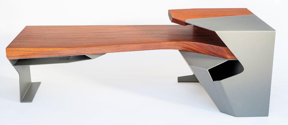
Oyler Wu choreographs a similar interlocking tension of metal and wood in a series of experiments they call Active Inlay (2016–). In these, the architects draw inspiration from a long history of ornamental techniques common in woodworking and the decorative arts, but to explore the hidden masses concealed beneath the flush surfaces of traditional inlays they appear to draw more decisively from the field of dentistry, where complexly three-dimensional inlays crafted in ceramic, porcelain, and precious metals are nested into the equally complex geometries of natural teeth. And as with Jack and Jill’s subversions of modern shibboleths, Oyler Wu refuse here to merely replicate the sources that stir them. Whereas they always execute joinery with a dentist’s precision, they usually stop short of flush transitions and instead leave figured gaps between materials. In the Active Inlay display cabinet (2016), metal erupts from the face of the piece with dramatic angularity, opening a layered cavity in an otherwise restrained vertical surface and making emphatically clear that sculpted space is as significant a compositional component as any of the solid materials the architects fashion with such care.
The Cheng coffee table (2023) raises similar questions about abstraction and efficiency as it blurs time-honored distinctions between functional surfaces and structural frames. Unwilling simply to support rich cherry tabletops, its plate-steel base folds busily to form discrete cubbies beneath the thick main slab and wraps above it to claim half of the upper surface as its own. The resulting spiral of metal and wood suggests in miniature the sort of sectional complexity Oyler and Wu pursue in their buildings, while a thin vertical seam hints at a clever surprise. Slide it open to access a hidden cubby and liberate an independent side table. Slide it back and notice the uncanny resemblance of an oversized molar with a silver crown.
But Oyler and Wu did not always operate with such calculated insouciance. In their first forays into furniture design they adhered far more closely to modern models. For a set of exquisitely crafted wood chairs designed for a live-work loft they once occupied, the architects channeled the elemental abstraction of Rietveld’s Red Blue Chair, though they rejected his abstract paint in favor of the clear finish they usually prefer when working in wood. Early experiments in welded steel and nylon cord maintain Stam’s canonical distinction between seating surface and supporting structure even as they allude, with dramatic zigzag profiles, to the formal excitement to come.
Leveling Up
Importantly, Oyler Wu photographs each of their pieces to highlight its architectural affiliations, with low angles and close-ups presenting the undersides of tables as sculpted ceilings, shelving units as building sections, and the brake-formed folds of door pulls and other metalwork as balconies, brackets, and spandrels. Conversely, as the office took on larger commissions, integrated seating and other built-in elements often found their way into their designs, as evidenced by the Exchange pavilion in Columbus, Indiana (2017); Screenplay (2012), an installation now in the permanent collection at the San Francisco Museum of Modern Art; and the stylish facility they designed for 3DS Culinary Lab in Los Angeles (2015).
Oyler Wu similarly obscured distinctions between architecture and furniture in a pair of elegant meditation pods designed for wellness-technology startups Headspace and Pause. For Headspace (2016), the architects hollowed out a seamless white block, roughly the size of a refrigerator, to cradle occupants and technology interfaces in voluptuous curves. The negative figure that organizes the interior intersects its bounding box to reveal layered-plywood construction as it provides visual and physical access through graceful fissures it opens across the façades. For Pause (2018) they took an opposite approach, building up a semienclosed space for individual meditation from a monocoque shell, a sculpted wood seat, and a wraparound privacy screen supported by a steel frame. Here again, what began as an elaborate chair evolved into an intimate quasi-building detailed with impressive tectonic complexity and meticulous craftsmanship.
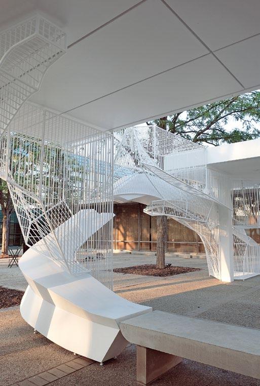
Oyler Wu Collaborative, The Exchange, Columbus, Indiana, 2017
Existing concrete furniture is integrated into the Exchange, a site-specific installation commissioned for the inaugural Exhibit Columbus exhibition on a site adjacent to Eero Saarinen’s Irwin Union Bank (1954).
Oyler Wu Collaborative, Headspace Meditation Pod,
The CNC-cut plywood surfaces of the Headspace meditation pod are clad in plastic laminate on the exterior and finished with clear acrylic polyurethane within. A concealed steel frame carries the plywood and reduces the weight of the completed structure.
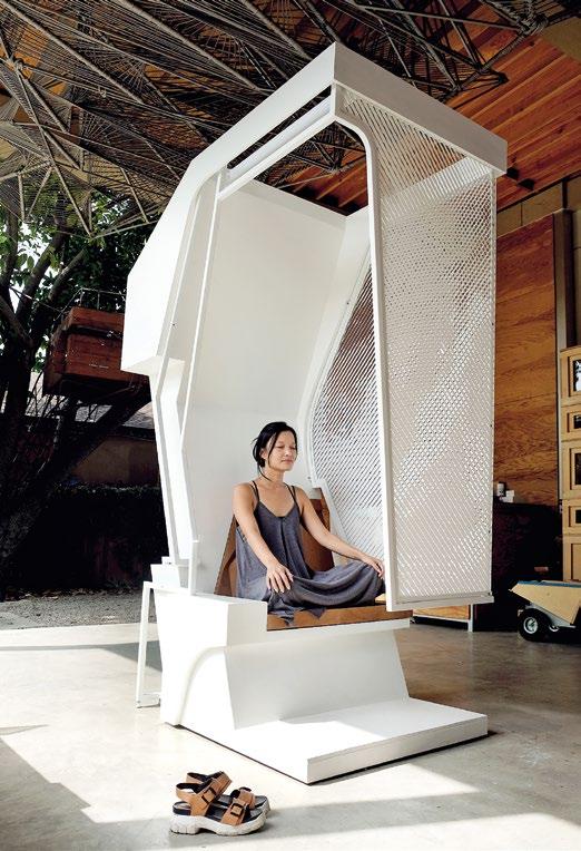
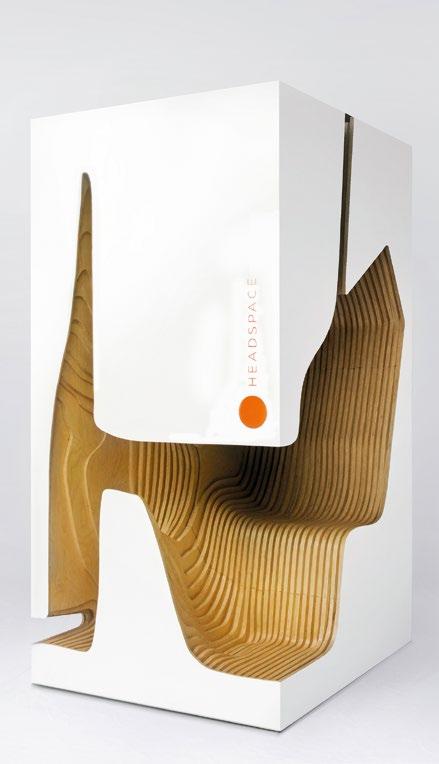
Oyler Wu Collaborative, Pause Meditation Pod, 2018
Architect Jenny Wu unwinds in a prototype of the Pause meditation pod at Oyler Wu’s studio in Los Angeles.
2016
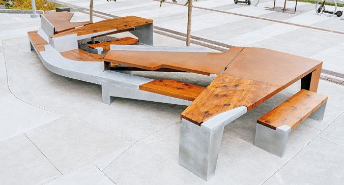
Furniture stretches further into architectural territory with the recently completed Urban Table in the Mission Rock district of San Francisco (2024). This elaborate composition of outdoor benches and tables slithers along a pedestrian promenade to offer street-side seating and informal gathering space to a new bayside development. Its gently curved surfaces and elongated tabletops are rendered in reclaimed redwood, Corten, and galvanized steel, and develop along the lines of earlier Active Inlay experiments. However, the scheme’s scale, sectional complexity, and sensitivity to its site suggest something more ambitious, like an imaginative park bench that dreamt of becoming a building.
Wild Cards
Of course many of the experiments Oyler Wu first conducted with furniture have been realized in their buildings, and others currently in development attest to the efficacy of their approach. Even so, subtle frustrations occasionally arise. Why, for example, are there so many pieces? How many rods, or ripples, or elaborate returns are too many? How much could be pared away from these complex arrangements, and would they be stronger for the effort? And then there is Oyler and Wu’s curiously conventional attitude toward materials. Throughout their portfolio, one finds wood presented matter-of-factly as wood, metal as metal, and other materials deployed with similar allegiance to the status quo. Nowhere does one find the sort of material investigations
pursued by the Eameses in warped plywood or by Frank Gehry in wriggling cardboard, and in every case traditional craftsmanship reigns supreme. Why? That Oyler and Wu seem satisfied to accept as given the conventional “nature” of materials—and established techniques for manipulating them—strikes a discordant note that undercuts, if only faintly, the contemporaneity of their work.
How to Win
At the same time, these mild reservations point to a key aspect of Oyler Wu’s critical stance toward conventionally classic design. Eschewing those definitive solutions to defined problems that Meadmore associated with modern masters, Oyler and Wu structure open-ended investigations that aim instead at dialectical tension. Their goal is less to produce that sense of authoritative finality that issues from classic work than to prolong the cascade of emotions—curiosity, excitement, wonder, and even, at times, frustration—that one enjoys when immersed in a challenging task. And if this way of working seems to call for adjectives other than “iconic” or “classic,” it should not be taken to mean that Oyler Wu’s experiments fall short of some line drawn in the disciplinary sand by Charles and Ray Eames or Clement Meadmore. It is simply to suggest that when it comes to their furniture, Dwayne Oyler and Jenny Wu are less interested in solving design problems than in setting them, as one sets a problem in chess or takes up in a puzzle.
Oyler Wu Collaborative, Urban Table, San Francisco, California, 2024
opposite : Urban table is one of five “Street Rooms” commissioned by the developers of a new residential district along San Francisco Bay that features buildings by MVRDV, Studio Gang, Henning Larsen, and WORKac.
below : Galvanized steel, Corten steel, and reclaimed redwood are joined together with carefully designed seams that refer to Oyler Wu’s earlier Active Inlay experiments. The project was prefabricated offsite and assembled using concealed connections points integrated with the seams.
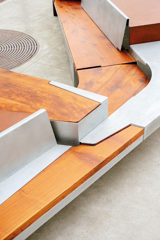
Thus, all the ways that Oyler and Wu both embrace and evade longstanding conventions, the ways they unsettle customary distinctions between economy of means and expressive exuberance, between contemporary formalism and traditional materiality, and between what one confidently knows and what remains to be discovered, are best understood as an evolving conceptual framework that holds open rather than concludes promising lines of inquiry, rewards sustained attention, and encourages inquisitive play. In other words, it is all part of the game! 2
Notes
1. Clement Meadmore, The Modern Chair: Classics in Production, Van Nostrand Reinhold (New York), 1979, p. 7.
2. Van Doesburg’s oft-quoted quip originally appeared in “Notes on an Armchair by Rietveld,” De Stijl, 2 (11), September 1919: n.p. Reyner Banham introduced the phrase to English-speaking readers in Theory and Design in the First Machine Age, Architectural Press (London), 1960, p. 190.
3. Each of these pieces is held in the permanent collection of the Museum of Modern Art (MoMA) in New York and can be viewed at www.moma.org/collection/.
4. Gerrit Rietveld, quoted in Van Doesburg, “Notes on an Armchair by Rietveld.”
5. In conversation with the author, 15 October 2024.
6. Rietveld’s and Rowland’s chairs also are held in MoMA’s permanent collection. Stam’s chair is in the collection of the Victoria & Albert Museum in London. Each is illustrated, with commentary, in Meadmore, The Modern Chair, pp. 32–6, 54, and 158–161.
Broadcasting Table
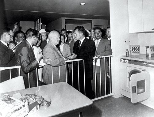
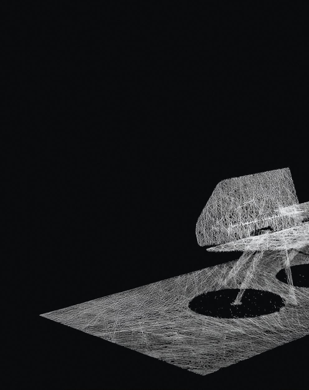
Domestic Beginnings
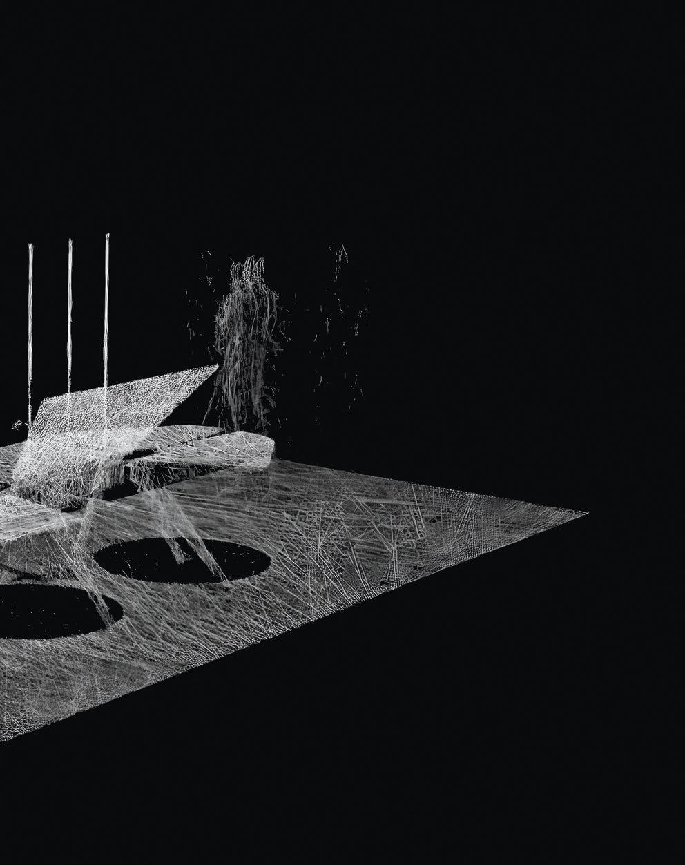
US Vice-President Richard Nixon with Russian Prime Minister Nikita Khrushchev at the American National Exhibition, Sokolniki Park, Moscow, 1959
opposite : On July 24 1959, Khrushchev and Nixon debated the ideals of capitalism and communism in a staged domestic setting, highlighting cultural contrasts amid Cold War tensions. These impromptu exchanges came to be known as the Kitchen Debate.
4/16 Architects / Captivate Heritage Laboratory, Design development imagery, University of Greenwich, London, England, 2024
above : Having been digitally scanned, the Kitchen Table prototype was immortalized in a point cloud and digitally prepared for its next evolutionary state.
Nick Elias
The notion of the table as nourishing convivial conversations, projecting a collegial togetherness, and seeding ideas is the basis of a series of multivalent constructions proposed and built by 4/16 Architects, a practice formed of academics and architects who specialize in speculative design. Co-founder Nick Elias outlines the development, involving a hybrid of digital and analog technologies, of the broadcasting table prototype he designed with his 4/16 co-founders Simon Herron and Susanne Isa.
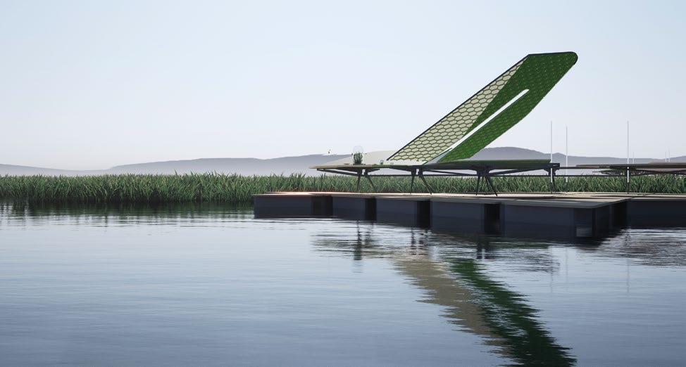
On July 24, 1959, the “Kitchen Debate” took place at Sokolniki Park in Moscow, staged within a model suburban American home, as part of the American National Exhibition. This unusual Cold War event featured a televised exchange between Soviet Premier Nikita Khrushchev and US Vice President Richard Nixon, debating the comparative merits of capitalism and communism. Captured on Ampex color videotape and broadcast on both American and Soviet networks, the domestic setting fostered a sense of familiarity amid Cold War tensions, with the intention of showcasing cultural contrasts while easing political hostilities.
The kitchen table, historically a gathering point for family and communal interaction, has a rich foundation in cultural symbolism. It serves as the setting where energy is consumed and metabolized, a site of creation where the act of eating connects us to cultural traditions, shapes our identities, and sustains the relationships that define us. It is also here that narratives unfold for pivotal decisions to take shape, promoting the table to a crucible of human connection and transformation.
4/16 Architects are interested in the performative potential of the everyday. The spatial and social possibilities of the kitchen table became a catalyst for a project on connection, conversation, and change. Stemming from an ancestor project that was conceived for Festival UK 2022—a nationwide traveling festival of creativity and innovation—as a multi-use surface serving as a connective nucleus where voices were collected and disseminated, the prototype has since evolved to demand more of its designers and the product. For example, the idea of the table as a social hub echoes the role of furniture in places such as Maggie’s Centres, specialist cancer care centers across the UK, where the table functions as a pivotal architectural element, promoting healing, conversation, and unity. This loads the prototype with further intellectual burden.
Developed during the new era of the climate emergency and the “digital depression,” the prototype bridges the natural world with technological innovation. Rooted in the principles of rewilding, it actively tests the potential of furniture to encourage human interaction. The intention of this table was to “rewild” by its conceptual meaning; to seed ideas and connect cultures beyond the domestic sphere, and to challenge and redefine our relationship with materials, the environment, and one another.
4/16 Architects, Kitchen Table prototype design development imagery, 2021
opposite : Still from a digital film showing an ancestor of the prototype as a floating island of information waiting to be shared, as part of the research and development project Festival UK 2022.
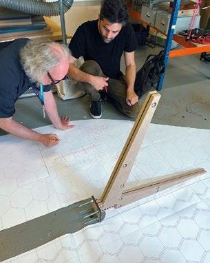
Design Development and Fabrication
Our relationship with digital technology and its products has arguably distanced many from the tactile qualities of physical craft and the role of the crafter. In the 19th century, during the era of William Morris, the latter were considered revolutionary: as a key figure in the Arts and Crafts Movement, Morris championed the value of traditional craftsmanship and design in reaction to industrialization. However, it would be irresponsible to overlook the potential of the digital in advancing craft in the 21st century. 4/16 Architects’ table prototype was developed from a hybrid of technologies, across the digital and the analog, using various digital-physical collaborations.
Computer-aided design (CAD) was used as a sketch tool by creating rough 3D digital sketches at the speed of a flicking pencil, to award the role of “maker” to the human, and “tool” to the computer. The sketch models were vast and varied, with 3D prints drawn over for collaborative review. In the digital space gravity has little authority, which was further cause for 3D printing and computer-numerically controlled (CNC) milling test subjects. Live loading and rotational torque of the hinged “wings” required thorough demonstration and redesign. The procurement and fabrication methods were chosen to demonstrate the value of the iterative process and to celebrate technology as an integral part of it. This approach demonstrated that technology could complement, rather than replace, the artisan, to offer a commentary on the future of “craft.”
4/16 Architects, Kitchen Table prototype assembly, University of Greenwich, London, England, 2023
top : Members of 4/16 Architects Nick Elias and Simon Herron iterate a mock-up leg and arm unit in the University of Greenwich workshop. Several mediumdensity fiberboard (MDF) mock-ups and standard fixings were required to refine key junctions.
The final prototype piece was crafted from factory-sourced, kiln-dried, sustainable, prime-grade, planed European oak. For the structural frame, quarter-sawn planks were chosen for aesthetics, workable properties, and stability, also being reflective of traditional craft. The mechanically dried wood serves both practical and political purposes. By reducing the material’s propensity for movement and decay, the process of drying effectively slows the rate of decay to put the wood in a state of reliability, preserving its integrity. As a prototype it must demonstrate the intended qualities for its descendants, a durable, enduring object in an era of impermanence.
The oak was milled for its accuracy, with sockets precisionrouted for steel fixings, timber wedges, and electrical probes and outlets of varied specifications. The grain of the wood runs along each structural component, offering strength to the point of junction where steel brackets take over at key angle variations. The brackets are designed to be hidden in its assembled state, but readily accessible for repeated dismantling and reassembly. The four wings were milled from 98-by-49-inch (2,500-by1,250-millimeter) panels of 1-inch-thick (26-millimeter) “Triply” (three-layer) edge-glued A/B-grade European oak with full-length 3/16-inch-thick (5-millimeter) oak finished faces. The winged
tabletops were then chamfered with radiused edge profiles by hand routers. Finally, it was hand-sanded and oiled in a collaborative embalming ritual, carried out in respect for its origins as an organism and to preserve its organic properties. The once dynamic and alive natural material gave way to a new dynamic upon its surface, active display and conversation. The development of the kiln-dried table prompted a new discussion for a living counterpart. 4/16 Architects are developing a series of sisters to the prototype, including an experimental “living twin,” in moist and unstable green oak. Milling greenwood creates all sorts of unpredictable form outcomes. As it dries from 80 percent humidity to less than 10 percent, the timber twists and solidifies into its predetermined, yet practically unpredictable, state. The curing process of the living twin is a reminder of similar origins birthing alternative states.
Broadcasting and Dialogue
Practically, the table is offered to galleries and event spaces for academic and public workshops on topical design-related subjects. It has capacity for the display of a wide range of information, and an ability to record and broadcast discussions to a metaverse of podcast recipients, by one example. This table is a prototype,
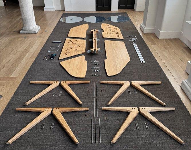
however, a pilot for further tables in production. It has so far been used as a test bed for academics and the public to share and develop progressive ideas to the point of execution, when the right people are “around the table.”
Soon after the table prototype was fabricated in London, in 2023 it was exhibited at ANON, an innovative public cultural space in Malmö, Sweden, where it was the centerpiece of a series of architectural workshops and exhibitions under the careful curation of Jenny Grettve, a specialist in economic systems and the built environment. Discussions of city planning, the politics of finance, and societal change have been its first enquiries to host and relay. Malmö’s evolving urban landscape has encouraged professionals in the industry to vocalize positions, particularly through the various social media platforms that are available. The “table” was drafted for its first assignment, to transcend the confines of the kitchen and its domestic attributes to become a communal meeting space for professionals of the built environment, a shared domestic ecosystem. The role as a physical public consultation forum is now one of many futures for its descendants.
4/16 Architects, Kitchen Table prototype componentry, University of Greenwich, London, England, 2024
opposite : The prototype’s basic components checked and ready for assembly at its second exhibition, back in the UK. Each piece is individually wrapped and arranged in sequence before assembly.
4/16 Architects, Kitchen Table prototype, ANON, Malmö, Sweden, 2023
below : In flux, the assembled table ready for its first public consultation event in Malmö. Its surface was used to display architectural theory papers and economic models in 3D form, setting the stage for the debate that followed.
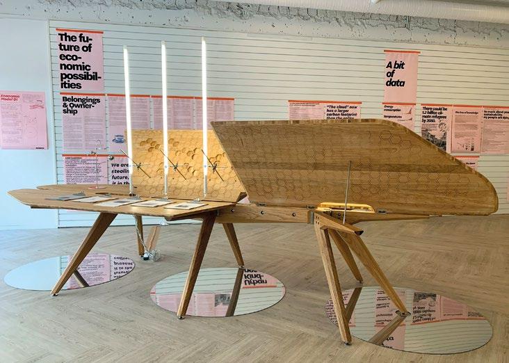
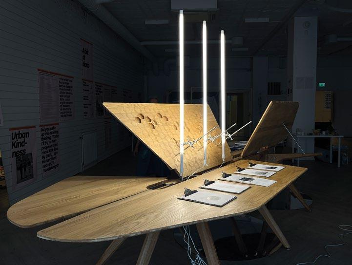
4/16 Architects, Kitchen Table prototype –evening rest, ANON, Malmö, Sweden, 2023
above left : The prototype resting after a workshop event, before relaying meeting minutes and outcomes internationally through its beta broadcasting technology.
4/16 Architects / Captivate Heritage Laboratory, LiDAR record, University of Greenwich, London, England, 2024
above right : The table was scanned to create a digital record, allowing for further iterations that evolve beyond the original. These digital “descendants” adapt and transform through modifications, preserving the prototype’s essence while enabling new possibilities.
Functioning as both a mobile broadcasting device and a “kitchen table,” the project celebrates togetherness and the sharing of information through electrical inputs. It can be programmed to mechanically prompt discussions on a variety of topics, aiming to make complex economic fundamentals accessible through familiar domestic references. For example, future “conversations” for the table include acting as an “economic weather station.” The table has been prepared with an ability to host digital technologies that can decipher economic weather in the UK, by a computer reading the stock market, and to broadcast it through domestic-style appliances. Through collaboration with finance experts in the built environment, the prototype’s descendant Kitchen Table is being designed to host a series of domestic kettles that are triggered by spikes in the UK economy. Their steam delivery will condense on a large Perspex surface to project the economic climate for review.
The prototype ultimately serves as a gathering place for voices designed to connect people. As a carrier of conversation, it has a central spine, the nerve center, where wires and electrical outlets feed each wing. Recognizing the rapid obsolescence of digital tools, the prototype’s central tray accommodates today’s requirements and evolves between exhibitions to remain functional. Its underbelly also hosts an array of cable-tidy fixings that conduit the conversations, packaging and delivering them to ears and voices internationally.
But this table hopes to be more than an object of conversation; it feeds off the political polemics that are had over it. It wants to be a medium of change. By serving as a moving and projecting platform for discourse on topics ranging from economic fundamentals to ecological restoration, it transforms gathering into an act of activism. It has big ambitions to invite users to participate, to challenge, and to reimagine the systems that govern our world.
Digital Craft
In collaboration with the Captivate Heritage Laboratory at the University of Greenwich, the physical assembly was retraced with a LiDAR 3D scanner, generating a point-cloud digital twin, returning to the digital origin of the project. The physical artifact is now translated back to a state of digitized dust, providing a flexible matrix of raw data to explore, contort, and manipulate into new unseen states. This digital model is currently undergoing transformations to branch new descendants of the pilot, where genetic attributes are developed for prototype 2 via the initial push-pull process of the CAD model sketching. This cyclic design process, at a macro scale of product to product, is a reminder that every product is subject to scrutiny and evolution, and inherently linked to our biological existence.
In exploring “digital craft,” the prototype raises a debate about the increasing disconnection between the physical and virtual worlds. This disconnection is often linked to discussions on “digital depression,” a theory highlighting the mental health challenges that arise from excessive digital engagement and a diminishing connection to tangible experiences. By opening a discussion around this disconnection, the prototype invites reflection on how design can mediate the relationship between digital technologies and physical experiences, prompting broader conversations about their impact on mental well-being. By grounding us in the physical, the prototype acts as a new technological “device” by which we can physically access information, just as a mouse and monitor allow us to access the internet. Acknowledging the pervasive influence of the digital is essential in the built environment and in every act of design; yet living in the physical demands that designers continue to offer tactile counterparts, which includes even the most mundane of furniture types. 2
Text © 2025 Axiomatic Editions. Images: p. 122 (inset) Nixon Presidential Library and Museum; pp. 122–3, 129 © Captivate Heritage Laboratory, University of Greenwich, all rights
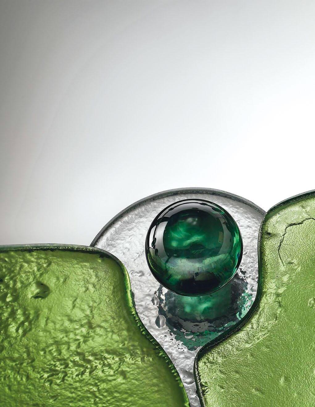


Working With a Paradox
A Manifesto on Furniture and Architecture
Kiki Goti
A tribute to the feminine mystique, the mirror is inspired by the enchanting world of water lilies, and designed to reflect light and highlight its irregularities with a gentle, mysterious, watery shimmer.
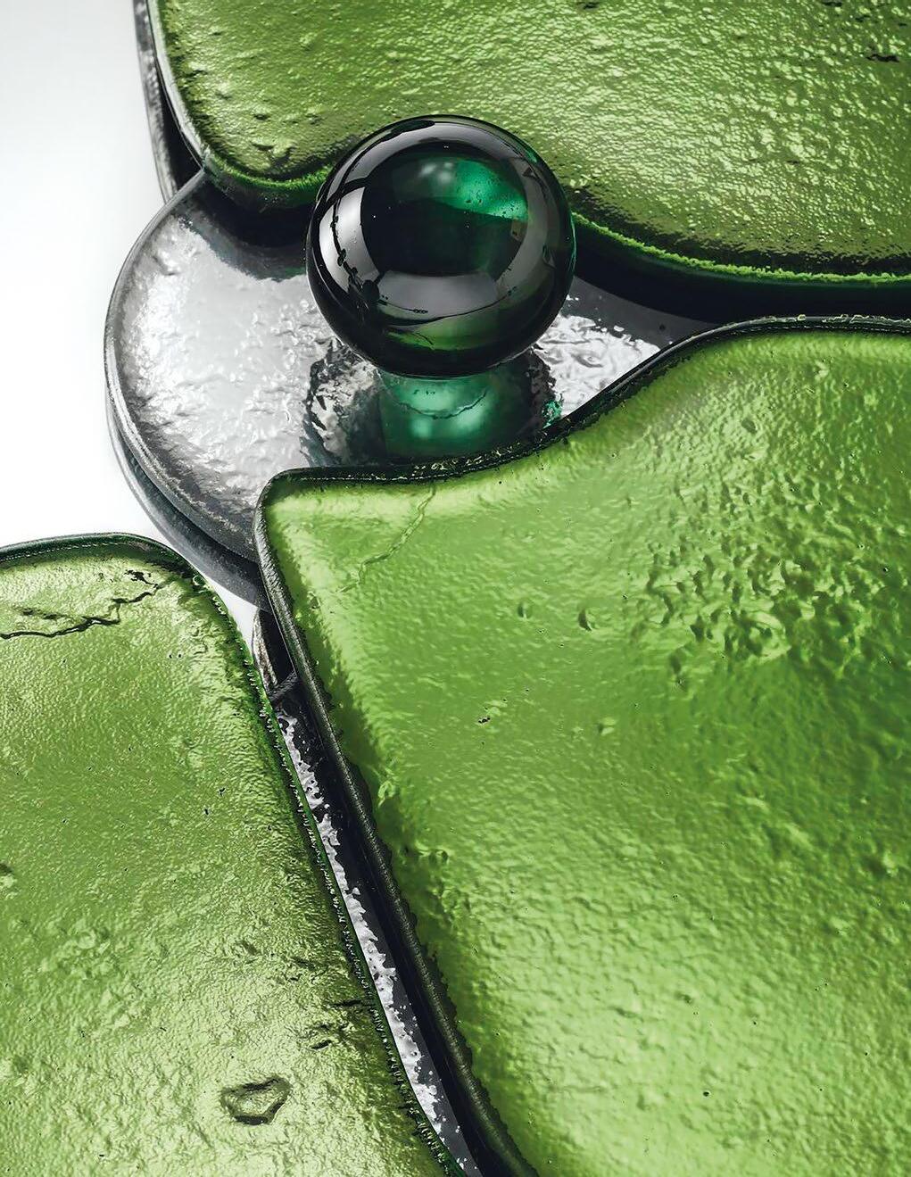
A variety of almost alien furniture items populate the imagination of New York City-based Greek architect, designer, and educator Kiki Goti. Her furniture and fittings hybridize analogous forms from nature with industrial materials to create a strange beauty. When brought together in a room, her interior and product designs present startling yet enticing tableaus.
Kiki Goti, Nuphar Mirror, 2024
The polarities architectural thinking still suffers from—form versus function, artificial versus human, less versus more—have their origins in the dualistic philosophy of Plato and Descartes. From separation of the body and the mind to the understanding of materiality as an imperfect representation of the perfect form, such dualistic thinking has deeply penetrated the design field, leaving no space for less clear, less absolute, more experimental, more messy, and more controversial architectural ideas.
Because of its small scale, fast speed, and low cost, furniture is a perfect medium for experimenting with ways to fluctuate between dichotomies, avoiding picking a side, and allowing one to exist in the in-between space. Clarification: “in-between” doesn’t mean balanced. If anything, the opposite. It is the constant tension, continuous back-and-forth, and uncomfortable blur between opposing forces. This is where the beauty of the paradox exists.
My lighting and furniture designs revolve around four dualities, four antithetical ideas of function versus ornamentation, tradition versus innovation, feminine versus masculine, and material versus form, revealing a paradoxical world that shows how the space between polarities can become fertile ground for new design narratives.
Aspirational Decor (Function Versus Ornamentation)
Historically, ornamentation has struggled to justify its existence, often dismissed for lacking conventional functionality. Yet its ambition goes far beyond ergonomics or physical comfort—it strives for beauty, confidence, intimacy, and evocation. Achieving such emotional depth is no simple task.
To forge this emotional connection, I personify my designs, imagining furniture as personas dressing up and accessorized, putting on their favorite screws, bolts, and light bulbs. All functional hardware and fixtures become jeweled accessories. Frivolous yet assertive, the pieces
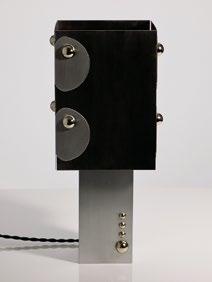
exude confidence and affection, evoking memories of people while drawing on historical narratives.
In my lighting collections, ordinary, affordable materials are transformed into opulent, ornate designs that celebrate exuberance and audacity. The fixtures, ranging from wall lights to table lamps, are crafted from aluminum and stainless steel. While metals are often associated with industrial functionality, their inherent silver tones and polished finishes remind us of their connection to the family of precious metals found in jewelry.
Strobilus Lamp (2023) features four identical aluminum pieces, cut, bent, and assembled with embellished halfball polished nickel bolts. Similarly, Celestial Lamp (2024) incorporates industrial hardware to form a confident, dressed-up companion in the domestic space. These objects aspire to elevate functional decor to its full potential, revealing how ornamentation, embellishment, and beautification can act as tools for domestic empowerment.
Kiki Goti, Celestial Lamp, 2024
Ordinary bolts are transformed into jewelry-like accessories that are both functional and decorative.
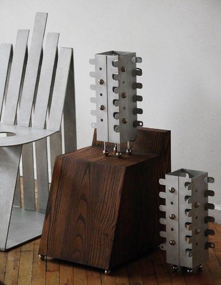
Vernacular Future (Tradition Versus Innovation)
Ornaments carry memories, references, and stories subjected to individual interpretation, but they also carry collective memories and manifest deep cultural bonds. I explore ornamentation through rigorous research and the intuitive transformation of historical themes that I relate to. Through this, new forms and material techniques emerge, demonstrating how novelties can be part of a dialogue between materiality, heritage, and cultural storytelling.
Neo-Vanity (2023) is a collection of four pieces: a pendant light, side table, two sconces, and a standing vanity. By developing a technique
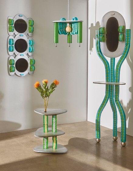
for upcycling found foam, I created malleable surfaces that can be shaped in various forms and adorned with hand-painted patterns. The colors and patterns of the collection refer to traditional textile techniques of the Balkan region, such as stitching, weaving, and lacing. The painted Balkan motifs derive from folkloric textiles and traditional women’s wear. The inspiration stemmed from the way identities are expressed through folk costumes, thus the pieces look both familiar and uncanny, futuristic and ancient. This retro-futuristic vision is realized through a novel material system born from the reimagining of traditional artifacts, blending heritage with innovation.
Kiki Goti, Strobilus Lamp, 2023
above left : The table lamp is a porous rectangular form that consists of four pieces of aluminum, bent to create a textural three-dimensional structure and an ornamental lighting effect.
Kiki Goti, Neo-Vanity collection, 2023
above right : Hand-painted foam pieces drape the aluminum structure of the collection. All pieces are “dressed up” and “accessorized” to celebrate confidence, autonomy, and femininity.
By personifying and dressing up furniture, the notions of femininity and masculinity in design can be explored, creating a dialogue between contrasting elements within the furniture itself
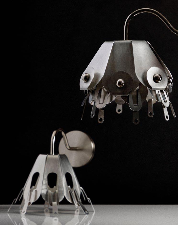
Cross-dressed
Furniture (Feminine Versus Masculine)
Fashion and jewelry design have long been powerful expressions of personal identity and nature. By personifying and dressing up furniture, the notions of femininity and masculinity in design can be explored, creating a dialogue between contrasting elements within the furniture itself.
The Buttoned Up collection (2024) began as an exploration into incorporating the concept of “crossdressing” into furniture design. It is an ode to the Victorian-era androgynous style—to feminist accessories and masculine garments designed and worn together to define a new genre of creative self-expression. The objects are made of aluminum, the softest of metals, in an effort to balance utility with the feminine. Invoking the sense of touch, each piece mirrors the prudence of a tailor, made using a special hand-bending process to achieve a balance of lissomeness and grace, utility and durability. Inspired by accessories (from buttons and belts to collars and hats), each mirror and lighting fixture is itself an accessory, reflecting and enhancing its own nature in the domestic space.
Timeless Transformation (Material Versus Form)
Driven by craftsmanship, my work brings the necessary mortality to the form and allows imperfection to emerge through the reinterpretation of artisanal techniques, an approach that introduces a level of artistic informality that makes the pieces timeless.
The Nuphar Mirror (2024), a collaboration with Venetian artisans, draws on centuries-old glass-making traditions to reimagine traditional Venetian mirrors in a contemporary context. The design embraces irregular forms created through a glass-fusion process. As layers of glass melt and fuse in the kiln, the initial shapes from my drawings become deformed and imperfect. The mirror reflects this process in both its material texture and its subtle irregularities of form. For a form to truly resonate with the human experience, it must embrace its mortality; only through imperfection can design evoke the depth, emotion, and relevance that connect us to it.
Objects of Empowerment
To create objects outside of polarities and schisms is to create objects of empowerment. Objects that embody communal liberation and acceptance while remaining deeply rooted in individual expression. Objects that find their place in the ambivalence between all opposing forces, embracing the paradoxes inherent in our human existence. 2
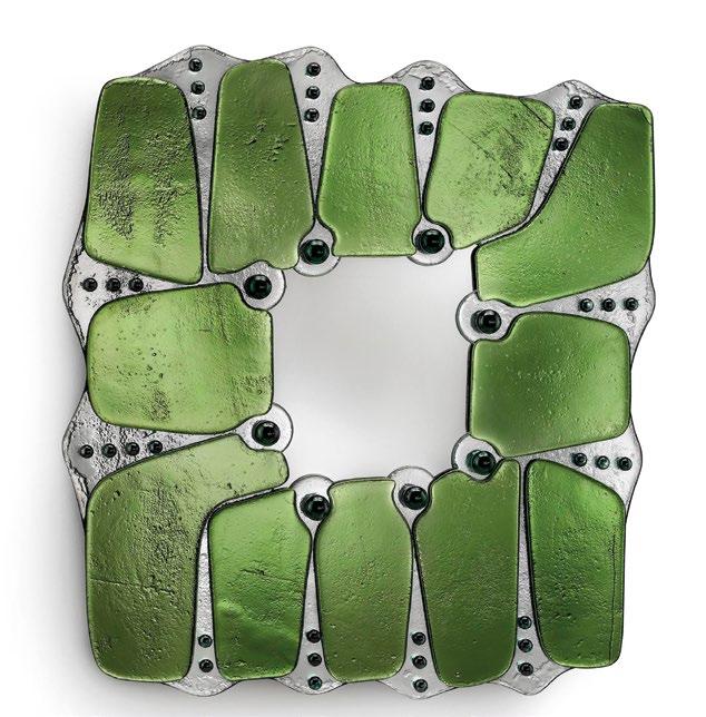
Text © 2025 Axiomatic Editions. Images: pp. 130–1, 135 © Vetralia Collectible; pp. 132, 133(r), 134 © Chelsie Craig; p. 133(l) © Kiki Goti
Kiki Goti, Buttoned Up collection, 2024
opposite : The layered metal wall lights resemble clothing and accessories such as ruffle skirts and bonnets.
Kiki Goti, Nuphar Mirror, 2024
below : The mirror was fabricated in Venice in collaboration with the glass-manufacturing company Vetralia.
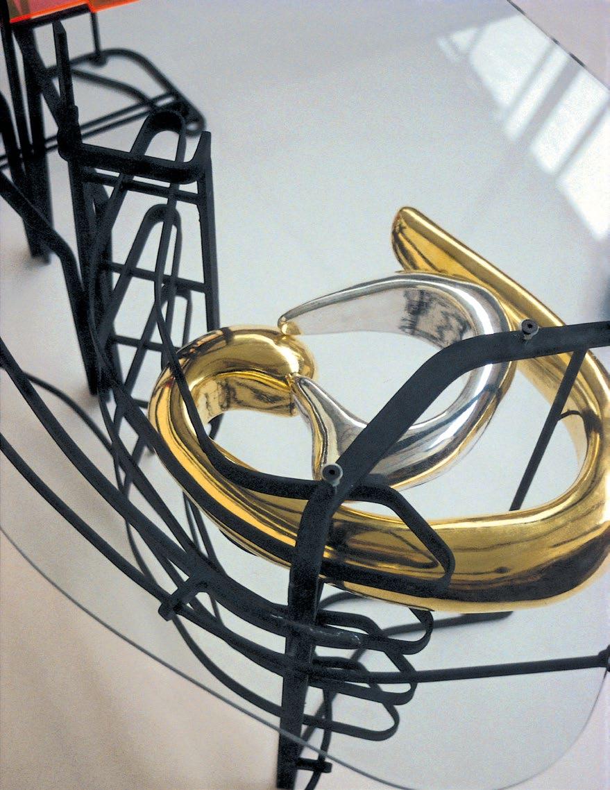


Of Brains, Eyes, Ribbon Models, and Proteins
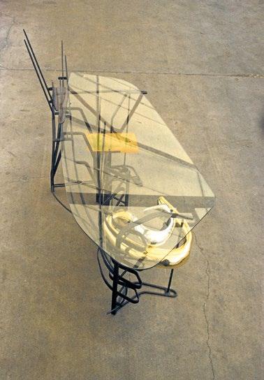
Most architects have a few furniture designs in their closet, and I am no exception. This “From Another Perspective” is certainly from another architectural perspective—that of tables, fountains, and bus-shelter seats. It is a story that is embedded in the mid- to late 1990s. I was running the Diploma (MArch nowadays) in Architecture at the Bartlett School of Architecture, University College London (UCL), and drawing and designing by night and weekend, hoping to hustle some opportunities for my fledgling architectural practice and to further explore my personal architectural lexicon, which I’d been experimenting with for the preceding 10 years or more.
Neil Spiller and sixteen*(makers), Hot Desk, 1994
opposite : The gold- and silvergilded corpus callosum/nano-vats (notional containers of molecular scaled nanotechnological self-replicating robots) adds a formal focus to the Hot Desk and appropriately hints at the client’s psychology studies.
above : The glass top of the Hot Desk allows the structure to be viewed from above. It also creates pleasing reflections.
Corpus Callosum
In 1994 I was approached by a client who had just started a psychology degree, to design a larger desk for her to study at. While I wanted the commission, I also wanted the project to exhibit some of my own architectural and intellectual preoccupations of the time. I had interests in what the then embryonic cyberspace might mean for architecture, what the self-replicating biological machines of nanotechnology might mean for the pliability and hybridization of materials, and what the play-off between the virtual and the real might do to the sites and scales of architecture. I had also just finished writing my book Digital Dreams: Architecture and the New Alchemic Technologies (1998),1 which speculated in prose and drawings on this new emerging architectural potential.
I was interested in anatomy and organic cell structures, too. One day I found some sectional drawings of human brains and was aesthetically pleased by the geometry of the tube in the center of the brain that connects its two hemispheres. Called the “corpus callosum” (Latin for “tough body”), this dense, wide, thick tube of nerves branches across 200–300 million nerve fibers, making all manner of synaptic connections. Simultaneously with this discovery I was reading K. Eric Drexler’s Engines of Creation (1986),2 which discusses the plausibility and astounding alchemic potential of molecular technology. I was particularly taken with the notion of what I dubbed “nano-vats”—vats of gray goo nanotechnology that could be atomically programmed to disassemble or build things. So, with these ideas spliced together, the Hot Desk was born.
I set about doing an exploratory drawing that seemed to be telling a story of surface turbulence. I had two students at the time, Bob Sheil and Nick Callicott, who called themselves sixteen*(makers) and who had just set up a small workshop in London’s East End where they made constructions of steel, glass, and wood. Once refined into another drawing and printed at full size to create what is called a “rod,” the Hot Desk became a collaboration between the three of us. Its centerpiece was a goldand silver-gilded stylized corpus callosum which also in my mind served as dual nano-vats—yet as far as the client was concerned was a symbolic manifestation of the subject she was studying. For her, she got a pretty avant-garde table with reading-book rest and space for blank paper—a talking point. For me, I could use the desk as a thought experiment about nanotechnology and the idea that, like a computer’s digital desktop, we might be able to create nested information structures of actual objects, similar to files inside folders, in the material world. The client was happy but a couple of years later gave it back to me, as she had fallen pregnant and was worried that her future toddler might impale himself on its spiky metal projections.
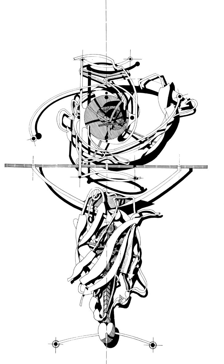
Flushed with the success of the Hot Desk, similar methods of construction were imagined. However, the Bitai Table was never fabricated. The horizontal line denotes the glass tabletop; below this line is an elevation, and above it is what is seen through the glass top from above.
Neil Spiller, Bitai Table, 1996
Neil
Spiller, Protein Furniture, fountain, Croydon, South London, England 1996

Bitai Table
In 1996 a commission came in for another table design—this time a smaller occasional table. I had befriended a trainee surgeon whose mentor, an ophthalmic consultant, was retiring. My friend wanted to commemorate his medical life with a gift, and we thought a small but lyrical table would be good. I was shown some diagrams of the history of haptic supports for artificial eye lens surgery. The geometry of these haptic supports had a pleasing appearance, particularly when superimposed on each other and stylized in stainless steel with a glass convex lens centered within them. Again, as with the Hot Desk, a glass tabletop was imagined so the geometric acrobatics below could be viewed from above. I was also a subscriber to the journal Nature Biotechnology in that period, and was often visually entranced by protein ribbon models within its pages. A found ribbon model for a fluorescent protein had a pleasing resonance and was hung below the lens and “haptics” under the glass top to provide more rigidity and support. Finally, just above the floor, the whole ensemble is terminated by a pharaoh’s-beard-like form.
As with the Hot Desk, my preoccupations about the digital and the real, together with my Surrealist leanings, made me interpret the design in a more expansive metaphorical way. “Bitai” in Japanese means “coquetry,” “sexual allure,” or “flirtiness,” and often in such actions the eyes are important. Also, in the art of Surrealism the blinding or obscuring of the eyes is symbolic—an attempt to reveal the dreamscape of our interior thoughts, desires, and yearnings, in their marvelous, juxtaposed, and chimeric settings. At the time, I wrote: “[T]he changing eye is still a useful symbol for the effects of digital and soft technologies but this eye, like the new flesh, will be hardly recognisable. This new eye is the amalgam of organic and mechanic, wet yet dry, binary yet analogue and focused everywhere simultaneously. Its cone of vision is no longer conic; the conic sections of vision are bent out of shape and are of a higher-order topology. It is simultaneously fluorescent and illuminates all it scans with hyperreal exactitude.”3 In the passage of time since this was written, the ubiquitous recording of our own everyday activities, by us and others, has exponentially proliferated; electronic “eyes” of every sort survey and trace our actions and movements both in the digital/virtual and real worlds, illuminating the full gamut of the human condition—good and bad. Unfortunately the Bitai Table remains unbuilt and would have been an appropriate smaller sibling to the Hot Desk.
The plan of the fountain was inspired by protein ribbon models and creates an almost Baroque composition.
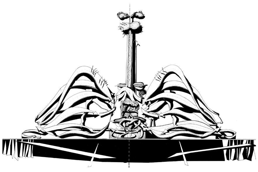
Protein Furniture
The final set of furniture in this triptych is set in the public realm and dates from the same period as the Bitai Table. The Protein Furniture carried on the theme of being interested in microbiology, and consists of a fountain and some bus-shelter seats. They were designed as a competition entry for Croydon, a part of South London.
I had recently been reading and admiring the illustrations in American structural biologist David Goodsell’s two books The Machinery of Life (1993)4 and Our Molecular Nature: The Body’s Motors, Machines, and Messages (1996).5 Goodsell is adept at drawing proteins, cellular structures, and DNA configurations. These images seemed to me to be very architectural, and I wanted to use them in a design context. The Croydon street-furniture competition provided the opportunity. I was particularly enamored with the notion of the “active site” that appears in enzymes. An active site is an area of an enzyme where substrate molecules can bond and provoke chemical reactions. They are small pockets of amino acid residues that are uniquely tailored to receive specific molecular structures, which then catalyzes a reaction to strengthen the enzyme’s function.
In a typical, intentionally opaque way, I wrote of the designs and the drawings, mixing science with Surrealist imagery: “Fountain: Model of EP0 memetic cross-linked to form a covalent dimer with nested spiky gooseberry and central water butt feature. Fountain elevation: with kinesin central shaft surmounted by myosin supported by three pronged dynein and bathed in liquid desire. Seating: Semi-supported on NADH dehydrogenase complex, cytochrome reductase and squashed spiky gooseberry with growth hormone details and Daliesque crutches.”6
So this triumvirate of small furniture projects are some of my last individual designs responding to others’ briefings, that I did before I commenced my long-running “Communicating Vessels” project (1998–). My preoccupations changed, cyberspace was burgeoning, augmented reality was being born, and biomechanical materials were starting to be explored. One thing that didn’t change was my interest in Surrealism and the belief that the tired dogmas and doctrines of white, clean, and neat Modernism were no longer appropriate architecturally in a world of such spatial, chemical, and virtual diversity and consequently Surreal architectural opportunity. 2
Neil Spiller, Protein Furniture, fountain, Croydon, South London, England, 1996
The elevation of the fountain and its central shaft draws heavily on David Goodsell’s structural biology illustrations.
Neil Spiller, Protein Furniture, bus-stop seating, Croydon, South London, England, 1996
Plan, elevation, and details. The seating is an architectural interpretation of protein and enzyme geometry and enzyme active sites.
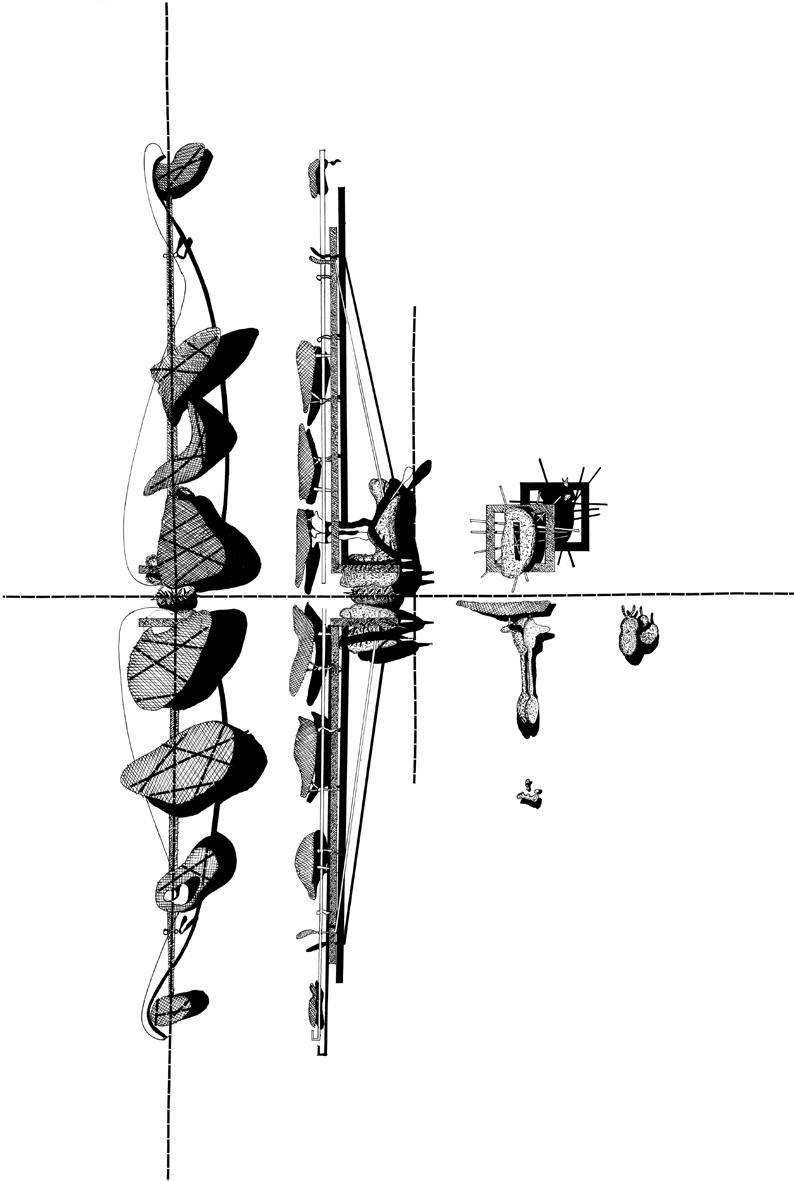
Text © 2025 Axiomatic Editions.
Images pp. 136–7 © sixteen*(makers); pp. 138–41 © Neil Spiller
Notes
1. Neil Spiller, Digital Dreams: Architecture and the New Alchemic Technologies, Ellipsis (London), 1998.
2. K. Eric Drexler, Engines of Creation: The Coming Era of Nanotechnology, Doubleday (New York), 1986.
3. Neil Spiller, Maverick Deviations: Architectural Works (1985–98), Architectural Monograph No. 53, Wiley-Academy (London and New York), 2000, p. 114.
4. David S. Goodsell, The Machinery of Life, Springer-Verlag (New York), 1993.
5. David S. Goodsell, Our Molecular Nature: The Body’s Motors, Machines, and Messages, Springer-Verlag (New York), 1996.
6. Spiller, Maverick Deviations, p. 118.
CONTRIBUTORS
Nigel Coates founded the NATØ architecture group in the early 1980s, and since then has consistently challenged the practice of architecture, overlapping it with fashion, design, and the history of ideas. He trained at the Architectural Association (AA) in London, and his inventive, artfully driven narratives have translated into many buildings, interiors, and exhibitions around the world, particularly in Japan and the UK. More experimental exhibition work has included Mixtacity at Tate Modern (2007), and Ecstacity (2000), Babylon:don (2006), Hypnerotosphere (2008), and Margherissima (2025), all at the Venice Architecture Biennale. As a designer of lighting and furniture he collaborates with Italian companies including GTV, and Fornasetti. His books include Guide to Ecstacity (Laurence King, 2003), Narrative Architecture (John Wiley & Sons, 2012), and Ecstacity (2000), Babylon:don (2006), Hypnerotosphere (2008), and Margherissima (2025), all at the London School of Architecture.
Johan Deurell is a curator of design and architecture with an interest in critical design and discourses around cultural hybridity, politics, and ecology. In 2025 he joined the Vitra Design Museum, Weil am Rhein, Germany. Prior to this he worked at the Zaha Hadid Foundation in London, overseeing the institution’s exhibition program and researching Hadid’s design and interior projects. From 2018 to 2022 he was at the Röhsska Museum of Design and Craft in Gothenburg, Sweden, where he curated Migration: The Journey of Objects (2021), Forensic Architecture: Design as Investigation (2020), and Ocean Plastics (2019).
Carrie Eastman is a writer and editor, designer, and educator. She has authored or edited recent texts on topics from urban waterfront reclamation to biodesign, to the fiction of architectural representation. She practiced landscape architecture in and around New York City for fifteen years, and teaches undergraduatelevel courses on the history and theory of architecture.
Nick Elias is the founder and Director of Nick Elias Studio, and a recipient of the RIBA Silver Medal. He is also co-founder of 4/16 Architects along with Simon Herron and Susanne Isa, who are partners in the design and procurement of the studio’s Kitchen Table prototype. He is a Master in Architecture lecturer and architectural illustrator for the built environment, a TEDx speaker, and an academic contributor to think-tanks such as Londonon.
Todd Gannon is a Professor of Architecture at The Ohio State University’s Knowlton School in Columbus. He studies the history and theory of late 20th-century and contemporary architecture, focusing on architectural materiality and media, the historiography of modern and postmodern architecture, and vanguard architectural movements from the postwar period to the present. His books include Franklin D. Israel: A Life in Architecture (Getty Research Institute, 2025), Figments of the Architectural Imagination (Applied Research & Design, 2022), and Reyner Banham and the Paradoxes of High Tech (Getty Research Institute, 2017).
Kiki Goti is a Greek architect, designer, and educator currently based in New York City. As a maker, she hybridizes materials and fabrication methods to explore relationships between color, texture, heritage, and identity. Her creative scope spans furniture, public sculptures, and interior design, where she critically engages with notions of femininity, beauty, and ornamentation, offering innovative interpretations of art historical themes. She currently teaches at Pratt Institute and Parsons New School for Design in New York, and has previously taught at Carnegie Mellon University in Pittsburgh and the University of Pennsylvania in Philadelphia.
Vanessa Grossman is an architect, historian, curator, and Assistant Professor of Architecture at the University of Pennsylvania Stuart Weitzman School of Design. Her research focuses on the global history of Modernism and contemporary architecture. Her most recent books include A Concrete Alliance: Communism and Modern Architecture in Postwar France (Yale University Press, 2024) and the co-authored Everyday Matters: Contemporary Approaches to Architecture (Ruby Press, 2021) and Oscar Niemeyer en France: Un exil créatif (Éditions du patrimoine, 2021). Catalogs of the exhibitions she has co-curated worldwide include Constructed Geographies: Paulo Mendes da Rocha (Casa da Arquitectura/Yale University Press, 2024).
Sandy Jones is Assistant Curator of Architecture and Urbanism at the Victoria and Albert Museum in London. She curated the museum’s display on protest architecture,
Barricade and Beacon, for the 2024 London Design Festival. She was previously an Assistant Curator at the De La Warr Pavilion, Bexhill-on-Sea, England, where she was curatorial researcher for the exhibition The New Line: Works from the Jobbing Printing Collection and co-curated The People’s Pavilion: Our First 70 Years. With a background in design management and visual identity, she also has a research interest in the typographer Jan Tschichold, and has lectured and written on his material in the V&A’s collection.
Dean Maltz is a partner at Shigeru Ban Architects, where he has managed the New York Office for the past 25 years. Through his leadership, the office has designed numerous AIA award-winning projects including the Aspen Art Museum (2014) and the Cast Iron House (New York, 2021), as well as numerous multi-family and single-family residences. Dean is also a furniture designer who has been honored with the Pinnacle Award from the American Society of Furniture Designers (2005). Beyond the furniture he has designed for Natuzzi, Kimball, and Dellarobbia, Dean is known for his patented “accordion seat.” He is a frequent lecturer on the subject of timber and biophilia, and has taught at the Graduate School of Architecture, Planning and Preservation (GSAPP) of Columbia University and at Cornell University.
William Richards is a writer whose work has been published in Architect, Architectural Record, and The Architect’s Newspaper, among other publications. He is the author of Against the Grain: Mass Timber
in the Home (Schiffer Publishing, 2024), Bamboo Contemporary: Green Houses Around the Globe (Princeton Architectural Press, 2022), Together by Design: The Art and Architecture of Communal Living (Princeton Architectural Presss, 2022), and Revolt and Reform in Architecture’s Academy (Routledge, 2017). He holds a doctorate in art and architectural history from the University of Virginia in Charlottesville.
Eoin Shaw is a designer at Londonbased design practice CRAB Studio, working on projects internationally and in the UK, ranging from homes to masterplans, installations, and handmade tables. They are a graduate of the Bartlett School of Architecture, University College London (UCL) where they were awarded the Donaldson Medal. Where possible, their work takes an interest in queer readings and approaches to architecture, attempting to disentangle design from logic and order.
John Szot is an architect practicing in New York City and Portland, Oregon. His work related to building design has been exhibited widely, including at the Shenzhen Architecture Biennial, SIGGRAPH, the WNDX Festival of the Moving Image, Pinkcomma Gallery, and the Art Institute of Chicago. He is a principal at Lyon/Szot Architects, a creative director at the Brooklyn Digital Foundry, and has held teaching positions at Pratt Institute, Columbia University, the University of Texas at Austin, University of Oregon, and Parsons New School for Design. His forthcoming book, Buildingness, will be an independently published volume of drawings, images, and writings related to the work of his studio.
Dimitra Tsachrelia Holl is a registered architect and Principal at Steven Holl Architects where she leads cultural and residential projects. She also serves as an Adjunct Assistant Professor at the Graduate School of Architecture, Planning and Preservation (GSAPP) of Columbia University in New York, where she co-teaches with Steven Holl and focuses on the intersection of music and architecture, a topic she actively researches and has lectured on. Additionally, she dedicates her efforts to the Board of the Steven Myron Holl Foundation, advancing its mission at the intersection of art, architecture, music, and ecology.
Guilherme Wisnik is a tenured professor and Vice Dean of the Faculty of Architecture and Urbanism at the University of São Paulo (FAU USP). He is also the curator of the Brazilian Museum of Sculpture and Ecology (MuBE). He was the chief curator of the 10th São Paulo Architecture Biennial (2013), of the exhibition Infinite Span: 90 Years of Brazilian Architecture (Casa da Arquitectura de Portugal, 2018), and of the Brazilian Pavilion at Expo 2020 in Dubai. He is the author of books including Lucio Costa (Cosac Naify, 2001) and Inside the Mist: Contemporary Art, Architecture and Technology (2018). He received the “Prominence 2018” award from the Brazilian Association of Art Critics.
1 WHAT IS ARCHITECTURAL DESIGN?
Founded in 1930, Architectural Design (2) is an influential and prestigious publication. It combines the currency and topicality of a newsstand journal with the rigor and production qualities of a book. With an almost unrivaled reputation worldwide, it is consistently at the forefront of cultural thought and design.
Issues of 2 are edited either by the journal’s Editorial Director, Ashley Simone, and Editor, Neil Spiller, or by an invited GuestEditor. Renowned for being at the leading edge of design and new technologies, 2 also covers themes as diverse as architectural history, the environment, interior design, landscape architecture, and urban design.
Provocative and pioneering, 2 inspires theoretical, creative, and technological advances. It questions the outcome of technical innovations as well as the far-reaching social, cultural, and environmental challenges that present themselves today.
For further information on 2, subscriptions, and purchasing single issues, see: www.archdesignjournal.com


Volume 94 No 2
ISBN 978-1-119-98430-6

Volume 94 No 5
ISBN 978-1-394-23216-1


Volume 94 No 3
ISBN 978-1-394-19121-5

Volume 94 No 6
ISBN 978-1-394-20417-5

Volume 94 No 4 ISBN 978-1-394-18508-5

Volume 95 No 1
ISBN 978-1-961856-98-1
HOW TO SUBSCRIBE
Individual backlist issues of 2 are available as books for purchase starting at US$40
www.archdesignjournal.com
With 4 issues a year, you can subscribe to 2 either print or online.
Institutional subscription
$950 print and online
$850 print only
$850 online only
Individual subscription
$190 print and online
$160 print only
$120 online only
Individual issues
$40
To subscribe to (print or online)
E: subscriptions@archdesignjournal.com W: www.archdesignjournal.com
General queries
E: hello@archdesignjournal.com
Visit our Online Customer Help www.archdesignjournal.com
1 ARCHITECTURAL DESIGN
FORTHCOMING TITLES

December 2025 | Vol 95 | 3
ISBN 978-1-966515-00-5
REIMAGINING ARCHITECTURAL DRAWING PRINT AND PROCESS
Guest-edited by Mark Dorrian, Riet Eeckhout, and Arnaud Hendrickx
Tradition and precedent inspire invention, architectural drawing, and media practice. This issue presents a series of encounters with printed drawings, leading to their transformation and reimagination in a series of new works. Archival media from the John Nichols Printmakers & Publishers Collection, located at the A83 gallery in New York City, is the foundation for these new inventions by contemporary architects. International contributors extend the discourse on architectural representation and its evolution through print media, offering critical reflections on specific pieces. The project and A83 exhibition— entitled “The Sixth Somewhat Annual Meeting”—from which this issue stems concern questions of the archive; modes through which archival materials may become activated; situated approaches to intricate material objects that allow them to be read in non-normative ways; media transformations; and issues of disciplinary indebtedness and influence. The writers address and/or extend these concerns in their consideration of specific works.
Contributors:
Stan Allen, Greg Barton, Paddi Alice Benson, Peter J. Baldwin, Adam Dayem, Iman Fayyad, Jimenez Lai, Jason Lee, Bea Martin, Thom Mayne, Alex Pillen, Aleksandra Wagner, and Bart Verschaffel
Drawings and works by:
Bryan Cantley, Nat Chard, Peter Cook, Riet Eeckhout, Arnaud Hendrickx, James Kennedy, Perry Kulper, CJ Lim, Metis: Mark Dorrian + Adrian Hawker, Shaun Murray, Owen Nichols, Smout Allen, Neil Spiller, Natalija Subotincic, Clara Syme, Michael Webb, Mark West, and Michael Young


BIODESIGN IN ARCHITECTURE
Guest-edited by Rachel Armstrong and Richard Beckett
February 2026 | Vol 96 | 1
ISBN 978-1-966515-39-5
BIODESIGN IN ARCHITECTURE
Guest-edited by Rachel Armstrong and Richard Beckett
While biodesign’s roots lie in the material science and medical innovations of the 1990s, architecture’s relationship with nature stretches back millennia. Today, this relationship is being redefined as biodesign forays further into the public realm and actively reshapes how we imagine and construct our living environments.
The means and methods of contemporary biodesign signal a disciplinary transition toward an adaptive, collaborative approach to architecture that promotes an ethics of co-creation with nature, a politics that embraces marginalized traditions, and an economics grounded in ecological resilience.
This issue of 2 marks a turning point in the evolution of biodesign, from isolated prototypes to visionary, inhabitable futures—spaces where the built environment becomes indistinguishable from the living systems it supports. This reality requires new theories of practice that integrate microbial intelligence, unconventional computing, biomaterials, and architectural design—a plurality of approaches grounded in reciprocity and regeneration.
Contributors:
Rachel Armstrong, Phil Ayres, Richard Beckett, Marcos Cruz and Brenda Parker, Jonathan DessiOlive, Nancy Diniz and Frank Melendez, Joyce Hwang, Kyoung Hee Kim, Maria Kuptsova, MaeLing Lokko, Claudia Pasquero and Marco Poletto, Ronald Rael, Mette Ramsgaard Thomsen, Ehab Sayed, Neil Spiller, and Mike Weinstock and Milad Showkatbakhsh
Featured architects and designers: AA Design + Make, BIOHM, bioMATTERS, Beckett Lab, CITA – Centre for Information Technology and Architecture, ecoLogicStudio, Emerging Technologies (Architectural Association), Regenerative Architecture Arts and Design (RAAD) research group, and Studio Biocene


CHIMERAS
THE ARCHITECTURE OF CONTEMPORARY UTOPIAS
Guest-edited by Elena Manferdini and Damjan Jovanovic
May 2026 | Vol 96 | 2
ISBN
CHIMERAS
THE ARCHITECTURE OF CONTEMPORARY UTOPIAS
Guest-edited by Elena Manferdini and Damjan Jovanovic
Are utopias still necessary—and if so, for whom? Fifty years ago, architects actively envisioned the future. In a world dominated by techno-euphoria or fears of ecological collapse, it’s paradoxically easier to imagine the end of everything than to envision meaningful change. This issue of 2 argues that when alternative solutions lie outside the realm of collective imagination, utopia resurfaces as a way out. But what if utopia today is less an idealized destination and more a means of unlocking transformative potential? As planetary computation, climate crisis, and synthetic cognition increasingly converge, utopia becomes a tool for speculative worldmaking—designing new systems, meanings, and realities.
Contributors engage with a shifting intellectual landscape, ranging from embracing technological acceleration to a call for metaphysical architecture as an escape from exhausted logics of capitalism. Between these poles, we explore utopia as a way to unlock all possible futures.
Contributors:
Adil Bokhari, Federico Campagna, Robert Cha, Jennifer Chen, John Cooper, Krish Dittmer, Graham Harman, Damjan Jovanovic, Neil Leach, Elena Manferdini, Alina Nazmeeva, Antoine Picon, Carlo Ratti, Paulette Singley, Andrew Witt, and Liam Young
Featured architects and artists: Meteora, Robert Cha Architect, Jennifer Chen, John Cooper, Lifeforms.io, Atelier Manferdini, Studio Nawa, Carlo Ratti Associati, Certain Measures, and Liam Young
CONTRIBUTORS
Nigel Coates
Johan Deurell
Carrie Eastman
Nick Elias
Todd Gannon
Kiki Goti
Vanessa Grossman
Dimitra Tsachrelia Holl
Sandy Jones
Dean Maltz
Eoin Shaw
Neil Spiller
John Szot
William Richards
Guilherme Wisnik
FEATURED ARCHITECTS AND DESIGNERS
4/16 Architects
AL_A
Shigeru Ban
CRAB Studio
Frank Gehry
Zaha Hadid
Steven Holl Architects
Greg Lynn
Paulo Mendes da Rocha
Oyler Wu Collaborative Reiser+Umemoto
Andrew Skey
Architectsand Furniture
Architects have designed some of the most iconic items of furniture. This 2 features ingenious architect-protagonists of this genre, and explores the recent history and chronology of architectural involvement in the discipline.
Furniture augments architect-designed environments, contributing to the holistic ambience of a space and displaying in microcosm architects’ preoccupations with material palettes, haptic sensitivities, and structural invention. It can take the form of props for commercial purposes including business meetings and offices, for spaces susceptible to the weather, or for convivial, domestic settings. Whatever the programmatic imperative, architects have contributed in the most aesthetic ways. This issue honors some of the best.
