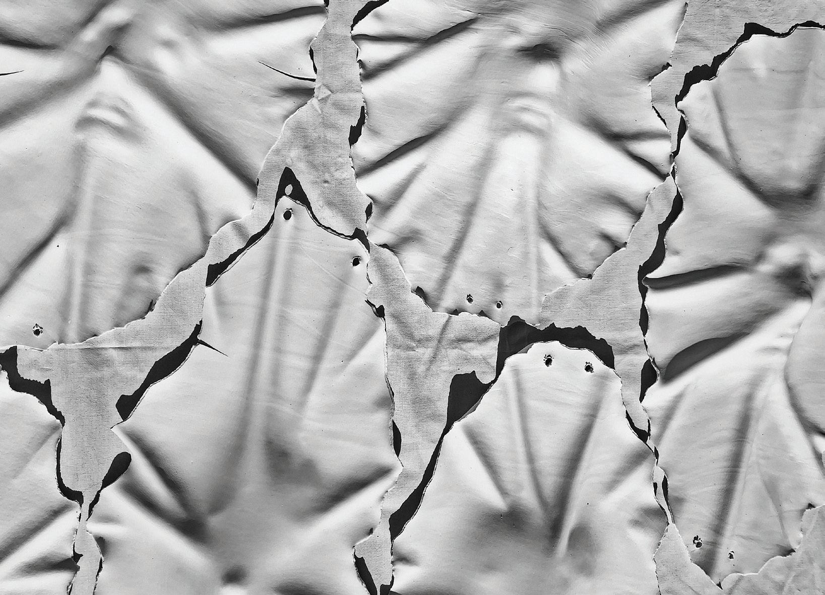
Department of Creative Arts and Media Degree Show 2026
Bachelor in Arts ( Honours) in Art
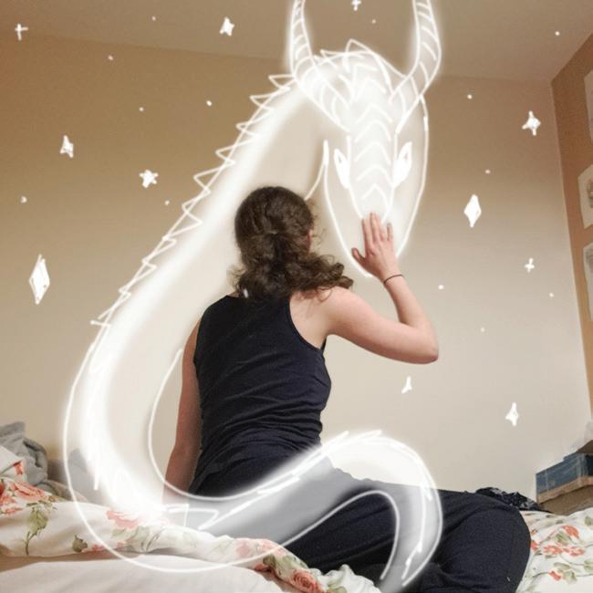
Audrey Healy
Audrey Bridget Healy is an Irish contemporary artist based in Galway, Ireland. Audrey Bridget utilises an array of media including charcoal, ink, gouache, acrylic, cyanotype, Procreate editing and photography. Audrey is currently in her final year BA (Hons) in Art and is working towards her degree show in June 2026. In 2025, Audrey exhibited in 126 Gallery with the show Ephemera. In 2024, she exhibited in Bridie Murphy Café. In 2023, she volunteered with TULCA Festival. In 2022, Audrey won a joint award with artist Laoise O’Brien for the Mercy Sisters Excellence in the Arts. In 2021 Audrey won first place in the Credit Union Art Competition.
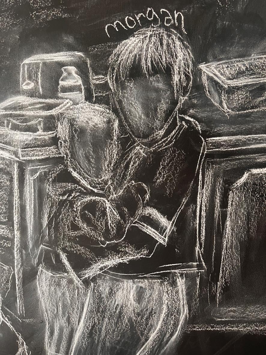
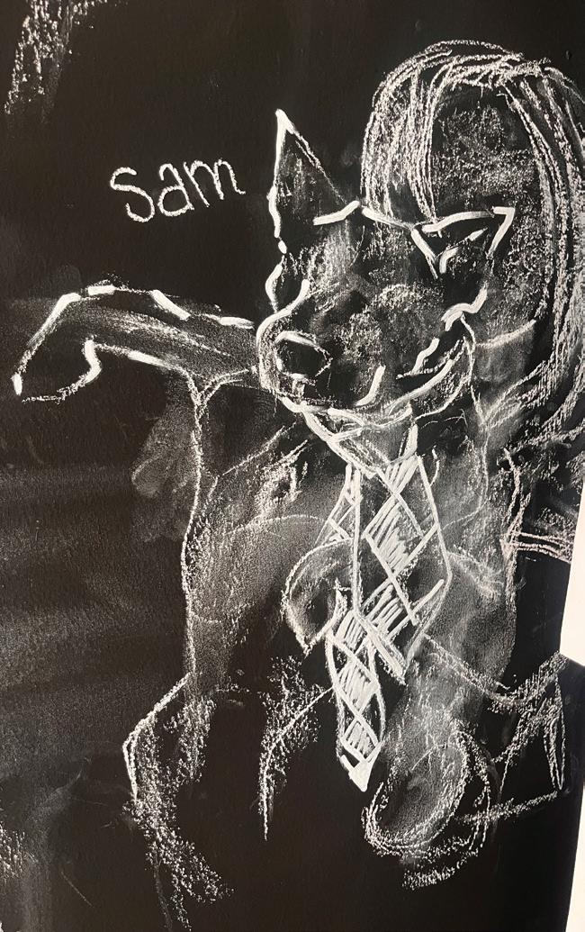
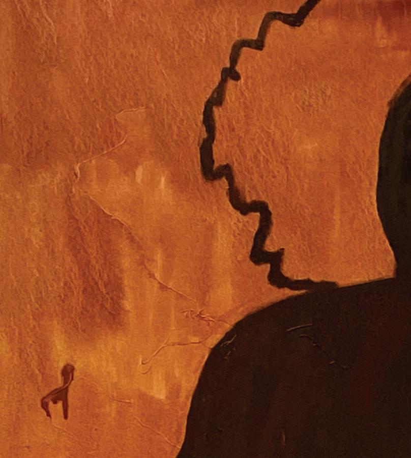
“My art practice is autobiographical and led by intuition. In my current work I explore themes of grief and nostalgia retrospectively, focusing on the duality of the emotions in memories as I explore the experience of grief. My personal journey with grief began with the loss of my mother two years ago. Throughout my healing, I often reflect on nostalgia and the sadness within the happy memories. The materials I use in this body of work are white compressed charcoal and chalk on the studio walls, which I painted black.
The purpose of the white charcoal and chalk is to express the glimmer of hope in grief whilst the faded quality carries the movement of the application and represents how the memories are fading with time. The use of a strong black background serves the purpose of immersing the viewer within the emotion of grief. I’m drawn to an immersive experience for the viewer is that grief is an all-consuming experience and people can approach it in an awkward uncomfortable way, but there’s strength and community within expressing the authenticity of grief.”
Charles O’Mahoney
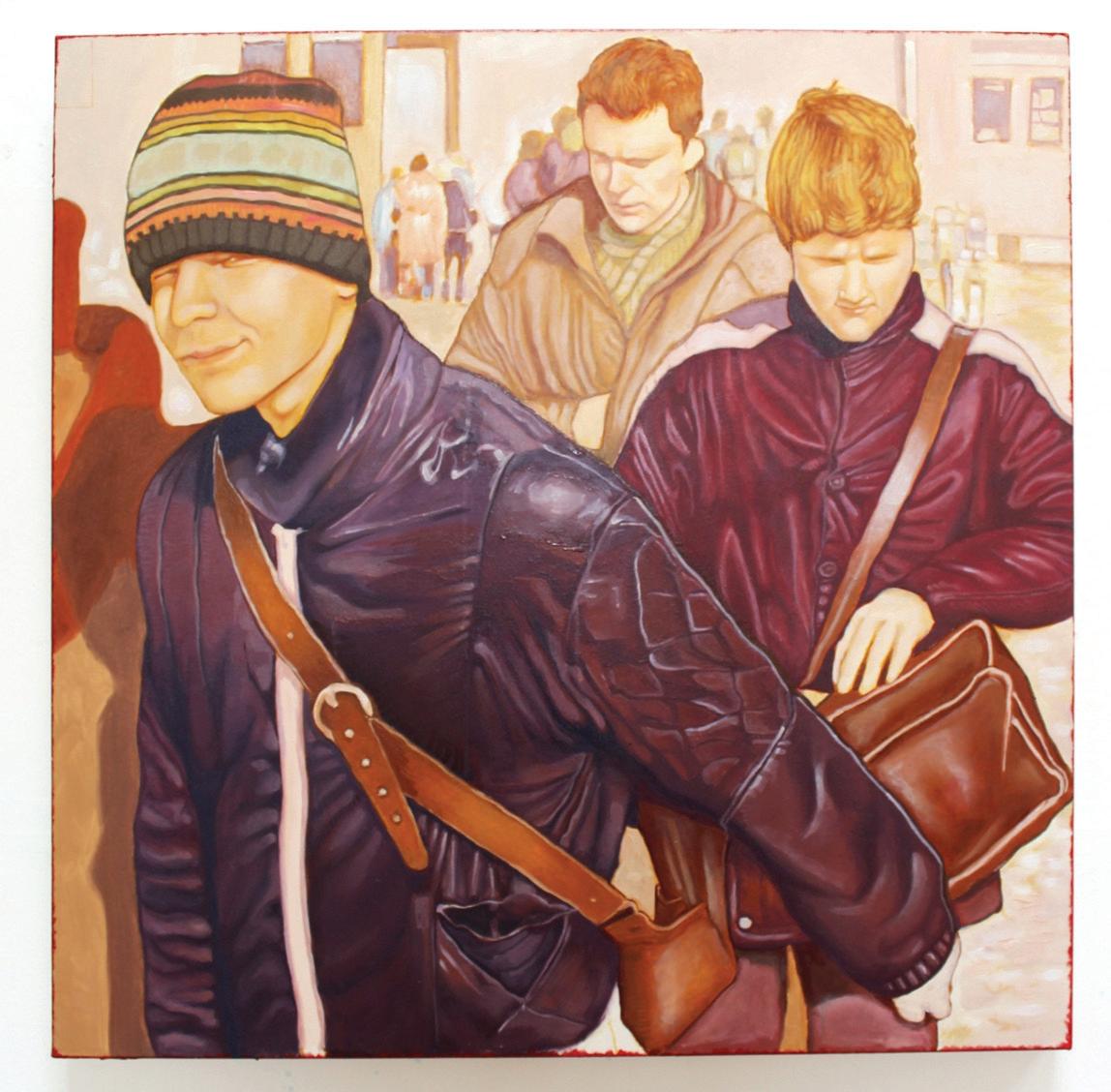
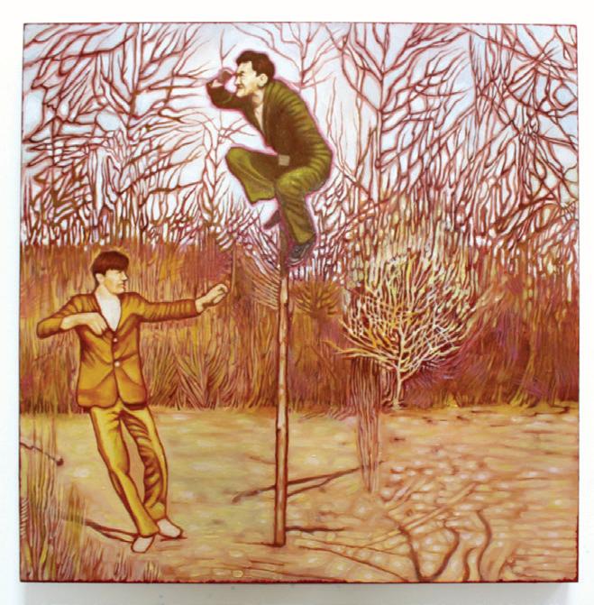
“I am an Irish-Russian painter whose practice centers on social dynamics. Through a slow, contemplative process, I create oil paintings based on archival black-and-white photographs from my mother’s upbringing in the Soviet Union. My mother’s archive, containing informal scenes of a close-knit group of friends, serves as a means for me to examine socialisation behind the Iron Curtain.
I am drawn to the close connections and subtle intimacies between these people alongside the broader historical narratives, as well as the contrast between adolescence and the constructed ideals of normality. Adolescence, I find, is a vulnerable yet transformative period where the environment plays a decisive role in shaping identity and behavior. The paintings capture figures in calm, transient moments, blissfully unaware that the Soviet Union would collapse a decade later, following the onset of Perestroika in the late 1980s, and its far-reaching consequences.”
Charles O’Mahoney is currently completing a BA Hons in Art from ATU Galway. A sustained interest in social dynamics informs his practice, alongside his mother’s biography and an ongoing engagement with historical contexts such as the Iron Curtain and Perestroika.
@omahoneycharles charlesomahoneyart@gmail.com
“The sun will shine into our yard, too”, 2026, oil on canvas, 90 x 90cm
“Work is not a wolf”, 2026, oil on canvas, 90 x 90cm
Claire Dennehy
Claire Dennehy is a fourth-year Art student at ATU Galway. Originally from Dublin, she recently moved to Galway to pursue art full-time. She’s also a qualified Home Economics teacher and Guidance Counsellor. Mental health issues and art from the female perspective heavily influence her work. She uses a variety of media, including sculpture, ceramics, digital media, and textiles.
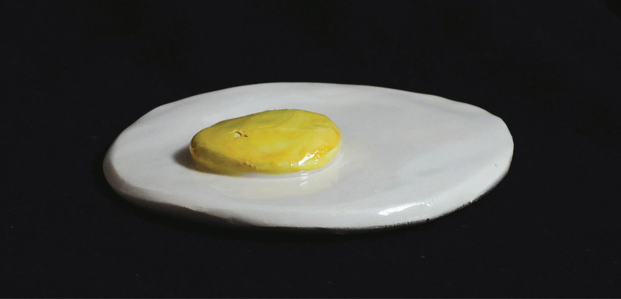
For her latest work, she has been exploring the theme of women as a commodity. She chose mainly ceramics for this project, as unlike women, it doesn’t have an expiry date, and both women and ceramics are some of the earliest commodities.
Women and their body parts are often compared to food. It suggests that women’s purpose is to be consumed. She created the piece Blas na mBan, inspired by this concept.
At first glance, the works resemble familiar foods and produce. However, each object is drawn from slang terms historically used to describe women, their shape, or parts of their bodies. By creating these ceramic forms, it reduces the female body to consumable parts that can be easily arranged, priced, displayed, and sold.
She chose a farmers’ market-type stall to bring it back to traditional ways of buying and selling. It becomes a site where humour and discomfort intersect, where the colourful visual display masks a deeper critique of how women’s bodies are assigned value.
Blas na mBan exposes the absurdity embedded within everyday speech. What is often dismissed as playful slang is revealed as a vocabulary of consumption, commerce, and control, where the viewer is positioned not only as an observer, but as a consumer.
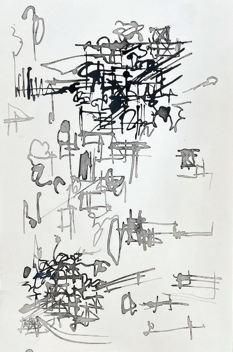
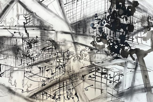
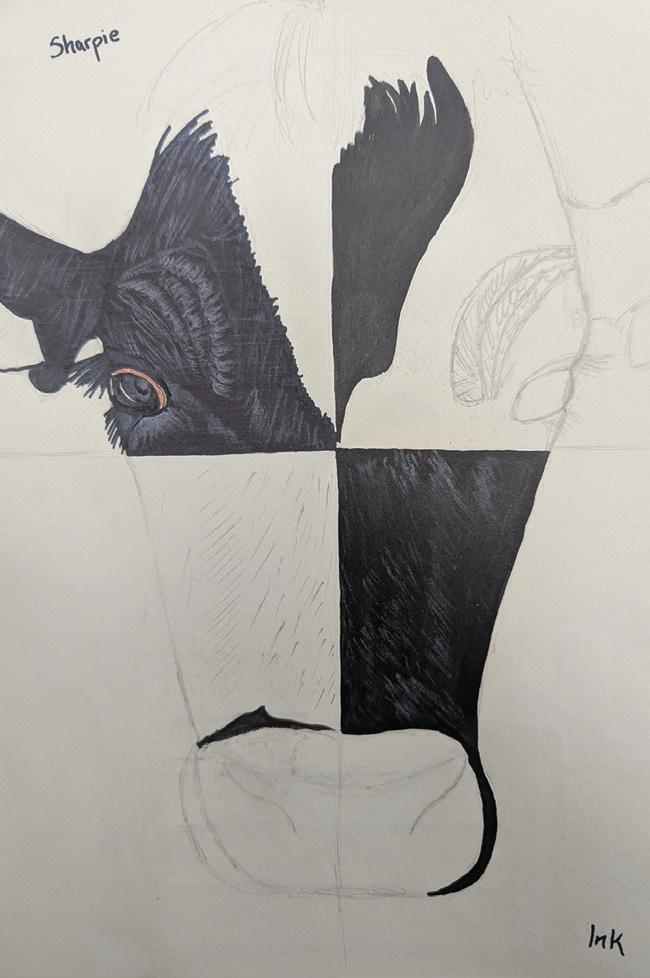
Hermione is a visual artist based in the West of Ireland. Her current practice is grounded in a sustained engagement with drawing, exploring the possibilities of ink and charcoal to examine attention and perception. Through this work, she questions how built and digital structures shape and control everyday life.
The materiality of ink and charcoal introduces instability, drawing her toward the tensions and risks that come with losing control. This unpredictability creates a space of negotiation, where she continually works to re - establish control through the act of drawing.
Across her work, this process opens up alternative modes of looking and being within systems that control, accelerate, and consume. She positions her drawings as a commitment to attentive modes of observation and release, creating space for reflection on structures of control across urban and digital environments.
@hermionerufflesart
hermionerufflesart@gmail.com
Release, 2026, ink on cartridge, 29.7 x 21cm
Simulation, 2026, ink & charcoal on fabriano artistico paper, 76 x 56cm
Julia Wolkowyska
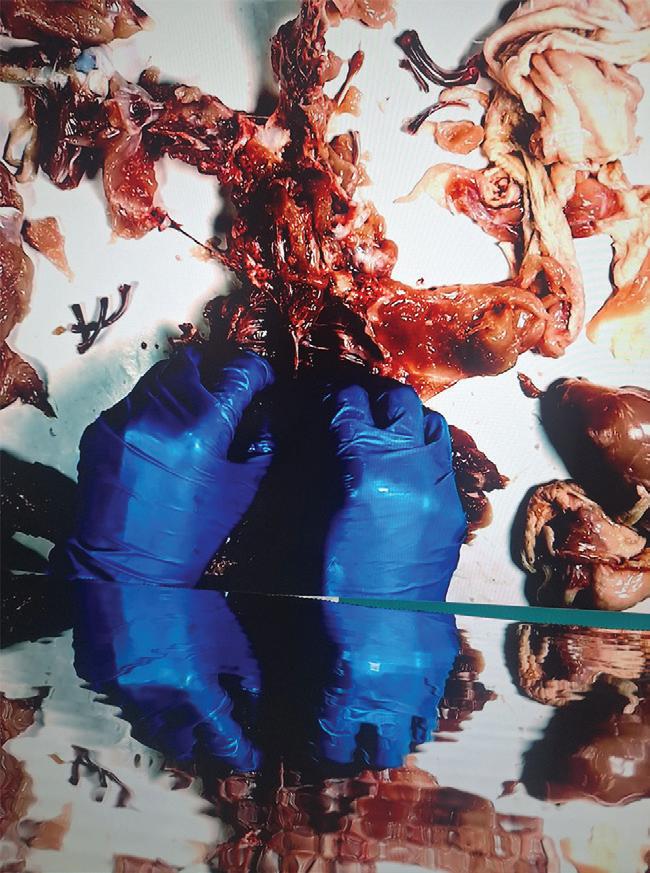
Julia Wolkowyska is a Polish-born multidisciplinary visual artist based in Galway, working across ceramics, sculpture, video, and photography. Their practice examines themes of memory, suffering, violence, endurance, and the fragility of self-worth. Their work confronts both emotional and physical vulnerability, creating unsettling experiences that resist comfort with the intent to provoke visceral, lingering responses. Through sculptural and digital processes, Wolkowyska explores the tension between sensation and numbness.
Recent work investigates the desensitization to violence, suffering, and the aestheticization of self-harm shaped by constant exposure to graphic imagery through news, cinema, and social media. With repeated encounters - initial shock erodes, discomfort dulls, and empathy thins, what once disturbed becomes background noise, resulting in complete void of emotion in response to such content. It bleeds into our perception of real-world pain, where violence risks becoming normalized and consumable. Wolkowyska examines this erosion of feeling as a form of dependency: the pursuit of increasingly extreme stimuli in an attempt to recover lost sensation and meaning.
By confronting viewers with visceral interpretations of discomfort and psychological unease, their practice questions what remains when the ability to feel is diminished entirely. The work interrogates the threshold between awareness and indulgence, exposing the intoxicating repetition of numbness while asking; how far individuals are willing to go simply to feel something again?
Beauty in my Blood (Detail), 2026, Ceramic, 300x200cm
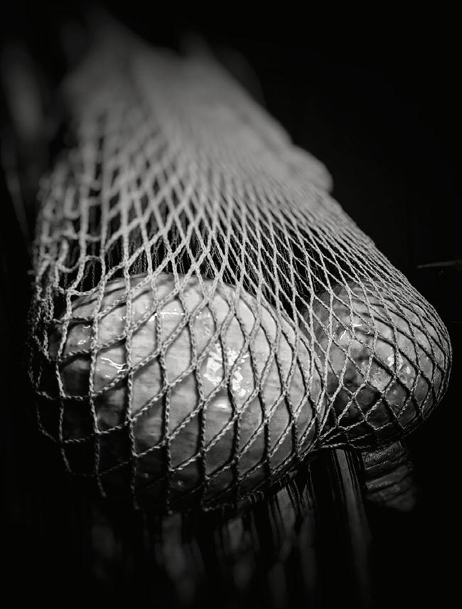
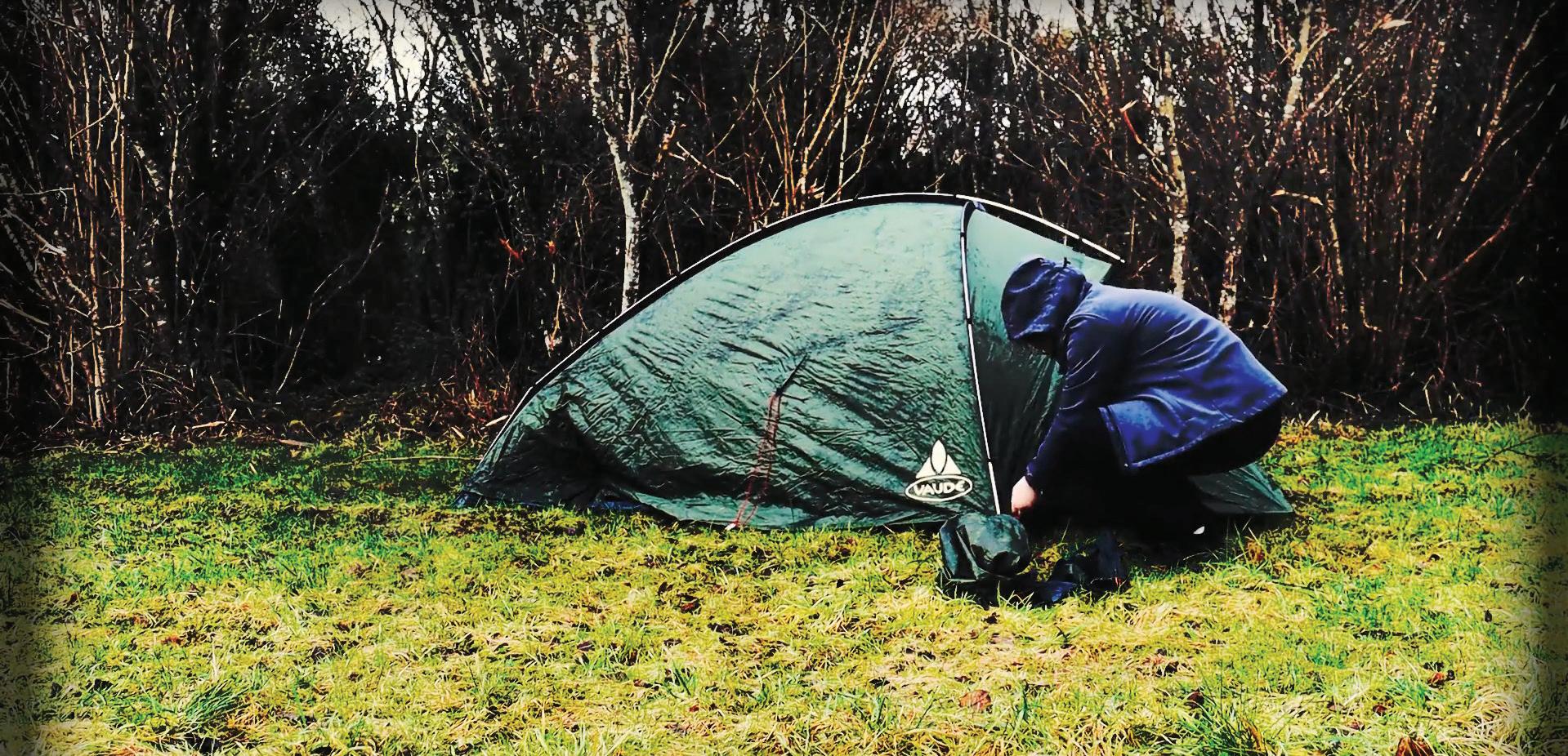
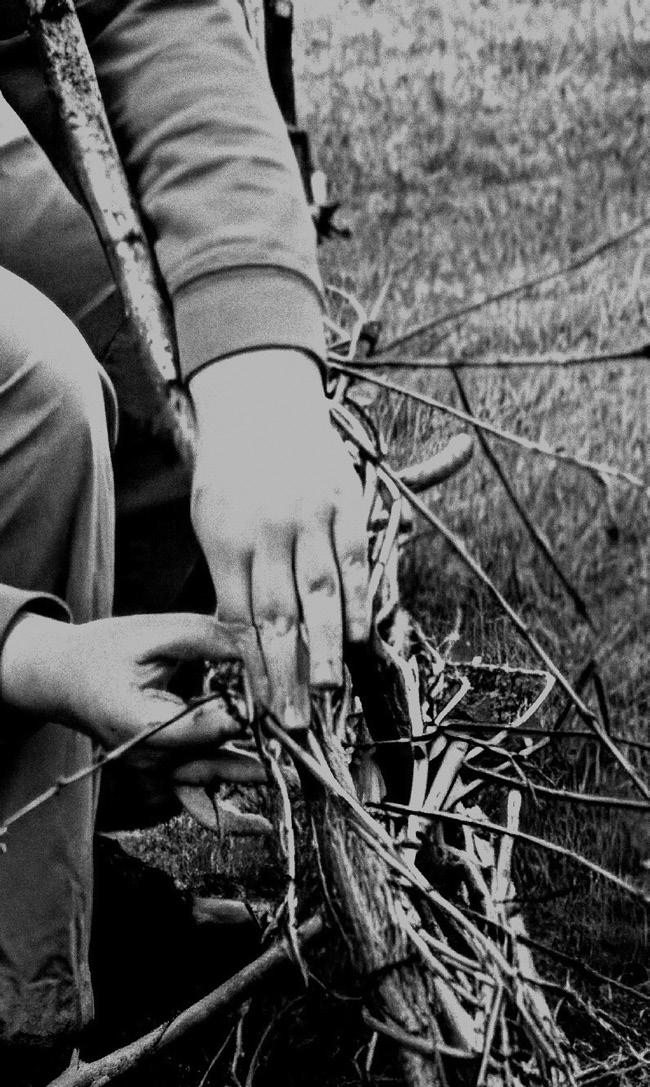
Katie Duson is a multidisciplinary artist, working mainly with themes of mental health. Her work depicts the human body, life and mentality. Katie is influenced by artists such as Andy Goldsworthy, Laura Ellen Bacon and Frida Kahlo, as well as her own personal experiences. Her work often depicts mental health in hidden ways, focusing on depression and isolation, both in a positive and negative light. Katie is currently a 4th year student in ATU Galway studying BA (Hons) Art and has exhibited in the 126 Gallery in Galway in a group exhibition. Her background includes performance, and this is shown in some of her pieces.
katieduson@gmail.com
@art_space_pics
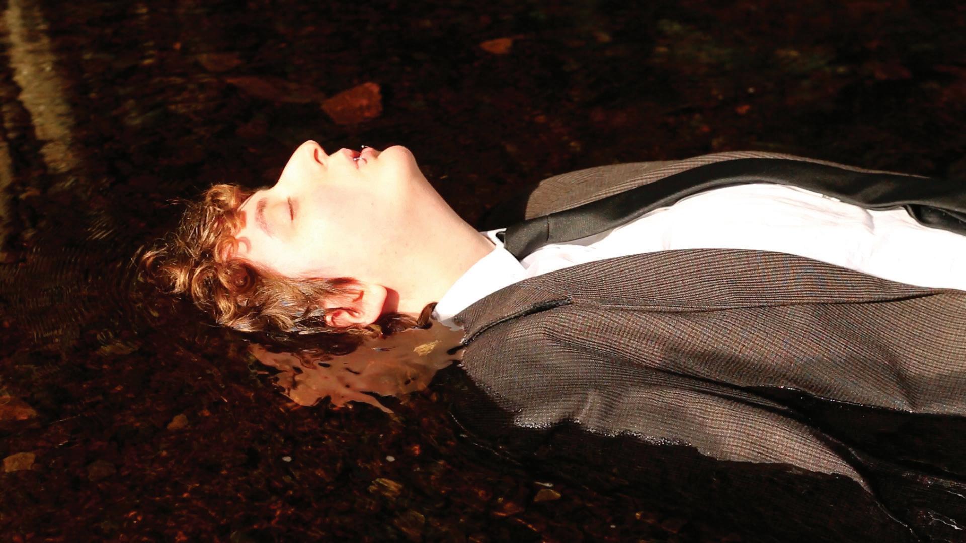
Isolation, 2026, video still
Detailed image of willow weaving, 2026, willow and hazel branches
Katie Duson
Mickyla Tate
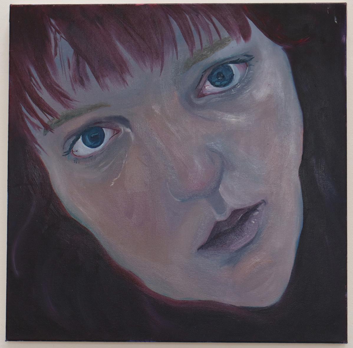
My work is rooted in human experience and emotion as I hope to open conversations around representation in art and the layered complexities of being human. Each painting becomes a record of a fleeting internal state, a moment where feeling and form briefly meet. I choose to depict myself in an unflattering, often cold manner, resisting idealisation and in doing so, I aim to reveal the rawness of human skin and the unfiltered reality of being.
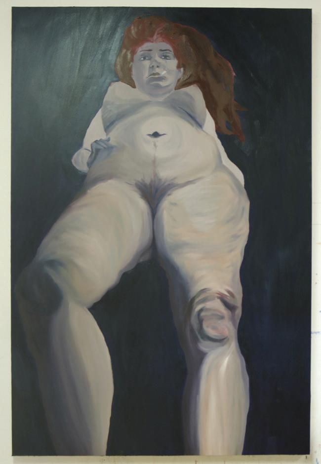
I aim to challenge the viewer’s perception of the body, subverting traditional representations of femininity and sexuality. Each piece becomes a dialogue on power, objectification, and autonomy, using the body as an expressive form of self-reflection and a means to spark thought on how we portray women in present day media and culture. By using my own body as both subject and site of exploration, through expression, facial movement, and physical gesture, I attempt to capture psychological experiences, moments of feeling held in time.
@kyla_tate3
kyla.tate.1234@gmail.com
Self-Portrait I, 2026, Oil on canvas, 70x70cm
Giantess, 2026, Oil on canvas, 180x120cm
Reithabetse Rita Moiloa is South African born, Galway based Visual Artist working predominately through the mediums of paint, photography and moving image.
Her current body of work is centred on the depiction of the female body, not as a still source but as a functioning medium and an active source.
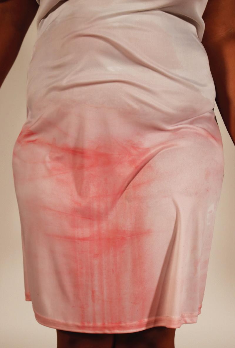
Having researched the historical conceptualisation of the menstrual cycle, she aims to challenge patriarchal and religious ideologies that have birthed and continue feeding into the negative connotations held towards the menstrual cycle and the physicality of menstrual blood.
Through this work she aims to diminish the internalised shame and hatred that menstruators have been taught to have for their menses.
The artist’s concern is primarily with how her painterly materials and photographic work can translate into drawing connection to the female body as an active medium and the menstrual cycle as the source of life.
Her work also tries to address the public health crisis of period poverty that goes unnoticed in our daily lives but deeply affects menstruating bodies around the world.
Menstrual Wait,performance video still, 2026.
Heavenly Flow #2, detail, 2026, oil on canvas, 90x70cm panel.
Reithabetse Rita Moiloa
Robin Quinn
Robin Quinn is an Irish artist working with various mediums, including sculpture, film and photography. Their work centres themes of identity and queer experience through these creative disciplines.
Currently their work focuses on the fluidity of identity and attempts to investigate the confusion and inner exploration that often accompanies it. Robin uses their own image and body within their art, in effort of communicating their personal understanding of queerness, and trying to create through a lens of vulnerability.
As a trans artist they are heavily influenced by their understanding of varying identities and their surrounding community. Their work reveals moments of openness and reflection, in hopes of creating an atmosphere which captures the viewers curiosity.
The unpredictable nature of the queer experience and Robin’s personal struggle with how they are perceived in society, both play into how their art manifests. By focusing on finding clarity in their identity, while simultaneously trying to conceal and suffocate it, Robin’s work strives to express a feeling of not knowing oneself but wanting to.
Robin’s current project, entitled ‘Downriver,’ incorporates a film piece and various sculptural works, each of these elements combined creates an immersive space that hopes to show a glimpse of emotion, and evoke feeling within the viewer.
@bitsnrobs.art
robin_quinn@outlook.com
Downriver, 2026, Film
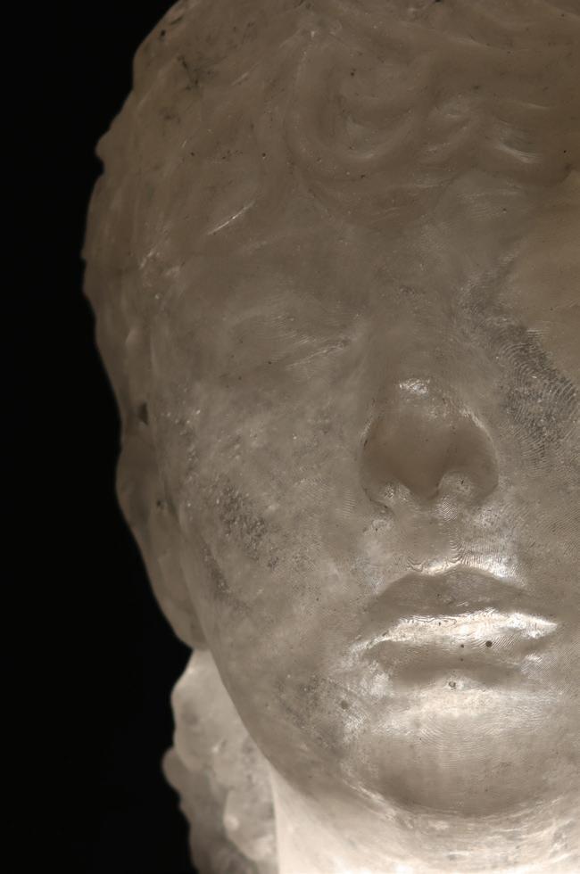
Untitled, 2026, Resin, 26 x 18 cm
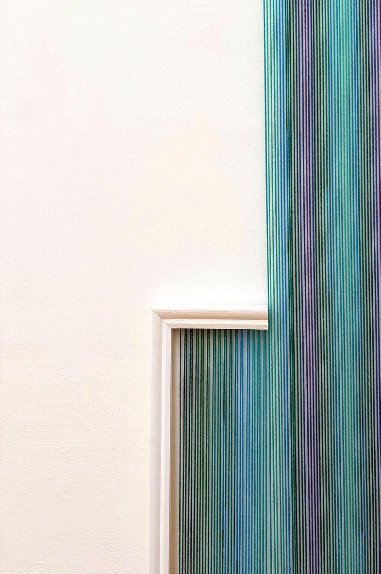
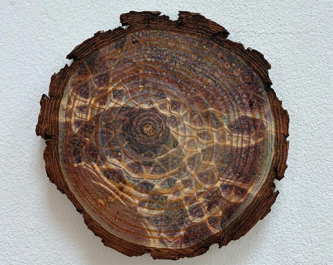
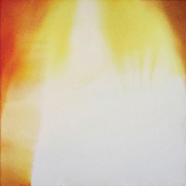
“My practice explores geometry as a visual language that connects historical and contemporary forms, from the structured patterns of Persian architecture to emerging visual languages that engage with a spectrum of speculative futures. The tension between past and future, order and chaos, underpins my artistic inquiry. My current work is spatially reactive and materially driven, often developing in direct relation to its environment, exploring the line between 2D and 3D. I enjoy the challenge and the intuition that comes with creating these immersive pieces that expand from the wall into the surrounding space, suggesting hidden spatial realities. I use dye sublimation, installation, and textile-based processes using string, wool, fabric, and nails to create layered compositions.”
Sarah Callaghan is a multidisciplinary artist from Dublin, based in the West of Ireland. She has previously exhibited in 126 Artist-Run Gallery as part of the group show Ephemera in 2025, and the 126 Members Exhibition in 2026. Her travels, including a residency in Iran, have influenced her practice, particularly in merging traditional crafts with futuristic ideals.
Her work is inspired by her interest in geometry, and the intersection of art and science. Her current work challenges the convention of painting by working within and against the frame, allowing wool to act as a painterly material that stretches, spills, and expands into a sculptural installation. In repurposing materials traditionally associated with craft and painting, Sarah positions this material tension as a way to question her place as a woman within the canon of fine art.
@sarahcallaghanart
www.sarahcallaghanart.com
sarahcallaghanart@gmail.com
String Theory III, 2026, wool, wood, 90cm x variable
Persian Geometry, 2026, dye sublimation on wood, 14cm
Sarah Callaghan
Sophie Barling
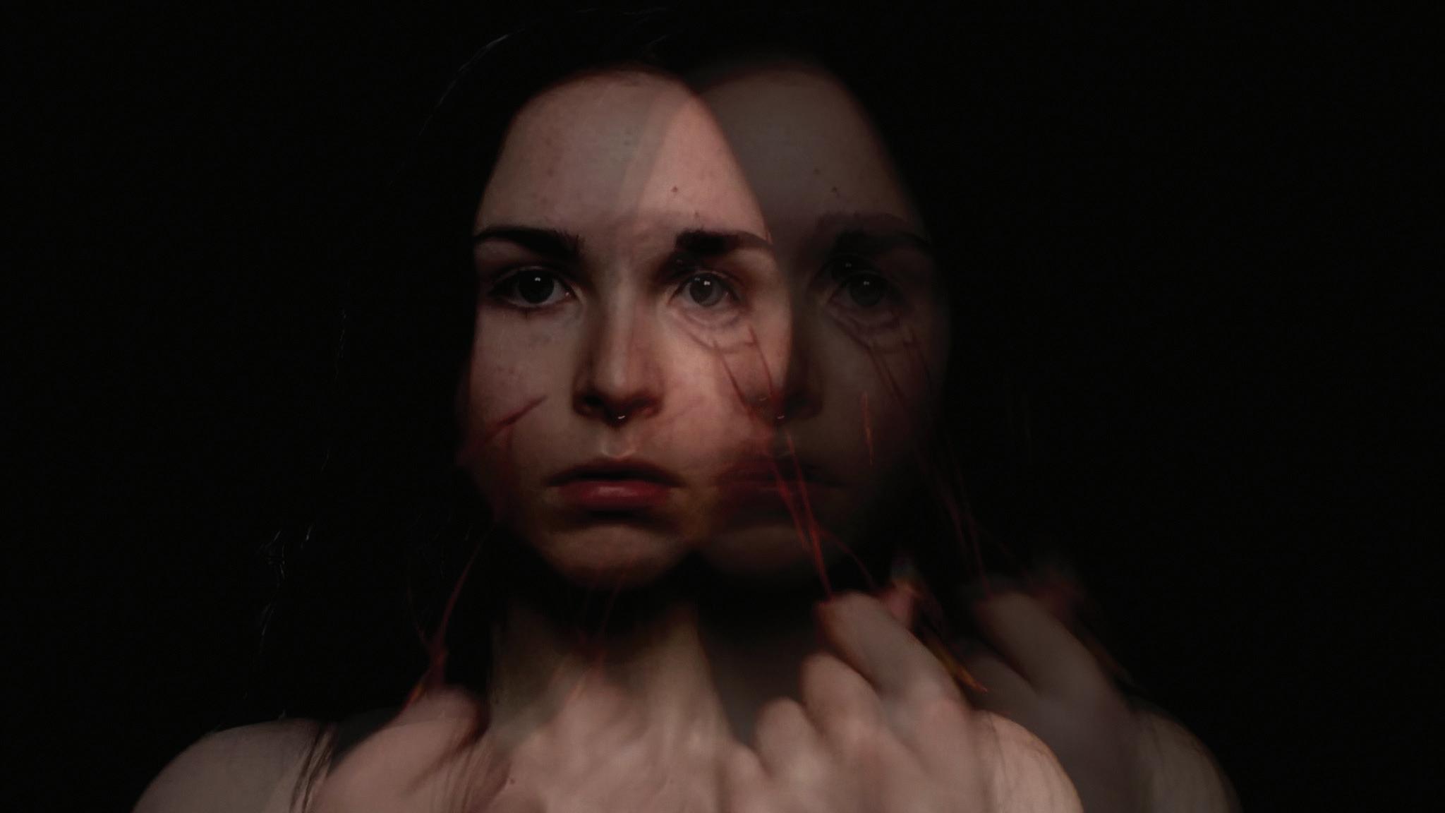
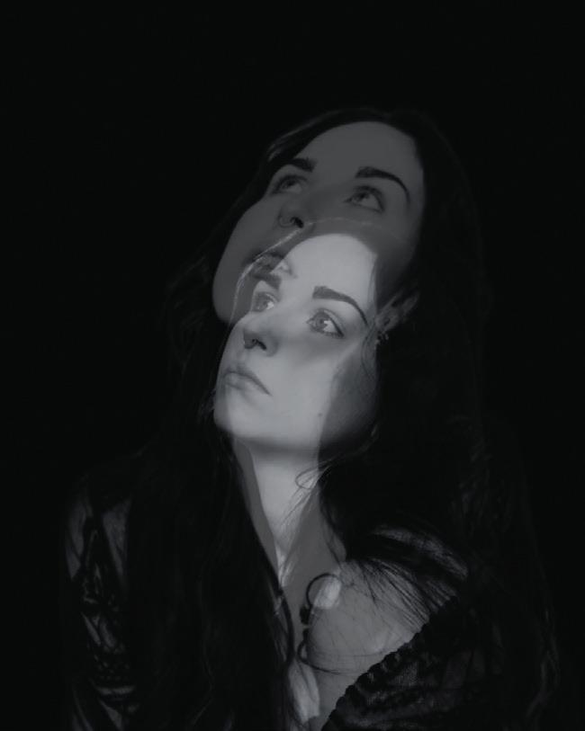
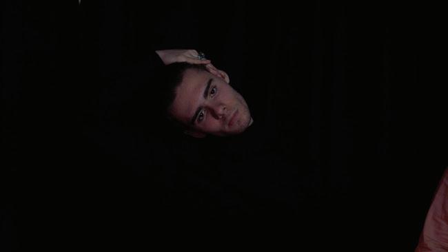
Sophie Barling is a multidisciplinary artist based in Galway, Ireland. She creates a range of work from painting, drawing, photography and video works. Inspired by the surrealist and gothic artists, her work includes unusual and dark themes such as body dysmorphia and distortion of the human body and shows this throughout all her work. Sophie tends to keep her work very dark using very little colour and usually includes blacked out backgrounds to stay connected with the themes of the Gothic, dark aesthetic. Her work mainly consists of photography and video work. Whilst drawing is a very important part of her practice, these drawings usually end up as inspiration for a video piece or photography collection. Including herself as a focal point in her artwork is a common theme. This makes her feel more connected to her works and gives the finished pieces a personal touch.
sophbarl31@gmail.com
‘Control’ , 2025, Photography , 115cmx115cm
‘Amorphous’ , 2026 , Photography , 62cmx60cm
Tanya Chakálova
Tanya Chakálova is a Ukrainian multidisciplinary artist based in Ireland, working across painting, printmaking, textile-based work, and video. Her practice explores memory, trauma, and identity through material processes rooted in reconstruction, repetition, and preservation.
In 2022, Tanya survived the siege and destruction of her native Mariupol during the fullscale Russian invasion of Ukraine. This experience continues to shape her work, which reflects on how war trauma settles within memory, body, and everyday life.
Rather than attempting to depict war directly, the work becomes a way of living alongside its aftermath and of reclaiming the ability to document and witness. A central tension within the practice lies between preserving the collective memory of war and learning how to live with its emotional weight.
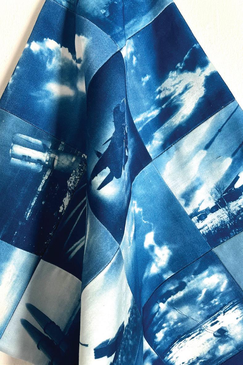
Fabric and embroidery have become central materials within the body of work. Associated with care, protection, domestic space, and intergenerational connection, they stand in contrast to imagery of war and destruction. Photographic prints function as fragments of memory and reconstructions of moments that could not be documented at the time, yet continue to demand preservation. Anthotype prints mirror the nature of trauma memory itself – unstable, fragile, and vulnerable to fading and disappearance. As a slow and repetitive gesture, stitching serves both as testimony and as grounding, tracing experiences that resist erasure while becoming a way of returning to the body during repeated engagement with traumatic memory and imagery.
In her work, Tanya also reflects on how war is remembered, mediated, and spoken about, while preserving the lived experiences of civilians often reduced to maps, statistics, and military or political reports.
tanya.chakalova.art@gmail.com
@tanya_chakalova
www.tanyachakalova.com
Back Flash No. 32, 2026, watercolour on cotton paper stretched on basswood panel, 40x40 cm.
The Source of Light (detail), 2026, cyanotype quilt, 120x180 cm.
Taylor O Connell
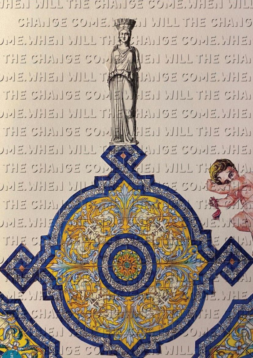
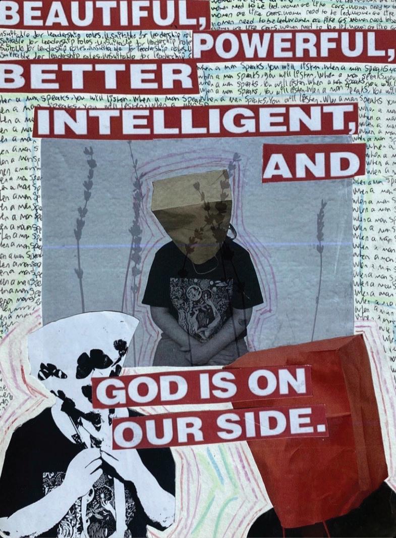
“My work combines videography, collage, sculpture and digital media. The art I create originates from an interest in how women are continuously portrayed in the media as objects. I have a keen interest in magazine advertisements that is often used to belittle women within them. By splicing imagery together, I create imaginative compositions that portray a satirical take on these themes.
Working through collage gives me the opportunity to tackle political issues at hand while keeping a lightness to my work. I use text in my work frequently, with misogynistic phrases or sentences and repeating them in the background of collages.
My work is to confront issues of sexism in media that we see in everyday life. These issues are still growing exponentially due to the rise of social media and the toxic masculinity of men wanting to prove their masculinity by creating a space where the defamation of women is normalised.”
Residing in the midlands of Ireland, Taylor is a mixed-media artist whose primary focus of work is collage and digital media. Taylor is interested in aligning politics within her work as it’s something that she feels resides personally with. Through working with text and splicing images together, she brings a satirical sense to her work drawing viewers in.
tayloroconnell421@gmail.com
When will the change come. 2025. Digital collage.
God is on our side. 2024. Collage on paper
Bachelor in Arts ( Honours) in Communications, Media and Storytelling
Grace Fitzpatrick
Grace Fitzpatrick is a Communications, Media and Storytelling student hailing from County Mayo in the West of Ireland. She always had a strong sense of creativity as a child, spending every moment of her free time either drawing or doing arts and crafts. This lifelong interest has evolved into a professional focus on graphic design, social media management, and content strategy at Atlantic Technological University.
Grace’s work is driven by an interest in exploring specific social subjects, including rural isolation, mental health, and beauty norms. Rather than focusing solely on aesthetics, she uses design to bridge communication gaps and highlight overlooked experiences.
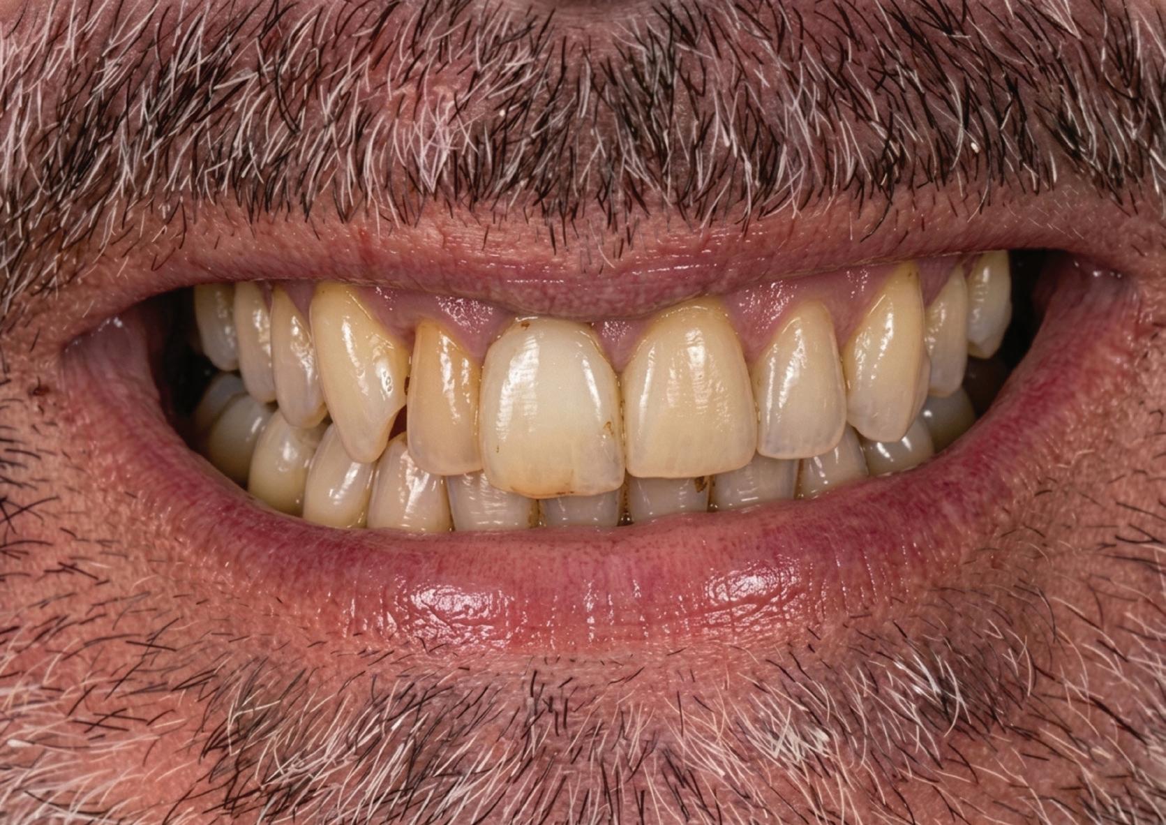
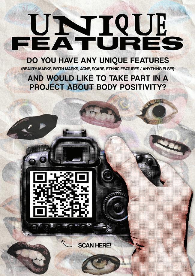
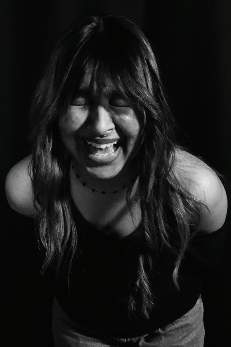
This interest in challenging standard perspectives led to her contribution to the website project Nor.Mal, where she directed a photoshoot centred on teeth and beauty norms. Grace specifically enjoyed this project for the way it subverted conventional standards, opting instead to celebrate the character and authenticity found in natural imperfections.
Through her creative practice, Grace has refined her ability to develop social media content and design strategies that prioritize meaningful engagement. Her approach remains focused on creating purposeful, socially conscious media that resonates with a modern audience.
Title: Smile For Us! , Year: 2026 , Medium: Photography , Dimensions: 3508 x 2480 (300dpi)
Title: Unique Features Poster , Year: 2026 , Medium: Digital Design , Dimensions: 2480 x 3508 (300 dpi)
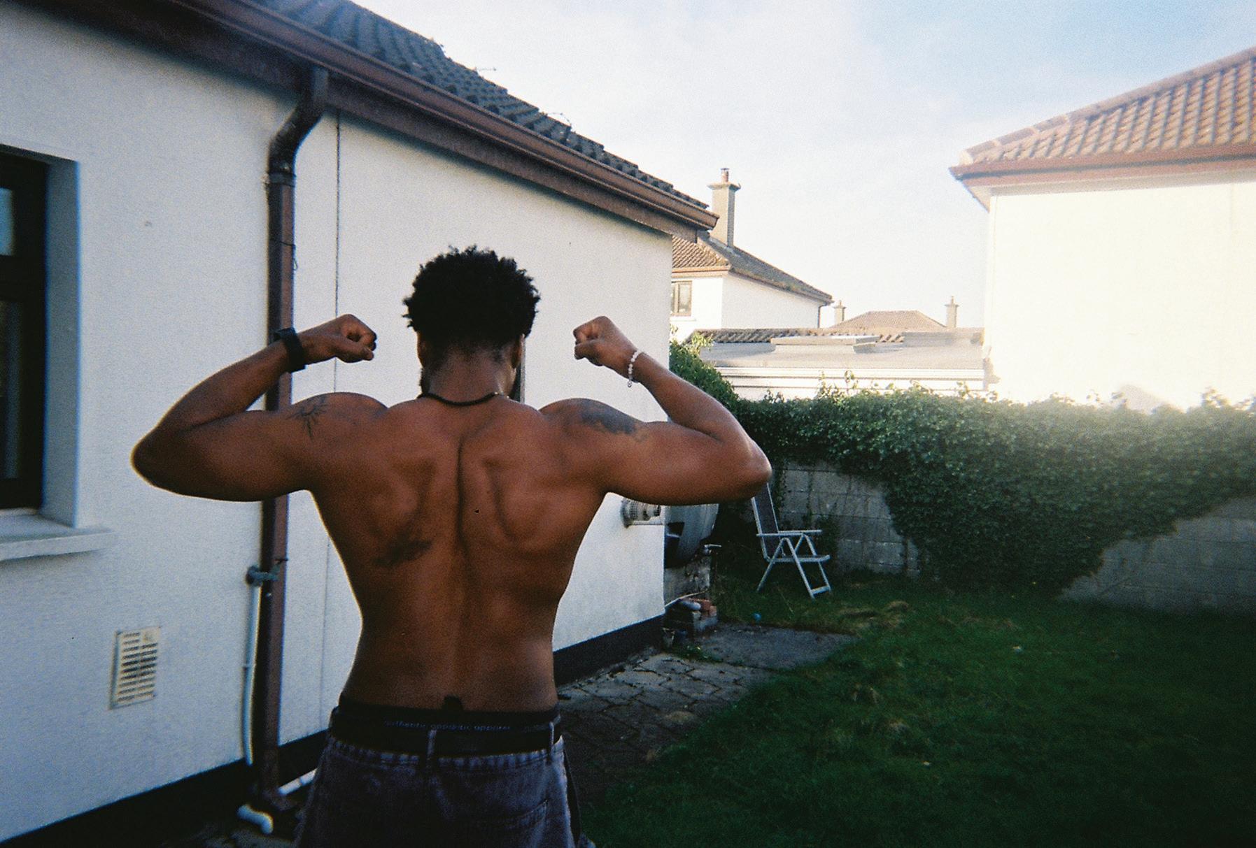
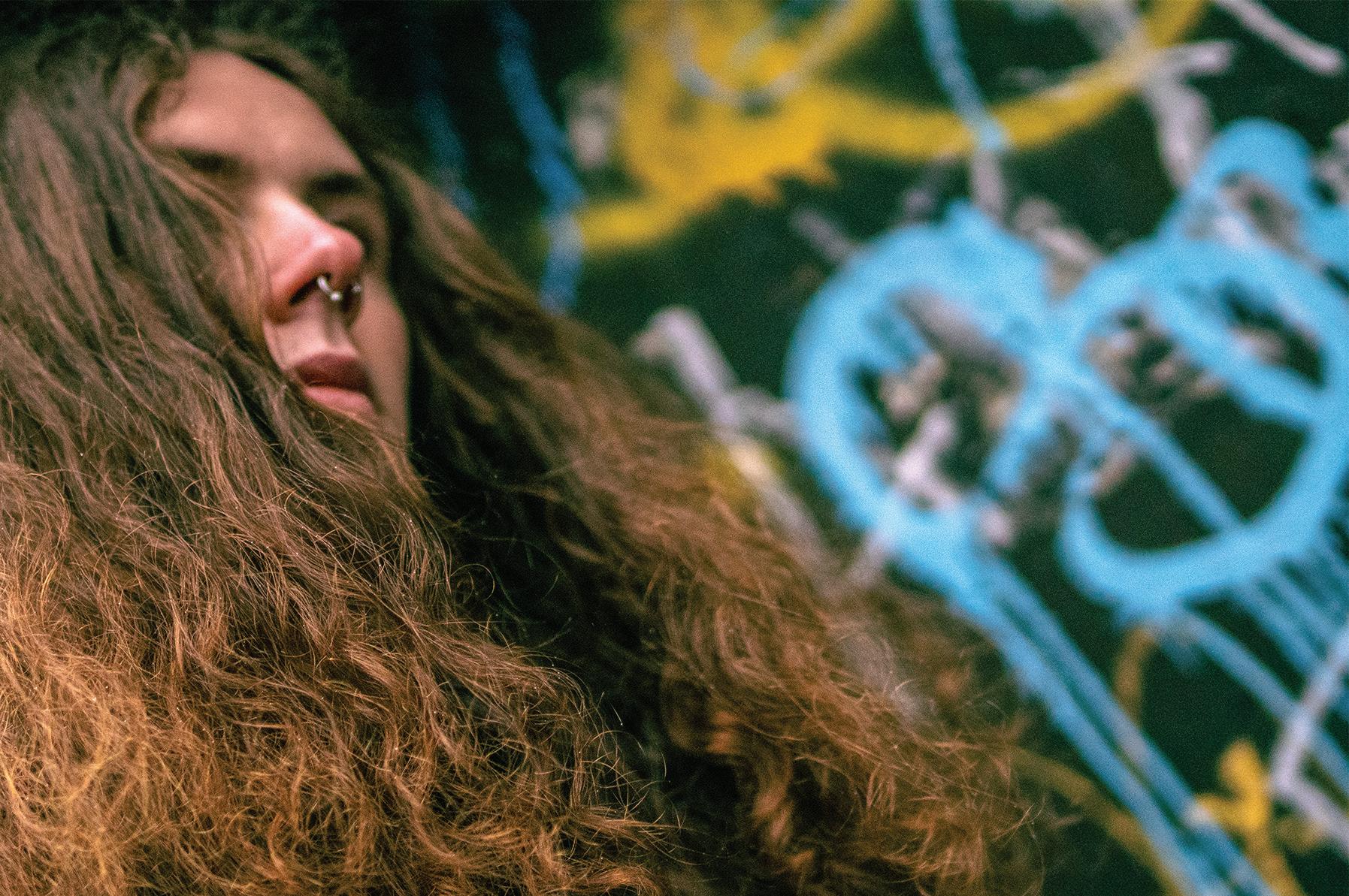
Not wishing to be confined to one medium, Jake Carroll’s practice spans digital storytelling, creative direction and community-led initiatives. His work draws from Irish life, subcultures and online spaces to build worlds that reflect his everyday experience. Studying Communications, Media & Storytelling sharpened his skills across a broad range of disciplines including local journalism, media production and digital marketing. This culminated in his work as digital lead on the online magazine Nor.Mal. His featured photo series on body positivity offers an alternative perspective on male body modification and control.
EMFM, his most recent project, translates this multidisciplinary approach into a focused platform for alternative nightlife, promoting e merging artists and local culture. For Jake, this reflects the core of his work: making stuff that feels authentic, forward-thinking and meaningful to those it represents.
KDX, 2026
CARDS, 2025
Jake Carroll
From Czech Republic Lucie started her journey in finding how to express herself with early experimentation in artistic areas. By developing a deeper understanding of video, audio, editing, animation and design elements during her time on this course, she has found her creative voice and set her creativity free.
Lucie began to feel a strong pull towards creating fictional worlds, finding gratification in world-building through digital drawing and writing. For Lucie, expression has no single medium. She lets every story choose how it wants to be told and brings it to fruition in her own distinctive way.
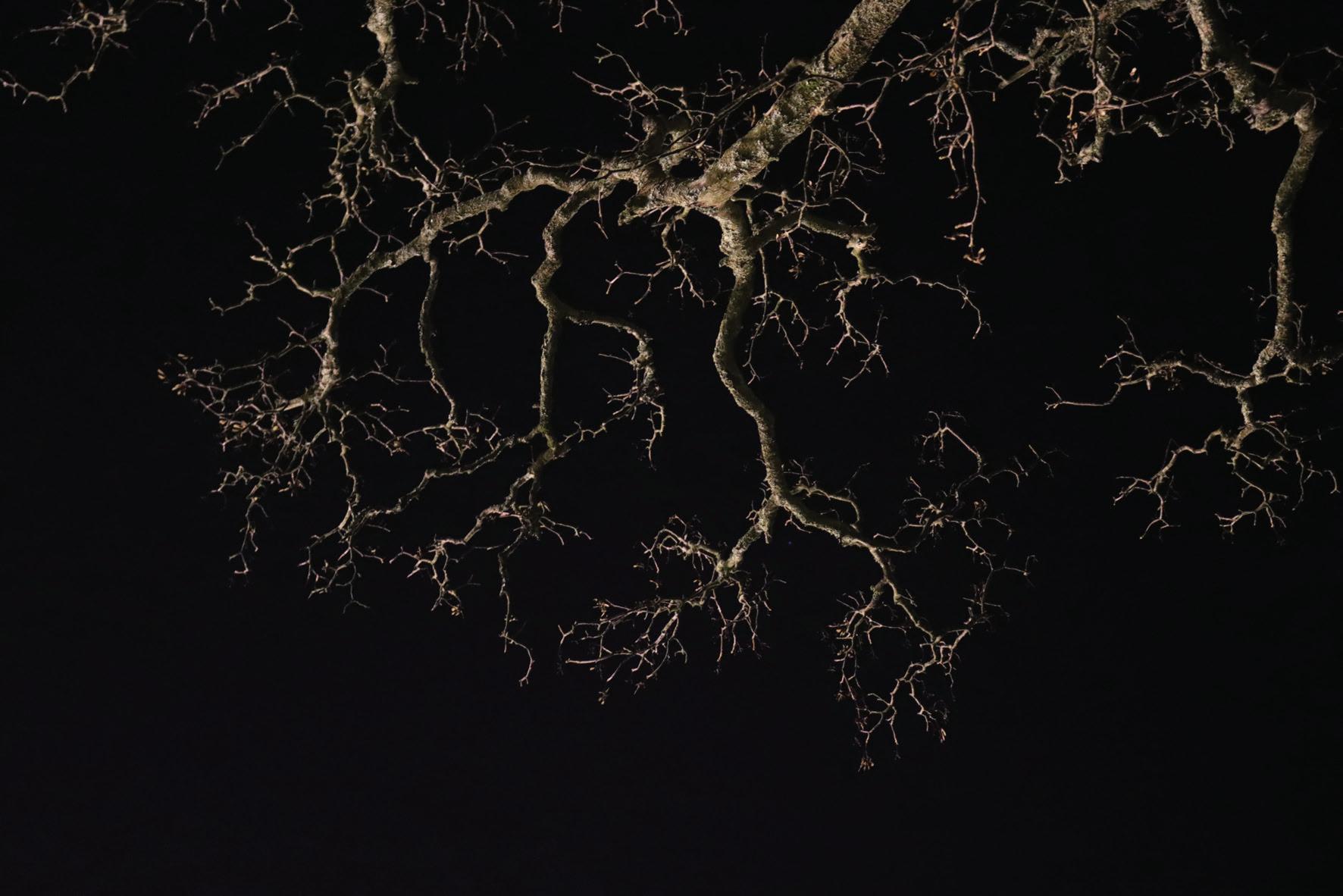
Having a close relationship with nature helps her to find beauty in everyday life; moments that many often overlook. In her project with night time photography, she was inspired by the way light changes our perception of and connection to ordinary objects. In the dark of night, the same old things we see daily and stop paying attention to are suddenly illuminated differently, giving them a new dimension.
With the project Free to Fly, Lucie combined photos with digital drawings, creating imagery that helped her share her inner world with others.
With her class they created a digital magazine Nor.Mal and Lucie created for it an animation depicting the inner turmoil of eating disorders and created a photo series on body hair combining her love for both photography and digital drawing.
https://luciecreates.framer.website
Lucie Suzane Williams
Natures dark beauty (2025) photography, 150x100 cm
Spirit Guide – Free to Fly (2024) altered photography, 50x50 cm
Pushi is a third year Communications, Creative Media and Storytelling student. Having built up skills in various forms of digital media, whether that be social media content, photography, blogging, podcasting or film making, Pushi is interested in working in social media content creation and copywriting spaces, with both long and short form content.
Pushi has accumulated skills in trend forecasting, digital strategy, marketing, content creation as well as talent and client relations through a collection of web/media projects she’s worked on as part of a team or by herself. The key themes she’s gravitated towards have focused on sustainability, mental health advocacy, lifestyle and food content.
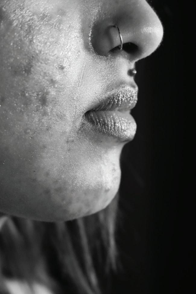
Authenticity and honesty are very important to Pushi, and these values consistently inform the work that she produces. One of her projects, a raw and unfiltered photography and interview combination, explores the mental health impact of living with acne and features student Suvini Edirisinghe. Pushi’s goal was to move beyond surface-level discussions about skincare routines and delve into the reality of cancelled plans, mirror anxiety, and the constant pressure to have perfect skin while living in a world obsessed with flawless appearance. The project aims to subvert modern beauty standards and offer an alternative narrative for self-image, body positivity and female empowerment.
bypushi.com
@Bypushi_
Bypushi@gmail.com
Pushpitaa Thadhani
Pushi Thadhani
Rhys Trimble
Rhys Trimble is a digital media producer who works to bridge visual storytelling and community advocacy. His time on the Communications, Media & Storytelling course saw his interest transition from filmmaking to broader digital media production. This insight came after producing several short films such as ‘THE LYDIA EFFECT.’ Having worked on several community advocacy projects with a team of his peers, Rhys would go on to co-create Nor·Mal Magazine with them. Moving forward, Rhys intends to continue Nor·Mal Magazine with his team, using digital production to drive community advocacy.
Based in the West of Ireland, Sophie Fallon is a Communications, Media and Storytelling student in Atlantic Technological University.
Having grown up in an artistic household, Sophie developed a keen interest in creativity, first manifesting through painting and music. Years later, following various creative paths and attending several courses, it became evident that photography was a strong suit. She pursued this by creating images in her room using fabrics as backdrops, lights piled high on books and stepladders, with outfits made from family hand-me-downs and thrifted vintage pieces.
Branching out from individual work in her bedroom to working with her peers and the public for college was a big adjustment. While attending ATU, she explored multiple media formats which include film making and editing, vlogging, photography, as well as creative, journalistic and investigative writing. Throughout the three years Sophie frequently found herself revisiting the three mediums she’d always loved; photography, cultural commentary, and journalistic and investigative writing.
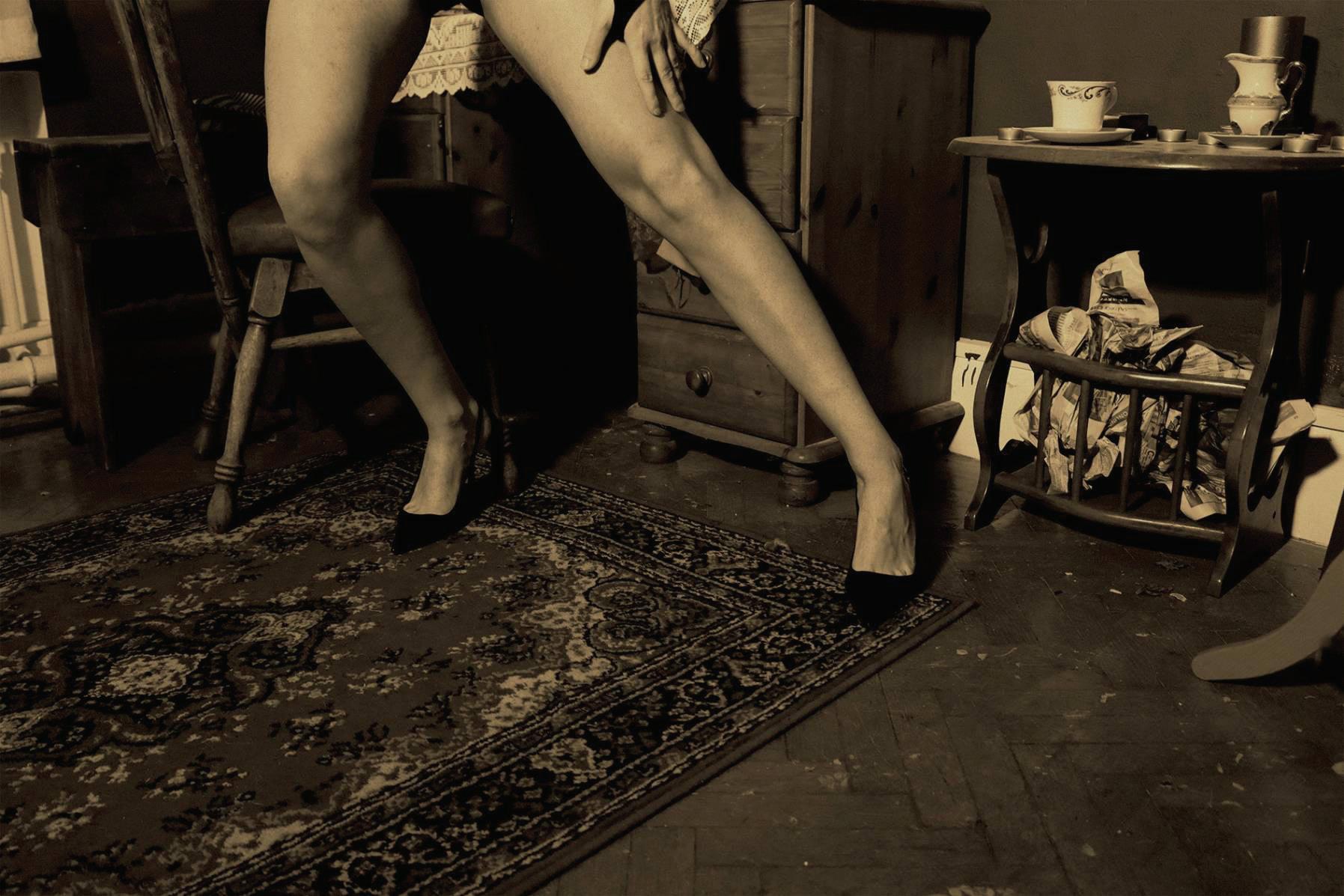
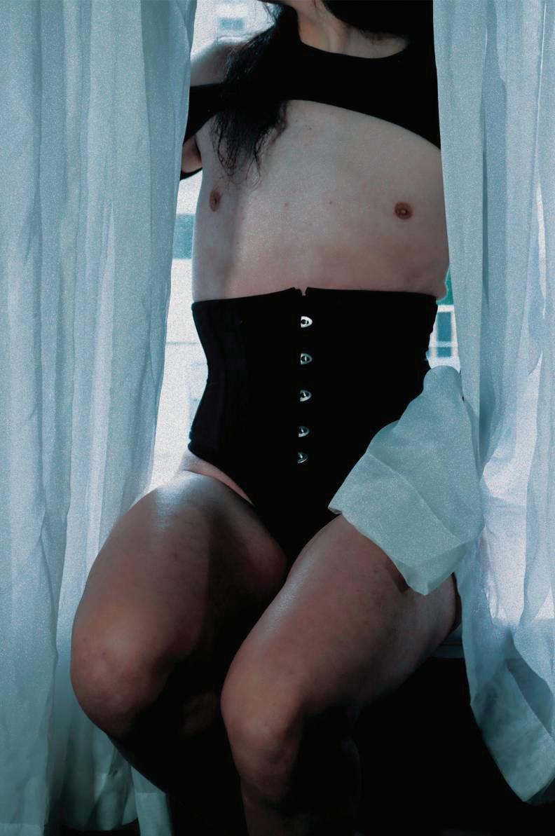
The two chosen photographs, starring Dr. Maria Tonka, are part of a set which were captured as part of the collaborative website; Nor.Mal. Nor.Mal is a site that intends to remind people what normal is. No skin smoothing, bright-eyed filters, or body altering tools. In her photos, Sophie wanted to capture something beyond traditional glamour shots. Close ups that show folds, marks and textures. All complimented by a style reminiscent of old film stills. Other photos from the set shed a light on what’s beneath the costume; the marks from tight corsets and the layers that lay beneath the visible garments.
In a time where harmful ideologies seem to be growing, it’s important not to allow forms of art, expression, or gender expression be pushed to the side.
Drag Superstar: Maria Tonka, 2026, photo, 152mm x 101mm, landscape
Drag Superstar: Maria Tonka, 2026, photo, portrait
Bachelor in Arts ( Honours) in
Film and Documentary
A Fool’s Performance
When the local community theatre’s Night of Shakespeare casts him as the Fool instead of Hamlet, Niall does what any self-respecting actor would do: absolutely refuses to accept it.
Niall has one dream: to play Hamlet. Not on Broadway, not in the West End, just on the creaking stage of his local community theatre’s annual Night of Shakespeare. He has the passion, he has the commitment, and he has spent an embarrassing amount of time practising the soliloquies in his bathroom mirror. What he doesn’t have is anything going in his favour. When rumours spread that a mysterious VIP from the West End will be in attendance on opening night, the stakes suddenly feel very real and the already fragile egos of the cast threaten to combust entirely. Things go from bad to worse for Niall when his insufferable rival is handed the role of Shakespeare himself, while Niall is cast as the Fool. The irony is not lost on him. It all comes to a head when Niall tackles the actor playing Hamlet mid-performance. But with the West End scout in the audience and the curtain still up, does Niall land his big break? The show, after all, must go on.
Director: Hugh Leigh
Assistant Director: Aengus Kelly
Producer: Niklas Innocenti
Cinematographer: Marek Olszweski
Editor: Emilie Downes
Production Designer: Liam O’Connacháin
Assistant Editor/Colourist: Jack Vickers
Location Audio: Cathal Galvin
Post Audio: Theo Fletcher
Just Breathe
An intimate exploration of stress, anxiety and worry and the coping mechanisms people use to relax and keep calm. What stresses you out day-to-day, is it work, college or is life just stressful? When the walls are closing in, when everything is collapsing, how do you relax? When everything is overwhelming, what do you do? From reading and disappearing in books, to expressing yourself in art, or physically distracting yourself, do you distract yourself, or do you face your worries?
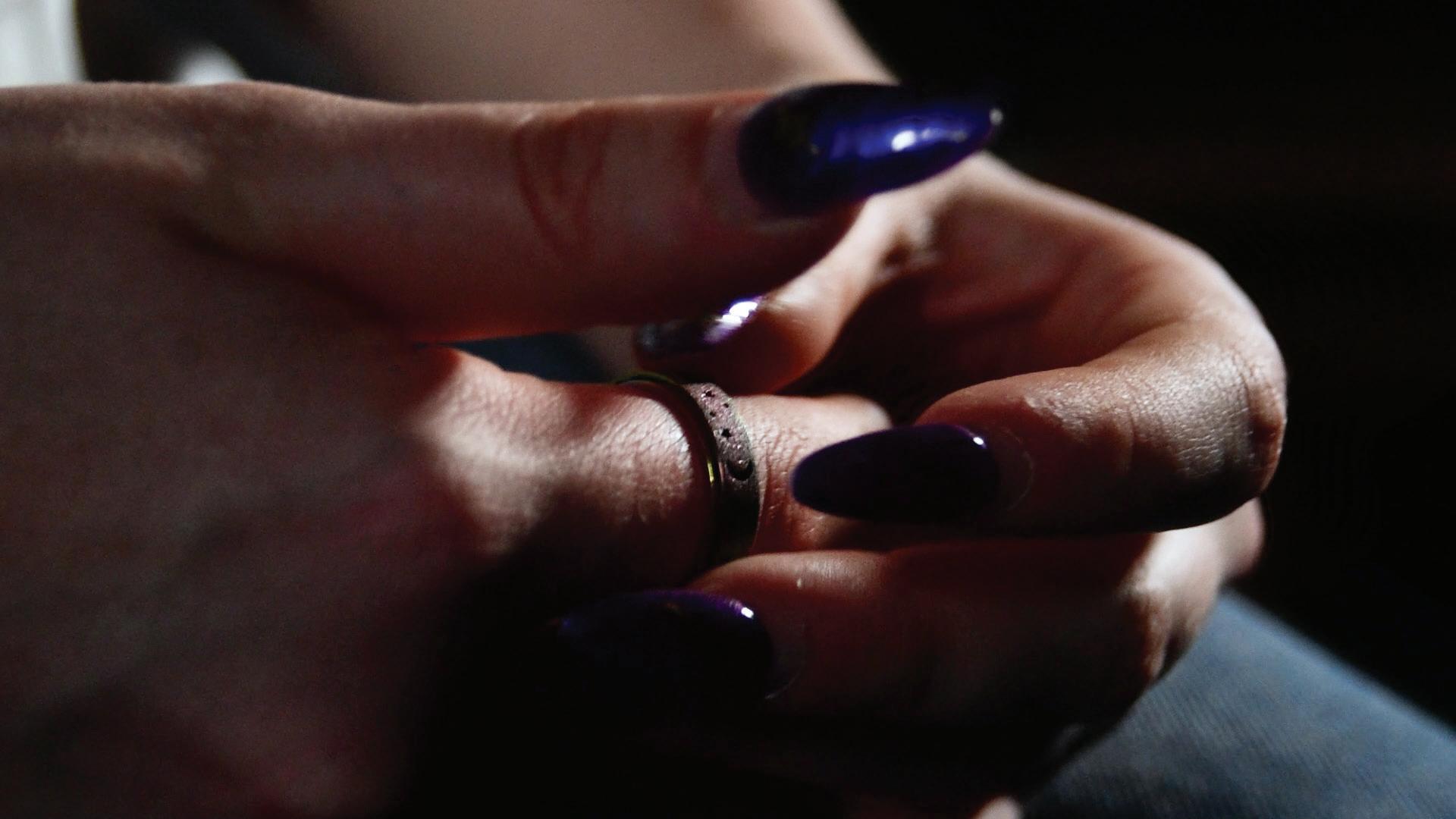
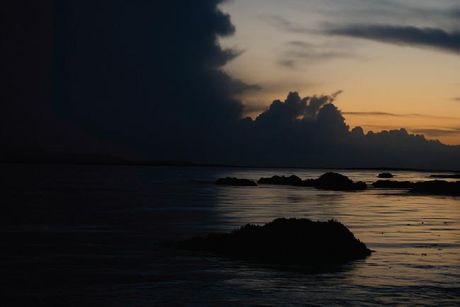
Just Breathe dives into the lives of five people as we explore what stresses them through intimate interviews about their everyday stresses, academic pressure or social anxiety. Featuring Laoi, Aoife, Muirin, Hannah and Paul, who talk us through what worries them, from academic pressure to feeling like they stick out like a sore thumb in public, to how they relax, by talking to their friends, writing their thoughts down in its rawest form, or sitting back and playing games. Throughout the documentary, reoccurring ocean imagery of crashing waves and calm tides play, from dark stormy seas, as the anxiety builds up, crashing with the waves, will the weight of stress drag you under? Will you stay afloat, will you breathe and let the storm pass by and as the waves settle and calm, will you calm too?
This documentary explores stress and relief and delves into self-reflection and the weight of living. And remember, Just Breathe, stay Dead Calm.
Just Breathe,
Take a second, a minute, hour or year,
Take a deep breath
Just two simple words
Slow and steady
Calm against the chaos”
Director: Remy Ryan
Producer: Jack O Regan
Camera & Edit: Amy Cannon
Sound & Edit: Leo Coffey
Aoife’s Ring, 2026, JPG, 1920.1080
Waves Split, 2026, Jpeg, 1080x720
Kiss My Vinyl
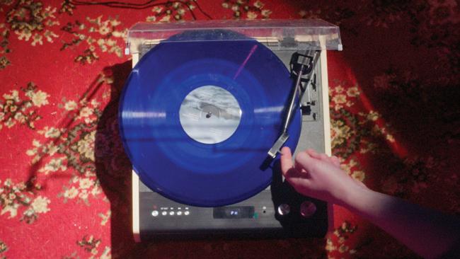
‘Kiss my Vinyl’ is a bombastic tribute to the sentimentality of owning physical media and how it affects one’s relationship to both the content of the media and the actual format.
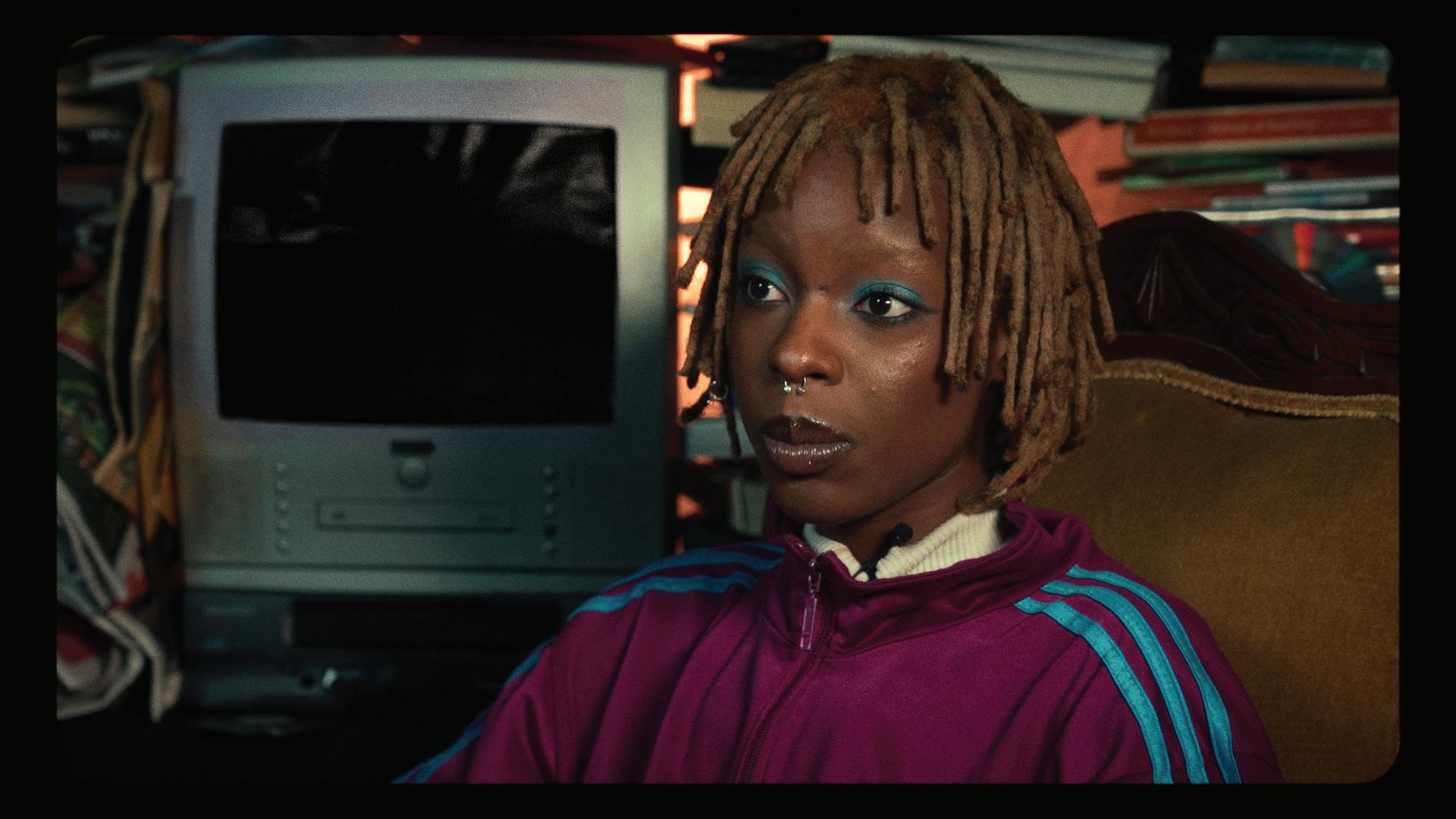
The documentary aims to realise opinions across generations by featuring conversations with contributors about the current state of physical media in our culture. Talking-head interviews are inter-cut with scenes of their respective speaker modelling in front of stylistic sets, interacting with pieces of physical media that are special to them, and scripted action-sequences of different rituals associated with the media: putting VHS/Cassette tapes into players, leafing through books, setting up turntables. The interviewees deliver anecdotes highlighting the value of the effort involved in having a dedicated object for experiencing art forms.
The documentary also features a reflective discussion on the current state of entertainment media, with most contributors expressing their displeasure with the gentrified digital media landscape and how impersonal it has become. These aspects come together in the reflexive elements of the documentary, with shots that break the fourth wall, exposing the filmmaking process, as well as scripted scenes featuring the crew.
Particular attention is paid to sound design, with a high-energy soundtrack contrasting the nostalgic, sensory foley of analogue mechanisms such as Polaroid cameras, video game consoles and tape decks. ‘Kiss my Vinyl’ climactically aims to encourage thought on our interaction with media, to consider the trade-off of materiality and accessibility, and emphasises the importance of effort in consuming art.
Director: Sam Gray
Producer: Brendan Faherty
Camera & Edit: Sam Burns
Production Design: Cormac Rowe
Film Still: Kiss my Vinyl
Film Still: Kiss my Vinyl
Piseog
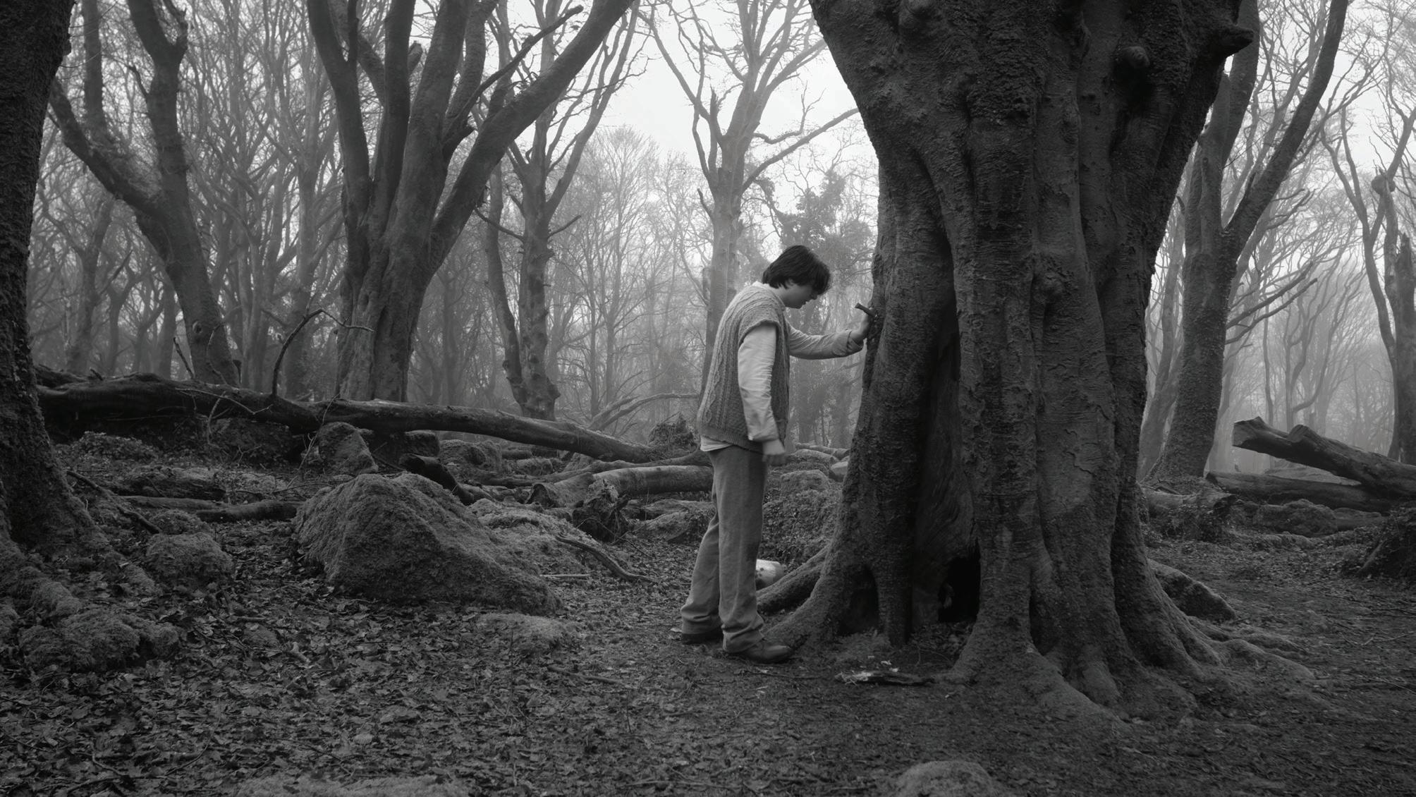
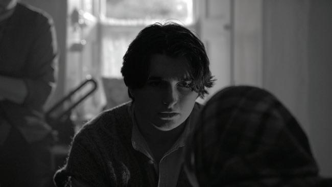
After disturbing a fairy tree in 1920s County Clare, Naoise is haunted by sinister visions. As his mother’s faith in the old ways collides with his brother’s cold refusal to believe, Naoise begins to wonder whether what is tearing his family apart was really awakened by a fairy tree, or by a grief they have never dared to name.
Set in the rugged landscape of County Clare in the 1920s, Piseog is an Irish folk tale steeped in superstition, grief, and the bonds of family. When young Naoise accidentally disturbs a fairy tree, the repercussions are immediate and unsettling. His mother, steeped in the old beliefs, is convinced the family has brought something upon themselves. His older brother wants nothing to do with it, dismissing the fairy tree as nonsense and his mother’s fears as superstition. But the supernatural is only half the story. As the brothers find themselves on opposing sides, long buried tensions rise to the surface. Forced together by fear and disbelief, they must confront something far older than any curse: the unspoken grief of losing their father and the fractures it left behind.
Director: Peadar McNelis
Assistant Director: Frank Taaffe
Producer: Oisin Gaughan
Cinematographer: Conor Nicholson
Editor: Oisin Gaughan
Production Design: Aengus Kelly, Liam O’Connacháin
Makeup: Ashley Durkin
Colourist: Conor Nicholson
Location Audio: Sophie Helga Gough
Fives Post Audio: Jack O’Gorman
Composer: Jamie Ross
Strung Out
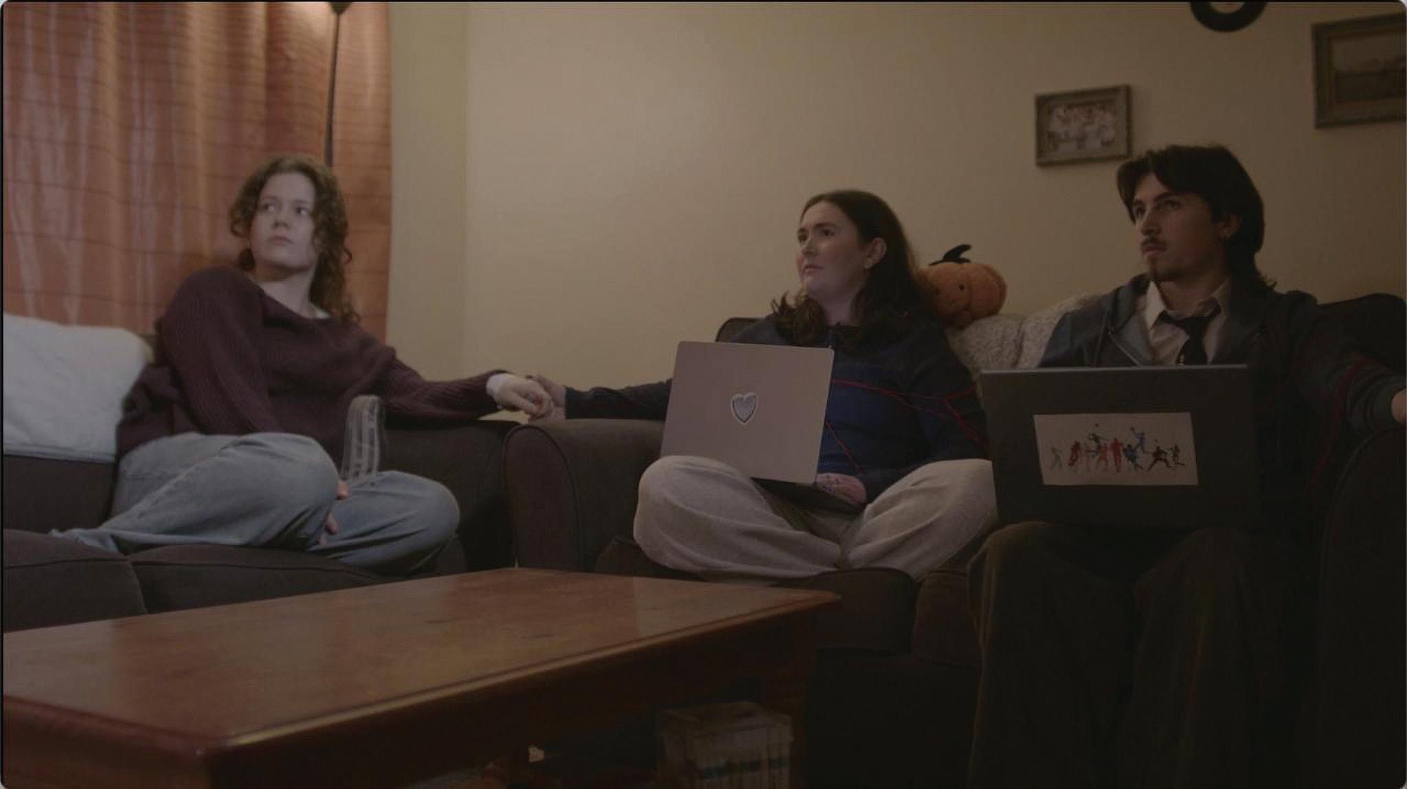
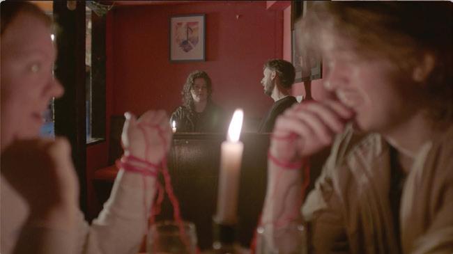
In a world where soulmates are bound by red strings, Talia is so focused on finding the right connection that she can’t see the one she already has.
Talia sees that Johnny is out with another girl and is devastated. In retaliation she decides that if he is moving on then so can she. She goes on a series of dates that all end terribly. Her housemate Adam notices this and brings her to the pitch to cheer her up. Once they arrive home they have a moment leaving Talia wondering if Adam could be the one she is looking for. She brushes it off. The following morning Talia wakes up to a text from Johnny asking her to meet for a drink. She is shocked and quickly gets ready with her best friend Rachael. Talia arrives at the pub and quickly realises Johnny is not all she thought he was. She gets a text from Adam and something clicks. This is not where she’s meant to be. She excuses herself and rushes home to find Adam leaving at the same time to come find her. They finally tell each other how they really feel and go inside holding hands, red string tying a bow around their wrists.
Director: Margaret Maeve Gillan
Assistant Director: James Greene
Producer: Chloe McDonagh
Cinematographer: Andrew Downey
Editor: Rebecca Osgood Daly, Cathal Schley
Production Design: Ciarán Timothy, Cathal Schley
Colourist: Ashley Durkin
Location Audio: Jack O’Gorman
Post Audio: Sophie Helga Gough Fives
Where We Once Were
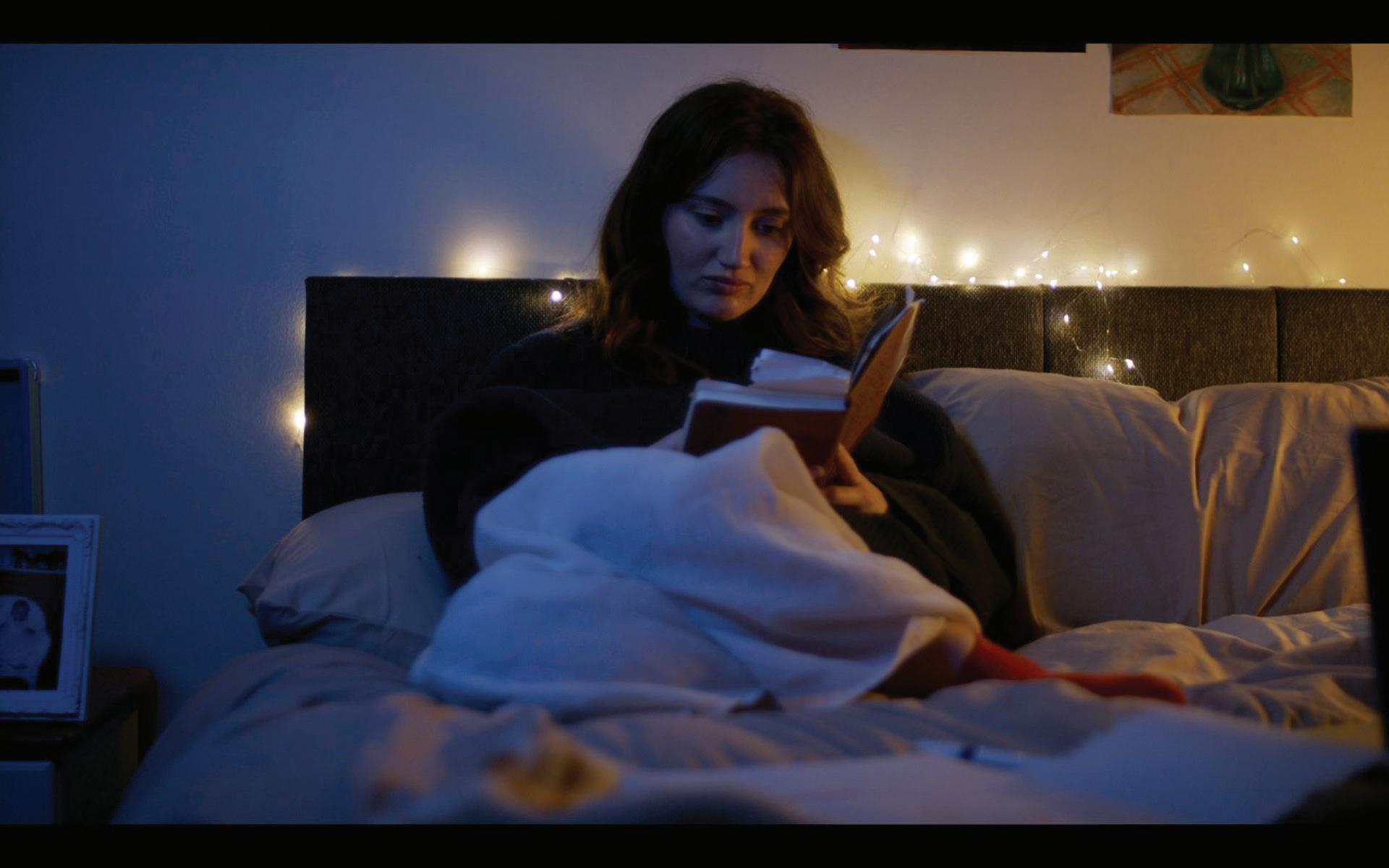
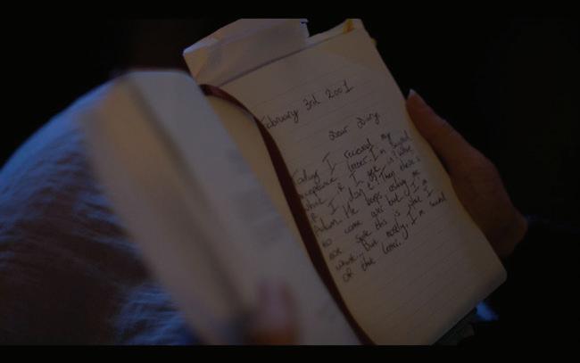
When grieving teenager Hazel finds her late mother’s diary and uncovers a painful truth, she realises that becoming the artist her mother never got to be is the most profound act of love she has left to give.
Hazel is a seventeen-year-old artist facing the most important deadline of her life: her application to art school. But with her mother’s passing still raw, she can’t find the inspiration to create the painting she needs to submit. Every blank canvas feels impossible.
Desperate, she retreats to her mother’s bedroom, the one room she hasn’t been able to bring herself to clear out, and discovers a diary written when her mother was exactly her age. The film moves between two timelines. In the present, we follow Hazel as she reads, grieves, and slowly comes back to life. In the past, we meet her mother as a teenager: vivid, passionate, and full of the same restless creative energy Hazel recognises in herself. As the diary entries unfold, so does a secret. Her mother gave up her own dream of art school when she fell pregnant with Hazel. The more Hazel reads, the more she understands. Her mother wasn’t just a parent. She was a kindred spirit, a fellow artist who chose love over ambition and poured everything she had into raising a daughter who could have the life she never did. With her deadline looming, Hazel finally picks up her brush. Not in spite of her grief, but through it.
Director: Muirin Dermody Dobbs
Producer: Mini Ngoc Thuy
Cinematographer: James
Greene Gaffer: Marek Olszewski
Editor: Mini Ngoc Thuy
Production Design: Cathal Schley, Jack Vickers, Ciarán Timothy
Colourist: Cathal Galvin
Location Audio: Theo Fletcher
Post Audio: Cathal Galvin
Bachelor in Arts ( Honours) in
Graphic Design and Illustration
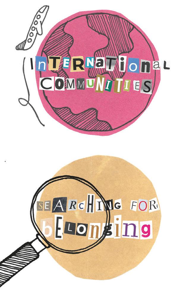
Where Are My Roots? is a collection of experiences and stories from former students who attended the European School of Brussels II (EEB2), an international school. Former schoolmates were invited to contribute to the project, sharing their feelings and experiences of attending the school and the kind of struggles they have faced since graduating. Through an analogue approach, this project explores the themes of belonging and identity among children who grew up abroad away from their country of nationality. It also explores what it was like growing up in the multicultural EEB2 community and the challenges of searching for your roots. The aim of this project is to bring a sense of community to anyone who has struggled to feel like they belong.
Anna Forde is a Finnish and English graphic designer and illustrator who was born and raised in Belgium. She has a special interest in tactile design and especially likes to incorporate traditional or analogue methods in her work.
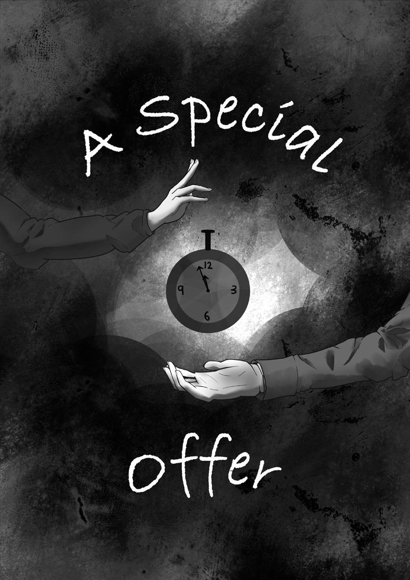
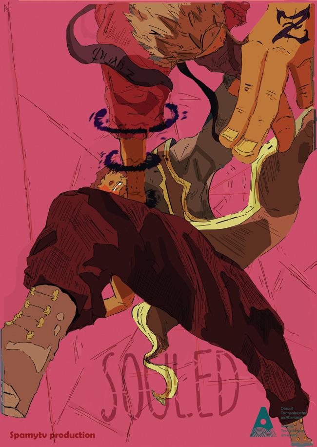
A Special Offer is a graphic novel that incorporates the illusion of choice, with a primary focus on marketing, within its narrative.
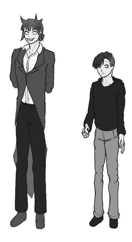
The story focuses on the protagonist, Parker, as they are tempted by the demon Zazzle into giving up a family heirloom in exchange for a better life.
The project aims to allow readers to experience the illusion of choice without its consequences, assisting them in recognising the associated signs more easily.
The key issue stemming from the illusion of choice is the false sense of control over one’s own decisions. This occurs as a result of familiarity in options and how convenient or sensible they are in comparison to other decisions they could make.
Dylan Alexander Devlin is an illustrator and graphic designer from Galway. His work often focuses on digitally created illustrations for the purpose of character designs and illustrated media.
‘A Special Offer’ Graphic Novel Cover, 2026, Clip Studio Paint (Digital), 2894 x 4093 Pixels (350 dpi)
‘A Special Offer’ Character Designs (Greyscale), 2026, Procreate (Digital), 462 x 845 Pixels (300 dpi)
Éanna Brennan
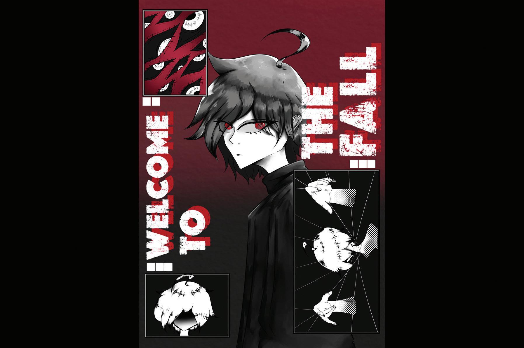
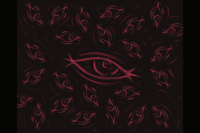
Welcome To The Fall is a horror comic and digital storytelling project exploring themes of observation, fear, and inevitability. The story follows a young individual who is invited into a mysterious museum by a godlike curator who appears to possess knowledge of events before they unfold.
The project examines horror through concepts of surveillance, curation, and control. Its atmosphere is deliberate and composed, yet deeply unsettling. Visually, the work draws inspiration from museum archives, exhibition spaces, and formal presentation design. Through structured layouts, restrained compositions, and atmospheric imagery, the project creates a persistent sense of quiet tension. Rather than relying on shock or explicit horror, suspense develops gradually through mood, symbolism, and the viewer’s relationship to the space itself.
Combining sequential storytelling and extensive worldbuilding, the project blurs the boundary between observer and participant. By presenting the narrative through both comic pages and archival-style digital content, Welcome To The Fall encourages audiences to investigate, interpret, and question their role within the story.
Éanna Brennan is an illustrator and graphic designer with a particular interest in digital storytelling. Their work focuses on atmospheric and immersive narratives, often combining visual storytelling with experimental presentation techniques to create unsettling and engaging audience experiences.
Welcome To The Fall, 2026, Digital Painting, 152mm x 101mm
What You See, 2026, Digital Painting, 152mm x 101mm
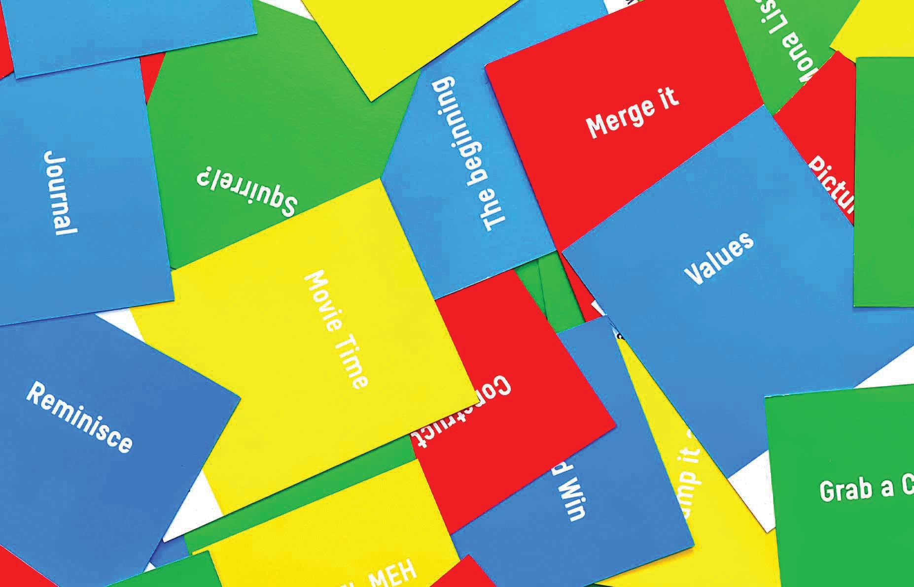
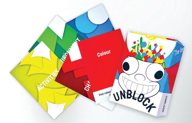
Unblock is a creative wellbeing project that stems from personal experience, designed to support graphic designers experiencing creative block. Through series of reflective interactive prompt cards, the project encourages designers to step away from pressuredriven creative habits and reconnect with inspiration through everyday experiences.
The prompts explore themes such as changing your environment, setting challenges, changing your perspective and self-motivation. Each card invites the user to make small intentional shifts in their routine, mindset, or surroundings to disrupt repetitive thinking patterns and spark new ideas. The project promotes a more balanced and sustainable creative process, by positioning wellbeing, curiosity, and reflection as parts of creativity.
Emmanuel Oke is a graphic designer from Westmeath whose work explores the relationship between effects of stress on creativity. His practice focuses on creating thoughtful and engaging experiences that encourage new perspectives and reflection. They aim to challenge pressure-driven creative culture and promote healthier approaches to the design process.
emmanueloke39@gmail.com
Unblock, 2026, Printed Interactive Design
Unblock, 2026, Printed Interactive Design
Emmanuel Oke
Julia Crampsie
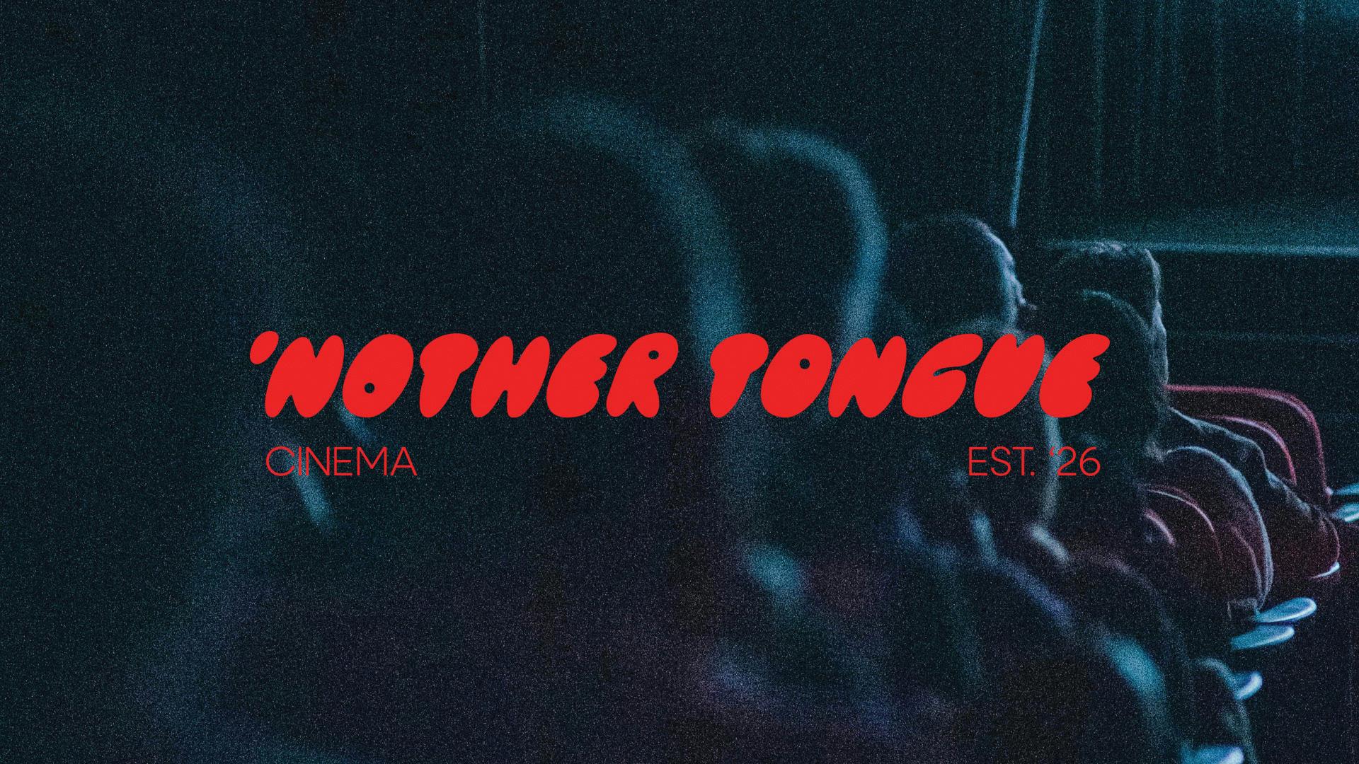
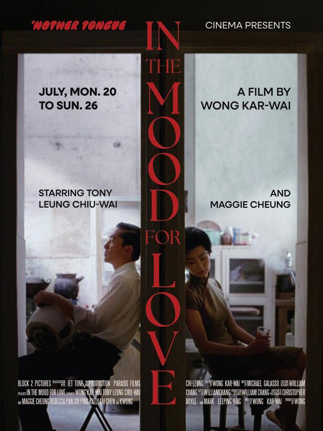
‘Nother Tongue Cinema is an independent cinema and café concept based in Galway that reimagines film-going as a social, third-space experience. Focused on international, independent, and small-release films, the project creates an approachable, communitydriven space where audiences can engage with cinema beyond mainstream Hollywood releases and connect with stories from different cultures and perspectives.
Developed in response to the closure of Pálás Cinema, the project explores how branding can help reconnect Galway audiences with global and underrepresented film. Inspired by the atmosphere of independent cinemas and cafés, ‘Nother Tongue Cinema positions film as both a cultural and communal experience for film enthusiasts, students, and members of Galway’s international community.
Julia Crampsie is a graphic designer from Ontario currently based in Galway. She is interested in creating brands that feel fun, bold, and dynamic, with a focus on striking colour palettes and expressive visual identities that stand apart.
Her work is influenced by her interests in film, fine art, and contemporary culture, often combining playful concepts with strong visual contrast and personality. Through branding and visual storytelling, she aims to create work that feels approachable, engaging, and culturally driven.
https://jncrampsie.myportfolio.com/
‘Nother Tongue Cinema Wordmark
Poster for Wong Kar-wai’s In the Mood for Love at ‘Nother Tongue Cinema
Kate Brophy
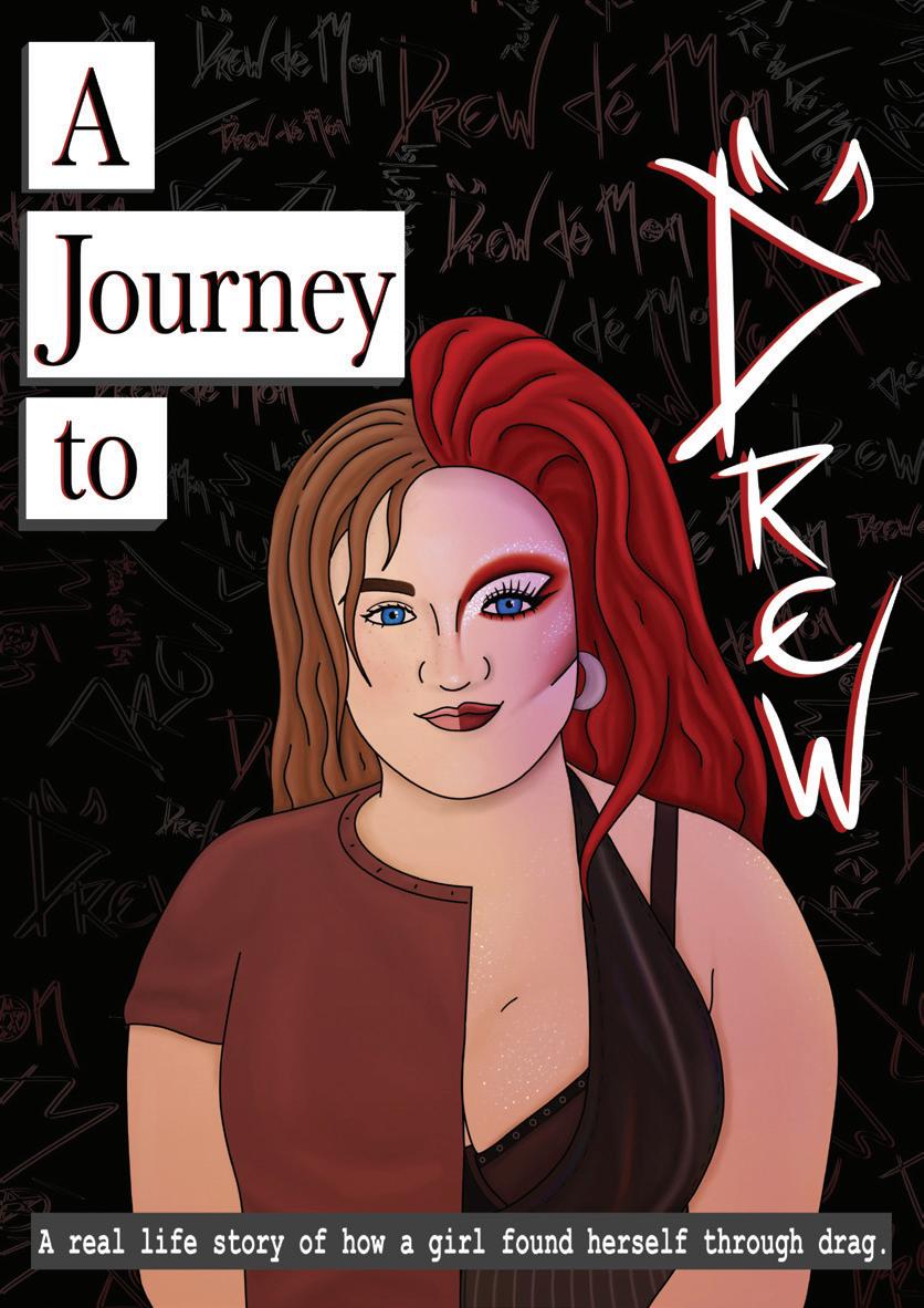
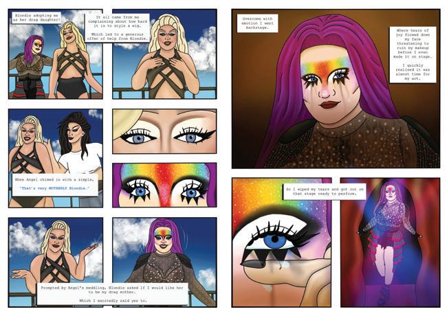
A Journey to Drew: a sample of a graphic novel that depicts the real life story of how a girl found herself through the art of drag. Bringing the theme of found family into the spotlight through the lens of queer joy. This is done through illustrations of key moments in the journey from a baby drag queen dreaming of being on stage, to being a part of a strong drag family that performs together. This shows the potential for a full graphic novel through its thoughtfully designed spreads that showcase multiple character designs and settings.
The style of a graphic novel and the themes of the drag community are connected through the representation and pleasure they provide as a piece of art. Drag is an art form — however under all the wigs, makeup and stunning outfits is a story of belonging. It’s not just the rhinestones and glitter that makes drag artists shine, it’s the support and community they create.
Kate Brophy is an illustrator who has a strong interest in the use of colour and its impact on how the viewer enjoys a piece of art. She enjoys working with different types of media but has a passion for character design and digital illustration. Combining methods of creation help her to gain an in-depth understanding of her subject. Her work is made to convey emotion and to bring the viewer into the world on show.
Kate.brophy2004@gmail.com @tejaye_design
A Journey to Drew cover, 2026, Digital illustration, 297 x 210 mm.
Graphic novel double spread, 2026, digital illustration, 297 x 420 mm.
Maolíosa Ní Thuathail
Edited Images from Workshop, 2026, Digital
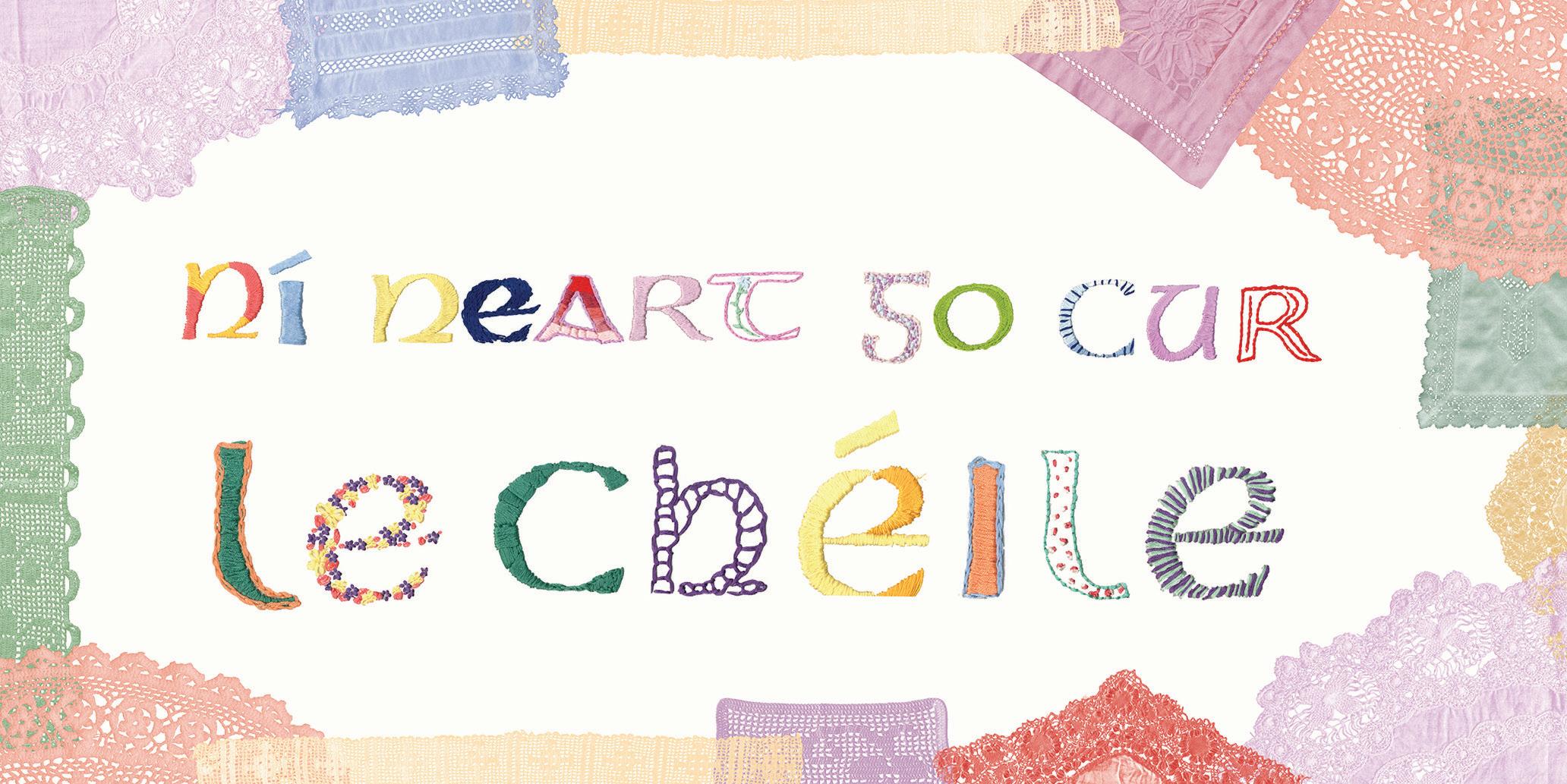
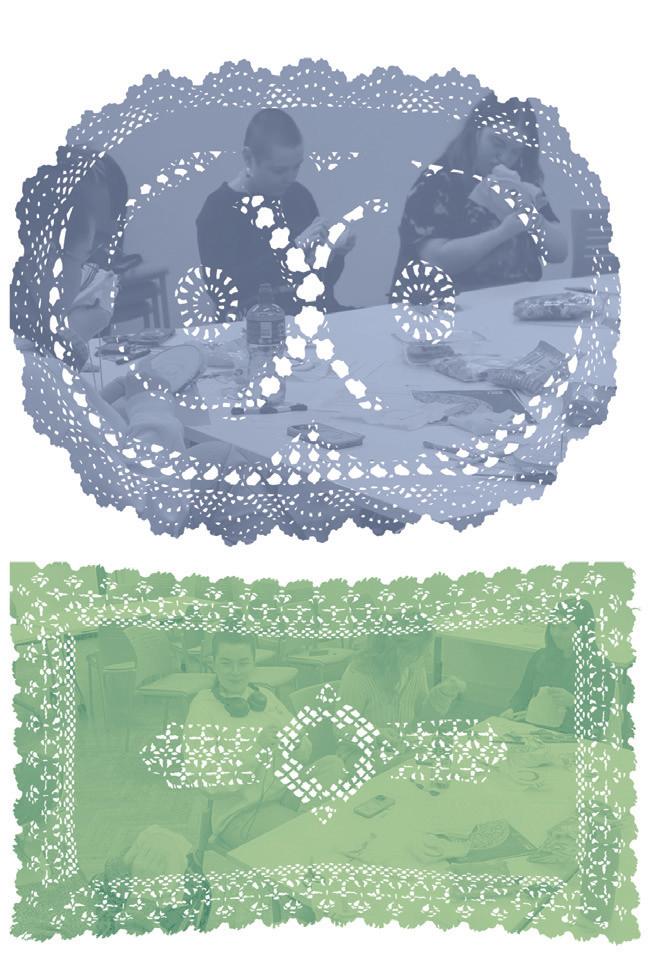
Snáth agus Seanchas is a process-led design research project exploring how textile and language heritage can benefit us today. The concept for this project was inspired by the history of lace-making in Ireland and its role as a craft of survival during the Famine. While Irish lace became admired for its beauty and delicacy, it also represented the resilience, skill, and strength of the women who created it. As industrialisation grew, many of these handmade traditions declined, along with the sense of community and shared making that surrounded them.
Today, there is growing interest in heritage-inspired design, traditional craft and the Irish language, yet opportunities to use Irish informally remain limited. In response, this project aims to reconnect people with Irish heritage, and each other, through a craftand-chat workshop conducted as Gaeilge.
During the workshop, participants embroidered Cló Gaelach letters which went on to form part of a co-created textile piece spelling the phrase “Ní Neart Go Cur Le Chéile.” Attendees reflected positively on the experience, particularly the opportunity to practise Irish in an informal environment and spend time away from screens in a creative, social space.
Alongside the embroidery, a booklet was created as a visual response to the workshop, documenting the research, process, and shared experience of the project. The booklet incorporates stitched letterforms developed during the workshop, a custom typeface made from them, and images of Irish lace.
Maolíosa Ní Thuathail is an Irish graphic designer interested in heritage, community, and socially engaged design. Her practice combines research-led design and hands-on making processes to create resonant, impactful work.”
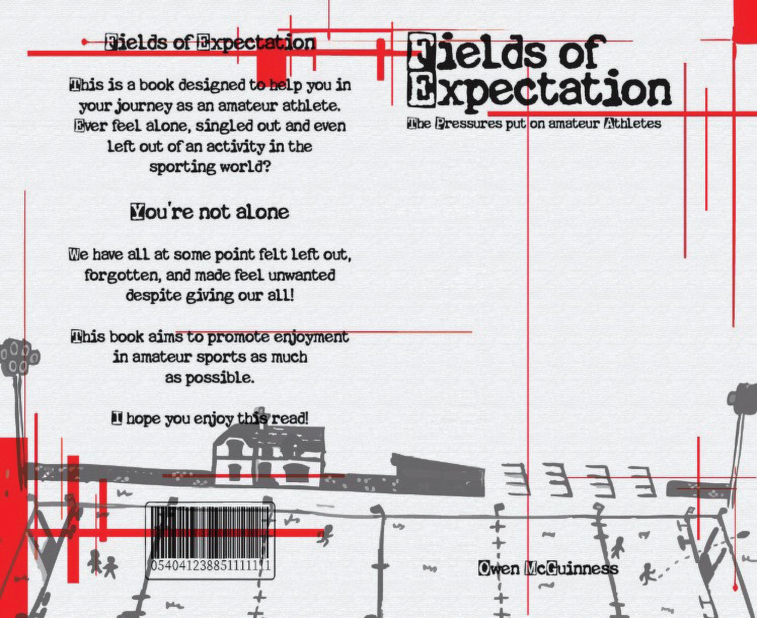
Fields of Expectation is a project created to reveal the often-overlooked pressures placed on athletes in amateur sport. These pressures are quiet, persistent, and frequently unspoken and shape how athletes see themselves and how they perform. Many feel isolated in these experiences, and the goal of the project is to show that they are not alone. The book aims to capture the emotional landscape of athletes who carry expectations that are far heavier than they appear from the outside.
The illustrations in the book were created and edited by hand, giving the work a raw, personal quality. The accompanying text blends both personal reflection and the perspectives of others, making the narrative more relatable and grounded in real experience. To this end, contributions from ATU students shaped the direction of the project and ensured that the book reflects genuine voices.
The visual tone is set through a dark, muted colour palette, with sharp bursts of red cutting through the pages. This contract represents the fear, anxiety, and internal tension that many athletes feel when confronted with expectations whether from coaches, teammates, family, or themselves. Red becomes a visual metaphor for the emotional spikes that disrupt an athlete’s sense of calm on the field.
Fields of Expectation is dedicated to anyone who has ever felt forgotten, overwhelmed, or unseen in the sporting world. It stands as a reminder that behind every performance is a person navigating pressures that deserve to be acknowledged and understood.
Owen McGuinness is a graphic designer and illustrator from Galway. He has a particular interest in combining analogue and digital techniques to create work with a strong emphasis on visual storytelling.
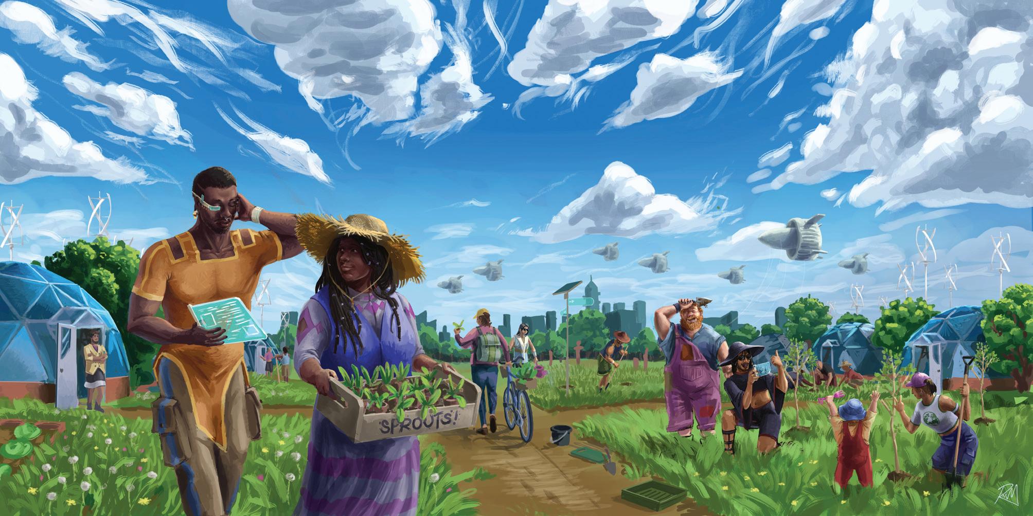
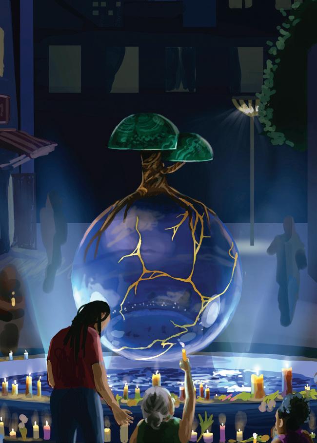
Earth Day 2120 is a speculative illustration project that presents what life could be like for humanity in the not-so-distant future. Amid the ongoing climate crisis there is a dearth of representations of what a positive future for our planet may look like, despite all the tools to mitigate climate change being at our fingertips.
These images and accompanying material chronicle the activities and events during Earth Day almost 100 years from now in a hypothetical scenario where humanity has survived and mitigated the worst effects of climate change. Humanity now almost universally employs practices of sustainability and regeneration, not as a radical lifestyle choice but as a mode of living in community with the natural world.
Inspired by speculative fiction such as the work of Becky Chambers and writings from sustainable designers and thinkers such as Christiana Figueres and Sarah Ichioka the goal of this project from the outset was to give people a visualization of what is possible. A visual style known as Imaginative Realism has been used to bring these scenes to life, which required extensive visual research and referencing to achieve using a variety of digital design techniques. These techniques included 3D modelling, sketching, digital painting, branding and identity design, and conceptual art.
Imagination is a powerful tool. It helped us create the world we currently live in, and it will be vital in creating a more regenerative, kinder one too.
Ralph McMahon (they/he) is an illustrator and artist proudly from the city of Galway. They endeavor to tell evocative stories through their use of intense color, varied and thoughtful character design, and atmospheric, storied environments.
@ralphmcmahonart
info@ralphmcmahon.art
Noon, 2026, Digital, 100 x 50 cm
Night, 2026, 100 x 50 cm, Digital
Ralph McMahon
R Ramesh
Lifting Spirits – A Fitness Journal for Body and Mind: Lifting Spirits is a fitness journal that explores the relationship between physical activity and mental well-being among young adults. This project explores exercise as a supportive and nonjudgmental practice that benefits body and mind.
The book combines structured workout routines with guided self-reflection prompts to encourage the reader’s awareness of physical and emotional states. By implementing reflection before and after each workout, a mindful and balanced approach is encouraged. While fitness is promoted, progress is measured through physical strength and mental resilience.
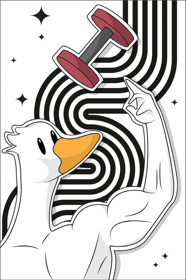
The central character in the journal is a duck, which acts as a relatable and symbolic guide as it represents the often-unseen struggles of each reader. The character aims to create a sense of comfort and support.
Lifting Spirits encourages readers to move at their own pace, reflect without judgment, and build a healthier relationship between body and mind.
Virooshan R Ramesh is a graphic designer and motion designer specialising in art direction, branding, content creation, animation and digital imaging. He is interested in visual storytelling and driven by the power of artistic expression and meaningful communication. He creates work that aims to connect, inspire and leave a lasting impact.
@virooshan
@Virooshan R Ramesh
virooshan00@gmail.com
Virooshan
Zara Lomax
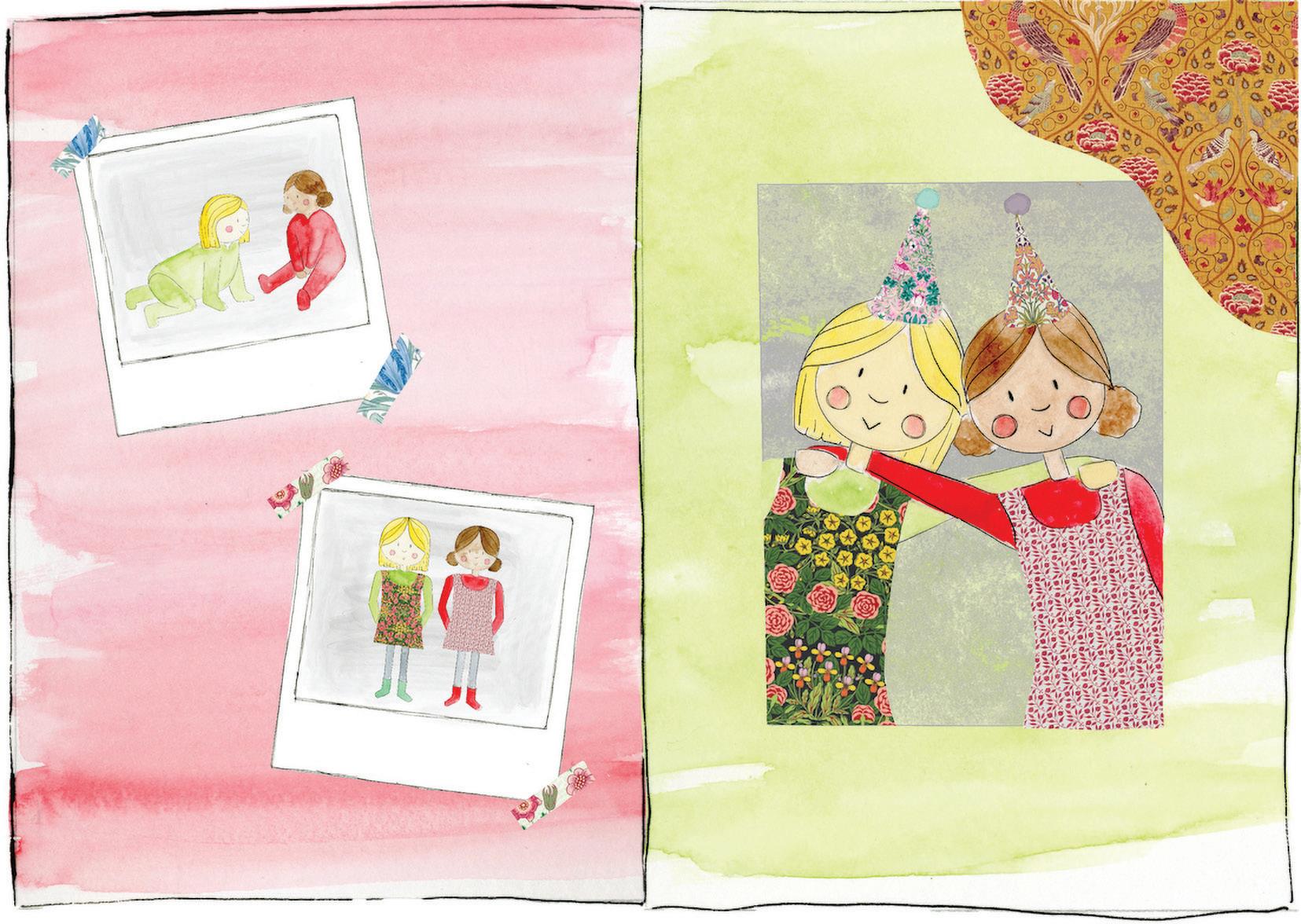
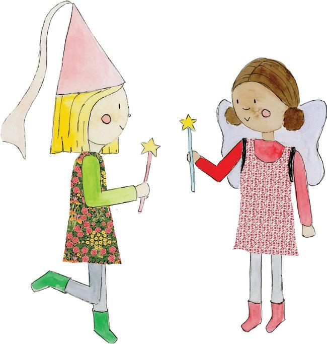
Sophie & Sarah is a watercolour illustrated children’s book that explores the theme of emigration through navigating goodbyes and embracing new beginnings. Rooted in personal experience of emigrating to Australia during early childhood, this book paints the story of two friends adapting to a new friendship dynamic. This book combines analogue and digital approaches to create engaging visual designs. Wallpaper and fabric designs by William Morris feature heavily throughout this book.
Zara is a Graphic Designer & Illustrator from Kildare with a passion for branding, visual storytelling and watercolour illustration. She is interested in creating intentional designs that serve clear visual communicative purposes while connecting with the audience.
Sophie & Sarah’s Memory Book, 2026, watercolour & collage, 105mm x 105mm
Sophie & Sarah, 2026, watercolour & collage, 101mm x 106mm
Bachelor in Arts ( Honours) in
Interior Design
Armand Epitime
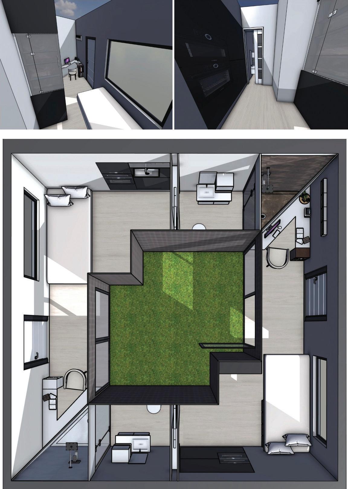
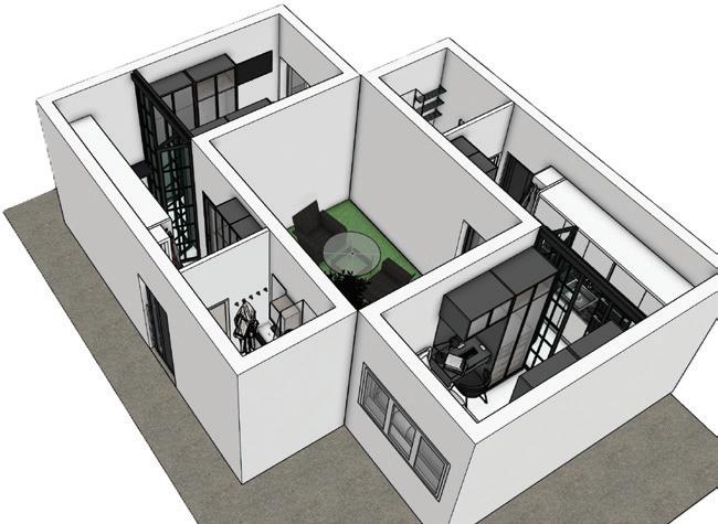
My name is Armand, and I am a BA Interior Design student. My work explores how interior spaces can be designed to support comfort, accessibility, privacy, and everyday wellbeing. I am particularly interested in how thoughtful design can improve the way people live, study, rest, and move through a space.
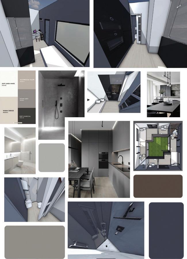
This project focuses on student accommodation, with an emphasis on creating a compact but functional living environment. The design considers the needs of students by combining sleeping, studying, storage, washing, and relaxation areas within a carefully planned interior. The layout is organised around a central outdoor courtyard/ green space, allowing natural light, ventilation, and a sense of openness to become part of the experience. The contrast between clean white surfaces, darker architectural elements, and light flooring creates a modern, calm, and practical atmosphere.
The work reflects my interest in interiors that are not only visually appealing but also useful and human-centred. In student living, space is often limited, so every area must have a clear purpose. I wanted the design to feel efficient without becoming cold or impersonal. The inclusion of natural light, visual connection to greenery, and simple circulation helps create a more balanced environment for both study and rest.
As an interior design student, I am developing a design approach that values accessibility, sustainability, and user experience. I see interior design as more than decoration; it is about shaping spaces that respond to real people and real needs. Through this project, I aim to show how compact accommodation can still feel comfortable, organised, and supportive of daily life.
Title: Interior renders Year:2026
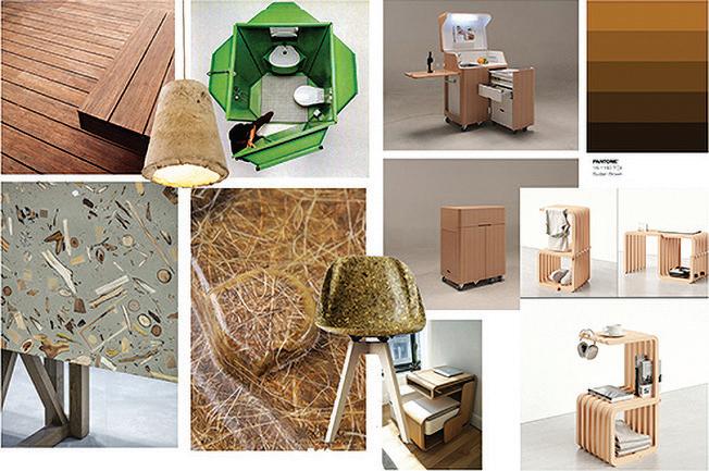
Title: MoodBoard Year:2026
Oliwia Brzezinska is an Interior Design student whose interests include compact living, modular architecture, and human-centred spatial design. Her work investigates how interior environments can address contemporary social and housing challenges.
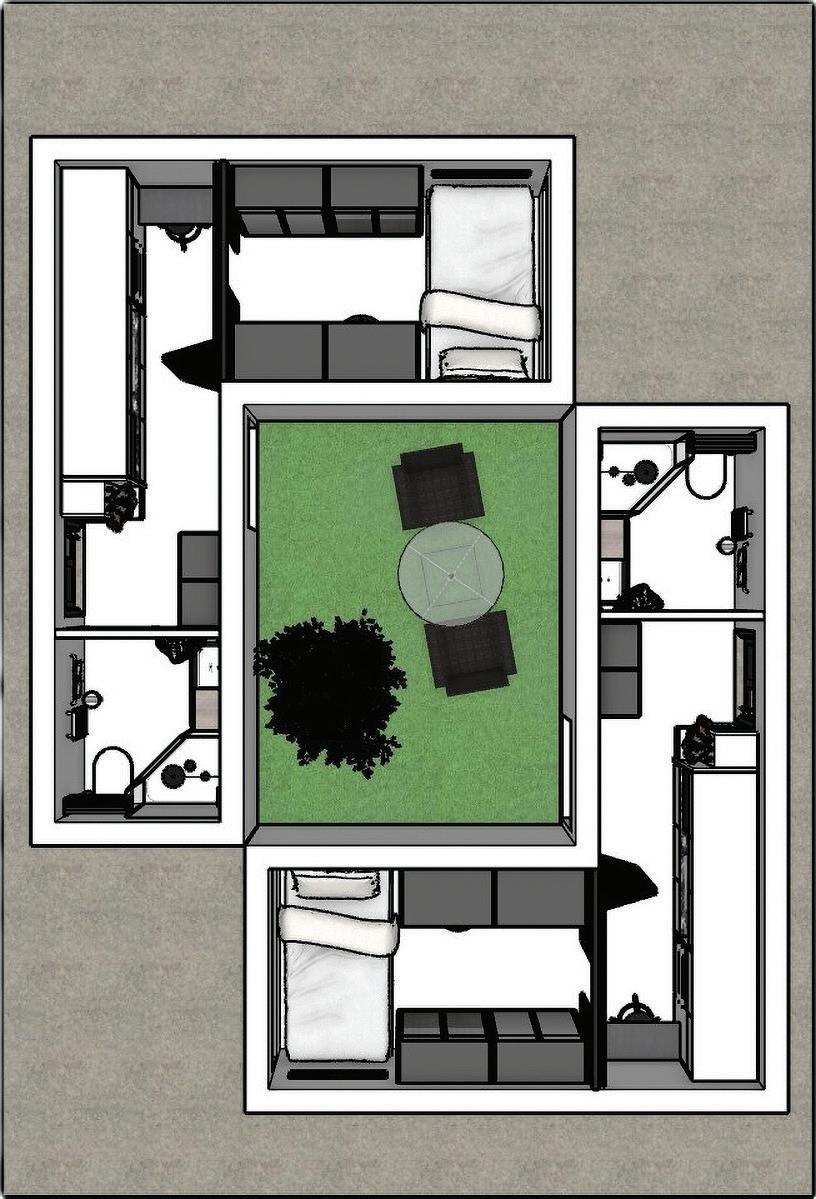
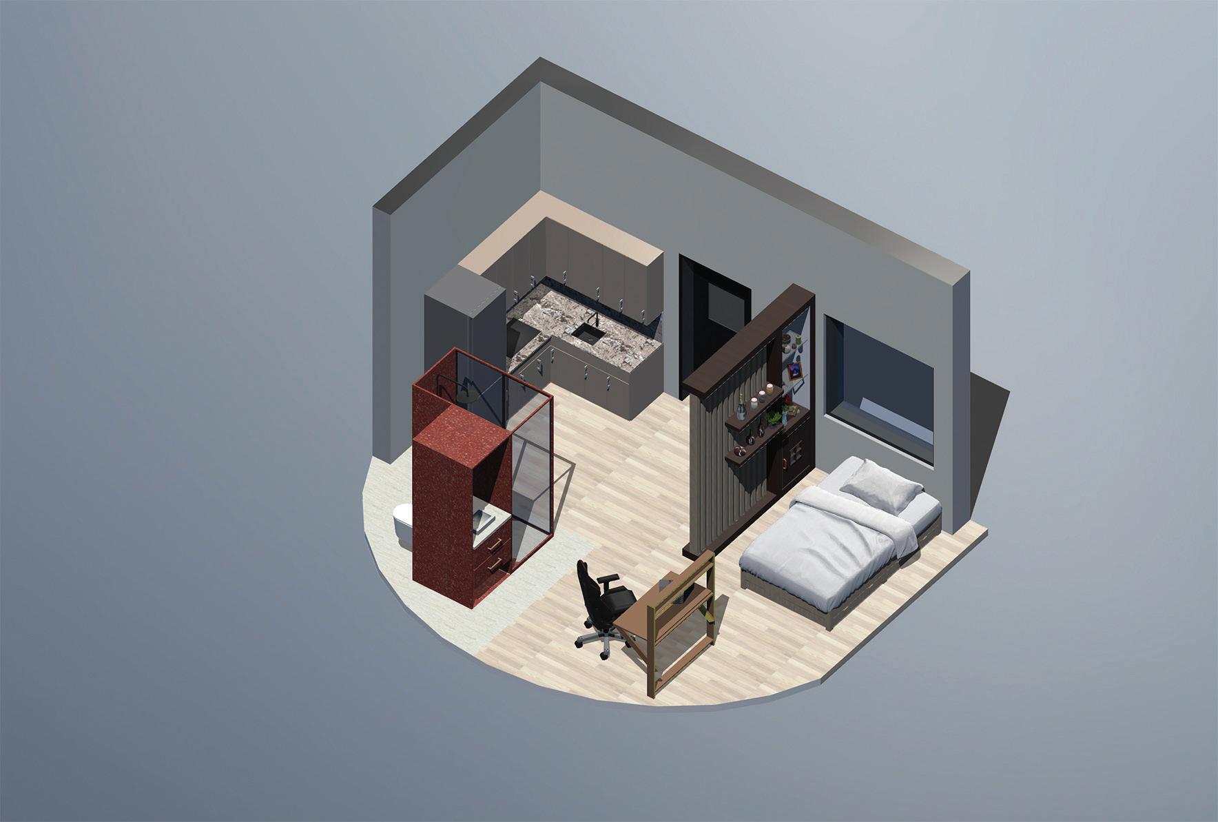
Micro Student Living is a conceptual interior design project developed in response to Ireland’s ongoing student accommodation crisis. The project examines how compact living can achieve both functionality and sustainability through innovative spatial planning and adaptable design solutions.
Occupying a 15m² footprint, the proposal reimagines student housing through the use of multifunctional furniture, integrated storage, and flexible living zones that accommodate studying, resting, cooking, and daily activities. Drawing on principles from modular architecture, capsule living, and contemporary co-living environments, the design prioritises efficiency while maintaining comfort and wellbeing.
A central courtyard maximises natural light, openness, and visual connectivity within the compact layout, establishing a balance between privacy and communal living. The project challenges conventional perceptions of small-space living by demonstrating that thoughtful interior design can enhance usability while preserving atmosphere and identity.
Drawing on research into the housing crisis, micro-apartments, and modular living systems, the project proposes an alternative housing model that is affordable, adaptable, and responsive to the needs of contemporary student life.
My name is Rion Feeney Mc Sharry, a final-year interior design student presenting my end-of-year exhibition project. Throughout my four years of study, I have developed a strong design philosophy rooted in modernism, clean lines, functional spaces, and carefully considered materiality. My work is driven by the belief that good design should be both beautiful and purposeful, and that even the smallest spaces can feel considered, elevated, and liveable.
My project is a student pod, a compact, self-contained living unit of just fifteen square meters. The brief challenged me to maximise every inch of space without compromising on style or comfort, designing entirely around the needs of a modern student and to create an affordable living space for students in response to the cost-of-living crisis that has arisen over the years for students. The result is a highly functional, open-plan layout where the bedroom and kitchen-dining-living area flow seamlessly into one another, creating a sense of openness rarely associated with student accommodation.
At the heart of the pod is a multifunctional bathroom unit, a freestanding structure housing the sink, shower, and toilet in one integrated form, enclosed by a built-in sliding door for privacy. A fold-out desk with a gaming chair offers a dedicated workspace that disappears when not in use, while built-in wardrobes ensure storage is never sacrificed.
A stunning curved glazed window floods the space with natural light, becoming the architectural centrepiece of the design.
Materially, I have drawn inspiration from an affordable, low-impact palette of recycled cork and terrazzo printed vinyl surfaces, warm cork flooring, and dark blue cabinetry with wooden hardware. Earthy tones and bronze accents run throughout, creating warmth against the clean modernist structure. Underfloor heating and a central heating unit ensure the space is as comfortable as it is considered.
This pod is my vision of what student living could and should look like.
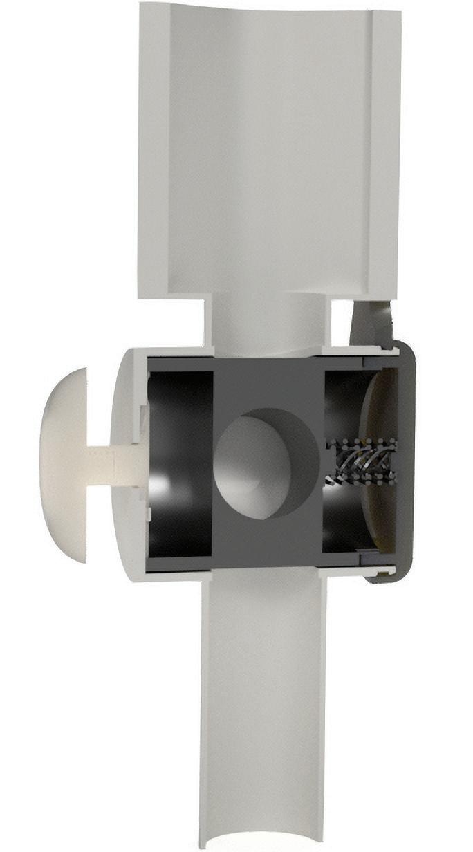
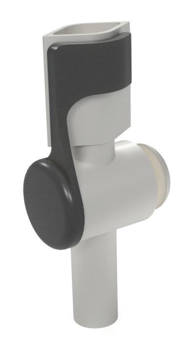
My product Uriva reimagines the traditional lever valve used on urinary drainage leg bags by introducing a secure dual-locking mechanism designed to improve safety, discretion, and user confidence. Standard lever valves can sometimes open accidentally during daily movement. This leads to the risk of leaks, discomfort, and embarrassing situations for users. Uriva addresses this issue through a two-step locking system that keeps the valve firmly secured until intentionally opened.
The design focuses on both functionality and peace of mind. By reducing the chance of accidental drainage, the product helps users feel more confident which can enable them to get back to tasks and everyday activities they may have put on hold out of fear of embarrassment. The added security also reassures carers and healthcare professionals, who can trust that the bag will remain safely closed and hygienic between uses.
Ease of use was also a key consideration throughout this redesign. The valve remains simple and comfortable to operate, while still providing a noticeably higher level of protection than conventional systems.
Overall, the product aims to improve dignity, independence, and quality of life for urinary drainage leg bag users by combining practical innovation with discreet, reliable performance.
My name is Catherine Lyons, and I am a product designer from Mayo specialising in the redesign of medical devices to improve user experience and accessibility. My work focuses primarily on wearable medical devices that users are required to carry or wear for extended periods of time, often throughout their lives. Through this work, I aim to better understand the social, emotional, and functional challenges associated with these devices in order to create more user-centred and supportive design solutions.
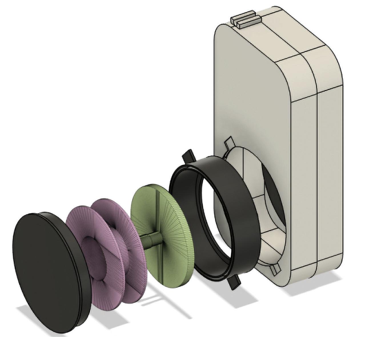
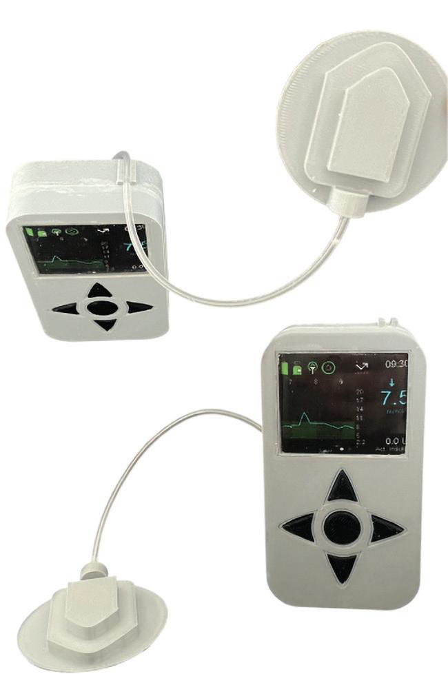
Ríl is an innovative insulin pump concept developed to improve both usability and day-to-day comfort for people living with diabetes. The design combines continuous glucose monitoring integration with a retractable tubing system that reduces the inconvenience and risks. The tubing retracts into a casing located on the back of the device when not in use, helping to prevent snagging, accidental pulling, or cannula dislodgement during everyday activities.
When insulin delivery is required, the user can easily extend the tubing, attach it securely to the holder positioned at the top of the device, and use the pump comfortably before allowing the tubing to retract back into the casing afterwards. By prioritising convenience, and safety, Ríl aims to reduce interruptions to daily life while improving the overall experience to the users.
Catherinel0802@icloud.com
Fusion 360 3D Model Displaying Components of Retractable Mechanism and Casing 151 X 101
Fusion 360 3D Model Displaying Front View of Insulin Pump With Tubing on the Holder 101 X151
Isabella Doyle
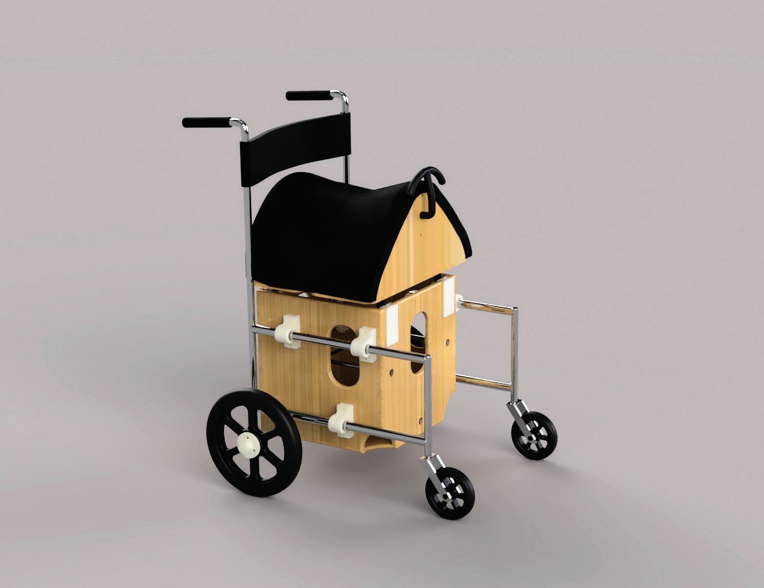
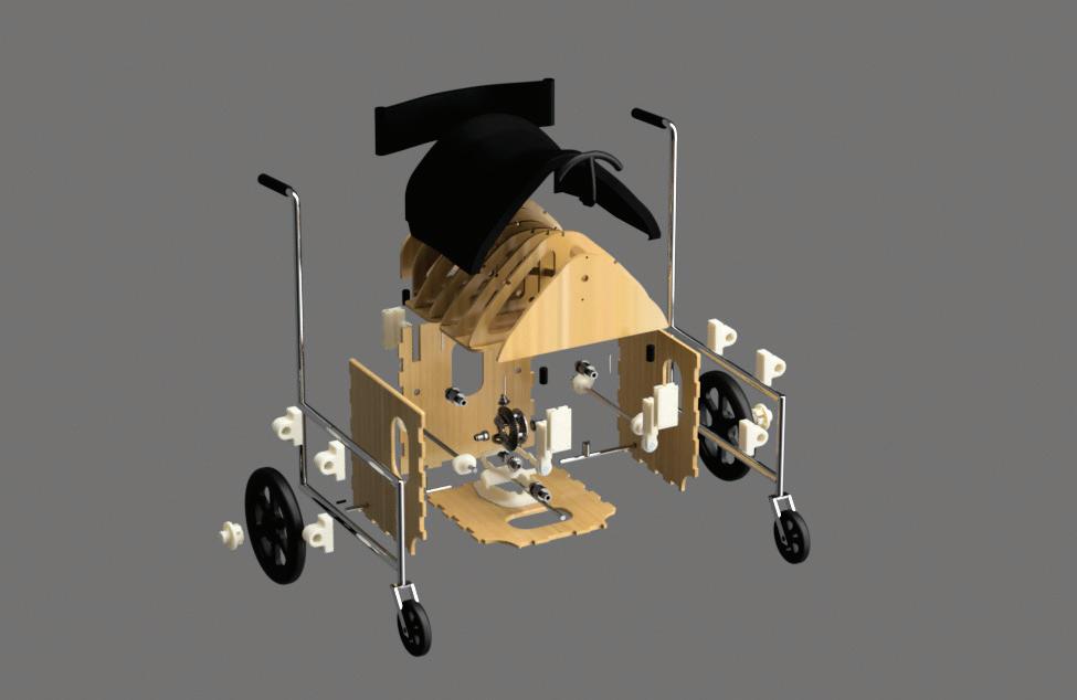
Through my research, I explored the long-term effects of static sitting in wheelchair use, including poor posture, weakened muscles, pressure sores, reduced circulation, and limited physical engagement. Many wheelchairs are designed primarily around function and medical necessity, acting only as mobility devices rather than supporting long-term physical health or rehabilitation.
Through working in a therapeutic riding charity, I saw first-hand how horse riding can improve posture, balance, core strength, coordination, and independence for people with disabilities. However, I also became aware of how inaccessible this form of therapy can be due to cost, location, limited availability, and the physical challenges involved in accessing specialised riding centres. This project explores how the therapeutic movement and physical benefits of horse riding could be translated into a wheelchair experience, allowing aspects of the therapy to become more accessible and integrated into everyday life. Inspired by the rhythm and motion of riding, the design challenges the passive nature of traditional wheelchair seating by encouraging active sitting through controlled responsive movement.
The seat is shaped around the anatomy and movement of a horse’s back, using a motion system that mimics the walking gait of a horse. As this movement closely mirrors human walking patterns, it helps stimulate muscle memory, posture correction, and continuous core engagement throughout use. The movement system is powered through the rotation of the wheelchair wheels as the chair is pushed, integrating therapeutic motion naturally into everyday mobility. By introducing movement into prolonged sitting, the wheelchair acts as both a preventative measure against physical deterioration and a therapeutic device rather than solely a mobility aid.
Rather than replacing therapeutic riding, this project aims to extend its benefits beyond the riding environment, supporting greater independence and making this form of therapy as accessible as possible for the people who need it most.
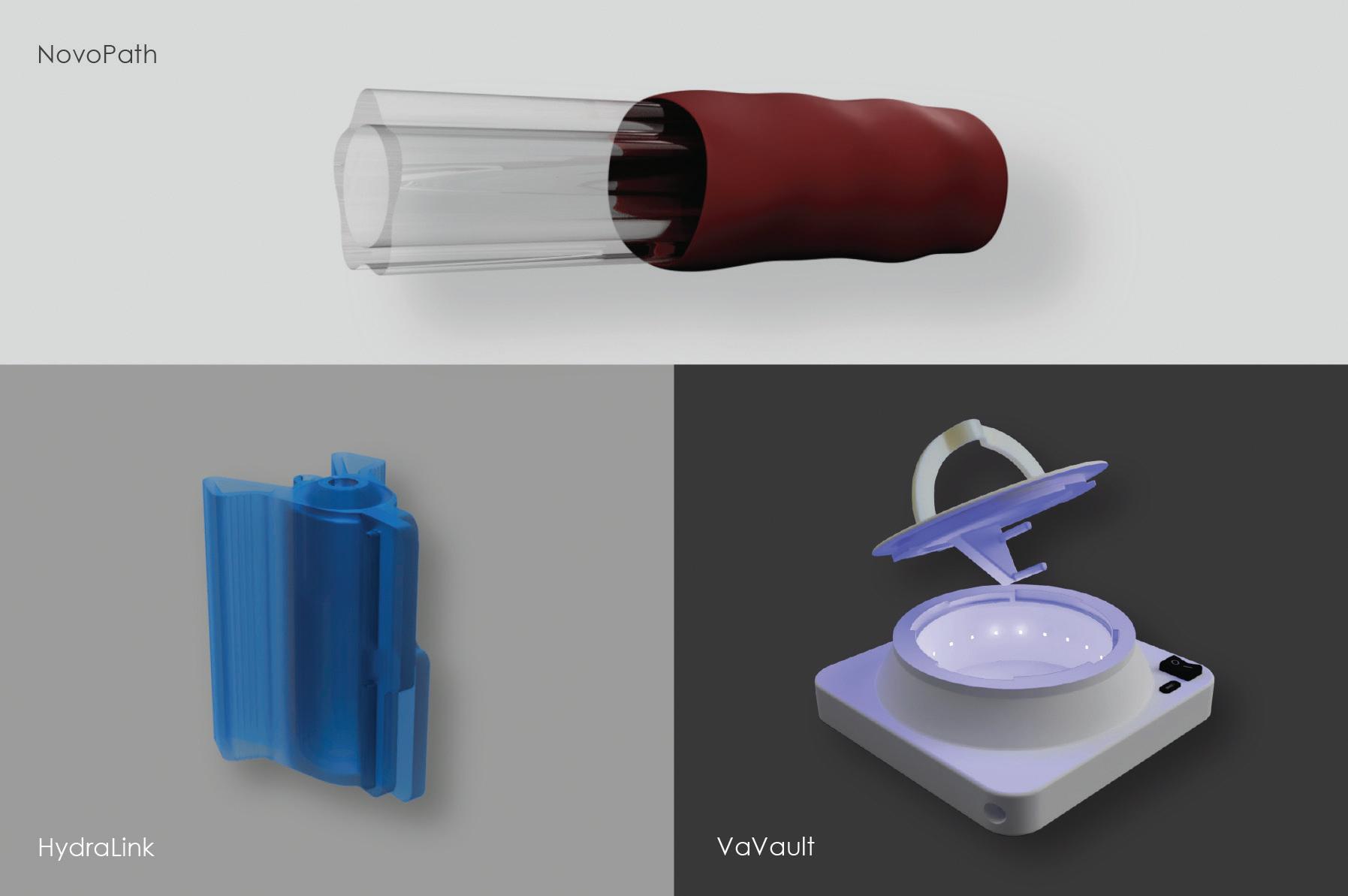
The NovoPath system is an integrated, reusable urinary care solution designed to prioritise patient dignity, comfort, and long-term urethral health. This holistic system contains three specialised components: the NovoPath catheter, the HydraLink relubrication device, and the VaVault sterilisation station. Together, they form a sustainable, high-performance alternative to traditional single-use plastics, addressing the physical, emotional, and financial burdens often associated with chronic catheterisation.
Central to the system’s comfort is the NovoPath catheter. By utilising a unique five-point raised geometry rather than a standard cylindrical surface, it minimises contact with the urethral wall. This design significantly reduces friction and mechanical irritation, directly mitigating both insertion and long-term trauma. Furthermore, the integration of titanium dioxide (the self-sterilising material) into the medical-grade thermoplastic elastomer provides continuous antimicrobial protection, ensuring a safer experience from the inside out.
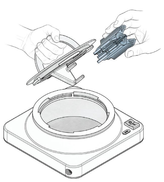
For users navigating the challenges of limited manual dexterity, the HydraLink re-lubrication device provides a vital ergonomic advantage. Its self-closing hinge mechanism allows for effortless hygienic preparation and insertion without compromising the sterile field of the catheter. This is complemented by the VaVault sterilisation station, which ensures clinical-grade safety by employing UV-powered photocatalytic sterilisation. With USB-C compatibility, the VaVault grants users’ total independence, ensuring clinical-grade safety even in off-grid or travel scenarios.
Ultimately, the NovoPath System transforms the user experience by eliminating the constant dependency on healthcare supply chains and the recurring high costs of single use catheters. By providing a reliable, long-term asset, the system offers peace of mind during supply shortages or financial hardship. This innovation not only drastically reduces environmental waste but empowers the user with a discreet, portable, and dignified solution that seamlessly adapts to an active, autonomous lifestyle.
jamiejog0903@gmail.com
NovoPath System Products, 2026
Sketch of NovoPath System in use, 2026
Observer of people and translator of emotion. I turn human tension, desire, & behaviour into thoughtful product experiences. My approach to issues are first & foremost human centred which is designing for how people feel & not just what they do.
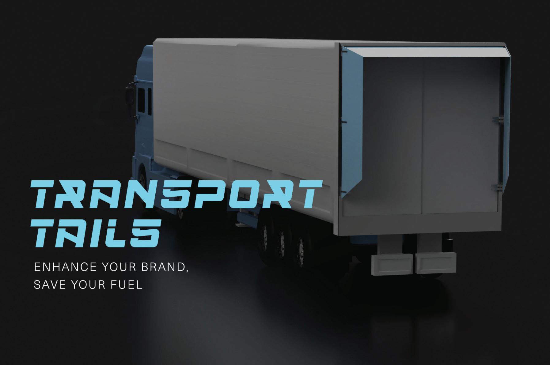
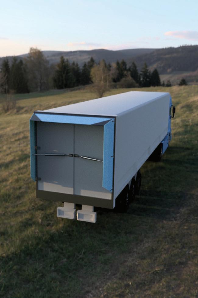
This project Transport Tails is a remedy to aid the ongoing global fuel crisis. People shouldn’t be forced to be struggling daily with increasing cost of living & expenditure on transport. Going ‘Green’ isn’t a viable solution for all income brackets if it’s not affordable, meanwhile there are little solutions in place for Heavy Commercial Vehicle’s (HGV)s which account for 28% of road transport CO2. Recently, owners of HGV fleets & vehicles are getting hit the hardest financially without any recommendations on how to move forward.
Transport Tails is a rear aerodynamic retrofit devices for box trailers. It redirects airflow at the rear, reducing pressure drag resulting in an estimated yearly fuel saving of €3,900 per vehicle. This design is empathy driven: no handling, no extra labour and no added concerns when manoeuvring. It was inspired by Porsche 911 spoilers which uses speed sensors to control actuators for deployment & retraction during highway speeds. The tails do not become an extra burden to users unlike previous designs in the past. Automated retraction in urban zones & automated deployment on highway speeds, a non-invasive device to a driver’s workload. The design is 2019 EU regulated approved which follows appropriate dimension guidelines for aero retrofits allowing an extra 500mm length to a HGV.
Fleet owners, driver’s & customers of haulage companies are offered with a greener approach to their lifestyle without the cost of increased manual labour, mental strain or financial burden.
LineLink is a kitchen operations system built to address one of the most common issues in professional kitchens: inconsistency.
In a lot of kitchens, standards live in people’s heads. Prep gets done differently depending on who’s in, cleaning gets missed, new staff get shown the wrong way by the wrong person and nobody catches it until something goes wrong. There’s no single source of truth.
I spent the past year testing this problem in real kitchens to develop a shared tablet system that gives kitchen teams a clear, consistent structure for daily work. Prep lists, recipes, cleaning checklists and section setup all in one place. Everything gets signed off in real time. The head chef can see what’s been done, who did it and when, without needing to ask.
It’s not about replacing the chef. It’s about making sure the standard exists somewhere other than their head.
rpg1118@gmail.com
LineLink Tablet System, Fourth Year, Physical Tablet System and Figma Prototype
Robert Green
Bachelor in Arts ( Honours) in Textile and Fashion Design
Dija Virkutyte
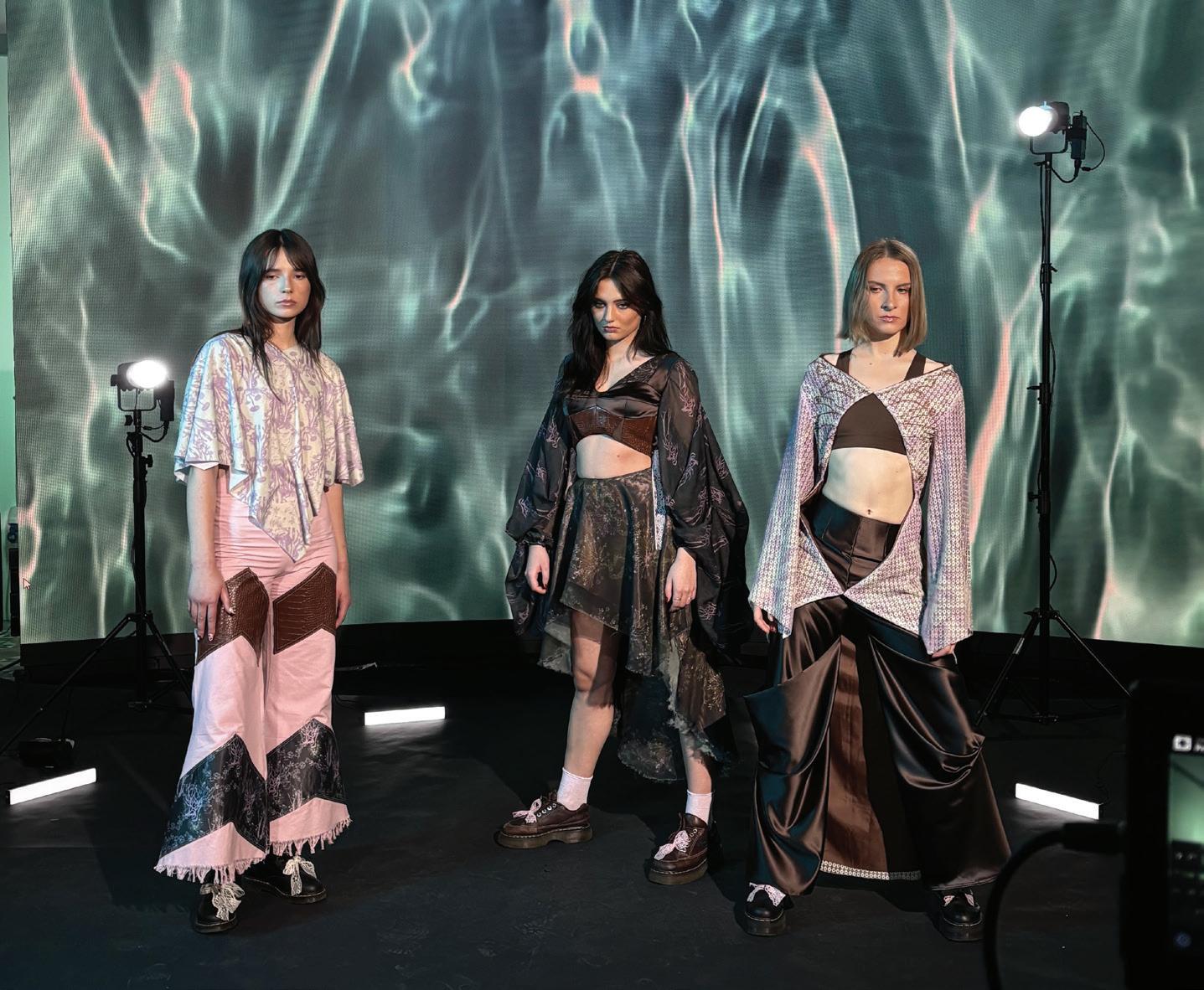
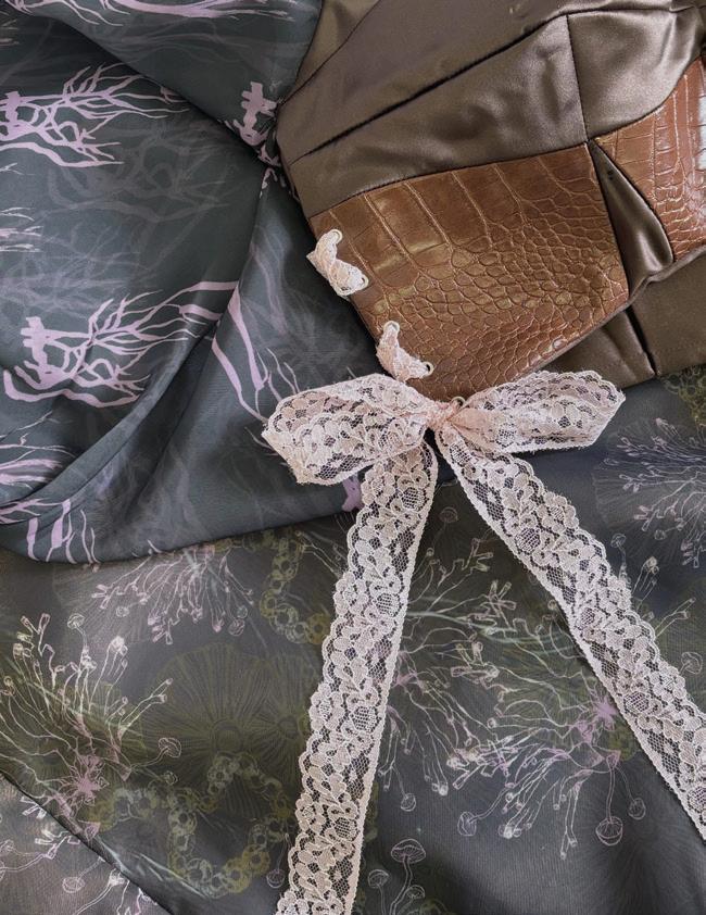
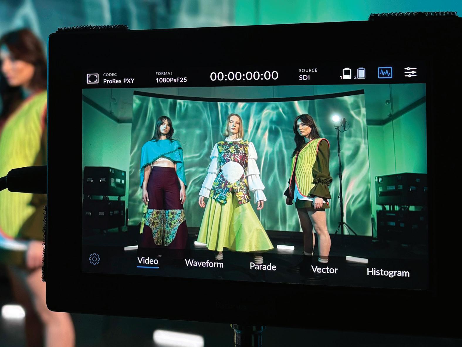
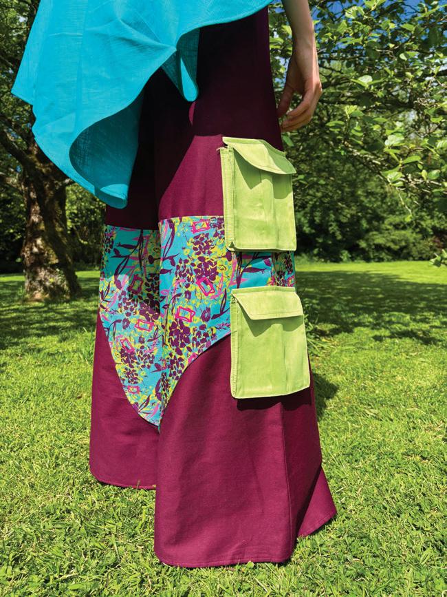
My collection, Mycelium Dreams, explores the forest as a living, dreamlike world shaped by memory, imagination, and nature. Inspired by childhood foraging trips with my grandmother, the collection draws from the quiet details found beneath the trees. My textile collection incorporates organic forest elements such as mushrooms, ferns, trees, and tangled roots. These natural elements become distorted and reimagined through colour, texture, and surface design to create an atmosphere that feels both familiar and surreal.
The collection reflects the feeling of entering another reality within the forest, where nature appears strange, magical, and almost psychedelic. Organic forms flow across the garments through layered prints, textured fabrics, and expressive silhouettes, capturing the sense of movement and growth found within woodland environments.
Mycelium Dreams is a collection that celebrates the hidden beauty of overlooked natural details while exploring themes of nostalgia, transformation, and connection to the natural world.
dijavirkutyte@gmail.com
@dija.textiles linkedin.com/in/dija-v-0568b7353
Collection photoshoot, 2026
Textile Collection, 2026
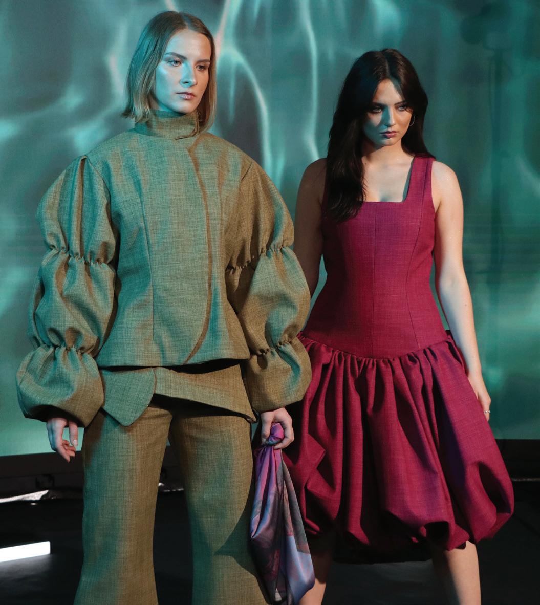
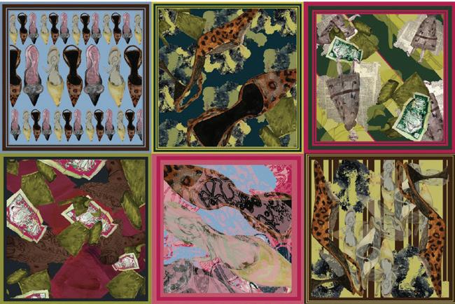
My final year collection, in with the old, consists of three outfits along with a print collection including a series of scarves. My fashion collection is based upon a variety of bespoke tweeds, therefore rather than printing directly on top of my fabric I chose to incorporate my prints in a more subtle way though hidden details. For example, each of my outfits are lined with my personally designed sublimation prints.
The theme of my collections, both print and fashion sprung from my interest in clothing quality, and how that of today compares with the quality of clothing in the past. I began my research by looking through old photos from the 1970s, 80s and 90s and studying the garments within these photos. As I progressed I gathered items of clothing and other objects that were either in the pictures or similar and of that era. Using those objects I created hand drawn illustrations using a variety of different media. I then used those illustrations to curate digital patterns, which I sublimation printed to create the linings of my outfits as well as my scarf collection and all other prints.
In addition I used some of the garments from the photos to determine the beginnings of the silhouettes for my fashion collection by draping them on the mannequin and getting a vague outline of a shape. i refined these shapes and eventually they because my fashion collection. All inspiration must come from pre existing ideas, and using photos and garments so close to home to inspire both, a fashion and a print collection is an act of creative preservation, capturing the fleeting essence of the past and weaving it into a modern narrative.
Leah Hoey
“In with the old” graduate fashion collection 2026
Molly Doyle
Molly Hill is a contemporary fashion and print collection inspired by Irish heritage, family history, and personal connection. Named after the place where my grandfather grew up – and where my own name originates – the project explores memories, imagery, and objects connected to his life and the rural surroundings of Molly Hill. Through this collection, I wanted to reinterpret elements of rural Irish life in a contemporary way, combining personal history with modern fashion and textile design.
The development process began through the collection of old family photographs, found objects, archival imagery, and visual research gathered from my grandfather’s home and farm. These materials became the starting point for drawing, collage, mark making, and print development, allowing me to transform fragments of memory into original textiles, and garments. The collection references textures, colours, structures, and details associated with Irish rural environments, while maintaining a contemporary and fashion-focused aesthetic.
Irish heritage played a significant role throughout the project, influencing both the visual language and emotional direction of the work. Traditional ideas of craftsmanship, longevity, and storytelling through material informed the collection’s silhouettes, prints, and fabric choices. One garment was particularly inspired by my grandmother’s wedding dress, incorporating softened references to its shape and detailing within a modern context. This connection between past and present became an important aspect of the collection, allowing family history to be carried forward through design.
By combining expressive print, contemporary silhouettes, and personal narrative, Molly Hill reflects themes of identity, memory, and inheritance, creating a body of work that feels both grounded in heritage and relevant to modern fashion.
mdoyle2003@gmail.com
Sophie Finneran
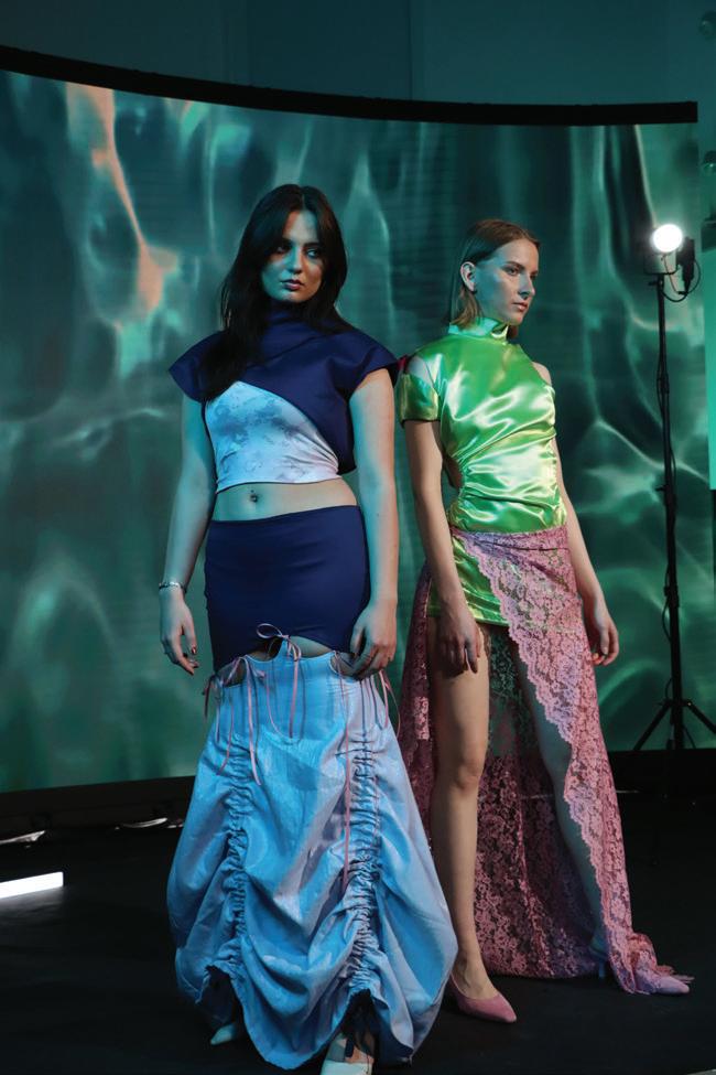
As a fourth-year Fashion and Textile Design student, my collection Afterlight explores the contrast between structure and softness through print, silhouette, and fabric. The starting point for the project came from photographs I took of streets, buildings, and nighttime scenes. I was interested in the sharp corners and rigid shapes within architecture, but also in the softer glow of artificial light reflecting onto surfaces after dark. That balance between harsh structure and softness became the main influence throughout the collection.
The garments combine structured silhouettes and angular shapes with softer details like draping, curved cut-outs, and gathered elements. I wanted the pieces to feel strong but still feminine and fluid. Fabrics such as satin and lace were chosen because of the way they catch light and create movement, referencing the shine and layered textures seen in urban night settings. The mix of structured forms with softer, more delicate fabrics helped me bring together both sides of the concept.
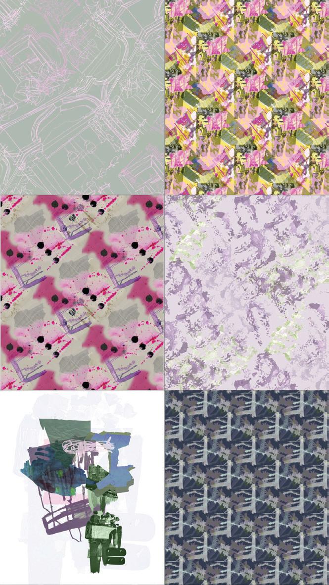
My print collection was developed digitally using layered imagery, textures, and abstract marks inspired by the surfaces and atmosphere of the city at night. Some prints are more repetitive and structured, while others are looser and more textured, allowing the collection to feel varied while still connected visually.
The colour palette was inspired by spring tones but with a softer, muted look. Soft lilacs, dusty neutrals, greens, blues, and pinks are contrasted with brighter yellow tones and darker navy shades. I wanted the colours to reflect the mix of light, shadow, and reflections found in nighttime environments.
Overall, Afterlight focuses on combining opposing qualities like sharp and soft, structured and fluid, and translating them into both textiles and garments in a way that feels expressive and wearable.
sophierosefinneran@gmail.com
Afterlight, 2026, Digital Photograph, 155mm x 101mm
Afterlight, 2026, Digital Print Series, 152mm x 101mm
Bachelor in Arts ( Honours) in Animation
and Game Design
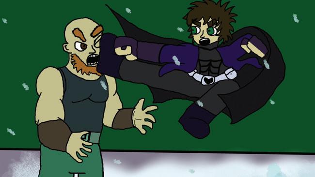
Alan Walsh is an animation graduate and served as the class representative for the year group. Originally drawn to animation through a lifelong interest in cartoons and visual storytelling, Alan developed a strong appreciation for the impact animated media can have on childhood development, imagination, and emotional engagement.
This early fascination evolved into a creative practice centred on colour theory, visual atmosphere, and the expressive use of hue and vibrancy. His work explores how colour can influence mood, perception, and wellbeing, reflecting his research into the psychological and emotional effects of visual design within animation and illustration.
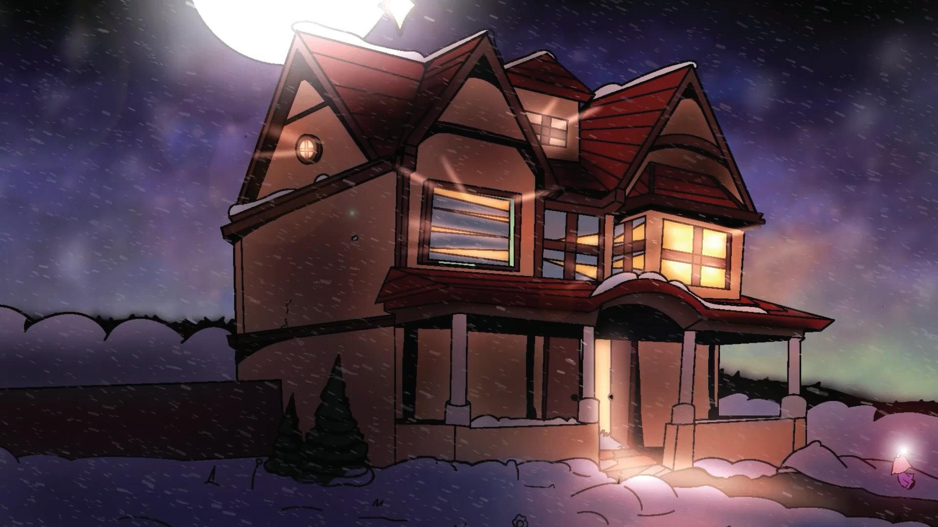
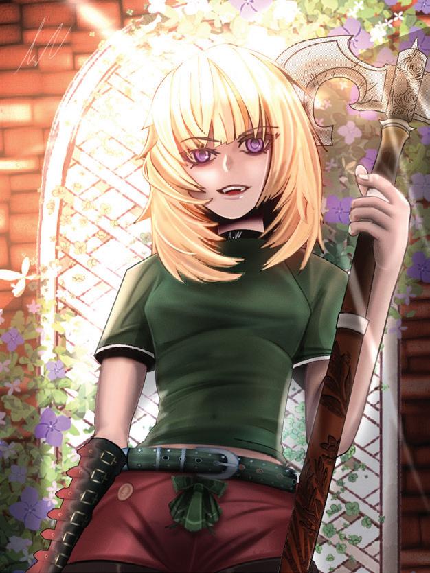
His primary featured work is a winter-themed landscape background created for an animated short film, demonstrating his ability to build atmosphere and environmental storytelling through colour and composition. His second piece, a portrait illustration, places greater emphasis on personal style, intricate detail, and character-focused visual expression, highlighting the range within his artistic practice.
Alan is also a disabled student living with a neuromuscular dystrophy condition that affects communication between certain nerves and the brain. Despite these challenges, he has continued to develop a distinctive artistic voice and a thoughtful approach to animation that combines technical skill with emotional awareness.
Through his work, Alan aims to create visually engaging animation and illustration that not only captures attention but also explores the deeper relationship between colour, emotion, and human experience.
Alan Walsh
Home, 2026, digital background painting 1920 by 1080
Valkyrie,2026, digital illustration, 1080 by 1440
Aoife Tobin Hawkins
I’m Aoife, an animation graduate from County Clare, and my favourite aspect of animation is how it allows me to turn almost anything into a story. Over the course of this degree, I’ve grown enormously both creatively and technically, which still feels surreal considering I didn’t even know how to switch on a computer when I first started. Over the last few years, I’ve gained a huge amount of knowledge and confidence, and I’m now excited to continue developing my journey as an animator.
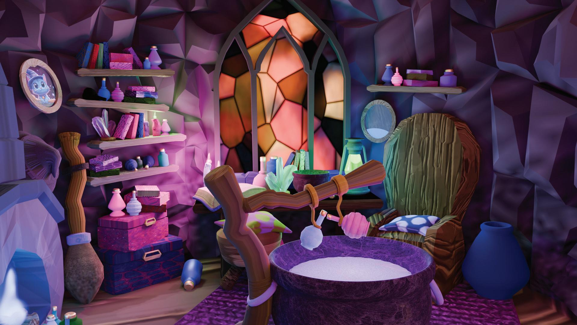
My primary featured project is Little Witch Room, a detailed 3D environment created in Blender. Inspired by Howl’s Moving Castle, I wanted to create a space that felt both chaotic and cosy while also subtly telling a story through its objects, layout, and atmosphere. The project allowed me to explore environmental storytelling and develop my skills in lighting, composition, and world-building.
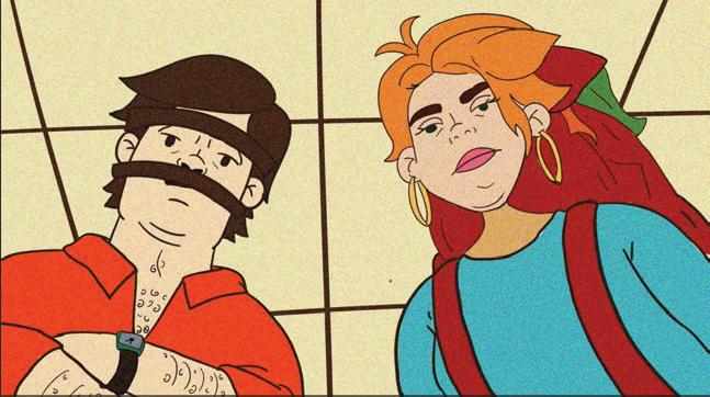
My most recent animation, Late For Lanzarote, follows the comedic story of a family rushing through Shannon Airport after running extremely late for their flight. With this piece, I wanted to focus on humour, timing, and the entertaining dynamics within family relationships, while also creating moments that audiences might recognise from their own travel experiences.
A Little Witch Room, 2026, Blender, 1920 x 1080
Late For Lanzarote, 2026, Toon Boom Harmony, 1920 x 1080
Aria Doherty
I am Aria, an aspiring game designer. Over the past three years, I have developed a wide range of both 2D and 3D games as part of my coursework, allowing me to build strong technical and creative skills in game development.
Throughout the course, I extensively worked in the Unity game engine, gaining significant experience in gameplay programming, level design, and project development. This growing technical foundation has shaped my interest in creating engaging interactive systems and designing games that combine action, progression, and immersive mechanics.
My current project, Sceptre, is the largest game I have developed so far and serves as my final major college assignment. The game is a third-person shooter built and incorporates a range of mechanics and systems developed throughout my previous projects.
Sceptre features two playable levels connected through cinematic cutscenes that help develop the game’s narrative and pacing. Players can access three distinct elemental weapons; each designed around a rock-paper-scissors-style damage system in which different enemy types are vulnerable to specific elemental attacks. Through this system, I wanted to encourage strategic gameplay while also creating a fast-paced and engaging combat experience.
Through my work, I aim to continue developing games that combine strong mechanical design, technical problem-solving, and immersive gameplay experiences, while further refining my skills as a game designer and developer.
@starryaria ariannadohertyart@gmail.com
Sceptre Poster, 2026, digital illustration, 2480 x 3530
Screenshot of level 1, 2026, screenshot, 1920 x 1080
My name is Carol Griffin, an animation student with a strong interest in 2D animation and visual storytelling. My work is heavily inspired by memory, atmosphere, and the emotional connection between people and place, particularly within natural and rural environments.
Over the course of my studies, I have developed a creative practice focused on expressive digital painting techniques and narrative-driven animation. I enjoy exploring how texture, colour, and environment can evoke emotion and create a sense of nostalgia within animated work.
The two featured images are taken from my final year 2D animated film, Blackberry Season. The film follows a character who is taken on a nostalgic journey through memories of childhood, reflecting on moments shaped by nature, familiarity, and personal experience. Both images were painted digitally using watercolour and charcoal-style brushes, allowing me to create a soft, textured visual style inspired by the Irish countryside and the changing atmosphere of the natural landscape.
Blackberry Season, 2026, digital
Hilltop Horizon, 2026, digital
Carol Griffin
Dan Connolly
Daniel Connolly is an aspiring animator and creative director based in Galway. He is inspired by the stories he was told growing up, drawing heavily from Irish folklore, fairytales, and fantasy storytelling. This interest in myth and imaginative world-building has become a central influence throughout his animation practice and creative development.
Daniel has developed his skills contributing to several group productions in a variety of creative roles. On Catsmas, he worked as a 3D object designer, while on Hammering the Anvil and Let’s be Frank he contributed as a storyboard artist. He also directed the latter, further developing his skills in visual storytelling, project coordination, and creative leadership. Daniel is currently developing a pilot for an original animated series titled Folk Tails, a project that continues his exploration of folklore, fantasy, and original character-driven narratives.
Daniel previously attended Galway Technical Institute, where he studied Fine Art and Portfolio Preparation, which greatly helped with his development as an animator at ATU. His background in both fine art and animation has helped shape a visually driven approach to storytelling and design.
Outside of animation, Daniel has a strong passion for fantasy novels, tabletop roleplaying games such as Dungeons & Dragons, and both video and board games. He also enjoys cooking and hosting, often taking any opportunity to prepare meals for friends and family. These interests continue to influence the imaginative, communal, and storyfocused nature of his creative work.
@danimatorstudios
danielconnolly202@gmail.com
Puca, 2026, digital illustration, 1080 x 1600
Henry’s rise, 2026, digital illustration, 5121 x 3839
David Hughes
David Hughes is a multi-award-winning game design student. He was narrative lead on project Matter Baby, a futuristic physics-based delivery game, and winner of Best Narrative and Best Sound Design at the TUS Games Fleadh 2026. He has a passion for narrative and rules/systems designs in games, with a fondness for tabletop and board games.
In 2025 he worked on Neko 9 Lives with two fellow game design students for the Global Game Jam Jamsepticeye. A post-apocalyptic, first-person puzzle platformer where the player steps into the paws of Neko the Cat, escaping the feline imprisonment facilities of Professor Madra. It was met with high praise and positive feedback by the main event organisers. Building on this the development team created Stonefaced Games, a game development studio, with plans to create a fully playable version of Neko 9 Lives upon completion of our course.
Gak in Action is his newest Game, wherein the player explores the tunnels of Ivoryburrow in this fantasy third-person magic shooter, where the player utilizes randomized magic spells to defeat the new hulking monsters that plague the burrow. This newfound magic has Gak confused, but hopeful that he can save the draconic queen of the burrow, Lady Frostcrown, before these monsters reach her first.
David’s simple goal is to make one person’s truly favourite game. Whether that be one of his digital endeavours, or from his probably eventual soirée into tabletop games design. If someone approaches him one day to excitedly chat about their favourite experience playing something he assisted in creating, he will have considered himself successful.
Dong Er Liu is a 3D game development artist based in Galway with a strong focus on creating immersive in-game environments, characters, and props. His work primarily explores military, science-fiction, and modern visual aesthetics. He particularly enjoys collaborative development and values the creative process of building games as part of a team.
Dong Er has contributed to a wide variety of game projects across multiple genres, including 2D side-scrollers, top-down RPGs, first-person shooters, horror adventure games, driving delivery games, and third-person action titles.
Two of these projects were created for competition settings. One, Neko 9 Lives, was developed during the Global Game Jam alongside two teammates. The game is a horror first-person adventure in which players take control of a cat navigating a dangerous environment. The second project, Matter Baby, is an arcade-style driving delivery game set within a cyberpunk-inspired world. Serving as the project’s primary 3D modeller, Dong Er, the game was later showcased at the Games Fleadh, where it won national awards for Best Narrative and Best Audio Design.
His final year project, DeltaFall, is a third-person science-fiction shooter and represents one of his most ambitious works to date. Developed primarily using Blender, the project features original environments, enemy designs, and cinematic cutscenes created largely from scratch with minimal reliance on external asset libraries. The project demonstrates both his technical ability and his passion for constructing detailed futuristic worlds and large-scale action experiences.
Dong Er is particularly interested in creating immersive futuristic settings filled with large battles, cinematic scale, and dynamic environments. Through his work, he hopes to continue developing visually ambitious games that combine strong environmental storytelling with engaging gameplay experiences.
Neko 9 Lives , 2025 , Digital Print , 1795 x 1192 Pixels
Set in the 1960s, this 2D animated short follows a young woman attending a basement house party. In her boredom she realises that the other guests are acting very strange. Her curiosity gets the better of her, as she realises why.
With a Little Help From My Friends, 2025, 2D animation
With a Little Help From My Friends, 2025, 2D animation
Gabriella da Silva
Hanif Fitriyani
Hanif is an artist who treats each creation as a doorway into the stories she wishes to share. She is passionate about character design, carefully crafting characters that feel expressive, personal, and full of life. Her characters are more than designs; they are small pieces of her heart brought into visual form.
Over the course of her creative development, she has found an outlet creating 3D environments, using them to expand the worlds her characters belong to and strengthen the storytelling within her work. Drawing inspiration from many aspects of her life, both good and bad Hanif turns ideas, emotions, and observations into art that tells a story.
Through expressive characters and atmospheric environments, she allows her stories to unfold, aiming to create work that leaves a lasting impression on those who experience her work.
I’m Jake Molloy, an artist and animator who has been drawing from a young age, and over the last three years at ATU I have continued to develop and refine my animation skills, building both my technical ability and creative approach.
My final animation project, Armageddon: The Showdown, centres on the final confrontation between those who seek salvation through destruction and those willing to endure the hardships of life. The story follows the climactic battle between the hero Jason and the antagonist Kyren. Driven by bitterness and spite, Kyren seeks to destroy the universe and rebuild it in his own image as a twisted messianic figure. Jason, despite experiencing failure as a hero, student, and friend, continues to fight to save his world regardless of how others perceive him.
My goal was to create a visually engaging fight scene with dynamic fight choreography. I gave the animation a dark aesthetic with a dark green sky and clouds to convey the end of the world setting and snow for harsh cold weather conditions.
Going forward, I intend to continue refining my 2D animation skills while further developing my visual style and approach to cinematic storytelling.
jakemolloy64@gmail.com
Armageddon: The Showdown: The face off
Armageddon: The Showdown: The fight
Jake Molloy
This short film mostly falls into the category of fantasy, whilst also occupying that of comedy. If tells the tale of a dragon unleashing wanton destruction upon the world, while entirely unaware of its actions.
The animation opens on a calm shoreline as waves roll gently in and out beneath the night sky. Suspended in the upper corner of the scene is the moon, quietly overlooking the landscape. As the peaceful atmosphere continues, subtle cracks begin to spread across the moon’s surface until it gradually splits apart like a hatching egg.
The scene then shifts to reveal a colossal dragon sleeping peacefully while curled around a planet resembling Earth. Enormous in scale, the creature wraps its tail around much of the planet’s surface, appearing almost protective despite its overwhelming size. Accompanied by soft, mellow, and playful music, the dragon slowly begins to wake. It yawns, stretches dramatically like a cat, and extends its claws across the planet below.
As the dragon moves, the tone of the soundtrack shifts into something far more dramatic and tense. Its claws scour across the landmass, while the creature’s deep purring causes the entire planet to tremble with violent earthquakes. Despite the destruction created by its sheer scale and movement, the dragon itself remains calm and unaware of the chaos it causes.
Eventually, the creature settles once more and gazes briefly into space, where the cracked moon can now be seen more clearly. A fragment of the broken moon falls away from the dragon’s wing like a piece of eggshell, revealing that the moon itself had formed around the sleeping creature. The dragon purrs softly once again before curling back into itself and returning to sleep, restoring the quiet stillness from the beginning of the animation.
Gaia’s Play, 2026, digital, 1920x1080
Gaia’s Play, 2026, digital, 1920x1080
Jessica Fletcher
Jordan Doyle
Jordan Doyle is a Galway-based game designer specialising in level & environment design.
Crystal Heart is a third-person, cinematic shooter. Driven by its cold war era spy thriller narrative. Agent Max Bennett of the Department of Metaphysical Occurrences is deployed to the rural town of Woodquay to locate Dr. Reinhard Weaver, a missing scientist. The situation spirals as Bennett uncovers a town in disarray, a fanatical computer-worshipping cult, and a conspiracy that reaches to the highest branches of government. Can you uncover the source of corruption?
Jordan co-founded the studio Stonefaced alongside his two co-developers of the game Neko Nine Lives which follows the story of a cat fallen into the depths of an industrial labyrinth where living machines run rampant. Neko must sneak and climb his way back to his family on the surface. The game has had a successful prototype and will be developed in full.
Our game fleadh team won the awards Best Narrative and Best Audio Design at the TUS Game Fleadh 2026.
You can play my games and view my showcases @ jordan-stonefaced.figma.site
My art primarily consists of a sort of grunge or punk style. It aims to make you laugh your ass off or squirm in your seat.
As an animator, movement is important in my work, including in my illustrations. In Music at Blue Hour, the aim is to draw the viewer to the face first, then, like orbiting the moon, shoot them back out to the rest of the image to slowly observe the details of the room.
In Under the Sea, the goal is to draw the viewer in with an upward motion towards the face, while the background gives a sinking feeling.
My name is Katie O’Leary and I am a final year animation student at ATU Galway specialising in 2D and 3D animation. Over the past three years I have become proficient in Toon Boom Harmony, the Adobe Suite, Maya and Blender. With a passion for visual storytelling, I like to focus on creating fluid, 2D, hand-drawn animations, including storyboards, character designs and animatics.
Nyx is the character I created for my futuristic yet old-timey Comic Book. Nyx is a girl who runs away from an orphanage after finding out that she is being sold off. She ends up stowing away on a ship and disguises herself as a man. This Comic Book focuses on digital 2D hand-drawn animation.
The Cow was part of my research for a Storyboard centred around the life cycle of a cow. I used multiple mediums throughout the storyboard, and this image shows how I incorporated ink, sharpie and white charcoal. This Storyboard focuses on traditional hand-drawn images.
katieoleary04@gmail.com
@katies_animation
Nyx, 2024, Digital (Sketchbook), 1193 x 1795px Portrait
Cow, 2024, Sharpie, Ink & White Charcoal, 1193 x 1795px Portrait
Luke Hayden
Luke Hayden, originally from County Cork, has spent the past three years living in Galway while studying Animation at Atlantic Technological University.
Over the course of their studies, Luke has worked as both a producer and director on a series of short animatics, gaining experience in visual storytelling, project coordination, and creative development. Alongside animation work, they have also created a range of character designs and 3D pieces, allowing them to explore both stylised visual design and digital production techniques.
Their interests extend into post-production, including visual effects, sound design, and editing, helping them develop a broader understanding of the complete animation and production pipeline.
Through their creative practice, Luke continues to build a versatile skillset across both production and post-production, with an interest in developing visually engaging animation projects supported by strong technical and organisational skills.
AmnaceiaArts.cargo.site
Petrichor Poster. 2026, Digital Art (Clip Studio Paint), 101mm/152mm
Cassandra, 2026, Digital Art (Clip Studio Paint), 101mm/152mm
Hi, I’m Michael, an animator and 2D artist, with a particular passion for 2D animation and its ability to express emotion through movement, atmosphere, and visual subtlety. I am especially drawn to the handcrafted quality of 2D work, and to the way it can communicate intimacy, memory, and feeling in a way that feels both timeless and deeply personal.
My creative interests lie in emotionally driven storytelling, with a focus on nostalgia, melancholy, and quiet moments that often carry the greatest emotional weight. I am deeply influenced by music as a narrative device, and I am interested in how sound and melody can shape memory, rhythm and human experience within a film.
By using lighting, composition, colour, and gesture, I aim to create work that speaks to universal experiences without relying heavily on dialogue. Also, I have a fascination with stories grounded in an Irish cultural perspective, capturing a sense of tradition and atmosphere that feels both local and widely relatable.
@anam_8_r
michaelcoenmedia@gmail.com
www.anam8r.com
Opening shot of Nobody Else, 2026, 2D animation created in Photoshop
Self Portrait, 2023, digital illustration in Photoshop
Michael Coen
Primary Image: The Dragon Mother features tiedown drawings of the dragon from my animated short, The Blood From Swords & Scales. One of the greatest challenges during the design process was transforming a slender dragon concept into a form that felt tangible and suitable for animation while still capturing the grandiose power and presence associated with mythical creatures.
Much of my approach was inspired by the Genga (原画) pipeline used in Japanese anime production, meaning “key frame” animation. Drawing influence from this process helped make the creation of tiedown poses more manageable using clean white linework and carefully selected light hues to indicate lighting areas and important visual features for later colouring stages. This process allowed me to focus on both animation clarity and expressive form while maintaining the character’s scale and elegance
Second Image: This image is the final frame from the colour-scripted animatic, The Red & Yellow Lens Flares. I have always been fascinated by the way light affects visual composition across all forms of media, particularly when animation attempts to recreate that sense of atmosphere and intensity. The lens flare itself is an optical phenomenon caused by stray light scattering within a lens, creating visual effects such as rings, starbursts, and hazy streaks of low-contrast light.
Using simple linework, blending modes, and carefully selected colour palettes, I wanted to direct the viewer’s eye immediately towards the source of light within the composition. In this scene, the glowing crimson eye sockets of a giant fictional bone serpent emerge from the darkness, disrupting an otherwise ordinary cave-diving experience. Through visuals like these, I aim to create imagery with such strong atmosphere and movement that the audience can almost hear the action unfolding within the scene.
@RedLeftHandPictures
@arcanereeee
@BigRagguh
mcgannmicheal@gmail.com
The Dragon Mother - The Blood From Swords & Scales, 2026, 2D Illustration Tiedowns, 3840 x 2160 px
Climactic Red - The Red & Yellow Lens Flares, 2025, 2D Illustration Colour Script Frame, 1920 x 1080 px
Micheál McGann
Born in The Netherlands and raised in Ireland, Nicolaas has also lived, worked and studied in Spain, Canada, and Guatemala. This multicultural background has informed a wide-ranging and diverse practice in creativity, including game development. Nicolaas’ passion lies in crafting immersive, interactive experiences that appeal to our playful nature and our sense of wonder but also resonate with our drive to contribute in a meaningful way to the communities of which we are members.
“My Favourite Dinosaur”, Digital sketch Nicolaas Venneman
I have just completed my final year as an animation student at ATU Galway. During my time here I have worked on multiple individual and group projects. I have a particular interest in the visual style of animation and in combining 2D and 3D animation. I have spent my final year working on an animation titled I’m With You as well as various other projects including a group animation titled A Star in My Hands
I’m With You is a still from my final year animation in which a cat struggles to come to terms with the loss of her owner. She befriends a butterfly who reminds her a lot of him and helps her feel cared for again.
This still, showing the cat running to her beloved owner, feels like one of the most important scenes to me as it shows her love for him and why she must feel so heartbroken when he’s gone. It was created using a mixture of 3D models (for the cat and house) as well as 2D elements using Blender.
Stars is a 3D modelled space environment created in blender. It was made as part of a larger background for a group animation project I worked on about a little boy who is daydreaming about flying a rocket through space. I wanted to make it dreamlike and relaxing, like something you would see in a children’s cartoon. I used a soft yellow glow and added faces to the stars to contrast the dark purple fluffy clouds which I hoped would make it feel like something a child would imagine.
oliviagilbert1510@gmail.com
oliviagilbertportfolio.cargo.site
Olivia Gilbert, 2026, Blender Grese Pencil, 152mm x 101mm
Stars, 2025, 3D Model, 152mm x 101mm
Olivia Gilbert
Priscilla Paul Nicson
Priscilla Paul Nicson is an ambitious artist whose work blends ethereal and dreamlike movement as she explores the fantasy world with emotional minimalism. Her style usually focuses on the aspects of movement and tone, using simplicity as a key role in her narrative storytelling.
She plays with different hues of a colour and finds beauty in the simplicity of its environmental setting. As seen in A Hidden Cove, she uses a blue but plays with lighting and the many shades blue could offer to highlight the silent ambience of an imaginary world.
With a combined passion for music, Priscilla composes original soundtracks for her animations, allowing sound and image to evolve together. The rhythm shapes her storytelling, while her art’s movement inspires her musical compositions.
https://ppn0825.wixsite.com/ntapriscillanicson
A Hidden Cove, 2024, 1920x1080
Null, 2024, 2000x2000
Roisin Cooney
Hailing from the countryside of County Clare, Roisin moved to Galway in 2023 at the age of 18 to pursue a career in animation. During her time studying Animation and Game Design course at ATU she has continued to develop her creative and technical skills across both individual and collaborative projects.
Throughout her college experience, Roisin has contributed to several short films and personal projects, including the 2D short Meet-Cute and the 3D short Catsmas. Her latest project, What Remains of Faith? reflects her growing confidence as a storyteller and visual artist.
Roisin is particularly recognised for her storytelling abilities and her interest in exploring deep and personal themes through animation. Much of her work focuses on emotional connection, character-driven narratives, and meaningful visual development. She also has a strong interest in pre-production work, particularly concept art and character design, where she enjoys developing personalities, emotions, and visual identities that feel authentic and relatable.
Her long-term creative goal is to design and create meaningful characters capable of forming strong emotional connections with audiences. Inspired by the same sense of attachment and immersion that first drew her towards animation.
The Sanctum, 2026, Digital Illustration, 1920 x 1080
Voltage, 2026, Digital Illustration, 1080 x 1500
Samuel Mickey
Samuel Mickey (@Spamytv) is an aspiring animator and visual storyteller. He focuses on developing a fresh and considered creative perspective within the animation field, with an emphasis on strong visual storytelling and design-led thinking.
His specialism lies in 2D animation and background design, with a particular interest in character-driven narratives and immersive world-building. His work focuses on expressive character performance and cohesive environmental design, using composition, colour, and atmosphere to support narrative clarity and emotional tone across each project.
Samuel is especially interested in exploring hybrid animation workflows that combine 2D and 3D techniques to expand the possibilities of visual storytelling. He works across industry-standard tools and is actively seeking collaborative opportunities on short films, creative projects, and experimental animation work.
His portfolio demonstrates a strong focus on 2D animation and background design, where carefully constructed environments and expressive visuals work together to support clear and engaging storytelling. Each piece is developed with attention to composition, atmosphere, and narrative purpose, resulting in work that is both visually cohesive and story driven.
Samuel encourages a creative philosophy centred and advises the reader to start, mess-up and look as silly as you can be while you’re young, because eventually, what may look silly can be turned into an art.
Hi my name is Saoirse and I’m an animation student studying 2D and 3D animation. I have a big interest in character design and 3D modelling and like to bring characters to life.
Saoirsek.cargo.site
3D Cat Sequence, 2025, Blender
Benson, 2025, Procreate
Hi! I’m Sara, and I am a graduate in the Animation & Game Design course. I am an aspiring concept artist & illustrator and hope to apply what I’ve learned in this course to the gaming industry. I have a strong foundation in character design and conceptual art for video games. I am very passionate about story telling through video game art. I’m always looking for new opportunities for growth and improvement in my art journey.
For my final year game, I created a third-person shooter named Jestears, This game is set in the fictional world of Muselin, a once bright and cheerful world, now overrun with a depressive miasma which plagues its citizens. The player controls a Jester named Jes who uses playful abilities such as throwing cards and confetti to pull people out of their depressive, hostile states. However, constantly facing so much negativity drains her morale, so the player must collect tissues and let her cry to recover. The main image showcased here is the digital poster I created for ‘Jestears’.
The secondary image depicts an anxiety ridden girl named Lemon for my game concept named Cloudy Lemon. When she feels anxious her vision gets clouded by water droplets. I used a minimalistic colour palette, opting for blues and greys as dominating colours, with a pop of yellow and orange to draw attention to the protagonist and create contrast in the image. In the background I drew shadowy blob figures that represent how Lemon views the people around her and her mental state.
Jestears Poster, 2026, Digital Illustration (Photoshop), 2512 x 3539
Cloudy Lemon, 2025, Digital Illustration (Procreate), 3277 x 2277
Sara Jakowicz
Hi, I’m Sean Park, a game designer who studied Animation and Game Design at ATU. I focus on creating and designing video games with an emphasis on delivering unique and compelling player experiences that remain memorable long after the game has been completed.
Throughout my studies, I developed a strong passion for all aspects of game design, including systems, mechanics, and player experience. My approach is grounded in analyzing the elements of games I enjoy and applying that understanding to my own work. This allows me to create designs that respect established game design principles while also introducing my own creative ideas and perspectives.
I am also an avid consumer of fictional media, including books, games, and films, which have played a significant role in shaping my creative interests and design influences. These inspirations continue to inform my work, supporting my goal of creating engaging and thoughtfully designed interactive experiences that resonate with players.
sean.p.park20@gmail.com
linkedin.com/in/sean-park-79318a319
Western Wyrdness Poster, 2026, poster, 101mm x 152mm
Histo Character Model, 2025, 3D model, 152mm x 101mm
Sean Park
Shane Williams
Shane Williams is an animator based out of Galway, Ireland. He attended Atlantic Technological University in Galway where he achieved a BA (Honours) in Animation and Game Design. His work tends towards the comically absurd. He is especially inspired by adult animated comedies, such as the acid-trip-esque creations you’d find playing on Adult Swim circa the early 2000’s. He is situated in Ireland for the long-term and wishes to help bolster the Irish animation industry by creating new and exciting original projects based upon local culture.
He possesses an enthusiasm towards all kinds of animation - including 2D, 3D, and stopmotion. He has a deep-rooted love for animation in all its various shapes and forms. He tries to implement these different styles and methods into his work to achieve a certain mania in the viewer that only mixed media can deliver upon. He hopes to normalise mixed-media use throughout his works.
Pick Anything is an animated pilot that seeks to explore the horrors of recreational overabundance and the war on attention spans that the youth find themselves caught within in this day and age. Through a darkly surreal lens, the show examines said dilemma by illustrating how two slackers on a Friday afternoon descend into the depths of their own insanity by being unable to simply pick something on TV to watch, slowly losing their minds over the completely overwhelming amount of choice at their fingertips
Promotional Poster for Pick Anything, 2026, Digital Illustration, 1920x1080 px.
Still from Pick Anything, 2026, Digital Illustration, 1920x1080 px.
Polish animator, producer, and director Victoria-Maria Zabnicka-Zbroja grew up in Galway, She attended Galway Technical Institute to study Fine Art, followed by studies in Digital Marketing, before completing her Bachelor’s Degree in Animation and Game Design at ATU.
Throughout her studies, Victoria-Maria has worked across a range of small animation projects, developing experience in animation production, storytelling, and project coordination. Her creative practice reflects a balance between artistic direction and production-focused roles, allowing her to contribute both creatively and organisationally to collaborative work.
Her final animation showcase is called The Devil’s Daughter (and Other Lies), Victoria is also co-producing an ongoing animated series titled The Gap
Alongside her current work, her long-term career ambition is to contribute to the development of major narrative-driven games, with a particular goal of working on the next Cyberpunk title in Warsaw. Her interests lie in combining animation, storytelling, and interactive media within large-scale production environments.
The Devil’s Daughter , 2026, Digital art using Clip Studio Paint, dimensions : 5025px x 7080px, 300 dpi
What If We Were Cyber? 2026 , Digital art using Clip Studio Paint, dimensions : 5000px x 6667px, 300 dpi