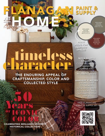
FLANAGAN
PAINT & SUPPLY BENJAMIN MOORE CROMWELL GRAY HC-103 BENJAMIN MOORE MONTEREY WHITE HC-27
timeless character THE ENDURING APPEAL OF CRAFTSMANSHIP, COLOR AND COLLECTED STYLE
50
Years OF
I CONIC COLO R
CELEBRATING BENJAMIN MOORE’S HISTORICAL COLLECTION
PAINT PICKS FOR INSPIRED SPACES
BENJAMIN MOORE COUNTRY REDWOOD HC-183
NOVA SCOTIA CALLING COASTAL DRIVES, CHARMING TOWNS AND UNFORGETTABLE ATLANTIC VIEWS HARVEST FLAVORS FROM CIDER TO SALADS, DELICIOUS WAYS TO ENJOY CRISP, ORCHARD-FRESH APPLES VISIT FLANAGAN PAINT & SUPPLY AT:
SINCE 1883
®
TWO FREE COLOR SAMPLES
Redeemable at any Flanagan Paint & Supply location!
WEBSTER G R OVE S 8041A Watson Rd, Webster Groves (314) 962-7575
S A I N T PET ERS 3790 Harvester Rd Suite 2, St Peters (636) 626-2334
W EN T ZV I L L E 405 East Pierce Blvd, Wentzville (636) 538-6060
ELLI SVI L L E 15878 Clayton Road, Ellisville (636) 391-8448
ED WA RD S V I L L E 1510 Troy Road, Edwardsville (618) 656-0490
FLANAGANPAINT.COM
Limit 1 coupon per customer | Not valid with other offers | No cash value | Expires 12.31.27
HOW MUCH PAINT DO I NEED?
Follow this formula to estimate the paint requirements of your next project. Don’t run out! Let Flanagan Paint & Supply help calculate the right amount for you.
STEP 1: Measure the Walls
STEP 4:
Wall 1 Width: ________ ft. X Height: ________ ft. = ________ ft.
Add Total Doors plus Total Windows to = Surface Not to Be Painted.
Wall 2 Width: ________ ft. X Height: ________ ft. = ________ ft. Wall 3 Width: ________ ft. X Height: ________ ft. = ________ ft. Wall 4 Width: ________ ft. X Height: ________ ft. = ________ ft. Add together to find Total Wall Surface = ________ ft.
STEP 2: Measure the Doors Door 1 Width: ________ ft. X Height: ________ ft. = ________ ft. Door 2 Width: ________ ft. X Height: ________ ft. = ________ ft.
STEP 5: Subtract Surface Not to Be Painted from Total Wall Surface = Total Surface To Be Painted.
STEP 6: Divide Total Surface to Be Painted by the Spread Rate* = Amount of Paint Needed For Each Coat.
Add together to find Total Door Surface = ________ ft.
STEP 3: Measure the Windows
*SPREAD RATE: The spread rate is the recommended
Window 1 Width: ________ ft. X Height: ________ ft. = ________ ft.
yield you can expect from a can of paint. Typically, a
Window 2 Width: ________ ft. X Height: ________ ft. = ________ ft.
U.S. gallon of paint will cover 350-400 square feet. As
Add together to find Total Window Surface = ________ ft.
coverage may vary depending on paint product and thickness of application, check your paint can label to determine the spread rate before purchasing.
PRO TIP Buy a bit more paint than you think you will need for the job. This way, you can ensure you will not run out of paint before the job is done, plus you’ll have leftover paint for touch-ups.
SPACES: Real home redesigns with wall-to-wall ideas you can use.
26
THE ADAPTABILITY ADVANTAGE A historic Pasadena home is transformed into a personality-filled, Swedish-inspired retreat
32
MID-CENTURY MAGIC A Calgary home blends retro character with fresh, contemporary living
DESIGN: MALLORY MATISON, PHOTOGRAPHY: JEFF HERR PHOTOGRAPHY
42
IN GOOD HANDS A New York designer gives her childhood Lido Beach home a colorful second act
48 A SPACE THAT SINGS An Atlanta home finds harmony through bold color, layered pattern and thoughtful design
Check out more colorful & inspiring spac starting on page 28
Products featured in At Home are available at Flanagan Paint & Supply, some by special order.
FA L L 2026
5
CON TEN TS
22
CRAFTY: DIY? WE SAY Y-E-S!
FALL 2026
Bahia Taylor Editor in Chief Co-founder Leigh McKenzie Creative Director Co-founder Twila Driedger Contributing Writer & Editor Olivia Guay Graphic Designer Carlee Baigrie Contributing Writer
Color accuracy is ensured only when tinted in quality Benjamin Moore® paints. Color representations may differ slightly from actual paint. ©2025 Benjamin Moore & Co. Aura, Benjamin Moore, Regal, the Signature Paint Dollop, and the triangle “M” symbol are registered trademarks licensed to Benjamin Moore & Co. 10/25
KIRSTEN FRANCIS, AMY BARTLAM, KM PHOTOGRAPHY INTERIORS
Aubrey Taylor Contributing Photographer Jim Taylor Painter & Set Contractor Graphic Design Styling Gallon Creative www.galloncreative.com Owned and Published by: Gallon Creative For inquiries, please contact us at projectsgalloncreative@gmail.com 5 Scurfield Blvd #25 Winnipeg, Manitoba R3Y 3G4 www.galloncreative.com projectsgalloncreative@gmail.com Cover Photography - Aubrey James Projects aubreyjamesprojects.com
While every effort has been made to ensure that advertisements and articles appear correctly, At Home Magazine cannot accept responsibility for any loss or damage caused directly or indirectly by the contents of this publication. All material is intended for informational purposes only. The views expressed in the magazine are not necessarily those of its publisher or editor.
FRIDGE FRAME GALLERY MAGNETS Turn treasured family photos into vintage-inspired refrigerator art
56
CHOW: Just thinking about it is making us hungry AN APPLE A DAY Celebrate apple season with comforting recipes starring fall's favorite fruit
P G.34 P G.44
62
EXPLORER: Pack your sense of adventure and let's go THE MARVEL OF THE MARITIMES From colorful fishing villages and rugged coastlines, explore the eclectic charm of Canada’s East Coast
70
INSIDER: BENJAMIN MOORE’S HISTORICAL COLOR COLLECTION Explore the timeless paint colors that continue to inspire beautiful homes
P G.50
76
COVER FORMULA: STYLED THROUGH THE SEASONS See how one thoughtfully styled vignette evolves month by month with seasonal florals, artwork and decorative accents
All rights reserved. Reproduction in whole or part prohibited without written permission from the publisher. Typeset in Adobe Garamond and Avenir Printed in Canada
FA L L 2026
7
Permi ion to Make It Personal FIN D A B RE AK D O WN O F THIS CO VE R O N P G . 7 6
CLEAN
PATCH & REPAIR
PAINT*
WATERPROOFING SOLUTIONS FOR EVERY STEP OF THE PROJECT
Waterproof Water Guarantee Pressure PSI Resistant
Mold & Mildew Proof*
Smooth Paint-Like Finish
Tintable to 20+ Colors
Brush, Roll or Spray Application
Soap and Water Clean-Up
*This product contains a mildewcide to prevent the growth of mold and mildew on the paint film only
Scan to learn more about our waterproofing program 8
ISSUE 20
AUBREY JAMES PHOTOGRAPHY
T
here was a time when it seemed every beautiful home looked remarkably similar. Crisp white walls. Perfectly styled shelves. Minimal accessories. Every room overly polished. Today, something different is happening. Design is becoming deeply personal again. We’re seeing interiors that embrace personality over perfection, collected treasures over cookie-cutter decor and character over convention. The biggest shift in design isn’t towards a particular color palette or decorating style. It’s the permission to create a home that reflects your life rather than the algorithm. This issue is filled with that kind of inspiration. On PG.26, you'll see how a cool backdrop becomes anything but ordinary when it’s layered with a vibrant collection of colors, craftsmanship and pieces chosen to be lived with and loved. Turn to PG.32 to see homeowners who went all-in on their love of mid-century design, creating a renovation that’s completely unforgettable. You'll also meet a designer on PG.42 who listened to her heart while creating a joyful home for her own family – a reminder that color and personal style are always the right choice when it makes you feel something. And on PG.48, you'll find a fearless celebration of pattern, texture and personality that encourages us all to be a little bolder. The season itself offers inspiration, too. From the comforting flavors of apples on PG.56 to the colorful coastal charm of Nova Scotia on PG.62, these pages celebrate the richness, warmth and character of autumn. So, consider this your permission slip. Paint the room the color you’ve always loved. Display the heirloom that tells your family’s story. Mix old with new. Add another lamp. Stack the books. Fill the bowl with apples. Because the most timeless homes have never been about perfection. They’ve always been about the people who live in them.
LASTING BEAUT Y. SOLID PERF ORMANC E. PEAC E OF MIND.
After 24 months exposure
Deck Protection, Tough is Beautiful Whether you’re refinishing an existing deck or protecting a brand-new one, Sansin’s family of premium deck finishes delivers outstanding performance in any climate. Our penetrating deck stains provide powerful protection against the elements, ensuring your deck stays beautiful for years to come. Dec™️ combines exceptional beauty, superior durability, and ease of maintenance. Contact your local Sansin dealer at www.sansin.com/dealer-locator to learn more.
1-877-SANSIN-1 | sansin.com
An interior door is the perfect opportunity to add a pop of color. Perfectly framed and primed to be a focal point, it’s a contained way to experiment and infuse your space with a bold new hue.
BEST COLORS FOR INTERIOR DOORS:
Help An Accent Pop: If you want to help a piece of artwork or
BLACK BEAUTY 2128
A CASE FOR COLOR(ED INTERIOR DOORS)
Downplay with Darks: Alternatively, if you don’t want to draw attention to a doorway, you can downplay it using darker hues
ONYX 2133-10
same sightline a similar shade.
Black works instantly to make a space feel modern and elegant.
NIGHTFALL 1596
beloved textile in your space pop, paint an interior door in the
BLACK: When in doubt, a deep, dramatic black is a wonderful option.
GREEN: Invite a sense of nature to ground your space. A soothing,
like a black or navy.
subtle green pairs effortlessly with predominantly white interiors, Balance the Void: In most modern shared spaces, you’ll see a TV or fireplace that leaves a void. A door painted in a deeper hue will
providing just the right dose of personality without overpowering.
help to balance these larger bulks of black, adding symmetry to
across as intentional and elevated while providing an opportunity to create cohesion in your home’s palette. Elongate your Ceiling Height: The contrast of a colored interior door will draw the eye upward, creating the illusion of higher ceilings.
OCTOBER MIST 1495
place, but it won’t make a statement either. A painted door comes
TREE MOSS 508
From Stock to Special: A white door won’t ever look out of
SAGE WISDOM CSP-775
your space.
BLUE: Pick a bright and brilliant blue to add character. With the right
hue, this can feel fun and sophisticated all at once.
and knicks. A bold color will make these small quirks and smudges less noticeable.
LUCERNE AF-530
adorn interior doors, it’s easy to see imperfections like fingerprints
TALK TO THE COLOR EXPERTS AT FLANAGAN PAINT & SUPPLY TO GET YOUR INTERIOR DOOR PAINT PROJECT STARTED.
HAMILTON BLUE HC-191
a lot of traffic, and paired with the standard white that usually
PATRIOT BLUE 2064-20
Hide Imperfections: Interior doors have a tendency to pick up
Color Trends 2026 Palette Thread craftsmanship into any design with this artfully balanced selection of enchanting pales and handsome midtones. This inviting palette of eight hues can stand alone with grace, or pair with other colors for a chic approach to layering. Visit us to experience the beauty of Color Trends 2026.
Raindance 1572
First Crush CSP-310
Swiss Coffee OC-45
Batik AF-610
Narragansett Green HC-157
Southwest Pottery 048
Sherwood Tan 1054
Silhouette AF-655
FLANAGAN PAINT & SUPPLY For a location near you, visit FLANAGANPAINT.COM
©2025 Benjamin Moore & Co. Benjamin Moore and the triangle “M” symbol are registered trademarks licensed to Benjamin Moore & Co. 11/25 All other marks are the property of their respective owner. 11/25
Compact Color: The Best Paint Colors for Small Spaces
Jet Black 2120-10
GO BOLD OR GO HOME: Smaller spaces can present the perfect opportunity to experiment with colors outside of your comfort zone. Because smaller spaces are usually more secluded from the rest of the home, you have more freedom to play with the atypical. Choose a brilliant blue in a bedroom to make it feel simultaneously relaxing and exciting. BRING ON THE BEIGE: Neutrals are always a safe bet in smaller spaces, bringing warmth without overwhelming the eye. This is perfect for those that aren’t willing to settle with white and want to incorporate some color, but aren’t ready to commit to anything too bold or bright. This shade is perfect for a smaller-scale living room or sun room.
Metro Gray 1459
Carried Away 849
GO OVER TO THE DARK SIDE: Dark colors won’t always make a room feel more compact. In fact, a darker hue can actually make a space feel bigger by drawing the eye inward. Try using a deep shade of black in your powder room—the darkness can actually be your friend, creating the perception of depth.
Paddington Blue 791
white is never a bad idea, don’t concede too soon! There are plenty of shades in the color wheel that can have a similar effect without sacrificing the much needed punch that a bold shade can pack, or making it feel like the walls are closing in on you. A few general rules of thumb to keep in mind:
Sierra Hills 1053
Often in situations where space is in short supply, people will automatically gravitate toward crisp whites to make a room feel more open. This is a good, tried-and-true tactic for creating the illusion of expansion, but it also leaves little room for character and personality to shine through. While a nice clean
GET COZY WITH CONTRAST: One of the most important aspects of decorating a smaller space is ensuring there is plenty of contrast. Try a lighter pastel on your walls and pair it with white décor or furniture. The definition will help make the space feel more dynamic, while the lighter tone of the pastel will keep things from feeling too weighed down. WHEN IN DOUBT, GO GRAY: Gray is one of those timeless neutrals that never seems to go out of style. Go for one with a lighter tone and a little bit of luminosity in it. The color will fluctuate slightly with the changing natural light throughout the day, keeping you on your toes. This is a great option for a high-traffic areas like a hallway or entryway.
PRO TIP Painting your walls and ceiling the same color give the illusion of a bigger space. Because there is nowhere for the eye to stop, the room will feel more expansive. –––––––––––––––––––– If you’re working with a smaller space and want to choose shades that create the illusion of expansion, talk to the experts at Flanagan Paint & Supply to choose the perfect Benjamin Moore color.
FLANAGAN PAINT & SUPPLY For a location near you, visit FLANAGANPAINT.COM
Benjamin Moore Benjamin Moore Benjamin Moore COOL Benjamin Moore Benjamin Benjamin Moore Moore UNDERTONES
Smoky Green CC-700
Sweet Innocence 2125-60
Stonington Gray HC-170
Balboa Mist OC-27
Thunder AF-685
Neutral PPG PPG PPG PPG PPG PPG
KNOWLEDGE N
eutrals are the gift that keeps on giving. They pair easily and provide a foundation to lie your design dreams upon. The key to picking the right one is understanding the color components involved in your selected shade, because as we all know too well, swatches don’t always tell the whole story. Here is a little cheat sheet containing some insider knowledge that will help you ensure your next gorgeous grey doesn’t pop up purple after the second coat.
HIGH CHROMA (BRIGHTS) bright, crisp, & clean
LOW CHROMA (NEUTRALS) muddied, muted, & complex
Neutrals can be warm or cool, and although these attributes seem easily identifiable in theory, this can sometimes be a more difficult task. Neutrals, like high chroma colors, also belong to color families, and as they are muted down, the impact of each color family’s attributes are also muted down. The choice between a warm-toned neutral and a colder-toned one can make the difference between the desired affect: warmer tones create a cozy feel, while colder tones are great for making a room feel spacious. Neutrals are colors that have been diluted and toned down by adding an amalgam of other shades and tones to soften them up. The more pigments added, the more complex a color becomes. Neutrals are considered low chroma, in that their colors have many components and are quite complex, so it can be difficult to discern which color family they are from, and therefore how to pair them. This is where neutrals can trip us up. The key is identifying the undertones involved, which your experts at Flanagan Paint & Supply are trained to do.
Natural Linen CC-90
WARM UNDERTONES
Talk to the color experts at Flanagan Paint & Supply to learn more about the science behind neutrals and which shades are right for your space!
HUE’S
ON FIRST How to use a standard color wheel to paint your home Colors don’t exist in a vacuum; rather, every shade
AD J ACEN T / AN AL O G O US TWO SIX COLORS
This system employs two or more colors which are found next to one another on the color wheel. The best execution of this color scheme involves choosing one color to use more dominantly than the others. CHAMPION COBALT 2061-20
BUCKLAND BLUE HC-151
WATERBURY GREEN HC-136
STRATFORD BLUE CC-830
is intricately connected and bears a relationship to one another. By familiarizing yourself with the color wheel and the way it operates, you can gain a better understanding of the relationships between shades, and therefore be in a better position to select colors that help achieve the desired aesthetic of your home. Working with a color wheel, the potential for devising
MO N O CH R O MATI C ONE COLOR
This scheme utilizes one color in several different shades or tints, often in light, medium, or dark tones. A monochromatic palette screams sophistication, especially when dealing with a softer or more subtle shade. When a monochromatic palette is utilized in a darker or bolder shade, the result it daring.
attractive decorating schemes is practically limitless. Schemes are helpful guidelines that ensure cohesion and cooperation amongst your selected shades. The most successful and intriguing combinations fall into
STEEL WOOL 2121-20
BLACK TAR 2126-10
ICED CUBE SILVER 2121-50
WHITE DIAMOND 2121-60
one of the following categories.
CO MPL EMEN TARY TWO COLORS
They say the best clichés are irrefutably true, and that’s certainly the case with the saying “opposites attract” in the world of interior design. This scheme mobilizes two colors that sit opposite to one another on the color wheel. The best results will favor one shade more prominently to prevent the shades from clashing. MARBLEHEAD GOLD HC-11
GENTLEMAN’S GRAY 2062-20
TR I AD
THREE COLORS
This scheme takes three colors that form an equally-spaced triangle on the color wheel. For example, purple, orange, and green. With the triad scheme, you’ll want to select one shade as your dominant, one as your secondary, and another as accent.
To find the best color scheme for your home, talk to the experts at Flanagan Paint & Supply.
GOSSAMER BLUE 2123-40
KITTERY POINT GREEN HC-119
MALIBU PEACH 2169-50
FLANAGAN PAINT & SUPPLY For a location near you, visit FLANAGANPAINT.COM
Color accuracy is ensured only when tinted in quality Benjamin Moore® paints and stains. Color representations may differ slightly from actual stain. ©2024 Benjamin Moore & Co., Limited. Benjamin Moore, the triangle “M” symbol, and Woodluxe are registered trademarks of Benjamin Moore & Co., Limited. 2/24
CONTROL THE STAIN MASTER THE SURFACE Old Masters® Gel Stain Stays Where It’s Put. The professional’s secret for fiberglass, metal, and wood
SCAN TO LEARN MORE myoldmasters.com | (800) 747-3436 |
WALLS: DECORATOR'S WHITE CC-20 PG.26
CRIB: IRON ORE RED 2089-10 PG.42
JEFF HERR, KIRSTEN FRANCIS, AMY BARTLAM, KM PHOTOGRAPHY INTERIORS
WALLS: WOODLAWN BLUE HC-147 PG.42
WALLS: PALEST PISTACHIO 2122-60 PG.48
CABINETS: ICEBERG 2122-50 PG.48
s what paint can do WALLS: BONE WHITE OC-143 PG.32 ARCH: COVERED BRIDGE CC-126 PG.32
Every beautiful room starts with the perfect color. Explore the Benjamin Moore paints featured throughout this issue at Flanagan Paint & Supply, where friendly experts can help you find the ideal products, professional advice and everything you need to tackle your next project with confidence.
Love the designs within our pages? Connect with the talented folks behind the gorgeous spaces. THE ADAPTABILITY ADVANTAGE | PG.26 Amy Sklar Design Inc. | Amy Sklar sklardesign.com | @amysklardesign
IN GOOD HANDS | PG. 42 DATE Interiors | Molly Torres Portnof | dateinteriors.com @dateinteriors
MID-CENTURY MAGIC | PG.32 Studio Felix | Suzanne Tetrault studiofelix.ca | @studiofelixyyc
A SPACE THAT SINGS | PG.48 Mallory Mathison Inc. Mallory Mathison mallorymathison.com @mallorymathisoninc
C R A FT Y
Fridge Frame Gallery Magnets CREATE CHARMING MINI FRAMES FOR A ONE-OF-A-KIND
ISTOCKPHOTO
FAMILY DISPLAY
22 I S S U E 2 0
Turn ordinary refrigerator magnets into a miniature gallery of treasured memories with this creative DIY project. Using ALLPRO Pro Stretch interior/exterior caulk by Tower Sealants and a silicone mold, you can create ornate vintage-inspired frames that look like tiny heirlooms. Once painted and paired with family photos, these lightweight magnets become a personalized display that adds warmth and character to the kitchen. Whether showcasing vacation snapshots, beloved pets or milestone moments, this simple craft transforms an everyday appliance into a meaningful focal point.
what you'll need
• ALLPRO Pro Stretch interior/exterior caulk by Tower Sealants •
Ornate silicone frame molds
•
Magnets
•
Paint + brush
•
Small printed photos
•
Scissors or craft knife
•
Hot glue gun
memories on display
There's something special about seeing meaningful moments throughout your day. Crafting mini frame magnets combines creativity with storytelling, turning cherished photos into decorative keepsakes. The project is simple enough for an afternoon of crafting, yet the finished result feels thoughtful and custom. As your collection grows, your refrigerator becomes a living scrapbook filled with the people, places and memories that matter most.
STEP ONE: F I L L T H E M O L D S Apply ALLPRO Pro Stretch interior/exterior caulk by Tower Sealants into the silicone molds, pressing firmly to fill all the decorative details. Smooth the back so each frame has a flat surface. STEP TWO: A L L OW T O C U R E Leave the filled molds on a flat surface and allow the caulk to cure completely. Depending on the thickness of the frame design, this may take 24 to 48 hours. Once fully cured, gently remove the frames from the molds. STEP THREE: PA I N T A N D F I N I SH Paint the frames - metallic gold creates the look of antique gilded frames, while black, neon or white offer a more contemporary feel. Allow the paint to dry completely. STEP FOUR: A D D P HO T O S Print and trim photos to fit inside the frame openings. Secure each image to the back of the frame using hot glue or craft adhesive. Be sure the photo is centered and visible through the opening. STEP FIVE: AT TAC H M AG N E T S Hot glue a magnet to the back of each frame. Let the adhesive cool and set before handling. STEP SIX: C R E AT E YOU R G A L L E RY Arrange your mini frames on the refrigerator, mixing frame shapes and sizes for a collected, curated look. Group photos by theme, family members or special occasions to create a display that's uniquely yours.
AT HOME CRAFTY SPONSORED BY:
www.towersealants.com
Scan To See The Full Second Collection
Home of the Original Peel and Stick Wallpaper AT YO U R S E R V I C E @ T E M PA P E R . C O M | 7 3 2 . 9 2 0 . 2 6 5 4 | W W W.T E M PA P E R . C O M
P E R F EC T I N G T H E A RT O F PA I N T S I N C E 1 94 6 Unrivaled Paint and Wallpaper, Responsibly Made To find your nearest stockist, visit farrow-ball.com
AB OD E
THE ADAPTABILITY
advantage Design: Amy Sklar Design | Photography: Amy Bartlam Text: Twila Driedger
After growing up in more than 15 homes across the country,
designer Amy Sklar discovered her greatest design strength: the ability to create spaces that feel deeply personal – no matter the style. Oak Knoll is proof that her superpower is alive and well.
Bright white walls and warm wood floors provide a timeless foundation in the formal living room, while built-in bookcases and French doors reference the home’s 1920s architecture.
26 I S S U E 2 0
fast five
Q: Favorite color right now?
A: Robin’s egg blue with a dusty undertone inspired by French porcelain. Q: Material you can’t get enough of?
A: Performance faux suede that’s incredibly realistic – and washable with dish soap. Q: Dream project location?
A: Norway, embracing both endless summer daylight and long winter nights. Q: One design rule you’re happy to break? A: Symmetry.
Q: Every home needs...
A: ...something ridiculous – a pink flamingo, something cheeky that makes people smile.
FA L L 2026
27
“There isn’t a style of home I haven’t lived in, and I really think that’s become my superpower.” - A M Y SK L A R
B
y the time Amy Sklar graduated high school, she’d already lived in more than 15 homes. Her father spent his career opening department stores across the country, which meant frequent moves and an ever-changing backdrop of neighborhoods and houses. “We lived in everything from 100-year-old houses to ranch homes, super-modern homes and suburban cookie-cutter houses,” Sklar says. “There isn’t a style of home I haven’t lived in, and I really think that’s become my superpower.” Each move meant creating a new sanctuary – a place that felt like home. As a child, she was forever rearranging her bedroom, experimenting with layouts and imagining how each new space could become distinctively hers. “Every place that we would move, I’d think, ‘How am I going to make this my own? What am I going to do that’s going to make it unique and special?’” she recalls. “I loved the new experience.” Those experiences became what Sklar now describes as her “mental library” – a collection of memories, architectural references and lived experiences. “This vast and really varied style completely informs how I design,” she says. “I have all of these little touchstones from every different kind of space that I’ve been in.” That ability to adapt made the Oak Knoll project a natural fit for Sklar’s full-service design studio, Amy Sklar Design. The Pasadena homeowners brought a vision that aligned with Sklar’s approach. Above: Inspired by the homeowners’ Swedish heritage, the kitchen celebrates clean lines, natural materials and understated elegance. Left: The exuberant Josef Frank wallpaper became one of Oak Knoll’s signature design moments. Paired with a vintage sideboard and contemporary mirror, it perfectly balances history, personality and playfulness.
28 I S S U E 2 0
Originally from Sweden, the wife gravitated toward clean-lined modernism but wasn’t afraid of bold color. Rather than viewing those ideas as opposites, Sklar saw an opportunity to celebrate both. “There are two arms of this Swedish aesthetic that we folded into the home,” she explains. “One, she is a big fan of that very clean aesthetic – not a lot of dark wood, not a lot of big, chunky things. But definitely not afraid of color. Josef Frank, for example, is a Swedish designer who has the most exuberant, colorful graphic designs.” For Sklar, the accepted challenge was to find this balance between a clean esthetic and a bright and bold Scandie vibe, while also incorporating and honoring the bones of the home. “I have a soft spot for historic homes,” she adds. Built in the 1920s in Pasadena – a city known for its stately historic homes – the residence deserved to retain its architectural character while evolving to support modern family life. The couple was raising three daughters and wanted spaces that were functional, welcoming and built for entertaining, without sacrificing the home’s original charm. “Older homes weren’t quite built for how we live today,” says Sklar. “We wanted to update it so it functioned beautifully for their family and friends... but I didn’t want to throw out the baby with the bathwater.” Instead, the renovation became an exercise in thoughtful restraint. Some walls came down to improve flow, while others remained exactly where they belonged. The goal wasn’t to erase the home’s history, but to help it evolve gracefully for the next generation. “I love a separate dining room,” says Sklar. “I like to sit down at a dining room table and not look at the dirty kitchen.” That same sense of balance carries throughout Oak Knoll. Crisp white walls and cabinetry create a calm architectural backdrop, allowing moments of bold color and pattern to shine without overwhelming the home. It’s a design approach that feels effortless, but every decision was carefully considered.
Sklar wasn’t afraid to “take some really big swings” in the children’s bathroom. Rich green tile provides a classic backdrop, while the botanical shower curtain adds a layer of youthful fun that can easily change over time.
While color and pattern bring energy to other areas of the home, the primary bedroom offers a gentle place to rest and reset. Texture, light and layered neutrals come together to create a space that feels both timeless and tranquil.
FA L L 2026
29
Rather than introducing color at random, Sklar created what she describes as a subtle “through line” that connects one space to the next. Greens, blues, sunny yellows and rich crimson tones quietly reappear throughout the home, creating continuity from room to room. A contemporary piece of art visible from the backyard became one of those “color cues,” according to Sklar. Its palette is echoed in the dining room wallpaper, the playful front door, textiles and accessories throughout the home. Even the interior of the front entry lantern was powder-coated to match the periwinkle blue found in the wallpaper of the nearby powder room. “They’re all sort of tonalities,” she explains. “Those little pops of crimson and blues and yellows keep appearing.” That attention to detail gives Oak Knoll a sense of cohesion that’s felt more than noticed. Perhaps nowhere is Sklar’s confidence more evident than in the home’s smallest room. Originally a coat closet tucked beneath the staircase, the powder room didn’t exist in the original floor plan. Rather than trying to make the compact space feel larger, Sklar embraced its intimate proportions. “When something is so small, your first instinct is to think, ‘Let’s keep it light so it feels bigger,’” she says. “Instead, I thought, ‘Let’s go lock, stock and barrel.’” She wrapped not only the walls, but the ceiling in dramatic wallpaper, transforming the tiny room into what she affectionately describes as “a little hug.” A petite side table was cleverly repurposed into a custom vanity, proving that thoughtful design often comes from seeing possibility where others see limitation. Elsewhere, bold moments unfold with the same intentionality. A graphic wallpaper enlivens the dining room, while a vibrant green tile anchors one of the children’s bathrooms. Yet each dramatic choice is grounded by quieter finishes and familiar colors that repeat throughout the home, allowing every room to feel distinct while remaining connected to the whole. The philosophy extends outdoors as well. In Southern California, where outdoor living is part of everyday life, the backyard was designed as a natural extension of the interiors. Colors found inside continue through outdoor furnishings, while a custom curved bench creates another destination for family and friends to gather. “We wanted this house to feel like every area was a hangout zone,” says Sklar. For the designer, every project begins by understanding how her clients want to live. Her own childhood – spent making one unfamiliar house after another feel like home – gave her an appreciation for the individuality of every space and every family. That perspective has become the hallmark of her work. Whether she’s designing for a modern Scandinavian aesthetic, a historic Pasadena home or something entirely different, she isn’t chasing a signature style. Instead, she’s drawing from a lifetime of experiences to create homes that feel authentic to the people who live in them. It turns out that growing up in more than 15 homes was the beginning of a design superpower.
30 I S S U E 2 0
Manufactured by GRACO® Professional Grade Spray Equipment
EQUIPMENT THAT LASTS LONGER AND COSTS LESS TO OWN IS THE RESULT OF MANY YEARS OF CONTINUED INNOVATION. ALLPRO Mustang® Sprayers ALLPRO Mustang products have long been trusted by professional painting contractors for their consistent reliability. Since day one, the mission has been clear: deliver superior performance, backed by exceptional value and outstanding service. The ALLPRO Mustang success formula is simple: • Design equipment that can reliably pump more gallons between recommended service intervals • Build pumps with the longest operational life • Have the industry’s lowest cost of maintenance ALLPRO Mustang products are built for painting professionals who rely on them every day – continuously improved for ease of use, durability, and low maintenance costs. A full line of parts and accessories is backed by expert technical support whenever you need it
MADE IN THE USA WITH GLOBAL COMPONENTS
For more information visit your local ALLPRO Mustang Distributor
©2025 Graco Inc. All Rights Reserved. 344195 Rev .B 8/25 Printed in U.S.A.
AB O D E
A Calgary family’s willingness to embrace color,
magic
creativity and a few crazy ideas transformed a
MID-CENTURY two-story home into a mid-century masterpiece.
Design: Studio Felix Photography: KM Photography Interiors Text: Twila Driedger
32 I S S U E 2 0
fast five Q: Design trend you’re loving: A: Block prints.
Q: Favorite color to decorate with: A: Burgundy or wasabi green.
Q: One material you can’t get enough of: A: Plain sawn oak. We love the cathedraling and visible grain. Q: Dream project location: A: Mexico – I would love to design a colorful, pattern-heavy hacienda with access to Mexico’s beautiful moldings and tiles. Q: One design rule you’re happy to break: A: The idea that you should design for resale value or go neutral just in case you get sick of it.
A walnut slat wall, jewel-toned millwork and a buttery leather sectional set the tone for a home that embraces color, character and vintage-inspired charm. FA L L 2026
33
W
arm cedar. A hand-painted mural. A custom green raked plaster headboard. A color-drenched parlor worthy of a Mad Men set. Today, Lakeview Village feels like the kind of home that has always known exactly what it wanted to be: playful, collected and unmistakably mid-century. But it didn't start that way. When the owners of this Calgary home first connected with Studio Felix, the plan was relatively straightforward. They wanted to remove a few design elements that weren’t working, update some finishes and tackle areas that previous renovations had left untouched. A kitchen banquette was on the chopping block. Certain finishes felt out of step with the home’s character. A handful of rooms needed attention. But as walls opened up and possibilities emerged, the project grew. “It evolved over time into a much larger scope, essentially becoming a full-home renovation,” says Suzanne Tetrault, owner and principal interior designer of Studio Felix. What followed was a comprehensive transformation that included reframing and drywall, new paint throughout, a largely rebuilt kitchen, wallpaper, custom millwork and wood paneling, furniture and decor, window coverings, a complete reconfiguration of the primary suite and a full exterior renovation. For Studio Felix, however, the story isn’t about scope. It’s about trust. “We believe in the process of making mistakes. We believe in getting a bit messy, trying new things and throwing out some crazy ideas,” the firm shares on its Instagram page. “And once in a while our clients let us really play, and those are our favorite projects of all.” Lakeview Village is the result of exactly that kind of creative collaboration. The homeowners, a busy family of four with a love of color and mid-century design, wanted a home that felt warm, layered and lived
Above: The curved opening offers a preview of the home’s confident use of color and texture. From plentyGlossy of seating space thewhite large cabinetry living area, to the roomy entrance This image: green tile, in crisp (check out that brick floor!) create and beverage areawarm in this lake and a curved walnut island a kitchen that every Styles, colors and materials converge in thecenter, kitchen, where walnut house is intended forand gathering with family and friends. feels both nostalgic undeniably current. cabinetry, mint-hued pendants and stone surfaces strike a careful balance.
34 I S S U E 2 0
SUZANNE TETRAULT’S ADVICE FOR A MORE
ADVENTUROUS PALETTE: 1. Start small! A powder room, a big piece of artwork, a chair – even a small piece with bold color can make a big impact. Don’t feel that you need to immediately start with a deep red color-drenched bedroom (though truthfully, we love that for you!). 2. Don’t get too matchy-matchy. We often see homes that utilize the exact same shade throughout – white and gray with turquoise chairs, turquoise art, turquoise throw pillows. Instead, figure out your favorite range of tones (pastels, jewel tones, earthy tones, neutrals) and aim for as much texture and pattern as possible within that range of color. 3. Don’t be afraid to play! Our homes should constantly evolve, and it’s okay to change and move things until you feel like the space truly reflects who you are.
From the rich walnut island to the stone fireplace beyond, layered textures and warm tones create a seamless connection between spaces.
FA L L 2026
35
“Don’t be afraid to play! Our homes should constantly evolve, and it’s okay to change and move things until you feel like the space truly reflects who you are.” SU Z A N N E T E T R AU LT
Peak personality lives in the living room, where a sculptural sofa, vibrant artwork and playful patterns celebrate the home’s mid-century spirit.
36 I S S U E 2 0
The home’s architecture is brought back to life with a coat of paint, then accented with easy-living furniture and a layout designed for hosting.
in – a place that worked equally well for family movie nights and entertaining friends. From the outset, the vision was to strip away the delicate, transitional details that had accumulated over time and create a home that felt cohesive, authentic and unmistakably mid-century. Color became one of the project’s defining features. The design team spent months searching for the perfect green backsplash tile for the kitchen. Once they found it, the tile became the foundation for the entire home’s palette. “This shade of green served as the jumping-off point,” says Tetrault. The hue reappears throughout the home, from the primary bedroom and ensuite, while complementary colors create depth and personality in other spaces. A deep teal drenches the parlor and provides the perfect backdrop for a good book and a glass of bourbon. A salmon pink accent animates the living room archway, also replicated in the ensuite and other areas of the home. Scattered patterned jewel tones bring energy to the ensuite. Despite the home’s playful palette, nothing feels chaotic. Warm wood tones, cedar detailing and textural neutrals ground the design and create the coziness associated with classic mid-century interiors. “These wood tones were incredibly important,” says Tetrault. “They are pivotal to creating that vintage, warm feeling of a mid-century interior.” The kitchen is perhaps the best example of the balance between function and personality. Custom details are everywhere, but none feel forced. A walnut slatted island with a stone countertop anchors the room, introducing warmth and texture. Nearby, a former pantry was reimagined as a coffee station – a feature tailored specifically to the homeowners’ lifestyle and love of entertaining. “We even squeezed a prep sink in there despite the shallow depth,” says Tetrault. “We love the walnut shelf that aligns with the open shelves on the range side, tying everything in together.” In the dining room, Studio Felix faced a dilemma. The existing grasscloth wallpaper added valuable texture, but its color and traditional feel no longer suited the design direction. Rather than removing it, the team took a more
A hand-painted mural layered over existing grasscloth wallpaper creates a bespoke backdrop that’s equal parts art installation and conversation starter.
Natural materials, soft color and thoughtful architectural details transform the primary bedroom into a restful sanctuary. FA L L 2026
37
imaginative approach, commissioning a local artist to hand-paint a custom mural directly over the surface. The result feels like a one-of-a-kind feature. It’s the kind of design solution that emerges when homeowners are willing to embrace something unexpected. Nowhere is that sense of adventure more evident than in the primary suite. Before the renovation, the space was uncharacteristically drab for the home’s highly coveted neighborhood. Low ceilings, grey walls and grey carpet left it feeling underwhelming. Studio Felix envisioned something entirely different: a retreat that felt special, personal and reflective of the home’s mid-century character. “We built out a new headboard wall to create an arched niche, finished in raked plaster, which offers another level of depth and texture,” explains Tetrault. “The newly vaulted cedar ceilings, skylights, textural carpet and wall-to-wall drapery make this space a showstopper rather than just ‘another room.’” The transformation continues into the ensuite, where the design team deliberately rejected the all-white spa aesthetic that dominates many contemporary bathrooms. Instead, they embraced color and character. Vaulted ceilings, a matching skylight and cedar detailing connect the room visually to the primary bedroom while creating a sense of openness and a vibe all its own. For Tetrault, the project’s most rewarding elements are the ones that pushed the design beyond the expected. “Our favorites have to be the primary bedroom headboard wall and the colordrenched study,” she says. Yet what makes Lakeview Village memorable isn’t any single room or feature. It’s the atmosphere Studio Felix created through layers of color, texture and personality. The result is a home where vintage-cool charm meets modern family living. Above: Pink sinks, green millwork and playful tile set the tone, while a vaulted cedar ceiling and skylight bring warmth and airiness to the ensuite. Right: Showering never looked so stylish. Studio Felix capitalized on the client’s desire to go bold and colorful with a custom wall tile installation.
38 I S S U E 2 0
Classic Roman Shades in Rawhide, Pure with Edge Banding and Deco Tape in Nightingale, Lapis. Design modified with special size Edge Accent 1” on the edge and a special size inset Edge Accent 3” with special placement.
A CUSTOM LOOK ALL YOUR OWN If you can dream it, we can do it! At Horizons, we custom craft everything to fit your window and suit your taste perfectly. It's created just for you by skilled professionals who hand make window treatments to your exact specifications. You can choose any fabric from our extensive assortment, or select your very own choice of fabric from your interior designer's library. Visit www.horizonshades.com to get design inspiration and find a Horizons dealer today.
PREMIUM BLUE MASKING TAPE
FEATURING BLOC•IT™ TECHNOLOGY FOR THE SHARPEST and FINEST paint lines ever! • Superior paint lines on all surfaces
• Prevents paint from seeping under the tape
• Safe for use on treated floors, clears, & drywall • Stays applied even in humid climates
• Indoor and outdoor: 14 day clean removal • UV Resistant for 14 days • Excellent cornering
14 DAY CLEAN REMOVAL
PRODUCT INFORMATION DESCRIPTION
ALLPRO MODEL # IPG RESOURCE #
CASE QTY
PALLET QTY
Blue 14 Day Premium Grade with Bloc-it Technology 1” x 60yds (Single Roll)
46011
86543
36
64
Blue 14 Day Premium Grade with Bloc-it Technology 1.5” x 60yds (Single Roll)
46012
86544
24
64
Blue 14 Day Premium Grade with Bloc-it Technology 2” x 60yds (Single Roll)
46013
86545
24
48
888-898-7834 | itape.com
SPA C ES
IN GOO D HAN DS Design: Molly Torres Portnof, DATE Interiors Photography: Kristen Francis | Text: Carlee Baigrie
In this Lido Beach home, in its second iteration for its second generation, a New York designer’s love of color and willingness to make the unexpected choice shines bright.
Natural light streams in to highlight the ultimate gathering spot, featuring a low-profile sofa for lounging and layered rugs to ground casual entertaining or family time.
42 I S S U E 2 0
FA L L 2026
43
“One of the biggest fears so many clients have is color … When it’s my own home, I really experience that freedom … [I get to do] whatever feels good. There’s something so nice about just being able to go for it. I feel like that reads throughout the house – it’s pretty joyful.”
Molly Torres Portnof
Work and play merge in this home office, which is complemented by avant-garde artwork.
44 I S S U E 2 0
fast five
Q: Would you rather color drench a room or use high contrast trim to make a statement? A: Don't make me choose! High contrast trim likely makes more of a visual statement, but both are great for adding a bit of drama. Q: Design trend you’d like to see more of in 2026? A: Rejection of trends! As Bunny Williams says, design is not fashion. Q: Finish/material you keep going back to? A: Velvet forever. Q: Dream design project location? A: A Brooklyn restaurant. Q: Favorite kind of millwork or wall feature detail? A: Vanities or islands that look more like furniture.
W
hen DATE Interiors founder and principal designer Molly Torres Portnof’s parents initially proposed that she purchase their Lido Beach home, she turned them down. “It just felt like we were not in that phase of life yet. Most of our friends were in the city or Brooklyn and no one had kids yet. It just seemed like a very adult, later-in-life thing to do,” explains Torres Portnof, who, at the time, had been on the hunt for an apartment in New York City. But, over time, stifled by a highly competitive real estate market, the idea softened and then eventually swelled to excitement. The change of tune can partially be attributed to Torres Portnof’s husband, who also grew up on the island and reminded her how much she loved the house and how dearly they both held memories of their respective childhoods in Lido Beach. Within six months of her parents’ suggestion, the property officially changed hands. The property itself housed important emotional weight for Torres Portnof. She had spent the latter half of her teen years and most college weekends there, but she never imagined it would be where she laid down her own roots. “If you had told me [back then] that [I] was going to be back here, I would have said, ‘No, we’re not.’ But as we get older, we’re like, ‘Wow, that was really special.’” As she and her husband began planning to start their own family, the prospect of returning to the scene of their own childhoods began to feel kismet.
Above: Mediterranean influences steep this bedroom with a coastal sensibility that elevates the traditional vacation home, while varied textural scale invites visual interest. FA L L 2026
45
What was once Torres Portnof’s little sister’s room has now been converted into her daughter’s nursery. A full circle design moment made more impactful with a playful palette and a darling woven floral rug.
46 I S S U E 2 0
The upgrades made to the home were focused on cosmetics: finishes, paint colors and furnishings that would ensure the space felt truer to its new owners. Ultimately, Torres Portnof hopes to engage in a full-scale renovation which will see layout changes and custom architectural updates, but she knew she would be content to live within the blueprint of her family home so long as she could make it her own. With expert precision, their personal family histories, current hobbies and practical lifestyle pieces are interwoven and overlapped to form a backdrop for daily life to unfold. While Torres Portnof knew she wanted to design a space that felt congruent with Long Beach Island’s laid-back, seaside appeal, she was cautious to avoid selections that were “too on the nose” – a trap that many ocean-adjacent properties fall into. Instead, she subtly incorporated nods to Lido Beach’s signature charm without ever leaning too far in and overwhelming the aesthetic with trite nautical references or coastal cliches (you won’t find any starfish figurines here!), allowing a more meaningful character of home to take shape. Only in retrospect did she find that the seascape had subconsciously guided the color palette, which is grounded by easy-going deep blues and turquoise hues. It was also important to pay tribute to her first experiences living within its walls. At times, that meant preserving aspects from the past: a refinished piano from her early years, an unbelievably comfortable chair she couldn’t bear to part with. In other areas, the meaningful touches arrive in the form of vintage music equipment, curated by her vinyl-obsessed husband, and the striking entryway mirror, which belonged to his grandparents. Although brimming with memories and details Torres Portnof was keen to preserve or pay homage to, it was also laden with hallmarks of early aughts design trends that she wanted to put in the rearview. “It was a place I always loved coming home to, but once it was ours, [the things we wanted to change] became obvious.” One of the most important updates that Torres Portnof tackled was an awkward double-sided fireplace, which now feels like a defining feature of the home, clad in a glossy eggplant tile. Originally, it was framed by a mantle on one side and open wall on the other. Torres Portnof brought cohesion and purpose to the fixture by bringing the eye-catching tile all the way up to the ceiling. “I never want to just fill the walls,” reveals Torres Portnof, who instead prefers to seek out thoughtful pieces that add to the story of a home. And in this new iteration, Torres Portnof’s narrative is unfolding beautifully, something designing for herself affords and the expertise she has cultivated in her years of experience. “I used to get suckered into trends. I didn’t have as much of my own innate taste,” admits Torres Portnof, reflecting on her growth since her first venture into interiors – her own New York City studio apartment that garnered enough praise from loved ones and Instagram followers to convince her to leave behind a lucrative career in fashion and go back to school to pursue interior design professionally. In comparing the two, it’s easy to see how her instincts have evolved and sharpened. “I just got so much more comfortable…trusting myself,” she admits. With confidence comes efficiency, but Torres Portnof cautions that the feeling of agonizing over and oscillating between two paint colors, that to the untrained eye may even appear identical, never goes away. But what has shifted is the degree of joy she is able to extrapolate, particularly when designing without the usual constraints of client work. “One of the biggest fears so many clients have is color. Sometimes there is that push and pull, and I have to show restraint. When it’s my own home, I really experience that freedom … [I get to do] whatever feels good. There’s something so nice about just being able to go for it. I feel like that reads throughout the house – it’s pretty joyful.” What a privilege it is to peer inside this colorful world, where every place the eye rests there is another detail for it to feast upon. A space that has witnessed old memories and will continue to foster new ones.
“TURN YOUR WALLS INTO A MASTERPIECE”
LA U R E NC E LLE WE LY N-B O WE N
OFF THE WALL
New Wallpaper Collection from
W WW. G AL E R IEWALLPAPER.COM 8 0 0 -9 8 5 -9 1 5 1
S PAC ES
sings
A S PACE THAT An Atlanta home is reinvigorated through the thoughtfully bold vision of Mallory Mathison Inc. Design: Mallory Mathison Inc. Photography: Jeff Herr Photography Text: Carlee Baigrie
Though adorned with antiques and custom pieces, this formal living room retains a strikingly livable feel thanks to layered textures and unexpected prints and patterns.
48 I S S U E 2 0
W
hen the owners of this Atlanta, Georgia, home decided to embark on a full-gut renovation, they wasted no time bringing the talents of Mallory Mathison Inc., a renowned local firm with an eye for vibrant interiors, on board. Their early involvement meant they were able to closely collaborate with architect Brandon Ingram as they reimagined nearly every aspect of the home, adding multiple additions and creating a redesigned floor plan. From new windows and doors to custom cabinetry and millwork, flooring and finishes, tile selection and hardware, Mathison and her dedicated team were able to provide thoughtful contributions throughout the construction process, allowing a truly customized vision for the transformed space to come to life. The clients, a young and active family, were eager to update their early 2000s build to accommodate their growing children, dogs and desire to live amid a bolder, more playful aesthetic. Infusing a sense of timelessness into every inspired choice, Mathison took her aim at updating the interiors away from the once trenddriven selections and toward something more enduring in nature – all while retaining a rich sense of character. To achieve that balance, traditional architectural elements are paired with unexpected details. Intricate crown moldings, luxurious fabrics and opulent fixtures mingle with an almost impossibly diverse array of patterns and colors – something Mathison shares she’s always had an affinity for. “Creating vibrant, layered spaces is what brings me the greatest joy as a designer,” she acknowledges, explaining the gravitational pull these palettes have on her and citing Sister Parish, Alexa Hampton, Mario Buatta and Miles Redd among some of her biggest inspirations. Mathison’s approach to bringing these distinctive color stories to life involves the designation of what the firm calls a lead fabric or pattern – a starting point from which the firm FA L L 2026
49
fast five
Q: Color drench or high contrast trim to make a statement? A: High contrast trim but add a fun wallpaper! Q: Design trend you hope is on its way out? A: Accent walls. Q: Finish/material you keep going back to? A: Unlacquered Brass. Q: Beach house or mountain cabin? A: Beach house. Q: Dream client? A: Taylor Swift.
Layers of texture and pattern overlap in this cozy setup that could do double duty for morning coffee or afternoon cocktails.
50 I S S U E 2 0
pulls accompanying paint colors and fabrics to adorn the rest of the room. From there, each lead fabric is considered in conjunction with the other rooms, ensuring a natural flow and cohesion throughout the spaces. “There is usually a theme or color scheme that flows throughout the home,” explains Mathison, “…[in] this project, shades of green became the unifying thread, drawing inspiration from the lush landscape outside and creating a seamless connection between the interiors and their surroundings.” Complementing Mathison’s adventurous eye was the client’s existing art collection – beloved pieces that held significant sentimental value for the family, reflecting their travels and personal narratives and playing a key role in determining the overall design direction. The team also worked with local Atlanta galleries and artists to seek out additional pieces, putting Mathison’s incredible talent for sourcing to use. Mathison, who holds a post-graduate certificate in Antiques and Interior Connoisseurship from one of America’s top art and design schools (Parsons School of Design), practices her craft in such a way that every space sings with an effortless mixture of the old and the new, the formal and the relaxed. This is perhaps best on display in the living room, where custom pieces like Chippendale mirrors and silk-pleated lampshades are paired with a curated selection of antiques like the Chinese screen-top cocktail table. The result is
Above: Hand-painted custom wallpaper functions as a work of art in and of itself, featuring bespoke details like the clients’ initials, favorite florals and personal motifs. Right: An expansive and inviting entryway sets the tone for a home adorned in classical charm, modern comforts and innovative color combinations.
a home that is filled with meaning – pieces as well as stories that can be loved by this generation and the next. While the remarkable aesthetics of this project are most immediately apparent to those who aren’t living within its walls, there are significant functional considerations operating behind the scenes to bring more presence and joy into the everyday. “Every aspect of this home was designed to support the way this family lives, gathers and entertains,” says Mathison, pointing to a dedicated dog-washing station, butler’s pantry and custom bar as examples. Whether assembling as a family for quality time or hosting a crowd for a celebration, this home can serve as the ideal backdrop. One of the design goals the clients had given Mathison was to create a home that their daughters would always want to bring their friends to. As the project neared its end, the running joke became how they might not be able to find a reason to leave!
Above: Even a room reserved for utility is carefully woven into the design story of this home, pairing herringbone brick flooring with classic white subway tile and custom green cabinetry with coordinating trim and moldings. Top Left: A cleverly conceived drop zone off the back entrance provides structure for daily routines, while the pop of colour provided by the built-ins hint at the lush greenery that surrounds the home: one of the key influences for the home’s overarching color palette.
52 I S S U E 2 0
SINCE 1883
®
STAIN BLOCKING PRIMER (ALKYD)
STAIN BLOCKING PRIMER (100% ACRYLIC)
6 IN 1 PRIMER & SEALER
STAIN & ODOR BARRIER PRIMER
MOLD BARRIER PRIMER & TOPCOAT
DIRECT-TOMETAL PRIMER & TOPCOAT
GRIPCOAT® BONDING PRIMER
PVA DRYWALL PRIMER
INTERIOR & EXTERIOR USE
YES
YES
YES
YES
YES
YES
YES
INTERIOR
SOAP & WATER CLEAN UP
NO
YES
YES
YES
YES
YES
YES
YES
HIDING STAIN BLOCKING PROMOTES ADHESION SEALS POROUS SURFACES OPTIMIZES SHEEN MOLD RESISTANT RUST PREVENTION ODOR BLOCKING
FA L L 2026
53
MADE IN USA
WITH GLOBAL MATERIALS
TRY IT AND YOU’LL BE HOOKED™ Wooster® Hook & Hold® helps make paint projects easier. Featuring a convenient swivel hook for hanging the brush on the side of a paint can, tray or bucket, Hook & Hold® allows you to keep your brush out of the paint and right where you need it. Its synthetic filament blend is designed for all paints and offers a smooth finish for cut-in and trim work.
We Take Pride In Your Results
2" Thin Angle Sash
2 1/2" Angle Sash
TM
LASTING BEAUT Y. SOLID PERF ORMANC E. PEAC E OF MIND.
After 24 months exposure
Deck Protection, Tough is Beautiful Whether you’re refinishing an existing deck or protecting a brand-new one, Sansin’s family of premium deck finishes delivers outstanding performance in any climate. Our penetrating deck stains provide powerful protection against the elements, ensuring your deck stays beautiful for years to come. Dec™️ combines exceptional beauty, superior durability, and ease of maintenance. Contact your local Sansin dealer at www.sansin.com/dealer-locator to learn more.
1-877-SANSIN-1 | sansin.com
CHOW
A N A P P LE
a day
Five fresh recipes that celebrate the season’s favourite fruit – from cozy breakfasts and crisp salads to decadent desserts and festive cocktails.
56 I S S U E 2 0
OLD-FASHIONED APPLE CUSTARD PIE Wrapped in a buttery, flaky homemade crust, this comforting pie combines tender apples with a silky vanilla custard filling for a dessert that’s destined to become an autumn tradition.
HOMEMADE ALLBUTTER PIE CRUST Ingredients 2½ cups all-purpose flour 1 tsp fine sea salt 1 tbsp granulated sugar 1 cup cold unsalted butter, cubed 6–8 tbsp ice water Directions 1. In a large bowl, whisk together the flour, salt and sugar. 2. Cut in the cold butter using a pastry cutter or your fingertips until the mixture resembles coarse crumbs with pea-sized pieces of butter remaining. 3. Sprinkle in the ice water, one tablespoon at a time, gently mixing until the dough just comes together. 4. Divide into two discs, wrap in plastic, and refrigerate for at least one hour. 5. Roll one disc into a 12-inch circle and fit it into a 9-inch pie plate. Trim and flute the edges. (Reserve the second disc for another pie or freeze for later.)
APPLE CUSTARD FILLING Ingredients 5–6 cups Honeycrisp or Granny Smith apples, peeled and thinly sliced 3 large eggs ¾ cup granulated sugar 1 cup heavy cream ½ cup whole milk 2 tbsp all-purpose flour 2 tsp pure vanilla extract 1 tsp ground cinnamon ¼ tsp freshly grated nutmeg Pinch of sea salt
Directions 1. Preheat the oven to 375°F (190°C). 2. Arrange the sliced apples evenly in the prepared pie shell. 3. In a separate bowl, whisk together the eggs, sugar, cream, milk, flour, vanilla, cinnamon, nutmeg and salt until smooth. 4. Carefully pour the custard mixture over the apples, allowing it to settle between the slices. 5. Bake for 55–65 minutes, or until the custard is set with just a slight wobble in the center and the crust is deeply golden. 6. Cool completely before slicing to allow the custard to fully set. Serve with softly whipped cream, a scoop of vanilla bean ice cream or simply dusted with cinnamon.
APPLE, WALNUT & CHIA OVERNIGHT OATS Make-ahead breakfasts never tasted so cozy. Ingredients (2 servings) 1 cup rolled oats 1 cup milk (or almond milk) ¼ cup plain Greek yogurt 1 tbsp chia seeds 1 tbsp maple syrup ½ tsp cinnamon 1 apple, diced ¼ cup coarse chopped walnuts Pinch of salt Directions 1. Stir oats, milk, yogurt, chia, maple syrup, cinnamon and salt together. 2. Fold in half of the diced apple. 3. Refrigerate overnight. 4. Before serving, top with remaining apple, walnuts and an extra sprinkle of cinnamon.
FA L L 2026
57
APPLE, CRANBERRY & PECAN SALAD WITH FETA A beautiful balance of sweet, tart and crunchy. Ingredients 6 cups arugula 2 Honeycrisp apples, thinly sliced ½ cup dried cranberries ½ cup toasted pecans ½ cup crumbled feta
MAPLE DIJON VINAIGRETTE ¼ cup olive oil 2 tbsp apple cider vinegar 1 tbsp maple syrup 1 tsp Dijon mustard Salt and pepper Directions 1. Whisk vinaigrette ingredients together. 2. Arrange greens on a platter. 3. Top with apples, cranberries, pecans, and feta. 4. Drizzle with dressing just before serving.
58 I S S U E 2 0
SPICED APPLE CIDER COCKTAIL Warm spices meet crisp autumn flavor. Ingredients (1 cocktail) 2 oz bourbon 4 oz chilled apple cider ½ oz fresh lemon juice ½ oz maple syrup Ice
BROWN SUGAR RIM Coarse sugar Cinnamon Garnish Cinnamon stick Fresh thyme sprig Thin apple slice Directions 1. Moisten the rim of a rocks glass with lemon and dip into cinnamon and coarse sugar mixture. 2. Fill the glass with ice. 3. Shake bourbon, cider, lemon juice and maple syrup with ice. 4. Strain into prepared glass. 5. Garnish with a cinnamon stick, thyme sprig and apple slice.
CORE MEMORIES FOR THE WHOLE FAMILY: Fall means crisp air, cozy sweaters and the unmistakable excitement of apple season. As the leaves begin to turn, orchards and apple festivals come alive, welcoming families and friends to celebrate the harvest. Beyond filling a basket with fresh-picked apples, you'll discover artisan markets, homemade pies and cider, live entertainment, hayrides, and picture-perfect photo opportunities that have made apple picking a beloved autumn tradition. If you're planning a day at the orchard, pack a reusable tote, comfortable boots, water, sunscreen, a light jacket, and a small cooler to keep your fresh harvest crisp for the trip home.
Keep an eye out for exciting newer varieties like Cosmic Crisp, SnapDragon, EverCrisp, RubyFrost, and SweeTango. They're known for their exceptional crunch, balanced sweetness and long-lasting freshness. • To keep sliced apples from browning, skip the lemon juice and soak them for a few minutes in pineapple juice. The natural vitamin C slows oxidation without adding a tart flavour. • Store apples in the refrigerator to help them stay crisp for weeks. • Pair apples with sharp cheddar, peanut butter or caramel for a delicious snack. • Firm apples like Cosmic Crisp and EverCrisp are ideal for baking, while SweeTango shines in salads. • One medium apple contains about 4 grams of fibre and is over 80% water, making it a naturally satisfying snack.
JOIN THE GREAT AUTUMN TRADITION OF APPLE FESTIVAL SEASON Bayfield Apple Festival: Enjoy winery tours, live music, local vendors and the crowning of the festival's king and queen. October 2–4 | Bayfield, Wisconsin
GRANNY SMITH CARAMEL APPLES An enchanting autumn treat. Ingredients 6 Granny Smith apples 6 sturdy twigs (washed and dried) or wooden sticks 1 package soft caramels 2 tbsp heavy cream Flaky sea salt (optional) Directions 1. Remove stems and insert clean twigs into apples. 2. Melt caramels with cream over low heat until smooth. 3. Dip apples, allowing excess caramel to drip off. 4. Place on parchment paper. 5. Sprinkle with flaky sea salt if desired. 6. Chill until caramel sets.
FUN FACT: Apples float because they're about 25% air—that's why bobbing for apples has been a favourite fall tradition for generations!
Gravenstein Apple Fair Celebrate Sonoma County's agricultural roots with local food, live music and family-friendly fun. VIP tickets include lounge access, private restrooms and complimentary drinks. August 8–9 | Sebastopol, California The National Apple Harvest Festival Held in the heart of Pennsylvania's Apple Country, this two-weekend festival features hundreds of vendors, live music, and family activities. October 3–4; 10–11 | South Mountain Fairgrounds, Pennsylvania Johnny Appleseed Festival Step back in time with historical reenactments, fresh cider and entertainment celebrating the legendary folk hero. September 19–20 | Fort Wayne, Indiana Oliver Fall Festival & Apple Harvest Celebrate the Okanagan harvest with orchard tours, fresh apples, local wines, artisan vendors and family-friendly activities. Late September (dates vary annually) | Oliver, British Columbia Annapolis Valley Apple Blossom Festival One of Canada's best-known orchard celebrations, featuring parades, local food, music and the rich apple-growing heritage of Nova Scotia. Late May to early June (dates vary annually) | Annapolis Valley, Nova Scotia Ithaca Apple Harvest Festival: Taking place downtown in New York’s Finger Lakes region, this festival features live music, carnival rides and a wide array of local vendors. September 25-27 | Ithaca, N.Y. FA L L 2026
59
Premium. Custom. The wow factor. Walk into exclusive style and inspirational innovation with Graber custom window treatments. They’re just the finishing touch you need to complete your parade-worthy home. Find your local Graber Expert to get started.
E XPL O R ER
THE MARVEL OF THE maritimes Lighthouse at Peggy's Cove
62 I S S U E 2 0
ISTOCKPHOTO
Text: Carlee Baigrie
Lunenburg
S
urrounded by more than 13,000 kilometers of rugged Atlantic coastline and defined by an easygoing, eclectic charm, Nova Scotia may be the most picturesque destination you’ve never heard of. Dense forests and beautiful beaches are punctuated by quaint seaside fishing villages with steeply pitched roofs and cozy cafes. Rolling hills give way to sweeping ocean views and historical sites shoulder charming restaurants where lobster is almost always on the menu. Here, the lore runs deep, the beer flows freely and there’s a piece of Nova Scotia for everyone to fall in love with.
Nova Scotians (affectionately referred to as “BlueNosers”) are beloved for their legendary East Coast hospitality, a trait that will keep both your glass and ear full as you navigate all the province has to offer. The rhythm of daily life is relaxed, and every view seems more spectacular than the next.
The famed hues that have made Lunenburg’s painted houses (above) so recognizable are a relatively new development: the original structures would have been painted a simple white or black since they were the most readily available in the shipyard.
ISTOCKPHOTO
Nova Scotia’s cultural tapestry is a blend of Celtic, Mi'kmaq, Acadian and African Nova Scotian roots with a deep sense of local community. The land’s
original inhabitants, the Mi'kmaq (represented by 13 communities whose presence can be traced back more than 4,000 years), steep the land in a deep reverence for the natural world alongside a legacy of peacemaking, while European settlers who hailed predominantly from Scotland and Ireland have passed down their folksy traditions and affinity for music – something you’ll catch on to quickly if you spend any time patronizing the pub scene.
FA L L 2026
63
FUN FACT:
Cabot Trail
64 I S S U E 2 0
ISTOCKPHOTO
The province received its name from Sir William Alexander in 1621, following a land grant from King James VI of Scotland: he sent settlers by boat to help cement Scotland’s presence in the quickly developing New World. The migration of Scottish settlers continued into the 18th century, with many transported across the Atlantic in Ship Hector, which is currently being restored to set sail again at Hector Heritage Quay.
SIGHTS & DELIGHTS CABOT TRAIL: Located on Cape Breton Island, this scenic trail boasts some of the most spectacular highland and ocean views in the world. Take in charming seaside towns, designated lookout spots and local artisan shops along the way. LUNENBURG: A designated UNESCO World Heritage Site, this colorful fishing port city is beloved for its vibrantly painted and well-preserved 18th-century architecture and its legacy of shipbuilding. Visit the Fisheries Museum of the Atlantic to learn more about Nova Scotia’s prominent contributions to Canada’s fishing industry, then continue down the waterfront to pop in and out of shops, cafes and see a replica of the famed Bluenose (the schooner featured on Canada’s 10-cent coin). PEGGY’S COVE: Here you’ll find Canada’s most photographed lighthouse, surrounded by a bed of granite rock and patches of mossy grass. Enjoy the iconic windswept view for yourself, located along the province’s south shore on the eastern edge of St. Margaret’s Bay (about a 45-minute drive from Halifax). HALIFAX: The province’s capital is an urban center with plenty of city sights to take in, but the buzziest place to be is on one of the largest urban boardwalks in the world, offering 4 kilometers of picturesque harborside shops, restaurants and entertainment venues. BAY OF FUNDY: Home to the world’s most dramatic tides, the Bay of Fundy experiences tidal shifts of up to 16 meters between high and low tide.
Peggy's Cove
Bay of Fundy
ANNAPOLIS VALLEY: Considered the agricultural heartland of the province, this stretch of land possesses its own microclimate, which has laid the ground for fertile soil and ideal growing conditions. Be sure to explore local farmers’ markets and enjoy upscale dining: it’s a favorite foodie destination for good reason. A vineyard or orchard is never far away, and farmland stretches far off into the horizon. MILLBROOK CULTURAL AND HERITAGE CENTRE: A space dedicated to the stories of the Mi'kmaq people, the land’s Indigenous population who have inhabited the land for 4,000 years. Here, you’ll find artifacts and exhibits grounded in the people’s deep reverence for nature: a celebration of their enduring culture.
ISTOCKPHOTO
ACADIA: In the 17th century, settlers from France arrived at what is now Port-Royal National Historic Site, where they lived alongside the province’s Indigenous peoples. Le Village Historique Acadien de la Nouvelle-Écosse offers a bridge to the past, allowing visitors to imagine the customs and daily life of the Acadian people shortly after their arrival in Canada.
FA L L 2026
65
MAUD LEWIS (1903-1970) One of Canada’s most beloved folk artists
Known for her quiet demeanor but delightful smile, Lewis went on to make revered paintings that featured themes of optimism and joy, often depicting everyday scenes of rural living. The buoyancy of her style was a testament to her willingness to see the glass half full amid a life of adversity. Her colors were always vibrant, and her forms were always simple, but in her quiet insistence on seeing the silver lining, she achieved monumental success and respect as an artist. Lewis lived most of her life in Marshalltown, Nova Scotia, with her lifelong companion and husband, Everett. Her condition prevented her from contributing to labor around the home, which Everett took on while Lewis brought in money through her paintings. The two were said to have made a formidable and harmonious pair. Today, the home they shared, where so many iconic works of art were created, is restored and on display in the Art Gallery of Nova Scotia in Halifax.
66 I S S U E 2 0
RON COGSWELL, PUBLIC DOMAIN, ALAMY, AUBREY JAMES PROJECTS
Born on Nova Scotia’s Acadian shore, Maud Lewis’ childhood, although generally happy, was also marked by isolation from her peers due to physical effects brought on by juvenile rheumatoid arthritis. She began her long career in the arts by painting Christmas cards at the request of her mother.
SAVE TIME & MONEY. FINISH JOBS FAST. NEW for 2026
ULTRA QUICKSHOT II™
PROREACH™Telescoping Spray Pole
THE FASTEST WAY TO A PERFECT FINISH
COMPLETE HIGH-REACH WORK UP TO 2X FASTER
®
• Unrivaled Efficiency, Compact Cordless Convenience • Instant-Response Gun Virtually Eliminates Spits • 2X Faster Cleaning with Quick Flush™ • Long-Life QuickShot II Pump with Easy Out® Filtration
• Eliminate ladder, lift, and scaffolding time • Adapt quickly to changing heights and angles • Reach elevated and complex spaces easier
MADE IN THE USA WITH GLOBAL COMPONENTS
©2026 Graco Inc. 3J0916 - A 5/26 Product covered by issued and pending patents, see graco.com/patents. DEWALT® and the DEWALT Logo are trademarks of DEWALT Industrial Tool Co. and are used under license. with respect to 20V MAX, maximum initial battery voltage (measured without workload), is 20 volts. Nominal is 18 volts.
1381994_CD_ADP_3J0916_Allpro At Home Magazine Fall Ad_Graco_4.indd 1
6/3/26 12:37 PM
Choose Quality That Lasts a Lifetime...
Painters Know AllPro® GoldPro®
...or Choose Cheap That Lasts...How Long?
INS ID ER
WALLS & CEILING: Kendall Charcoal HC-166, Aura®, Satin TRIM & DOORS: Kendall Charcoal HC-166, Advance®, Satin
Iconic Colors. Distinctively Benjamin Moore. The Benjamin Moore® Historical Color Collection sets the standard for enduring paint color. For 50 years, it has elevated interior and exterior spaces with classic appeal and lasting quality that continue to inspire generations.
A SELECTION FROM THE HISTORICAL COLOR COLLECTION From nuanced neutrals to rich, deep hues, the Historical Color Collection brings timeless beauty to every space. This curated selection of eight popular hues showcases shades beloved for their versatility, character, and enduring appeal.
Revere Pewter HC-172
Shaker Beige HC-45
Gloucester Sage HC-100
Kendall Charcoal HC-166
Chestertown Buff HC-9
Palladian Blue HC-144
Hodley Red HC-65
Hale Navy HC-154
Revere Pewter HC-172
An iconic neutral that bridges warm and cool tones.
WALLS: Revere Pewter HC-172, Aura, Matte TRIM & MANTEL: Simply White OC-117, Advance, Satin LOWER WALL: White Dove OC-17, Aura, Matte
Shaker Beige HC-45
A quintessential neutral that exudes simple elegance and usability.
WALLS: Shaker Beige HC-45, Regal® Select, Matte TRIM: Dove Wing OC-18, Advance, Satin
Gloucester Sage
HC-100
An adaptable dark hue that conjures thoughts of rain-soaked moss.
WALL: Gloucester Sage HC-100, Aura, Eggshell
Kendall Charcoal HC-166
A classic charcoal gray with timeless dependability and enduring appeal.
WALLS: Kendall Charcoal HC-166, Aura, Eggshell TRIM: Kendall Charcoal HC-166, Aura, Semi-Gloss
Chestertown Buff
HC-9
A sumptuous yet earthy honeyed hue that can enliven rustic and modern spaces.
WALL: Chestertown Buff HC-9, Aura, Eggshell STAIRS & TRIM: Atrium White OC-145, Advance, Satin
FA L L 2026
73
Palladian Blue HC-144
All is calm with this soft, airy blue-green that brings to mind clear skies.
WALL: Palladian Blue HC-144, Ben®, Eggshell WAINSCOTING: Van Deusen Blue HC-156, Ben, Eggshell
Hodley Red HC-65
A deep red with versatile undertones that shift from elegant purple to cozy brown.
WALL: Hodley Red HC-65, Aura, Eggshell TRIM & DOORS: Grant Beige HC-83, Advance, Semi-Gloss FAR WALL: Clarksville Gray HC-102, Aura, Eggshell
Hale Navy HC-154
A signature, use-anywhere shade of navy with a classic, compelling maritime feel. WALL: Hale Navy HC-154, Regal Select, Matte
Time-Honored Color. Our Most Popular Paint. Set the standard for excellence when you bring home the hues of the
HISTORICAL COLOR COLLECTION
in premium Regal® Select Interior or Exterior paint. Trusted by generations, Regal Select offers the ideal combination of durability and premium, beautiful results that stand the test of time.
Visit benjaminmoore.com or your locally owned retailer for more information. Color accuracy is ensured only when tinted in quality Benjamin Moore® paints. Color representations may differ slightly from actual paint. ©2026 Benjamin Moore & Co. Advance, Aura, Ben, Benjamin Moore, Regal, the Signature Paint Dollop, and the triangle “M” symbol are registered trademarks licensed to Benjamin Moore & Co. 7/26
COVER F ORM U L A One of the simplest ways to refresh your home throughout the year is by restyling a single vignette. A vintage secretary desk, bookshelf, etc. provides the perfect canvas for seasonal decorating. Rotate colors, textures and meaningful accessories as the months change. By layering artwork, books, florals, treasured collections and seasonal accents, you’ll enjoy an ever-evolving focal point in your home. From the fresh blooms of spring to the cozy textures of autumn and the joy of the holidays, a few thoughtful updates can transform one small space into a year-round reflection of your style.
styled through the seasons HARVEST HUES & HEIRLOOMS
Images: Aubrey James Projects
Autumn is the season for rich layers and meaningful collections. Start with artwork featuring warm ochres, rusts and deep greens, then echo those colors with seasonal florals like chrysanthemums, dahlias or dried elements. Copper vessels, antique crocks, baskets filled with cozy throws and vintage books add warmth and history while creating a welcoming focal point.
76
ISSUE 20
Sesonal styling tip! Freshen the palette with richly colored seasonal flowers. Dahlias, mums, berries and dried
ANNAPOLIS GRAY HC-176
seed heads instantly
SUNFLOWER 2019-30
Color accuracy is ensured only when tinted in quality Benjamin Moore® paints. Color representations may differ slightly from actual paint. ©2025 Benjamin Moore & Co. Aura, Benjamin Moore, Regal, the Signature Paint Dollop, and the triangle “M” symbol are registered trademarks licensed to Benjamin Moore & Co. 10/25
introduce autumn while adding
MAPLE LEAF RED 2084-20
height and texture.
WRAP THE SEASON IN WARMTH
DESIGN IS IN THE DETAILS Look closely at the craftsmanship of antique pieces. The glass ball-and-claw foot on this vintage piano stool adds sparkle, sculptural interest and a sense of history that newer furnishings rarely replicate.
Richly colored throws, chunky knits and heritage textiles instantly shift a room toward fall. Whether collected over time or newly found, layers add comfort, texture and inviting seasonal character.
FA L L 2026
77
BATH SALTS 624 SUNSHINE 2021-30
SMOKE 2122-40
FRESH BEGINNINGS
Images: Aubrey James Projects
Spring invites us to lighten our homes just as nature lightens the landscape. Trade heavier textures for airy ceramics, soften rich autumn hues with fresh greens and buttery yellows and welcome the season with simple displays of budding branches, emerging foliage or cheerful citrus. You don’t need abundant blossoms to capture the feeling of spring – the first signs of green, paired with collected treasures and lighter tones, are enough to breathe new life into a favorite piece.
78
ISSUE 20
MONOCHROMATIC MAGIC
Color accuracy is ensured only when tinted in quality Benjamin Moore® paints. Color representations may differ slightly from actual paint. ©2025 Benjamin Moore & Co. Aura, Benjamin Moore, Regal, the Signature Paint Dollop, and the triangle “M” symbol are registered trademarks licensed to Benjamin Moore & Co. 10/25
Create depth without clutter by layering shades within one color family. Soft blush, rose, raspberry and burgundy create a rich ombré effect that’s beautifully cohesive.
TICKLED PINK 2002-50
PINK CORSAGE 1349
FLAMINGO’S DREAM 2002-40
Showcase summer with garden showstoppers by way of richly colored seasonal flowers. Anchor your display with large, dramatic blooms in saturated shades of crimson, raspberry, fuchsia and violet. A few spectacular flowers make a lasting impression.
FA L L 2026
79
MYSTIC GOLD HC-37
DEEP ROSE 2004-10
LAFAYETTE GREEN HC-135
As autumn gives way to winter, embrace the season with rich layers, warm metallics and nature-inspired accents. Brass, evergreen branches, berries, pomegranates and winter landscapes create a festive atmosphere without relying on traditional holiday motifs. The result is a timeless display that carries beautifully from the holidays through the quiet months beyond, celebrating the warmth, beauty and stillness of winter.
80
ISSUE 20
Images: Aubrey James Projects
WINTER'S QUIET ELEGANCE
Color accuracy is ensured only when tinted in quality Benjamin Moore® paints. Color representations may differ slightly from actual paint. ©2025 Benjamin Moore & Co. Aura, Benjamin Moore, Regal, the Signature Paint Dollop, and the triangle “M” symbol are registered trademarks licensed to Benjamin Moore & Co. 10/25
Rotate your collections and display pieces that reflect the season – a favorite trove of treasures, vintage books in warm tones, or handcrafted pieces. Rotating collections keeps familiar furniture feeling fresh throughout the year.
Embrace the whimsical. Every vignette benefits from one unexpected conversation piece. Whether it's nesting dolls, a vintage toy or a treasured souvenir, personality makes a display memorable.
Seasonal Styling Tip! Build your display in layers. Begin with artwork or mirrors at the back, add medium-height pottery and greenery, then finish with seasonal treasures collected from nature or family heirlooms. The most inviting displays evolve throughout the year instead of looking perfectly matched. FA L L 2026
81
GOLD PLUS PROFESSIONAL MASKING TAPE
FEATURING A HIGH TACK ADHESIVE WITH A 3 DAY CLEAN REMOVAL Available in Contractor Packs and Single Roll Formats • Excellent cornering and conformability • Safe for use on lacquered and polyurethane-coated surfaces
• Stays applied even in humid climates
• Indoor and outdoor: 3 day clean removal
• Perfect balance of strong adhesive and clean release • Residue-free removal
PRODUCT INFORMATION ALLPRO MODEL #
IPG RESOURCE #
CASE QTY
PALLET QTY
Gold Plus High Tack Professional Masking Tape 1” x 60yds (Single Roll)
DESCRIPTION
46024
86357
36
64
Gold Plus High Tack Professional Masking Tape 1.5” x 60yds (Single Roll)
46025
86358
24
64
Gold Plus High Tack Professional Masking Tape 2” x 60yds (Single Roll)
46026
86359
24
48
Gold Plus High Tack Professional Masking Tape 1” x 60yds (Contractor Pack)
46054AP
99291
36
64
Gold Plus High Tack Professional Masking Tape 1.5” x 60yds (Contractor Pack)
46055AP
99292
24
64
Gold Plus High Tack Professional Masking Tape 2” x 60yds (Contractor Pack)
46056AP
99293
24
48
888-898-7834 | itape.com
1
#
MOST TRUSTED BRAND OF PAINTER’S TAPE *
THE BEST PAINT JOBS START WITH Painter’s Tape *ScotchBlue™ and Scotch® brands are ranked as the most trusted based on Oct 2023 Methodify Global Claims Study. © 3M 2025. All rights reserved. 3M, Scotch, ScotchBlue, Edge-Lock™+ Technology and the BLUE color of the tape are trademarks of 3M.
BUILT TO PERFORM
P E R F EC T I N G T H E A RT O F PA I N T S I N C E 1 94 6 Unrivaled Paint and Wallpaper, Responsibly Made To find your nearest stockist, visit farrow-ball.com
SINCE 1883
®
PREP NOW. SAVE YOUR WEEKEND LATER.
START RIGHT WITH FIXALL PRIMERS.
Nothing slows down a DIY project like having to redo it. That’s why the smartest home-improvers never skip the primer step. FixALL Specialty Primers create the ideal foundation so your paint glides on smoother, hides better, and stays beautiful far longer. Stains stay sealed. Odors stay locked out. Mold and rust stay under control. And you stay on schedule—with fewer coats, fewer surprises, and zero do-overs. Built on more than a century of proven performance, FixALL primers gives you the confidence of a pro finish in a fraction of the time. Because the fastest way to finish your project… is to do it right the first time. FixALL: Prep Smart. Paint Once. Love the Results for Years.
www.icpgroup.com © 2026 ICP
FIXALLPAINT.COM
/A'\D....olphin• All?S � �
NEW!
INTRODUCING
TRUECUT
www.premierpaintroller.com
SHORT ANGLE SASH FLEXIBLE RUBBER GRIP
PRO
USA
DL
U
WITH FLEXIBLE RUBBER GRIP
wi
th
SINCE 1968
YM
A N UFAC
G lob
D IN
SHORT ANGLE SASH PAINT BRUSH RE
NEW!
TM
TU
e al C ompon
nts
PAINT BET TER CE EREN FEEL THE DIFF
TRUE PERFORMANCE. TRUE COMFORT. MADE IN THE USA
With global components
FLEXIBLE RUBBER GRIP *China Bristle Not Made In USA
For Superior Comfort & Control
PREMIUM FILAMENTS For smooth, even coverage
BETTER CONTROL Flexible grip for precision painting
PROFESSIONAL QUALITY
Trusted by pros Perfect for DIYers
DURABLE & RELIABLE
Built to last Made to perform
PARTIN G S HOT
Color accuracy is ensured only when tinted in quality Benjamin Moore® paints. Color representations may differ slightly from actual paint. ©2025 Benjamin Moore & Co. Aura, Benjamin Moore, Regal, the Signature Paint Dollop, and the triangle “M” symbol are registered trademarks licensed to Benjamin Moore & Co. 10/25
AUTUMN LEAF 1131
Your front door is more than an entryway – it’s the first chapter of your home’s story. This fall, let color create a warm welcome while reflecting your own personal style. Trends may come and go, but authenticity never fades. As renowned designer Billy Baldwin said,
"Be faithful to your own taste, because nothing you really like is ever out of style."
WATERBURY GREEN HC-136
EXOTIC RED 2086-10
SPACE BLACK 2119-10
FA L L 2026
91
1
#
MOST TRUSTED BRAND OF PAINTER’S TAPE *
THE BEST PAINT JOBS START WITH Painter’s Tape *ScotchBlue™ and Scotch® brands are ranked as the most trusted based on Oct 2023 Methodify Global Claims Study. © 3M 2025. All rights reserved. 3M, Scotch, ScotchBlue, Edge-Lock™+ Technology and the BLUE color of the tape are trademarks of 3M.
BUILT TO PERFORM
COLOR OF THE YEAR COLOR OF THE YEAR Paint that holds up to & COLOR TRENDS & COLOR TRENDS whatever life throws at it.
2023 2023
Raspberry Blush Raspberry Blush 2008-30 2008-30
Vivacious optimism. Undeniable charisma. Joie de vivre. Vivacious optimism. Undeniable charisma. Joie de vivre.
Wall: Waterbury Green HC-136, Regal® Select, Matte Wainscoting: Waterbury Green HC-136, Advance®, Satin Color accuracy is ensured only when tinted in quality Benjamin Moore® paints. Color representations may differ slightly from actual paint. ©2026 Benjamin Moore & Co. Advance, Benjamin Moore, Regal, and the triangle “M” symbol are registered trademarks licensed to Benjamin Moore & Co. All other marks are the property of their respective owner. 5/26
LOGO LOGO
Retailer Name Address Retailer Name FLANAGAN PAINT & SUPPLY City, State, Zip Address For a State, location Phone Number City, Zip nearest you, visit: Website Phone Number FLANAGANPAINT.COM Website
©2022 Benjamin Moore & Co. Benjamin Moore and the triangle “M” symbol are registered trademarks licensed to Benjamin Moore & Co. 9/22 ©2022 Benjamin Moore & Co. Benjamin Moore and the triangle “M” symbol are registered trademarks licensed to Benjamin Moore & Co. 9/22