Dages Hikes Point Paint & Wallpaper At Home Fall 2025

Page 1


DAGES HIKES POINT PAINT & WALLPAPER

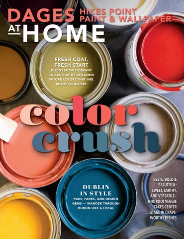
FRESH COAT, FRESH START

DISCOVER THIS VIBRANT COLLECTION OF BENJAMIN

MOORE COLORS THAT ARE READY TO INSPIRE

color olor crush

DUBLIN IN STYLE

PUBS, PARKS, AND DESIGN GEMS — WANDER THROUGH DUBLIN LIKE A LOCAL

BEETS, BOLD & BEAUTIFUL: SWEET, EARTHY, AND VERSATILE— THIS ROOT VEGGIE TAKES CENTER STAGE IN CRAVEWORTHY DISHES

FLAWLESS FINISH

TECHNOLOGY FOR

Instant response electronic gun virtually eliminates spits

Low pressure RAC X™ tip technology reduces overspray

Exclusive XT™ motor technology monitors pressure 60X per motor revolution for the perfect airless finish™

SPACES: Real home redesigns with wall-to-wall ideas you can use.

28 A NATURAL BEAUTY

Organic warmth meets function and familiarity in this new build

FROM PERIOD PIECE TO PLAYFUL PARADISE

A 19TH century Victorian is reimagined as a vibrant sanctuary for a family of five

40 INTO THE WOODS

Masculine design and midcentury warmth meet in California’s redwoods 46 WHERE THE HEART IS Family land, classic charm and a home built to last

Check out more colorful & inspiring spac starting on page 28

FALL 2025

Bahia Taylor

Editor in Chief

Co-founder

Leigh McKenzie

Creative Director

Co-founder

Twila Driedger

Contributing Writer & Editor

Olivia Guay

Graphic Designer

Carlee Baigrie

Contributing Writer

Aubrey Taylor

Contributing Photographer

Jim Taylor Painter & Set Contractor

Graphic Design Styling Gallon Creative www.galloncreative.com

Owned and Published by: Gallon Creative

For inquiries, please contact us at projectsgalloncreative@gmail.com

5 Scurfield Blvd #25 Winnipeg, Manitoba R3Y 3G4

www.galloncreative.com projectsgalloncreative@gmail.com

Cover Photography - Aubrey James Projects aubreyjamesprojects.com

While every effort has been made to ensure that advertisements and articles appear correctly, At Home Magazine cannot accept responsibility for any loss or damage caused directly or indirectly by the contents of this publication. All material is intended for informational purposes only. The views expressed in the magazine are not necessarily those of its publisher or editor.

All rights reserved. Reproduction in whole or part prohibited without written permission from the publisher.

22

CRAFTY:

DIY? WE SAY Y-E-S!

LETTER PERFECT

Add character to your containers with a chic caulking technique

24

HOT SPOT:

Shining a spotlight on the world’s hidden gems

ROUND TOP

This Texas treasure hunt has a timeless appeal

54

TOOLBOX: Helpful resources for any homeowner

DIY PROJECTS MADE BETTER WITH CAULK

Take your home to the next level with Tower Sealants

58

CHOW:

Just thinking about it is making us hungry

THE BEET GOES ON Digging deep into nature’s most vibrant root

64

EXPLORER:

Pack your sense of adventure and let’s go

THE EMERALD ISLE

Discover Ireland, the island of saints and scholars

PG.28
PG.58
PG.34

AMADE IN THE USA

DOCKSIDE

Style. Strength. Simplicity.

Crafted for the way you live, Dockside is designed for everyday life. Proudly Made in the USA, it’s built to stand up to life’s toughest moments — 100% waterproof, scuff-resistant, and dent-defiant. Whether you’re chasing adventure or embracing everyday ease, Dockside brings effortless elegance and rugged resilience to every space.

Live boldly. Live beautifully. Live Dockside.

s the golden hues of fall begin to settle in, and the days begin to slow, there's something about this season that invites us to nest – to surround ourselves with warmth and familiarity. At At Home, we’ve long believed that the best spaces are those that feel lived-in, loved and layered with meaning. And in this issue, that sentiment rings especially true.

Our feature on Round Top (PG.24) captures the thrill of the hunt – of finding that perfect piece tucked away at the end of a dusty aisle or beneath a stack of forgotten treasures. Antiques, salvaged pieces, mementos passed down through generations – these are the items that lend soul to a space.

You’ll see this thread woven throughout the homes in this issue. Cortney McClure’s traditional farmhouse (PG.46) is filled with things that matter – cherished finds that she’s gathered with intention over time. That kind of patience, we think, is a form of artistry all its own. That same sense of timelessness comes through in Tays & Co.’s collaboration with a longtime client (PG.28), a newly built home that already feels etched in time because of its beautiful stonework and thoughtful detailing. In Studio Munroe’s vibrant Queen Anne refresh (PG.34), bursts of color and playful energy are grounded by objects that hold meaning and purpose. A home doesn’t need to be filled with antiques to feel warm or welcoming – but we believe it should be filled with things that feel true to you. Sometimes that’s a 100-year-old mirror. And sometimes it’s a well-used cookbook or a collection of matchbox cars. And in Kristen Peña’s project in the redwoods (PG.40), that authenticity shines through in the art – pieces chosen not just for their beauty, but for how they reflect the homeowner’s spirit.

So as the days grow shorter, we hope this issue inspires you to decorate with purpose – whether that means using what you have, waiting for the right piece to come along or restoring a family heirloom. Because ultimately, it’s the meaningful details that make a house a home.

The bright, the Soft and the Simply Stunning color

olor crush

CHANGE OF BLINDS

ese classic window treatments are wonderfully adjustable

Some people may have a “blind spot” when it comes to window treatments, yet horizontal and vertical blinds are a great option. With the tug of a cord, blinds can be adjusted for mood or occasion. They can be kept tightly closed for privacy, tilted open to allow in the desired amount of natural light, or pulled back from the window to provide an unobstructed view.

PULL THE CORD ON CHOOSING WINDOW BLINDS

Horizontal blinds work great on midsize to smaller windows in homes, offices and cottages. Vertical blinds are ideal for wider windows or sliding glass doors as they can be gathered off to one side rather than at the top of the window. Both types of blinds come in a range of materials, including aluminum, wood, woven woods (which are made of natural grasses, reeds, jute or bamboo and look more like shades) and faux woods; and of course, sheer or opaque fabrics.

To choose blinds that will not look dated, pick a neutral that is closest to the color of the trim. is way, if you decide to change the color of the room, the blinds will not need to be replaced.

Consider how you want your blinds to raise and lower: top-down, bottom-up, or a combination of both? You’ll need to think about privacy and light issues before making the decision.

Do you need a top treatment? If choosing roller blinds, for example, it is recommended that you install a top treatment that will hide the roll-and-clutch mechanics of the blinds.

Blinds can be mounted inside the window casing or outside of it. Inside-mounted treatments provide a clean look that highlights the window trim around the window. ey are great for deep sills. But sometimes, the window isn’t deep enough for inside mounting. An outside mount overlaps the trim, creating the appearance of a larger window.

BEYOND WINDOWS

FRENCH DOORS: Any blind you choose for a window can also work on a door. If you’re looking for a consistent look, use the same window treatments on the door in the room. You can add brackets to keep the blinds in place at the bottom of the door when it opens or closes.

SLIDING DOORS: Dress up a sliding patio door with verticals, which can be installed within the frame or over the frame as an outside mount.

BAY WINDOWS: Take proper measurements in order to minimize gaps where the products meet. Bay windows can be treated the same as any other window as long as there are places to secure cords along the mullions of each window. Otherwise, cordless options may be necessary.

WE’RE DA BOMB

(SPRAY BOMB, THAT IS)

Dages Hikes Point Paint & Wallpaper will put your favorite custom paint into an aerosol spray can

Imagine duplicating your favorite color as a one-of-akind spray paint that can be applied to metal, wood, vinyl, glass or canvas. Now stop imagining – because Dages Hikes Point Paint & Wallpaper can actually do that for you!

Our in-store spray paint system allows you to take any custom paint and put it into a handy spray can ready for creating amazing DIY projects or doing quick touch ups in difficult-to-paint areas. Bring in your latex or alkyd paint or tell us the specific color and type of finish you want (ultraflat, low lustre, semi-gloss or high-gloss) and we’ll fit the unique paint formula inside an aerosol can suitable for all your spray bombing needs. Creating custom colored “spray bombs” for your special project is just one of the many benefits of bringing your DIY project to us, whether you come in to shop or to pick up some of our expert advice. We understand that starting a new project can be intimidating and complicated, but we’re here to simplify the process and walk you through the steps to achieve the results you want.

As an independent paint retailer, we deliver unparalleled customer experience, whether you are looking for interior or exterior, premium or commercial-grade paint or stain. Our color-match experts are ready to help you mix the right color with the right paint to get the right results. Plus, unlike the big box stores, we treat each of our customers like a friend, not a number. at means no matter what you come in looking for, you’ll always find a welcoming atmosphere and personalized, unrushed service.

In addition to paints, stains, tools and accessories, we offer a wide range of brand-name products to help you take on a new project or finish up one that’s already in the works. If you need a quick bit of advice, a product recommendation or to be steered in the direction of a local installation expert, our in-store team of experienced and knowledgeable professionals are happy to hear your ideas and share their expertise with you.

Whether you’re a handy homeowner, a commercial contractor or an interior designer, we’ve got the paint, tools and advice you need to turn your next project into a job well done.

CREATIVE USES IN YOUR HOME

Wallpaper has made a huge comeback in recent years, and we’ve all come back around to embrace it for its magical ability to lend a space its own unique sense of character and depth. Because of this, we’re seeing manufacturers release some truly remarkable prints and patterns, so many so, that we are running out of precious wall space. Or perhaps, you’re just dipping your toes into the wonderful world of wallpaper and aren’t quite ready to commit to a floor-to-ceiling application just yet. Regardless of the reason, it’s always a good idea to think outside the box. In fact, there are so many overlooked surfaces where a dose of print or pattern is just what the designer ordered.

01 02 03 04 05

STAIRCASE

Although the work of sectioning off your wallpaper might seem a bit intimidating, it will be well worth it once you see the finished result! Measure and apply wallpaper to the risers, the vertical sections of the stairs (the surfaces that won’t be stepped on), and you’ll have a totally unique statement staircase.

CEILING

Whoever said that a ceiling had to be white hadn’t considered the potentialities of wall coverings. So long as the design is on the lighter side and it blends or contrasts nicely with your wall color, a wallcovering on a ceiling is a playful, unique, and bold choice.

SHELVING UNIT

The back of a shelving unit is the perfect opportunity to provide a splash of character to help your décor pop. PRO TIP: If possible, install the paper on the back surface before installing the individual shelves.

FRAMED AS ARTWORK

If you have extra wallpaper from a previous project laying around you might want to think twice before throwing it out. Try framing it and placing it in a room in need of a little love. Don’t worry if the wallpaper is installed in a different room in your house—it could be a great way to add cohesion to the overall feel of your home.

LAUNDRY ROOM BACKSPLASH

We’ve never met anyone who loves doing laundry, but it is significantly less painful when your surroundings are pretty. Show your laundry room a little love with a wallpaper backsplash!

Talk to our experts at Dages Hikes Point Paint & Wallpaper for more ideas & how to browse our collections.

Shown: Thibaut ALBERO T45012 | Tangerine and Turquoise

A fresh coat of curb appeal

A vibrant, welcoming front door turns your home into the new kid on the block

Let’s address your address. By that we mean taking a good, long look at how your house appears from the street. If you believe the exterior is in need of a refresh, there’s an easy and inexpensive DIY project that really packs a punch: giving your front door a face-lift!

No matter the color, your front door is more than a transition from the outdoors in. at’s why choosing a bright shade of “hello” elevates the appearance of your home and makes a bold statement amidst everyday surroundings. Paint your front door and get ready for the neighborhood to take notice.

you will need:

° Painter’s tape

° Paintable filler

° Sponge

° High-density foam rollers

° Fine grit sandpaper

° Good quality paint brushes

° 1 quart adhesion primer

° 1 quart satin/semi-gloss exterior paint see “Choosing a Sheen”

Choose moderate and dry weather for painting. You’ll have to keep your door open for a few hours, so pick a day when the temperature is neither too hot nor too cold. Avoid windy days because of all the dust and debris swirling in the air. You should also have a temporary replacement to protect your house while you are completing this project. A heavy tarp, an existing storm door or even a large piece of plywood will deter insects, birds and other unwanted visitors.

STEP 1: Remove the door and all hardware (wedge a screwdriver in the joints between the hinges and the hinge pin, then tap lightly with a hammer until the hinge pins come loose). Rest the door on a pair of sawhorses outside. Remove any remaining hardware, such as the door handle.

STEP 2: Wipe the door clean, then scrape off any blistered or peeling paint. Use sandpaper until the surface feels smooth. If there are cracks in the door, repair them by working small amounts of paintable filler in with a putty knife. Let it dry and sand until smooth. Before priming, wipe away the extra dust with a damp cloth.

STEP 3: Use painter’s tape to protect and cover anything you want to keep clean and free of paint, such as glass accents or windows.

STEP 4: Priming prevents the door from absorbing moisture, smooths out the texture and keeps the paint from seeping in to the wood so don’t skip this step. Apply a coat of primer with a foam roller or a wide paintbrush. Be sure to cover the front and all the side edges.

STEP 5: Once the primer is dry, it’s time to paint in this order: 1) Bevels, 2) Panels, 3) Center stile, 4) Rails, 5) Outer stiles. One common question is how to paint edges. When a door is painted two colors on either side, the two side edges get a different color. e hinged edge gets the exterior color when the door swings in. If the door swings out, the side with the knob gets the exterior color.

STEP 6: Apply a second coat of paint for a smooth finish and truer color. Once the door is completely dry (it will no longer be tacky to the touch), the hardware can be reattached and the door reinstalled.

doorstep palettes made for a pop

• Red: Feng Shui’s bold symbol of happiness, strength & positivity.

• Black: e ultimate contrast color is as dramatic as it is elegant.

• Turquoise: Romantic Tiffany-inspired color against an otherwise all-white exterior.

• Lime Green: Greens, even lime green, pick up natural colors from the surrounding landscape.

• Yellow: An irresistible sunny entryway hints at a home’s warmth.

choosing a sheen

e sheen describes the glossiness of your paint’s finish. For doors, choose a satin, semi-gloss or high gloss paint. Satins are more lustrous and have a greater warmth and depth than flat paints. Semi-gloss are slightly glossy, sleek and radiant, offer good stain resistance and are easy to clean. High-gloss paint is the shiniest because it has the highest light-reflective characteristics.

Shop these stunning Benjamin Moore paint colors, from the homes featured in this issue, at Dages Hikes Point Paint & Wallpaper. The friendly staff will help you get all the right tools to help with your project.

Love the designs within our pages? Connect with the talented folks behind the gorgeous spaces.

A NATURAL BEAUTY | PG.28

Tays & Co. Design Studios

Laura Tays taysandco.com @taysandcodesign

Kristen Peña Interiors

Kristen Peña kristenpenainteriors.com @kinteriors_sf

FROM PERIOD PIECE TO PLAYFUL PARADISE | PG.34

Studio Munroe Emilie Munroe studiomunroe.com @studiomunroe INTO THE WOODS | PG.40

WHERE THE HEART IS | PG.46

Cortney McClure Design Cortney McClure cortneymcclure.com @designedbycortney

ATHABASCA

Letter Perfect

ADD CHARACTER TO YOUR CONTAINERS WITH THIS CHIC CAULKING TECHNIQUE THAT BRINGS TEXTURE AND CHARM TO YOUR GARDEN GAME. IT’S SIMPLE, STYLISH AND TOTALLY CUSTOM.

Give your garden pots a personal, high-end upgrade with this simple and stylish bas-relief monogram technique using ALLPRO Pro Stretch interior/exterior caulk by Tower Sealants. This DIY transforms basic terracotta or ceramic planters into elegant, customized pieces that look straight out of a boutique. Using a stencil and paintable caulk, you’ll create raised, sculptural lettering that adds texture and sophistication to your outdoor décor. A final coat of paint ties everything together for a seamless, professional finish. Whether you’re sprucing up your own patio or crafting a thoughtful handmade gift, this project is an easy and beautiful way to elevate your container garden game.

MONOGRAM GARDEN POT

one for everyone!

STEP ONE: PREP THE POT

Clean a terracotta or ceramic pot thoroughly and let it dry. Lightly sand the surface if it’s glossy to help the caulking adhere better.

STEP TWO: SELECT YOUR STENCIL

Buy or create your monogram stencil – look for premade options or print/draw one on cardstock and cut it out with a craft knife. Tape it securely to the pot to keep it in place while applying the caulking.

Personalize a pot for each member of the family using their initials. Line them up on your porch, windowsill or garden bed for a charming display that’s as meaningful as it is beautiful. Let everyone pick their own color, herb or flower to plant inside – it’s a fun way to get kids involved and makes a great seasonal tradition or handmade gift idea.

STEP THREE: APPLY CAULKING

Using a squeeze tube or caulking gun, fill the stencil with ALLPRO Pro Stretch interior/exterior caulk by Tower Sealants. Smooth it with a palette knife or your finger. Carefully remove the stencil and let the caulking cure for 24 hours.

FRESH HERBS YEAR ROUND

STEP FOUR: PAINT IT

As days grow shorter and gardens retreat into dormancy, a burst of green can still thrive indoors. Many herbs adapt beautifully to life on a sunny windowsill, offering fresh flavors – and a touch of nature’s beauty – through fall and winter.

Once dry, paint the entire pot – monogram included – with a matte or satin outdoor paint in your chosen color for a seamless, sculpted look. Let dry completely before displaying.

Pick the Perfect Stencil

Choose a bold, easy-to-trace stencil with clean lines – block or serif fonts work best. Avoid intricate details, which can blur with caulking. For multiple pots, use sturdy cardstock or a reusable plastic stencil to keep your monograms consistent and crisp every time.

Basil, chives, mint, oregano, parsley, rosemary, sage and thyme are all excellent for indoor growing. These kitchen staples not only elevate seasonal meals but also add subtle fragrance and vibrant color. Pot them in well-draining containers with rich, organic soil, and place them in a sunny south- or west-facing window with at least six hours of light. If needed, supplement with a grow light.

Beyond their culinary perks, herbs add charm to your kitchen decor. Grouped in vintage mugs or ceramic planters, they create a living vignette that evolves with the seasons. Clip often to encourage growth – and get creative in the kitchen. A sprig of rosemary transforms a roast; fresh mint enlivens everything from tea to cocktails.

Bringing herbs indoors is a simple way to stay connected to the garden year-round. It’s a small ritual that nurtures both your cooking and your well-being – one fragrant leaf at a time.

Round Top the rundown on

Round Top

They say that everything is bigger in Texas – but the small town of Round Top is an exception. With a population that hovers just under 100 and a singular square mile to call its own, Round Top, situated halfway between Austin and Houston, might have been forgotten in another timeline. But in this one, the late socialite Emma Lee Turney (known fondly as the godmother of Texas antiques), put this Lone Star town on the map by making it the home of one of America’s largest antiques shows. Thanks to her, three times a year, hundreds and thousands of America’s most aesthetically in-tune descend upon the rural town to find those perfectly patinated pieces.

Gone are the days when only industry professionals and elite designers perused through Round Top’s aisles. Today, the secret is out. Instagram influencers, tastemakers and celebrities (we hear Diane Keating is a fan!) are now regulars. But Round Top’s recent rise to fame should come as no surprise. In fact, our population feels primed to be enamored by what Round Top has to offer. Armed with an increasing interest in sustainability, a stifling sense of nostalgia and an intense desire for individuality, the new generation is hardwired to seek out unique tokens of selfexpression. It’s easy to understand the allure of time-worn items when put in this context. The hunt in and of itself is a creative act, linked inextricably to the act of identity building – and at Round Top, there’s enough to go around for everyone.

“The Show,” as fair veterans refer to it, occurs three times a year, each time attracting hundreds of thousands to pore over

MUST-SEES

e Marburger Farm: This larger-than-life venue stretches five football fields and hosts more than 300 sellers. Well curated and beloved among show regulars, you’ll find an endless variety of pieces from the Art Deco and midcentury modern periods, industrial-style furnishings, Americana artifacts and more.

e Junk Gypsies: Open year-round, this iconic sister duo’s spot is known for bohemian clothing, Provençal antiques, eclectic décor and Western wear.

e Big Red Barn: An iconic building housing English antiques, rare ceramics and much more. This venue boasts air conditioning – a hot commodity during spring and fall shows where the Texas sun can take a lot out of you!

e Compound: Established in 2015, the Compound fuses tradition with innovation to offer a broad but curated selection of European and American furniture, fixtures, decorative arts, lighting, garden wares and architectural remnants.

treasures untold. It’s made up of 100 independently owned shopping venues, each holding numerous vendors. Among its offerings are vintage clothing (cowboy boots galore!), bespoke jewelry and of course, the original raison d’etre – antique home wares. You’ll find one-of-a-kind artwork that feels like a frame from a John Wayne movie, midcentury furnishings, Turkish rugs… the list could go on. Some even say if you can’t find it at Round Top, it simply doesn’t exist. The Texan flair and Americana aesthetic may be the founding imagery associated with the fair, but in reality, the show contains an impressive array of goods from around the globe.

While designers dressed to the nines jump from barn to barn brokering deals, and influencers search out standout pieces, Round Top’s scenic setting often can’t help but steal the show –or at the very least, set the tone. There’s something about a group of longhorns grazing in a field of bluebonnets just out of frame that casts everything in a glowing light. With this image in mind, it’s easy to see how Round Top has earned its stripes. Its quaint, authentic Texan charm has stolen enough visitors’ hearts to keep its lights on year-round, attracting tourists between shows for weekend getaways. Many of its shops now stay open through the off-season, and its most popular hotels book up months in advance. Vacationers can now enjoy a slice of small-town living whenever they please, all while still scouring for that perfect something with a good story. You’ll know it when you see it.

Zapp Hall: Equipped with beer gardens, the show’s best café and a rotating slate of musical stylings, Zapp Hall is the place to be in the evenings. It’s family-owned and -operated and mainly deals with architectural salvage, collectibles and art.

Blue Hills: Twenty-six acres filled with an impressive array of collectibles, furniture, artwork, clothing and more. The highly coveted Italian Murano glass collection by Janet Wiebe can also be found here. Here, you’ll have no shortage of options for refueling with barbecue food trucks, a full-service cash bar and more.

Henkel Square: The city’s official town square is home to 17 permanent buildings where you can pick up baked goods, cowboy boots and browse 14 antique vendors at the Round Top Antiques and Design Center.

Market Hill: Open year-round and boasting 225,000 square feet, this venue features a remarkable rug collection, industrial gems from Nomadic Trading Company and more.

FOLLOW THESE TIPS TO MAKE THE MOST OF YOUR FIRST RODEO:

MEASURE BEFORE YOU GO: It’s a great idea to head to Round Top with your home’s measurements handy so you can easily guage what furniture or architectural elements would work with your home. If you can, sneak a small measuring tape into your tote bag so you can save time!

PLAN YOUR VISIT: What was once a two-day affair is now a weeks-long event, but every venue will have its own specific dates of operation. With no one governing body, you’ll have to do a bit of homework if you’ve set your sights on a specific barn or seller. The sheer number of venues can be extremely overwhelming, so create a plan before you arrive and keep scale in mind – most visitors are only able to tackle one or two venues in a day.

TRANSPORTATION: Fly in to either Houston or Austin – both are about an 1.5-hour drive from Round Top. Ideally, you’ll want to secure a rental car (keep trunk space in mind if you’re planning to do some damage!), as Lyfts and Ubers can be unreliable and subject to surge pricing during show dates.

ACCOMMODATIONS: Round Top’s recent commercial popularity means more local hotels are popping up (Hotel Lulu has country charm nailed and is currently a resounding favorite among frequent show-goers), but Round Top is tiny – don’t be surprised (or discouraged!) if local accommodations are unavailable. The nearby towns of Brenham, La Grange, Burton or Carmine are always options if you’re not wanting to commute from one of the bigger cities.

DRESS THE PART: Whenever you gather some of the design industry’s best, you can expect aesthetics to carry over into fashion. Dressing to impress is part of the allure of Round Top, but there’s no dress code to follow. Have fun with your outfit, be sure to wear comfortable shoes and keep the weather in mind. Layers are always a smart choice.

LEAVE ROOM FOR HAPPY HOUR: End your day the Round Top way by comparing hauls over cocktails or mocktails at one of the town’s many watering holes, the show’s roadside cocktail trucks or one of the venue’s pop-up bars.

HIT THE ATM: Antiques dealers can be old-school, and many operate with cash-only sales. It’s smart to bring the amount you plan to spend in physical form so you don’t have to leave behind that perfect find.

The story behind "the show"

In the late 1960s, the more affluent residents of Houston began purchasing country homes in the more pastoral landscapes of Hill Country. They found themselves in search of home wares commensurate with the rural setting of their newly purchased real estate. Turney, a local antiques dealer and friend of said homeowners, recruited 20 fellow dealers to gather their best at Rifle Hall, a local venue, for a two-day antiques show. With the help of a press release in Life magazine, the event was a major success. Word spread, and just over a decade later, dealers from all over the globe were hoping to snag a spot to sell their wares, forcing the show to expand beyond the capacity of Rifle Hall. A large tent was pitched for overflow. And then another, and then another. Each year, the site continued to grow until it reached its epic proportions of today. The Official Round Top Antiques Show now occupies an 11-mile stretch down highway 237, also known as Antiques Corridor, with more than 100 venues. Most people involved in operations today still credit Turney’s extraordinary vision for the event’s enduring appeal, particularly as it gains traction with a new generation.

The Best Just Got Better

New FrogTape Advanced™ Painter’s Tape

Introducing FrogTape Advanced™ Painter’s Tape –the best painter’s tape we’ve ever made. Edge-treated with exclusive PaintBlock® Technology, FrogTape Advanced is engineered with everything you love about FrogTape® Multi-Surface plus advanced performance in conformability and shred-resistance, giving you the confidence of professional results – when it matters most.

A NATURAL BEAUTY

Tays & Co. brings longtime clients’ new build to life with a little help from their signature natural charm and an eversteady focus on function.

Stunning views surround this well-appointed kitchen, featuring custom cabinetry, butcher block counters and an unexpected pendant light fixture with an antique brass finish.
Design: Tays & Co. Design Studios | Photography: Spacecrafting Photography | Text: Carlee Baigrie
"It f ls elevated and thoughtful, yet nothing is t precious or perfect to not be used fr ly."
- LAURA TAYS, TAYS & CO.

There’s a beautiful synergy that occurs when working with longtime clients, a rhythm set in motion when a designer understands the homeowners’ tastes implicitly. This familiarity laid the foundation for this project, the sixth collaboration with Minnesota-based design firm Tays & Co. With adult children who were starting families of their own, the couple had decided to part ways with the home they had raised their own kids in and move into a space with a smaller footprint – albeit one that was still suitable for hosting their growing group of grandchildren. They settled on a lot bordering a golf course (with its very own pickleball court – a favorite pastime for the couple), in the centrally located suburb of Medina and, like they had done so many times before, entrusted Laura Tays, Tays & Co.’s founder and principal designer, to work her magic.

Tays knew from experience that flow would be a primary consideration. “Layout wise, we took a lot of inspiration from the couple’s previous home,” she explains. But with a new project also comes a new purpose. With their sights set on this new home serving as a place where their children and grandchildren could gather, Tays aimed to balance a desire to host and entertain with the comfort and ease the homeowners wanted now that they were living a semi-retired lifestyle. The main level became home base for the homeowners, with easy access to everything they’d need, while the lower level was set up to host additional guests, granting everyone privacy whenever the space was being shared.

TOP: Closed storage embedded in stone and coated in an understated moss green houses essentials for family entertaining.

BOTTOM: The curbside view hints at the color story unfolding within its walls.

This thoughtful approach to layout extended well beyond the floor plan, and is perhaps best demonstrated in the kitchen, which, for Tays, is always at the forefront of any conversation around function. “These are some of the most used spaces in any home and having them not flow properly can make or break a homeowner’s experience.” From largescale layout decisions to finer details that her intimate knowledge of the couple’s personal day-to-day living enabled, there’s an underlying current of intentionality. Tays considered grocery hauls and how they might flow from car trunk in the garage to shelves in the fridge. The butcher-block cabinet was selected with the homeowner’s love of healthy home cooking (and the endless veggie prep that accompanies it) in mind. The pantry door was installed with a swinging door to make entering and exiting with full hands possible. These small details – the ones that have been expertly crafted by the team at Tays & Co. – can make a huge difference in the ease with which a person can move through their day-to-day.

While the home is swelling with examples of customized functional solutions, it also possesses some stunning architectural and design moments, which are never in short supply throughout Tays & Co.’s portfolio. “[There’s] a common thread through all of [our] designs, regardless of style, of bringing the outdoors in and adding interest with vintage pieces.” Big believers in the power of the great outdoors to provide exceptional aesthetics, they opted for natural materials like reclaimed white oak wood flooring, stone walls, beautifully veined Calacatta Borghini marble countertops and pencil limestone tile. Most impressively, Tays pulled off a large-scale barrelvaulted hallway arch – a plan that almost didn’t come to fruition. After some back and forth, the homeowners ultimately decided to move forward, and they are eternally grateful that they did: It quickly became one of their home’s most beloved features.

Floor-to-ceiling windows were an intentional choice to take full advantage of the golf course’s green views and bring in more natural light.
Cozy textures and shades offer warmth while ‘70s silhouettes and curvilinear shapes bring dimension. Here, the nightstands have just the right amount of distress to suggest antique status.

This bunkbed room is at the ready for the homeowners’ growing group of grandchildren.

A home office was on the list of must-haves for the homeowners, who haven’t completely retired yet. Tays maximized the space with built-in storage and a mix of light and dark tones.

While some designers shy away from using too much stone in fear of making a space come off too cold, Tays embraces it, using it as a character-enriching tool. “Any space with too much of the same feels cold and uninviting,” explains Tays, who avoids this pitfall by ensuring balance and variety in her material selection. “We mixed in lots of different types of stone throughout the home, alongside soft furniture fabrics, bed linens, wool rugs, plush pillows and vintage collectibles. It feels elevated and thoughtful, yet nothing is too precious or perfect to not be used freely.”

Adding further to the outdoor thematic was the understated palette that pervades the home. “Of course there are a lot of neutral sprinkles throughout…but we did lean into some softer colors…as well as a few moody ones…I was loving wine tones in this home,” explains Tays, pointing to the dreamy powder bath walls, the berry textural fabric on the great room’s swivel chairs and the laundry room cabinetry.

Alongside the down-to-earth color palette, Tays incorporated vintage elements to invoke a timeless feel – a move she knew from experience would bode well for her clients. “We had really honed in on their style preferences,” recalls Tays, who describes their taste as “transitional to modern.” These touches manifest in subtle but impactful ways, like custom cabinetry in the bathroom, scalloped wood detailing on the mudroom bench and of course the stunning reclaimed wood flooring: “Each board tells the story of times past with its imperfections, old nail and worm holes and white oak graining.”

From dreaming up the concept drawings to hunting down the perfect pieces to complete every room, no stone was left unturned when it came to executing the vision and fulfilling the mandate – every detail carefully considered to carry the couple through their day-to-day for the decades to come. When every corner is bespoke, every day inside is beloved – a gift the homeowners will get to cherish as they live out their second act surrounded by nature, the welcomed company of the family they built and the beautiful space Tays and her team brought to life.

ft five

Q: Go-to paint color right now:

A: I'm really into a buttery yellow right now, but it always changes. I don't like to reuse the same colors over and over, so I'm always searching for something fresh!

Q: Design detail you can’t live without:

A: Natural stone!

Q: Design trend you’re tired of:

A: Shiny gold finishes.

Q: Current favorite material or texture:

A: Any old wood. I love the imperfections, the patina, the way it wears a mysterious story.

I just love it.

Q: Dream project location:

A: Anywhere in Europe!

FROM PERIOD PIECE TO PLAYFUL PARADISE

Studio Munroe reimagines a 19th-century Victorian as a vibrant, joy-filled sanctuary for a modern family of five – full of color, character and not a single space off-limits.

Design: Studio Munroe | Photography: Thomas Kuoh | Text: Twila Driedger

fQ: Go-to paint color right now:

A: That's like choosing a favorite child! But I'd say green. Very green.

Q: Design detail you can’t live without:

A: Wallpapered ceilings.

A: Brass.

Q: Design trend you’re ready to let go of:

A: Natural fiber window shades.

Q: Dream project location:

A: We just finished a project in Paris –and I'd love more of those!

Q: Favorite natural material to work with:

From its exterior, this Queen Anne Victorian has all the hallmarks of a “look but don’t touch” historic home – stained glass, carved trim and grand proportions. But behind the deep pine green front door, it tells a much livelier story. Designed by Emilie Munroe of Studio Munroe for a vibrant family of five, this nearly 7,000-square-foot residence was transformed into a layered, color-splashed sanctuary where the rules are simple: nothing too delicate, and absolutely nothing off-limits.

"This project w po ible because the homeowners were wiing to take creative leaps with us."
- EMILIE MUNROE, STUDIO MUNROE

“It was critical the home was functional for their busy family of five, while also being authentic to their personal style, and never too precious or delicate,” she says. “They wanted to be sure no room – or furniture piece – was off limits, that every space was welcoming and able to be utilized by any and all guests, ages 0 to 101.”

Munroe and her team got to work reimagining the 1896 home as an energetic hub, where every room has its own purpose, each oozing more personality than the next. “The main bedroom and bath were reconfigured, the top floor – which had been more of an attic-style playroom – was completely reimagined into usable space, including one of the daughters’ rooms and an office. The main level kept its layout, but we upgraded all the finishes.”

Function was at the forefront. Both parents work from home, and with three kids under one roof, the design needed to support everything from school-day routines to late-night entertaining. According to Munroe, every aesthetic element needed to embody the family’s dynamic, joyful spirit, while also standing the test of time.

“One of our biggest design challenges and opportunities was bringing in the life and energy of a young, modern family while honoring the home’s beautiful original details,” shares Munroe, explaining how they kept the character but removed the stuffiness. “We preserved features like casework, flooring details, stained glass and trim, but updated other areas to strike that balance.”

A glossy black piano takes center stage where bold color meets collected charm. A malachite-framed mirror, sculptural accents and a punchy checkered throw bring playful energy to the moody blue walls.
The living room bursts with playful energy, where a custom tufted sofa, vibrant pillows and natural textures – from the woven rattan pendant to green raffia-wrapped lamps – create a space designed for everyday living.

A canopy bed anchors the serene main bedroom, where soft blue walls, layered patterns and bold accents add both comfort and character. The charcoal window sashes match the mantle, with updated details and a marble slab.

It’s one of the original details that inspired the color story in the home’s front rooms – an existing stained-glass window, which features several shades of green. “Studio Munroe is a huge fan of green – it’s grounding, life-affirming and connects to nature. We chose shades with blue undertones to avoid that acidic quality some greens can have. And we strategically repeated green in a triangular configuration: on the front door, the ceiling in the piano/library room and in the dining room on the opposite side, balancing each other.”

To pull off the powerful shades, Munroe kept the other walls on the main floor “the lightest whisper of a silver tone with a silvery gray baseboard,” and a reverse of the typical white-trim/darker-wall formula. “That approach helped us accentuate the architecture while creating neutral grounding spaces that allowed for vibrant color moments elsewhere.”

Color has countless defining moments throughout the stately structure –from the kaleidoscope of hues in the dining room, to the whisper-soft blue in the master bedroom, all the way up to the sophisticated office space on the top floor, where slate-toned walls, a tufted sofa and built-in book nooks update the attic into a grown-up hideaway.

“I love color so much and I think people can worry that color can get chaotic, or get too youthful or animated, but these small tricks make it additive. You notice and you’re aware, but ultimately the colors just affect you environmentally,” says Munroe.

With their signature mix of textures and color-rich materials, Studio Munroe transforms every room into a space where comfort meets jubilant character. Juicy patterns on chairs, polka dots on pillows and bursts of color in playful vases infuse the home with vigor and charm. Nowhere is this more evident than in one of the daughter’s bedrooms, where pale lilac walls and a blush-pink ceiling set the stage for a dreamy, imaginative escape – complete with a whimsical cloud mobile floating above the original fireplace.

Right middle: In the dining room, Scandi-style chairs, mossy green ceiling, and salmon wallpaper blend tradition with modern flair; Right: A hub for daily life and entertaining, the kitchen and family room flow together in a bright, open-plan space, perfect for games and get-togethers.

In the powder room, Studio Munroe went all in with a whimsical octopus wallpaper, pairing it with warm brass fixtures for a moment that surprises and delights.

The same playful practicality carries into the son’s bathroom, where Studio Munroe used a patterned concrete tile to mimic the look of wallpaper – but with all the durability tile affords. Installed across the floor and carried up the vanity wall, the design brings bold visual interest while keeping the surrounding walls crisp and clean. “It’s perfect for high-use, moisture-prone spaces,” says Munroe. “It brings visual interest and pattern without being overwhelming – and it’s so easy to clean.”

One of the most daring moves comes in the main-level powder room – a perfect place, Munroe says, to push the envelope. “Pattern can get chaotic quickly, just like color, so we’re always aiming for balance. In that powder room, we went all in – I always tell clients that the main-level powder room is the perfect place to go bold. It’s small and private, but guests spend time in there. So why not let it tell a story? Give your guests a laugh. In this case, we used an octopus motif.”

Ceilings also become canvases throughout the home – a Studio Munroe signature. “If you’re using wallpaper, paint the ceiling,” Munroe insists. “A white ceiling in a bold space can feel like a missed opportunity.”

And like any home truly lived in by a family of five, it’s filled with everyday objects –children’s artwork, stacks of books and tabletops with toys and building blocks. But here, nothing feels out of place. Munroe blends personal effects with a curated mix of vintage finds and new furnishings, giving the home its fresh and collected composition.

“We wanted to create a warm, colorful, joyful interior space with furnishings that felt as though they had been collected over the course of years,” she describes. “It was critical the client’s personality and personal effects were present in each space, radiating a natural and authentic feeling.”

Now that the dust has settled and the paint has dried, the homeowners are fully embracing life in their new space.

“They’re thriving,” says Munroe. “Life is full – and having a home that supports that pace, both functionally and aesthetically, has made a big difference. It matches their energy and style, and it’s been so gratifying to hear how much they’re enjoying it.”

When asked if there’s one thing she hopes readers take away from the project, Munroe doesn’t hesitate: “These ideas only come to life when a client says ‘Yes!’ This project was possible because the homeowners were willing to take creative leaps with us. That kind of trust is everything.”

A wall of windows and warm wood tones ground this living room in its redwood surroundings, where sculptural seating, moody textures and a travertine-clad fireplace create a cozy, contemporary retreat.

INTO THE WOODS

Design: Kristen Peña Interiors | Photography: John Merkl | Text: Twila Driedger Kristen Peña Interiors creates a cocoon in the redwoods for a dream client.

fQ: Current design obsession:

A: Upholstered walls.

Q: Favorite material to work with right now:

A: Mohair!

Q: Go-to coffee order:

A: Black.

Q: Dream project location:

A: Hawaii.

Q: Item you always splurge on:

A: Lighting.

"It's not a pale e for everyone, but that's what mak it special. We wanted the house to have a color storygr n here, mar n there, each r m its own moment. That kind of risk is what mak a project stand out."
- KRISTEN PEÑA, KRISTEN PEÑA INTERIORS
Rich veining and warm wood tones bring depth to this striking bar nook, where simple shelving and curated glassware construct a refined yet inviting moment.

When interior designer Kristen Peña first met the homeowner behind Woodside, she knew the project would be special. “He was a dream client. He wanted to take it all the way through – from furniture to dishes to art,” she says, explaining that that kind of creative trust is rare, and it allowed the design team to create something truly immersive.

Set in the redwoods of California, the 1970s ranch-style residence is surrounded by towering trees, filtered light and forest trails just steps from the front door. For the homeowner – a single man with a deep love of hiking, reading and cooking – this location wasn’t just a setting, it was the soul of the project. Instead of leaning into a light, airy design often found in Bay Area homes, Peña and her team from Kristen Peña Interiors took a different path – one rooted in earth tones, saturated hues and tactile materials. The result is a home that feels inviting, cocooned and entirely custom.

At its core is the main living space – a vaulted great room designed to extend seamlessly into the surroundings. A wall of windows and glass doors frames the forest, drawing the eye outward and blurring the boundary between indoors and out. Curated furnishings fabricate an elevated space with a masculine aesthetic and midcentury style.

Color plays a supporting role in the project, enhancing the character of the abode and allowing the external to be the star. “The color palette was really drawn from textures in the redwoods and the environment,” Peña explains. The color story is layered, tonal and deeply engrained in the home’s natural surroundings.

In the media room, walls are painted a mossy, pine-needle green – an earthy hue reminiscent of hikes through budding redwood groves. “We committed

Top to bottom: Veined marble steals the spotlight in this rich kitchen full of dark cabinetry and natural sunlight; A bespoke dining table and midcentury-inspired chairs provide an area for thoughtful conversation and connection; A floor-to-ceiling bookcase and dramatic brown walls make this home office feel equal parts stylish and smart.

to wrapping the entire room in that green,” says Peña. “It’s a risk a lot of clients wouldn’t take, but he said ‘Yes.’” Paired with plaid upholstery and velvet pillows, the space reads as both nostalgic and modern.

“I think plaid is one of those textures that immediately signals cozy. You see it in a Tahoe house or Montana lodge – it’s familiar, but there’s a sophisticated version of it, too. It wraps you up. The wool and velvet textures help create that cocooned feeling. If it’s cold or foggy outside – and it often is in that area – you want to be enveloped in something warm and rich.”

That same willingness to take color risks continues in the home office, where walls are cloaked in a saturated chocolate brown. “He asked, ‘Will it feel dark?’ And we said, ‘Yes – and that’s the point,’” Peña laughs. The result is a moody, masculine study – perfect for a space where the client, who works in tech, spends most of his days.

Throughout the home, materials were selected with a reverence for the land. Natural stone – used liberally on countertops, around the fireplace and in the spa-like bathroom – is both luxurious and grounding. “We always try to use materials that come from the earth,” Peña explains. “Solid wood, wool, ceramic – things that are born of the earth and have a story in themselves. Then we layer in texture, color and elements that reflect the homeowner’s desired feeling.”

In the kitchen, oxblood-veined marble extends out over the island, countertops and backsplash. Down the hall, dramatic stonework in the bathroom is complemented with a glass-enclosed wet room and freestanding tub.

“In the bathrooms and kitchen, we played with bolder stone choices to add excitement,” she tells. “The design overall is cozy, but we wanted elements of surprise. When you walk into the kitchen or primary bath, you have that ‘Oh, this is cool. This is different.’ reaction.”

Even the primary bedroom has its own aha moment, with a palette of deep greens and navy and a striking statement wall – all while maintaining the feeling of a quiet retreat tucked into the forest.

“The bed and headboard are custom – again inspired by the redwoods, with linear paneling and a midcentury arch. The nightstands are attached and scaled down to suit the space. All of it is very purpose-driven.”

That includes everything from the built-in office shelving (designed to house the client’s extensive book collection) to the large, round walnut table in the dining area.

Art also played a key role in shaping the home’s identity. Peña introduced the client to San Francisco’s Hosfelt Gallery, and together they curated a collection to reflect his style and interests. “The piece in the kitchen is from the era when the house was built and just felt so right – indoor-outdoor vibes, great color. In the office, he really wanted a Jim Campbell piece, which is more tech-driven – a grid of lights that create shifting patterns. He works in tech, so that was a great fit. And in the bedroom, we focused on texture. The art is quiet, introspective –like the client himself,” Peña shares. “Some pieces we sourced, some he selected. It was a joint effort that unfolded organically.”

Today, the homeowner is enjoying the space more than ever. He hikes the trails outside his door, cooks meals in his sunlit kitchen and curls up by the fire with a good book. “It’s become his sanctuary,” Peña says. “A place where he’s truly surrounded by all his creature comforts.”

While every project decision was intentional, the end result doesn’t feel overly designed. Instead, the house feels lived-in, layered and entirely its own – a reflection of its surroundings and its owner. As Peña puts it: “It’s not a palette for everyone, but that’s what makes it special. We wanted the house to have a color story – green here, maroon there, each room its own moment. That kind of risk is what makes a project stand out.”

Plaid upholstery and mossy green walls bring a retro vibe to this cozy media room, enhanced with sculptural tables and a shaggy rug.
Sleep soundly in this cocoon-like retreat complete with deep hues, tailored textures and rich wood details.

f t five

Q: Go-to paint color right now:

A: My Heirloom Collection with Spectrum – Vintage Porcelain.

Q: Favorite natural material to work with:

A: Quartzite countertops.

Q: Design trend you’re tired of:

A: Not creating personal spaces or incorporating family photos and meaningful items into the decor.

Q: Design signature you swear by:

A: Antique mirrors – in every project, if I can!

Q: Home habit you're willing to admit:

A: I'm probably the world's messiest bed maker.

Grounded in rich wood tones and layered textiles, the living room blends elegance with everyday comfort. Antique accents and thoughtful symmetry create a space where tradition and relaxation meet.

A vintage-inspired display cabinet holds multiple treasures – a curated mix of pottery, glassware and collected pieces.

Right:

WHERE THE HEART IS

Design: Cortney McClure Design

Photography: Kacey Gilpin Photography

Text: Twila Driedger

Cortney McClure Design creates a new home on cherished family land –one that feels like it’s stood for a century.

At first glance, Cortney McClure’s traditional farmhouse appears as if it has been nestled into the Oklahoma countryside for generations, layered with stories and softened by the passage of time. Designed by McClure herself, the home is deeply personal, connecting both her design philosophy and the enduring influence of her grandmother.

“From the start, I wanted our home to feel like my grandmother’s: cozy, welcoming and lived-in,” says McClure, who launched her interior design firm, Cortney McClure Design, in 2018 after transitioning from a corporate career. For McClure, design is more than visual. “It’s a true act of service,” she explains. “Whether it’s a new build or a renovation, my goal is always to design homes that are lived in, loved and made to last.”

Set on family land that connects to her parents’ and brother’s property, the home was built from the ground up, but McClure made every decision as though she were restoring a beloved farmhouse from a century ago. Transom windows, tall baseboards

This farmhouse kitchen marries vintage charm with everyday function, featuring soft gray cabinetry, butcher block counters and a central island perfect for meal prep or homework.

and a clawfoot tub were non-negotiables, and even the flooring was chosen with heritage in mind. “The floors actually are that old,” she says. “They were reclaimed from a historic hotel in Bartlesville. They creak in all the right places and carry stories of their own, which makes it feel like home the moment you walk in.”

McClure designed the living room to be the heart and the kitchen the hub of the home. In the former, the weathered floors, with their warm, aged finish, antique side tables and a carved coffee table invite conversation and contentment.

“We kept the walls, ceilings and trim all white for a fresh, timeless look,” she details. “The dark floors add just the right amount of contrast and help ground the space (and hide all the dirt from living in the country!).”

Centered in the space is a classic brick fireplace framed by black iron sconces and tall candles – McClure’s favorite touch for creating a flickering, magical glow. The refined details balance the cozy, livable aesthetic, while a sofa below a gallery wall of traditional art provides the

perfect place to cuddle up and enjoy the evening with a good book and cup of tea.

Something you’ll find in every room or down every hallway? Heirlooms and found pieces that give vintage vibes and old-world charm while still staying purposeful.

“I believe in taking time to furnish a home and always layering in antique pieces, meaningful finds and elements that truly speak to you,” says McClure. “It’s taken me years to finish ours, and honestly, it’s still evolving.”

In the kitchen, function and beauty go hand in hand. Green-gray cabinetry and warm butcher block countertops echo the farmhouse tradition found around every corner, while slender windows and an oversized range hood add a hint of formality. “I knew I wanted soft green cabinets from the start,” McClure shares. A vintage rug, a charming pendant and apron-front sink contribute to the treasured look, while the subway tile backsplash and polished chrome fixtures keep things crisp and classic. “The palette is neutral so everything can layer in naturally,” she adds. “New and old.”

A layered mix of pattern, texture and warm neutrals makes this bedroom feel both refined and inviting –beauty and comfort in perfect balance.

"Hom should f l like the people who live there."
– CORTNEY MCCLURE, CORTNEY MCCLURE DESIGN

In the neighboring dining room, a round pedestal table, ladderback chairs and a black iron chandelier capture the soul of the home, a room ready for fellowship over family meals. A dark wood hutch filled with antique plates and candlesticks lend even more character. “I’d rather wait for the right piece than fill a space with something that doesn’t feel personal.”

Connecting rooms is a hallway that adds as much purposeful storage as it does charm. Open wood shelves with iron brackets display dishes, glassware and pottery, while lower cabinets add more space to hide everyday dishes and essentials. A transom window above the doorway adds to the historical detailing McClure adores.

In the primary bedroom, effortlessness leads. “There’s just enough space for a comfy chair, bed and some mismatched furniture that feels personal,” McClure says, referring to the upholstered bed and a combination of windows dressed in both drapes and shutters for elevated livability. Vintage mismatched nightstands keep the curated look consistent and wall-mounted iron sconces provide elegance and symmetry. “It’s not perfectly polished, but it’s truly comfy,” McClure says. “The walls are filled with our kids’ artwork and meaningful photos. It’s a space full of love.”

Steps from the bedroom, the ensuite bathroom is a nod to rustic romance. A clawfoot tub sits beneath a tall window, accompanied by more candlelight. The focal point, however, is a vintage dresser-turned-vanity McClure found early in her relationship. “I didn’t know where it would go at the time, but I knew I couldn’t leave without it,” she says. Paired with an antique mirror and aged brass sconces, the piece brings a soulful patina that new cabinetry simply can’t replicate. “It’s perfectly aged and brings so much character to the space. Proof that sometimes the best design decisions happen before the plans are even on paper!”

Throughout the home, McClure’s eye for antiques and affection for meaningful design is carefully woven. From the intentional mix of weathered woods and vintage patterns to the country living practicality, the home exudes personality without pretense. “I’m ready to let go of the trend of not incorporating personal pieces into a space,” she says. “Homes should feel like the people who live there.” It’s that balance of warmth and clarity – of structure and soul – that defines her design approach.

With this project, McClure hasn’t just designed a house – she’s created a home: a landing place for her family, a space to belong, to make memories and to live well. Like her grandmother’s house, it’s sure to be remembered for generations to come.

Top: A classic pedestal table, vintage hutch and gingham-covered chairs give this dining room its heirloom charm. Hallway: Open shelving and traditional details make this thoughtfully designed pass-through as beautiful as it is functional.

and versatility, FrogTape

reinvented painting with PaintBlock® Technology – delivers performance you can be proud of, when it matters most.

reinvented painting with PaintBlock® Technology – delivers performance you can be proud of, when it matters most.

FrogTape.com/Contractors

FrogTape.com/Contractors

From clean lines and conformability to durability and versatility, FrogTape® – the brand that reinvented painting with PaintBlock® Technology – delivers performance you can be proud of, when it matters most. FrogTape.com/Contractors

the finishing touch your home deserves

Whether you’re sealing a drafty window, sprucing up trim or refreshing your bathroom, caulking is a simple and affordable way to save energy and enhance your home. With trusted ALLPRO Sealants made by Tower and these expert tips, your DIY projects will look as polished as professional work.

THE POWER OF CAULK

When it comes to DIY home improvement, caulk might not be the most glamorous material, but it’s undoubtedly one of the most versatile. Whether you’re sealing gaps for energy efficiency, creating a polished look for trim work or tackling a bathroom makeover, caulking is an essential skill. With the right product – like ALLPRO’s premium line of caulks – and a little know-how, you can achieve professional level results on a range of projects.

WHY CHOOSE TOWER SEALANTS?

For DIY enthusiasts, choosing the right caulk can make or break a project. TOWER Sealants provides a variety of high-performance caulks designed for every application, from paintable interior trim work to water-resistant options for kitchens and baths. Their products are trusted for their superior adhesion, durability and smooth application. Whether you’re a seasoned DIYer or just starting out, TOWER Sealants’ user-friendly products ensure excellent results every time.

INTERIOR DIY PROJECTS MADE BETTER WITH CAULK

PERFECTLY TRIMMED ROOMS

Nothing elevates a space like pristine crown molding, baseboards or door trim. However, even the most expertly installed trim often has gaps where walls or ceilings aren’t perfectly flat.

1. ALLPRO Pro Gun Plus is ideal for interior trim, as it’s easy to apply and paintable.

2. Clean surfaces with a damp cloth to remove dust and debris.

3. Cut your caulk tube’s nozzle at a 45-degree angle for precision. A small opening works best for fine cracks.

4. Use a caulk gun to apply a thin, even bead along the gaps. Smooth with a damp finger or caulking tool for a seamless finish.

5. Once the caulk has cured, paint your trim for a professional, polished look.

DRAFTY WINDOWS AND DOORS

Drafty windows and doors not only make your home uncomfortable but can also send energy bills skyrocketing. Sealing these areas with caulk is a simple, cost-effective solution.

1. Look for visible gaps, cracks or areas where light peeks through.

2. ALLPRO Pro Stretch Urethanized Acrylic is perfect for areas that expand and contract with temperature changes.

3. For wide gaps, cut the nozzle with a larger opening. Apply a bead of caulk along the seam, then smooth with a caulking tool or your finger, ensuring adhesion to either side of the gap.

4. Ensure no gaps remain. This step keeps out drafts and moisture. Make sure not to apply sealant on any components of the window that will move when opening.

BATHROOM MAKEOVER MAGIC

Bathrooms are one of the most high-maintenance areas in any home due to constant exposure to moisture. Caulking around tubs, sinks and showers can keep mold and mildew at bay while giving your bathroom a fresh, clean appearance.

1. Use a caulk remover tool to scrape away old, cracked material. Clean the area with rubbing alcohol to remove residue.

2. ALLPRO Tub and Tile is mold-resistant and ideal for wet areas.

3. Cut the nozzle at a 90-degree angle for tight corners. Apply a steady bead of caulk, pressing it firmly into the joint.

4. Use a wet finger or a caulking tool to create a clean, even line. Allow the caulk to cure fully before exposure to water.

Pro Tips:

PRO TIPS FOR CAULKING SUCCESS

Practice First: If you’re new to caulking, practice on a scrap surface to get a feel for the caulk gun and smoothing technique.

Use Painter’s Tape: For clean lines, apply painter’s tape along the edges of the area you’re caulking. Remove the tape immediately after smoothing the caulk.

Don’t Rush: Allow the caulk to fully cure before painting or exposure to water. Check the instructions for drying times.

PRO TIPS FOR PERFECT CAULK BEADS

Cut the Nozzle at a 45-Degree Angle: Ideal for trim and baseboards. Provides a precise bead for small gaps.

Cut the Nozzle at 3/16” Flat: Best for wide joints, such as gaps in siding or large seams in drywall.

Cut the Nozzle at 1/8” Angle: Perfect for tight corners and areas where precision is key, like around sinks or tubs, backsplash or tile.

PRO TIPS WHEN YOUR CAULKING PROJECT IS DONE

1. Wipe excess caulk off tools with a damp cloth before it dries. For silicone caulk, use mineral spirits.

2. Store partially used caulk by first covering the nozzle. Use a nozzle cap or wrap the open nozzle with plastic wrap. Protect from freezing and store in a dry place.

3. Properly stored caulk will have a two-year shelf/storage life.

For more DIY inspiration and product recommendations, visit your local independent paint store or explore TOWER Sealants’ full ALLPRO product line. Your next project is just a bead of caulk away from perfection! www.towersealants.com

The B t Go On

From earthy starters to sweet surprises, we’re digging deep into nature’s most vibrant root. ese beetforward recipes prove there’s nothing this ruby-red gem can’t do – roasted, nothing boiled or even pureed.

ROASTED BEETS 4

medium beets

(red, golden or a mix)

1–2 tablespoons olive oil

½ teaspoon kosher salt

¼ teaspoon freshly ground black pepper

Fresh herbs (like thyme or rosemary)

A splash of balsamic vinegar, olive oil or herbs for finishing

1. Preheat the oven to 400°F (200°C).

2. Trim and scrub the beets.

Cut off the beet greens (save them for sautéing or smoothies!) and gently scrub the beets clean. No need to peel yet – roasting makes the skins easy to remove.

3. Prepare for roasting.

Drizzle each beet with olive oil and sprinkle with salt, pepper and herbs. Seal in foil on a sheet pan or inside a covered baking dish.

4. Roast for 45–60 minutes.

Roast until a knife slides easily into the center – just like a baked potato. Small beets may finish closer to 40 minutes; larger ones can take over an hour.

5. Cool and peel.

Let the beets cool slightly, then gently rub off the skins using a paper towel or your fingers (wear gloves if you want to avoid beetstained hands!).

6. Slice or cube.

Use as-is, or finish with a light drizzle of olive oil, balsamic vinegar and/or fresh herbs.

Serving Ideas:

• Layer on toast with ricotta and honey.

• Serve warm with a dollop of Greek yogurt and herbs.

• Mix into grain bowls or add to a roasted veggie platter.

Servings: 4

Prep Time: 10 minutes

Cook Time: 45–60 minutes

Total Time: ~1 hour

HEARTY BEET & CABBAGE BORSCHT

3 large beets, peeled and shredded or finely chopped

5 cups red cabbage, shredded

1 large onion, diced

3 medium carrots, peeled and chopped or grated

4 large potatoes, peeled and cubed

2–3 garlic cloves, minced

2 tablespoons olive oil

12 cups beef broth (or substitute vegetable broth for vegetarian version)

1 can (6 oz) tomato paste

Salt and pepper, to taste

1–2 tablespoons white vinegar

Fresh parsley, chopped (for garnish)

1. Prep the vegetables. Peel and chop (or shred) the beets, carrots and potatoes. Dice the onion, shred the cabbage and mince the garlic.

2. Sauté the vegetables.

In a large pot or skillet, heat olive oil over medium heat. Add onions, carrots, beets, potatoes, cabbage and garlic. Cook for 10–15 minutes, stirring occasionally, until slightly softened and fragrant.

3. Start the broth. In a large soup pot, bring the beef broth to a boil.

4. Add the sautéed vegetables to the broth along with the can of tomato paste. Stir well to combine.

5. Season and simmer. Add salt, pepper and white vinegar to taste. Reduce heat to low and let the soup simmer uncovered for 3–4 hours, stirring occasionally. The flavors will deepen and the vegetables will become tender. Leave as is or blend in batches to desired consistency. Ladle hot borscht into bowls and top with fresh parsley. Optional: Add a spoonful of sour cream for creamy richness.

Serving Ideas:

• Make it a meal: Serve with rye bread or garlic toast.

• Make ahead: Borscht tastes even better the next day after the flavors meld in the fridge.

Servings: 6–8

Prep Time: 20 minutes

Cook Time: 3–4 hours

Total Time: Up to 4 hours 20 minutes

Nothing says cozy like a steaming bowl of borscht – a rustic Eastern European soup loaded with earthy beets, sweet carrots and tender potatoes in a tangy tomato

Top with sour cream and parsley for peak comfort.

Bright, bold and surprisingly sweet, this beet smoothie blends earthy goodness with a berry boost for a vibrant start to your day!

broth.

GOAT CHEESE, BEET & WALNUT SALAD

3 medium beets, roasted and sliced or cubed (see roasting instructions on PG.58 )

3 cups mixed greens (arugula, baby spinach or spring mix work well)

½ cup fresh parsley, roughly chopped

½ cup walnuts, toasted

¼ cup goat cheese, crumbled

2 tablespoons red onion, thinly sliced (optional)

For the dressing:

3 tablespoons olive oil

1 tablespoon red wine vinegar or balsamic vinegar

1 teaspoon Dijon mustard

½ teaspoon honey or maple syrup

Salt and pepper, to taste

1. Roast your beets using roasting instructions on PG.58.

2. Toast the walnuts.

In a dry skillet over medium heat, toast the walnuts for 3–5 minutes until fragrant. Set aside to cool.

3. Make the dressing.

Whisk together olive oil, vinegar, Dijon mustard, honey, salt and pepper until emulsified.

4. Assemble the salad.

In a large bowl or platter, layer the greens and parsley. Top with sliced beets, toasted walnuts, crumbled goat cheese and red onion (if using). Garnish with parsley sprigs.

5. Dress and serve.

Drizzle with dressing just before serving. Gently toss or serve with dressing on the side.

Serving Ideas:

• Add protein: Try grilled chicken or lentils to make it a full meal.

• No goat cheese? Feta or ricotta salata work beautifully, too.

• Herb switch-up: Try fresh mint or dill alongside parsley for a twist.

Servings: 4

Prep Time: 15 minutes

(plus time for roasting beets)

Total Time: ~15–60 minutes, depending on beet prep

BEET, BERRY & CITRUS SMOOTHIE

(Pictured on PG.59)

1 small to medium raw beet*, peeled and chopped

1 cup frozen strawberries

1 banana (for creaminess and sweetness)

½ cup orange juice (fresh-squeezed or bottled)

½ cup water or coconut water

1 tablespoon lemon juice (optional, for brightness)

½ inch fresh ginger (optional, for a zesty kick)

Ice cubes (as needed for texture)

*You can also use pre-cooked beets for a milder flavor and smoother blend.

1. Prep the beet.

If using raw beet, peel and chop it into small chunks so your blender can handle it easily. If you have a high-speed blender, you can throw it in raw; if not, consider steaming it for 5–10 minutes to soften slightly.

2. Add everything to a blender.

Combine the beet, berries, banana, orange juice, water, lemon juice and ginger (if using).

3. Blend until smooth.

Blend on high until the mixture is silky and vibrant. Add a few ice cubes and blend again if you prefer it colder or slushier.

4. Taste and adjust.

Add a splash more juice or water if it’s too thick. If you like it sweeter, a little honey or maple syrup does the trick.

5. Serve immediately.

Pour into glasses and enjoy the bright magenta glory!

Smoothie Add-In Ideas:

Protein: Add Greek yogurt or a scoop of protein powder for postworkout fuel.

Greens: Toss in a handful of spinach – it won’t overpower the flavor.

Seeds: Flax, chia or hemp seeds for fiber and omega-3s.

Servings: 2

Prep Time: 5 minutes

Total Time: 5 minutes

TheEmerald Isle

On the westernmost edge of Europe sits the island of saints and scholars: the lush, storied land of Ireland, waiting to be discovered and enjoyed.

Text: Carlee Baigrie

Ireland stands apart from its European neighbors in our Western imaginations – its culture, full of paradoxes, is difficult to define with adjectives alone. Its landscapes feature both rugged, staggering coastlines and rolling pastoral scenes. Its people, ever the dynamic conversationalists (provided you can keep up!), are known for their wicked sense of humor, while also having a flock of forlorn romantic poets among their midst. (Ireland is home to four Nobel laureates and five Booker Prize winners – an impressive feat for a nation of just 5 million). Made up of both quaint country towns and big-city metropolises, there’s only one way to comprehend its tremendous range: to visit yourself.

One of the things that makes Ireland such a pleasant place to visit is the Irish themselves: They are wonderful hosts. Most are genuinely proud of what their country has to offer and will happily point you in the direction of their favorite sights or fill you in on a spot of history you might have missed. The best place to meet and talk to locals is in their natural habitat: the pub. The best ones will have live music – the kind where everyone is singing along. In Dublin, the Republic of Ireland’s capital, some pubs are so old you’ll find traces and tributes to the literary giants who once roamed there, from Oscar Wilde to James Joyce.

But Ireland’s city life offers much more than a cold pint (or five) to its visitors. Contrary to stereotypes, which would have you expecting bland potatoes at every meal, Ireland’s culinary scene produces rave reviews, thanks in part to its commitment to local ingredients and production. Sustainable tourism initiatives like Origin Green certifications have helped keep this commitment alive, as well as their thriving cattle, fishing and farming industries. Their cuisine is best on display in the city of Cork, where restaurants like The Glass Curtain and Goldie (Michelin

A NATION DIVIDED

Ireland is comprised of two distinct countries: the Republic of Ireland and Northern Ireland, a divide with a complicated history that goes back centuries. Once a self-governing nation, Ireland became a part of the United Kingdom in 1801, which marked the start of an unhappy relationship. Tensions rose with Britain’s less than popular treatment of the Irish during the Great Famine – 1 million people died and another million fled (primarily to Australia). This sparked talk of independence, predominantly among Ireland’s Catholic population. Ireland’s Protestant inhabitants, however, who were concentrated mostly in the north,

awarded them a Bib Gourmand), wow the taste buds.

Travel east on the island, and you’ll run into a different kind of Ireland, where its ancient roots are more apparent. Remnants of Ireland’s mythical past – from 5,000-year-old monuments to mystic hills with sweeping vistas – line the coast, but you’ll have to dig a little deeper to get acquainted with what makes these sites truly come alive: Ireland’s rich oral storytelling tradition.

Irish folklore includes myths of banshees, fairies, leprechauns and more –tales which have been passed down in the original native Irish tongue of Gaeilge through generations. It wasn’t until the 19th century that English gained traction, eventually becoming the primary mode of communication. Today, just 1% of the Irish population speaks the original tongue. Because the transition to English occurred informally and over time, many nuances developed among Irish English speakers, creating a new dialect referred to as Hiberno English (from the ancient Roman name for Ireland: Hibernia). This distinctive voice, filled with its own novel inflections, has lent generously to Irish writers, creating a unique musicality in their writing that has helped them stand out in the literary sphere.

Whether you come to live out your most epic pub night or dive deep into the mystical allure of Ireland’s more rural sensibilities, the island’s charms will have you happy you came and sorry to leave.

remained loyal to Britain. Eventually, civil war broke out. In 1921, a treaty was created which granted Ireland near-total independence, except for Northern Ireland, which remained a part of the UK. This treaty, however, did not mark the end of the violence. Decades of terrorism ensued before peace was achieved in the early aughts. Although Ireland remains divided, travel between the two is quite seamless thanks to various agreements and treaties. Travelers can move freely between the two nations, but you should note that you’ll need separate currencies: Northern Ireland operates with pounds, while Ireland uses euros.

MUST SEE STOPS:

The City of Cork: An often-overlooked marvel of the island, Cork is Ireland’s second largest city. Visit in the fall to experience the Jazz Music Festival, where everything is alive and buzzy. Stay at the River Lee hotel for a delicious continental breakfast and incredible aesthetics.

Ashford Castle: If you’re looking to nestle into the lap of luxury for a few days and experience a traditional Irish castle with all the amenities of modern life, look no further. The grounds themselves are breathtaking – stop into their School of Falconry for some close encounters with birds of prey or spend an afternoon having high tea.

The Temple Bar: That iconic red façade cannot be missed. Proudly family-owned and located in the heart of Dublin’s downtown, stop here for a pint.

Cli s of Moher: Often described as sublime, the Cliffs of Moher are an iconic site featuring a rough and rugged coastline. Continue just a few miles more to see The Burren and its breathtaking limestone plateaus.

The Ring of Kerry: This scenic loop takes hikers through Ireland’s most beautiful natural sights, from sparkling lakes to patchwork fields and rolling hills.

Trinity College: Nestled conveniently in downtown Dublin, you’ll want to ensure you visit the Long Room in the university library for a view of the most impressive bookcase you’ve ever seen! And who doesn’t love that old book smell?

Blarney Castle: Constructed more than 600 years ago, this famed attraction features the Blarney Stone: the legendary Stone of Eloquence, which sits at the top of the tower. Visitors come from far and wide to kiss it, which apparently bestows the kisser with the “gift of the gab.”

Guinness Storehouse: They say a pint of Guinness tastes better in Ireland, and most who visit agree. Perhaps nothing compares to a perfectly poured pint served at the top-floor Gravity Bar, with panoramic views of Dublin.

Titanic Museum: Situated in Belfast, where the ship first set off on their ill-fated journey, it’s packed with insights into the triumph of the ship’s construction and the tragedy of its sinking.

Waterford Treasures Museum: Discover Ireland’s Viking roots – and then visit Kilkenny nearby to walk the Medieval Mile to soak in even more history.

The City of Cork
Ashford Castle
Cliffs of Moher
Titanic Museum
©2020 Benjamin Moore & Co. Benjamin Moore and the triangle
“M” symbol are registered trademarks licensed to Benjamin Moore & Co. Color accuracy is ensured only when tinted in quality Benjamin Moore paints.
Color representations may differ slightly from actual paint.
ACCENT WALL: Wind Chime AF-465
WALLS & CEILING: Frostine AF-5
ISLAND & CABINETS: Flint AF-560
DOOR: Lucerne AF-530

AFFINITY® COLOR COLLECTION

COUNTLESS COMBINATIONS ONE COLOR COLLECTION

COLORS DESIGNED TO LIVE TOGETHER

These 144 colors were meticulously curated to complement one another, no matter what colors are chosen.

AN EDITED SELECTION

Explore a sampling of the sophisticated and storied paint colors that make up the Affinity Color Collection.

Steam
Eternity AF-695
Storm
Thunder
Sparrow
Jute
Cotswold AF-150
Tamarind
Fresh Farm
French Press
Proposal
Caliente
symbol are registered trademarks licensed to
Moore & Co. Color accuracy is ensured only when tinted in quality Benjamin Moore paints. Color representations may differ slightly from actual paint.
UPPER WALLS: Cotswold AF-150
LOWER WALLS: Proposal AF-260
CEILING: Gardenia AF-10
WALL: Solitude AF-545
HALLWAY & CEILING: Frostine AF-5
BACK WALL: Buttered Yam AF-230

LEFT: UPPER WALLS: Constellation AF-540

LOWER WALLS: Steam AF-15

BELOW: LEFT WALL & TRIM: Tamarind

AF-120 BACK

WALL: Constellation

AF-540 HALLWAY WALL, TRIM & CEILING: Steam AF-15

Affinity Authentic Printed Grasscloth Collection seamlessly blends traditional craftsmanship with exceptional design sensibility. With the growing demand for organic materials in interiors, Affinity stands out as a luxury printed pattern wallcovering with all the nuance of the beautiful natural grasscloth on which it is printed.

Scan to see our entire printed and unprinted authentic grasscloth collection.

Your premier destination for peel and stick wallpaper and authentic grasscloth. ATYOURSERVICE@TEMPAPER.COM | 732.920.2654 | www.tempaper.com

Metallic Paint

COLLECTIO N ™

The Metallic Paint Collection™ allows you to achieve a shimmering high end look on a variety of surfaces. Available in 49 pre-mixed satin colors, they are gorgeous on their own or can be intermixed for endless color options. The smooth, easy application works great for projects like: For more information on the Metallic Paint Collection™, available colors, and project inspiration visit modernmasters.com

color crush

THE BRIGHT, THE SOFT AND THE SIMPLY STUNNING

WWhether you’re craving a burst of bold energy or a whisper of soothing calm, color is your most powerful decorating tool. Explore the hues that bring walls to life and spark everyday joy, from sun-drenched yellows to moody teals and earthy blushes, and celebrate the shades that set the tone in every room. It’s not about following trends – it’s about finding the colors that make your home feel like you. Let the rich and radiant or soft and subtle inspire your next project – big or small – and rediscover the magic of color.

White

White paint may seem simple, but it’s one of the most nuanced choices in home decorating. With countless undertones – from cool blue to warm peach to earthy gray – white can dramatically affect the feel of a room. Crisp, clean whites with cool undertones lend a fresh, modern look and pair beautifully with bold colors and sleek finishes. Warm whites, like ivory or cream, have yellow or beige undertones that create a cozy, inviting atmosphere – perfect for living rooms and bedrooms. Then there are the “dirty” or muted whites: think chalky, aged or antique whites with hints of taupe or green. These work wonderfully in vintage-inspired or rustic spaces where pure white might feel too stark. Choosing the right white is all about context – consider your lighting, existing furnishings and the mood you want to create. Done right, white isn’t boring – it’s timeless, adaptable and quietly powerful in setting the tone of a space.

* denotes anchor color

Yellow

Yellow is one of the most versatile and uplifting colors in home decorating. From pale buttercreams to rich ochres, yellow can bring warmth, optimism and energy to any space. Light tints of yellow, like soft lemon or creamy vanilla, feel airy and fresh – perfect for brightening kitchens, bathrooms or nurseries. In living rooms and bedrooms, muted yellows create a gentle, welcoming glow without overwhelming the space. For a bolder look, deep golden tones like mustard or marigold add richness and depth, working beautifully as accent walls or in cozy, moody rooms. Yellow pairs well with both warm and cool palettes – try it with crisp whites for a sunny vibe, or layer it with navy, charcoal or olive for a more grounded, modern look. Whether you go soft or saturated, yellow has a way of making a space feel joyful, lived-in and full of light.

YELLOW RAIN COAT 2020-40
OXFORD GOLD 315*
MELLOW YELLOW 2020-50
ULTRA WHITE
MILKYWAY

Peach

Peach is a quietly charming paint color that brings warmth, softness and a touch of whimsy to home interiors. From the lightest hint of blush to richer salmon tones, peach spans a surprising spectrum. Pale, barely-there peach with soft pink or beige undertones creates a warm, flattering glow – ideal for bedrooms, bathrooms or any space where you want a subtle, calming effect. Mid-tone peaches with coral or terracotta influence feel fresh and inviting, perfect for brightening up living rooms, breakfast nooks or home offices without overpowering the space. On the deeper end, warm salmon or sunset-toned peach adds personality and depth, especially when paired with creamy whites, earthy neutrals or deep green accents. Peach tones are especially versatile – they can lean sweet, sophisticated or modern depending on the undertones and pairings. Whether you use it as a gentle wash or a bold pop, peach is a color that always feels joyful, soft and unexpectedly stylish.

Green

Green paint brings a sense of balance and calm to any space, making it a favorite in home decorating. With a wide range of tints and tones, green can shift dramatically in mood depending on its undertones. Soft, yellow-based greens like pistachio or mint feel fresh and cheerful – perfect for kitchens, bedrooms or nurseries where you want a sense of lightness and energy. Mid-toned greens with a touch of warmth, like sage or avocado, offer a grounded, organic feel that pairs beautifully with wood, leather and natural textures. Deeper greens with blue or gray undertones – think forest or olive – can add richness and sophistication, ideal for creating cozy, moody atmospheres in dining rooms or dens. Whether used as a soft backdrop or a bold statement, green has a timeless versatility. It brings the outside in, plays well with neutrals and shifts beautifully with the light – making it one of the most livable colors in the spectrum.

Blue Purple

Blue is one of the most versatile and beloved paint colors in home decorating, offering a full range of moods from airy and refreshing to dramatic and cozy. Light aqua or powder blue bring a breezy, coastal feel to bedrooms, bathrooms and sunrooms – especially when paired with crisp whites and natural textures. Mid-tone blues like robin’s egg or French blue carry soft gray or green undertones that add subtle sophistication, making them ideal for living rooms or entryways. Teal, with its bold blend of blue and green, creates a rich, vibrant atmosphere and works beautifully as an accent wall or in a statement powder room. On the deeper end, navy blue brings elegance and depth, especially when contrasted with brass, wood or soft neutrals. Whether cool and calming or deep and dramatic, blue adapts effortlessly to many styles. It’s a true chameleon that can ground a space or lift it, depending on how it’s used.

Muted purple is an elegant, often unexpected choice in home decorating, offering a balance of softness and sophistication. These dusty, toneddown purples span a wide range – from barelythere lavender blush to deep, moody purplegrays – each with its own personality. Light tints with pink or gray undertones bring a romantic, ethereal quality without feeling overly sweet. Mid-range mauves and lilacs, especially those with taupe or brown undertones, feel grounded and grown-up, perfect anywhere you want a sense of calm. At the deeper end of the spectrum, smoky eggplant or plum-gray hues add a rich, cocooning effect ideal for creating a cozy den or dining space. Muted purples pair beautifully with warm neutrals, soft whites and natural materials like oak, linen or brass. Whether you lean pastel or moody, these softened shades of purple create a quietly luxurious backdrop that feels both timeless and modern.

WOOD FINISHING PRODUCTS

STAIN COLOR MASTERED

Old Masters is the most requested wood stain by do-it-yourself and professional woodworkers. We know color and offer the top trending stain colors perfect for your next project.

Spanish Oak
Dark Mahogany
Dark Walnut
Carbon Black
Weathered Wood

THAT DELIVER YOUR VISION

WOOD STAINS THAT DELIVER CLEARLY EFFORTLESS

Old Masters offers three unique wood stains targeted for specific jobs and wood types.

GEL STAIN

• Formulated for use on interior and exterior wood, fiberglass, primed metal, and composition surfaces

• Perfect for previously finished surfaces and vertical surfaces, such as cabinets and front doors

• Achieve intense, uniform color in a single application

WIPING STAIN

• For general woodworking, difficult to stain woods, veneers, and faux wood

• Robust, thick formula allows for superior color control

• Best for interior woods such as pine, birch, maple, poplar, and cherry

FAST DRY STAIN

• High quality interior oilbased penetrating stain

• Applies easily with rapid dry time

• Ability to top-coat quickly, granting a more efficient turnaround

Old Masters offers water- and oil-based clear finishes for superior durability.

MASTERS ARMOR®

INTERIOR WATER-BASED CLEAR FINISH

• Easy to apply and fast drying

• Levels quickly for a smooth, even finish

• Excellent clarity and superior durability on floors, cabinets, and furniture

• Add Part B Hardener for enhanced durability and chemical resistance

INTERIOR OIL-BASED POLYURETHANE

• Easy to apply and self-leveling

• Provides lasting, durable protection from abrasion, marring, chipping, alcohol, and water

• Great for use on floors, counters, tabletops, cabinets, and interior doors

FLAWLESS FINISH

TECHNOLOGY FOR

Instant response electronic gun virtually eliminates spits

Low pressure RAC X™ tip technology reduces overspray

Exclusive XT™ motor technology monitors pressure 60X per motor revolution for the perfect airless finish™

“Midnight blue is the only color that can ever compete with black.“
- Christian Dior
GENTLEMAN'S
VICTORIAN MAUVE 2114-50

Turn static files into dynamic content formats.

Create a flipbook
Issuu converts static files into: digital portfolios, online yearbooks, online catalogs, digital photo albums and more. Sign up and create your flipbook.