Selected concept + creative direction “The Morning After” for Stitch FSU, featured on zine & website
Spring 2024
I&D Charrette - 1st Place
Invited Exhibition FSU - Celebration of the Arts
Invitation to 50th Anniversary Gala and IA&D FSU exhibit of furniture design models
Fall 2023
Project featured in the FSU SIX magazine 2023-2024
EXPERIENCE
Spring 2026
College Of Fine Arts Ambassador
FSU College of Fine Arts - Tallahassee, FL
Summer 2025
Sales & Vendor Relationships Internship
Commercial Design Services - Tallahassee, FL
Summer 2024
Study Abroad
History of Interiors & Architecture - FSU London, UK
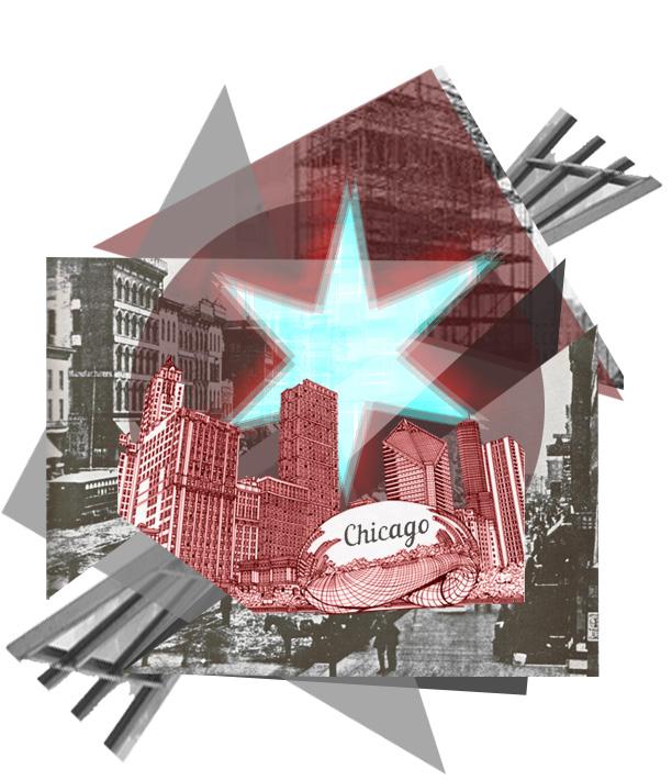
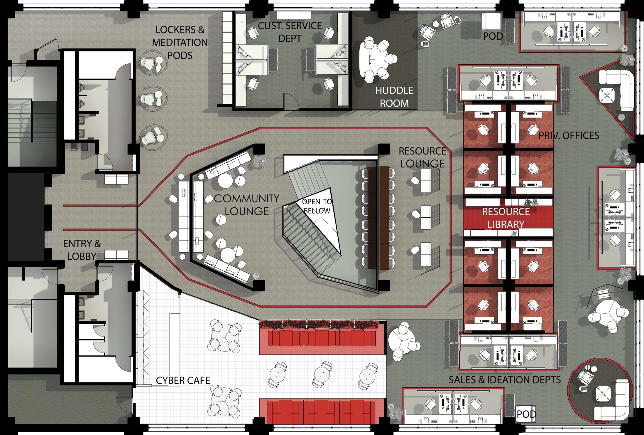
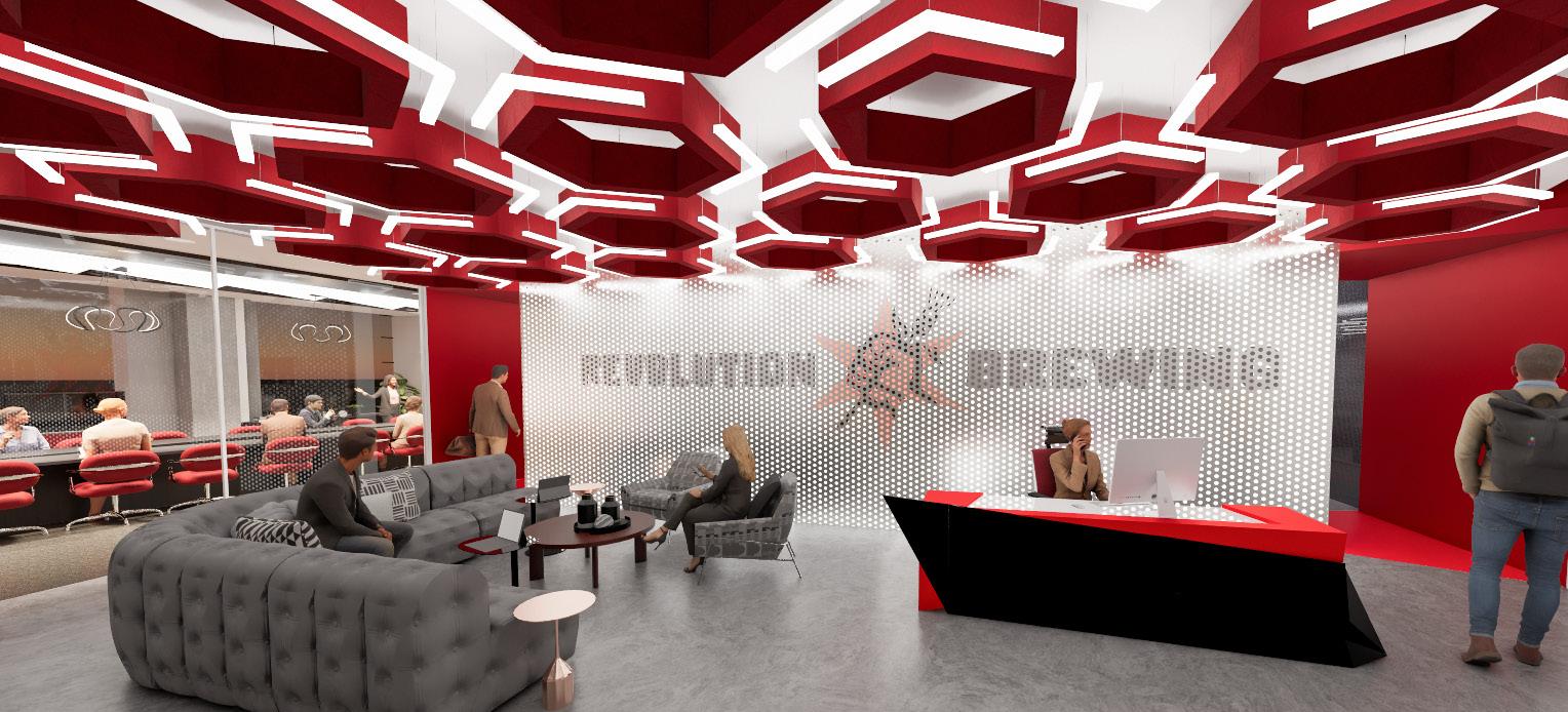
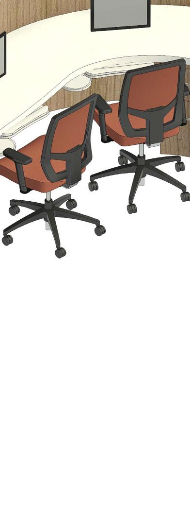
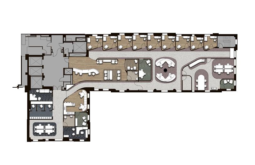
REVOLUTION BREWING CO.
DESIGN THAT FOSTERS CREATIVITY & COMMUNITY
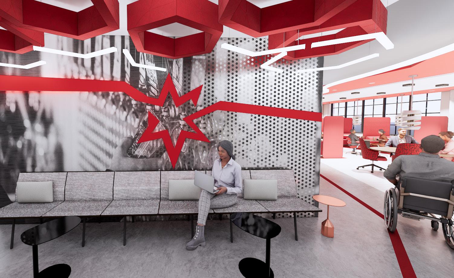
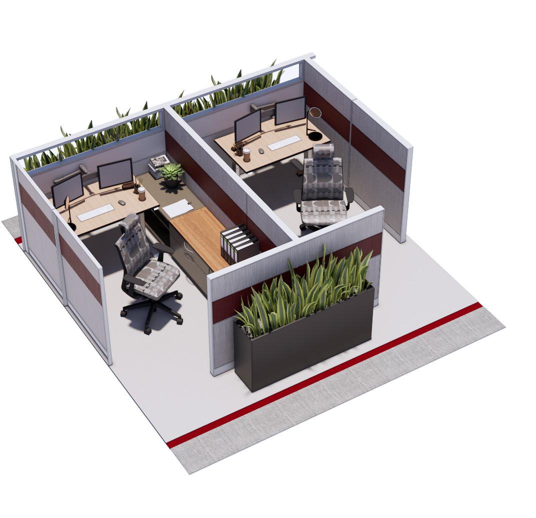
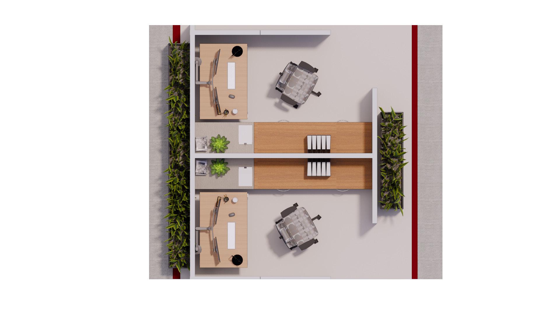
INCLUSIVE + ACCESSIBLE + IMMERSIVE WORKPLACE
REVIT / PHOTOSHOP / ENSCAPE
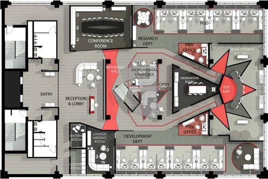
PROJECT SCOPE : 16,000 sq
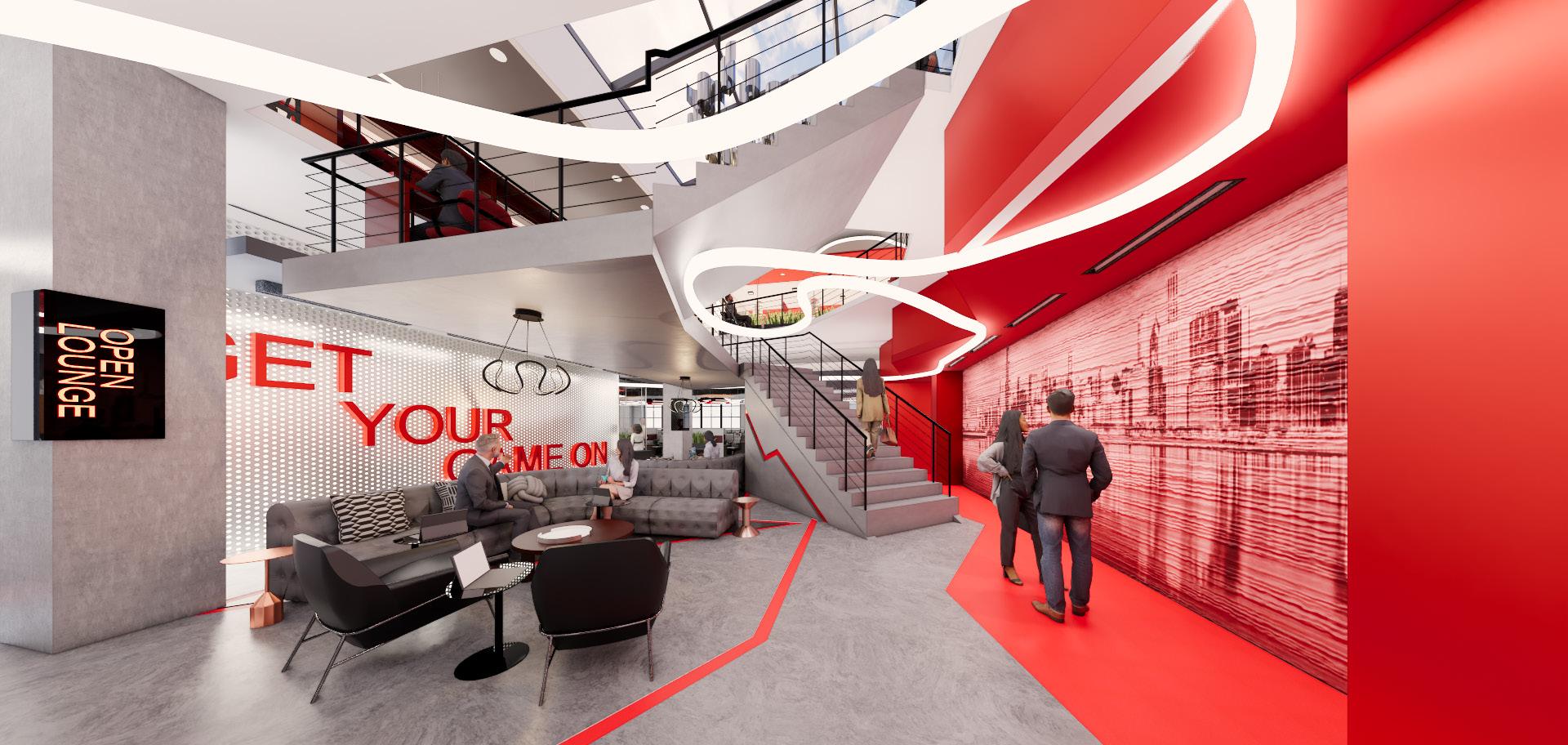
The Revolution Brewing Chicago office celebrates the company’s culture while supporting creativity, community, and flexibility. Designed to balance focus and collaboration, it integrates intentional acoustical treatments, adaptable spaces, and inclusive design solutions that meet modern employee needs. The environment fosters belonging, accessibility, and productivity through cultural expression, innovation, and sense of place.
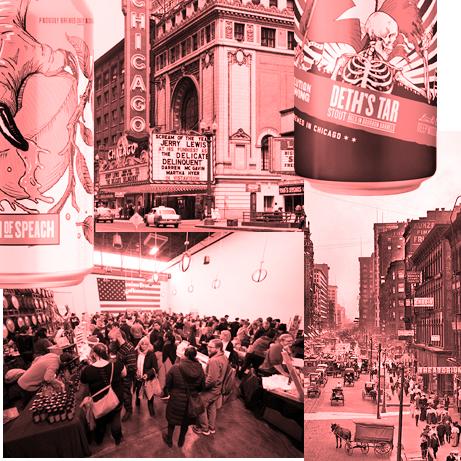
The Innovation Star concept, intertwines the essence of Chicago with the brand’s identity, reflecting the city’s rich culture and innovative spirit. Drawing inspiration from the six-sided star found in both the Chicago flag and the brewery’s logo, the design translates this symbol through architectural extrusions and deconstructed forms. The result is a bold and functional workspace that celebrates creativity, fosters collaboration, and embodies the progressive spirit of both the city and Revolution Brewing.
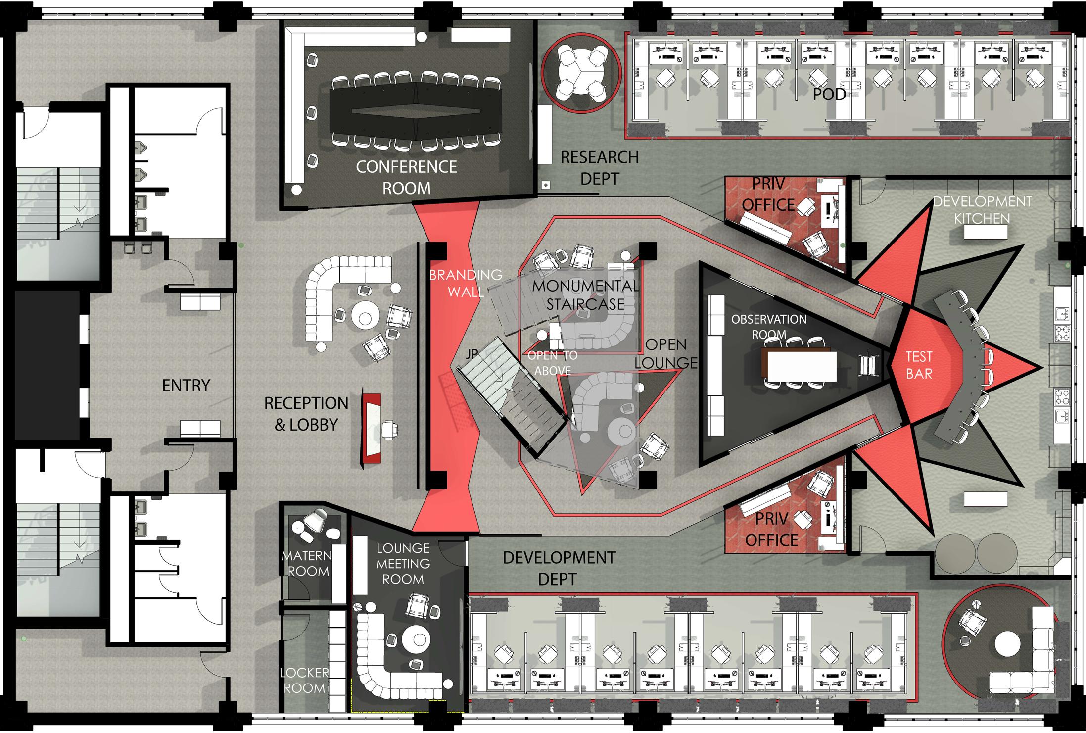
FLOOR 01
IMMERSIVE CORE / FOCUSED AREAS / BOLD BRANDING DESIGN THAT FOSTERS CREATIVITY & INNOVATION
MODERN EMPLOYEE NEEDS :
USER-CENTRIC DESIGN
FACILITATE REMOTE COLLABORATION
The first floor sets the tone with an immersive brand experience, blending focused work with a central social lounge. The design provides modern employees with the flexibility and environmental control they need while nurturing a sense of belonging and supporting a culture of creativity and meaningful work.
FLOOR 02
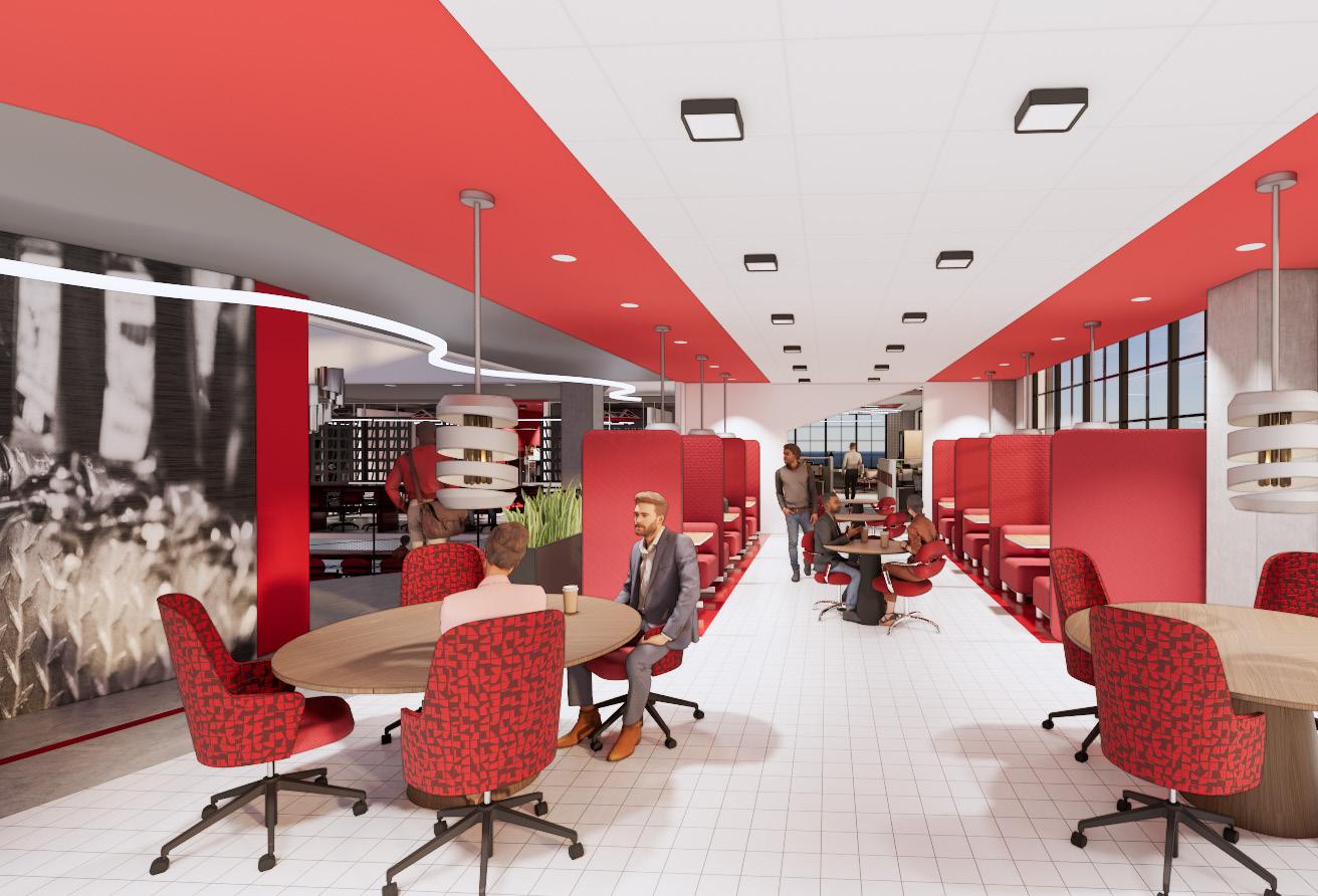
SOCIAL COLLISION / USER CONTROL / QUIET + SOCIAL SPACES
DESIGN THAT FOSTERS COMMUNITY & COLLABORATION
PASSION & PURPOSE
FLEXIBILITY BETWEEN FOCUS WORK AND COLLABORATION
The second floor layout is inspired by the Chicago flag, whose stripes represent the city’s sectors, creating a neighborhood feel supported by a variety of work and social spaces that encourage social collision and strengthen community, mentorship, and sense of belonging.
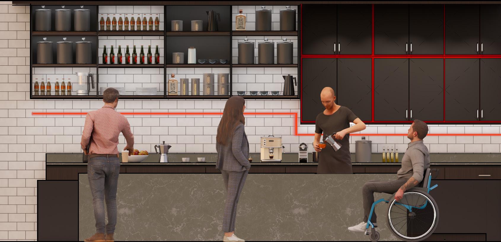
The Cyber Cafe offers an additional comfortable workspace where a variety of options can be used to support The Control Theory, allowing employees to adjust their environment based on individual needs. Whether they require a focused setting, specific lighting conditions, or ergonomic support, these choices help maximize comfort and productivity for diverse users.
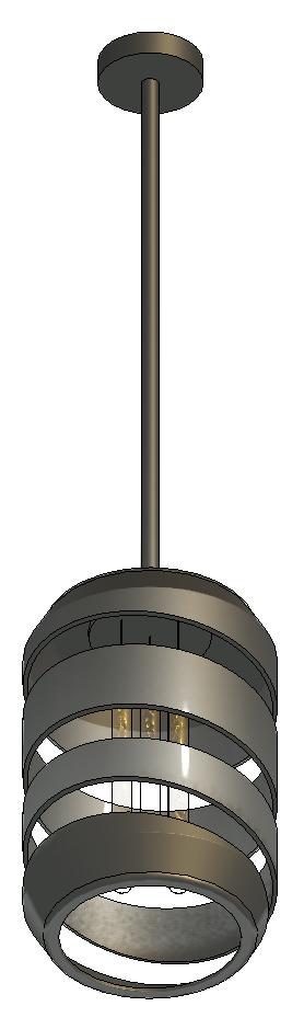
CUSTOM PENDANT SHREDDED CAN
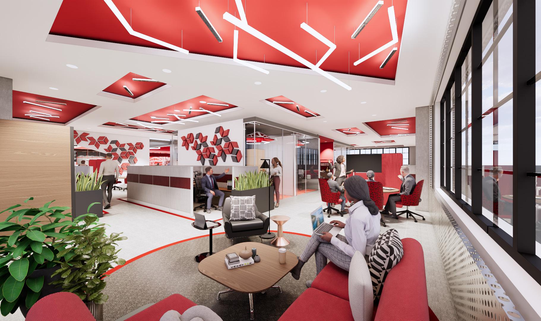
CYBER CAFE 2ND FLOOR
BOLD + ENERGIZING
CUSTOM SIGNAGE
OPPORTUNITIES FOR WORK & SOCIAL INTERACTION
STEEL CONSTRUCTION INSPIRED DETAILS
SOCIAL COLLISION + MAXIMIZED DAYLIGHT = ACTIVE SPACES
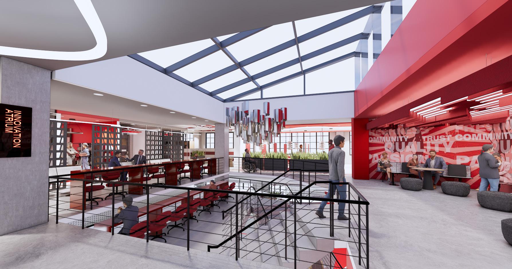
COMPANY VALUES + EMPLOYEE HUB
INNOVATION ATRIUM 2ND FLOOR
ACTIVE + SOCIAL + INCLUSIVE + “NEIGHBORHOOD FEEL”
Steelcase
BUZZ2 Fabric
Red 5F04
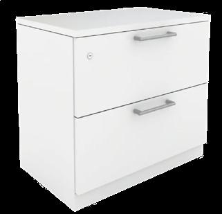
DSK-5
Steelcase
BUZZ2 Fabric
Alpine 5G64
WCT-3
Wilsonart
837 Graphite
Matte HPL
WCT-2
Wilsonart
Continental Walnut 8232
Timber Grain
Top
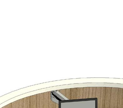
Main Desk Top
Wilsonart Asian sand Linearity
Wilsonart 1595 Black High-gloss
USER CONTROL
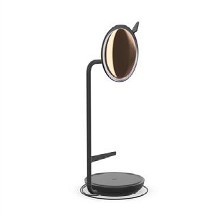
a. Steelcase Eclipse dimmable task/ video lamp.
b. Steelcase Universal storage/ bench.
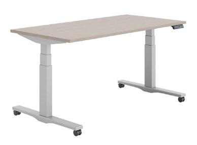
c. Steelcase Migration deskHeight Adjustable.
WCT-1
DSK-2
MATERIALITY AS WAYFINDING
NATURAL ELEMENTS :
• SUNLIGHT
• GREENERY
• WOOD GRAINS
• PATTERN
• TEXTURE
FLEXIBILITY :
• INDIVIDUAL + COLLABORATION
• ACOUSTICS & LIGHTING
• OPEN CONCEPT WITH SPACED CUBICLES = “NEIGHBORHOOD FEEL”
• TASK + LOUNGE SEATING
INCREASED PRODUCTIVITY & EMPLOYEE SATISFACTION
ACOUSTIC TILES + SOUND MASKING
HIGH CEILINGS = CREATIVITY & SOCIAL INTERACTIONS
STEEL CONSTRUCTION INSPIRED DETAILS
OFFICE 2ND FLOOR
CULTURAL EXPRESSION + CREATIVITY
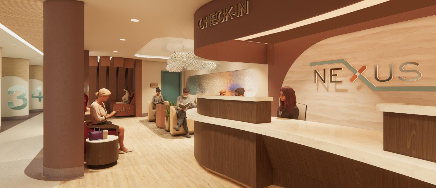
NEXUS FAMILY CLINIC
PREVENTATIVE CARE FOR AGING POPULATIONS
COMFORTING + SUPPORTIVE + EMPOWERING
TEAM MEMBERS: Alisson Angarita & Eden Mateo
REVIT / PHOTOSHOP / ENDSCAPE
PROJECT SCOPE : 5,900 sq
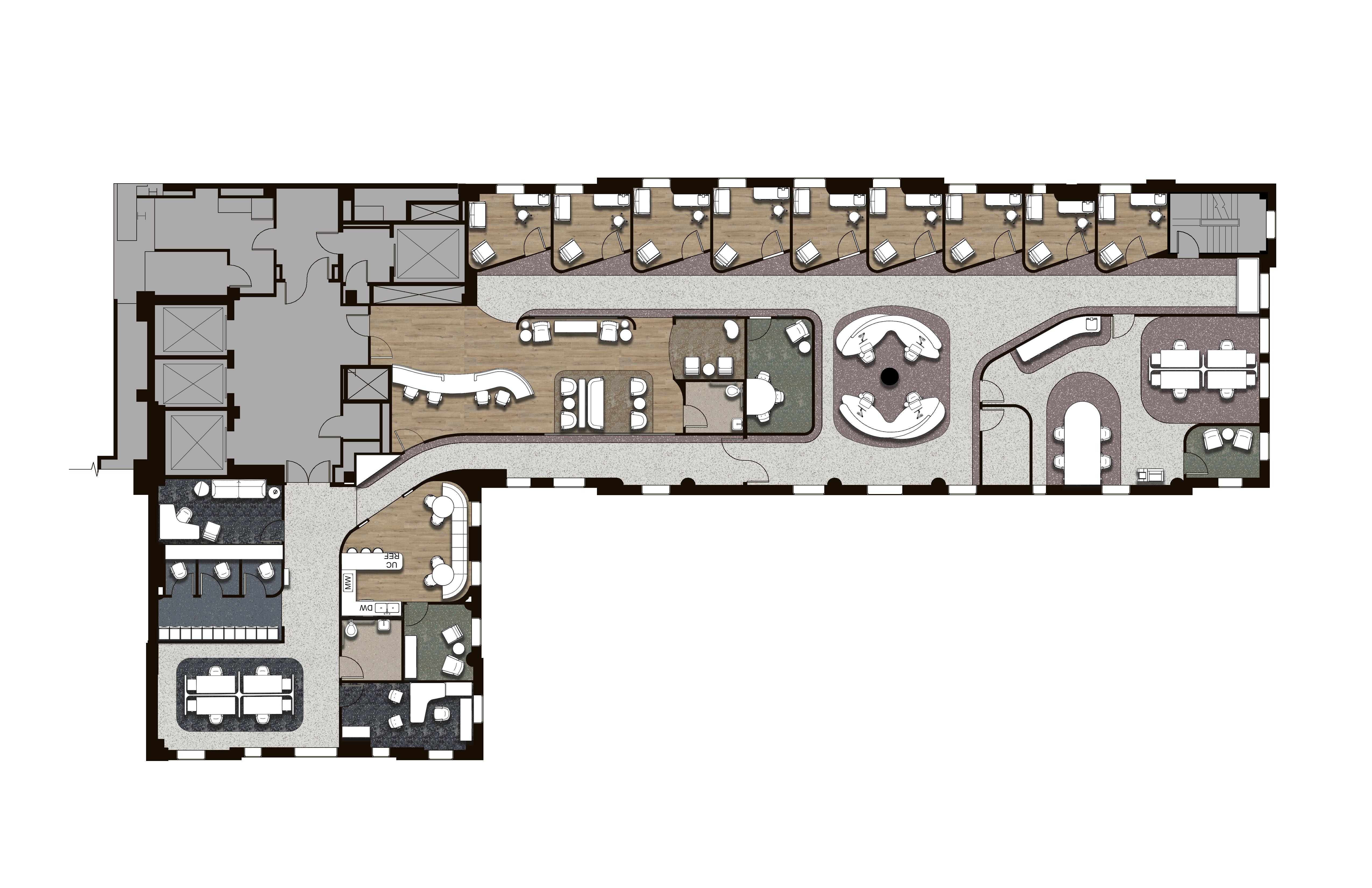
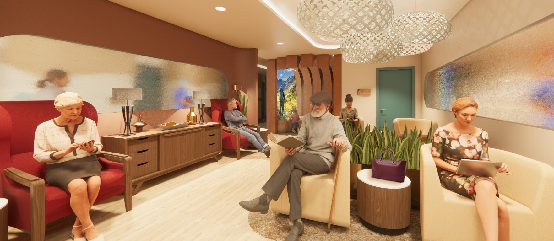
The Nexus Clinic redefines care in the rural community of Whitefish, Montana by creating a place where people feel comfort, connection, and control over their health. The design replaces the institutional feel of traditional clinics with a welcoming, hospitality inspired environment that supports the aging population and encourages preventative care. Nexus empowers the community to make consistent, confident health choices that lead to more resilient lives.
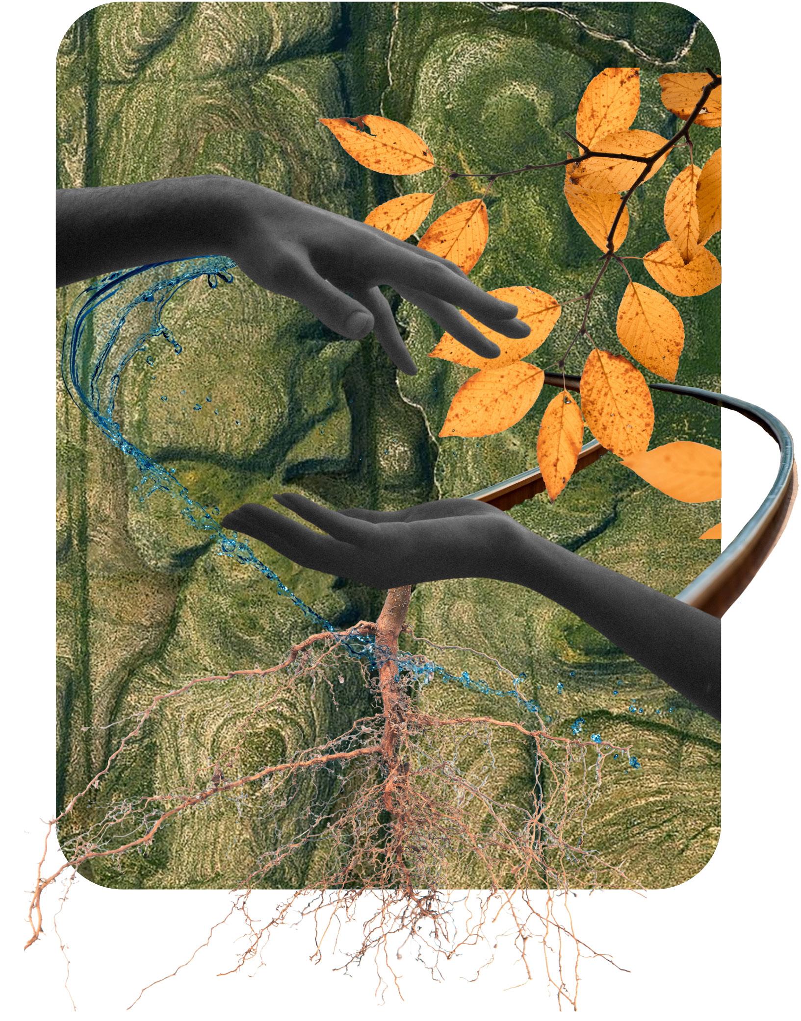
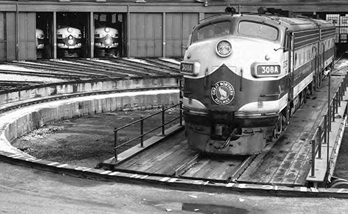
Expanding Frontiers reimagines healthcare as a guided journey inspired by Whitefish’s railroad heritage. Patients follow a clear, intuitive path supported by caregivers who help them reach a healthier and more resilient life. This journey model responds to the aging population and current healthcare pressures by encouraging consistent checkups and promoting preventative care.
Architecture reinforces the journey through simple, linear pathways and warm, hospitality inspired spaces that reduce stress and support ease of navigation. Moments of natural light, landscape views, and biophilic elements act as positive distractions, easing uncertainty the way a calming window view empowers a traveler.
Nexus becomes both a station and a guide, offering resources at every stop and empowering the rural community to build long term wellness through supportive and uplifting experiences.
NE US
NEXUS LOGO
INTENTIONAL + SYMBOLIC + DYNAMIC
Used for signage and environmental graphics
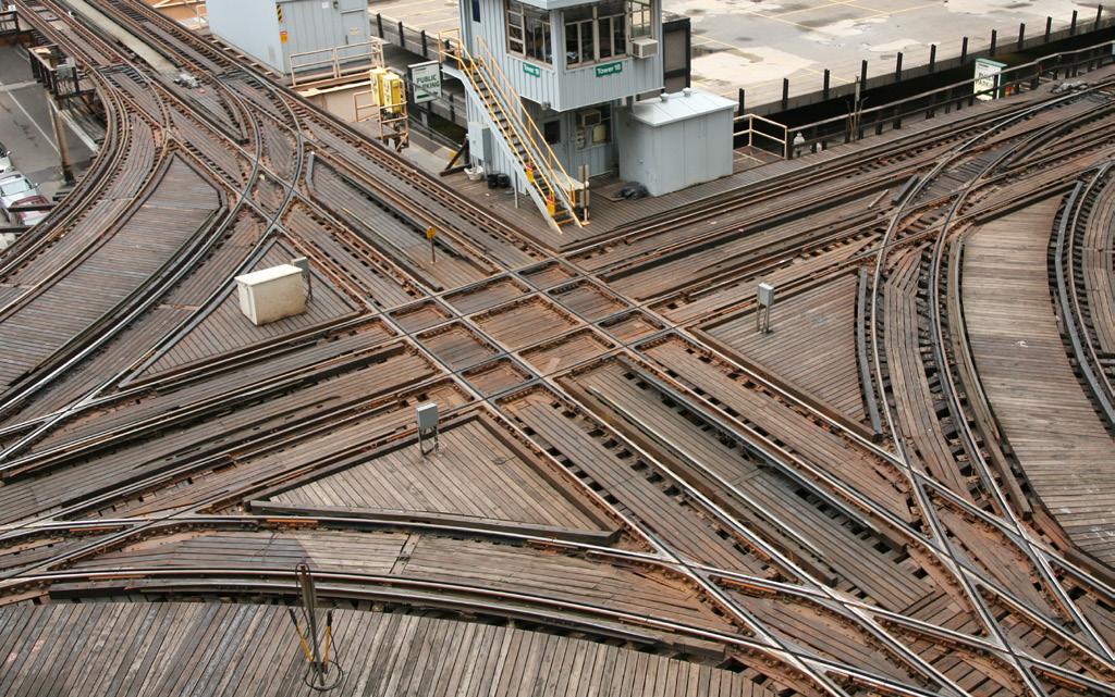
The logo is modeled after a railroad junction, or ‘nexus’, representing the brand’s dedication to providing quality healthcare resources to the community. The arms of the ‘X’ imply convergence and divergence, symbolizing regular visits to the clinic. The intersection of the two ‘railroad tracks’ forms a star in the middle, signifying that Nexus Clinic is a destination on the road to health, much like the stations along a railroad.
Provider’s Journey
Patient’s Journey
NEXUS EMBLEM BOLD + DYNAMIC
Used for uniform embroidery, letterheads and stamps
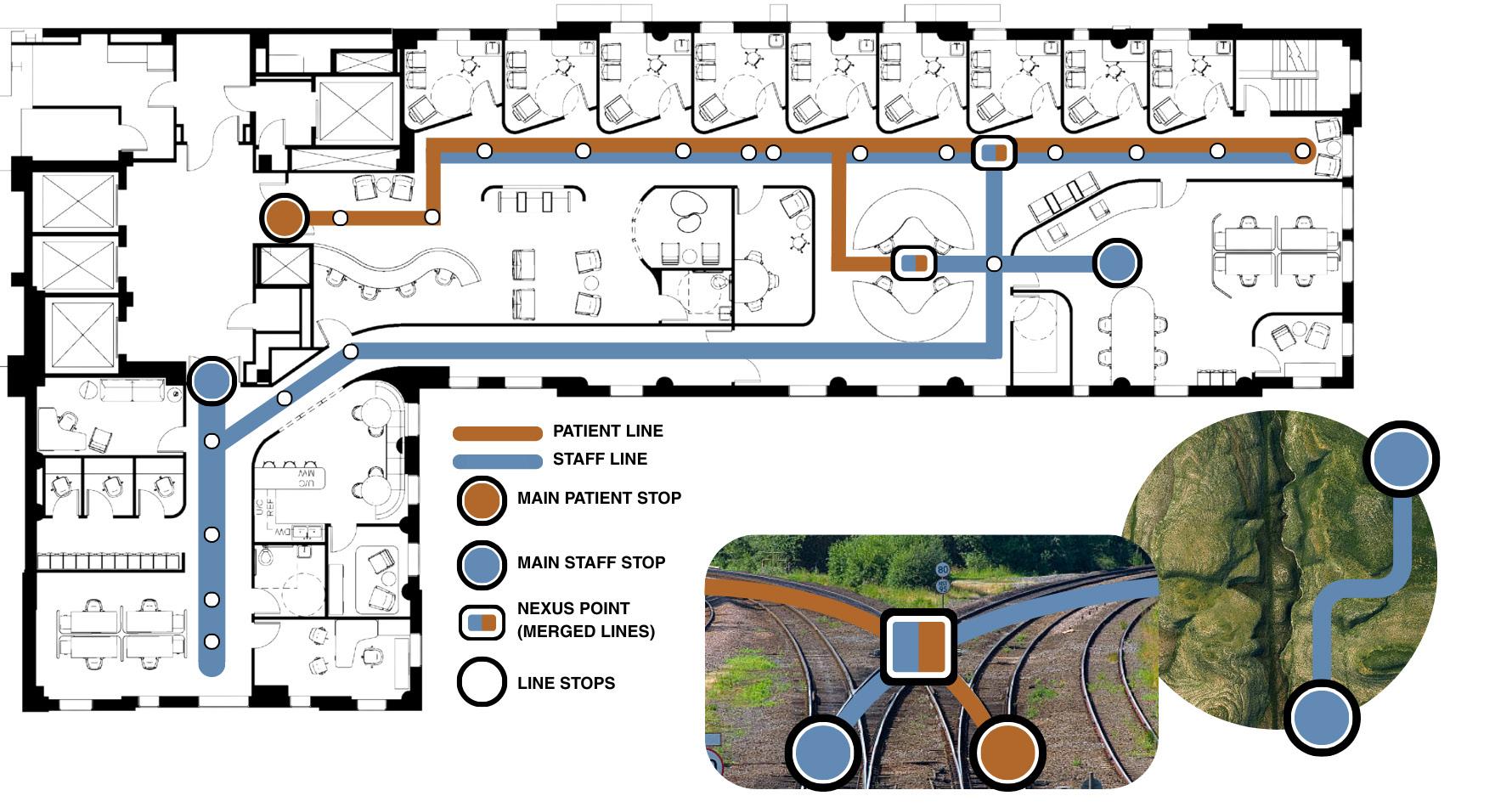
PARTI DIAGRAM
INTENTIONAL & INTUITIVE FLOW
PATIENT LINE
STAFF LINE
MAIN PATIENT STOP
MAIN STAFF STOP
NEXUS POINT (MERGED LINES)
LINE STOPS
The parti diagram describes the main circulation paths for patients and providers with “train stops” along the way for exam rooms and staff work areas. The paths converge at the “Nexus” care desk, where communication between staff and patients merge, and resources are expanded.
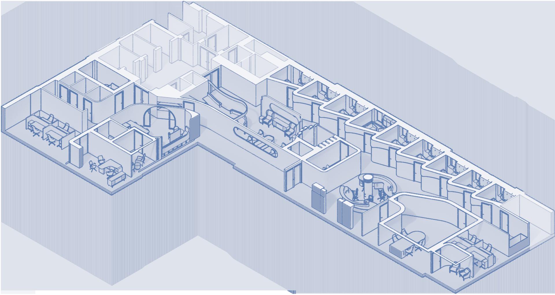
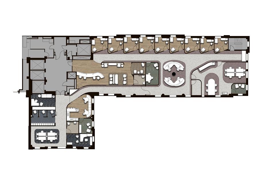
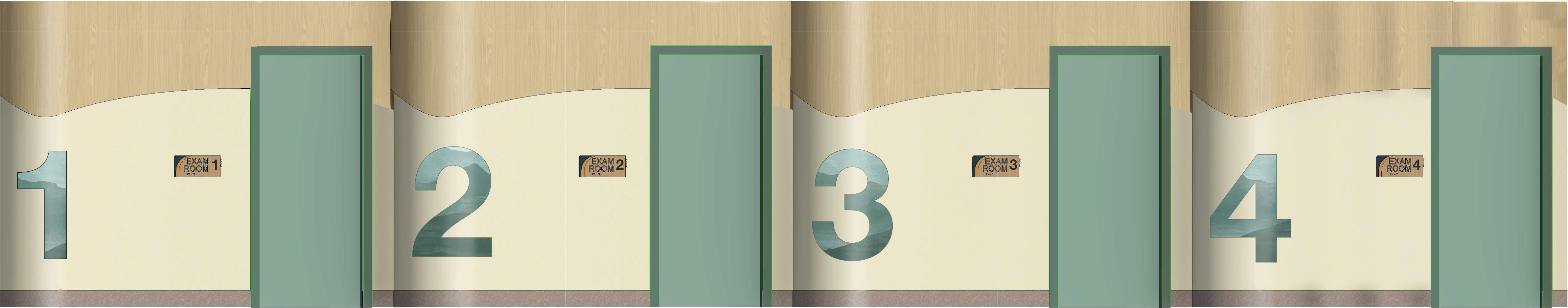
FLOOR 01
ACCESSIBLE / CULTURALLY RESPONSIVE / EASY TO NAVIGATE
DESIGN THAT SUPPORTS PREVENTATIVE CARE
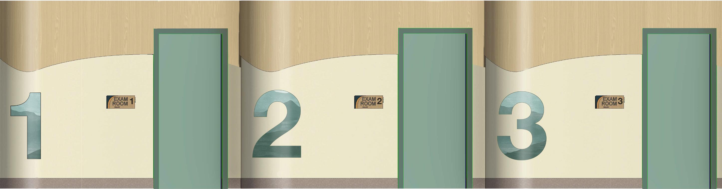
Environmental graphics and curved architectural accents mark exam rooms.
• Column marks care desk architectural accent with built-in storage.
• Rubber flooring changes delineate linear “tracks” on main pathways referencing the journey concept, elevate the acoustical quality, and reduce walking strain for staff and elderly patients.
• LVT and carpet finishes bring a warm and elegance that echoes hospitality.
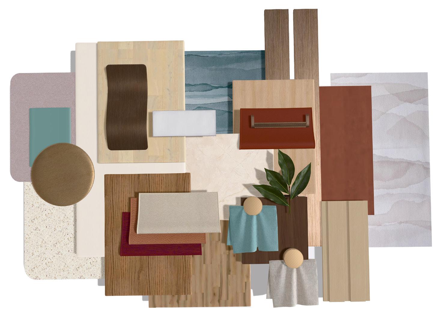
COLOR PALETTE & FINISHES
NATURAL MONTANA’S RESOURCES / RAW MATERIALS / VISUAL TEXTURES
Wayfinding: Navigation is intuitive. The space uses rubber flooring patterns to delineate main pathways as linear tracks.
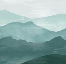
Honoring Whitefish’s History: The logging town’s history will be honored through local wood look finishes, and teal accents that reflect the bodies of water. These materials represent expanded local resources.
ULRICH’S THEORY OF SUPPORTIVE DESIGN
Expanding Frontiers Concept: The railroad concept is represented through the use of brushed bronze details that elevate the design.
Ulrich’s Theory of Supportive Design: Biophilic elements such as greenery and earth tones reduce stress.
Ulrich’s Theory of Supportive Design explains that healthcare environments can reduce stress and support healing by offering social support, positive distractions, and a sense of control. These elements help lower anxiety, improve comfort, and promote better physiological responses, which leads to faster recovery and a more enjoyable experience for patients, visitors, and staff.
HOSPITALITY INSPIRED DESIGN THAT ENHANCES WAYFINDING.
• All acoustic ceiling baffles and panels feature suspended linear LEDs between panels.
• All architectural ceiling coves house linear strip lighting and linear HVAC supply and returns at a ratio of 2:1.
• All windows are equipped with sheer, motorized shades to maximize user control, daylight and energy efficiency, and minimize heat gain.
• All lighting maintains a CRI of 80. Exam rooms and food prep areas feature a CRI of 90.
• All walls maintain an STC of 40. Walls marked with a feature an STC of 55.
• Check-in and Care desks equipped with under-counter panic/security buttons.
• All desks and workstations equipped with personal task lighting.
• All wall extend beyond ceiling finish to meet next level for noise control.
GOALS & THEORY APPLICATION
Ulrich’s Theory of Supportive Design: Providers have a sense of control over where they work with access to private office enclaves.
Wayfinding:
Circulation is easy and intuitive. The space uses clear patient and staff zones, linear pathways with clear sightlines, and prominent landmarks.
Ulrich’s Theory of Supportive Design:
Patients are offered a positive distraction with desirable mountain
Expanding Frontiers Concept:
Repetition of architectural forms enhance wayfinding and emulate train stops along the journey, or ‘track’.
Expanding Frontiers Concept:
Community buidling:
Socialization and communication is encouraged amongst staff and patients to build a sense of support and community.
Ulrich’s Theory of Supportive Design:
Patients experience social support with a residential-inspired waiting room and adjacency to the care desk
Expanding Frontiers Concept:
The care desk functions as the ‘Nexus’ point of connection at a central location between patients and
Patient Processing:
Layout of exam rooms and intentionally adjacent spaces facilitate efficient patient processing with shortened walk times.
Architectural accents and lighting will mimic the scenic horizons, creating a nurturing and familiar atmosphere for
Universal Design: Considerations include bariatric armchairs, rounded corners, soft flooring, and adjustable, ergonomic task seating.
PEEK OF HALLWAY AND WAITING CREATE DIVERGENCE AND RESOURCE EXPANSION
EARTH COLORS BRING WARMTH AND SERVE AS VISUAL LANDMARKS
CUSTOM NEXUS LOGO MARKS CHECK IN DIRECTLY UPON ENTERING
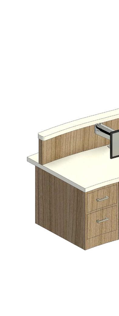
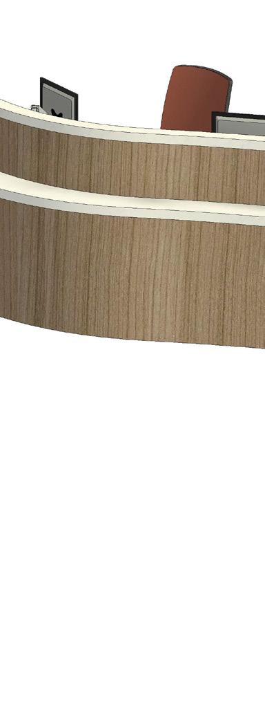
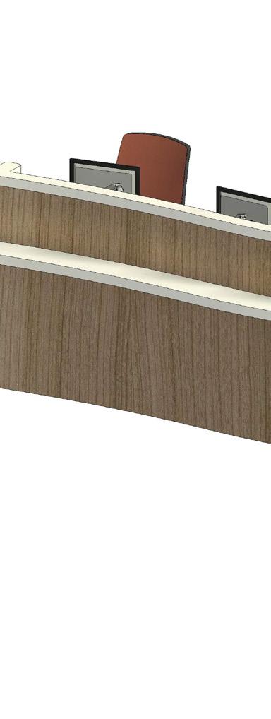
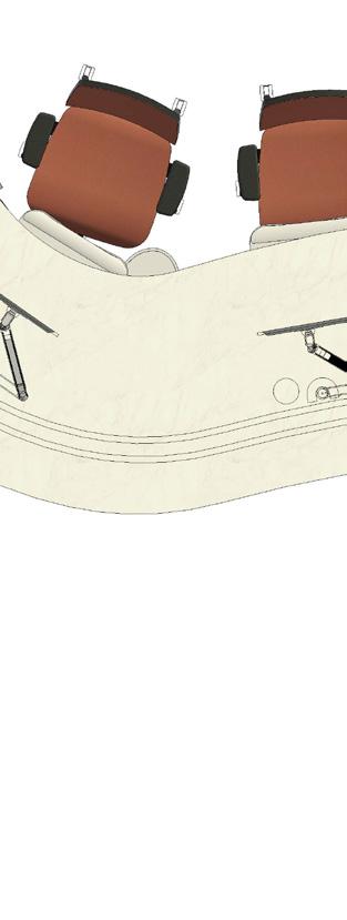
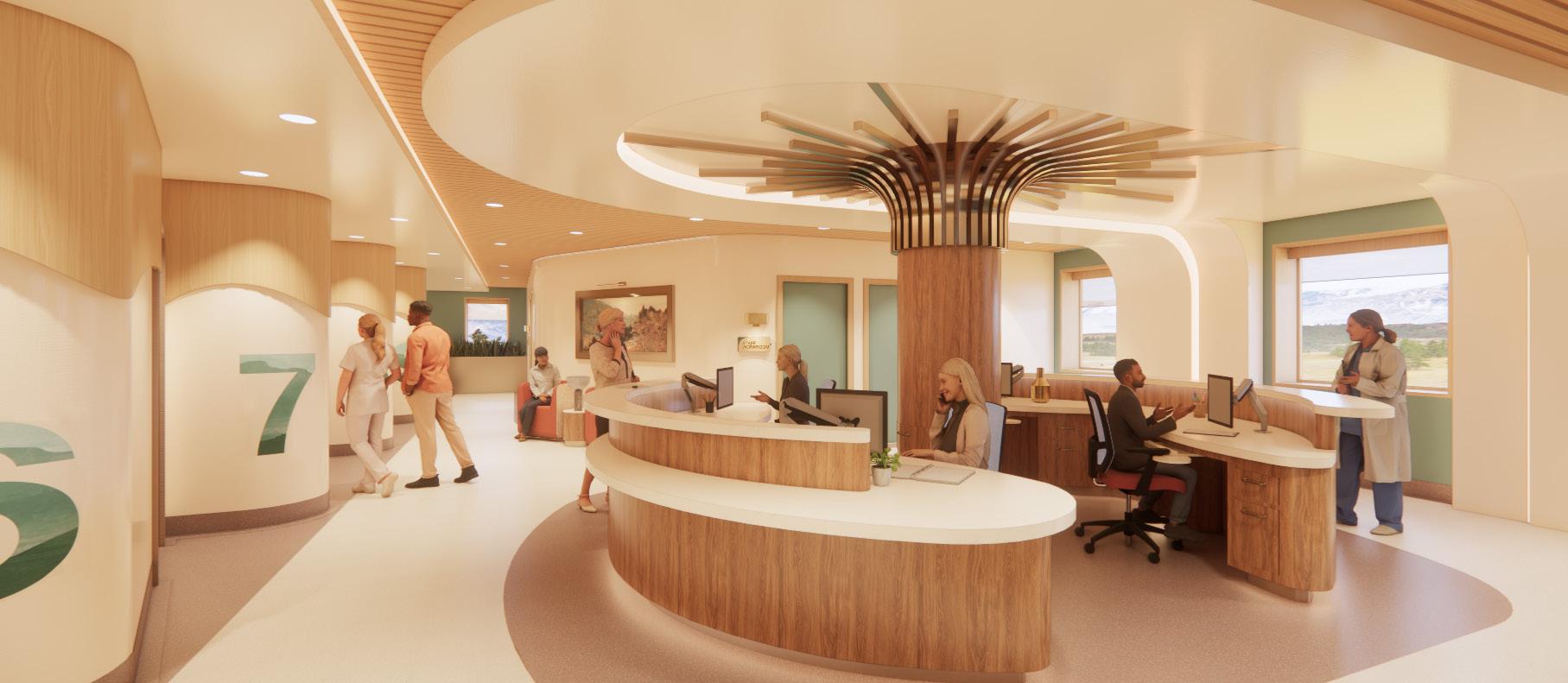
RECEPTION & WAITING AREA
WARM + ACCESSIBLE + WELCOMING
Upon entering Nexus clinic, patients are greeted by a warm and welcoming reception and waiting area. Patients check in for their appointments on the reception desk which curves to guide them into their ‘next stop’, a comfortable waiting loun. Clear branding along with warm and neutral tones create a supportive atmosphere emphasizing the quality care that patients will receive.
Support counter to rest personal items
Desk privacy cover
Adjustable single monitor arm
30” H and 22” D
Roll-under Accessible desk counter
Under-desk storage
Ergonomic under-mount keyboard tray
Desk privacy cover Wire grommet
30” H and 22” D
Roll-Under Accessible desk pop-up power strip
Ergonomic Considerations:
User centric design strategies such as clear and direct sightliness, accessibility, and ergonomic features like furniture supports staff and helps reduce the turnover high rate in healthcare fields.
EARTH TONES CREATE A WARM AND GROUNDING ATMOSPHERE
CONNECTION TO STAFF AS TRAIN IN MOTION
CEILING COVES AND NEUTRAL TONES FEEL SAFE AND PRIVATE
LANDSCAPE ORIENTED FROSTED WINDOWS
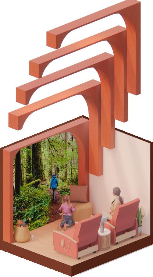
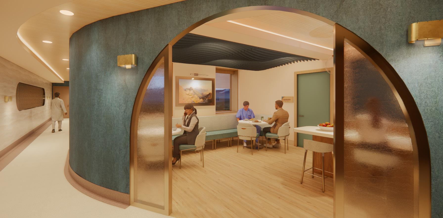
WAITING AREA & SENSORY ROOM
COMFORTING + GROUNDED + HOSPITALITY INSPIRED
Upon entering Nexus clinic, patients are greeted by a warm and welcoming reception and waiting area. Patients check in for their appointments on the reception desk which curves to guide them into their ‘next stop’, a comfortable waiting area. Clear branding along with warm and neutral tones create a supportive atmosphere emphasizing the quality care that patients will receive.
User Centric Design:
The sensory room supports patient well-being and mental health utilizing acoustical beams and multi-sensory display. This measure promotes physical activity and meditation to address obesity and substance abuse as leading health concerns.
Felt acoustic coves mitigate unwanted noise in the space, decreasing patient stress.
The dimmable linear LED lighting creates a soft and calming atmosphere.
Matching vinyl 3’-0” AFF covering base of coves for cleanability.
The projection screen plays first-person videos of hikers, bikers, or rock climbers exploring Montana’s natural and mountainous terrain. This provides a positive distraction to patients and inspires them toward healthy habits such as exercising outdoors.
Integrated speaker pillows create an immersive experience as patients watch the projected videos.
Adjustable massage chairs help calm and relax stressed patients as they wait to be seen by providers.
Curved layers incorporate brand colors and track shape
Clipboard and activity/health pamphlets storage
Color coded pull tabs communicate patient status within the exam rooms to alert staff members from the hallway of which patients have or haven’t been seen
6” Letter height with high contrast materials for legibility
Braille lettering mounted 51” AFF for legible and accessible height
OVERLAPPING OF CURVES HIGHLIGHT ENVIRONMENTAL GRAPHICS
BRUSHED BRONZE ACCENTS HONOR RAILROAD HERITAGE AND EXPANDING FRONTIERS CONCEPT
RUBBER FLOORING IN MAIN PATHWAYS REDUCES WALKING STRAIN
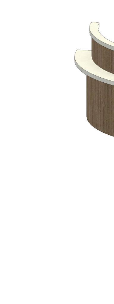
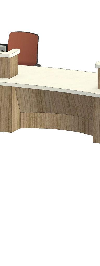
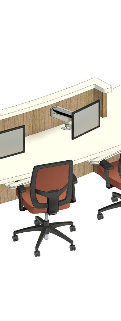
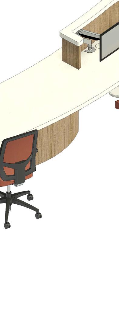
CARE DESK
SUPPORTIVE + ACTIVE + INVITING
The care desk is a prominent landmark in Nexus Clinic. With clear sightliness to all exam room entrances, the care desk acts as a nurse’s station for patient monitoring, coordination and administration. Architectural features like the central, decorative column with integrated storage act as a way-finding device, guiding visitors and staff toward their destinations.
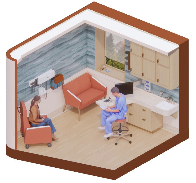
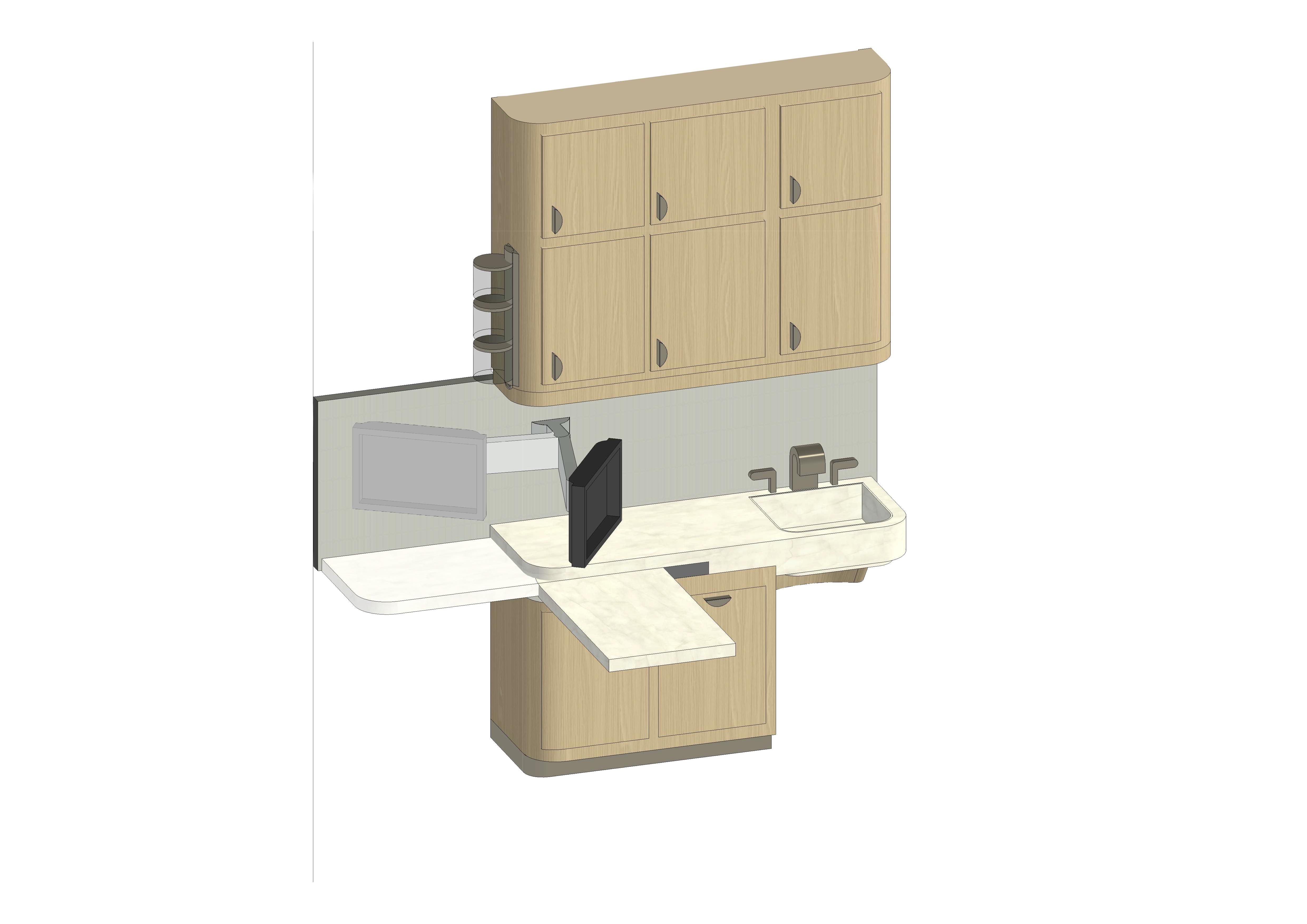
EXAM ROOM
RELAXING + CLEAN + HOSPITALITY INSPIRED
Coves provide indirect layers of lighting, reducing glare.
Motorized rolling shade gives users a sense of control over light levels in the space.
Views to the outdoors offer a positive distraction, causing patients to percieve shorter wait times.
wall-mounted diagnostic equipment.
Guest seating provides an opportunity for social support.
Placing patient recliner in a curved cove upholds prospect and refuge theory, allowing them to feel more comfortable and open.
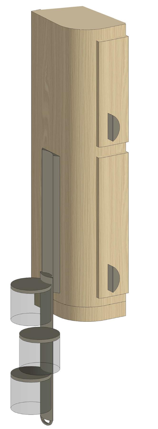
Cabinet mounted containers faccilitate storage and access to
Track mechanism allows pull-down motion for easier access to
Flexible wall mounted monitor arm allows screen to be accessible at all counter positions, facilitating communication between staff, guests, and patients.
Flexible wall mounted monitor arm allows screen to be accessible at all counter positions, facilitating communication with guests and patients, functions as Communication & Monitoring Equipment (screen for xrays,
Swivel pull out counter for ergonomic support. Ergonomic features contribute to Ulrich’s Theroy, Sense of control
Swivel/pull-out features provides ergonomic support for staff and implements the sense of control in Ulrich’s Theory
Sharps disposal
Sharps Dispos-
Waste Can
U handle faccilitates pulling up and down
CUSTOM EXAM ROOM CABINETS
ERGONOMIC + ADJUSTABLE + EASY TO CLEAN
Sink
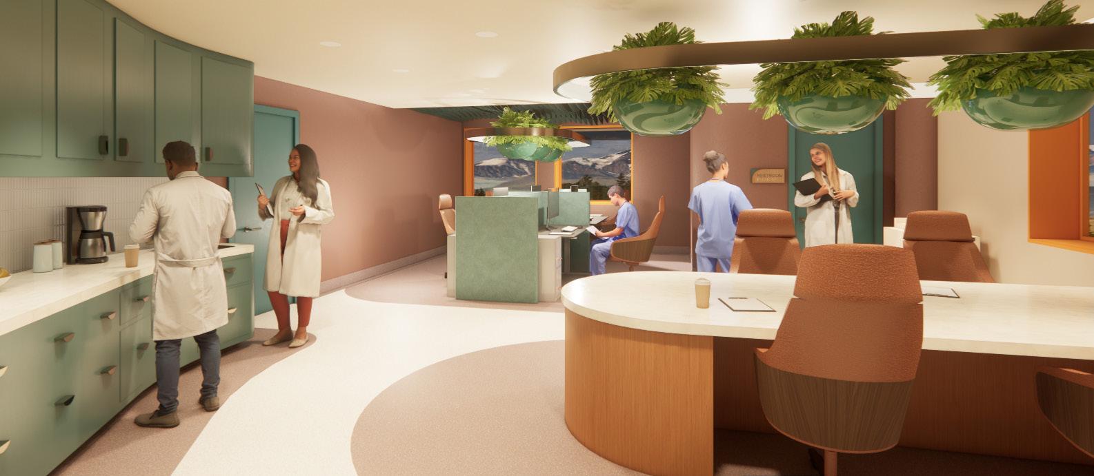
COFFEE BAR
FLOOR DESIGN COMMUNICATES CIRCULATION INTUITIVELY
FELT WAVES IMPROVE ACOUSTICAL QUALITY OF THE WORKSTATIONS
STAFF SENSORY
CUSTOM HALO LIGHTING WITH HANGING PLANTERS
PROVIDER WORK ROOM
EFFICIENT + FLEXIBLE + COLLABORATIVE
The workroom combines natural tones, with amenities such as a custom conference table, private computer work space, sensory room, coffee station, and custom halo pendant to reduce stress and burnout. This space functions as an efficiency sanctuary where staff find community, opportunities for retreat, and ergonomic support for their tasks.
CONNECTION TO PATIENTS IN THE WAITING AREA THROUGH FROSTED WINDOW
FROSTED WINDOW DESIGN EMBOSSED WITH MOUNTAIN PATTERNS STAFF SENSORY ROOM
STAFF LOUNGE
ELEGANT + COZY + SOCIAL
The lounge supports staff well-being by offering a welcoming and informal space for breaks. The kitchen allows staff to prepare food, and seating arrangements encourage socialization. Direct adjacency to the staff sensory room promotes mental health amongst providers.
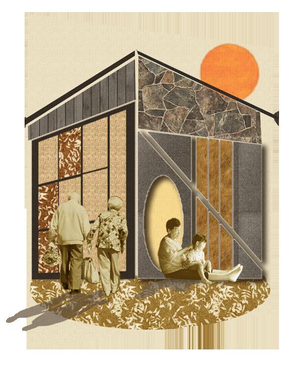
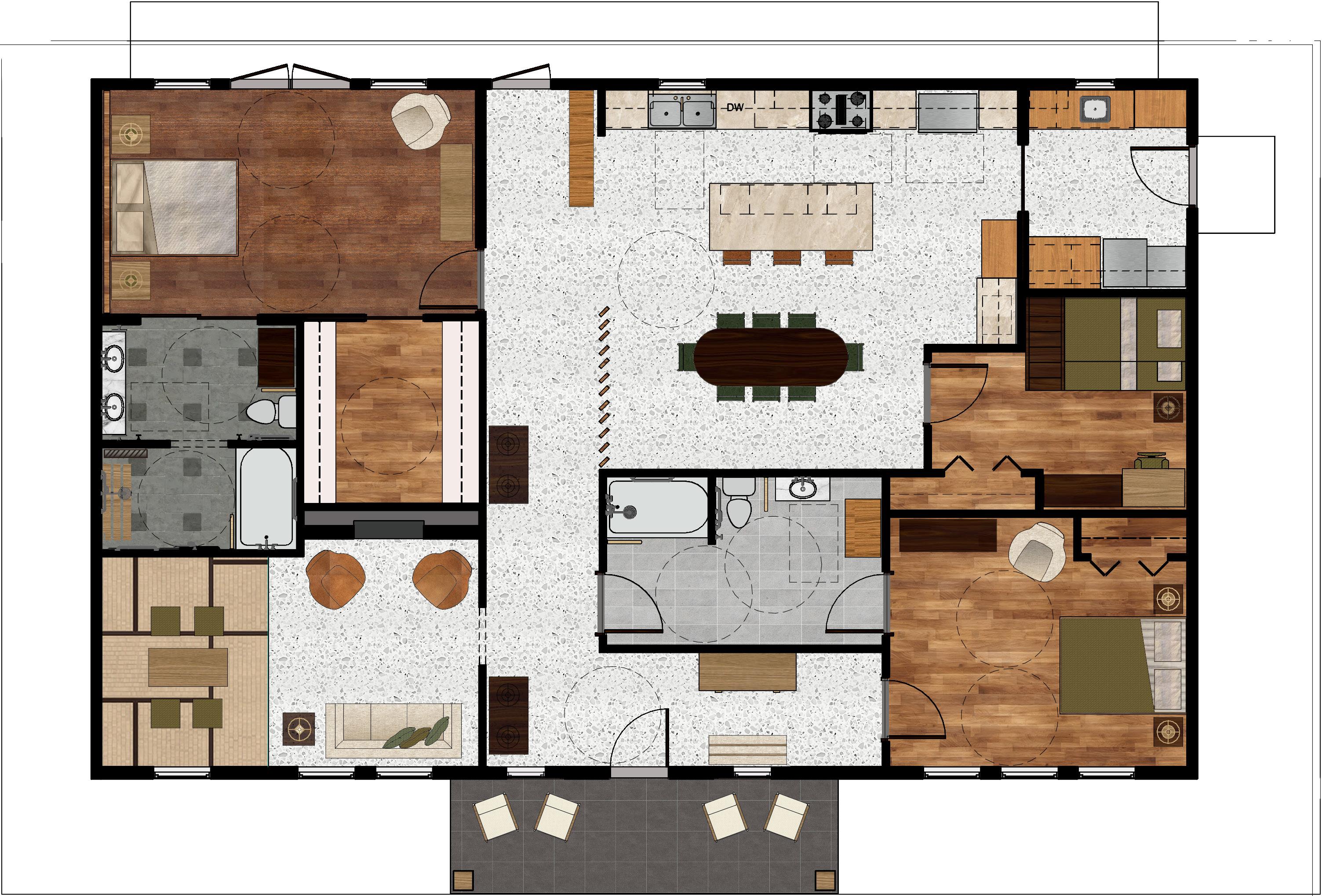
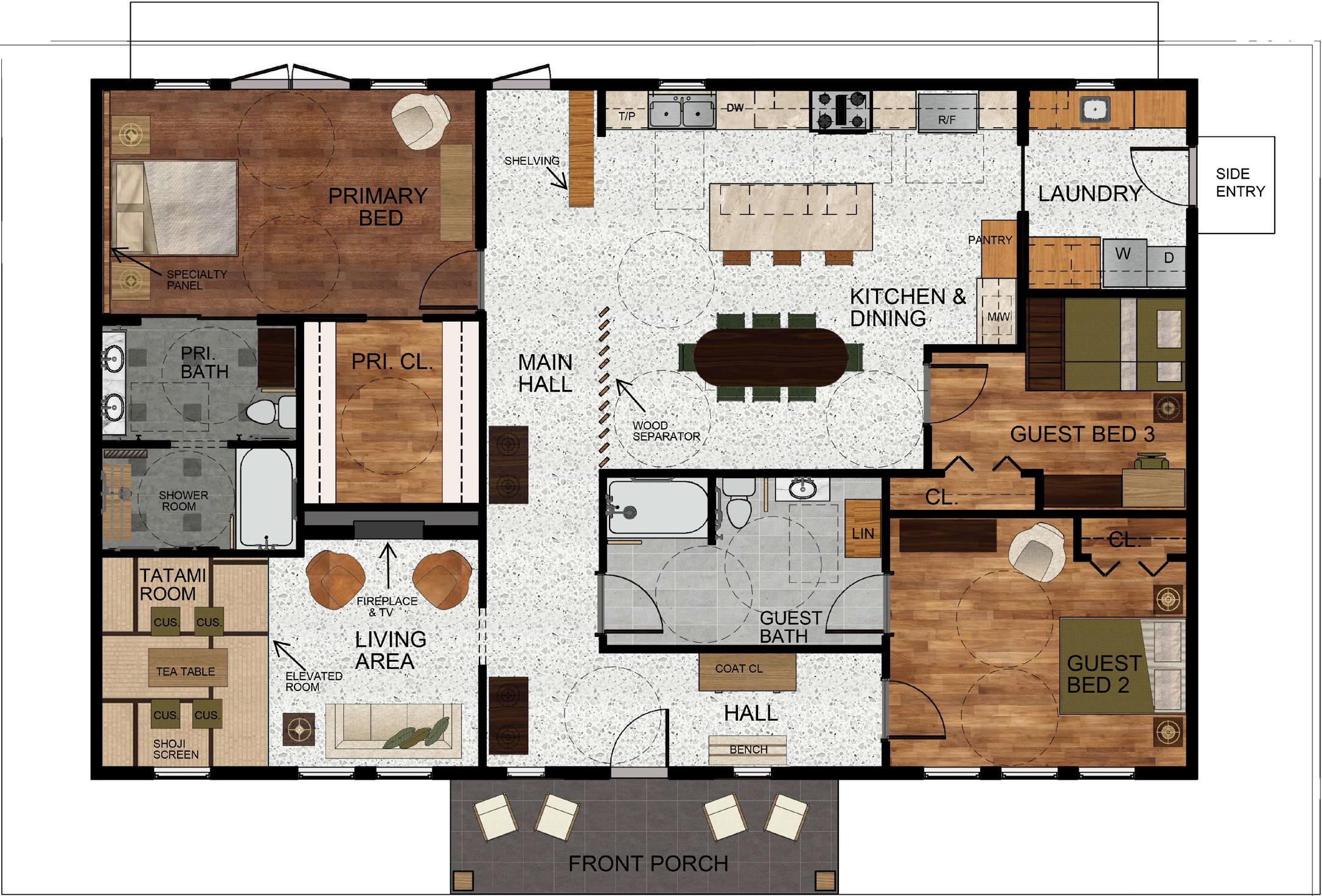
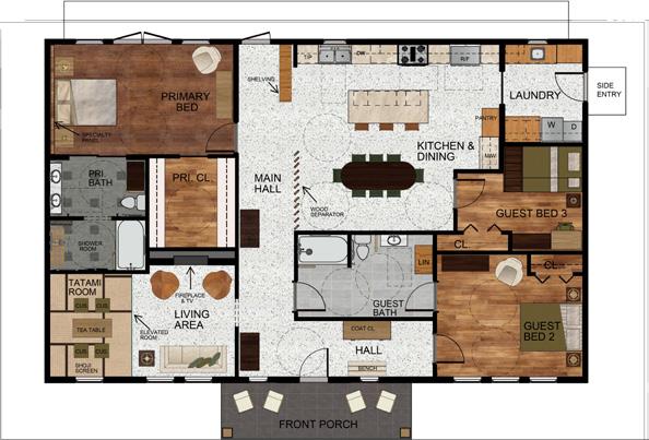
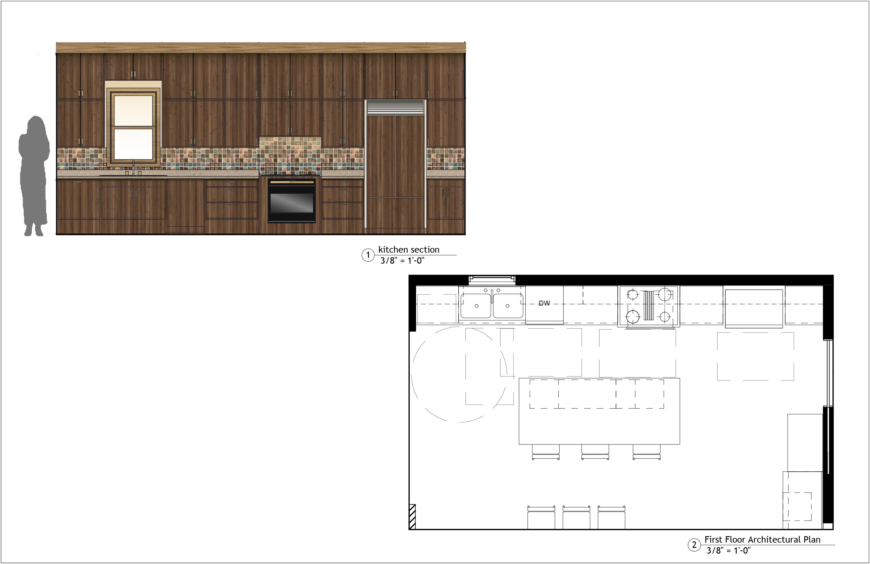
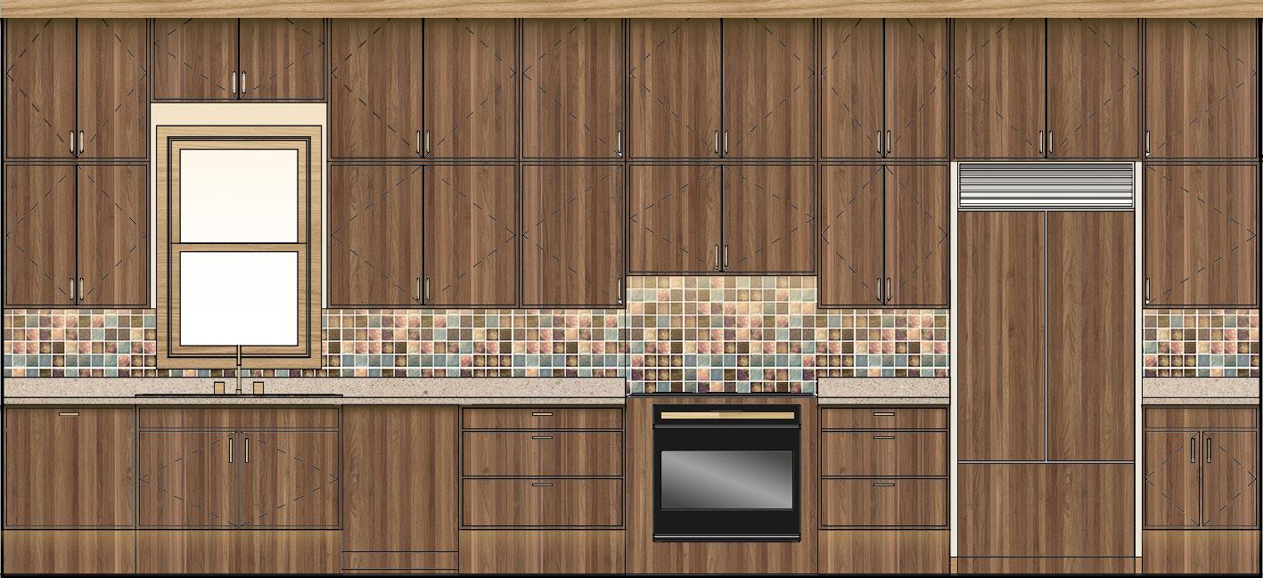
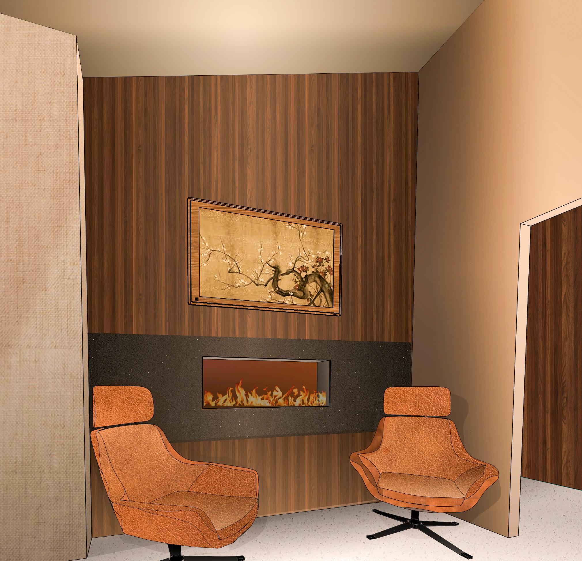
THE KIMURA’S FOREVER HOME
ACCESSIBLE HOMES AS A NEW STANDARD
NURTURING + ACCESSIBLE + INTENTIONAL
REVIT / PHOTOSHOP / AUTOCAD
PROJECT SCOPE : 1960 sq
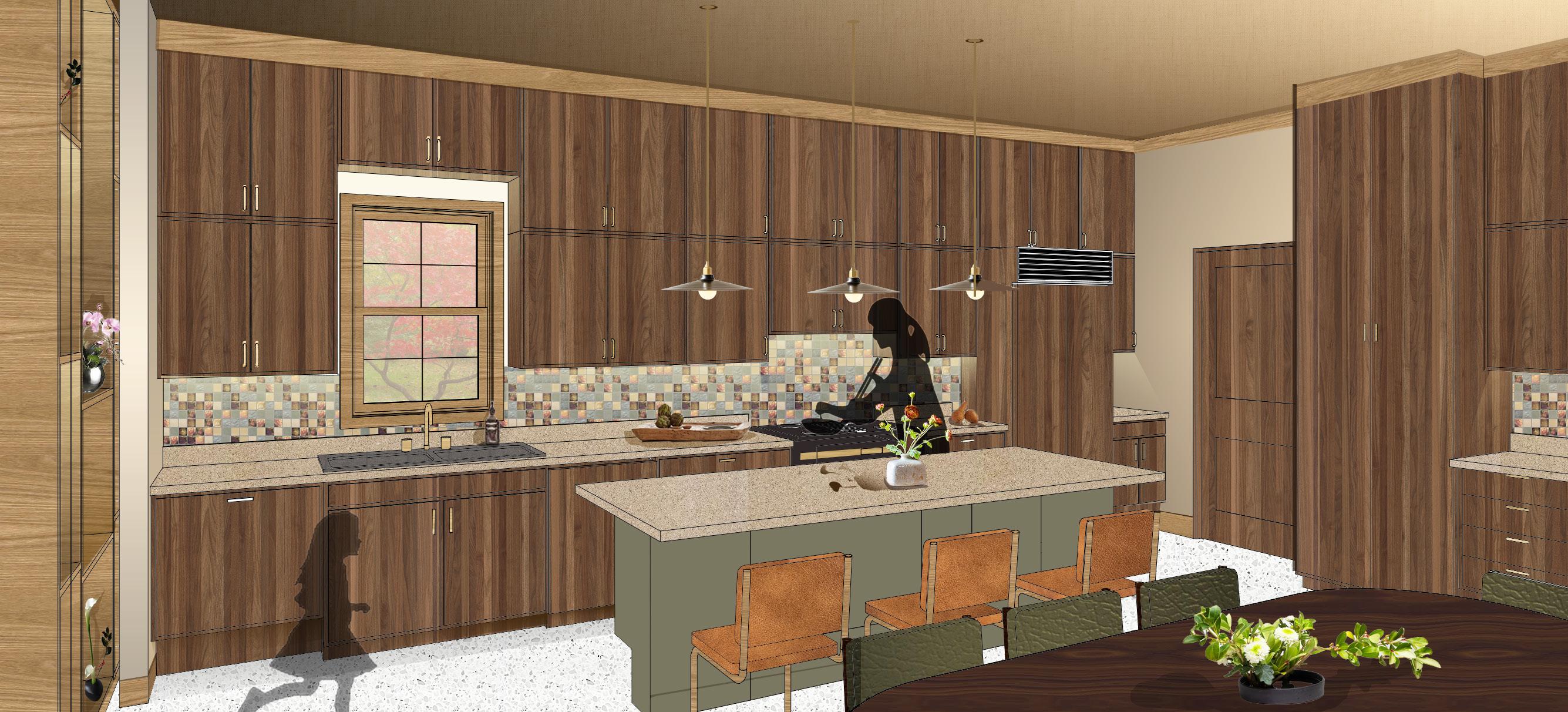
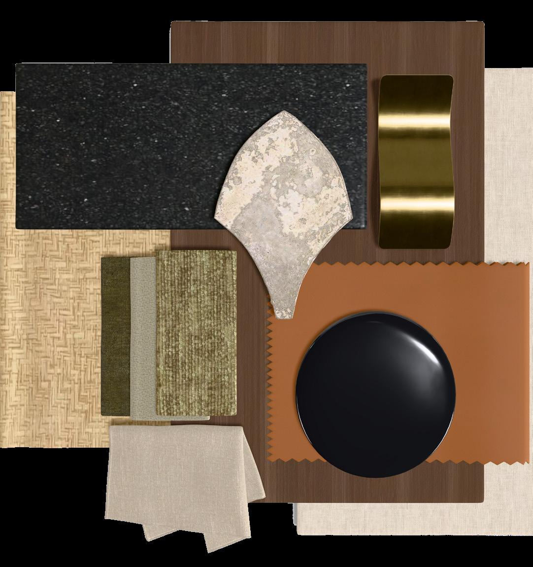
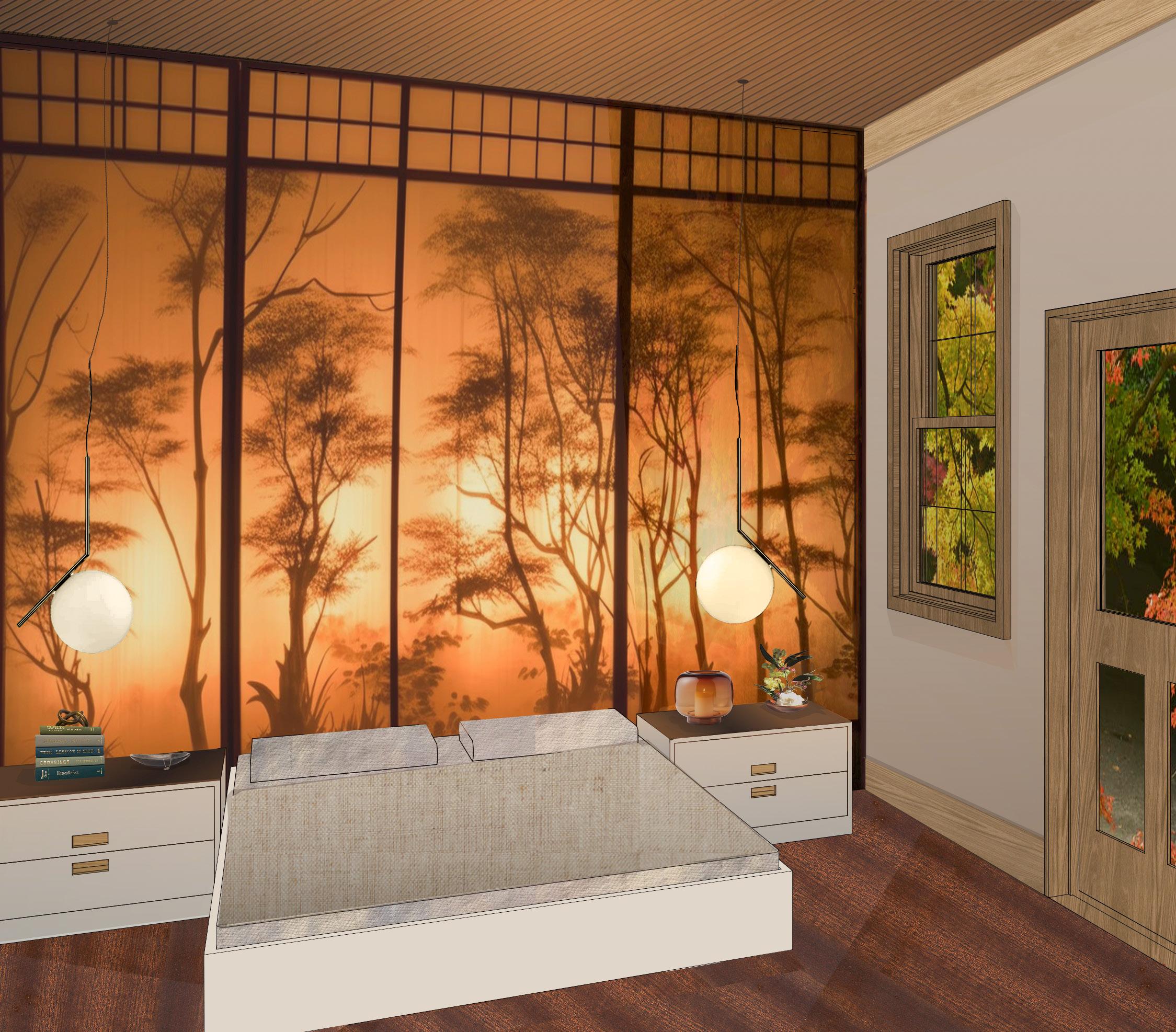
The Kimura’s Forever Home supports a fulfilling and intentional transition into retirement by blending traditional Japanese elements with mid century modern design. Designed to support quiet reflection, creative pursuits, and meaningful connections, the home offers fully accessible spaces that promote comfort, independence, and multi-generational ease of use. Thoughtful universal design enriches the couple’s daily rhythms, honors their values, and creates a calm and supportive environment that nurtures health, intention, and connections as they age in place.
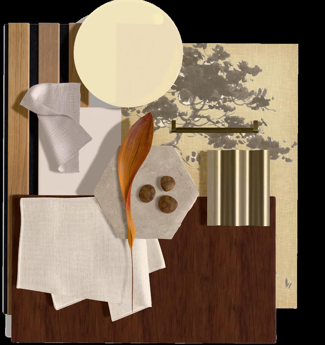
The design of the Kimura’s Forever Home is inspired by traditional Japanese tatami mats, symbols of meditation, gathering, and intentional living. Their woven structure becomes a guiding metaphor for the home, with each straw and seam representing the different aspects of the life the Kimuras are building, coming together to form a strong and purposeful foundation for a healthy and fulfilling old age. This idea shapes the use of natural textures, warm tones, and the interplay of line and scale, where stacked forms from Japanese architecture meet the diagonal and polished details of mid century modern design. The result is a home that celebrates artistic craft, culture, and intentional living while supporting a fulfilling and connected aging in place experience.
FLOOR 01
ACCESSIBLE / RAW MATERIALS / LINEAR ACCENTS
DESIGN THAT PROMOTES EASE OF USE AND WELL-BEING
Opportunities for hobbies:
Tai Chi
Nature
Ikebana
Tea ceremony
Watercolor Painting
Classical Music
Opportunities for Community
The home emphasizes natural materials and earth tones, where wood and stone textures create a tactile and grounding atmosphere. The layout stacks rooms in a rectilinear rhythm that echoes tatami patterns, while subtle diagonal details guide the eye upward and along the main pathways, adding gentle accents and spatial definition.
LAUNDRY
FRONT PORCH
KEY CONSIDERATIONS
LIGHT, VIEWS, AND MATERIAL COMFORT
• Rooms used for long periods are oriented toward natural light and calming exterior views to maximize light and regulate the sleep cycle.
ZONING AND SPATIAL STRATEGY
• The layout is organized to stack the foundations of the Kimuras’ daily life together, placing spaces for routines, activities, and opportunity for hobbies in a intuitive sequence.
• The layout reduces walking strain and promotes the desired habits.
• Private, guest, and support zones remain distinct yet comfortably connected, allowing privacy while still accommodating visiting family or a future caregiver.
The laundry doubles as a mudroom with generous counter space
• Its location near the kitchen eases the offloading of groceries,
• Warm wood, stone textures, and earth tone palettes establish a tactile and grounding atmosphere throughout.
LIFESTYLE, RITUALS, AND PERSONAL PASSIONS
• Dedicated areas for ikebana, tea ceremonies, and exercise are intentionally integrated into the plan.
CIRCULATION, ACCESSIBILITY, AND SAFETY
• 48” Main pathways and 36” wide doorways to support wheelchairs, walkers, and fall prevention.
• Contrasting floors and walls improve visibility, while layout includes grab bars and seating near transitions areas.
VARIETY OF AMBIENT, NATURAL, DECORATIVE, AND TASK LIGHTING
SLIDE DOOR LEADS TO LAUNDRY/ MUD ROOM DIRECTLY INTO THE KITCHEN AND NEXT TO PANTRY