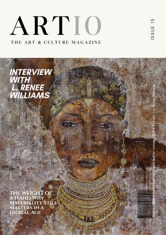
INTERVIEW WITH L. RENEE WILLIAMS
THE WEIGHT OF A HAND Why Materiality Still Matters in a Digital Age
ISSUE 15
THE ART & CULTURE MAGAZINE
Malkia / Mixed media and liquid gold leaf on canvas / 91.4 × 91.4 cm — L. Renee Williams
ARTIO
ARTIO MAGAZINE
INTRO
Director/Curator in Chief Bisa Bennett An accomplished and experienced artist herself, Bisa Bennett understands the importance of creating meaningful opportunities for artists to exhibit their work. As a curator and multimedia designer, she is also well-versed in creating engaging opportunities for viewers to experience art. “At our gallery, our vision is to serve as a dynamic and inclusive platform that fosters connections between artists and art enthusiasts, nurturing a vibrant and diverse artistic community,” she explains. Cover Photo Artist: L. Renee Williams
Instagram: artio.art.gallery Email: exhibit@artiogallery.com Copyright © Artio Gallery.Inc
01
CONTENTS JUN. 2026 Interview with L. Renee Williams
02
Why Materiality Still Matters in a Digital Age
10
Represented artists
12 After the white cube
40
02
EMPATHY AND THE LANGUAGE OF HUMAN EXPERIENCE – AN INTERVIEW WITH
L. RENEE WILLIAMS For US-based artist L. Renee Williams, art and creativity are pathways to understanding, bringing the artist closer to her emotions and the experience of others. She states, “I grow each time I create, learning more about my own innermost thoughts and emotions […] Watching someone see themselves through my artwork and witnessing their confidence awaken was the moment I knew that this is what I want to do for the rest of my life.” Working in a variety of media, from charcoal and acrylic to graphite and photography, Williams explores themes of healing, resilience, and spiritual connection.
A R T I O
M A G A Z I N E
03
Mbuyu | The Root, Acrylic and gesso on canvas, 76.2 × 76.2 cm
L. RENEE WILLIAMS A R T I O
M A G A Z I N E
INTERVIEW L. RENEE WILLIAMS
Malkia, Mixed media and liquid gold leaf on canvas, 91.4 × 91.4 cm
A R T I O
M A G A Z I N E
04
05
With a career in medicine, Williams has spent many years caring for people during moments of profound significance. “Those experiences have given me a deep appreciation for the unspoken parts of being human, and they continue to shape every piece I create,” the artist explains. The way in which Williams arrives at an artwork involves many sources of inspiration; from observations and life events to feelings and internal experiences that resist language. Some works involve considerable research, reflection and narrative development while others evolve organically from a loose concept. What unites each piece is its emotional resonance: “No matter where the inspiration comes from, it has to pass through my own emotional experience before it becomes a painting. I always find myself asking, ‘How does this make me feel?’”
A R T I O
M A G A Z I N E
INTERVIEW L. RENEE WILLIAMS
06
Mwito ya Takatifu, Mixed media on canvas, 76.2 × 101.6 cm A R T I O
M A G A Z I N E
07
Asili | First Ground, Mixed media on canvas, Diptych, 40.6 × 45.7 cm each panel
Williams builds exquisitely tactile atmospheric works that suggest textured terrain or the naturally aged surfaces of ancient artefacts. In works such as Nasaba ya Urithi and Mbuyu | The Root, the human figure is intertwined with the landscape. In Mbuyu | The Root, two small figures stand in awe at the face of a monumental tree.
L. RENEE WILLIAMS A R T I O
M A G A Z I N E
INTERVIEW L. RENEE WILLIAMS
In Nasaba ya Urithi, an elegant face in profile looks across at the African continent. In Malkia, a portrait is adorned with gold elements, enhancing the precious, regal nature of the image. Asili | First Ground captures the sacredness of the land in rich earthy tones such as burnt umber and deep brown. In each piece, the land is imbued with power and historical meaning, further deepened by the Swahili titles that accompany the works. The artist’s body of work is intricately layered with symbolic meaning. Williams explains, “You’ll often notice my compositions move from darkness on the left into light on the right because that progression is intentional. It represents the journey from uncertainty to clarity, whether spiritual, emotional, mental, or physical. It’s my subtle way of expressing hope and reminding us that transformation is possible.”
A R T I O
M A G A Z I N E
08
09
Nasaba ya Urithi, Mixed media on canvas, 76.2 × 101.6 cm A R T I O
M A G A Z I N E
10
THE WEIGHT OF A HAND WHY MATERIALITY STILL MATTERS IN A DIGITAL AGE
As images move faster than ever, artists are returning to surfaces that resist the screen. This is not a retreat into nostalgia, but a renewed insistence on time, touch and the physical intelligence of making. We encounter more art than any previous generation, yet much of it reaches us without weight, scale or texture. A painting appears as a bright rectangle between messages; a sculpture is reduced to a turn of the wrist; an installation becomes a sequence of images viewed in seconds. Digital circulation has expanded access to art and transformed the way artists build audiences, but it has also made one fact newly precious: an artwork is not only an image. It is an object with a temperature, a surface, a density and a history of touch. This may explain the renewed attention being given to materiality across contemporary practice. Linen is left raw at the edges. Clay retains the pressure of a thumb. Thread, plaster, ash, wax, timber and metal are allowed to behave according to their own temperaments. Rather than disguising the process by which a work was made, artists are increasingly permitting that process to remain visible. A seam becomes a line of thought; a crack records tension; a stain marks duration. The material is no longer the silent carrier of an idea. It is part of the idea itself. The distinction matters because materials communicate before they are interpreted. Polished stone establishes one kind of distance; frayed cloth creates another. Glass can suggest fragility and control at once, while earth brings with it associations of origin, labour and return. These meanings are not fixed, nor are they merely symbolic. They arise from what the viewer knows physically: that metal resists, paper tears, wax softens and wood carries the evidence of growth. Material knowledge is stored in the body long before it becomes language.
A R T I O
M A G A Z I N E
11
This visibility of process is sometimes mistaken for a celebration of imperfection. Yet the most compelling materially driven art is rarely casual. Its roughness is precise; its restraint is highly considered. A scraped field of colour may contain dozens of decisions about pressure, timing and removal. A modest ceramic form may depend upon an exact knowledge of balance and firing. What appears spontaneous is often the result of deep familiarity. The hand is present not as a sentimental signature, but as evidence of attention. Craft traditions have become central to this conversation. Practices once separated from the category of fine art—embroidery, basketry, quilting, ceramics and decorative techniques—now occupy an increasingly visible place within contemporary exhibitions. Their presence does more than correct an old hierarchy. It introduces different ideas of authorship, knowledge and value. Skill may be inherited, communal or learned through the rhythms of domestic life. An object can be conceptually rigorous while remaining useful, ornamental or intimately connected to the body. In this context, the return to the handmade is not an escape from technology. Many artists move fluently between digital and physical processes, translating scans into textiles, algorithms into drawings or virtual forms into cast objects. The point is not to restore a vanished purity. It is to make the passage between image and object visible. Technology can generate speed, variation and complexity; the material world introduces friction, limits and consequence. The tension between them is often where the work becomes most alive. Material choices also carry ethical weight. Every surface has a source, and every source belongs to a network of extraction, labour and transport. To work with marble, timber, textiles or industrial compounds is to enter a history that extends beyond the studio. Some artists respond by salvaging discarded matter; others foreground local resources, repair, reuse or slow production. Such gestures do not automatically make a work ethical, but they can turn material from a neutral resource into a subject of inquiry. The question is no longer simply, “What can this become?” It is also, “Where has this been, and what did its transformation require?” For the viewer, these works ask for a different kind of attention. A screen encourages us to recognise quickly; a physical surface rewards the time spent not yet knowing. From a distance, we see composition. Up close, we discover joins, fibres, sediment and corrections. Moving around an object reveals that perception is never singular. The artwork changes with light and position, and the viewer becomes conscious of occupying the same space. This is the quiet force of material art today. It does not deny the speed of contemporary life, but it offers a counter-rhythm within it. It reminds us that meaning can accumulate slowly; that surfaces can hold memory; that intelligence is not confined to language or image. In the trace of a brush, the pull of a thread or the uneven edge of a cast form, we encounter time made visible. The hand leaves the work, but its attention remains.
A R T I O
M A G A Z I N E
12
A R T I S T
Rain Man. Atypical / Mixed media on canvas / 65 × 80 cm
ALISA CHERNOVA
Alisa Chernova is a contemporary artist whose practice explores the psychological structures shaping identity, memory, and perception. Drawing on her background in psychology, she combines painting, texture, and mixed media to make inner states materially present. In Who Am I? Monologue with Myself, the face is broken into fields of ochre, blue-grey, cream, and brown. One eye remains sharply defined while the raised hand partially conceals the figure, transforming portraiture into a scene of inward inquiry. The work resists a fixed likeness, suggesting identity as something continually reconstructed through memory and self-perception. Rather than answering the title’s question, Chernova leaves it suspended, allowing the image to function as both portrait and mirror.
A R T I O
M A G A Z I N E
13
A R T I S T
Who Am I? Monologue with Myself / Mixed media on canvas / 65 × 80 cm
A R T I O
M A G A Z I N E
14
A R T I S T
BESNIK AJAZI
Where Sophia Waits / Linen Oil Painting on Canvas / 101.6 × 76.2 cm
Besnik Ajazi is a contemporary painter based in the United States whose practice moves between representation and abstraction. He began his artistic journey in Albania, where he studied painting and graphics, before relocating to the United States in 2013. This movement between European and American contexts has shaped a visual language built through rhythmic brushwork, layered colour, and subjects that shift between physical reality and psychological experience. Ajazi has participated in 17 international solo and group exhibitions and has received awards and recognition for his work. A R T I O
M A G A Z I N E
15
A R T I S T
Modern Spring / Linen Oil Painting on Canvas / 76.2 × 61 cm
Sophia represents the Original Divine Wisdom and Creative Light that existed before the material world, serving as the archetype of supreme consciousness mediating between divine light and the physical realm. Conceived as an open semiotic work rendered in Gnostic NeoImpressionism, 'Where Sophia Waits' frames this allegorical portrait as the embodiment of eternal wisdom amidst a sea of chromatic chaos. Her crown of golden spirals and penetrating gaze function as signifiers within a cosmic labyrinth, inviting the viewer into an active hermeneutic dialogue to decipher its hidden truths. Ultimately, the painting operates as a generative engine of meaning, perpetually weaving the anticipation of Divine Light into the shattered plane of material existence. Modern Spring turns the natural world into a dense field of colour and movement. Flowers and leaves overlap until the still life begins to approach abstraction. Greens, yellows, blues, and reds create a sense of growth that feels active and unruly rather than decorative. Together, the two paintings show how Ajazi begins with recognizable imagery, then uses colour and gesture to move the work toward emotion, movement, and inner experience. His wider practice similarly treats landscape and the human figure as connected parts of a larger emotional and imaginative world. A R T I O
M A G A Z I N E
16
A R T I S T
CARLOS ABRAHAM
Carlos Abraham is a Lebanese-Mexican artist trained in architecture and photography. His practice centres on the human body, using light, pose, and surrounding space to explore beauty, vulnerability, and self-possession. His work has appeared in international publications and has been exhibited across Mexico as well as in Barcelona, Madrid, Rome, Paris, Miami, and Buenos Aires. Abraham has also studied at the Houston Center for Photography and the International Center of Photography, and his photographs are held in the permanent collection of the Mediateca INAH in Mexico. Agustin, Photography, 50x60 cm
A R T I O
M A G A Z I N E
In Agustin, the subject sits alone in a bathtub, framed by glass, stone, water, and soft natural light. Although the body is visible, the image feels private rather than performative. His lowered gaze and folded posture create a moment of inward attention, while the controlled architecture around him contrasts with the vulnerability of the figure.
17
En la patineta, Photography, 50x60 cm.
A R T I S T
En la patineta moves from domestic stillness to an exposed urban setting. A figure walks with a skateboard beneath coils of wire, separated from his surroundings further by the headphones he wears. The contrast between the unprotected body and the defensive architecture creates a tension between freedom and restriction. Abraham’s black-and-white treatment reduces the scene to line, movement, and balance. Together, the photographs present the body not as a fixed ideal, but as a human presence negotiating privacy, risk, and autonomy within contemporary space.
A R T I O
M A G A Z I N E
18
A R T I S T
HERVÉ TEBOUL
Hervé Teboul is a French artist based in Montreal since 2001. He began developing his practice in Nice at the age of eighteen, drawing early inspiration from the gardens, villages, countryside, and bodies of water of southern France. From 1998, he worked in a post-impressionist style shaped by Mediterranean light and colour. After moving through several artistic periods, Teboul developed a contemporary practice combining acrylic paint with metallic leaf. His recent work has been presented at the Carrousel du Louvre in Paris, One Art Space in New York City and MEAM in Barcelona, experiences that now inform a new series being created in his Montreal studio.
Rose Gala / Acrylic, copper leaf and epoxy / 92x122 cm
A R T I O
M A G A Z I N E
In Rose Gala, the outline of an evening dress appears against a softly layered blush ground. Copper leaf defines the bodice and full skirt through broken, lace-like marks, allowing the pale surface beneath to remain visible. Although no figure is present, the garment carries a strong sense of human presence. Teboul uses the dress as a symbol of ceremony and transformation, while the reflective copper changes with the surrounding light.
19
Rocky, victoire en silence / Acrylic, silver leaf and epoxy / 100x122cm
A R T I S T
Rocky, victoire en silence presents a silver figure with both arms raised against a field of blue, grey, and muted pink. The pose suggests triumph, yet the quiet palette removes any sense of spectacle. The figure appears suspended between visibility and disappearance, turning victory into a private moment of endurance and release. Together, the works show how Teboul uses metallic leaf as more than decoration. Light becomes an active part of each image, shifting the figures between solidity and absence while giving familiar forms a deeper emotional weight.
A R T I O
M A G A Z I N E
20
A R T I S T
"The Musical", mixed media, 91.4 × 91.4 cm
IRENE AGAPION
Irene AGAPION is a Greek-American pop and modern artist based in High Point, North Carolina. Raised in a family where painting and drawing were encouraged by both of her artist grandmothers, she developed an early connection to colour and visual expression. Inspired by popular music, live performance, and film, AGAPION began working full time as an artist approximately six years ago. She now owns an art showroom and is an active participant in the International Home Furnishings Market. Her work is guided by a clear aim: to communicate joy, exuberance, and play through subjects she genuinely loves. In The Musical, a chorus line of performers moves across the canvas in coordinated pink costumes. Repeated figures and raised arms create a strong visual rhythm, while curling lines and textured passages extend the movement beyond the dancers’ bodies. Rather than focusing on one central performer, AGAPION makes collective energy the subject. The painting captures the shared momentum of live performance and the pleasure of moving as part of a group.
A R T I O
M A G A Z I N E
21
A R T I S T
"Smooth Michael", acrylic, 91.4 × 91.4 cm
Smooth Michael shifts from the ensemble to the individual performer. A singer in a pale suit and hat stands at the centre of a blue and violet stage-like setting, surrounded by musical instruments. The face is largely hidden, allowing costume, posture, and gesture to carry the figure’s identity. AGAPION uses these familiar signs of popular entertainment to explore how a performer can become recognizable through movement and style alone. Together, the works show how music functions as both subject and structure within AGAPION’s practice. Repetition, colour, costume, and rhythm shape each composition, turning the atmosphere of performance into a direct visual experience.
A R T I O
M A G A Z I N E
22
A R T I S T
Menhir / mixed technique / 100 x 100cm
MARTA GREGORI PUIGJANÉ
Marta Gregori Puigjané, known as M_art_a, is a Catalan artist whose painting and sculpture explore emotion, inner strength, and the symbolic structures that shape human experience. Through gesture, texture, and colour, she works between chaos and order, using personal imagery to connect individual feeling with shared psychological experience. Her background as a special education teacher brings empathy and close observation to her practice, while her artistic development has been influenced by the sculptors El Maño and Gabriel Sanz. She has exhibited across Europe, including presentations in Paris, Miami, New York City, Ghent, Cologne, Tuscany, and Barcelona. In Menhir, a tall ochre form rises from a dark, irregular field. Its simple vertical shape recalls a standing stone, a doorway, or a solitary human presence. Around it, torn surfaces, black pigment, and restless lines create a sense of instability. The central form remains still, acting as a point of orientation within the surrounding movement. Gregori Puigjané uses this contrast to consider how inner structure can be maintained during periods of uncertainty and change. A R T I O
M A G A Z I N E
23
Lucis nox / Insight light, mixed technique / 100 x 100cm
A R T I S T
Lucis nox / Insight light moves into a denser psychological space. Layers of black, grey, red, and textured material partially conceal forms that appear to emerge from the surface. Small areas of white and gold interrupt the darkness, drawing attention to what is present but not fully visible. Light is not presented as separate from darkness; it develops from within it. Together, the works offer two connected views of the psyche. Menhir gives it a stable axis, while Lucis nox / Insight light reveals its layered and unsettled interior. In both, material, contrast, and absence become ways of expressing experiences that cannot always be put into words.
A R T I O
M A G A Z I N E
24
A R T I S T
ERNEST LANGSTON
Ernest Langston is a Latinx writer and visual artist whose work draws from his experience of the physical and metaphysical world. Working from a position of empathy, he uses art to examine emotion, uncertainty, and the ways people search for meaning. In Familiar Strangers, dark blue forms rise against a lighter blue ground. They resemble figures, doorways, or distant structures, but never settle into one clear identity. Their repetition suggests a group, while the spaces between them create a sense of separation. Langston uses this ambiguity to explore how another person can feel both known and unfamiliar. The painting becomes a reflection on recognition, connection, and the limits of what we can understand about one another.
A R T I O
M A G A Z I N E
25
A R T I S T
Familiar Strangers, 2025 / Acrylic on canvas / 61 × 50.8 cm
A R T I O
M A G A Z I N E
26
A R T I S T
GIORGIA ZANUSO
Giorgia Zanuso is an Italian artist and architect who combines detailed figurative drawing with geometry and light. Her architectural background is visible in the precision and balance of her compositions. In Relational field, two hands meet around a transparent plexiglass panel engraved with curved lines. The hands remain visible, but the geometric layer changes how we see them. They do not touch directly; instead, they are connected by the structure between them. Zanuso presents relationships as something formed through closeness, distance, tension, and care. By placing the human body behind a measured geometric pattern, she shows that connection is shaped not only by the people involved, but also by boundaries, perception, and the space between them.
A R T I O
M A G A Z I N E
27
A R T I S T
Relational field / Pastel on paper with an engraved geometric composition on transparent plexiglass / 69 × 69 cm
A R T I O
M A G A Z I N E
28
A R T I S T
Moko Jumbie / Multicolored & gold acrylic paints on canvas / 76.2 × 101.6 cm
INDRA PERSAD MILOWE
Indra Persad Milowe is a painter whose narrative work draws on the culture, folklore, and everyday life of Trinidad and Tobago. Returning to art after a career in nursing, she creates carefully planned compositions shaped by personal memory and cultural tradition. In Moko Jumbie, a traditional Carnival guardian is built from repeated triangles, radiating lines, and a focused black-and-gold palette. The figure fills the canvas like both a body and a structure, giving it a strong protective presence. Rooted in West African tradition, the Moko Jumbie is believed to see danger from above and ward off harm. Milowe presents the figure not as spectacle alone, but as a symbol of protection, cultural memory, and continuity.
A R T I O
M A G A Z I N E
29
A R T I S T
Homo Plumbi – Fragmentation I / Acrylic on canvas / 114 × 87 cm
MARGARET B WALLACE ARAUJO
Margaret B. Wallace Araújo is a Spanish-Uruguayan artist based in Barcelona whose practice connects painting with her study of consciousness, philosophy, alchemy, and complex systems. Her Homo Plumbi series follows the symbolic journey from lead to gold, treating fragmentation as a necessary stage before reconstruction and unity. In Homo Plumbi — Fragmentation I, a human profile is divided into geometric blocks, while liquid forms descend from above and smaller shapes appear to separate from the figure. The image presents the mind as a structure undergoing change. Rather than showing fragmentation as collapse, Wallace Araújo frames it as a period of transition in which an established identity breaks apart so that a more integrated form can emerge.
A R T I O
M A G A Z I N E
30
A R T I S T
ROSITA LARSSON
Rosita Larsson is a Swedish artist whose work grows from a lifelong need to create. Using monotype, drawing, and painting, she combines layered patterns, bold colour, and expressive line to turn inner experience into visual form. In Chromatic Veins, large blue and violet forms run through a dense network of floral and cellular shapes. Dark outlines separate the different sections, while flowing colour connects them across the surface. The composition suggests a living system in which each part remains distinct but dependent on the others. Larsson presents resilience not as a return to order, but as the ability to continue growing through change, tension, and uncertainty.
A R T I O
M A G A Z I N E
Chromatic Veins / Monotype and drawing / 90 × 60cm
A R T I S T
A R T I O
M A G A Z I N E
31
32
A R T I S T
TINA CRISTINA BEICA VYAS
Tina Cristina Beica Vyas is a Romanian visual artist and multidisciplinary creator whose work explores memory, identity, femininity, healing, and personal transformation. Drawing from her Eastern European heritage, Ayurvedic philosophy, and spiritual travels in India, she uses symbolism and colour to examine the space between suffering and renewal. In Wounded Queen, a female figure appears against a dense red ground, surrounded by broken marks, circles, and crown-like forms. Her profile is composed but guarded, while the fragmented surface suggests an inner life shaped by pain and change. The title brings strength and vulnerability together: the figure remains queenly not because she is untouched, but because she continues to hold her identity through difficulty. Beica Vyas presents healing as an act of selfrecognition rather than a return to perfection.
A R T I O
M A G A Z I N E
Wounded Queen / Medium not provided in the submission / Dimensions not provided in the submission
A R T I S T
A R T I O
M A G A Z I N E
33
34
A R T I S T
ULRICA ULFHIELM
Ulrica Ulfhielm is a Swedish artist whose intuitive practice is shaped by nature, travel, the sea, and the emotional rhythms of everyday life. She uses layered colour, texture, and movement to explore mindfulness, healing, and inner reflection. Over the past two years, her work has appeared in six exhibitions, including presentations in Paris and London. In Love, a woman’s face emerges through soft washes of cream, pink, brown, and blue, while flowers gather around her head and merge with the surrounding surface. The portrait remains partly defined and partly obscured, giving the figure a sense of both presence and vulnerability. Ulfhielm uses this balance between clarity and dissolution to present love as an emotional state that is layered, changing, and closely tied to memory, openness, and renewal.
A R T I O
M A G A Z I N E
Love / Acrylic on canvas / 100 × 80 cm
A R T I S T
A R T I O
M A G A Z I N E
35
36
A R T I S T
VALENTINA AGOSTINI
Valentina Agostini is an Italian artist whose paintings explore individual emotional states through acrylic colour and fluid, circular lines guided by music. Her studies in human communication and helping relationships inform a practice focused on making emotion visible and easier to understand. In Silence, a blue figure passes through a pale arch, eyes closed and face lifted. Green forms gather behind and around the body, suggesting thoughts and feelings that remain active beneath an outward state of calm. The arch creates a boundary between inner and outer experience, yet the figure crosses it. Agostini presents silence not as absence, but as a focused emotional space in which distraction recedes and the self becomes more clearly felt.
A R T I O
M A G A Z I N E
Silence / Acrylic on Canvas / 100 × 120 cm
A R T I S T
A R T I O
M A G A Z I N E
37
38
A R T I S T
YINGSHUET LAM
Yingshuet Lam is a New York-based mixed-media artist who draws from physics and Eastern philosophy to examine how matter, perception, and time interact. In her practice, “blur” is not simply a loss of focus. It describes how the mind filters overwhelming information and how materials move between states. In Blur, a vertically striped sheet of inked rice paper hangs over horizontal bands of paint and layered fragments. The grid suggests order, while folds, tears, and exposed edges interrupt that structure. The work moves between painting and installation, image and object. Lam uses these shifts to show perception as an active process: what we understand depends not only on what is visible, but also on what is covered, reduced, or left unresolved.
A R T I O
M A G A Z I N E
A R T I S T
39
Blur / Oil and acrylic on canvas, rice paper, ink, bamboo and metal parts / 147.3 × 147.3 × 5.1 cm
A R T I O
M A G A Z I N E
40
AFTER THE WHITE CUBE THE EXHIBITION AS ATMOSPHERE, ENCOUNTER AND LIVING SPACE The most memorable exhibitions do more than place objects in a room. Through light, sound, rhythm and movement, they create conditions in which art and viewer can meet anew. The white cube once promised an ideal form of neutrality: clean walls, even light and a protected distance between art and the distractions of ordinary life. Its apparent emptiness was meant to allow each work to speak for itself. Yet exhibition spaces are never truly silent. Architecture directs movement. Scale produces intimacy or awe. Light selects what becomes visible, and even the placement of a bench proposes how long a viewer might stay. The gallery does not simply contain an exhibition. It interprets it. Today, some of the most resonant exhibitions begin from this recognition. They treat space as an active medium rather than a neutral backdrop. The visitor is not led through a row of isolated objects, but through a sequence of encounters: compression followed by openness, brightness giving way to shadow, a concentrated cluster interrupted by an expanse of quiet. Curation becomes a form of composition, working with pace and pause as deliberately as a musician works with sound. This approach does not require spectacle. A dramatic installation can transform a building, but so can a subtle adjustment in distance. Two paintings hung close together may begin to behave like a conversation; the same works separated by a wide wall may feel selfcontained. A sculpture placed near a threshold is encountered first through movement, while one positioned at the centre of a room becomes almost architectural. Curatorial intelligence often reveals itself through such precise, nearly invisible decisions. The changing use of sound has further unsettled the ideal of the silent gallery. Voices travel between rooms. A low mechanical hum changes the texture of stillness. Music can draw visitors towards a work before it comes into view. Sound refuses the stable border that a frame provides; it spills, overlaps and makes neighbouring works newly dependent on one another. This can create conflict, but it can also reveal that an exhibition is a shared ecology rather than a collection of sealed experiences.
A R T I O
M A G A Z I N E
41
Duration has become equally important. Moving-image works, performances and responsive installations challenge the expectation that art can be understood at a glance. They ask the viewer to arrive in the middle, to miss something or to wait for a change that may be slight. The exhibition becomes different at noon than it was in the morning; a room changes as bodies enter and leave it. Time is no longer merely the period allocated to a visit. It becomes part of the material of the show. Alternative venues have expanded this spatial vocabulary. Art shown in a domestic interior, an industrial building, a garden or a former place of worship inherits the atmosphere and memory of its setting. These locations can offer a richness that the conventional gallery deliberately suppresses. They also demand care. A historic building can overwhelm a quiet work, while an immersive environment can reduce architecture to scenery. The strongest exhibitions resist this competition. They allow site and artwork to alter one another. The result is often a more bodily way of seeing. Viewers bend, circle, listen, step back or look through one work towards another. Sight is joined by balance, hearing and an awareness of proximity. This does not diminish critical thought; it gives thought a physical dimension. We understand differently when our route is uncertain, when a surface catches light only from one angle or when another person’s presence becomes part of what we perceive. There is, however, a danger in confusing immersion with depth. An exhibition designed primarily to be photographed may produce an immediate impression while offering little that changes on closer attention. Monumental scale, saturated colour and digital effects can be powerful, but they are not meanings in themselves. The question is whether the environment sharpens the work or merely surrounds it. Atmosphere should not replace interpretation; at its best, it makes interpretation more layered. This is also an argument for generosity. A well-considered exhibition offers more than one way to enter. It provides places to pause, clear transitions and enough space for different bodies to move comfortably. Context can be available without dictating a single response. Accessibility is not separate from aesthetics: seating, sound levels, legibility and circulation all shape the quality of attention an exhibition makes possible. To consider the viewer is not to simplify the art. It is to take the encounter seriously. Perhaps this is what comes after the white cube: not the rejection of white walls, but the end of believing they are neutral. An exhibition is a proposition about how to look, how to move and how to share space with objects and with one another. Its architecture may be grand or nearly invisible; its technology may be advanced or absent. What matters is the sensitivity with which relationships are formed. Long after individual details fade, we often remember an exhibition as a climate—a particular quality of light, a rhythm of rooms, the feeling of having been briefly taught to notice differently.
A R T I O
M A G A Z I N E
42
A R T I O
M A G A Z I N E
ARTIO THE ART & CULTURE MAGAZINE
www.artiogallery.com/magazine exhibit@artiogallery.com