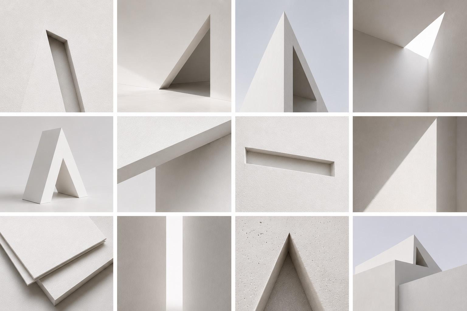
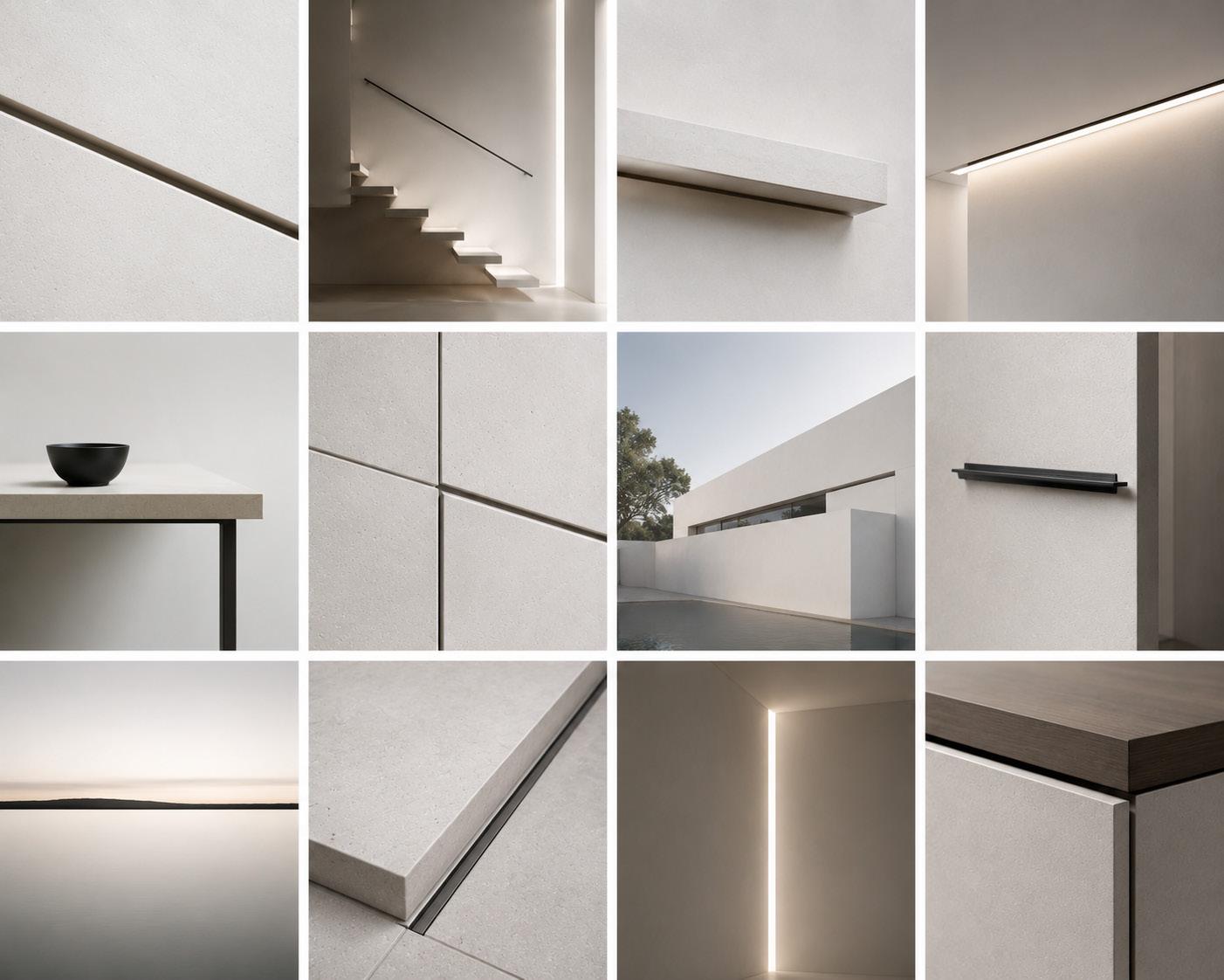
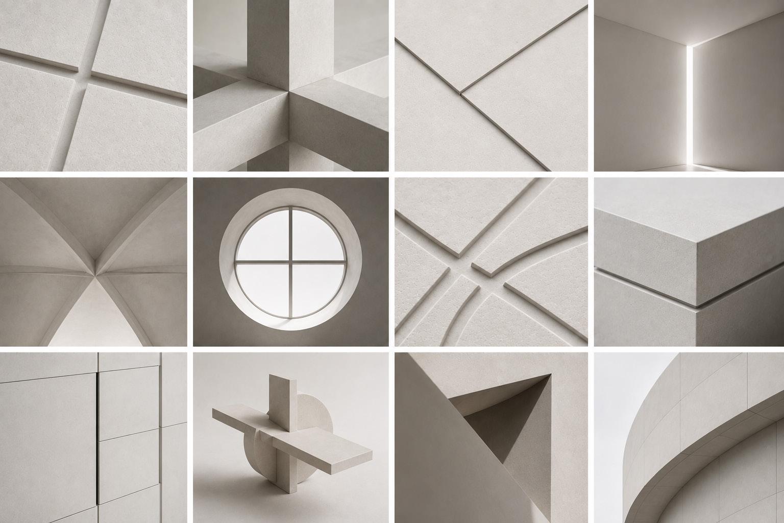
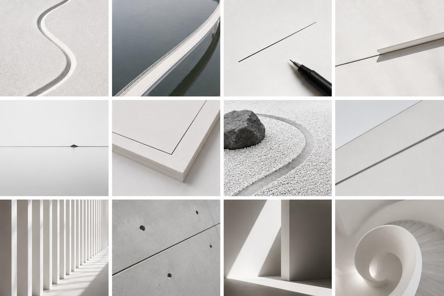
Traditional and vernacular Arab and Gulf architecture carries a sophisticated body of spatial and environmental intelligence, and ASD's work translates that intelligence into contemporary buildings. Heritage-informed, not heritage-referencing.
Option 01
A Different Perspective
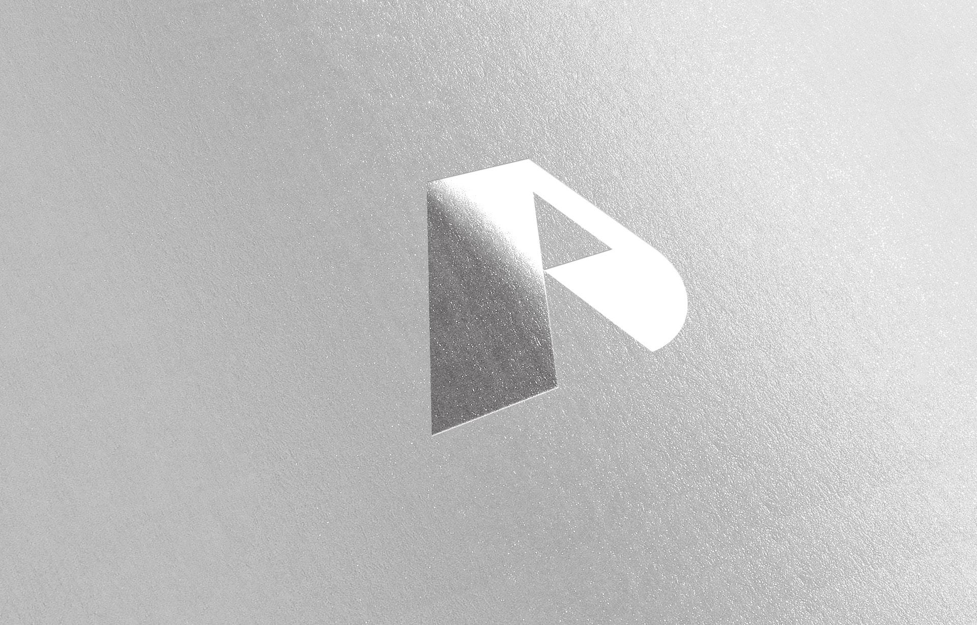
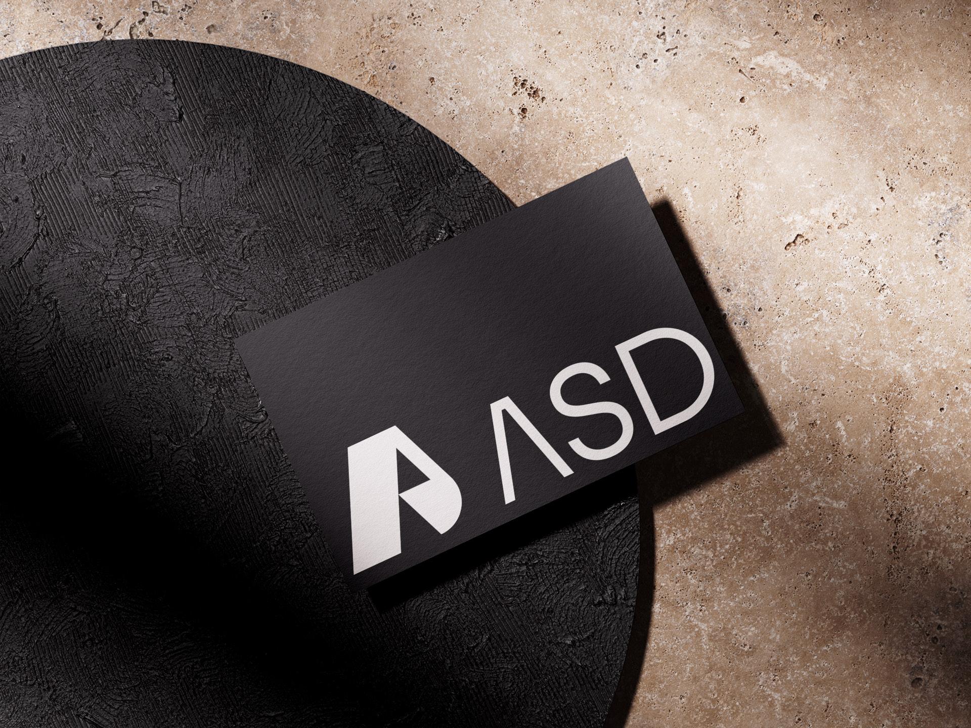
Every studio has its own way of thinking, so we wanted ASD to have a mark that feels equally distinctive. Rather than treating the A as just a letter, we reshaped it into a simple symbol with its own personality. The opening through the middle adds just enough character to make it memorable, giving ASD a signature mark that becomes confident.
Option 02
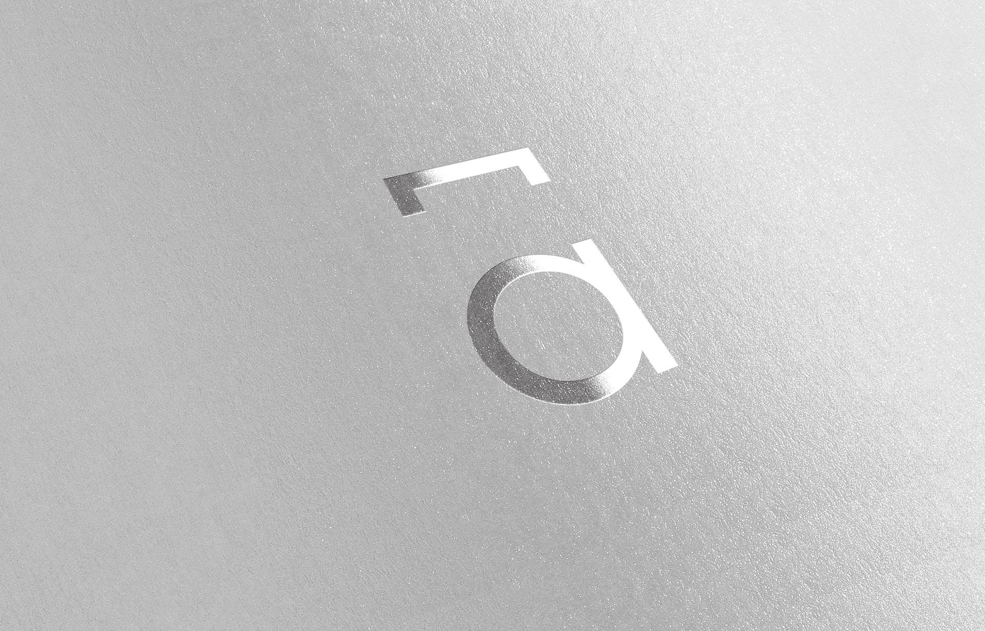
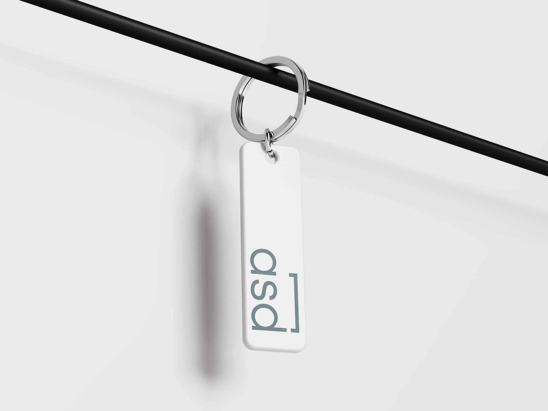
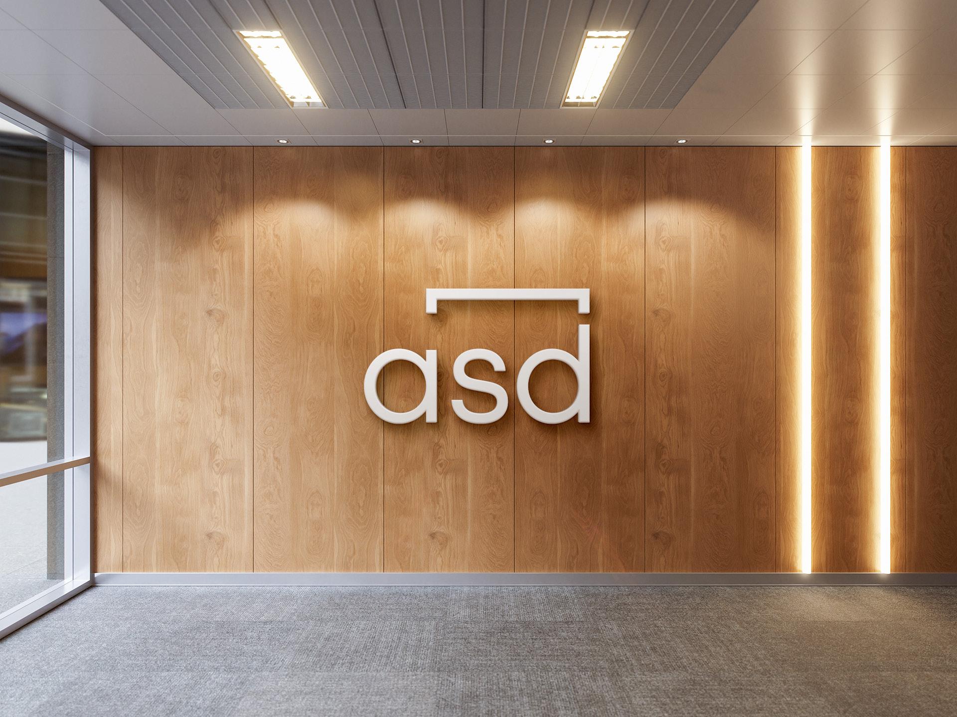
The Power of One Line
This direction started with a simple question: How can we make a wordmark feel unique without changing too much? We introduced a single line above the name, creating a hidden detail that becomes part of the logo's identity. It's a small move, but it gives the wordmark a feature that's easy to recognize and hard to forget and well connected to Architects & Interiors.
Option 03
The Structured Direction
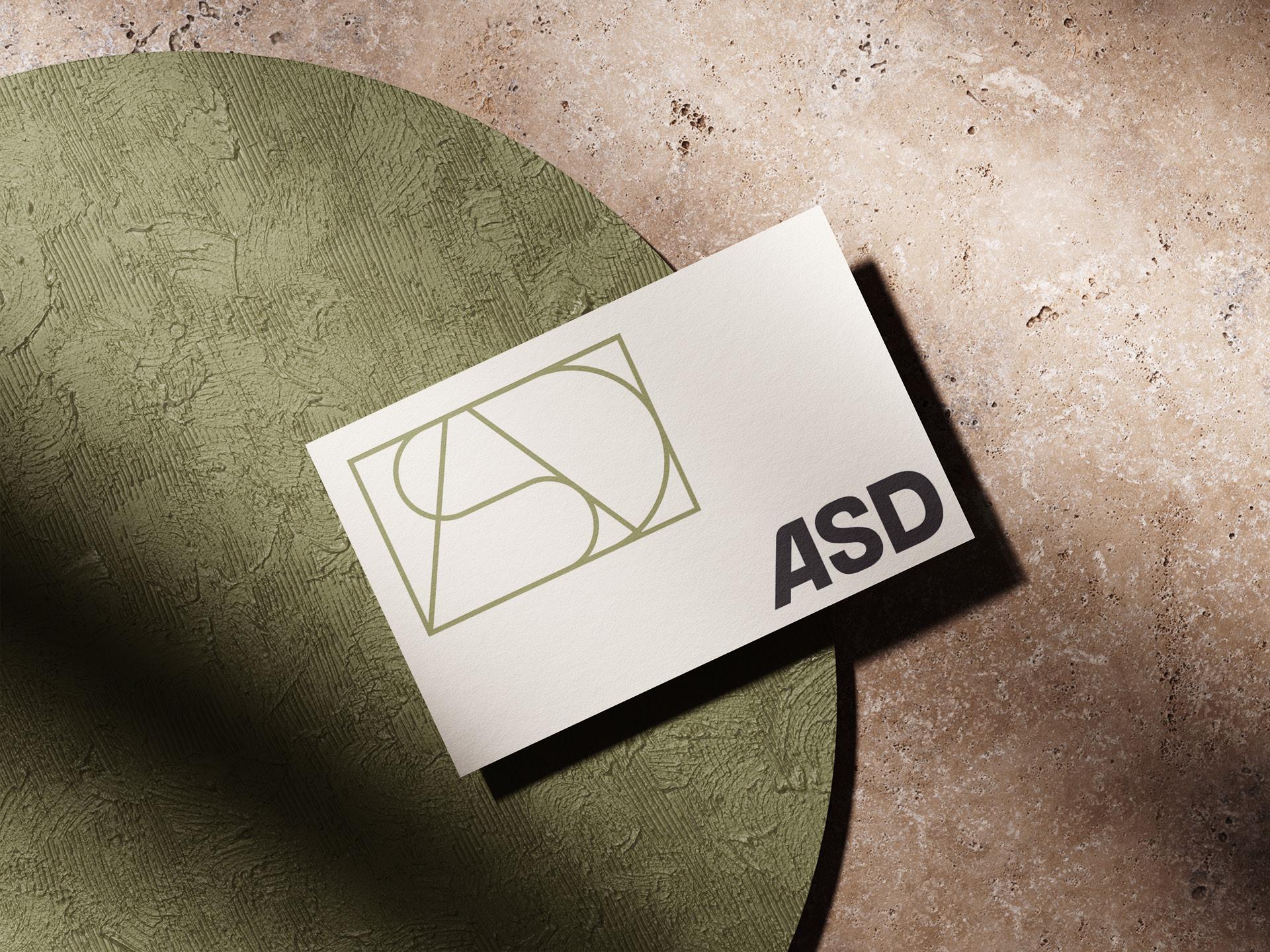
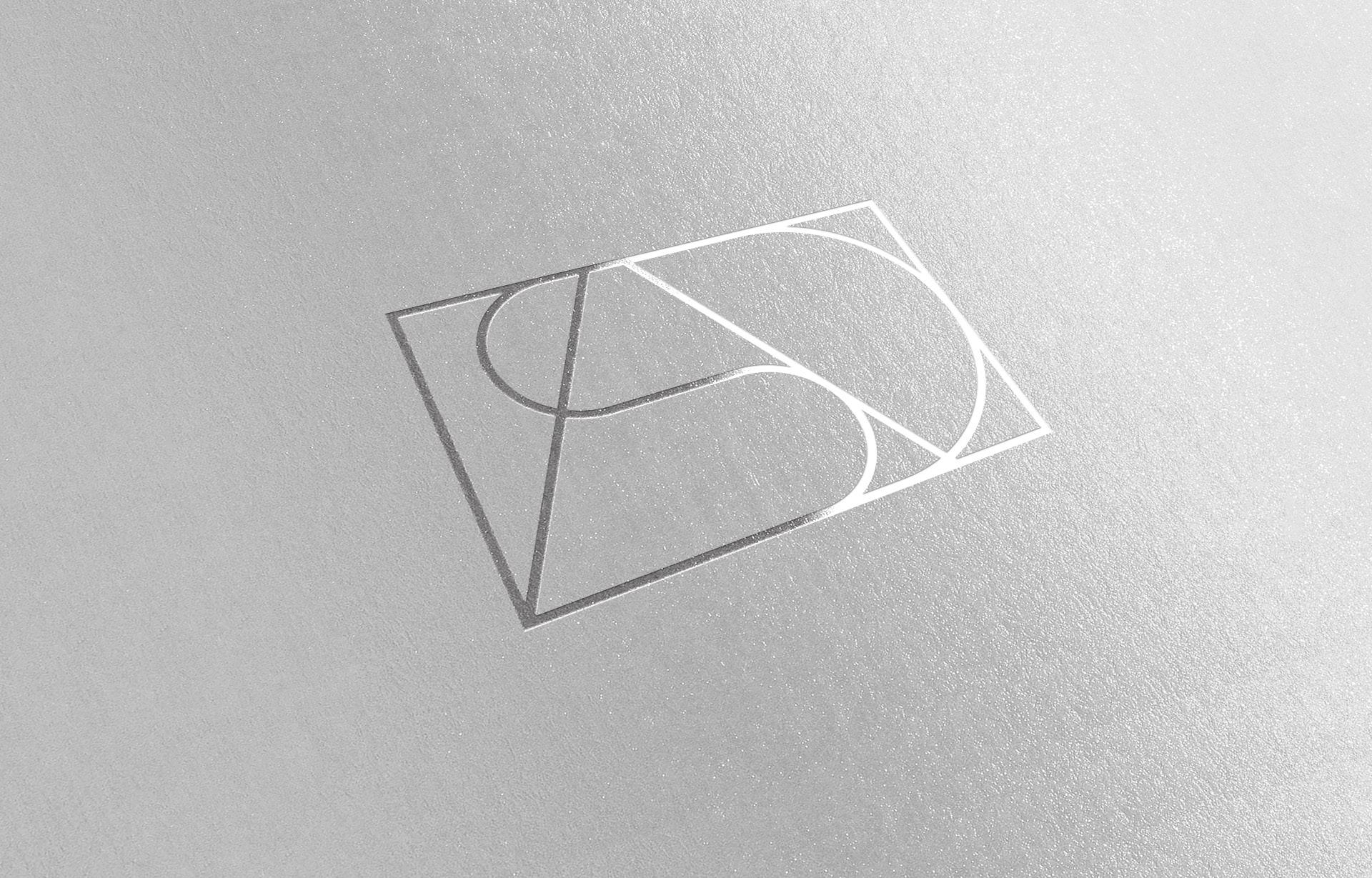
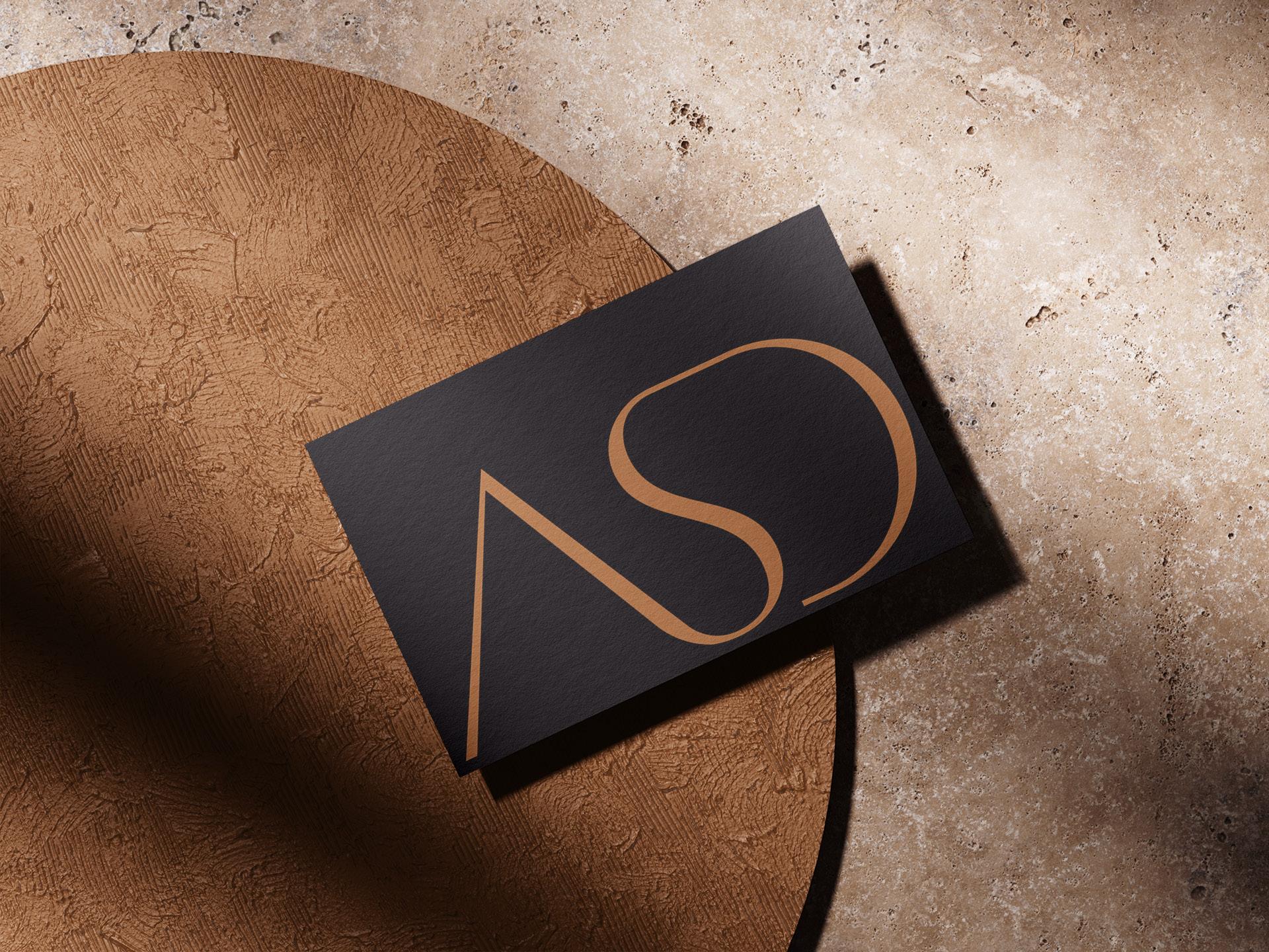
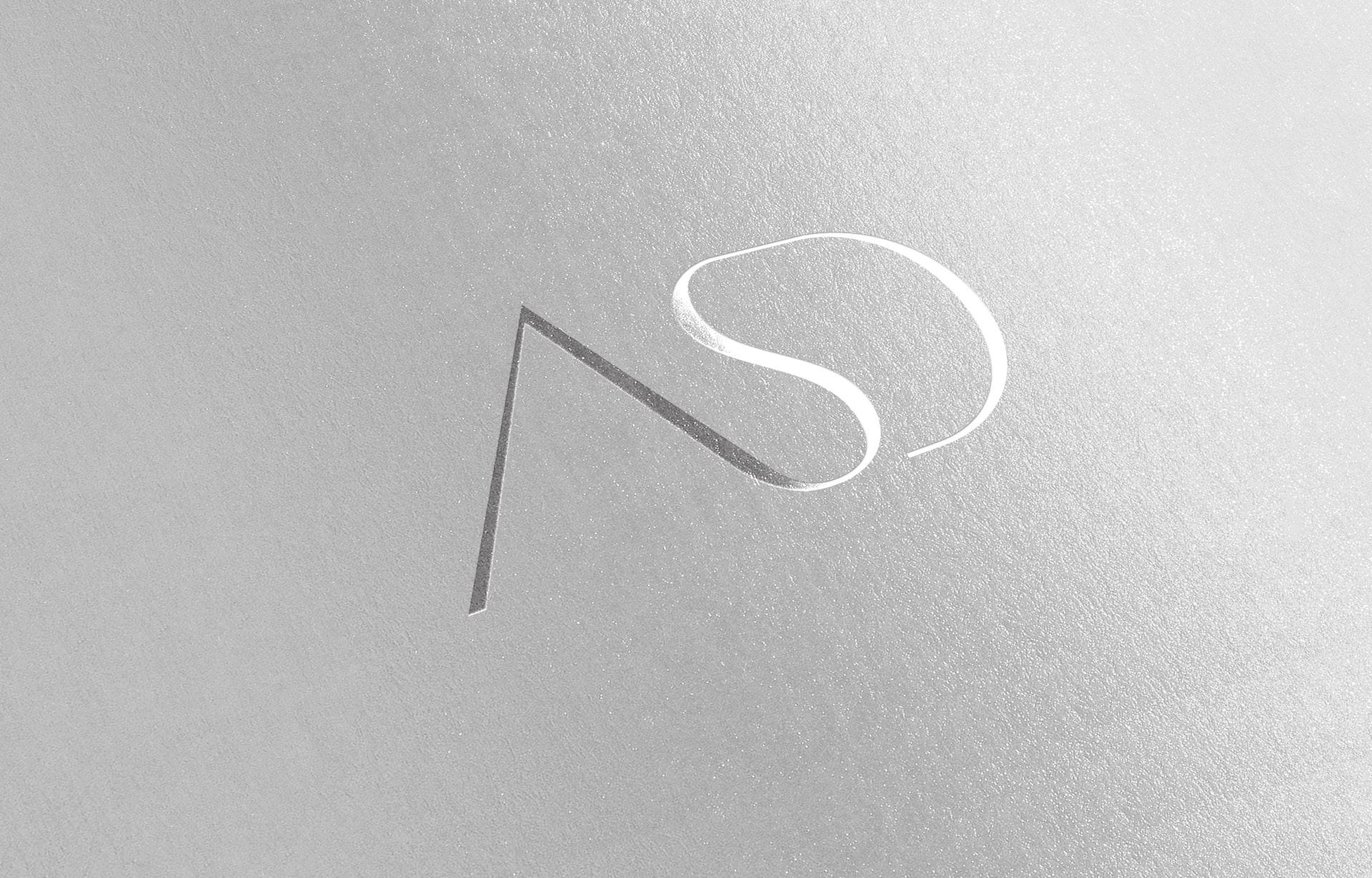
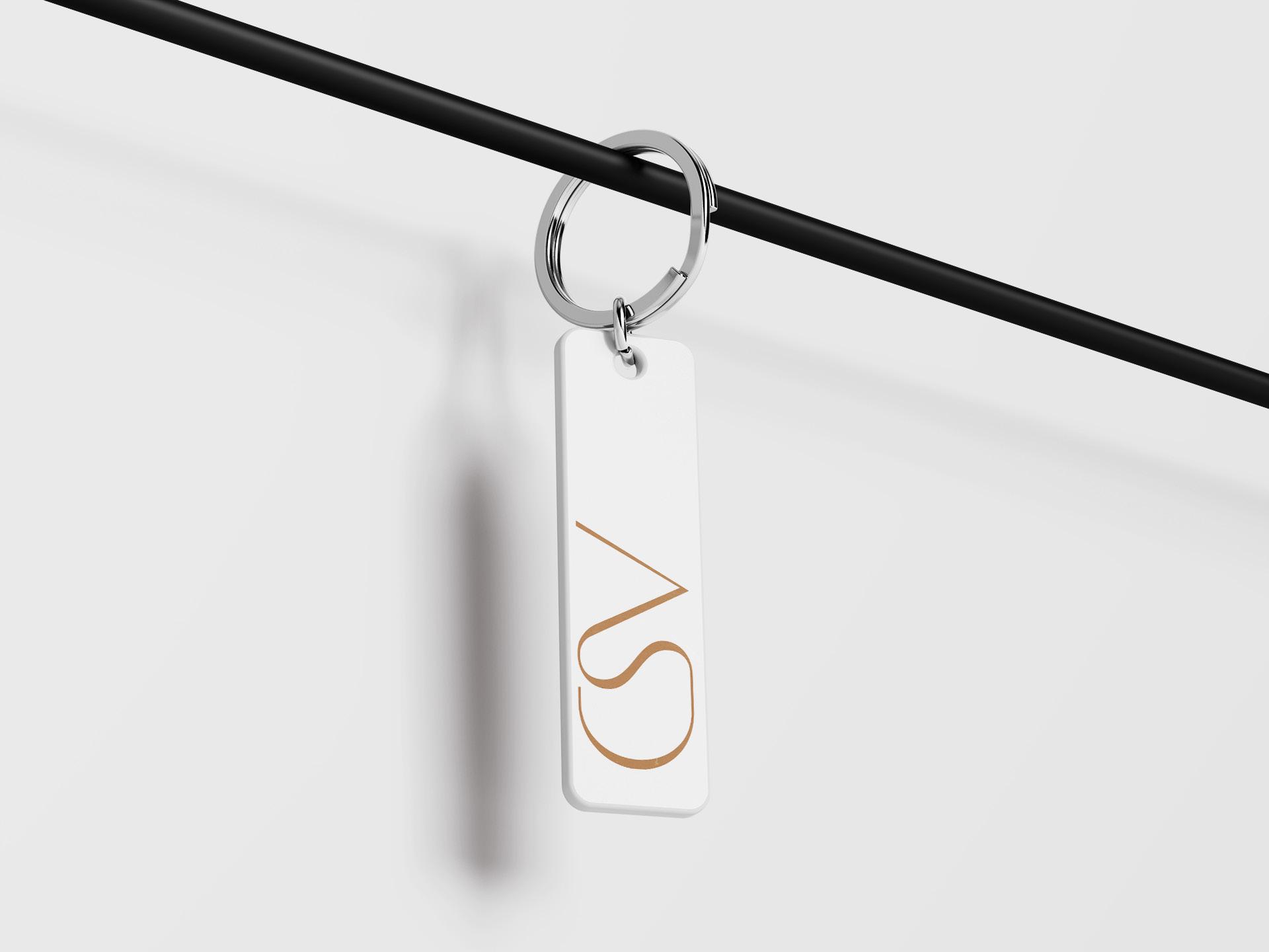
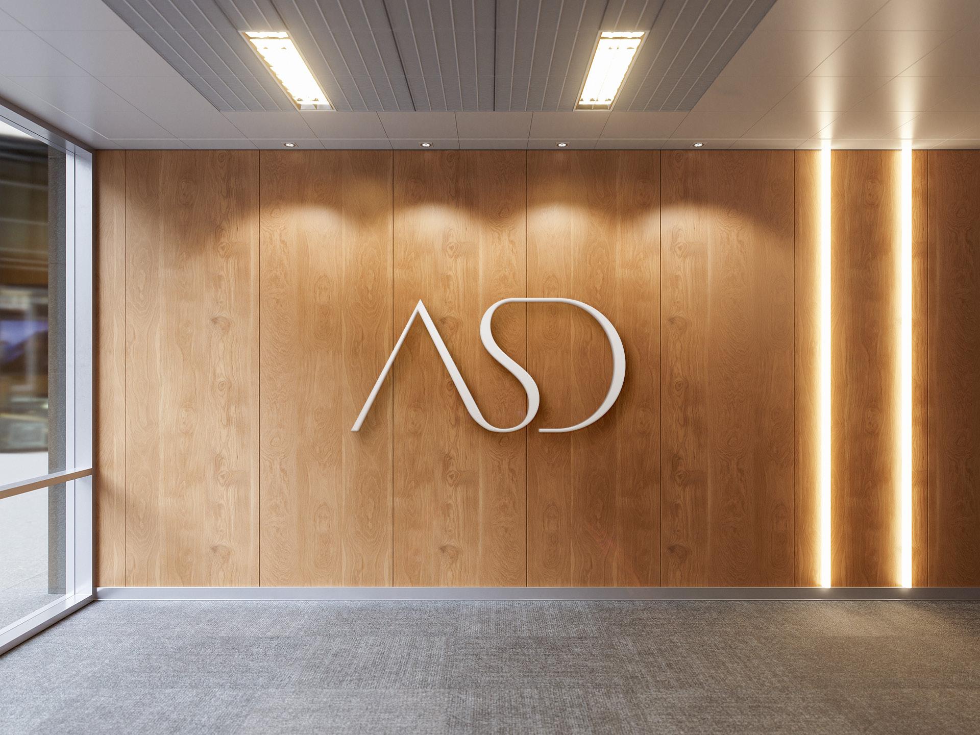
The idea here was to let the initials do all the work. Instead of designing a separate icon, we explored different ways of connecting the A, S, and D into one balanced symbol. After refining the proportions and the spacing, everything came together naturally, turning three letters into one recognizable mark.
Option 04
For this concept, we focused on creating a symbol that feels carefully put together from the first look. Every line was adjusted until the initials connected as one shape instead of three separate letters. The final composition has a strong sense of balance, giving ASD a logo that's simple, distinctive, and full of character.