
5 / 13
Jürg Halter
6 –11 / 234 –235 / 248 –249
Zsigmond toth
14 –17 / 18 –21
b eat Wismer
22 –225
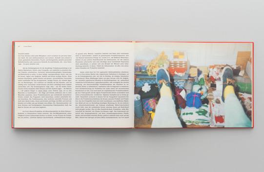
b ook Diary
24 –26 / 27–29
Chris b ünter
98 / 99
e tienne l ullin
124 –125 / 126 –127
torben Hardenberg
182 / 183
Peter s uter
204 –205 / 206 –207
k ana Ueda t homa
232 / 233
m iriam Cahn
236 –241 / 242–247
Claudio m oser
250 –254
Contributors t hanks
Impressum / Imprint
After taking a degree in graphic design, I couldn’t find a job. I knew too much or too little; I was too old to be a newcomer; I had the education but no expe rience — a woman in a field dominated by men, a) with a child, which the men considered a handicap, and b) my Danish ways. b ut then the innovative Danish designer Verner Panton asked me to do some freelance work, to colour in textile and wallpaper repeats, which turned into doing this book with him it was exactly what I wanted. It had to be finished in time for a major retrospective in Copenhagen on the occasion of his sixtieth birthday. l ater the exhibition came to b asel, where it was housed in a circus tent. t here were no computers in those days. f irst we had to trawl his archives for photographs, slides, drawings and documents. We there were two of us, two graphic designers o le Herskind from Denmark and I outlined sections of the photographs on tracing paper and sketched the layout on graph paper, not really much different from working with computer programmes except that it took a lot of table space. t he book came to life in the enchanted house where Verner lived with his wife m arianne and with all of the prototypes he had designed. It was home, studio and showroom all in one. t he book was presented as a gift at the opening. t he first edition was huge, 10,000 copies. s adly, he died in 1998, the same year the book was reprinted, and didn’t live to see the revival of his products.
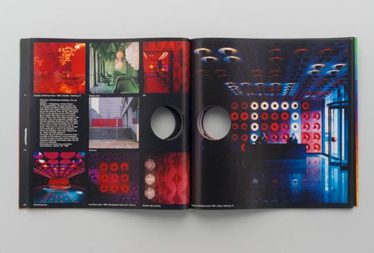
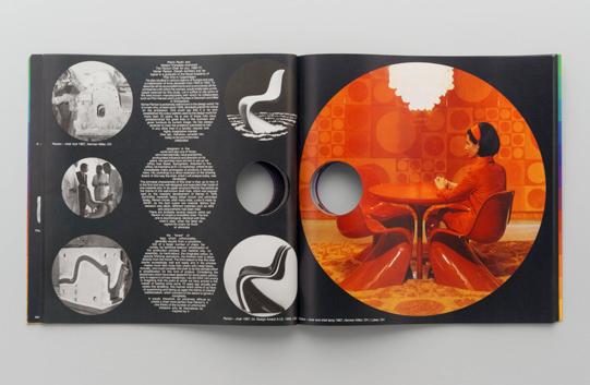
Verner Panton
1986, Copenhagen / b asel, Verner Panton and n iels-Jørgen k aiser (eds) 72 pages, 29.9 × 29.9 cm, printed in colour, softcover with a circular hole through the entire book
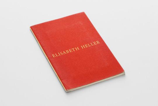
t he artist had a very tight budget, only enough to print in black and white. to show her colourful work, we came up with the idea of printing all of the works in colour on a single sheet and the cover as a two-colour screen print. t he text and little dots to mark the position of the pictures were printed in black black and white. t he reproductions, cut to size, were then pasted in by hand. e lisabeth had to do a lot of pasting: 12 illustrations × 600 copies. It was her first catalogue.
Elisabeth Heller
1989, e lisabeth Heller, Galerie f abian Walter / text e lisabeth Heller, Urs s tahel
32 pages, 17.5 × 22 cm, sewn binding
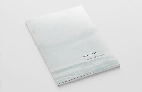
When Gisele l inder opened her gallery in e lisabethenstrasse in b asel, she asked me to design the invitations for her. I am still doing them after twentyseven years, and they are still being exquisitely printed by Peter s chleiss. f or the twentieth anniversary of her gallery, Gisele did not present an artist but rather all of her invitations. s he pinned them in a line at eye level around the walls of her gallery. It looked lovely, all the colours and typography. I was really touched. s he also asked me to do a few catalogues. t his one was for a group show in b elfort, f rance. t he artists each had eight pages at their disposal. t hese were bound singly for them but also together in a catalogue with a foreword.
Bale — Belfort
Rencontre d’une Galerie et d’un Musée
1990, Galerie Gisele l inder, b asel and m usée d’Art et d’Histoire b elfort / text Christophe Cousin, Doléne Ainardi, s igmar Gassert, Alois- karl Hürlimann, Hans-Joachim m üller, Reinhard Wanner, m artin Zingg
50 pages, 21 × 27.9 cm, b / w, softcover
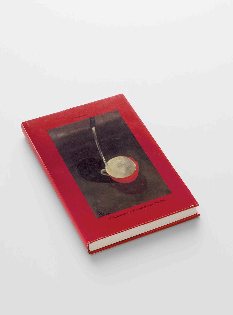
e ric Hattan cofounder of f iliale, basically the first fringe art space in b asel asked me if I would contribute, designing invitations and helping out. I worked there from n ovember 1987 to April 1989 and met a lot of people who played an important role in my life, for instance, Peter s uter (see p. 251). t he book Schweizerbilder was the first of many exciting projects conceived and carried out with him. t he printers used white instead of dark brown endpapers. I had to fight terribly hard to have that changed because I just couldn’t accept the easy way out of having ten per cent lopped off the bill.
Schweizerbilder
Ein Bilderbuch zur Schweizer Malerei 1910–1940 1991, Wiese Verlag, b asel, Peter s uter (ed.) / text Peter s uter 226 pages, 22 × 30 cm, profusely illustrated in colour, red linen hardcover with dust jacket
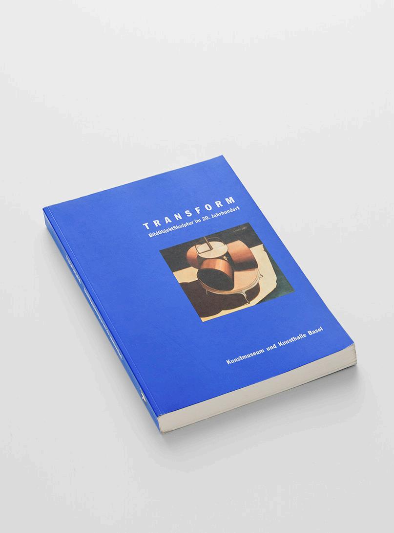
t heodora Vischer organized the joint exhibition Transform at kunsthalle b asel and kunstmuseum b asel. We had to submit the design to e rnst b eyeler. m att m ullican’s visit to my office was an absolute highlight for me. He had sketched a symbol, a logo for the exhibition we used it for invitations, flyers, posters, tickets, outdoor advertising, small pins and even for the streetcars in b asel. I had to do the final artwork for all of the printed matter. In 2016 I had the opportunity to do similar work with him again for his exhibition at kunstmuseum Winterthur.
Transform
BildObjektSkulptur im 20. Jahrhundert
1992, kunstmuseum and k unsthalle b asel, t heodora Vischer (ed.) / text e rnst b eyeler, f ranz m eyer, Dieter koepplin, t heodora Vischer (et al.) 224 pages, 23.5 × 31 cm, profusely illustrated in colour, softcover
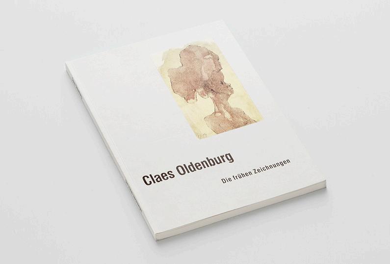
o n the occasion of the exhibition at Öffentliche k unstsammlung b asel, kupferstichkabinett and b erowergut, Riehen.
Claes Oldenburg — Die frühen Zeichnungen
1992, Wiese Verlag b asel, kunstmuseum b asel / text Dieter koepplin, Claes o ldenburg
82 pages, 20.5 × 25.5 cm, two editions: softcover for the exhibition and hardcover version for the bookstores
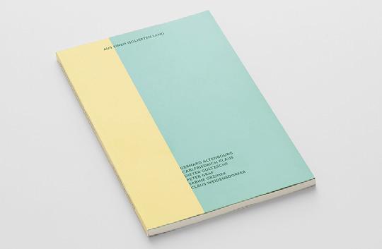
Rudolf Velhagen, curator of the exhibition and Dieter koepplin’s assistant at the b asel Department of Prints and Drawings, produced a slender catalogue for his exhibition of artists from the former GDR. t hey were not at all pleased when I told them that the colours for the invitation and the cover had been inspired by the so-called trabi, the automobile that had been produced in e ast Germany for many years.
Aus einem isolierten Land
Fünf Zeichner und eine Zeichnerin aus der ehemaligen DDR
1992, Öffentliche k unstsammlung b asel, kunstmuseum b asel, s taatliche
Graphische s ammlung m ünchen / text Dieter koepplin, t ilman f alk, Wener s chade, Rudolf Velhagen
84 pages, 23.5 × 31 cm, softcover
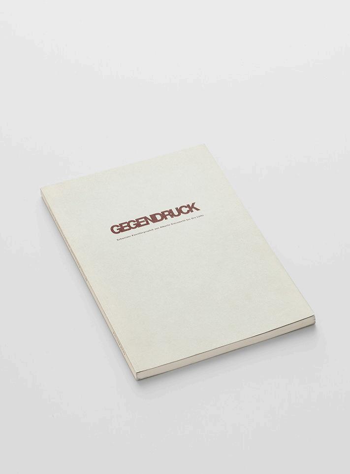
Gegendruck
Schweizer Künstlergraphik von Alberto Giacometti bis Urs Lüthi e xhibition catalogue for Galerie der f riedrich- e bert- s tiftung b onn, Galerie im taxispalais Innsbruck and Graphische s ammlung der et H Zürich 1993, Graphische s ammlung der et H Zürich / text e va korazija 94 pages, 21 × 27 cm, softcover
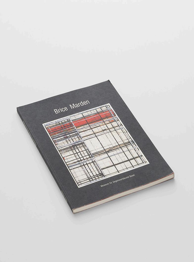
Brice Marden
1993, Öffentliche k unstsammlung b asel, m useum für Gegenwartskunst b asel / text Dieter koepplin
94 pages, 24 × 30 cm, 2 pages foldout, softcover
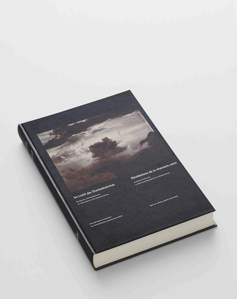
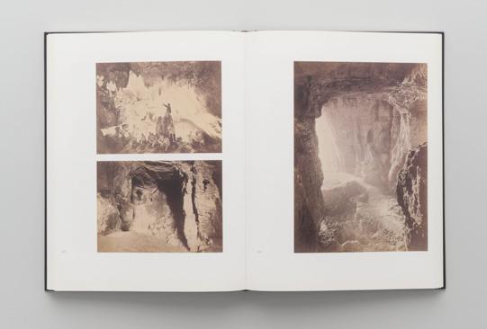
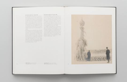
I had already designed a poster for the presentation of Ruth and Peter Herzog’s collection of photographs at the Zurich m useum of Design. t his substantial book for an exhibition at the s wiss n ational m useum Zurich was published by Christoph m erian Verlag in two languages and with exceptionally beautiful reproductions. It was printed by the b asler Zeitung, the local newspaper, which still operated a major printing company in those days. Award-winner.
Im Licht der Dunkelkammer Die Schweiz in Photographien des 19. Jahrhunderts aus der Sammlung Herzog / Révélations de la chambre noire — La Suisse du XIXe siècle à travers les photographies de la collection Herzog
1994, Christoph m erian Verlag, s chweizerisches l andesmuseum Zürich / text (German, f rench) Hanspeter l anz, b eatrix m esmer, Rudolf s chnyder, David s treiff, b eat von Wartburg (et al.)
228 pages, 22.8 ×30.6 cm, illustrated in colour, one foldout, hardcover
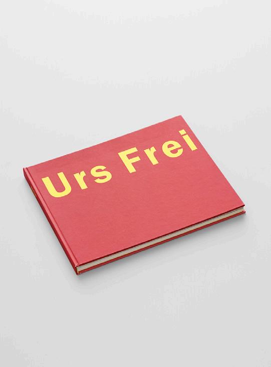
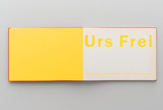
two artists were chosen for the Venice b iennale: Helmut f ederle for the pavilion and Urs f rei for the Chiesa s t. s tae. Urs wanted something ‘simple’, so I took inspiration from the landscape format of children’s books. t he cover was bright red with big yellow letters reading Urs Frei. Urs Frei
1997, Verlag l ars m üller, s wiss f ederal o ffice of Culture / text (German, e nglish, f rench, Italian) Christoph Cherix, y vonne Volkart, Vitus H. Weh 60 pages, 30.8 × 22 cm, paper-covered hardcover
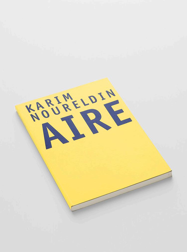
It was the second book that I designed for k unstmuseum Winterthur and the second catalogue for k arim n oureldin. k arim had been awarded the m anor Prize, which includes not only prize money but also an exhibition and a publication. t hree years later, in 2007 the director of the museum Dieter s chwarz asked me to create a new corporate identity for the museum logo, invitations, all the printed matter, shopping bags, everything. An exciting job. I did it for ten years, until 2017.
Karim Noureldin Aire
2004, kunstmuseum Winterthur / text ( e nglish, German) k atharina Holderegger, m ax Wechsler
88 pages, 23.5 × 29.5, profusely illustrated in colour, softcover with flaps
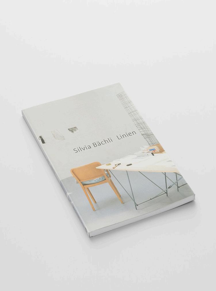
Silvia Bächli Linien
2005, m useum zu Allerheiligen s chaffhausen, Verlag für moderne k unst n ürnberg / m arkus s tegmann (ed.) / text m arkus s tegmann
80 pages, 21.5 × 31 cm, drawn-on cover